Glyph Lights? Tecno Put Actual Plasma Lightning Inside One Of Its Phones At MWC 2026

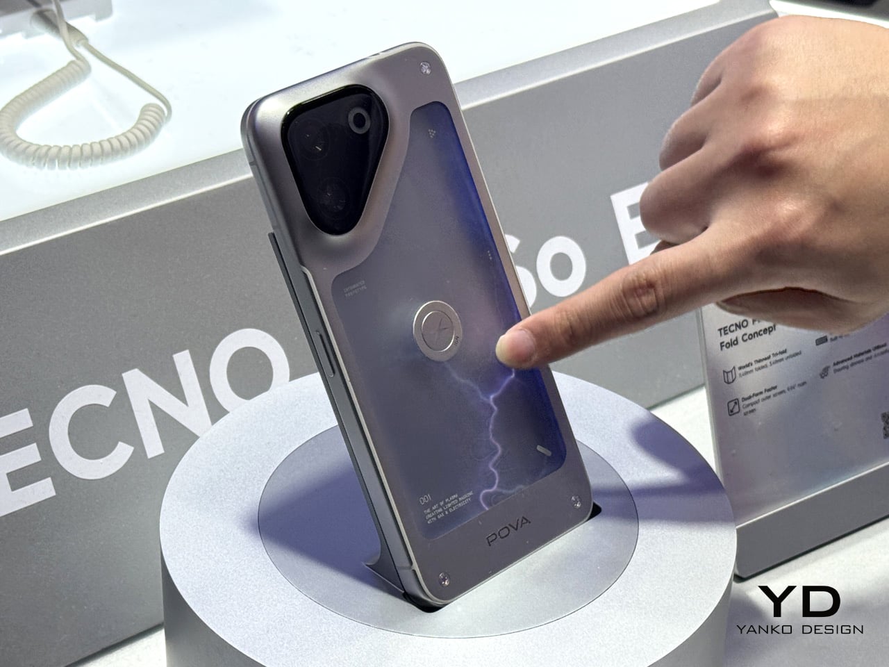
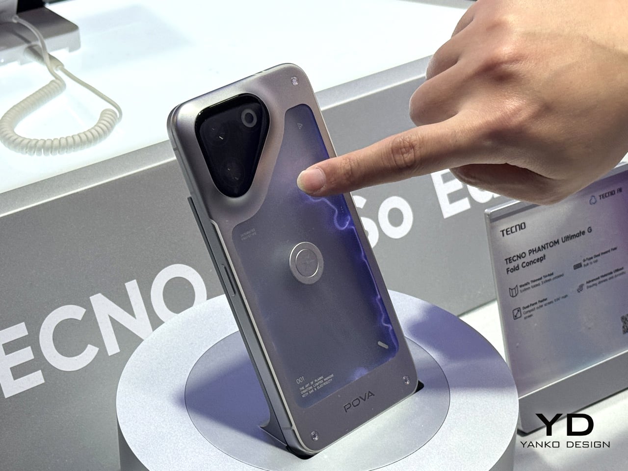
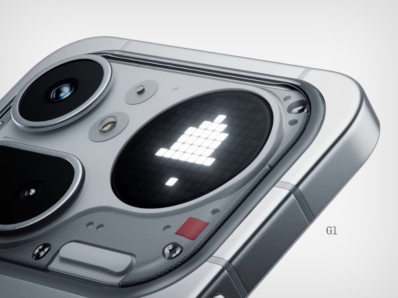
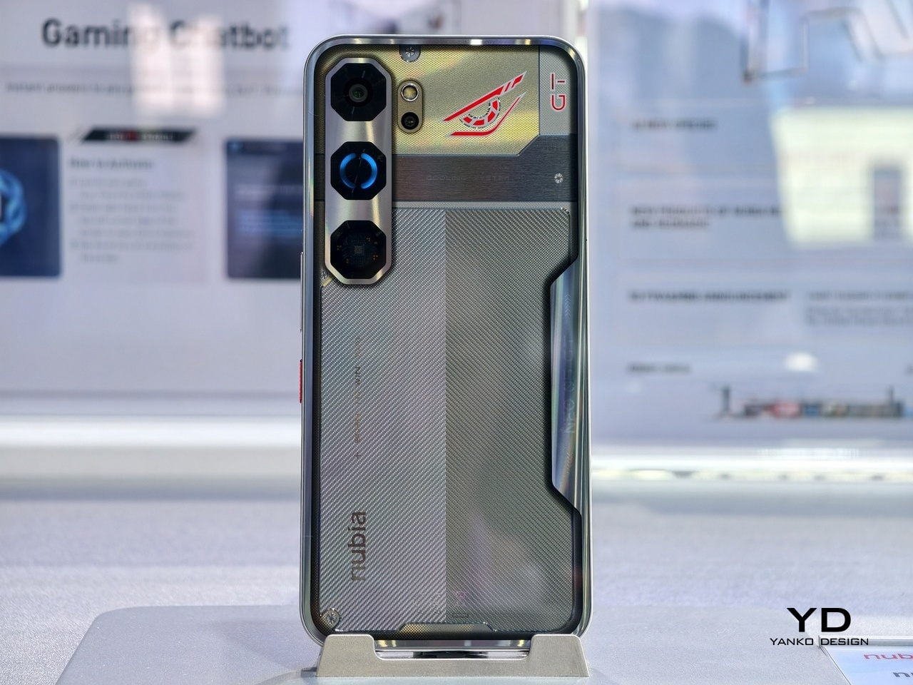
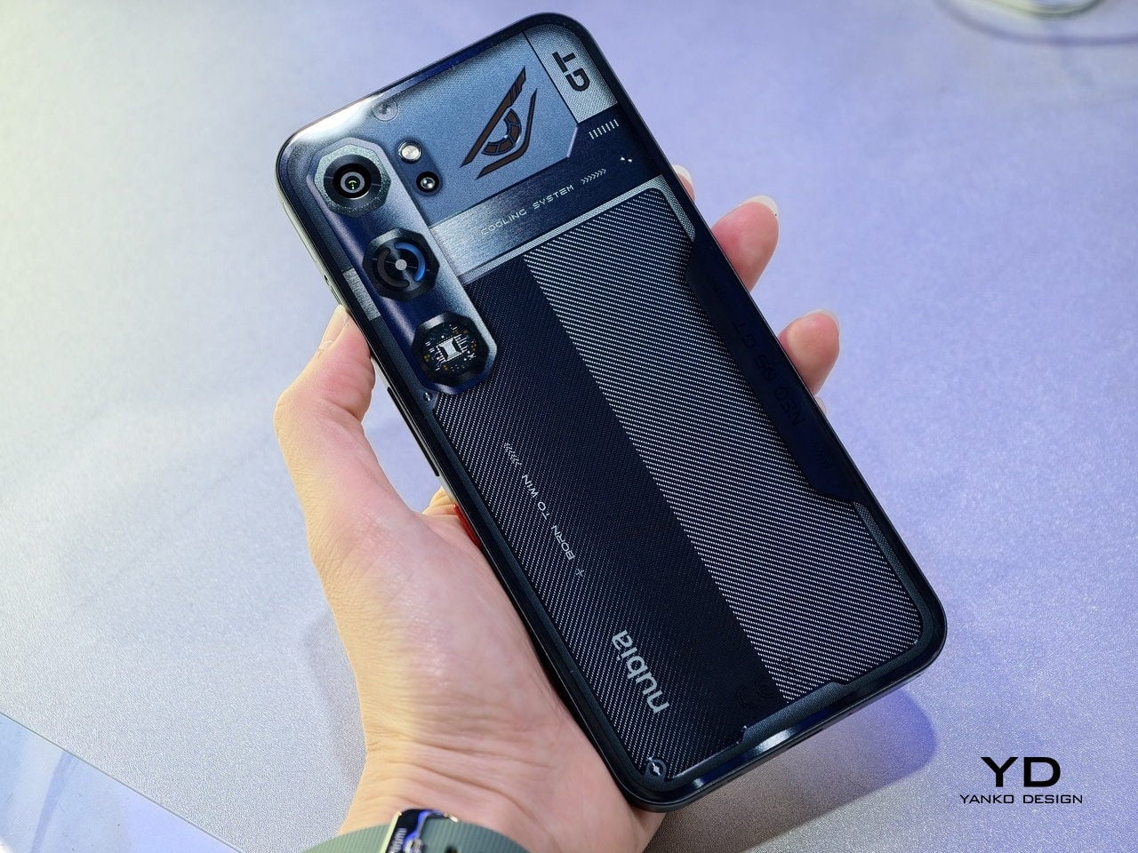
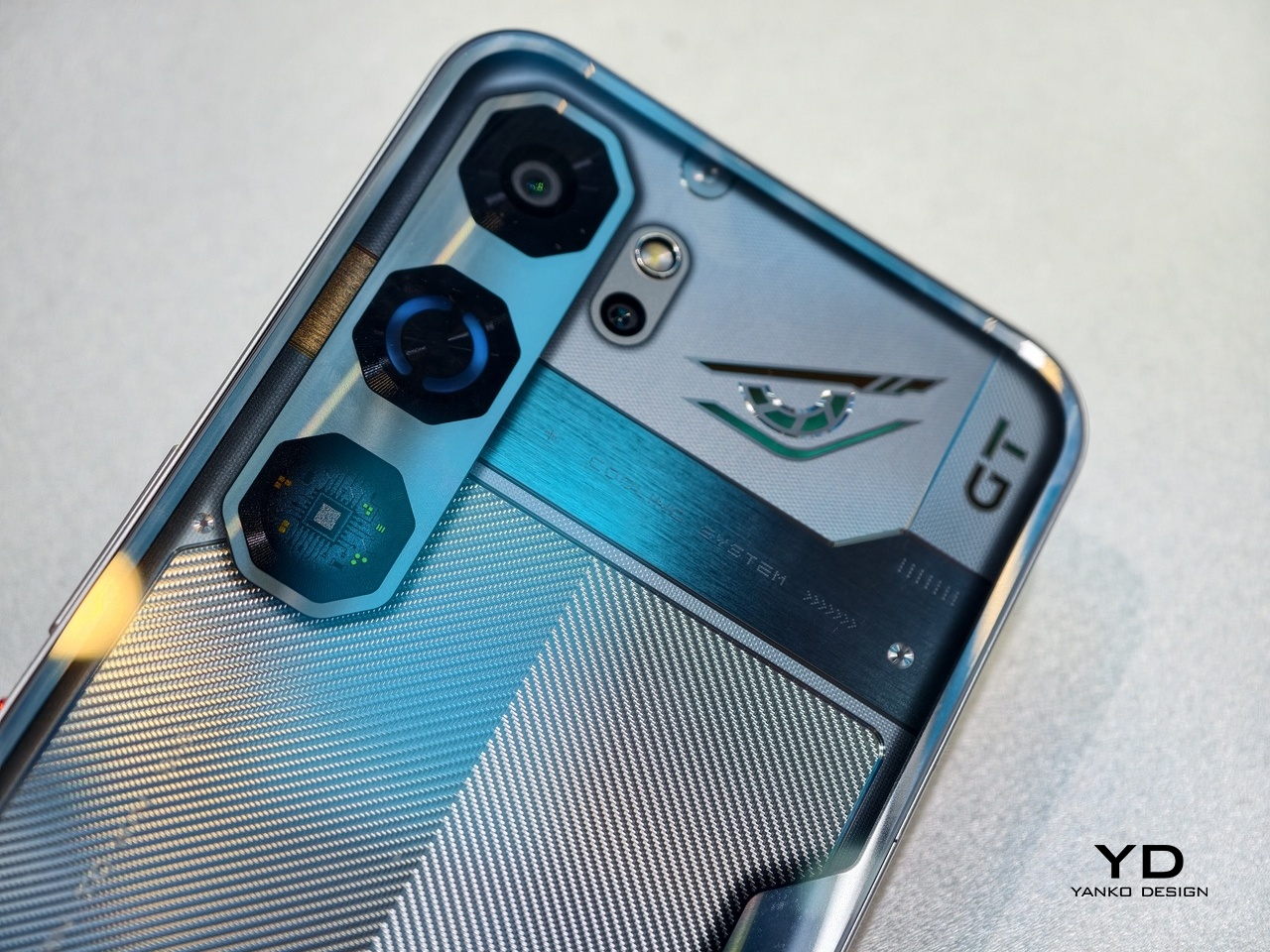
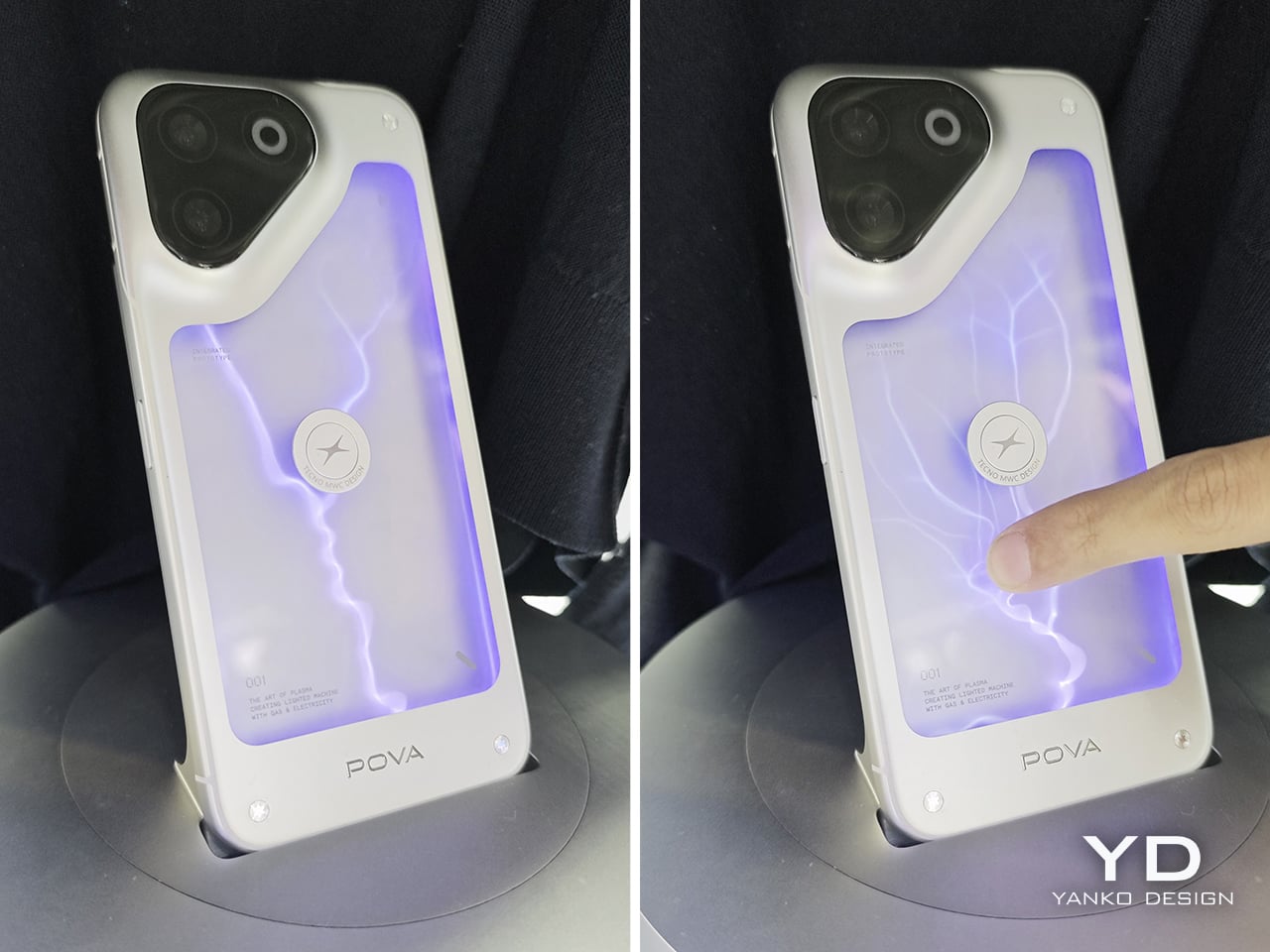
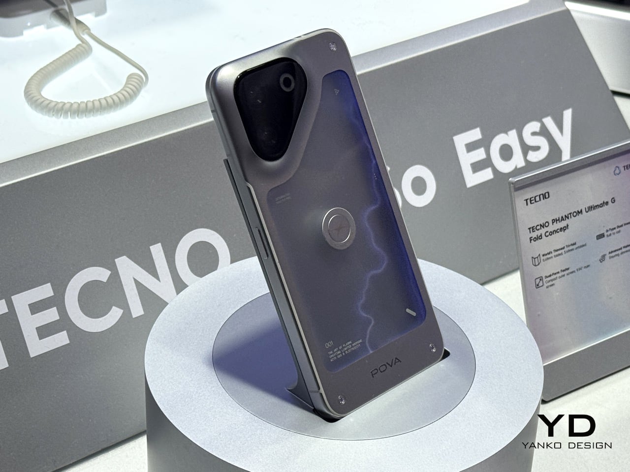
While Nothing flits with Glyph Matrixes and Bars, Tecno decided to infuse the soul of Thor into its latest phone concept. Dubbed the Pova Neon, this phone was possibly the most unique thing we’ve seen in the phone market in a while. Built inside the back of a phone is an inert gas chamber that emits beams of plasma thanks to high voltages that’s passed through the gas. Touch the glass panel separating you from the plasma, and the lightning gathers around your fingertips, quite like it would around a tesla coil, if you ever saw or owned one as a kid.

The detail (and the execution) is impressive, but it begs the question – who needs this?! Why does this exist? And what exactly is its purpose? Why must I have lightning trapped inside the back of my smartphone? Doesn’t it already do enough?? Or maybe the plasma lights are a great distraction from your doomscrolling habit. I’d probably pick staring at random beams of light than scroll through the news…

Designer: Tecno

The Pova Neon is just a concept. Tecno doesn’t plan on building this at all, not just because it’s complicated – it’s also fragile, fairly dangerous, and really doesn’t do much to make the phone better. Adding inert gases at the back removes the ability to add a wireless charging coil there, which means no MagSafe either. You put a case on the phone and you lose all novelty immediately. And drop the phone and you genuinely risk a fairly serious fire hazard.

But for what it’s worth, the phone is a bundle of fun. In the bright lights of MWC, the plasma wasn’t fairly visible. But the minute we put a coat around the phone to block light out, the lightning looked genuinely amazing. The random patterns, the interaction with your fingertip, it’s all entirely cosmetic, but it’s also somewhat cosmic! Good job flexing your tech chops, Tecno. I mean, besides the fact that they actually built a modular smartphone ecosystem which managed to win YD’s Best of MWC Award!

The post Glyph Lights? Tecno Put Actual Plasma Lightning Inside One Of Its Phones At MWC 2026 first appeared on Yanko Design.

Nothing Phone 4a Pro: Metal Build, Glyph Matrix, and a Price That Actually Makes Sense


The ink on Barcelona was barely dry when Nothing pulled everyone back to London. The Phone (4a) had its big MWC moment just days ago, where journalists and the public got their hands on it, took the obligatory photos, and filed their takes. And then Nothing said: actually, we have another one. The Phone (4a) Pro launched today at Central Saint Martins, the world-famous College of Art and Fashion in London’s Kings Cross, a deliberately art-coded venue for a brand that has always treated its phones as objects as much as devices. This is how Nothing operates in 2026, staggered drops fired in rapid succession to keep the conversation alive, and the strategy is working.

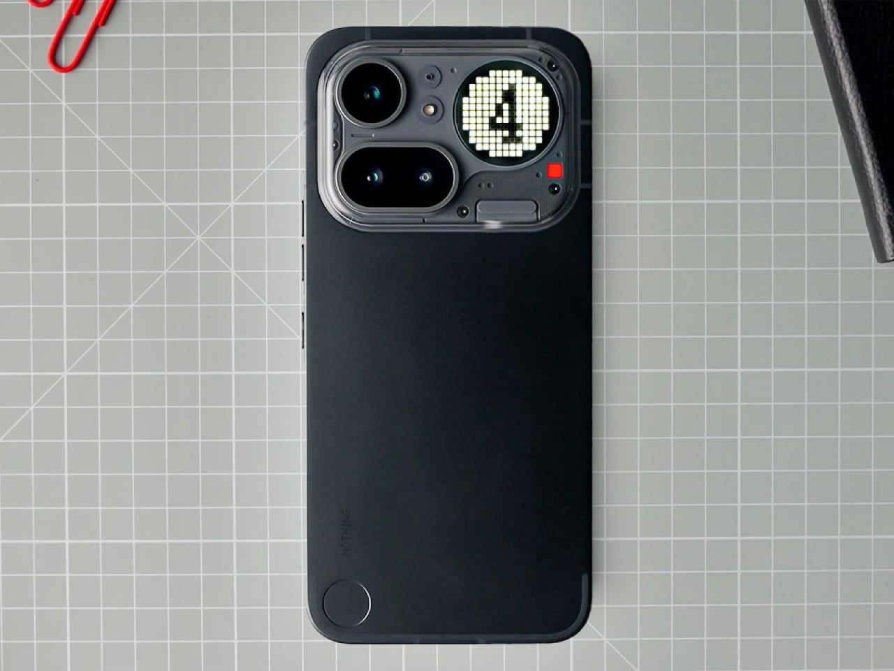
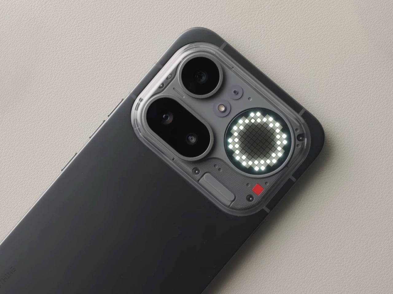
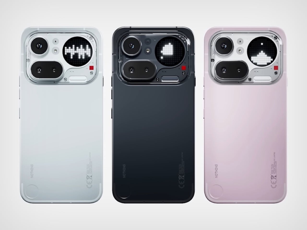
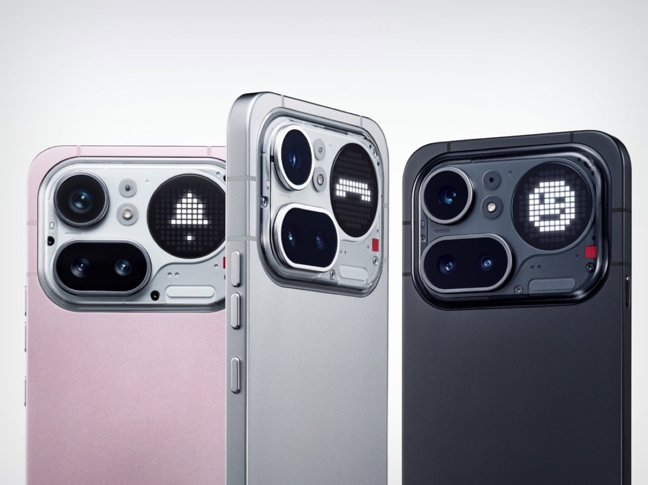
The reason the Pro matters so much this year comes down to a decision Carl Pei made at the start of 2026: Nothing will not launch a flagship phone this year. That puts the Phone (4a) Pro in the role the Phone (3) would have occupied, as the design halo, the statement piece, the device that earns a second look across a dinner table. And so the Glyph Matrix returns. When we covered the Phone (3), the Matrix was the headline, a circular LED array in the top-right corner of the rear panel that could display pixel-style animations, timer readouts, caller signatures, and even a spin-the-bottle mini-game. It was the kind of feature that made you rethink what a phone’s back panel could do. The (4a) Pro’s version runs 137 LEDs against the Phone (3)’s 489. On paper that sounds like a step back. In practice, the circle is 57% larger and the LEDs are twice as bright at 3,000 nits, making for a more visible, punchy display even if the pixel resolution is reduced. The tradeoff is real but not as simple as the numbers suggest.

Designer: Nothing

Compare the (4a) Pro’s rear panel to the (3a) Pro’s and you feel the difference before you can articulate it. We wrote about the (3a) Pro’s camera arrangement at the time, and the word we used was chaos: lenses placed asymmetrically, Glyph LEDs ringing a circular module like someone got excited and kept adding things. The (3a) Pro took cameras arranged asymmetrically with Glyph LEDs around the circular camera module. The (4a) Pro looks like that design went away, thought about what it was doing, and came back with some self-control. The cameras and Glyph system now sit inside a raised transparent plateau, three lenses in a proportional, structured arrangement with the Matrix at the top-left and the red recording indicator tucked below it. Nothing is pushing back on the plateau comparison, but the composure of the layout is undeniable. This is what a camera array looks like when the brief is restraint rather than personality, and it turns out restraint suits Nothing rather well.

That same shift in attitude shows up in the build. The (4a) Pro drops the plastic frame and goes metal unibody at 7.95mm, which is directly relevant to something we flagged in our (4a) coverage: the blue colorway looked cheap against a plastic frame, the color promising something the material could not back up. That tension is gone on the Pro. A metal chassis earns the Silver colorway, gives the Pink something to push against, and makes the whole thing feel like a considered object rather than an aspirational one. The IP65 rating arrives alongside it, with a non-standard but still real claim of 25cm submersion for 20 minutes. The chipset steps up properly too: the Snapdragon 7 Gen 4 brings a 27% CPU uplift, 30% better GPU performance, and a 65% jump in AI processing over the 7s Gen 3 that powered the (3a) Pro. The standard (4a) gets the 7s Gen 4, technically a newer chip but only a 7% performance improvement over the outgoing model. The meaningful generational gains live in the Pro.

On the camera side, the Pro runs Sony’s Lytia 700C, a 50MP 1/1.56-inch main sensor with OIS, alongside a periscope telephoto using a Samsung JN5 50MP sensor at 3.5x optical zoom, extendable to 7x with in-sensor cropping. The system supports 4K Ultra XDR recording, comparable to Dolby Vision, with up to 140x hybrid zoom. The display is a 6.83-inch AMOLED at 144Hz, 1.5K resolution. The Pro comes in Black, Silver, and Pink, while the (4a) ships in Black, Blue, Pink, and White. Both run Nothing OS 4.1 on Android 16, with three OS updates and six years of security patches committed.

Pre-orders for the (4a) open today with sales from March 13, while the (4a) Pro takes pre-orders from March 13 with open sales on March 27. UK pricing is £349 and £499 respectively. Holding the launch at Central Saint Martins was not a neutral decision: it is one of the most culturally loaded art schools on the planet, and Nothing knows exactly what it is saying by being there. Two phones, one week, one city. Nothing is playing the long game with a short runway.

The post Nothing Phone 4a Pro: Metal Build, Glyph Matrix, and a Price That Actually Makes Sense first appeared on Yanko Design.

This Rugged Phone Ships With 2 Batteries You Can Hot-Swap

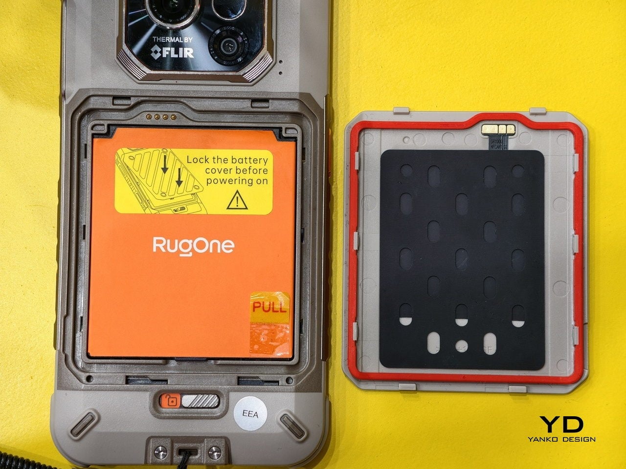
Dead battery anxiety is real, and for most people, the solution is either a power bank they forgot to charge or a desperate search for an outlet. Flagship phones have been getting faster at charging for years, but none of them have gone back to the one fix that actually solves the problem: a battery you can take out and replace with a fresh one, right there on the trail.

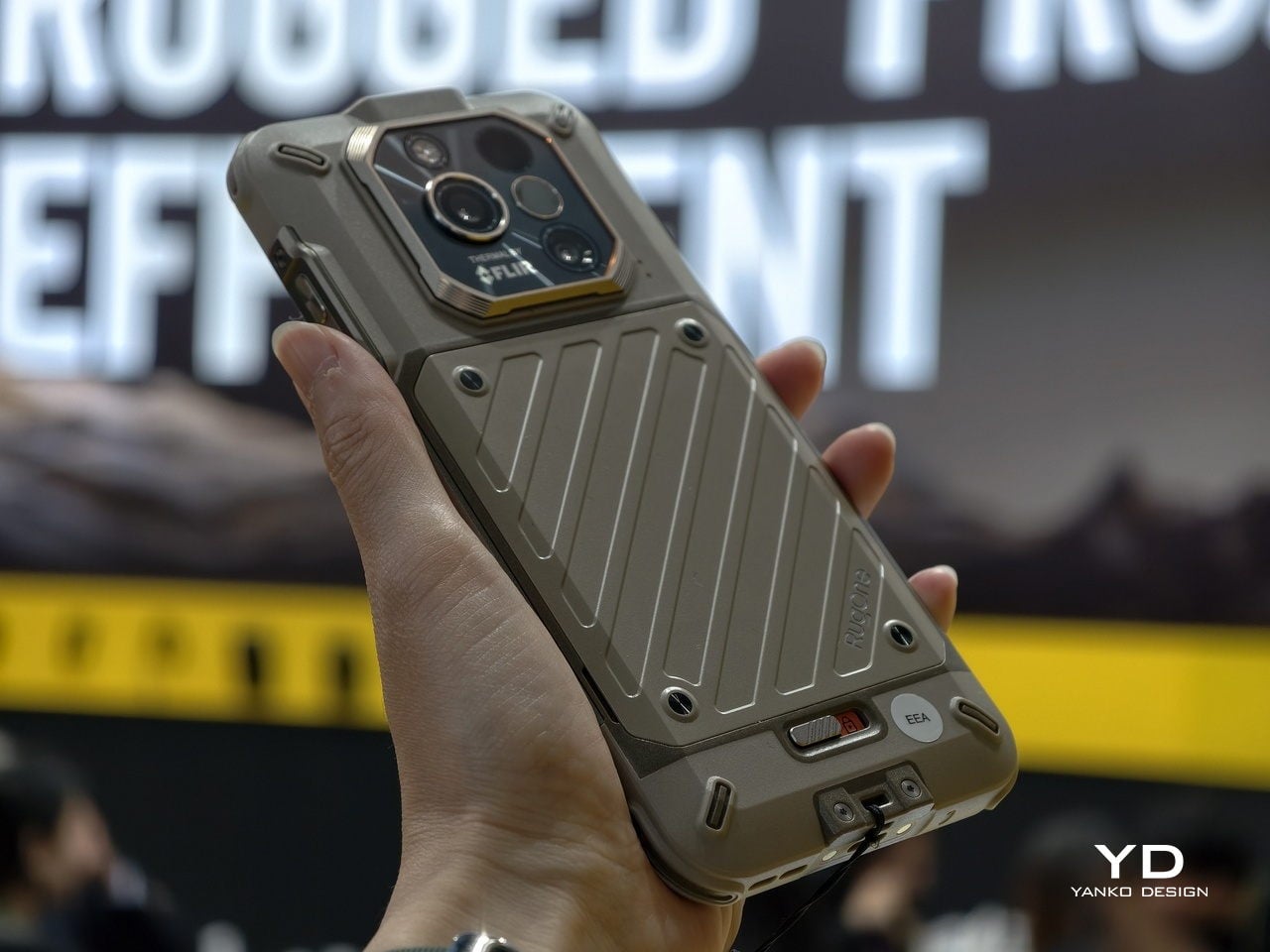
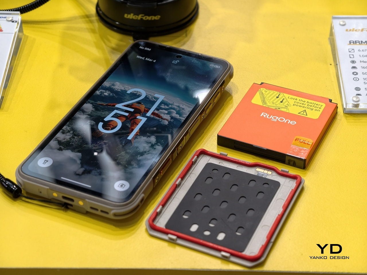
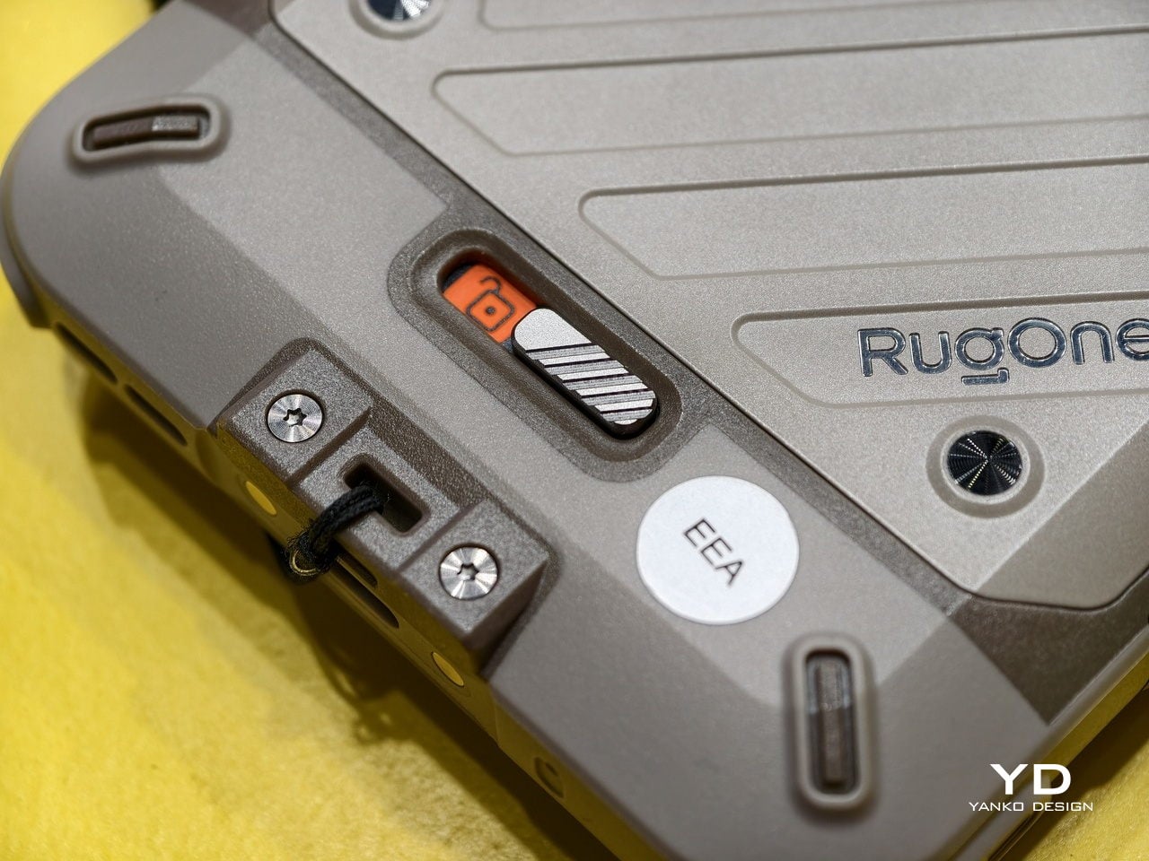
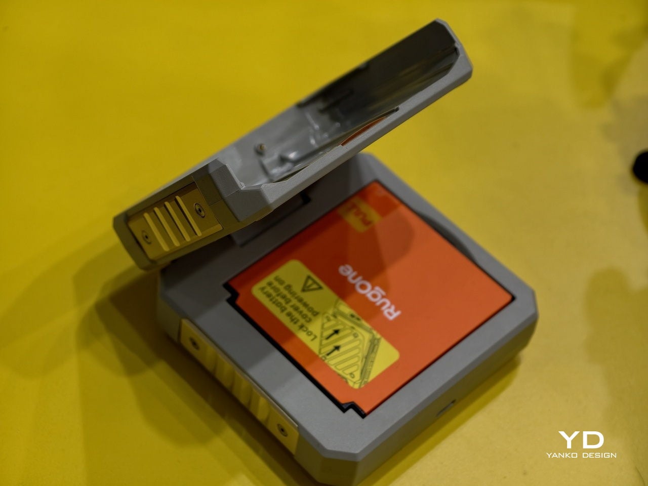
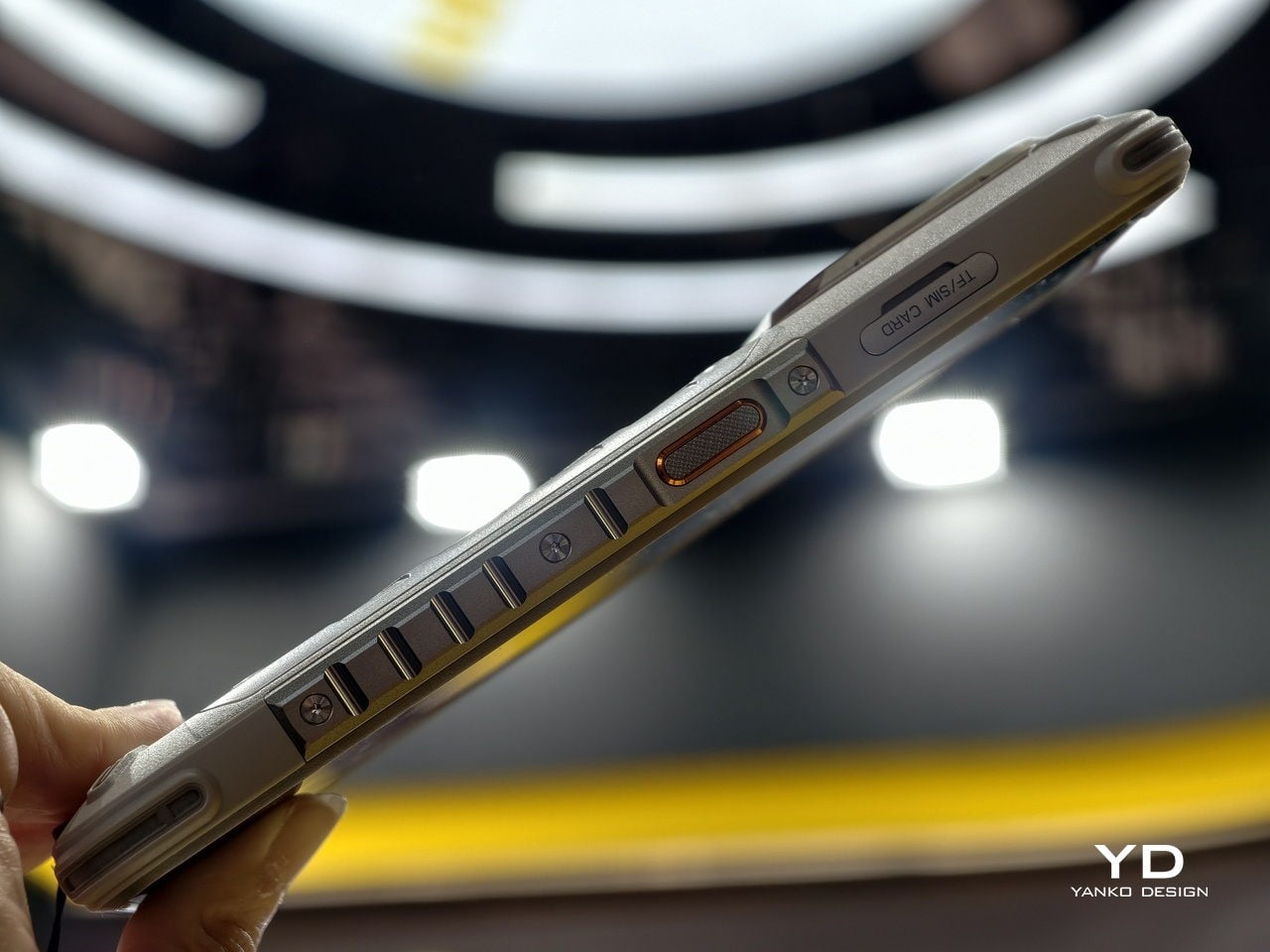
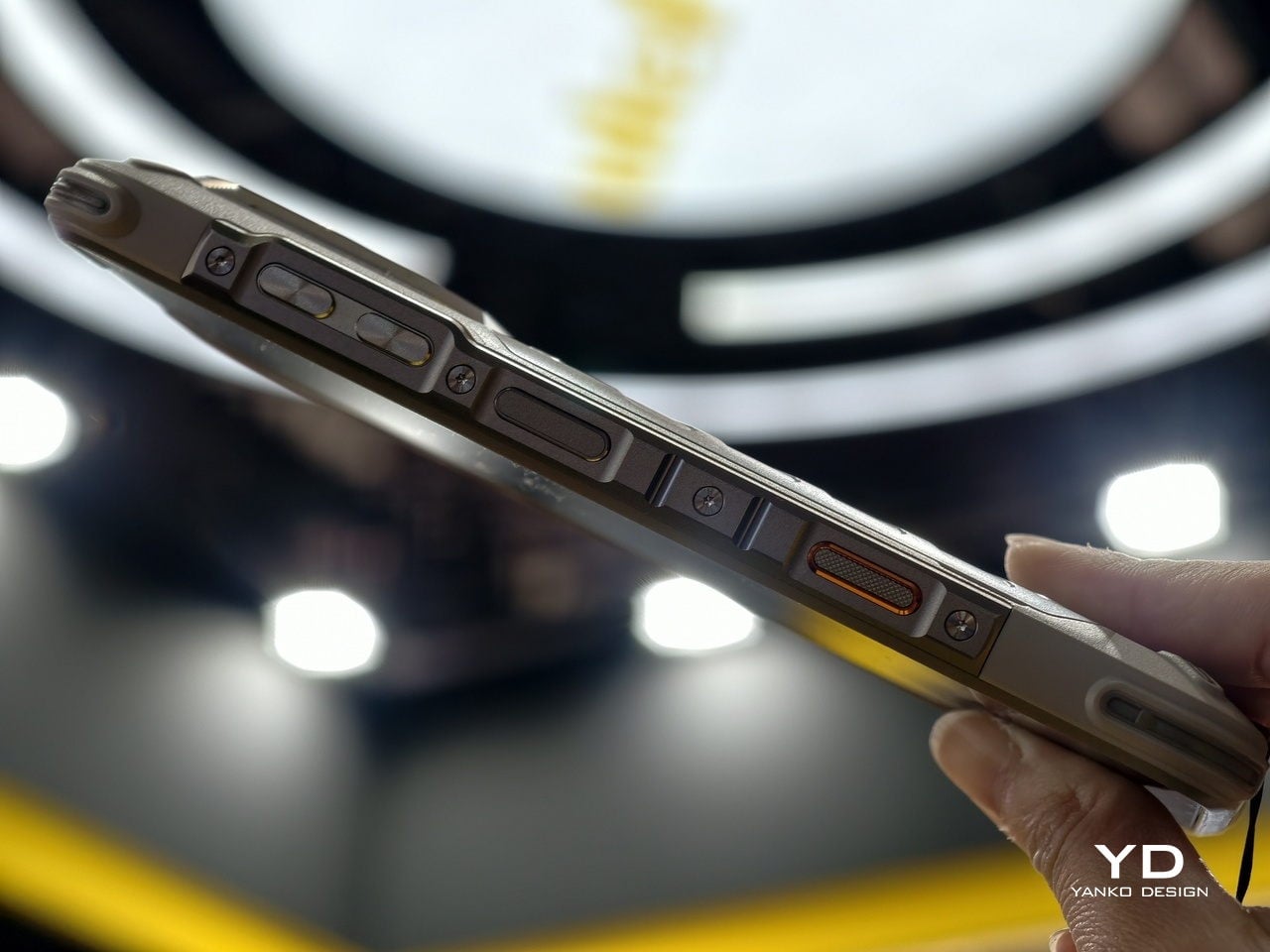
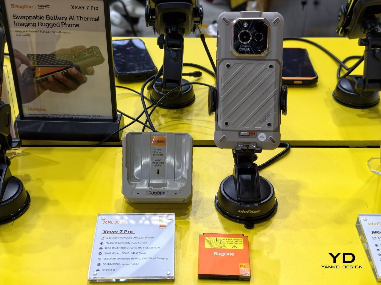
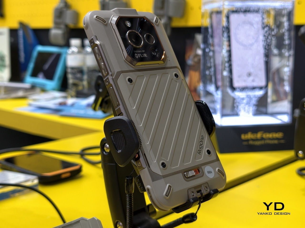
That is exactly what the RugOne Xever 7 does. It ships with two 5,550 mAh batteries and a built-in buffer cell that keeps the phone alive during the swap, so you never have to restart. The whole process takes under 180 seconds. There is no hunting for a socket, no waiting out a charging cycle, and no watching the percentage tick up while your plans sit on hold.

Designer: Ulefone

The phone is IP69K and IP68 rated, survives drops per MIL-STD-810H certification, and weighs 325 g, which is heavy but not unusual for a rugged device with this much packed inside. The 64 MP night vision camera uses four built-in infrared lights to shoot in complete darkness, which is genuinely useful if you have ever tried to photograph a campsite at 2 a.m. with a regular phone and gotten nothing.

There is also a 50 MP main camera with optical image stabilization, a 50 MP ultra-wide with a 117.3-degree field of view, and a 32 MP front camera. The phone supports underwater photography as well, with controls you can operate while submerged. Video tops out at 2K at 30 fps, which is fine for most outdoor documentation but a step behind phones at similar price points that record at 4K.

The display is a 6.67-inch AMOLED panel running at 120 Hz with a 2,200-nit peak brightness, which holds up well in direct sunlight. Inside is a MediaTek Dimensity 7025 chipset paired with 12 GB of RAM and 512 GB of storage, expandable to 2 TB via microSD. That chipset is mid-range by current standards, so this is not a performance-first phone, but it handles everyday tasks without friction.

Charging runs at 33W over USB-C or 18W through the Pogo Pin dock that comes in the box. The dock charges the spare battery simultaneously, so by the time your current battery runs low, the backup is already full and ready. That closed loop is the smartest part of the whole system, and the detail that makes the swappable battery feel like a considered design decision rather than a novelty.

Android 15 runs clean here, with Google Gemini built in, a 230-lumen flashlight, an X-axis linear vibration motor, and a 3.5 mm headphone jack that has no business still being this satisfying to find on a phone. The Xever 7 does not try to reinvent what a rugged phone is. It just fixes the one thing that frustrates people most, and lets everything else do its job quietly.

The post This Rugged Phone Ships With 2 Batteries You Can Hot-Swap first appeared on Yanko Design.

7 Best Japanese Kitchen Gadgets & Tools So Clever They Make Every Meal Feel Like a Ceremony

Japanese kitchenware operates on a different frequency than most Western cooking tools. Where mass-market brands chase multifunctionality and feature bloat, Japanese design strips everything back to the single gesture that matters: the cut, the strain, the flip, the pour. The result is objects that feel less like gadgets and more like quiet collaborators in your cooking process, each one shaped by decades of manufacturing precision in regions like Tsubame and Niigata, where metalworkers have been refining their craft since the Edo period.

We have curated seven of the most thoughtfully designed Japanese kitchen tools that deserve a permanent place in your cooking routine. These are not flashy unitaskers destined for a drawer. They are carefully considered pieces of functional design that treat the act of cooking with the same seriousness as the meal itself, and each one brings something to your kitchen that no Western equivalent has managed to replicate with the same level of care.

1. Iron Frying Plate

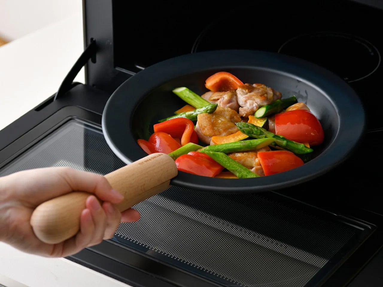
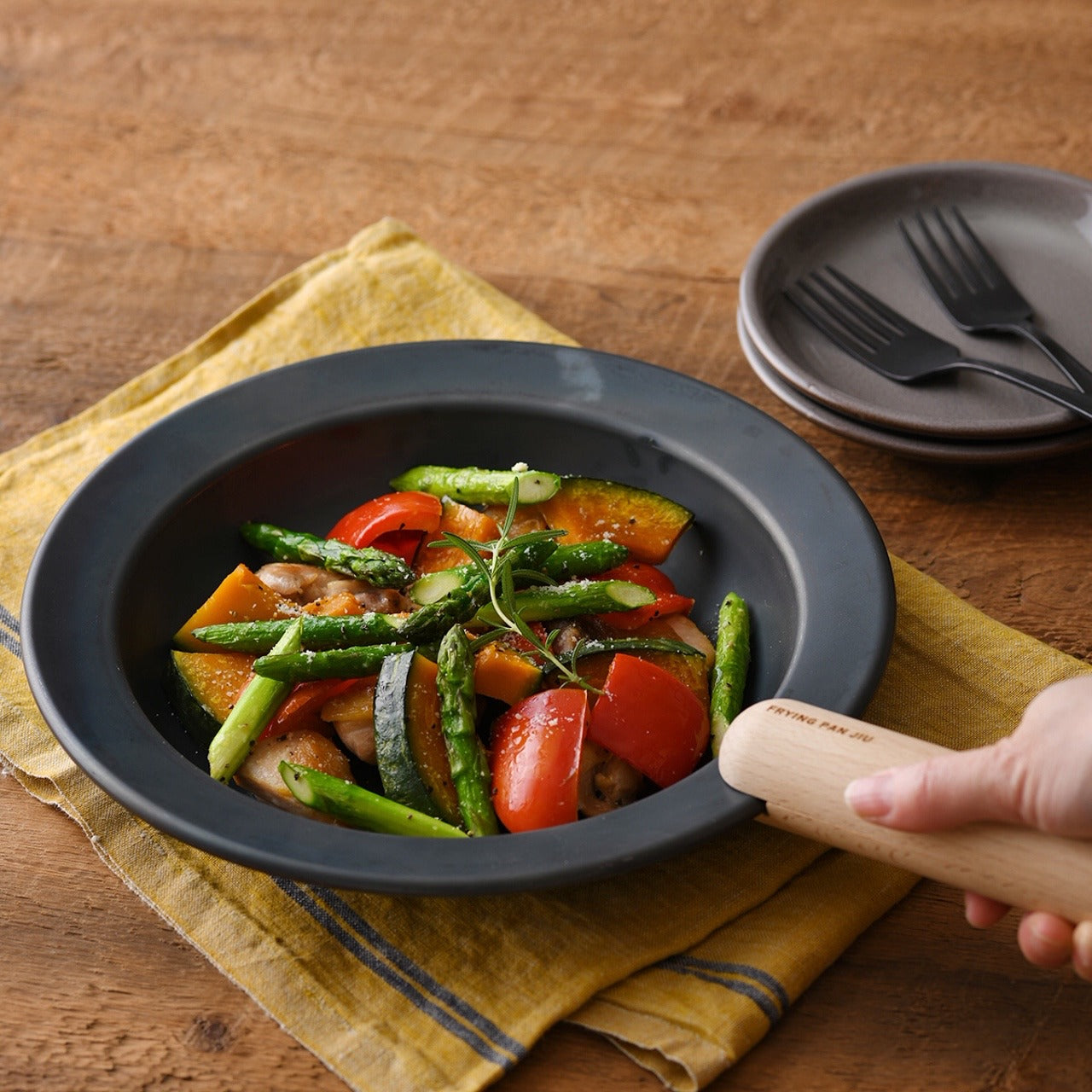
This piece of cookware collapses the distance between the stove and the table in a way that feels both radical and sensible. Made from 1.6mm-thick mill scale steel, the plate arrives rust-resistant, stick-resistant, and ready for immediate use without the lengthy seasoning ritual most iron cookware demands. The wooden handle attaches and detaches with one hand, transforming the object from cooking tool to serving vessel in a single motion. Mill scale steel is an unusual choice for consumer cookware because most manufacturers sand it off during production, but leaving it intact creates a natural non-stick surface that improves with use.

The heat distribution across that thin steel body brings out caramelization and texture in ways that thicker cast iron struggles to match, and the visual warmth of iron against a wooden table turns an ordinary weeknight dinner into something more composed. For a kitchen where counter space is limited, and dishes pile up fast, eliminating one entire step of the cooking-to-eating chain is not a gimmick. It is a rethinking of how we interact with food once it leaves the heat, and the pan-to-plate logic makes cleanup faster than any two-vessel alternative.

Click Here to Buy Now: $69.00

What we like

  • The one-hand detachable wooden handle makes the transition from stove to table seamless and eliminates the need for separate serving dishes.
  • Mill scale steel requires no initial seasoning, so it is usable straight out of the box, unlike most raw iron cookware on the market.

What we dislike

  • The thin 1.6mm steel will not retain heat as long as heavier cast iron, which means food cools faster once removed from the burner.
  • Eating directly from a frying surface takes some adjustment, and the flat profile does not contain sauces or runny dishes well.

2. Akebono Square Sandwich Cutter & Sealer

Sandwich-making in most kitchens involves a knife, a cutting board, and the quiet disappointment of fillings oozing out the sides. The Akebono cutter and sealer replaces that entire sequence with a single press that cuts and crimps simultaneously, producing sealed pockets that hold their shape through a commute, a school day, or a few hours in a lunchbox. Made in Japan with durable, food-safe materials, the tool is dishwasher-safe and simple enough for children to operate without supervision.

What makes it more than a novelty is how it changes the approach to sandwich construction entirely. Instead of spreading fillings thin to prevent spillage, the sealed edges allow for generous, layered interiors: curries, egg salad, fruit, and cream combinations that would be impossible with open-edge bread. Japanese convenience stores have perfected the sealed sandwich format for decades, and this tool brings that same logic to a home kitchen for a fraction of the cost, turning a five-minute task into a two-minute one.

What we like

  • The simultaneous cut-and-seal action locks fillings inside, making it ideal for runny or layered ingredients that would fall apart in a regular sandwich.
  • Dishwasher-safe construction and a straightforward press mechanism mean there is almost no learning curve and minimal cleanup.

What we dislike

  • The square format limits bread choices, as it works best with standard sliced bread and does not accommodate artisan loaves or thicker cuts.
  • Sealed sandwiches can trap steam when made with warm fillings, resulting in soggy bread if not cooled before sealing.

3. Three Snow Stainless Steel Round Mesh Oil Skimmer

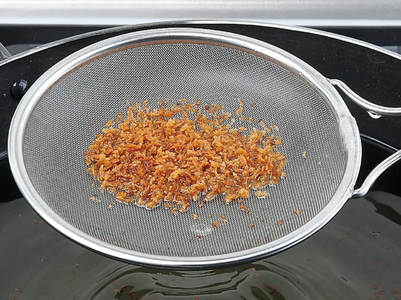
Most oil skimmers sold outside Japan are clunky perforated ladles that catch large debris and let everything else through. The Three Snow skimmer operates on a different principle. Manufactured in Tsubame, Niigata, this tool uses 18-8 stainless steel mesh available in fine (40 mesh, 0.4mm) and coarse (16 mesh, 1.2mm) options, giving it the ability to filter particles most skimmers ignore completely. The fine mesh variant catches even the smallest frying residue, which means cleaner oil that lasts longer between changes.

Beyond deep-frying, the tool doubles as a scum remover for stocks and soups and works as a miso strainer, making it one of the more versatile single-form tools in a Japanese kitchen. Available in 12cm, 15cm, and 18cm diameters, the sizing accommodates everything from a small saucepan to a full-sized fryer. At roughly 90 to 140 grams, depending on size, the weight is negligible during long frying sessions. Tsubame stainless steel has earned its reputation: the corrosion resistance and structural integrity of these skimmers outlast most competitors by years.

What we like

  • The fine 40-mesh option catches debris as small as 0.4mm, which keeps frying oil cleaner far longer than standard perforated skimmers allow.
  • Multi-use functionality as a miso strainer, scum skimmer, and oil filter means it earns its space in a drawer more than most single-purpose tools.

What we dislike

  • Fine mesh requires more careful cleaning than a simple perforated ladle, as particles can embed in the weave and are difficult to dislodge without a brush.
  • The shallow depth (25mm to 35mm, depending on size) limits the volume of debris it can collect in a single pass during heavy frying sessions.

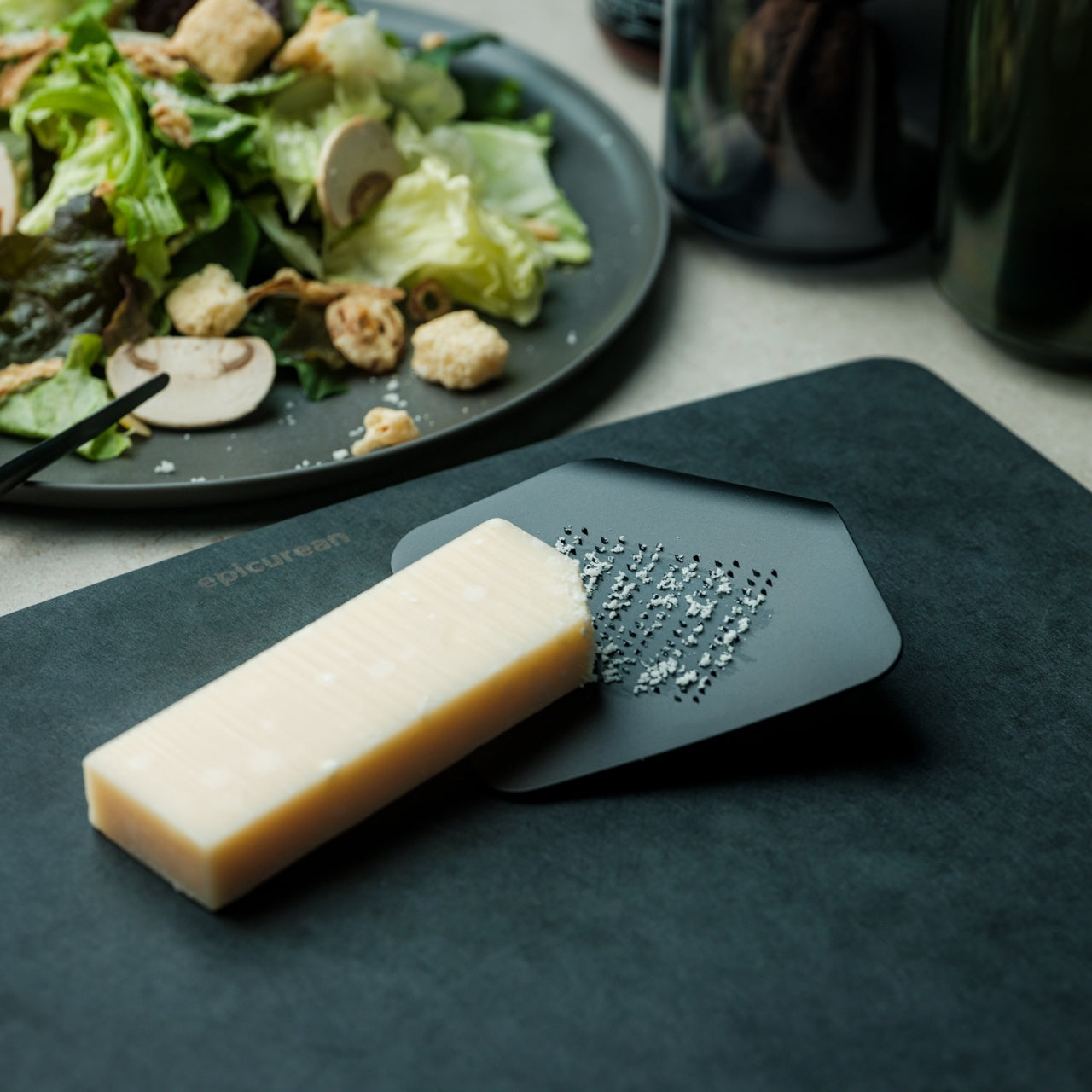
4. Playful Palm Grater

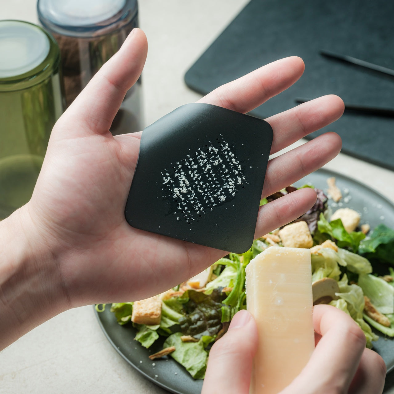
Conventional box graters are bulky, awkward to store, and dangerous to clean. The Playful Palm grater is none of those things. Cut from a single aluminum alloy plate and curled into a form that sits naturally in the palm, this tool reimagines what a grater can physically be. The curve creates a natural channel that directs grated cheese, ginger, garlic, or zest toward the dish below, and the ergonomic fit means the grating hand stays protected behind the plate rather than hovering over exposed blades.

Available in multiple colors, the grater looks more like a piece of desktop sculpture than a kitchen tool, which is part of the design intent. Japanese kitchen philosophy often resists the idea that tools should be hidden in drawers between uses, and a grater this visually appealing can sit on a counter without disrupting the space. The compact size makes it ideal for tableside use: grating Parmesan directly over pasta, adding fresh wasabi at the last second, finishing a salad with lemon zest. The palm grater treats garnishing not as an afterthought but as a distinct step worth its own dedicated instrument.

Click Here to Buy Now: $25.00

What we like

  • The single-plate aluminum construction eliminates crevices and joints, making it far easier to clean than traditional multi-sided graters.
  • The palm-fit ergonomic design keeps fingers behind the grating surface, reducing the risk of nicked knuckles that plague box grater users.

What we dislike

  • The compact grating surface is not suited for large-volume tasks like shredding an entire block of cheese for a casserole.
  • Aluminum alloy, while lightweight, is softer than stainless steel and will dull faster with frequent use on hard ingredients like nutmeg or frozen ginger.

5. Conte Drip-Free Oil Pot with Fine Mesh Filter

Reusing frying oil is standard practice in Japanese home cooking, and the Conte oil pot is the tool that makes it effortless. A fine black stainless steel mesh catches food particles left behind from tempura, tonkatsu, or karaage, and the non-reflective black finish serves a practical purpose: it allows a clear view of the oil level from above, something shiny stainless steel interiors make nearly impossible. The precisely curved rim eliminates drips during pouring, a detail that sounds minor until considering how many oil pots leave trails across the stovetop.

Angled knobs on the lid and strainer allow one-handed operation, so pouring oil back into a pan while holding an ingredient in the other hand becomes routine rather than a balancing act. Available in small (300ml) and large (700ml) sizes, the pot scales to different cooking habits. The small version is suited for seasoning cast iron or saving oil after pan-frying dumplings, while the large handles full frying sessions comfortably. Both sizes sit compactly beside a stove without crowding the workspace, making oil reuse clean, dignified, and free of the greasy mess that discourages most home cooks from attempting it.

What we like

  • The drip-free rim design eliminates oil trails on the stovetop, solving a problem that nearly every other oil storage container ignores.
  • The black stainless steel mesh filter makes oil clarity visible from above, so determining when to discard rather than reuse becomes a visual check instead of a guessing game.

What we dislike

  • The small 300ml version fills up rapidly and is too limited for anyone who deep-fries regularly or cooks for more than two people.
  • Stainless steel retains oil odors over time, and thorough degreasing between uses requires more effort than a quick soap-and-water rinse.

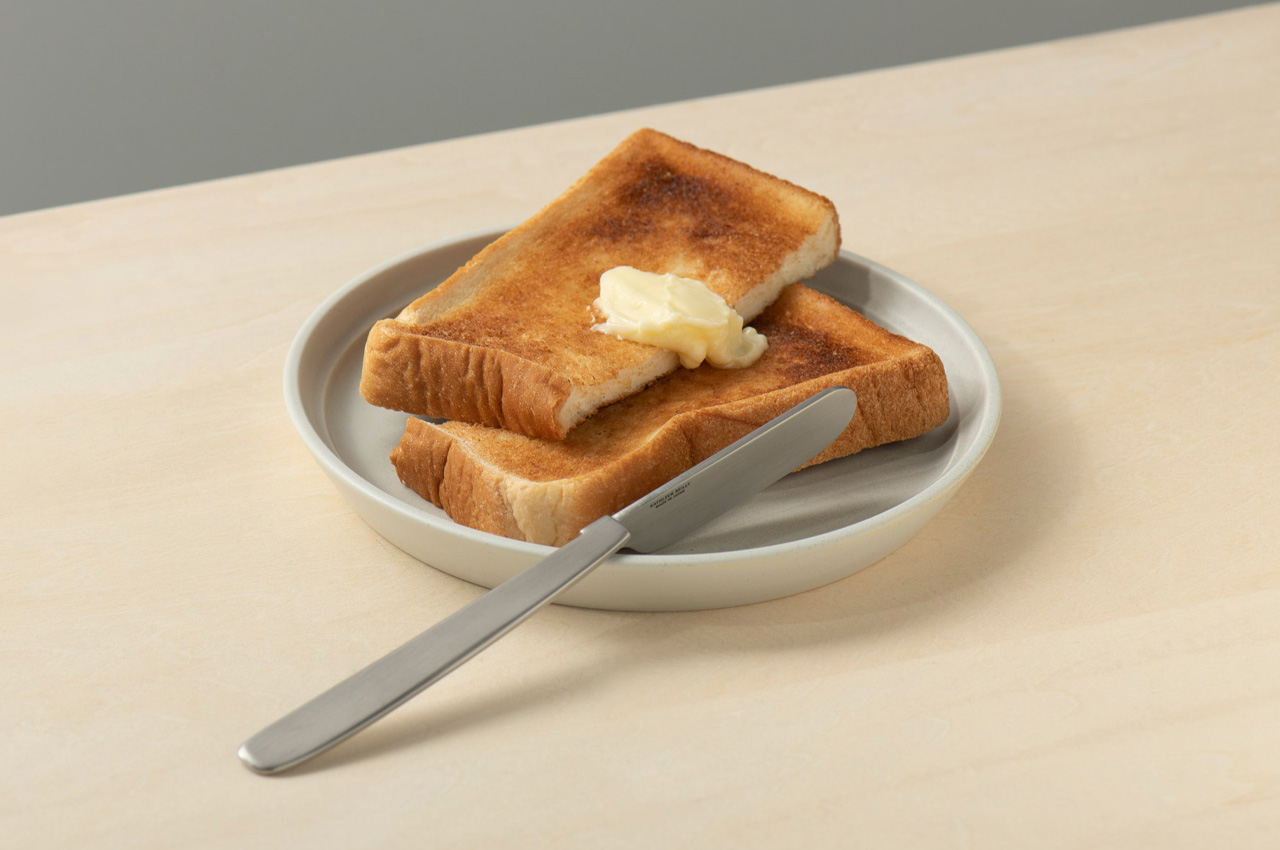
6. Oku Knife

Scottish artist and metalworker Kathleen Reilly designed the Oku knife as a direct response to a problem most Western cutlery ignores: where does the knife go between bites? Informed by the Japanese tradition of chopstick rests (hashioki), which lift eating utensils off the table surface to prevent contamination, the Oku features a handle folded 90 degrees from the blade. This fold allows the knife to rest with its handle on the table while the blade sits perpendicularly in the air, touching nothing.

The result is a tool that solves a cleanliness issue most diners have accepted as unsolvable: the dirty knife laid flat against a tablecloth or balanced on the edge of a plate. Hooking the blade along the edge of a cutting board or plate creates what Reilly describes as an intimacy between the two objects, and the angular geometry locks the knife in position rather than allowing it to slide. For a kitchen where multiple cutting tasks happen in sequence, the Oku provides a resting solution that no flat-handled knife can match. It is a rare case of form and function arriving at the same conclusion through a single geometric decision.

What we like

  • The 90-degree fold solves the dirty-knife-on-table problem that flat cutlery has ignored for centuries, keeping the blade cleanly suspended between uses.
  • The hookable design creates stability on plate rims and cutting board edges, eliminating the wobble and sliding common with standard knives at rest.

What we dislike

  • The unconventional handle angle requires a different grip than traditional knives, which may feel awkward during extended cutting or food prep sessions.
  • As a handcrafted piece by an independent metalworker, availability and pricing are limited compared to mass-produced alternatives.

7. Obsidian Black Salad & Serve Tongs

Salad tongs tend to be one of two things: flimsy spring-loaded mechanisms that lose grip on the third toss, or heavy stainless steel clamps better suited to a barbecue than a dinner table. The Obsidian Black tongs occupy neither category. Made from SUS821L1 stainless steel (a variant twice as strong as the standard SUS304 used in most kitchen tools), they achieve a thinner, lighter profile without sacrificing structural integrity. One head is shaped as a spoon, the other as a spork, and this asymmetry is the design’s smartest move.

That mismatched pairing allows the tongs to clamp down on leafy greens with the same confidence as slippery pasta or bite-sized grain bowls, because each head approaches the food from a different angle. At 20cm in length, the reach is sufficient for deep salad bowls without compromising control. The black finish creates visual contrast against greens, fruits, and light-colored dishes, which makes plating feel more considered, and the high corrosion resistance of SUS821L1 steel means the finish holds up through years of use. For a kitchen that treats presentation as part of the cooking process, these tongs turn the final step of assembling a dish into something deliberate.

Click Here to Buy Now: $32.00

What we like

  • SUS821L1 stainless steel is twice as strong as the standard SUS304, allowing a thinner profile that feels lighter in the hand without bending or flexing under load.
  • The asymmetric spoon-and-spork head design grips a wider range of textures and food types than matching heads would, from arugula to penne.

What we dislike

  • The 20cm length may feel short for tossing salads in oversized serving bowls or deep mixing containers.
  • The dark finish, while visually striking, can show water spots and fingerprints more readily than brushed or polished stainless steel.

Where This Leaves Your Kitchen

Japanese kitchen tools share an unspoken philosophy that the best gadgets do not announce themselves. They integrate. They become invisible extensions of the hand, the stove, the table, dissolving the seams between preparation, cooking, and eating until the whole sequence feels like a single continuous act. The seven tools on this list operate exactly within that logic, each one addressing a friction point that most cooks have simply accepted as normal.

Investing in these pieces is not about filling a kitchen with more objects. It is about replacing thoughtless tools with considered ones, swapping volume for precision, and treating the daily act of making food with the same intentionality that Japanese design applies to everything it touches. A kitchen built around tools like these does not feel cluttered. It feels ready.

The post 7 Best Japanese Kitchen Gadgets & Tools So Clever They Make Every Meal Feel Like a Ceremony first appeared on Yanko Design.

This Rugged Phone’s Action Camera Pops Off to Become a Wearable

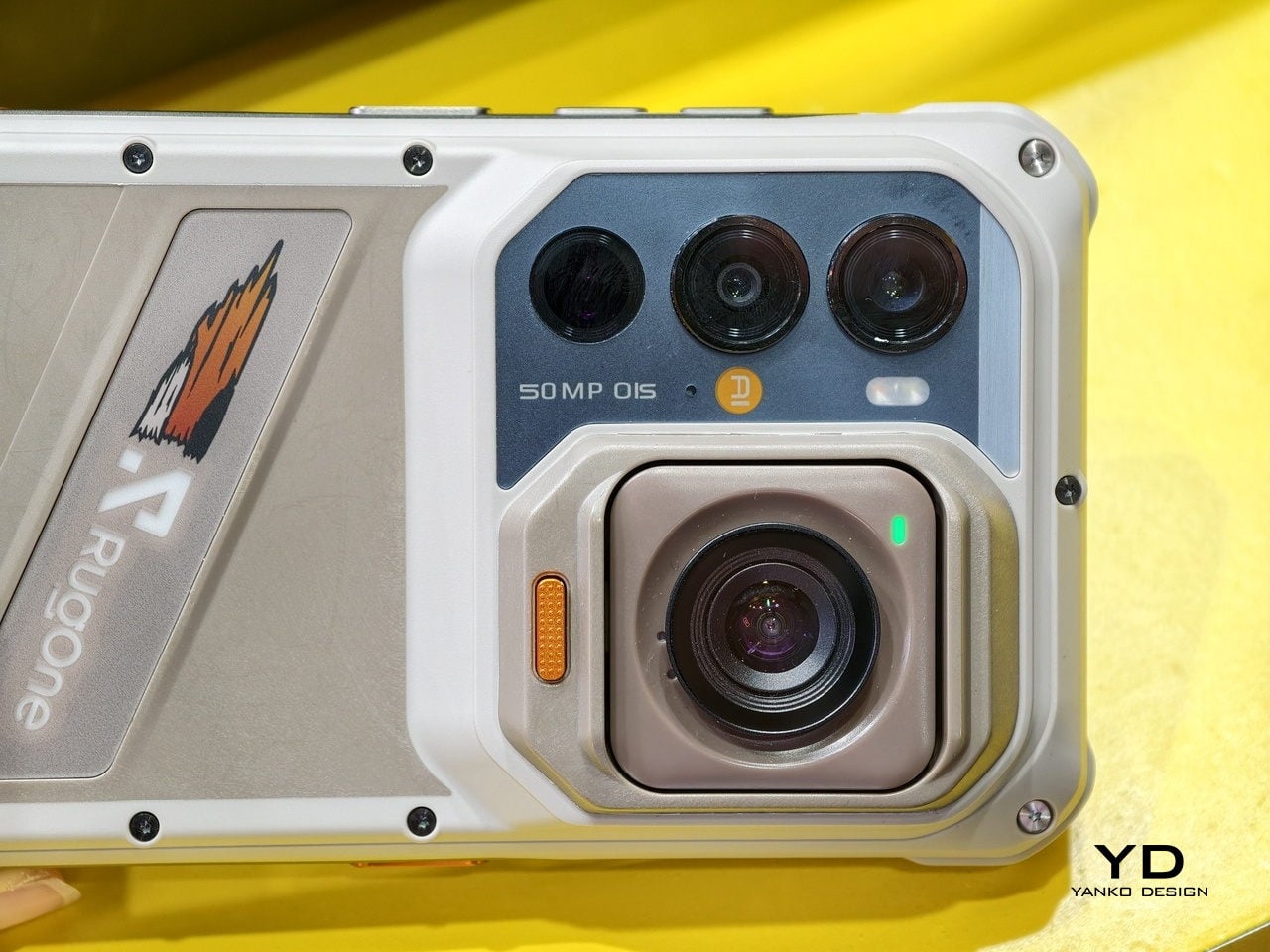
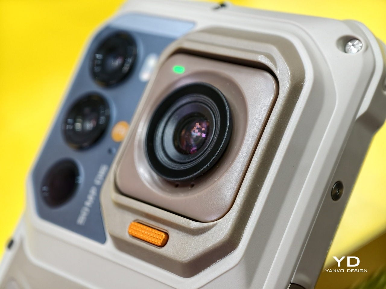
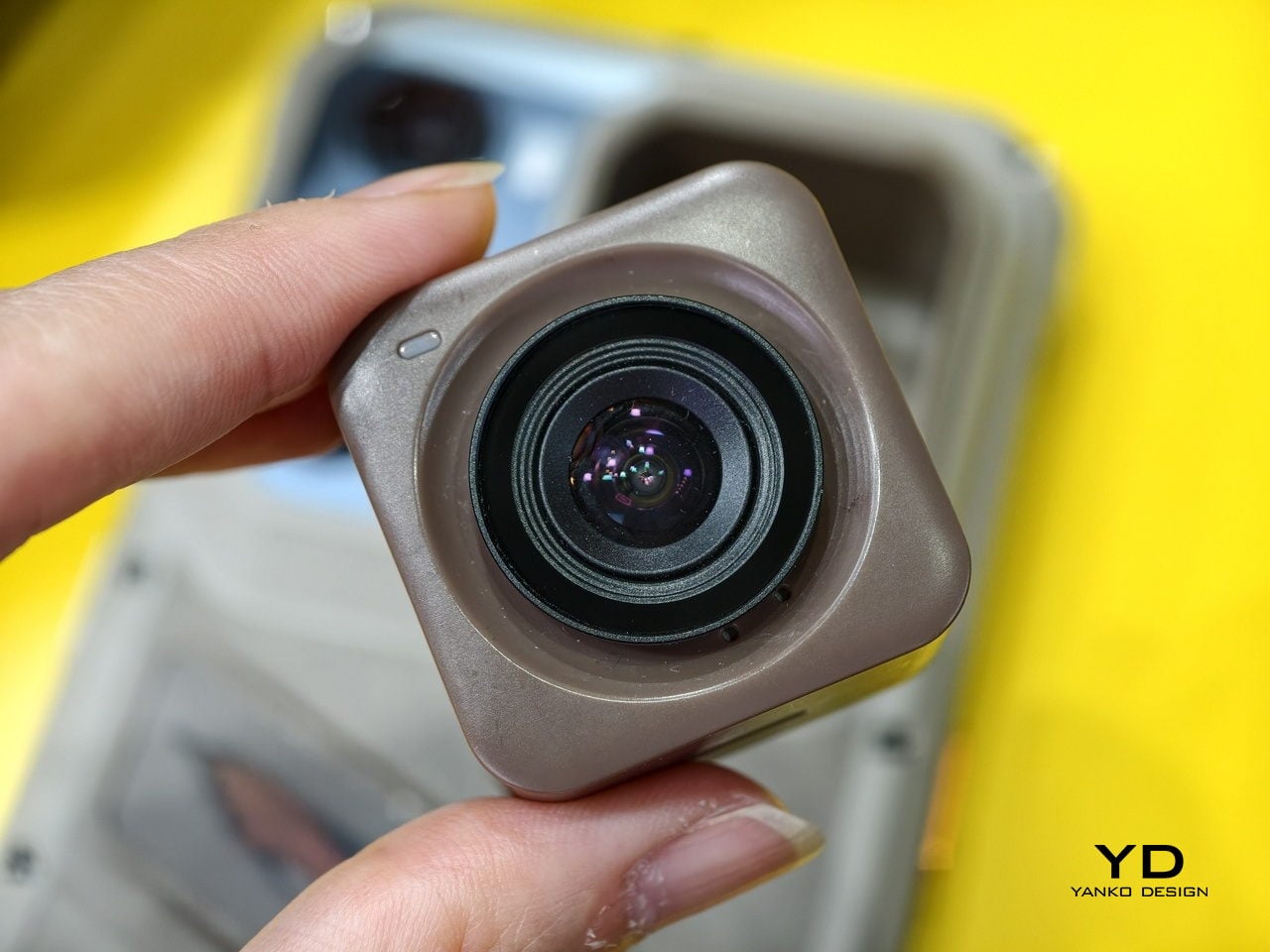
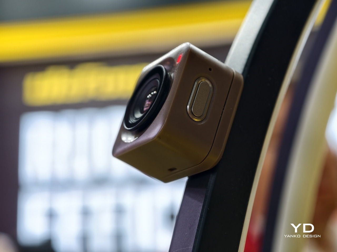
Action cameras and rugged phones have always solved slightly different problems. One survives the adventure; the other documents it. Bringing both means two devices, two cables, and two things to lose in a river. Ulefone’s RugOne Xsnap 7 Pro tries to close that split by putting a detachable magnetic action camera directly on the back of the phone, so both jobs start from one object.

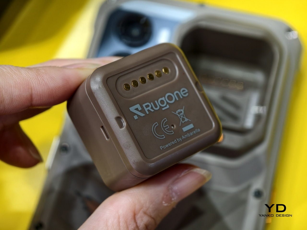
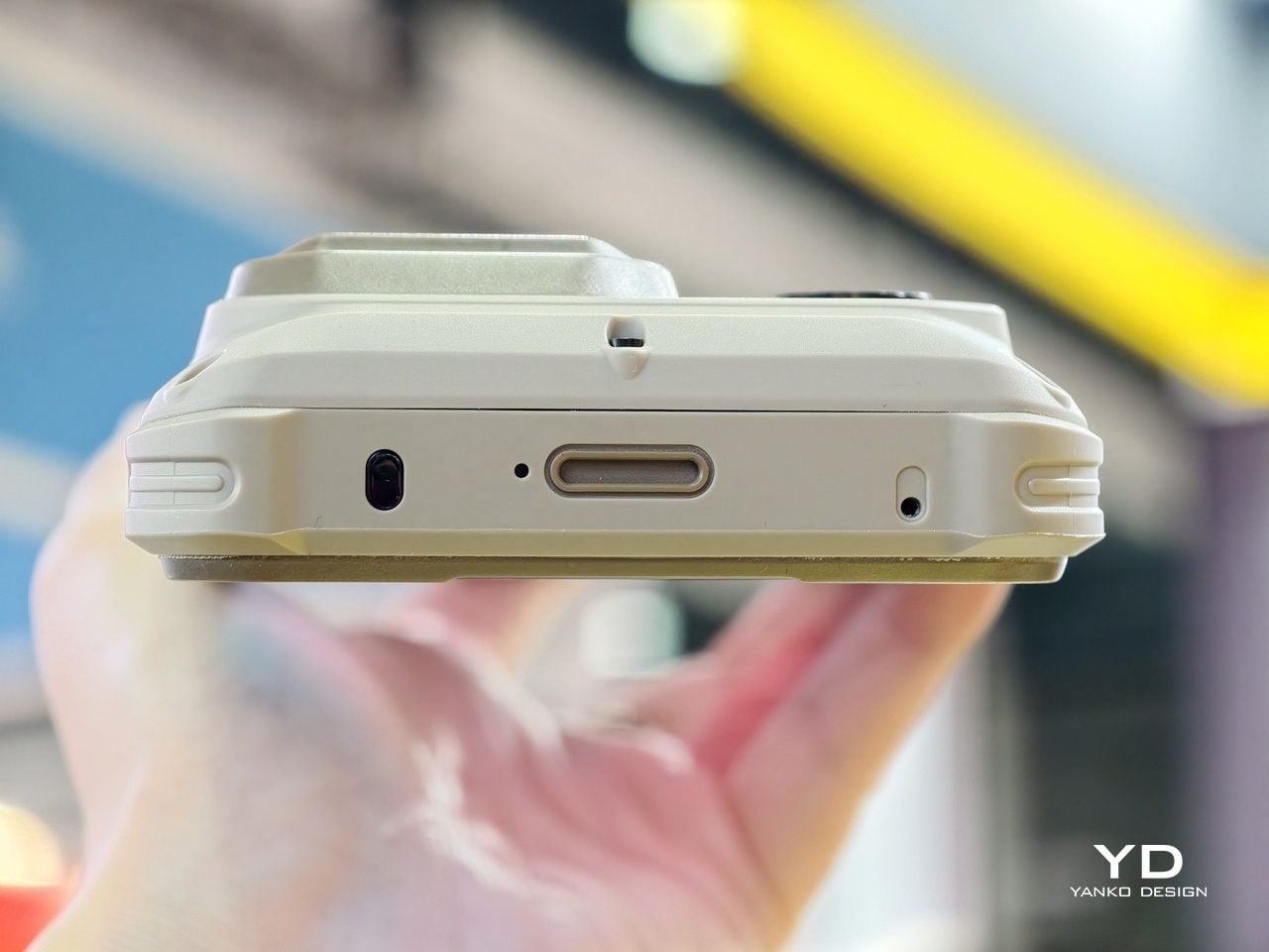
The module snaps onto the rear chassis magnetically, drawing obvious design inspiration from the Insta360 GO series, and peels off into a fully independent wearable. Stick it on a helmet or a bike frame, and it films hands-free while the phone handles viewing and charging. The two pieces are built as a single system, not as separate products that happen to coexist on the same body.

Designer: Ulefone

Ulefone has not yet disclosed the module’s sensor resolution, video specifications, or battery life. Given its thumb-sized form, runtime is likely limited; the Insta360 GO 3S manages roughly 30 minutes per charge in a comparably small body. That is workable for a short trail run or a surf session, but it will not replace a dedicated action camera for a full day out. The production specs will matter a lot once they arrive.

The phone itself is not an afterthought. A MediaTek Dimensity 8400 5G chipset sits inside, paired with a 50 MP OIS main camera, a 64 MP night vision lens, and a 9,000 mAh battery behind a 6.67-inch 1.5K AMOLED display at 120 Hz. That night vision lens is the kind of spec aimed at people who are actually outdoors after dark, not those who like to imagine they could be.

Ulefone is also pitching the magnetic dock as the base for a broader module ecosystem, with planned additions that include thermal imaging, night vision enhancement, and a professional lens suite. That framing is familiar territory in the modular phone space and has collapsed under its own ambitions before. Tracking how many of those planned modules actually ship, rather than staying on a roadmap slide, will be worth watching.

Pricing has not been set, and a mid-2026 commercial launch is the current target. The things that will actually determine the phone’s value, including how quickly the module detaches, how reliably the phone recognizes reattachment, and how cleanly footage syncs, are details that only a finished unit in regular use can settle.

Rugged phones have spent years stacking specs that most owners never actually invoke, so a design decision that changes what the phone physically does day to day is worth paying attention to. The module ecosystem is what separates a compelling demo from a genuinely useful product, and that part of the story depends entirely on whether the follow-through arrives on time and in one piece.

The post This Rugged Phone’s Action Camera Pops Off to Become a Wearable first appeared on Yanko Design.

Samsung’s Mini PetBot Gives AI a Face So It Feels Less Cold

Talking to AI still feels a bit strange for a lot of people. You type into a chat box or ask a question into empty air, and something invisible answers back. It works, but it does not feel particularly warm. That low-grade awkwardness has quietly pushed a whole product category into existence: small, expressive desktop robots designed to put a visible face on AI and make the whole interaction feel less like filling out a form.

Samsung Display’s concept shown at MWC 2026 in Barcelona fits neatly into that wave. Called the OLED AI Mini PetBot, it is a compact robot built around a 1.34-inch circular OLED screen that acts as its face. That screen displays animated expressions that shift in response to voice and touch input, so the robot is not just sitting blankly while it processes a command. It reacts, visibly and immediately, which is exactly the point.

Designer: Samsung

The instinct behind it is not new. Products like EMO from LivingAI, Eilik from Energize Lab, and Loona from KEYi Tech have each explored the formula with varying personalities and price points. KEYi Tech even debuted a concept at CES 2026 that docks an iPhone on a motorized MagSafe stand to create a desk robot face. DIY builders have been constructing expressive robot heads from microcontrollers and small screens for years. The appetite for something to look at while talking to a machine is apparently very real.

What Samsung Display contributes to that conversation is the OLED panel itself. A 1.34-inch circular OLED renders fine gradients and deep blacks without a backlight, which means animated eyes or shifting emotional states read clearly even at that small scale. The circular format also removes any rectangular frame of reference, so the face reads more organic than a screen mounted on a housing. That distinction drives the entire emotional premise of these robots.

The MiniPetBot is a concept from a display technology booth, not a product headed to retail. Samsung Display’s interest here is in showing where its panels can go, and the robot shares booth space with the AI Toyhouse, a separate concept pairing a 13.4-inch circular OLED with an 18.1-inch flexible panel. Both exist to make the screen the story. Whether a hardware partner picks up the form factor is a separate question.

The real question these robots keep circling is whether giving AI a physical face actually changes how people relate to it. A robot that looks up when spoken to, or scrunches its face when confused, closes a certain psychological distance that better language models alone cannot bridge. Samsung Display’s Mini PetBot might only be a concept today, but the reasoning behind it seems to be where the whole industry is quietly heading.

The post Samsung’s Mini PetBot Gives AI a Face So It Feels Less Cold first appeared on Yanko Design.

6 Camping Mugs From Japan That Make Coffee Taste Better (Science Says So)

You know that first sip of coffee in the morning, the one where everything just clicks? Turns out, the mug you’re drinking from has more to do with that feeling than you might think. Research has shown that ceramic mugs maintain temperature better, have a neutral flavor profile that won’t interfere with your brew, and even influence how your brain perceives taste. Studies suggest that the shape, material, and even the color of a cup can shift how sweet, intense, or satisfying a coffee actually tastes. In short, your vessel is not just a vessel. It is part of the experience.

And when it comes to vessels, Japanese ceramics have been quietly setting the standard for centuries. Right now, Japanese design is having a well-deserved moment in the spotlight, with hot beverage lovers drawn to its philosophy of wabi-sabi, finding grace in imperfection, and a deep respect for intentional, handcrafted beauty. A Japanese ceramic mug is not mass-produced or cookie-cutter. It carries the marks of its maker, the character of its kiln, and a quiet soul that only deepens with use. Bring one to your next camping trip, and that early morning brew by the fire? It just became a whole experience. These six Japanese camping mugs are proof of that.

1. Ceramic Cup
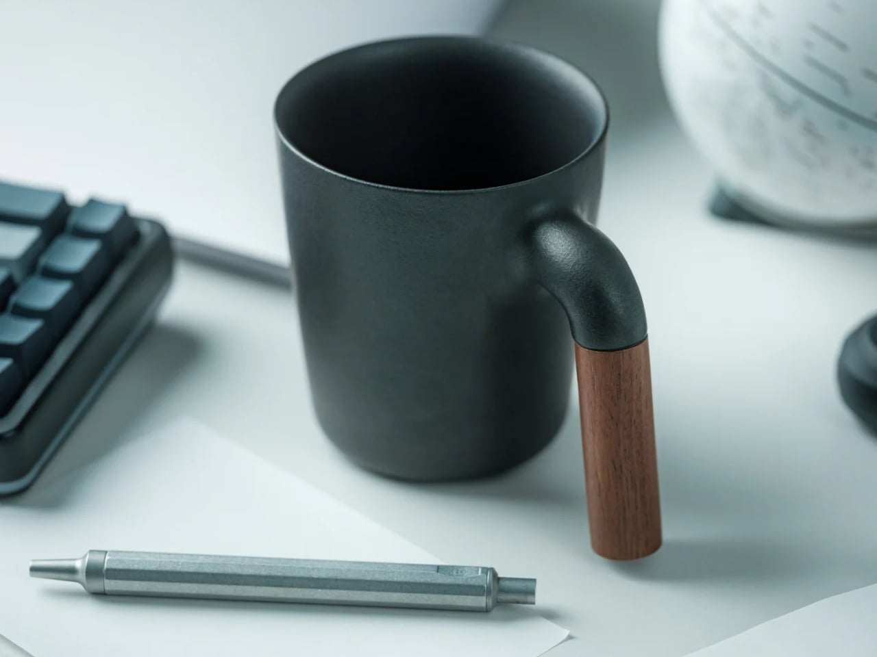
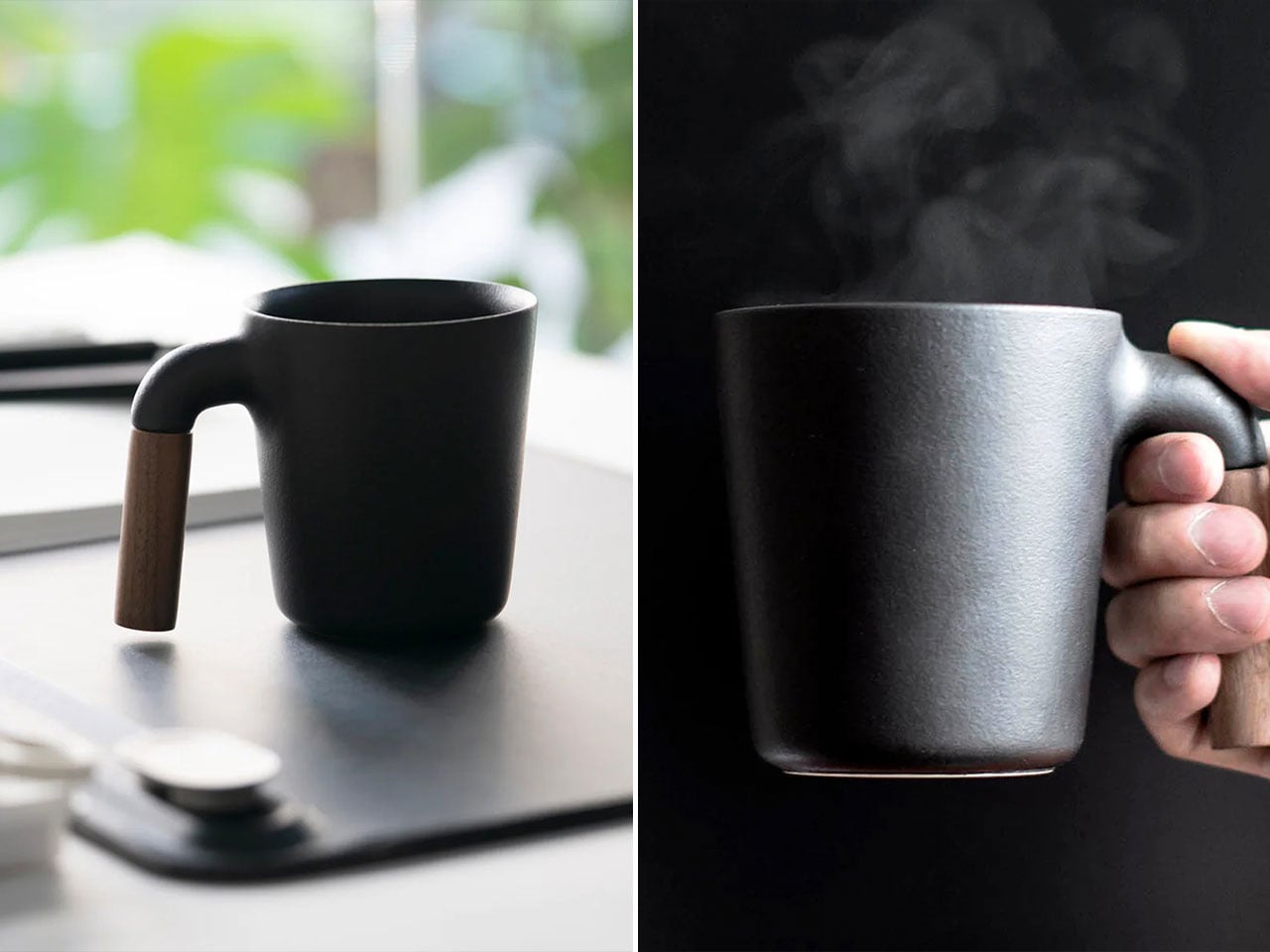
Japan’s relationship with coffee is a serious one, and the objects surrounding that ritual tend to reflect it. This Ceramic Cup is a product of that culture: a 350ml vessel crafted from Japanese ceramic with a smooth, refined finish and a natural wood handle, designed to slow the act of drinking down into something closer to meditation. It’s the kind of cup you buy because you’ve decided your daily coffee deserves better than whatever was left in the cabinet.

The pairing of ceramic and wood isn’t accidental. The ceramic body holds heat beautifully, keeping your pour at temperature while you linger over it, while the wood handle stays cool and grounded in your grip. At $60, the Ceramic Cup sits in that satisfying range of objects that feel like a genuine investment in small daily pleasures, the kind you notice every single morning and never quite get tired of.

Click Here to Buy Now: $60.00. Hurry, only a few left!

Why do we love this mug?

Bring it camping and it becomes something else entirely. Picture a particular kind of morning: cold air, slow light, the sound of a stove clicking to life. That morning deserves a proper cup. The sturdy ceramic and warm wood handle make that ritual feel intentional, even deliberate. It’s not just a mug. It’s a reason to wake up a few minutes earlier.

2. Haori Cup
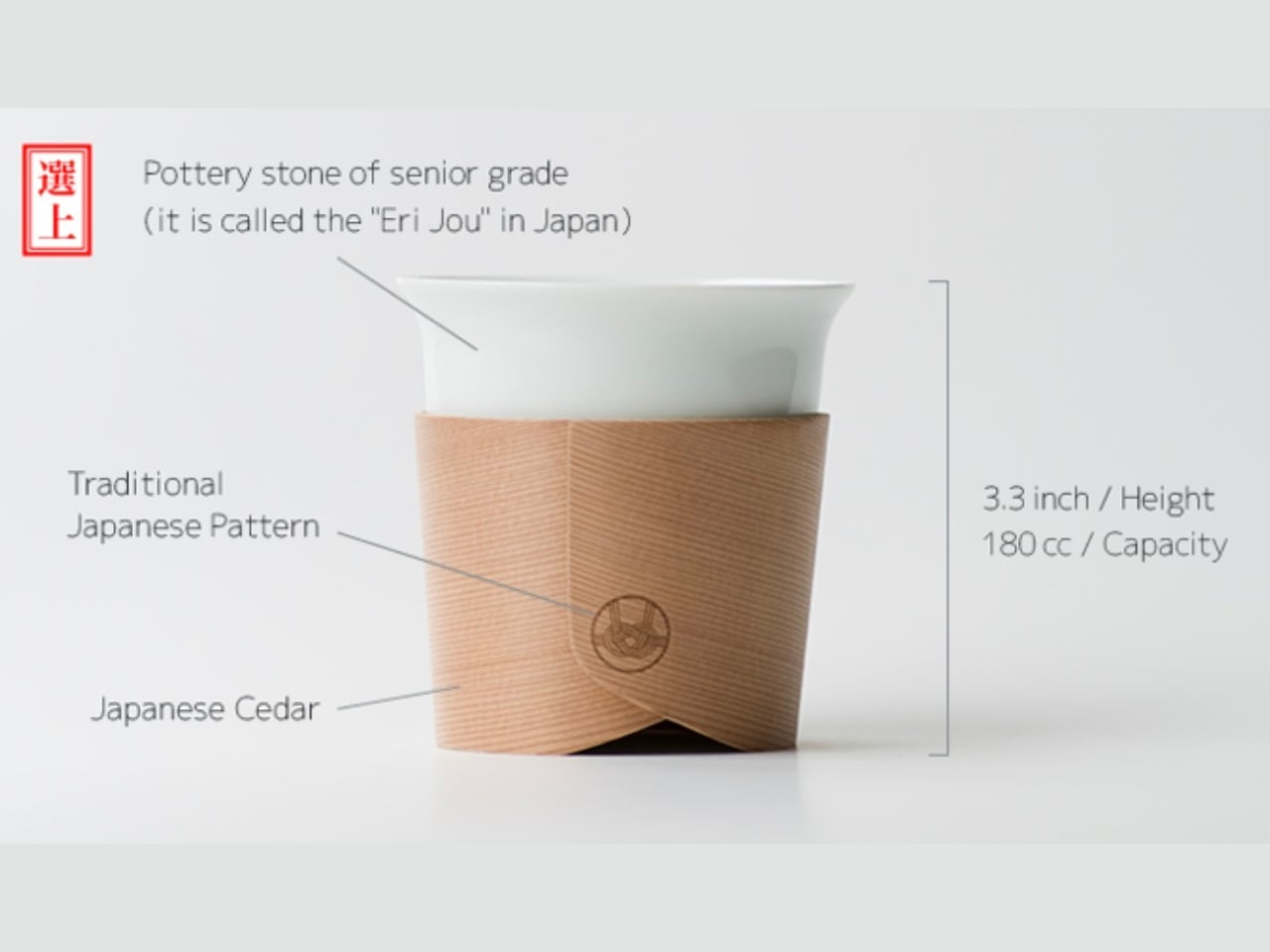
When designer Tomoya Nasuda set out to revive the 400-year-old Japanese craft of Hakata Magemono, the painstaking art of hand-bending thin cedar wood plates into curved forms, the world took notice. The response was a resounding answer to the question of whether people still care about objects made with genuine cultural depth and human skill. Named after the haori, the traditional Japanese garment that wraps itself around the body, the cup follows the same principle: a single wooden plate, coaxed by hand into a form that feels both ancient and entirely new.

What elevates the Haori Cup from beautiful object to exceptional mug is how it actually performs. The bentwood construction provides natural insulation, keeping your coffee comfortable to hold whether it’s steaming hot or poured over ice, with no burning fingers and no sweating cup. The cedar wood lends a subtle, clean fragrance to each sip: a whisper of forest, not a shout. Available in several colorways including the delicate “Sakura,” every cup is handmade and genuinely one of a kind, shaped by the same grain patterns and hands that define any true craft object.

Why do we love this mug?

Bring the Haori Cup camping and something clicks into place. Holding warm coffee in a vessel bent from a single piece of Japanese cedar, sitting among trees that look not so different from the ones that made it, that’s the kind of moment you came outside for. It’s lightweight, it’s alive with history, and it makes your first cup of the morning feel less like a caffeine delivery system and more like a ceremony worth showing up for.

3. Earth Friendly Tumbler
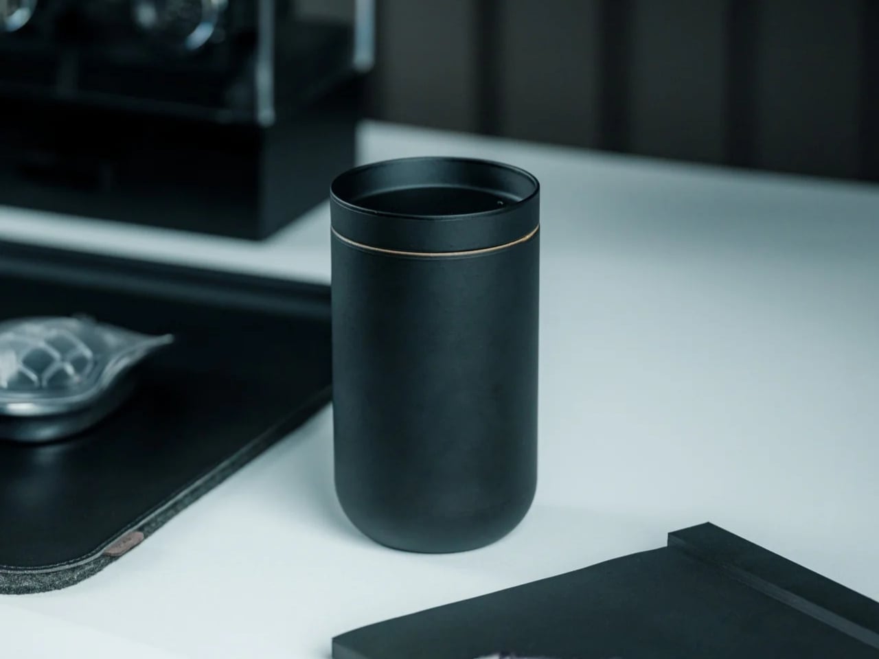
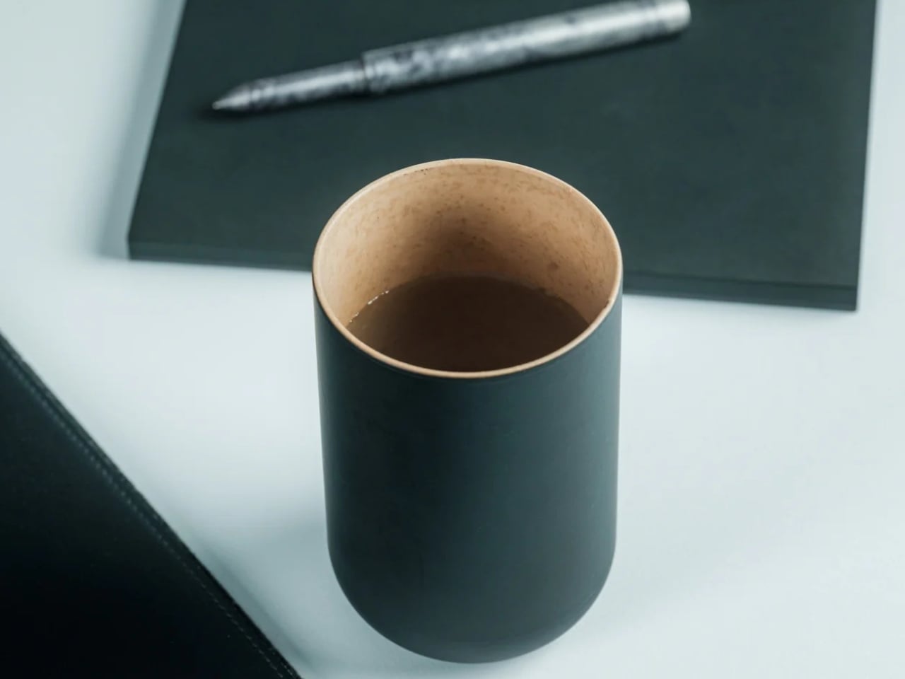
There’s something poetic about a vessel that eventually gives itself back to the earth. The Earth Friendly Tumbler from Japan’s EcoCraft line is made from a biodegradable resin derived from paper and corn, meaning that when its long life finally ends, it quietly decomposes into water and CO₂ through natural microbial action. It’s a cup that carries the philosophy of the country that made it: thoughtful, restrained, and deeply intentional about its place in the world.

What keeps you reaching for it, though, is how it feels. The surface has a distinctive texture that sits somewhere between ceramic and wood, warm to the touch, satisfying in the palm, and nothing like the cold uniformity of plastic. Its minimalist design is clean enough for a city desk but earthy enough for the forest, and starting at just $25, it’s an easy yes. Because each tumbler’s material is shaped naturally through the biodegradable process, no two are exactly alike, a quiet nod to the Japanese ideal of wabi-sabi.

Click Here to Buy Now: $25.00. Hurry, only a few left!

Why do we love this mug?

For the camper who takes their environmental footprint as seriously as their coffee, this tumbler is a natural match. It’s light enough for a day hike, beautiful enough to sit on a camp table at sunrise, and carries with it the rare satisfaction of knowing the mug in your hand is doing the planet a quiet favor.

4. Titanium Mug

Titanium has always been the material of people who won’t compromise, and Japan’s precision metalworkers know how to honor that reputation. This mug is engineered from pure titanium, a material roughly 45% lighter than stainless steel yet equal to it in strength, which means the first time you pick it up, the lightness will catch you off guard. It feels almost implausibly slight in your hand for something this solid.

But the real story is what titanium does for your coffee. Unlike stainless steel, titanium imparts zero metallic taste or odor to your drink, so your coffee arrives exactly as it was brewed, nothing added, nothing taken away. Its lower thermal conductivity also means heat moves through the walls more slowly, keeping your drink warmer for longer on cold mornings. And with use, the titanium surface develops a gradual oxide film, a deepening, iridescent patina that makes each mug grow more beautiful and personal over time.

Why do we love this mug?

This is gear built for the outdoors without apology. It can be placed directly over a camp stove, it’s impervious to rust even in wet conditions, and its ultralight profile makes every gram-counting backpacker smile. It’s the mug you bring on every trip and eventually can’t imagine leaving behind.

5. T-Go Mini

The premise of the T-Go Mini is a simple one: great coffee shouldn’t require you to leave your standards at the trailhead. This compact travel mug was designed for people who refuse to accept that “outdoor coffee” has to mean bad coffee. Small enough to disappear into any pack, it strips the camping mug back to its most essential form and then gets every detail of that form exactly right.

“Mini” here means refined, not reduced. The T-Go Mini is shaped by the Japanese design principle of doing more with less: a tighter footprint, a secure seal, heat retention that punches above its size, and a construction that speaks of deliberate craft rather than cost-cutting. It’s the kind of object that reveals itself slowly. The more you use it, the more you appreciate what its designers chose not to include, and why.

Why do we love this mug?

For the hiker, the trail runner, or the minimalist camper who’s already decided every gram matters, the T-Go Mini is an easy decision. Slip it into a chest pocket, a jacket pouch, or a side sleeve, and let it quietly prove that the best outdoor gear doesn’t ask you to compromise. It just asks you to pay attention.

6. Pilmoa Mug
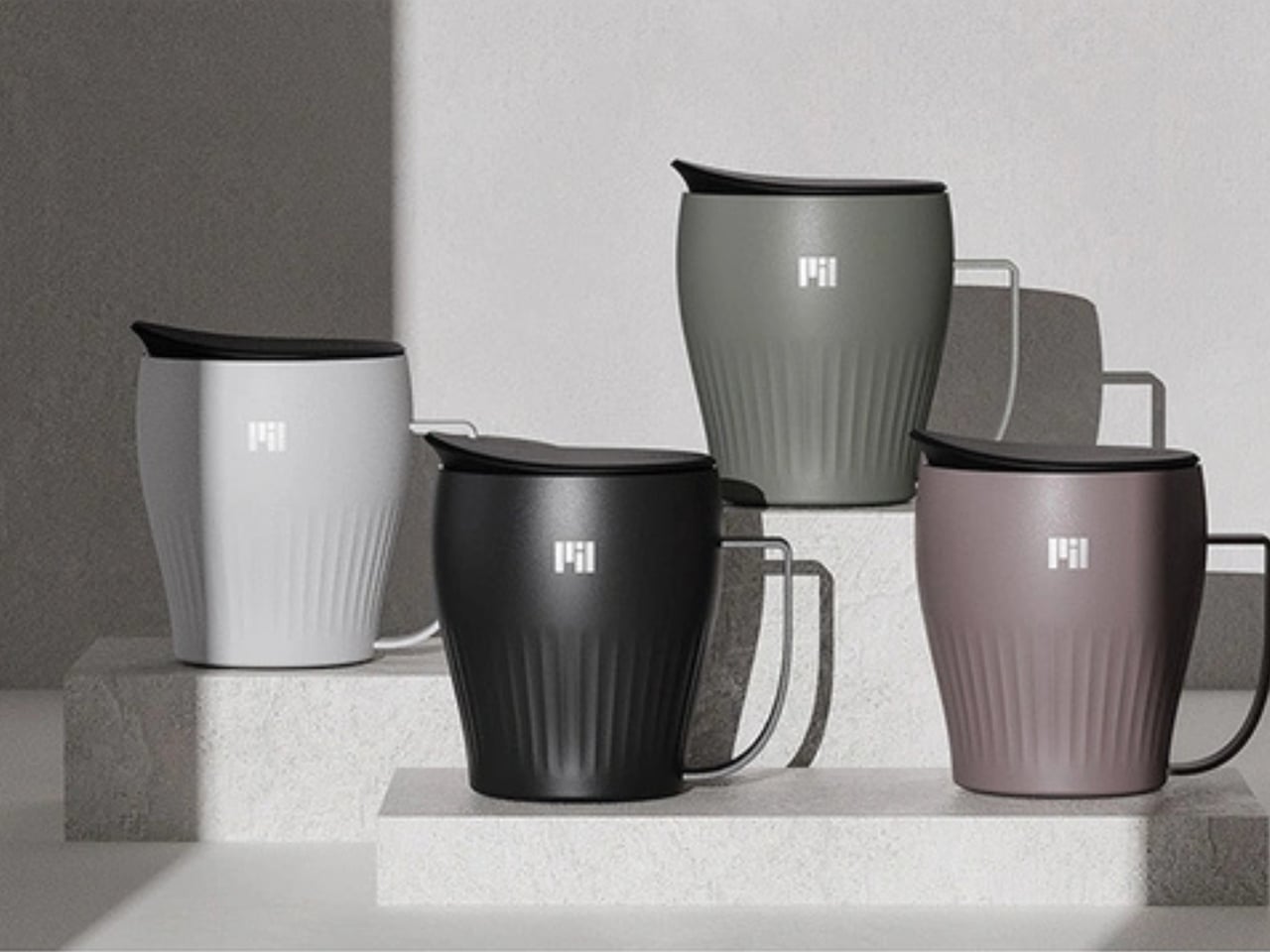
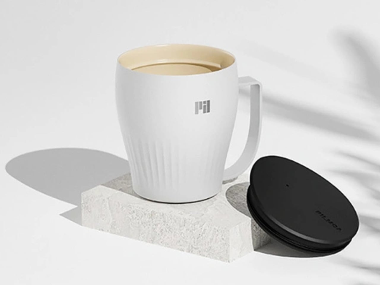
The Pilmoa Mug is a second-generation design refined through real-world feedback and use. It represents something increasingly rare in the outdoor gear market: a mug designed by people who actually think carefully about what it means to drink coffee well, not just to drink it conveniently.

The Pilmoa is built around the small details that most camping mugs overlook: the feel of the rim against your lips, the balance of the cup in a cold hand, the way heat distributes through its walls on a slow morning. These are the quiet, almost invisible considerations that separate a mug you tolerate from one you genuinely look forward to. It’s not trying to do everything, just trying to do one thing with the kind of focus that Japanese product design consistently brings to the table.

Why do we love this mug?

Compact and carefully conceived, the Pilmoa earns its place in any outdoor kit. Whether you’re setting it beside a stove in the backcountry or pulling it from a hip pack mid-hike, it holds its ground. It’s the kind of mug that reminds you, every time you use it, that good mornings outdoors are worth planning for.

Six mugs, six philosophies, one shared conviction: that how you drink matters as much as what you drink. Whether you reach for the biodegradable quiet of the Earth Friendly Tumbler, the handcrafted soul of the Haori Cup, or the no-compromise precision of the Titanium Mug, each of these objects carries the same Japanese understanding that a well-made vessel is never just a vessel. It is an argument, made in clay or cedar or titanium, that ordinary moments deserve extraordinary attention. Science already told us that the cup shapes the experience. Japan has known that for centuries. So the next time you find yourself at a campsite with cold air in your lungs and a stove hissing to life, think carefully about what you pour your coffee into. The right mug won’t just hold your drink. It will hold the whole morning.

The post 6 Camping Mugs From Japan That Make Coffee Taste Better (Science Says So) first appeared on Yanko Design.
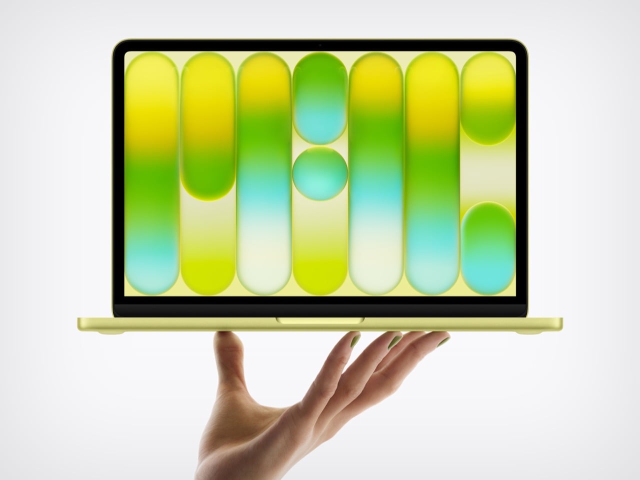
Did Apple’s $599 MacBook Neo just paint a target on the Google Chromebook’s back?

The cheapest MacBook now costs exactly the same as the cheapest iPhone. That’s not a punchline; it’s a price list. For $599, you can get a phone, or you can get a laptop that runs on a phone’s chip, specifically the A18 Pro that powered the iPhone 16 Pro a couple of years back. Apple looked at its vast bin of perfectly good, massively over-engineered mobile silicon and made the most logical leap imaginable. They put it in a beautifully milled aluminum chassis with a keyboard and a 13-inch Liquid Retina display, creating a machine that is, for all intents and purposes, a grown-up iPhone that doesn’t make calls. It’s a wildly clever, almost cynical, piece of product engineering that redefines the entry point to the entire Mac ecosystem.

This move wasn’t about inventing new technology, but about finding the perfect home for existing tech that had become inexpensive through sheer scale. The A18 Pro, with its 6-core CPU and 5-core GPU, is more than capable of handling the daily workload of the average student or web-browser warrior. Paired with a baseline of 8GB of unified memory and a 256GB SSD, the MacBook Neo is engineered to be just enough computer for a massive audience that was previously priced out. Apple’s genius here is recognizing that the performance floor of their mobile chips has risen so high that it now meets the “good enough” ceiling for a huge segment of the laptop market. This is an exercise in masterful cost management, not a race for benchmark glory.

Designer: Apple

That brings us to the real target of this colorful little machine: the classroom. The MacBook Neo isn’t for the video editor or the traveling professional; it’s a precision-guided missile aimed directly at the heart of Google’s Chromebook empire. With an education price of just $499, Apple has officially entered a knife fight with a very sharp, very shiny knife. For years, schools have defaulted to fleets of cheap, functional, and ultimately disposable Chromebooks. Apple is betting that for a small premium, school districts will jump at the chance to give students a device that feels premium, integrates with their iPhones, and carries the weight of the Apple brand. It’s a compelling argument that repositions the Mac from an aspirational product to a practical, attainable one.

It’s not that Google completely fumbled its lead, but it certainly grew complacent. The Chromebook ecosystem won on price and dead-simple IT management, not on user experience. Google’s Auto Update Expiration policy, which effectively gives every device a software death sentence, has been a constant source of friction for budget-strapped schools that need hardware to last. This created an opening for a company known for its long-term software support. Apple can now walk into a school administrator’s office and offer a more durable, better-feeling machine with a clear software roadmap, making the slightly higher initial cost seem like a smarter long-term investment. Google sold schools a cheap solution, and Apple is countering with a cost-effective one.

Of course, a $599 Mac comes with an asterisk, and the MacBook Neo has a few big ones. The most glaring omission is the lack of a backlit keyboard, a feature that has been standard on laptops for over a decade and feels almost punitive to remove. There’s also no support for fast charging, so topping up the battery will be a leisurely affair. These aren’t accidents; they are carefully calculated sacrifices made to protect the profit margin and create clear feature differentiation from the more expensive MacBook Air. Apple is using the vibrant new color options, like Citrus and Indigo, to distract from the spec sheet compromises, but to be honest, nothing is more of a distraction than that price point.

The post Did Apple’s $599 MacBook Neo just paint a target on the Google Chromebook’s back? first appeared on Yanko Design.
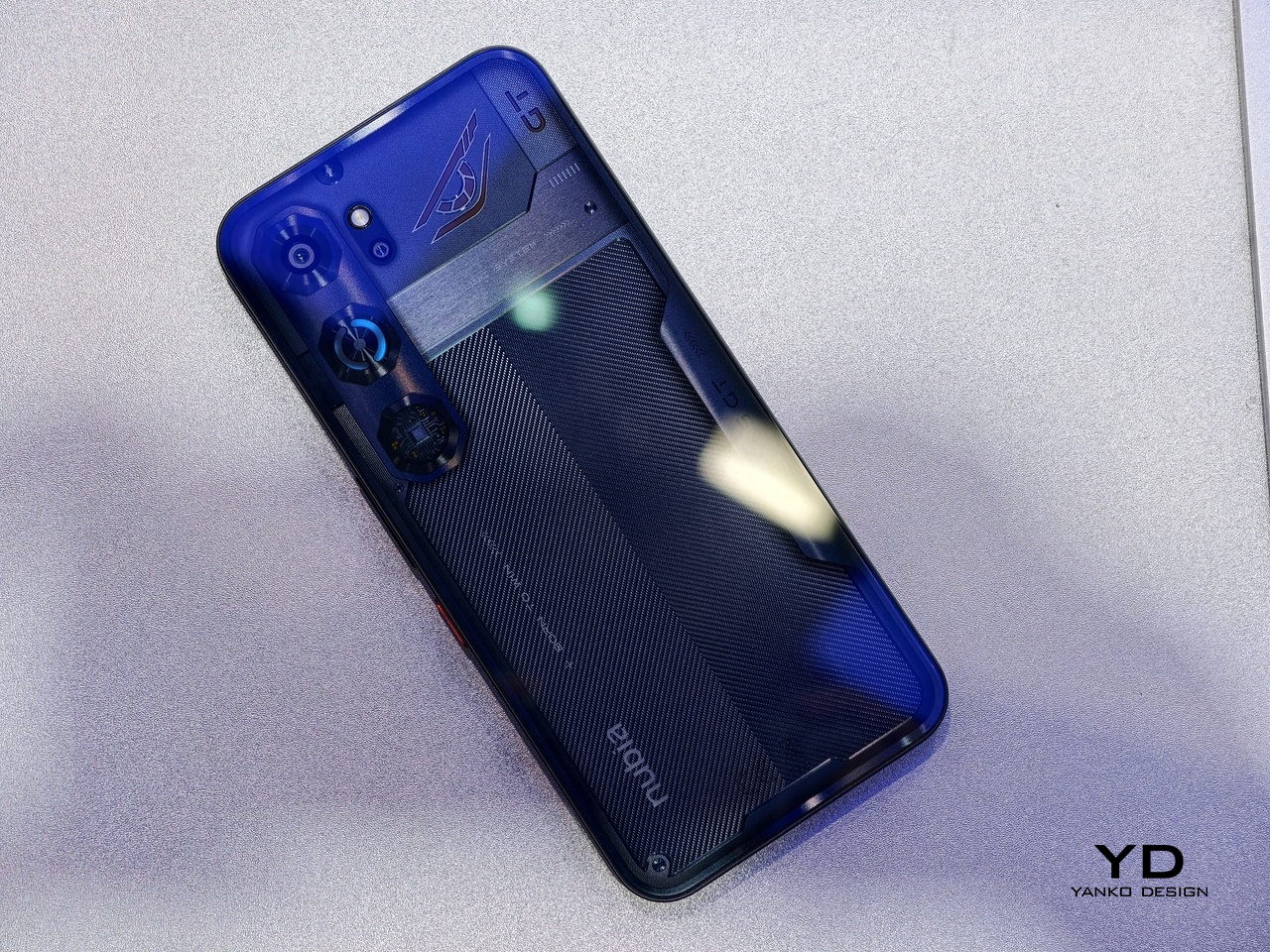
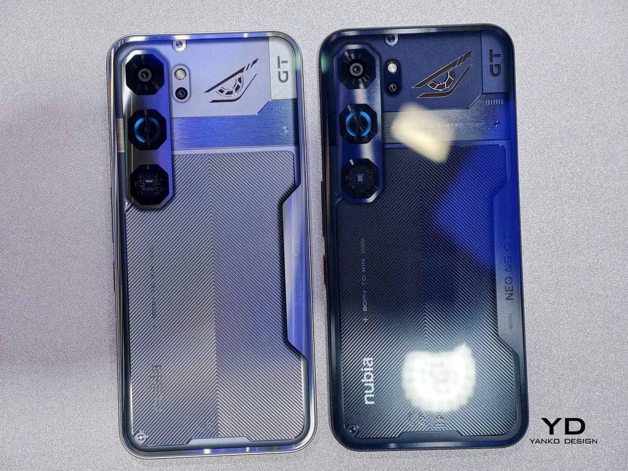
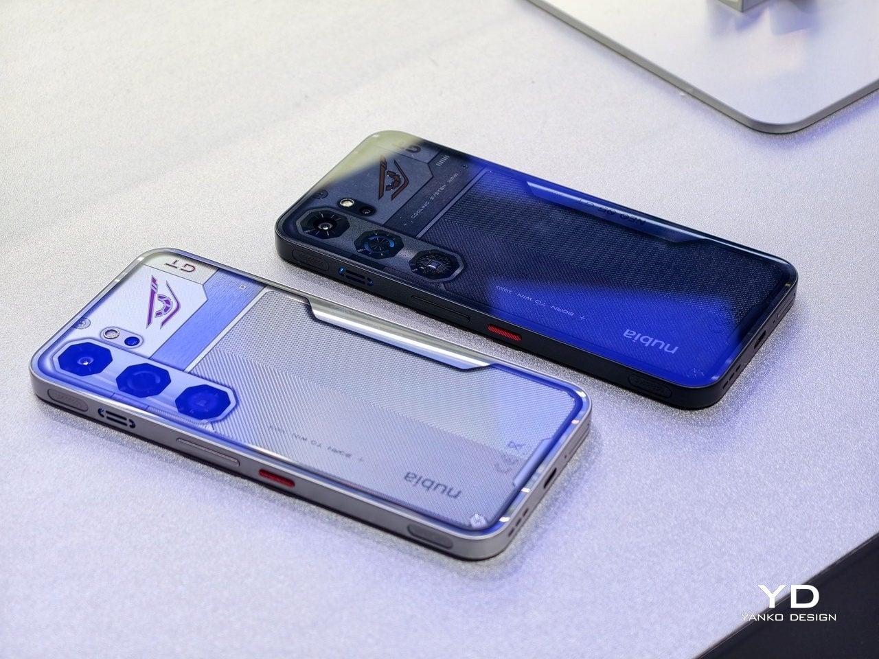
nubia Neo 5 GT: €399 Gaming Phone With a Built-In Cooling Fan

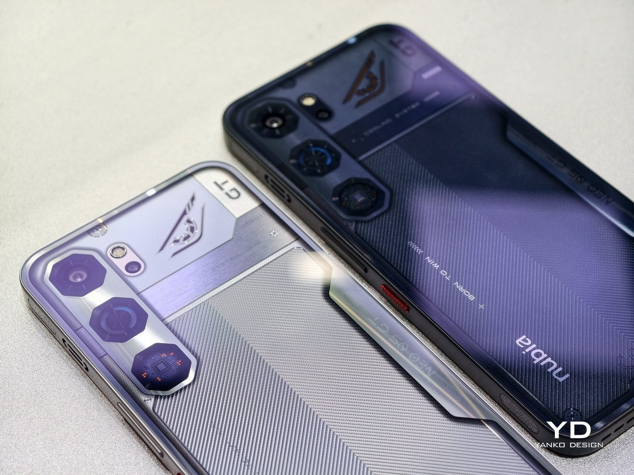
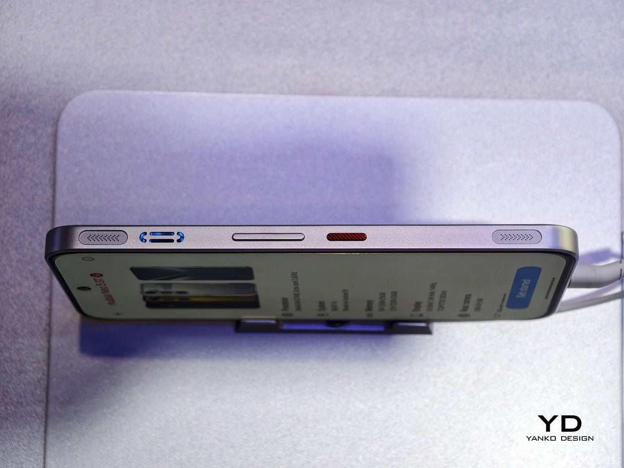
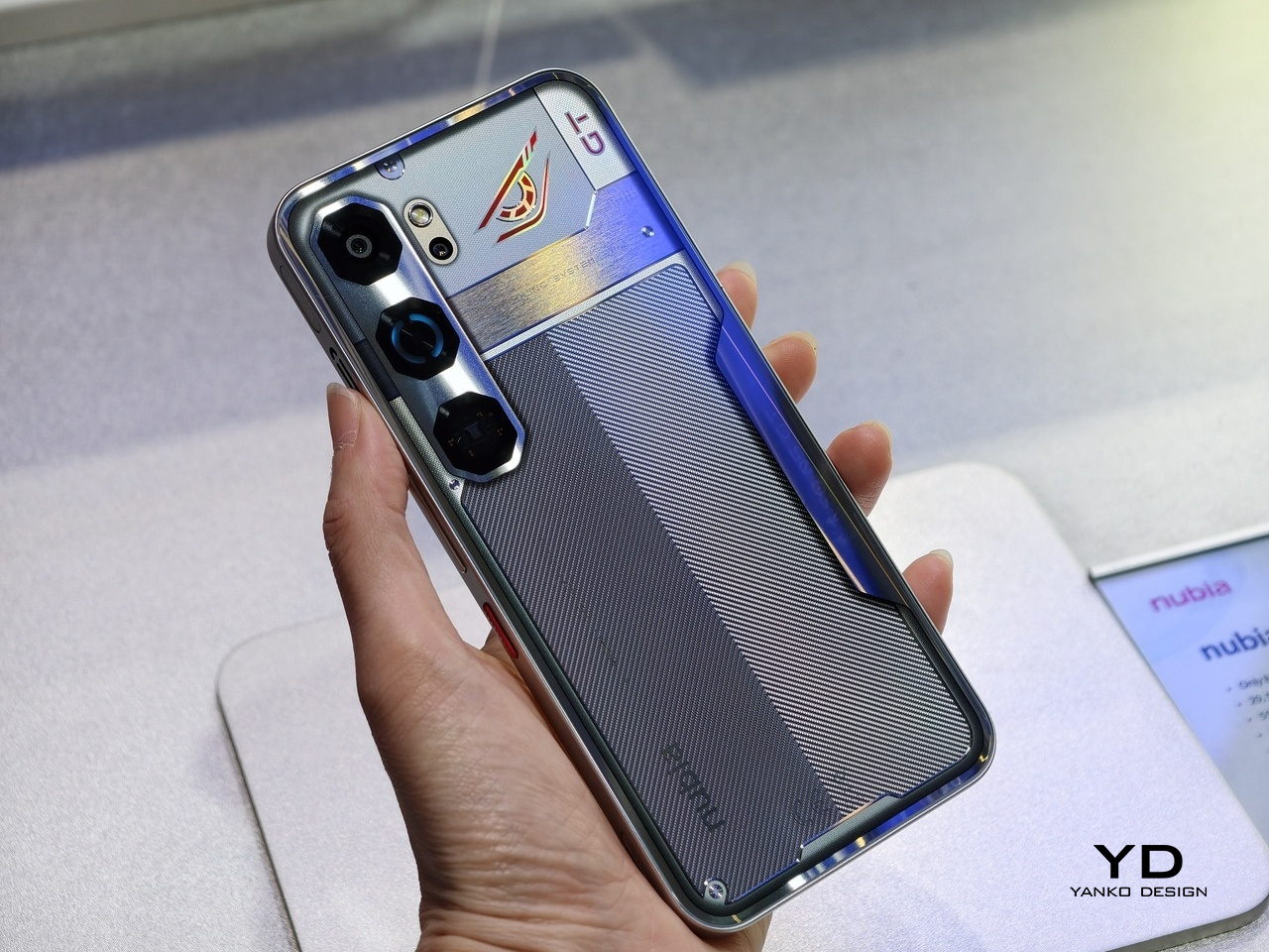
Gaming phones have a reputation for looking like they were designed by someone who just discovered RGB lighting for the first time. Big, chunky, aggressive, and occasionally embarrassing to pull out in public. The nubia Neo 5 GT takes a different approach: keep the silhouette clean, make the back completely flat with no camera bump, and deal with the overheating problem that plagues every long session by putting an actual fan inside.

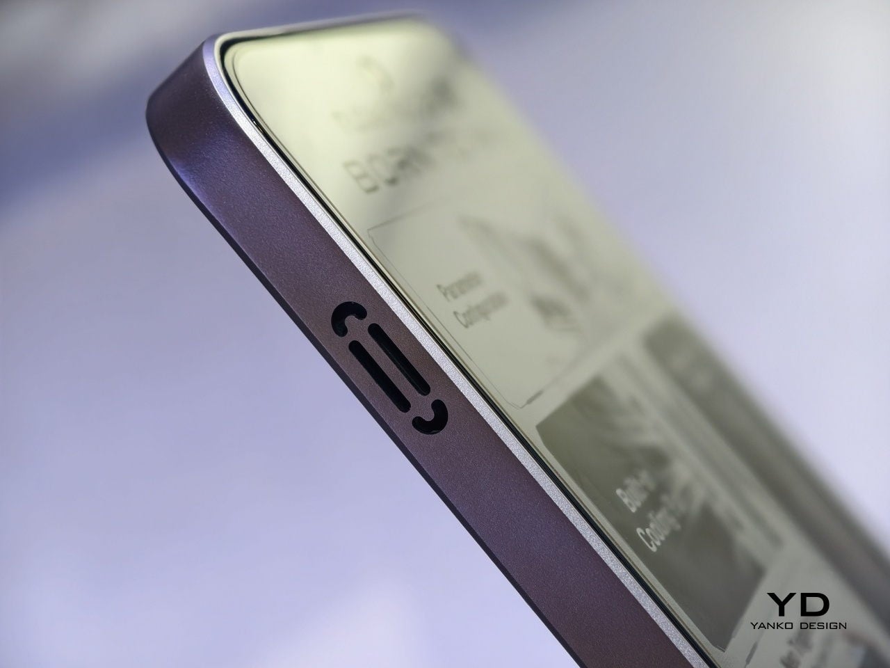
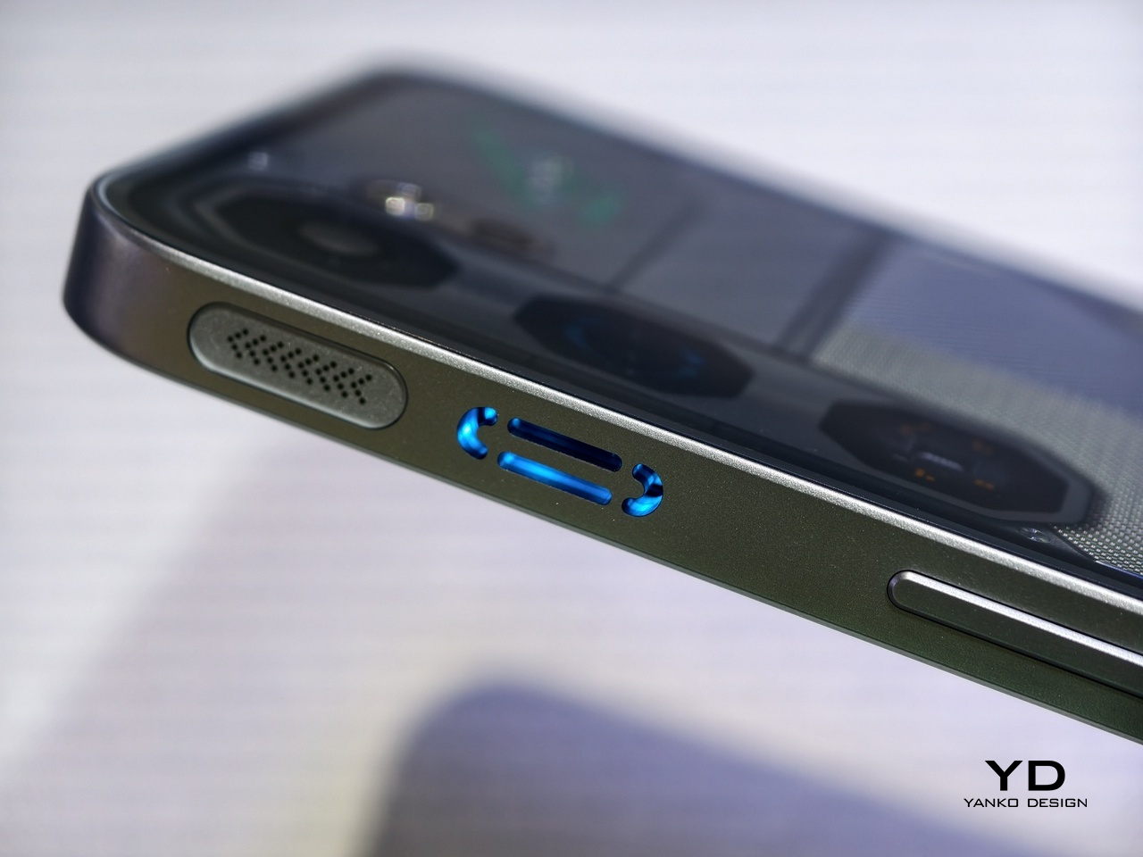
That last part is worth pausing on. Nearly every smartphone manages heat passively, relying on vapor chambers and graphite layers. The Neo 5 GT adds a built-in active cooling fan, paired with a Through-Flow Duct design that channels fresh airflow directly over the CPU and battery across a 29,508 mm² cooling area. nubia claims it’s the only device in its price class doing this, and at €399, that’s a hard combination to find anywhere else.

Designer: nubia

The processor is the MediaTek Dimensity 7400, a 4 nm chip paired with LPDDR Max 6400 Mbps memory and managed by nubia’s NeoTurbo Engine. The phone is officially certified for 120 FPS gameplay on Garena Free Fire and Mobile Legends: Bang Bang, and reaches 90 FPS on Delta Force. Whether sustained frame rates hold at those figures over a full match, rather than just during benchmarks, is a question active cooling is specifically designed to answer.

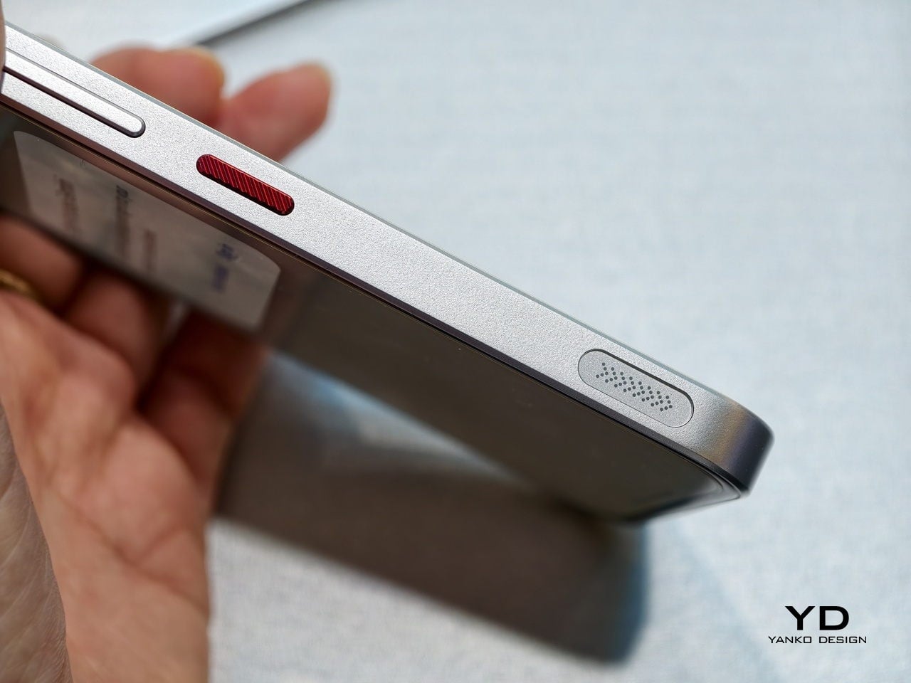
Physical controls come through Neo Triggers 5.0, shoulder buttons running at 550 Hz with sub-5.5 ms latency and a 3,049 Hz touch sampling rate. The 6.8-inch 1.5K AMOLED display runs at 144 Hz with 4,500 nits peak brightness, genuinely useful for outdoor play. Magic Touch 3.0 keeps the screen responsive when fingers are wet or sweaty, a detail that sounds minor until a match-deciding moment slips through an unresponsive tap.

Battery life gets similar attention. The 6,210 mAh dual-cell pack supports up to 80 W fast charging, dropping to 45 W for European markets. Bypass Charging routes power directly to the phone during gaming without cycling it through the battery, extending lifespan over time. A 5% Extreme Mode squeezes out up to 23 additional minutes of gameplay or 29 hours of standby from the last sliver of charge, useful for anyone who routinely forgets to plug in.

AI Game Space 5.0 houses AI Copilot Demi 2.0, which covers real-time Gaming Coach updates for FPS and MOBA titles, a Gaming Chatbot for mid-session queries, and automatic message replies during play. Outside of games, there’s a 50 MP triple rear camera, AI Scam Alert, AI Translate, and AI Memory for everyday tasks. The nubia Neo 5 at €299 and the larger nubia Neo 5 Max, with its 7.5-inch display, round out the series with different trade-offs.

The Neo 5 GT’s real pitch is straightforward: sustained performance at mid-range pricing, in a form factor that doesn’t announce itself as a gaming phone the moment it leaves a pocket. The flat back and the lack of a camera bump are easy to take for granted until you remember what most gaming phones look like.

The post nubia Neo 5 GT: €399 Gaming Phone With a Built-In Cooling Fan first appeared on Yanko Design.
Infinix and Pininfarina Phone: Flush Camera, Hidden Display

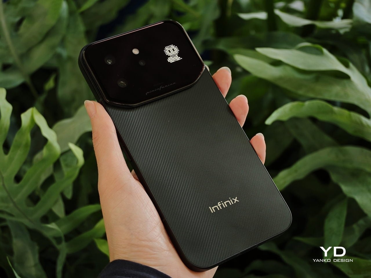
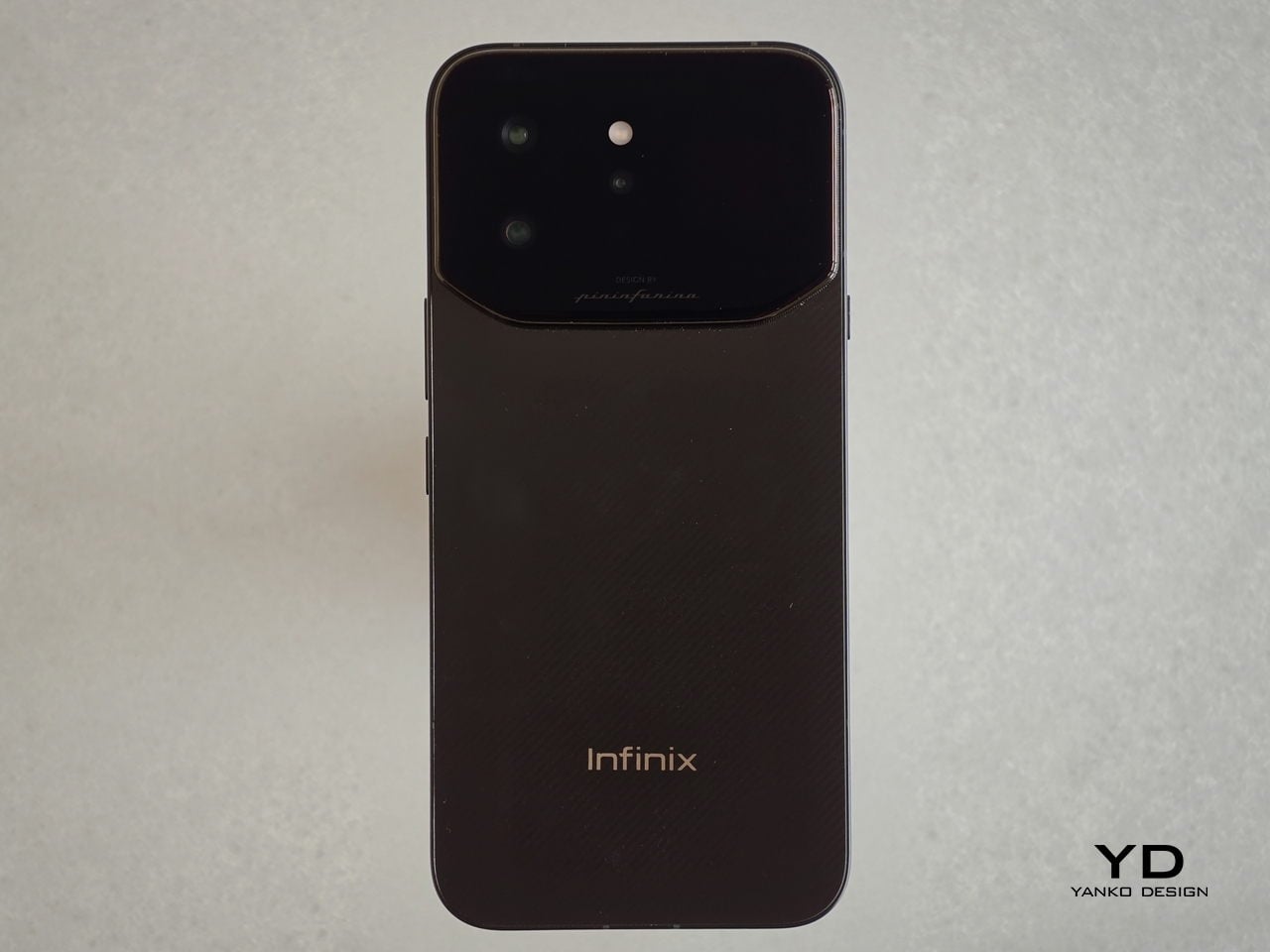
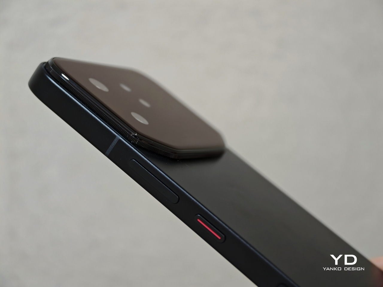
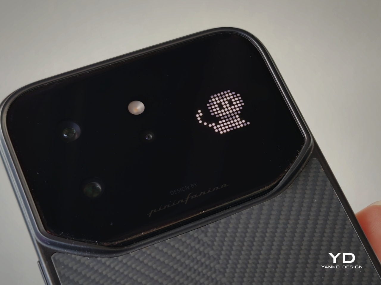
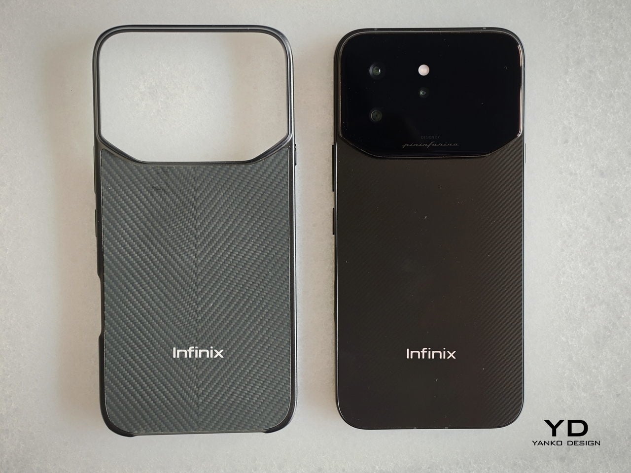
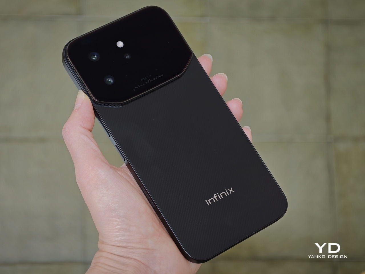
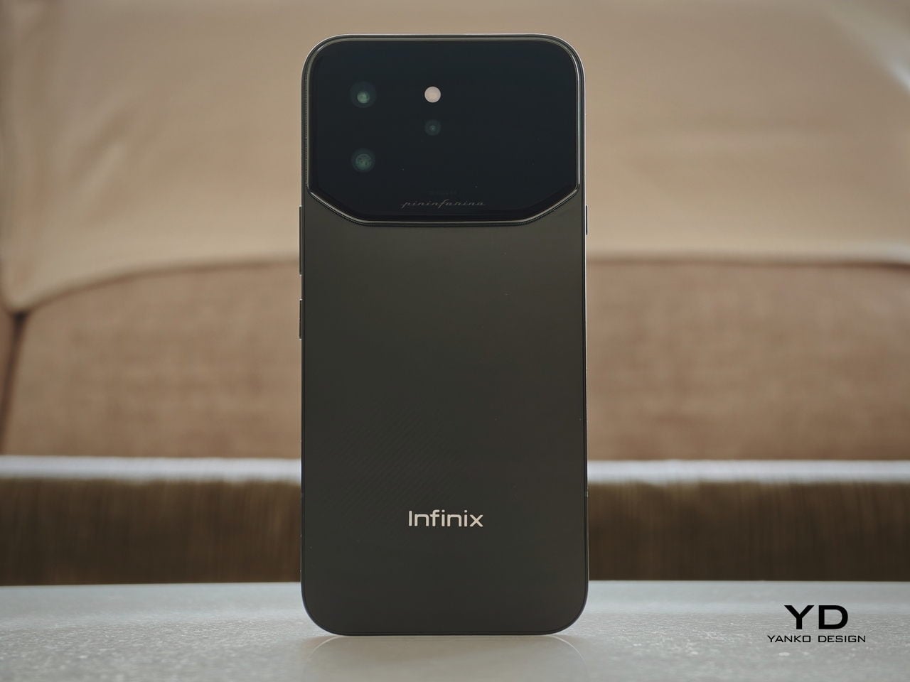
The camera bump problem has quietly become one of those things smartphone designers just accept these days. Every generation, the sensors get bigger, the modules get thicker, and the back of your phone starts looking like a small mountain range. Infinix decided to do something about that with the NOTE 60 Ultra, working with Pininfarina (yes, the Italian firm behind some of the most famous Ferrari bodies ever made) to create a rear panel where the triple-camera array, a hidden notification display, and a lighting strip all vanish into a single flush glass surface.

That design approach has a name: the Uni-Chassis Cam Module. It borrows from the unibody monocoque philosophy that makes sports car bodies both sleeker and more rigid, applying the same logic to a phone’s rear. The entire back is formed from a single continuous sheet of Gorilla Glass Victus, keeping the profile at 7.9mm while housing everything beneath without any visible interruption. The engineering explanation actually makes it look cooler once you know it.

Designer: Infinix x Pininfarina

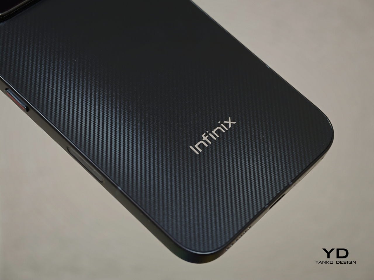
Pininfarina’s influence extends to the four color options as well. Torino Black has a Kevlar-weave texture referencing basalt fiber; Monza Red borrows its surface geometry from the Daytona SP3 grille. Each colorway has a distinct material treatment, not just a tint on a shared base finish. These are details that often disappear between concept and mass production, so the fact that they survived here says something about how seriously the collaboration was taken.

Photography is anchored by a 200-megapixel Samsung ISOCELL HPE main sensor. The 1/1.4-inch sensor area and f/1.69 aperture mean the full-resolution mode captures enough data to crop aggressively without losing sharpness. Paired with it is a 50-megapixel Samsung ISOCELL JN5 periscope telephoto with its own optical image stabilization, offering a native 3.5x optical zoom that extends to 7x losslessly before reaching 100x digitally.

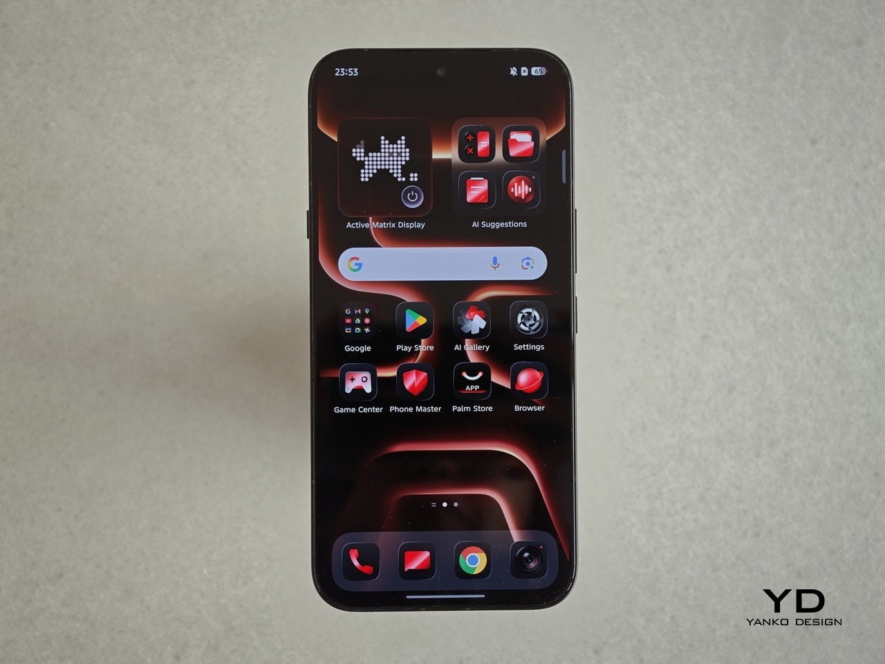
Tucked beneath the glass rear is the Active Matrix Display, a dot-matrix LED panel that surfaces through the glass when needed and disappears completely when dormant. It handles notification alerts, time and weather readouts, animated pixel pets, and two motion-controlled mini-games. The panel draws no power when inactive, leaving the flush rear surface completely undisturbed until it decides it has something to say.

The NOTE 60 Ultra also introduces Infinix’s XDR Image Engine, which applies a full-chain HDR workflow from capture all the way through to the 1.5K display. In practical terms, this means the phone is managing highlight and shadow detail simultaneously when shooting high-contrast scenes, rather than picking one at the expense of the other. That workflow supports 4K 60fps video recording with Full-Link HDR 10+ for footage up to 4K 30fps.

Inside, the MediaTek Dimensity 8400 Ultimate runs an all-big-core architecture where all eight Arm Cortex-A725 cores operate at full performance. Infinix’s own optimization engine manages CPU allocation and background memory compression on top, which is the kind of system-level tuning typically reserved for higher-tier chips. A 3D IceCore cooling system with a 5,142-square-millimeter vapor chamber handles heat across intensive sessions.

The 7,000mAh silicon-carbon battery has twice the silicon content of the previous generation, allowing higher energy density without a thicker body. It charges fully in 48 minutes via 100W wired charging, and Infinix included a self-healing function that runs low-current cycles to slow long-term anode degradation, recovering roughly 1% of battery health every 200 charge cycles. There is also 50W wireless charging for the days when a cable feels like too much effort.

Perhaps the most distinctive addition is the two-way satellite communication via Thuraya’s GEO satellite network, covering around 120 countries across Asia, Europe, and Africa. This goes beyond the one-way SOS messaging seen on other phones: the NOTE 60 Ultra supports actual voice calls at up to 4kbps and two-way SMS, activated through a Thuraya SIM card without any additional registration. For frequent travelers in areas with patchy terrestrial coverage, that is a genuinely useful difference.

The post Infinix and Pininfarina Phone: Flush Camera, Hidden Display first appeared on Yanko Design.