Leaked Honor 600 Pro looks a lot like the iPhone 17 Pro, but with a much bigger battery

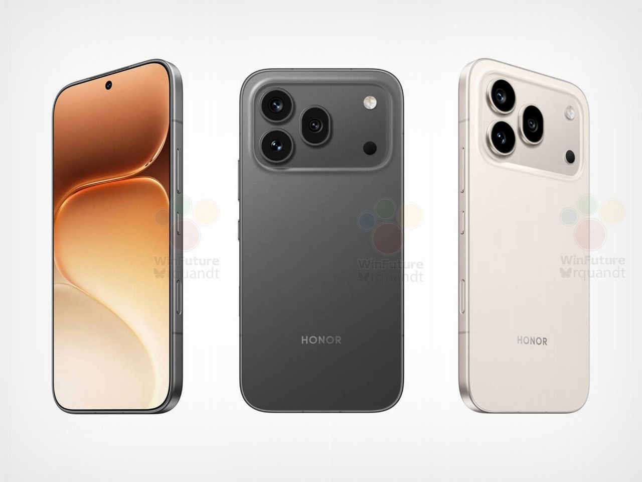
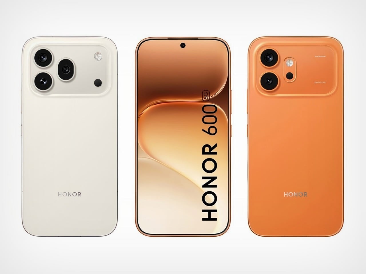
I have to hand it to Honor, they are consistent. When I wrote about the Magic8 Pro Air and its striking similarity to the iPhone Air, I thought we had seen the peak of their “inspiration.” It turns out that was just the warm-up act. The main event has arrived in the form of the Honor 600 and 600 Pro, and this time they have perfectly mimicked the iPhone 17 Pro. The new renders, courtesy of WinFuture, show a design that lifts every key element from Apple’s latest flagship. The full-width camera bar, the arrangement of the lenses, the flat metal frame, and even the color options are all present and accounted for. It’s a remarkable feat of reverse-engineering that feels both impressive and completely shameless.

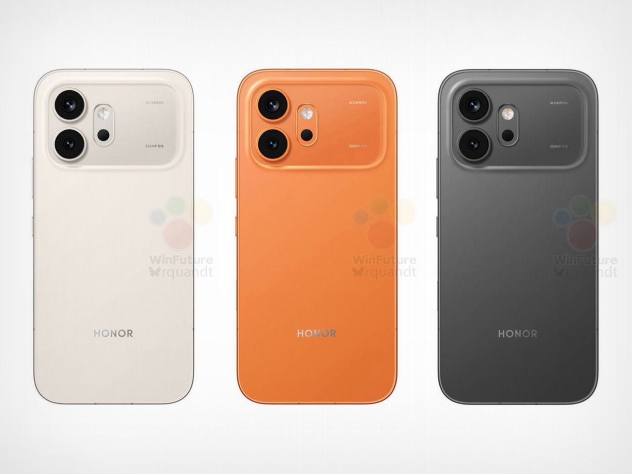
What makes this strategy so fascinating is that Honor isn’t just making a cheaper clone. They are using the familiar, market-tested design as a vessel for a totally different philosophy. The Honor 600 is expected to ship with a 200MP camera and a 9,000mAh battery, specs that are practically alien to Apple’s ecosystem. It’s a phone designed to look like an iPhone from a distance but to function like an endurance-focused Android powerhouse up close. Honor is essentially telling the world that you can have Apple’s style without having to accept Apple’s compromises, and that’s a powerful message.

Designer: HONOR

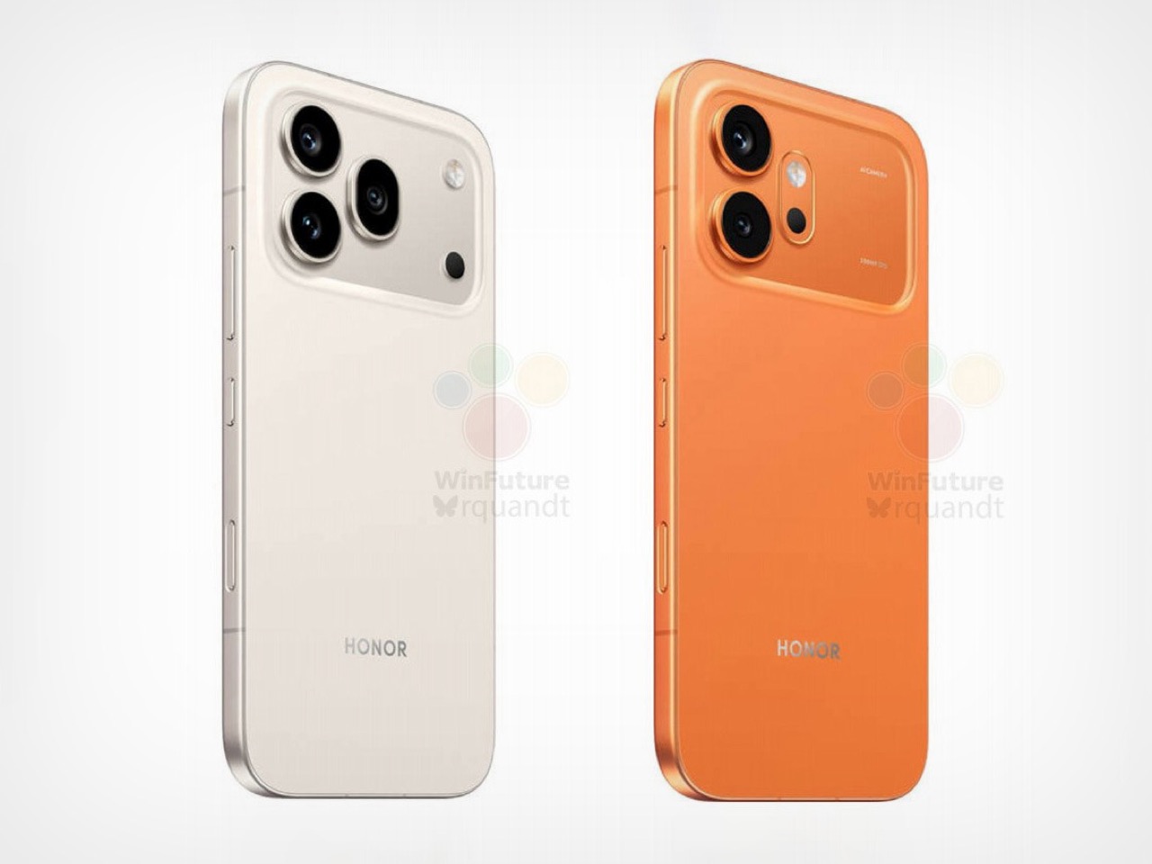
The horizontal camera bar is not just vaguely similar, it’s dimensionally faithful. Both models feature the same raised rectangular module spanning nearly the full width of the device, with lenses, flash, and sensor cutouts arranged in a configuration that directly mirrors Apple’s layout. The standard Honor 600 goes with a dual rear camera setup, with its LED flash and laser autofocus tucked into a separate pill-shaped island below. The Pro model steps it up with a triple-lens arrangement, going all-in on the vertical stack. Even the colorways follow Apple’s playbook closely, with glossy black, metallic gold, and a bright orange finish that lands somewhere between homage and photocopy. Honor’s team clearly studied the iPhone 17 Pro with the intensity of an art student sketching a masterpiece in a museum.

The hardware rumors add even more intrigue to the picture. A 9,000mAh silicon battery in a flagship-tier device is almost unheard of in 2026, delivering the kind of multi-day endurance that the iPhone 17 Pro can only dream about. Both phones also get a 6.57-inch 120Hz OLED display at 1.5K resolution, wireless charging, a 3D ultrasonic in-display fingerprint sensor, and a Snapdragon 8 series chipset. There’s even a dedicated camera button on the side, which is, yes, another very Apple-like touch. Honor is effectively saying: if you love how the iPhone looks but wish it prioritized endurance and camera specs over thinness, we built that phone for you. Whether that resonates with buyers remains to be seen, but the logic behind it is hard to argue with.

The post Leaked Honor 600 Pro looks a lot like the iPhone 17 Pro, but with a much bigger battery first appeared on Yanko Design.

Leaked Honor 600 Pro looks a lot like the iPhone 17 Pro, but with a much bigger battery

I have to hand it to Honor, they are consistent. When I wrote about the Magic8 Pro Air and its striking similarity to the iPhone Air, I thought we had seen the peak of their “inspiration.” It turns out that was just the warm-up act. The main event has arrived in the form of the Honor 600 and 600 Pro, and this time they have perfectly mimicked the iPhone 17 Pro. The new renders, courtesy of WinFuture, show a design that lifts every key element from Apple’s latest flagship. The full-width camera bar, the arrangement of the lenses, the flat metal frame, and even the color options are all present and accounted for. It’s a remarkable feat of reverse-engineering that feels both impressive and completely shameless.

What makes this strategy so fascinating is that Honor isn’t just making a cheaper clone. They are using the familiar, market-tested design as a vessel for a totally different philosophy. The Honor 600 is expected to ship with a 200MP camera and a 9,000mAh battery, specs that are practically alien to Apple’s ecosystem. It’s a phone designed to look like an iPhone from a distance but to function like an endurance-focused Android powerhouse up close. Honor is essentially telling the world that you can have Apple’s style without having to accept Apple’s compromises, and that’s a powerful message.

Designer: HONOR

The horizontal camera bar is not just vaguely similar, it’s dimensionally faithful. Both models feature the same raised rectangular module spanning nearly the full width of the device, with lenses, flash, and sensor cutouts arranged in a configuration that directly mirrors Apple’s layout. The standard Honor 600 goes with a dual rear camera setup, with its LED flash and laser autofocus tucked into a separate pill-shaped island below. The Pro model steps it up with a triple-lens arrangement, going all-in on the vertical stack. Even the colorways follow Apple’s playbook closely, with glossy black, metallic gold, and a bright orange finish that lands somewhere between homage and photocopy. Honor’s team clearly studied the iPhone 17 Pro with the intensity of an art student sketching a masterpiece in a museum.

The hardware rumors add even more intrigue to the picture. A 9,000mAh silicon battery in a flagship-tier device is almost unheard of in 2026, delivering the kind of multi-day endurance that the iPhone 17 Pro can only dream about. Both phones also get a 6.57-inch 120Hz OLED display at 1.5K resolution, wireless charging, a 3D ultrasonic in-display fingerprint sensor, and a Snapdragon 8 series chipset. There’s even a dedicated camera button on the side, which is, yes, another very Apple-like touch. Honor is effectively saying: if you love how the iPhone looks but wish it prioritized endurance and camera specs over thinness, we built that phone for you. Whether that resonates with buyers remains to be seen, but the logic behind it is hard to argue with.

The post Leaked Honor 600 Pro looks a lot like the iPhone 17 Pro, but with a much bigger battery first appeared on Yanko Design.

These Ceramic Lamps Look Like 90s Caramel Candy and Stack Any Way

The interiors most people aspire to these days tend to share a common trait: they’re clean, restrained, and almost aggressively neutral. Scandinavian minimalism, Japandi aesthetics, and muted palettes have dominated home design for years, and while there’s nothing wrong with a well-curated beige room, a lot of modern spaces have started to feel emotionally flat, like showrooms rather than places where people actually live.

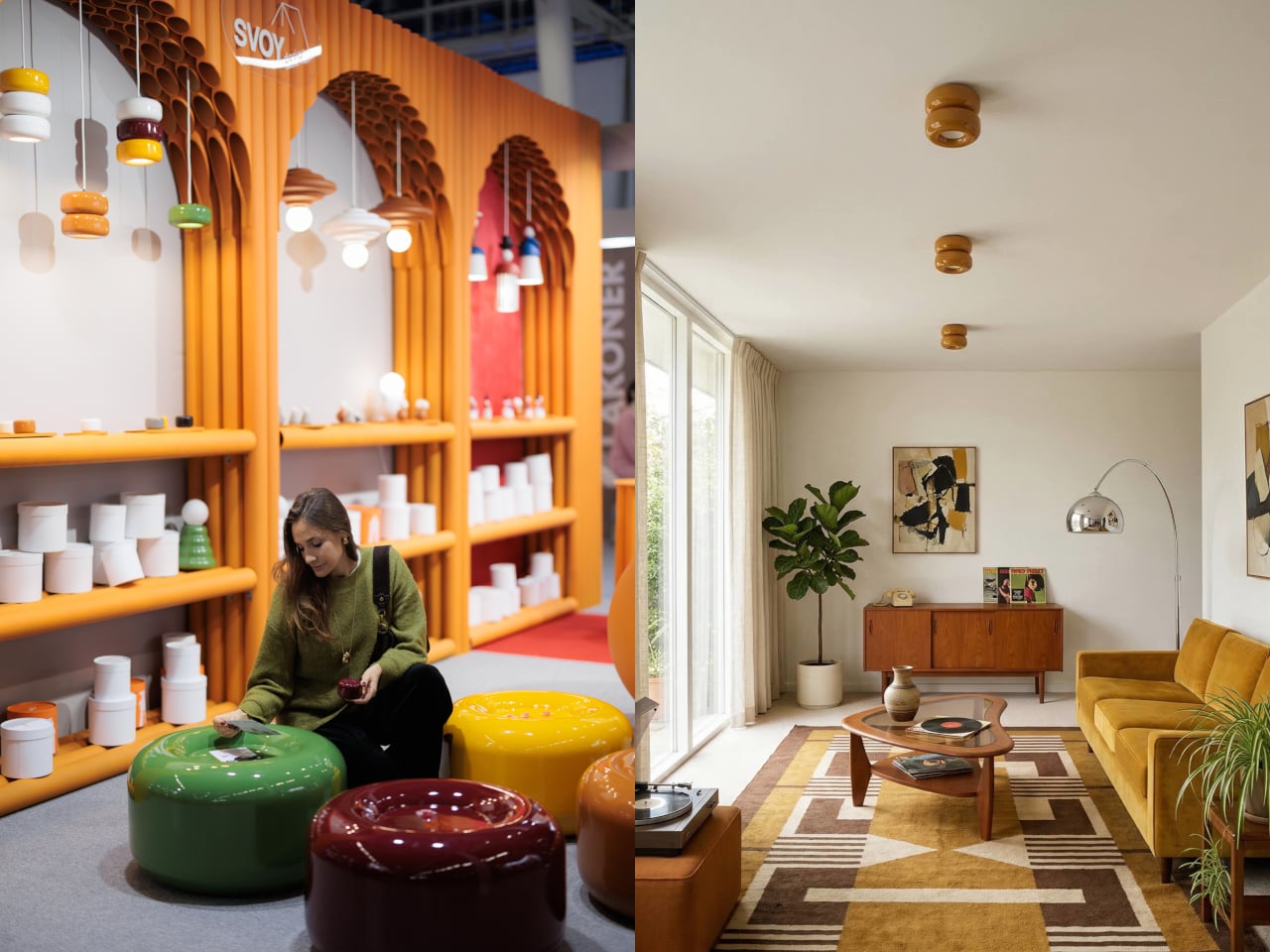
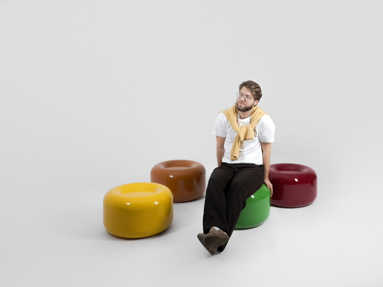
That’s where the Caramel collection comes in. Designed by Moscow-based product designer Maxim Tatarintsev in collaboration with Russian brand Svoy Design, this new series of ceramic lighting and furniture takes a very different approach to interior objects. Rather than adding another understated piece to a polished shelf, it reaches back to a simpler, sweeter time, asking whether a lamp or a side table can carry something as intangible as joy.

Designer: Maxim Tatarintsev

Tatarintsev’s inspiration came from a period of deep personal reflection. Amid what he describes as the noise of contemporary life, he looked inward and found his answer in childhood, specifically in the candy that practically every kid growing up in the 90s and early 2000s would recognize. That small, glossy, jewel-toned caramel sweet became both his muse and his design vocabulary, shaping everything from the forms to the color palette.

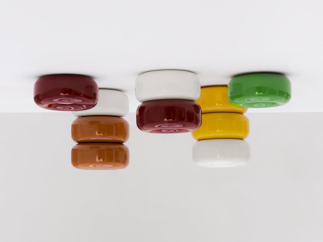
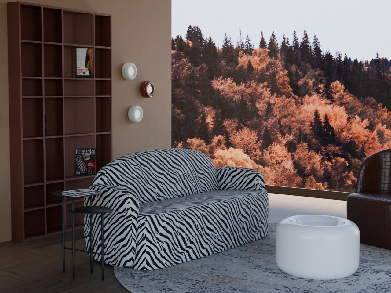
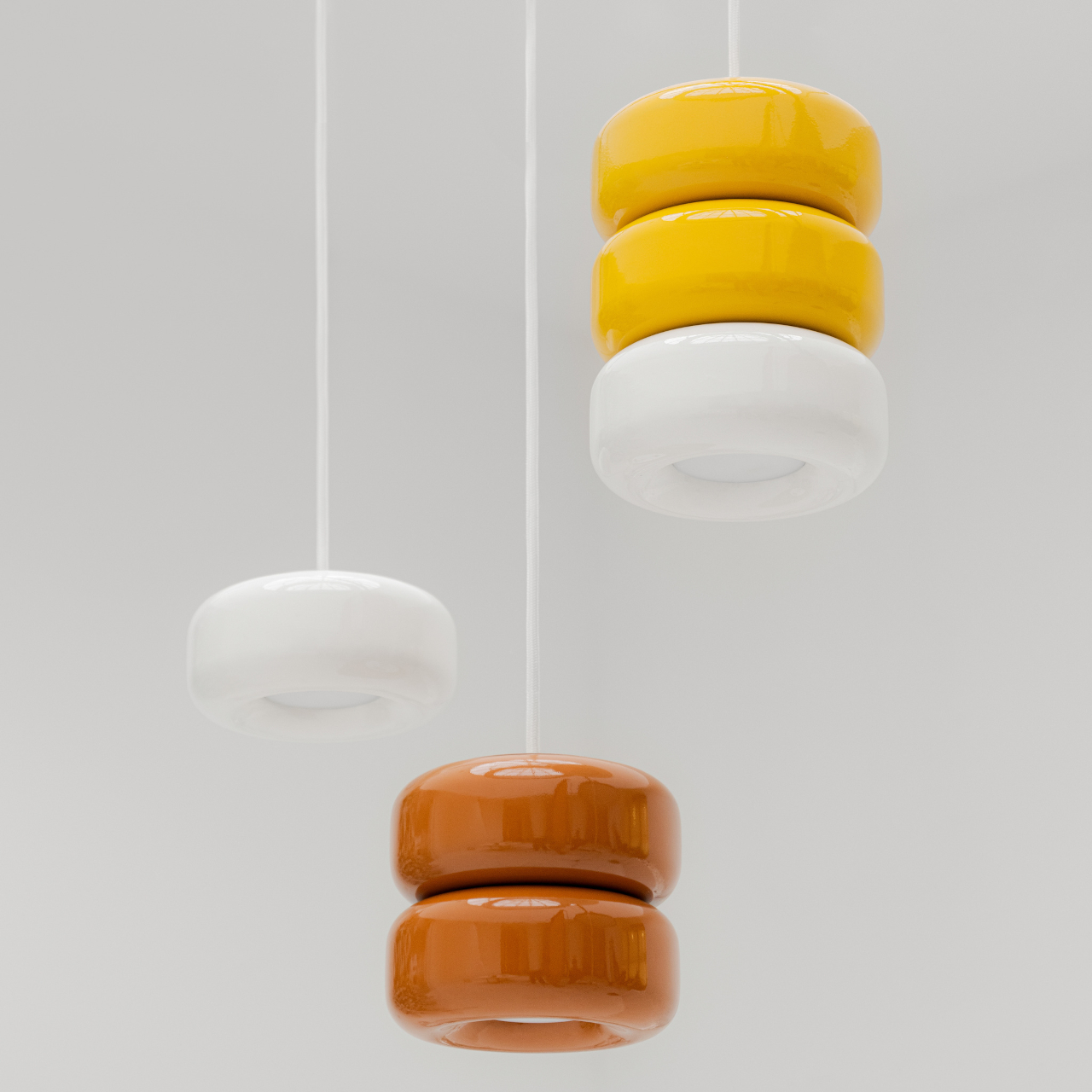
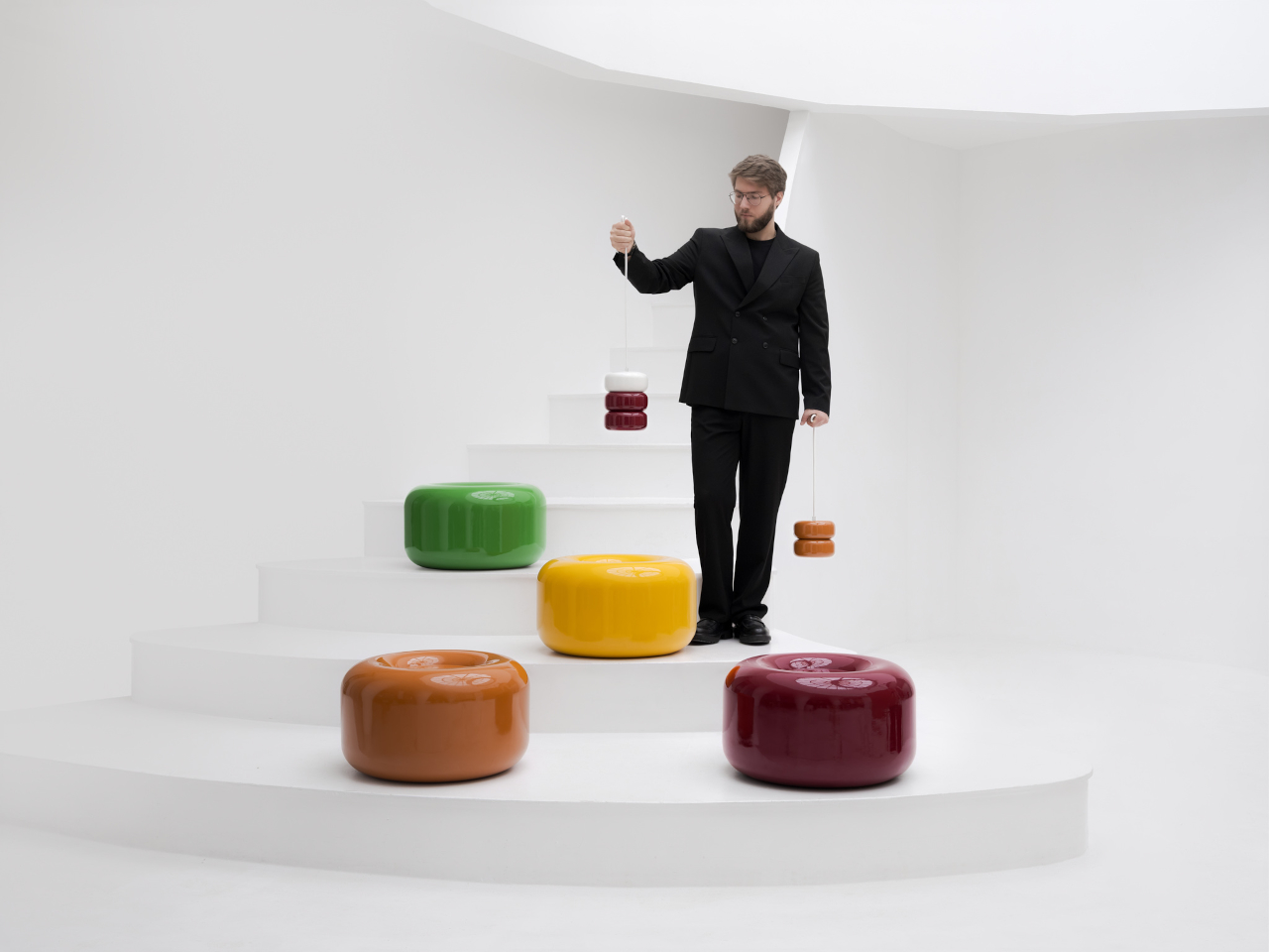
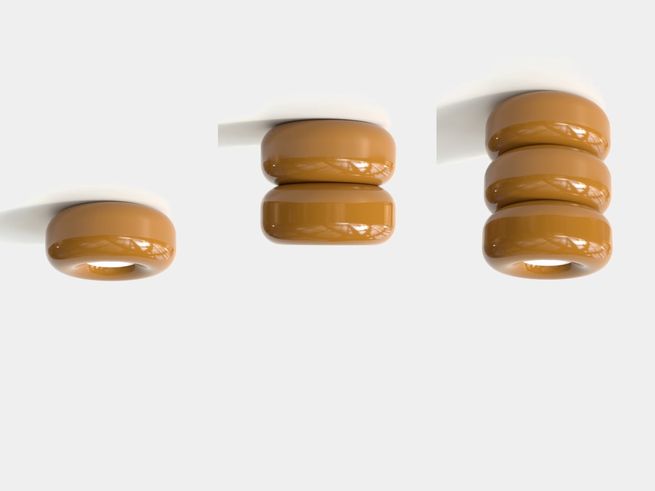
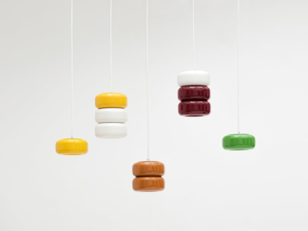
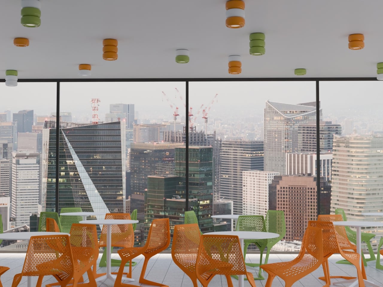
The collection spans pendant lights, ceiling fixtures, and wall-mounted lamps, all crafted from semi-porcelain, as well as a low-profile side table made from a proprietary composite material. What stands out is the modular approach: each ceramic unit can be combined and reconfigured, letting you stack or cluster them into different lighting arrangements depending on the mood or corner of the room you’re working with.

Think of it like assembling your own arrangement from a jar of sweets. One configuration might call for a single pendant above a kitchen island; another might cluster a few units along the ceiling of a reading nook. The point isn’t to follow a prescribed layout but to put that creative decision in the hands of the person actually living in the space, not just the designer who furnished it.

The craftsmanship behind the lighting is traditional and deliberate. Each piece starts as a slip-cast semi-porcelain form, drying for several days before being fired at 1,100°C inside a muffle furnace. A coat of glaze and paint follows, giving the finished modules their signature smooth, candy-like sheen. It’s a fairly labor-intensive process for what might look like a simple geometric shape, but that’s precisely what gives each piece its quiet depth.

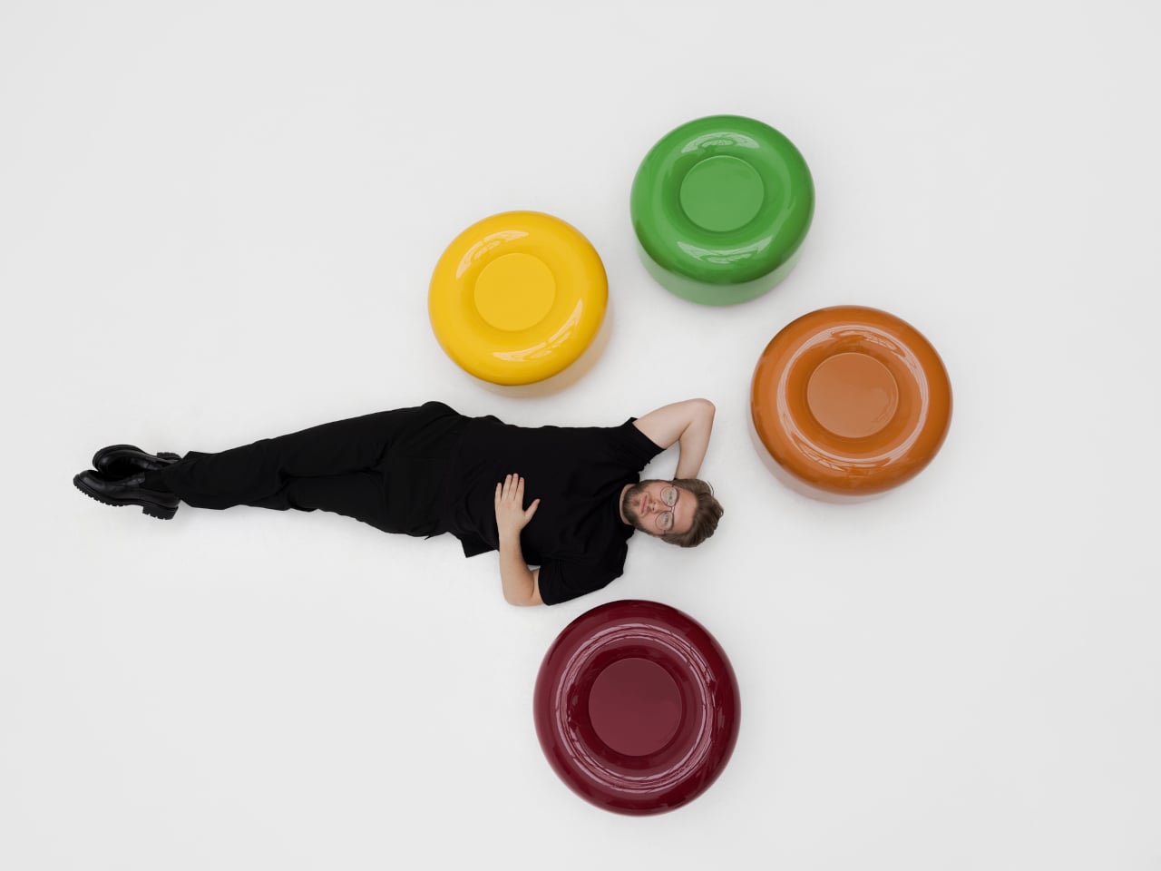
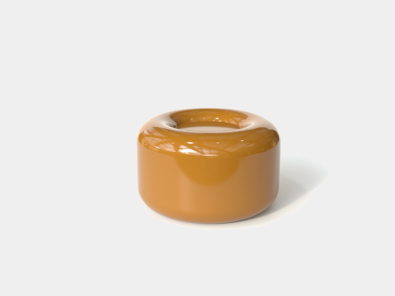
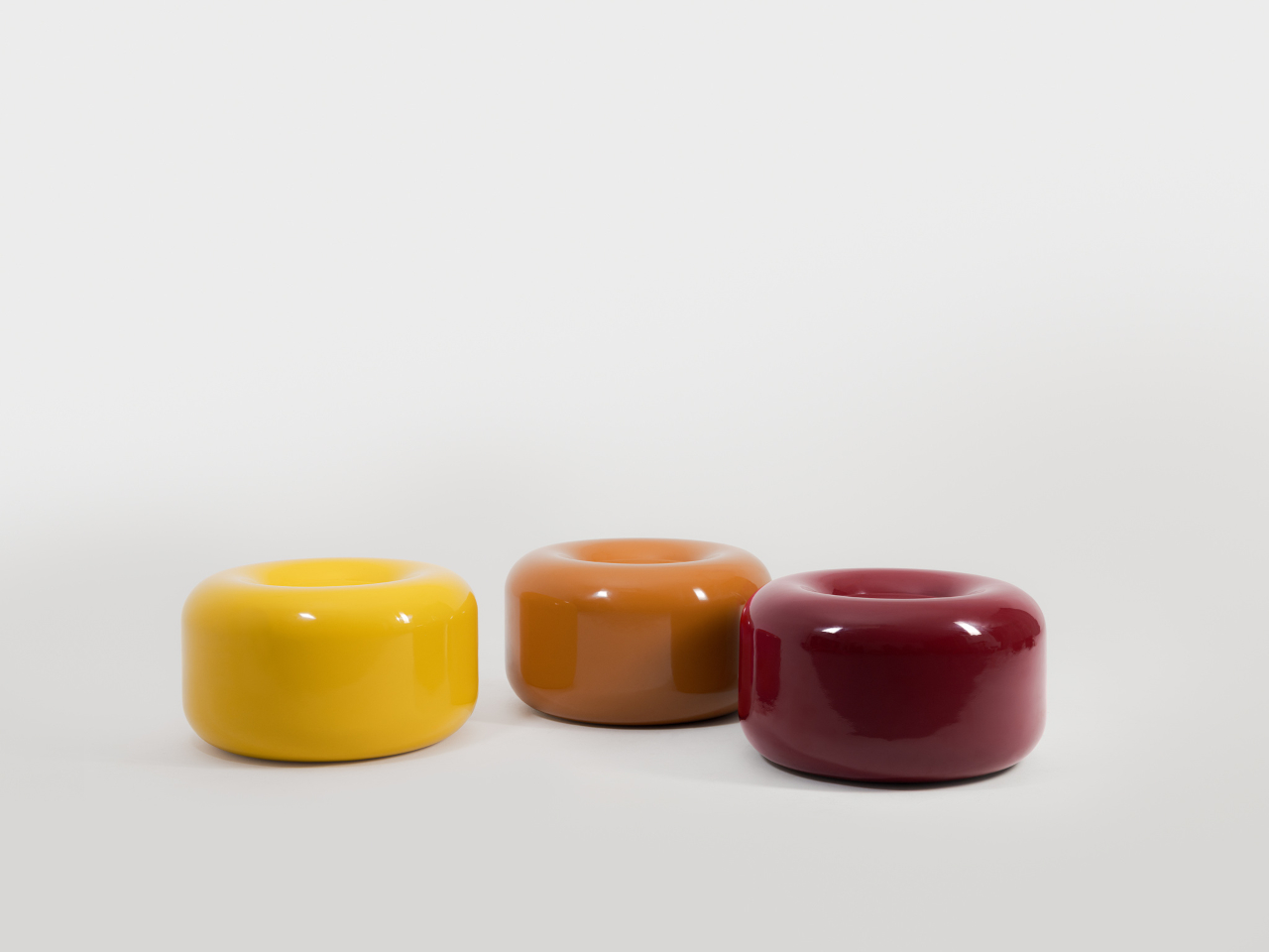
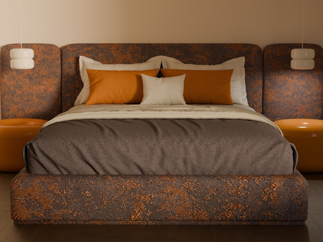
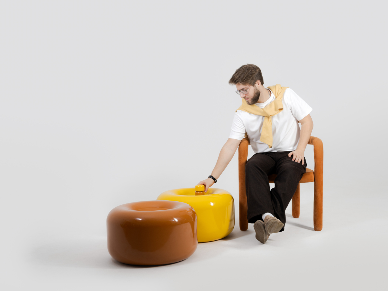
The side table takes a different manufacturing route altogether. Made from a proprietary composite rather than ceramic, it’s significantly more durable and comes in two versions, one for indoor use and one for covered outdoor settings. At first glance, it reads as a low, rounded ottoman, and people will probably be unable to resist using it as a delicious seat instead.

None of that is accidental. Tatarintsev’s stated goal wasn’t to produce pretty objects but to create what he calls “emotional anchors,” pieces capable of sparking a genuine reaction in whoever encounters them. A set of lamps you can rearrange on a whim, a table that moonlights as a seat, and a color palette borrowed from childhood treats make for a collection that gives any room a personality it actually earned.

The post These Ceramic Lamps Look Like 90s Caramel Candy and Stack Any Way first appeared on Yanko Design.

PlayStation Moon Legacy Edition TV Stand brings Retro PS1 style to your modern gaming setup

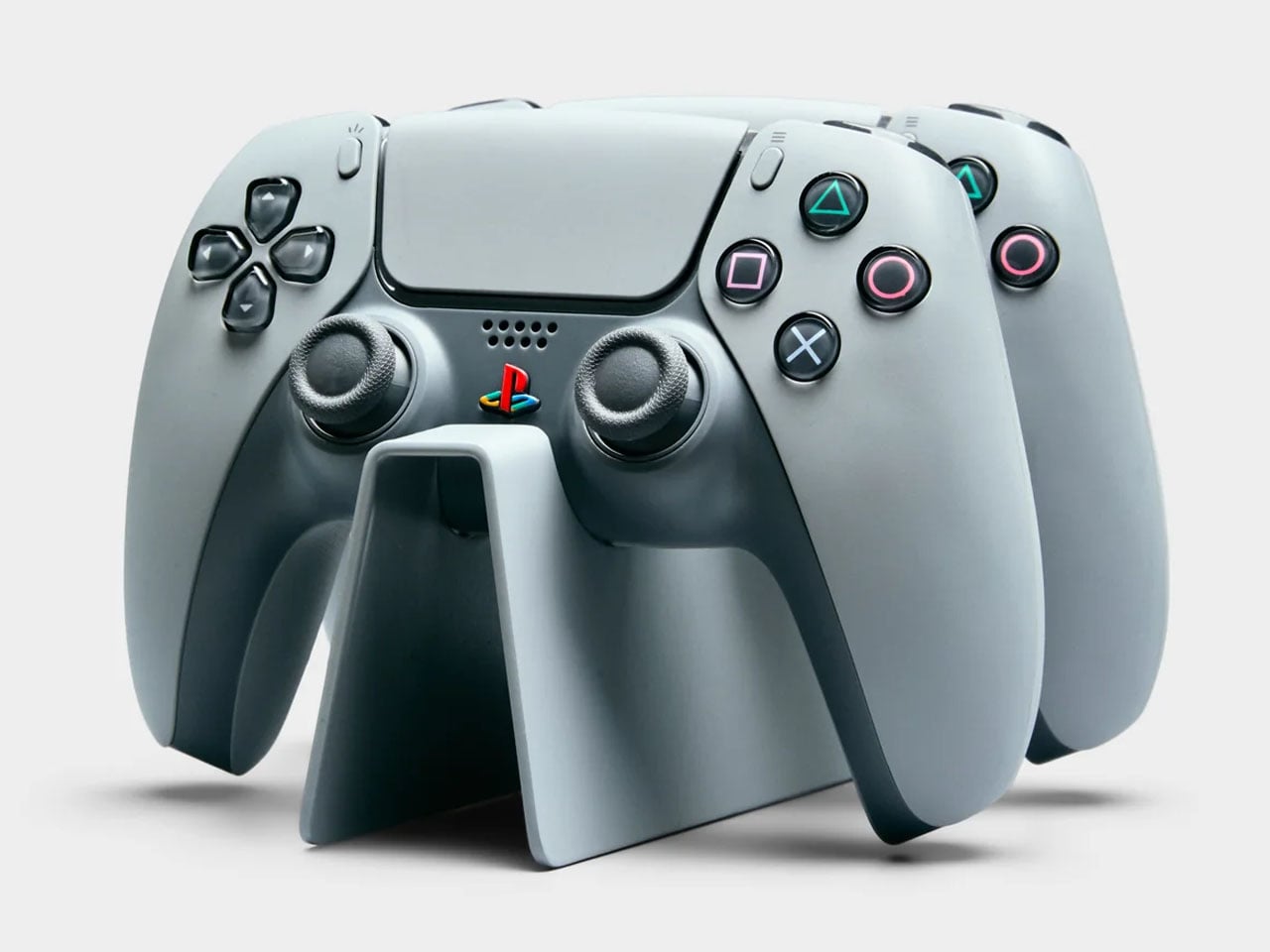
PlayStation turned 30 a couple of years ago, and milestones like this rarely pass quietly in the consumer electronics world. Sony marked the occasion with a special edition PlayStation 5 and accompanying accessories finished in a nostalgic gray tone inspired by the original PS1 console. If you were among the lucky few who managed to get hold of that anniversary edition styled after the classic PlayStation color scheme, there is now an equally themed piece of furniture designed to show it off in the living room.

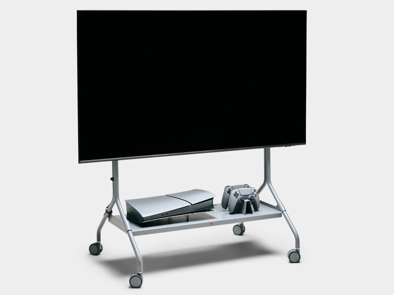
Designed in collaboration with Danish furniture maker Pedestal, PlayStation Norway has introduced a statement accessory that celebrates gaming culture as much as it serves a functional purpose. The Moon Legacy Edition TV stand arrives in a muted “Legacy Gray” finish that reflects the iconic tone of the original PlayStation console. The visual connection immediately creates a retro aesthetic, making it particularly appealing for collectors who appreciate the history of gaming as much as the hardware itself.

Designer: Pedestal and PlayStation Norway

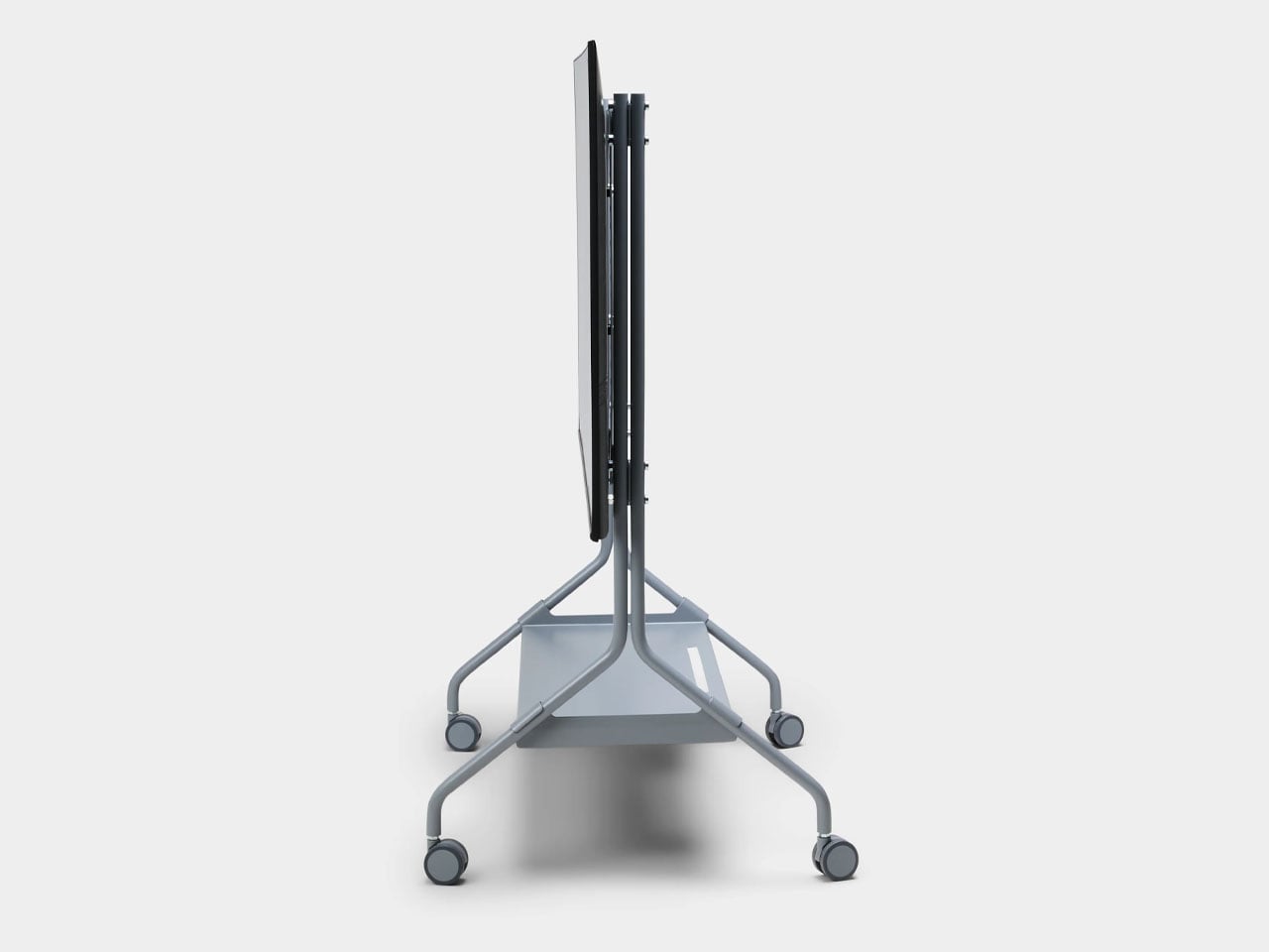
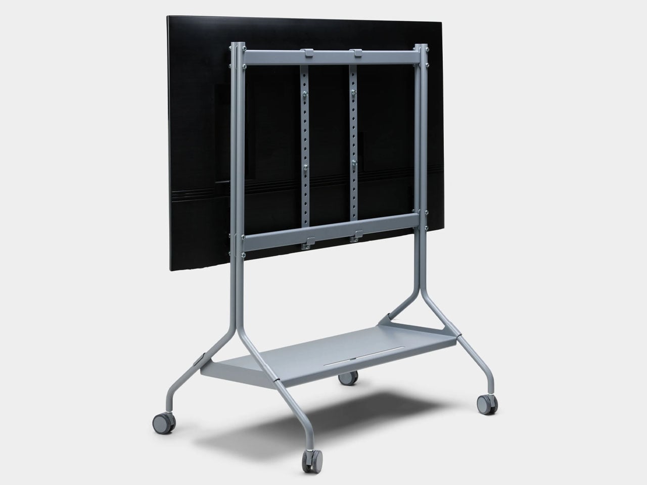
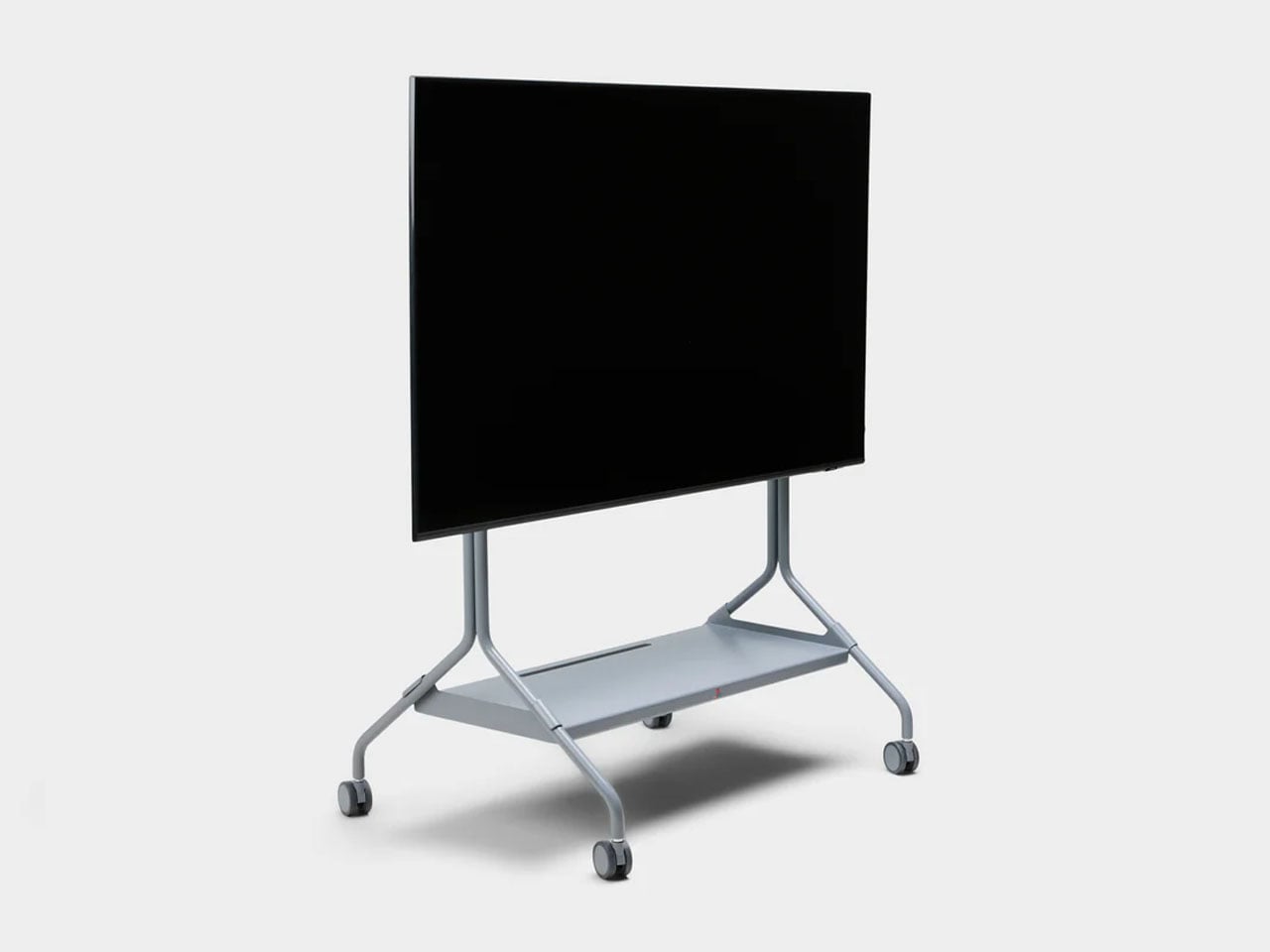
Beyond the nostalgic color palette, the stand follows Pedestal’s minimalist Scandinavian design philosophy. The frame is constructed from powder-coated steel with a satin finish, giving the structure a sturdy and refined appearance while maintaining a relatively lightweight build. Despite the industrial material choice, the design remains clean and understated, allowing the console and TV setup to remain the visual focus. The stand measures roughly 42 inches high, 31 inches wide, and 21 inches deep, and weighs just under 33 pounds, making it substantial enough for stability without feeling overly bulky. It supports flat-screen televisions between 40 and 70 inches and can handle loads of up to about 110 pounds, which comfortably covers most modern TVs and gaming setups.

The Moon Legacy Edition sits on premium furniture wheels with soft polyurethane coating, allowing the entire entertainment setup to move easily between spaces. For users who rearrange their living room or occasionally shift their gaming setup to different areas, the wheeled base offers flexibility that traditional TV cabinets often lack. The stand also adheres to the widely used VESA mounting standard, meaning it is compatible with most flat-screen television brands currently on the market.

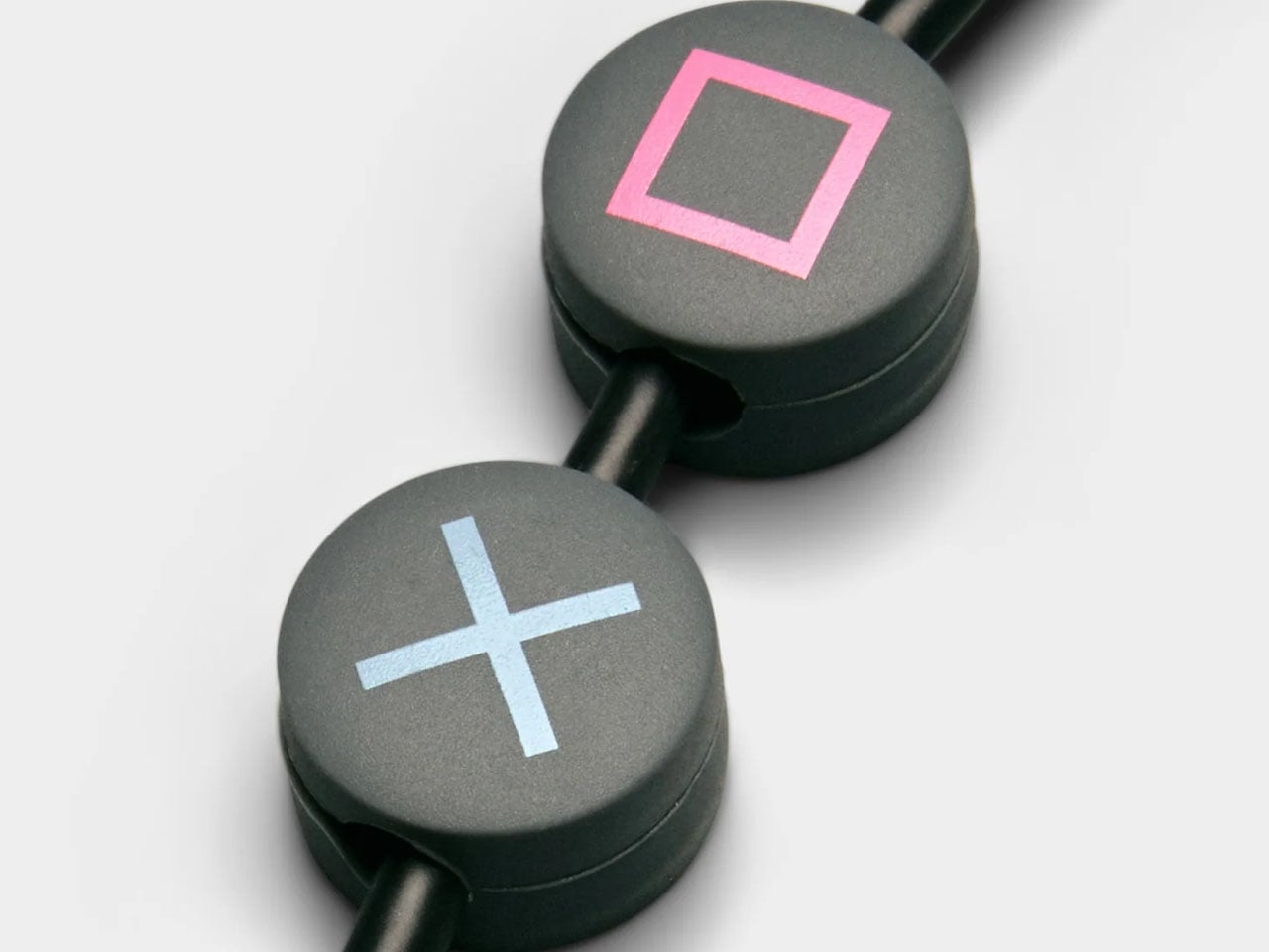
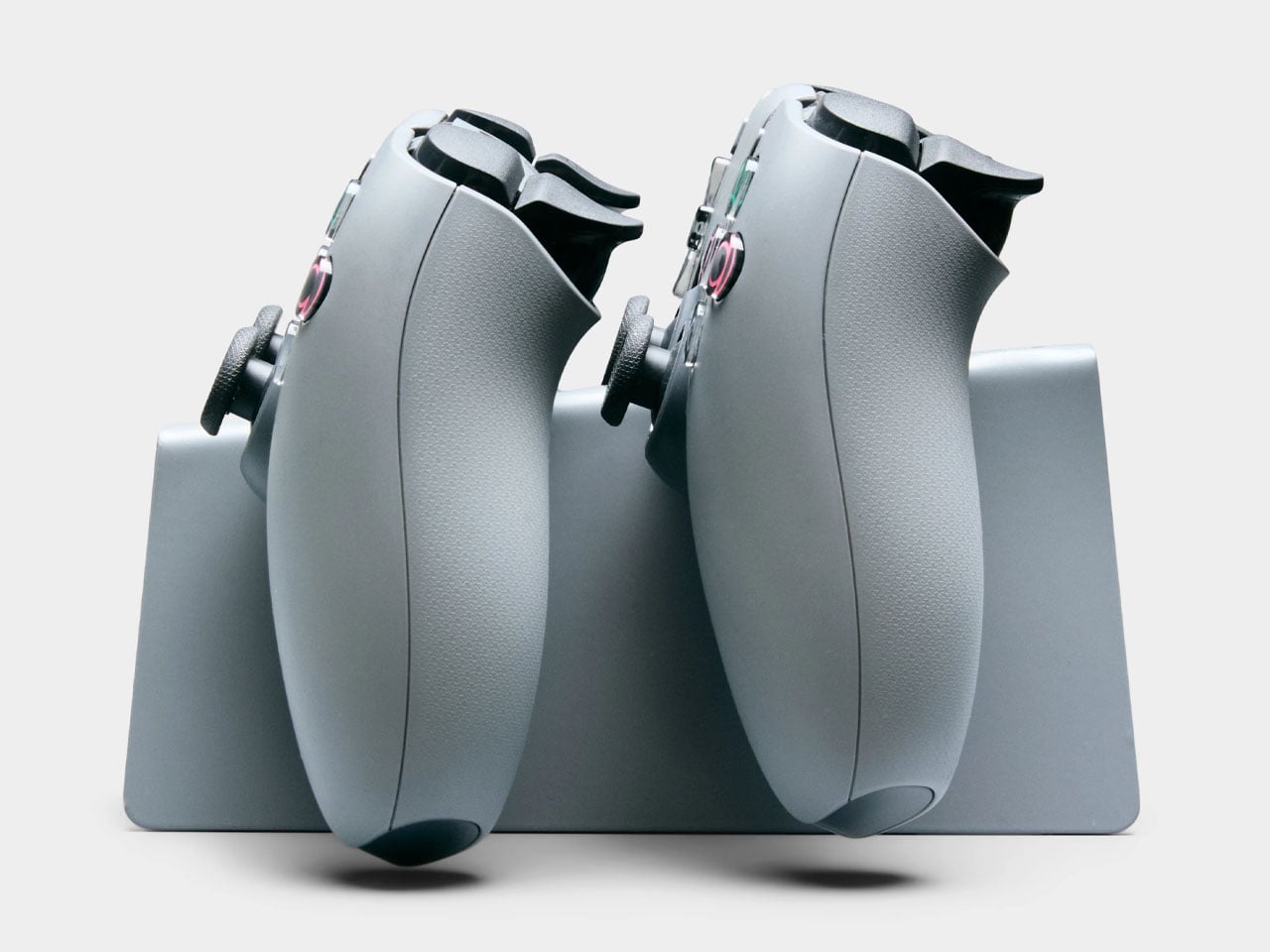
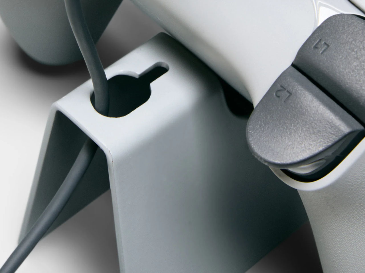
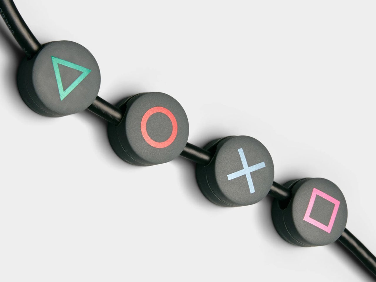
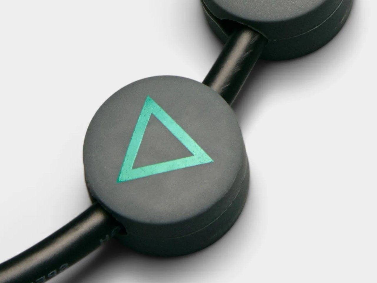
Functionality extends beyond simply holding a TV. The limited-edition package includes a matching Legacy Shelf and a controller stand, giving players a dedicated place to display a controller or store accessories. Additional cable management accessories, such as cable dots and cable ties, are also included to help keep wires organized and out of sight. The shelf adds a subtle display area that can hold game cases, collectibles, or other gaming gear without interrupting the stand’s minimal design language.

The Moon Legacy Edition TV stand is priced significantly higher (approximately $775) than the normal version, which costs $385, reflecting its limited-edition status. The price covers only the stand and included accessories; neither the television nor the PlayStation console is part of the package. As a result, the stand clearly targets dedicated fans and collectors who value the design connection to PlayStation history rather than simply looking for a functional TV stand.

The post PlayStation Moon Legacy Edition TV Stand brings Retro PS1 style to your modern gaming setup first appeared on Yanko Design.

Galaxy Z Fold 8 Renders: Same Look, Bigger Battery, and S Pen Is Back

Foldable phones have reached a point where the form factor itself is no longer the talking point it once was. The big, dramatic “look how it folds” moment has settled into a quieter rhythm of iterative refinement, with each generation tweaking dimensions and chasing thinner profiles. Most buyers know what a modern book-style foldable looks like, and the language of change has shifted from shape to substance.

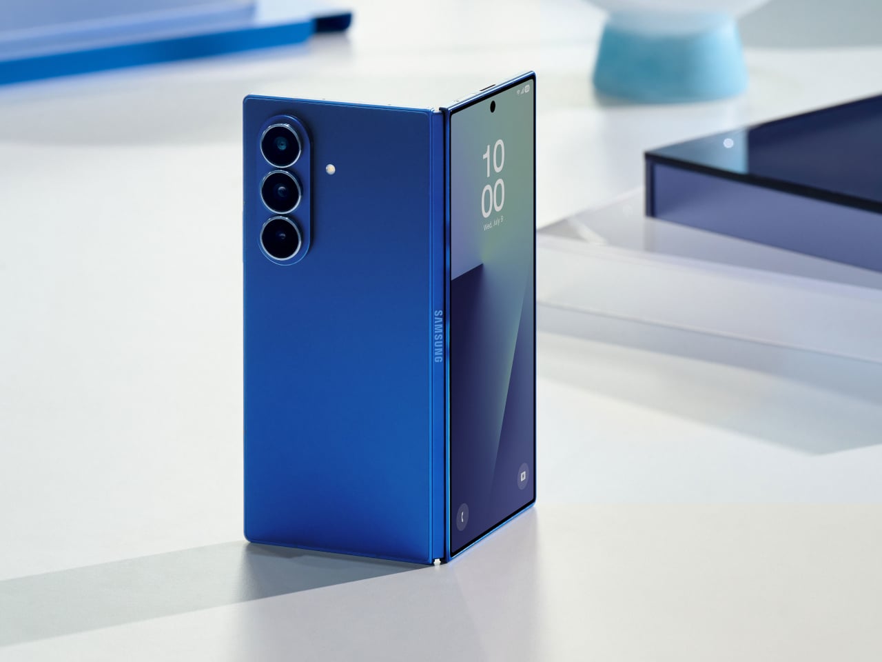
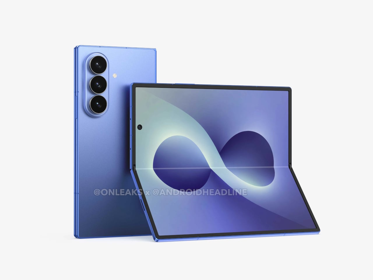
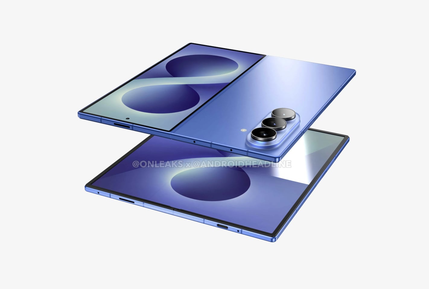
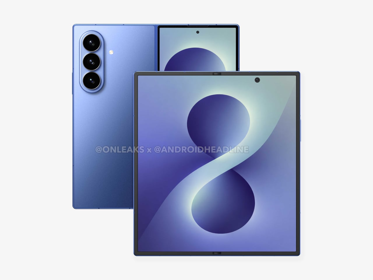
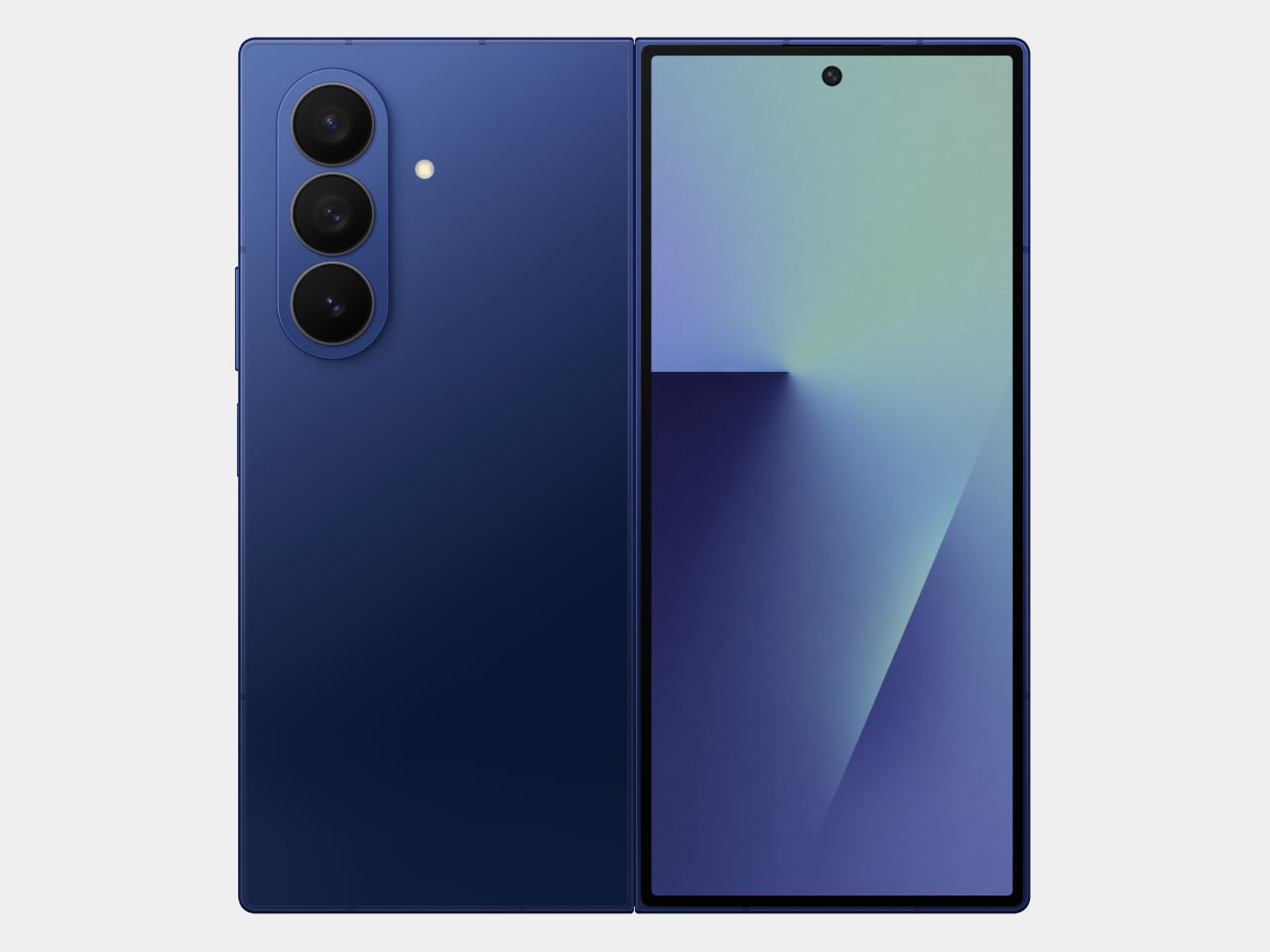
That’s the situation shaping the Samsung Galaxy Z Fold 8 conversation right now. Leaked CAD-based renders show a design that’s nearly indistinguishable from the Z Fold 7 pictured above: same flat sides, same sharp corners, same camera layout. The cover screen sits at 6.5 inches and the inner display at 8 inches, both unchanged. If you handed someone these renders without context, they’d probably just guess it was another angle of last year’s model.

Designer: Steve Hemmerstoffer/OnLeaks (Renders) via AndroidHeadlines

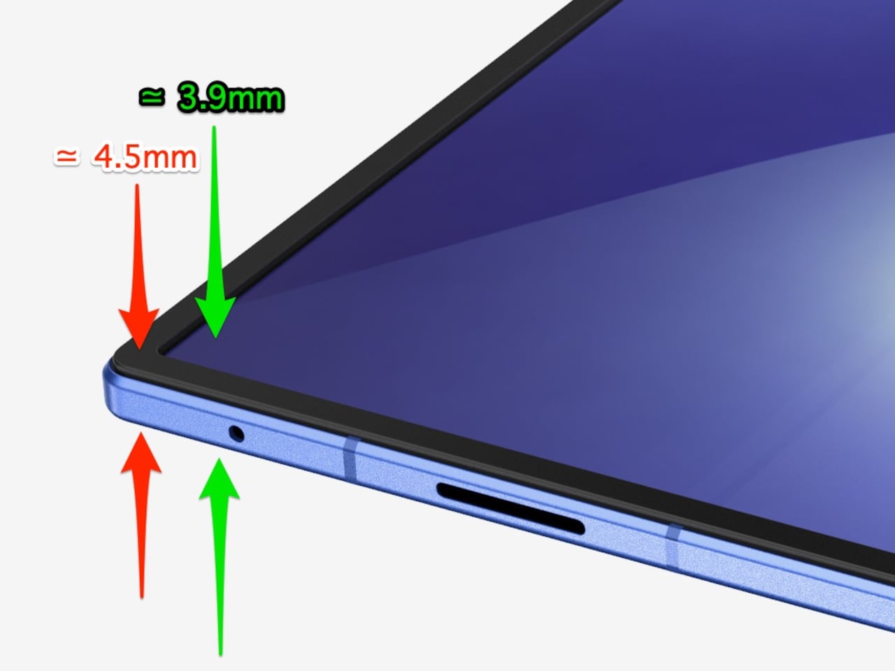
There’s one notable external difference, though, and it actually goes in the wrong direction. The leaked dimensions put the Z Fold 8 at 4.5mm thick when open and 9mm folded, compared to the Fold 7’s 4.2mm and 8.9mm. That’s a slight regression for a phone that went to considerable lengths to slim down the year prior. It’s not dramatic, but for a device that made a point of its thinness, it’s worth flagging. That said, the 4.5mm figure includes the protruding bezels around the display; it’s actually just 3.9mm thin.

The likely reason for that extra thickness is one of the better leaks so far: the possible return of S Pen support. Samsung dropped the stylus from the Fold 7, and that’s been a consistent complaint from the people who actually used it for note-taking or sketching on that wide inner canvas. If the S Pen does come back, a fraction of a millimeter is a fair trade for most of those users.

The battery theory, however, is probably more probable. A jump from 4,400 mAh to a rumored 5,000 mAh would mark the first capacity upgrade since the Galaxy Z Fold 3, and pairing that with 45W wired charging, up from 25W, addresses one of the more persistent frustrations with this lineup. Spending less time near an outlet matters more on a device you’re likely using across more tasks throughout the day.

The camera is also in line for a significant upgrade, according to the same leak. The main sensor is rumored to still be 200MP, and the ultrawide jumps from 12MP to 50MP. That ultrawide improvement in particular has been a long time coming. The gap between the Fold’s main and ultrawide cameras has been noticeable enough that it’s affected how people use the phone outdoors.

All of this is still leak territory, of course, pulled from CAD renders and a specs tipster ahead of what’s expected to be a July 2026 Unpacked announcement. Samsung hasn’t confirmed any of it, and final specs frequently shift between early renders and launch day. The Z Fold 8 is shaping up to be a phone that looks familiar and updates what actually needs updating, but none of that is official yet.

Galaxy Z Fold7

The post Galaxy Z Fold 8 Renders: Same Look, Bigger Battery, and S Pen Is Back first appeared on Yanko Design.

The 5 Best Furniture Designs of March 2026

March brought the kind of furniture that doesn’t need to announce itself. A student chair that shifts between sitting and lounging through physics alone. A coffee table whose legs look like they’re caught mid-step toward the door. A stool that opens from flat with a single press and no tools required. An office system built to reconfigure whenever the day asks for something different. A footstool that handles posture quietly, without making it your problem to manage.

What connects these five pieces isn’t a shared material or a shared aesthetic. What connects them is the absence of excess. Each one solves something real, and each one does it without layering on complexity to get there. That kind of restraint is harder to land than it looks. Most furniture design in 2026 is reaching for the new, for the bold, for the statement piece. These five reach for the right answer instead, and find it.

1. Tilt Chair
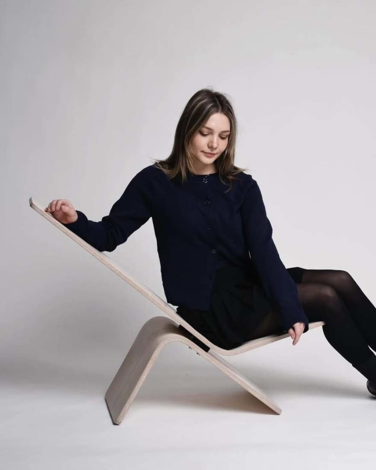
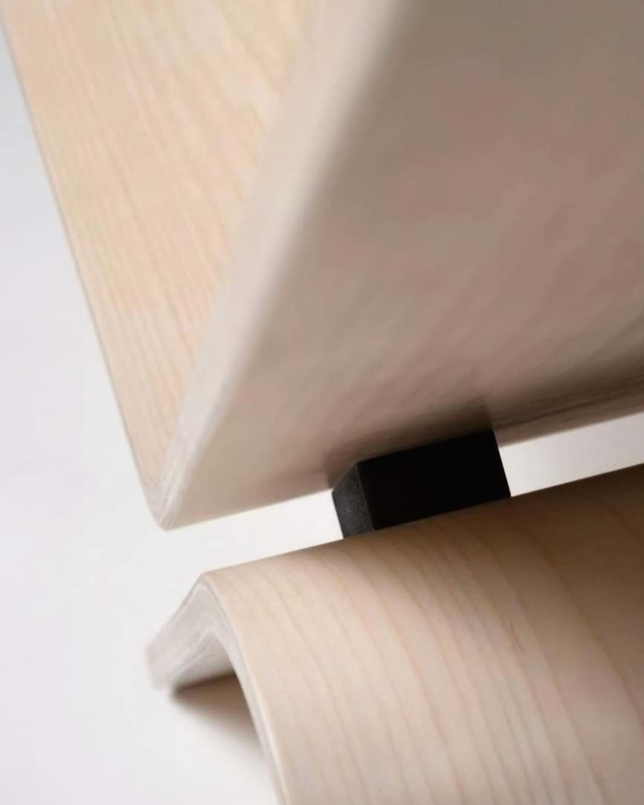
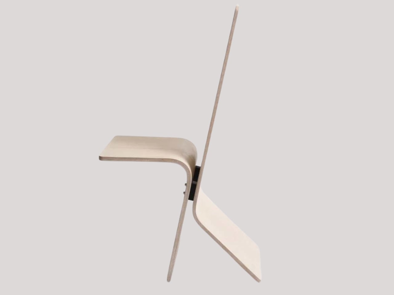
Manuela Hirschfeld is an industrial design student at Germany’s Hochschule Pforzheim, and her Tilt chair does exactly what the name suggests. Built from bent plywood, it shifts between upright and reclined with a single forward tilt. No levers, no hardware, just physics and balance. The restraint here is rare for student work. Most student designs reach for the complex or the speculative. Tilt strips everything back until the idea stands entirely on its own.

What makes it genuinely useful is how naturally it handles the shift between focused work and winding down. Most chairs make you choose one mode and stay there. Tilt lets your body make that call instead. Lean it forward, and the geometry changes. The bent plywood keeps it light and easy to move, so it works as well in a small apartment as it does in a studio or home office.

What We Like

  • No mechanical parts means nothing to replace or service over time
  • Dual function in a single lightweight form, no extra hardware needed

What We Dislike

  • The minimal plywood aesthetic may feel too sparse for warmer, more layered interiors
  • May not offer enough firm back support for users who need a fixed, stable position

2. Barefoot Collection
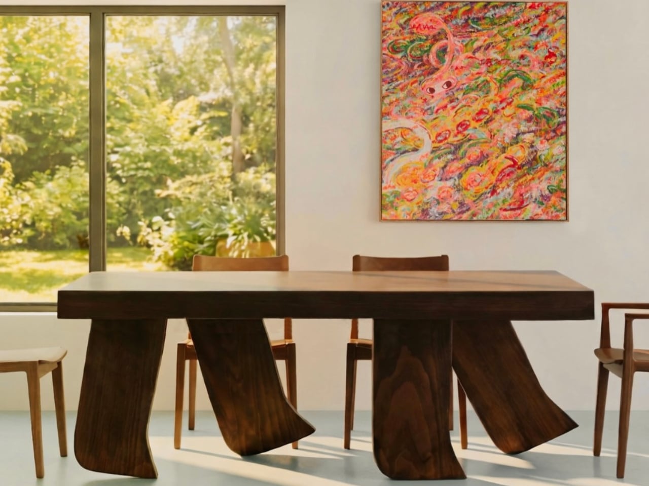
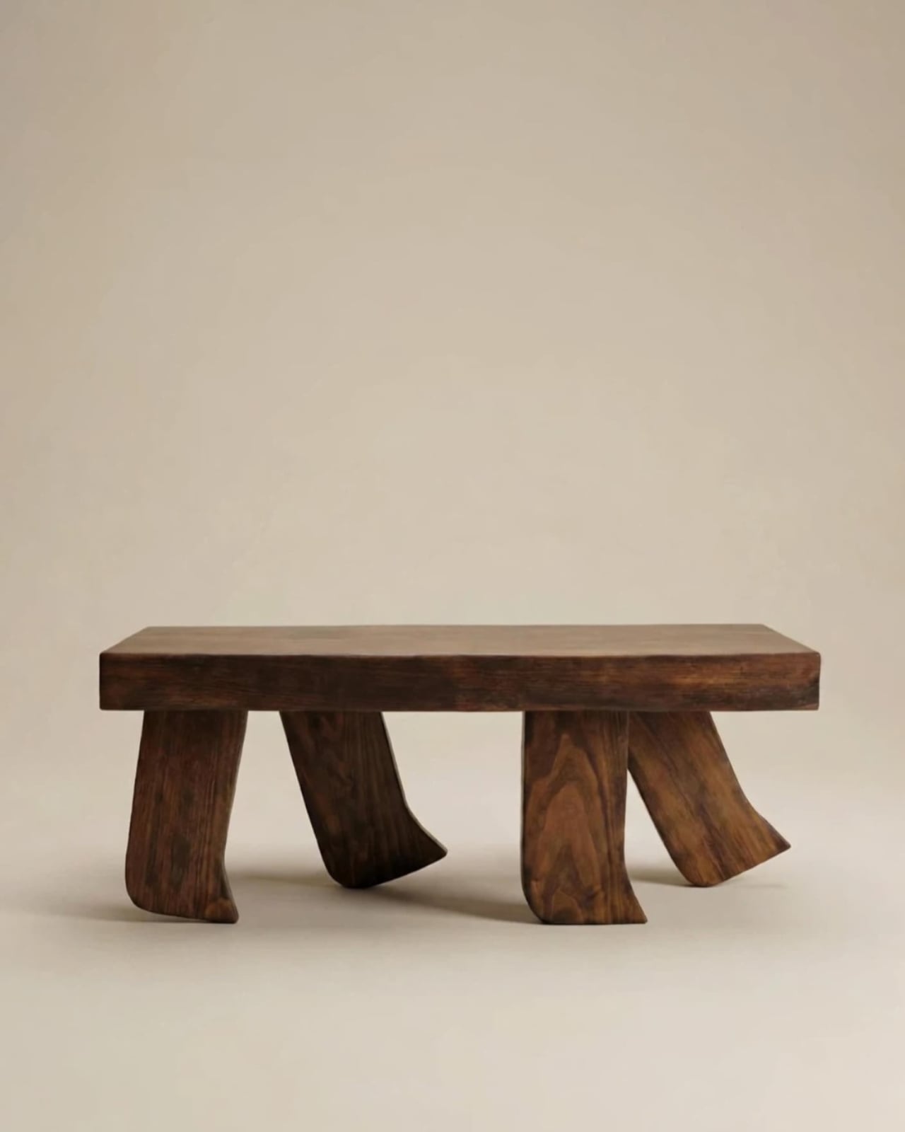
The Barefoot Collection started with a single image: a coffee table that looks like it’s walking away. The legs are carved from solid wood to simulate the arc and flex of a bare foot mid-step, while the tabletop stays completely flat and rectilinear. Stillness above, motion below. That contrast is the whole point, and it works better than it has any right to. The piece reads as coherent long before it reads as clever.

What you actually get is a coffee table that functions without apology and sparks a real conversation without ever trying to. Set a cup on it and forget the concept entirely. Then a guest walks in, does a double-take, and suddenly the room is talking. Most concept-led furniture exhausts you after a few weeks. Barefoot earns its place by being genuinely useful first and genuinely interesting second. That’s always the right order.

What We Like

  • Solid wood construction gives it real longevity, well beyond its visual appeal
  • Works as a fully functional surface while quietly holding a strong point of view

What We Dislike

  • The sculpted legs make it difficult to pair with more conventional, straight-lined furniture
  • The level of craft involved likely puts it at a higher price point

3. Press Stool
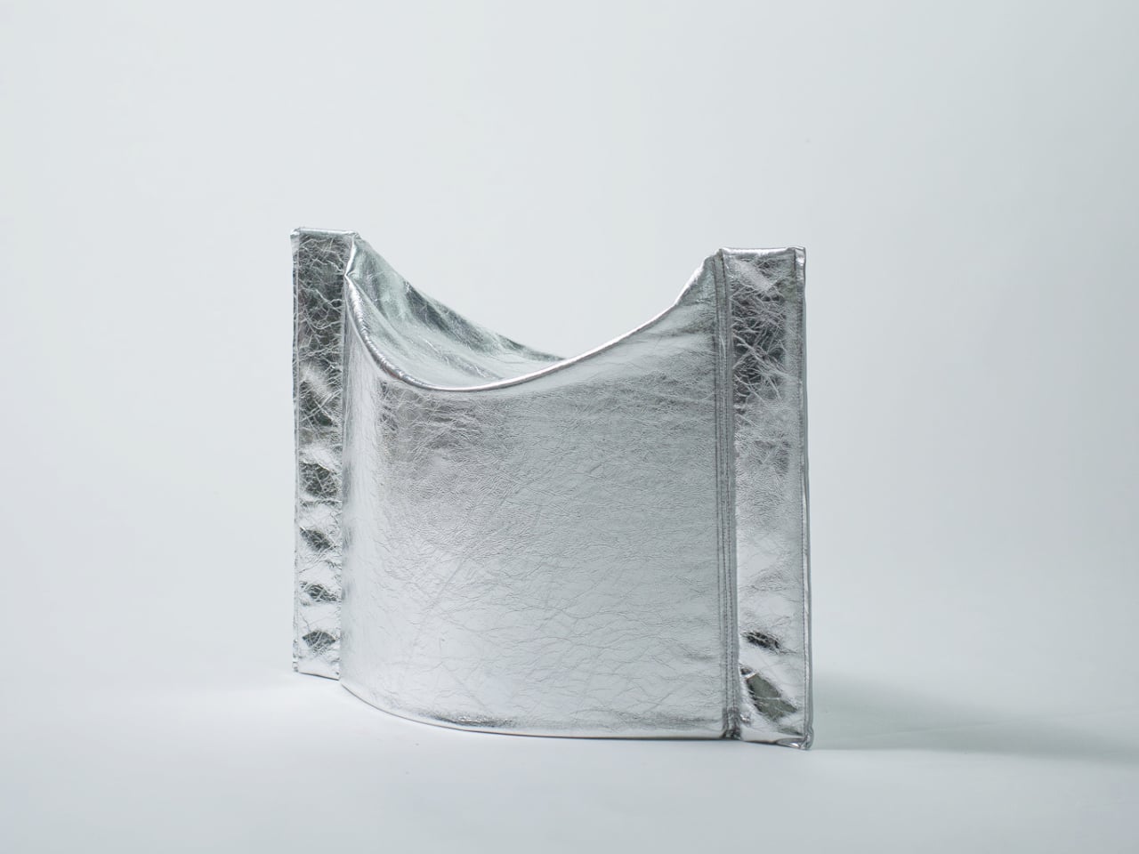
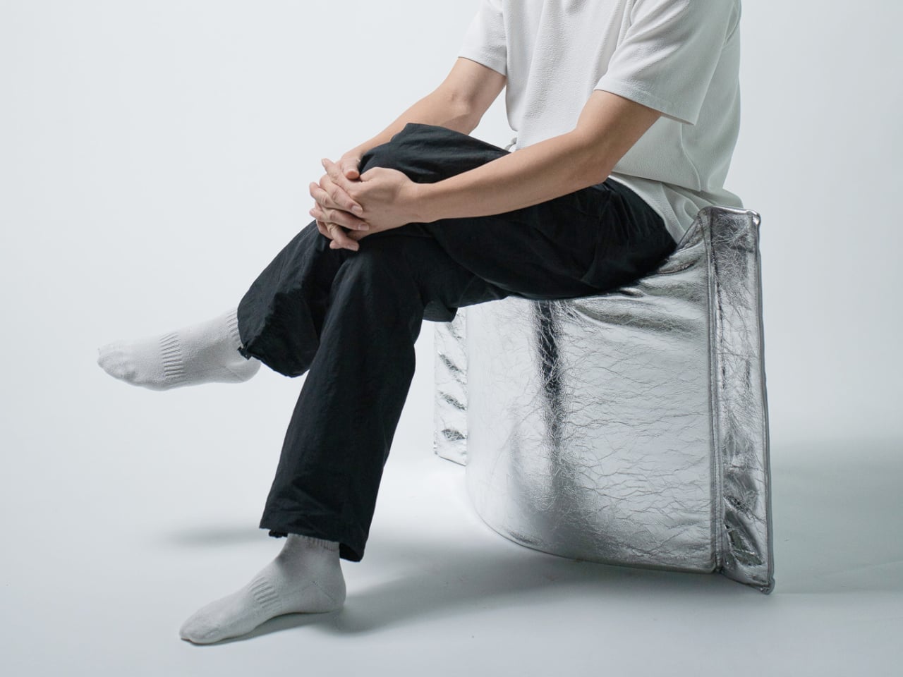
The Press Stool borrows its structural logic from folded paper. A flat sheet has no load-bearing strength, but fold it, and the forces redistribute across the geometry. Crease it further, and the form resists compression. That principle does all the work here. In its flat state, it collapses into a wide oval with a crinkled metallic silver surface that lands somewhere between industrial foil and fabric. One press and it opens. No legs, no bolts, no tools.

For anyone in a small apartment, it solves a storage problem while putting something worth looking at in the room. It ships flat, weighs little, and can slide under a bed or lean against a wall when it isn’t needed. Most fold-flat furniture looks like a compromise. The Press Stool looks intentional. The crinkled surface and gathered folded ends give it a presence that holds up even when it’s closed.

What We Like

  • Ships and stores completely flat, ideal for smaller homes and tight living spaces
  • No assembly required, the folded form does all the structural work

What We Dislike

  • The metallic silver finish is a strong statement that won’t suit every interior palette
  • Load capacity may be more limited compared to stools with conventional structural frames

4. Kylinc Modular Office System
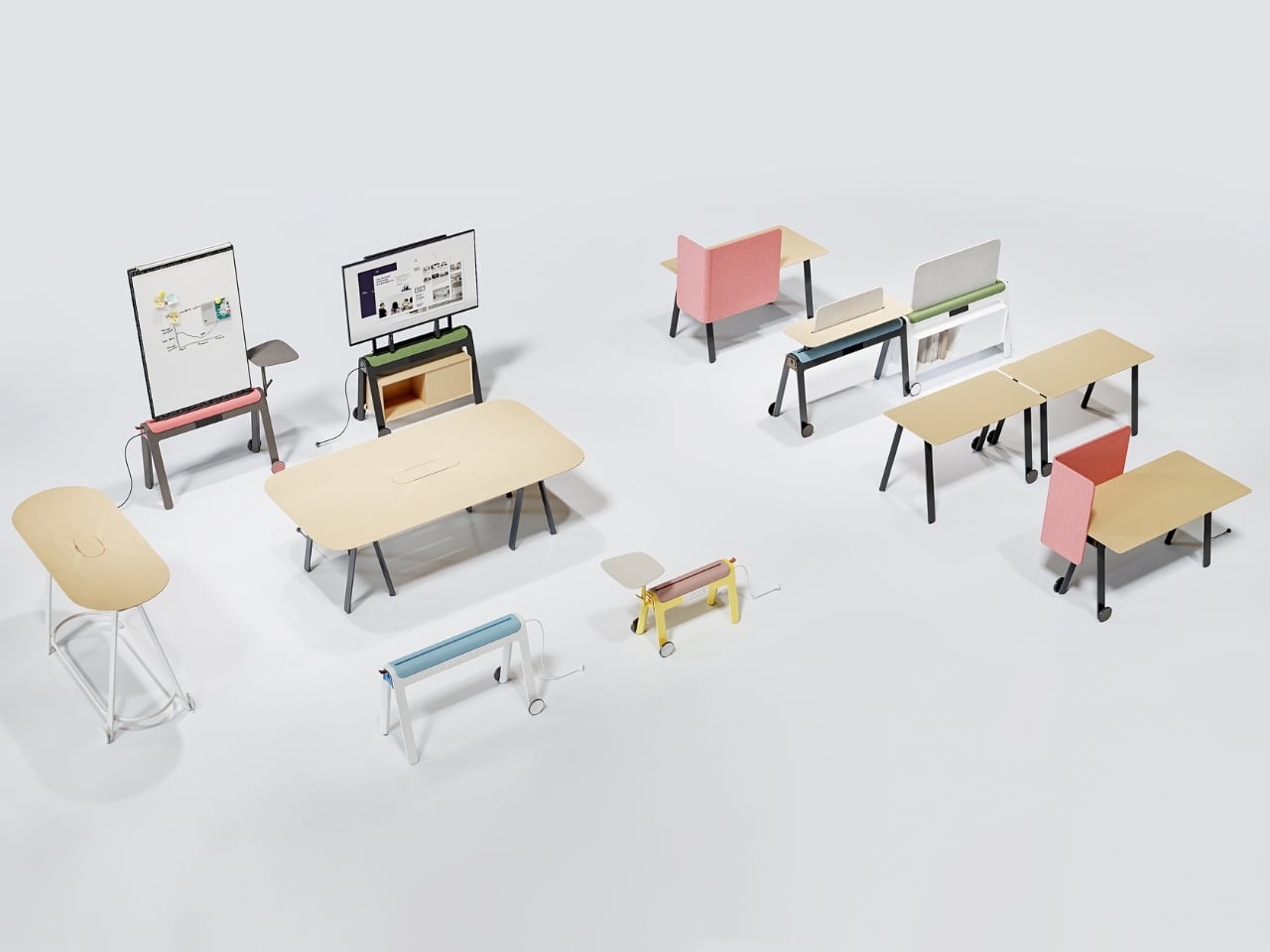
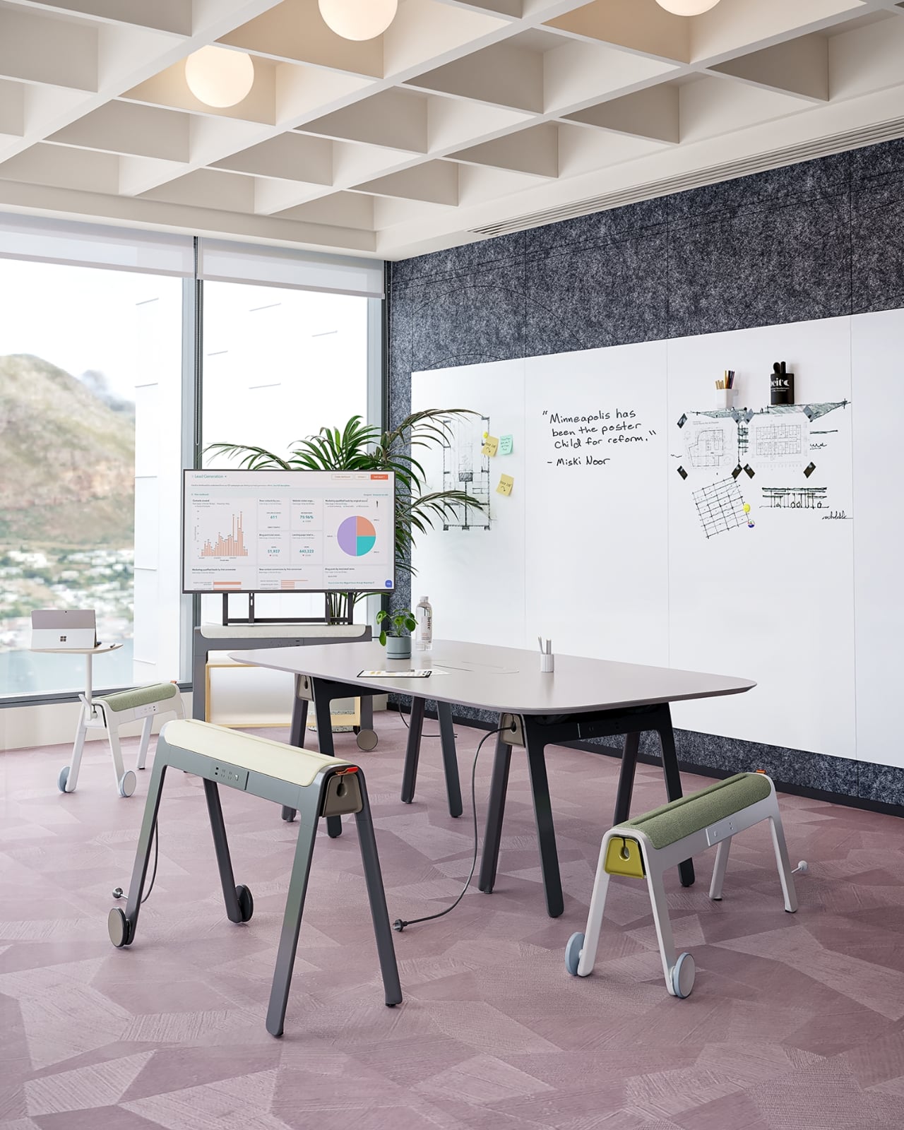
Kylinc treats the workspace like something that should change whenever the day asks it to. Each piece rolls on oversized wheels, which makes reconfiguring your office feel genuinely effortless rather than theoretically possible. Push pieces apart for a collaboration zone, pull them together for focused work. Power management is built directly into the furniture, with smart cable organization that keeps surfaces clean without any additional accessories to track down or manage.

The benefit shows up most for people working from home across a day that never asks the same thing twice. A static configuration works well some of the time and poorly the rest. Kylinc changes that without requiring much effort, which is the real difference between a system that actually gets used and one that stays fixed out of habit. The built-in cables move with the furniture. Your layout becomes something you actually control.

What We Like

  • Oversized wheels make real reconfiguration effortless, not just possible on paper
  • Integrated power and cable management keep the workspace clean without extra accessories

What We Dislike

  • Rolling furniture may feel less stable than fixed pieces for users who prefer an anchored setup
  • A full modular system likely carries a significantly higher upfront cost than standard office furniture

5. OTTO Footstool
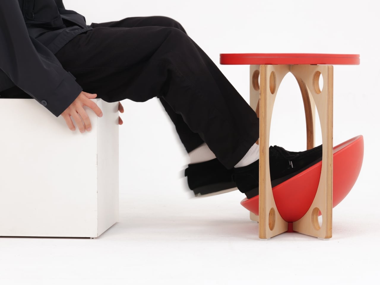
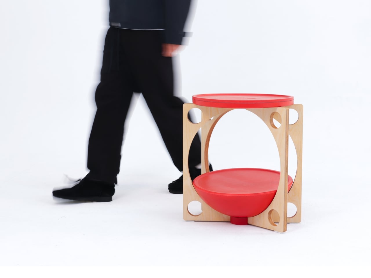
OTTO takes its name from the Korean roly-poly toy Ottogi, a round-bottomed figure that always rights itself because of its convex base. Designer Woonghee Ma applied that same logic to a footstool. The convex base means it rocks and shifts as your body moves throughout a long sitting session. No adjustment needed, no settings to configure. You shift weight, the stool moves with you, and that’s the whole mechanism.

For a home office that needs to support you without making a production of it, OTTO is exactly right. Most ergonomic products demand your attention to work. OTTO doesn’t. The passive rocking base handles posture support quietly while you stay focused on everything else. It also looks good, which matters more than it might seem for something you’ll look at every working day. Clean, compact, and entirely unpretentious about what it is.

What We Like

  • Passive rocking base provides ergonomic support through natural weight shifts, no settings required
  • Compact and well-proportioned, it works equally well in home and professional office settings

What We Dislike

  • The rocking motion may feel unfamiliar at first for users accustomed to fixed support
  • May not suit very low seating arrangements where foot elevation isn’t part of the setup

March Didn’t Make a Noise. It Made a Point.

What connects these five pieces isn’t an aesthetic or a material. It’s restraint. A chair that changes mode with one gesture. A table that earns its concept by being useful first. A stool that ships flat and opens in a second. A workspace that adapts without asking for your help. A footstool that supports you without ever drawing your attention to the fact that it’s doing so. That quiet confidence is what good design actually looks like in practice.

Most design coverage this month was busy chasing the big swing. The sculptural statement, the unexpected material, the idea that needs a paragraph of explanation before it lands. What these five pieces share is something quieter. They ask less of you. They make their case by fitting into your life rather than reshaping it around themselves. March didn’t produce the loudest furniture of the year. It produced some of the most considered. That’s always the better result.

The post The 5 Best Furniture Designs of March 2026 first appeared on Yanko Design.
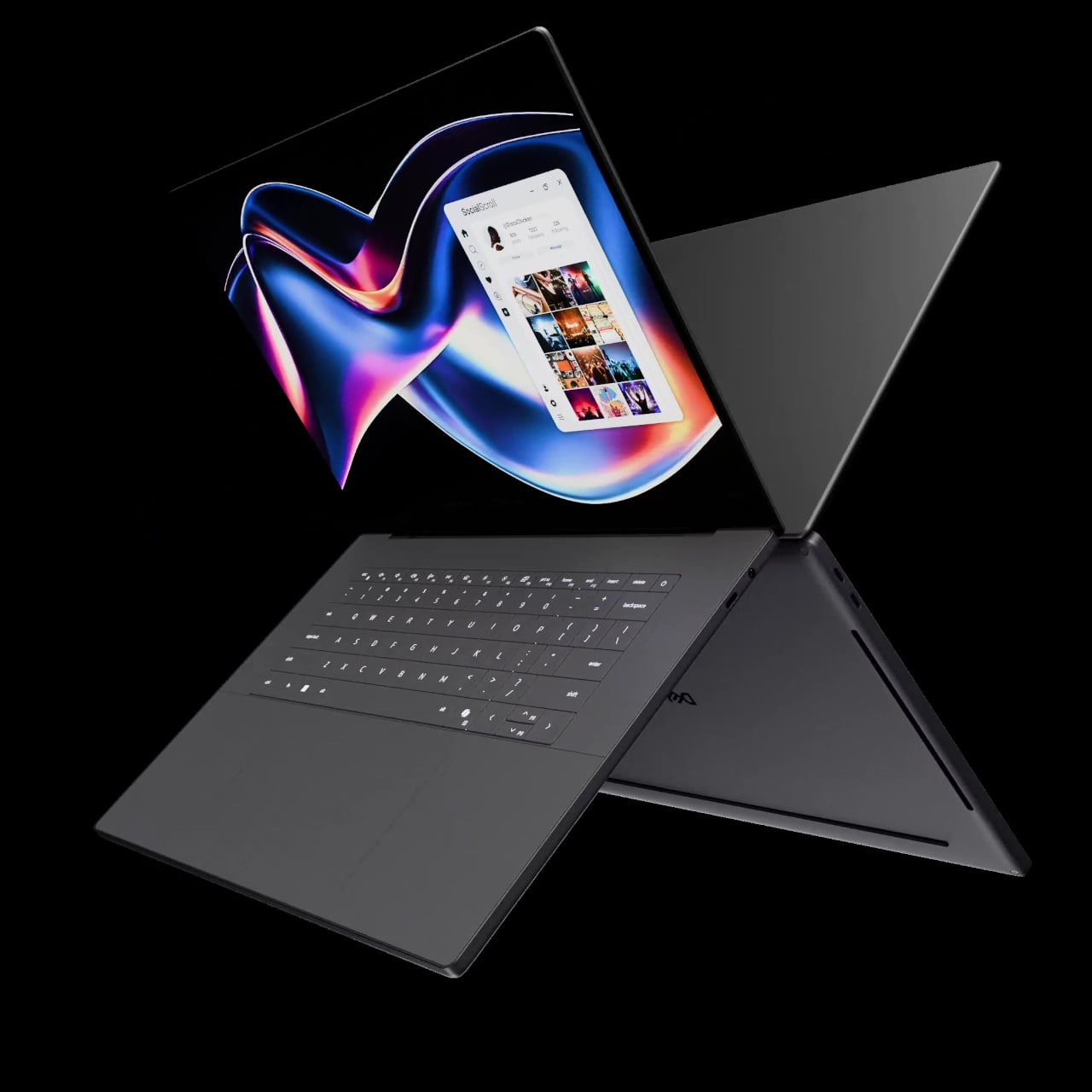
LG’s World-First 1Hz Panel Gives the Dell XPS 48% More Battery

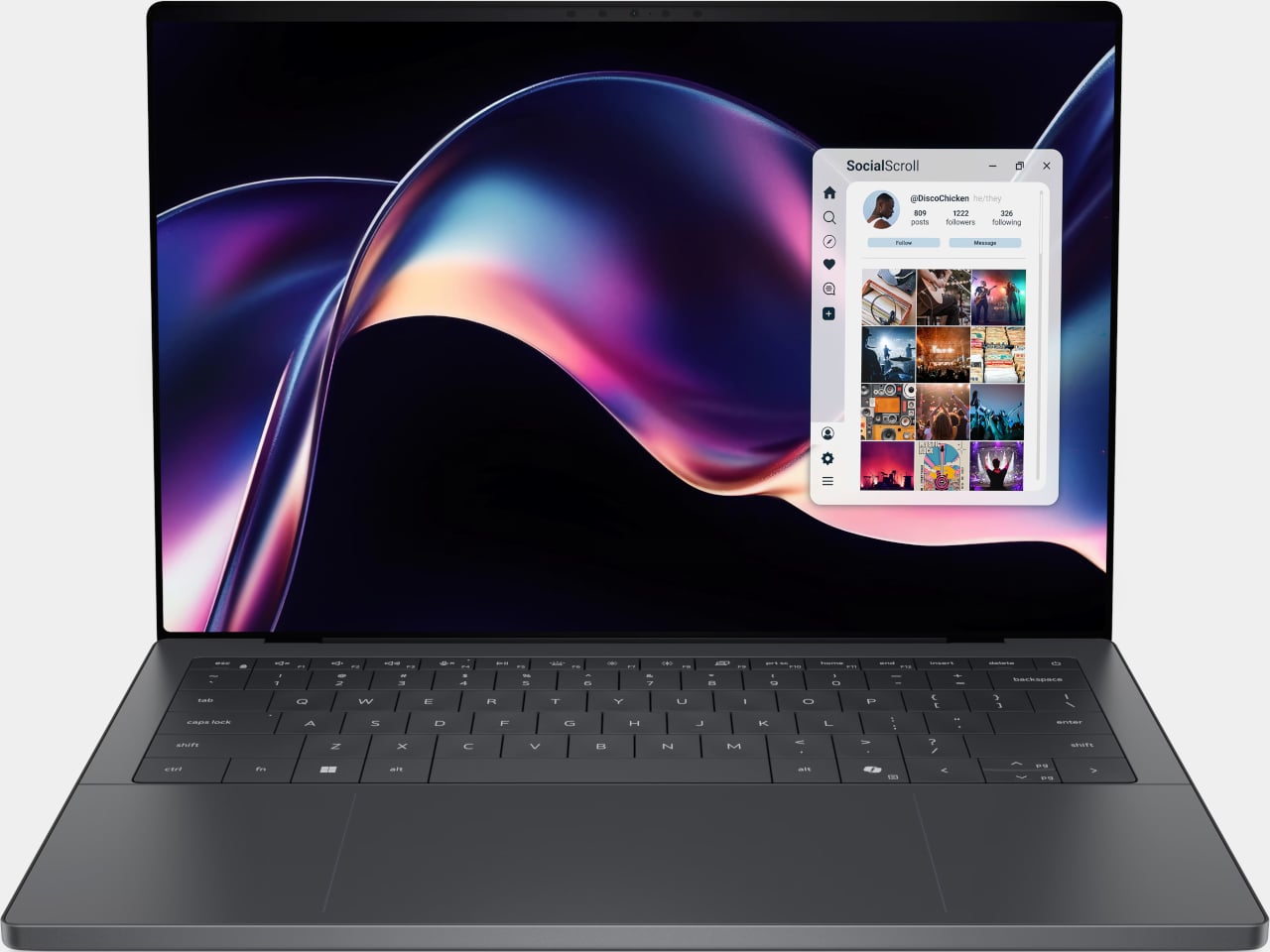
Battery life has been one of the laptop industry’s most persistent design headaches, especially among Windows notebooks. Despite significant gains in chip efficiency, the display consistently ranks among the biggest power consumers in any portable computer. Most laptop screens refresh at a fixed rate regardless of what’s actually on them, which means the panel keeps drawing full power even when you’re sitting completely still, reading a document with nothing on screen changing at all.

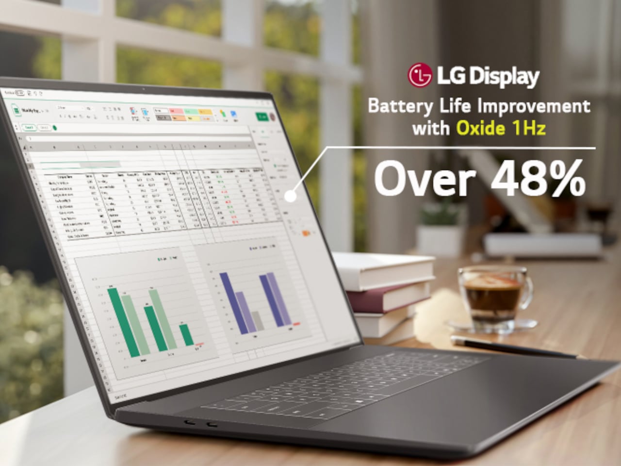
LG Display’s new Oxide 1Hz panel is the first mass-produced LCD laptop screen that doesn’t work that way. Rather than holding a fixed rate, it reads what’s on screen and drops to 1 Hz when the content is static, then scales back up to 120 Hz for video or gaming. LG began mass production on March 22, 2026, claiming the first-ever achievement of this at scale.

Designer: LG, Dell

The technology relies on custom circuit algorithms and a new oxide material applied to the panel’s thin-film transistor. That oxide holds an electric charge longer than conventional LCD materials, letting the screen maintain a still image without continuously refreshing it. LG claims the result is up to 48% more use on a single charge versus existing solutions, which is a significant number if it holds up in everyday use.

In practice, this matters most during the parts of a workday you spend the bulk of your time in. Checking emails, reading through documents, and sitting on a static slide during a meeting are all moments where a 60 Hz or 120 Hz screen burns power for no real benefit. The Oxide 1Hz panel handles those scenarios at a fraction of the usual draw without any visible difference.

When you do pull up a video or launch something that demands smooth motion, the panel doesn’t hesitate. It detects the change and jumps back up to 120 Hz automatically. There’s no mode to switch into, no setting to toggle, and no trade-off to manage. It just adjusts based on what’s happening on screen, which is how this kind of feature should work in the first place.

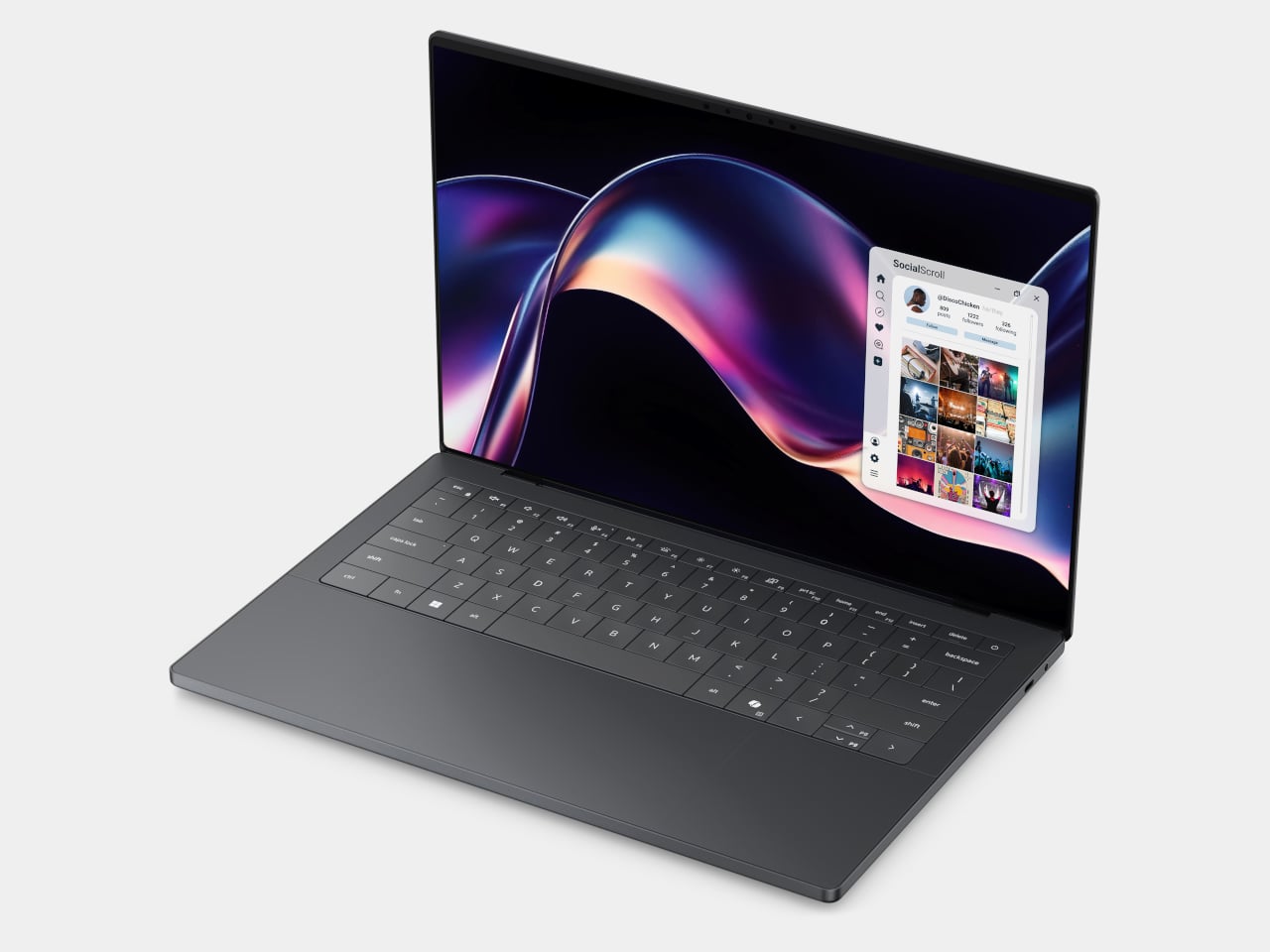
The first laptops to ship with this panel are the Dell XPS 14 and Dell XPS 16 for 2026, both unveiled at CES 2026 in January. The LCD option on both models runs at 1920 x 1200 pixels and 500 nits of brightness. Dell’s OLED option only drops as low as 20 Hz, which means the more affordable LCD configuration actually wins on low-power behavior.

Here’s where it gets interesting from a design standpoint. The display is one of the biggest power consumers in any laptop, so a screen drawing significantly less power during typical use creates real headroom for designers. They can use that headroom to maintain battery size and gain extra runtime, or to trim the battery slightly for a lighter, thinner chassis without giving up the battery life buyers already expect.

Of course, LG is already planning a 1 Hz OLED version of this technology for 2027, which is when things could get more interesting. OLED handles contrast and color in ways LCD can’t match, and pairing that quality with proper low-refresh-rate behavior could push portable laptop design further than it’s been able to go. For now, the Oxide 1Hz LCD is in something you can actually go out and buy.

The post LG’s World-First 1Hz Panel Gives the Dell XPS 48% More Battery first appeared on Yanko Design.
This Tungsten-tipped Nutcracker Works On Walnuts, Seafood, and even Car Windows in an Emergency

Think for a moment about three common tools: the nutcracker that sends shell fragments flying across the room, the bulky hammer you have to retrieve for the simple task of hanging a photo, and the emergency window breaker you bought for your car but have since forgotten about. Each serves a purpose, yet each comes with its own inconvenience, whether it’s mess, cumbersomeness, or the simple fact that it’s never around when you actually need it. These are the kinds of minor but persistent frustrations that we tend to accept as normal, the small design flaws in our daily routines.

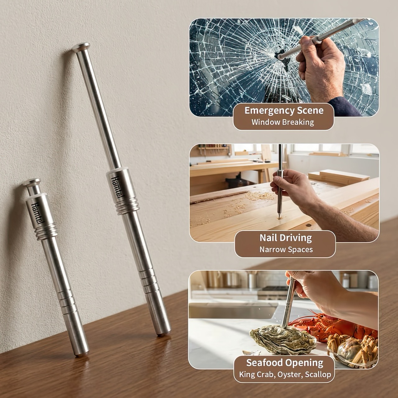
The Hamtel was born from a refusal to accept those flaws. It was conceived as a direct answer to these distinct problems, elegantly combining their solutions into a single, compact device. Its core function is a spring-loaded impact mechanism that cracks nuts with precision, eliminating mess and preserving the kernel. With a simple adjustment, that same tool becomes a capable mini-hammer for light-duty tasks. Finally, its tungsten steel tip provides the reliable performance of a dedicated car safety hammer, creating a single tool that is practical enough for daily use and critical in an emergency.

Designer: Hamtel

Click Here to Buy Now: $66 $124 (47% off) Hurry! Only 9 days left.

The real draw for anyone with an appreciation for good gear is the sheer tactile satisfaction of its action. You pull back the plunger to arm the manganese alloy steel spring, a process that feels deliberate and mechanical, like chambering a round. Placing the tip on the target and pressing down unleashes an explosive force reportedly moving at over 530 meters per second. This impact-driven deployment is what separates it from every dull lever-action cracker on the market. It’s a clean, contained, and frankly, an incredibly cool way to apply force. This is the kind of thoughtful engineering that gets EDC enthusiasts talking, turning a mundane kitchen task into an opportunity to use a well-made instrument.

The body is stainless steel, providing a solid, weighted feel in the hand, while the business end features a high-hardness tungsten steel tip rated at HRC60+. This is the material specification you expect in high-end cutting tools or industrial equipment, not something designed to crack walnuts. This choice is critical for its dual-purpose role as a car window breaker, ensuring the tip remains sharp and effective even after repeated use. That effectively means your walnut or macadamia or brazil nut stands absolutely no chance. The tip works remarkably well against seafood too, letting you crack into crab and lobster claws/shells without breaking out industrial equipment.

This precision translates directly to its performance in the kitchen. It boasts a 95% kernel preservation rate, a number that seems ambitious until you consider the physics at play. Instead of crushing a shell with slow, brute force, the Hamtel delivers a sharp, localized impact that fractures the shell without pulverizing the contents. This makes it just as effective for delicate jobs, like cracking open crab legs or lobster claws without shredding the meat inside. It brings a surprising level of finesse to a category of tools typically defined by their crudeness, making it a genuinely useful upgrade for any kitchen.

Initial pricing puts the Hamtel at $66, which is a compelling entry point considering its planned retail is set at $124. Logistics are refreshingly simple, with a flat $9 shipping fee for delivery anywhere in the world. An optional nut pick can be added for just a few dollars, making it a complete package for dealing with stubborn shells. For the price of a single-purpose emergency tool, you’re getting a device that serves three distinct functions, some life-changing, others life-saving. But for most of the time, bon appetit!

Click Here to Buy Now: $66 $124 (47% off) Hurry! Only 9 days left.

The post This Tungsten-tipped Nutcracker Works On Walnuts, Seafood, and even Car Windows in an Emergency first appeared on Yanko Design.
This 3D-Printed Lamp Changes Its Pattern When You Tilt It

Many of us first encountered the magic of lenticular printing on a pocket-sized novelty card. Tilting it back and forth would make a cartoon character move or a flat image suddenly appear to have three-dimensional depth. The principle was simple and clever: a series of tiny, parallel lenses on a plastic sheet would direct different slivers of an underlying image to our eyes depending on the viewing angle. It was a fun, tactile illusion, a small piece of optical engineering designed to create a moment of surprise and delight from a static object.

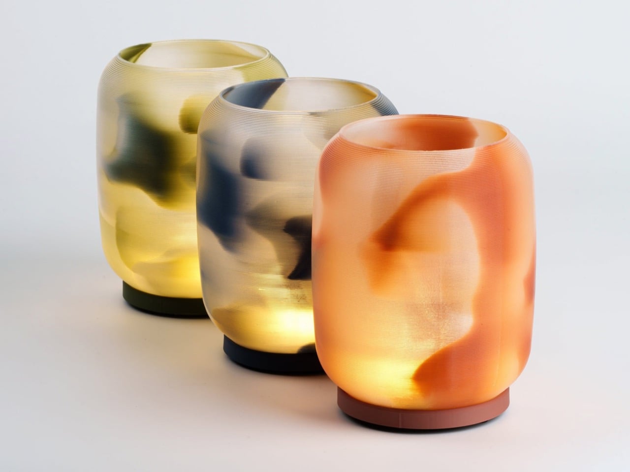
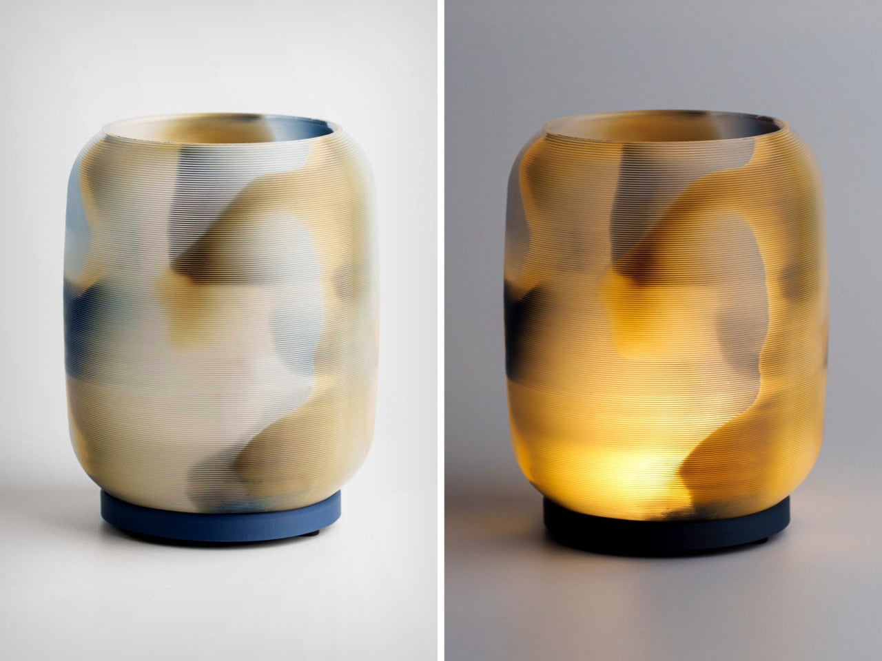
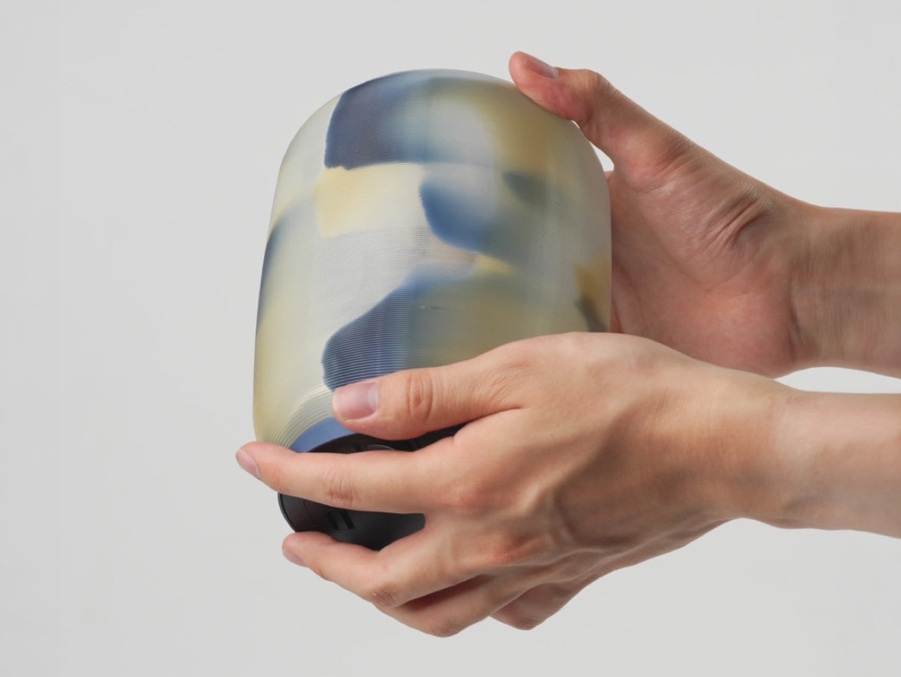
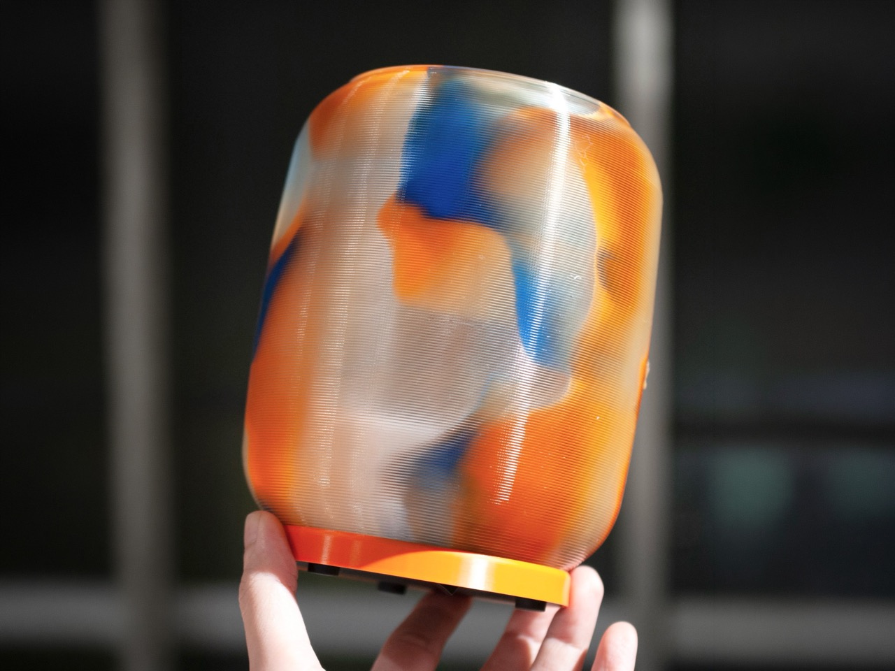
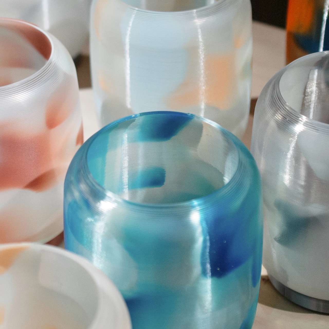
Imagine taking that same principle and applying it to a gracefully curved, three-dimensional lamp. This is precisely what the Japanese brand QUQU has achieved with its Nishiki line. The entire body of the lamp functions as a lenticular lens, using the fine, horizontal ridges of the 3D printing process as the optical array. As you move around the lamp, patterns of colour suspended within its translucent walls shift and swim, revealing new dimensions and tones. It transforms a simple light source into a dynamic object that performs a quiet, constant dance with the viewer’s perspective.

Designer: QUQU

The entire trick hinges on QUQU’s decision to weaponize what most of the FDM printing world considers an imperfection. We spend countless hours and dollars on post-processing to eliminate layer lines, chasing that injection-molded smoothness to prove the technology is “ready.” QUQU went in the complete opposite direction and made those 0.2mm or 0.3mm ridges the star of the show. Each concentric line acts as a cylindrical lens, refracting light that passes through the lamp’s wall. Instead of a flaw, the texture becomes the engine of the visual effect. This is a genuinely sharp piece of design thinking that elevates the manufacturing process itself into an aesthetic feature, rather than something to be hidden.

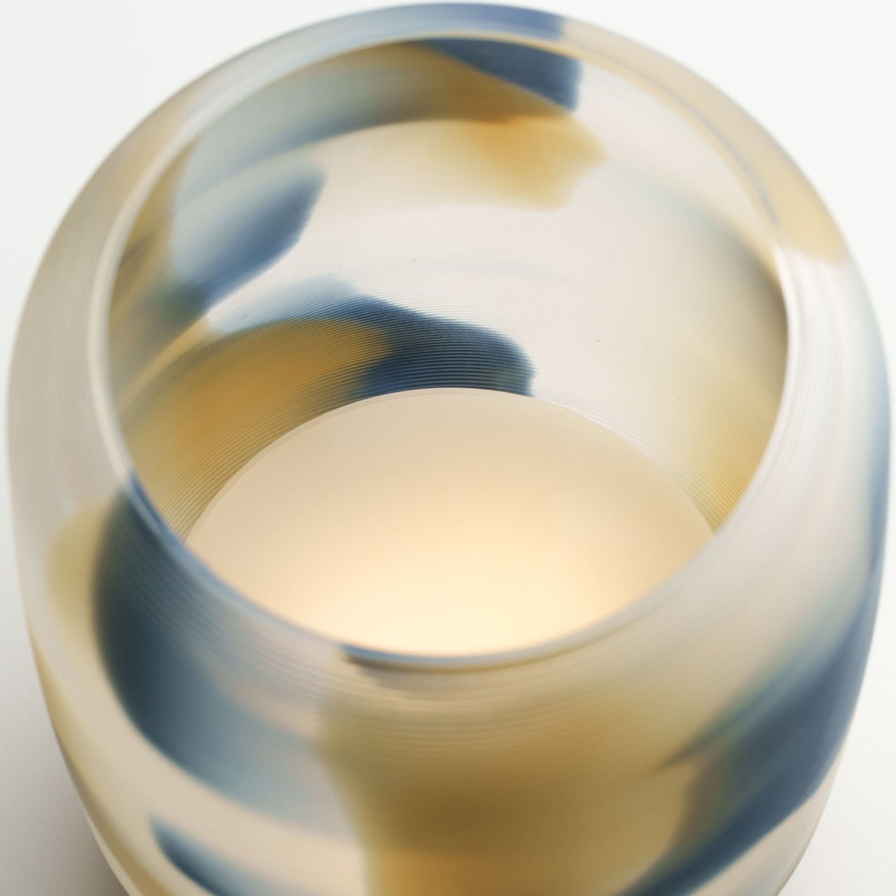
This effect would fall completely flat with the wrong material. A standard PLA or PETG filament would be too opaque or have the wrong refractive index, turning the whole thing into a muddy mess. QUQU’s use of a semi-translucent, grain-derived biomass plastic is the critical second half of the equation. This specific material choice gives the 155mm tall shade a soft, fibrous quality that diffuses light beautifully, preventing harsh hotspots from the internal LED. It has just enough clarity to let you perceive depth but enough haze to blend the suspended colours into those soft, koi-like patterns. The material is doing as much optical work as the surface geometry is.

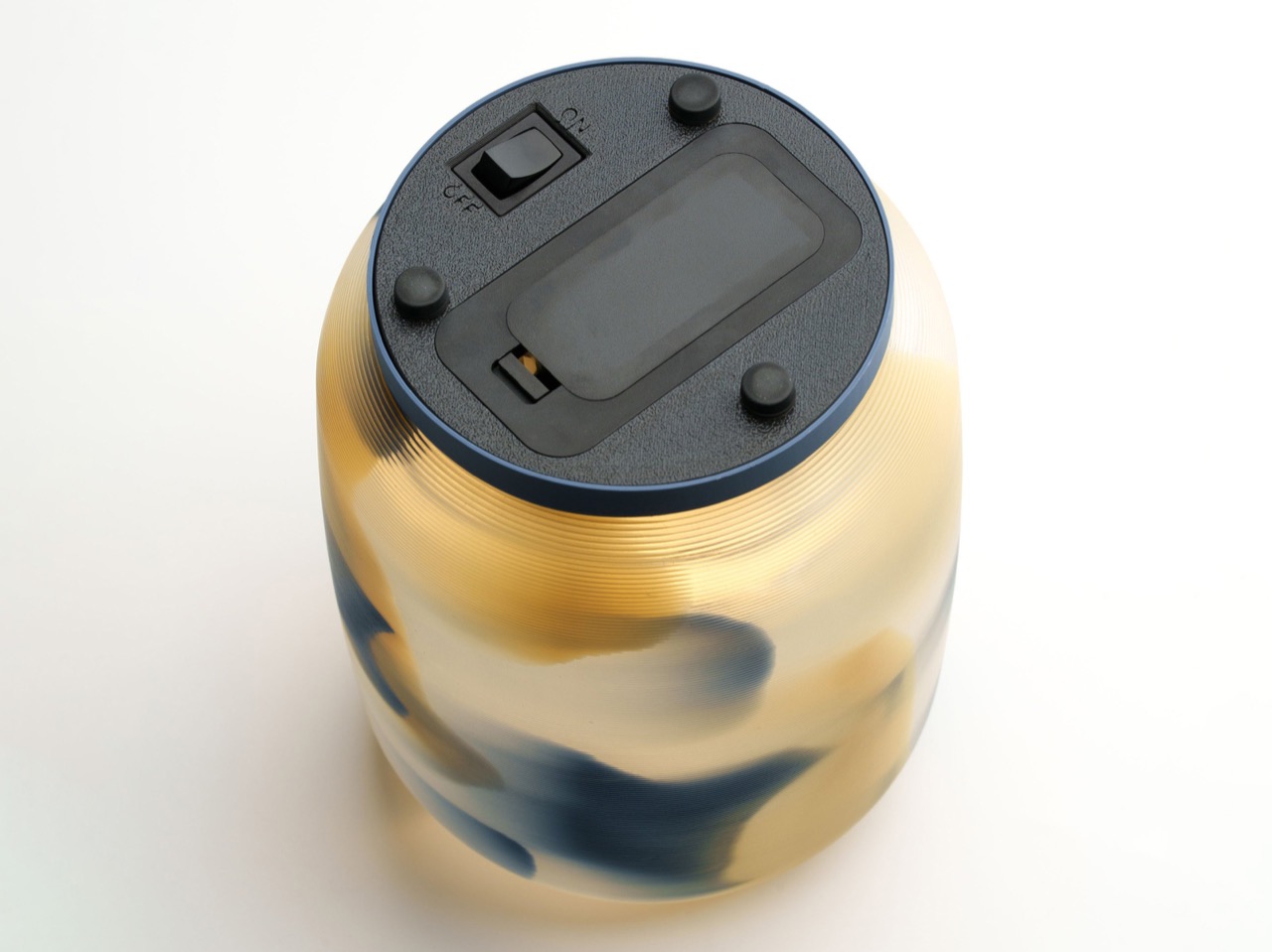
The printer deposits coloured filament at varying depths inside the thick wall of the shade, sandwiching it between inner and outer layers of the translucent base material. This is a level of algorithmic control that feels like a form of digital craft, placing colour with volumetric precision. When you see the lamp unlit, the colours appear soft and suspended. Turning the internal LED on then completely inverts the experience, as the pigmented patterns become dark, dramatic silhouettes against a warm, glowing background. This gives the object a compelling dual personality, making it an entirely different piece depending on whether it is active or at rest.

The Ruri colorway, with its deep lapis lazuli tones, is the one getting the most attention, but the line includes others worth a look. The Koubai offers a warm plum red, Moegi provides a fresh spring green, and Hakumu is a subtle “white mist” variant. They are available directly from QUQU’s Japanese webstore for ¥19,800, which works out to roughly $125 USD. Now imagine this technique being used on other 3D printed products. I’d kill for a phone case made this way!

The post This 3D-Printed Lamp Changes Its Pattern When You Tilt It first appeared on Yanko Design.
A Whale Lamp That Transforms Ocean Vastness into a Gentle Bedside Glow

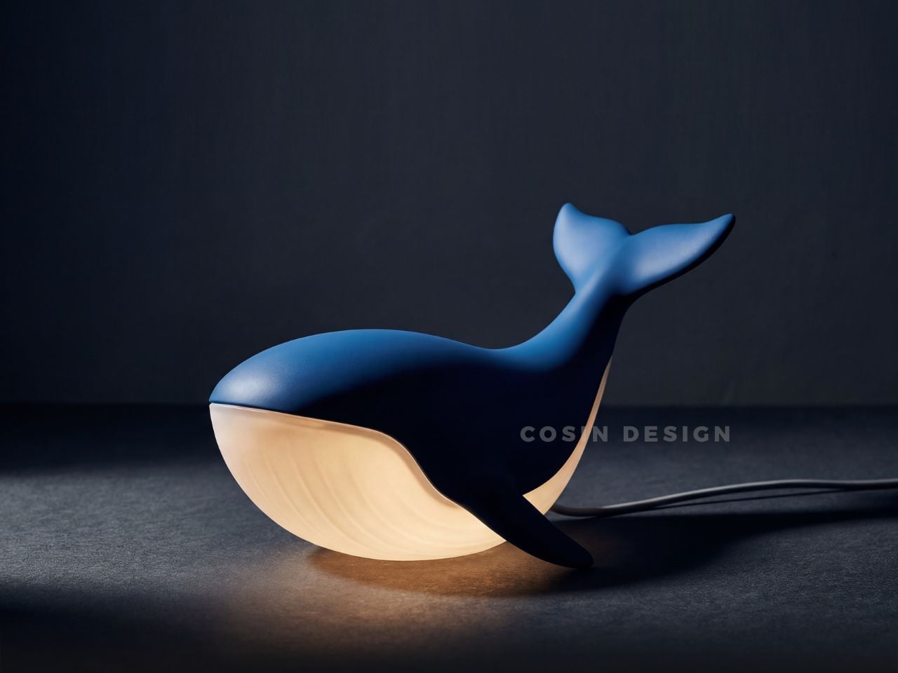
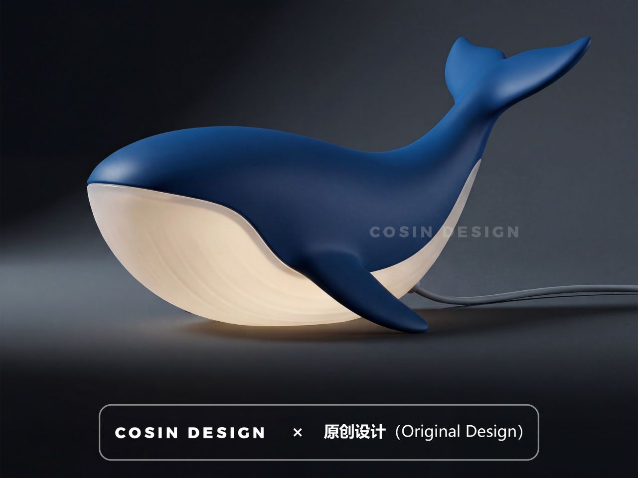
There is something quietly radical about a whale that does not belong to the ocean. Not because it has been displaced, but because it has been reimagined. COSIN DESIGN’s whale lamp is not an imitation of nature. It is a reinterpretation of how we feel about it. We are used to whales as symbols of magnitude. Vast, powerful, unknowable. They belong to depths we cannot reach. Yet here, that same creature is reduced in scale, softened in form, and placed gently on a bedside table. It no longer overwhelms. It comforts, and that shift in perception feels intentional.
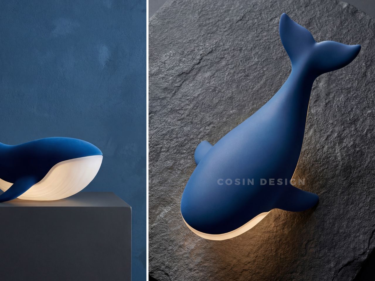
The lamp captures a whale mid-leap, its body curved in a suspended gesture that feels both dynamic and still. The lines are fluid and uninterrupted, almost meditative. There are no sharp edges, no visual noise, just a continuous surface that invites the eye to move along with it. It feels like a sculpture before it feels like a product, and that is what gives it presence even when it is not turned on.

Designer: COSIN DESIGN

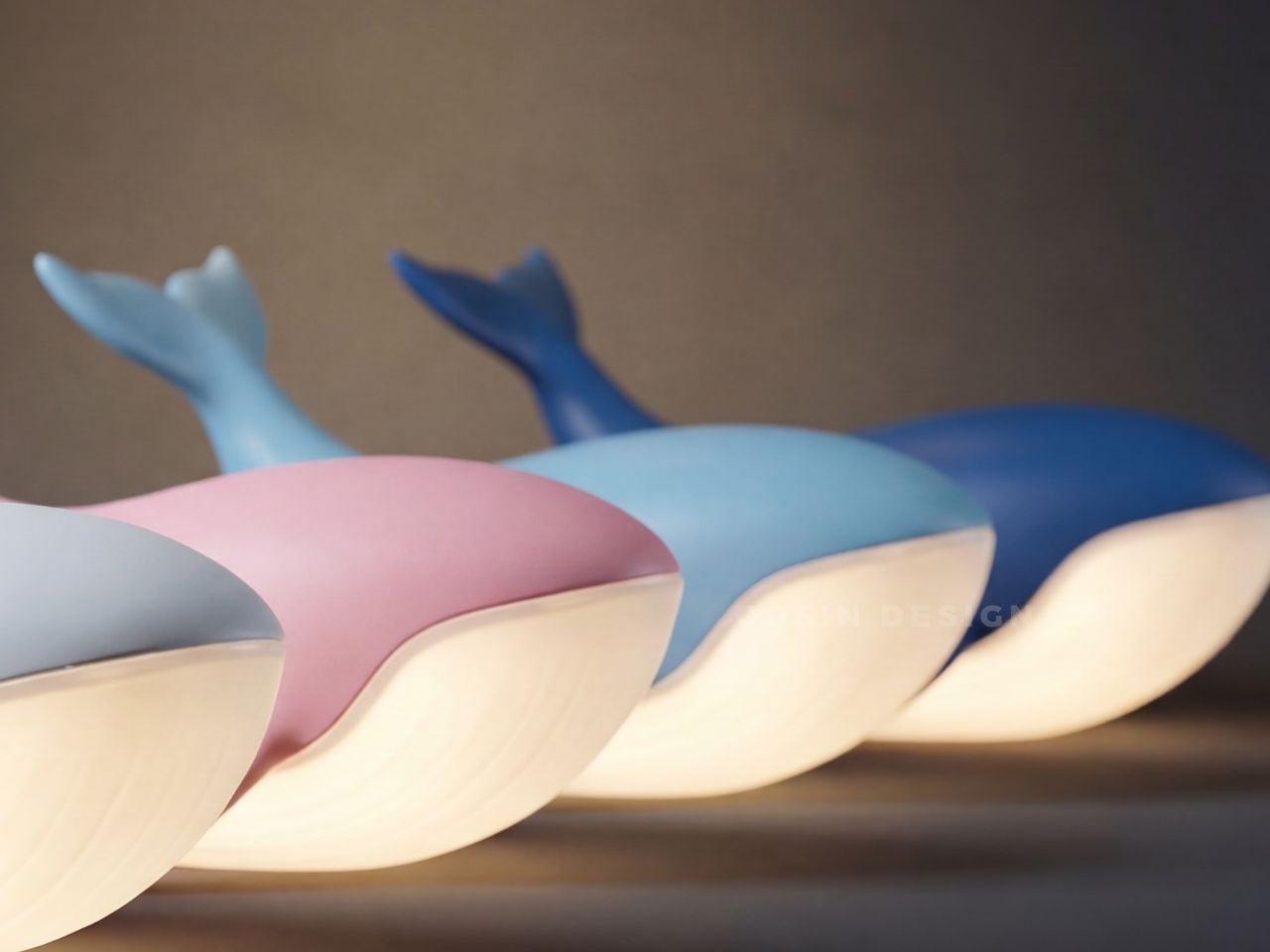
The real transformation happens with light. It seeps through the semi-transparent abdomen, not as a beam but as a soft diffusion that spreads slowly and evenly. It does not try to dominate the room or claim attention. Instead, it settles into the space, creating a calm and ambient glow. There is something almost alive about it, as if the whale carries light within itself, like a quiet presence from the deep sea. In that moment, the object shifts from something you look at to something you feel, and that emotional transition is where the design becomes meaningful.

For a long time, lamps have been about control. Adjustable brightness, direction, and precision. But there has been a noticeable shift toward lighting that feels more atmospheric and emotionally aware. The whale lamp sits comfortably within this shift. It does not attempt to do everything. It focuses on creating a specific feeling, and it does so with clarity and restraint. The design does not rely on complexity or excess detail. Instead, it leans into softness, both in form and in function.

Nature plays an important role here, but not in a literal sense. The whale is recognizable, yet simplified just enough to feel universal. It is less about replicating an animal and more about capturing a sense of calm, depth, and quiet strength. That balance allows the lamp to exist across different environments without feeling out of place. It feels just as appropriate in a child’s room, where its gentle glow can provide comfort at night, as it does in a more mature, minimal interior where it reads as a sculptural object.

The availability of four color options adds to this flexibility. Each variation subtly changes the mood of the piece, allowing it to align with different interior styles and personal preferences. Whether placed in a playful setting or a more subdued one, the lamp adapts without losing its identity.

What lingers most, however, is the way the design translates something vast into something intimate. A whale, typically associated with scale and distance, becomes a small, glowing presence that quietly occupies a personal space. It turns awe into reassurance and transforms something distant into something familiar. In doing so, it reflects a broader shift in how we approach design today, where emotional resonance matters just as much as function.

Not everything needs to be louder or brighter to be effective. Sometimes, the most powerful design choice is to soften, to create objects that do not demand attention but instead become part of the atmosphere. The whale lamp does exactly that. It does not insist on being noticed, yet over time, it becomes something you grow attached to.

The post A Whale Lamp That Transforms Ocean Vastness into a Gentle Bedside Glow first appeared on Yanko Design.