Polaroid Just Made the Pokémon Camera Every Fan Wants

It’s been 30 years since Pokémon invaded our lives and we’ve witnessed a whole generation of trainers trying to catch them all. The beloved franchise has had several exciting tie-ups with various brands in the past months to celebrate this momentous anniversary, and each one has gotten us excited to collect these interesting collaborations. From clothing to gaming gear, it’s been a year of Pokémon everywhere you look.

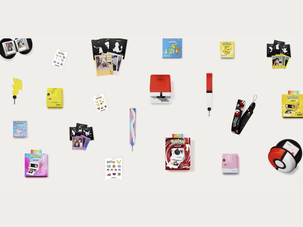
If you’re into the whole analog photography trend, then you’ll be truly excited (like me) about this newest brand partnership. The Polaroid x Pokémon collection is more than just logos and pictures stuck onto cameras. It’s one of their largest collaborative efforts, bringing together the tactile joy of analog instant photography and the beloved Pokémon universe into nine limited-edition pieces that are equal parts functional and collectible.

Designer: Polaroid x Pokémon

The main characters in this collection are of course the three special-edition Polaroid cameras. The Polaroid Now Generation 3 camera now comes in a Poké Ball version and is the hero piece of this entire collaboration. The camera’s body comes in white with bold red and black accents, just like the iconic instrument you use to capture the creatures. It has a Poké Ball shutter button and Poké Ball patterns across the full camera body, making it your tool to capture moments instead of Pokémon but looking almost exactly the part. Beyond the design, the Polaroid Now Gen 3 also packs a solid technical punch with a two-lens autofocus system that automatically chooses the best lens for each shot, so every memory comes out crisp and beautifully Polaroid-esque.

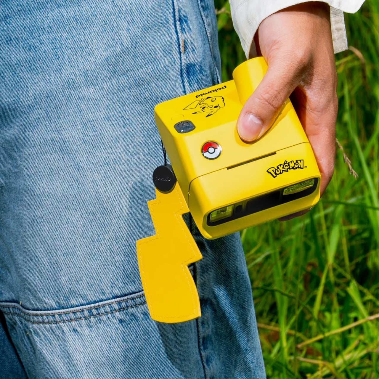
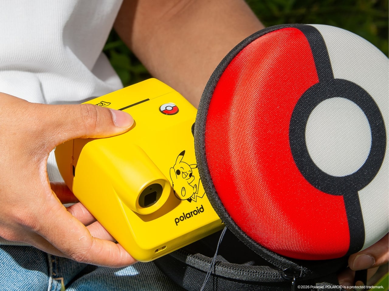
Meanwhile, the smaller but equally famous Polaroid Go cameras have been transformed into two Pokémon-themed devices that go well beyond just having a logo attached to them. You have the Pikachu Edition, which comes in the franchise’s distinct, vibrant yellow, complete with a Poké Ball shutter button and a lightning-bolt tail wrist strap to carry it around. The Sylveon edition, meanwhile, features pink, white, and blue fairy-type colorways, along with Sylveon graphics and a themed wrist strap. Both are built on the Polaroid Go Generation 3 platform, also known as the world’s smallest instant analog camera, making them as pocket-friendly as they are charming.

Aside from the cameras, there are other items in the collection worth getting excited about. There are three exclusive Pokémon-edition film packs, each featuring custom-designed frames and dark slides that make every print feel like a collectible. For the Polaroid Now Gen 3, the i-Type Color Film pack comes with Poké Ball-motif frames. For the Go Gen 3 cameras, you have the Pikachu Edition and Pokémon Edition Go Color Film packs, the latter featuring beloved characters like Eevee and Togepi. These aren’t just rolls of film; they’re tiny pieces of Pokémon art wrapped around every shot you take.

If you want to fully accessorize your Pokémon camera setup, the collection has you covered there, too. There’s the Polaroid Go camera case designed as a round Poké Ball zip case, the Polaroid Go Photo Album styled in the same Poké Ball design for storing your instant prints, and a universal camera strap with a matching Poké Ball pattern. That strap is a particularly thoughtful touch, as it works with both the Polaroid Now Gen 3 and the Go Gen 3, keeping your entire setup looking cohesive no matter which camera you bring out.

The entire nine-piece collection launches globally in limited quantities, so this one is for the early birds. Pre-orders open on August 25, 2026 on polaroid.com and through the Pokémon Center in the U.S., U.K., and Canada, with the full global release dropping on October 5, 2026. Whether you’re a lifelong Pokémon fan, a Polaroid collector, or simply someone who loves a beautifully designed limited-edition drop, this collection is genuinely hard to pass up. After all, why just catch Pokémon when you can capture your best moments with them, too?

The post Polaroid Just Made the Pokémon Camera Every Fan Wants first appeared on Yanko Design.

Most Phones Last 3 Years, This $650 Fairphone 6+ Is Built for 8

The smartphone upgrade cycle has been one of the more quietly destructive consumer habits of the past two decades. Most people replace their phone every two or three years, and most of the time the reason has less to do with the device failing than with the manufacturer stopping support for it, making it feel obsolete ahead of its actual lifespan. The waste this generates at the component and material level is substantial, and the industry has largely responded with recycling pledges rather than any structural rethinking.

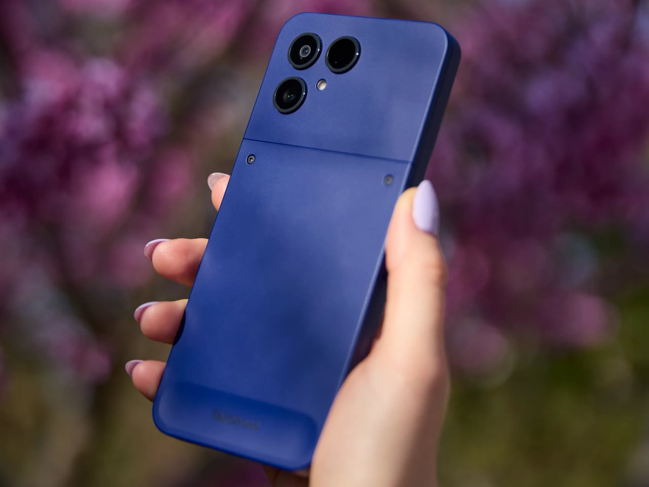
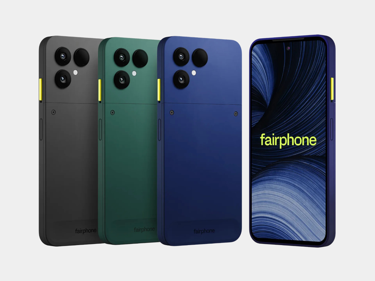
Fairphone has spent the better part of sixteen years making a structural argument instead. The Fairphone (Gen. 6+) is the latest iteration of that argument, and it arrives with a notable addition to its story: it’s the first Fairphone sold directly in the United States. For a phone built around the idea that longevity and repairability should be standard expectations rather than premium options, reaching the world’s largest smartphone market is a meaningful step.

Designer: Fairphone

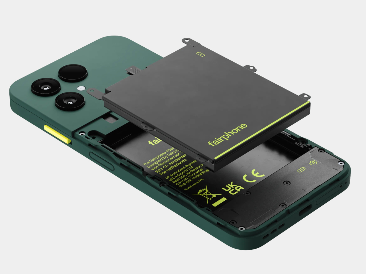
The Gen. 6+ carries twelve user-replaceable parts, from the battery and display to the USB-C port and back cover, most swappable with a single screwdriver in under five minutes. The phone has earned iFixit’s 10/10 repairability score, making it the fifth consecutive Fairphone to do so. Spare parts are guaranteed to be available until 2033, and the five-year warranty covers the device for as long as most people own a phone at all.

That repairability doesn’t come at the cost of ignoring performance. The Gen. 6+ runs on the Snapdragon 7s Gen 4 paired with 12GB of RAM, which is a meaningful step up from the Gen. 6’s Snapdragon 7s Gen 3 and 8GB. The 6.31-inch LTPO AMOLED display runs at an adaptive 10–120 Hz with up to 1,400 nits of peak brightness, and the 4,415mAh removable battery delivers up to two days between charges, with fast charging reaching 50% in 30 minutes.

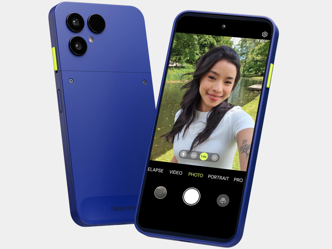
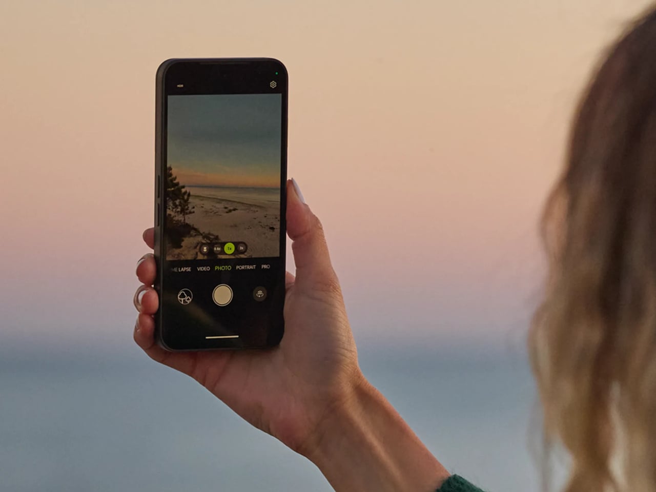
The camera system centers on a 50MP Sony LYTIA sensor with optical image stabilization, supported by a 13MP ultrawide and a 32 MP front-facing camera. It’s a capable setup for the mid-range segment it occupies, handling 4K video at 30 fps and slow-motion recording up to 1080p at 120 fps. What’s worth noting is that the camera module, like everything else in the phone, is replaceable. A damaged lens or degraded sensor doesn’t mean the device is finished.

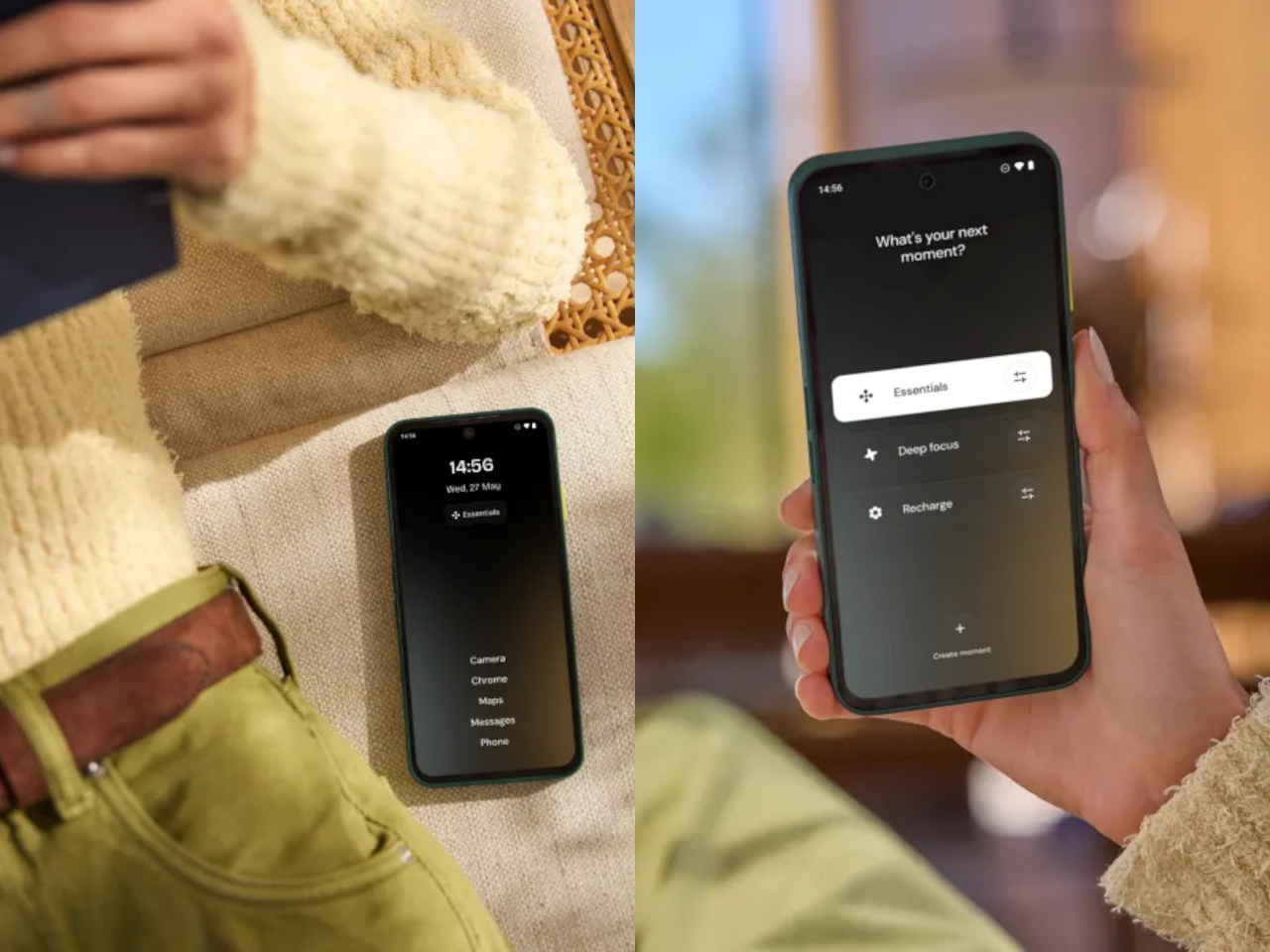
The phone’s physical design includes a dedicated switch, called Fairphone Moments, that toggles between full functionality and a stripped-back mode that limits access to only what you’ve decided matters. It’s a small thing, but it addresses a real pattern: most of us don’t need every app and notification available every hour of the day, and having a physical switch to enforce that boundary is more reliable than navigating a settings menu under pressure.

The materials list is as deliberate as everything else. The phone uses 51% fair or recycled materials by weight, including Fairmined gold and tungsten, recycled aluminum, copper, steel, and plastics, along with Fair Cobalt Credits applied to cobalt sourcing. It ships in plastic-free packaging. The Gen. 6+ is available in Cobalt Blue, Forest Green, and Horizon Black, priced at €649 in Europe and $649.99 in the US.

For a device this thoughtfully constrained, the case for it doesn’t rest on outpacing the competition on any single spec. It rests on the idea that a phone lasting seven or eight years has more value, environmental and financial, than one that lasts three, and that keeping it alive should never require shipping it off to a service center.

The post Most Phones Last 3 Years, This $650 Fairphone 6+ Is Built for 8 first appeared on Yanko Design.

A 24K Gold Game Boy From Supreme Is FW26’s Wildest Drop

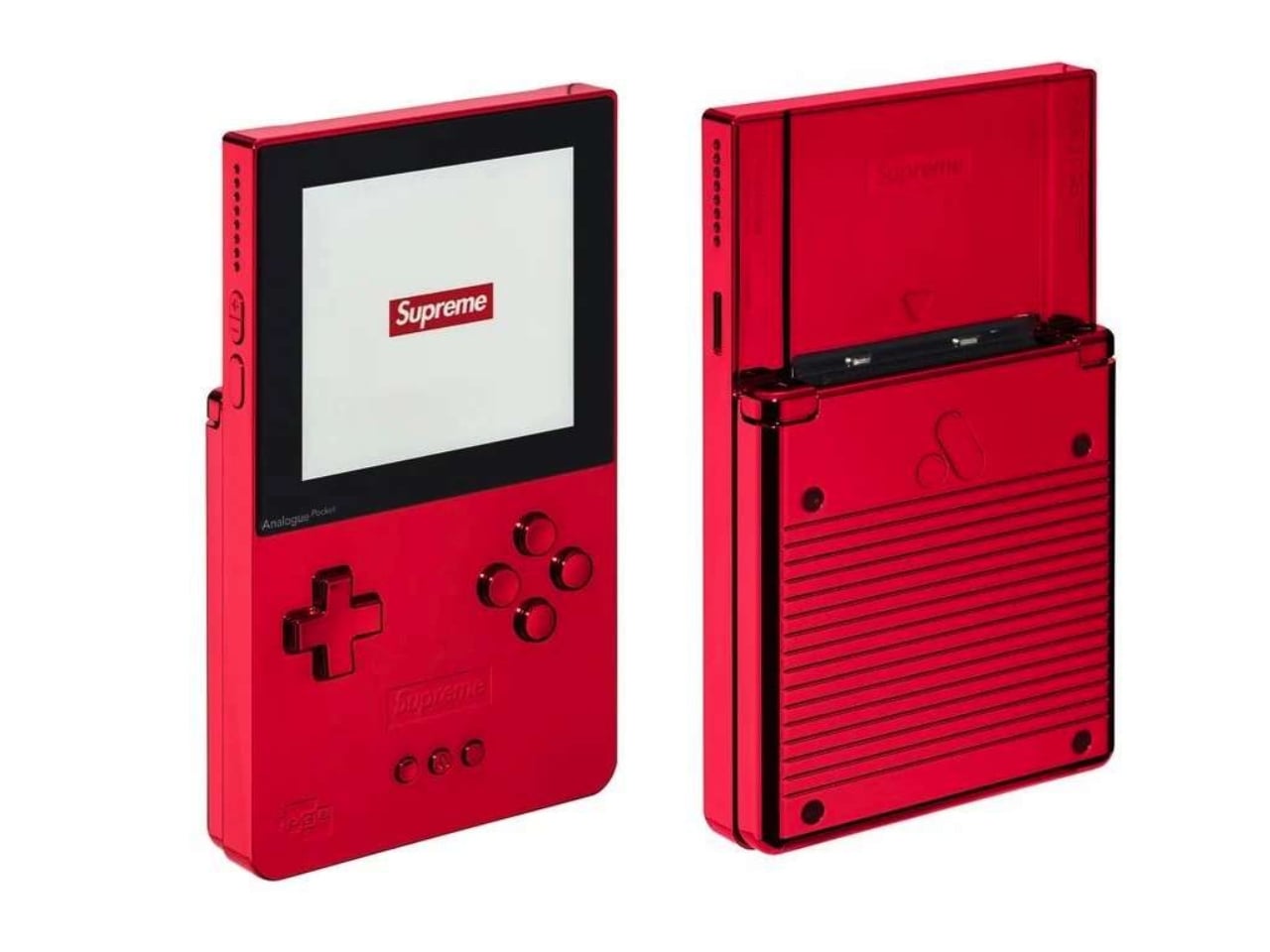
The Analogue Pocket has always been the kind of device that makes you look twice. It plays original Game Boy, Game Boy Color, and Game Boy Advance cartridges on modern hardware, which is already a compelling pitch for anyone who grew up with a brick-sized handheld stuffed in their backpack. Supreme’s Fall/Winter 2026 collaboration with Analogue goes further than that. It’s turning a piece of retro gaming hardware into a genuine collector’s object, and the result is genuinely hard to walk past.

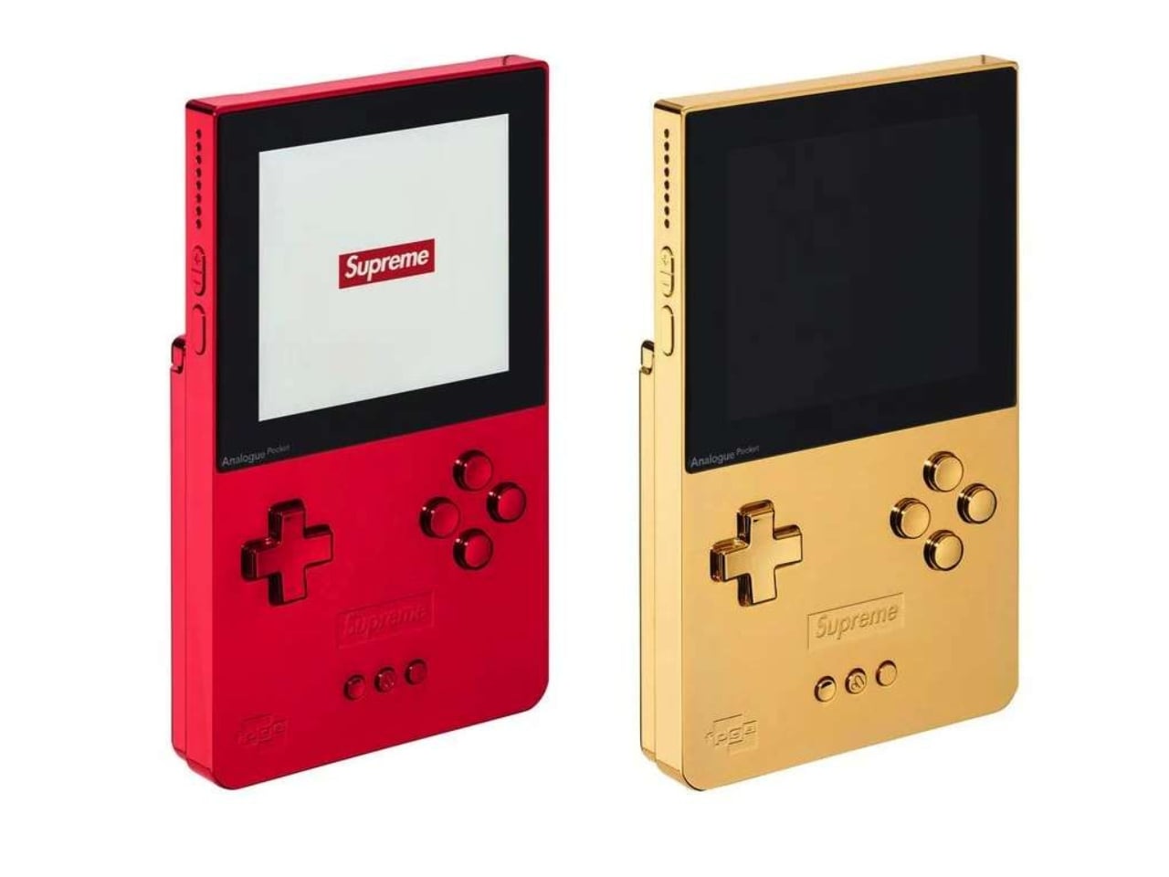
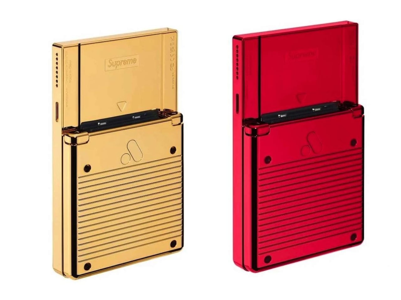
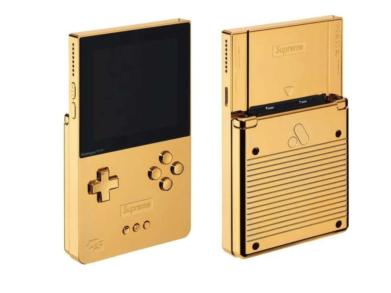
For FW26, Supreme is releasing two limited edition versions of the Analogue Pocket: one in glossy red, the brand’s unmistakable signature colorway, and one finished in 24K gold-plated aluminum. Both versions sit in a unibody aluminum shell with Supreme branding debossed on the front and back, along with a custom logo LCD display. They measure 3.5″ x 5.75″, which is compact enough to hold in one hand and striking enough to stop a room.

Designer: Supreme x Analogue

A quick note on what the Analogue Pocket actually is, because context matters here. This is not a generic emulator. It plays original cartridges, meaning if you’ve been holding onto your copy of Pokémon Gold since 1999, you can slot it right in and go. The device supports over 2,780 Game Boy, Game Boy Color, and Game Boy Advance titles, and also works with cartridge adapters for other handheld systems. It has a built-in synthesizer and sequencer, a MicroSD card reader, and modern internals running the whole operation. The Analogue Pocket was a well-regarded piece of hardware long before Supreme got near it.

That distinction matters, because it’s what makes this collaboration feel earned rather than arbitrary. Supreme has a long and occasionally theatrical history of taking functional objects and turning them into cultural moments through branding alone. The archive includes bricks, crowbars, and fire extinguishers, and somehow it all makes sense in retrospect. But when the base product is genuinely good on its own, the collaboration lands differently. The Analogue Pocket had its own dedicated following before this. Supreme is amplifying that into the fashion and streetwear conversation, and the resulting object speaks to both audiences without alienating either.

The gold version is the obvious showstopper here. A 24K gold-plated handheld is, objectively, an extremely specific thing to produce. It is not subtle, and it is not trying to be. The red version, while less theatrical, carries its own appeal. Supreme’s red is one of the most recognizable colors in contemporary design, and seeing it applied to the clean lines of the Analogue Pocket’s aluminum body feels surprisingly considered rather than purely cosmetic. Both finishes have the kind of presence that makes you hesitate before putting fingerprints on them, which raises a personal question worth sitting with: are you buying this to play, or to display?

The answer is probably both, and that’s the genuinely interesting tension at the heart of any collaboration like this. Retro gaming has shifted from a hobby into a full cultural moment, one where the hardware carries as much meaning as the software. People frame limited edition consoles. They display cartridge collections. They treat the objects of their gaming childhoods as artifacts worth preserving and presenting. The Supreme Analogue Pocket belongs in that space, and that’s not a criticism. It’s an observation about how the culture has evolved.

Pricing and availability details haven’t been fully confirmed, but the device will be available exclusively through Supreme, which is predictable in the best way. Supreme drops being what they are, demand will not be a problem and availability will be. Whether you land one or spend the afternoon refreshing a browser tab is largely a matter of timing.

For now, the Supreme x Analogue Pocket reads as one of the more coherent streetwear collaborations in recent memory. It doesn’t feel like branding for branding’s sake. It feels like two brands that actually have something meaningful to say to each other, and the result is a handheld that lands at the exact crossroads of nostalgia, craft, and cultural currency.

The post A 24K Gold Game Boy From Supreme Is FW26’s Wildest Drop first appeared on Yanko Design.

You Can Feel Van Gogh’s Starry Night on This $2,399 MSI Laptop

Laptop aesthetics have grown considerably more ambitious over the past few years. Brands that once shipped identical black or silver slabs have started exploring textures, colorways, and material finishes with more intention. Most of these efforts stop at surface level: a matte coating here, an embossed pattern there. Every so often, though, something arrives that treats the hardware itself as a meaningful design object rather than just a functional appliance with a prettier lid.

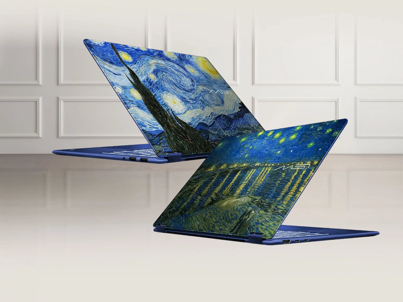
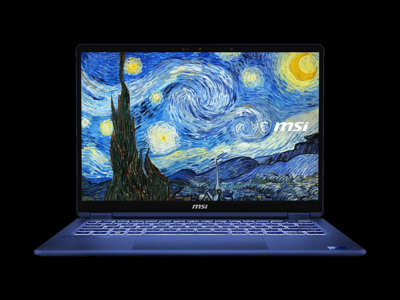
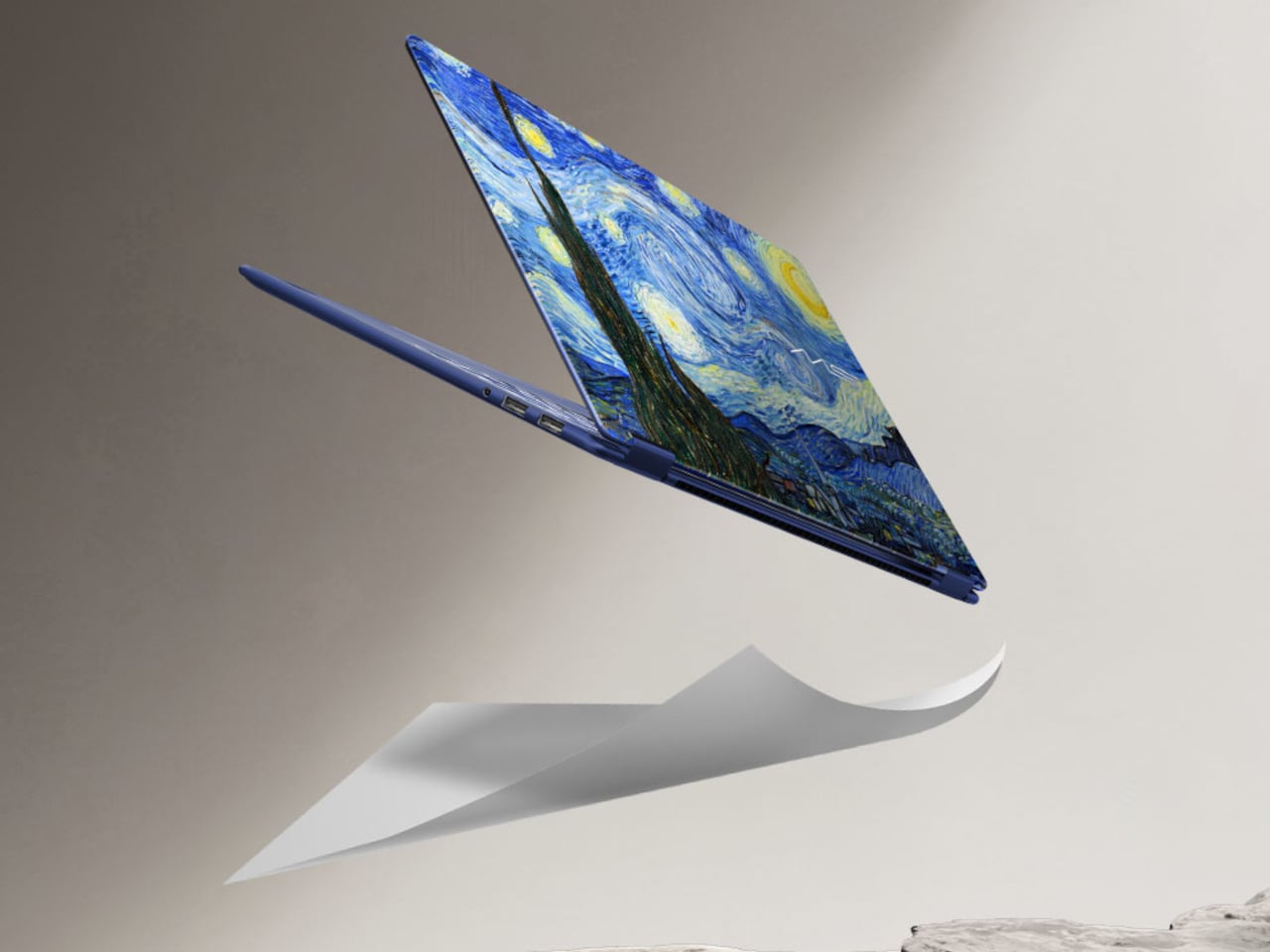
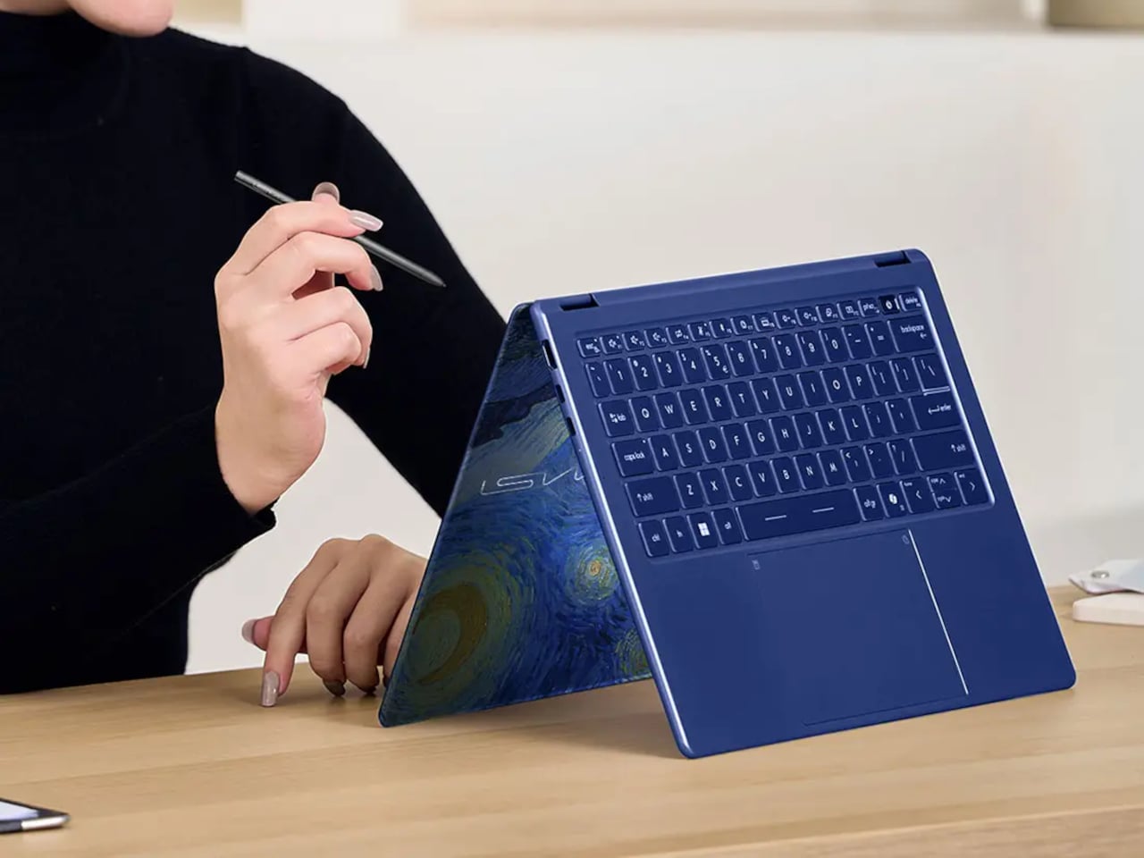
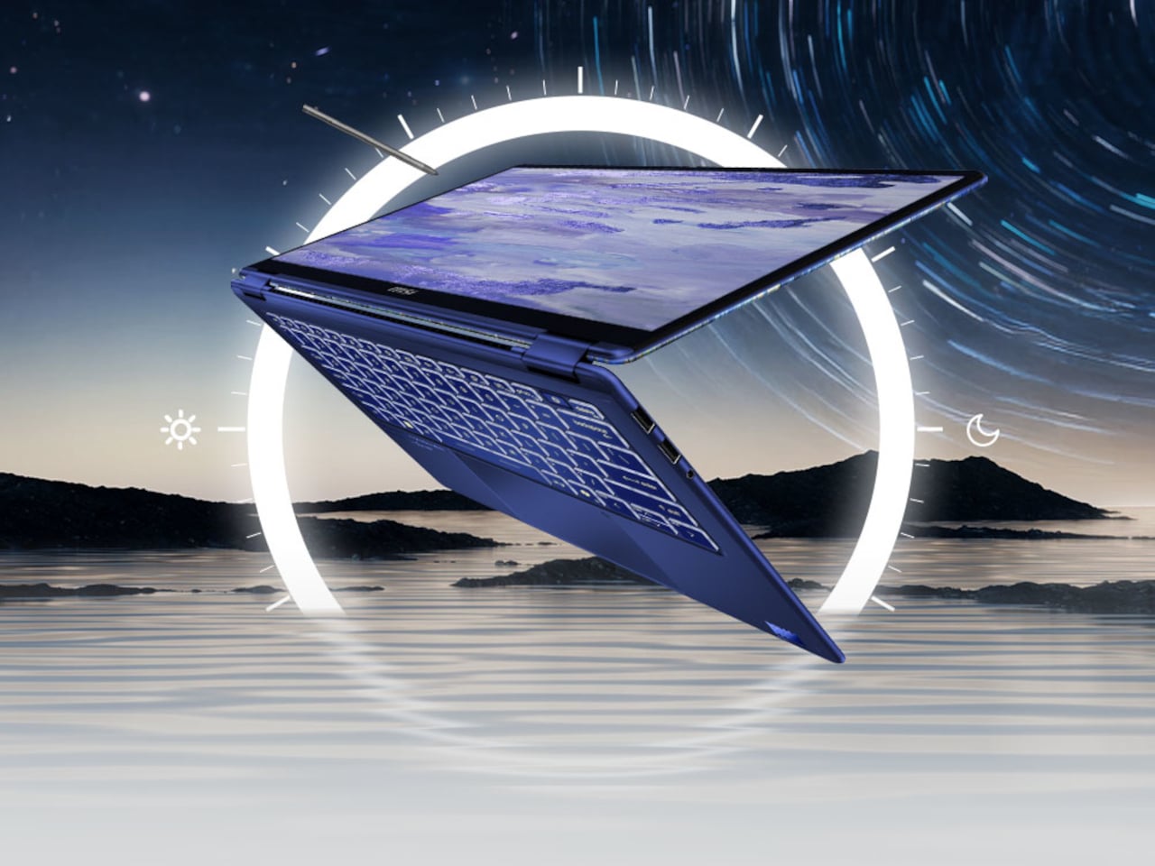
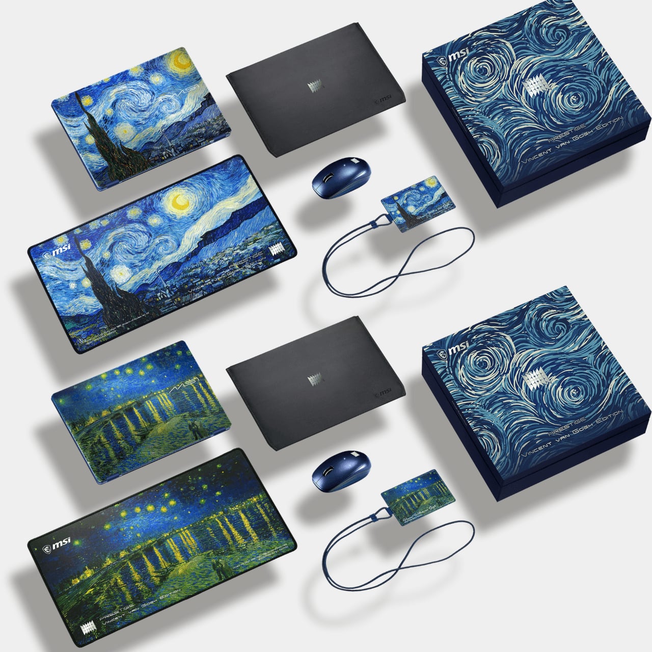
The MSI Prestige 14 Flip AI+ Van Gogh Edition is part of MSI’s Artisan Collection, a line that takes the collaboration between technology and fine art more seriously than most. This particular edition draws from two of Van Gogh’s most recognizable nightscapes: Starry Night Over the Rhône and The Starry Night. The two paintings carry different emotional temperatures, one calm and reflective, the other intense and restless, and that contrast is embedded into the laptop’s design language through varying blue tones, textures, and finishes across the chassis.

Designer: MSI

The lid carries a textured rendering of Starry Night Over the Rhône that you can feel with your fingertips, a tactile detail that distinguishes it from the flat printed graphics that typically pass for special editions in the category. The keyboard deck continues the theme with a deep blue surface and golden key legends that, in low light, appear illuminated like a reflection on the Rhône itself. It’s a more cohesive design treatment than most art collaborations of this type manage to deliver.

Beneath that, the hardware doesn’t ask you to compromise for the art. The machine runs on Intel’s Core Ultra X9 378H processor, paired with an Intel Arc B390 GPU,32 GB of LPDDR5X RAM, and a 1TB SSD. The 14-inch OLED touchscreen covers 100% DCI-P3 at 1920×1200 resolution and is certified for Low Blue Light and flicker-free output. At 11.9mm at its thinnest point and 1.37 kg, the aluminum chassis keeps the whole thing genuinely light.

The 2-in-1 hinge lets the screen fold flat, which makes the MSI Nano Pen feel considerably more relevant than on a conventional convertible. The stylus lives in a dedicated groove along the chassis bottom and pairs via Bluetooth. For quick sketching, note-taking during meetings, or marking up documents in presentation mode, it’s a more integrated solution than the sticky-magnet approach most competitors use.

The laptop qualifies as a Copilot+ PC, with a 50 TOPS NPU handling AI tasks locally, alongside Live Captions, AI Noise Cancellation, and Windows Copilot. Battery life is rated at over 30 hours from the 81 Whr cell, with 100W Power Delivery fast charging support. Connectivity covers dual Thunderbolt 4 ports, USB 3.2 Gen 2 Type-A, HDMI 2.1, and Wi-Fi 7. Audio comes from a four-speaker setup combining two 2W tweeters and two 2W woofers with DTS processing.

The Van Gogh Edition ships with an exclusive themed accessories bundle and is priced at $2,399. That’s a meaningful premium over the base Prestige 14 Flip AI+, which starts around $1,699 without the art treatment. The gap isn’t just cosmetic; the Van Gogh Edition represents the top configuration of the line, and the design treatment alone makes it a genuinely different object to own and carry.

For a category that doesn’t often justify that kind of price separation, the Artisan Collection at least makes the argument clearly. The spec sheet is strong enough to hold up in any direct comparison, and the hardware behind the painting doesn’t need the art to justify itself.

The post You Can Feel Van Gogh’s Starry Night on This $2,399 MSI Laptop first appeared on Yanko Design.

The Kitchen AI That Finally Makes Sense, Built by Someone Who Cooks

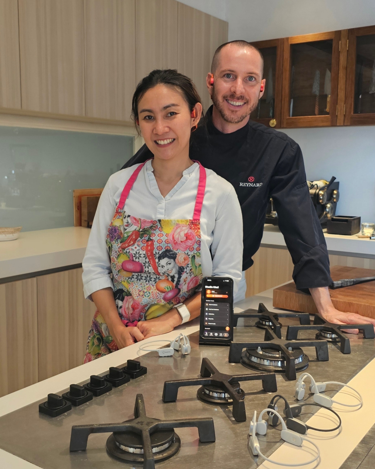
Most kitchen tech is designed by people who think about kitchens. Nicolas Reynard’s StudioChef KAI was designed by someone who has actually worked in one for 26 years. That distinction matters more than you might think. The gap between what your hands are doing and what your brain needs to know is real in a professional kitchen. You’re managing heat, timing, texture, and a dozen other variables all at once. In a restaurant brigade, you shout across the pass and someone shouts back. But private chefs work alone. There’s no one to call out to, no one to double-check the temperature on the duck, no one to remind you that the soufflé has four minutes left.

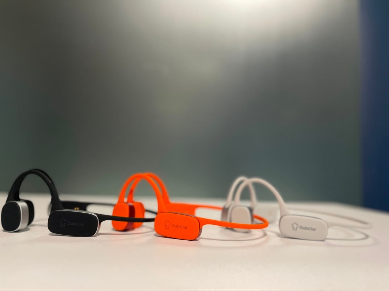
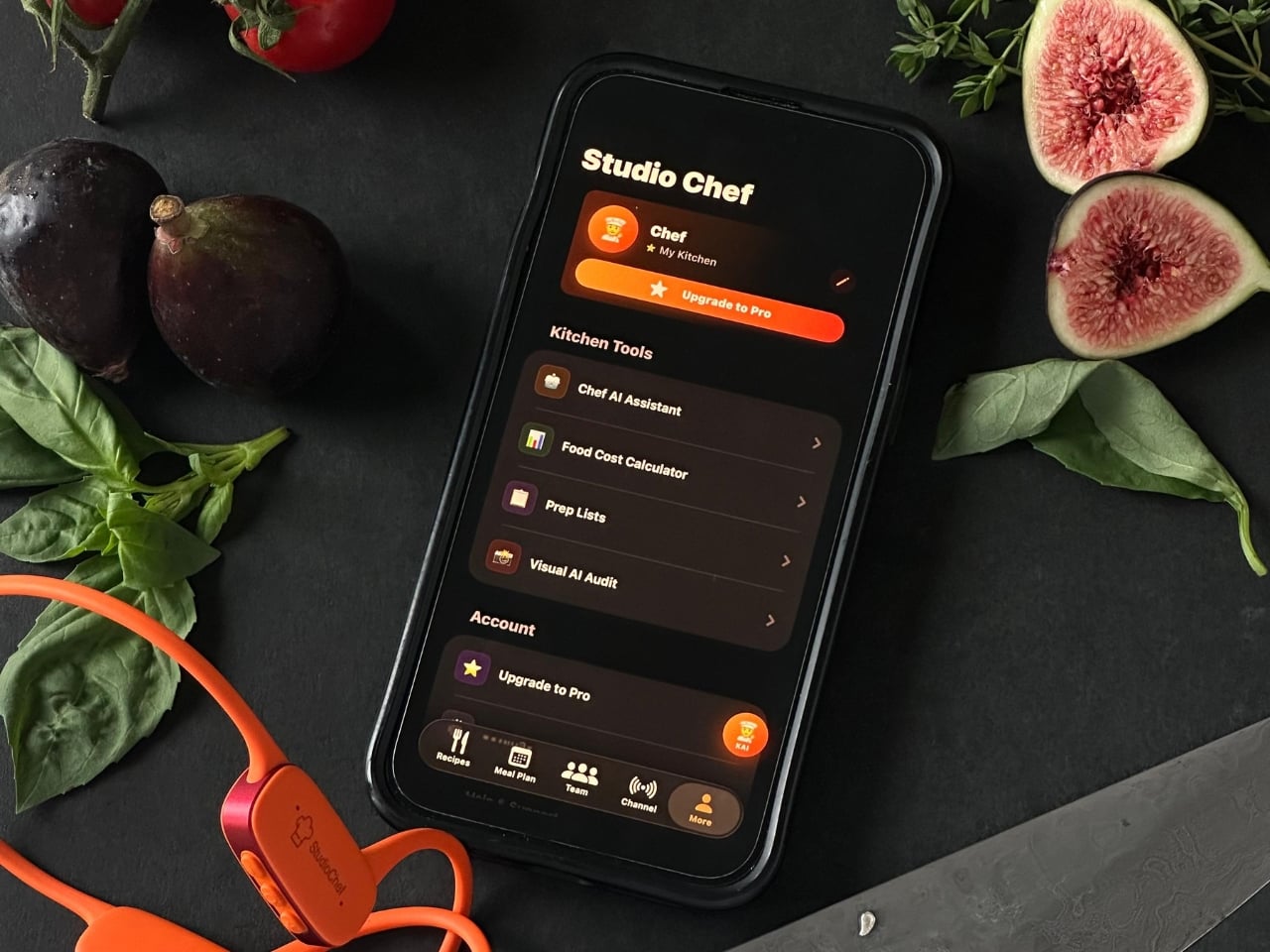
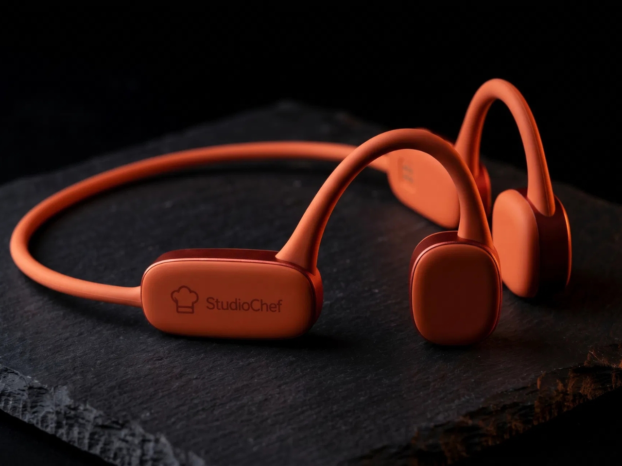
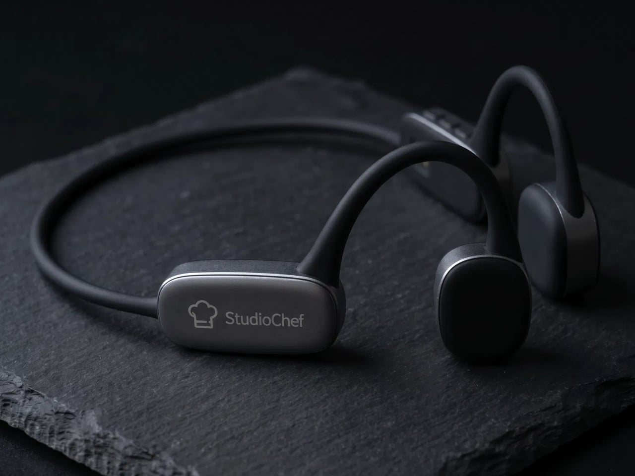
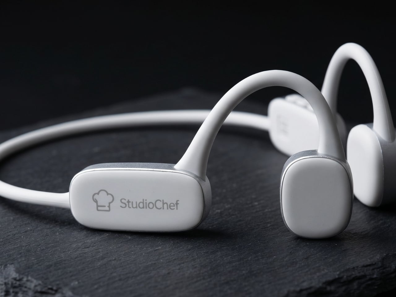
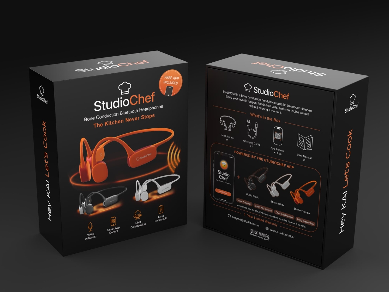
Reynard sat with that problem for two years before he decided to build a solution. What he came up with is genuinely interesting, not because it’s flashy, but because it’s specific in exactly the right way. KAI is an AI sous chef that lives in a pair of bone-conduction headphones. If you’re not familiar with bone conduction, here’s the short version: instead of sitting inside or over your ears, the headphones rest against your cheekbones and send sound directly through bone to your inner ear. Your ear canal stays completely open. You hear KAI reading you a recipe step, and at the same time you hear the sizzle in the pan, the beep of the oven timer, the sound of someone walking into the kitchen.

Designer: Nicolas Reynard

That last part is the design decision I keep thinking about. It would have been easy to build a smart speaker for the kitchen, or another Bluetooth earbud with a voice assistant baked in. But closed ears are a real hazard in a kitchen. You need to hear your environment. Bone conduction is the rare case where the technical choice and the functional choice are exactly the same choice. Reynard didn’t just pick a format. He picked the right one.

KAI itself handles the things that typically require a second person. It reads recipes aloud, step by step. It runs your timers. It answers questions while your hands are covered in flour or butter or whatever you’ve gotten yourself into. The hands-free part sounds like a small convenience until you’ve ever had to scroll through a recipe on your phone with oily fingers, which is a special kind of frustration that I suspect every home cook has experienced at least once.

What I appreciate about StudioChef’s approach is how grounded it is. We’re at a moment when AI tools are being layered onto everything, often because they can be rather than because they should be. KAI doesn’t feel like a gimmick. It feels like a problem that was studied for a long time and then solved. The chef-as-designer origin story isn’t marketing fluff; it’s the actual reason the product makes sense. The specificity of the bone conduction choice, the focus on keeping ears open, the voice-first interface that doesn’t require you to look at a screen, these aren’t features a generalist tech team would have landed on. They’re the product of someone who has been standing in a professional kitchen for over two decades and knew exactly what he was missing.

StudioChef KAI is heading to crowdfunding in September, and I’ll be watching it closely. Not because I think AI is the answer to everything happening in food culture right now, but because this is one of the rare cases where the technology actually fits the task. Good design, at its best, makes you wonder how you managed before it existed. A voice in your ear that tracks your recipe, runs your timers, and answers your questions while the rest of your senses stay focused on the food? That’s not a novelty. For anyone who cooks seriously, that might just be the tool they didn’t know they were waiting for.

The post The Kitchen AI That Finally Makes Sense, Built by Someone Who Cooks first appeared on Yanko Design.

This $99 Trackball Has Gesture Controls That Work Without Any Software

The computer peripheral market has always been more experimental at its edges than in the mainstream. Ergonomic trackballs, in particular, have attracted a devoted following among power users, but the options tend to cluster at two extremes: consumer-facing products with locked-down firmware, and niche open-source hardware that trades polished finish for deep customizability. Finding something that genuinely does both has rarely been straightforward.

Ploopy’s Adept trackball made a compelling case for the latter category, earning a loyal following with its open-source, 3D-printed design and QMK compatibility. But it always felt like it had more to say. Its circuit board had always reserved space for two more switches that never made it to production, and the base had slots for a wrist rest that never materialized. The A+ is that unfinished story, now finished.

Designer: Ploopy

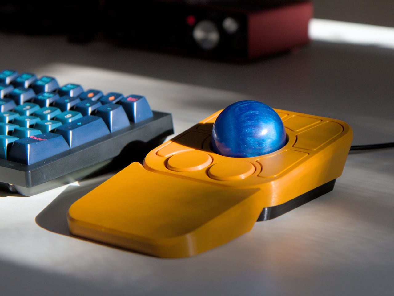
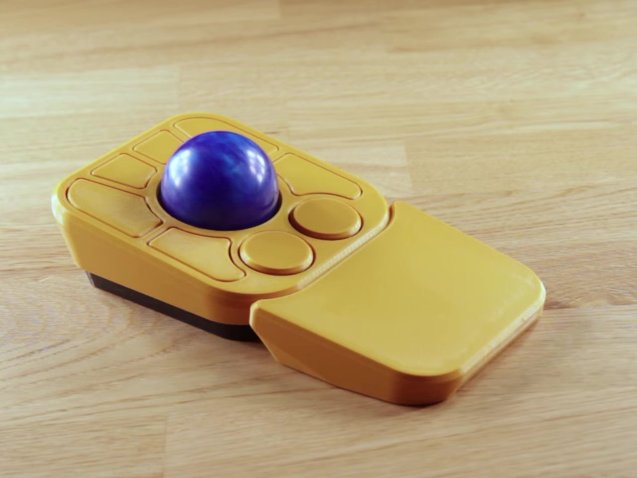
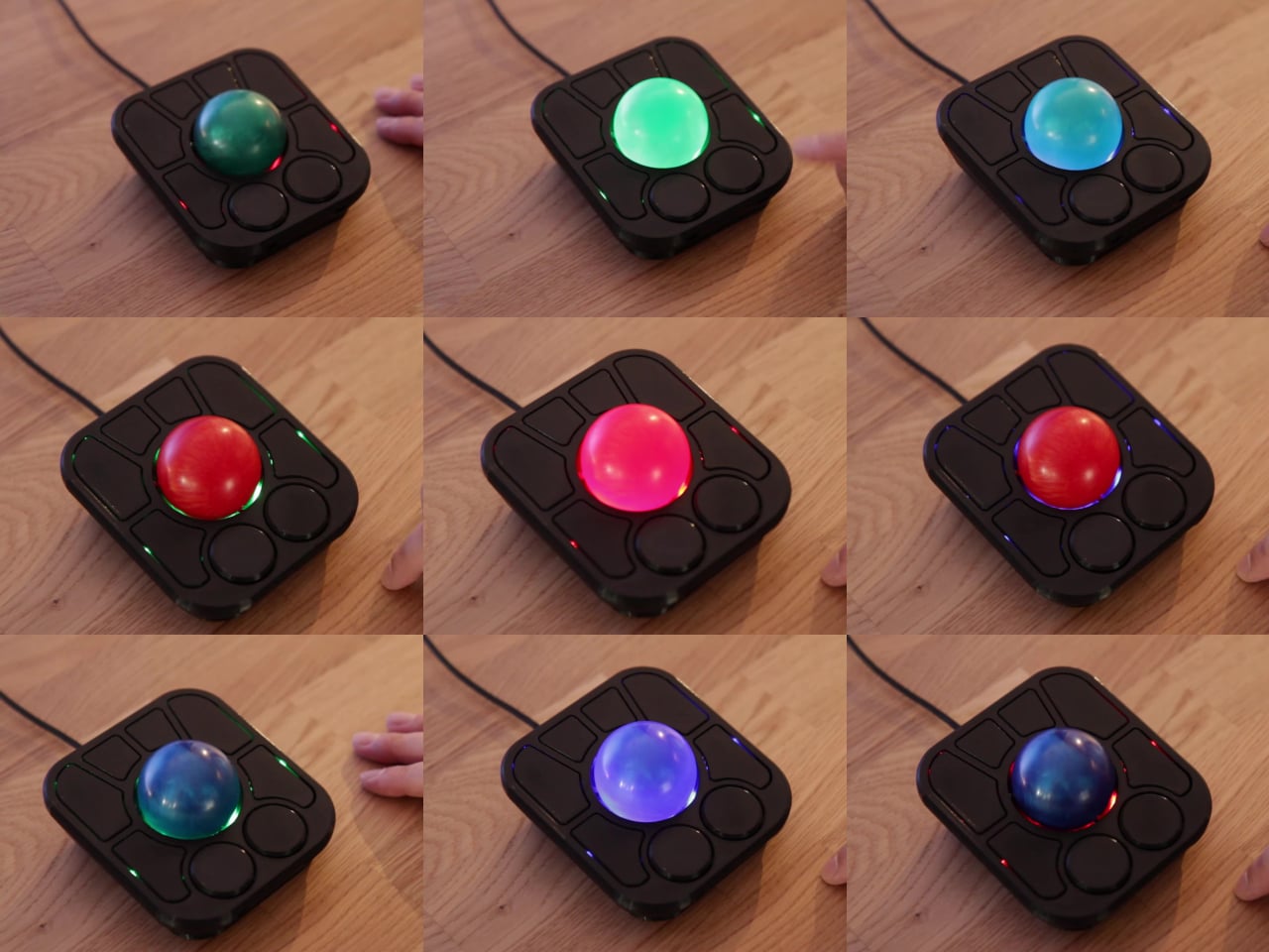
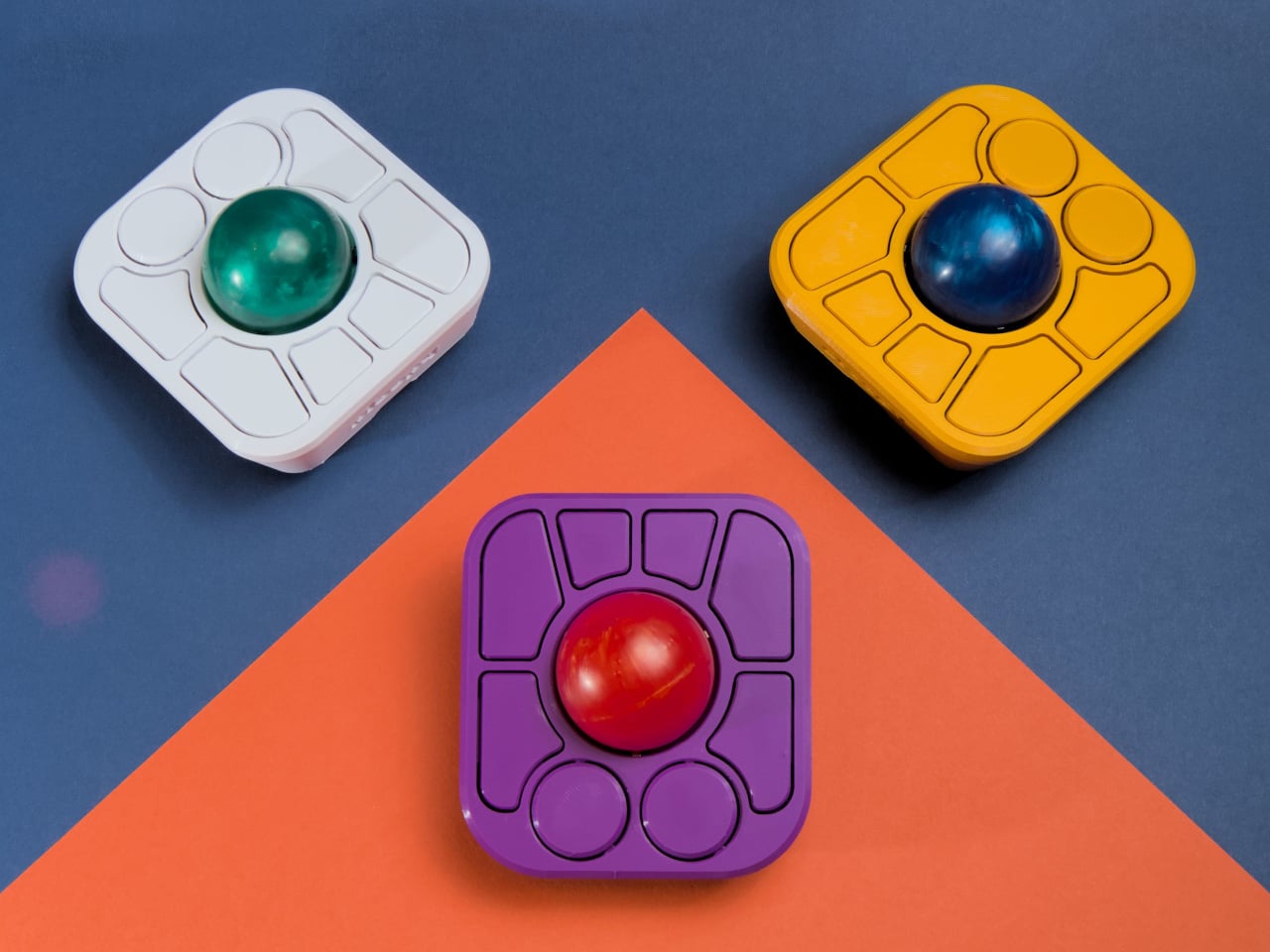
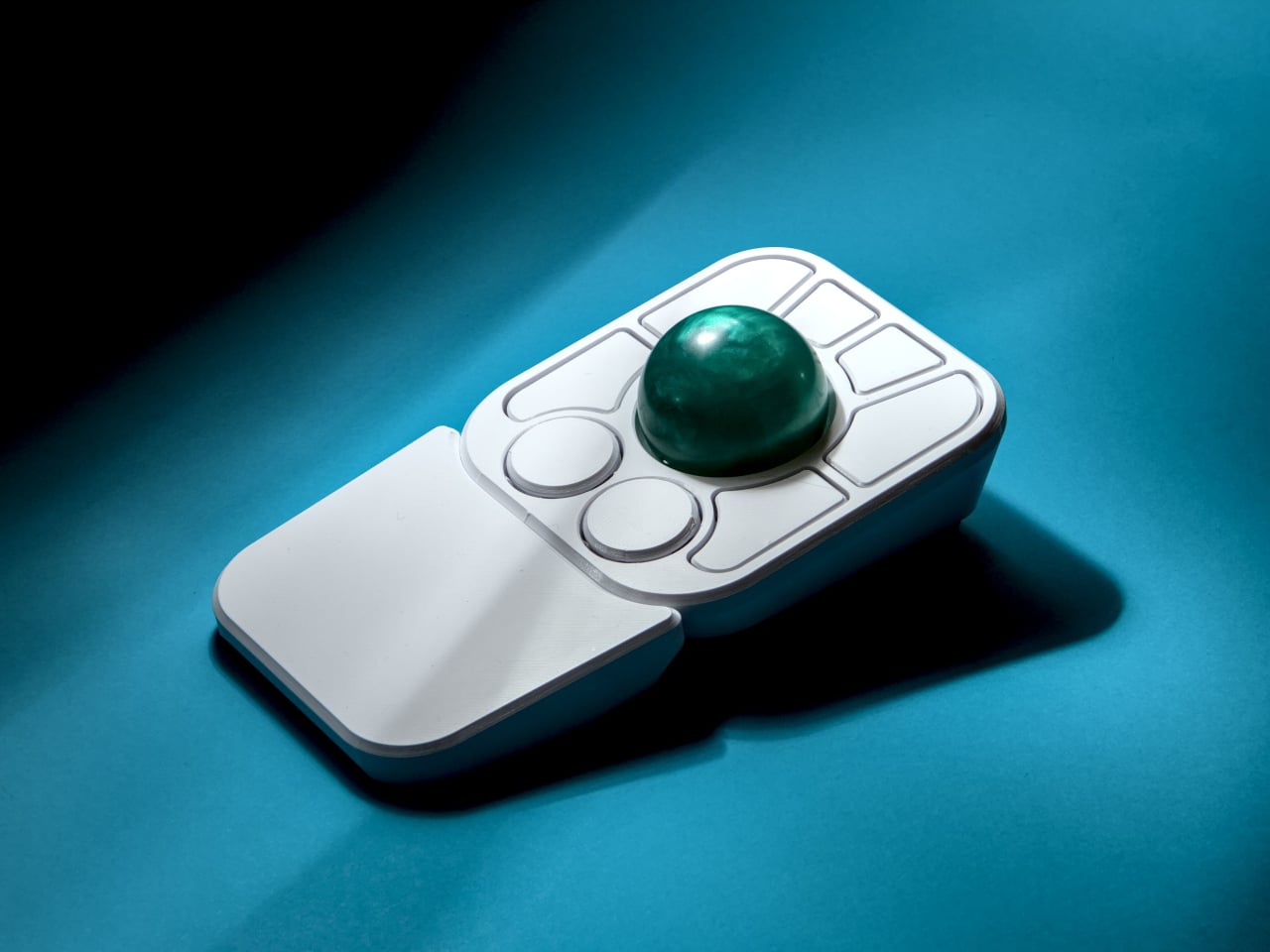
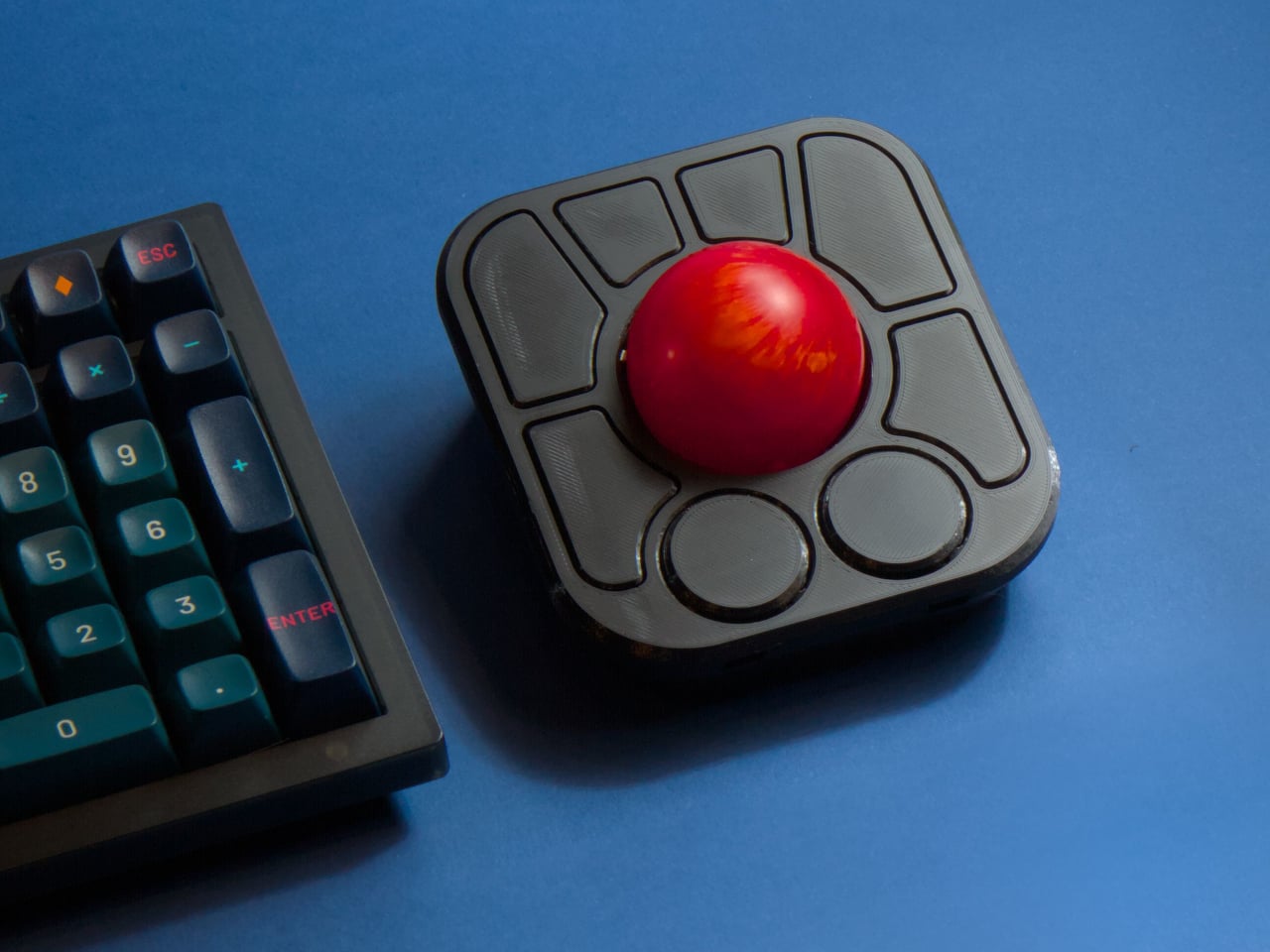
The most visible addition is the button count. The Adept had six; the A+ has eight, two of which also function as knobs. Out of the box, the knobs handle high-resolution vertical and horizontal scrolling, but both are fully reprogrammable for other functions. That dual-purpose approach keeps navigation and control within a single hand without needing a separate scroll wheel or accessory sitting alongside it.

The gesture system is arguably the more interesting addition. Hold a button and flick the ball in any of eight directions, and the device fires a command. By default, the left knob activates cut, copy, paste, desktop switching, and media controls. For someone who lives inside a browser and a text editor all day, that’s a significant amount of functionality without ever lifting a hand off the device.

Layers add another dimension. The A+ has two: a navigation layer for everyday use and a control layer accessed via the right knob. The control layer handles on-device configuration, covering left-hand mode switching, toggling between high-resolution and stepped scrolling, and other adjustments. It’s the first trackball to bring this kind of layered behavior, working entirely without any software running on the host computer. There are also two bright LEDs that can be used to visually tell you what layer you’re on without having to rely on some embedded screen.

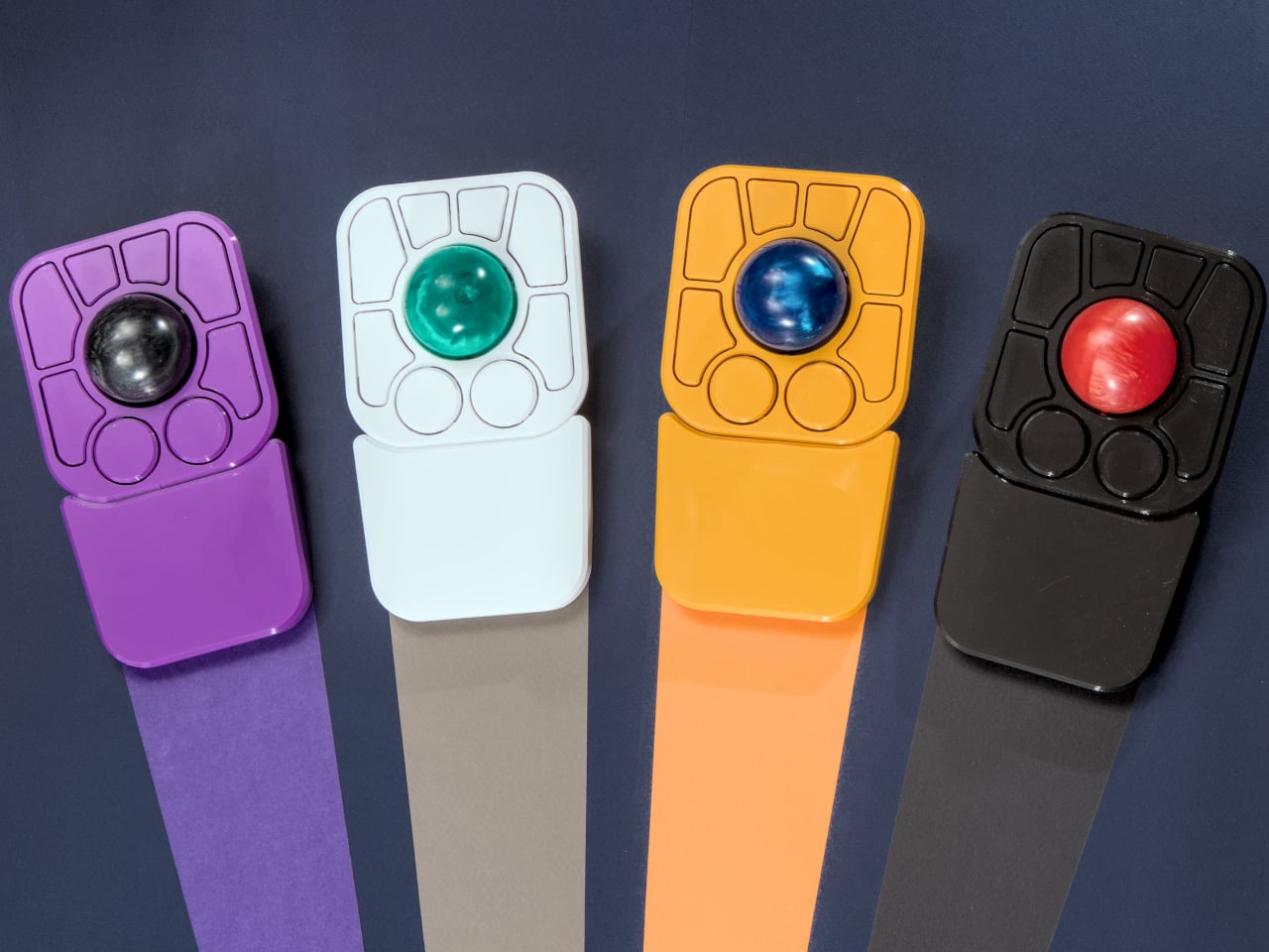
The detachable wrist rest is another long-promised feature that finally arrives with the A+. It slots in or out during use and can be screwed on permanently if preferred. The device stays ambidextrous throughout, and its 3D-printed shell means the community can print modified bodies, alter the layout, or swap in custom colors. That kind of adaptability isn’t an afterthought; it’s part of how the whole thing is designed.

The Pixart PMW-3360 sensor carries over from the Adept, running at a 1,000Hz polling rate with the tracking accuracy that has made it a standard for performance-oriented pointing devices. Omron D2LS-21 switches handle the physical buttons. The firmware remains QMK, configurable through VIA, with all design files, firmware, and assembly instructions freely available on GitHub. Kits start at $99 CAD.

The post This $99 Trackball Has Gesture Controls That Work Without Any Software first appeared on Yanko Design.

ESR Atelier Magnetic iPhone 17 Pro Max Case Review: Vegan Leather Done Right

PROS:


  • Refined and elegant aesthetic with no visible magnetic ring

  • Animal-free silicone-based vegan leather with soft, warm feel

  • Built-in FlexStand doubles as camera guard when closed

  • Military-grade protection that stays out of sight

CONS:


  • Kickstand doesn't support full vertical placement

RATINGS:

AESTHETICS
ERGONOMICS
PERFORMANCE
SUSTAINABILITY / REPAIRABILITY
VALUE FOR MONEY

EDITOR'S QUOTE:

The ESR Atelier Magnetic Case is protection that's actually worth touching.

Phone cases occupy a strange middle ground in the accessories market. The more protective options tend to look utilitarian, all rugged textures and chunky frames that trade elegance for toughness. The ones that do look refined often use faux leather, which can stain, fade, or scuff with daily handling. Finding something that sits comfortably between both worlds has always been easier said than done.

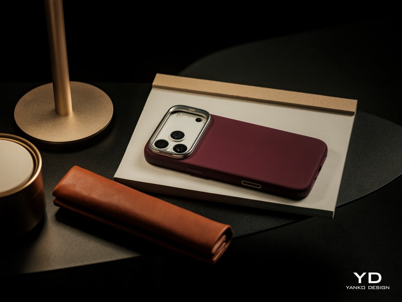
ESR’s Atelier Magnetic Case for the iPhone 17 Pro and iPhone 17 Pro Max tries to answer that question. It’s the brand’s first vegan leather iPhone case, built from a silicone-based material that carries the soft, warm feel of leather without the upkeep that usually comes with it. Paired with an integrated FlexStand, strong MagSafe magnets, and layered protection, it feels more personal and more resolved than a typical protective shell. But is it all just marketing speak, or does it really pack more than what our eyes, and hands, perceive? We slap this bold new case on our large iPhone to find out.

Designer: ESR

Click Here to Buy Now: $45.99

Aesthetics

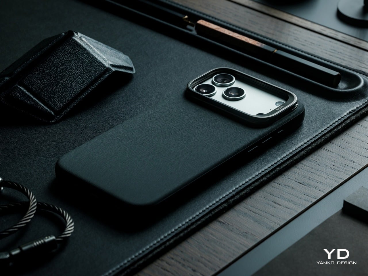
The ESR Atelier’s back is its most immediate and telling detail. The silicone-based vegan leather carries a refined grain texture and a warmth to the touch that doesn’t register as plasticky or clinical, the way many textured phone cases can. It’s the kind of surface that encourages contact rather than avoiding it, settling naturally into the hand in a way that plain silicone and polycarbonate cases rarely manage.
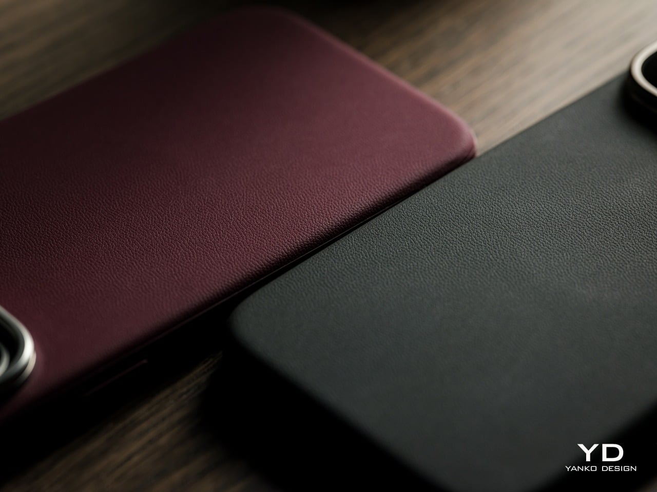
The leather finish is only part of what sets the back apart. Equally notable is what’s absent. Many MagSafe-compatible cases leave a visible circular ring pattern on their backs, a telltale sign of the magnets beneath. The Atelier keeps its rear surface completely smooth and unbroken, with no ring to interrupt the leather. That absence alone makes the overall look feel more cohesive and considered.

One of the more practical arguments for the Atelier’s vegan leather material is longevity. Designed for long-lasting everyday use, the material resists scratches, wear, and fading while maintaining its appearance over time. Traditional faux leather cases often start showing their age within months from regular holding and pocket wear, which means the case is likely to look considerably better after a year of daily handling than many alternatives in the same category.
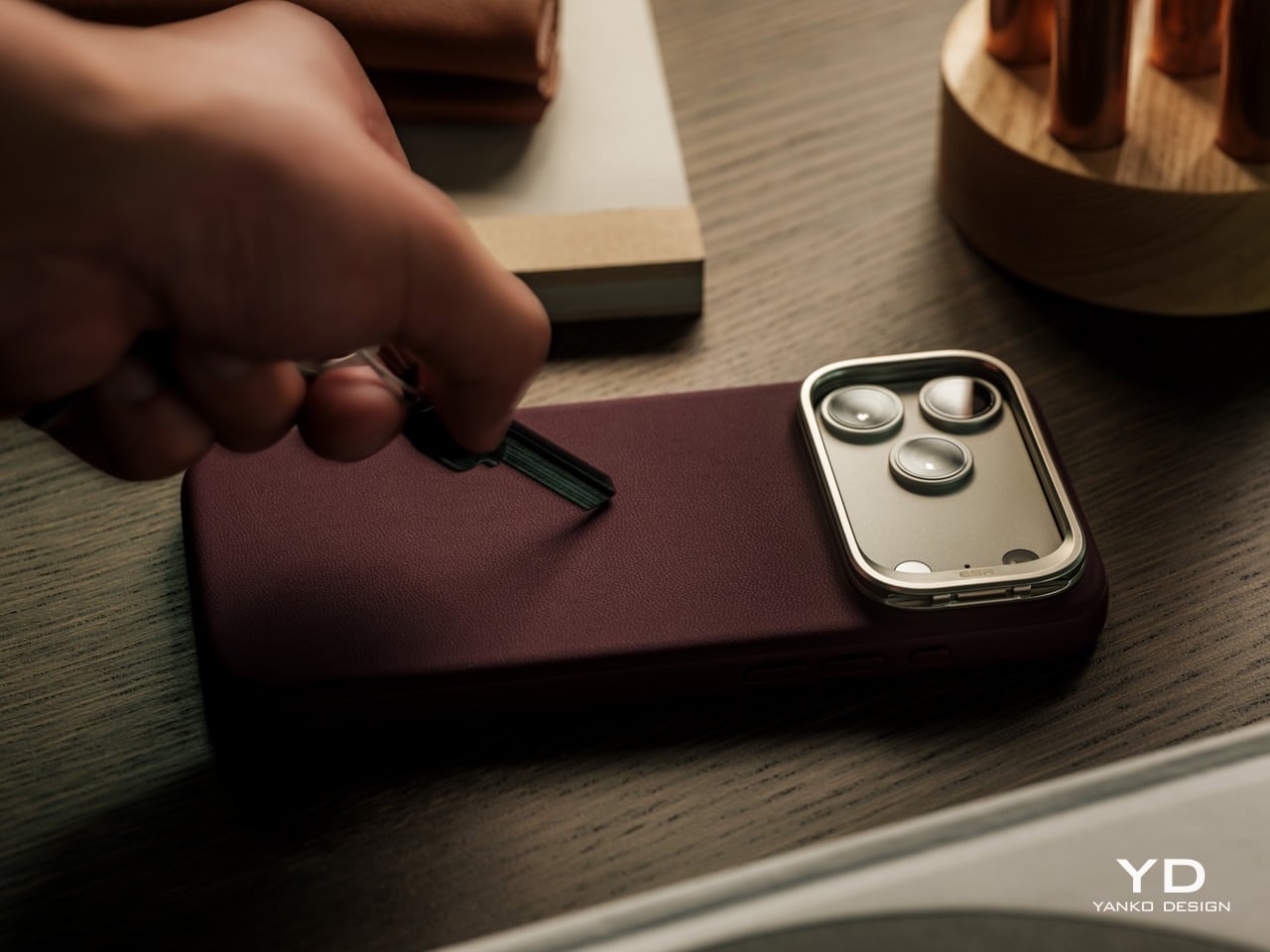
An anti-fouling surface coating and stain-resistant frame treatment add to that picture. Spills and smudges wipe away easily with a soft cloth, without needing specialized cleaning products. This silicone-based vegan leather, similar to the material pioneered in high-contact automotive interior surfaces, is designed to maintain its appearance under the kind of daily conditions that would visibly wear down most conventional leather finishes over time.

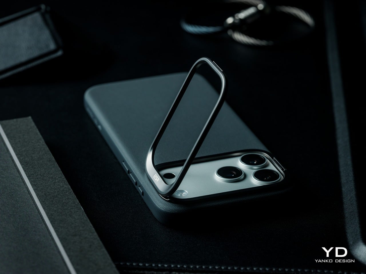
The camera surround anchors the Atelier’s visual identity while adding practical function. Rather than hiding the iPhone 17 Pro Max’s large camera island behind a flush cutout, ESR frames it with a distinctive metallic guard that immediately draws the eye and doubles as a camera-protecting stand. In its closed position, the guard sits flat and clean, giving the case a confident, top-weighted silhouette. When opened, it provides a convenient way to prop up the phone. It’s a design detail that does more than make the Atelier stand out; it makes the case stand out with purpose.
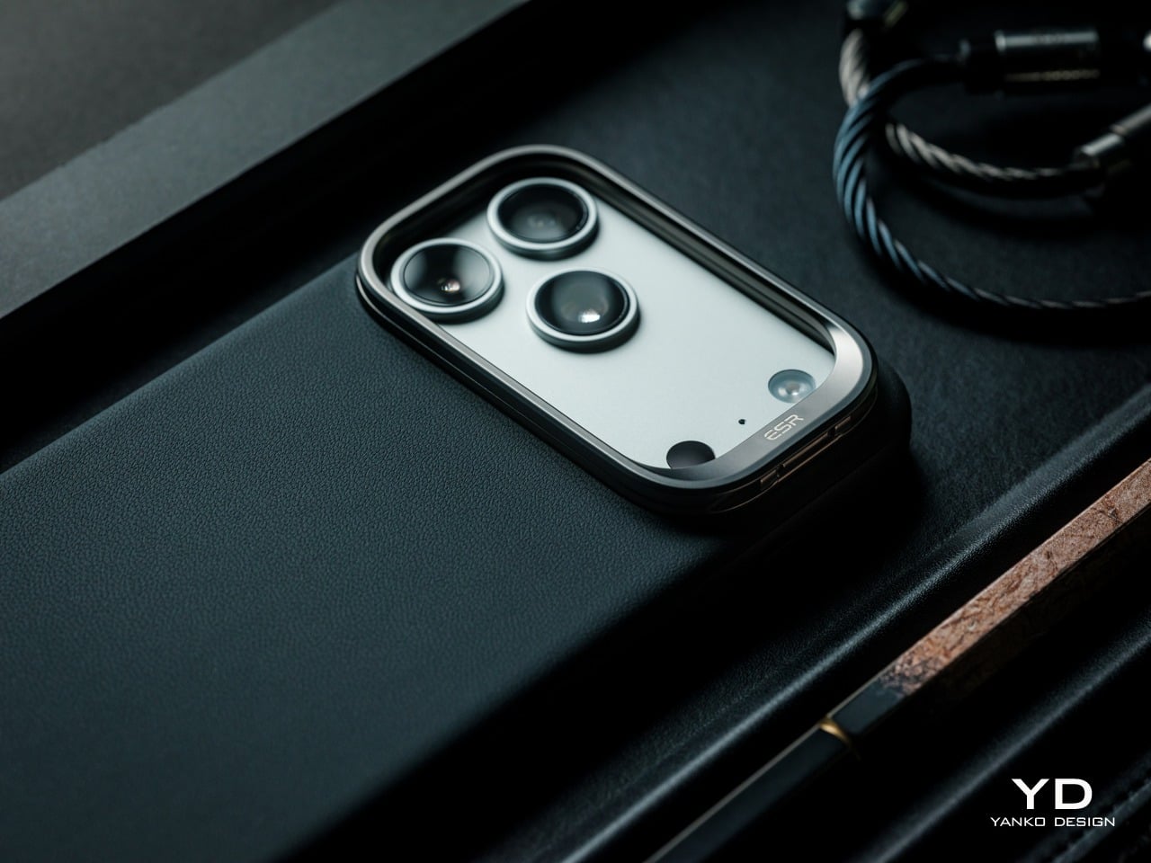
Running a thumb along the side reveals what the back suggests: the Atelier is more carefully constructed than it might initially seem. The TPU frame has a subtle micro-texture that feels slightly different from the smoother leather panel, providing grip without calling attention to itself. That material contrast is understated, but it adds some welcome depth to what is otherwise a clean and quiet form.

Two colors were available for this review, Black and Deep Burgundy, and both make a strong case for the Atelier’s design language. Black keeps things understated and versatile, almost disappearing as a deliberate choice. Deep Burgundy, on the other hand, is far more expressive, with a rich, wine-like tone that brings out the warmth and softness of the vegan leather even more.
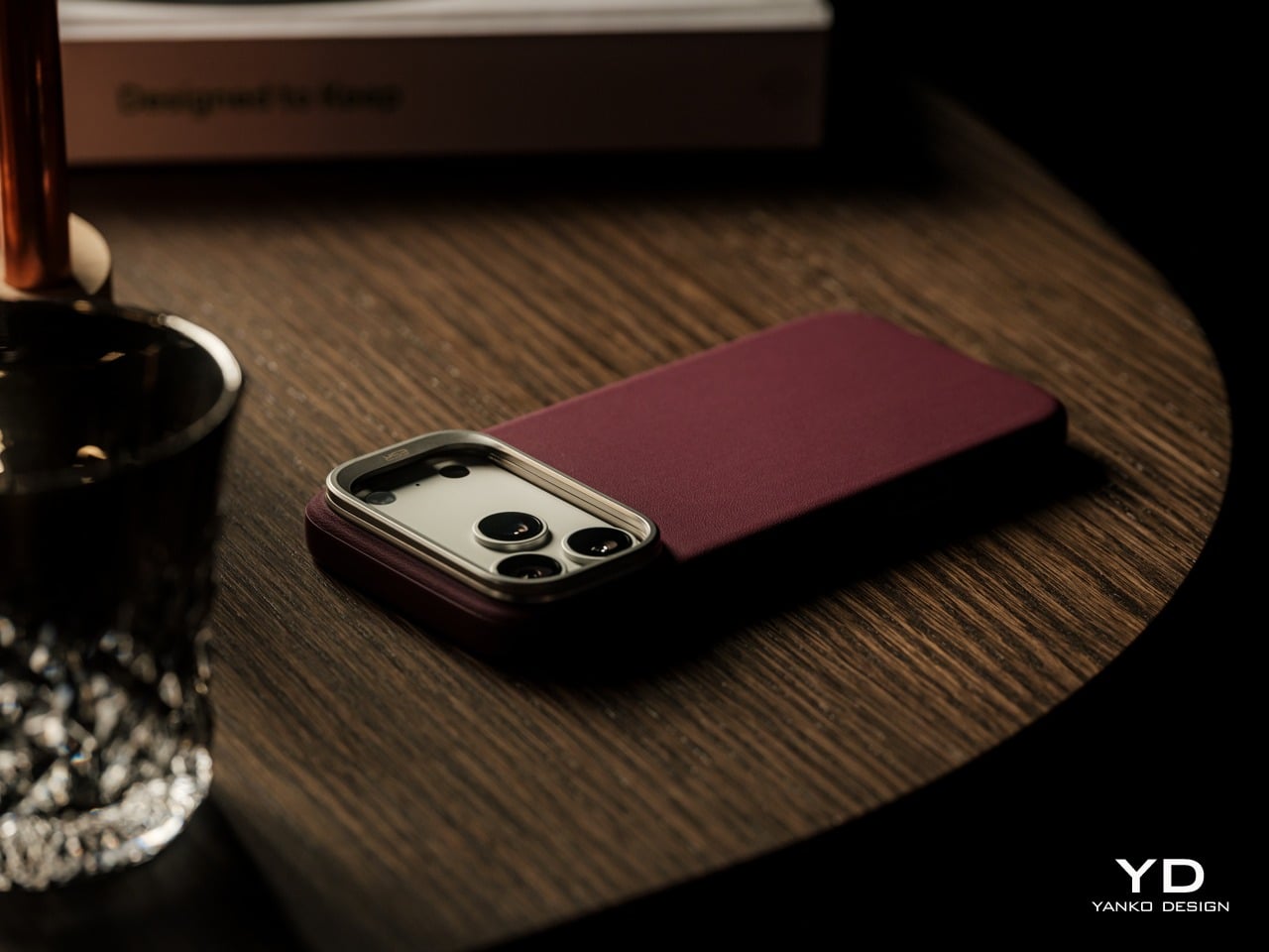
The Atelier rounds out its lineup with four colors in total, Light Gray and Misty Blue joining the Black and Deep Burgundy reviewed here. The palette is deliberately quiet and wear-anywhere, skipping bold or trend-chasing tones in favor of shades that feel considered rather than seasonal. That restraint runs through the whole design, where nothing on the surface feels accidental or arbitrarily decorative.

Ergonomics

Slipping the Atelier onto the iPhone 17 Pro Max for the first time, the fit is snug and confident. The case doesn’t shift or creak under pressure, and the soft microfiber lining helps the phone slide in cleanly. Button access is well handled, with the case’s profile keeping all controls accessible and tactile, so there’s no need to press hard through a thick wall of material just to adjust volume.
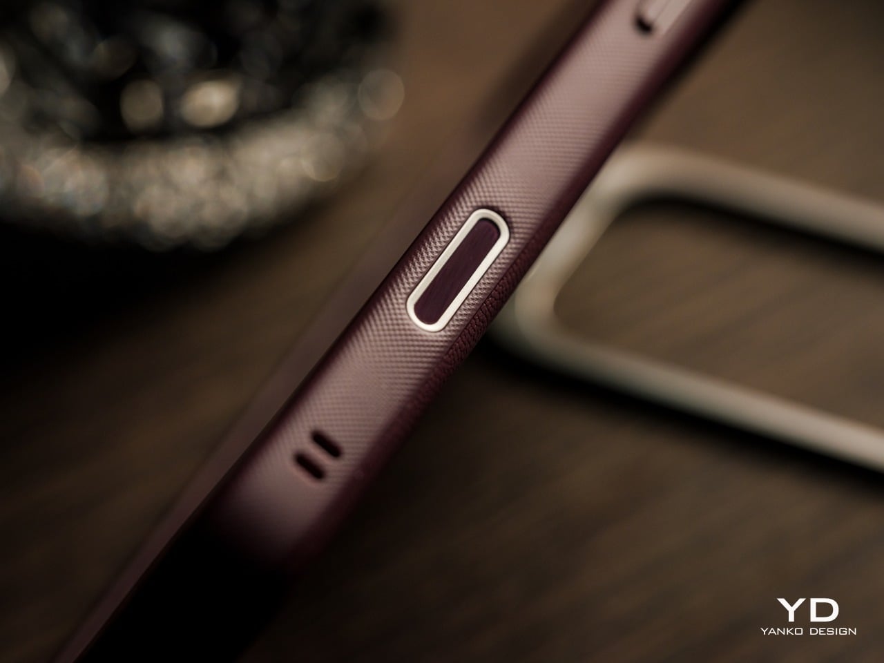
ESR includes a built-in Camera Control cover on the case’s side, a detail that’s easy to overlook but matters for anyone using that feature regularly. The cover preserves access without leaving an awkward gap in the frame. For a phone this size, the Atelier also adds enough grip to make single-handed use feel more manageable, without the bulk that typically comes with heavily protective cases.

Carrying the phone in a pocket with the Atelier on feels different from a plain silicone case. The material has a subtly grippier quality that keeps the phone from sliding around freely, and it doesn’t attract lint or dust the way softer cases sometimes do. Set it down on a desk or table, and it stays put, which is a small but consistently welcome trait.
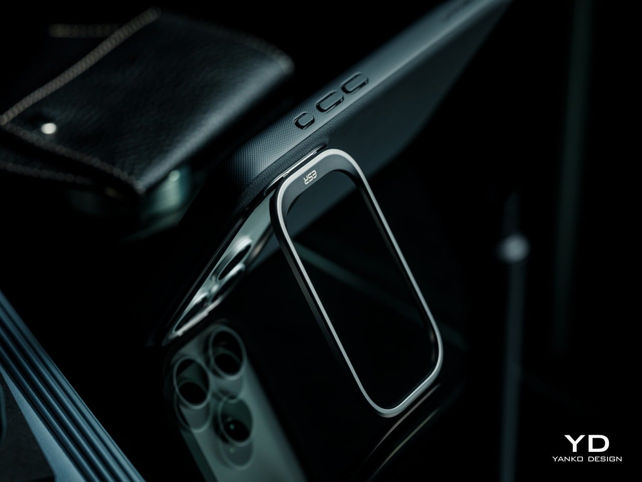
In practice, the headlining FlexStand’s mechanism feels smooth. Opening the guard takes a deliberate nudge rather than snapping open accidentally, and once propped, the stand supports both landscape and portrait viewing, with angles from 15 to 69 degrees. It works in landscape for video calls just as well as in portrait for reading or scrolling. When closed, the guard does raise the camera’s profile even higher than what it already has without any case, a necessary tradeoff for a creative solution to two problems in one.

Performance

The FlexStand is the Atelier’s most interesting functional detail, because it solves two problems at once. ESR’s FlexStand combines a camera guard to protect the device’s camera lenses when closed and an adjustable stand for hands-free viewing when open. On a phone with a camera island this large, exposed lenses are a genuine vulnerability, and folding that protection into the stand mechanism itself is a smarter solution than treating them as separate concerns.
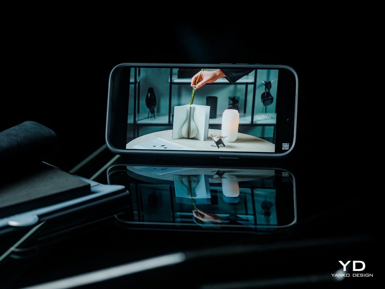
The stand supports viewing angles from 15 to 69 degrees, which covers enough range for upright reading and low-angle watching from across a desk. Shallower angles work well on uneven surfaces like an airplane tray table or a lap, while steeper ones put the screen more directly in view. Both portrait and landscape orientations are supported, with no additional mechanism or adjustment needed between the two. That said, vertical orientation pretty much means just tilting the back of the phone up, enough for scrolling or reading but definitely not for video calls.
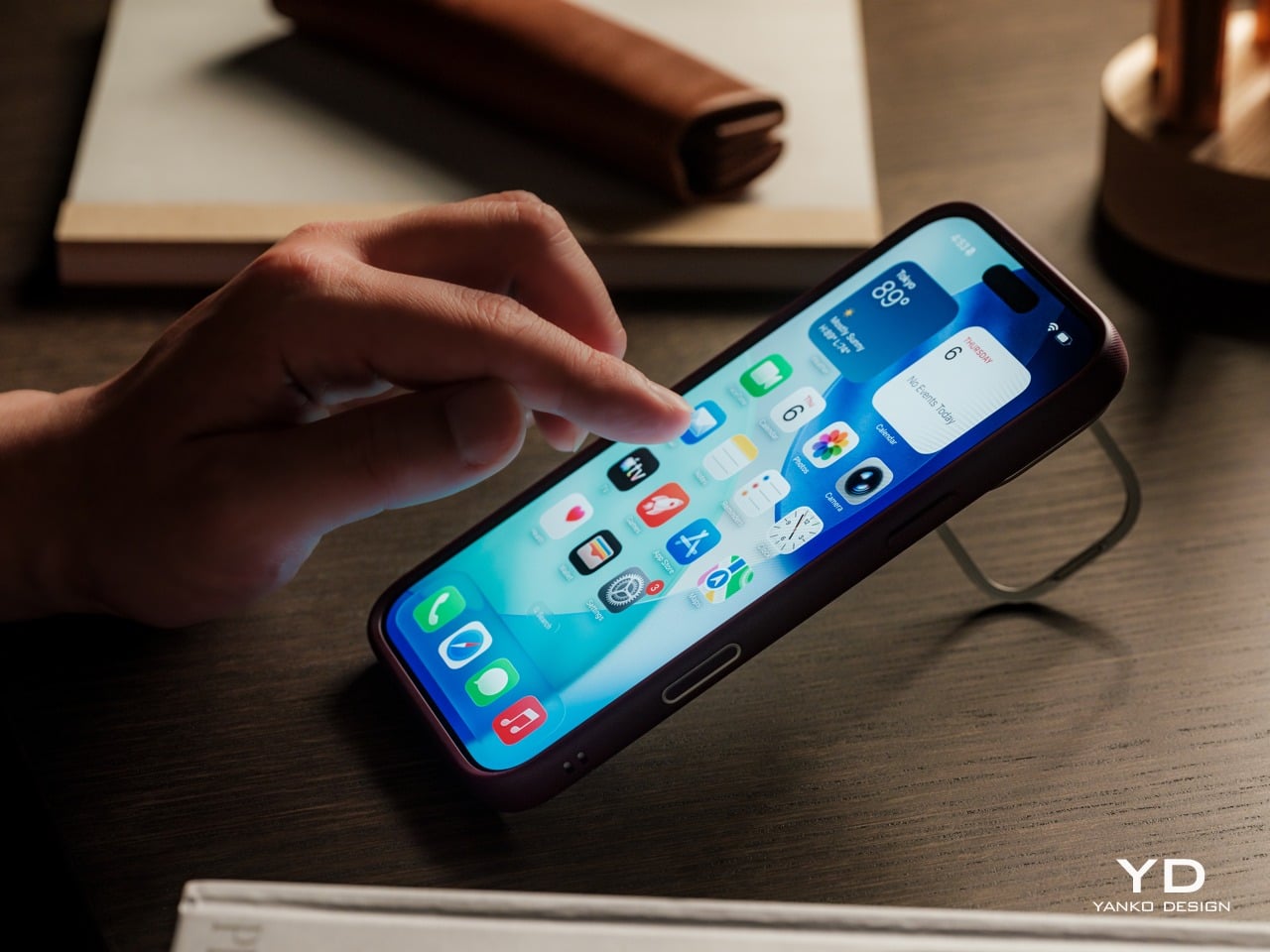
Beyond the stand, the Atelier handles everyday protection through a combination of a shock-absorbing TPU frame, and raised-edge protection. ESR rates the case for 3x military-grade protection, and the overall construction feels solid and deliberate rather than rubbery or flimsy. You can expect some added bulk and heft, but not more than any rugged protective case worth its salt.

MagSafe performance is strong. The Atelier uses built-in magnets rated at 1,400g of force, and compatible chargers and accessories snap on with a reassuring click. Because the back panel carries no visible ring or hardware, the magnetic experience feels clean and uncluttered from the outside.

Sustainability

Most phone cases don’t come with a sustainability story worth telling, and the ones that do tend to lean on recycled packaging rather than anything in the product itself. The Atelier’s more grounded argument is that a case built to resist early aging is more responsible than one that looks worn within months of purchase, and the silicone-based vegan leather is central to that reasoning.
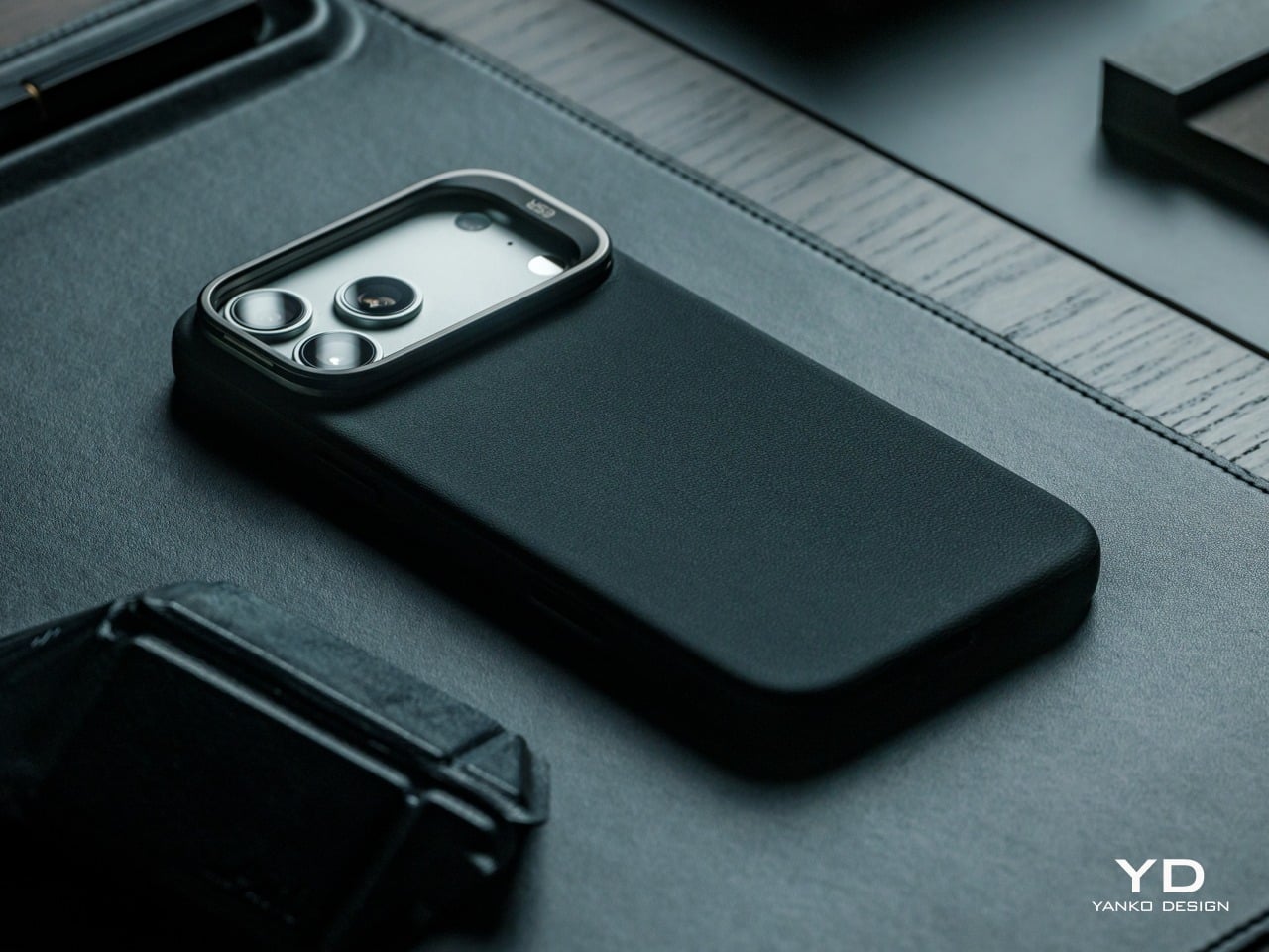
Being animal-free by construction, the vegan leather adds appeal for buyers thoughtful about materials but still wanting a leather-like aesthetic. It isn’t positioned as an environmental product in the way that a recycled-material case might be, but choosing a durable, easy-care surface that resists early replacement adds up meaningfully over time. A case that doesn’t need swapping out every few months is quietly a more sustainable choice.

Value

The Atelier is priced at $42.99 for Black and $45.99 for the remaining three colorways, including Deep Burgundy. Those figures sit toward the upper end of what most buyers expect to spend on a phone case, but the price reflects a package that bundles considerably more than leather. A built-in stand, strong MagSafe compatibility, and multi-layer protection are all part of what that cost covers.
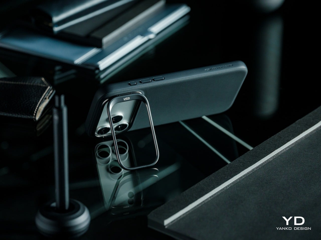
For comparison, many premium leather-style cases fall into a similar price range, but often without integrated stand functionality, and a dedicated kick grip would be an added accessory on top of that. The Atelier handles both without making the back look overcrowded or adding any structural compromise. That combination, at this price, represents a reasonably compelling package for buyers who care about aesthetics and functionality in equal measure.
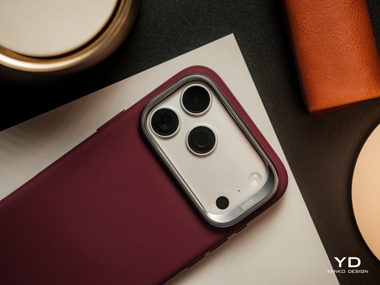
Where the Atelier’s value becomes most clear is in how long it’s designed to hold up. Buyers who regularly replace cases because of fading, stains, or surface wear will likely get considerably more time out of this one before that becomes a concern. That longevity also means less time hunting for a replacement case that ticks the same boxes, which is rarely as easy as it sounds.

Verdict

The ESR Atelier Magnetic Case finds its innovation in restraint, representing a new design direction for ESR’s protective case lineup and combining a more refined aesthetic with the everyday functionality ESR is known for. It finds a more sensible middle ground through better material choices, a stand that genuinely belongs to the case’s geometry, and a visual language that doesn’t rely on aggressive branding or drama to make an impression.
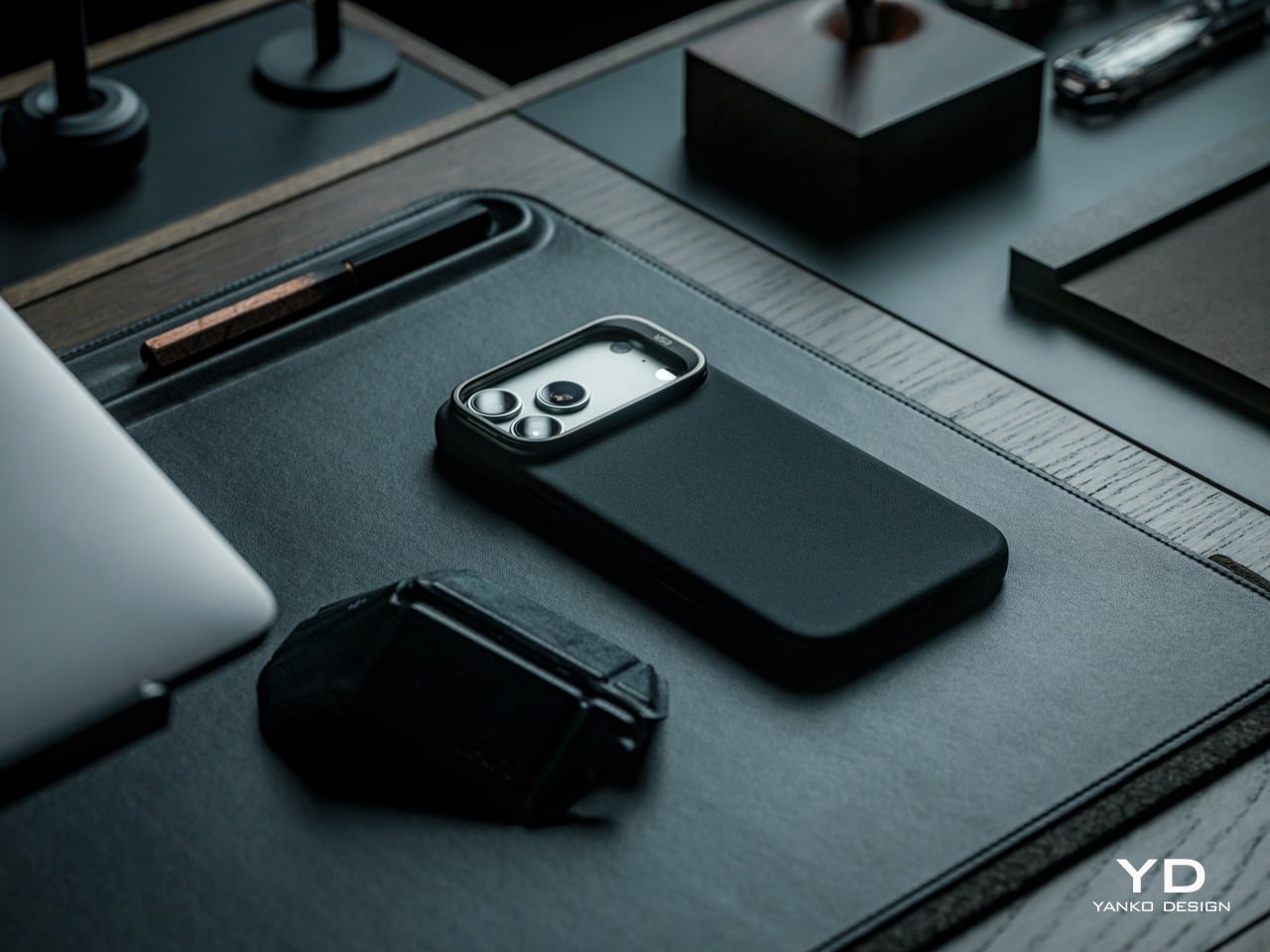
It suits buyers who want their iPhone 17 Pro Max to feel considered at every touchpoint, designed for users who appreciate the premium look and feel of leather but want a more durable and easy-to-maintain alternative for daily use. The Deep Burgundy variant, in particular, carries a character and warmth that’s genuinely hard to find in most protective cases, making it a compelling choice for sophisticated buyers who have grown tired of flashy and gimmicky accessories.

Click Here to Buy Now: $45.99

The post ESR Atelier Magnetic iPhone 17 Pro Max Case Review: Vegan Leather Done Right first appeared on Yanko Design.


Samsung Killed the Galaxy Note, but This S27 Concept Brings It Back

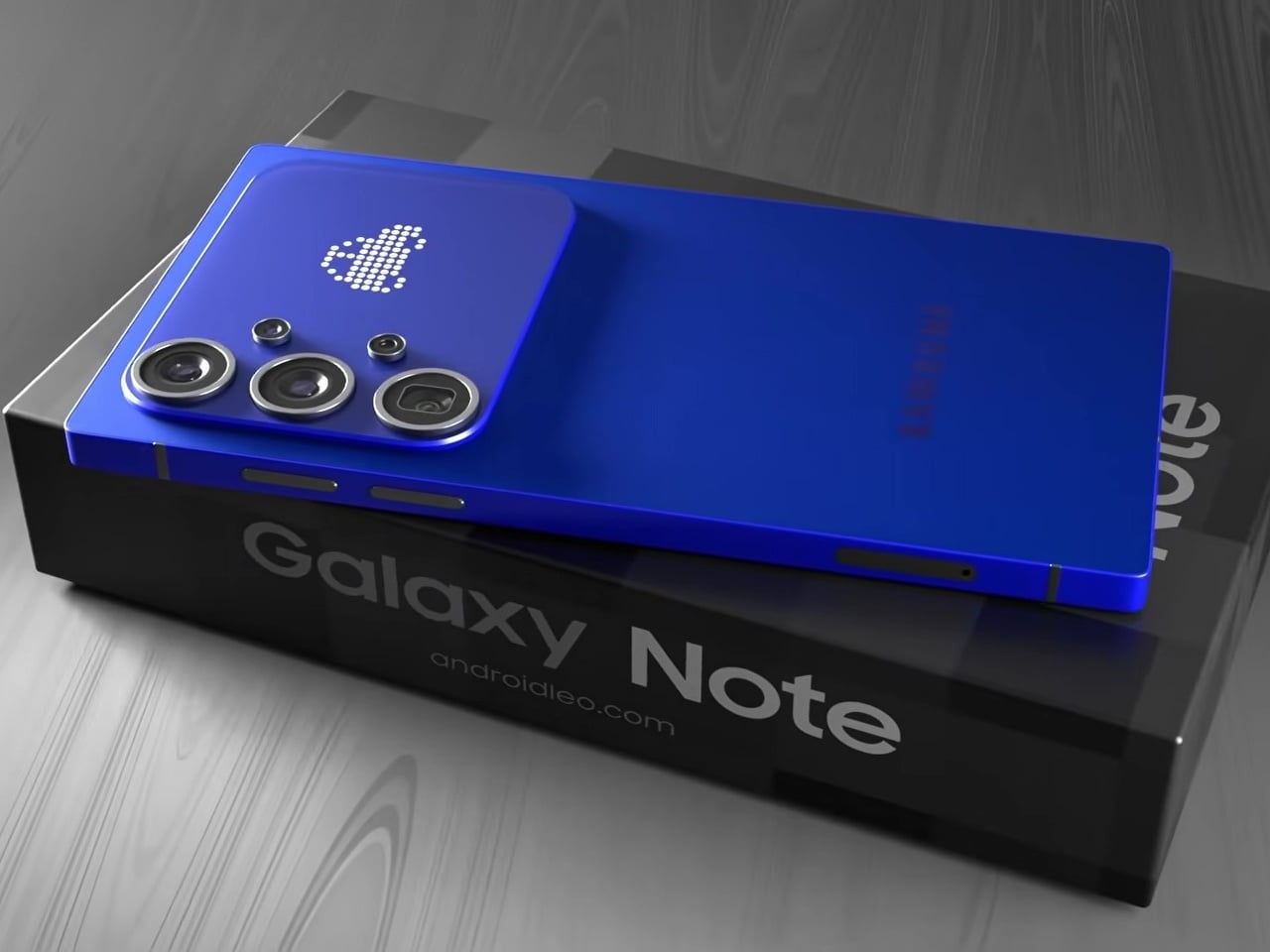
Samsung’s Ultra lineup has been on a gradual softening trajectory. The hard, squared-off corners that made early Galaxy S Ultra and Note phones feel deliberately architectural gave way to progressively rounder edges with each generation, culminating in the S26 Ultra’s fully rounded ergonomic corners. For users who preferred the original boxy confidence of those older devices, that direction has been a slow farewell to something they actually liked.

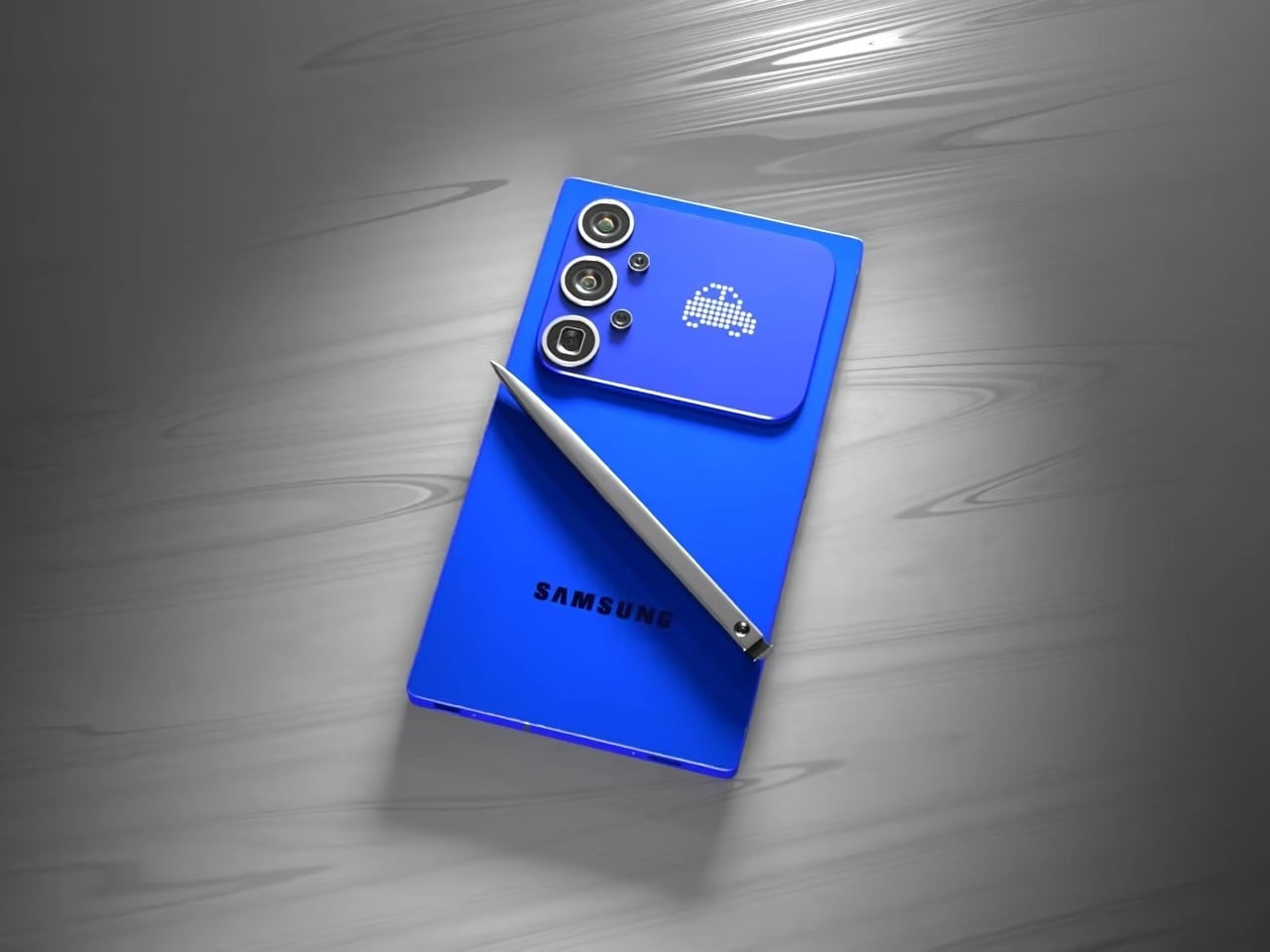
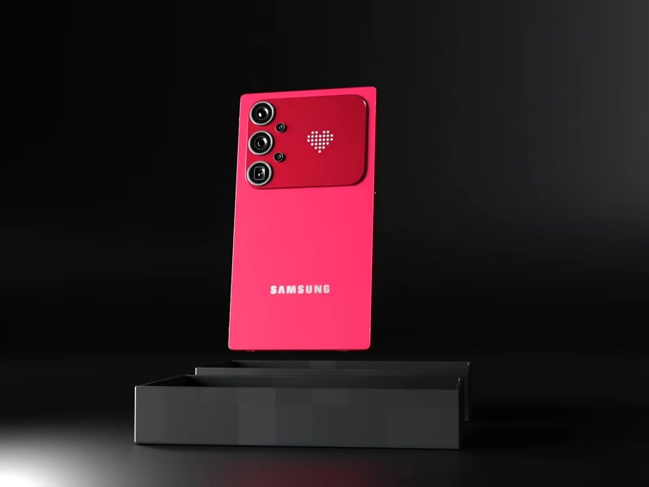
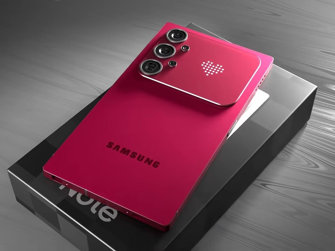
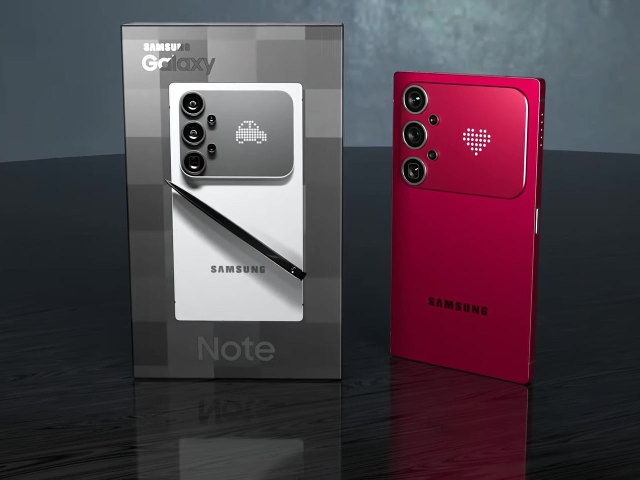
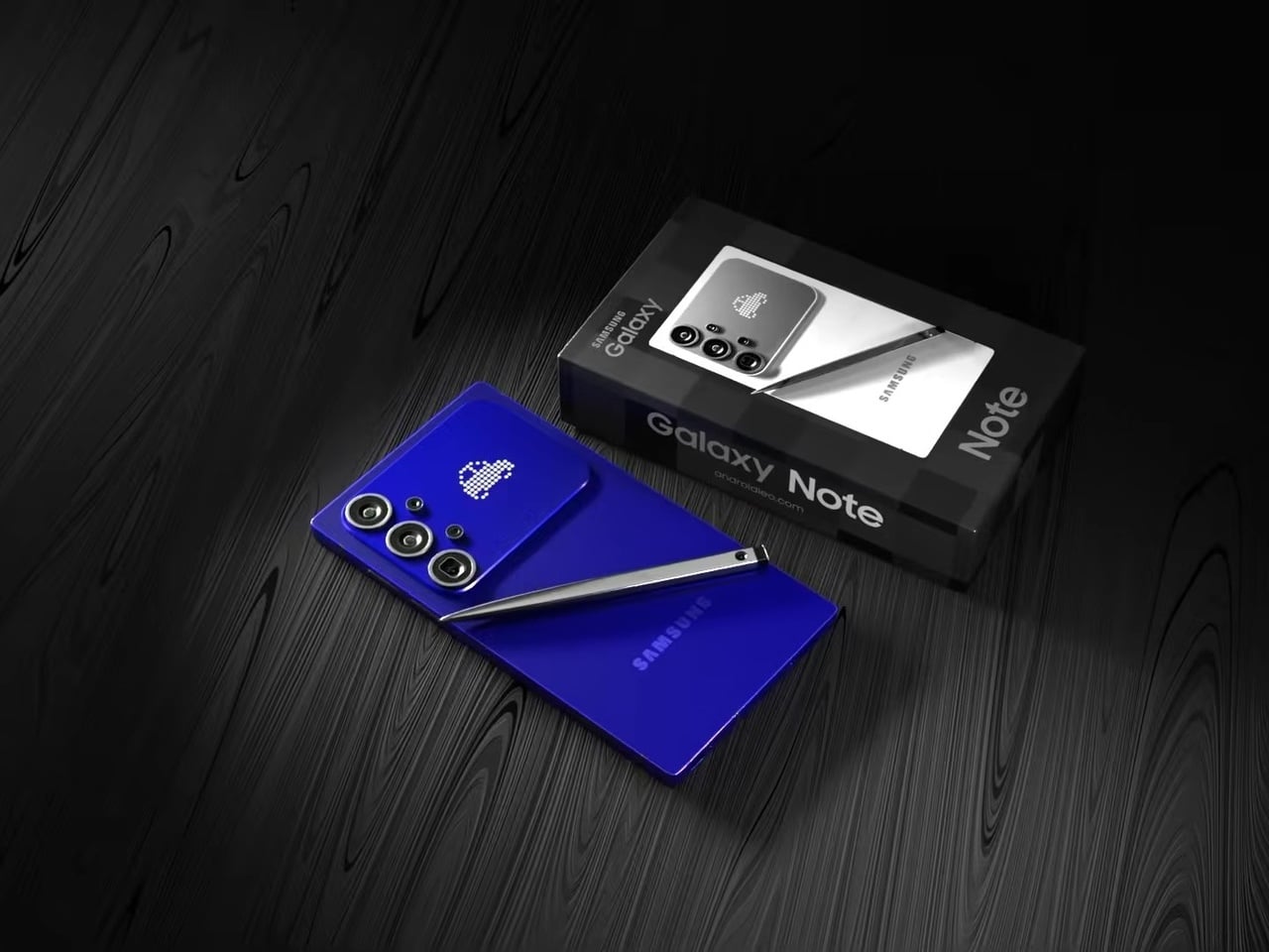
This concept for a Galaxy S27 Ultra reverses that. The sharp 90° corners are back, along with flat top and bottom edges that give the phone a distinctly geometric presence. The “Galaxy Note” name appears on the packaging, framing this as a full revival of Samsung’s discontinued productivity flagship identity rather than just another Ultra iteration. It’s a design argument about what the phone should have stayed.

Designer: AndroidLeo

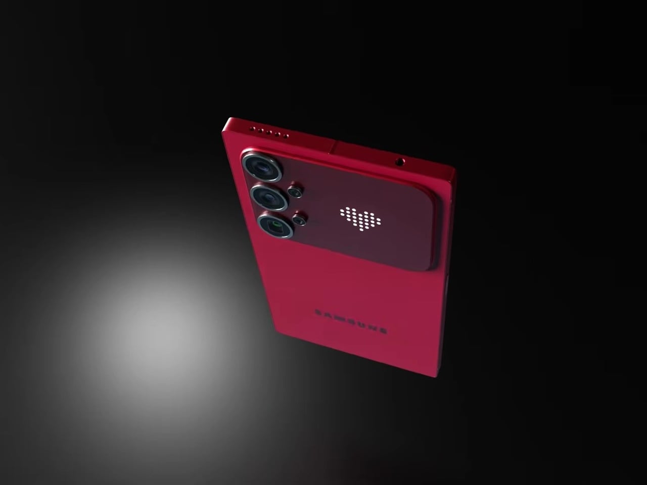
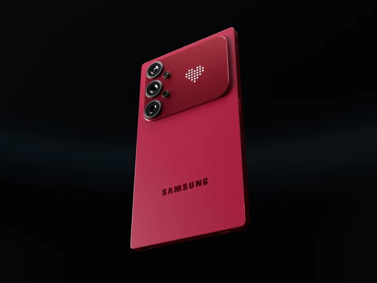
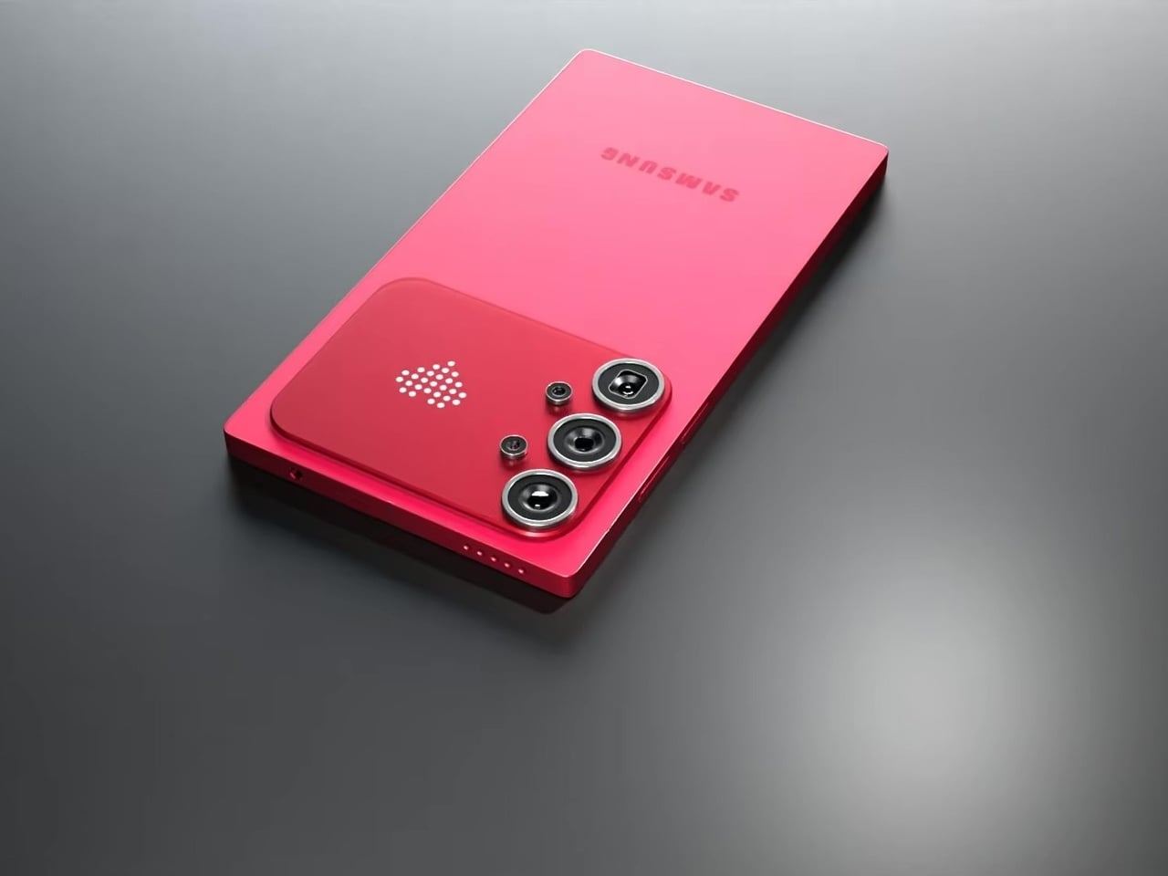
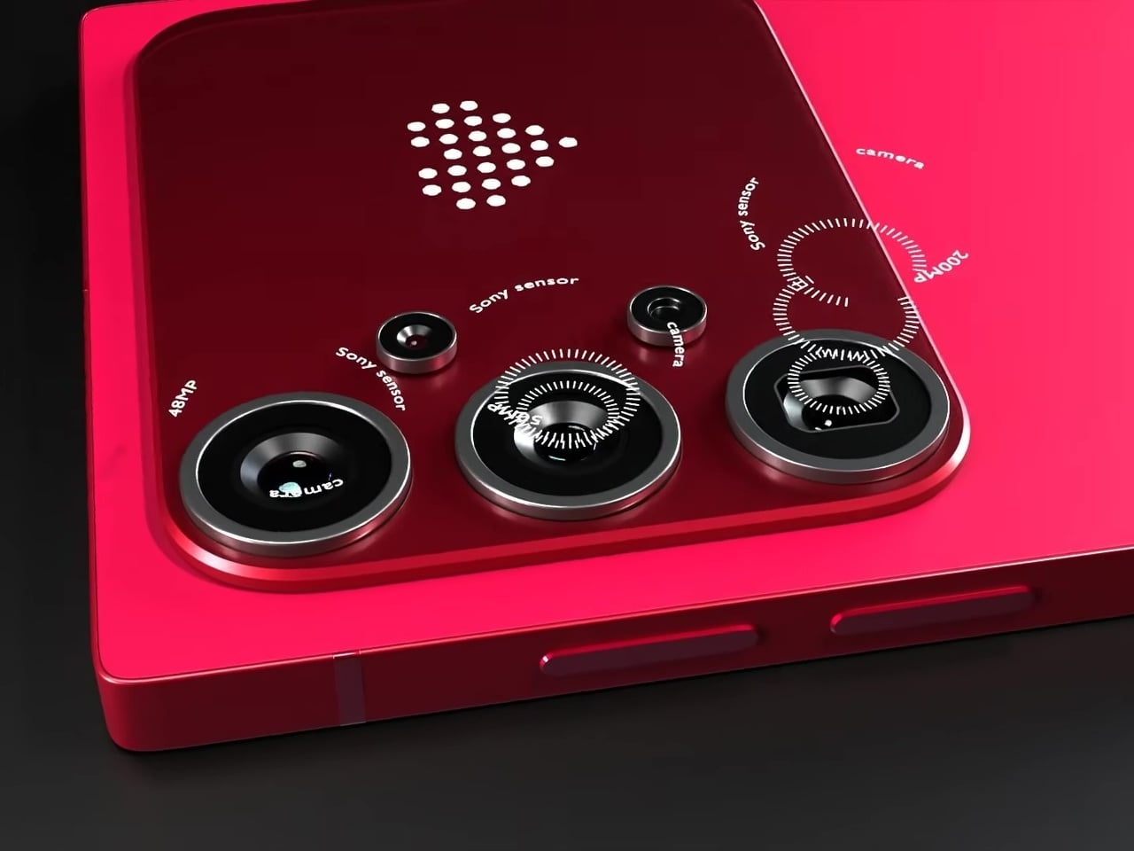
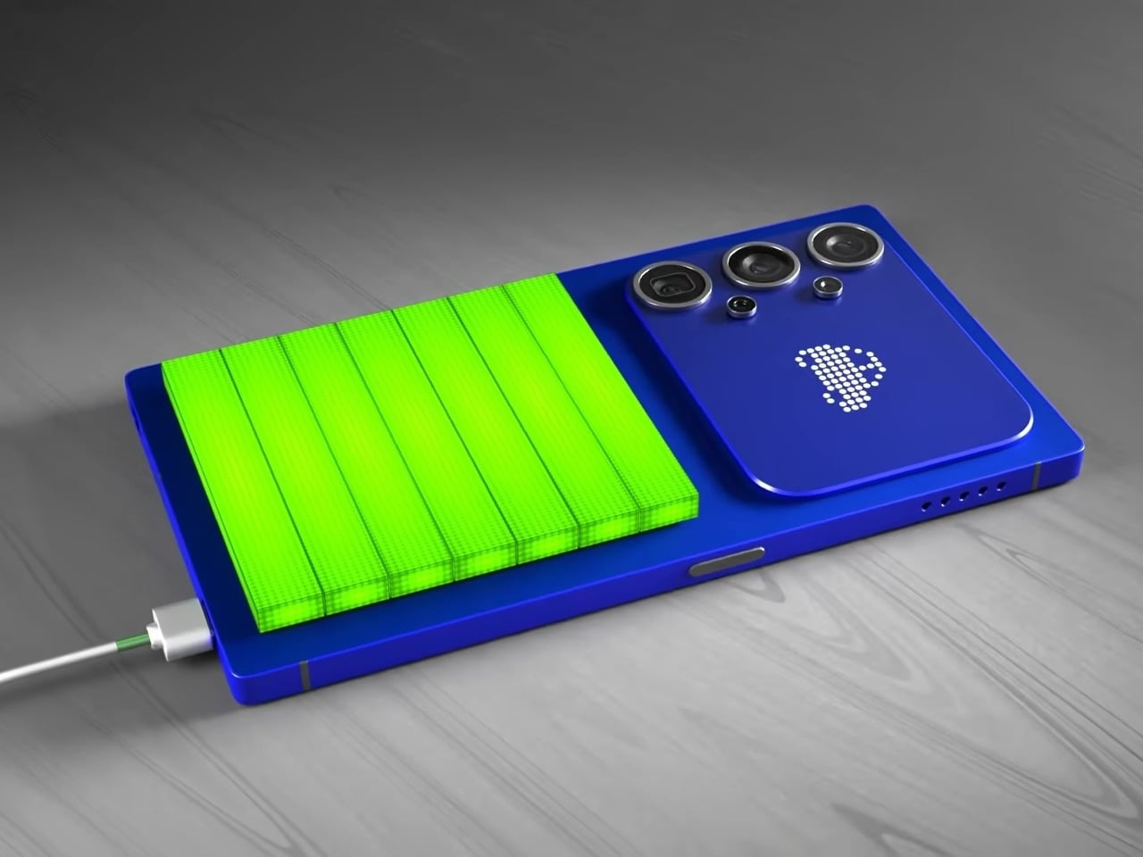
The most unexpected element on the back isn’t the camera. Nestled beside the vertical triple-lens array is a dot-matrix LED display that shows customizable pixel art animations, swapping between icons as conditions change. It’s the same logic that Nothing applied with its Glyph Matrix and that ASUS uses on ROG devices: the back of a phone has real estate that can do something, and simply leaving it matte glass feels increasingly like an opportunity missed.

In practice, that small display becomes a second layer of expression without pulling attention away from the main screen. Notification icons, charge indicators, and personalizable graphics all live on a surface that’s visible when the phone rests face down or sits on a desk, the exact moment when the front display is least useful. The concept proposes this as an attention filter as much as a personalization feature.

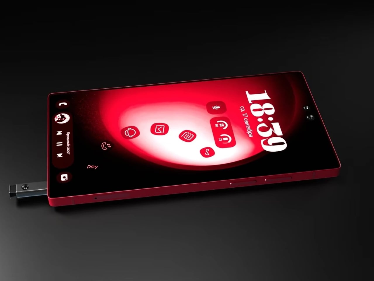
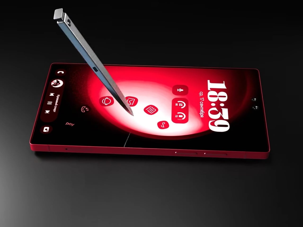
The S Pen slots into the bottom rail via a spring-ejected silo, appearing chunkier than the slim stylus Galaxy Note and Ultra users are familiar with, which may be more a rendering artifact than an intended design change. The front is a flat, edge-to-edge panel with a dual punch-hole selfie camera configuration at the top center, serving the kind of stylus-optimized interface that the Note series built its identity around. The high-contrast red UI reads as purpose-designed for wide-open canvas navigation.

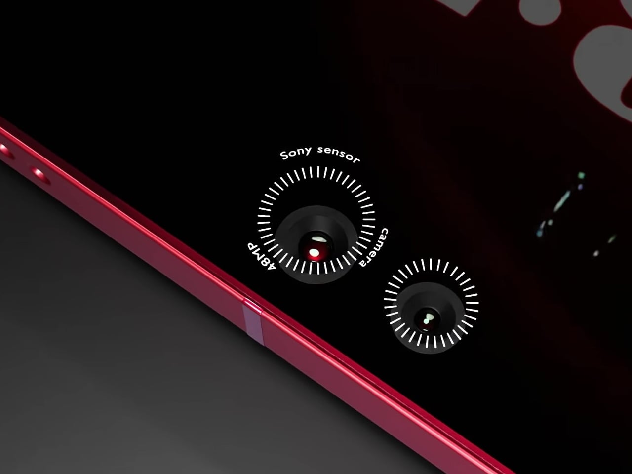
Camera specifications go ambitious: a 200MP main sensor paired with 48MP Sony sensors and periscope telephoto optics round out the vertical lens configuration. The USB-C port, notably, isn’t centered on the bottom edge, a small but visible deviation from convention. And this is where the whimsical and fantastical nature of the design shows through.

None of this is real, of course. Samsung hasn’t announced any plans to revive the Note name, and the dot-matrix display exists in the realm of render enthusiasm rather than confirmed engineering. What the concept captures is a reasonable frustration: the Ultra line has drifted from the qualities that made it distinct, and features appearing elsewhere, like Nothing’s Glyph Matrix, suggest the broader market hasn’t fully moved past wanting the back of a phone to say something.

The post Samsung Killed the Galaxy Note, but This S27 Concept Brings It Back first appeared on Yanko Design.

The $499 E Ink Tablet That Runs Spotify, WhatsApp and Doesn’t Hurt

Screens have been the unresolved tension at the center of productivity for years. LCD and OLED displays do everything well except the one thing that matters most during a long reading or writing session: they don’t stop being screens. The brightness, the blue light, and the glare accumulate into eye fatigue that most people simply accept as part of working on a device all day. E Ink tablets have addressed that problem, but historically at the cost of color and app freedom.

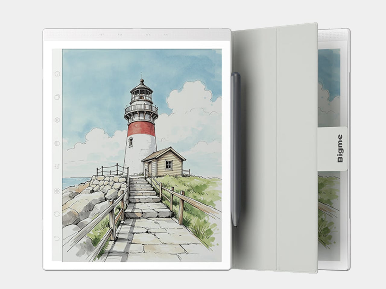
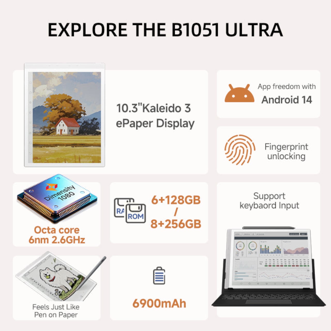
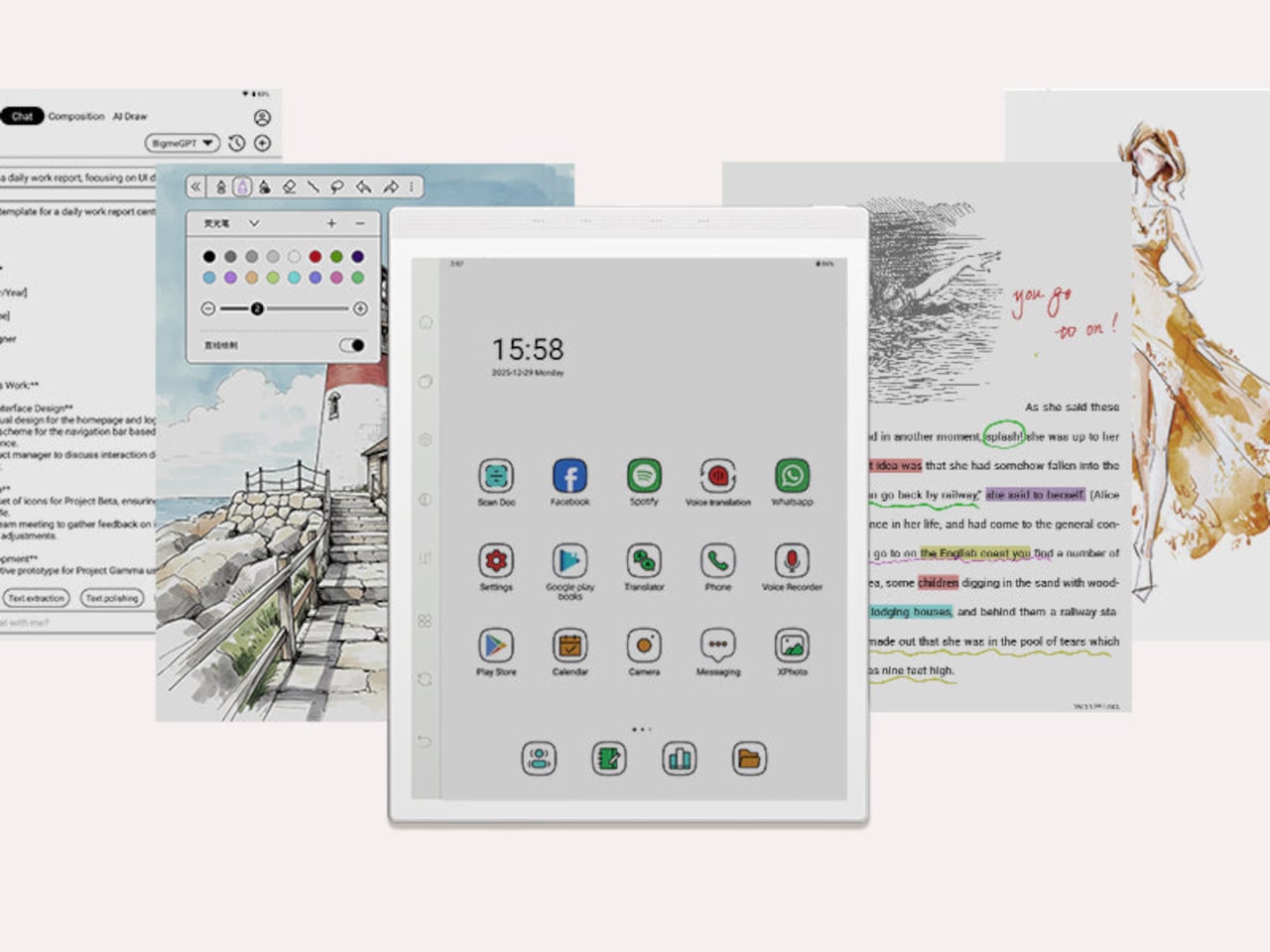
The Bigme B1051 Ultra is built on the premise that none of those trade-offs need to be permanent. Its 10.3-inch Kaleido 3 E Ink display is color-capable and glare-free, with an adjustable front light covering 36 levels of brightness in both warm and cool tones. The result is a surface that handles illustrated documents, annotated PDFs, and color-coded spreadsheets without sending the wearer reaching for eye drops an hour in.

Designer: Bigme

Color E Ink of any generation has historically been limited in brightness and saturation compared to traditional displays, and the Kaleido 3 panel doesn’t fully close that gap. What it does deliver is a dramatically more comfortable reading experience for long sessions, particularly in well-lit environments where conventional displays produce the most glare. For documents, annotations, and notes, the color rendering is more than sufficient to make the information readable without eye strain.

The hardware underneath is capable enough to run Android 14 without compromise. A MediaTek Dimensity 1080 octa-core chip running at 2.6GHz with up to 8GB of RAM handles third-party apps from Google Play without the sluggishness that plagued earlier E Ink Android devices. Spotify works. WhatsApp runs. The Google Play Store is fully accessible. A 6,900mAh battery supports the kind of all-day use the form factor implies.

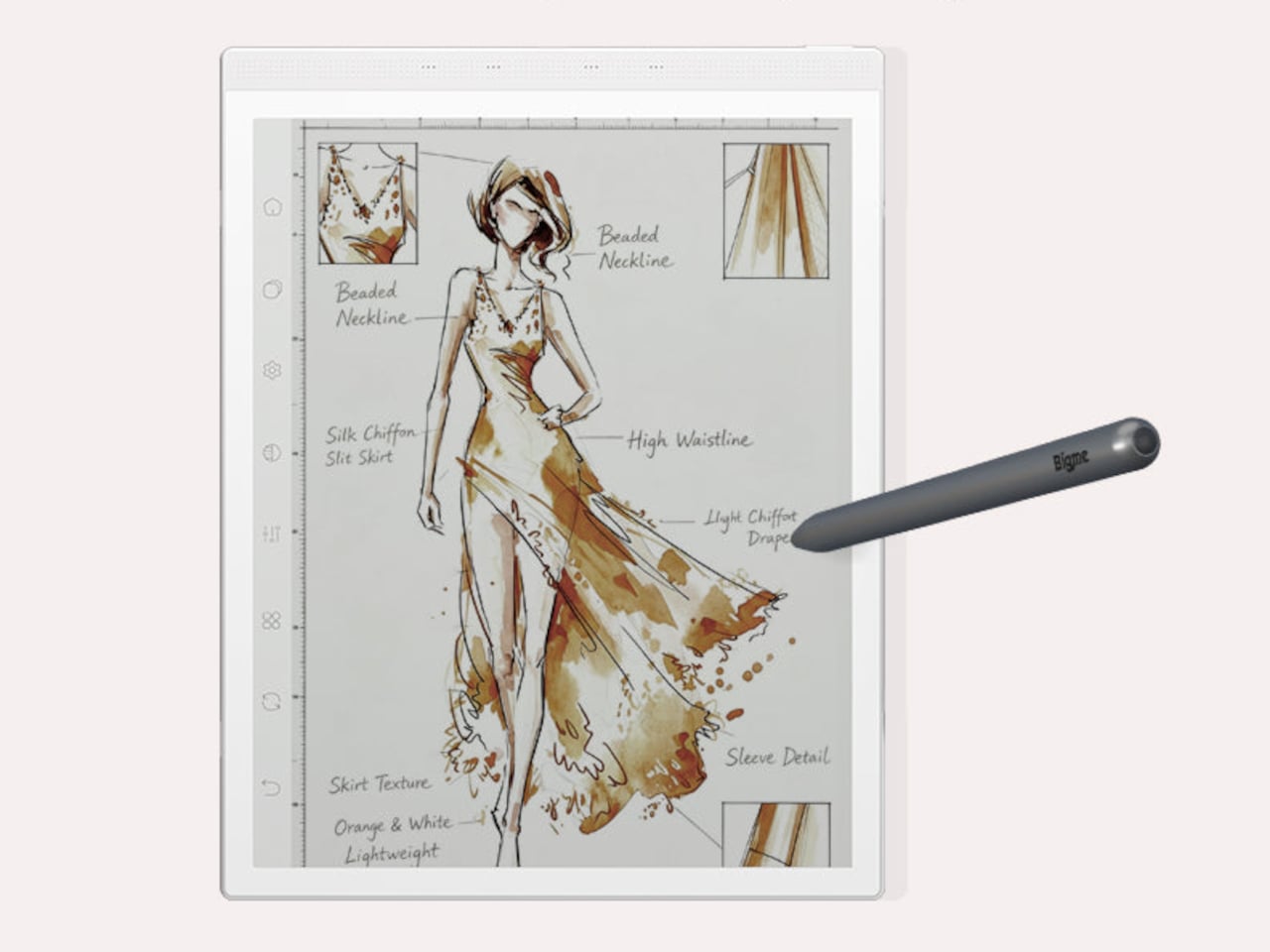
Writing and sketching feel natural on the included stylus, which offers 4,096 levels of pressure sensitivity and a surface friction designed to replicate paper. An annotated legal document, a fashion sketch with labeled callouts, or a watercolor illustration all sit on the display with the same kind of grainless, paper-like quality. Bigme’s auto ghosting elimination technology handles the visual artifacts that have historically made fast stylus input on E Ink screens feel laggy or muddy.

The optional keyboard folio cover turns the B1051 Ultra into something that reads more like an e-paper laptop. A trackpad is built into the keyboard, and the folio supports dual-angle positioning for desk and lap use. Connecting to an external keyboard and looking at a dashboard of charts and figures across the full 10.3-inch surface is a different experience from doing the same work on an LCD that competes with every other light source in the room.

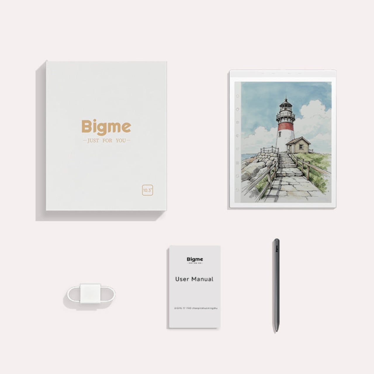
Integrated AI tools extend beyond the display and stylus. Text extraction, text polishing, AI-assisted drawing, and composition features are baked into the software layer. Fingerprint unlocking handles access. The B1051 Ultra is available starting at $499 for the device-and-case bundle, with the keyboard configuration adding to that. E Ink has always been the right technology for certain kinds of work, and the Bigme B1051 Ultra is one of the more complete arguments that it doesn’t need black-and-white e-readers to make that case convincingly.

The post The $499 E Ink Tablet That Runs Spotify, WhatsApp and Doesn’t Hurt first appeared on Yanko Design.

This Modded Android Phone Runs The Witcher 3 at 1080p Ultra Settings

The boundary between a smartphone and a desktop computer has been narrowing for years. Modern flagship phones carry processor configurations, RAM capacities, and GPU performance that would have qualified as desktop territory not long ago. Most of the time, that hardware sits underutilized inside a slim glass slab, throttled by thermals the moment any sustained workload asks it to perform at its actual ceiling.

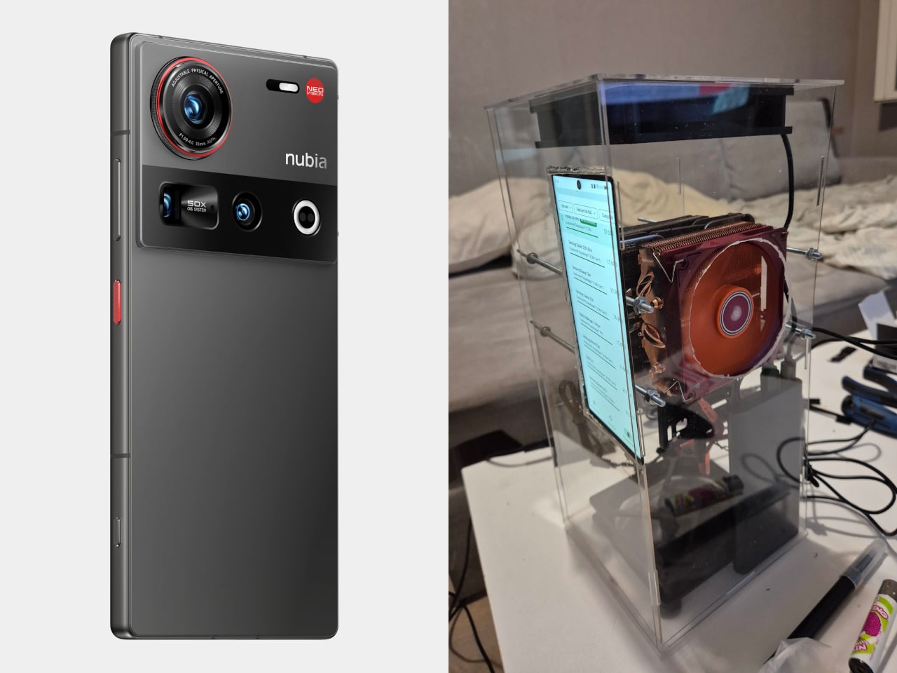
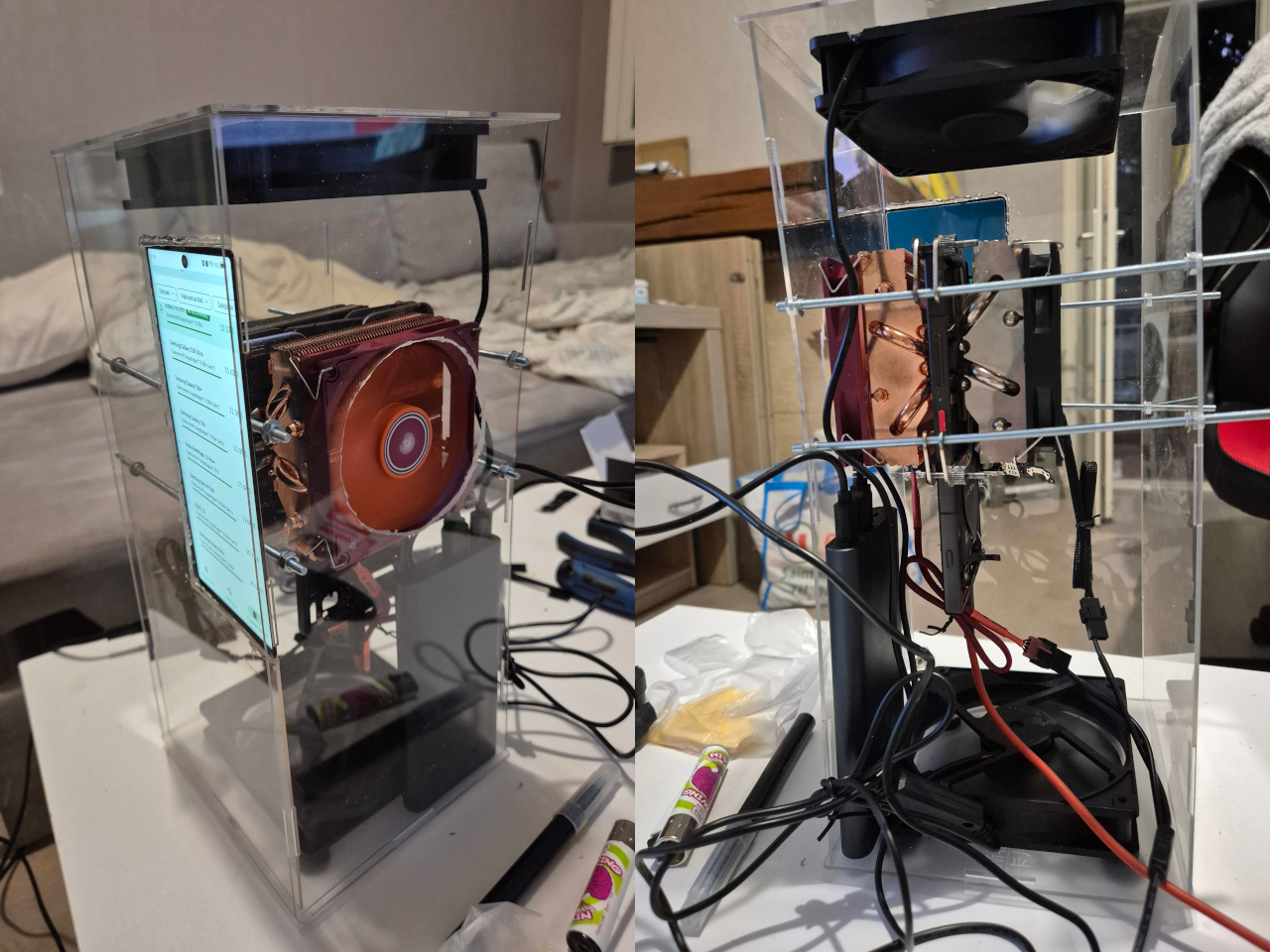
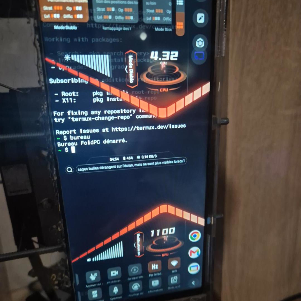
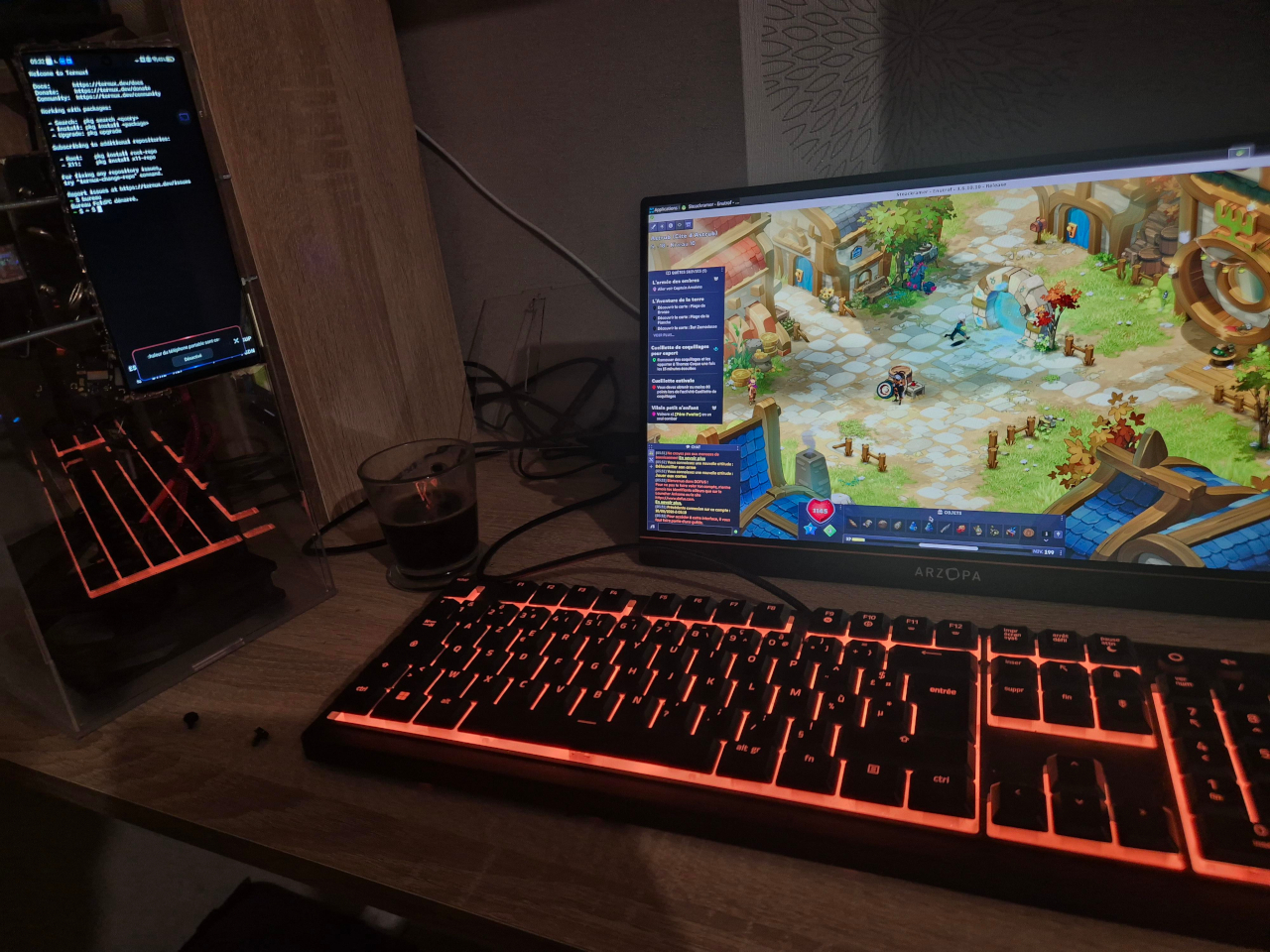
One modder decided to find out what a flagship Android phone such as the nubia Z70 Ultra could actually do if thermal throttling was removed from the equation. The answer involved relocating the screen to the front of a custom acrylic case and sandwiching the phone itself between two desktop-grade CPU coolers with direct contact against the Snapdragon chip’s shielding. The result doesn’t fit neatly into any existing product category.
Designer: ntsow

The Nubia Z70 Ultra carries a Snapdragon 8 Elite processor with a maximum clock speed of 4.32 GHz and 24 GB of RAM. Removing the screen was the key step: the CPU coolers need direct access to the chip’s shielding for full thermal contact, so the display had to migrate to the outside of the case. A power bank handles the energy supply, completing the self-contained build.

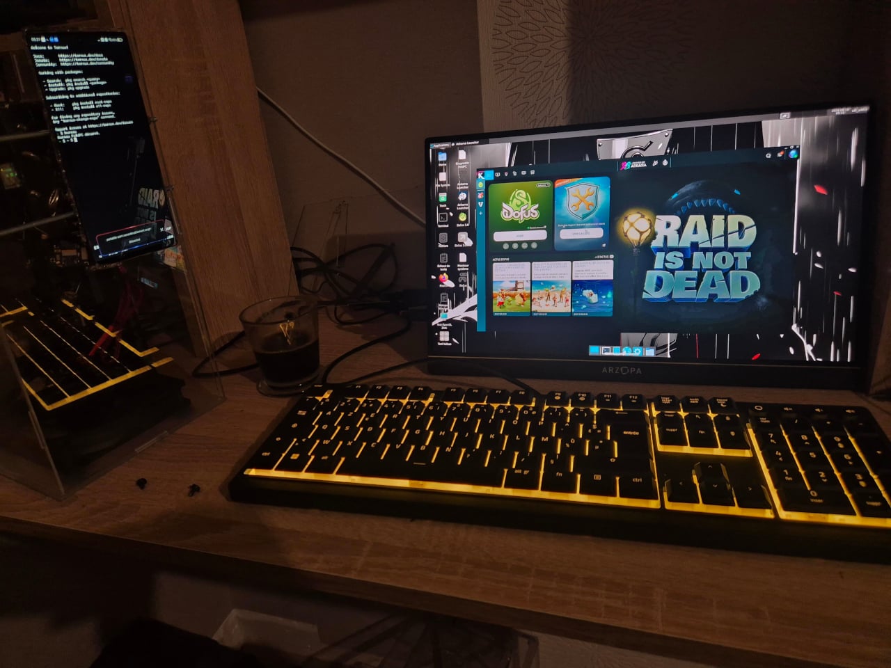
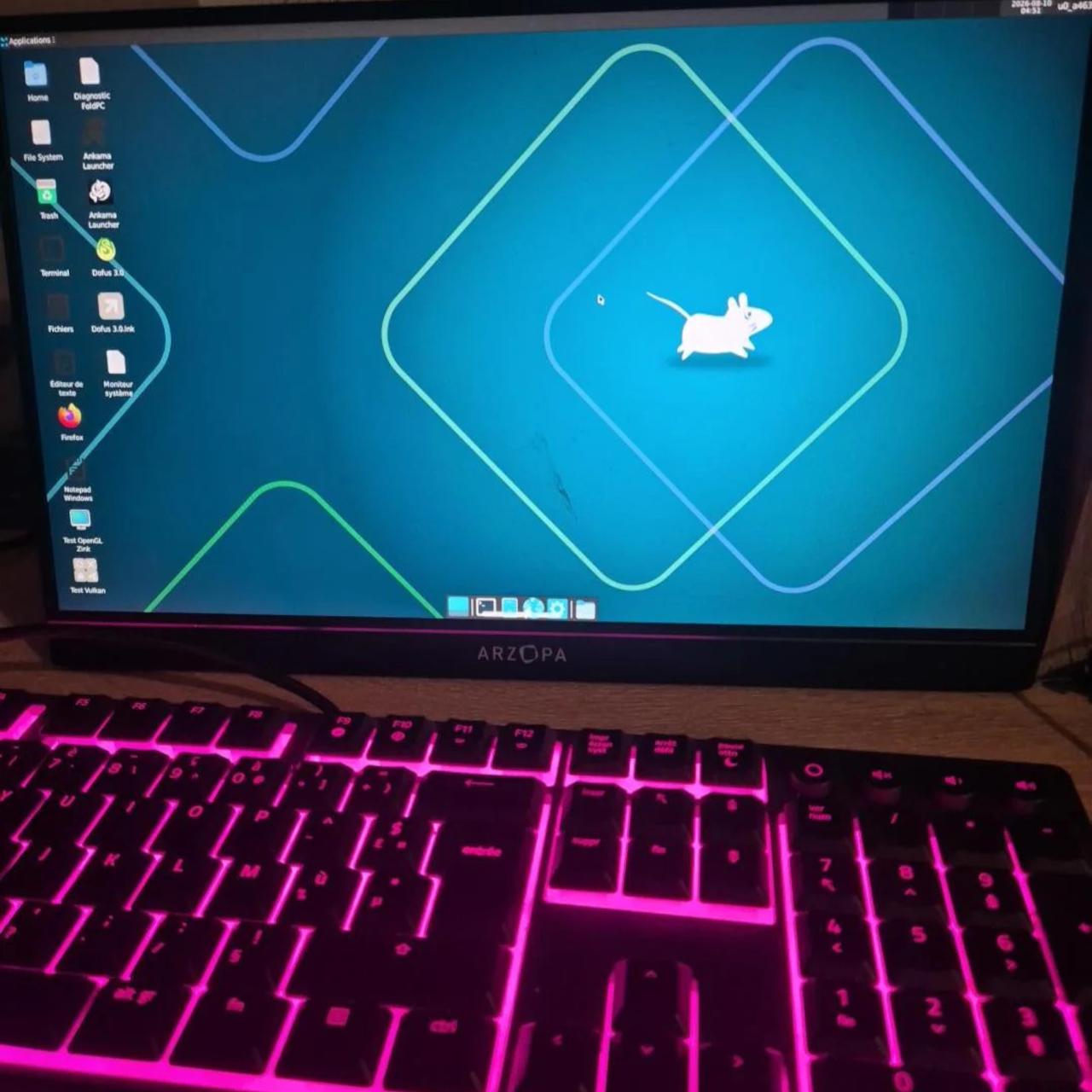
On the software side, the build runs a full XFCE Linux desktop through Termux with GPU acceleration, layering Windows application support on top via Wine and Box64. The Android system remains fully intact underneath, making the device simultaneously a phone, a Linux workstation, and a Windows gaming machine. The stated end goal is one device that handles everything, including native Linux work and full Windows game support.

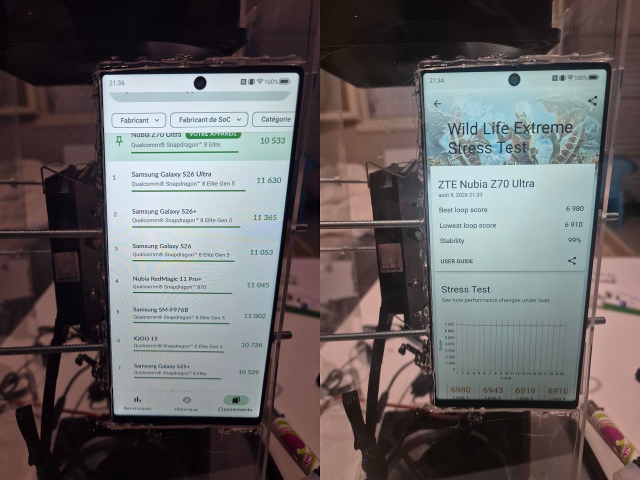
The cooling changes what the hardware is capable of sustaining. In 3DMark’s Wild Life Extreme Stress Test, the modified phone achieved 99% stability across 20 loops, outperforming the newer Snapdragon 8 Elite Gen 5, Apple A19 Pro, and Dimensity 9500 on the consistency metric. That sustained performance is the point: most mobile chips can briefly hit impressive scores, but they thermal-throttle within minutes under continuous load.

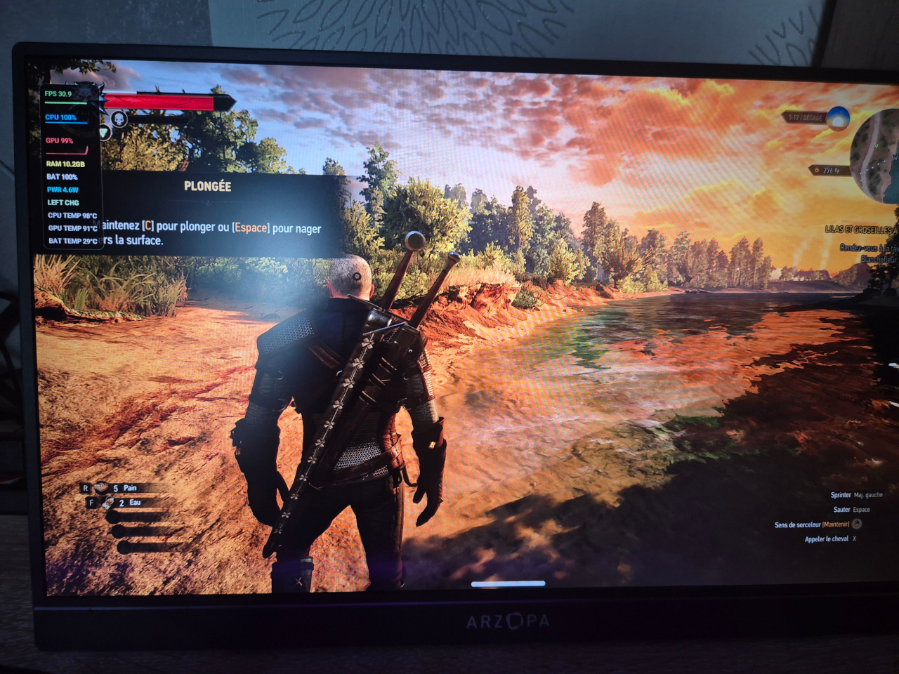
The Witcher 3 runs at 1080p with Ultra graphics settings, hitting 20 to 30 fps and occasionally exceeding 30 fps when the phone operates in its maximum-performance overclocking mode. The Adreno GPU runs at 99% utilization during those sessions, and the build connects to an external monitor with keyboard and mouse support for a genuine desktop gaming setup. For an Android phone, the performance is difficult to dismiss.

What the build demonstrates is less about running The Witcher 3 at any particular resolution and more about how far the gap between a phone and a desktop has actually closed. Adequate cooling was the only thing separating the Snapdragon 8 Elite from sustained desktop-class workloads. The question the project raises isn’t whether phones can replace PCs but how much work remains before the hardware inside them can already handle it.

The post This Modded Android Phone Runs The Witcher 3 at 1080p Ultra Settings first appeared on Yanko Design.