The Sazae Radio was a Japanese novelty radio built into a turban shell, sold by lottery in 2016 with just 100 units available for 8,350 applicants. The odds were 83.5 to one. Losing that lottery left a maker named hide-key with a simple choice: accept the disappointment or build something better. The DIY pivot turned into the Steampunk Nautilus, a haptic speaker project that takes a similar idea and pushes it considerably further.
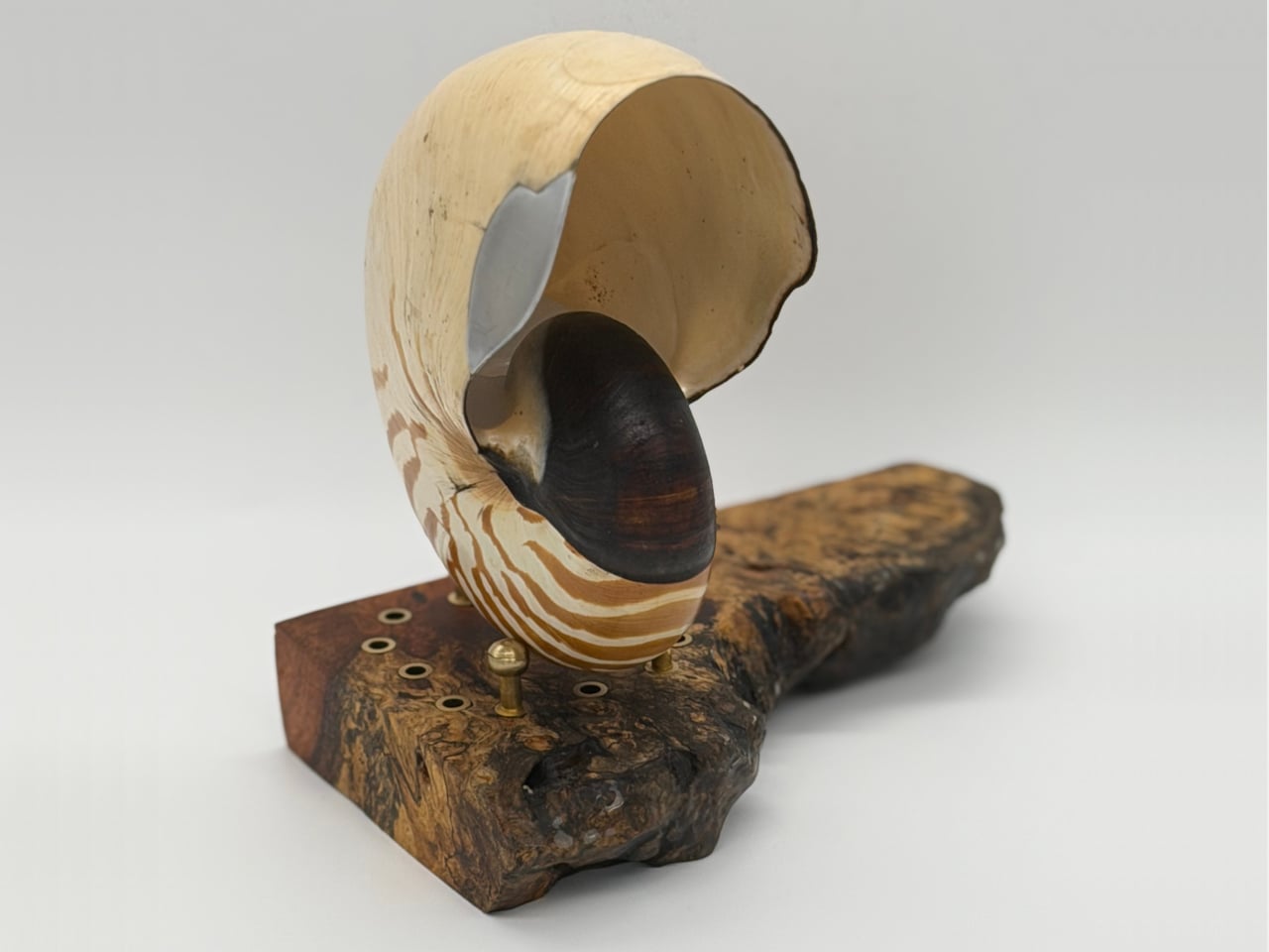
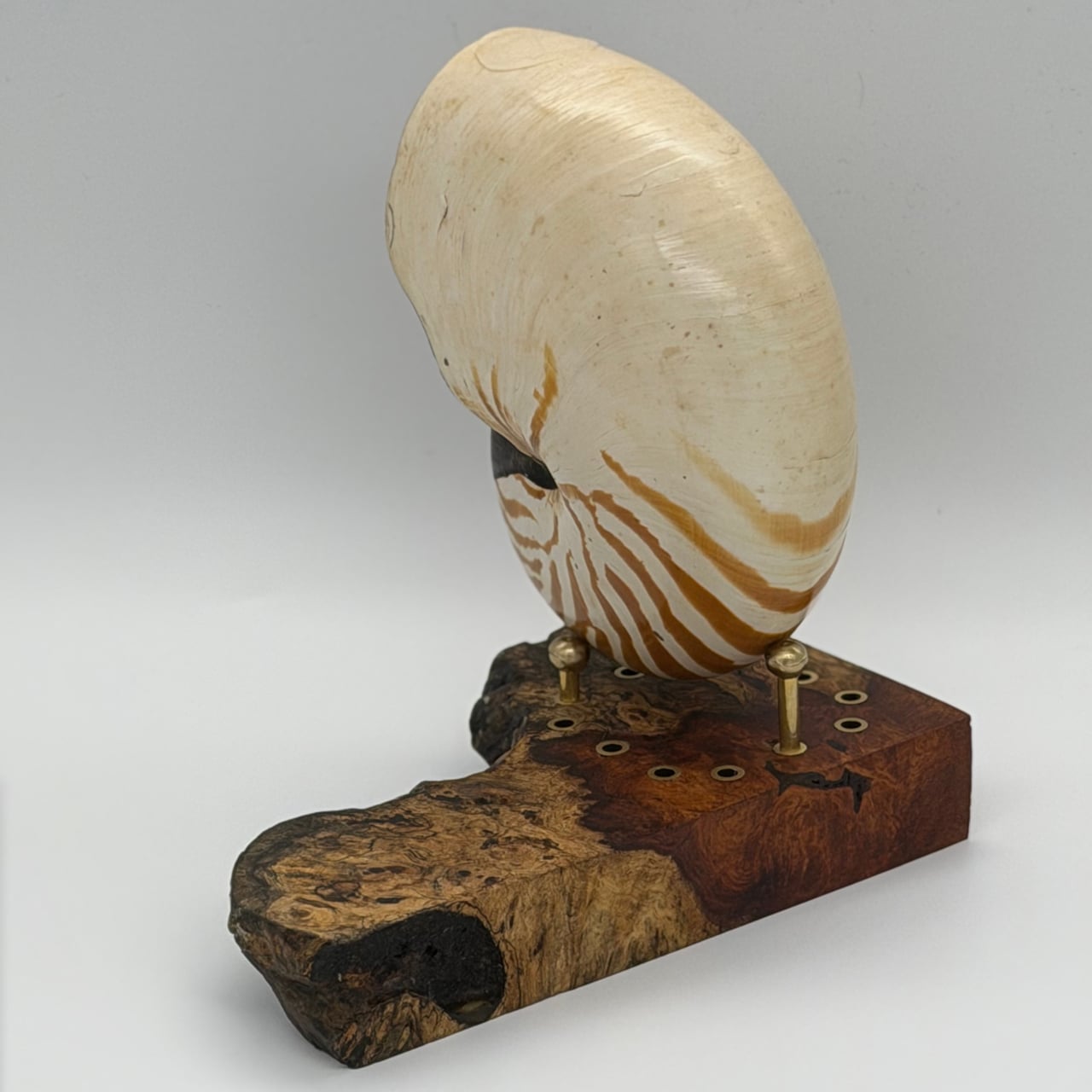
The choice was a nautilus shell, a living fossil that has barely changed in 500 million years. Discovering that its English name matched Jules Verne’s submarine sealed the decision. The goal became not just a speaker, but a piece of audio art with three rules: steampunk-kintsugi repair, where metal celebrates the shell’s imperfections, conservation-minded reversibility, where every adhesive can be removed with acetone, and a haptic drive that turns the shell itself into a vibrating diaphragm.
Early experiments failed. A massive sea snail shell refused to vibrate, too thick and heavy for a small exciter to drive. The nautilus, by contrast, worked immediately. Its thin, lightweight structure, built for buoyancy, behaves like a violin body or speaker cone, with internal ribs adding resonance without mass. The project quietly became a study in bioacoustics, where shell biology dictated whether the fossil could sing, and heavy shells behaved like bricks.
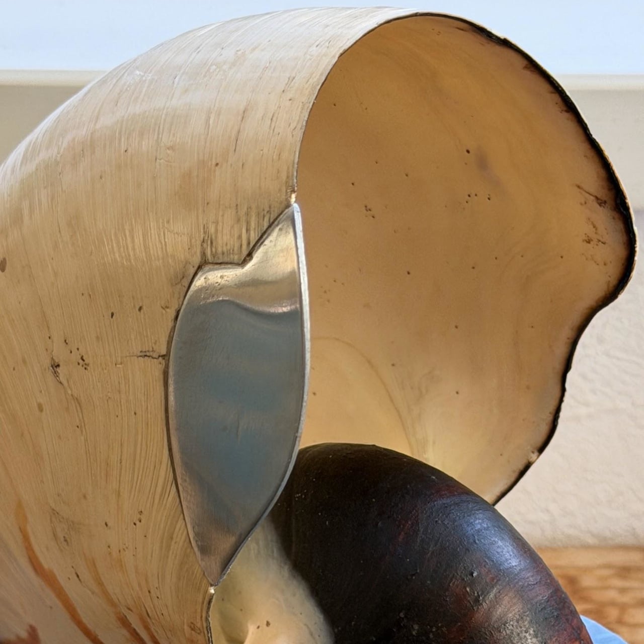
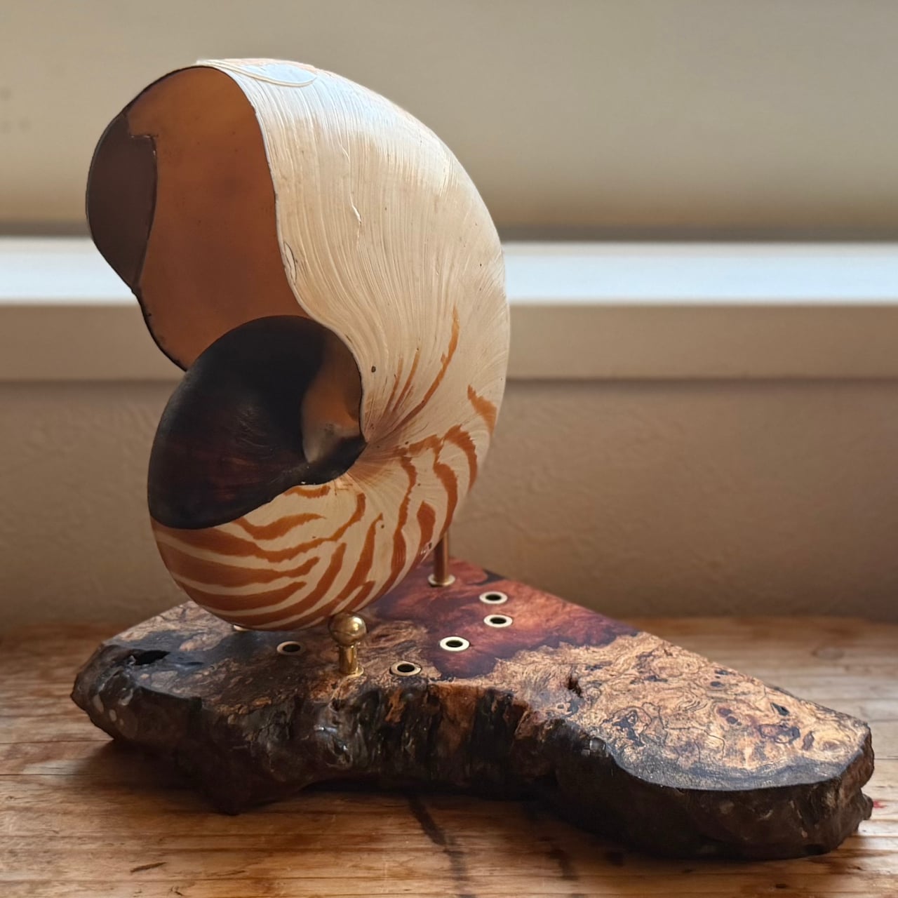
The build starts with a chipped shell and leans into the damage. The broken area is traced, and a 1.2 mm aluminum sheet is hammered and filed to match the organic curve, polished to a mirror, and attached with cyanoacrylate and brass-colored epoxy putty. All adhesives were chosen so they can be removed with acetone, leaving the shell intact underneath. Reversibility was treated as a hard constraint, respecting the specimen while giving it a new function.
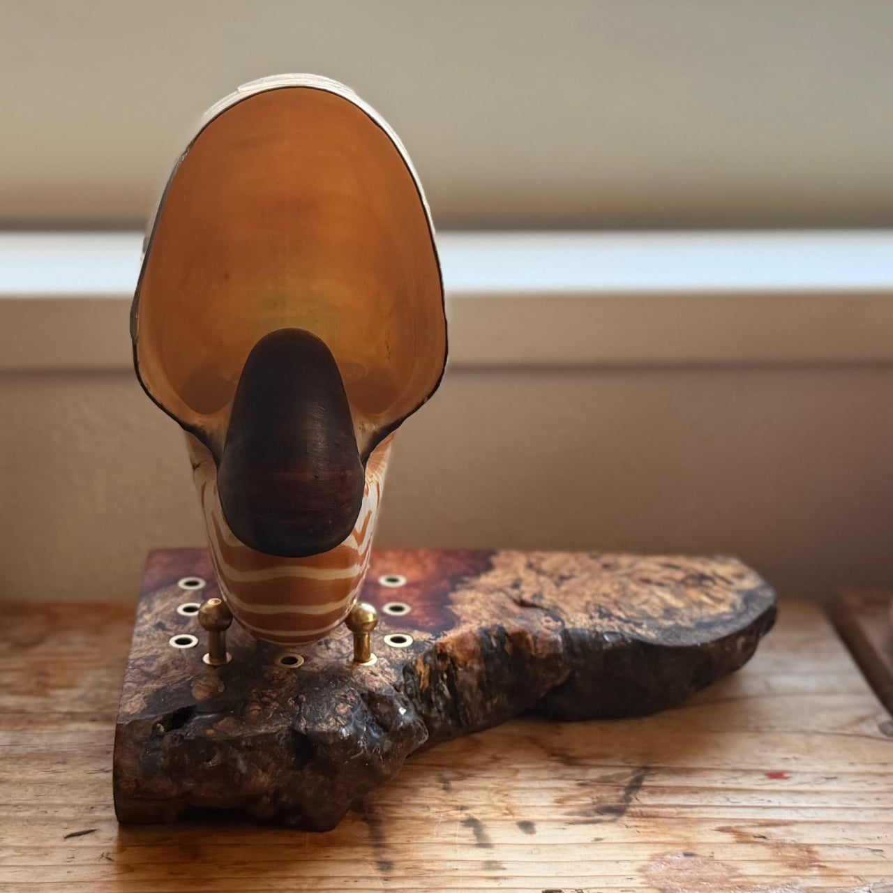
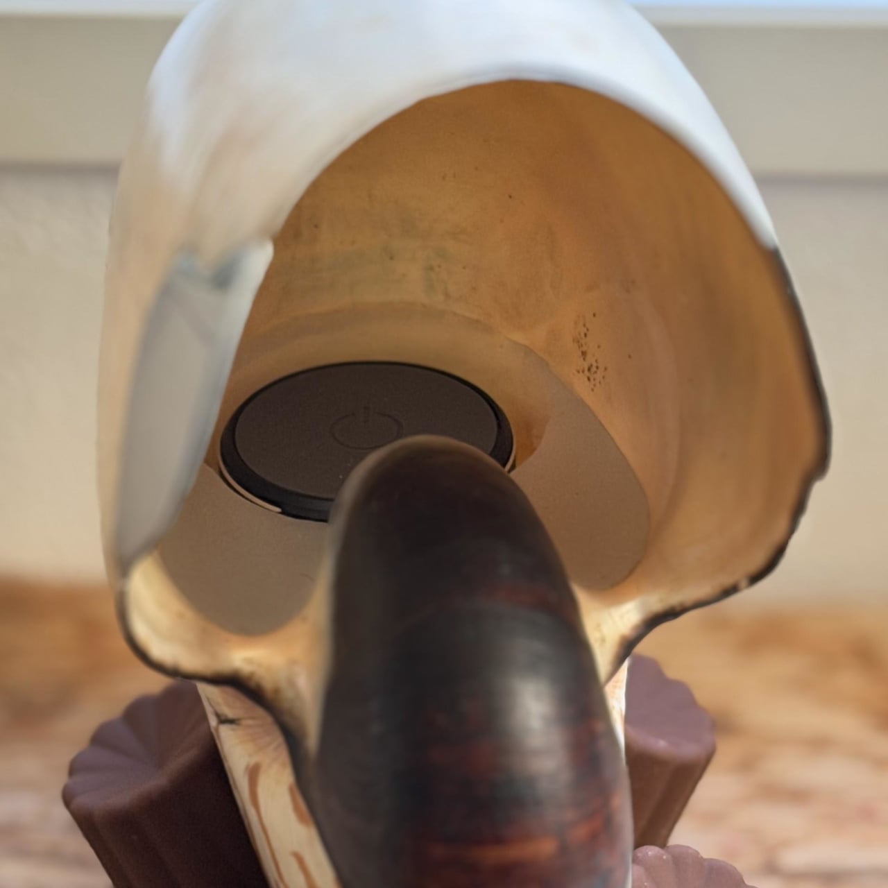
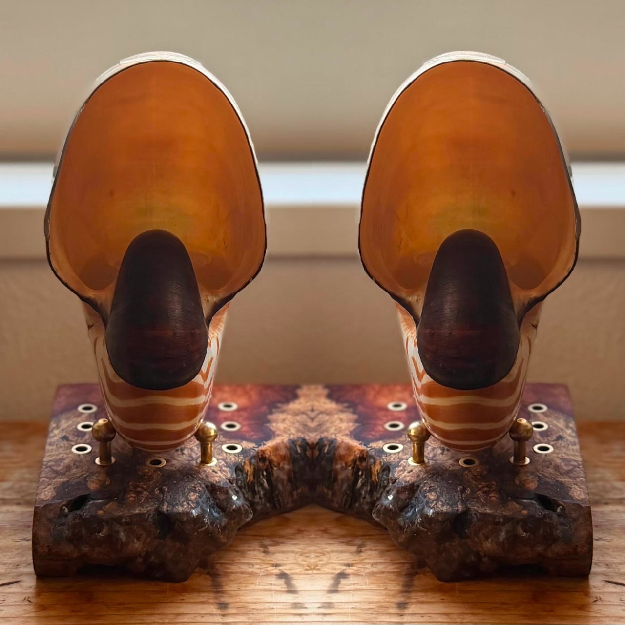
The haptic core moved from a boring internal speaker to a vibration exciter mounted in a custom silicone cartridge that fits the shell’s living chamber. Water displacement measured the volume at just 50 cc, and Shore 15A silicone was poured to create a perfect seat. A transparent hair band acts as a hidden pull tab, and a silicone cap hides the exciter and diffuses its faint blue LED into a heartbeat-like glow deep in the spiral.
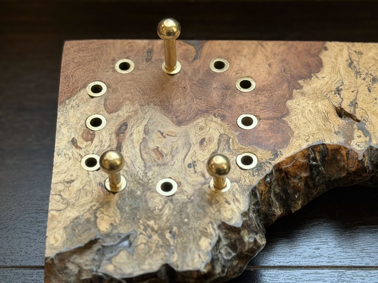
The base is a Quince burl chosen for its red, white, and black grain that echoes the shell’s pattern. A Magic Circle layout of brass bushings lets the shell’s angle be changed by moving three brass pillars. Threaded brass rods with ball nuts support the shell, and a drop of soft UV resin on each contact point prevents buzzing, making the heavy fossil appear to float while staying mechanically quiet.
Three hidden modes emerge. Holding the shell in your hands for bone-conducted haptic listening, shifting the exciter between internal and external mounts to change the sound from lo-fi radio to a sharper, more direct tone, and the dream of a stereo pair if a second shell appears. The Steampunk Nautilus turns a broken specimen into a reversible, vibrating instrument that asks you to feel the music as much as hear it, turning disappointment from a lottery into something tactile, strange, and surprisingly beautiful.
The Sazae Radio was a Japanese novelty radio built into a turban shell, sold by lottery in 2016 with just 100 units available for 8,350 applicants. The odds were 83.5 to one. Losing that lottery left a maker named hide-key with a simple choice: accept the disappointment or build something better. The DIY pivot turned into the Steampunk Nautilus, a haptic speaker project that takes a similar idea and pushes it considerably further.
The choice was a nautilus shell, a living fossil that has barely changed in 500 million years. Discovering that its English name matched Jules Verne’s submarine sealed the decision. The goal became not just a speaker, but a piece of audio art with three rules: steampunk-kintsugi repair, where metal celebrates the shell’s imperfections, conservation-minded reversibility, where every adhesive can be removed with acetone, and a haptic drive that turns the shell itself into a vibrating diaphragm.
Early experiments failed. A massive sea snail shell refused to vibrate, too thick and heavy for a small exciter to drive. The nautilus, by contrast, worked immediately. Its thin, lightweight structure, built for buoyancy, behaves like a violin body or speaker cone, with internal ribs adding resonance without mass. The project quietly became a study in bioacoustics, where shell biology dictated whether the fossil could sing, and heavy shells behaved like bricks.
The build starts with a chipped shell and leans into the damage. The broken area is traced, and a 1.2 mm aluminum sheet is hammered and filed to match the organic curve, polished to a mirror, and attached with cyanoacrylate and brass-colored epoxy putty. All adhesives were chosen so they can be removed with acetone, leaving the shell intact underneath. Reversibility was treated as a hard constraint, respecting the specimen while giving it a new function.
The haptic core moved from a boring internal speaker to a vibration exciter mounted in a custom silicone cartridge that fits the shell’s living chamber. Water displacement measured the volume at just 50 cc, and Shore 15A silicone was poured to create a perfect seat. A transparent hair band acts as a hidden pull tab, and a silicone cap hides the exciter and diffuses its faint blue LED into a heartbeat-like glow deep in the spiral.
The base is a Quince burl chosen for its red, white, and black grain that echoes the shell’s pattern. A Magic Circle layout of brass bushings lets the shell’s angle be changed by moving three brass pillars. Threaded brass rods with ball nuts support the shell, and a drop of soft UV resin on each contact point prevents buzzing, making the heavy fossil appear to float while staying mechanically quiet.
Three hidden modes emerge. Holding the shell in your hands for bone-conducted haptic listening, shifting the exciter between internal and external mounts to change the sound from lo-fi radio to a sharper, more direct tone, and the dream of a stereo pair if a second shell appears. The Steampunk Nautilus turns a broken specimen into a reversible, vibrating instrument that asks you to feel the music as much as hear it, turning disappointment from a lottery into something tactile, strange, and surprisingly beautiful.
The Sazae Radio was a Japanese novelty radio built into a turban shell, sold by lottery in 2016 with just 100 units available for 8,350 applicants. The odds were 83.5 to one. Losing that lottery left a maker named hide-key with a simple choice: accept the disappointment or build something better. The DIY pivot turned into the Steampunk Nautilus, a haptic speaker project that takes a similar idea and pushes it considerably further.
The choice was a nautilus shell, a living fossil that has barely changed in 500 million years. Discovering that its English name matched Jules Verne’s submarine sealed the decision. The goal became not just a speaker, but a piece of audio art with three rules: steampunk-kintsugi repair, where metal celebrates the shell’s imperfections, conservation-minded reversibility, where every adhesive can be removed with acetone, and a haptic drive that turns the shell itself into a vibrating diaphragm.
Early experiments failed. A massive sea snail shell refused to vibrate, too thick and heavy for a small exciter to drive. The nautilus, by contrast, worked immediately. Its thin, lightweight structure, built for buoyancy, behaves like a violin body or speaker cone, with internal ribs adding resonance without mass. The project quietly became a study in bioacoustics, where shell biology dictated whether the fossil could sing, and heavy shells behaved like bricks.
The build starts with a chipped shell and leans into the damage. The broken area is traced, and a 1.2 mm aluminum sheet is hammered and filed to match the organic curve, polished to a mirror, and attached with cyanoacrylate and brass-colored epoxy putty. All adhesives were chosen so they can be removed with acetone, leaving the shell intact underneath. Reversibility was treated as a hard constraint, respecting the specimen while giving it a new function.
The haptic core moved from a boring internal speaker to a vibration exciter mounted in a custom silicone cartridge that fits the shell’s living chamber. Water displacement measured the volume at just 50 cc, and Shore 15A silicone was poured to create a perfect seat. A transparent hair band acts as a hidden pull tab, and a silicone cap hides the exciter and diffuses its faint blue LED into a heartbeat-like glow deep in the spiral.
The base is a Quince burl chosen for its red, white, and black grain that echoes the shell’s pattern. A Magic Circle layout of brass bushings lets the shell’s angle be changed by moving three brass pillars. Threaded brass rods with ball nuts support the shell, and a drop of soft UV resin on each contact point prevents buzzing, making the heavy fossil appear to float while staying mechanically quiet.
Three hidden modes emerge. Holding the shell in your hands for bone-conducted haptic listening, shifting the exciter between internal and external mounts to change the sound from lo-fi radio to a sharper, more direct tone, and the dream of a stereo pair if a second shell appears. The Steampunk Nautilus turns a broken specimen into a reversible, vibrating instrument that asks you to feel the music as much as hear it, turning disappointment from a lottery into something tactile, strange, and surprisingly beautiful.
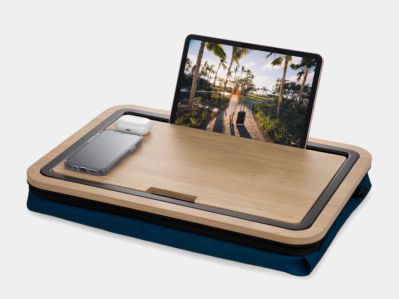
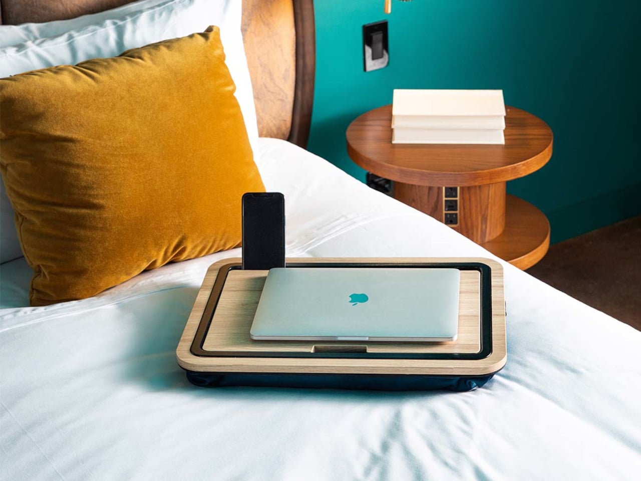
A lot of work now happens on beds, sofas, and in hotel rooms, with laptops balanced on knees and chargers snaking across blankets. Most lap desks are flimsy plastic trays that solve heat and stability but do nothing for clutter, leaving pens, earbuds, and phones scattered around you. The Arlo Skye Stowaway Lap Desk is a piece of travel-inspired furniture that tries to make mobile work feel less improvised and more intentional.
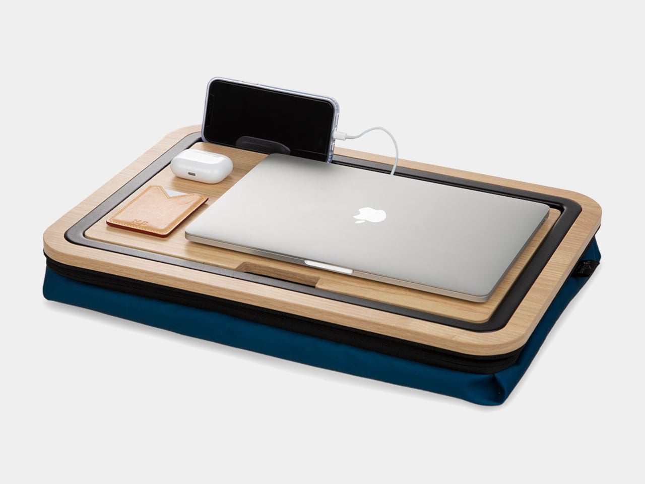
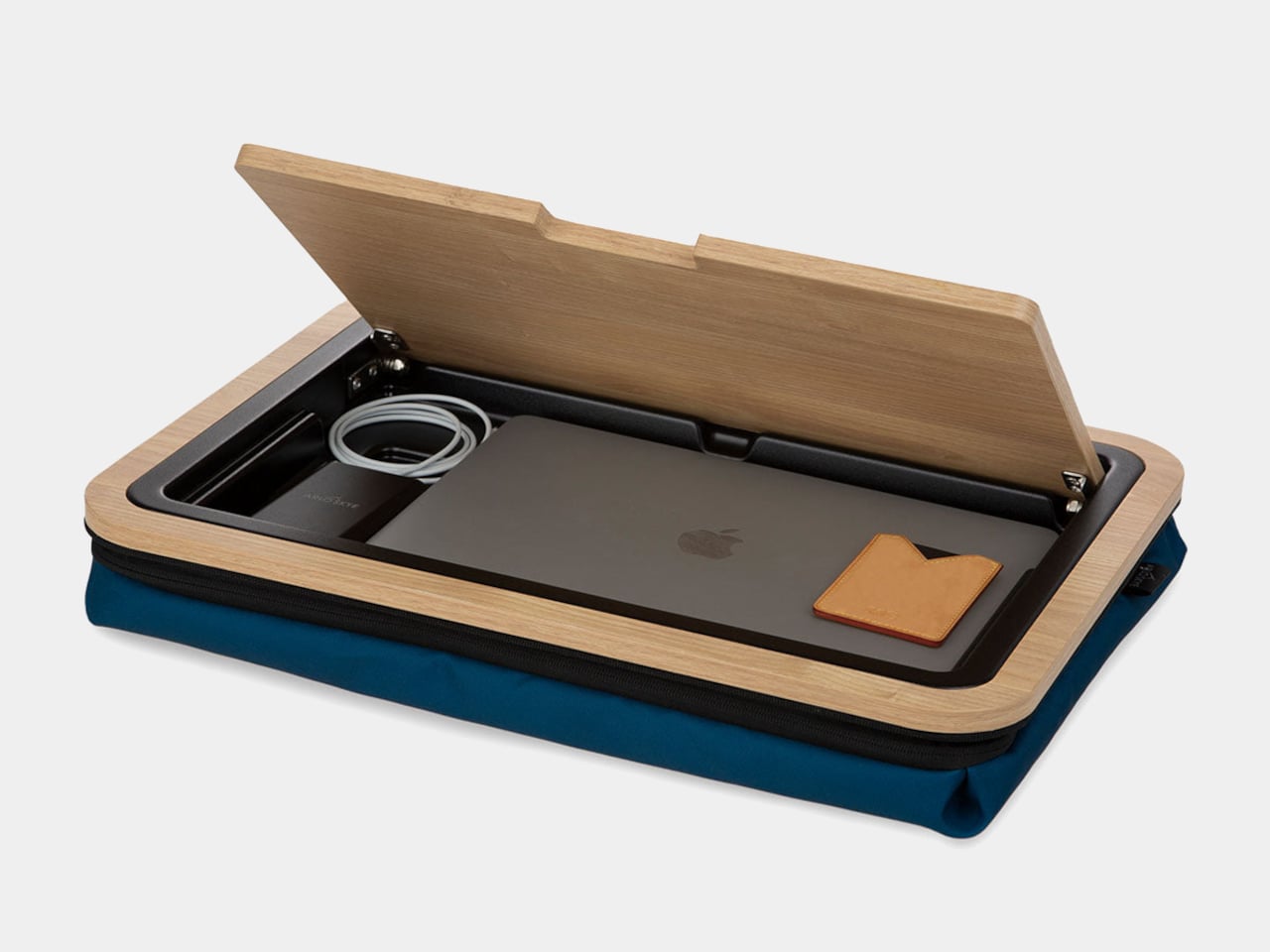
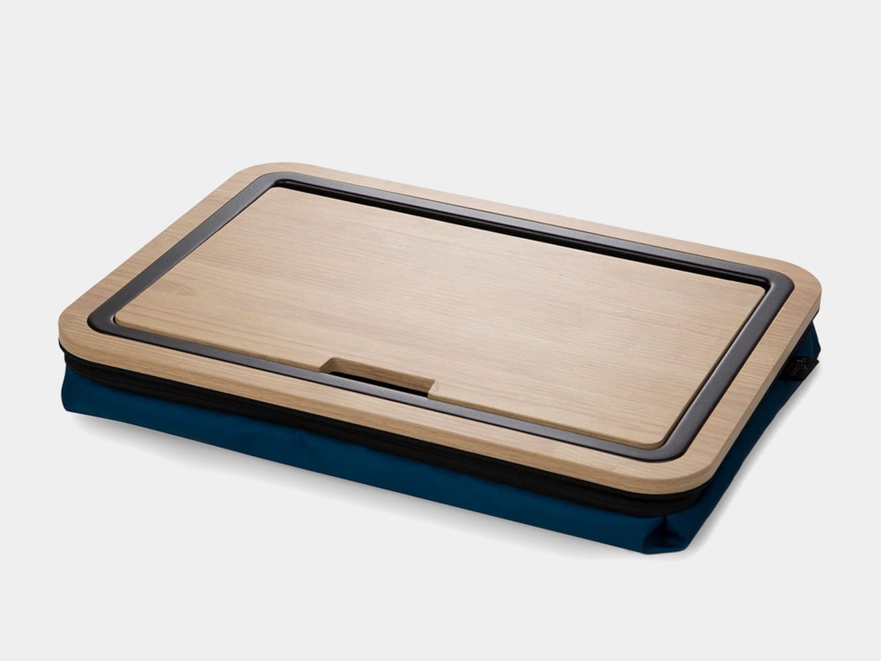
The Stowaway Lap Desk 19 is a compact mobile workstation built around a white-oak work surface and a cushioned base. It is sized for a 16-inch laptop, with room for a mouse or notebook, and designed to move between bed, sofa, and carry-on without looking like office gear. The defining move is the hidden storage built into the desk itself, turning it into a portable drawer for your laptop and everyday tools.
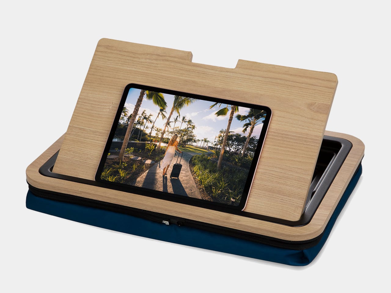
A slot along the back edge holds a tablet or phone upright, turning the lap desk into a small command center with multiple screens. The oak surface is framed by a low lip on three sides, which keeps devices and pens from sliding off when you shift position. The result is a stable, furniture-like platform that feels more like a small table than a tray, with enough space to spread out without everything falling into the blankets.
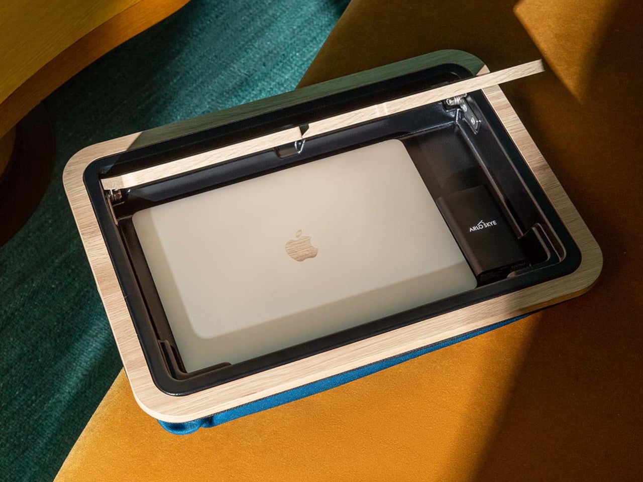
The top opens to reveal a compartment large enough for a laptop, tablet, and flat accessories. That means when you are done working, everything can live inside the desk instead of being scattered across the bed or sofa. A cut-out doubles as a cable pass-through, so you can charge devices while they are tucked away, keeping cords from tangling around your legs or snagging on bedding when you move.
The microbead cushion attached to the underside conforms to your lap and lifts the wooden surface off your legs. It helps with ventilation and spreads weight more evenly than a hard board. Some reviewers find microbeads firmer than expected, but the combination of cushion and wood still feels more considered than a bare tray or a laptop directly on your knees, especially during longer work sessions that stretch past an hour.
The lap desk doubles as a side table or serving tray when you are not working, holding breakfast, snacks, or a book without needing a separate piece of furniture. The oak top and dark cushion let it blend into a bedroom or living room without screaming office, so it can live out in the open instead of being hidden in a closet between uses, ready to grab whenever you need it.
The Stowaway Lap Desk changes the experience of working away from a desk. It corrals your tools, gives them a defined home, and makes it easier to pack up in one motion when you are done. The idea of a lap desk that behaves like a small, self-contained workstation feels like a welcome upgrade over the usual plastic slab, especially when your office is often a bed, sofa, or hotel room and you need every piece of gear to earn its footprint.
Dual functionality in a single, well-designed form
Top-fill design prevents back strain
DermaSense skin mode with intelligent humidity control
Long-life, machine-washable components
Comprehensive hygiene features
CONS:
Large and heavy body feels imposing in small spaces
Only available in one neutral color
Premium price tag
RATINGS:
AESTHETICS
ERGONOMICS
PERFORMANCE
SUSTAINABILITY / REPAIRABILITY
VALUE FOR MONEY
EDITOR'S QUOTE:
The Blueair 2-in-1 Pro Purify + Humidify makes air quality feel like part of your skincare routine, blending serious performance with bedroom-worthy design.
Air purifiers and humidifiers usually look like they belong in a hospital supply closet rather than a bedroom. Most are boxy white appliances with visible mist plumes, blinking lights, and a general vibe that says “I am here to solve a problem” rather than “I belong in this space.” Meanwhile, people who care about sleep quality and skin health are starting to realize that the air itself might be part of the routine.
The Blueair 2‑in‑1 Pro Purify + Humidify feels like Blueair finally designed for people who want both functions but refuse to sacrifice aesthetics or simplicity. It is a tall, sculptural tower that combines serious air purification with gentle, invisible humidification and a skin-focused mode that adjusts humidity based on time of day and room temperature, positioned as step zero in a nighttime skincare routine. Let’s dive in to see if it delivers on its promises.
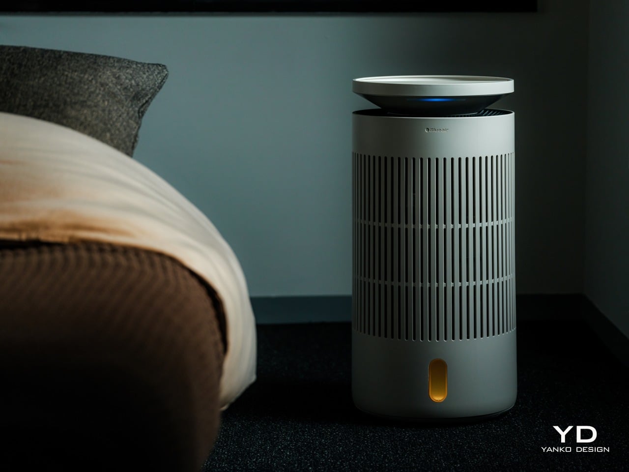
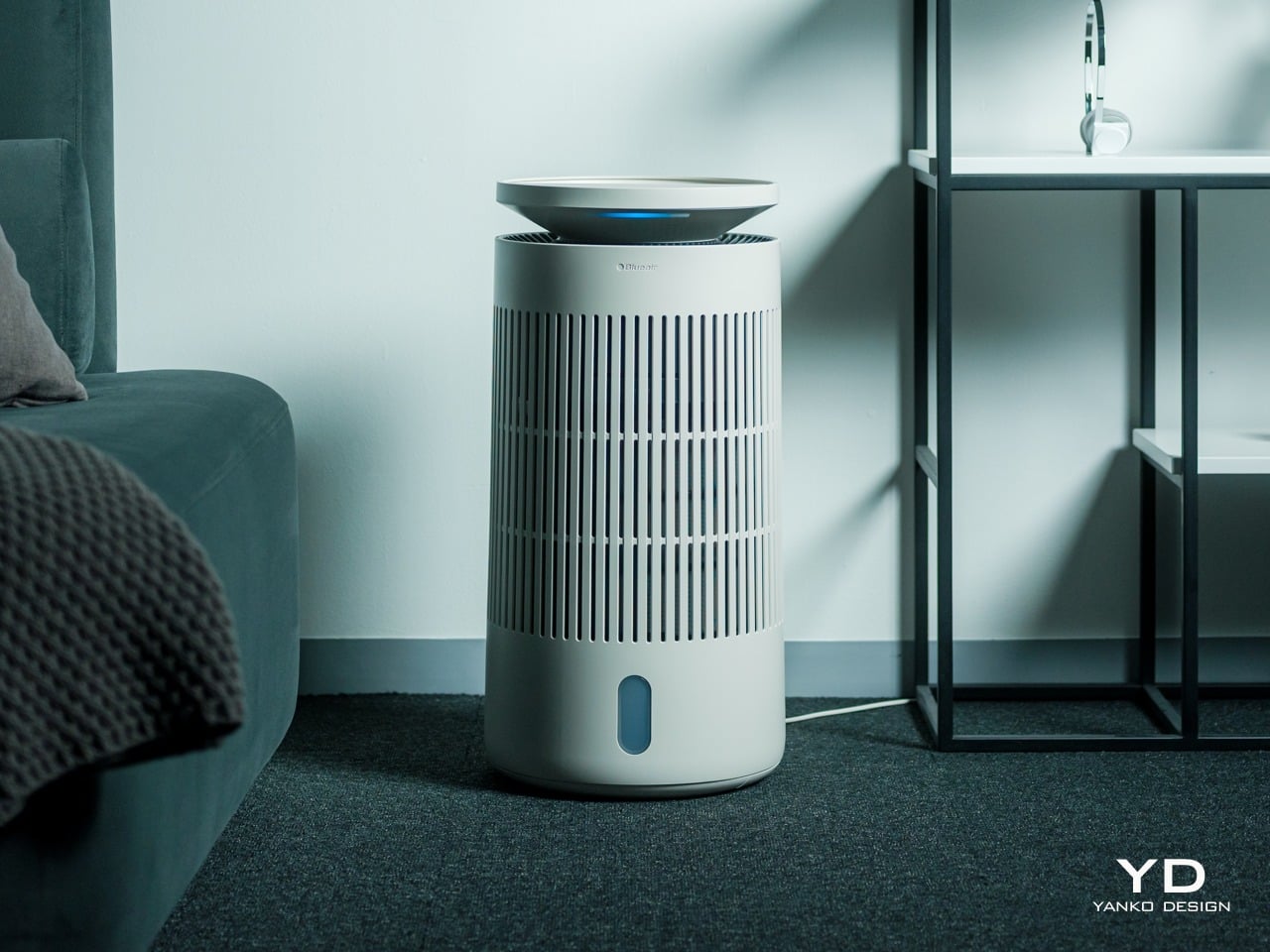
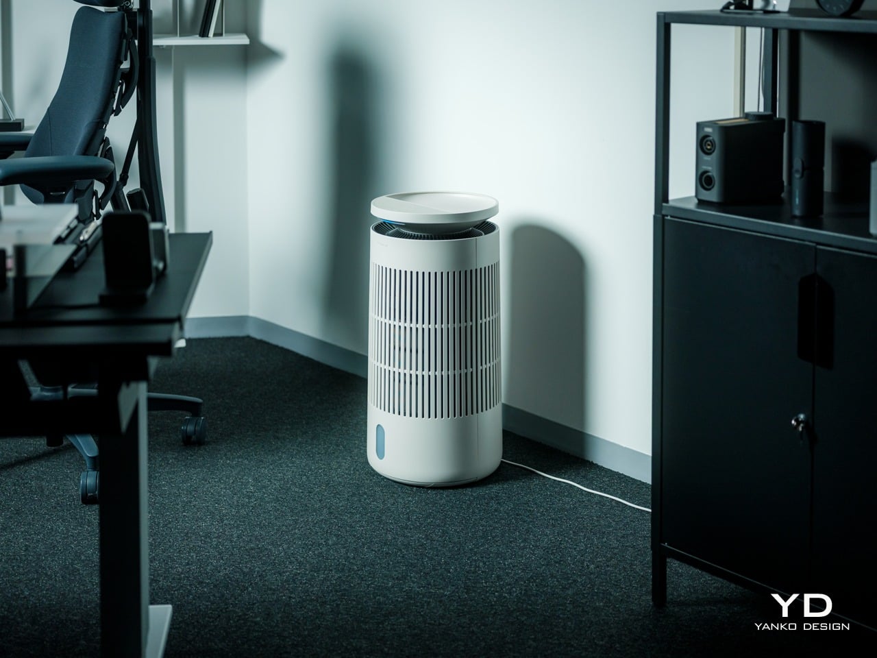
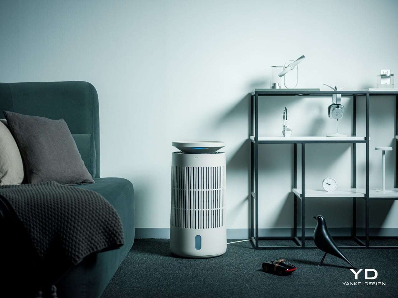
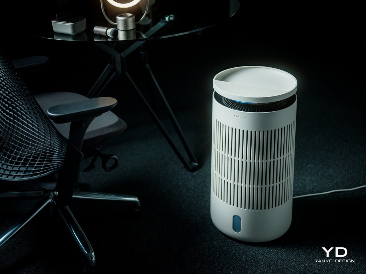
The first thing you notice about the Blueair 2‑in‑1 Pro is that it does not look like an appliance trying to hide. It is a cylindrical tower wrapped in evenly spaced vertical slats, finished in a soft off white that reads somewhere between warm beige and coastal linen, depending on the light. The proportions feel Scandinavian, tall enough to have presence but narrow without crowding the floor.
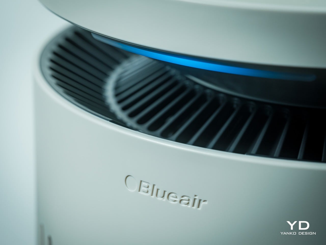
The top disc floats slightly above the body with a subtle gap, and when the device is running, a thin line of blue light glows in that gap, more like a bedside lamp than a status LED. The slats wrap 360 degrees around the body, which gives it a kind of architectural rhythm that works whether you see it from the front or the side.
Near the base, there is a small vertical window that shows the water level and projects mood lighting when enabled in the Blueair app, but it is narrow enough that it does not break the visual flow. The top disc itself is smooth and plate-like, with a matte finish that does not collect fingerprints. The material is still primarily plastic, but it is clearly chosen to feel refined rather than cheap. The matte finish softens reflections and resists the glossy sheen that makes a lot of gadgets look disposable.
The tower looks comfortable in different contexts. In a bedroom next to wood furniture and neutral textiles, it reads as another piece of the interior rather than a piece of tech parked temporarily. In a small office with dark carpet, floating shelves, and a desk chair, it sits in the corner without clashing with the more technical surroundings, which makes it easy to imagine moving between spaces. The sense you get is that someone thought about how this object would age in a room where it runs every night.
Ergonomics
The Blueair 2‑in‑1 Pro is tall enough that you do not need to crouch to reach the controls, which sounds minor until you realize how many bedside devices force you to bend or kneel just to tap a button. The footprint is compact, roughly a foot in diameter, and the weight gives it enough stability that you can brush past it without worrying it will tip.
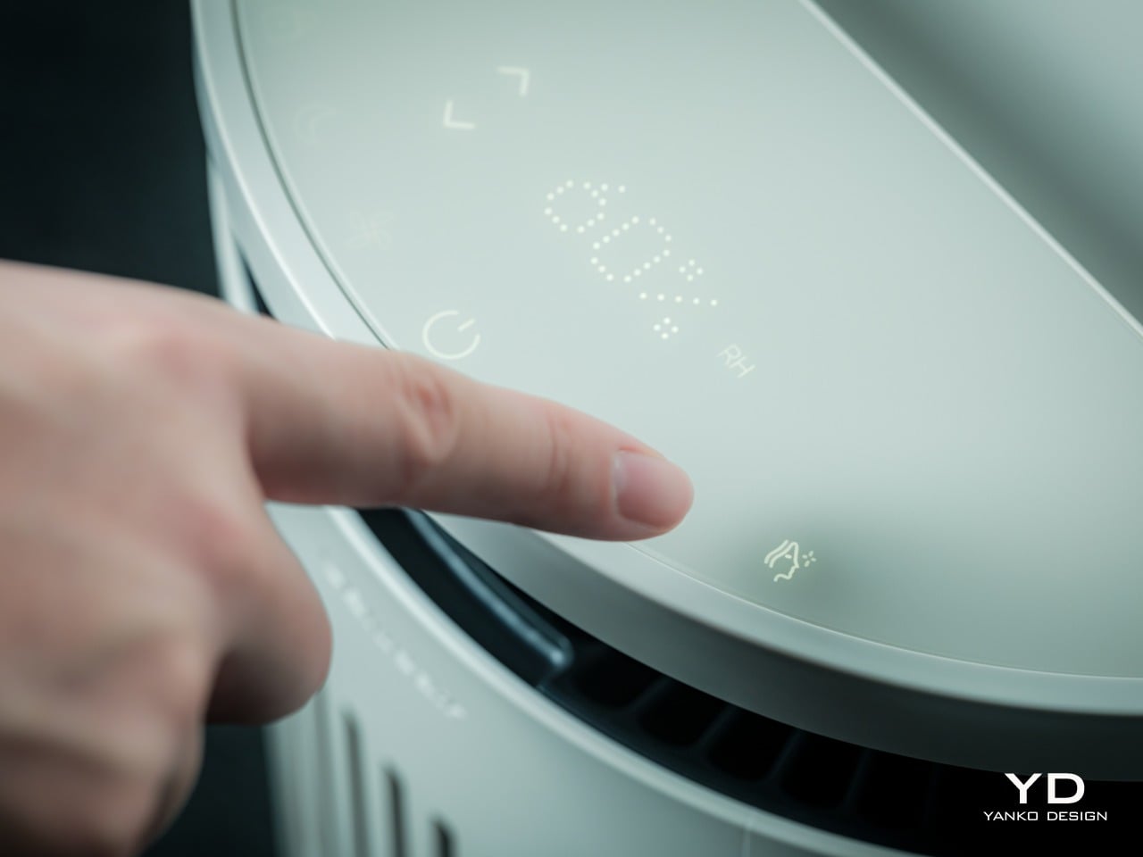
The top surface is where most of the interaction happens. A semi-circular ring houses clearly marked icons for power, fan speed, night mode, humidification toggle, and skin mode, along with indicators for air quality, humidity percentage, and water level. The layout is simple enough that you can understand it at a glance, so switching into auto mode or activating skin mode is a one-tap affair.
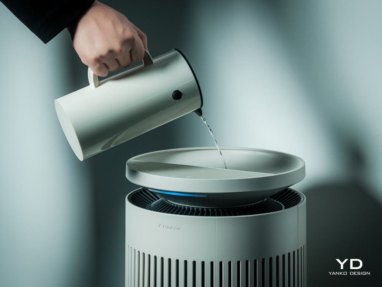
One of the most thoughtful ergonomic details is the top fill design. Most humidifiers require you to lift a heavy tank, carry it to a sink, fill it, then carefully carry it back and slot it into place, which gets old quickly and can be awkward if you have back or shoulder issues. The Blueair 2‑in‑1 Pro lets you simply lift the top disc slightly and pour water directly into the opening from a jug or carafe. The smart water sensor and real-time display remove worries by reminding you when the water level is low and alerting you when the tank is almost full.
It feels as easy as watering a houseplant, and for people who want to avoid bending and lifting, this small design choice makes day-to-day upkeep significantly less annoying. There is still the option to remove the tank entirely and fill it at a sink when you want to add a larger volume at once, but most of the time, the top fill is faster and easier.
Performance
Blueair boasts the 2-in-1 Pro Purify + Humidy as the most powerful of its kind, delivering balanced and superior performance in such a compact package. Compared to a leading competitor, its tests have proved it to offer 3x better purification and 2x cleaner humidification. Although we don’t have labs to verify these numbers, our own day-to-day use proved it to work as advertised.
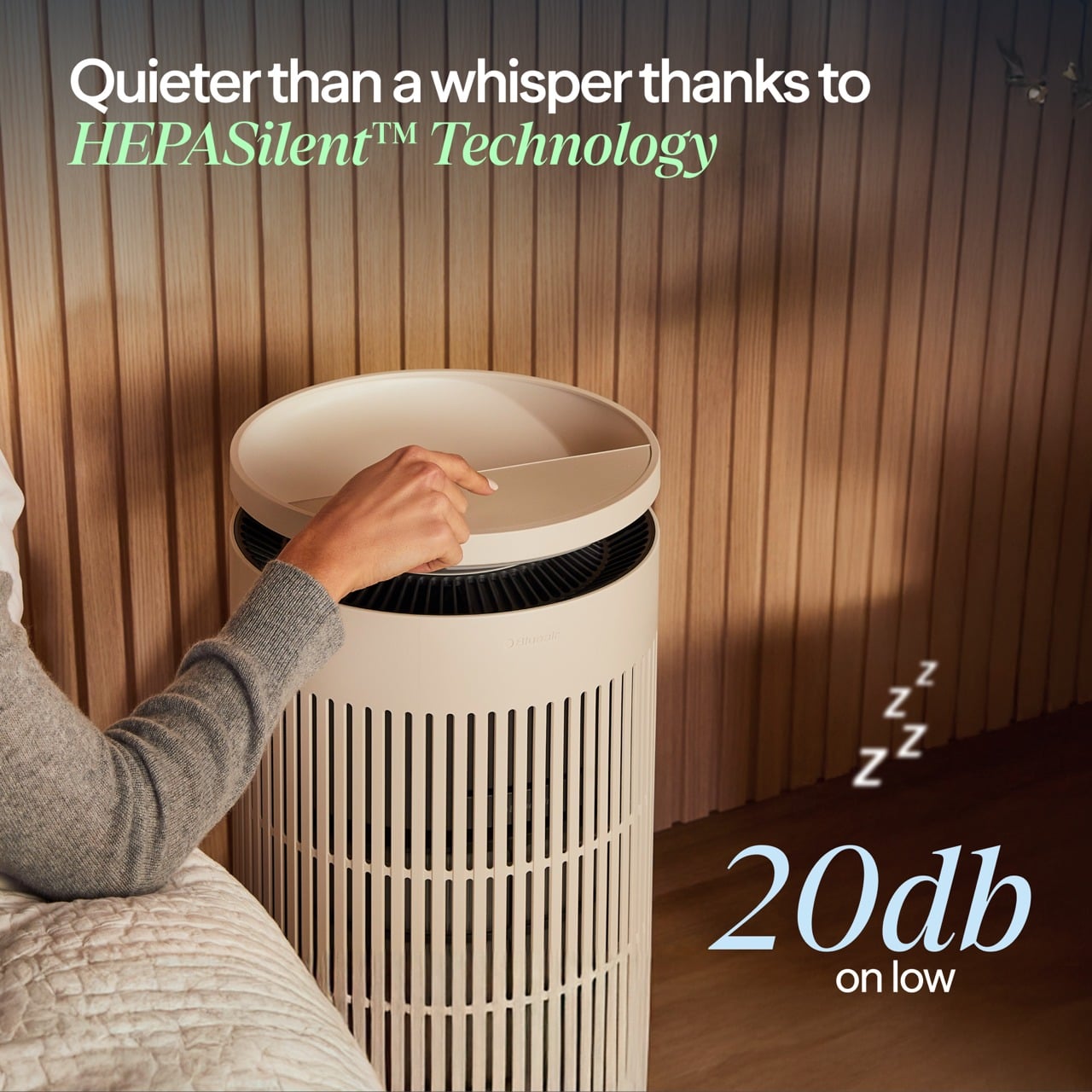
The Blueair 2‑in‑1 Pro is both a capable air purifier and a serious humidifier, which is a harder balance than it sounds. The purification side uses Blueair’s HEPASilent technology, which combines mechanical filtration with an electrostatic charge to capture fine airborne particles like dust, pollen, smoke, and volatile organic compounds. The intake and outlet are 360 degrees around the body, so it pulls air from all sides and pushes it back out clean.
The humidification uses evaporative technology that Blueair calls 360° InvisibleMist. Instead of producing visible fog or mist, it adds moisture to the air in a controlled, gradual way that avoids white dust on furniture and damp spots on nearby surfaces. This matters especially in bedrooms and offices with electronics, books, or wood finishes, where you want comfortable air without worrying about residue or condensation.
The skin and beauty sleep focus is where the device starts to feel like something designed for wellness routines rather than just air quality. The dedicated skin mode keeps humidity in a range dermatologists typically recommend for skin comfort, roughly between 40-60%, and adjusts that target based on room temperature and time of day. At night, when your skin tends to lose more moisture, the device gently raises humidity levels.
In practice, this feels like setting skin mode before bed, going through your normal cleanse and treatment routine, and then falling asleep in a room that feels neither dry nor heavy. You do not wake up with that tight, parched feeling that dry winter air or overheated apartments tend to cause, and your skin does not feel irritated or raw the way it sometimes does when indoor air is harsh.
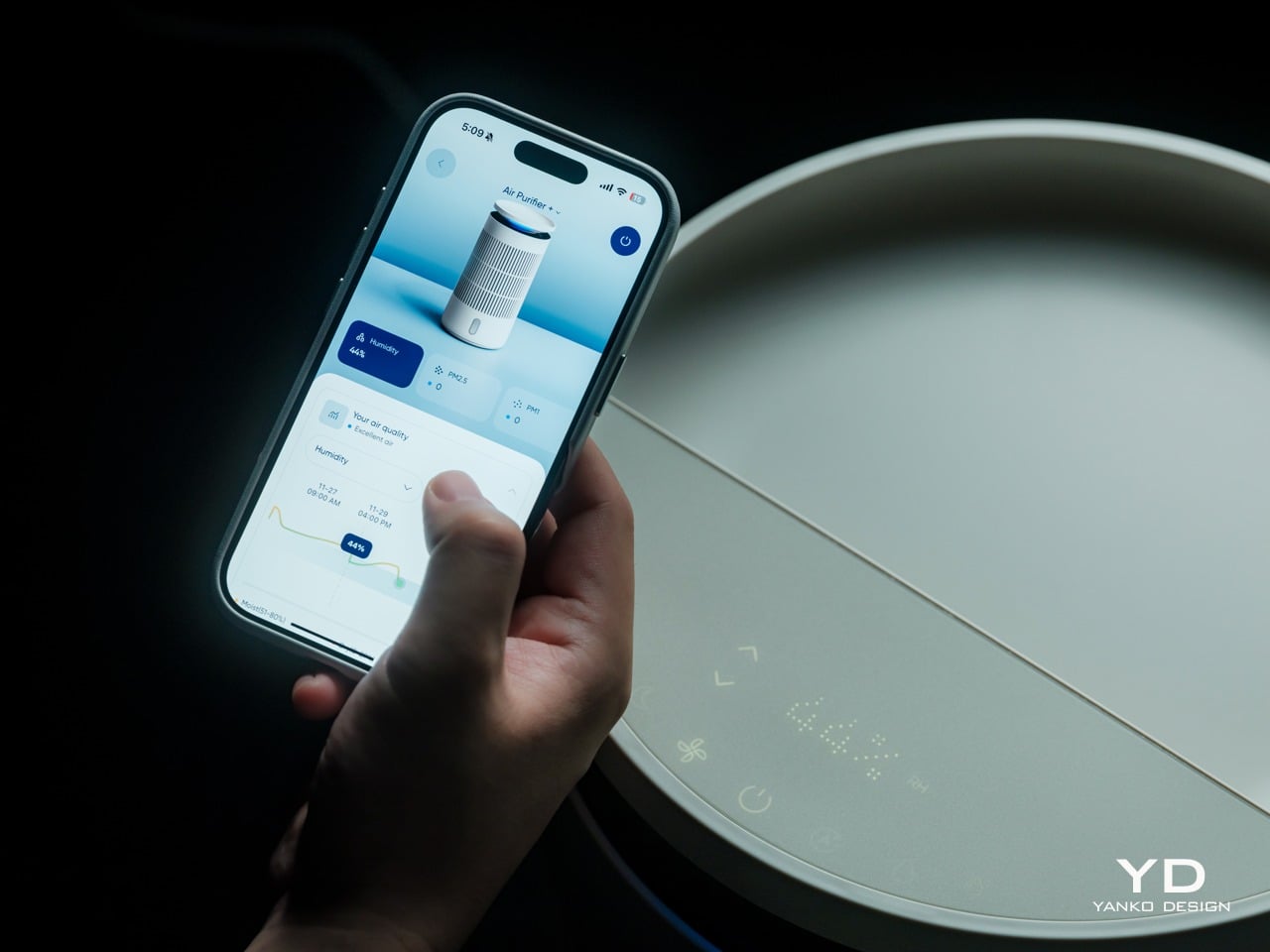
The Blueair app adds another layer of control and insight without being required for basic use. From your phone, you can set target humidity levels, create schedules for when the device runs, adjust display brightness, and choose between three mood lighting settings that turn the top ring into a warm, normal, or bright glow. You can also see air quality and humidity trends over time.
That said, most of the time you can leave it in auto or skin mode and let it manage itself quietly in the background. The app is there when you want precision or automation, but the device does not force you into it for everyday operation, which feels like the right balance for a bedroom appliance.
Noise is surprisingly gentle at lower speeds. In night mode, the sound profile is closer to a soft fan than a mechanical hum, which many people find soothing as a kind of background white noise. Higher speeds are audibly stronger when the device detects poor air quality and ramps up to clear it faster, but the ability to drop back into quiet operation keeps it compatible with light sleepers.
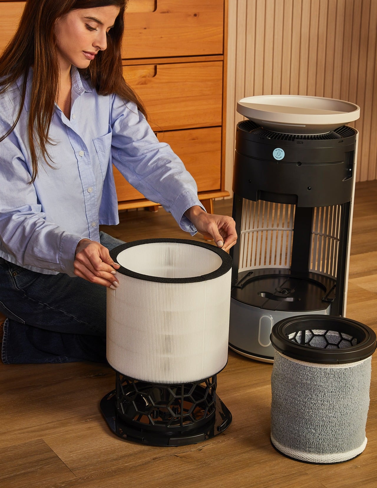
The device also includes several behind-the-scenes hygiene features that keep the humidifier side fresh over time. A built-in UV pump recirculates water to help inhibit bacterial growth, a wick dry mode runs automatically when the tank is empty, or the device goes to standby to prevent musty smells, and a water refresher module made of activated carbon helps absorb minerals and reduce discoloration.
Sustainability
Blueair is a Certified B Corp, which signals that the company has passed third-party audits for social and environmental impact. This does not magically make the device carbon neutral or eliminate its footprint, but it does suggest that longevity, energy use, and materials were part of the design conversation rather than afterthoughts. For a device designed to run every night, that kind of corporate positioning matters.
The 2‑in‑1 Pro is built around long-life, user-replaceable components. Both the air filter and the humidifier wick are rated for up to twelve months of use, which reduces the frequency of replacements and the amount of waste compared to devices that require new cartridges every few weeks. The wick is machine washable, which extends its life even further and keeps it feeling fresh without needing to buy a new one prematurely.
The hygiene features also support sustainability indirectly. A humidifier that stays clean and pleasant to use is less likely to be abandoned in a closet after one winter, which means fewer devices being replaced prematurely. The UV pump, wick dry mode, and water refresher all work together to keep the system feeling fresh, which encourages long-term ownership.
The housing is still primarily plastic, and this is an electrically powered device, so it has an environmental cost. But combining two machines into one does reduce the total number of housings, motors, and power supplies needed compared to buying a purifier and a humidifier separately. For someone who needs both functions, the 2‑in‑1 approach is a more efficient use of materials and space.
Value
The Blueair 2‑in‑1 Pro Purify + Humidify sits firmly in the premium category with its price tag, which is a real investment for a bedroom appliance. That figure makes more sense when you consider that it replaces a standalone purifier, a standalone humidifier, and in some ways a separate wellness gadget, while also adding design intelligence and app control that many basic units lack.
Space is part of the value equation. In bedrooms and small home offices, floor space and visual calm are both precious. Having one well-designed column instead of multiple mismatched boxes reduces clutter, simplifies cable management, and makes the room feel more intentional. For design-minded homeowners, that reduction in visual noise is a real form of value, not aesthetic preference alone.
The skincare and beauty sleep focus adds another dimension to the value story. For people already spending money on serums, moisturizers, and treatments, optimizing the air they sleep in is a logical extension of that investment. The fact that the device can quietly maintain a skin-friendly humidity range while filtering out airborne irritants makes it feel like a wellness tool that supports the rest of your routine.
Verdict
The Blueair 2‑in‑1 Pro Purify + Humidify is a carefully considered column that manages to be a capable purifier, a gentle humidifier, and a sleep-friendly presence without ever looking or feeling like a clinical appliance. It blends into bedrooms and small offices with the kind of visual ease that makes you forget it is technology, and the ergonomic details like top fill refilling and intuitive controls make it easy to live with day to day.
The 2‑in‑1 Pro makes the most sense for people who care about both design and wellness, who want their bedroom or office to feel like a calm, supportive environment, and who appreciate when technology quietly improves their routines without demanding constant attention. For that audience, this feels less like a splurge and more like a thoughtful upgrade to the air they live in every day.
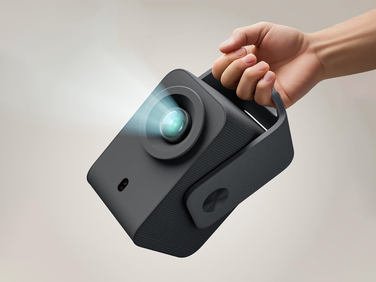
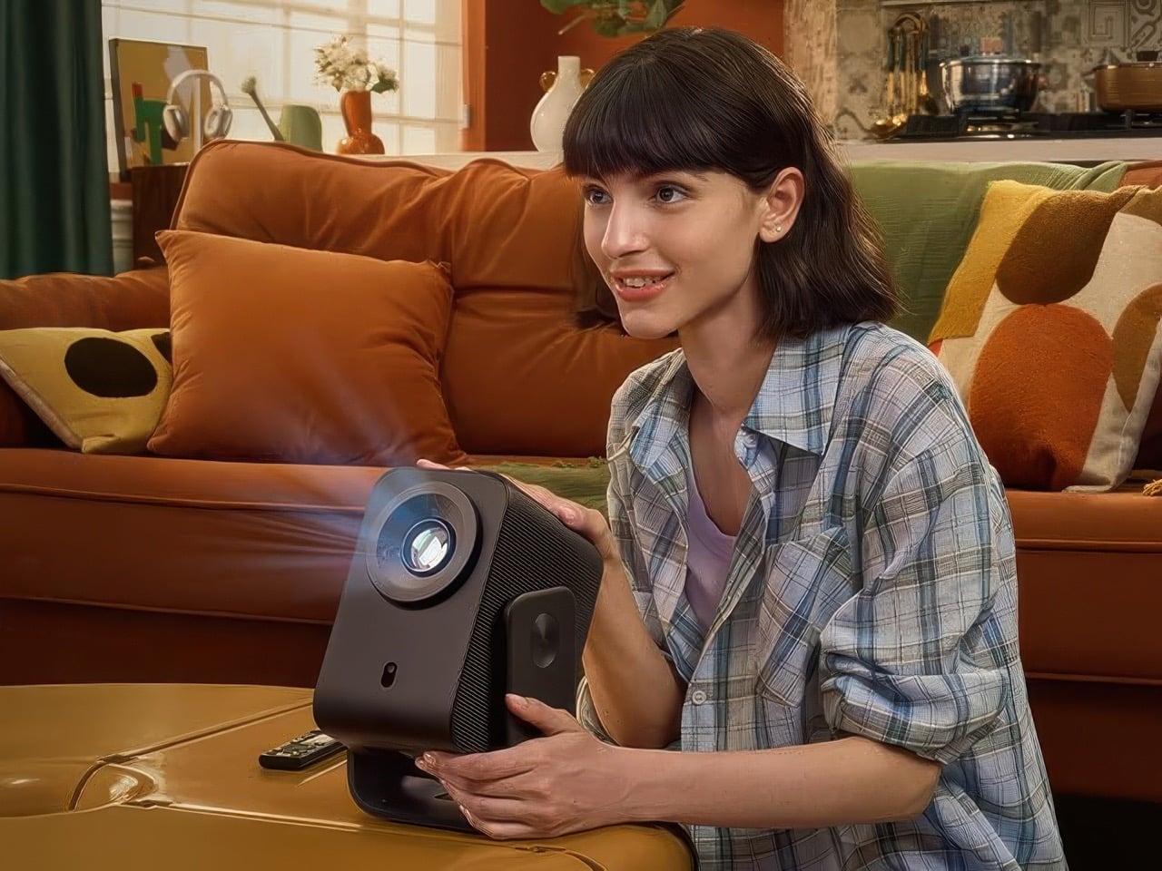
Home cinema has never been this affordable. The TCL Projector C1 brings 120-inch screen entertainment to your living room for just $199, making it cheaper than the AirPods Pro, which sounds wild considering one’s a tiny pair of earbuds and the other’s an entire cinema in your house. This isn’t a stripped-down compromise either. The projector packs Google TV, automatic focus, and a built-in battery into a portable package.
What makes this pricing remarkable is the complete feature set TCL has managed to include. Most projectors at this price point require external speakers, lack smart TV capabilities, or need constant manual adjustments. The C1 combines all these essentials in one device. You can set it up anywhere in your home, cast content from your phone, and enjoy Dolby Audio without buying additional equipment. For the cost of a mid-range streaming device, you’re getting an entire home theater system.
TCL just launched their C1 projector in the UK for £249.99, though Americans get a fairly sizeable price slash of $199. I keep staring at that number trying to figure out where the catch is. You can project a 120-inch image for less than a pair of premium wireless earbuds. A full-size screen that dwarfs even the most absurdly large televisions, available for impulse-purchase money. And there isn’t some limited Black Friday offer anywhere – this is the MSRP on the box.
Obviously they cut corners somewhere. The projector outputs 230 ISO lumens, which isn’t the brightest out there by a fair mile. Yes, you can still watch movies and shows just fine, the only real caveat is that you’ll need absolute darkness – simply drawing one curtain in the afternoon won’t cut it, and watching a game with the lights on may prove to be less than satisfactory – but hey, two hundred bucks. Spend a few more on blackout curtains and you’re good. The LCD panel delivers 1080p natively with 4K support, and you need about 2.5 meters of throw distance to hit that 120-inch maximum.
Google TV comes baked in, which matters more than it should. Most cheap projectors force you to plug in a Chromecast or Fire Stick, adding another $50 and another remote to lose between your couch cushions. Netflix certification means proper app support instead of janky workarounds or browser-based streaming that buffers at the worst possible moments. Auto-focus and keystone correction handle the setup pain points that make most people abandon projectors after one frustrating evening. I’ve spent twenty minutes adjusting focus wheels on projectors that cost ten times this much, so having it happen automatically feels like cheating.
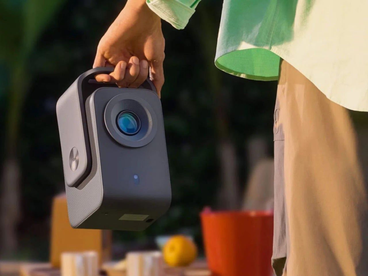
TCL included a 60 Wh battery, which gets you through a two-hour movie without trailing extension cords across your living room. Weighing 1.8 kilograms means you can actually carry this thing around from your living room to your bedroom. The integrated adjustable stand folds into the body instead of requiring a separate tripod purchase, and you can even rotate the C1 to face your ceiling for in-bed entertainment. HDMI and USB-A ports cover the basics, Wi-Fi 5 handles streaming without constant buffering, and Bluetooth 5.1 lets you pair actual speakers because that 8-watt built-in option with Dolby Audio support exists purely for emergencies. Nobody’s watching Dune on an 8-watt speaker and pretending they’re satisfied.
Projectors have always occupied this frustrating middle ground where cheap ones are genuinely terrible and good ones cost mortgage payment money. You either bought a $79 pico-projector that barely functioned or dropped $2,000 on something that required a dedicated room and professional calibration. TCL figured out that most people just want to watch movies on a big screen without taking out a loan or earning an engineering degree. The brightness limitations mean this won’t replace your main TV for daytime viewing, but it turns movie nights into actual events instead of just sitting on your couch scrolling through Netflix for forty minutes. Gaming on a 100-inch screen changes how you experience everything from racing games to sprawling RPGs. Your living room becomes the place where people actually want to gather instead of everyone staring at their phones in different corners.
Two hundred dollars removes most of the decision-making anxiety. You can buy this on a whim and if it doesn’t work out, you’re not crying into your pillow about wasted money. Although, considering TCL’s track record, this one might actually work out to be as good as, if not more reliable than, a 50″ smart TV that may cost 4-5x more.
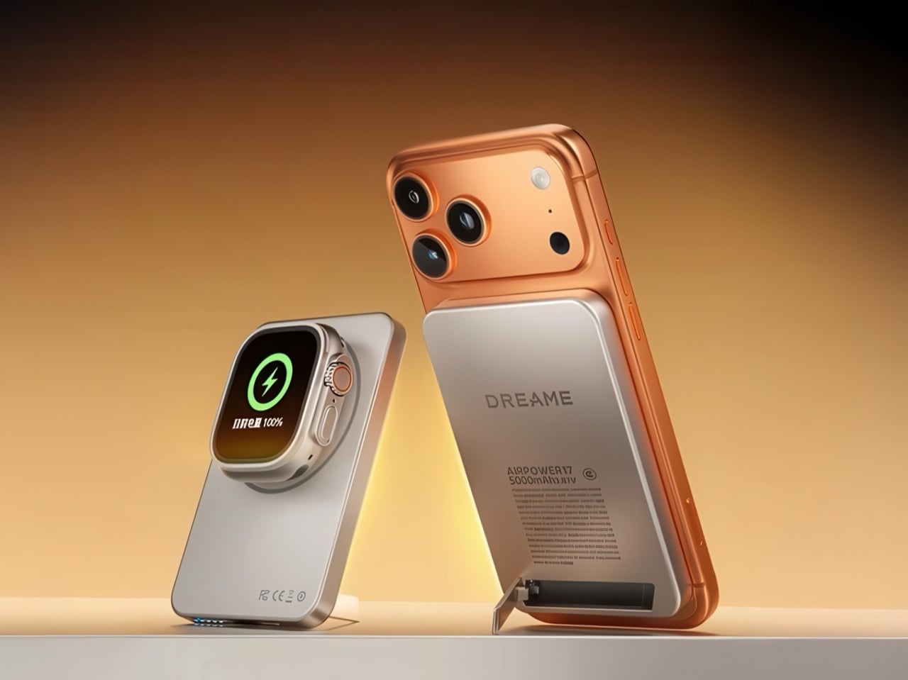
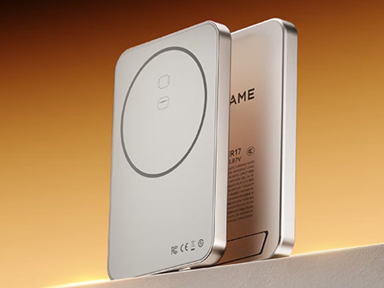
Dreame built its name on robot vacuums and smart cleaning stations, but its newest release does not clean your floors at all. Dreame’s Air Power 17 arrives as a magnetic portable power bank with a surprisingly polished feel, pairing an aluminum frame with AG glass and a footprint barely larger than a bank card. It clicks into place on an iPhone 17 or any Qi2 compatible phone, then quietly delivers up to 15 watts wirelessly or 20 watts over USB-C. But that’s not what’s so surprising about the power bank (apart from the fact that the parent company also manufactures robot vacuums)… it’s that the AirPower 17 also charges your TWS earbuds AS WELL AS your Apple Watch, right through the same wireless charging surface.
The name is a clever dig at Apple’s own AirPower disaster from 2017, when the company announced a charging mat that could handle 3 devices at once. Now, it seems like Dreame’s taken the mantle of making that happen, that too in a compact form factor that still feels decidedly premium, thanks to the slim design, the aluminum alloy frame, and AG glass back. Now, the obvious question is why a vacuum company thinks it can waltz into a market already flooded with Anker, Baseus, and a hundred Shenzhen generics. Here’s the thing: Dreame has been on an absolute tear since July, dropping or teasing products in personal care, large appliances, consumer electronics, and even automotive adjacent gear. This power bank feels like part of a coordinated land grab, and the clever multipurpose design genuinely feels like a consumer-focused product aimed at winning hearts, not just adding small numbers to a company’s profits.
Designer: Dreame
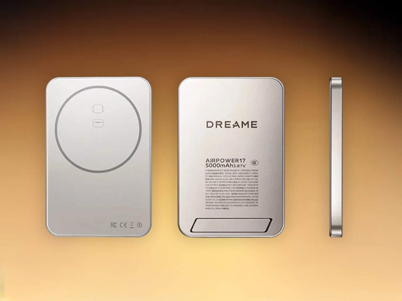
The Air Power 17’s design is fairly simple and straightforward, packing one USB C port, Qi2 wireless at 15 watts max, and that integrated kickstand. The 5,000 milliamp hour version comes in at just 8 millimeters thick and 125 grams, which is borderline remarkable when you consider it includes a stand mechanism and a full magnetic ring. The 10,000 milliamp hour Pro is predictably chunkier at 12.8 millimeters and 189 grams, but still compact enough that you could daily carry it without hating your life. Both share the exact same 103 by 58.4 millimeter footprint, so your choice really comes down to whether you value slimness or capacity more.
The winning feature, however, is the power bank’s ability to charge both smartphones as well as an Apple Watch from the same charging surface. Snap the Air Power 17 to the back of your phone, or just place it on a surface and rest your Apple Watch on the watch symbol and you’re good to go. Right below the Watch symbol is also a TWS earbud case symbol, which means you can even charge your AirPods or other earbuds on the power bank. I’ve yet to see a single power bank this slim so elegantly cover all bases. The fact that a robot vacuum company pushed this first seems odd but hey, the consumer in me is happy he doesn’t need dongles, cables, and other paraphernalia to keep his devices charged.
The built in stand is the sneaky detail that turns the power bank into a proper desk accessory, the kind of thing you slap your phone onto during a video call or while following a recipe. Most magnetic power banks treat the stand as an afterthought, a flimsy plastic hinge that wobbles under the weight of a phone. Dreame integrated it into the rear housing with their branding stamped right on it, so it doubles as brand presence and functional hardware. Wireless efficiency is rated above 60 percent, which tracks with Qi2 standards but also means you lose about 40 percent of capacity to heat and conversion losses when charging wirelessly. If you want the full 10,000 milliamp hours, you need to cable up.
The catch is availability. Right now this lives exclusively in China, sold on platforms like JD.com with zero confirmed timeline for a global rollout. Dreame already sells robot vacuums in the US and Europe, so the infrastructure exists, but consumer electronics accessories face different certification hoops than home appliances. At 219 yuan for the 5,000 milliamp hour model and 259 yuan for the 10,000 milliamp hour Pro, Dreame is pricing aggressively enough to make established brands nervous while keeping enough margin to signal this is a real product line. Here’s to hoping for a global rollout soon – maybe this is the AirPower Mat we truly deserve!
Most cyclists who commute and ride recreationally face an uncomfortable choice: buy a dedicated ebike for weekday miles and a separate unassisted bike for weekend adventures, or pick one and accept its limitations. The garage fills with frames, the budget stretches thin, and neither bike does both jobs particularly well. Sonder and Skarper have looked at this problem and proposed something different.
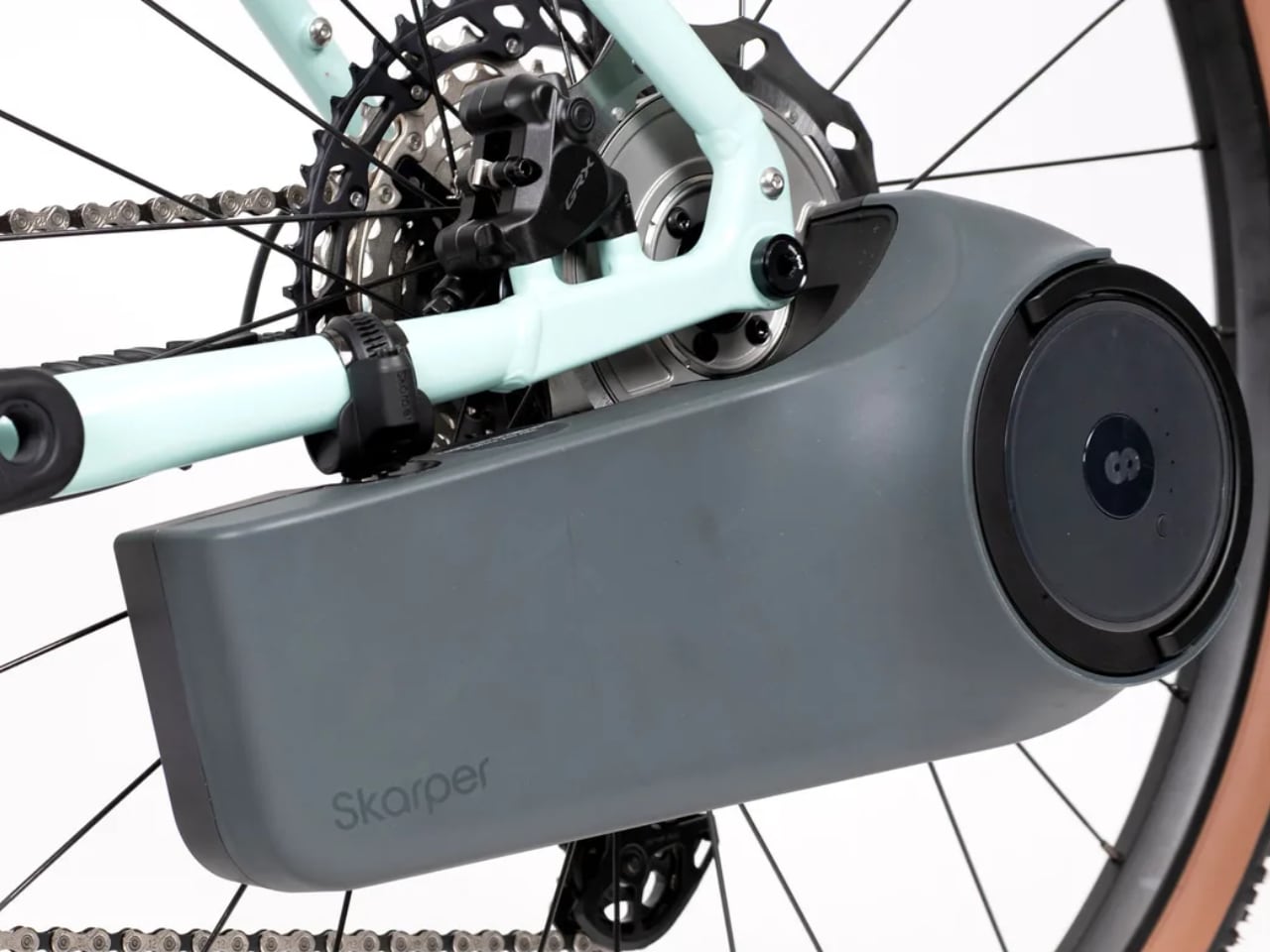
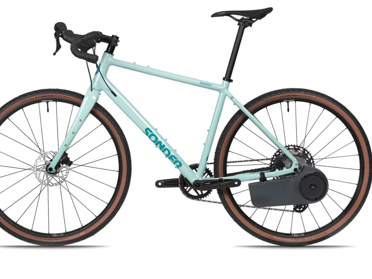
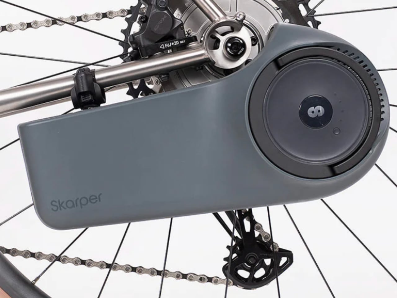
The Sonder x Skarper Camino collaboration bundles three gravel bike configurations with the Skarper DiskDrive system pre-installed, creating what both companies call a “two bikes in one” solution. The concept is straightforward: clip on the motor for assisted commutes, unclip it for unencumbered gravel riding. What makes this interesting is not the idea itself, which conversion kits have promised for years, but the execution and the factory integration that distinguishes it from aftermarket retrofits.
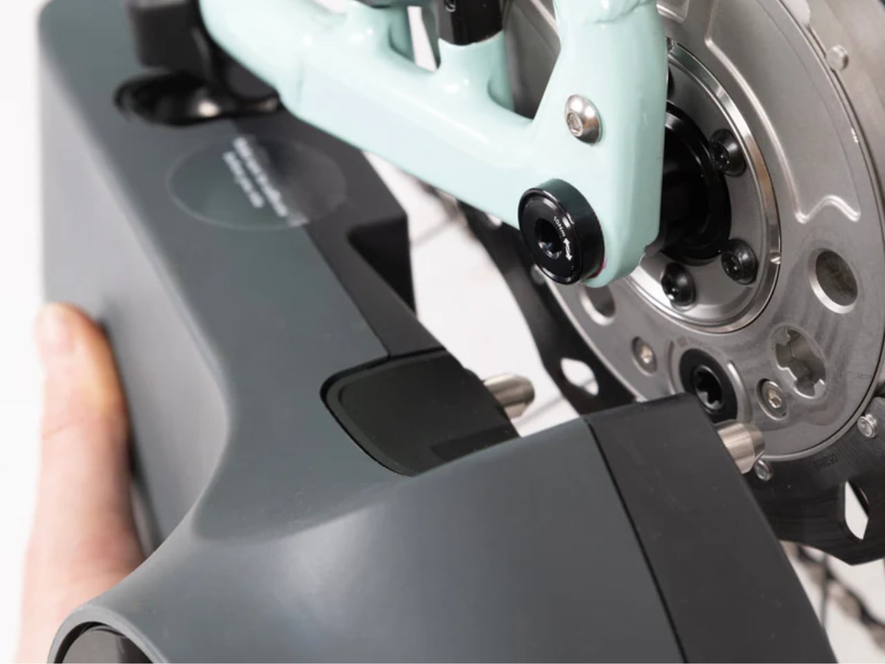
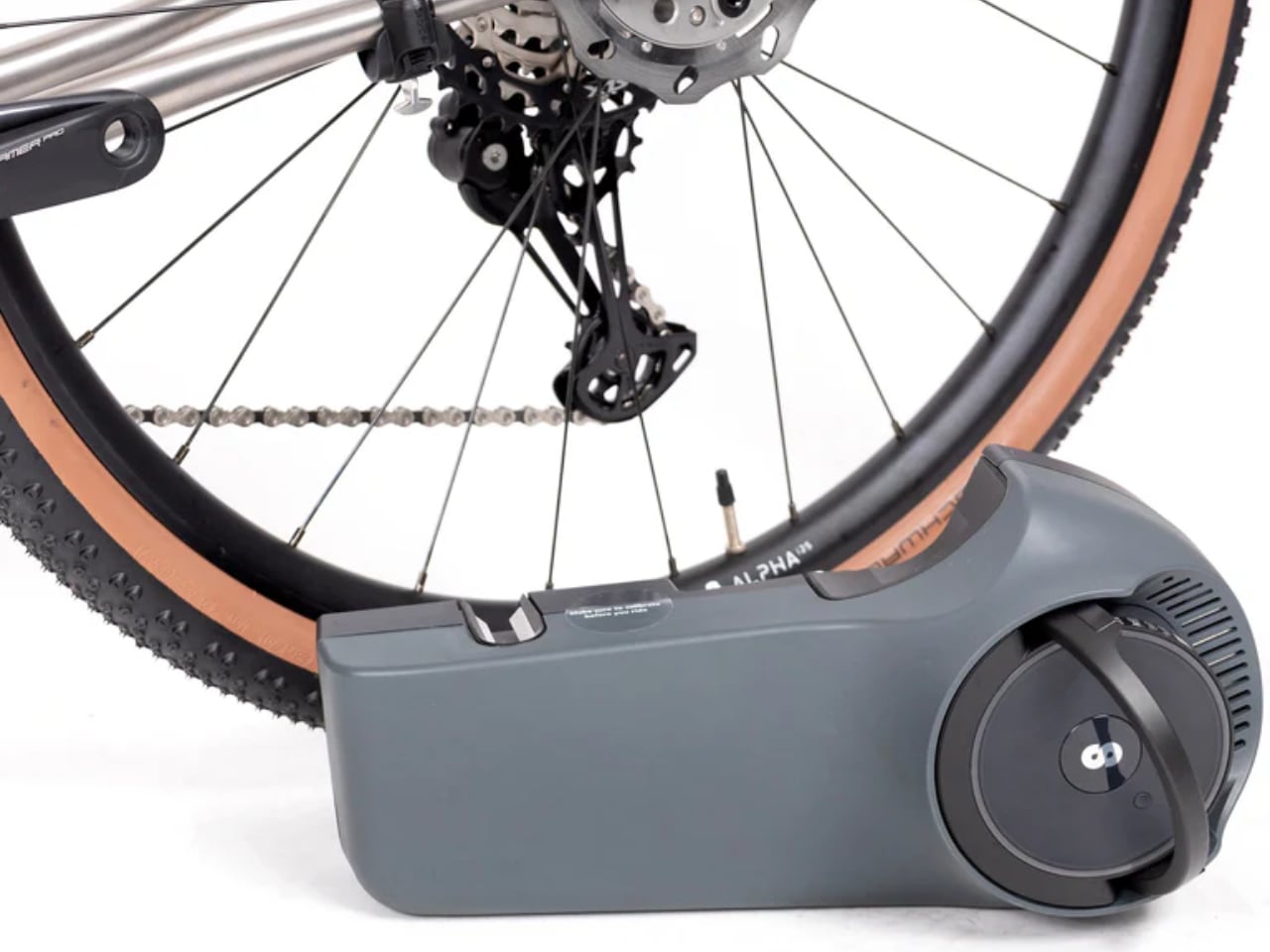
Skarper’s approach to electric assist differs fundamentally from hub motors or mid-drives. The DiskDrive unit locks onto a specially designed rear brake rotor and delivers torque through that interface rather than through the wheel axle or crankset. This rotor-drive architecture means the motor sits at the chainstay, clips on and off without tools, and leaves no permanent frame modifications when removed.
How the DiskDrive System Works
Rotor-Based Power Delivery
The Skarper unit contains a 250W motor rated at approximately 45 to 50 Nm of torque depending on generation. Rather than spinning the wheel directly or pushing through the chain, it grips the proprietary DiskDrive rotor and rotates it, which in turn rotates the wheel. This mechanically simple layout avoids the planetary gears found in hub motors and bypasses the drivetrain entirely, which may reduce wear on chains and cassettes over time.
A 240 Wh internal battery provides the energy storage, with Skarper claiming a full charge time of roughly 2.5 hours. Range estimates land between 50 and 60 km in eco mode, dropping in higher power settings. These figures are modest compared to purpose-built ebikes with larger battery packs, but the trade-off is system weight: approximately 4.5 kg for the drive unit plus around 600 grams for the special rotor. Under 5.2 kg total when fitted, and zero added weight when the unit stays home.
Integration and Connectivity
The drive unit houses its control electronics alongside the motor and battery, incorporating wireless connectivity to apps and head units, including Bluetooth and, in some configurations, ANT+ and Wi-Fi. This allows communication with cycling computers and smartphone apps without requiring additional handlebar-mounted controllers or wiring runs along the frame. The interface remains clean whether the bike runs assisted or stripped down for pure pedaling.
Skarper designed the attachment mechanism for tool-free operation. The unit clicks into place on the rotor, locks securely for riding, and releases with a lever action. The transition takes seconds rather than minutes, which matters for riders who genuinely intend to use both configurations rather than leaving the motor permanently attached.
The Camino Platform
Gravel Geometry and Capability
Sonder’s Camino line has earned recognition as a capable adventure platform before this collaboration existed. The geometry emphasizes stability and confidence on mixed terrain: a slack, gravel-ready head angle in the high 60s, a long wheelbase that tracks predictably over rough surfaces, and tire clearance that accommodates rubber wide enough for bikepacking or rough bridleway exploration. Internal routing supports dropper posts for technical descents.
The frame accommodates racks and accessories through multiple mount points, positioning the Camino as much for loaded touring as for fast gravel rides. Sonder markets these bikes for everything from UK B-roads to multi-day routes, which makes the addition of removable electric assist logical: the same frame that handles loaded bikepacking benefits from power assistance when covering urban miles with gear.
Available Configurations
The collaboration launches with three builds, each pairing a different Camino specification with the Skarper system pre-installed:
The entry point is the Camino Apex 1 Flat Bar at 2,649 GBP. The flat handlebar configuration and SRAM Apex 1x drivetrain position this build for commuter-first buyers who want gravel capability without drop bar commitment. The aluminum frame keeps costs reasonable while the Skarper system adds the assisted dimension.
The Camino Al GRX1 at 2,999 GBP moves to drop bars and Shimano GRX 610 12-speed gearing. This build targets the rider who wants traditional gravel geometry with quality shifting and the option of motor assistance. The aluminum frame carries through from the flat bar model.
At the top sits the Camino Ti GRX1 at 4,249 GBP, pairing the titanium frame with GRX 1x and the Skarper drive. Titanium’s compliance and durability appeal to riders thinking in decades rather than seasons, and the “forever bike” logic extends to the modular motor: invest in a frame that lasts, add or remove assistance as needs change over time.
Value Proposition and Market Position
Pricing Logic
The standalone Skarper conversion kit sells for 1,495 GBP. Buying a regular Camino and adding Skarper separately would cost more than these bundled configurations, which means the partnership delivers genuine pricing advantage rather than merely convenience. Whether the discount compensates for the commitment of buying a specific bike with a specific motor system depends on individual circumstances, but the math favors the bundles.
Compared to purpose-built electric gravel bikes, the starting price of 2,649 GBP positions these configurations competitively. The differentiation comes from capability: remove the Skarper unit and you have a conventional gravel bike that weighs and rides like a conventional gravel bike. Purpose-built ebikes carry their motors and batteries permanently, adding weight and changing handling characteristics regardless of whether you want assistance on any given ride.
Who This Serves
The target buyer emerges clearly from the product logic: someone who commutes by bike during the week and rides gravel on weekends, who lacks space or budget for two dedicated machines, and who wants neither a permanently heavy ebike nor a permanently unassisted bike that exhausts them before arriving at the office. The Skarper system’s quick-release nature makes the dual-use scenario practical rather than theoretical.
Neil Sutton, Sonder’s product manager, frames it around simplicity and adventure, noting that the removable drive “keeps a Sonder feeling like a Sonder” when unclipped. Ean Brown, Skarper’s CEO, emphasizes freedom and flexibility over the alternative of owning “a second heavy bike.” Both statements acknowledge the core insight: versatility matters most when it does not require permanent compromise.
Availability and Upgrade Path
The three Sonder x Skarper models are available immediately through Alpkit stores, Alpkit’s website, and Selfridges in London. The retail presence at Selfridges suggests positioning beyond core cycling audiences, reaching urban consumers who might not otherwise visit specialty bike shops.
Existing Sonder owners can purchase Skarper add-on kits with free professional installation at participating Alpkit stores. This upgrade path extends the collaboration’s reach beyond new bike sales, allowing current Camino riders to convert their frames without buying a complete new build. The factory integration remains cleaner, but the option exists for those already invested in the platform.
Design Significance
The Sonder x Skarper collaboration represents something worth watching in the electric cycling space: an OEM partnership that treats removable assist as a feature category rather than an aftermarket addition. Most ebikes build their motors permanently into the frame architecture. Most conversion kits remain aftermarket products that buyers install themselves. This sits between those models, offering factory confidence with modular flexibility.
Whether the rotor-drive approach gains broader adoption depends on how well Skarper’s execution holds up to real-world use and whether other frame manufacturers follow Sonder’s lead. For now, the Camino collaboration offers one answer to the two-bike problem: a gravel bike that becomes an ebike when you want it to, and becomes a gravel bike again when you do not.
Most smart speakers are designed to disappear, cylinders and pucks that sit in a corner and wait for voice commands. That is convenient but also a bit dull; you talk, they respond, and the hardware never really asks you to engage with it. Sound Maestro is a concept that goes the other way, imagining a living room as a small orchestra pit you can actually conduct with gestures instead of just tapping a screen.
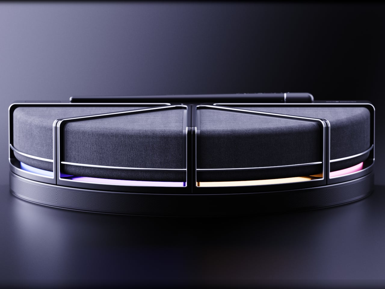
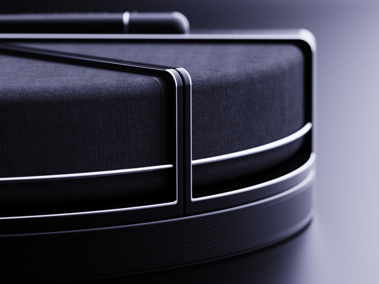
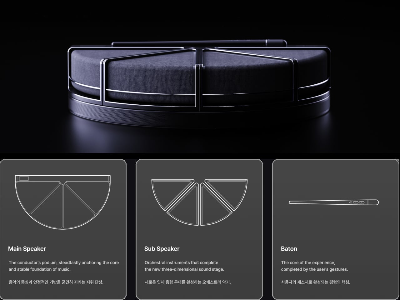
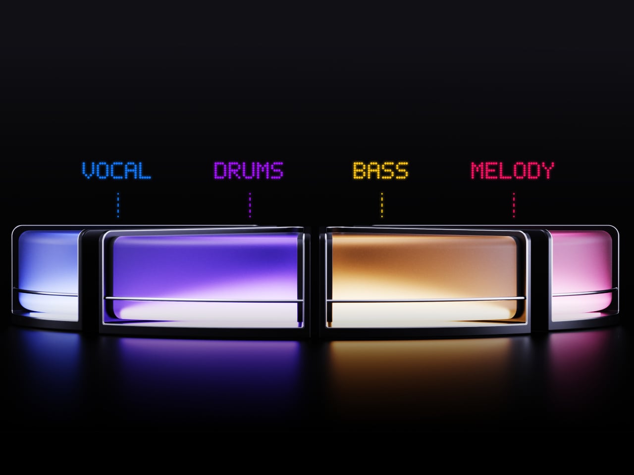
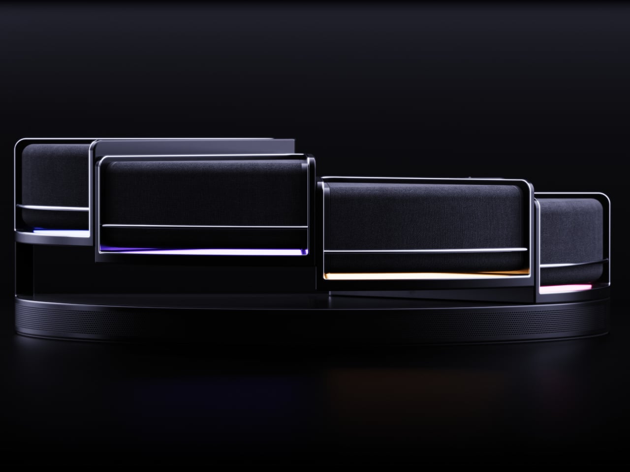
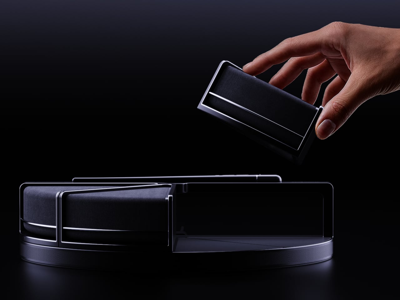
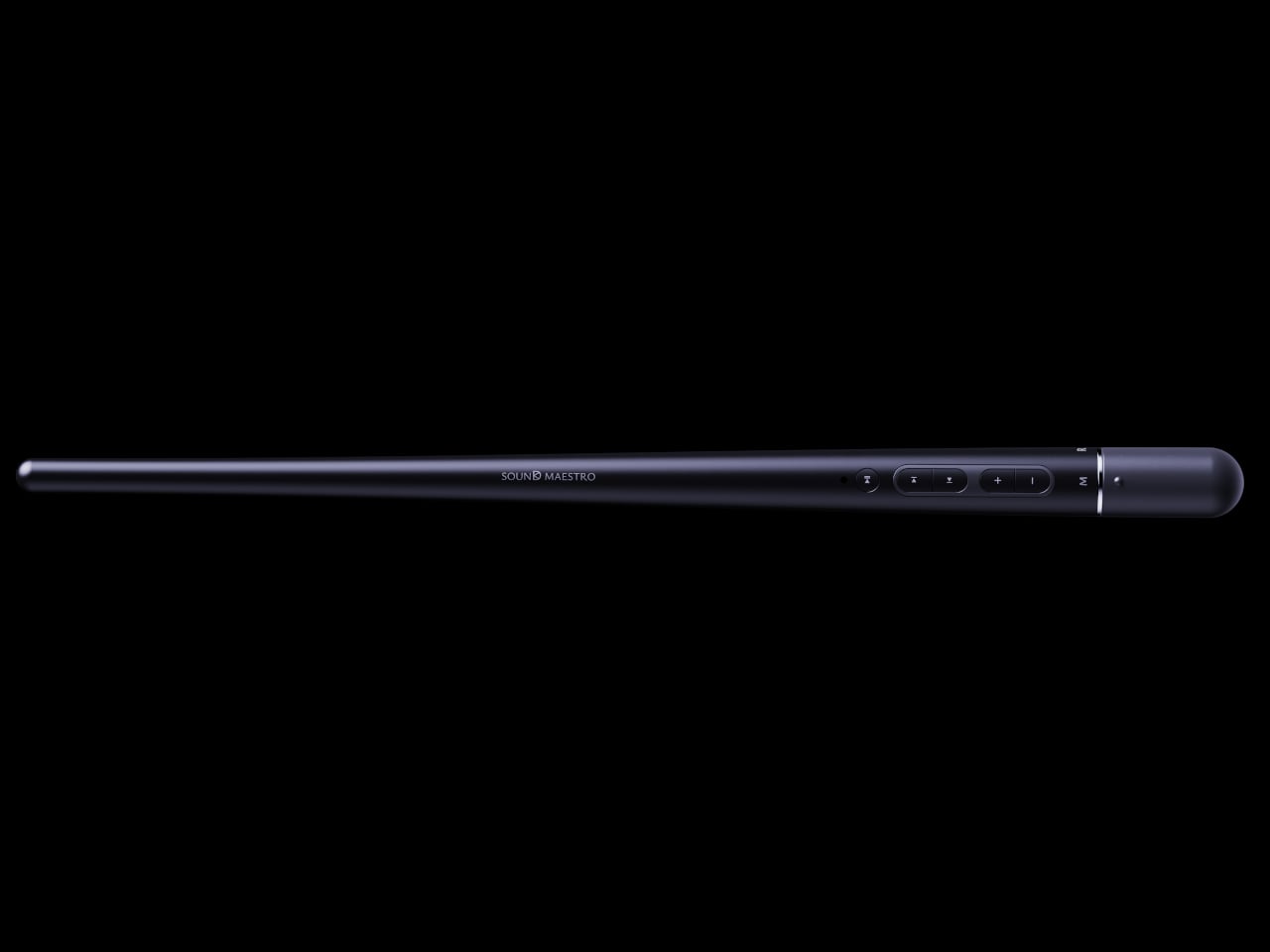
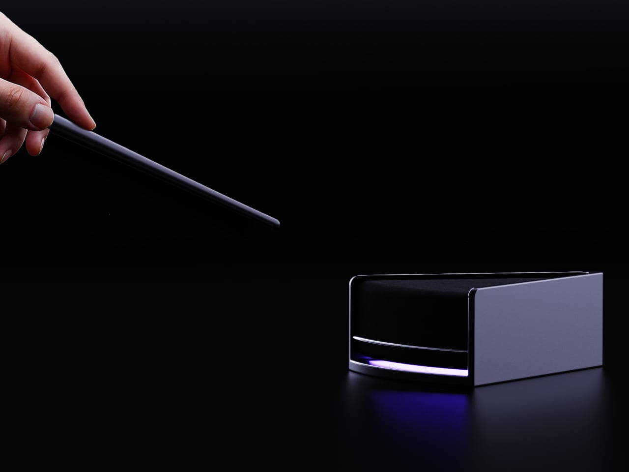
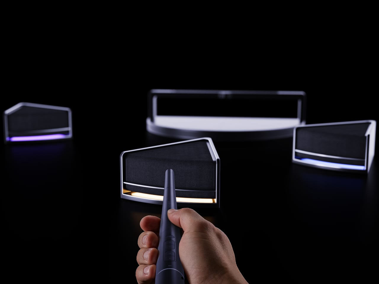
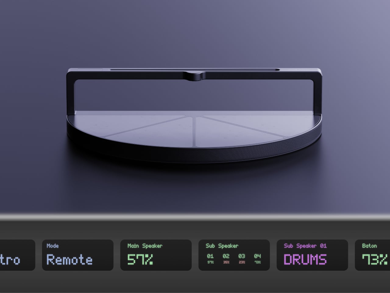
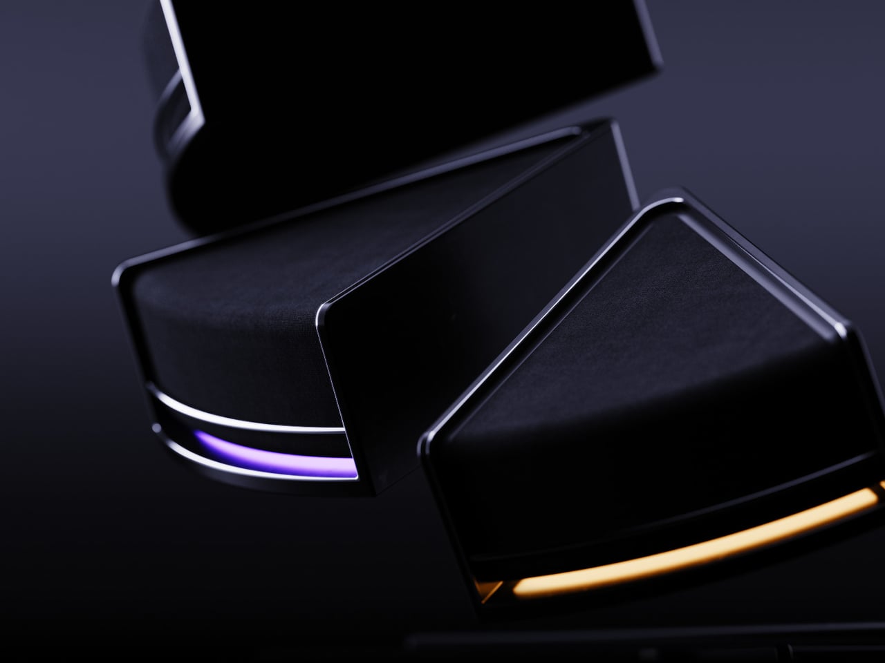
Sound Maestro is a speaker inspired by an orchestra conductor that consists of three core parts: the conductor’s podium, the instruments, and the conductor’s baton. When everything is docked together, it reads as a single object, but each of the four modular speakers can be detached and assigned a different musical part, vocals, drums, bass, and melody, each with its own LED color glowing underneath the grille.
The system uses AI to split a track into four stems and send each to a different speaker, so one cube carries the vocal, another the drums, another the bass, and another the melody. The LEDs on each unit glow in a unique color, making it easy to see which part is where. This spatial mapping of sound means the mix becomes something you can see and point at, not just hear as a single stereo image coming from two speakers.
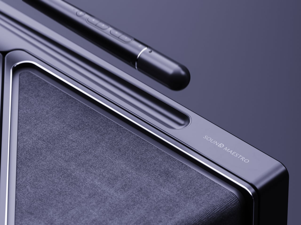
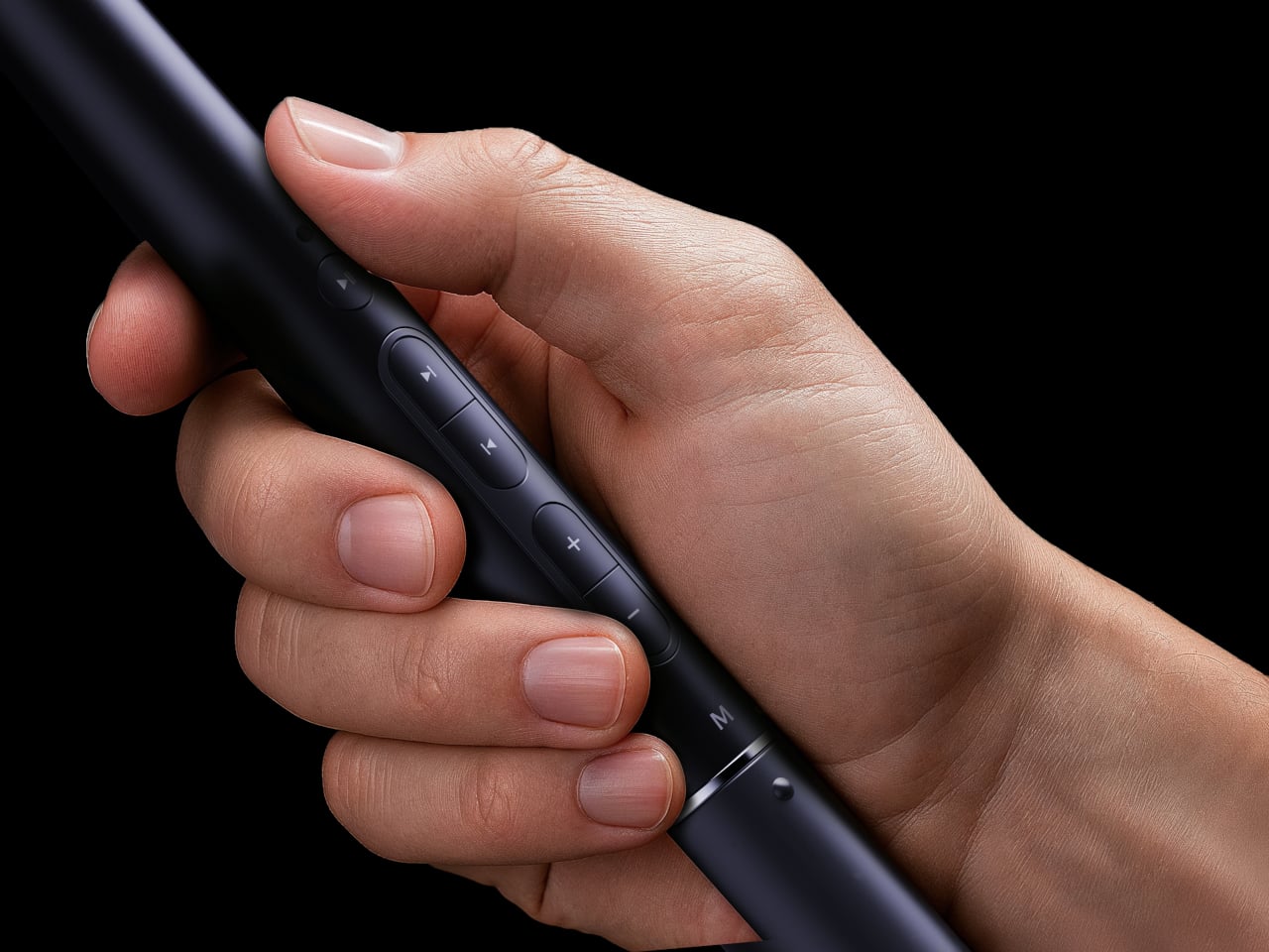
The baton-shaped controller is the main interface. In Maestro Mode, you twist a dial to enter a state where the default buttons are locked, zand you control speakers by pointing and gesturing. A quick left-right wave skips tracks, a slow up-down motion adjusts volume with LED brightness as feedback, and drawing a circle pauses or resumes playback, with all LEDs turning off or on to confirm what just happened.
Remote Control Mode lets the same baton behave more like a traditional remote. You still point it at a specific speaker, but now you press buttons instead of waving. This lets you fine-tune or mute individual units without the full theatricality of Maestro Mode. The two modes together acknowledge that sometimes you want to perform, and sometimes you just want to nudge the volume down on the drums without getting up.
The main speaker takes its form from an orchestra podium and acts as the system’s brain. It handles the main bass that anchors the center and runs the AI that assigns parts to each satellite. A small display shows the current mode, battery levels, and which part each speaker is playing, so you can glance down and see the state of your orchestra without opening an app.
Sound Maestro pokes at the idea that home audio can be more than invisible boxes and playlists. By giving each part of a song its own physical presence and letting you conduct with a baton instead of a touchscreen, it makes listening into a small performance. Whether or not you want to wave a stick in your living room, the idea that a speaker system could ask you to point, gesture, and conduct instead of just pressing play feels like a surprisingly theatrical take on what modular audio might become.
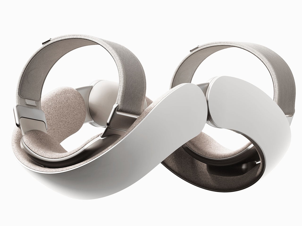
One thing exoskeletons have done right is help with motor rehabilitation. Of course, their size and weight have decreased over time, but most of those available are suitable for rehabilitation, load-bearing assistance, and similar purposes. However, they are not designed for daily wear. Not concentrating on the lower limb, which is a saturated market, a duo of budding South Korean designers has targeted the upper limb; creating a wearable robot that can be worn for daily usage.
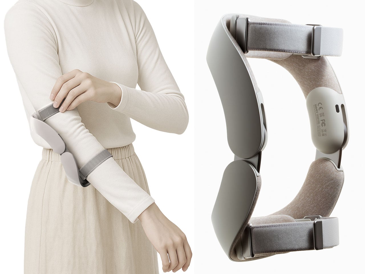
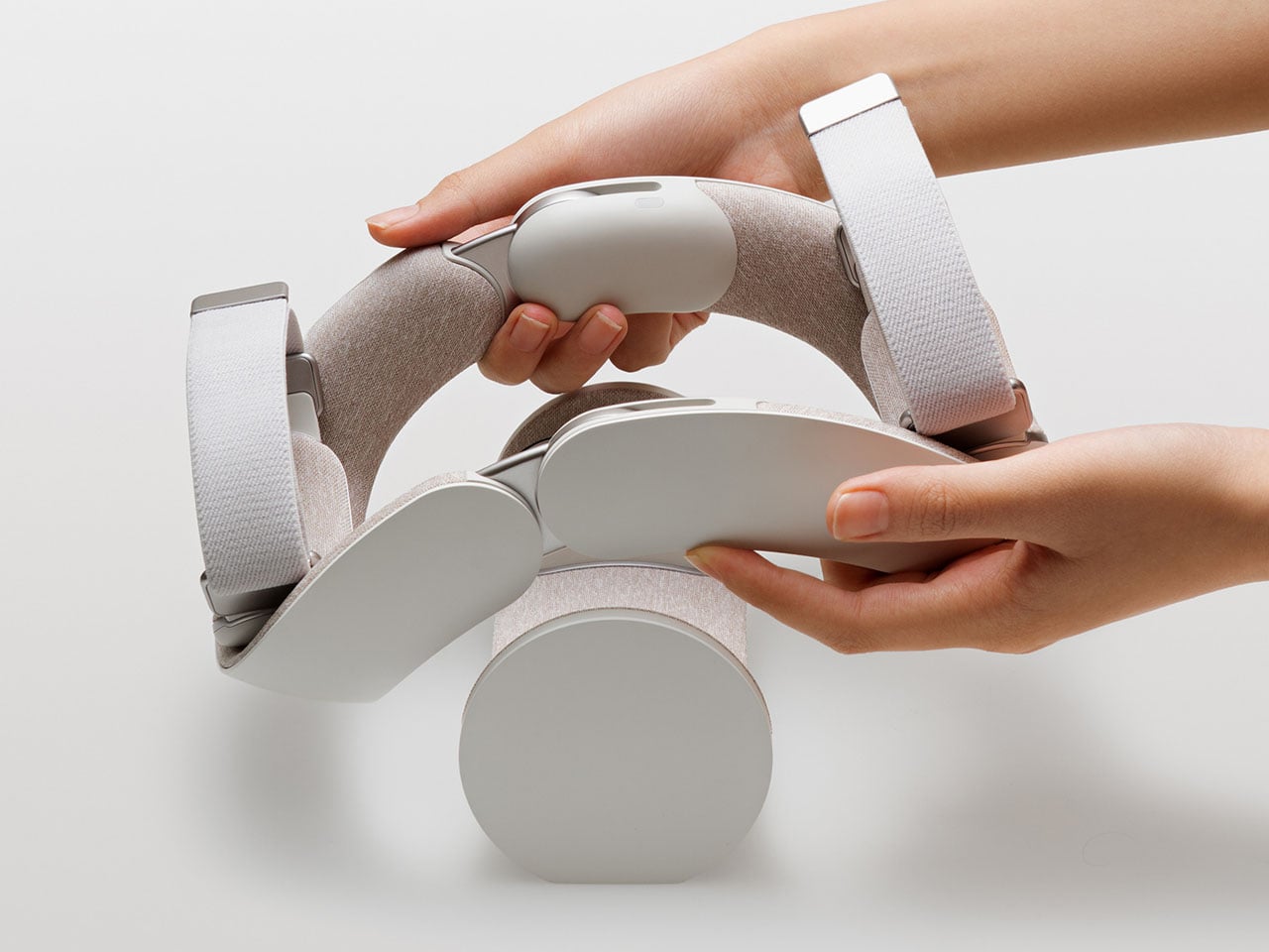
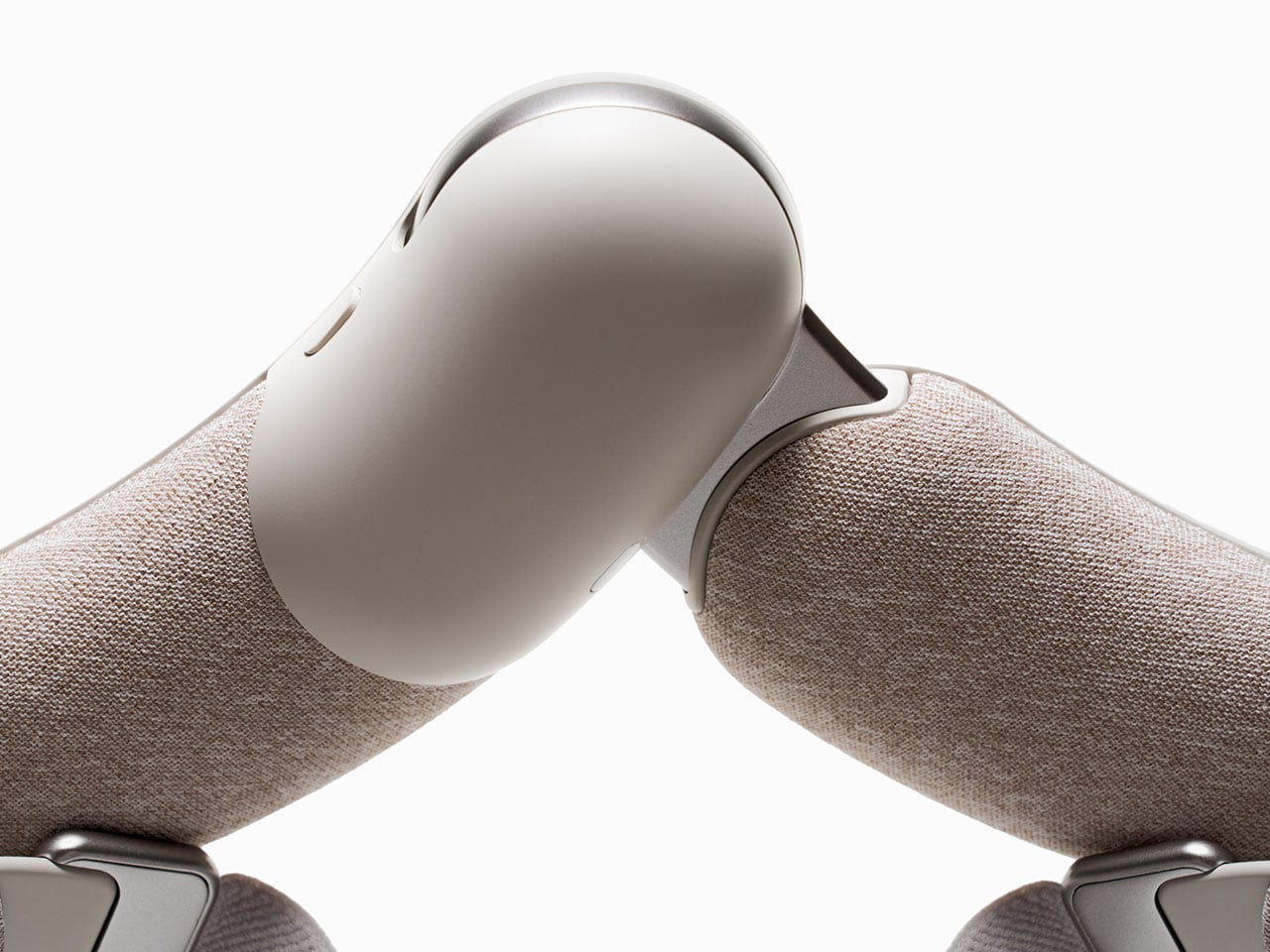
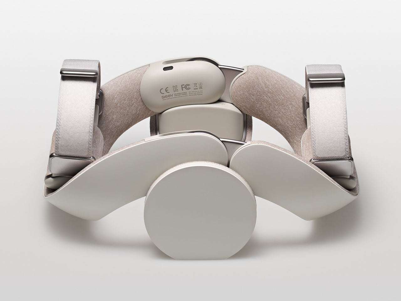
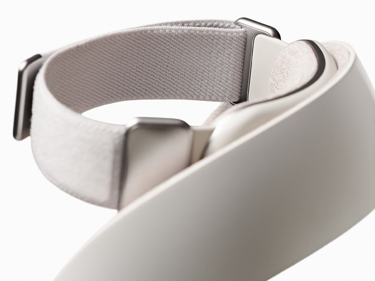
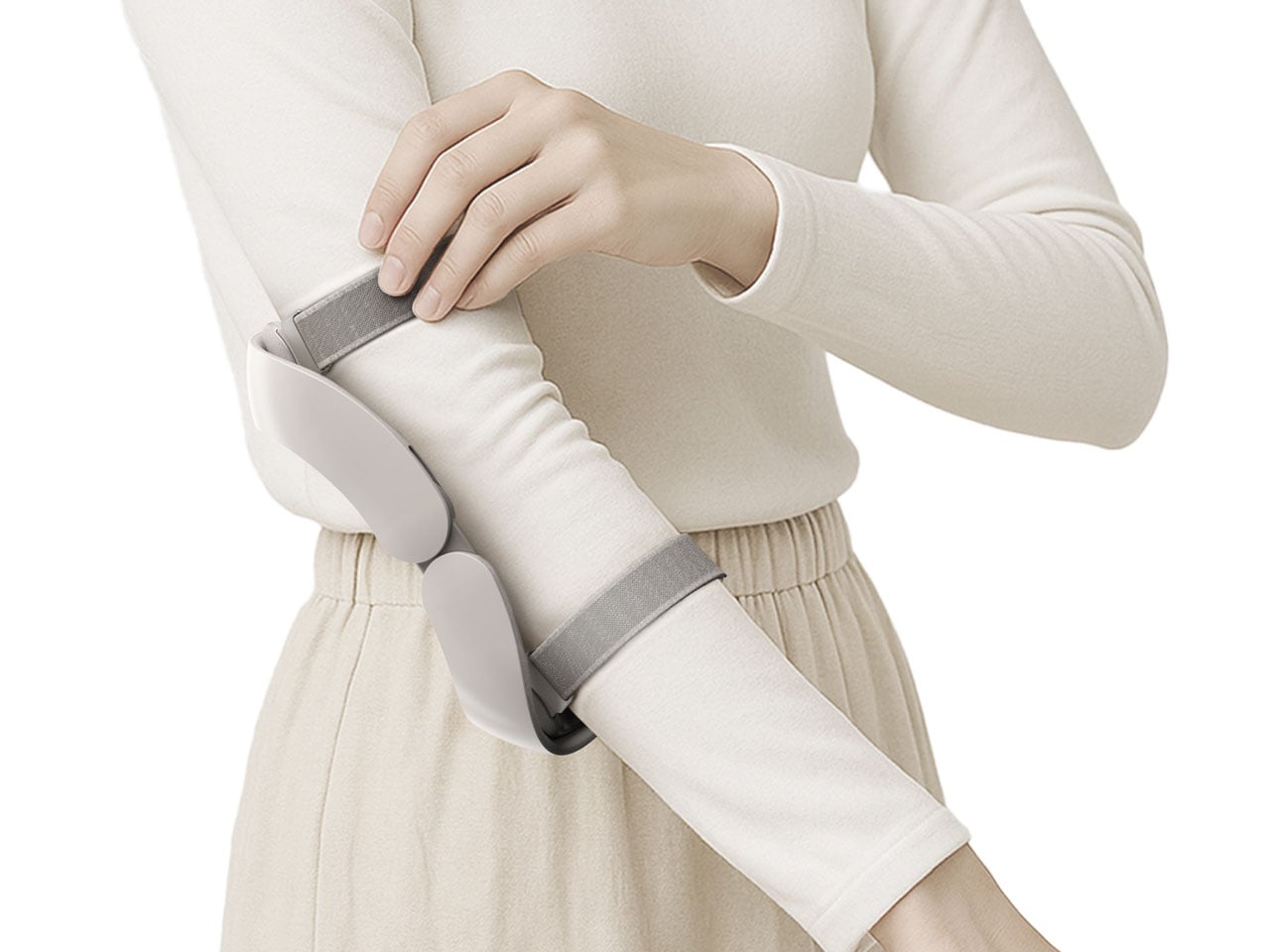
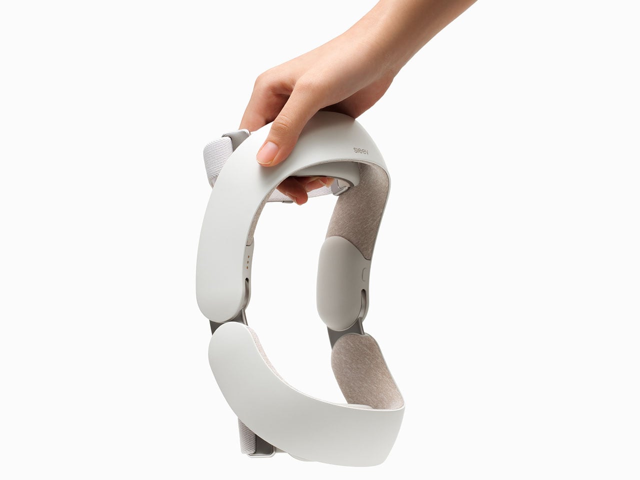
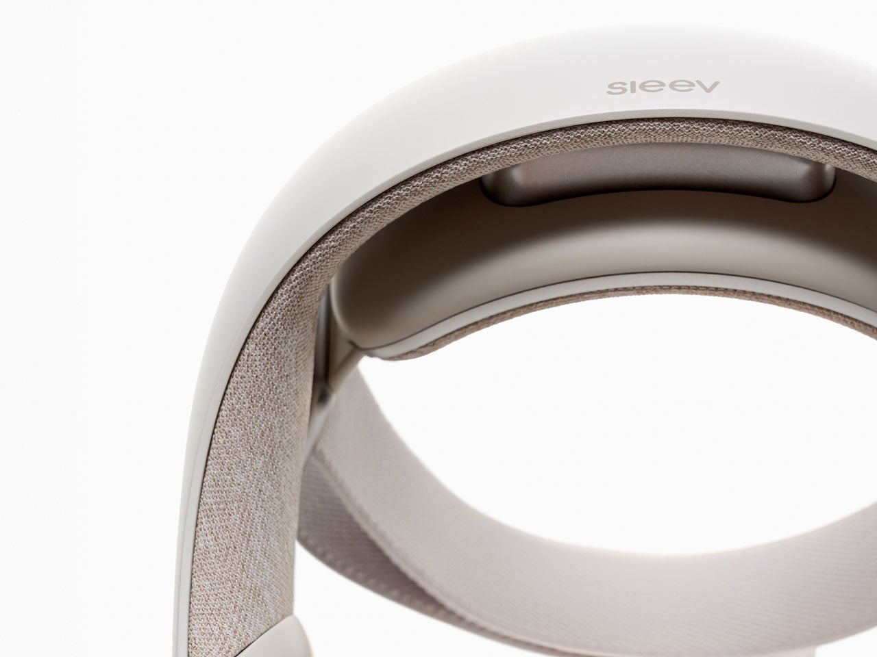
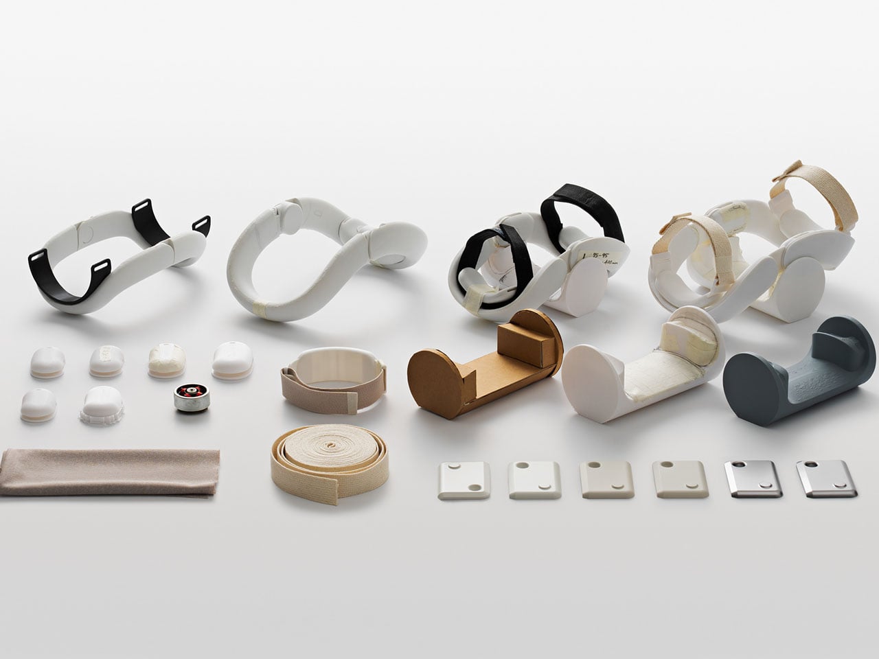
It’s called the Sleev. For now, it’s not far beyond the drawing books, but from how and what it’s projected to be built for, its God damn great solution for the purpose. Sleev is designed as a daily upper-limb exosuit (wearable robot). It supports independent arm movement and is effortless to wear and remove: just one hand, no more!
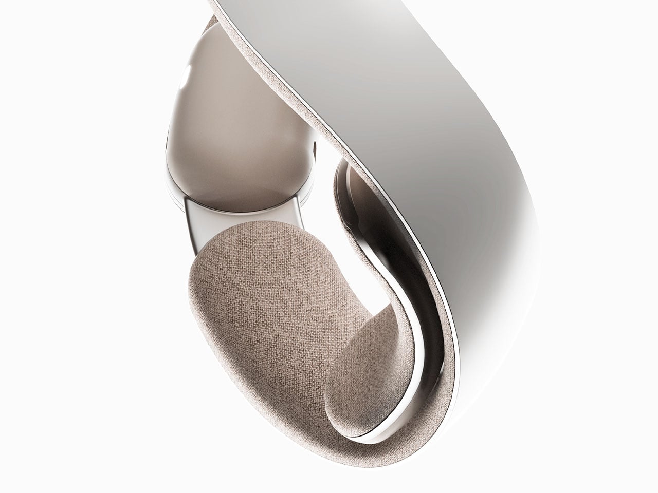
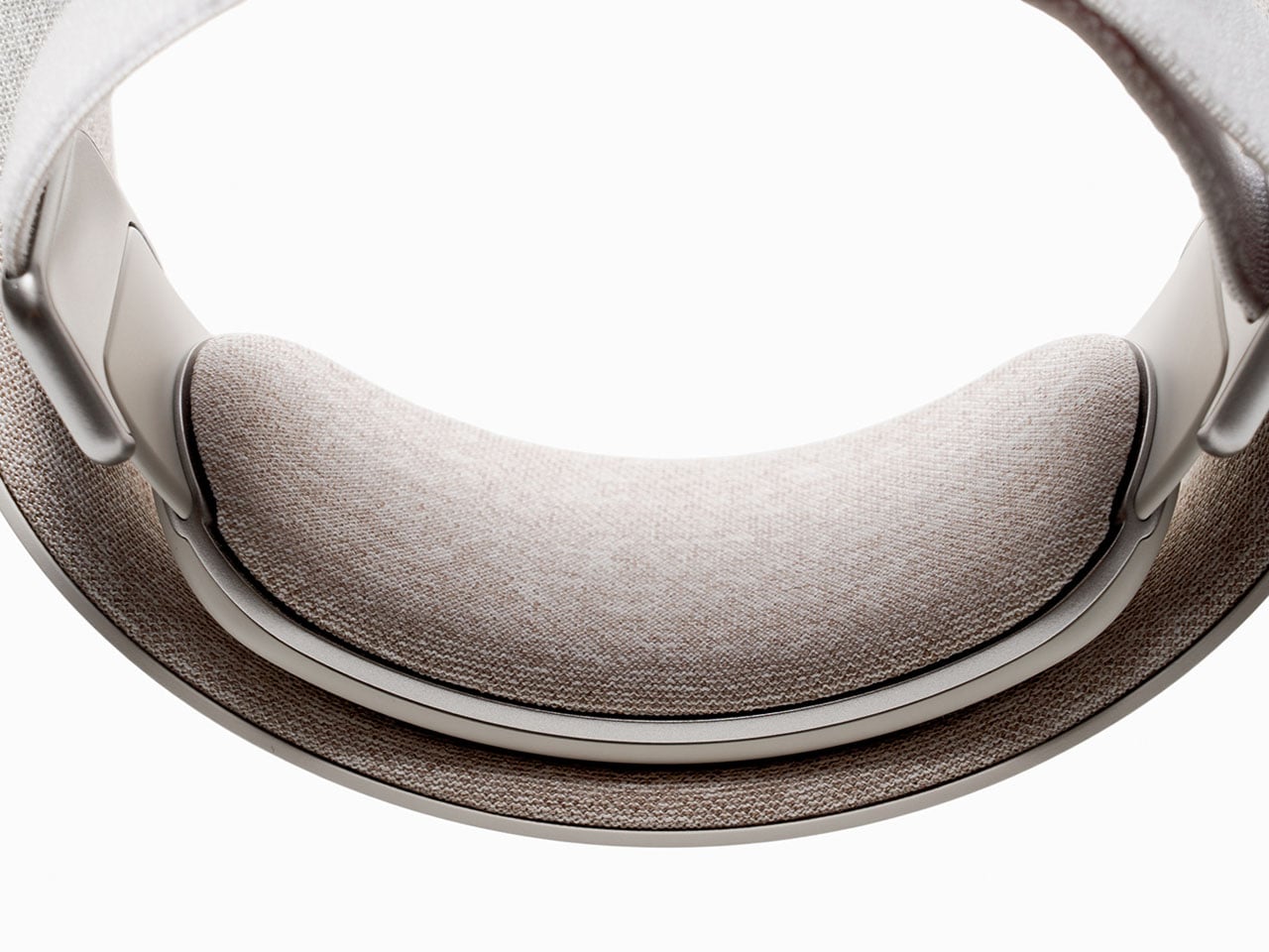
It’s not that we are seeing a robotic assistant for the arm for the first time. The market is flooded with iterations of bulky and inconvenient wearable robots that are designed with a great level of technological input and robotic sensors, but somehow make the wearer feel like a cyborg. With its sleek and lightweight limb, the Sleev is conceptualized to change that for a robotic assistant that you would like to wear. It can be strapped on like any other elbow brace to provide assistance in its movement. In addition to being a crucial option for people recovering from stroke or sports injury, the Sleev (for its design and attractive appearance) will augment daily tasks like lifting and carrying; you will like wearing it when carrying a baby for a long time or doing groceries and have a lot of packets to carry back home.
As a wearable robot conceptualized to integrate exoskeletons into our daily life, the Sleev is also strong and intelligent enough to support with rehabilitation activities. To ensure this, the design is integrated with FMG (force myography), a method that detects movement intentions through muscle pressure. The muscle pressure is different in people based on their gender, height, weight, and age. So, for the data accuracy and for the correct functioning of the wearable robot, this information about the users will be necessary. And a larger database will ensure better results, the designers believe.
Collaborating FMG with IMU sensors, the designers suggest, they can allow the algorithm to know where the user intends to move and help them with it accordingly. Both these sensors are affordable and commonly used in game controllers, so they should not be overly expensive when Sleev can find itself into mass production. Interestingly, it relates its movements based on muscle strength and intention. The Sleev doesn’t need to be worn directly on the skin; users can wear it over a thin innerwear as well and go on with it during their daily activities.






 technology, which combines mechanical filtration with an electrostatic charge to capture fine airborne particles like dust, pollen, smoke, and volatile organic compounds. The intake and outlet are 360 degrees around the body, so it pulls air from all sides and pushes it back out clean.