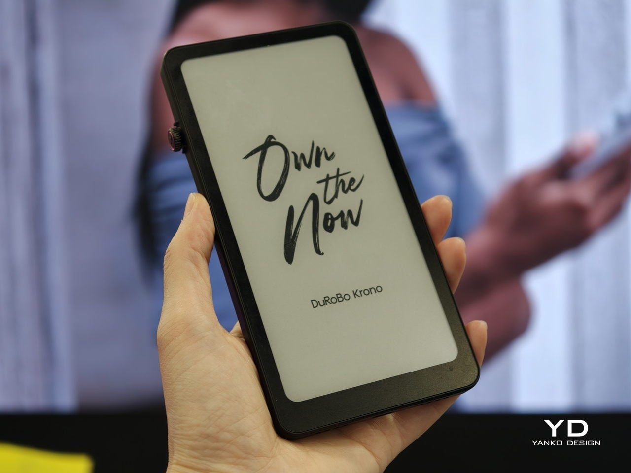
Trying to read or think on a phone never quite works. Notifications interrupt articles halfway through, feeds wait one swipe away from whatever you were concentrating on, and even long reads become just another tab competing for attention. E‑readers tried to solve this, but most stopped at books and stayed locked into one ecosystem. DuRoBo, a Dutch e‑paper specialist, is bringing Krono to CES 2026 in Las Vegas with a different ambition, treating focus, reflection, and idea capture as equally important.
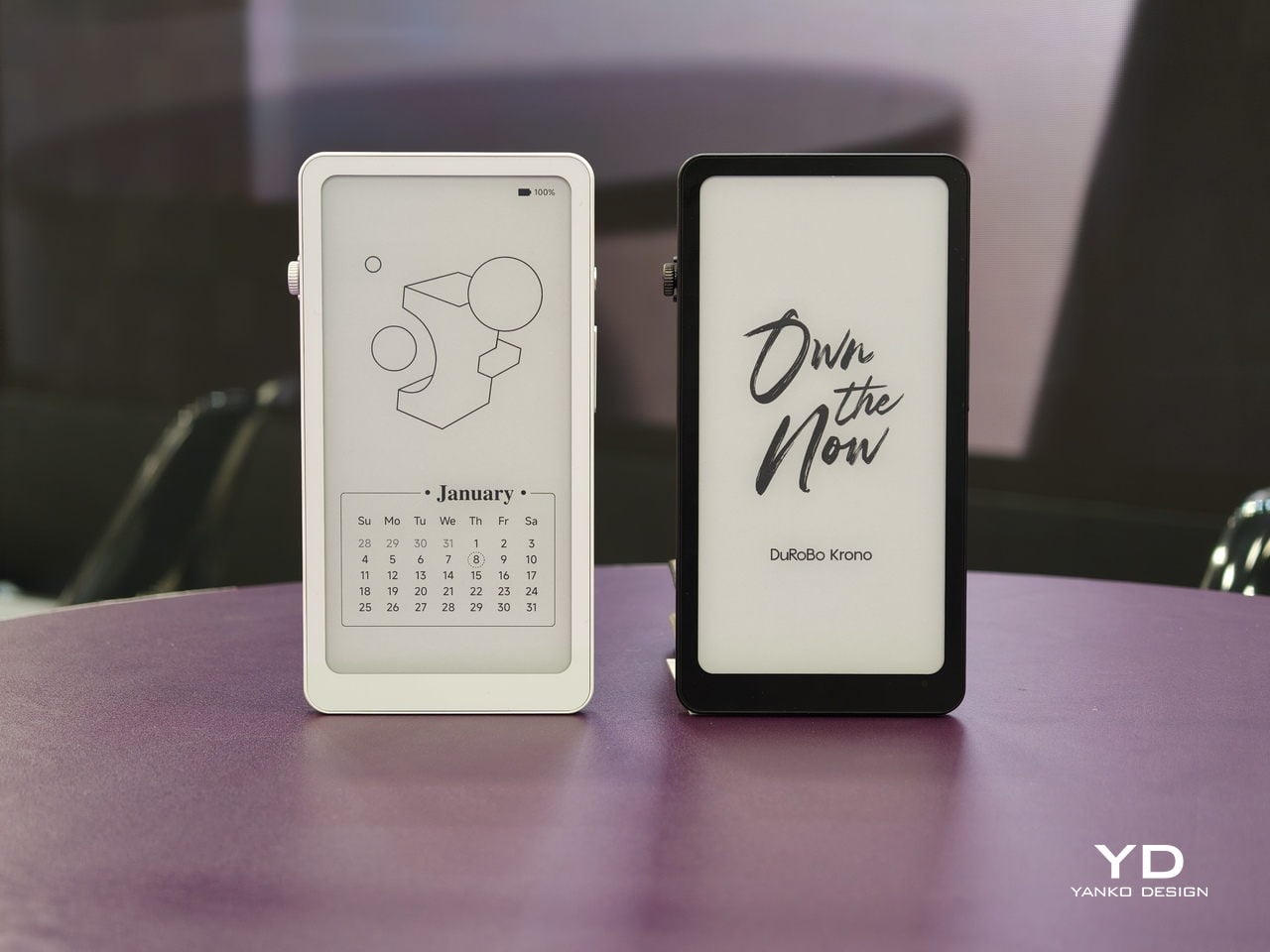
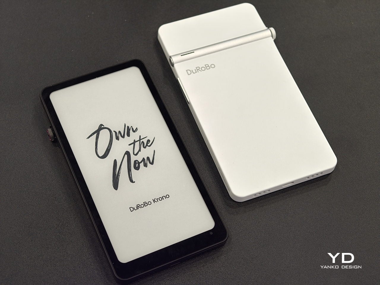
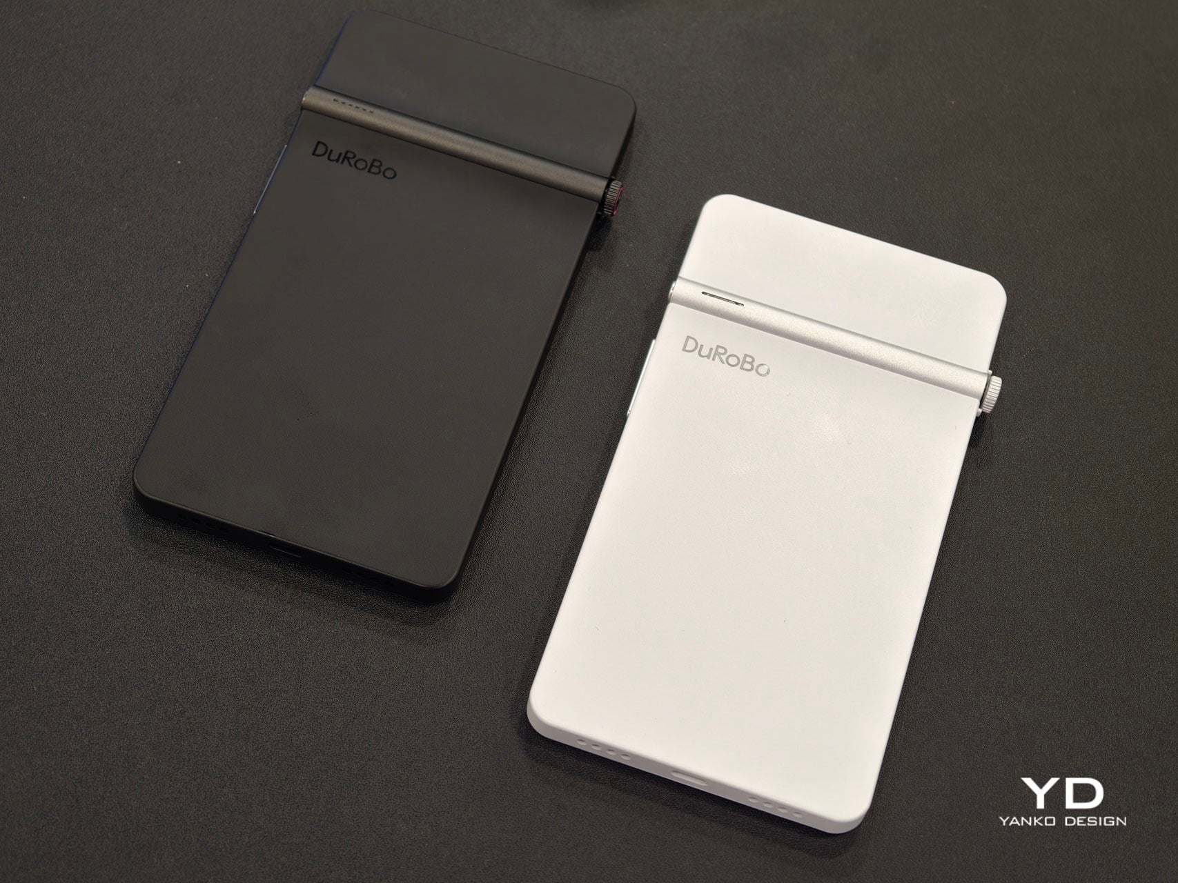
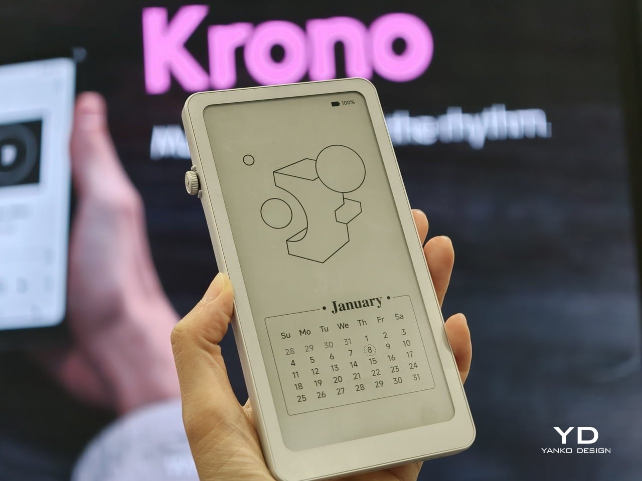
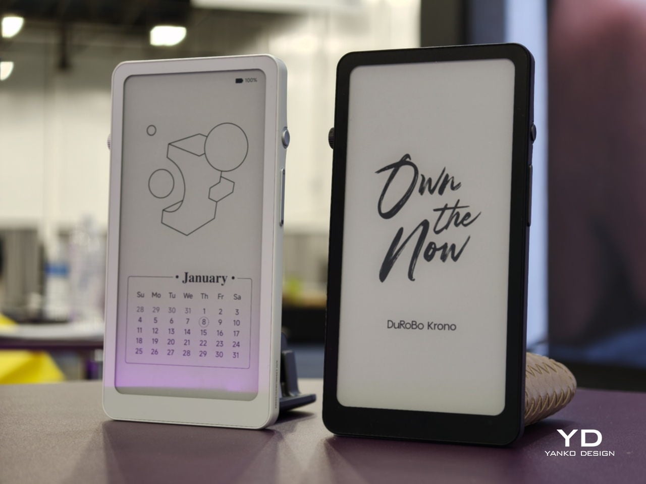
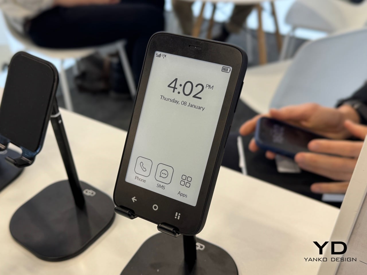
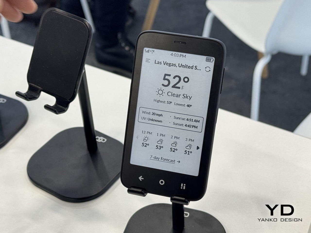
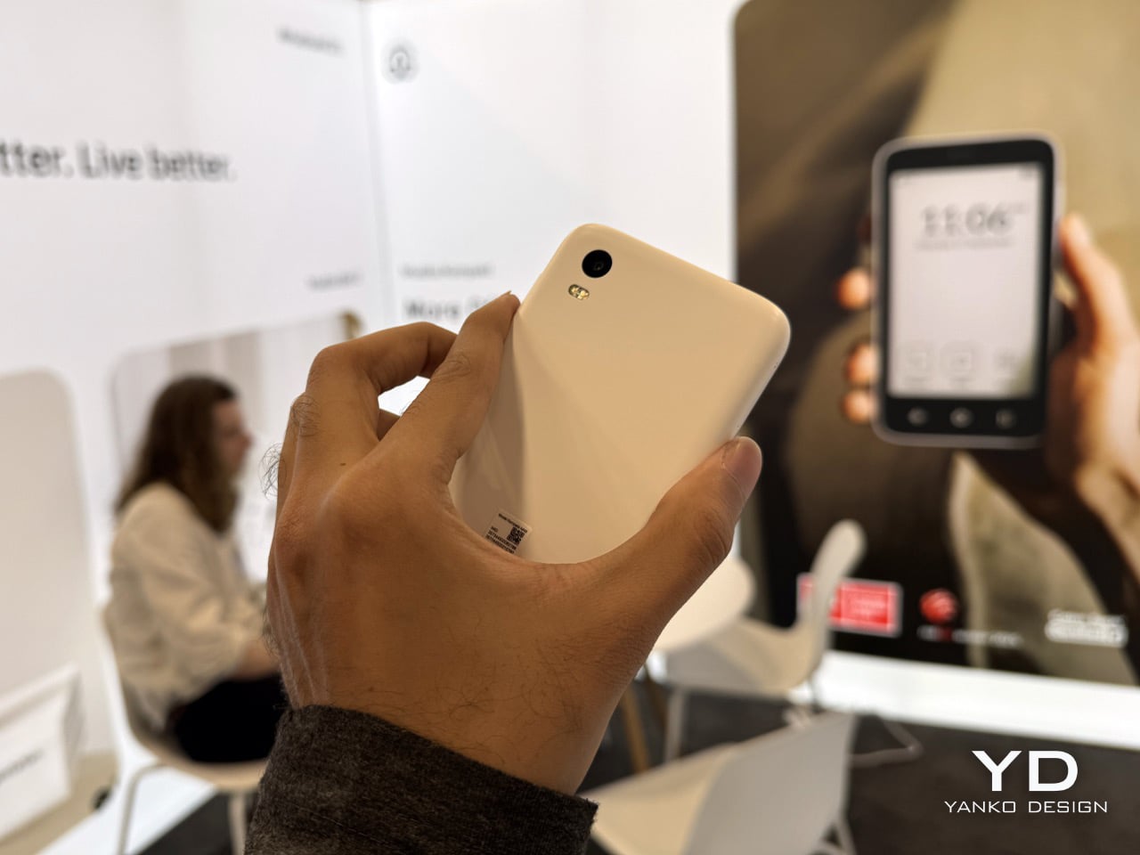
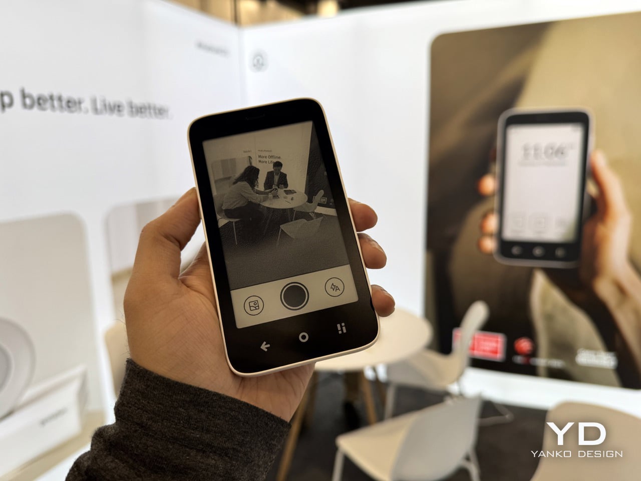
Krono is a pocket‑sized smart ePaper focus hub that has made waves in Europe and is now entering the US market. It wraps a 6.13‑inch E Ink Carta 1200 display with 300 PPI clarity into a minimalist, mechanical‑inspired body that measures 154 × 80 × 9 mm and weighs about 173 g. It is for capturing and shaping thoughts with on‑device AI, ambient audio, and a Smart Dial that feels more tactile than tapping glass.
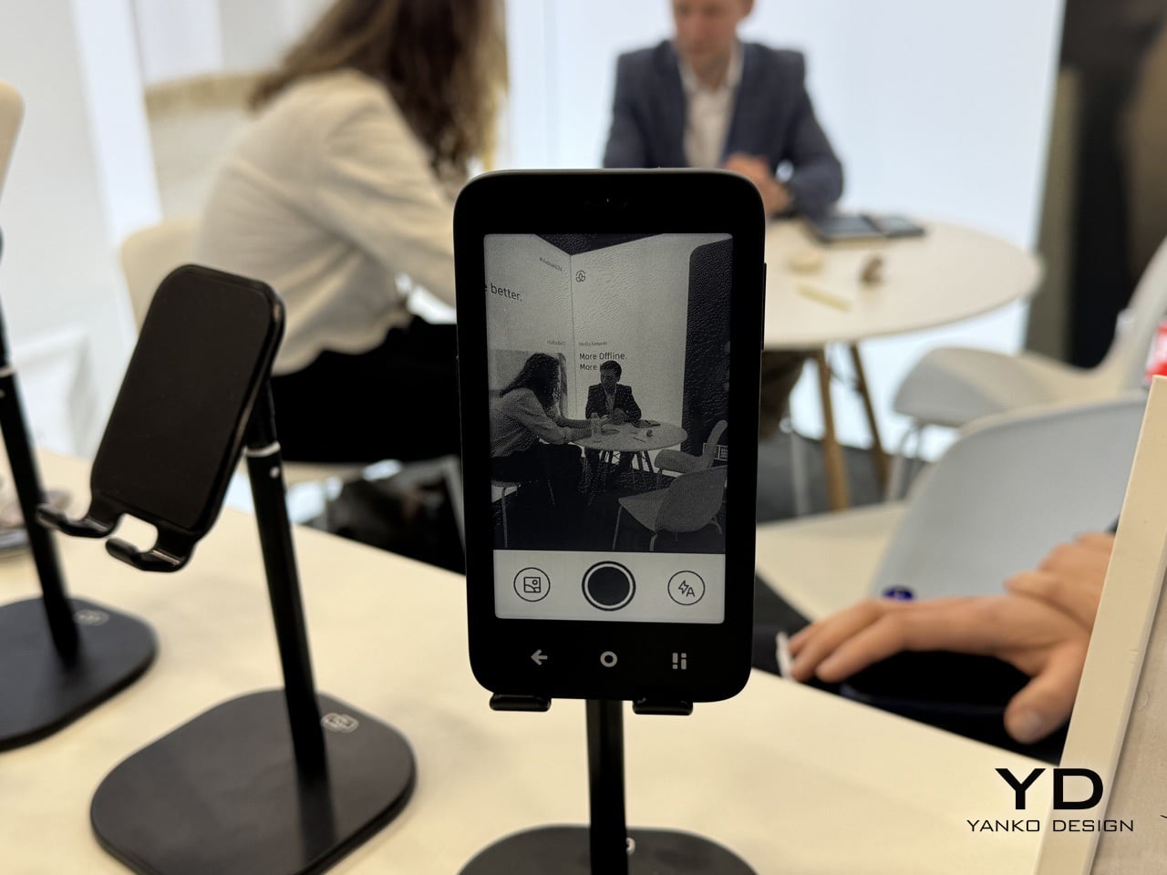
The paper‑like screen, anti‑glare etching, and dual‑tone frontlight make it comfortable for long reads, whether books, saved articles, or PDFs. The compact body feels closer to a large phone than a tablet, which encourages carrying it everywhere as a dedicated space for slower content. The display mimics paper well enough that you can read for hours without the eye strain from backlit screens.
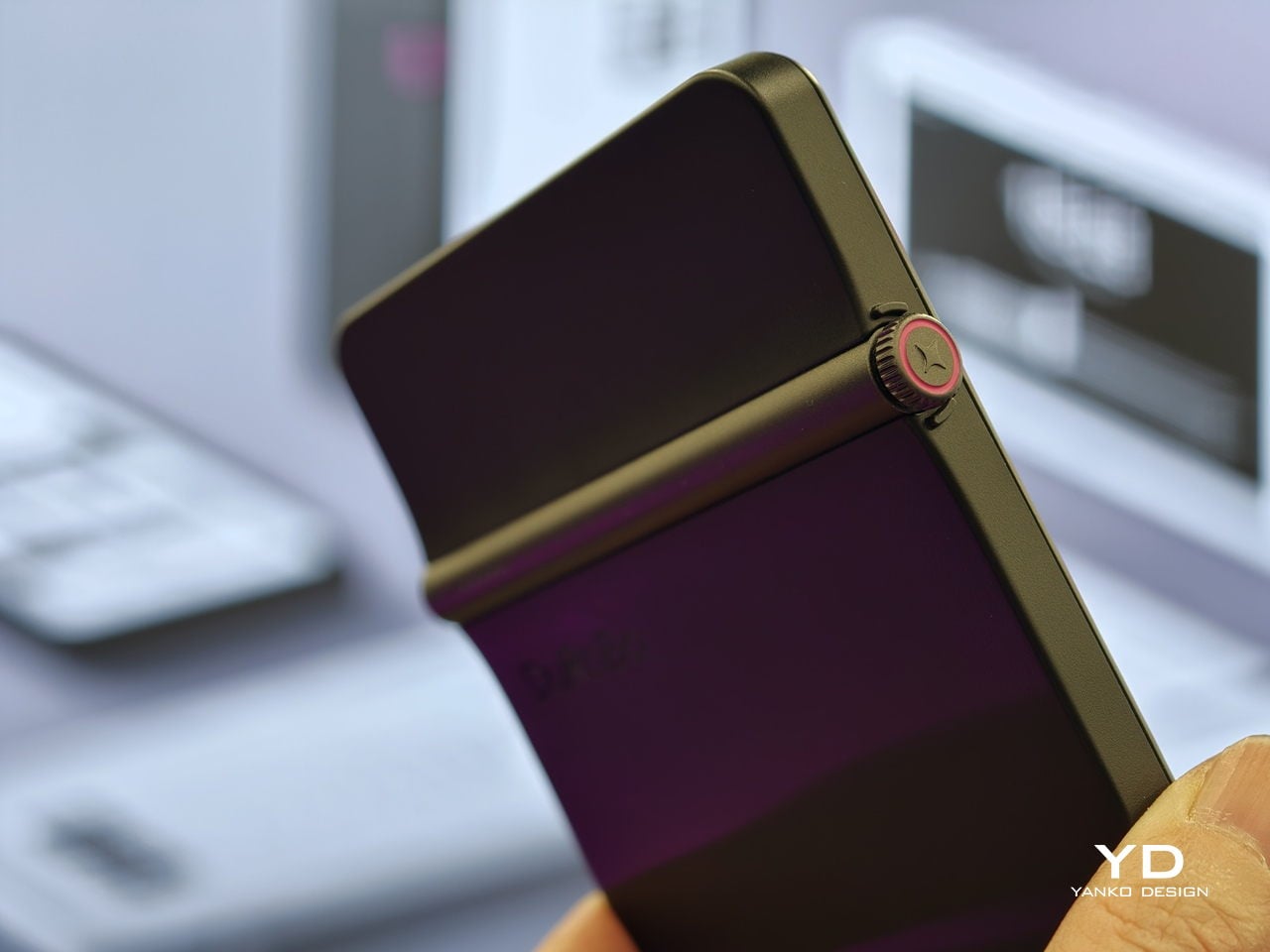
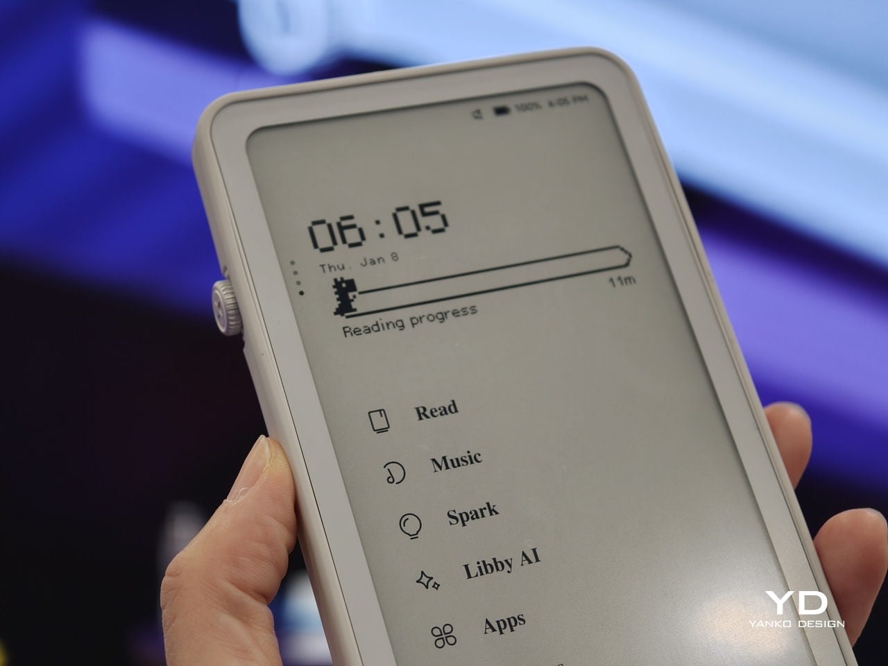
The Smart Dial and Axis bar are the main interaction story. The dial lets you flip pages, adjust brightness or volume, and, with a long‑press, open Spark, Krono’s idea vault. The Axis along the top rear houses eight breathing lights that glow subtly while you read or work, reinforcing the sense of a calm, separate device. The dial and lights give Krono a more analog feel, turning navigation and focus into something you do with your hand.
Spark is where AI enters. Press and hold the dial to dictate a thought, meeting note, or passing idea, and Krono records it, transcribes it with speech‑to‑text, and runs an AI summary that turns it into a structured note. Text Mode lets you refine that note on the e‑paper screen. The whole process happens on‑device, keeping ideas private and the interface calm.
Libby AI is the on‑device assistant that answers prompts and helps with outlines or clarifications without dragging you into a browser. Krono runs Android 15 with full Google Play Store access, powered by an octa‑core processor, 6 GB of RAM, and 128 GB of storage, so it can run Kindle, Notion, or other tools. DuRoBo’s own interface keeps the experience geometric and minimal.
The built‑in speaker and Bluetooth audio are part of the focus story. You can listen to music, podcasts, or audiobooks while reading or writing, turning Krono into a self‑contained environment for commutes or late‑night sessions. The 3,950 mAh battery and tuned refresh algorithms support long stretches of use, not constant app‑hopping, which is what you want from a device that is supposed to be a reprieve from the usual screen.
Krono’s CES 2026 appearance is more than just another e‑reader launch. It is DuRoBo’s attempt to give US readers and thinkers a pocketable device that treats focus, reflection, and idea capture as first‑class design problems. The specs matter, but the real promise is a small, quiet object that can sit between a book and a phone, borrowing the best of both without inheriting their worst habits.
We have seen quite a number of laptops bearing mind-blowing flexible screens that fold or roll, and while they do help push the envelope of laptop design, they might be the future, but it is definitely not yet here. Foldables still scratch easily and are expensive, rollables are at a concept stage, and both rely on technology that is impressive in a demo booth but nerve-wracking when you actually need to get work done and cannot afford downtime or repair bills.
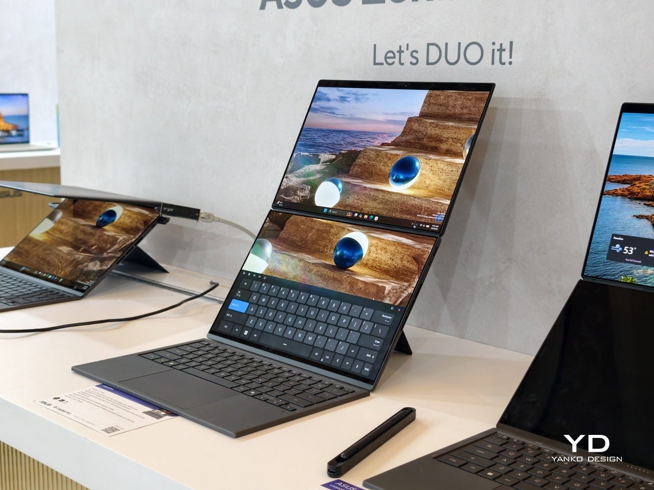
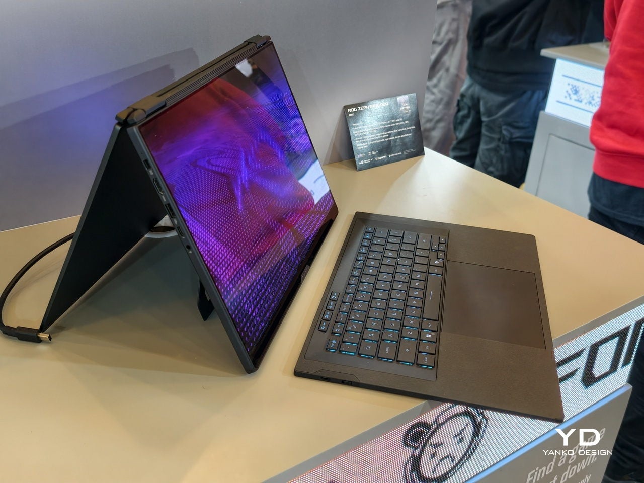
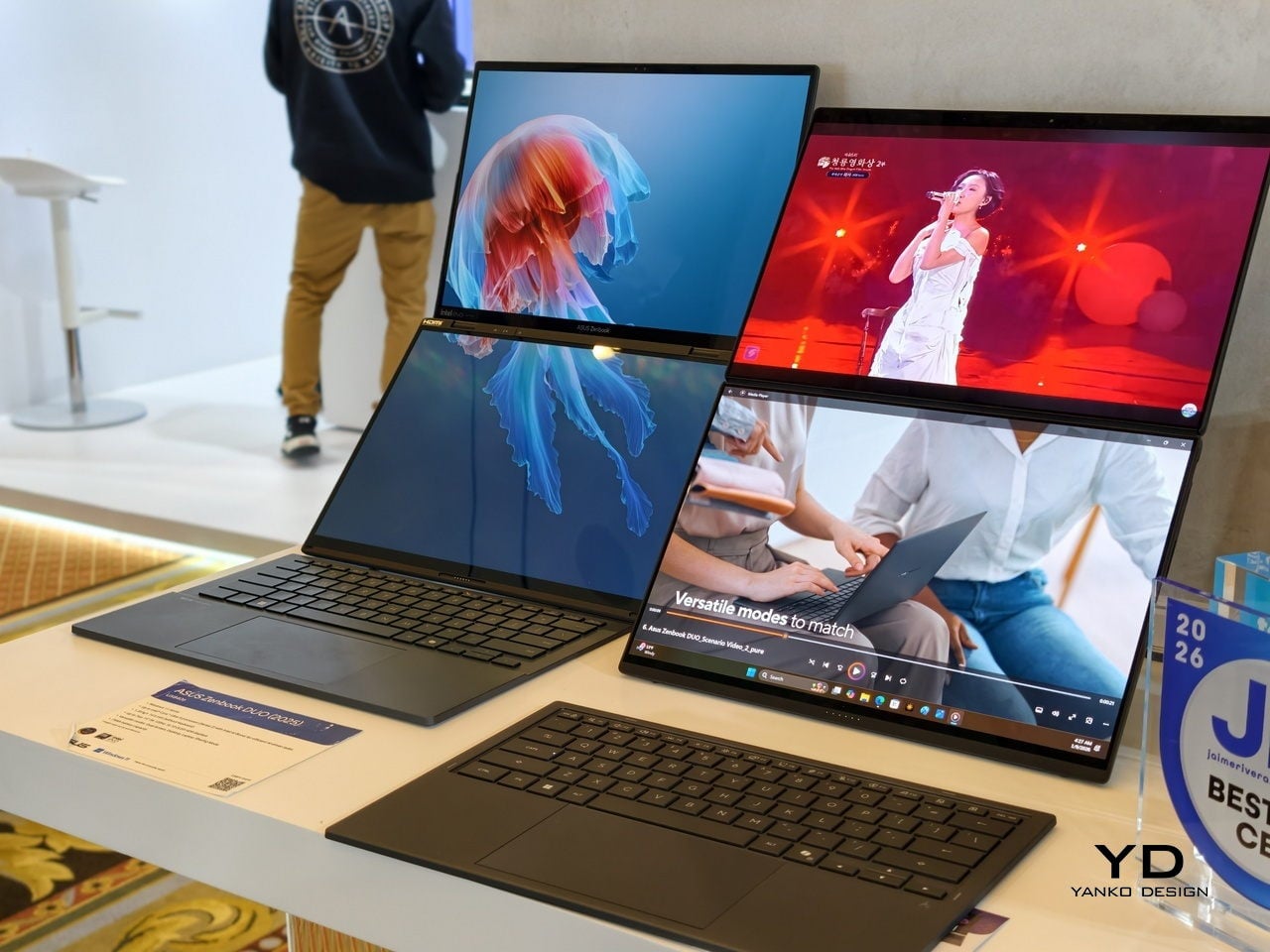
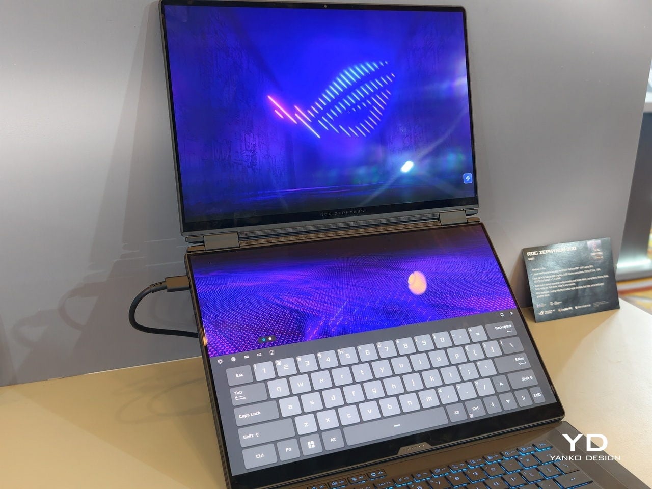
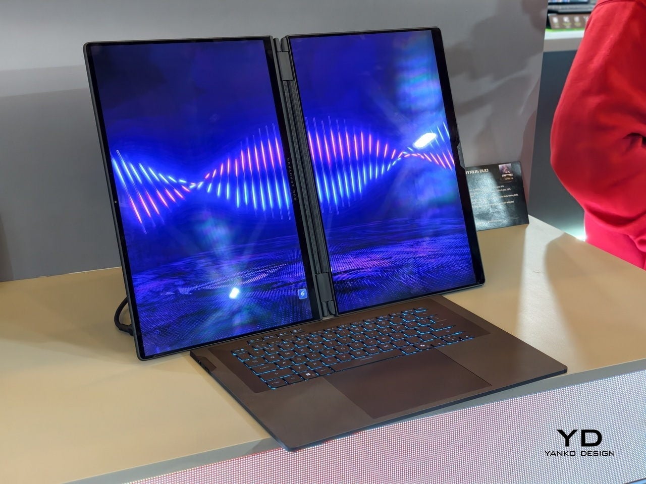
At CES 2026, ASUS and its gaming brand Republic of Gamers are offering two designs for people who need to get stuff done here and now. Although less spectacular than a screen that folds like paper, the ROG Zephyrus Duo 2026 (GX561) and the ASUS Zenbook DUO 2026 (UX8407) promise a more versatile and more reliable experience, using two rigid OLED panels, conventional hinges, and software layouts that treat dual screens as a workflow multiplier instead of a party trick.
Designer: ASUS
Dual Screens, Multiple Possibilities
With a foldable laptop, you get a large screen that folds down to the size of a normal laptop, or a laptop-sized screen that folds down to half its size. A rollable laptop, on the other hand, starts with a normal size and then expands for more real estate. They both try to offer more screen space with a manageable footprint, but it is still a single panel with a limited set of poses. You can fold it like a book or lay it flat, but you cannot flip one half around into a true tent or dual-monitor arrangement, and the panel itself stays soft and fragile under your fingertips.
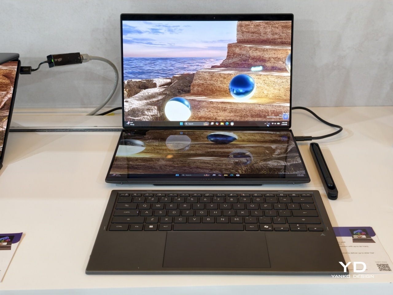
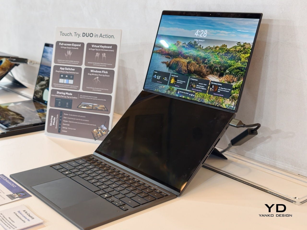
The dual-screen design sported by the new Zephyrus Duo and Zenbook DUO uses two independent but connected screens, practically dual monitors connected by a hinge. They are conventional, rigid OLED panels, so none of the soft, scratch-prone flexible displays of foldables. It feels almost like a normal laptop, just one that has a second monitor permanently attached, hinged, and ready to be stood up, laid flat, or folded back into tent mode for sharing across a table.
More importantly, however, this design offers more versatility in terms of how you actually use the machine throughout the day. You can use only a single screen in laptop mode if space is a constraint or if you want to stay focused. You can flip the whole thing into tent mode to share your screen with someone sitting across from you. You can detach the keyboard entirely and stand both panels up as a tiny dual-screen desk, with the keyboard floating wherever your hands are most comfortable. ASUS brings this design to two different kinds of laptops, really just two sides of the same coin, offering the same core idea with the flexibility you can use today.
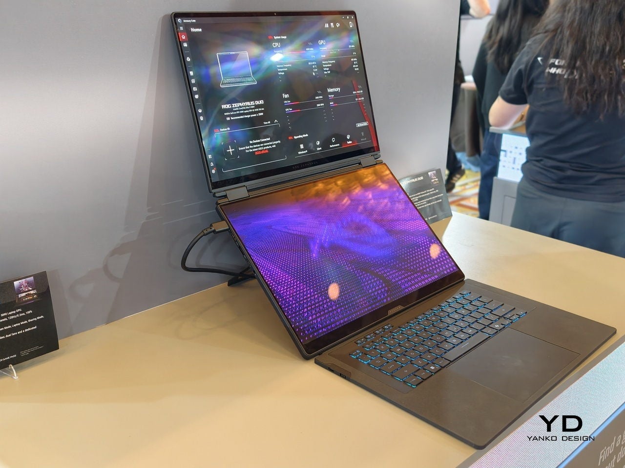
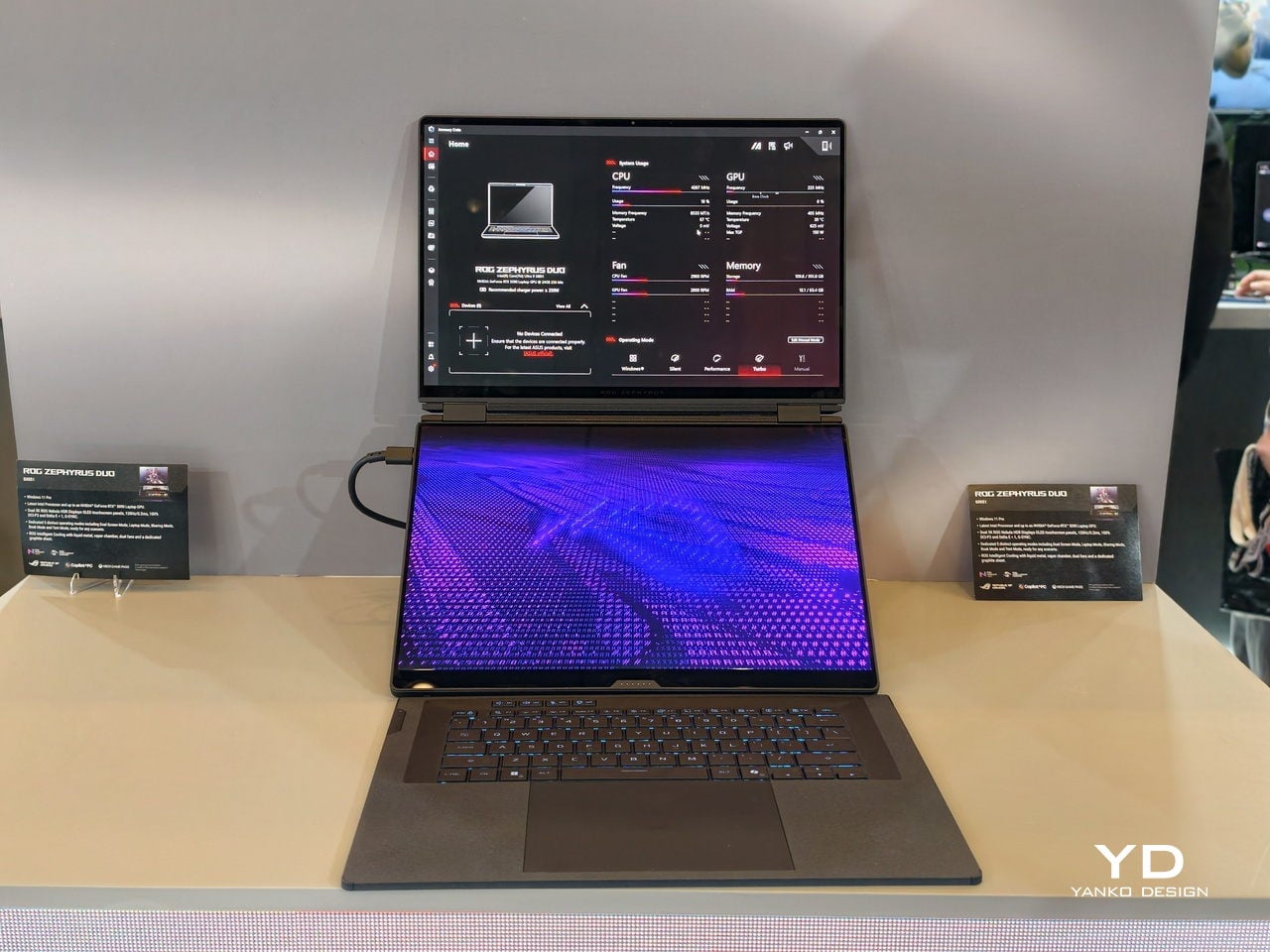
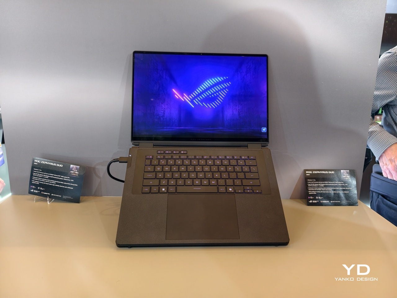
ROG Zephyrus Duo 2026 (GX561): Not Just a Gaming Laptop
This is not the first Zephyrus Duo, but the first one launched nearly six years ago was more of a one-and-a-half-screen laptop. There was a smaller touchscreen right above the keyboard that offered some space for tool palettes and chat windows, but it was still very much a secondary strip. This 2026 redesign, in contrast, is a bold new direction, going full dual-screen with two large OLED panels and a detachable keyboard like no other gaming laptop has dared to go.
It is a true gaming laptop, of course, and the specs show its pedigree. An Intel Core Ultra 9 processor, paired with up to an NVIDIA GeForce RTX 5090 Laptop GPU pushing up to 135W TGP, backed by up to 64GB of LPDDR5X memory and up to 2TB of PCIe Gen5 SSD storage with easy swap access. The 90Wh battery supports fast charging, hitting 50% in 30 minutes.
The main display is ROG Nebula HDR, a 3K OLED panel running at 120Hz with 0.2 ms response time, HDR 1100 nits peak brightness, 100% DCI-P3 coverage, and ΔE below 1 color accuracy, protected by Corning Glass DXC. All of that is cooled by ROG’s Intelligent Cooling system, with liquid metal on the CPU, a vapor chamber, graphite sheets, and 0 dB Ambient Cooling mode for silent operation when you are not rendering or fragging.
At 6.28 lb and just 0.77 inches thin, it is heavy enough to remind you there is serious silicon inside, but still portable enough to live in a backpack. The machine includes Wi-Fi 7, Thunderbolt 4, HDMI 2.1, USB 3.2 Gen 2 Type-A, and an SD card slot, plus a six-speaker system with two tweeters and four woofers running Dolby Atmos, so you can actually enjoy game audio without always reaching for headphones.
Where the ROG Zephyrus Duo 2026 really shines is in versatility. Because a laptop that can run AAA games can practically do anything as well, including content creation, programming, video editing, and 3D work. Designers and creatives will definitely love the freedom such a design offers, paired with powerful hardware that does not compromise just to fit two screens. You can keep After Effects timelines on one panel while the preview lives on the other, or split code and output, or run a game on the main screen with Discord and guides on the second, all without alt-tabbing or shrinking windows.
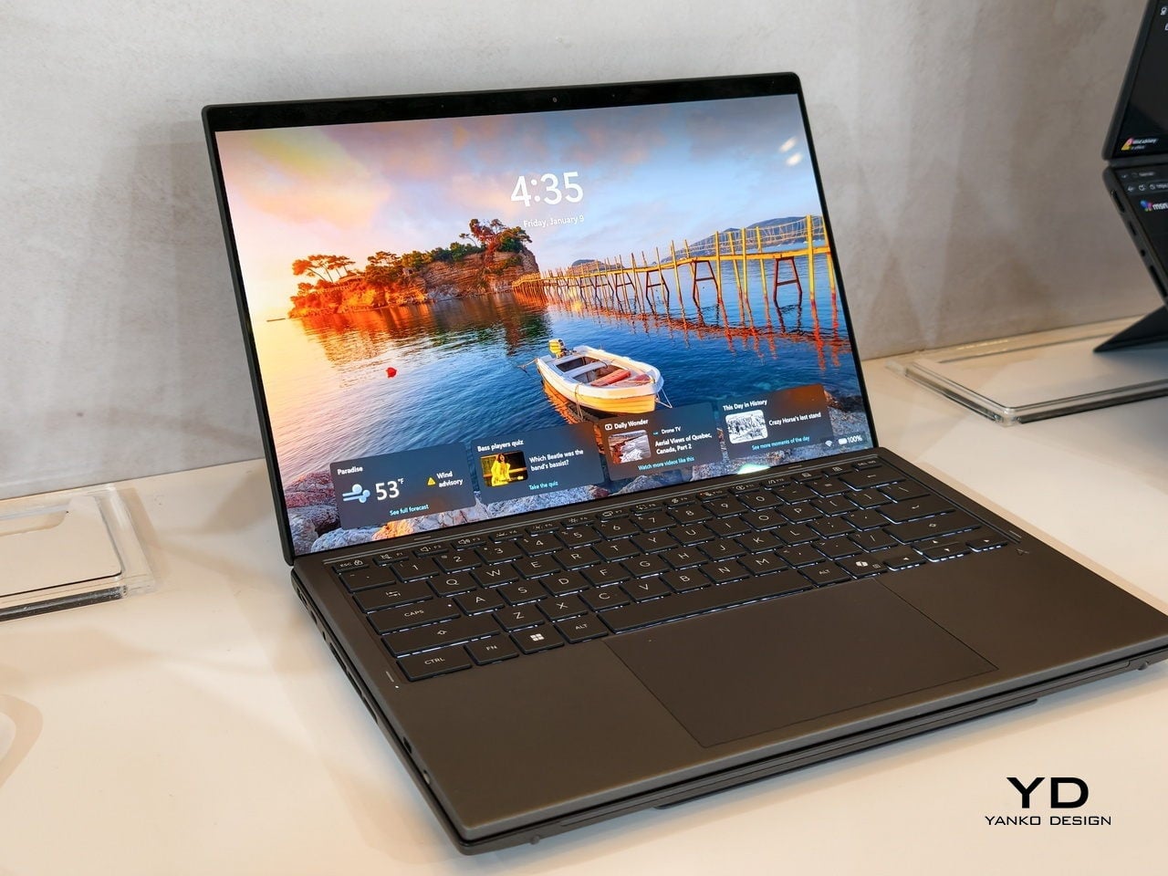
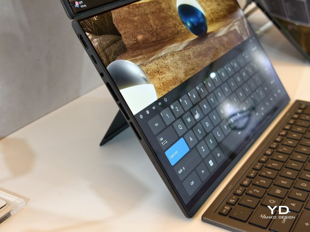
ASUS Zenbook DUO 2026 (UX8407): Dual-Screen Goes Lux
The ASUS Zenbook DUO 2026 shaves off some of the gaming hardware to offer a dual-screen laptop that is slimmer, lighter, and a little more stylish. It is no slouch, though, and carries plenty of muscle to handle any productivity task you might throw at it. That also includes content creation, with a bit of light gaming on the side when you want to unwind between meetings or deadlines and do not need RTX power for every session.
The Zenbook DUO 2026 runs a next-gen Intel Core Ultra processor with up to 50 TOPS NPU for AI workloads, paired with Intel Arc integrated graphics, up to 32GB of memory, and up to 2TB of SSD storage. It supports up to 45W TDP with a dual-fan thermal solution, keeping the machine stable during sustained loads without the heavy cooling overhead of a discrete GPU, which helps keep the chassis thin and light.
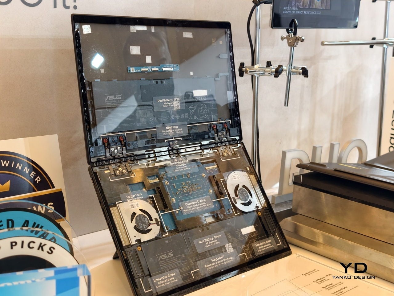
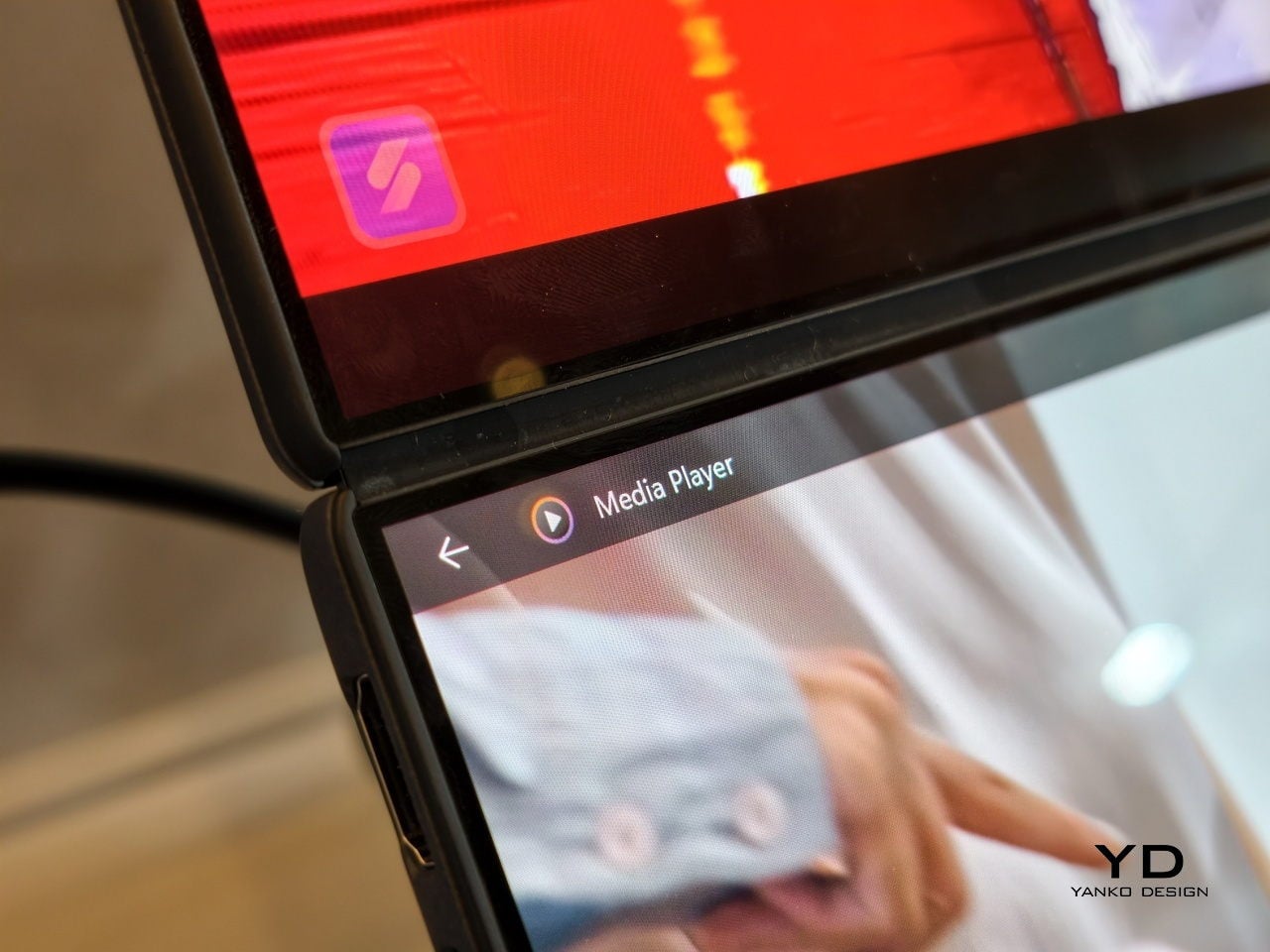
The main display is an ASUS Lumina Pro OLED with 1000 nits peak brightness, and both screens are treated with the same level of care, making them equally usable for productivity, media, and light creative work. What differentiates this next-gen dual-screen from its predecessor is the new hinge design that puts the screens closer together. With thinner bezels, they now sit just 8.28mm apart, a 70% reduction, and they almost look like a single continuous piece.
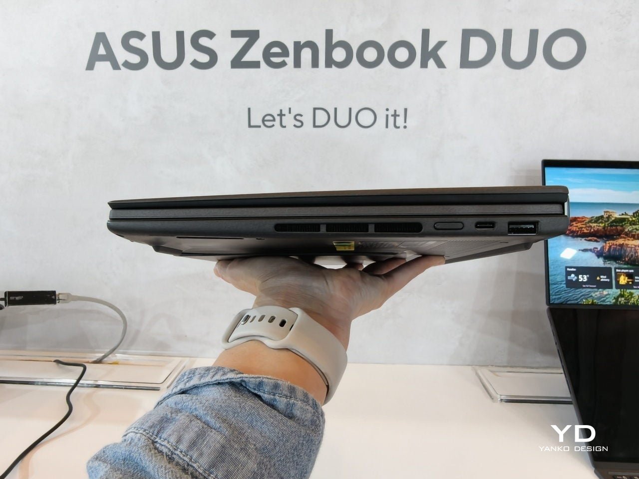
ASUS has adopted its Ceraluminum material for the Zenbook DUO 2026’s laptop lid, bottom case, and kickstand, making it not only look and feel more luxurious but also be a bit more resilient to accidents and daily wear. The Zenbook DUO weighs just 1.65kg and has a 5% smaller footprint than previous generations, which makes it easier to carry and fit on smaller desks or café tables.
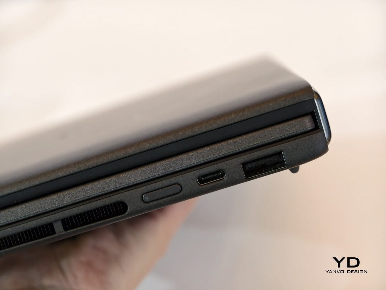
It is packed with ports, including two Thunderbolt 4 connections, HDMI 2.1, USB 3.2 Gen 2 Type-A, and an audio jack, plus six speakers with two front-firing tweeters and four woofers for surprisingly rich audio from a thin chassis. The keyboard connects via magnetic pogo pins or Bluetooth, and the machine supports ASUS Pen 3.0, turning both screens into writable surfaces for notes, sketches, or annotations during video calls or brainstorming sessions.
Like the Zephyrus Duo, the Zenbook DUO 2026 can be used in multiple orientations. Laptop mode with the keyboard on top of the lower screen for traditional clamshell use. Desktop mode with both screens stacked or side-by-side, the detachable keyboard placed separately, and the built-in kickstand propping the whole thing up like a tiny dual-monitor workstation. Tent mode for presentations or sharing content across a table without needing an external display or awkward screen mirroring. The flexibility is the point, and it works without asking you to trust a flexible panel not to crease or scratch under normal use.
Trade-offs and Potential
Dual-screen laptops are not perfect, of course. You need to keep track of a separate keyboard you hope you will not lose, though that is also the case for some foldable laptops anyway, and the detachable keyboard is also what lets both the Zephyrus Duo and Zenbook DUO behave like tiny dual-monitor desks in tent or desktop modes. These machines are easily heavier than single-screen laptops with equivalent specs, and they will likely be priced firmly in premium territory, though still far below the stratospheric costs of early foldables.
There is also that unavoidable divider between the two screens, though ASUS has gotten it down to 8.28 mm on the Zenbook DUO, and at that point it starts to feel more like a subtle pause than a major interruption. The hinge is still visible, the gap is still there, but it is less about accepting compromise and more about acknowledging that two rigid, high-quality OLED panels with a small gap are more practical than one fragile foldable panel with no gap at all.
Despite those limitations, these designs offer a kind of versatility that neither conventional laptops nor foldable laptops can match. You get to decide how to use the laptop, unrestricted by a single panel or a prescribed set of folds. You can boost your productivity with two screens for timelines and tools, or save space with just one when you are working in a tight spot. You can stand them up for presentations, lay them flat for collaborative work, or use them as a traditional clamshell when muscle memory takes over.
Maybe someday, we will have foldable laptops that can bend both ways, support multiple modes, and will not easily scratch with a fingernail or develop a permanent crease after a few months of daily folding. But if you want to be productive and create content today, the ROG Zephyrus Duo 2026 and ASUS Zenbook DUO 2026 could very well be among the most productive and most versatile laptops of 2026, delivering the dual-screen promise without the fragility, the expense, or the anxiety that comes with carrying a piece of still-experimental tech into the real world.
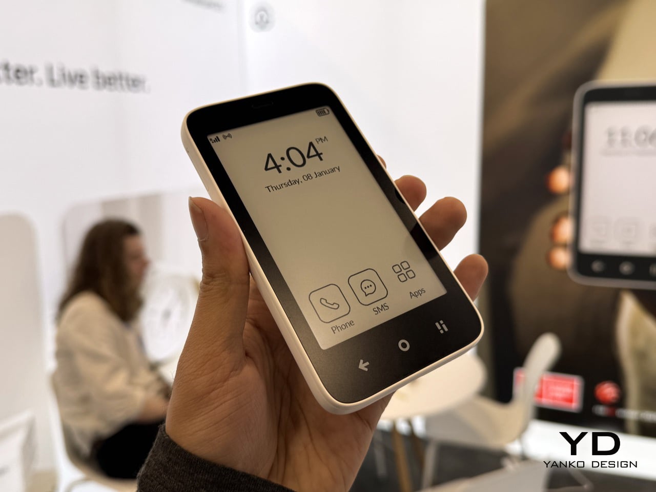
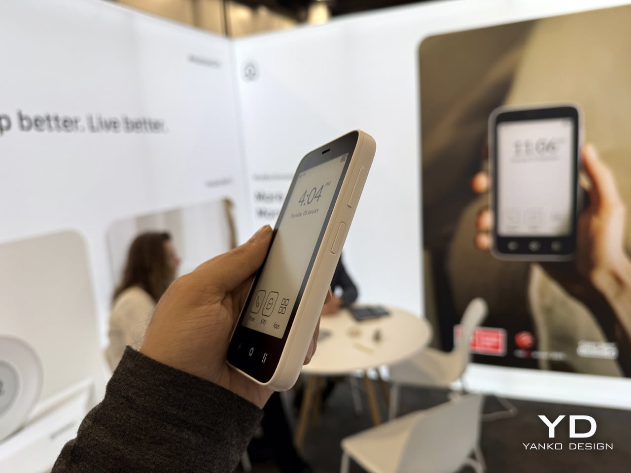
Mudita is a company that focuses on minimalism and mindfulness in technology, a rare philosophy in an industry that relentlessly chases engagement metrics and data monetization. At CES 2026, while competitors showcased AI-powered everything and sensor-packed gadgets, Mudita’s booth felt like a calm oasis in the chaos. CEO Michał Stasiuk explained that most people quickly grasp the concept behind Mudita’s products when they hear what the company does, noting that “most of our conversations here were with people who, you know, when they hear what we are about, what we are doing, what the product is about, they do get the concept.”
The real challenge, Michał acknowledges, isn’t explaining the philosophy but implementing behavioral change: “The difficult part is to actually implement the usage in their own lives because it’s a trade-off between the convenience and the less usage of the device and the peace of mind.” We sat down with Michał to discuss how Mudita positions itself as the antidote to big tech’s attention economy, why the company deliberately avoids AI, and how it’s building trust with consumers who are burned out and skeptical of technology promises.
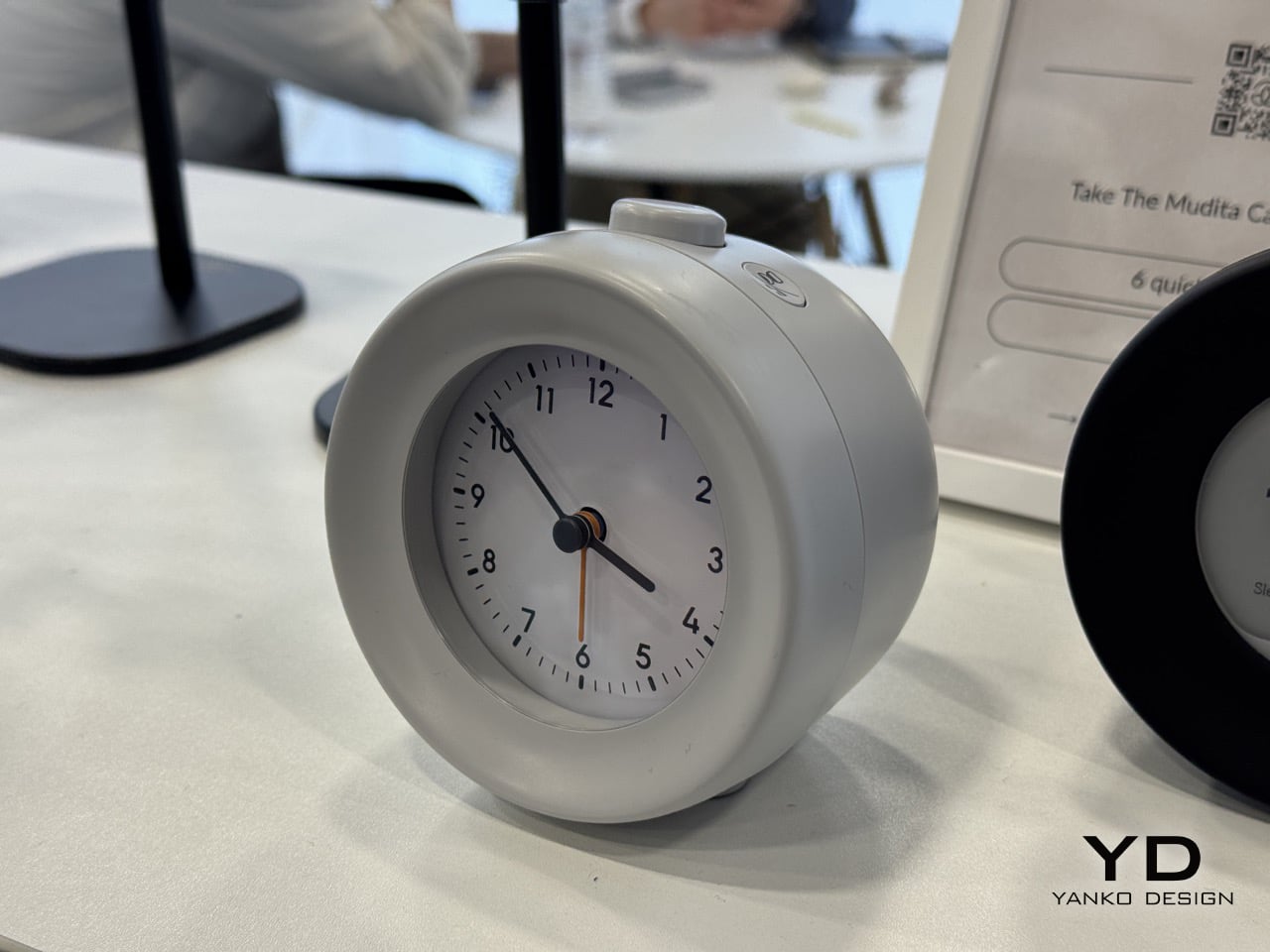
Mudita Kompakt
Trading Convenience for Calm in a Sensor-Saturated World
CES 2026 was dominated by products cramming sensors into everything, trying to capture data at every opportunity. Mudita stands in stark contrast, deliberately avoiding data gathering and Google APIs. When asked how it feels to be such an outlier, Michał responded positively, explaining that visitors “do get the concept” fairly quickly. The philosophy resonates because people recognize the problem in their own lives, even if acting on it requires uncomfortable changes.
The company frames its products as a deliberate trade-off: “It’s a trade-off between the convenience and the less usage of the device and the peace of mind so the difficult part for them is to actually use the screen less and use the phone less for their benefit but with the trade of convenience.” This honesty about sacrifice sets Mudita apart. Rather than promising effortless transformation, they acknowledge that reclaiming attention requires genuine commitment and a willingness to forego some modern conveniences.
Michał cited sobering statistics: “The average screen time is above six hours a day in the US.” He suggested that all that time could be spent elsewhere, “doing other stuff,” emphasizing that “this device is designed for that purpose of reducing the screen time.” By acknowledging the scale of the problem without sugar-coating the solution, Mudita positions itself as the company willing to say what others won’t.
Band-Aids vs. Built-In Guardrails
The interviewer characterized messaging from Apple and Google about mindfulness and digital well-being as “putting a band-aid on a problem that is actually a really big problem,” noting that their corporate ethos centers on data gathering. Michał agreed, pointing out that big tech companies acknowledge the problem by implementing screen-time controls, which means “they are admitting that the issue is there, right?” However, he argued their implementations are “less efficient” because “you can disable the screen time limitations with no problem whatsoever on your device any time you like.”
Mudita’s approach hardens the constraints: “The device that we’ve made can be much more efficient in that regard. Because when you’re making a decision to use our phone instead of, for example, iPhone or Samsung, it’s much more difficult to break the habit of not using the phone so much.” The key difference? “You cannot disable the limitation on this device.” This is product design as commitment device, locking users into healthier patterns by removing escape hatches.
The business model distinction is fundamental: “The main difference is that the business model of large companies is set to monetize the data, for example, and to make the device as appealing as possible. So our device is designed not to be as appealing as possible, rather it’s designed for our users, clients, to do what they need to do on the phone and then move on.” The goal is to free up time “in life, spending their time elsewhere, doing actually meaningful things instead of staring at the phone, whatever brings joy to them and not spend so much time using a phone.”
Recognition Arrives Fast, Habits Follow Slowly
Michał noted that “the niche is growing and quite fast,” with significantly more awareness in recent years: “What we’ve seen for the last couple of years is definitely more awareness and people get the concept now. Most of the people understand the concept now.” He contrasted this with a few years ago when “it wasn’t the case,” meaning the minimalist phone category had to overcome basic comprehension barriers that no longer exist.
Regulatory momentum supports this shift. Legislators, psychologists, and even big tech insiders are talking about “serious damage happening and mental damage and psychological damage happening with these devices that are constantly taking our attention.” Michał highlighted parental demand as a key driver, noting that “in the last year 2025 there were three phones released on the market designed solely for the purpose of digital minimalism.” The market is validating Mudita’s early bet.
Yet Michał tempered expectations about speed: “I wouldn’t say that the change is very fast in terms of consumer habits because the consumer habits take long time to change much longer but in terms of understanding the issue I would say that everybody agrees.” Many visitors tell him the phone is something “someone would buy for their children” because “a lot of parents are concerned with the screen time of their children so actually they are looking for solutions.” Understanding precedes action, and the gap between the two is where Mudita must operate.
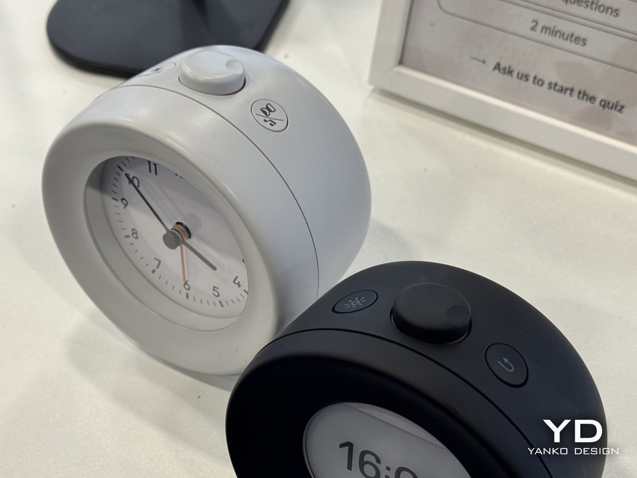
Mudita Bell 2 & Harmony 2
Old Problems Don’t Need New AI
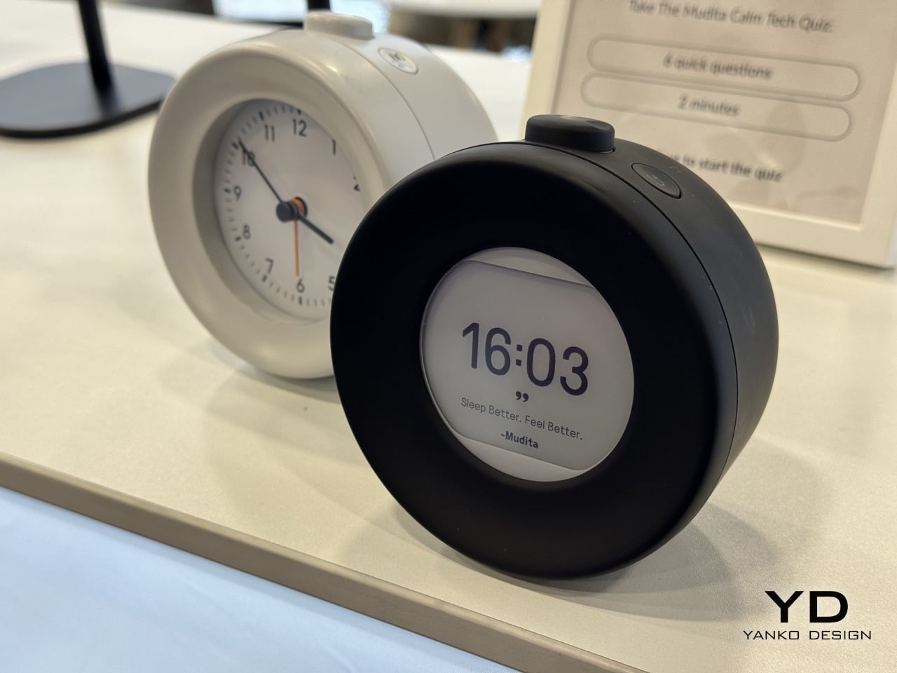
At a show where AI appeared in “literally every product now,” including “an AI alarm clock” and “an AI toaster,” Mudita’s CEO was blunt: “We do not see any need for AI usage in the products that we are creating so far, because the problems we are trying to solve do not require AI, like for example in the alarm clocks, the problem we are trying to help to solve is better sleep and to improve sleep which is harmed by extended use of mobile devices like phones before going to bed.”
He explained that people “scroll for three hours before they go to sleep and this can disturb the sleep and circadian rhythm,” and that Mudita’s alarm clocks use “e-ink display like the phone does and for that reason it does not emit any blue light right so you do not need to look at the blue light before you go to bed.” The solution is material science and interface design, not machine learning. Solving sleep disruption doesn’t require algorithms; it requires removing the stimulating screens that prevent sleep in the first place.
Michał clarified the stance isn’t ideological: “We are not against AI in general but until now there wasn’t any need to use AI.” It’s a refreshing example of technology restraint, deploying tools only when they serve a genuine purpose rather than chasing trends. By avoiding AI where it’s unnecessary, Mudita reinforces its core message that more technology isn’t always the answer.
How Mudita’s Design Language became Instantly Recognizable
When asked about Mudita’s distinctive design DNA, Michał described the unifying principles: “In every product that we are making we are aiming for similar outcomes for example we want to create simple products we want to create products that are easy to use and easy on the eyes without any eye strain so we design all of our interfaces to be pleasant not very cluttered without any jumping elements.” The aesthetic is functional, driven by the goal of reducing cognitive load and visual stress.
He elaborated on the interface philosophy: “In our phone we design the user interface not to have any popping up notifications that could be disturbing and to be as simple as possible and black and white aesthetics are very good fit for that purpose and E Ink displays are also very good fit for what we are trying to achieve without the blue light emission and black and white interfaces.” The monochrome palette isn’t a stylistic flourish; it’s a deliberate choice to make devices less stimulating and more restful to look at.
Rather than building a data-sharing ecosystem, Mudita envisions “an ecosystem but of a different sort,” where devices like alarm clocks work well with lamps “that will have colors adjusted for bedtime like for example you can have warmer colors without any blue light emission.” Importantly, “there is no need for data transfer between those two devices,” and the philosophy is “if they can solve an issue or solve a problem being simple there is no need for us to complicate things with the massive ecosystem that’s not needed.” Simplicity, kept simple.
Transparency as the Trust Strategy
Given that potential customers “have a problem with big tech because they’ve had issues of their own whether it’s data breaches, whether it’s mental health exhaustion or any sort of anxiety,” the challenge for Mudita as “ultimately a tech company” is “how do you win their trust when they’re already so skeptical?” Michał’s answer centers on transparency: “What we are trying to do is to be transparent so basically what you see is what you get okay we are describing our products on our marketing information like, explicitly saying what they are what they are not just to make sure that every important information is out there communicated.”
The company uses community feedback to calibrate disclosure: “We have a forum that people are very active and this is like a source of information for us, what’s important to them, what information should be disclosed and so on,” adding that “it’s not always obvious for us what people are looking into.” Additionally, “what we are trying to do is to deliver what we say when we announce it, so if we announce that there is going to be released with some changes, we are doing everything we can to deliver exactly those changes in exact time that we promised our clients and community.”
Michał summed up the philosophy: “We are doing our best to be as transparent as we what you see is what you get what you see is what you get this is this is like something is a model yes.” By contrast to big tech’s opacity and broken promises, Mudita offers radical honesty about capabilities, limitations, and timelines. Trust isn’t assumed; it’s earned through consistent delivery and clear communication about what the products can and cannot do.
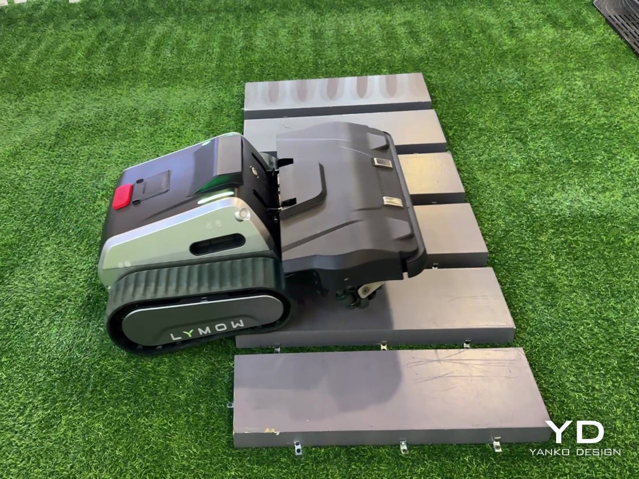
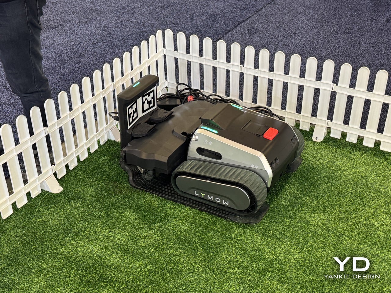
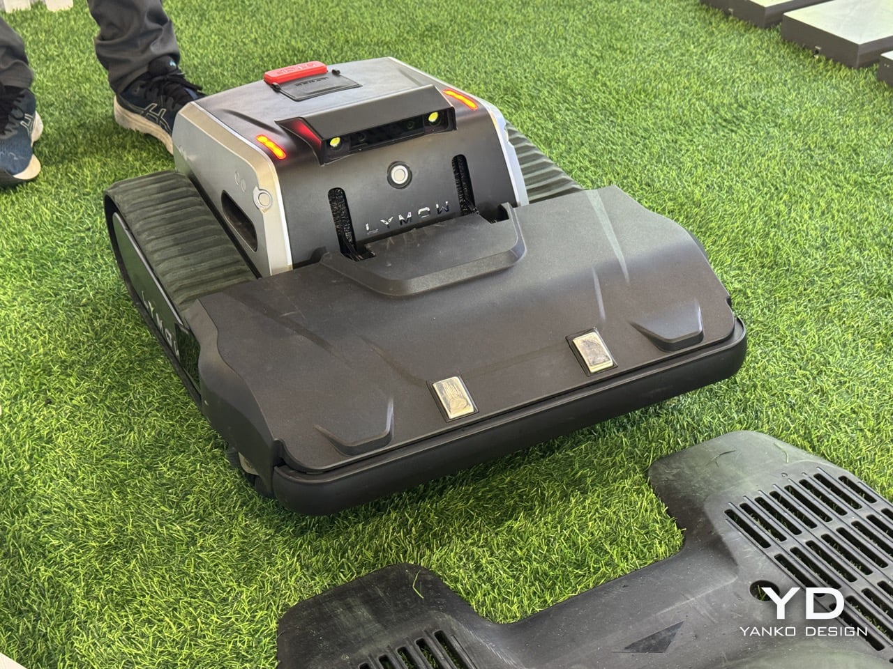
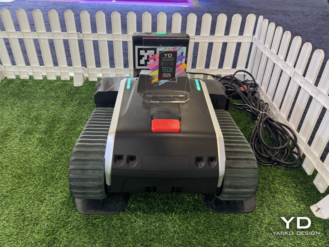
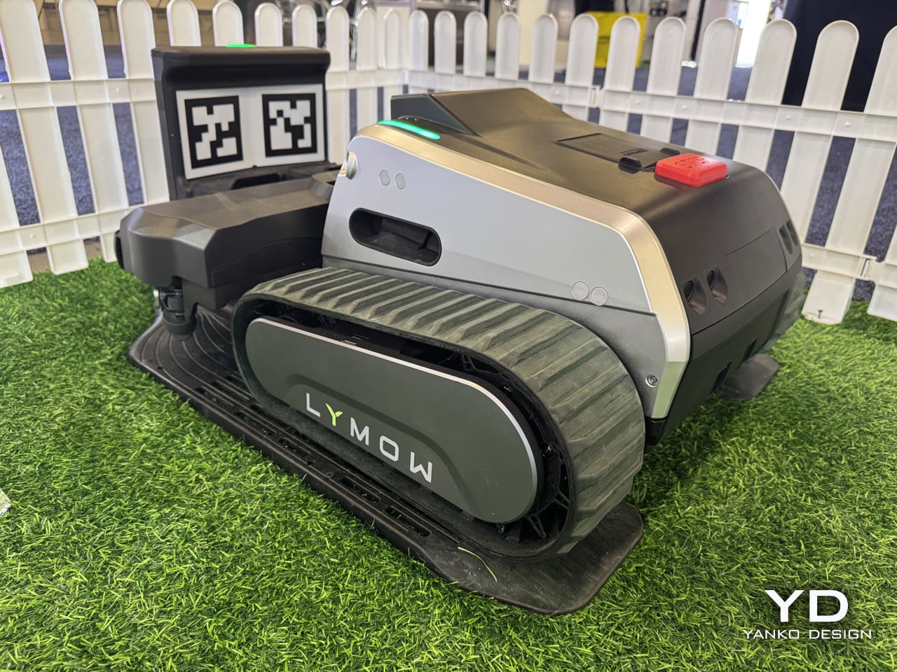
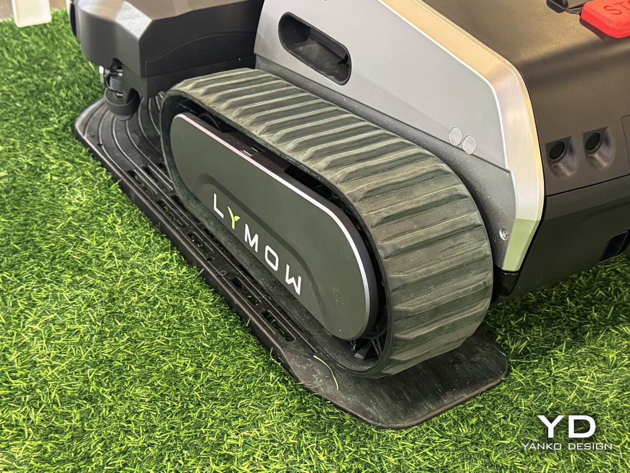
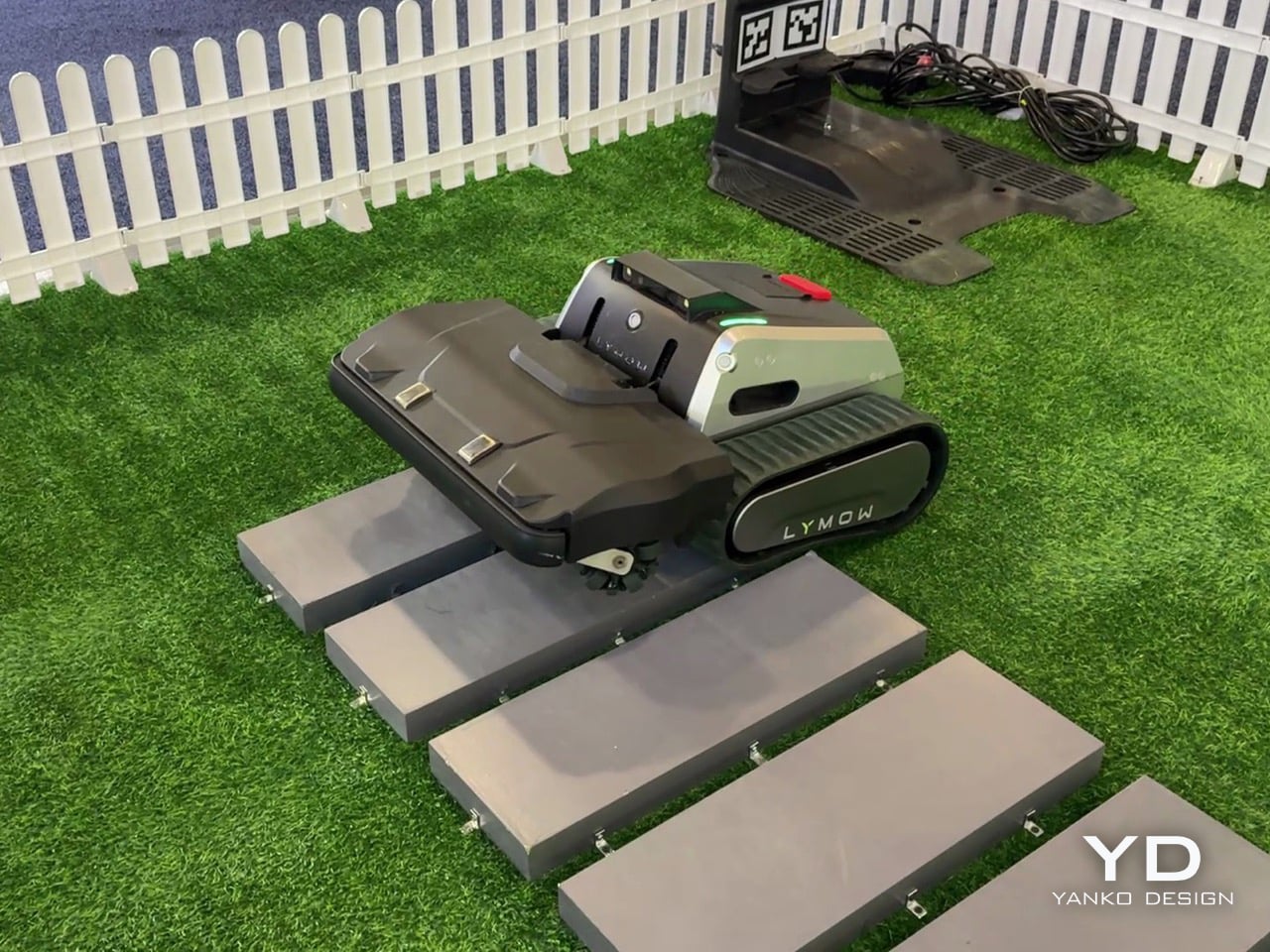
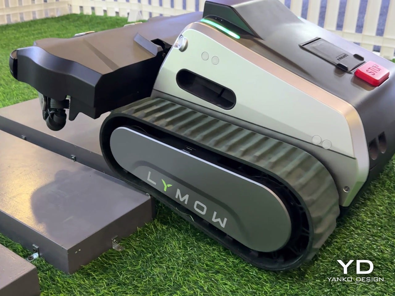
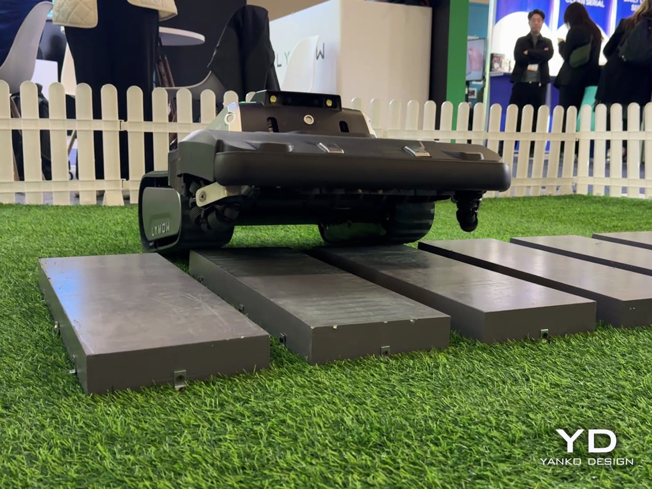
Robotic lawn mowers don’t fail because they lack autonomy – they fail because owners stop trusting them. Missed patches, unexpected downtime, edge-case breakdowns: these are the reasons robotic mowing still hasn’t fully replaced traditional mowers on large and complex lawns. Lymow One Plus addresses that trust gap head-on. An evolution of Lymow’s tank-tread, boundary-free mower that has already attracted attention for its rotary mulching blades and steep‑slope capability. The new model builds on its predecessor with targeted hardware and software enhancements, including sharper SK5 blades, an improved airflow system, and advanced AI algorithms. For homeowners with demanding lawns, that means more confidence that the mower will get the job done right.
On the CES floor in Las Vegas, Yanko Design’s Radhika Seth sat down with Lymow co‑founder Charles Li to unpack what “replacement‑grade” actually means. Across the conversation, a few themes kept surfacing: ruthless user‑centric research, a willingness to admit and fix first‑generation flaws, and an almost stubborn insistence on “appropriate technology” over spec‑sheet theater. Lymow One Plus is the hardware expression of those values.
From Lymow One to One Plus, a mower built to actually solve North American yards
Charles describes Lymow One Plus as nothing less than a ground‑up evolution of the original product. “Lymow One Plus is a comprehensive upgrade of Lymow One,” he says. “It delivers a fundamental step up in cutting performance, stability, and long‑term reliability, while becoming noticeably smarter in complex, real‑world yard conditions.”
The target is very specific. Lymow One Plus is “a mower built to genuinely solve problems for large and complex lawns in North America, and increasingly, globally.” Instead of chasing flashy AI tricks, the team went back to first principles. “We didn’t design it to showcase flashy intelligence. Instead, we went back to the first principles and asked a very simple question. What does the user ultimately care about? The answer is very straightforward. Cut the grass short, and well, consistently, without hassle.”
That framing also ties into timing. Robotic mower penetration in North America is still under 5 percent as of 2025, and Charles is blunt that “no one is really successful in the robotic lawn market in the US” yet. The team sees 2026 as a genuine inflection point and wants Lymow One Plus positioned as the product that makes skeptical homeowners comfortable crossing the chasm.
Road‑tripping for R&D, and why a startup can ship what big brands will not
Charles makes it clear that Lymow One Plus is not the result of a whiteboard exercise. He talks at length about the legwork behind the company’s user research. “We’ve traveled through the U.S. I have visited more than 10 states. I’ve spoken to more than 30 families, three hours each one,” Charles explains. “You touch the grass through your own hands. You listen to the users from the deep, from your heart.”
That qualitative research is layered on top of a fairly serious engineering pedigree. “We do have very good accumulation in R&D,” Charles says. “Hardware level, mechanical design. Software level, we do have our accumulation, our autonomous algorithm. Our software team, most of our software team are from autonomous driving industry.” This is the same toolkit used to keep cars between lane markings, now repurposed to keep a mower reliably on task in a yard with patchy GPS and changing light.
There is also a cultural angle: Lymow is deliberately leaning into what a startup can do that a large appliance company often cannot. Charles contrasts their top‑down product decisions with the risk‑averse committees he remembers from his big‑company days, where “the quality manager is going to say, hey, you don’t have reference data” and after‑sales teams push back on anything too unconventional. For Lymow One Plus, that freedom shows up in choices like a front‑mounted mulching deck and tracked treads that would be harder to push through a conservative roadmap.
“Appropriate technology,” not tech for tech’s sake
When asked about Lymow’s long‑term vision, Charles does not talk about AI, RTK, or connectivity first. He talks about time. “Our core vision has always been using the best, or let’s say the most appropriate technology to give people their time back, to make them truly hands‑free,” he says. “Not to show off those fancy technology, but to understand what users need. We tend to say the most appropriate technology, rather than the best technology.”
That philosophy also reframes the yard itself. “A yard should be an extension of the home,” Charles notes in the same breath. If the home has already been transformed by robot vacuums and smart locks, Lymow wants the yard to feel similarly invisible in terms of maintenance, without forcing homeowners to become part‑time robotics engineers.
Specs are treated as a means to that end, not the end itself. Near the close of the interview, Charles relays something “from the bottom of our founder’s heart”: “Specs can tell you what a product is capable of, but they rarely explain how it feels to live with it… What truly earns trust is solving real problems in a pragmatic way, paying attention to small details, and delivering a level of reliability users can depend on day after day.” For Lymow One Plus, he says, “many of its most important [things] don’t stand out on a spec sheet, but users will feel them in how consistently the model works, how little friction it adds to daily life, and how thoughtfully it handles edge cases.”
Redefining “all‑terrain” around real backyards, not demo slopes
“All‑terrain” has become a throwaway phrase in outdoor robotics marketing. Charles is visibly wary of that. “Marketing is kind of tricky,” he says with a laugh. “A lot of manufacturers or lots of brands tend to use those, how can I put it, extreme words. Yeah, I can do everything. People use that in marketing words. ‘All terrain’ is a very strong word. It means a lot. It actually means a lot.”
For Lymow, redefining it started again with fieldwork. North American yards, they found, are not just about inclines. They are about unpredictability. Open lawns with exposed tree roots, mole and rabbit holes, swings, trampolines, and informal forest edges became the true baseline, not edge cases. “In North America, these aren’t edge cases, but they are the baseline. So they became the scenarios we absolutely refused to fail at,” Charles says.
Grass type is another non‑negotiable benchmark. The team evaluated more than a dozen common cool‑ and warm‑season grasses, including thick, tough varieties that will quickly expose underpowered blades. That research directly informed Lymow’s rotary mulching blade system, which is designed to maintain cut quality across that diversity, not just on manicured test plots.
Fixing wet‑mowing failures and rebuilding the cutting system from the inside out
One of the most candid portions of the interview comes when Radhika asks what feedback from Lymow One directly shaped Lymow One Plus. Charles does not sugarcoat it. “One of the issues reported was our hub reliability during wet mowing conditions,” he admits. “In our first generation, the grass clippings could accumulate and eventually kind of damage the hub motor. We’re honest for this.” The response came in two stages. First, interim fixes and even unit swaps for affected early adopters. “For the people that are suffering this issue, we already swapped some new Lymow One units for them,” Charles notes. Mandy adds that it only affected a small number of users, but was taken seriously precisely because they did not want it to happen to anyone.
For Lymow One Plus, the team went much further. “We added dedicated debris shields to significantly reduce grass clippings and introduced scraping guards to prevent the clippings from getting trapped. And also we increased our motor strength by more than two times. Altogether, this changes fundamentally, entirely resolve these issues rather than masking it.” Underneath, the cutting system itself has been re‑architected. The cutting chamber volume has been expanded by roughly 50 percent, creating the airflow headroom needed for more aggressive mulching. Peak cutting power is up by about 50 percent as well, paired with SK5 industrial‑grade blade steel and redesigned geometry that generates a cyclone‑like airflow to lift grass before cutting. “When the blade is rotating, the grass will lift up, so you’re going to have a clean, even cut,” Charles explains.
Side discharge has also been rethought. Instead of leaving visible windrows, the Lymow One Plus deck is tuned to blow clippings out in a more even pattern. “We just kind of blow the grass clipping to make sure it’s not in the line… so in this case it’s healthier for your lawn,” Charles says. “You don’t have grass clippings in the line, but you have, like, an average… so that’s healthy.” Functionally, all of that shows up in three scenarios the team calls out as major improvement areas: wet and rainy mowing, heavy growth (long grass and dense weeds), and leaf‑heavy autumn yards. With the new airflow and power, Lymow One Plus can now lift and mulch thick vegetation that previously needed more favorable conditions or manual intervention, and it shreds fallen leaves more effectively so homeowners can “have a relaxed autumn.”
Why Lymow thinks Lymow One Plus can lead the category, not just join it
Asked to deliver a 30‑second elevator pitch against premium competitors, Charles narrows it down to three claims. “We’re the first one using rotary blades, multi‑rotary blades, the best cutting capability. And we’re the first one who can support the slope of 45 degrees, 100 percent, so let’s say the best climbing capability. And we mow up to 1.73 acres per day in our testing environment. So that’s an industry‑leading cutting efficiency.”
Those are bold numbers, but he quickly pivots back to something less easily quantified: trust. Lymow is not especially interested in feature‑by‑feature comparison charts. “We don’t spend much time positioning ourselves feature by feature against premium competitors,” he says. “What Lymow does is understanding user needs and systematically improving real user experience. So for us, more importantly, it’s the market education. It’s a heavy job, honestly, it’s a heavy job.”
That combination of specs and stance might be what makes Lymow One Plus interesting in a sea of CES robots. On paper, it is a tracked, rotary‑blade mower that climbs 45‑degree slopes, handles over an acre and a half per day, and navigates without boundary wires. In conversation, it is a case study in how a young hardware brand can own its mistakes, obsess over edge cases, and still talk about something as unsexy as “low friction daily life” with conviction.
If CES 2025 was Lymow’s coming‑out party for the original One, CES in Las Vegas now feels like the moment the company starts arguing not just that robot mowers can replace traditional ones, but that they should be held to the same standard of reliability and cut quality. Lymow One Plus is the company’s attempt to prove that out, one tricky backyard at a time.
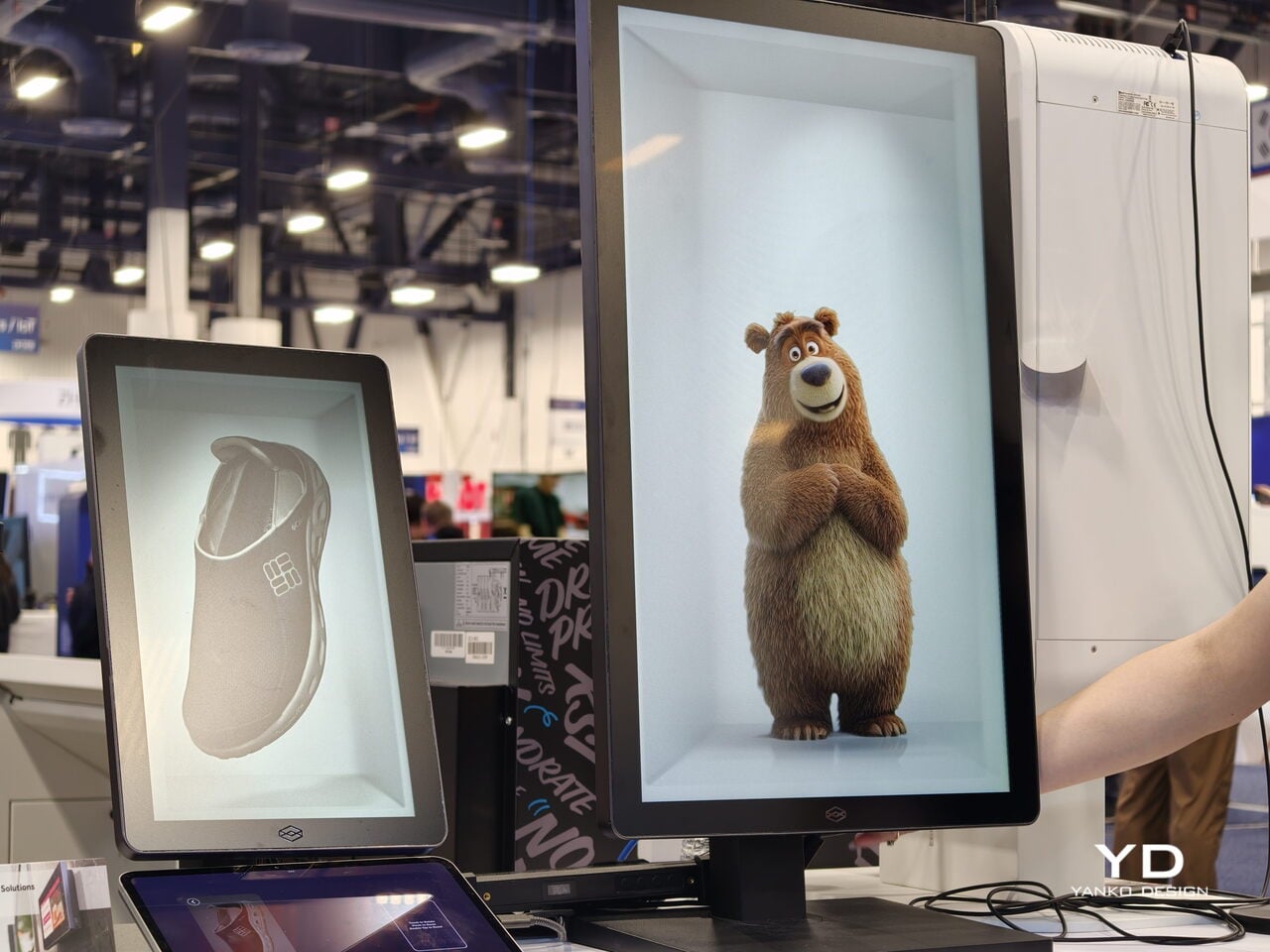
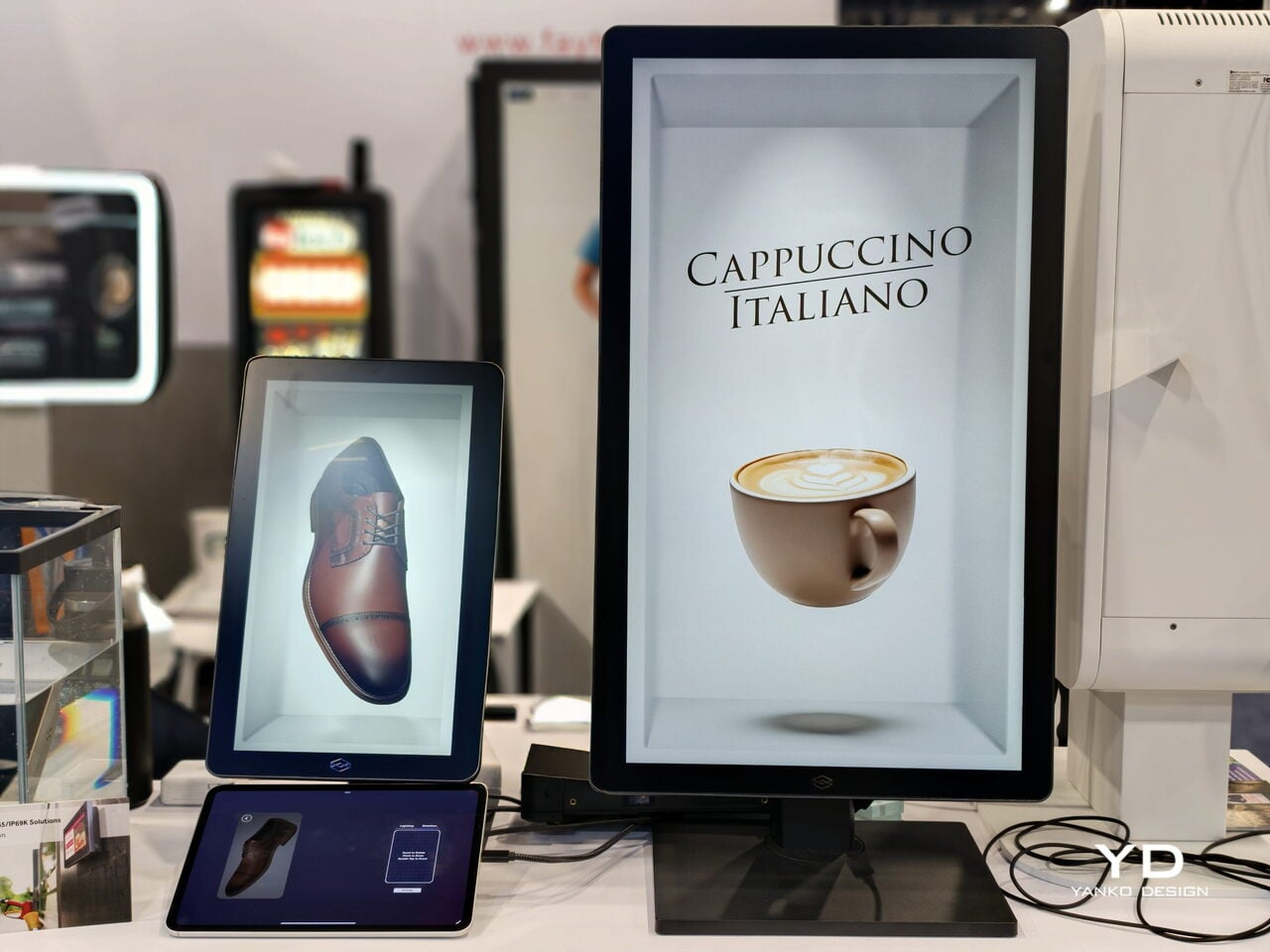
Do you remember that scene from Minority Report when Tom Cruise’s character was walking around and there were 3D hologram ads being served to him after scanning his eyeballs? You might think we’re decades away from this, but the technology is actually already being developed. Well, we still won’t get that kind of personalized marketing just yet, but the holographic structure of these displays may already be here sooner than we thought.
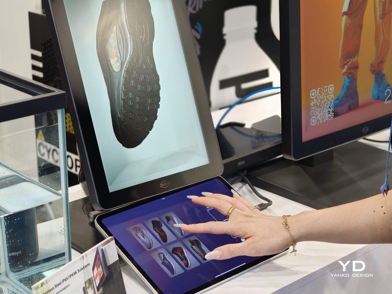
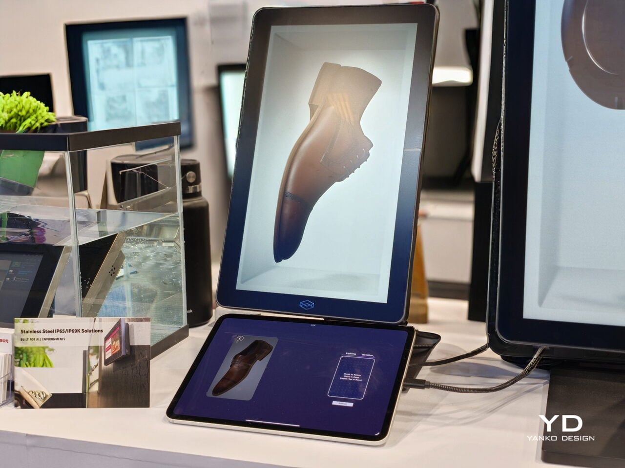
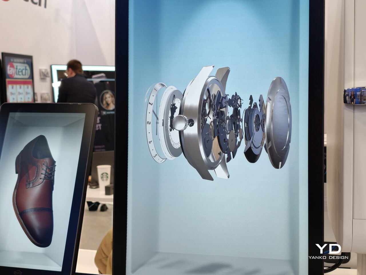
The Hololuminescent Display (HLD) is a revolutionary razor-thin holographic display that transforms standard 2D video content into three-dimensional, spatial experiences. Basically, it can display virtual space from your ordinary videos to make it seem like the people, products, and characters in them are floating in mid-air on the display screen. So those scenes from sci-fi movies with hologram videos in public spaces won’t be sci-fi anymore in the very near future.
The HLD has a built-in holographic layer inside the LCD/OLED panels that creates what they call a “holographic volume.” There’s a 16″ model that is perfect for your desktop or counter, and there’s an 86″ model that can be used in retail stores, public installations, and as signage. It has an ultra-slim design, so you can display it anywhere you could put a regular 2D screen. It uses patented technology (with some patents still pending) for both the hardware and software, with worldwide protection.
Unlike some of the VR/AR devices out there, this one doesn’t need any glasses or additional devices. Viewers can experience these 3D holograms with just their naked eyes, making it completely accessible and barrier-free. What’s more, it can transform standard 2D videos into holographic displays, so you don’t need to pay for expensive 3D modeling or complex production pipelines. Of course, there may probably still be some expense involved in optimizing these videos, but it will likely not be as expensive as the usual methods.
There are many uses for this kind of device. For retail stores, it can be used to catch passersby’s attention without blocking sightlines. Imagine walking past a storefront and seeing a gorgeous piece of jewelry or a designer handbag floating in the air, rotating to show every exquisite detail. Point-of-sale displays can also now be more dynamic if you have this holographic display, potentially increasing customer engagement and dwell time.
For collectors, this opens up fascinating possibilities. Imagine showcasing your most prized collectibles, whether it’s limited edition art, rare figurines, or vintage fashion pieces, in holographic format. You could create a digital gallery that brings your collection to life in ways traditional display cases never could. The technology could revolutionize how we preserve and share precious memories too, transforming video messages from loved ones into immersive, lifelike experiences.
This display is also incredibly useful for remote presentations, brand experiences, and entertainment venues. Since it works under normal lighting conditions (no dark rooms required), it’s also perfect for outdoor public spaces like bus shelters, museum installations, and trade show booths.
The 86″ model is currently priced at $18,000 (down from $20,000) and is set to ship in Spring 2026. While that might seem steep for individual consumers right now, early adoption by businesses and institutions will likely drive innovation and eventually make smaller, more affordable versions available for home use.
What’s truly exciting is that we’re witnessing the birth of an entirely new display category. The Hololuminescent Display bridges the gap between our current flat-screen world and the immersive future we’ve only seen in movies. As the technology matures and becomes more accessible, we might soon find ourselves surrounded by holographic displays in our daily lives, from shopping malls to our living rooms. The future of visual communication is literally taking shape before our eyes, and it’s more tangible than we ever imagined.
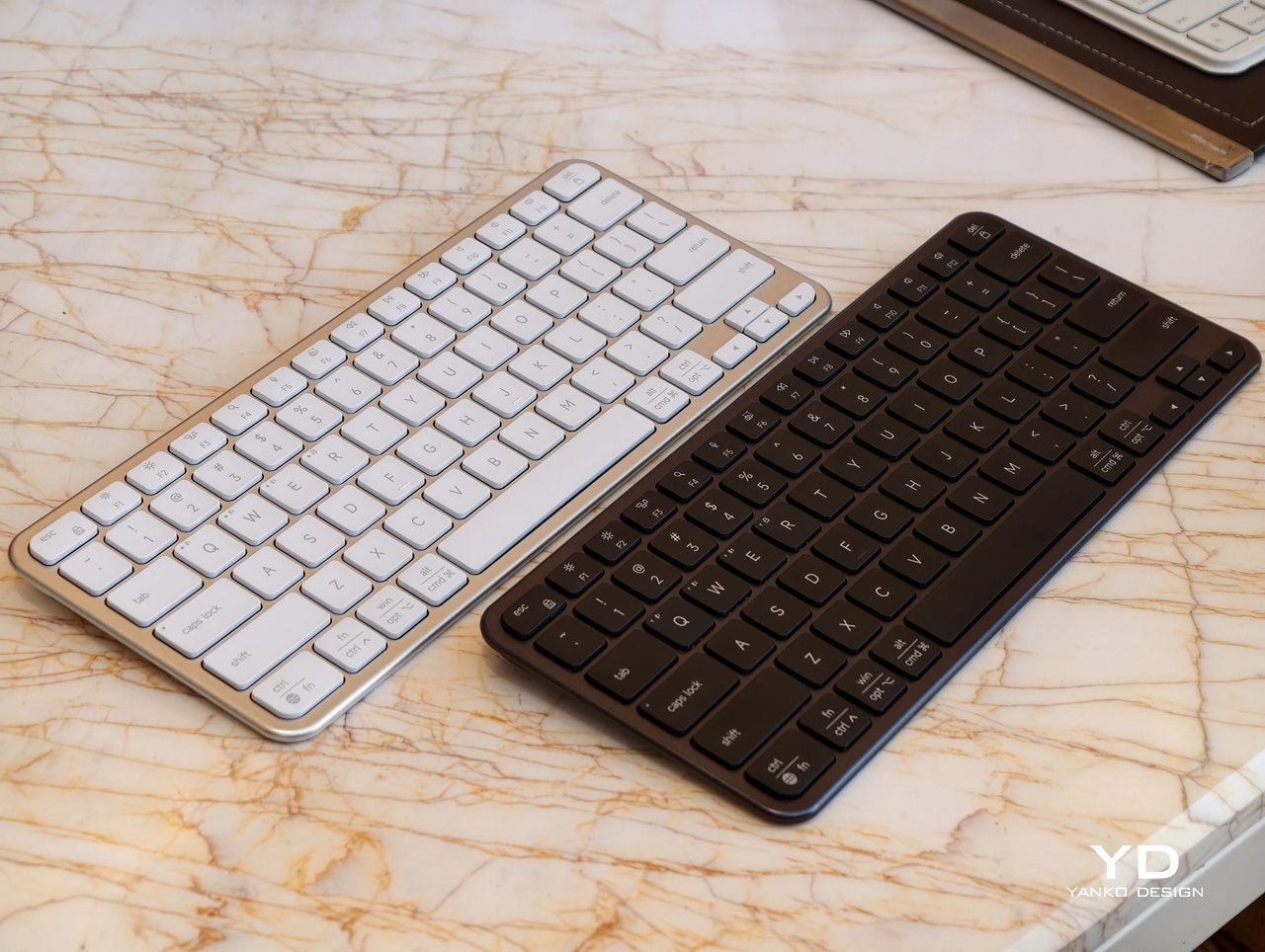
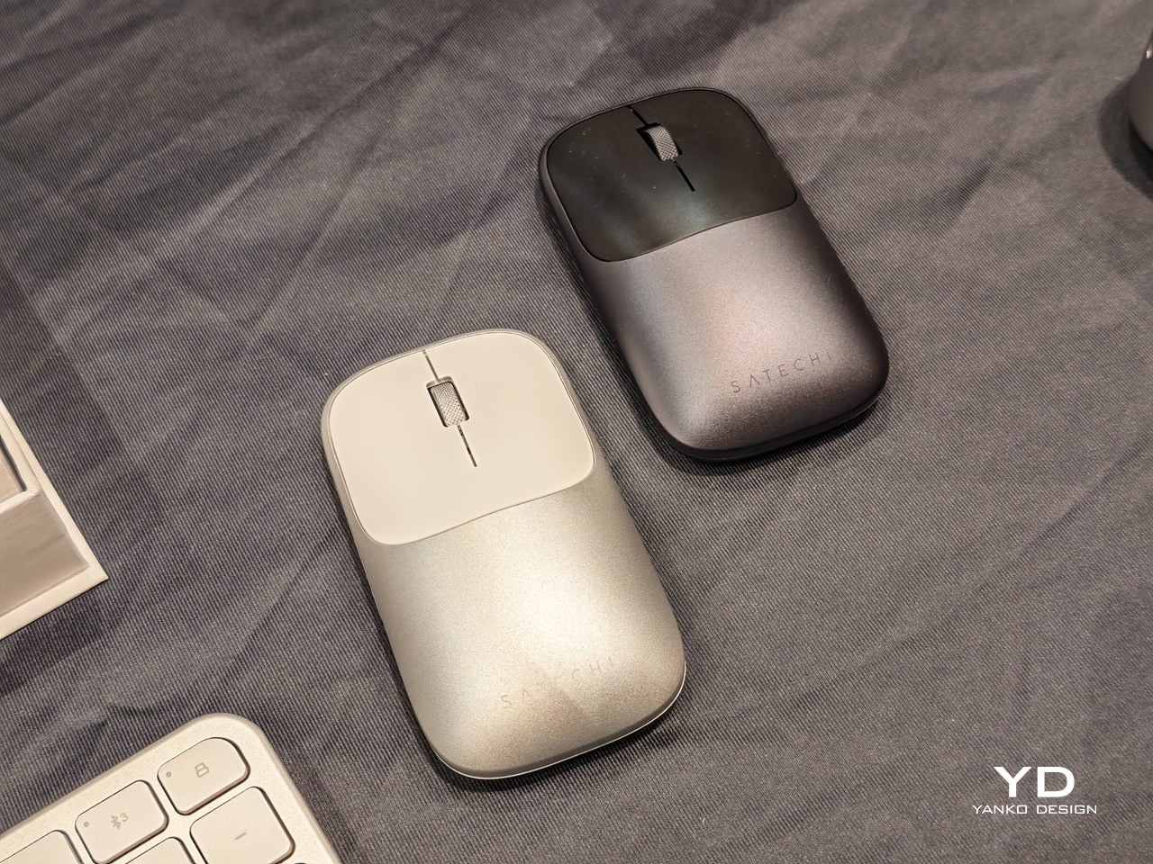
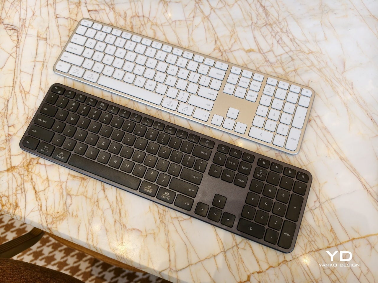
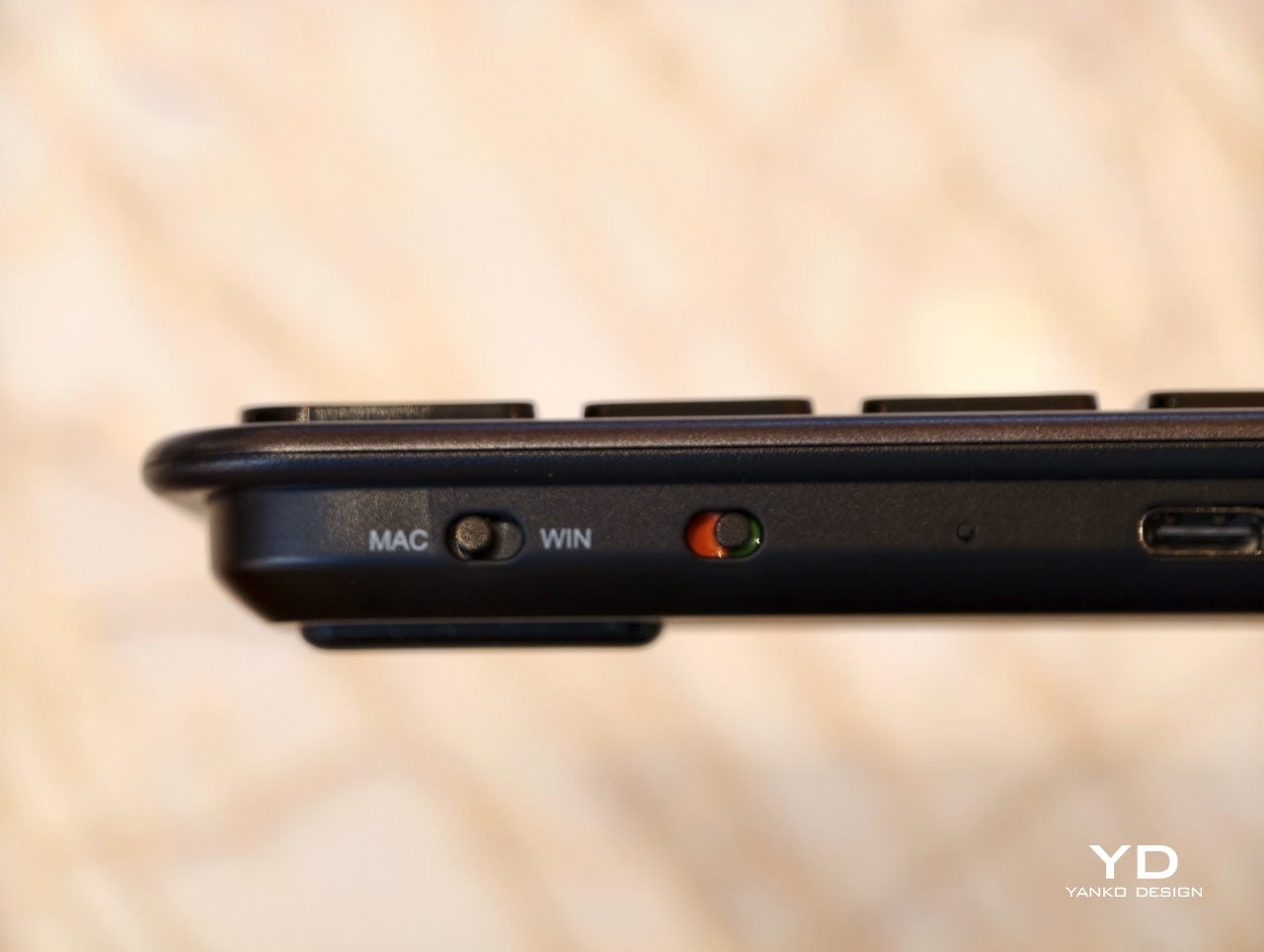
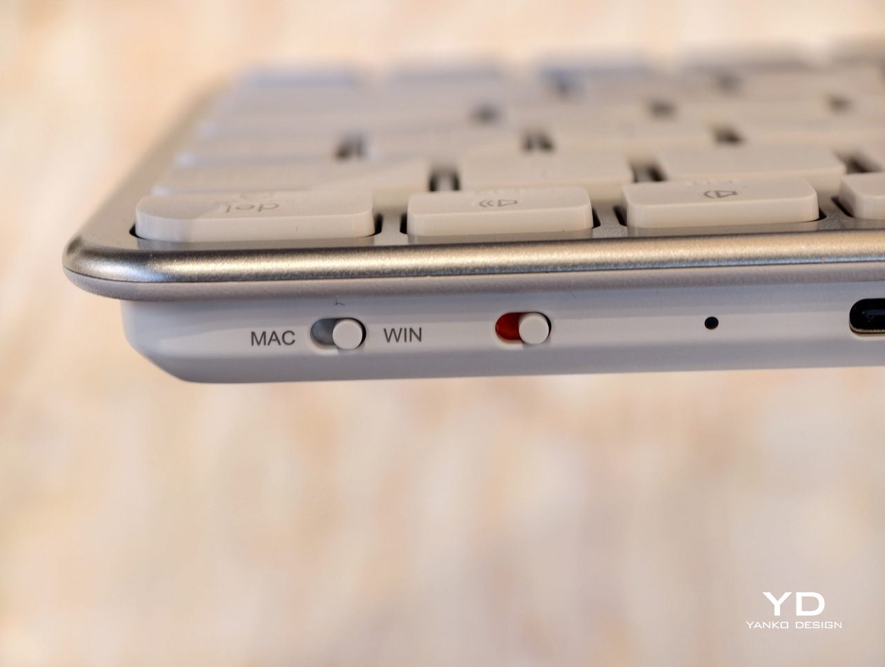
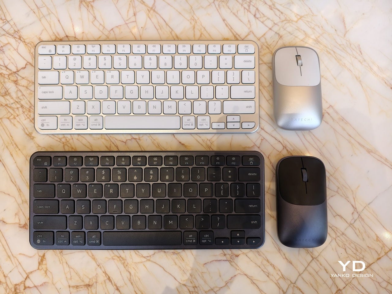
Most people no longer live on a single machine. A MacBook for creative work, a Windows desktop for heavier tasks, an iPad for meetings, and a phone for everything in between. The awkward dance of swapping keyboards, re-learning shortcuts, or tolerating cramped laptop layouts becomes daily routine, and most wireless sets still assume you are loyal to one OS and one device at a time, which feels increasingly out of step with how people actually work.
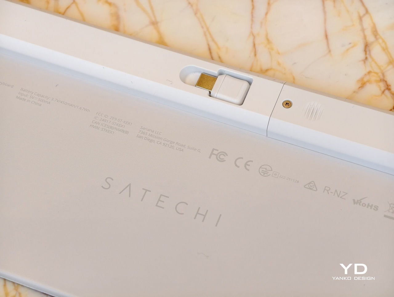
Satechi’s Slim EX Wireless Series, the EX3 and EX1 keyboards, plus the Slim EX Wireless Mouse, is an attempt to make that juggling act feel natural. All three are designed to work across macOS, Windows, Android, and iPadOS, connect to multiple devices, and use USB-C rechargeable, user-replaceable batteries so they do not become e-waste the moment the original cell starts to fade after a few years of daily charging cycles.
Designer: Satechi
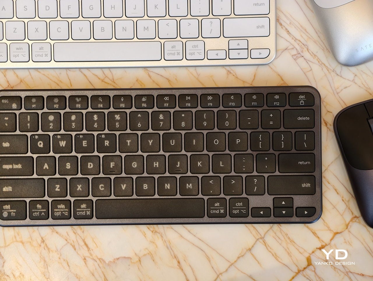
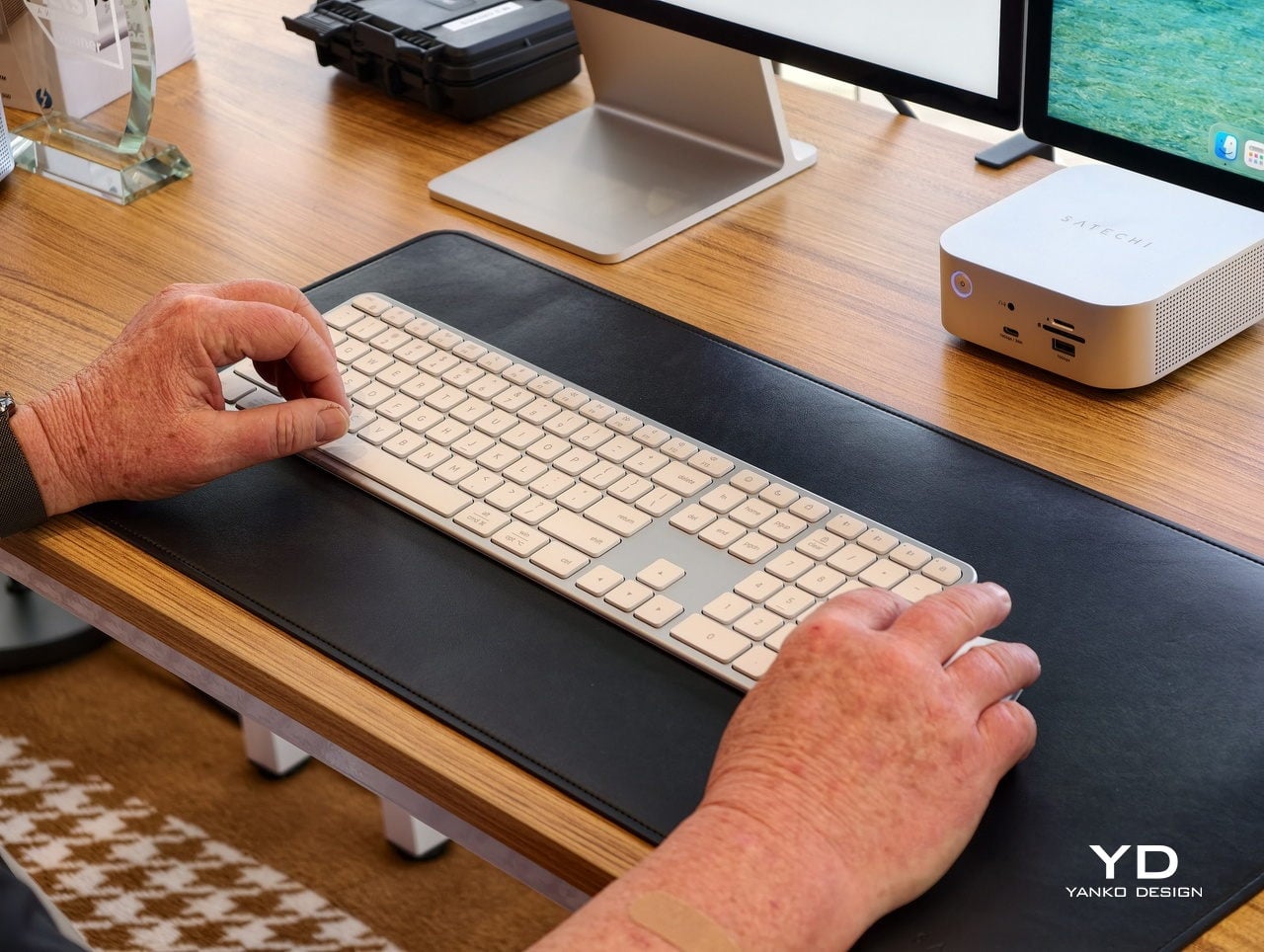
A desk-based setup is where the Slim EX3 Wireless Keyboard lives under a monitor, handling most of the day’s typing. Its full-size layout includes a numeric keypad and navigation keys, quiet scissor-switch keys, and automatic OS-specific key mapping that flips modifiers when you jump from a Mac to a Windows machine. Up to four devices can stay paired over Bluetooth or a 2.4 GHz USB-C dongle, so switching does not mean re-pairing every time you close one laptop and open another.
A smaller table, a shared workspace, or a café is where the EX3 feels too wide. The Slim EX1 Wireless Keyboard steps in with a more compact layout that still keeps the same quiet scissor switches and cross-platform brain. It drops the numeric keypad to save space but keeps the ability to talk to four devices, making it easier to travel light or reclaim desk space without giving up a familiar typing feel.
Both keyboards promise up to five weeks of use on a single charge, depending on how hard you hammer them, and when that internal battery eventually loses capacity, you can replace it instead of replacing the whole board. Charging over USB-C fits into the same cable ecosystem as laptops and phones, which keeps the desk cleaner and the routine simpler, with one fewer proprietary cable to remember when packing a bag.
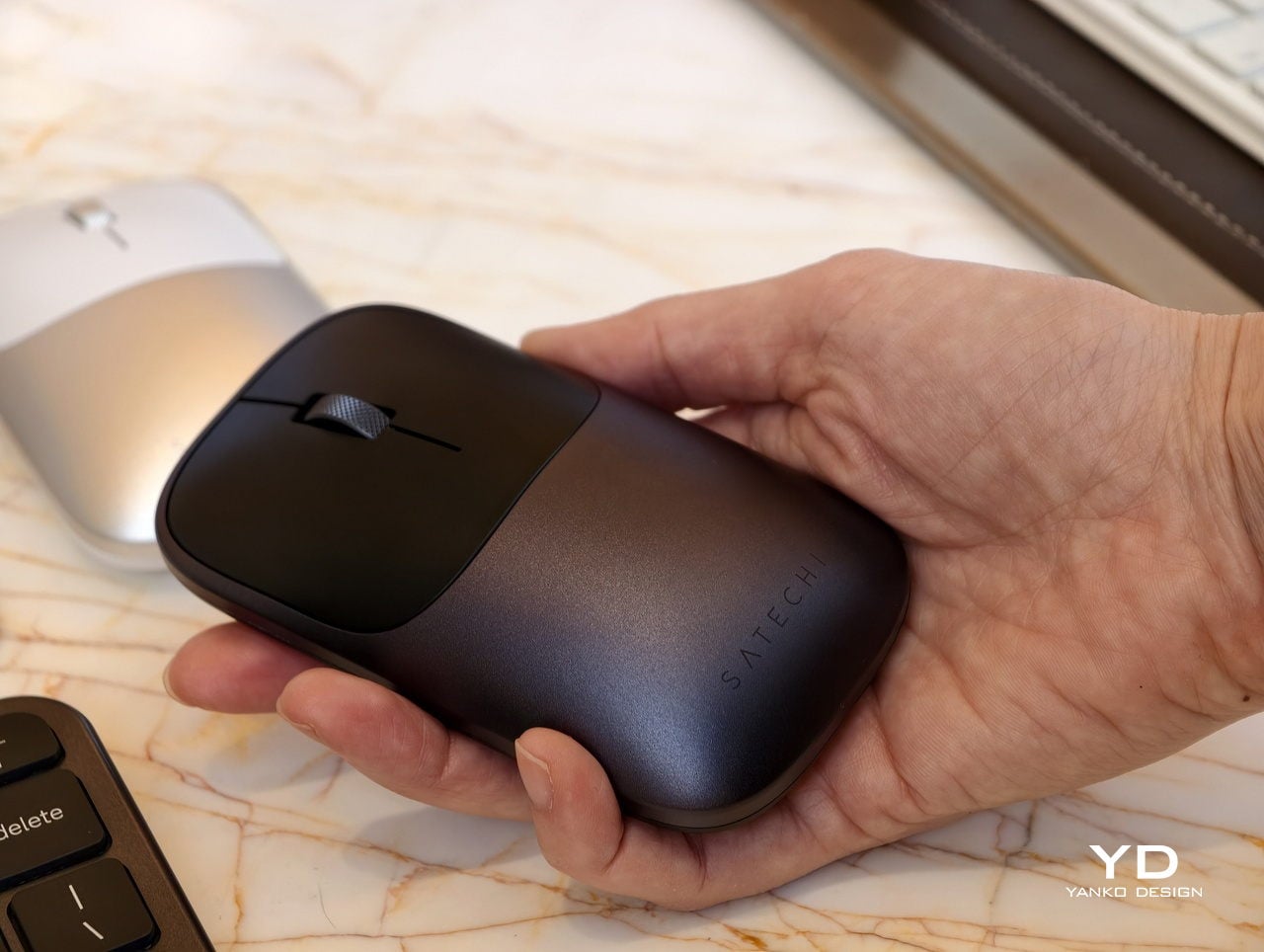
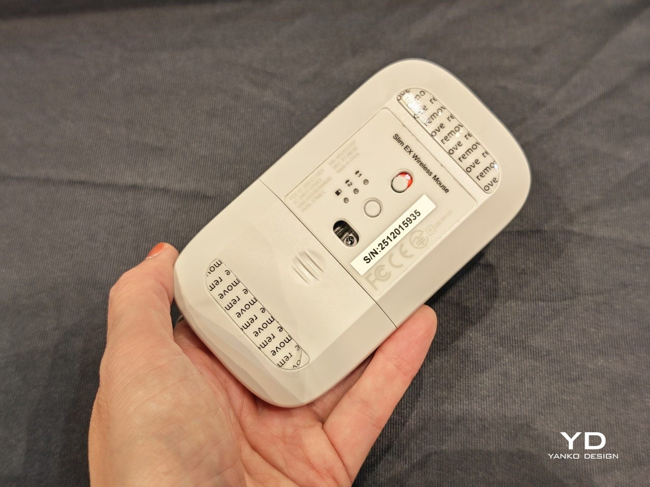
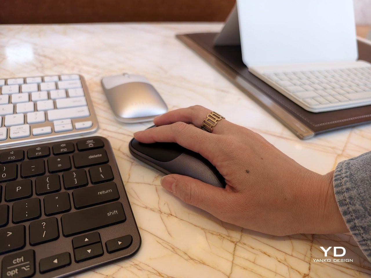
The Slim EX Wireless Mouse is the low-profile aluminum companion that glides between platforms just as easily. It supports Bluetooth and 2.4 GHz wireless, uses quiet click switches, and has a precision-machined scroll wheel that feels more deliberate than generic plastic. Like the keyboards, it runs on a USB-C rechargeable, user-replaceable battery rated for millions of clicks and scrolls, so it is built for the long haul instead of the upgrade cycle.
The Slim EX series quietly pushes back against disposable accessories and single-platform thinking. Instead of buying one set for each machine or tossing a keyboard when the battery gives up, you get a trio that moves with you between devices and years. For hybrid workers and students who live in that in-between space, having peripherals that are as flexible and long-lived as their setups feels like the right kind of upgrade.
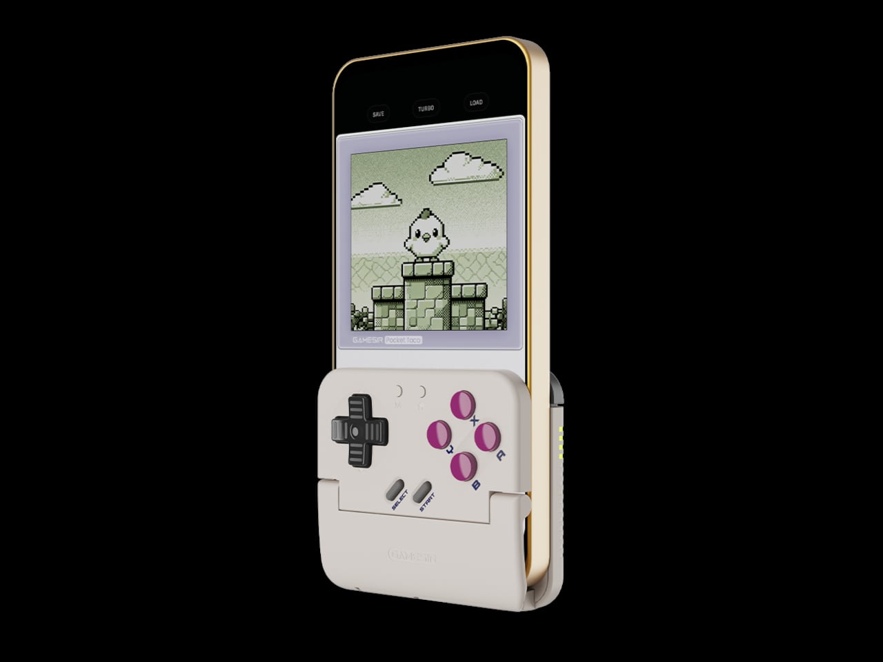
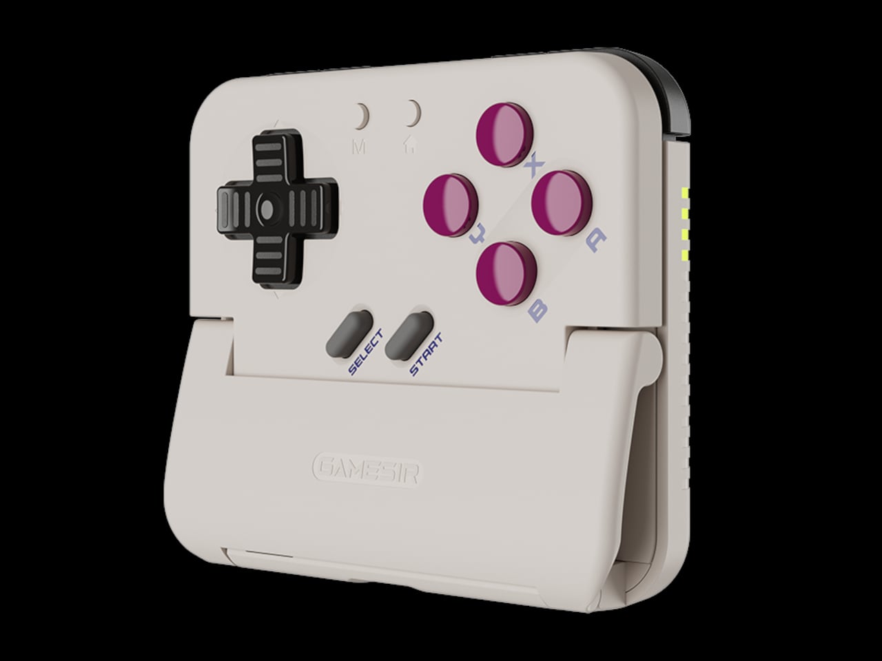
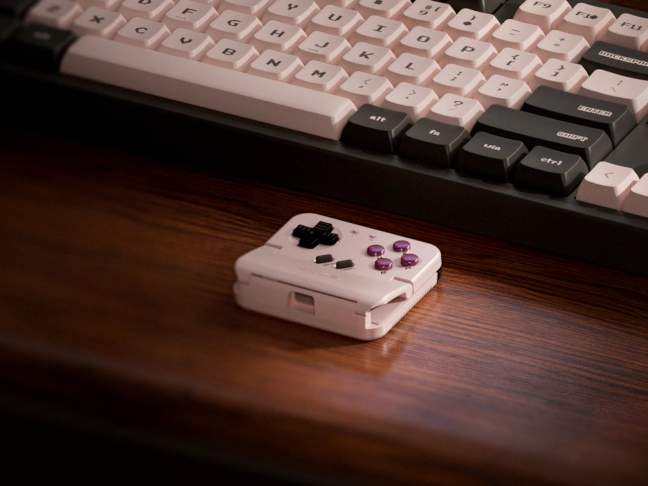
Almost every mobile controller assumes you want to play in landscape, snapping your phone into a wide handheld that feels great for modern shooters and racing games. This works for most titles, but when you fire up Game Boy-era platformers or vertical arcade classics, the experience feels slightly off, like forcing old games into a shape they were never meant to inhabit, holding them sideways while your thumbs reach for controls that never land right.
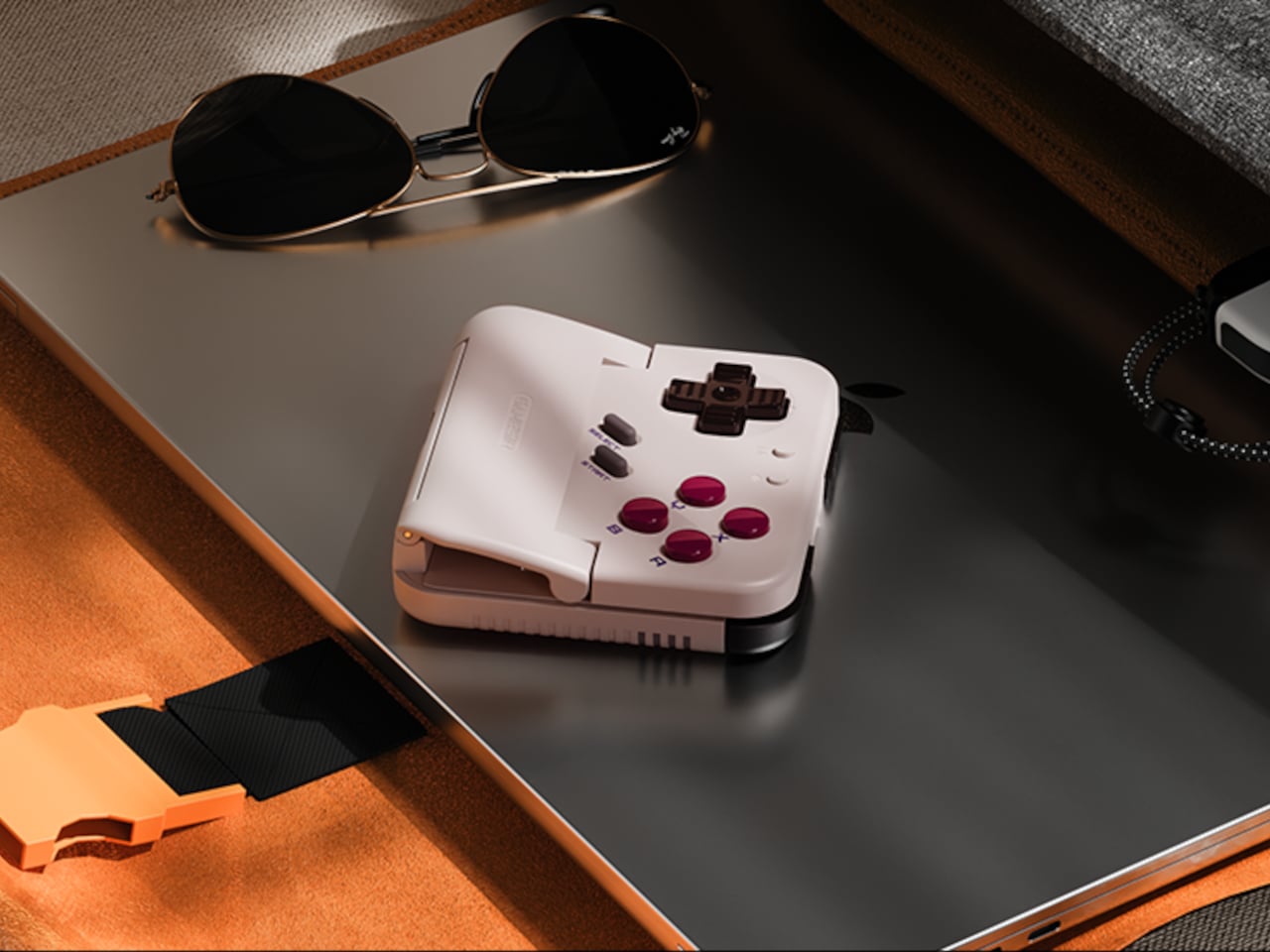
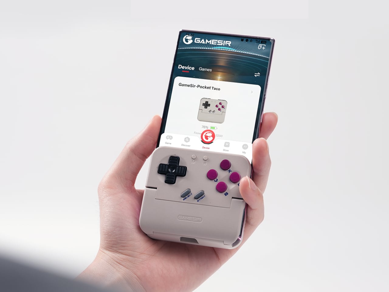
GameSir’s Pocket Taco leans into portrait play instead of fighting it, turning your phone into something closer to a classic handheld. It first appeared as the Pocket 1 at Tokyo Game Show, then resurfaced as Pocket Taco just as 8BitDo teased its own vertical FlipPad, setting up a clash of design philosophies aimed at people who want to hold their phones the way they held Game Boys.
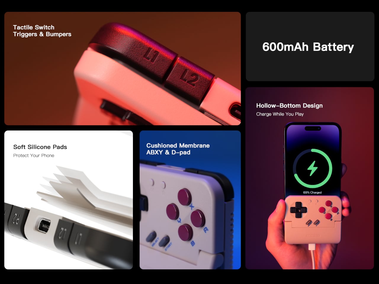
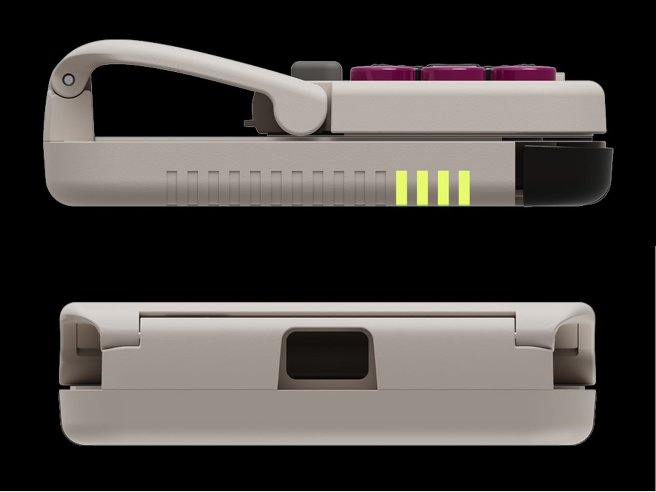
The rebrand to Pocket Taco fits the design; the controller clamps to the bottom of your phone like a taco shell. The foldable front accommodates different phone sizes, and soft silicone pads line the clamp area so you are not grinding plastic against glass every time you snap it on, which matters when you pull it out multiple times a day for quick sessions between meetings or commutes.
The control layout separates Pocket Taco from 8BitDo’s FlipPad. Pocket Taco gives you a traditional D-pad, ABXY face buttons, and actual triggers and bumpers on the back. FlipPad keeps everything on the front in a row of circular buttons, which is clever for compactness but less like the shoulder-button ergonomics many players expect from dedicated handhelds, especially during games with heavy simultaneous inputs.
Pocket Taco uses Bluetooth, so it can talk to Android and iOS phones, tablets, and other devices, and it still works when not clamped. FlipPad plugs in over USB-C, which keeps latency low and removes battery anxiety, but ties it to phones with that port and to a tethered style where the controller must stay attached to function at all.
One practical touch is the large cutout at the bottom that leaves your phone’s charging port accessible while the controller is attached, so you can plug in and keep going during long sessions. FlipPad occupies the USB-C port and does not offer passthrough charging, which is fine for short bursts but less ideal for marathon runs that drain the phone before you finish the dungeon.
Pocket Taco runs on a 600 mAh battery with smart power behavior, open to play, close to rest. The trade-off is one more battery to watch and slightly more bulk. FlipPad stays slimmer and battery-free, but leans on your phone for power, shifting the burden and adding a small drain to your phone’s battery during long play sessions.
Pocket Taco and FlipPad are two paths toward the same fantasy, turning a slab of glass into a dedicated retro handheld. Pocket Taco leans into wireless freedom, proper triggers, and charging-while-playing practicality, while FlipPad bets on wired simplicity and a flatter front. For anyone who grew up holding a Game Boy vertically, it is nice to have options that respect that muscle memory instead of pretending mobile gaming should feel like a miniature Xbox stuck in landscape.
Almost every mobile controller assumes you want to play in landscape, snapping your phone into a wide handheld that feels great for modern shooters and racing games. This works for most titles, but when you fire up Game Boy-era platformers or vertical arcade classics, the experience feels slightly off, like forcing old games into a shape they were never meant to inhabit, holding them sideways while your thumbs reach for controls that never land right.
GameSir’s Pocket Taco leans into portrait play instead of fighting it, turning your phone into something closer to a classic handheld. It first appeared as the Pocket 1 at Tokyo Game Show, then resurfaced as Pocket Taco just as 8BitDo teased its own vertical FlipPad, setting up a clash of design philosophies aimed at people who want to hold their phones the way they held Game Boys.
The rebrand to Pocket Taco fits the design; the controller clamps to the bottom of your phone like a taco shell. The foldable front accommodates different phone sizes, and soft silicone pads line the clamp area so you are not grinding plastic against glass every time you snap it on, which matters when you pull it out multiple times a day for quick sessions between meetings or commutes.
The control layout separates Pocket Taco from 8BitDo’s FlipPad. Pocket Taco gives you a traditional D-pad, ABXY face buttons, and actual triggers and bumpers on the back. FlipPad keeps everything on the front in a row of circular buttons, which is clever for compactness but less like the shoulder-button ergonomics many players expect from dedicated handhelds, especially during games with heavy simultaneous inputs.
Pocket Taco uses Bluetooth, so it can talk to Android and iOS phones, tablets, and other devices, and it still works when not clamped. FlipPad plugs in over USB-C, which keeps latency low and removes battery anxiety, but ties it to phones with that port and to a tethered style where the controller must stay attached to function at all.
One practical touch is the large cutout at the bottom that leaves your phone’s charging port accessible while the controller is attached, so you can plug in and keep going during long sessions. FlipPad occupies the USB-C port and does not offer passthrough charging, which is fine for short bursts but less ideal for marathon runs that drain the phone before you finish the dungeon.
Pocket Taco runs on a 600 mAh battery with smart power behavior, open to play, close to rest. The trade-off is one more battery to watch and slightly more bulk. FlipPad stays slimmer and battery-free, but leans on your phone for power, shifting the burden and adding a small drain to your phone’s battery during long play sessions.
Pocket Taco and FlipPad are two paths toward the same fantasy, turning a slab of glass into a dedicated retro handheld. Pocket Taco leans into wireless freedom, proper triggers, and charging-while-playing practicality, while FlipPad bets on wired simplicity and a flatter front. For anyone who grew up holding a Game Boy vertically, it is nice to have options that respect that muscle memory instead of pretending mobile gaming should feel like a miniature Xbox stuck in landscape.
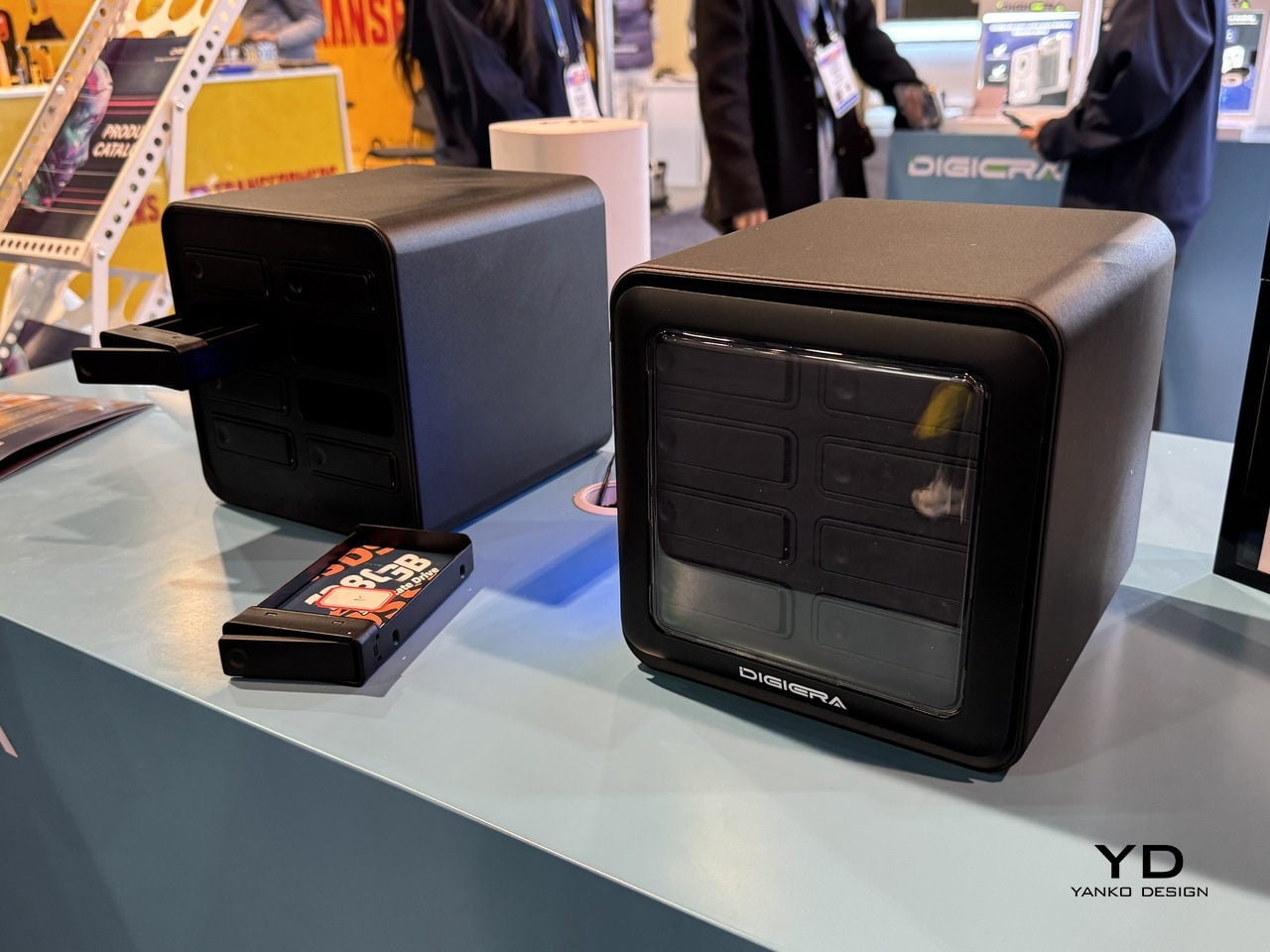
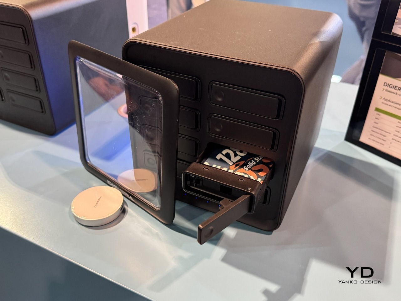
For most designers and filmmakers, storage is the quiet problem that never gets a mood board. Projects start on phones, move through cameras and laptops, and end up scattered across drives and cloud folders that you half remember naming six months ago. CES 2026 is full of AI-driven devices and next-gen connectivity, but DigiEra’s booth is interesting because it treats storage as part of the creative environment, not just a spec to tick off on a spreadsheet.
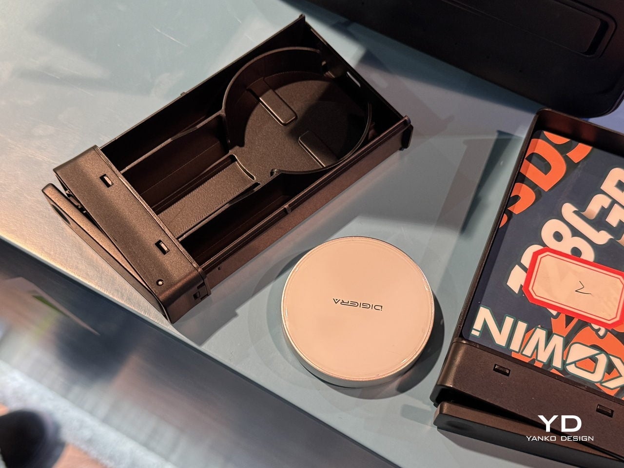
The lineup tells a single story across four products. OmniCore is the modular, all-flash AI NAS that wants to be the studio’s private brain. Endura is the rugged field drive that can live in a bag without babying. Portable Hub SSD is the tiny block that turns a phone or camera into a serious capture and editing station. The Diamond Magnetic Portable SSD is the piece that lives on the back of an iPhone, turning storage into something closer to jewelry than IT gear.
Designer: DigiEra
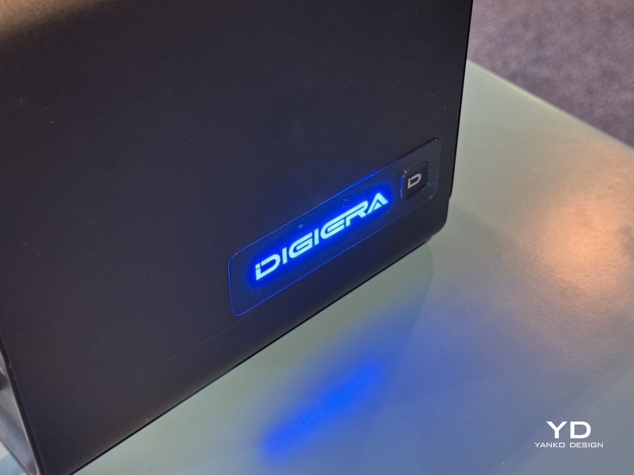
OmniCore: AI NAS as a Private Studio Brain
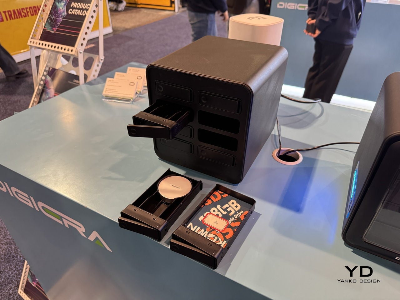
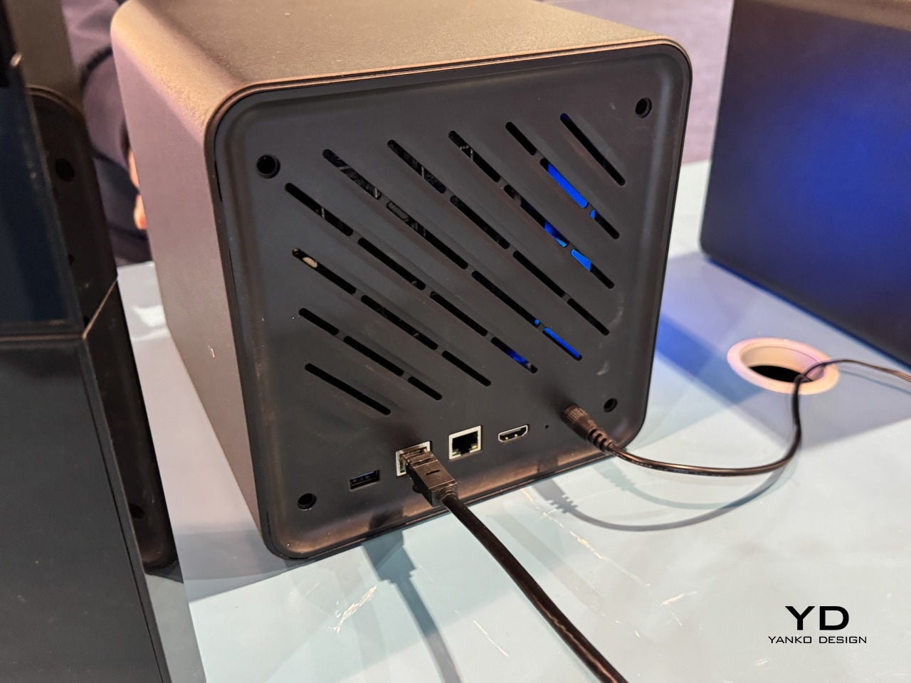
The pain of hunting for assets across old drives and cloud accounts is real. OmniCore is DigiEra’s answer, a modular all-flash AI NAS designed to sit in a studio and quietly index everything. It supports up to 80 TB of SSD storage across eight 2.5-inch SATA bays and two M.2 slots, all hot-swappable, so the box can grow with a studio instead of being replaced every time a project spikes in size or a client asks for all the raw footage from three years ago.
OmniCore is not just a fast box of drives. A Rockchip RK3588 CPU, 16 GB of LPDDR5 RAM, and a 6 TOPS NPU let it run AI tasks locally, from automatic image tagging and semantic search to transcription, document analysis, conversational chat, and clip generation. That means a designer can type “blue packaging concept with foil logo” and have the NAS surface relevant shots, instead of scrolling through folders named final underscore final underscore v3.
The privacy-first angle matters here. OmniCore is designed to work fully offline, with no cloud dependency, which is important when client work, unreleased campaigns, or personal archives cannot leave the building. Dual LAN ports, including 2.5 GbE, and Wi-Fi 6 support let it serve multiple editors or designers at once without feeling like a bottleneck, and Docker support means it can host custom tools alongside its own AI engine for people who need more than a basic file server.
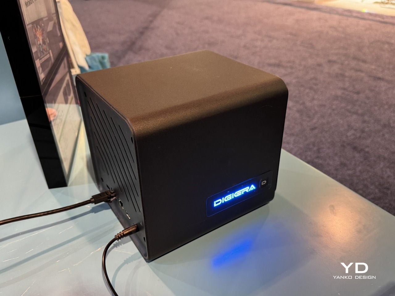
The physical experience is part of the design. The cube-like form factor with front-loading SSD modules makes storage feel tangible and approachable, more like a card catalog than a server rack. Drives slide in and out on small trays, so expanding from a few terabytes to tens of terabytes is a matter of minutes, not a weekend migration project where everything has to stop. For small studios, that kind of modularity is as much a design decision as a technical one.
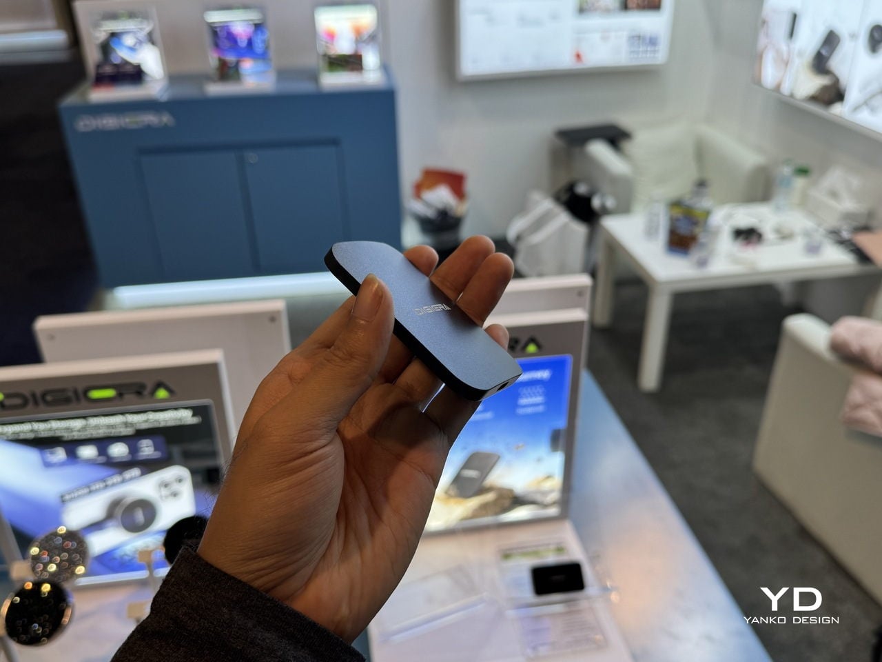
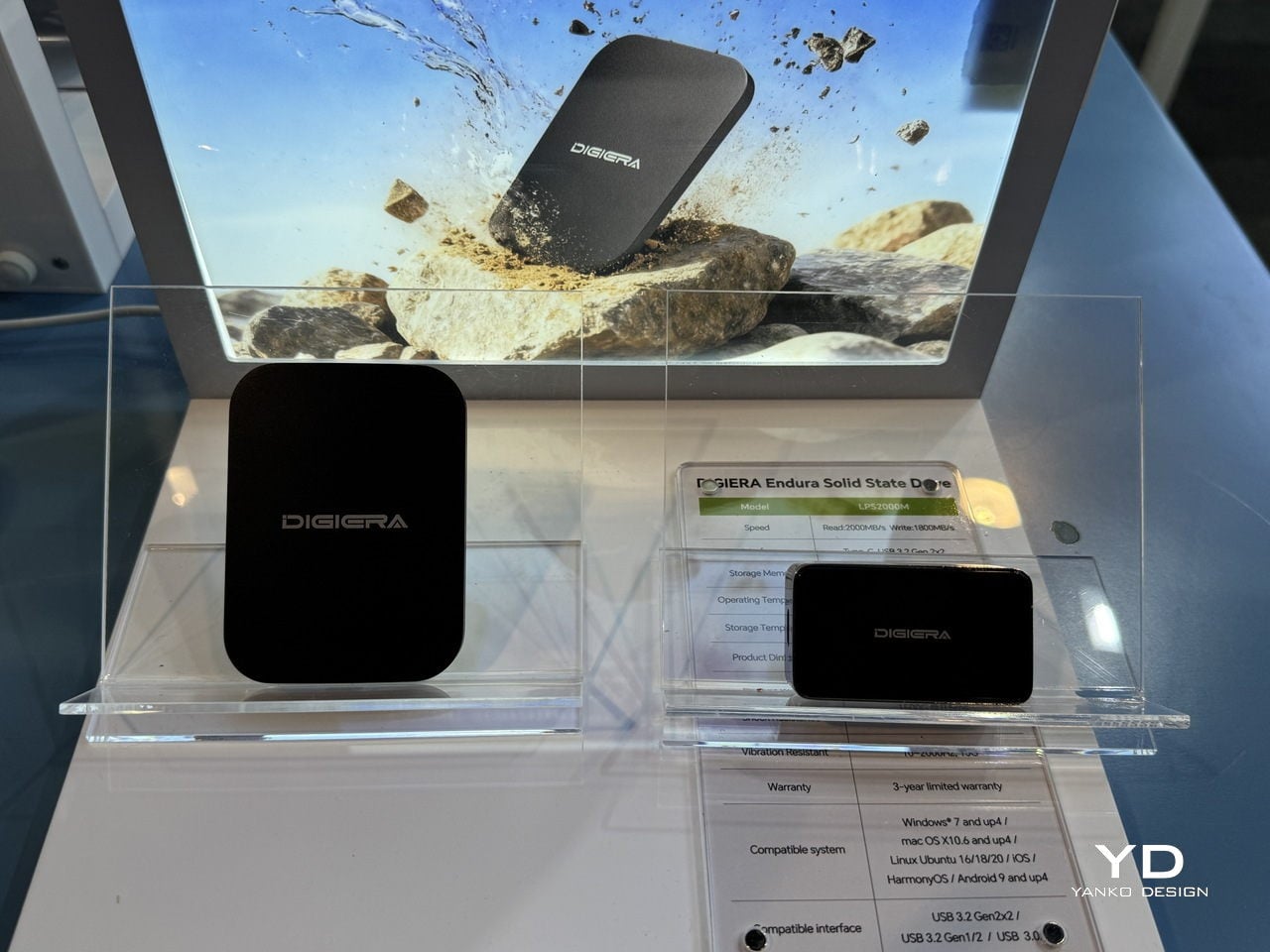
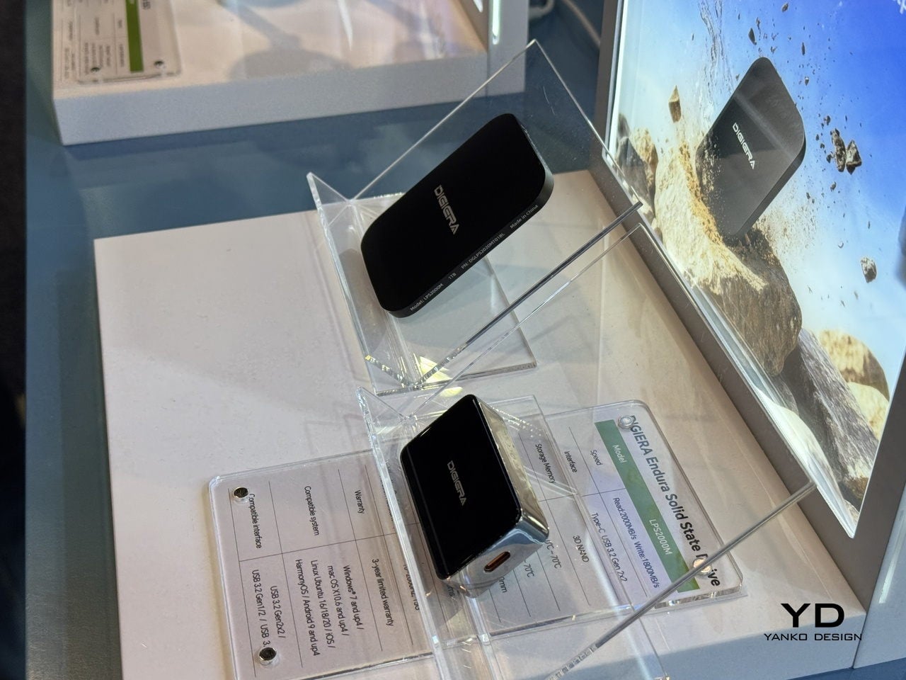
Endura Portable SSD: Rugged Speed with a Material Story
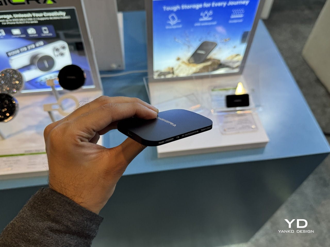
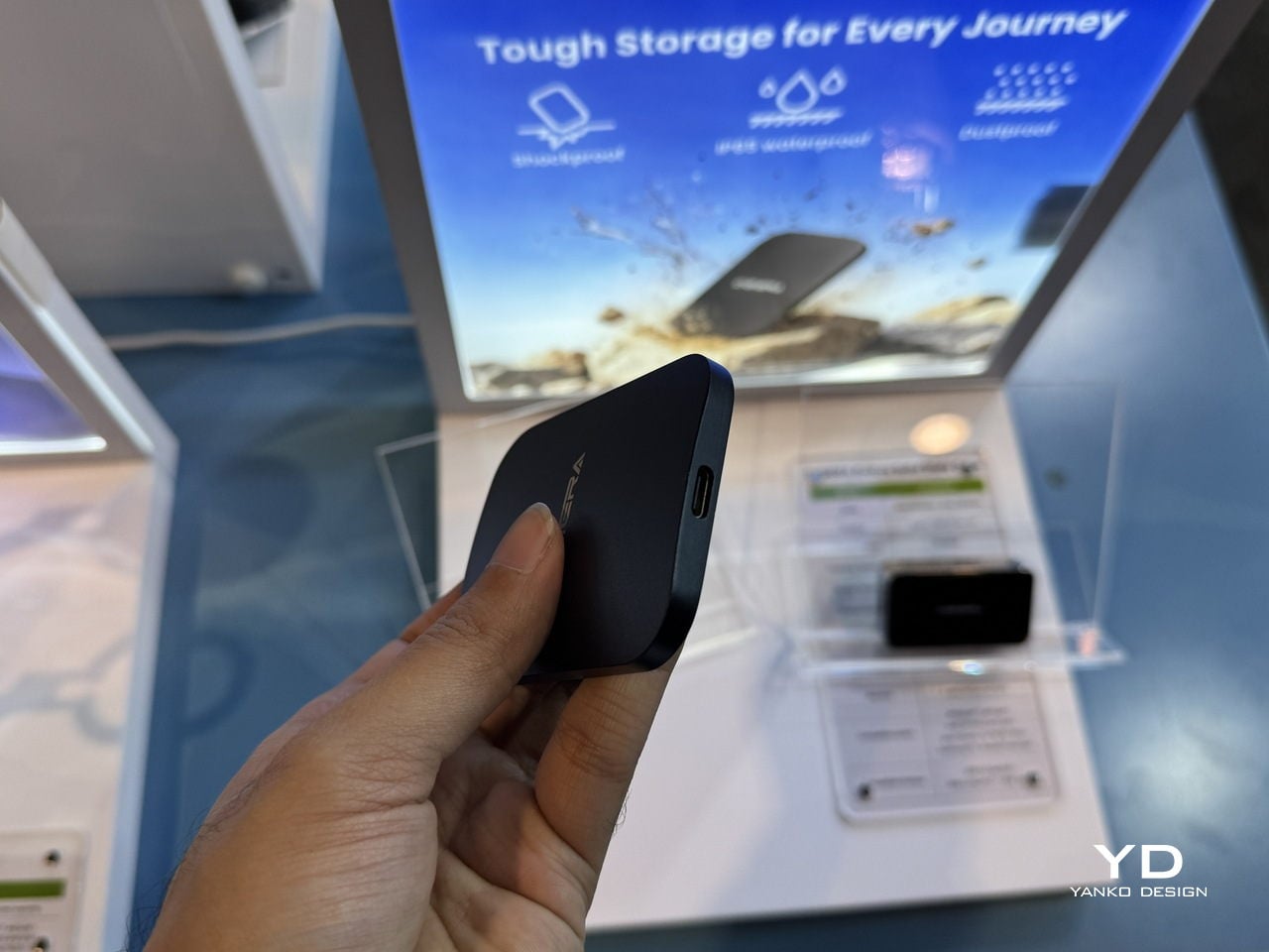
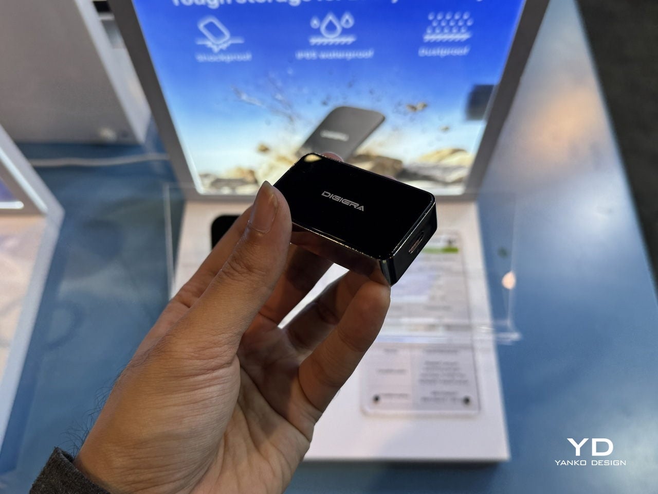
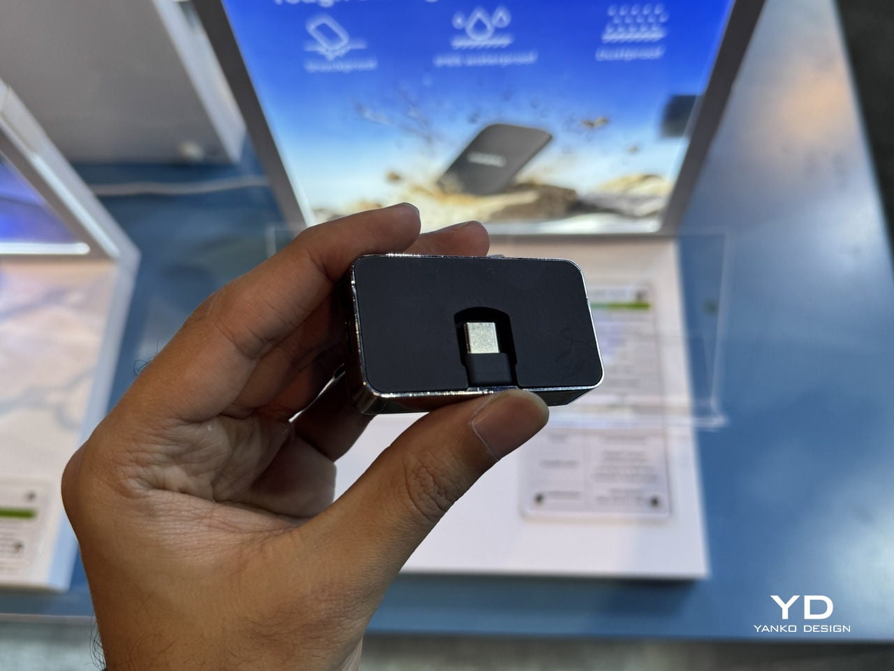
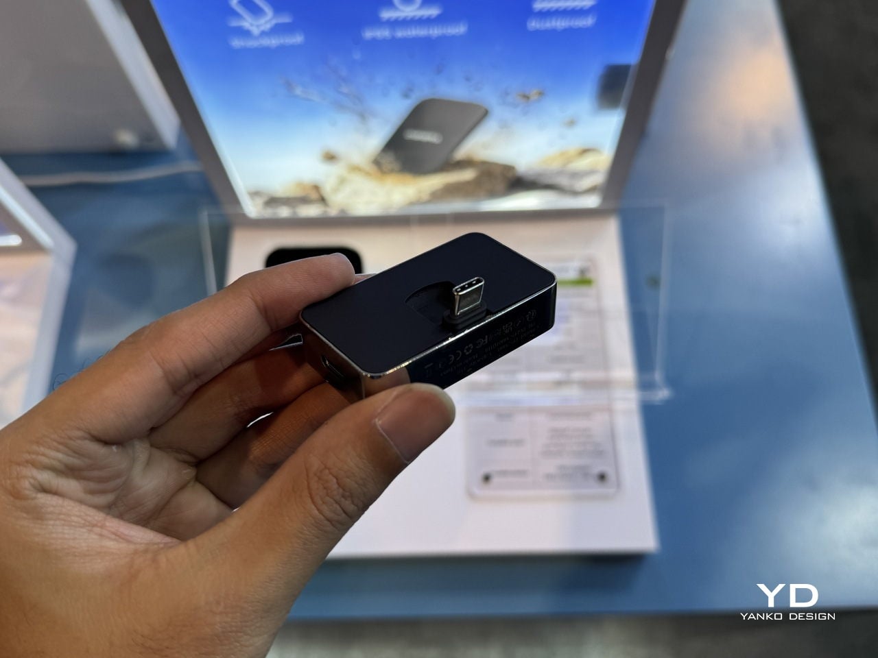
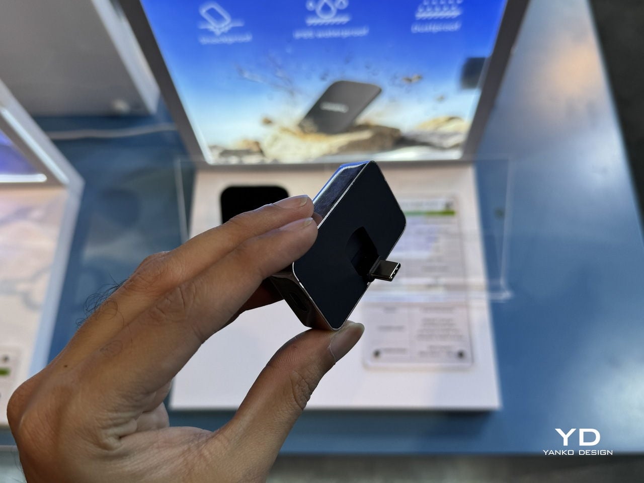
Endura is the drive that lives in the camera bag and follows people to shoots. DigiEra bills it as the world’s first portable SSD with an aluminum–carbon-fiber shell, rated IP65 for water, dust, and shock resistance. That combination of materials gives it a technical, motorsport-like feel, while also signaling that it can handle being tossed into a backpack, clipped to a rig, or dropped on a sidewalk without needing a protective case wrapped around a protective case.
Under the shell, Endura uses USB 3.2 Gen 2×2 over USB-C, delivering up to 2,000 MB/s read and 1,800 MB/s write speeds in capacities from 512 GB to 4 TB. For photographers dumping RAW stills between locations or filmmakers backing up cards on set, that means less time watching progress bars and more time shooting, with a drive that looks like it belongs in a design-conscious kit and can survive the environments where most shoots actually happen.
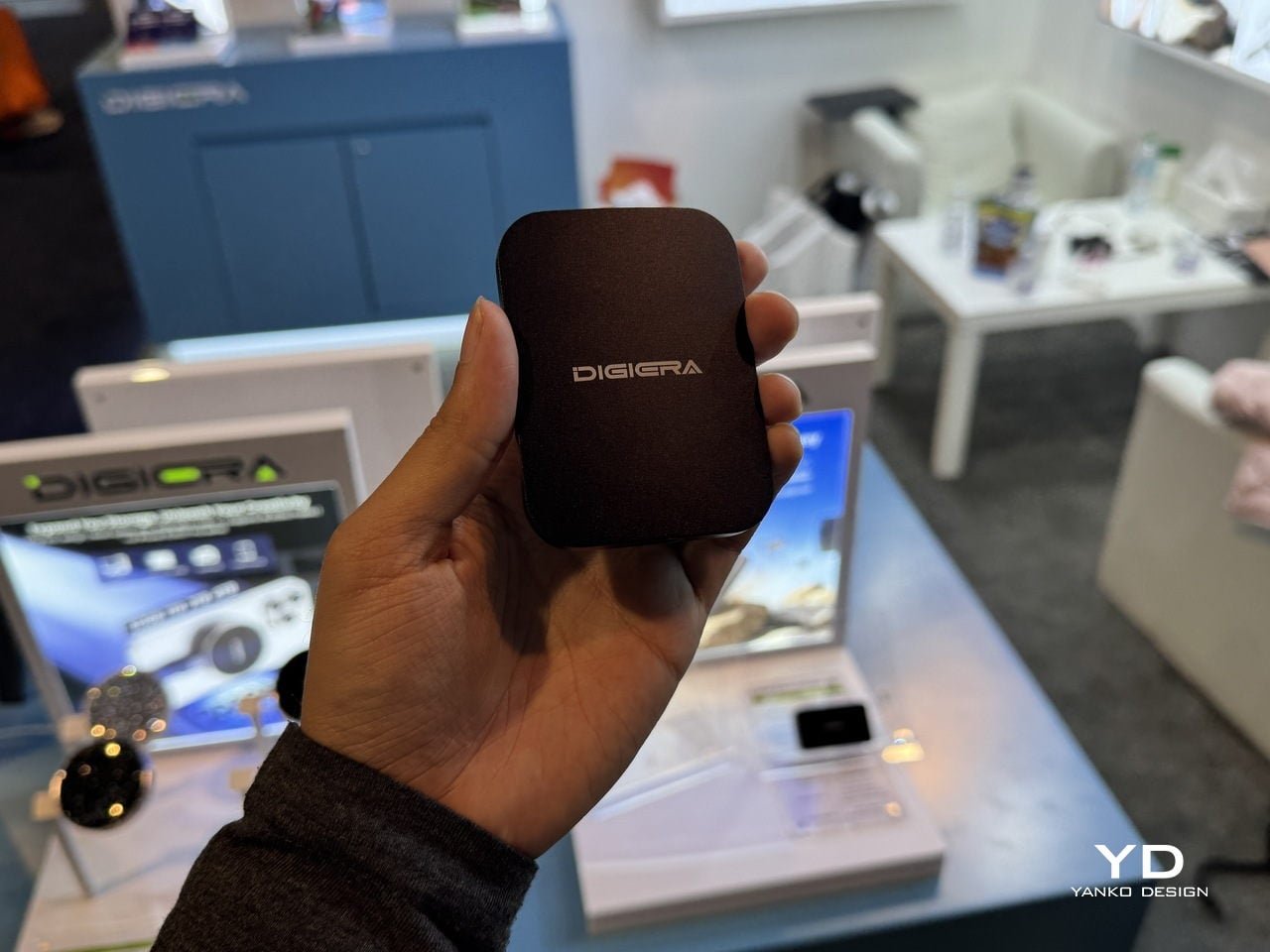
Portable Hub SSD: One Block to Replace the Dongle Pile
The Portable Hub SSD is the antidote to the usual tangle of hubs, drives, and chargers. It wraps the same 20 Gbps SSD core in a compact aluminum block that also acts as a hub, combining high-speed storage, PD fast charging, and extra USB-C connectivity. Plug it into a phone, tablet, or laptop, and it becomes both a scratch disk and an expansion port, turning one cable into a complete mobile workstation.
The fold-out USB-C plug and side ports make it particularly friendly to iPhones and USB-C cameras. Instead of hanging a drive and a hub off a gimbal or handheld rig, one block adds space for ProRes or LOG footage and passes power through to keep the phone or camera alive. For designers who sketch on tablets or edit on ultraportables, it is the kind of object that quietly simplifies the everyday carry, handling data and power from a single point without adding bulk or visual noise.
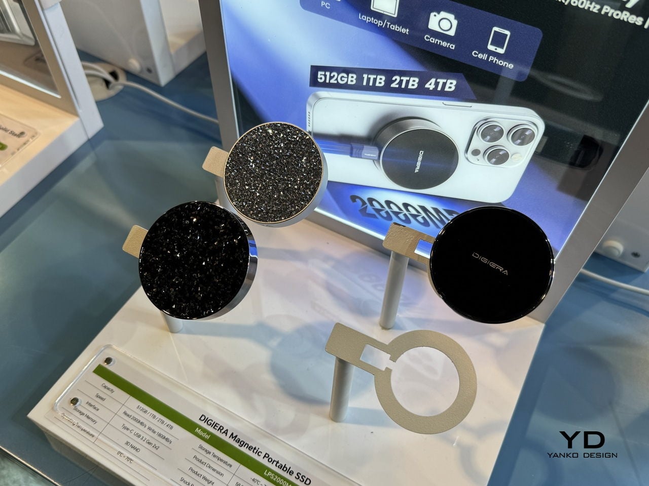
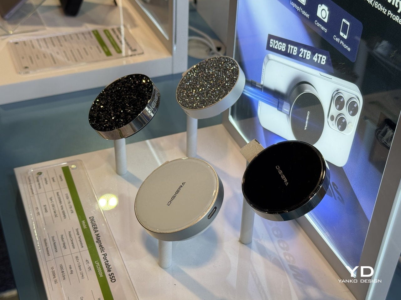
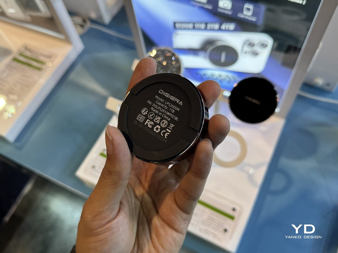
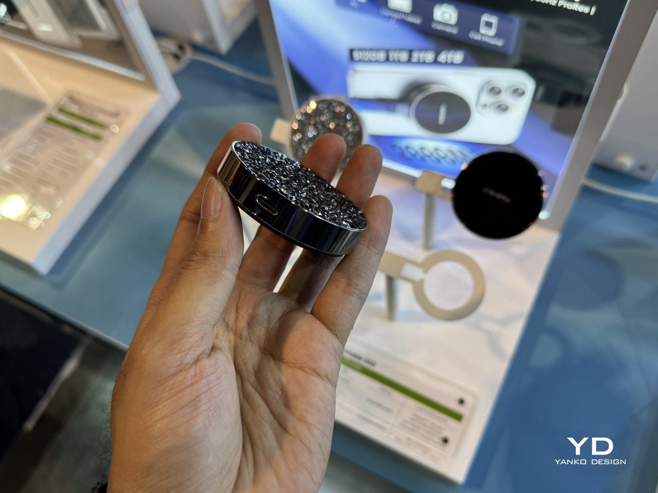
Diamond Magnetic Portable SSD: Storage as Visible Accessory
The Diamond Magnetic Portable SSD is the piece that never leaves the phone. It snaps magnetically to the back of an iPhone 15 or 16 Pro and records 4K 60 FPS ProRes video directly to external storage, lifting the ceiling on how long you can shoot without cages, rigs, or bulky battery grips. For content creators who rely on their phone as a primary camera, that is a big shift in what is possible with a pocket-sized setup.
The diamond-encrusted, circular design makes the drive look closer to a compact mirror or piece of jewelry than a tech accessory. Underneath, it still runs USB 3.2 Gen 2×2 over USB-C at up to 2,000 MB/s read and 1,800 MB/s write, in capacities up to 4 TB. That mix of performance and visual polish means it can stay on the phone in a meeting, a shoot, or a café without feeling out of place, turning storage into something you actually want to show rather than hide in a pocket until needed.
DigiEra at CES 2026: Turning Storage into a Creative Toolkit
OmniCore anchors the studio as a private, AI-enabled brain that knows where every file lives and can answer questions in natural language. Endura and Portable Hub SSD handle the messy middle, moving data safely and quickly between cameras, phones, and laptops, with materials and form factors that feel deliberate rather than generic. The Diamond Magnetic SSD lives on the phone, turning storage into something you actually want to show. That is DigiEra’s real story at CES 2026: storage treated not as an afterthought or a cloud subscription, but as a set of designed objects that respect the way creative work actually moves through the day, from the pocket to the field to the desk and back.
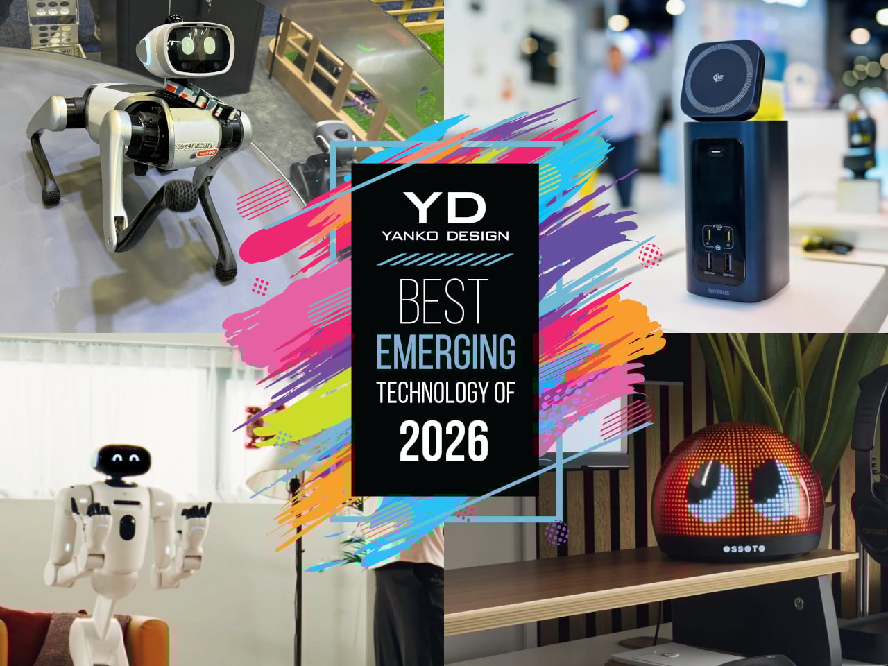
Every January, the Las Vegas Convention Center fills up with ideas that sit somewhere between prototype and inevitability. Some will vanish after a single news cycle, but a few feel like early drafts of how we will actually live with technology, once the spectacle wears off and the hardware shrinks into something you can forget about until you need it. Those are the ones worth bookmarking, the quiet experiments that hint at new categories rather than just new specs.
This year’s crop of emerging tech has a very particular flavor. Robots are edging closer to being housemates instead of stage acts, ambient objects are getting just enough AI to feel expressive rather than chatty, and work gear is evolving into compact appliances that reclaim space instead of stealing it. None of these ideas are mainstream yet, but they are all far enough along that you can imagine them in your home or on your desk, which is exactly what makes them so interesting to watch.
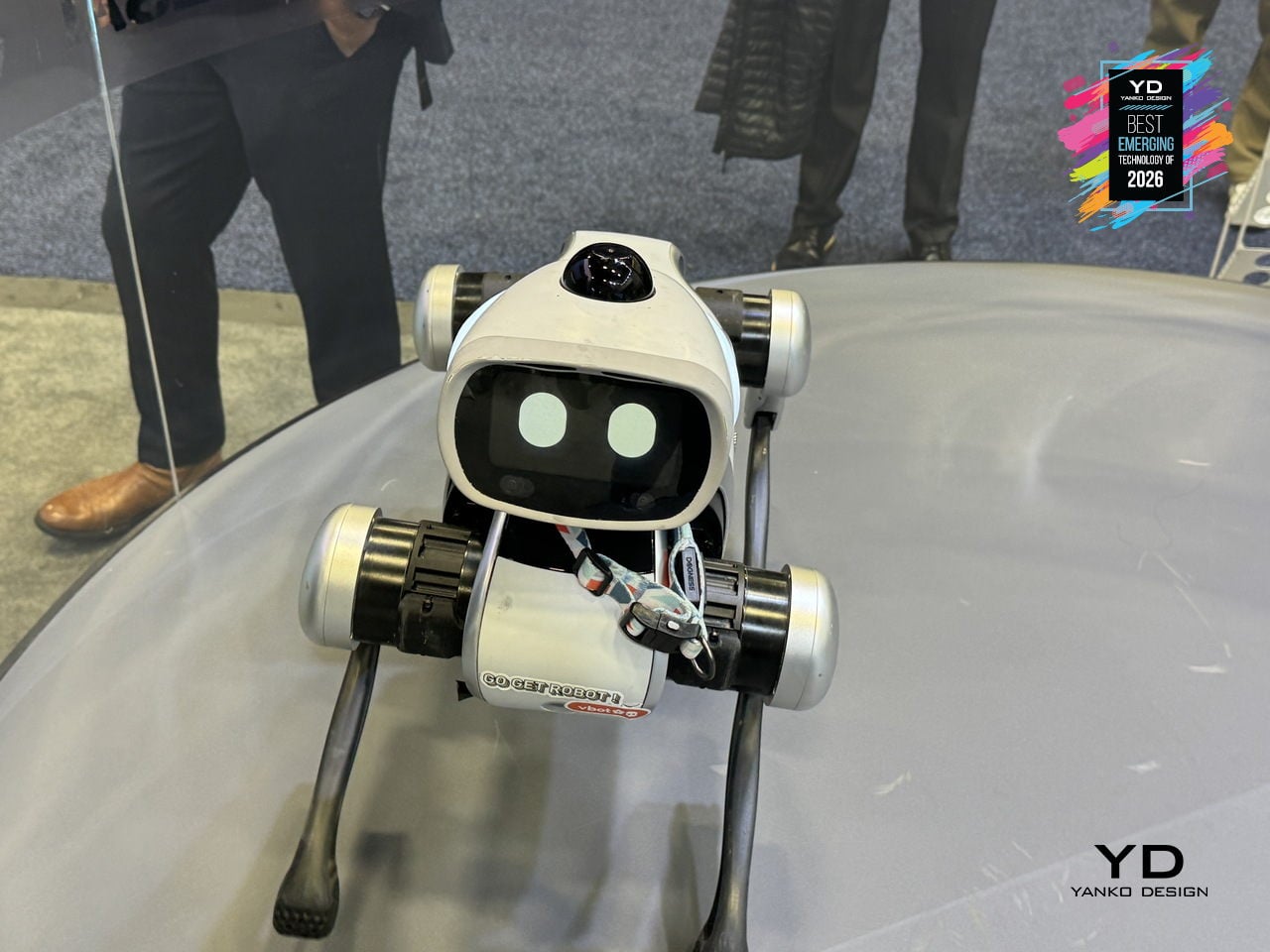
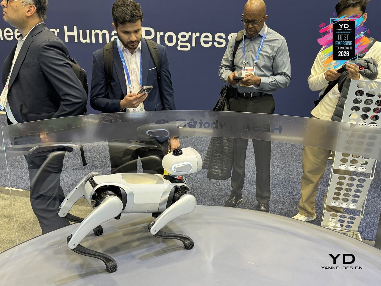
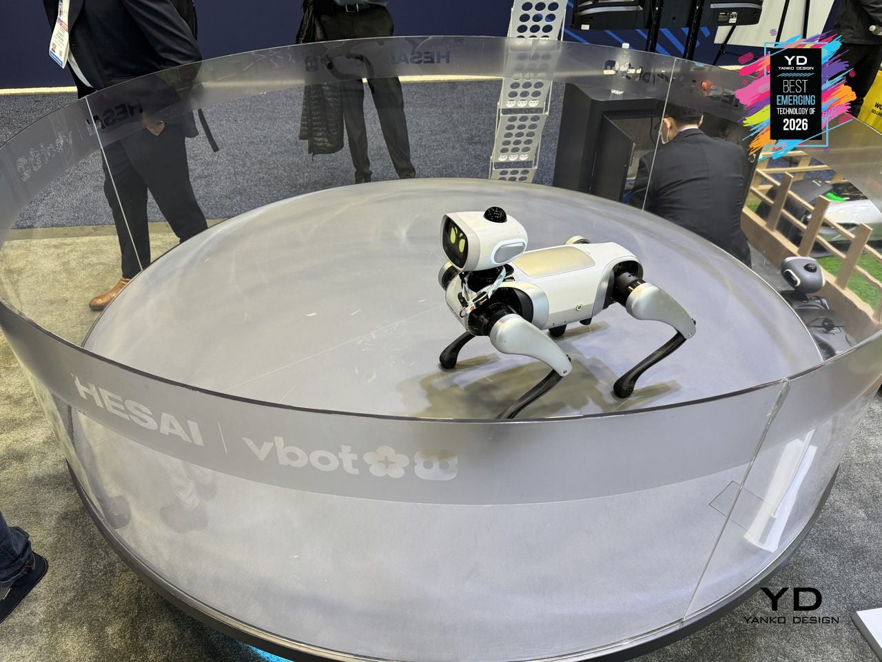
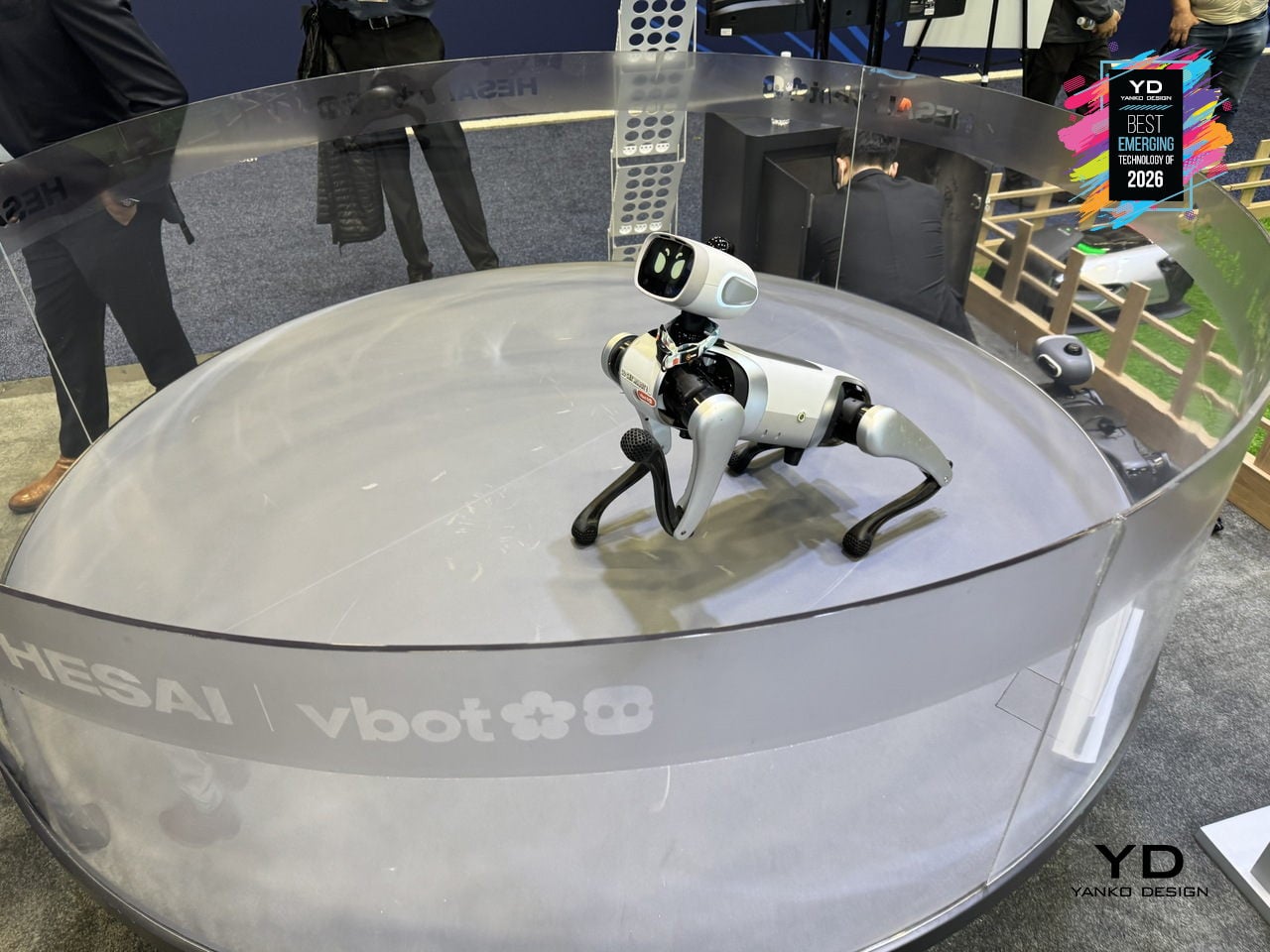
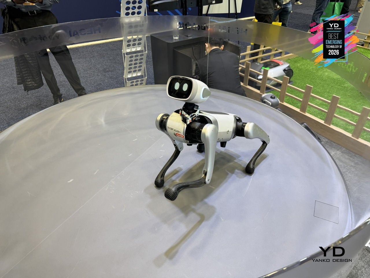
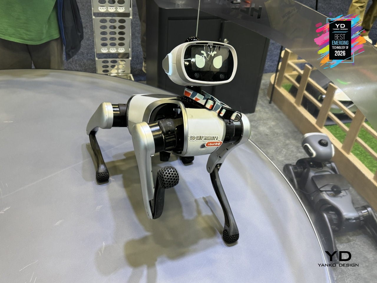
Vbot Companion Robotic Dog
Most quadruped robots people have seen are either industrial, loud, or built for stage demos rather than living rooms. Vbot is a companion robotic dog engineered around a single principle, Made to Be Near, designed for safe, quiet, human-scale proximity. The rounded body has no sharp edges, pinch-free joints maintain 2.5cm safety gaps, and soft-touch mesh covers the mechanical core. Low-noise locomotion using 3D-printed shock-dampening feet and tuned motors makes it quiet enough to watch over a sleeping baby.
Vbot’s social intelligence turns that safe form into something that feels alive and helpful. It interprets natural-language commands through tone, context, and meaning, understanding verbs like bring, follow, lead, show, or find without a remote. Agent intelligence breaks down objectives into steps, guiding visitors, escorting someone along a route, or positioning itself as a camera buddy for hands-free filming. It matches walking pace and repositions for better engagement.
Under the skin, embodied and spatial intelligence allow Vbot to operate as a real physical agent. Its legs use 22cm segments proportioned to match 18-20cm stair standards, giving it leverage to climb steps where wheeled robots struggle. A proprietary N45 motor delivers more torque at 25% less weight, while a 594Wh battery supports more than five hours of outdoor operation. A perception system with 360-degree LiDAR and UWB positioning understands paths and obstacles without cloud latency.
Vbot signals an early consumer-grade physical AI category. Unlike robots adapted from industrial platforms, it is built from scratch around close human proximity, readable motion based on animation principles, reliable battery life, and modular interfaces for cargo baskets, cameras, and tow carts. Its three-layer intelligence, embodied, spatial, and agent, points toward robots that are sociable enough to join you outside, smart enough to anticipate intent, and gentle enough to belong in family spaces.
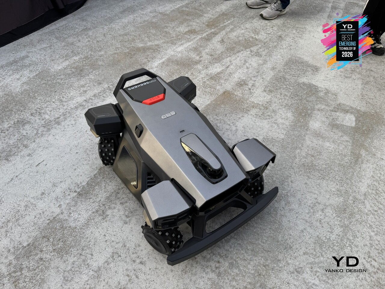
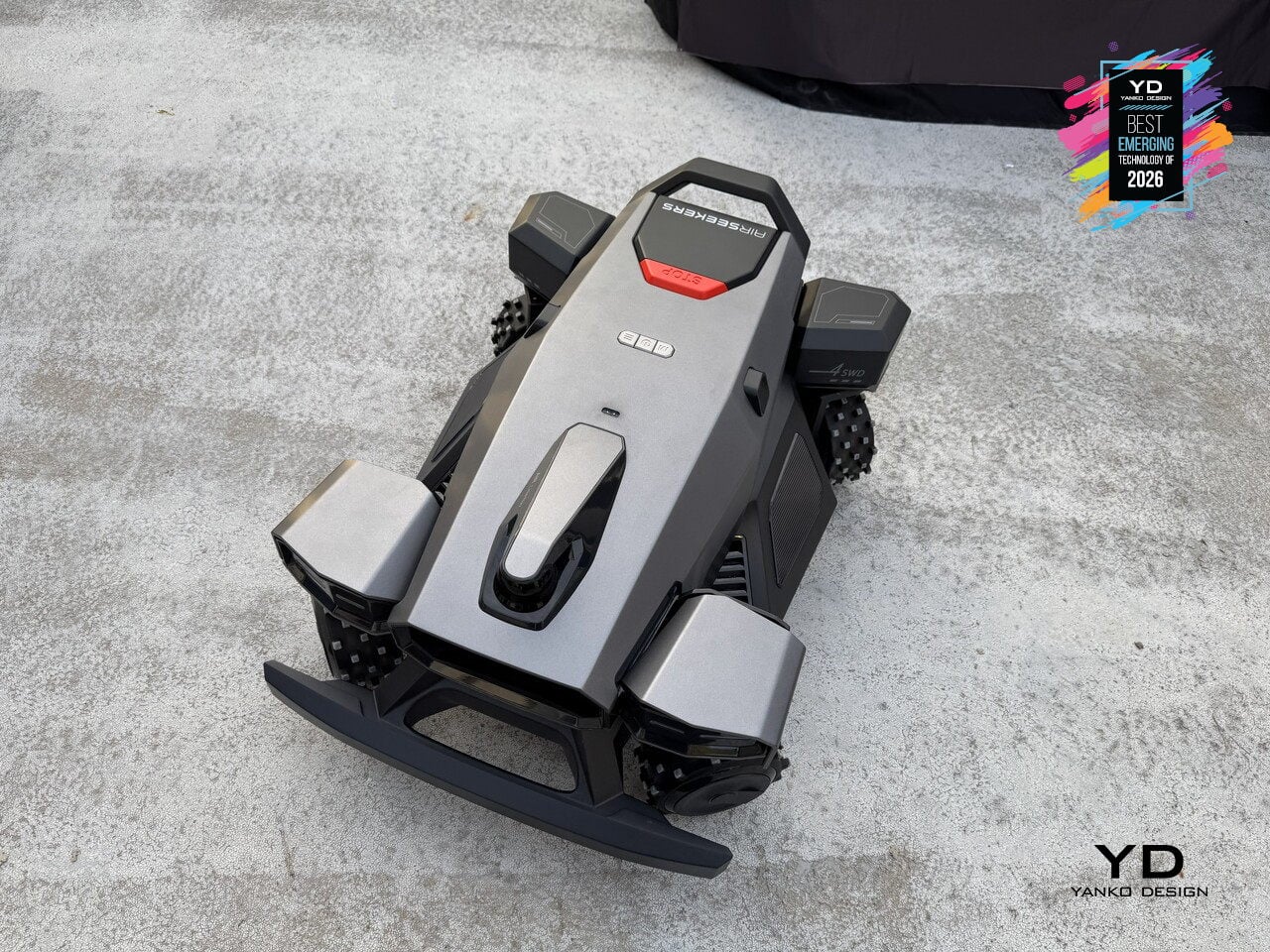
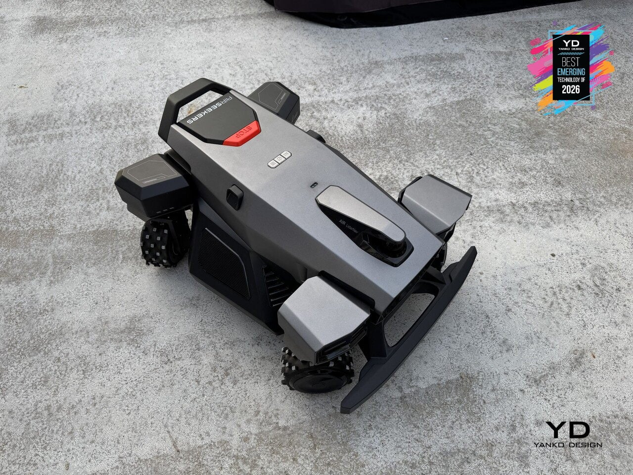
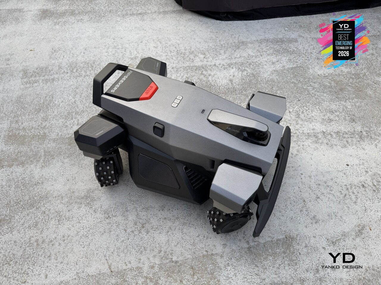
Airseekers Tron Ultra Robotic Lawn Mower
Robotic mowers have mostly relied on differential steering or front omni-wheels to navigate yards, which works for wide-open lawns but struggles with tight corners and complex obstacles. Airseekers Tron Ultra uses a 4SWD drive system with independent control of each wheel, allowing it to move in ways that feel closer to industrial robotics than consumer lawn care. The mower can rotate in place without a turning radius, shift laterally, horizontally, or even diagonally through narrow gaps between garden beds, and pivot around obstacles up to 2.36 inches tall without backing up. That four-corner independence changes how the mower approaches difficult terrain. Upgraded high-traction wheels give it the grip to climb inclines up to 85% grade and traverse wet grass without spinning out, while intelligent environmental detection adjusts power distribution per wheel to prevent soil compaction and turf damage.
Under the hood, Omni Navigation combines AI vision sensors, LiDAR, and VSLAM mapping with a 300° field of view to feed real-time data to the 4SWD controller, dynamically adjusting wheel speed and direction as terrain changes. A 594Wh swappable battery supports up to 0.49 acres per charge, with the mower autonomously returning to its dock and resuming exactly where it left off. Paired with 360° radar beacons that eliminate dead zones under trees and around structures, the Tron Ultra reduces manual intervention by over 50% compared to earlier models. It signals a shift from mowers that follow preset patterns to machines that move like outdoor robots, treating lawns as navigable environments rather than obstacle courses.
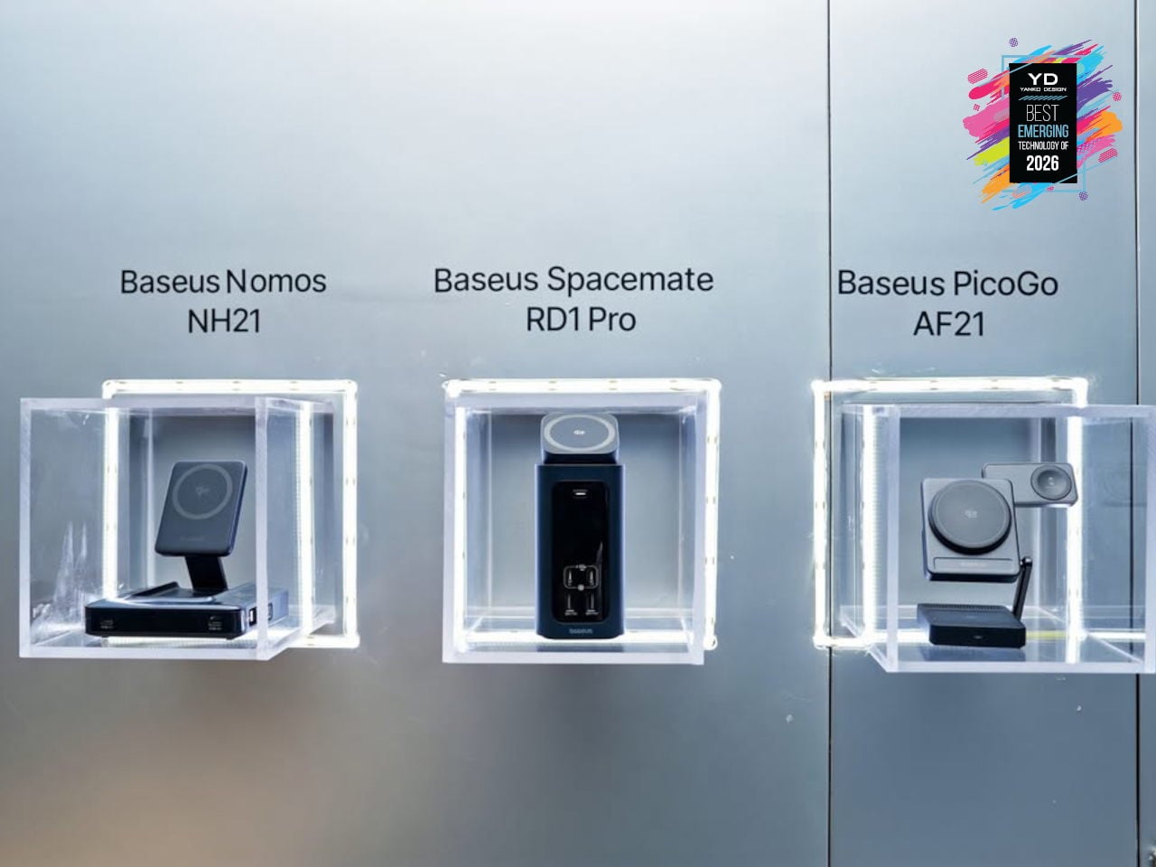
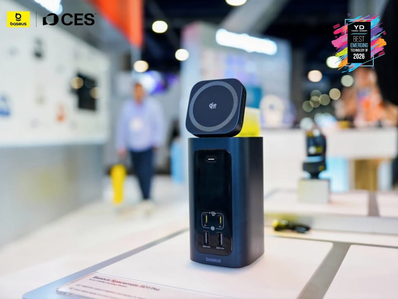
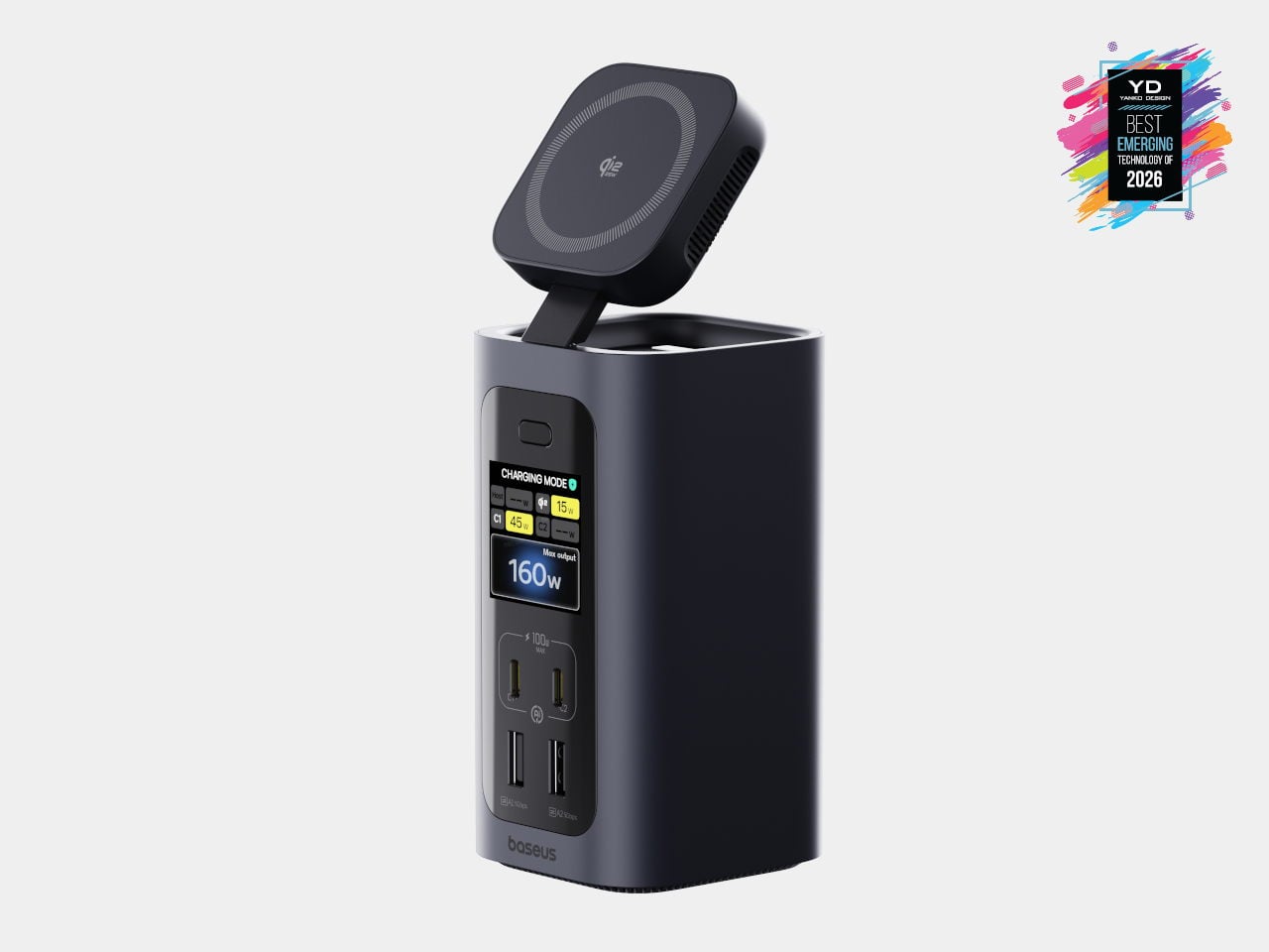
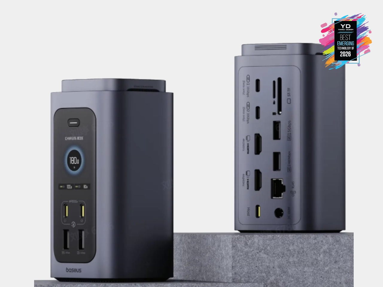
Baseus Spacemate RD1 Pro Desktop Dock
USB-C hubs and flat docks have become standard, but most still sprawl across the desk with cables radiating in every direction. Baseus Spacemate RD1 Pro is a vertical, 15-in-1 docking station that treats the dock as a compact desktop appliance instead of a dongle. A single USB-C cable links a Windows laptop to dual 4K monitors, 10 Gbps USB-C ports, SD and TF slots, and 1 Gbps Ethernet, while the tall, minimalist tower tucks ports on the back and keeps the footprint small.
The Spacemate RD1 Pro merges that connectivity with a serious GaN power stack. An included 180 W GaN adapter feeds up to 160W of total output, with 100W PD reserved for the laptop, dual USB-C 100W-capable fast-charging ports for accessories, and a retractable Qi2.2 25W magnetic wireless pad on top for phones or earbuds. Intelligent power management dynamically allocates power and surfaces status on a front LED display, showing per-port draw and alerts. It feels like an early example of vertical, multifunctional docks becoming central power-and-I/O blocks for increasingly dense, multi-device workspaces.
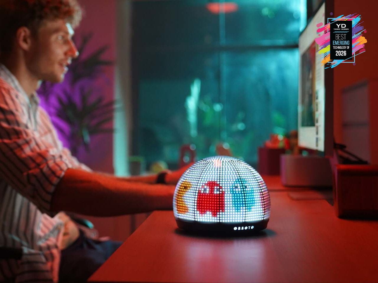
Switchbot OBBOTO
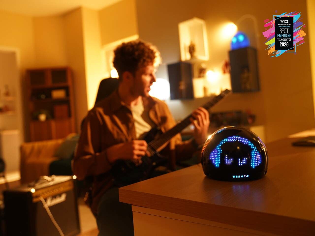
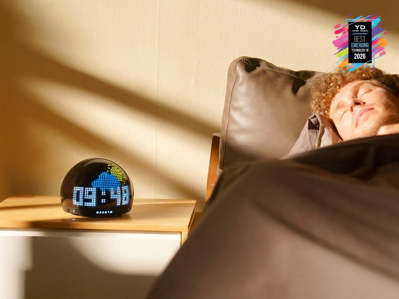
Desks and living rooms are filling up with smart lights and displays, but most still behave like obedient bulbs or tiny billboards. SwitchBot OBBOTO is a desk-sized pixel globe that tries to be something closer to a companion, using more than 2,900 RGB LEDs, motion sensing, and music visualization to turn light into an expressive presence. It can show time and weather as patterns, react when someone walks by, and sit alongside SwitchBot’s Comfort Tech lineup as the one that gives the room a bit of personality.
OBBOTO leans on AI-driven mood animations and ambiance modes to adjust to what someone is doing, shifting between sleep-friendly scenes, focus-oriented visuals, or relaxed, reactive patterns that move with music. Interactive pixel art and animations can be triggered or customized, making it as much a canvas as a lamp. It hints that tomorrow’s smart home might rely less on flat screens and more on small, characterful devices that quietly broadcast information and vibe at the same time.
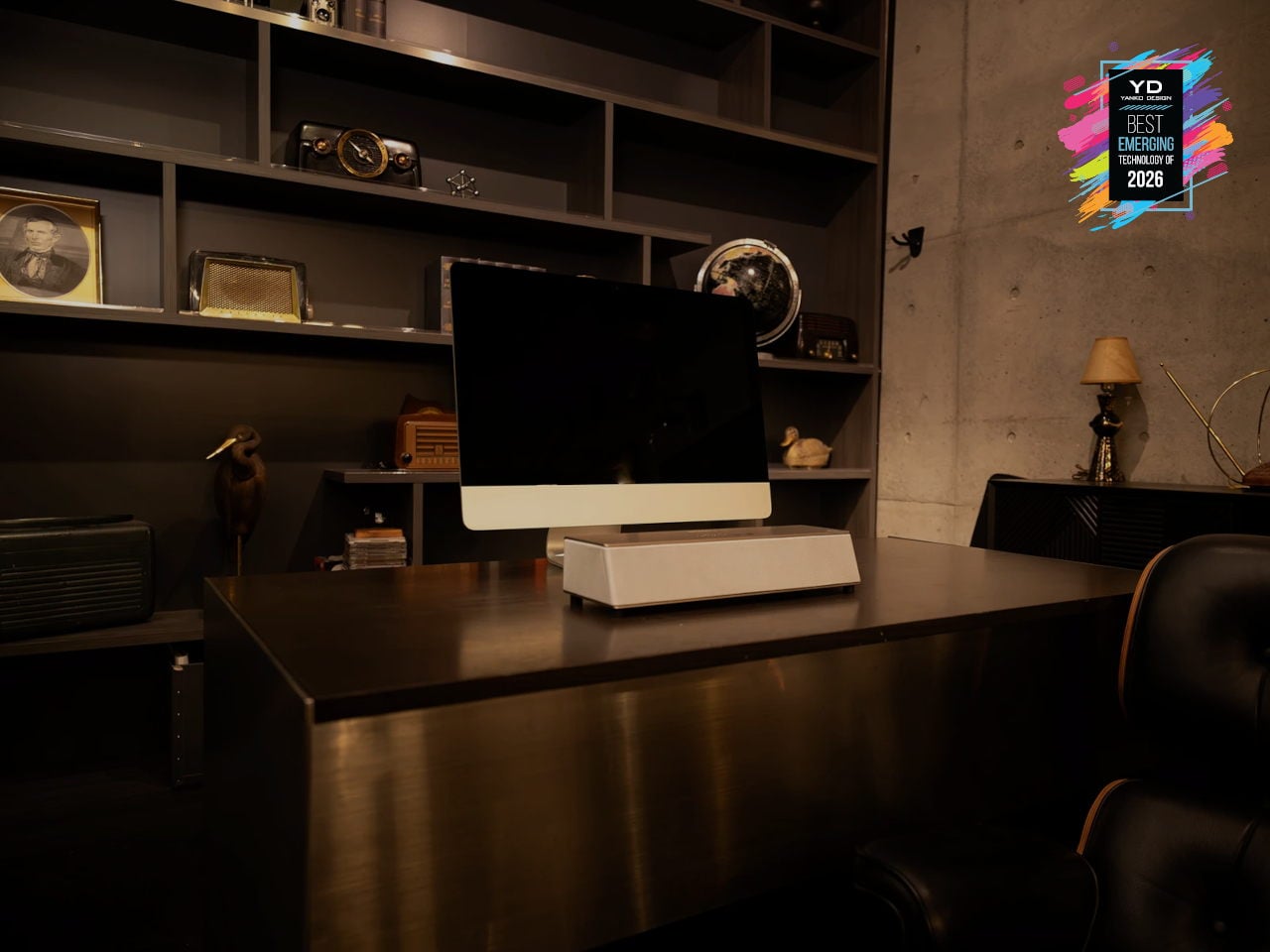
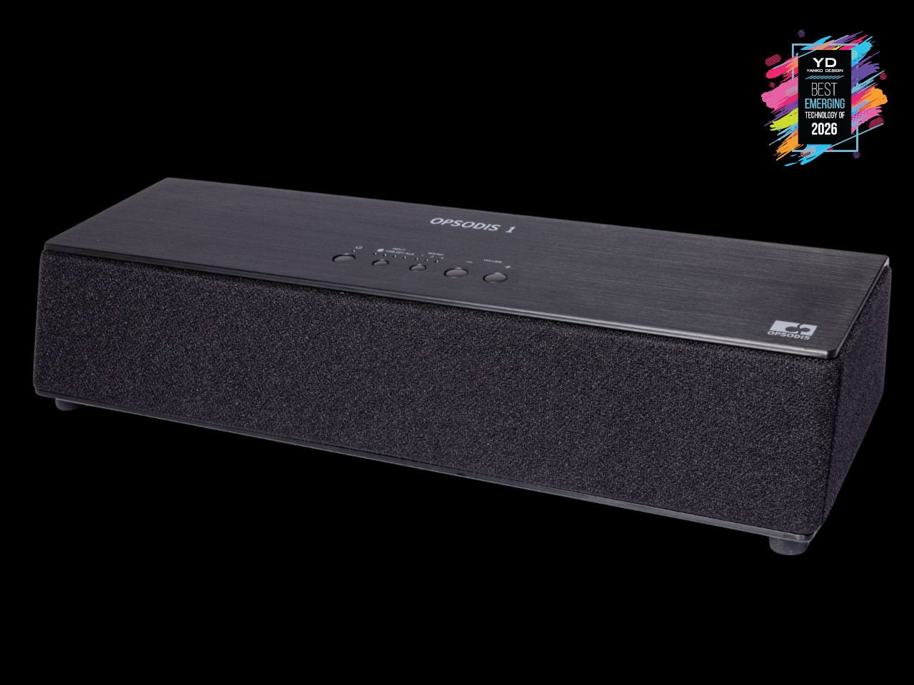
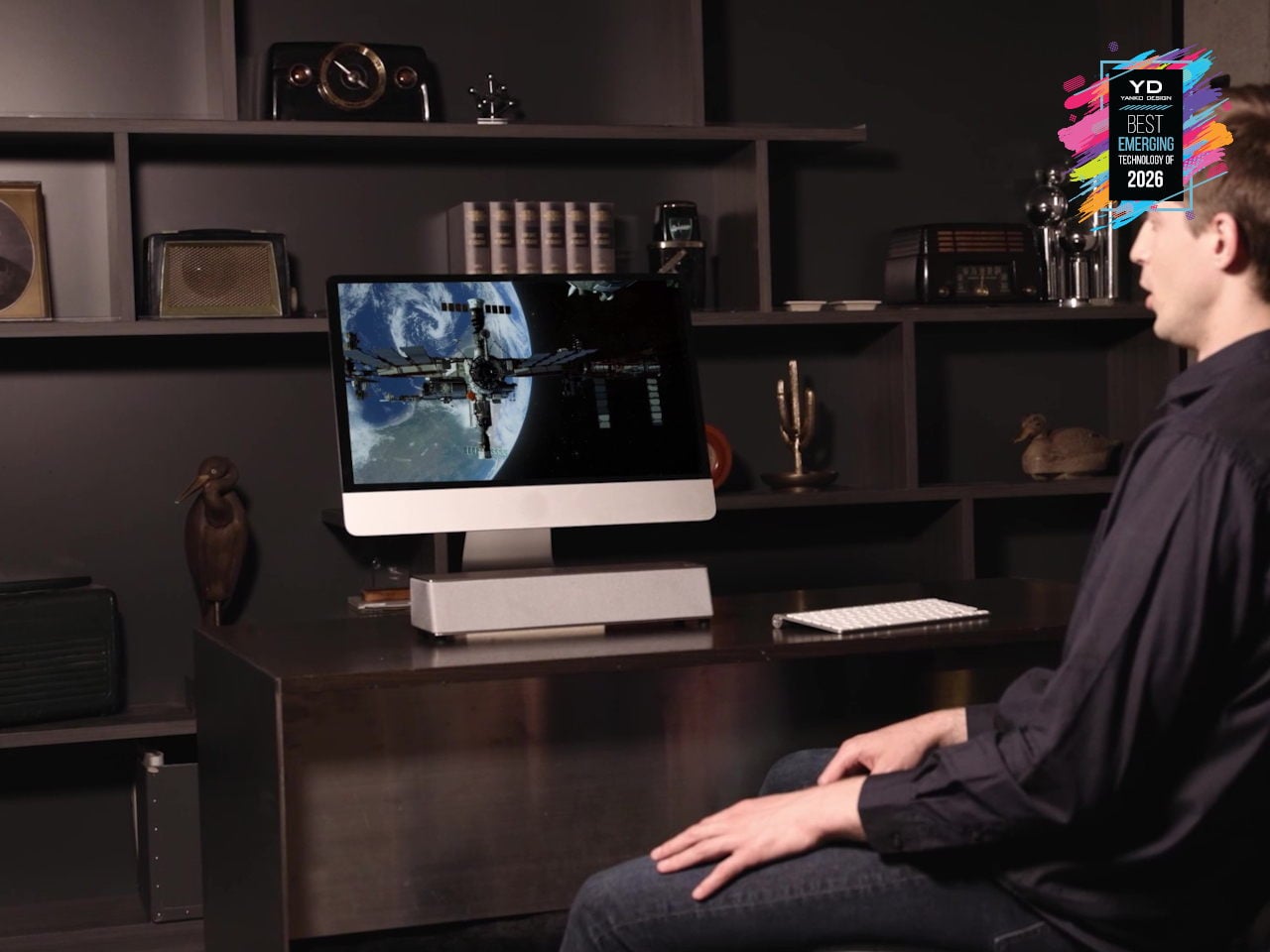
OPSODIS 1 Compact 3D Audio Speaker
Surround sound has usually meant either a ring of speakers around the room, a big soundbar that leans on wall reflections, or headphones that lock you into a bubble. OPSODIS 1 is a compact desktop 3D audio speaker that tries a different route, using Kajima’s OPSODIS technology to project a 360-degree sound field from a single box. The 6-channel, 3-way, 6-driver array delivers natural spatial cues without depending on walls or ceilings, making it as at home on a desk as in a small living room.
OPSODIS, developed with the University of Southampton’s Institute of Sound and Vibration Research, uses optimal source distribution, crosstalk cancellation, and a symmetrical layout with high-frequency drivers near the center axis to send precise sound to your ears. Multiple inputs, from Bluetooth and USB-C to optical and 3.5 mm, plus listening modes like Narrow, Wide, and Simulated Stereo, adapt to different setups. It hints at a shift where immersive audio is moving beyond headphones and multi-box systems, toward single, research-driven speakers that create convincing 3D soundstages from one spot on your desk.
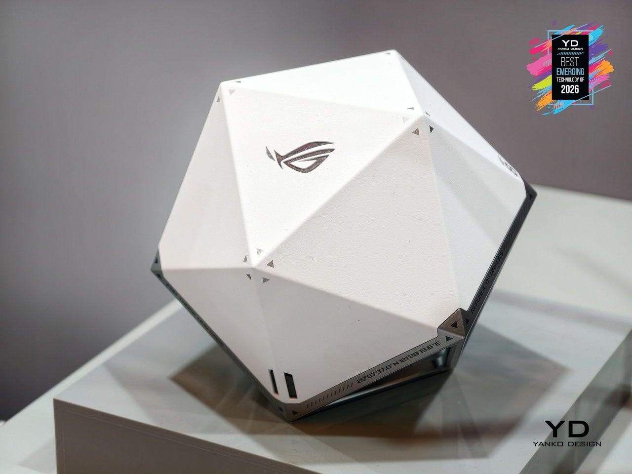
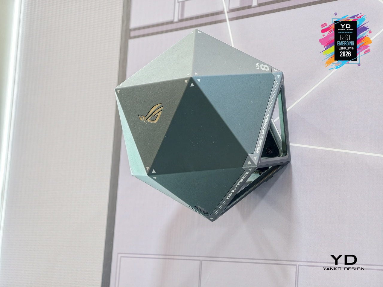
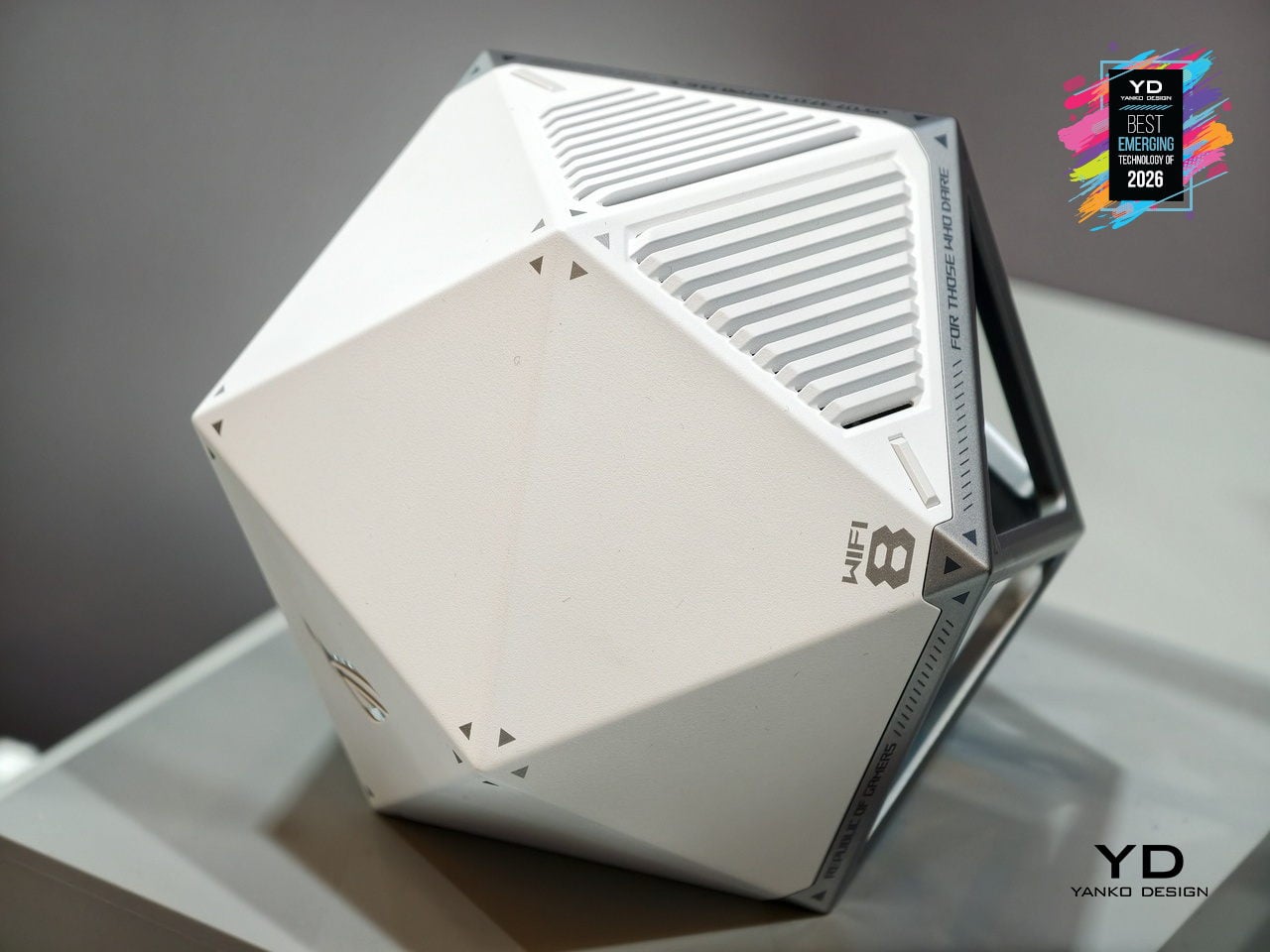
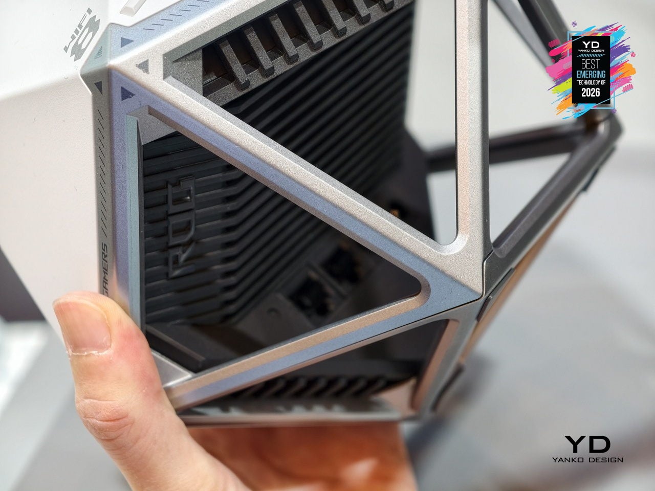
ASUS ROG NeoCore WiFi 8 Router
Most routers are still anonymous black slabs you hide behind a monitor or under a TV, even as they quietly run more and more of the home. ASUS ROG NeoCore takes the opposite approach, turning next‑gen Wi‑Fi 8 hardware into an object you actually want on the desk. The faceted polyhedral shell, somewhere between a gaming dice and a sci‑fi artifact, replaces the usual antenna farm with a sculptural form that can sit flat or be wall‑mounted without looking like infrastructure.
That shape is not just for show. A rigid exoskeleton frame wraps a ventilated inner core, giving the router plenty of airflow while keeping ports and heatsinks tucked into one face. The multifaceted body helps distribute antennas in three dimensions, supporting the tri‑band Wi‑Fi 8 radio stack that pushes more data, more efficiently, to many devices at once. NeoCore ends up feeling like an early glimpse of networking gear designed as part of a performance‑focused setup, where the box handling low‑latency gaming, 4K streaming, and dense device loads finally looks as intentional as the hardware it supports.
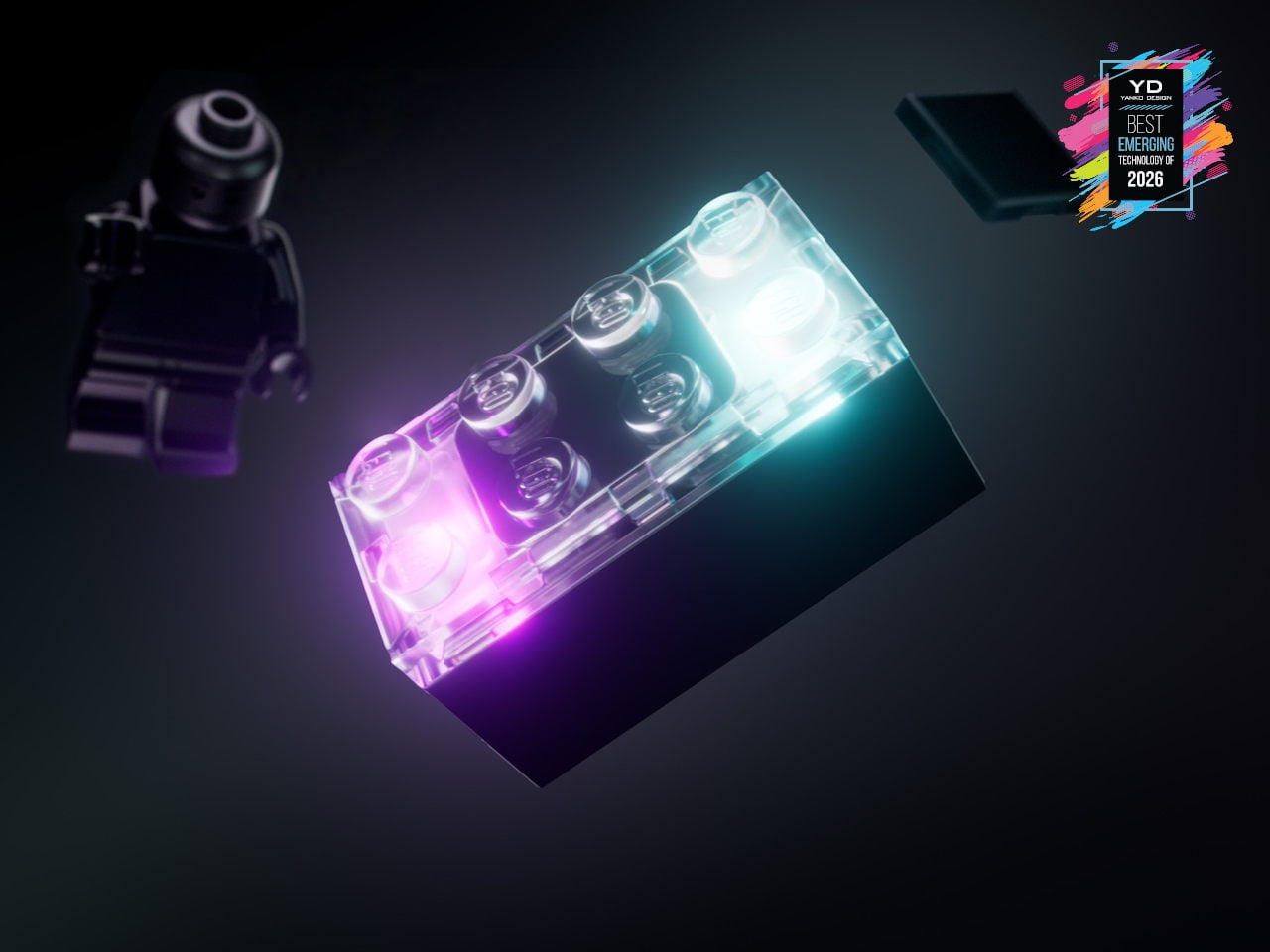
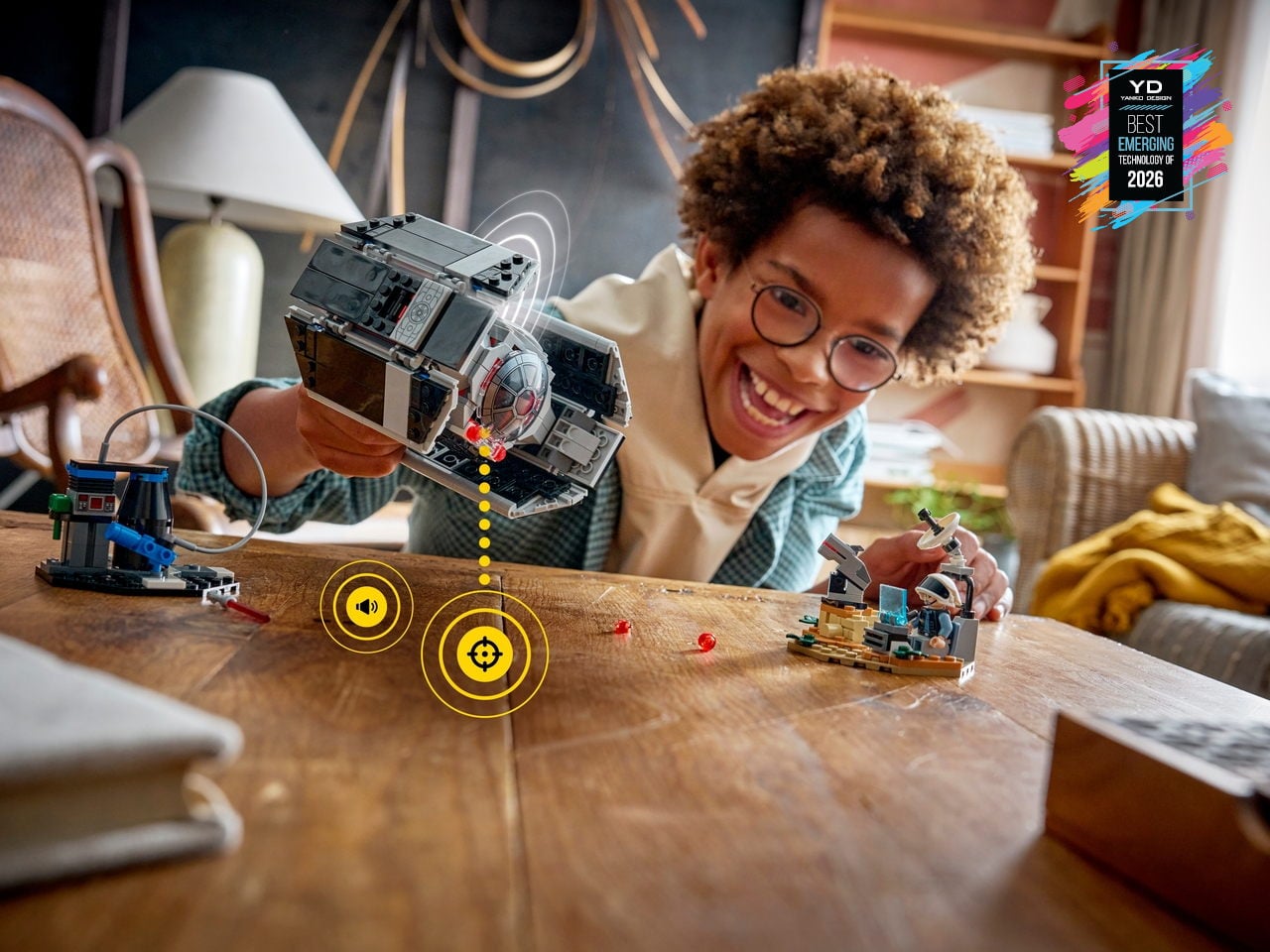
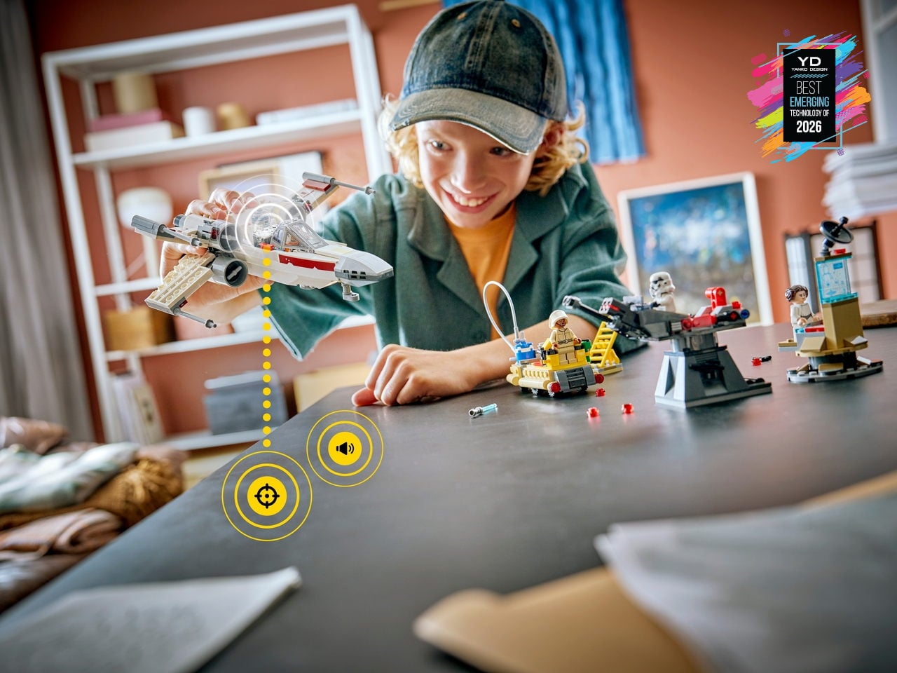
LEGO SMART Brick
LEGO has flirted with electronics before, but usually in the form of obvious hubs or screen-tethered experiences. LEGO SMART Play shifts that by hiding a custom chip smaller than a stud inside the new SMART Brick, along with sensors, a sound engine, and wireless charging. Paired with SMART Tags and SMART Minifigures, it lets familiar builds react to swoops, crashes, and docking maneuvers with lights, motion-aware sounds, and contextual behaviors, while still feeling like pure, open-ended brick play on the table.
This platform quietly turns the entire LEGO System-in-Play into a canvas for responsive, screen-free interaction. Instead of asking kids to stare at a tablet, the SMART Brick listens through its sound sensor, feels through accelerometers, and responds through an onboard synthesizer, making ships, turrets, and throne rooms hum, fire, and react as they are moved. Because it is fully compatible with existing bricks and anchored in more than 20 patented world-first technologies, it feels like the early layer of a long-term platform that hints at everyday building blocks quietly carrying embedded intelligence.
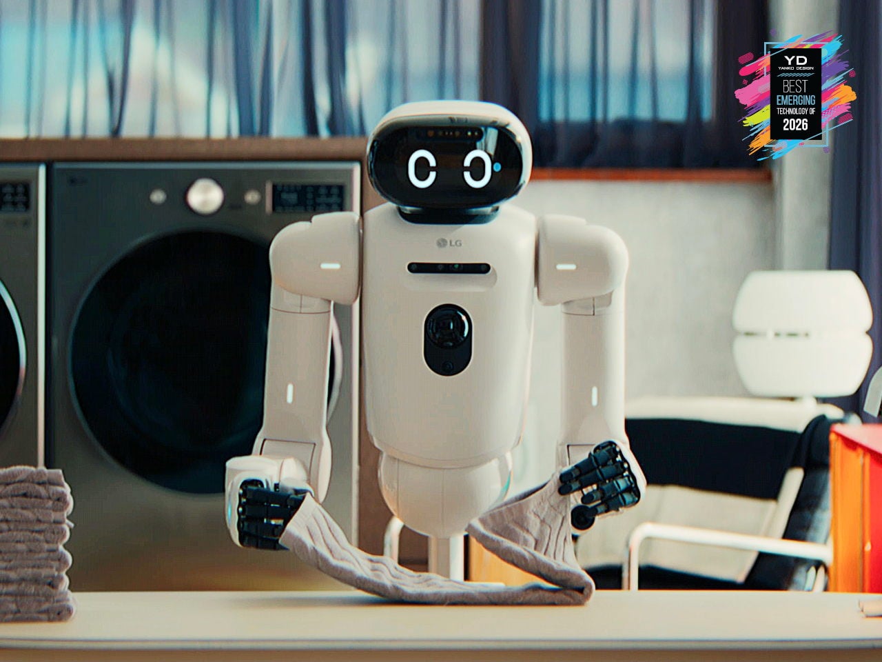
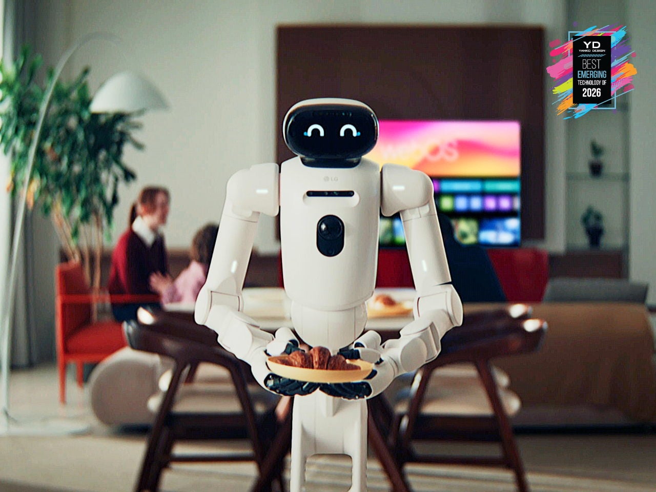
LG CLOiD Home Robot
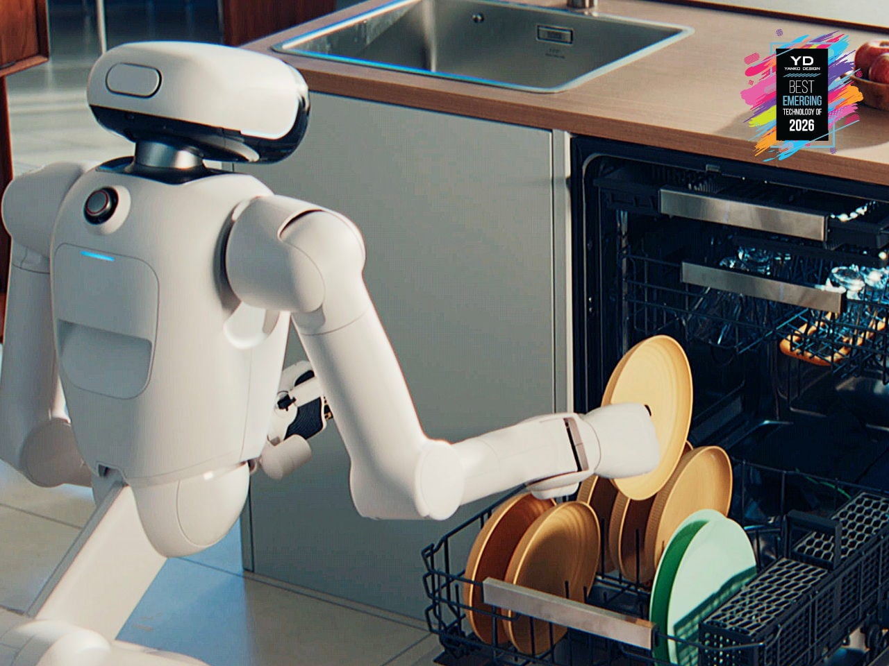
Home robots that can actually do chores are finally edging out of concept videos and into real homes. Robot vacuums are now background noise, and companies are quietly testing machines that can sort laundry or help in the kitchen instead of just answering questions from a speaker. LG’s CLOiD feels like the next step in that progression, a full-body home robot that does not just connect to appliances; it moves through the house and physically uses them.
CLOiD can take milk from the fridge, slide a croissant into the oven, start laundry cycles, and fold and stack clothes after drying. A tilting torso, two seven-degree-of-freedom arms, and five-finger hands ride on a wheeled base tuned for stability around kids and pets. LG’s AXIUM actuators give its joints compact, high-torque behavior, while a Vision Language Model and Vision Language Action system trained on tens of thousands of hours of household tasks lets it recognize appliances and coordinate with the ThinQ ecosystem, making housework automation feel less like science fiction.
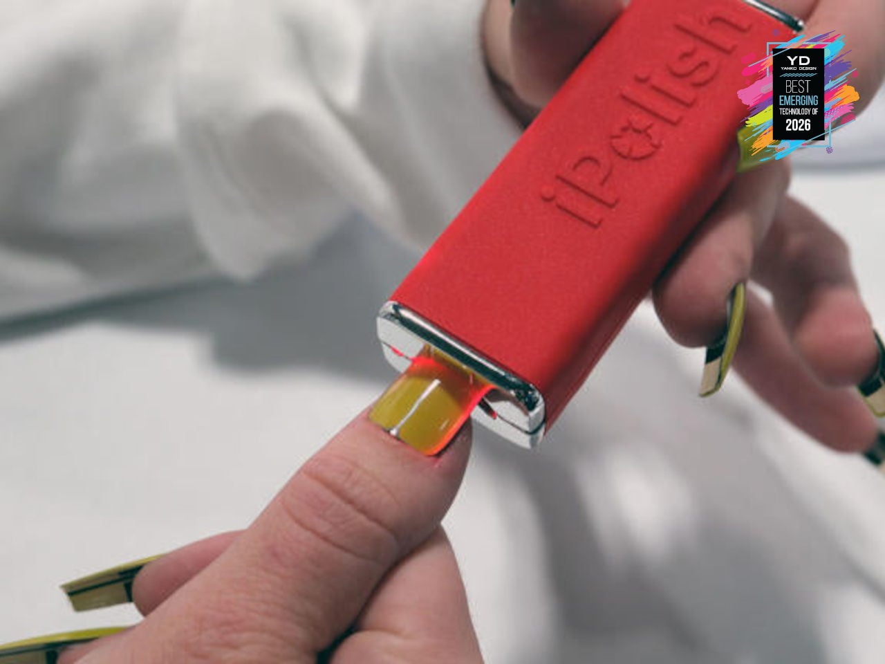
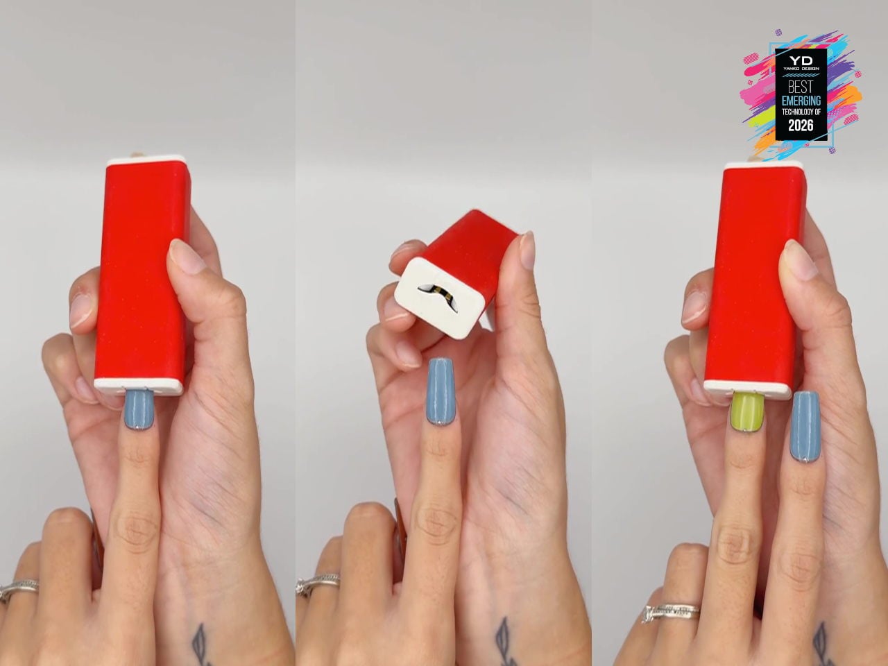
iPolish Color-changing Press-on Acrylic Nails
Fashion and beauty are quietly becoming the next frontier for consumer tech, from smart fabrics to LED-laced festival fits, but nails have mostly stayed analog. iPolish is a set of smartphone-driven digital press-on acrylics that behave like reprogrammable cosmetics, with wearable electronic nails that can display hundreds of rich colors on demand. You apply them like regular press-ons, then pair the iPolish app with the Magic Wand over Bluetooth to send your chosen palette, turning color changes into a quick gesture instead of a full removal and repaint.
The interaction is simple: you choose colors in the app, the Magic Wand stores them, and each nail cycles through options when inserted, pausing with a green blink at one of your selections so you can stop at the exact shade you want. Colors can last minutes, hours, or days, and if your outfit or mood changes, you just reselect and reinsert rather than soaking off layers of polish. Because the system works with accessories and fashionwear as well as nails, it feels like an early glimpse of where beauty tech is heading, where digital finishes become as swappable as makeup.


 Display (HLD) is a revolutionary razor-thin holographic display that transforms standard 2D video content into three-dimensional, spatial experiences. Basically, it can display virtual space from your ordinary videos to make it seem like the people, products, and characters in them are floating in mid-air on the display screen. So those scenes from sci-fi movies with hologram videos in public spaces won’t be sci-fi anymore in the very near future.