A Student Built a Buoy That Could Fix Seaweed Farming

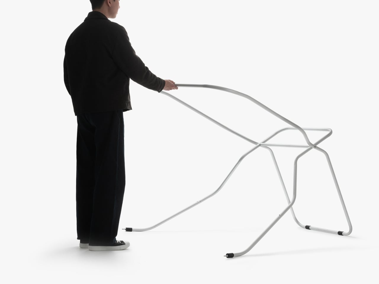
Most of us don’t spend a lot of time thinking about seaweed. It turns up in sushi, drifts around in the ocean, and occasionally ruins a beach day. But seaweed farming is quietly becoming one of the more compelling conversations in sustainable food and ocean health, and the tools that support it are finally starting to catch up with the ambition. Enter Symbios, a buoy system designed by Aaron Mooser as his bachelor thesis project at Bauhaus University Weimar, and one of the more quietly impressive things to come out of student design in recent memory.

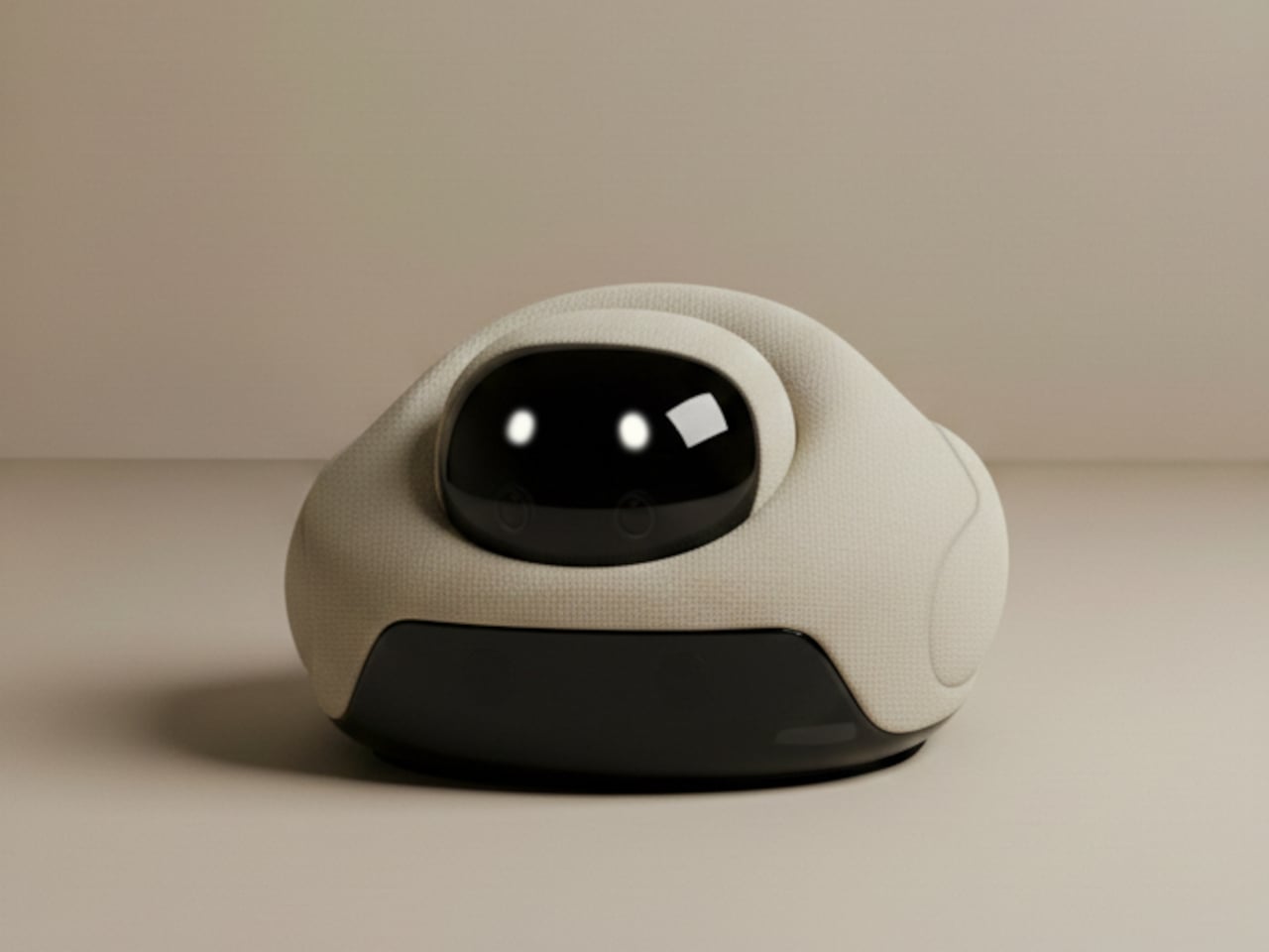
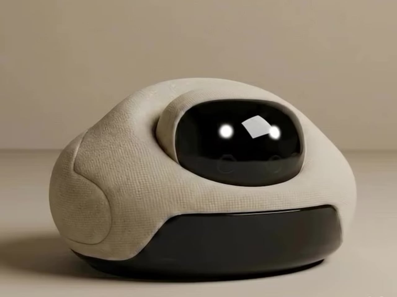
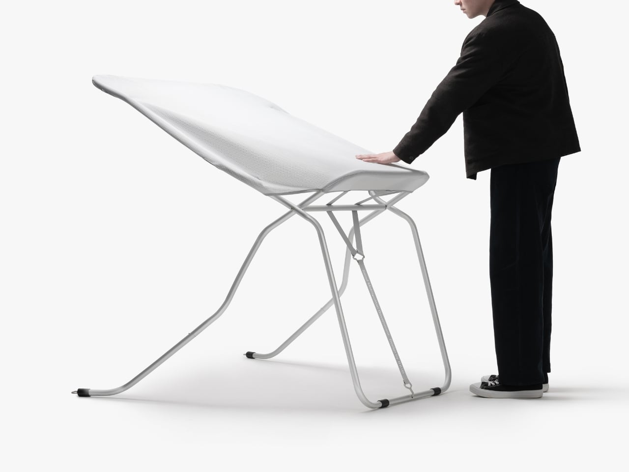
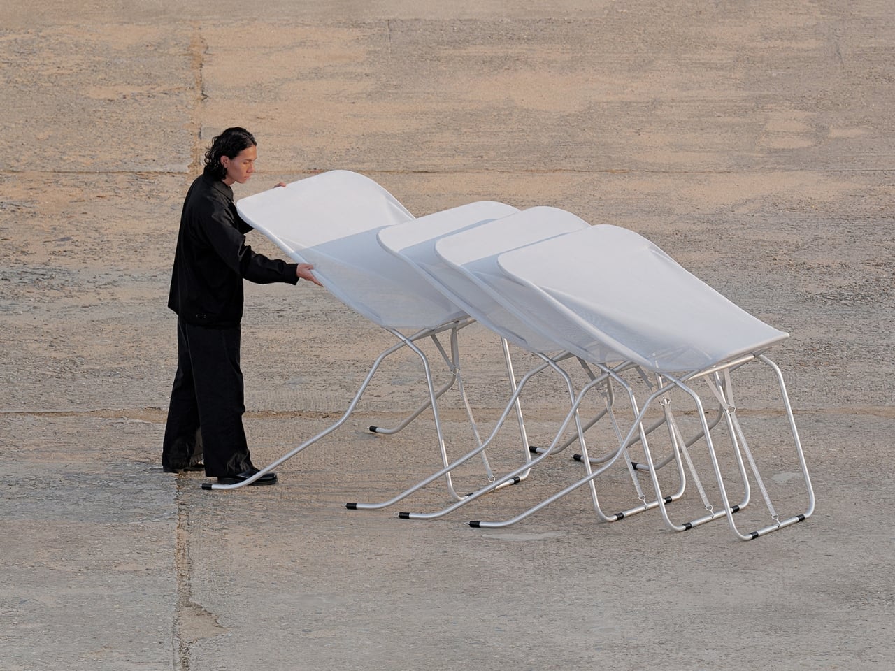
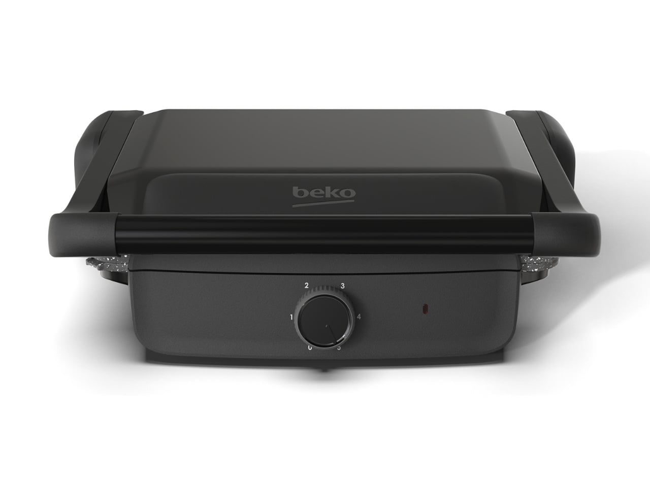
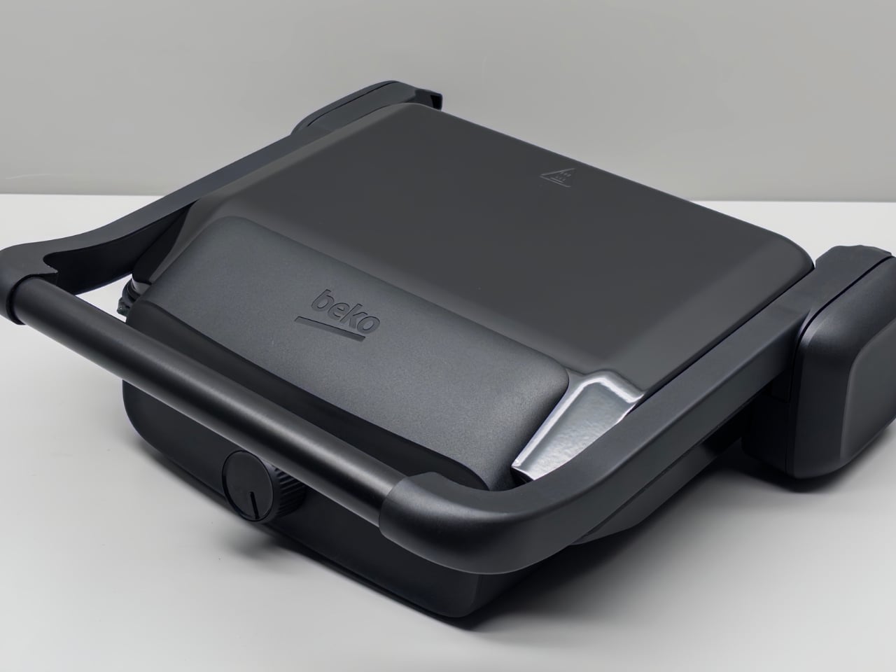
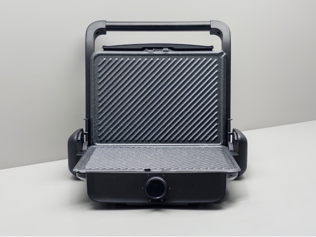
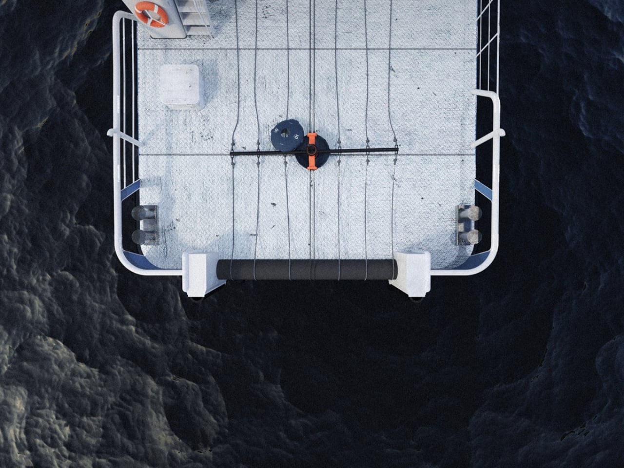
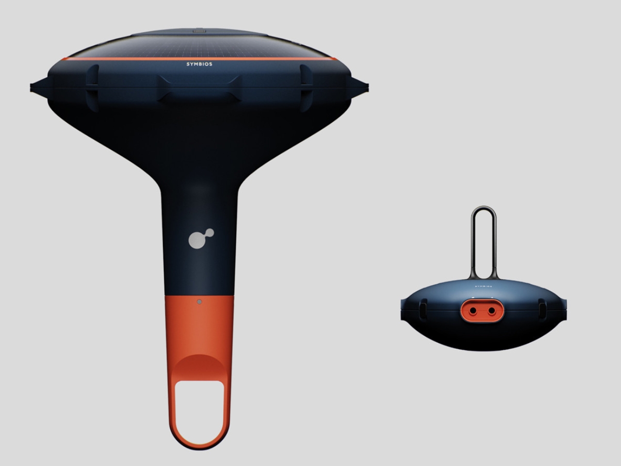
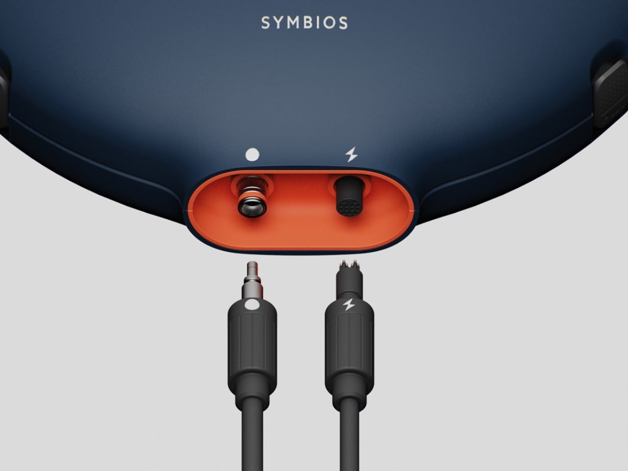
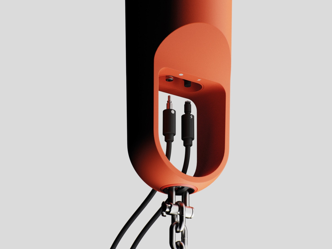
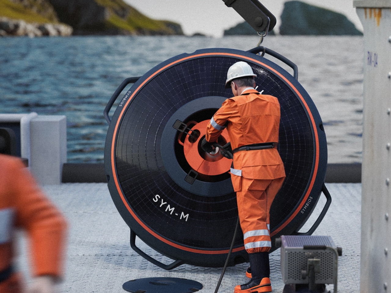
The core idea is straightforward, but the thinking behind it is genuinely sharp. Symbios is an automated buoy system built for Nordic nearshore seaweed farmers. Its central feature is depth regulation, allowing the buoys to move seaweed into cooler, deeper waters during warmer months. This solves one of the most persistent problems in seaweed cultivation: ocean temperatures fluctuate enough to disrupt or completely derail a harvest season. By managing that shift automatically, Symbios makes year-round cultivation and partial harvesting not just possible, but practical.

Designer: Aaron Mooser

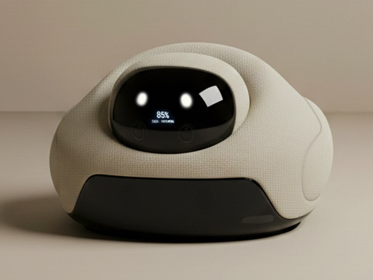
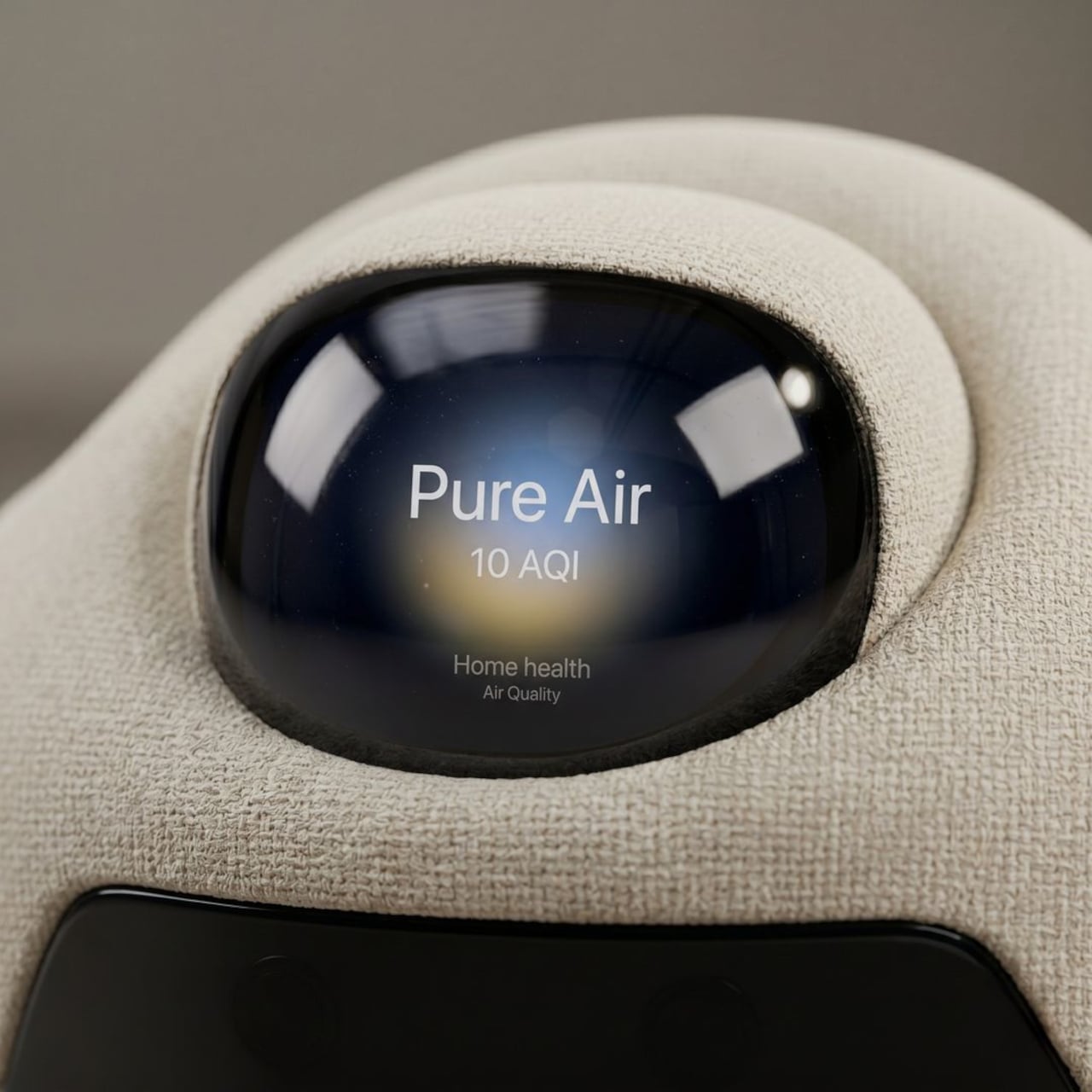
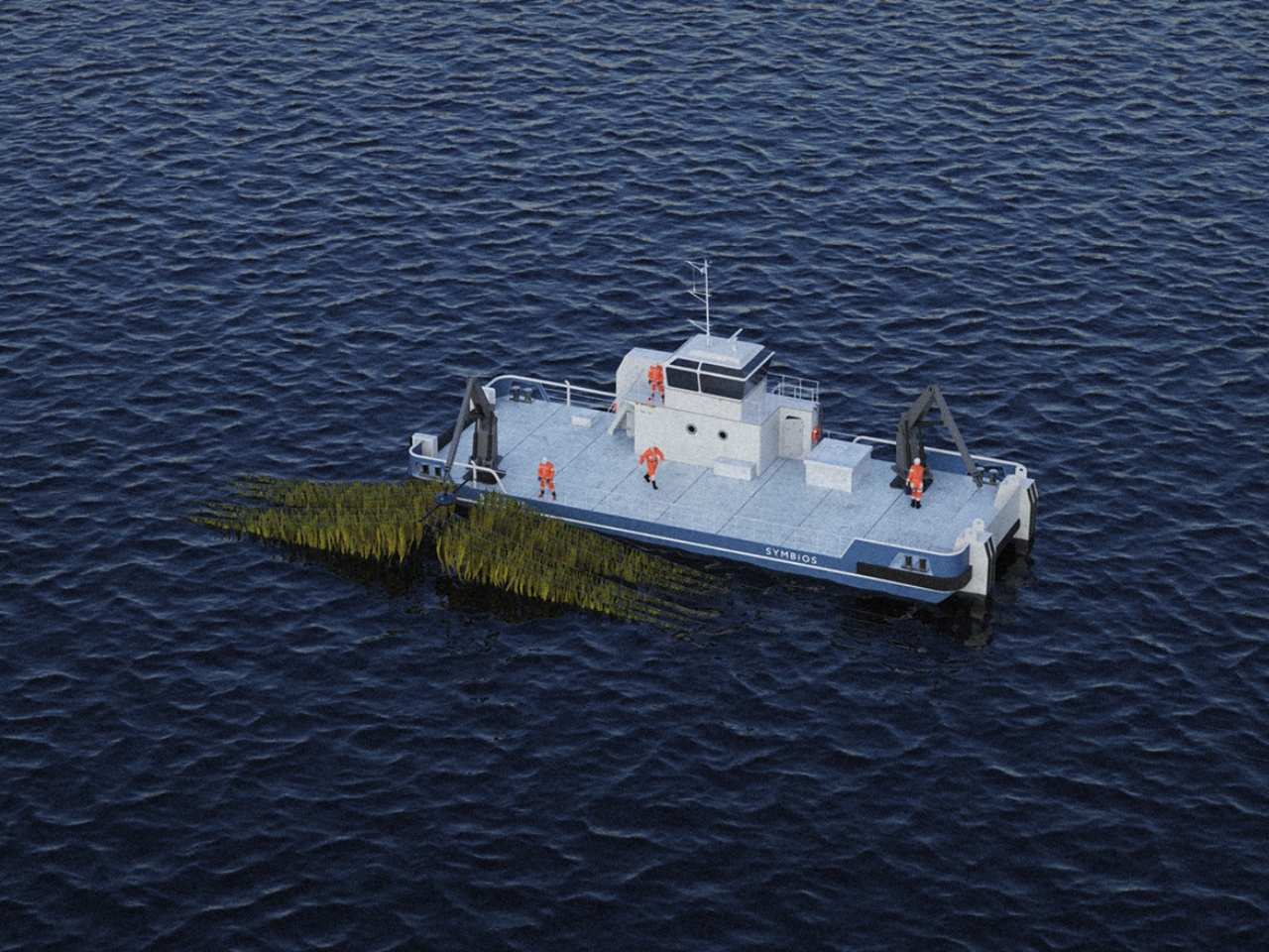
That might not sound like a design story, but it absolutely is. The challenge Mooser was solving wasn’t purely biological. It was logistical, environmental, and deeply human. Seaweed farmers in Nordic regions deal with the compounding pressure of climate variability and the sheer labor of monitoring a harvest that lives underwater. Every unnecessary boat trip costs time, fuel, and money. Symbios addresses this through remote monitoring built directly into the system, reducing the number of trips farmers need to make without losing visibility into what’s happening below the surface.

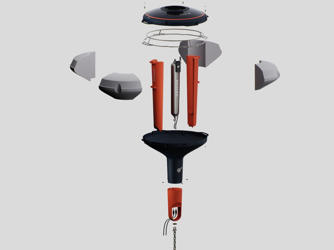
There’s an elegance here that feels distinctly Bauhaus-trained. Mooser completed his bachelor’s in product design at Bauhaus University Weimar and is now pursuing a Master’s in Industrial Design at FH Joanneum, where he’s focused on Eco-Innovative design. That background shows. The buoys are modular, built to be repaired rather than replaced, and designed for durability in conditions that would wear most things down quickly. It’s the kind of systems thinking that doesn’t get enough attention in sustainability discussions, because repairability rarely makes a headline. But designing for longevity in a marine environment is a serious commitment, and it’s a far more honest environmental gesture than a lot of what gets labeled green.

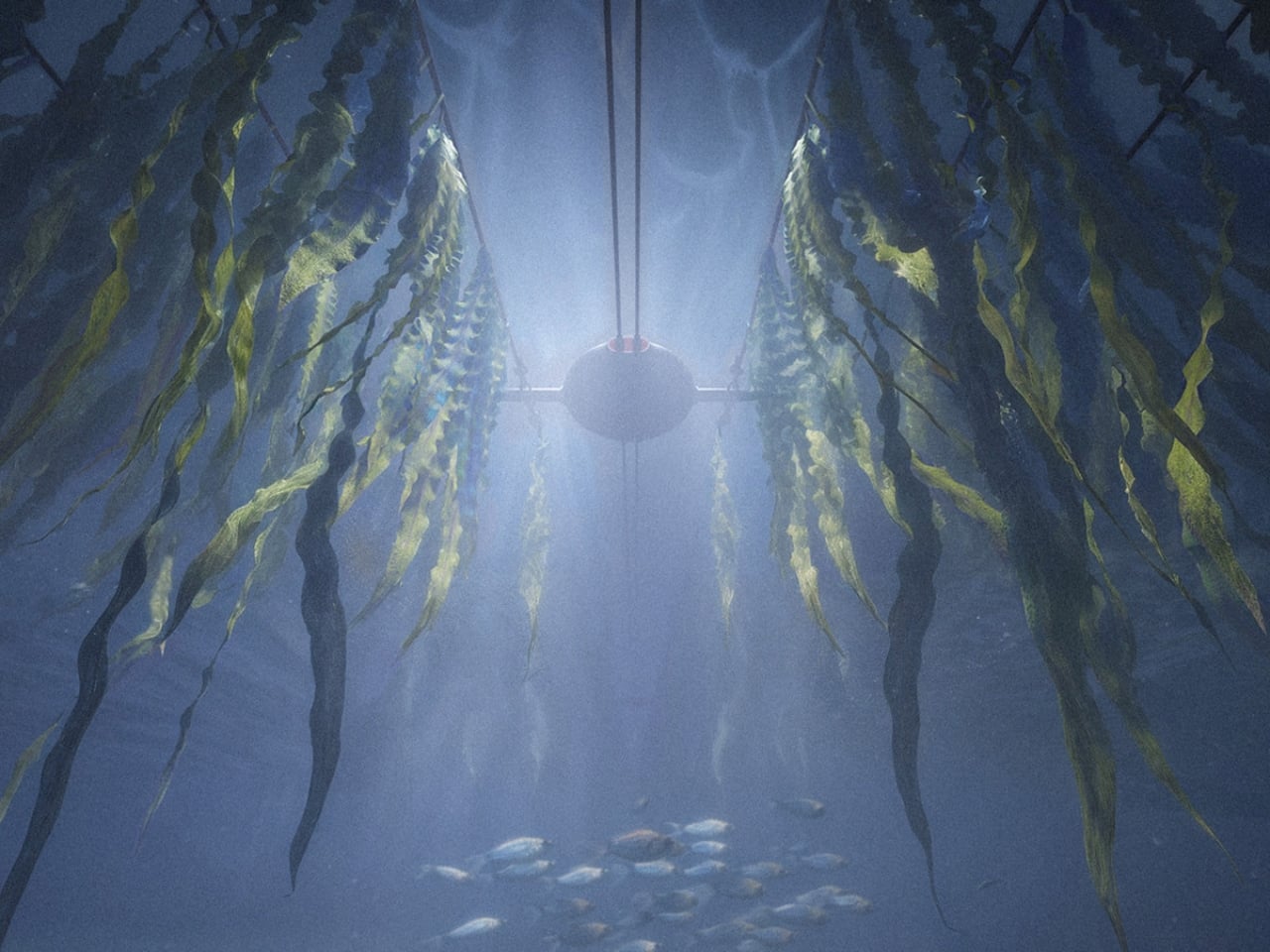
What Symbios also does, somewhat unexpectedly, is create stable marine habitats. Because the seaweed is cultivated continuously in a regulated environment, it offers more consistent ecosystem support for the marine life around it. The design doesn’t just serve the farmer. It serves the water, too. That dual benefit, where agriculture and ecology work together rather than in opposition, is what makes Symbios feel like more than a polished student project. It reads as a genuine proposal for how nearshore food systems could be structured.

The fact that this began as a bachelor thesis is worth sitting with. Student design can sometimes feel speculative, imaginative but distant from actual use. Symbios pushes back on that assumption. It’s detailed, practical, and built around a real user: the Nordic seaweed farmer navigating a genuinely complex set of conditions. The design process clearly involved deep engagement with that context, not just a convincing visual presentation.

Aaron Mooser’s work has been recognized by the Green Product Award, and it earns that recognition. Not because it’s flashy, but precisely because it isn’t. Symbios doesn’t try to solve everything at once. It addresses specific problems cleanly, considers the full lifecycle of the product, and respects both the people who will use it and the environment it operates within. That kind of restraint, in a design culture that so often rewards novelty over genuine usefulness, is worth paying attention to.

Seaweed farming isn’t going anywhere. If anything, it’s going to become more prominent as food systems shift toward more sustainable sources. The real question is whether the infrastructure supporting it can evolve fast enough. If Symbios is any indication, the answer might surprise you.

The post A Student Built a Buoy That Could Fix Seaweed Farming first appeared on Yanko Design.

This Concept Organizes the First 30 Seconds of Coming Home in the Rain

Home entryway products have a coverage problem. A shoe rack deals with footwear, but not the umbrella. An umbrella stand handles the wet item but does nothing for the dripping floor around it. A small tray catches keys but not the daily chaos that accompanies them. The pieces exist, but they don’t form a coherent system, and the result tends to be a doorway that feels permanently unsettled.

ENTRY is a concept that answers that scatter with one vertical object. It integrates umbrella guidance, water collection, elevated footwear storage, and a top catch-all surface into a single threshold form, described by its designer as something that organizes the first 30 seconds of coming home. Rather than treating the entrance as a storage corner, it reframes that space as a managed wet-dry transition between outside conditions and domestic calm.

Designer: Zhenhua Chen

The design gives the wet umbrella a precise position rather than a vague area to lean against. A vertical spine with controlled side geometry holds the umbrella in a defined relationship to the base, reducing the casual lean that scatters water across walls and floors. It’s structural thinking that locates the wet object deliberately, so that whatever drips off it goes where the design expects it to go.

Below the umbrella position, a concealed, removable tray collects water at the base. Rather than allowing drips to pool on the floor or soak into a mat, the design makes water collection part of the object’s own structure. The tray pulls out when it needs emptying, keeping the maintenance cycle as minimal as the design premise itself. Water arrives with the umbrella, gets directed downward, gets caught, and gets removed.

Footwear gets lifted off the floor onto dedicated raised platforms rather than accumulating at the base of the door in the usual loose arrangement. The difference between floor-level disorder and a designated surface is partly visual but also functional: the floor around the entrance stays clear, and the entryway retains the quality of a space someone has thought about rather than one that simply absorbed what was dropped into it.

The top surface is a flat catch-all tray for keys, cards, and anything else that comes in at the end of the day. Placing that surface on the same object as the umbrella and shoes means the coming-home ritual resolves at a single point. You don’t split between the entryway table, the kitchen counter, and the shoe mat; everything lands together, and the entrance stays coherent rather than scattered.

The design doesn’t try to decorate the problem. It reframes the entryway as a piece of domestic infrastructure, a small managed object whose job is to absorb the friction of arriving rather than add to it. ENTRY currently exists as a concept prototype that confirms scale, spatial arrangement, and visual language. Drainage performance and load testing are identified as the next steps before the design moves further forward.

The post This Concept Organizes the First 30 Seconds of Coming Home in the Rain first appeared on Yanko Design.

Nothing Book laptop concept let’s you be more expressive with a slender secondary screen on the lid

Nothing has revived and redefined the see-through design aesthetics that blew up in the late 1990s and early 2000s. That era was highlighted by colorful polycarbonate plastic material for translucent casings for the futuristic, fun vibe. Carl Pie took the bold step and weaved his brand’s design philosophy around clean minimalism and see-through designs in colorless aesthetics.

Over the years, Nothing’s products have inspired countless designs and concepts for good reason. Battery banks, headphones, turntables, vacuum cleaners, and whatnot. So how could we not bet against a Nothing-themed laptop tailored for gamers and creators?

Designer: Nikita Bukoros Design

The designer wants to grow on the idea of a Nothing laptop that Carl hinted at years earlier when the brand was taking its baby steps. The highly anticipated gadget never came to fruition thus far, and left Nothing fans yearning for one. Nikita wants to give the fans another reason to keep believing and perhaps subtly remind Carl of the prospect. He calls it the Nothing Book, and his idea is to reveal the complexity underneath, much like a see-through gaming PC case that reveals the innards in their glory. Everything from the inner architecture, dynamic cooling system boards, to the other components is layered in a hypnotic composition.

The designer labels the performance laptop as an industrial art piece, more than a high-end consumer electronics gadget. I totally agree with the emotion, as the PC, when flipped over, reveals all the inner electronics. One unique element that defines this laptop is the secondary screen on the lid of the machine. This external display breaks the monotony of the machines we are accustomed to, as you can show off any messages, symbols, emojis, or other elements in the classic Nothing font. To spice things up, Nikita goes beyond the monochrome color scheme and offers the concept laptop in peppy options. You can have it in hot red, cool green, subtle pink, or magnetic teal hues as well.

Going with the modern design aesthetics of the creator-focused laptop, the accompanying charging dock is purpose-built to flaunt the attractive make of the machine. When docked in, the cool charging animation is displayed on the secondary screen. At the end of the day, the laptop has to be highly practical, hence, it comes with the customary HDMI, USB-C, USB, and wired charging port.

Whether Nothing will release a laptop anytime soon is anybody’s guess, but one thing is for sure: the brand needs to look at it very seriously. The design aesthetics of the modern-day laptops are quite muted and predictable, and this concept gives fans one more reason to believe.

The post Nothing Book laptop concept let’s you be more expressive with a slender secondary screen on the lid first appeared on Yanko Design.

What If the Internet Had a Building You Could Actually Walk Inside?

The internet has always been invisible. It moves information at a scale and speed the human mind can’t fully grasp, yet we access it through the most ordinary of interfaces: a flat screen, a pair of earphones, a keyboard. Nothing about how we physically engage with it reflects the enormity of what it represents, or what it means to be connected to the entire world from a single chair.

Michael Jantzen’s Internet Observatory concept addresses that disconnect directly by building a physical structure around the idea of internet access. Placed outdoors, the structure uses its architectural form to stand in for the abstract mechanics of the web. The outer support grid frame represents the internet’s matrix, while the curved space it encloses represents where a person enters and engages with the flow of information.

Designer: Michael Jantzen

You reach the interior by climbing a staircase up to an elevated platform and stepping inside the curved shell. At its center sits an interactive workstation that rises through a glass floor and can also rotate along the floor’s surface, letting the person inside face in any direction. It’s a deliberately simple setup that places one person at the physical center of a structure designed to represent the entire internet.

All of the large curved panels that form the enclosing space can be automatically repositioned around the occupant. The core can be fully open, fully closed, or any variation in between, depending on the activity. Some configurations allow for projecting images and sounds from the internet or the main computer onto the surrounding panels, turning the interior into a fully immersive display environment.

Some of those projected images also appear on the exterior faces of the panels, making what happens inside the structure visible to anyone nearby. A private internet session becomes something closer to a public exhibition, with the curved panels acting as screens that anyone outside the grid frame can see. The distinction between the individual’s experience and the community’s visibility gets built directly into the architecture.

Each structure would also have its own website, through which people could visit and interact with it remotely in real time, selecting images and sounds to be projected inside or directing the movement of the panels. Someone seated at the workstation might find the content surrounding them being shaped by a stranger thousands of miles away. The structure becomes a live, physical interface for the collaborative possibilities of the internet.

The design also contemplates many of these structures existing simultaneously around the world, each publicly or privately owned, all communicating with each other as they interact with their respective occupants. What begins as one architectural statement scales into a distributed global network, a physical version of the very internet it represents, built from steel frames and curved panels rather than servers and cables.

Jantzen calls this a “symbolic temple for the computer age,” and there’s something deliberate in that description. Climbing a staircase, entering a curved space, and sitting at the center while content from around the world flows around you is a kind of ritual that a laptop screen doesn’t offer. It’s an architectural argument for what it might feel like if the internet had a home you could walk into.

The post What If the Internet Had a Building You Could Actually Walk Inside? first appeared on Yanko Design.

Gustav Friebel’s Red Lamp and the Art of Breaking Light Apart

The first time you look at Gustav Friebel’s Hands On Light, you might do a double-take. Is it a lamp? A science experiment? An art installation that somehow found its way onto a side table? The answer, satisfyingly, is all three, and that is exactly the point.

Hands On Light is Friebel’s contribution to the exhibition of the same name, a master’s cooperation between ERCO, one of Germany’s most storied lighting manufacturers, and UDK Berlin (Universität der Künste). Fifteen prototypes were shown at Berlin Design Week 2026, each one exploring what the project called the “Alchemy of Light.” Friebel’s piece stood out immediately, not just for its color (that urgent, almost aggressive red) but for what it asks you to think about when you look at it.

Designer: Gustav Friebel

The concept is grounded in natural light segmentation. Think of the way sunlight hits a cluster of bubbles on water, or how dappled light falls through a canopy of leaves. Each point of light is distinct, separated, alive. Friebel took that idea and made it structural. Seven frosted glass spheres, each with polished sides, sit inside the holes of a deep-drawn PMMA sheet. That sheet, the red one that catches your eye first, is not a simple tray. It is a sculptural form in itself, its organic rounded edges suggesting something molten, like a material caught mid-transformation.

The glass spheres do something genuinely clever. The frosting diffuses the light, softening it into a gentle glow, but the polished sides of each sphere allow light and color to interact in a way that feels less like engineering and more like physics made beautiful. When the lamp is on, the red of the PMMA bleeds into the milky glass, and the whole thing pulses with warmth. Lit or unlit, it reads differently. That duality is not an accident.

What sits beneath all of this is also worth paying attention to. The base is a chrome metal armature with a sculptural quality of its own. The supports branch out from a cylindrical foot, holding the whole assembly with a kind of studied asymmetry, like a model of an atom or something lifted from a lab. A red braided cord runs through it all, tying the color story together from bottom to top. Disassembled and laid out flat, as the photographs show, the components look like they belong to three different design languages. Assembled, they resolve into something surprisingly unified.

The collaboration context matters here. ERCO brings with it a serious design heritage. Otl Aicher, one of the most influential visual designers of the 20th century, is among those connected to the company’s tradition. That background gives the brief real weight, and you can feel it in the work the students produced. This was not a decorative exercise. The project pushed students to engage with light as a raw material, not a byproduct. Friebel clearly took that seriously.

My honest read on this is that Hands On Light sits in a genuinely interesting space between functional object and conceptual statement. The lamp works. It lights a room. But it also asks you to reconsider what a lamp is supposed to do, and whether utility and spectacle have to be in tension with each other. I do not think they do, and this piece makes a strong case for that position.

Lamps tend to be the most overlooked objects in interior design, bought last and thought about least. Friebel’s piece argues, quietly and colorfully, that they deserve better than that. Light is not just a utility. It is a mood, a texture, a quality of space. When a designer approaches it that way from the very start of the process, you end up with something that earns a second glance, a third, and eventually a permanent spot on your wishlist.

The post Gustav Friebel’s Red Lamp and the Art of Breaking Light Apart first appeared on Yanko Design.

FutureWave’s Furny home robot talks to you by moving, not by talking

Most home robots ask a lot from the room they inhabit. They arrive with screens, speakers, wake words, and personalities, all requiring acknowledgment from whoever happens to be nearby. The interaction model is fundamentally borrowed from smartphones: alerts, prompts, and responses delivered through layers of interface. The result is a machine that demands attention in a space that already has more than enough competition for it.

Brussels-based studio Futurewave took a different position with Furny, a domestic robot concept presented at the last Milan Design Week 2026. Rather than building something with a face, a voice, and a screen, the team asked whether a robot in the home could communicate through posture and movement alone, the way furniture communicates presence and purpose without saying anything at all.

Designer: Futurewave

The answer is a furniture-sized object with a movable head that expresses itself entirely through physical behavior. When something happens nearby, the head tilts. When the robot is ready to act, it orients toward the task. When it’s waiting, it recedes into a posture that reads as neutral, almost still. The timing, direction, and intensity of each shift are calibrated to communicate specific states: focus, readiness, attention, and reaction. There are no pixels involved in any of it.

Deliberately avoiding humanoid proportions was a foundational decision. Furny doesn’t mimic the way a person or animal moves. The gestures it uses are abstract enough to feel designed rather than imitated, which makes them easier to read in context without triggering the uncanny valley that tends to follow robots built on biological templates. The visual restraint also helps it belong in a room. It reads as an object with behavior, rather than a character out of place.

The research behind the project draws on work in expressive movement design for non-anthropomorphic robots, a field that looks at how physical states and intentions can be conveyed through spatial behavior without resorting to screens or voice. Furny’s head doesn’t speak for it. The way the body holds itself does. The robot signals what it’s about to do before it does it, which is a meaningful distinction from machines that simply act and leave the explanation for an app notification afterward.

Futurewave also built Furny within a manufacturable framework, which separates it from most conceptual robot work. The project integrates industrial design, embedded electronics, and software-controlled motion systems in a way that points toward practical production rather than exhibition only. That framing is important because the most interesting thing about Furny isn’t the movement vocabulary itself but the argument it makes about what a domestic robot is supposed to be.

The prevailing assumption has been that robots become more useful as they become more capable of mimicking human interaction. Furny pushes back on that. A robot that remains quiet when nothing’s needed, reads the room through its posture, and signals intention before acting doesn’t interrupt the household. It becomes part of it, the way a good piece of furniture does, present and purposeful without drawing attention to itself until the moment calls for it.

The post FutureWave’s Furny home robot talks to you by moving, not by talking first appeared on Yanko Design.

Seoul Has a New Shade of Cool, and It Folds Flat

Most urban design conversations center on permanence: the building, the plaza, the park. Fixed, costly, and slow to adapt. Seoul-based studio BKID Co is thinking differently, and the result is the Seoul Shade, a compact, foldable sunshade that quietly challenges the idea that public comfort has to be built into the ground.

BKID, founded by BongKyu Song in 2006, is the kind of studio that doesn’t stay in one lane. Song is a former Samsung designer who helped lead the design of the original Galaxy Tab. Over the years, BKID has built a portfolio that spans medical devices, car diffusers, furniture, and smart home tech, earning 13 iF Design Awards along the way and ranking number one in Korea for public design. The Seoul Shade feels very much like a continuation of that public-minded design ethos, this time applied to something deceptively simple: personal shade.

Designer: BKID Co

The concept takes the folding mechanism of a camping chair and applies it to a canopy structure sized for one to two people. Set it up in a few steps, pack it down flat, carry it with you. The whole thing is disarmingly low-tech, which is actually the point. When a design works this well without a battery or an app, you notice.

Visually, the Seoul Shade earns its place. The canopy is a stretched fabric panel held aloft by a lightweight tubular frame, and depending on the angle you catch it from, it looks like a wing, a sail, or a sculptor’s study of tension and curve. The product shots are beautiful, with users tucking themselves underneath in sandy fields and poolside terraces, which might feel aspirational to the point of absurdity, but they do communicate one thing clearly: the form has real presence. It’s not just a utility item. It looks considered.

What makes this more than a clever camping accessory is the urban application BKID has built into the concept. The studio envisions these shades deployed collectively, arranged in rows along pathways, fanned out around trees, clustered at event spaces. A single unit is practical. A fleet of them becomes temporary infrastructure, which is genuinely interesting from a city planning standpoint. Seoul’s summers are increasingly brutal, and heat-related interventions at the city scale are becoming less optional. The Seoul Shade proposes a lightweight, human-scale response that doesn’t require the city to commit to anything permanent.

There’s a part of me that wonders how this holds up in actual use. Wind is the obvious concern for any canopy-style structure that isn’t staked to the ground, and the images, as carefully styled as they are, don’t really address that. But this is still a concept, and BKID has a track record of bringing things to production in ways that account for those engineering realities. The studio describes its process as a balance between emotional aesthetics and logical engineering, which suggests they’re not ignoring the practical questions so much as staging the presentation around the vision first.

The broader appeal here, I think, is that the Seoul Shade represents a shift in how we think about personal comfort in public spaces. The expectation has long been that cities provide the shade, usually through trees that take decades to mature or structures that cost a fortune to install. Seoul Shade flips that: it says maybe comfort is portable, personalized, and doesn’t have to wait for infrastructure funding. That’s a genuinely useful reframe.

BKID has been consistent about designing objects that propose new behaviors rather than just solving obvious problems. The Seoul Shade is less about fixing shade scarcity and more about introducing the idea that public space can be made adaptive, one foldable canopy at a time. Whether it ends up being produced for mass distribution, deployed as a public event furnishing, or stays a proposal, the conversation it starts is worth having.

The post Seoul Has a New Shade of Cool, and It Folds Flat first appeared on Yanko Design.

A Designer Just Gave the Sandwich Maker the Concept It Deserved

Small appliances are the forgotten middle children of industrial design. We obsess over espresso machines and standing mixers, but the humble sandwich maker? It usually gets whatever plastic shell a product team could push through engineering fast enough to hit a price point. That’s exactly why Dogac Can Sagirosmanoglu’s sandwich maker concept caught my attention, and I suspect it’s catching a lot more than mine.

Sagirosmanoglu is a Lead Industrial Designer based in Istanbul, and he posted this concept project on Behance, where the numbers speak for themselves: over 560,000 views and more than 4,000 appreciations. For a sandwich maker concept. That response says less about novelty and more about something the design community rarely applies to small countertop appliances: genuine intention.

Designer: Dogac Can Sagirosmanoglu

The concept is presented under the Beko name, though it exists as a portfolio project rather than an officially announced product. That distinction matters, but it doesn’t make the design any less compelling. If anything, it makes it more interesting. A designer working within the constraints of a real brand’s visual language, applying that kind of care to a product category that nobody asked him to elevate, is a different kind of creative statement than a fully unconstrained concept. It says something about what he thinks good design actually owes the everyday object.

The design itself carries the kind of restraint that only looks effortless after a lot of work. Clean lines, a minimal form language, and a clear understanding that this object will live on someone’s kitchen counter, which means it has to look right whether it’s in use or not. Most sandwich makers are things you hide in a cabinet. This one looks like it was designed to stay out. That shift in thinking, from kitchen tool you tolerate to one you actually want to see, is a more significant design decision than it sounds.

There’s also something honest about the proportions. This isn’t a concept that drifts into fantasy, all floating surfaces and materials that will never survive a production line. It feels buildable. Considered. The kind of design where you can tell the person behind it was asking whether every decision was earning its place, rather than simply asking whether it looked good in a render.

I’ll admit I’m personally drawn to small appliance design right now. We’ve reached a moment where the home, and specifically the kitchen, has become a genuine expression of identity for a lot of people. Social media has made countertops aspirational real estate. The appliances sitting on them aren’t invisible anymore, and the industry is only just beginning to catch up to that shift. Concepts like this one feel like someone who understands that change and is designing accordingly, even before the brief exists to demand it.

It’s also worth noting that this kind of work, a concept developed with real brand context and real production sensibility, is increasingly how design culture moves forward. The conversation doesn’t only happen at Milan or in the pages of Wallpaper. It happens on Behance, where a designer in Istanbul can rack up half a million views on a sandwich maker concept and start a conversation that ripples through the industry. That’s genuinely exciting, and more democratizing than most design institutions would like to admit.

The bigger question this concept raises is why we settled for so long. Kitchen appliances are touched multiple times a day. They shape the experience of a space we spend real, meaningful time in. A sandwich maker that someone put thoughtful effort into isn’t a luxury, it’s just respect for the user. And once you see a design that gets it right, the ones that don’t become very difficult to look at.

Sagirosmanoglu’s sandwich maker concept doesn’t solve every problem with small appliance design. But it makes a compelling argument that someone should be trying. Whether or not it ever gets made, that argument is already winning.

The post A Designer Just Gave the Sandwich Maker the Concept It Deserved first appeared on Yanko Design.

How One Loop of Bent Wood Became a Complete Chair

Every so often, a piece of furniture stops you the way a good sentence does. You read it once, then go back and read it again just to understand how it works. The Sori Chair by Portugal’s Teixeira Design Studio is exactly that kind of piece. It started, as the best ideas often do, from a daily ritual of sketching. Not a brief, not a client request, just the quiet, intuitive kind of drawing you do before the day gets loud. And somewhere in that process, a loop took shape that became something worth talking about.

What came out of that ritual is a chair that feels completely resolved. A single, continuous ribbon of bent wood loops upward from the seat to form the double-ply backrest, open at the center like a hollow frame, and the contrast it creates against the chair’s firmly geometric base is fully intentional. Below that fluid loop, the structure is all right angles and clean planes, held together by a cross-shaped base that looks as if it was drawn with a ruler and a very steady hand. That tension between the organic and the architectural is where the Sori Chair lives, and it’s a genuinely compelling place to be.

Designer: Teixeira Design Studio

The technical side of this piece deserves more attention than it usually gets in design coverage. That backrest loop doesn’t just sit on top of the seat. It rises through it, emerging from a precise cutout with the kind of considered joinery that takes real craft to execute. The layered plywood edges are fully exposed throughout, and rather than hiding them, the design leans into them. You can see the pale strata of wood at every bend, every curve, every corner. It reads as an honest material and an honest process, and that matters more now than it perhaps ever has. In an era where furniture is increasingly flat-packed and finish-wrapped, a chair that shows you exactly how it was made feels almost countercultural.

The name is worth pausing on. Sori is a Japanese word for the natural curvature or warp of wood, the subtle bow that timber develops over time or when shaped under heat and pressure. Whether the studio intended that specific reference or landed on it instinctively, naming the chair after that particular quality of the material says something about how this work is approached: not as a battle against the material’s limits, but as a genuine conversation with them.

Teixeira Design Studio, based in Viana do Castelo in northern Portugal, has built a portfolio that consistently returns to this idea of using plywood and bent wood to find new formal possibilities. Earlier pieces like the Void Chair explored how a single sheet of plywood could fold into a form that contained seating and hidden storage simultaneously. With Sori, the focus narrows considerably. No secondary function, no added utility. Just the pursuit of one fluid, structural gesture, executed as cleanly as it possibly can be.

That restraint is what gives the chair its real weight. Designers who know how to do more but choose to do less are often the most interesting ones to follow, and Sori feels like a quiet, confident declaration of that philosophy. Every angle you approach it from reveals something new. From the front, it reads almost architectural, like a small building with an open courtyard. From the side, the loop of the backrest curls inward like a wave at the moment before it breaks. From above, the cutout in the seat and the twin arcs of the backrest create a composition that could hold its own as a flat drawing.

Good design holds up under scrutiny. It doesn’t just photograph well and vanish once you look too closely. The Sori Chair gets richer the longer you sit with it, and that, more than anything else, is the standard worth measuring any piece of furniture against.

The post How One Loop of Bent Wood Became a Complete Chair first appeared on Yanko Design.

The Stool Made From 100% Recycled Plastic That Looks Like Art

If you’ve ever tossed a plastic bottle cap into the recycling bin and wondered where it actually ends up, the Bit Stool might be the most satisfying answer the design world has offered in a while. Created by Neetica Pande for Normann Copenhagen, it’s a piece of furniture that reframes the entire conversation around sustainable design. Not because it comes with a manifesto, but because it’s genuinely, undeniably beautiful.

The design brief was built around a deceptively simple tension: familiar forms, surprising materials. Pande took 100% recycled household and industrial LDPE, the kind of low-density polyethylene that shows up in your everyday plastic packaging and bottle caps, and compressed it into dense, speckled cylinders and discs. The result looks, at first glance, like granite or terrazzo. The texture is almost painterly. Get close enough and you see the whole story: a surface made up of color fragments, each one a former piece of something that would otherwise have been thrown away.

Designer: Neetica Pande

What the Bit range gets right, architecturally speaking, is restraint. The three variants, the Bit Stool, Bit Stool Stack, and Bit Stool Cone, all work with stacked geometric volumes: cylinders, discs, cones widening toward the base. The silhouettes feel ancient, like something lifted from a Roman column or a mid-century Scandinavian furniture catalogue. That familiarity is intentional. Pande, working under the mentorship of Simon Legald and Saskia Huebner alongside collaborator Marie Bal-Fontaine, leaned into shapes the eye already trusts, then let the material do the unexpected.

And that material does a lot of heavy lifting, literally. The Bit Stool handles temperatures from -10°C to +50°C, making it equally at home on a sun-drenched outdoor terrace and inside a living room. It’s also genuinely multifunctional in a way that doesn’t feel forced. Use it as a seat. Park a vase on top. Slide it next to the sofa as a side table, or push it over when an unexpected dinner guest shows up. That kind of quiet adaptability is something I appreciate more and more in furniture right now, especially as living spaces keep shrinking and every object in the room has to justify its footprint.

The color palette is where the collection really hits its stride. The range comes in black, white, red, yellow, blue, green, and a confetti-speckled multicolor that leans directly into the recycled identity instead of downplaying it. These aren’t muted, apologetic tones. They’re bold and deliberate, treating sustainability as something to celebrate rather than something to compensate for. That shift in framing matters more than it might seem. Sustainable design has spent a long time wrapped in neutral linens and earthy tones, as though beauty were somehow incompatible with responsibility. The Bit Stool proves otherwise.

The campaign photography makes a compelling argument too. Seeing the stools scattered across tiled floors like oversized chess pieces, or sitting quietly on a wooden outdoor deck with open countryside behind them, or propping up flower arrangements in a well-lit interior, you get a clear sense that these are objects designed to be looked at just as much as used. The sculptural confidence the collection carries earns its place in any room.

Pande never tried to hide what the Bit Stool is made of, and that honesty is the crux of why it works. The speckled surface isn’t a flaw to be corrected or a quirk to be tolerated. It’s the entire aesthetic argument. Every fragment of compressed plastic embedded in those cylinders is evidence of the process, proof that something discarded became something worth keeping. Making recycled material feel genuinely desirable, without dressing it up as something it isn’t, is a much harder design challenge than it appears. This collection handles it quietly and confidently.

Normann Copenhagen has long had a reputation for functional objects that also happen to be beautifully considered. The Bit Stool sits well within that lineage, while also feeling like something new. The conversation around sustainable design doesn’t have to be earnest or beige. Sometimes it gets to be speckled, sculptural, and exactly what your terrace was missing.

The post The Stool Made From 100% Recycled Plastic That Looks Like Art first appeared on Yanko Design.