Your Phone Has 12 Calendar Apps. None of Them Look Like This

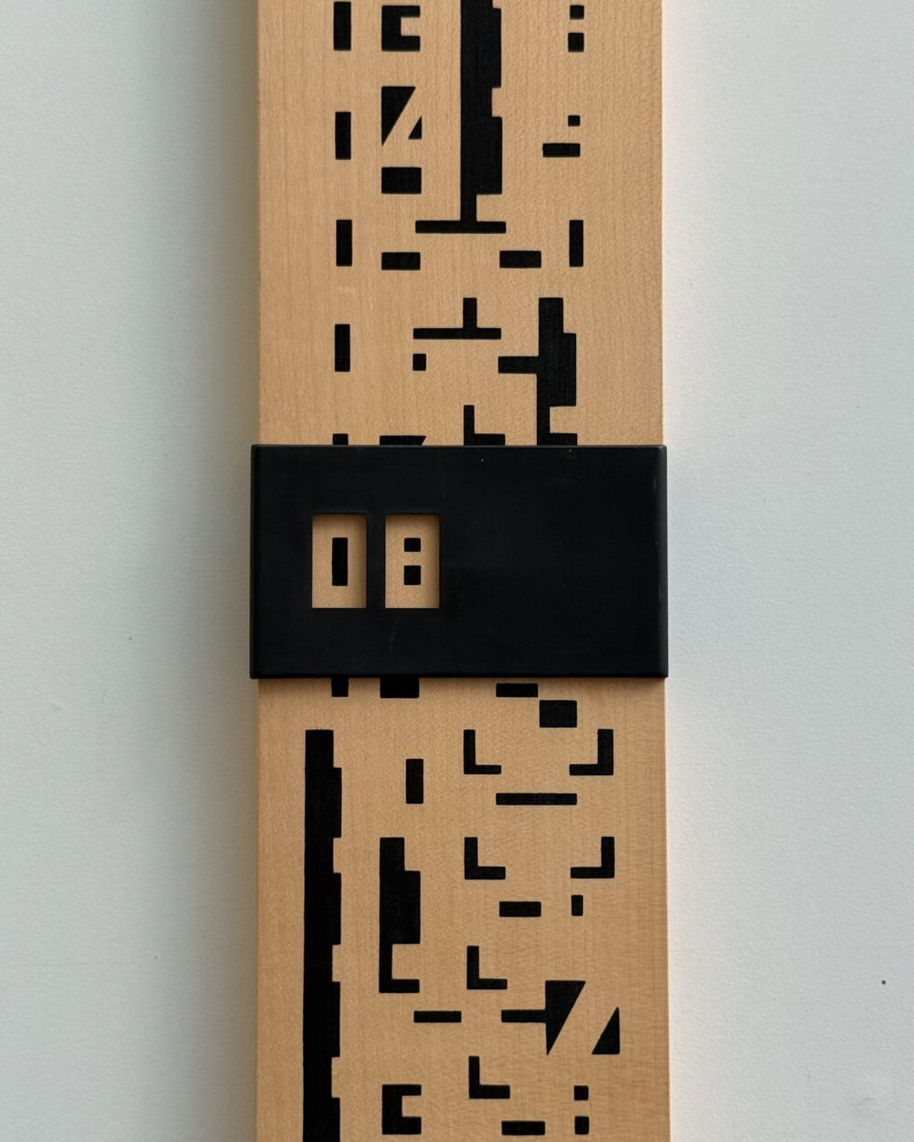
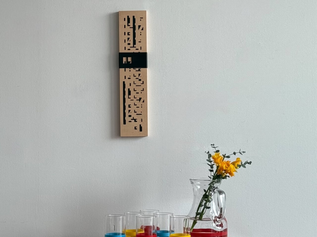
We are living through a slow, quiet rebellion against digital everything. Vinyl record sales have been climbing for years. Film cameras are back on shelves. People are buying paper planners again. And now, a wooden perpetual wall calendar made in France in the 1970s is having a moment through a Korean design shop called Wertwerk, and I am completely on board.

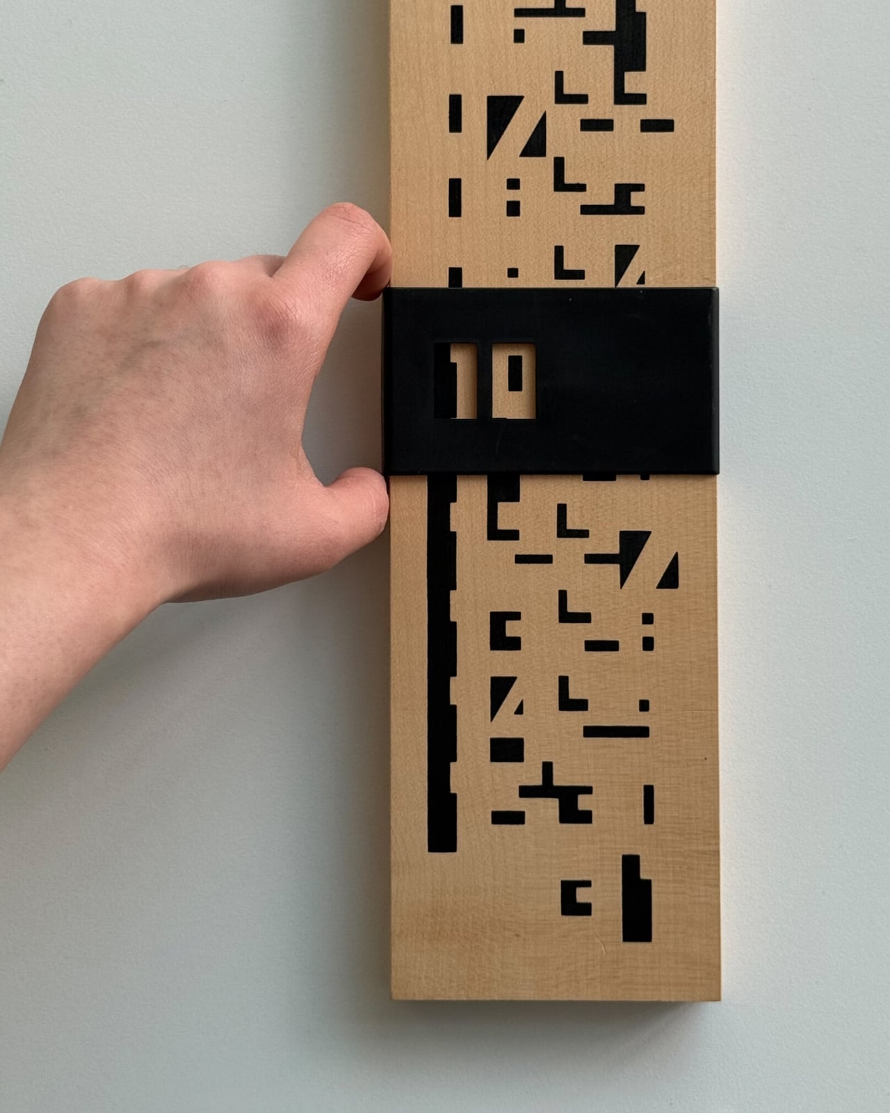
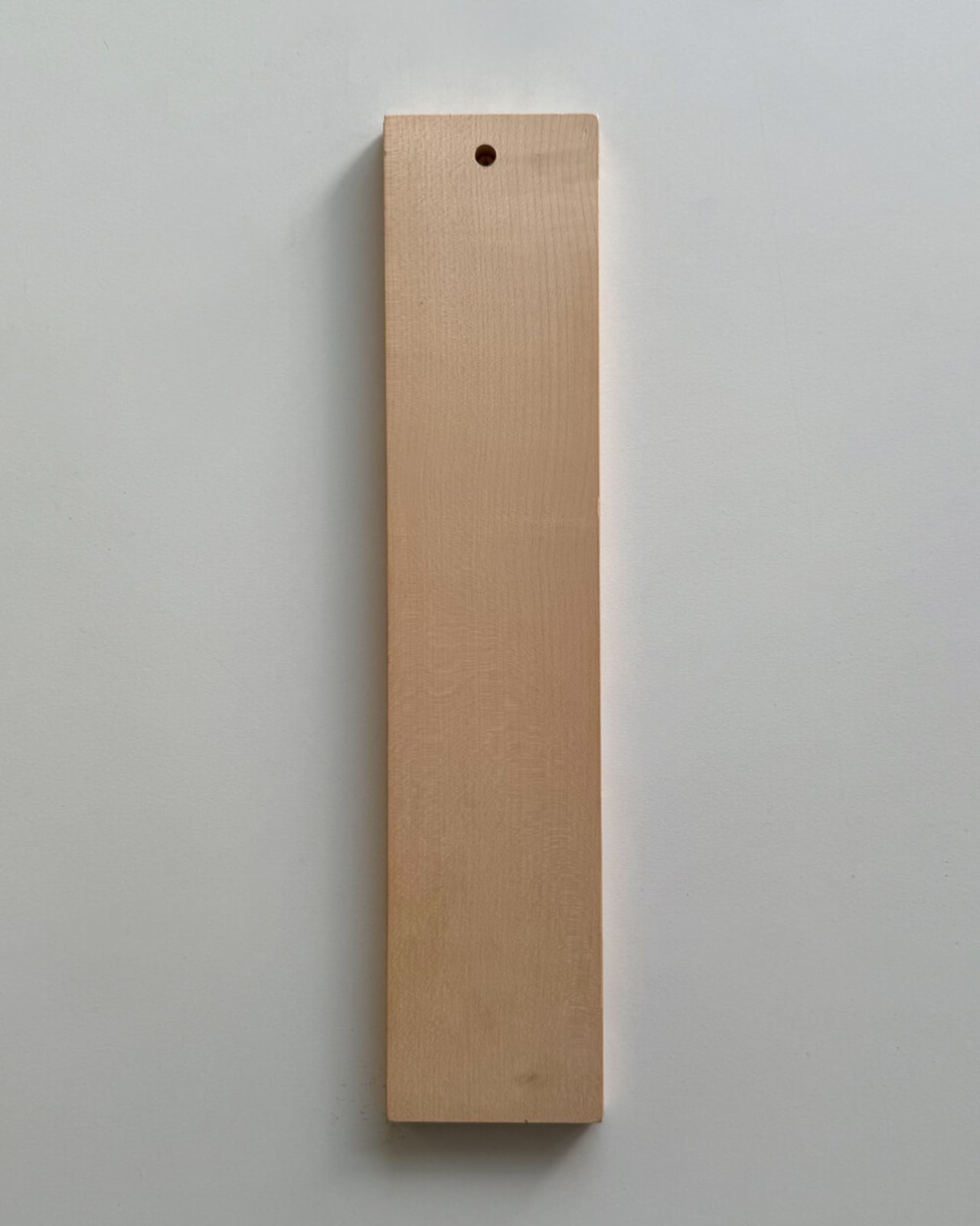
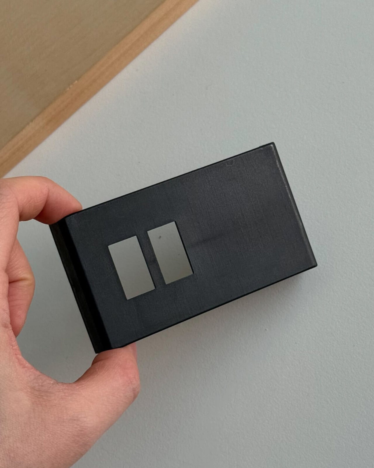
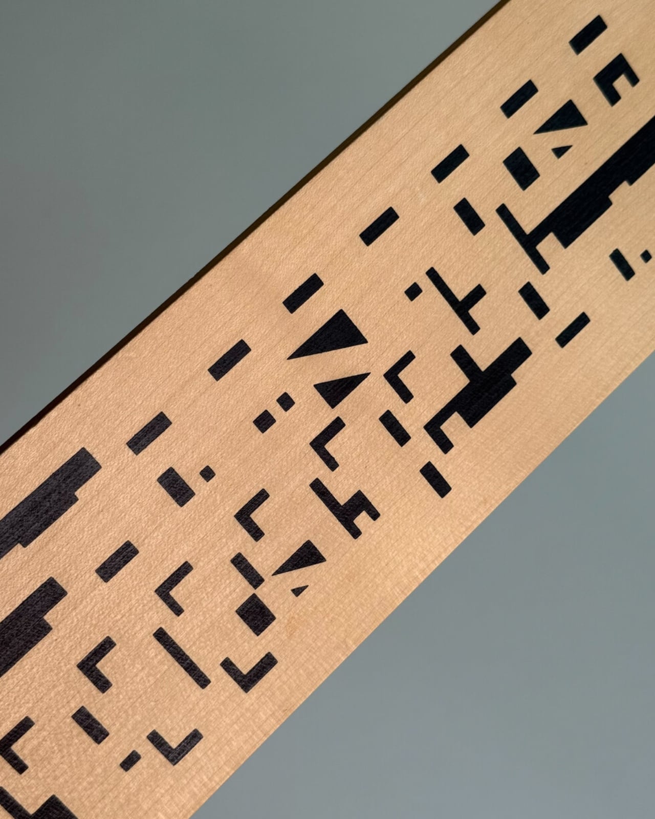
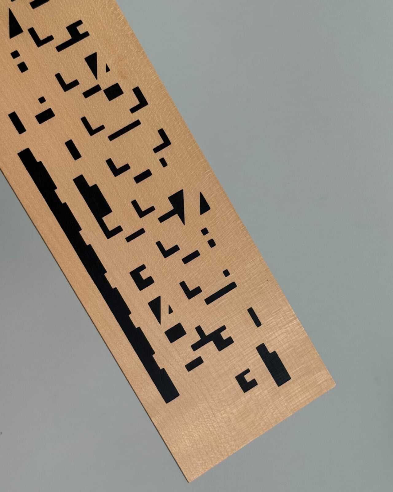
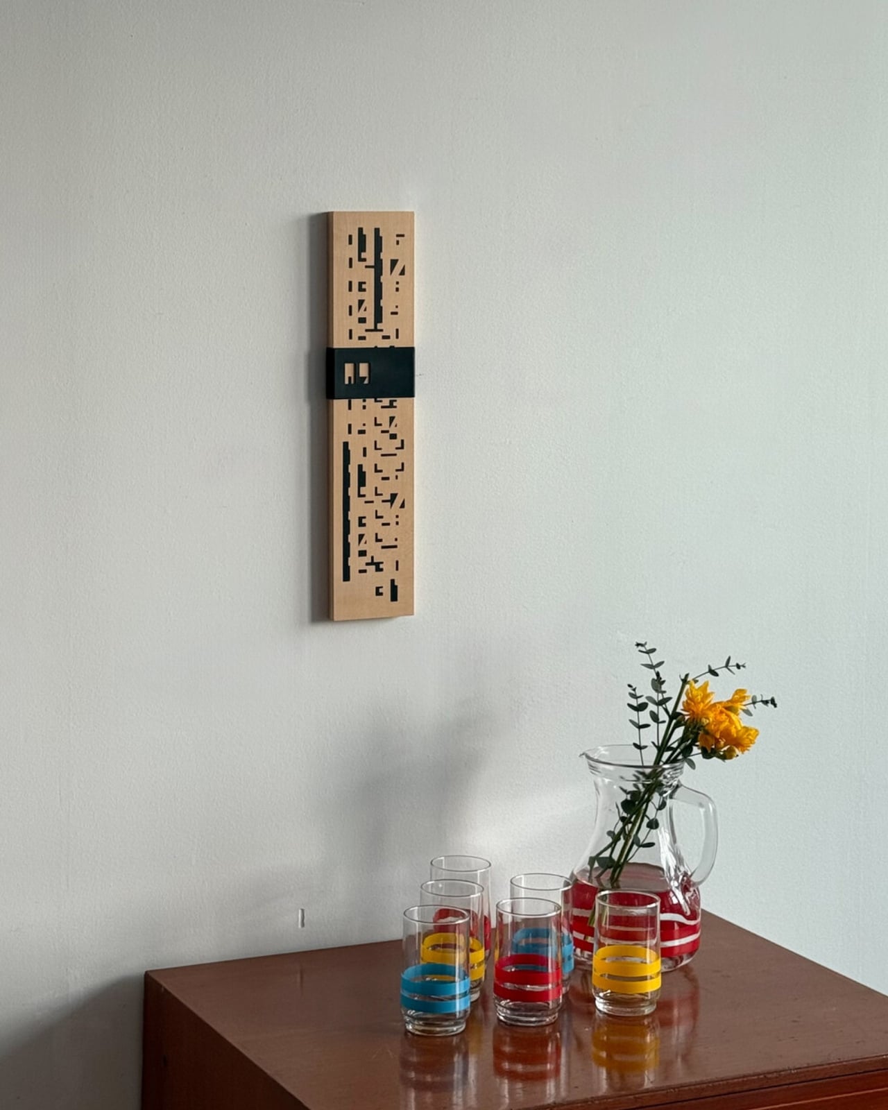
The piece is exactly what it sounds like: a wall-mounted calendar built from a warm wood base, with a row of plastic sliders numbered 1 through 31 that you manually shift to mark the date. No batteries. No notifications. No algorithm nudging you toward anything. Just wood, a little plastic, and the deliberate act of moving a slider every morning. That’s the whole thing. And yet, it manages to do something almost no digital tool can: make you stop and actually notice what day it is.

Designer Name: Wertwerk
What makes this particular object so interesting is the decade it comes from. The 1970s were a sweet spot in product design, especially in France, where makers were beginning to marry natural materials like wood with the new optimism of plastic. The result was objects that felt warm and industrial at the same time, organic and modern, useful and beautiful. A wooden calendar with plastic sliders is a textbook example of that tension. It doesn’t feel like a throwback. It feels like a design decision that simply worked the first time and never needed revisiting.
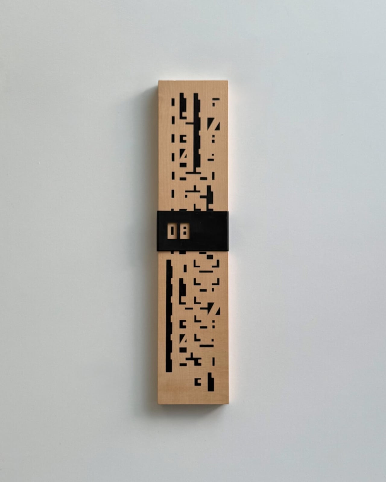
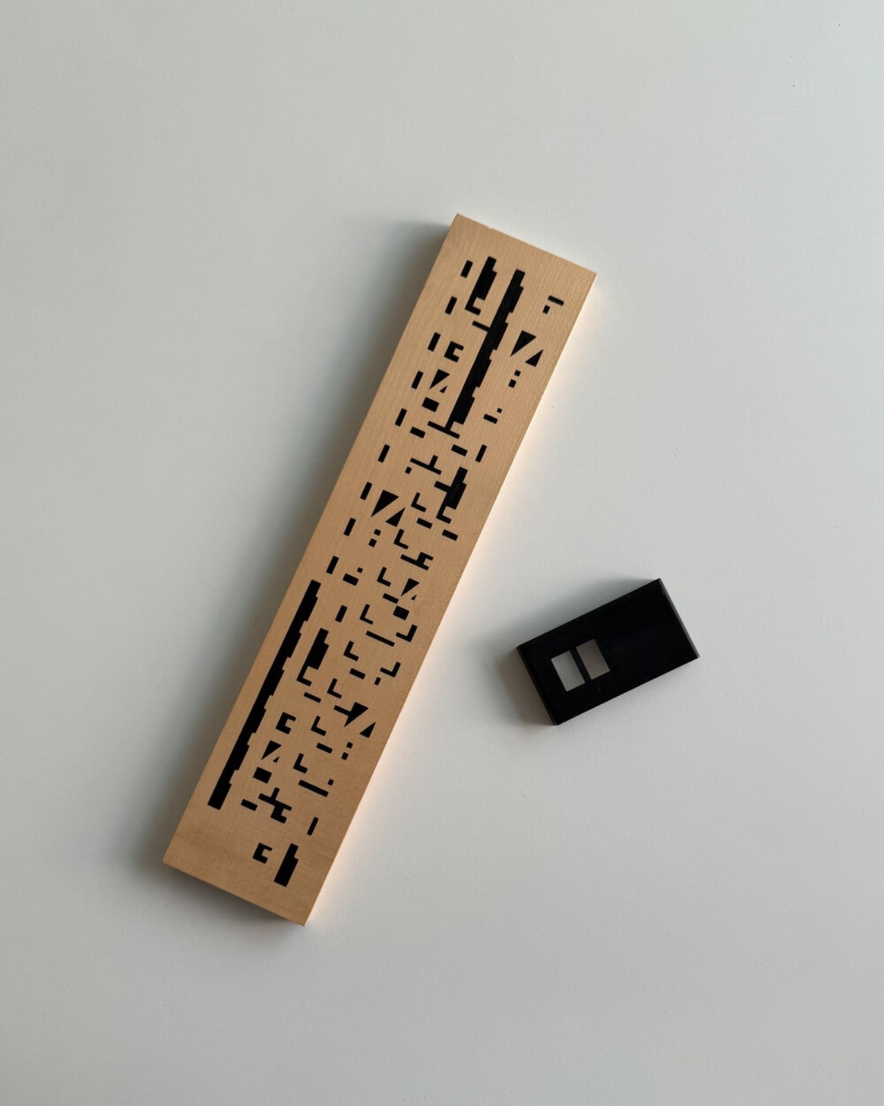
The word “perpetual” is doing a lot of heavy lifting here, and it deserves a moment. A perpetual calendar doesn’t expire. It doesn’t have a year printed on it. It covers every day and every month indefinitely, because those numbers don’t change; only the arrangement does. You can hang this on your wall and it will be just as functional in 2045 as it was in 1975. Compare that to your phone’s calendar app, which will feel dated in five years and be incompatible with something in ten. The perpetual calendar was designed with an understanding that good things don’t need to be replaced, just updated slightly, by hand, once a day.
Wertwerk is the Seoul-based shop behind this particular find, and they deserve full credit for the eye. Their name pulls from the German words for “worth” and “work,” and that philosophy runs through everything they source. They’ve built a devoted following by seeking out vintage objects that carry actual value beyond nostalgia. Their pieces sell out fast, sometimes within hours. They’re not selling aesthetics for aesthetics’ sake. They’re making a case that a well-made object from fifty years ago can do something a new one cannot: carry the evidence of its own history.
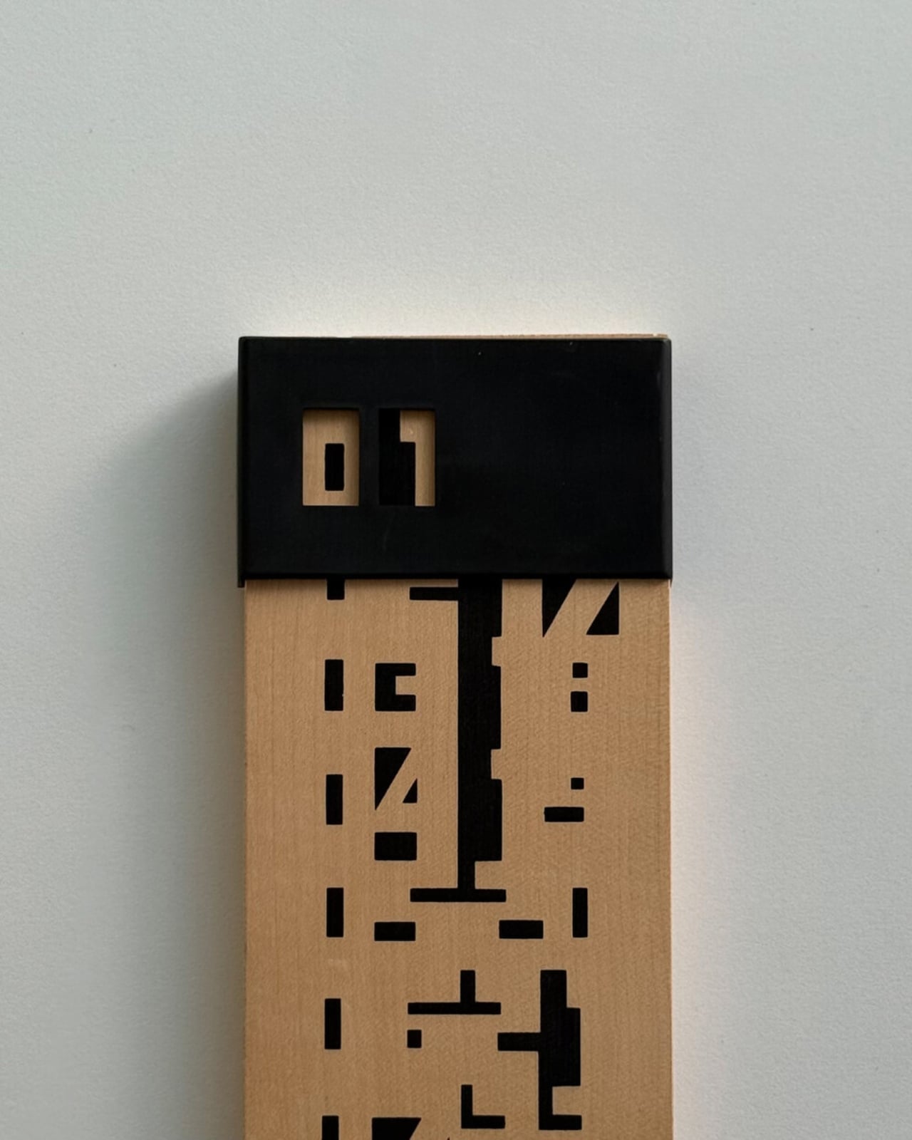
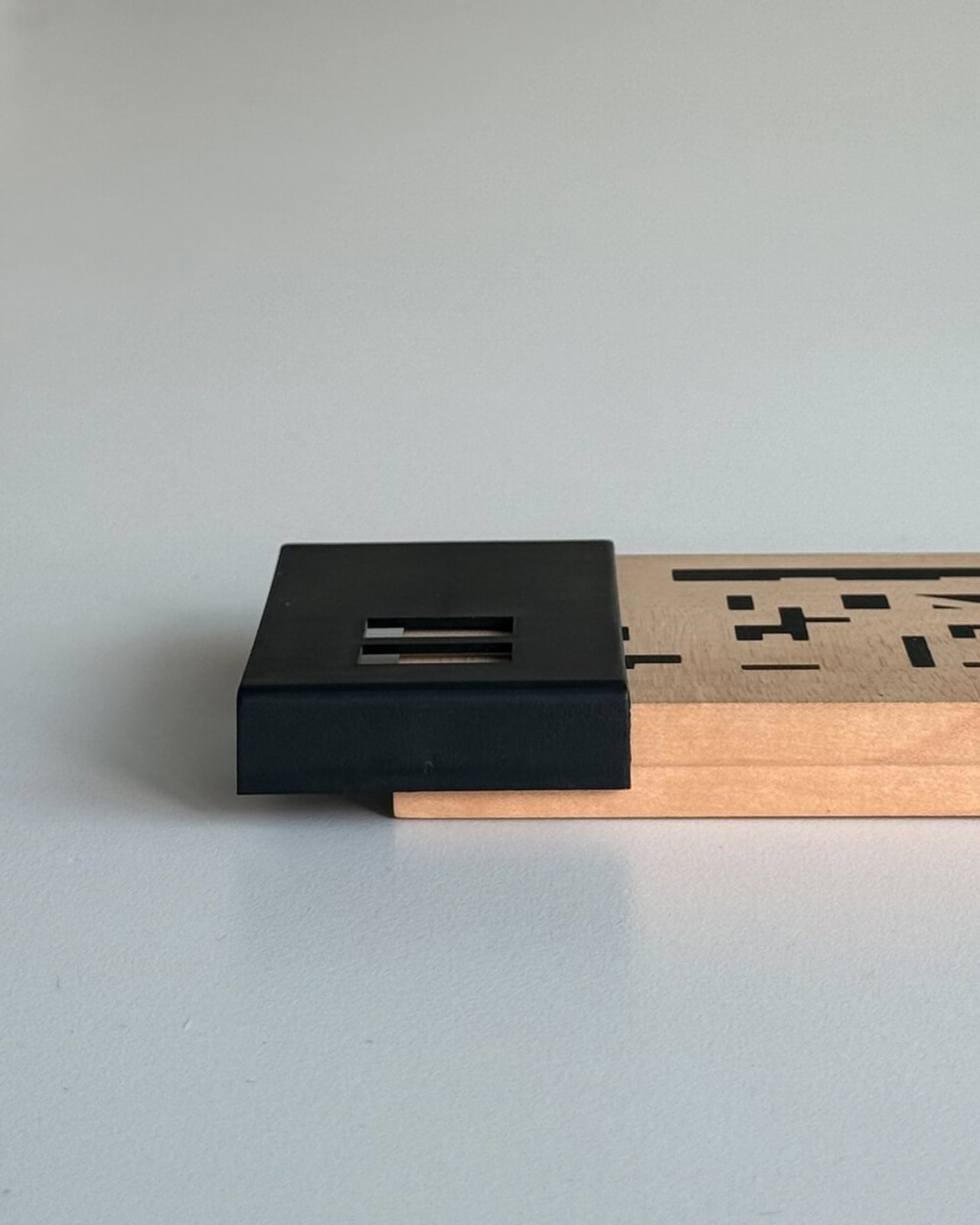
I’ll admit I’m biased toward objects that reward you for paying attention to them. The wooden perpetual calendar does exactly that. Each time you slide the date, you’re reminded that time is something you track, not something that tracks you. It’s a small distinction, but it adds up over days and months. Moving a physical date marker is categorically different from glancing at a lock screen, and not in a pretentious way. It’s just more deliberate.
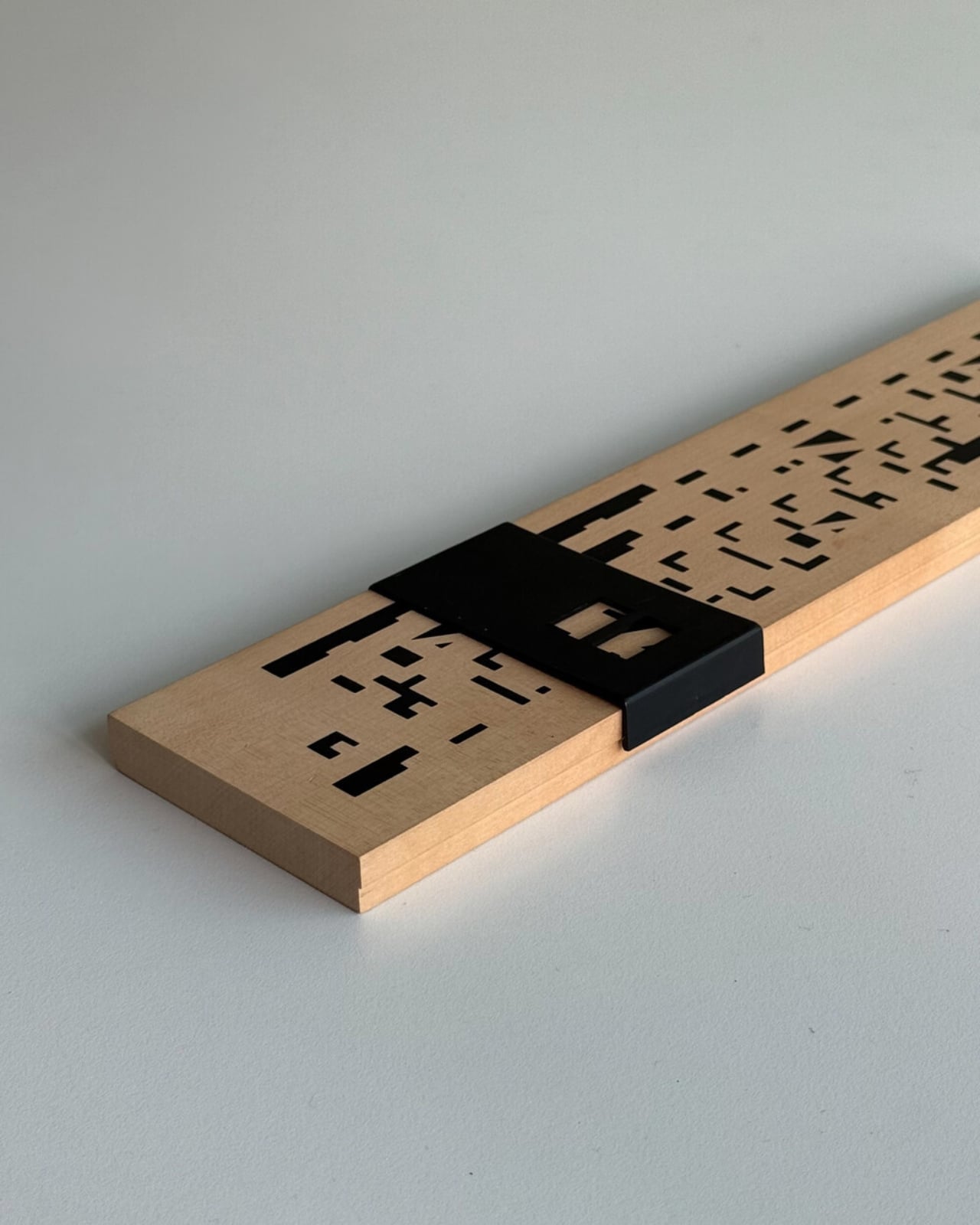
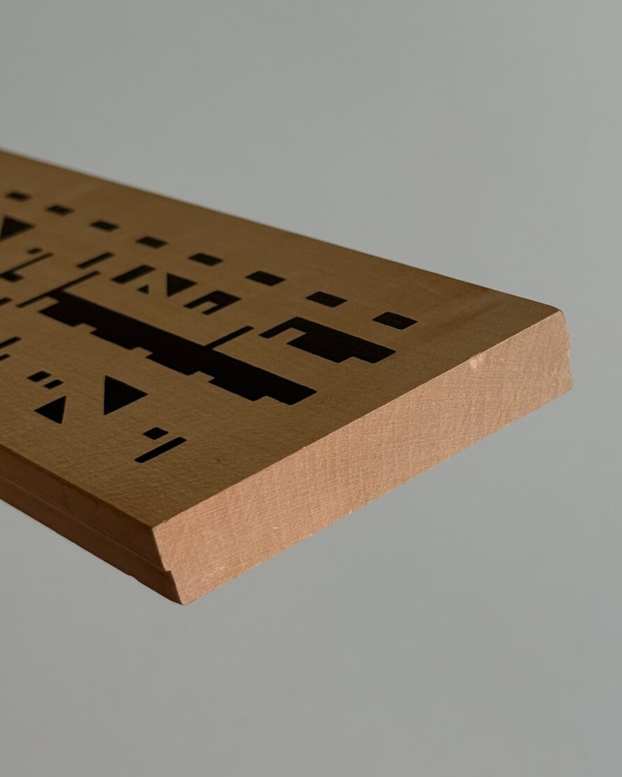
The design also photographs beautifully, which is partly why it’s gaining traction in design communities. The wood grain set against the geometric order of numbered sliders reads as both nostalgic and contemporary. It’s the kind of object that looks intentional in a space, not decorative for decoration’s sake, but genuinely considered.
If you’ve ever bought something because it made you feel a certain way before you even used it, this is that kind of object. It quietly tells anyone who notices it that you care about how things are made and how long they last. Not everyone reads a wall calendar that way. But for those who do, this one from Wertwerk is worth finding before it disappears, and based on how fast their inventory moves, that won’t take long.
The post Your Phone Has 12 Calendar Apps. None of Them Look Like This first appeared on Yanko Design.
This $145 Wood and Brass Timer Finally Gets Your Phone Off the Desk

Productivity apps have become one of the more ironic problems of modern work life. The tools meant to keep us focused are apps that live on the same devices responsible for most of our distractions. Switching to a timer app means unlocking a phone, and unlocking a phone means notifications, messages, and a dozen other things competing for your attention before you’ve even started the clock.

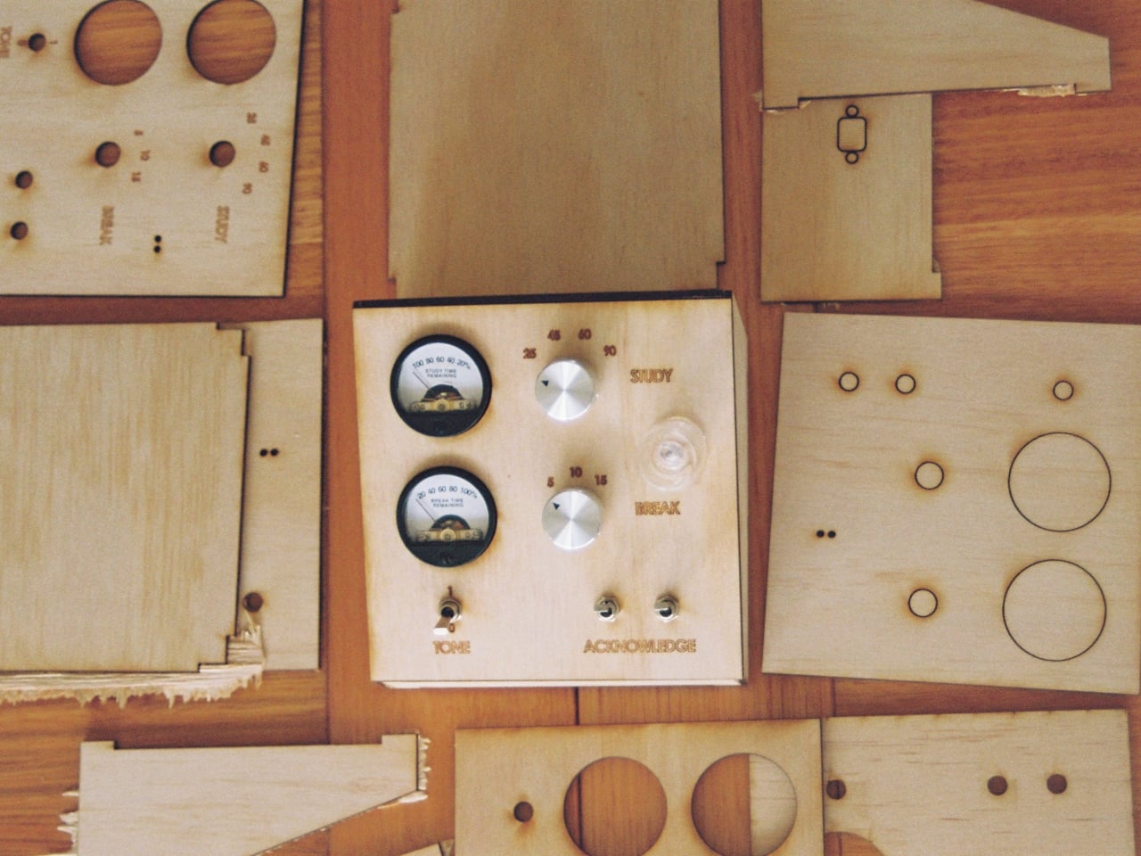
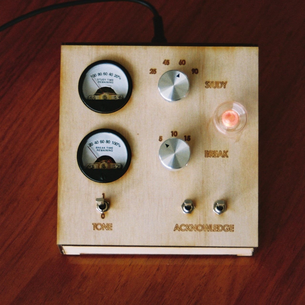
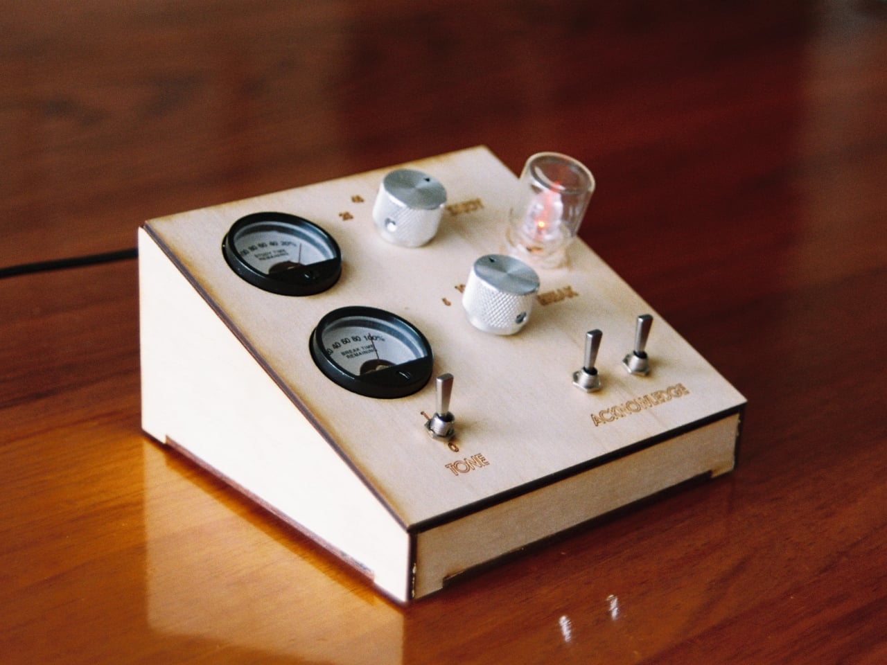
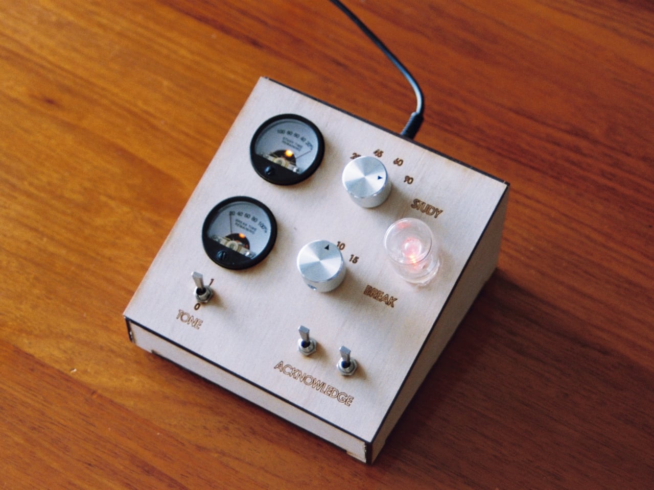
Thomas Curnow of Tomato Clocks had that contradiction in mind when he created the Roma Mk. 1, a purely analog study timer built around the Pomodoro Technique. The method is simple and widely used, working in focused intervals broken up by short rests, but it works best when the timing happens completely off-screen. The Roma Mk. 1 is designed to make that as easy and satisfying as possible.

Designer: Thomas Curnow (Tomato Clocks)

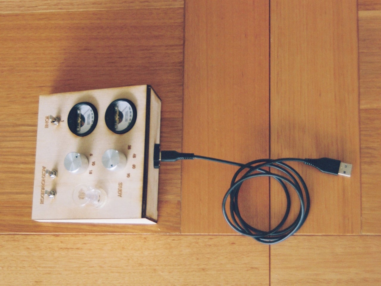
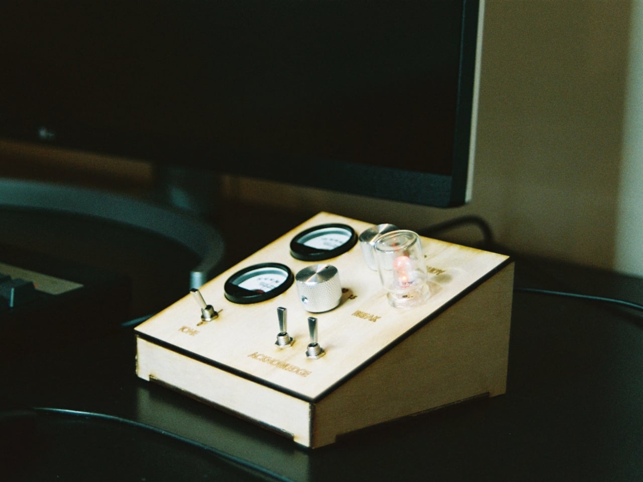
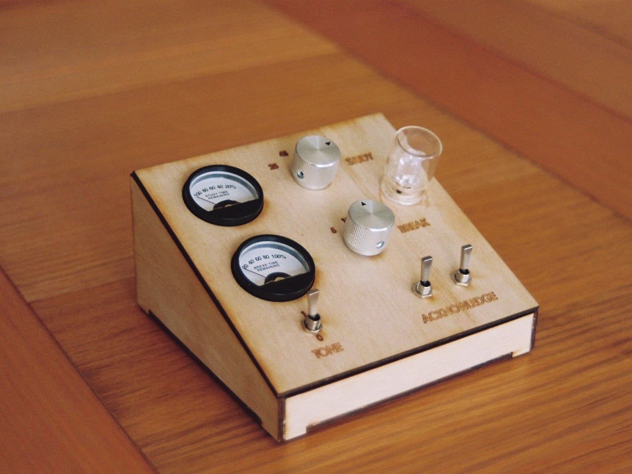
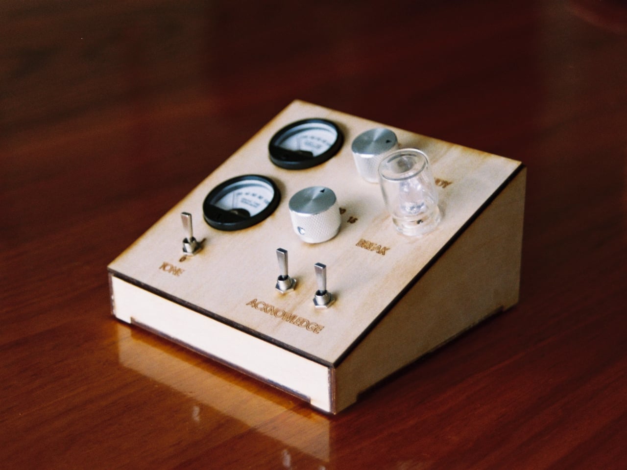
At the center of the design are two analog gauges, one for tracking a work interval and one for the break that follows. There are no menus to navigate and no app to open. You set the dials, get to work, and let the timer do the rest. The whole interaction takes a second, and that simplicity is precisely the point. It keeps the focus on the task at hand rather than the device managing it.

The build quality reinforces that philosophy. Each unit is laser-cut from premium Australian timber and assembled by hand in Melbourne, giving it a warmth and solidity that’s hard to find in mass-produced productivity gadgets. The brass switches used for input have a tactile snap to them, the kind of satisfying physical feedback that makes the act of starting a session feel deliberate rather than incidental.

It’s the sort of object that belongs on a desk permanently, not tucked into a drawer. A wooden timer with analog dials sits comfortably alongside notebooks, pens, and other tools that don’t demand your attention when you’re not using them. That’s a quality digital devices rarely manage, and it matters more than it might seem when you’re trying to build a consistent work habit.

The Pomodoro Technique has been around since the late 1980s, and the basic premise hasn’t changed much since then. What has changed is the environment in which most people try to use it. Screens are everywhere, and the pull of notifications is relentless. A dedicated physical timer doesn’t connect to the internet, doesn’t send alerts, and doesn’t tempt you with anything outside the task you’re working on.

The Roma Mk. 1 is currently available for pre-order at $145, which puts it well above a basic kitchen timer but firmly in the range of a thoughtful, long-term desk tool. It’s handmade, uses real materials, and is designed to last rather than be replaced. For anyone who has tried and failed to stay off their phone during a work session, a well-made analog alternative might be worth far more than what it costs.

The post This $145 Wood and Brass Timer Finally Gets Your Phone Off the Desk first appeared on Yanko Design.

These Wood and Leather Wall Holders Swap Hooks for Hidden Magnets

The entryway tends to be the most neglected spot in any home when it comes to design. Things pile up at the door, and most of the solutions people reach for, plastic key hooks, adhesive strips, wire baskets, tend to prioritize function so heavily that they end up looking like afterthoughts. It’s a corner of the home that rarely gets the same design attention as the living room or kitchen.

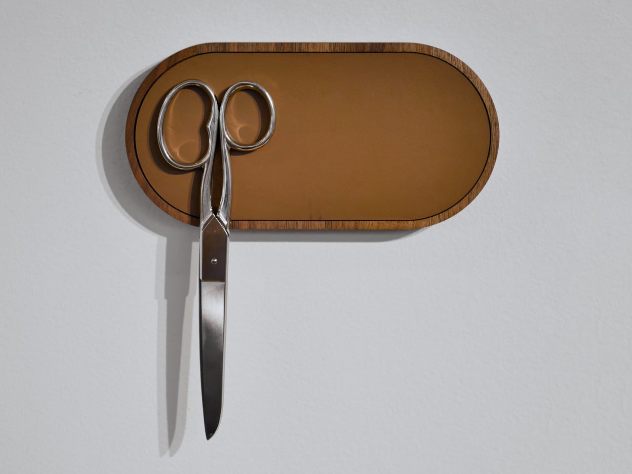
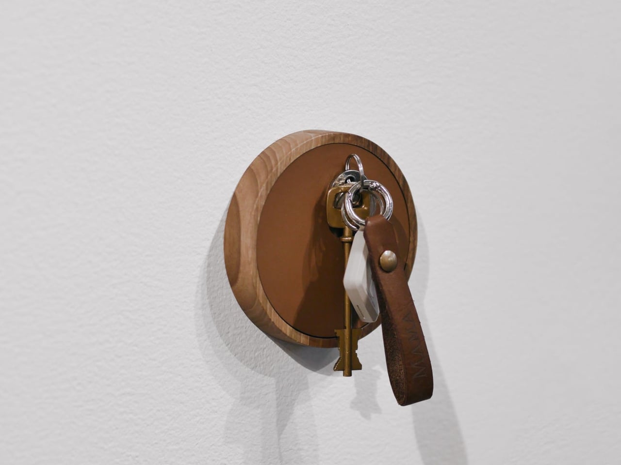
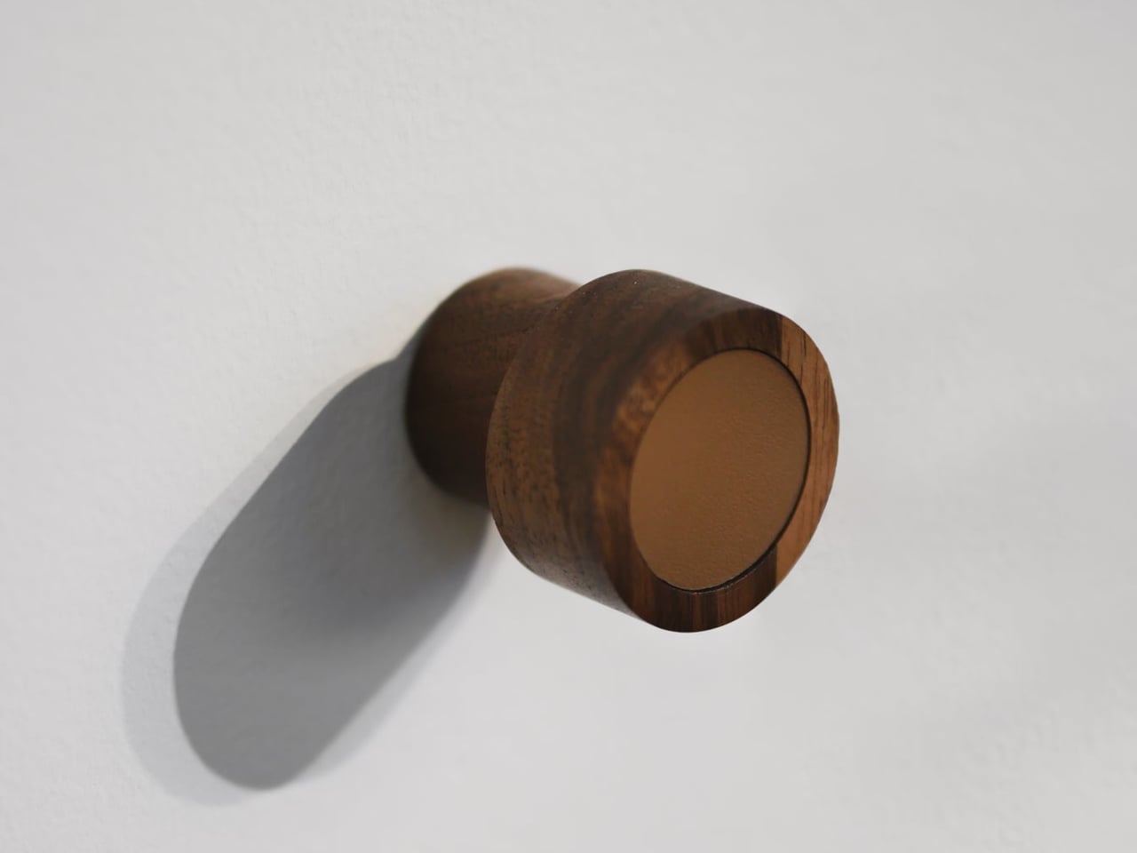
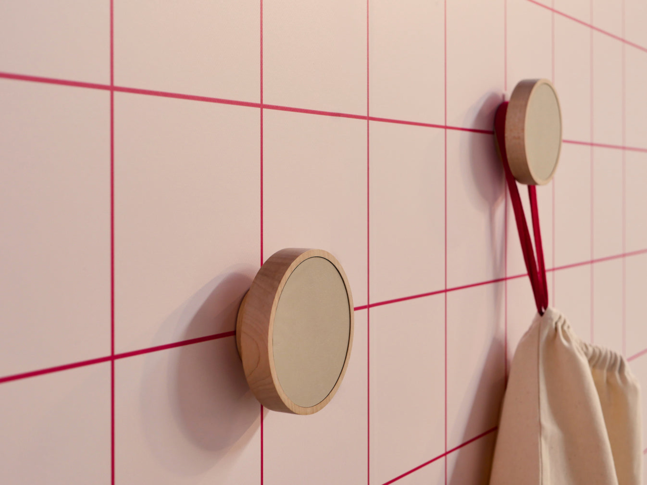
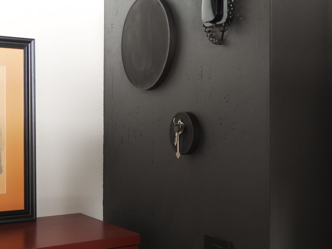
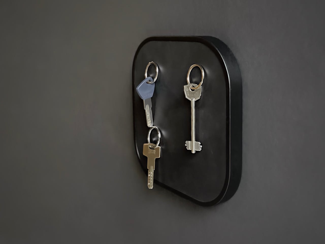
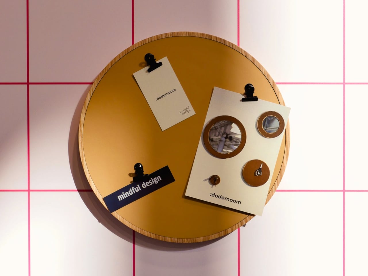
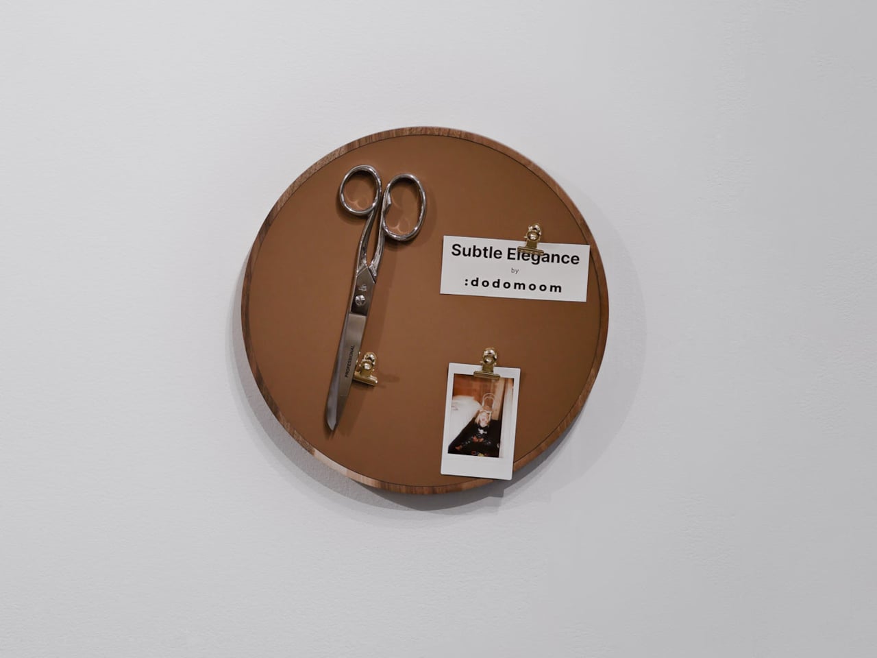
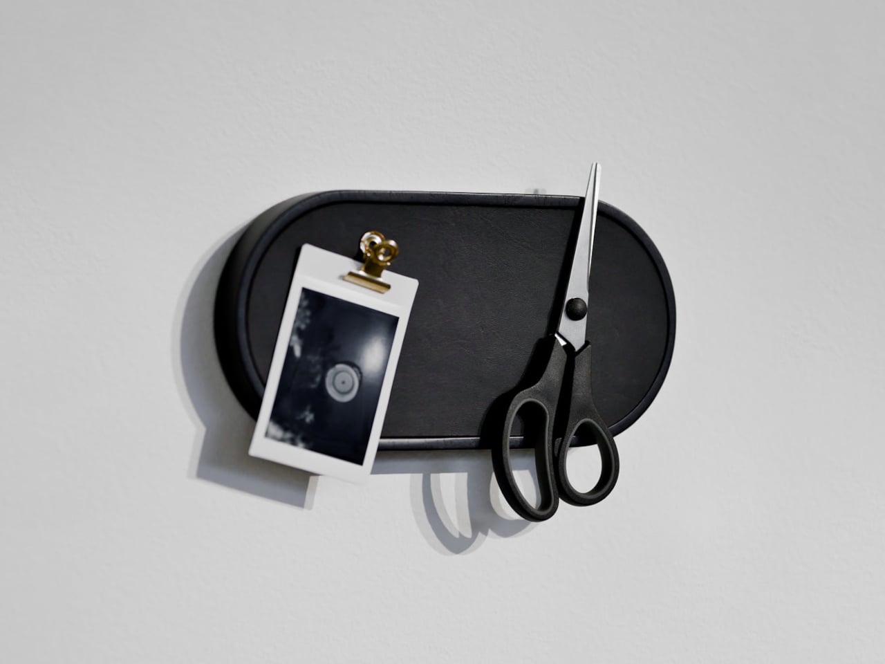
Ukrainian design brand dodomoom takes a different approach with its Magnetic Holders & Hooks collection. Designed by Andrii Burzi, the pieces combine natural wood and smooth leather to make something that looks far more like wall decor than a key holder. That impression, though, isn’t the whole story. Beneath the leather surface, a precision magnetic system does the actual work of holding keys and other small metal objects.

Designer: Andrii Burzi

That hidden mechanism is part of what makes the collection so satisfying to use. There’s no hook to loop your keys onto, no notch to fumble with when your hands are full. You just bring your keys close to the surface, and the magnets hold them flat against the leather face. Burzi described the reaction from people who try it: “It isn’t magic. It’s precision.”

The collection has six pieces in total, ranging from the compact Nordic Little Magnetic Holder to the larger Nordic Family Magnetic Holder, which can hold up to four sets of keys at once and measures roughly 8 inches square. You can mount any of them with 3M adhesive tape or standard screws, giving you the option to hang them without committing to permanent hardware on the wall.

Each piece is available in walnut, ash, or maple, with a Night Black option in painted ash for spaces with a darker palette. The leather inlay sits against the wood base, and the combination reads as considered rather than decorative for its own sake. These aren’t objects that need to be explained; you’d be happy having them on the wall even if they didn’t hold a single key.

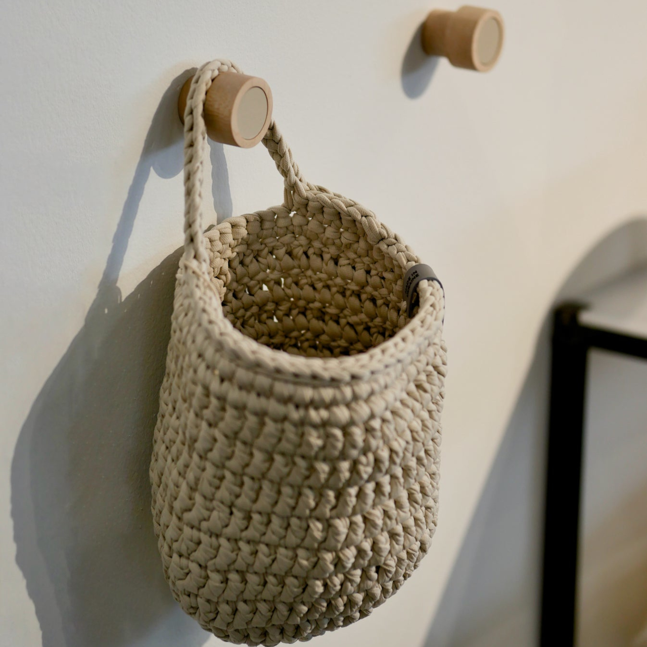
The collection also includes the Nordic Little Coat Hook, which follows the same material language as the rest of the holders. That consistency matters if you’re planning to use more than one piece on the same wall, and dodomoom clearly anticipated that. The Nordic Line is designed with modularity in mind, so pairing a key holder with a coat hook feels more like a deliberate arrangement than an accidental one.

The Nordic Family Magnetic Holder is priced at $98, which puts it closer to a considered purchase than an impulse buy. That’s a fair trade-off for something that pulls double duty as a decorative object and doesn’t make you stare at an ugly key rack every time you come home. Most entryway solutions make you pick between looking good and working well, and dodomoom doesn’t put you in that spot.

The post These Wood and Leather Wall Holders Swap Hooks for Hidden Magnets first appeared on Yanko Design.
This Wooden Basket Becomes a Low Table When You Flip It Upside Down

There’s a familiar moment that happens when you carry food, cups, and random essentials to a park, balcony, or floor seating setup and then realize you still need a stable surface to put any of it on. Most people improvise with a bag or a corner of a blanket. Small-space living and casual gatherings reward objects that can do two jobs without taking up twice the storage, but most furniture is still designed around one fixed purpose.

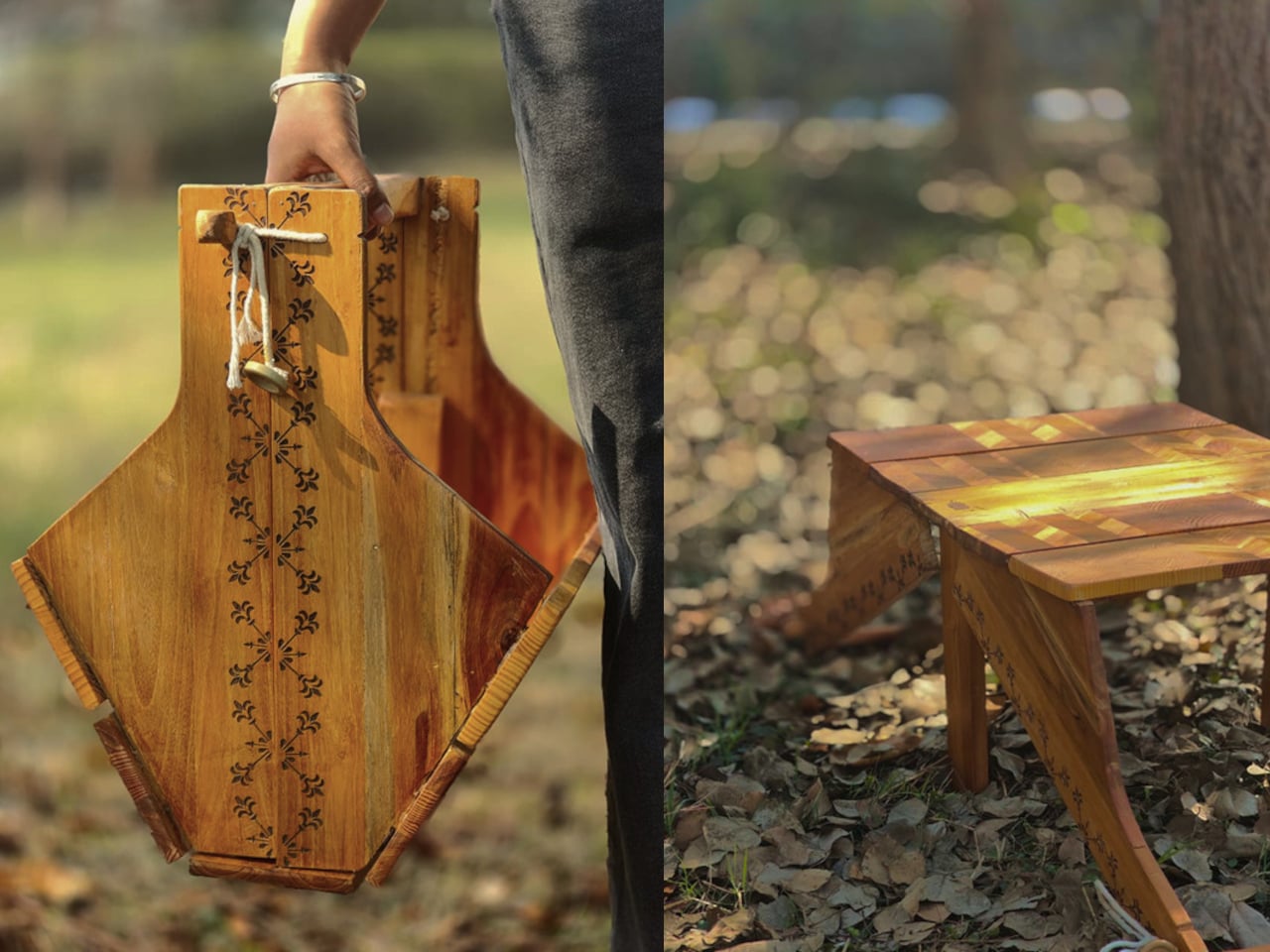
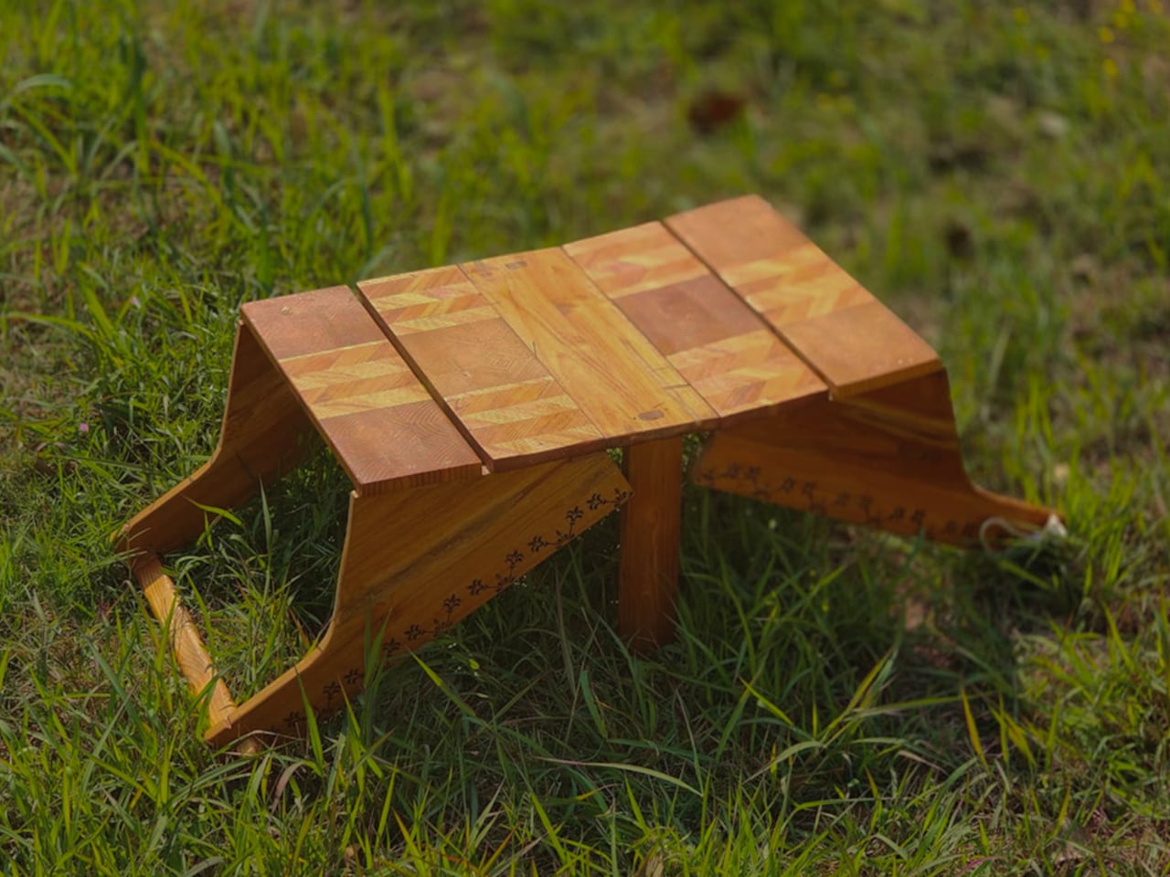
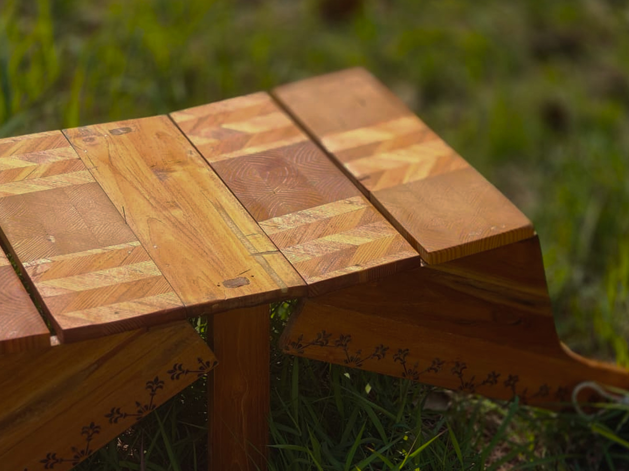
This Convertible Basket Table concept works as both a carry basket and a low table in one form. By simply inverting it, the basket becomes a stable table surface suitable for picnics or casual indoor use. The design combines storage, portability, and easy transformation, making it ideal for relaxed gatherings and compact living spaces.

Designer: Siya Garg

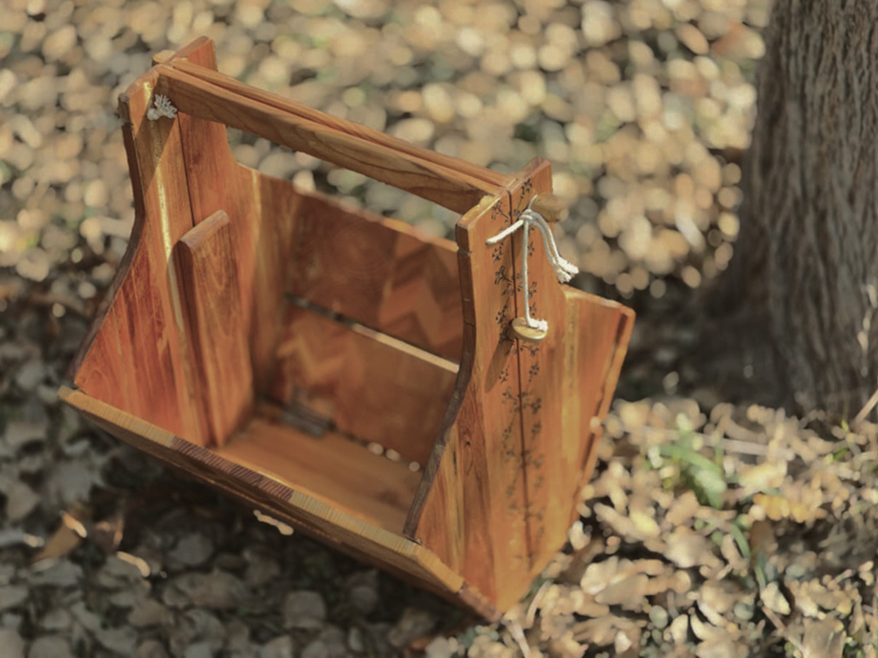
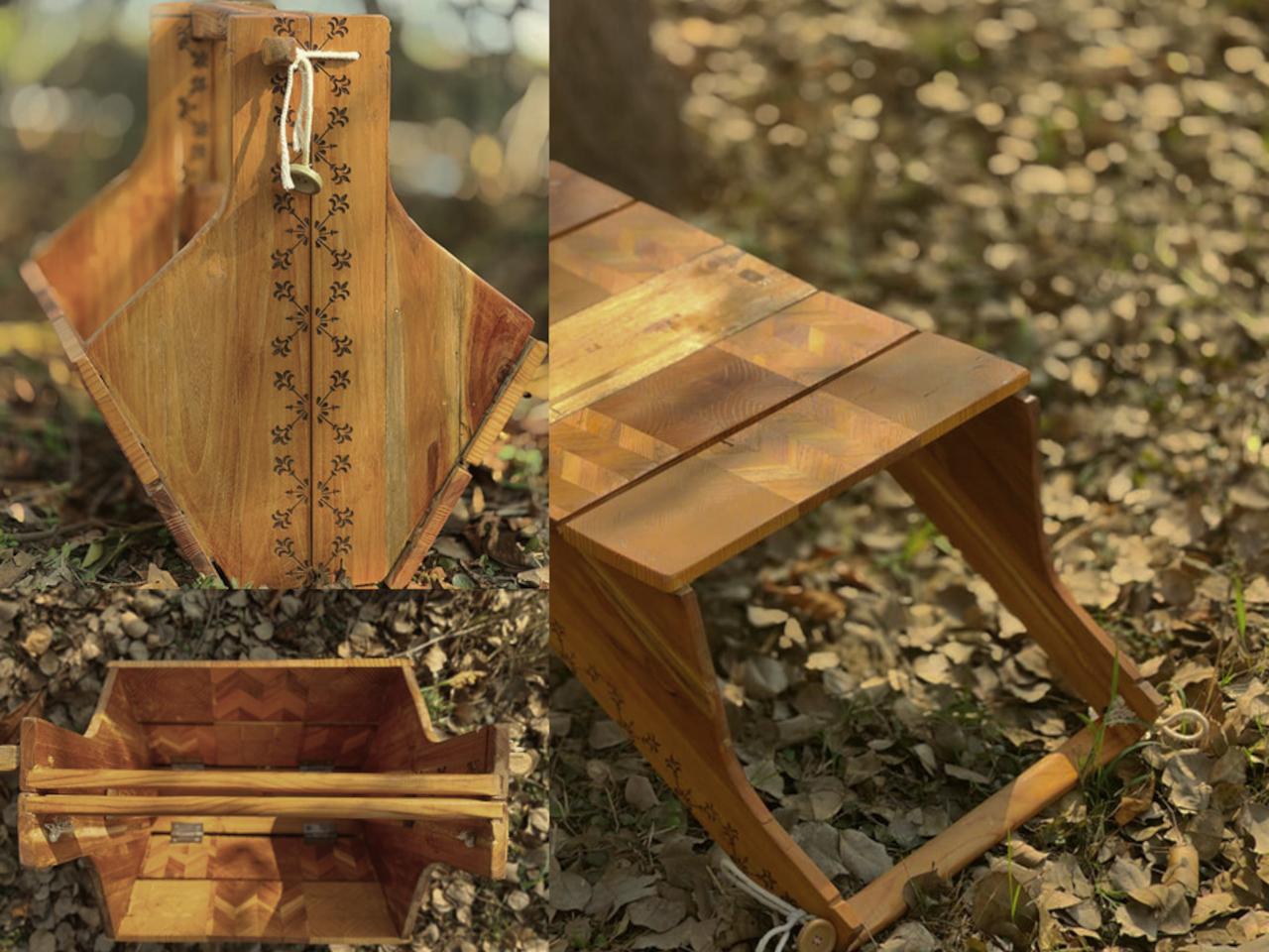
In basket mode, the structured wooden body has a built-in handle and a container that can hold the messy mix of picnic items, fruit, napkins, a book, or a small speaker. The form feels sturdy rather than floppy, carrying like a proper object with a clear handle instead of a tote that collapses when you set it down. That sturdiness is what makes the flip transformation credible. It’s definitely not a soft bag pretending to be furniture.

Once inverted and unfolded, it becomes a low table that works with floor cushions, outdoor blankets, or a casual living room setup. Low tables are the unsung heroes of flexible spaces. They work as coffee tables, game surfaces, or quick work perches, but they’re rarely portable. This one travels in your hand and arrives as a surface, which is a surprisingly underexplored idea.

A square knot side lock keeps the form secure when needed. It’s a rope-based closure that tightens the sides without complicated latches, click mechanisms, or hardware that will eventually strip or break. The whole thing is quiet, tool-free, and easy to replace if the rope wears out, which fits the picnic vibe better than snapping plastic clips would.

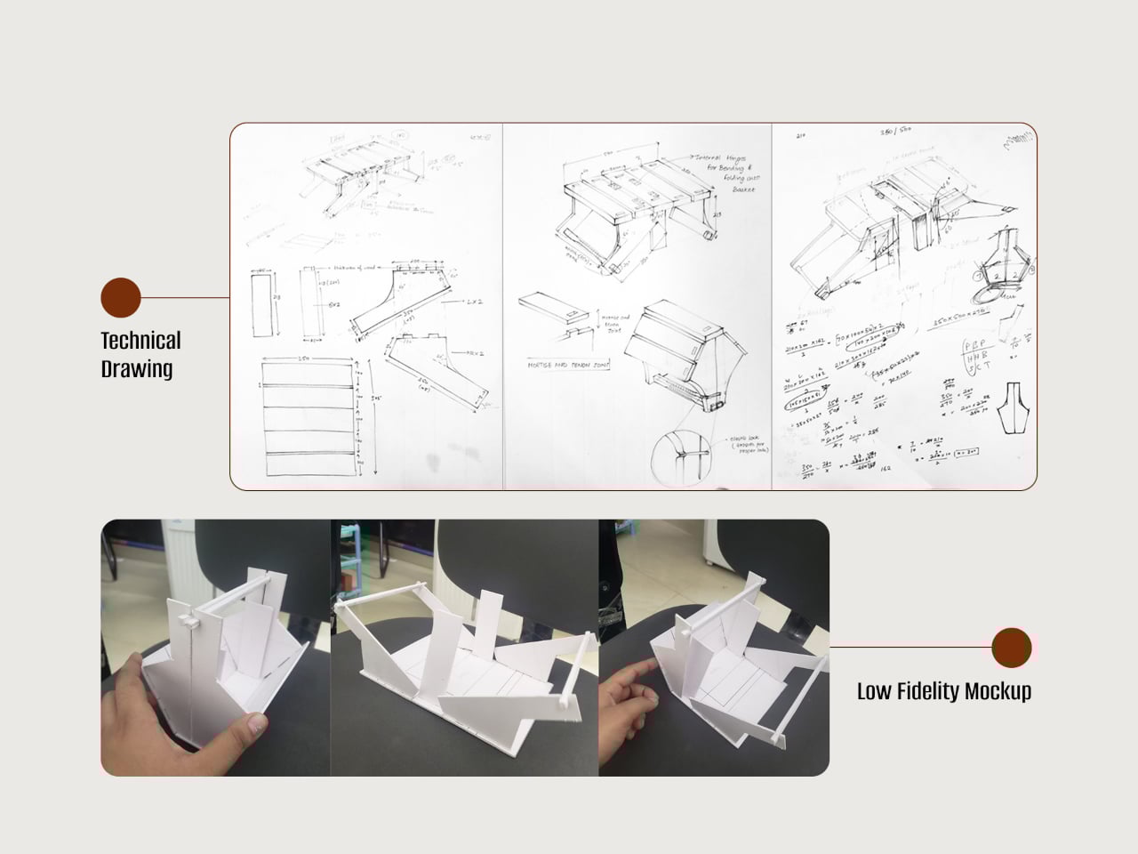
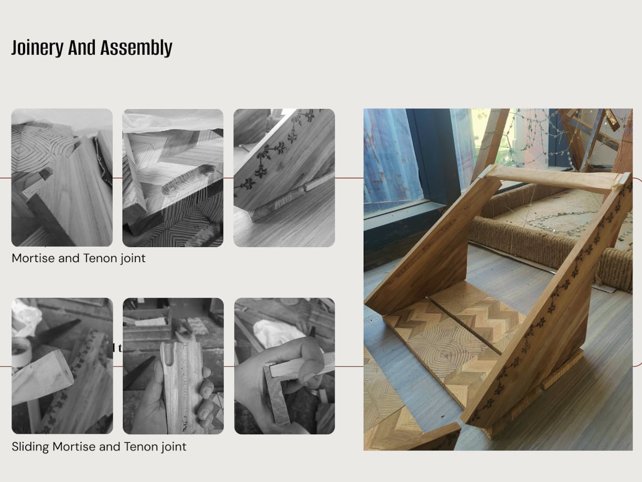
The build draws on traditional woodworking throughout. Pattern making involved pine wood in alternating grain directions and a chevron pattern using alternating teak and pine strips. Assembly relies on mortise and tenon joints and sliding mortise and tenon joints to hold the structure together without screws, so the connections are strong enough to handle the repeated flipping and carrying that the concept demands.

The design doesn’t ask you to change how you live, it just quietly accommodates the way you already move through the day. A basket when you’re going somewhere, a table when you arrive, and a warm wooden object that looks like someone actually made it rather than assembled it from a flat pack.

The post This Wooden Basket Becomes a Low Table When You Flip It Upside Down first appeared on Yanko Design.
This Headphone Stand Looks Like a Sculpture Even Without Headphones

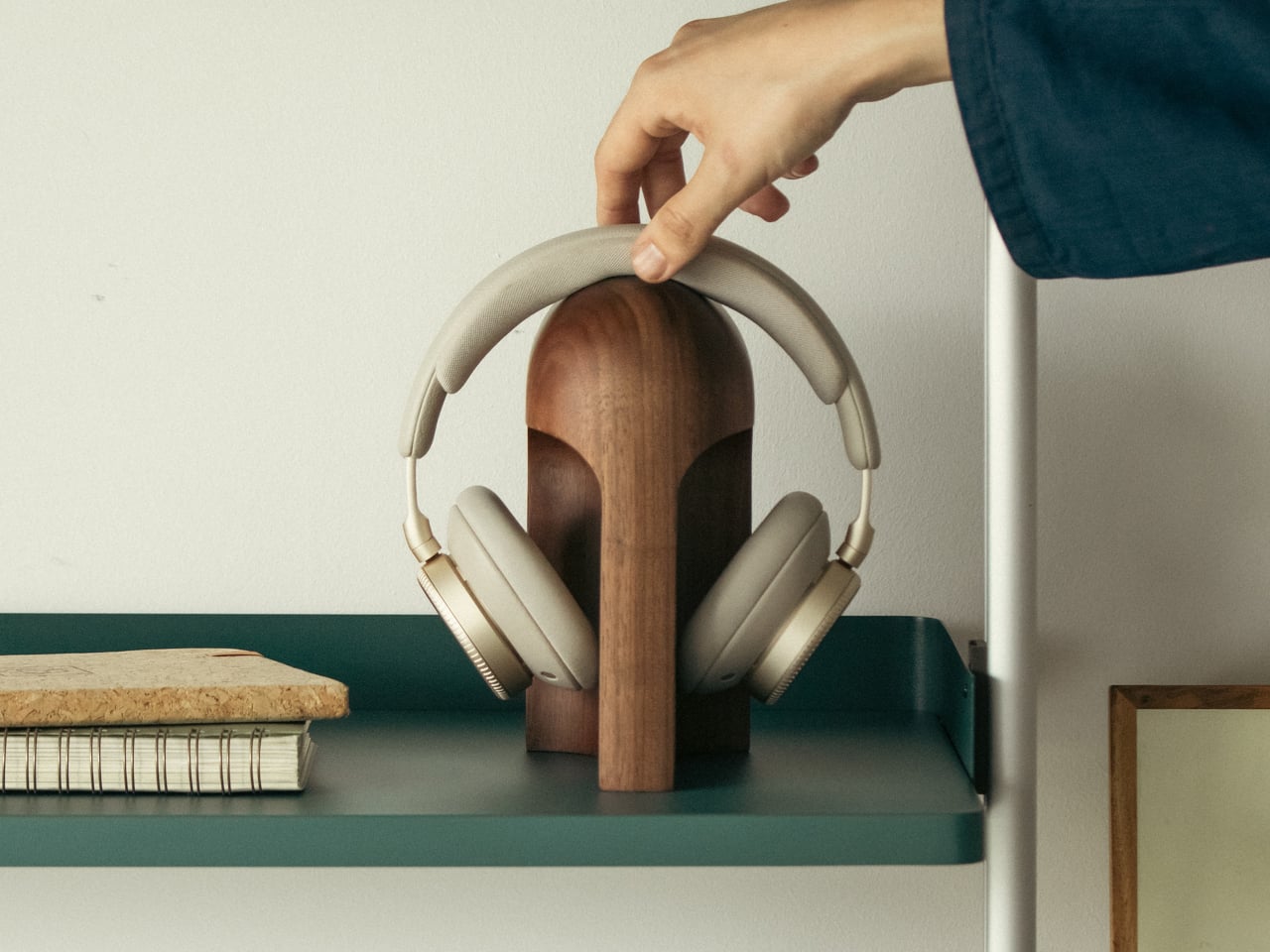
Headphones usually end up draped over monitors, balanced on stacks of books, or left in a tangle on the desk. They are often the nicest piece of audio gear in the room, but rarely have a home that matches their presence. Most stands are plastic hooks or generic metal frames that disappear under the headband, doing their job but adding nothing to the space. Arco is a response to that gap, a stand that treats headphones like something worth giving a proper place.

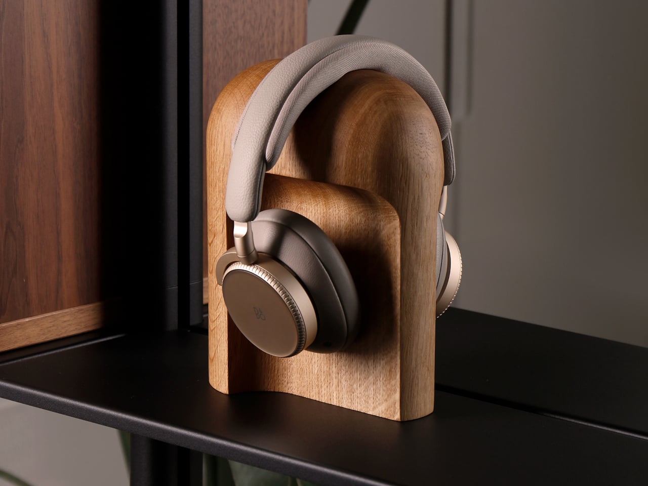
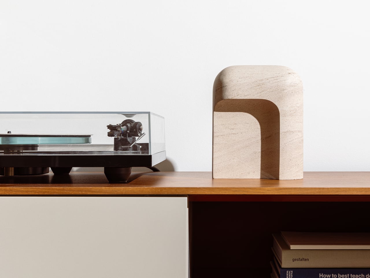
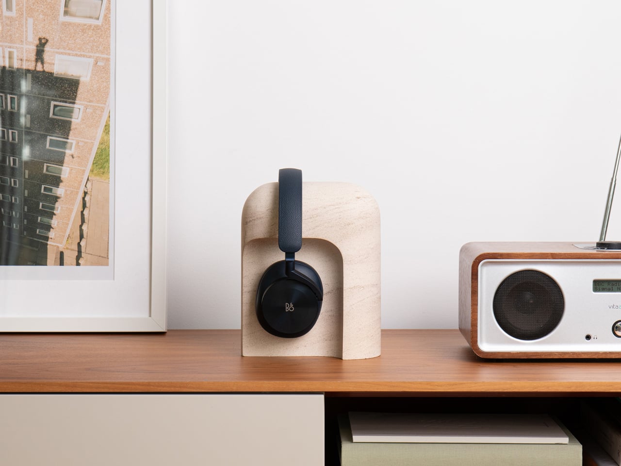
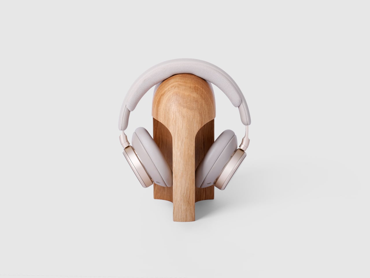
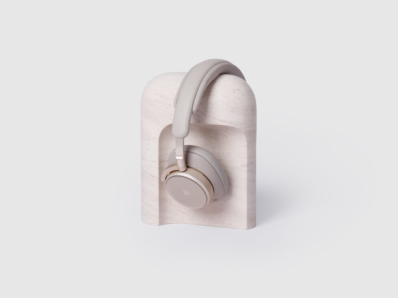
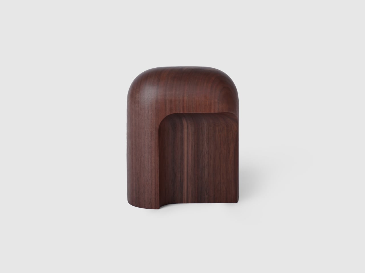
Arco is a headphone stand designed to feel like a finished object, whether or not there is a pair of headphones resting on it. Carved from a single block of wood or stone, it has a smooth arc that gives the headband a gentle resting point and a solid base that reads more like a small piece of furniture than an accessory. When empty, it still looks complete, adding subtle presence to a shelf or desk.

Designer: latr.

Reaching for headphones becomes a small, deliberate gesture instead of fishing them out from under papers. When you are done listening, they go back to the same place, the arc catching the headband and lifting the earcups off the surface. Over time, that simple habit keeps the desk clearer and the headphones in better shape, protected from pressure points or deforming pads that come from stacking other things on top.

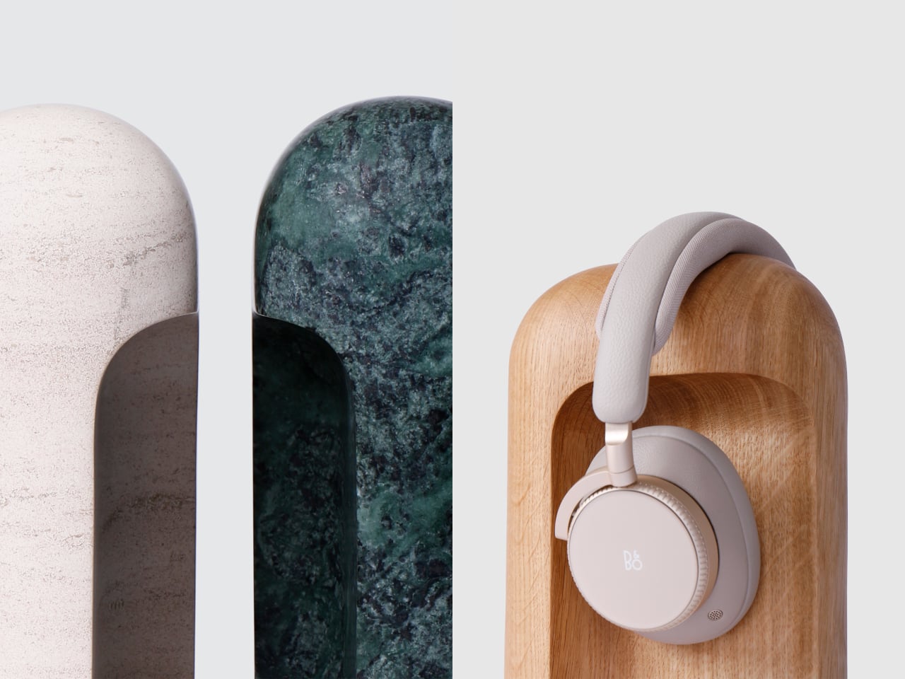
The wood versions, oak and walnut, bring warmth and visible grain to a shelf or sideboard. The stone versions, Portuguese limestone for subtlety and Guatemala marble for a stronger character, feel more like small monoliths anchoring a corner of the room. In each case, the material is chosen to sit comfortably among books, speakers, and other objects without shouting for attention or feeling like obvious “tech gear.”

Both wood and stone Arcos are CNC-machined from a single solid block, then finished entirely by hand to refine surfaces and edges while letting the natural character of the material remain visible. The arc and outer volume went through many sketches and prototypes until the proportions felt natural and there was nothing left that looked unresolved, which is why the form feels calm rather than generic or rushed.

Latr is a young design brand focused on lifestyle pieces with character for a more relaxed way of living. Arco fits that ethos by turning a purely functional object into something that quietly adds presence to a room, giving headphones a place in the open instead of hiding them away. It is easygoing and optimistic in its own way, inviting you to enjoy the small pleasure of a tidy, intentional audio corner.

Arco is not trying to reinvent storage; it is simply making one everyday object feel more considered. By giving headphones a stand that looks complete on its own, it turns a bit of visual noise into a small architectural moment. In rooms where so many accessories feel disposable or provisional, a single block of wood or stone that earns its place on the desk every day is a quiet kind of luxury.

The post This Headphone Stand Looks Like a Sculpture Even Without Headphones first appeared on Yanko Design.
This Japanese Cabinet Uses Real Forest Branches as Doors

There’s something deeply satisfying about furniture that refuses to stay in one place. Not in the sense that it walks around your living room, but in how it adapts, shifts, and changes with you. Taishi Sugiura’s Hayashi Cabinet does exactly that, blurring the line between functional storage and something far more poetic.

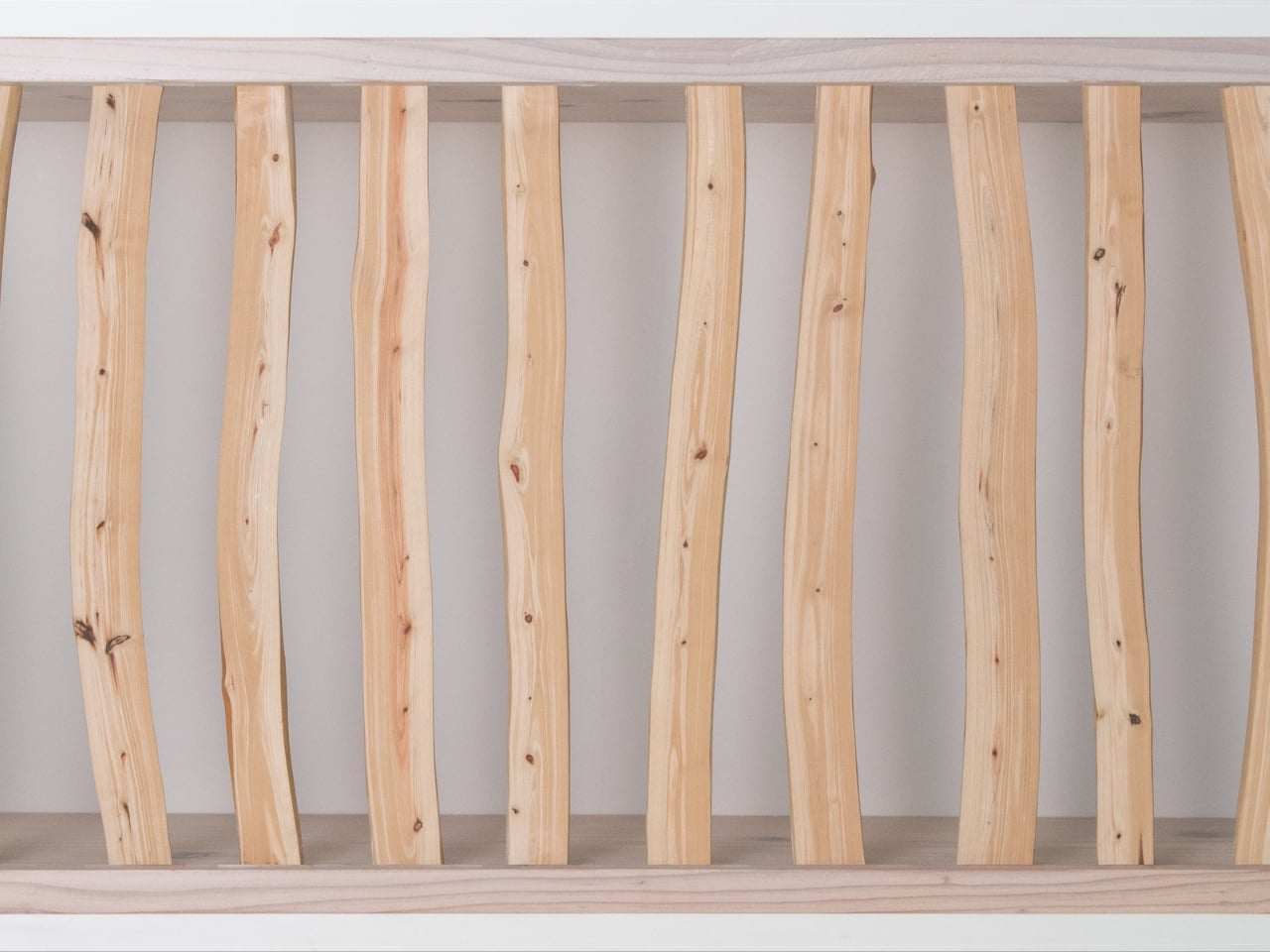
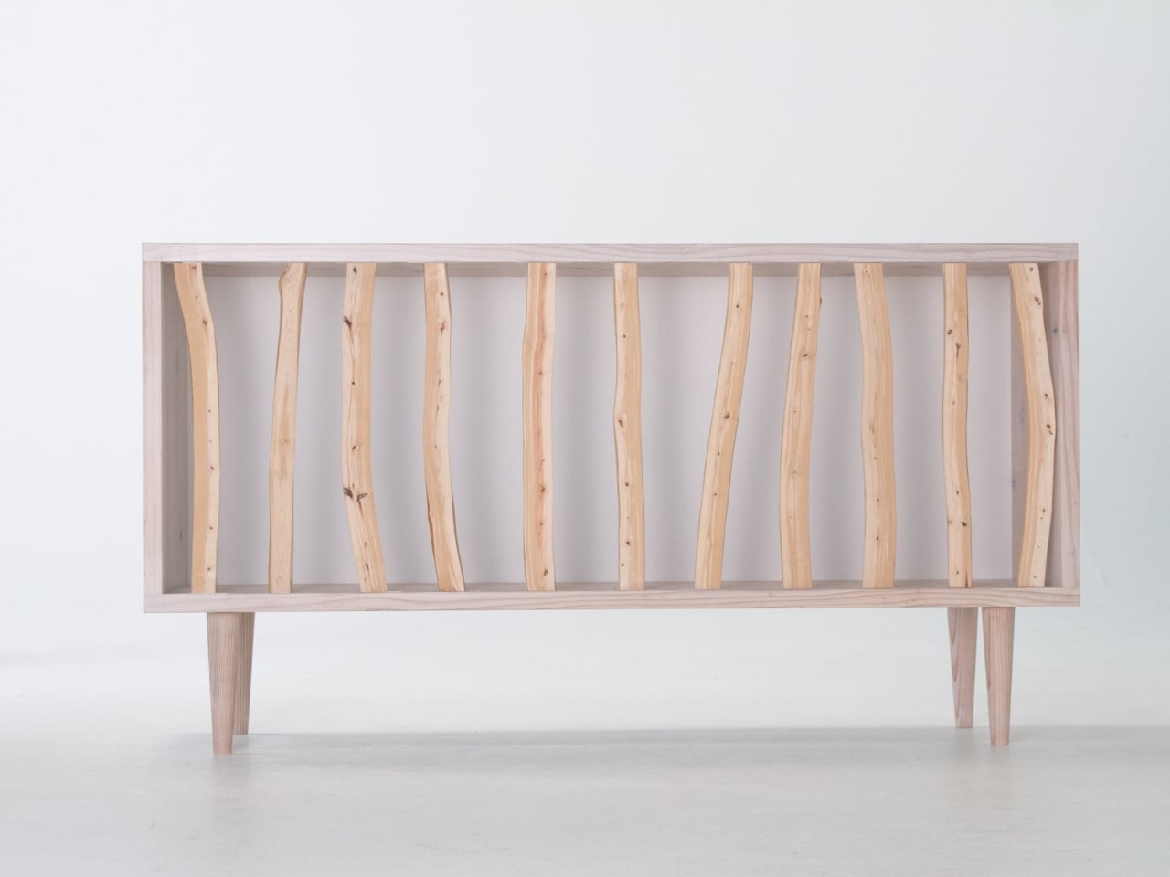
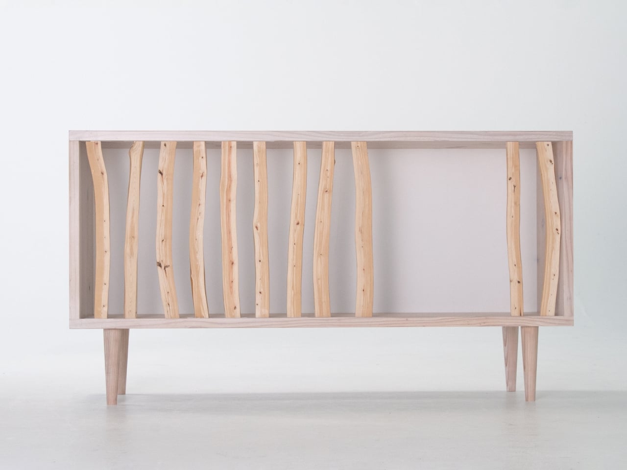
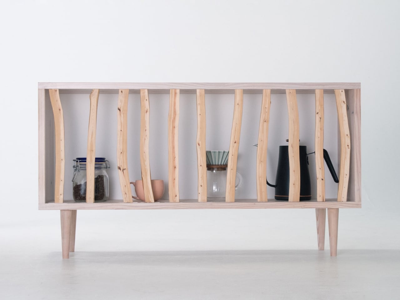
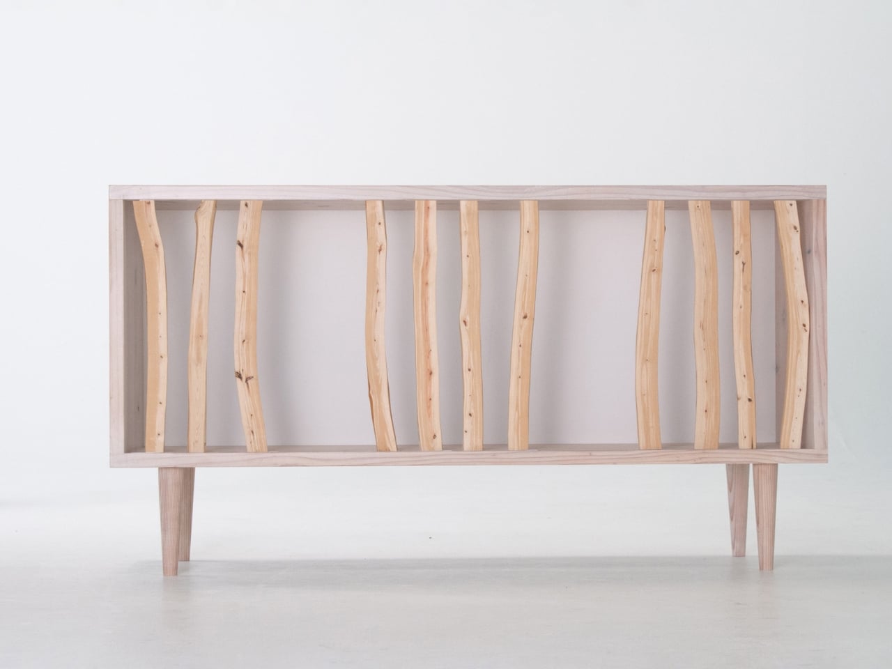
The word “Hayashi” translates to “forest” in Japanese, and once you see this piece, the name makes perfect sense. Instead of traditional cabinet doors or panels, Sugiura uses actual Japanese cypress branches arranged across the front of the frame. These aren’t decorative touches glued on for aesthetic appeal. They’re the real deal, thinned branches that would typically be left discarded in the mountains after forest management. Sugiura saw potential where others saw waste.

Designer: Taishi Sugiura

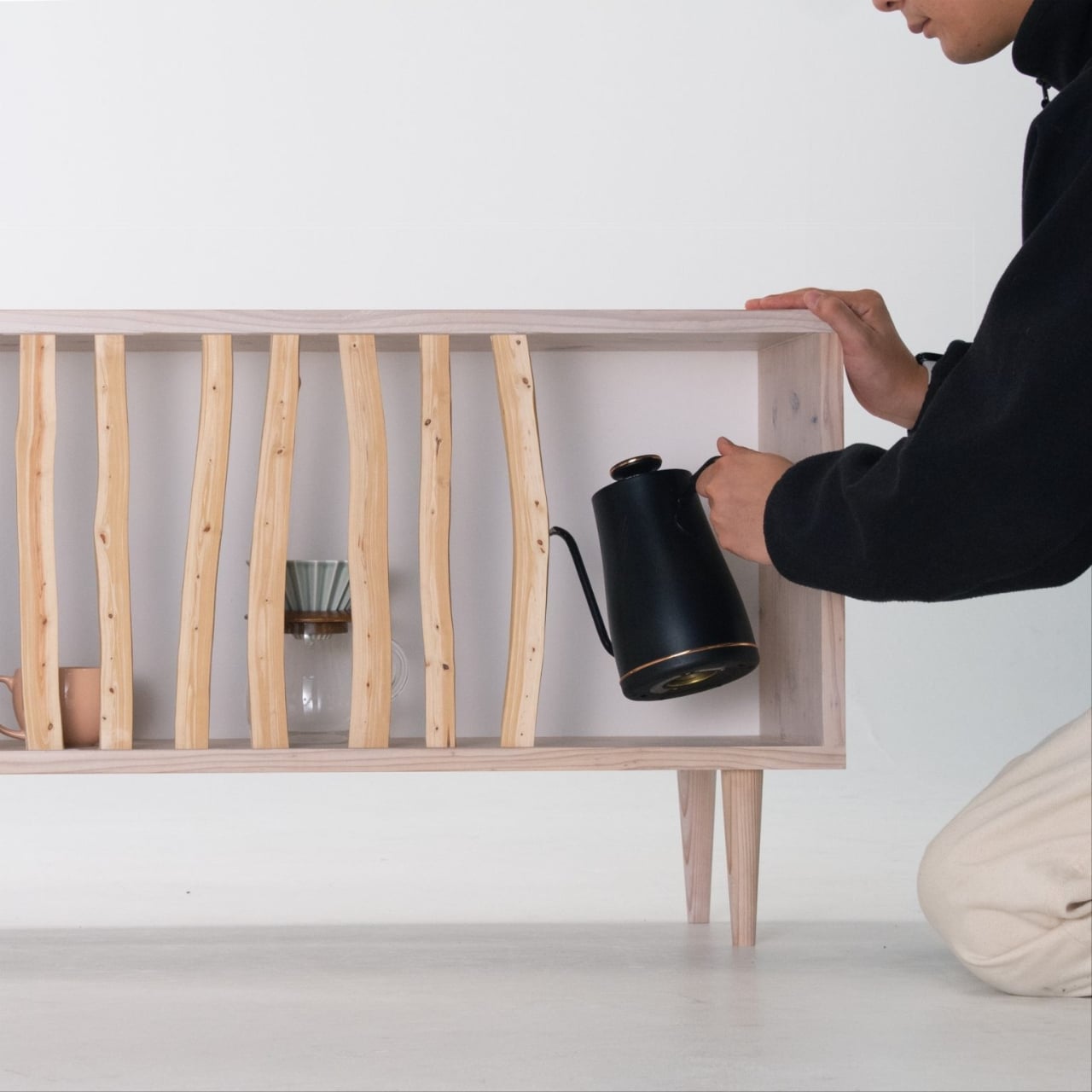
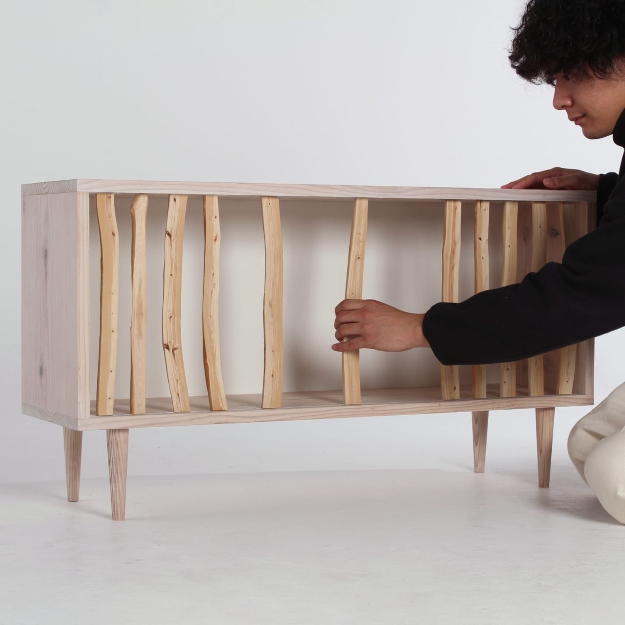
What makes the Hayashi Cabinet genuinely clever is its movability. Each branch can slide left or right along the cabinet frame, letting you customize the openness or privacy of your storage space. Want to show off that vintage record collection? Slide the branches apart. Need to hide some clutter? Push them together. It’s like having adjustable blinds, except way cooler and made of wood.

This design philosophy stems from traditional Japanese spatial concepts. Think about shoji screens and sliding doors in Japanese homes, elements that define space without rigidly locking it down. Sugiura brings that same flexibility to furniture, creating something that responds to your changing needs rather than forcing you to work around it. Some days you want minimalist display, other days you need concealment. The Hayashi Cabinet doesn’t judge either choice.

The materials tell their own story. Japanese cypress branches have these gorgeous tight grains and natural curves that you’d never find in standard lumber. They’re inherently asymmetrical, which means no two cabinets will ever look identical. As light filters through the gaps between branches throughout the day, the shadows shift and dance, transforming the piece from static furniture into something almost kinetic. It’s the kind of detail that makes you notice your own furniture, which sounds strange until you realize how rarely that actually happens.

Sugiura studied at Nagoya University of Arts, and his material-first approach runs through all his work. Before designing the Hayashi Cabinet, he created the Kintoun Kits, playful modular construction sets that won a JID NEXTAGE silver prize. That same curiosity about how people interact with objects translates beautifully into this domestic context. It’s not just about looking good on an Instagram feed. It’s about living with something that genuinely adapts to you. We’re already flooded with mass-produced, one-size-fits-all storage solutions but here’s a piece that celebrates imperfection and individuality. The branches aren’t perfectly straight. They don’t align in rigid rows. They breathe.

There’s also an environmental angle worth noting. Using thinned cypress branches addresses a real problem in Japanese forestry, where these materials typically get abandoned as too difficult or low-value to process. By turning them into design features rather than treating them as scraps, Sugiura gives them new life and purpose. It’s sustainable design that doesn’t announce itself with green marketing buzzwords but simply makes smart material choices.

The beauty of the Hayashi Cabinet lies in its restraint. It could easily tip into gimmicky territory with all those moving parts, but Sugiura keeps the overall design clean and understated. The frame stays simple, letting the natural cypress branches become the focal point. And because you’re the one deciding how open or closed the front becomes, you’re essentially co-designing the piece every time you adjust it. The Hayashi Cabinet doesn’t need batteries or WiFi. It just needs you to slide some branches around. Simple, tactile, human. That’s the kind of interaction design that endures long after the tech trends fade.

The post This Japanese Cabinet Uses Real Forest Branches as Doors first appeared on Yanko Design.
This Airport Lounge Turned Mondrian’s Boogie-Woogie into Wood Islands

Long layovers usually mean seas of identical metal chairs, bright signage, and constant motion that makes rest feel impossible. Even premium lounges often feel like slightly nicer waiting rooms, not places with a point of view beyond arranging seating in rows. Schiphol’s Lounge 2 sits in the flat Haarlemmermeer polder outside Amsterdam, which gave Beyond Space a specific landscape and design history to work with when redesigning the 1,000 square meter space.

The studio looked at that polder and the Dutch De Stijl movement it inspired, particularly Mondrian’s orthogonal paintings. His late Boogie-Woogie works are essentially abstractions of that landscape, grids of lines and colored planes forming rhythmic compositions. Beyond Space took those paintings as an organizing principle, using sequences of orthogonal lines and planes to define where and how people sit instead of just dropping furniture onto a floor.

Designer: Beyond Space

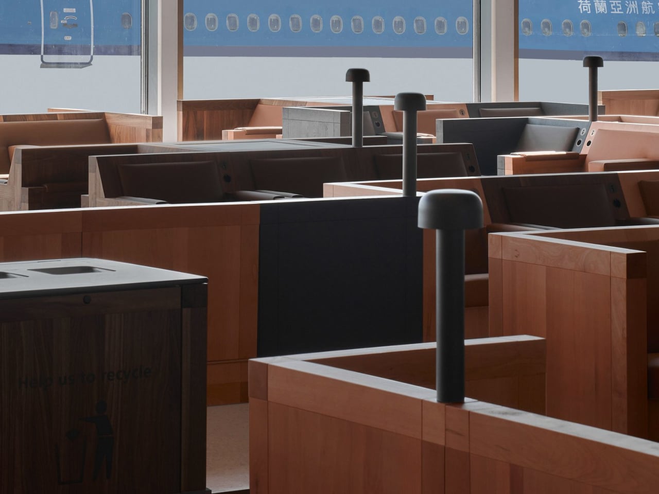
Entering the lounge, you realize you are not looking at rows of chairs but a low wooden city. Connected seats form islands of different sizes that plug into the existing architecture, creating pockets for solo travelers, pairs, and larger groups. You can choose a corner that feels tucked away, a spot with a direct runway view, or a cluster where a family can spread out without blocking circulation.

Instead of Mondrian’s red, yellow, and blue, the designers used solid wood from European tree species Mondrian once painted in his early landscape work. That swap keeps the De Stijl grid and rhythm but trades visual shouting for warmth and calm. In a terminal full of screens and branding, the consistent wood tones and leather upholstery act like a noise-cancelling layer without resorting to beige blandness.

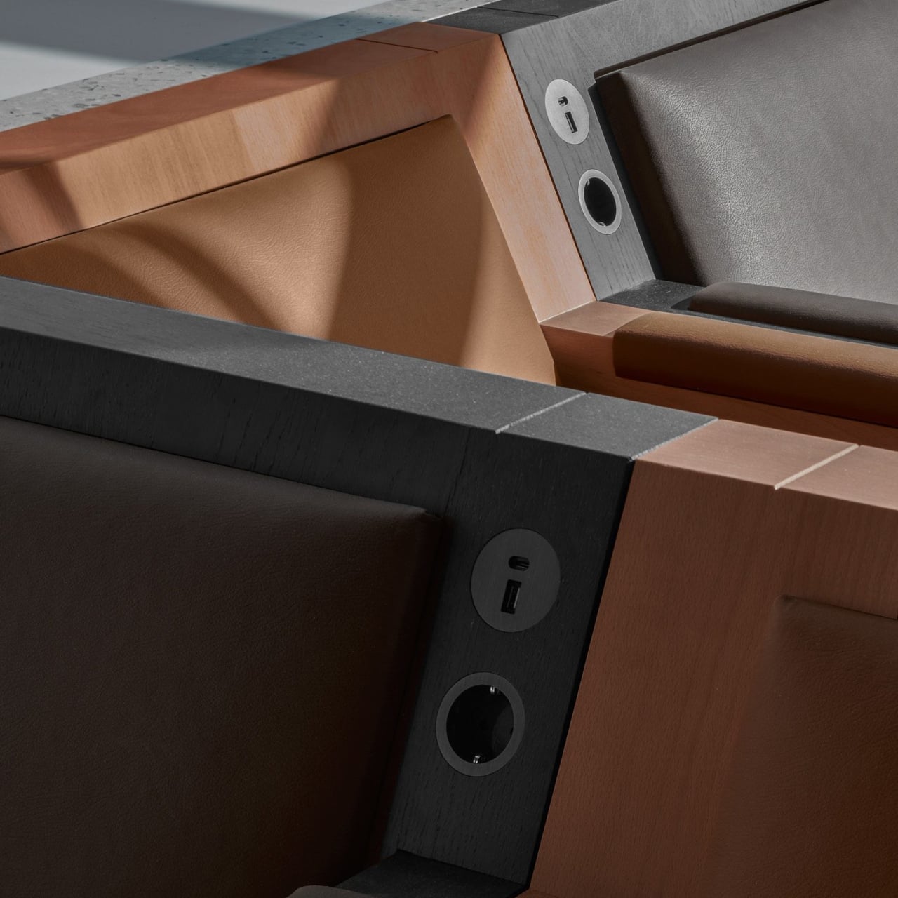
The orthogonal layout hides surprising variety, armchairs with side tables, benches, back-to-back arrangements, and larger platforms for groups. Power outlets are integrated into the wooden blocks, so charging a laptop does not mean hunting for a wall socket or sitting on the floor. The grid gives order, but within it you can find a spot that matches how you actually want to wait.

Because seating follows a clear grid aligned with the architecture, it is easier to orient yourself and remember where you were sitting when you come back with coffee. The repetition of similar forms, combined with daylight from large windows and a neutral floor, creates visual tranquility rare in airports. It feels designed to let your brain idle instead of constantly scanning for threats.

The lounge treats waiting not as dead time to fill with more screens, but as a chance to sit in a space with a clear idea behind it. By abstracting the landscape outside and channeling Mondrian without copying his colors, Beyond Space turns a generic airport zone into a small wooden blueprint of Dutch design history that just happens to be comfortable between flights.

The post This Airport Lounge Turned Mondrian’s Boogie-Woogie into Wood Islands first appeared on Yanko Design.
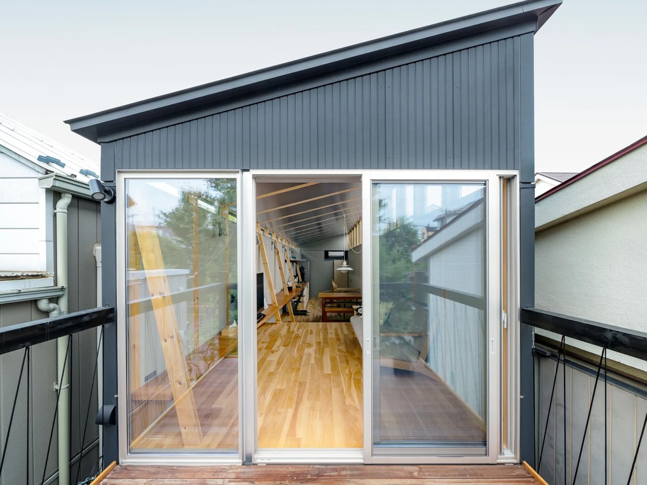
This Fukasawa Residence Honors Japanese Timber Traditions on a Narrow Plot

In the quiet residential enclave of Fukasawa, south-west Tokyo, narrow plots and intimate streetscapes create an architectural character that feels worlds away from the metropolitan sprawl surrounding it. This area, bearing the name of renowned designer Naoto Fukasawa, who made it his home, carries a quaint charm reminiscent of older Japanese shopping streets. Within this context, architecture firm MIDW has completed a striking residence that reinterprets traditional building methods for contemporary living.

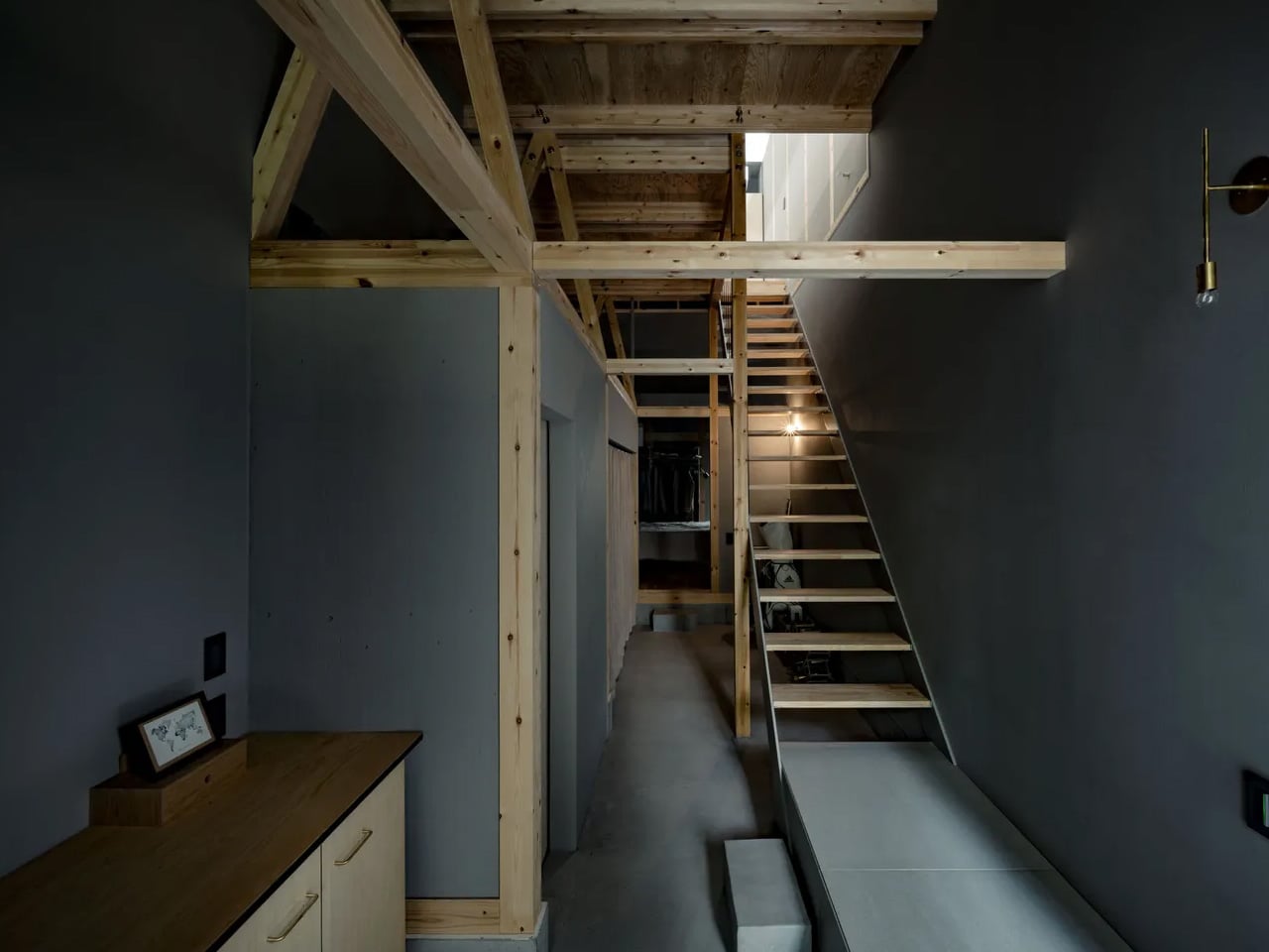
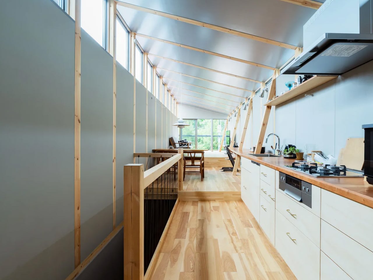
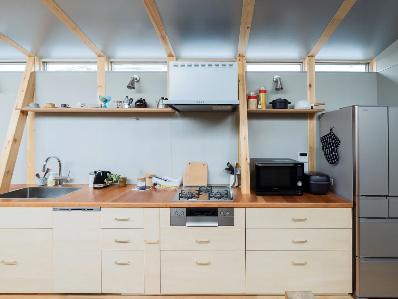
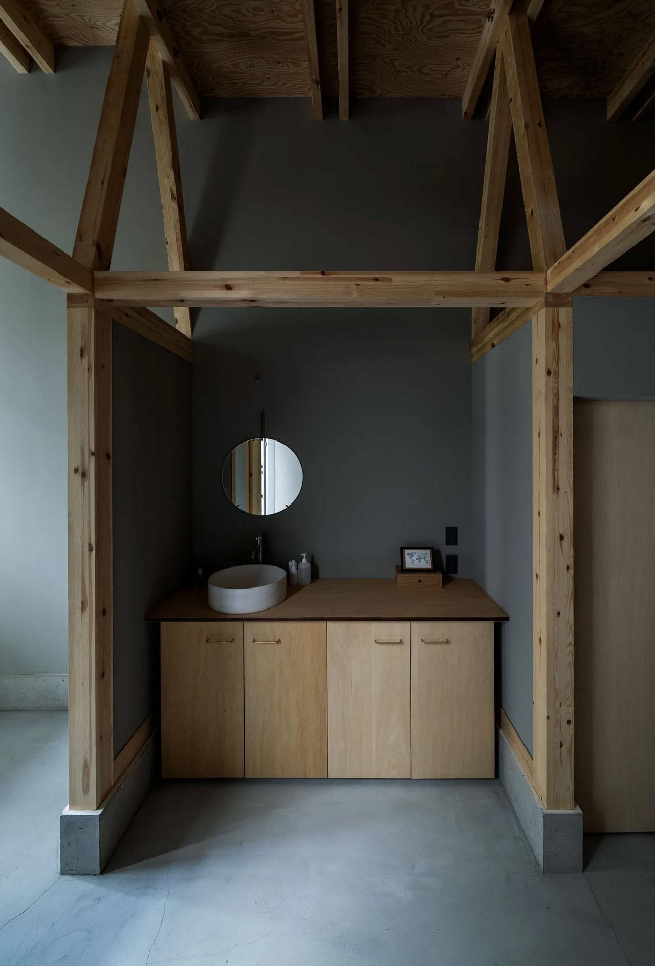
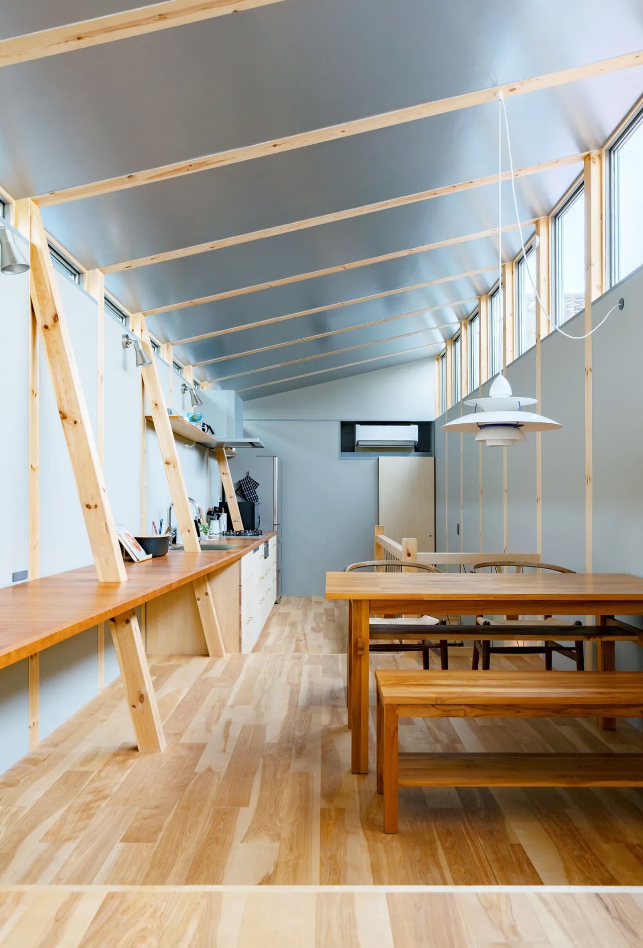
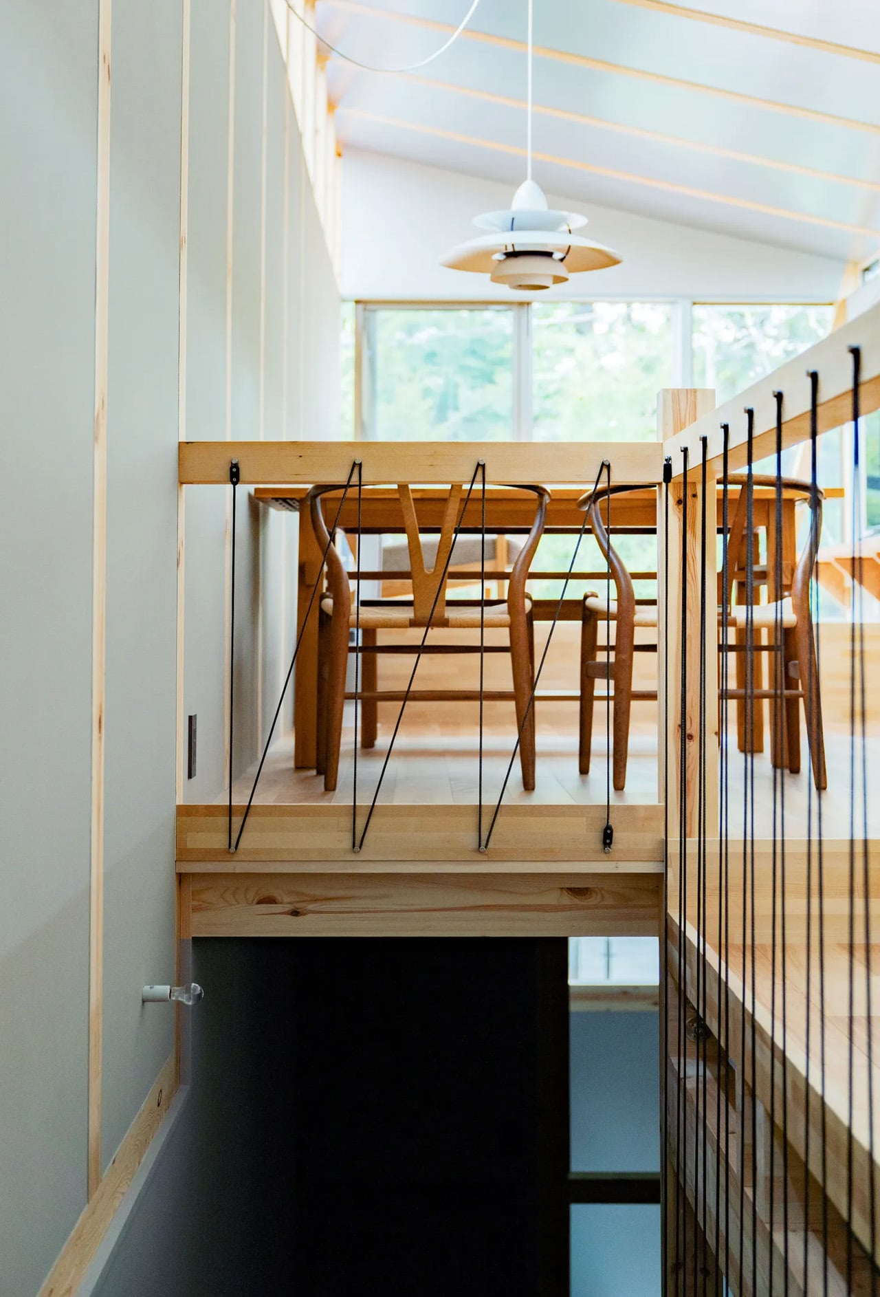
The house occupies a slender plot measuring just 2.73 metres in width and 13.65 metres in depth. Rather than viewing these proportions as limitations, MIDW embraced them as design opportunities. The structure is defined by six truss-shaped load-bearing walls, their beams spanning gracefully between evenly spaced columns to create a rhythmic structural language that anchors the entire composition.

Designer: MIDW

Daisuke Hattori, co-chairman and managing architect of MIDW, explains the conceptual foundation. The firm frequently draws from local construction techniques, particularly the traditional Japanese timber post-and-beam system. This method, built through the assembly of linear wooden members, offers both structural integrity and visual refinement. It remains among Japan’s most enduring building approaches, balancing flexibility with aesthetic clarity. The Fukasawa residence presents a contemporary dialogue with this heritage. The structural framework isn’t hidden behind finishes or treated as mere utility. Instead, it takes centre stage as a defining architectural element, echoing the exposed timber construction found in historic shrines and temples across Japan. This approach transforms structural necessity into spatial poetry.

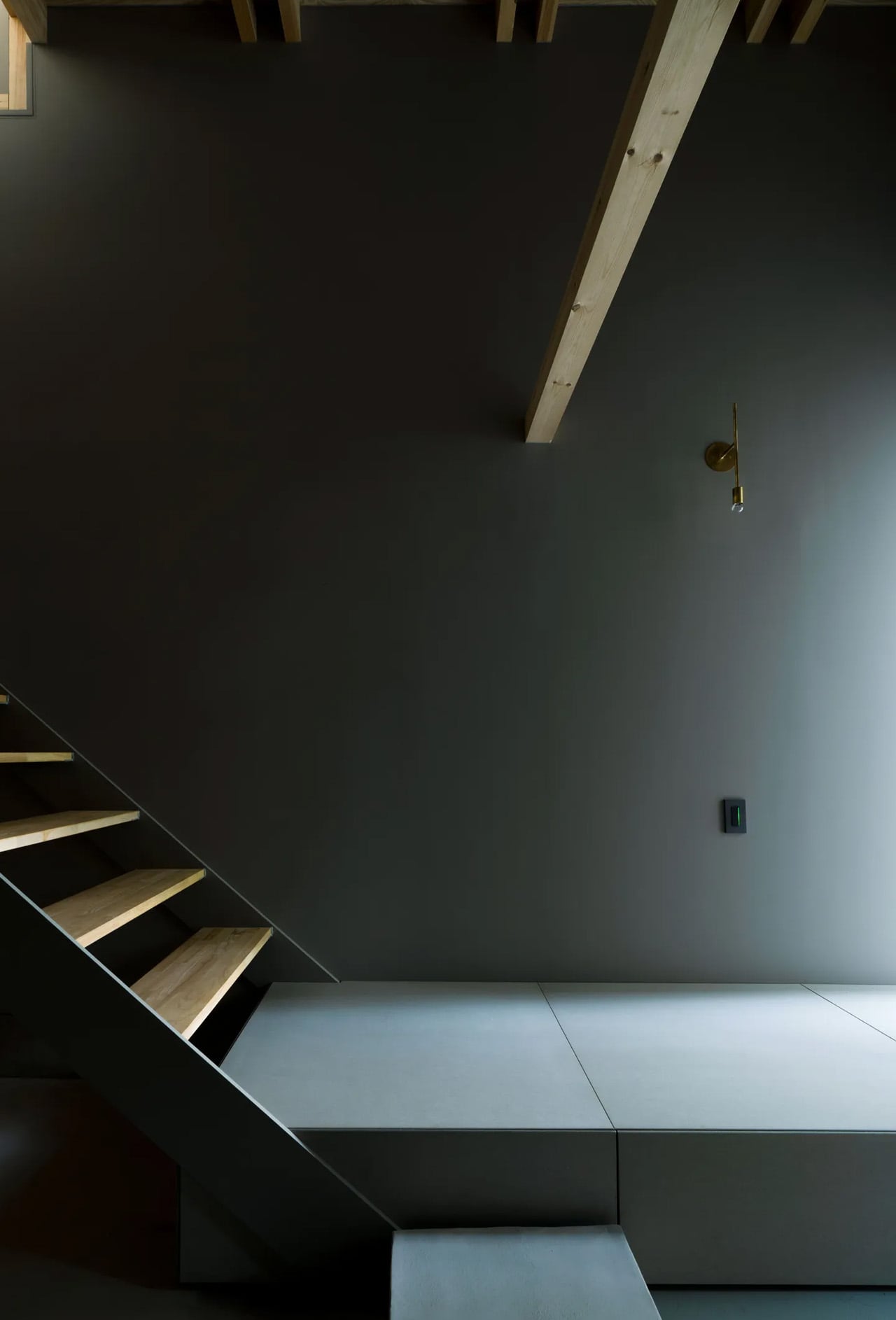
Entering the home, visitors encounter a slightly sunken floor plane that marks the transition from street to sanctuary. From this entry point, a carefully choreographed sequence of spaces begins to reveal itself. Light and shadow play across surfaces as one moves through the narrow depth of the plot. A straight staircase draws the eye upward, leading to the upper level where the spatial experience opens considerably.

The upper floor presents a broad, generous volume animated by the repetitive cadence of exposed timber beams. These structural elements create a calming visual rhythm that organizes the space while celebrating the material honesty of wood construction. The beams don’t merely support; they define the character and atmosphere of the interior.

Working within Tokyo’s dense urban fabric presented challenges beyond just dimensional constraints. Material choices and design gestures required careful consideration. Yet MIDW approached the project not as a problem to solve but as an opportunity to develop universal design principles rooted in specific site conditions. The result is a home that feels both distinctly of its place and timelessly resonant, proving that constraint often breeds the most compelling creativity.

The post This Fukasawa Residence Honors Japanese Timber Traditions on a Narrow Plot first appeared on Yanko Design.
Oakywood Desk Shelf Pro Holds 100kg and Hides Clutter in Wood Drawers

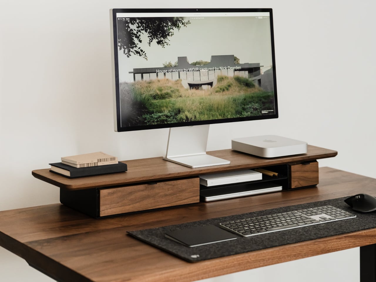
Desks fill up fast. A nice monitor and laptop sit on a surface that slowly accumulates cables, notebooks, charging docks, and random accessories. The usual fixes are cheap monitor risers, plastic drawer units, and cable trays that solve one problem but add visual noise. The Oakywood Desk Shelf Pro tries to handle ergonomics and organization without making the desk look busier, treating the riser as solid-wood furniture instead of an accessory.

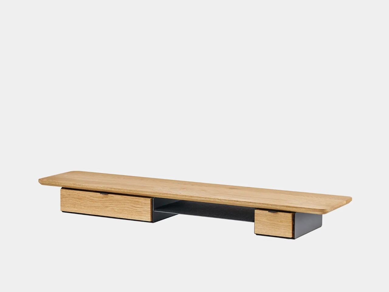
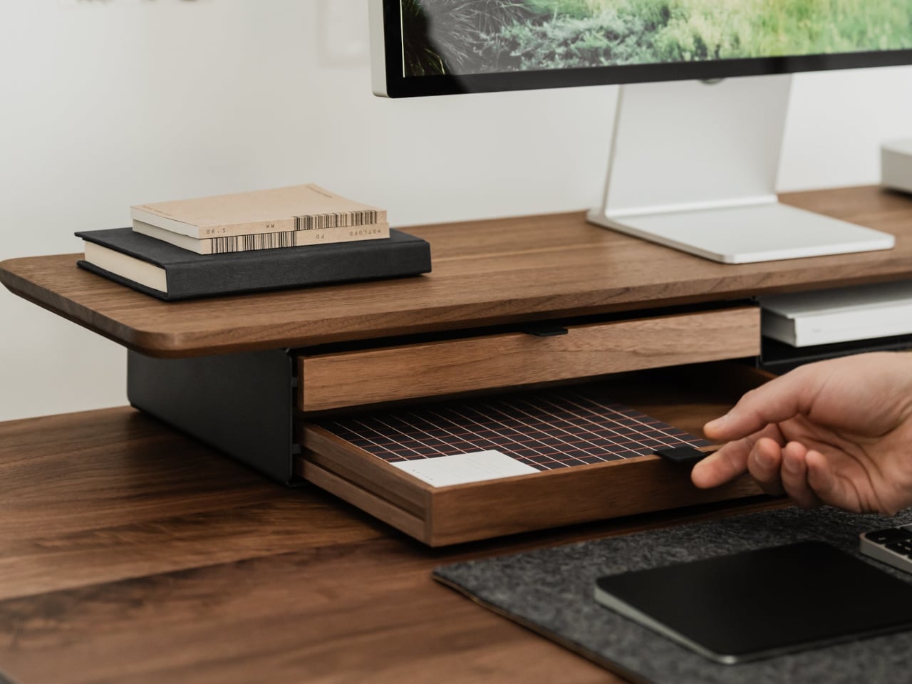
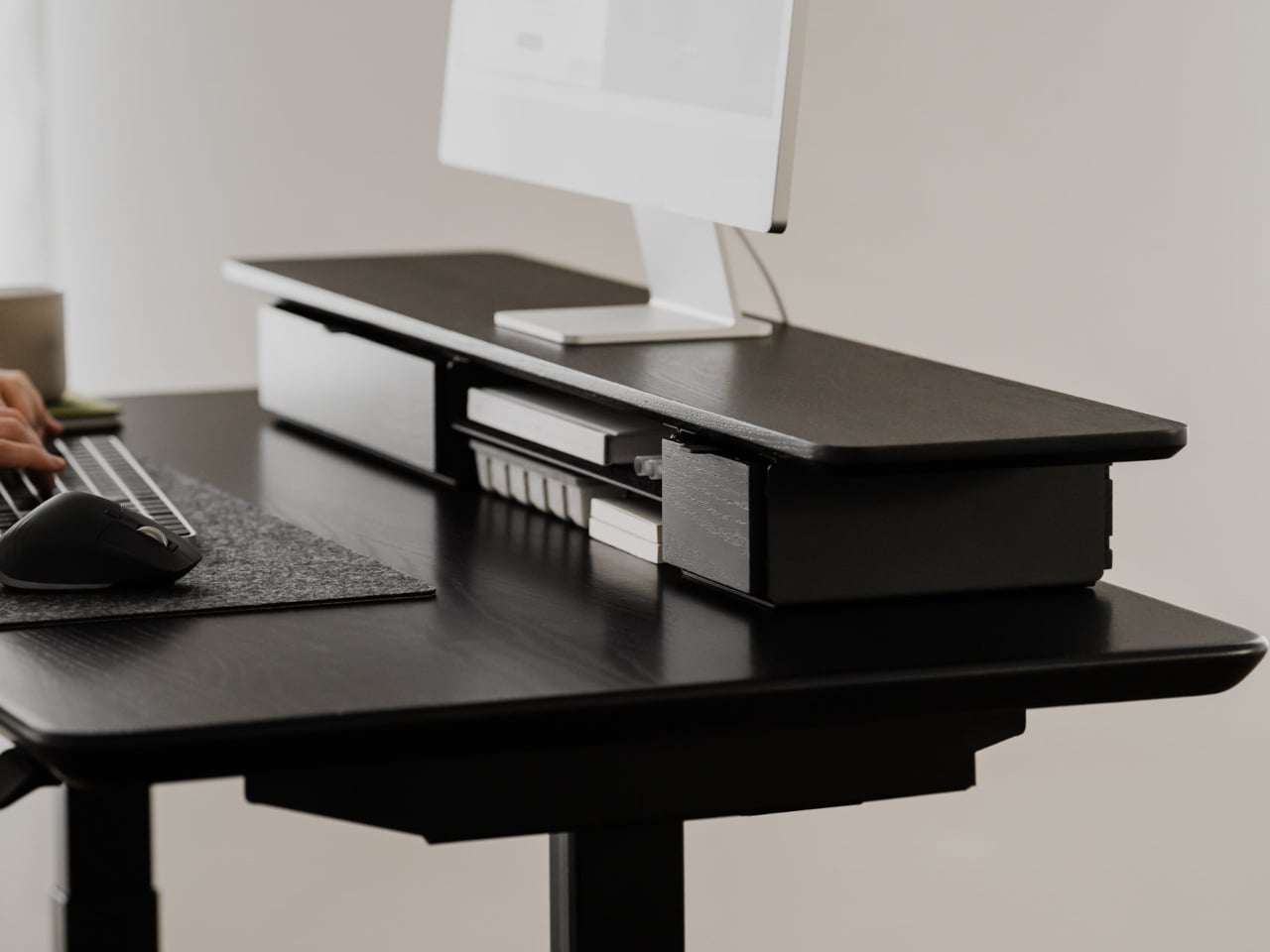
Desk Shelf Pro is an all-in-one desk shelf that lifts your monitor, hides clutter, and adds a second functional level to the workspace. It combines a long, rounded wooden platform with powder-coated steel legs, integrated drawers, and a felt-lined open shelf. It is built from solid oak or walnut, not MDF with a plastic skin, so it feels like part of the desk rather than something perched on top.

Designer: Oakywood

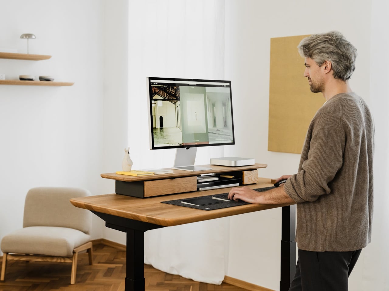
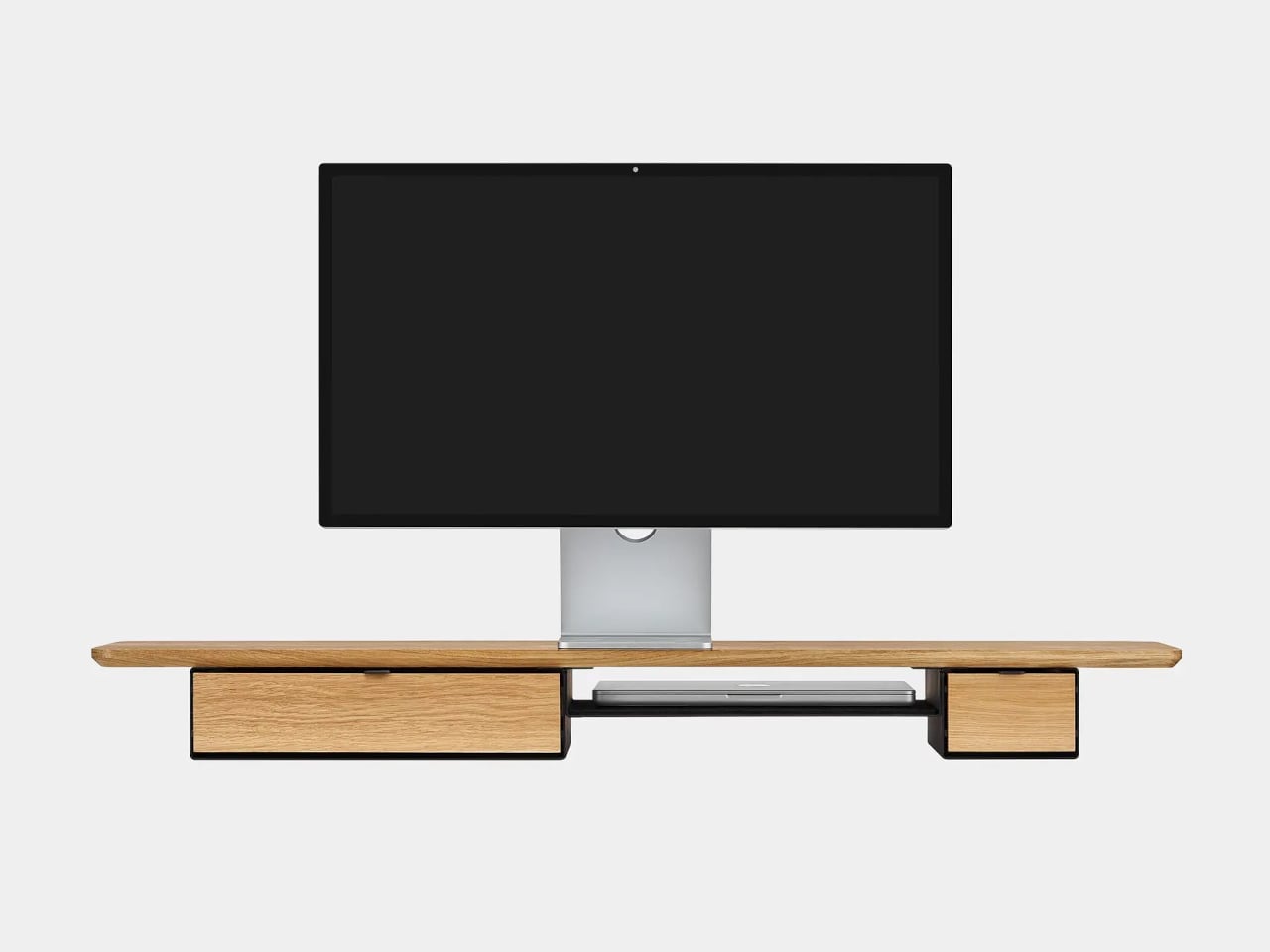
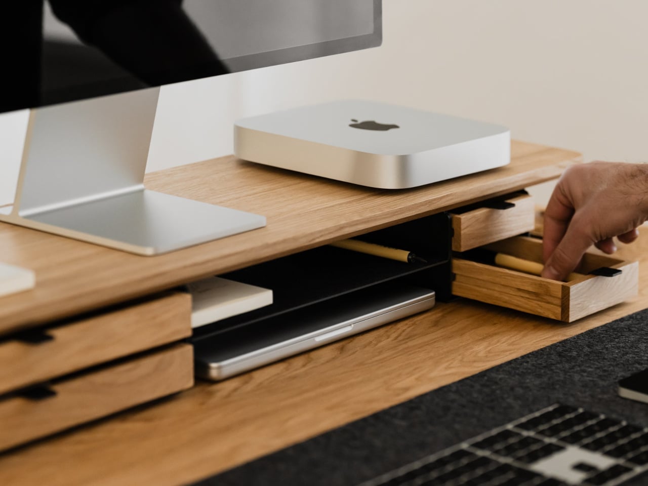
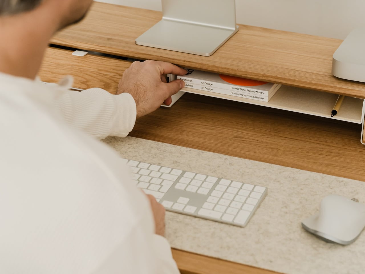
The shelf spans the width of the desk, raising a monitor to a more natural eye level while leaving space underneath for a keyboard or laptop. Steel legs sit at each end, creating a floating effect and a central bay that becomes a home for devices. The shelf holds up to 100 kg, so it can handle large displays, desktop machines, and accessories without flexing, even when you lean on it.

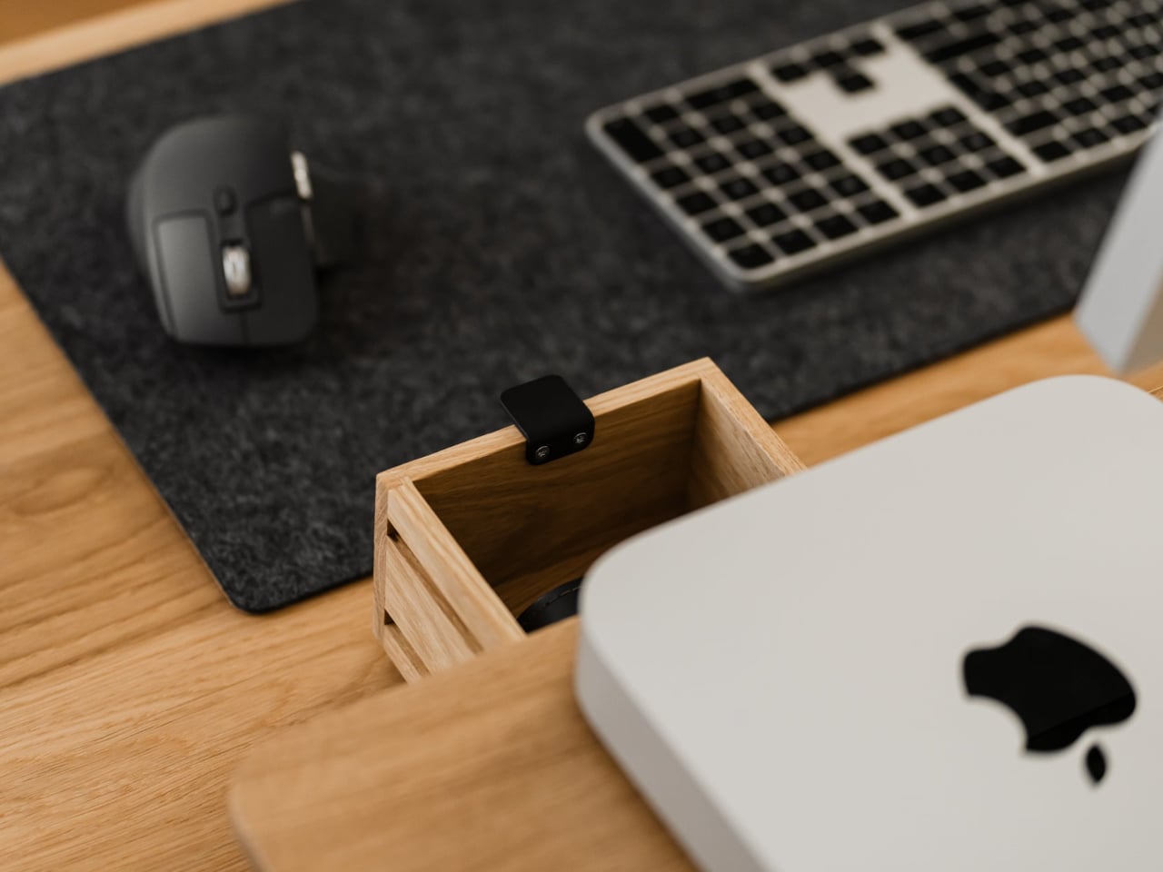
Storage splits between one or two solid-wood drawers built into the leg modules and an open shelf running between them. The drawers swallow stationery, notebooks, and small tech, keeping the desktop clear. The open shelf is lined with merino wool felt, which protects tablets, trackpads, or a closed laptop from scratches and adds a soft, tactile layer that contrasts with the wood and steel.

1

Oakywood contrasts solid wood against plastic laminate, highlighting warm, unique grain versus uniform texture, durability that improves with age versus chipping and peeling, and the ability to refresh the surface with natural oils instead of replacing it. The felt is OEKO-TEX-certified merino wool, and the legs are powder-coated steel, so every major component is designed to last and age gracefully instead of ending up replaced after a few years.

The shelf comes in oak for a lighter Scandinavian look, walnut for a richer studio vibe, or black-stained oak for a more dramatic setup. You can choose single or dual drawers depending on how much you like to hide, and black or white legs to match your hardware. It works equally well on a sit-stand desk or a fixed one, anchoring everything from a minimalist Mac setup to a more eclectic creative workstation.

Desk Shelf Pro changes the feeling of sitting down to work. Instead of a scatter of objects, you get a clear plane of wood with a monitor, a few intentional items, and everything else tucked away but within reach. For people who spend all day at a desk, the combination of solid materials, hidden storage, and quiet ergonomics makes a case for treating a monitor riser as real furniture, something worth keeping for years instead of replacing when the next cheap organizer trend arrives.

The post Oakywood Desk Shelf Pro Holds 100kg and Hides Clutter in Wood Drawers first appeared on Yanko Design.
BALOLO Setup Cockpit: Wood Monitor Stand That Adapts to Your Work

Most desks tell the same story. A monitor sitting too low, forcing you to hunch forward. A tangle of charging cables disappears behind the desk, where you’ll never find them again. Your phone wedged between the keyboard and a coffee cup, headphones draped over the back of your chair, and a growing pile of notebooks that never quite fit anywhere. It’s functional enough to get work done, but it’s also the kind of setup that makes you dread sitting down every morning.
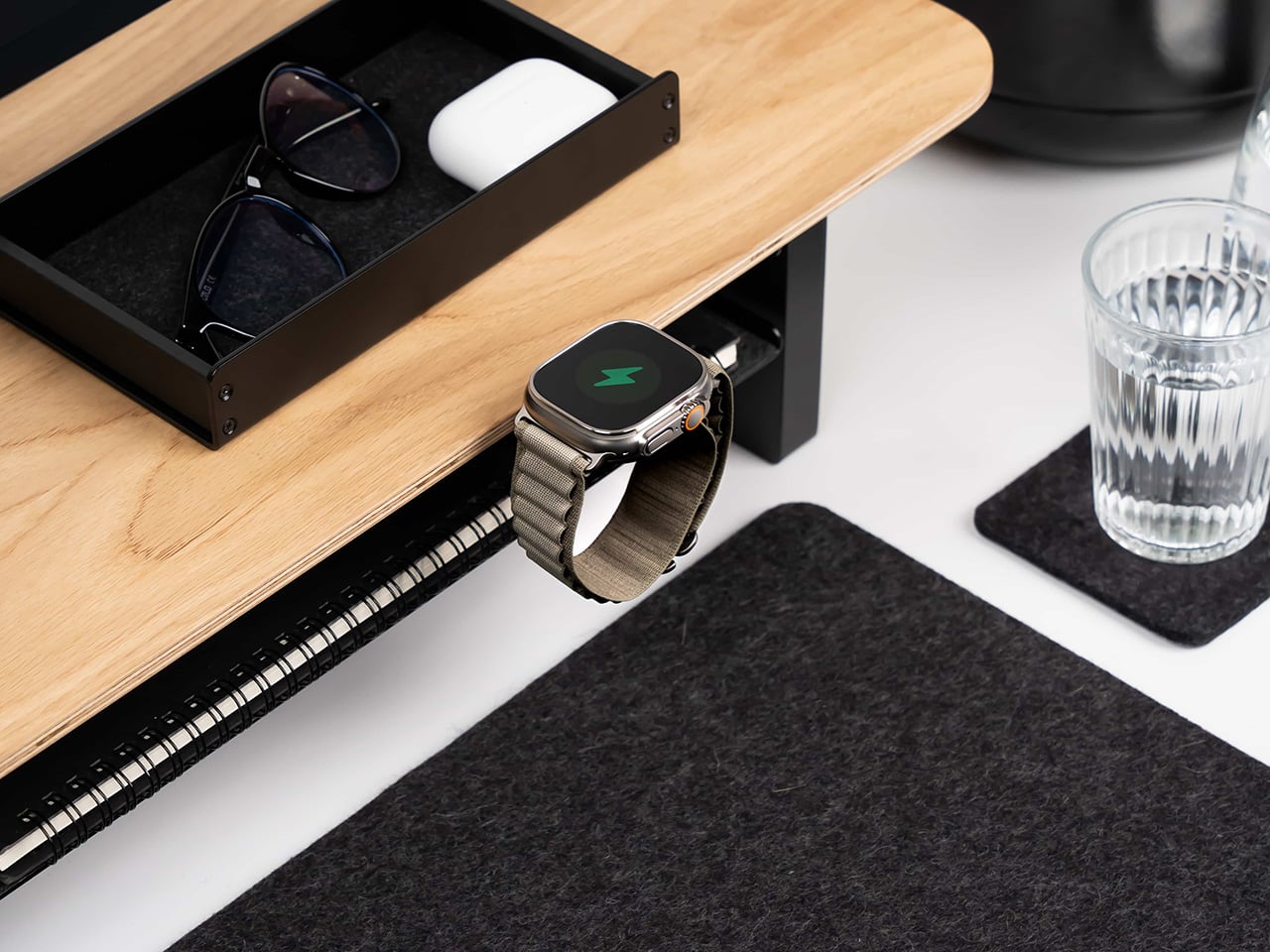
The Setup Cockpit by BALOLO approaches this differently. Instead of adding more organizers that take up space or forcing you to commit to a fixed layout, it creates a foundation that adapts to however you work. The monitor stand itself is straightforward, a long walnut or oak shelf that raises screens to eye level while freeing up the desk underneath. What sets it apart is the patented mounting grid running along the bottom, a system of attachment points that lets you easily add accessories wherever they’re needed and rearrange them whenever your workflow changes.

Designer: Ruben Keferstein

Click Here to Buy Now: $237.92 $279.90 (15% off, use coupon code “BLACKBALOLO”). Hurry, deal ends in 48-hours!

The first thing you notice when unpacking the Setup Cockpit is how solid it feels. The wood is real American walnut or oak, hand-finished in Germany with natural oils and waxes that bring out the grain. The feet, made from MDF wood, are sturdy enough to keep the whole thing stable, even with two large monitors perched on top. It’s the kind of build quality you’d expect from furniture that costs a few hundred dollars, not something marketed as a desk accessory.

Setting it up is refreshingly simple. Slide your monitors onto the shelf, adjust the monitor height if needed, and tuck your keyboard underneath in the 3.9 inches of clearance. That alone transforms how your desk feels, raising screens to eye level and opening up space you didn’t realize you were wasting. But the real shift happens when you start adding accessories from BALOLO’s modular ecosystem, which is where the mounting grid earns its keep.

A laptop riser is perfect for those days when you need a second screen. A MagSafe holder keeps your phone charged and visible for notifications without cluttering the surface. Cable magnets attach to the grid, holding charging cables in place so they don’t slip behind the desk every time you unplug something. Heck, there’s even a headphone holder that keeps your cans within reach instead of draped over your monitor or tangled in your bag.

The modularity is what makes this feel genuinely useful instead of just another piece of furniture you buy once and forget about. Your workflow changes depending on what you’re working on, and the Setup Cockpit keeps up. Whether you need a tablet holder for sketching or more space for your accessories, the BALOLO Setup Cockpit lets you customize your desk to suit your preference, while leaving you with the freedom to expand and change it at any time.

What’s surprising is how much this changes the rhythm of your workday. Starting with a cleared surface instead of a pile of cables and peripherals makes sitting down feel less overwhelming. Everything has a spot, and that spot can change if you decide you want your phone on the left instead of the right. It’s the kind of flexibility most desks never offer, where adding one thing means removing something else or living with clutter.

The materials help too. The walnut finish warms up spaces that lean too heavily on black plastic and aluminum, while the oak or black-stained oak options fit minimalist setups without feeling cold. The wood is sealed, so spills and wear won’t ruin the finish, and the whole thing is built to support up to 50 pounds without wobbling. That’s reassuring when you’re stacking ultrawide monitors and laptops on top of a shelf.

The Setup Cockpit doesn’t reinvent what a monitor stand can do so much as it refines every detail until nothing feels compromised. BALOLO’s approach combines German craftsmanship with modularity that actually makes sense, creating furniture that transforms your desk without forcing you to tear everything apart first. It’s designed to adapt as your work evolves, which is exactly what premium workspace solutions should have been doing all along.

Click Here to Buy Now: $237.92 $279.90 (15% off, use coupon code “BLACKBALOLO”). Hurry, deal ends in 48-hours!

The post BALOLO Setup Cockpit: Wood Monitor Stand That Adapts to Your Work first appeared on Yanko Design.