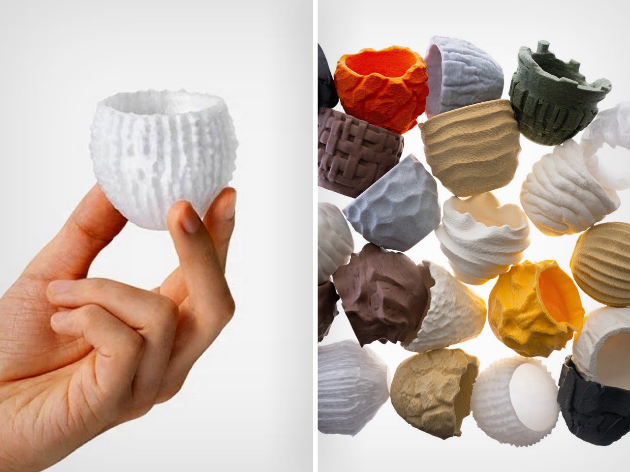
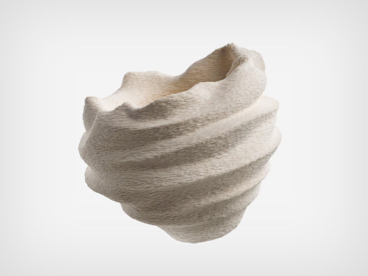
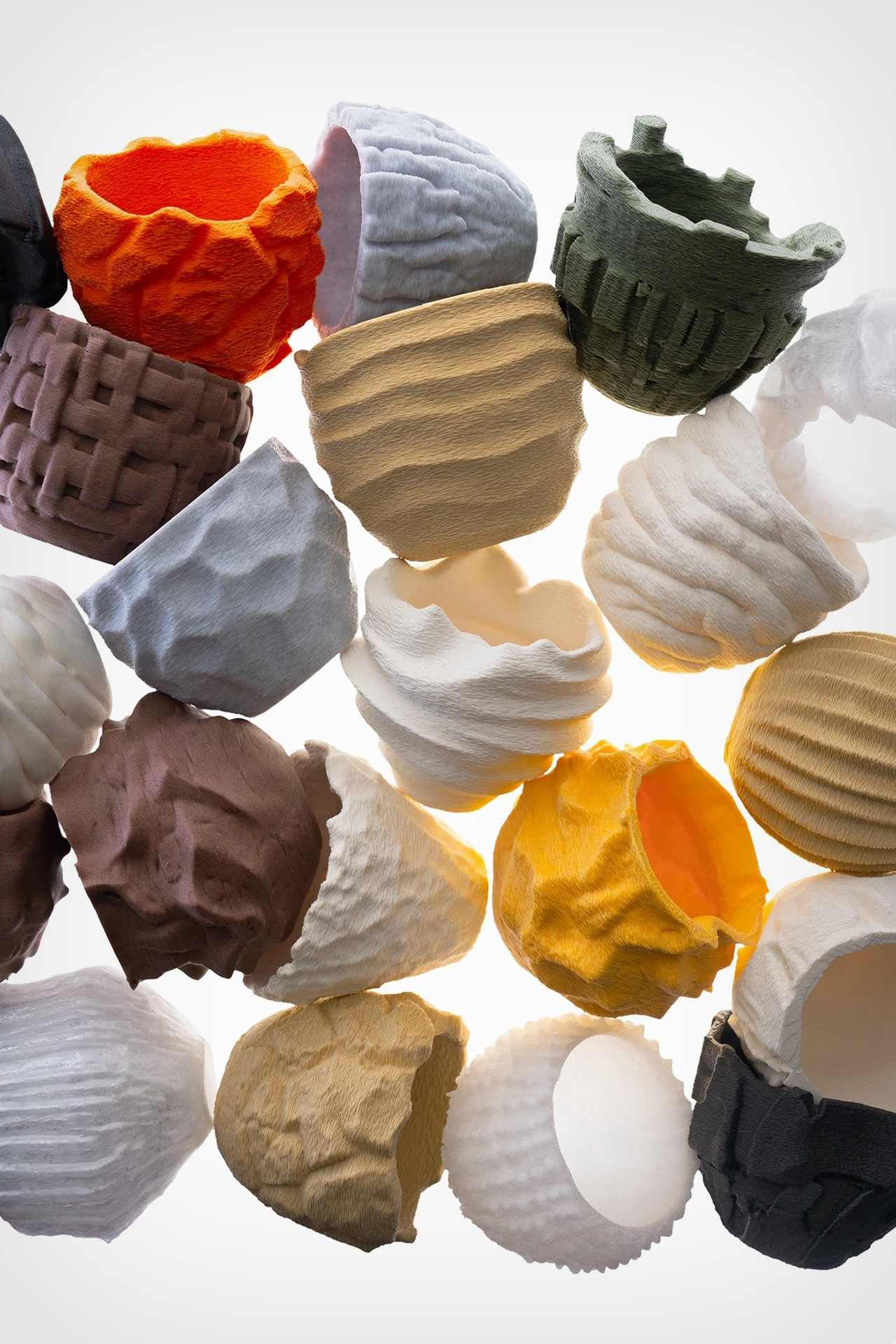
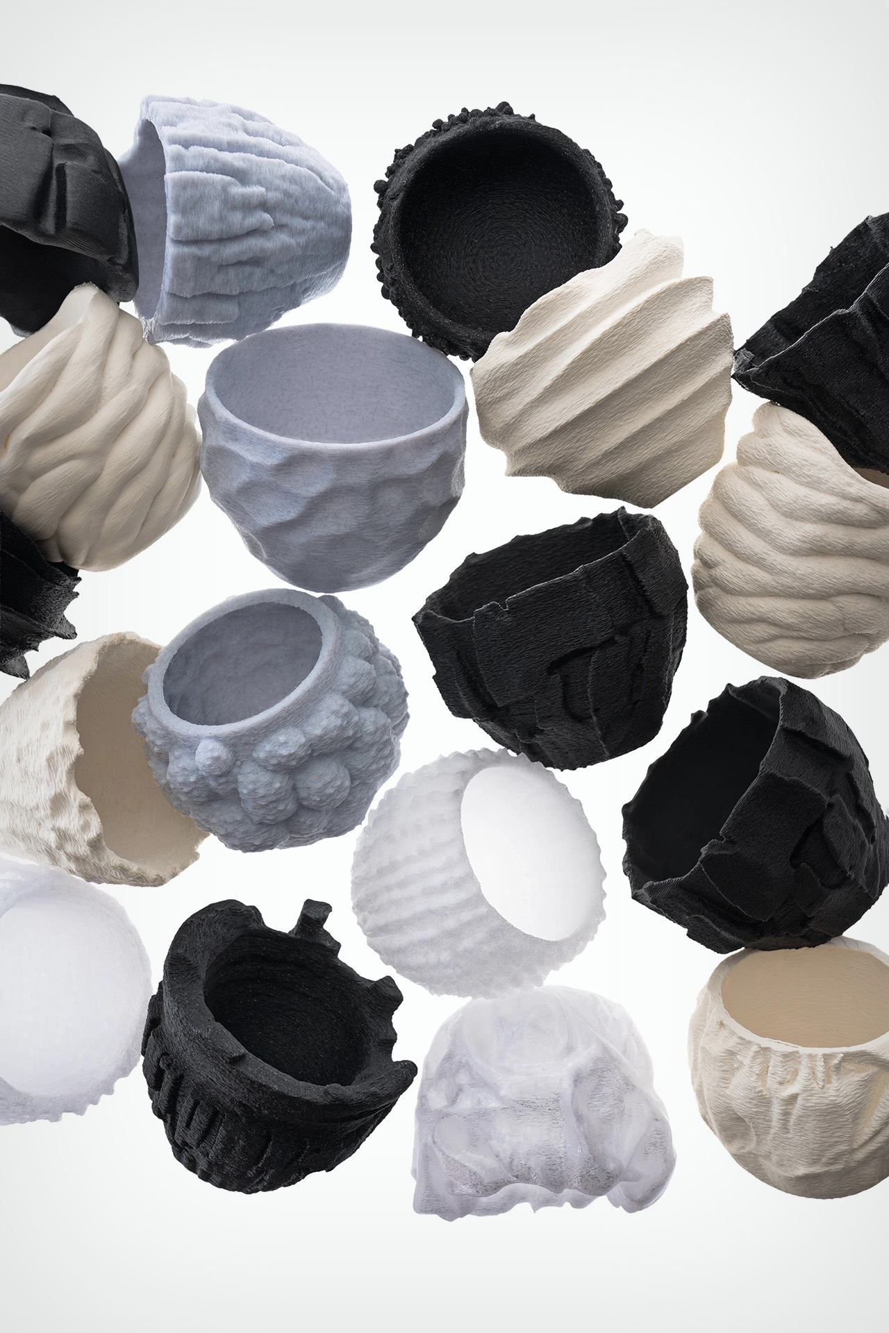
Sure, we could sit and fearmonger about how AI will one day replace designers, but here’s an alternative reality – what if AI didn’t replace us, it just created a parallel reality? Like you’ve got Japanese ceramics, Italian ceramics, and Turkish ceramics, what if you could have AI ceramics? Not a replacement, not a substitute, just another channel. That’s what BKID envisioned with ‘Texture Ware’, a series of cups designed entirely by AI and manufactured using 3D printing. Minimal human intervention, and minimal human cultural input.
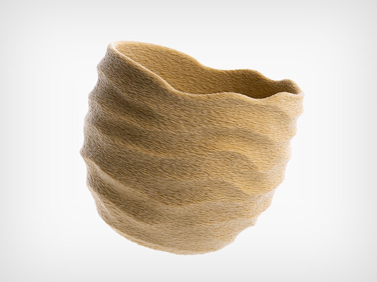
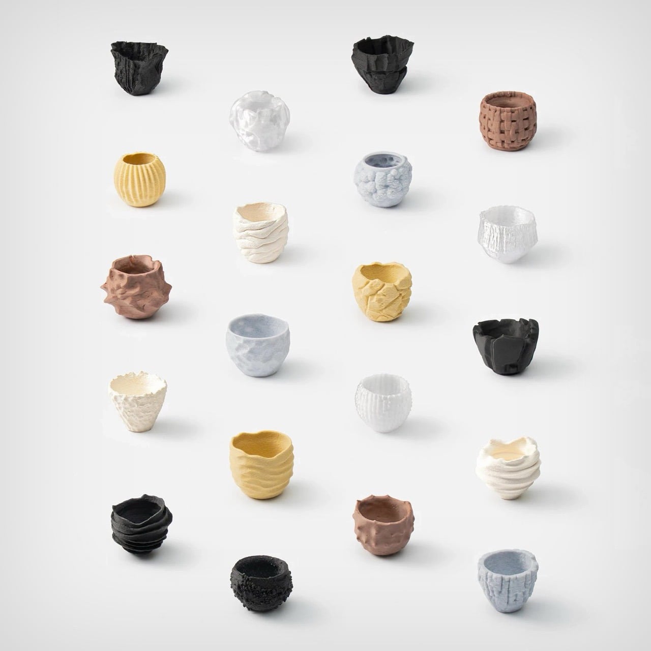
The AI feeds itself a vast repository of data and uses its own database to make textural products that humans then use. BKID’s results look nothing like anything we’ve seen before, each cup of the Texture Ware series looks almost alien, an exaggeration of textures found in nature taken to an extreme. You wouldn’t find such cups in a handicrafts bazaar or your local IKEA. They’re so different that they exist as a separate entity within the industry, not a replacement of the industry itself.
Designer: BKID co
The workflow uses different AI services to go from prompt to cup. The only real input is a text prompt from a human specifying what sort of texture they want. The AI generates the texture image using ChatGPT’s Dall-E, creates a cup out of it in Midjourney, and then translates the 2D image of a cup to 3D using Vizcom. The 3D file then gets 3D printed, eliminating pretty much any actual human intervention as the machine models and manufactures the design from start to end.
“What would normally require a considerable amount of time if crafted entirely by hand was instead realized through two to three generative tools and a process of repeated trial and error,” says BKID. “The exaggerated expressions and omitted forms that emerge in each stage invite the audience to experience the subtle differences in sensibility between traditional handcraft and craft shaped by generative software.”
Users can make cups inspired by brutalist textures of concrete, fuzzy textures of moss, rustic textures of wood-bark, wrinkled textures of crumpled paper, raw textures of coal, columnar textures of basalt rock, porous-like textures of coral, or even alien-like textures of fungi. Each cup looks unique and the AI never repeats itself, which means even cups within the same texture category could be wildly different.
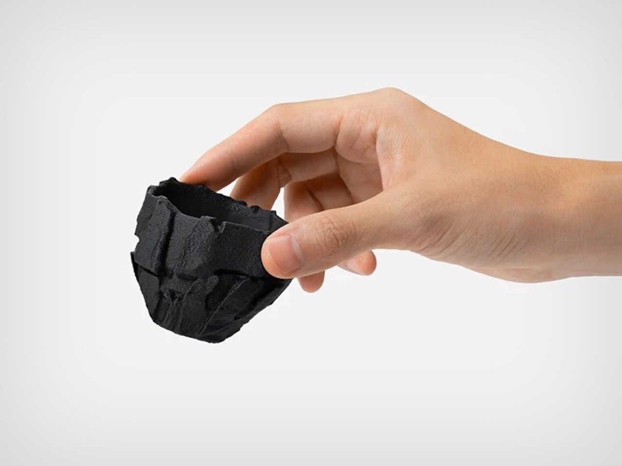
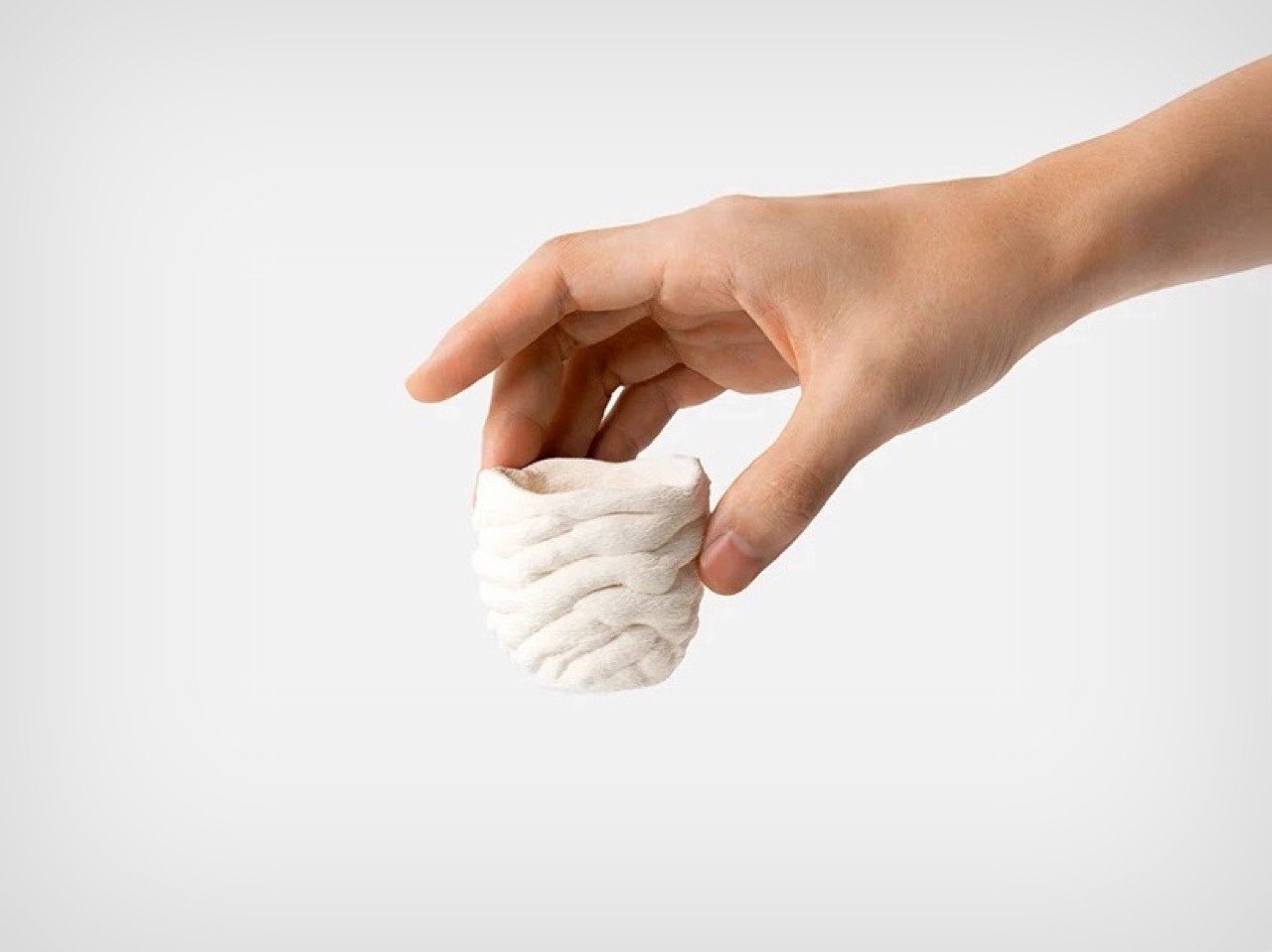
The result truly feels alien, because the AI approaches design using an entirely different set of parameters. Their imperfections become design details, their lack of ergonomics or awareness become a unique design DNA. The result isn’t like any cup you’ve ever seen before, and that’s the point – it’s created by an AI that hasn’t ‘seen’ cups, hasn’t used cups, and doesn’t test its output. That being said, the cups are still usable because of the parameters set by the human. The cups don’t have holes, and contain enough volume to hold liquid efficiently. They’re perfect for espresso, saké, or green tea, something that’s savored in tiny quantities in vessels that feel less utilitarian and more ritualistic.
What BKID’s experiment proves is that AI (at least in this case) won’t replace designers, it’ll exist independent of them. Can an AI make a cup exactly like a regular designer would? Absolutely… but there’s a better case to be made to have AI make things beyond human creativity and culture. These cups contort nature and textures into something that feel extremely new, in a way that allows AI-made cups and human-made cups to coexist peacefully.
As Mariah Carey says religiously every single December – “It’s tiiiime!” As we kick off the last month of the year and the holiday season, this LEGO build adds exactly the right spice to everyone’s lives. Why buy a generic snow globe from Hallmark when you could make your own, asks The Brick Artist – the designer behind the Christmas Snow Globe currently gathering momentum on the LEGO Ideas website.
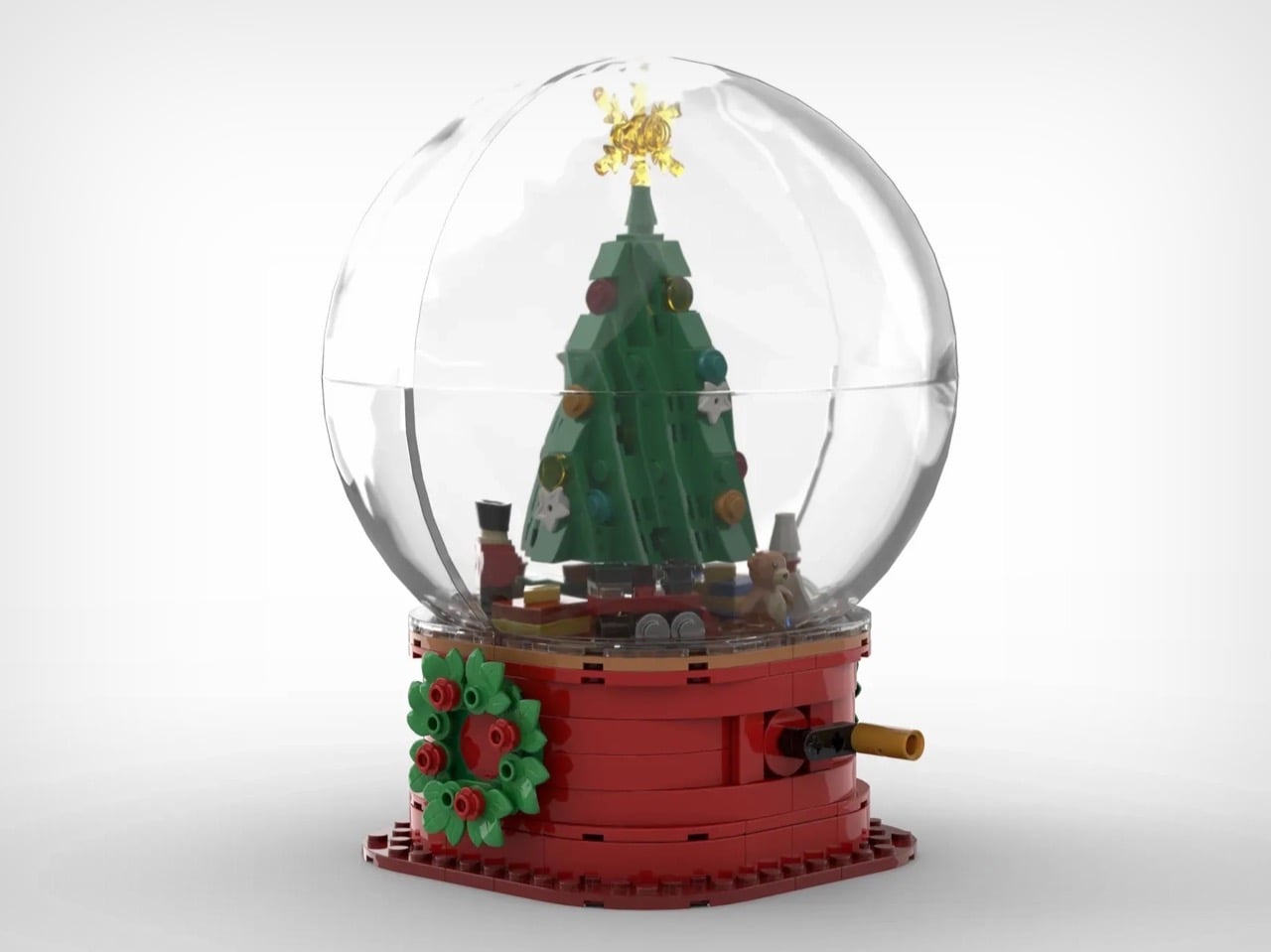
We’ve covered LEGO snow globes before on this website, but none of them designed to be as dynamic as this MOC (My Own Creation). The Brick Artist’s build actually features a rotating element, allowing the globe to spin on its own axis like a tiny fidget toy. Inside, the globe features a decked out Christmas tree complete with baubles, stars, and a shimmering snowflake tree topper. Underneath the tree are the usual suspects, gifts like a wooden train, the nutcracker, a toy rocket, and a remote-controlled airplane.
Designer: The Brick Artist
The build looks fairly simple, with a base decorated with snowflakes and wreaths, capped off with a rotating platform which houses the Christmas tree encased in the clear orb. The Brick Artist hasn’t detailed the part-count, but it’s probably in the 200-400 brick-ballpark, making it easy to assemble and perfect for kids, adults, or even Santa and his elves.
The way the tree rotates is using a rotary crank on the back that probably activates a pair of bevel gears that cause the upper half to spin on a central axis. There’s no music element here, although that would probably seal the deal as a pretty fun Christmas toy. However, the joy of this MOC isn’t in the experience as much as the journey of building your own snow globe from scratch.
The drill with this MOC is like every other one we’ve written about. It’s a fan-made creation that currently exists only on LEGO’s Ideas website – an online forum where people build and share their own LEGO creations and have the broader community vote for them. The only way this build becomes an official LEGO box set is if it crosses the 10,000 vote mark, and then gets approved by LEGO’s internal team after a review period. If you want to see that happen, head down to the LEGO Ideas website and cast your vote for this brickset!
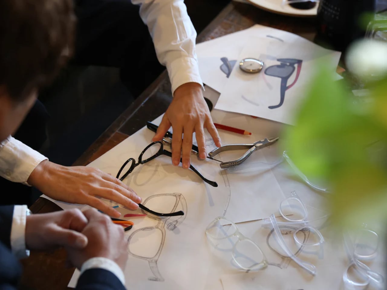
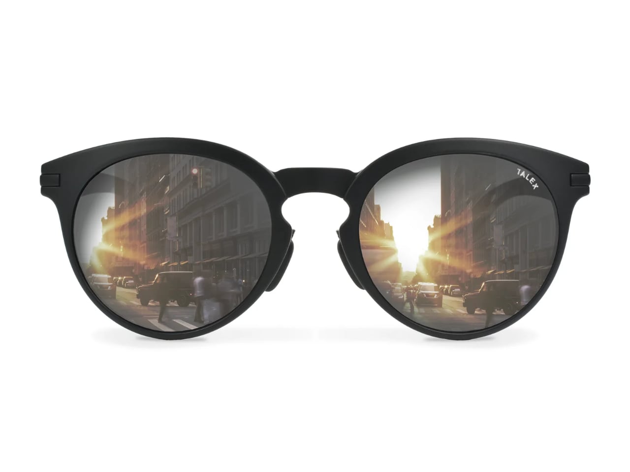
When the Lens Comes First: Most sunglasses begin as sketches. Designers draw frames that photograph well, then select lenses that match the aesthetic. Shinzo Tamura flips that sequence entirely. This Osaka-based brand starts with TALEX polarized lenses, then engineers frames specifically to house them. The result challenges how we think about eyewear design.
Designer: Shinzo Tamura
The approach stems from an uncomfortable truth about the sunglasses industry: dark lenses can actually damage your eyes. When non-polarized dark lenses block visible light without filtering UV rays, your pupils dilate to compensate for the darkness. More UV radiation reaches your retina than if you wore nothing at all. Shinzo Tamura positions itself against this paradox, treating eye protection as the foundation of design rather than an afterthought. That commitment traces back nearly a century, to a family workshop where lens-making became a generational obsession.
Three Generations in Tajima
The brand carries the name of its founder, a third-generation lens maker whose family began crafting eyeglass lenses in 1938. Tajima, the region near Osaka where the family workshop sits, has functioned as Japan’s optical manufacturing heartland for decades. This geographic heritage matters because it embedded generations of lens expertise into the company’s DNA before a single frame was ever designed.
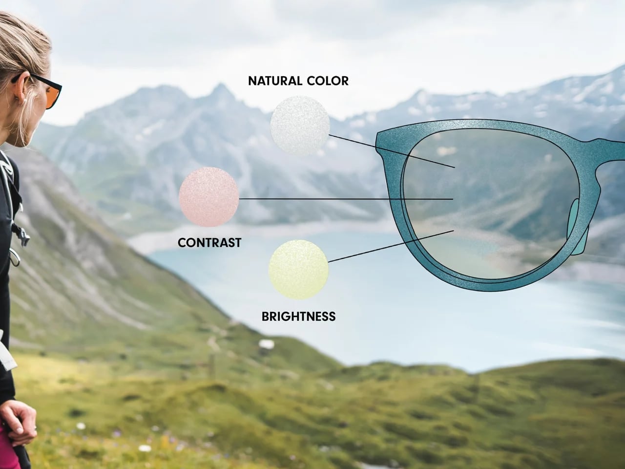
The critical moment came in 1966 when Shinzo Tamura’s grandfather created what the company describes as the first fully balanced polarized lens. That balance refers to three properties TALEX has spent eight decades refining: natural color reproduction, contrast enhancement, and brightness optimization. Standard polarized lenses sacrifice one or more of these qualities. TALEX treats all three as non-negotiable.
Understanding this history reframes the brand’s design philosophy. When your family has spent 80 years perfecting lens technology, starting frame design with the lens feels obvious rather than contrarian. The lens expertise preceded the eyewear brand by multiple generations. What that expertise produced deserves examination.
Inside the TALEX Filter
The technical core of every Shinzo Tamura lens is a proprietary iodine compound filter that TALEX developed in Japan. Unlike standard polarization that simply blocks horizontal light waves, the iodine compound targets specific wavelengths that cause eye strain and fatigue. The company claims this approach eliminates glare without the characteristic darkening that makes cheap polarized sunglasses feel like wearing tinted windows.
Three distinct lens properties emerge from this filtration system. Natural color lenses render the world without the yellow or blue tint common to polarized eyewear. Contrast lenses sharpen edges and add depth, useful for activities requiring precise visual judgment. Brightness lenses intensify light transmission while still blocking harmful rays. TALEX tunes these three qualities for specific use cases, from driving to fishing to golf.
The technical claims carry weight because of how TALEX has positioned its lenses commercially. The Porsche Experience Center Japan equips its driving instructors with TALEX sunglasses. Professional fishing guides in mountain streams use them. Japanese women’s surfing champion Narumi Kitagawa competes in them. These partnerships suggest performance validation beyond marketing copy.
UV protection reaches 99% according to TALEX specifications. But the brand emphasizes something beyond UV numbers: the reduction of eye fatigue over extended wear. This positions the lenses as tools for sustained activity rather than accessories for brief outdoor moments. The newest lens technology pushes these principles further.
The HD Lens Series
TALEX’s latest lens advancement arrives in two specialized variants, both built from the company’s patented CACCHU® material. This proprietary compound achieves something that seemed mutually exclusive: the optical clarity of glass combined with the impact resistance and weight savings of polyurethane. Nine distinct layers work together in each lens, with a super-thin polarizing film infused with iodine compounds at the core. The construction passed ANSI Z87.1 certification, which TALEX describes as the world’s most demanding optical inspection standard.
Onyx HD targets everyday wear and driving applications. At 13% visible light transmission, the lens handles strong light intensity while preserving natural color reproduction with a slightly warmer character than conventional grey polarized lenses. The design prioritizes defined contours and enhanced contrast, making road markings, traffic signals, and distant objects appear with unusual clarity. Standard Onyx HD lenses price between $275 and $325, with an HD-M mirror finish option available at $360.
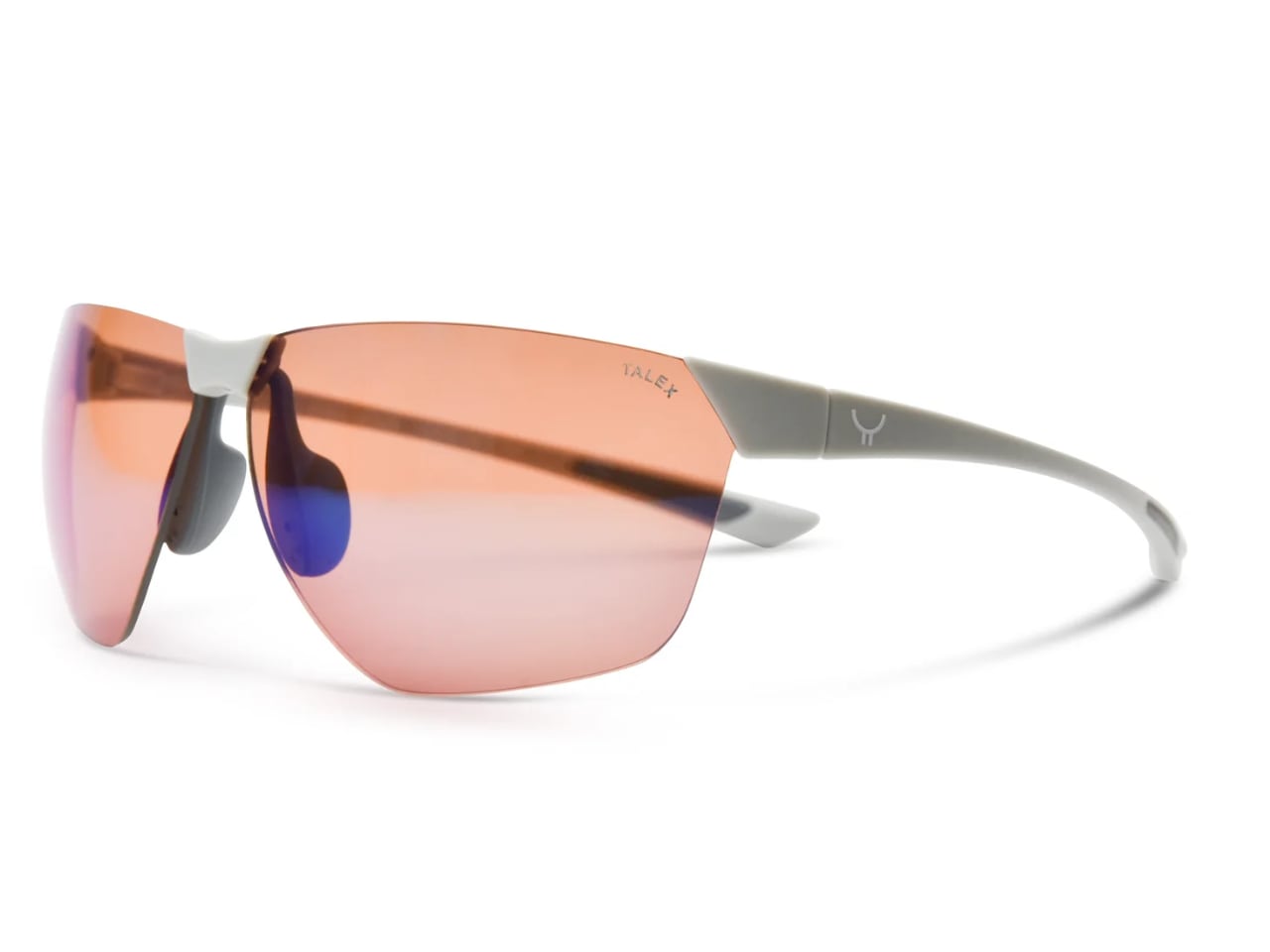
Zircon HD addresses outdoor sports and high-speed activities where visual precision determines performance. The lens shares the same 13% VLT as its Onyx sibling but optimizes for directional visibility at velocity. TALEX engineered this variant to recognize the smallest terrain changes and render object outlines with three-dimensional depth. Cyclists, skiers, and motorsport enthusiasts represent the target audience. Pricing mirrors the Onyx HD structure: $275 to $325 for standard versions, $360 for HD-M mirror coating.
Both HD lenses eliminate the discoloration and distortion that plague conventional polarized eyewear. The nine-layer CACCHU® construction maintains optical consistency across the entire lens surface, even at the edges where cheaper lenses typically degrade. With the lens technology established, the question becomes what holds it.
Premium Nylon Innovation
Frame design at Shinzo Tamura uses double-shot injection molding with premium nylon compounds. The material choice addresses specific failures in traditional eyewear materials. Acetate frames warp over time and develop surface whitening from sweat and plasticizers. Standard plastic loses structural integrity. Premium nylon resists all of these degradation patterns while achieving significantly lower weight than comparable materials.
The manufacturing collaboration with local Tajima factories applies Japanese precision standards to each frame. The Ultralight Collection pushes material efficiency to its limits, producing frames substantially thinner than industry standard constructions. The Classic Collection references 1960s and 1970s American and Japanese eyewear aesthetics, acknowledging the shared sunglass culture that developed between both countries during those decades. Material choice means nothing, though, if the wearer notices the frame at all.
The Disappearing Frame
Shinzo Tamura articulates its ultimate design goal through an unexpected metric: how quickly you forget you are wearing sunglasses. The brand wants frames so light, so precisely fitted, that by day’s end the wearer has no awareness of them. This invisible design philosophy runs counter to fashion eyewear that demands attention and signals status.
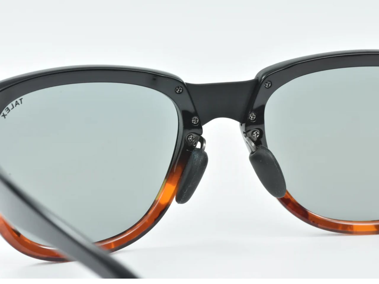
The goal requires solving weight distribution problems that most eyewear designers ignore. Nose pads must transfer minimal pressure. Temple arms must grip without squeezing. The combined weight of lens and frame must balance across contact points rather than concentrating at any single location. Low bridge fit options address additional anatomical variations, ensuring the disappearing frame experience extends to wearers with pronounced cheekbones and lower nose bridges.
This comfort obsession connects directly to the lens-first philosophy. If you are building eyewear around lenses designed for all-day outdoor activity, the frame must support that duration. Beautiful frames that cause headaches after two hours betray the lens technology they carry.
What Lens-First Design Means for Eyewear
The fashion industry spent decades training consumers to evaluate sunglasses by their frames. Designer names, trending shapes, and celebrity endorsements became the vocabulary of premium eyewear. Shinzo Tamura speaks a different language entirely, one where the invisible component determines value.
For designers watching this space, the lens-first approach suggests a broader principle: that the functional core of any product deserves design priority over its visible shell. The most elegant solution might be the one users forget they are wearing. Shinzo Tamura built an entire brand around that disappearance.
I’ve accepted the fact that in my lifetime, my home country will probably never win the World Cup, seeing as we’ve never come close to qualifying for one. So the next best thing would be to see the World Cup trophy in person, although that is also still a long shot given that the trophy tour will never pass by this side of the world. So the next best thing would be to see a replica of some sort and as I’m a LEGO fan as well, this newest build would be the perfect thing to own. It’s one of those rare occasions where my love for collecting LEGO sets and my passion for football intersect in the most beautiful way possible.
The LEGO® Editions FIFA World Cup Official Trophy (43020) is for the soccer (or football, as the rest of the world calls it) fan in you that would love to display the trophy on your shelf. It’s meant to hype up the 2026 World Cup tournament happening in the US, Canada, and Mexico in June-July 2026, which is one of, if not the world’s most popular sporting tournament. It’s a LEGO-fied replica of the trophy, featuring authentic details that capture the essence of the real thing. In case, like me, this is the closest you’ll ever come to actually touching this prestigious trophy, at least you can say you built it brick by brick with your own hands.
Even though the World Cup is one of the most-watched sporting events every four years, drawing billions of viewers from around the globe, this is actually the first time that football fans will be able to build an official replica 1:1 scale model of the trophy. The iconic design features two human figures holding up the earth, symbolizing the global unity that football brings. The build is made up of 2,842 LEGO elements, making it a substantial and satisfying project that will keep you engaged for hours. What’s particularly impressive is that it has the highest number of gold-colored bricks used in a single LEGO set, giving it that authentic metallic sheen that makes the real trophy so mesmerizing under stadium lights.
The attention to detail is remarkable. The build also includes a printed plaque under the base which lists all the countries that have lifted the current trophy design since it was introduced in 1974. This includes legendary winners like Brazil, Germany, Argentina, France, and Italy. It’s a nice touch that adds historical context and makes the replica feel more authentic and commemorative. For collectors and football historians, this detail alone makes the set worth having.
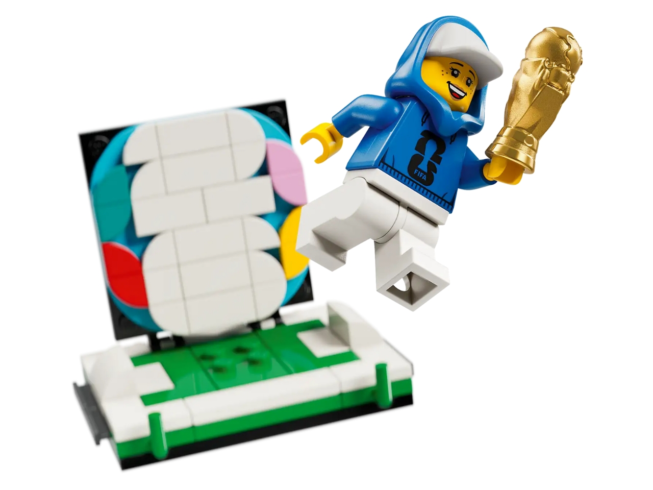
You even get a special easter egg when you pull out the slip in a hidden compartment in the upper globe section. You’ll see the actual FIFA World Cup 2026 logo and a cute branded minifig holding up a mini trophy toy. Basically you get a small trophy within the trophy replica, kind of like an inception-style setup. You can pull out this mini scene and display it next to the trophy replica so you sort of get two kinds of decorations. It’s these thoughtful little surprises that LEGO is known for, and they really enhance the overall building experience and display value.
The building process itself is designed to be both challenging and rewarding. With nearly 3,000 pieces, you’ll need to set aside several hours to complete it, but the step-by-step instructions make it accessible even if you’re not a LEGO expert. The modular construction means you build from the base up, just like the journey teams take to reach the final. There’s something meditative about clicking those golden bricks into place, watching the trophy take shape before your eyes.
The main trophy itself measures around 14.5 inches high once finished, making it a substantial display piece that commands attention without overwhelming your space. It’s a perfect gift for kids aged 12 and above or adults like me who are fans of both the sport and LEGO builds. Whether you display it in your living room, office, or dedicated collection space, it’s sure to be a conversation starter, especially during World Cup season.
It will be available for purchase starting March 2026 in the lead up to the tournament, giving fans plenty of time to build and display it before the first match kicks off. LEGO also said they will be rolling out new products and experiences to celebrate this momentous tournament that will feature 48 teams, the most of any edition. This expansion makes the 2026 World Cup historic in its own right, and having this replica feels like owning a piece of that history.
Pantone has officially called it: the prevailing mood for 2026 is exhaustion. This marks a sharp departure from recent years, when the annual announcement felt like a conversation happening in a different room. The world was navigating a pandemic hangover and digital burnout, while Pantone was prescribing electric purples for creativity and defiant magentas for bravery. Each choice, while commercially friendly, felt like a wellness influencer telling a tired person to simply manifest more energy.
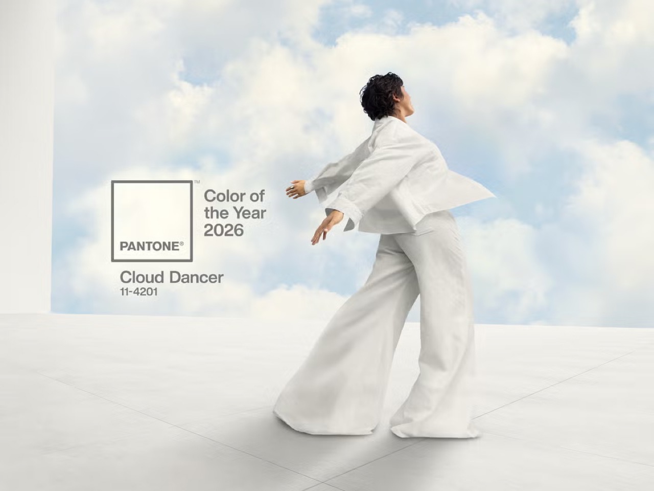
This year, however, their choice of Cloud Dancer, a soft, billowy white, functions less like a statement and more like a surrender. It is the color of a blank page, an empty inbox, a quiet sky, a white flag, if you will. By choosing a hue defined by its peaceful lack of saturation, Pantone is finally acknowledging the dominant cultural mood – burnout. They are admitting that the most aspirational feeling right now is not vigor or joy, but rest.
Designer: Pantone
To understand why this feels so significant, you have to look at the recent track record. The disconnect between Pantone’s narrative and the world’s reality has been the core of the critique, which I made back in 2022, calling Pantone’s Very Peri an exercise in blind futility. The argument was that Pantone was no longer reading culture but trying to write it, pushing a top-down color prophecy that served its own marketing ecosystem more than it reflected any genuine grassroots sentiment. This critique felt especially potent with the last two selections, Peach Fuzz and Mocha Mousse.
Peach Fuzz, the choice for 2024, was sold with a story of tenderness, community, and tactile comfort. It was a lovely, gentle shade, but it landed in a year defined by rising inflation, geopolitical instability, and a pervasive anxiety about the acceleration of artificial intelligence. The narrative felt like a beautifully packaged lie of omission. Then came Mocha Mousse for 2025, a comforting brown meant to evoke groundedness and stability. It was a safe, aesthetically pleasing choice that aligned perfectly with coffee-shop interior trends, but it felt more like an algorithmic pick from a Pinterest board labeled “cozy” than a meaningful cultural statement. It was a color for a lifestyle, not for a life.
Which brings us to Cloud Dancer. On the surface, choosing white seems like the ultimate cop-out. It is the absence, the default, the non-choice. But Pantone’s justification is, for the first time in a long while, deeply resonant. Leatrice Eiseman, the executive director of the Pantone Color Institute, describes it as a “conscious statement of simplification” meant to provide “release from the distraction of external influences.” Laurie Pressman, the vice president, is even more direct, stating, “We’re looking for respite, looking for relief… we just want to step back.”
This is not the language of aspirational marketing; it is the language of burnout. Pantone is explicitly naming the problem: overstimulation, digital noise, and the overwhelming “cacophony that surrounds us.” Cloud Dancer is positioned as the visual antidote, a quiet space in a world that refuses to shut up. It is a breath of fresh air, a lofty vantage point above the chaos. By framing the color as a tool for focus and a symbol of a much-needed pause, Pantone has shifted from prescribing an emotion to validating one. It feels less like they are telling us how to feel and more like they are saying, “We hear you. You’re tired.”
Of course, we should not mistake this newfound self-awareness for a complete abandonment of the marketing machine. The Color of the Year is, and always will be, a commercial enterprise. But the choice of Cloud Dancer is a savvier, more sophisticated move. Choosing white cleverly sidesteps the pressure to project forced optimism. It aligns perfectly with existing design trends like soft minimalism and quiet luxury, making it an easy sell to brands. Most importantly, it allows Pantone to craft a story about retreat and renewal, a narrative that feels both authentic and highly marketable in a wellness-obsessed culture.
So, is the ‘marketing fluff’ gone? Not entirely. But it has been supplemented with something much more compelling. Instead of a tone-deaf declaration, we have a confession that feels a little more aware of a global sentiment. Cloud Dancer works because it is an admission of defeat. It is a white flag, a symbol of surrender to the relentless pace of modern life. In a world saturated with color, demanding our attention at every turn, the most radical and desired hue might just be the one that asks for nothing. Pantone did not just pick a color for 2026; it picked a feeling, and for the first time in a long time, it feels like our own.
Candles have had their moment. The same pillar wax, the predictable flicker, the scent that lingers just a bit too long. Winter gift giving deserves better than another vanilla-scented cylinder wrapped in recycled paper. The people on your list who care about how things look, who curate their spaces with intention, who grimace at generic seasonal decor, need gifts that match their standards. They want ambiance without the cliché, warmth without the waxy residue, ritual without the routine.
This collection of five winter gifts speaks directly to that sensibility. Each piece brings light, warmth, or comfort into cold-weather living spaces without relying on the tired tropes of holiday shopping. From buildable nostalgia to precision-engineered flames, these designs prove that seasonal gifting can be thoughtful, functional, and genuinely exciting. These are the gifts that get displayed year-round, not shoved into storage boxes come January.
1. LEGO Snow Globes
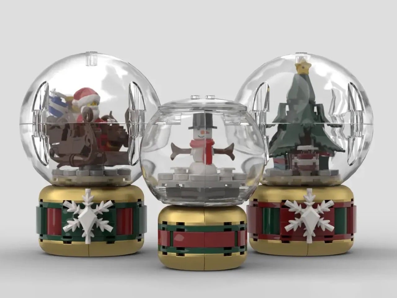
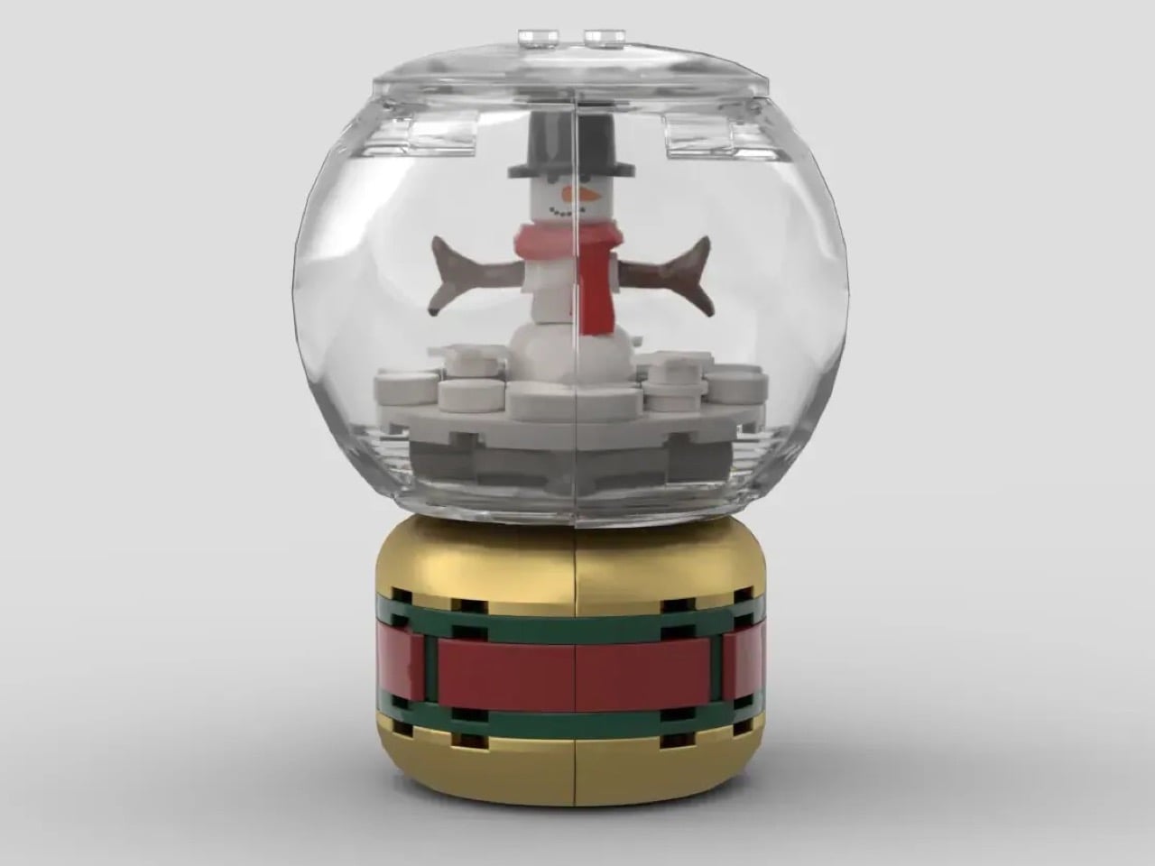
Winter nostalgia gets a modular makeover with these buildable snow globes that let brick enthusiasts create their own holiday scenes. Designed as a My Own Creation by builder ItzEthqn, this trio of festive displays captures seasonal charm through 385 carefully selected pieces. The set includes three distinct globes: a petite snowman complete with carrot nose and branch arms, a fuller Christmas tree topped with a star and surrounded by wrapped gifts, and a scene featuring Santa on his loaded sleigh ready for his annual delivery run.
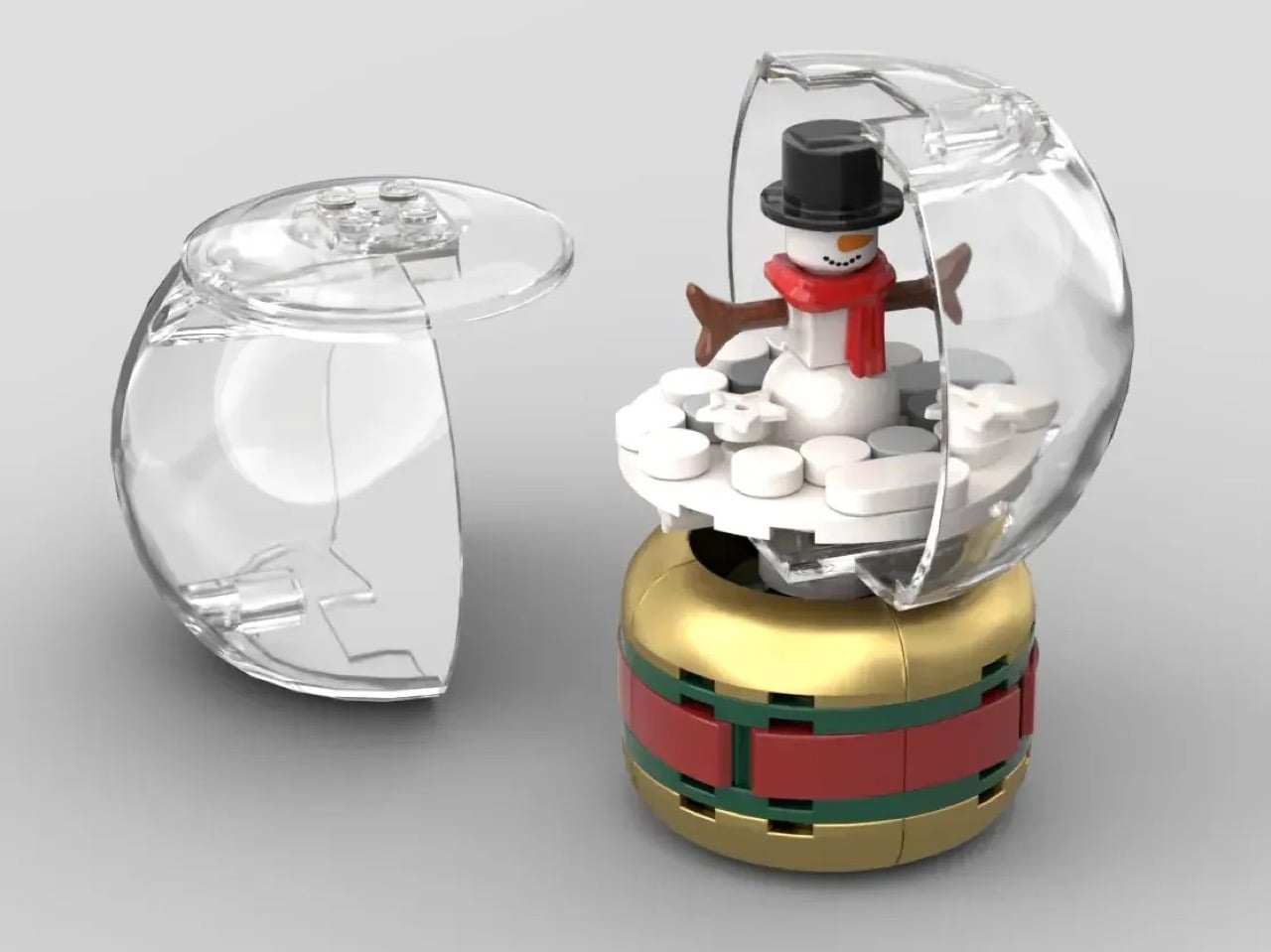
The genius lies in the construction itself. Each globe uses transparent LEGO pieces to create the illusion of a glass encasement, while the bases mirror the gold, green, and red bands found on vintage novelty shop displays. The larger two globes feature two-part orb designs with snowflake bricks embedded into their bases for extra seasonal detail. The modular nature means anyone with a decent LEGO collection can swap out the interior scenes entirely, transforming these from Christmas-specific decorations into year-round display pieces that reflect personal interests, inside jokes, or seasonal rotations beyond December.
What we like
The completely customizable interior scenes mean these globes evolve with your interests.
The nostalgic factor hits perfectly for anyone who grew up building with bricks.
Display-worthy finished product that bridges childhood play and adult design sensibility.
What we dislike
At 385 pieces total across three globes, the build might feel quick for serious LEGO fans.
The transparent pieces showing seams rather than smooth glass may bother purists.
2. Ceramic Cup
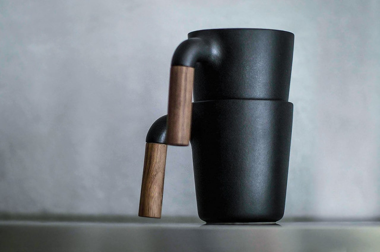
Coffee and tea drinkers who treat their daily ritual as meditation rather than caffeine delivery will recognize themselves in this Japanese-inspired ceramic mug. The design mimics the textured appearance of cast iron teaware, bringing that same grounded, tactile quality to a modern drinking vessel. The exterior surface carries visual weight and an almost rustic presence, while the interior remains smooth, glazed ceramic that won’t interfere with the taste of whatever fills it. A wooden handle provides warmth against cold hands without conducting heat from the cup itself.
The 350ml capacity hits the sweet spot between delicate tea ceremony portions and American coffee mug excess. This size encourages slower drinking, multiple pours from a pot, and refills that keep you present rather than caffeinated into oblivion. The design philosophy clearly draws from wabi-sabi aesthetics, where imperfection and earthiness create beauty. The faux cast iron finish gives each mug subtle variations in tone and texture. Hand washing requirements and the prohibition against microwaving signal that this piece demands a bit more care than your standard dishwasher-safe corporate logo mug, which somehow makes the daily use feel more intentional.
The visual weight and texture create a grounding sensory experience with every sip.
Japanese ceramic construction ensures quality that improves with age and use.
The wooden handle stays cool while the cup retains heat beautifully.
What we dislike
Hand-wash only requirement adds extra steps to morning routines.
The cast iron aesthetic might feel heavy for minimalist spaces that favor lighter palettes.
3. Harmony Flame Fireplace
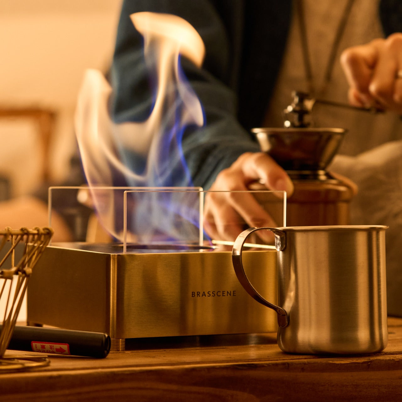
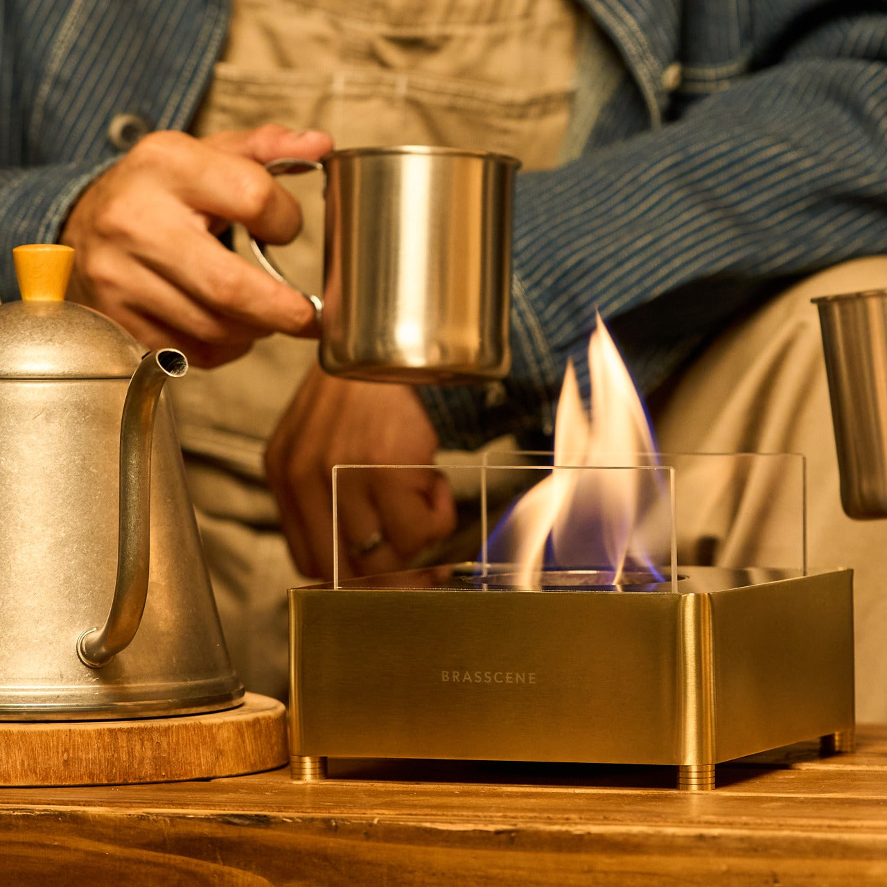
Real fire indoors stops being a fantasy with this brass lamp that burns bioethanol fuel for genuine flames without smoke, odor, or ventilation requirements. Crafted using the same techniques employed by brass instrument makers, this piece brings music-quality precision to functional fire. The reflective brass surface catches and multiplies the flame’s movement, creating shifting patterns of light and shadow across nearby walls and surfaces. The result feels less like lighting a candle and more like introducing a living element into your space that breathes and dances.
Bioethanol burns clean, producing only water vapor and trace carbon dioxide comparable to human breath. No soot stains your ceilings, no smoke triggers alarms, no lingering smell clings to furniture and curtains the way traditional candle wax does. The brass construction develops a patina over time, recording the lamp’s history in subtle color shifts and darkened areas where hands frequently touch. The compact box design means this flame source travels easily from dining table to side table to outdoor patio, adapting to wherever the evening takes you. Winter gatherings gain instant atmosphere when real fire reflects off brass onto faces gathered around, telling stories.
Genuine flame provides an unmatched ambiance that LED alternatives can never replicate.
Handcrafted brass construction means each piece carries slight variations and will age uniquely.
Bioethanol fuel eliminates all the drawbacks of traditional candles while keeping the essential magic of fire.
What we dislike
Bioethanol fuel requires purchasing and storing separately from the lamp itself.
The exposed flame demands more caution around children and pets than enclosed lighting.
4. Fire Capsule Oil Lamp
Minimalist design meets extended burn time in this cylindrical oil lamp that delivers up to 16 hours of continuous light from a single 80ml fill. The sleek form factor disguises remarkable functionality: a precision-engineered lid keeps dust away from the glass chimney, an included aroma plate transforms the lamp into a scent diffuser, and the option to use insect-repelling paraffin oil makes this equally valuable for winter indoor ambiance and summer outdoor dining. The glass cylinder protects the flame while allowing full visibility of the flickering light that creates the same meditative quality fire has provided humans for millennia.
The portability changes how you think about lighting. A drawstring pouch protects the lamp during transport, making this equally at home on a dinner party sideboard, a camping trip table, or a long weekend cabin mantle. The cylindrical shape packs efficiently, and the durable construction survives the bumps of travel that would shatter more delicate candle holders. The aroma plate sits above the flame, gently warming essential oils or fragrance without burning them, creating a subtle scent that disperses naturally rather than the overwhelming cloud some candles produce. Winter nights call for this kind of adjustable, movable light that follows you from room to room as evening activities shift from cooking to conversation to reading.
The 16-hour burn time from 80ml capacity means fewer refills and uninterrupted ambiance.
Dual functionality as both light source and aroma diffuser maximizes versatility.
The portable design with protective pouch makes this equally valuable at home or while traveling.
What we dislike
Oil lamps require more active maintenance than battery-powered alternatives.
The open flame design means careful placement away from fabrics and flammable materials.
5. Smart Tea Pot
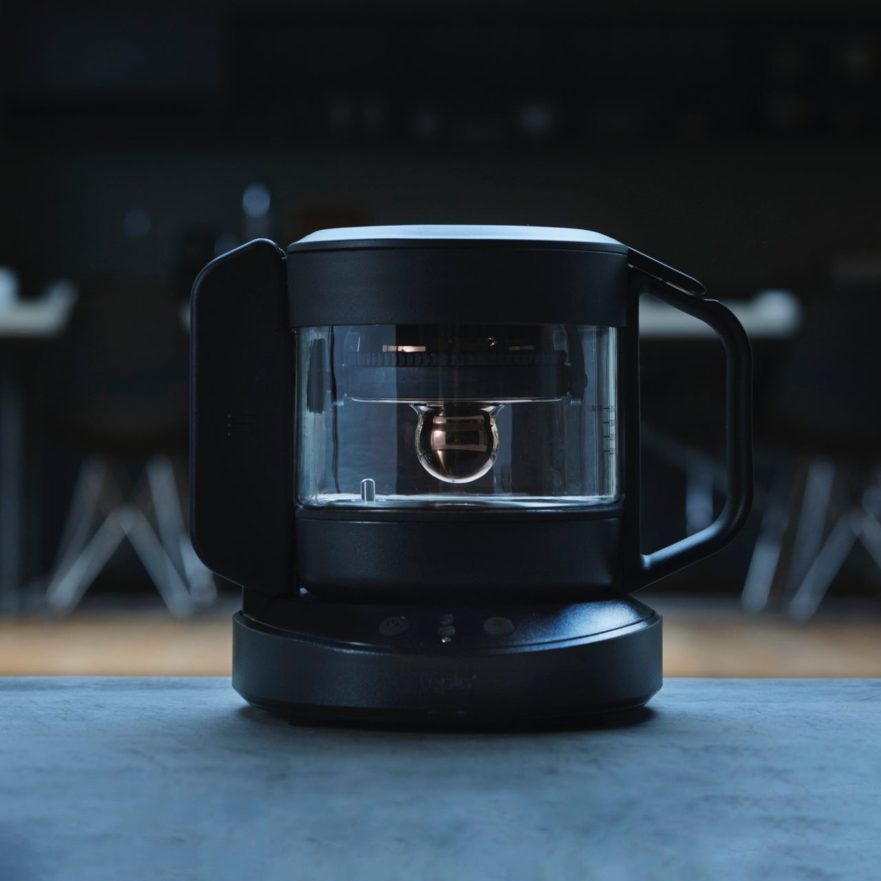
Tea preparation becomes a personalized wellness ritual with this app-connected teapot that analyzes your biometric data and environmental conditions to brew each cup specifically for your current state. Six integrated sensors read heart rate, finger temperature, ambient temperature, humidity, and other factors to determine whether you need calming chamomile brewed gently or energizing green tea extracted with precision. The comprehensive database includes optimal brewing parameters for hundreds of tea varieties, removing guesswork and delivering consistent results that honor each tea’s unique characteristics. Traditional tea knowledge meets modern sensor technology.
The patented rotary brewing system replicates the subtle wrist movements Japanese and Chinese tea masters spend years perfecting. This mechanical choreography affects extraction rates, flavor development, and aromatic compound release in ways that simply dunking a bag in hot water can never achieve. The teapot essentially contains centuries of tea ceremony expertise translated into repeatable, programmable motion. Winter mornings transform when your first cup emerges, brewed to match your resting heart rate and the cold air temperature, while evening cups adjust to help you wind down as your body temperature drops toward sleep. The app interface removes complexity, letting you simply select a tea type and trust the sensors to handle the details.
Biometric sensors create genuinely personalized brewing that responds to your actual physical state rather than generic presets.
The rotary brewing system delivers tea master quality without requiring years of training.
The extensive tea database educates while it brews, expanding your knowledge of varieties and optimal preparation methods.
What we dislike
The technology complexity might overwhelm purists who prefer intuitive, hands-on tea preparation.
App connectivity requirements mean this teapot depends on your phone being charged and nearby.
Why These Gifts Work
Candles represent passive consumption. You light them, they burn, they disappear. These five designs offer something fundamentally different: engagement, customization, and evolution over time. The LEGO snow globes rebuild into new configurations, the ceramic mug develops character with use, the brass lamp gains patina, the oil lamp travels to new contexts, and the smart teapot learns your preferences. Each piece rewards attention and active participation rather than simply existing as background decoration that you replace when the wax melts down.
The people who think candles are too basic already understand this distinction. They curate rather than accumulate, they value objects that perform multiple functions or reveal new dimensions with extended use, and they invest in pieces that justify their presence through both aesthetics and utility. These winter gifts speak that same language. They bring warmth and light into cold months without relying on the disposable logic that dominates seasonal shopping. Give these to the design-conscious people in your life and watch them actually use them instead of filing them away with other well-intentioned but ultimately generic presents.
Candles have had their moment. The same pillar wax, the predictable flicker, the scent that lingers just a bit too long. Winter gift giving deserves better than another vanilla-scented cylinder wrapped in recycled paper. The people on your list who care about how things look, who curate their spaces with intention, who grimace at generic seasonal decor, need gifts that match their standards. They want ambiance without the cliché, warmth without the waxy residue, ritual without the routine.
This collection of five winter gifts speaks directly to that sensibility. Each piece brings light, warmth, or comfort into cold-weather living spaces without relying on the tired tropes of holiday shopping. From buildable nostalgia to precision-engineered flames, these designs prove that seasonal gifting can be thoughtful, functional, and genuinely exciting. These are the gifts that get displayed year-round, not shoved into storage boxes come January.
1. LEGO Snow Globes
Winter nostalgia gets a modular makeover with these buildable snow globes that let brick enthusiasts create their own holiday scenes. Designed as a My Own Creation by builder ItzEthqn, this trio of festive displays captures seasonal charm through 385 carefully selected pieces. The set includes three distinct globes: a petite snowman complete with carrot nose and branch arms, a fuller Christmas tree topped with a star and surrounded by wrapped gifts, and a scene featuring Santa on his loaded sleigh ready for his annual delivery run.
The genius lies in the construction itself. Each globe uses transparent LEGO pieces to create the illusion of a glass encasement, while the bases mirror the gold, green, and red bands found on vintage novelty shop displays. The larger two globes feature two-part orb designs with snowflake bricks embedded into their bases for extra seasonal detail. The modular nature means anyone with a decent LEGO collection can swap out the interior scenes entirely, transforming these from Christmas-specific decorations into year-round display pieces that reflect personal interests, inside jokes, or seasonal rotations beyond December.
What we like
The completely customizable interior scenes mean these globes evolve with your interests.
The nostalgic factor hits perfectly for anyone who grew up building with bricks.
Display-worthy finished product that bridges childhood play and adult design sensibility.
What we dislike
At 385 pieces total across three globes, the build might feel quick for serious LEGO fans.
The transparent pieces showing seams rather than smooth glass may bother purists.
2. Ceramic Cup
Coffee and tea drinkers who treat their daily ritual as meditation rather than caffeine delivery will recognize themselves in this Japanese-inspired ceramic mug. The design mimics the textured appearance of cast iron teaware, bringing that same grounded, tactile quality to a modern drinking vessel. The exterior surface carries visual weight and an almost rustic presence, while the interior remains smooth, glazed ceramic that won’t interfere with the taste of whatever fills it. A wooden handle provides warmth against cold hands without conducting heat from the cup itself.
The 350ml capacity hits the sweet spot between delicate tea ceremony portions and American coffee mug excess. This size encourages slower drinking, multiple pours from a pot, and refills that keep you present rather than caffeinated into oblivion. The design philosophy clearly draws from wabi-sabi aesthetics, where imperfection and earthiness create beauty. The faux cast iron finish gives each mug subtle variations in tone and texture. Hand washing requirements and the prohibition against microwaving signal that this piece demands a bit more care than your standard dishwasher-safe corporate logo mug, which somehow makes the daily use feel more intentional.
The visual weight and texture create a grounding sensory experience with every sip.
Japanese ceramic construction ensures quality that improves with age and use.
The wooden handle stays cool while the cup retains heat beautifully.
What we dislike
Hand-wash only requirement adds extra steps to morning routines.
The cast iron aesthetic might feel heavy for minimalist spaces that favor lighter palettes.
3. Harmony Flame Fireplace
Real fire indoors stops being a fantasy with this brass lamp that burns bioethanol fuel for genuine flames without smoke, odor, or ventilation requirements. Crafted using the same techniques employed by brass instrument makers, this piece brings music-quality precision to functional fire. The reflective brass surface catches and multiplies the flame’s movement, creating shifting patterns of light and shadow across nearby walls and surfaces. The result feels less like lighting a candle and more like introducing a living element into your space that breathes and dances.
Bioethanol burns clean, producing only water vapor and trace carbon dioxide comparable to human breath. No soot stains your ceilings, no smoke triggers alarms, no lingering smell clings to furniture and curtains the way traditional candle wax does. The brass construction develops a patina over time, recording the lamp’s history in subtle color shifts and darkened areas where hands frequently touch. The compact box design means this flame source travels easily from dining table to side table to outdoor patio, adapting to wherever the evening takes you. Winter gatherings gain instant atmosphere when real fire reflects off brass onto faces gathered around, telling stories.
Genuine flame provides an unmatched ambiance that LED alternatives can never replicate.
Handcrafted brass construction means each piece carries slight variations and will age uniquely.
Bioethanol fuel eliminates all the drawbacks of traditional candles while keeping the essential magic of fire.
What we dislike
Bioethanol fuel requires purchasing and storing separately from the lamp itself.
The exposed flame demands more caution around children and pets than enclosed lighting.
4. Fire Capsule Oil Lamp
Minimalist design meets extended burn time in this cylindrical oil lamp that delivers up to 16 hours of continuous light from a single 80ml fill. The sleek form factor disguises remarkable functionality: a precision-engineered lid keeps dust away from the glass chimney, an included aroma plate transforms the lamp into a scent diffuser, and the option to use insect-repelling paraffin oil makes this equally valuable for winter indoor ambiance and summer outdoor dining. The glass cylinder protects the flame while allowing full visibility of the flickering light that creates the same meditative quality fire has provided humans for millennia.
The portability changes how you think about lighting. A drawstring pouch protects the lamp during transport, making this equally at home on a dinner party sideboard, a camping trip table, or a long weekend cabin mantle. The cylindrical shape packs efficiently, and the durable construction survives the bumps of travel that would shatter more delicate candle holders. The aroma plate sits above the flame, gently warming essential oils or fragrance without burning them, creating a subtle scent that disperses naturally rather than the overwhelming cloud some candles produce. Winter nights call for this kind of adjustable, movable light that follows you from room to room as evening activities shift from cooking to conversation to reading.
The 16-hour burn time from 80ml capacity means fewer refills and uninterrupted ambiance.
Dual functionality as both light source and aroma diffuser maximizes versatility.
The portable design with protective pouch makes this equally valuable at home or while traveling.
What we dislike
Oil lamps require more active maintenance than battery-powered alternatives.
The open flame design means careful placement away from fabrics and flammable materials.
5. Smart Tea Pot
Tea preparation becomes a personalized wellness ritual with this app-connected teapot that analyzes your biometric data and environmental conditions to brew each cup specifically for your current state. Six integrated sensors read heart rate, finger temperature, ambient temperature, humidity, and other factors to determine whether you need calming chamomile brewed gently or energizing green tea extracted with precision. The comprehensive database includes optimal brewing parameters for hundreds of tea varieties, removing guesswork and delivering consistent results that honor each tea’s unique characteristics. Traditional tea knowledge meets modern sensor technology.
The patented rotary brewing system replicates the subtle wrist movements Japanese and Chinese tea masters spend years perfecting. This mechanical choreography affects extraction rates, flavor development, and aromatic compound release in ways that simply dunking a bag in hot water can never achieve. The teapot essentially contains centuries of tea ceremony expertise translated into repeatable, programmable motion. Winter mornings transform when your first cup emerges, brewed to match your resting heart rate and the cold air temperature, while evening cups adjust to help you wind down as your body temperature drops toward sleep. The app interface removes complexity, letting you simply select a tea type and trust the sensors to handle the details.
Biometric sensors create genuinely personalized brewing that responds to your actual physical state rather than generic presets.
The rotary brewing system delivers tea master quality without requiring years of training.
The extensive tea database educates while it brews, expanding your knowledge of varieties and optimal preparation methods.
What we dislike
The technology complexity might overwhelm purists who prefer intuitive, hands-on tea preparation.
App connectivity requirements mean this teapot depends on your phone being charged and nearby.
Why These Gifts Work
Candles represent passive consumption. You light them, they burn, they disappear. These five designs offer something fundamentally different: engagement, customization, and evolution over time. The LEGO snow globes rebuild into new configurations, the ceramic mug develops character with use, the brass lamp gains patina, the oil lamp travels to new contexts, and the smart teapot learns your preferences. Each piece rewards attention and active participation rather than simply existing as background decoration that you replace when the wax melts down.
The people who think candles are too basic already understand this distinction. They curate rather than accumulate, they value objects that perform multiple functions or reveal new dimensions with extended use, and they invest in pieces that justify their presence through both aesthetics and utility. These winter gifts speak that same language. They bring warmth and light into cold months without relying on the disposable logic that dominates seasonal shopping. Give these to the design-conscious people in your life and watch them actually use them instead of filing them away with other well-intentioned but ultimately generic presents.
Most desks accumulate a scattered collection of control devices over time. There’s the keyboard and mouse, maybe a Stream Deck for shortcuts, a volume knob for your speakers, a phone running smart home apps, and a separate remote for the desk lamp. Each solves a specific problem, but together they create a landscape of disconnected gadgets competing for space and attention. The monitor sits above it all, while everything underneath becomes a tangled mess of cables and redundant functions.
UltraBar X tries to consolidate that chaos into a single, modular strip that lives under your monitor. Built around a long, wedge-shaped bar with an ultra-wide display, it acts as a command center for your computer, applications, and even your smart home devices. Instead of a fixed product, it works more like a platform where you snap on magnetic modules to build the exact control surface your desk needs.
The central piece is CoreBar, a low, seven-inch display wedge-shaped bar tilted at forty-five degrees so it’s easy to glance at without adjusting your posture. The screen shows clocks, system stats, app icons, and customizable scenes that change based on what you’re doing. Tap the screen to wake your PC, jump between apps, or trigger macros, all from a touch interface that sits right where your hands naturally rest.
What makes the system feel different is how the magnetic modules expand it. DotKey snaps onto the side and brings a cluster of Cherry MX mechanical keys for shortcuts and macros. KnobKey adds a precision rotary dial that clicks crisply as you turn it, perfect for adjusting volume, brush size, or timeline scrubbing. VivoCube is a tiny controller with its own AMOLED screen and switches, small enough to hold or dock alongside the bar.
Of course, there’s also SenseCube, the environmental sensing module. Inside its small triangular shell are millimeter-wave radar and sensors for light, temperature, humidity, and vibration. This gives your desk a kind of ambient awareness, letting it detect when you sit down, notice changes in lighting, or respond when the room gets too warm. The workspace starts to feel less static and more responsive without constant input.
A typical morning might look like this. You walk up to your desk and tap CoreBar to wake the PC, which also brings up a layout tuned for writing and email. The mechanical keys are mapped to window management shortcuts, while the knob handles scrolling through long documents. Later, a single press shifts CoreBar into a design layout, and pretty much the same modules now control brush size, zoom, and layers in Photoshop or Illustrator.
The system doesn’t stop at the screen. Through its network connection, CoreBar can talk to Philips Hue lights to adjust the room based on your focus mode, or trigger a Sonos playlist with a single tap on an icon. The same bar that manages your open apps can also dim the lights or change the soundtrack, turning your desktop into a bridge between your computer and the rest of your space.
What keeps the experience from feeling overwhelming is how the software handles it. CoreBar runs a custom system with an app store and a library of templates for different workflows. Programmers get layouts for terminal, debugging, and IDE shortcuts. Designers get knobs and keys for brushes and layers. Streamers get scene controls and quick mutes. These templates bundle icons, animations, and logic, so you can load a complete setup without building from scratch.
That said, the modular approach means the system can grow over time. You can start with just CoreBar and add modules as you figure out what you actually need, swapping them in and out as your workflow shifts. The QuantumLink magnetic protocol means modules snap on, get recognized instantly, and can be reconfigured in seconds without tools or menus.
UltraBar X is made for people who enjoy shaping their tools rather than accepting whatever default interface their operating system provides. It doesn’t replace your keyboard or mouse, but it gives the space under your monitor a clear job beyond collecting dust and cable clutter. For anyone tired of juggling separate devices or hunting through nested menus, a modular bar that can sense, adapt, and consolidate feels like a thoughtful step toward desks that work the way you do.
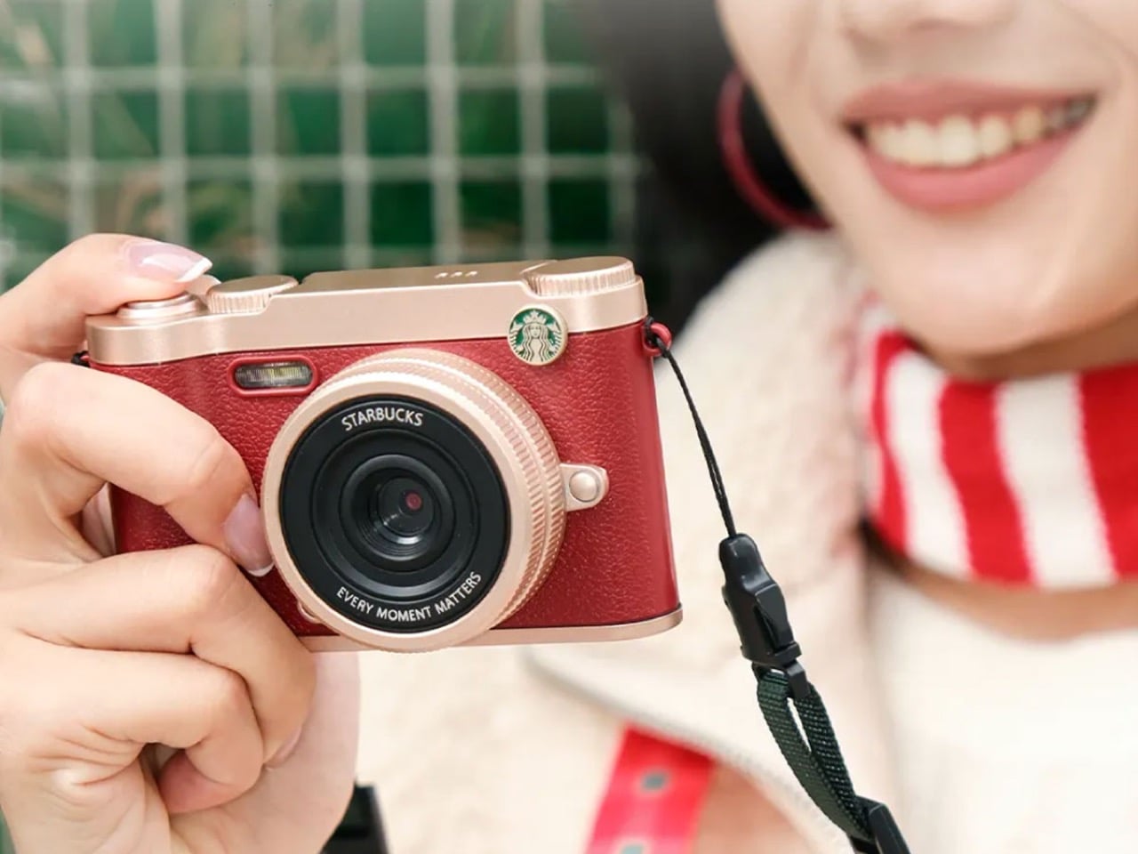
Starbucks wants you to photograph your coffee so badly that they’ve started selling you the camera to do it with. The Seattle coffee chain has ventured into digital imaging with a retro-styled camera that’s generating buzz for being surprisingly functional rather than just another piece of logo-plastered merchandise.
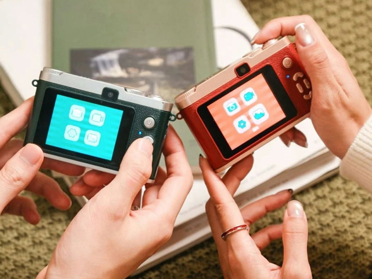
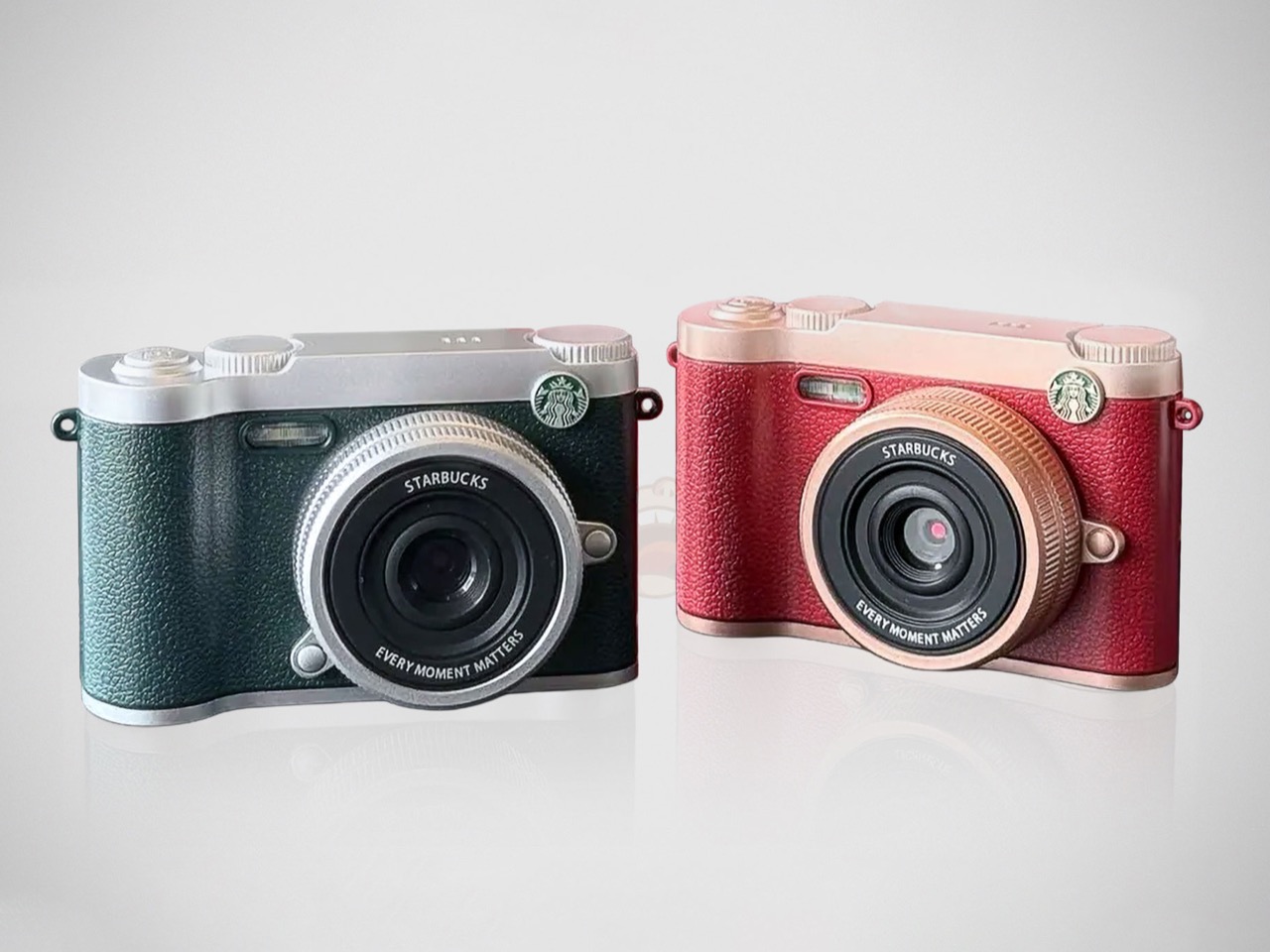
Released in China for the 2025 holiday season, the Starbucks Retro Digital Camera comes with dual sensors, vintage filters, and a design aesthetic borrowed from classic rangefinder cameras. At 198 yuan (roughly $28), it undercuts almost every digital camera on the market while offering features like proper selfie framing through its rear sensor and Y2K photo overlays. The metal-and-leather construction in burgundy-gold or green-silver colorways suggests Starbucks contracted with an established camera manufacturer rather than creating novelty electronics from scratch.
Designer: Starbucks
Look, Starbucks absolutely did not design this camera from the ground up. That $28 price point screams white-label collaboration with one of China’s numerous budget camera OEMs, and honestly, why wouldn’t they? The country has an entire ecosystem of manufacturers churning out retro-inspired digital cameras for the nostalgia market. You’d be an idiot to build camera R&D infrastructure when you’re a coffee company. Slap your logo on proven hardware, customize the leather colors, engrave “EVERY MOMENT MATTERS” around the lens ring, and call it a day. Starbucks already did this dance with LOMO on an instant camera in 2024, so they know the playbook. Partner with people who actually understand imaging sensors and leave the coffee roasting to yourself.
What actually matters here is that dual-sensor setup, because it solves a problem that every budget camera has ignored for decades. Taking selfies with a traditional camera means holding it at arm’s length, pressing the shutter, and praying you’re somewhere in the frame. Maybe your face is cut off. Maybe you captured mostly ceiling. Who knows? Starbucks stuck a second sensor where the viewfinder would normally sit, turning decorative nonsense into a functional front-facing camera. You frame yourself on the rear LCD exactly like using a smartphone, which means the target audience (people who want filtered photos for Instagram) can actually use this thing without wanting to throw it against a wall. Those nine Y2K photo frame overlays and retro filters are pure nostalgia bait, but we’re drowning in millennium aesthetics right now anyway. Fashion’s doing it, UI design’s doing it, why shouldn’t cameras?
Resale prices jumped to $72 almost immediately, which tells you everything about actual demand. Triple the original price means people want these as functional devices, not just collectors hoarding Starbucks merch. The lychee leather texture and metal construction feel surprisingly premium when you hold one. Those decorative dials on top are completely useless, sure, but they nail the vintage rangefinder look well enough that you’d need to inspect closely to realize this costs less than a week of lattes. At some point, perceived quality matters as much as actual specs, especially when you’re targeting casual photographers who care more about vibes than aperture settings.
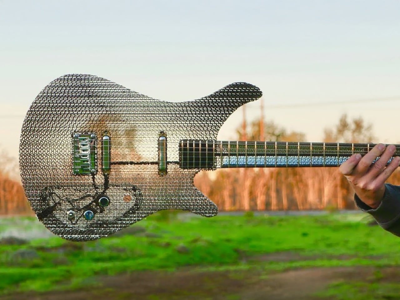
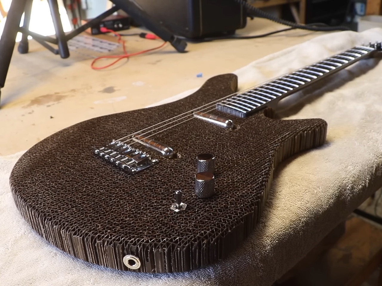
Ten years ago, Fender and Signal put out a cardboard Stratocaster that made the rounds online and promptly disappeared into the “cool but impractical” category of guitar experiments. Burls Art saw it and had a different reaction: he wanted to build his own. Not as a replica, but as a legitimate exploration of what corrugated cardboard could do as a guitar-building material. The result is a 4.42-pound fully functional electric guitar that sounds surprisingly good and raises some interesting questions about material choices in instrument design.
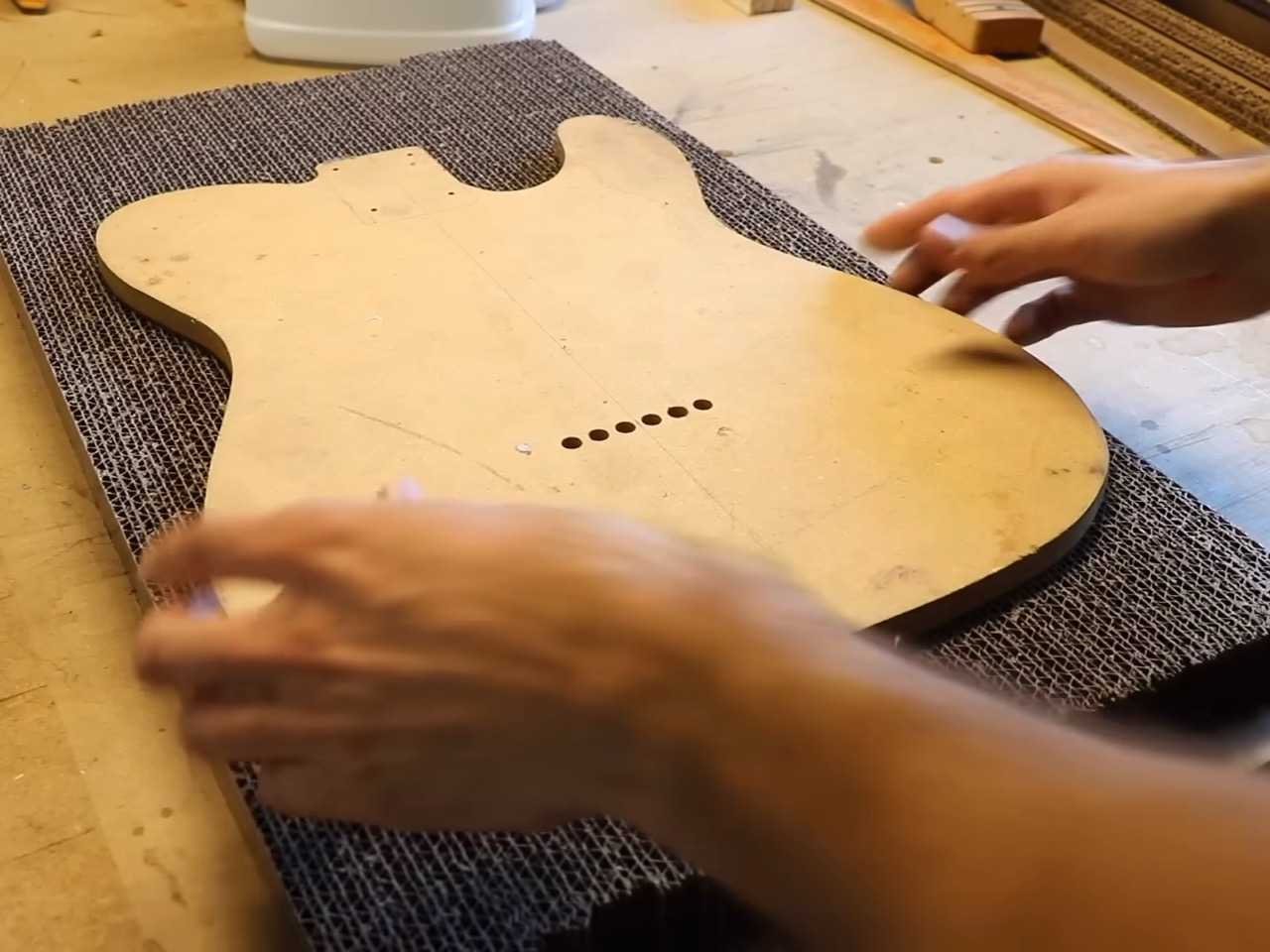
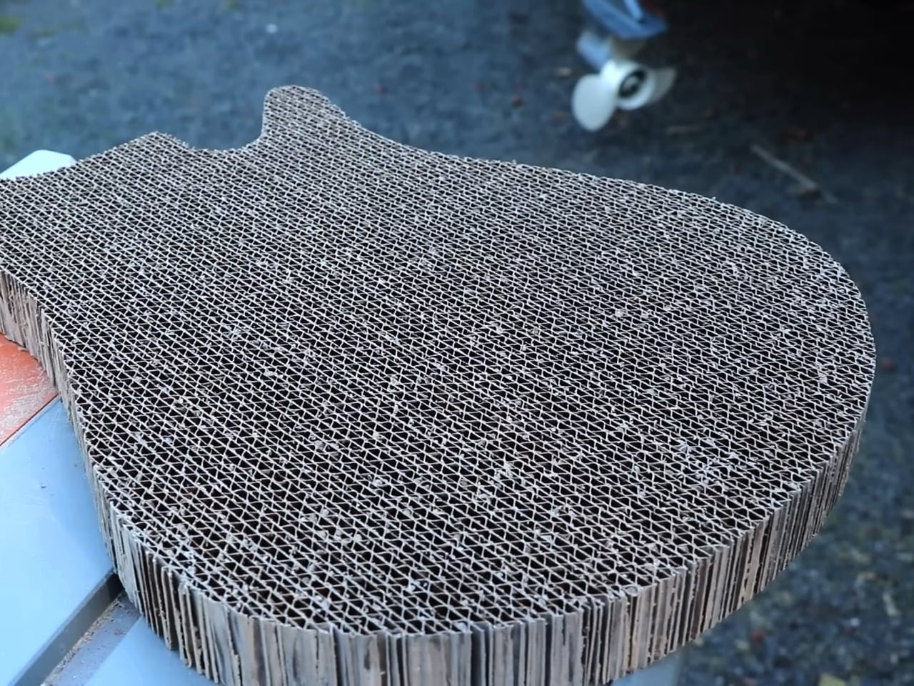
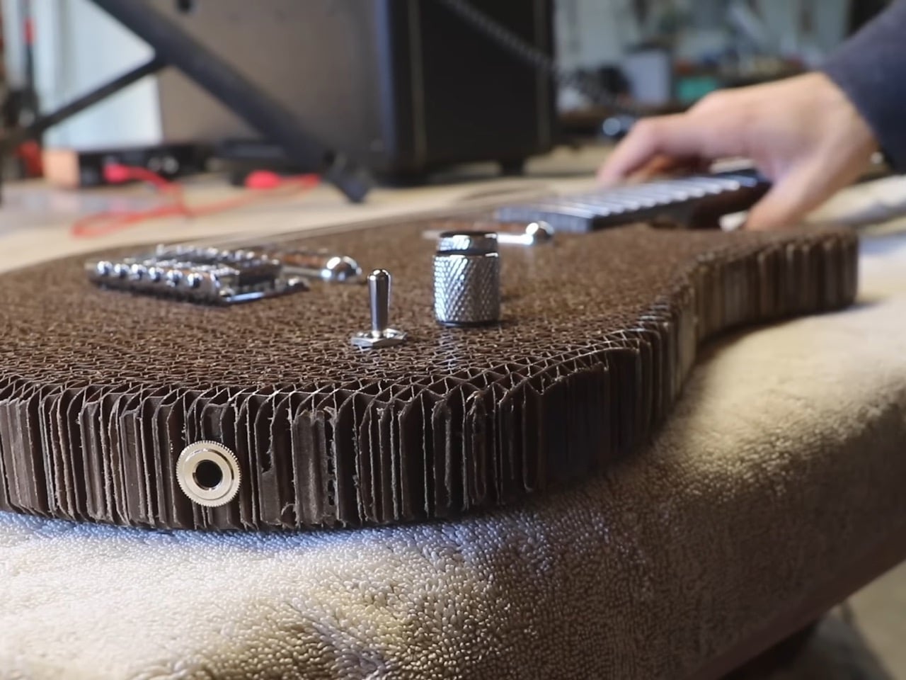
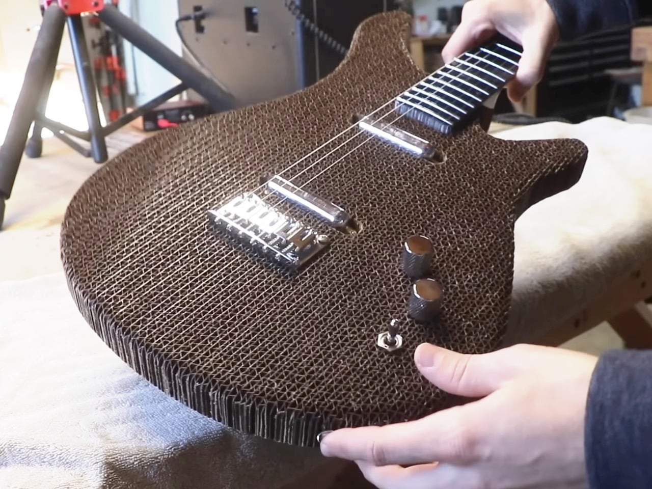
The concept isn’t about gimmickry or standard internet clout-chasing, it’s about pushing cardboard to its structural limits while keeping the guitar genuinely playable. Burls Art started with recycled corrugated cardboard sheets, laminating them with resin into blanks thick enough to shape into a body and neck. The key was saturating each piece thoroughly while letting excess resin drain through runners, leaving the corrugated channels mostly hollow. This gave him blanks that were roughly 70% air but rigid enough to route and carve like traditional tonewoods.
Designer: Burls Arts
The body came together relatively smoothly. He used a router sled instead of risking the planer, carving in standard contours – a belly carve on the back, an arm bevel on top – that wouldn’t look out of place on any conventional Strat-style build. The visual effect is unexpectedly compelling: from up close, the corrugation creates a textured, almost screen-like appearance, but step back and align your sight line just right, and the guitar becomes nearly transparent, with just the outline visible through thousands of tiny cardboard channels.
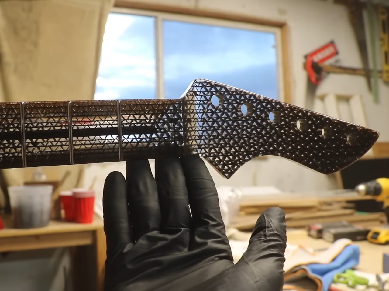
The neck presented a more complex engineering challenge. String tension on a guitar neck isn’t trivial, we’re talking about roughly 100-150 pounds of force depending on string gauge and tuning. Cardboard, even laminated cardboard, doesn’t immediately inspire confidence in this application. Burls Art’s first approach drew inspiration from an unexpected source: the Wiggle Side Chair he’d seen at the London Design Museum, which alternates the grain orientation of its cardboard layers for added strength. He tested two lamination methods – one with consistent orientation, another alternating… and the results were dramatic. The alternated pattern withstood 125 pounds of force before breaking, compared to just 37 pounds for the standard orientation.
The first neck, despite being theoretically strong enough, had a fatal flaw: the edges kept peeling and creating rough, jagged surfaces that would be uncomfortable to play. This is where real-world application diverges from lab testing, a neck that can withstand string tension in theory still needs to feel right in your hands. Rather than continuing to troubleshoot the alternating pattern, he pivoted to a fully resin-saturated approach, essentially creating a cardboard-epoxy composite. It’s heavier, sure, but the cardboard fibers act like fiberglass reinforcement, preventing the cracking issues you’d see in a pure resin neck while giving him a surface that could be carved smooth and fretted without delamination issues.
Weight became the next puzzle. That resin-saturated neck was too heavy for the ultra-light body, creating the dreaded neck dive – where the headstock droops toward the floor when you’re wearing the guitar on a strap. He carved aggressively, removing as much material as possible without compromising structural integrity, using the balance point at the neck plate as his target. The final setup required dropping down to Super Slinky strings to reduce the tension demands on the truss rod, which makes sense when you’re working at the edge of a material’s capabilities.
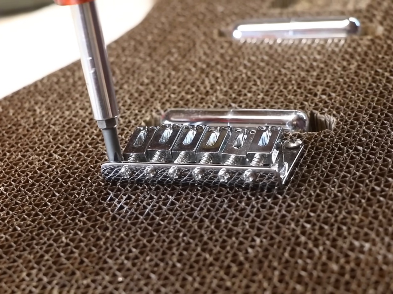
Hardware mounting in corrugated cardboard requires creative problem-solving. You can’t just screw into hollow channels and expect it to hold. For the bridge, he fabricated a resin-saturated cardboard backplate that gets inset into the body, creating a clamping system with the cardboard sandwiched between the bridge and plate. The electronics cavity cover uses magnets paired with screw heads hot-glued into the corrugation – a cleaner solution than trying to thread screws into this material.
The finished instrument plays better than you’d expect. Action is solid, intonation holds, and the sound quality is legitimately good with its pair of lipstick single-coils. There’s an interesting side effect from the flexible body: it’s exceptionally responsive to vibrato from arm pressure. Apply a bit of force with your forearm and you get pronounced pitch modulation, far more than you’d get from a traditional solid-body design. Whether that’s a feature or a bug depends on your playing style, but it’s the kind of unexpected behavior that makes alternative materials interesting.
The tactile experience is admittedly different from your standard Stratocaster. The surface has a sticky quality against fabric, and the edges are intentionally rough – he could have added wood binding to smooth them out but chose to keep it authentically cardboard. At 4.42 pounds, it’s 3-4 pounds lighter than a typical electric guitar, which puts it closer to laptop weight than instrument weight. That’s legitimately remarkable when you consider it’s holding tune under full string tension.
This isn’t going to replace your main gigging guitar, and Burls Art isn’t suggesting it should. But it’s a genuine exploration of material science applied to lutherie (the craft of making stringed instruments), the kind of project that answers questions nobody was asking but everyone’s curious about once they see the results. The original Fender collaboration was proof of concept. This is proof that with enough ingenuity and willingness to iterate past initial failures, cardboard can be a legitimate choice for guitar-building… after all IKEA’s made tables out of the same material too.










 Official Trophy (43020) is for the soccer (or football, as the rest of the world calls it) fan in you that would love to display the trophy on your shelf. It’s meant to hype up the 2026 World Cup tournament happening in the US, Canada, and Mexico in June-July 2026, which is one of, if not the world’s most popular sporting tournament. It’s a LEGO-fied replica of the trophy, featuring authentic details that capture the essence of the real thing. In case, like me, this is the closest you’ll ever come to actually touching this prestigious trophy, at least you can say you built it brick by brick with your own hands.