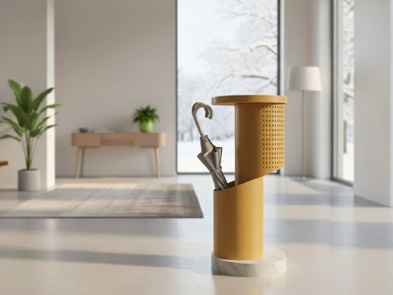
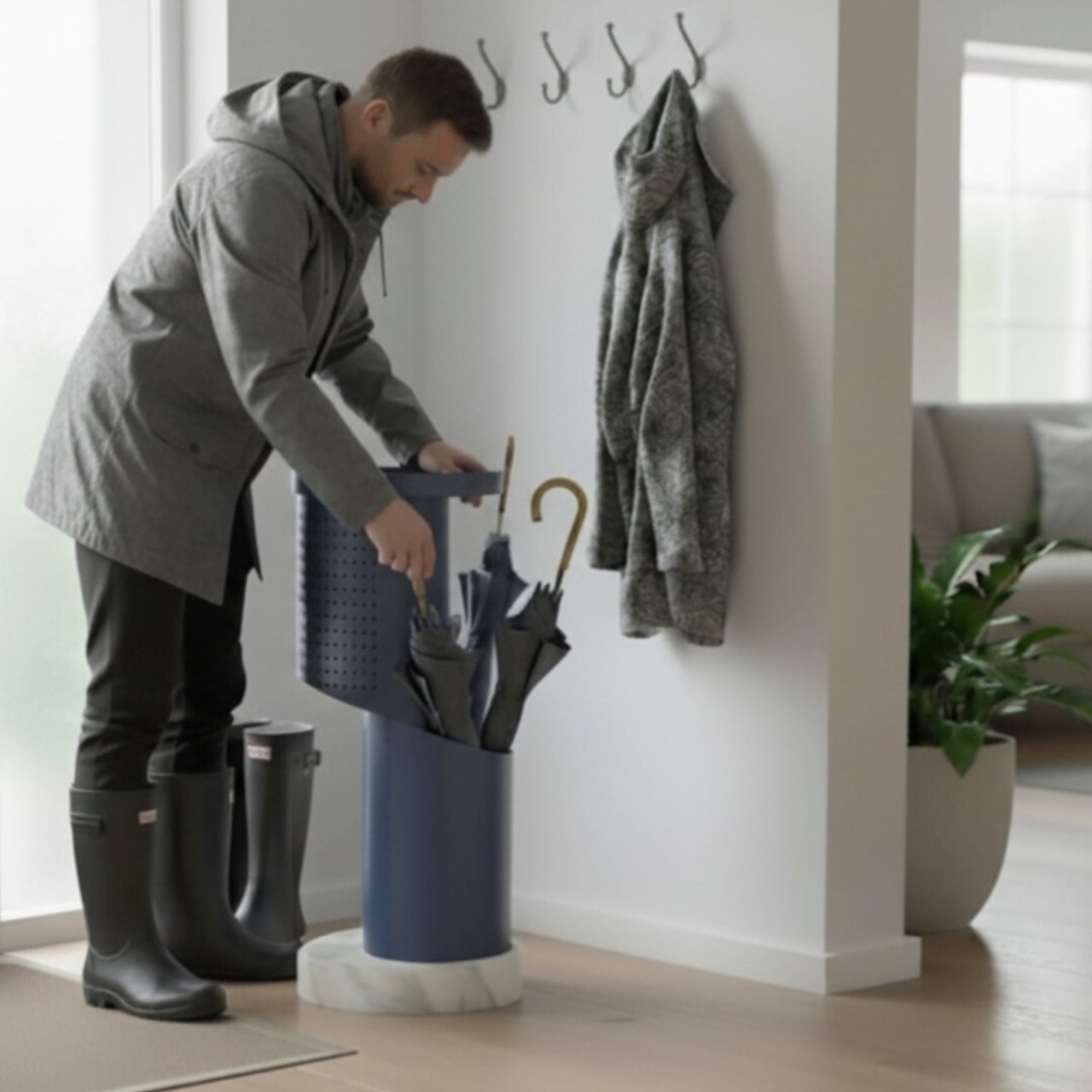
Most entryways are chaos zones. Umbrellas lean against walls, keys land on whatever surface is closest, and the stand is usually just a metal tube catching drips in a corner nobody looks at twice. This corner of the home rarely gets the same design attention as the living room or kitchen, even though it is the first thing you see when you walk in and the last thing you touch before leaving.
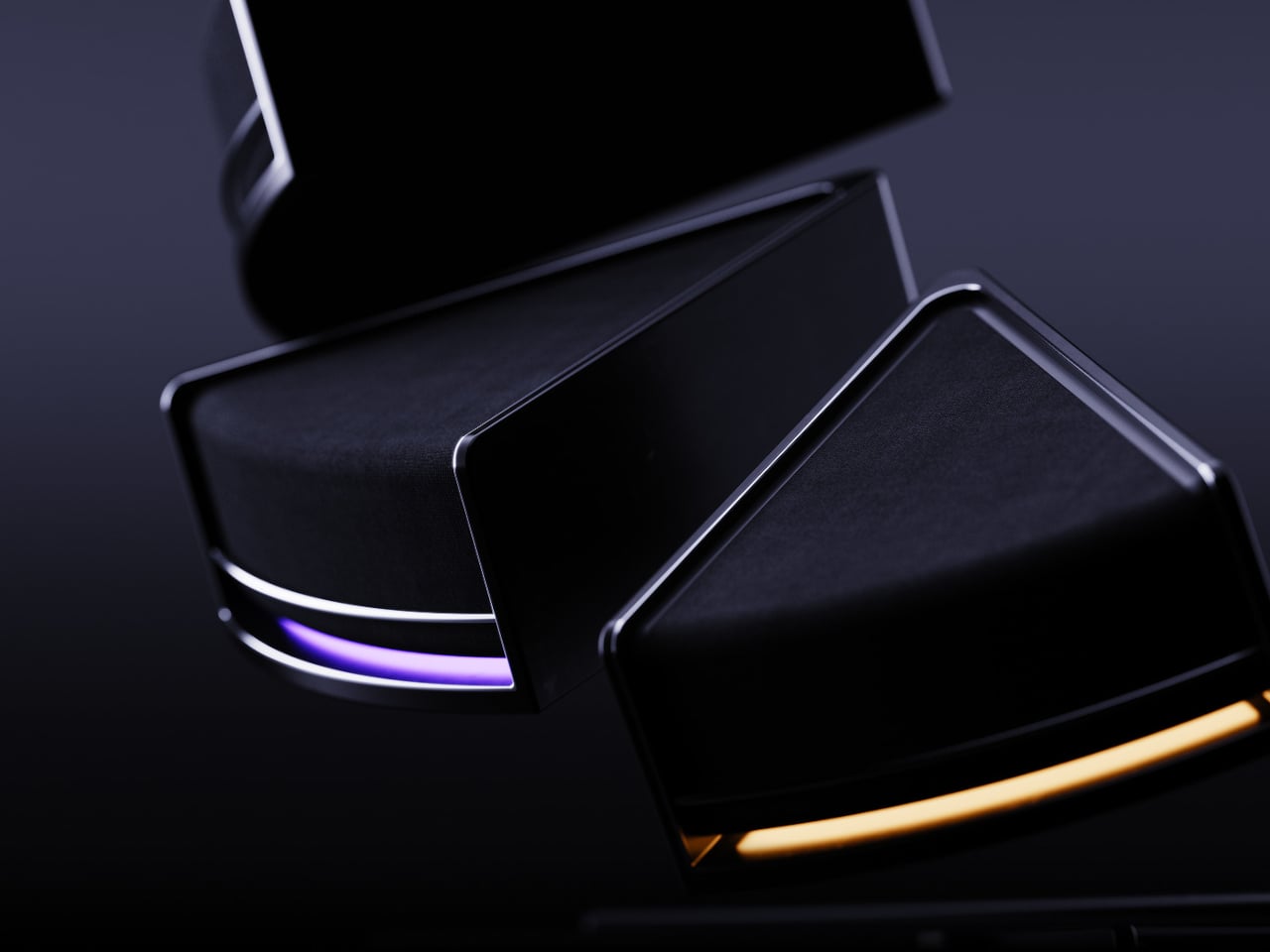
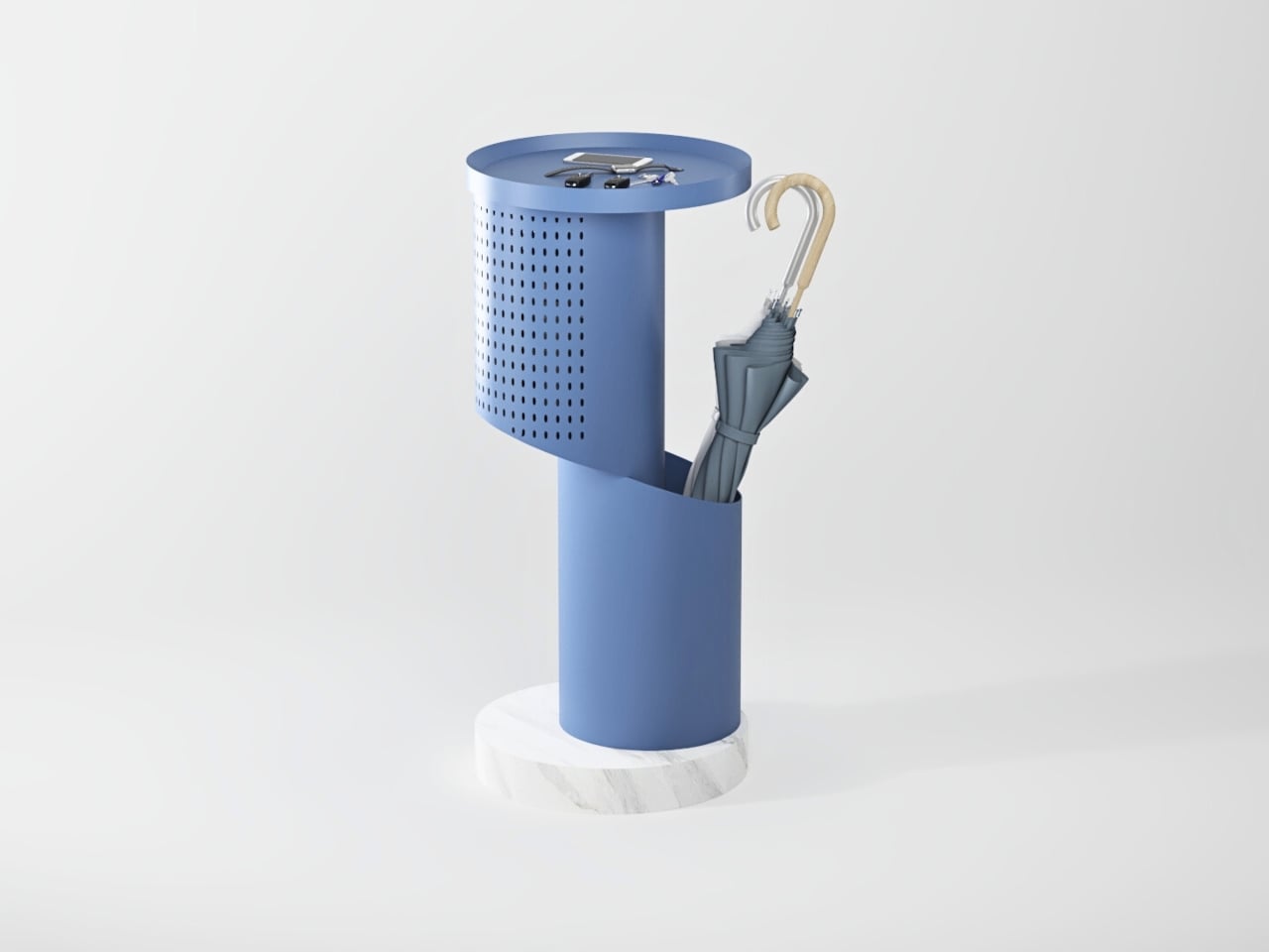
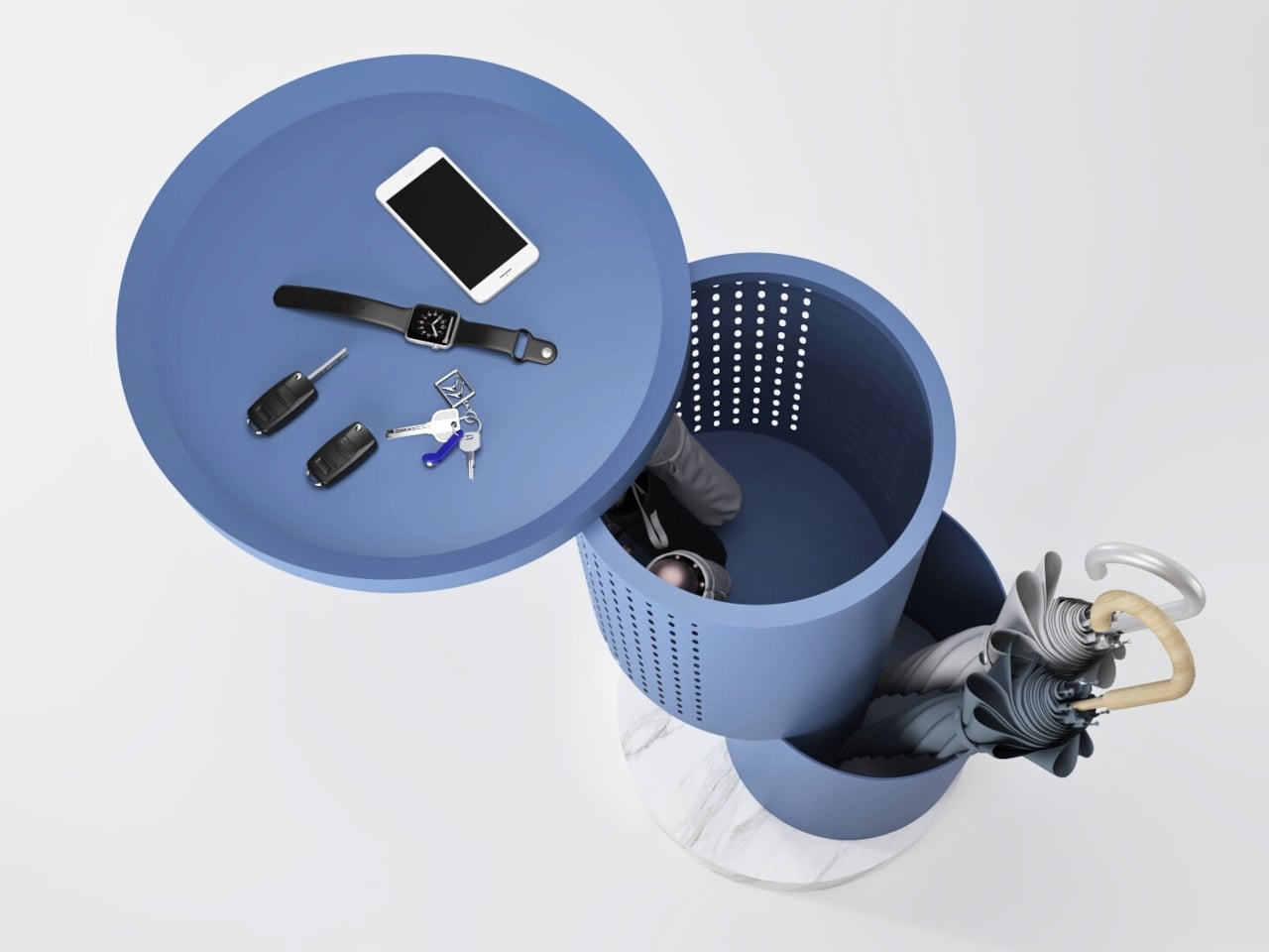
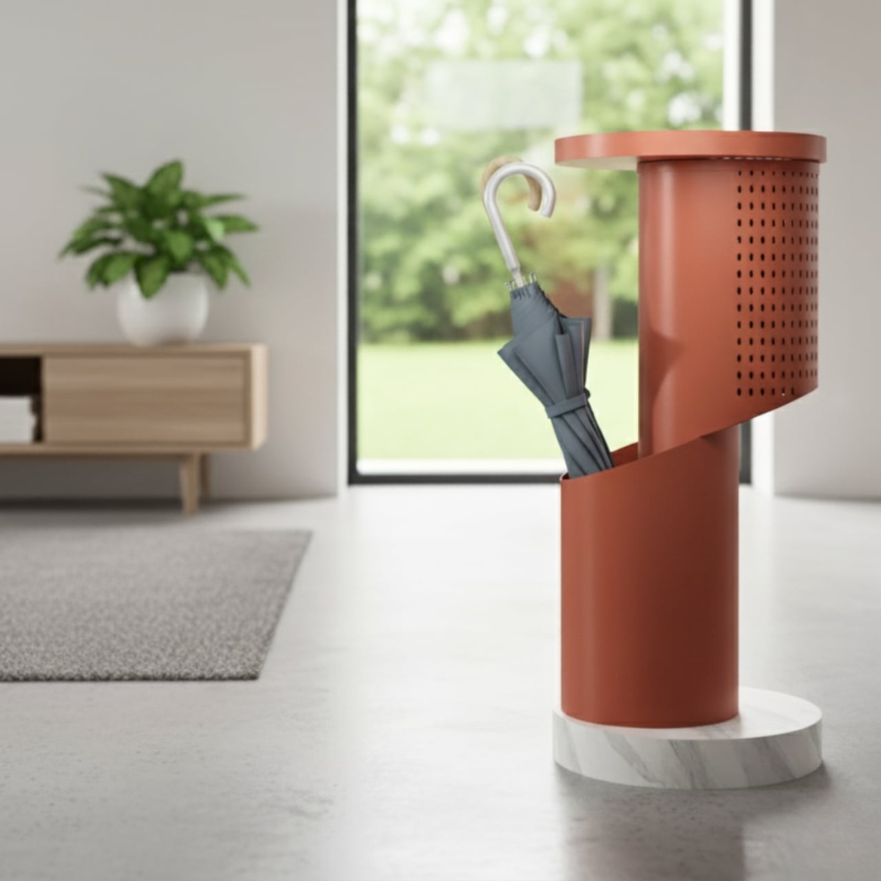
Split is an umbrella stand concept that behaves like a small, movable console. It is built around a sleek cylindrical form that opens with a pivoting lid, revealing storage for short and long umbrellas. When closed, the lid becomes a tabletop for keys, phones, or a wallet, turning the stand into a compact landing zone for everything you carry through the door, wet or dry.
Designer: Yomna Elborollossy
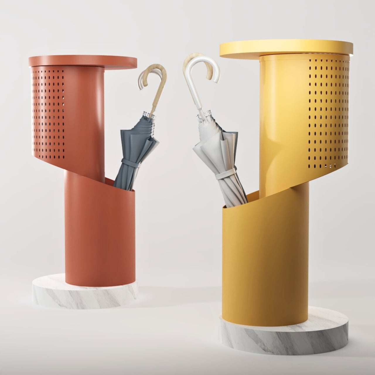
The cylinder splits into two functional zones. An open lower section holds long umbrellas, keeping handles accessible and letting wet fabric breathe. A closed upper section stores compact umbrellas or other small items, hiding clutter without sealing it in a damp box. The geometry makes it obvious where things go, which is half the battle in keeping an entryway tidy without thinking about it every single time.
The perforated upper shell works like a pegboard and a vent at the same time. The grid of circular holes can accept hooks for hanging small items like dog leashes, lanyards, or lightweight bags, and it also lets air circulate through the closed space so damp umbrellas or gloves can dry. That detail keeps the object from becoming a humid box and gives it a subtle, graphic texture that reads well from across a room.
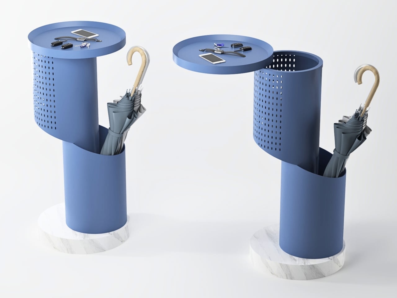
The pivoting lid turns a simple stand into something interactive. A quick swing of the lid reveals the inner compartment without forcing you to clear off the top first, and when it is closed, the flat surface is ready for keys, a phone, or a small tray. The motion adds a bit of ceremony to arriving home, making the act of putting things away feel deliberate instead of automatic or rushed.
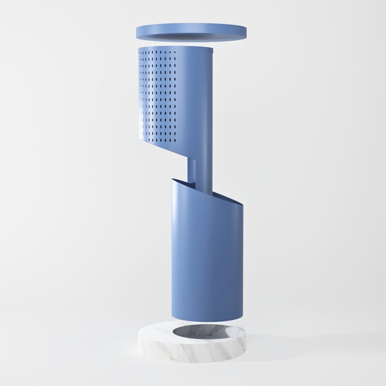
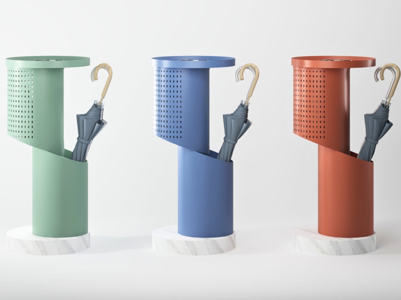
The body is imagined in lightweight aluminum, which keeps it easy to move while resisting rust and corrosion from wet umbrellas. It sits on a heavier stone base that keeps it stable when loaded with multiple umbrellas and everyday items. The concept uses warm, modern colors like terracotta, mustard, and muted blue, so it reads as a small piece of furniture rather than a purely utilitarian object and can live comfortably in a hallway, living room corner, or office lobby.
Split reframes a neglected object. It does not try to reinvent storage, it simply layers a console, a pegboard, and a ventilated umbrella stand into one compact cylinder. It feels like a quiet but meaningful upgrade over the usual metal tube shoved in a corner. People who care about the small transitions in their day will love the idea of an entryway piece that catches umbrellas and everyday carry with a bit of elegance.
The post Split Is an Umbrella Stand Concept That Opens Into a Hallway Console first appeared on Yanko Design.