The 10 Best Sneakers from August

August 2024 has brought a fresh wave of sneaker releases and collaborations that captivated athletes and collectors alike. From limited-edition retros to performance-driven designs, brands like Nike, Jordan, and New Balance pushed athletic style boundaries. Collaborations with boutique labels like A Ma Maniere highlighted the deepening connection between luxury fashion and sneaker culture, making August a pivotal month for sneaker enthusiasts. Whether it was a nod to classic colorways or innovative new materials, these releases captured the spirit of modern sneaker culture, blending heritage with contemporary flair.

1. Puma Porsche Design 50th Anniversary Edition

Celebrating half a century of luxury and style—Puma and Porsche Design come together for a sleek tribute.

Puma teamed up with Porsche Design to release a special edition sneaker celebrating the 50th anniversary of Porsche Design. Reflecting the luxurious and sporty aesthetics both brands are known for, this sneaker is crafted with high-quality materials and a minimalist design. Ideal for both Porsche enthusiasts and those looking for a sophisticated everyday shoe, this pair has earned my top spot.

I previously covered the Porsche 911 Turbo 50th anniversary and the Puma collaboration, noting how both products capture the spirit of Porsche’s rich design history while pushing the envelope forward. Much like the car, this sneaker bridges a storied past with modern luxury.

Design & Colors That Pop: The 50th Anniversary Edition features a minimalist black and silver colorway crafted with premium leather and subtle Porsche branding. The design emphasizes comfort, elegance, and hints of sporty details.

Why is it noteworthy?

This collaboration combines Puma’s athletic expertise with Porsche’s luxury craftsmanship to mark 50 years of Porsche Design. Understated yet elegant, it’s a versatile sneaker perfect for collectors.

Price & Availability: The retail price is $300. Limited quantities are available through Puma’s website and select luxury boutiques.

What We Love:

  • Sleek, minimalist design.
  • Premium materials.
  • Commemorative collaboration celebrating Porsche Design’s legacy.

Not So Great:

  • High price point.
  • Limited availability.

2. Air Jordan 6 “Olympic”

Get ready to relive the magic of Sydney 2000—Nike is back with the Air Jordan 6 ‘Olympic,’ a true blend of nostalgia and performance.

The Air Jordan 6 “Olympic” returns to honor its connection with the 2000 Sydney Olympics. Featuring a colorway of White, Varsity Red, and Midnight Navy, this sneaker is perfect for those looking for a mix of history and functionality. Its timeless design makes it a favorite among retro Jordan fans and new sneaker enthusiasts.

Design & Colors That Pop: The “Olympic” Air Jordan 6 features a classic colorway of White, Varsity Red, and Midnight Navy, reminiscent of the 2000 Sydney Olympics.

Why is it noteworthy?

The return of the “Olympic” Jordan 6 is significant for fans of retro releases. Its association with the Sydney Games gives it a nostalgic appeal while maintaining the performance aspects Jordan Brand is known for.

Price & Availability: The retail price is $200. It was released on August 3, 2024, through Nike and major retailers.

What We Love:

  • Iconic colorway with Olympic heritage.
  • It’s a nostalgic value for Jordan fans.
  • Solid performance features for basketball use.

Not So Great:

  • The limited release makes it hard to acquire.
  • The price may be higher due to its retro status.

3. Nike x Nina Chanel Abney Air Jordan 3

Get ready for an art gallery at your feet!

Nina Chanel Abney’s reimagining of the Air Jordan 3 turns the iconic sneaker into a vibrant canvas. This pair draws attention like no other, featuring a mix of textured suede, canvas, and bright splashes of orange. Abney’s contemporary artistic flair brings culture into sneaker fashion, merging streetwear with a bold art statement.
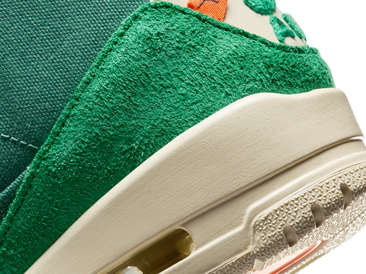
Design & Colors That Pop: A mixed-material upper with textured suede and canvas creates depth, while fuzzy branding and bright orange accents keep things fresh. A vivid green base adds even more visual punch.

Why is it noteworthy?

Nina Chanel Abney transforms the Air Jordan 3 into artwork that merges modern art and sneaker culture. This collaboration celebrates creativity and self-expression.

Price & Availability: Retail price: $225. Limited release available through Nike SNKRS and select boutiques.

What We Love:

  • Inventive mix of materials.
  • Bold artistic expression.
  • Unique branding that draws attention.

Not So Great:

  • It’s tough to get your hands on due to limited availability.
  • It’s more suited for style than for basketball action.

4. Adidas Originals x Bad Bunny Gazelle San Juan

Bad Bunny takes the iconic Gazelle on a ride through Puerto Rico—expect a sneaker that tells a story.
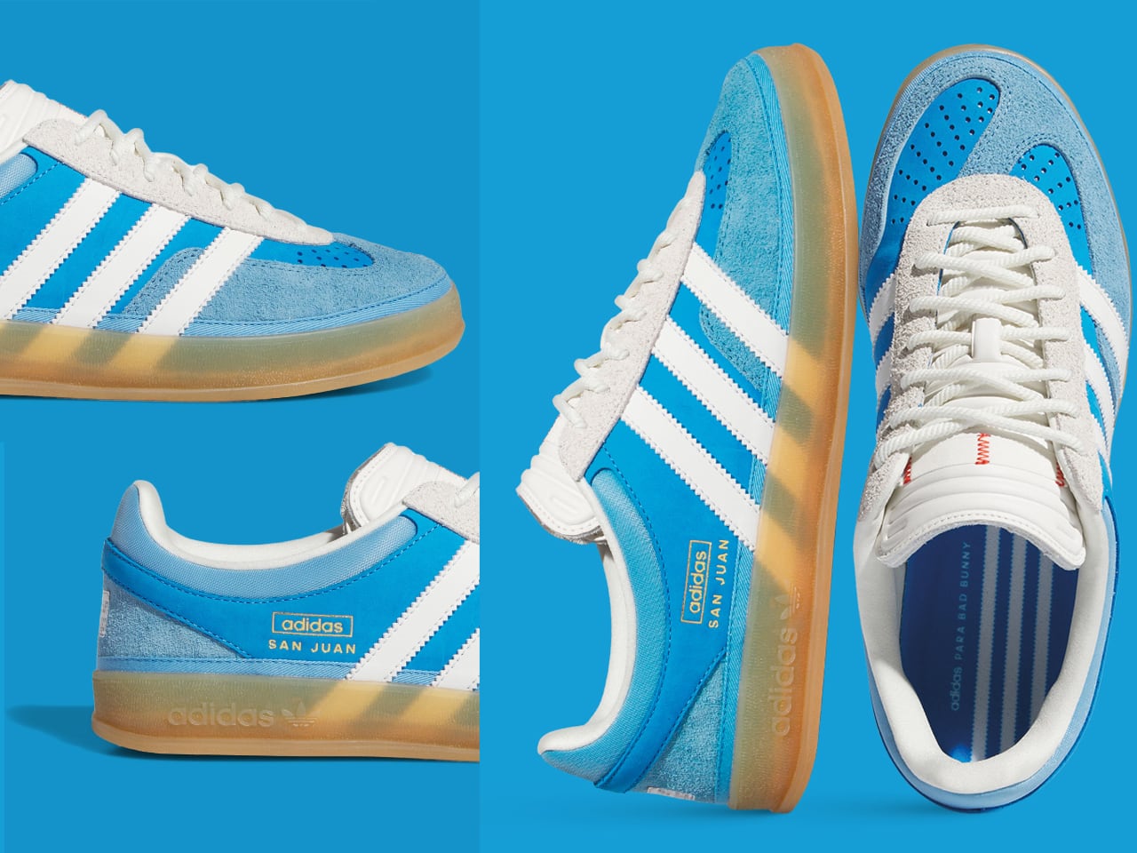
Bad Bunny and Adidas teamed up again to deliver an experimental take on the iconic Gazelle. This iteration celebrates Bad Bunny’s Puerto Rican heritage with elements that pay homage to San Juan. Twisted front panels, a stitched size tag on the exterior, and a unique colorway create a fresh take on a classic design, breaking away from conventional molds.

Design & Colors That Pop: Twisted front panels, stitched size tags, string laces, and a padded tongue. The colorway pays homage to San Juan with tasteful accents.

Why is it noteworthy?

Bad Bunny’s collaboration with Adidas redefines the Gazelle with fresh, unconventional elements. The combination of experimental details and cultural nods makes it a standout in sneaker fashion.

Price & Availability: The retail price is $150. It is available through Adidas and select retailers, with limited drops in some regions.

What We Love:

  • Unique twisted panel design.
  • Comfortable padded tongue.
  • Strong cultural reference to San Juan.

Not So Great:

  • Twisted design might not appeal to everyone.
  • Limited production run.

5. New Balance 1906L

When classic meets comfort, you get a sneaker ready for boardrooms and brunch.

The New Balance 1906L takes inspiration from classic loafer designs and merges them with a sneaker’s comfort and versatility. This hybrid model gained popularity on social media for casual outings or more dressed-up occasions due to its unique twist on sneaker and loafer styles.

Design & Colors That Pop: The New Balance 1906L combines a loafer aesthetic with a sneaker, featuring a classic yet formal design that suits casual and dressier occasions.

Why is it noteworthy?

The 1906L blends elements of traditional loafers with sneaker comfort, effortlessly bridging formal and casual wear. Its viral social media debut quickly made it a talking point.

Price & Availability: The retail price is $170. It was released globally through New Balance’s website and select fashion boutiques.

What We Love:

  • Hybrid design for versatility.
  • Viral popularity and social appeal.
  • Comfortable fit for extended wear.

Not So Great:

  • The loafer-sneaker hybrid might be too niche.
  • It is expensive compared to other New Balance models.

6. Air Jordan 4 RM “Driveway Grey” by Nigel Sylvester

Nigel Sylvester blends BMX style with Jordan Brand heritage in this eye-catching edition.

Nigel Sylvester brings his BMX-inspired vision to the Air Jordan 4 in the “Driveway Grey” colorway. Tonal anthracite with subtle University Red accents gives this pair a versatile yet bold look. Sylvester’s personal style and influence shine through, making it a must-have for fans of street culture and high-performance design.

Design & Colors That Pop: Tonal anthracite colorway with subtle University Red accents, combining the iconic Jordan 4 silhouette with BMX-inspired details.

Why is it noteworthy?

This sneaker is truly unique because of its connection to BMX athlete Nigel Sylvester, who brings personal style and influence. Its limited-edition nature and aesthetic make it a must-have for collectors.

Price & Availability: Retail price: $160. Available through Nike SNKRS and select retailers.

What We Love:

  • Nigel Sylvester’s personal touch.
  • Unique tonal colorway with bright accents.
  • Versatile for both casual wear and street style.

Not So Great:

  • Limited release, making it hard to acquire.
  • The price point may be higher due to exclusivity.

7. A Ma Maniere x Air Jordan 3 “While You Were Sleeping”

Luxury meets streetwear in this premium collaboration celebrating A Ma Maniere’s 10th anniversary.

Celebrating their 10th anniversary, A Ma Maniere and Jordan Brand collaborated to create the “While You Were Sleeping” Air Jordan 3. With a luxurious quilted lining and muted tones of Black, Flat Pewter, and Violet Ore, this sneaker is as sophisticated as it gets—a refined take on a classic silhouette.

Design & Colors That Pop: The mixed-material upper is in Black, Flat Pewter, and Violet Ore, with a quilted lining and embossed branding that adds a touch of luxury.

Why is it noteworthy?

A Ma Maniere’s signature style elevates the Jordan 3 to a new level, with luxury materials and muted colors that appeal to collectors and trendsetters alike.

Price & Availability: The retail price is $225. It is available through A Ma Maniere’s website and select Nike retailers.

What We Love:

  • Premium materials and luxurious design.
  • Quilted lining for added comfort.
  • It’s a subtle but stylish colorway.

Not So Great:

  • High retail price.
  • The limited release makes it challenging to find.

8. New Balance x Miu Miu 530 SL

New Balance and Miu Miu show us what happens when high fashion meets classic comfort.

The collaboration between New Balance and Miu Miu brings high fashion to a classic sneaker silhouette. The 530 SL gets upgraded with minimalist aesthetics and luxury materials, embodying Miu Miu’s signature style while keeping New Balance’s comfort in place.

Design & Colors That Pop: This collaboration elevates the classic New Balance 530 with a minimalist color palette and luxury materials reflecting Miu Miu’s touch.

Why is it noteworthy?

Miu Miu’s high-fashion take gives New Balance’s functional design a runway-worthy upgrade, blending style with everyday wearability.

Price & Availability: The retail price is $1,120. Limited quantities are available through the Miu Miu and New Balance websites.

What We Love:

  • High-fashion collaboration.
  • Elevated materials and craftsmanship.
  • Versatile minimalist design.

Not So Great:

  • Very high price point.
  • Limited availability.

9. Onitsuka Tiger Mexico 66 SD “Flame” Pack

Heritage meets heat in this flaming new edition from Onitsuka Tiger.

The Onitsuka Tiger Mexico 66 SD “Flame” Pack reimagines the iconic Mexico 66 silhouette with a contemporary twist. Released in August 2024, this updated version features premium leather and a striking flame motif, giving the iconic design a bold yet classic feel. With distinct colors and high-quality craftsmanship, it’s a nostalgic nod to Onitsuka’s heritage and a modern sneaker with eye-catching flair.

Design & Colors That Pop: The Mexico 66 SD “Flame” Pack has three distinct colorways: White, Black, and Yellow. Each showcases a flame motif for a dynamic element. Premium leather gives it a luxurious finish.

Why is it noteworthy?

The Mexico 66 SD “Flame” Pack’s heritage-inspired design and modern flair stand apart. Onitsuka Tiger’s emphasis on craftsmanship and bold motifs adds character to this release.

Price & Availability: The retail price is 27,500 JPY (~$189 USD). It is available through Onitsuka Tiger’s website and select retailers, and the “Yellow” colorway is set for a September release.

What We Love:

  • Premium leather construction.
  • The striking flame motif adds a unique touch.
  • Heritage design with modern updates.

Not So Great:

  • Limited availability.
  • The price may be high for casual buyers.

10. ASICS Gel-Kayano 30 Anniversary Edition

Celebrating three decades of innovation in running technology, the ASICS Gel-Kayano 30 Anniversary Edition delivers comfort and stability.

ASICS celebrates the 30-year legacy of the Gel-Kayano series with this special anniversary edition. The Gel-Kayano 30 incorporates FlyteFoam Blast+ Eco technology, offering enhanced cushioning, stability, and a smoother stride for runners. This model continues the heritage of delivering top-notch running performance while maintaining a stylish, modern design.

Design & Colors That Pop: The Gel-Kayano 30 Anniversary Edition features a breathable mesh upper with reinforced overlays for stability. The colorway includes a mix of soft grays with vibrant blue accents, providing a sleek yet dynamic appearance.

Why is it noteworthy?

The Gel-Kayano series has been a cornerstone of stability running shoes for decades, and this anniversary edition brings the latest technology into the mix. FlyteFoam Blast+ Eco provides a lightweight feel with eco-friendly materials, blending performance with sustainability.

Price & Availability: The retail price is $180. It is available globally through ASICS’ website and select sporting goods retailers.

What We Love:

  • Enhanced stability and cushioning.
  • Eco-friendly FlyteFoam technology.
  • Stylish anniversary design.

Not So Great:

  • High price point for casual runners.
  • Limited colorway options.

The post The 10 Best Sneakers from August first appeared on Yanko Design.
The Nothing Robot Vacuum (1) brings transparent tech to Smart Homes, along with a Glyph Interface

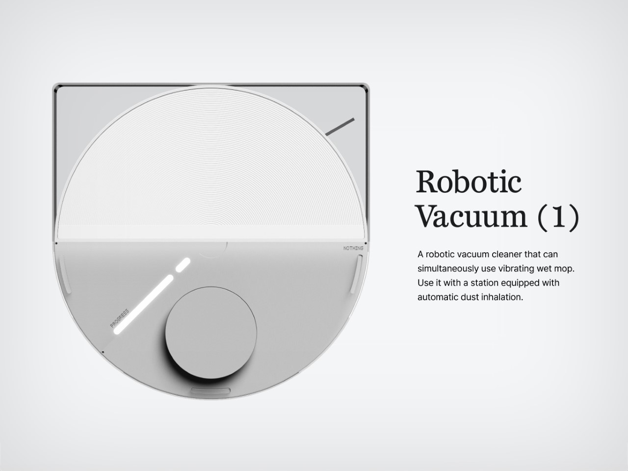
If you think just about the Nothing.tech company ethos of bringing fun back to tech while still being design-driven and meaningful, that ethos can apply to pretty much any category of product. Sure, Nothing’s best known for their earbuds, phones, and even other accessories like the CMF Watch Pro… so here’s a proposition – what if we took Nothing’s ethos and brought it to other products that are a bit of a visual afterthought? The robot vacuum, for instance, is a fairly ‘boring’ looking product. Its job is literally to scuttle around the house cleaning up after your mess, so for the most part, its design is driven by function rather than expression. However, by bringing the robot vacuum under the Nothing design umbrella, Soo Hyun Lim and PDF HAUS have uplifted an otherwise dull-looking appliance into something that inherently feels more modern – because it borrows its design cues directly from Nothing’s modern-looking smartphones.

Designers: Soo Hyun Lim & PDF HAUS

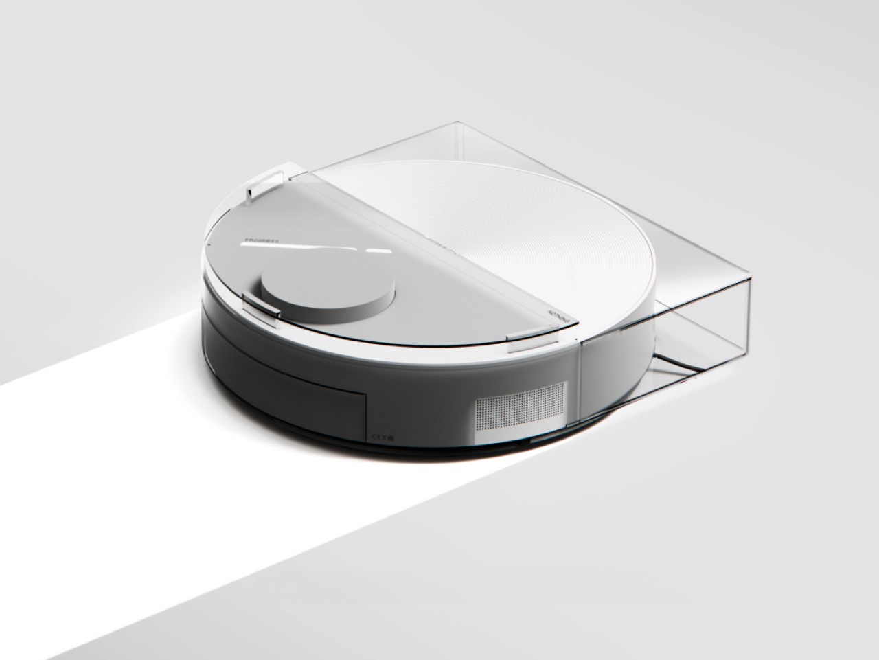
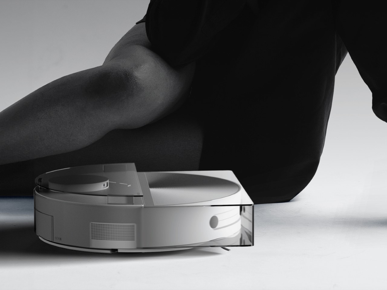
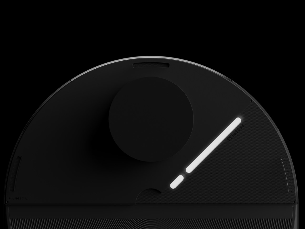
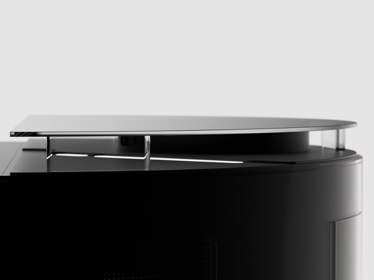
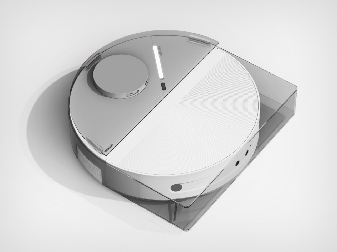
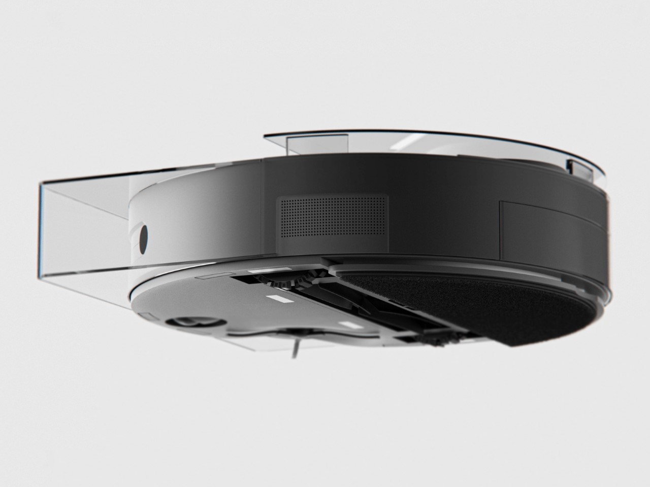
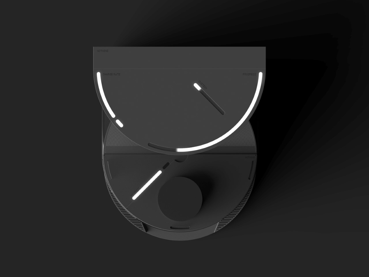
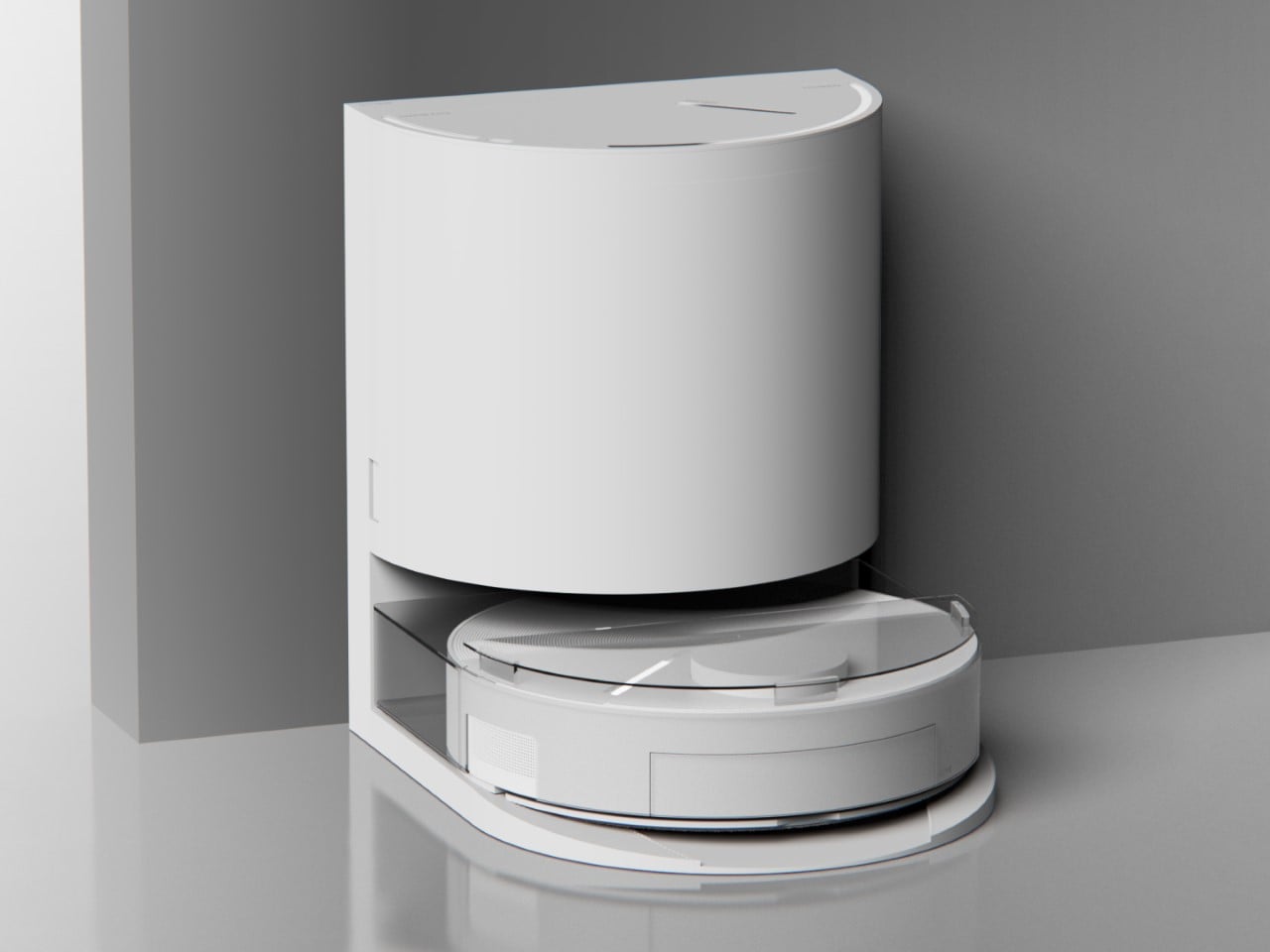
Meet the Nothing Robot Vacuum (1), a tongue-in-cheek fan-made concept that ports Nothing’s DNA onto a familiar product template. Most robot vacuums are the same shape and size, so how could you possibly make things interesting? Well, LEDs and transparent covers, of course! The Robot Vacuum (1) has a circular profile that’s then outfitted with a transparent D-shaped outer shell, giving it an almost ‘preserved in glass’ kind of look. Sensors are where they belong (on the front as well as on the top), and although you can’t entirely make a robot vacuum transparent, what with all the dust and dirt, Hyun Lim does something clever by bringing the Glyph Interface to the product. What does the interface do? Well, it acts as a progress bar that lets you know how much cleaning’s left. Similarly, Glyph lights on the vacuum’s docking station light up to indicate charging process as well as letting you know the fill-status on the station’s dustbin, so you know when to throw the trash out every week or so.

With the aesthetic appeal of a fancy turntable, the Nothing Robot Vacuum (1) highlights a kind of Bauhaus-meets-Scandinavian minimalism that companies like Bang&Olufsen have come to showcase so well with their products. The vacuum looks classy, not appliance-y, which is quite a win because of how menial its task actually is. I mean, sure some appliances have boring jobs, like thermostats and dehumidifiers, but that’s no reason they should look ‘boring’, right? Well, the Nothing Robot Vacuum (1) rejects that stereotype.

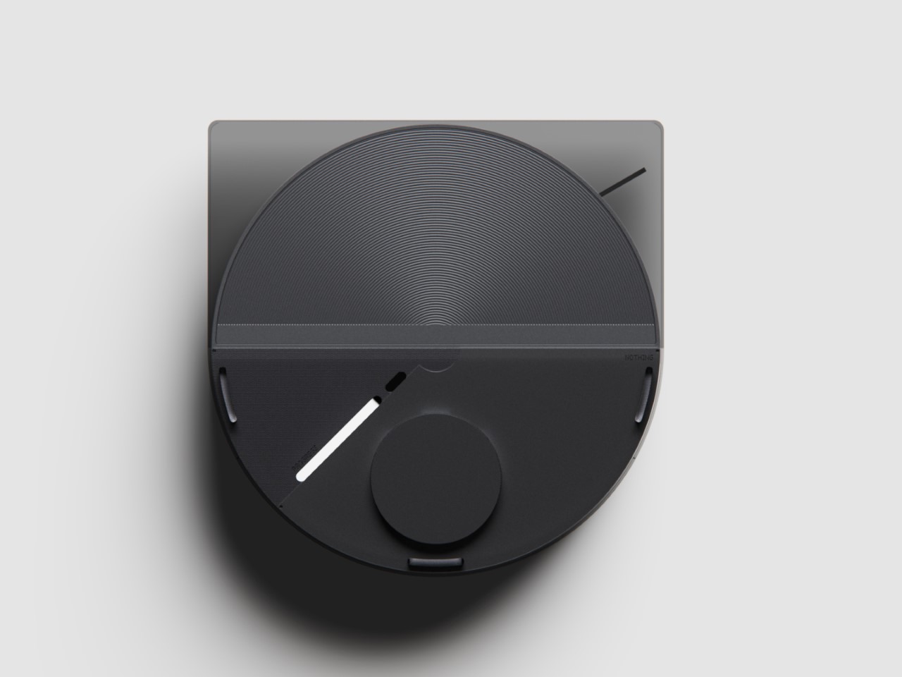
As far as the design goes, the vacuum comes in 3 colors – black, white, and grey. Just from a top view, you instantly recognize the Nothing design template. The Glyph Interface at the 7 o’clock position, the transparent elements along the body, and a radial pattern on the upper half of the circular top that sort of resembles the coils in the wireless charging zone on the smartphones. It’s simple, yet cleverly executed.

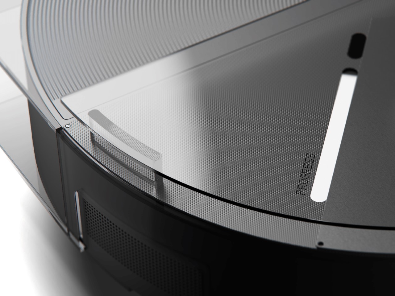
Just like with the phones, you’ve got microtextures galore, along with text screen-printed onto the transparent elements like the upper guard (that prevents the sensors on top from being damaged), and the front transparent bumper that helps the robot vacuum easily maneuver into corners. Moreover, Hyun Lim mentions that the vacuum is constructed from recycled plastic and aluminum, which seems like a nice sustainability touch that goes well with the ‘clean’ image of the vacuum cleaner.

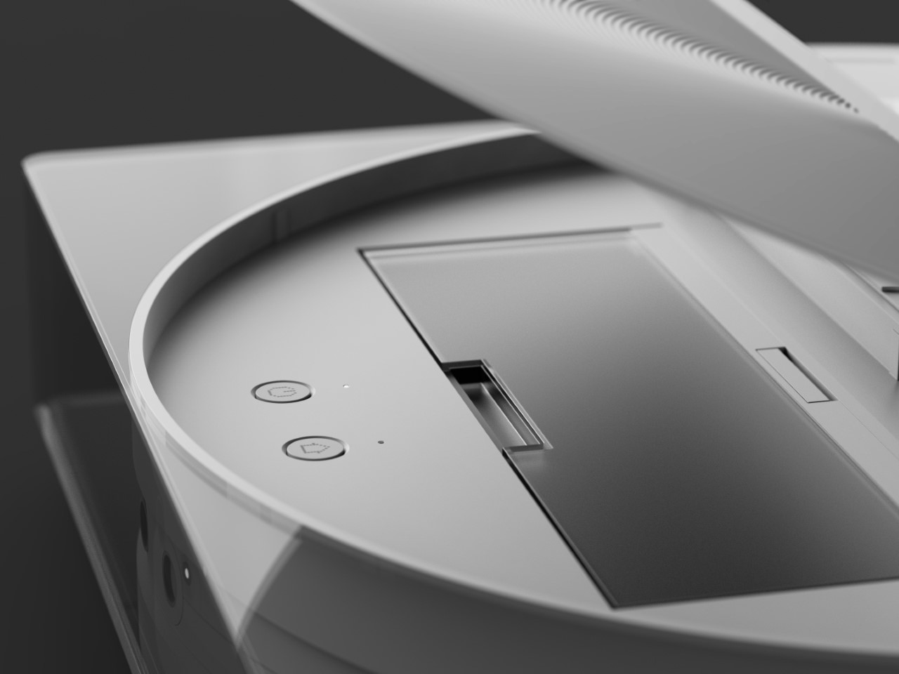
Although conceptual, Hyun Lim does give the robot vacuum a fair bit of detail. You’ve got a rotary broom on the front, along with a vibrating wet mop that helps get grease, grime, and other stains off your floor. The simple design is complemented by a simple UX – you can lift the lid to access the robot’s power button or open its water reservoir to replenish it between cleaning sessions. The sensors on the front and top help the vacuum navigate through the house, while an app on the phone gives you all the controls you need to set schedules, paths, no-go zones, and charging times. Plus, when the robot vacuum runs low on juice, it automatically goes and docks in its station, where the battery gets charged and the dust-tank gets cleaned.

The docking station is just as minimal as the vacuum itself, and serves as a place where your appliance goes to take a pit-stop. Once docked, the Robot Vacuum (1) charges its batteries, while performing a self-clean operation so it’s good to go for round 2. This means the mop head gets cleaned with water, and the dust/dirt tank gets disposed into the docking station’s larger ‘dustbin’. When the dustbin gets filled (after a couple of days of cleaning), all you need to do is empty the trash bag inside and replace it with a new one. That’s where the docking station’s Glyph lights come handy, letting you know your vacuum’s charging rate, along with the dustbin’s current capacity.

Although the Robot Vacuum (1) is purely conceptual at this point, it does prove that Nothing’s approach to redefining technology as ‘accessible fun’ is quite a winning and versatile one. The Robot Vacuum (1) doesn’t exist but there’s no reason it shouldn’t. Carl, you listening?

The post The Nothing Robot Vacuum (1) brings transparent tech to Smart Homes, along with a Glyph Interface first appeared on Yanko Design.
The Ultimate Tactical EDC Upgrade: Tekto’s A2 Badger OTF Knife Packs a Punch

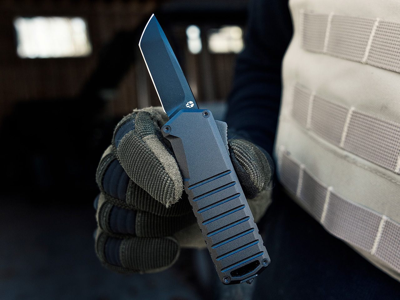
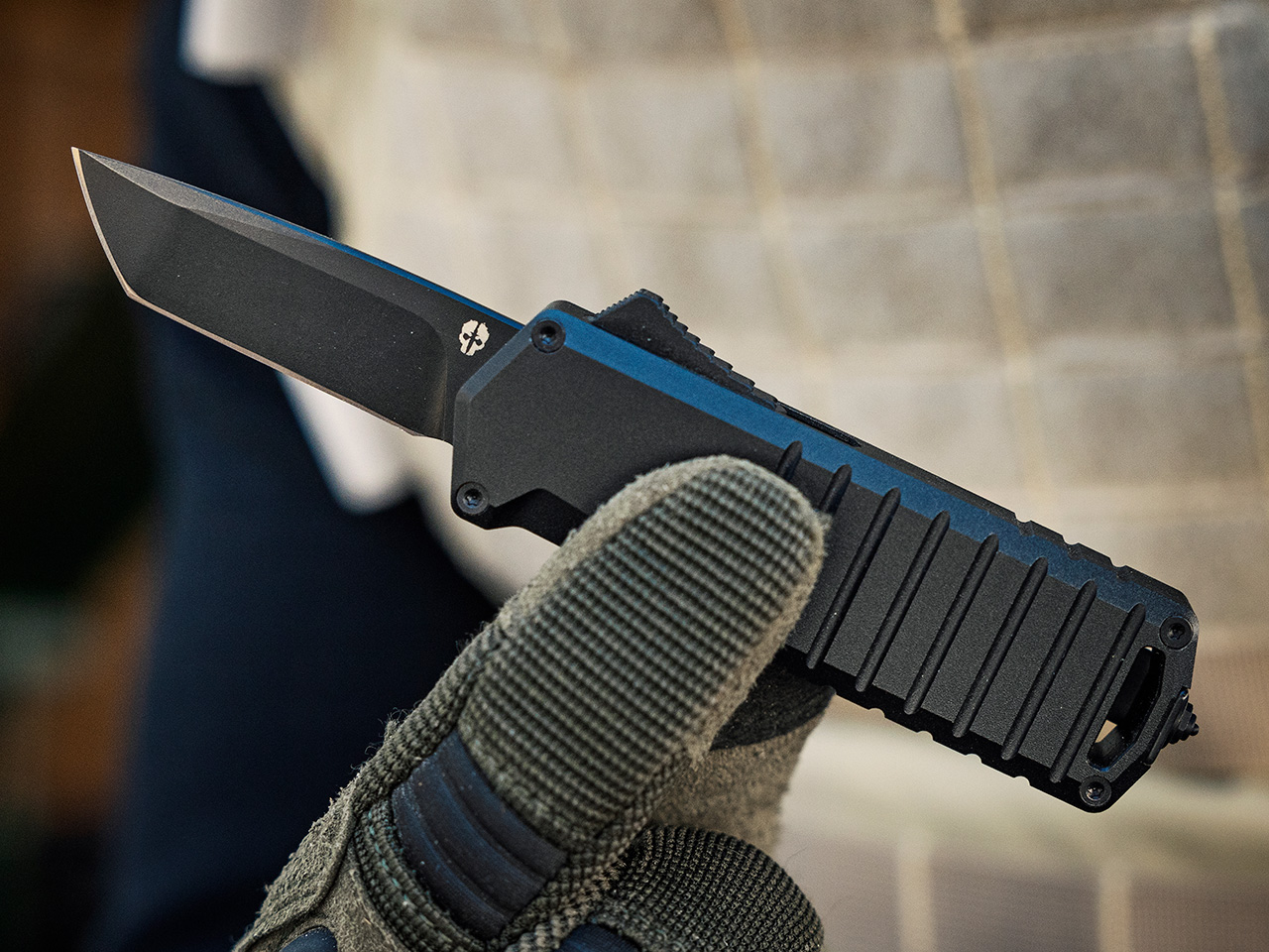
Named after the world’s most fearless animal, the Honey Badger, the A2 Badger from Tekto has quite a reputation to live up to… and let’s be honest, it does. It’s tiny yet ridiculously capable, with a 1.85-inch OTF blade on the front that deploys as soon as you hit the switch on the handle, and a glass-breaker on the end that makes the A2 Badger a formidable EDC literally from head to toe!

OTF knives are a little different from your standard folding blades; they’re spring-loaded switchblades that shoot straight out from the front of the handle. It’s a thrill to watch and even better when you realize just how functional that quick deployment can be. Whether you’re a tactical aficionado or just someone who appreciates a well-designed knife, the A2 Badger could be your new favorite.

Designer: Tekto

Click Here to Buy Now: $118.99 $139.99 (15% off, use coupon code “A2YANKO”). Hurry, deal ends in 48-hours! Also, get free FedEx 2 day shipping.

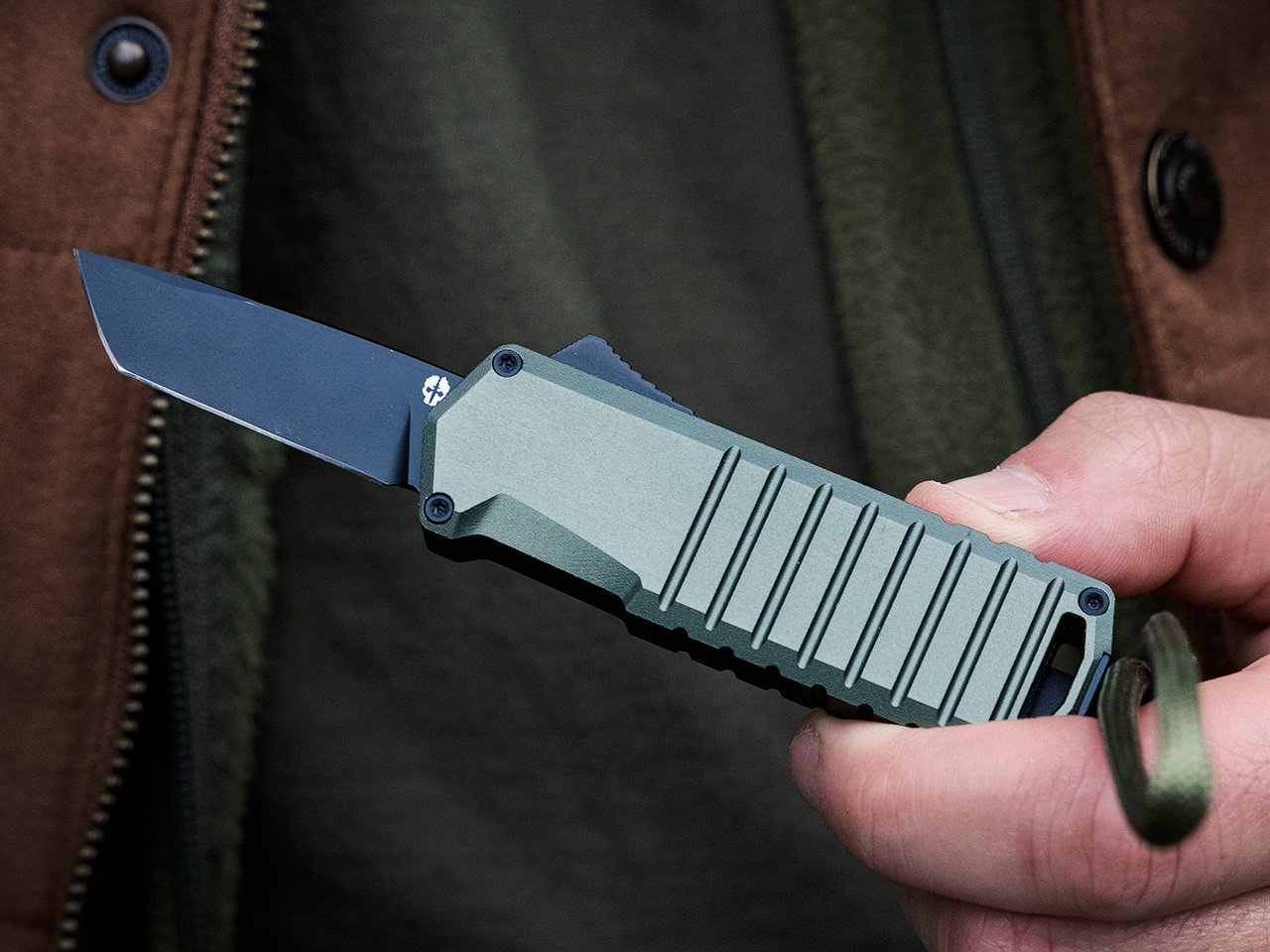
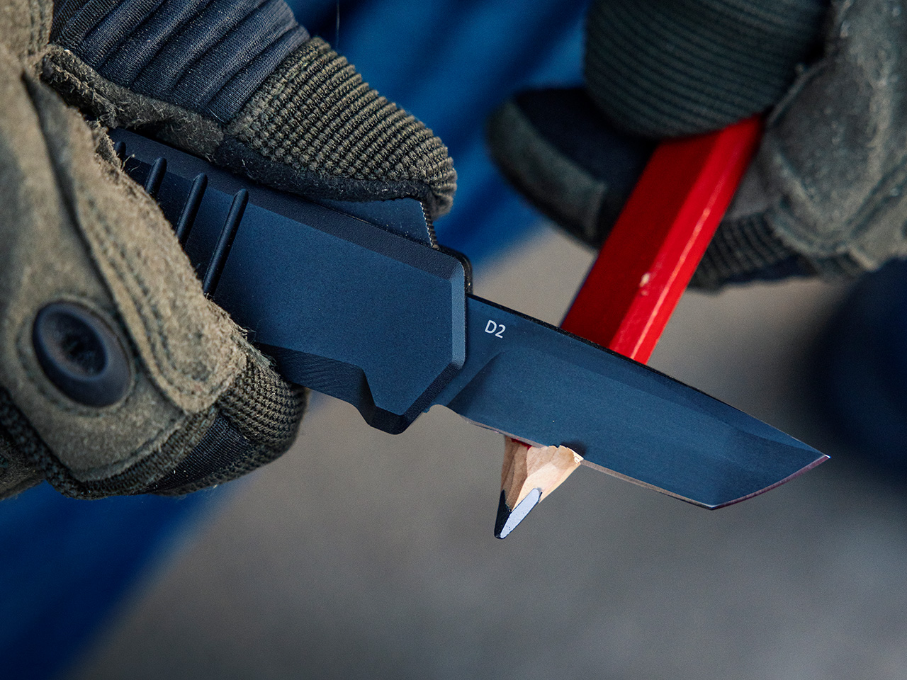
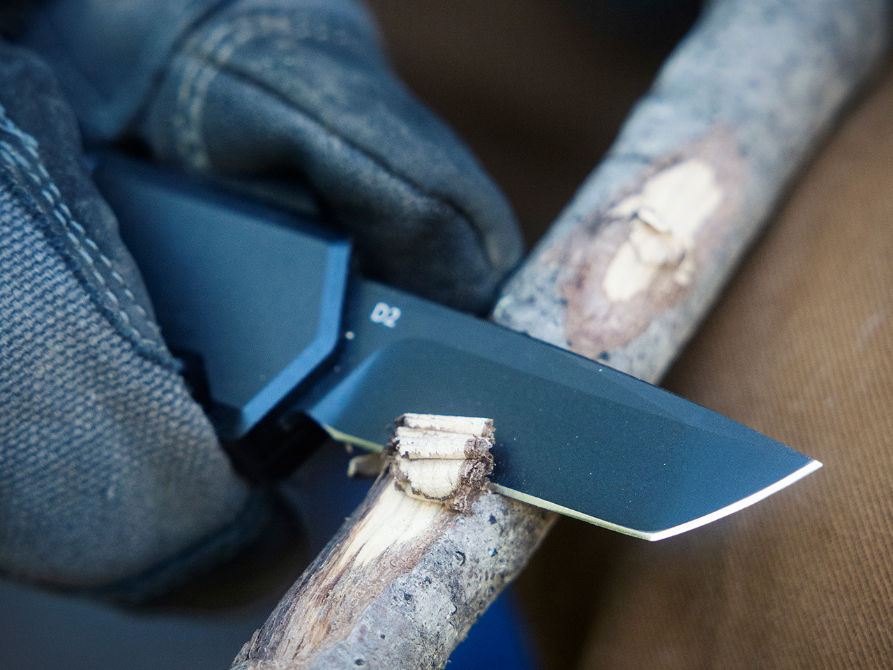
At first glance, you wouldn’t expect much from a knife that measures just 5.26 inches when open. But don’t let the size fool you. The A2 Badger packs a 1.85-inch tanto-style blade made from titanium-coated D2 steel. This isn’t your average pocket knife. The tanto blade’s angular tip is engineered for strength, perfect for piercing tasks or cutting through tough materials. And because it’s coated in titanium, the blade offers added durability and resistance to wear and tear. It’s the kind of material you want on your side when you’re deep into an outdoor adventure or facing a split-second emergency.

The A2 Badger button boasts an exceptional grip, ensuring maximum grip and control in any situation.

With its compact and lightweight design, the A2 Badger is both easy to store and transport, making it a popular choice among outdoor enthusiasts and those with limited space.

Featuring an oversized lanyard hole, this knife design accommodates a wider range of attachment options, including larger cords and paracords.

The A2 Badger doesn’t just stop at being sharp; it’s thoughtful in its design, too. The oversized lanyard hole is a small detail, but one that makes a big difference. You can easily thread larger cords or paracords through it, making the knife more accessible when you’re in challenging environments. Speaking of environments, the 6061 aluminum handle is lightweight yet durable, designed to withstand the kind of rugged conditions that would send a lesser knife packing. Plus, there’s a button lock mechanism in place that ensures the blade stays secure, whether you’re opening or closing it, so you can count on the knife when it matters most.

But what makes the A2 Badger stand out isn’t just its functionality—it’s how easily it fits into your life. At a featherlight 2.18 ounces and just 3.3 inches small when closed, this is Tekto’s smallest OTF knife (even tinier than their A5 Spry Mini). Yet, its size is deceptive; this little tool is nimble, quick to deploy, and engineered for ambidextrous use. A pocket clip can be attached on either side of the handle, making it perfect for left or right-handed users. Plus, at the end of the handle is a glass-breaker tip that can be used to shatter through even laminated and reinforced glass panels – perfect for an emergency escape (especially when paired with the D2 blade for cutting through seatbelts). It’s an ideal everyday carry tool, whether you’re heading into the great outdoors, running errands around town, or even protecting yourself in an emergency.

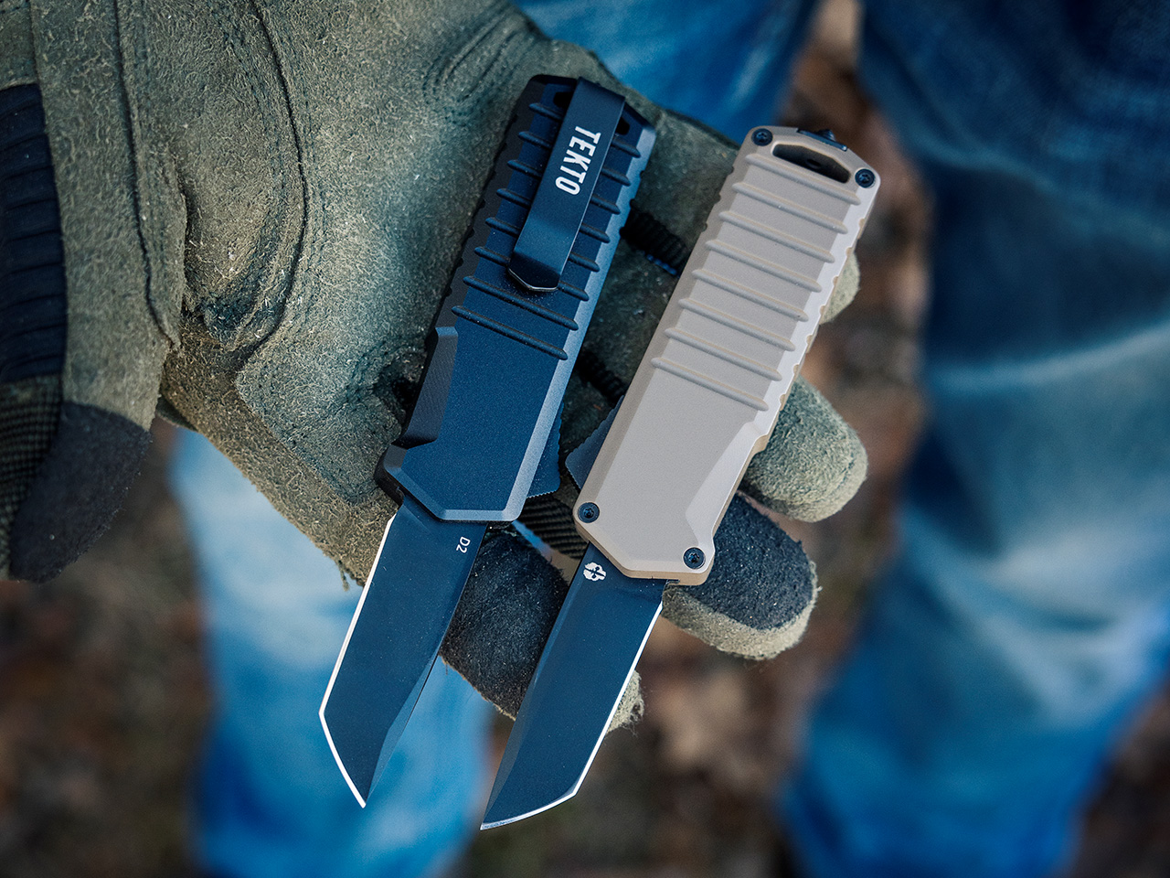
For those who like options, Tekto delivers. The A2 Badger comes in three grip colors—Black, Desert, and OD Green—so you can match it with your style or other gear. Whether you’re a seasoned outdoorsman, a first responder, or just someone who values great design, the A2 Badger proves that sometimes, the best things really do come in small packages.

Click Here to Buy Now: $118.99 $139.99 (15% off, use coupon code “A2YANKO”). Hurry, deal ends in 48-hours! Also, get free FedEx 2 day shipping.

The post The Ultimate Tactical EDC Upgrade: Tekto’s A2 Badger OTF Knife Packs a Punch first appeared on Yanko Design.
Cooler Master MasterHUB Controller Review: Complete Control Over Your Creative Pursuits

PROS:


  • Innovative modular design puts users in control

  • Incredible flexibility in software customization

  • Future-proof design for extended functionality

CONS:


  • Essential stand is a separate purchase

  • Can't fit all 5 modules on the base

  • Aesthetics and texture feel a bit cheap

RATINGS:

AESTHETICS
ERGONOMICS
PERFORMANCE
SUSTAINABILITY / REPAIRABILITY
VALUE FOR MONEY

EDITOR'S QUOTE:

The Cooler Master MasterHUB's modular design redefines the control panel category and empowers creative professionals to design their own tools for a smoother and effortless workflow.

Generative AI is getting better at creating images and videos, but if you want professional-looking, not to mention correct, content, someone still has to put in the work. Software tools are also becoming more powerful and more sophisticated, but sometimes that creates even more complexity, with more features hidden behind incomprehensible sequences of keys. That’s not even considering how a single person might have to juggle different apps, each with their own set of functions. There are now tools like customizable keyboards or buttons that try to alleviate some of that pain, but there really isn’t a “one size fits all” solution. Instead, Cooler Master takes a different approach by providing not a single tool but a toolkit, allowing creators, streamers, gamers, and power users to build their own control panel that adjusts to their needs and workflow rather than forcing them to adapt to simply pushing buttons on a box. Given the novelty of this proposal, we took the MasterHUB for a spin, a roll, and a push to see if it can really take a load off creators’ already heavy shoulders.

Designer: Cooler Master

Aesthetics

If you judge the Cooler Master MasterHUB solely based on its appearance, you will probably be disappointed. Right out of the box, the different modules look pretty ordinary, even uninteresting. Sure, you have a variety of physical controls, more than competing brands that offer only programmable buttons with tiny displays, but the quality of the design and the material themselves are nothing to write home about.

The MasterHUB is a completely black affair, which seems to be the standard for control panels like this. It’s also mostly made of plastic, and not the premium kind either. Different areas of the modules have different textures, with some smooth and reflective, while others have a rougher matte surface. To be fair, this particular market isn’t exactly known for stylish designs and premium materials, so it’s in good company as well.

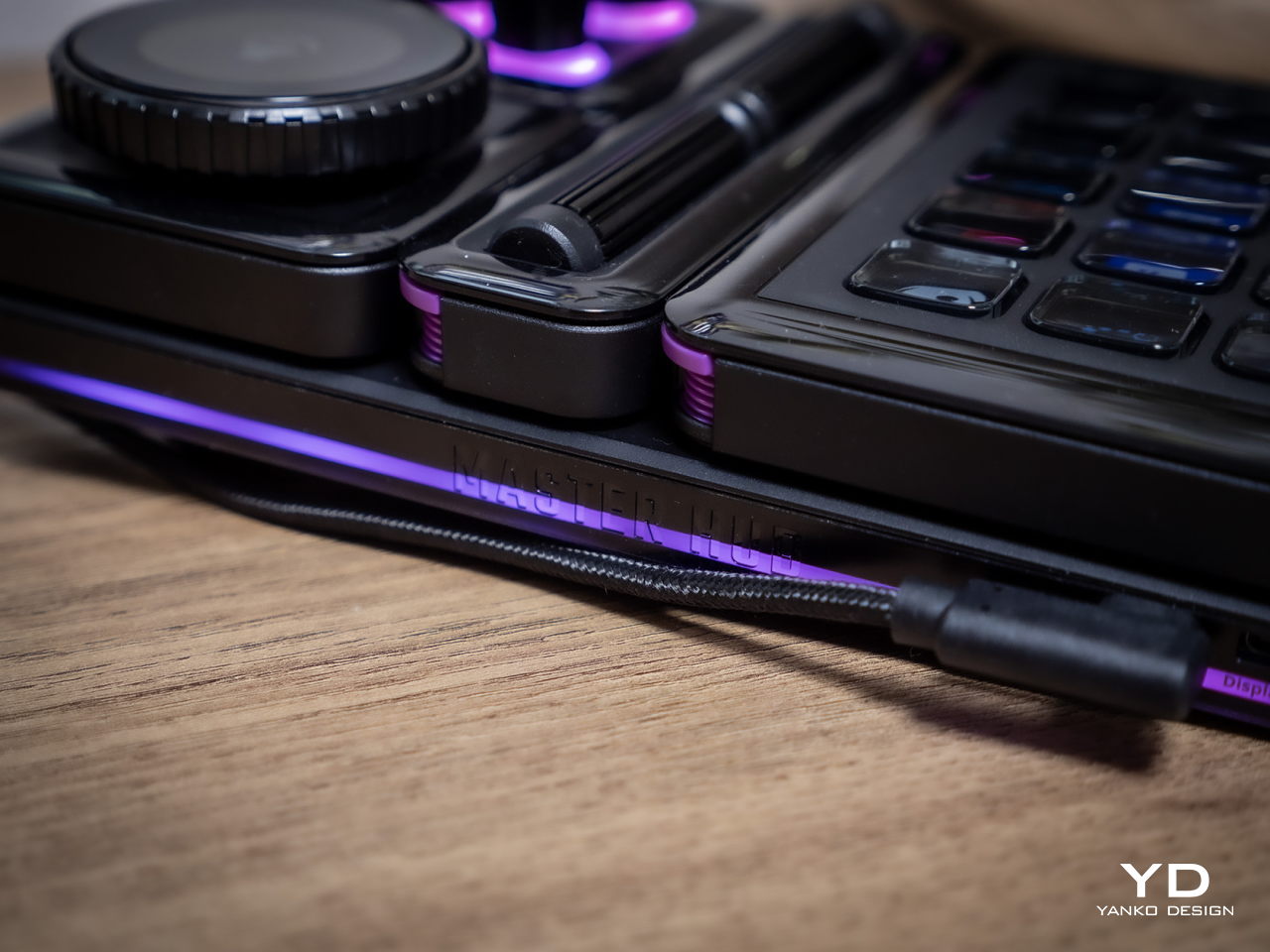
Cooler Master does make up for it with plenty of LED colors, whether on the display of the dial and the buttons or beneath some of the controls. You have a great degree of freedom when it comes to customizing the MasterHUB’s RGB lighting, except for one module that oddly doesn’t have any kind of lighting. Hopefully, it’s just some oversight, because there’s really no logical reason for this inconsistent design.

In the final analysis, the Cooler Master MasterHUB isn’t exactly something great to look at, but its true value lies in its performance. Unfortunately, it shouldn’t be a choice between form or function, when you can and should have both. And with something as big as the MasterHUB always in your field of vision, something more aesthetically pleasing could do wonders for your mind as well.

Ergonomics

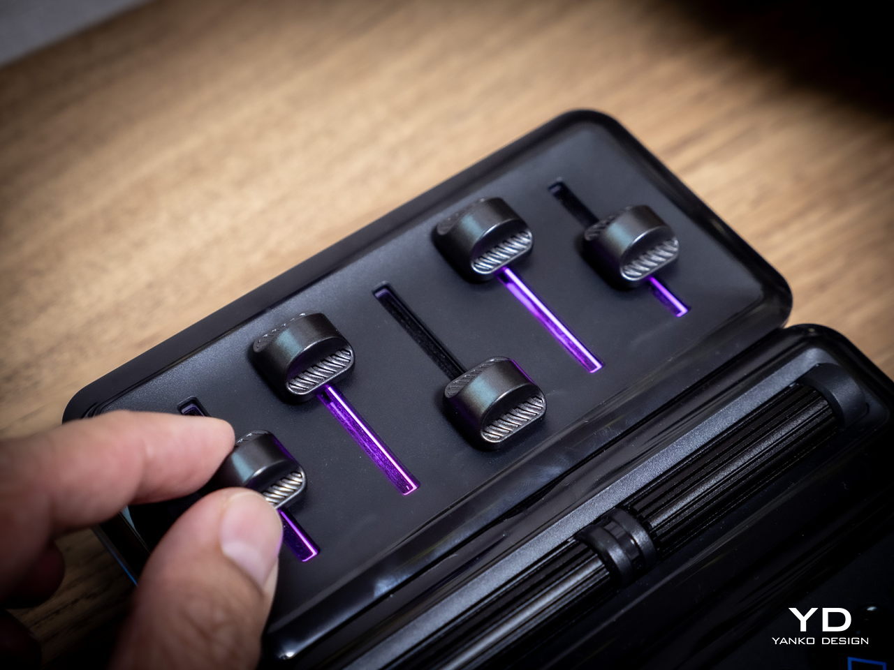
The MasterHUB is already a league above other keyboard decks and controllers for offering a more tactile experience that goes beyond pressing buttons. Some actions, like scrubbing through timelines or changing the size of a brush, just feel more natural if you use a dial, a slider, or a roller instead of repeatedly mashing a single button. It isn’t just about intuitive controls either, as having your fingers actually manipulate something tangible adds a certain depth and enjoyment to the action.

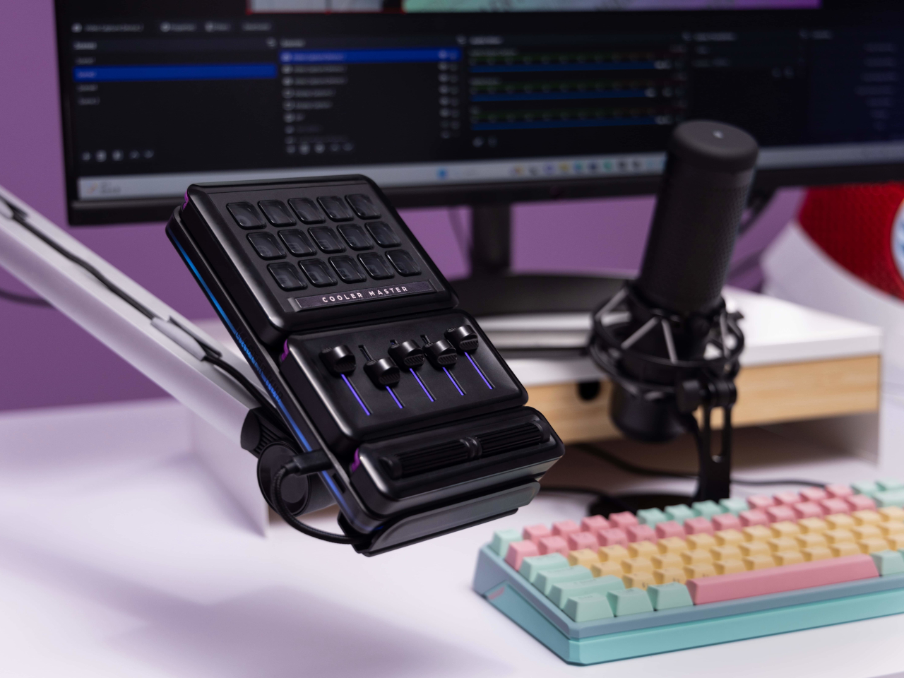
At the same time, however, Cooler Master’s default package isn’t exactly ergonomic because it practically lies flat on your desk. There’s a low magnetic foot included in the box, but that barely lifts the controller at a comfortable angle. This can be especially problematic when you need to see the icons on the buttons or the display. There is a stand available, but it’s a separate purchase rather than a part of the entire ensemble. Depending on how you use the MasterHUB, it might not be a deal-breaker, but it’s still something that logically would be included or even built into the base.

Performance

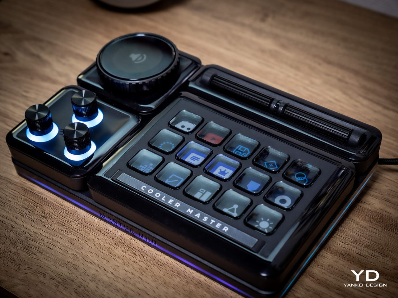
The Cooler Master MasterHUB immediately sets itself apart from the likes of the Stream Deck and the Loupedeck with its modular design. While some brands and models might offer knobs in addition to buttons, it doesn’t stop there nor does it presume it knows best what creators need. Just like LEGO, it provides the building blocks for you to arrange your own setup, whether that means using two 15-key modules or having two Encoder dials.

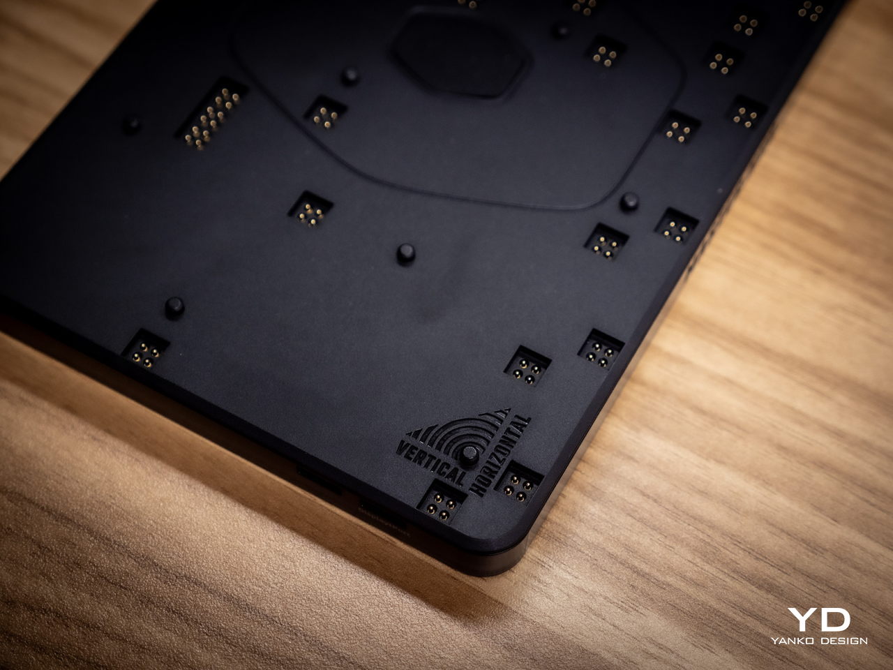
The MasterHUB currently has six modules, starting with the innovative Base module that makes all of these possible. This unassuming flat box holds the pogo pins that connect the other modules to one another as well as magnets that keep them in place. Of course, you can set the base horizontally or vertically, adding another layer of customization.

In theory, you’re free to put any of the other modules in any position as long as they’re connected to those pins and held down by magnets. In practice, however, you’ll probably want to have the modules fit snugly inside the boundaries of the base, which means you have a limited number of arrangements considering the sizes and shapes of those modules. You can’t also fit all five other modules on the Base, so you’ll have to choose which ones you need for a given task.

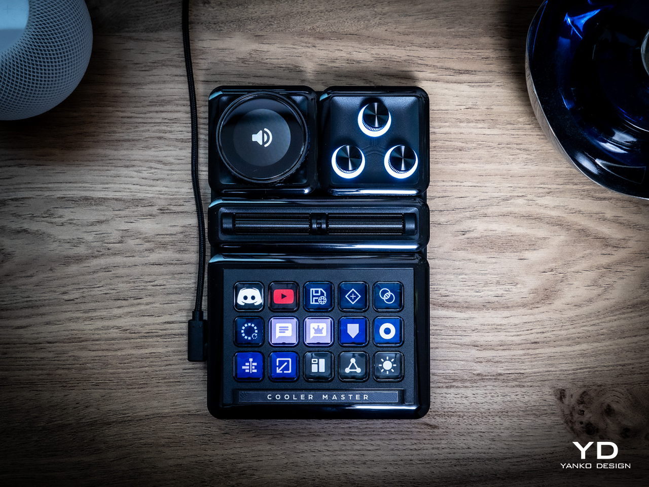
The 15-key IPS module is probably going to be familiar to users of other control panels. Each key can be mapped to almost any action or combination of actions, a.k.a. macros, through the MasterHUB software. You can also select different icons or make your own to assign to that key. On an amusing note, pressing each key makes the icon shrink while it’s depressed and jumps back to its normal size once you release the button, adding a bit of visual feedback to the action.

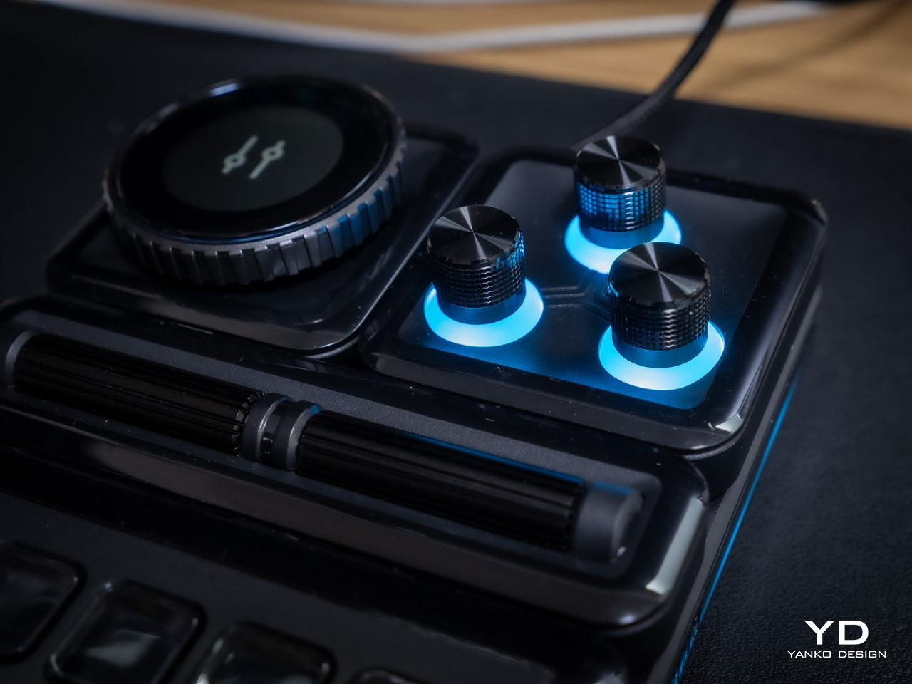
There’s a 3-knob module you can use to adjust minor settings like lighting, opacity, and the like. For bigger or major adjustments, you might want to use the Econder with an IPS display module, which is just another way of calling a big dial with a circular screen in the middle. Just like with the buttons, the display can be customized with complete freedom.

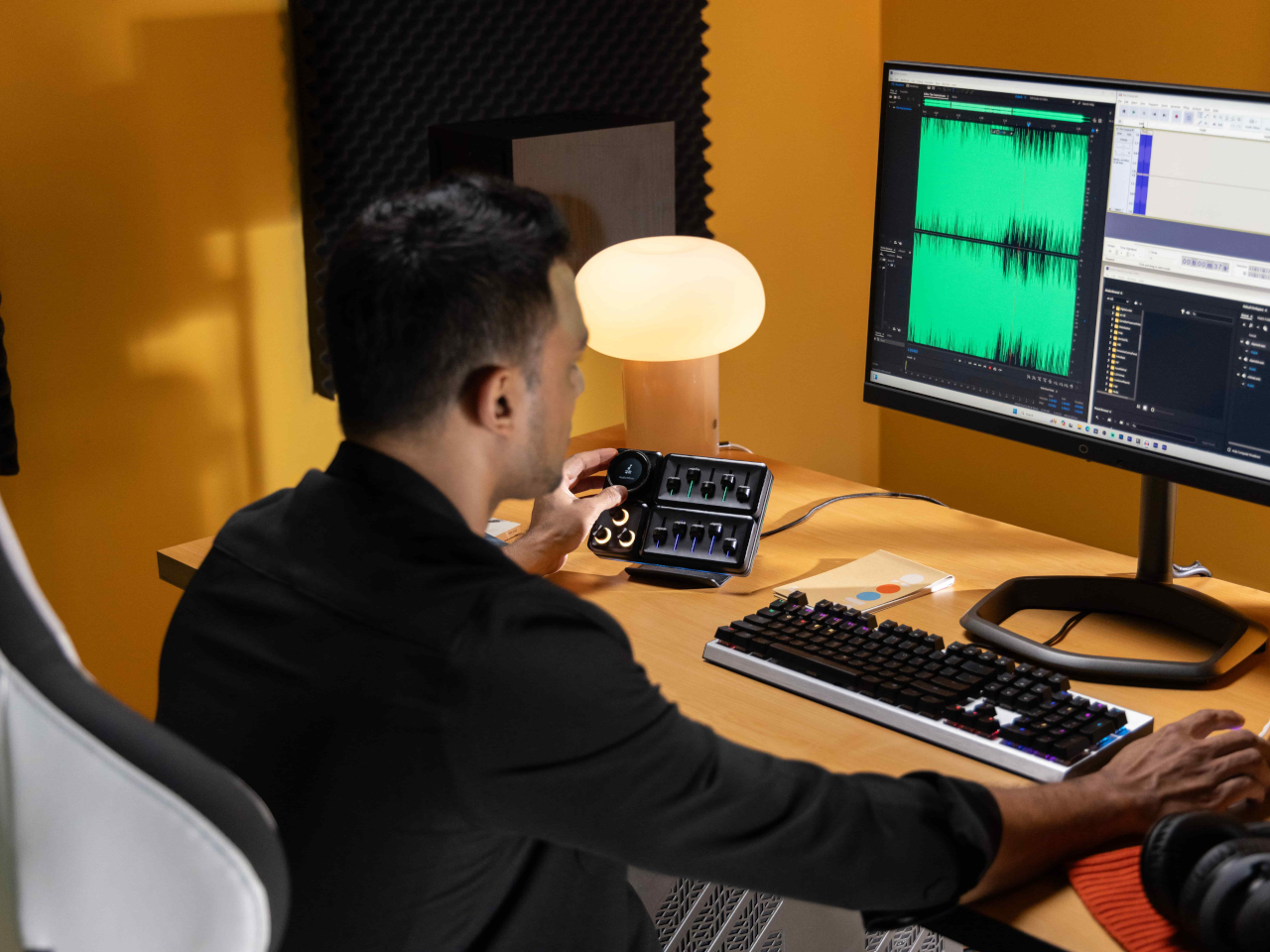
The 5-Fader module is not a common sight on controllers like these, but it’s a standard device for many tools related to multimedia work. Perhaps the most unusual of the group is the 2-Roller module, which is perfect for scrolling or going through undo and redo histories quickly. These five pretty much offer everything you need to work with almost any creative suite, though you can’t fit them all at the same time, as mentioned earlier. You can, however, use as many of the same modules you can fit, as long as you buy those additional modules, of course.

If the modular hardware was already impressive, the MasterHUB software doesn’t disappoint either. It has almost limitless possibilities in how you can set up and control the device, almost to the point of being overwhelming and confusing. Some things, like visually dragging and dropping actions to the controls, are easy, but some require digging through layers of options. The user interface could do a bit of polish, and thankfully that’s easier to pull off than a hardware upgrade.

Even if it doesn’t have a head-turning design, the Cooler Master MasterHUB’s functionality is pretty mind-blowing. If you’re a creative who juggles multiple apps, a streamer who needs to have every control under their finger or a gamer who can’t afford the latency of a string of keyboard combos, the flexibility that this modular controller offers is unbeatable. The power it offers is both outstanding and overwhelming, so it’s kind of exciting what Cooler Master will cook up next for future modules and software improvements.

Sustainability

Despite its heft, the MasterHUB is thoroughly made of plastic. It might be resilient, but it’s not completely durable nor hardened against accidents. It’s also not a sustainable material, though Cooler Master thankfully uses post-consumer recycled or PCR plastics for some of its products, though it doesn’t indicate if the MasterHUB benefits from this program. It might also be good if it used other materials like rubber, both for protection and tactile properties, though it could still do so in future iterations.

The MasterHUB’s modular design does bring one indirect advantage over the likes of the Stream Deck, which is that it’s more future-proof. Cooler Master could put out revised and improved versions of the modules, expand the selection of modules or even add new features that it didn’t have at launch. In fact, there are DisplayPort ports on the Base module, teasing the possibility of new features. Of course, that will all depend on Cooler Master actually continuing to push the envelope in the foreseeable future.

Value

Cooler Master definitely struck a chord with creators, streamers, and gamers with the modular design of the MasterHUB. It offers not only flexibility but also power, putting users in complete control of their workflows. Even Logitech’s new MX Creative Console barely scratches the surface of what this control panel is capable of, especially when you consider the possibilities of future modules and features.

That said, the MasterHUB isn’t an inexpensive kit, which is probably to be expected considering how much more it offers compared to similar products. That’s why you’ll probably want to take advantage of discounts, like the current pre-order campaign that’s offering the basic kit, which includes only the 15-key IPS, 5-Fader, and 2-Roller modules, for only $299 instead of the $399 SRP. If you really want more flexibility, the Pro bundle adds the Encoder with IPS display and 3-Knob modules for $399, a rather steep $150 discount from the $549 SRP. Whichever bundle you pick, though, the stand will cost an additional $17 (SRP $19) if you want it.

Verdict

With great power comes great responsibility, or in this case, more keyboard shortcuts. Content creation shouldn’t be a dreadful and tiring task, and tools should be making people’s lives easier, not harder. As software becomes more sophisticated, the need for better and more efficient controls also increases. Rather than forcing users to shoehorn their workflows into a grid of LCD buttons and a few dials, the Cooler Master MasterHUB offers professionals and hobbyists the freedom to design their own tools and define their own strategies that let them focus on the most important task: creating their best content.

The post Cooler Master MasterHUB Controller Review: Complete Control Over Your Creative Pursuits first appeared on Yanko Design.
Glue gun concept gives the crafting tool a modern and ergonomic makeover

Anyone who has done any kind of craft would have at one point or another used a glue gun. This tool simply melts solid glue and dispenses it through a nozzle, and its design hasn’t changed one bit over the decades. It’s a very simple tool that’s shaped like a toy gun, and while it does get the job done, it is inefficient, uncomfortable, and even unsafe. Perhaps it’s because it has fallen out of use that the glue gun hasn’t seen any action in the design department, something that this concept design tries to make up for by taking inspiration from an iconic houseware brand commonly associated with kitchen tools.

Designer: Sahitya Kashyap

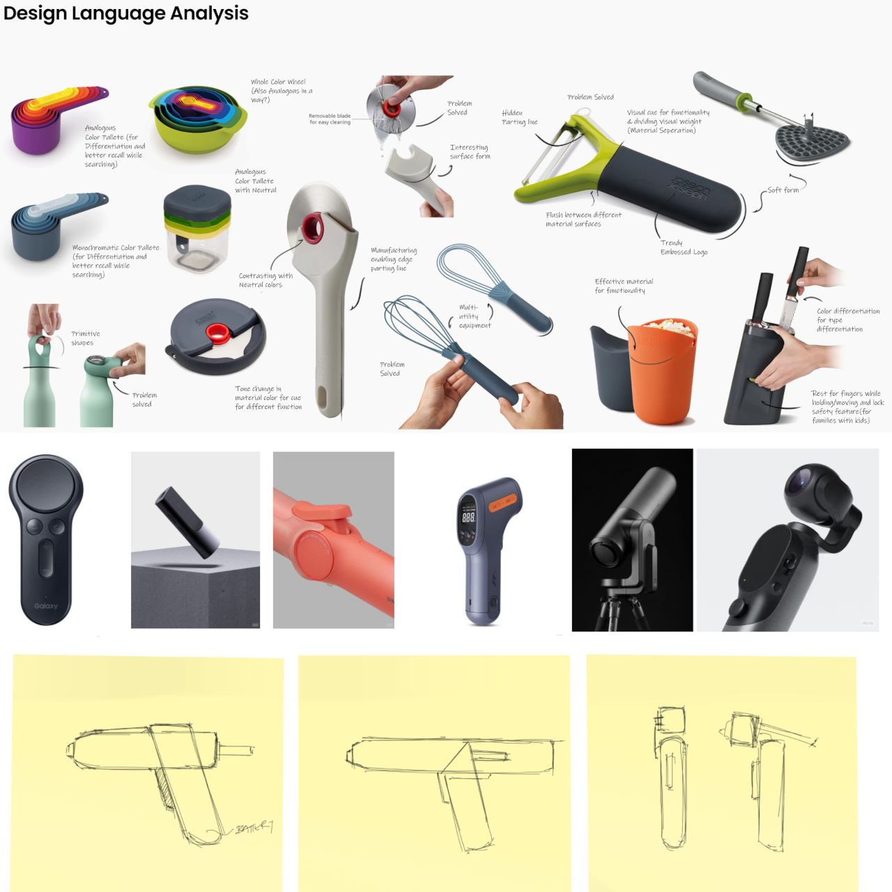
Kitchen tools like whisks and tongs are probably the last things you’d expect to be given the beauty treatment, but that’s exactly what Joseph Joseph brought to the kitchen countertop. The brand’s products are famed not just for their utility but also for their simple charm, turning their use from a chore to a joy. Given the expectations of a glue gun, this tool definitely deserves such a treatment as well, but one that also redefines the basic shape that is at the heart of the glue gun’s woes.

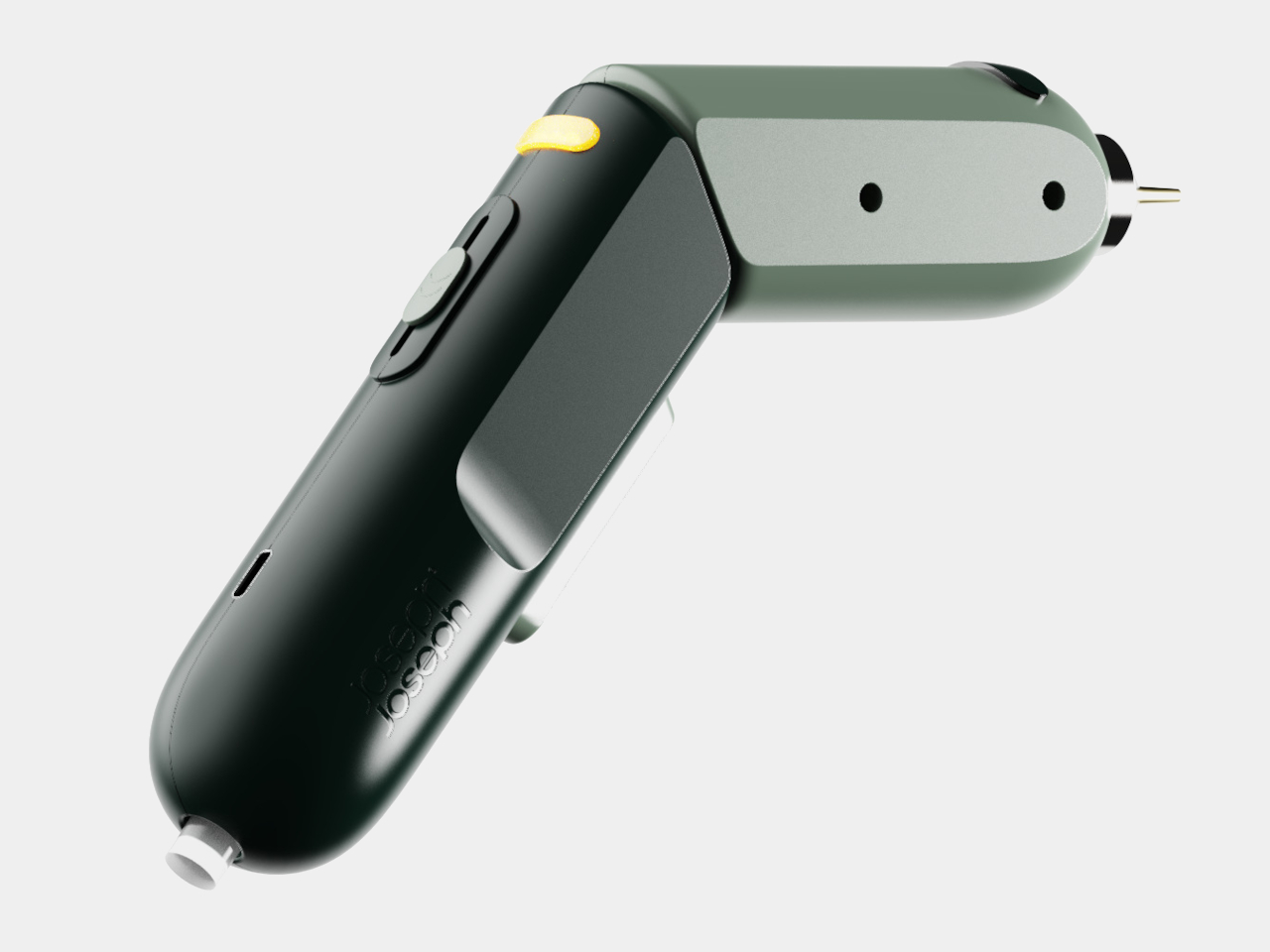
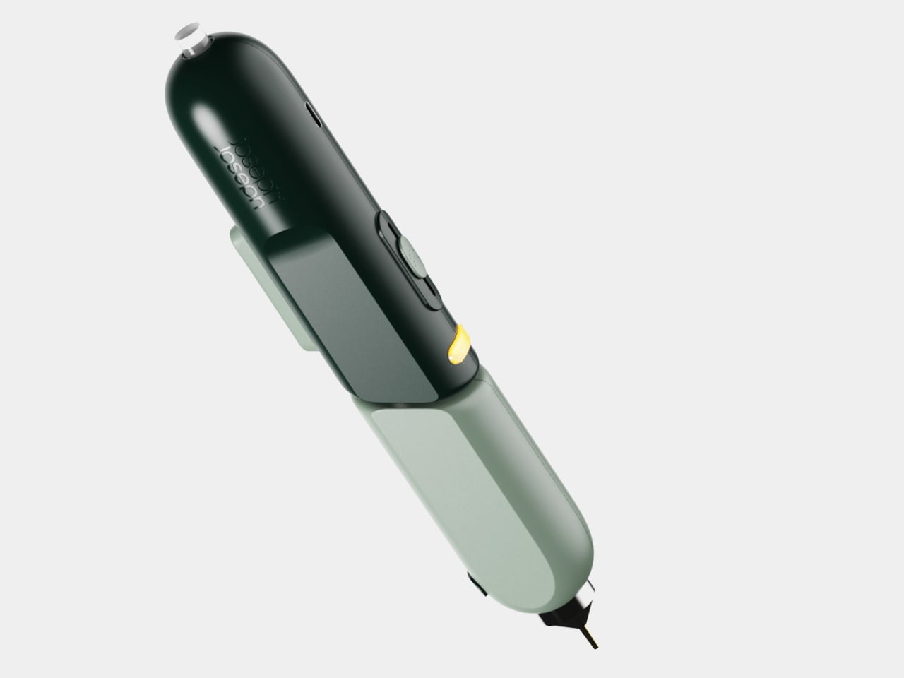
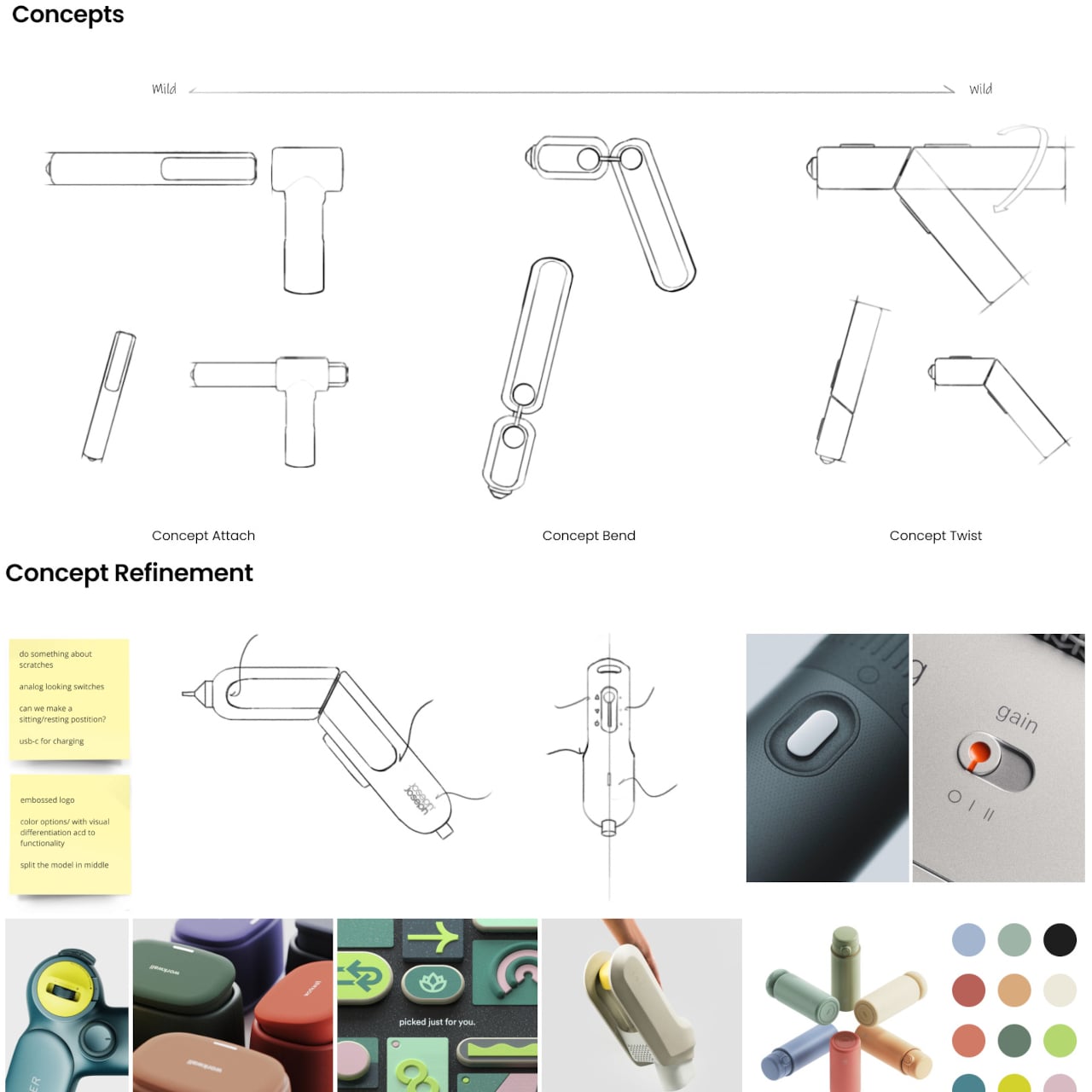
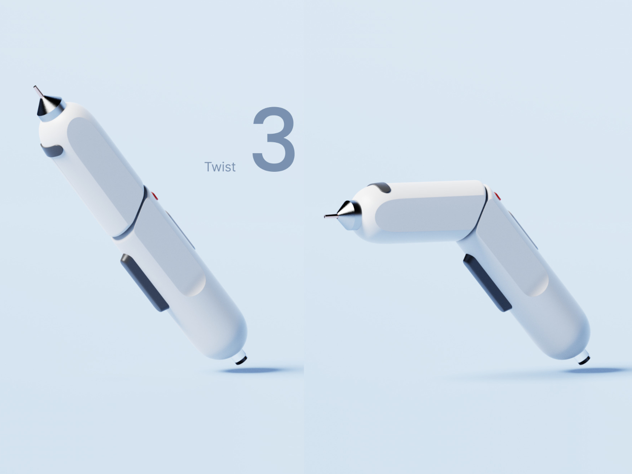
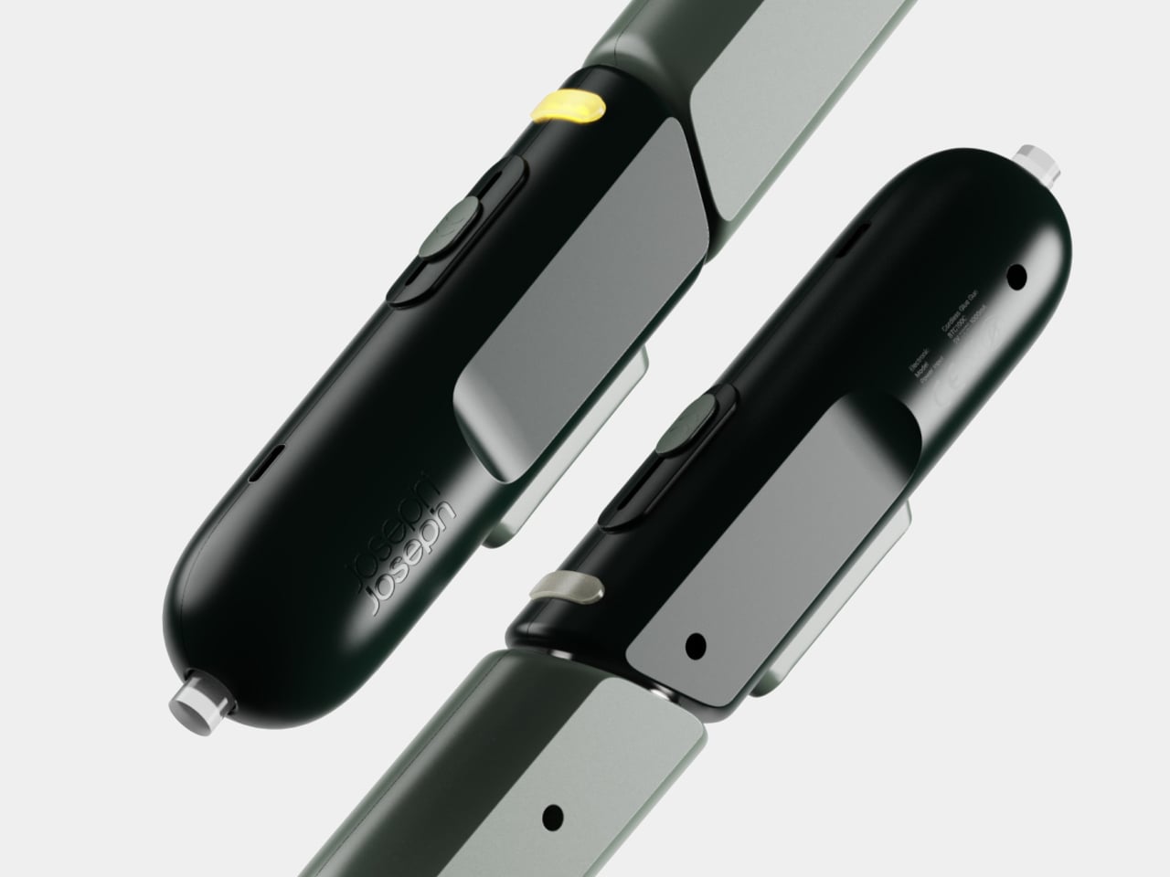
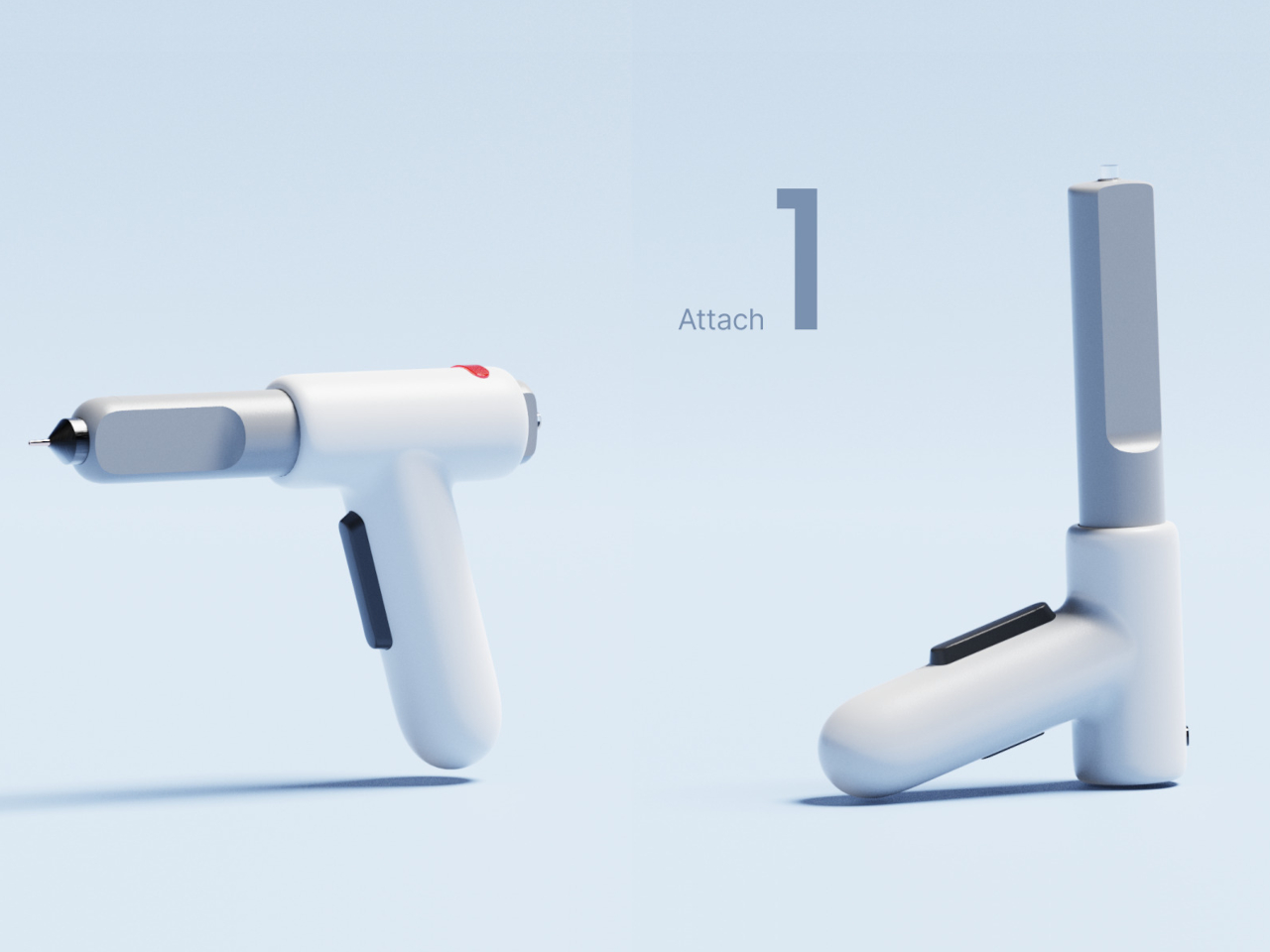
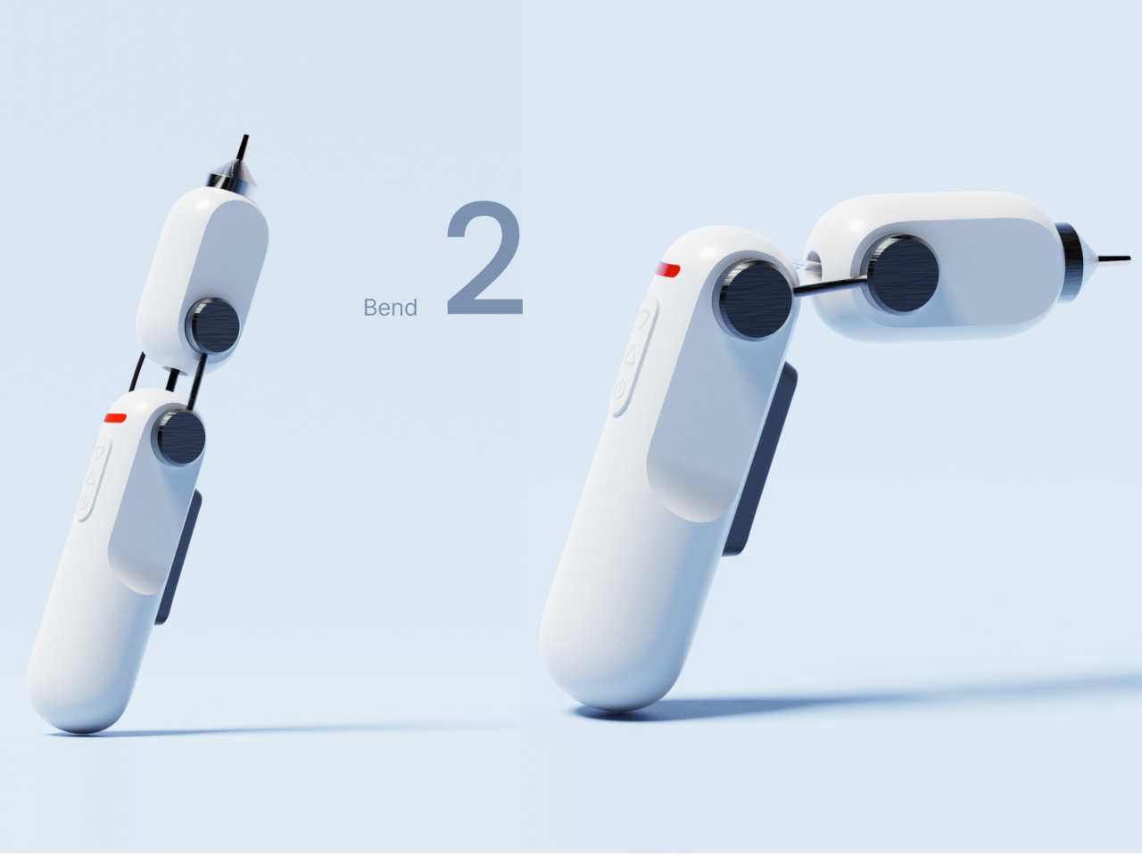
There’s really no reason why it needs to be shaped like a gun anymore, at least not one that faithfully sticks to that form. Any L-shaped form with a trigger mechanism can easily be considered a gun, and our brains will fill in the rest. This concept goes through various iterations to achieve that design, until one that is distinctive and more interactive makes it to the top. It comes in the form of a tube that has been flattened on its long sides and is actually made of two parts connected at an angle. Thanks to that cut, twisting one end creates that angle that associates the form with a gun.

The design also resolves the problem of precision with a significantly smaller and thinner rod-shaped nozzle. Unlike the conical nozzle of today’s glue guns, this allows the tip to get closer to narrow spaces without the hot metal touching the surface. The design also adds an LED light to signal when the gun is ready to use, a feature that 3D printing pens had for years now. And when you’re done, simply twisting the gun back to its original straight form is enough to turn it off, and you don’t have to worry about how to put the still-hot gun down.

More than just the form, the aesthetics of the glue gun also changes significantly. Gone is the plain, unattractive, and cheap plastic, replaced by a smooth and glossy finish befitting of a Joseph Joseph product. The design does still leave a few problems to be solved, like how the glue stick is supposed to bend as well, but it’s an interesting thought experiment for a product that has barely been given the long-overdue attention it deserves.

The post Glue gun concept gives the crafting tool a modern and ergonomic makeover first appeared on Yanko Design.
Top 10 Must-Have Accessories For Your iPhone 16 To Deliver Functionality, Protection & Style

The iPhone 16 was recently launched, and Apple lovers have been itching to get their hands on it, excited to explore the latest tech and features. And, sometimes all you need to elevate your experience of a new smartphone is to purchase a bunch of super cool accessories that will elevate its functionality, offer protection, and make it look even better! Hence, we’ve curated a collection of functional and unique accessories for your iPhone 16. From cutting-edge protective cases to charging solutions designed for utmost efficiency – these accessories have been created to enhance your smartphone’s performance while adding a touch of sophistication and style to it. These impressive accessories are the essential companions your iPhone 16 deserves!

1. CASETiFY Ultra Bounce Case

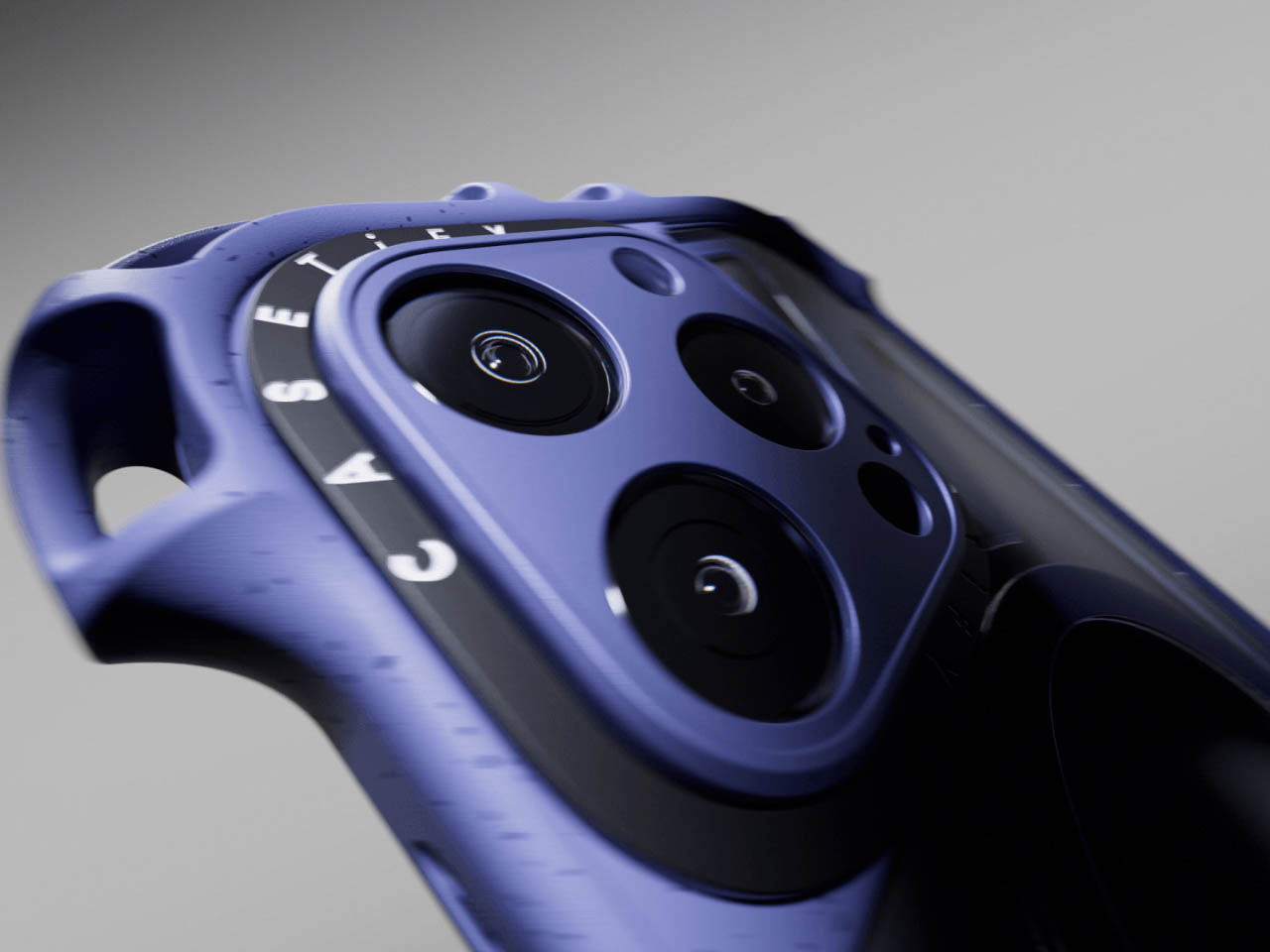
Designed by CASETiFY, the Ultra Bounce case for the iPhone 16 is an extension of their Bounce series cases. As the name implies, the case is amped with shock-absorbing properties. The MagSafe-compatible Ultra Bounce cover is built from a mix of recycled phone cases and plant-based materials. It is equipped with raised camera lens protection to offer maximum shock absorption if the phone lands on the ground, facing the camera. You can clip the case wherever you like using a carabiner, or you can carry it around using a lanyard.

2. GameBaby

Named the GameBaby, this cover is designed for the iPhone 15 and 16 Pro Max. It is created by Bitmo Lab and will convert your phone into a gaming handheld, that will remind you of the classic Game Boy. It is a practical design that offers a functional and fun gaming experience in the form of a phone case. It is equipped with a two-piece system, with the upper section functioning as a standard iPhone protector, while the lower section features physical buttons inspired by classic handheld gaming consoles. The bottom section can be flipped to the front, offering you a bunch of tactile controls.

3. iPhone DN 40 Dock

Inspired by Dieter Rams’ DN 40 electronic, funnel-shaped alarm clock, the musician OVERWEK teamed up with designer Scott Yu-Jan to create the iPhone DN 40 Dock. They took the original design and made two important changes – an ejection button was added to the top to push the iPhone ahead, allowing it to detach from the MagSafe charger. An additional space was integrated for a small Apple Watch MagSafe charger, letting you charge your AirPods on top as well.

4. SANDMARC Prolight Mini iPhone Camera Light Series

The SANDMARC Prolight Mini iPhone camera light series serves as powerful lighting for your iPhone. The lights come in 2 models – the Prolight Mini B-Color and the Prolight Mini RGB. They are amped with a long battery size and powerful illumination. They feature a compact and easy-to-carry size, measuring around 2″ L x 3.3″ x 0.4″ H, so you can easily fit them into your pocket. The Mini B-Color provides a full spectrum of warm to cool temperature tones, while the Mini RGB offers over 16 million hues of light.

5. ESR iPhone 16 Classic Hybrid Case

The new ESR iPhone 16 Classic Hybrid Case with Stash Stand and its siblings have been designed for the iPhone 16, and they have been labeled “Classic” since the transparent back allows the original color and style of the iPhone 16 to truly shine. You have an option to choose the colored edges to match the iPhone’s natural color. The back is only 1.6mm thick, so it won’t add much bulk or thickness to your slim, sleek, and stylish iPhone 16! Additionally it has an overall thickness of only 14.2mm and a weight of only 42g (1.7oz).

6. Classic C1 Cover

Designed by Spigen, the Classic C1 cover is inspired by the iconic iMac G3 case. It is priced at $59.99, and it is a celebration of one of the most fashionable computers there was. Much like the iMac G3, the C1 is available in a bunch of fun candy colors – tangerine, Bondi blue, graphite, and ruby. The cover has been made from a two-piece PC and TPU and features a retro translucent design. The cover features the MagFit ecosystem and has been made for complete MagSafe compatibility.

7. Native Union (Re) Classic Case

Native Union designed the (Re) Classic Case for the iPhone 16. It is a blend of sustainable design and premium protection. The case delivers on quality and style, while also providing an eco-friendly solution. It has been made from 100% recycled materials and consists of a smooth and recycled TPU frame and a microfiber lining. The case is also super durable and showcases a sleek and minimal design which elevates the iPhone 16’s natural good looks.

8. Moment Mobile VND (2-7 Stop) QuickLock Filter

Elevate your smartphone photography skills with the Moment Mobile VND (2-7 Stop) QuickLock Filter for iPhone 16 Pro and Pro Max! It offers professional-level exposure control to you. The filter utilizes premium Schott B270 Pro Cinema Glass, which provides sharp and distortion-free images, with no color fringing and cross-polarization. The metal rings are aerospace-grade level, and they have been precision-machined to deliver long-lasting durability.

9. The Monument

Dubbed the Monument, this iPhone MagSafe stand is made from concrete and will add an alluring hint of brutalism to your room or work desk. It draws inspiration from the cold architecture of brutalist Germany/UK, and Soviet-era Russia, as well as a touch of Arrakis from Dune. The monolithic stand is designed to hold and support your iPhone’s MagSafe charger, serving as a single sturdy block with no glue or fasteners.

10. Twelve South PlugBug

Designed by Twelve South, this is the PlugBug, a trackable multi-port wall charger designed to bring cutting-edge and nifty convenience to your charging experience. It is equipped with Find My technology, so you don’t need to worry about losing your charger ever again. It is available in 50W or 120W options, so you can select the power you need. It can charge 2 devices in one go, or juice up multiple devices for your entire family.

The post Top 10 Must-Have Accessories For Your iPhone 16 To Deliver Functionality, Protection & Style first appeared on Yanko Design.
First Omega in Space: A Timeless Tribute with a Modern Edge

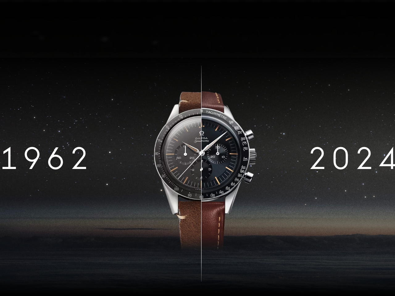
The Omega Speedmaster “First Omega in Space” (FOiS) is a piece of history that captures the spirit of adventure, space exploration, and timeless craftsmanship. First worn by astronaut Wally Schirra during the Mercury Sigma 7 mission in 1962, the CK2998 Speedmaster marked Omega’s debut into space, creating an unbreakable bond between the brand and the spacefaring legacy. Omega’s reissue of the FOiS, over 60 years after the original, retains the historical design elements while incorporating modern technological advancements, preserving the original’s aesthetics for today’s collector. Let’s dive into the details of the FOiS—its historical significance, design elements, and the enduring appeal that captivates watch enthusiasts and collectors.

Omega Speedmaster “First Omega in Space” (FOiS)

Designer: OMEGA

Forging History: Omega’s First Steps in Space

The Speedmaster’s story in space blasted off when astronaut Wally Schirra chose to wear his personal Omega CK2998 during the Mercury Sigma 7 mission in 1962. With Schirra orbiting Earth six times, this defining mission established Omega as a force of nature in space exploration, even before NASA officially qualified the Speedmaster for manned space missions. Schirra’s CK2998 was his personal choice, not an official NASA-issued watch, but his decision to wear it made history, setting the foundation for Omega’s subsequent involvement in space programs.

In 1965, after rigorous testing, NASA certified the Omega Speedmaster as the official watch for manned space missions, solidifying Omega’s crucial role in human space exploration. In 1969, the Speedmaster accompanied astronauts to the moon, earning the iconic nickname “Moonwatch.” The FOiS model, which pays tribute to Schirra’s original watch, demonstrates Omega’s legacy of precision, reliability, and special connection to space exploration.

More than 60 years after Schirra’s historic mission, Omega has reimagined the Speedmaster “First Omega in Space” to honor its storied legacy. This reissue isn’t just a watch—it’s a tribute to the spirit of exploration and a tangible connection to Omega’s role in space history.

Meticulously retaining the vintage aesthetics that made the original CK2998 iconic while incorporating modern advancements that appeal to today’s collectors. The domed sapphire crystal, Hesalite-like finish, vintage lume, and the thoroughly modern Calibre 3861 movement all contribute to the watch’s timeless charm.

This re-edition captures not just the look but the very spirit of Omega’s heritage. It embodies the courage, technological advancement, and the human desire to explore beyond known boundaries, blending tradition with innovation in every detail.

Mastering the Art of Vintage Elegance

Dial and Aesthetics

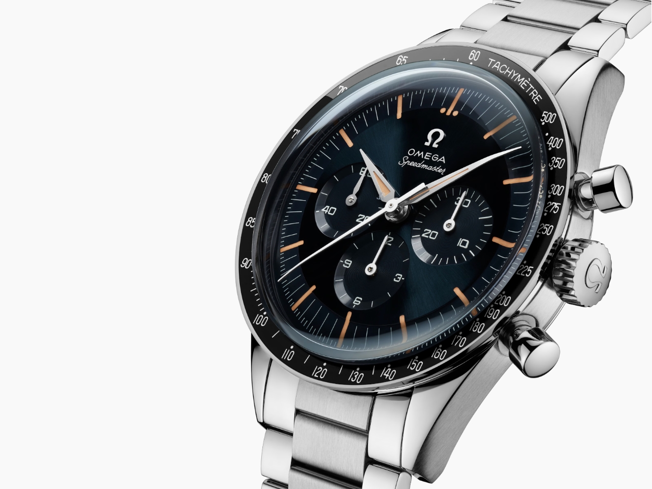
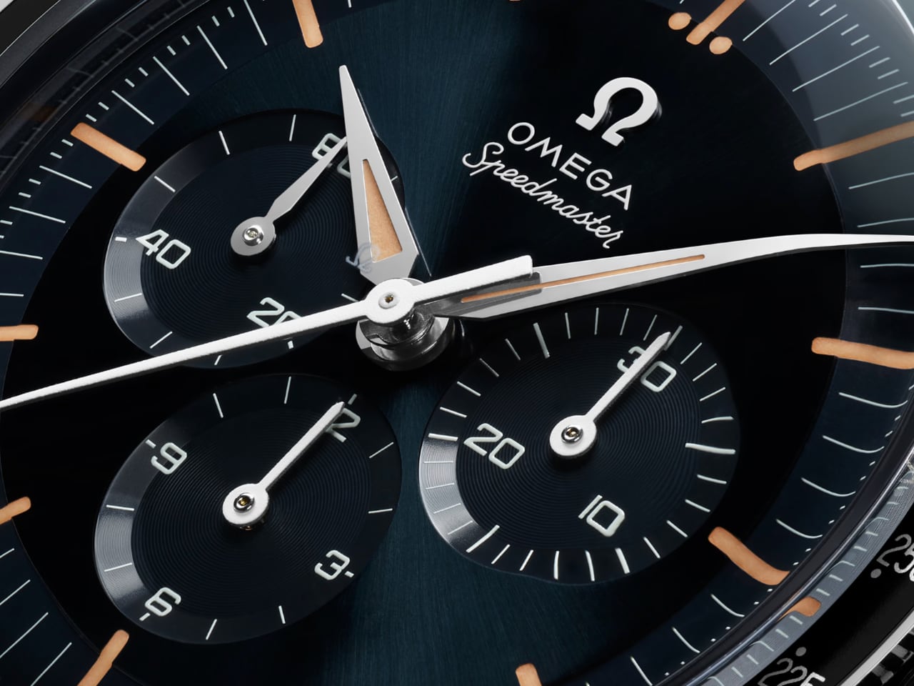
The Omega Speedmaster FOiS showcases a dial that blends vintage aesthetics with modern elegance. Its deep blue-gray finish, achieved through a CVD coating, brings a fresh yet nostalgic look. The sunburst effect catches light dynamically, adding depth and giving the watch a distinct presence.

True to the original Speedmaster design, the tri-compax chronograph layout is symmetrical and well-balanced. Each sub-dial is sunken to add visual depth, with concentric circle detailing that enhances readability while preserving the classic Speedmaster look.

Hands and Lume

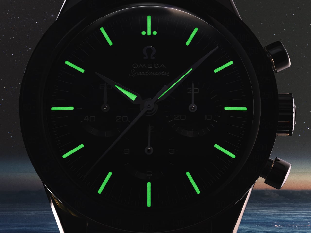
The alpha-style hands from the original CK2998, have been meticulously polished to achieve a striking reflective surface, bringing a touch of timeless elegance to the watch. The hands are filled with Super-LumiNova in a gold-orange shade that mimics the appearance of aged tritium, often referred to as “fauxtina.” This vintage-inspired lume gives the watch an authentic historical feel and ensures optimal readability in low-light conditions. The indexes and Alpha-style hour and minute hands are similarly filled with vintage Super-LumiNova, replicating the original’s luminescence while enhancing the watch’s nighttime functionality. The small seconds hand, updated with a new Alpha-style design, allows for easy reading and adds to the overall balance of the dial.

Domed Sapphire Crystal

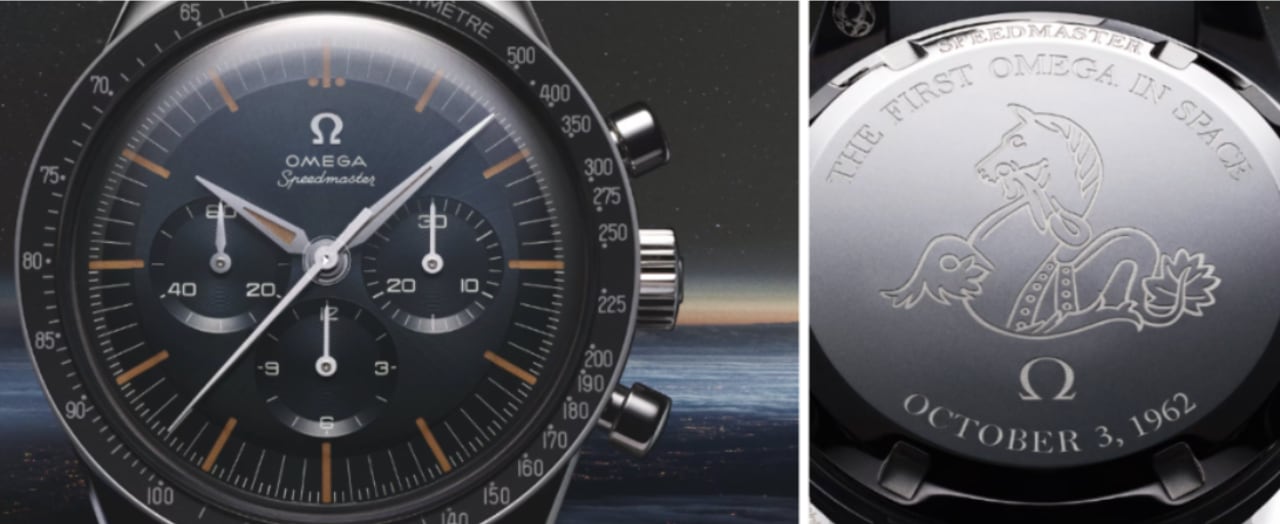
The FOiS showcases a domed sapphire crystal closely resembling the Hesalite crystal used on the original CK2998. Omega chose sapphire for enhanced durability, while the Hesalite-like domed form retains the watch’s vintage roots. The subtle doming adds a retro flair, and the crystal’s clarity ensures that every dial detail is perfectly visible without distortion.

Mission-Ready Bracelet

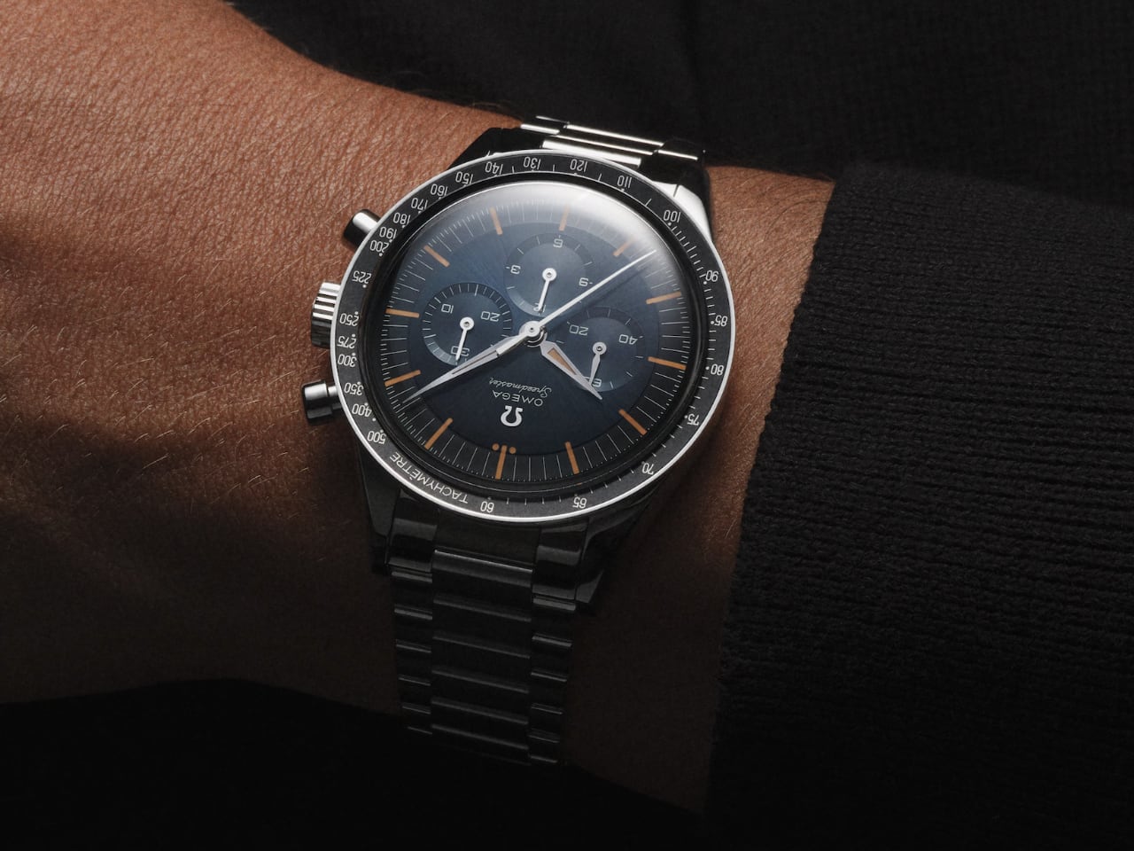
The Speedmaster FOiS has a polished, brushed stainless steel bracelet with tapered flat links featuring Omega’s comfort release adjustment system. Drawing inspiration from the classic Omega designs of the 1960s, this bracelet combines a vintage look with modern comfort and functionality. Alternatively, the watch can be fitted with a brown leather strap, echoing the look of the original worn by Schirra, giving collectors options for personalizing their timepieces.

Commemorative Caseback

The commemorative caseback of the FOiS is another distinctive element. Crafted from polished stainless steel, it is engraved with ‘THE FIRST OMEGA IN SPACE’ alongside the mission date ‘OCTOBER 3, 1962.’ These engravings encircle a Seahorse motif, a long-standing symbol of Omega’s connection to exploration and adventure. The caseback is water-resistant up to 50m/165ft, making the watch suitable for everyday wear while celebrating its rich heritage.

Movement and Technological Advancements

The heart of the Speedmaster FOiS is the Omega Calibre 3861 manual-winding chronograph movement. This movement marks a significant evolution from its predecessor, combining new technologies while preserving some of the original features that made the Speedmaster iconic.

OMEGA CALIBRE 3861

One of the major updates in the Calibre 3861 is the inclusion of the Co-Axial escapement, a technology that reduces friction within the movement, allowing for longer intervals between servicing. This advancement represents a considerable improvement in the movement’s durability and reliability, a key upgrade from the original.

Another innovation is the free-sprung balance with a silicon balance spring. Silicon makes the movement more resistant to magnetic fields, a crucial feature in modern watchmaking. This movement is METAS certified as a Master Chronometer, which means it has passed stringent tests for accuracy, performance, and resistance to magnetic fields up to 15,000 gauss. This certification underscores the reliability of the FOiS, elevating it above its predecessors.

The Calibre 3861 retains the manual-winding mechanism, staying true to the original’s charm and offering the wearer a more intimate, tactile experience. The power reserve has been upgraded to 50 hours, making the FOiS suitable for extended use without compromising performance.

Visually, the Calibre 3861 stands out with rhodium-plated finishes and straight Geneva waves, which enhance the movement’s aesthetic appeal. These features reflect the meticulous craftsmanship that Omega is known for, elevating the FOiS from a simple reissue to a contemporary classic. The combination of modern advancements with elements that honor its legacy makes the Calibre 3861 a defining aspect of the Speedmaster FOiS, seamlessly blending heritage and innovation.

Yanko Design’s Perspective and Conclusion

The Omega Speedmaster FOiS channels the spirit of exploration in a personal and genuine way. It’s much more than the specs or history that make it special—it’s how it feels on your wrist. The FOiS brings the ambition of the 1960s into the present, blending its retro character with modern enhancements that make it a joy to wear. Omega has a balanced heritage with meaningful improvements from the domed sapphire crystal to the vintage lume and updated Calibre 3861.

Why It’s Noteworthy

Omega kept the original charm intact while enhancing practicality for today’s collector. The period-accurate design and upgraded movement make it look authentic and awesome and perform reliably, making it a solid choice for collectors and watch lovers.

5 Things I Like

  1. The domed sapphire crystal beautifully recreates the Hesalite look without sacrificing durability.
  2. The vintage-inspired lume adds a nostalgic touch while remaining functional.
  3. The modern Calibre 3861 movement combines heritage with precision.
  4. The well-balanced chronograph layout retains Omega’s classic design aesthetics.
  5. The comfort release system on the bracelet makes it practical for daily wear.

3 Things I Dislike

  1. The water resistance could be improved to make it more versatile for outdoor activities.
  2. The pricing feels a bit steep, especially considering other models in the Speedmaster lineup.
  3. Using “fauxtina” lume may not appeal to collectors who prefer a more contemporary look.

The Omega Speedmaster FOiS is a perfect example of honoring a legacy without being trapped by it. Omega has taken what was already iconic and made it relevant, wearable, and just as inspiring today as in 1962. And for me, that makes it worth every attention it gets.

The post First Omega in Space: A Timeless Tribute with a Modern Edge first appeared on Yanko Design.

Tactical and Practical: This 6-in-1 Titanium EDC Multitool Packs Versatility in a Compact Form

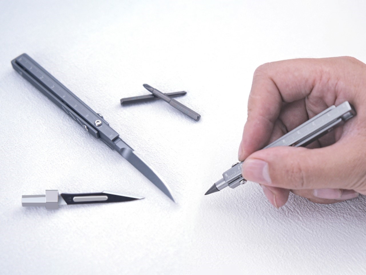
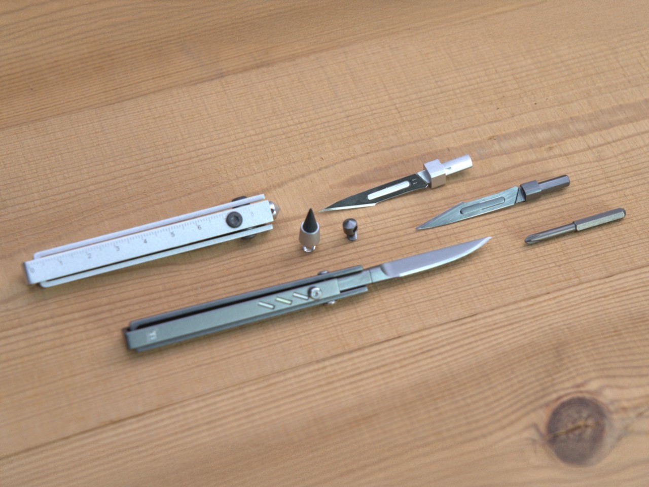
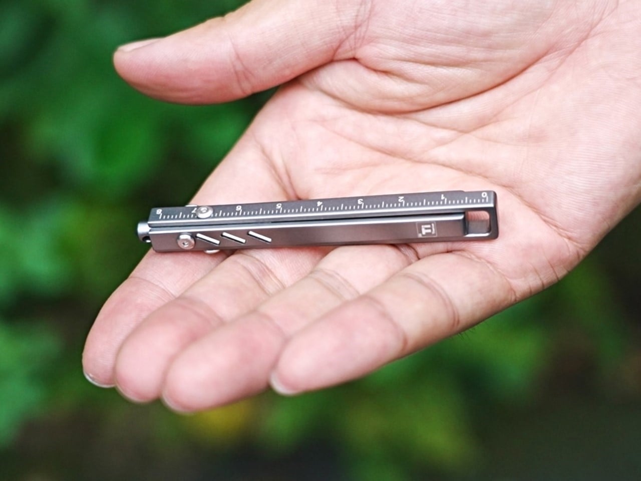
Remember those thick pens back in the ’90s and early 2000s with three-four refills that could individually be deployed? The same pen could write in red, blue, black, or even green, and truth be told, that’s about as versatile as pens got back in the day, but not today. Something as slim as a pen today can write, measure, cut, carve, assemble/disassemble, and even break windows. Meet the Ti-ONE, a 6-in-1 pen-shaped EDC multitool that doesn’t pack a punch, it packs an entire 6-step melee combo. The tool, no bigger than a pencil measuring less than 4 inches tall, packs a Cutting Blade, a Craft Blade, a multi-bit Screwdriver, an Eternal Pen, A Window-breaker, and even a multi-unit Ruler or Scale. Crafted from either titanium or stainless steel depending on the variant you choose, this tool is both lightweight and remarkably durable, making it a perfect companion whether you’re camping outdoors or just tackling everyday tasks at home. At just 90mm (3.5 inches) in length and 10mm in width, it’s sleek, sophisticated, and engineered to perform.

Designer: Clean One

Click Here to Buy Now: $59 $99 (40% off) Hurry! Only 11 days left. Raised over $79,000.

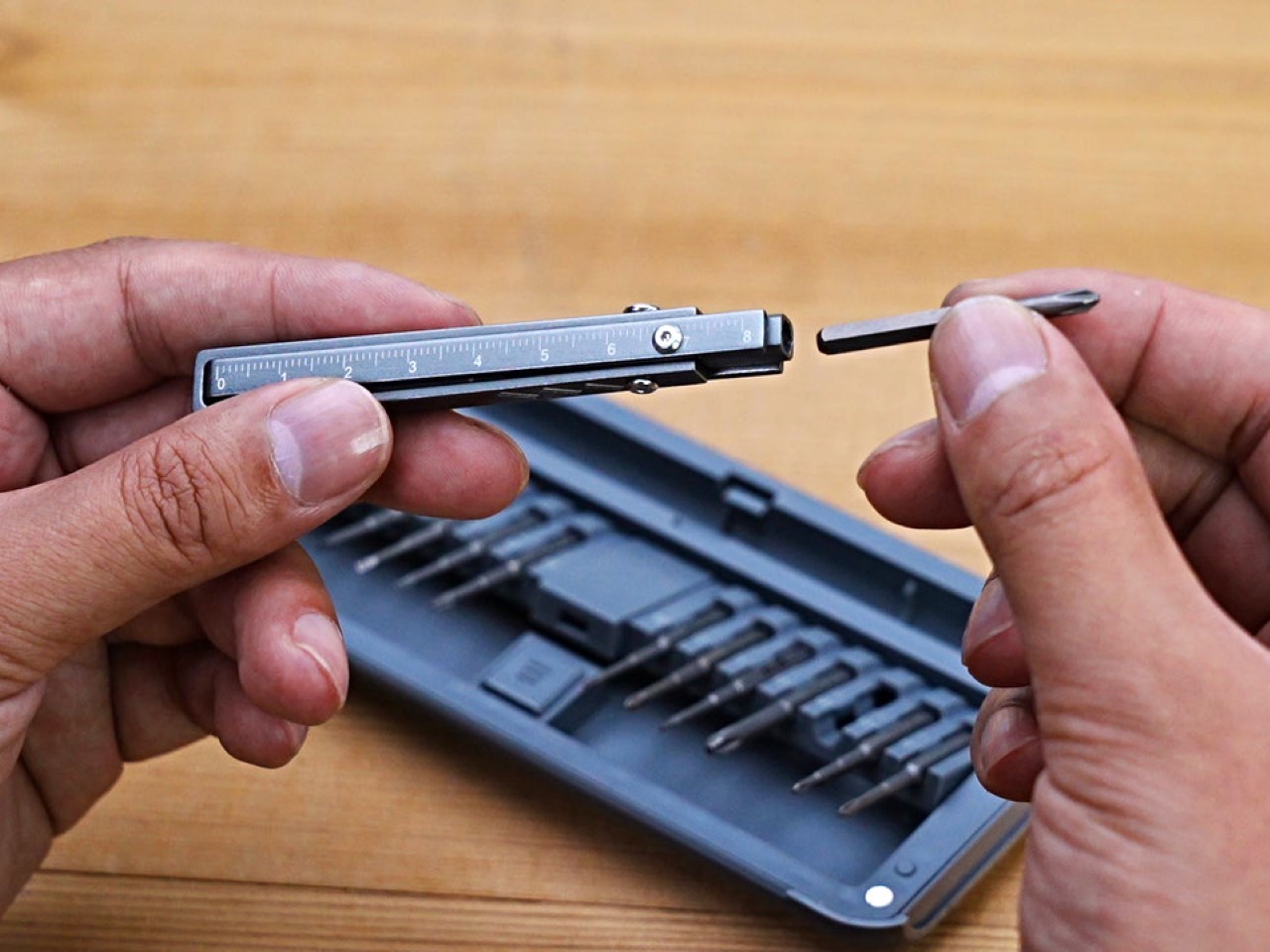
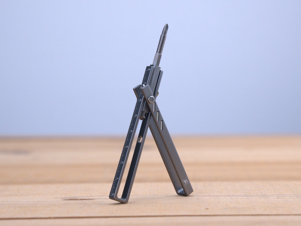
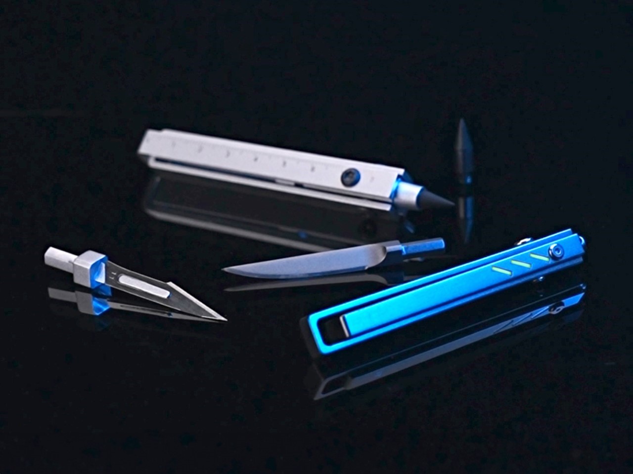
The Ti-ONE’s six tools exist within a modular form factor no larger than the average index finger. The body features a multi-point swiveling design that either reveals the Ti-ONE’s cutting blade, or a hex-bit docking zone that lets you attach a variety of modules from screwdriver bits to stationery. The swiveling design has a unique fidget-like quality to it, but it also gives the Ti-ONE the ability to shapeshift between tools and even transform into a high-torque driver just in case you’re working with tough screws and bolts.

The first tool is the Ti-ONE’s Cutting Knife, a built-in drop-point blade. Made from steel, the blade offers the ability to achieve quite a few indoor or outdoor tasks, from opening mail to cutting/whittling branches outdoors. It’s fairly durable and lends itself rather well to intense tasks, but the best part is its ability to un-dock from the knife, letting you detach it when you want to carry your EDC on flights.

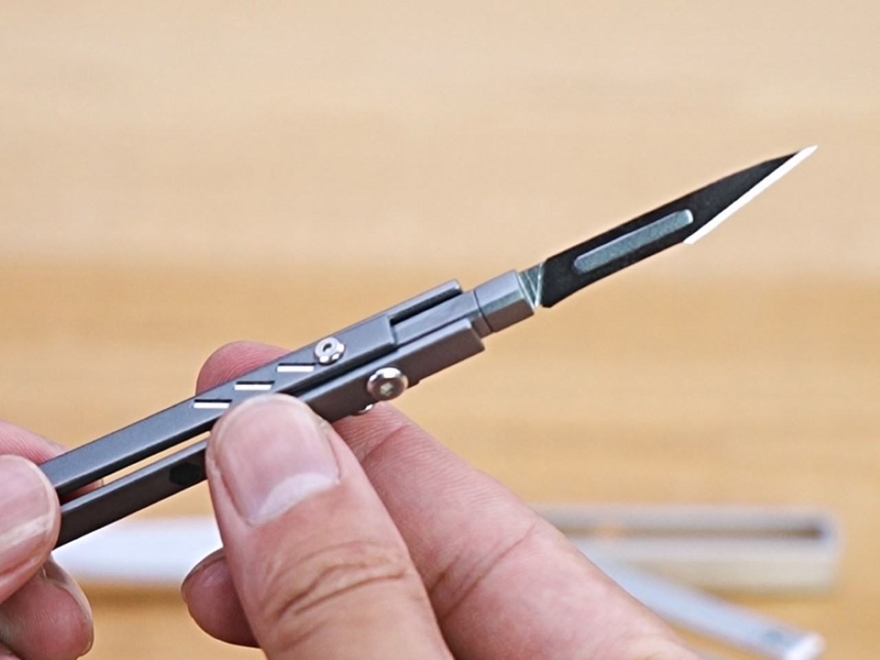
While the Cutting Knife has its specific skill-set, for other kinds of cutting, you’ve got a Craft Knife mount that accepts scalpel blades. The cutting knife isn’t replaceable, but the Craft Knife’s blades are. They’re ridiculously sharp, making them perfect for working with precision, whether it’s slicing paper, working with materials like leather or cardboard, or even carving/scraping hard materials like plastic or soft wood. Scalpel blades, made from surgical-grade steel, are a little more fragile than the Ti-ONE’s own knife, which is why they’re designed to be replaceable. They come in a variety of styles too, so you can alter the shape of the blade too – something that makes them a tad more versatile than the included Cutting Knife.

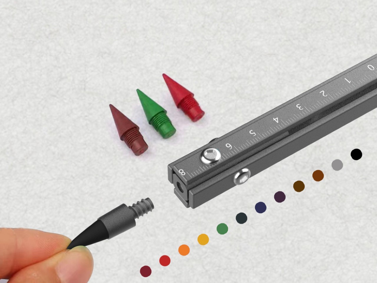
Moving beyond blades, the Ti-ONE comes with an ‘Eternal Pen’ module that lets you almost literally write forever. Designed to write up to 10,000 meters, it becomes an indispensable companion for anyone on the go. The pen fits effortlessly into the compact frame, always ready for those moments of inspiration or necessity. Whether you’re sketching out a design, jotting down field notes, or signing documents, the Eternity Pen delivers smooth, reliable performance. Moreover, built with a standard threaded design, the Eternal Pen’s nib can be replaced for traditional graphite or even any color-pencil nibs, giving you a veritable stationery set in your palms.

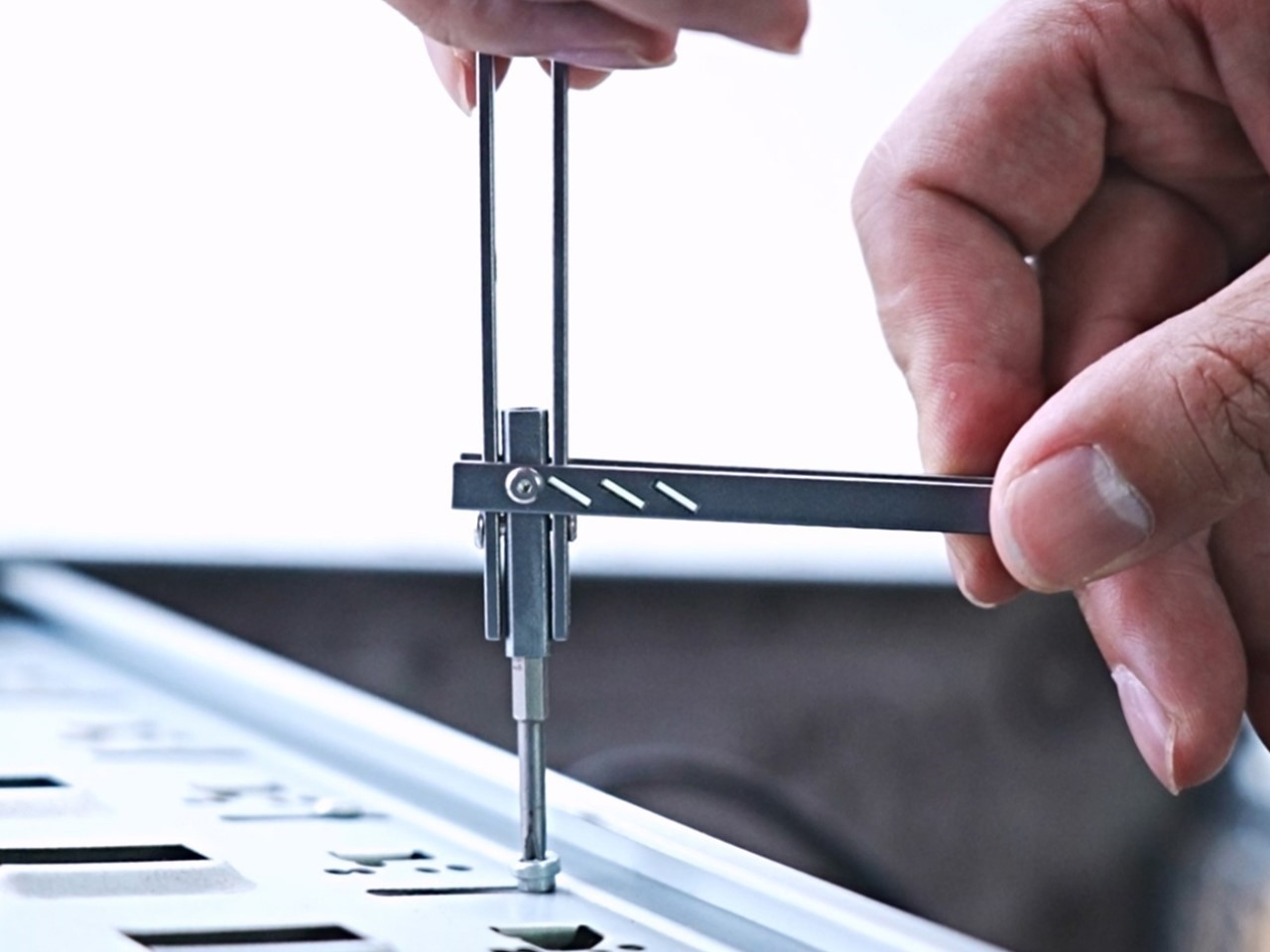
When it comes to functionality, the Ti-ONE’s screwdriver is a standout feature. But this isn’t your average screwdriver—it’s engineered for versatility and strength. Dock the bit in and you’ve got yourself a standard screwdriver that’s fairly elementary… but swing the Ti-ONE’s outer arm down and you now have an L-shaped screwdriver, allowing for high-torque use that makes it ideal for both small, precise adjustments and heavier jobs. Whether you’re fixing something at home or tackling a repair on the go, the tool’s design ensures that you have the leverage you need without the bulk of a full-sized driver. The clever, external extension port means it can reach deep, narrow spaces that traditional screwdrivers struggle to access, so no screw is too far out of reach.

The L-shaped Screwdriver in action

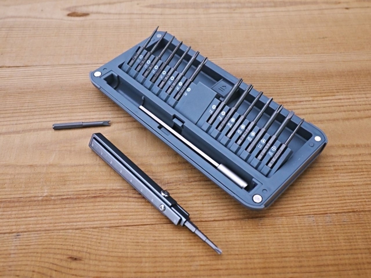
What sets the Ti-ONE apart is its compatibility with standard hex bits, giving you the freedom to use the bits from your existing screwdriver set. It comes equipped with a single Phillips head bit, which covers most everyday tasks. But for those situations where you need a flathead, Torx, or specialized bit, you can simply swap in any standard hex bit of your choosing. This flexibility is a game-changer, transforming the Ti-ONE from a simple EDC tool into an essential part of your toolkit. You no longer need to carry multiple screwdrivers or worry about the right bit for the job—Ti-ONE adapts to your needs, effortlessly.

The square cross-section lends a few advantages to the Ti-ONE. For starters, it prevents the tool from rolling around the way a pencil or pen would, while also offering a better grip thanks to the squarish design that’s perfect for when you’re working with screws and such. However, the flat surfaces of the sides of the Ti-ONE also double as a tiny makeshift scale, allowing you to measure in both imperial and metric units. Sure, at just 3.5 inches in length, there isn’t much you can measure… but it’s still a neat add-on.

Lastly (and by no measure the least) is the Ti-ONE’s emergency window-breaker tip, which sits at the end of the device. Designed to instantly shatter reinforced or laminated glass, this glass-breaker might look small, but is quite literally the difference between life and death. The inclusion of this tool really makes the Ti-ONE a must-have EDC, allowing you to make quick exits from buildings and vehicles in an emergency. Pair it with the scalpel blade’s ability to cut through a seatbelt like a knife through butter and you’ve really got yourself a life-saver on your hands. Quite a hefty reputation for something the size of a pencil, no?!

The Ti-ONE comes in two variants, with the stainless steel version starting at $59, and the titanium at $79. Both have the exact same design and features (including even tritium slots in the body for adding glow vials), except the titanium variant has the added advantage of being stronger, lighter, rust-proof, and just being nearly 4x stronger than stainless steel, giving you an EDC that could – for all intents and purposes – last multiple lifetimes. Grab yours now and the Ti-ONE begins shipping globally in December.

Click Here to Buy Now: $59 $99 (40% off) Hurry! Only 11 days left. Raised over $79,000.

The post Tactical and Practical: This 6-in-1 Titanium EDC Multitool Packs Versatility in a Compact Form first appeared on Yanko Design.
A User Interface Designer redesigned MKBHD’s Panels app and made it 10x better

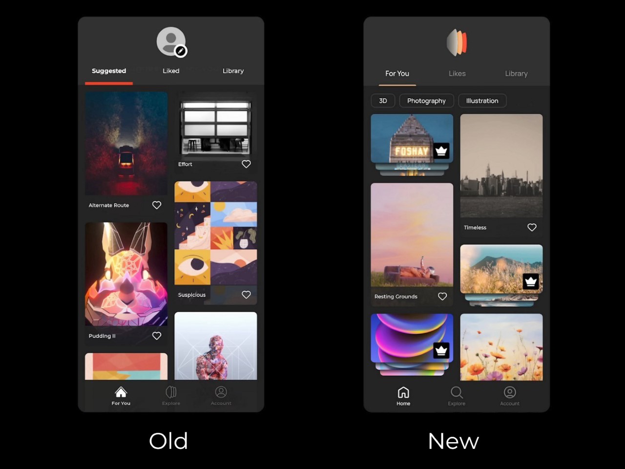
Juxtopposed’s redesign of the Panels app is a literal chef’s kiss if you love a good review. Just like MKBHD politely dismantles bad design, Juxtopposed brings the same calm demeanor to her review of the Panels app, while simultaneously redesigning literally every page to make the app MUCH better. Not only does the new app have a better UI, it’s more feature-packed, less buggy, more visually efficient, and even proposes a new way to monetize the app that makes it, well… less offensive.

MKBHD announced his first ever product last week – an app that gives you access to a wallpaper marketplace featuring wonderfully curated artist-made wallpapers that come personally approved by YouTuber and tech-culture icon Marques Brownlee. The problem, however, was that the app was a fraction of what we expected from tech’s greatest reviewer. It was buggy, had ad-ware, tracked personal data (which a wallpaper app definitely shouldn’t do), and tried to monetize jpegs by asking for $12 a month or $50 a year… something that was simply outrageous for essentially a bunch of wallpapers. The internet revolted in massive swathes, raking MKBHD’s credibility over fire for what seemed like a very obvious cash-grab. Moreover, people somehow managed to reverse-engineer the app and extract the wallpapers for free as a form of protest. Paying $12 a month for wallpapers isn’t something that makes a lot of sense to most people, considering Netflix, Spotify, hell even MKBHD’s own YouTube Premium cost the same amount. However, this isn’t about the app’s launch or its pricing model – it’s the fact that the app itself could be better designed. Taking things to task, YouTuber and UI designer Juxtopposed decided to quickly critique and redesign the Panels app. For UI/UX designers, this video is an absolute masterclass in great design, as she breaks down her entire process, providing constructive criticism of the existing app and fixing every flaw with simple design tweaks. If you’re a UI/UX designer or just an enthusiast, grab a coffee, sit down, and enjoy the next 5 and a half minutes of the video above… or scroll through to quickly read how Juxtopposed took the most polarizing phone app of last week and turned it into a well-designed experience that any tech YouTuber would recommend.

First off, the website—a brand’s first handshake with its audience—felt like a bit of a fumble. Given MKBHD’s production quality for his videos, you’d imagine expecting precision, but instead you’ve got a layout that feels like a rushed draft. There’s an odd flatness to the design, where headings blend into paragraphs and links lead you down rabbit holes of nowhere (it’s also incredibly heavy and doesn’t scroll smoothly on weak internet connections). It’s strange, considering MKBHD’s professional video production setup. But to be fair, this is just the website, not the app itself. And if there’s anything we know about the tech world, first impressions on paper (or screen) don’t always define the real experience.

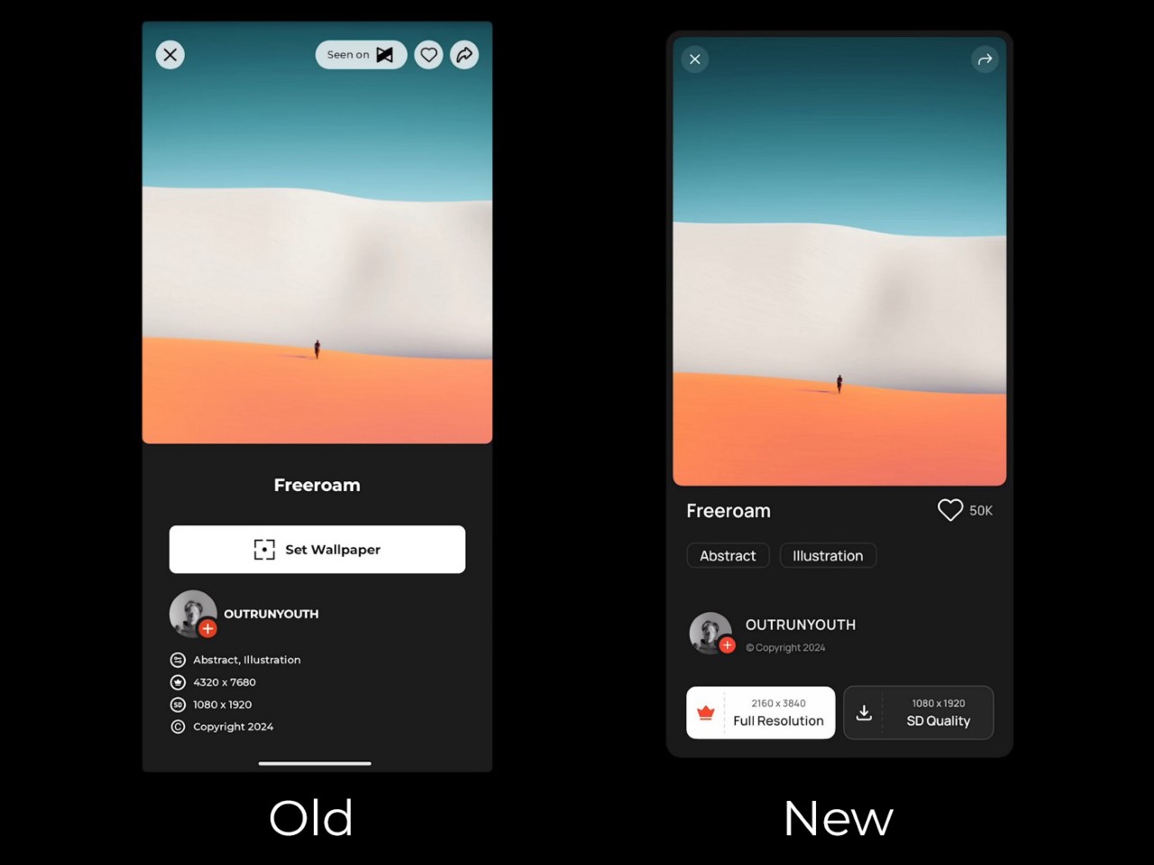
Once you install the app, you’re greeted with a setup process – and here’s where things feel, well, clunky. To create a personalized home feed, users are asked to select five artists from a list of fourteen. Sounds simple enough—except there’s a catch. You can’t actually explore these artists’ work before choosing. No profiles, no descriptions, just a gallery of unfamiliar names, leaving you to essentially take a shot in the dark. Wouldn’t it be easier to offer some style or mood-based suggestions? Especially for an app built around personalization, this initial friction feels like a missed opportunity to connect with users from the get-go.

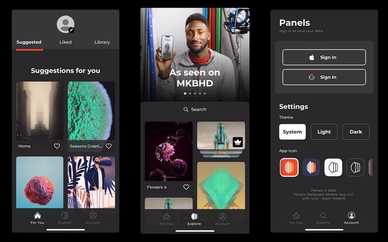
The three core sections of the Panels app

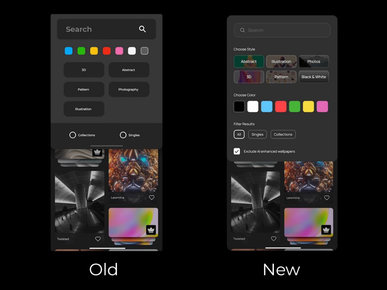
Navigating through Panels, you’re introduced to its three core sections: Home, Explore, and Account. It’s a simple enough structure, but it doesn’t quite land. The Home page, intended to show personalized suggestions, feels more like a placeholder, with user favorites and purchases awkwardly scattered. Meanwhile, the Explore section, where discovery should thrive, suffers from design missteps. A small, nearly invisible search button? In 2024? Come on. Even the icons seem to have skipped the quality check, with mismatched styles and inconsistent border thicknesses. It’s hard not to feel like this is still a work in progress—one that launched too soon.

Inconsistent icon styles

But here’s where the real frustration sets in – pricing. For an app that delivers digital art, the monetization strategy feels surprisingly tone-deaf. Want standard wallpapers? Watch an ad. Want premium ones? That’ll be $50 a year or $12 a month (this is AFTER Marques reduced the prices following a blowback). Compared to other apps in this space, many of which offer free ad-supported options with lower subscription rates, Panels’ pricing feels excessive. It’s not that the app shouldn’t charge, but the balance between free and paid features needs rethinking. Locking everything behind a hefty subscription might scare off users before they even have the chance to engage with what could be a fantastic product. Remember, nobody buys NFTs anymore because of how inherently people feel JPEGs shouldn’t cost so much money. For $12 a month, you can either have a premium wallpaper app subscription or pay $2 extra for YouTube Premium. The math isn’t mathing, as people on the internet say nowadays.

Technically, Panels offers some good ideas, but they’re overshadowed by awkward execution. There’s no flexibility in how wallpapers are applied—no option to choose between home screen or lock screen. The search functionality is limited, forcing you to abandon filters if you want to type a new term. And for a wallpaper app, isn’t search everything? Refining the search experience and adding sorting options like relevance or popularity could make a huge difference in how users interact with the app.

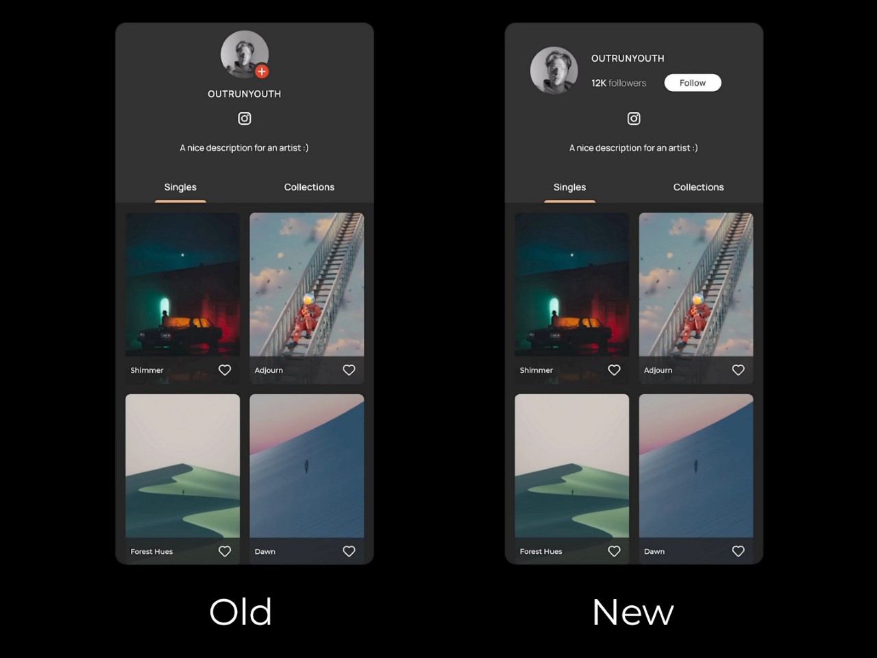
In fact, Juxtopposed even proposed turning the Panels app into a de-facto social network where people can build out a proper profile and create and share their own wallpaper designs (sort of like how OnePlus did with their community). It’s a clever idea that offers the ability to strengthen MKBHD’s own 19.5 million-strong follower base, effectively also becoming a place where Marques can share exclusive content with Panels+ members. But alas, the app currently is a victim of Marques’ success as a YouTuber who puts quality above all. It’s a shame the app didn’t reflect that.

Ultimately, Panels is a solid idea that just needs time to mature. It’s not there yet—the design is inconsistent, the pricing feels off, and the user experience needs a serious overhaul. But as with most things Marques touches, there’s potential. Feedback from the community could steer the app in the right direction. For now, though, Panels feels like a promising beta rather than a polished product… but hey, the redesign feels like a major improvement, doesn’t it?

Images via Juxtopposed

The post A User Interface Designer redesigned MKBHD’s Panels app and made it 10x better first appeared on Yanko Design.

LEGO recreates the classic 1966 Batmobile with all its retro intricacies

Many renditions of the Batmobiles have kept us all hooked to Bruce Wayne’s crime-fighting antics. Undeniably the 1966 TV show featuring the superhero’s ride is the best of them all, and now you have the chance to own a LEGO version of Bruce’s favorite crime-fighting machine.

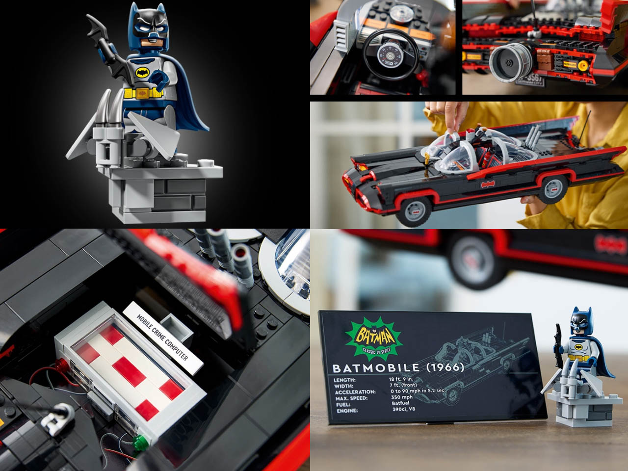
This 1,822-piece scaled-down replica of the cape crusader’s classic ’60s Batmobile recreates the real ones’ sleek lines and curves to perfection. The interiors are extensively detailed on both the Batman and Robin’s side. To give you an idea of the level of detailing, the opening trunk has a mobile crime-fighting Bat Computer stashed in there. The latest version of the classic Batmobile has a minifigure of Adam West’s legendary Bright Knight with its own display base. Not surprising the superhero poses with a batarang.

Designer: LEGO Group

Compared to some previous LEGO Batmobile builds, this one has more intricate detailing. When fully assembled, it measures 19 inches long and seven inches wide. Everything about this pursuit vehicle is rigged with bat gadgets. There are molded windshields, a rear jet engine, movable wheels, and an informative plaque to complete the display. In the driver’s seat is Adam’s legendary crime fighter in all his might, and looking intimidating with the painted eyebrows on the cowl. The only thing missing is a can of Bat-Shark Repellent.

The $150 price tag is a bit surprising given the size of the completed LEGO build. Compare that to the likes of The Legend of Zelda Deku Tree or other smaller sets, this one seems to have hit the sweet spot. LEGO Group is pitching it as Batman: The Classic TV Series Batmobile. If I had to choose one of the LEGO Batmobile versions, this one would be it.

The post LEGO recreates the classic 1966 Batmobile with all its retro intricacies first appeared on Yanko Design.