Kids’ Tech Has a Screen Problem: This $139 Button Is the Fix

Getting kids through morning and bedtime routines is one of those parenting problems that never quite gets solved. Apps on tablets and phones have tried, but the device that’s supposed to help with brushing teeth is the same one that can pull up YouTube. Most parents end up nagging anyway, just now with a screen involved. The category of kids’ tech hasn’t really made mornings easier. It’s made them busier.

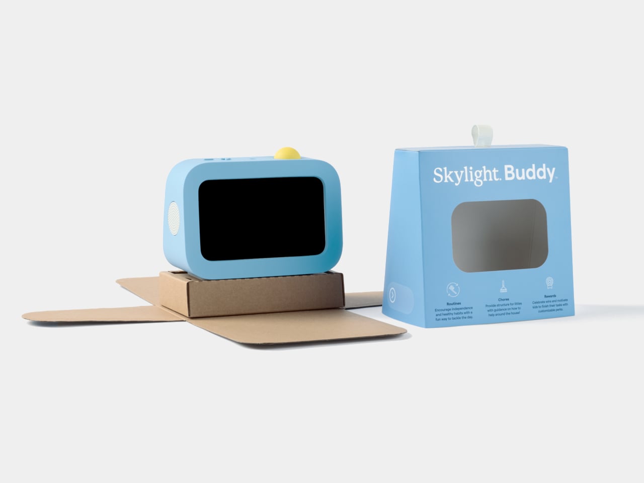
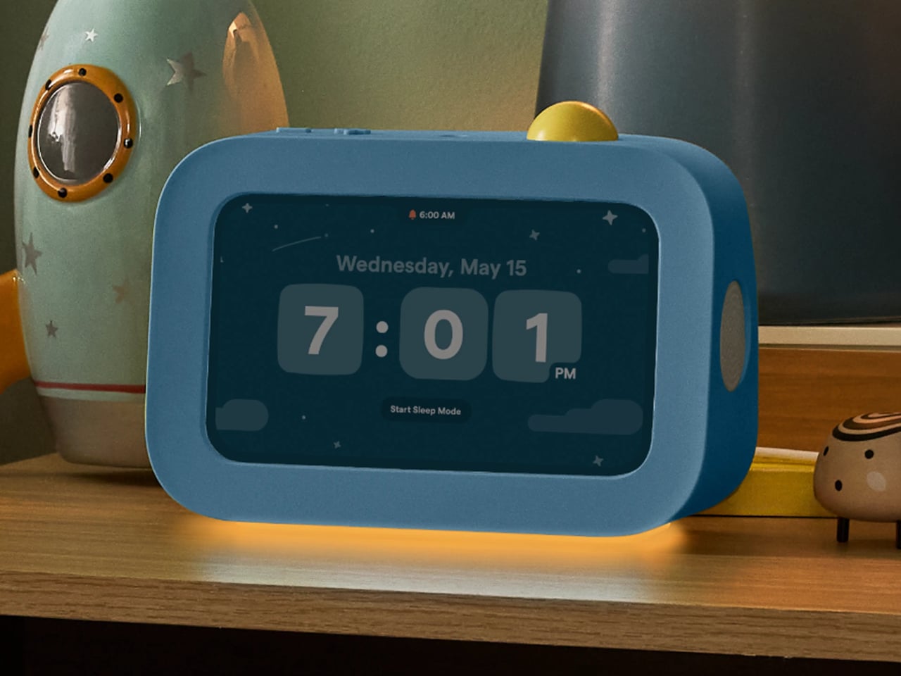
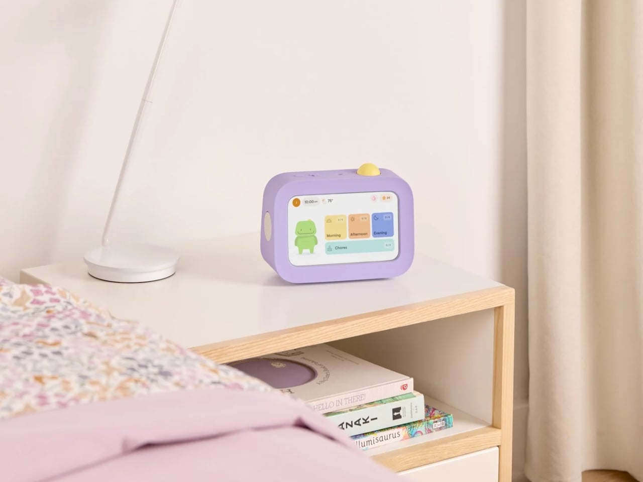
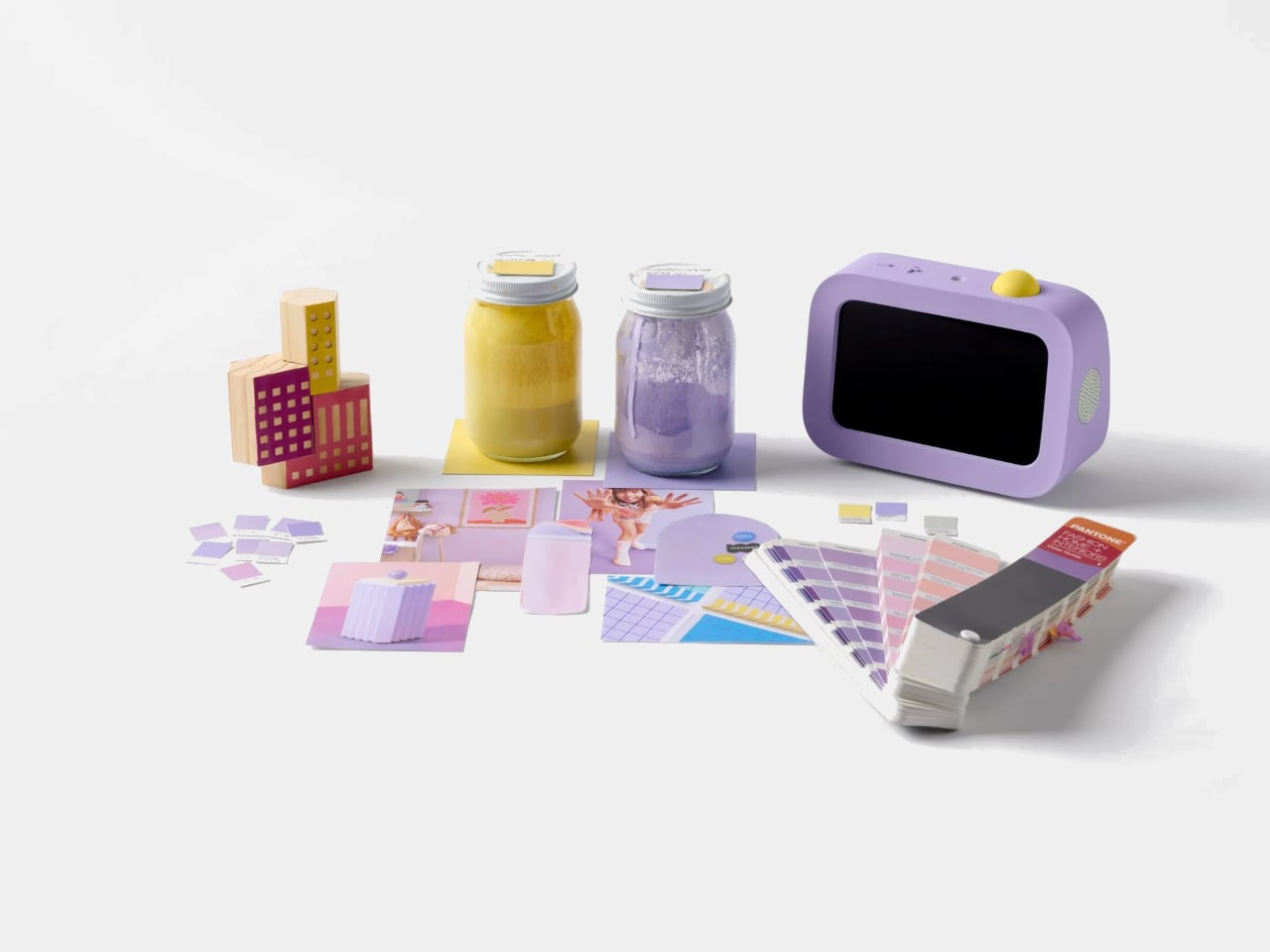
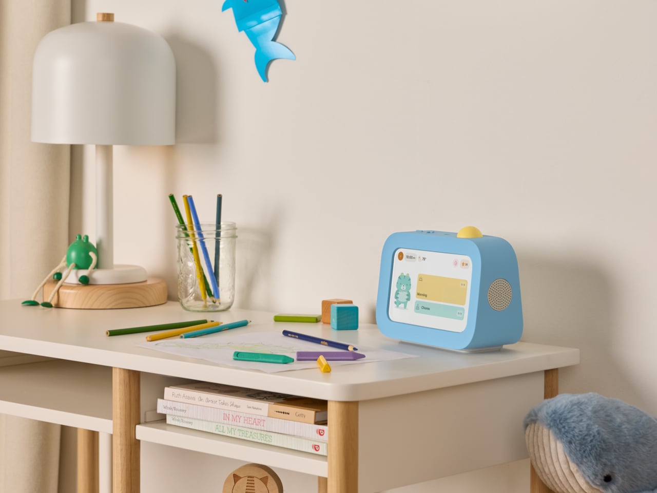
Skylight Buddy takes a different approach. It’s a purpose-built bedside device for children ages 4 to 10, with a touchscreen, a speaker, a built-in nightlight, and a physical action button. What it doesn’t have is just as deliberate: no internet access, no browser, no downloadable apps, no camera, and no microphone. It launched in June 2026, and its first production run sold out within a week.

Designer: level Design

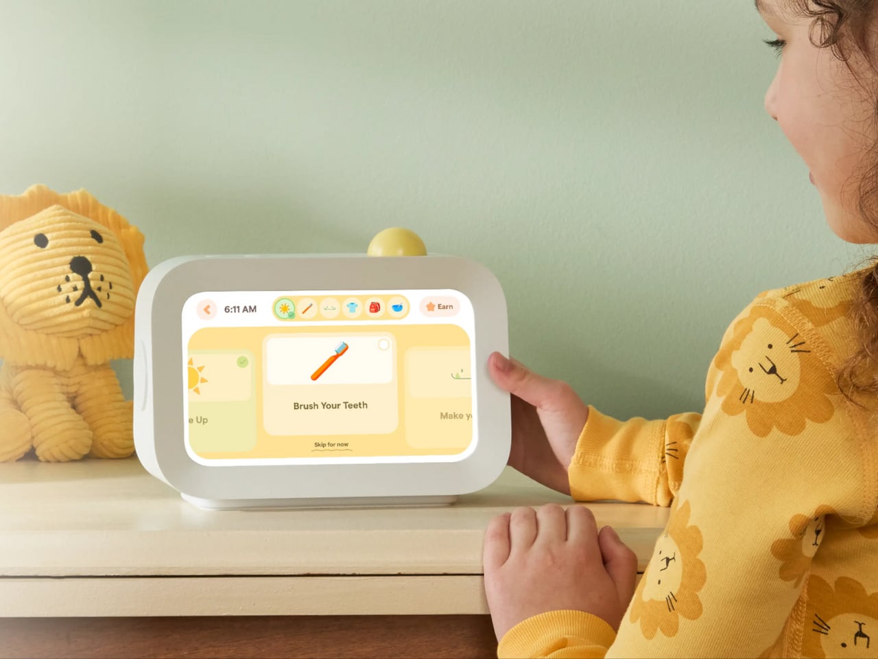
The core interaction is simple. Buddy guides kids through their morning, after-school, and bedtime tasks one at a time, showing each with clear on-screen visuals. When a task is done, the child presses the action button on top to confirm, advance to the next step, and collect stars. The design team pushed hard to keep that physical button rather than defaulting to a screen-only approach.

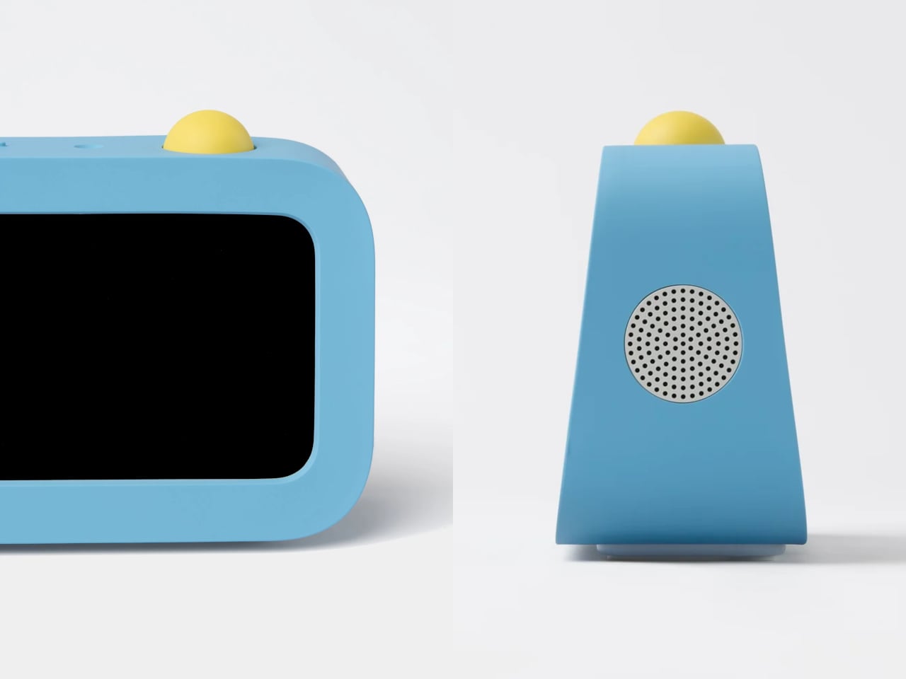
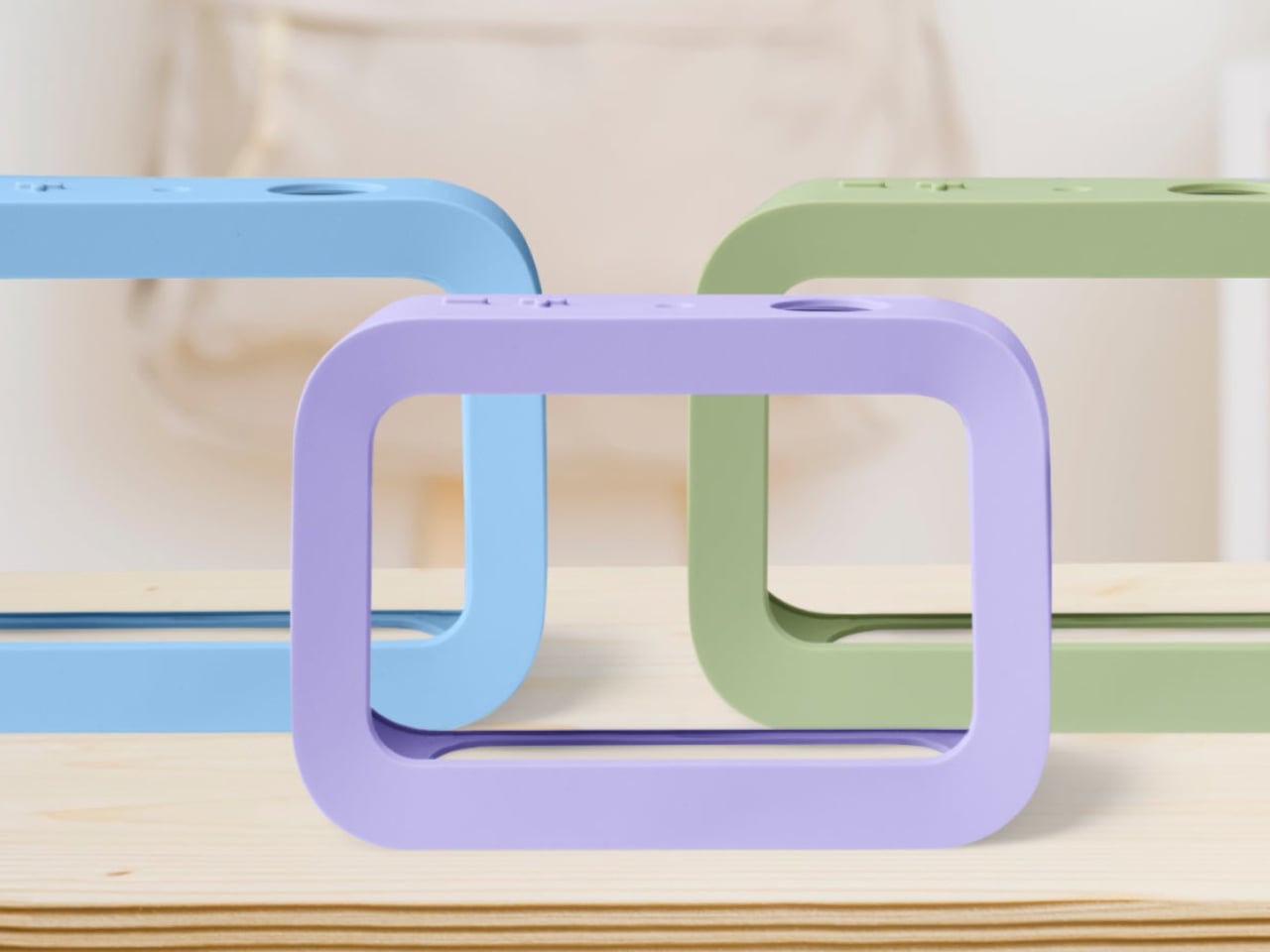
The button is yellow across all three colorways, which serves a functional purpose. It’s the brightest thing on the device, a deliberate visual signal that reads as “press me” from across the room. Buddy comes in blue, sage, and lavender, each with a soft silicone case that wasn’t designed as an accessory but as part of the form. With the case on, the side speaker sits flush with the body.

The integrated light handles two things that parents often buy as separate products: a nightlight for bedtime and an OK-to-wake signal for mornings, so younger kids know when it’s actually time to get up. Add a sound machine for winding down at night and an alarm clock for starting the day, and Buddy replaces a collection of single-purpose devices that typically end up crowding a child’s nightstand.

Buddy works as a standalone device right out of the box, covering routines, chores, the alarm clock, and all core features without any additional cost. Families who already use Skylight Calendar can link the two through the same parent app, syncing a child’s tasks and rewards automatically. A Buddy Plus subscription unlocks additional tools, including rewards tracking, visual timers, and nudges for transitions that are harder to manage.

At $139, it isn’t a cheap clock, but it’s also not competing with tablets or general-purpose screens. That’s the point. Kids can’t download apps on it, can’t open a browser, and can’t drift into videos once their tasks are done. For a category of products that’s gotten very good at capturing children’s attention for all the wrong reasons, Buddy’s restraint is its most compelling feature.

The post Kids’ Tech Has a Screen Problem: This $139 Button Is the Fix first appeared on Yanko Design.

SwitchBot Lock Vision Series Review: Face ID for Your Front Door


PROS:


  • Fast 3D face unlock that feels truly hands free and effortless.

  • Palm vein and fingerprint biometrics add secure, contactless backup options.

  • Geo-fence auto-unlock arms intelligently and avoids accidental walk-by unlocks.

  • Three-tier battery system reduces lockout risk and long-term power anxiety.

  • Weatherproof IP65 exterior and mmWave radar help sensors last and save power.

CONS:


  • Motor noise is noticeably louder, especially near a bedroom off entryway.

  • Auto-unlock only works for owner or admin, not regular family members.

RATINGS:

AESTHETICS
ERGONOMICS
PERFORMANCE
SUSTAINABILITY / REPAIRABILITY
VALUE FOR MONEY

EDITOR'S QUOTE:

Face unlock finally feels like a deadbolt you forget is even there.

You walk up to your front door with both hands full of groceries. You don’t stop. You don’t shift bags to free a thumb for a fingerprint sensor. You don’t dig for keys. The door unlocks before you reach it. That’s the promise of the SwitchBot Lock Vision Series, and it’s the first deadbolt I’ve seen that actually delivers.

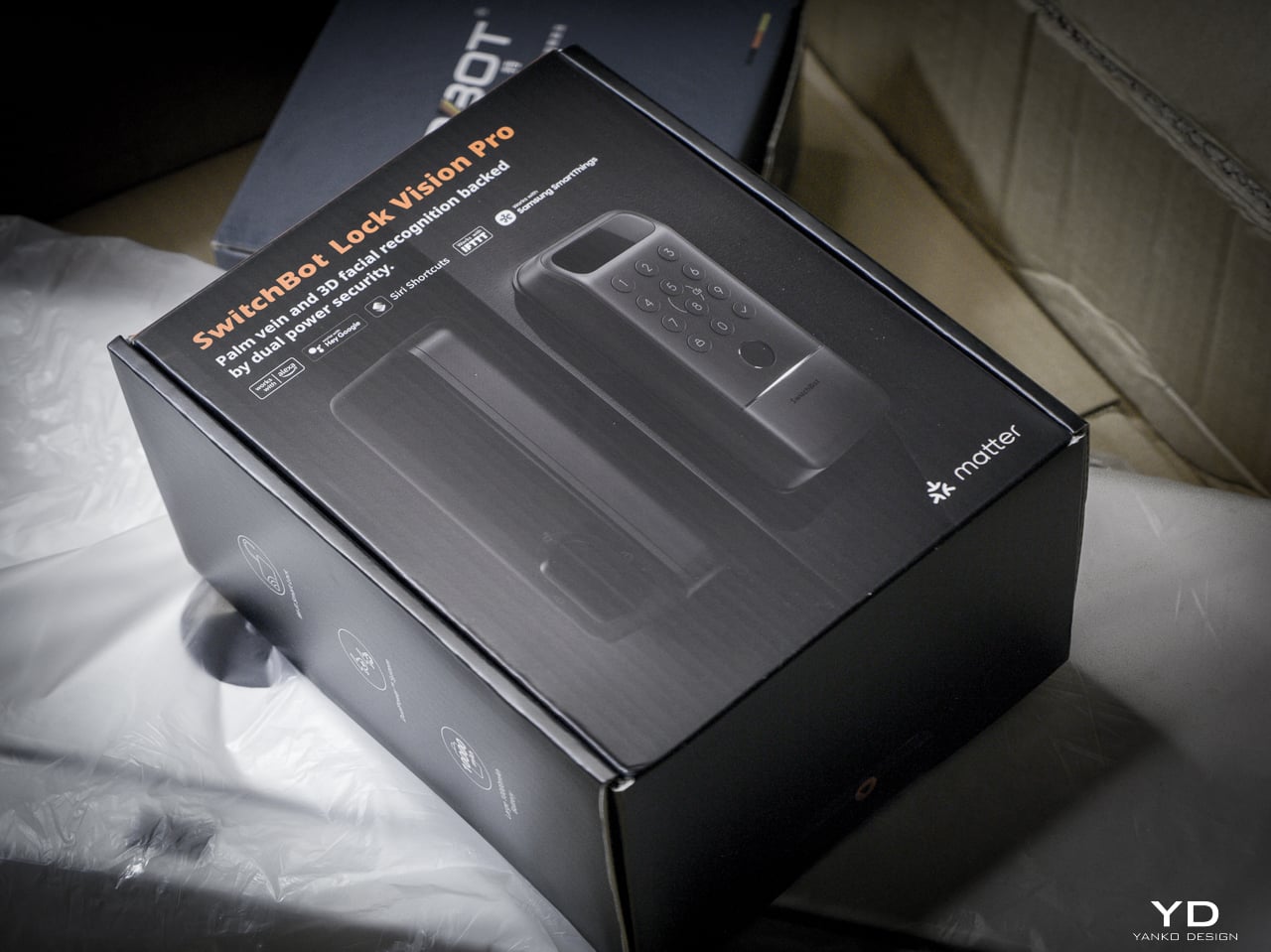
The Lock Vision Series has two models. The Lock Vision at $169.99 (model W9022003) gives you 3D structured-light facial recognition, passwords, NFC, auto-unlock via geo-fence, app control, and voice control. The Lock Vision Pro at $229.99 (model W9022000) adds contactless palm vein recognition and a semiconductor fingerprint sensor. Everything else is identical between them.

Click Here to Buy Now: SwitchBot Lock Vision Pro | SwitchBot Lock Vision
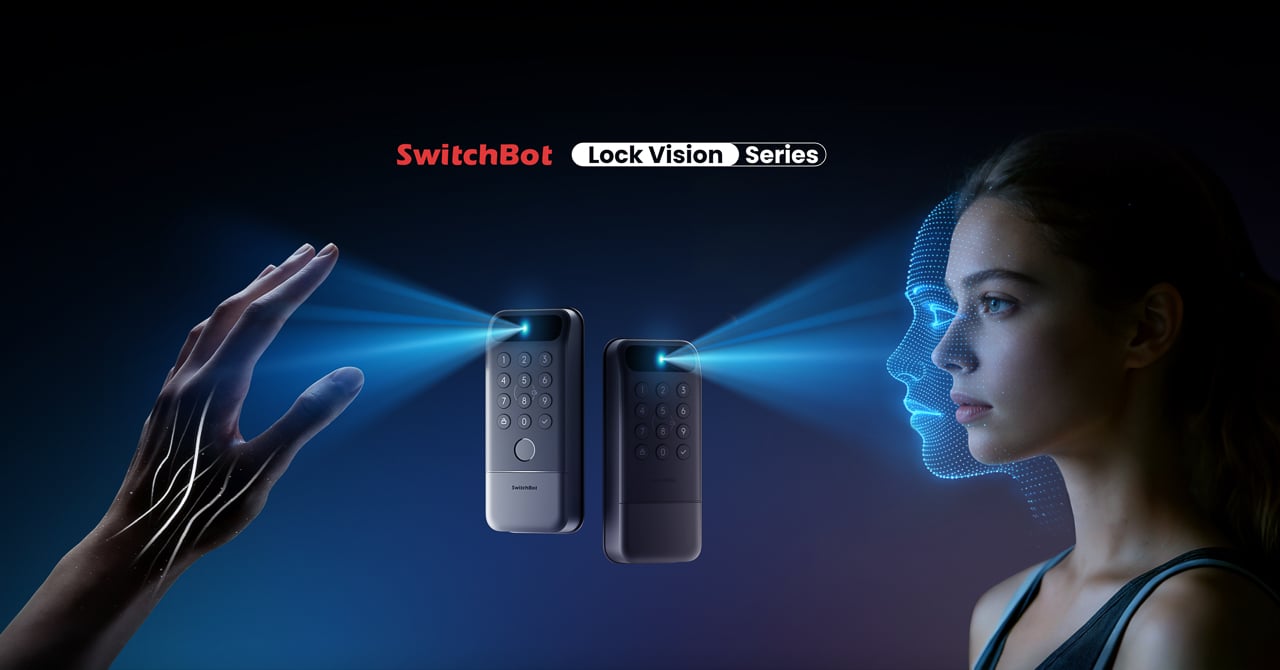
This is the world’s first deadbolt to use 3D structured-light facial recognition. Same core technology as iPhone Face ID. Twenty thousand infrared dots projected across your face, a camera captures the deformed pattern, a 3D map reconstructs and matches in under a second. The false recognition rate is less than 0.0001 percent. It works in total darkness because the IR projector is its own light source. It resists photo and video spoofing. It works with glasses, wigs, and makeup.

The first time it happened, I didn’t believe it. I walked up to the door, heard the bolt snap back, and walked through. Fast. Effortless. I dare say magical. That’s not a word I throw around in reviews, but there it is.

Other smart locks I’ve tested share the same bad habit: the deadbolt motor is too slow, so if you push or pull the door before it finishes retracting, the bolt catches, the lock panics, and you have to unlock it all over again. The Lock Vision doesn’t do that. The motor is quick enough that the bolt clears before you register it moving, and the sound it makes isn’t a whir. It’s a thunk. That’s the difference between a lock you wait for and a lock you forget is there.

Design, Ergonomics, and Aesthetics

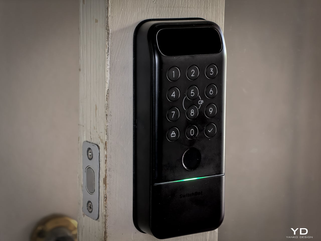
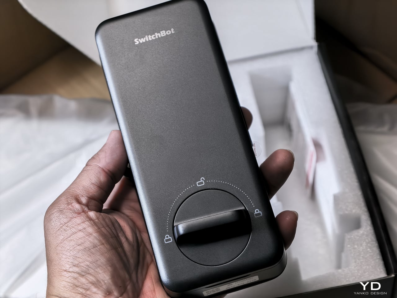
The Lock Vision Series is a rectangular slab in black zinc alloy with a circular keypad integrated into the lower half and a sensor module at the top. The exterior unit measures 6.42 by 2.76 by 1.10 inches and weighs 551 grams (19.4 ounces), with an interior unit at 7.09 by 3.03 by 1.26 inches. It isn’t tiny, but it doesn’t dominate the door the way some camera-heavy smart locks do. The proportions are clean. The branding is restrained. On a dark door, it disappears visually.

SwitchBot built the exterior for weather. IP65 water and dust protection means rain and grime don’t get inside. The operating range spans minus 20 to 55 degrees Celsius, and humidity tolerance runs 10 to 90 percent. Certifications hit BHMA Grade 3, FCC, IC, and ISDS.

The interior unit is where things get interesting. At 218 grams (7.7 ounces), it’s strikingly light. SwitchBot uses a combination of zinc alloy and PC+ABS. On paper you might wonder if it feels cheap. Doesn’t matter. You mount it to the door. You only touch it to lock or unlock from inside, and the knob has a click to it. Clean look, feels fine where it counts. I stopped thinking about the weight after day one.
The keypad features tactile mechanical buttons with red, white, and green LED indicators. Press and hold for 2 seconds to pair. Press and hold for 15 seconds for Matter pairing. There’s a knob for manual unlocking from the inside.

The included visual assets tell the story well. The key visual shows both models with a hand reaching for a palm scan and a face profile with a 3D wireframe overlay. Scene images show a woman with groceries (hands-free), a child using palm vein (family-friendly), and a dramatic ice-encased shot (weather resistance). All available in the Drive media kit.

Performance: How It Actually Works

I’ve been living with the Lock Vision Pro long enough to say this: everything works. The facial recognition, the palm vein sensor, the fingerprint reader, and the geo-fence auto-unlock all behave the way the spec sheet says they should. When you test as many smart home devices as I do, that kind of delivery is rare.
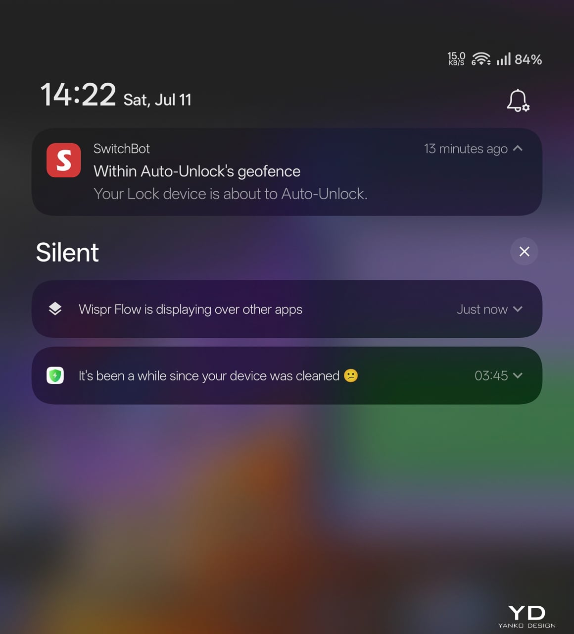
The auto-unlock geo-fence is the killer feature here. SwitchBot labels it beta in the app, which makes its reliability surprising. Here’s how the chain works.

You set a geofence radius around your home. When your phone crosses into that zone from outside, the lock doesn’t open. It arms. The SwitchBot app starts scanning for the lock over Bluetooth. A validity timer starts, default ten minutes. When you close to within Bluetooth range, your phone and the lock establish a connection. The bolt retracts.

No biometric step. No app interaction. You walk through.

That arming step is the design intelligence in a system that could have been a disaster. A dumb geofence that unlocked the door whenever your phone wandered into range would trigger every time you walked past your own house. SwitchBot’s version requires the inbound crossing, starts the timer, and disables itself if you don’t reach the door within that window. Leave and re-enter, a new cycle begins.

No hub required. GPS, Bluetooth, the app running in background, and Wi-Fi enabled on the phone are the only prerequisites.

The limitation worth knowing: auto-unlock only works from the home owner’s phone or an admin account. Family members and shared users with member permissions don’t get the walk-up entrance on their own devices. They authenticate at the door with face, palm vein, or a code instead. For a lock built around passive entry, that’s a real asymmetry, and it’s the first thing I’d ask SwitchBot to fix as the feature graduates from beta.

3D Structured-Light Facial Recognition

Your face becomes the key. Most smart locks with facial recognition at this price use 2D infrared cameras that a printed photo can defeat. The Lock Vision Pro does not.

A laser and IR dot projector embedded around the lens cluster fires more than 20,000 infrared dots across your face in a grid pattern invisible to the naked eye. An IR flood illuminator provides fill light for total darkness operation. An IR camera captures how that dot pattern deforms against the three-dimensional contours of your face and reconstructs a millimeter-accurate depth map. The system matches that map against your enrolled template, the same foundational principle behind iPhone Face ID, and throws the bolt if the geometry matches.

The sub-second unlock speed means you don’t pause at the door. The IR projector works through condensation and surface buildup on the housing exterior, so IP65 weatherproofing doesn’t degrade sensor accuracy over time. It works in total darkness because the IR projector is its own light source. It resists photo spoofing because a flat image can’t reproduce the spatial deformation pattern. It resists video spoofing for the same reason.

Glasses, wigs, and makeup don’t throw it off because the underlying facial geometry the dot grid maps doesn’t change. SwitchBot claims a false recognition rate under 0.0001 percent. Across my testing period I haven’t had a single false positive or false negative in any lighting condition.

Contactless Palm Vein Recognition

Palm vein recognition is what separates the Pro from the standard Lock Vision. The technology reads subcutaneous vein patterns using near-infrared light: the unique geometry of veins inside your palm, entirely internal to your body.

You hover your palm near the sensor without touching anything. The IR emitter penetrates the skin surface and maps the vein network underneath. The lock matches that vascular geometry against your enrolled template.

This matters more than fingerprint in practice. A surface impression doesn’t work because veins aren’t on the surface. A photograph fails. The contactless method sidesteps the hygiene friction of a shared fingerprint pad, and it keeps working when your hands are slightly wet or dirty because the sensor reads through the skin rather than off it. Palm vein readers have been in high-security facilities for years. Finding one in a sub-250-dollar deadbolt is what makes the Pro worth the extra money.

Semiconductor Fingerprint Recognition

The fingerprint sensor is the third biometric layer. It’s positioned for kids and guests not in the face or palm databases, plus it works as a deliberate emergency fallback.
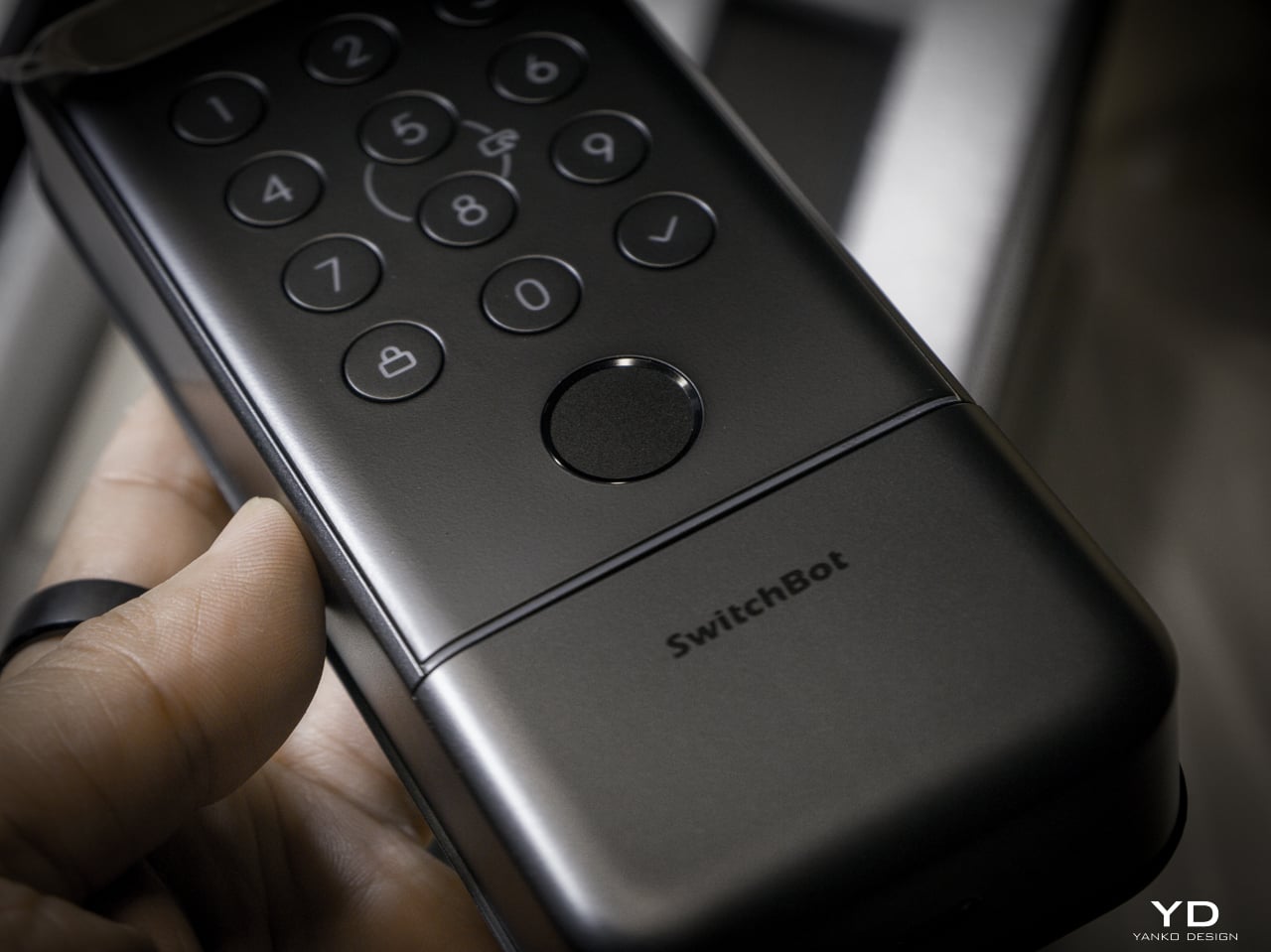
The semiconductor reader captures ridge patterns at the hardware level without storing images. All biometric data stays on the device, never routed to the cloud. It holds up to 90 user fingerprints and reserves 10 more slots for emergency prints.

The sensor reads quickly and reliably in dry and normal conditions. Wet fingers introduce the same challenge every semiconductor reader faces, but the palm vein sensor above it makes that edge case less relevant than it’d be on a lock without another contactless option.

mmWave Radar: The Power Manager

None of these biometric sensors stay active, and the mmWave radar unit handles that. It detects approach and wakes the recognition stack only when someone shows up. Without it, the 10,000mAh battery drains keeping a face camera awake. With it, the lock sleeps until you approach, wakes the sensors, and opens by the time you reach the handle. Across my testing it runs with no phantom triggers from passing cars or pedestrians.

The radar is separate from the auto-unlock GPS and Bluetooth chain. Auto-unlock handles the actual door opening via your phone. The radar handles sensor power management so the biometric readers aren’t burning battery scanning an empty porch all day.

A Note on Motor Noise

I’m not gonna sugarcoat this: the Lock Vision is noticeably louder than most smart deadbolts I’ve tested. The trade-off is speed. It’s the same trade-off you make with a fast garage door opener, more noise, faster movement. I’d rather have a motor that gets out of the way quickly than one that whispers and leaves me standing at the door.
That said, there’s a guest bedroom about five feet from our front door. It doesn’t get a lot of use, so most nights it’s a non-issue. When we do have guests staying over, the lock cycling is a little louder than I’d like. It’s one of the very few genuine downsides to this product, and the only people it will affect are those with a bedroom directly off the entryway.

The Access Hierarchy

The full unlock method count sits at 19, but the design intelligence isn’t in the number. It’s in how SwitchBot organized them by use case rather than technology type.

Passive biometrics, face and palm vein, for residents who should never have to think about unlocking. Fingerprint and NFC cards for recurring guests. Temporary and one-time passwords for deliveries and service visits. Geo-fence auto-unlock for the owner’s daily return. Physical key as the permanent legal fallback that requires no battery, no firmware, and no app update.

That’s a considered access hierarchy, not a feature list.

SwitchBot also built six tiers of security into the lock, and they all run behind the scenes. The alarm system records and notifies door status, ajar alerts, and tamper detection. Geo-fence auto-lock secures the door when you leave. On the unlock side, you get SOS fingerprint recognition, remote unlock confirmation, forced unlock for emergencies, and auto-lockout after repeated failed attempts. Data moves over AES-128 encryption, and every biometric stays local. Three-tier power management keeps the whole thing running with intelligent failover.

DualPower and DualBackup

Battery anxiety keeps people from buying smart locks. SwitchBot built a three-tier system.

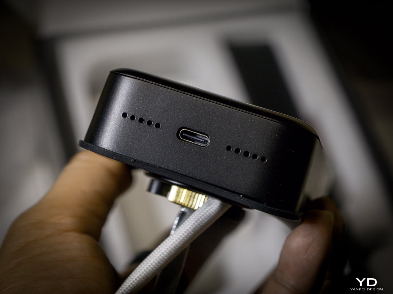
Tier one: 10,000mAh rechargeable Li-Po. SwitchBot rates it for up to 12 months at 10 lock/unlock cycles per day, and the motor handles 50,000 cycles. Tier two: CR123A backup providing up to 500 emergency unlocks with 5-year standby. Auto-activates if main battery dies. Tier three: USB-C port on the keypad surface for emergency power. Connect a power bank, unlock, go find batteries.
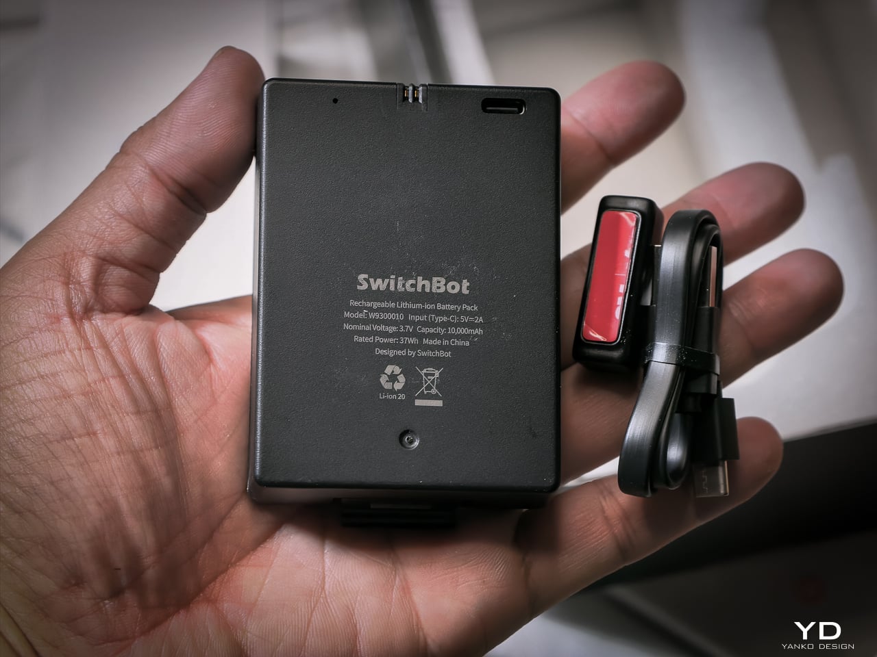
I haven’t had it long enough to need a recharge yet, and that’s the whole idea. SwitchBot says the 10,000mAh battery lasts up to 12 months, and so far it hasn’t dipped enough for me to notice.

When it does run dry, the CR123A backup beats what most locks offer. Some competitors make you tap a battery pack to two contacts outside the lock for one open. This one has a dedicated cell already inside, good for 500 emergency unlocks and five years on standby. Haven’t needed it yet. Glad it’s there.
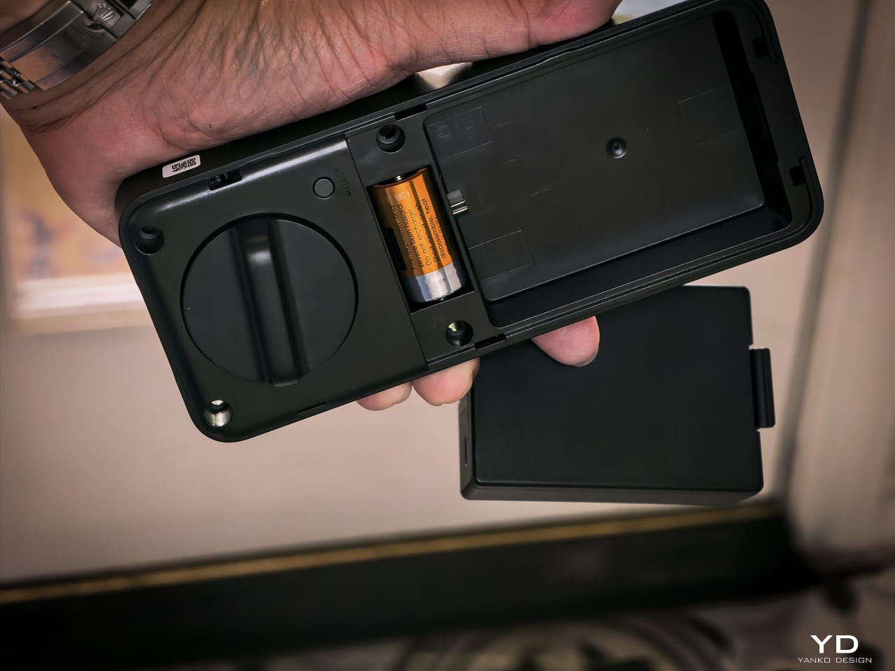
The mmWave radar handles power management. The lock only activates biometric sensors when someone approaches. The app provides real-time battery monitoring, push notifications at low power, and audio alerts at critical level.

Matter-over-WiFi and Ecosystem

Connects via Matter-over-WiFi. You don’t need a separate hub. Bluetooth holds a stable connection within 16.4 feet outside the door, and WiFi manages the same range through walls. SwitchBot listed Apple Home certification as in progress at launch. I don’t use Apple Home, so I didn’t test it, and that’s not a feature I personally value on a lock. The SwitchBot app handles everything: lock status, battery level, access management, unlock logs going back six months. Voice control works through Alexa, Google Assistant, and Siri if you want it. If Apple Home integration is a dealbreaker for you, verify it’s live before buying. For me, the app does everything I need.

With the Smart Video Doorbell: monitor activity outside, lock/unlock from doorbell, automate entry. With the Wallet Finder Card: tracking card doubles as NFC key. With the Hub 3: doorbell chime plus lock status display. All biometric data stays local on the device.

Installation

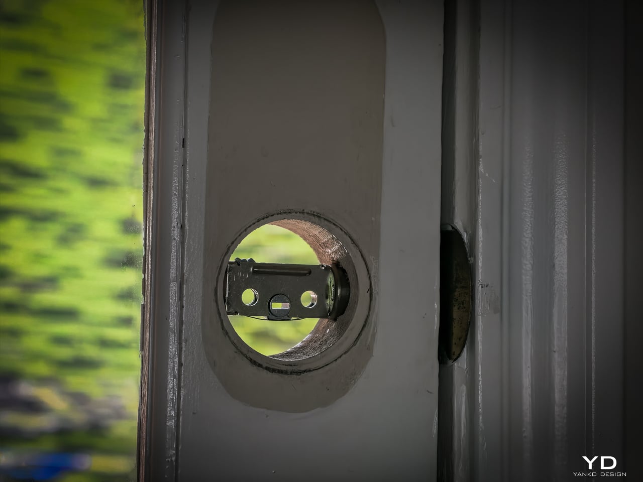
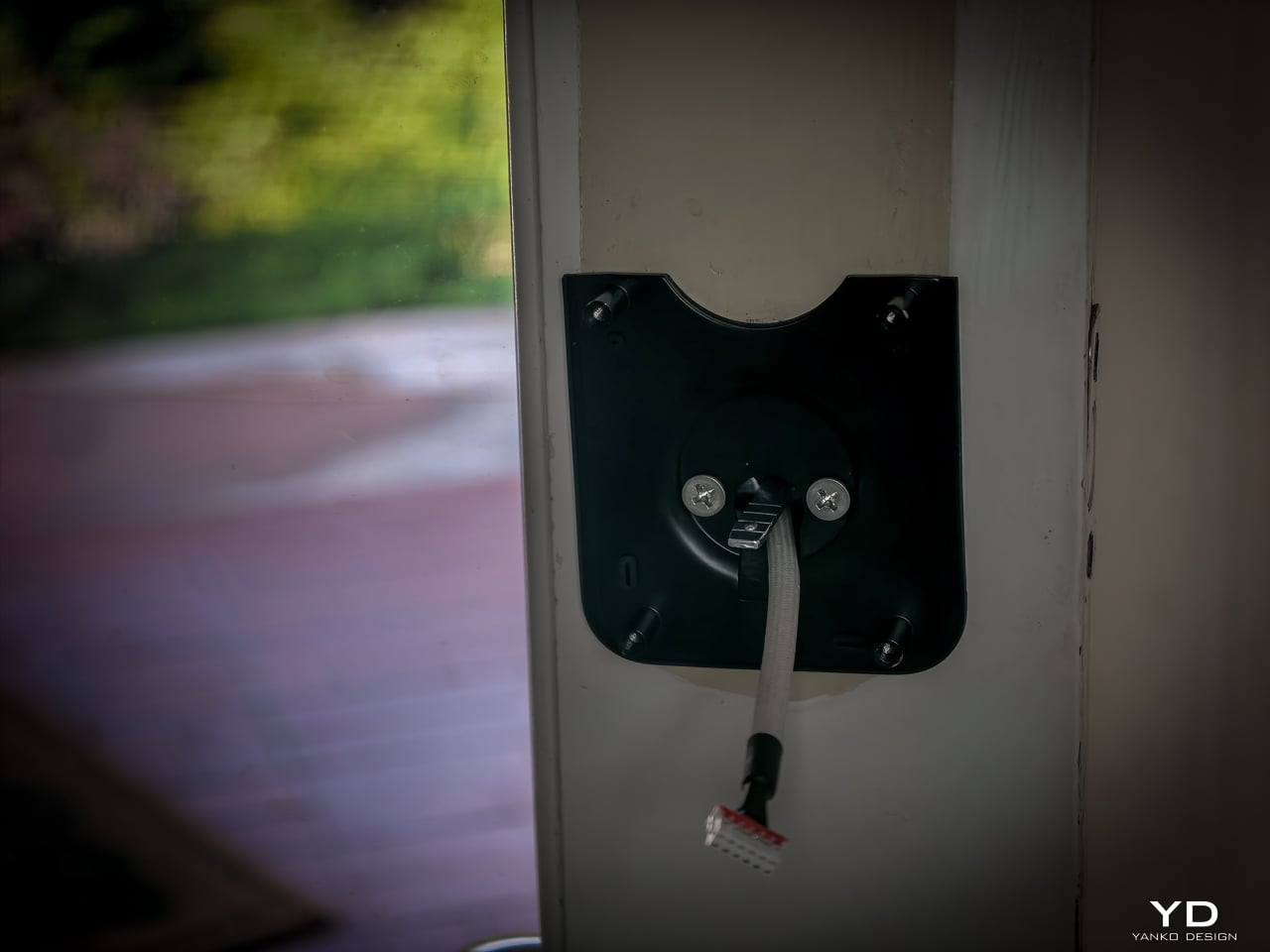
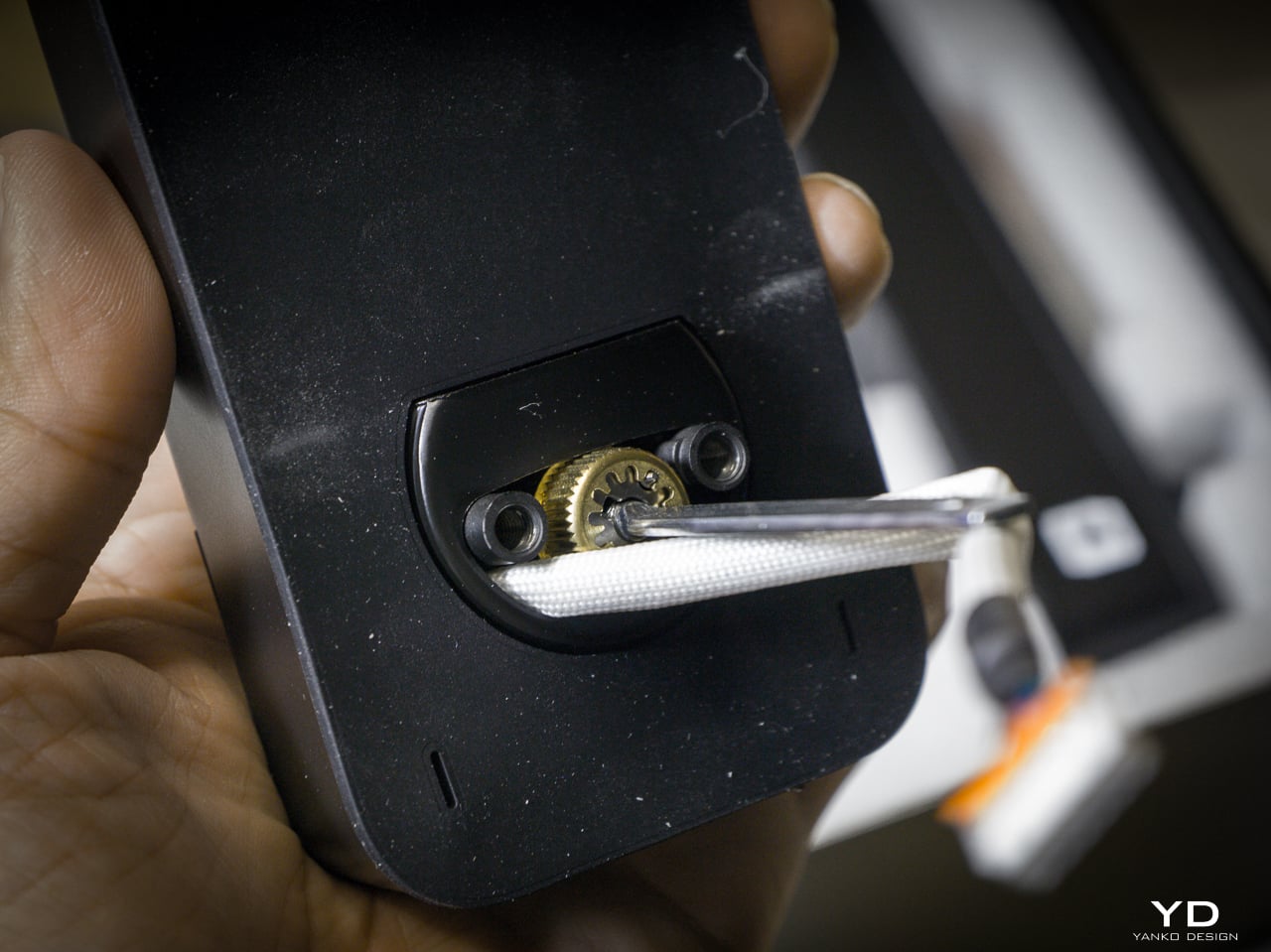
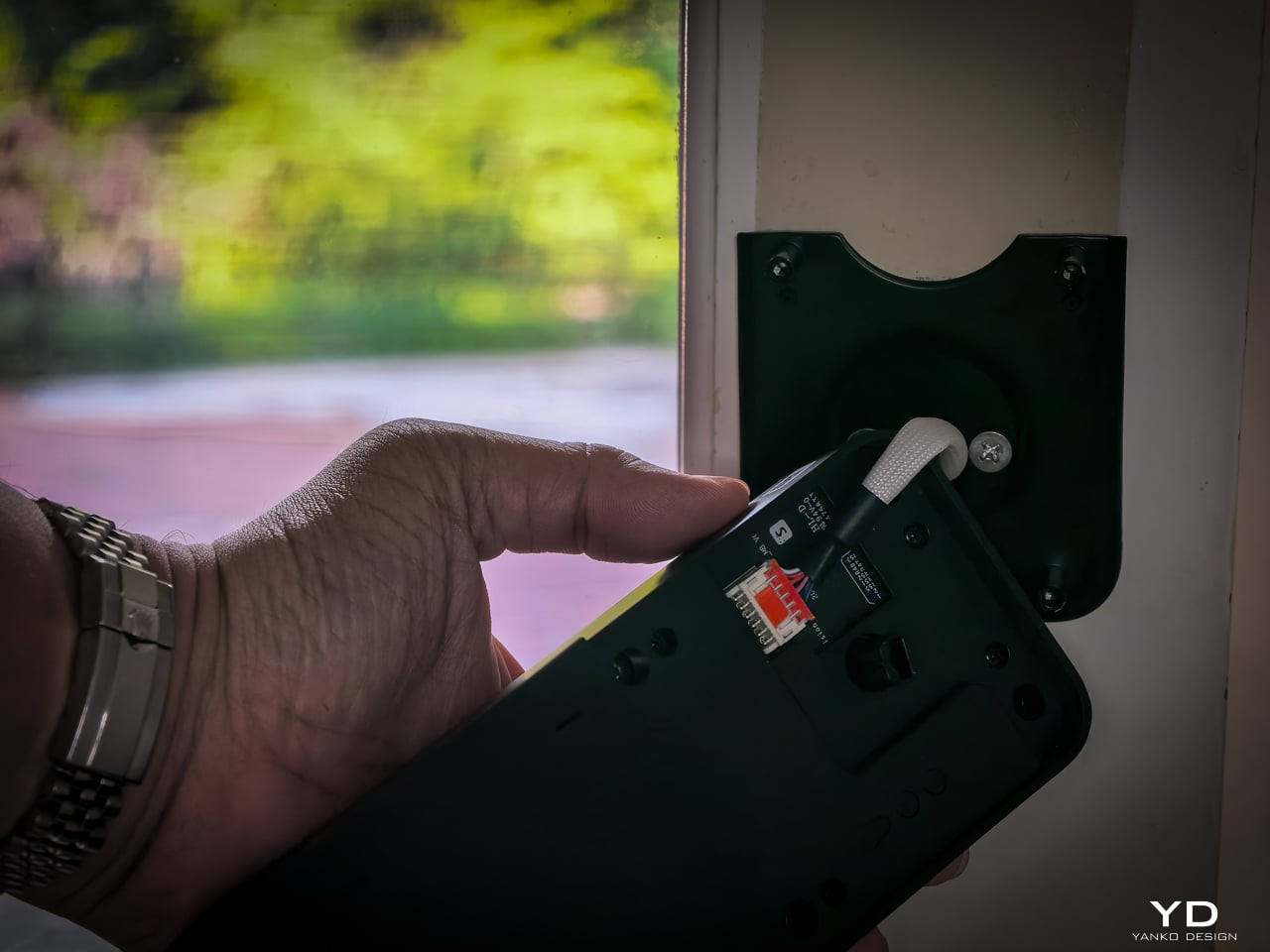
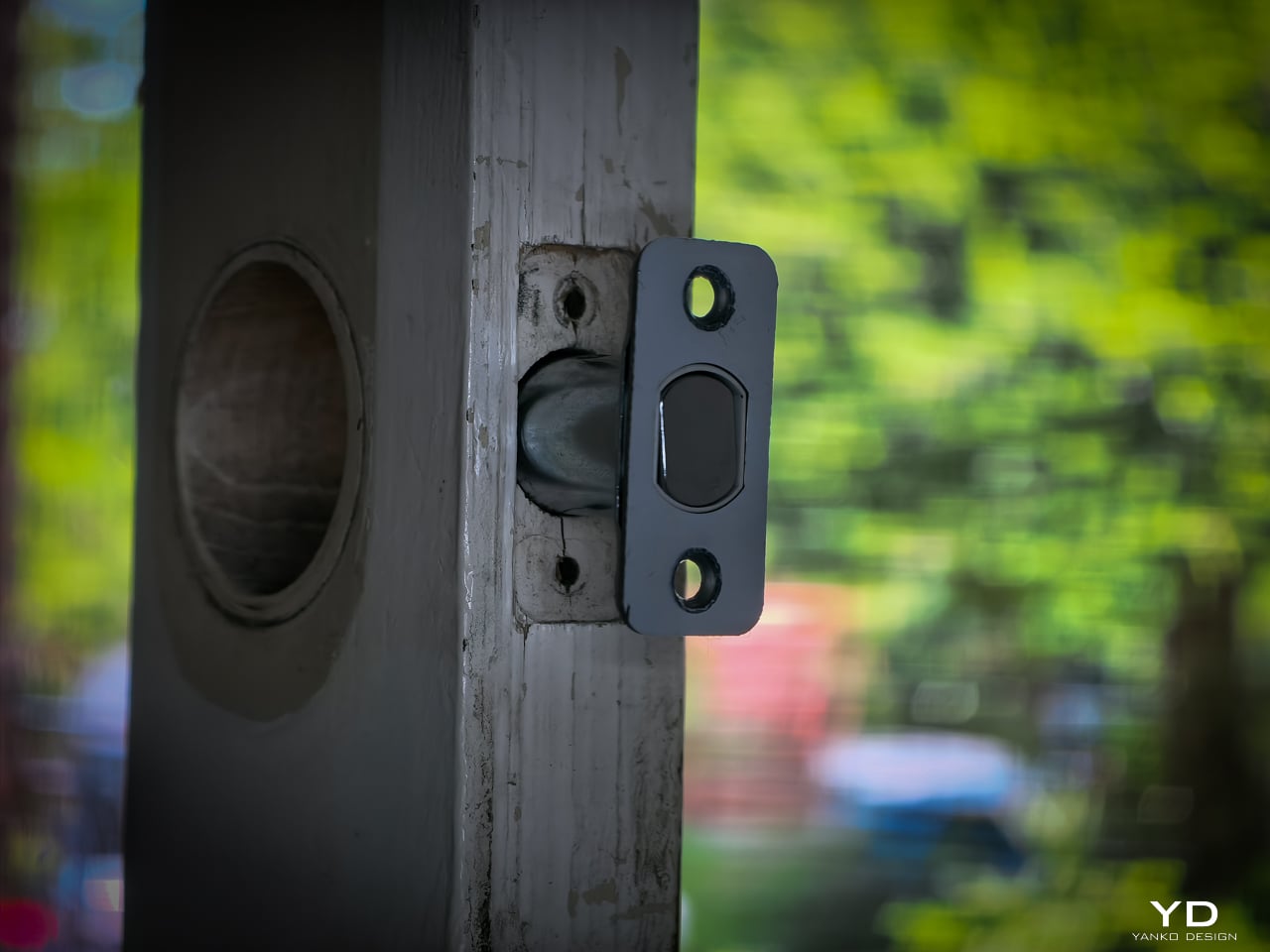
Installation didn’t take long. My previous deadbolt had four screws. The Lock Vision’s bolt has a specific notch that mates with the SwitchBot housing, so I did have to swap out the deadbolt that was already in the door. That added maybe an extra minute to pull the old one and slide the new one in. Everything else lines up cleanly since the dimensions are standard.
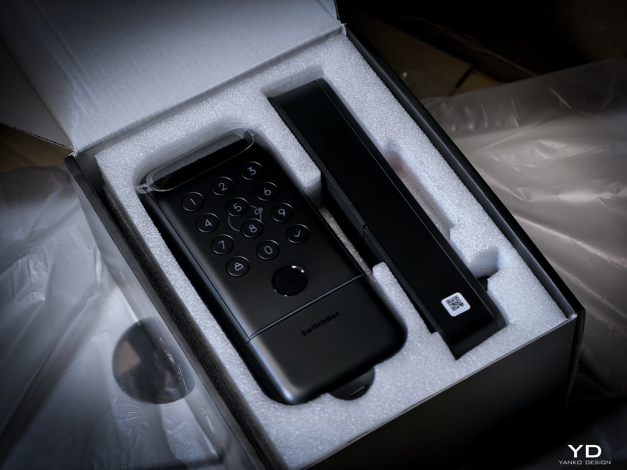
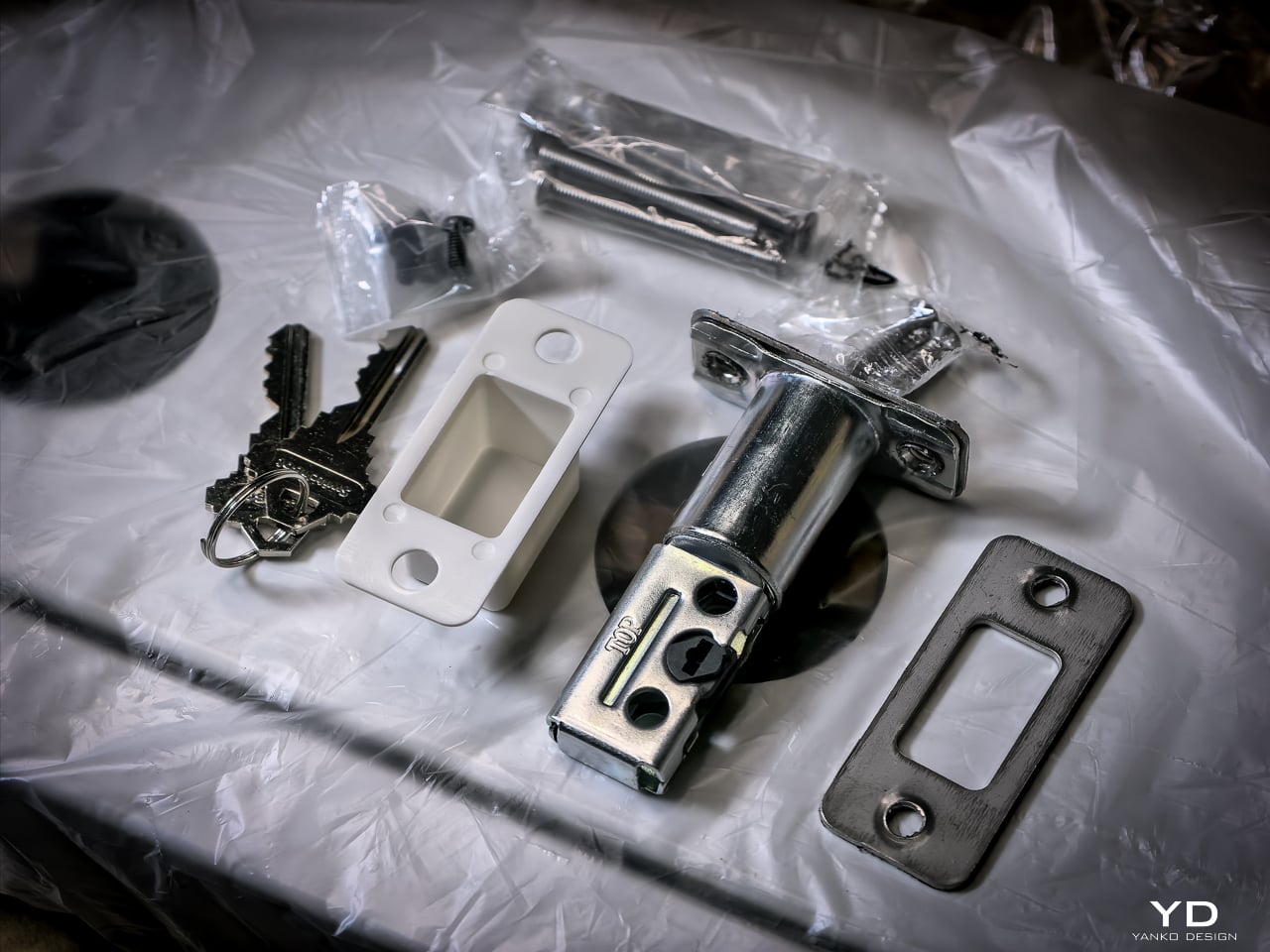
Hardware swap took about 10 to 12 minutes. Setup: pairing the lock, enrolling my face, enrolling a palm, enrolling fingerprints, all of it happened fast. Under 20 minutes total and the new lock was live. If you’ve swapped a deadbolt before, this is the same job. If you haven’t, a single screwdriver and the included instructions will get you there.

Sustainability

The 10,000mAh battery is rechargeable and rated for 12 months per charge. CR123A backup lasts 5 years in standby. USB-C emergency port eliminates lockout. All biometrics stay local with no cloud dependency. SwitchBot rates the motor for 50,000 cycles.
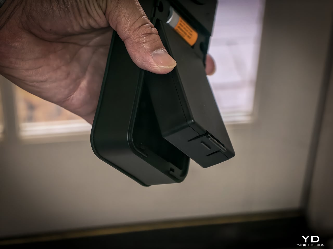
One detail I really like: the battery compartment comes off the top with no screws, no tools. Just lift and the battery slides out. SwitchBot clearly thought about what actually happens when someone needs to swap or charge a battery, and they made it easy. That’s the kind of ergonomic detail you appreciate six months in when you finally need to pull it.
Value

At $169.99 (Lock Vision) and $229.99 (Lock Vision Pro), SwitchBot prices against the August Wi-Fi Smart Lock, Yale Assure Lock 2, and Level Lock Plus. None of those competitors offer 3D structured-light face unlock. The facial recognition alone puts the Lock Vision Series in a different category.

The $60 Pro premium gets you palm vein and fingerprint. I’d pay it. We’ve got a front door, a back door to the garage, and a garage door into the house. If I had to redo all three, I’d spend the extra for the Pro on every single door.

Bundle pricing: Lock Vision + Video Doorbell $259.99, Pro + Video Doorbell $329.99. Canadian buyers pay CAD 229.99 and CAD 299.99 for the locks, CAD 329.99 and CAD 399.99 for the bundles. Both models sell direct from SwitchBot and on Amazon in the US and Canada.
Verdict

The Lock Vision Series is the first smart deadbolt I’d put on my own door. The 3D facial recognition works in the dark. The battery system covers every failure mode. Matter-over-WiFi means no hub on your nightstand. And when the battery dies, there’s a key in your hand. Two of them in the box.

But it isn’t for everyone. Apple Home certification hadn’t gone live as of my testing. Not every home qualifies without power tools on the door compatibility front. And I want to live with the 218g interior unit for a month before I trust the long-term build.

It’s a lock that just works, no matter how you get it open. Face, palm vein, fingerprint, code, phone, NFC, geo-fence, and yes, a physical key. Comes with two. When the tech is optional and the brass key still turns, that’s a lock I trust.

Click Here to Buy Now: SwitchBot Lock Vision Pro | SwitchBot Lock Vision

The post SwitchBot Lock Vision Series Review: Face ID for Your Front Door first appeared on Yanko Design.

Satechi Just Built the MacBook Neo Accessories Apple Forgot to Make

Apple has always used color as a defining feature of its consumer laptops, and the MacBook Neo leans into that more than most. It’s the brand’s most affordable MacBook yet, arriving in four expressive colorways that clearly aren’t an afterthought. The accessories market hasn’t kept pace with that thinking, though. Most hubs and mice sold alongside colorful laptops are still generic gray or silver, made for nothing in particular.

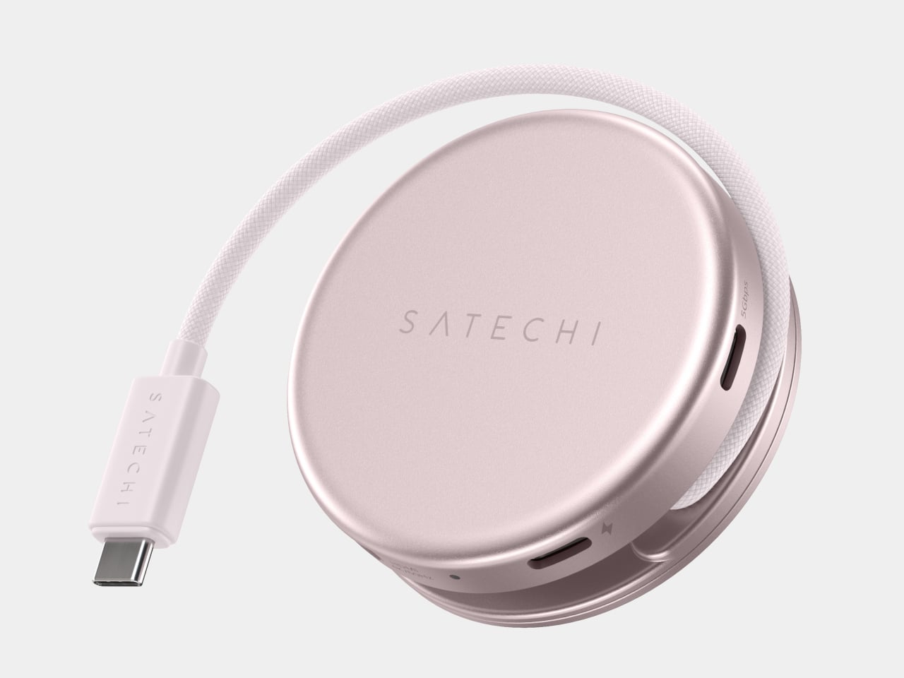
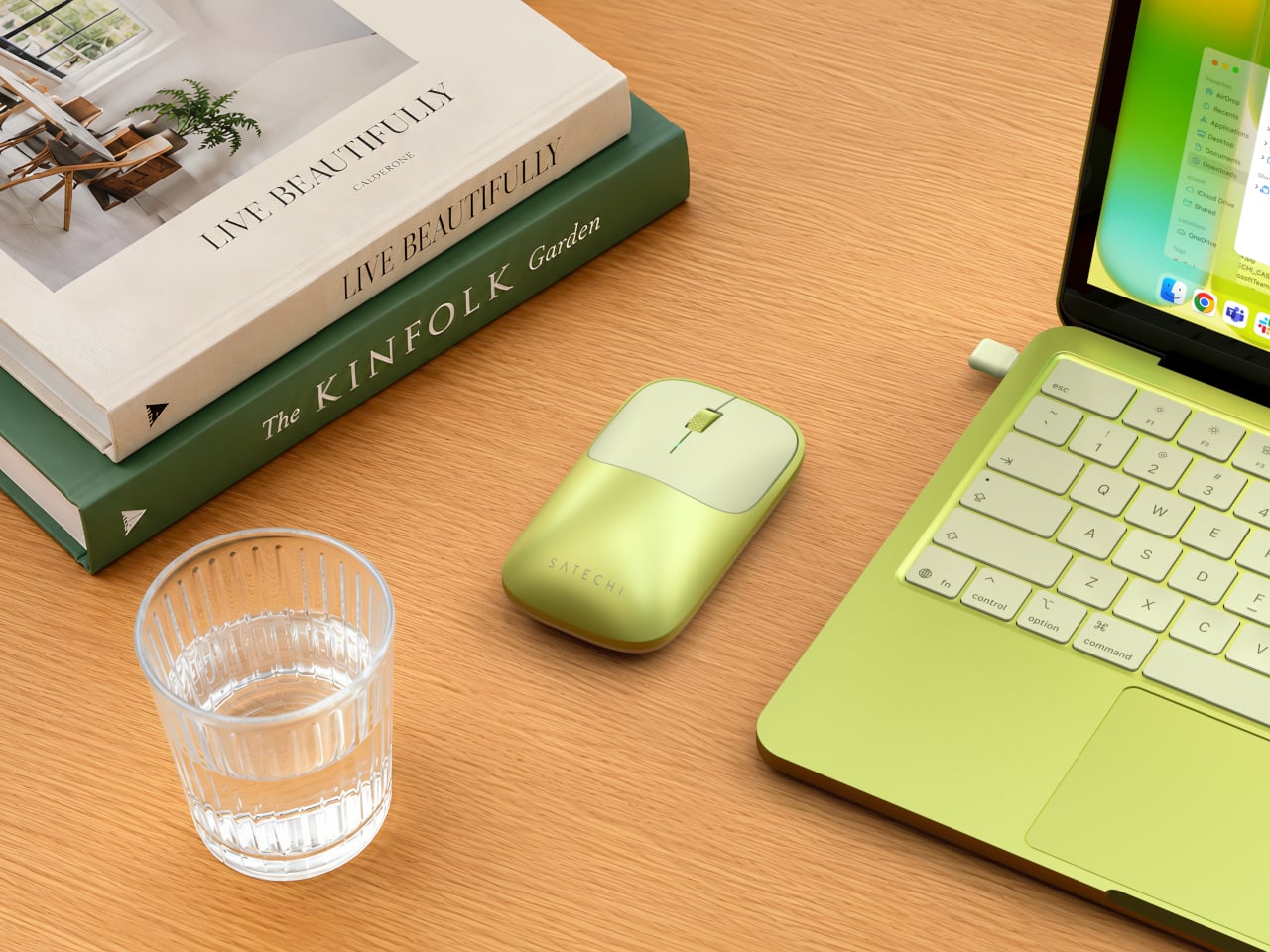
Satechi’s MacBook Neo Collection takes direct aim at that gap. The three-piece lineup, available in Citrus, Blush, Indigo, and Silver, is built around the simple idea that accessories for a distinctly colored laptop should actually match it in kind. That means two USB-C hubs that address the Neo’s limited port selection, and a wireless mouse that rounds out the desk setup with the same visual intention the laptop brought.

Designer: Satechi

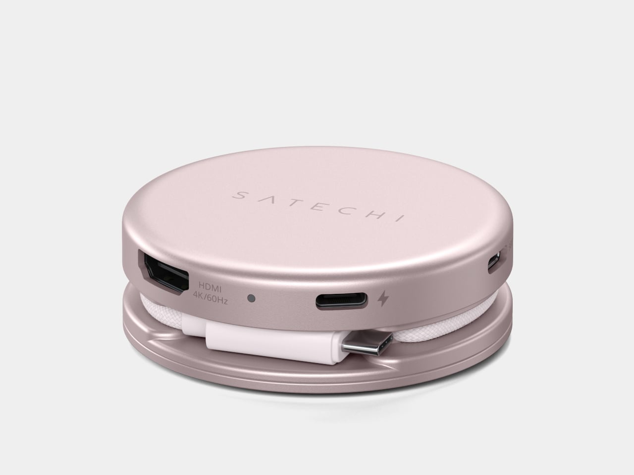
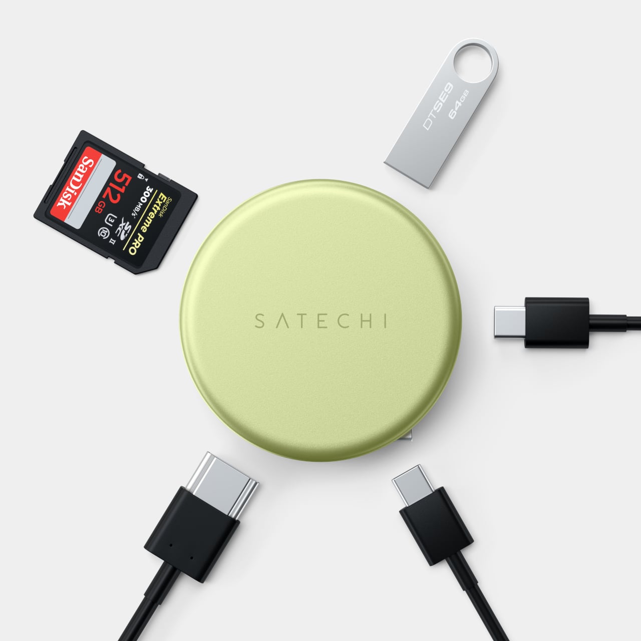
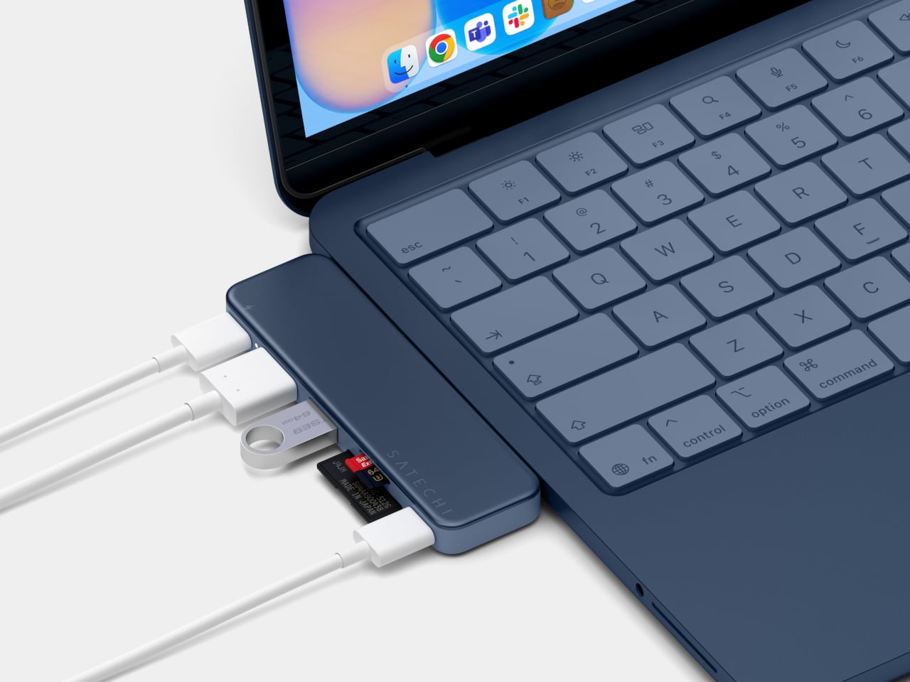
Of the two hubs, the USB-C Snap Hub ($44.99) is the one built most specifically around the Neo. It connects to both of the laptop’s USB-C ports simultaneously and sits flush against the chassis without any cables running off to the side. Six ports all operate at once without any configuration needed, covering 4K/60Hz HDMI output, USB-A and USB-C data, SD and microSD card slots, and 45W pass-through charging.

What makes the Snap Hub more considered than a typical color-matched hub is its two-tone construction. The top surface is anodized aluminum matched to the Neo’s body color, while the base is soft-touch ABS aligned to the keyboard finish, giving it a genuinely integrated look. Most accessories stop at a matching surface. This one accounts for how it looks when it’s actually attached to the laptop, not just placed nearby.

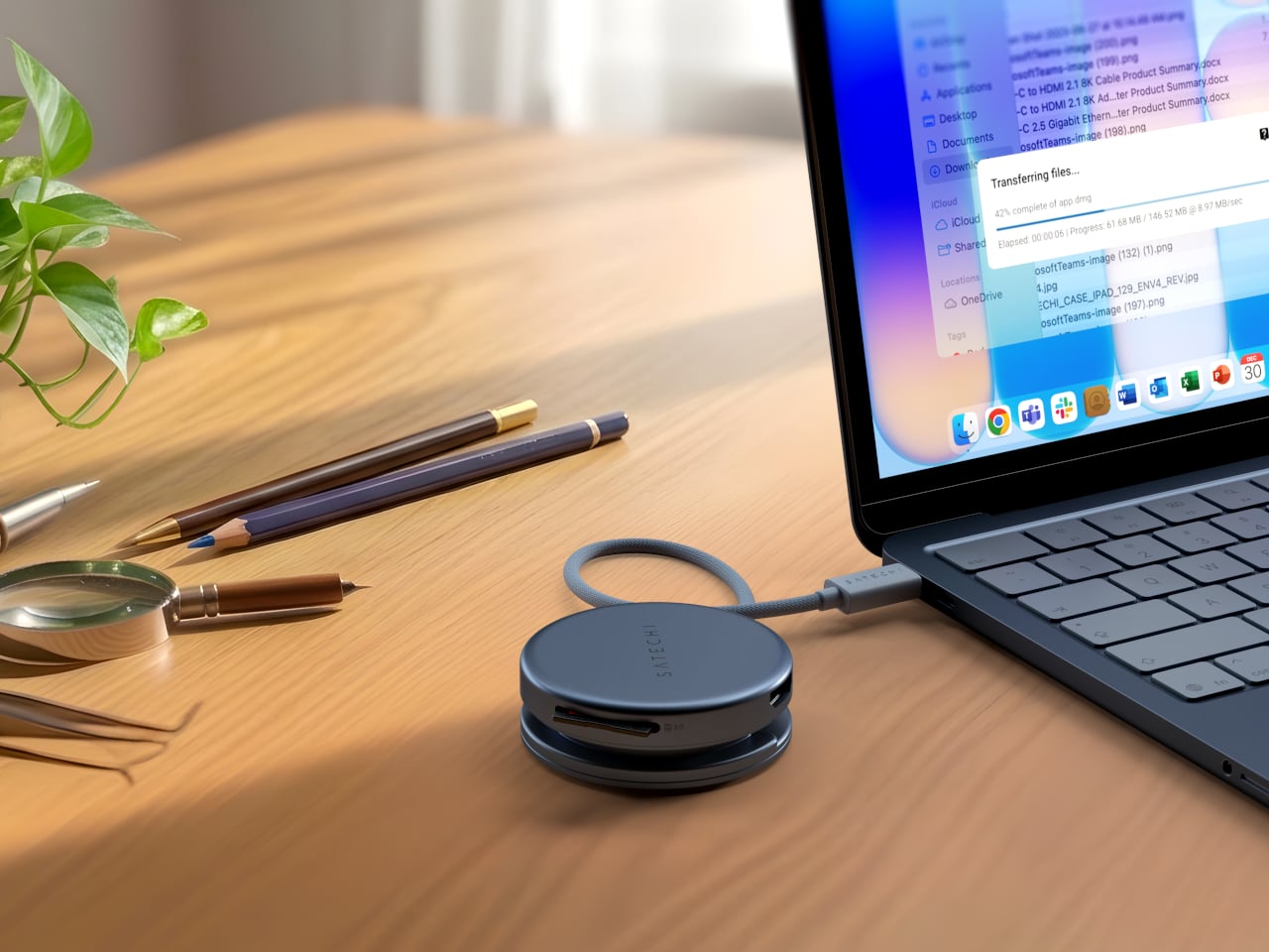
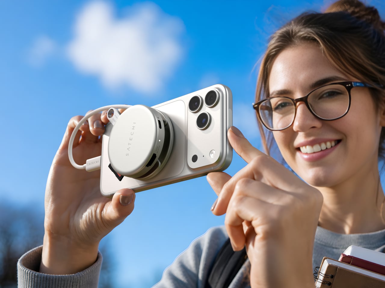
The OntheGo 5-in-1 Multiport Adapter ($44.99) takes a more portable approach to the same connectivity problem. It connects through a single USB-C port via a nylon-braided cable, and its magnetic soft-touch base can snap onto a MagSafe iPhone or mount flush to the Neo’s lid with an included adhesive ring. The ports cover 4K/60Hz HDMI output, 60W USB-C pass-through charging, dual 5 Gbps data ports, and an SD card reader.

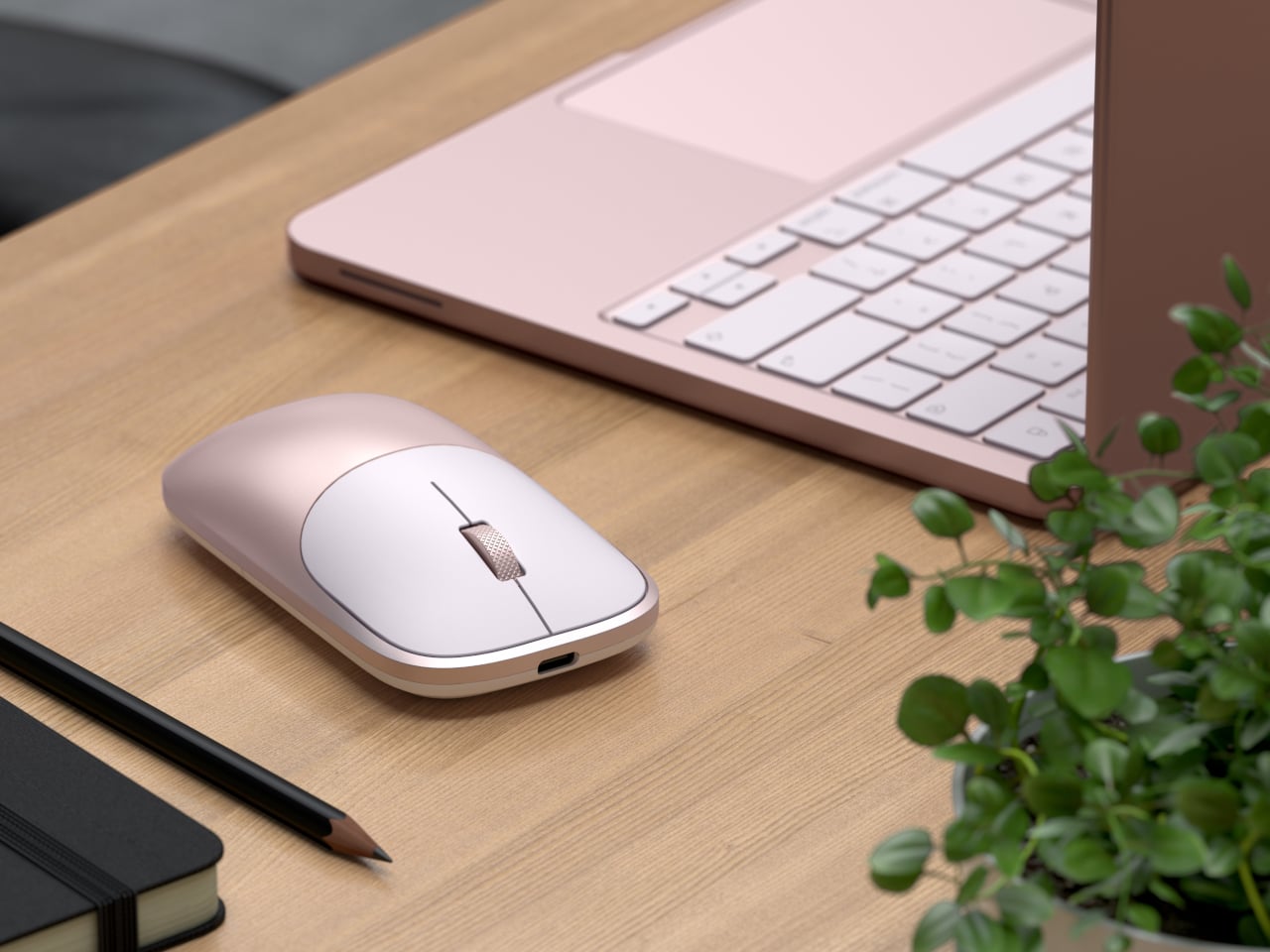
The Slim EX Wireless Mouse ($29.99) completes the collection and the color story it sets up. Previously only available in standard finishes, it now comes in the same Neo colorways for the first time, on an aluminum body that matches the hubs it sits beside. It supports two simultaneous Bluetooth channels and a 2.4 GHz wireless connection, quiet click switches, a precision-machined scroll wheel, and a USB-C rechargeable battery.

The MacBook Neo was designed for people who care about color as much as capability, and the accessories around it should reflect that sensibility. At $29.99 for the mouse and $44.99 for either hub, the collection isn’t asking much. It gives back a desk setup that actually feels considered from one end to the other, which is a harder outcome to achieve in the laptop accessory space than it sounds.

The post Satechi Just Built the MacBook Neo Accessories Apple Forgot to Make first appeared on Yanko Design.
Huawei Built a 200MP Camera Phone That Finally Shows Your True Colors

The smartphone camera arms race hasn’t let up. Most flagships are pushing harder on AI-assisted processing to compensate for the physical limits of small sensors, and the results are often technically impressive but not always true to what was in front of the lens. There’s a real difference between a photo that looks good and one that actually looks right, and that’s a harder problem to solve than adding megapixels.

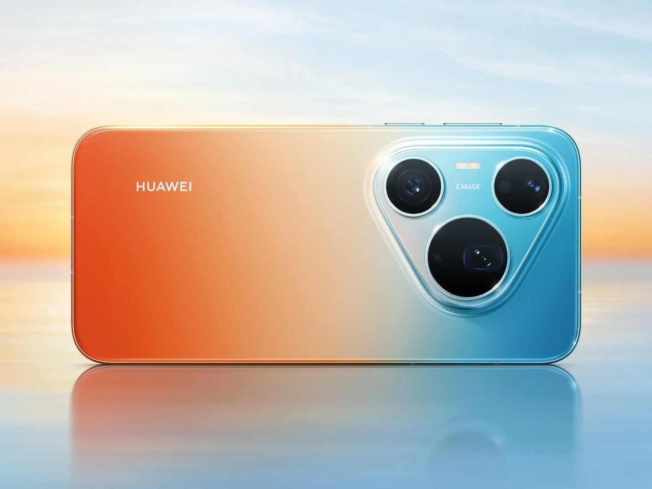
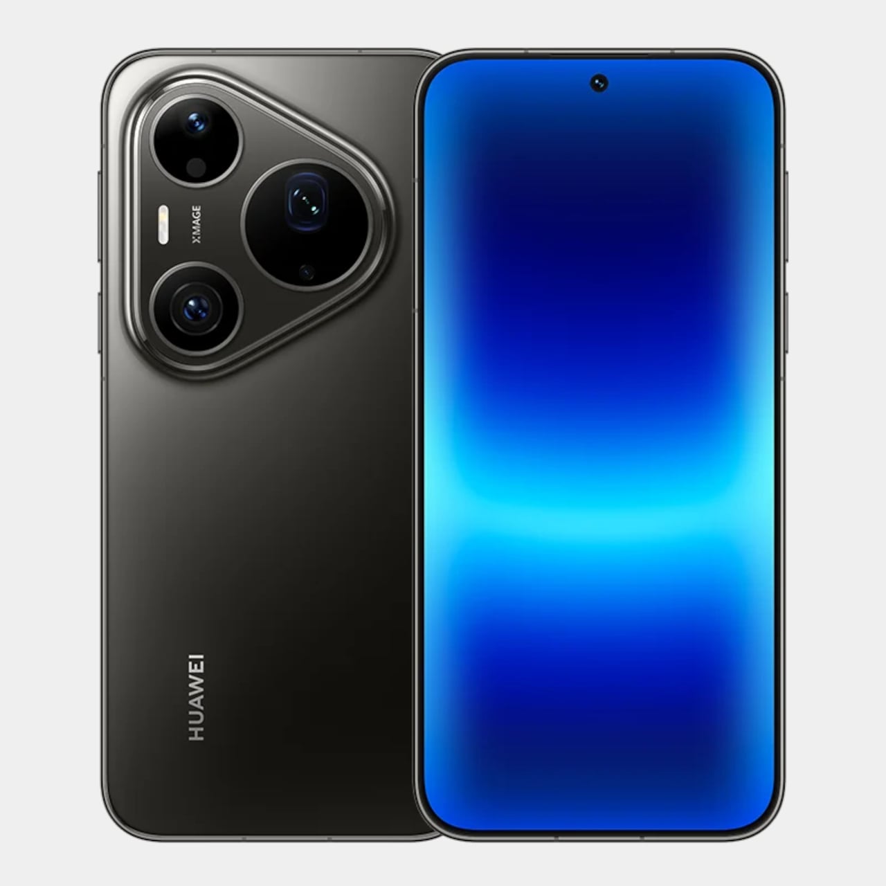
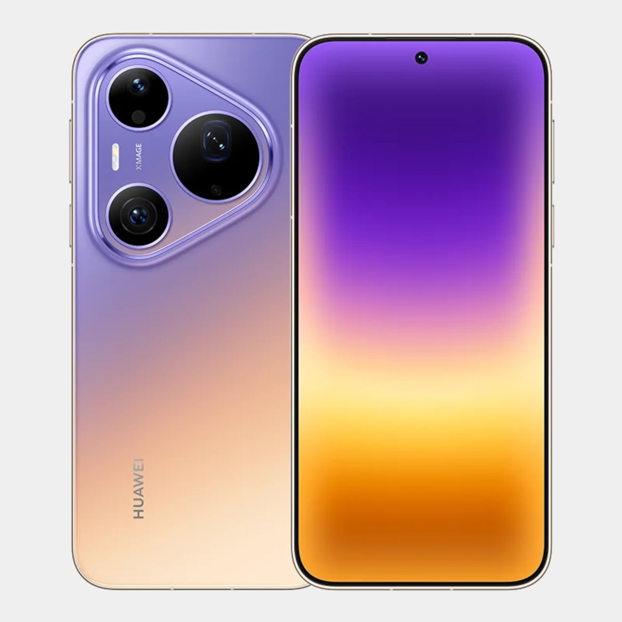
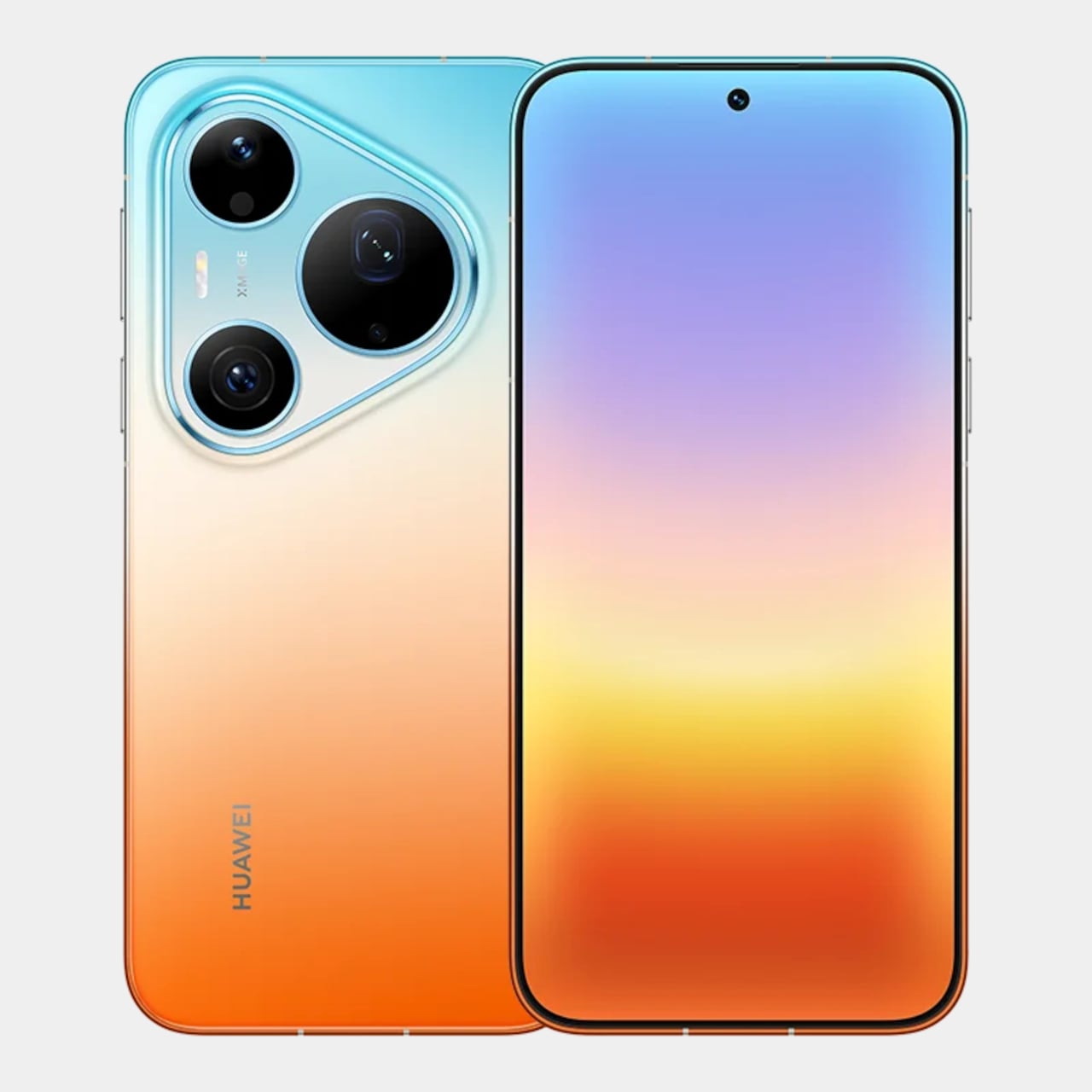
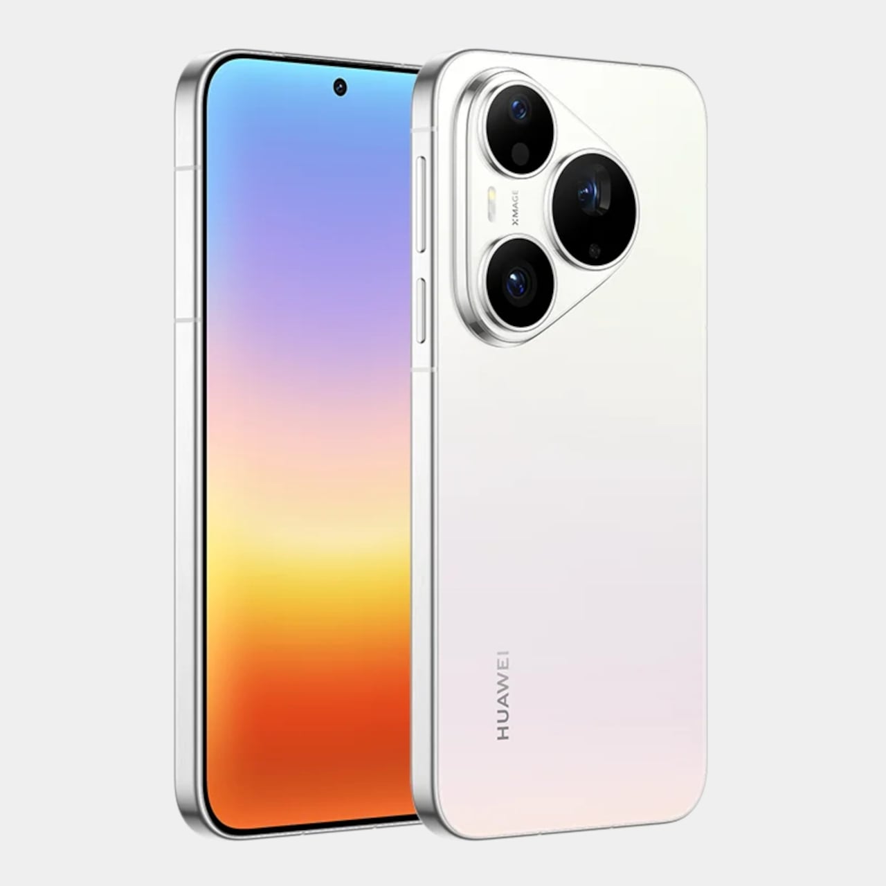
The Huawei Pura 90s Pro and Pura 90s Pro Max are Huawei’s answer to both. Launched in Kuala Lumpur on July 14, 2026, the two phones arrive with a design philosophy called “Rhythm of Colour,” gradient colorways that flow across the chassis, and a camera system built around the idea that color accuracy matters just as much as how sharp the final image gets.

Designer: Huawei

Both models feature True-to-Colour Camera 2.0, a system designed to close the gap between what the sensor captures and what the eye actually sees. A sunset shouldn’t come back looking oversaturated, and skin tones shouldn’t shift cooler or warmer than reality. The RYYB sensor array across all cameras supports this by gathering more color information in low-light conditions than a conventional RGGB layout can.

The Pro Max’s standout addition is a 200MP telephoto camera built on a 1/1.28-inch ultra-large sensor with OIS and 4x optical zoom that also functions as a macro lens. That resolution allows for aggressive cropping while still retaining detail throughout the frame. The Pro takes a different route with a 50 MP telephoto covering 4x optical and up to 8x optical-quality zoom.

Both phones share a 50MP main camera with a physical aperture spanning 10 sizes from F1.4 to F4.0. It’s a genuine mechanical iris rather than a simulated depth-of-field effect, and that distinction matters when conditions change. Moving from a dim restaurant to a bright outdoor afternoon doesn’t mean switching modes; the aperture adjusts, the exposure holds, and the shot works.

An AI composition feature suggests framing adjustments while you’re still pointing the camera, and Kunlun Glass on the front panel is rated at 25 times the drop-resistance and 16 times the scratch-resistance of standard glass. The Pro Max also carries a 40 MP ultra-wide camera, stepping above the 12.5MP sensor on the Pro, and adds LOFIC technology to the main sensor for better dynamic range.

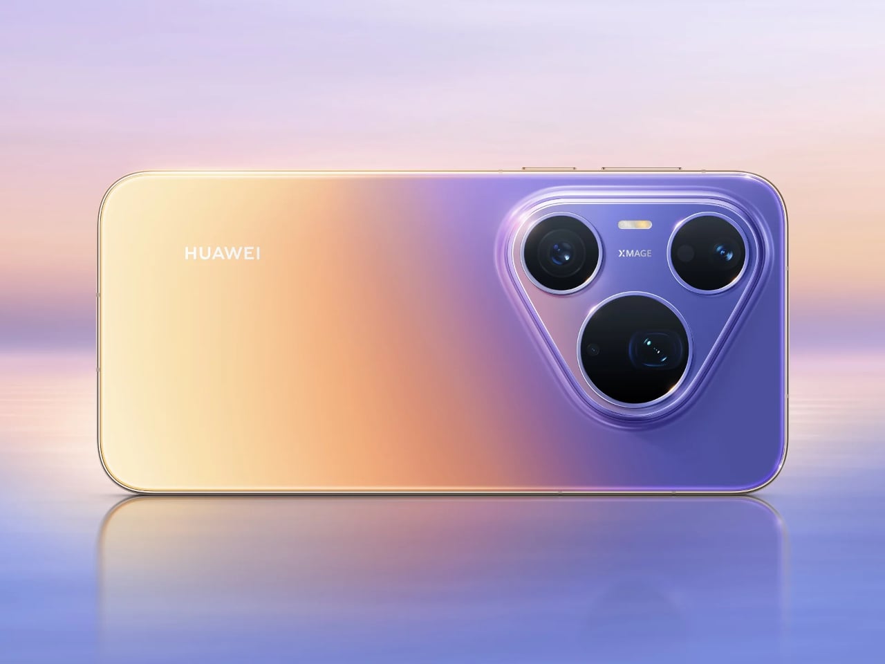
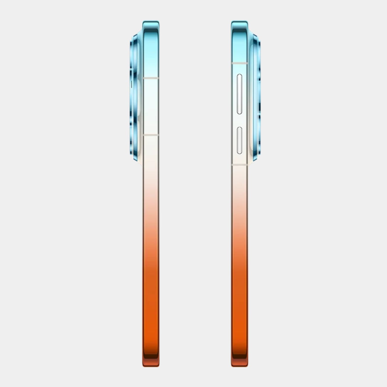
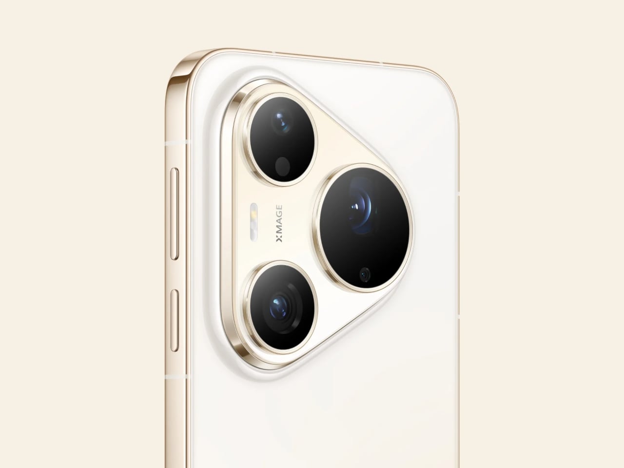
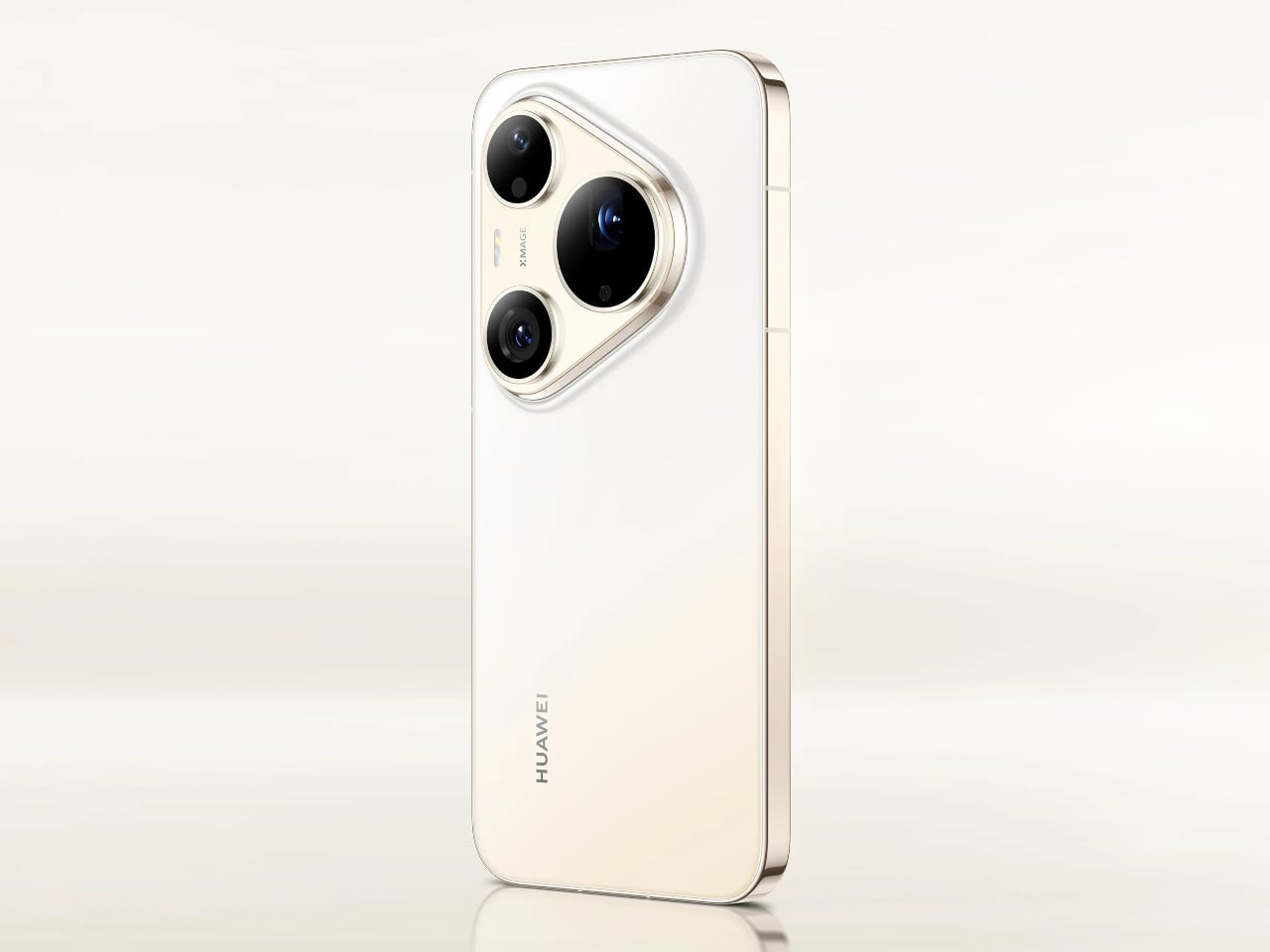
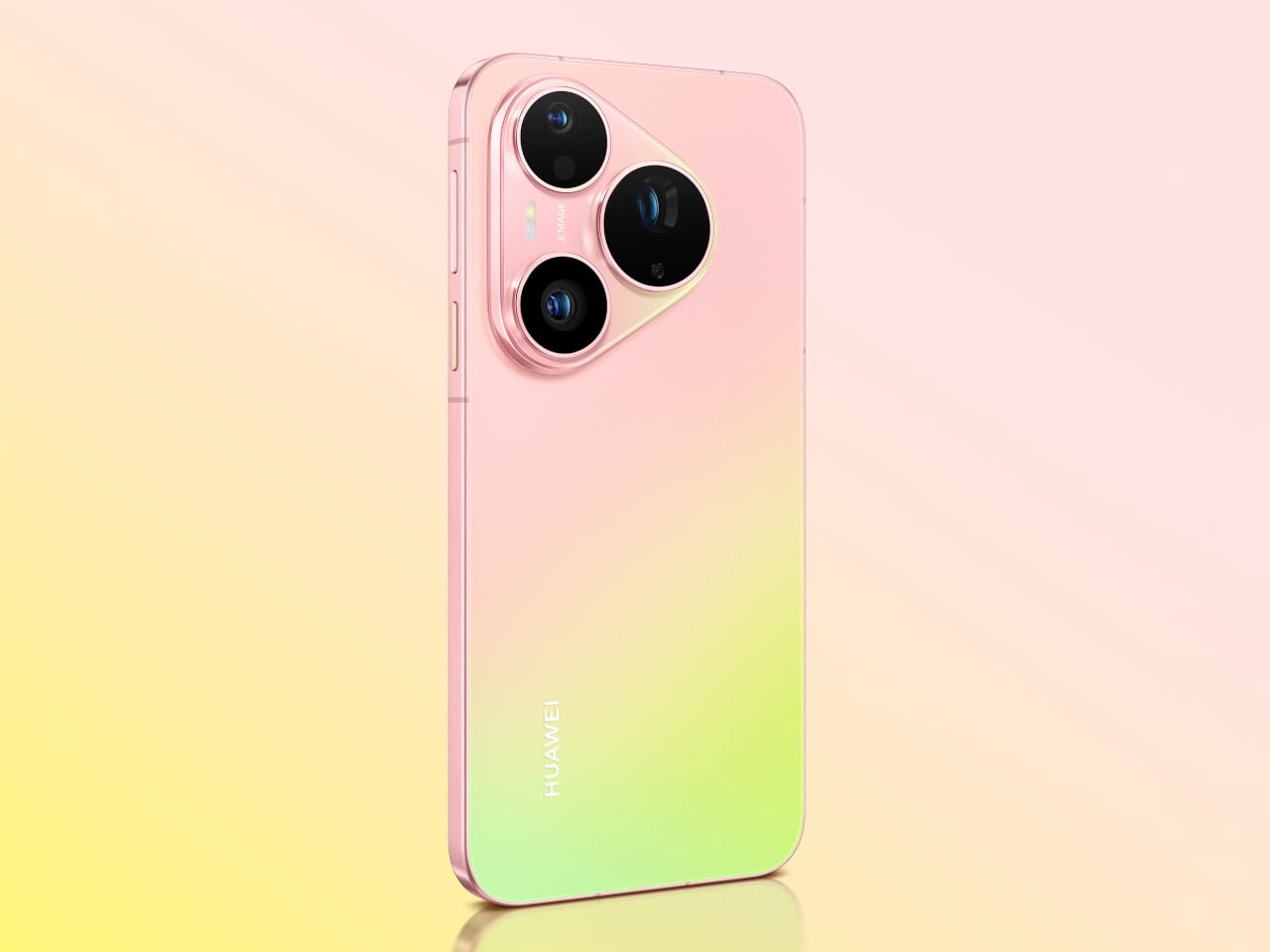
The “Rhythm of Colour” philosophy runs through every finish in the lineup, from the warm orange-to-gold Orange Ocean with its Dual-Tone Gradient Mid-Frame to a purple-to-peach option, deep matte black, and soft pearl white. The triangular camera module on both phones carries XMAGE branding and sits within a chassis that, despite the hardware inside, still manages to feel like a deliberate aesthetic choice.

A 5270mAh battery powers both phones, with 66W Huawei SuperCharge on the Pro and 100W on the Pro Max. Both run HarmonyOS 6.1 on the Kirin 9030S chip and carry IP68 and IP69 ratings for dust and water resistance. The Pro has a 6.6-inch OLED display, while the Pro Max steps up to a 6.9-inch LTPO OLED panel with an adaptive refresh rate from 1 to 120Hz.

The post Huawei Built a 200MP Camera Phone That Finally Shows Your True Colors first appeared on Yanko Design.
Honor Watch 6 Review: Great Endurance, Not Quite Perfect

PROS:


  • Excellent battery life

  • Great AMOLED display

  • Unique soccer and badminton sports mode

CONS:


  • Honor Health app lacks polish

  • Twilight Brown leather strap feels stiff

RATINGS:

AESTHETICS
ERGONOMICS
PERFORMANCE
SUSTAINABILITY / REPAIRABILITY
VALUE FOR MONEY

EDITOR'S QUOTE:

The Honor Watch 6 pairs a gorgeous display with excellent battery life, even if its software and leather strap feel less refined.

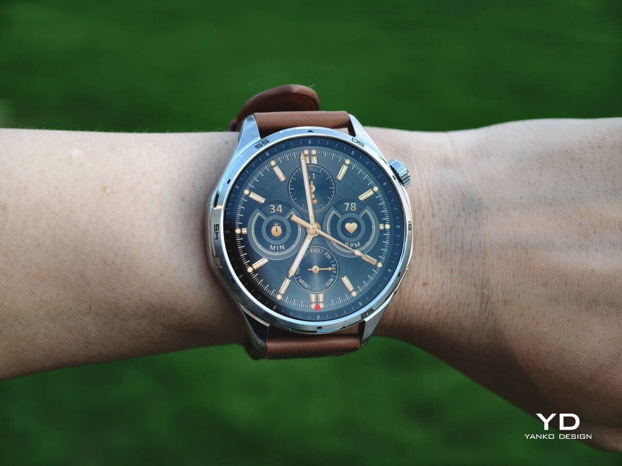
With the Watch 6, Honor has given the series a complete visual reset. After the square-faced Watch 5, this new model arrives with a round case that feels more in step with the look of a traditional wristwatch. That redesign is backed by a fairly clear set of priorities. The Honor Watch 6 focuses on the things users are likely to notice first, such as a bright, attractive display and battery life that can stretch beyond a month.

After spending time with it, the Watch 6 comes across as a smartwatch built around practical strengths rather than bold innovation. The hardware makes a solid first impression, and the core experience is clearly aimed at people who want something dependable and easy to live with. At the same time, a few details, from the software experience to the quality of the leather strap, keep it from feeling quite as refined as it initially suggests.

Designer: Honor

Aesthetics

The Honor Watch 6 leans heavily into the visual language of a traditional wristwatch, and that gives it an immediate sense of familiarity. Its round face, sculpted lugs, and restrained detailing make it feel more like an everyday timepiece than a piece of sporty tech. That approach gives it some welcome versatility, allowing it to fit easily into casual or more polished settings.

At the same time, the design also feels a little too safe. There is nothing awkward or unattractive about the Watch 6, but there is also very little that feels surprising or distinctly memorable. It is clean, balanced, and easy to like, yet it stops short of making much of a visual statement.

Honor offers the Watch 6 in two versions. The Twilight Brown model I received pairs a silver-colored 316L stainless steel body with a brown leather strap, giving it the more classic look of the two. The Shadow Black version uses a black aluminum alloy body with a matching black fluoroelastomer strap, which feels more understated and fitness-oriented.

The leather strap on the Twilight Brown unit is where the aesthetic story loses some of its polish. From a distance, it looks fine and complements the silver-toned case well, but up close, it feels stiff and a little synthetic. Thankfully, it uses a 22mm quick-release system, so swapping it out for something better is easy.

Ergonomics

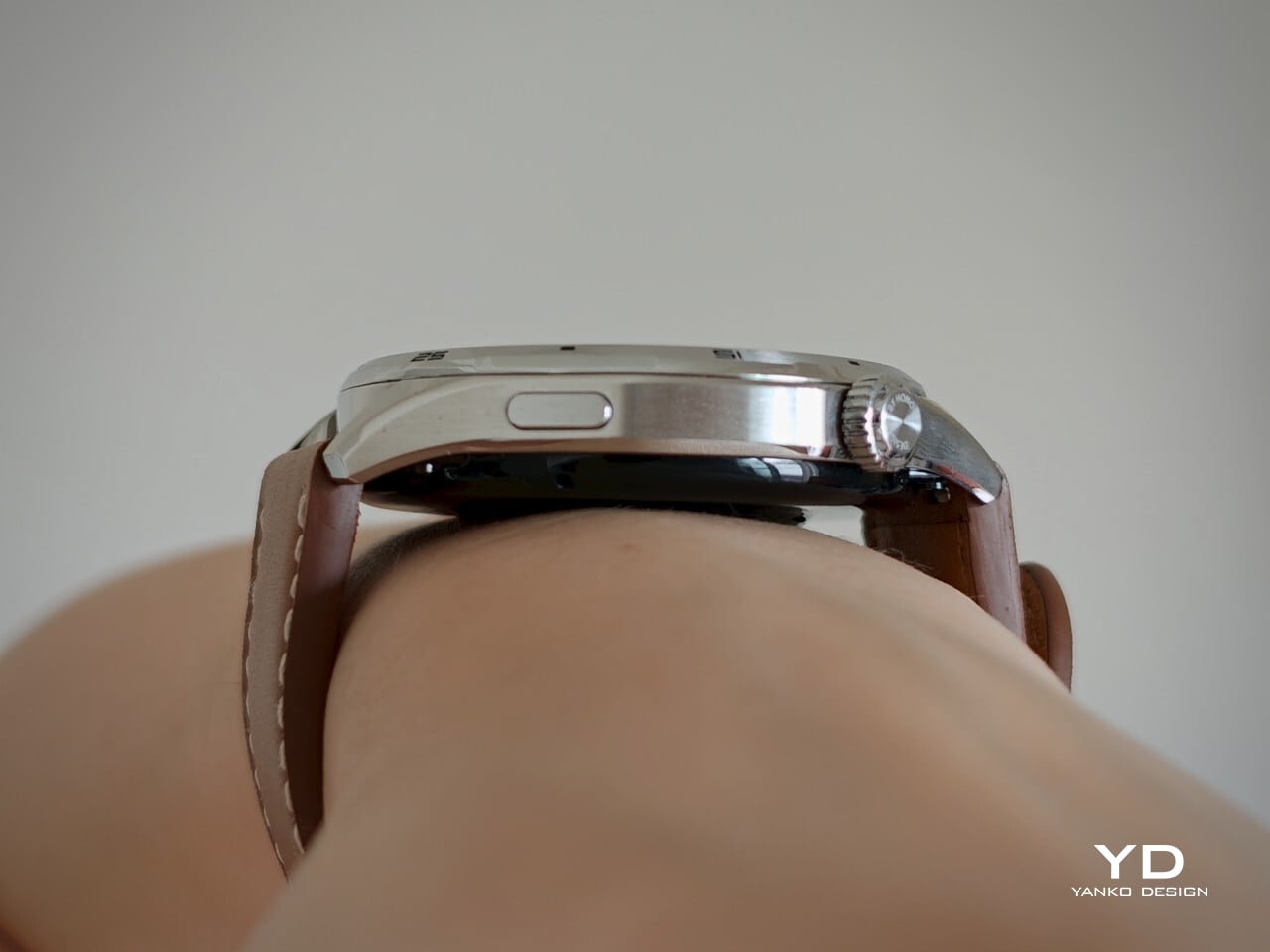
With its 46.5mm case and 10.8mm thickness, the Honor Watch 6 sits squarely within the familiar modern smartwatch zone in terms of size. It is large enough to feel substantial on the wrist and give the display room to shine, yet it never looks ridiculously bulky, even on my relatively small wrist. There is a definite presence here, but it is handled with enough restraint that the watch does not feel visually overwhelming in daily wear.

The Shadow Black version comes in at 41 grams, while the Twilight Brown model weighs 50 grams, both figures excluding the straps. That makes the Watch 6 relatively light for something this large, though not dramatically so. You are always aware that you are wearing a sizable device, but it does not become overly cumbersome during normal daily use.

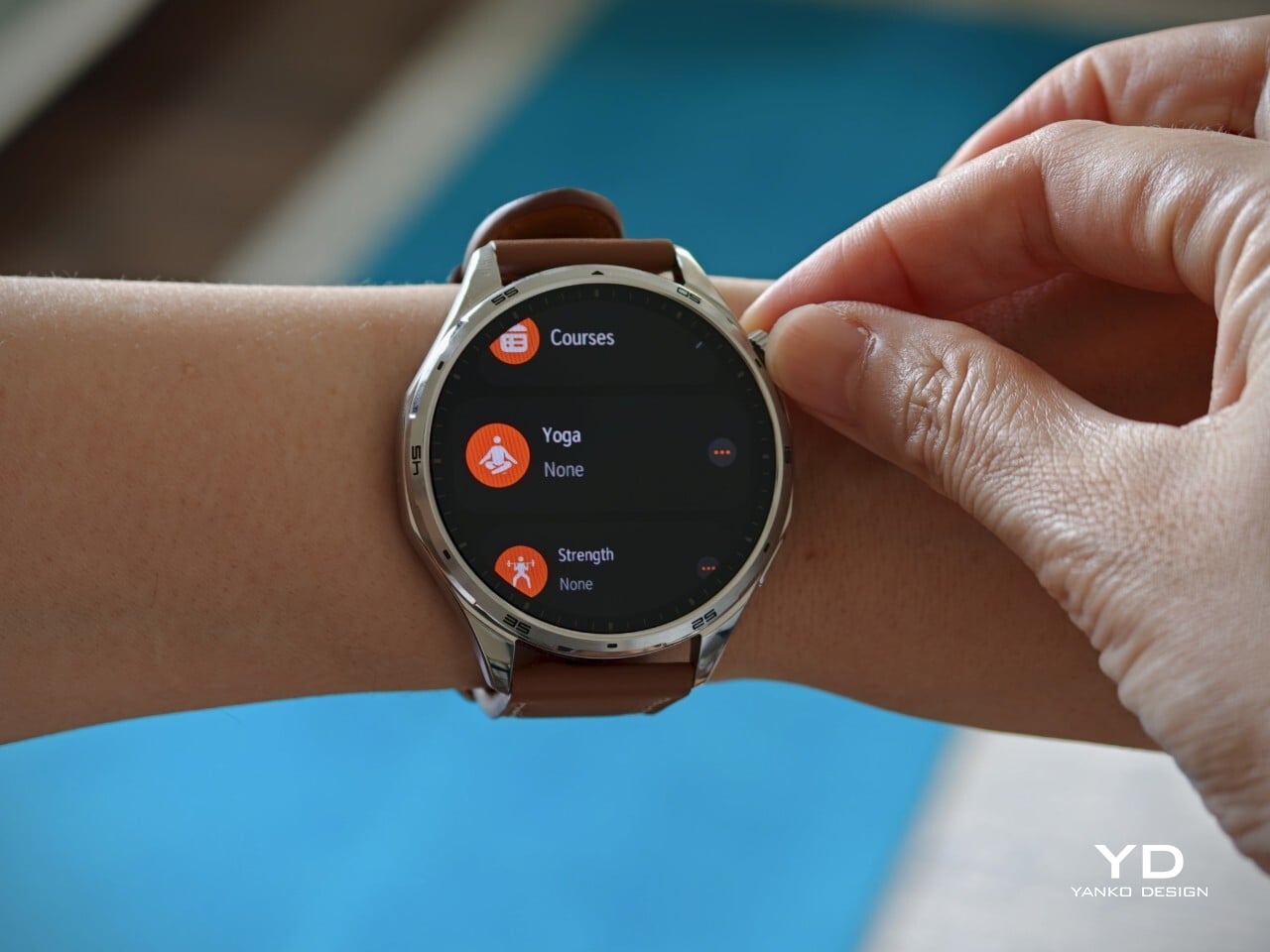
The physical controls are straightforward and familiar. On the right side of the case, Honor places two buttons in a layout that will feel instantly recognizable to most smartwatch users. The top control is a rotating crown that lets you scroll through apps, while the lower button serves as a shortcut to the workout menu. The crown is responsive, and the haptic feedback is satisfyingly strong.

Gesture navigation is equally easy to grasp. Swiping down brings up the quick menu, swiping up reveals notifications, and swiping left or right cycles through panels. The touch experience is not completely foolproof. I noticed a few instances where a scroll gesture was interpreted as a tap instead, which led to accidental selections. It is a minor frustration, but it chips away at the sense of polish.

Performance

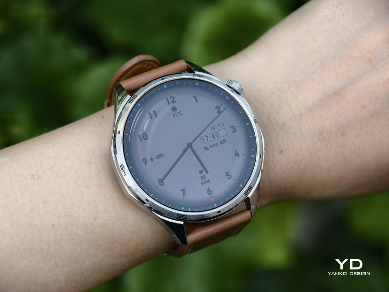
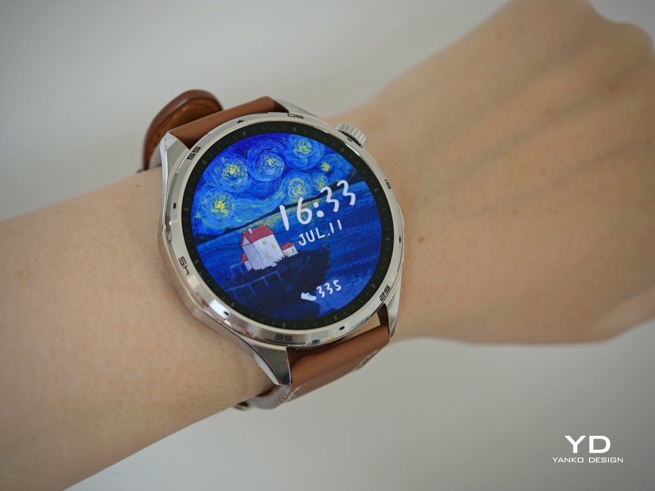
The Honor Watch 6’s display is easily one of the best parts of the entire experience. It uses a 1.4-inch AMOLED panel with a 464 x 464 resolution, and the result is exactly what you would hope for from a modern smartwatch screen. The bezel is not especially thin, but colors look rich, and text appears crisp, giving the display a bright, polished quality that stands out in everyday use. Brightness is another major advantage. With a peak brightness of 3000 nits, the display remains clearly visible even under bright sunlight, which makes a real difference during outdoor use.

The Watch 6 covers the broad health tracking essentials that most mainstream users actually want. It handles heart rate monitoring, blood oxygen monitoring, sleep tracking, step count, and general day-to-day wellness features in a way that feels accessible and easy to understand. Nothing here feels especially groundbreaking or deeply specialized, but that could also be part of the appeal. Honor has focused on delivering a practical set of features rather than overwhelming users with more data than they are likely to need.

The same can be said for the fitness experience. The Watch 6 does not try to present itself as a hyper-technical performance tool for elite athletes, but it does offer enough depth to keep active users engaged. The data is presented clearly, the core features are easy to access, and the overall experience feels designed for people who want useful feedback without having to decode a mountain of analytics.

There is also a healthy amount of variety for exercise tracking. The watch includes 122 sports modes, which should be more than enough for most people, whether they are casual walkers or more active users looking for something specific. If you are inspired by the World Cup, there is a professional soccer mode that adds a little more personality than the usual generic workout presets. During exercise, you can view step count and distance in real time, while post-workout data includes top sprint speed, average speed, and even a heat map.

Another unusual addition is the badminton mode, which goes beyond simple calorie tracking and actually tries to capture the rhythm of play. Here, you can check swing count, swing speed, shot power, forehand to backhand ratio, and stroke type. Features like these do not transform the Watch 6 into a specialist sports device, but they do make it feel more considered than a smartwatch that simply piles on empty exercise labels.

Other smart features include notifications, the ability to make and answer phone calls, and a remote shutter function. If the watch is connected to an Android phone, you can also control music playback. When paired with an Honor phone, it can be used as a voice recorder as well. Honor also says NFC support will roll out to available markets in July, which should add a little more convenience depending on where you live.

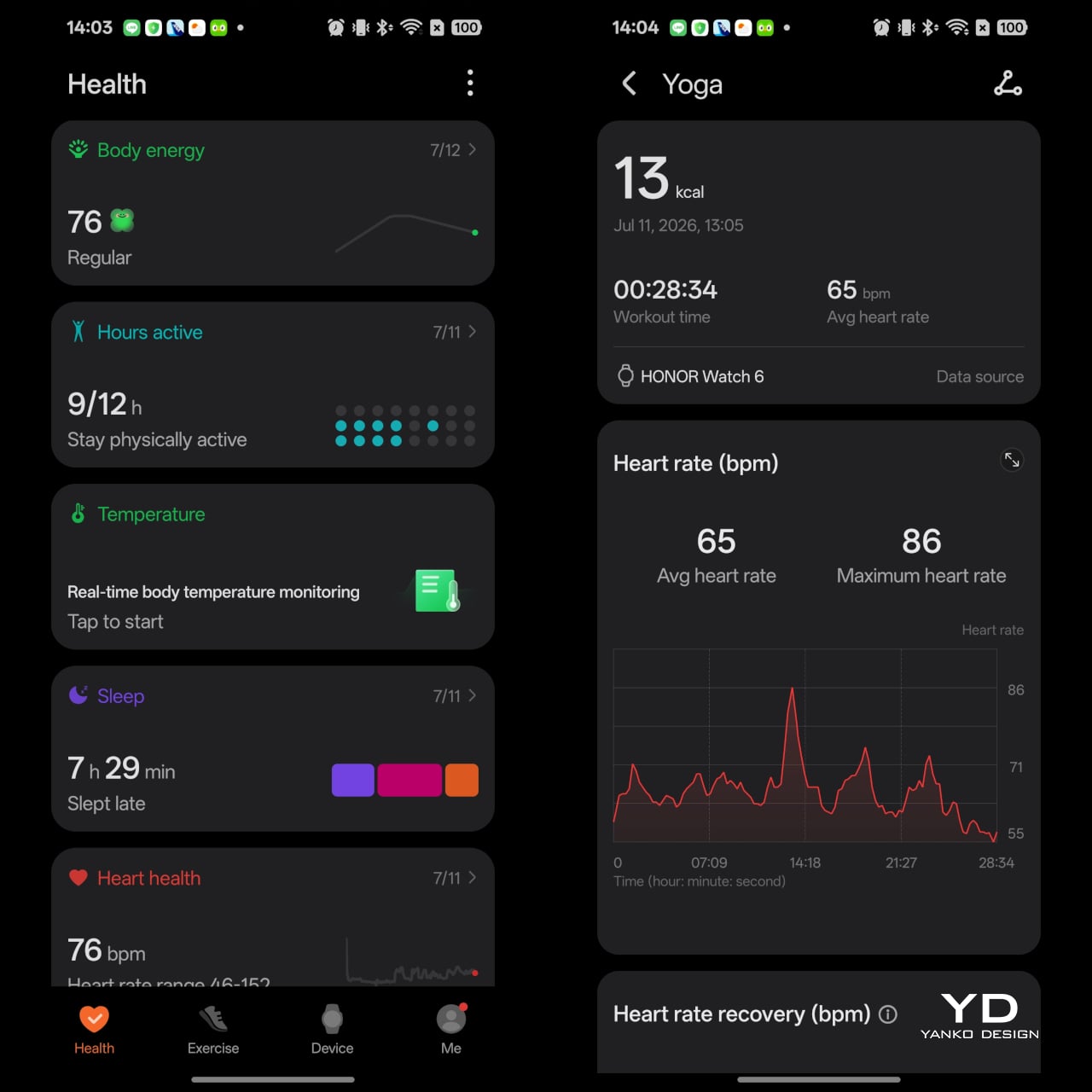
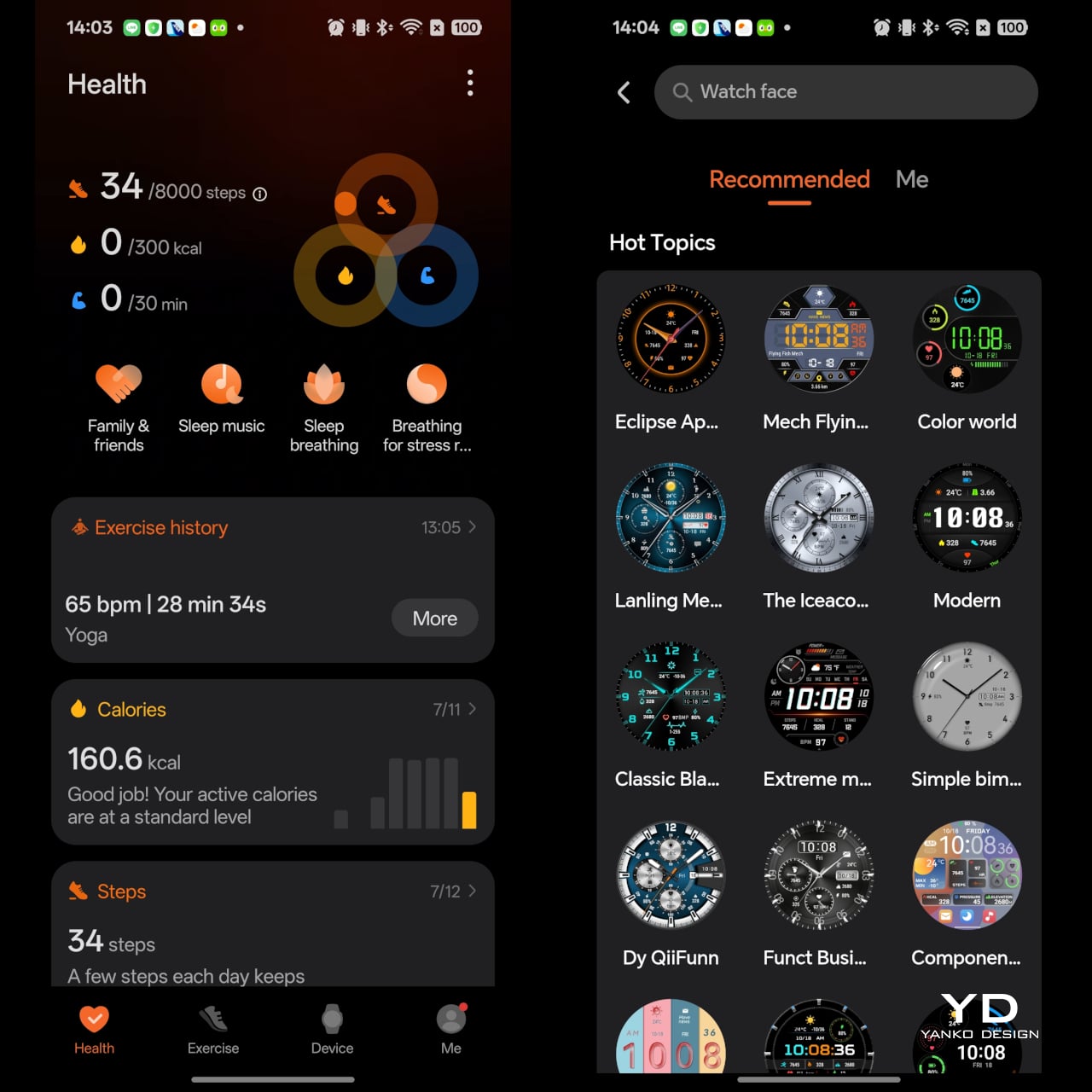
On the software side, the Watch 6 is functional but not especially refined. It works with both Android and iOS through the Honor Health app, which is good news for users who do not want to be locked into one ecosystem. Pairing and everyday syncing are straightforward enough, and the app gives you access to the usual health data, settings, and customization tools.

Still, the interface does not feel especially sophisticated. It gets the job done, but it lacks the polish and clarity found in the better smartwatch companion apps. Some of that lack of refinement shows up in the workout menu as well. Instead of grouping activities with the kind of color coding seen on many rival smartwatches, Honor presents them in a much plainer way. It gets the job done, but it makes the interface feel less intuitive and less thoughtfully designed.

That lack of refinement becomes especially noticeable when you start looking for watch faces. There are plenty of options available, which is great in theory, but the browsing experience could be much better. Instead of organizing faces in a way that helps users quickly narrow down what they want, too much of the selection feels thrown together. Compared to other smartwatch apps that sort faces into clearer styles or categories, Honor’s approach feels less curated and more cluttered. It is not a deal-breaker, but it does make personalization feel more cumbersome than it should.

Battery life, on the other hand, is impressive. The Watch 6 packs a 980mAh battery, and Honor claims it can last for up to 35 days. That figure is only possible if you turn off features like automatic blood oxygen detection, automatic stress detection, and raise to wake, while limiting exercise to light weekly activity. Even so, the claim gives a good sense of what the watch is aiming for, which is endurance far beyond what most smartwatches in this category can offer.

Honor says regular usage should deliver around 17 days of battery life, and based on my experience, that sounds believable. I have been wearing the watch for about 10 days and still have 55 percent battery left, so I have little reason to doubt the company’s estimate. When it is finally time to top up, charging is handled through the included magnetic pin charger.

Sustainability

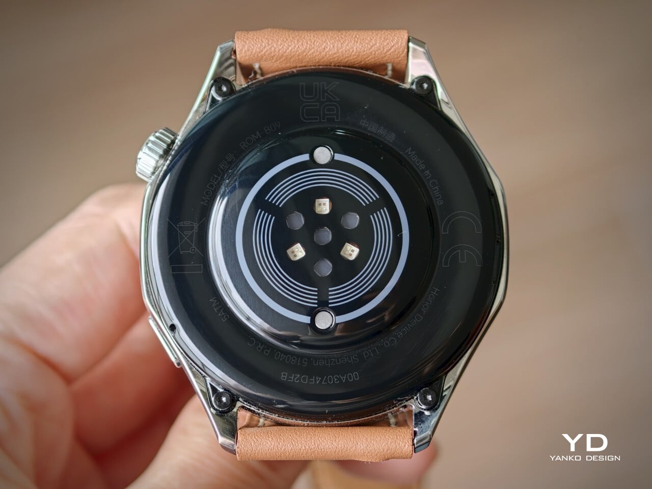
Sustainability is rarely a headline feature for smartwatches, but the Honor Watch 6 does make a few sensible moves. Its IP69 and 5ATM ratings suggest it should hold up well against sweat, water, dust, and the wear of everyday use. In practical terms, that simply means it is built to take more abuse before becoming a problem.

Honor also says the watch uses recyclable aluminum alloy, which adds a small but welcome nod toward material responsibility. Paired with the excellent battery life, the Watch 6 feels like a device designed to stay in use rather than one that constantly asks for attention. It does not do anything groundbreaking on the sustainability front, but for a smartwatch, it makes a decent case for itself.

Value

At £229.99 for the Shadow Black version and £249.99 for the Twilight Brown model, the Honor Watch 6 sits in the upper mid-range part of the smartwatch market. That works out to roughly $295 and $320, respectively. It is not exactly cheap, especially for a smartwatch that does not offer the most polished software experience, but it does bring a few strengths that help justify the asking price.

The strongest part of its value proposition is that Honor has clearly invested in the features users will notice most often. The display is gorgeous, the battery life is genuinely excellent, and the core health and fitness features are broad enough for most people. At the same time, the stiff leather strap on the Twilight Brown version and the merely functional software keep it from feeling like a complete home run. The Watch 6 offers solid value if your priorities are battery life and screen quality, but it is a little harder to recommend purely on refinement alone.

Verdict

The Honor Watch 6 succeeds by keeping its priorities simple. It delivers a lovely display, excellent battery life, and a broad enough set of health and fitness features to satisfy most people who want a smartwatch for everyday use. Just as importantly, it wraps those strengths in a design that feels far more wearable and familiar than the square-faced direction Honor took before.

At the same time, it does not feel like a fully polished package. The software works, but it lacks the refinement and thoughtful organization that would make the experience feel truly premium. The leather strap on the Twilight Brown version also lets the hardware down a bit, since it looks better from a distance than it feels in the hand or on the wrist.

That leaves the Watch 6 in an interesting spot. It is not the most exciting smartwatch in its class, and it is not the one I would point to as the benchmark for software or overall finesse. But if your priorities are a gorgeous screen, long battery life, and a classic watch-like design, Honor gets a lot right here. The Watch 6 may not be the most memorable smartwatch of the year, but it is an easy one to live with.

The post Honor Watch 6 Review: Great Endurance, Not Quite Perfect first appeared on Yanko Design.

Inkleaf’s foldable dual-screen E Ink notebook lets you read and write at the same time

E Ink tablets have become a solid alternative for people who read and write for a living. Devices like the reMarkable 2 and Kindle Scribe do a good job of making digital note-taking feel closer to paper, but they all share the same fundamental limitation. You get one screen, which means you’re either reading or you’re writing, but not both, and that’s a workflow problem that hasn’t really been addressed.

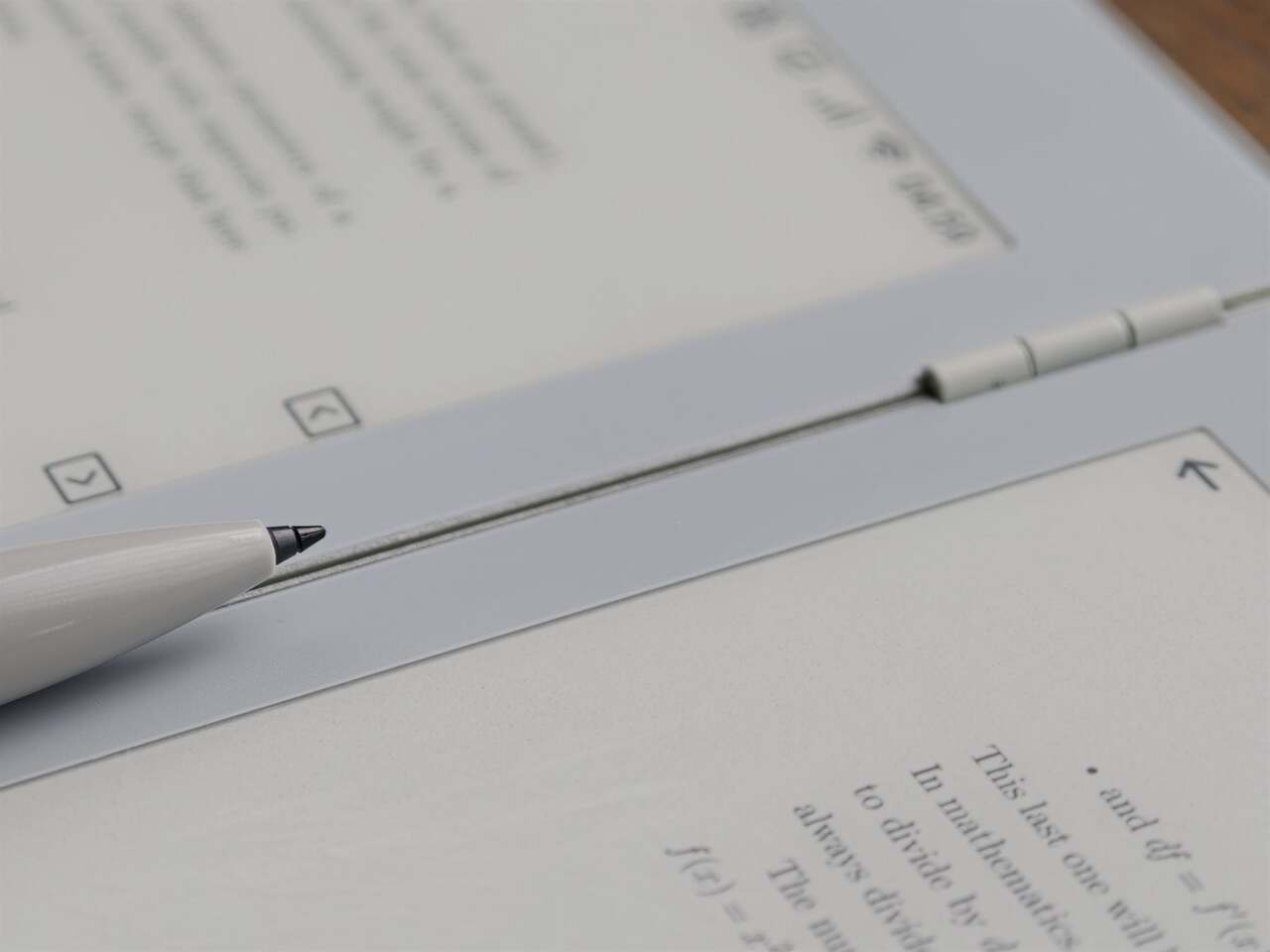
The Inkleaf is a foldable dual-screen E Ink tablet designed specifically for that gap. It opens up to two full 10.3-inch Carta E Ink panels side by side, which lets you keep your source material on one screen while your notes stay on the other. It’s the kind of setup that researchers, students, and writers have been piecing together awkwardly with a tablet and a separate notebook for years.

Designer: Kameron Yu

Think about the last time you had to annotate a PDF while also drafting a response, or work through a textbook while keeping running notes. Most tablets force you to switch between apps constantly, losing your place and breaking focus. With the Inkleaf, you can read on the left and write on the right, and even flick a page from one screen to the other with the stylus.

What makes the form factor just as interesting as the screens themselves is how the Inkleaf handles both. It folds shut like a hardcover with a 180-degree hinge that lays perfectly flat when open. Closed, it’s thinner than a standard paperback at 8.4mm and barely heavier at 480 grams. The body is cast aluminum with a precision-machined hinge barrel and tactile page-turn buttons right where your thumb expects them.

To put the thinness in perspective, each open panel measures just 4.2mm, which is thinner than the reMarkable 2 at 4.7mm, the Kindle Scribe at 5.4mm, and the Boox Note Air4 C at 5.8mm. None of those fold, either. It’s a notable feat given that the Inkleaf is essentially two tablets in one, and it’s the only foldable E Ink tablet currently available on the market.

The software runs on Android and supports open file formats, including PDFs, EPUBs, MOBI, and TXT files, with no subscription required to access your own content. An AI-powered handwriting search can surface any phrase across every notebook you’ve written. And because it folds to the size of a hardcover, it doubles as a portable secondary display at a coffee shop, a hotel room, or wherever else you end up working.

The Inkleaf is reportedly priced at around $450, with the first units expected to reach founders in August 2026. It ships with the pressure-sensitive stylus, a USB-C cable, and no subscription fees tied to reading your own files. For people who spend long hours moving between books and notebooks, it’s one of the more thoughtful attempts at genuinely rethinking what a digital writing and reading device can look like.

The post Inkleaf’s foldable dual-screen E Ink notebook lets you read and write at the same time first appeared on Yanko Design.

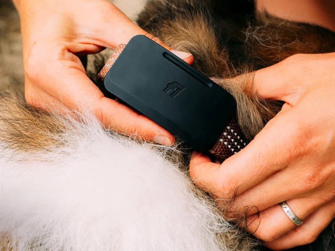
This GPS dog tracker uses Starlink satellites to work anywhere cell service doesn’t

Satellite connectivity used to be reserved for phones, off-grid communicators, and specialized outdoor gear. Now it is showing up in far smaller devices, and Fi Ultra pushes that trend into pet care. The tracker taps into the Starlink satellite network to keep dogs locatable in places where cell towers never reach, a capability that would have sounded unrealistic in a consumer pet product only a few years ago. Hikers, hunters, and rural dog owners have spent years accepting blind spots in their tracking apps as a fact of life. Fi Ultra treats that blind spot as a problem worth solving with real infrastructure instead of a bigger antenna.

Fi built its business on GPS trackers that relayed location through LTE, a system that worked well until a dog wandered beyond cellular range. Fi Ultra closes that gap by adding satellite as a fallback layer, switching automatically between Bluetooth, Wi-Fi, LTE, and satellite depending on what is available. Priced at $199, with an additional $189 a year for satellite access, it signals how quickly satellite technology is trickling down into everyday consumer products. This is the same T-Satellite infrastructure conversation phone carriers have been having for the last two years, except here it is stitched into a dog collar instead of a flagship handset.

Designer: Fi

Satellite transmission is power hungry by nature, since the tracker has to punch a signal far enough to reach orbit rather than the nearest cell tower. Fi’s answer is a connection hierarchy that always defaults to the cheapest option available, quietly downgrading from satellite to LTE to Wi-Fi to Bluetooth the moment a lower power option exists. It is the same logic your phone uses when it prefers Wi-Fi over cellular data, just applied to a device with a fraction of the battery capacity. The result is a tracker that only reaches for its most expensive connection when nothing else will do the job.

An Apple AirTag runs for a year on its coin cell battery, and Fi’s own Fi 3+ lasts up to three months, but Fi Ultra is rated for only several days between charges. That is a steep drop, and it says something about how much energy satellite radios actually demand compared to the low power Bluetooth chips inside most trackers. Fi is betting that owners in genuinely remote areas will accept more frequent charging in exchange for a tracker that never goes dark, which is a reasonable bet for search and rescue dogs, hunting companions, and anyone hiking well outside cell coverage. It is a much harder sell for a dog that mostly patrols a suburban backyard.

Fi Ultra also carries over Fi Callback, a feature that lets owners send sound and vibration cues through the smartphone app to recall a dog from a distance, alongside standard support for both collar and harness mounting. None of that is revolutionary on its own. What makes Fi Ultra worth watching is the precedent it sets. Satellite hardware has spent years shrinking from ships and expedition gear down to phones, and now down to a dog collar. The next logical step is livestock tags, wildlife collars, and eventually anything small enough to wear that still needs to be found. Fi just got there first.

The post This GPS dog tracker uses Starlink satellites to work anywhere cell service doesn’t first appeared on Yanko Design.

What If Your Earbuds Could Help You Sleep After They Played Music And Podcasts All Day?

After roughly 14 years at Samsung and then more than 20 years engineering Bluetooth audio, much of it developing products for and alongside Samsung’s ecosystem, Juwon Heo began asking a new kind of question. He had dedicated his career to making earphones sound clearer and connect more reliably. He helped perfect the technology that allows people to fill their world with music and podcasts. He then wondered if that same small device could do something more, something to help people quiet their inner world, too.

The result of that inquiry is the HealingFit TWS, a product that reflects its creator’s deep background in audio hardware. Heo’s company, MobiFren, developed a unique system in which premium true wireless earbuds transform, through a single magnetic link-cable connection, into a wellness device for better sleep, stress relief, and improved focus and memory, whenever the user needs it. It represents a seasoned engineer’s attempt to evolve the earbud’s purpose, from a simple listening tool into a versatile daily companion.

Designer: Juwon Heo, Founder & CEO, MobiFren

Click Here to Buy Now: $169 $300 (44% off). Hurry, only 15/210 left! Raised over $51,700.

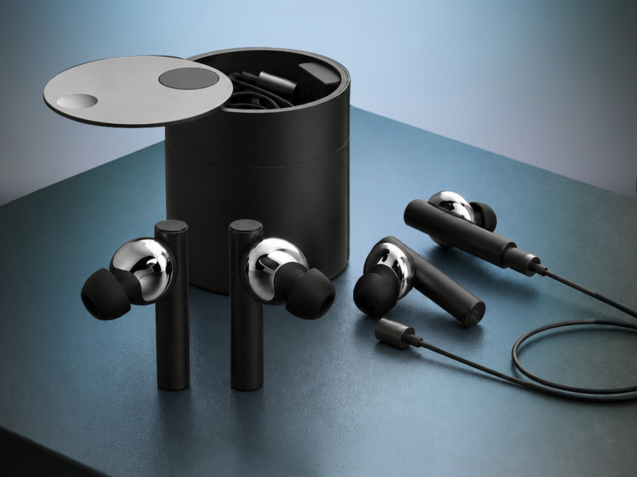
The core innovation lies in the product’s dual-mode architecture. HealingFit TWS operates as fully independent wireless earbuds most of the time, handling calls, music streaming, and podcast listening without any cable or physical link. The moment a user wants to engage the wellness features, they snap on the Magnetic TES Link™, a slender cable that magnetically attaches to both earbuds. During a session, it provides the pathway for the TES microcurrent signal between the two earbuds. If you detach the cable or remove the earbuds from your ears, the microcurrent is immediately cut off, just like turning off a light switch. This connection enables bilateral TES (Transcranial Electrical Stimulation) microcurrent delivery paired with binaural soundscapes. The design allows the product to preserve the freedom of true wireless audio while activating a wellness mode only when deliberately chosen. The architecture has received a U.S. patent application allowance and is proceeding to registration, signaling that the concept offers technical novelty beyond typical wellness add-ons.

Personal audio has followed a clear trajectory over the past two decades. Wired earphones removed the need for bulky speakers but kept listeners tethered to their devices. The first wireless models cut the cord, but still linked the two earbuds together with a neck cable. True wireless earbuds eliminated that last physical connection, turning a pair of earphones into two independent modules that communicate through Bluetooth alone. Each leap reduced constraints and simplified the user experience. Heo views HealingFit TWS as the next logical step in that evolution, a category he refers to as TES wellness earbuds. The product builds on the independence of TWS but reintroduces connectivity selectively, for a functional purpose rather than a technical limitation.

MobiFren began in 2002 as a contract-development business working on feature phones for Samsung Electronics. Around 2005, while continuing that Samsung feature-phone development work, the company moved into Bluetooth audio development in parallel. By 2006, it brought its first Bluetooth earphones to market. That two-decade stretch gave Heo and his team fluency in hardware miniaturization, acoustic tuning, and wireless protocol integration. HealingFit TWS draws on that accumulated expertise, especially in balancing audio fidelity with the demands of compact electronics.

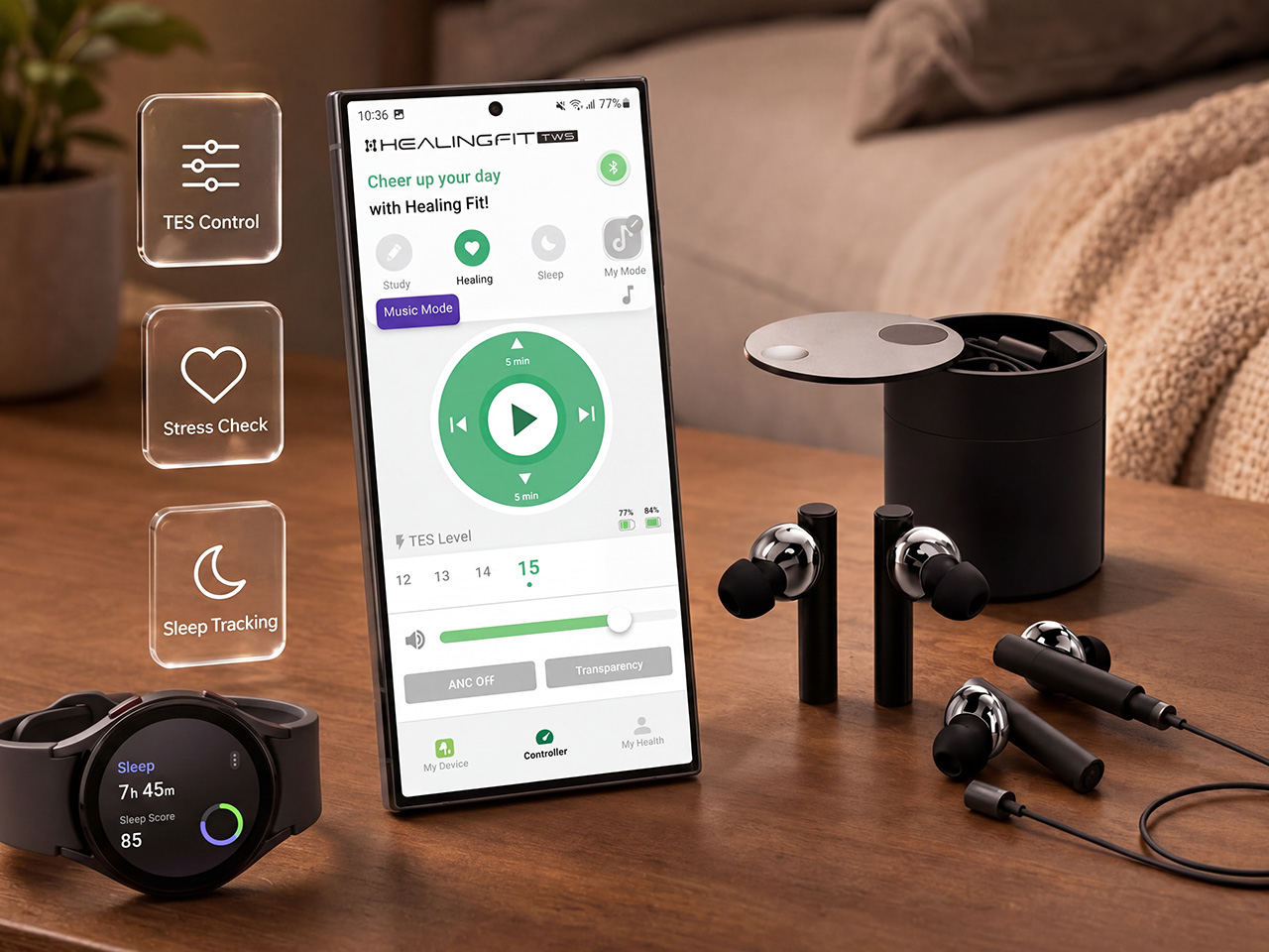
The earbuds use the MobiFren Sound Tuning System (MSTS™), a proprietary approach to acoustic profiling. Everyone hears differently, so the My HealingFit app provides five fully tuned MSTS™ sound modes, like five great earphones in one pair. MobiFren Mode delivers clean, natural, and balanced sound. BassBoost Mode offers richer low-end energy. Enhance Mode adds clarity for vocals, podcasts, and acoustic detail. Tender Mode provides soft, gentle sound for calm listening. Space Mode creates a wider, more immersive soundstage. Rather than forcing one fixed sound on everyone, Heo built the equivalent of five separate high-end, high-fidelity earphones into a single device, so each listener can choose the one that matches their taste. At CES 2015, in a blind listening comparison against Westone’s W60, more than 92% of listeners preferred MobiFren’s tuning. Sound tuning is the founder’s life’s work, and this audio foundation is what the entire product is built on.

The physical design is built around everyday portability and comfort. The earbuds feature an anodized aluminum body with an in-ear fit, a form factor intended to remain stable during commutes, calls, and general daily wear. The charging case uses a cylindrical design with a magnetic docking mechanism, sized to fit comfortably in a pocket or bag. The TES Link cable stores inside the case alongside the earbuds, avoiding the need for separate accessories or additional carrying solutions. The entire system is engineered to minimize friction in both modes, whether the user is moving through the day untethered or settling in for a focused wellness session at night.

HealingFit TWS recently passed another technical milestone. The device has received FCC certification, a regulatory requirement that confirms compliance with electromagnetic interference and radio frequency standards in the United States. This approval follows the U.S. patent application allowance and a CES 2026 Innovation Awards Honoree designation in the Headphones & Personal Audio category. These markers suggest that the product has moved well beyond concept-stage validation and into formal manufacturing readiness. For a crowdfunding campaign, these certifications provide a measure of reassurance that the hardware is real, tested, and legally cleared for production distribution.

The wellness component of the system centers on user control and choice. The app, My HealingFit, offers three routine modes: Sleep, Healing, and Study. Each mode delivers a combination of gentle microcurrent and binaural audio designed to support a specific mental state. Users can adjust the TES intensity across 15 levels, tailoring the experience to their own comfort threshold. The device is designed as a wellness tool, explicitly disclaiming any medical diagnosis or treatment function. That distinction is important. It positions HealingFit TWS as a personal relaxation and focus aid, not a therapeutic device subject to medical regulatory oversight.

Heo’s question from the beginning was simple. Could earbuds designed for the noise and motion of the day also serve the stillness and quiet that follows? HealingFit TWS is his answer, a product that tries to bridge those two states without forcing the user to own two separate devices. Earbuds have already become an everyday essential of the smartphone era, worn for hours at a time by millions. What Heo proposes is that they are evolving from a device we listen with into a device we also heal with. Whether that vision takes hold will depend on how users experience the transition between modes, and whether the wellness routines prove meaningful enough to justify the added capability. For now, HealingFit TWS stands as a milestone in that shift, a thoughtful industrial design experiment from a team that understands audio hardware deeply and believes the next chapter of personal audio is about versatility across the full rhythm of modern life.

Click Here to Buy Now: $169 $300 (44% off). Hurry, only 15/210 left! Raised over $51,700.

The post What If Your Earbuds Could Help You Sleep After They Played Music And Podcasts All Day? first appeared on Yanko Design.
DJI built a parachute into their drones to protect the hardware… and people’s heads

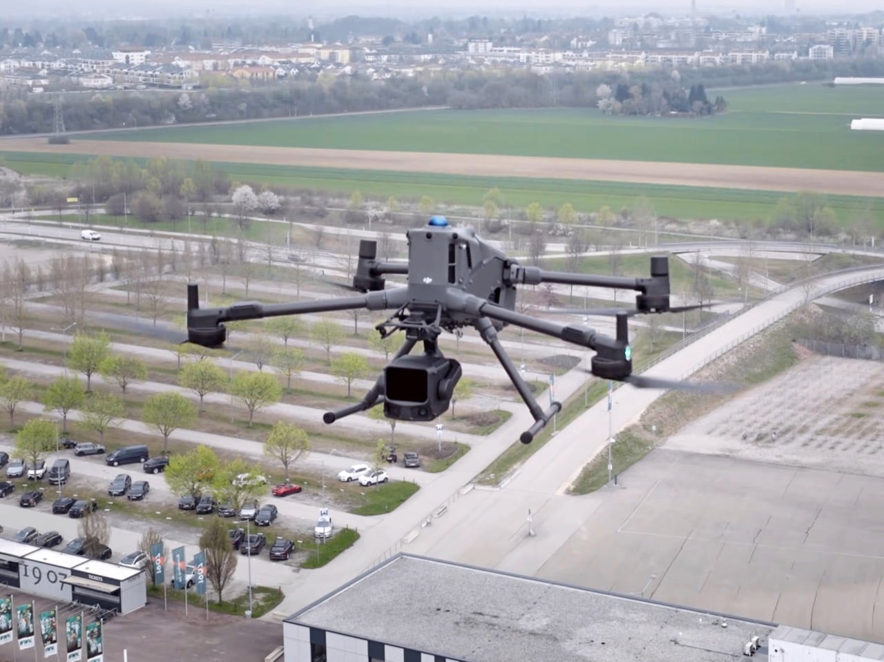
Drones fall. Sensors fail, signals drop, batteries die at inconvenient moments, and until now the consequences of that failure were left largely to chance. Obstacle avoidance technology solved one half of the safety equation, keeping drones from flying into buildings, power lines, or each other. But avoidance only works while the aircraft is still flying. Once a drone loses power or control, all that sensor smarts becomes irrelevant, and physics takes over. Even a small consumer grade drone weighing 8 or 9 ounces turns into a falling object with real force behind it when it drops from 200 or 300 feet, and DJI’s Matrice 400 is a far heavier machine flying far more demanding missions.

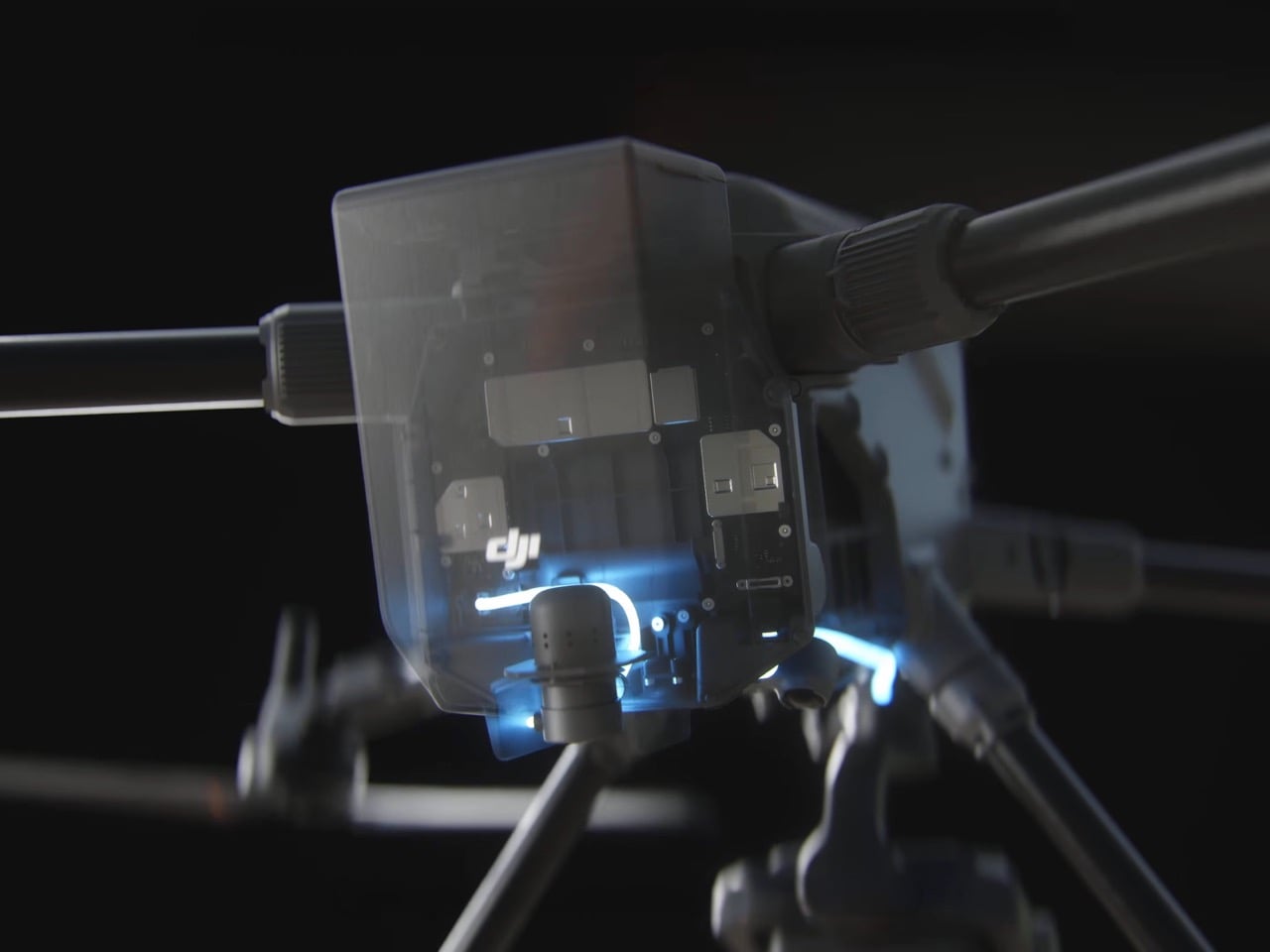
That is the gap the AP100 Parachute was built to close. It watches its own hardware in real time, running continuous checks so it knows the instant something looks off. Backup capacitors keep the system powered even if the drone itself loses electricity, which matters because a mid air failure rarely comes with a warning. Once triggered, deployment is instant, and the parachute slows descent to under 5 meters per second, turning what would be a crash into something closer to a controlled landing. Alarms then kick in after deployment, alerting anyone nearby and helping pilots track down exactly where their aircraft ended up.

Designer: DJI

The AP100 gives pilots three separate ways to pull the ripcord, so to speak. It can trigger itself automatically the moment it detects an anomaly or a geocaging breach, meaning the drone strays somewhere it should not be. Pilots who want manual control can swipe to deploy directly inside the DJI Pilot 2 app, no digging through menus required. There is also a remote option through FlightHub 2’s FTS page, useful for fleet operators managing multiple aircraft from a central hub. Layering automatic, manual, and remote deployment together means there is rarely a scenario where the parachute simply cannot be triggered in time.

None of this exists in a vacuum. Commercial drone missions flying over cities or beyond the pilot’s direct line of sight, what the industry calls BVLOS, have to satisfy strict safety categories like C5 and C6 before regulators sign off. Surveying a highway route or inspecting a pipeline that snakes through populated areas used to mean stacking on extra precautions just to get approval. A parachute rated to meet those standards effectively does the compliance heavy lifting on its own. That turns what used to be a drawn out approval process into something considerably more straightforward for operators trying to get missions off the ground, literally and legally.

The hardware itself is built for the grind of daily operations rather than sitting as a one time safety gimmick. Pilots can swap batteries without ever detaching the parachute, which sounds minor until you are the one doing it in the field between flights. It also carries the same IP55 rating as the Matrice 400 itself, so rain or dust does not take it out of commission. Full system self checks run automatically at startup, cross referencing communication links and hardware status before the drone even leaves the ground. These are the kinds of details that matter more to the operator running ten missions a week than to anyone reading a spec sheet once.

Here is the catch, though. The AP100 is built exclusively for the Matrice 400, DJI’s enterprise platform aimed at industrial inspection, surveying, and public safety work. Your Mavic will not be getting one, and neither will your FPV drone, at least not yet. That is not entirely surprising given the size and cost tradeoffs involved in strapping a parachute system to something meant to be light and nimble. But DJI has a track record of trickling enterprise safety features down into consumer lines once the engineering matures, and a company that just built a first party parachute for one drone rarely stops at just one.

Regulators keep pushing drones toward busier skies, over highways, over crowds, over exactly the kind of scenarios where a hardware failure stops being a minor inconvenience and starts being a genuine hazard. DJI building a parachute directly into its own ecosystem, rather than leaving it to third party add ons, suggests the company sees this as a standard feature rather than an optional extra. Whether that logic eventually reaches the Mavic or Air lineup remains to be seen, but the direction feels obvious. Falling should not be part of the risk calculus anymore, and DJI just made a very public bet on that idea.

The post DJI built a parachute into their drones to protect the hardware… and people’s heads first appeared on Yanko Design.

ASUS Zenbook A16 (UX3607OA ) Review: Big screen, Surprisingly Light

PROS:


  • Exceptionally light for a 16-inch laptop

  • Beautiful 3K OLED display

  • Great battery life

  • Strong everyday performance

CONS:


  • Touchpad clicks feel firm

  • Only one color option

RATINGS:

AESTHETICS
ERGONOMICS
PERFORMANCE
SUSTAINABILITY / REPAIRABILITY
VALUE FOR MONEY

EDITOR'S QUOTE:

The ASUS Zenbook A16 gets something surprisingly right. It makes a 16-inch laptop feel light, easy, and genuinely pleasant to carry, without losing the kind of performance most people actually need.

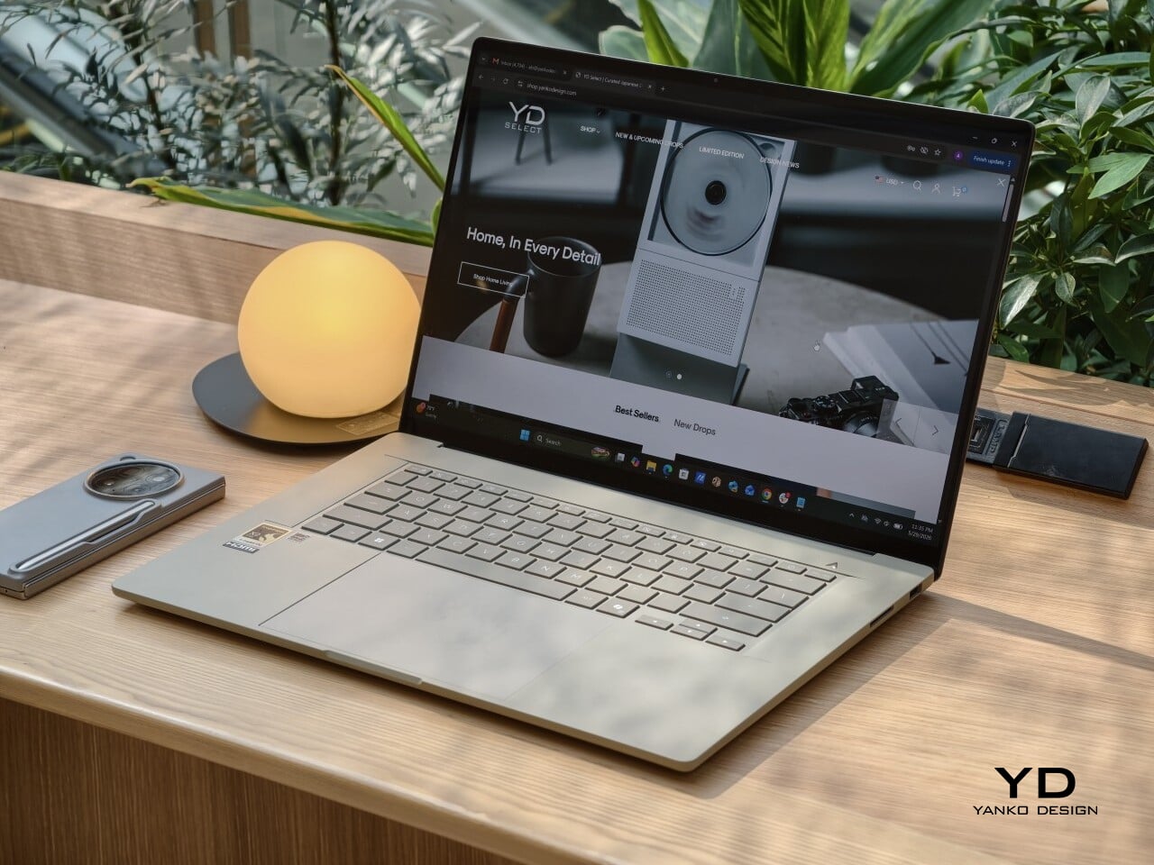
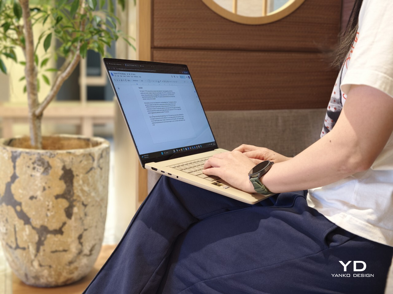
Big laptops usually ask for a compromise. You get the roomy screen, but you also get the extra weight, the larger footprint, and the feeling that you are carrying a little too much machine around every day. The ASUS Zenbook A16 UX3607 takes a different route, giving you a 16-inch canvas in a body that is startlingly light for the size, at around 1.3 kg, or 1.2 kg depending on the version.
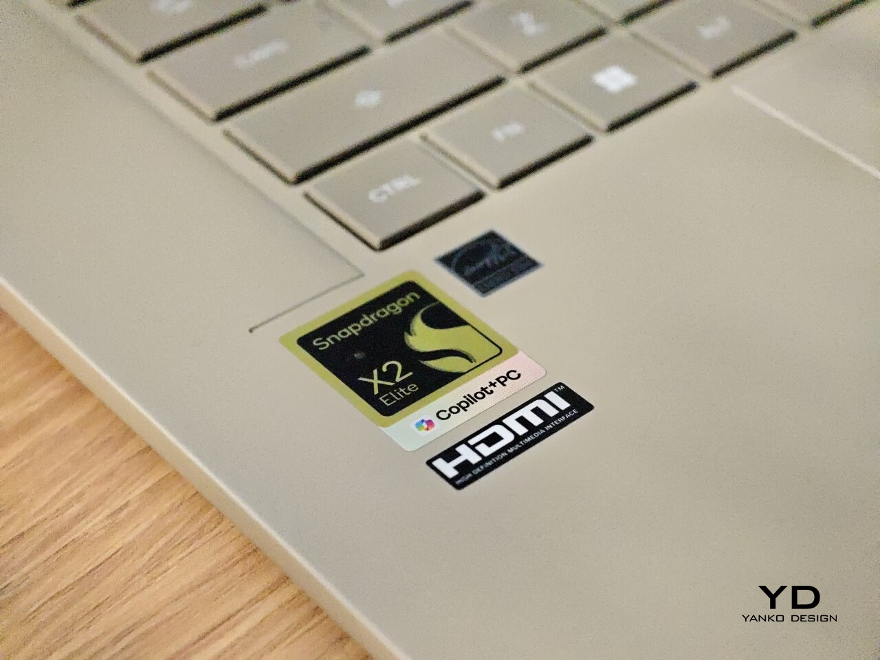
What makes it stand out even more is that ASUS pairs that light build with Qualcomm’s Snapdragon X2 Elite platform, which still feels relatively rare. The result is a slim, polished laptop that makes a larger display feel easy, casual, and genuinely portable, while still delivering strong everyday performance. With a 16-inch 3K 120 Hz OLED panel and Snapdragon X2 Elite hardware in the latest refresh, it is clearly built for people who want comfort, battery life, and speed in one very travel-friendly package.
Designer: ASUS

I spent about a month with the laptop, including three international trips. That gave me a good sense of how it felt not just at a desk, but in transit, in hotel rooms, and in the kind of everyday situations where a large laptop usually starts to feel less convenient. Over that time, the Zenbook A16 made a strong case for itself as a big-screen machine that does not ask you to live around it.

Aesthetics

The Zenbook A16 has a clean, minimal design, but it does not feel cold. That is an important distinction because a lot of slim laptops, especially larger ones, can come across as a little sterile. This one feels softer and more inviting, with a look that is polished without being severe.

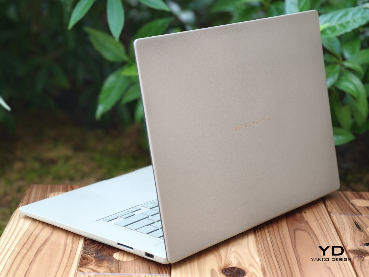
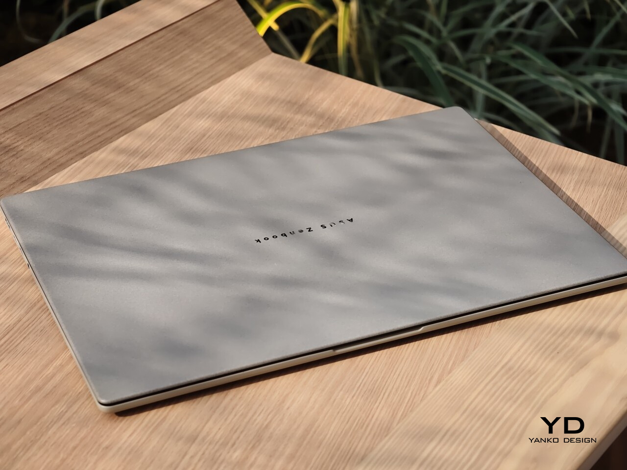
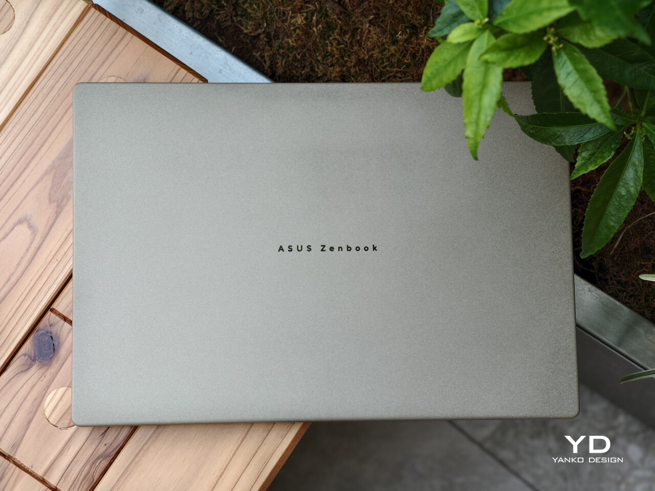
A lot of that comes down to ASUS’ patented Ceraluminum finish. ASUS gives the chassis a surface that feels less harsh than typical metal, which helps the laptop look warmer and more tactile in person. It still feels premium, but in a more relaxed and approachable way.

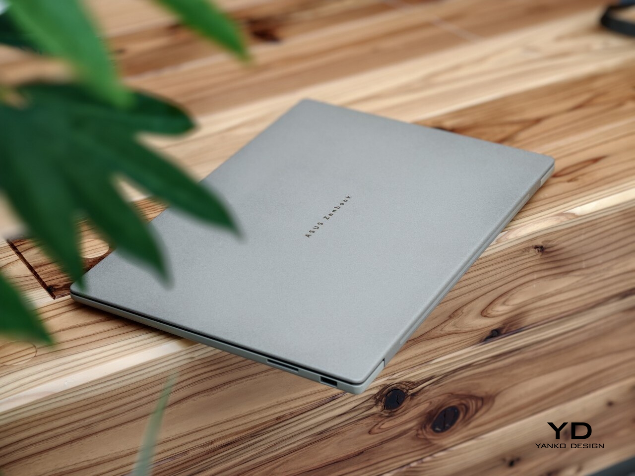
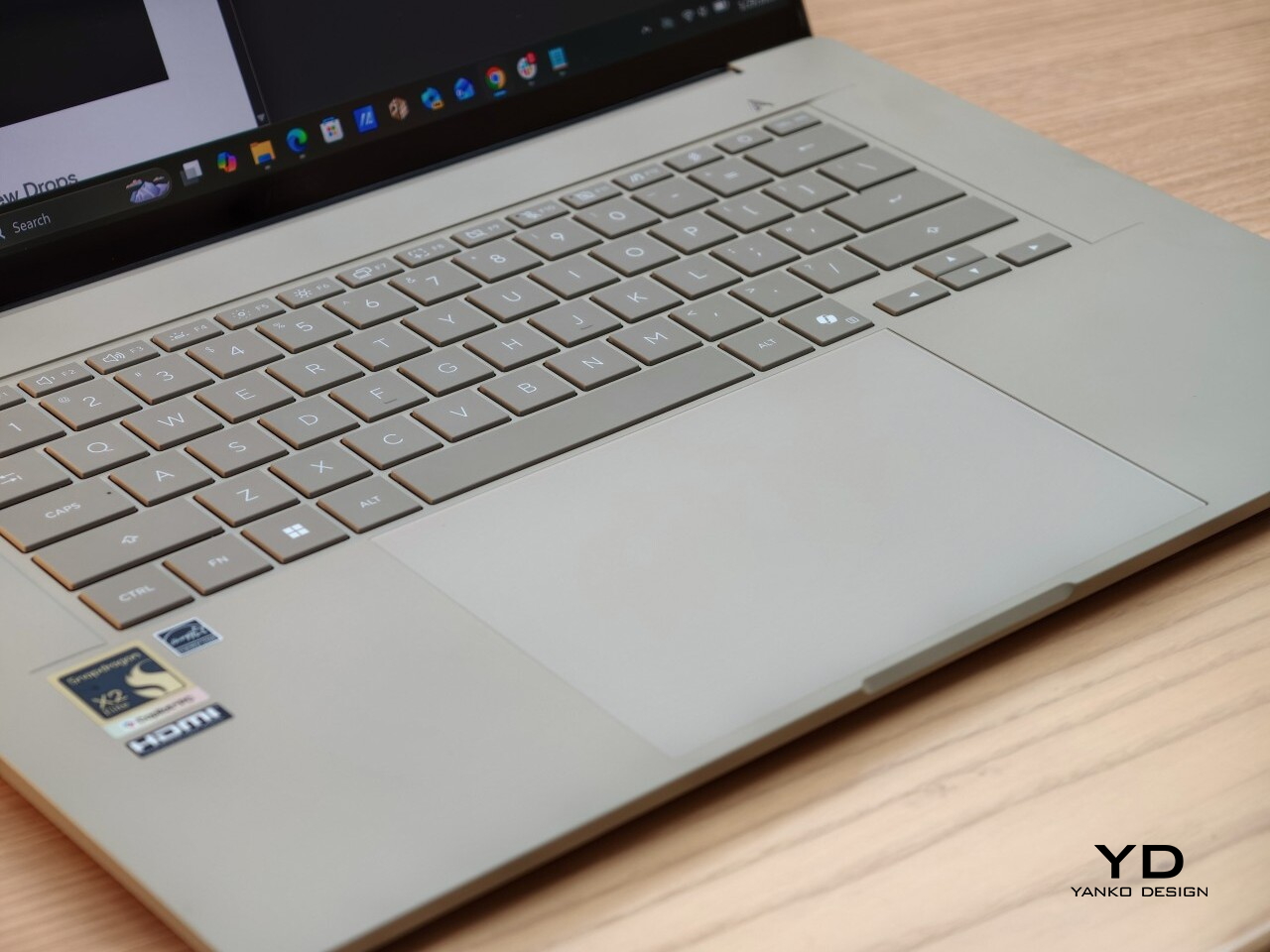
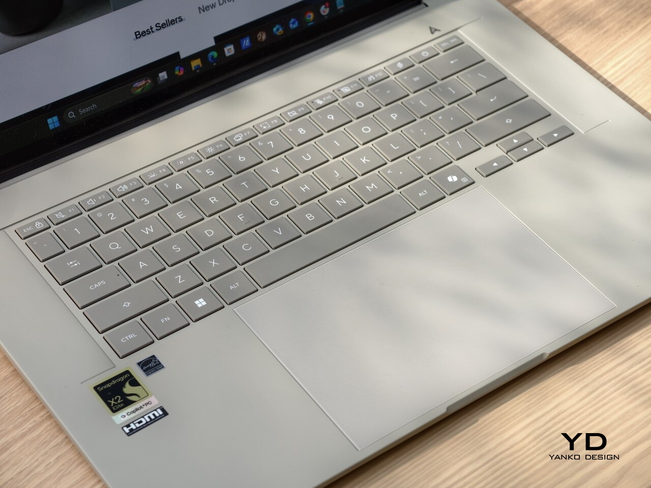
The details are subtle, but they give the laptop some character. A silver ASUS Zenbook logo sits centered on the lid, adding just enough contrast without disturbing the clean look. Open it up, and the full-sized backlit keyboard in a darker greige finish brings a bit of depth to the interior, while the stylized “A” above the right side of the keyboard adds a small touch of personality.

The color helps too. The review unit I received came in Zabriskie Beige, which was the only color option for this variant. It suits the Zenbook A16 especially well, giving it a softer and more distinctive look than the usual sea of silver laptops.

Ergonomics

What I liked most about the Zenbook A16 was how easy it was to live with. On paper, the dimensions and weight are impressive for a 16-inch laptop at 35.35 × 24.24 × 1.65 cm and around 1.3 kg (2.87lbs), but what stayed with me more was the overall feel of using it. It never felt awkward or demanding, which is not something I can say about every large laptop.

The lid is a good example of that. I could open it easily with one hand, and the hinge felt smooth and well-balanced. It is a small thing, but details like that shape your impression of a laptop very quickly. In this case, it made the Zenbook A16 feel immediately more comfortable and better resolved.

I also really liked the texture of the chassis. The Ceraluminum finish has a smooth, pebble-like texture that feels warm and pleasant under the hands. It helps the Zenbook A16 stand apart from the colder, more clinical feel that metal laptops often have. That tactile quality gives the laptop a more relaxed and welcoming character in everyday use.

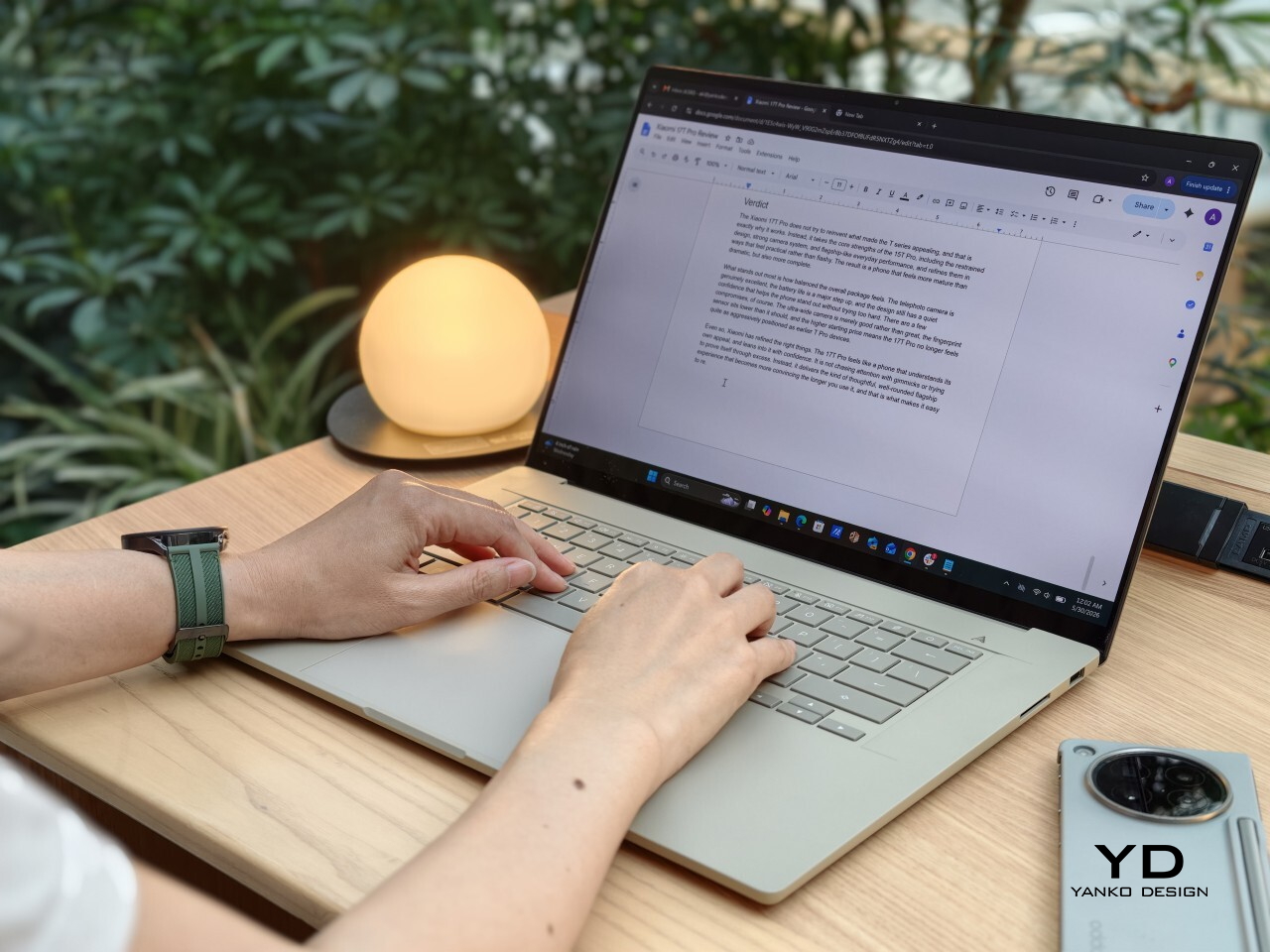
The keyboard was another highlight for me. The keys are very comfortable to type on, and that became more obvious the longer I used it. Whether I was writing, replying to emails, or working through longer stretches of text, it felt like a laptop that stayed out of the way in the best sense.

The touchpad is generously sized, which suits the scale of the laptop, but I did find that it needed a bit more force than I expected to click. It was not a major issue, and I got used to it, but it did stand out at first. On a laptop that otherwise feels so easy and light in use, that slightly firmer click felt a little less effortless than the rest of the experience.

This reads well already. If you want, I can do one very light polish pass to make it sound a touch more natural and less repetitive without changing your meaning. For example, I would probably trim phrases like “what stayed with me more” and “made a difference” just to make the rhythm feel a little cleaner.

Performance

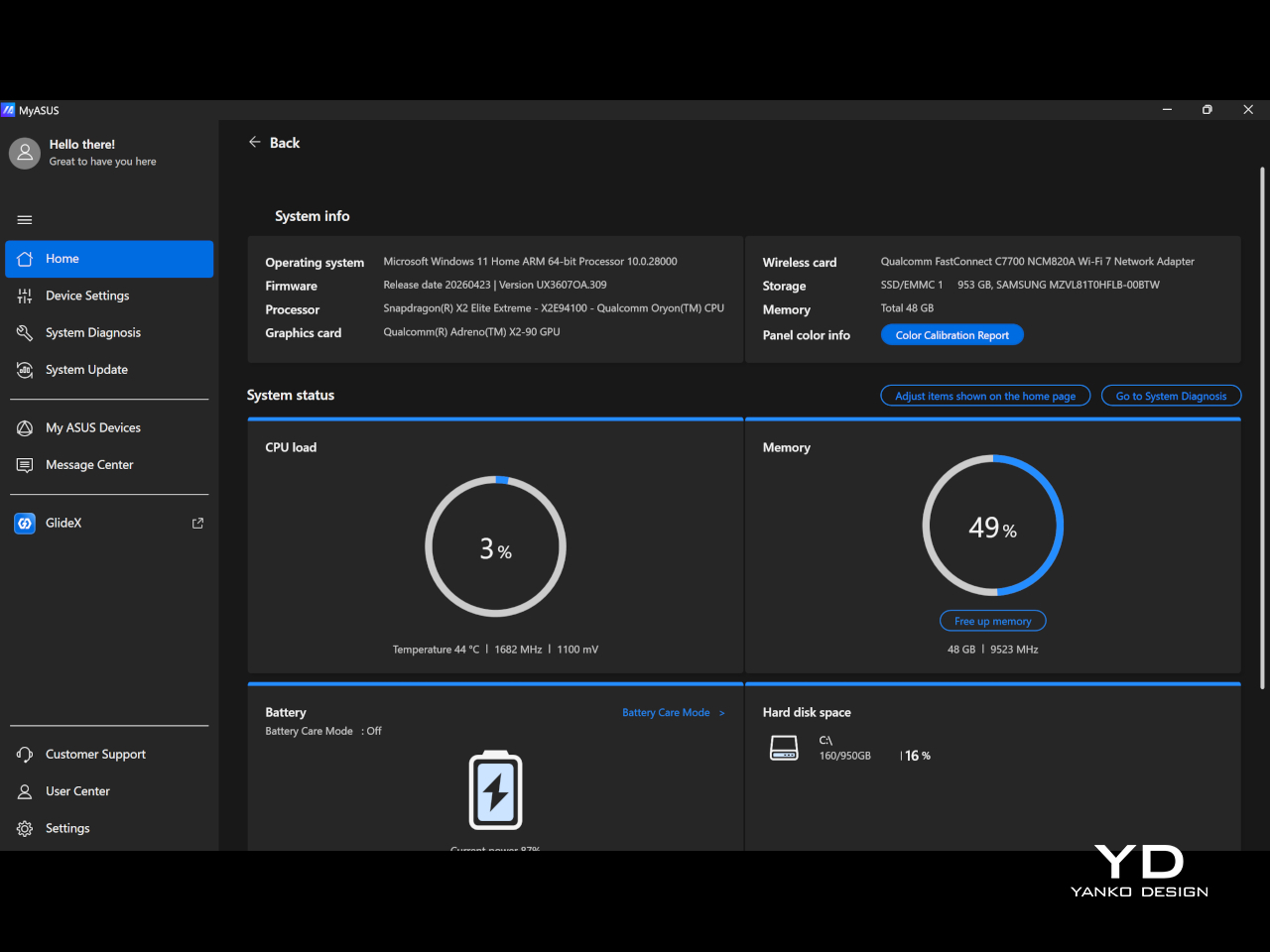
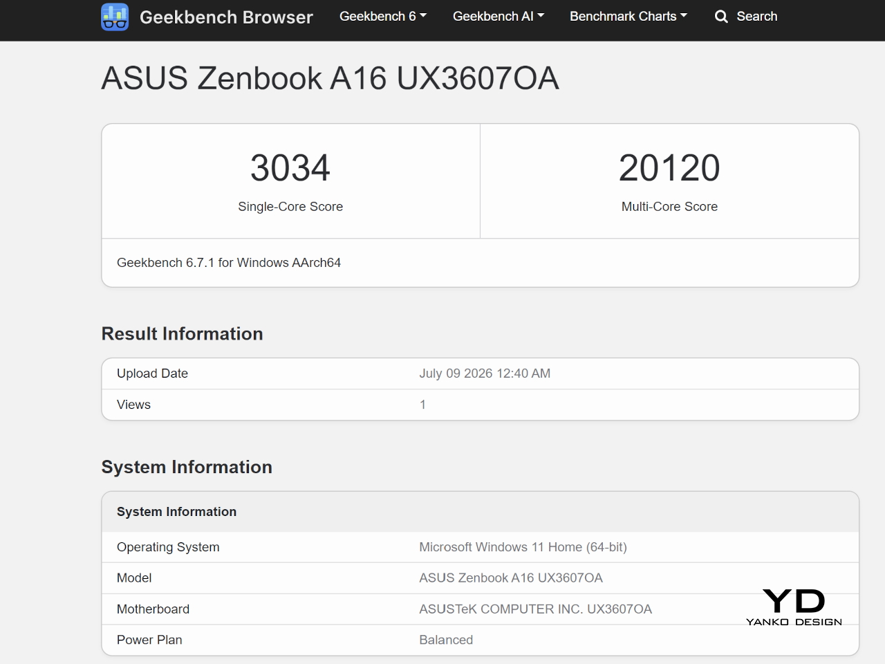
The review unit I received is the ASUS Zenbook A16 UX3607 with Qualcomm’s Snapdragon X2 Elite processor, paired with 48GB of RAM and 1TB of storage. That is a fairly premium configuration, and in everyday use, it felt quick, quiet, and consistently easy to rely on. It handled the usual multitasking of writing, research, email, an unruly number of browser tabs, streaming music, watching video, and light photo and video editing without ever feeling like it was running out of breath.

The Zenbook A16 (2026) runs Windows 11 and is part of the Copilot+ PC category. That places it firmly in Microsoft’s new AI PC push, though in daily use, the more noticeable benefit is still the machine’s general speed and efficiency. It feels modern and responsive in a very straightforward way, without constantly calling attention to the AI angle.

Although compatibility has clearly improved from Snapdragon X1 to X2, I still think it is something some buyers will worry about. Snapdragon X2 Elite gives the laptop much of its efficiency and responsiveness, but it also means this is still an ARM-based Windows machine. For general use, that was not a problem for me, but if your workflow depends on niche programs or you are into gaming, it is still worth checking that everything you need works properly before buying.

The display is one of the best parts of the Zenbook A16. The unit I tested comes with the touch-screen version of the 16-inch 3K OLED panel, and it gives the laptop a richness that you notice right away, whether you are working, streaming, or simply scrolling through photos. The 120 Hz refresh rate gives everything a welcome smoothness, while 500 nits of typical brightness, up to 1100 nits in HDR, 100% DCI-P3 coverage, and a 1,000,000:1 contrast ratio help the screen look vivid, punchy, and properly premium.

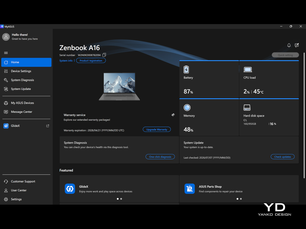
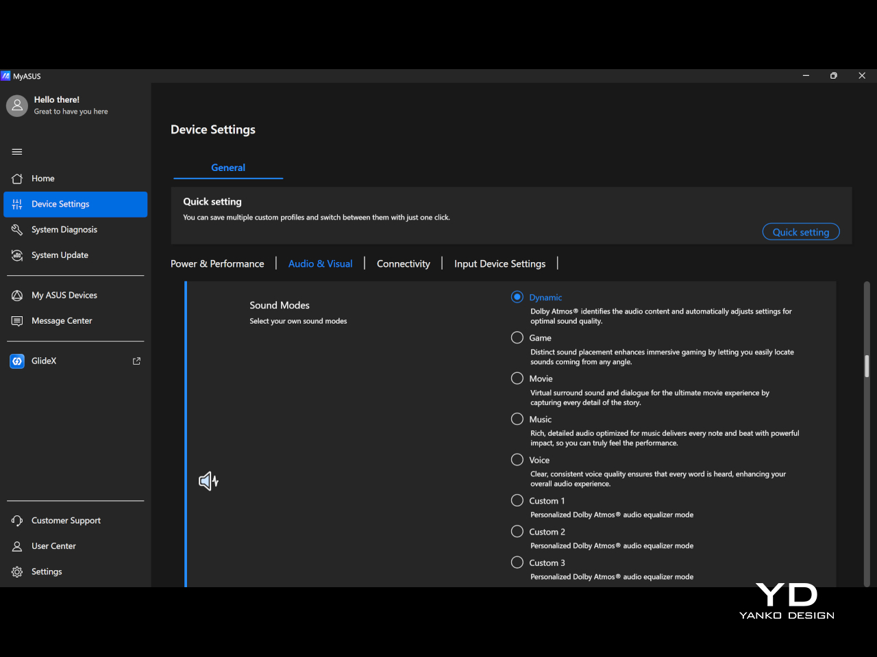
Audio is another pleasant surprise. The six-speaker array sounds full and clear, and Dolby Atmos support helps give movies, music, and even casual video watching a little more scale and dimension. I also liked that MyASUS lets you switch between sound modes like Dynamic, Game, Movie, Music, and Voice, or create up to three custom Dolby Atmos equalizer settings, which makes it easier to tune the sound to whatever you are doing.

Battery life was also a strong point for me. I kept the laptop in balanced mode, and it easily lasted a full workday with eight hours or more of continuous use, which made it easy to trust when I was out and about. The included 130W charger is fast and still easy enough to carry, so the overall setup remained travel-friendly.

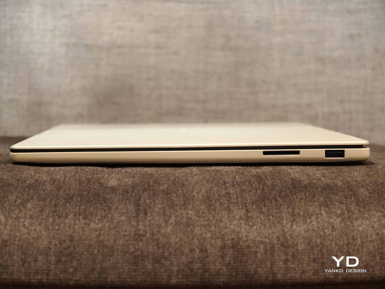
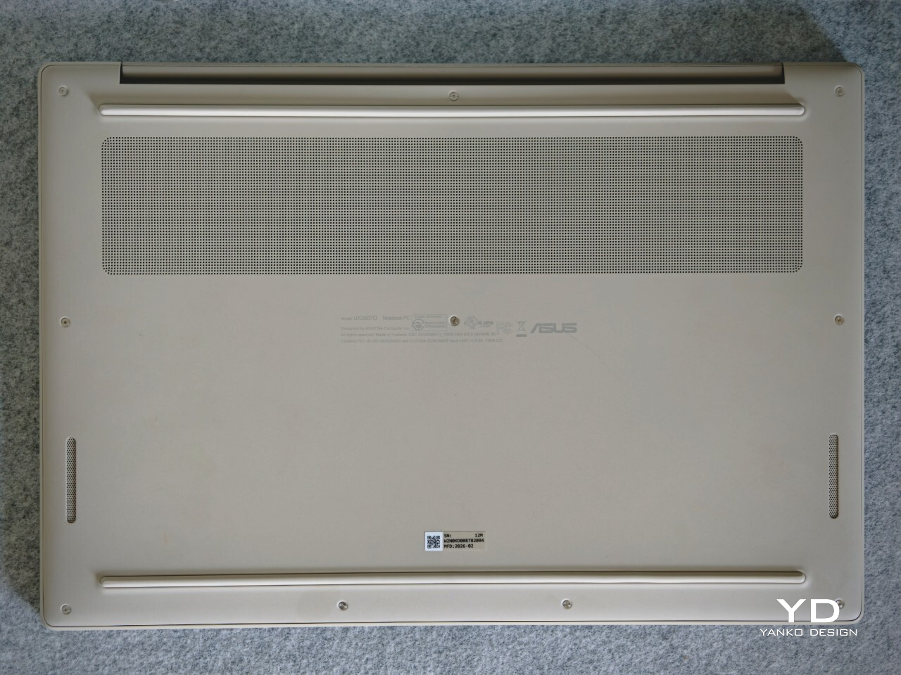
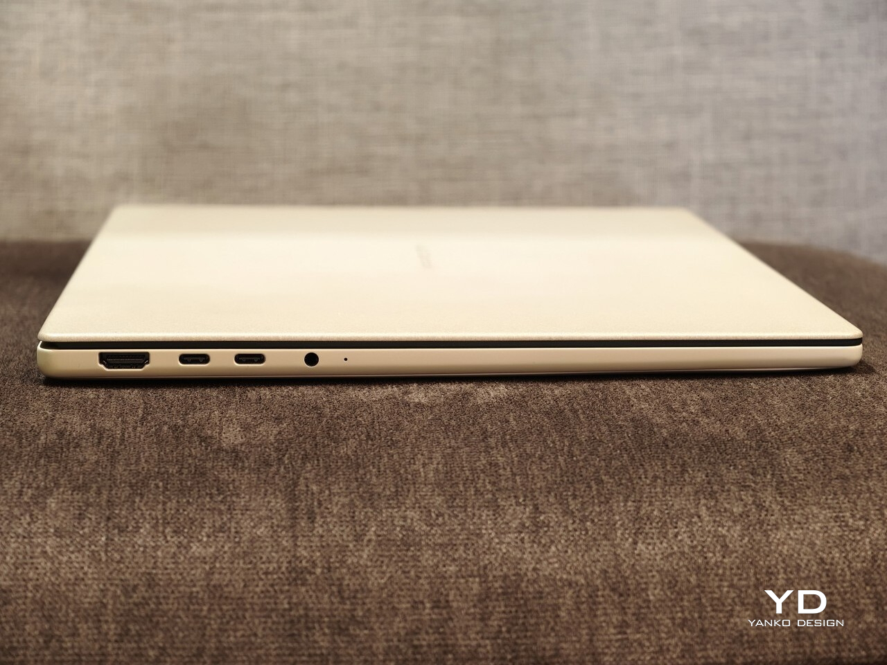
I also appreciated the port selection. ASUS includes two USB4 ports, a USB-A port, HDMI, a headphone jack, and an SD card slot, which makes the Zenbook A16 feel practical in a way many thin premium laptops no longer do. The SD card slot in particular is one of those small features that ends up being genuinely useful more often than you expect.

Sustainability

Sustainability is not the first thing the Zenbook A16 draws attention to, but it is part of the story. ASUS says its Ceraluminum material is made using pure water and electricity, without added organic compounds, strong acids, or heavy metals. That gives the finish a bit more substance than a purely cosmetic talking point.

There is also a more practical side to this. Battery replacements are doable, which is a plus, but the storage is not removable or serviceable. That makes the Zenbook A16 a somewhat mixed story on sustainability, with thoughtful material choices but limited repairability.

Value

The touch-screen version I tested is the Best Buy model, priced at $1,699.99. That puts the Zenbook A16 firmly in premium laptop territory, so it is not a machine that gets by on novelty alone. At this price, it needs to justify itself through the full experience, not just one or two standout specs.

I think it mostly does. You are getting a very light 16-inch laptop with a beautiful OLED display, strong battery life, a high-spec configuration, and a design that feels thoughtful in both look and feel. Still, $1,700 is enough money that buyers are right to think carefully about software compatibility and long-term flexibility before deciding it is the right fit.

Verdict

The Zenbook A16 ended up winning me over in a quiet way. It is not the kind of laptop that shouts for attention, but the longer I used it, the more I appreciated how thoughtfully it fits into everyday life. The light weight, the large and beautiful display, the warm feel of the Ceraluminum finish, and the overall ease of using it all added up to something that felt genuinely enjoyable.

What stayed with me most was how little friction there was to living with it. I liked being able to carry a 16-inch laptop without feeling weighed down, and I liked that it still felt polished and comfortable once I opened it up and got to work. The comfortable keyboard, strong battery life, good speakers, and practical port selection all helped make it feel like a machine designed by people who had actually thought about daily use.

It is not perfect, and I would still tell buyers to think carefully about software compatibility if they rely on niche programs or want a laptop for gaming. The firmer touchpad click also stood out on a machine that otherwise feels so easygoing. Even so, I came away with a lot of affection for the Zenbook A16, because it manages to feel both special and easy at the same time.

At $1,700, it is a serious purchase. But for someone who wants a premium laptop with a big OLED screen, long battery life, and a design that feels lighter and warmer than most, I think the Zenbook A16 makes a strong case for itself. It is one of those laptops that feels nicer the longer you live with it, and that may be its best quality.

The post ASUS Zenbook A16 (UX3607OA ) Review: Big screen, Surprisingly Light first appeared on Yanko Design.