This Pixel 11 Pro Concept Makes the Camera Bump Its Best Feature

The back of a smartphone has historically been the least interesting real estate on the device. A logo, some camera lenses, and a flat slab of glass or metal. Nothing phones started to change that conversation a few years ago by threading LED strips through their transparent backs to indicate calls, charges, and timers with light patterns. The question since then has been whether anyone else would take the idea further.

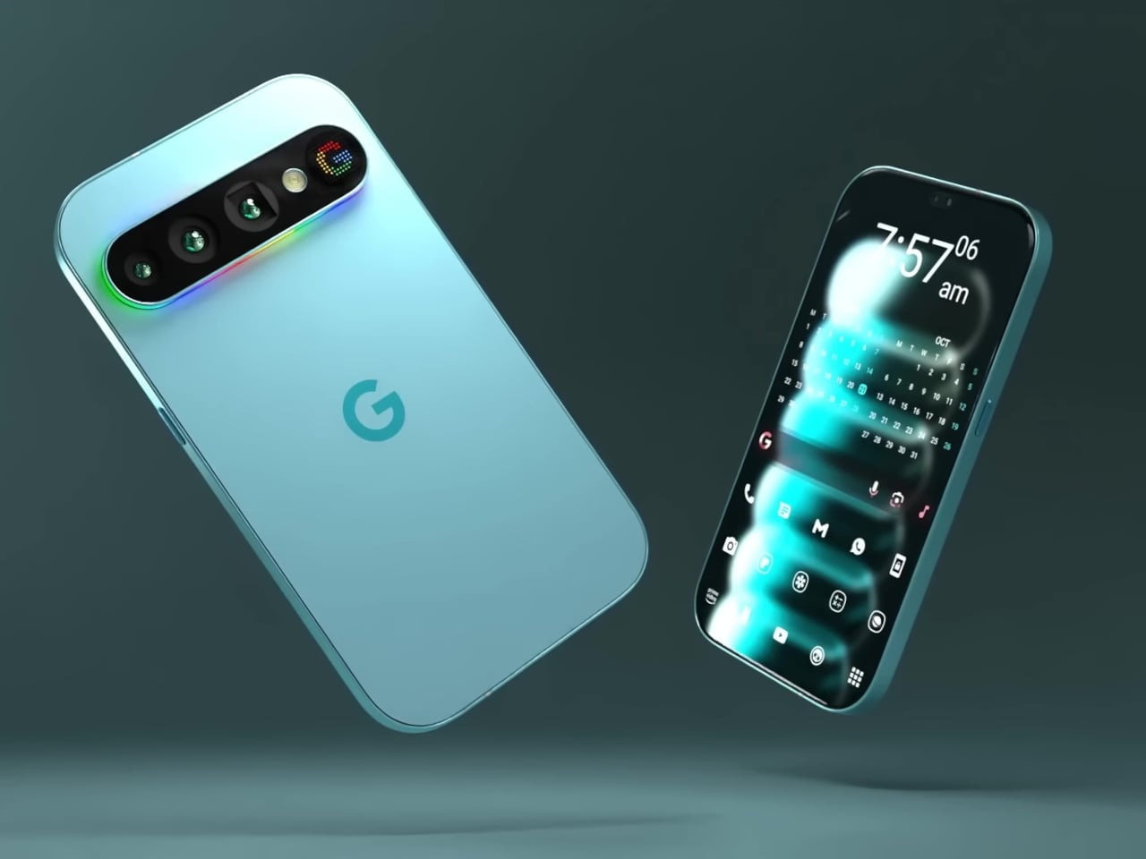
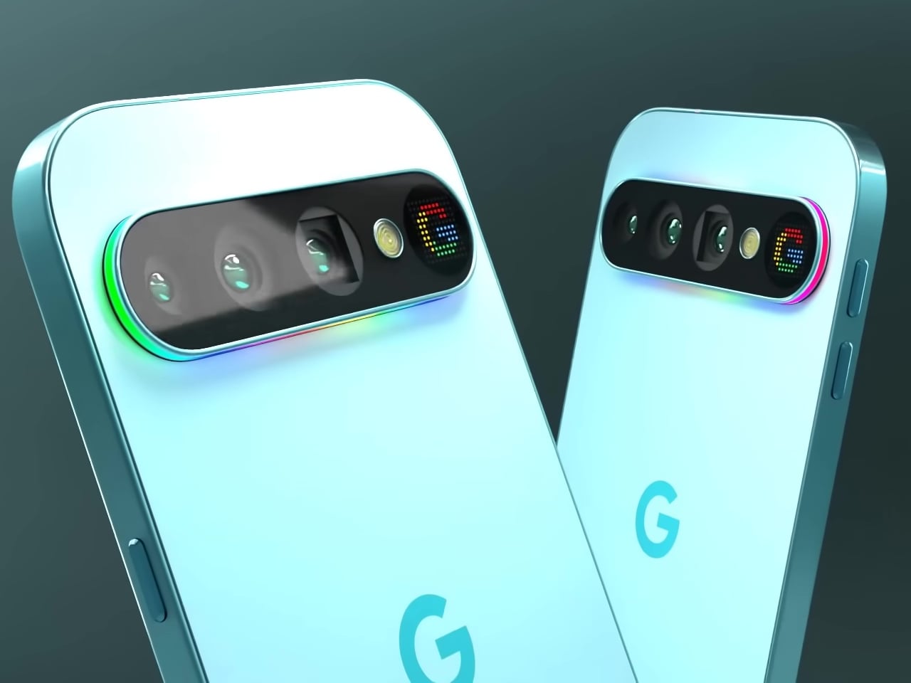
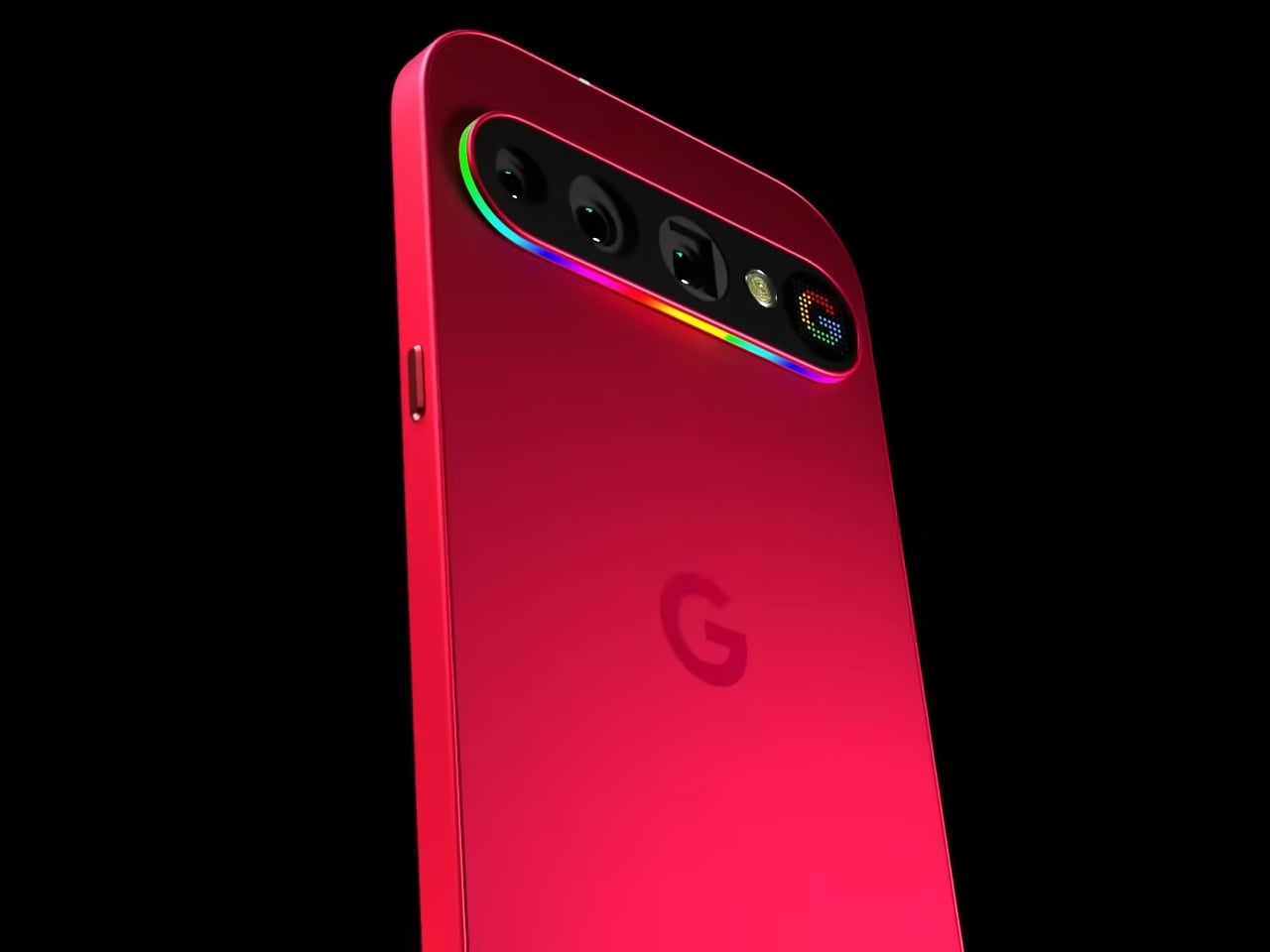
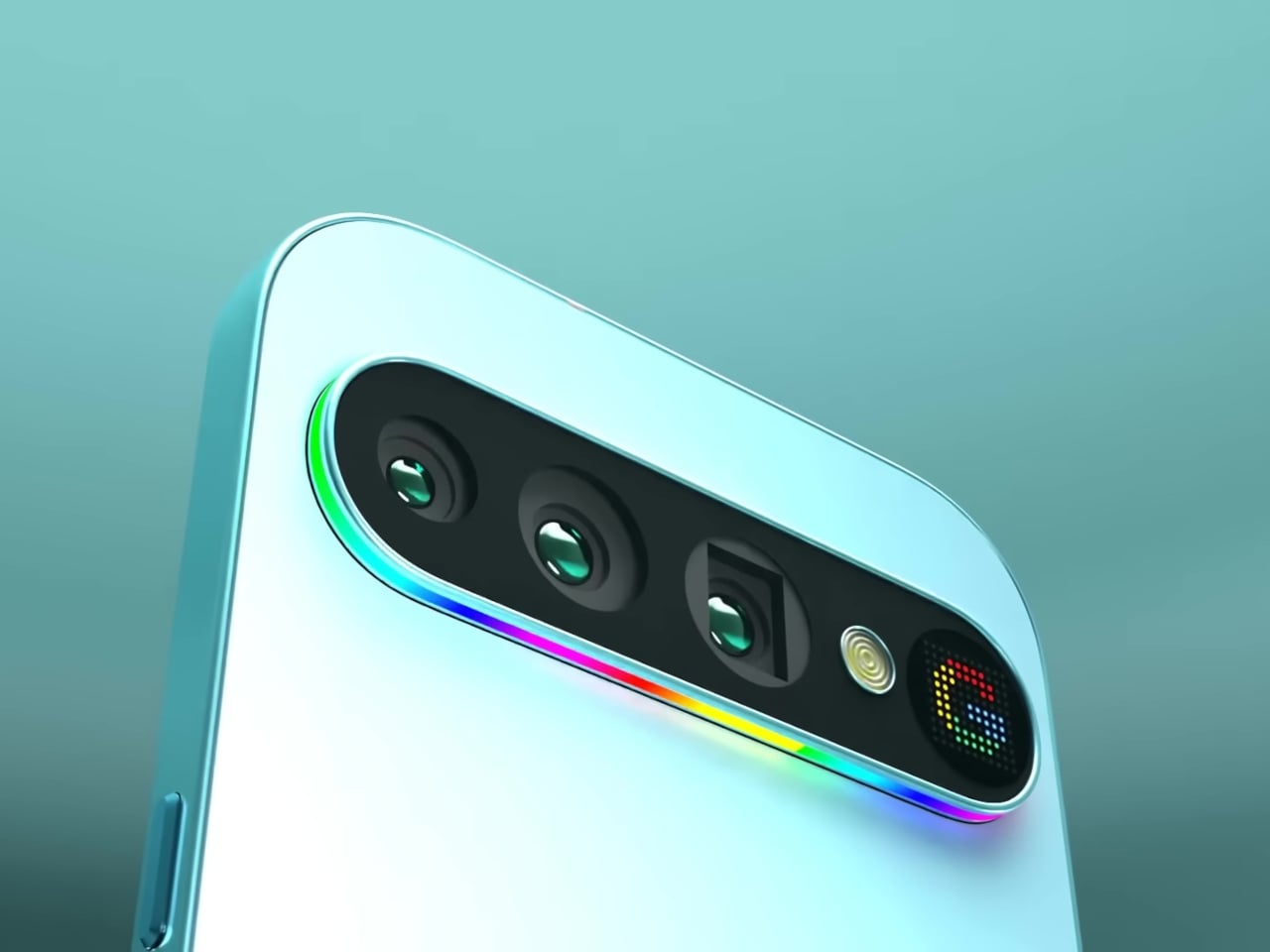
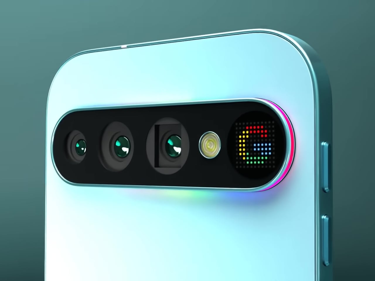
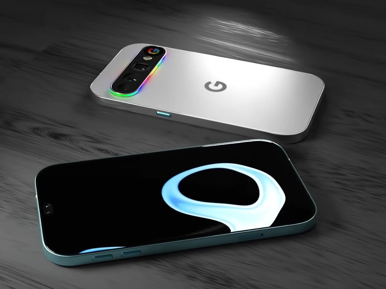
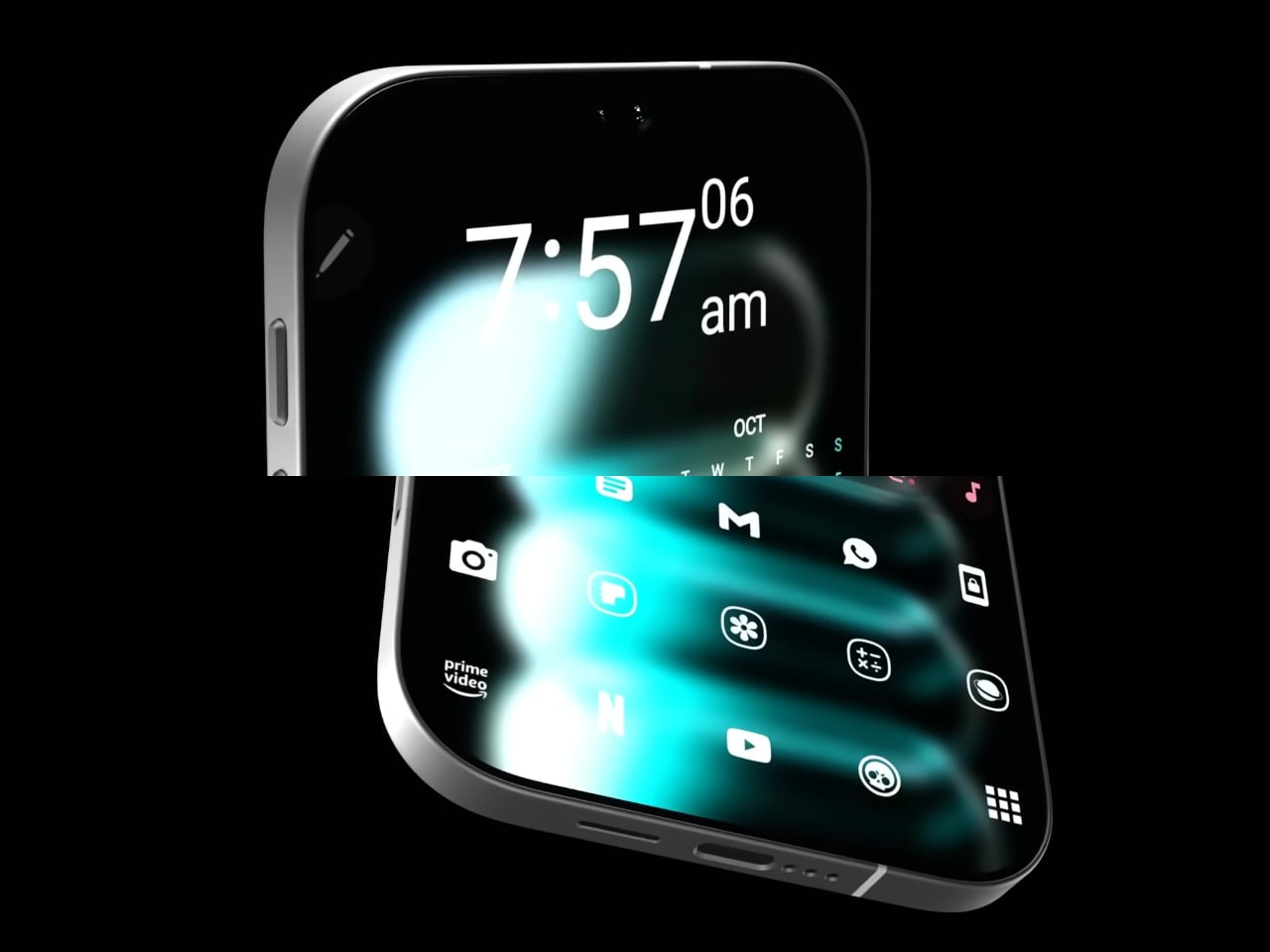
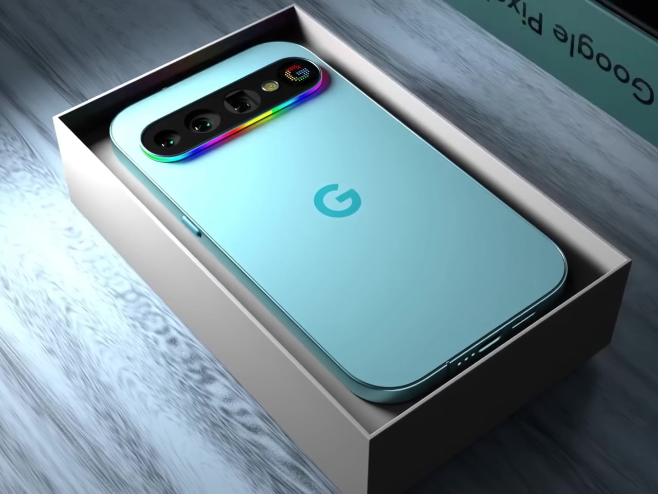
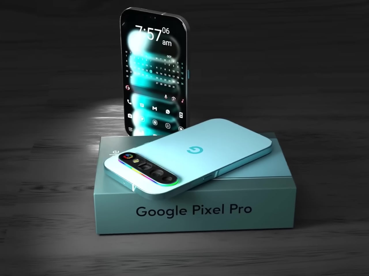
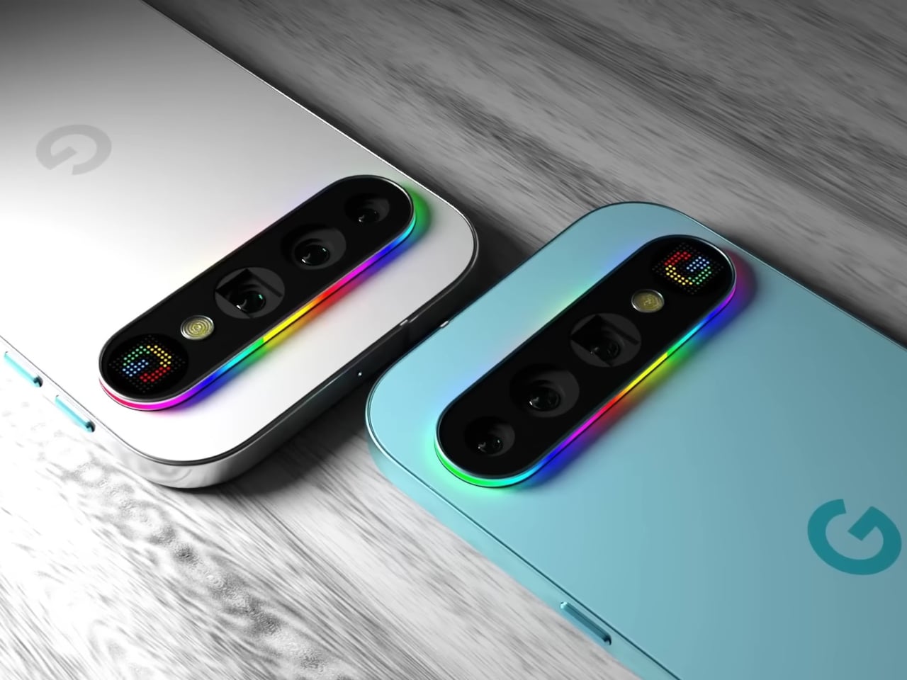
This concept for the Google Pixel 11 Pro imagines exactly that. Built around the Pixel’s signature horizontal pill-shaped camera module, it proposes two distinct types of back-panel feedback: a full-spectrum RGB light strip running around the entire perimeter of the camera bump, and a small dot-matrix display embedded at its right end that can render icons and text in pixel-art style.

Designer: AndroidLeo

The light strip is the more immediately readable of the two. A continuous loop of addressable LEDs traces the full outline of the pill module, capable of cycling through any color and pattern the software dictates. A missed call could glow one color, a new message another, and a timer nearing its end could pulse differently again, all communicable from across the room without touching the phone.

The dot-matrix panel, which the concept labels the “Pixel Display,” takes things a step further. Rather than a single color conveying a signal type, this small grid of colored LEDs can render simple graphics, caller ID icons, app logos, or even short scrolling text. It’s the difference between a traffic light and a small sign, and for a platform with as much software integration as Google’s, the implications are hard to ignore.

There’s an obvious precedent in Nothing’s Glyph Matrix, which brought a similar dot-matrix concept to Phone (3). That system already lets users assign custom animations to specific contacts and apps, turning the back of the phone into a secondary notification surface. What this Pixel concept adds is the light strip as a companion layer, the two systems working together rather than choosing between ambient mood and readable icon.

The practical case for this kind of design doesn’t require much imagination. Leave your phone face down on a table, and you will lose all notification awareness. Flip it over, and you get the full attention-grabbing brightness of the main display. A customizable light strip and a small icon panel would let the phone communicate at a much lower intensity, at a glance, rather than a full distraction.

The concept renders the phone in both a pale aqua colorway and Parchment white, giving the full-spectrum strip a different quality in each: cool and vivid against the teal, soft and almost art deco against the white. Either way, the camera bump, typically the most criticized part of Pixel’s evolving design language, becomes something that actually earns its presence.

This is, of course, a fan concept rather than a leaked render or confirmed direction. The real Pixel 11 Pro hasn’t arrived yet, and nothing official confirms either the Pixel Display or the RGB strip. But the appetite for this kind of back-panel intelligence is clearly there, and if Nothing can build a devoted following around light strips alone, the version with two complementary systems and Google’s ecosystem behind it would be something worth watching for.

The post This Pixel 11 Pro Concept Makes the Camera Bump Its Best Feature first appeared on Yanko Design.

Bug Saber Turned Lightsaber Fantasy Into a 4,000V Bug Zapper

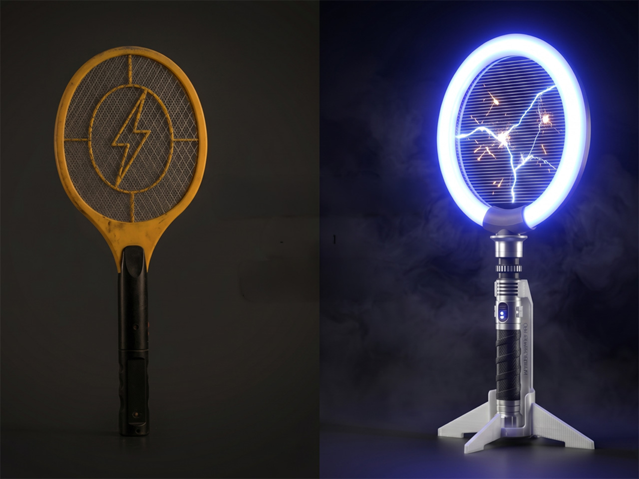
Bug zappers haven’t had a design moment yet. They’ve existed in more or less the same form for decades, somewhere between forgettable and mildly unpleasant to look at. Most of them get tucked into corners or mounted out of sight, which is exactly where most people prefer them. They do the job, roughly speaking, but nobody’s ever been genuinely excited to reach for one.

Brightbeam Solutions seems to have taken that as a challenge. Bug Saber is the brand’s attempt at rethinking what a bug zapper can feel like, not just what it can do. The concept is simple enough: take pest control, which has always been a thankless task, and design it to be something you’d actually want to pick up. Nobody in the category had really tried.

Designer: Jonathan Barraclough

Click Here to Buy Now: $24. Hurry, only a few left!

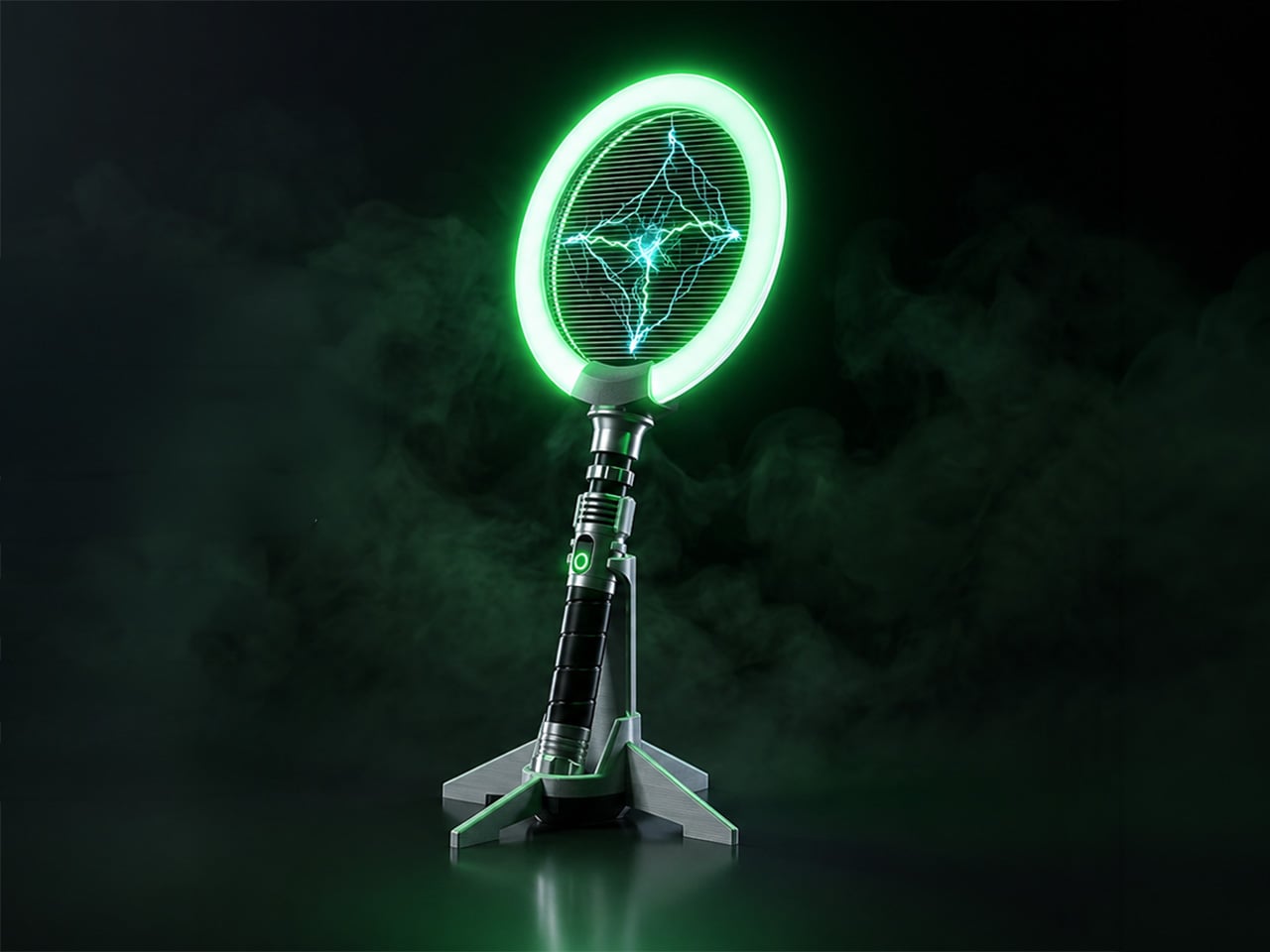
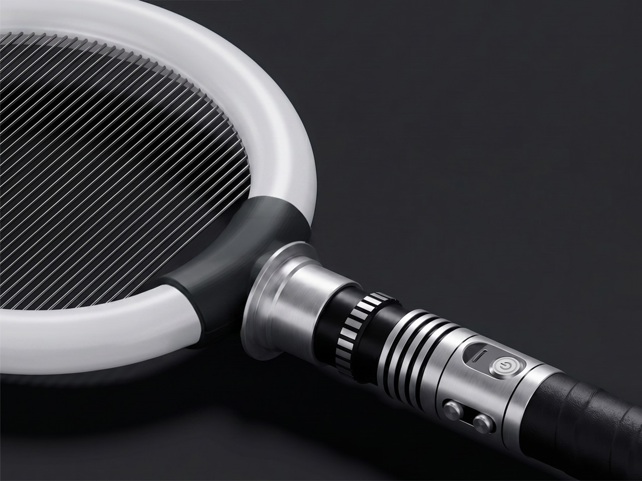
The design makes that clear immediately. Bug Saber is built around a high-voltage zapping grid framed by a glowing LED ring, mounted on a lightsaber-style hilt with a distinctly mechanical character. It doesn’t look like anything from a hardware store, and that’s entirely the point. The aesthetic borrows from sci-fi gadget culture rather than home appliance conventions, and it’s surprisingly hard to ignore when it’s nearby.

Switch it on, and everything shifts. The LED ring glows, saber-style sound effects kick in, and insects are naturally drawn toward the light. When one gets close enough, the 4,000V high-voltage grid takes care of it instantly, with no waiting and no cleanup. The entire sequence takes only seconds, and the combination of light, sound, and immediate result makes each instance feel surprisingly satisfying.

That satisfaction makes sense in practice. Picture a summer evening on the back porch, a fly that’s made itself at home, and the usual frustration of swatting blindly at the air. With Bug Saber in hand, you’re in control rather than reacting. The act feels deliberate in a way that pest control rarely does, which is a strange thing to say and yet completely accurate.

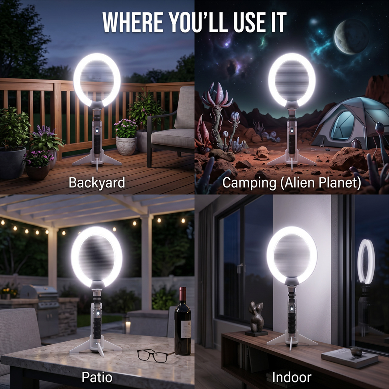
Not every situation calls for hands-on use, though. Bug Saber can sit on its vertical stand with the illuminated ring running on its own, drawing in insects without you having to do anything. This works especially well at night, when flying pests are most active, and you’d rather not be involved. It handles things quietly in the background, whether you’re inside or out on the patio.

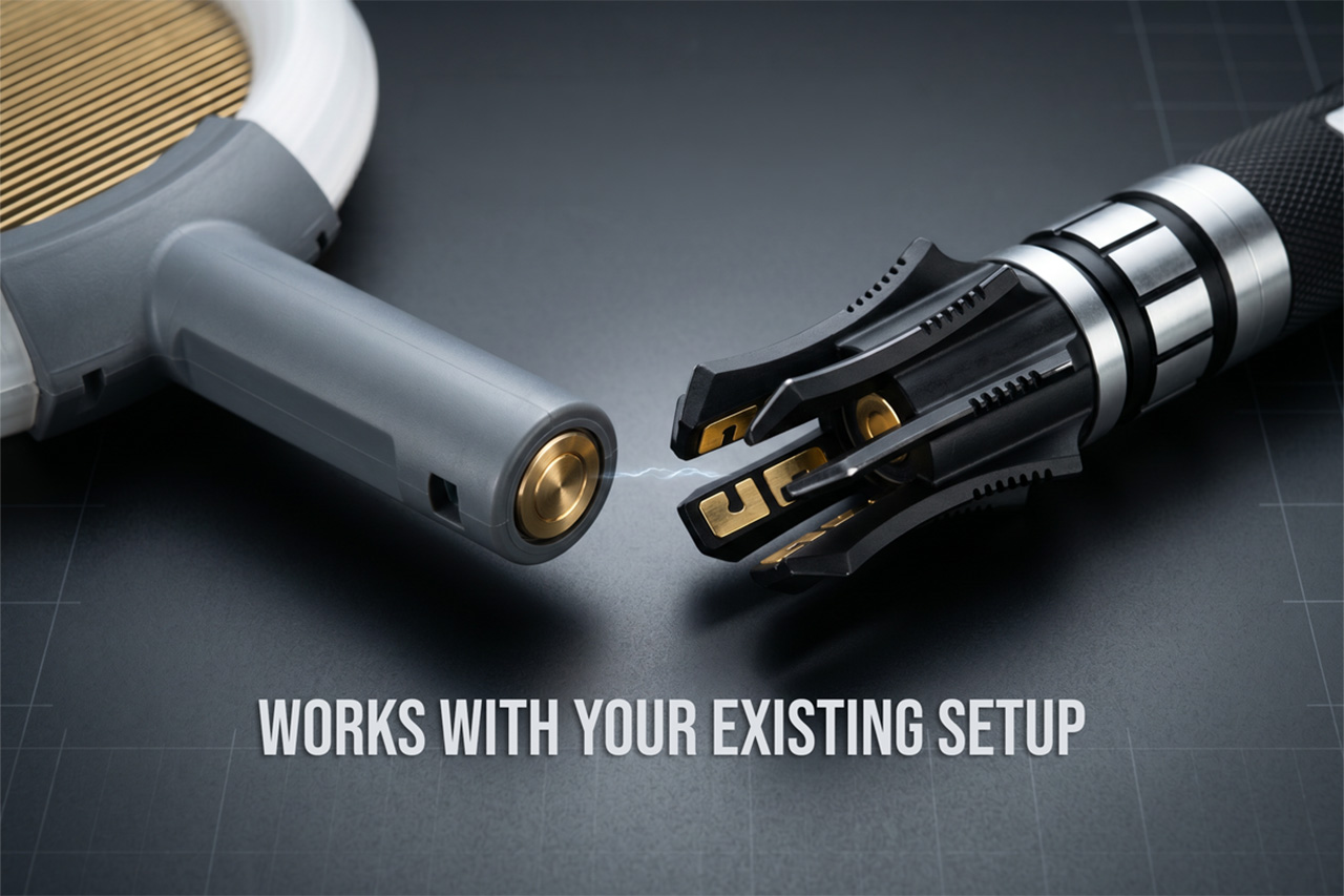
Bug Saber is built around three core components: the Bug Saber Head, which houses the ring and zapping grid; an entry-level hilt for those starting fresh; and the vertical stand. People who already own a compatible saber-style hilt, the kind used in cosplay or collecting communities, can swap in the head directly, converting their existing setup into a functional bug-control device without needing anything else.

What makes Bug Saber work so well is how the experience reinforces itself over time. The glow, the sound, and the instant result work together to create something that feels rewarding rather than routine. You pick it up the first time because there’s a fly in the room. The second time, you reach for it a little more quickly than strictly necessary.

There’s a broader shift in product design, one where objects that used to be purely functional are being reconsidered as things worth looking at. Routers, speakers, and kitchen appliances have all gone through some version of this. Bug Saber brings that same sensibility to a category that’s rarely had it, which on paper sounds like a stretch and in practice feels entirely overdue.

The strangest thing about Bug Saber might also be the most telling. A bug zapper with a sci-fi hilt, a glowing LED ring, and sound effects that respond to movement really shouldn’t feel like a natural addition to a patio or living room shelf, and yet here we are, genuinely glad that someone decided this particular category was finally worth a proper redesign.

Click Here to Buy Now: $24. Hurry, only a few left!

The post Bug Saber Turned Lightsaber Fantasy Into a 4,000V Bug Zapper first appeared on Yanko Design.

Bigme Finally Made an E Ink Phone Without the Usual Trade-Off

E Ink phones have built a devoted following among people who’ve grown tired of the toll a conventional smartphone screen takes on their eyes. The technology’s reflective nature means less eye strain over long sessions, better outdoor readability, and dramatically lower battery drain. The problem has always been what happens when you need your phone for something that an E Ink display simply can’t handle well.

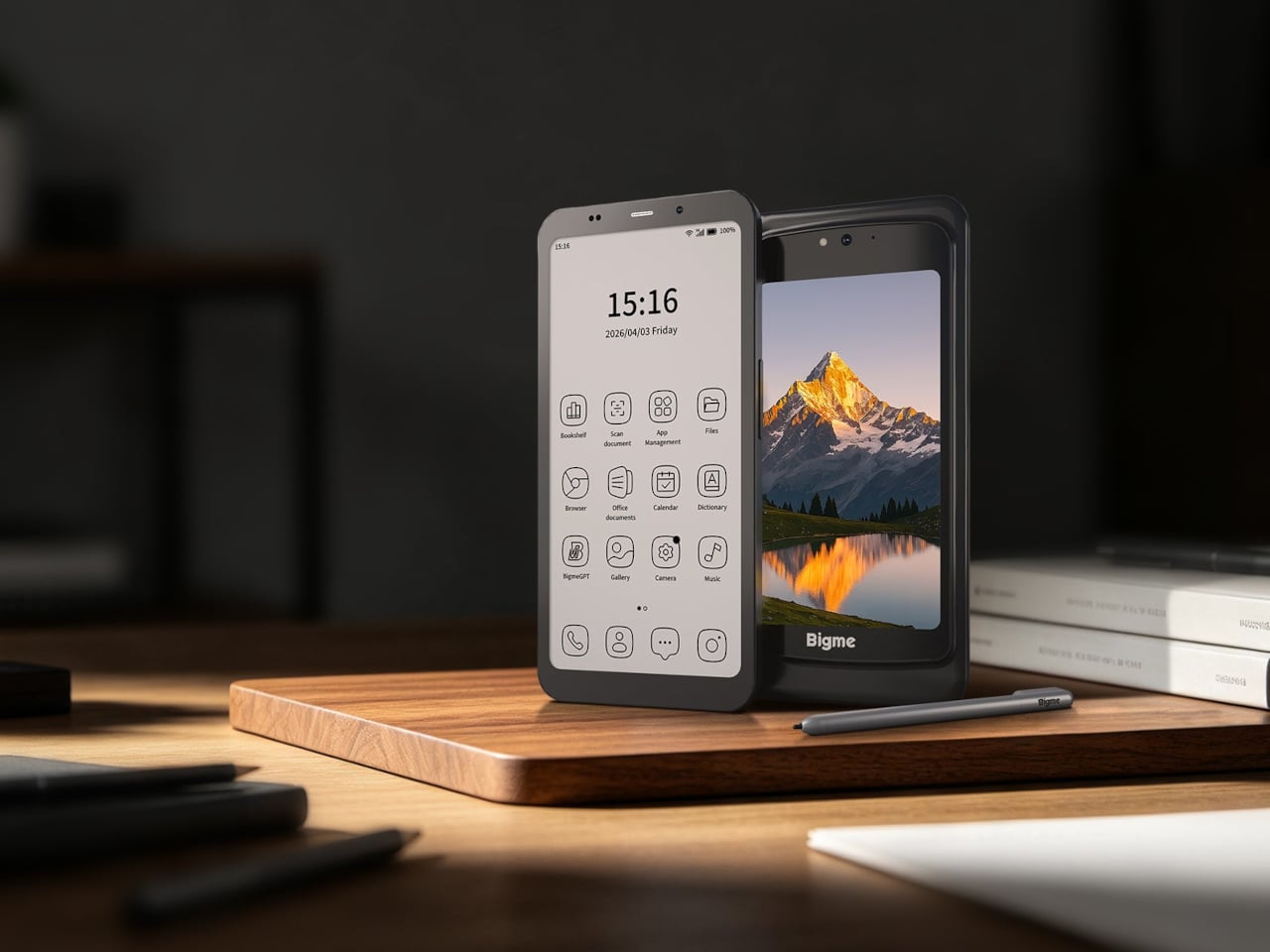
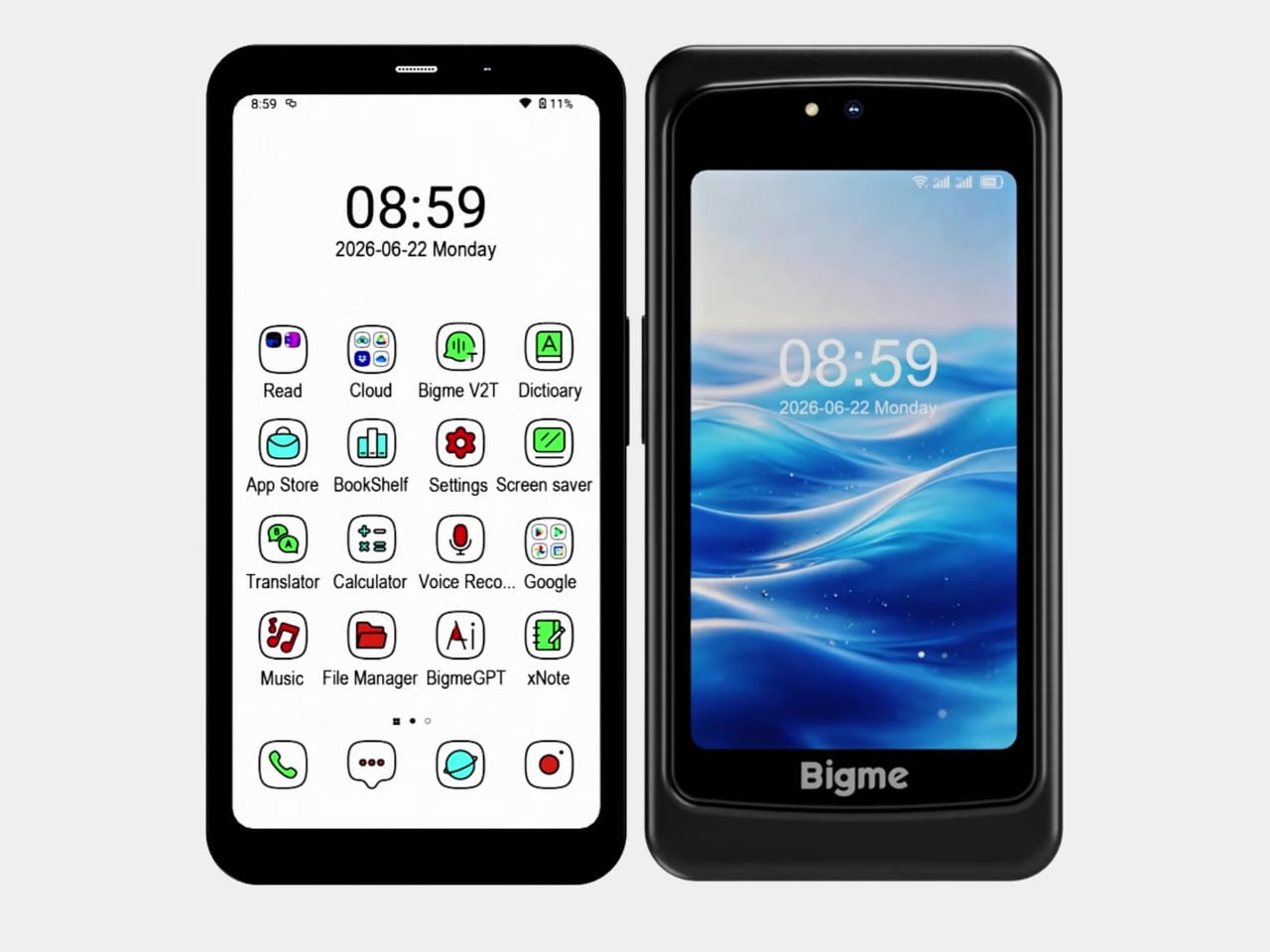
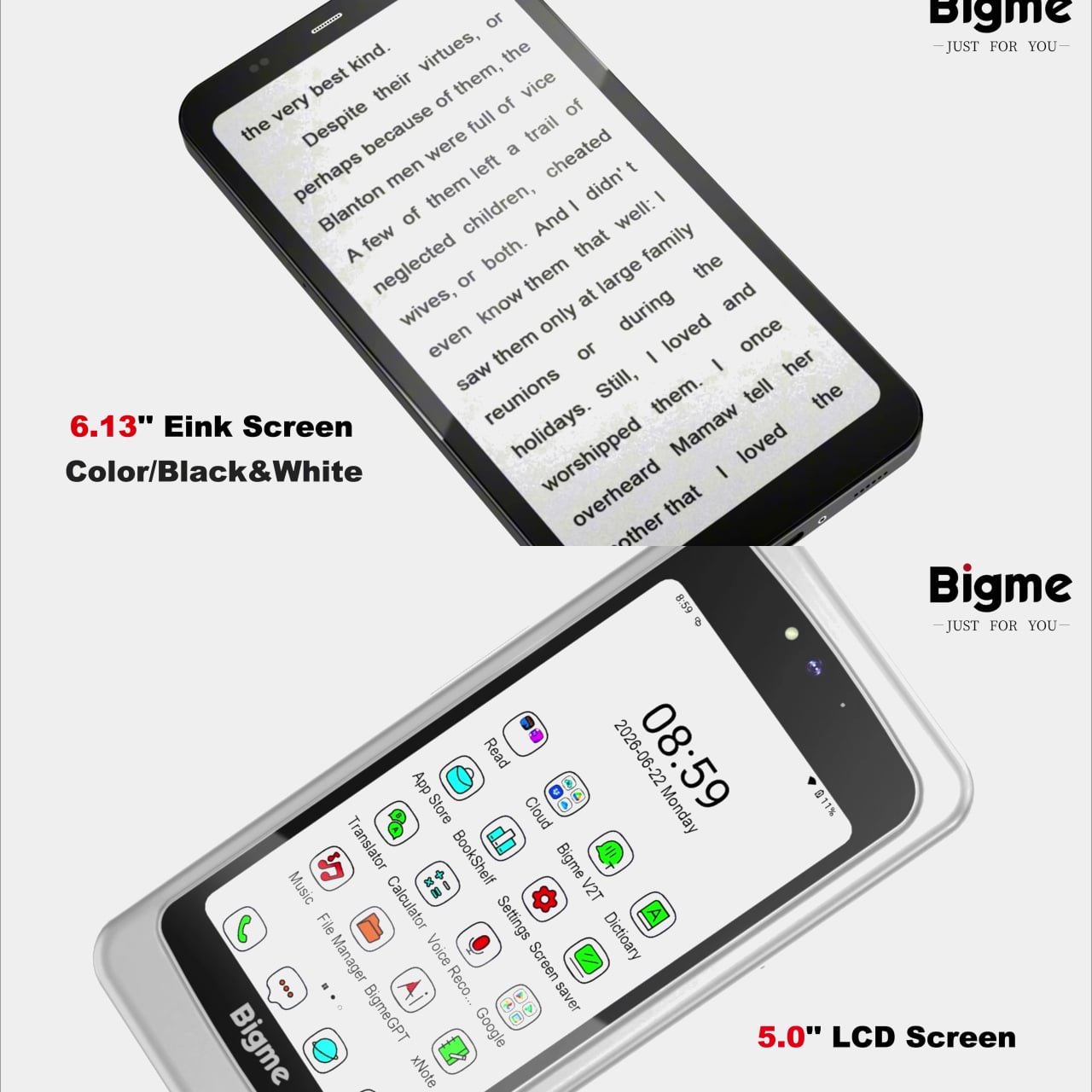
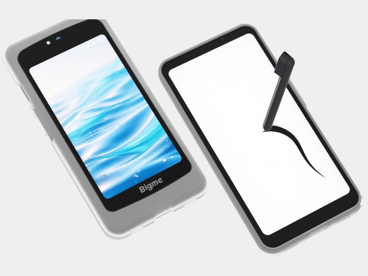
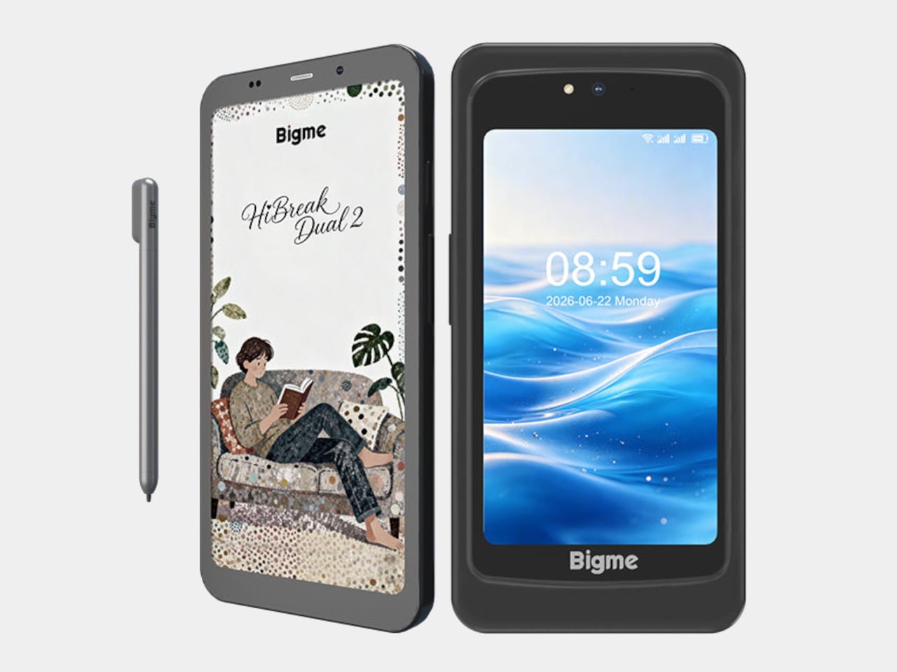
Watching a video, navigating an unfamiliar city, or glancing at a notification with any urgency are all tasks that remind E Ink phone owners of what they gave up. The Bigme HiBreak Dual 2 takes a different approach to this trade-off by not asking you to make it at all. It carries both a 6.13-inch color E Ink display and a 5-inch LCD in the same device.

Designer: Bigme

The E Ink side refreshes at up to 80 frames per second, considerably faster than earlier E Ink phones, and addresses the ghosting and sluggishness that made scrolling a timeline or navigating menus feel like wading through mud. The display supports both color and black-and-white content, and stays readable under direct sunlight without the glare that makes most LCD and OLED screens unusable outdoors.

The 5-inch LCD handles the tasks that E Ink screens aren’t built for. A video call, a color-accurate map, a quick stream of something while you’re waiting; these situations don’t work well on E Ink, and the Dual 2 doesn’t pretend otherwise. Flip the phone, and the LCD takes over without sacrificing the primary display that makes reading and messaging so much easier on the eyes.

What makes the Dual 2 a real step forward from its predecessor is the size of that LCD. The original HiBreak Dual had a token sub-screen, small enough to overlook and hard to take seriously as a second display. At 5 inches, the Dual 2’s LCD is actually large enough to be useful, bringing both displays into rough parity rather than a clear main-and-minor arrangement.

The stylus support adds another layer that typical smartphones don’t offer. A dedicated note-taking app with pressure sensitivity and variable pen thickness lets you annotate directly on the E Ink screen with familiar paper-like resistance. For anyone who prefers handwritten notes over typed ones, or who marks up documents throughout the day, this combination of a large E Ink screen and stylus input is the entire value.

The hardware isn’t a compromise, either. A MediaTek Dimensity 8300 processor, 12GB of RAM, 256GB of storage, a 50MP rear camera, and Android 16 with Google Play already installed make it a fully capable phone rather than a reading device that also makes calls. Dual 5G SIM support and NFC round out a spec sheet that doesn’t ask the buyer to excuse anything on the technical side.

The Bigme HiBreak Dual 2 has a super early bird pricing starting at $574 for the black-and-white E Ink configuration and around $699 for the color version. That’s the going rate for a phone that takes eye comfort seriously enough to build an entirely separate display around it, and supplies enough everyday capability alongside to not feel like a specialist tool with a serious drawback.

The post Bigme Finally Made an E Ink Phone Without the Usual Trade-Off first appeared on Yanko Design.

Beatbot’s AquaSense X Proves the Best Technology Goes Unnoticed

Smart home products have a funny habit of promising to simplify your life while quietly adding to your list of things to manage. Pool cleaning robots are a sharp example. They roam the floor, collect debris, and surface when finished, but someone still has to rinse the filter, empty the basket, and reset the machine before the next cycle. The automation, it seems, doesn’t quite finish what it starts.

Beatbot seems to have noticed this gap and designed AquaSense X around a different question altogether. Rather than asking how to make pool cleaning more autonomous, it asks how to make the whole experience, cleaning and cleanup both, feel like it barely happened. That sounds like a marketing promise until you start looking at how the system actually works, at which point it becomes something closer to a design thesis.

Designer: Beatbot

Click Here to Buy Now: $3999 $4250 ($251 off). Hurry, deal ends in 48-hours!

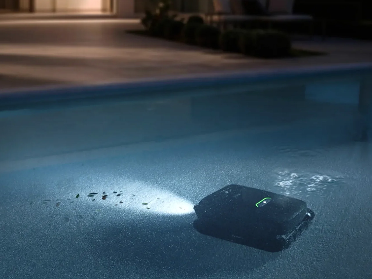
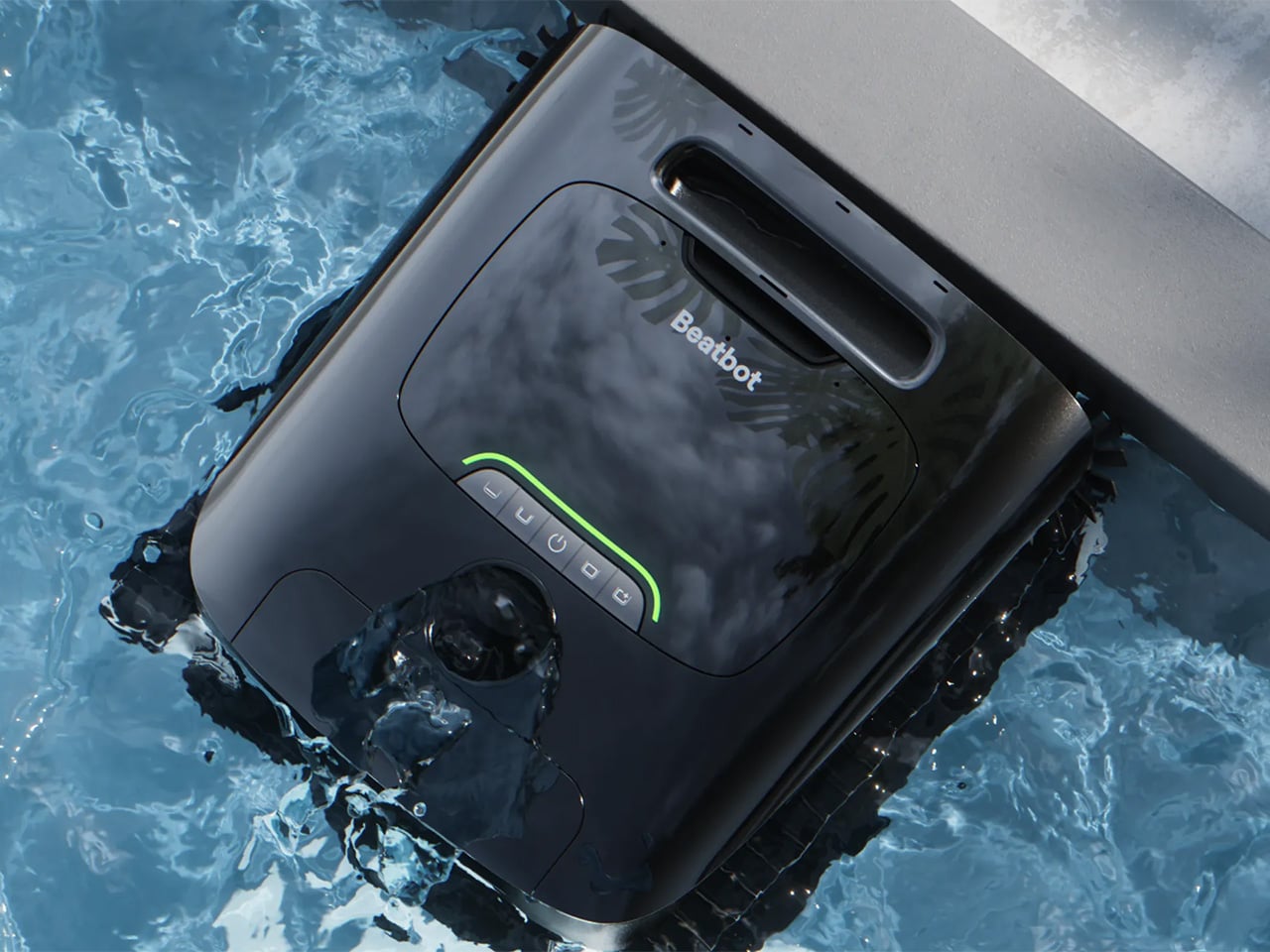
AquaSense X isn’t sold as a single robot but as an ecosystem, and that distinction matters. The system pairs the AI robotic pool cleaner with the AstroRinse cleaning station, and the pairing is the point. The robot cleans the pool. The station cleans the robot. That self-sustaining cycle sets AquaSense X apart from every other autonomous pool cleaner on the market, which still leaves the messy part to you.

After each cleaning cycle, docking the robot is all that’s required. Once it’s seated in the station, a high-pressure rotating nozzle enters the filter basket, backflushes the trapped debris, and transfers everything directly into the station’s sealed bin. The filter basket opens from the bottom to make sure nothing gets left behind. The whole process takes about three minutes, and you don’t touch a thing.

When the filter is clean, charging starts automatically, and the robot is ready for its next run without any intervention from you. The station’s debris bin holds 22 liters, which under typical conditions translates to roughly two months of operation before it needs emptying. That’s not a small number. It means pool maintenance stops being something on your weekly checklist and becomes something you handle a few times a season.

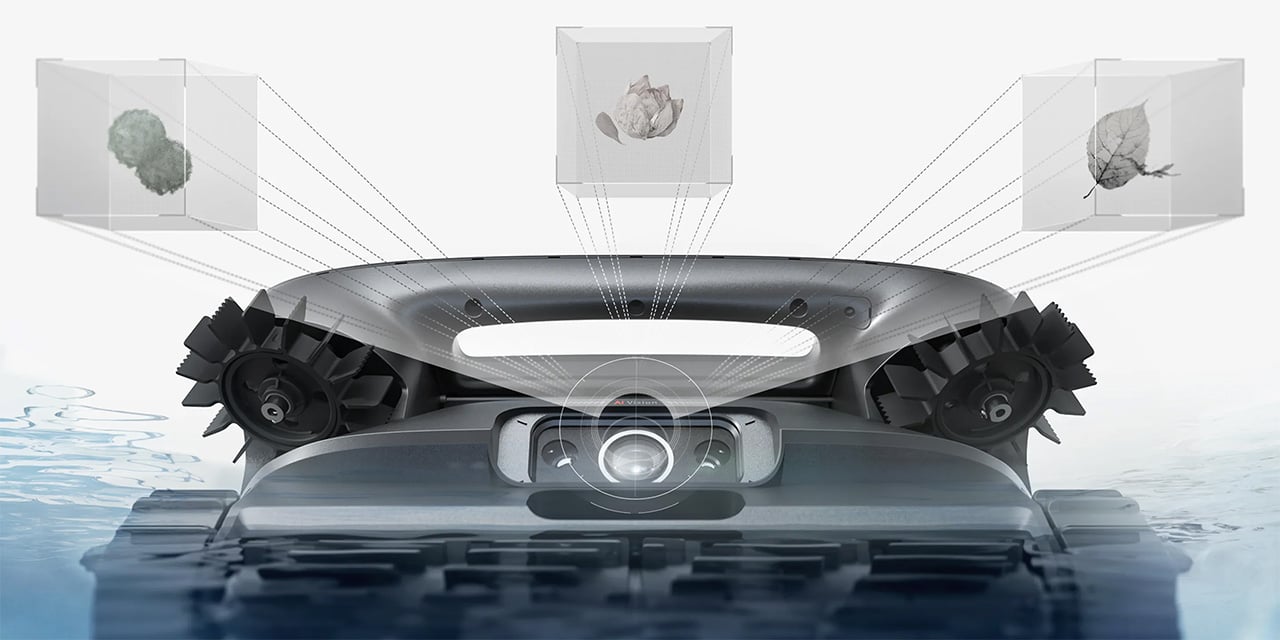
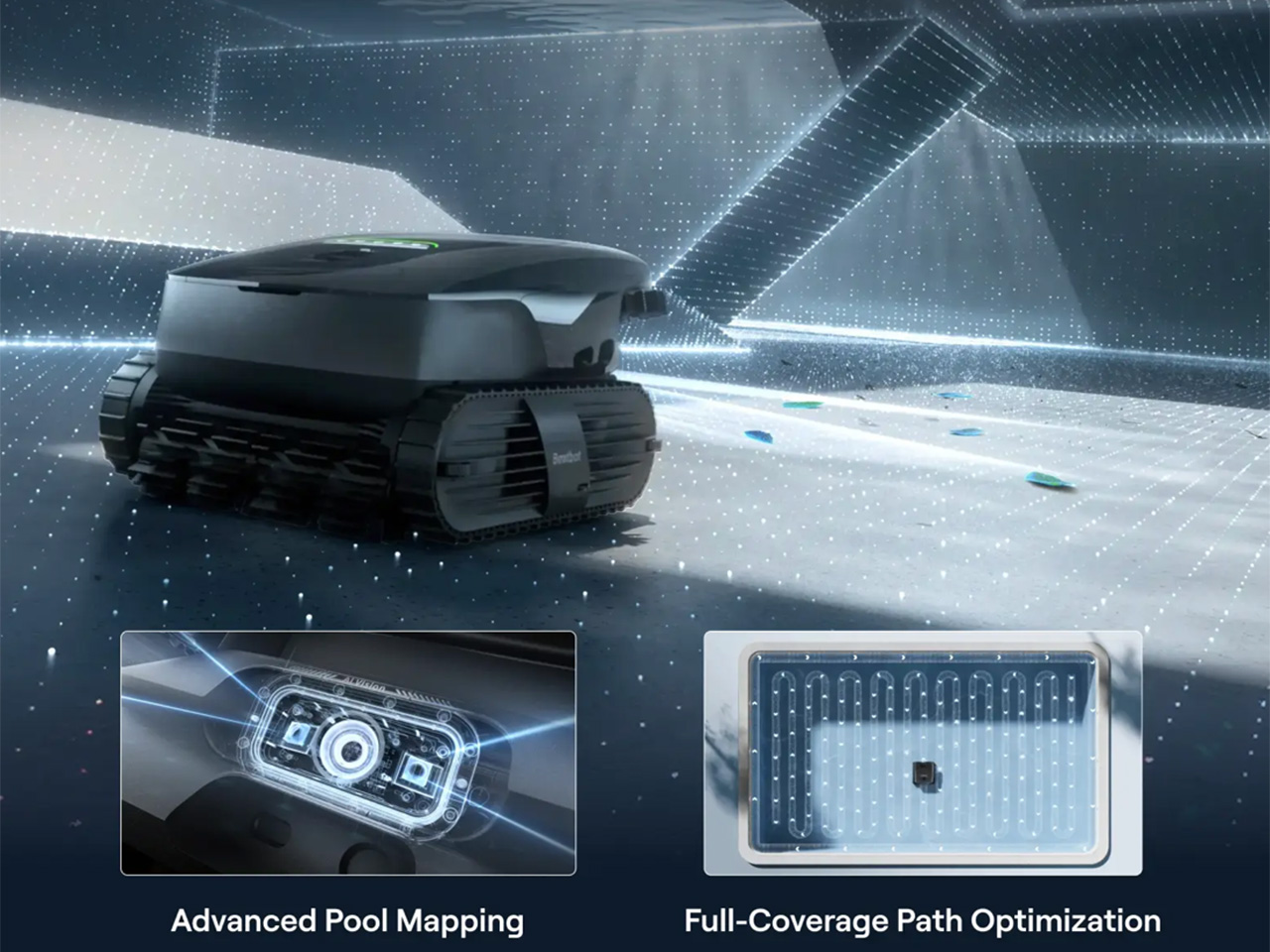
What makes the robot itself worth talking about is that its intelligence is tied to genuine utility. HybridSense AI Vision, which combines an AI camera with infrared and ultrasonic sensing, recognizes 40 debris types, twice what the previous generation could identify, and extends that detection to the water surface, not just the pool floor. That broader scope means fewer spots get overlooked after the robot surfaces and calls the job finished.

Coverage also runs deeper than detection. A single AquaSense X handles the water surface, the floor, the walls, the waterline, and elevated platforms like shallow entry steps and tanning ledges, all without swapping attachments. Using 11 motors and a submarine-style propulsion system, the robot transitions between floating and diving seamlessly, while dual downward-facing ultrasonic sensors detect edges on raised platforms so it never tumbles off one.

Then there’s the water clarification piece, which is perhaps the most invisible feature in the entire system. As the robot cleans, it automatically dispenses Beatbot’s AquaRefine 3-in-1 Clarifying Agent, a formula made from recycled crab shells that removes fine particles, oils, and residue without any mixing or measuring on your part. One 300mL kit treats up to 99,000 gallons, so it’s not something you’ll be restocking constantly.

Voice control through Google Home, Amazon Alexa, and Apple Siri adds another layer to the hands-off experience. From outside the pool, you can start or stop a cleaning cycle, check battery status, enable the child lock, or get an alert when the session wraps up. The Beatbot app handles scheduling, pool mapping, cleaning mode selection, and over-the-air software updates, so the system keeps improving without asking for much in return.

Beatbot describes its mission as making technology disappear into the background, giving users back their time without demanding constant attention. AquaSense X makes that feel tangible rather than aspirational. The robot cleans, the station resets, and the pool stays clear, and the most you’ll probably do is glance at an app notification. That’s the kind of ownership that feels less like managing a device and more like just having one.

Click Here to Buy Now: $3999 $4250 ($251 off). Hurry, deal ends in 48-hours!

The post Beatbot’s AquaSense X Proves the Best Technology Goes Unnoticed first appeared on Yanko Design.

Nokia’s 4 New Dumb Phones Still Come With an AI Button

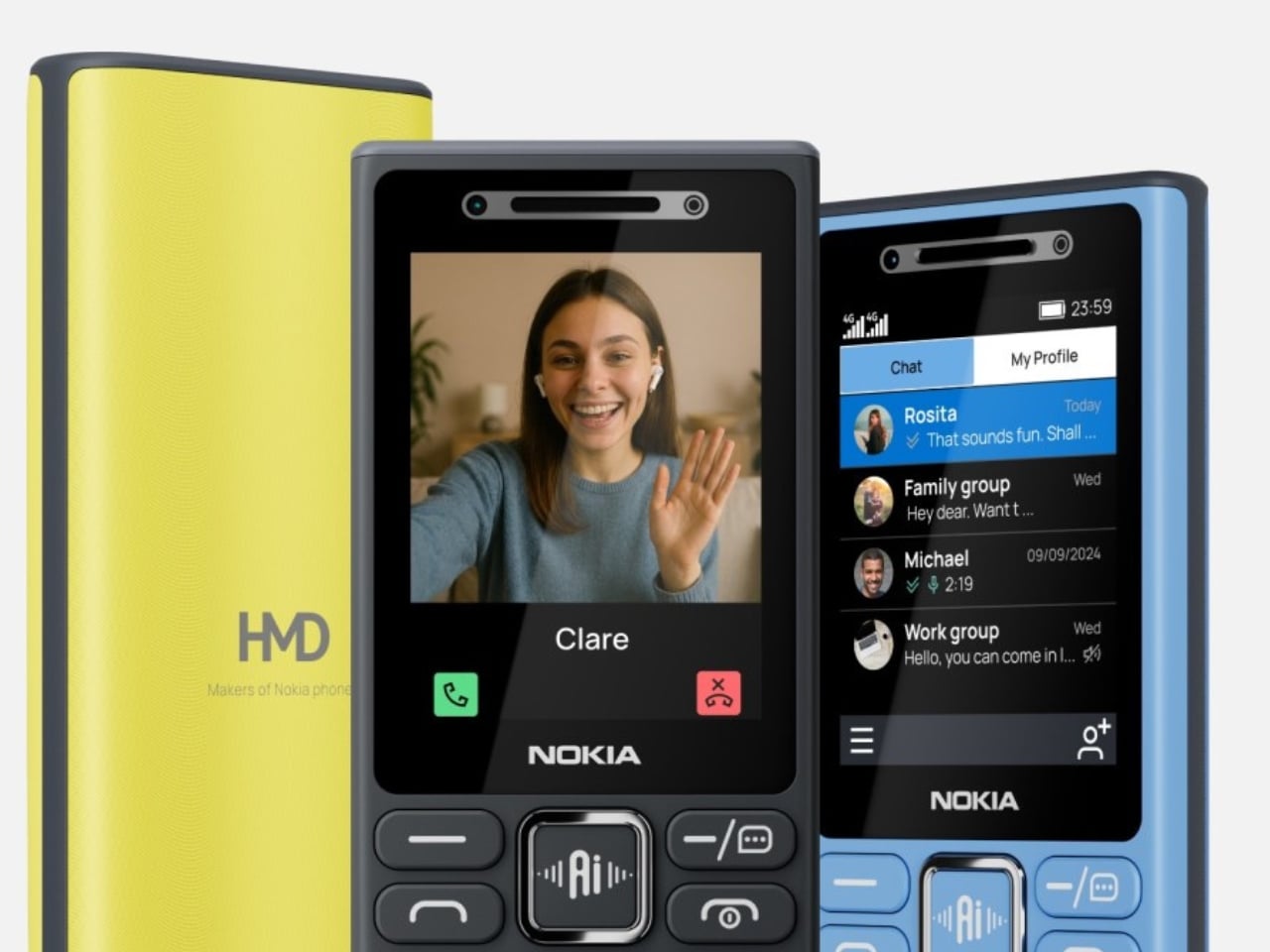
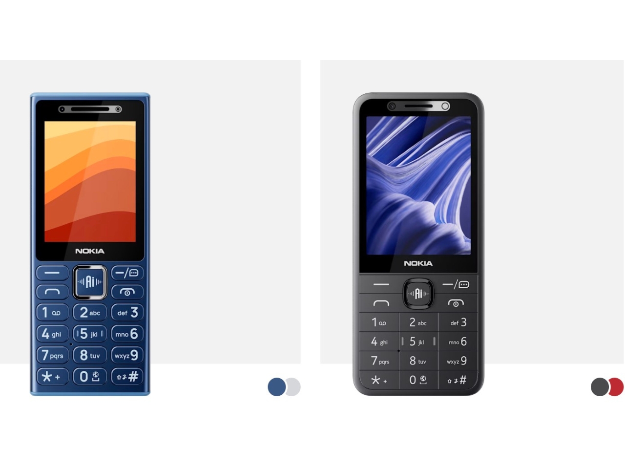
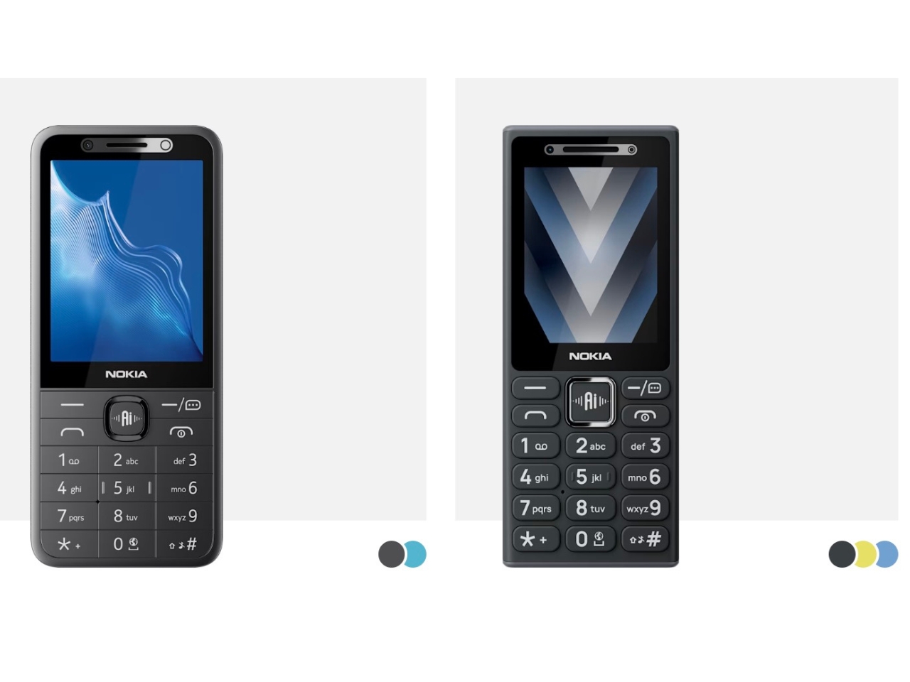
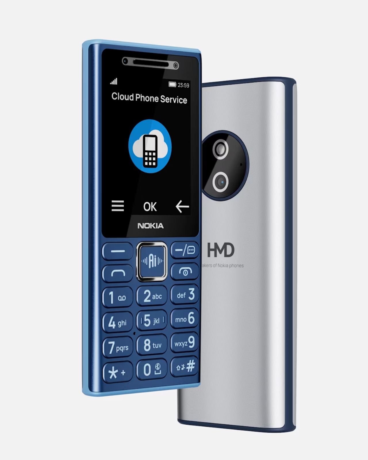
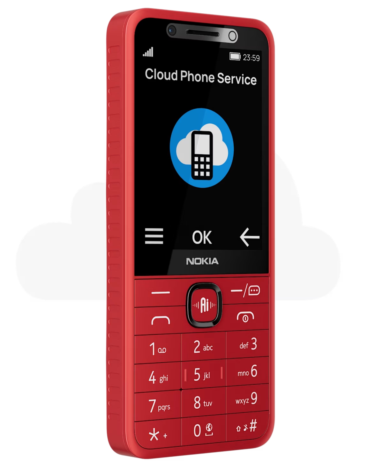
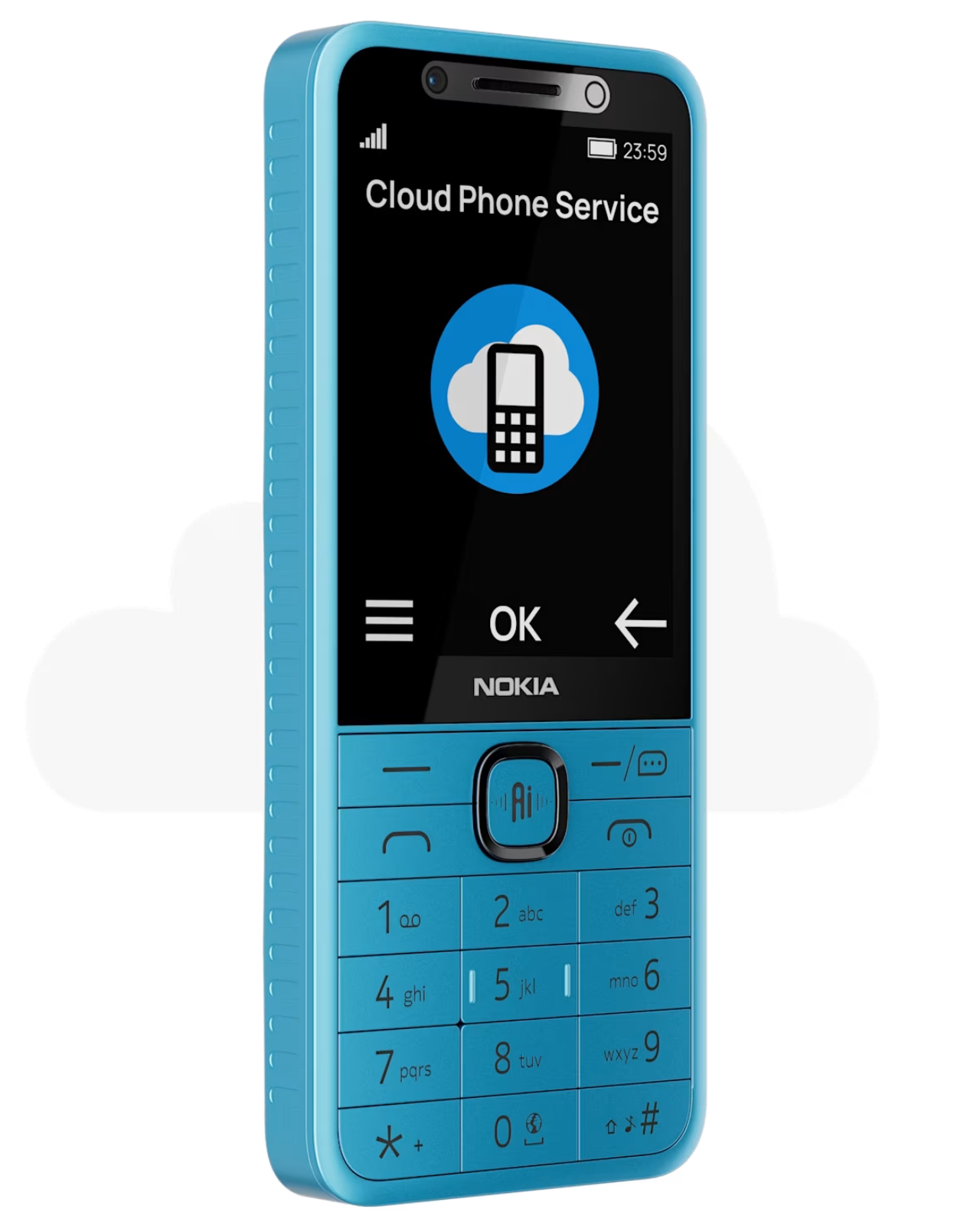
The dumb phone comeback has been one of the more quietly satisfying design stories of the last few years. People are tired. Tired of doom-scrolling, tired of notification overload, tired of carrying a pocket-sized anxiety machine everywhere. So when HMD quietly dropped four new Nokia feature phones — the Nokia 210 4G, Nokia 200 4G, Nokia 215 4G 2nd Edition, and Nokia 235 4G 2nd Edition — it felt like another chapter in that story. Except for one very notable detail sitting right on the side of each device: a dedicated AI button. Yes. An AI button. On a dumb phone.

Let me back up. These phones are, by most definitions, exactly what the dumb phone crowd has been asking for. Compact candy-bar designs. That immediately recognizable Nokia build, now with a metallic frame around the selfie camera and speaker that gives it a slightly more premium feel. A 1,450 mAh battery. A 3.5mm headphone jack, because HMD remembers those exist. FM radio. USB-C charging. The Nokia 215 4G 2nd Edition and Nokia 235 4G 2nd Edition carry 2.8-inch IPS displays, while the Nokia 200 4G and Nokia 210 4G keep things even more minimal with 2.4-inch screens. You can make calls, send texts, set an alarm, and leave your house without dreading a 14-hour screen time report. Classic.

Designer: HMD

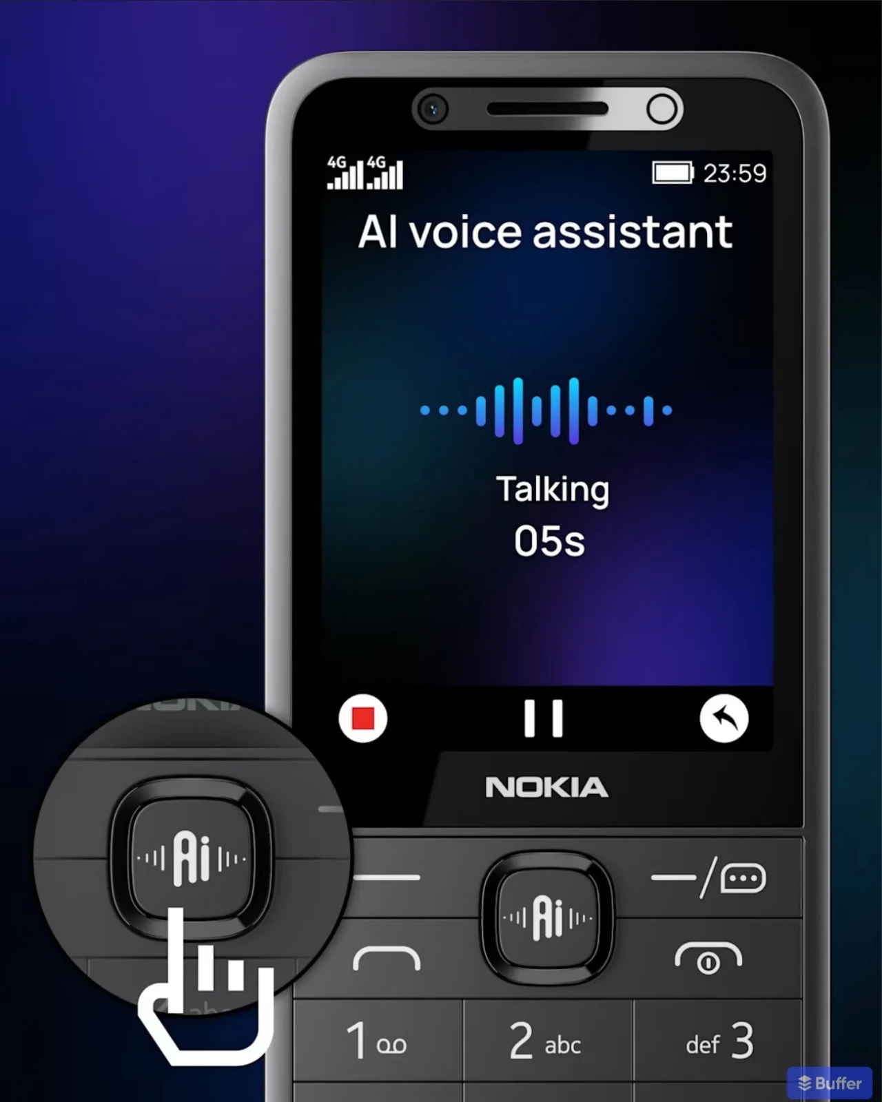
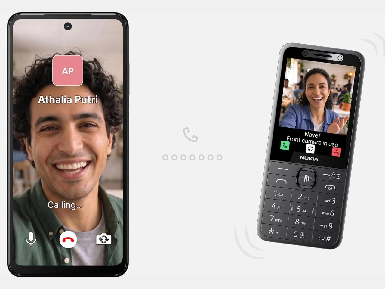
And then there’s the AI. The button accesses an on-device assistant powered by Sikey AI, which lets you do things like turn on the flashlight, set a reminder, open the camera, or place a call using voice commands. It even comes with cloud phone service support, so you can check weather forecasts, sports news, and short-form video without eating up local storage.

On paper, that sounds almost reasonable. Voice control on a small phone with no touchscreen? Fine, I get it. But the moment you start pulling on that thread, the whole premise of a “digital detox device” starts to unravel a little. A feature phone that checks your weather and streams video content via the cloud is not exactly the quiet, intentional tool that most dumb phone enthusiasts are reaching for. It starts to feel less like a step back and more like a regular phone wearing a disguise.

The subscription element makes it even more interesting. The Sikey AI features come with a free trial period, after which users need to subscribe to a paid plan. HMD notes, somewhat cheekily, that you’ll need an actual smartphone to complete that purchase. So your minimalist phone requires a smartphone to fully unlock its most marketed feature. That’s a sentence.

None of this makes the devices bad. For their actual intended market — likely first-time phone users, older users who want simplicity, or people in markets where smartphone data is still a real cost concern — these phones make a lot of sense. The design language is clean and familiar. The feature set is honest. And HMD has clearly put thought into making them feel more current with the USB-C port and 4G connectivity.

But I keep thinking about what the AI button is really doing here. Is it genuinely useful? For some users, absolutely. Is it a design choice that muddies the identity of a product built around the appeal of doing less? Also yes. The best thing about a dumb phone is the clarity of purpose. You pick it up, you make a call, you put it down. Every added layer of “smart” functionality chips away at that clarity, even if the layer is thin.

HMD is navigating a strange middle ground, honoring a legacy brand built on simplicity while trying to stay current in a market that rewards anything labeled AI. Whether that balance lands well depends entirely on who’s buying. For the digital detox crowd, these probably won’t scratch that itch. For everyone else, they’re solid little phones with a lot of nostalgic charm and a feature that might come in handy more often than expected.

The post Nokia’s 4 New Dumb Phones Still Come With an AI Button first appeared on Yanko Design.

Most MagSafe Wallets Just Hold Cards, MOFT’s Also Tracks Itself

MagSafe wallet accessories have become their own product category, and the options aren’t in short supply. Most do one thing well. The slim ones snap on neatly but run out of card space fast. The fuller ones carry more but are hard to ignore in a pants pocket. Finding one that handles everyday carry, quick card access, and location tracking together has been less straightforward than it sounds.

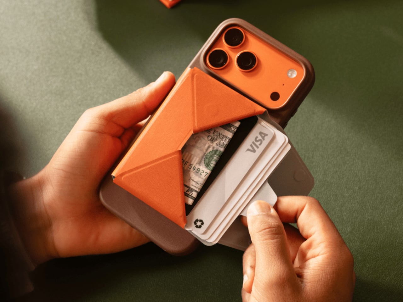
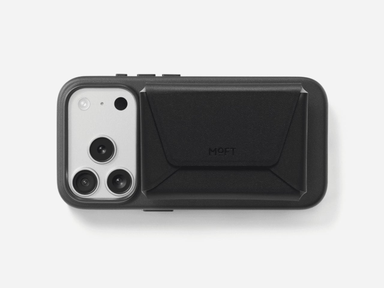
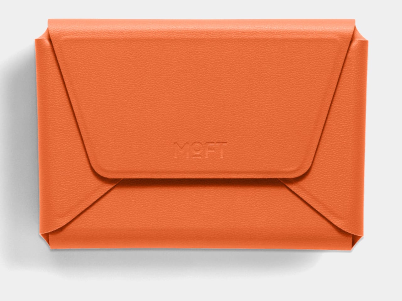
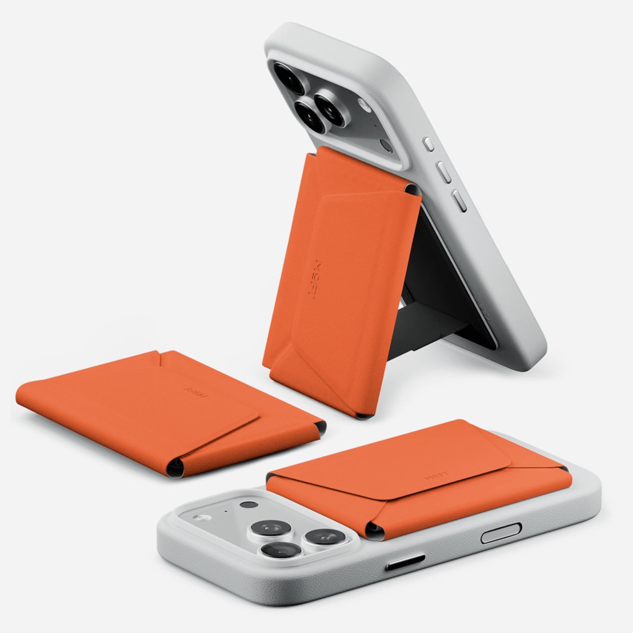
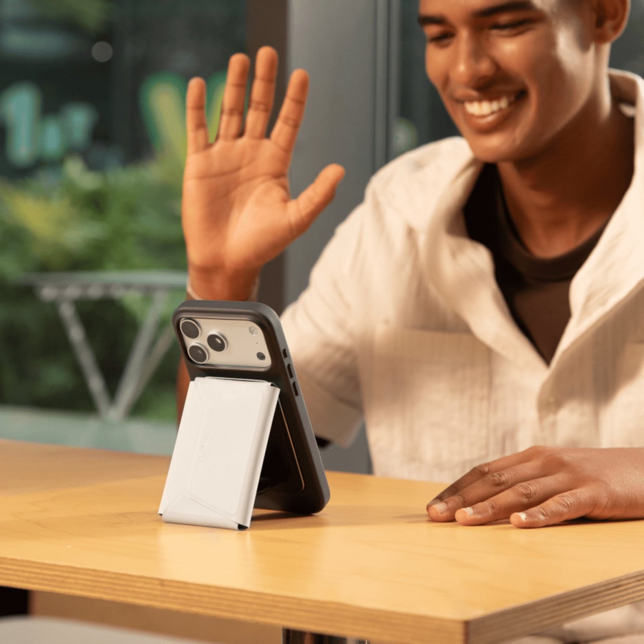
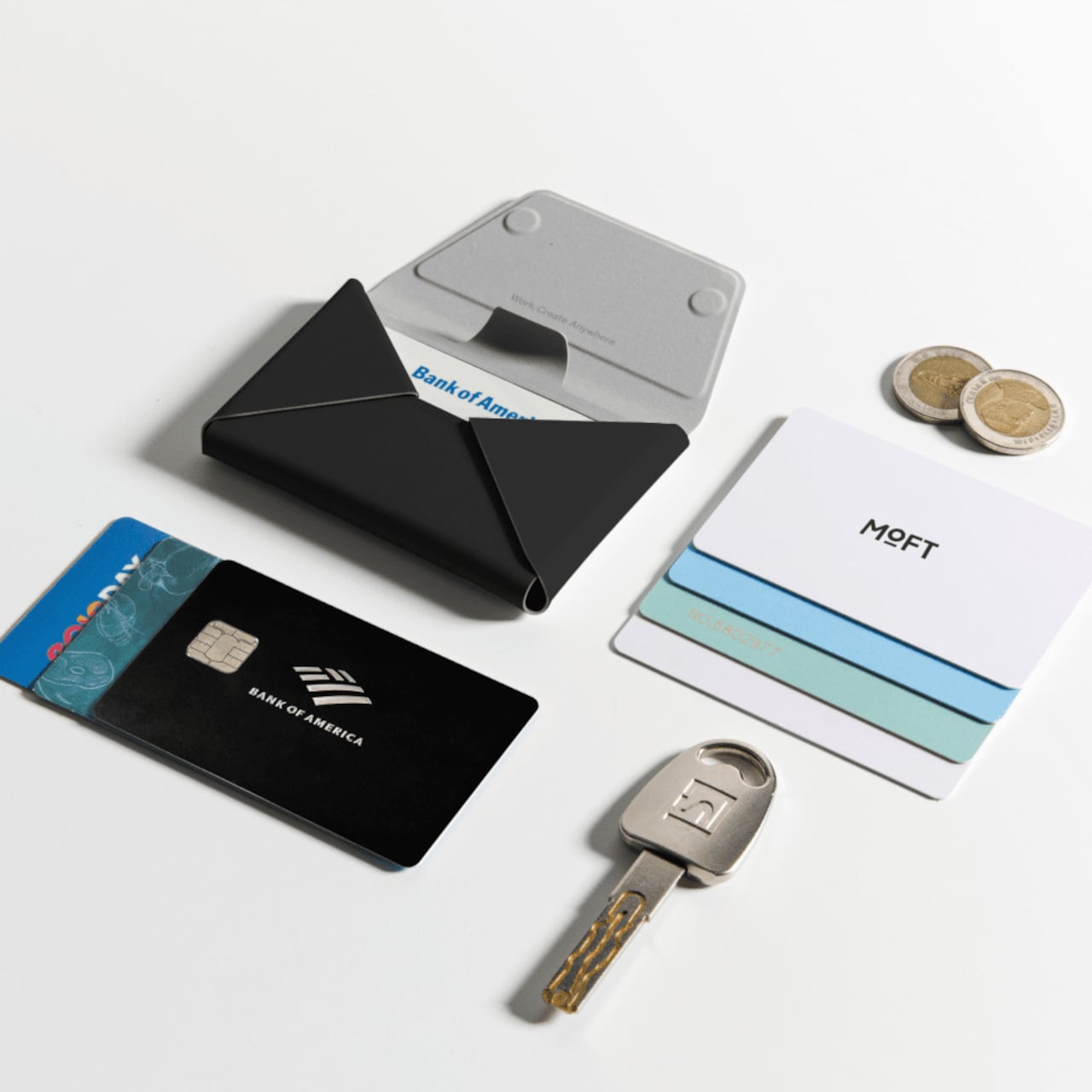
MOFT’s Trackable Field Wallet is a more ambitious take on the MagSafe wallet than the category usually produces. It snaps to an iPhone with strong magnetic force, holds up to eight cards in three organized compartments, tracks its location through Apple’s Find My and Google’s Find Hub, and folds into a phone stand. That’s an unusual amount of functionality packed into something roughly the size of a standard wallet.

Designer: MOFT

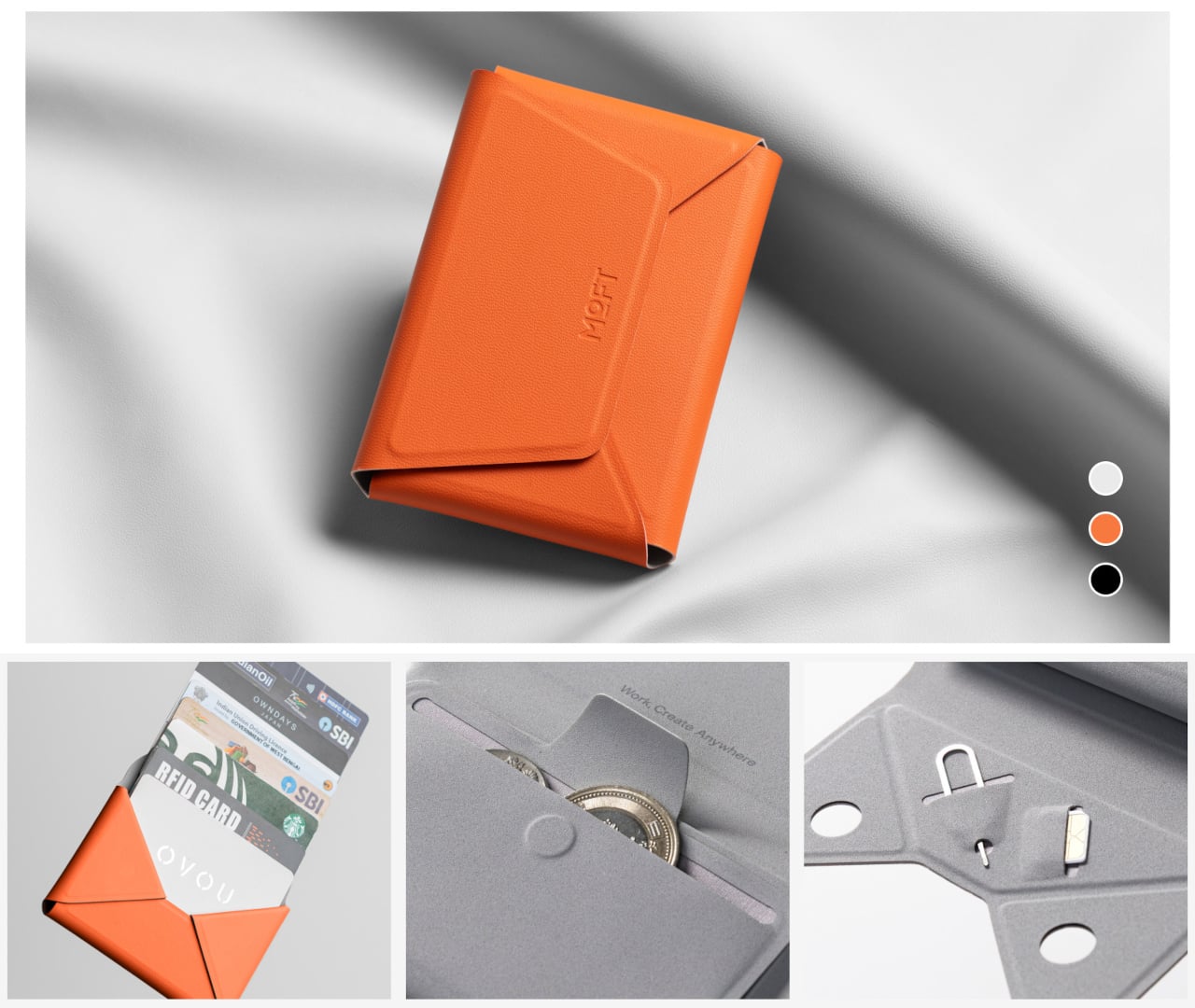
The card access design is one of the more practical details. A pull-tab on the front fans cards outward the moment you pull it, so you aren’t standing at a checkout counter hunting for the right one. The envelope-style body opens to three compartments: space for cards in the back, cash in the middle, and a magnetic slot for coins or small items like a SIM ejector tool.

The built-in tracker is what separates this from other Field Wallet versions. It connects to both Apple’s Find My network and Google’s Find Hub, so both iPhone and Android users can locate it from their device’s native tracking app. The hardware runs on a single wireless charge that lasts up to six months before it needs topping up again, meaning the tracking capability doesn’t ask for much maintenance in return.

There’s a particular kind of dread that comes from reaching into your bag and finding your wallet isn’t there. The tracking doesn’t prevent loss; it just gives you a map back to wherever the wallet went. For anyone who carries their cards clipped to their phone, the wallet and phone are already together in the first place, which narrows the chances of separation considerably.

Flipping the wallet into stand mode is straightforward enough to do while you’re still holding the phone. The geometry of the envelope-style body creates a natural kickstand angle when folded open, propping the phone up for hands-free calls or a video playing on a table. It’s an expected feature from MOFT at this point, but it integrates naturally into the wallet’s fold-and-snap design rather than feeling like an afterthought.

The outer shell uses MOFT’s MOVAS vegan leather, which has a consistent texture and holds up to daily wear without requiring special care. An RFID-blocking layer keeps the cards protected from unauthorized scanning, though the magnets mean magnetic stripe cards shouldn’t be stored inside. The wallet is compatible with iPhone 12 through iPhone 17 series and works with non-MagSafe phones via a metal ring adapter included in the box.

The Trackable Field Wallet comes in three colors, Jet Black, Terracotta, and Misty Cove, and in two versions: one with a built-in stand and one without. For anyone who has been carrying a separate tracker alongside their wallet and phone, the appeal here is straightforward. The organization, the tracking, and the phone stand are built into a single object that already goes everywhere your phone does.

The post Most MagSafe Wallets Just Hold Cards, MOFT’s Also Tracks Itself first appeared on Yanko Design.

Wake Up, Neo. Your Ring Is Playing the Matrix.

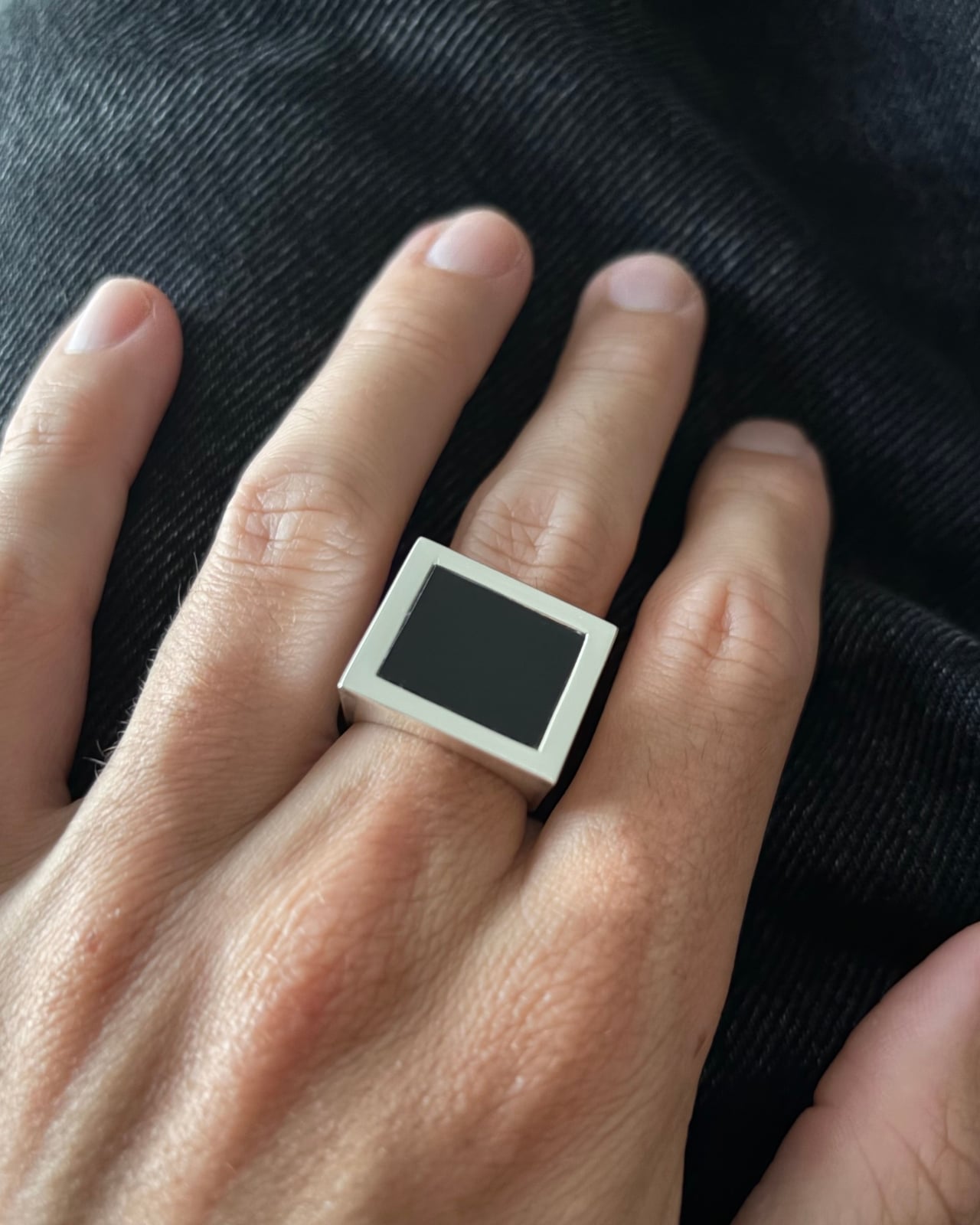
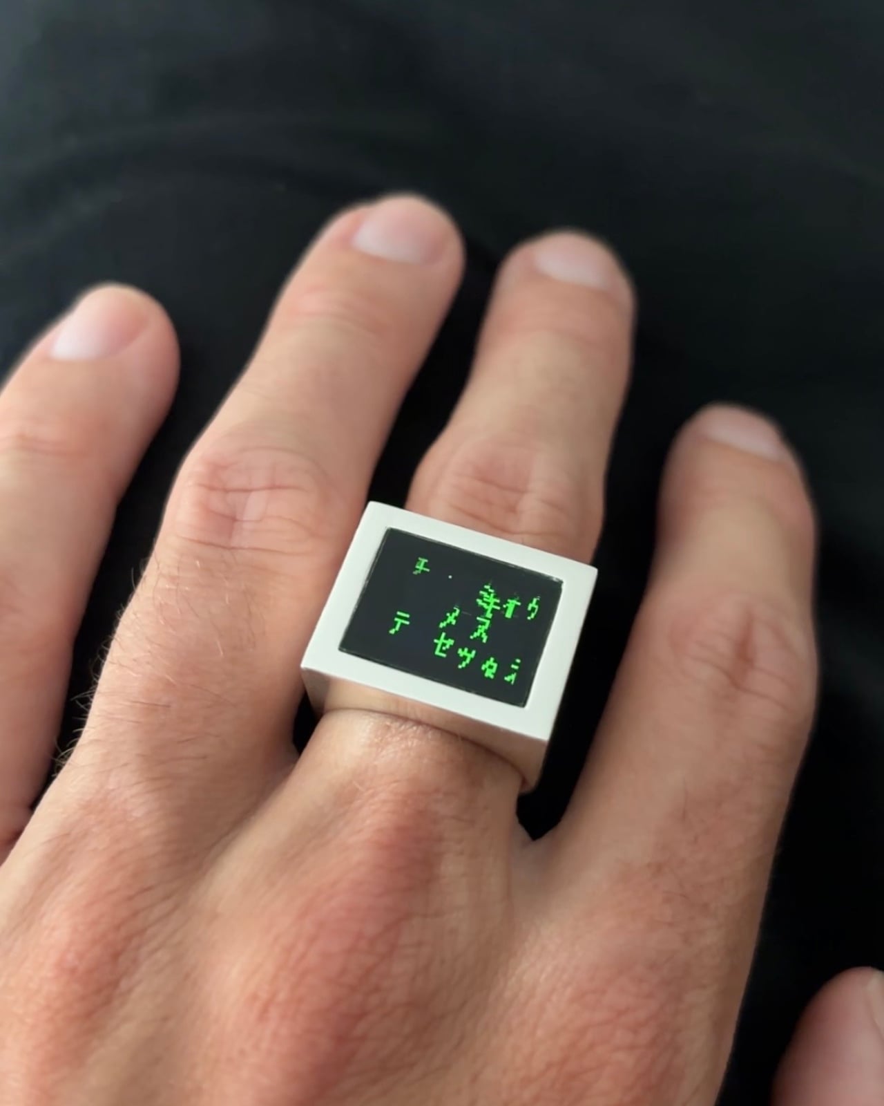
Look at the Digital Rain Ring when the screen is off, and you might not immediately clock what you’re looking at. A clean silver bezel. A flat black face. Bold, architectural proportions that sit somewhere between a modern signet ring and a minimalist sculpture. It reads as jewelry, completely and confidently. Then the animation starts.

That double life is arguably the most deliberate design decision Daniel Idle made. The OLED display, sitting recessed behind a polished silver frame, does something that most tech-forward jewelry fails to pull off: it disappears when it’s not in use. The black glass of the screen at rest looks remarkably close to a dark stone setting, the kind of graphic, monochromatic face you’d expect on a considered piece of contemporary jewelry. It’s only when the Matrix rain animation loops across it that the object reveals its other identity.

Designer: Daniel Idle

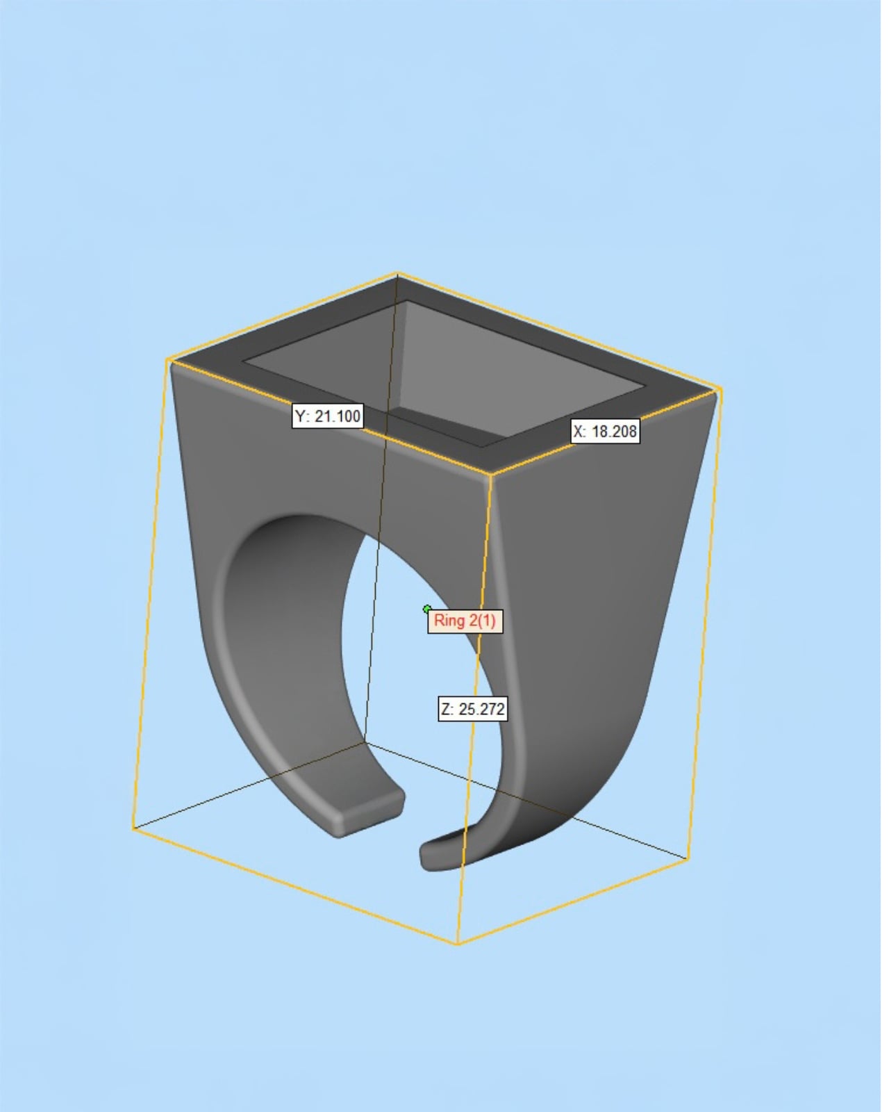
The physical form took real thinking to get right. Looking at the CAD model, the ring measures approximately 21mm by 18mm across the face, with a total height of just over 25mm. Those proportions matter. The face is large enough to hold the display at a readable scale, but the tapered body connecting it to the band keeps the overall silhouette from reading as clunky. The geometry is almost architectural, widening from the band up toward the face in a way that gives the piece visual weight without making it feel like you’re wearing a small appliance on your finger.

The band itself is an open C-shape rather than a fully closed ring. It’s a practical call given the electronics that need to live inside the body, but it also lands well aesthetically, softening what is otherwise a very hard-edged, geometric form. From the side, the two components sit in good proportion to each other. Nothing feels like an afterthought.

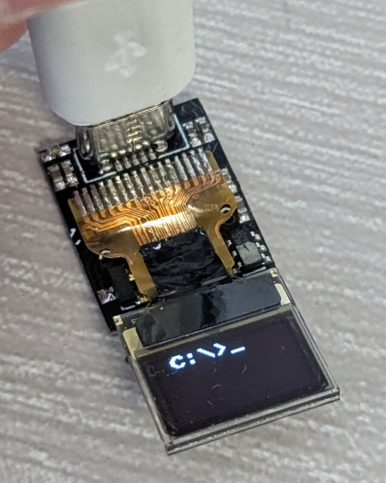
The custom PCB is worth pausing on. It’s tiny, densely packed, and clearly built to exact dimensions to fit within the ring body. A flexible ribbon cable connects the board to the OLED display, and a USB-C port is integrated for charging. The fact that all of this infrastructure lives inside something you wear on your finger is genuinely impressive engineering, but Idle’s judgment was to make sure none of it is visible in the finished piece. That restraint is what separates this from a hobbyist build.

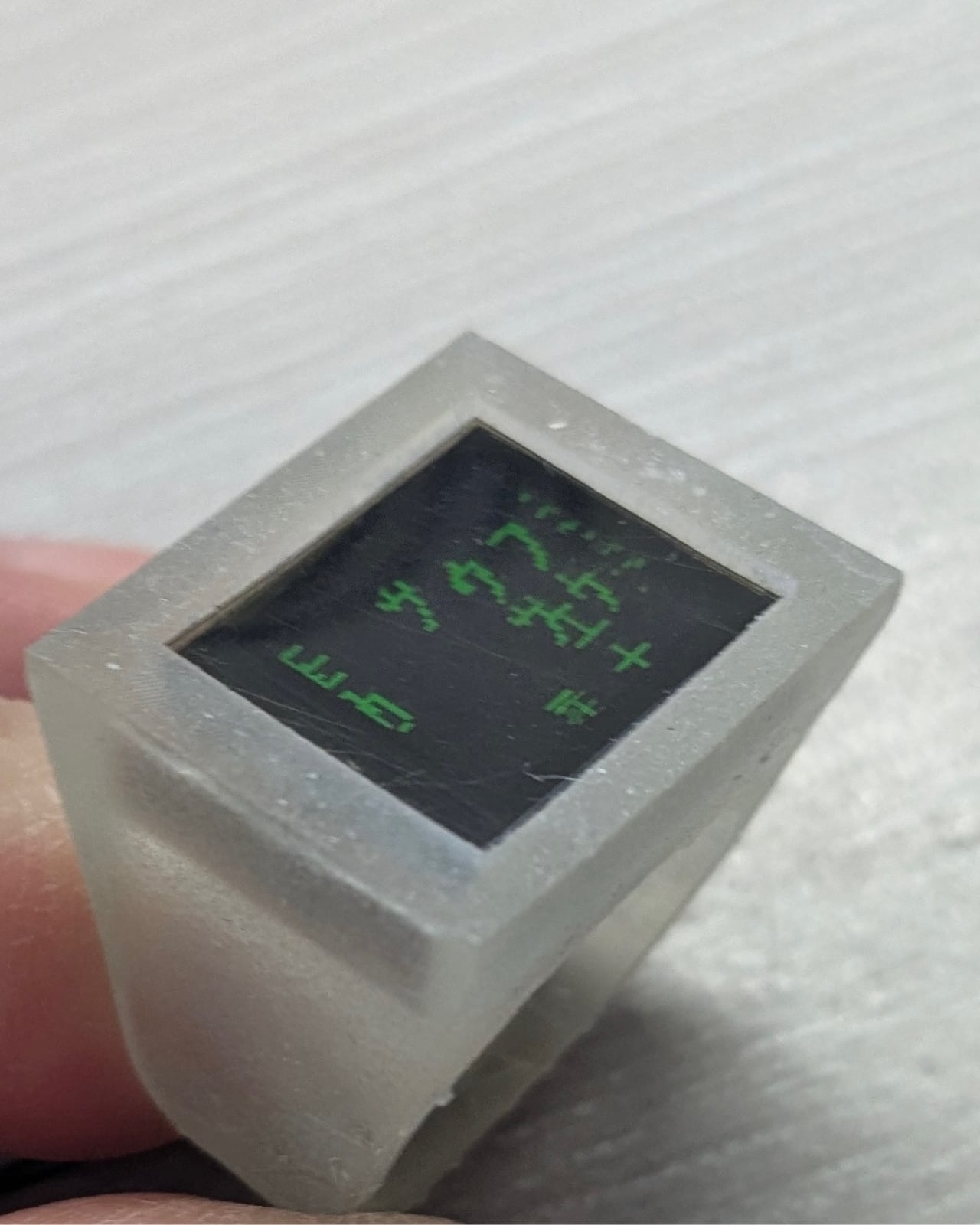
The prototype stage used a white resin body, which actually shows the concept quite clearly in a raw, honest way. You can see the display sitting flush with the face, the green animation already doing its work against the matte surface. But the shift to polished silver for the finished version was the right call. Silver gives the piece the visual language of jewelry rather than a prototype, and the contrast between the warm metal bezel and the deep black of the OLED screen is genuinely considered. It has the graphic confidence of a piece that was thought about as an object first and a technology project second.

The animation choice suits the form well too. The Matrix rain, those cascading columns of green katakana-inspired characters, fills a small square display naturally. It loops cleanly, it doesn’t demand to be read in detail, and its cultural weight does a lot of communicative work in a very compact space. “Wake up, Neo” appearing in green pixels on a silver ring is a complete sentence in the language of pop culture, and Idle clearly knows that.

What makes the Digital Rain Ring worth paying attention to is not the novelty of putting a screen on a ring. It’s the evidence that someone thought through the design consequences of doing so. The proportions hold up. The material choices are intentional. The off-state is as considered as the on-state. Most tech jewelry gets the technology right and the jewelry part wrong. This one seems to have gone in the other direction, starting with the object and working inward from there. That’s a harder problem to solve, and it’s the one that actually matters.

The post Wake Up, Neo. Your Ring Is Playing the Matrix. first appeared on Yanko Design.

The 8 Best Tech Gadgets of July 2026

July 2026 is shaping up to be a rich month for design-forward tech. From a power bank that rewrites what thin means to a speaker that turns a living room into a visual concert experience, the products landing this month share a common thread: they all challenge a category assumption. This roundup brings together eight picks that earned their place not on spec sheets alone, but on how well they’re thought through from the outside in.

Whether you’re a daily commuter who needs a mouse that disappears into a bag, a field worker who can’t afford a dead tablet, or someone who just wants a smartwatch that looks right on a dressed-up wrist, there’s something here for you. These are gadgets that earn attention through design intelligence first and capability second. In that order, they’re worth your time.

1. Nothing 4a Pro with an E-Ink Display Concept
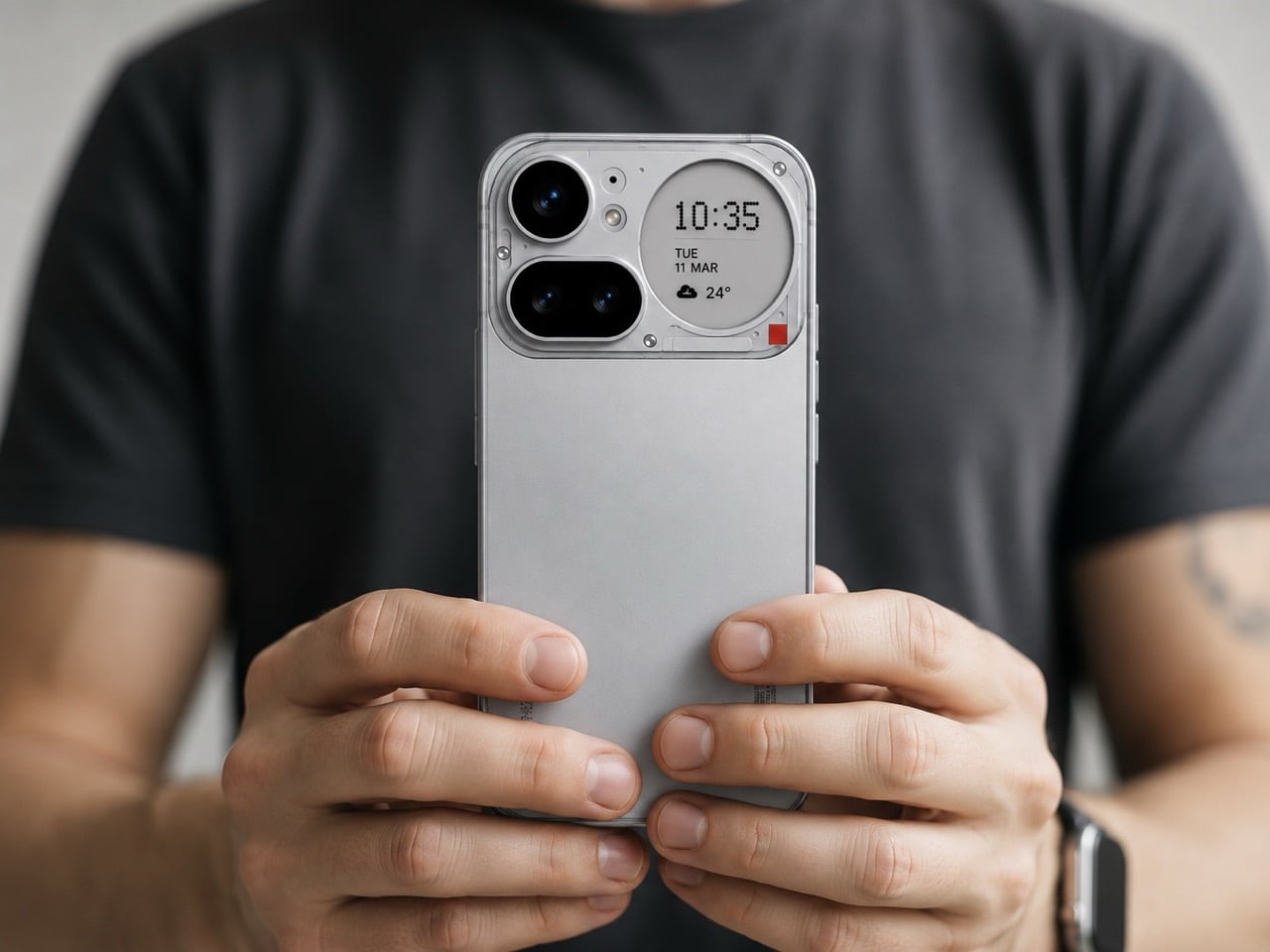
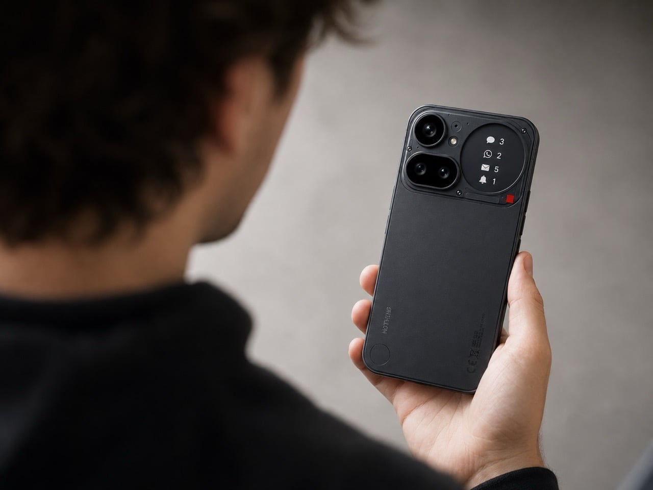
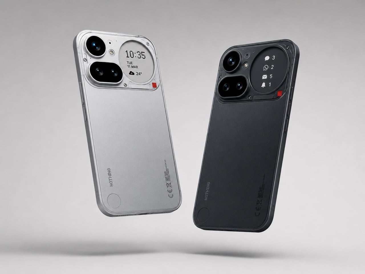
The Nothing 4a Pro already has its fans, but a Redditor named Taweros made a compelling argument for what it could have been. This concept swaps the Glyph Matrix for a full e-ink display on the back of the phone, and the result feels genuinely more useful. Rather than light patterns that impress for about thirty seconds, you get an always-on second surface that can show weather alerts, caller information, or a QR code at a networking event, all without changing a single thing about the internals.

The hardware underneath stays intact: Snapdragon 7 Gen 4 processor, triple camera setup, and the same display up front. The addition is purely on the rear panel, and it’s a quiet, considered one. E-ink only draws power when the image changes, which means the display stays active all day without meaningfully affecting battery life. It’s less TikTok and more LinkedIn than Nothing’s usual brand register, but the argument for using the phone’s real estate more thoughtfully is hard to dismiss. Here’s hoping the Nothing 5 takes notes.

What we like

  • Always-on e-ink rear display works with almost no battery drain
  • Turns decorative real estate into a functional ambient information layer

What we dislike

  • This is a fan concept, not a confirmed product from Nothing
  • Ditching the Glyph Matrix removes the brand’s most recognizable design signature

2. OrigamiSwift Mouse

The OrigamiSwift is what happens when a designer takes the brief “travel mouse” seriously rather than just shrinking an existing one. Designed by Horace Lam, it folds flat to 0.18 inches thick and weighs just 40 grams, but unfolds into a full-sized working mouse in under half a second. The origami-inspired triangular structure gives it a rigidity that flat folding designs often sacrifice, and the result is a mouse that holds its shape through real work sessions, not just on a demo table.

The Bluetooth 5.2 connection pairs across Mac, Windows, Android, and iPadOS, with a wireless range of 32.8 feet in open environments. A 4,000 CPI HD infrared sensor tracks at up to 4,000 frames per second, a genuinely capable spec for a device this light. USB-C charging delivers up to three months of use on a single charge, and the soft-click buttons keep things quiet in shared spaces. At $85, the OrigamiSwift is a thoughtful tool for anyone who works on the move and is tired of compromising.

Click Here to Buy Now: $85.00

What we like

  • Folds to 0.18 inches thick and weighs only 40 grams
  • Three months of battery life on a single USB-C charge

What we dislike

  • Stock is very limited at the time of writing, with only a few units available
  • A 4,000 CPI ceiling may not satisfy precision-heavy creative workflows

3. MorningBlues SonicGlass A1 Transparent Speaker

Most home speakers are designed to disappear. The MorningBlues SonicGlass A1 was designed to do the opposite. Its front face is a 21.5-inch TFT panel with over 90% light transmission, framed in black with a transparent driver sitting behind it, fully visible. When a song plays, lyrics appear across the glass in motion styles tied to the track’s rhythm and emotional character. MorningBlues calls this MoodLyric, built on data from hundreds of millions of playbacks, with all lyrics licensed through LyricFind to properly credit the artists whose words it borrows.

A feature called SceneSync layers AI-generated visuals tuned to music genres in real time: pop, hip-hop, R&B, and rock each trigger different visual aesthetics on screen. When the music stops, the AI stays on as a room display with ambient backgrounds, dynamic clock faces, and an ASMR sleep mode for winding down. Pair it with a microphone, and it becomes a full karaoke setup with lyrics scrolling live. The MorningBlues Music Hub 1 controller manages playback without involving your phone.

What we like

  • Transparent driver and 21.5-inch display make it function as room art between listening sessions
  • MoodLyric and SceneSync create a visually synced experience native to each genre

What we dislike

  • $646 is a significant entry price for a product still in the crowdfunding phase

4. Lenovo ThinkTab X11 Rugged Tablet

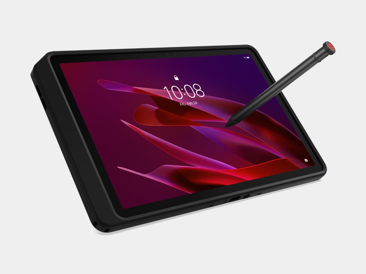
Rugged tablets have historically lived in an awkward pricing tier: too expensive for teams with tight budgets, too limited for anyone expecting a consumer-grade finish. The Lenovo ThinkTab X11, the first device to carry the ThinkTab name, targets frontline workers in logistics, construction, manufacturing, and transportation starting at $499. The 10.95-inch display runs at 90 Hz with 800 nits of peak brightness and Gorilla Glass protection, and the touch layer is calibrated to respond to gloved hands and wet fingers, which matters on a loading dock far more than any raw spec comparison.

The standout feature is a 10,200 mAh battery that swaps without tools through a screwless mechanism, letting workers keep moving mid-shift without losing the device entirely. It also runs directly from DC power with no battery installed at all for fixed vehicle or workstation deployments, reducing heat and removing the cell’s natural degradation from the equation. MIL-STD-810H and IP68 ratings round out the durability credentials. It ships with Android 16, guaranteed to reach Android 18, and four years of security patches. The 256 GB model is available at $579.

What we like

  • Screwless hot-swappable battery makes it genuinely practical for multi-shift field use
  • Battery-less DC operating mode extends device lifespan in fixed deployments

What we dislike

  • $499 still sits above the average consumer tablet price point
  • Enterprise-facing software and setup may feel less intuitive for individual buyers

5. Xiaomi Watch S5 46mm
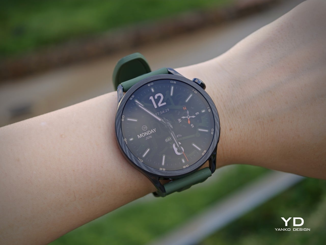
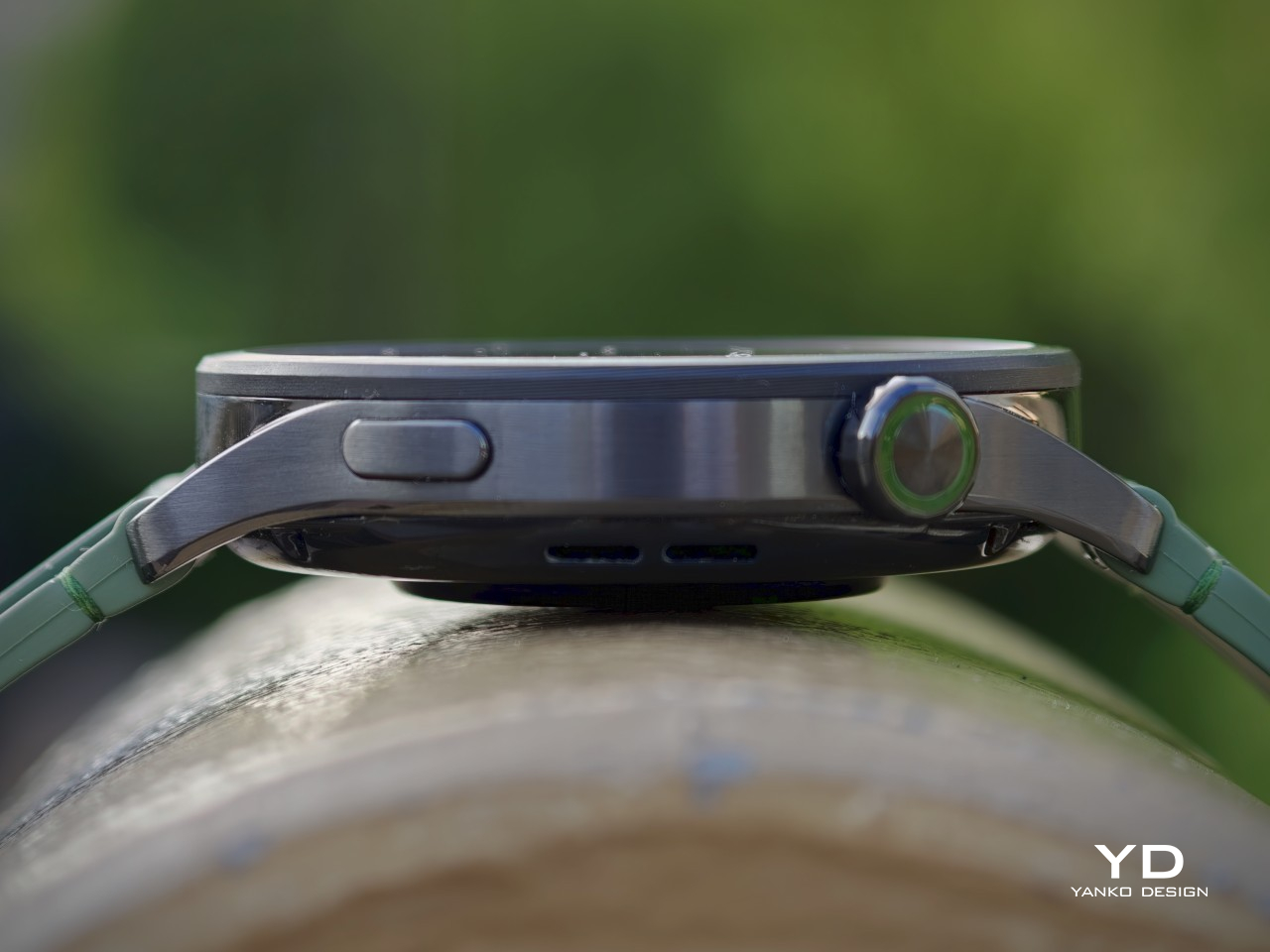
The Xiaomi Watch S5 46mm looks less like a gadget trying to pass as a watch and more like a watch that happens to be smart. The 1.48-inch AMOLED display runs at 2,500 nits peak brightness with a 2.6mm bezel that’s 40% narrower than the previous generation. The forged stainless steel frame comes in four distinct styles, including a Ceramic Blue version with a zirconia ceramic bezel and leather strap, and a Jungle Green with a forged carbon bezel and hybrid band that leans sportier. Each variant has a clear identity rather than reading as a simple color refresh.

The 815mAh battery delivers up to 21 days under light use, a 68% improvement over the Watch S4. In real-world testing with Always On Display and full health tracking running, expect around six days before a charge. Five-system GNSS, 5ATM water resistance, 150 sports modes, and an updated four-LED heart-rate sensor built on the same hardware platform as the flagship Xiaomi Watch 5 round out the specs. At £149.99 for standard models and £169.99 for the Blue and Green colorways, the Watch S5 offers a lot of watch per pound.

What we like

  • 2,500-nit AMOLED display stays sharp and readable in direct sunlight
  • Up to 21 days of battery life on a single charge

What we dislike

  • HyperOS 3’s app ecosystem is noticeably limited compared to Wear OS
  • Sleep tracking still misses short naps in regular use

6. Nothing Book Laptop

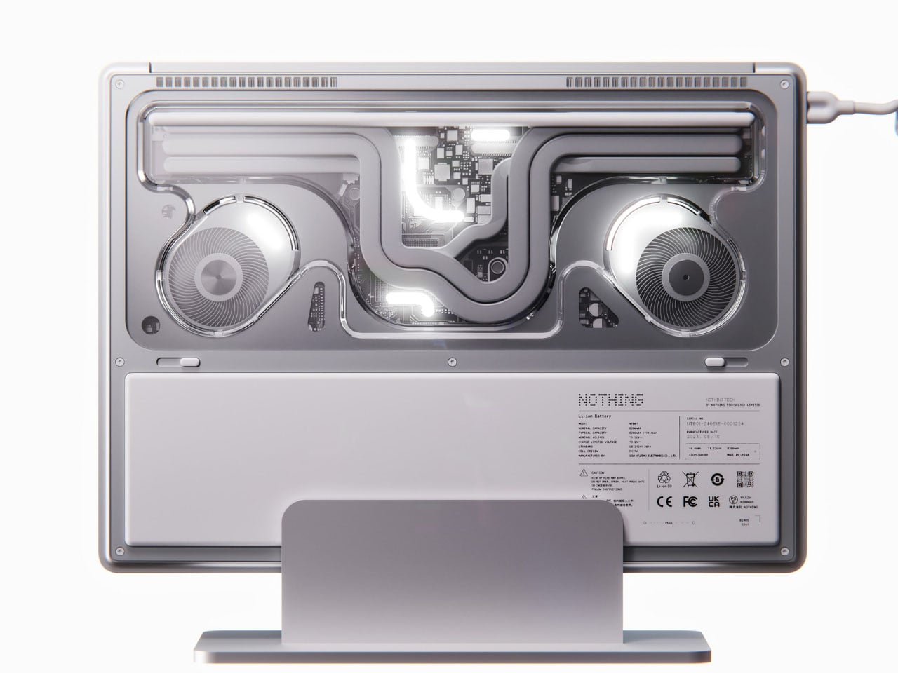
Nothing has built its identity on see-through design, and Nikita Bukoros has taken that logic as far as it goes. The Nothing Book is a concept laptop that lays the machine’s internals bare through transparent panels, revealing the inner architecture, cooling boards, and components in a layered composition the designer describes as industrial art. The secondary screen on the lid is the standout feature: a slender external display that shows messages, symbols, emojis, or custom text in the classic Nothing font, giving the machine a personality that no other laptop on the market currently attempts.

When docked in its accompanying charging cradle, the secondary lid display runs a charging animation. The concept comes in hot red, cool green, subtle pink, and magnetic teal, which is a bold departure from Nothing’s usual monochrome palette. Port options include HDMI, USB-C, USB, and wired charging. Whether Nothing ever produces this is an open question, but Nikita’s concept makes a clear case that the laptop category is overdue for a brand willing to treat the machine as something genuinely worth looking at, not just opening.

What we like

  • Secondary lid screen is a genuinely useful extension of the Nothing design language
  • Transparent chassis turns working components into deliberate visual design elements

What we dislike

  • Remains a concept with no confirmed production timeline from Nothing
  • Colorways depart from Nothing’s established monochrome aesthetic, which may divide the existing fanbase

7. Battery-Free Amplifying iSpeakers
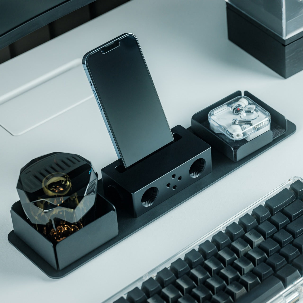
In a world where most audio accessories arrive loaded with chips, apps, and charging cycles, the Battery-Free Amplifying iSpeakers take a different position entirely. These passive acoustic speakers work without any power source, relying on physical design principles to amplify sound naturally. That means no charging routine, no Bluetooth pairing, and no setup ritual. For smaller living spaces, a tiny home, or a desk that doesn’t need another cable cluttering it, the appeal is immediate, and the logic is completely sound.

Sitting in the Yanko Design tiny homes collection at $179, the iSpeakers are designed for people who think carefully about what earns a place in their space. The absence of a battery means the device has no defined end of life in the way most gadgets do. You’re not buying a product with a two-year replacement cycle quietly built in. You’re buying an object made to stay, which feels increasingly rare and worth paying attention to in a product category that tends to treat longevity as an afterthought.

Click Here to Buy Now: $179.00

What we like

  • Zero power requirement means no charging, no battery degradation, and no added cables
  • Designed for genuine longevity with no electronic components to degrade over time

What we dislike

  • Limited product detail available makes it difficult to compare against powered alternatives
  • $179 is a premium ask without detailed specification transparency on the product page

8. Xiaomi UltraThin Magnetic Power Bank 5000 15W
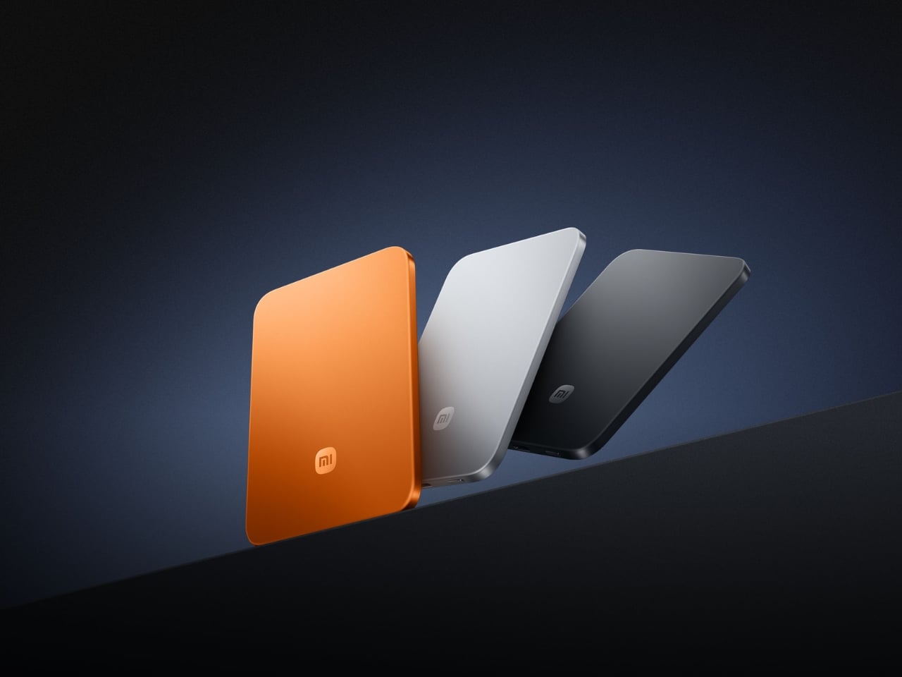
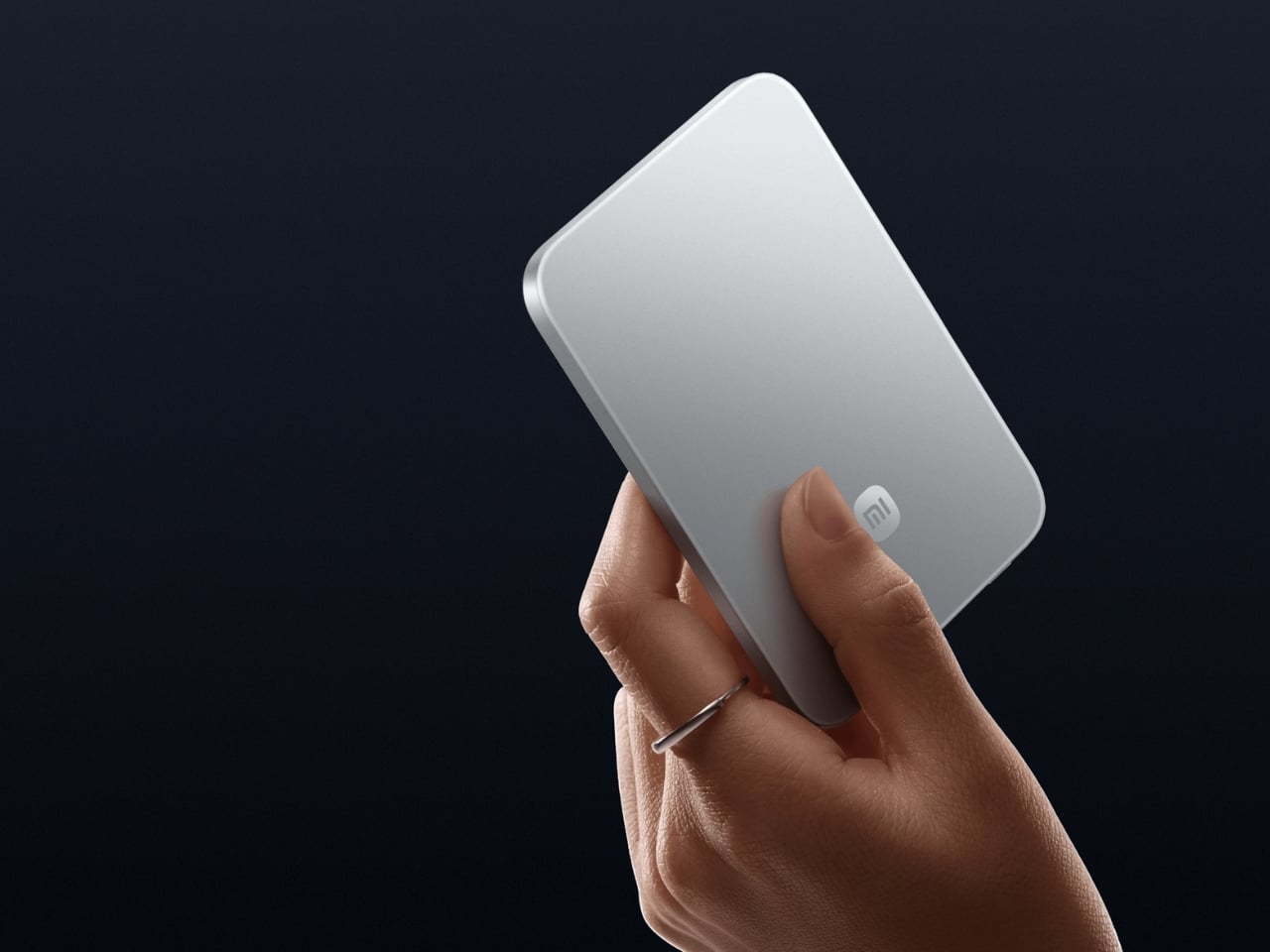
At 6mm thick and 98 grams, the Xiaomi UltraThin Magnetic Power Bank makes every other power bank in your bag feel like a failure of imagination. The 5,000 mAh capacity is made possible by a silicon-carbon battery with 16% silicon content, a chemistry that delivers higher energy density than conventional lithium cells in a dramatically slimmer form. The aluminum alloy shell carries a photolithographically etched logo on the back, and the phone-facing surface uses fire-resistant fiberglass with an excimer coating for heat management. It was officially showcased at MWC 2026 in Barcelona and has since launched across Europe, Australia, Singapore, and South Korea.

Wireless charging tops out at 15W when paired with the Xiaomi 17 series and 7.5W for iPhones via MagSafe. The USB-C port pushes up to 22.5W wired, and the bank charges two devices simultaneously. Ten layers of protection cover overvoltage, overcurrent, overheating, and short circuits, with dual NTC temperature sensors running constantly in the background. Priced at €60 in Glacier Silver and Graphite Black, with a Radiant Orange option at €65, it’s one of the cleanest arguments for restraint in recent consumer electronics memory.

What we like

  • 6mm thickness is thinner than any current smartphone on the market
  • Silicon-carbon battery chemistry packs 5,000 mAh into an almost impossibly slim profile

What we dislike

  • iPhone charging is capped at 7.5W due to Apple’s MagSafe restrictions
  • 5,000 mAh won’t fully recharge most modern flagship phones from zero

The Best Tech This Month Isn’t Doing More – It’s Doing Less

What ties this month’s best together is a shared commitment to solving the right problem. The Xiaomi power bank doesn’t chase the biggest number; it chases the best shape. The Lenovo ThinkTab doesn’t pile on features; it removes friction from a real working environment. The SonicGlass A1 doesn’t compete on specs alone; it rethinks what a speaker is allowed to look like while it works. Each of these products decided what mattered most, and then built toward it.

Great design in July 2026 isn’t about doing more. It’s about knowing exactly what the object is for and building toward that with enough conviction to leave everything else out. From a 6mm power bank to a see-through laptop concept, from a foldable mouse to a watch that holds its own against something far more expensive, the best tech this month is defined by how precisely it makes its case. These eight make theirs well.

The post The 8 Best Tech Gadgets of July 2026 first appeared on Yanko Design.
Get Ready for the Color E Ink Monitor That Finally Runs at 60fps

E Ink displays have earned a devoted following among people who spend long hours reading or writing. The technology produces virtually no flicker, doesn’t use the same harsh backlight as a typical LCD or OLED, and is considerably easier on the eyes over extended sessions. The catch has always been speed; these screens refresh slowly, making them suitable for e-readers but impractical for real-time interaction.

Color E Ink made things more complicated. Adding a color layer came at the cost of even slower refresh rates, keeping these monitors firmly in the reading-only category for most users. Bigme’s B251 Pro takes direct aim at that limitation, pushing a 25.3-inch color E Ink screen to reach up to 60 frames per second, a meaningful first for this panel type.

Designer: Bigme

The screen uses Kaleido 3 technology at a 3200×1800 resolution, and at 145 DPI, it’s modest by LCD standards but respectable for E Ink, where the color filter layer tends to soften detail. The panel supports 4,096 colors and 16 levels of grayscale, while an adjustable front light with warm and cool modes lets you set the tone for your workspace.

What 60 frames per second changes practically is the range of tasks the monitor can handle without resistance. Scrolling through a long document doesn’t leave a trail of ghost images. A video clip doesn’t dissolve into motion blur on every cut. It’s not yet the fluidity of an LCD, but it’s the first time a color E Ink monitor has felt fast enough for an ordinary workday.

The B251 Pro accepts input through HDMI and DisplayPort. The USB-C port is reserved for firmware updates only, not video signal, which is worth knowing before assuming you can use it with a laptop’s Thunderbolt port. A wireless mirroring option covers that gap for cable-free setups, and the monitor ships with a remote control for switching display modes from your desk.

Spend enough hours at a standard monitor and eye strain becomes a familiar background discomfort: dull headaches, dry eyes, and that particular kind of fatigue that sets in before the day is even over. The B251 Pro is built for people in that position, specifically those whose work keeps them at a screen for most of the day and who’ve started looking for a less punishing alternative.

Bigme lists the B251 Pro at $1,599, currently reduced to $1,279 at launch. That’s a significant sum for a monitor that tops out at 4,096 colors and 145 DPI, and it won’t appeal to anyone who needs accurate color for professional photo or video work. For people who simply need a large, easy-to-live-with display and have started counting the hours their eyes spend under artificial light, the math looks different.

The B251 Pro doesn’t ask you to trade speed for eye comfort, and that compromise has defined this category since its beginning. Writers, coders, and anyone whose work is mostly text and reference material will find the 60FPS upgrade more compelling than any spec sheet can convey. The original B251 already built a devoted following at lower speeds; this version gives that crowd considerably less to apologize for.

The post Get Ready for the Color E Ink Monitor That Finally Runs at 60fps first appeared on Yanko Design.
This Award-Winning Guitar Ditches the Strings, the Frets, and Most of the Body, and I Kind of Love It

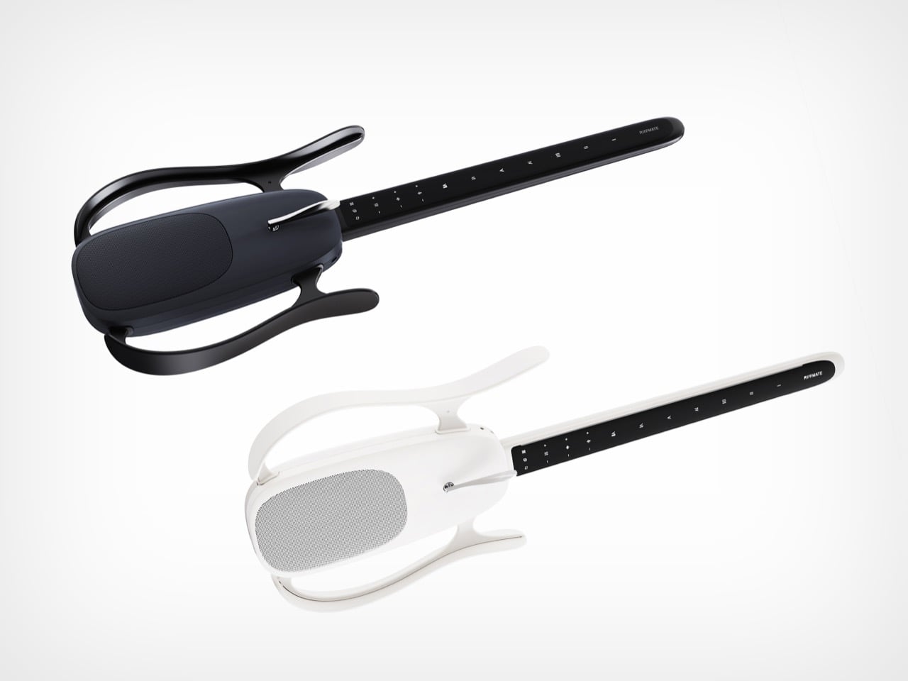
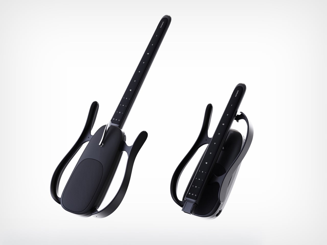
Look at RIFFMATE for a second and try to name what is missing. No strings. No fretboard bristling with metal wire. No solid slab of tonewood. What remains is the silhouette of an electric guitar sketched in mid-air, a skeletal frame that holds the double-cutaway outline everyone recognizes while hollowing out almost everything inside it. Those sweeping arms curving off the body trace exactly where a guitar’s shoulders and horns would sit, and then they float, framing empty space instead of filling it.

It takes real confidence to design an instrument by subtraction, and the RiffmateGT01 pulls it off with a straight face. Built by Shanghai’s Wo Tan Ni Chang Technology with industrial design from LKK Design Beijing, it collapses the guitar into two pieces, a slim touch-strip neck and a central pod holding the speaker, electronics, and acoustic chamber. The neck wears Roman numerals from I to VII where frets used to sit, and you play it by touch rather than by plucking steel. An AI layer shapes the sound and flattens the brutal learning curve that sends most beginners quitting by their fourth barre chord.

Designers: LKK Design Beijing

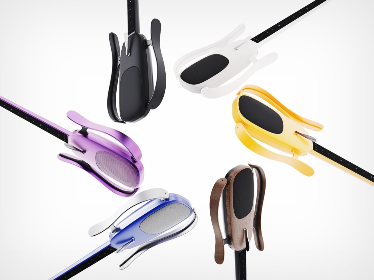
One-key disassembly lets the neck separate from the body, so the whole instrument folds into a small carry-on bag and clicks back together in seconds. Anyone who has wrestled a guitar into an overhead bin understands why that matters more than it sounds. The shells pop off too, which is where the personality lives, with RIFFMATE rendering in matte black, crisp white, a purple gradient, sunshine yellow, a blue-to-silver fade, and a warm walnut finish. Swapping those panels lets owners recolor the instrument or replace a scuffed part, stretching its lifespan instead of sending it to landfill. Modularity turns the guitar from a fixed object into a system that grows and changes with the person holding it.

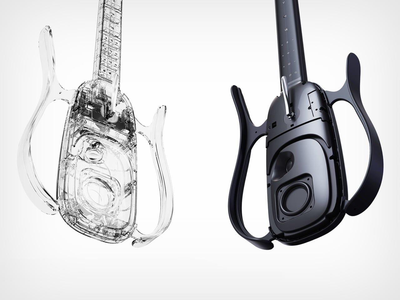
The transparent render exposes a properly engineered acoustic cavity inside that central pod, with dedicated internal channels feeding a front-firing driver. That makes RIFFMATE self-amplifying, able to fill a room without an external amp or a tangle of pedals. The body wears a matte frosted texture over soft, rounded contours, sitting closer to a well-resolved Bluetooth speaker than to a slab-bodied Stratocaster. Those friendly surfaces read as age-agnostic, pitched at a curious ten-year-old and a lapsed forty-year-old guitarist alike. The whole object invites handling, exactly what an instrument built to lower the stakes should do.

Smart guitars have inched toward this moment for years, and LAVA did much of the groundwork by wrapping carbon fiber around a built-in touchscreen and turning the instrument into a full software ecosystem. RIFFMATE pushes that lineage somewhere stranger, questioning whether a guitar needs strings or a body at all, and joining a small wave of stringless designs rethinking the form from scratch. The honest caveat is that this remains award-stage industrial design, so we are judging intent and renders rather than a shipping spec sheet. As a vision, it lands as one of the boldest reinterpretations of the guitar to cross my desk in a while. Whether Wo Tan Ni Chang can build the object as beautifully as LKK drew it is the question worth watching.

The post This Award-Winning Guitar Ditches the Strings, the Frets, and Most of the Body, and I Kind of Love It first appeared on Yanko Design.