bibigo Just Made Chopsticks With Touchscreen Tips for Scroll-Eaters

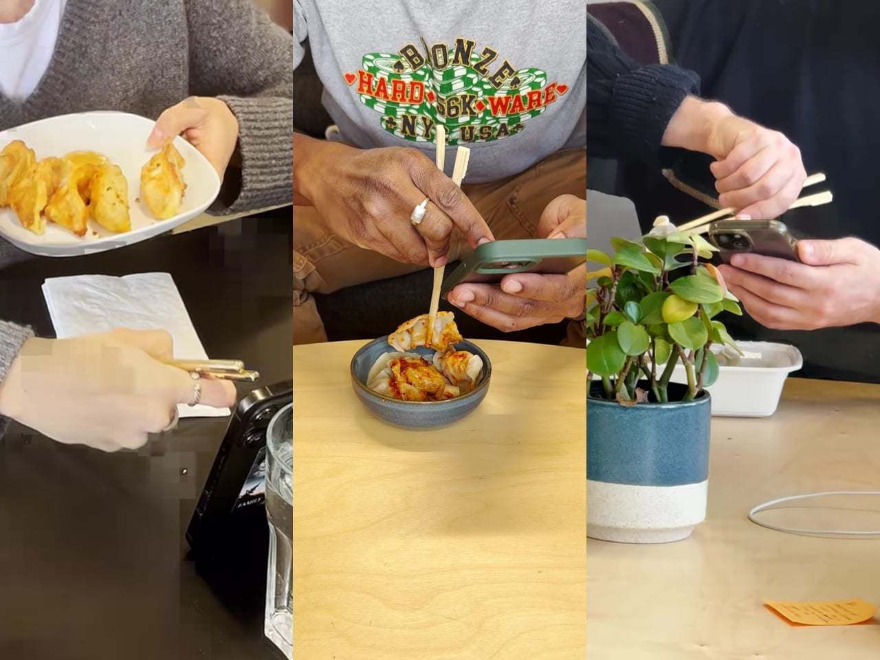
There’s a greasy phone screen somewhere in your immediate past. Maybe it was a dumpling, maybe it was a bowl of noodles, maybe it was something with a suspiciously orange sauce. Either way, you were eating and scrolling at the same time, and the evidence is still on the glass. Nobody’s proud of it, but according to a survey bibigo ran through Angus Reid, 96% of Americans have used their phone while eating, so at least you’re in excellent company.

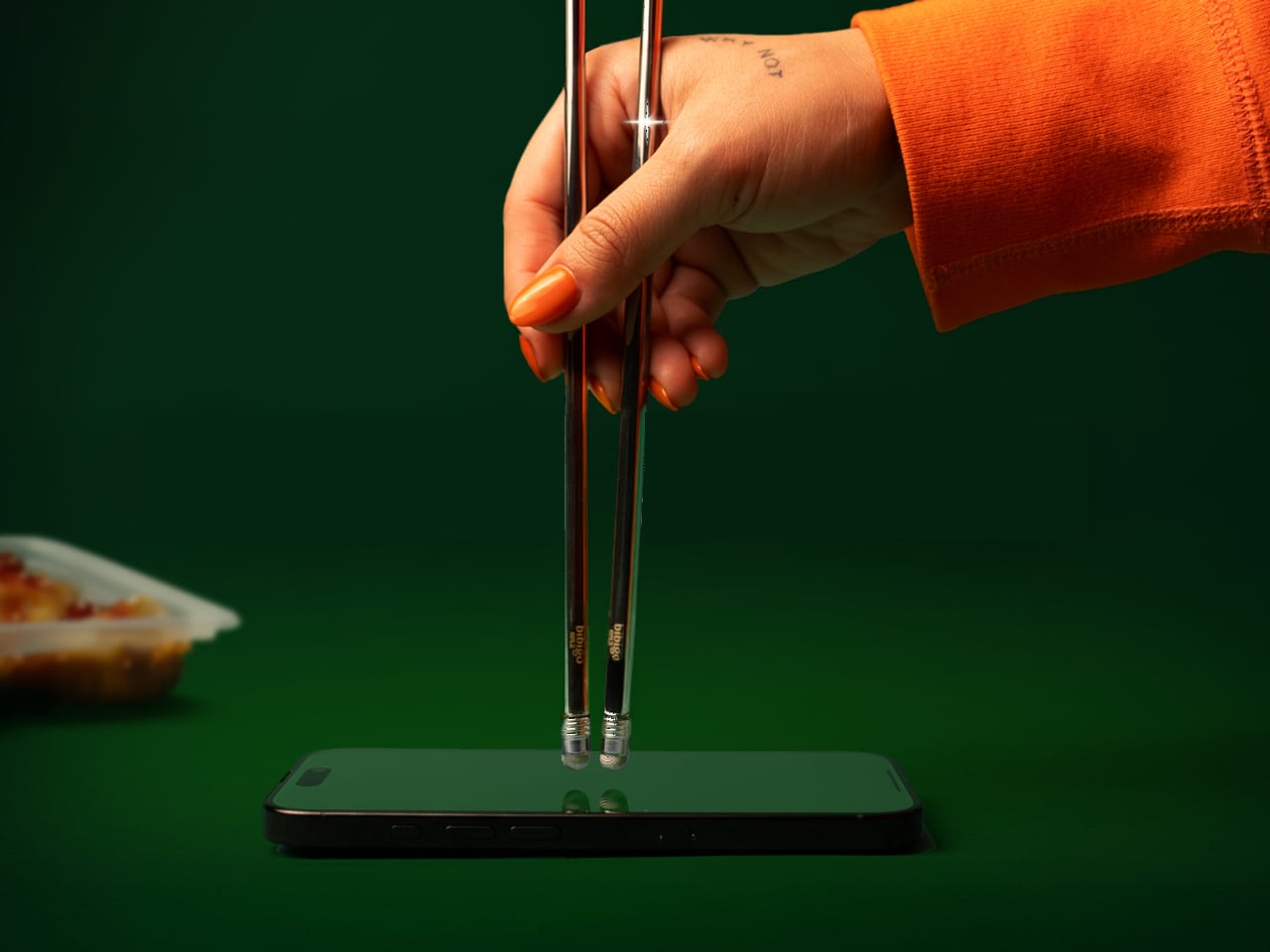
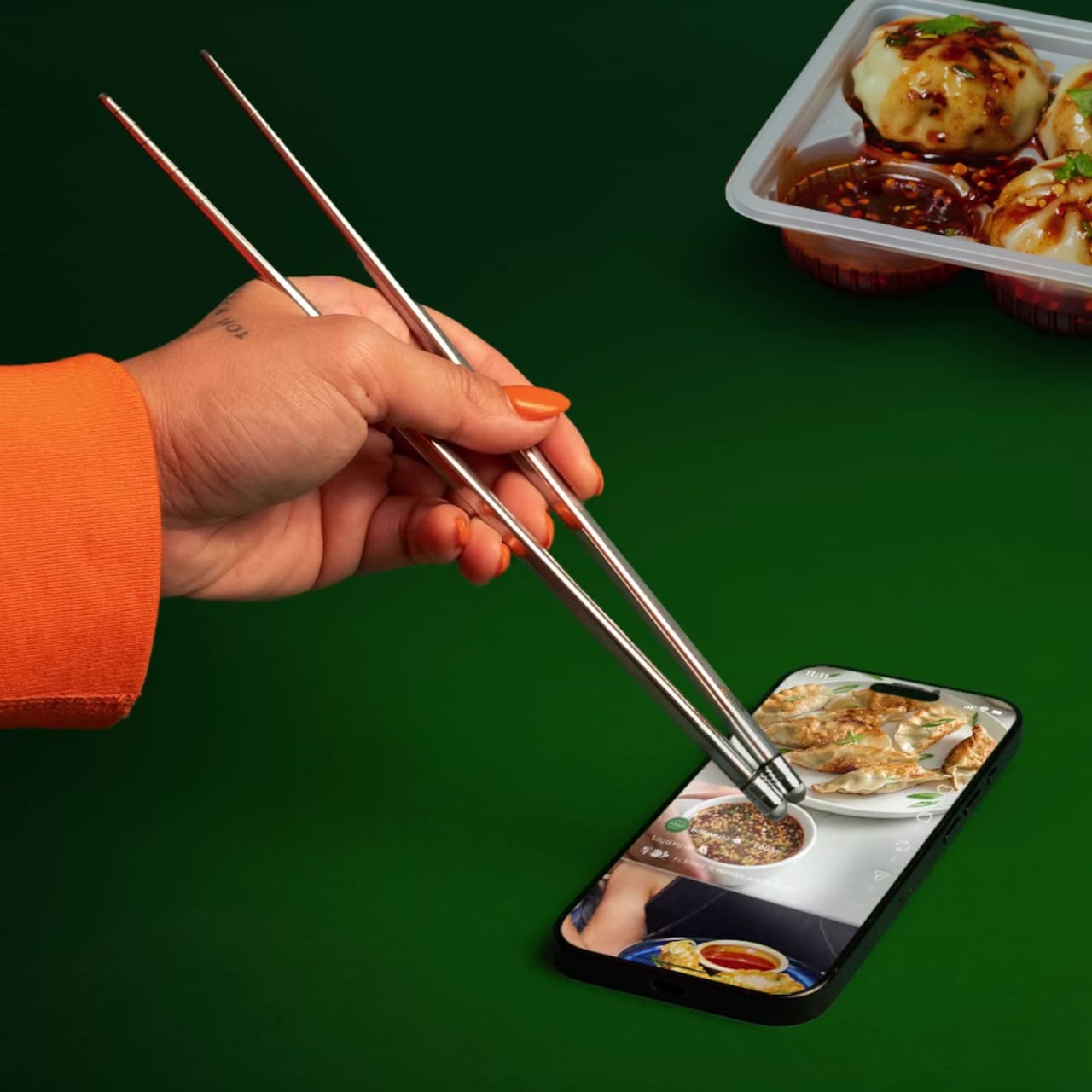
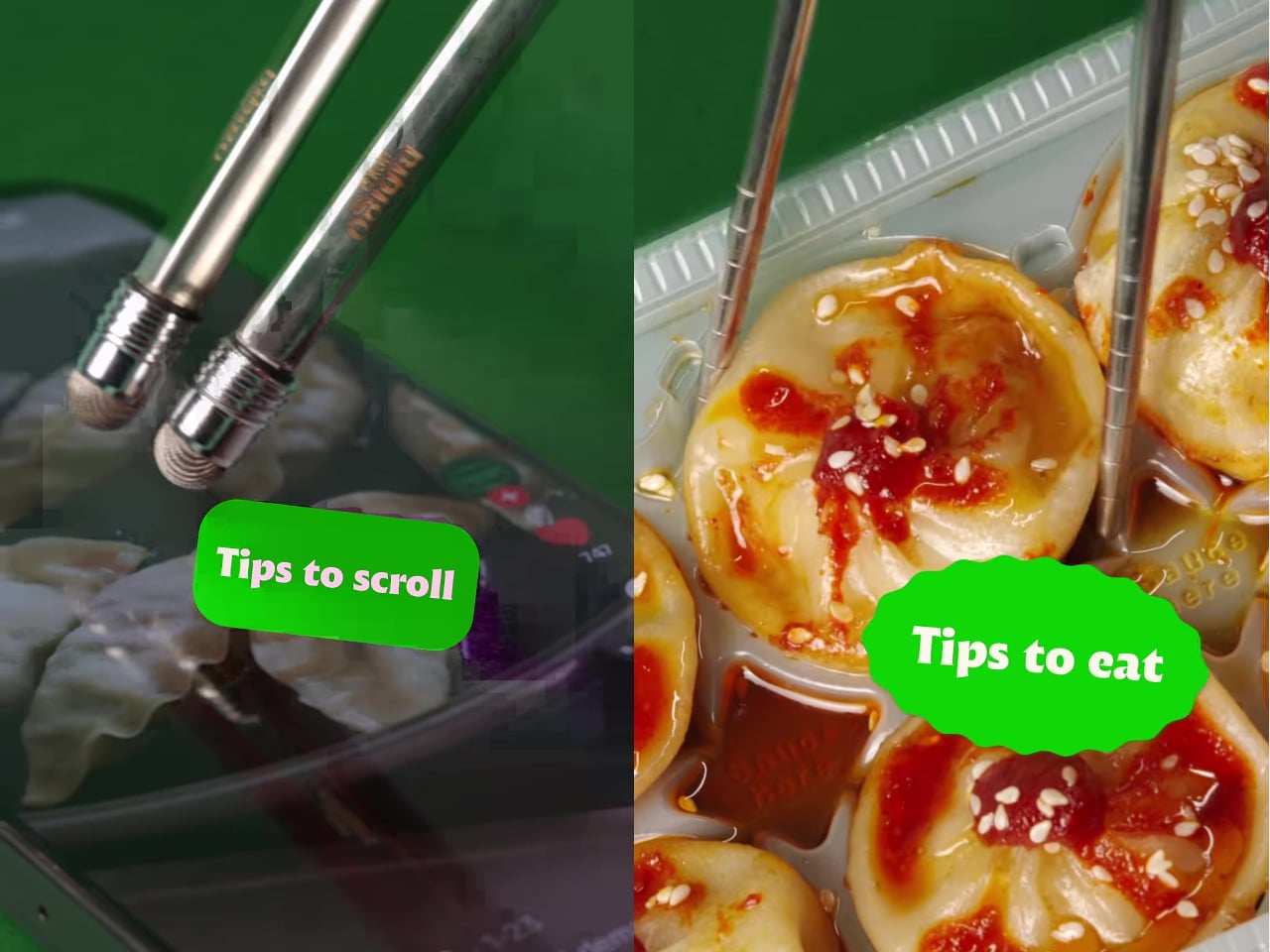
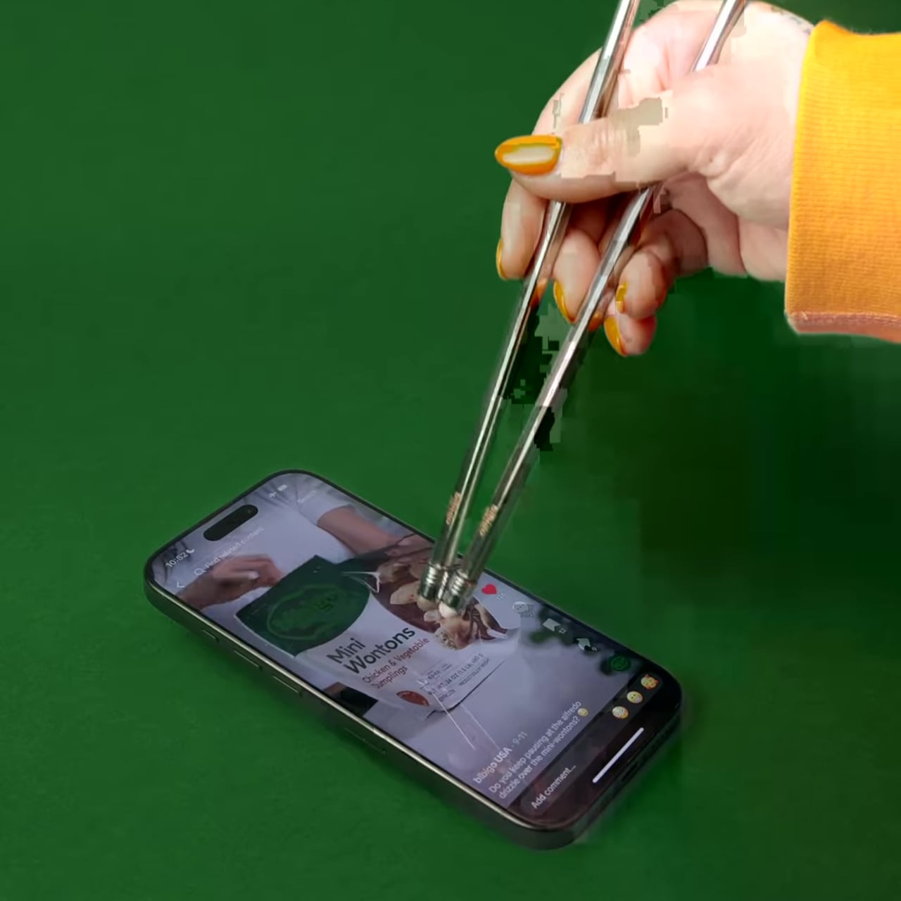
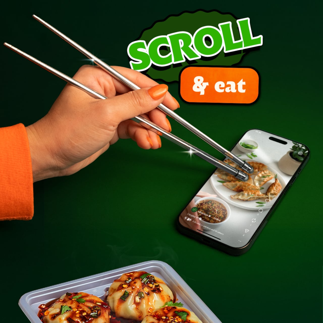
bibigo, the Korean food brand behind what the internet has collectively decided are its favorite dumplings, decided to design for the habit instead of lecturing about it. ScrollSticks are dual-ended chopsticks with touchscreen tips, one end for picking up food and the other for tapping, swiping, and scrolling on a phone. The premise is simple: two dedicated ends for two different jobs, keeping the oil and sauce where they belong.

Designer: bibigo

The research behind the launch is basically a monument to relatable chaos. Beyond the 96% who’ve scrolled while eating, 66% do it often during at least one meal a day. Nearly three in four people report frustrations: 41% are frustrated by getting their hands or phones dirty, 30% struggle to hold a phone comfortably while eating, and 28% can’t keep their screen clean. ScrollSticks are bibigo’s answer to all of the above, which is either very clever or a sign of the times, possibly both.

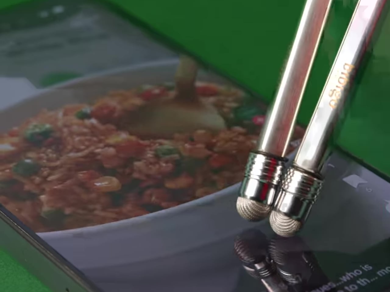
The design logic is straightforward. You eat with the food end, then flip the chopsticks and use the touchscreen-compatible tips to tap and scroll without transferring dumpling residue onto the glass. The tips work with capacitive touchscreens, so it’s not just poking the screen with metal but actually registers as a touch. One tool, two dedicated functions, and your screen stays marginally more dignified.

The cleaning situation is also handled better than you’d expect from what sounds like a novelty item. The touchscreen tips unscrew from the chopsticks, so you can dishwasher or sink-wash the metal body just like any other silverware. That modularity is doing serious practical work here. A touchscreen-tipped chopstick that you can’t properly clean would be a different, worse product.

bibigo frames ScrollSticks as part of its “food-tainment” innovations, which is a word that exists now and apparently describes branded objects that blur eating and entertainment culture. The previous entry in that line was the bibigo Dashboard Kitchen. ScrollSticks are sillier and more useful, which is a hard combination to pull off.

The chopsticks are a limited-edition drop, and the window is short. That’s fitting for something that is partly a product and partly a cultural artifact: a small, polished admission that dinner and doomscrolling are now the same meal, and if the phone is staying at the table, at least the screen deserves better than a dumpling-flavored fingerprint in the corner.

The post bibigo Just Made Chopsticks With Touchscreen Tips for Scroll-Eaters first appeared on Yanko Design.
Gustaf Westman’s Curling Bowl Turns Olympic Gold Into Your Snack

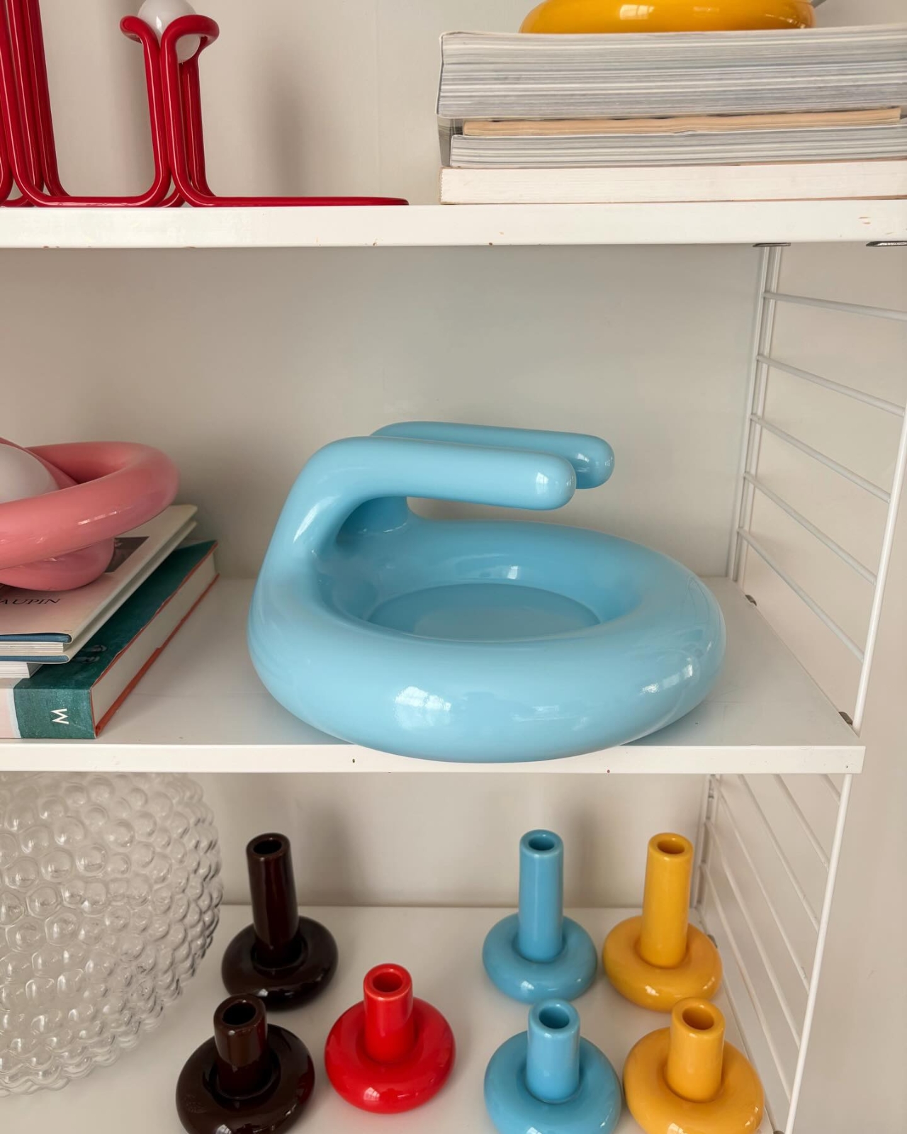
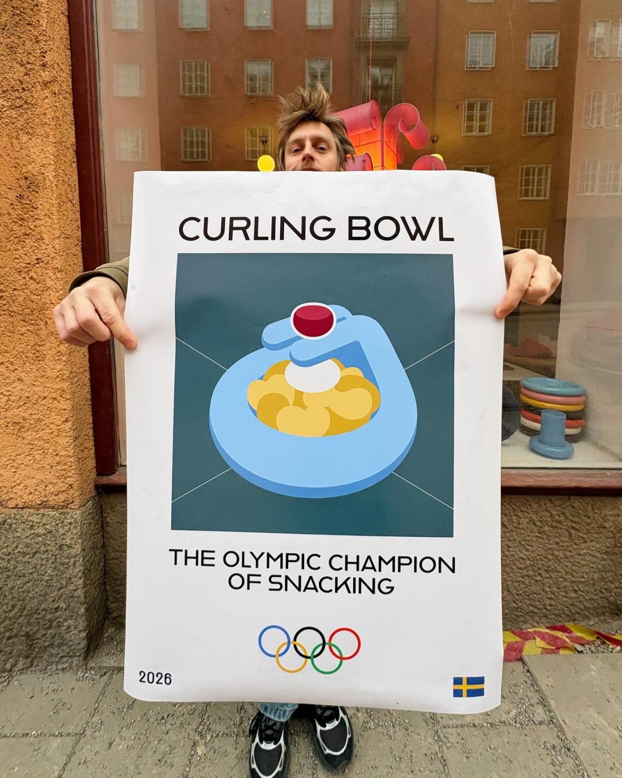
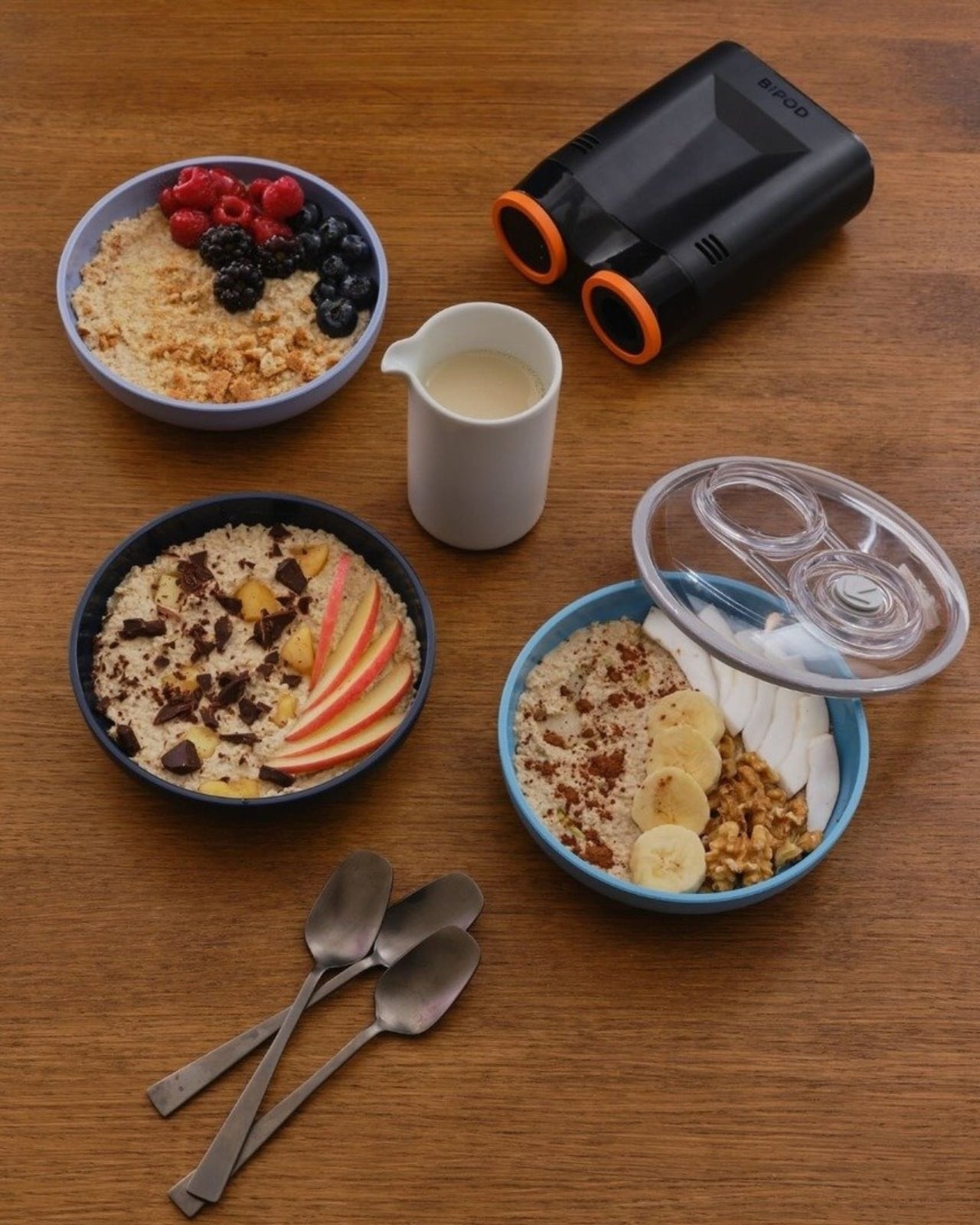
There’s something delightfully unexpected about watching a designer take a winter sport and turn it into a snack vessel. But that’s exactly what Swedish designer Gustaf Westman has done with his latest creation, the Curling Bowl, and it might be the most charming thing to come out of the Milano Cortina 2026 Winter Olympics.

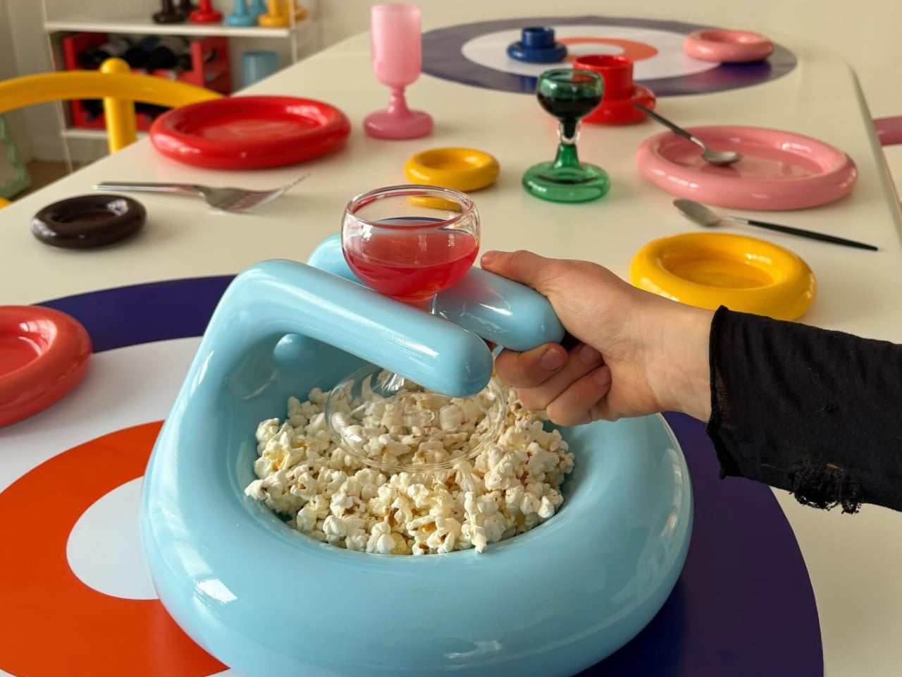
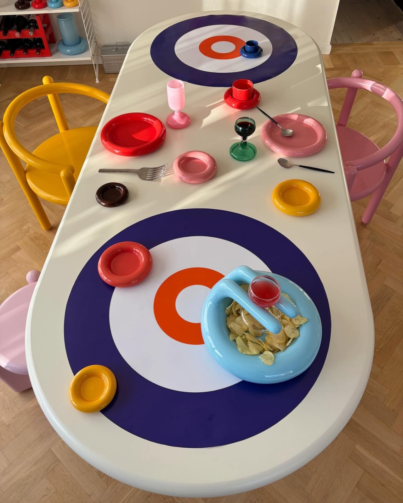
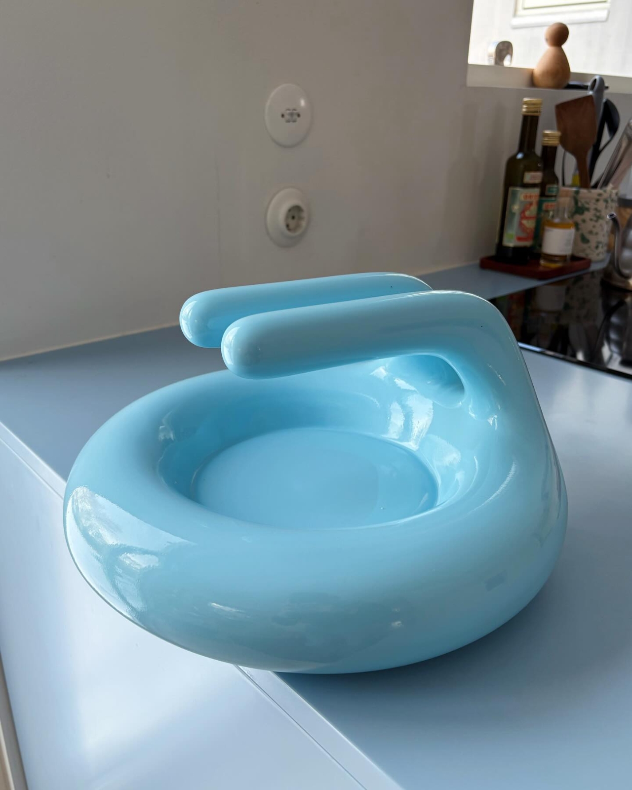
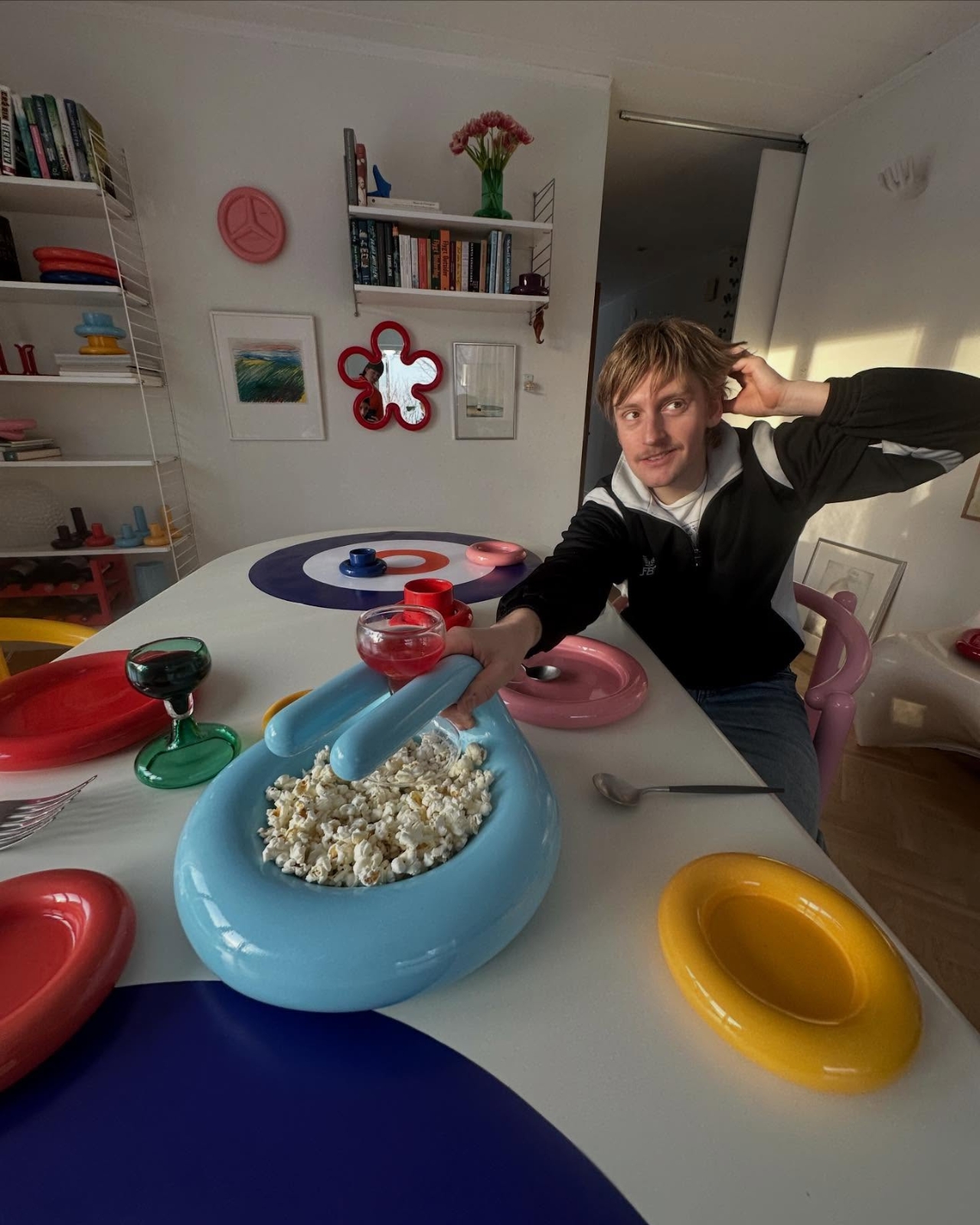
Westman, who has built a reputation for his inflated, chunky aesthetic that makes everything look like it’s been puffed up with joy, found his inspiration in an unlikely place. When his fellow Swedes, siblings Rasmus and Isabella Wranå, took gold in the mixed doubles curling event against Team USA, Westman did what any designer would do: he celebrated by creating something new. The result is a glossy, sky-blue bowl that perfectly captures the rounded silhouette of a curling stone, complete with that distinctive elevated handle.

Designer: Gustaf Westman

The Curling Bowl isn’t just a literal translation of sports equipment into home decor. It’s smarter than that. Cast in high-gloss pastel blue, the piece softens the compact mass of a traditional curling stone into something that feels approachable, almost huggable. The handle, which on a real curling stone helps players grip and release with precision, here doubles as both a functional grip and a built-in tray. It’s the kind of thoughtful design twist that makes you wonder why no one thought of it before.

What makes this piece particularly clever is how Westman transforms the essence of the sport itself. Curling is all about precision, friction, and those hypnotic sweeping gestures that look like someone’s desperately trying to convince the ice to cooperate. Westman takes that same energy and translates it into the domestic ritual of snacking. Reaching for popcorn from the Curling Bowl mimics that poised grip before a slide. It’s sport as metaphor for hosting, and it works surprisingly well.

This isn’t Westman’s first rodeo with playful design. Since establishing his Stockholm-based studio in 2020, he’s developed a signature style that’s immediately recognizable. His work features tactile curves, surprising color combinations, and shapes that look almost cartoonish in their exaggerated proportions. Whether it’s his wavy mirrors, chunky desks, or blob sofas, there’s a consistent thread of joy running through everything he creates. His pieces don’t just sit in a room; they announce themselves with cheerful confidence.

The collaboration with IKEA last year for a holiday collection showed Westman’s range. Working with pastel pinks, dusty blues, cherry reds, and emerald greens, he created tableware and home objects that challenged conventional holiday aesthetics. The collection was playful without being childish, bold without being overwhelming. It’s that same sensibility that makes the Curling Bowl work. It’s fun, but it’s also genuinely functional.

The timing of the Curling Bowl’s release feels intentional. Dropping it during the Winter Olympics taps into that collective sports enthusiasm that sweeps through social media every few years. But unlike official Olympic merchandise that often feels corporate and forgettable, this piece has staying power. It’s the kind of object that will still feel relevant long after the closing ceremonies, because it’s not really about the Olympics at all. It’s about taking something ordinary (a snack bowl) and making it extraordinary through thoughtful design and a healthy dose of whimsy.

What’s particularly refreshing about Westman’s approach is his willingness to be unserious in a design world that can sometimes take itself too seriously. There’s a playfulness here that feels genuinely joyful rather than forced. The Curling Bowl doesn’t pretend to be solving major design problems or revolutionizing how we think about tableware. It’s just a really well-designed bowl that happens to look like a curling stone and makes you smile when you use it.

For anyone who’s been following Westman’s work, the Curling Bowl feels like a natural evolution. It has his signature inflated geometry, his love of glossy finishes, and his ability to take everyday objects and inject them with personality. For those discovering him for the first time, it’s a perfect introduction to a designer who understands that good design doesn’t have to be austere or minimal to be meaningful. Sometimes it can just be fun, functional, and finished in the perfect shade of pastel blue.

The post Gustaf Westman’s Curling Bowl Turns Olympic Gold Into Your Snack first appeared on Yanko Design.
HEINZ Put Ketchup on Tap, and Game Day Will Never Be the Same

Abundance defines the modern football watch party. Chips come in oversized bowls, wings arrive by the tray, and drinks are rarely poured one glass at a time. Yet one essential element of the game day ecosystem has remained painfully under-engineered. The ketchup bottle, small, squeezable, and deceptively fragile, has long been the weakest link in an otherwise well-orchestrated snack spread. And during football’s biggest game of the year, that failure is almost inevitable.

This season, HEINZ decided to redesign the ritual!

Designer: HEINZ

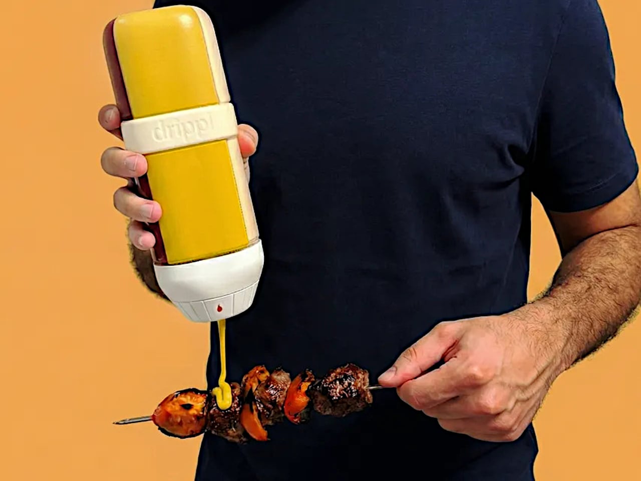
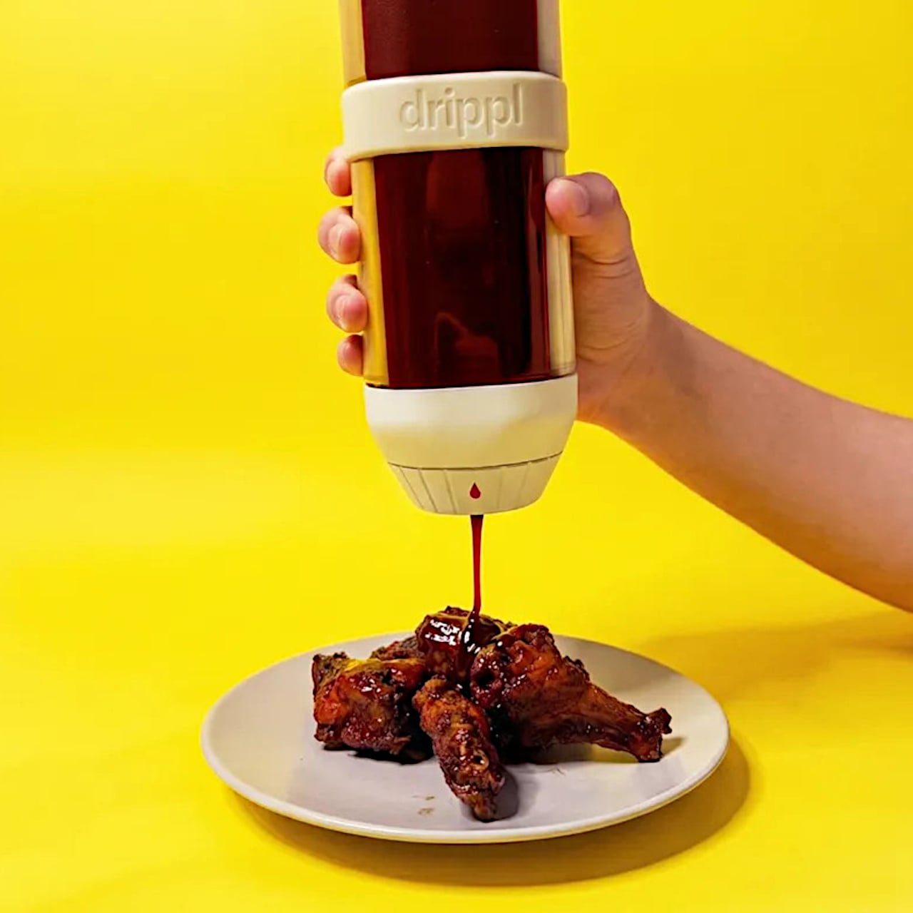
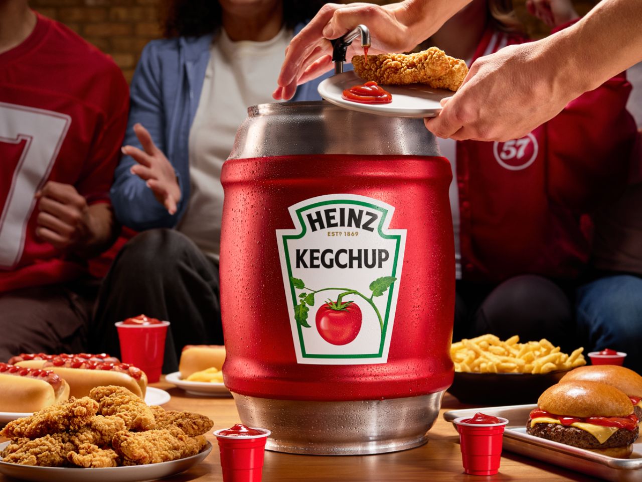
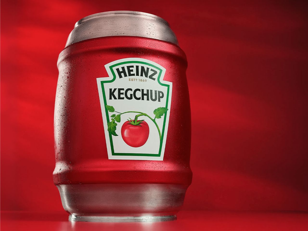
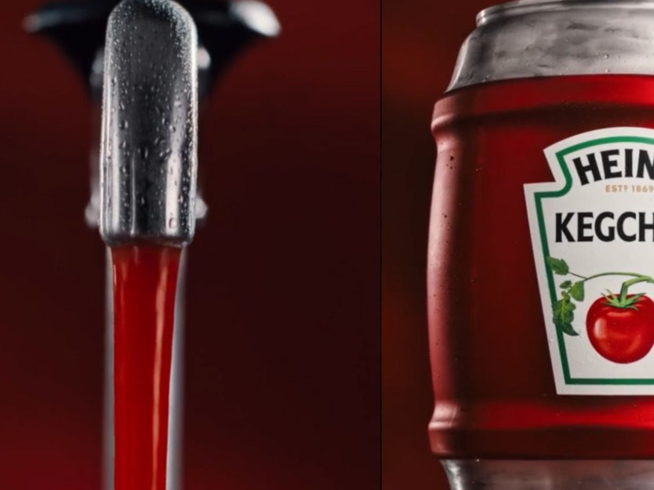
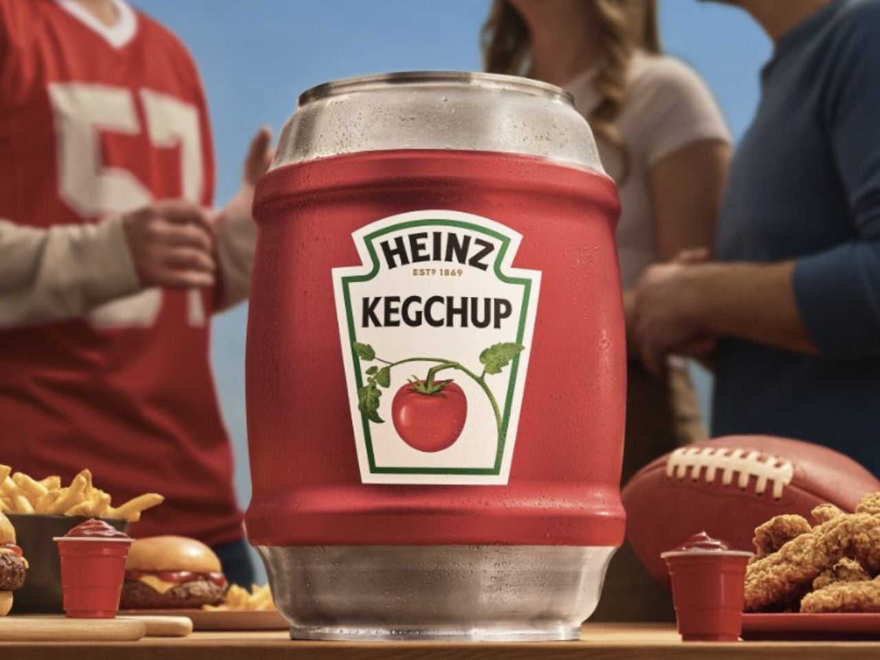
Ahead of the Big Game, the brand has introduced the HEINZ KegChup, a stainless steel, 114-ounce keg filled entirely with its unmistakably rich ketchup. The idea borrows directly from beer culture, a space that solved the problem of running out long ago. Football fans understand this instinctively. When something matters to the experience, it is engineered for scale. It is put on tap!

For decades, beer has been treated as the centerpiece of watch parties, designed for endurance across four quarters. Food, however, has quietly taken on an equally important role. The Big Game is now the second-largest food holiday in the US, with the majority of fans watching from home and preparing their own snacks. Fries, sliders, nuggets, and hot dogs are not just menu items. They are structurally dependent on ketchup. Yet the condiment itself has remained confined to packaging designed for moderation rather than momentum.

The HEINZ KegChup flips that logic entirely. Standing 19.5 inches tall and fitted with a tap-style spigot, the keg is unapologetically excessive. It removes the need to squeeze carefully, ration servings, or keep a backup bottle hidden in the fridge. Instead, it allows ketchup to flow freely throughout the game. Pour, dip, repeat. No interruptions. No halftime shortages.

From a design perspective, the KegChup does more than scale volume. It reframes ketchup as infrastructure. The spigot becomes a visual and functional anchor on the snack table, much like a beer tap at a tailgate. The stainless steel body signals durability and seriousness, while the familiar HEINZ branding ensures the object reads as trustworthy rather than novelty. The result is playful, but grounded in real use behavior.

The product also reflects a feedback-driven design approach. After teasing the concept on Instagram last fall, HEINZ saw nearly 1 million views and thousands of fan interactions, effectively validating the idea before it became physical. That momentum has now translated into a limited rollout, with fans able to enter a social giveaway and sign up for exclusive access ahead of a broader limited edition release planned for the start of the 2026 football season.

In a category often focused on new flavors or packaging tweaks, the HEINZ KegChup stands out by redesigning the ritual itself. It acknowledges a simple truth of football culture. Running out of ketchup can feel like a bigger party foul than a dry keg. By putting its most iconic product on tap, HEINZ is not just solving a supply problem. It is designed for the emotional rhythm of game day, from kickoff to the final whistle.

When the clock is ticking, the crowd is hungry, and the stakes are high, the last thing anyone should be worrying about is whether there is enough ketchup left.

The post HEINZ Put Ketchup on Tap, and Game Day Will Never Be the Same first appeared on Yanko Design.
This Platinum-Winning Glass Stacks Like a Chalice

There’s something incredibly satisfying about a drinking glass that just feels right. You know what I mean: the perfect weight in your hand, a shape that fits naturally to your lips, and maybe even a little something extra that makes you smile every time you reach for it. Austrian designer Florian Seidl gets this, and his Cali glassware series just won a Platinum A’ Design Award, proving that even the simplest everyday objects deserve serious design love.

The Cali series comes from Officina Endorfino, Seidl’s creative playground where curiosity meets experimentation. These aren’t your standard kitchen glasses. Made from borosilicate glass (the same stuff used in lab equipment and high-end cookware), they’re surprisingly lightweight yet durable enough to handle hot and cold liquids without breaking a sweat. But what really catches your eye is how they play with light and perception. The material’s unique properties create captivating reflections that mess with your sense of volume and weight, making each glass look almost sculptural on your table.

Designer: Florian Seidl

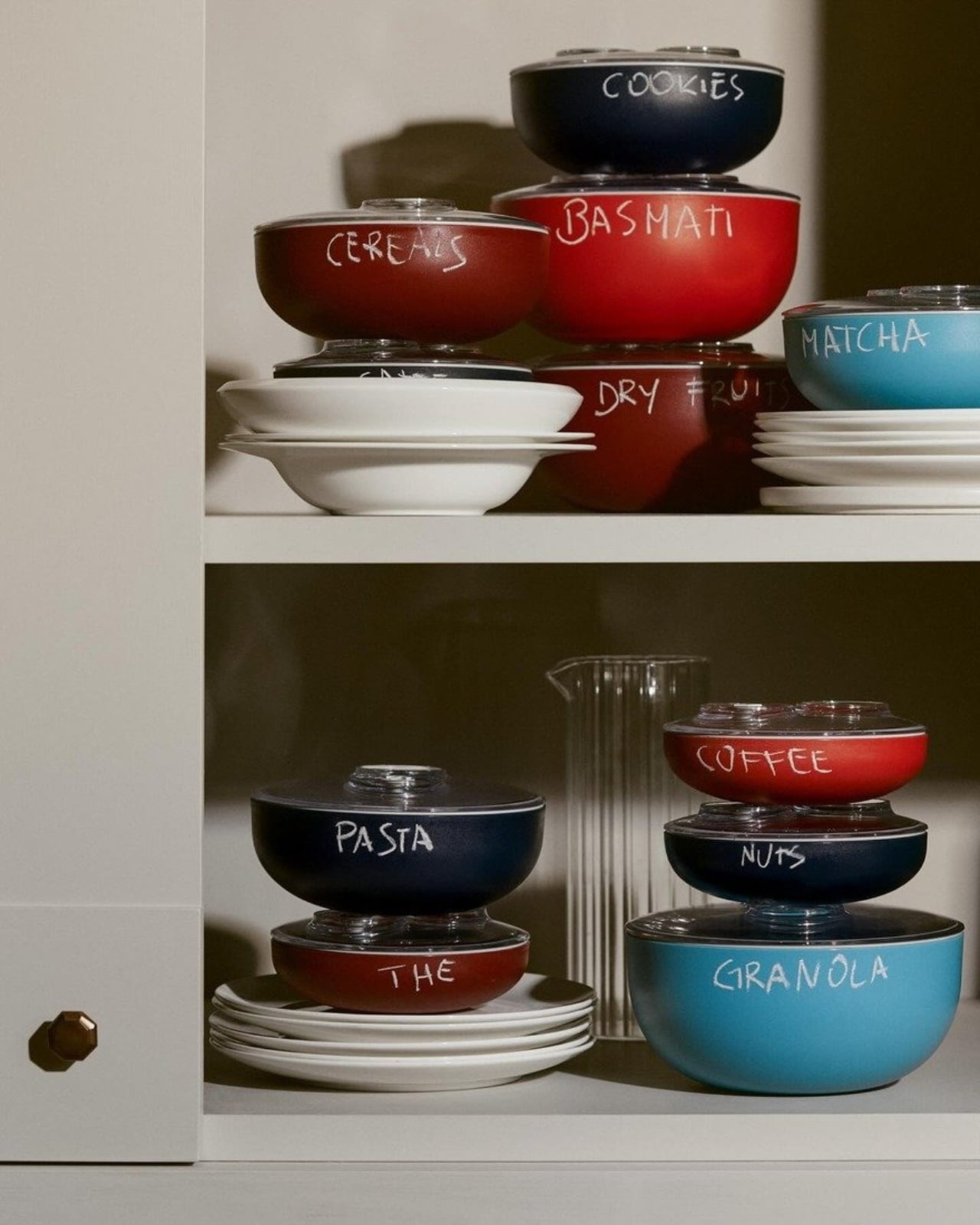
What makes this collection particularly clever is its stackable design. The glasses come in three distinct sizes that nest together beautifully, solving that eternal kitchen cabinet space problem we all deal with. But Seidl didn’t just think about storage. The way these glasses stack actually references the elegant form of a chalice, giving them a subtle sophistication that elevates your everyday water or morning juice into something more special.

Seidl brings an interesting background to this project. With years of experience across various industries, including automotive and product design, he knows how to balance form with function. His multidisciplinary approach shows in the Cali series, where practical considerations never overshadow the aesthetic vision. Each glass manages to have personality without being fussy, and functionality without being boring.

The sustainability angle is worth mentioning too. While the glasses themselves are built to last (borosilicate glass is notably resistant to thermal shock and everyday wear), the packaging gets its own eco-friendly treatment with recycled cardboard. It’s a thoughtful touch that shows consideration for the entire product lifecycle, not just the glamorous end result.

What strikes me most about Cali is how it represents a growing shift in design culture. We’re moving past the idea that everyday objects should just blend into the background. Instead, designers like Seidl are asking why our daily rituals shouldn’t involve beautiful, well-considered pieces. Your morning coffee, your afternoon iced tea, your evening wind-down beverage all of these moments can be enhanced by thoughtful design that respects both your practical needs and your aesthetic sensibilities.

The Platinum A’ Design Award recognition is particularly significant here. This isn’t a participation trophy. It’s an acknowledgment from design professionals that Cali represents something genuinely special in the kitchenware category. The award highlights how the series addresses contemporary needs for space-efficient, versatile solutions while pushing creative boundaries in material exploration.

For anyone who cares about the objects they live with (whether you’re a design enthusiast, a minimalist who values quality over quantity, or simply someone who appreciates when things are done right), the Cali series feels relevant. It’s not about status or showing off. It’s about recognizing that the small choices we make about our everyday surroundings actually matter. They accumulate into an environment that either energizes us or drains us, delights us or just exists.

Seidl’s work with Cali suggests that good design doesn’t require complexity or gimmicks. Sometimes it’s about understanding a material deeply, respecting functional requirements completely, and then adding just enough personality to make something memorable. The result is a drinking glass series that works beautifully in practice while looking like something you’d want to display even when you’re not using it. That’s the kind of everyday magic worth celebrating.

The post This Platinum-Winning Glass Stacks Like a Chalice first appeared on Yanko Design.
This Folded Knife Design Challenges 400 Years of Tableware

Sometimes the best designs come from asking a simple question nobody bothered to ask before. For designer Kathleen Reilly, that question was: why does a knife always have to lie flat on the table? The answer came in the form of Oku, a table knife that literally hangs around the edges of your plates and boards thanks to a unique folded handle that defies centuries of Western tableware convention.

When Reilly first arrived in Tsubame-Sanjo, a region in Japan’s Niigata Prefecture known for over 400 years of metalworking tradition, she wasn’t planning to revolutionize the humble dinner knife. The Scottish metalworker had been awarded a Daiwa Scholarship in 2019 and was eager to immerse herself in the legendary craftsmanship of Japanese artisans. What emerged from this cultural exchange was something that bridges East and West in a way that feels both natural and unexpected.

Designer: Kathleen Reilly

The genius of Oku lies in that distinctive bent handle. Instead of resting horizontally like every other knife you own, it hooks over the edge of a plate or wooden board, elevating the blade and creating this almost sculptural presence on your table. It’s a design choice inspired by traditional Japanese place settings and arrangement principles, where every object has intention and purpose. But it’s not just about aesthetics. That elevated position means the blade never touches the table surface, keeping things cleaner and adding an element of interaction between the knife and whatever it’s sitting on.

The project brought together some serious talent from Japan’s craft world. The metal work came from skilled craftspeople in Tsubame-Sanjo, using techniques passed down through generations. The wooden boards that pair with the knives are made by Karimoku Furniture, Japan’s leading wooden furniture manufacturer known for both quality and sustainability. Every piece of wood is sustainably sourced from Japanese forests managed to promote conservation, and the high-quality stainless steel is domestically produced. The whole project operates under Japan’s Ministry of Foreign Affairs Sustainable Development Goals, which gives it some serious environmental credentials.

What makes Oku particularly interesting is how it challenges assumptions. Western tableware has followed basically the same template for centuries, but Reilly looked at those conventions through fresh eyes informed by Eastern design philosophy. The result is functional yet unconventional, introducing what she describes as a refined aesthetic that breathes new life into dining spaces. Dezeen Awards judges agreed, naming Oku the Homeware Design of the Year in 2022. Their comments captured something essential about the design: “Oku has a certain humour to it while being beautiful and innovative. It is a beautiful, honest and delicate design, the way the knife and the block work together has a kind of unified function that is expressed through the form of each.”

There’s something playfully subversive about a knife that refuses to behave like other knives. It perches rather than lays, it interacts rather than just existing. The form tells a story about craft traditions meeting contemporary design thinking, about respecting heritage while pushing boundaries. It’s the kind of object that makes you reconsider other everyday items you’ve taken for granted.

For anyone interested in how design can create dialogue between cultures, Oku offers a compelling case study. It demonstrates that innovation doesn’t always mean adding more features or technology. Sometimes it means looking at something familiar from a completely different angle, informed by traditions that value mindfulness and intentionality in daily rituals. The collaboration between Scottish creativity and Japanese craftsmanship produced something neither culture would have created alone, and that’s where the magic happens.

The post This Folded Knife Design Challenges 400 Years of Tableware first appeared on Yanko Design.

This Oreo-shaped Tea Infuser Retains The Dunking Ritual With A Twist!

There’s something deeply comforting about a cup of tea, especially when it’s paired with an object that makes you smile before you even take the first sip. CookieTea, a tea infuser designed by Peleg Design, turns a familiar daily ritual into a small, joyful moment. Shaped like a classic sandwich cookie, it brings warmth, humor, and intention to the simple act of brewing tea.

At first glance, CookieTea looks almost edible. The resemblance to a real cookie is so convincing that you might hesitate for a second before dropping it into your cup. That playful confusion is part of its charm. Unlike regular tea bags, which tend to disappear into the mug, this infuser is meant to be seen. When dunked into hot water, it looks deliberate and thoughtfully placed, as if it belongs there by design rather than necessity. The act of steeping suddenly feels visual and expressive, not just functional.

Designer: PELEG DESIGN

Click Here to Buy Now

The experience goes beyond appearance. CookieTea is genuinely easy to use, even for someone who does not usually reach for loose-leaf tea. One side of the cookie lifts open effortlessly, creating a small compartment where you can add your preferred tea leaves. Once filled, it seals back securely with a simple press. There is no struggle, no fiddling, and no sense of fragility. The interaction feels natural and intuitive.

The cream layer of the cookie hides one of the smartest details of the design. A peelable strip controls how the tea infuses. When closed, it keeps the interior clean and contained. When opened, tiny perforations allow the flavor and aroma of the tea to mix with the water gently. This thoughtful mechanism ensures that the infuser performs just as well as it looks, balancing cleanliness with proper brewing.

Another small but meaningful detail is the hook-shaped edge built into the peelable strip. This allows CookieTea to rest securely on the rim of the cup, preventing it from sinking to the bottom or floating around while steeping. It also makes removing the infuser effortless once the tea is ready. It solves a common annoyance so quietly that you only realize how useful it is once you experience it.

After brewing, CookieTea continues to add value. Instead of feeling like something to hide away, it fits perfectly on a plate beside your cup. It adds to the overall table setting, enhancing the visual experience rather than disrupting it. Whether used during a quiet afternoon break or while hosting guests, it naturally becomes part of the moment.

CookieTea does not try to redefine tea drinking. It simply makes it more pleasant, more intentional, and more human. It is a reminder that good design lives in the details and that even the smallest everyday rituals deserve objects that spark joy.

Click Here to Buy Now

The post This Oreo-shaped Tea Infuser Retains The Dunking Ritual With A Twist! first appeared on Yanko Design.
Airline Meal Trays Are Broken: This Korean Design Fixes Them

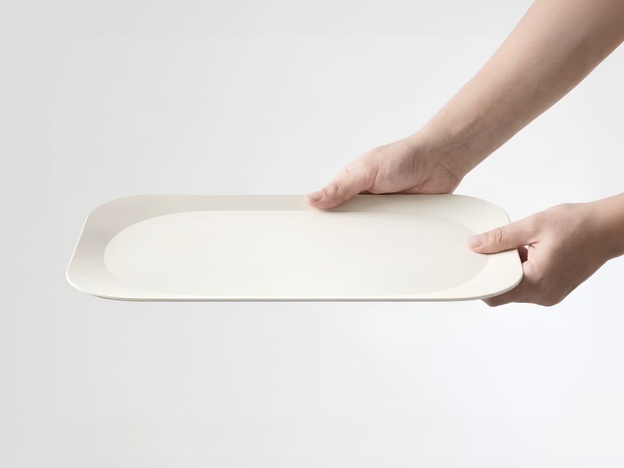
There’s something deeply satisfying about opening a Korean meal to find those little side dishes, each in their own small bowl, arranged just so. The banchan tradition turns eating into a kind of visual feast before you even take a bite. Now, imagine bringing that same thoughtful, modular approach to one of the most notoriously cramped dining experiences: airplane meals.

That’s exactly what BKID co has done with their System Tray design, and honestly, it’s one of those ideas that makes you wonder why we didn’t think of this sooner. The project takes the organizational genius behind Korean side dish service and reimagines it for the narrow, tray-table constrained world of in-flight dining.

Designer: BKID co

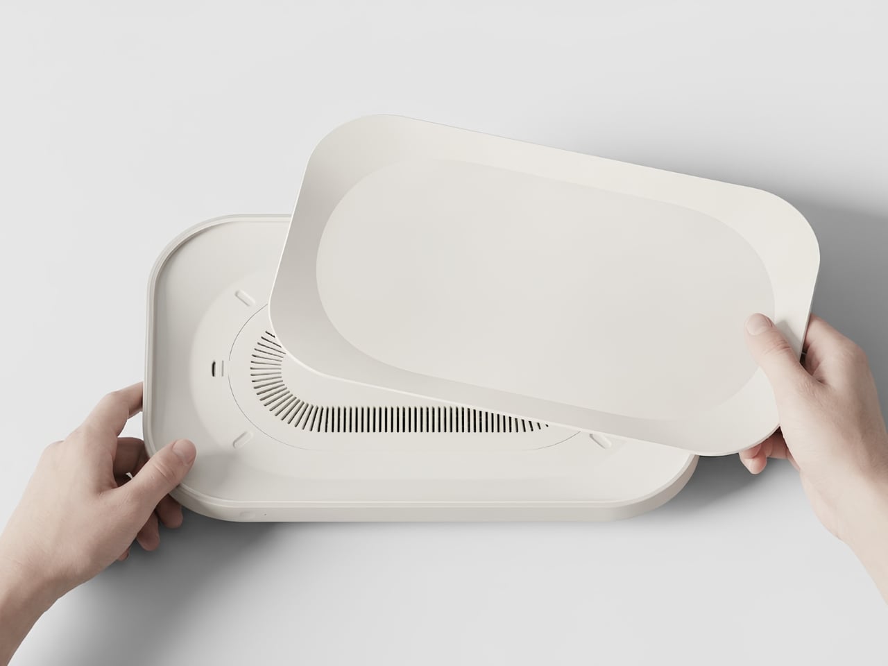
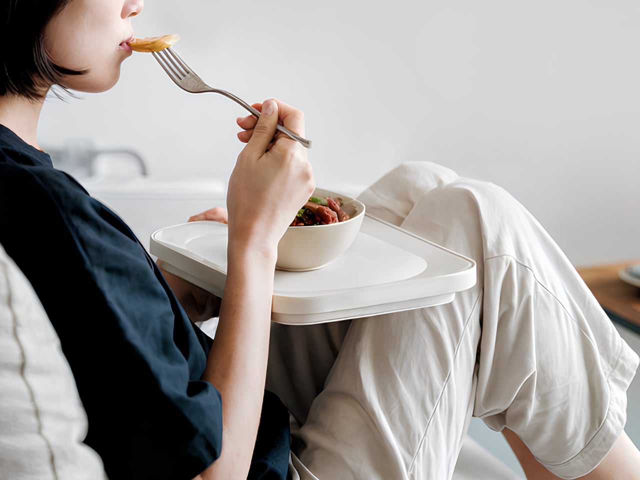
Anyone who’s flown recently knows the struggle. You get your meal tray, and it’s this precarious balancing act of overlapping plastic containers, a wobbly cup threatening to spill, and utensils that somehow always end up on the floor. There’s no elegance to it, no sense that anyone actually thought about the experience beyond “how do we get food from point A to point B?” The System Tray flips that script entirely. Drawing inspiration from traditional Korean wooden trays that hold multiple small dishes, the design creates a modular system where individual plates nest together like a puzzle. Each piece has those beautiful organic, flowing shapes that lock into each other or fit perfectly within the main tray. It’s functional geometry that doesn’t look robotic or cold.

What makes this particularly clever is how it addresses real constraints. Airlines aren’t going to adopt anything that doesn’t meet strict safety standards or adds significant weight. So BKID co worked with lightweight materials like durable plastics and lightweight ceramics, keeping things practical while maintaining that elevated aesthetic. The pieces can stack when not in use, which means they take up less storage space in the galley. For airlines constantly trying to maximize every square inch of cabin space, that’s a huge selling point.

But let’s talk about the visual appeal, because this is where the design really shines. The color palette is subtle and sophisticated: soft creams, muted blues, warm beiges, and earthy browns. These aren’t the harsh primary colors or industrial grays we’re used to seeing on planes. The shapes themselves are organic and almost playful, with curved edges that interlock in unexpected ways. Laid out, they look more like modern art than airline serviceware.

There’s something almost meditative about the way the pieces fit together. You can configure them in different arrangements depending on the meal, whether it’s a full dinner service with multiple courses or a lighter snack. That flexibility is key because not every flight or passenger needs the same setup. The modular approach means the system can adapt rather than forcing one rigid solution.

This design also taps into a broader trend we’re seeing in travel and hospitality: the push to make utilitarian experiences feel special. We’ve watched airport lounges transform into design showcases. We’ve seen hotel rooms become Instagram-worthy destinations. Even train stations are getting architectural makeovers. Why should airplane meals be any different? The banchan tradition isn’t just about having multiple dishes. It’s about balance, variety, and presentation. It turns a meal into something communal and considered, where each element has its place and purpose. That philosophy translates surprisingly well to the challenge of airline food service, where space is limited but the desire for a pleasant dining experience remains.

What BKID co has created here isn’t just a better tray. It’s a rethinking of how we approach one of travel’s most mundane moments. It suggests that even in a space as constrained as an airplane cabin, there’s room for thoughtfulness and beauty. The design proves that solving practical problems doesn’t mean sacrificing aesthetics.

Will we see these trays on flights anytime soon? That’s the real question. Airlines move slowly, and switching out serviceware across an entire fleet isn’t a small undertaking. But as more carriers compete on experience rather than just price, innovations like this become more attractive. Passengers increasingly expect more, even in economy. A meal served on a thoughtfully designed tray system could become a differentiator.

For now, the System Tray stands as a brilliant example of cross-cultural design thinking, where a traditional dining practice inspires a modern solution to a very contemporary problem. It reminds us that good design often comes from looking at how people have solved similar challenges in different contexts, then adapting those insights with fresh eyes.

The post Airline Meal Trays Are Broken: This Korean Design Fixes Them first appeared on Yanko Design.
This Ceramic Bowl Has Secret Compartments for Pistachio Shells

Eating pistachios or olives usually means improvising a discard situation. Shells end up on napkins, side plates, or scattered across the coffee table, and by the time the bowl is empty, there’s a mess to clean up. Shared snack bowls at parties have the same problem: fresh food mixed with scraps, and everyone reaches in with uncertain hands trying to avoid the pile of pits someone left on the edge.

CALYRA treats that mess as part of the design brief rather than an afterthought. It’s a ceramic food and waste server that combines a main serving space with dedicated discard areas in a single form. The two pieces nest together symmetrically, both during use and when tucked away in a cupboard, so pits and shells have an obvious home from the start instead of wandering around the table.

Designer: Christina Tran

Picture a casual evening with pistachios on the coffee table. CALYRA’s larger basin holds the fresh snacks, while two smaller cavities collect empty shells and pits as you work through the bowl. Instead of juggling an extra plate or folding a napkin into an improvised waste pouch, everything stays within one footprint. When you’re done, you can carry the whole situation to the sink in one trip.

Once the food is gone, the two pieces nest into a compact stack. The cut-out legs and curved profiles lock into a stable shape that’s easy to store in a small cabinet. That symmetry means you can carry it as a single object from the cupboard to the table and back again, even when your hands are already full with wine glasses or a tray of something else that needs attention.

CALYRA’s smooth ceramic surfaces and rounded interiors make it simple to rinse or wipe clean, with no tight corners for residue to hide in. The neutral form and color let it move between different foods and settings, from solo snacks at a desk to shared tapas at dinner. It behaves like regular tableware, just with the added intelligence of a built-in waste plan that most bowls quietly ignore.

The concept focuses on the unglamorous part of eating, the shells, seeds, and pits that usually get handled as an afterthought. By folding that step into the serving piece itself, CALYRA turns a small annoyance into a smoother gesture. It’s the kind of quiet improvement that makes you wonder why most snack bowls still pretend the messy part doesn’t exist, as if ignoring it makes it less of a problem when you’re trying to enjoy pistachios without turning your table into a shell graveyard.

The post This Ceramic Bowl Has Secret Compartments for Pistachio Shells first appeared on Yanko Design.
Handcrafted Porcelain Dinnerware Redefines Everyday Dining Through Craft, Light, and Ritual

Porcelain dinnerware has long been shaped by the logic of industrial production. Uniform forms, limited color palettes, and standardized finishes dominate the contemporary table, reducing porcelain to a neutral backdrop rather than an active part of the dining experience. This porcelain dinner set positions itself in deliberate contrast to that reality. It proposes a quieter, more thoughtful vision in which craft, material honesty, and visual sensitivity redefine how everyday meals are experienced.

At the core of the design lies a simple but powerful idea: food presentation should be as engaging as flavor. Dining is not only an act of nourishment, but also one of attention, rhythm, and atmosphere. By merging handcrafted processes with functional versatility, the set bridges modern living and nostalgic familiarity. It feels contemporary in its restraint, yet warm in its tactile and visual language.

Designer: Monte Porcelain

The collection consists of four pieces designed as a cohesive system: a glass, a bowl, a deep plate known as the Saturn plate, and a service or supla plate. Rather than assigning each object a single rigid purpose, the designer embraced multi-use functionality. This approach reflects evolving dining habits, where objects are expected to adapt fluidly across meals, occasions, and spaces.

The glass is conceived as more than a vessel for drinks. Its form allows it to function equally well as a dessert or snack bowl, encouraging informal and flexible use. The bowl supports a wide range of meals, from soup and salad to breakfast cereal and hot appetizers. Along its upper edge, engraved firefly patterns introduce a subtle decorative layer. These motifs are filled with glaze, ensuring a smooth, sealed surface that interacts gently with light, adding depth without distracting from the food itself.

The Saturn plate is designed for both sauced and non-sauced dishes, such as pasta and main courses. Its flat-edged form frames the food cleanly, while the patterned base enriches the visual composition of the plate. The service plate anchors the set, offering generous proportions suitable for main course presentations or layered pasta services. Together, the four pieces create a table setting that is expressive yet balanced.

Material integrity and production ethics play a central role in the project. White porcelain, often referred to as bone porcelain, was selected for its suitability for food contact, durability, and timeless visual quality. Each piece was cast using high-quality porcelain clay in plaster molds, then fired at 1230 degrees with transparent glaze. The firefly patterns were engraved using a special technique and selectively colored or left transparent, allowing light to pass through while remaining fully sealed and hygienic.

The project was developed over an eight-month period, beginning in June 2024 and completed in February 2025 at the Monte Porcelain Ayvalık Workshop. Every stage of production was carried out by hand, including molding, casting, glazing, and painting. Throughout the process, a fair production approach was maintained, with careful consideration for environmental responsibility and respect for nature. No living creatures were harmed at any stage.

Dishwasher safe, food safe, and designed for long-term daily use, the set demonstrates that handcrafted objects can be both poetic and practical. Recognized within international design contexts such as the A’ Design Award & Competition, this dinnerware collection repositions porcelain as an active participant in the dining ritual. It invites users to slow down, notice light and texture, and rediscover the quiet pleasure of thoughtfully designed everyday objects.

The post Handcrafted Porcelain Dinnerware Redefines Everyday Dining Through Craft, Light, and Ritual first appeared on Yanko Design.
This $109 Electric Moka Pot Lives on Your Desk, Not Your Stovetop

Coffee at work usually means a compromise, a paper cup grabbed between meetings or a lukewarm pot abandoned in the break room. The Flarix Pro steps into that gap as a compact electric moka pot that lives wherever you do your best thinking, quietly promising a richer, more focused cup without sending you on a pilgrimage to the office kitchen. It is a simple proposition, but one that required a complete rethink of a century-old brewing method, trading the romance of the flame for the quiet reliability of a dedicated electric base. The goal is to make good coffee a feature of your workspace, not a distraction from it.

Instead of treating great coffee as a weekend luxury, this little brewer integrates it into your everyday life. Plug it in beside your laptop, fill it with water and fresh grounds, and a few minutes later you have a dense, aromatic moka style coffee that feels closer to a ritual than a chore. This is also in part thanks to its avant-garde Alessi-esque Italian-design form factor. On the hardware front, you’ve got basic electronics wrapped in some clever design details, which essentially rewrites when and where good coffee is allowed to happen. This is not about replacing the café; it is about reclaiming the ten minutes at your desk with something that feels personal and well-crafted. The entire package is an argument for better coffee, right here and right now, without asking you to change your workflow. Think Moka pot reinvented for the modern age, because everything’s about convenience – and nobody likes the idea of leaving their desk to make (or worse, buy) coffee elsewhere.

Designer: CDKM

Click Here to Buy Now: $109 $199 (45% off) Hurry! Only 11 days left.

What makes this possible is the deliberate decoupling of the moka pot from the kitchen. By integrating a 365-watt heating element into a self-contained base, the designers have created a brewer that asks for nothing more than a standard wall socket. This modest power draw is key; it is low enough to play nice with office power strips and portable battery stations, making the “brew anywhere” claim feel credible. The unit weighs in at just 978 grams, light enough to be genuinely portable between home and the office. It is a clever piece of engineering that transforms the moka pot from a fixed kitchen appliance into a personal, relocatable coffee station that can follow you through your day.

Of course, putting a pressurized heating vessel on a desk crowded with electronics and paperwork demands a serious approach to safety. The Flarix Pro packs an Italian Albertinari safety valve – a world-class component known for its precise and reliable pressure release, and a critical feature in a device that literally operates on steam pressure. This is paired with a British Strix thermostat, the same kind of controller found in high-end electric kettles, which provides accurate temperature control and boil-dry protection. The system automatically shuts off when the brew is complete, a simple feature that provides enormous peace of mind when your attention is split between your coffee and your deadlines. Al; this is packed in a design that feels playful, unique, and pretty much deviates from the octagonal Moka pot design which feels almost like a template instead of an icon today. This product is fundamentally different, therefore it must look different, is the justification.

The Flarix Pro packs a patented spring-loaded funnel, which is a genuinely interesting departure from the standard passive funnel found in every other moka pot. This design appears to provide a gentle, consistent compression of the coffee grounds as you assemble the brewer. In theory, this could help create a more uniform coffee bed, reducing the risk of water finding a path of least resistance, a phenomenon known as channeling that leads to a thin, under-extracted brew. It is a small, mechanical detail that could have a significant impact on the final taste and consistency of the coffee, shot after shot.

The body is made from food-grade 304 stainless steel, which is durable, easy to clean, and does not impart any metallic taste to the coffee, a common complaint with older aluminum pots. The interior of the water chamber has been sandblasted, creating a matte texture that resists scale buildup and makes cleaning simpler. Even the spout has been carefully considered; its anti-drip design ensures a clean pour, an essential detail when you are serving coffee directly next to important documents or a keyboard. These are the kinds of thoughtful touches that separate a well-designed product from a mere novelty.

Flexibility is also built into the core design. The Flarix Pro comes with a dual-size filter basket, allowing you to easily switch between brewing two or four shots of moka coffee. This is a practical feature that acknowledges that coffee is not always a solo activity. The water chamber has clear internal markings for both volumes, removing any guesswork from the process. This adaptability makes the brewer suitable for a quick personal coffee break or for preparing a round for a small team meeting. The components are all fully detachable, which simplifies the cleaning process and prevents the buildup of old coffee residues that can ruin the taste of a fresh brew.
The result is an aesthetic and characteristic revival of the Moka Pot, which has been pretty much banished to the kitchen all its life. The Flarix Pro allows it to step out of its shell, and into any room you’d want to drink coffee in, whether it’s your home office, your workspace (accompanied by a few stares from coworkers, perhaps), your RV, or even your campsite. Although the classic brushed steel finish has my heart, CDKM offers a sky blue and a dark blue variant of the Flarix Pro, with a $109 price tag and global shipping starting February. Upgrade to the $199 perk, however, and you get the entire bundle, which also features milk steaming pitcher, a handheld electric milk frother, a coffee grinder, and an espresso cup + saucer.

Click Here to Buy Now: $109 $199 (45% off) Hurry! Only 11 days left.

The post This $109 Electric Moka Pot Lives on Your Desk, Not Your Stovetop first appeared on Yanko Design.