Coca-Cola Just Turned Its Iconic Bottle Into Chopsticks

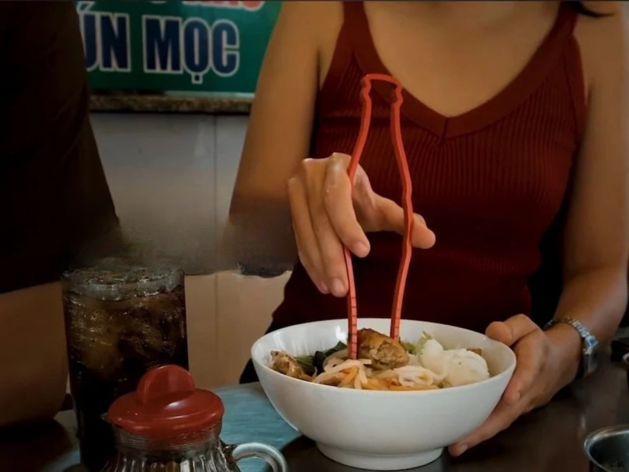
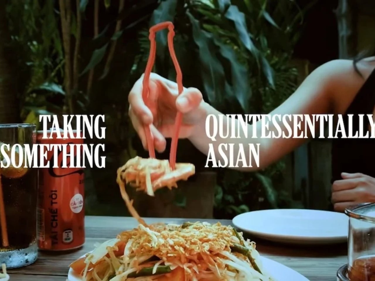
If you visit most parts of East Asia and Southeast Asia, you will find something on almost every dining table, whether it’s at home or a public dining establishment: a pair of chopsticks. If you live there, then you learned to use them starting when you were a young child. If you’re visiting, then you will have to learn to use a pair when eating, or else you embarrassingly ask for other utensils. But in any case, chopsticks are part of every dining experience in that part of the world. They are more than just tools; they are a cultural staple, passed down through generations and deeply woven into the rituals of everyday life.

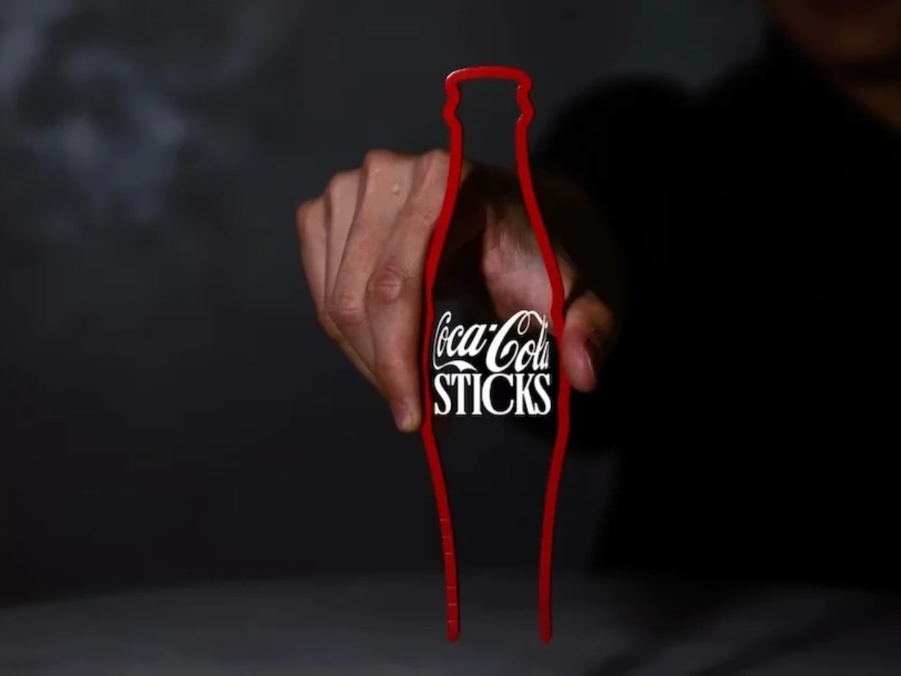
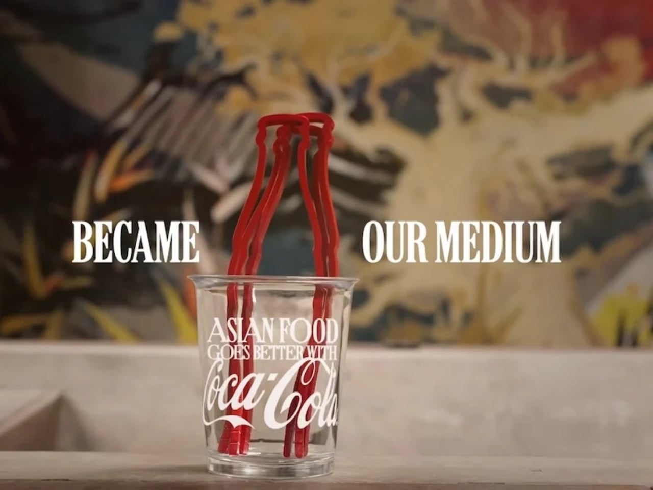
Wherever you live in the world, chances are you’re familiar with Coca-Cola’s iconic contour bottle, whether or not you drink it. Yes, there are cans and plastic bottles now, but even the latter has that distinct shape that was introduced in 1915 to make the brand identifiable wherever you see it, even if broken, even in the dark. That silhouette has since become one of the most recognizable forms in consumer branding history. Coke wants to bring the two together, as many parts of Asia don’t necessarily have the Coke bottle as a regular part of their dining table. So they decided to launch a campaign and create a product that would bridge the two worlds: CokeSticks.

Designer: Coca-Cola

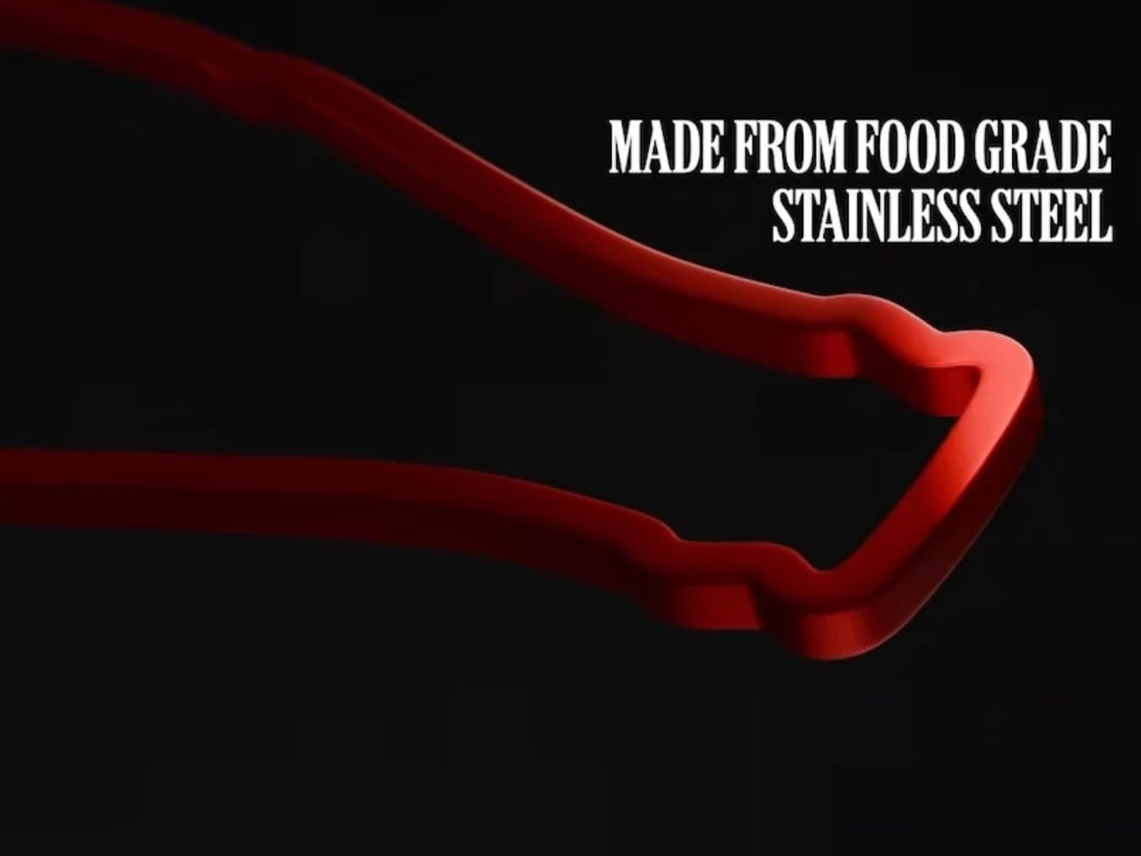
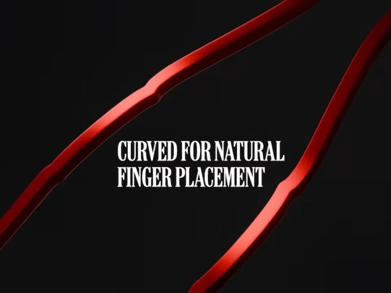
The product is just like what its name sounds like. It reimagines the famous contour bottle as chopsticks that people can actually use when eating. They’re not relying on a logo or any label, but purely on the power of its most iconic form and of course, the equally iconic Coke red color. It’s the kind of idea that feels both obvious and brilliant once you see it: strip away everything but the silhouette and the color, and the brand is still unmistakably there. It proves that this bottle is so distinctive that it can function as something else entirely, because it has its own design language that needs no introduction.

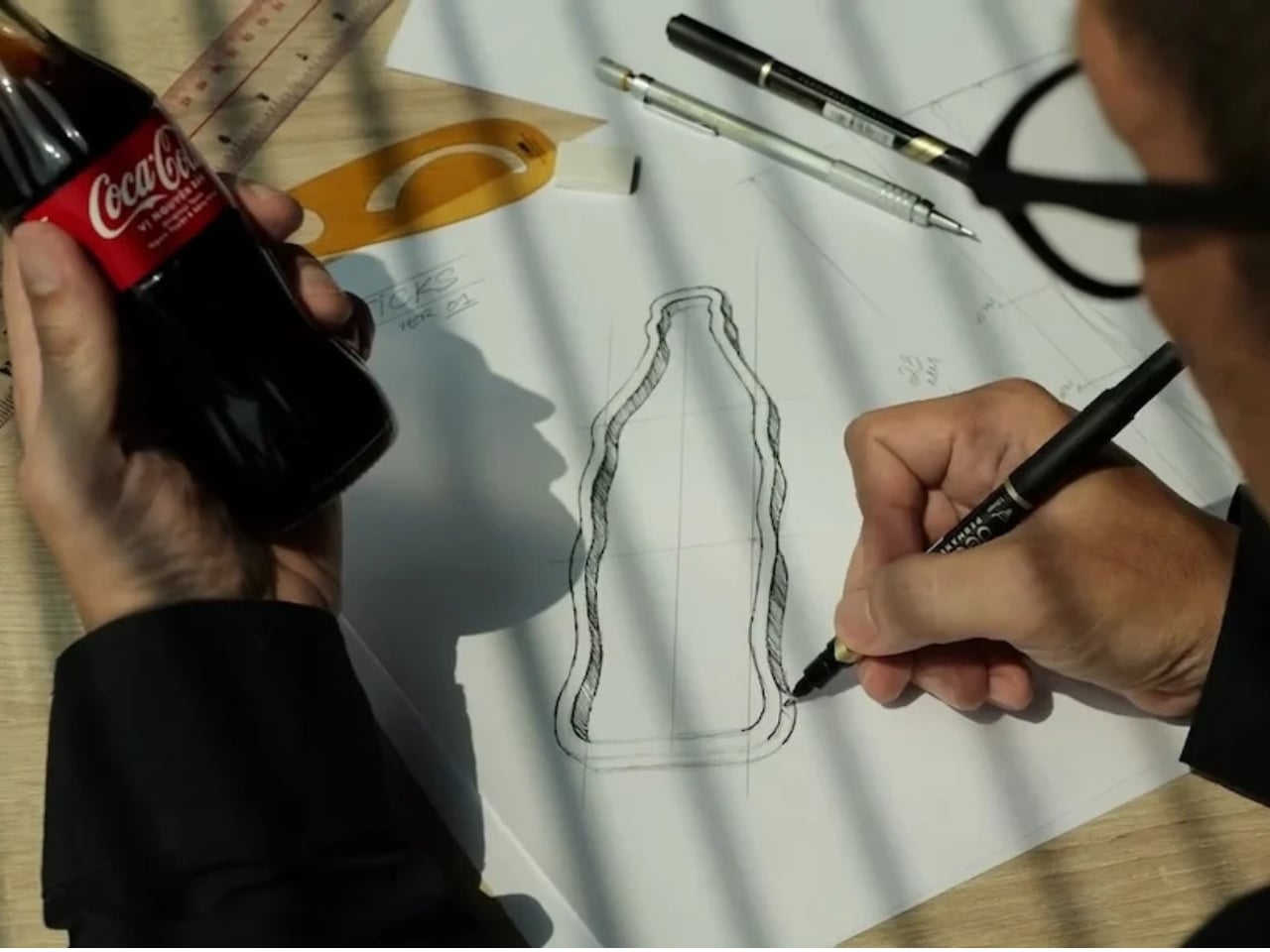
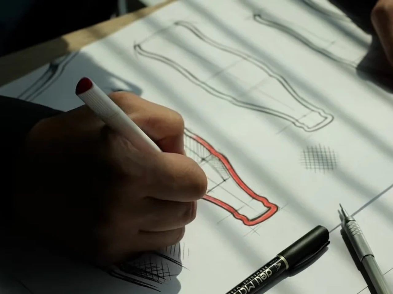
The CokeSticks are made from food-grade stainless steel and are designed to be fully usable despite their unconventional source of inspiration. They are also a clever crossover between packaging design and product design, which has been one of the brand’s strongest suits over the past decades. Coca-Cola has long understood that their bottle is more than just a container; it’s a visual icon, and CokeSticks is perhaps the boldest proof of that yet.

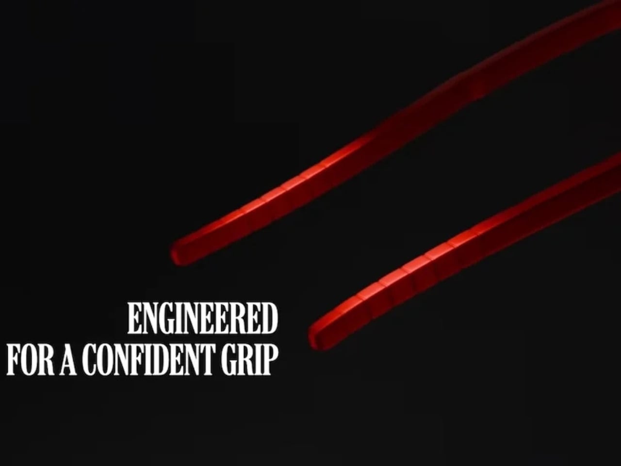
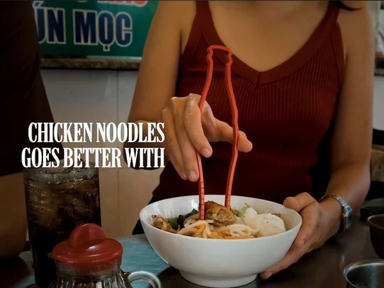
This concept and the campaign are also very specific to Asian dining culture, which goes to show that this is a market they really want to pick up, pun intended. The functional nature of the product can also be seen as both a branding exercise and an industrial design object. And if you’re a fan of the brand and love using chopsticks, then this could easily become part of your daily dining experience. It sits at a fascinating intersection: something that is both deeply familiar and completely new.

There’s also something satisfying about the idea that an object as everyday as chopsticks can carry that much brand storytelling. You don’t need the logo. You don’t need the label. Just those curves, that Coke red, and you already know exactly what you’re holding. It’s the kind of design thinking that collectors and design enthusiasts will appreciate, because it’s not just a gimmick. It’s a genuine extension of one of the world’s most iconic visual identities into a new, functional form.

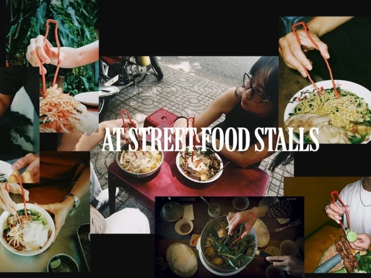
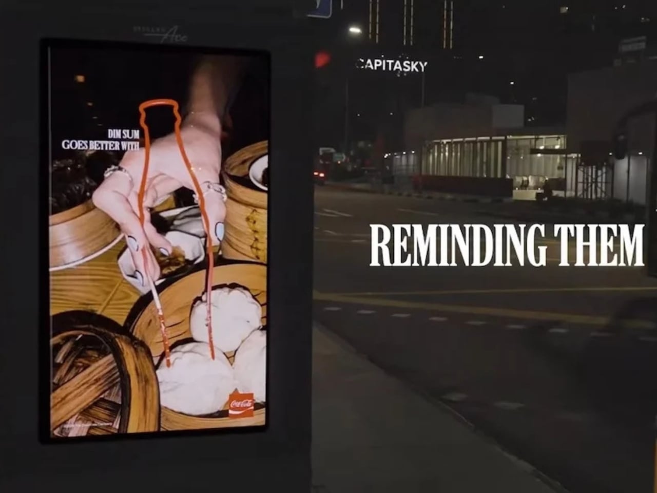
Well, that is, if you’ll be able to get them. It doesn’t seem like something they’ll be selling anytime soon, as CokeSticks will be distributed to restaurants and food delivery experiences in the region. They are targeting this to reach 700,000 people, so hopefully, if you live in Southeast Asia, this will eventually make its way to your table.

The post Coca-Cola Just Turned Its Iconic Bottle Into Chopsticks first appeared on Yanko Design.

G-Shock Just Dropped a Coca-Cola Watch for Its 140th Anniversary

There are some things that you know are fundamentally bad for you, but you can’t resist consuming them. Coke (the soft drink) is one such commodity, and especially during the summer season, it has become more of a necessity than an indulgence. The brand itself has been around for 140 years and has built itself into something that virtually everyone recognizes, from its logos and visual cues to its timeless ad campaigns. It has become a cultural artifact for well over a century, transcending beverage culture to become one of the most iconic brands in history.

To celebrate this milestone, Coca-Cola has partnered with another recognizable global brand, G-Shock, to create a limited-edition collaboration. The GA-2100CC-3A is the first-ever Coca-Cola watch built on the analog-digital GA-2100 base, which has its own massive cult following in the watch community. Enthusiasts affectionately nicknamed the GA-2100 the “CasiOak,” a nod to its resemblance to the luxury Audemars Piguet Royal Oak, making it one of the most talked-about G-Shock models of the modern era.

Designer: G-Shock x Coca-Cola

You would think that a Coca-Cola collaboration would have red and white splashed all over, but G-Shock took a more refined, classic approach. Instead of leaning into the brand’s signature bold palette, the design focuses on a translucent green bio-based resin that is directly reminiscent of Coca-Cola’s iconic vintage contour glass bottle. You do get minimalist splashes of red throughout the design, as it is of course the color most associated with the brand, but it’s tasteful rather than overwhelming. Instead of just slapping the logo on this wearable, you get smart design easter eggs that will delight the most die-hard of Coke fans.

Both the bezel and band come in the aforementioned translucent green, with the dial receiving Coca-Cola-toned hues as well as printed graphics evoking the iconic bubbles from the soft drink’s fizz. At the 9 o’clock position, the date indicator hand is shaped like the brand’s beloved fluted glass bottle. That same bottle motif is carried over into the band loop as well, keeping the design cohesive and intentional. Flip the watch over and you’ll find the case back engraved with a bottle cap-inspired design, a subtle but brilliant finishing touch. The entire watch also arrives in exclusive special-edition packaging specifically created to commemorate the brand’s 140th anniversary, making it a complete collector’s package from the moment you open the box.

It’s also worth noting that the use of bio-based resin is not just a stylistic choice. It reflects a growing commitment to more sustainable materials in watchmaking. The GA-2100 series adopted bio-based resin in 2024, and it carries forward seamlessly into this collaboration, giving the watch a modern, eco-conscious edge that feels right at home in 2026.

In terms of technical specifications, you still get all the great hallmarks of the GA-2100 base, which has made it one of the more popular G-Shock models. It is shock resistant as well as water resistant for up to 200 meters. It comes equipped with the usual functions including a timer, stopwatch, and Double LED light, with an approximate battery life of 3 years. The case measures 48.5 × 45.4 × 11.8 mm and weighs in at 51g, slim and lightweight for a G-Shock, which has always been a big part of the GA-2100’s appeal.

The GA-2100CC-3A is priced at ¥27,500 JPY (approximately $175 USD) and is set to release in May 2026 via the Casio webstore. Given that this is a limited-edition piece tied to a once-in-a-generation anniversary, it’s the kind of watch that won’t sit on shelves for long.

Whether you’re a G-Shock collector, a Coca-Cola memorabilia enthusiast, or simply someone who appreciates thoughtful design collaborations, the GA-2100CC-3A checks every box. It’s nostalgic yet modern, playful yet polished, and honestly, much like the drink it celebrates, it’s the kind of thing you didn’t know you needed until it’s right in front of you.

The post G-Shock Just Dropped a Coca-Cola Watch for Its 140th Anniversary first appeared on Yanko Design.