Braille learning device uses minimalist design to facilitate seamless learning

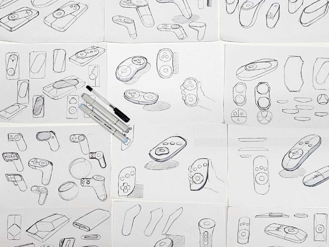
Most people assume that it is easy for visually impaired people to learn Braille. But according to those who are learning this system, the learning tools available are not always that intuitive and easy to use. In fact, the more cluttered a device or tool is, the harder it is as it can be overwhelming for those who are trying to learn and navigate it. Fortunately, there are product designers that want to create concepts for better designed tools that will hopefully be turned into actual products.

Designer: SAQ Design

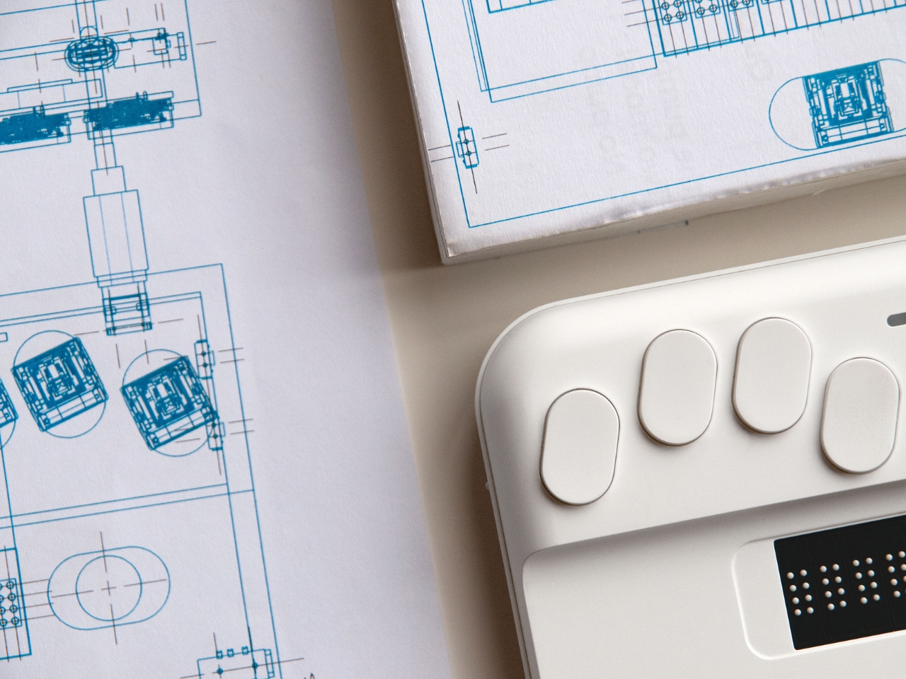
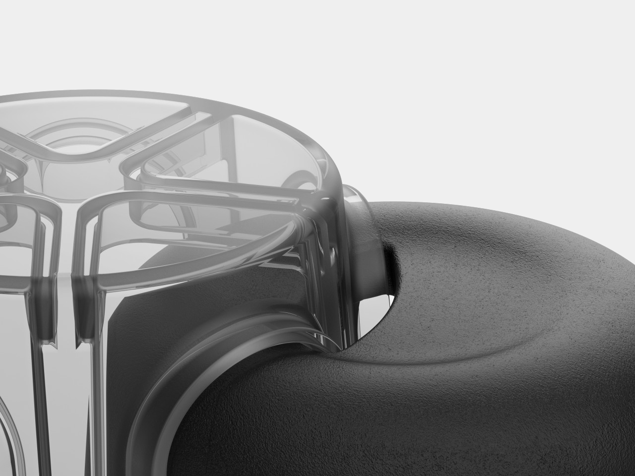
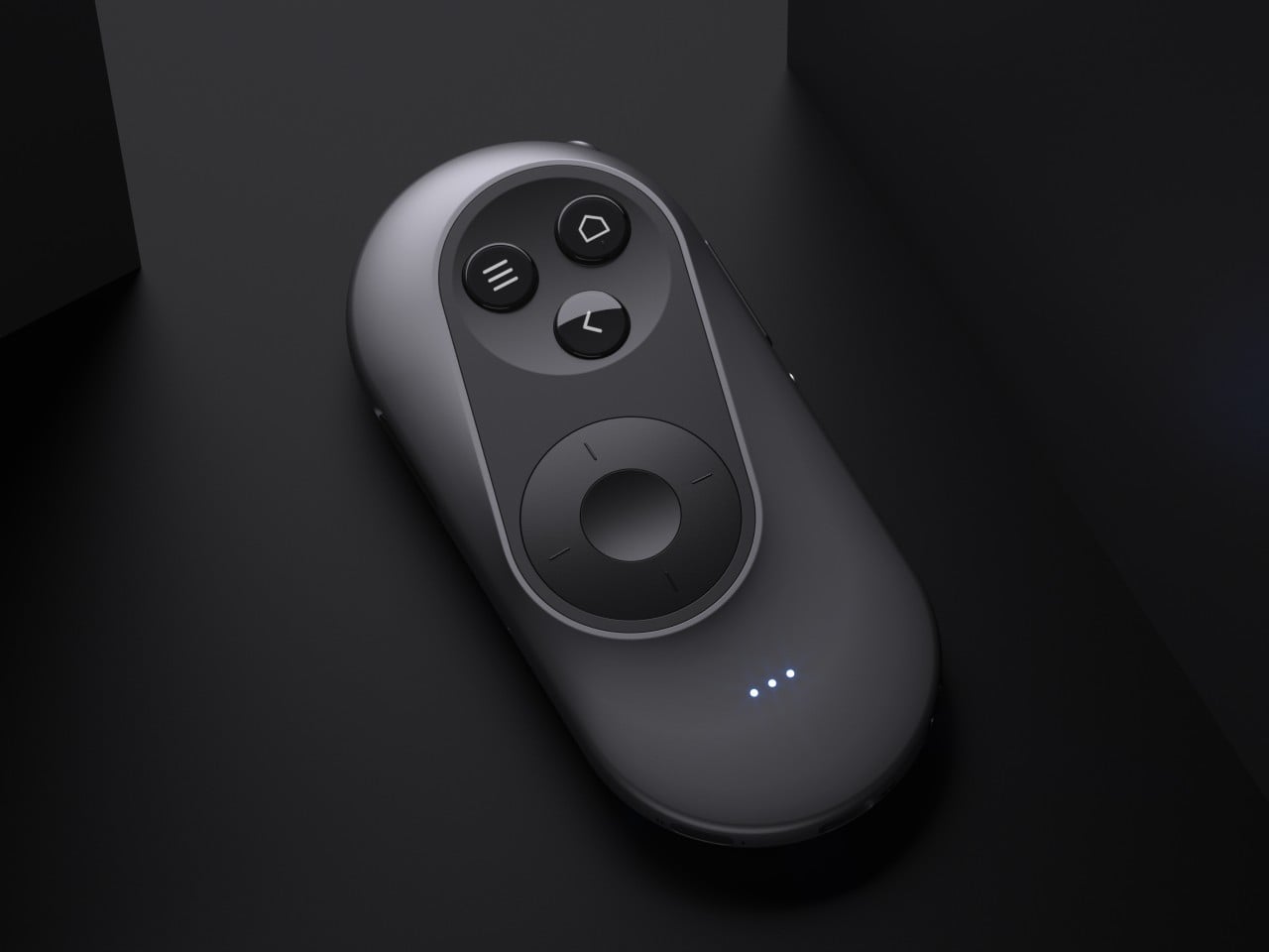
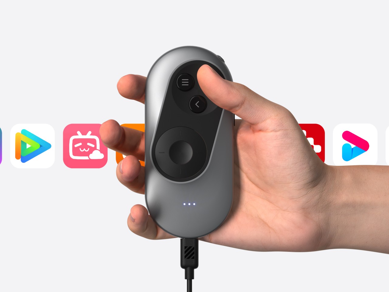
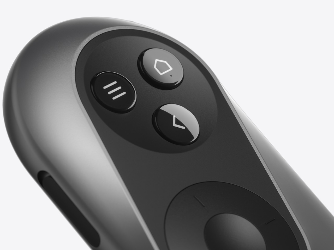
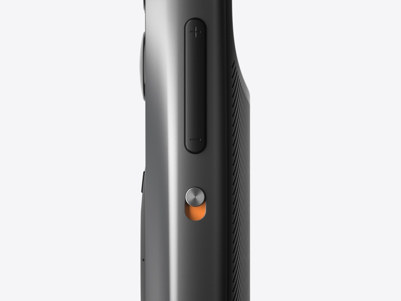
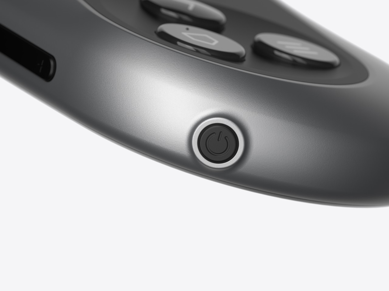
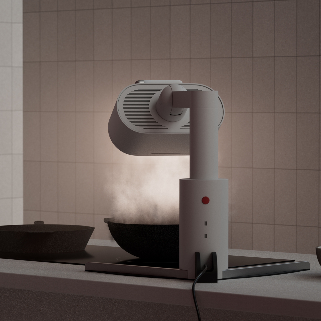
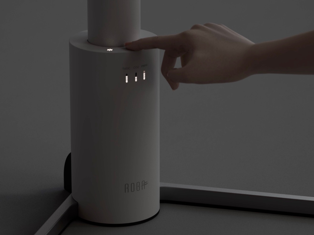
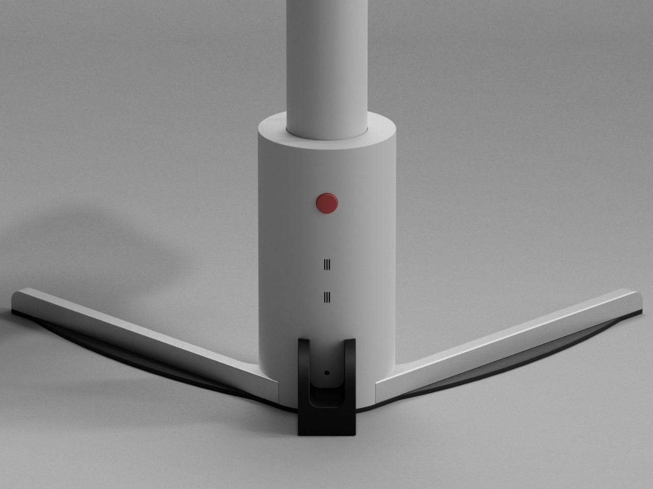
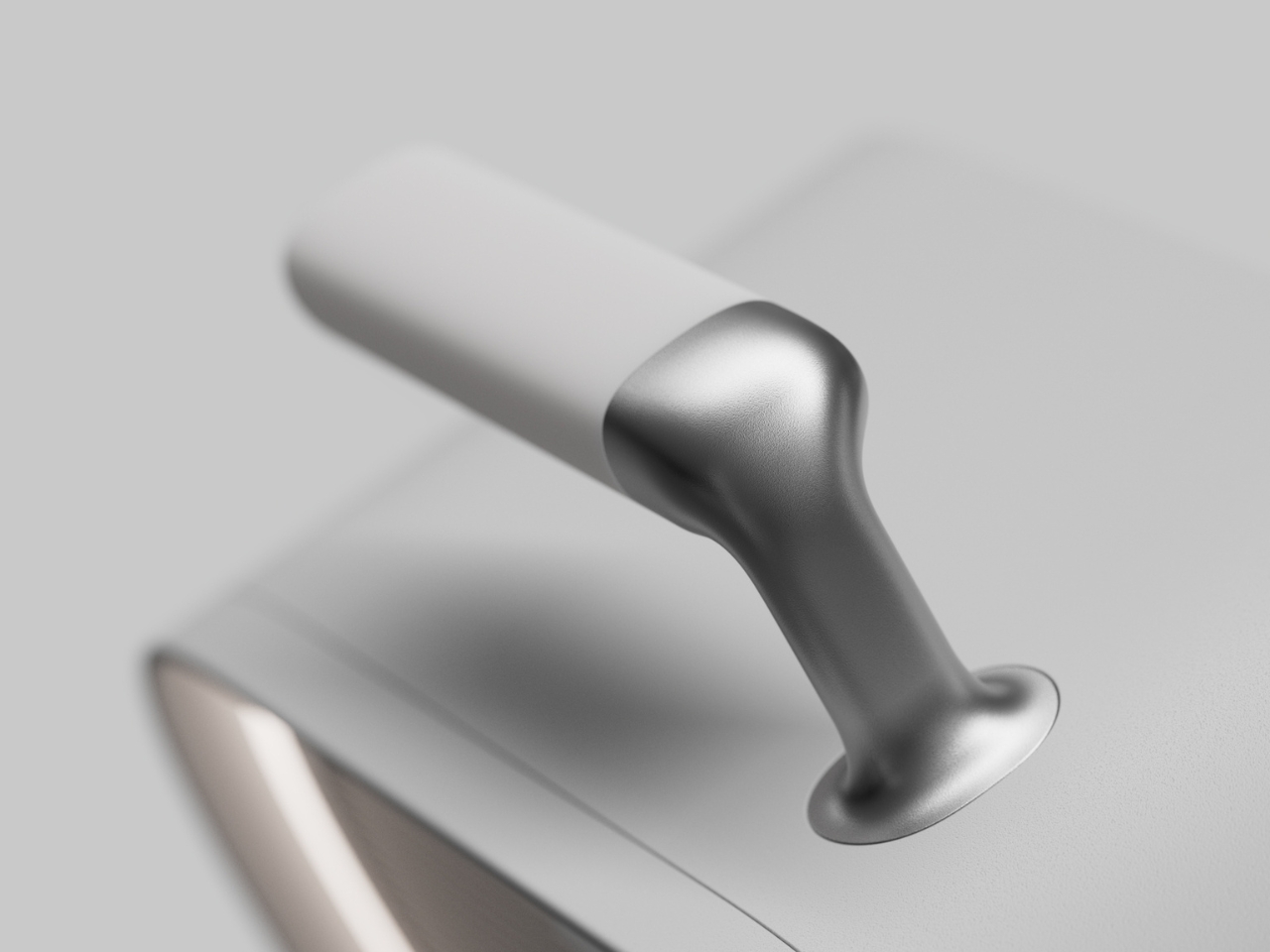
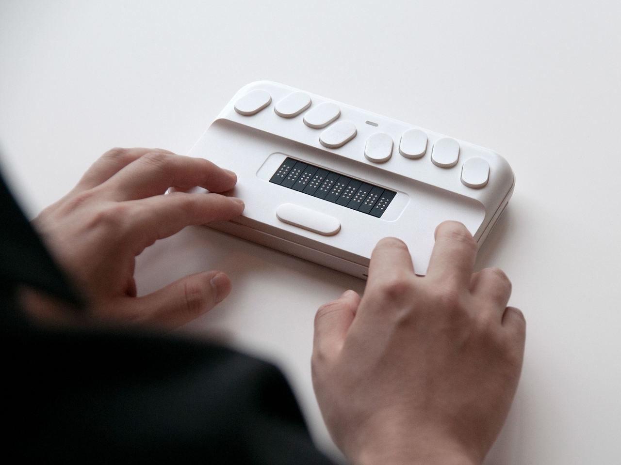
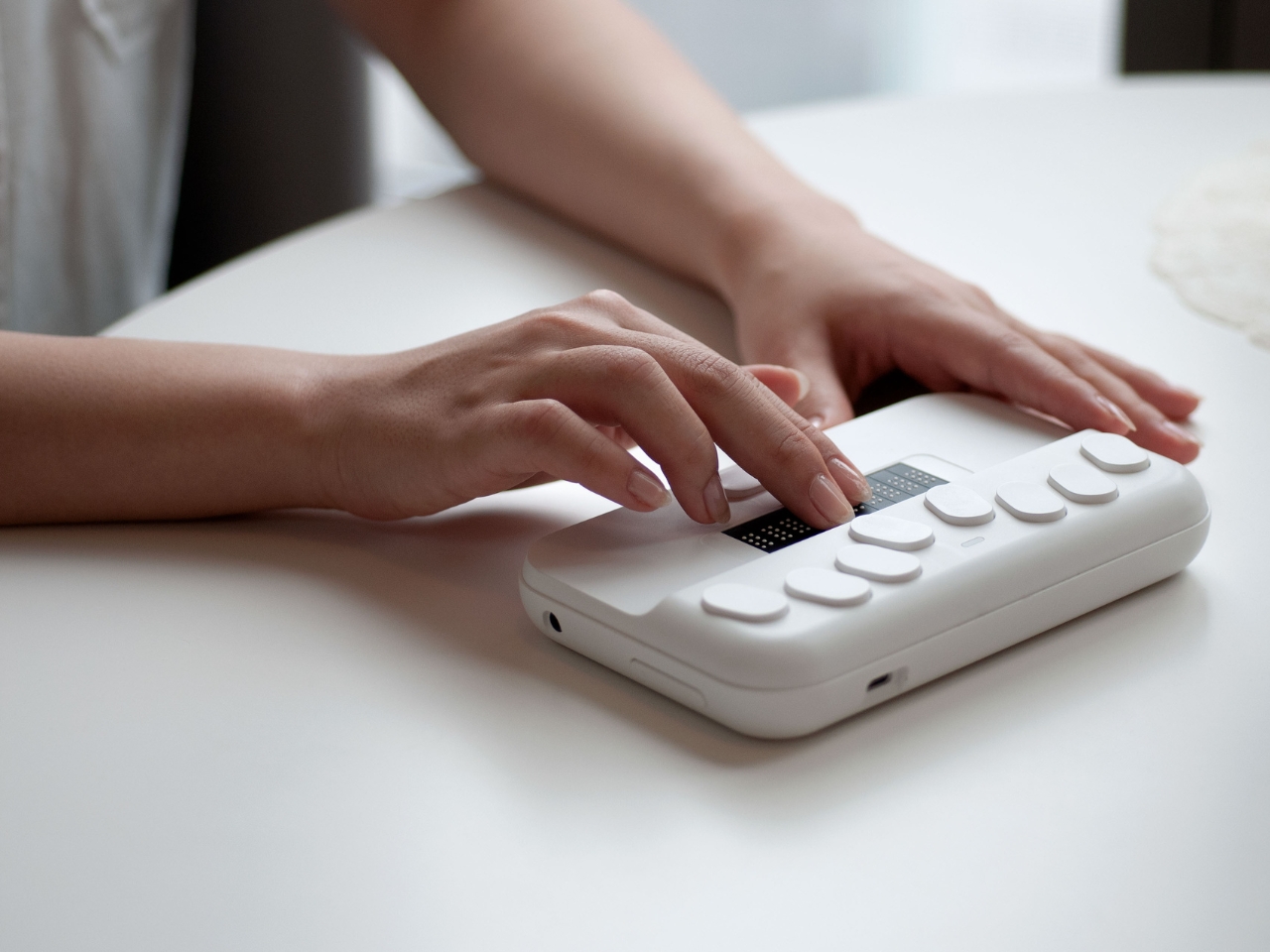
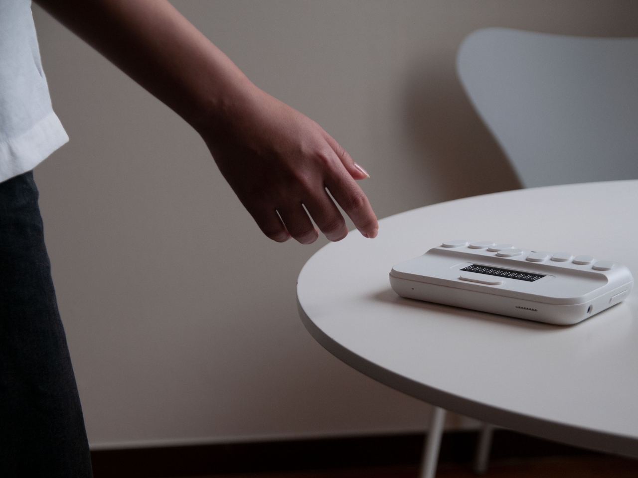
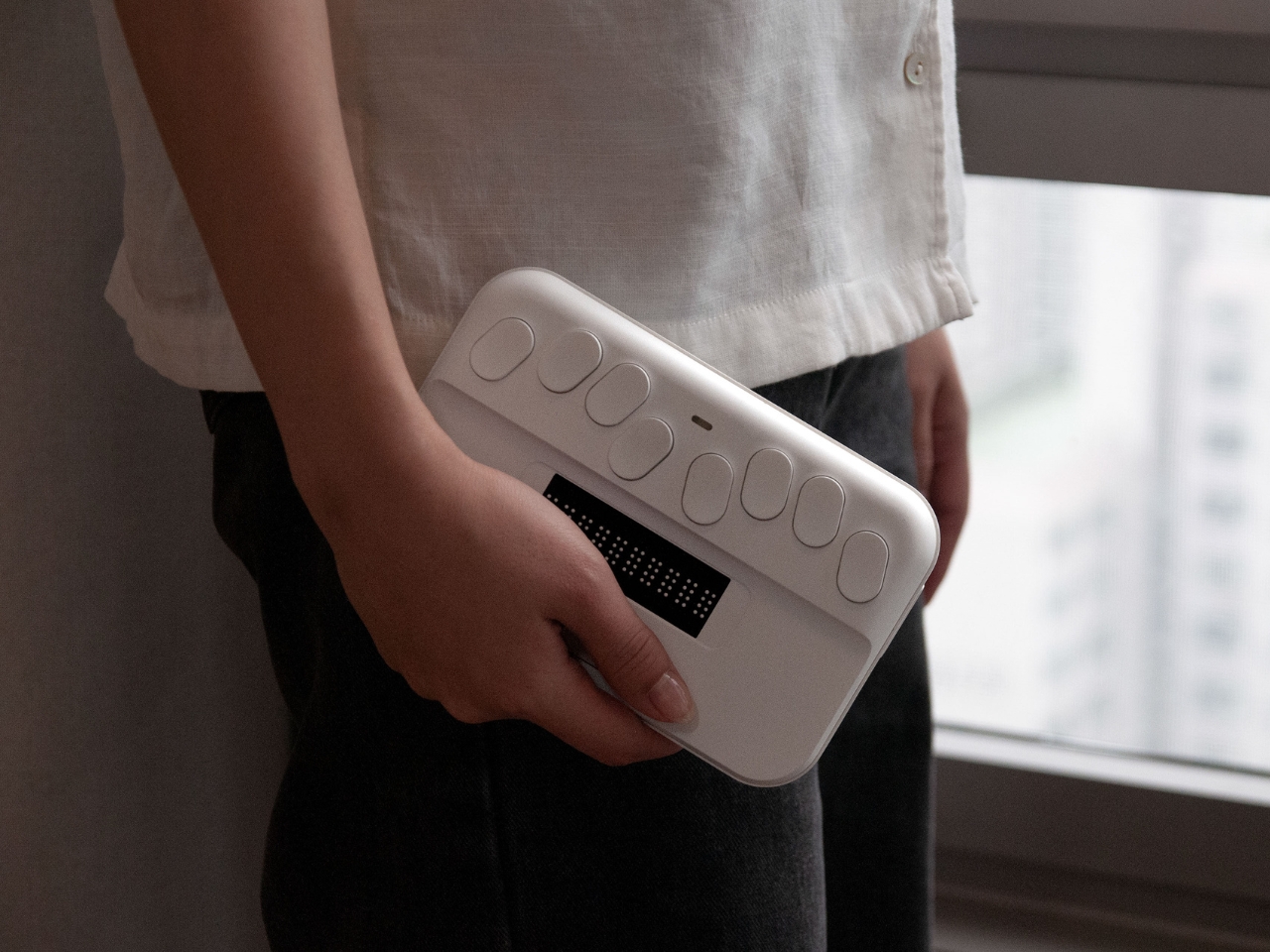
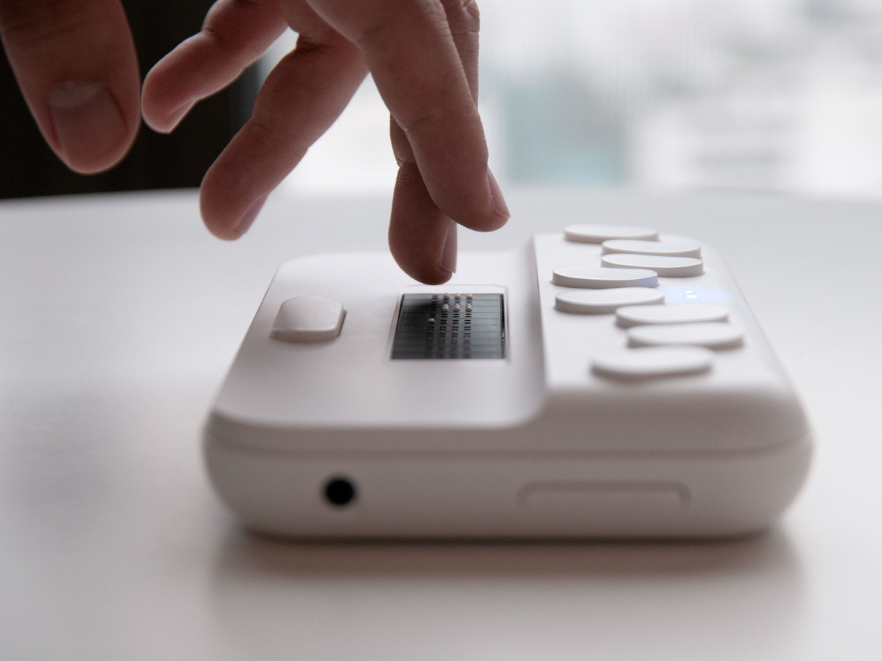
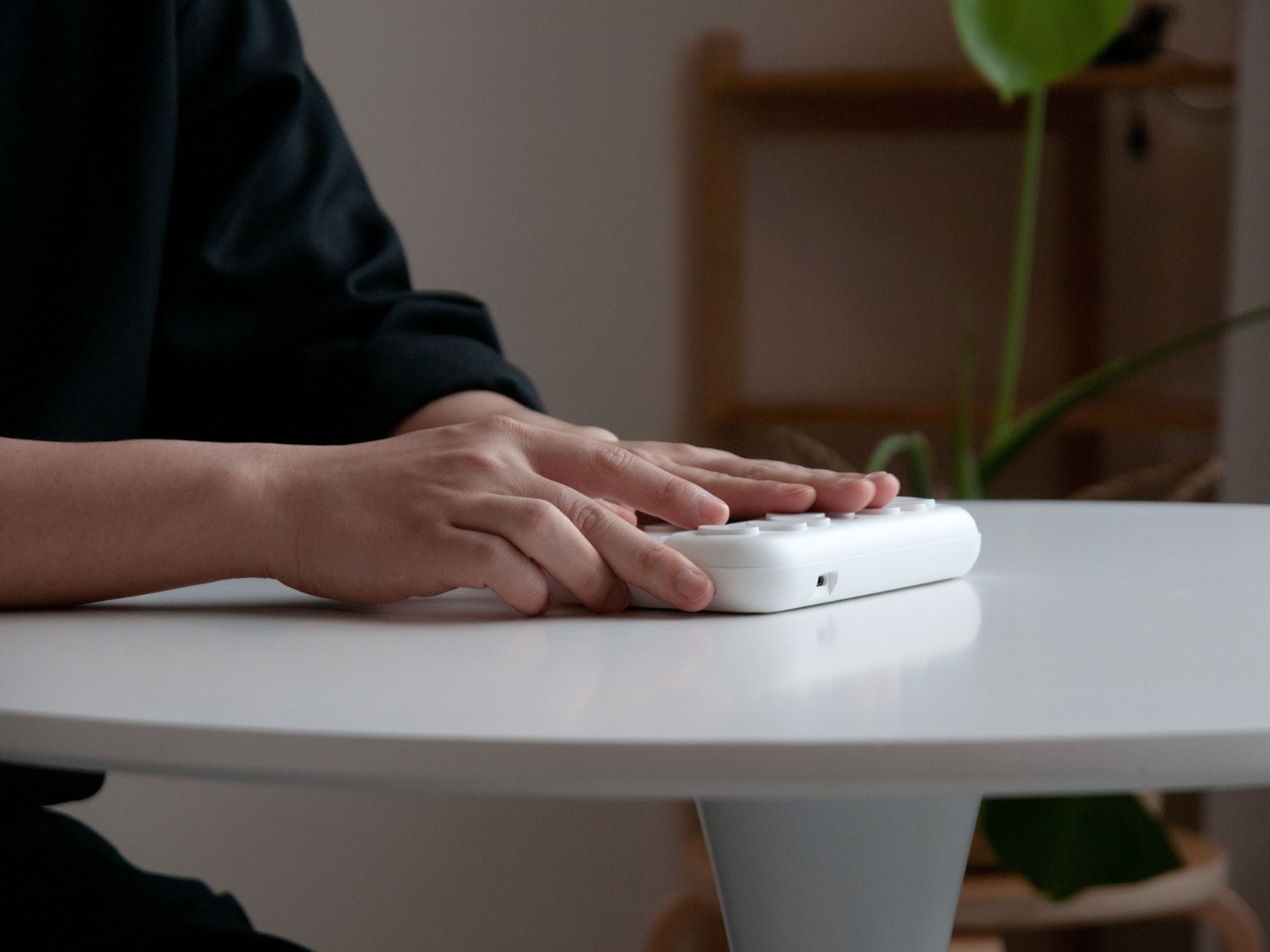
SMARTIO EDU is a concept for a Braille Education Device that uses minimal tactile noise for both teachers and students that are trying to learn Braille. It is designed to optimize the organization of the information that is at the user’s fingertips. They used soft contours for the surfaces of the device and at the same time used tactile hints to help the user read the information through their fingertips.

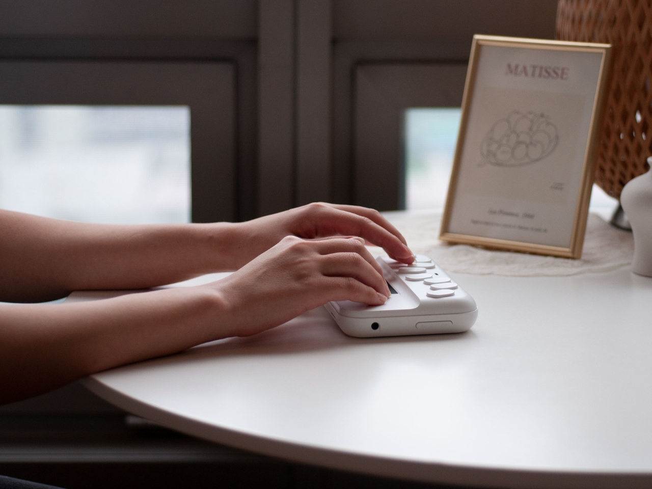
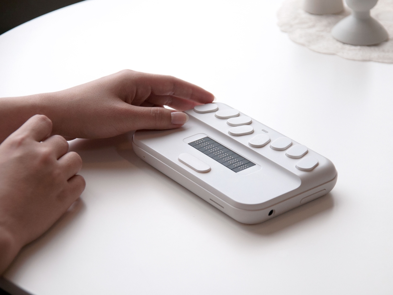
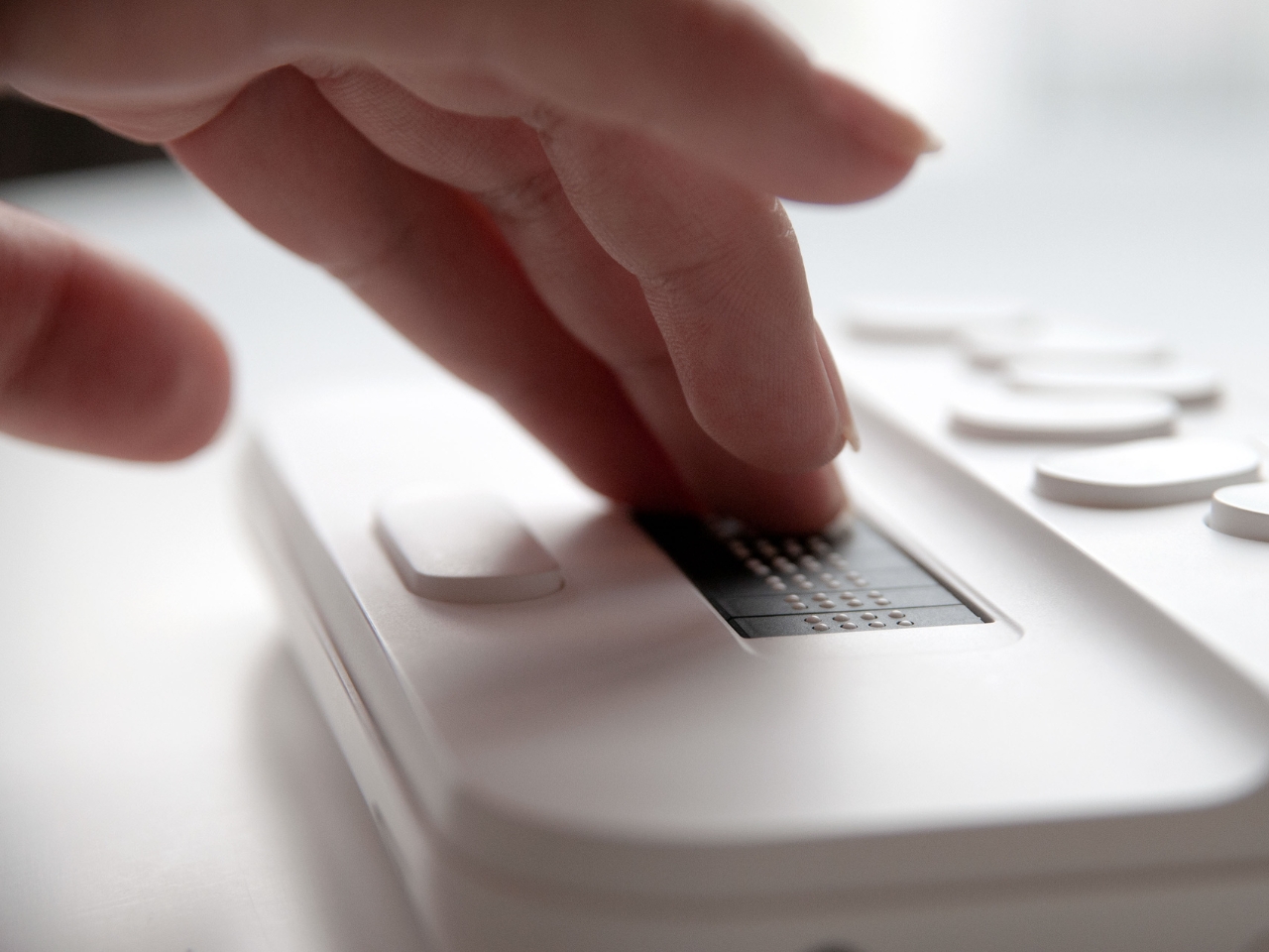
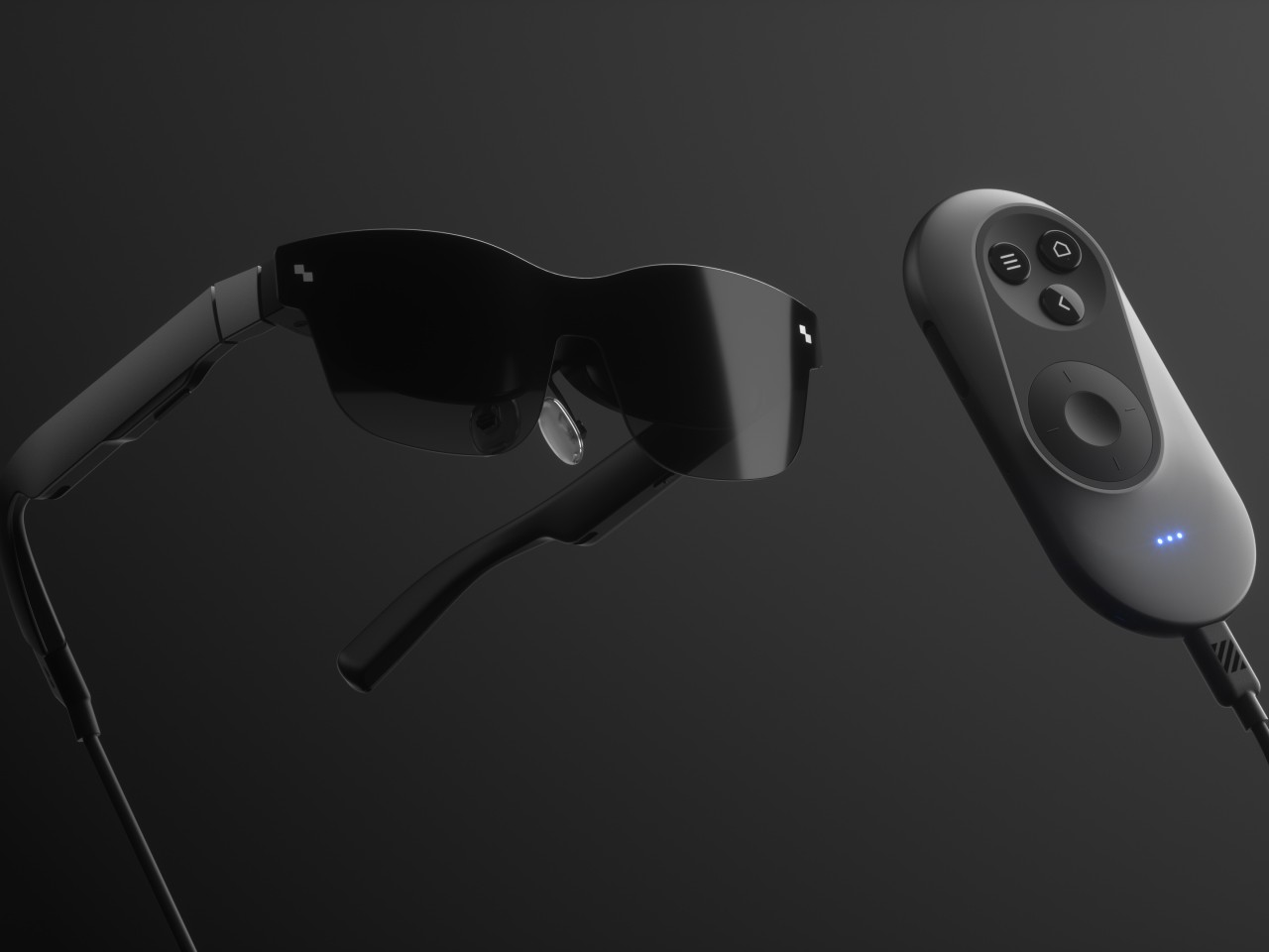
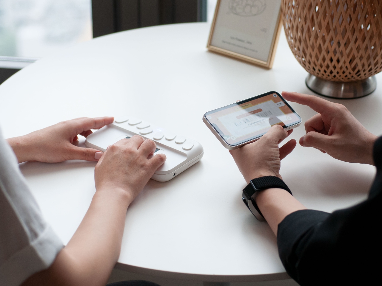
The device looks like an instrument and in fact, it is, just not one that produces music. There are buttons on top for the various functions and that can serve as navigational aids. The “subtle cues” is able to tell the user the front and back of the device and also where the key interfaces are located. The device is also designed to work with a companion app that the teacher and student can easily follow and engage with.

The designers would of course have consulted with actual Braille learners to determine if this is something that could work even as it is still a concept. But we don’t see a lot of Braille learning devices in the market so if this does become an actual product, it would be a big help to the community.

The post Braille learning device uses minimalist design to facilitate seamless learning first appeared on Yanko Design.

Modular stool concept is designed for people who love sitting cross-legged

Stools are often classified as tall, backless chairs, and like most seats, they’re designed to be used in a specific way. You simply sit on top of the stool and have your legs hanging from the edge, with your feet planted firmly on the ground. This style of sitting might be common, but it’s definitely not how everyone sits around the world. In some cultures, particularly in Asia, people tend to sit cross-legged on the floor, at least when they’re at home or in establishments designed to cater to that culture. Stools, of course, aren’t meant to support that way of sitting, but this concept design tries to expand the traditional stool design to be more inclusive while also offering an additional feature completely unrelated to sitting.

Designer: Gisung Han

It’s probably too much of a generalization but sitting cross-legged has become associated with Asian cultures. Especially in countries like Korea and Japan, some families tend to sit on the floor during meals in that position, something that might not sit well with those who don’t consider it proper during meals. Eating outdoors, of course, is a completely different matter, especially in public places like outdoor restaurants that only provide simple stools for customers. One simply can’t sit cross-legged comfortably, but still try to do it.

Named after a famous avenue in South Korea, the Euljiro stool concept tries to solve this conundrum with a design that caters to both normal sitting and cross-legged sitting. This seemingly magical capability is made possible by the stool’s two-part modular design. When joined together, it looks like a simple, two-color stool that you can use normally. But remove the top part and you actually get two stools, with the top shorter than the bottom.

1

When you insert one of the legs of the taller stool into the middle of the shorter one, you get a two-tier seat seemingly joined at the hip. This setup would allow the person to sit with their legs crossed without worries they’ll tumble backward or to the side. It doesn’t take up too much space either, and it can even be used as two separate stools if there aren’t enough seats to go around.

Euljiro’s flexibility also extends to its use as a place to put bags while eating. This is especially useful in restaurants that don’t have designated storage for bags, where putting bags down on the ground might be unhygienic. It’s definitely a creative way to solve multiple problems with a single design while ironically still sticking to the most common stool shape of all.

The post Modular stool concept is designed for people who love sitting cross-legged first appeared on Yanko Design.

Ergonomic controller suggests a more comfortable way to use XR glasses

The launch of the Apple Vision Pro sparked renewed interest in extended reality experiences, both those offered by full-blown and heavy headsets as well as those pushed by more straightforward glasses. The latter often rely on your smartphone or a dedicated remote control to navigate through apps projected in front of you, an indirect interaction method made more awkward by the standard design of these devices. Remote controls might be fine for TVs and appliances, but not when you can barely see your own hand. This concept design tries to challenge convention by redesigning the face of a remote, offering a more ergonomic and simpler way to move around mixed reality while wearing those XR glasses.

Designer: Yiqiao Liu

XR or eXtended Reality glasses like the Xreal Air and TCL RayNeo can probably be called the poor man’s Vision Pro. They practically display a virtual monitor in front of you, which may or may not be pinned in an arbitrary location or follow your head around. This allows the glasses to be lighter, cheaper, and less conspicuous, though they do look like overgrown sunglasses. This also makes using the XR platform feel a bit more familiar because they more or less correspond to familiar operating systems like Windows or Android.

Moving around and interacting with objects in this XR space is then a simpler matter as well, and some even use the phone itself as a pointer and remote control, which is difficult to use when your vision is partially obscured by the glasses and all your fingers can feel is a flat and featureless surface. On the other hand, conventional remotes with their numerous buttons and straightforward layout can also be cumbersome to use as well.

The XR Glasses Controller concept takes the minimalist design of something like an Apple TV remote and tilts it at an angle. Visually, this soap-shaped device looks like an unbalanced remote, with the top buttons leaning to the right and the bottom touch dial sliding to the left. It’s not a design that was made just to look different, though it definitely gives it a distinctive appearance.

The theory behind this design is the mobility and limited range of our thumbs when holding a remote. As many smartphone designers already know by now, the thumb holding the remote moves naturally in an arc, and that up-and-down movement can cause more strain. The controls are thus aligned with this arc, making it easy for the user to switch between buttons and touchpad without having to overextend or bend their thumb. Along with the significantly reduced number of buttons, the remote is easier to use as well, though it does limit itself to Android-based XR platforms since those buttons perfectly match Android’s navigation scheme.

The post Ergonomic controller suggests a more comfortable way to use XR glasses first appeared on Yanko Design.

Nokia Infinity Pro concept phone brings a pill-shaped design and a few questions

You might criticize Nokia for flooding the mobile market with dozens of hard-to-remember devices, but you can’t deny that the Finnish giant also brought bold new designs that were far too ahead of their time, from the gaming-centric N-Gage to the cinematic N93 to the fashion-conscious 7380 “lipstick.” In contrast, today’s smartphones mostly play it safe due to usability and sales concerns, but that’s not to say that an odd design won’t sell either. There’s definitely room for novelty and plenty of space for creative ideas. This curiously shaped phone, for example, changes the design formula significantly, and while it does look like a futuristic device, it also raises a few important usability questions.

Designer: AndroidLeo

The “candy bar” form factor has emerged as the one true smartphone shape because of its handy and compact design. That doesn’t mean it isn’t the only possible form, though, especially when you consider that the top and bottom of these devices don’t need to be perfectly flat. It’s not like you’ll be standing it up or squeezing it alongside other flat and rectangular objects. This “Nokia Infinity Pro” concept challenges that status quo with a thin pill-shaped design that seems like a cross between a foldable clamshell and a smartwatch all rolled into one.

The more curvaceous shape of this concept phone supposedly rests more comfortably in your hand with no corners to cut into your skin. There might be some doubts about whether that would also make it too slippery to hold, but that’s not always a uniform experience. This Nokia Infinity Pro wouldn’t be the first to try out this design either, as the likes of the short-lived “open source” phones like the OpenMoko and Neo Freerunner sported similar shapes.

What makes this idea different, however, is that the screen covers the whole surface of the phone’s front, not just a rectangular section. Such a screen is now more possible to pull off, even if it’s still not that easy. The back of the phone also has two circular mounds opposite each other. One is a dual-camera system and another is a circular display not unlike those on smartwatches or some foldable phones’ “cover screen.” The idea is that you can place the phone face down on a table but still have access to important notifications and controls without distractions.

As interesting as it might look, however, there are some practical issues with such a design. For one, putting the phone face down always risks scratching the screen. At the same time, the circular outer screen will be covered by your palm and smudges whenever you have to hold up the phone. And then there’s the matter of what UI elements can be used at the top and bottom of the display since most platforms and content are created for rectangular screens. Maybe someday, we will have more adaptable software, and that will be the time for the Nokia Infinity Pro to truly shine.

The post Nokia Infinity Pro concept phone brings a pill-shaped design and a few questions first appeared on Yanko Design.

Humanoid toy robot concept makes music more engaging for kids and the young at heart

Wireless speakers have become the standard for home audio equipment these days, and they come in a wide variety of designs. Some are rugged and geometrical, meant to be ready to brave the outside world if needed, while others are like art objects you’d dare not knock down accidentally. These designs are clearly targeted at adults as if they are the only user group who can appreciate music. Kids in their formative years need to be exposed to music as well, and not just from the tablets or smartphones that parents hand over to them for playtime. This robot concept not only gives these children an advanced toy to play with but also lets them have a more personal friend to enjoy listening to music with.

Designer: Jesus Gonzalez Torres

With a widespread interest in robotics, toy robots are no longer the exclusive domain of young boys, or kids for that matter. Kids of all ages will find a humanoid robot interesting, especially if it can express human-like behavior even through simple emoticons. Even better if it can actually perform seemingly magical feats, like singing to them while they’re engaged in play.

The musicBOT concept design is pretty much a Bluetooth speaker in the guise of a small human-like robot. It combines two already existing features into one, but this is a case where the sum is greater than its parts. More than just the collection of functions, it creates a totally different experience for the child whose mind is still open to so many imaginative concepts.

musicBOT is not just a music player but also a companion for the child. It plays tunes while you play with other things or play with the robot itself. The concept doesn’t go into the details, but the robot can display different facial expressions on its dot matrix face. It can even connect with a nearby musicBOT via Bluetooth, making them look like they’re friends and perhaps encouraging their owners to do the same.

Technologically speaking, the concept isn’t ground-breaking and could actually be an actual product. The novelty it offers is more on the experience and the psychology, putting the child at the center rather than becoming a passive listener. It makes listening to music a more active engagement, allowing them to develop a stronger mental association with music than simply hearing it from the background.

The post Humanoid toy robot concept makes music more engaging for kids and the young at heart first appeared on Yanko Design.

Robot-looking kitchen air purifier can get close to your stove to absorb smoke

Not all houses have built-in exhaust systems or have space for kitchen hoods so when you cook, it can turn a bit smoky and smelly in there. And of course, we know that the smoke isn’t always that healthy and there may be other harmful elements there. Having an air-purifying product that is small enough to fit in your kitchen but powerful enough to suck out all the smoke would be the ideal solution of course.

Designer: G11 Designs

The Roba is a robot-looking device but is actually an air purifier for your kitchen that can stay as close as possible to your induction stove top. It is able to absorb the smoke that may come as you cook as well as the harmful ingredients that come with it. It has two “legs” that are simple, thin, and hard metals that stand. at a 90-degree angle so it can support the weight of the entire thing and keep it as close as possible to your stove and the food you’re cooking.

Roba is designed with “flexible and concise movements” that can be adjusted as you cook. It has a height-adjustable pillar and an axis that can both rotate in different directions and also bend its head at different angles so it can adjust as you cook different things on your induction stove. The “friendly look” of the device means it can fit in well with most modern kitchen designs and the parts can be handled “concisely in cylinders”.

This seems to be a concept for now but it can actually be a pretty useful piece of kitchen appliance especially for people like me who have small kitchens and no exhaust system. The fact that it looks like a robot or at least a robot lamp adds to the cuteness factor that makes me want to buy one if it ever becomes available. Maybe I can start cooking regularly as well if I have something like this.

The post Robot-looking kitchen air purifier can get close to your stove to absorb smoke first appeared on Yanko Design.

Plywood desk concepts use waves to create easy-access storage spaces

Just because a design is minimalist doesn’t mean it has to be featureless. Part of the challenge of this design style is to deliver the same functionality that more complicated products offer in simpler ways. A desk, for example, would normally have drawers and shelves to put things in, but drawers often introduce mechanisms that wear down over time, and they often block their contents from view, forcing the person to remember what’s inside or waste time going through each drawer in search for an item. Aalto, which means “wave” in Finnish, removes the blinders and designs an open storage system that uses no extra parts, just the table’s body itself.

Designer: Liam de la Bedoyere

Common desk drawers use a sliding mechanism to move a box in and out of the table. Regardless of the design of the slider, it will eventually fall victim to wear and tear, making it less useful and more stressful. Desks with “open” shelves instead of drawers do remove that variable but doesn’t make it easy to see what’s inside unless everything is at the front or you stoop to take a peek inside.

The Aalto design concept uses a series of undulating forms that create nooks that can become storage spaces. Thanks to the glass (or any transparent material) tabletop, you can immediately see what’s inside, ready to be taken out when you need it. Conversely, you can also easily see which compartments are still unoccupied in case you need an empty space.

The waves can come in different sizes, which makes room for different kinds of stationery and tools as well, like a laptop in the larger space or pens for the smaller ones. What makes the design even more interesting is that it doesn’t use any extra pieces other than the tabletop. It’s a single unbroken form, though sheets of plywood are indeed joined together to create the semblance of a flowing shape. Regardless, there are no moving parts that will break down or extra parts that can get lost. It is minimalism at its finest.

Another version of the Aalto design uses shorter and more uniform waves to address concerns about the troughs hitting people’s knees and legs. That said, it also reduces the flexibility of those spaces to hold objects of any size, but that also becomes a sort of enforced organization system to keep the desk tidy. In exchange, this Aalto variant has a small shelf off to the side, for holding smaller items like books or even a vase. It does have to switch to a polycarbonate material for the tabletop in order to support that bending shape.

The post Plywood desk concepts use waves to create easy-access storage spaces first appeared on Yanko Design.

Google Next-inspired Omni Smart Speaker has integrated display to show what’s happening in real-time

Google Nest has had a fair share of success thanks to its built-in Google Assistant capabilities. The capable speaker has been the first introduction to the world of smart speakers for many of us, and now it is inspiring the Omni Smart Speaker – which looks similar to the Google speaker – but adds an auxiliary screen to it that distinguishes it for the better.

So, if you’re looking to upgrade your smart speaker, you may have a new option, amid a plethora of choices already available from Google, Amazon, Apple and many other manufacturers. The Omni is far from the others with its novel display that shows real-time visual feedback of what’s happening, saving effort and confusion during voice commands.

Designer: One Object Design Studio

One Object is a Hong Kong-based design and innovation studio with an undwindling focus on creating mobility, smart home, and home furnishing designs. Fueled by passion, dedication, and curiosity for novelty, the designers at One Object have come up with the distinct design of the Omni, which looks pretty recognizable in both form factors, yet is starkly different with the interesting, integrated display.

Described as the “next-generation smart speaker concept” – the Omni is equipped with a voice-enabled assistant – not sure which one though – and allows the users to tap on the convenience of voice to control home appliances easily and more intuitively. Whether the speaker is splash-proof or not, we are uncertain, so we are guessing it is made for indoor use only, where it would allow you to listen to different music in any room of your house.

You should be able to connect multiple devices in different rooms across the house and control them from the Omni, without moving a stride. And when you think, the commands are going to get mixed, you can look up and see the sleek, modern speaker’s integrated auxiliary display and see what’s happening in real time. Whether you’re adjusting the thermostat, turning on the lights, or setting the music, the Omni smart speaker will make every voice command “straightforward and responsive.”

The post Google Next-inspired Omni Smart Speaker has integrated display to show what’s happening in real-time first appeared on Yanko Design.

Radio concept brings the aural and tactile nostalgia of using actual radios

One of my favorite parts of going on road trips when I was younger is listening to the radio in the car. You never know what you’re going to get when you switch through stations. And even at home, tuning in on to a physical radio is always a fun time, something that the new generation may never experience ever. But there are still some radios in the market and even more design concepts for those longing for the “good ole days”.

Designer: Gisung Han

This concept for a radio is an interesting one as it doesn’t just play on the nostalgia of tuning in to the radio. The Calming Noise Radio also harps on both the aural and tactile experience that we had when we operated a physical radio back when people still tuned into it. Since the only tactile feel we get know from listening to music is tapping on our devices, this concept harps on the dials as we go from one radio station to another.

The designer made the dials to be “unusually large” so that visually and tactile-wise it stands out. It actually looks like the wheel in The Price Is Right (for those who actually know what that show is) and is meant to be both familiar and unique. The radio is in a familiar rectangular shape with the felt-like grills giving an interesting contrast with the round wheel of the dials.

The Calming Noise Radio, if it gets turned into an actual radio, will also probably play around with the “subtle static noise” that we get from old radios with the analog frequency adjustment sound. This will of course be pretty strange and unfamiliar for those who grew up in the age of MP3s and music streaming but will bring a nostalgic feeling for those who still get goosebumps from the sound of LPs and cassette tapes.

The post Radio concept brings the aural and tactile nostalgia of using actual radios first appeared on Yanko Design.

Nokia 7380 5G concept reimagines one of the quirkiest phones in history

At this point in time, the design of smartphones is pretty much set in stone, at least disregarding novel designs like foldables and rollables. The “candy bar” form factor emerged as the standard, displacing even the fashionable clamshell “flip phones” that are making a comeback through small foldables, mostly because they are practical, handy, and efficient. There was a time, however, when phone form factors were all over the map, with brands like Nokia boldly experimenting with different designs that were functional but also a bit unconventional. The Nokia 7280 and 7380 “lipstick” phones were two of the phone manufacturer’s oddest creations, and one creator is bringing that past design to the present, giving it a modern touch to fit today’s aesthetics.

Designer: AndroidLeo

The Nokia 7380 was, strangely enough, part of the company’s “Fashion Phone” line back in the early 2000s. At a time when people actually used mobile phones for phone calls more than anything else, it could easily get away with its stick-like design and tiny mirror-like screen. You can’t do much else with it, other than listen to music and take photos that were already high-quality during that era, which sounds like the perfect recipe for a distraction-free, minimalist phone today.

In that regard, the Nokia 7380 5G concept doesn’t sound that outlandish after all. The design updates the aesthetics to modern standards, making use of interesting geometric shapes like a trapezoidal prism instead of a rectangular box, and puts a slightly taller screen that covers the whole surface this time around. It will still be too small to do anything productive like texting or even browsing the web, so it will mostly be for controlling the phone and launching apps that have to be custom-designed for that screen aspect ratio.

There’s also a camera on the narrow side of the prism, hidden behind a sliding mechanism. Given today’s technologies and the fact that this phone won’t have much in the way of other components, there should be enough space for a 50MP or higher camera. The concept design, which is based on rumors, also puts a dual camera setup on the “front,” or rather where the screen is. It’s not clear what the use case would be for having two cameras there, though.

In a nutshell, this smartphone stick could be marketed as a device that’s oriented towards music and photos, at least taking photos. There are two headphone jacks on one end, perfect for sharing your music with a friend, and the handy shape of the device makes it easy to take photos and selfies. It’s like a fashionable action cam that can play music and make phone calls as well, though it also raises the question of who would want to buy such a curious but less usable smartphone in the first place.

The post Nokia 7380 5G concept reimagines one of the quirkiest phones in history first appeared on Yanko Design.