HubKey Gen2 Kills Dongle Mess, Adds Dual 4K and Physical Controls

The modern desk is a patchwork of small compromises. Your laptop has two USB-C ports, but you need displays, a wired network, external storage, and constant charging. That leaves you juggling dongles and adapters, with media controls and privacy shortcuts buried in software menus or keyboard combinations you can never quite remember. The setup works, but it never feels tidy or intentional, just workarounds gradually spreading across your workspace.

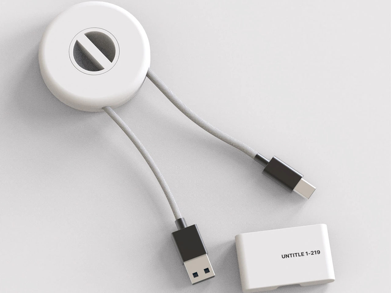
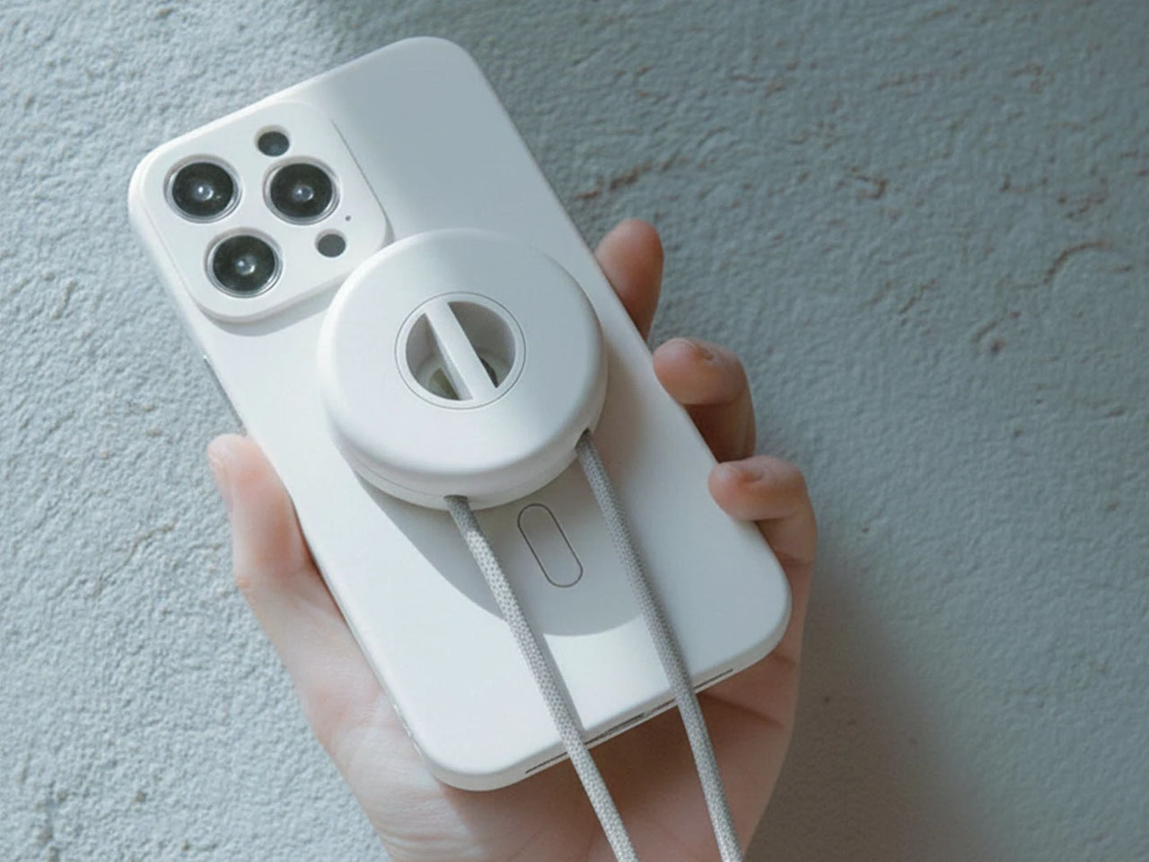
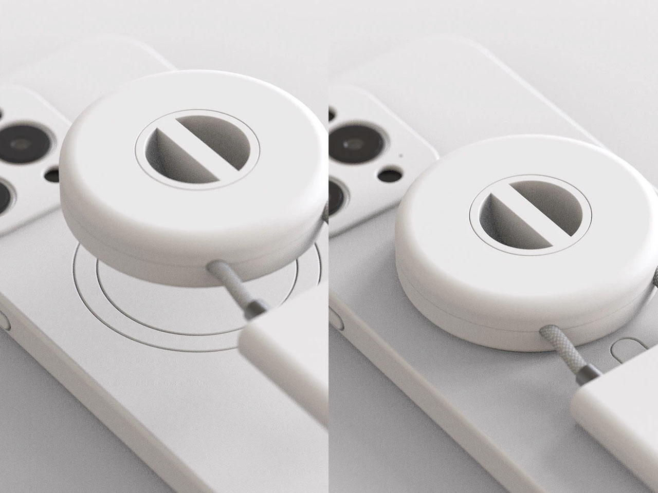
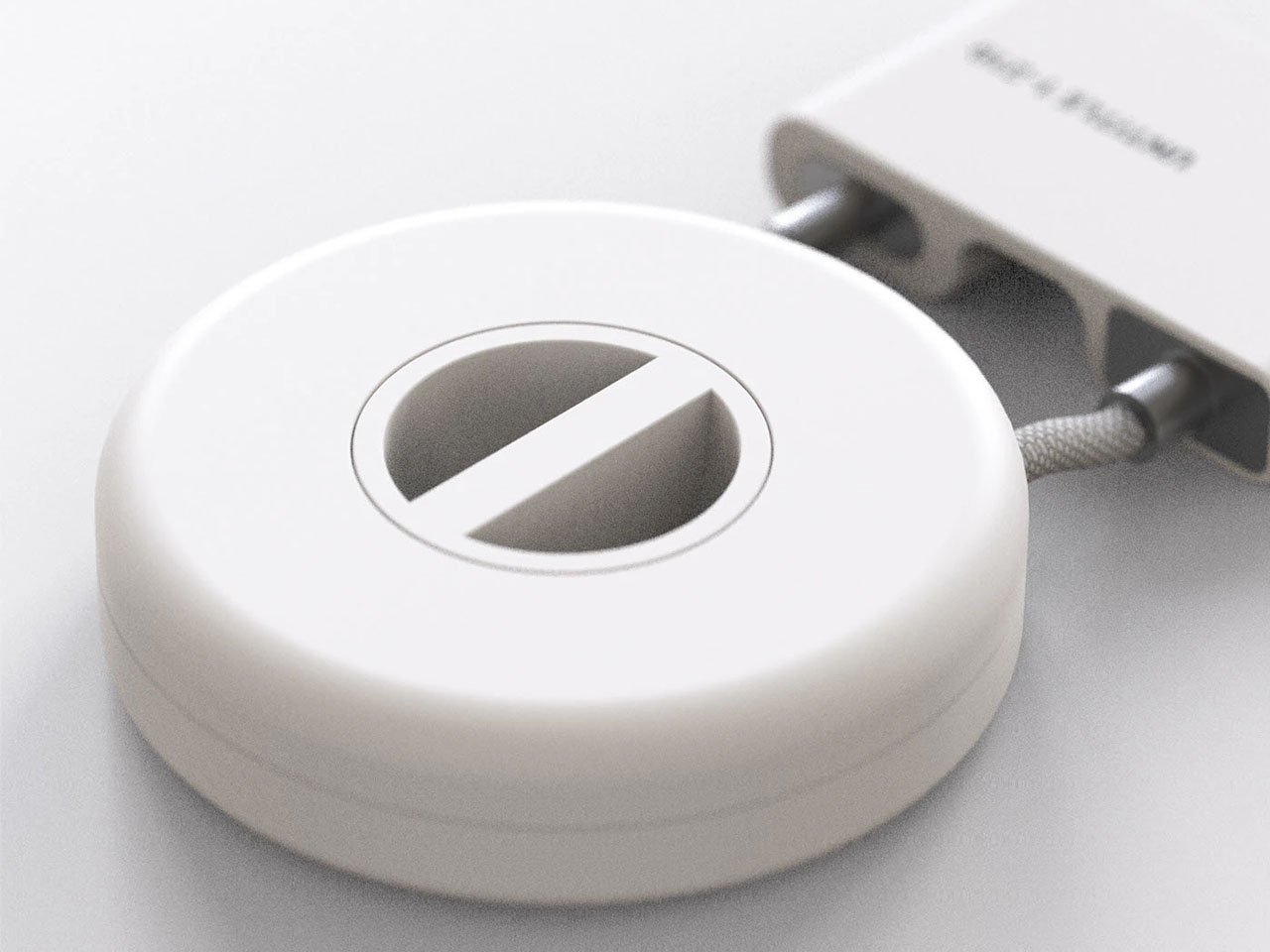
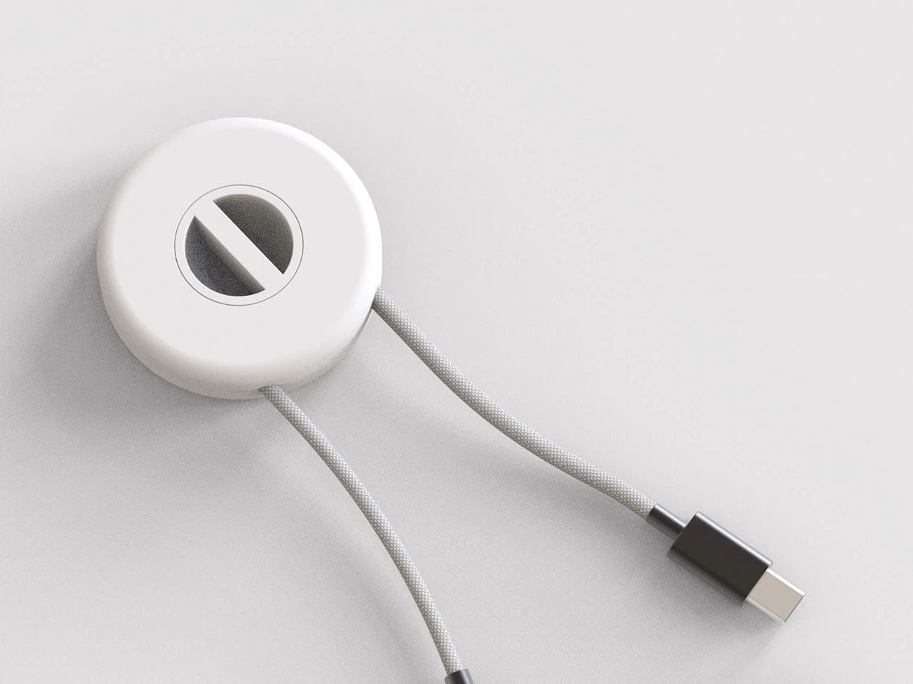
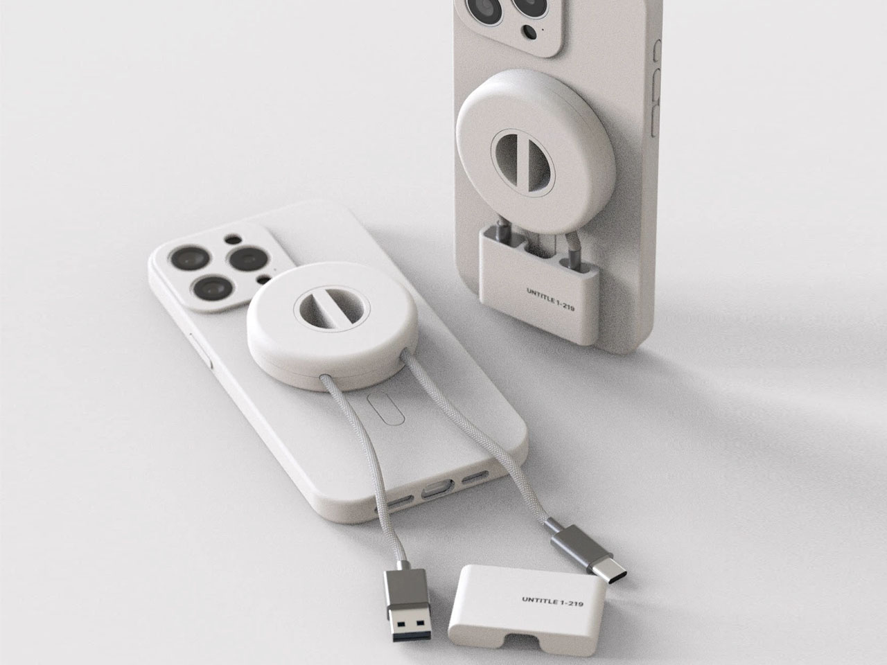
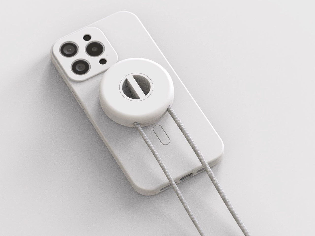
HubKey Gen2 tries to pull those pieces together in a single compact cube that sits within arm’s reach. It’s both an 11-in-1 USB-C hub and a small hardware control surface, with four shortcut keys and a central knob on top. The idea is to handle displays, power, storage, network, and a handful of everyday actions from one place, turning a desk full of little fixes into something more coherent.

Designer: HubKey

Click Here to Buy Here: $89 $179 (50% off). Hurry, only 266/500 left!

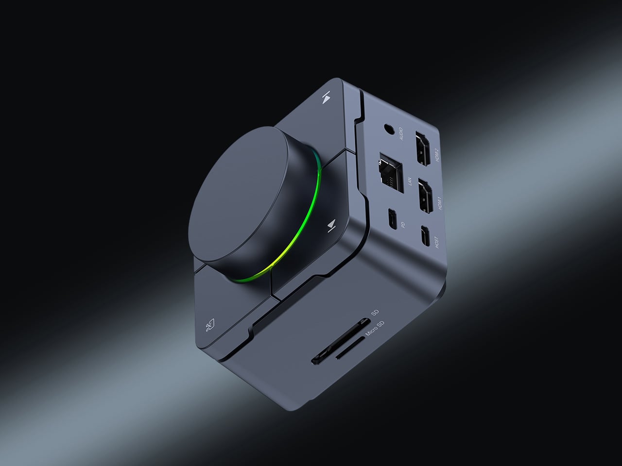
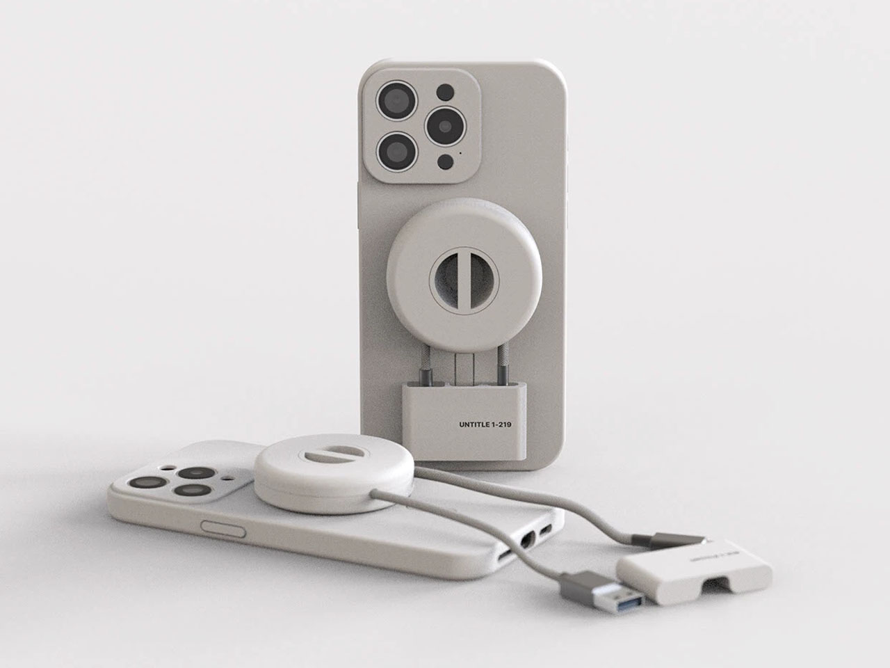
The most requested improvement for this version was better display support and five keys which can be fully customized. HubKey Pro 2 now offers two HDMI ports, each capable of driving a 4K display at 60Hz. That means a laptop can suddenly run a pair of high-resolution monitors smoothly, turning a cramped single-screen setup into a proper workspace for editing timelines, keeping reference material open, or spreading code and documentation across both panels without stuttering.

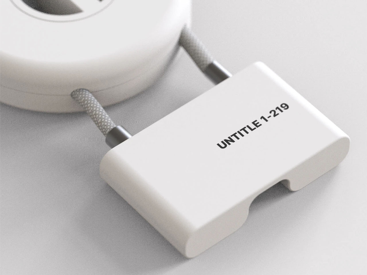
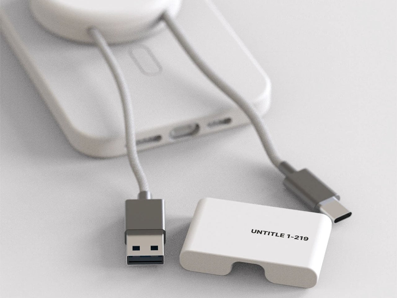
Between the USB-A 3.1 and USB-C 3.1 ports at up to 10 Gbps, SD and TF card slots, a 2.5 Gbps Ethernet port, 3.5 mm audio jack, and a dedicated 100 W USB-C PD port, HubKey Pro 2 can replace a whole handful of adapters. One cable from the hub to your laptop or handheld PC brings everything else online, from wired internet to external drives and dual displays, cutting down on the usual cable mess.

The top panel is where the shortcut side comes in. Four keys and a central knob are mapped to actions like volume and mute, screen lock, display off, screenshot, and lighting control. Instead of hunting through menus or remembering key combinations, you can twist the knob to adjust sound, tap a key to blank the monitor when someone walks by, or grab a screenshot with a single press.

Under the surface, the shortcut side goes deeper than a few hard-wired functions. A built-in driver unlocks five preset systems with 170 fixed combinations, plus a sixth mode where you can fully customize the key bindings. When you plug HubKey Gen2 into your machine, a settings interface pops up automatically, letting you assign shortcuts, macros, and key sequences in a few clicks.

For basic use there are no drivers to hunt down; it’s plug-and-play with Windows, macOS, Linux, and even devices like the Steam Deck, while the optional driver adds a deeper layer of customization when you want to fine-tune the keys. The internal circuitry and firmware have been tuned for faster recognition and more stable power delivery, and the press logic for Windows and macOS has been refined to reduce delays or misfires.

The 100W USB-C PD port can keep a laptop charged while the hub is driving dual 4K displays and handling data transfers. The The 10 Gbps USB ports and card readers make moving large files feel less like a chore, especially for photographers and video editors who are constantly offloading cards. The goal is to reduce the number of separate chargers and adapters that need to live on the desk.

Of course, the central knob has a smooth feel when you adjust volume, and the integrated LED ring can be dimmed or toggled with a key. The lighting adds a bit of atmosphere without turning the hub into a light show, and the compact form factor means it can sit next to a keyboard or under a monitor without demanding attention when you’re not actively using it.

HubKey Gen2 doesn’t claim to replace a full keyboard or a studio-grade dock, but it does try to make a typical laptop-based setup feel more intentional. By combining dual 4K display support, a full spread of ports, and a handful of physical controls in one small object, it turns a desk full of little compromises into something more coherent and easier to live with.

Click Here to Buy Here: $89 $179 (50% off). Hurry, only 266/500 left!

The post HubKey Gen2 Kills Dongle Mess, Adds Dual 4K and Physical Controls first appeared on Yanko Design.

MaClock Shrinks the 1984 Macintosh Into a $30 Rechargeable Clock

Nostalgia tech falls into two camps. Lazy references slap a retro logo on a modern object and call it vintage, while obsessive recreations feel like museum pieces. Most products lean too far in one direction, missing the sweet spot where memory and function coexist comfortably. The first feels cheap, the second feels precious, and neither ends up on your desk for very long once the initial charm wears off.

MaClock by Kokogol hits that balance. It is a miniature 1984 Macintosh that works as a rechargeable desk alarm clock, recreating the beige enclosure, rainbow Apple logo, CRT-style screen, and floppy disk slot at nightstand scale. It still behaves like a proper modern clock with 60-day battery life and USB-C charging, not just a static replica gathering dust next to other impulse buys that reminded you of childhood.

Designer: Kokogol

The physical details feel right. Warm beige ABS body, a recessed curved screen mimicking a cathode ray tube, horizontal ventilation grilles on the side, and a tiny floppy disk drive slot with a pink tab. At 80 x 91 x 112 mm, it is substantial enough to feel real in your hand, not a keychain trinket. The proportions match the original closely enough that it reads instantly as a Mac, even from across a room.

The included floppy disk acts as a power switch. You insert it to turn the clock on, a callback to the boot ritual of early Macs. The package includes a sticker sheet with rainbow Apple logos, a Macintosh label, and a dot matrix sticker, letting you customize and restore the design yourself. The unboxing becomes a small assembly project rather than a passive reveal, which makes it feel slightly more earned.

MaClock offers three display modes. Time mode shows large pixelated digits for hours, minutes, day, and temperature. Calendar mode centers the date in blocky characters. Easter egg mode wakes up Susan Kare’s Happy Mac icon, the smiling face from the original graphical interface. Seeing Happy Mac on your desk in 2025 is an unexpectedly emotional hit for anyone who grew up with early Macs and remembers what that face meant.

The adjustable backlight is controlled by a knob on the bottom left, which can be dialed down at night or turned off entirely. With the backlight off, the battery lasts up to 60 days, so it can sit on your desk for weeks without charging. It feels more like furniture than a gadget you babysit with a cable every few nights, which is exactly how a clock should behave.

MaClock treats nostalgia as something you participate in rather than just look at. The floppy disk, the stickers, the Happy Mac mode, and the CRT-inspired screen all ask you to engage with the memory. At just $30, it sits in the impulse buy zone, which might be the right price for functional nostalgia that earns its desk space by telling time and making you smile every morning when Happy Mac greets you with those chunky pixels.

The post MaClock Shrinks the 1984 Macintosh Into a $30 Rechargeable Clock first appeared on Yanko Design.

Stickerbox: Kids Say an Idea, AI Prints It as a Sticker in Seconds

Smart speakers for kids feel like a gamble most parents would rather skip. The promise is educational content and hands-free help, but the reality often involves screens lighting up at bedtime, algorithms deciding what comes next, and a lingering suspicion that someone is cataloging every question your child shouts into the room. The tension between letting kids explore technology and protecting their attention spans has never felt sharper, and most connected toys lean heavily toward the former without much restraint.

Stickerbox by Hapiko offers a quieter trade. It looks like a bright red cube, measures 3.75 inches on each side, and does one thing when you press its white button. Kids speak an idea out loud, a dragon made of clouds or a broccoli superhero, and the box prints it as a black-and-white sticker within seconds. The interaction feels less like talking to Alexa and more like whispering to a magic printer that happens to understand imagination.

Designer: Hapiko

The design stays deliberately simple. A small screen shows prompts like “press to talk,” while a large white button sits below, easy for small hands to press confidently. Stickers emerge from a slot at the top, fed by thermal paper rolls. The starter bundle includes three BPA-free paper rolls, eight colored pencils, and a wall adapter, turning the cube into a complete creative kit rather than just another gadget waiting for accessory purchases to feel useful.

The magic happens in three beats. A kid presses the button and speaks their prompt, as silly or specific as they want. The box sends audio over Wi-Fi to a generative AI model that turns phrases into line art. Within seconds, a thermal printer traces the image onto sticker paper, and the finished piece emerges from the top, ready to be torn, peeled, and stuck onto notebooks, walls, or comic book pages at home.

What keeps this from feeling like surveillance is the scaffolding Hapiko built around the AI. The microphone only listens when the button is pressed, so there’s no ambient eavesdropping happening in the background. Every prompt runs through filters designed to block inappropriate requests before reaching the image generator. Voice recordings are processed and discarded immediately, not stored for training. The system is kidSAFE COPPA certified, meaning it passed third-party audits for data handling and child privacy standards.

Thermal printing sidesteps ink cartridge mess entirely. Each paper roll holds material for roughly sixty stickers, and refill packs of three cost six dollars. The catch is that Stickerbox only accepts its own branded paper; using generic rolls will damage the mechanism. The bigger design choice is that every sticker is printed in monochrome, which is intentional. It forces kids to pick up pencils and spend time coloring, turning a quick AI trick into a slower, more tactile ritual.

Stickerbox gestures toward a version of AI-infused play that feels less anxious. The algorithm works quietly, translating spoken prompts into something kids can hold, cut, and trade, but the most important part happens after the sticker prints. It ends up taped inside homemade comic books, stuck on bedroom doors, or colored during rainy afternoons. The box becomes forgettable infrastructure, which might be the kindest thing you can say about a piece of children’s technology designed for creative independence.

The post Stickerbox: Kids Say an Idea, AI Prints It as a Sticker in Seconds first appeared on Yanko Design.

Fiio DM15 R2R CD Player fuels compact disk revival with modern day functionality

The music industry is in turmoil lately, as streaming services are seeing many musicians pull their music due to dismal royalty payments and AI-generated content being pushed to listeners. Thus, direct-to-fan models are preferred by artists to at least have a livelihood. This marks a moment that is highly conducive to CD listening, which in most instances, delivers better audio quality compared to streaming services that prioritize mediocre audio delivery as the basic plan offered.

Apart from those reasons, physical media is seeing a revival for more reasons than not. Beyond the vinyl-loving crowd, the next best thing is playing your favorite albums on a CD player. Yes, CD players are again hitting popularity, and Fiio wants to serve its audiophile community with all the possible options. The DM15 R2R Portable CD Player is their modern take on a CD player, since the silver disk is seeing a serious revival in 2025.

Designer: Fiio

This one is a successor to the DM13 deck, which is also liked by the audio community. The DM15 R2R is made out of a compact aluminium chassis with a transparent top panel that displays the disc as it spins and plays your favourite tunes. To keep things wire-free, the CD player has an in-built rechargeable battery that gives you around seven hours of non-stop music. Extending the use case scenario beyond just playing your CDs, the player comes with a USB DAC, Bluetooth mode, and Hi-Fi playback with the in-built optical and coaxial ports. To extend the functionality further, it has the customary 3.5mm jack and the balanced 4.4mm line output. In the USB DAC mode, the player outputs music at up to 32-bit/384kHz PCM and native DSD256.

You can stream high-res audio to your wireless headphones or speakers as the player supports codecs including aptX, aptX HD, aptX Adaptive and aptX Low Latency. The CD player comes with an ESP (Electronic Shock Protection) switch to eliminate skipping issues. This comes really handy when travelling as the movement of the CD player can heighten this problem. As an upgrade, the CD player comes with playback and control buttons on the front panel, paired with a tactile volume dial. As suggestive of the name, the CD player employs a resistor ladder to convert digital signals into analog waveforms, which, according to Fiio, translates to a smoother, more organic style of playback many listeners prefer.”

The premium build quality, added features and useful functionality come at a higher price of $270, but they are absolutely justified given what’s on offer. The CD player will be offered in four attractive finishes with pre-orders starting now. The silver and red variants will start shipping. If you want most of the features and functions at a lesser price, the $170 DM13 is the next best thing.

The post Fiio DM15 R2R CD Player fuels compact disk revival with modern day functionality first appeared on Yanko Design.

This $200 Display Finally Brings Album Art Back to Your Home

For most musicians and artists, the album artwork of their albums or EPs is serious business. In the days of cassette tapes, CDs, LPs, and other physical forms of media, they also served as part of your space’s display, especially if you’re a collector. But when streaming came along, you could only display these works of musical art on your smartphone or music player. But what if you really love your favorite albums’ cover art and wanted to show them off while listening to them?

That’s the idea behind the Tuneshine Album Art Display, which may become your newest favorite piece of technology. Created by Tobias Butler and lovingly assembled by hand in the USA, this charming little display brings a touch of vintage record store vibes into the streaming age. It basically shows off the album artwork of the song or album that’s currently playing. But if you’re not using it, it can also serve as an image display device.

Designer: Tobias Butler

At its heart, Tuneshine is a 6.3″ x 6.3″ square LED display that’s about 1.57″ thick (or 16cm x 16cm x 4cm if you prefer metric). Don’t let the compact size fool you, as this beauty packs 64 x 64 extra-bright pixels that make your album artwork pop with vibrant colors and impressive clarity. Plus, you have brightness control, so whether you’re setting the mood for a dinner party or jamming out in broad daylight, you can adjust it to perfection.

You can connect it to your music service of choice, including Spotify, Apple Music, Sonos, and last.fm. As long as your albums or playlists live in these services (no idea if YouTube Music will eventually be added), their album covers will be displayed in Tuneshine. You can also use Shazam to display artwork from other sources like vinyl records, CDs, radios, etc., and capture the magic of the art that the artists put effort into. You just need an iOS or Android device and a Wi-Fi connection to do the initial setup.

For those times when you’re not using the device to play music, you can actually customize it to display the image of your choice, whether it’s a favorite photo, a work of art, or a motivational quote. When it comes to the design, the Tuneshine comes in light and dark wood options like Beechwood + Walnut in a solid wood case. You can also get it in a solid anodized aluminum case with five options: Sapphire (a rich blue), Onyx (deep black), Obsidian (dramatic dark tones), Pearl (elegant and light), and Ruby (bold red).

You have to note that Tuneshine doesn’t include an internal or external speaker, so you have to use it alongside an existing speaker or sound system. For collectors, there’s an extra special touch: each Tuneshine unit is assembled, signed, and numbered inside the case by creator Tobias Butler himself, making it a genuine piece of functional art. The wooden versions are fulfilled quickly in 1-2 business days, while the Gems collection takes 1-2 weeks, but the wait is worth it for something this unique.

In our streaming age, we’ve gained incredible convenience but lost some of the tangible magic that came with physical music collections. Remember the ritual of carefully placing a record on the turntable, admiring the cover art before the first note played? Or displaying your favorite albums on your shelf like the treasures they were? Tuneshine bridges that gap beautifully, letting us reclaim that visual connection to our music without sacrificing modern convenience.

Whether you’re a longtime collector missing the days of physical media or simply someone who appreciates beautiful design and wants to celebrate the artistry behind your favorite music, the Tuneshine Album Art Display transforms any space into a personal gallery. It’s not just a gadget; it’s a love letter to album art, a conversation starter, and a daily reminder that music is meant to be experienced with all our senses.

The post This $200 Display Finally Brings Album Art Back to Your Home first appeared on Yanko Design.

UltraBar X Replaces Your Stream Deck, Volume Knob, and Phone Apps

Most desks accumulate a scattered collection of control devices over time. There’s the keyboard and mouse, maybe a Stream Deck for shortcuts, a volume knob for your speakers, a phone running smart home apps, and a separate remote for the desk lamp. Each solves a specific problem, but together they create a landscape of disconnected gadgets competing for space and attention. The monitor sits above it all, while everything underneath becomes a tangled mess of cables and redundant functions.

UltraBar X tries to consolidate that chaos into a single, modular strip that lives under your monitor. Built around a long, wedge-shaped bar with an ultra-wide display, it acts as a command center for your computer, applications, and even your smart home devices. Instead of a fixed product, it works more like a platform where you snap on magnetic modules to build the exact control surface your desk needs.

Designer: Team UltraBar

Click Here to Buy Now: $289 $429 (33% off). Hurry, only 379/500 left! Raised over $178,000.

The central piece is CoreBar, a low, seven-inch display wedge-shaped bar tilted at forty-five degrees so it’s easy to glance at without adjusting your posture. The screen shows clocks, system stats, app icons, and customizable scenes that change based on what you’re doing. Tap the screen to wake your PC, jump between apps, or trigger macros, all from a touch interface that sits right where your hands naturally rest.

What makes the system feel different is how the magnetic modules expand it. DotKey snaps onto the side and brings a cluster of Cherry MX mechanical keys for shortcuts and macros. KnobKey adds a precision rotary dial that clicks crisply as you turn it, perfect for adjusting volume, brush size, or timeline scrubbing. VivoCube is a tiny controller with its own AMOLED screen and switches, small enough to hold or dock alongside the bar.

Of course, there’s also SenseCube, the environmental sensing module. Inside its small triangular shell are millimeter-wave radar and sensors for light, temperature, humidity, and vibration. This gives your desk a kind of ambient awareness, letting it detect when you sit down, notice changes in lighting, or respond when the room gets too warm. The workspace starts to feel less static and more responsive without constant input.

A typical morning might look like this. You walk up to your desk and tap CoreBar to wake the PC, which also brings up a layout tuned for writing and email. The mechanical keys are mapped to window management shortcuts, while the knob handles scrolling through long documents. Later, a single press shifts CoreBar into a design layout, and pretty much the same modules now control brush size, zoom, and layers in Photoshop or Illustrator.

The system doesn’t stop at the screen. Through its network connection, CoreBar can talk to Philips Hue lights to adjust the room based on your focus mode, or trigger a Sonos playlist with a single tap on an icon. The same bar that manages your open apps can also dim the lights or change the soundtrack, turning your desktop into a bridge between your computer and the rest of your space.

What keeps the experience from feeling overwhelming is how the software handles it. CoreBar runs a custom system with an app store and a library of templates for different workflows. Programmers get layouts for terminal, debugging, and IDE shortcuts. Designers get knobs and keys for brushes and layers. Streamers get scene controls and quick mutes. These templates bundle icons, animations, and logic, so you can load a complete setup without building from scratch.

That said, the modular approach means the system can grow over time. You can start with just CoreBar and add modules as you figure out what you actually need, swapping them in and out as your workflow shifts. The QuantumLink magnetic protocol means modules snap on, get recognized instantly, and can be reconfigured in seconds without tools or menus.

UltraBar X is made for people who enjoy shaping their tools rather than accepting whatever default interface their operating system provides. It doesn’t replace your keyboard or mouse, but it gives the space under your monitor a clear job beyond collecting dust and cable clutter. For anyone tired of juggling separate devices or hunting through nested menus, a modular bar that can sense, adapt, and consolidate feels like a thoughtful step toward desks that work the way you do.

Click Here to Buy Now: $289 $429 (33% off). Hurry, only 379/500 left! Raised over $178,000.

The post UltraBar X Replaces Your Stream Deck, Volume Knob, and Phone Apps first appeared on Yanko Design.

This Rugged Braille Reader for Kids Has a Built-In Carry Handle

Blind students often rely on expensive embossers, special paper, and slow production cycles just to get a few Braille books. Most assistive tools are bulky, fragile, or designed for adults sitting at desks, not children carrying them between crowded classrooms and shoving them into backpacks. There is a clear gap between what visually impaired kids actually need and what most assistive hardware looks and feels like on a daily basis.

Vembi Hexis is a Braille reader purpose-built for children by Bengaluru-based Vembi Technologies, with industrial design by Bang Design. It turns digital textbooks, class notes, and stories into lines of Braille on demand across multiple Indian languages and English. The device had to be rugged enough for school bags, affordable enough for institutions to buy in quantity, and portable enough that children would actually want to carry it around.

Designer: Bang Design

The device is a compact, rounded rectangle with softened corners and thick bumpers that make it feel closer to a rugged tablet than a medical device. The front face is dominated by a horizontal Braille display bar, with a small speaker grille and simple control buttons kept out of the way. Branding is minimal, just small HEXIS and VEMBI marks, so the object reads as a tool for kids first rather than a piece of institutional equipment.

A built-in carry handle is carved cleanly through the top of the shell, giving children a clear place to grab and slide their hand into without straps or clip-on parts. The reading surface is sculpted with a gentle slope leading toward the Braille cells in the reading direction and a sharper drop at the far edge. Those height changes quietly guide fingers along each line and signal where to stop without needing any visual feedback at all.

The durability details acknowledge that classrooms are not gentle places. Corner bumpers extend slightly beyond the body to absorb drops from school desks, the shell is thick enough to shrug off everyday knocks, and charging ports are recessed and shielded to resist spills. This is a device meant to survive water bottles, lunch boxes, crowded bags, and everything else that happens in a normal school day without feeling like a heavy brick.

Bang Design studied how children read Braille in real schools and designed every surface with heightened touch in mind. The soft geometry avoids sharp edges that could become uncomfortable during long reading sessions, while the slope and drop around the display give constant orientation feedback. For kids who navigate the world through their fingers, those subtle contours become part of the interface just as much as the moving dots themselves.

Hexis connects over Wi-Fi to Vembi’s Antara cloud platform so teachers and foundations can push textbooks, notes, and stories directly to devices. It supports multiple Indian languages and has been widely adopted across schools and NGOs, picking up recognition from programs like Microsoft’s AI for Accessibility Grant and Elevate 100. Those signals show that the design is not just elegant on paper but is actually working in classrooms and special education centers.

Assistive technology for children rarely gets the same design attention as mainstream classroom tools, but Hexis treats ruggedness, affordability, and friendly form as equally important constraints. For blind students, having a Braille reader that feels like a normal classroom companion rather than an exception is a quiet but meaningful shift. Hexis sits in school bags next to pencil cases and notebooks, looking and feeling like it belongs there instead of standing out as something separate or clinical.

The post This Rugged Braille Reader for Kids Has a Built-In Carry Handle first appeared on Yanko Design.

iPhone Brutal is vibrant, sharp-edged concept you can’t look beyond

If the idea of a mirror on the iPhone lock screen was as brilliant as we thought it to be, this concept phone is idealized with a small display on the back, alongside its charismatic triple camera array, and we are bewildered: which one is a better feature. Of course, there is no contest, and designer Braz de Pina is far from contesting either. His new conceptual design of this iPhone Brutal is little about this small screen or the tri-lens camera array; it’s more about the form factor he has tried to achieve.

From when I first saw and all the way down to the last picture on the designer’s Behance portfolio, this brutal take basically came forward to me as a smartphone that someone created by cross-breeding a vibrant boxy floppy disk with a dual-screen flip phone. The designer doesn’t shy from affirming that his idea was never to make that concept sleek; it’s meant to be a study in “reduction, structure, and unapologetic geometry,” and it wears that mission loudly in its robust but bulky form factor.

Designer: Braz de Pina

The concept may be far from a full-fledged product, but it has certain clarity in its design. Japanese industrial cues are evident in its blocky yet functional approach. Besides the form, the color patterns give a clear definition to the modular layers of the phone, its airflow channels and even the camera housing at the back. Everything here is designed to be flaunted and thus this phone is anything close to the modern approach in phone making, thus substantiating its ‘Brutal’ identity.

For its functionality, as evident through the pictures, the iPhone Brutal is created to open like a flip, dual-screen phone. On the back of the rigid and abstract exterior lies a triple lens array, which is packed in a housing alongside a small screen, typically displaying the weather update in pictures. The lenses are Carl Zeiss–inspired for precision and immaculate quality.

Besides the design, if there is anything that will catch the eye, especially that of a photographer, it is this optical panel, which speaks a different design language to Apple’s approach, but is in the acceptable realm. Brutal’s exposed camera modules may therefore not be a roadmap for Apple’s next iPhone, but they have details to check out.

De Pina notes, the iPhone Brutal is “far from a final product.” It shares DNA with different designs he is exploring for a potential MacBook concept and challenges the natural status quo, where phones are mostly designed to look slimmer and smaller. This one brings out an honest, brutal look one we would mind being visualized for the MacBook either. Who’s interested?

The post iPhone Brutal is vibrant, sharp-edged concept you can’t look beyond first appeared on Yanko Design.

This MagSafe cable case wants to end the eternal bag-digging for good

The market is flooded with charging cables and MagSafe chargers. But both standalone ones only add to the inconvenience of carrying them. The endless toil in the bag for a cable is an everyday chore for me. I’m sure many of you have fished endlessly at the bottom of the backpack/handbag for a charging cable? To find a solution to this problem, I was scrolling through options for accessories with built-in charging cables, when I came across this interesting project for a MagSafe Multipurpose Charging Cable Case on Behance.

It is designed like a hand grip mobile holder, which I first presumed this guy to be, until I saw the dangling cable and thought there was more to it than its design. The cable case is designed in a way to store a charging cable within a MagSafe-compatible accessory. Sounds unfamiliar? It probably is, I haven’t seen a similar concept before.

Designer: Jinkyo Han

If you look over the last decade, charging cables (which still remain important after wireless charging and MagSafe options) haven’t meaningfully changed. Of course, universal acceptance of USB-C cable does help, but the standardization doesn’t stop the cables from tangling and getting lost in the bag. Maybe, a MagSafe case that allows the changing cable to literally attach to the back of your iPhone, could, in a way limit that.

Therefore, Jinkyo has conceived this idea with a focus on convenience: “easy portability and instant charging when needed.” The accessory – called UNTITLE 1-219 – as imprinted on it, is divided into three parts, the MagSafe cable case, the changing cable that coils within it, and the clip end, which secures the dangling USB-A and USB-C ends on either side. This design does not consider the case and the cable as two easily lost appendages, instead imagines it as a MagSafe-compatible puck that snaps to the back of your phone and doubles as a storage, allowing changing cable to be coiled right inside; so, you can pull it out when you need to power your device.

And when you’re not using it, the case becomes a bit of drop prevention for the iPhone. The accessory may seem like a small – even useless – tweak to some, but for me, it is an accessory that has the potential to evolve past the drawing board. The idea of allowing the changing case to live on the phone instead of in the backpack is a logical option to the problem of tangling and lost cables. But how thick would this accessory make the phone and how much of an inconvenience it will be in daily usage, is, of course questionable. From where I see though, this accessory would mean one less thing to buy or lose.

The post This MagSafe cable case wants to end the eternal bag-digging for good first appeared on Yanko Design.

This Square Player Refuses to Stream Music, and That’s the Point

Streaming services turned album covers into tiny squares you scroll past on your way to something else. Phones made music convenient, but also turned it into background noise competing with notifications, emails, and every app demanding attention at once. You used to hold a record sleeve and feel like you owned something specific. Now your entire library is just files in a folder somewhere, and nothing about that experience feels remotely special or worth paying attention to.

Sleevenote is musician Tom Vek’s attempt to give digital albums their own object again. It’s a square music player with a 4-inch screen that matches the shape of album artwork, designed to show covers, back sleeves, and booklet pages without any other interface getting in the way. The device only plays music you actually buy and download from places like Bandcamp, deliberately skipping Spotify and Apple Music to keep ownership separate from the endless scroll.

Designers: Tom Vek, Chris Hipgrave (Sleevenote)

The hardware is a black square that’s mostly screen from the front, with a thick body and rounded edges that make it feel more like a handheld picture frame than a phone. Physical playback buttons sit along one side so you can skip tracks without touching the screen. When you hold it, the weight and thickness are noticeable. This isn’t trying to slip into a pocket; it’s trying to sit on your desk or rest in your hand like a miniature album sleeve.

The screen shows high-resolution artwork, back covers, lyrics, and credits supplied through the Sleevenote platform. You swipe through booklet pages while listening, and the interface stays out of the way so the album art fills the entire square without overlays or buttons. The whole point is that the device becomes the album cover while music plays, which works better in practice than it sounds on paper when you describe it.

Sleevenote won’t let you stream anything. It encourages you to “audition” music on your phone and only put albums you truly love on the player, treating it more like a curated shelf than a jukebox with everything. This sounds good in theory, but means carrying a second device that can’t do anything except play the files you’ve already bought, which feels like a lot of friction for album art, no matter how nice the screen looks.

Sleevenote works as a small act of resistance against music as disposable content. For people who miss having a physical relationship with albums, a square player that only does one thing might feel like a shrine worth keeping. Whether that’s worth the price for a device with a screen barely bigger than your phone is a different question, but the idea that digital music deserves its own object makes more sense than cramming everything into the same distracted rectangle.

The post This Square Player Refuses to Stream Music, and That’s the Point first appeared on Yanko Design.