Most folding knives compromise somewhere. The blade steel holds an edge but rusts easily. The handle looks gorgeous but feels slippery when wet. The action is butter-smooth out of the box but develops wobble after six months of carry. MIH spent months asking a simpler question: what if you refused to compromise at all? What if you stripped away every feature that didn’t directly serve the three things a knife actually needs to do well, and then executed those three things with materials that cost more but last longer?
The GraphiX is the answer to that question. M390 steel, the supersteel standard, cuts 959mm of cardboard before dulling compared to 420HC’s 200mm. Ceramic bearings that will never rust paired with phosphor bronze washers that will never wear out. A titanium frame machined from Grade 5 aerospace alloy with a deep-carry clip milled directly into the structure. Carbon fiber scales with a tactile weave that ensures control even with gloves on. At $120 for the D2 version, this is a folder designed to be carried daily, used hard, and maintained rarely. It disappears in your pocket and appears in your hand exactly when you need it.
Designer: MIH
Click Here to Buy Now: $120 $183 (35% off) Hurry! Only 19 days left!
M390 is composed of 1.9% carbon for hardness, 20% chromium for corrosion protection, and 4% vanadium for edge life. That formula puts it at the top of the stainless steel hierarchy, well above the AUS-8 and 8Cr13MoV alloys found in budget production knives. The CATRA cardboard test proves it: M390 slices through nearly five times as much material as 420HC before edge degradation becomes noticeable. Heat-treated to 62 HRC and ground to a 15-degree edge angle per side, the blade hits the balance point where sharpness meets durability. You sharpen other knives. You just use this one. For those who prioritize toughness over ultimate edge retention, the D2 variant delivers serious cutting performance at 58-60 HRC, a tool steel with a long history of reliability in hard-use folders.

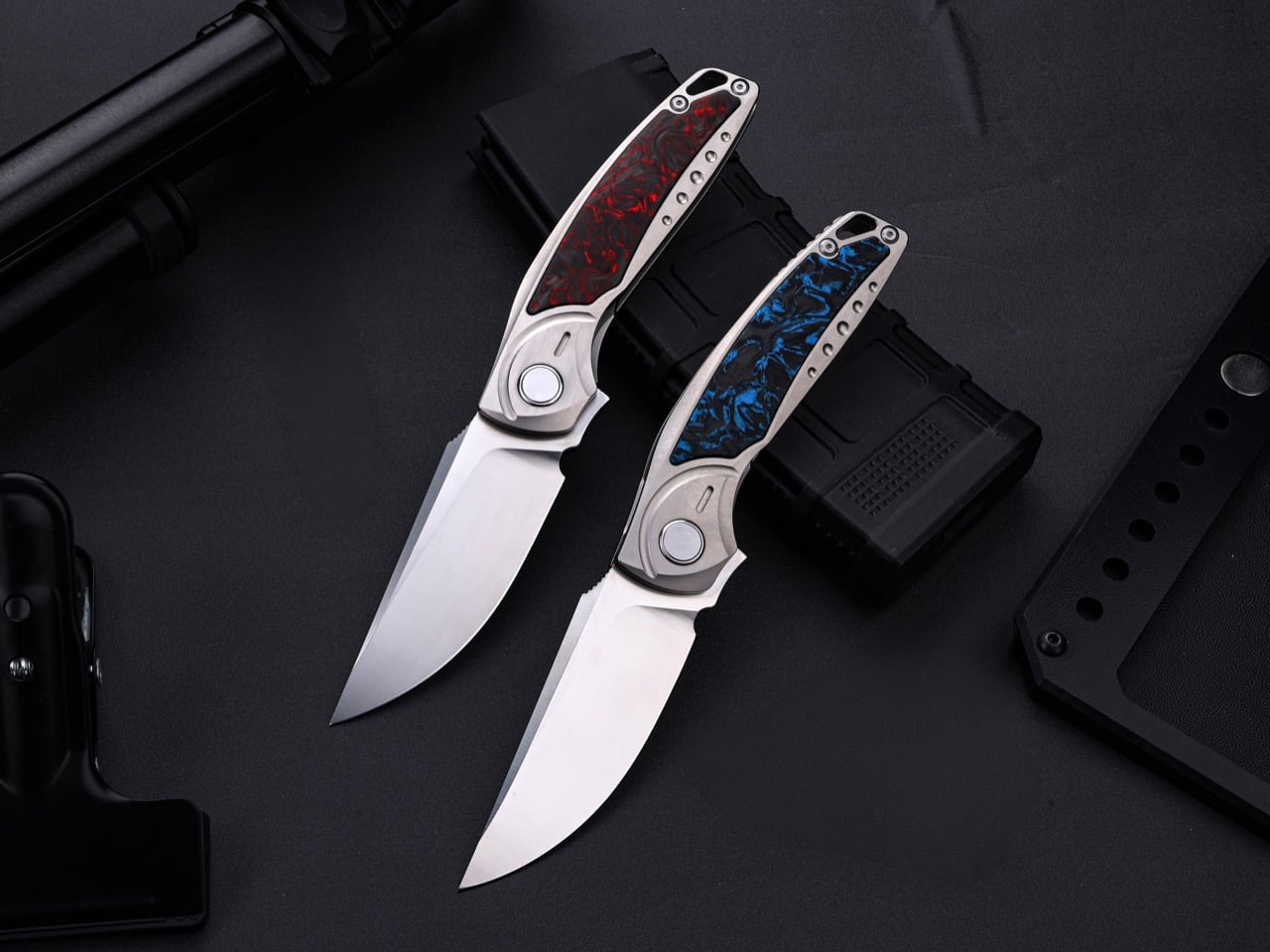
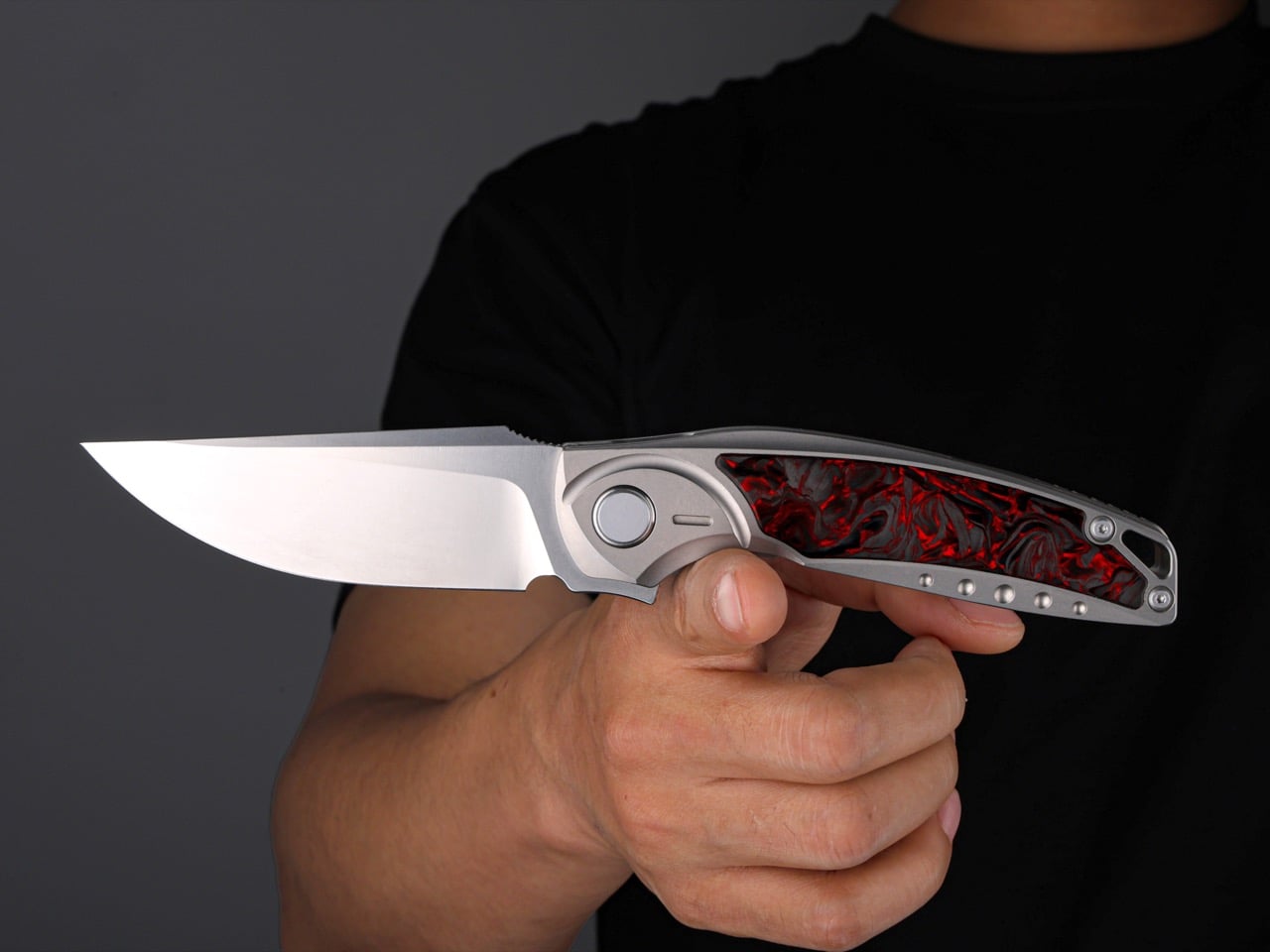
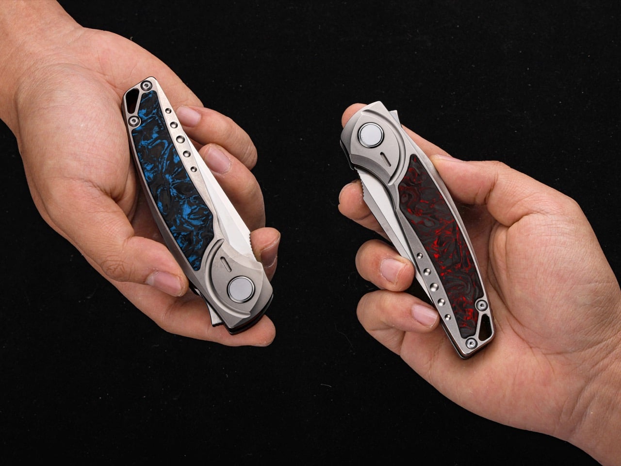
Grade 5 titanium, also known as Ti-6Al-4V, carries a strength-to-weight ratio that makes it the default choice in aerospace and medical implants. MIH machines the entire frame from this alloy, creating a structure light enough to disappear in your pocket at 5.6 ounces but strong enough to resist the kinds of lateral stresses that would bend a stainless steel liner. The frame curves to follow the natural contour of your palm, and the carbon fiber scales layered on top provide texture without aggression. Each scale displays a unique weave pattern since carbon fiber, by nature, never replicates exactly. Red, blue, or black colorways let you choose between bold presence, understated elegance, or low-visibility stealth. At the base of the blade, subtle jimping creates a tactile index point for your finger during detail work, the kind of small addition that only matters when you’re making precise cuts and suddenly realize how much control it gives you.

Ceramic bearings handle the pivot rotation while phosphor bronze washers distribute the load. Steel bearings corrode. Ceramic bearings don’t. Plastic washers compress and wear. Phosphor bronze doesn’t. The result is a deployment action that feels smooth the day it arrives and stays smooth years later. A strong detent keeps the blade locked closed during carry with no risk of accidental opening, but when you engage the flipper tab, the blade snaps out with a satisfying, controlled authority. The lock face and pivot are precision-machined to eliminate tolerances, which translates to zero blade play when the knife is open. No wobble. No lateral movement. Just solid lockup you can trust under hard use.
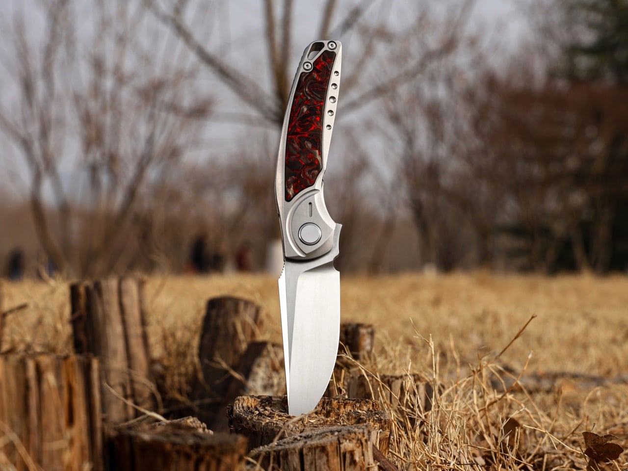
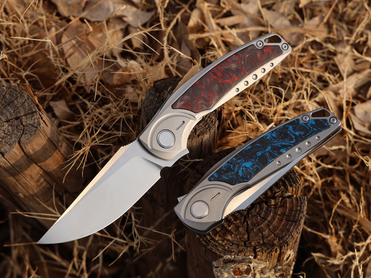
The blade runs a drop point profile, which means the spine curves gently downward to meet the tip, creating a strong point with plenty of belly for slicing. Drop point is the workhorse geometry for EDC because it excels at the tasks you actually do daily: opening packages, cutting cordage, preparing food, stripping wire, shaving wood. The tip is strong enough for piercing but not so aggressive that it tears through pocket fabric or catches on material when you’re making controlled cuts. At 62 HRC with a 15-degree edge angle, the M390 blade slices through cardboard, rope, plastic banding, and food prep tasks without requiring frequent touch-ups, while the D2 variant trades some of that extreme edge retention for better toughness under hard lateral loads. This is a knife built for the person who’s tired of pocket clips that loosen after a month, blades that need constant sharpening, and folders that feel like they were designed by a committee instead of someone who actually carries a knife daily.
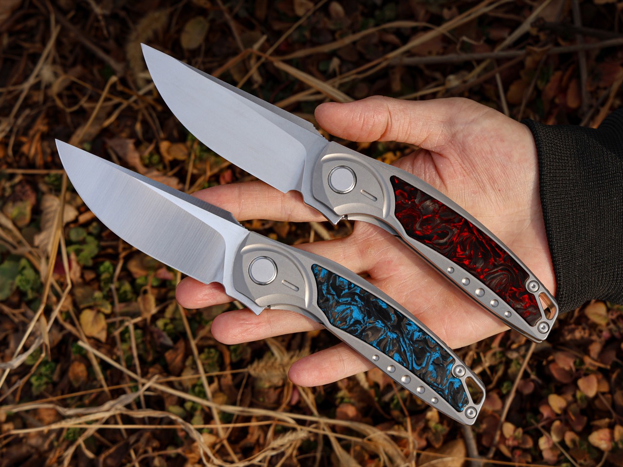
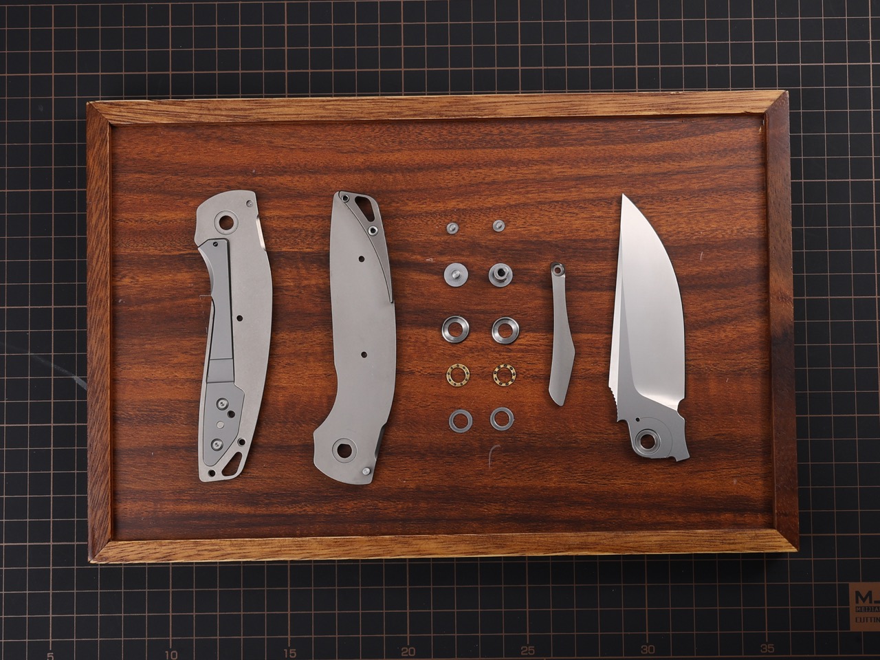
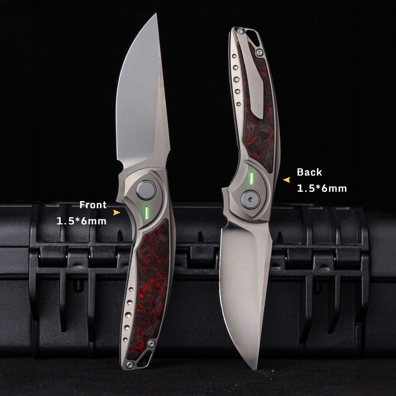
MIH milled the clip channel directly into the titanium frame so the clip sits flush with the handle contour, machined from spring-grade titanium so it grips firmly without deforming and releases smoothly without snagging fabric. Precision-machined tritium slots measuring 1.5x6mm sit on both sides of the handle, ready to accept self-illuminating vials if you want a subtle glow-in-the-dark locator, or you can leave them empty and enjoy the clean lines. A lanyard hole at the tail end gives you the option to attach a bead or cord for wrist retention or easier pocket extraction. Closed, the GraphiX measures 4.71 inches. Open, 8.27 inches. The balance ratio hits 0.618, essentially the golden ratio applied to weight distribution, which means the knife pivots naturally in your hand without feeling blade-heavy or handle-heavy.
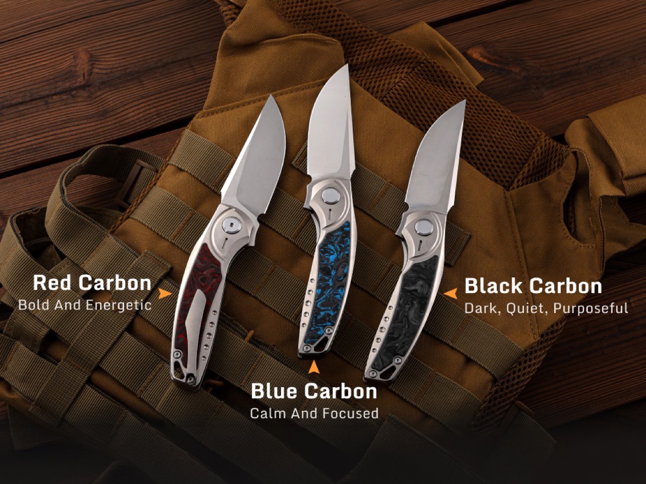
The D2 variant starts at $120, making it the accessible entry point into a titanium-framed folder with ceramic bearings and a carbon fiber inlay. The M390 version commands a premium for the superior edge retention. Add-ons include custom engraving, alternate carbon fiber colors (blue or black if you don’t want the default red), luminous vials, tritium vials, a titanium lanyard bead, and a foldable knife sharpener. The GraphiX ships worldwide with no additional shipping fees, and delivery is expected in August-September 2026 for backers who secure their spot during the campaign window.
Click Here to Buy Now: $120 $183 (35% off) Hurry! Only 19 days left!
The post Grade 5 Titanium, M390 Steel, Ceramic Bearings, $120 Price Tag: The EDC Knife to Beat in 2026 first appeared on Yanko Design.