Mixed reality headset bucks design trends for a complete audiovisual experience

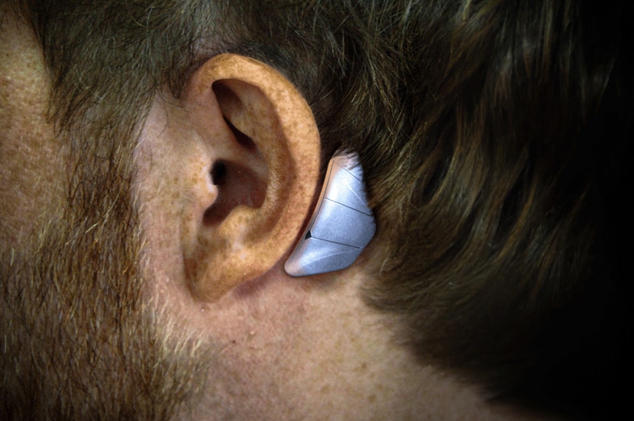
Thanks to the Apple Vision Pro, mixed reality is back in the news along with the hardware that will enable people to experience them. We have yet to hit the Holy Grail of headset design that will allow people to wear these devices on their heads for long periods, but brands like Apple and Meta definitely have that goal in their sights. MR headsets are getting lighter and slimmer, but that will always come at the cost of sacrificing some functionality that has to be offloaded to some other product you will have to buy and use separately. This concept design, however, goes in the other direction and tries to actually include everything you need for a more believable mixed reality experience, including the oft-neglected audio for your ears.

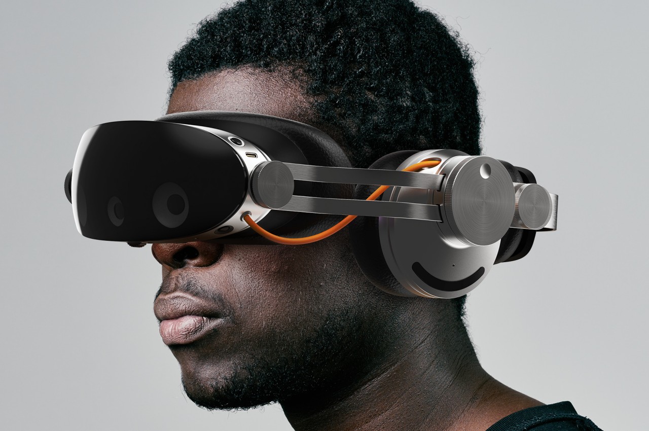
Designer: Dohyuk Joo

It’s harder to fool the eyes, which is why most of the focus in developing these mixed reality headsets is on the optics. But we don’t experience the real world with just our eyes, and a more immersive virtual world will also need to do more than just feed us visual data. Just like in the real world, audio is either taken for granted or at least takes second place only, but this headset design tries to balance the scales, even if it means going back to the days of bulky headsets.

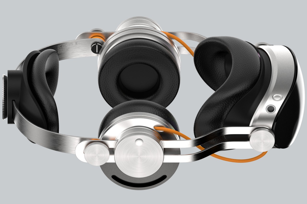
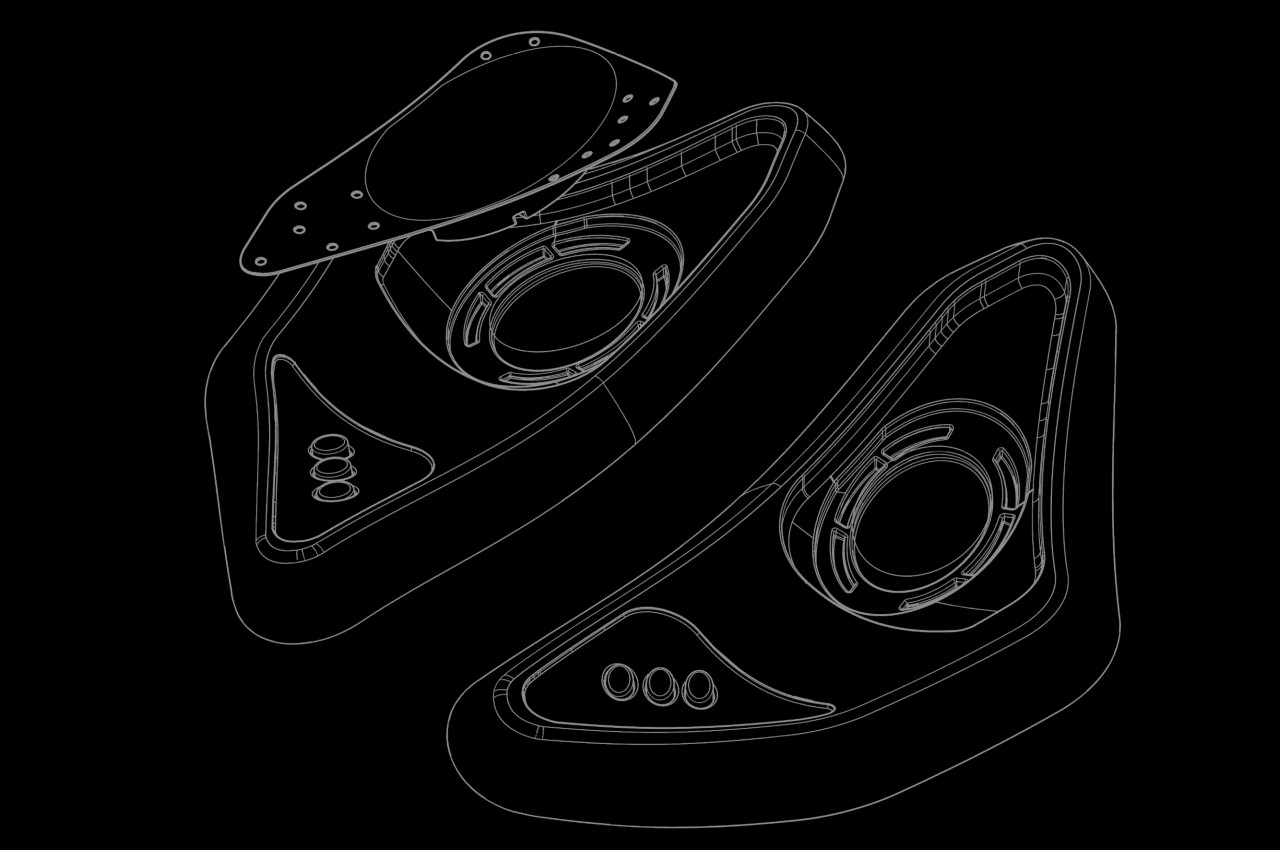
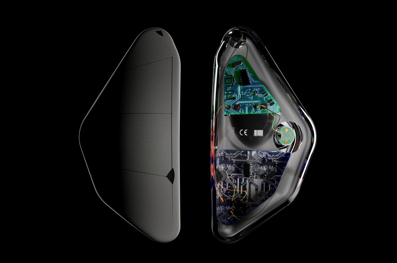
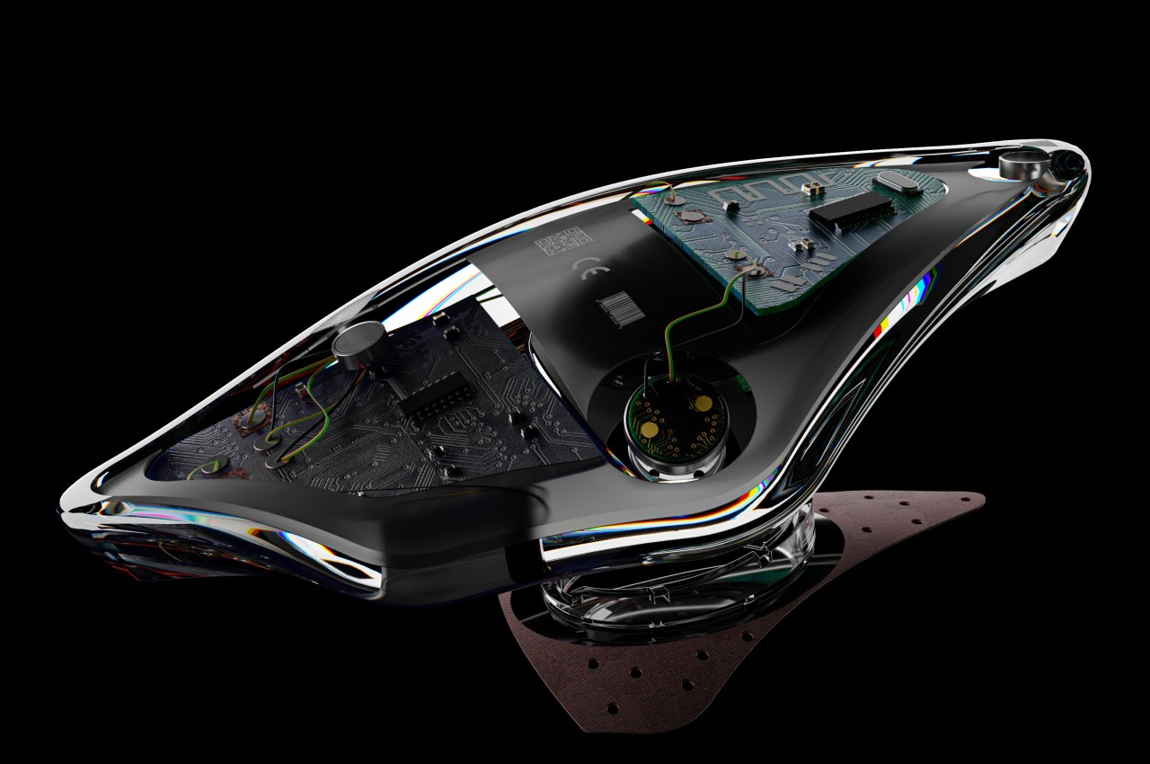
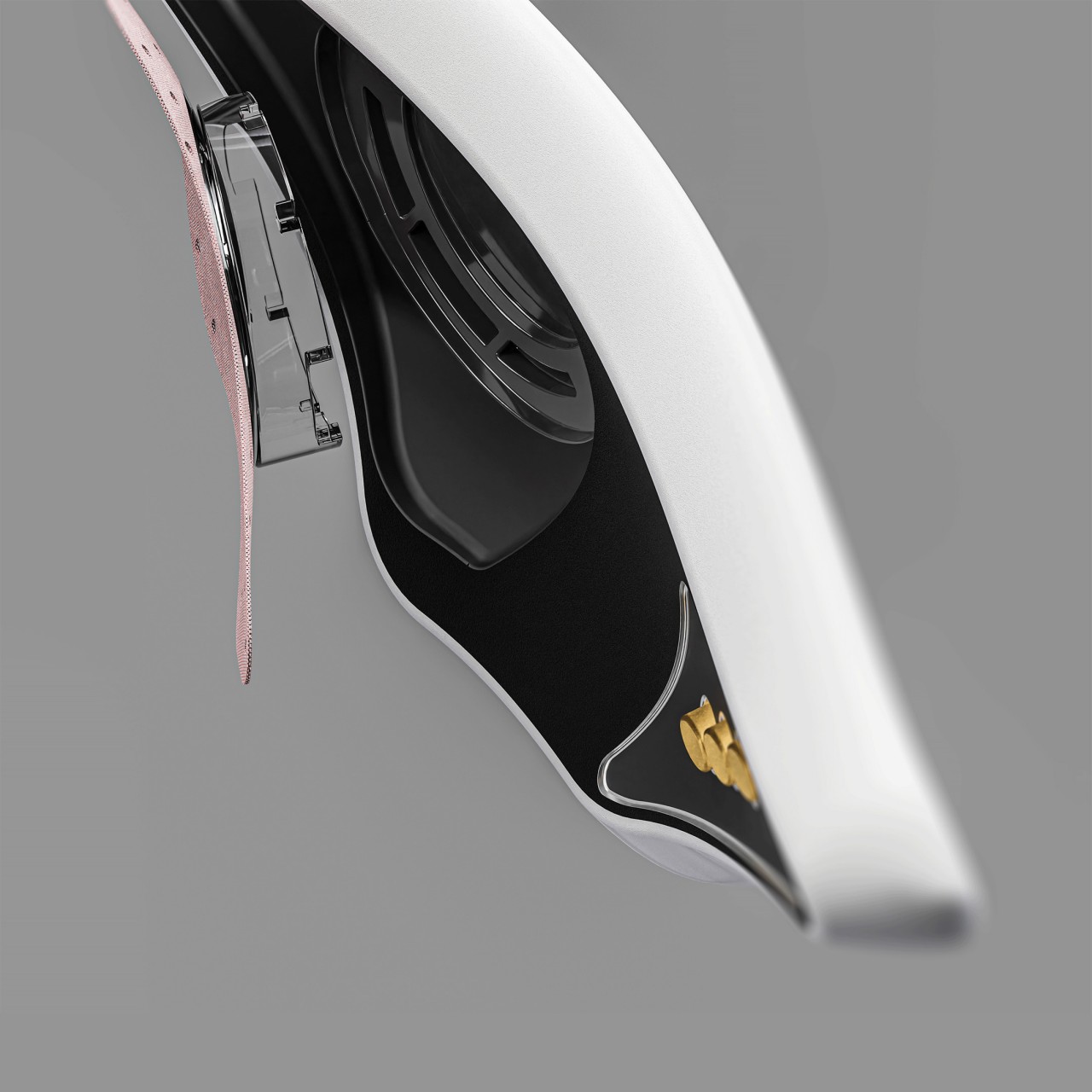
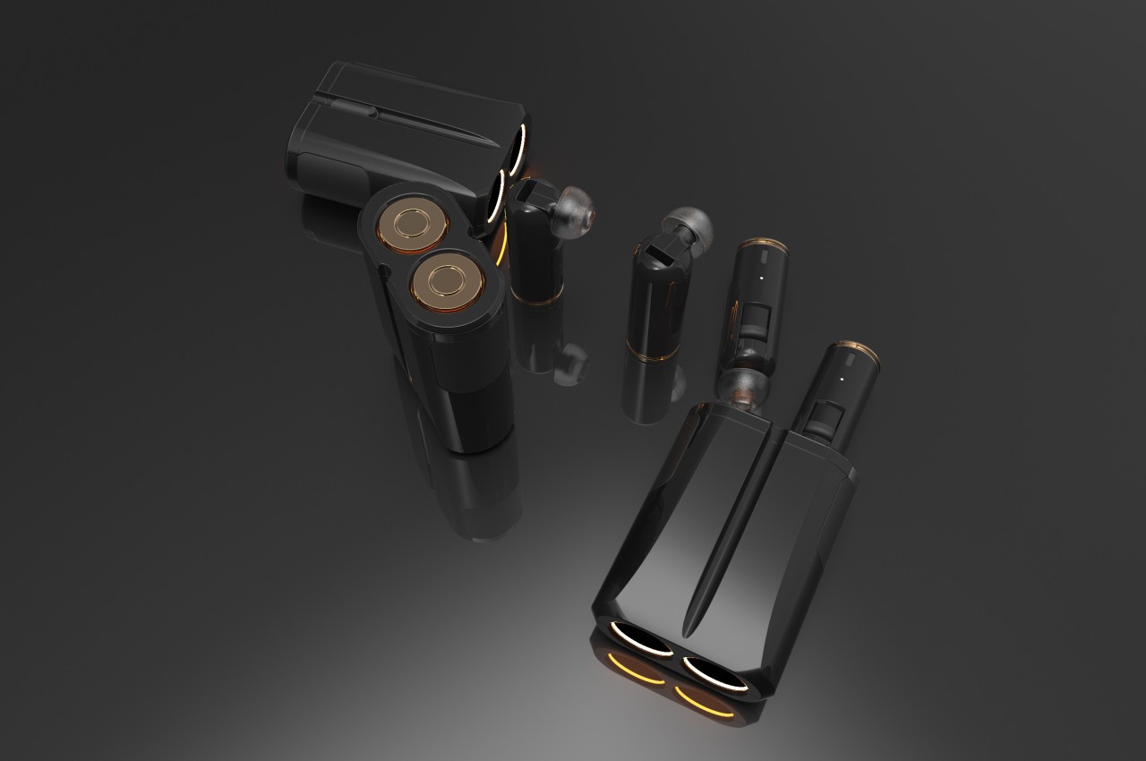
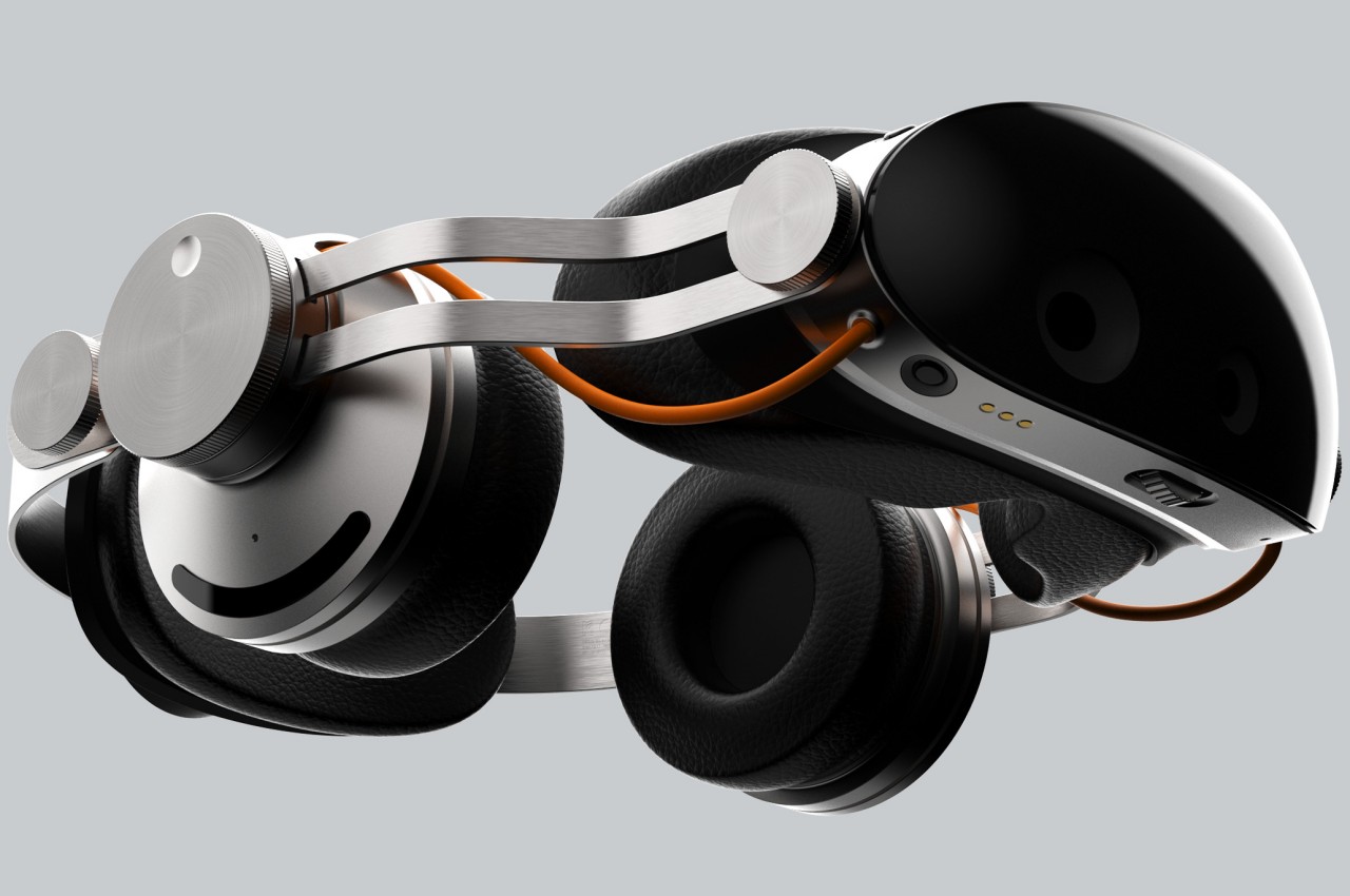
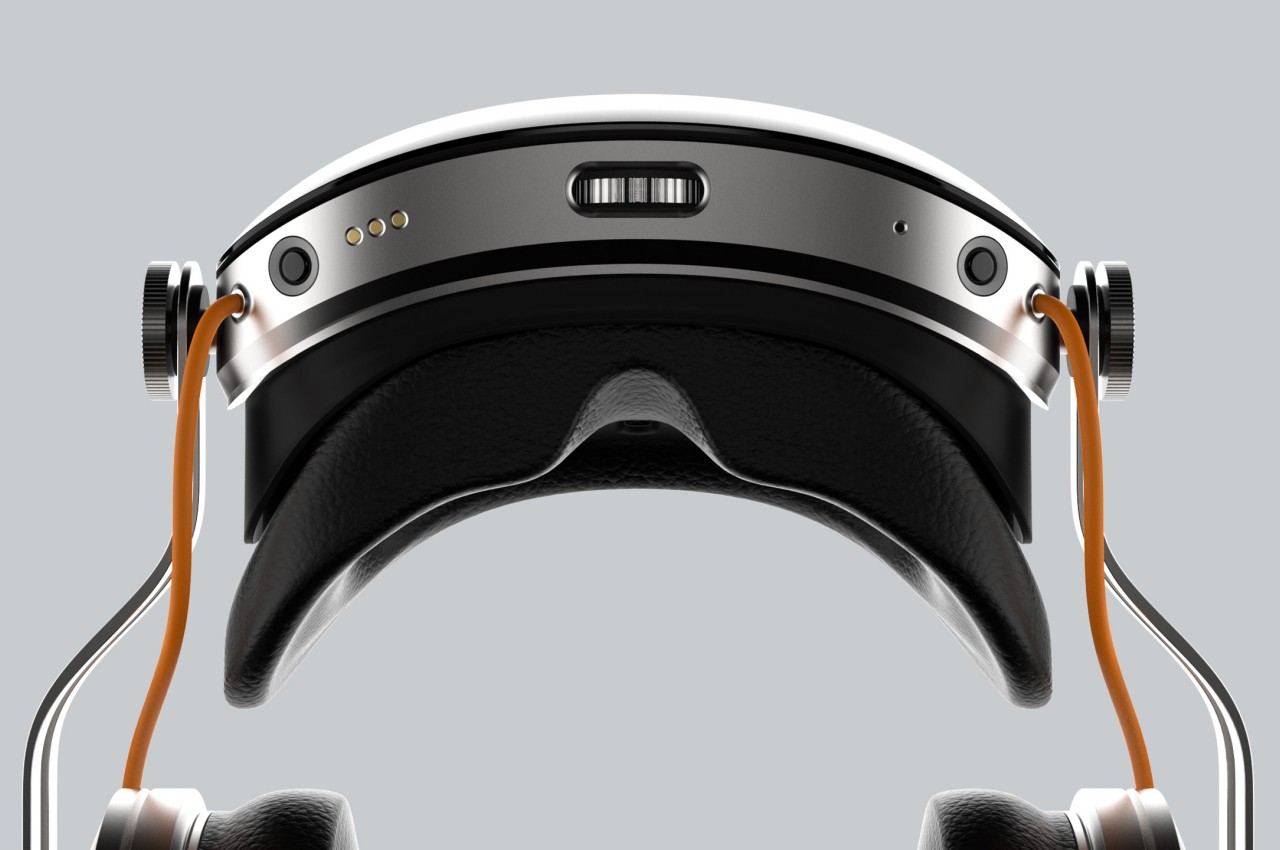
WavVision, whose name tries to embody the combination of sound and sight, attempts to be an all-in-one mixed reality solution for our eyes and our ears. In a nutshell, the headset includes over-ear headphones to deliver audio, particularly spatial audio, that would complete the immersion of existing in a virtual space. This wouldn’t be the first headset to attempt that combination, but it is definitely one of the few that make it painfully obvious. The Meta Quest 3, for example, does have built-in speakers but uses an open-ear design that simply directs the audio waves toward your ear.

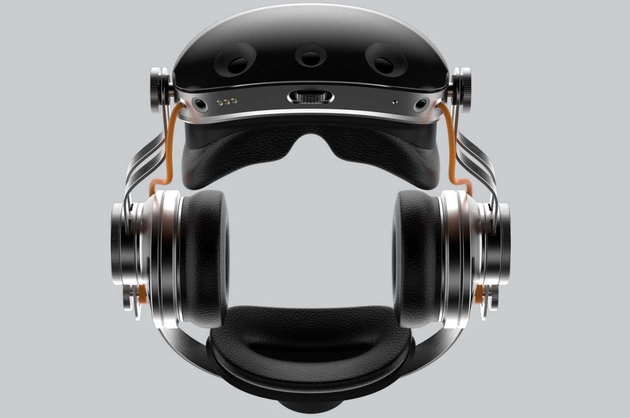
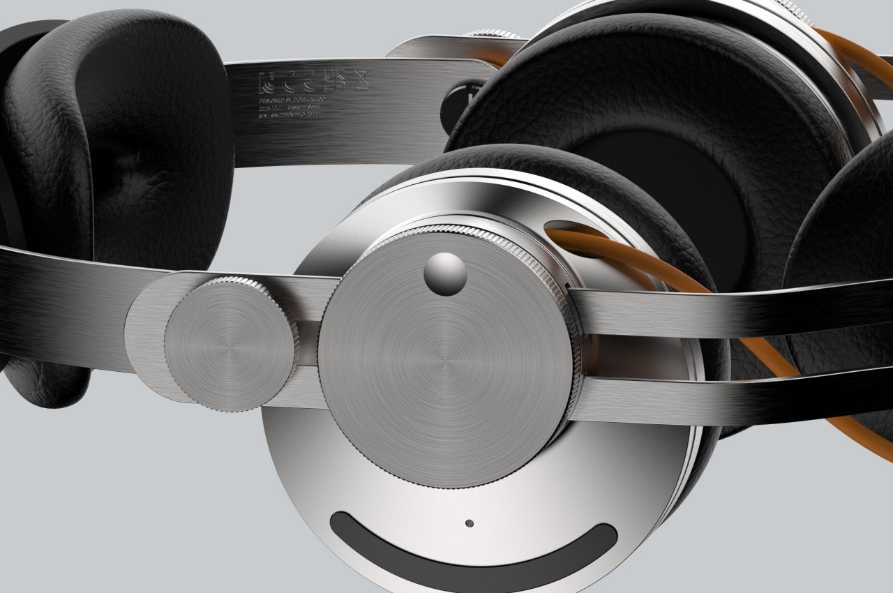
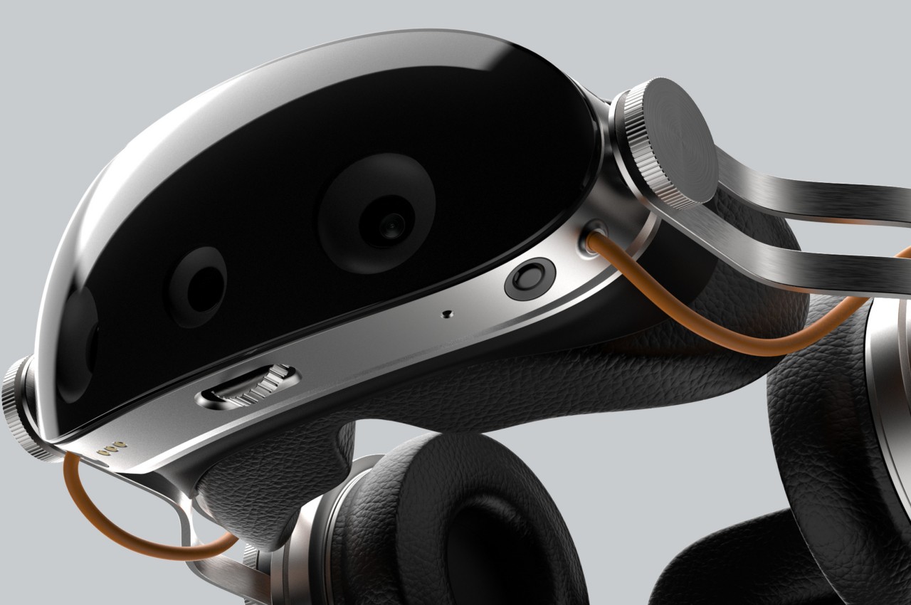
In addition to having over-ear cups built into the design, the very form and construction of WavVision go against the dominant trend in this niche market. The frame is made from thick steel plates bent to loosely follow the shape of the head. It’s a material that suggests quite a bit of weight and sharpness, which is the opposite of what headsets today are aiming for. It gives the design a distinct industrial aesthetic, which is intentional but also questionable.

One of the reasons why headsets don’t include dedicated headphones is because the audio experience could probably be delivered by more dedicated hardware that’s specially designed for performance as well as comfort. Building that part into the headset only weighs the product down, both literally as well as in terms of costs. Conversely, an integrated design ensures a unified appearance and, at least theoretically, a more complete experience. Admittedly, few of the mixed reality brands today seem to be paying that much attention to the audio aspect, but if Apple will be playing this game for long, it will undoubtedly dip its toes in that area sooner or later.

The post Mixed reality headset bucks design trends for a complete audiovisual experience first appeared on Yanko Design.

Discreet hearing aid concept empowers people with hearing disabilities

Many people try to deny experiencing physical disabilities for fear of making them look weak. This is especially true when it comes to hearing problems that people feel they can simply ignore or wave off easily. Those who do admit to having some hearing disabilities, however, are hesitant to get hearing aids that are expensive, fragile, uncomfortable, and too conspicuous, as if announcing their handicap to everyone around them. That doesn’t have to be the case, especially with today’s advancements in technology, and fortunately, some people are indeed stepping up to design a less obnoxious and more reliable hearing aid, such as this concept that tries to check all the boxes that would encourage more people to wear them and enjoy the world as it was meant to be heard.

Designers: Jitendra Kakade, Nikhil Srikrishnan, Riddhiman Dutta Choudhury

Despite how electronic components can now be so minuscule, most hearing aids still come in a large, two-piece design that, more often than not, clamps to the back of your ear. Such hearing aids are not only uncomfortable to wear, they also tend to put a very visible stigma on wearers, making them feel self-conscious and even ashamed to wear one. This leads to many owners abandoning these devices altogether, willing to sacrifice their happiness for the sake of their image.

Rezonance is a concept design that tries to think of a better solution that isn’t just more discreet but also more affordable and accessible in the long run. Instead of the typical clamping design, Rezonance employs bone conduction technology to be almost invisible. It’s a technology that is already used today on some wireless headphones, so it’s already a proven solution. By using bone conduction, there doesn’t need to be any visible part going into the person’s ear and Rezonance can stay hidden from view behind the wearer’s ear.

Instead of using clamping force to stay in place, the concept suggests an adhesive pad that’s similar to sports tape, ensuring that the material is not only waterproof but also reusable. Additionally, the components used to make the actual hearing aid are claimed to be quite cheap and easily available, which means that the final product itself doesn’t have to cost people an arm in exchange for their ear.

The design doesn’t specify whether Rezonance works only as a single piece or if you will need two for the full audio experience. Even then, it would still be a lot less cumbersome compared to the traditional hearing aid design. Of course, such a design will need to be verified first, especially by professionals, because a design that’s elegant yet ineffective will just end up disappointing and turning away people all the same.

The post Discreet hearing aid concept empowers people with hearing disabilities first appeared on Yanko Design.

Ergonomic mouse concept oddly looks like a familiar home appliance

Computer mice have been around for decades, and despite their form making no objective sense, they remain the most basic and most common pointing device that we now use intuitively. The core design of the mouse hasn’t changed significantly since its inception, which unfortunately means they’re still one of the biggest causes of repetitive strain injury or RSI for many people. Ergonomic mice are starting to gain traction, particularly the vertically oriented designs that promise a more natural and comfortable grip for your hand. This device concept builds on that same premise, but the execution is a bit puzzling considering how it looks less like a mouse and more like a miniature clothes iron.

Designer: Pranav Kuber

The rationale behind vertical mice is that the normal orientation of human hands has the palms facing inward rather than downward. With a regular mouse, users are forced to keep their hands at an unnatural angle, whether or not they’re moving the mouse at that moment. Of course, a vertical mouse would still need to provide the basic functions of a conventional mouse, which includes left and right buttons as well as a scroll wheel.

At first glance, the Ergo ergonomic mouse concept is just like any other vertical mouse now available for purchase, but examining its form and silhouette generates a slightly different image. The top plane’s wide surface tapers sharply toward the front, while the wide middle section looks rectangular when viewed from above. If not for the actual bottom of the mouse, which merges two vertical sides like the keel of a ship, the Ergo looks almost like a clothes iron, albeit one without a handle to grip.

Aside from the peculiar shape, the mouse design also raises a few other questions. The buttons on the outer or right side are clearly marked, but they don’t look like buttons you can physically click at first glance. The position of the mouse wheel on the opposite side is even more puzzling, as it will require a lot of swinging movement from the thumb that could actually put more strain on its joint. The rather wide rear might also make it harder to grasp the mouse, potentially resulting in more discomfort in the long run.

The post Ergonomic mouse concept oddly looks like a familiar home appliance first appeared on Yanko Design.

Tumbler-shaped portable projector concept promises entertainment freedom

Projectors are becoming a popular alternative to extra large screens like TVs, mostly at home but sometimes even outdoors. Product design trends have started to move away from bulky boxes to more compact forms, but most of them are still restricted by a few design considerations. Even projectors that are supposedly designed for portability often come with clunky and sometimes unattractive stands, or worse, require setting up on tripods just to get the perfect angle. This concept design tries to solve that problem in a rather creative way, offering a highly compact and portable projector that can be propped up and angled conveniently, all without using a tripod or even a stand.

Designer: Hana Belassi

Thanks to progress in technology and manufacturing, it’s now possible to cram much of the electronics that powered large, hulking projectors into something the size of a small box or even a cylinder. But despite the smaller designs, or probably because of their more cramped designs, these portable projectors often rely on an external mechanism like a tripod or stand to prop them up at the desired angle. Not only does this ruin the aesthetics of the otherwise beautiful product, it also makes it cumbersome to bring the projector along wherever you go.

The Slim.VU concept tries to offer the ultimate on-the-go entertainment experience by encapsulating all the needed parts and design in a single, compact, and portable package. A projector with a built-in battery is not exactly new, but one that comes with 4G connectivity is still unheard of. That enables the projector to function not only without an external power source but even without a Wi-Fi connection, allowing it to access streaming sources without having to use up your phone’s cellular data.

1

The more interesting aspect of the projector’s design, however, is the built-in stand that looks nothing like a stand. The removable “cap” of this tumbler-like projector functions as this stand, holding the projector in its place magnetically. The curved shape of this stand lets you rotate the cylindrical projector and angle it properly. This way, you don’t need any other accessory to enjoy a video anytime you want, anywhere you go.

The Slim.VU projector concept contains everything you need, freeing you from concerns about power, connectivity, and stability. Of course, actually implementing such a projector is a different matter entirely, and it might need to make a few compromises in exchange for its compact form. Audio and video quality might actually take a hit just to cram this much technology inside a canister shape, making the portable projector less ideal for outdoor use, or even indoor when there’s too much ambient light.

The post Tumbler-shaped portable projector concept promises entertainment freedom first appeared on Yanko Design.

Wireless earbuds concept suggests a novel and weird way to clean it

Wireless earbuds, particularly the so-called True Wireless Stereo or TWS earbuds, have now become a common sight, in no small part thanks to Apple retiring the headphone jack and pushing the AirPods as a solution. These accessories come in different shapes and sizes, but the one common design they share is that the buds are enclosed in a container that acts as their charger as well. As any user of these tiny buds has experienced by now, both the buds and their are often exposed to dirt and grime that could become a health issue over time. Cleaning the earbuds themselves might be trivial, but when that dirt gets deep inside the case, the task becomes significantly more difficult. This concept tries to solve that problem by practically overhauling the charging case design, and it takes inspiration from the weirdest source to implement the strangest cleaning method.

Designer: Seungjae Lee

For TWS earbuds that store the buds’ stems vertically like with the Apple AirPods, the charging cases have a small and deep tunnel where dirt and bacteria can get in and fester. It’s not impossible to clean but it does take some effort, requiring you to really stop and use some tools to wipe the dirt deep inside. If only you could blow the dust and dirt away quickly when you need to, just like with many other objects you might have with you.

The Double Barrel Bluetooth Earbuds concept offers that convenience by turning the charging case into two hollow tubes with openings on both ends. The inspiration for this design was, apparently, a double-barrel shotgun, which is probably the last thing you’d expect to associate with non-violent wireless earbuds. As a visual embellishment, inserting and removing the earbuds would light up LEDs inside the barrel, as if you were shooting bullets.

For this to work, however, the buds themselves have to be straight, which would have been awkward to wear inside our ears. The concept proposes to make the tips foldable so they would take the form of typical earbuds that you can comfortably wear in your ears. And because of the double-ended opening, you can actually put in or remove the buds in either direction.

While the concept design is definitely interesting, it is based on the rather shaky premise that cleaning the earbuds case by blowing into them is actually a smart idea. Our breaths aren’t exactly clean and, more importantly, they also carry with them small saliva particles that could damage the charging contacts inside. And by keeping both ends open, the case would actually invite even more dirt and particles inside, making regular cleaning even more of a chore.

The post Wireless earbuds concept suggests a novel and weird way to clean it first appeared on Yanko Design.

Magnifying glasses turn into classic magnifying lens when not in use

One of the things that I have to accept as a person that’s getting older and that has bad eyesight is the fact that I can’t read books with small fonts anymore. I’m not yet at the point where magnifying glasses are actually needed but I know we’ll eventually get there. There are more convenient ways now of using magnifying lenses instead of the old school way of actually holding a lens in one hand with the reading material on the other hand. This concept for magnifying glasses is something I may eventually want or need.

Designer: Jongcheol Yang

The VAN magnifying glasses concept fixes the problem of unnecessary parts that may cause inconvenience or even dizziness to those that need to use this kind of glasses. The idea is for this to be similar to reading glasses in a sense that you only wear them when you need to use them. The magnifying part is only placed on the lower part where the magnifying lens is located. And when you’re feeling dizzy or you need to rest your eyes, you just have to look straight ahead since the lens part will not be there anymore.

The other cool thing about this concept is that if you don’t need to wear the glasses, you can just fold up the front and then the “legs”. It will then turn into the classic magnifying glass that we’re used to and then you can store it in your bag. They don’t show it in the product renders but maybe if you just rotate the lens itself away from the stem, then you can use it like a regular magnifying glass without having to wear it as actual glasses.

It’s an interesting concept for sure, particularly for people who already have a hard time reading things that have small prints. Of course it’s another thing to add to things you need to bring and to mind. But at least it solves some of the issues that come with current magnifying glasses.

The post Magnifying glasses turn into classic magnifying lens when not in use first appeared on Yanko Design.

Laptop design concept has a creative way of hiding those ugly ports

Laptops are becoming powerful beasts that could almost match the computers sitting on top of our desks, but if there’s one thing they still can’t do is offer the same connectivity options as those towering boxes. You can only fit so many ports into a laptop without marring its slim profile, and some manufacturers have even started removing all but the small USB-C ports for the sake of aesthetics and weight. It’s a compromise imposed by current design restrictions, but it’s far from the ideal solution. If those restrictions are lifted, it might be possible to come up with a better design, like this concept for a laptop that still has a plethora of ports but can keep them out of sight when not in use.

Designer: Junichiro Yokota

A laptop’s purpose is primarily to offer computing power you can carry around with you and use anywhere, at least as long as it has some battery left. For most purposes, a laptop already has everything it needs to get the job done, but with the growing complexities of modern work, you will inevitably find yourself connecting some peripherals, such as an external storage drive at the very least. This is especially true for laptops that are used as “portable desktops” at work where you’d usually plug in a monitor, keyboard, mouse, and other accessories and then pull them all out when it’s time to leave.

Those connectivity ports give laptops their flexibility, but they also mar what would otherwise be a beautiful pristine design. You can minimize their effect with smaller USB-C ports, but you also make users’ lives complicated as Apple learned the hard way. A design that hides those ports while still making them available when needed is almost a pipe dream, at least if you only apply common conventions. This concept, however, thinks outside the box to come up with a solution that actually hits two birds with a single stone.

Commissioned by Fujitsu, this laptop concept employs a retracting mechanism to hide and then deploy ports inside a rectangular tube that sits underneath the laptop near its rear. It still has one USB-C port exposed for quick access, but all other connectors are still within easy reach once the inner bar slides out. That tube also functions as a riser to keep the keyboard at a more ergonomic angle.

The concept design uses a black and red motif to match Fujitsu’s official colors, but it’s not hard to imagine other designs being used as well. As interesting as the concept might be, it does also leave a few concerns unaddressed. The first would be the technical implementation of such a retractable design, especially when it comes to durability as well as the arrangement of electronics inside. More importantly, however, it also locks the laptop at a fixed angle determined by the riser tube, and unless it’s detachable, it also adds a somewhat unattractive protrusion to the laptop’s profile.

The post Laptop design concept has a creative way of hiding those ugly ports first appeared on Yanko Design.

Swiveling wooden stool is compact, multi-functional, and mildly uncomfortable

While all furniture needs to be stable, chairs and other seating furniture need to meet two requirements. They have to be stable enough to hold the weight of the person sitting on them, but they also have to be comfortable to encourage or even tempt those people to use them. Then again, there are some seats that seem to actually discourage lounging around, adopting a design that’s purely utilitarian and sufficient for a brief rest of a few minutes. However, there are chairs that were designed with comfort in mind but fall slightly short of that goal. This stool, for example, is undoubtedly quite useful, space-efficient, and probably even sustainable, but it might have slightly missed the mark in one of its core use cases.

Designer: Jeongchun Lee

The stool looks simple enough at first glance, with a tall box for a base and two plain boards forming the actual seat as well as a backrest. The latter element puts this design somewhere in between a typical stool and a chair, though the narrow area and absence of arms put it more in the category of a stool. Either way, it’s clearly designed for sitting, but it also does more than that.

The base of the stool has a rack for holding reading materials, either magazines or a few books. This small detail makes the design better suited for places where such an activity is conducive, such as a library, a lobby, or a common area in offices or schools. Of course, you can also place it around your home and it won’t even take up too much space because of its tall and narrow structure.

The Chair 025 design concept, however, has one trick up its sleeve. The seat can rotate 360 degrees, allowing you to actually face any direction you prefer without having to move the chair itself. That said, you might not be able to swing around so easily because your legs will hit the corners of the “stall” or base. Instead, you will just be swiveling back and forth, which could be the goal to induce a little blood circulation even while you’re sitting, although that still runs the risk of injuring your legs if you’re not careful.

The design’s low backrest can also be a point of contention, given it doesn’t exactly provide enough support and could even lead to injury or accidents if you forget that it doesn’t completely go all the way up. For a stool that seems to encourage sitting for long periods of time to read, the potential discomfort is a little counterintuitive. The economy of design and potential for using sustainable materials, however, do make the Chair 025 concept a candidate for cramped spaces and budget-constrained owners.

The post Swiveling wooden stool is compact, multi-functional, and mildly uncomfortable first appeared on Yanko Design.

Antiquated tools reinterpreted as delightful everyday products

Humanity has produced no small number of tools and objects over the course of history. Some have evolved to become the tools we use today, while others have almost faded into the background, remembered and illustrated only in history books. While these items of the past may no longer serve a practical purpose today, they could still serve as a stepping stone to inspire the designs of tomorrow. This collection of three everyday products, for example, takes a few pages from the form and even the function of these old objects, creating an atmosphere of wonder and curiosity, while also giving a few visual clues that connect us to our distant past.

Designers: Dami Seo, Dohui Kim, Dong Kyun Kim

1

Fire-lit lamps may have once been the only way that people could see in the dark of night, but these are not only impractical today, they’re also fire hazards. That said, there’s a certain romantic charm to the shapes and curves of these kerosene lamps, an emotion that the DIDIM_Stand Light tries to replicate with modern technology. The tall floor lamp imitates the style of a lamp dangling from a metal bar, but here the lamp is a battery-powered LED lamp that you can remove and use independently of the rest of the structure. The lamp’s two-piece stand and the wavy cantilever are meant to resemble a person holding such a lantern in olden times.

1

A bucket-drawn well is almost an iconic image in many historical or fictional settings that depict periods before an industrial age, and this old contraption has come to symbolize not only life that comes from water but also the routines of life in those ages. Today, we use clocks to mark those routines, and the DIDIM_Alarm Clock combines these two concepts into a miniature well that will hopefully make you feel less annoyed when it wakes you up in the morning. Instead of a basket, the “well” has a bell that rises from within when it’s time to sound the alarm. It isn’t a real bell, however, and has a speaker inside to do the work. Amusingly, you have to hit the bell in order to silence it.

1

A little bit more obscure is the DIDIM_Tray, inspired by old grinding stones that people used to prepare grains and beans for cooking. Instead of grinding things, however, turning the “pestle” handle deploys the fan-shaped trays that have compartments for your phone, your pens, and your earbuds. When you’re done using it and don’t want the circular tray to take up space, simply turn the handle in the opposite direction to transform it into a decorative for your desk or table.

These might be mundane objects you can find in anyone’s home, but giving them a bit of a flavor not only enhances their appearance but also changes the atmosphere around them. And you don’t even have to think hard of designs that will capture your visitors’ attention. By simply looking at our past and appreciating the designs that have come before us, we can already bring a unique visual and tactile experience to these everyday products, while also helping us make a connection with the past.

The post Antiquated tools reinterpreted as delightful everyday products first appeared on Yanko Design.

Chess set concept commemorates Nakhchivan’s 100th anniversary

If you’re the type to collect special edition chess sets, you’re probably always on the lookout for those that have a pretty unique design. You also probably don’t really play these sets on a regular basis but you’re more likely to display it somewhere in your space or if you’re planning to open a chess museum or something. If you’re also into sets that seem to belong on a set of fantasy epics like Game of Thrones, then this is something you might want to look at if this becomes a reality.

Designer: Adam Yuniso and Hatam Yunisli

Nakhchivan may not be a household name when it comes to places that you’d like to visit someday but based on what I’ve “researched” (read: Googled) so far, it is a place worth considering. The official name is Nakchivan Autonomous Republic, and is a “landlocked enclave” of the Republic of Azerbaijan bordered by Armenia, Iran, and Turkey. To celebrate its 100th anniversary, a souvenir project was proposed and it’s a stunning looking chess set (that also seems expensive).

Instead of the usual chess pieces, each one is designed to represent various Nakhchivan architecture like the Garabaghlar Mausoleum, Nakhchivan Memorial Museum, and several other mausoleums that hold significance to the republic. They look like they would look right at home at a classic castle that displays awesome-looking chess sets. Instead of being positioned in the traditional way that the pieces are placed, the designers said that they are placed in relation to the other chess pieces.

Now I don’t know if that means the rules are quite different ofr this Nakhchivan Chess Set but it does look pretty impressive based on the product renders. It may also not be something you’d play on a regular basis but a chess set that can be displayed especially if you have a strong connection to Nakhchivan.

The post Chess set concept commemorates Nakhchivan’s 100th anniversary first appeared on Yanko Design.