PROS:
- Dual functionality in a single, well-designed form
- Top-fill design prevents back strain
- DermaSense skin mode with intelligent humidity control
- Long-life, machine-washable components
- Comprehensive hygiene features
CONS:
- Large and heavy body feels imposing in small spaces
- Only available in one neutral color
- Premium price tag
EDITOR'S QUOTE:
The Blueair 2-in-1 Pro Purify + Humidify makes air quality feel like part of your skincare routine, blending serious performance with bedroom-worthy design.
Air purifiers and humidifiers usually look like they belong in a hospital supply closet rather than a bedroom. Most are boxy white appliances with visible mist plumes, blinking lights, and a general vibe that says “I am here to solve a problem” rather than “I belong in this space.” Meanwhile, people who care about sleep quality and skin health are starting to realize that the air itself might be part of the routine.
The Blueair 2‑in‑1 Pro Purify + Humidify feels like Blueair finally designed for people who want both functions but refuse to sacrifice aesthetics or simplicity. It is a tall, sculptural tower that combines serious air purification with gentle, invisible humidification and a skin-focused mode that adjusts humidity based on time of day and room temperature, positioned as step zero in a nighttime skincare routine. Let’s dive in to see if it delivers on its promises.
Designer: Blueair x Above
Click Here to Buy Now: $400 $499.99 ($99.99 off, use coupon code “YANKO20”). Hurry, deal ends in 48-hours!
Aesthetics
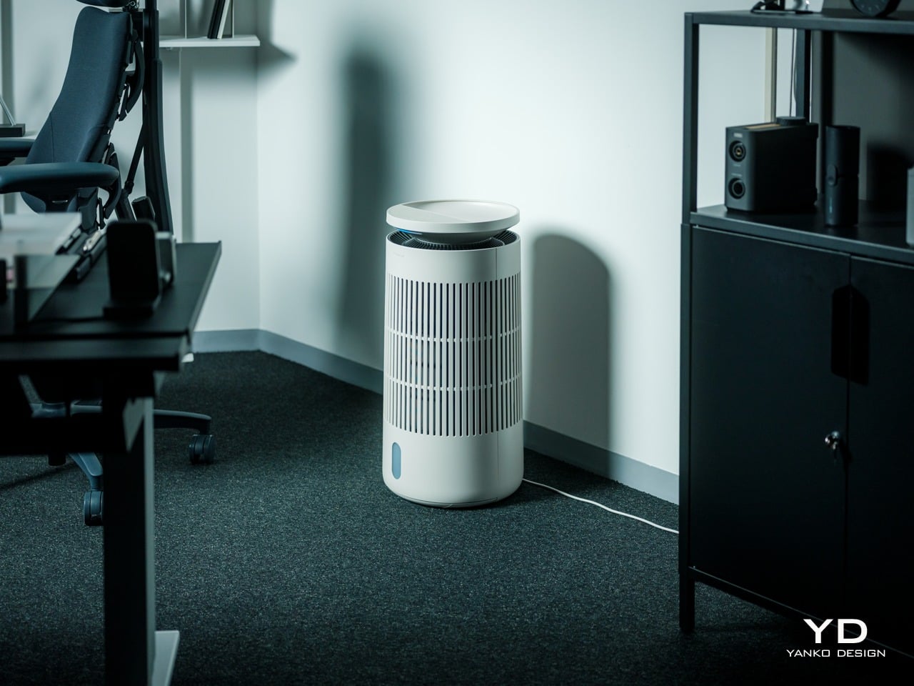
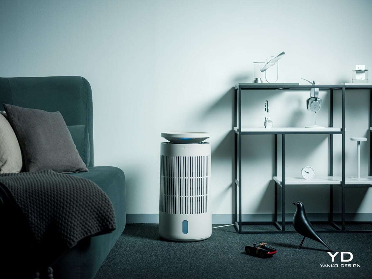
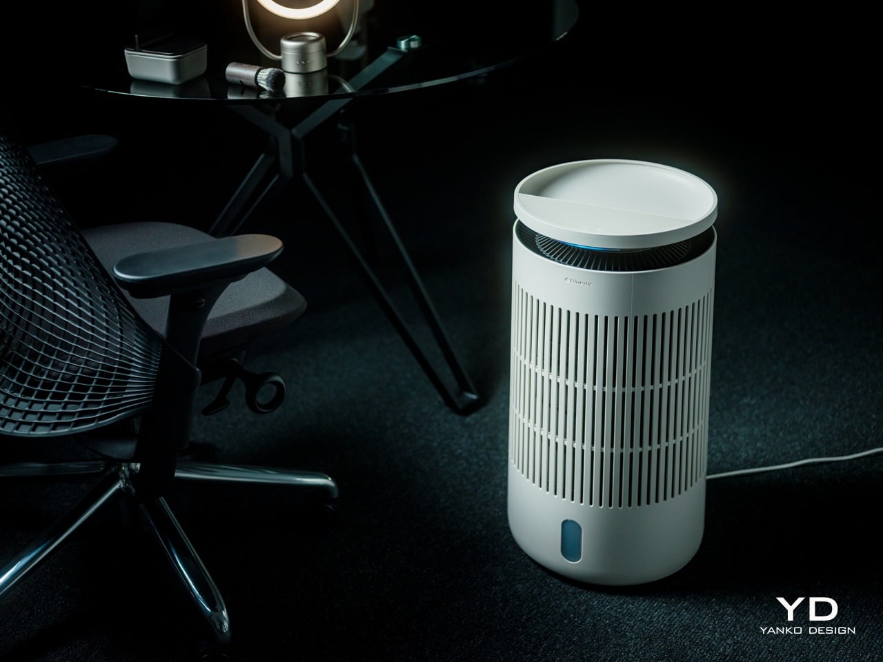
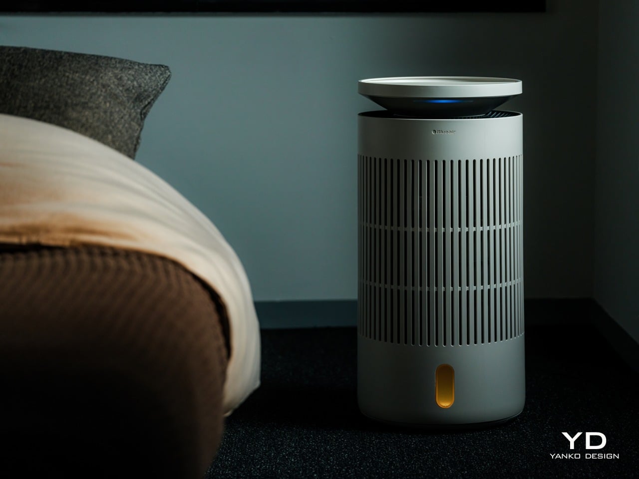
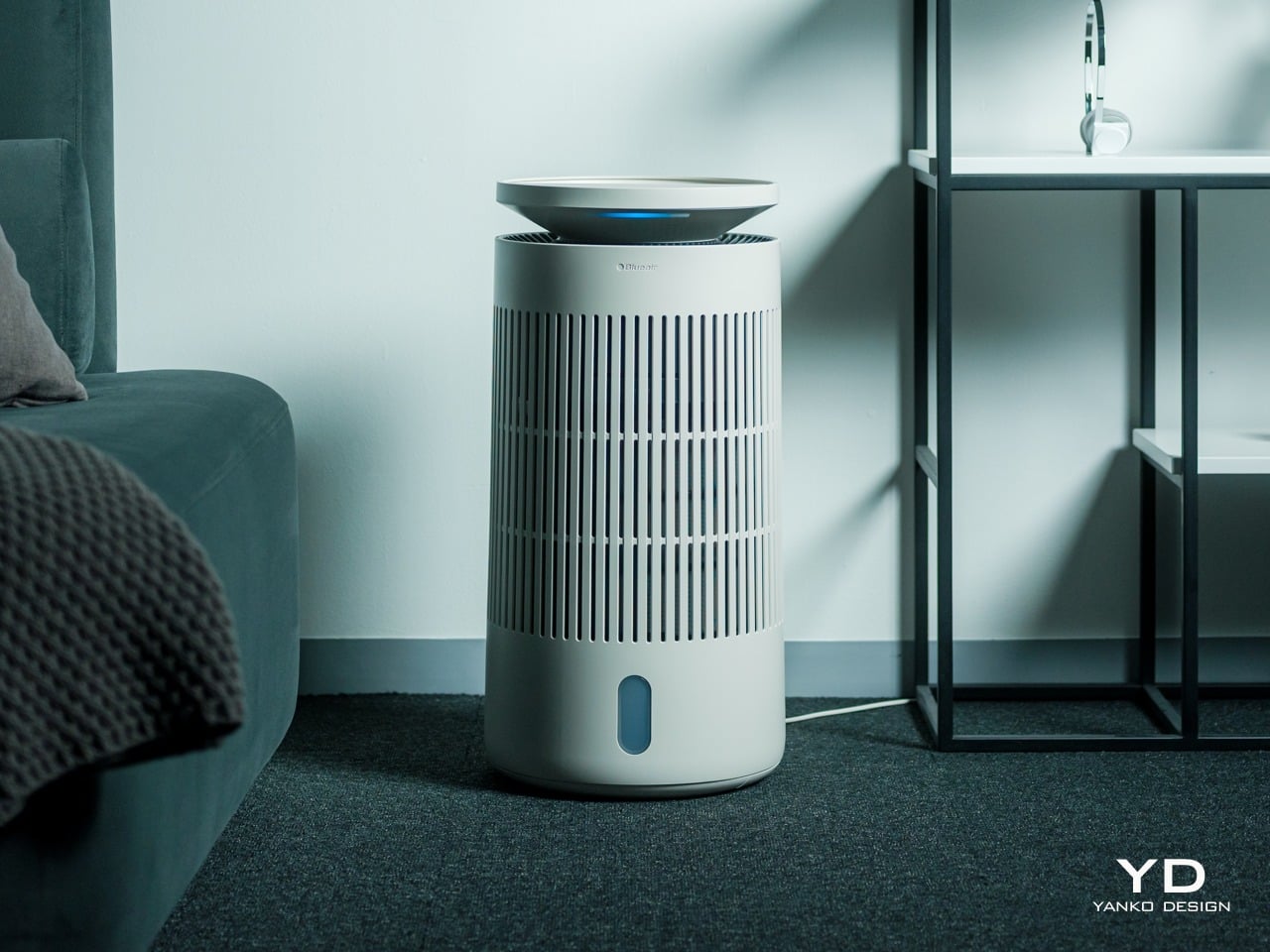
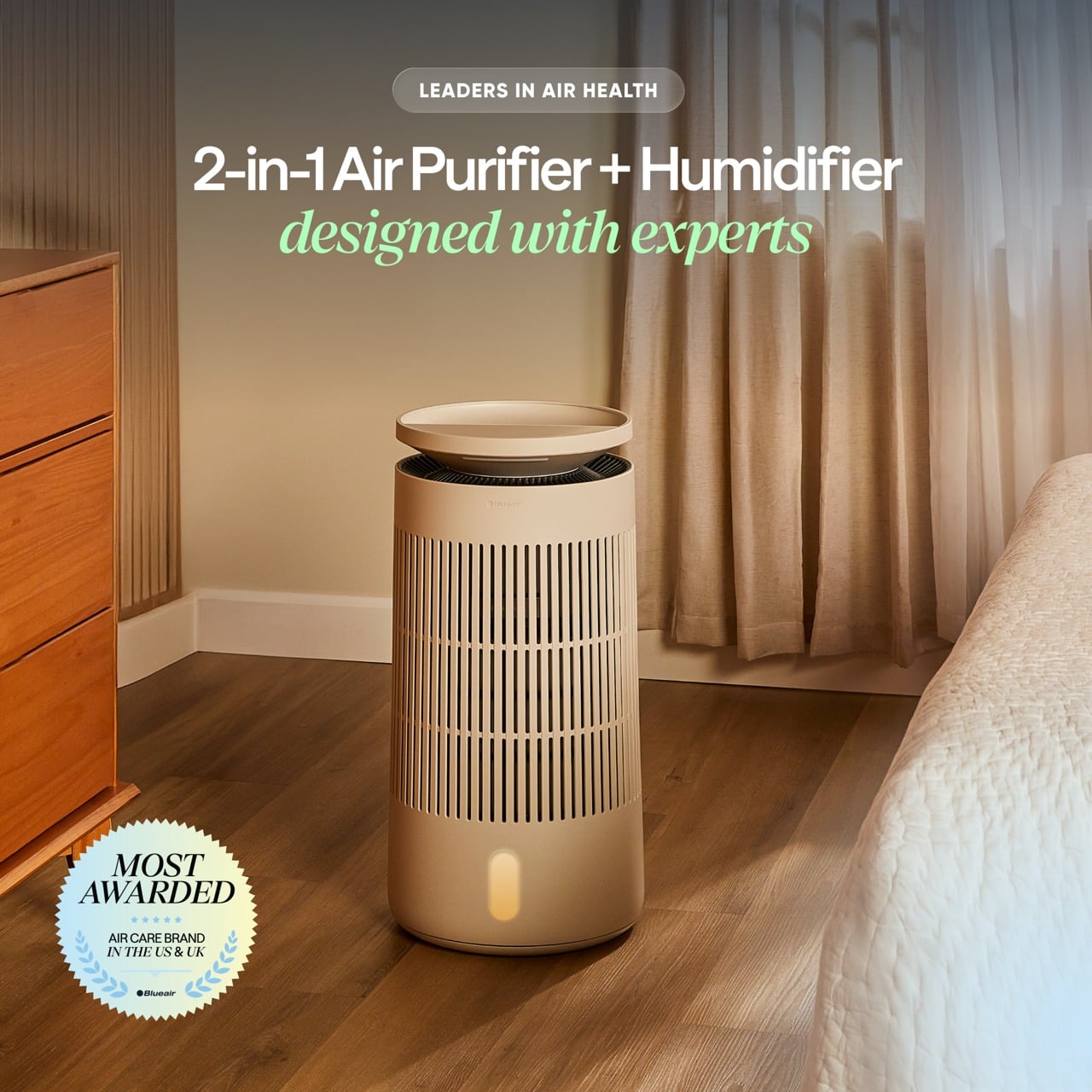
The first thing you notice about the Blueair 2‑in‑1 Pro is that it does not look like an appliance trying to hide. It is a cylindrical tower wrapped in evenly spaced vertical slats, finished in a soft off white that reads somewhere between warm beige and coastal linen, depending on the light. The proportions feel Scandinavian, tall enough to have presence but narrow without crowding the floor.
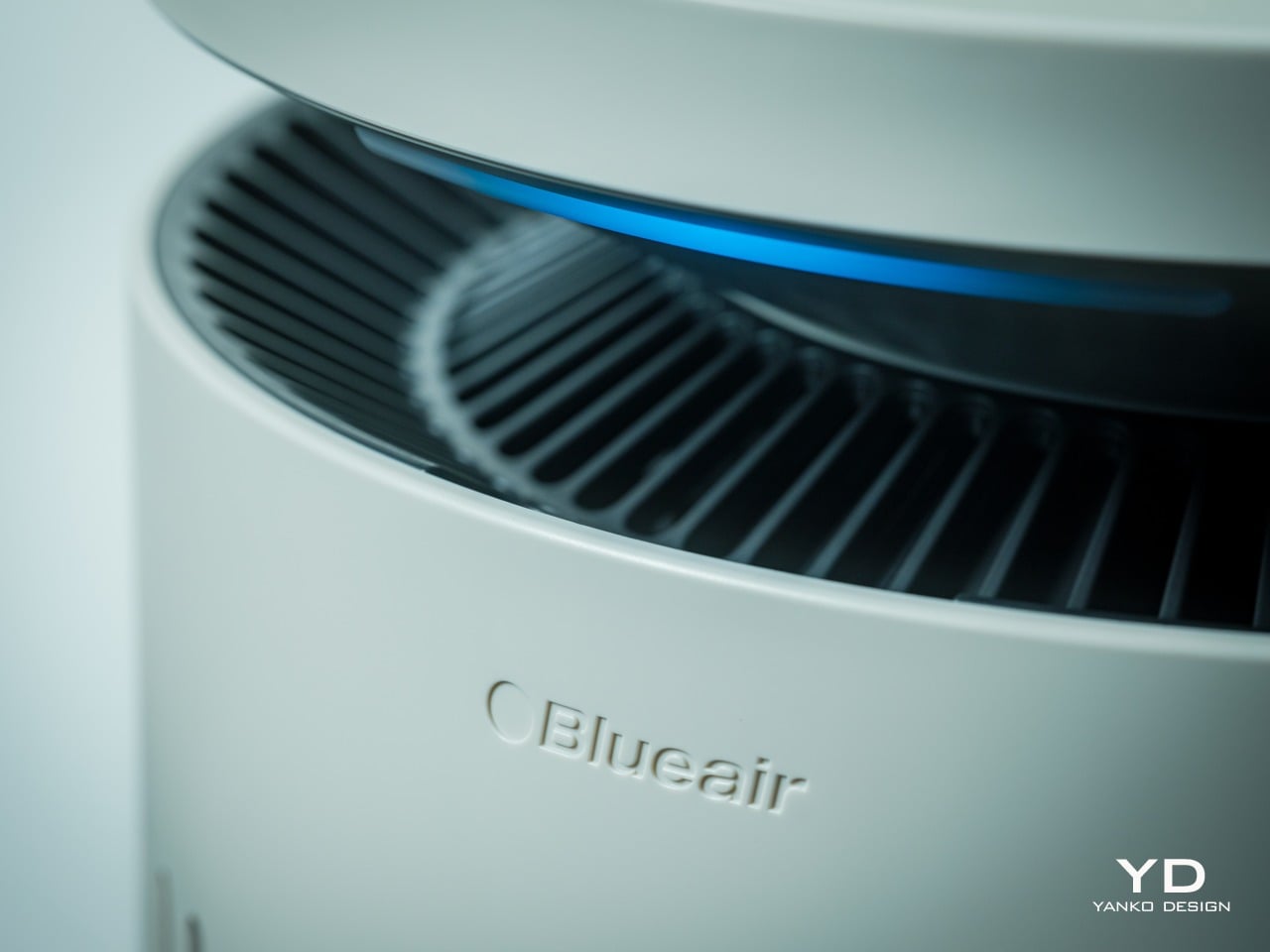
The top disc floats slightly above the body with a subtle gap, and when the device is running, a thin line of blue light glows in that gap, more like a bedside lamp than a status LED. The slats wrap 360 degrees around the body, which gives it a kind of architectural rhythm that works whether you see it from the front or the side.
Near the base, there is a small vertical window that shows the water level and projects mood lighting when enabled in the Blueair app, but it is narrow enough that it does not break the visual flow. The top disc itself is smooth and plate-like, with a matte finish that does not collect fingerprints. The material is still primarily plastic, but it is clearly chosen to feel refined rather than cheap. The matte finish softens reflections and resists the glossy sheen that makes a lot of gadgets look disposable.
The tower looks comfortable in different contexts. In a bedroom next to wood furniture and neutral textiles, it reads as another piece of the interior rather than a piece of tech parked temporarily. In a small office with dark carpet, floating shelves, and a desk chair, it sits in the corner without clashing with the more technical surroundings, which makes it easy to imagine moving between spaces. The sense you get is that someone thought about how this object would age in a room where it runs every night.
Ergonomics
The Blueair 2‑in‑1 Pro is tall enough that you do not need to crouch to reach the controls, which sounds minor until you realize how many bedside devices force you to bend or kneel just to tap a button. The footprint is compact, roughly a foot in diameter, and the weight gives it enough stability that you can brush past it without worrying it will tip.
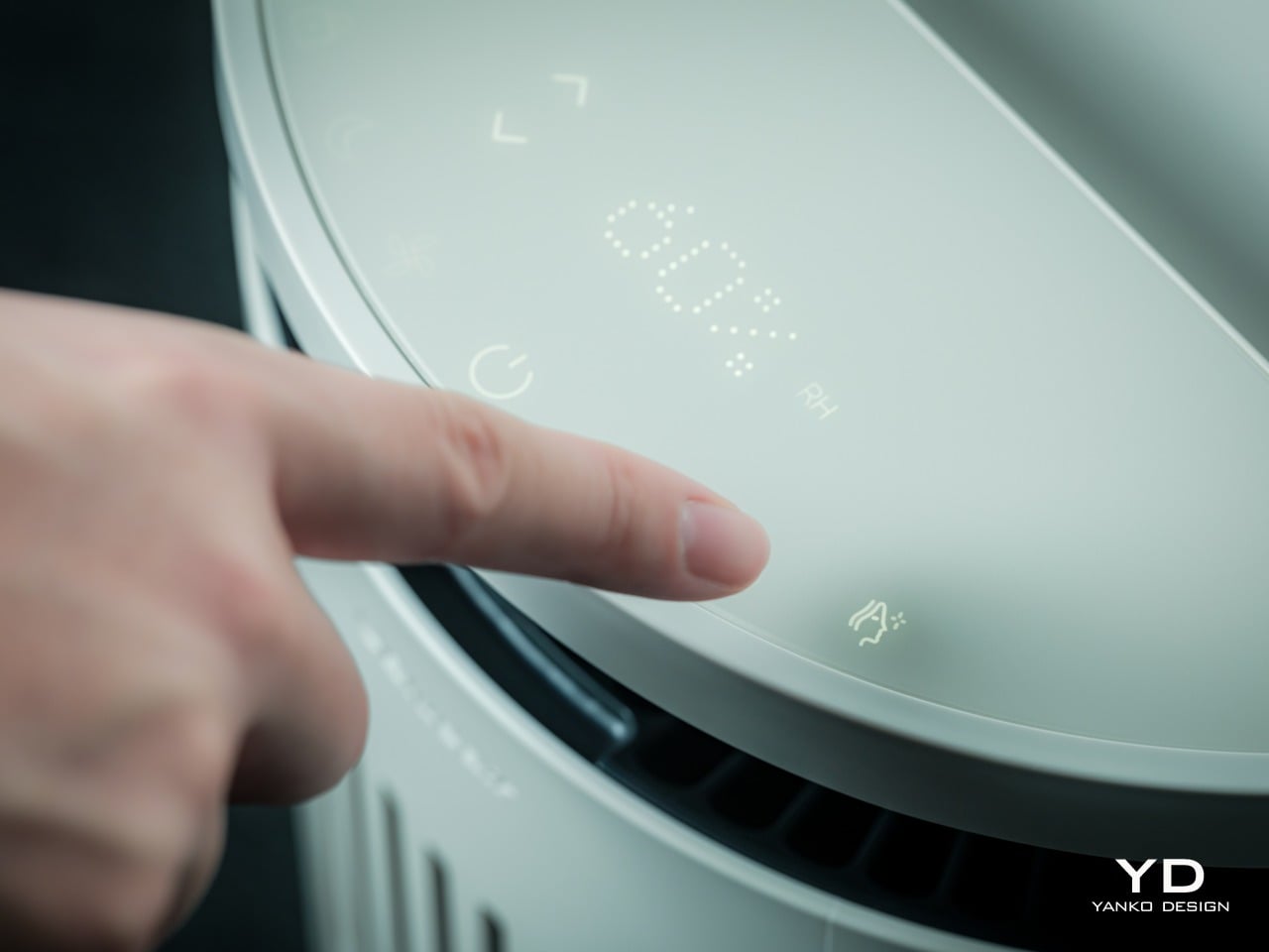
The top surface is where most of the interaction happens. A semi-circular ring houses clearly marked icons for power, fan speed, night mode, humidification toggle, and skin mode, along with indicators for air quality, humidity percentage, and water level. The layout is simple enough that you can understand it at a glance, so switching into auto mode or activating skin mode is a one-tap affair.
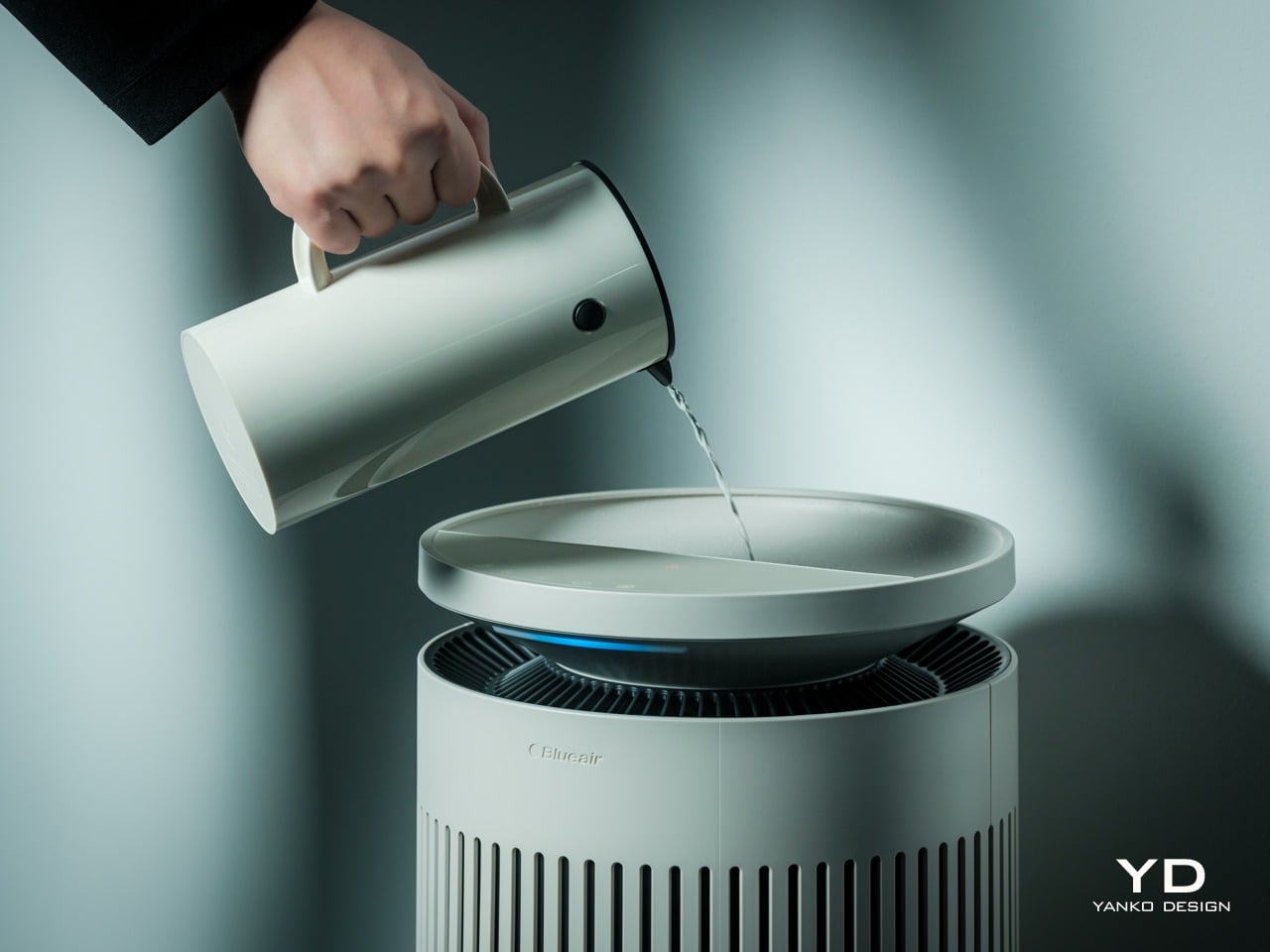
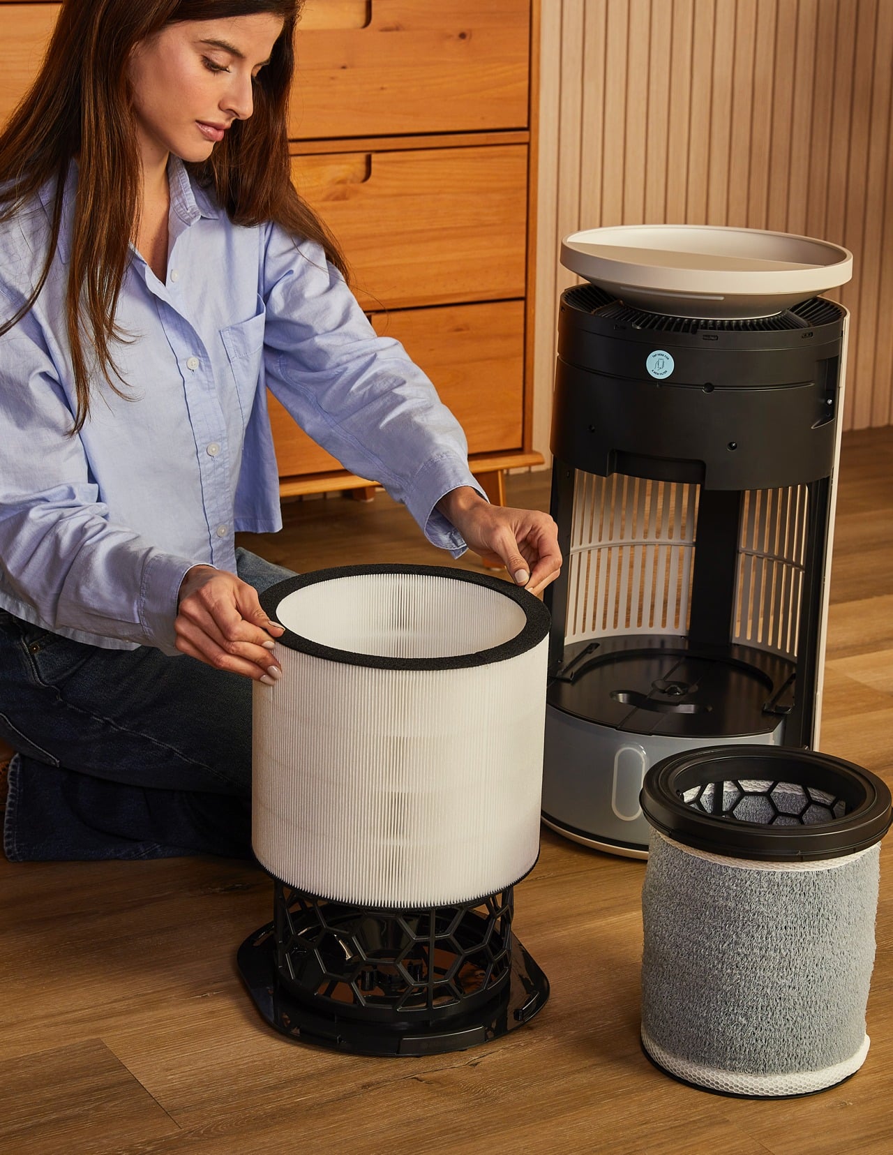
One of the most thoughtful ergonomic details is the top fill design. Most humidifiers require you to lift a heavy tank, carry it to a sink, fill it, then carefully carry it back and slot it into place, which gets old quickly and can be awkward if you have back or shoulder issues. The Blueair 2‑in‑1 Pro lets you simply lift the top disc slightly and pour water directly into the opening from a jug or carafe. The smart water sensor and real-time display remove worries by reminding you when the water level is low and alerting you when the tank is almost full.
It feels as easy as watering a houseplant, and for people who want to avoid bending and lifting, this small design choice makes day-to-day upkeep significantly less annoying. There is still the option to remove the tank entirely and fill it at a sink when you want to add a larger volume at once, but most of the time, the top fill is faster and easier.
Performance
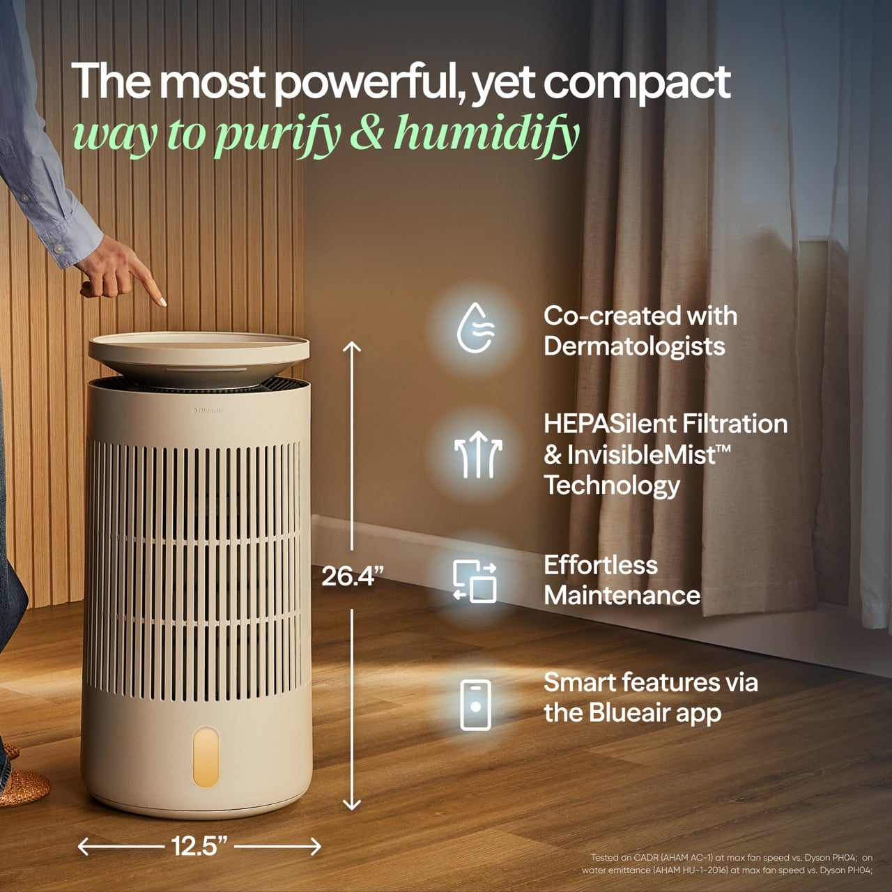
Blueair boasts the 2-in-1 Pro Purify + Humidy as the most powerful of its kind, delivering balanced and superior performance in such a compact package. Compared to a leading competitor, its tests have proved it to offer 3x better purification and 2x cleaner humidification. Although we don’t have labs to verify these numbers, our own day-to-day use proved it to work as advertised.
The Blueair 2‑in‑1 Pro is both a capable air purifier and a serious humidifier, which is a harder balance than it sounds. The purification side uses Blueair’s HEPASilent technology, which combines mechanical filtration with an electrostatic charge to capture fine airborne particles like dust, pollen, smoke, and volatile organic compounds. The intake and outlet are 360 degrees around the body, so it pulls air from all sides and pushes it back out clean.
The humidification uses evaporative technology that Blueair calls 360° InvisibleMist. Instead of producing visible fog or mist, it adds moisture to the air in a controlled, gradual way that avoids white dust on furniture and damp spots on nearby surfaces. This matters especially in bedrooms and offices with electronics, books, or wood finishes, where you want comfortable air without worrying about residue or condensation.
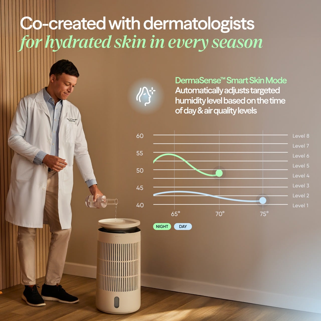
The skin and beauty sleep focus is where the device starts to feel like something designed for wellness routines rather than just air quality. The dedicated skin mode keeps humidity in a range dermatologists typically recommend for skin comfort, roughly between 40-60%, and adjusts that target based on room temperature and time of day. At night, when your skin tends to lose more moisture, the device gently raises humidity levels.
In practice, this feels like setting skin mode before bed, going through your normal cleanse and treatment routine, and then falling asleep in a room that feels neither dry nor heavy. You do not wake up with that tight, parched feeling that dry winter air or overheated apartments tend to cause, and your skin does not feel irritated or raw the way it sometimes does when indoor air is harsh.
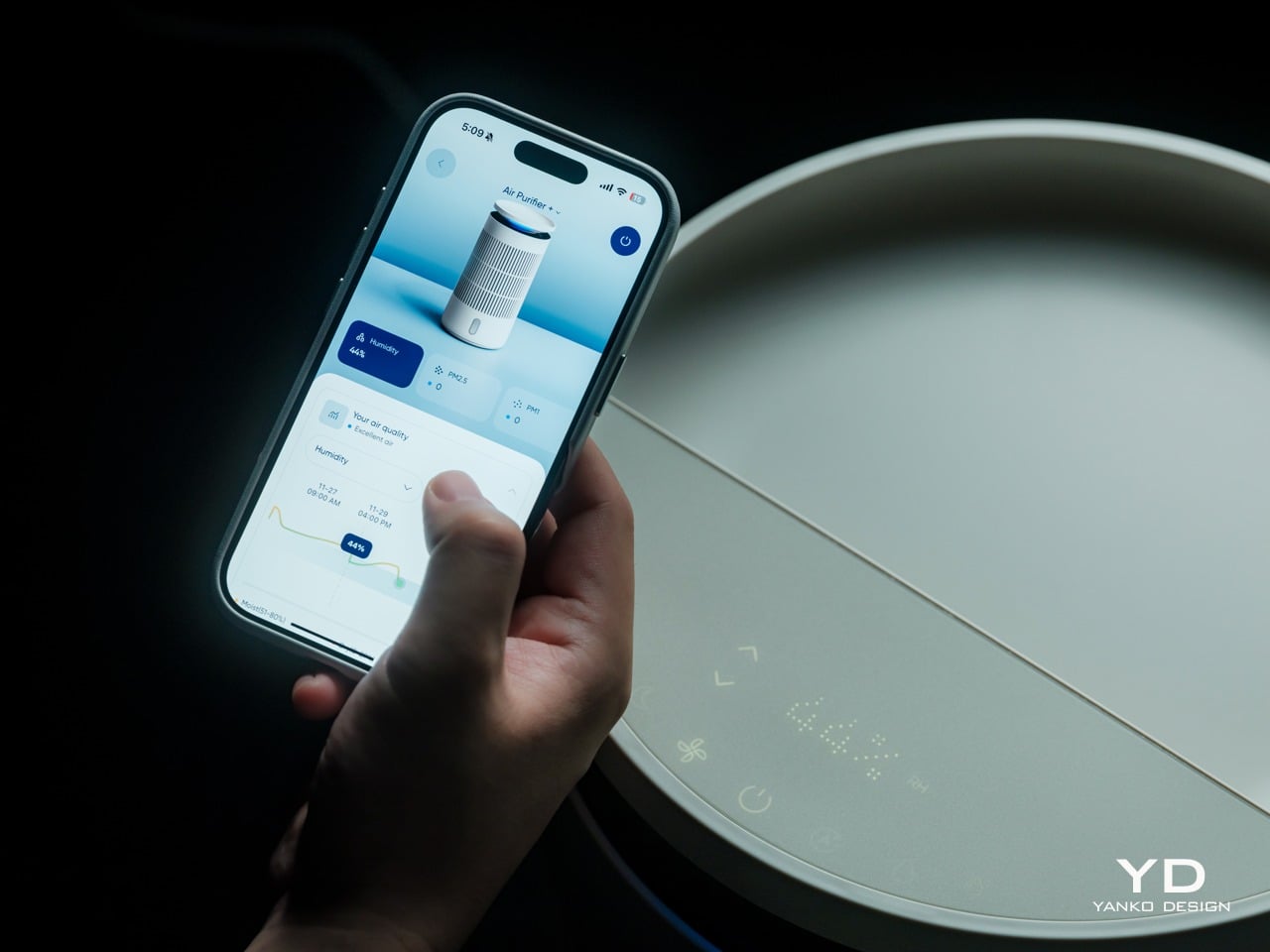
The Blueair app adds another layer of control and insight without being required for basic use. From your phone, you can set target humidity levels, create schedules for when the device runs, adjust display brightness, and choose between three mood lighting settings that turn the top ring into a warm, normal, or bright glow. You can also see air quality and humidity trends over time.
That said, most of the time you can leave it in auto or skin mode and let it manage itself quietly in the background. The app is there when you want precision or automation, but the device does not force you into it for everyday operation, which feels like the right balance for a bedroom appliance.
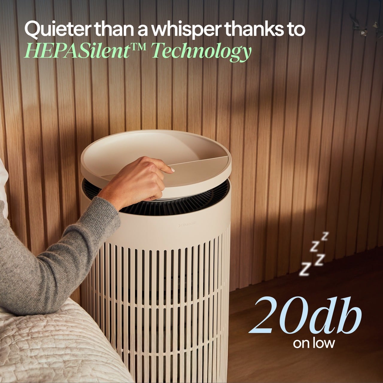
Noise is surprisingly gentle at lower speeds. In night mode, the sound profile is closer to a soft fan than a mechanical hum, which many people find soothing as a kind of background white noise. Higher speeds are audibly stronger when the device detects poor air quality and ramps up to clear it faster, but the ability to drop back into quiet operation keeps it compatible with light sleepers.
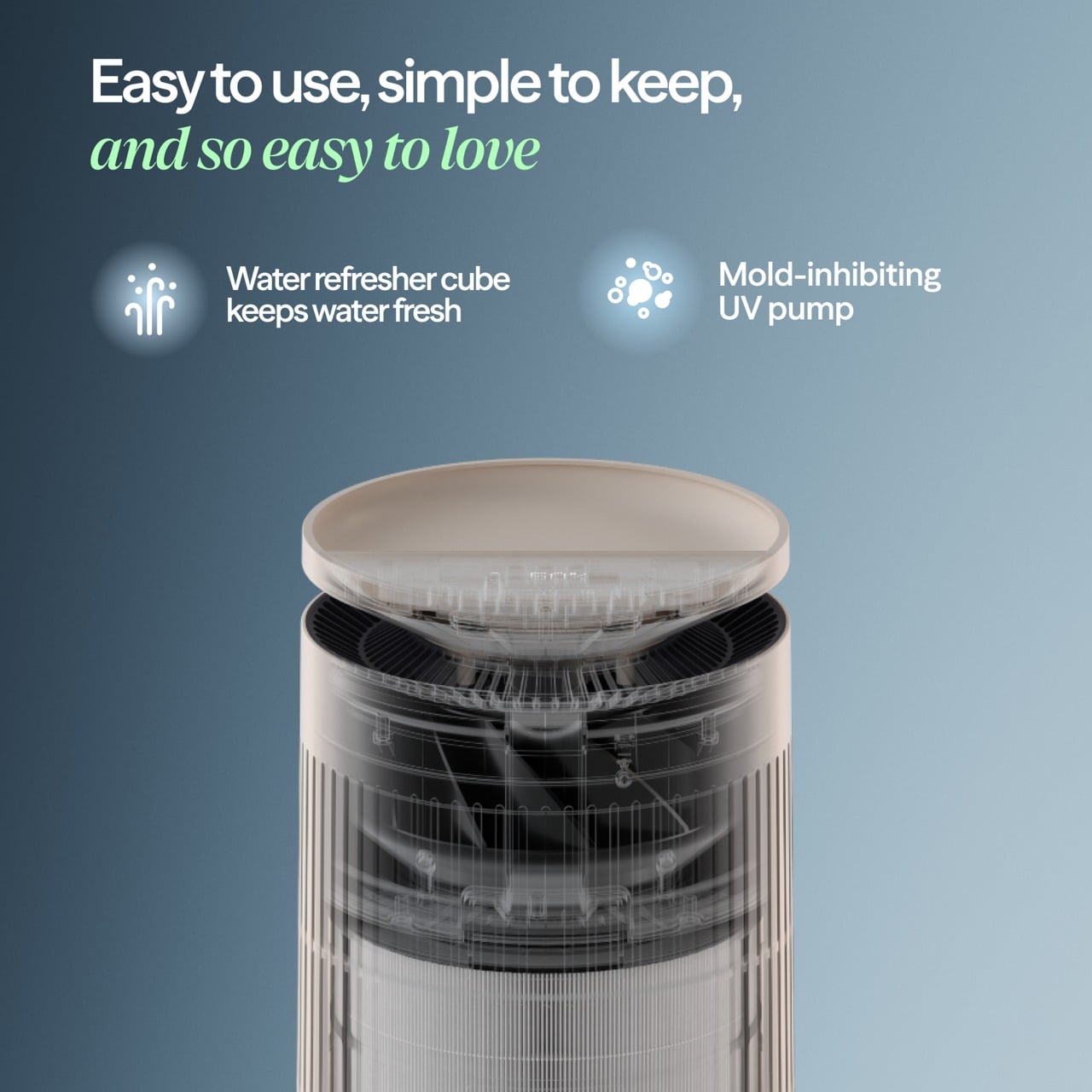
The device also includes several behind-the-scenes hygiene features that keep the humidifier side fresh over time. A built-in UV pump recirculates water to help inhibit bacterial growth, a wick dry mode runs automatically when the tank is empty, or the device goes to standby to prevent musty smells, and a water refresher module made of activated carbon helps absorb minerals and reduce discoloration.
Sustainability
Blueair is a Certified B Corp, which signals that the company has passed third-party audits for social and environmental impact. This does not magically make the device carbon neutral or eliminate its footprint, but it does suggest that longevity, energy use, and materials were part of the design conversation rather than afterthoughts. For a device designed to run every night, that kind of corporate positioning matters.
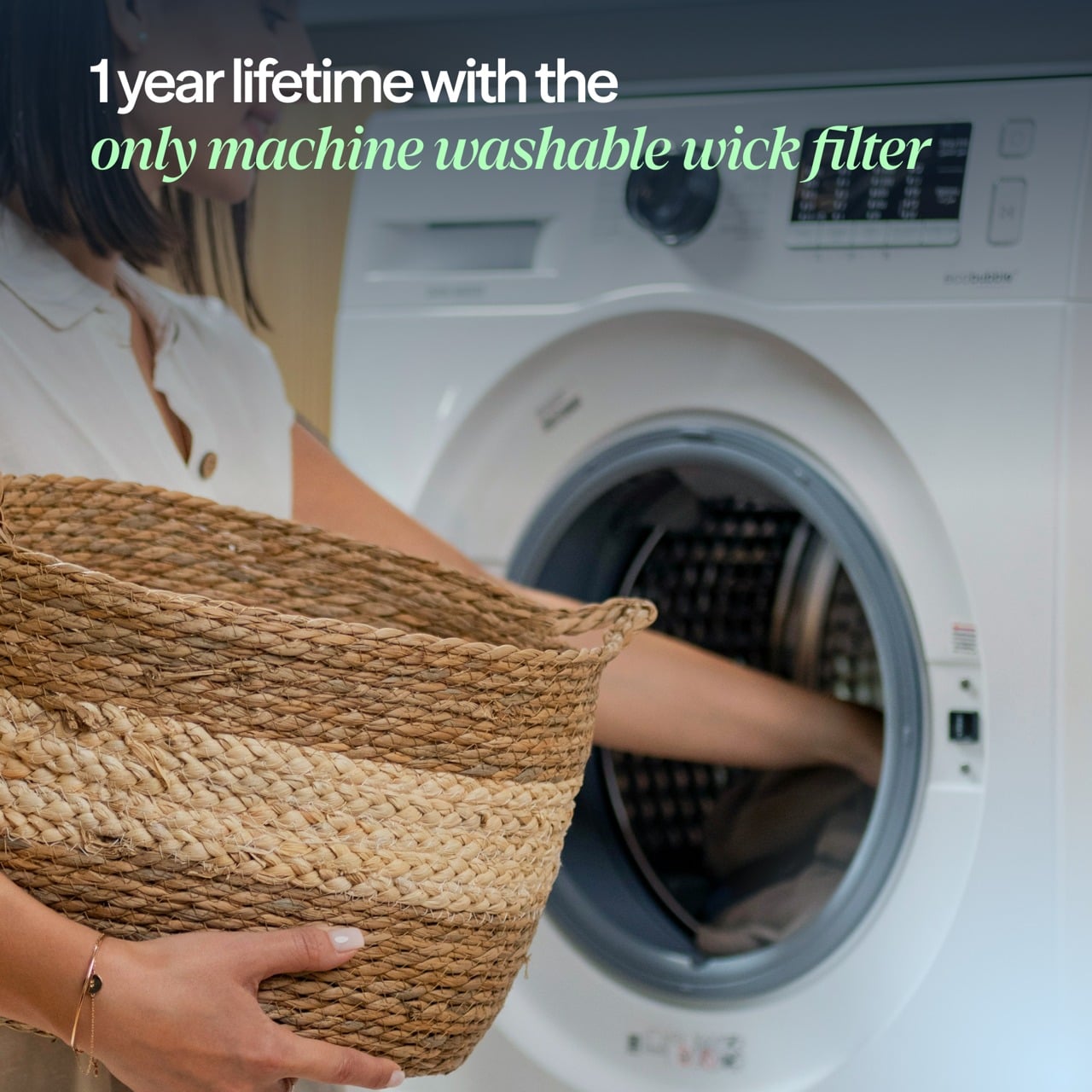
The 2‑in‑1 Pro is built around long-life, user-replaceable components. Both the air filter and the humidifier wick are rated for up to twelve months of use, which reduces the frequency of replacements and the amount of waste compared to devices that require new cartridges every few weeks. The wick is machine washable, which extends its life even further and keeps it feeling fresh without needing to buy a new one prematurely.
The hygiene features also support sustainability indirectly. A humidifier that stays clean and pleasant to use is less likely to be abandoned in a closet after one winter, which means fewer devices being replaced prematurely. The UV pump, wick dry mode, and water refresher all work together to keep the system feeling fresh, which encourages long-term ownership.
The housing is still primarily plastic, and this is an electrically powered device, so it has an environmental cost. But combining two machines into one does reduce the total number of housings, motors, and power supplies needed compared to buying a purifier and a humidifier separately. For someone who needs both functions, the 2‑in‑1 approach is a more efficient use of materials and space.
Value
The Blueair 2‑in‑1 Pro Purify + Humidify sits firmly in the premium category with its price tag, which is a real investment for a bedroom appliance. That figure makes more sense when you consider that it replaces a standalone purifier, a standalone humidifier, and in some ways a separate wellness gadget, while also adding design intelligence and app control that many basic units lack.
Space is part of the value equation. In bedrooms and small home offices, floor space and visual calm are both precious. Having one well-designed column instead of multiple mismatched boxes reduces clutter, simplifies cable management, and makes the room feel more intentional. For design-minded homeowners, that reduction in visual noise is a real form of value, not aesthetic preference alone.
The skincare and beauty sleep focus adds another dimension to the value story. For people already spending money on serums, moisturizers, and treatments, optimizing the air they sleep in is a logical extension of that investment. The fact that the device can quietly maintain a skin-friendly humidity range while filtering out airborne irritants makes it feel like a wellness tool that supports the rest of your routine.
Verdict
The Blueair 2‑in‑1 Pro Purify + Humidify is a carefully considered column that manages to be a capable purifier, a gentle humidifier, and a sleep-friendly presence without ever looking or feeling like a clinical appliance. It blends into bedrooms and small offices with the kind of visual ease that makes you forget it is technology, and the ergonomic details like top fill refilling and intuitive controls make it easy to live with day to day.
The 2‑in‑1 Pro makes the most sense for people who care about both design and wellness, who want their bedroom or office to feel like a calm, supportive environment, and who appreciate when technology quietly improves their routines without demanding constant attention. For that audience, this feels less like a splurge and more like a thoughtful upgrade to the air they live in every day.
Click Here to Buy Now: $400 $499.99 ($99.99 off, use coupon code “YANKO20”). Hurry, deal ends in 48-hours!
The post Blueair 2‑in‑1 Pro Purify + Humidify Review: Clean Air, Skin Care in One first appeared on Yanko Design.