LEGO and Nike make an impactful pairing. We have seen that in the past, and it’s a story that will repeat itself in the Spring of 2026, when the two stalwarts revive the Nike Air Max 95 in its OG colorway for the love of brick fans. Designed by Sergio Lozano, Air Max 95 is often regarded as the most popular Nike sneaker, and now, with its collaborative revisit after twenty years since release in 1995, the LEGO x Air Max 95 “Neon” is going to have some definite takers.
Nike and LEGO have been redefining the norm with their collaborations since the first fully co-branded Nike Dunk x LEGO Set. The idea behind their partnership has been to give kids a world where sports and creative play always win. In that accord, an inspiring celebration of the sneaker culture and creative imagination of LEGOs was the LEGO x Nike Air Max Dn that painted the internet yellow on its release in the summer this year.
After dropping these beauties, the two now have their eyes set on the release of the LEGO x Air Max 95 next spring. The sneaker in its neon colorway has a drawn-on upper and an evident love affair with LEGO bricks. The reimagined “Neon” colorway of the Air Max 95 is confirmed in Grad School and Pre School sizes, and is remarkably apparent in its inspiration even though it doesn’t feature the typical suede side panels.
The new LEGO Air Max 95 has a T-toe, which appears stretched on both sides and climbs up to the laces in shiny leather. The illustrated gradient panels – reaching up to the mesh upper – in a smooth progress from deep black to smoky gray and up to metallic silver, have a sense of charm in themselves. But what stands out is the vibrant neon accents that illuminate the lace eyelets, the Swoosh branding, and also finds a hint in the pressurized Air units within the midsole.
The volt green is not limited to the abovementioned accents, you can also find it in the underfoot, where it livens up the Air Max bubbles. The iconic square LEGO logo with the brand name outlined in white font is featured on the tongue and insoles. But what subtly makes its presence felt are the LEGO mini figs on the heel tab – one with a trophy in the hand and the other heading a football. If you like what you see, you can get the LEGO x Nike Air Max 95 Neon starting March 28, 2026. It will be released through Nike and select retailers, both online and in-store, in grade school and pre-school sizing, starting $162 and $132, respectively.
The fancy pen set has become the most predictable gift in the design world. Sleek metal barrels tucked into velvet cases, often expensive, rarely used. They end up in drawers alongside forgotten business cards and mystery cables. Designers know this pattern well because they’ve received these sets multiple times, smiled politely, and wondered why gift givers keep missing what actually matters: tools that solve real problems beautifully.
The best gifts for designers aren’t decorative. They’re functional objects elevated through thoughtful design, things that get touched daily and spark small moments of satisfaction. The tools below earned their place on studio desks and in everyday carry rotations because they do their jobs exceptionally well while looking good doing it. Each one beats the fancy pen set by actually getting used.
1. Stud Measure
The LEGO builder’s toolkit has remained surprisingly incomplete for decades. Brick separators arrived to spare fingernails, storage systems evolved to organize thousands of pieces, but measuring stayed primitive. Counting studs by hand across baseplates or estimating dimensions by eye works until precision matters. The Stud Measure addresses this gap with a measuring tape designed specifically for LEGO’s geometry, speaking the language of studs, bricks, and plates, rather than forcing builders to convert from inches or centimeters.
Riley from Brick Science designed this tool after years of building on camera for over two million subscribers. The bright blue clip snaps directly into LEGO studs, anchoring the tape without dangling metal hooks or slipping off edges. The flexible tape extends to 190 studs, covering roughly 60 inches of real-world distance. That length handles most train layouts, modular building displays, and tabletop city builds without needing to retract and reposition. The markings translate directly into LEGO measurements, turning what used to require mental math into something you can read at a glance.
What we like
The clip integration feels obvious once you see it, snapping into studs the same way bricks do.
The 190 stud length covers serious builds without falling short when you need it most.
Pricing sits at $9.99, low enough to grab without overthinking the purchase.
The tape works equally well measuring horizontal baseplates or vertical wall constructions.
What we dislike
The single color option limits personalization for builders who customize everything.
The tape’s flexibility means it can bow slightly on unsupported long measurements.
Storage becomes another loose item in the parts bin without a dedicated home.
The niche appeal means non-LEGO builders won’t find much use for it.
2. Magboard Clipboard
Clipboards haven’t changed much in generations. A rigid board, a spring clip, maybe a storage compartment if you’re lucky. They work fine for static documents but fall apart the moment you need to rearrange pages, add sheets mid-project, or work with different paper sizes. The Magboard rebuilds this basic tool using magnets and a lever mechanism that holds up to 30 sheets while letting you reorganize on the fly.
The hardcover design maintains writing stability even when you’re standing or moving between spaces, giving you the structure notebooks provide without forcing a predetermined page order. Water resistance protects your work when coffee tips over or rain hits unexpectedly. The magnetic clip releases and secures smoothly, creating a tactile interaction that feels more intentional than wrestling with a bent spring clip. Loose sheets stay loose, giving you complete freedom to sketch, annotate, shuffle, and discard without worrying about binding.
The magnetic mechanism handles 30 sheets without feeling strained or weak.
Rearranging pages mid-project happens instantly instead of requiring unbinding and rebinding.
The hardcover support makes vertical note-taking actually practical for site visits or standing meetings.
Water resistance means the clipboard itself survives the chaos that kills paper.
What we dislike
The minimalist design lacks storage pockets for pens or business cards.
Magnets can interfere with some types of metallic ink or magnetic stripe cards if stored together.
The rigid form takes up more bag space than flexible clipboards.
Premium materials push the price higher than basic office supply versions.
3. Z3RO Mini Knife
Keychain knives usually feel like compromises. Light enough to ignore until you need them, flimsy enough to make you wish you’d brought a real blade. The Z3RO mini knife weighs 11 grams and measures around 5 centimeters, but uses materials borrowed from surgical tools and industrial cutters: tungsten alloy for the cutting tip, carbon fiber for the body, and titanium for the backbone. It fits on a keychain without adding bulk yet handles daily cutting tasks with the kind of precision that makes cheap utility knives feel sloppy.
Tungsten alloy rates at Mohs hardness nine, sitting just below diamond on the scale. That hardness means the tip shrugs off cardboard, cord, plastic packaging, thick tape, and cable ties without dulling quickly or developing the microchips that ruin cheaper blades. The tasks designers face constantly, opening sample shipments, cutting shrink wrap, trimming threads, slicing through layers of tape, all happen cleanly without needing to swap blades every few weeks. The carbon fiber body keeps weight minimal while the titanium backbone provides the structural support that makes the knife feel like a precision tool rather than an emergency backup.
The tungsten tip maintains sharpness through months of daily abuse without needing replacement.
The 11-gram weight makes it genuinely keychain-friendly instead of pocket sagging.
Material choices create a tool that feels premium rather than disposable.
The compact size handles travel restrictions better than full-size knives.
What we dislike
The small size limits cutting leverage on thicker materials.
Replaceable tips aren’t as widely available as standard utility blades.
4. FoldLine Pen Roll
Pen storage tends toward two extremes: cases that rattle and clatter with every movement or rigid boxes that take up excessive space. The FoldLine Pen Roll takes a different approach, using a single piece of Italian Minerva Box leather that folds into structure without stitched dividers or internal compartments. It opens in two seconds, transforming from a compact roll into a stable tray that turns any surface into an organized workspace.
The folded leather naturally separates pens without requiring individual slots, wrapping each writing instrument in soft material that prevents scratching and eliminates the metallic clinking that makes some pen cases sound like tackle boxes. The symmetrical design works equally well for left or right-handed users, opening cleanly from either side without a preferred orientation. The leather comes from Badalassi Carlo tannery in Italy, vegetable tanned and enriched with cow leg oil, so it develops a unique patina over time while softening rather than cracking. The closure uses a machined snap from Italy’s PRYM, creating a satisfying click that signals quality in a detail most pen cases overlook.
The tray transformation provides instant workspace organization without requiring a dedicated desk.
The partition-free design adapts to different pen sizes and quantities naturally.
Minerva Box leather ages beautifully instead of showing wear as damage.
The ambidextrous design eliminates the frustration of cases built for one-handedness.
What we dislike
The premium leather commands a higher price than nylon or synthetic alternatives.
The soft material offers less impact protection than hard-shell cases.
The roll format requires slightly more bag space than flat cases.
Limited capacity means collectors with extensive pen rotations need multiple rolls.
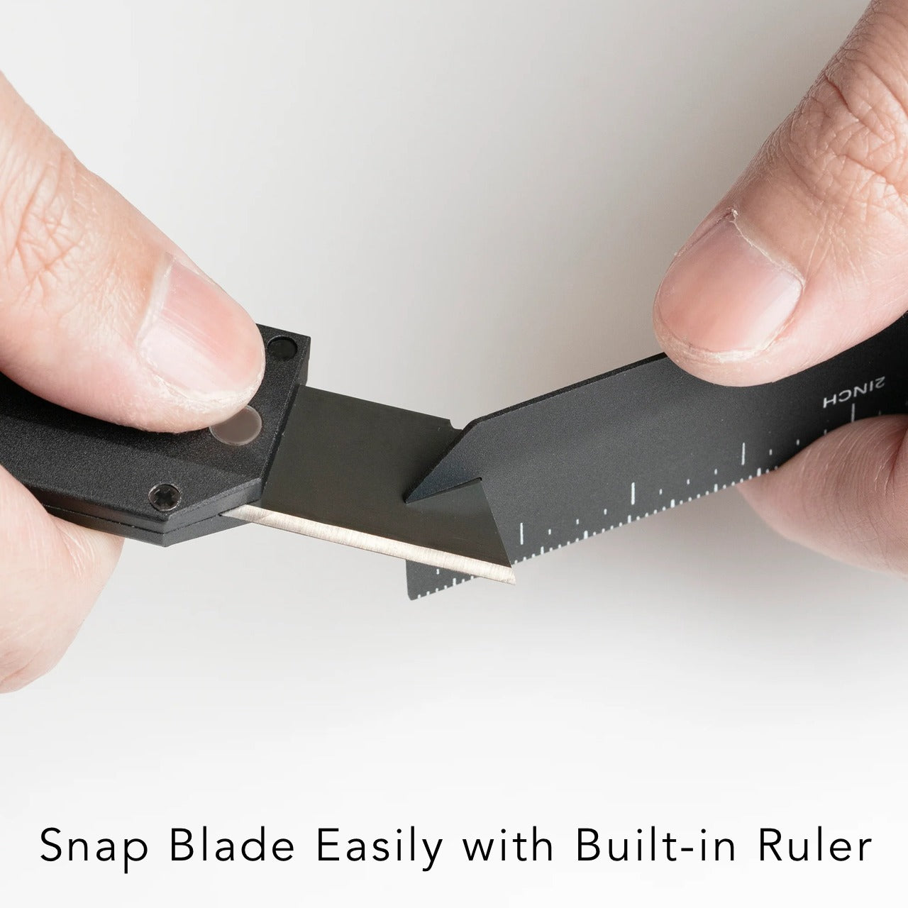
5. Craftmaster EDC Utility Knife
Standard utility knives work, but rarely feel good to use. Plastic bodies flex under pressure, blades wobble in cheap housings, and the overall aesthetic screams contractor’s toolbox rather than designer’s kit. The Craftmaster EDC Utility Knife rebuilds this category with a metal exterior that’s only 8 millimeters thick, a tactile rotating knob for blade deployment, and a magnetic back that docks with a metal scale combining measurement with blade maintenance.
The OLFA blade inside is easily replaceable, but the way you interact with it changes everything. The rotating knob deployment feels mechanical and precise rather than fumbling with a sliding lever. The magnetic back lets you store the knife on any metal surface, keeping it visible and accessible rather than lost in a drawer. The companion scale sports both metric and imperial markings with a raised edge that makes it easy to lift off flat surfaces, doubling as a cutting guide. The scale includes a blade breaker for snapping off dulled segments, keeping the knife sharp without requiring tools or leaving dangerous blade pieces loose.
The metal construction creates a tool that feels substantial and reliable in hand.
The rotating deployment mechanism provides satisfying tactile feedback with each use.
The magnetic scale pairing turns two separate tools into an integrated system.
The 8 millimeter thickness keeps the knife genuinely pocket-friendly despite the premium materials.
What we dislike
The metal body adds weight compared to plastic utility knives.
The premium price point makes it a significant investment for a utility blade.
The magnetic feature only works with ferrous metal surfaces.
The minimalist design lacks the blade storage compartments that some utility knives include.
6. Casta Universal Design Scissors
Scissors typically divide users into camps: right-handed tools that torture lefties or ambidextrous compromises that work poorly for everyone. The Casta Universal Design Scissors use perfectly round handles that rest in your palm regardless of hand dominance, creating equal comfort for all users. Inside each handle, a round concave shape produces a clicking sound that changes based on the material you’re cutting, adding unexpected sensory feedback to a tool most people tune out completely.
The round handles eliminate the finger loops that create pressure points during extended cutting sessions, distributing force across your palm instead of concentrating it on a few digits. The clicking sound might seem like a gimmick until you experience how it brings awareness to the cutting process, making routine tasks feel slightly more engaging. The ergonomic benefits combine with the acoustic element to create scissors that work efficiently while sparking small moments of satisfaction each time you use them.
What we like
The true ambidextrous design serves left and right-handed users equally well.
The palm grip distributes pressure more comfortably than finger loop handles.
The acoustic feedback adds unexpected delight to mundane cutting tasks.
The universal design makes sharing scissors in studios and offices friction-free.
What we dislike
The unconventional handle shape requires a brief adjustment period for users accustomed to traditional scissors.
The acoustic feature may distract in quiet environments or annoy those who prefer silent tools.
The specialized design typically commands a premium over standard scissors.
The round handles offer less precise control for detail cutting work.
7. Høvel Pencil Plane
Pencil sharpeners haven’t evolved much beyond the basic mechanism: insert pencil, twist, hope the lead doesn’t snap. The Høvel reimagines this tool completely, functioning as a miniature plane that lets you whittle your pencil to any desired point. The solid brass body weighs enough to feel substantial in hand while developing patina over time, gaining character instead of looking worn out.
Traditional sharpeners twist and stress the graphite core, often snapping it inside the wood and forcing you to sharpen repeatedly just to find intact lead. The Høvel’s planing action removes wood cleanly without torquing the core, working especially well with soft pencils, pastels, or makeup pencils that shatter in conventional sharpeners. The blade changes easily without tools, staying sharp through hundreds of sharpenings. You control the point shape precisely: long and needle sharp for detailed work, short and sturdy for bold strokes, or even flat like a chisel for calligraphy and lettering.
What we like
The brass construction ages beautifully instead of degrading over time.
The mechanism prevents lead breakage that wastes expensive art pencils.
Blade replacement happens in seconds without requiring screwdrivers or specialty tools.
The point customization serves different drawing and writing techniques equally well.
What we dislike
The manual process takes longer than electric or crank sharpeners.
The shavings scatter rather than collecting in a container.
The premium brass version costs significantly more than plastic sharpeners.
The technique requires practice to achieve consistent results at first.
Why These Tools Win
Fancy pen sets fail because they prioritize appearance over utility, offering solutions to problems designers don’t have. The tools above succeed because they solve actual daily frustrations while looking good on your desk or in your bag. They’re objects you reach for constantly rather than display once and forget. That’s the difference between a gift that impresses for a moment and one that earns permanent space in someone’s workflow.
The best design gifts acknowledge that designers value function as much as form. These seven tools deliver both, turning routine tasks into small satisfactions and proving that the most thoughtful presents are the ones that actually get used. The fancy pen set will keep collecting dust, but these tools will be reaching for them tomorrow.
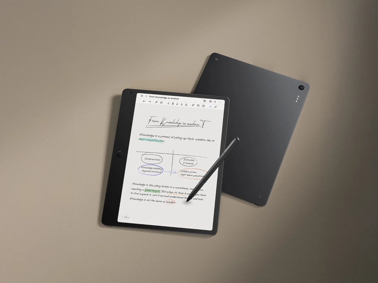
People bounce between paper notebooks, e-ink readers, and glossy tablets, each good at one thing and bad at others. E-ink is gentle but slow and monochrome, LCD is fast and colourful but tiring for long reading, and paper is great until you need to search or backup. TCL Note A1 NXTPAPER is an attempt to merge those worlds into a single, paper-leaning tablet that does not make you choose between comfort and capability.
TCL Note A1 NXTPAPER is an 11.5-inch eNote tablet that blends a full-colour LCD with a paper-like surface. The 3A Crystal Shield Glass brings anti-glare, anti-reflection, and anti-fingerprint coatings, plus TÜV Rheinland certifications for eye comfort, flicker-free operation, and low reflection. The idea is a screen you can stare at for hours of reading and writing without feeling like you are looking into a lightbox, which is exactly what most tablets become after the first hour.
The tablet is built around handwriting, with a stylus that has dual tips, an eraser, and haptic feedback from an X-axis linear motor. Each stroke is meant to feel smooth and controlled, closer to pen on paper than plastic on glass. TCL’s pitch is that every note and sketch feels natural and expressive, making it a place where you actually want to write instead of just tapping keys or hunting for the right toolbar icon.
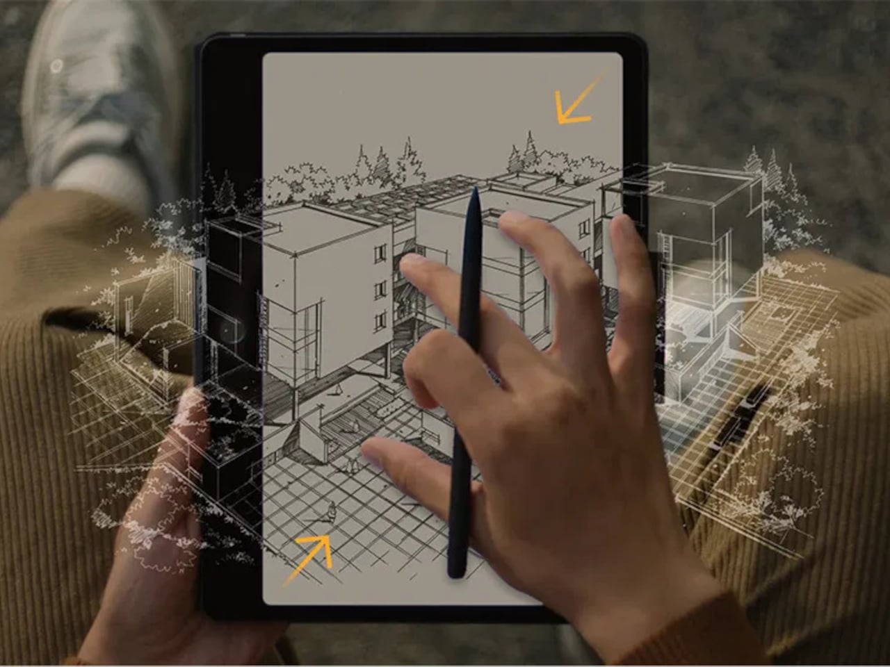
Note A1 has an octa-microphone array and tools for audio-to-text transcription, real-time translation, and AI summaries. In meetings or lectures, it can record, transcribe, and condense discussions so you can focus on listening instead of frantic note-taking. Writing helpers handle rewriting, grammar, translation, and summarising drafts, turning the tablet into a quiet collaborator rather than a blank page waiting for you to figure everything out alone.
The infinite canvas feature lets you zoom, expand, and sketch without hitting page edges, and the split-screen mode lets you read on one side while taking notes on the other. That combination makes it easier to absorb and organise information at the same time, whether you are annotating a PDF, outlining a report, or sketching over reference images without juggling windows or losing your place.
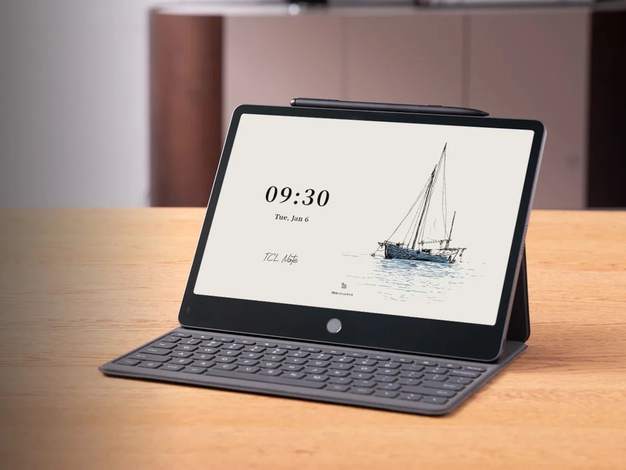
Note A1 supports syncing via Wi-Fi and cloud services like Dropbox, Google Drive, and OneDrive, plus wireless screen casting for presentations. The aluminium body is 5.5 mm thick and around 500 g, which keeps it light enough to carry all day. It feels more like a slim notebook than a chunky laptop, but with enough solidity to survive bags and desks without worrying about scratches or dents.
Note A1 NXTPAPER is aimed at people who read and write a lot, sit through meetings or lectures, and want a single device that feels kind to their eyes and helpful with their words. A paper-leaning, AI-assisted slate that treats focus and handwriting as first-class citizens offers a different path from the usual entertainment tablet, especially when long-form thinking matters more than another hour of streaming.
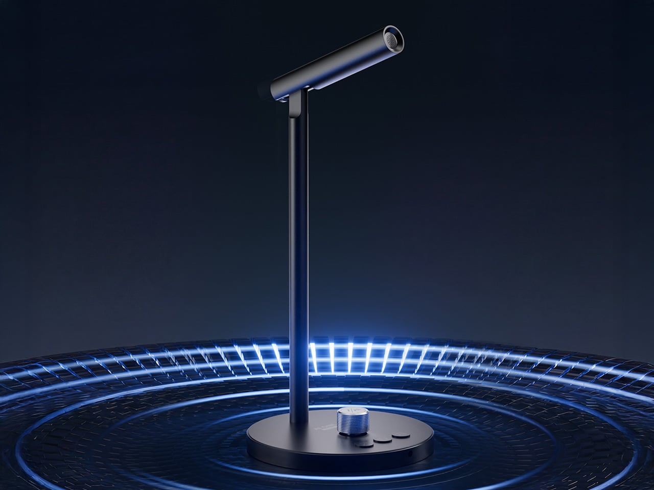
The most interesting AI hardware this year might not be a new screen or headset. It might be a microphone. Powerrider frames that idea very literally. It takes the form factor of a conference mic and refits it as a GPT‑4o terminal, so the same stem on your desk that handles Zoom calls can also translate in real time, summarize a briefing, or draft follow‑up emails while the meeting is still in progress.
What makes it feel clever is how little ceremony it adds. There is no new display to manage, just a few sculpted buttons for voice input, translation, and AI control. Tap, talk, and the response appears on your existing laptop, ready to paste into a chat, a slide deck, or a script. In a single accessory you get cleaner audio for podcasting and live streaming, plus a dedicated channel that turns casual speech into an ongoing conversation with ChatGPT.
The hardware itself (model M1) weighs 290 grams and stands 107 millimeters tall, machined from aluminum alloy with a 60‑degree adjustable boom so you can talk comfortably without hunching over your keyboard. The capsule is an omni‑directional condenser tuned to pick up voice across a 100 to 15,000 Hz range, with DSP noise reduction baked into the signal chain. It samples at 16‑bit/48kHz, which puts it squarely in the clean‑enough category for content work without venturing into audiophile overkill. USB‑C handles both power and data, plus there is a 3.5mm jack if you want to monitor through headphones. The base houses four physical buttons, each programmable through companion software. One button wakes the AI mode, another triggers translation, a third handles dictation, and the fourth is a rotary knob that doubles as a mute toggle and volume dial.
This is where Powerrider stops being a mic and starts being a control surface. You can map those keys to custom GPT‑4o prompts, so tapping one button might fire off “translate the last paragraph into Spanish and make it sound conversational,” while another could trigger “rewrite this email to sound less corporate.” The software supports Windows 7 and up, plus macOS 10.15 or later, which covers most setups that still get security patches. The AI functions pull from a pretty expansive toolkit: text translation, PPT generation, AI drawing, background removal, speech writing, document conversion, image analysis, code generation, reading comprehension, Q&A, writing assistance, table creation, and mind mapping. Some of those feel gimmicky (I have yet to meet anyone who genuinely wants AI‑generated mind maps on demand), but the core translation and drafting tools hit real pain points if you work across languages or spend half your day rewriting the same three types of message.
The hook here is immediacy. Most of us already talk to ChatGPT, but we do it through a browser tab or a pinned app, which means context‑switching, copying text, pasting prompts, and generally breaking flow. Powerrider tries to make that interaction feel more like push‑to‑talk in a game or on a two‑way radio. You hold a key, speak the command, release, and the result lands in your active window or in a floating overlay, depending on how you configure it. That workflow collapses a six‑step process (open ChatGPT, type or paste, wait, copy response, switch back, paste again) into a two‑step one (press, speak). If you live in tools like Notion, Google Docs, or any IDE that supports text injection, the time savings compound quickly. The software also handles screenshot translation, which is genuinely useful if you are reading documentation, design files, or research papers in another language and want inline conversion without manually copying blocks of text into DeepL.
Because the mic itself is a legitimate audio interface, you can use it in OBS, Zoom, or any DAW that recognizes standard USB microphones. The frequency response is wide enough for vocal clarity but not so hyped that you get harsh sibilance or boomy proximity effects. Think more “podcast interview” than “ASMR whisper track.” The omni pickup pattern means you do not have to aim it perfectly, which is nice if you are someone who gestures while talking or shifts around in your chair. The DSP noise reduction does a decent job of killing keyboard clatter and ambient hum, though it is not going to save you if you are recording next to a mechanical keyboard with clicky blues or a window AC unit. For meeting‑quality audio and streaming voiceover work, it sits comfortably in the same tier as entry‑level USB mics like the Blue Yeti Nano or the HyperX SoloCast, but with the GPT layer on top.
The company behind the Powerrider is positioning this as part of a broader peripheral ecosystem, which is where things get more interesting. They are also offering an AI‑powered keyboard (model K1) and an AI‑powered mouse (model S1), both of which follow the same philosophy: take an essential input device and wire it directly to GPT‑4o so you can invoke AI functions without leaving your workspace. The keyboard is a 98‑key Crater mechanical with RGB backlighting, a volume knob, and three custom macro keys dedicated to AI tasks. It supports both wired USB and wireless 2.4GHz/Bluetooth 5.0 across four channels, and the battery will run for 148 hours of continuous typing with the backlight off, or about 16 hours with the RGB cranked. The mouse is a wireless optical with adjustable DPI up to 4000, seven buttons (including dedicated AI, custom, and search keys), and a two‑hour charge time for what they claim is several days of use. Both peripherals plug into the same software suite as the mic, so you can trigger translation, text generation, or document conversion from any of the three devices depending on which one is closest to your hand.
Powerrider is live on Kickstarter right now with a few weeks left in the campaign, and the pricing is structured around bundles. A single mic starts at $59 for the super early bird tier (limited to 300 units) or $69 for the regular early bird. The full “Powerrider AI One Suite” bundle, which includes one mic, one keyboard, and one mouse, is priced at $269 (down from a claimed $608 MSRP). You can also grab the mic plus keyboard for $169 or the mic plus mouse for $149. Add‑on pricing if you are already backing is $119 for the keyboard, $99 for the mouse, and $59 for an extra mic. Those numbers put the mic roughly on par with mid‑tier USB condensers, but with the AI layer effectively thrown in as the value‑add. Whether that trade‑off makes sense depends entirely on how much friction you currently feel when bouncing between your tools and ChatGPT, and whether you are willing to let a hardware button own part of that workflow instead of a keyboard shortcut or Alfred snippet.
Merriam-Webster just named “slop” its word of the year, defining it as “digital content of low quality that is produced usually in quantity by means of artificial intelligence.” The choice is blunt, almost mocking, and it captures something that has been building for months: a collective exhaustion with AI hype that promises intelligence but delivers mediocrity. Over the past three months, that exhaustion has started bleeding into Wall Street. Investors, analysts, and even CEOs of AI companies themselves have been openly questioning whether we are living through an AI bubble. OpenAI’s Sam Altman warned in August that investors are “overexcited about AI,” and Google’s Sundar Pichai admitted to “elements of irrationality” in the sector. The tech industry is pouring trillions into AI infrastructure while revenues lag far behind, raising fears of a dot-com-style correction that could rattle the entire economy.
CES 2026 is going to be ground zero for this tension. Every booth will have an “AI-powered” sticker on something, and a lot of those products will be genuine innovations built on real on-device intelligence and agentic workflows. But a lot of them will also be slop: rebranded features, cloud-dependent gimmicks, and shallow marketing plays designed to ride the hype wave before it crashes. If you are walking the show floor or reading coverage from home, knowing how to separate real AI from fake AI is not just a consumer protection issue anymore. It is a survival skill for navigating a market that feeds on confusion and a general lack of awareness around actual Artificial Intelligence.
1. If it goes offline and stops working, it was never really AI
The simplest test for fake AI is also the most reliable: ask what happens when the internet connection drops. Real AI that lives on your device will keep functioning because the processing is happening locally, using dedicated chips and models stored in the gadget itself. Fake AI is just a thin client that calls a cloud API, and the moment your Wi-Fi cuts out, the “intelligence” disappears with it.
Picture a laptop at CES 2026 that claims to have an AI writing assistant. If that assistant can still summarize documents, rewrite paragraphs, and handle live transcription when you are on a plane with no internet, you are looking at real on-device AI. If it gives you an error message the second you disconnect, it is cloud-dependent marketing wrapped in an “AI PC” label. The same logic applies to TVs, smart home devices, robot vacuums, and wearables. Genuine AI products are designed to think locally, with cloud connectivity as an optional boost rather than a lifeline.
The distinction matters because on-device AI is expensive to build. It requires new silicon, tighter integration between hardware and software, and real engineering effort. Companies that invested in that infrastructure will want you to know it works offline because that is their competitive edge. Companies that skipped that step will either avoid the question or bury it in fine print. At CES 2026, press the demo staff on this: disconnect the device from the network and see if the AI features still run. If they do not, you just saved yourself from buying rebranded cloud software in a shiny box.
If your Robot Vacuum has Microsoft Copilot, RUN!
2. If it’s just a chatbot, it isn’t AI… it’s GPT Customer Care
The laziest fake AI move at CES 2026 will be products that open a chat window, let you type questions, and call that an AI feature. A chatbot is not product intelligence. It is a generic language model wrapper that any company can license from OpenAI, Anthropic, or Google in about a week, then slap their logo on top and call it innovation. If the only AI interaction your gadget offers is typing into a text box and getting conversational responses, you are not looking at an AI product. You are looking at customer service automation dressed up as a feature.
Real AI is embedded in how the product works. It is the robot vacuum that maps your home, decides which rooms need more attention, and schedules itself around your routine without you opening an app. It is the laptop that watches what you do, learns your workflow, and starts suggesting shortcuts or automating repetitive tasks before you ask. It is the TV that notices you always pause shows when your smart doorbell rings and starts doing it automatically. None of that requires a chat interface because the intelligence is baked into the behavior of the device itself, not bolted on as a separate conversation layer.
If a company demo at CES 2026 starts with “just ask it anything,” probe deeper. Can it take actions across the system, or does it just answer questions? Does it learn from how you use the product, or is it the same canned responses for everyone? Is the chat interface the only way to interact with the AI, or does the product also make smart decisions in the background without prompting? A chatbot can be useful, but it is table stakes now, not a differentiator. If that is the whole AI story, the company did not build AI into their product. They rented a language model and hoped you would not notice.
3. If the AI only does one narrow thing, it is probably just a renamed preset
Another red flag is when a product’s AI feature is weirdly specific and cannot generalize beyond a single task. A TV that has “AI motion smoothing” but no other intelligent behavior is not running a real AI model; it is running the same interpolation algorithm TVs have had for years, now rebranded with an AI label. A camera that has “AI portrait mode” but cannot recognize anything else is likely just using a basic depth sensor and calling it artificial intelligence. Real AI, especially the kind built into modern chips and operating systems, is designed to generalize across tasks: it can recognize objects, understand context, predict user intent, and coordinate with other devices.
Ask yourself: does this product’s AI learn, adapt, or handle multiple scenarios, or does it just trigger a preset when you press a button? If it is the latter, you are looking at a marketing gimmick. Fake AI products love to hide behind phrases like “AI-enhanced” or “AI-optimized,” which sound impressive but are deliberately vague. Real AI products will tell you exactly what the system is doing: “on-device object recognition,” “local natural language processing,” “agentic task coordination.” Specificity is a sign of substance. Vagueness is a sign of slop.
The other giveaway is whether the AI improves over time. Genuine AI systems get smarter as they process more data and learn from user behavior, often through firmware updates that improve the underlying models. Fake AI products ship with a fixed set of presets and never change. At CES 2026, ask demo reps if the product’s AI will improve after launch, how updates work, and whether the intelligence adapts to individual users. If they cannot give you a clear answer, you are looking at a one-time software trick masquerading as artificial intelligence.
Don’t fall for ‘AI Enhancement’ presets or buttons that don’t do anything related to AI.
4. If the company cannot explain what the AI actually does, walk away
Fake AI thrives on ambiguity. Companies that bolt a chatbot onto a product and call it AI-powered know they do not have a real differentiator, so they lean into buzzwords and avoid specifics. Real AI companies, by contrast, will happily explain what their models do, where the processing happens, and what problems the AI solves that the previous generation could not. If a booth rep at CES 2026 gives you vague non-answers like “it uses machine learning to optimize performance” without defining what gets optimized or how, that is a warning sign.
Push for concrete examples. If a smart home hub claims to have AI coordination, ask: what decisions does it make on its own, and what still requires manual setup? If a wearable says it has AI health coaching, ask: is the analysis happening on the device or in the cloud, and can it work offline while hiking in the wilderness? If a laptop advertises an AI assistant, ask: what can it do without an internet connection, and does it integrate with other apps (agentic) or just sit in a sidebar? Companies with real AI will have detailed, confident answers because they built the system from the ground up. Companies with fake AI will deflect, generalize, or change the subject.
The other test is whether the AI claim matches the price and the hardware. If a $200 gadget promises the same on-device AI capabilities as a $1,500 laptop with a dedicated neural processing unit, somebody is lying. Real AI requires real silicon, and that silicon costs money. Budget products can absolutely have useful AI features, but they will typically offload more work to the cloud or use simpler models. If the pricing does not line up with the technical claims, it is worth being skeptical. At CES 2026, ask what chip is powering the AI, whether it has a dedicated NPU, and how much of the intelligence is local versus cloud-based. If they cannot or will not tell you, that is your cue to move on.
5. Check if the AI plays well with others, or if it lives in a silo
One of the clearest differences between real agentic AI and fake “AI inside” products is interoperability. Genuine AI systems are designed to coordinate with other devices, share context, and act on your behalf across an ecosystem. Fake AI products exist in isolation: they have a chatbot you can talk to, but it does not connect to anything else, and it cannot take actions beyond its own narrow interface. Samsung’s CES 2026 exhibit is explicitly built around AI and interoperability, with appliances, TVs, and smart home products all coordinated by a shared AI layer. That is what real agentic AI looks like: the fridge, washer, vacuum, and thermostat all understand context and can make decisions together without you micromanaging each one. Fake AI, by contrast, gives you five isolated apps with five separate chatbots, none of which talk to each other. If a product at CES 2026 claims to have AI but cannot integrate with the rest of your smart home, car, or workflow, it is not delivering the core promise of agentic systems.
Ask demo reps: does this work with other brands, or only within your ecosystem? Can it trigger actions in other apps or devices, or does it just respond to questions? Does it understand my preferences across multiple products, or does each device start from scratch? Companies that built real AI ecosystems will brag about cross-device coordination because it is hard to pull off and it is the whole point. Companies selling fake AI will either avoid the topic or try to upsell you on buying everything from them, which is a sign they do not have real interoperability.
6. When in doubt, look for the slop
The rise of AI-generated “slop” gives you a shortcut for spotting lazy AI products: if the marketing materials, product images, or demo videos look AI-generated and low-effort, the product itself is probably shallow too. Merriam-Webster defines slop as low-quality digital content produced in quantity by AI, and it has flooded everything from social media to advertising to product launches. Brands that cut corners on their own marketing by using obviously AI-generated visuals are signaling that they also cut corners on the actual product development.
Watch for telltale signs: weird proportions in product photos, uncanny facial expressions in lifestyle shots, text that sounds generic and buzzword-heavy with no real specifics, and claims that are too good to be true with no technical backing. Real AI products are built by companies that care about craft, and that care shows up in how they present the product. Fake AI products are built by companies chasing a trend, and the slop in their marketing is the giveaway. At CES 2026, trust your instincts: if the booth, the video, or the pitch feels hollow and mass-produced, the gadget probably is too.
Exceptionally balanced chassis favors control over spectacle
Clark Plaid seating blends comfort, grip, and heritage
Torque rich powerband rewards real world driving
Daily usability achieved without sacrificing design intent
Restraint driven design feels complete and confident
CONS:
Touch sensitive controls reduce tactile certainty
Front wheel drive limits ultimate track theatrics
RATINGS:
AESTHETICS
ERGONOMICS
PERFORMANCE
SUSTAINABILITY / REPAIRABILITY
VALUE FOR MONEY
EDITOR'S QUOTE:
The GTI wins not by doing more, but by knowing when to stop.
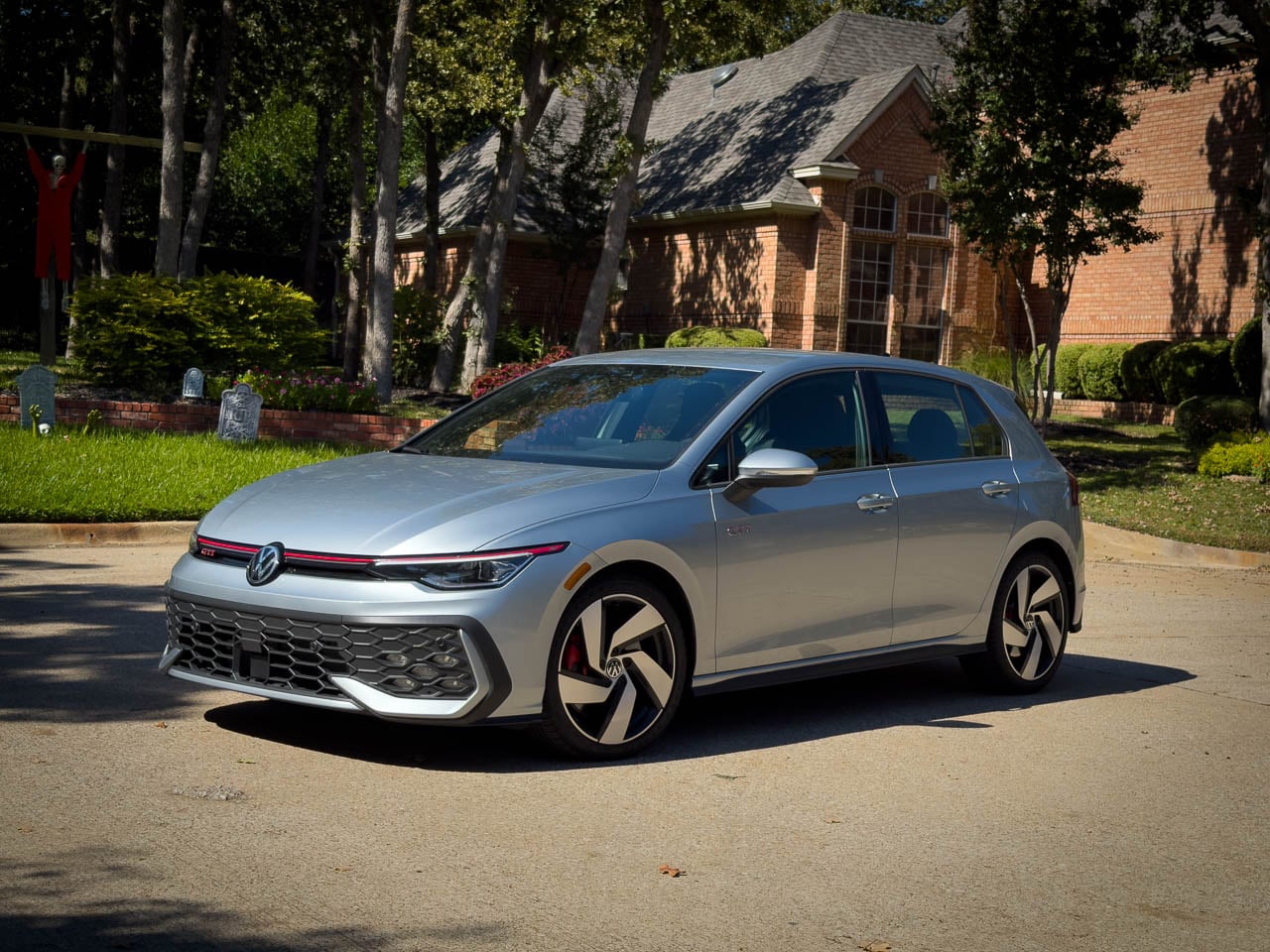
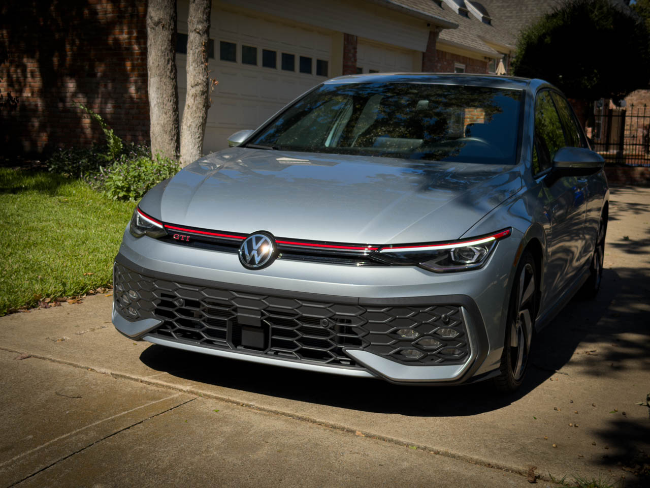
Forty years into its production run, the Volkswagen Golf GTI faces a question most performance cars never survive long enough to answer: what happens when the formula is complete? The 2025 model responds not with reinvention but with refinement so deliberate it borders on philosophical. Look at the grille: a single red line, unbroken, tracing the car’s width before disappearing into the headlight housings. No additional accent. No secondary flourish. That line is the thesis statement. Where competitors chase headline numbers and aggressive styling cues, the GTI presents something rarer in automotive design: the confidence to stop adding.
The exterior reads as studied understatement. Body lines remain clean, uninterrupted by vents or scoops that would suggest performance requiring constant explanation. The silhouette sits low without crouching, planted without posturing. In Alpine Silver Metallic, our test vehicle demonstrated how surface finish interacts with the car’s subtle curves, catching light across hood creases that reveal themselves gradually rather than announcing their presence.
Material Language
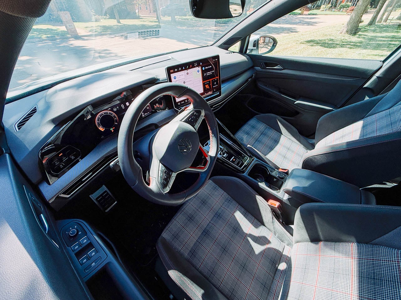
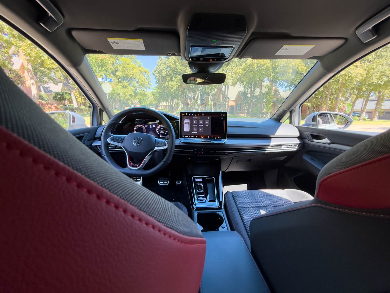
Inside, the cabin architecture prioritizes tactile hierarchy over visual spectacle. The flat-bottom steering wheel occupies the central position in this material conversation, wrapped in leather that wears smooth at the nine-and-three positions within the first few hundred miles of use. Stainless steel pedals catch light from the footwell, their brushed finish contrasting with the matte black plastic surrounds. Red ambient lighting threads through the dashboard at night, the only concession to interior theater.
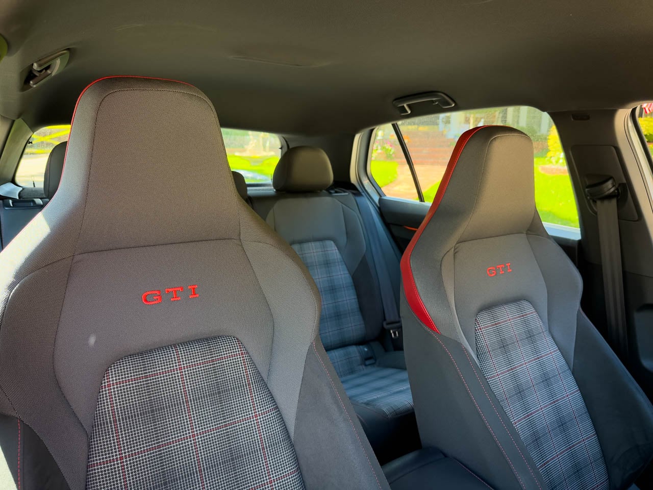
The Clark Plaid seats deserve separate consideration. This textile pattern has appeared in every GTI generation since 1976, and its persistence represents something beyond brand consistency. The weave itself tells a story about Volkswagen’s understanding of what performance seating actually requires: grip during lateral loading, breathability across temperature changes, durability that improves rather than degrades with use. Bolster foam density sits firmer than typical sport cloth, shaped to contain rather than squeeze the occupant. The fabric’s black and gray threads intersect at angles that catch cabin light differently depending on sun position, creating visual movement even when the car sits still. After a four-hour highway stint from Dallas to Austin, the seats demonstrated no pressure point fatigue, a claim many leather-wrapped alternatives cannot make. This is functional heritage, not nostalgia. The plaid works because the problem it solves has not changed.
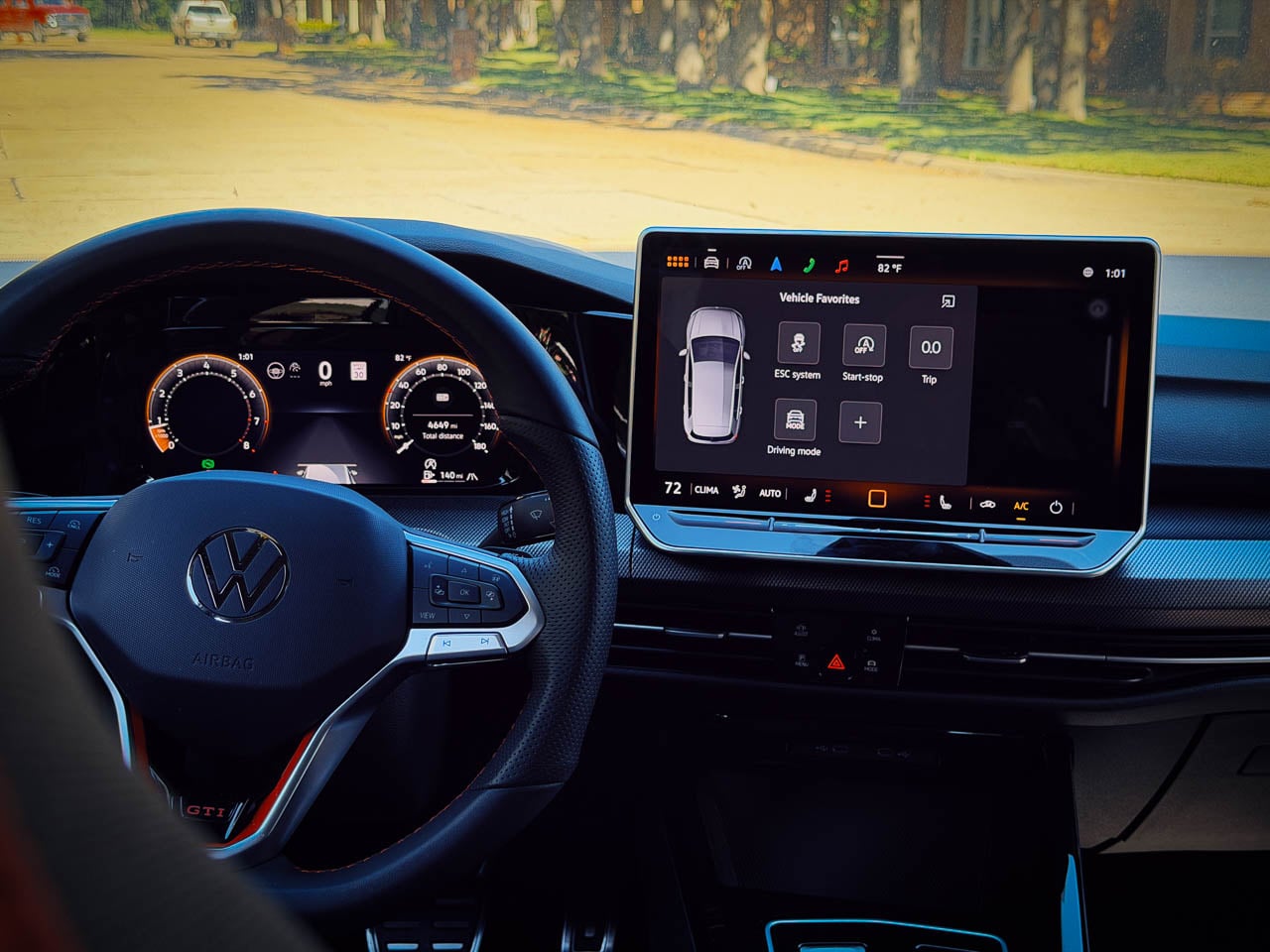
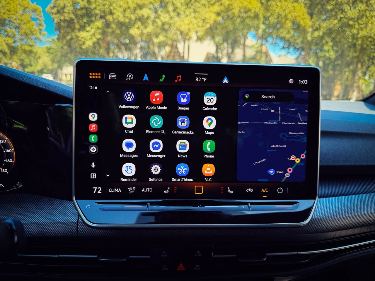
Dual 10.25-inch displays span the dashboard width, their bezels thin enough to suggest a single continuous surface interrupted only by the steering column. Touch-sensitive sliders for climate and volume occupy positions along the center console where physical controls once lived. This represents the GTI’s single visible concession to interface trends over tactile tradition, a trade that prioritizes visual continuity at a modest ergonomic cost. The adjustment period is real but brief.
Chassis Philosophy
The mechanical architecture beneath reveals Volkswagen’s approach to performance engineering. The 2.0-liter EA888 engine produces 241 horsepower and 273 pound-feet of torque, figures that appear conservative against current competition. These numbers obscure the delivery character. Torque arrives at 1,600 rpm and sustains through 4,300 rpm, creating a powerband that rewards partial throttle exploration rather than demanding full commitment.
Our test vehicle carried the seven-speed DSG dual-clutch transmission, a choice that alters the car’s personality without diminishing it. Upshifts compress into moments brief enough to feel like hesitations rather than events. Downshifts arrive with rev-matching that sounds intentional, the exhaust note rising through an acoustic signature tuned to communicate engagement without theater.
The VAQ electronic limited-slip differential manages front-wheel traction with intervention subtle enough to require attention to notice. Corner exit acceleration produces no wheel scrabble, no steering correction, no sense of mechanical systems working to contain mechanical excess. The differential’s operation suggests integration rather than intervention, a chassis behaving as a single coordinated system rather than independent components managed by software.
Dynamic Chassis Control adaptive dampers present a genuine choice rather than a marketing checkbox. Comfort mode absorbs expansion joints and surface imperfections with compliance that transforms the GTI into a credible highway cruiser. Sport mode firms the response enough to communicate surface texture through the steering rim and seat cushion. Steering weight builds progressively from center, carrying none of the artificial resistance that plagues many electronically assisted systems. Brake pedal travel follows the same logic: firm initial resistance, progressive bite, linear relationship between input and outcome. The spread between these settings covers sufficient range that drivers will likely settle into a preference rather than toggle constantly. These are not remarkable specifications. They are evidence of calibration discipline.
The Architecture of Usefulness
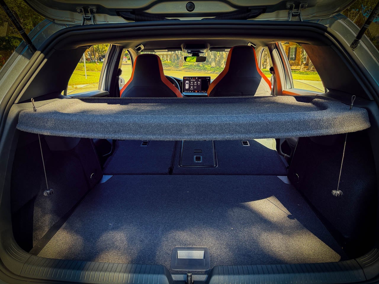
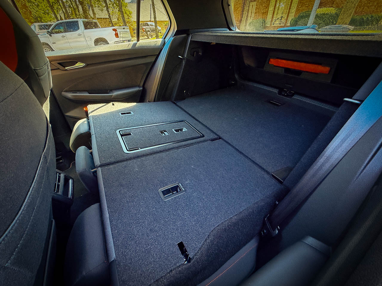
The hatchback form factor delivers practicality the GTI’s sedan competitors cannot match. Rear cargo volume expands from 22.8 cubic feet with seats upright to 52.7 cubic feet with the rear bench folded, the rear seatbacks folding via a single pull lever that releases with satisfying mechanical precision. The load floor sits level with the rear bumper height, its carpeted surface firm enough to slide boxes across without catching. This utility exists without visual compromise, the roofline maintaining its sporting rake while enclosing genuinely useful interior volume.
Rear passenger space accommodates adults across moderate distances. Legroom measures adequate for passengers under six feet, though knee contact with front seatbacks remains possible depending on front occupant positioning. Headroom proves more generous than the roofline suggests, the seating position dropping occupants low enough to clear the tapering roof glass.
The rear door apertures open wide enough for easy entry, their weatherstripping creating a soft thud on close that communicates build quality without conscious attention. Small storage solutions appear throughout: door pockets sized for water bottles, a center console bin deep enough for phones and wallets, map pockets behind the front seats. For a vehicle this compact, the packaging efficiency represents thoughtful spatial engineering.
The Value Proposition
At $33,860 as tested, the GTI positions itself not against the Civic Type R or GR Corolla but adjacent to them. This is strategic design territory. Volkswagen occupies the space where daily usability and driving engagement overlap, ceding the performance margins to competitors who build cars requiring accommodation. The Type R demands you rise to its level. The GR Corolla rewards commitment with drama. The GTI meets you where you already are.
2025 Toyota GR Corolla Premium Manual Review
The four-year bumper-to-bumper warranty and two years of included maintenance read as confidence in the object’s longevity, not as purchase incentives. This is the rarest positioning in contemporary automotive design: a performance car priced for accessibility that does not apologize for what it excludes. The GTI excludes excess. That exclusion is the product.
Resolution: Why This Is Our Car of the Year
The 2025 Golf GTI represents something increasingly rare in automotive design: a product that knows what it is and refuses to pretend otherwise. The chassis does not apologize for being front-wheel drive. The power figures do not strain toward competition with larger engines. The interior does not disguise its price point behind aggressive styling that overpromises.
What remains is a vehicle that executes its intended purpose with precision that approaches elegance. The hot hatch formula, refined across four decades, arrives here in what may be its final evolved form before electrification rewrites the category’s rules entirely. For drivers seeking performance that integrates into daily life rather than demanding accommodation from it, the GTI presents an argument for restraint that carries more conviction than any competitor’s argument for excess.
The 2025 Volkswagen Golf GTI is Yanko Design’s 2025 Car of the Year and earns our Editor’s Choice Award because it answers the question that matters: can a performance car be finished?
Yes. This is what finished looks like. Not the absence of ambition, but the presence of conviction. Volkswagen built the GTI they intended to build: complete, coherent, and resolved. In the final years before electrification rewrites every assumption about what a driver’s car can be, this is the closing argument for internal combustion restraint.
Exceptionally balanced chassis favors control over spectacle
Clark Plaid seating blends comfort, grip, and heritage
Torque rich powerband rewards real world driving
Daily usability achieved without sacrificing design intent
Restraint driven design feels complete and confident
CONS:
Touch sensitive controls reduce tactile certainty
Front wheel drive limits ultimate track theatrics
RATINGS:
AESTHETICS
ERGONOMICS
PERFORMANCE
SUSTAINABILITY / REPAIRABILITY
VALUE FOR MONEY
EDITOR'S QUOTE:
The GTI wins not by doing more, but by knowing when to stop.
Forty years into its production run, the Volkswagen Golf GTI faces a question most performance cars never survive long enough to answer: what happens when the formula is complete? The 2025 model responds not with reinvention but with refinement so deliberate it borders on philosophical. Look at the grille: a single red line, unbroken, tracing the car’s width before disappearing into the headlight housings. No additional accent. No secondary flourish. That line is the thesis statement. Where competitors chase headline numbers and aggressive styling cues, the GTI presents something rarer in automotive design: the confidence to stop adding.
The exterior reads as studied understatement. Body lines remain clean, uninterrupted by vents or scoops that would suggest performance requiring constant explanation. The silhouette sits low without crouching, planted without posturing. In Alpine Silver Metallic, our test vehicle demonstrated how surface finish interacts with the car’s subtle curves, catching light across hood creases that reveal themselves gradually rather than announcing their presence.
Material Language
Inside, the cabin architecture prioritizes tactile hierarchy over visual spectacle. The flat-bottom steering wheel occupies the central position in this material conversation, wrapped in leather that wears smooth at the nine-and-three positions within the first few hundred miles of use. Stainless steel pedals catch light from the footwell, their brushed finish contrasting with the matte black plastic surrounds. Red ambient lighting threads through the dashboard at night, the only concession to interior theater.
The Clark Plaid seats deserve separate consideration. This textile pattern has appeared in every GTI generation since 1976, and its persistence represents something beyond brand consistency. The weave itself tells a story about Volkswagen’s understanding of what performance seating actually requires: grip during lateral loading, breathability across temperature changes, durability that improves rather than degrades with use. Bolster foam density sits firmer than typical sport cloth, shaped to contain rather than squeeze the occupant. The fabric’s black and gray threads intersect at angles that catch cabin light differently depending on sun position, creating visual movement even when the car sits still. After a four-hour highway stint from Dallas to Austin, the seats demonstrated no pressure point fatigue, a claim many leather-wrapped alternatives cannot make. This is functional heritage, not nostalgia. The plaid works because the problem it solves has not changed.
Dual 10.25-inch displays span the dashboard width, their bezels thin enough to suggest a single continuous surface interrupted only by the steering column. Touch-sensitive sliders for climate and volume occupy positions along the center console where physical controls once lived. This represents the GTI’s single visible concession to interface trends over tactile tradition, a trade that prioritizes visual continuity at a modest ergonomic cost. The adjustment period is real but brief.
Chassis Philosophy
The mechanical architecture beneath reveals Volkswagen’s approach to performance engineering. The 2.0-liter EA888 engine produces 241 horsepower and 273 pound-feet of torque, figures that appear conservative against current competition. These numbers obscure the delivery character. Torque arrives at 1,600 rpm and sustains through 4,300 rpm, creating a powerband that rewards partial throttle exploration rather than demanding full commitment.
Our test vehicle carried the seven-speed DSG dual-clutch transmission, a choice that alters the car’s personality without diminishing it. Upshifts compress into moments brief enough to feel like hesitations rather than events. Downshifts arrive with rev-matching that sounds intentional, the exhaust note rising through an acoustic signature tuned to communicate engagement without theater.
The VAQ electronic limited-slip differential manages front-wheel traction with intervention subtle enough to require attention to notice. Corner exit acceleration produces no wheel scrabble, no steering correction, no sense of mechanical systems working to contain mechanical excess. The differential’s operation suggests integration rather than intervention, a chassis behaving as a single coordinated system rather than independent components managed by software.
Dynamic Chassis Control adaptive dampers present a genuine choice rather than a marketing checkbox. Comfort mode absorbs expansion joints and surface imperfections with compliance that transforms the GTI into a credible highway cruiser. Sport mode firms the response enough to communicate surface texture through the steering rim and seat cushion. Steering weight builds progressively from center, carrying none of the artificial resistance that plagues many electronically assisted systems. Brake pedal travel follows the same logic: firm initial resistance, progressive bite, linear relationship between input and outcome. The spread between these settings covers sufficient range that drivers will likely settle into a preference rather than toggle constantly. These are not remarkable specifications. They are evidence of calibration discipline.
The Architecture of Usefulness
The hatchback form factor delivers practicality the GTI’s sedan competitors cannot match. Rear cargo volume expands from 22.8 cubic feet with seats upright to 52.7 cubic feet with the rear bench folded, the rear seatbacks folding via a single pull lever that releases with satisfying mechanical precision. The load floor sits level with the rear bumper height, its carpeted surface firm enough to slide boxes across without catching. This utility exists without visual compromise, the roofline maintaining its sporting rake while enclosing genuinely useful interior volume.
Rear passenger space accommodates adults across moderate distances. Legroom measures adequate for passengers under six feet, though knee contact with front seatbacks remains possible depending on front occupant positioning. Headroom proves more generous than the roofline suggests, the seating position dropping occupants low enough to clear the tapering roof glass.
The rear door apertures open wide enough for easy entry, their weatherstripping creating a soft thud on close that communicates build quality without conscious attention. Small storage solutions appear throughout: door pockets sized for water bottles, a center console bin deep enough for phones and wallets, map pockets behind the front seats. For a vehicle this compact, the packaging efficiency represents thoughtful spatial engineering.
The Value Proposition
At $33,860 as tested, the GTI positions itself not against the Civic Type R or GR Corolla but adjacent to them. This is strategic design territory. Volkswagen occupies the space where daily usability and driving engagement overlap, ceding the performance margins to competitors who build cars requiring accommodation. The Type R demands you rise to its level. The GR Corolla rewards commitment with drama. The GTI meets you where you already are.
2025 Toyota GR Corolla Premium Manual Review
The four-year bumper-to-bumper warranty and two years of included maintenance read as confidence in the object’s longevity, not as purchase incentives. This is the rarest positioning in contemporary automotive design: a performance car priced for accessibility that does not apologize for what it excludes. The GTI excludes excess. That exclusion is the product.
Resolution: Why This Is Our Car of the Year
The 2025 Golf GTI represents something increasingly rare in automotive design: a product that knows what it is and refuses to pretend otherwise. The chassis does not apologize for being front-wheel drive. The power figures do not strain toward competition with larger engines. The interior does not disguise its price point behind aggressive styling that overpromises.
What remains is a vehicle that executes its intended purpose with precision that approaches elegance. The hot hatch formula, refined across four decades, arrives here in what may be its final evolved form before electrification rewrites the category’s rules entirely. For drivers seeking performance that integrates into daily life rather than demanding accommodation from it, the GTI presents an argument for restraint that carries more conviction than any competitor’s argument for excess.
The 2025 Volkswagen Golf GTI is Yanko Design’s 2025 Car of the Year and earns our Editor’s Choice Award because it answers the question that matters: can a performance car be finished?
Yes. This is what finished looks like. Not the absence of ambition, but the presence of conviction. Volkswagen built the GTI they intended to build: complete, coherent, and resolved. In the final years before electrification rewrites every assumption about what a driver’s car can be, this is the closing argument for internal combustion restraint.
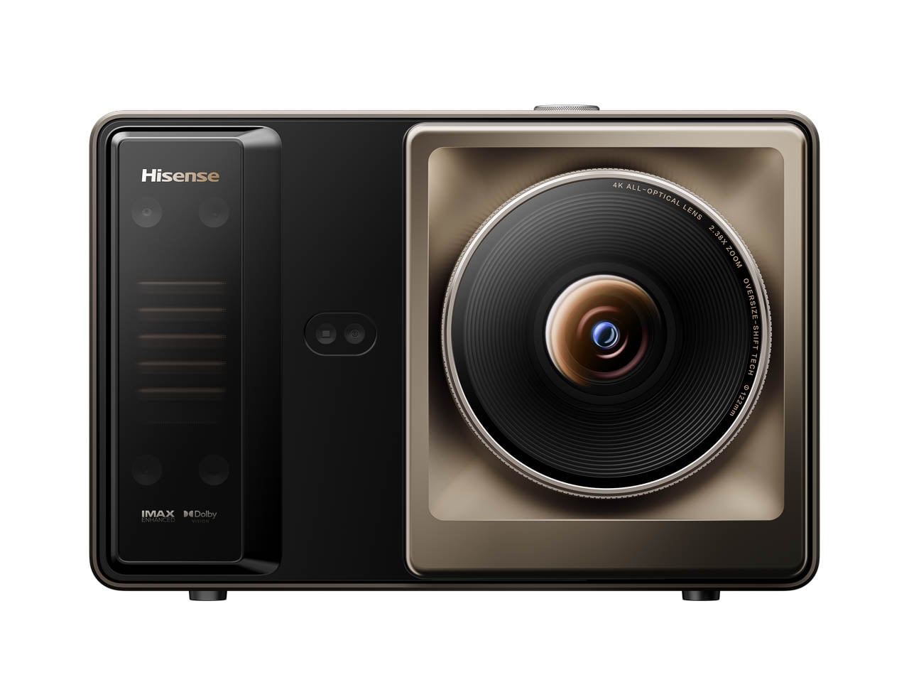
Large-format displays have always posed a spatial question that brightness alone cannot answer: how much permanence does a room owe to its screen? The Hisense 100U8QG, reviewed earlier this year, represented one answer. At 100 diagonal inches of Mini-LED panel, it demanded architectural consideration. Wall reinforcement, viewing distance calculations, furniture subordination. The display became a fixture in the truest sense, its physical presence reshaping the room around it.
Designer: Hisense
The XR10 Laser TV, unveiled ahead of CES 2026, proposes a different relationship between image and architecture. Where the 100U8QG commits, the XR10 suggests. Where fixed panels dictate, projection negotiates.
Scale Without Permanence
The fundamental distinction lies not in image quality but in spatial philosophy. A 100-inch television is a decision. Once mounted, its presence organizes the room. Seating angles become fixed. Wall treatments become irrelevant behind the panel. The display asserts dominance over its environment, requiring the space to accommodate its permanence.
Projection operates under different constraints. The XR10 can scale from 65 to 300 inches depending on throw distance and surface availability. This variability represents more than convenience. It represents a fundamentally reversible intervention. The wall remains a wall. The room retains its capacity to be something other than a viewing space. When the projector powers down, the architecture reasserts itself in ways that a mounted 100-inch panel never permits.
This reversibility carries design implications that extend beyond flexibility for its own sake. Spaces increasingly serve multiple functions. A wall that hosts a 200-inch projection in the evening might face windows in the morning, hang artwork during gatherings, or simply recede into architectural neutrality when entertainment is not the room’s purpose. Fixed ultra-large displays foreclose these possibilities. Projection preserves them.
Brightness as Spatial Liberation
The XR10’s triple-laser light engine achieves output levels that shift the traditional projector calculus. Where previous generations required environmental control, darkened rooms, managed window treatments, controlled artificial lighting, the XR10 can hold its image against ambient conditions that would have dissolved earlier projectors into washed abstraction.
This capability reframes brightness not as a specification but as a design constraint relaxed. The 100U8QG demanded nothing from its environment beyond structural support. It generated its own light, controlled its own contrast, existed independently of the room’s luminous conditions. Projection historically asked more: cooperation from windows, deference from overhead fixtures, submission from the broader lighting design.
The XR10 narrows this gap without eliminating it entirely. Ambient light remains a factor. Surface reflectivity still matters. But the threshold of environmental accommodation drops substantially. A room need not transform itself into a theater to achieve cinematic scale. The projection can coexist with the space rather than demanding its temporary transformation.
Material Presence and Absence
The physical footprint of these technologies tells its own story. The 100U8QG, despite remarkably thin bezels and careful industrial design, remains an object of substantial material presence. Its glass surface catches light. Its chassis occupies wall space whether active or dormant. The panel exists as an architectural element even when displaying nothing.
The XR10 operates on different terms. As an ultra-short-throw system, it sits near the projection surface rather than across the room, typically on furniture or a low console beneath the image. The projector itself occupies space, but that space bears no fixed relationship to the image’s scale. A 300-inch projection does not require a 300-inch object. The image and its source decouple in ways that fixed displays cannot replicate.
This decoupling creates interesting possibilities for spatial hierarchy. The 100U8QG is always the most visually dominant element in any room it inhabits. The XR10 can be subordinate, tucked below sightlines, present but not assertive. The image appears and disappears. The hardware remains modest.
The Engineering of Environmental Tolerance
Achieving brightness sufficient for ambient operation requires addressing thermal and optical challenges that compound at high output levels. The XR10 employs a sealed microchannel liquid cooling system, an approach that maintains laser stability without exposing internal optics to environmental contamination. Traditional air-cooled projectors draw dust through their optical paths over time, degrading image quality incrementally. Sealed liquid cooling preserves performance across years of operation rather than months.
The optical system centers on a 16-element all-glass lens array with dynamic aperture control. Glass elements maintain dimensional stability under thermal stress better than polymer alternatives, reducing the subtle warping that can soften images at extreme scales. The IRIS system adjusts light transmission in real time to preserve contrast across varying scene brightness, a capability that becomes more critical as ambient light levels rise.
Speckle suppression addresses the last major optical distinction between projection and panel display. The grainy texture that coherent laser light can produce against reflective surfaces has historically marked projection as visually different from emissive displays. The XR10’s suppression system reduces this artifact to the threshold of perception, bringing projected images closer to the smooth, grain-free character of LED and OLED panels.
Commitment and Its Alternatives
The choice between fixed ultra-large display and high-brightness projection ultimately reflects a stance on commitment. The 100U8QG rewards commitment. Once installed, calibrated, and integrated, it delivers consistent, environmentally independent performance. The room becomes better at being a viewing room. The display improves through permanence.
The XR10 rewards flexibility. It achieves similar or greater scale while preserving the room’s capacity for other identities. The wall can be a screen, then not a screen. The space can host cinema, then release it. The architectural intervention remains reversible in ways that panel installation does not.
Neither approach is superior in absolute terms. The design question centers on what a space is asked to become and for how long. Dedicated viewing environments favor the commitment model. Multi-use spaces, rooms with competing functions, and architectures that resist permanent visual dominance may find the projection model more sympathetic to their broader purposes.
Positioning in the Display Landscape
Hisense will demonstrate the XR10 at CES 2026, booth 17704 in Central Hall. The company has spent a decade developing laser projection technology, introducing its first laser TV in 2014 and pioneering triple-laser color architecture in 2019. The XR10 represents the current limit of that trajectory: maximum brightness, maximum scale, minimum environmental demand.
Pricing and availability remain unannounced. The competitive landscape has expanded considerably since Hisense established the ultra-short-throw category, with Samsung, LG, and numerous manufacturers offering alternatives. How the XR10 positions against both competing projectors and the fixed ultra-large panels it philosophically challenges will determine its market reception.
The more interesting question may be conceptual rather than commercial. As display technology continues pushing scale boundaries, the tension between permanence and adaptability becomes more acute. The XR10 and the 100U8QG occupy different points on that spectrum, offering different answers to the same fundamental question: what does a room owe to its screen, and what does a screen owe to its room?
There’s a particular kind of panic that sets in about thirty minutes before you need to leave for the airport. You’ve thrown clothes into a suitcase, triple-checked your passport, and convinced yourself that you’ve packed everything important. Then you arrive at your destination and realize you’ve brought three chargers for devices you don’t own but somehow forgot the one thing that would’ve made your entire trip better. Last-minute travel has a way of exposing what truly matters versus what we think we need.
The beauty of spontaneous trips lies in their unpolished edges, but that doesn’t mean you should suffer through bad coffee, tangled headphone cords, or eating with your hands because the airline meal came with a flimsy plastic fork that snapped on contact. The difference between a trip you remember fondly and one you spent complaining about comes down to a handful of well-chosen essentials that solve real problems. These five designs represent the kind of thoughtful gear that takes up minimal space but delivers maximum impact when you need it most.
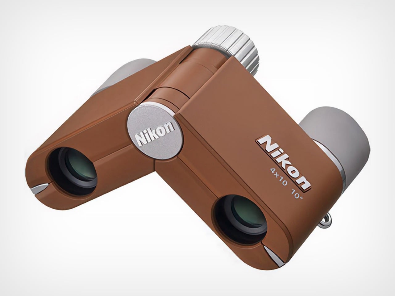
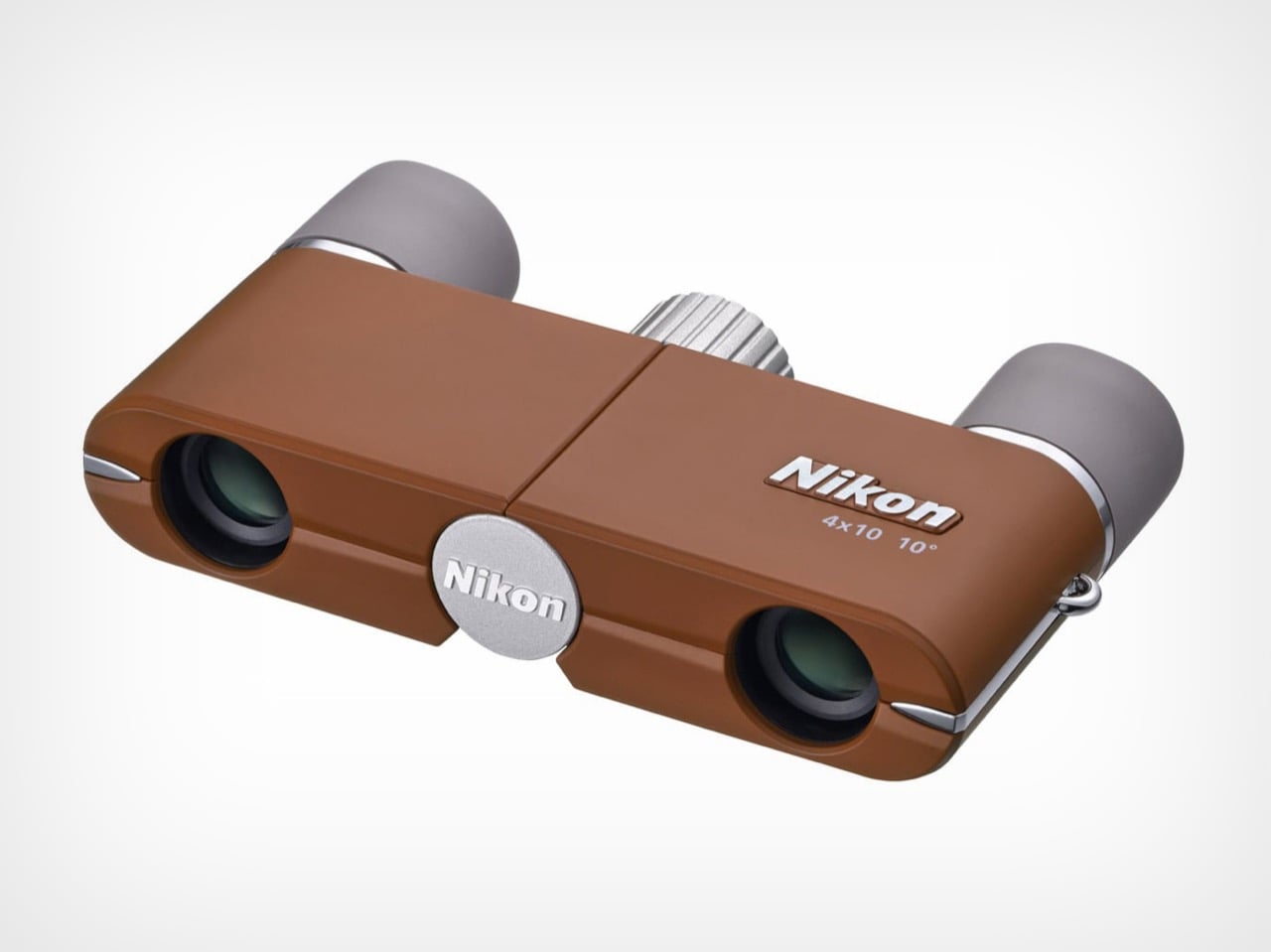
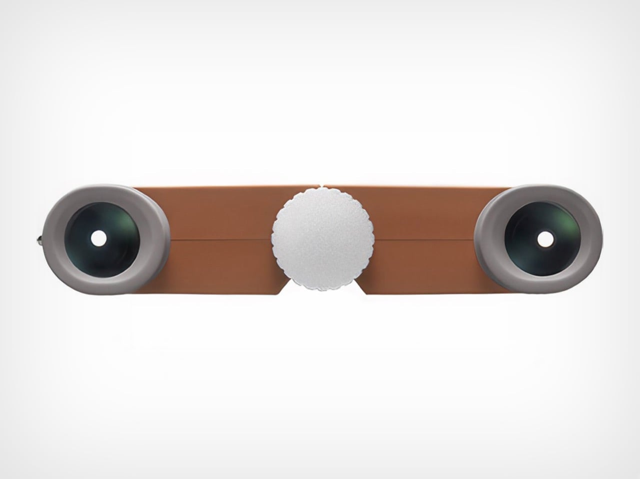
1. Nikon 4x10D CF Pocket Binoculars
Binoculars feel like relics from another era, the kind of thing your grandfather kept in a leather case that smelled faintly of pipe tobacco. Nikon’s 4x10D CF pocket binoculars challenge that entire perception by shrinking the form factor down to something that actually fits in your pocket without creating an awkward bulge. These aren’t meant to compete with your smartphone’s digital zoom or replace professional birding equipment. They exist in a different category entirely, prioritizing the experience of optical viewing over pixel counts and processing power.
The genius lies in recognizing that people don’t carry traditional binoculars because they’re too bulky and conspicuous. Nikon solved that problem by creating something so discreet it almost disappears. The optical quality remains surprisingly sharp for such a compact device, delivering a viewing experience that feels immediate and artifact-free. Whether you’re trying to read a distant street sign in an unfamiliar city or want a closer look at architectural details without looking like a tourist with professional gear, these slip into your travel kit without demanding dedicated space or special protection.
What we like
• The form factor makes them genuinely pocketable, solving the primary reason people don’t carry binoculars.
• Optical viewing delivers a tactile, immediate experience that digital zoom can’t replicate.
• The updated colorways transform them from technical equipment into an accessory you want to carry.
• Multiple uses, from reading transit signs to appreciating distant landscapes without looking conspicuous.
What we dislike
• The 4x magnification is modest compared to traditional binoculars, limiting long-distance viewing.
• The compact size means smaller objective lenses, reducing light-gathering capability in low-light conditions.
2. StillFrame Headphones
Air travel has become an endurance test for your ears. Between engine noise, crying babies, and the passenger next to you who insists on watching action movies without headphones until a flight attendant intervenes, you need something that creates a barrier between you and chaos. StillFrame wireless headphones approach this problem with a design philosophy borrowed from a time when music felt like a deliberate choice rather than background noise. The aesthetic draws from compact disc geometry, creating a visual language that feels refreshingly analog in an aggressively digital world.
Weighing just 103 grams, these headphones occupy a middle ground between intrusive over-ear designs and in-ear buds that always seem to fall out at the worst possible moment. The 40mm drivers create a soundstage that gives music room to breathe, which matters when you’re spending hours in compressed airplane cabins where everything feels claustrophobic. The combination of active noise cancelling and transparency mode means you can shift between complete isolation and situational awareness without removing them. That flexibility proves essential when navigating unfamiliar airports or wanting to hear boarding announcements without sacrificing your peace during the actual flight.
• The 24-hour battery life eliminates anxiety about running out of power mid-journey.
• Magnetic fabric ear cushions swap easily, giving you color options that match different moods.
• Dual connectivity through Bluetooth 5.4 and USB-C cable offers wireless freedom or wired stability.
• The exposed circuit board aesthetic celebrates the technology rather than hiding it behind plastic shells.
What we dislike
• The on-ear design may cause discomfort during extremely long flights compared to over-ear alternatives.
• The fashion-forward aesthetic might not appeal to travelers who prefer more conventional headphone designs.
3. 0.25 oz Aero Spork
There’s something deeply frustrating about packing perfectly good food for a trip only to realize you have nothing reasonable to eat it with. Plastic cutlery snaps under minimal pressure, full-sized metal utensils add unnecessary weight, and trying to eat noodles with a standard spoon requires patience most travelers don’t have after a long day. The Aero Spork weighs less than a quarter of an ounce but manages to feel substantial enough to handle actual meals. That combination of minimal weight and genuine utility makes it the kind of item that earns permanent residence in your travel kit.
The ergonomic curve gives you a secure grip even when your hands are cold or wet, while the tapered design specifically addresses the noodle-eating problem that plagues travelers across Asia and increasingly everywhere else. The stackable design means you can carry multiple sporks without them taking up more space than a single standard utensil. This becomes relevant when you’re traveling with others or want a backup. The durability factor matters more than you’d expect; these survive being tossed into bags, stepped on accidentally, and subjected to the kind of casual abuse that destroys lesser travel utensils within weeks.
• The 7-gram weight makes it lighter than most travel accessories you’ll forget you’re carrying.
• Stackable design solves the multi-person dining situation without requiring a full cutlery set.
• The tapered shape genuinely improves noodle-eating, addressing a specific and common travel challenge.
• Metal construction means it lasts indefinitely, unlike disposable or plastic alternatives.
What we dislike
• The hybrid spoon-fork design means neither side works quite as well as a dedicated utensil.
• Cleaning can be tricky in the field without proper access to soap and water.
4. MokaMax Portable Coffee Maker
Hotel coffee represents a special category of disappointment. It tastes like regret mixed with lukewarm water, extracted from pods that somehow cost three dollars each. Even when you find a decent café, you’re either waiting in line behind seventeen people who each ordered customized drinks with five modifications, or you’re drinking something that went cold during your walk back to your hotel. MokaMax addresses this problem by building a legitimate pressure-brewing system into a form factor that looks like a standard travel mug. The ridged stainless steel body provides a secure grip while reinforcing the rugged, outdoor-ready aesthetic.
The design spent considerable effort getting those ridges right, balancing functional grip with comfortable handling and visual interest. The flexible rope attachment transforms it from just another mug into something that clips onto backpacks or hangs from hooks, integrating into your mobile gear rather than requiring dedicated carrying. The key advantage over simply buying coffee everywhere you go is consistency and timing. You control the strength, temperature, and exact moment you brew. That autonomy matters when you’re dealing with jet lag and need coffee at 4 AM when nothing is open, or when you’re hiking and want something better than instant crystals dissolved in lukewarm water.
What we like
• The pressure-brewing system delivers espresso-style coffee without electricity or complex equipment.
• Single-vessel design eliminates the need to carry separate brewing and drinking containers.
• Ridged stainless steel construction provides grip and durability for genuine outdoor use.
• The rope attachment integrates it into your travel gear ecosystem rather than requiring dedicated space.
What we dislike
• The brewing process takes longer than simply buying coffee if you’re in an area with good options.
• Cleaning requires more attention than a standard travel mug, especially after brewing dark roasts.
5. Craftmaster EDC Utility Knife
Most travelers don’t think they need a utility knife until they’re standing in a hotel room trying to open packaging with their keys, teeth, or increasingly desperate improvisation. The Craftmaster EDC utility knife occupies just 8mm of thickness and 12cm of length, making it slim enough to slip into pockets, bags, or organizer pouches without creating bulk. The metallic construction gives it heft that feels reassuring rather than burdensome, while the rotating knob deployment mechanism adds a tactile satisfaction that pure functionality doesn’t require but somehow makes the tool more enjoyable to use.
The magnetic back serves double duty by letting you dock the knife on any metal surface and providing a home for the companion metal scale. That scale includes both metric and imperial measurements, a raised edge for easy pickup, and a blade-breaker for maintaining the OLFA blade’s sharpness. The 15-degree curvature protects your fingers during cutting tasks, while the 45-degree inclination helps with opening boxes without damaging contents. These details transform a basic utility knife into something that solves multiple problems, from precise measuring for emergency clothing repairs to clean package opening without destroying whatever’s inside.
• The 8mm thickness makes it genuinely pocketable without the bulk of traditional utility knives.
• Magnetic docking turns any metal surface into convenient storage, preventing loss in hotel rooms.
• The included ruler with blade-breaker combines multiple functions without requiring separate tools.
• OLFA blades are replaceable and widely available, extending the knife’s useful life indefinitely.
What we dislike
• The minimalist metal design lacks texture that could improve grip in wet conditions.
• Airport security restrictions mean it needs to go in checked luggage, limiting accessibility during travel days.
Why These Five Items Matter for Last-Minute Travel
The connecting thread between these designs is that they solve specific problems while occupying minimal space and requiring almost no learning curve. You don’t need an instruction manual, a YouTube tutorial, or previous experience. They work immediately and continue working reliably. That reliability becomes essential when you’re already dealing with the stress of spontaneous travel, unfamiliar locations, and the general chaos that comes from not having time to plan properly.
The other advantage is that none of these items are single-use solutions. Pocket binoculars serve navigation, sightseeing, and practical reading purposes. Headphones deliver both entertainment and environmental control. A quality spork handles any meal situation. The portable coffee maker works everywhere from mountain peaks to hotel rooms. The utility knife solves dozens of cutting, measuring, and opening challenges. That versatility means carrying five items gives you solutions to dozens of potential problems, which is exactly the kind of efficiency last-minute travelers need most.
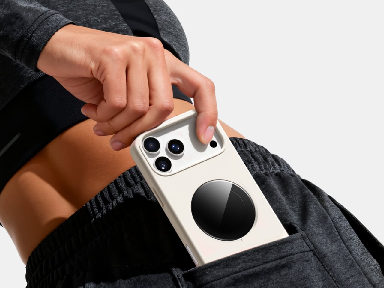
The iPhone’s rear cameras keep getting better, but selfies still rely on a smaller, lower-resolution front sensor, and storage upgrades cost considerably more than a microSD card. People who shoot a lot of photos and video feel squeezed on both fronts, choosing between spending hundreds on internal storage or dealing with blurry front-camera selfies. Selfix is a case for the iPhone 17 Pro that tackles both problems at once.
Selfix is a case for the iPhone 17 Pro and Pro Max that adds a circular 1.6-inch AMOLED screen to the back and hides a microSD slot inside. The rear screen acts as a tiny viewfinder so you can use the 48 MP rear cameras for selfies, while the card slot lets you add up to 2 TB of storage without touching Apple’s upgrade menu or monthly cloud fees.
The rear display mirrors the camera view so you can frame yourself, adjust in real time, and pick any of the rear lenses, from ultra-wide group shots to telephoto portraits. You get the main sensor’s larger 1/1.28-inch glass, Night Mode, and up to 8× optical zoom for selfies, instead of guessing with a cropped front camera and hoping everyone fits into the narrower field of view.
Selfix connects through the phone’s USB-C port and does not need a separate app. You snap the case on, open the camera, and the rear screen wakes up. A dedicated button on the case lets you turn the display off when you are not using it to save battery. The idea is to feel like a built-in second screen, not another gadget that needs pairing, permissions, and a drawer full of instructions.
The case includes a microSD slot that supports cards up to 2 TB, using the same USB-C connection to integrate with the phone. A 512 GB card costs around $50, while Apple’s $200 jump for the same capacity makes swappable storage a compelling alternative. Heavy shooters can archive trips or projects without paying monthly cloud fees or deleting older work to make room for new sessions.
Selfix is made from high-quality TPU and comes in Oat White, Blush Pink, and Midnight Black, sized to match the 17 Pro and Pro Max. It adds some thickness, bringing the total to 17mm, but in return, you get a grippy shell, a second screen, and a hidden storage bay. The design aims to look like a natural extension of the phone rather than a bolt-on camera rig or accessory that screams afterthought.
Selfix is aimed at people who care enough about image quality to use the rear cameras for everything, and who are tired of juggling storage or paying the upgrade tax. A case that quietly turns the iPhone into a dual-screen shooter with expandable memory makes you wonder why the phone did not ship this way, especially when the rear cameras already outclass the front by a significant margin, and storage remains artificially expensive.