About ten years ago, designer Adam C Miller made a pillbox for a close friend living with an invisible illness. The standard option available to her was the familiar hard plastic pharmacy organizer, practical enough, but hardly something anyone would want to carry proudly or leave out in the open. Miller decided she deserved better. Starting with a block of maple, paper templates, a few screws, and a lot of sandpaper, he built a pillbox she would actually want to keep nearby. That first handmade object became the beginning of Helia.
The project stayed with him for years. Miller kept refining the idea, and when he began taking a daily regimen himself, the design took on even more personal weight. About a year ago, he revisited the category and found plenty of pill cases that handled the basics, but very few that felt genuinely beautiful, portable, and display-worthy at the same time. Helia became the answer to that gap, shaped by a decade of iteration and by the simple belief that an object tied to daily care can carry warmth, beauty, and intention.
That mindset allowed Miller to look at Helia and pillboxes very differently. We already reserve beautiful containers for the things we value most. Watches arrive in fitted cases, jewelry rests in lined boxes, and keepsakes are stored in objects designed to honor their presence. Helia brings that same level of consideration to a weekly pill organizer. It treats a daily medical routine as something worth leaving out where you can see it –
personal and dignified instead of something to hide in a drawer.
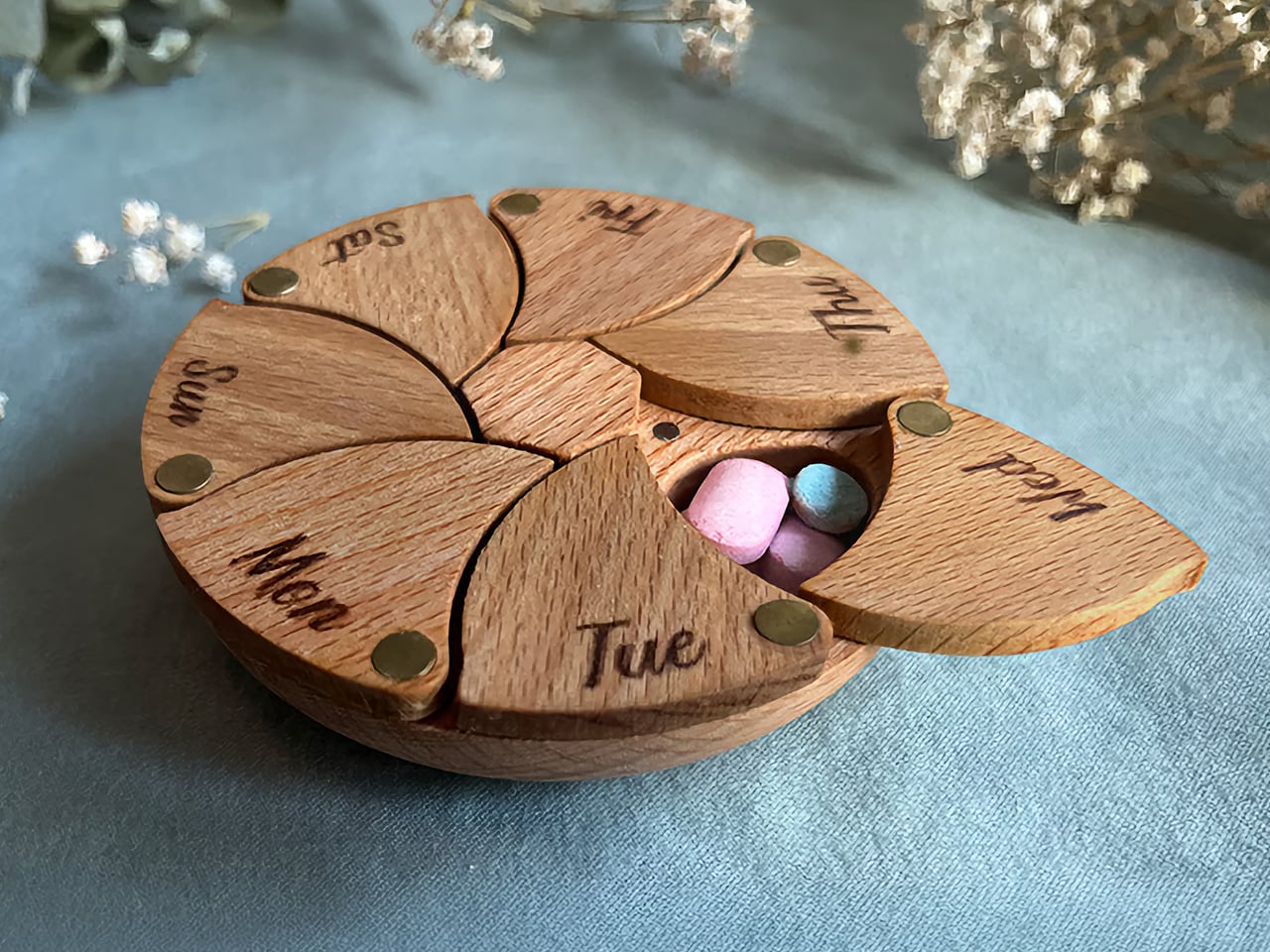
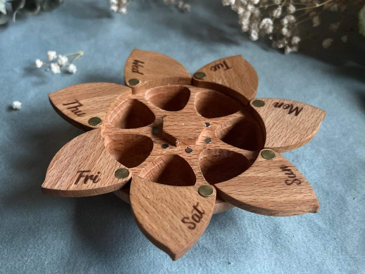
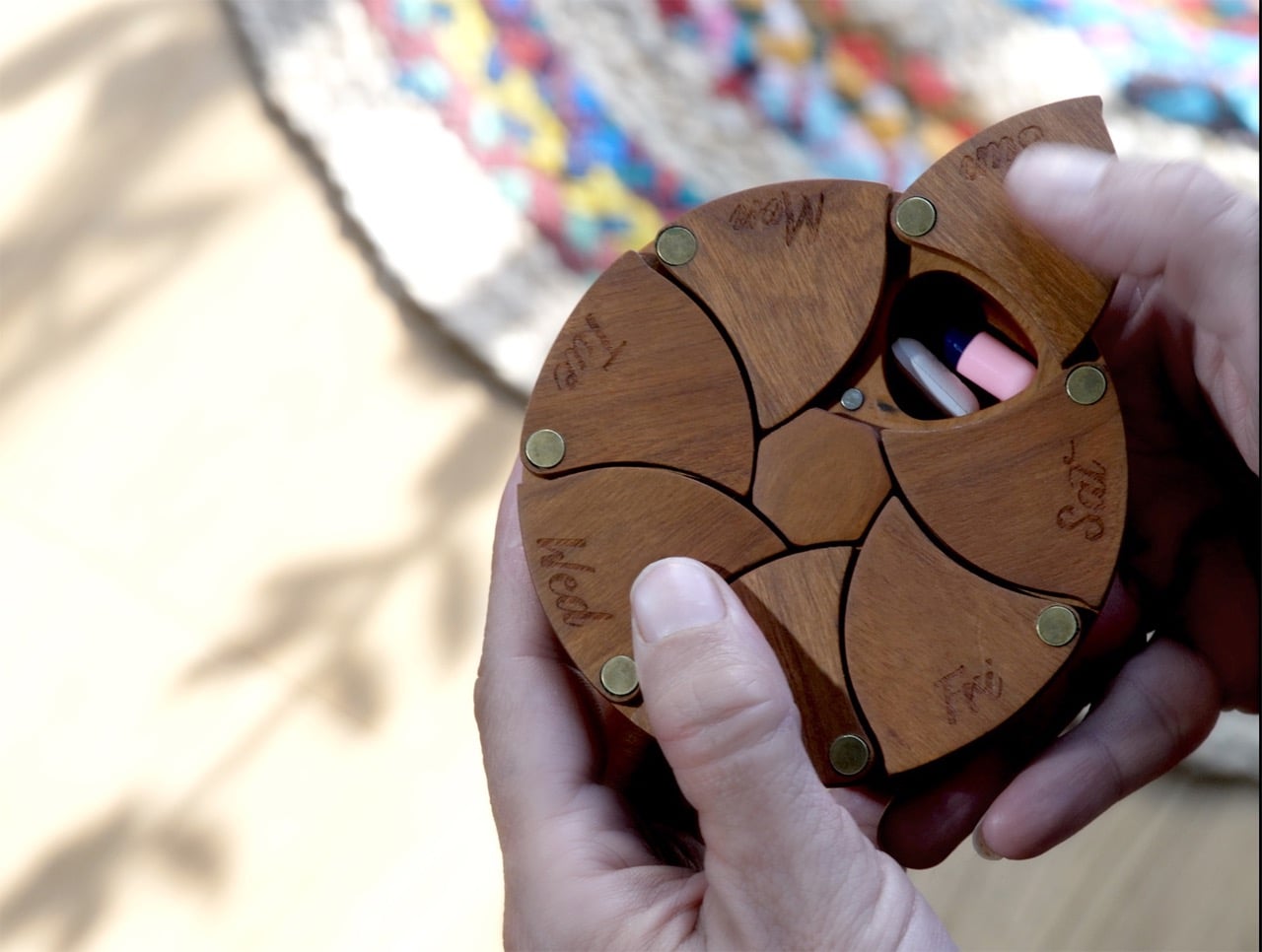
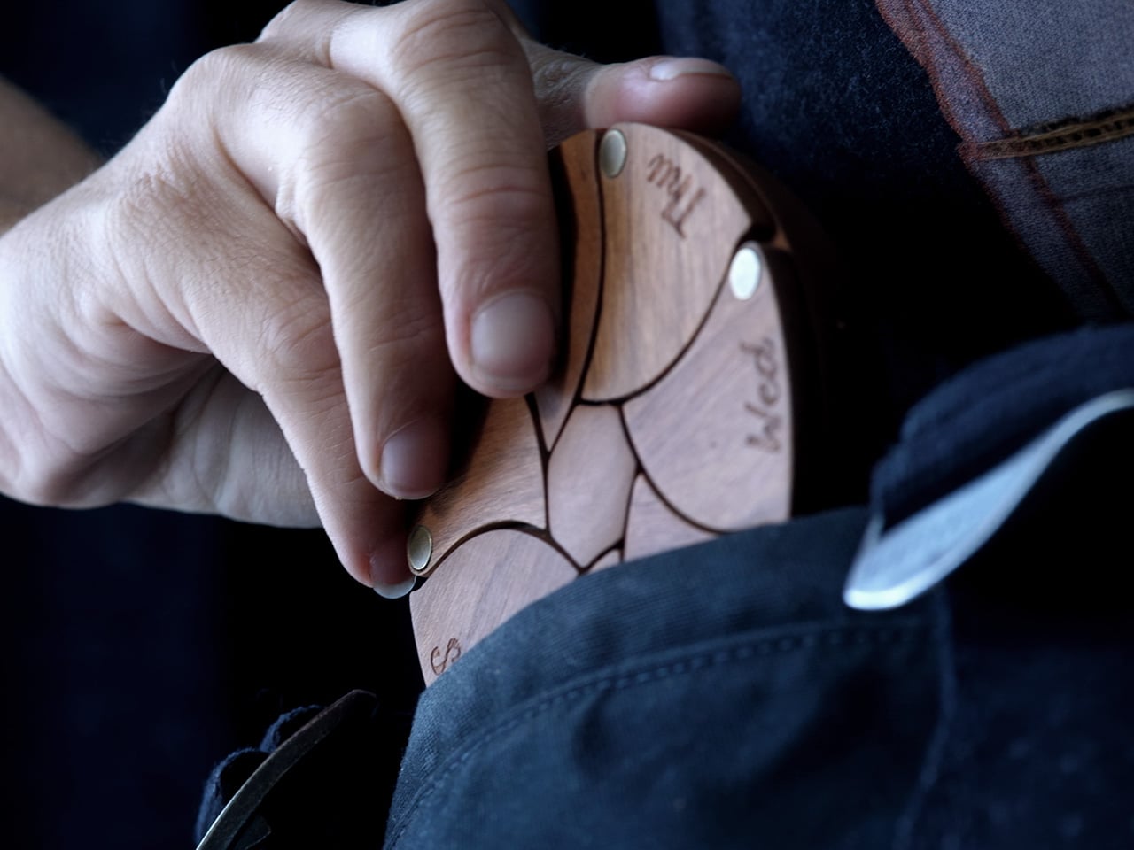
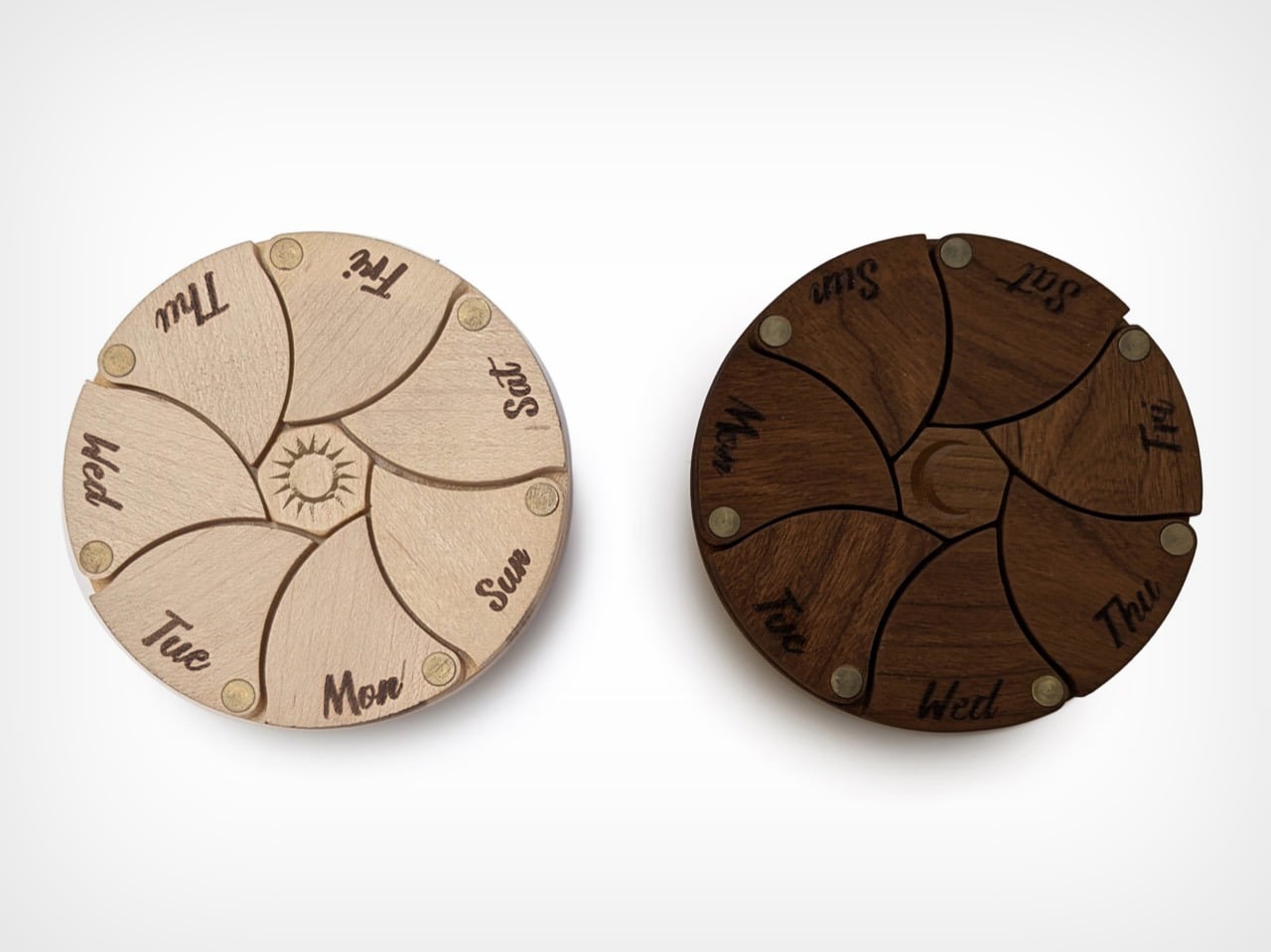
Seven petal-like compartments radiate from a central axis, forming a circular disc that reads closer to a crafted artifact than a storage device. With beautiful hardwood construction and seven magnetic doors, it is confidence-inspiring and satisfying to use. The primary material is FSC-certified cherry wood, finished with a food-safe, water-resistant mineral oil that brings out the warm reddish tones the species is known for. The wood species were tested one by one until cherry emerged as the clear choice after the finish was applied. Each compartment door turns on solid brass rivets and closes with strong neodymium magnets, adding a material contrast that lifts the object’s visual weight considerably, and the combination of wood, brass, and organic petal geometry gives Helia a design language the category has simply never used.
Each of the seven doors snaps open and closed with a satisfying click, held in place by four magnets each. They hold open while you load your medicine for the week, and when they snap closed, they hold your medication safe and secure. The door mechanism alone went through half a dozen iterations before it felt exactly right. Each daily pocket is about 0.9 inches across and roughly 0.5 inches deep, with room for a realistic daily mix, such as one large pill, three medium ones, and four small ones in a single compartment. It holds a week’s worth of medicine, while being compact enough to slip into a bag, and beautiful enough to leave on your counter.
Through his consulting firm IDMill, Miller has developed products spanning consumer electronics, furniture, RC vehicles, home goods, and tattoo machines, from initial sketch to production, for organizations ranging from thirty to thirty thousand employees. Within that range, his design work received a 2025 Silver A’Design Award for accessible design. He is also not new to Kickstarter, having co-founded the successfully funded ChargeCard and Snactiv campaigns before arriving at Helia.
The pharmacy pillbox has remained essentially unchanged for decades, and we are all familiar with the utilitarian rectangular plastic pill cases. These medicine organizers are designed to be used, then forgotten, out of sight in a drawer or buried in a bag. Everything about them reads clinical. Helia borrows from the same design playbook that transformed reading glasses into eyewear, orthopedic footwear into lifestyle sneakers, and fitness trackers into jewelry-grade wearables. In each of those cases, the category shifted when designers gave as much thought to the person using the object as to the function it performed. Helia frames itself as the shift from “clinical medicating” to “a daily ritual of taking care of you,” drawing on how spectacles evolved into eyewear and elevating the feeling of self-care through an object with genuine warmth, presence, and polish.
Helia is live on Kickstarter, where the standard cherry wood version starts at $40 for the early bird tier, limited to 100 pieces, before moving to a $45 campaign price, with retail planned at $60. The campaign also includes a Day and Night set that pairs a light maple Helia with a dark walnut one, engraved with a sun and moon respectively, along with personalized options, downloadable DIY files, and other extras worth exploring on the project page linked below. Shipping is expected in late 2026.
The story of Google Glass is a well-worn legend in Silicon Valley. It was a product so far ahead of its time that it became a cultural phenomenon and then a punchline, a symbol of technological overreach and social awkwardness. The project was ultimately shelved, a high-profile monument to a future that arrived too early. It was a public retreat, an admission that the world was not ready for a computer on its face, or perhaps that the computer was not ready for the world.
As that chapter closed, another one was just beginning, thousands of miles away. An executive from Alibaba, inspired by the initial audacity of Google’s idea, decided to take a different approach. Instead of chasing hype, he would chase utility. Instead of prioritizing features, he would prioritize weight and comfort. For twelve years, his company, Rokid, worked to solve the very human problems that Google had overlooked, and in 2026 that long bet looks less like a moonshot and more like a roadmap.
That roadmap now has a new center of gravity. Following Google’s latest Gemini updates at I/O, Rokid says it is bringing Gemini Flash 3.5 to its smart glasses, pushing the company deeper into what it calls agentic AI. The phrase matters because it signals a shift away from voice assistants that answer one question at a time and toward systems that can hold context, respond faster, and handle more layered tasks through simple voice commands. Rokid is framing the glasses as a place where conversational AI can stay present, useful, and continuous rather than trapped inside a phone screen.
That ambition sits on top of an unusually broad AI strategy. Rokid has spent the last year positioning its glasses as an open ecosystem rather than a single-model device, supporting ChatGPT, Qwen, DeepSeek, and Gemini across different products and regions. In Asia, the company has already built an AI Agent Store and says it has received more than 3,000 submissions for agentic workflows, with over 400 approved and published. The international push comes next, and that is where the latest Gemini integration becomes more than a feature update. It becomes a bridge between Rokid’s regional momentum and its global pitch.
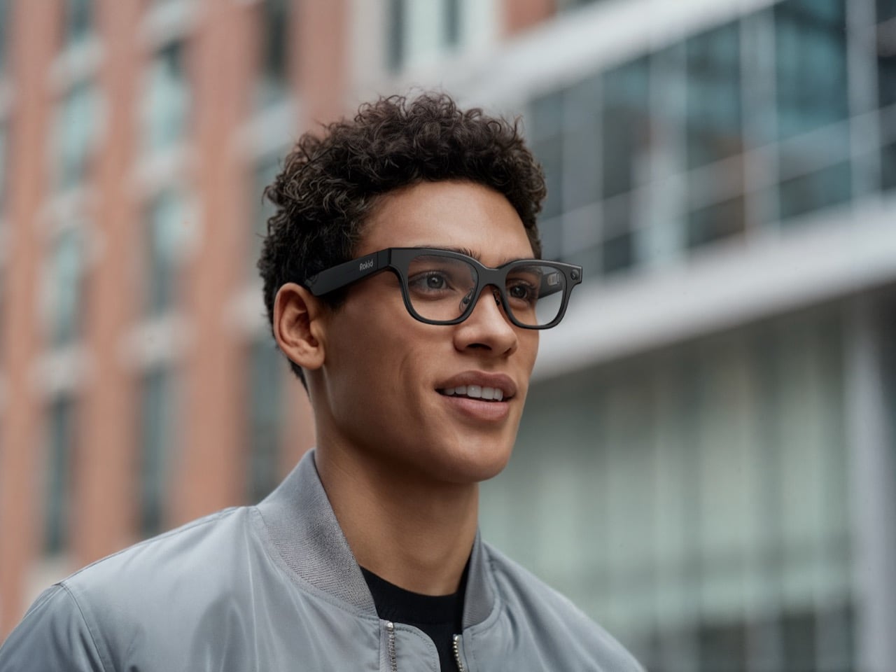
The hardware story still matters because smart glasses live or die by whether people will actually wear them. Rokid’s 2025 display-equipped glasses carried one of the most memorable specs in the category: 49 grams for a full-function AI and AR device with display. That number gave the company a clean answer to the oldest question in wearable tech, which is how much computation can disappear into something that still feels like eyewear. According to Rokid’s own materials, that product also helped it raise more than $6 million and move into global mass production by December, giving the company proof that its ideas could leave the demo stage.
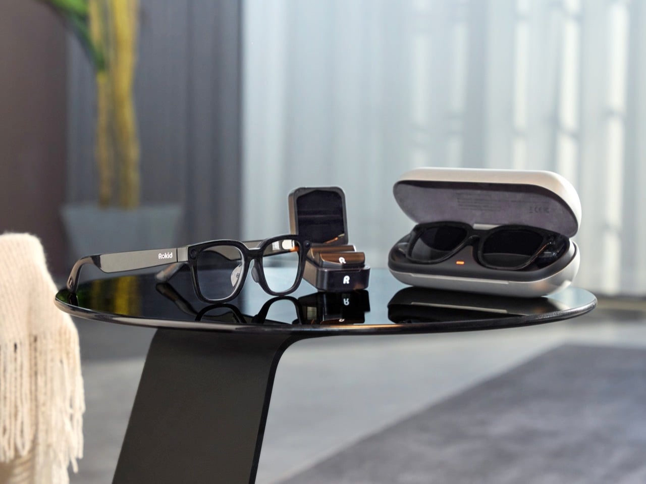
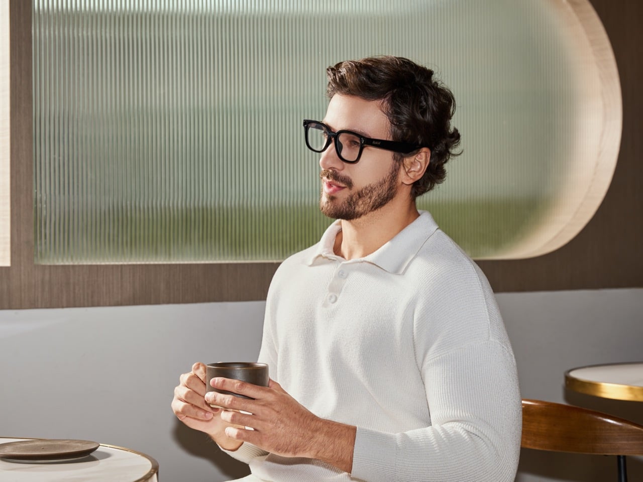
This year’s bigger mainstream play is Rokid AI Glasses Style, a different kind of product aimed at lowering the barriers that have kept smart eyewear niche for so long. Style is display-free, voice-centric, and starts at $299. At 38.5 grams, it is even lighter than the 49-gram model, and Rokid presents that reduction as part of a larger balancing act between comfort, battery life, and functionality. The frame is designed like premium eyewear, with titanium alloy hinges, liquid-silicone nose pads, and a classic D-shaped silhouette. Underneath that familiar form is a dual-chip architecture, with one chip handling low-power always-on tasks and another managing AI and imaging workloads.
Rokid clearly wants to win on openness, but it also wants to win on practicality. One of the strongest parts of the press material is its prescription-first approach, which treats vision correction as core infrastructure rather than a niche add-on. Style supports prescriptions up to ±15.00D, covering myopia, astigmatism, presbyopia, progressives, and functional lens options like photochromic and blue-light filtering. Users can upload prescriptions online and receive custom lenses in about 7 to 10 days. That sounds mundane compared to AI buzzwords, but it may be one of the most important adoption levers in the entire category. Smart glasses cannot become everyday objects if they still behave like specialty gadgets.
The other major throughline is accessibility. Rokid has been consistent here, both in the visit materials and in the press kit. The company is working with Google on accessibility-focused solutions for users with vision and hearing impairments, and its broader messaging keeps returning to a principle it phrases simply: leave nobody behind. For blind and low-vision users, Rokid positions audio-based AI glasses as digital eyes, and it has attached a small subsidy to purchases made for visually impaired users. That choice gives the company a more grounded social purpose than most wearable launches, which often stop at lifestyle language and creator features.
Those creator features are still part of the package. Style includes a 12MP Sony sensor, 4K capture, open-ear audio, and a triple-format imaging system designed for 3:4, 4:3, and 9:16 shooting. Rokid’s pitch is obvious and smart: content should be ready for Instagram, TikTok, or YouTube the moment it is captured, without cropping or post-editing. The glasses also support voice interaction in 12 languages and translation in 89, while adding head gestures and AI shortcuts for hands-free control. Nod to answer a call, shake your head to end it, ask for help in your own language, and keep moving.
All of this adds up to a company trying to define smart glasses less as a futuristic accessory and more as the next natural interface for AI. That is the real continuation of the Google Glass story. Google proved the cultural shock of putting a computer on your face. Rokid is trying to prove the quieter part, that wearability, prescription support, open AI access, and contextual software are what turn a provocative idea into a daily habit. The original dream never disappeared. It just needed lighter frames, better timing, and a company patient enough to spend twelve years building the version people might finally keep on.
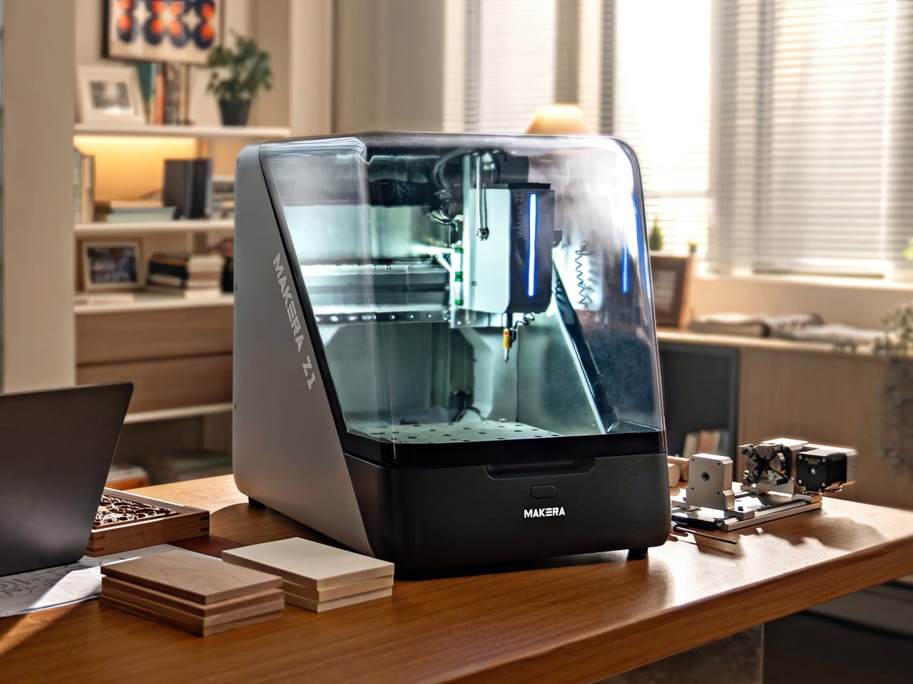
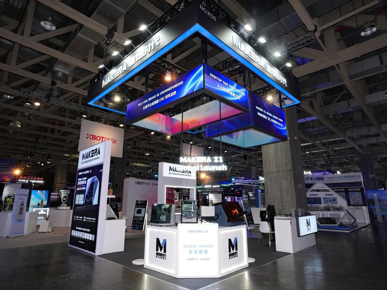
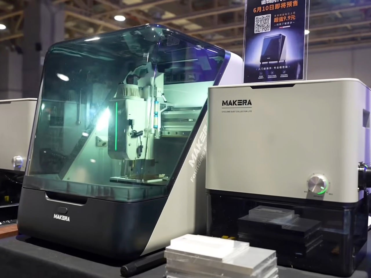
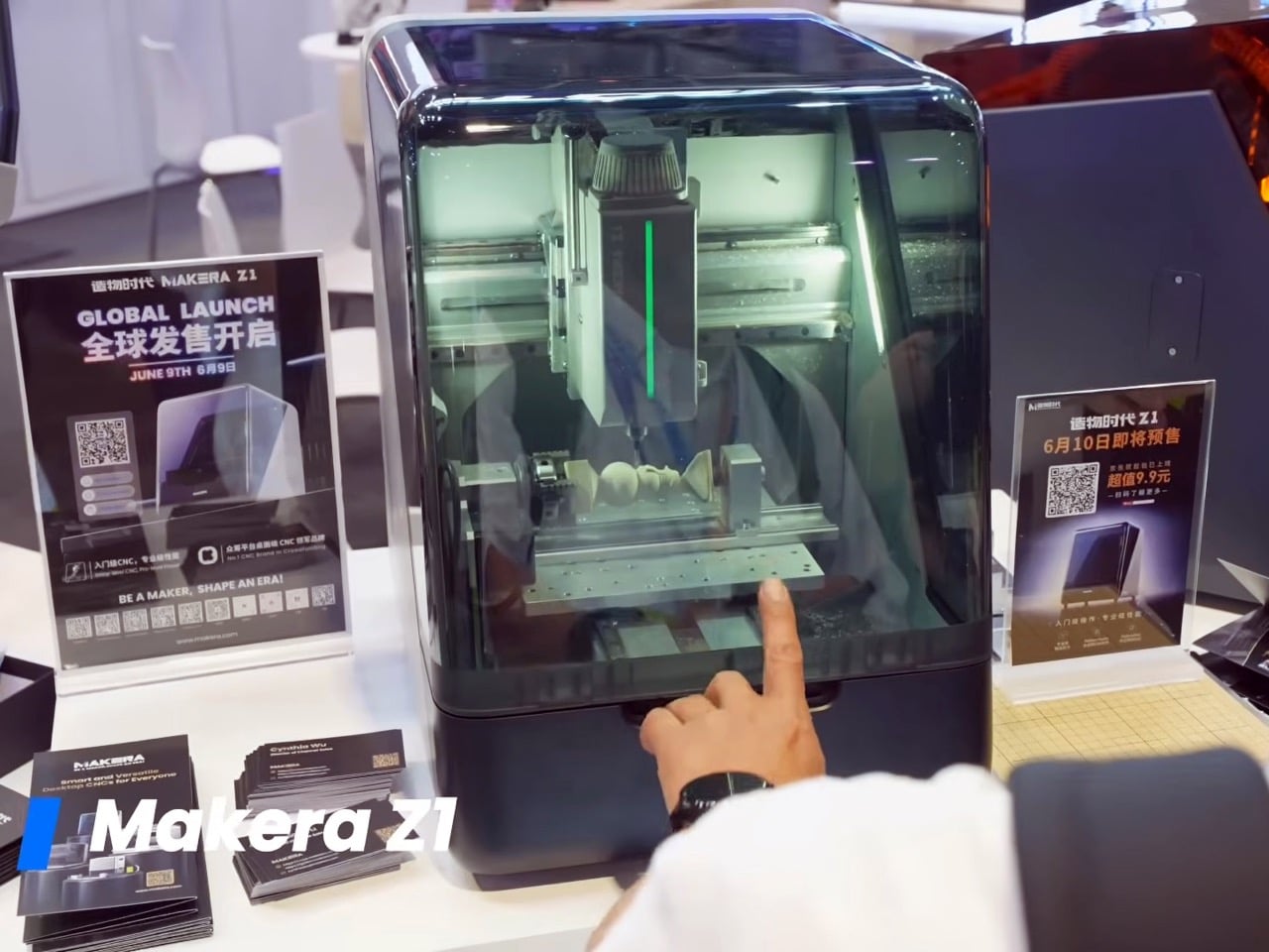
The guiding idea at BEYOND Expo 2026 was that AI software has finished its warm-up, and the main event is technology that acts in the physical world. Humanoid robots, intelligent wearables, and autonomous vehicles all made that case. So when the Makera Z1, a compact desktop CNC machine, won a Best of Innovation award, it felt less like a surprise and more like a statement.
This recognition was a direct nod to the expo’s central theme, “AI: Digital to Physical.” The Z1 is a tool of physicalization, a machine that takes a digital file and gives it mass, texture, and function by milling aluminium or wood. In a showcase built around moving intelligence beyond the screen, Makera’s device provided a clear, powerful example of what that transition looks like at a human scale.
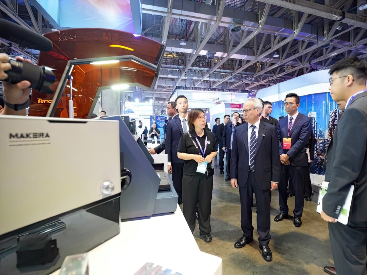
Four days at The Venetian Macao’s Cotai Expo brought together nearly 800 exhibitors, over 400 speakers, and more than 30,000 attendees from 120 countries and regions. Opening keynotes featured senior figures from NVIDIA, XREAL, Pudu Robotics, and the Linux Foundation, setting a tone built around industry direction rather than individual product announcements. Summits ran across seven main stages and covered embodied intelligence, spatial computing, AI agents, global capital flows, and cross-regional developer ecosystems. BEYOND co-founder Dr. Lu Gang described it as a moment where Asia is producing companies with real depth and global relevance, and the expo exists to show that to the world.
Over $10.2 million from nearly 7,000 backers is what the Z1’s Kickstarter campaign produced before closing in December 2025, a number that sits well above the typical ceiling for desktop hardware crowdfunding. IFA 2025 had already given the machine a “Best in Content Creation” Innovation Award before units shipped. The BEYOND recognition completes a three-stop credibility arc across Kickstarter, IFA, and Asia’s largest tech expo, a run few products in the desktop maker category have managed with this kind of consistency. As Makera’s third CNC machine, following the Carvera in 2021 and the Carvera Air in 2024, it carries a company track record behind it.
At $899 during its crowdfunding run, the Z1 targets a gap in desktop CNC that has historically been hard to fill. The machine carries a 200 x 200mm cutting area, a 100mm working depth, and a 150W spindle running at 13,000 RPM, handling materials from aluminium, brass, and copper to wood, PCBs, acrylic, and carbon fiber. With a claimed accuracy of 0.02mm, it sits in territory more commonly associated with machines priced two to three times higher. Automatic probing, levelling, a quick tool change system, and a built-in camera for real-time monitoring come standard, with an optional fourth axis, laser attachments, and dust collection available as add-ons.
Makera Studio handles toolpath generation automatically, and an AI-powered feature converts hand-drawn sketches or reference images into machinable 3D models, significantly lowering the barrier for anyone without a background in CAD software. A companion platform called Makerables extends this further, giving users access to a shared library of designs they can download, modify, and machine immediately. That full workflow, from a rough idea to a digital design to a finished physical object on a workbench, maps directly onto what “AI: Digital to Physical” was built to celebrate. Where many exhibitors at BEYOND demonstrated digital intelligence or physical hardware in isolation, the Z1 brought both into a single, compact package.
The Best of Innovation list at BEYOND 2026 included DEEPRobotics, Engine AI, iFLYTEK, Pudu Robotics, and AEROFUGIA alongside Makera, placing a sub-$1,000 desktop fabrication tool in the same frame as some of Asia’s most heavily funded hardware and AI companies. That company says something about where innovation appetite is moving at Asia’s largest tech gathering: toward tools that extend precision manufacturing beyond factory floors and into the hands of individual creators and small workshops. Whether the Z1 delivers fully on that promise across its growing user base is still being tested, but the BEYOND stage gave Makera a much bigger conversation to build from.
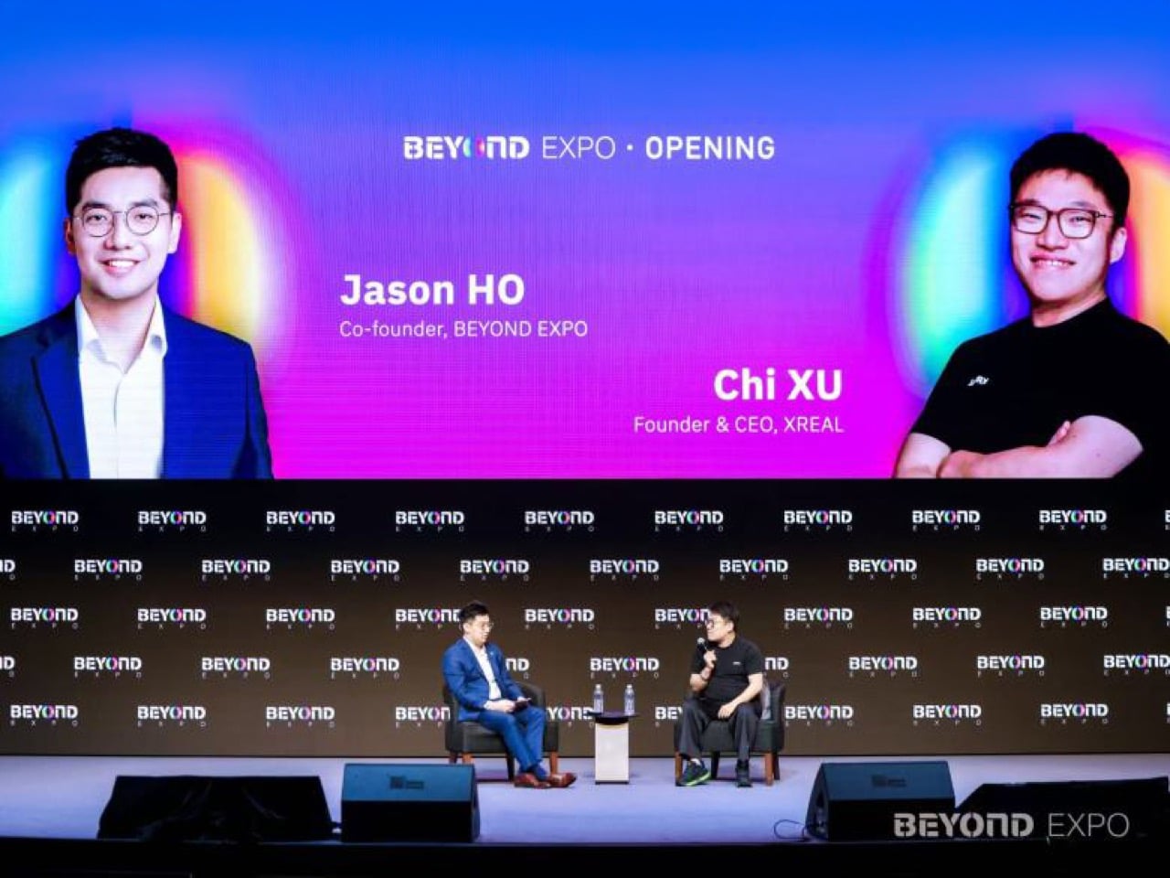
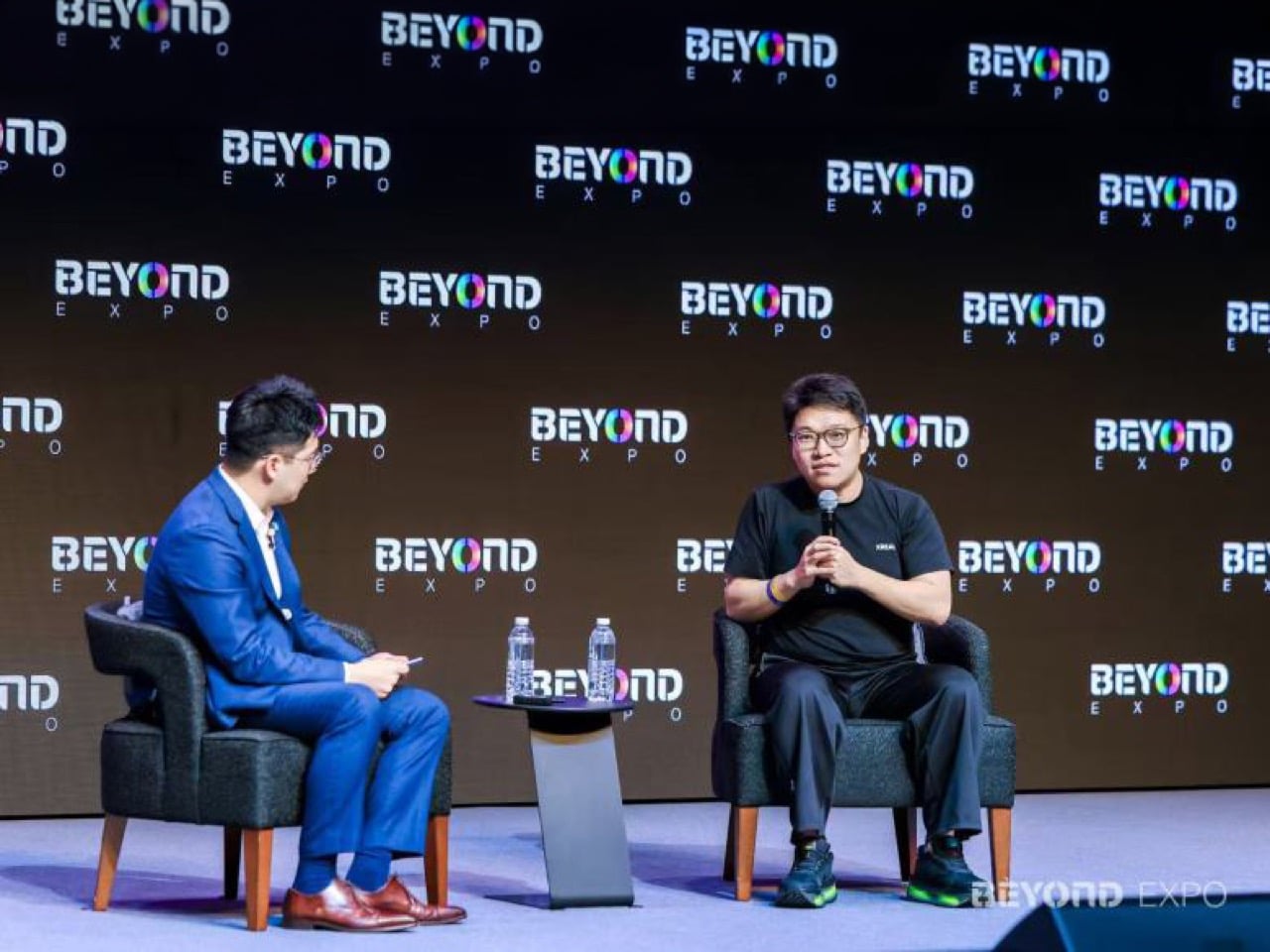
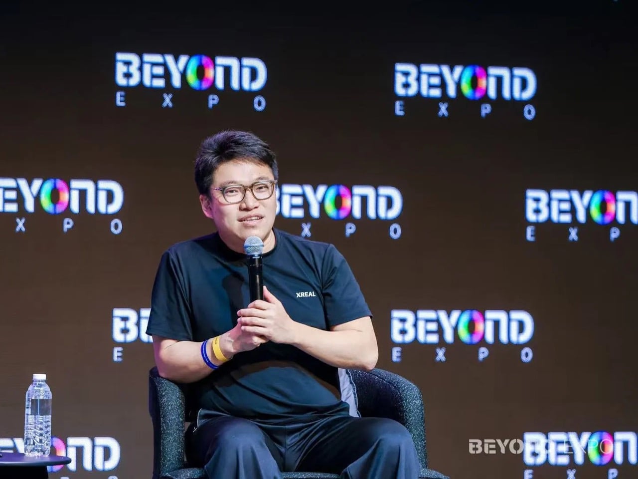
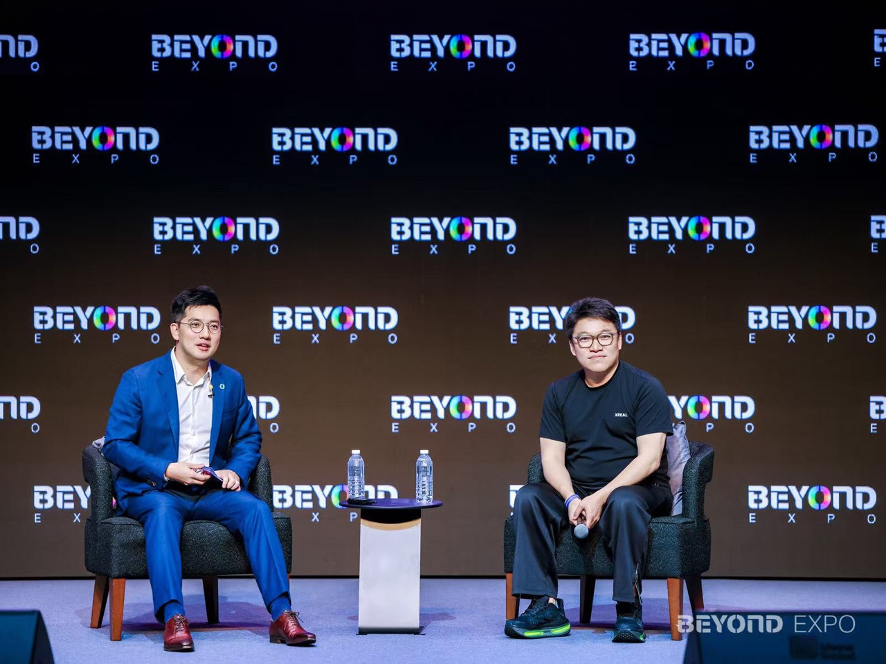
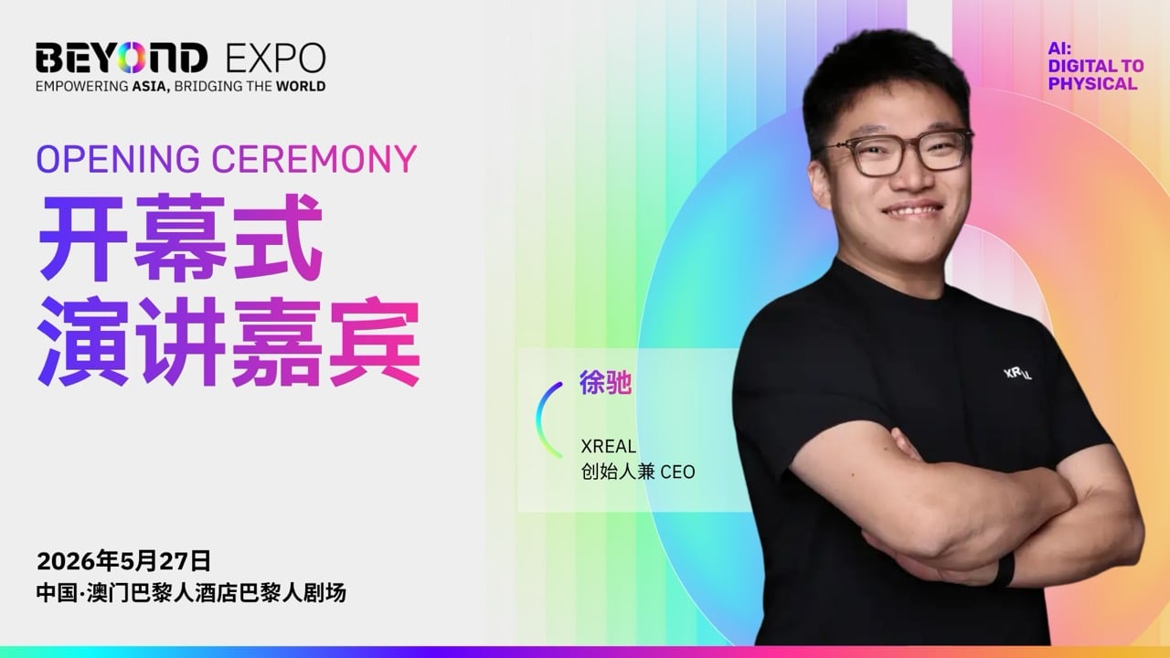
BEYOND Expo 2026 had no shortage of AI talk, but one of its most compelling hardware stories came in the shape of a pair of glasses. On stage in Macau, XREAL CEO Xu Chi laid out a vision for AI glasses as the next major personal computing device and revealed that XREAL is working with Google on a new product built around Android XR and Gemini, with a global launch expected later this year.
That announcement landed at a moment when BEYOND Expo was already showing how crowded and competitive the smart glasses field has become. XREAL shared the wider conversation with companies like iFlyTek, METLEN, and Even Realities, all pointing to a fast-moving shift in wearable tech. The thread running through all of it is industrial design, platform strategy, and the race to make AI hardware people might actually want to wear every day.
Designer: XREAL
Apple Vision Pro generated enormous attention when it launched, but the market’s response to its weight, price, and the physical effort of wearing it for extended periods made clear that the premium immersive headset route has a real ceiling. Xu Chi acknowledged this directly at BEYOND Expo, framing it as a hard lesson the entire industry absorbed. The opportunity XREAL and Google are now chasing is the one Vision Pro left open: a wearable that feels closer to a regular pair of glasses than a piece of lab equipment.
Called Project Aura, the product is being developed on Google’s Android XR platform with Gemini AI integrated at the core. It is a pair of lightweight extended-reality glasses featuring a 70-degree field of view and an optical see-through display. Processing is split between an X1S chip in the glasses frame and a Snapdragon XR2+ Gen 2 processor in a separate external compute puck, keeping weight off the face while retaining the muscle needed for 6DoF tracking, hand tracking, eye tracking, and continuous Gemini AI assistance.
Splitting compute between the frame and a pocketable external puck is the kind of constraint-led industrial design thinking that tends to produce genuinely useful hardware. Every previous attempt to pack full AR processing into a glasses frame has produced something that looks ungainly, runs hot, or drains its battery in under two hours. Project Aura sidesteps that compromise, and the fact that it took a Chinese hardware company partnering with Google to land on this solution says something interesting about where design ambition in this category currently lives.
Smart glasses have struggled for years to answer a simple question: what are they actually for? At BEYOND Expo, Xu Chi’s answer was the clearest the category has produced in some time. The true killer app, in his view, is a continuous all-day AI assistant that sees the world from the wearer’s perspective; navigation and translation are table stakes, not destinations. What he is describing is closer to ambient intelligence that understands context and responds usefully across the full span of a person’s day, and Gemini’s multimodal capabilities give that vision real technical grounding.
Global smart glasses shipments hit nearly 14.8 million units in 2025, a 44.2% year-on-year increase. Chinese hardware vendors held 23.3% of global shipments overall and an 87.4% share of the AR and extended reality segment specifically. These are the companies that have been quietly iterating on form factor and optics while the Western tech press kept its attention on headsets. BEYOND Expo’s smart glasses floor this year was, in a sense, the moment that iteration became difficult to overlook.
Even Realities, which picked up a BEYOND Best of Innovation award at the expo, represents the sharpest design-philosophy contrast to XREAL’s approach. Their glasses carry no camera and no microphone, a deliberate choice built around privacy concerns that have slowed wearable AI adoption in several markets. METLEN and iFlyTek each showed their own AI smart glasses interpretations on the same floor. Four distinct companies arriving at one event with serious smart glasses products, each solving the form factor problem from a different angle, signals something well beyond a routine product cycle.
Xu Chi used the phrase “iPhone moment” during his BEYOND Expo address, and it is a comparison that usually ages badly. But the conditions that made the iPhone’s arrival feel defining were a convergence of hardware maturity, software readiness, and a platform worth building for. Android XR with Gemini is a credible attempt at the third element. Project Aura handles the first two more convincingly than anything the category has previously produced. Whether 2026 turns out to be the year that proved Xu Chi right is a question the market will answer, but BEYOND Expo made clear that the companies trying to get there are no longer on the fringes of the industry.
Father’s Day is the holiday most people intend to prepare for and don’t. June arrives, the week narrows, and suddenly you’re looking at a browser tab full of gift sets that say nothing specific about the person you’re buying for. The window hasn’t closed. Every product on this list ships fast, buys in minutes, and arrives looking like the result of careful thought rather than a Sunday evening scramble.
The eight picks below share one quality: they belong to the category of things men genuinely want but rarely buy for themselves. That gap between wanting and buying is exactly where a great gift lives. From a speaker shaped like a mixtape to a pen that writes without ink, each one communicates something specific about the person giving it: you noticed what he actually likes, and you found it.
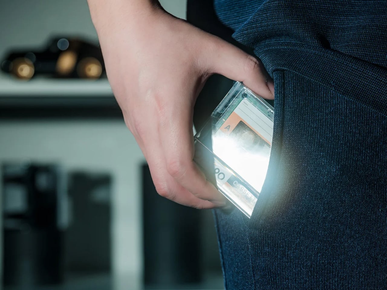
1. Side A Cassette Speaker
The Side A Cassette Speaker is built to look like a real mixtape. The transparent shell, the Side A label, the overall profile — it’s faithful enough to prompt a genuine double-take from anyone who spent their formative years recording songs off the radio. At 80 grams and arriving with a clear case that doubles as a display stand, it takes up almost no space on a shelf but immediately defines wherever it sits. For a dad who remembers making mixtapes, this does the emotional work before it plays a single note.
Bluetooth 5.3 handles wireless connection from any phone, tablet, or laptop. A microSD card slot adds offline MP3 playback for anyone who still curates music rather than surrendering it to an algorithm, and battery life runs to six hours with a two-hour USB-C recharge. The sound is tuned for warmth rather than clinical accuracy, which is exactly the right call for an object built around analog feeling.
Cassette form is executed faithfully enough to spark a real conversation, not just a polite smile before the object gets set aside
MicroSD offline playback is a thoughtful addition for any dad who believes a carefully chosen playlist says more than a shuffle queue ever could
What We Dislike
Six hours of battery life is modest — the trade-off makes sense at this size, but worth knowing before the gift gets unwrapped
Sound leans toward warmth and character rather than reference performance, so temper expectations accordingly
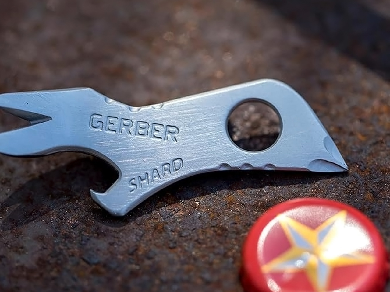
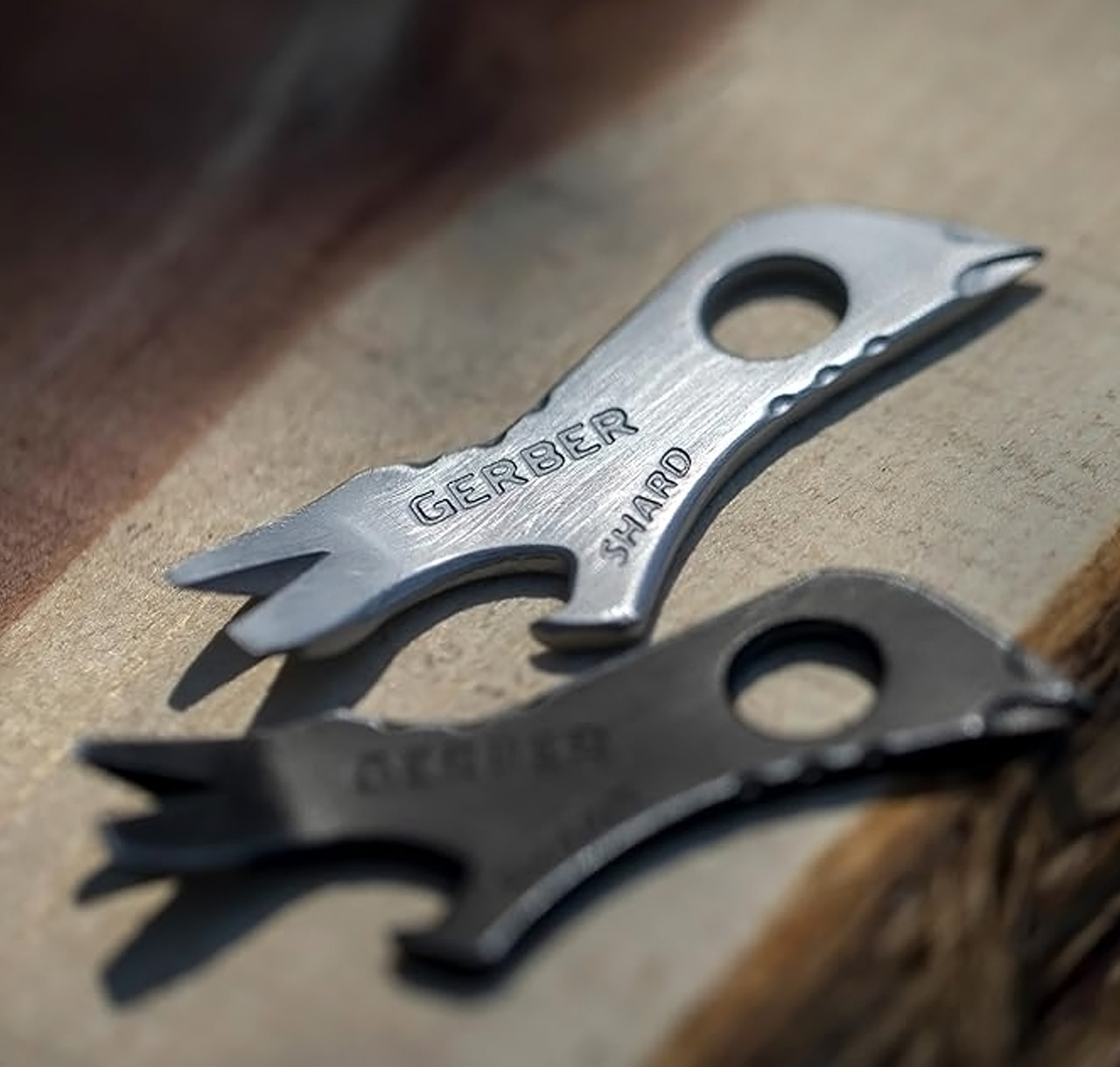
2. Gerber Shard Keychain Tool
The Gerber Shard takes about four seconds to explain and about four days to fully appreciate. A single piece of titanium, pressed flat, with a pry bar, bottle opener, flathead driver, wire stripper, and lanyard hole all living in the same compact profile. It slips onto any keyring without adding meaningful weight or bulk.
What makes the Shard worth gifting rather than simply keeping is its TSA compliance. The blade-free construction means it clears airport security without a conversation, which makes it genuinely useful for any dad who travels regularly. It solves the small daily frictions — a stuck lid, a screw that needs turning, a bottle that needs opening — without asking him to adjust what he already carries. Something this useful and this affordable rarely looks this considered, and that gap is exactly where the gift lands.
What We Like
TSA-compliant titanium construction means it travels everywhere — no conversations at security, no confiscations
At $10, the value is genuinely hard to argue with — most multitools at five times the price solve fewer daily problems
What We Dislike
Function set is intentionally narrow — anyone expecting Leatherman-level capability will need to look elsewhere
The flathead driver won’t accommodate Phillips heads, which limits its usefulness for anything beyond basic fastener work
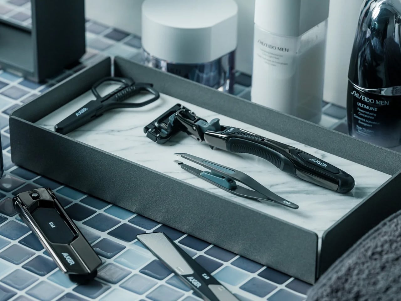
3. Auger PrecisionMaster Grooming Set
Grooming sets tend to fall into one of two categories: the kind bought without much thought, and the kind that reflect a genuine understanding of what precision looks like in a daily routine. The Auger Precision Mastergrooming Set belongs firmly in the second group. Designed with the same intention that good EDC tools bring to carry gear, it applies that same thinking to the objects a man reaches for every morning.
What separates a well-made grooming kit from a forgettable one is how it feels in hand and what it asks of the person using it. The Auger set is built for the dad who treats his routine like craft rather than obligation, who notices the difference between a tool designed with care and one that simply fulfills its function. For Father’s Day, that specificity matters. This is the upgrade he hasn’t bought himself yet, and it arrives looking nothing like the last-minute decision it technically was.
Brings the precision-first philosophy of good EDC design to a category that rarely receives that level of editorial attention
Works as both a daily-use kit and a display-worthy object — the standard any well-made grooming set should be held to
What We Dislike
A dad who keeps his routine deliberately minimal may find the full kit more than his mornings require
The value concentrates for someone who’ll actually use it daily — as a display piece alone, the case becomes harder to make
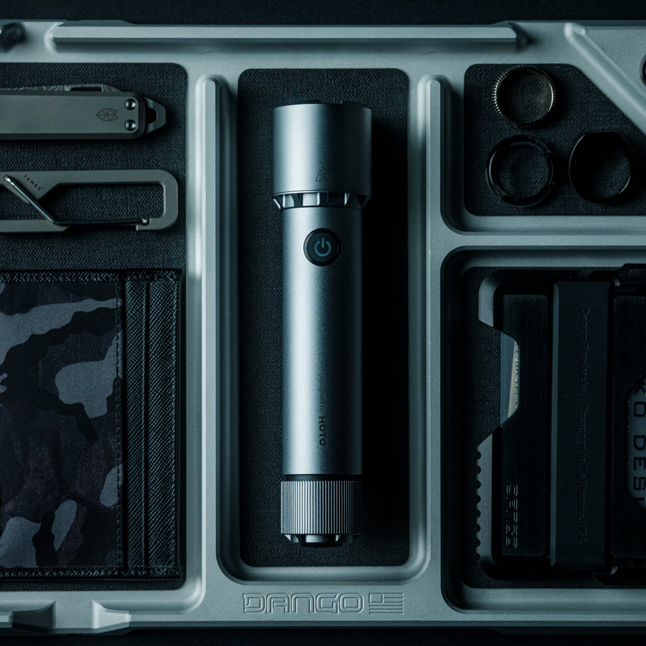
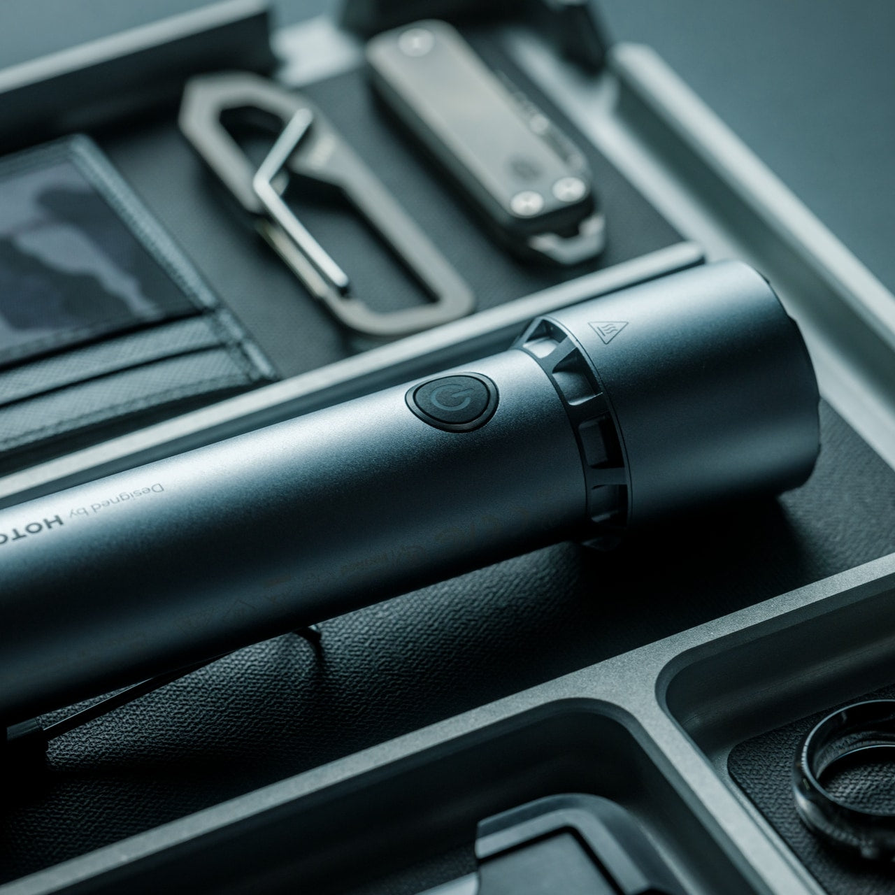
4. Blackout Beam Tactical Flashlight
There’s a version of a tactical flashlight that lives in a gear bag for years without ever earning its place there. The Blackout Beam is a different argument. For a dad who keeps a light in the car, the workshop, or the camping kit, this replaces whatever he currently has with something worth holding onto.
The tactical category tends to suffer from overclaiming: knurling that exists for the photograph, modes that exist for the spec sheet, and output numbers that bear little resemblance to everyday use. What the Blackout Beam does is deliver build quality and output that make sense of the description.
Build quality and output hold up to the description — a rarity in a category prone to overclaiming
What We Dislike
A dad who primarily needs a simple everyday light may find the tactical category more than his routine calls for
The tactical aesthetic won’t suit every sensibility — know your dad’s taste before committing
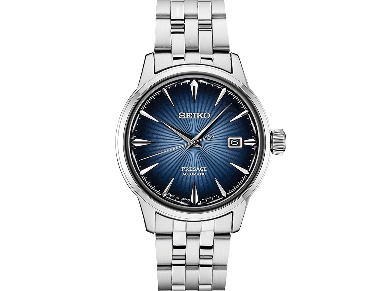
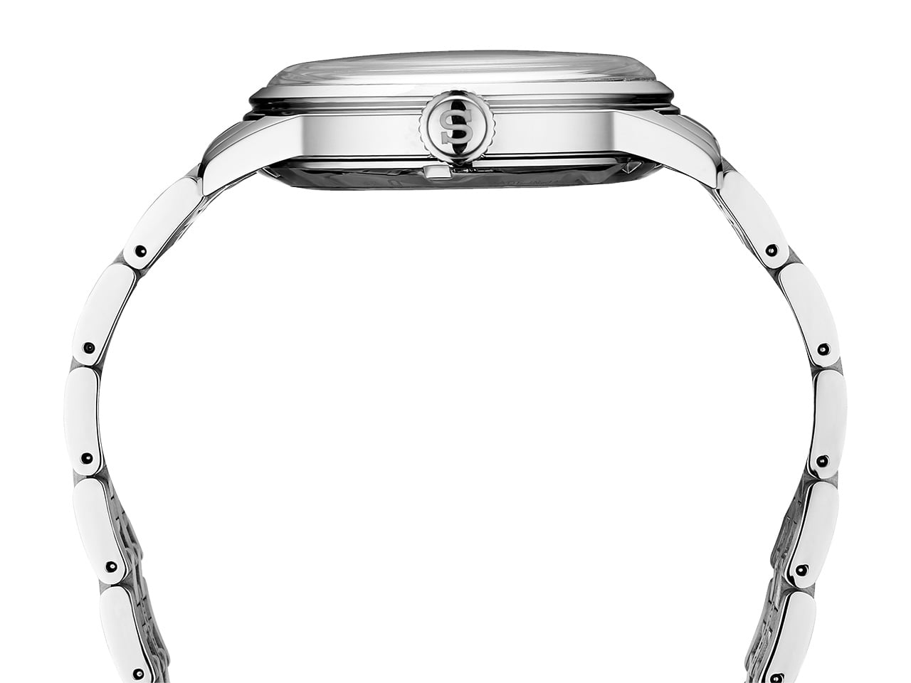
5. Seiko Presage Cocktail Time SRPB41
The SRPB41 is inspired by the Old Fashioned. Its sunburst enamel dial catches light the way a well-made drink does at the right angle, and the blue hands sweep across it with a precision no quartz movement can replicate. Seiko’s in-house automatic caliber winds itself from wrist movement, with the mechanism visible through the exhibition caseback. At 40.5mm and water-resistant to 100 metres, it wears formally without demanding it. No batteries. No quarterly trips to a jeweller. Nothing to maintain but the wearing of it.
What makes the SRPB41 the right last-minute gift isn’t just that it ships in days from Amazon, JomaShop, or SeikoUSA — it’s that it arrives looking like a decision made months ago. There’s a long tradition of Seiko producing watches that outperform their price point, and the Presage Cocktail Time series is where that tradition is most legible. It earns a second look across the dinner table and holds up under closer inspection every time. For a dad who appreciates when an object is exactly what it claims to be, this is the one.
What We Like
An in-house automatic movement at this price point remains one of the great bargains in contemporary watchmaking — the quality is audibly and visibly present
The cocktail-dial concept gives it a specific identity that generic dress watches at twice the price rarely manage to establish
What We Dislike
The formal aesthetic suits some lifestyles better than others — a dad who lives outdoors may find it less natural as a daily wear
It’s a dress watch first; anyone hoping it doubles as a field or sport watch will need to look at a different Seiko family entirely
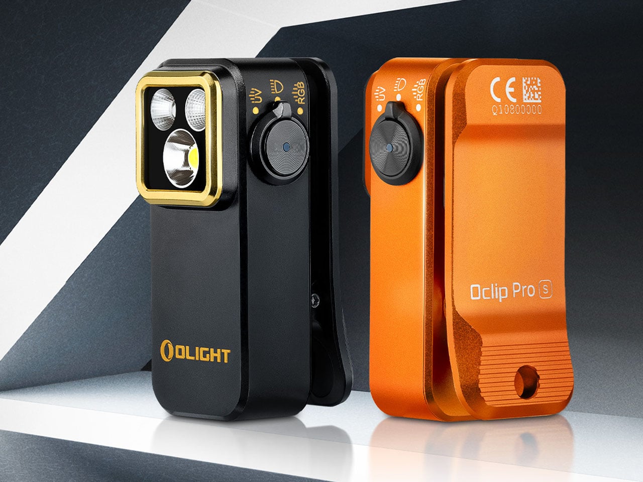
6. Olight Oclip Pro S
Most EDC flashlights ask you to hold them. The Olight Oclip Pro S clips to a pocket, bag strap, jacket, or gear loop and stays there until it’s needed, which is an entirely different carry proposition. At 53 grams and measuring 57 by 28 by 27mm, it disappears into whatever it’s attached to until it becomes the most useful object in the room. For a dad who prefers hands-free solutions over dedicated carry, this is the light that answers that preference with minimum fuss and maximum practical intelligence.
The 5-in-1 lighting system covers white spotlight at up to 600 lumens with an 80-metre beam, white flood mode, red, green, and blue signal options, and a 365nm UV light — all controlled by a side dial that works intuitively on first contact. Battery life reaches 144 hours on low mode with USB-C charging throughout. At around $59.95, the Oclip Pro S replaces multiple single-purpose tools in a single clip-on body. For a dad who carries thoughtfully, it adds genuine capability without adding meaningful weight.
What We Like
Five distinct lighting modes — including UV — at 53 grams is a genuine engineering achievement in a form factor this compact
USB-C charging and clip-on carry integrate seamlessly into any existing kit without introducing new habits or new accessories
What We Dislike
Maximum brightness triggers thermal management on extended runtime — a fair trade-off, but worth understanding before relying on it in demanding conditions
A dad who primarily needs a reliable everyday light may never explore the full five-mode system; the value concentrates for those who will
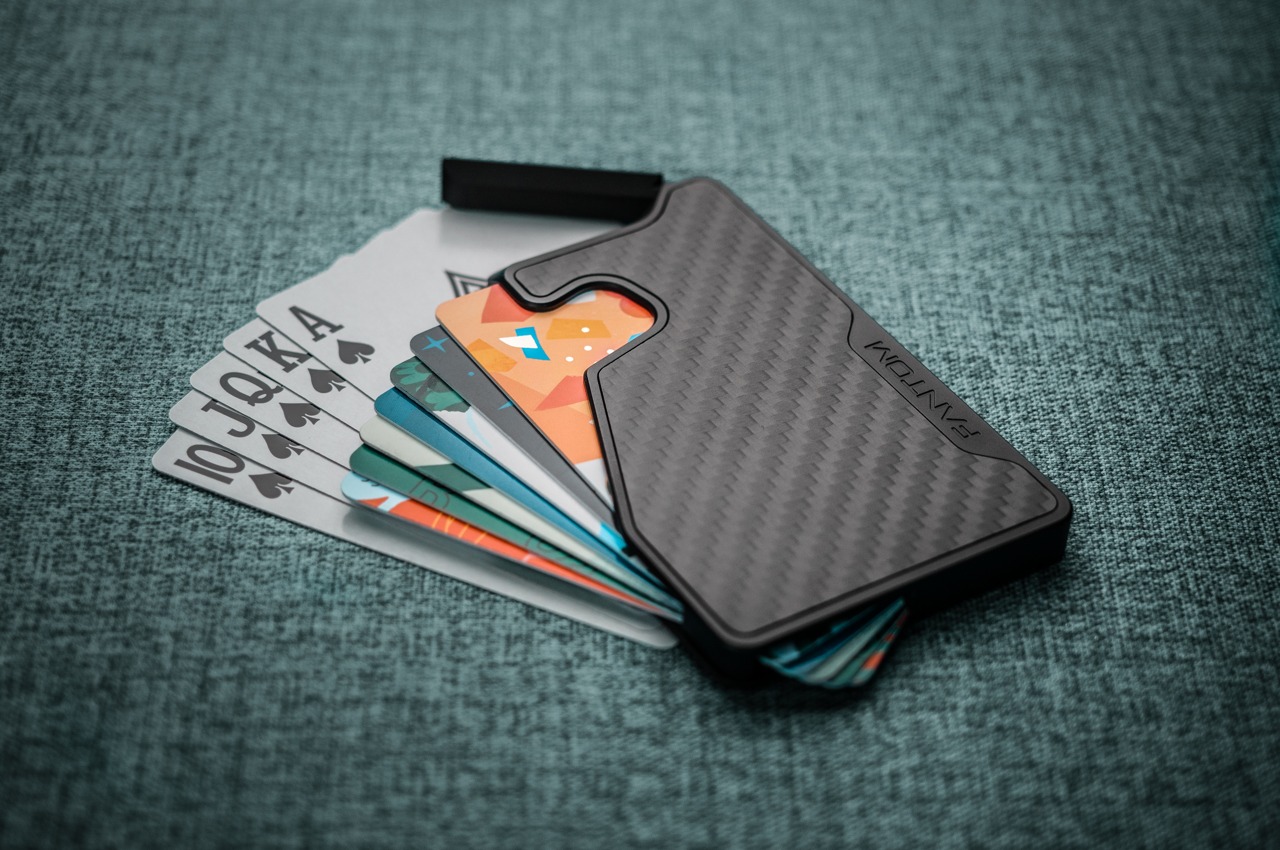
7. Fantom X Wallet
The Fantom X is the wallet you give the person still carrying a stuffed bifold like it’s a different decade. Machined from a single sheet of aluminum and finished in Cerakote for scratch and corrosion resistance, it holds between seven and thirteen cards depending on the size — all deployed with one thumb press on the side lever. Cards fan out individually, making each one visible at once. The wallet itself is three millimetres thicker than the cards it carries. That’s the entire margin between this and everything else in the category.
Made in Canada by Ansix Designs, the Fantom X comes RFID-blocked and backed by a lifetime warranty. Three size options mean the gift calibrates to how your dad actually carries rather than asking him to rebuild his wallet life around the product’s capacity. The lever mechanism has been tested to over half a million fanning cycles.
What We Like
The fan-out card mechanism makes accessing a specific card faster than any bifold — once you’ve used it this way, the standard wallet starts to feel like a design problem nobody bothered to solve
Three size options mean the wallet fits your dad’s carry habits rather than demanding he change them
What We Dislike
Card-first by design — regular cash carriers will find the experience less seamless without a dedicated money clip alongside it
The minimalist philosophy requires editing down from a stuffed wallet, which can feel like a bigger ask than the product deserves
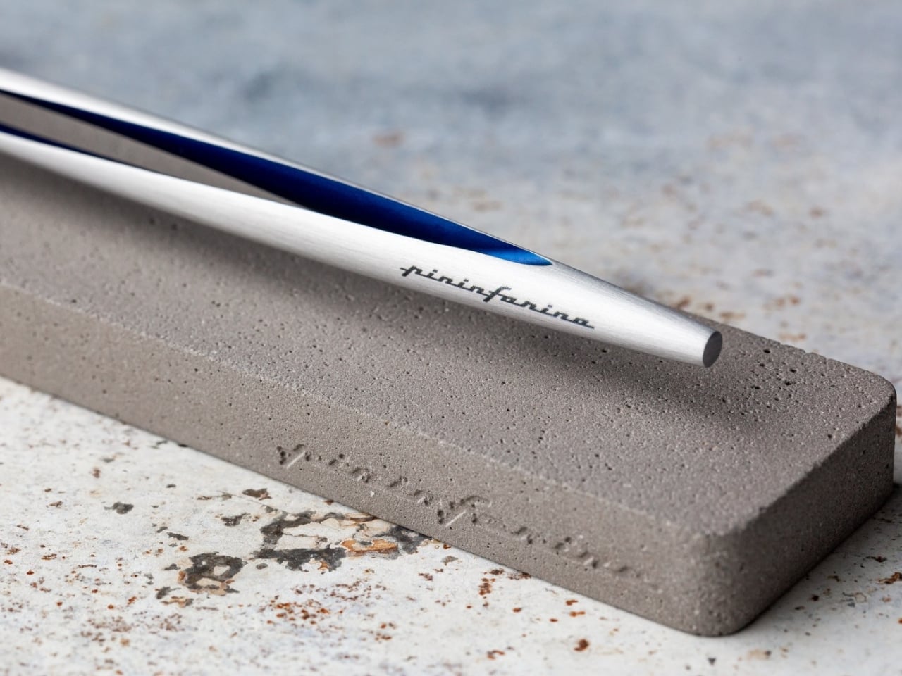
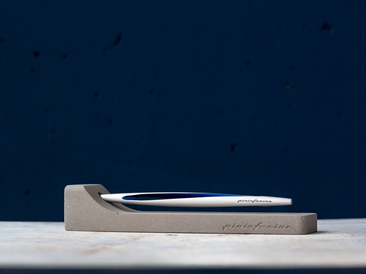
8. Pininfarina Aero Ethergraf — The Forever Pen
Pininfarina built its reputation on automotive silhouettes — Ferrari bodies, Maserati shapes, forms that held their beauty across decades. The Aero Ethergraf brings that same design philosophy down to the scale of a writing instrument. Machined from aerospace-grade aluminum, weighing 17 grams and measuring 160mm, it arrives paired with a raw concrete desk stand that reads less like packaging and more like a considered still-life. Made in Italy. No ink. No cartridges. No cap to misplace. Built to last without ever needing to be maintained.
The Ethergraf metal alloy tip writes through oxidation, leaving a graphite-like mark on paper that is precise, smudge-resistant, and permanent without relying on ink. The pen never dries out. It never runs out. For someone who has spent years managing fountain pen cartridges or replacing rollerball inserts, this inverts the entire expectation of what a writing tool asks of you. For a dad who notices objects and holds onto them, the Aero Ethergraf becomes the pen on his desk that earns a question from every person who picks it up.
What We Like
No ink, no refills, no maintenance — ever; the Ethergraf tip writes through oxidation, making the pen’s relationship with its owner permanent rather than consumable
Pininfarina’s automotive design lineage reads clearly in the body: aerodynamic, precise, and confident without announcing any of that on the surface
What We Dislike
The oxidation-based line runs lighter than a standard ballpoint — won’t suit every writing style or paper weight
The concrete stand is genuinely beautiful but adds volume to the package, a consideration for any desk already working at full capacity
The Best Last-Minute Gift Is One That Doesn’t Look Like It
The best Father’s Day gift is the one that looks like it came from somewhere thoughtful rather than somewhere fast. Every product on this list is available now and ships before June 21. The range runs from $10 to $350, which means there’s an entry point for every budget and a version of this list that works regardless of how late the decision hit. Good design doesn’t keep a delivery schedule. It just has to land well.
What these eight objects share is a quality the gift category rarely gets credit for: each one communicates something specific about the person giving it. A speaker shaped like a mixtape says you remember what he loved. A pen that lasts forever says you chose something built to last. Father’s Day doesn’t need to be a grand gesture. It just needs to be honest, considered, and there before Sunday.
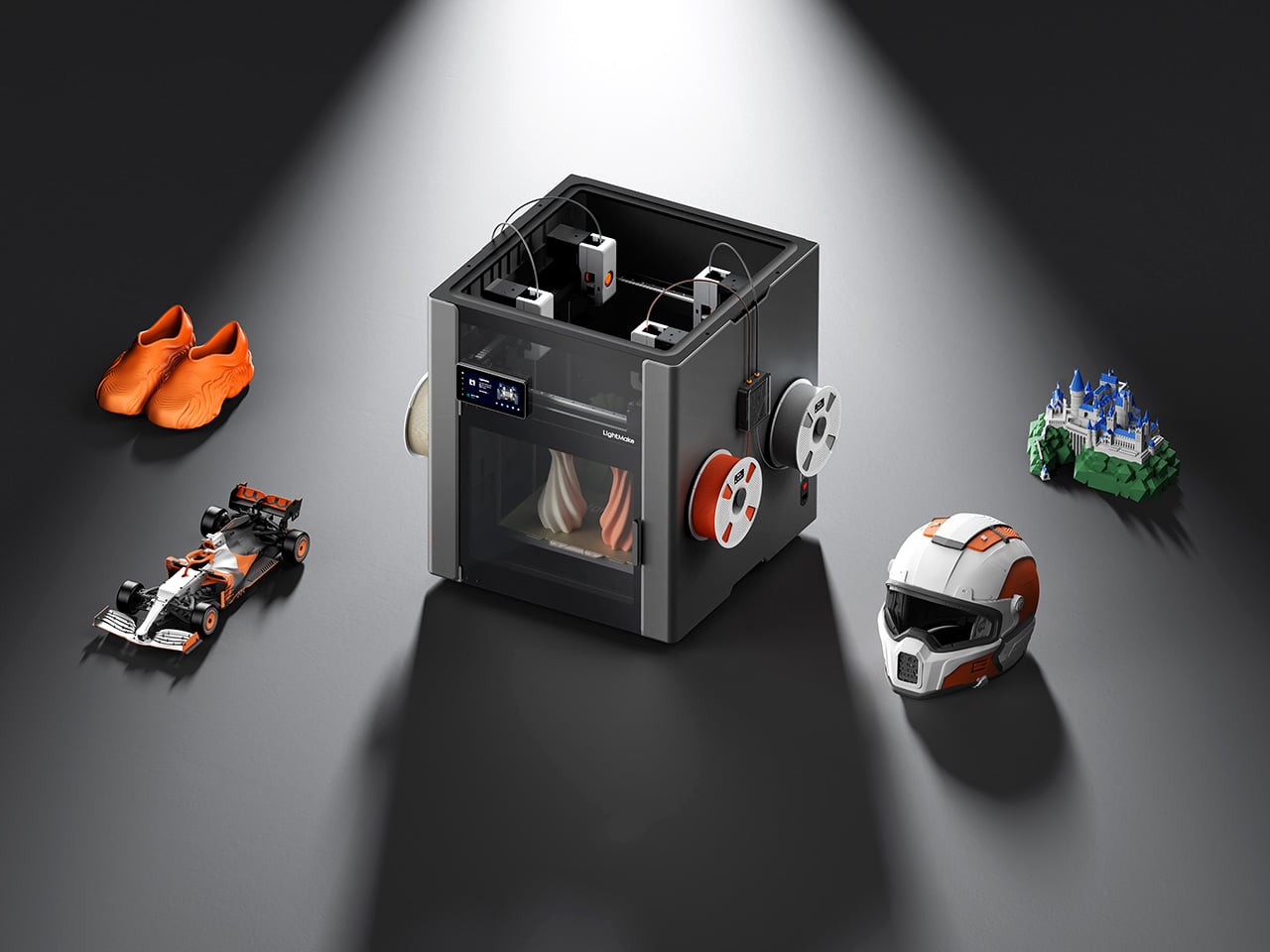
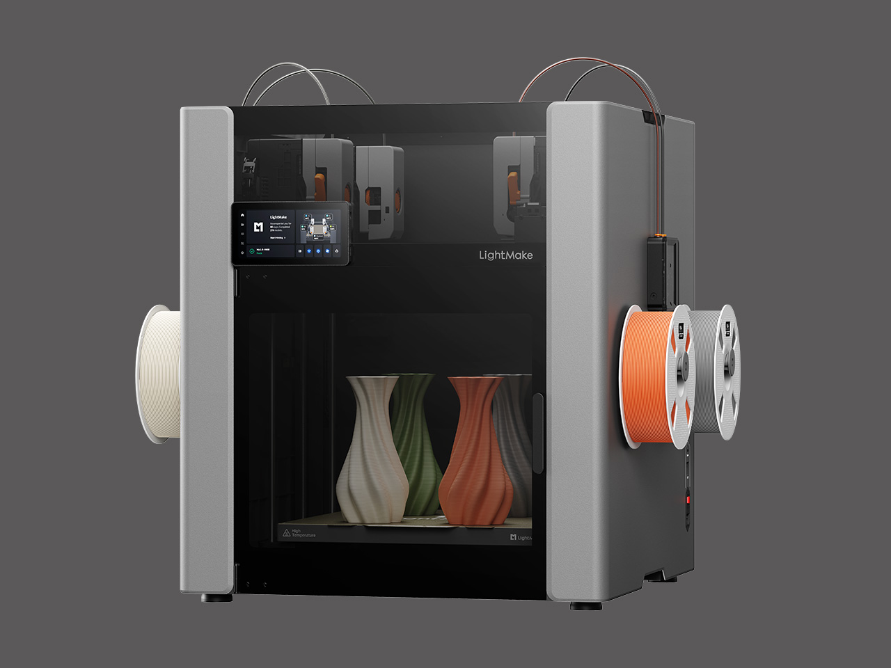
For years, one of the biggest tradeoffs in desktop 3D printing has been clear. You could chase larger builds, faster motion, or multi-color capability, but combining all three in a way that also supports smoother workflow has remained a tougher challenge. As more creators use 3D printers for batch production, prototyping, and short-run manufacturing, the machines drawing attention are the ones rethinking the print head itself.
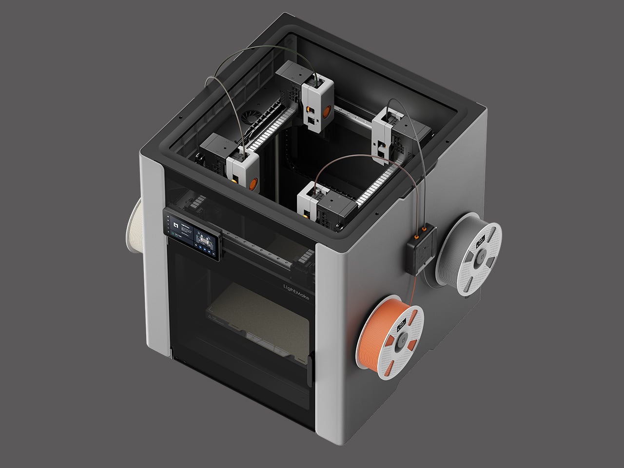
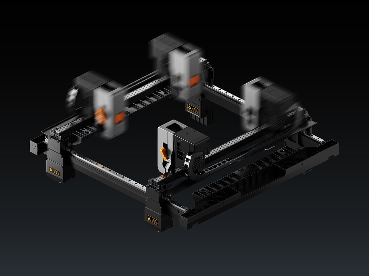
LightMake is preparing to enter that conversation with the LightMake L4. Set for a Kickstarter debut, the machine centers on an independent 4-head architecture designed to deliver 4X productivity by printing four identical models simultaneously, while enabling seamless multi-color/material printing on a single object. All while its beltless linear motor system targets ±1μm closed-loop motion precision and 50,000-plus hours of stable operation (for the linear motors). Taken together, those details position the L4 as a highly ambitious new entry in the premium desktop 3D printing space.
The L4’s most defining characteristic is its independent 4-head system, which allows four separate print heads to operate simultaneously within a single build volume. The four heads can print identical or mirrored models simultaneously, or all four can contribute materials or colors to a single complex print without the purge waste typical of single-nozzle multi-material systems. LightMake claims this architecture delivers a 4x efficiency increase when printing four identical single-color models at once, turning one machine into the functional equivalent of four printing machines. The system also supports mixing up to four materials in a single print, enabling multi-material assemblies that would otherwise require post-print bonding or fastening. For studios running repeat batches or prototyping multiple variants at once, that kind of parallel throughput changes the math around machine utilization and turnaround time.
The machine’s motion system abandons belts entirely in favor of linear motors, a shift that brings both precision and longevity benefits. Linear motors use electromagnetic force to drive motion directly, eliminating the wear, stretch, and maintenance associated with tensioned belts. LightMake reports that the L4 achieves ±1μm closed-loop precision, a figure that places it well into the territory of machines designed for repeatable, high-tolerance work. The contactless driving mechanism also contributes to the company’s claim of 50,000-plus hours of stable printing, a lifespan target that suggests the L4 is being designed with print farm durability in mind. Travel speed is rated at up to 1,000 mm per second, and the system’s rigidity comes from a one-piece die-cast metal frame paired with a vibration cancellation algorithm that mirrors toolhead movement to reduce print artifacts during high-speed operation.
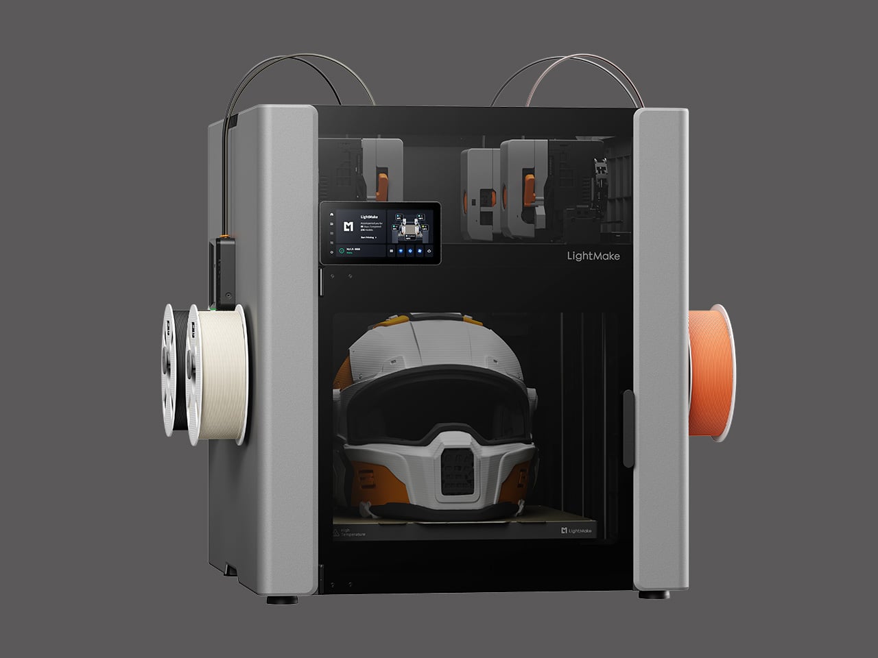
Toolhead changing happens in one second, a spec that directly addresses one of the most time-consuming aspects of multi-material or multi-color printing. Conventional systems that feed multiple filaments through a single nozzle spend significant time purging old material, which slows down the job and generates waste. By swapping between independent heads almost instantly, the L4 cuts that delay to nearly nothing. LightMake is designed to significantly reduce operational costs and maximize efficiency for professional studios, achieved through its independent 4-head system and minimized material waste. The four toolheads are also described as independently liftable, with 5mm of height adjustment to improve first-layer adhesion success rates and reduce early-stage print failures.
The L4’s build volume measures 354 x 370 x 386mm for single-color prints and 354 x 350 x 386mm for multi-color work, placing it in the large-format desktop category. The machine includes dual HD cameras, a 6.5-inch touchscreen, and RFID material recognition. It supports PLA, ABS, PETG, TPU, ASA, PVA, PET, and carbon-fiber composites, with a maximum nozzle temperature of 320°C. Software features include fleet management tools that LightMake says can dispatch tasks to over 1,000 machines simultaneously, as well as an AutoQueue system that analyzes real-time printer status to allocate the right number of machines for each order deadline.
LightMake will debut the L4 on Kickstarter. With its combination of independent multi-head architecture, linear motor precision, and print farm automation features, the L4 represents a clear bet that the next wave of desktop 3D printing will be defined by batch manufacturing efficiency as much as by speed or build size alone.
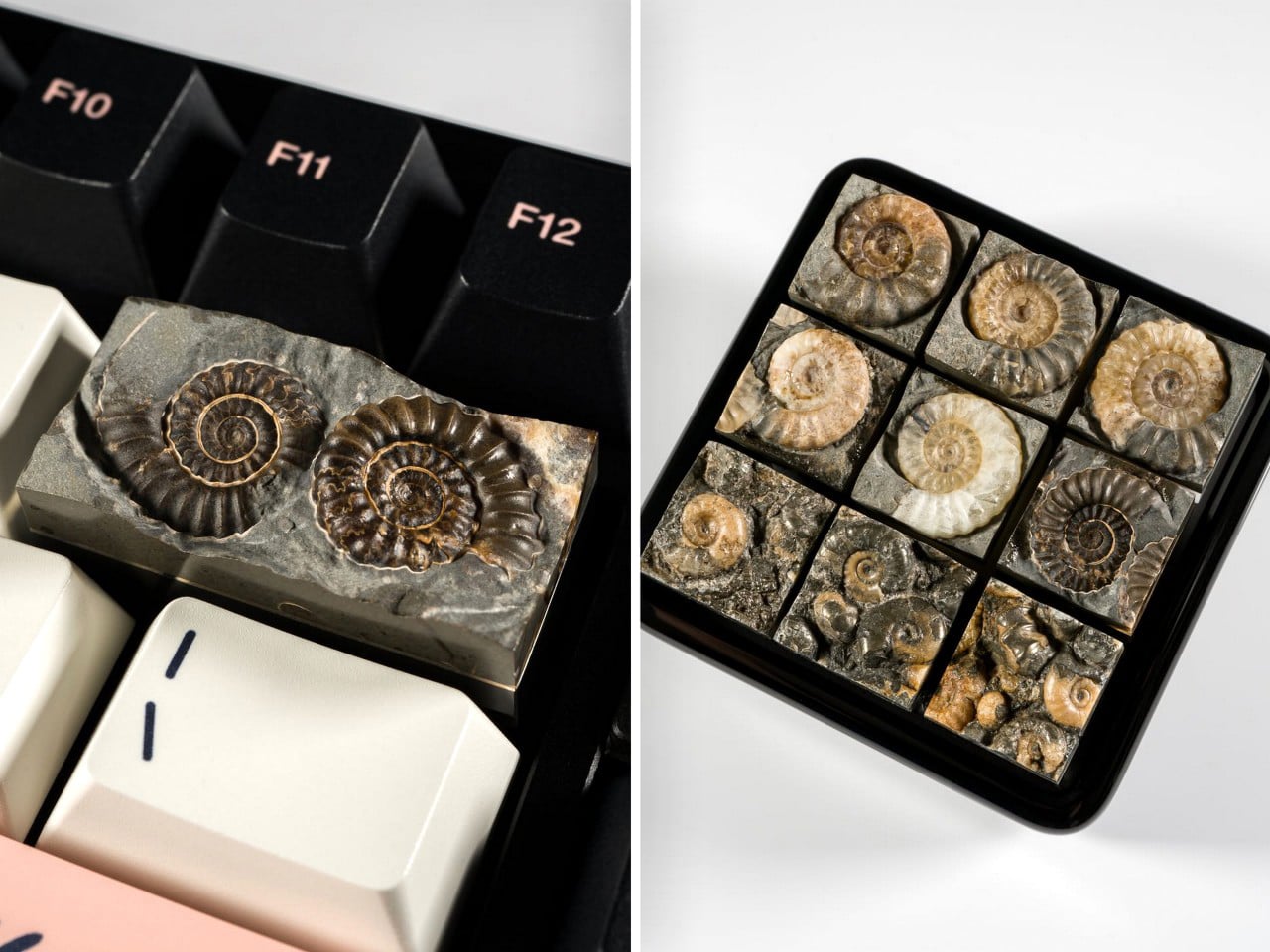
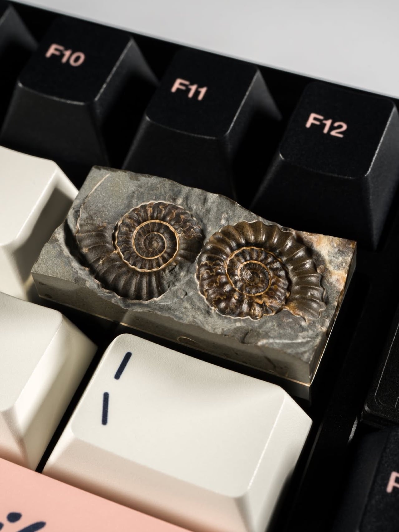
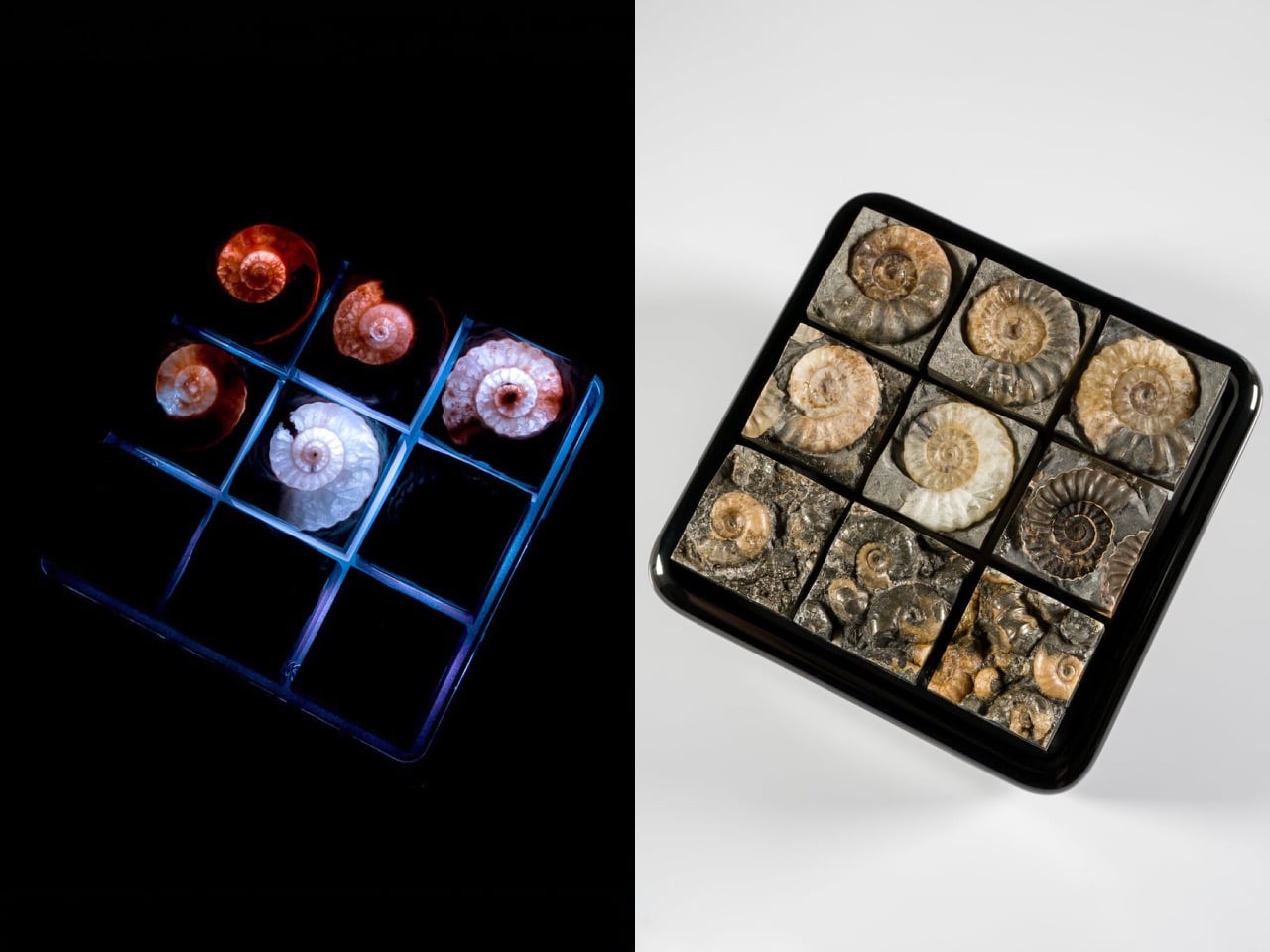
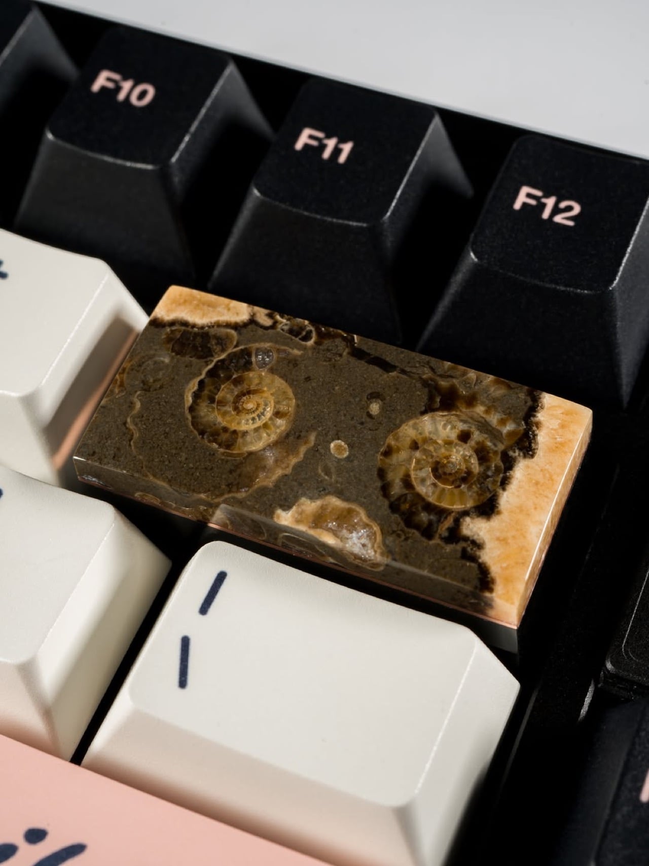
Your keyboard connects to your computer via a 2.4GHz wireless dongle. This keycap designed to slot onto your keyboard was formed at the bottom of a Jurassic sea roughly 200 million years ago. Both of these facts are simultaneously true, and together they produce one of the more pleasingly absurd objects in recent design memory. These might be the only keycaps on Earth that existed before the dinosaurs did…
Keycap Quarry’s ammonite fossil keycaps are Carter Stay’s answer to the question nobody thought to ask: what happens when lapidary craft meets keyboard modding? Stay sources actual prehistoric ammonite specimens from England’s Jurassic Coast and the fossil-dense limestone beds of Somerset, then cuts, grinds, and polishes each one down to a functional keycap with a Cherry MX stem. The Marston Marble pieces carry clusters of tiny spiral fossils embedded in dark stone. The Charmouth calcite pieces are translucent enough that Stay hollows them from behind, letting the keyboard’s backlight pour straight through 200 million years of geological history.
Designer: Carter Stay (Keycap Quarry)
Quarried from Marston Magna in Somerset, Marston Marble is a fossiliferous limestone dense with Promicroceras marstonense ammonites from the Lower Jurassic, roughly 195 to 200 million years old. When polished, the dark grey matrix throws the cream and amber fossil spirals into sharp relief, producing a surface that looks simultaneously geological and deliberate, like a texture a product designer might spend weeks trying to simulate in resin and never quite nail. Each slab is unique because the distribution of fossils across the stone is entirely nature’s doing, meaning two Marston Marble keycaps will never look the same. The material is also becoming increasingly rare at the source, which gives these pieces a provenance weight that purely manufactured artisan caps simply cannot claim.
The Charmouth calcite ammonites come from the Black Ven Marls along the Jurassic Coast in Dorset, where mineral-rich water has replaced the original shell material with translucent calcite over geological time. Stay carves out the rear of each fossil to exploit that translucency, turning the keyboard’s own RGB into a light source that illuminates the internal chamber structure of a 200-million-year-old cephalopod. Under UV, the calcite glows with a cold blue-white that makes each keycap look less like a desk accessory and more like a biopsy slide from a natural history museum. It is the same optical trick that makes backlit calcite specimens prized in the collector market, now deployed on a 1U footprint between your F-row keys.
Dwarf Factory and the wider resin artisan world build narrative through sculpting and hand-painting, layering fiction onto a manufactured substrate. Stay works in the opposite direction, subtracting everything unnecessary from a material that already contains the narrative. No manufacturing process replicates what 200 million years of geological compression and mineralization produces, and no hand-painter can fake the variance in a Marston Marble slab or the internal chamber glow of a backlit calcite fossil.
Unlike most keycaps we’ve covered on this site, these Ammonite ones aren’t easy to replicate. They’re difficult to come across, and every single one looks different, so images don’t really reflect what newer stock will look like. Keycap Quarry’s been selling these (along with a bunch of other) keycaps on their website, and while the ammonite ones are sold out, they’re roughly in the $180 range per cap, making them fairly expensive but equally elusive and priceless.
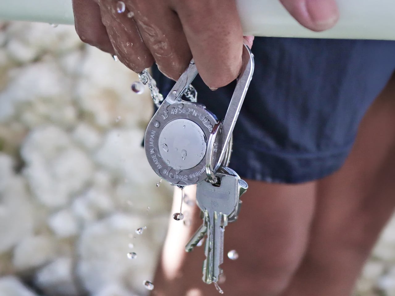
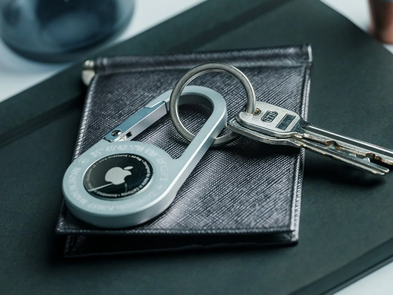
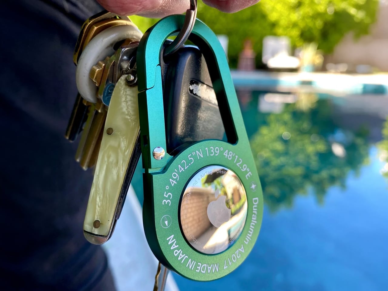
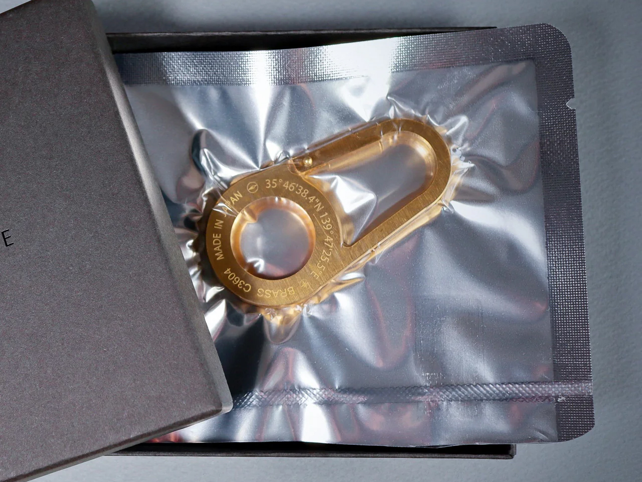
There is a specific kind of frustration that comes with building a carry kit piece by piece over months, selecting each object for a reason, and then clipping on an AirTag that looks like it came in a party favor bag. The titanium pen, the slim card wallet, the knife with the stonewashed blade that earns its spot every single day – and then that silicone loop. The coherence collapses, and we know it the moment it happens.
In 2026, the AirTag accessory market has split at a visible fault line. On one side: the standard silicone loop Apple sells for $29, the Spigen Rugged Armor case, and a range of injection-molded plastic clips that treat the tracker as a packaging problem rather than a design opportunity. On the other: a smaller group of manufacturers asking what kind of object an AirTag deserves to travel inside. That question is driving a genuine shift in carry culture right now, separating the kits assembled with intention from the ones that stopped one decision short.
After handling and carrying all three material variants across several weeks of daily use – commute conditions, trail carry, and air travel – the AirTag Carabiner is the most considered tracker carrier we have tested in this category.
Three Materials, Three Different Arguments
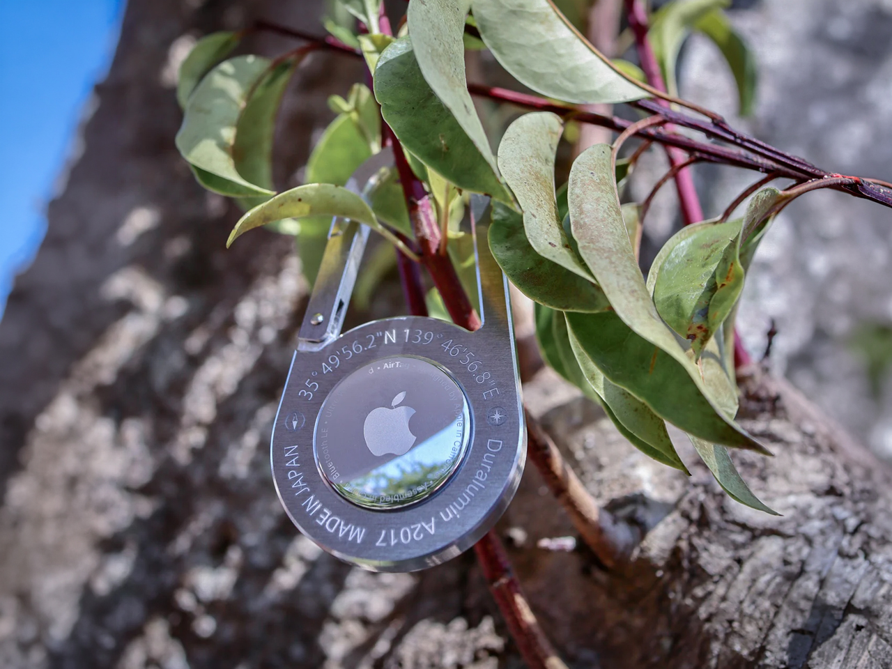
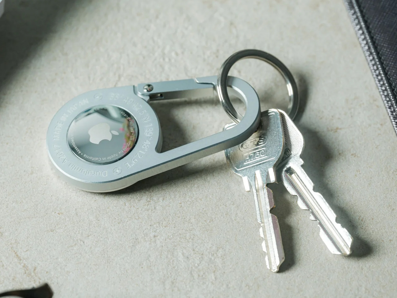
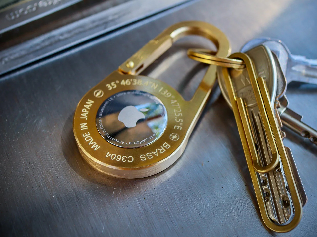
The AirTag Carabiner is made in Japan and individually hand-crafted. It comes in three materials: Duralumin composite alloy, untreated Brass, and Stainless Steel, and each variant makes a different argument for itself.
The Duralumin at 0.59 ounces – roughly the weight of a standard coin – is for those who account for every gram in a cycling kit or trail pack. It is, practically speaking, weightless in use.
The Brass at 1.7 ounces develops surface character over time that neither alternative will.
The Stainless Steel at 2 ounces carries its weight as a tactile signal of permanence.
The Brass variant arrives with a warm matte surface that shifts toward a richer patina at contact points within the first few weeks of carry. The Stainless Steel reads as deliberately neutral – a finish that recedes into a bag’s existing hardware rather than competing with it. The Duralumin sits between them: a cool, slightly satin surface that holds its character rather than developing one. Each variant is visually distinct enough that the choice of material is also a choice about what the rest of the kit communicates.
Sized for Motion, Not the Display Case
At 3.1 inches by 1.6 inches, the carabiner is sized for function without excess. The 0.2-inch profile means it sits flat against a zipper pull or bag strap rather than protruding outward to snag on jacket fabric, handlebar bags, or adjacent gear in a pack. For cyclists on a commute or a weekend ride, that profile matters in motion.
For travelers moving through terminals with carry-on luggage, it is one fewer point of friction in a sequence of movements that accumulates quickly across a long travel day.
Why the Alloy Choice Actually Matters
The Duralumin alloy deserves specific attention because it is not a decorative material reference. It belongs to the same alloy class used in aircraft, spacecraft, and marine applications – a pairing of low mass and high tensile strength that explains why the carabiner weighs 0.59 ounces without sacrificing structural integrity.
Applied here, it produces a carrier suited for the conditions an active kit already operates in: salt air, rain, altitude, and the sustained mechanical stress of a clip opened and closed hundreds of times a year. This is not a material chosen for its name. It is a material chosen because its properties match the job.
What Hand Production Means at This Scale
Hand production in Japan means finishing tolerances are set by a maker, not a mold. Carrying the AirTag Carabiner’s Duralumin variant daily for three weeks made that difference concrete: the gate action is consistent across hundreds of openings, the edge quality where the alloy meets at its joins has no rough transition point, and the surface shows none of the micro-scoring that injection-molded carriers typically develop within the first month of use.
These are details that do not appear in a spec sheet and do not become visible in product photography. They register in the hand, and they compound over time. At six months of daily carry, an object built to a specification and one built to a price have separated completely.
Where It Delivers
For the weight-optimized active carry: At 0.59oz – roughly a coin’s worth of mass – the Duralumin variant adds nothing measurable to a cycling pack, trail kit, or camera bag. It is the only tracker carrier in this category that does not undo the weight discipline a considered kit has already established.
For outdoor and travel conditions: The alloy’s documented suitability for water and high-altitude environments means this carabiner performs alongside the gear it clips onto – from a salt-air coastal commute to a pressurized cabin – without corrosion or gate fatigue.
For carry coherence: The hand-finished construction and material quality place this carabiner alongside machined pens and precision wallets without asking the rest of the kit to lower its standard.
What to Factor In
The Apple AirTag is not included. At $119 starting for the AirTag Carabiner alone, the full system investment clears $150 once the tracker is added. That is the honest cost of entry and should be weighed against a kit where every other object has been selected at a comparable standard.
The weight spread across variants is significant: 0.59oz for Duralumin versus 2oz for Stainless Steel – a 3.4x difference across identical dimensions. Users attaching this to a keychain or wrist lanyard will feel that gap in daily carry and should choose their variant before ordering rather than after.
The standard for AirTag carry has been a $29 silicone loop. The AirTag Carabiner sets a different standard: machined-quality construction, aircraft-grade material, and hand finishing that holds up to daily inspection after a year of use. Whether that standard becomes the category norm depends on whether the rest of the market decides the AirTag deserves to be treated as a permanent part of the kit rather than a temporary addition to it.
The AirTag Carabiner is available now starting from $119 at Yanko Design.
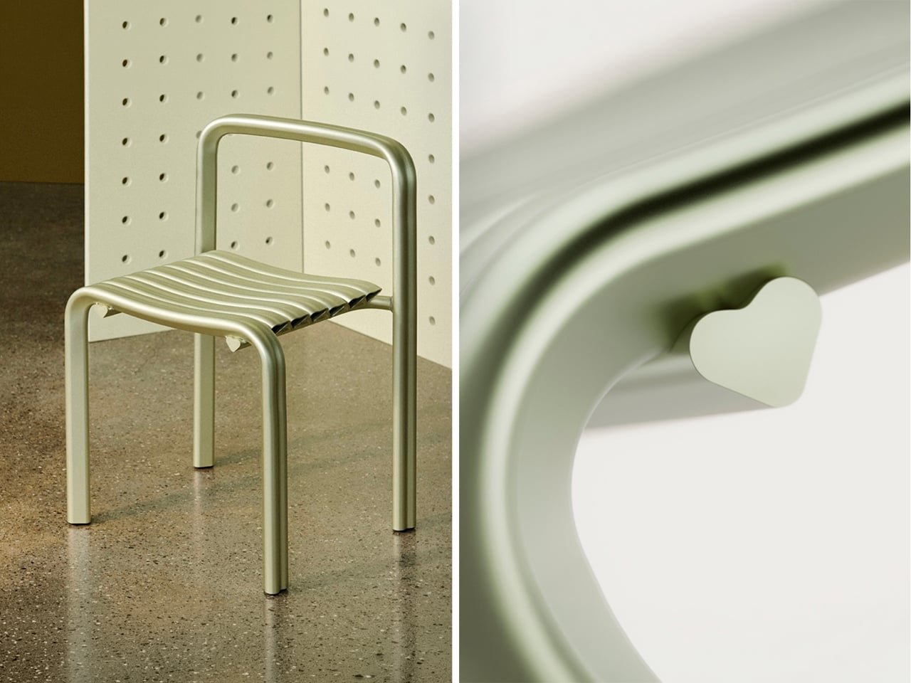
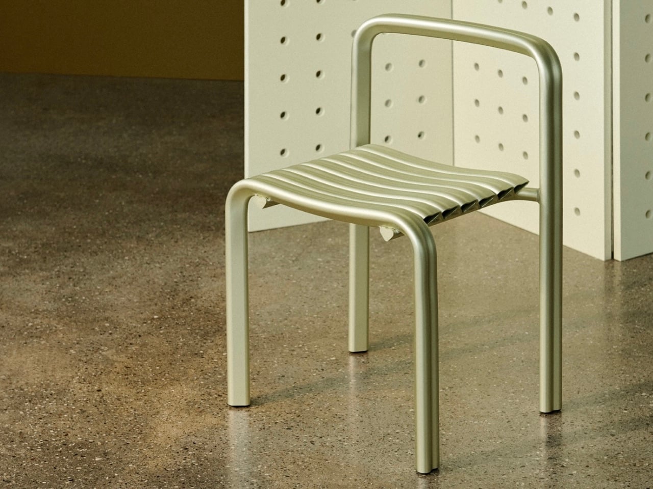
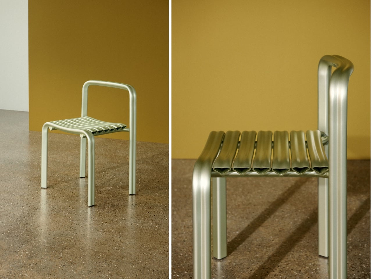
There are few symbols more familiar than the heart. It appears everywhere, from children’s drawings to luxury branding, which is perhaps why designers rarely touch it. The shape carries so much cultural baggage that it can quickly slip into sentimentality.
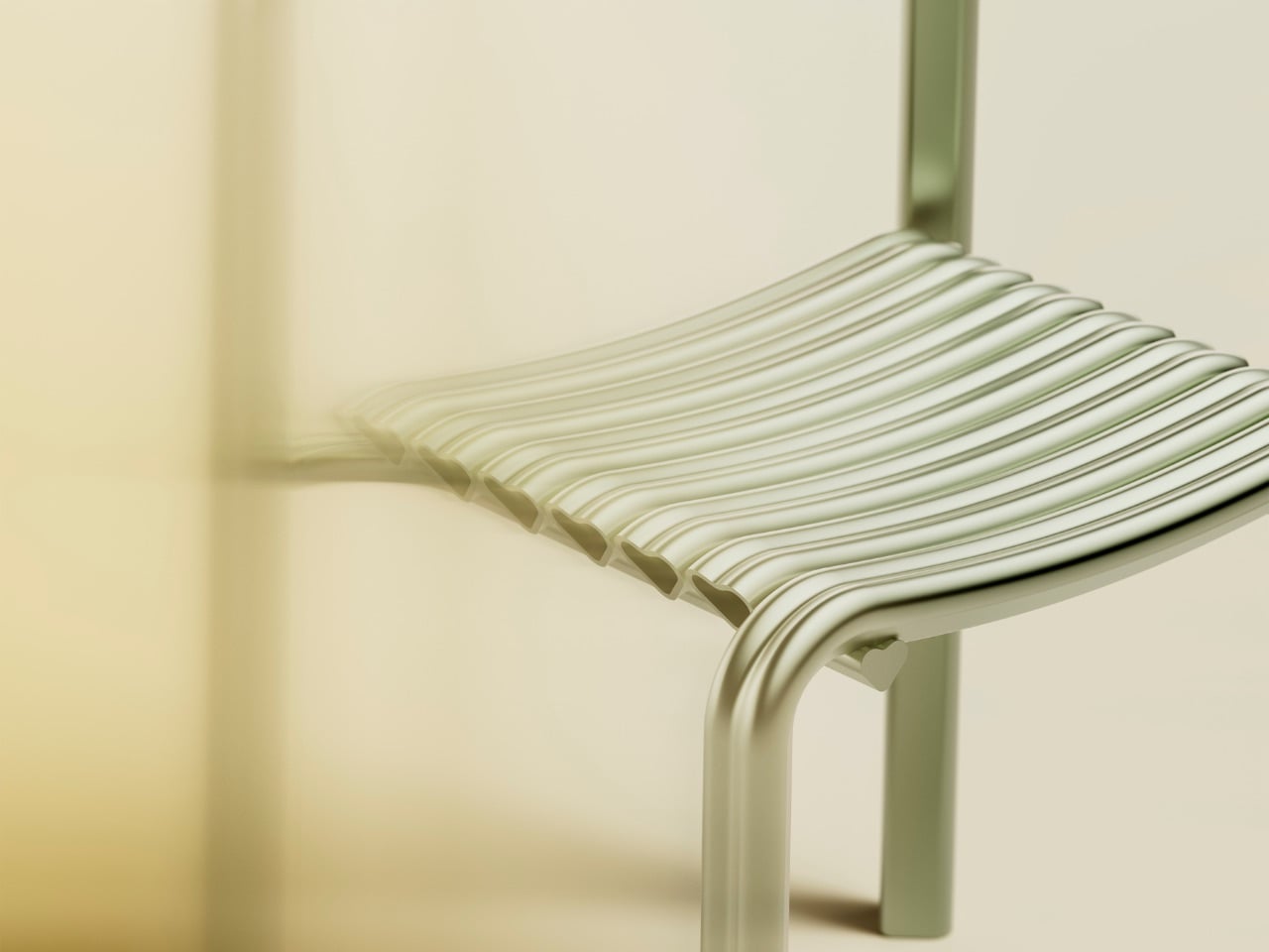
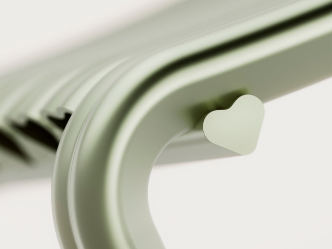
For its twentieth anniversary, Danish furniture brand Muuto decided to take that risk! Created with Copenhagen studio Spacon, the *Close to Heart* chair debuts during 3 Days of Design as part of Muuto’s anniversary programme, *Next Chapters in Scandinavian Design*. Limited to 150 pieces and produced in Denmark from extruded aluminium, the chair transforms the heart from a graphic symbol into a structural system. Every profile used to construct the chair is shaped like a heart.
The project began with a clear direction from Muuto, which was to avoid nostalgia. Rather than celebrating the past, the anniversary was framed as an opportunity to explore where Scandinavian design might go next. For Spacon partners Nikoline Dyrup Carlsen, Malene Hvidt, and Svend Jacob Pedersen, that conversation led unexpectedly to the heart.
What attracted the designers was not its symbolism alone, but its geometry. A heart combines two very different formal qualities within a single shape. One side is defined by a sharp triangular point, while the other is made up of generous curves. It is a shape that feels simple at first glance, yet becomes surprisingly intricate when examined closely.
That balance between softness and precision carries through the entire chair. From a distance, the heart references are obvious. Up close, they begin to disappear into the construction, becoming part of the chair’s proportions, joints, and structure rather than decorative details.
Material selection played an equally important role. Extruded aluminium is typically associated with engineering and manufacturing efficiency, making it an unusual choice for an object built around one of culture’s most emotionally loaded symbols. Yet the designers found that the material’s characteristics aligned naturally with the concept. Its light weight and ability to accommodate smooth curves allowed the heart profile to be repeated throughout the chair without becoming visually heavy.
The anodized finish further softens the material’s appearance. Instead of presenting aluminium as hard or industrial, the treatment gives the surface a subtle depth that reacts to changing light throughout the day. Reflections become muted, colors from the surrounding environment are absorbed into the surface, and the material takes on a quieter presence.
The chair sits within a broader collaboration between Muuto and Spacon centred on the relationship between technical systems and emotional experience. Muuto’s history is rooted in innovation and manufacturing development, while Spacon’s work frequently crosses between architecture, interiors, art, and craft. Close to Heart brings those interests together in a single object.
That intersection feels particularly relevant to how Scandinavian design is evolving today. The defining values remain familiar: experimentation, material honesty, and careful craftsmanship. What is changing is the willingness to embrace stronger narratives, cultural references, and emotional expression without treating them as separate from function.
The heart, surprisingly, proved to be a useful vehicle for that discussion. What could easily have become a novelty instead became a study in proportion, material, and manufacturing. The symbolism is impossible to ignore, yet the chair succeeds because it never relies on symbolism alone.
For Muuto and Spacon, the anniversary project is less about celebrating twenty years of design history than testing where design can go next. If Close to Heart is any indication, that future may involve a little more emotion, a little more playfulness, and a willingness to find sophistication in places designers have often overlooked.
There are few symbols more familiar than the heart. It appears everywhere, from children’s drawings to luxury branding, which is perhaps why designers rarely touch it. The shape carries so much cultural baggage that it can quickly slip into sentimentality.
For its twentieth anniversary, Danish furniture brand Muuto decided to take that risk! Created with Copenhagen studio Spacon, the *Close to Heart* chair debuts during 3 Days of Design as part of Muuto’s anniversary programme, *Next Chapters in Scandinavian Design*. Limited to 150 pieces and produced in Denmark from extruded aluminium, the chair transforms the heart from a graphic symbol into a structural system. Every profile used to construct the chair is shaped like a heart.
The project began with a clear direction from Muuto, which was to avoid nostalgia. Rather than celebrating the past, the anniversary was framed as an opportunity to explore where Scandinavian design might go next. For Spacon partners Nikoline Dyrup Carlsen, Malene Hvidt, and Svend Jacob Pedersen, that conversation led unexpectedly to the heart.
What attracted the designers was not its symbolism alone, but its geometry. A heart combines two very different formal qualities within a single shape. One side is defined by a sharp triangular point, while the other is made up of generous curves. It is a shape that feels simple at first glance, yet becomes surprisingly intricate when examined closely.
That balance between softness and precision carries through the entire chair. From a distance, the heart references are obvious. Up close, they begin to disappear into the construction, becoming part of the chair’s proportions, joints, and structure rather than decorative details.
Material selection played an equally important role. Extruded aluminium is typically associated with engineering and manufacturing efficiency, making it an unusual choice for an object built around one of culture’s most emotionally loaded symbols. Yet the designers found that the material’s characteristics aligned naturally with the concept. Its light weight and ability to accommodate smooth curves allowed the heart profile to be repeated throughout the chair without becoming visually heavy.
The anodized finish further softens the material’s appearance. Instead of presenting aluminium as hard or industrial, the treatment gives the surface a subtle depth that reacts to changing light throughout the day. Reflections become muted, colors from the surrounding environment are absorbed into the surface, and the material takes on a quieter presence.
The chair sits within a broader collaboration between Muuto and Spacon centred on the relationship between technical systems and emotional experience. Muuto’s history is rooted in innovation and manufacturing development, while Spacon’s work frequently crosses between architecture, interiors, art, and craft. Close to Heart brings those interests together in a single object.
That intersection feels particularly relevant to how Scandinavian design is evolving today. The defining values remain familiar: experimentation, material honesty, and careful craftsmanship. What is changing is the willingness to embrace stronger narratives, cultural references, and emotional expression without treating them as separate from function.
The heart, surprisingly, proved to be a useful vehicle for that discussion. What could easily have become a novelty instead became a study in proportion, material, and manufacturing. The symbolism is impossible to ignore, yet the chair succeeds because it never relies on symbolism alone.
For Muuto and Spacon, the anniversary project is less about celebrating twenty years of design history than testing where design can go next. If Close to Heart is any indication, that future may involve a little more emotion, a little more playfulness, and a willingness to find sophistication in places designers have often overlooked.