The Most Visually Striking Convertible Chair We’ve Ever Seen Hides All Its Mechanism Inside the Structure

The transformable furniture category has an ugliness problem.The transformable furniture category has an ugliness problem. Murphy beds wear their utilitarian origins on their sleeve, all exposed hinges and wall-mounted hardware that reads less like furniture and more like a filing system for humans. Sofa beds announce their dual nature through the awkward geometry of frames that can never quite commit to either function they serve. The mechanical logic of most convertible furniture sits right on the surface, visible and apologetic, because the joinery required to make an object shapeshift tends to be industrial in a way that no amount of upholstery can fully absorb. Jonah Rappaport’s Silhouette, a convertible chair that just won at the A’ Design Award 2025-2026, treats that ugliness as the actual design problem, not a side effect of solving a functional one.

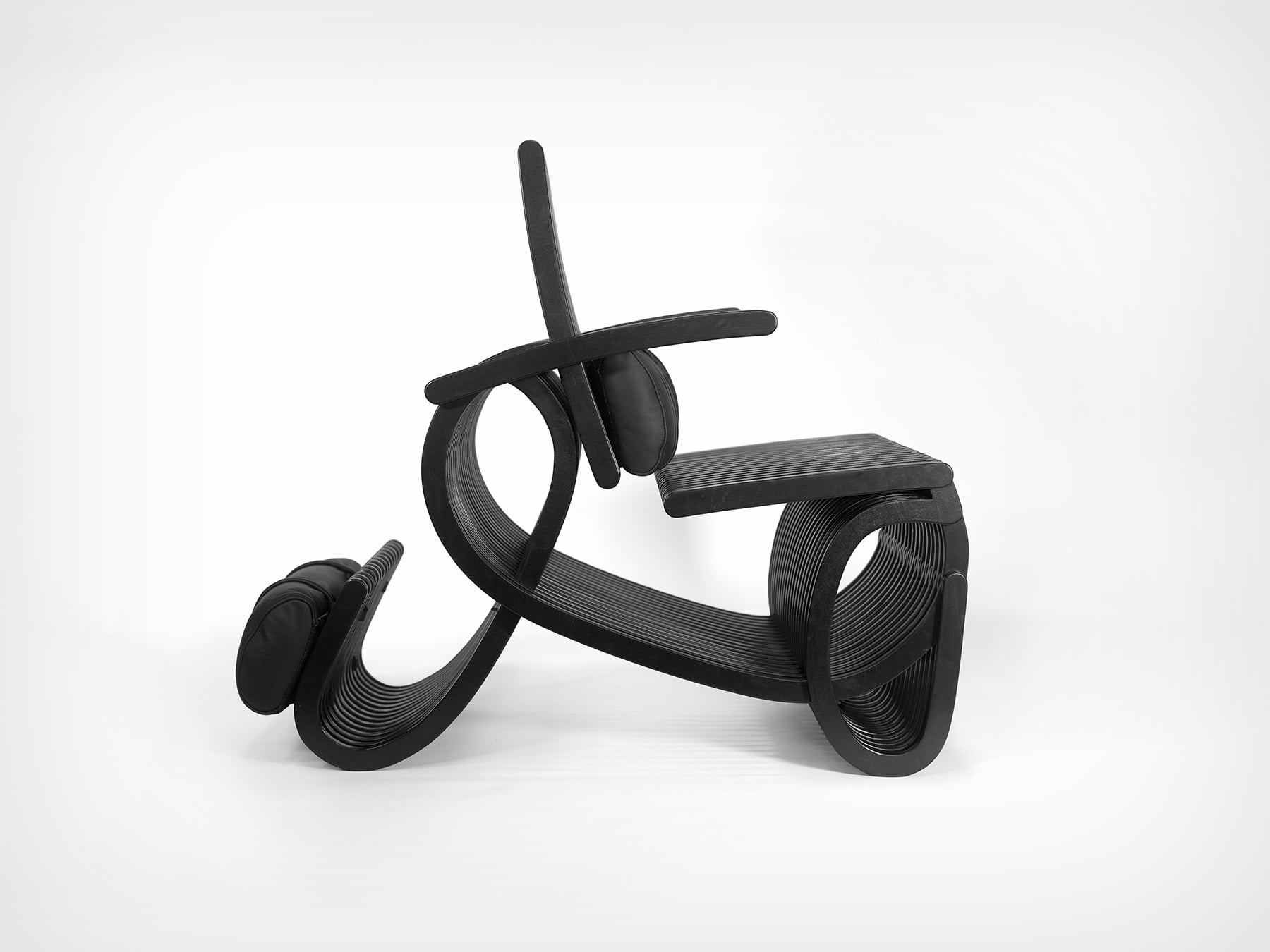
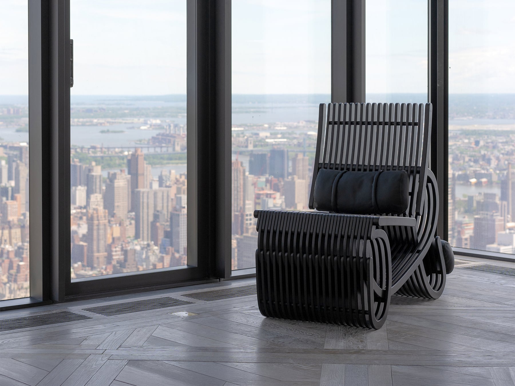
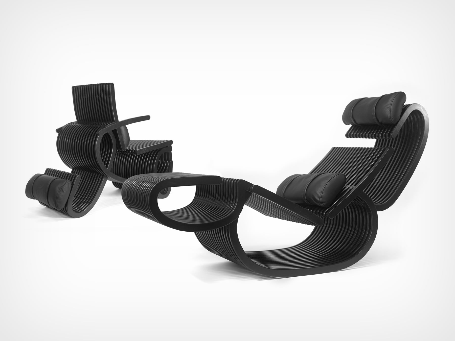
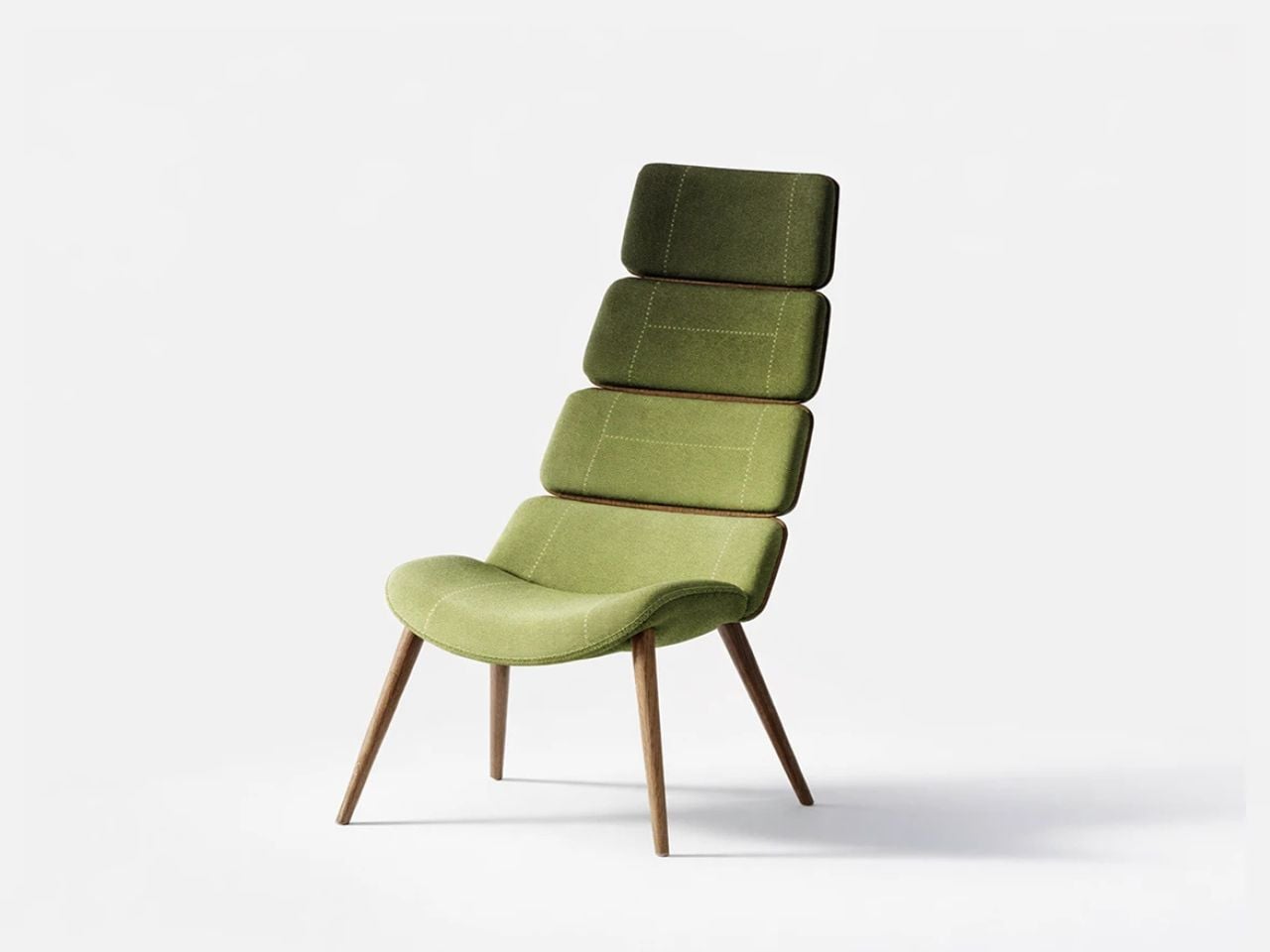
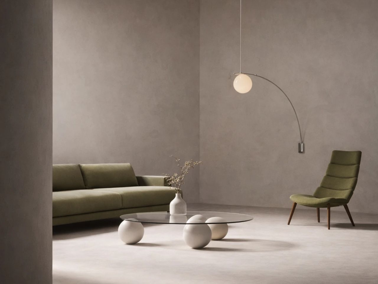
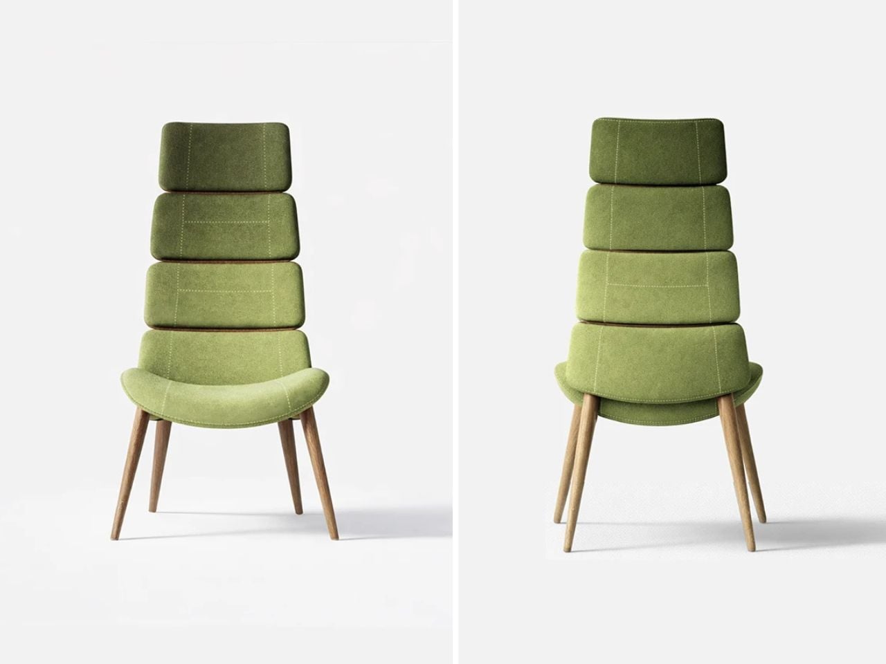
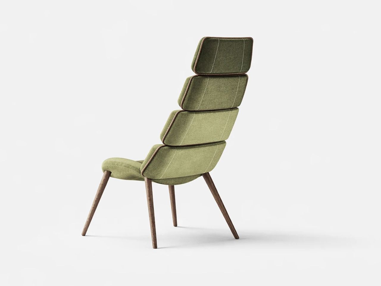
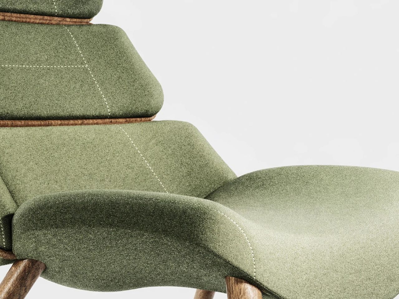
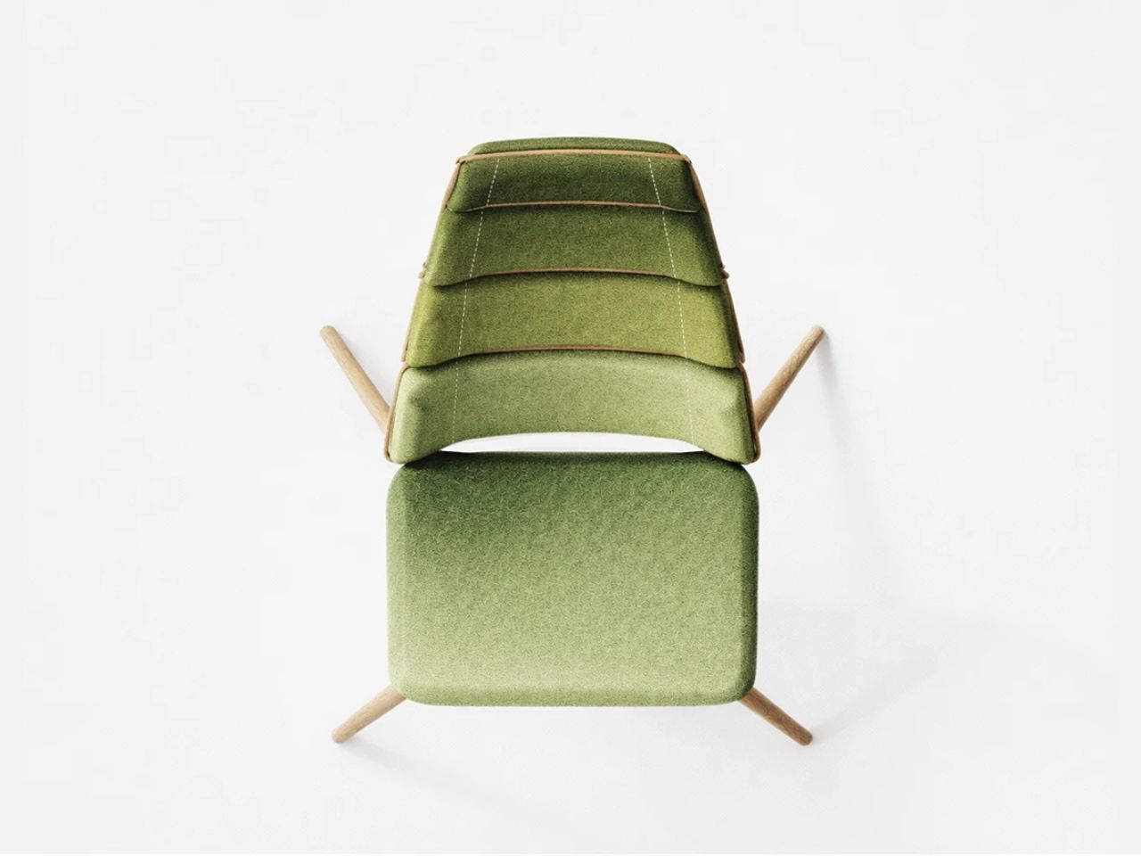
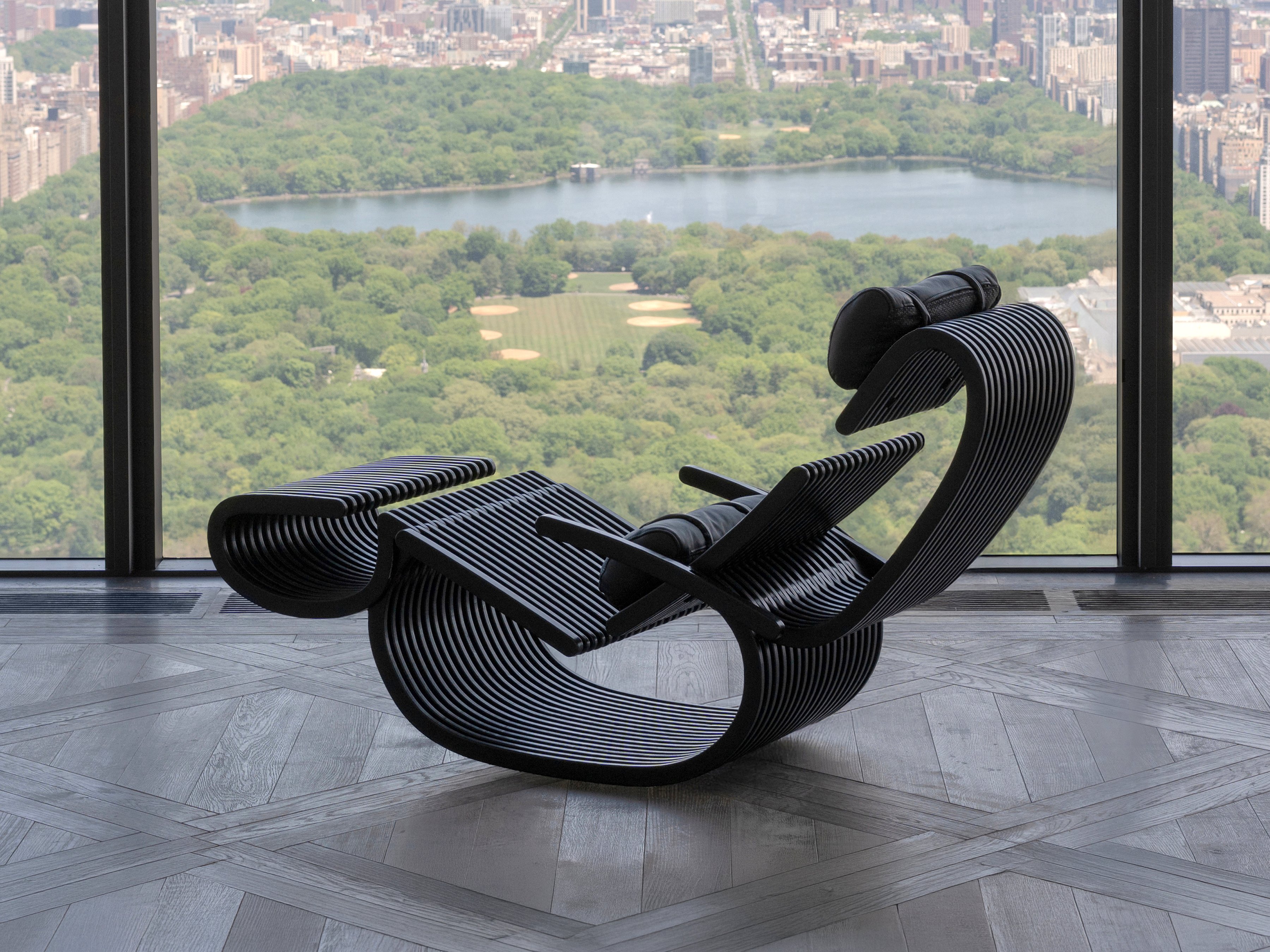
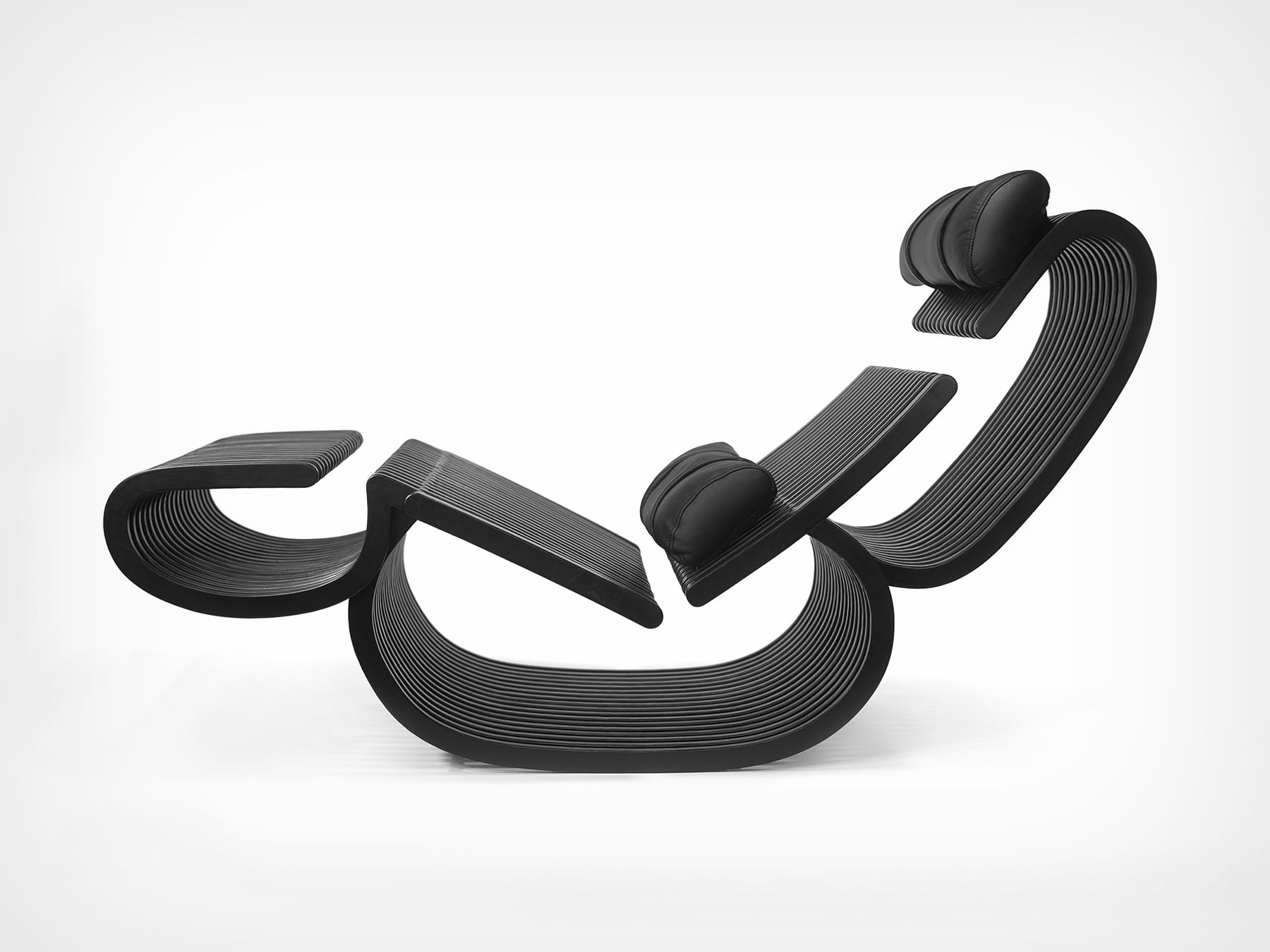
What Rappaport made instead looks, depending on the configuration, like a piece of abstract calligraphy that somebody decided to sit in. The layered Baltic birch plywood builds into looping, scroll-like curves that read as pure formal composition regardless of which of the three configurations the chair currently occupies, armchair, lounge chair, or chaise longue. Nothing about the silhouette suggests mechanism, utility, or compromise. The transformation is structural rather than additive: the headrest and legrest rotate to swap between suspended cushion supports and load-bearing legs, with concealed locking components in the base securing each position. Rappaport conceived and fabricated the entire object across four months at Yale’s wood and metal shops, and the finish, a true black stain under clear polyurethane, gives the whole assembly the visual unity of something carved rather than constructed.

Designer: Jonah Rappaport

Most convertible furniture relies on added hardware, external pivots, visible bolts, upholstered-over frames, precisely because the transformation logic lives outside the primary structure. Silhouette inverts that entirely. The same components that suspend the headrest and legrest in chaise mode rotate down to become the front and rear legs in armchair mode, meaning the chair’s structural geometry reorganizes around a single fluid movement with no auxiliary parts changing state. Concealed locking mechanisms within the base guide and secure each position, and the adjustable armrests and infinitely variable backrest handle the postural transitions in between, from fully reclined to fully upright, without requiring any tools or external hardware whatsoever.

Wood components were laser-cut, hand-routed, sanded, and stained. Custom sheet metal parts were manually threaded, welded, and finished by hand. Every moving connection is metal to metal, with no glue or permanent bonds between joints, meaning the entire object can be fully disassembled, repaired, and reassembled without degrading the wood. That repairability is a quiet but serious design statement in a furniture market that treats most objects as disposable on a ten-year horizon. The chair measures 545mm by 900mm by 860mm in armchair configuration and extends to 1,400mm in chaise mode, dimensions that keep it residential without being precious about space.

Rappaport is Montreal-born, Yale-trained, and currently a designer at ASH NYC, a Brooklyn-based studio known for residential and hospitality interiors with a strong material sensibility. Silhouette reads as entirely consistent with that context, the kind of object a serious interior practice would specify for a client who wants furniture with genuine formal presence and no tolerance for the visual noise that convertible pieces usually bring into a room. The A’ Design Award recognition in Furniture Design positions it alongside professionally produced work from established studios, which is notable given that this began as a graduate thesis project built entirely within a school workshop. IP filings across the UK, EU, Canada, and the United States suggest a production version is a serious near-term possibility, and you can follow the project at jonahrappaport.com/chair.

The post The Most Visually Striking Convertible Chair We’ve Ever Seen Hides All Its Mechanism Inside the Structure first appeared on Yanko Design.

The 7 Interior Design Trends Actually Defining 2026 Homes

Five months into 2026, the interior design trends predicted back in January are no longer speculative mood boards or Pinterest saves. They are appearing in apartment listings, furniture launches, hospitality spaces, and renovation projects worldwide. Grey walls are officially over. Six months into 2026, the interior design predictions from January have either proven true or quietly disappeared. What remained? Terracotta, limewash, curved sofas, and layered warmth – and what didn’t? Icy white rooms, sharp minimalism, and any surface that feels clinical rather than lived-in.

The biggest shift in 2026 home décor trends is emotional, as homes are moving away from the cool, ultra-controlled minimalism that defined much of the past decade. In its place comes warmth, tactility, softness, and personality. Terracotta is replacing icy grey. Rounded forms are overtaking rigid geometry. Natural stone, vintage furniture, and sculptural decor are transforming interiors into layered spaces that feel lived-in rather than staged.

Here are the seven interior design trends 2026 shaping homes, while some older design styles are slowly fading away in the background.

1. Warm Neutrals Replace Cool Grey Interiors

The era of cold grey interiors is fading fast. In 2026, warm neutrals interior palettes are dominating living rooms, kitchens, and hospitality spaces with shades like terracotta, creamy white, ochre, sand, caramel, and warm taupe. These tones create spaces that feel grounded and relaxed rather than clinical. Designers are increasingly choosing colors that mimic earth, clay, and sunlit plaster instead of industrial concrete-inspired shades.

This shift is also influencing materials and furniture finishes. Walnut wood, brushed brass, textured linen, and warm-toned stone are replacing chrome, charcoal, and high-gloss monochrome schemes. The popularity of Mediterranean-inspired homes and desert-inspired interiors has accelerated this movement. Cool grey walls and icy white spaces now feel visually distant and emotionally detached compared to the softer atmosphere homeowners want in 2026.
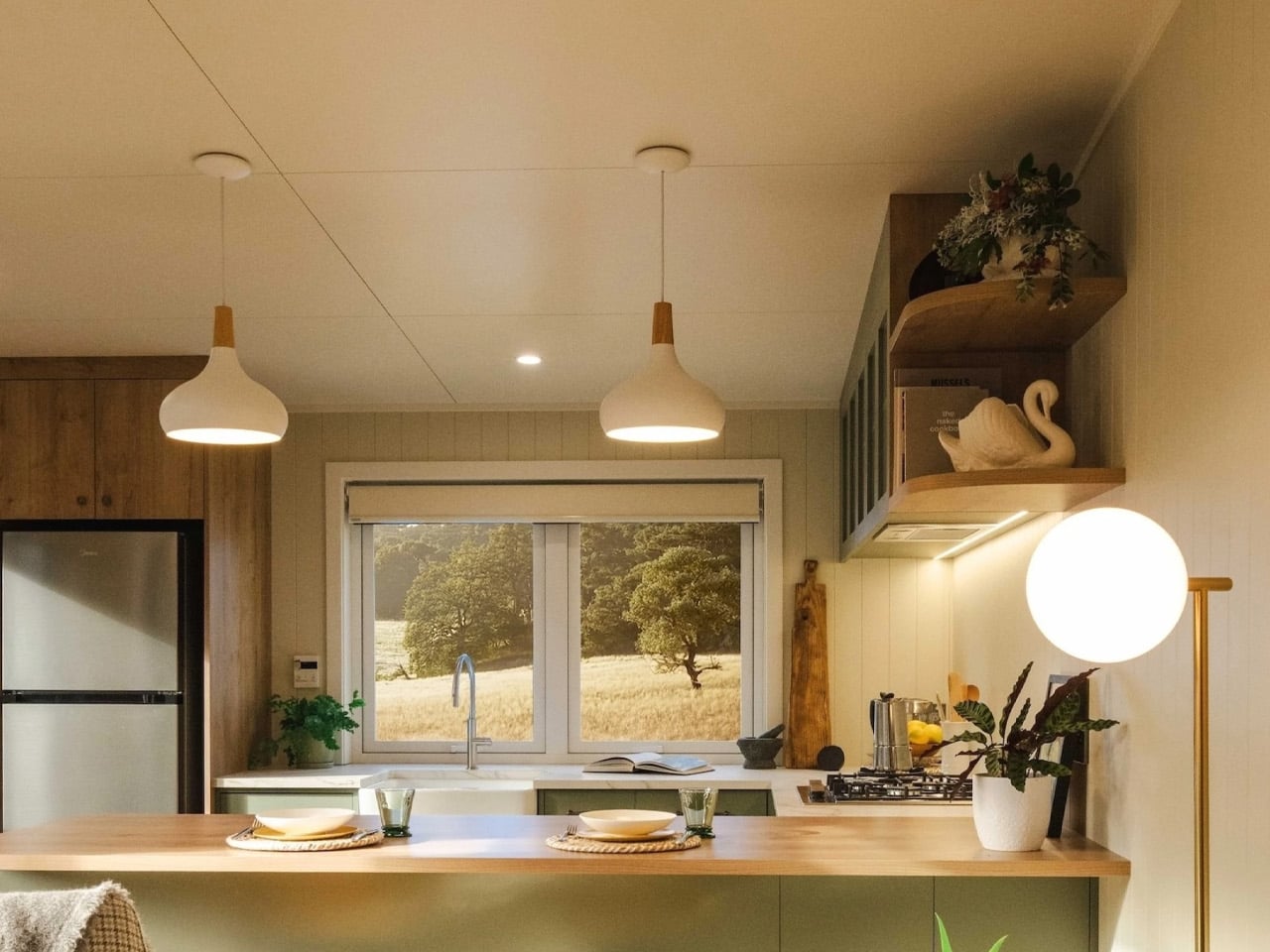
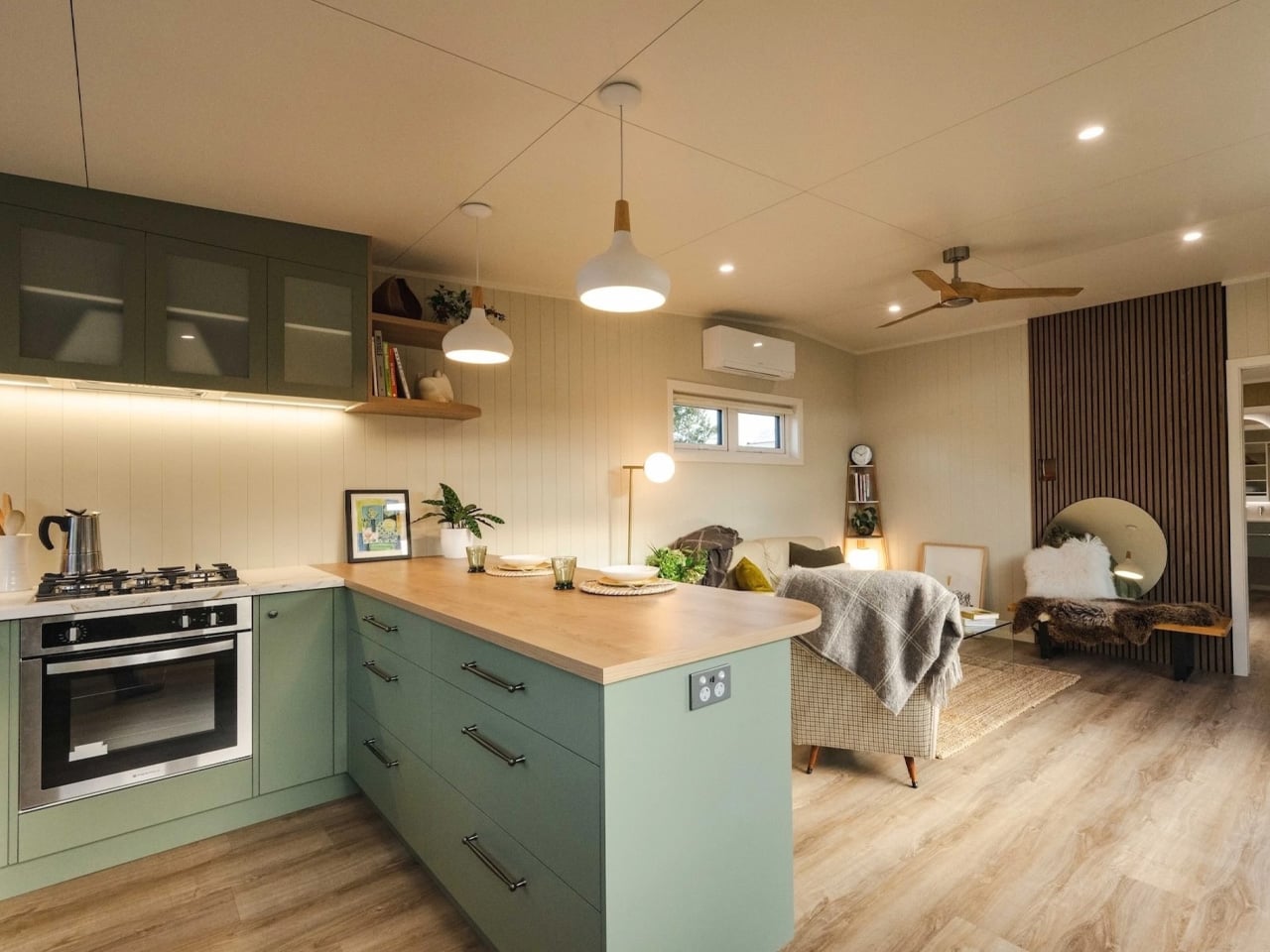
The English Garden by South Base Tiny Homes reimagines compact home design by creating a space that feels open, warm, and highly functional despite its modest footprint. Unlike many tiny homes that rely on lofts and ladders, this residence follows a single-level layout that allows every room to flow naturally into the next. Large windows fill the interiors with sunlight, enhancing the warmth of the timber finishes and soft earthy tones used throughout the home. Inspired by traditional English cottages, the design combines cosy textures with a relaxed coastal aesthetic, making the compact dwelling feel more like a refined apartment and not just a typical tiny house.
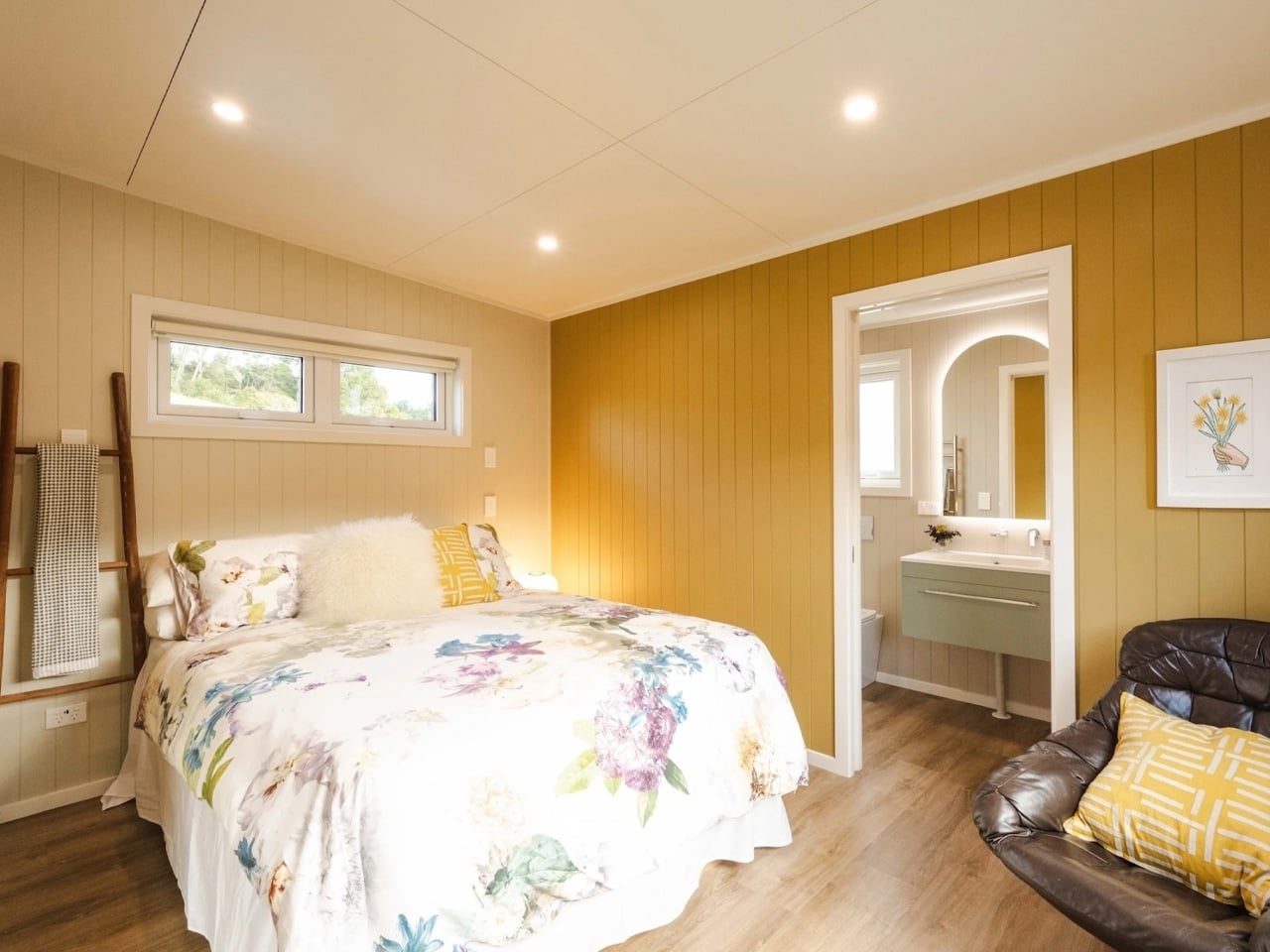
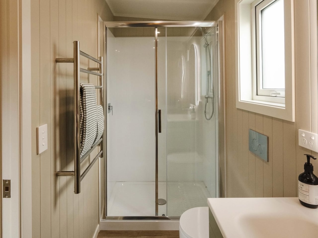
The kitchen features warm wood cabinetry, generous storage, a farmhouse sink, and a full cooking setup that supports everyday living. At one end, the bedroom connects directly to a private bathroom, creating a suite-like arrangement that adds a sense of luxury to the compact interior. Natural materials, warm colours, and thoughtful spatial planning work together to make the home feel calm, inviting, and visually spacious.

2. Curved Furniture Becomes the Dominant Silhouette

The curved furniture trend has officially moved into the mainstream. Sofas with rounded backs, circular coffee tables, arched shelving, and soft-edged islands are replacing the sharp, angular minimalism that dominated the late 2010s. Interiors now prioritize flow and comfort over strict geometry, creating spaces that feel visually softer and easier to inhabit.

Designers are leaning into sculptural forms because they make rooms feel more organic and less rigid. Rounded silhouettes also work well with smaller urban homes, where softened corners visually reduce harshness and improve movement through space. Even luxury kitchens and bathrooms are adopting curved detailing through fluted islands, oval mirrors, and arched entryways. The clean-lined boxy aesthetic is slowly giving way to interiors that feel fluid and calming.
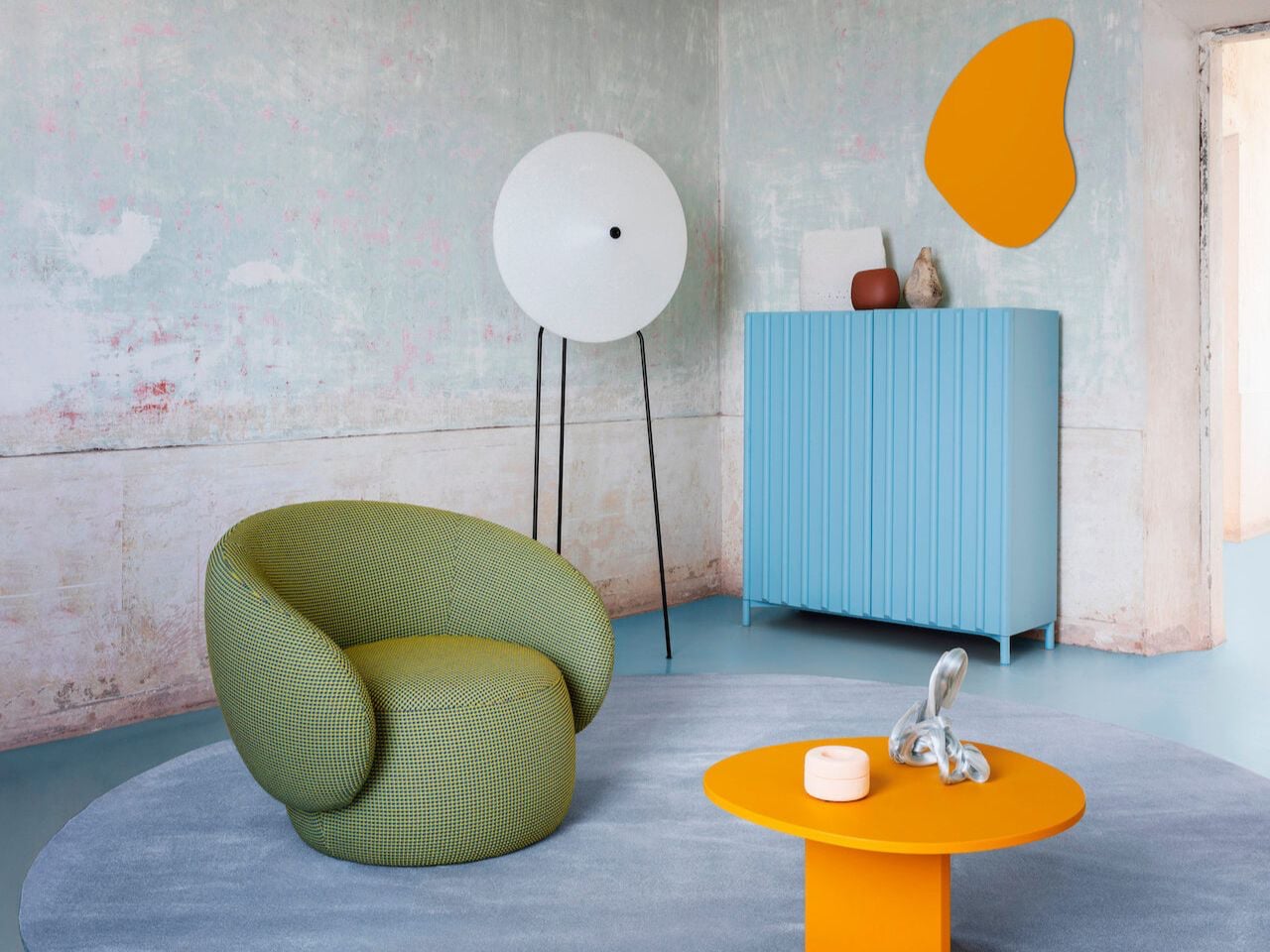
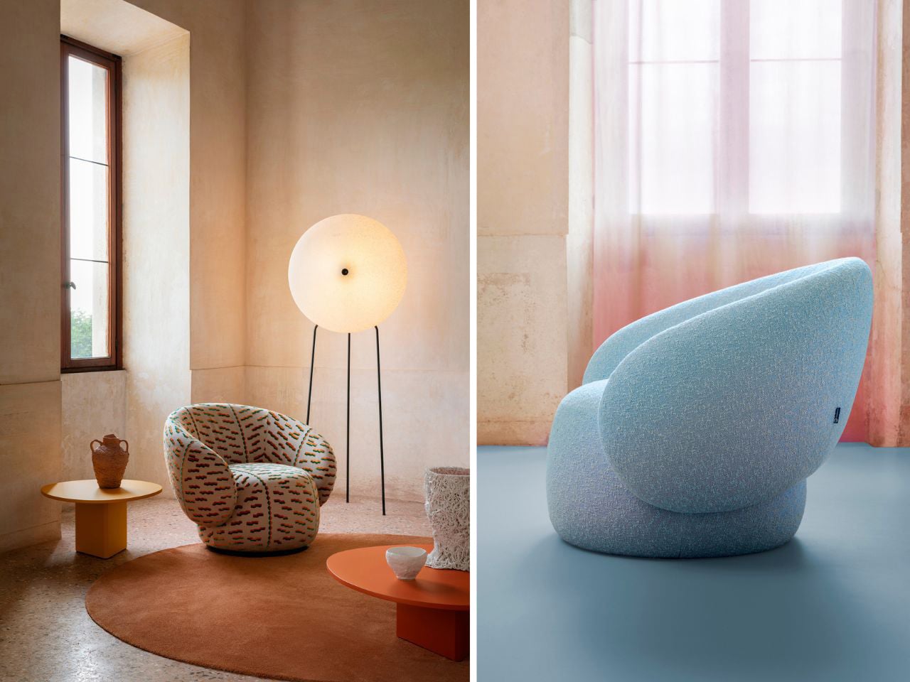
The Nebula collection by Miniforms transforms furniture into sculptural design objects inspired by the softness and fluidity of clouds. Defined by sweeping curves and oversized teardrop-shaped armrests, the collection creates a bold visual identity that feels both artistic and comforting. The Nebulona Armchair features a cocoon-like silhouette with rounded edges that flow seamlessly into the seat and backrest, giving the piece an organic and almost floating appearance. Its soft curves and voluminous form add a sense of movement, turning the armchair into a sculptural centerpiece within modern interiors.
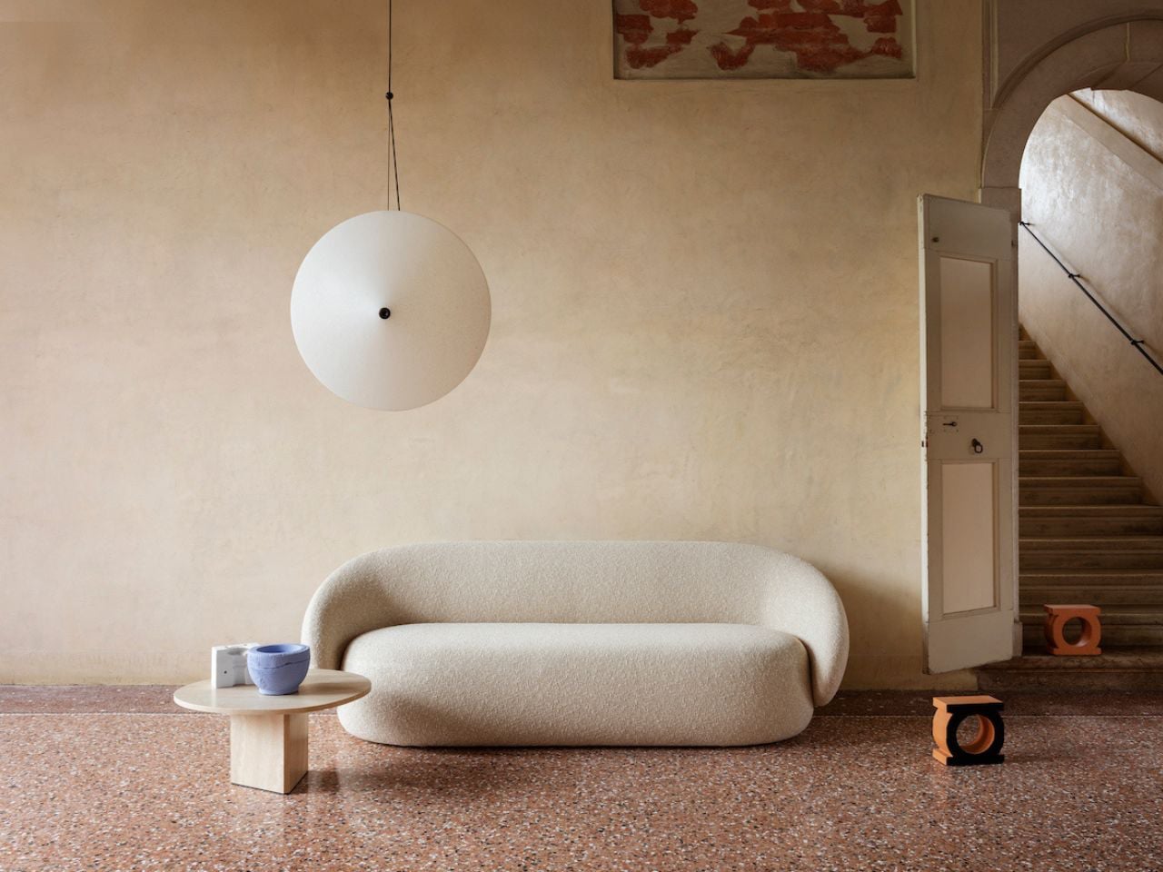
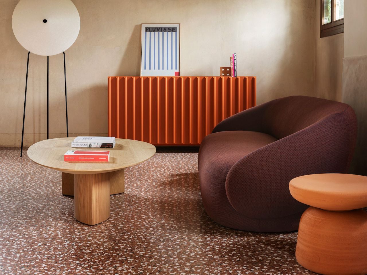
Expanding the collection’s curvaceous language, the Nebulone Sofa introduces elongated proportions and exaggerated rounded forms that emphasize comfort through design. Crafted with plush contours and seamless curves, the sofa creates a fluid silhouette that feels soft from every angle. The oversized armrests and sculpted structure enhance its artistic presence while maintaining a welcoming atmosphere. With its cloud-like shapes, tactile upholstery, and flowing geometry, the Nebula collection blurs the line between furniture and sculpture, bringing a sense of softness and visual elegance into contemporary living spaces.

3. Biophilic Interiors become Bolder and more Architectural

Biophilic interior design is no longer limited to a few indoor plants near a window. In 2026, the trend has become far more immersive and architectural. Stone walls, exposed timber beams, indoor courtyards, oversized skylights, and integrated greenery are increasingly becoming part of the actual structure of the home rather than decorative additions.

Natural materials are also appearing in more expressive ways. Travertine, raw limestone, textured slate, and reclaimed wood are being used to create tactile surfaces with visible imperfections and grain. Designers are embracing materials that feel alive and weathered instead of polished and artificial. Living walls and oversized plants remain popular, but the real evolution lies in how architecture itself is being designed to reconnect interiors with nature.
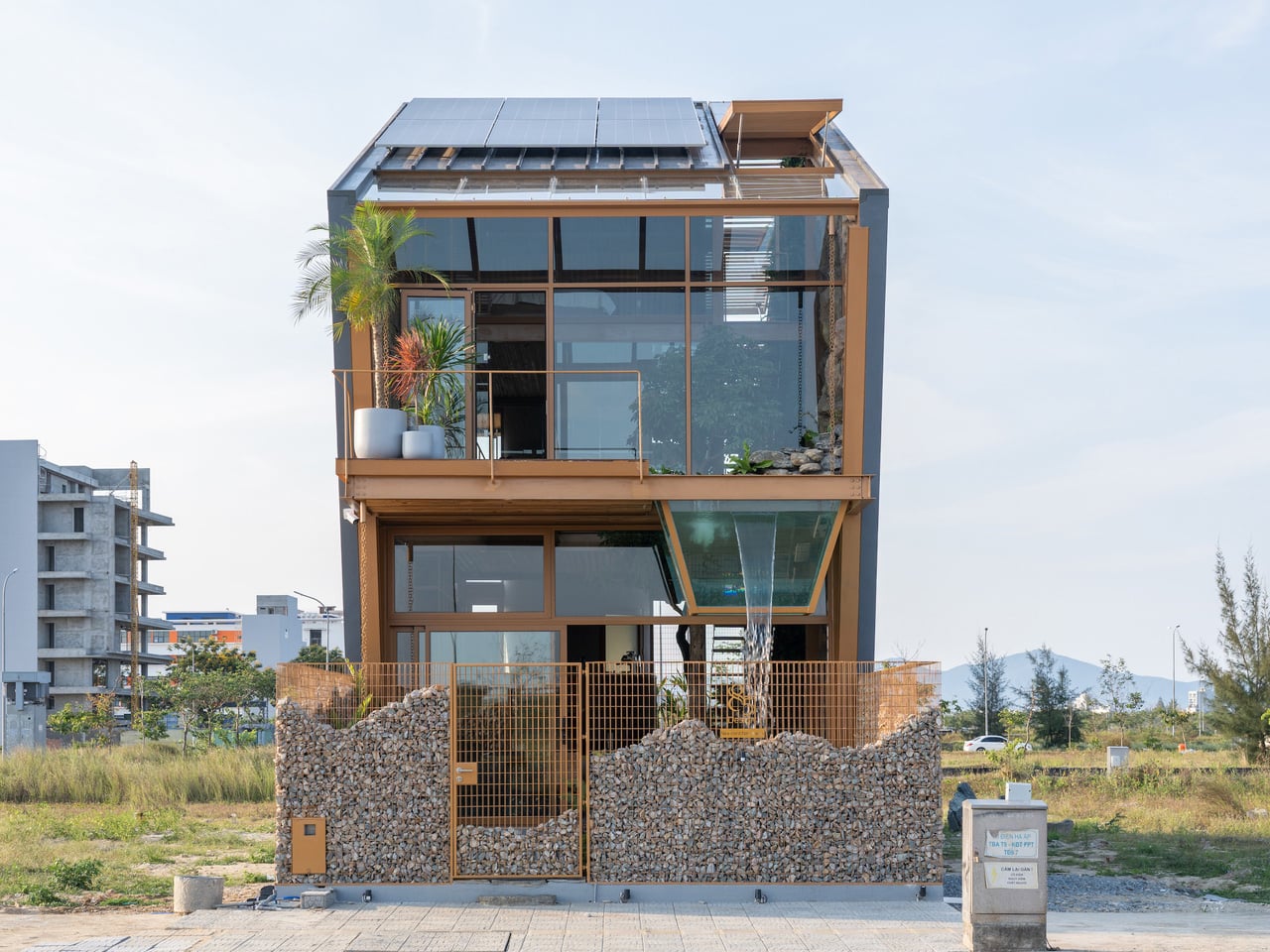
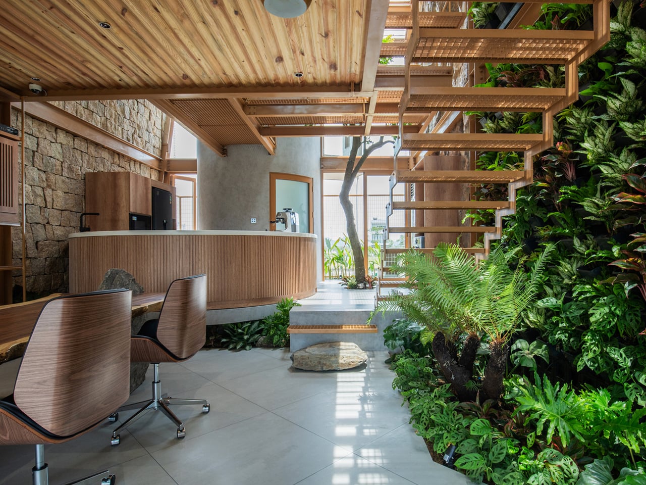
G.ao House by 85 Design embraces biophilic design by creating a strong connection between architecture and nature within a compact urban setting in Vietnam. Surrounded by tropical greenery, the residence combines indoor and outdoor living through open layouts, natural airflow, and abundant daylight. Gardens wrap around the structure, softening the building’s footprint while improving ventilation and creating a calming environment. Water features, reclaimed stone, and lush planting introduce natural textures throughout the home, allowing the spaces to feel deeply connected to the surrounding landscape.
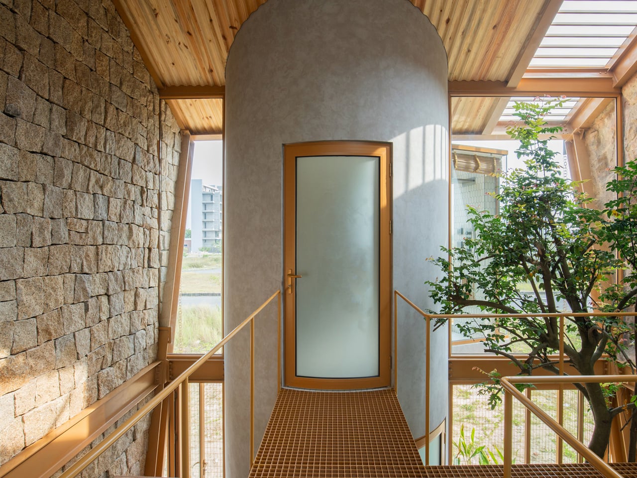
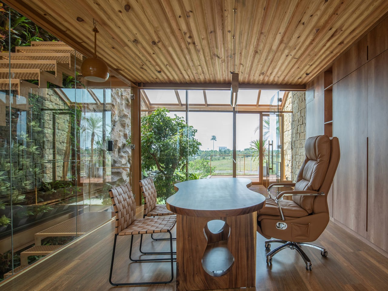
The interior design further strengthens this relationship with nature through layered sensory elements and fluid spatial planning. A double-height void increases openness and allows sunlight to move freely across the interiors, while balconies, cascading water features, and a glass fish tank add movement and tranquility. Flexible living and working spaces are carefully positioned to maintain visual links with greenery at every level. By blending sustainable materials with biophilic principles, G.ao House creates a peaceful environment that promotes comfort, well-being, and harmony with nature.

4. Tactile Walls Replace Flat Minimal Surfaces

One of the biggest 2026 home decor trends is the return of surface texture. Limewashed walls, slatted wood paneling, ribbed finishes, and decorative molding are transforming interiors that once relied on flat painted drywall. Homeowners are increasingly looking for depth, shadow, and handcrafted character within spaces.

Limewash, in particular, has become popular because of its soft movement and imperfect finish, which changes subtly throughout the day with natural light. Slatted wood detailing is also appearing everywhere, from bedrooms to kitchen islands, because it introduces warmth and rhythm without feeling overly decorative. Instead of smooth perfection, interiors now celebrate material variation and tactile richness that make spaces feel layered and visually engaging.
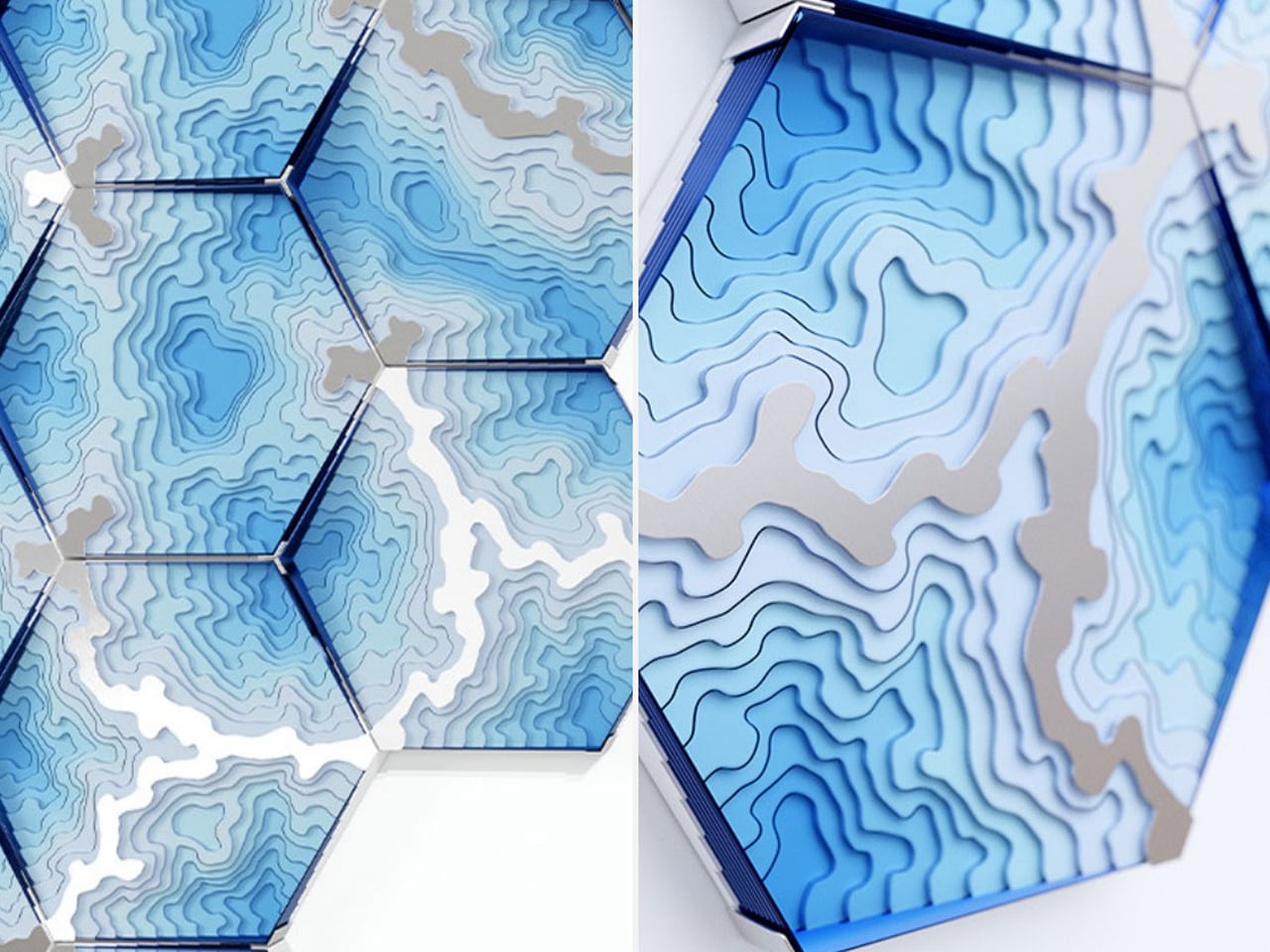
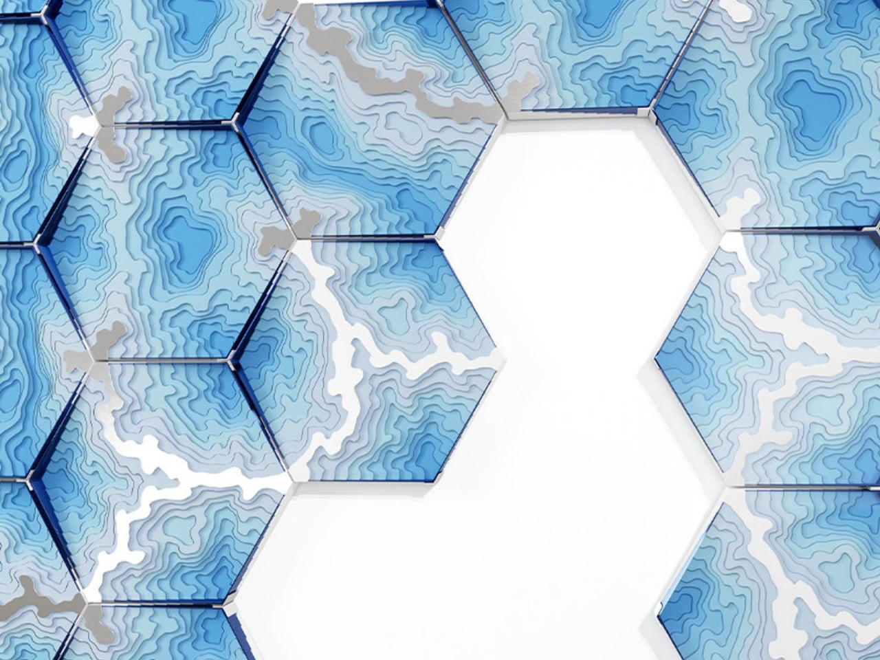
Close-up of blue hexagonal panels with layered topographic contour patterns forming a geometric wall sculpture.

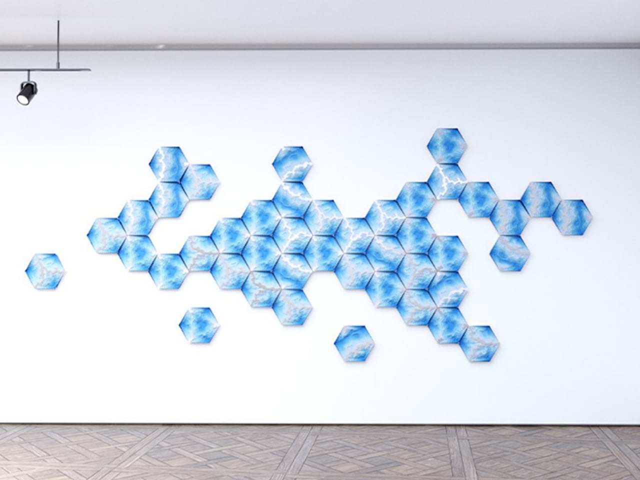
Blue hexagon wall mural forming a geometric honeycomb pattern on a white gallery wall and wooden floor, left-aligned with a few isolated hexagons offshoots.

Geometric wall of blue hexagonal tiles with contour-patterned surfaces and a white hexagonal gap in the center (decorative architectural detail)

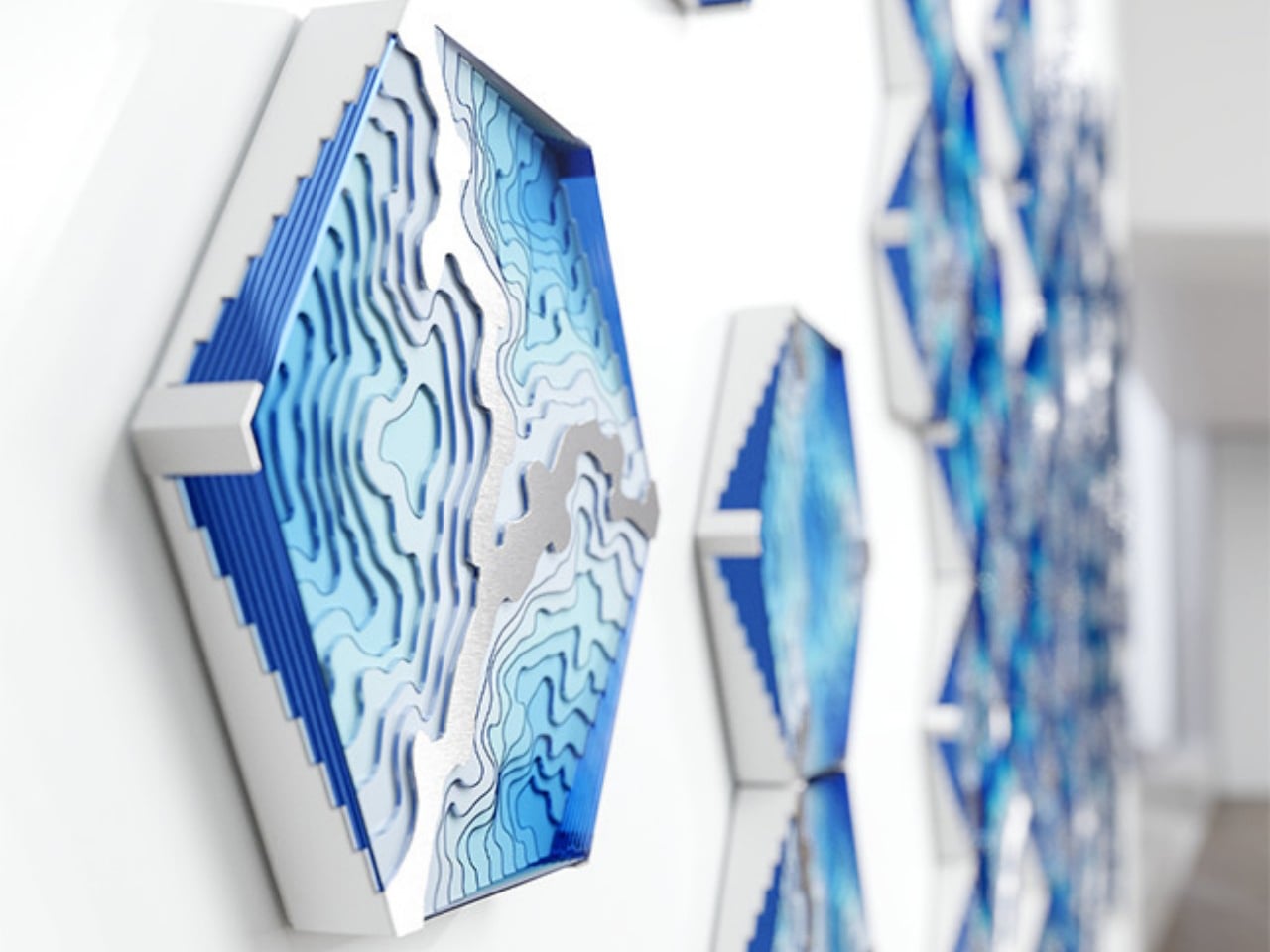
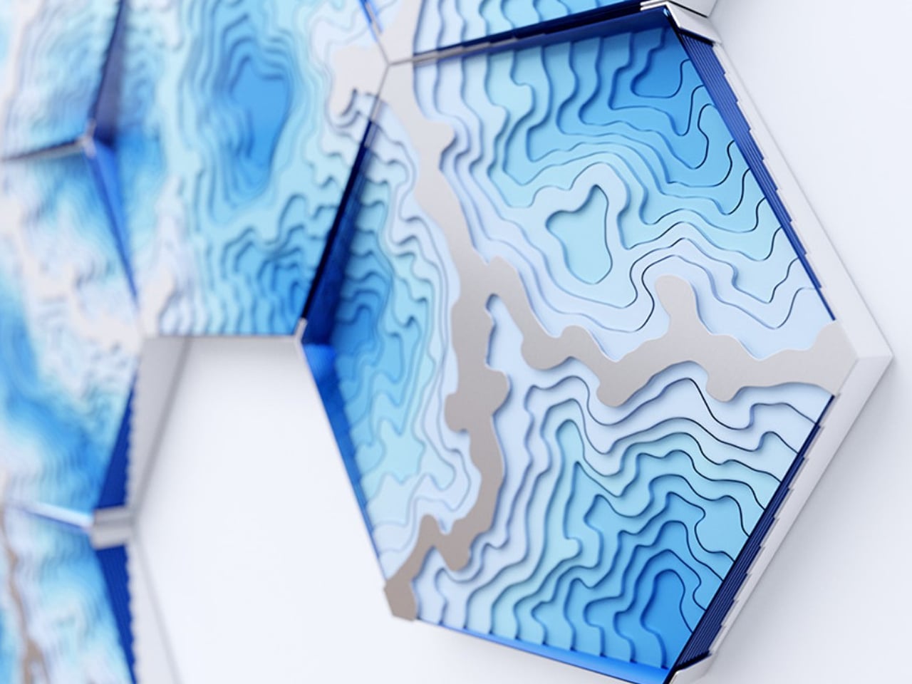
The Abyss Wall Tiles by Duffy London transform wall décor into a tactile design experience through layered textures and sculptural surfaces. Inspired by ocean floor contour maps, each hexagonal tile features engraved patterns that create visual depth and a striking three-dimensional effect. The overlapping lines and textured detailing invite both visual and physical interaction, turning ordinary walls into dynamic art installations. Crafted from plexiglass, recycled plastic, and brushed stainless steel, the tiles combine reflective finishes with textured surfaces that shift beautifully under changing light.

Abstract blue hexagonal wall sculpture with layered contour patterns and 3D depth.

Blue abstract topographic contour design framed by a hexagonal metal outline in varying blue hues.

Abstract blue layered wall sculpture in a row, forming a wave-like pattern, seen from a close-up perspective in a bright modern space.

The modular design allows the tactile surfaces to evolve freely across the wall, creating compositions that feel organic and fluid. Different hexagonal patterns can be rotated and rearranged while still maintaining a seamless visual flow, adding flexibility to the design. The layered contours create shadows, movement, and depth, enhancing the sensory quality of the installation. Through its sculptural textures and handcrafted finish, the Abyss collection transforms flat walls into immersive surfaces inspired by the mystery and movement of the ocean.

5. Sculptural Decor becomes the Focal Point of Rooms

Art-driven interiors are becoming one of the defining aesthetics of 2026. Rather than filling rooms with multiple small accessories, designers are focusing on fewer but more sculptural statement pieces. Oversized lighting, abstract chairs, ceramic installations, and collectible furniture are increasingly acting as the visual anchor of a room.

This shift reflects a growing overlap between interior design, art, and fashion. Homes are being styled more like curated galleries where each object contributes to the identity of the space. Sculptural furniture also complements the rise of curved forms and textured interiors, adding visual drama without relying on excessive decoration. Minimalism is not disappearing entirely, but it is evolving into something more expressive and emotionally layered.
Cozy minimalist room with three warm wooden pendant lights above a wooden bench and a yellow cushion, plus a small coffee setup on the floor nearby.

Decorative woven bronze pendant light ball hanging against a dark teal wall.

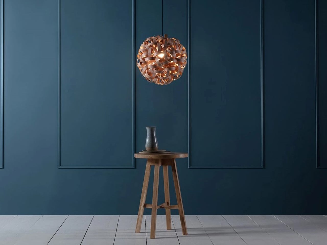
Wooden stool with a small ceramic vase under a copper pendant light against a dark blue paneled wall.

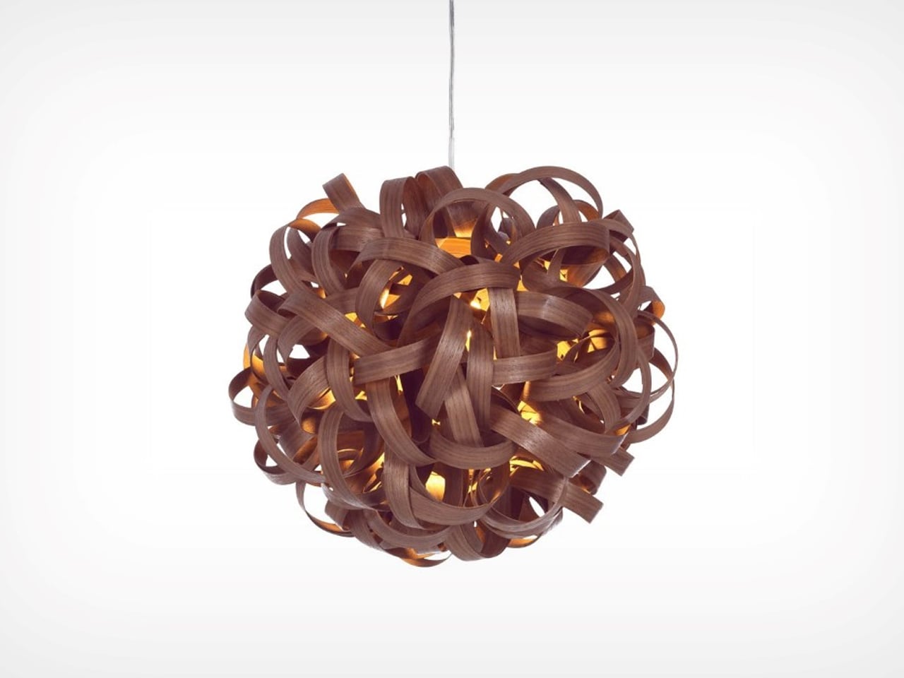
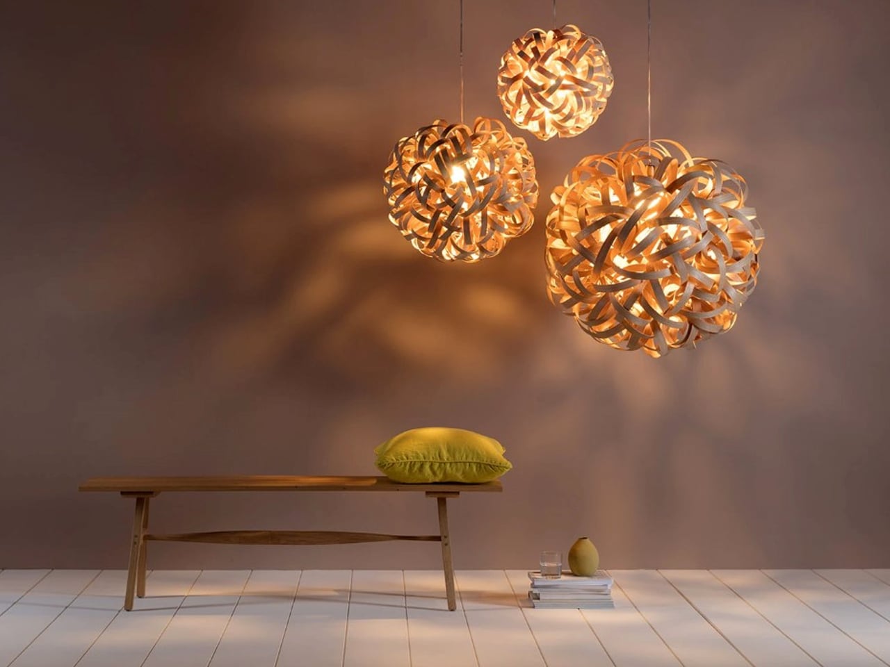
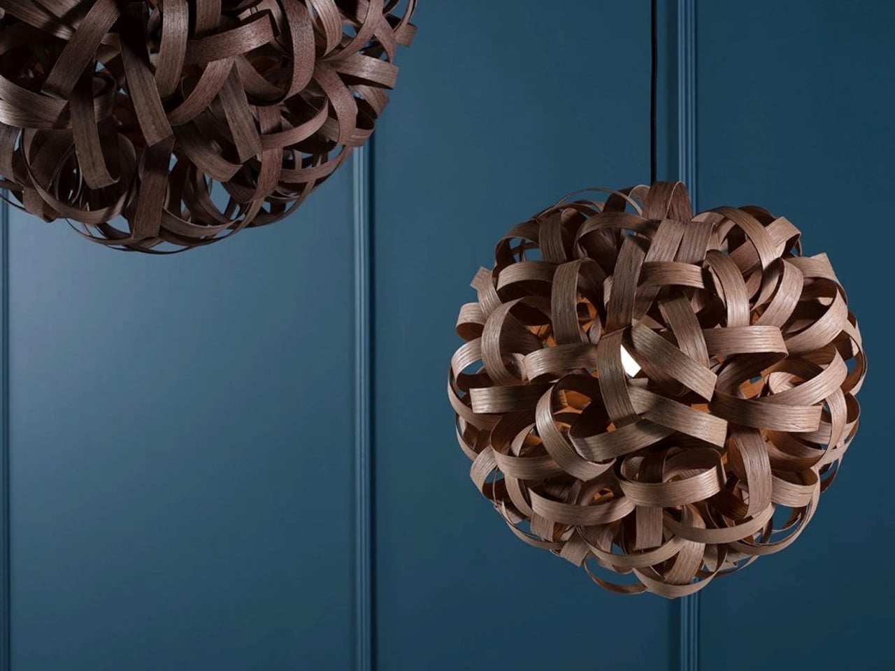
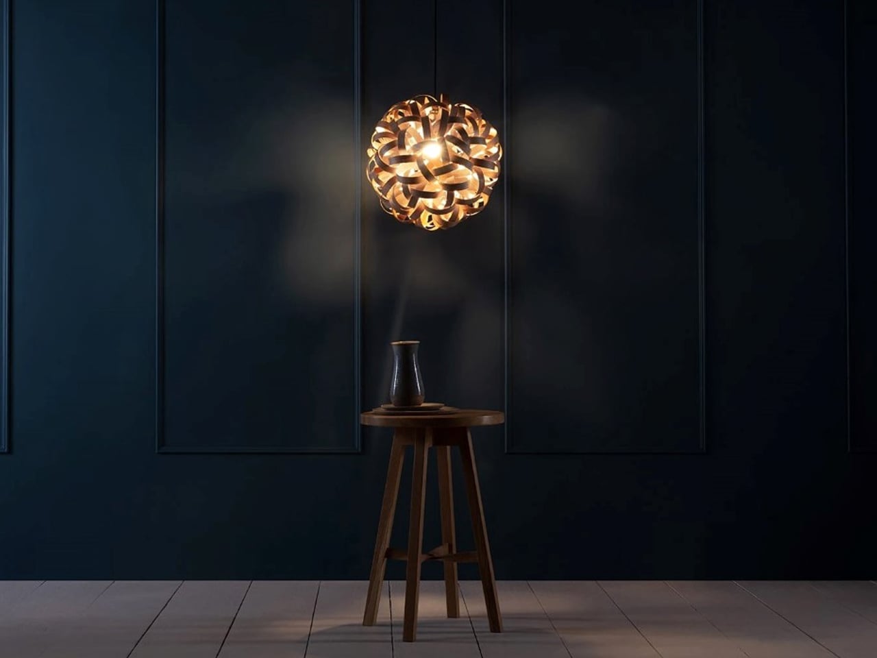
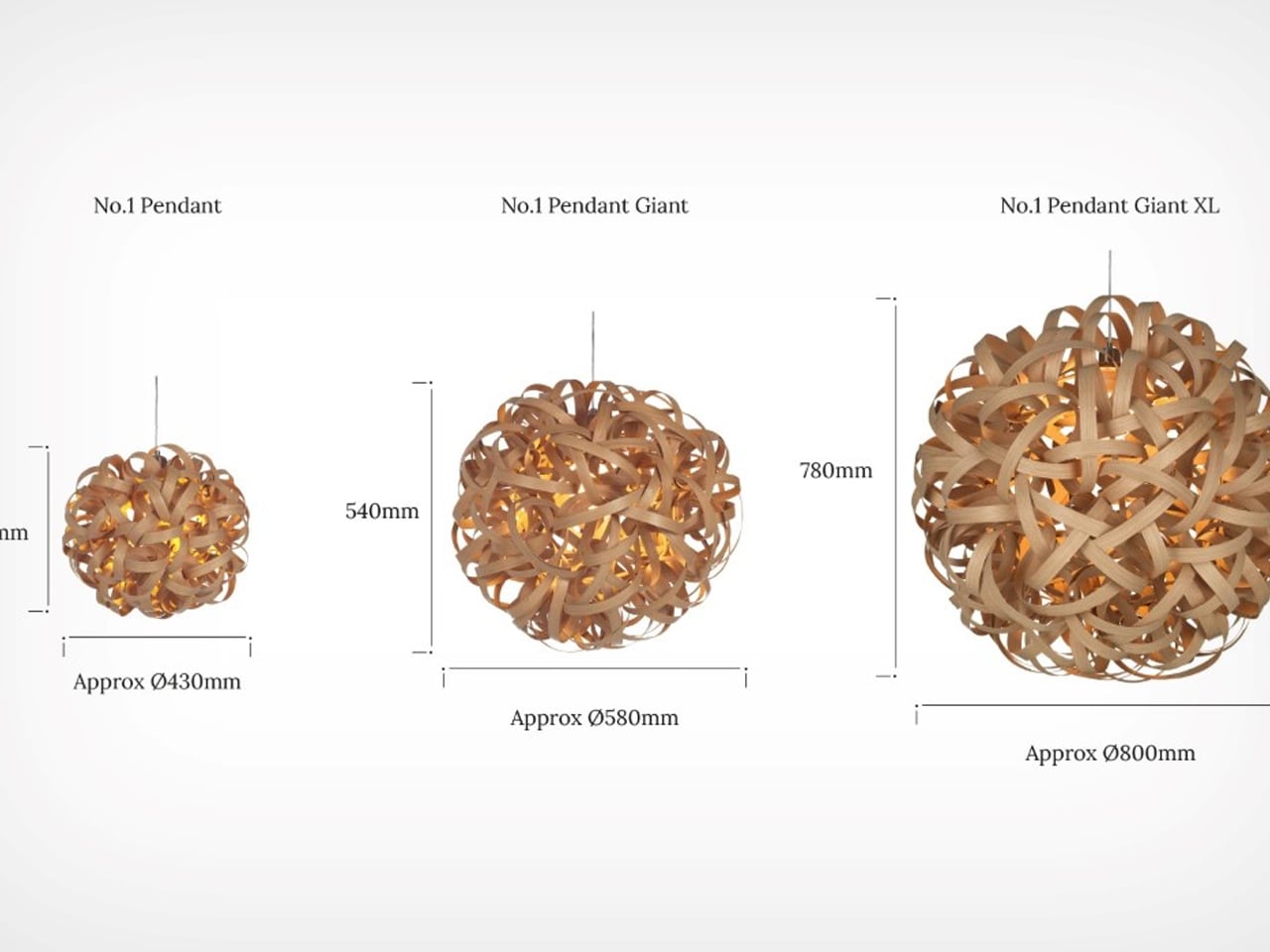
For art-inspired interiors, consider the No.1 Pendant by Tom Raffield, which transforms traditional woodworking techniques into sculptural art through flowing layers of steam-bent timber. Inspired by the curled shavings found in woodworking studios, the pendant light captures movement and texture in an organic form that feels both delicate and dramatic. Instead of treating wood curls as waste, Raffield elevates them into an artistic composition where each curved strip contributes to a larger sculptural silhouette. The layered timber creates a soft, swirling structure that resembles a suspended artwork more than a conventional lighting fixture.
Warm spherical pendant lamp glowing above a wooden stool with a small vase on a round tray in a dark navy room, minimal decor.

Diagram showing three woven spherical pendant lights: No.1 Pendant (Ø430mm), No.1 Pendant Giant (Ø580mm), No.1 Pendant Giant XL (Ø800mm) with height measurements.

Tangled brown wooden ball pendant lamp glowing from within, hanging from a cord.

Crafted using over 40 meters of carefully steam-bent wood, the pendant features an intricate woven form inspired by the folds of a scrunchie. The overlapping curves create depth, rhythm, and shadow, allowing the piece to interact beautifully with light from every angle. Available in ash, oak, and walnut finishes, the design highlights the natural beauty of timber while celebrating craftsmanship through sculptural expression and fluid geometry.

6. Vintage and Sustainable Furniture become the Default Choice

Sustainable design in 2026 is less about marketing language and more about purchasing behavior. Vintage furniture, reclaimed materials, and long-lasting craftsmanship are becoming standard choices for homeowners who want interiors with character and durability. The fast-furniture cycle is increasingly losing appeal as buyers seek pieces with history and longevity.

Designers are also mixing contemporary interiors with antique or vintage accents to create contrast and authenticity. A sculptural modern sofa paired with an aged wooden cabinet or vintage marble table now feels more desirable than a perfectly matched showroom set. Sustainability is no longer treated as a separate design category. It has become integrated into how people define good design itself.
Vintage turntable on a gray console with vertical wooden panel and vinyl records nearby on the shelf.

Wooden mid-century record player on a black and wood stand with vinyl records displayed nearby in a bright room.

Mid-century wooden record player on a black tray with two vinyl records displayed beside it .

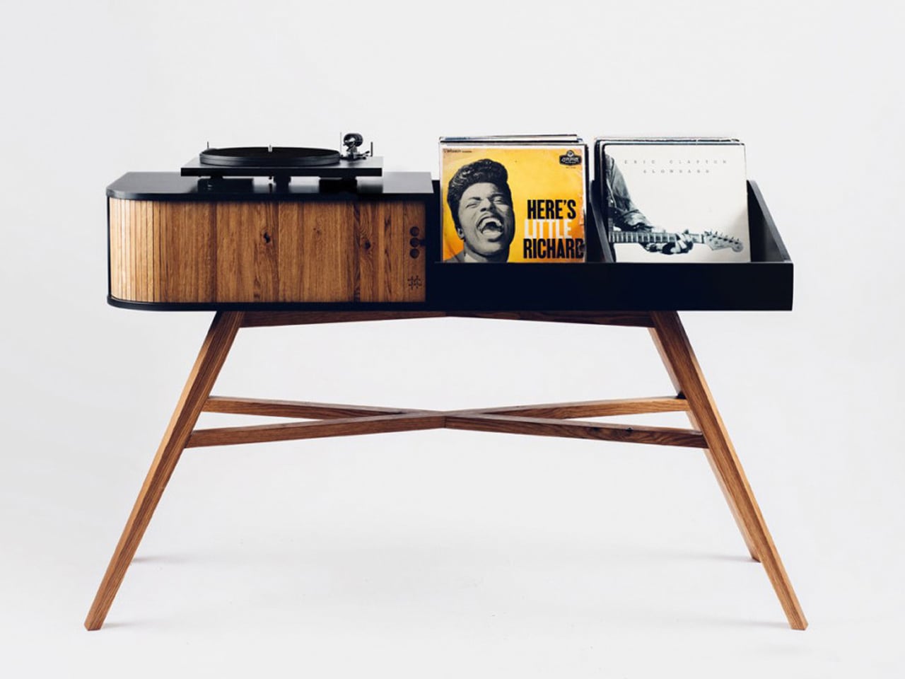
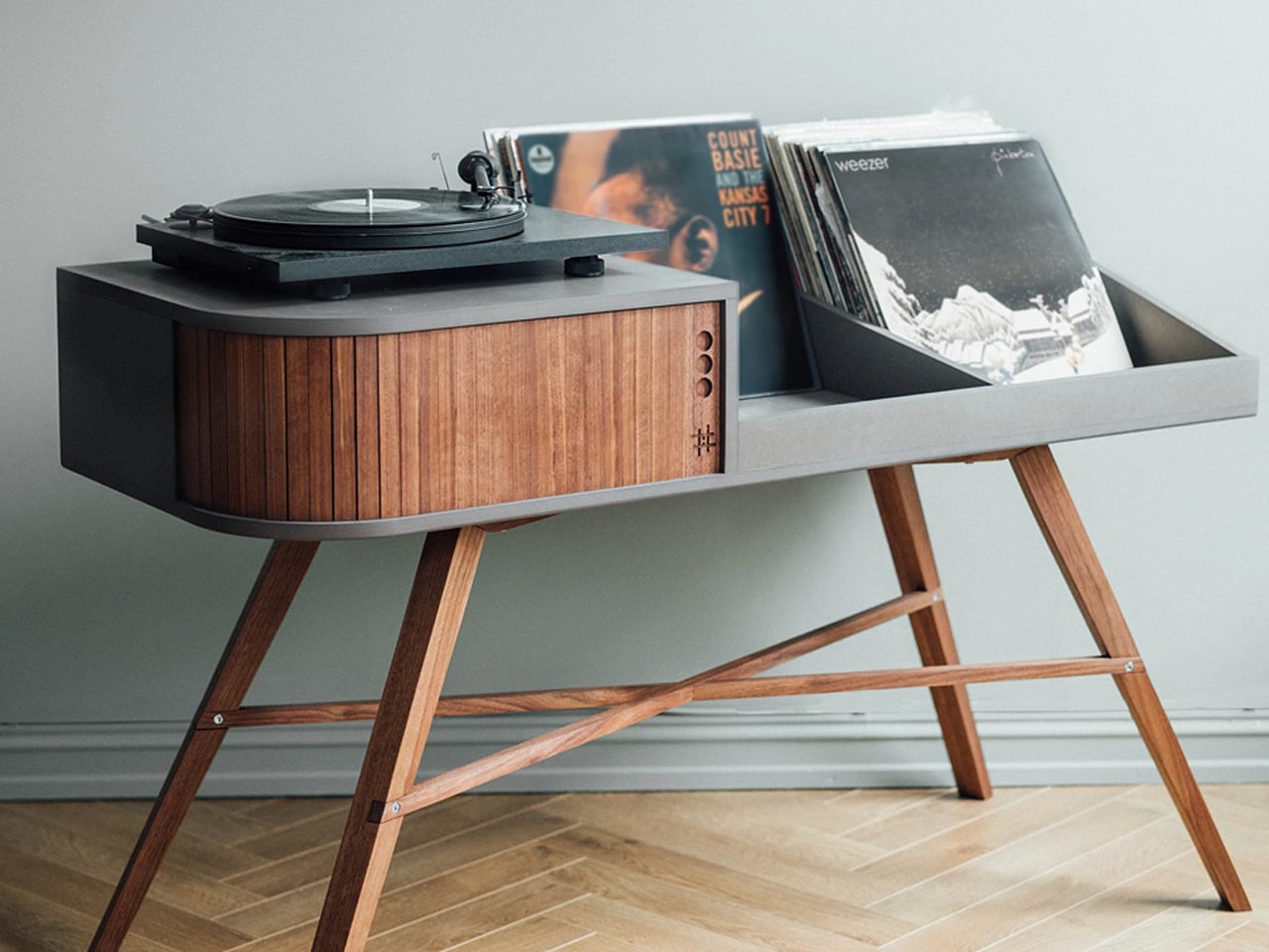
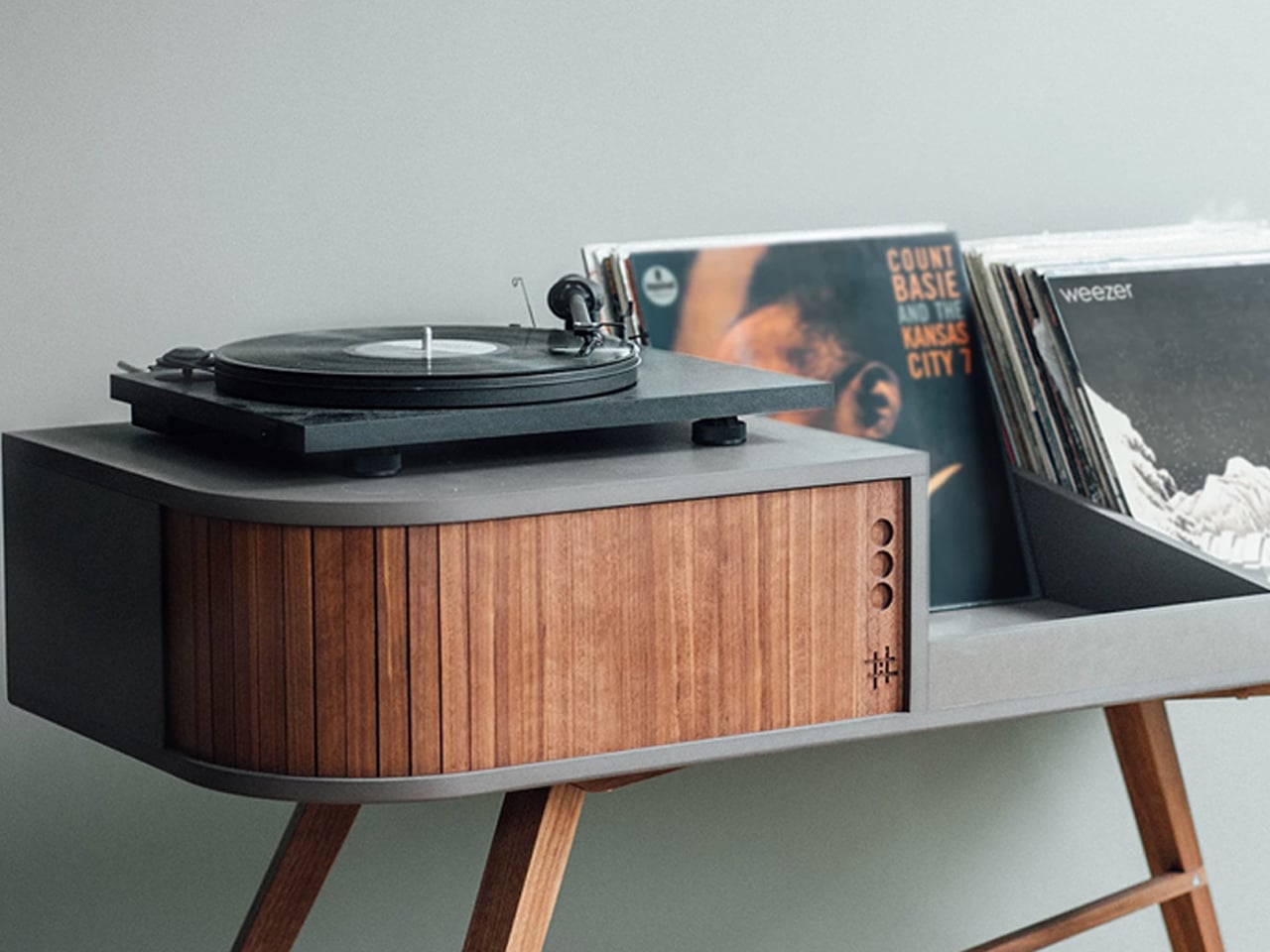
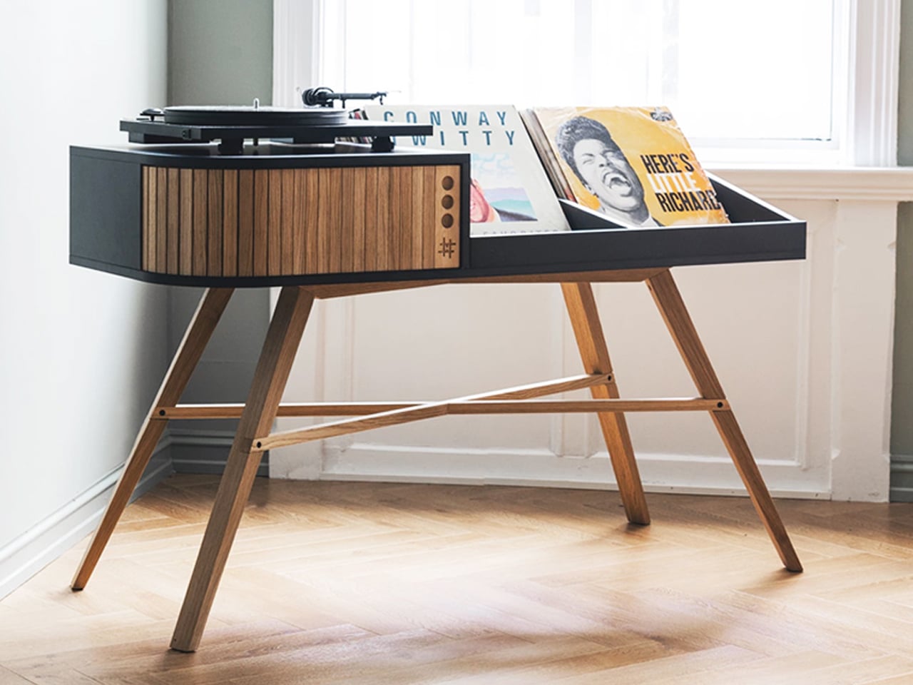
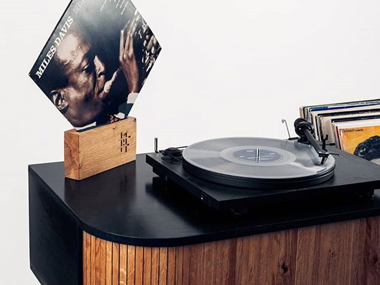
Take a look at the Vinyl Table by Stian Herdal, which celebrates vintage design through a warm mid-century aesthetic crafted for modern vinyl collectors. Made from oak and Valchromat, the handcrafted cabinet combines the character of classic record consoles with clean contemporary detailing. Its elegant proportions, tapered leg options, and natural wood finishes evoke the charm of retro interiors while creating a dedicated space for turntables and treasured vinyl collections. Designed to hold nearly 200 records, the piece transforms music storage into a nostalgic visual centerpiece that feels timeless and personal.
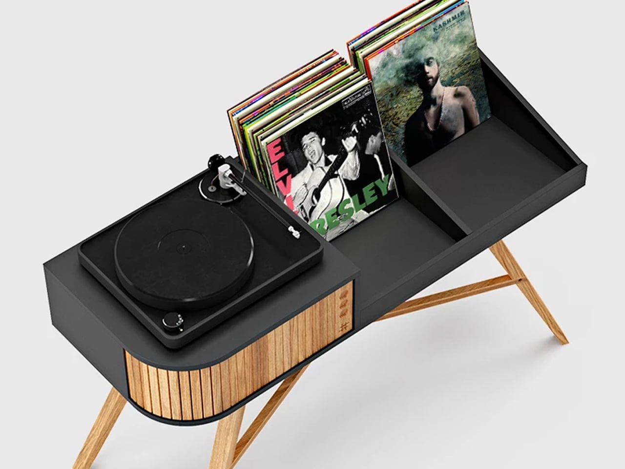
Turntable on a dark cabinet with a stack of vinyl records in the background and a Miles Davis album cover propped on a wooden stand.

Sleek black and wood record player console with a turntable on the left and vinyl storage on the right, supported by angled wooden legs.

A standout vintage detail is the beautifully crafted sliding tambour door, which introduces both texture and movement to the design. As the wooden panels glide open, they reveal hidden storage for amplifiers and audio equipment, recreating the tactile experience associated with classic furniture craftsmanship. Every element, from the smooth wood grain to the soft mechanical movement, reflects an appreciation for old-world design traditions. The Vinyl Table captures the atmosphere and romance of vintage listening culture through refined craftsmanship and nostalgic detailing.

7. Layered Lighting Replaces Harsh Overhead Illumination

Lighting design has become far more atmospheric in 2026 interiors. Instead of relying on a single overhead fixture, designers are layering spaces with table lamps, concealed LED lighting, wall sconces, floor lamps, and sculptural pendants. The goal is to create warmth, softness, and visual depth throughout the home.

This approach works closely with the wider movement toward comforting and emotionally rich interiors. Warm lighting enhances terracotta tones, textured walls, and natural materials while making spaces feel more intimate. Harsh white lighting and ultra-bright open spaces are increasingly being replaced by layered illumination that changes mood throughout the day. Lighting is now treated as part of the architecture of the room and not just a decorative addition.
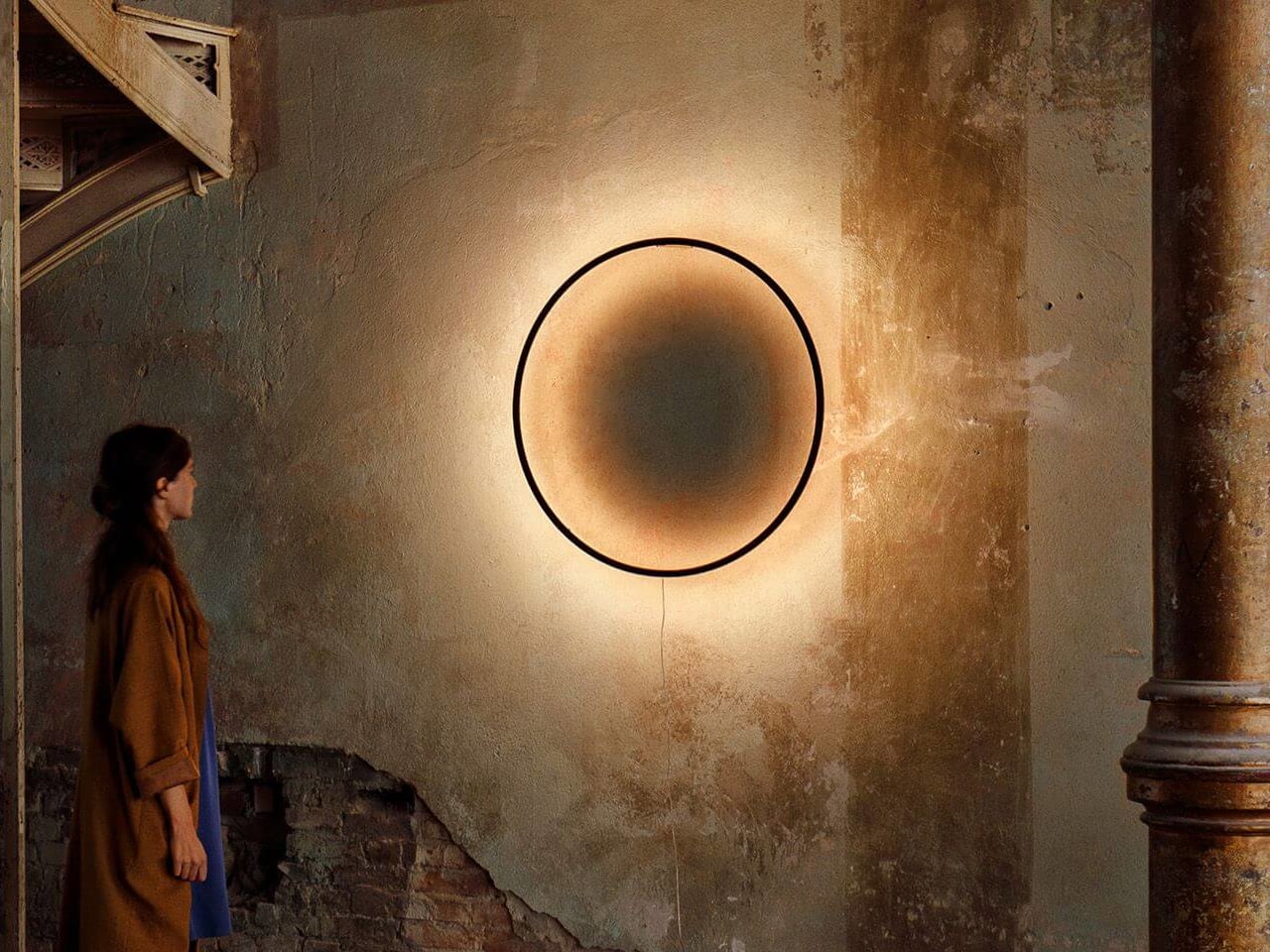
Woman in a brown coat standing in a weathered room, looking at a large glowing circular artwork on the wall.

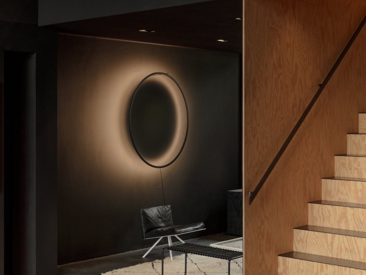
Minimalist living area with a circular halo light on a dark wall, a black leather chair, and a wooden staircase to the right.

Round wall-mounted light fixture with a black rim and a warm beige gradient shade, creating a soft glow against a white wall.

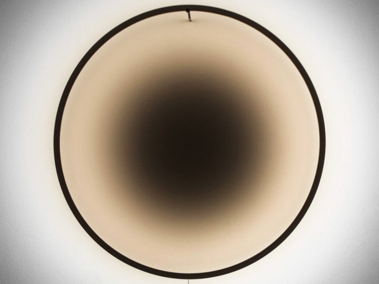
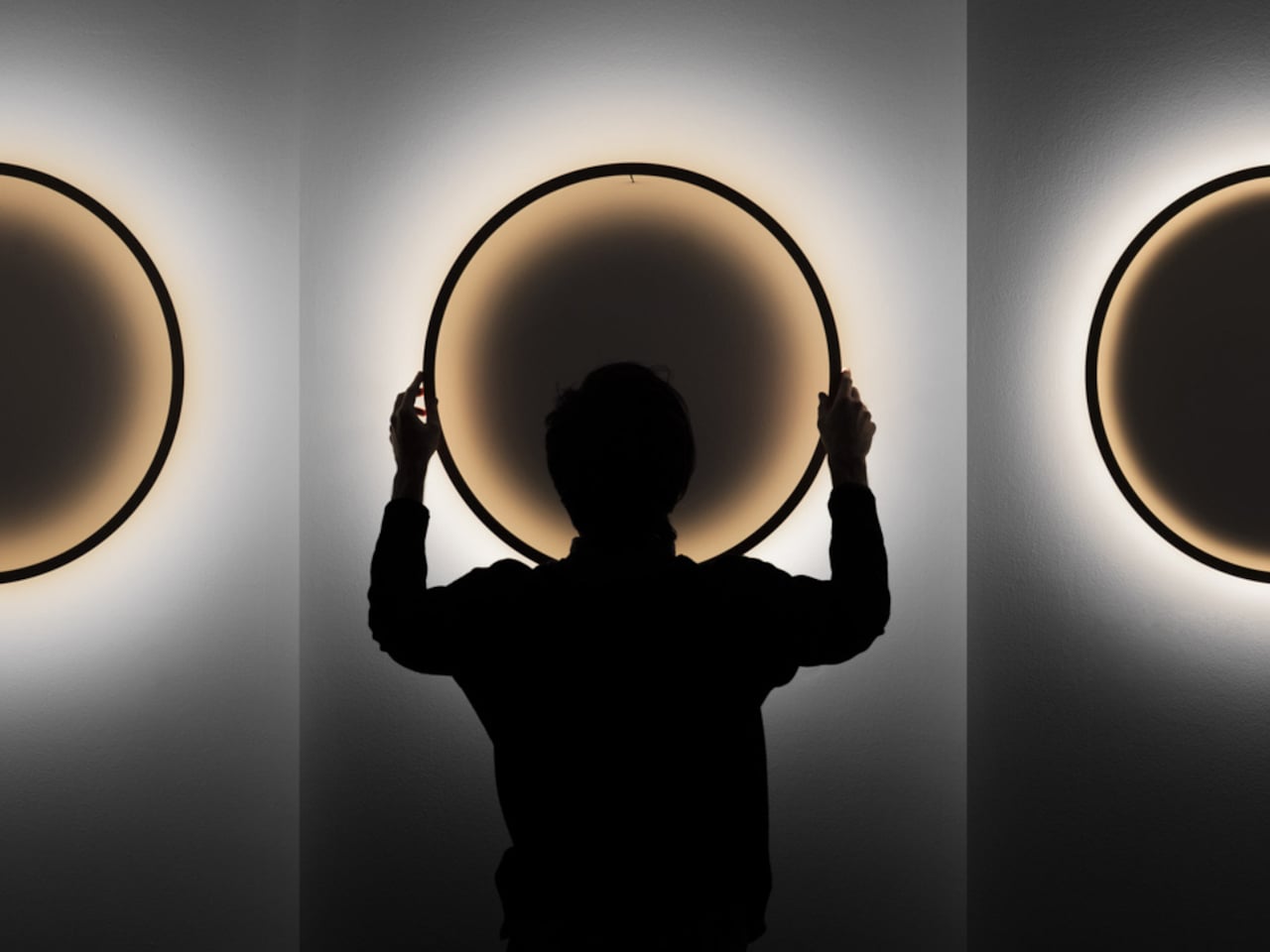
The Eclipse wall lamp by Tilen Sepič explores layered lighting through a sculptural circular form that transforms the atmosphere of a room. During the day, the lamp appears as a minimalist wooden ring with a quiet architectural presence, blending naturally into contemporary interiors. Crafted in finishes like natural beech, white, and burnt wood, the design balances simplicity with visual depth. It steps beyond a conventional wall fixture; Eclipse acts as both decorative art and an ambient lighting element that changes character throughout the day.
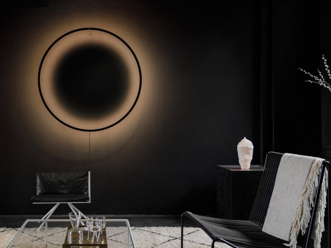
Dark minimalist living room with a large circular wall halo, a black chair, and a glass coffee table; a white sculpture rests on a side table to the right.

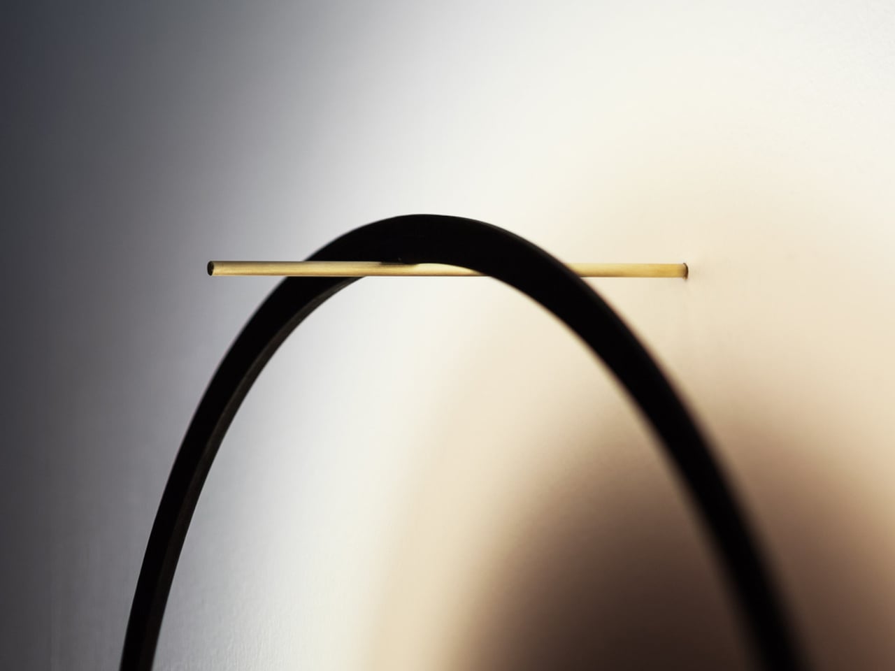
Abstract close-up of a black curved arc with a thin gold rod crossing it against a light gradient background.

Silhouette of a person standing with arms raised, touching a glowing circular wall light, flanked by two more illuminated circles on a wall.

Once illuminated, the lamp creates a layered lighting effect through a warm LED glow diffused across the wall surface. The circular frame casts a dramatic central shadow, producing depth, contrast, and a soft, halo-like atmosphere that feels almost cinematic. Its adjustable distance from the wall allows the light to shift between sharp definition and softer diffusion, giving users control over the mood of the space. The interplay of glow, shadow, and warm tones transforms the lamp into an immersive lighting experience rather than a simple source of illumination.

What’s quietly being retired in 2026 interiors

Several aesthetics that once dominated social media and showroom floors are now losing relevance. Cool grey palettes are the clearest example. Once considered modern and timeless, they now often feel cold and overexposed. Stark all-white interiors are also fading because they lack the warmth and tactility homeowners increasingly want from their spaces.

Sharp-edge minimalism is another design language slowly being softened. Boxy furniture, rigid monochrome schemes, and ultra-sparse rooms are giving way to layered interiors with texture, warmth, and personality. The dominant mood of 2026 is no longer about perfection or restraint. It is about creating homes that feel human, sensory, and emotionally comforting.

Interior design trends 2026 are ultimately moving toward spaces that feel softer, warmer, and more connected to everyday life. The homes defining this year are tactile, expressive environments built around comfort, material richness, and individuality. As the second half of 2026 approaches, it is becoming increasingly clear which trends truly landed and which ones quietly stayed behind in January mood boards.

The post The 7 Interior Design Trends Actually Defining 2026 Homes first appeared on Yanko Design.
A “Modular Bento Box” for Your Desk Gear: Meet Orbitkey’s $42 Grid Organizer

Orbitkey’s design story has always revolved around everyday friction, the loose keys in a pocket, the tangled cable in a bag, the small desktop essentials that somehow scatter across every available surface. Its early key organizers turned a familiar pocket annoyance into a cleaner, quieter carry experience, while the Orbitkey Nest translated that same philosophy into a lidded tray for modern EDC, complete with customizable dividers and a top surface made for quick access. Products like the Desk Mat pushed further into the workspace, showing how Orbitkey likes to treat organization as part utility, part atmosphere.

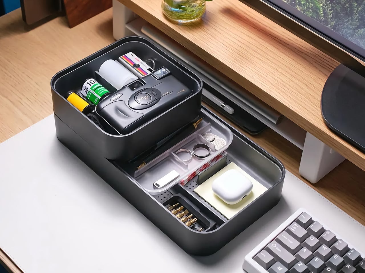
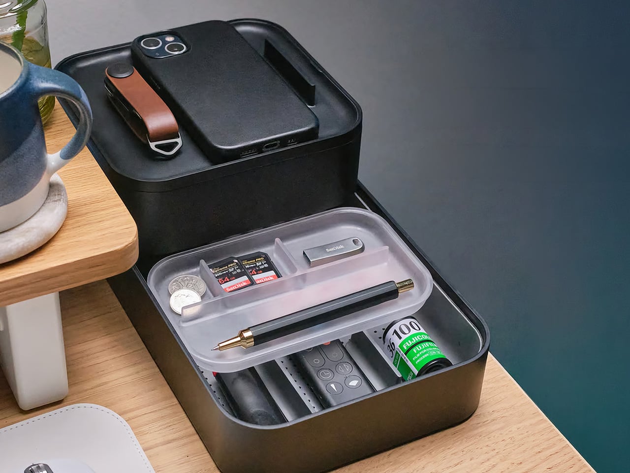
The Grid Desk Organizer brings that philosophy into a broader desktop format, creating a modular home for the loose objects that gather around work and living spaces. Its perforated tray base works with snap-in dividers that can be adjusted any number of ways to suit different layouts, whether the setup leans toward tech accessories, stationery, EDC, bedside essentials, or any items required close at hand. Stackable construction allows the system to grow over time, while soft-touch lining, quiet feet, and a lid that doubles as a phone stand sharpen the day-to-day experience. Offered in Black, Stone, and Terracotta, and available in both standard and mini versions, the Grid starts at $42 with shipping expected in September 2026.

Designer: Orbitkey (Charles Ng, Maneet Singh)

Click Here to Buy Now: $42 $49.90 (16% off). Hurry, only a few left! Raised over $428,000.

The Nest earning both an iF Design Award and a Red Dot Award in 2021 said something specific about what Orbitkey prioritizes: functional performance through material restraint rather than formal complexity. Forms across the lineup stay compact and geometric, surfaces carry a soft tactile quality, and color palettes lean deliberately toward the understated. These choices reflect a brand that understands organization products share space with other carefully chosen objects, and that the best-designed ones tend to recede rather than announce themselves. The Grid carries that same sensibility, favoring clean geometry and muted tones over anything decorative or loud. It is built to improve a space rather than compete with what is already in it.

The patent-pending snap-on divider design is the mechanical core of the Grid, a perforated tray floor that accepts snap-in dividers at any position along its grid, like a pegboard, but horizontal. Long dividers run the full depth of the tray while shorter ones slot in crosswise, and the entire arrangement can be lifted out and reconfigured whenever the contents are changed. Most desk organizers impose a fixed spatial logic, demanding objects conform to pre-cut compartments regardless of whether they actually fit. This inverts that relationship entirely, letting each divider position respond to the specific objects beside it rather than the other way around. The practical difference between those two approaches is significant enough that once you experience the latter, returning to the former feels immediately wrong.

While the main tray forms the operational base, a translucent accessories tray nested inside manages the smaller objects that vanish at the bottom of any open container. Above that, the lid serves as a valet surface for quick-drop essentials, with its handle engineered to double as a portrait phone stand when set upright. Accessing a lower layer takes only a forward slide of the top tray, fast enough to register as a gesture rather than an interruption. The structure maps to how a desk gets used through a day: high-frequency items on the surface, everything else one movement away. Each layer feels less like an added feature and more like part of a cohesive system shaped around everyday use.

The interior is lined with a soft-touch rubberized coating that protects items from scratching and gives the tray a tactile quality that cheaper desk accessories rarely bother with. Silicone feet on the base keep it from migrating across hard surfaces and cut out the sharp click that plagues most rigid desk objects when bumped or brushed. Exterior walls carry a clean matte finish that holds up well against fingerprints and reads easily alongside wood, concrete, or painted surfaces. Corners are gently curved and proportions sit deliberately low and wide, qualities that let the Grid disappear into a desk setup rather than dominating it. The three colorways, warm Terracotta, muted Stone, and near-universal Black, cover the major interior design directions without forcing a choice between personality and practicality.

Units stack both horizontally and vertically, so the Mini can sit beside or beneath the standard tray depending on the surface available. Future accessory inserts are planned as the system develops, echoing how the best modular product lines grow: incrementally, in response to real use patterns rather than speculative feature lists. For anyone already running a Nest for travel, the Grid functions as its natural stationary counterpart, the surface the Nest gets unpacked onto. Orbitkey has consistently built products as long-term investments rather than seasonal releases, and the Grid’s emphasis on future compatibility carries that same commitment.

Open black camera/tech case on a wooden desk, revealing small items: memory cards, coins, a USB drive, a fountain pen, and a small bottle with a green label in a clear tray.

The standard Grid Desk Organizer ships with one lid, one standard tray, one accessories tray, three long dividers, and four short dividers, priced at $42. The Mini, which includes a lid, mini tray, one long divider, and three short dividers, is available as a $26 add-on or bundled with the standard for $64. An Ultimate Bundle covering two standard units and two minis comes in at $110. All three colorways are available across both sizes, with color selection finalized at the close of the campaign. Shipping is expected in September 2026, and the Grid Desk Organizer is live now on Kickstarter.

Click Here to Buy Now: $42 $49.90 (16% off). Hurry, only a few left! Raised over $428,000.

The post A “Modular Bento Box” for Your Desk Gear: Meet Orbitkey’s $42 Grid Organizer first appeared on Yanko Design.

5 Best Japanese Kitchen Gadgets That Make Cooking Feel Like a Meditation Ritual

Japanese kitchen tools operate differently from their Western counterparts. They don’t promise to speed things up or reduce effort. They promise to make that effort worth something. The objects below share a commitment to material honesty and precision that changes the pace of cooking without changing the recipe. Each one invites you to slow down, pay attention, and find something close to calm in the ordinary rhythm of preparing food.

None of these tools asks for much counter space. None comes with instruction manuals. What they share is a design philosophy rooted in centuries of Japanese craft tradition, where restraint and intention produce objects that reward your attention rather than compete for it. Cooking with them slows you down in a way that feels like a gift. The meditation isn’t something you bring to the kitchen. These tools create the conditions for it.

1. Iron Frying Plate

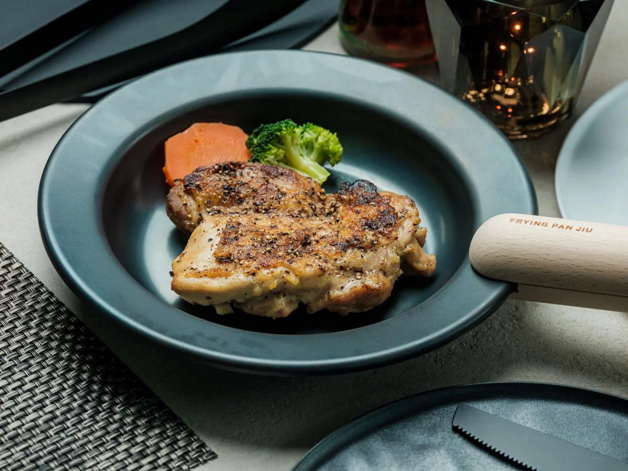
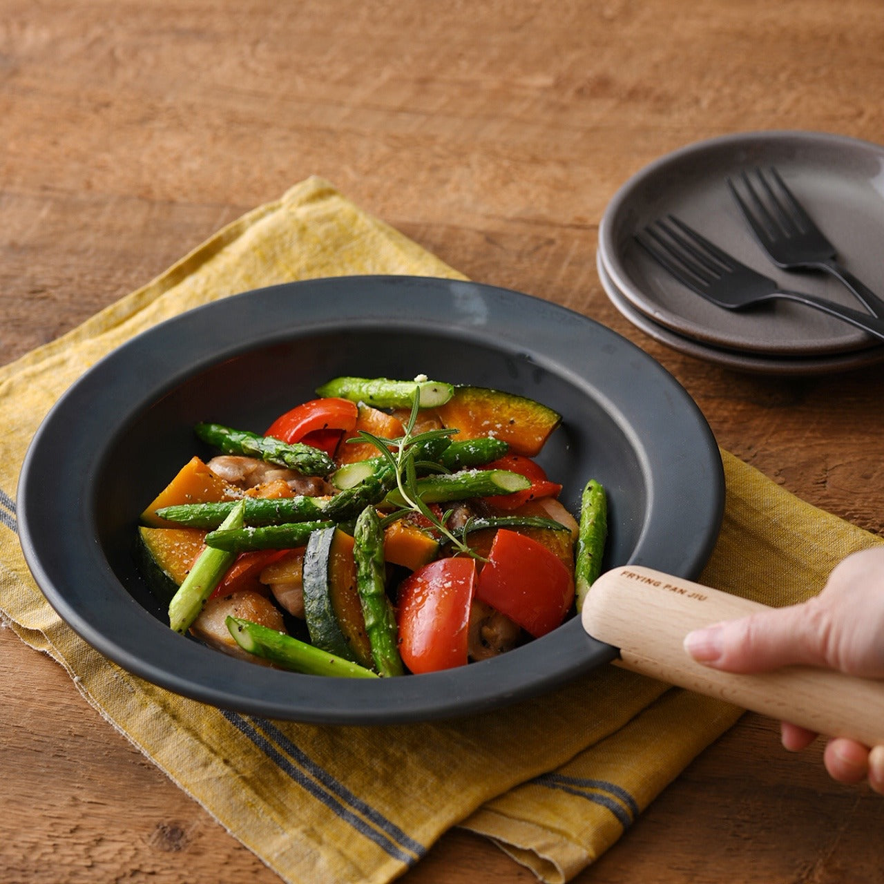
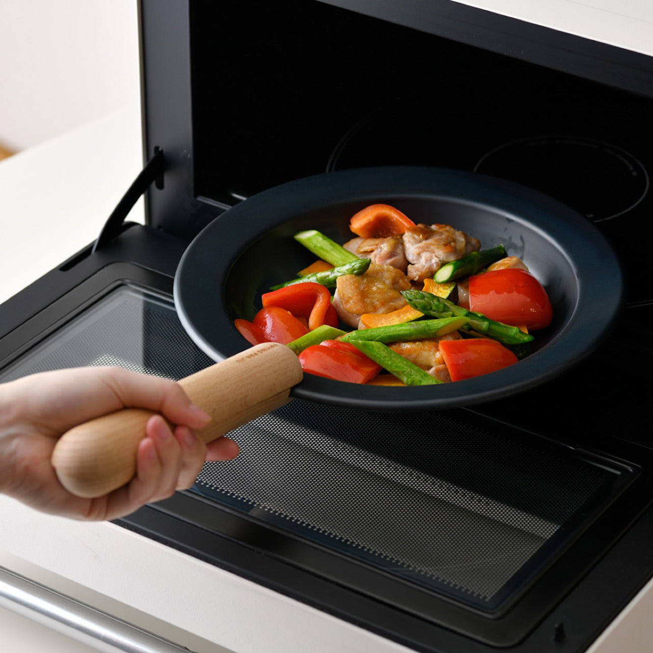
The Iron Frying Plate removes the boundary between the cooking vessel and the serving dish. Crafted from rust-resistant mill scale steel with a detachable wooden handle, it moves from stove to table without a transfer, without a plate in between. Eggs arrive still sizzling. Fish comes off the heat and onto the table in the same object, retaining the kind of temperature and texture that plating destroys. The cook-and-serve design isn’t a shortcut. It’s a different way of thinking about food.

The uncoated surface requires no seasoning before first use and develops natural non-stick properties through regular cooking. The detachable wooden handle attaches and releases with one hand, making the transition from burner to table completely fluid. Retained heat keeps food at a temperature throughout the meal, which changes its pace in subtle but noticeable ways. You stop rushing through dinner because the plate is still doing its job while you’re still deciding what to eat first.

Click Here to Buy Now: $69.00

What We Like

  • The cook-and-serve design preserves the temperature and texture that get lost in any transfer to a separate plate
  • The uncoated mill scale steel develops natural non-stick properties through use, with no chemical coatings involved

What We Dislike

  • The iron construction retains heat long after serving, which requires careful handling at the table
  • Heavier than standard serving dishes, which takes some adjustment if you’re used to lighter ceramics

2. Katakuchi Suribachi & Surikogi Set

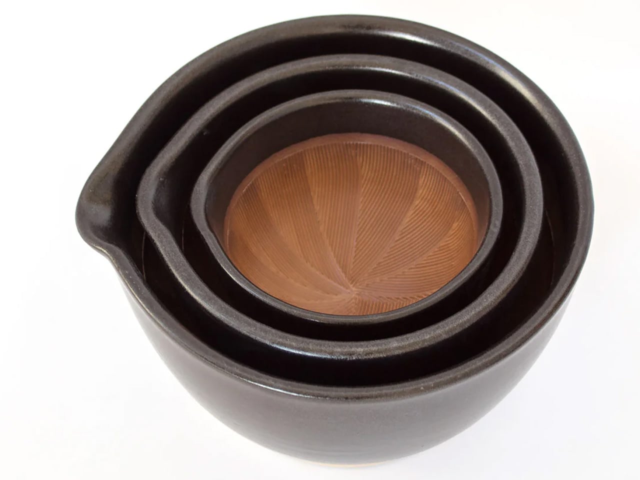
The suribachi is a Japanese mortar defined by its interior: a web of fine ridges that grip seeds and fibres and pull them apart through friction. Unlike smooth-walled mortars that crush, this one grinds, and the difference in what that produces is immediate. The katakuchi design adds a spout, so freshly ground sesame pours cleanly from the vessel without a transfer step. The wood surikogi follows the curve of the bowl exactly, which is the whole point of the pairing.

Using a suribachi imposes a different pace on cooking. You bring the seeds in, you begin to work the pestle in slow circles, and the sound changes as the seeds release their oil. The kitchen starts to smell like food before the pan is even on. That sensory sequence of physical work and gradual transformation is what separates this from a standard grinding tool. Available from TOIRO Kitchen in two colorways, it’s priced between $36 and $63 depending on size.

What We Like

  • The katakuchi spout makes it a single-vessel process from grinding to pouring; nothing gets lost in the transfer
  • The ridged earthenware interior produces a texture and aroma from sesame and spices that a food processor simply cannot replicate

What We Dislike

  • The earthenware body is heavy and requires careful handling; it’s not something you grab quickly
  • Cleaning the grooved interior takes more attention than a smooth-walled mortar

3. Iga-yaki Donabe Clay Pot

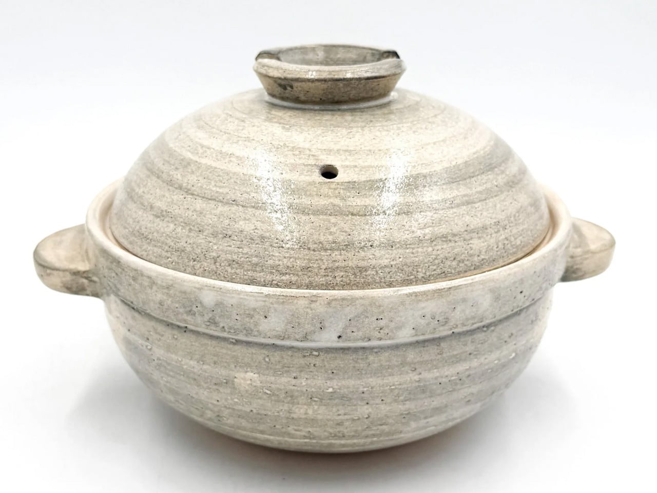
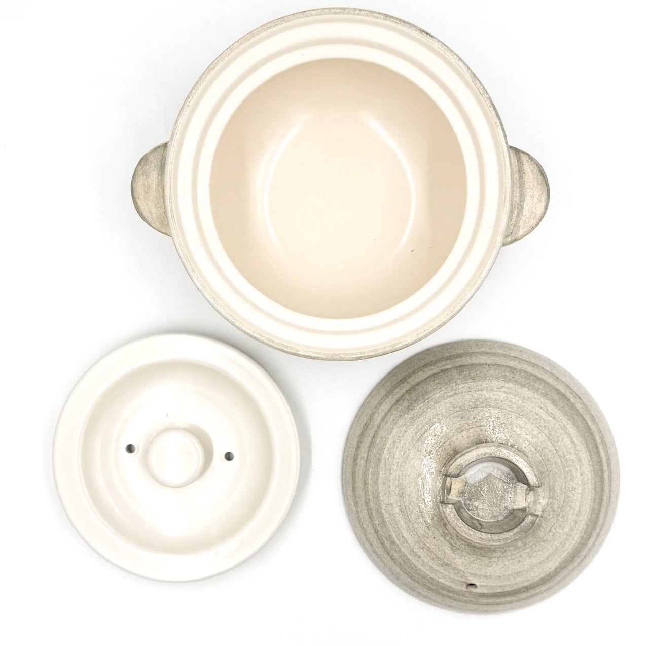
Iga-yaki clay comes from Mie Prefecture in Japan, where the local earth has been used for ceramics since at least the Kamakura period. The porous structure absorbs heat slowly and releases it evenly, creating a cooking environment that metal pots simply cannot replicate. Rice cooked in it sweetens. Broth deepens over a lower flame. The exterior stays rough and unfinished while the interior is glazed smooth: two textures on the same vessel, each doing exactly what it needs to.

Using a donabe imposes a different pace on dinner. You bring it to a heat gradually, you watch the steam rising from the lid, you lower the flame, and wait. That sequence of patient setup, attention to what the pot is communicating, and the discipline not to rush transforms cooking into something closer to practice than production. TOIRO Kitchen stocks Iga-yaki donabe in several sizes, all made in Japan, all functioning as vessels for the kind of cooking that rewards presence.

What We Like

  • Iga-yaki clay retains heat well past the point of turning off the flame, keeping food at a temperature while you’re still at the table
  • Genuinely versatile across hot pot, rice, steaming, and slow braise. One vessel covers all of it

What We Dislike

  • Clay donabe requires seasoning before first use, typically by simmering rice water in it, a step not everyone anticipates from the packaging
  • The porous clay body can absorb strong cooking odors over time and needs to be stored with the lid off after washing

4. Sakura Petal Grater

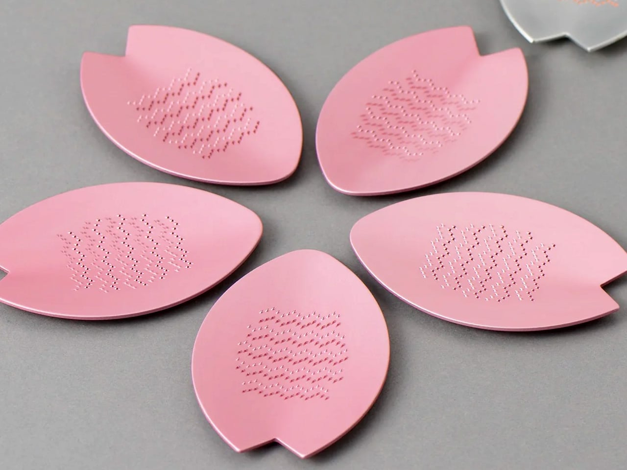
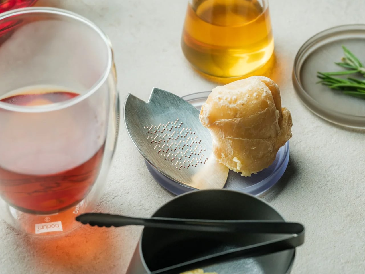
Fresh wasabi grated at the table is a different ingredient from the paste that comes in a tube. The same is true of ginger, of daikon, of any root that peaks the moment it’s reduced. The Sakura Petal Grater is built around that principle. Its sakura petal form brings tableside preparation into the meal itself, turning garnish work from a kitchen task into part of the ritual of eating. The circular motion has a quality that makes stopping feel abrupt.

Made from stainless steel, the grater sits flat and stable at the table, and the anti-slip silicone base doubles as a protective cover when stored. Its compact size means it takes no space to speak of, but what it brings to the table is disproportionate to its footprint. Grating fresh ginger over soup, wasabi alongside sashimi, and daikon over a bowl of soba becomes something you look forward to rather than manage. The shape itself is worth lingering on.

Click Here to Buy Now: $45

What We Like

  • Tableside grating turns fresh garnish preparation into part of the dining ritual rather than prep work done in advance
  • The compact form requires almost no storage space, and the silicone base doubles as a protective cover

What We Dislike

  • The small size means slower processing for larger quantities, so it works best for garnish amounts rather than bulk grating
  • Specialist in scope: for kitchen prep in volume, a larger grater is the more practical tool

5. Yoshihiro VG-10 16-Layer Hammered Damascus Nakiri 165mm

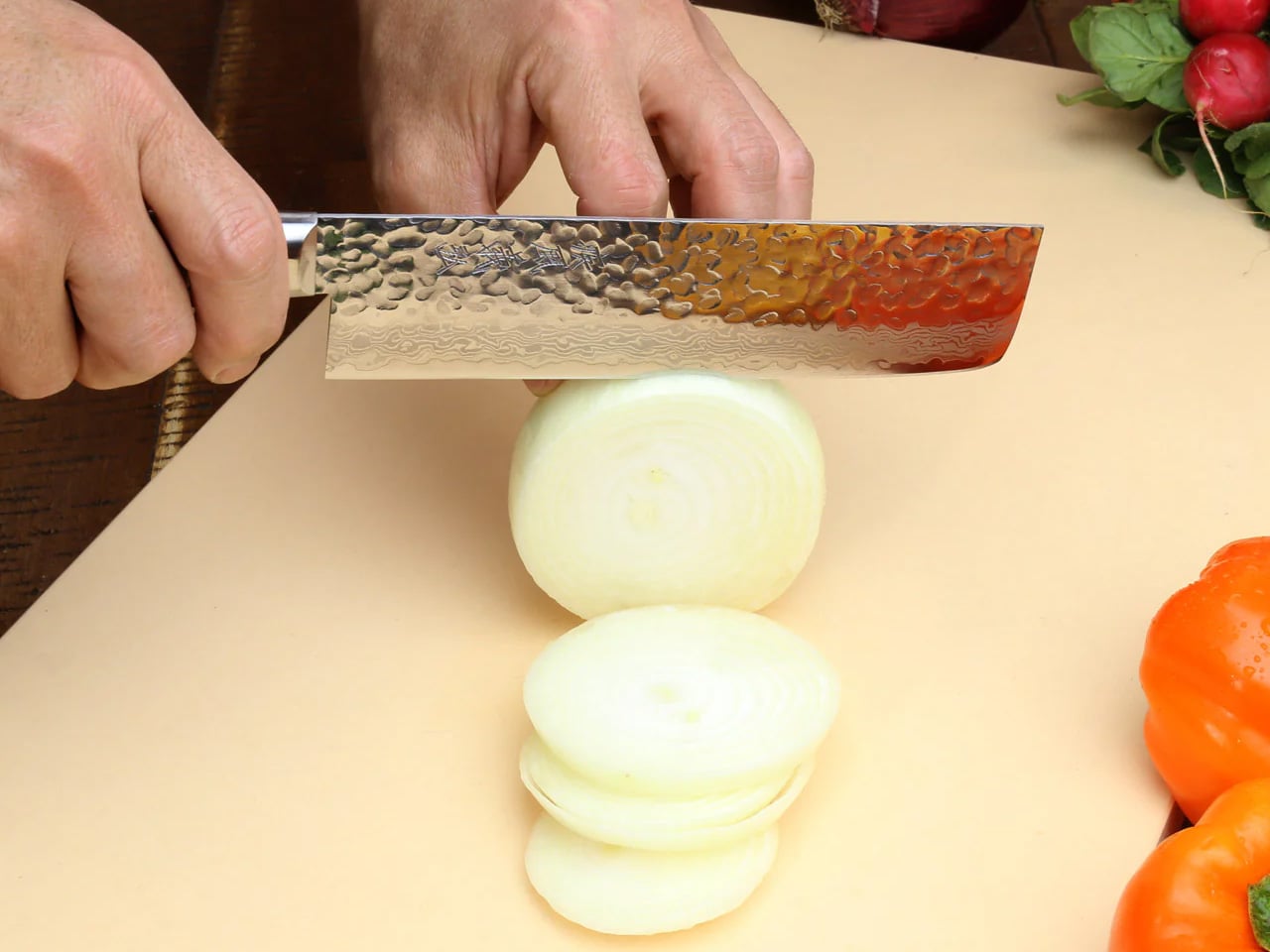
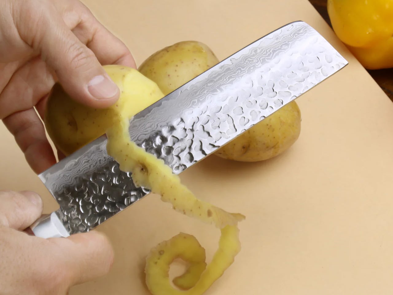
The Nakiri is designed exclusively for vegetables, and that singular focus is the entire point. The flat rectangular edge makes full contact with the cutting board on every stroke, without tip lift, without the curved rock of a chef’s knife. Just clean forward pressure through root vegetables, leafy greens, and ripe tomatoes with equal consistency. Yoshihiro builds this version around a VG-10 core wrapped in 16 layers of hammered Damascus steel, and the surface reduces friction through each cut, so nothing drags.

The Damascus layering produces a pattern unique to each blade, a specific arrangement of steel that no other knife in the world shares with yours. That individuality matters more than it sounds. The full-tang mahogany handle distributes weight in a way that makes extended prep feel balanced rather than tiring. Each blade is handcrafted by master artisans and certified for commercial kitchen use.

What We Like

  • The 16-layer Damascus pattern is unique to every individual blade, making this a personal object in a way factory knives never manage
  • Full-tang construction distributes weight evenly through the handle, reducing fatigue during longer vegetable prep sessions

What We Dislike

  • The Nakiri is a specialist vegetable blade and is not designed for meat, fish, or general-purpose cutting
  • Damascus finishes need careful maintenance and proper storage to preserve both the edge geometry and the layered surface over time

The Kitchen Is Already the Meditation

These five objects share something beyond country of origin. They each ask something of the person using them: attention, patience, a willingness to slow down and notice. The iron plate asks you to eat at the pace of the heat. The donabe asks you to wait for the steam before you touch the lid. The suribachi asks you to stay with the grinding until the smell tells you it’s ready. That presence is the common thread.

None of these tools will make you a better cook overnight. What they will do is change how cooking feels from one session to the next, until the kitchen becomes a place you want to spend time in rather than a place you want to get through. That shift is harder to achieve than any technical skill, and these five objects are exceptionally good at producing it.

The post 5 Best Japanese Kitchen Gadgets That Make Cooking Feel Like a Meditation Ritual first appeared on Yanko Design.

5 Designer Pens That Make Every Other Gift for Him Look Lazy

Most gift guides for him are boring. A leather wallet, a whiskey set, a watch he already owns in a different color. But if the person you’re buying for genuinely cares about the objects around him, about what something communicates before he even uses it, a pen is an underrated move. Not just any pen. The five below are the kind of pieces that make everything else on the gift table look like an afterthought.

These aren’t novelty pens with logos. Each one makes a deliberate argument about what a writing instrument can be, rethinking the material, the mechanism, or the relationship between the pen and the desk it lives on. Together, they represent how designers are now treating an object that most people have stopped thinking about. Whether you’re shopping for a birthday, an anniversary, or a reason to stop buying the same gift twice, this list delivers.

1. Pininfarina Aero Ethergraf

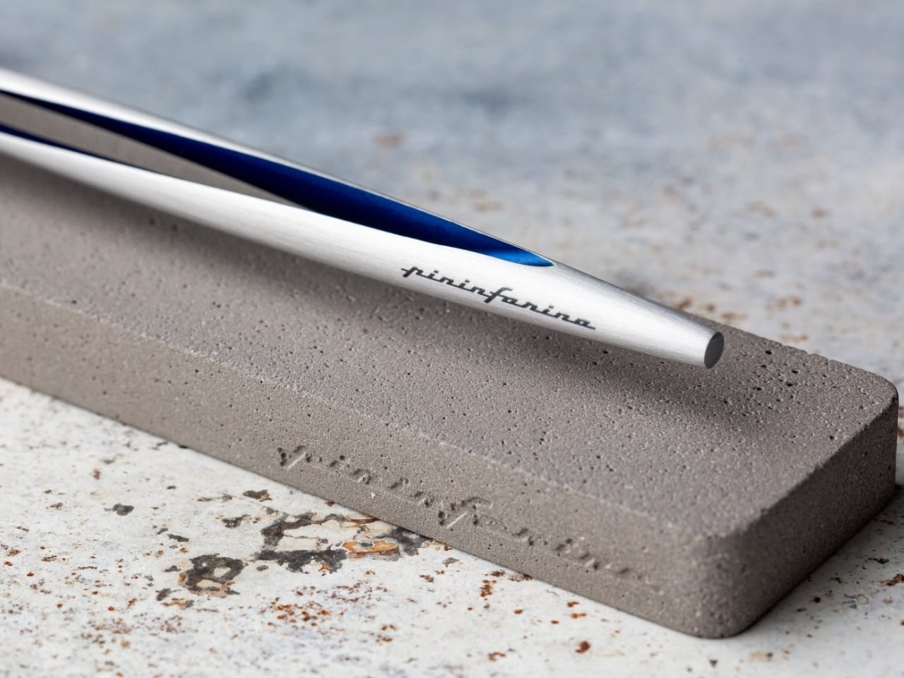
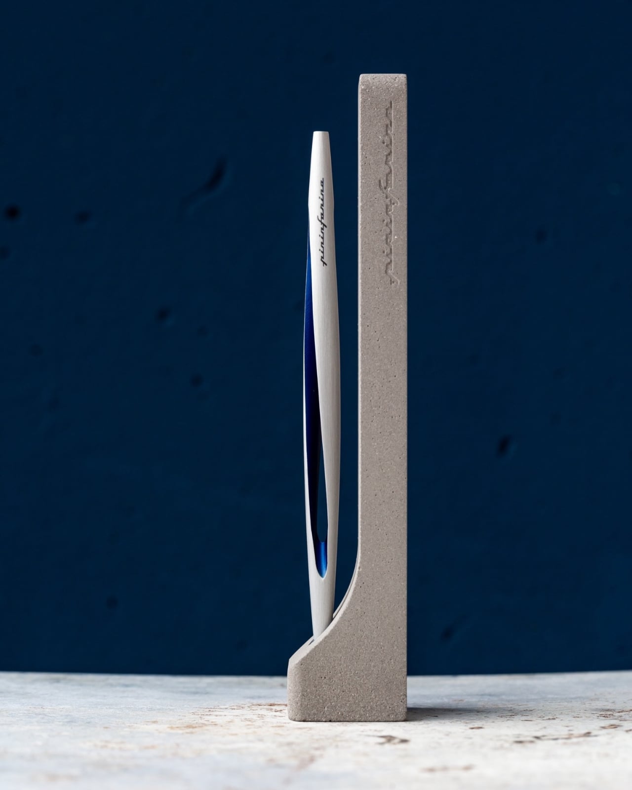
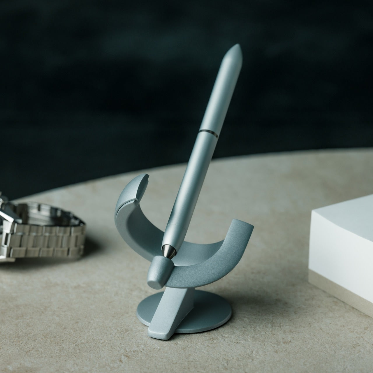
Pininfarina’s design language has always been about the single confident line that communicates speed and restraint at once. The Aero Ethergraf carries that directly to the desktop. It writes through an Ethergraf metal alloy tip that works via oxidation, leaving a graphite-like mark on paper without any ink. No cartridges, no cap to lose, no refills, ever. For him, this means a writing tool that genuinely never runs out, made in Italy and handcrafted to outlast anything else on his desk.

The aluminum body carries a blue accent that catches light the way a car door does at the right angle, which makes complete sense coming from the studio responsible for decades of Ferrari and Maserati bodies. Sitting in its raw concrete cradle, the Aero Ethergraf reads less like office stationery and more like a considered piece of sculpture. The line it leaves is precise, smudge-proof, and won’t bleed through paper. It’s the kind of object that earns its place on whatever desk it lands on.

What we like:

  • Writes indefinitely with no ink, cartridges, or maintenance required — the Ethergraf alloy tip is genuinely a forever writing surface
  • Handcrafted in Italy, the aerospace-grade aluminum body and raw concrete cradle together make a gift that reads as a design object, not an office supply

What we dislike:

  • The mark left by the Ethergraf tip is lighter than a standard pen line, which may not suit those who prefer a bold, ink-heavy stroke
  • Very smooth or coated paper surfaces can diminish the writing quality, so it performs best on standard uncoated notebooks or writing pads

2. Inseparable Notebook Pen

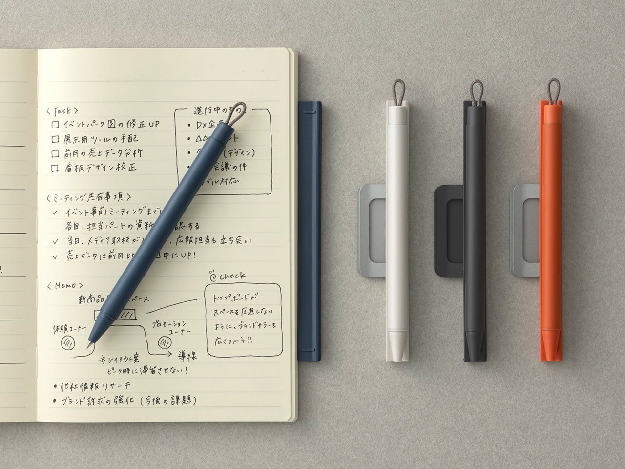
The premise is almost frustratingly simple. A pen that attaches magnetically to the side of a notebook — the way an Apple Pencil does on an iPad — so the two are always together and always ready. Designer Yusuke Nagao built it with a three-part construction featuring a plastic protector, a metal clip, and the pen itself. For him, it solves one of the most persistent small frustrations in daily life: a notebook sitting on the table with nothing to write with.

There’s a quiet confidence to the Inseparable’s design that reveals itself the longer it’s used. Nothing feels overworked. The silhouette is clean, the clip is integrated rather than decorative, and the magnetic attachment snaps silently into place in a way most products would never bother to refine. The ink flows smoothly for clear and precise writing on the go.

Click Here to Buy Now: $19.95

What we like:

  • Magnetic attachment to any notebook eliminates one of the most persistent small frustrations in daily writing habits in the cleanest possible way
  • The minimal three-part design prioritizes function without visual noise — it looks exactly as useful as it actually is

What we dislike:

  • The magnetic clip system is built around a single notebook format, so those who move between multiple journals will find the integration more limiting
  • The compact form and single-ink style serve portability well, but leave little room for those who prefer a heavier body weight or a finer writing point

3. Yamaha Swing Scribe

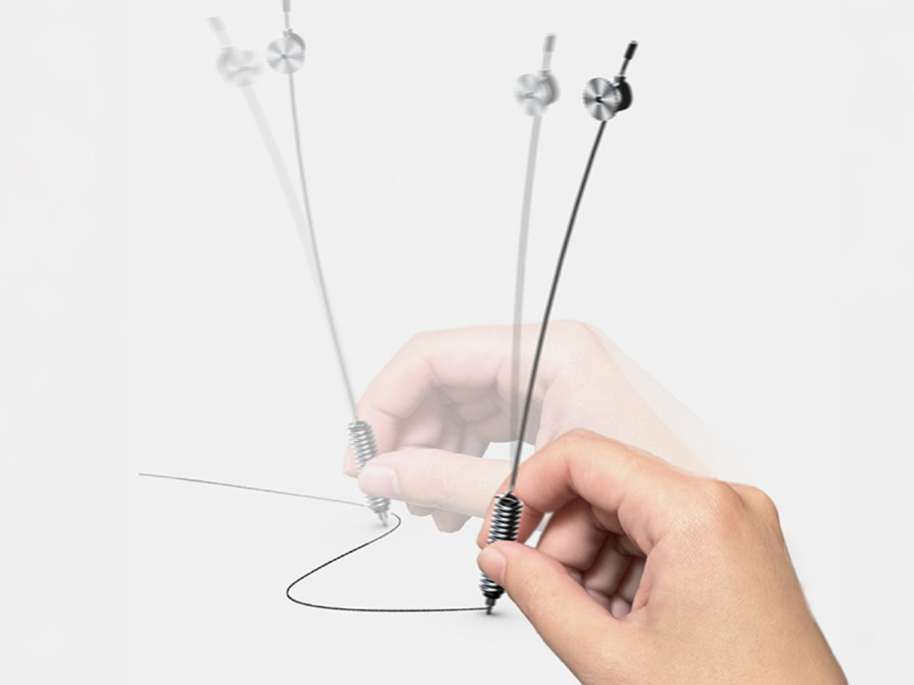
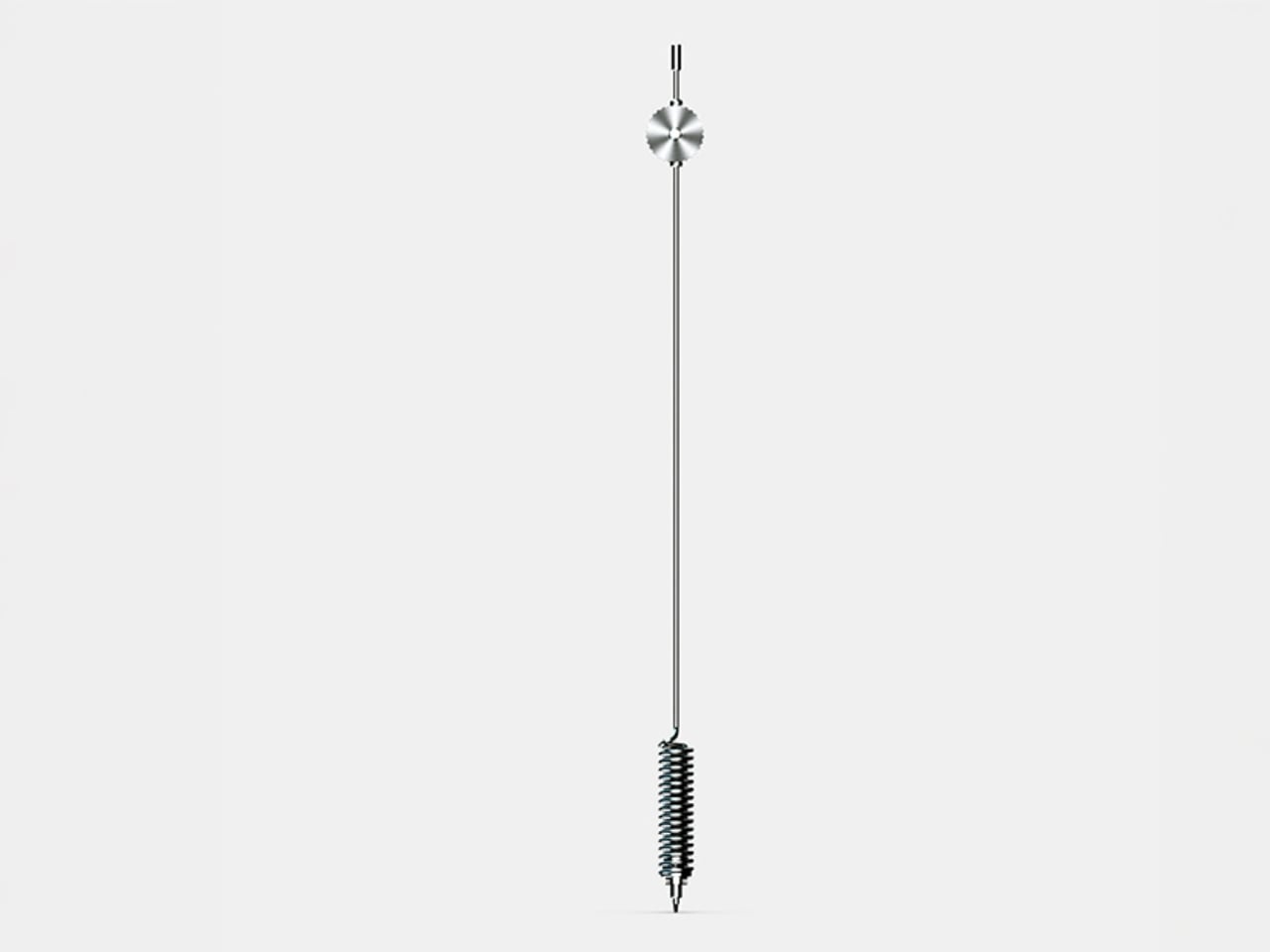
If someone asked you to name a Yamaha product, you’d say piano or motorcycle before you said pen. That gap is exactly what makes the Swing Scribe interesting. Part of Yamaha’s Scribe Tool Design 2024 project, it’s a collaboration between Yamaha Corporation and Yamaha Motor designers in the US. The premise draws from the quill: as a feather naturally wobbles under air resistance while writing, it creates a rhythm. Yamaha made that incidental quality deliberate and physical for him to feel.

A weighted tip is attached to a metal bar, and as he writes, it swings. The small pendulum force feeds a steady beat back into the hand with every stroke. No batteries, no app, just physics. For someone who gets his best thinking done with a pen in hand, the Swing Scribe adds a dimension to the writing experience that no other pen on any other list has thought to offer.

What we like:

  • The pendulum mechanism delivers a genuinely new physical sensation in writing, drawing directly on the natural rhythm that once made quill writing feel so distinct from any modern tool
  • The creative pedigree is unlike anything else here — a joint effort between two legendary Yamaha divisions, treating writing as a sensory design challenge worth solving

What we dislike:

  • The Swing Scribe is a concept from Yamaha’s design research project, meaning it isn’t currently available as a retail product ready to purchase and wrap
  • The swinging weighted mechanism, while compelling in execution, may require an adjustment period for those accustomed to the predictable feel of a standard pen

4. Levitating Pen 3.0

The third iteration of a design that has always pushed toward the improbable, the Levitating Pen 3.0 is built from aerospace-grade aluminum and titanium with a zinc alloy base and balances at a 60-degree angle in a charged magnetic field, bobbing gently when it settles into position. For him, this is the desk object that does something no leather-bound pen set ever managed: it makes people stop mid-conversation and ask what that thing is.

Available in silver or anodized black with a satin finish, it ships with a German-engineered Schmidt rollerball cartridge that delivers a silky writing experience to match its appearance. Undocking the pen to write is its own small ritual. Docking it back lets it find its magnetic sweet spot on its own. Spin it against the stand, and it rotates for up to 30 seconds.

Click Here to Buy Now: $139.00

What we like:

  • The magnetic levitation is genuinely hypnotic, and the Schmidt rollerball cartridge means it writes as well as it performs — form and function earn equal attention
  • Ships complete in silver or anodized black with a satin finish, making this an immediate desk statement that needs nothing added to impress

What we dislike:

  • The levitation only functions on a flat, stable surface — this is strictly a stationary desk piece and cannot be stored on its side or carried in its floating position

5. Pulse

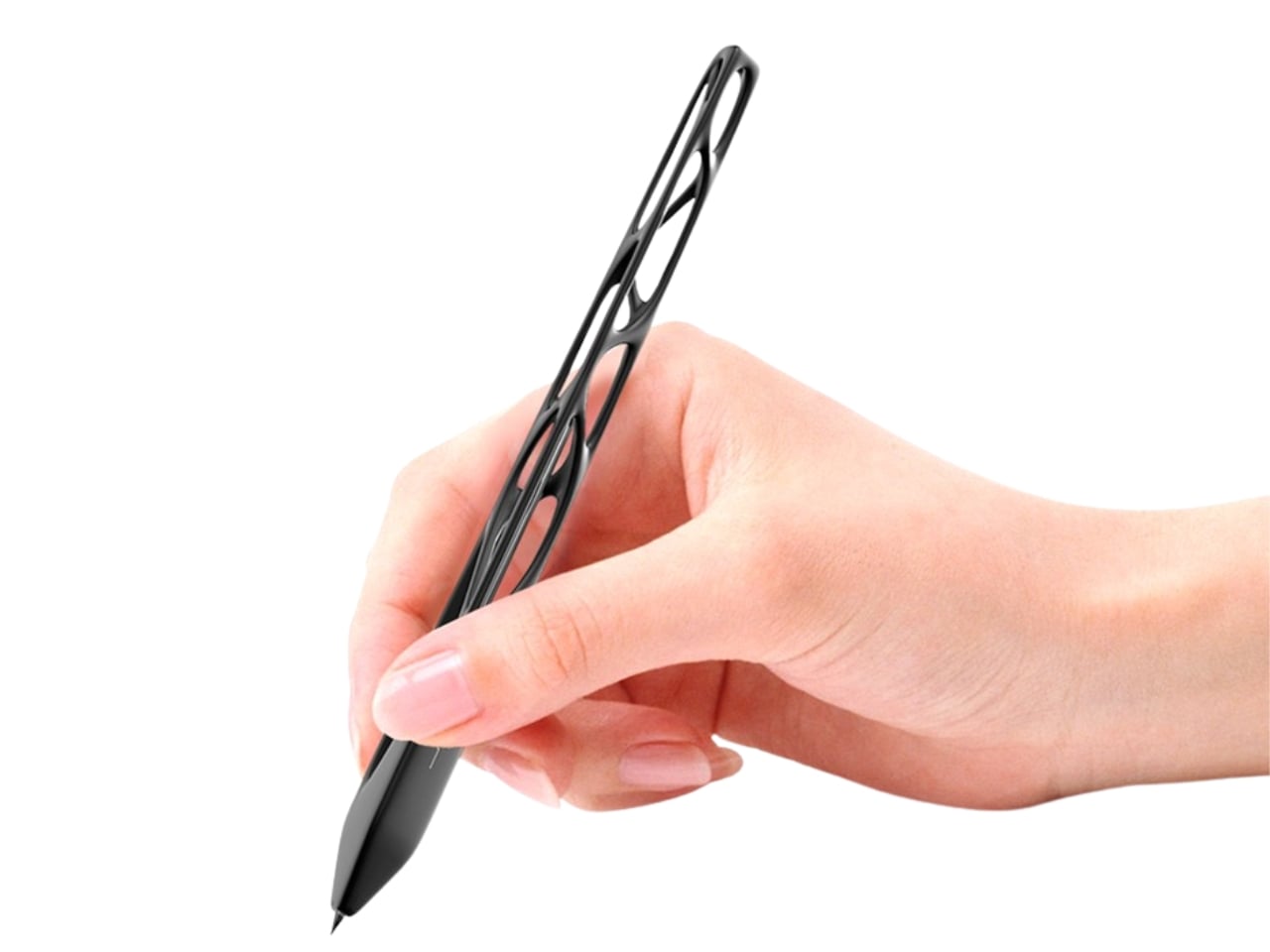
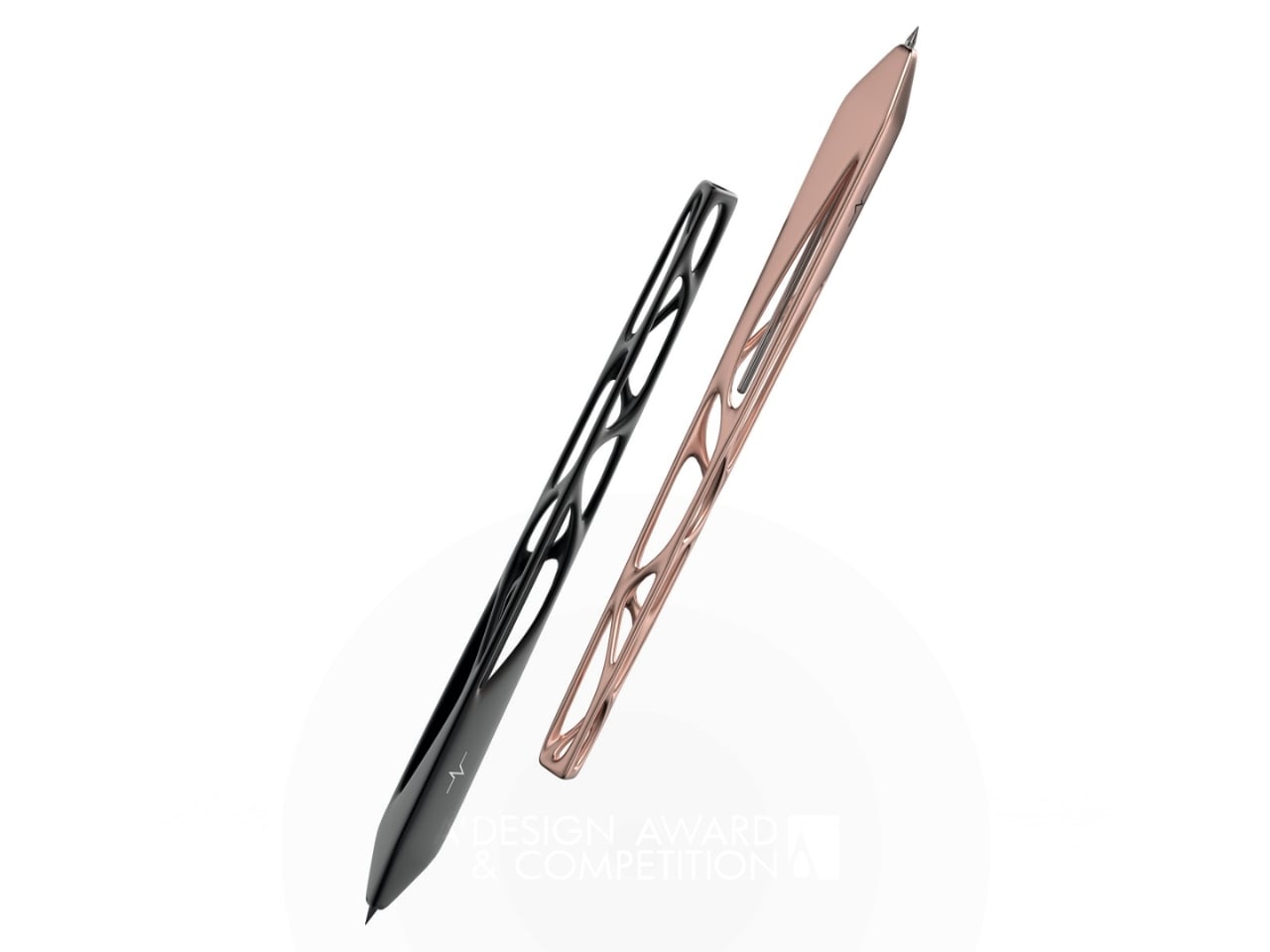
Leila Ensaniat, an industrial designer with a background at Cisco in consumer electronics, spent over a year developing Pulse, earning the 2025 Golden A’ Design Award for 3D Printed Forms and Products. The pen draws its inspiration from clouds — the quiet drift rather than the dramatic storm — translating that into a skeletal biomorphic form with flowing cutouts that resemble veins in a leaf. For him, it’s the kind of object that changes what he expects from a writing instrument entirely.

The biomorphic patterns are created using lost wax casting in aluminum, silver, bronze, and gold — a centuries-old metalworking technique typically reserved for jewelry and fine art. Ensaniat’s approach centers on how we actually interact with objects rather than how they look in isolation. The negative space is considered the material itself. On the desk, it reads as a sculpture. As a gift, it lands as a statement about what good design actually is.

What we like:

  • The Golden A’ Design Award and lost wax casting in precious metals make Pulse as legitimate a design object as anything found in a gallery, not a gift shop
  • The biomorphic skeletal form earns visual attention without demanding it — arresting and considered in equal measure, it rewards a closer look every time

What we dislike:

  • The open skeletal frame, while visually exceptional, may feel more delicate in hand than the solid-body construction many people expect from a daily writing tool

A Pen Says More Than the Note Written With It

What makes a designer pen worth giving isn’t prestige or price. It’s the decision behind every detail — where the material comes from, how it feels before the first word is written, what it says about the person who chose it. The five pens above span different philosophies and price points, but each makes the same quiet argument: the objects we pick up every day are worth getting exactly right.

If there’s a theme running through this list, it’s that the best writing tools aren’t the ones with the most features. They’re the ones where a specific design problem was solved in a way that hadn’t been tried before. Whether that’s a pen without ink, a pen with a heartbeat, or a pen that floats, each one earns its place on a desk. And that’s exactly what a good gift should do.

The post 5 Designer Pens That Make Every Other Gift for Him Look Lazy first appeared on Yanko Design.

Forget iCloud. This Case Gives Your iPhone 2TB of Real Expandable SD Card Storage

For all the progress packed into modern smartphones, one missing feature still haunts creators who shoot on the go: the humble card slot. Cameras, drones, action cams, and 360 rigs still lean heavily on microSD, yet the phone at the center of the workflow often has no easy way to read, back up, or expand that storage without a chain of adapters hanging off the side. That situation has only gotten more acute as flagship manufacturers keep stripping the slot away, leaving creators to engineer their own workarounds. The result is a very current kind of friction, high-end capture paired with genuinely awkward file management, bridged by tiny adapters that end up in the wrong bag on the wrong shoot day. A creator juggling drones, action cams, and a phone simultaneously has effectively been abandoned by the hardware industry on this one.

That tension is exactly where iRe5 Gen 2 finds its story. Built as a modular ecosystem for iPhone and Android by a Hong Kong-based team, it combines expandable microSD storage, PD charging, direct file transfer, and creator-friendly rig support in a form that stays attached to the phone. The first generation launched in 2024, shipping to over a thousand creators whose feedback shaped a complete re-engineering of the concept for Gen 2. For a product category crowded with forgettable dongles, this one leans into permanence, portability, and the idea that storage should be available the moment inspiration, or a full memory warning, shows up. Gen 2 adds pass-through charging, hub functionality, and cinema rig compatibility to the original storage-first premise.

Designer: iRe5

Click Here to Buy Now: $128.9 $249.9 (48% off) Hurry! Only 87 of 200 left.

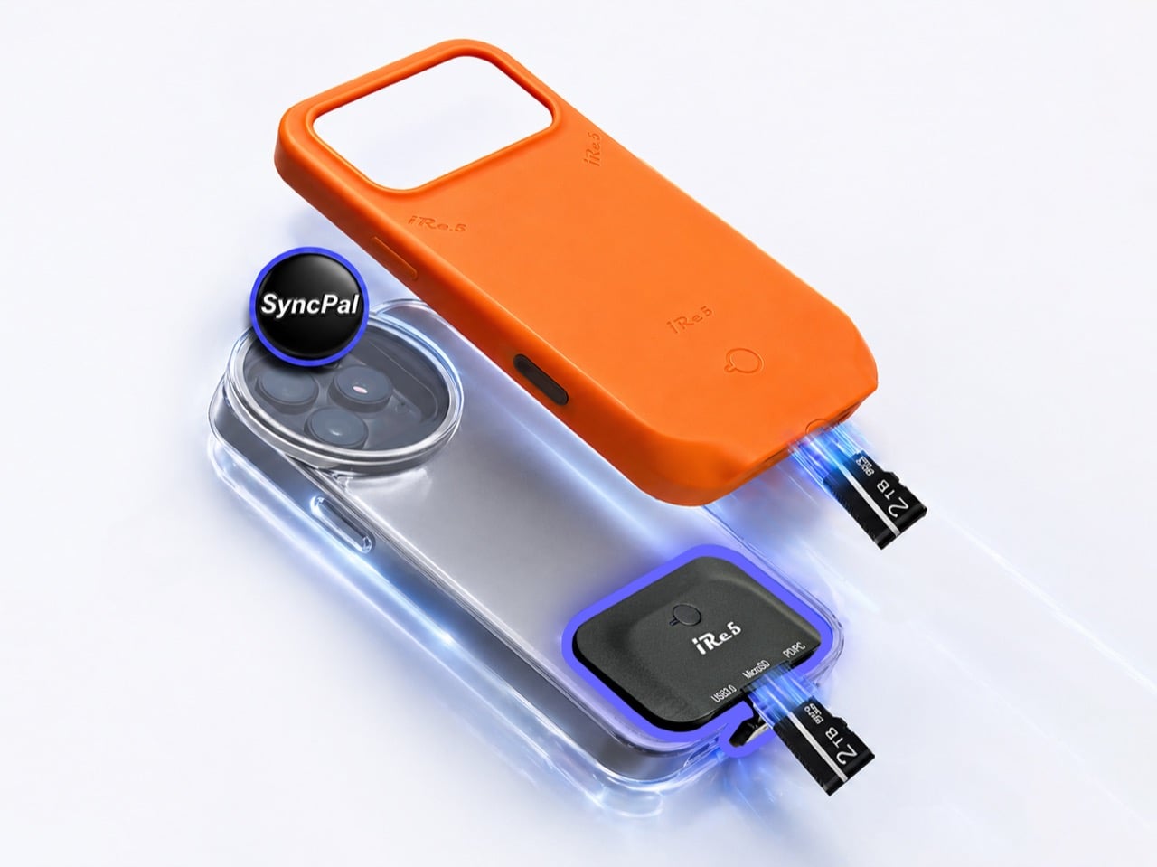
The core design decision is the split between two physically distinct form factors built around identical internal hardware. The X-Module is a professional-grade hub engineered for cinema rigs and cages, designed to snap on when a shoot begins and swap out when it ends, while the Storage Case takes the opposite approach: a protrusion-free, seamless shell offering invisible storage that fits right in a pocket. The X-Module is built from aerospace-grade aluminum alloy with an incredibly thin and durable metal shell, offering superior heat dissipation and a sleek, professional aesthetic that feels like a native extension of a filming rig. The Storage Case uses a compact, lightweight silicone architecture with a soft-touch, secure grip while maintaining a slim profile that slides effortlessly into a pocket. The aluminum’s thermal properties matter during sustained ProRes sessions; the silicone’s wear resistance matters across years of daily carry.

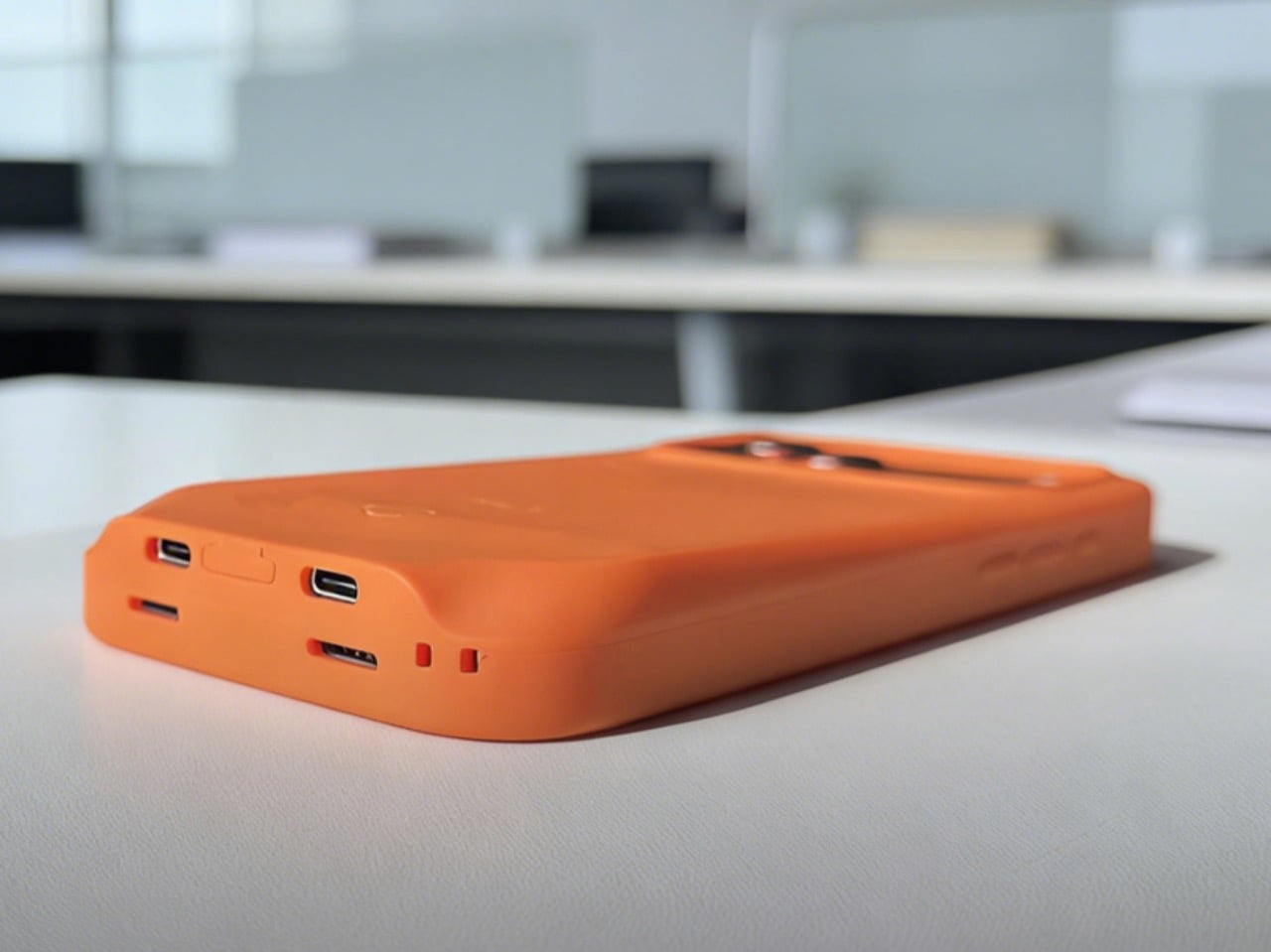
Orange portable charger lying on a white desk with visible USB-C and USB-A ports on the side, in an office setting.

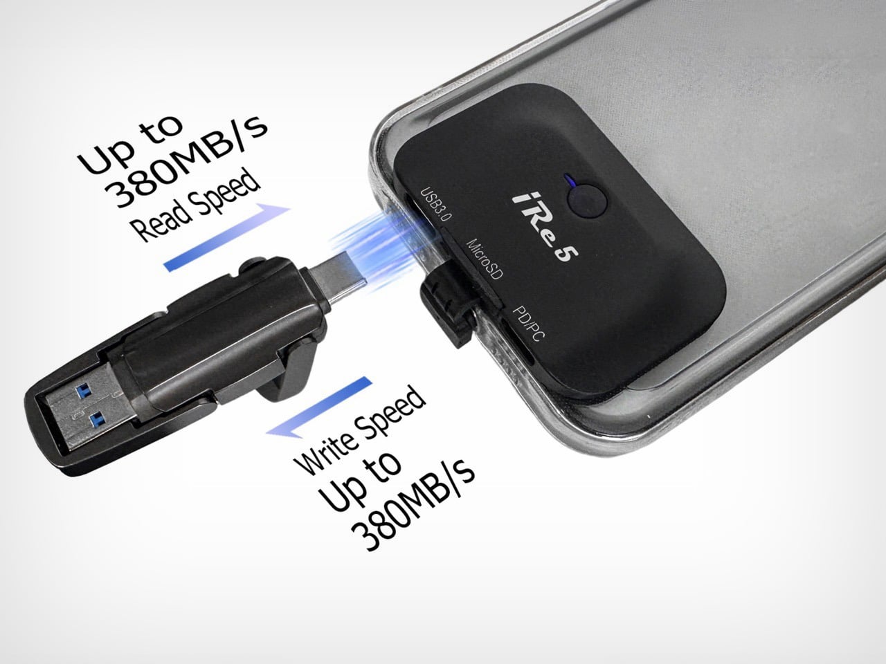
Both designs share the same high-performance architecture: a dual-port USB 3.0 system supporting up to 2TB MicroSD expansion, PD Pass-Through Fast Charging, and universal connectivity for 3.5mm audio and external SSDs across iPhone and USB-C Android devices. The biggest breakthrough in Gen 2 is that users no longer have to choose between their storage and their battery, with advanced pass-through charging technology allowing filming, backing up, and connecting peripherals while PD Fast-Charging the phone simultaneously. Interface speeds peak at 360 MB/s, handling continuous 4K ProRes recording without the frame drops that expose slower storage solutions mid-take. Whether on the latest iPhone with Lightning or USB-C, or a flagship Android, iRe5 provides a universal bridge for all media files. Standby power draw stays under 5 mA, meaning the module sitting on a phone between shoots won’t register meaningfully on battery consumption.

SyncPal, iRe5’s companion app designed for professional efficiency, handles backup through a physical NFC disc that triggers the entire workflow with a single tap against the phone, intelligently organizing the media library by date or project and seamlessly syncing files across the SD card, smartphone, and PC. The NFC trigger means no opening the app, no navigating menus, and no manual sorting, which is a meaningful quality-of-life detail for shoots where the phone is constantly moving between hands and rigs. For desktop transfer, the X-Module or Storage Case mounts as a standard external drive when connected to a Mac, PC, or iPad via USB-C, with no drivers or special cables involved. Seamless drag-and-drop covers large video files, music, documents, and more, powered by USB 3.0 Gen 2 for lightning-fast speeds. The app also handles cross-platform file movement between Android and iPhone storage through the hub itself, which removes the cloud from a workflow that often has no reliable signal anyway.

Smiling man wearing sunglasses holds up a smartphone with triple camera lenses in a clear protective case outdoors at the camera.

The device supports capturing high-bitrate ProRes video directly onto the Micro-SD card, eliminating internal storage limits and delivering smooth, professional recording with zero lag. The expansion port connects external SD card readers or high-capacity SSDs directly to the hub to record 4K footage at blazing-fast speeds of up to 380 MB/s. The X-Module is engineered with a specialized profile to fit perfectly within professional camera cages, staying out of the way of grips while remaining fully compatible with external lens mounts and rigs. The same device simultaneously connects professional 3.5mm microphones, high-speed external SSDs, and USB-C peripherals while maintaining a high-speed data link to a PC or iPad. For vlog-to-edit pipelines where the phone is both camera and editing suite, the reduction in cables and adapters is the actual design win.

Man wearing a brown hat and aviator sunglasses holds up a smartphone with a clear case and a clip-on accessory on the back, outdoors.

The iRe5 Gen 2 X-Module is priced at a discounted $69.90 (MSRP $119.90) and the Storage Case at $75.90 (MSRP $129.90), with a Duo Bundle combining both available at $134.90 (MSRP $249.90). An optional SyncPal Backup Key and App Bundle adds the full one-tap backup and file management system for $9.90. The X-Module ships USB-C by default, with a free Lightning interface swap available for users on iPhone 14 and older; the Storage Case is matched to specific phone models through a post-campaign backer survey. The X-Module package includes the module, a transparent phone case, and two adhesive mounting stickers. Worldwide shipping is included in the price, delivering iRe5 Gen 2 directly to the doorstep at no extra cost, with shipping expected to begin in July 2026, backed by a 12-month global warranty.

Click Here to Buy Now: $128.9 $249.9 (48% off) Hurry! Only 87 of 200 left.

The post Forget iCloud. This Case Gives Your iPhone 2TB of Real Expandable SD Card Storage first appeared on Yanko Design.

This LEGO Harvey Specter Office Has the Basketball Collection, the Painting, and Yes, Even Donna

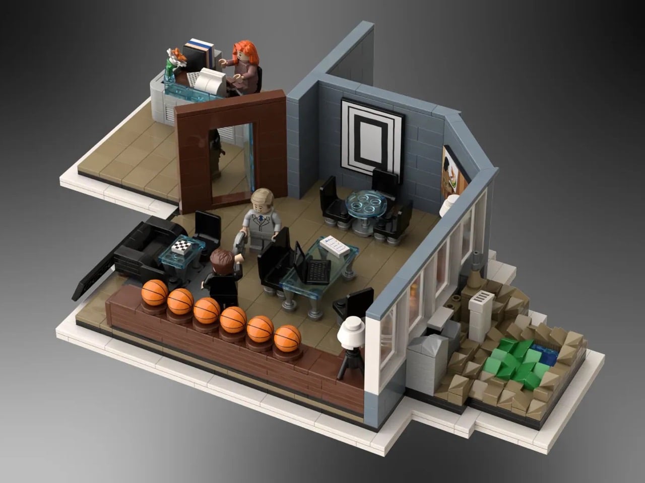
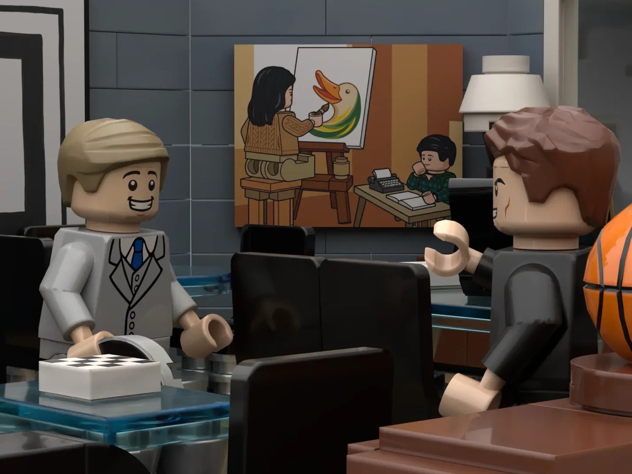
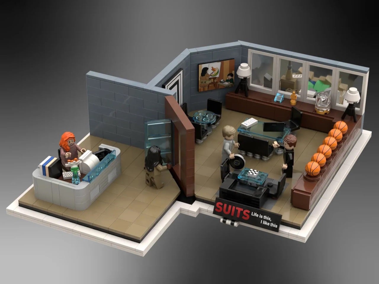
Harvey Specter kept a chess set on his office coffee table. It was never really explained, never made into a plot point, just always there, sitting on the glass surface between Harvey and whoever was about to lose an argument. It suited the room perfectly. The whole space was engineered as a performance of control: the signed basketballs, the glass desk with nothing to hide behind, the painting of his mother as the one admitted vulnerability in an otherwise impenetrable presentation. Production designers on Suits understood that Harvey’s office had to do half his character work for him before he even spoke.

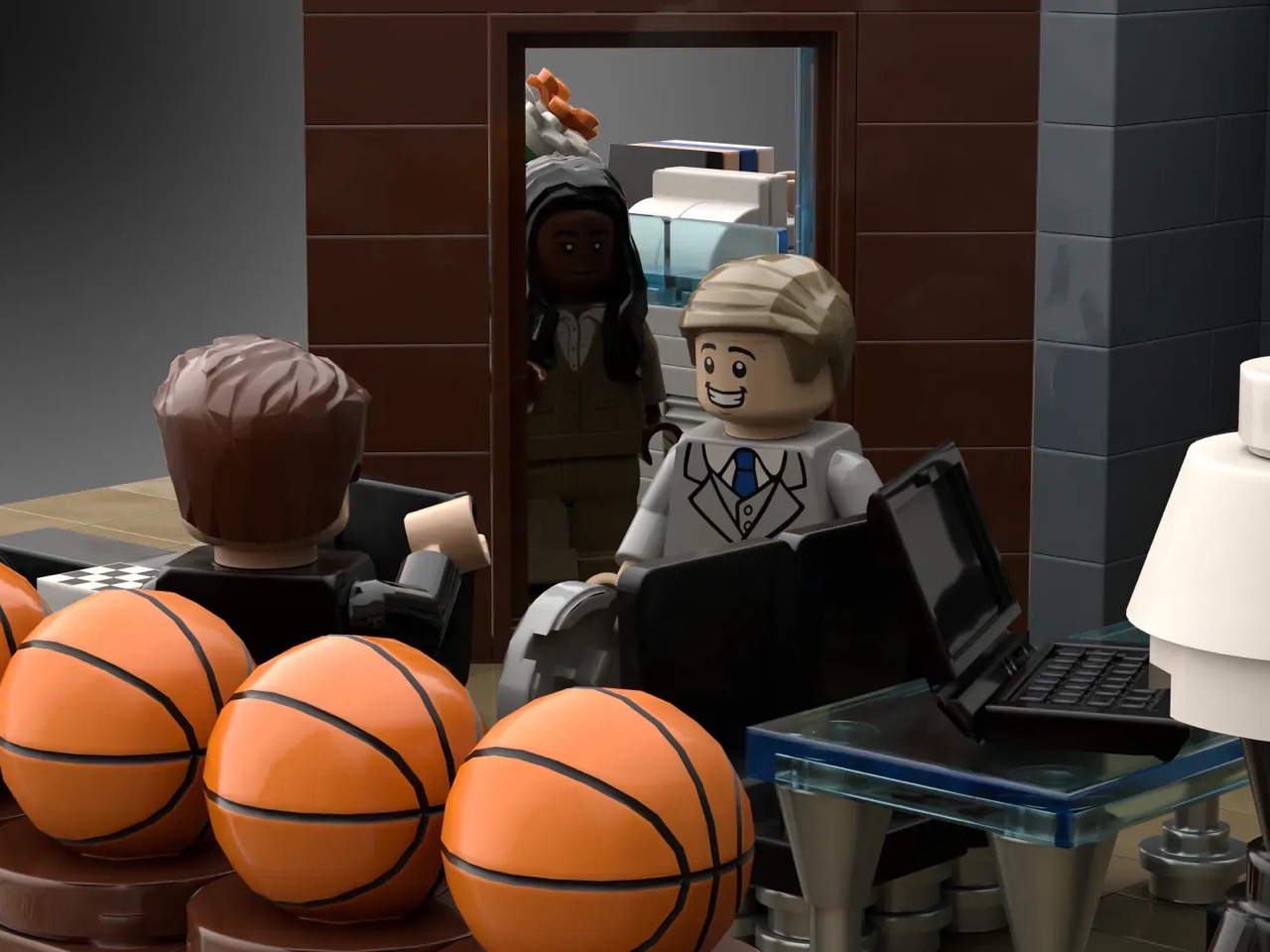
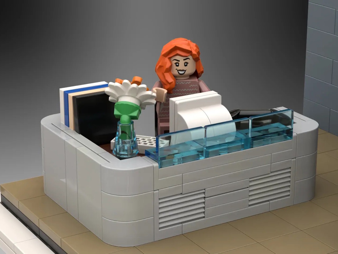
Gentvilas, building on the LEGO Ideas platform, understood the same thing. The chess set makes it into the brick version. So does the painting. So do the basketballs, rendered as a satisfying row of orange LEGO spheres along a dark wood shelf. Donna sits at her reception desk out front, composed as ever. Harvey and Mike are positioned mid-conversation inside the glass-walled inner office, and Jessica is stepping through the door with the specific energy of someone who already knows what you did. The forced-perspective window view, a microscale Central Park and skyline built to suggest height, finishes the illusion.

Designer: Gentvilas

The build splits cleanly into two zones. Donna’s curved reception desk anchors the entrance, built from smooth grey elements with a transparent blue front panel that captures the cool, corporate modernism of the Pearson Hardman lobby perfectly. Her desk is stocked with a monitor, stacked books, and a small flower vase, the kind of considered personal touches that tell you this is someone’s space, not just a gatekeeping station. Step past the dark wood doorframe and you’re in Harvey’s inner office, where a glass-topped desk sits center stage, black leather seating flanks a low coffee table, and the basketball shelf runs the full length of the side wall. Gentvilas has used transparent blue elements throughout for the glass surfaces, a smart and consistent material choice that gives the whole build a visual coherence the show’s set designers would appreciate.

My favorite detail, though, is that painting. Harvey’s mother is a complicated figure in the show’s emotional architecture, and the fact that Gentvilas rendered her as a custom decal, painting a duck at an easel while young Harvey watches, and hung it exactly where it belongs on the back wall, is the kind of deep-cut accuracy that separates a fan-made tribute from a generic office diorama. The builder notes that the actual painting couldn’t be reproduced due to copyright considerations, so this bespoke interpretation is entirely original, and honestly, it works just as well.

The forced-perspective exterior is the other standout move. A microscale build outside the windows creates a convincing illusion of height, with a tiny Central Park visible in the skyline, making the model feel like it genuinely occupies a Manhattan high-rise rather than sitting on someone’s display shelf.

Suits found a second life on Netflix in 2023, pulled in an entirely new generation of fans, and spun off into Suits LA. The timing for a LEGO set feels right. This MOC is currently gathering supporters on the LEGO Ideas platform, where builds need to cross 10,000 votes to trigger an official LEGO review. You can head to the LEGO Ideas page here and cast your vote.

The post This LEGO Harvey Specter Office Has the Basketball Collection, the Painting, and Yes, Even Donna first appeared on Yanko Design.

This Chair Turns Fragmented Structure Into Ergonomic Support

Aerise is a seating concept that reimagines how structure, support, and movement can coexist within furniture design. Seating has long followed rigid forms and familiar construction systems, where stability is often achieved through heavy frames and static surfaces. Aerise challenges this conventional approach by introducing segmentation as a more fluid and adaptive method of support. Instead of treating seating as a singular fixed structure, the project explores how interconnected elements can work together to create a system that feels lighter, more responsive, and visually dynamic while still maintaining ergonomic comfort and stability.

The project began with an exploration into the relationship between structure and the human body. Seating is one of the most familiar objects in everyday life, yet its design is deeply influenced by posture, proportion, material behavior, and the way the body interacts with support systems over extended periods of time. Aerise investigates what happens when structure is no longer viewed as a rigid shell, but rather as a collection of coordinated parts working together in balance. This shift transforms the chair from a static object into a more fluid system that adapts visually and functionally to the body’s natural posture.

Designer: Dhruvisha Shah

The primary inspiration for the project came from the dragonfly and the unique characteristics of its segmented exoskeleton. Despite its lightweight form, the dragonfly demonstrates exceptional control, precision, and agility in movement. Its body is composed of interconnected sections that provide both strength and flexibility simultaneously, allowing the insect to move with remarkable balance and efficiency. Aerise draws from these principles and translates them into a seating system that embodies similar qualities of controlled support and visual lightness.

This inspiration is most clearly reflected in the chair’s segmented backrest. Rather than relying on a continuous solid surface, the backrest is divided into repeated modular elements that function together as a cohesive support system. Each segment corresponds to different zones of the spine, creating targeted areas of support while collectively forming a fluid and uninterrupted silhouette. This modular arrangement introduces a rhythmic visual language that echoes the structure of the dragonfly’s body while also enhancing ergonomic responsiveness.

The flowing geometry of the chair further reinforces this sense of continuity and movement. Soft curves guide the body naturally into a reclined posture, allowing the seating experience to feel intuitive and relaxed rather than forced or rigid. The reclined angle was carefully considered to balance comfort with structural integrity, ensuring that the chair maintains a stable presence while still appearing visually lightweight. This sense of suspension is amplified by the minimal framework and elevated form, giving the chair an almost floating quality despite its structural strength.

The leg positioning also plays an important role in translating the dragonfly’s balanced alignment into furniture form. Angled supports create stability while maintaining a sense of openness beneath the chair, preventing the structure from appearing heavy or grounded. These subtle details contribute to the overall perception of lightness and precision that defines Aerise as a concept.

At its core, Aerise explores segmentation not simply as an aesthetic gesture, but as a functional support strategy. Each individual element contributes independently to the user’s comfort while simultaneously operating as part of a larger interconnected system. The chair demonstrates how fragmented structures can still create cohesion, and how flexibility and stability do not need to exist in opposition. Through this approach, Aerise proposes a new perspective on seating design, one where support is adaptive, structure feels fluid, and visual lightness becomes an integral part of the experience rather than just a stylistic choice.

By drawing from the natural intelligence of biological systems, Aerise transforms the principles of segmentation, balance, and exoskeletal construction into a refined seating concept that feels both contemporary and intuitive. It is an exploration of how nature-inspired structures can influence not only the appearance of furniture, but also the way it supports and interacts with the human body.

The post This Chair Turns Fragmented Structure Into Ergonomic Support first appeared on Yanko Design.

Eufy Just Built a Robot Vacuum With a Built-In Fragrance Air Freshener, and it’s Absolute Genius

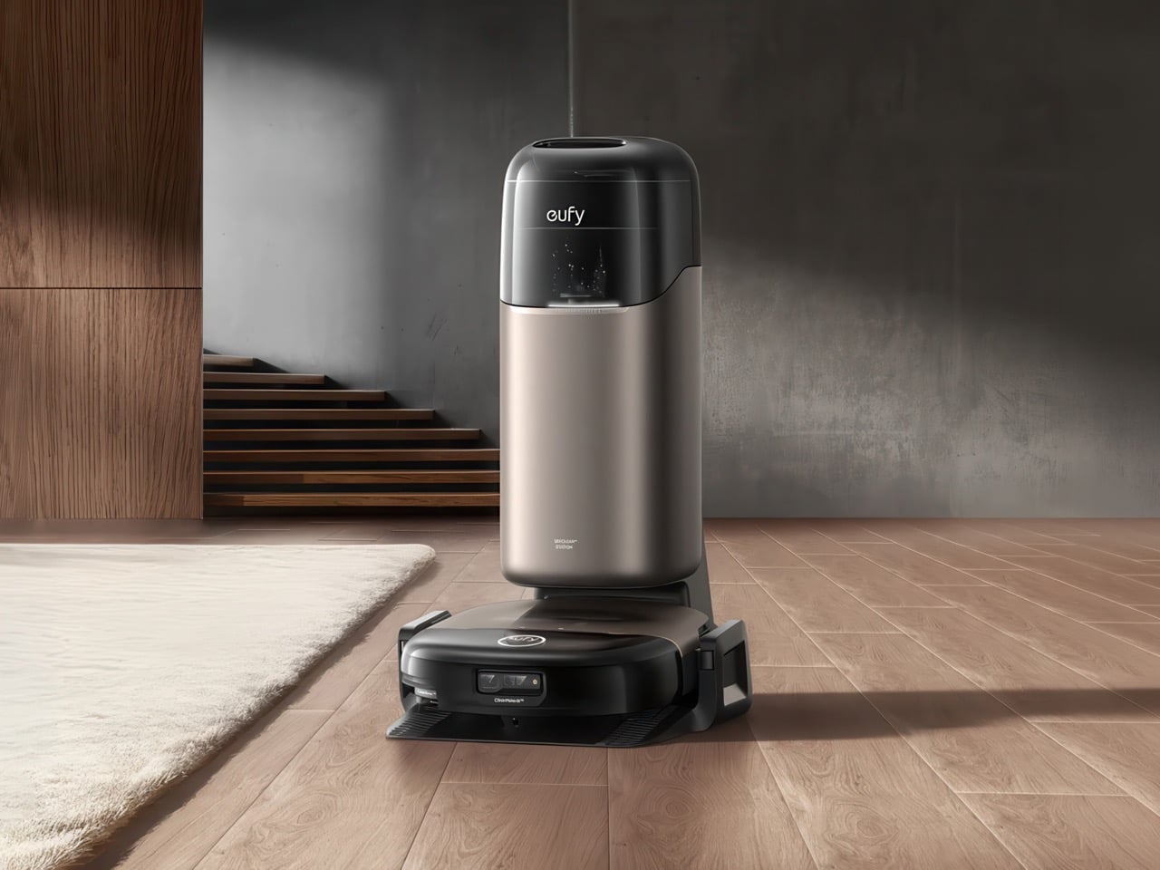
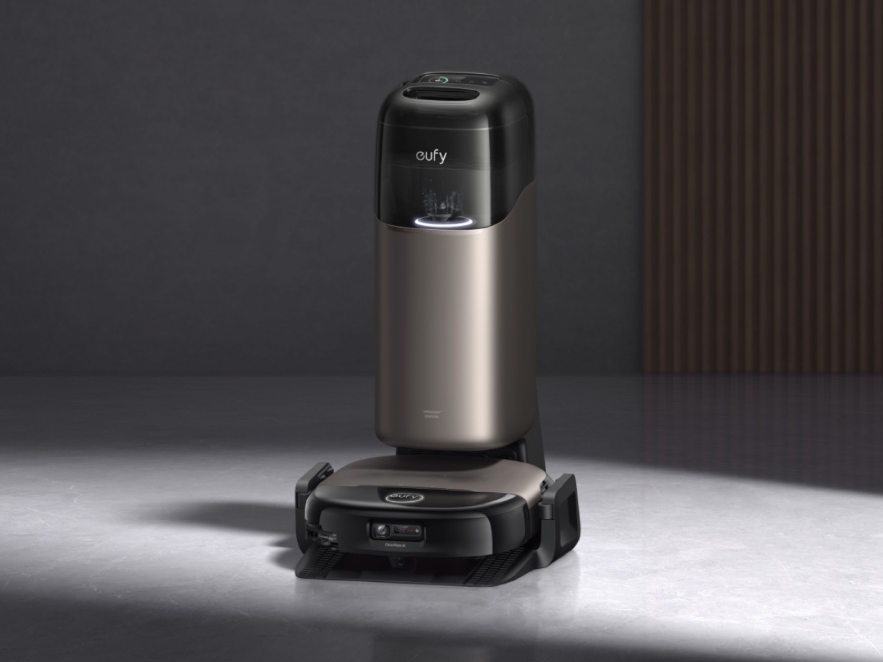
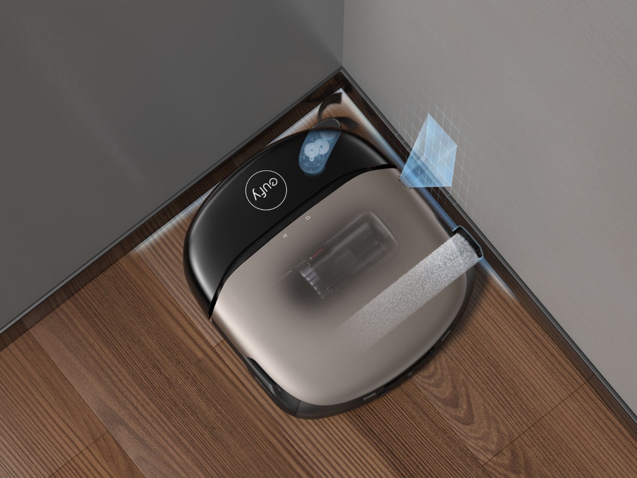
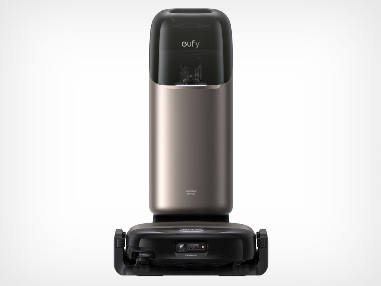
The champagne-bronze cylindrical base station in Eufy’s product photos does something most robot vacuum marketing images fail to do: it makes the thing look like it belongs in a well-designed home. The category has long defaulted to black plastic towers and aggressive venting grilles, the visual language of utility appliances that you hide in a laundry closet. Eufy’s Omni S2 system has clearly been styled to sit in the open, the tall dock finished in warm metallic tones that read more like a Dyson or a premium air purifier than a cleaning robot. That aesthetic ambition signals something about where Eufy wants to position this product, and it’s worth paying attention to.

The hardware underneath backs up the posturing. The S2 runs 30,000 Pa of suction through a multi-cyclone airflow system that Eufy calls AeroTurbo 2.0, pairs it with a HydroJet 2.0 roller mop that self-cleans during operation, and adds a fragrance diffuser capable of dispensing Citrus and Basil or Bamboo and Sage throughout the room as it works. The CleanMind AI navigates without a LiDAR tower, recognizing over 200 obstacle types through RGB vision, and the accompanying UniClean station handles dust collection, mop washing, drying, and refilling across a 68-day maintenance window. This is Eufy’s bid to be taken seriously at €1,499, competing directly against Roborock and Ecovacs flagships that have owned the top shelf for the last few years.

Designer: Eufy (Anker Innovations)

The fragrance diffuser deserves more than a passing mention because it represents a genuine category first. No flagship from Roborock, Ecovacs, or Narwal has shipped this feature, and the fact that Eufy built it into the robot rather than the dock is a deliberate design choice. The diffuser module is interchangeable, with three scent options available at launch, and it activates on request rather than running continuously, which is the right call. A robot that dumps fragrance into every room on every cleaning cycle would get exhausting fast. Treating it as an on-demand ambient feature gives the user control over the experience, and that restraint reflects a level of UX thinking that budget-era Eufy products rarely demonstrated.

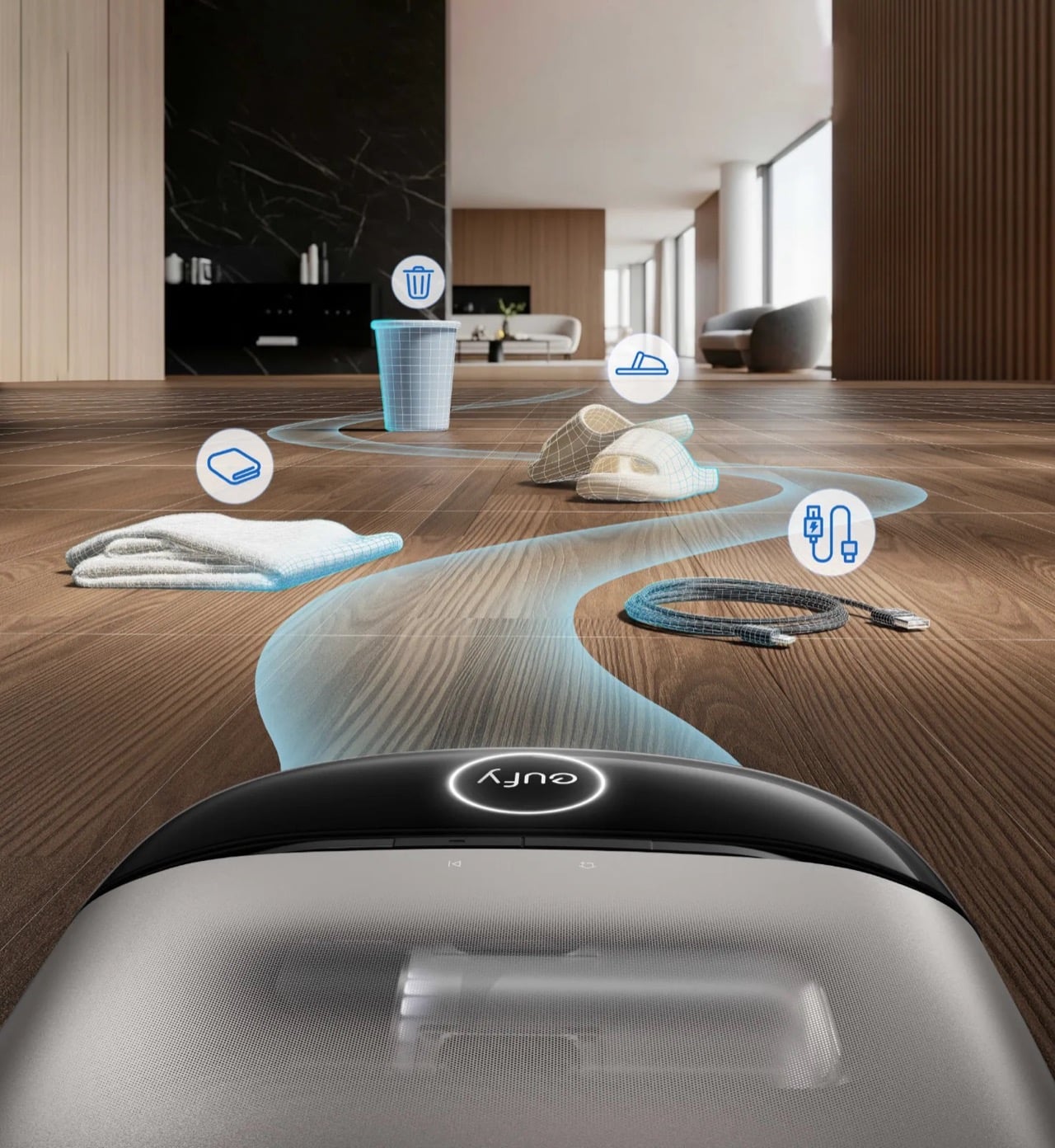
The CleanMind AI system powering the S2’s navigation is equally notable for what it eliminates. Removing the LiDAR turret, that rotating sensor tower that sits on top of most premium robots, was Eufy’s defining engineering bet with the S1 generation, and it paid off both aesthetically and practically. The S2’s low, angular profile fits under more furniture than competitors with turrets, and the RGB-based vision system now handles over 200 object categories, up from roughly 100 in the S1 Pro. The second product image Eufy released shows this in action: cables, slippers, cups, and folded towels each flagged with category icons as the robot plots its path around them. The visual is almost diagrammatic in its clarity, and it communicates the system’s capability faster than any spec sheet would.

The generational jump from the S1 Pro to the S2 is substantial on paper. Suction goes from 8,000 Pa to 30,000 Pa, the mop system gains additional pressure and rotation speed, the dock expands from 10-in-1 to 12-in-1 automation, and the maintenance interval stretches to 68 days. Eufy received a CES 2026 Innovation Award Honoree for the S2 before it had even launched commercially, which at minimum confirms that the industry was paying attention. Whether real-world performance matches the specification sheet is a question only extended testing will answer, and early reviews from European outlets suggest the mopping performance is genuinely competitive while obstacle avoidance still has occasional gaps with small or low-contrast objects.

At €1,499, the Omni S2 is priced squarely against the Roborock S8 MaxV Ultra and Ecovacs Deebot X2 Omni, robots that have held the premium conversation for the better part of two years. Eufy’s strongest argument is not that it out-specs those competitors in every category, but that it packages competitive cleaning performance inside a system that looks like it was designed for the room it operates in, adds an ambient experience layer nobody else offers, and maintains that 68-day hands-off window that turns a high-maintenance appliance into something that actually recedes into the background. The robot vacuum category has spent years chasing full automation as its north star. Eufy’s move is to ask what happens after you get there, and the answer, apparently, smells like bergamot and lychee.

The post Eufy Just Built a Robot Vacuum With a Built-In Fragrance Air Freshener, and it’s Absolute Genius first appeared on Yanko Design.

8 Best Summer Gadgets for Men Who Think “Outdoor Tech” Usually Looks Terrible

The category of outdoor tech has a reputation problem. Most of it arrives in high-visibility colors, wrapped in rubberized plastic, and styled as if the designer’s only brief was “make it survive a war.” For men who care equally about function and form, the annual summer gear drop is usually a disappointment. These eight picks are the exception — products that earn their place outside without looking like they belong in a disaster preparedness kit.

Each one solves a real outdoor problem — heat, hydration, light, sound, coffee — without the aesthetic compromise that typically comes with the territory. If you’re selective about what you carry into the wild, this is a list worth saving.

1. RetroWave 7-in-1 Radio

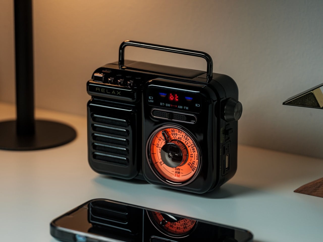
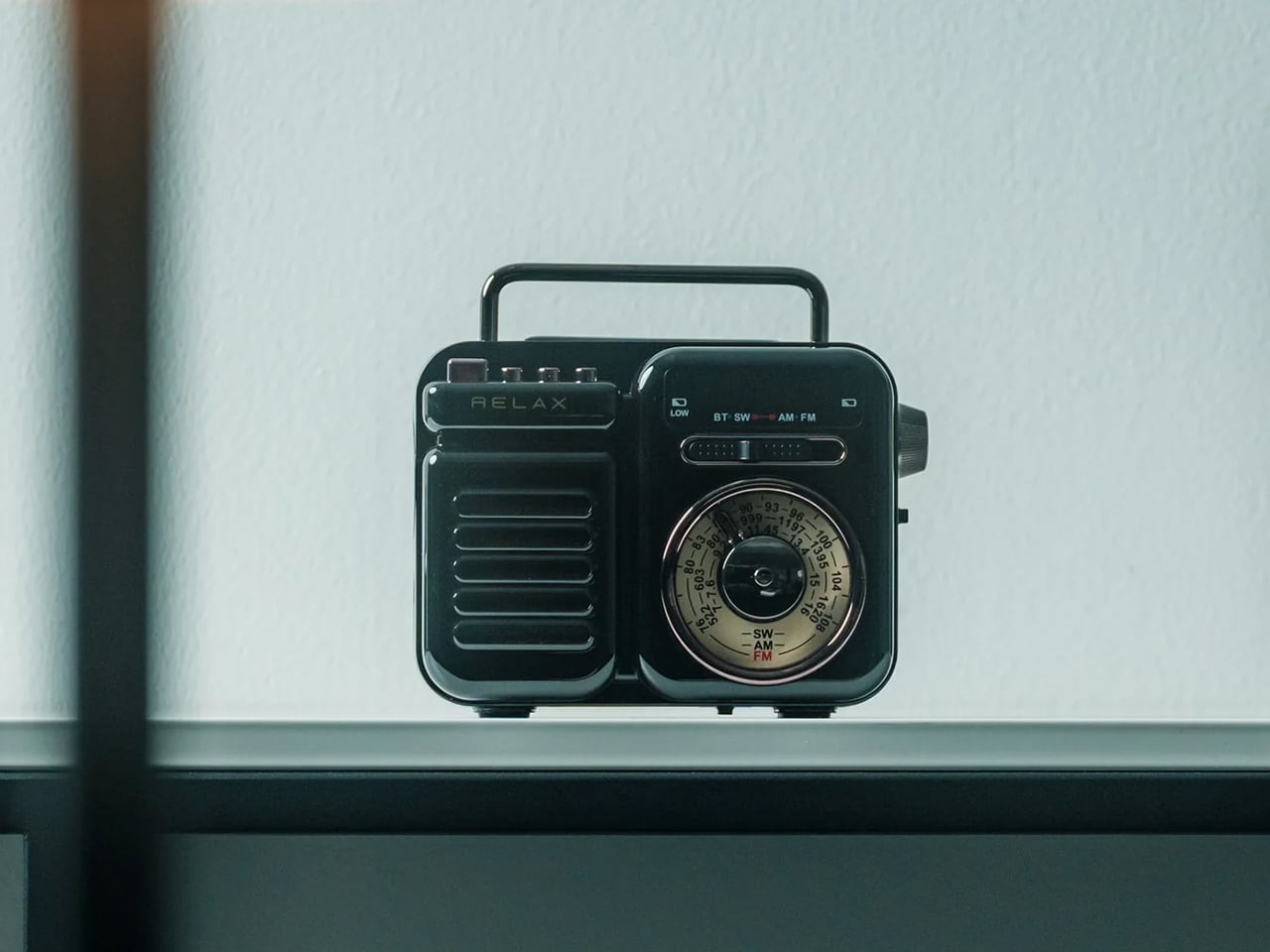
Most emergency gear sits in a drawer until it’s needed — which defeats the entire point. The RetroWave earns shelf space because it looks good enough to display. Styled with a retro Japanese aesthetic and a satisfying tactile tuning dial, it functions as a portable speaker, emergency radio, flashlight, and portable charger from one compact device. It’s the rare piece of outdoor kit that solves the preparedness paradox through sheer design restraint.

At $89, it covers ground that would otherwise require four separate items in your pack. Two colorways — black and warm gray — make it feel considered rather than utilitarian. The 20-hour battery life is enough for a full weekend without reaching for a cable, and the 8W speaker delivers enough warmth to soundtrack a campfire properly. It’s less a gadget and more a statement that survival gear doesn’t have to look survivalist.

Click Here to Buy Now: $89.00

What We Like

  • Seven functions collapse into a single carry-anywhere device with a retro form that earns every gram of its weight
  • Intentional enough in design to live on a shelf rather than be hidden in a bag until an emergency strikes

What We Dislike

  • The retro aesthetic won’t resonate with those who prefer a more modern industrial look
  • Audio output is optimized for outdoor ambience rather than high-fidelity listening

2. Solar-Powered Camping Tent AC

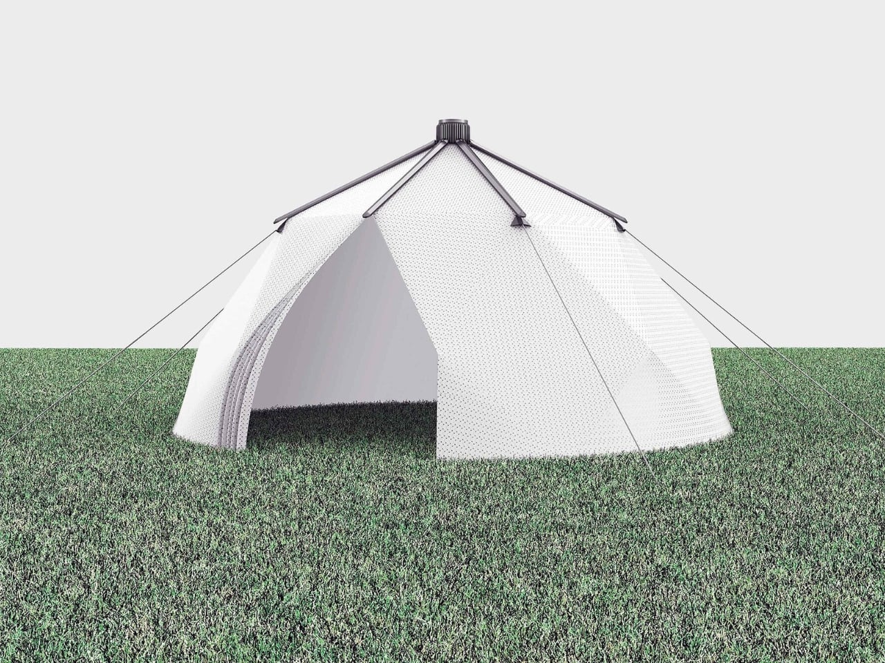
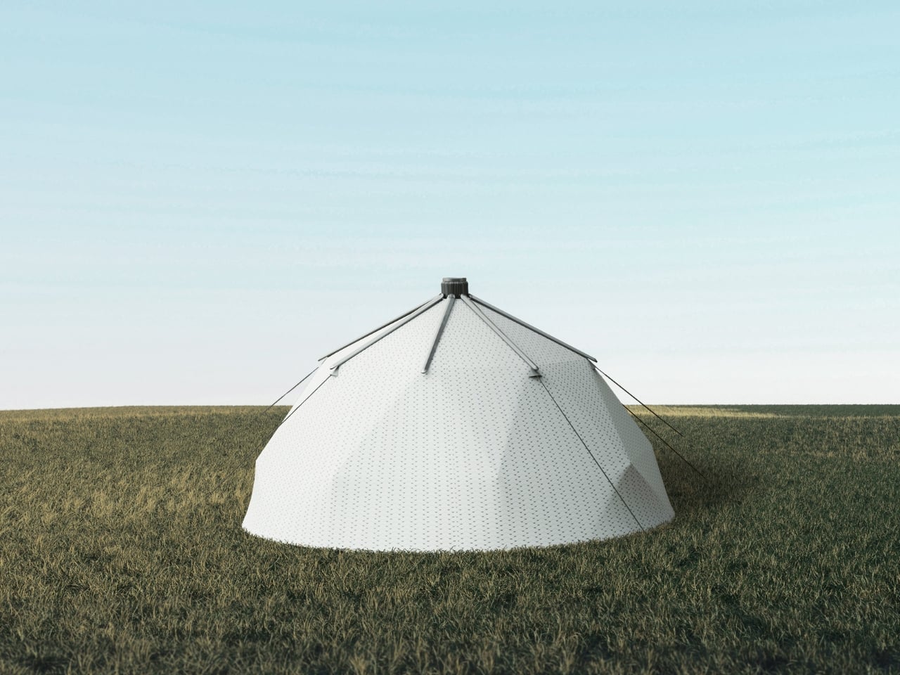
Summer camping’s biggest lie is that you’ll adjust to the heat. You won’t — you’ll sleep worse and wake up annoyed. This solar-powered camping tent concept earned recognition at the Red Dot Design Awards for solving exactly that problem: integrating an air conditioning system powered entirely by solar panels into the structure of the tent itself. No generator noise, no extension cord draped across the campsite. Just a cool night’s sleep that feels like the future.

The design challenge here isn’t purely technical — it’s visual. Solar camping gear has a long history of looking like a science project. This concept sidesteps that with a clean, structured silhouette that doesn’t announce its engineering from across the campsite. For summer trips where heat is the limiting factor rather than terrain, it reframes what a tent can actually do. The idea that solar power and sleeping comfort can coexist elegantly is no longer hypothetical.

What We Like

  • Solar-powered air conditioning solves the most persistent problem in summer camping without relying on noisy, bulky generators
  • Red Dot Design Award recognition confirms that the concept holds up both functionally and aesthetically

What We Dislike

  • As a concept, real-world availability and pricing have not yet been fully confirmed
  • Solar performance will depend heavily on campsite exposure and prevailing weather conditions

3. Yuuye Portable Air Conditioner

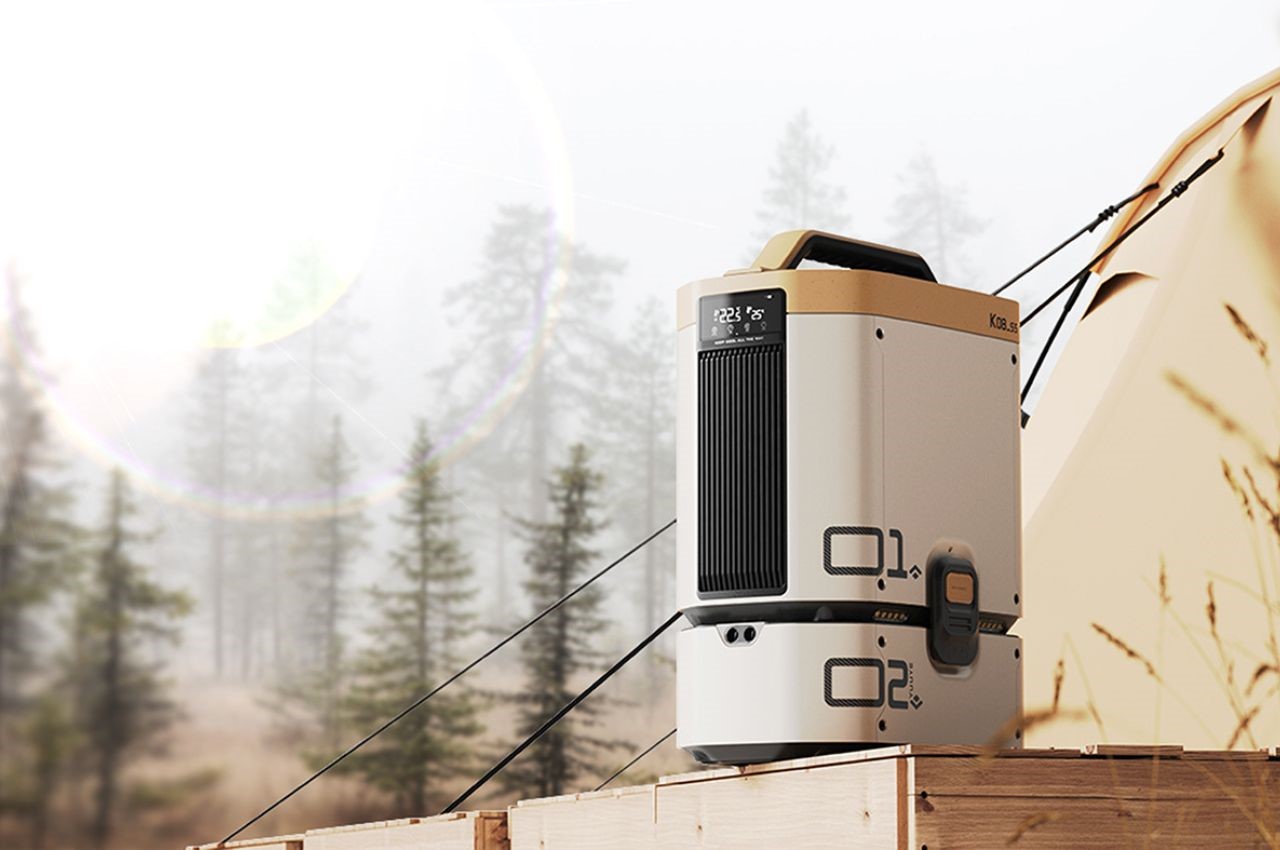
Where the solar tent integrates cooling into the structure, the Yuuye takes a more immediate approach. Its modular design separates the refrigeration unit from the exhaust, drawing in heat and pushing out cool air in a package compact enough to move between a patio, a tent, and an outdoor workspace without a second thought. The LCD screen keeps control simple, and the detachable build means adapting it to a new setting takes seconds rather than a prolonged setup.

The large air outlet distributes cooling evenly rather than in a single concentrated stream, which matters when you’re sitting in front of it rather than standing directly in the airflow. It understands the difference between moving air and actually cooling a space. Compact, lightweight, and designed for exactly the kind of summer that turns a backyard into an endurance test, it earns its place outdoors not by being impressive on paper, but by working when the temperature genuinely spikes.

What We Like

  • The modular, detachable build makes relocating it between outdoor settings fast and completely intuitive
  • Delivers consistent cooling without the bulk or noise of traditional portable air conditioning units

What We Dislike

  • Best suited for small to medium spaces — larger gatherings will need more than one unit to feel the difference
  • Requires a power source for extended use, which limits fully off-grid applications

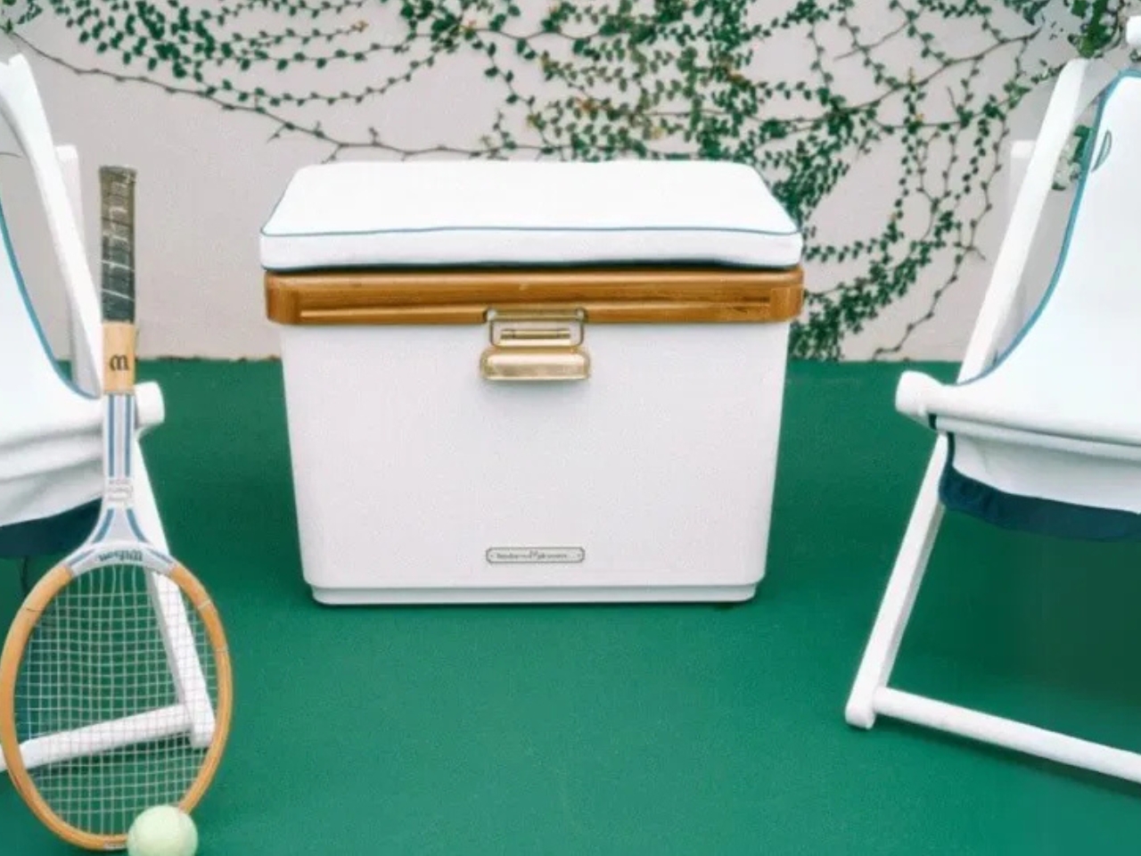
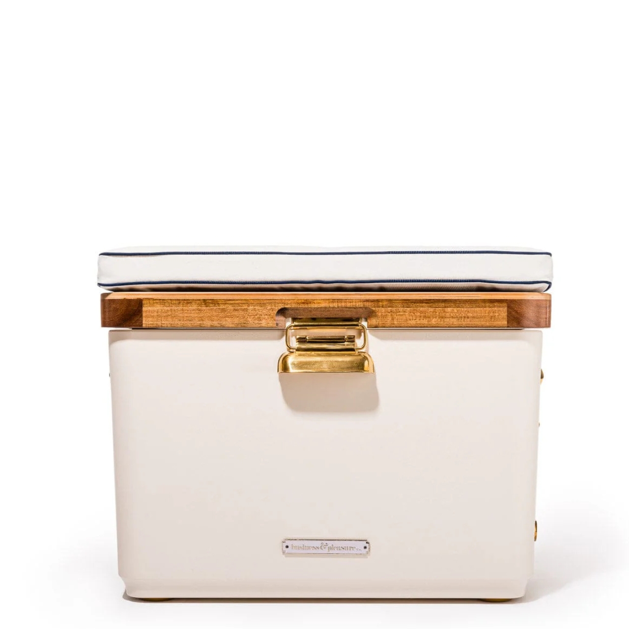
4. Hemingway Cooler

Coolers have spent decades looking like objects that are embarrassed to be at the party. The Hemingway takes a different position entirely. Designed with reference to mid-20th-century European cars and speedboats, it brings a classic, rugged sensibility to something most people treat as purely functional. It’s a cooler that looks as deliberate as the rest of your setup — the kind of thing you’d pack into the back of a Land Rover without any irony whatsoever.

The design doesn’t sacrifice performance for aesthetics. The rugged build holds up to outdoor conditions that take the shine off lesser products quickly, and the form is cohesive enough that it reads as a considered object rather than a branded afterthought. For men who treat the patio and the campsite as extensions of their taste rather than exceptions to it, the Hemingway is the first cooler that actually deserves to be seen.

What We Like

  • The mid-century design reference gives it a visual identity that holds up well beyond the campsite or tailgate
  • Rugged construction means the good looks aren’t at the expense of actual outdoor durability

What We Dislike

  • The deliberate aesthetic may feel out of place in purely utilitarian outdoor contexts
  • Premium design positioning likely carries a premium price point to match

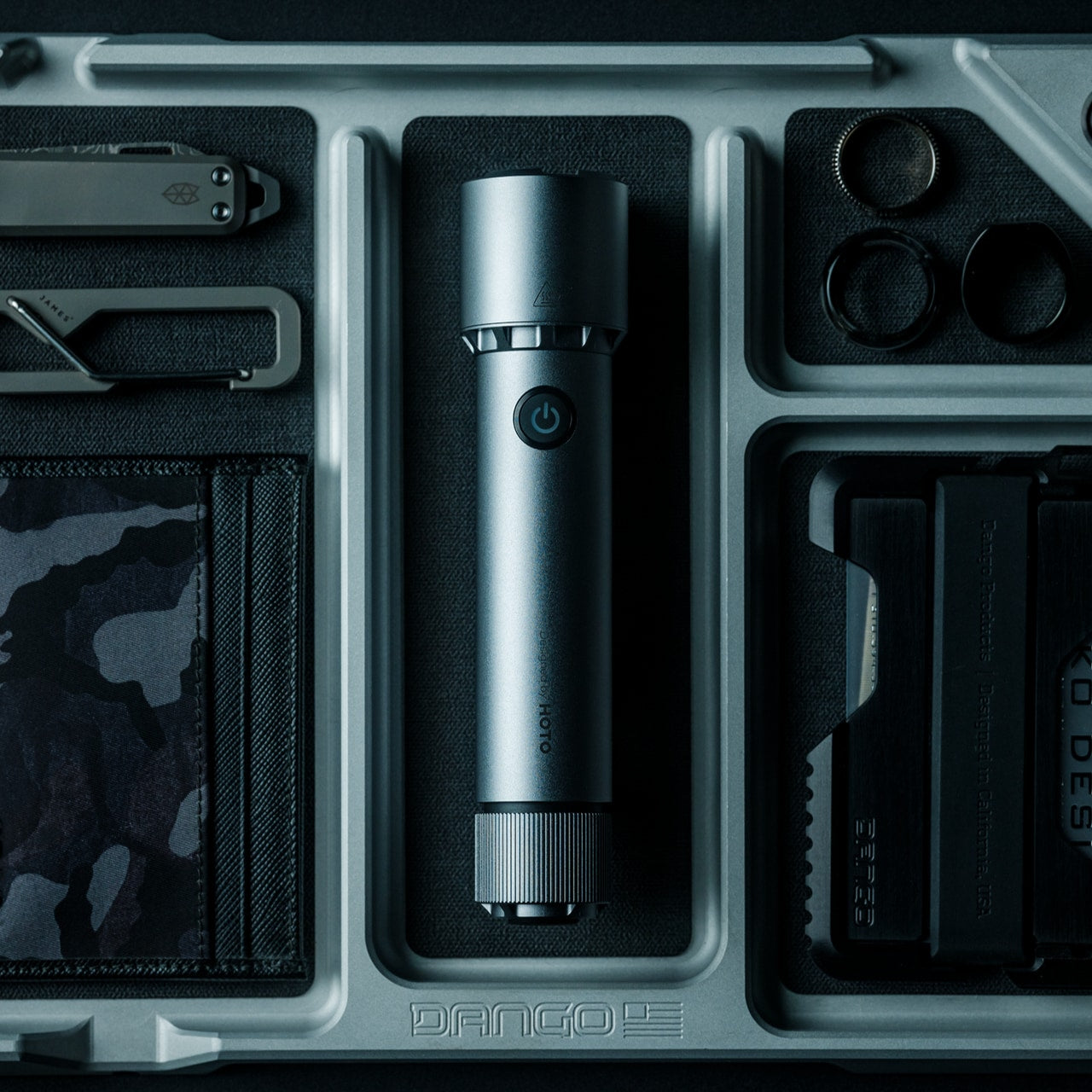
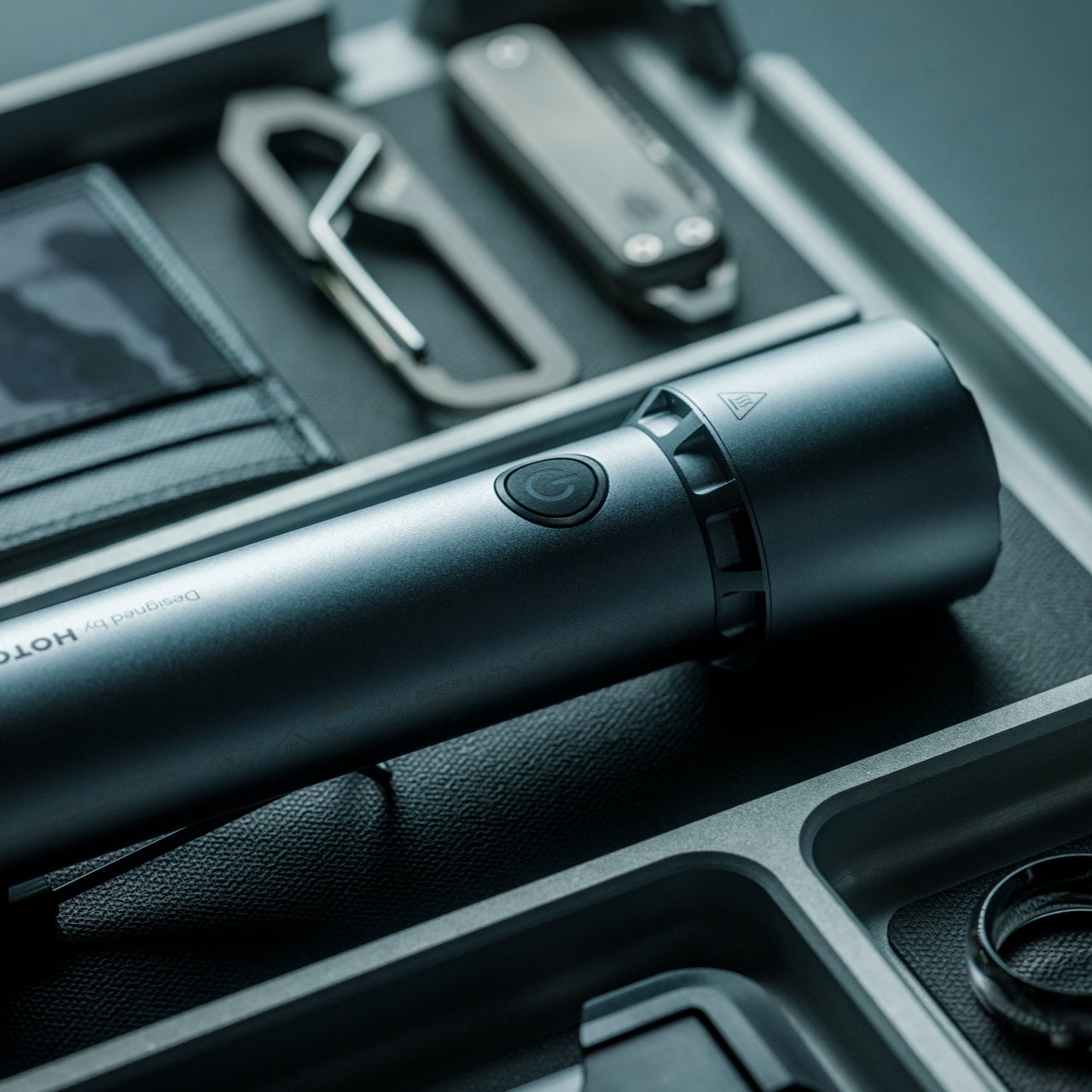
5. BlackoutBeam Tactical Flashlight

“Tactical” is a word that has done a lot of damage to outdoor gear design. The BlackoutBeam manages to carry the term without leaning into the aesthetic that usually comes with it. At $90, it sits in the range where you’re buying something built for real use rather than a shelf demonstration.

A good flashlight is one of those objects where the quality gap between a considered design and a generic alternative is immediately felt in the hand. Weight distribution, button placement, beam control — these are the details that separate tools from gadgets. The BlackoutBeam handles them with enough conviction to earn the “tactical” descriptor on function rather than branding alone. For the man who refuses to carry anything that looks apologetic, this is the one to reach for.
Click Here to Buy Now: $90.00

What We Like

  • The $90 price point reflects genuine build quality rather than brand markup on a commodity product
  • Restrained design language avoids the aggressive tactical styling that makes most flashlights look out of place

What We Dislike

  • The “tactical” category still carries aesthetic baggage that may not suit every outdoor context
  • Limited design detail available through the shop listing makes spec comparison difficult before purchase

6. MokaMax

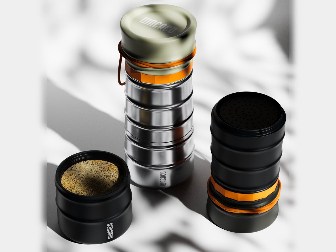
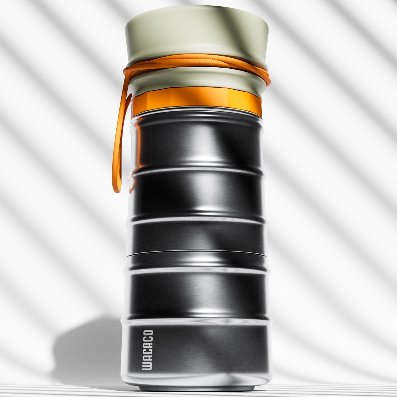
Portable coffee makers have a consistency problem. The plunger versions are messy, the capsule versions need a power source, and the pour-over options require more patience than most mornings allow. MokaMax resolves the argument by packing a pressure brewer directly into a rigid stainless travel mug — delivering espresso-style coffee in the same vessel you carry it in. It positions itself as the proper successor to the Pipamoka, with a form language that reads more like outdoor equipment than a kitchen appliance.

The ridged exterior isn’t purely visual texture — it provides a secure grip in conditions where hands are wet or cold, and it helps the MokaMax blend naturally with the kind of rugged travel gear men who care about this sort of thing tend to carry. It’s a product that earns its presence on a campsite or a trailhead without announcing itself. Good coffee, away from a kitchen, in an object worth actually owning.

What We Like

  • Pressure brewing and carrying a vessel combined means fewer items to pack and clean in the field
  • The ridged stainless form integrates visually with quality outdoor gear rather than clashing against it

What We Dislike

  • Espresso-style output may not satisfy those who prefer larger-volume filter coffee while camping
  • Pressure brewing has a learning curve for those accustomed to simpler portable methods

7. FLEXTAIL Tiny Pump 2X

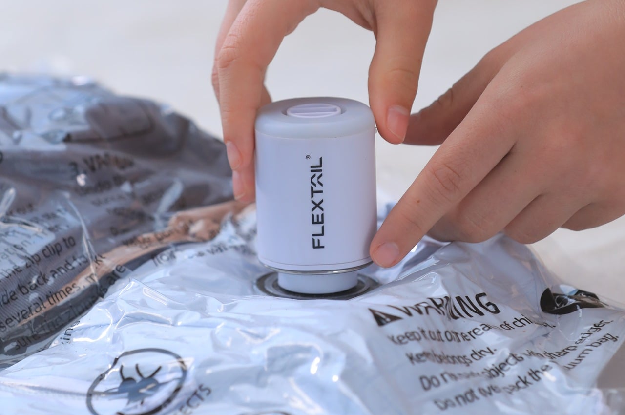
Camping gear that does one thing well is easy to find. Camping gear that does three things well, fits in a pocket, and doesn’t look like an infomercial product is considerably rarer. The FLEXTAIL Tiny Pump 2X manages exactly that — functioning as an outdoor pump, a camping lantern, and a general-use light source in a form factor small enough to get lost in a daypack if you’re not paying attention. Its utility-to-size ratio is genuinely difficult to argue with.

The design restraint does the heavy lifting. Rather than communicating its multi-function capability through an overload of controls or visual complexity, it reads as a single clean object that happens to do more than expected once you engage it. For summer trips where pack weight is a decision every item has to justify, the Tiny Pump 2X earns its place three times over. It’s the kind of product that makes you rethink what minimum viable gear actually looks like.

What We Like

  • Three functions in one compact body reduce the individual item count needed for a serious weekend outdoors
  • The restrained form doesn’t visually telegraph its multi-function capability, which is a genuine design achievement

What We Dislike

  • Compact size means output on each function is calibrated for personal use rather than group coverage
  • Lantern brightness may be insufficient for larger camping setups requiring wider illumination

8. StillFrame Headphones

The case for taking good headphones outside has never been stronger, and the StillFrame makes a compelling argument for why. They occupy the space between in-ears and over-ears deliberately — more open than the former, more relaxed than the latter. “Featherlight yet full-bodied” sounds like marketing until you put them on, at which point it just sounds accurate. Listening becomes a physical ritual rather than background noise management.

For outdoor use, weight matters as much as sound. Headphones that feel present on your head become an irritant across longer stretches — hiking, a morning at the campsite, a slow afternoon by the water. The StillFrame disappears in a way that heavier alternatives don’t, which means you stop thinking about them and start thinking about what you’re actually listening to. That’s the benchmark for any piece of audio gear, and this one clears it comfortably.

Click Here to Buy Now: $245.00

What We Like

  • The positioning between the in-ear and over-ear categories gives it a comfort profile that holds up across extended outdoor use
  • At $245, the price reflects a genuine design object rather than commodity audio gear

What We Dislike

  • The open design means reduced passive isolation in high-noise outdoor environments like busy trails or campsites
  • The featherlight build may not appeal to listeners who associate weight with perceived audio quality

Gear That Earns Its Place

The outdoor tech category earns its bad reputation because most of it treats function and form as competing priorities. These eight products make the opposite argument: that the best gear is what you actually want to carry, because it holds up visually and practically. Each one has a design story worth reading before you even get to the spec sheet.

The RetroWave and BlackoutBeam are available directly through the YD shop. The MokaMax, Yuuye, and StillFrame have earned space in multiple roundups for good reason. The solar tent, still in concept territory, is the kind of idea that makes the rest of the industry look like it isn’t trying hard enough. Summer has better options than it used to.

The post 8 Best Summer Gadgets for Men Who Think “Outdoor Tech” Usually Looks Terrible first appeared on Yanko Design.