Rope Replaced Every Screw and Dowel in This $77 Wooden Folding Stool

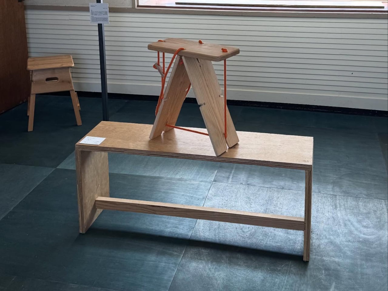
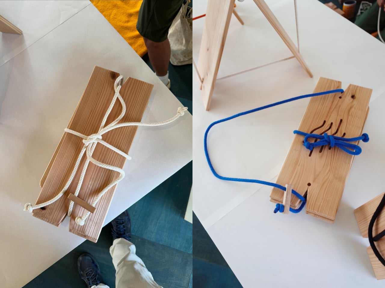
Most furniture relies on hardware you can’t see to hold everything together. Screws, bolts, dowels, and adhesives do the invisible work that keeps chairs and stools from coming apart. The Rope Stool does without all of it. Designed as part of a craft exchange between Tottori, Japan, and Gothenburg, Sweden, it holds its flat cedar boards together through rope tension alone, and it folds flat when it’s done.

The exchange that produced it ran for three weeks in Tottori Prefecture, where six Swedish creatives came to collaborate with local Japanese craftspeople. The initiative was organized by Oshinsha, a Japanese retailer dedicated to promoting the work of local artisans, with funding from both countries. It was structured as a genuine creative residency, not a cultural showcase, and the stool that came out of it reflects that difference.

Designers: Esbjorn Grip, Junsei Fujimoto

The brief handed to the pair who made the Rope Stool was deliberately restrictive: create a piece of furniture from a single, repeatable wooden element. What they arrived at is a seat made entirely from identical flat boards of Japanese cedar, no custom-cut components, no specialized hardware. The rope pulls them into formation and holds them there, tight enough to carry a person’s weight, loose enough to release when you want to pack up and leave.

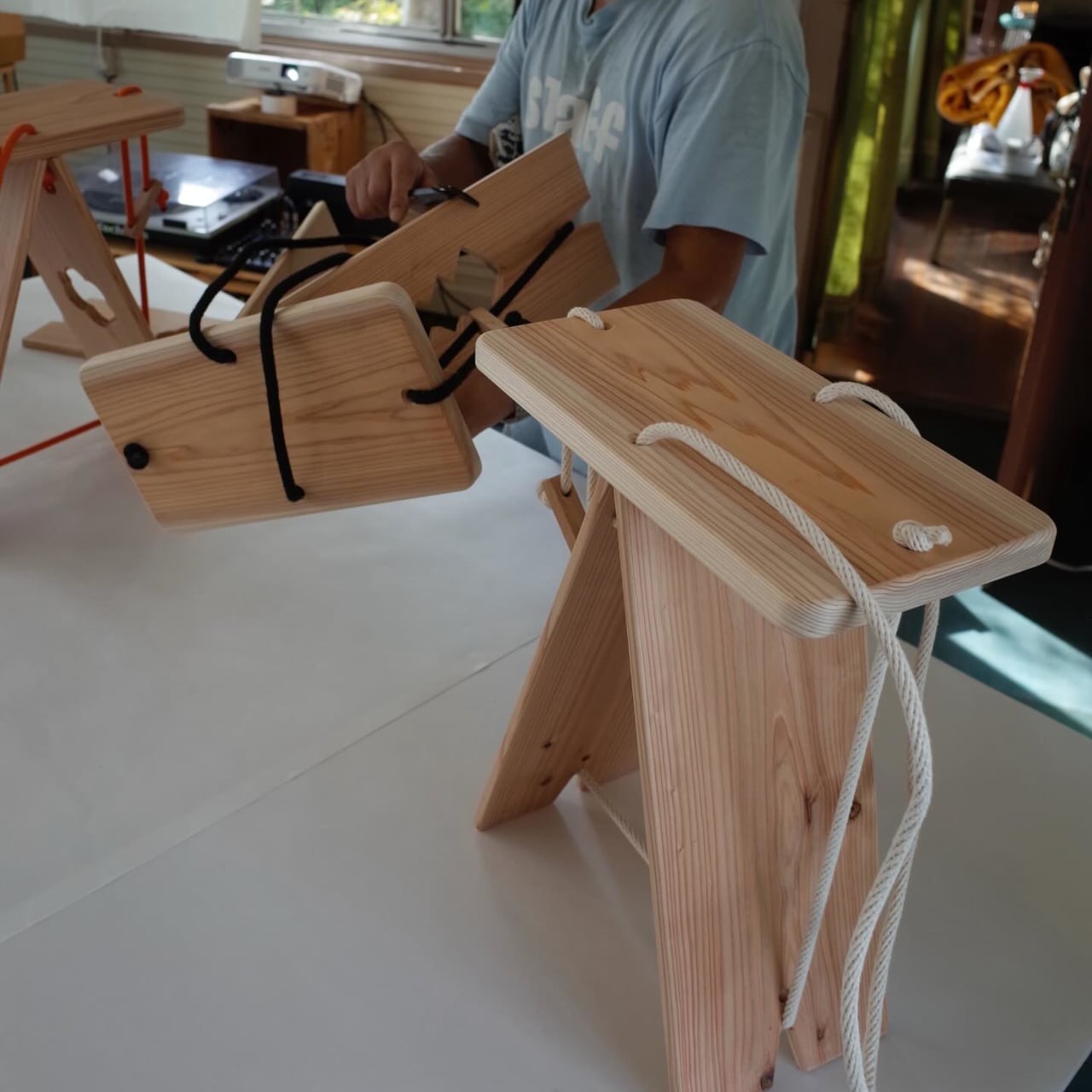
That packing-up quality is one of the things that makes the stool more than a design exercise. A seat that disassembles into a flat bundle of boards and a length of rope is genuinely portable in a way that most stools aren’t. You can bring it to a market stall, a workshop, an outdoor event, or anywhere that needs a seat more than it needs a chair stored permanently in the corner. The rope tension is what creates the rigidity; without it, the parts stay separate and flat.


The cedar itself is a considered choice. Japanese cedar, or sugi, is one of the most widely used traditional wood materials in Japan, valued for its light weight, straight grain, and durability. Flat boards cut from it are uniform enough to be truly interchangeable, which is the point of the single-repeatable-element brief. Each board in the stool is the same as the others, and the rope is what differentiates a pile of boards from something you can sit on.

There’s a conceptual clarity to the construction that most furniture doesn’t achieve. The structure is visible, the logic is readable, and nothing about how it stays together is concealed. Pull the rope, and it assembles. Loosen it, and it comes apart. The simplicity isn’t a limit on what the stool can do: it’s the thing itself, expressed as directly as the brief demanded.

The post Rope Replaced Every Screw and Dowel in This $77 Wooden Folding Stool first appeared on Yanko Design.
Rock Paper Pencil 4.0 Adds the Paper Feel the Apple Pencil Never Had

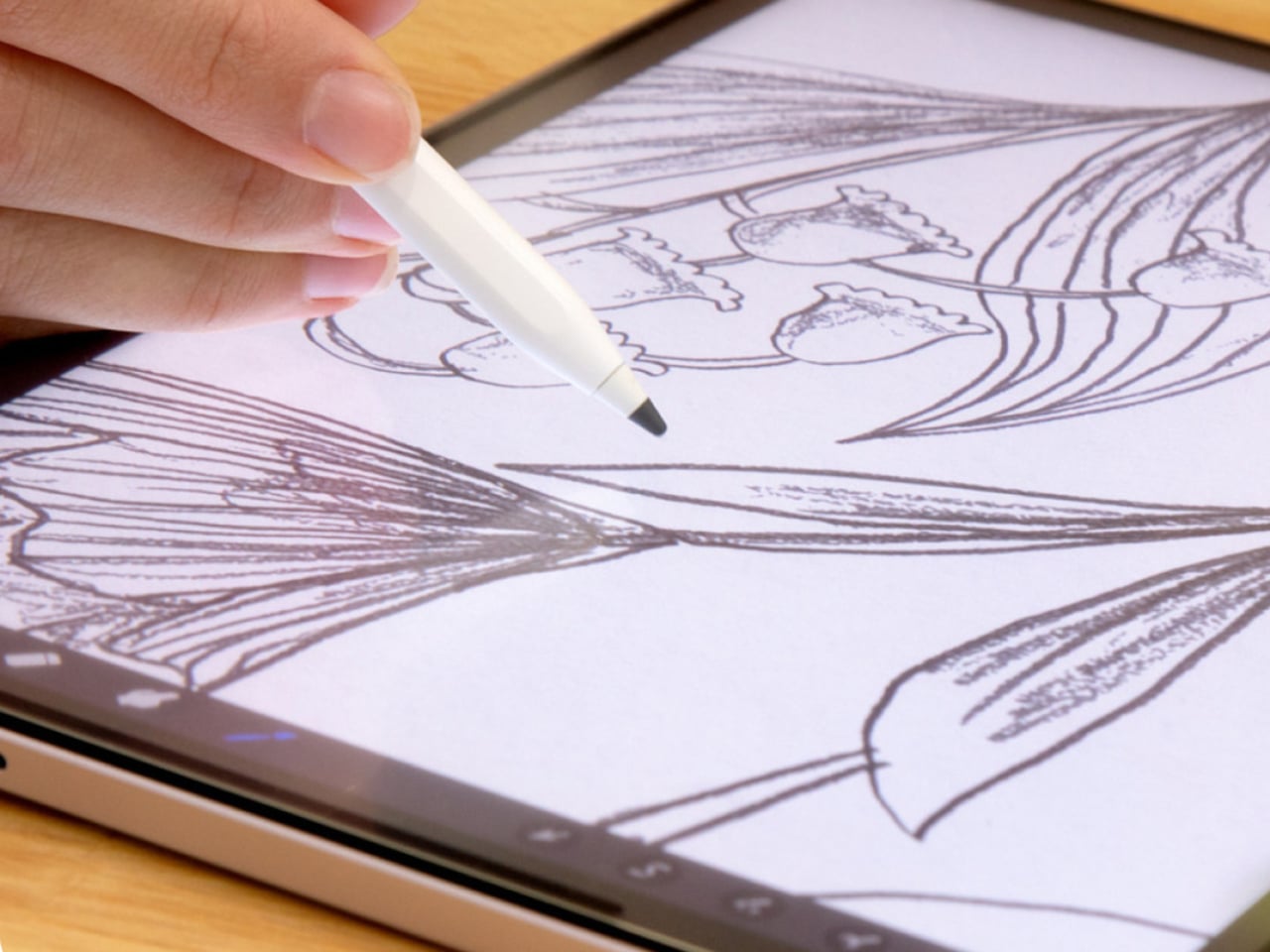
The Apple Pencil on a standard iPad screen is a competent stylus. It isn’t, however, anything like writing on paper, and for a lot of artists and note-takers, that distinction matters enough to do something about it. Rock Paper Pencil has been the go-to solution for this since version one, and version 4.0, at $49.99, adds something earlier versions couldn’t offer: a choice of how drawing actually feels.

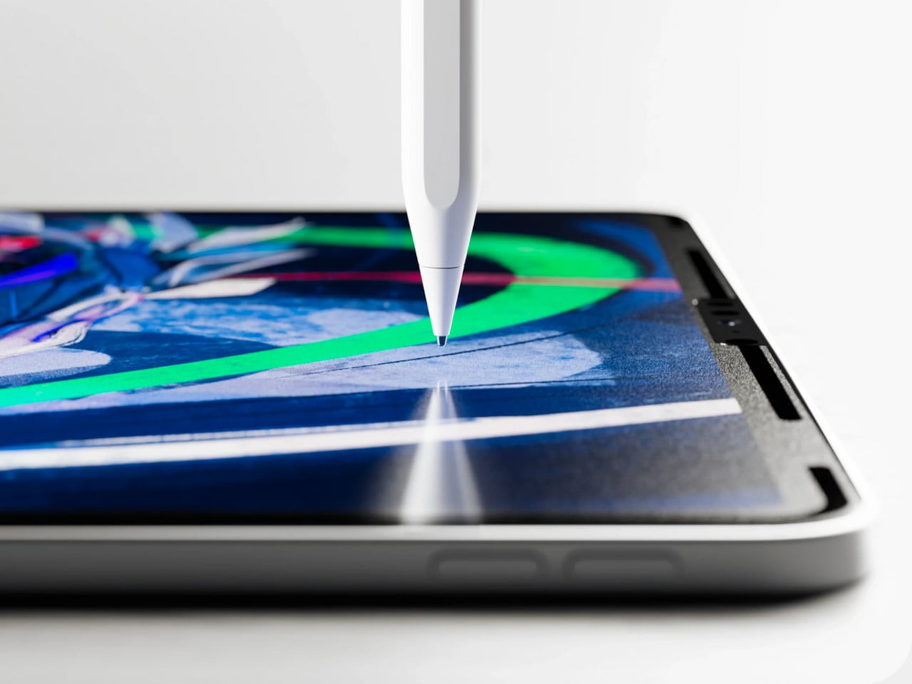
The setup is a two-part system. A removable screen protector attaches to the iPad’s display without adhesive, using NanoCling technology that leaves no residue when peeled off. Its microscopic texture adds enough controlled friction to the surface that the Apple Pencil moves across it the way a pencil moves across paper, with resistance that makes strokes feel intentional rather than frictionless.

Designer: Astropad

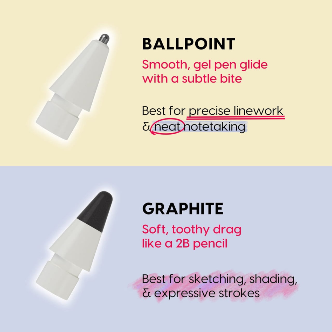
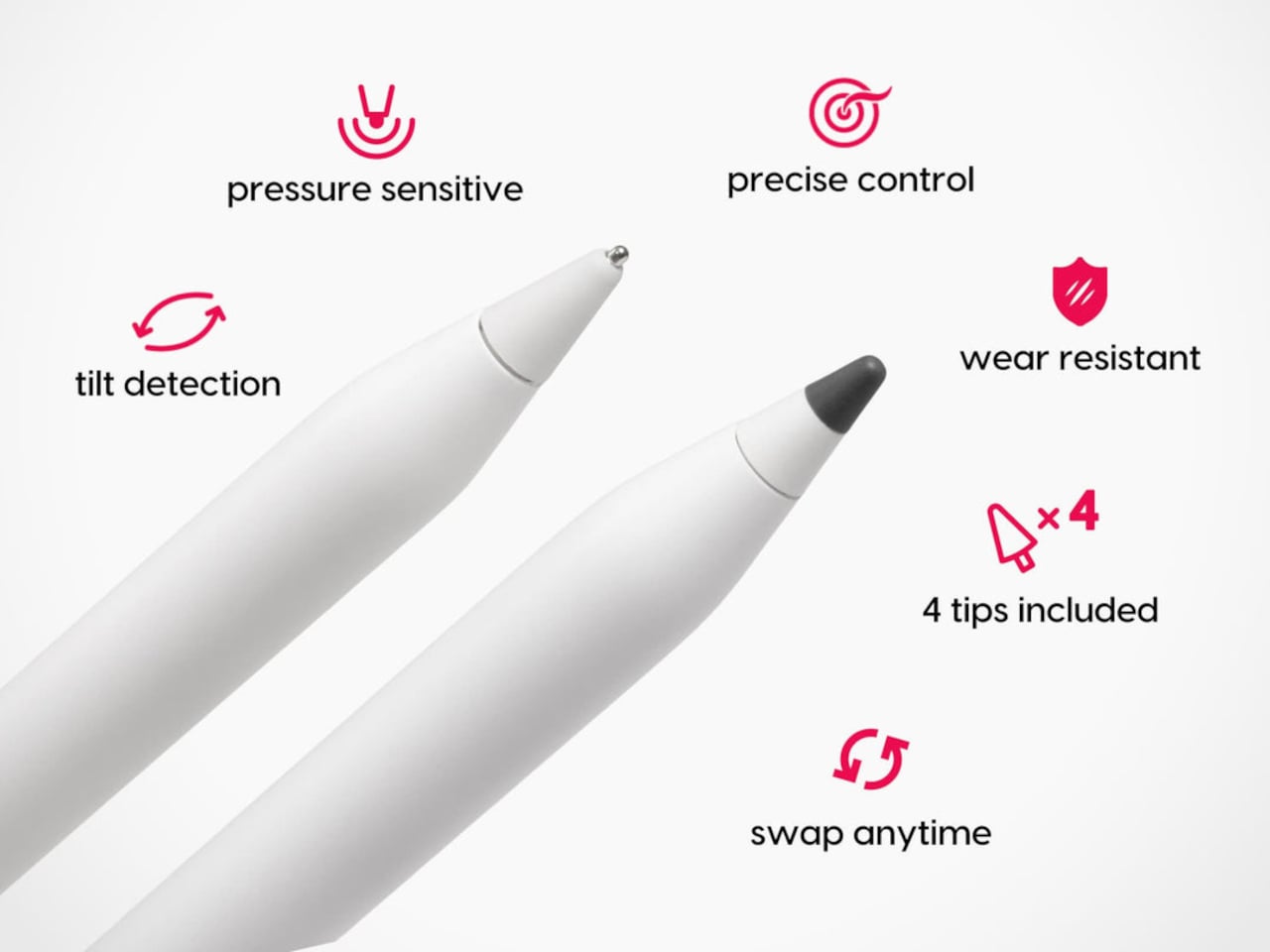
The four included tips are the version 4.0 update. Two are ballpoint, the same smooth steel-tip design from previous versions, and two are graphite, a new addition made from POM material and modeled after a 2B pencil. The graphite tips have a softer, toothier drag that catches the screen protector’s texture more noticeably, delivering the kind of feedback artists reach for when sketching, shading, or building up layered strokes.

Switching between the two feels like the difference between reaching for a pen and reaching for a pencil, which is precisely the point. Writers and quick note-takers tend to prefer the ballpoint’s smoother glide. Illustrators working on expressive, pressure-sensitive line work often want more grip. Neither one is wrong, and having both in the same kit means you don’t have to commit to one style of input permanently.

What makes this system work as well as it does is that the tips and the protector are engineered together rather than as separate products. The custom tips are designed specifically to interact with the nano-texture protector surface, so the friction you feel isn’t random. It’s calibrated. The tips work with every Apple Pencil model, including the Apple Pencil Pro, so upgrading your stylus doesn’t require replacing the tips you’re used to.

The screen protector itself attaches in seconds and stores in an included protective sleeve when it’s not on the iPad. The removable design is one of the things that separates Rock Paper Pencil from Apple’s own nano-texture glass option, which is a permanent surface applied at purchase on select high-end iPad Pro configurations. Rock Paper Pencil achieves a comparable paper-like feel without locking you into it, and without the price premium that comes with Apple’s version.

Compatibility covers most iPads in active circulation, from the iPad mini to the full-size iPad Pro, with model-specific screen protectors ordered for the right fit. The tips, by contrast, are universal across Apple Pencil generations. Each Rock Paper Pencil 4.0 kit ships with the screen protector, the protective sleeve, and all four tips: two ballpoint and two graphite.

The $49.99 price keeps the entry point low enough that it doesn’t feel like a commitment. The protector comes off clean, the tips swap in seconds, and the graphite option adds a dimension to iPad drawing that wasn’t there before. It’s a small change to the physical layer that produces a noticeably different experience.

The post Rock Paper Pencil 4.0 Adds the Paper Feel the Apple Pencil Never Had first appeared on Yanko Design.

Cyberpunk 2077 Just Got a Commodore Collab That’s Absurd and Logical

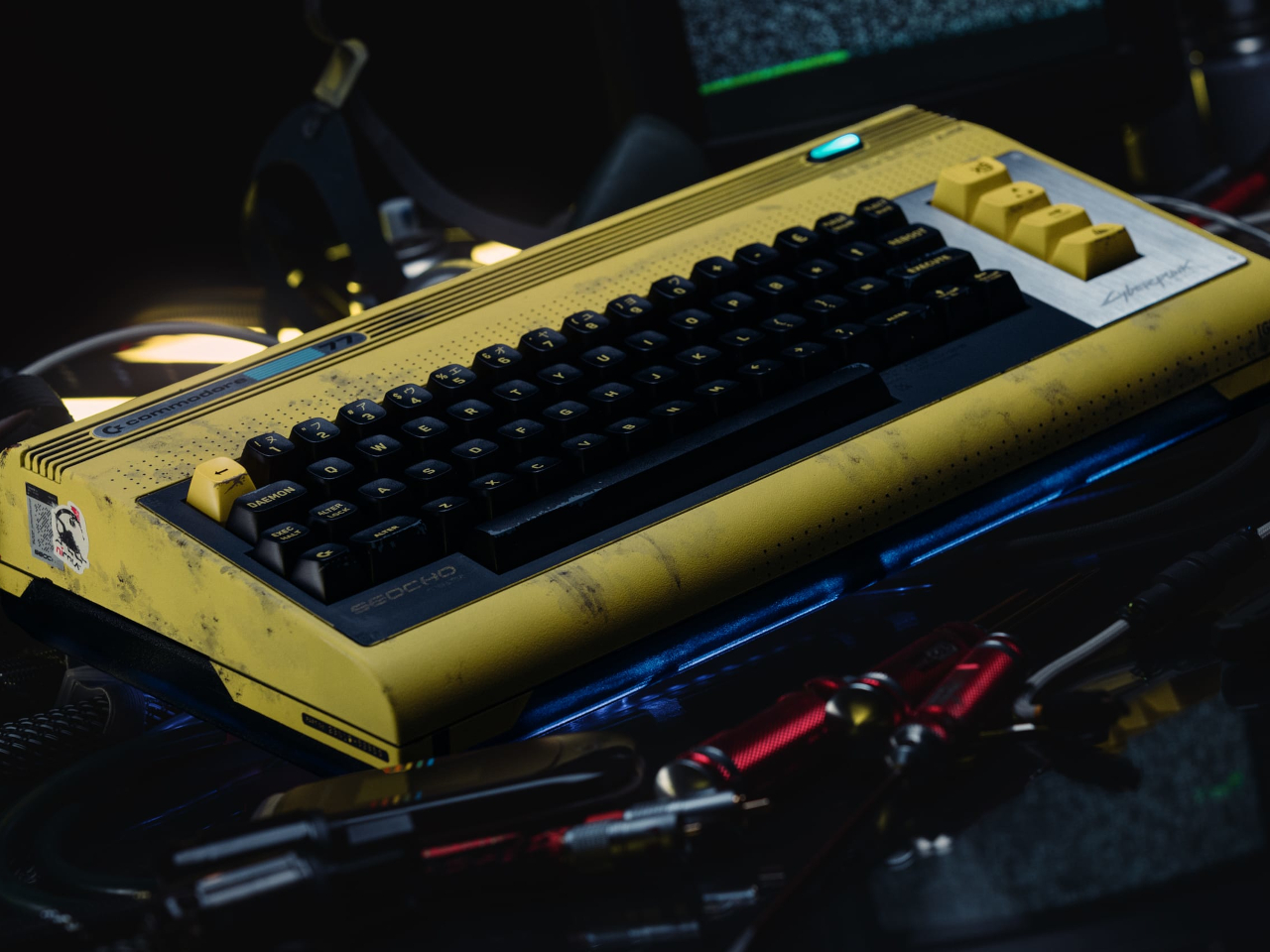
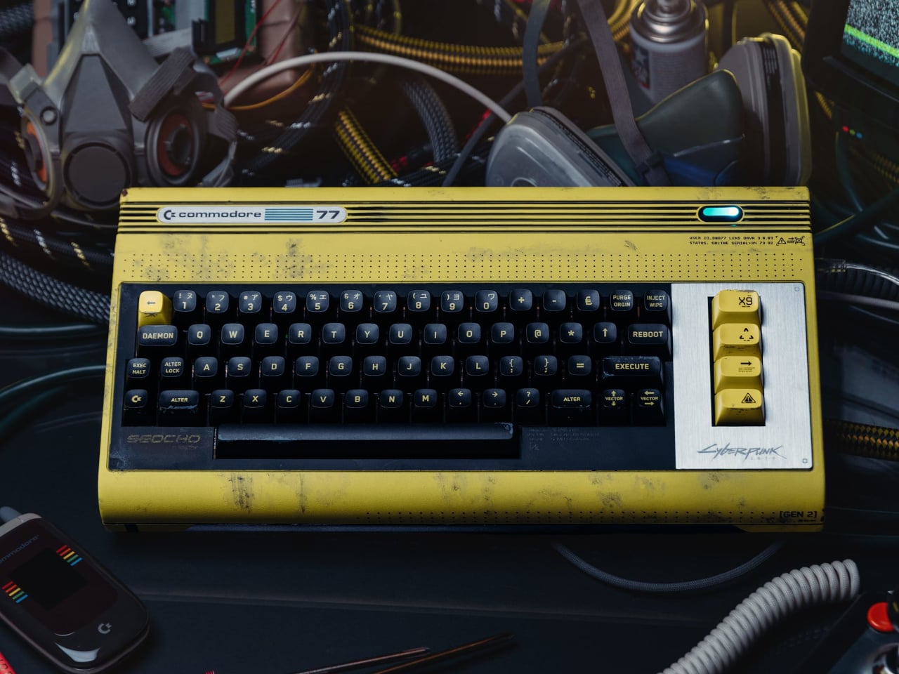
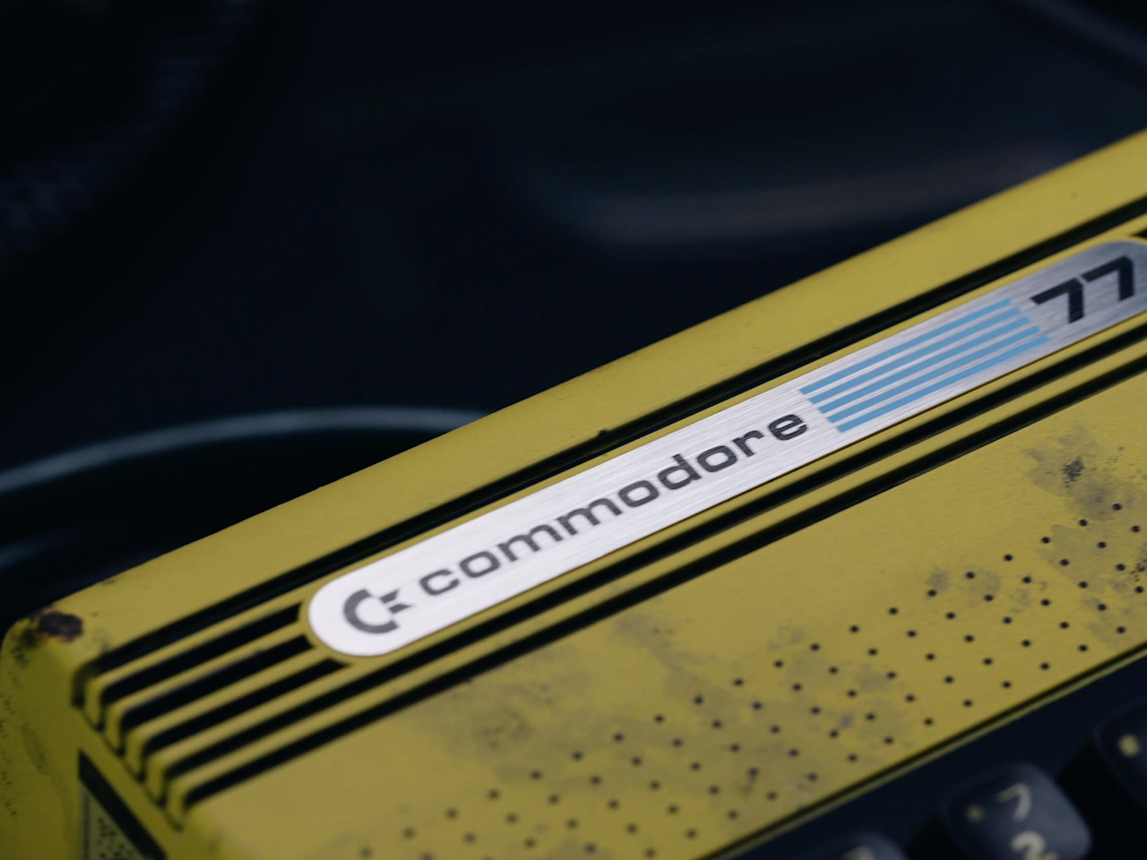
The original Commodore 64 launched in 1982. Cyberpunk 2077, the game, is set in 2077. The gap between those two years is roughly the entire history of the personal computer, which makes the Commodore 77 either the most absurd collaboration in gaming hardware history or the most logical one, depending on how you look at it. At $377, it’s clearly betting on the latter.

The 77 is a special edition of the Commodore 64 Ultimate, the FPGA-based revival that earned a 10/10 from IGN when it launched in 2025. FPGA recreations matter because they reproduce the original hardware’s behavior at the circuit level rather than running it through conventional software emulation. The practical result is compatibility with 99.9% of the 10,000-plus game and peripheral library built up over four decades.

Designer: Commodore

Under the hood, this edition upgrades the processor from the AMD Artix XC7A50T to the more powerful XC7A100T, pushing the ceiling from the Commodore 64 Ultimate’s speed to 77MHz. That’s a long way from the original machine’s 1 MHz, though the number was clearly chosen as much for the name as for the engineering. It also connects to modern TVs via HDMI and supports Wi-Fi and USB, covering the practical bases without compromising what the platform does.

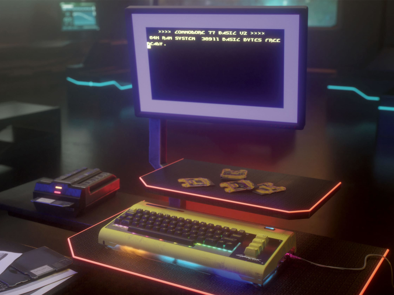
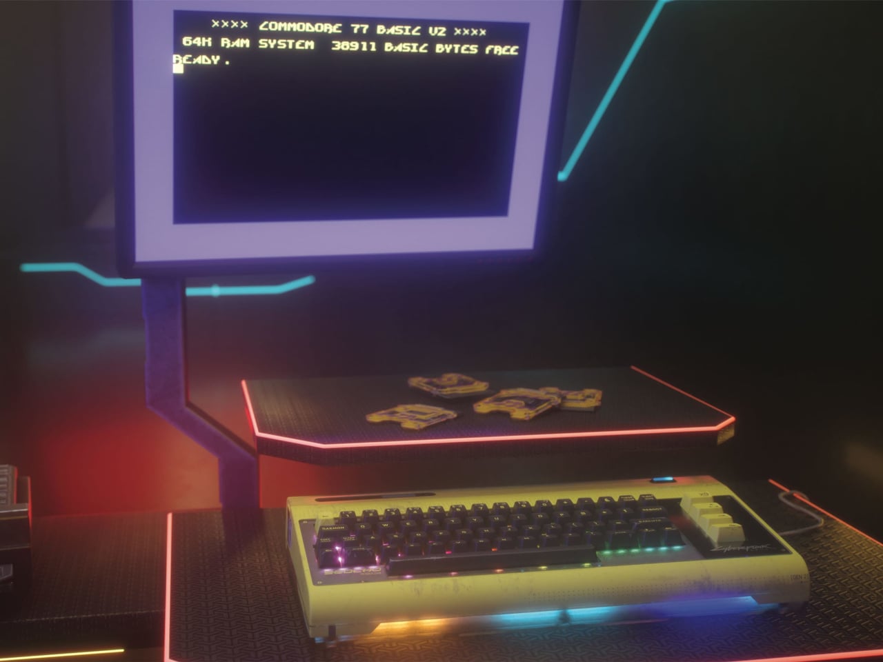
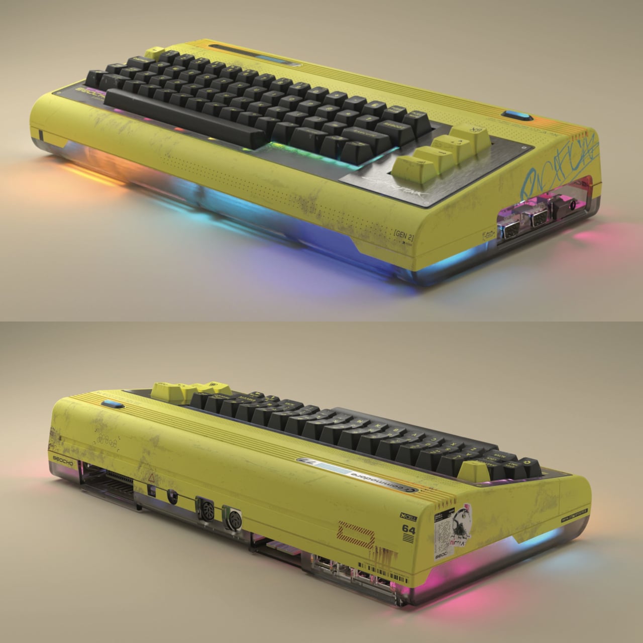
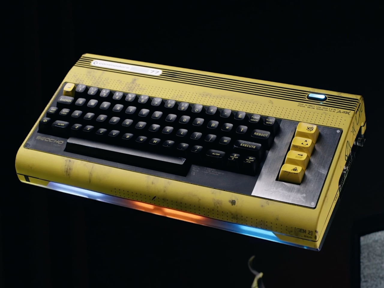
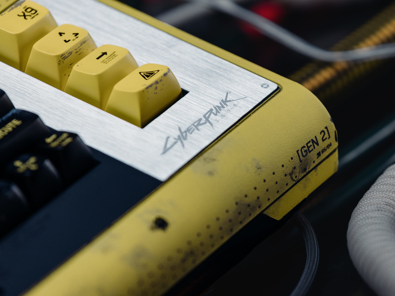
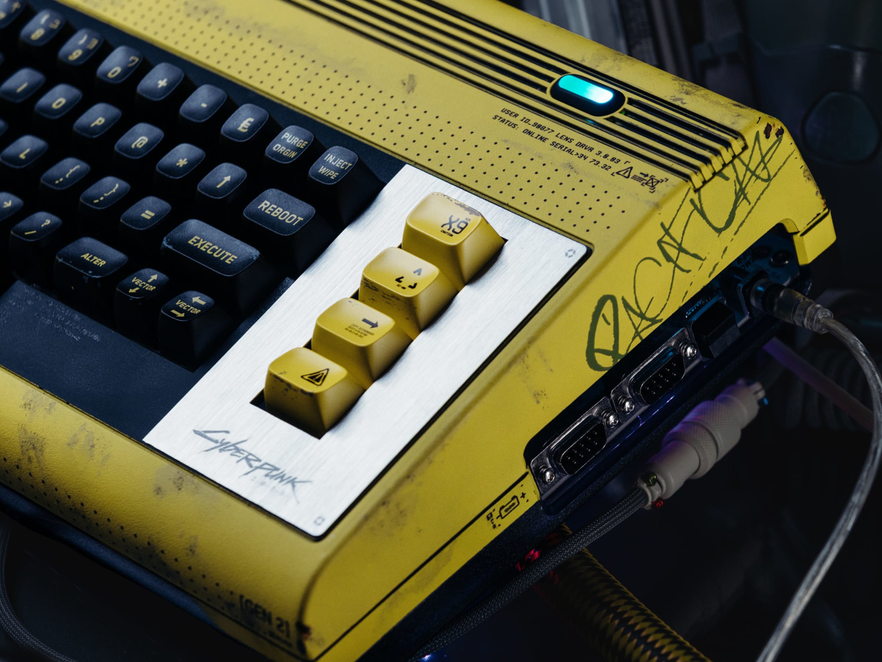
The design is where Cyberpunk 2077 fully takes over. The main body is a distressed, weathered yellow with graffiti tags, a brushed-metal plate, and a teal power indicator. The bottom of the shell is smoked-gray translucent, with multicolor LEDs glowing through from beneath. It boots into a custom BASIC 2.0 startup screen themed around Seocho Electronics, a fictional Night City manufacturer, which separates this from a sticker job.

The most compelling piece of the package is the demo. Called “The Shard,” it ships on an exclusive cartridge designed to look like the data chips from Cyberpunk 2077 and was created by Arise, a long-running Polish C64 demo group with a serious reputation in the scene. It’s a non-interactive 8-bit audiovisual experience, not a playable game, with a 24-channel stereo SID soundtrack by chiptune artist LukHash. For anyone who follows the C64 demo scene, Arise and LukHash together is a meaningful combination.

The spiral-bound user guide is another thing entirely. It comes packed with Cyberpunk 2077 lore alongside type-in BASIC programs that you can key into the machine yourself, which is about as 1982 as anything in the box. It’s the kind of detail that only makes sense if you understand what a Commodore 64 actually meant to the people who grew up with one, and it suggests whoever put this together understood the audience fairly well.

This is Commodore’s first franchise hardware collaboration in 68 years of existence. That’s worth pausing on. The Commodore 64 became a cultural landmark not through corporate restraint but through the things people built on it, the games, the demos, the music, the code. The Commodore 77 is a collector’s object, but the BASIC programs in that guide are an open invitation to do something with it rather than just admire it.

The post Cyberpunk 2077 Just Got a Commodore Collab That’s Absurd and Logical first appeared on Yanko Design.
The Click Wheel Is Back, and This Pocket Player Has 4 DACs

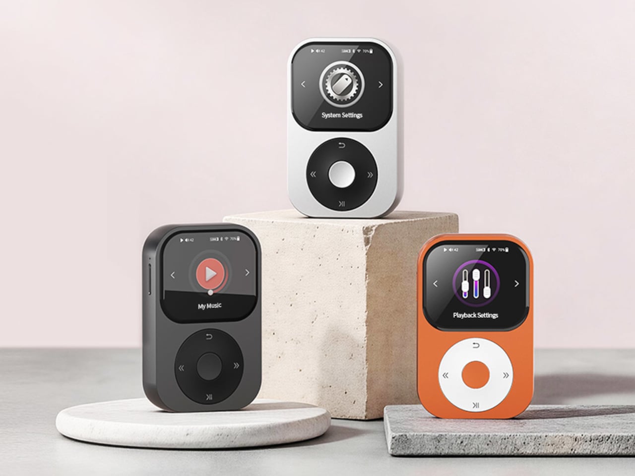
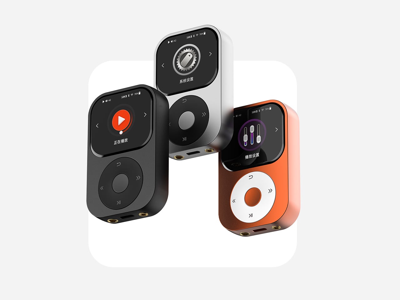
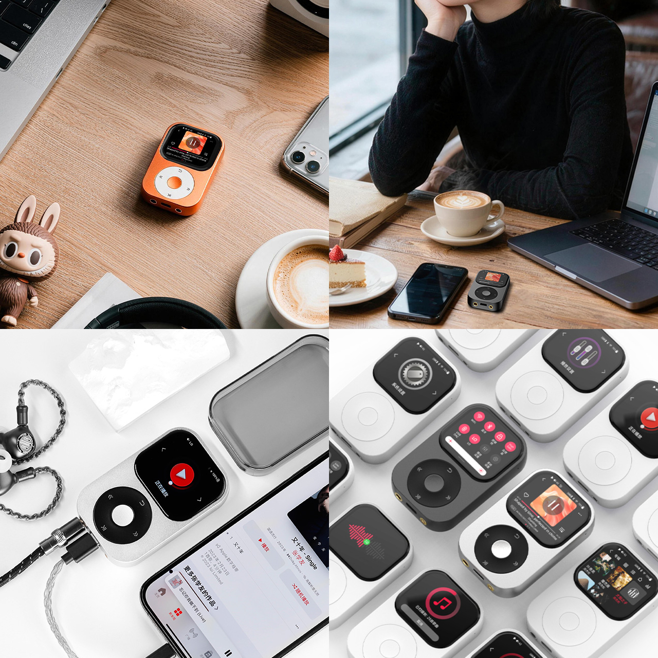
The Shanling Q2 is a pocket-sized hi-fi player that fits four Cirrus Logic CS43131 DAC chips into a body smaller than most wallets. It measures 80mm x 50mm x 13.5mm, weighs 83g, and supports PCM up to 768 kHz/32-bit alongside native DSD512 playback. It also has a Click Wheel, which, depending on your age, will either mean nothing to you or mean a great deal.

The Click Wheel here is a touch-sensitive ring that sits alongside a 2.09-inch touchscreen, giving you two ways to move through menus and adjust volume. The touchscreen handles the broader interface work while the wheel handles the tactile stuff, volume adjustments and quick navigation without staring at a screen. Four physical buttons round it out. The combination is deliberate and slightly nostalgic, and it works.

Designer: Shanling

Those four DAC chips working in tandem are why the audio section matters. Through the 4.4 mm balanced output, the Q2 pushes up to 425mW into a 32 Ω load, which is enough to properly drive full-size headphones that most portable players give up on. The 3.5mm unbalanced output still delivers 120mW. Both gain settings, low for sensitive in-ear monitors and high for harder-to-drive cans, give you control over the amplifier’s output to match your headphones precisely.

One of the more useful things the Q2 can do is disappear into your current setup rather than replace it entirely. The bidirectional Bluetooth 5.2 works in both directions: as a transmitter to wireless headphones and speakers, and as a receiver that turns the Q2 into a DAC and amplifier for your smartphone. Plug a set of wired headphones into the Q2, pair it with your phone via Bluetooth, and you get a meaningful upgrade over your phone’s built-in audio without any extra hassle.

There’s no internal storage, which keeps the Q2 light and simple, but the microSD slot accepts cards up to 2TB. Most high-resolution music libraries won’t come anywhere near filling that, but it’s generous enough that the storage question essentially disappears. The dual-band Wi-Fi supports AirPlay and DLNA for wireless streaming, and native Tidal support means you don’t have to rely on stored files at all if you’d rather not.

Battery life holds up well relative to what’s being asked of the hardware. The 3.5mm output gets up to 13.5 hours; the balanced connection trims that slightly to 12.5 hours. Run the Q2 as a Bluetooth receiver using LDAC, and you get up to 16.5 hours, which comfortably covers a long-haul flight or a full day of listening without needing to think about charging.

The aluminum-alloy frame and glass rear panel keep it feeling premium in hand, and available colors are Smoky Grey, Moonlight Silver, and Twilight Orange. The MTouch OS runs on an Ingenic X2000 processor, and the interface is reportedly clean and fast enough that it doesn’t get in the way of actually using the player. In USB DAC mode, it extends its usefulness to desktop setups, handling PCM up to 384 kHz/32-bit from a connected computer.

The Q2 retails at around $269, which puts it squarely in the serious-but-not-extreme tier of portable hi-fi. It ships with a case, a USB cable, and a manual, and it’s available in all three colorways from launch. For anyone who has ever felt their phone was the weak link in an otherwise respectable headphone setup, the Q2 is a reasonably direct answer to that specific frustration.

The post The Click Wheel Is Back, and This Pocket Player Has 4 DACs first appeared on Yanko Design.
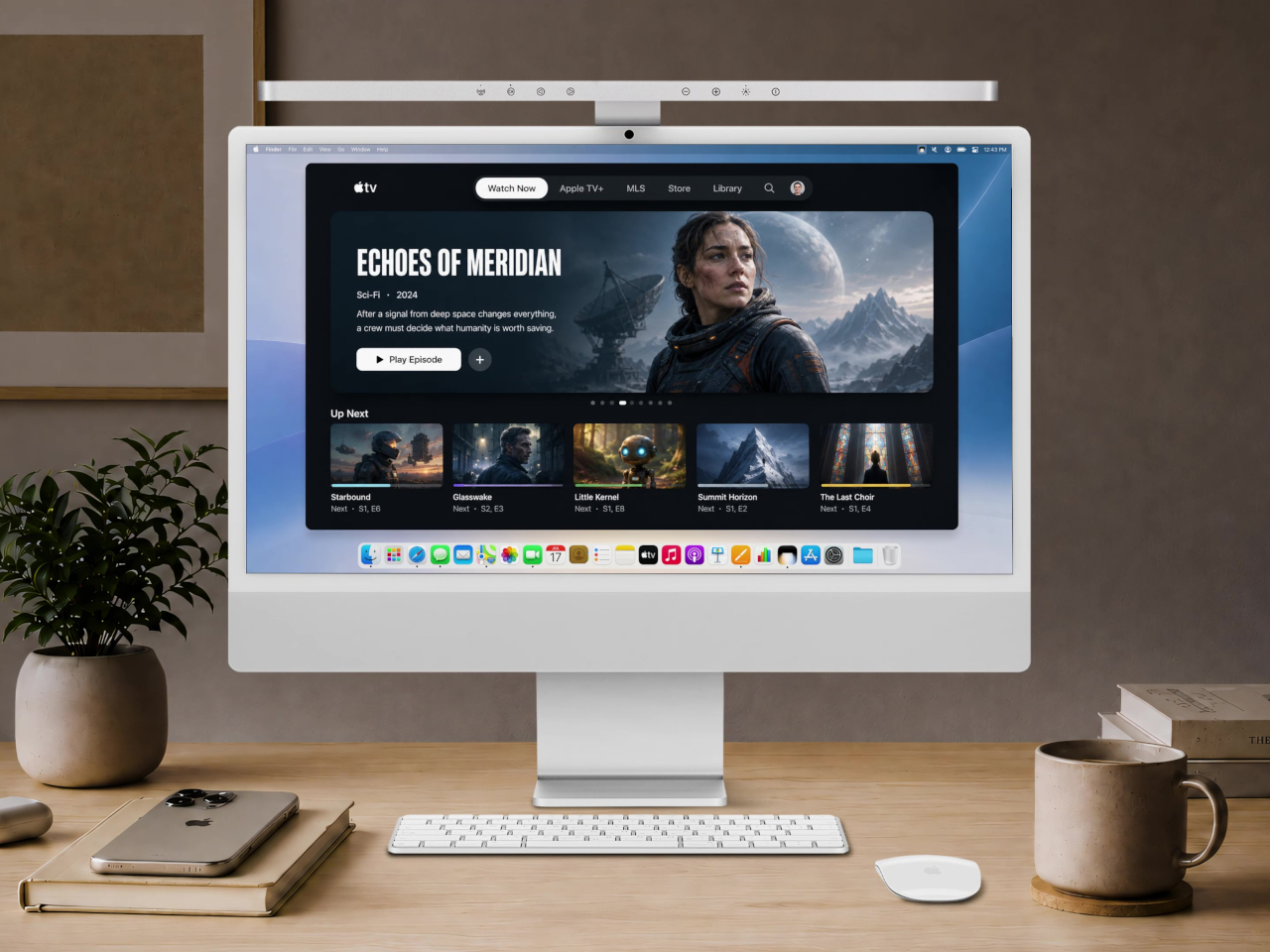
BenQ Just Made a $189 iMac Light Bar That Looks Like Apple Designed It

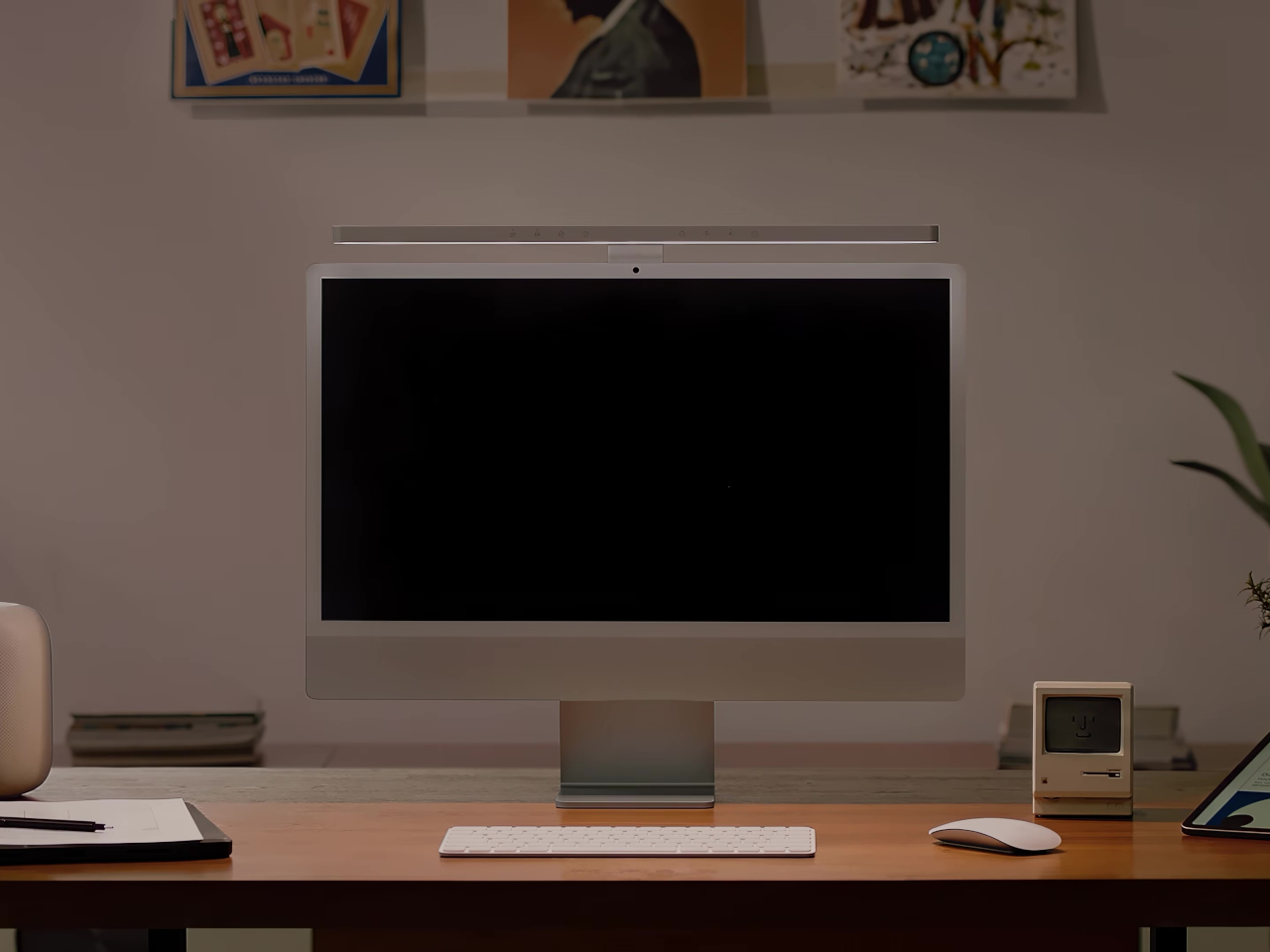
The iMac has always had a light bar problem. You could put any number of BenQ ScreenBars on top of one, but they’d cover the camera, block the microphone, or clip over the Apple logo on the back. None of them were made for it. The BenQ iScreenBar is the first that actually is, and it arrives at $189, looking like it was designed by the same people who designed the computer it sits on.

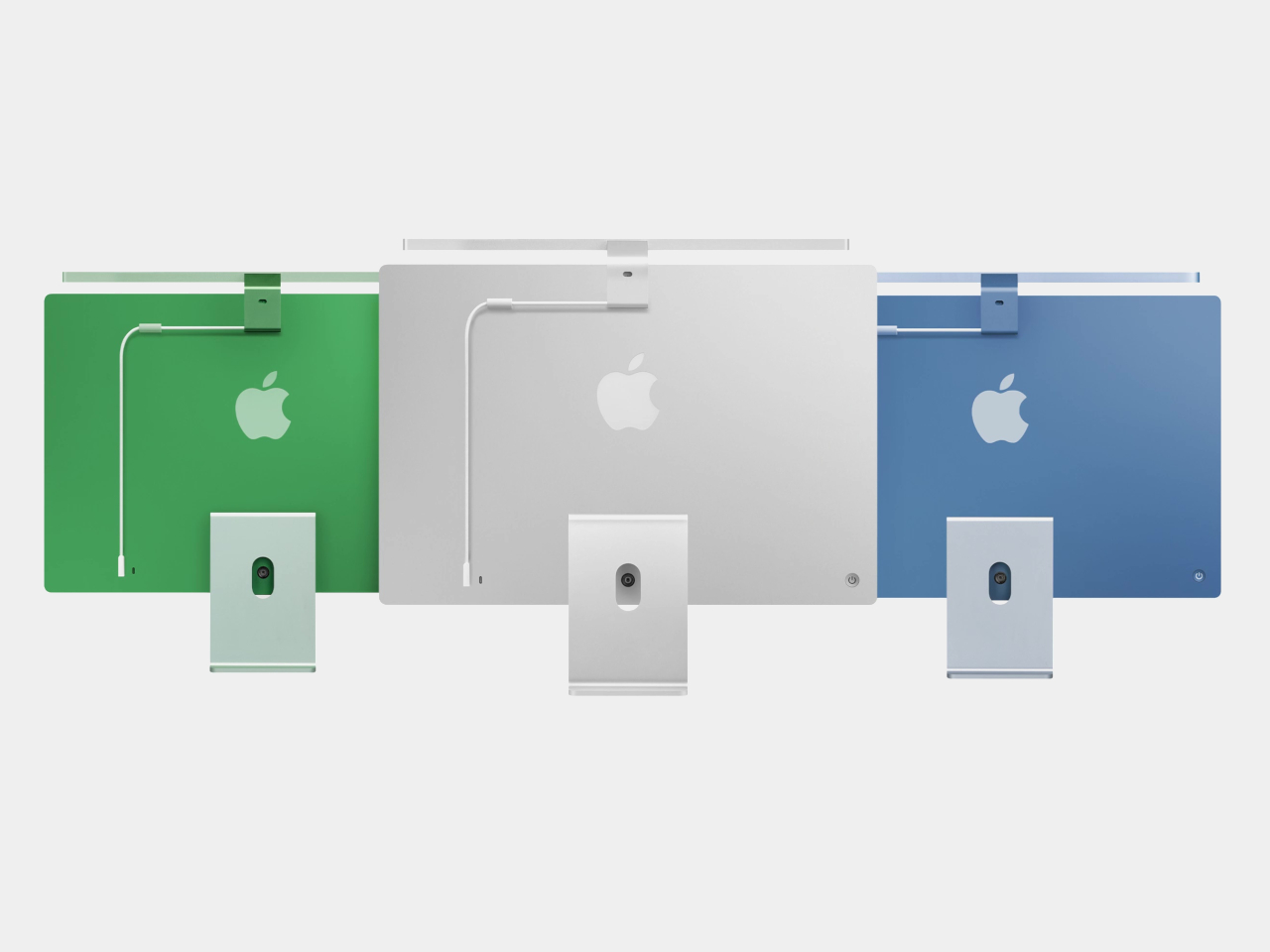
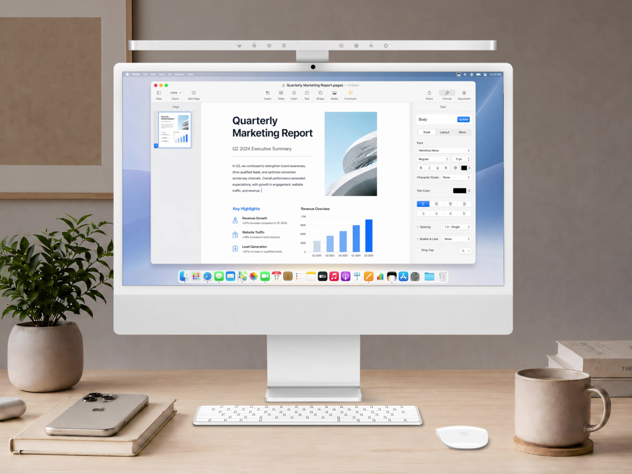
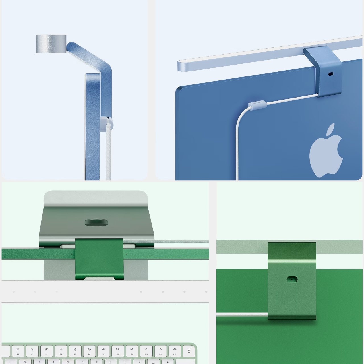
The construction makes the case immediately. Unibody aluminum with a glass touch panel, finished in Silver to match the iMac directly, mounting via a custom magnetic clamp on the back rather than a standard monitor clip. A magnetic cable clip routes the USB-C power cord out of view. The rear logo, the camera, and the microphone all remain unobstructed. It’s the kind of detail that should have been obvious from the start but apparently wasn’t until now.

Designer: BenQ

Compatibility is specifically tuned to the 24-inch iMac from 2021 onward. That USB-C connection does more than just carry power. It lets the iScreenBar communicate with the iMac directly, enabling a dedicated macOS app for software control of brightness and color temperature. It also means the light bar knows when the camera is active, which feeds into one of the more useful features here.

That feature is Video Mode. When the iMac’s built-in webcam turns on, the iScreenBar automatically shifts its output to reduce bright spots on the user’s face, giving calls and recordings a more balanced, flattering light rather than the harsh overhead glow that most desk setups produce. Nobody wants to look like they’re being interrogated from below during a team call, and Video Mode addresses that without any manual intervention.

The light itself uses BenQ’s ASYM-Light optical design, which angles illumination downward toward the desk rather than toward the screen. That means no glare, no hotspots reflecting back from the display, and lighting that reaches an area of roughly 33.5in x 19.7in at 500 lux. The glass touch panel on the bar handles brightness and color temperature adjustments directly, and auto-dimming keeps the workspace at a consistent level as conditions change.

Blue and Green colorways, two of the iMac’s most popular colors, are planned for late 2026. The Silver version is the only one available at launch, which is also the most versatile option since it matches every iMac color reasonably well. For buyers committed to a Blue or Green iMac, the wait might be worth it for a more cohesive result, but the Silver still looks deliberately matched rather than generically attached.

BenQ’s existing ScreenBar lineup has been a reference point in desk lighting for years, with options ranging from $109 for the standard bar to $179 for the Halo 2 and $289 for the new ScreenBar Max built for dual-monitor setups. The iScreenBar slots in at $189, making it competitive with the premium end of that range while offering something none of the others can: a mount that actually fits the iMac the way it was intended, rather than sitting on top of it like an afterthought.

The post BenQ Just Made a $189 iMac Light Bar That Looks Like Apple Designed It first appeared on Yanko Design.
MagSafe Wallets Leave Your Cards Exposed but This $24 One Closes

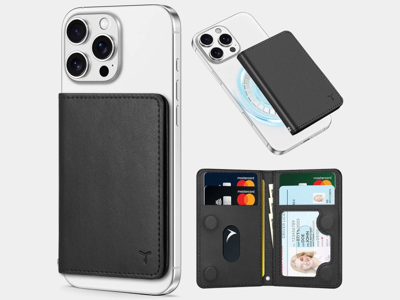
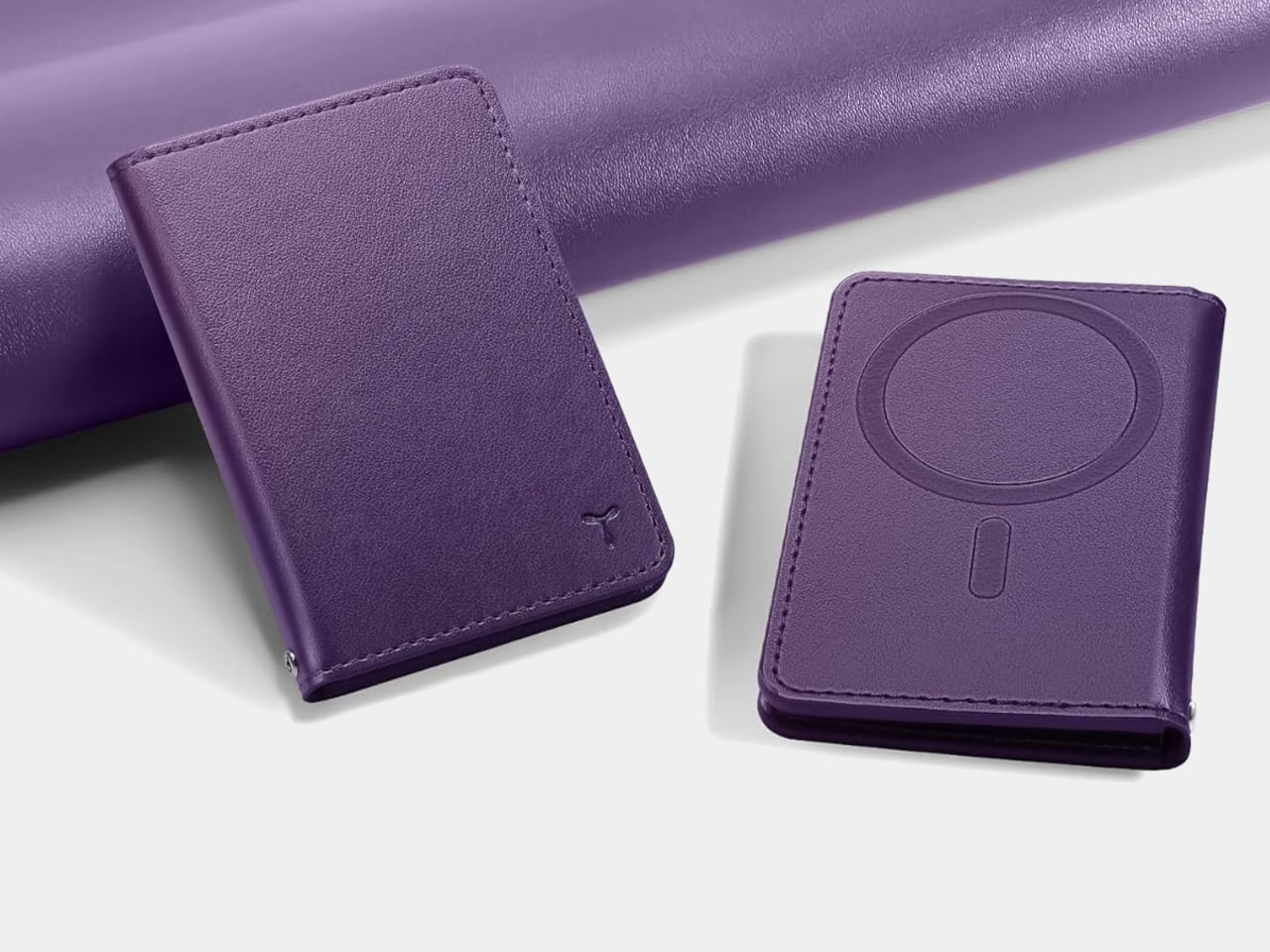
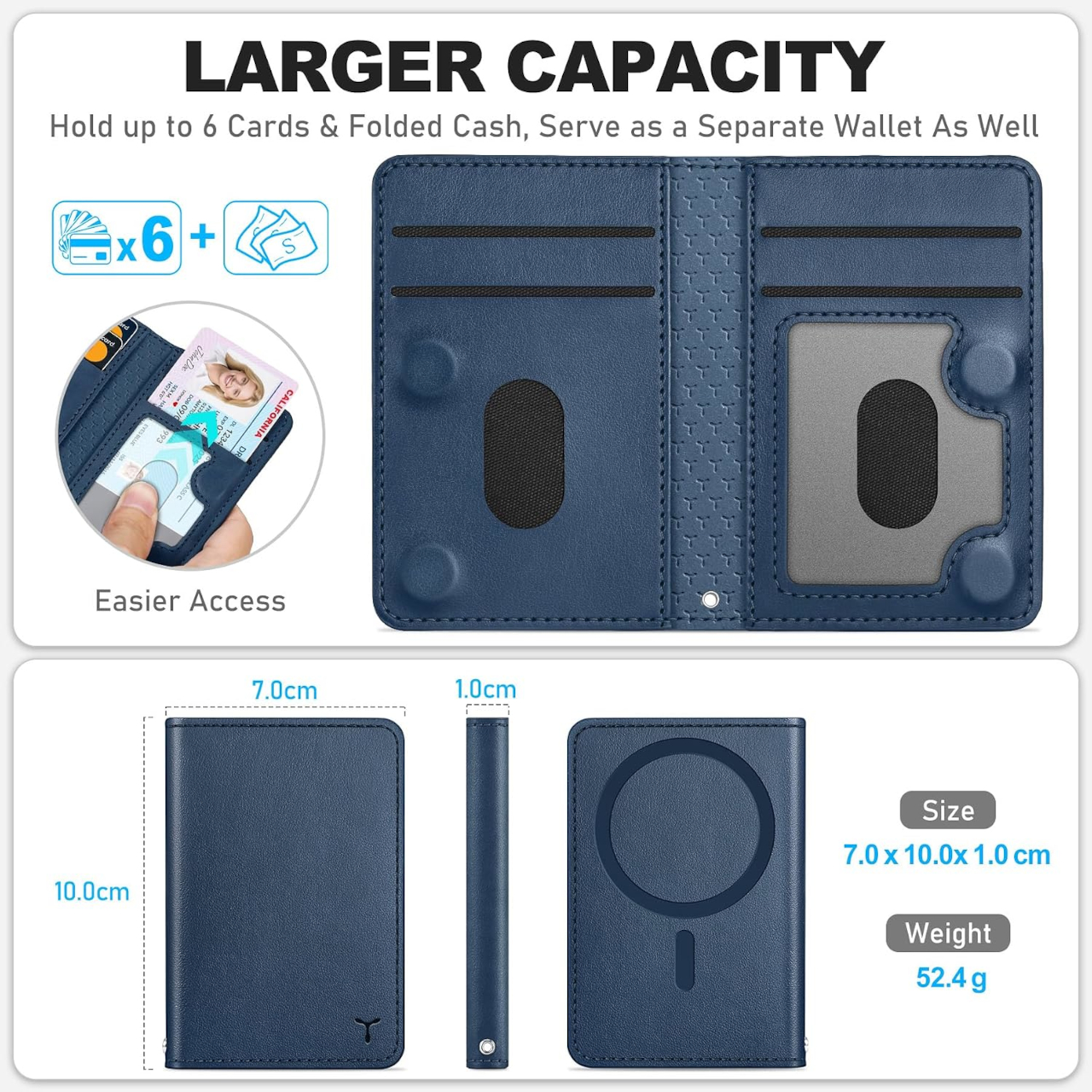
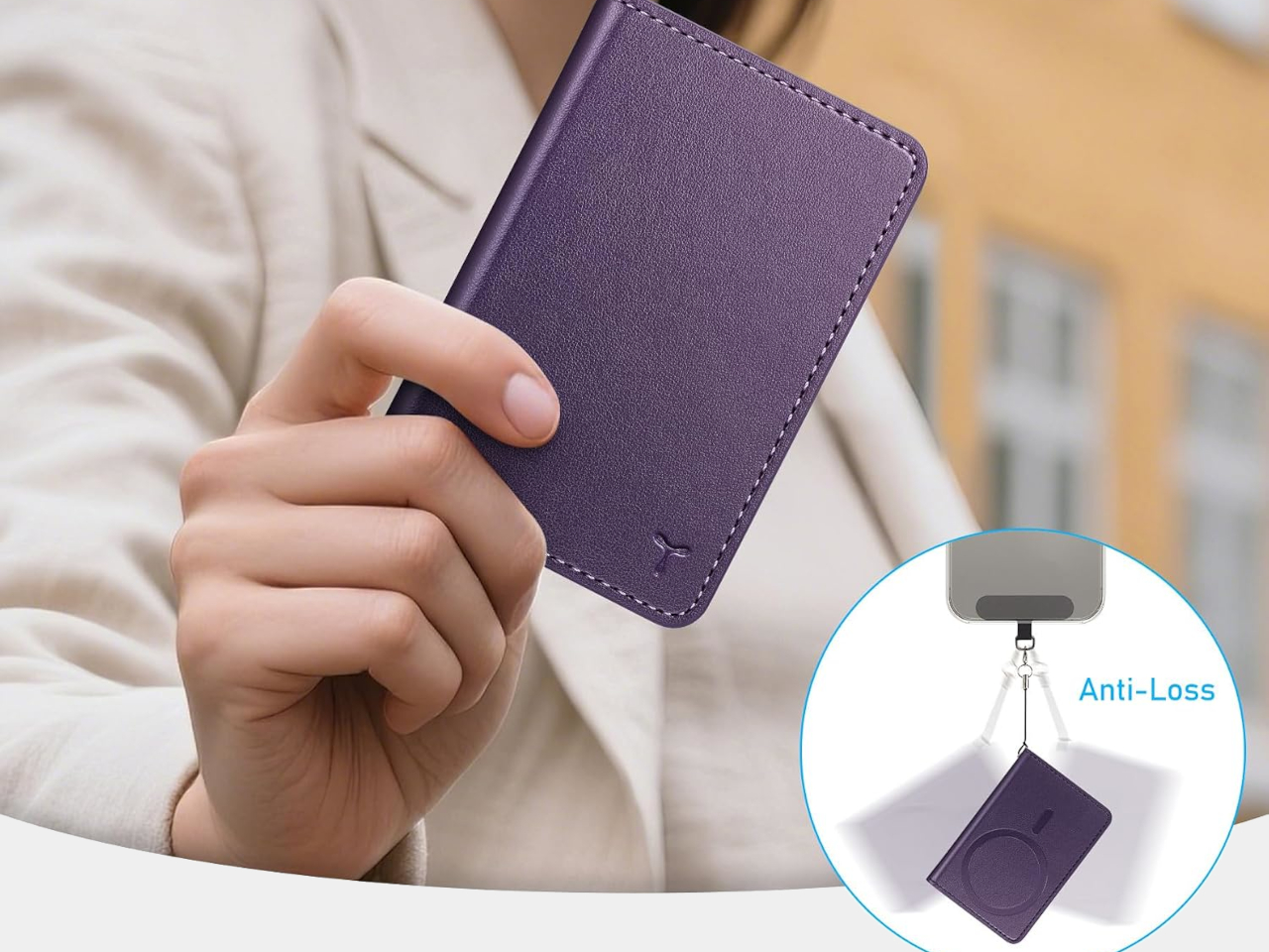
The TUCCH PU Leather Mag Wallet does something most MagSafe wallets don’t bother with: it folds closed. Rather than leaving your cards exposed in an open slot on the back of your iPhone, this one shuts like a traditional bi-fold and stays that way thanks to internal magnets. At $23.99, it holds six cards, blocks RFID signals, and includes a clear window for your ID.

The problem with most MagSafe wallets is that they’re really just an open pocket attached to your phone. Your cards sit loose, there’s nothing stopping them from sliding out when you dig into your bag, and pulling the wallet off doesn’t make it any more secure. If you’ve ever watched a card quietly escape an open MagSafe slot mid-commute, you already understand why a wallet that actually closes is a more useful object.

Designer: TUCCH

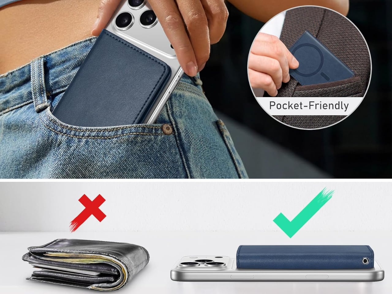
The folding design here means the same magnets doing the MagSafe work also keep the wallet shut when it’s off the phone. Pop it off your iPhone before going through airport security, tuck it into your jacket pocket, and your cards stay in place rather than fanning out freely. It’s a small shift in how the accessory behaves, but it makes the difference between something that feels like a wallet and something that just holds cards.

Six slots is more than most MagSafe wallets offer, and the layout is more thoughtful than a generic card stack. One slot is a dedicated clear window for your ID or driver’s license, something the category almost universally skips. Two of the remaining slots have cutout openings for the cards you grab most, so you’re not pulling out a chunk of plastic to find your transit card or gym membership every time.

RFID blocking is built into the PU leather shell, which is worth having without having to think about it. Contactless card skimming isn’t something most people worry about until it happens, and having that protection passive rather than optional means one less thing to consider. The wallet handles it quietly, in the same way that the best security features tend to stay out of your way entirely.

Magnetic strength is strong enough to hold through a firm shake of the phone, which is about what you’d expect from a well-built MagSafe wallet at this price point. Compatibility extends beyond TUCCH’s own cases as well. Any MagSafe-compatible case from another brand works just as well, which matters if you’re already committed to a case you like and don’t want to switch just to add a wallet.

The wallet stays flat even when all six card slots are filled, which isn’t guaranteed with wallet accessories in general. A lot of them start to bow under a full card load, adding enough thickness to make a slim phone feel bulky. At approximately 0.4 inches thick fully loaded, the TUCCH keeps things compact enough that adding it doesn’t noticeably change how the phone sits in your hand or your pocket.

Compatibility covers the iPhone 12 series through the current lineup, excluding Mini models and cases without MagSafe support. The $23.99 price puts it well below what most leather MagSafe wallets ask without trimming the features that make this one worth buying. A MagSafe wallet that closes, organizes, and works as a standalone is simply a more complete object than the category norm.

The post MagSafe Wallets Leave Your Cards Exposed but This $24 One Closes first appeared on Yanko Design.
The Cyberdeck Trend Went Viral and Raspberry Pi Just Made It Official

A cyberdeck, as Raspberry Pi defines it in its freshly published official build guide, is something you make to solve a problem that a conventional tablet or laptop simply can’t, or just to build something entirely your own for no reason beyond the satisfaction of doing it. That definition is broad on purpose. The cyberdeck trend has been all over social media and the Internet for months now, and Raspberry Pi has finally stepped in with its own version.

The concept traces back to William Gibson’s cyberpunk novels, where cyberdecks were the portable hacking tools of futuristic underground operators. What people are building now is less dystopian but arguably more interesting: compact, custom computers assembled from parts, housed in whatever enclosure the builder can imagine, running whatever software fits the project. Briefcases, mint tins, old pocket computers, wooden boxes, purses, prop replicas, and more have all served as cyberdeck enclosures.

Designer: Raspberry Pi

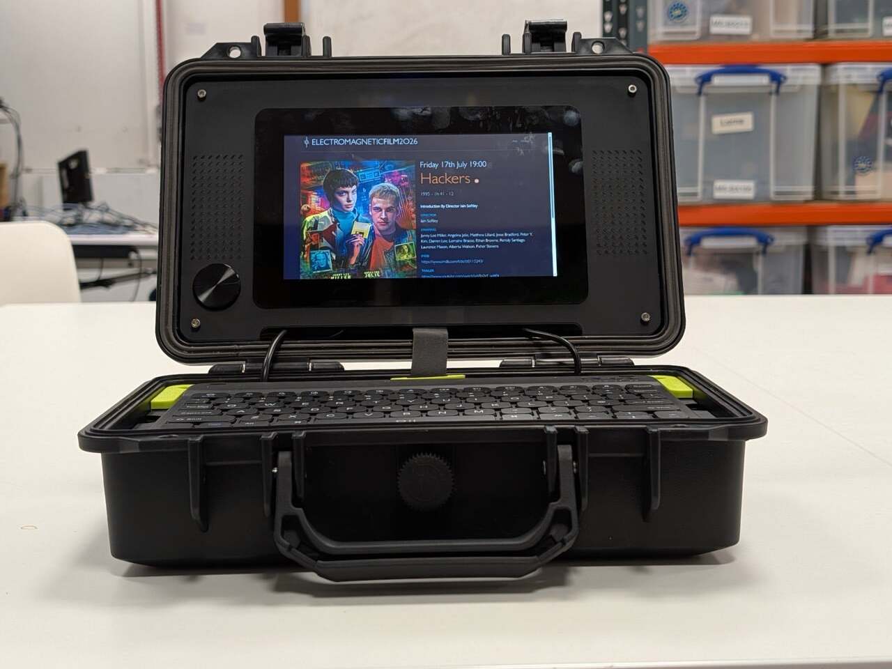
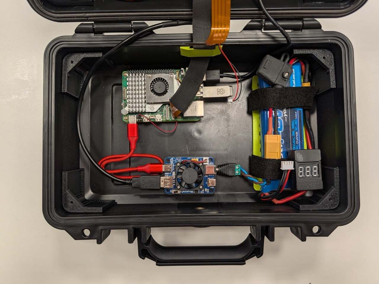
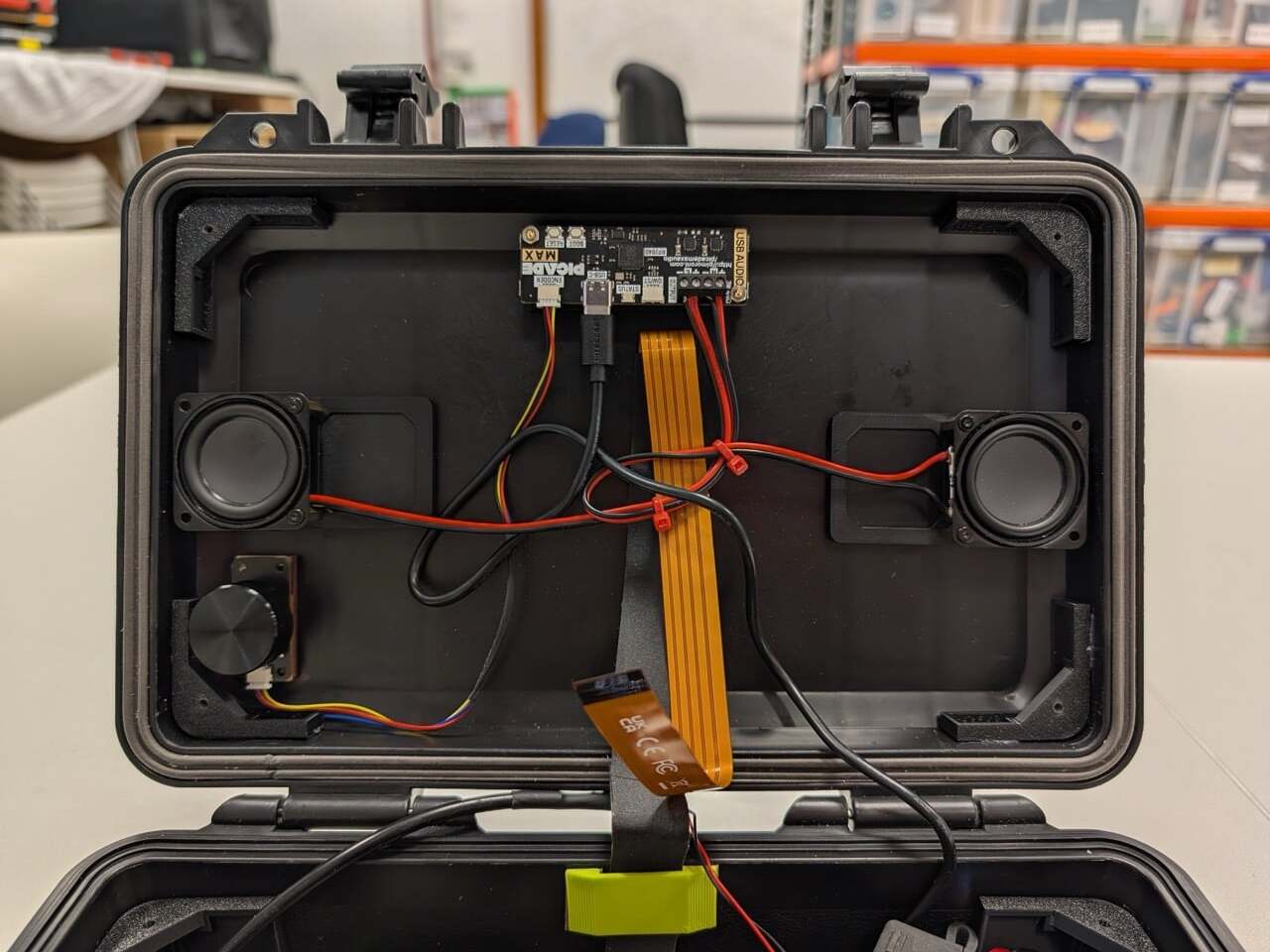
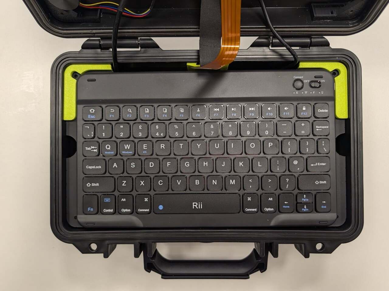
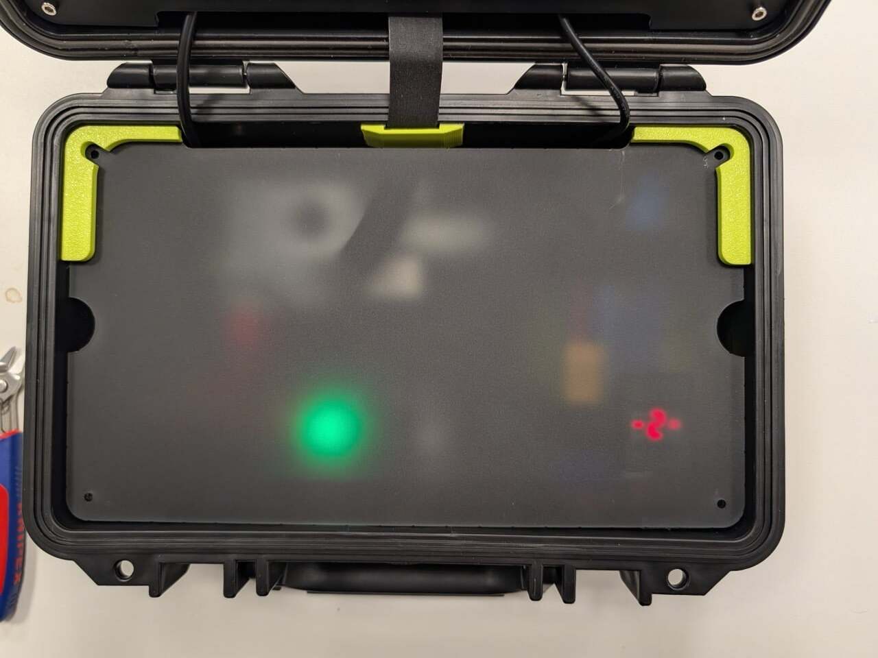
Raspberry Pi’s reference build keeps things approachable for first-timers. The brain of the whole thing is a Raspberry Pi 5 board paired with Raspberry Pi flash storage. The keyboard is the Rii RK302, a low-profile Bluetooth model small enough to fit inside the chosen case. Audio comes from the Pimoroni Picade Max USB Audio, a compact USB-C sound card with a 3W stereo amplifier that handles everything through a single connection, leaving the 40-pin GPIO header completely free for other uses.

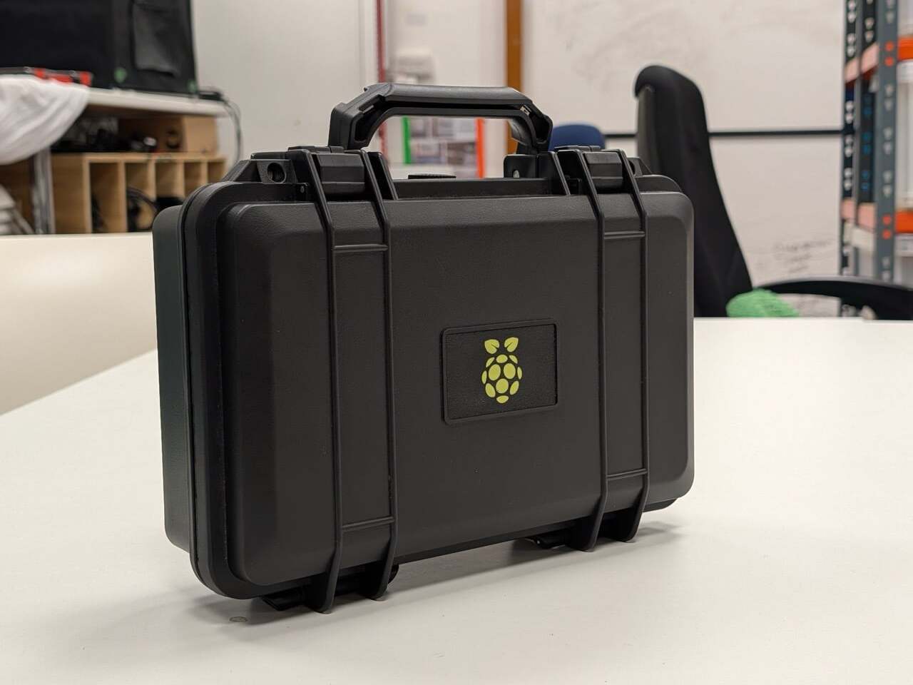
Power comes from a LiPo battery tucked underneath the keyboard plate, a small but deliberate detail that keeps the layout clean while making the computing stack accessible whenever needed. The whole assembly sits inside a black Pelican-style hard case, which is weatherproof, carries a handle, and is widely available at various price points. It’s an unassuming container that happens to hold a working personal computer inside.

The guide is structured around four decisions: brains, peripherals, power supply, and case. Each section walks through the considerations that matter most, power consumption, processing power, fit, and form, without prescribing a single right answer. The Pelican-style case gets the most airtime because Raspberry Pi says the case is what defines a cyberdeck. Pick a different container, and you get a fundamentally different machine.

Customization is built into the concept from the start. A Raspberry Pi Pico can be added as a secondary processor to drive a smaller auxiliary display, control LEDs, or monitor the battery level in real time. The guide notes this explicitly and frames it as just the beginning of what you can bolt on. For anyone who wants a project that never really finishes, that’s part of the appeal.

The timing connects to something real. The viral wave of cyberdeck content on the Internet has pulled in creators who’ve built these machines into everything from jewelry boxes to rehabbed thrift store bags. Some have attracted millions of views. Raspberry Pi’s social team admitted it “hasn’t been able to get away from” the trend, which makes the official guide feel less like a product launch and more like the company finally joining a conversation it had been watching for a while.

The post The Cyberdeck Trend Went Viral and Raspberry Pi Just Made It Official first appeared on Yanko Design.
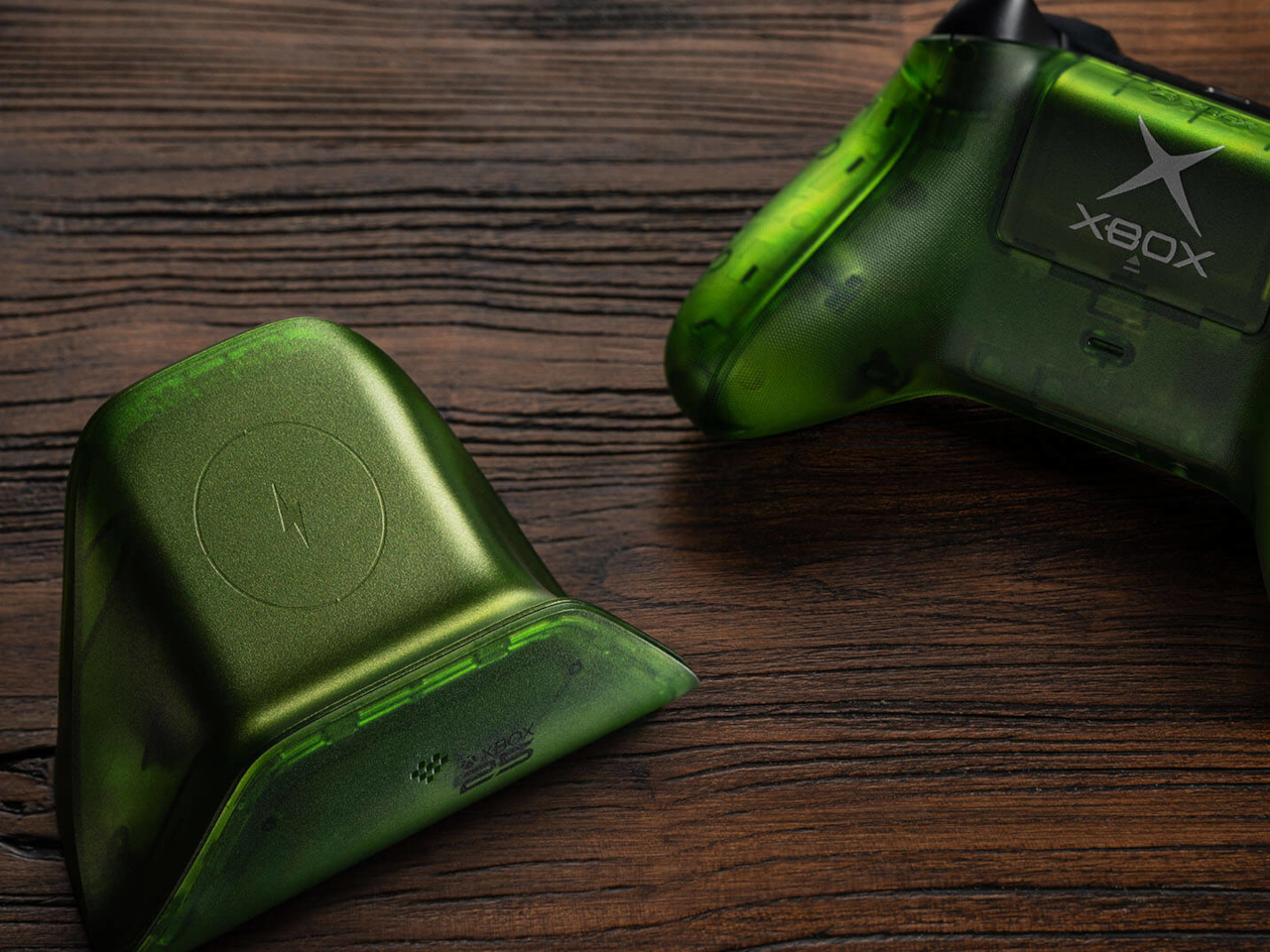
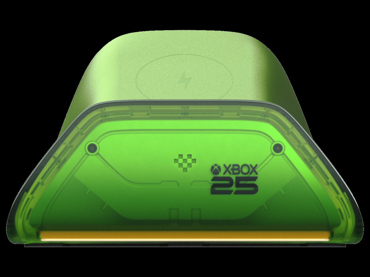
XBOX Is 25 and 7 Accessories Just Brought Back Its Most Iconic Color

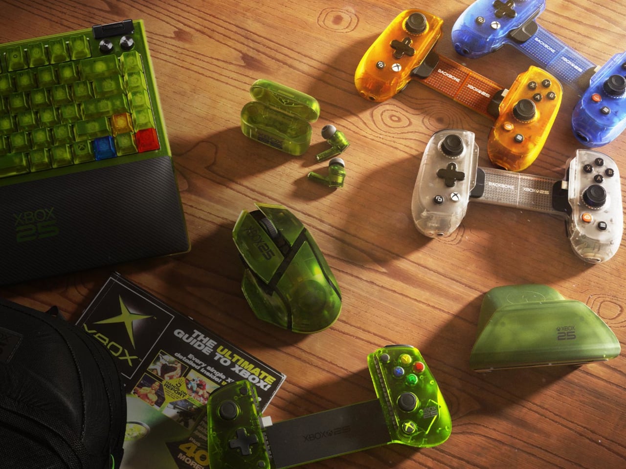
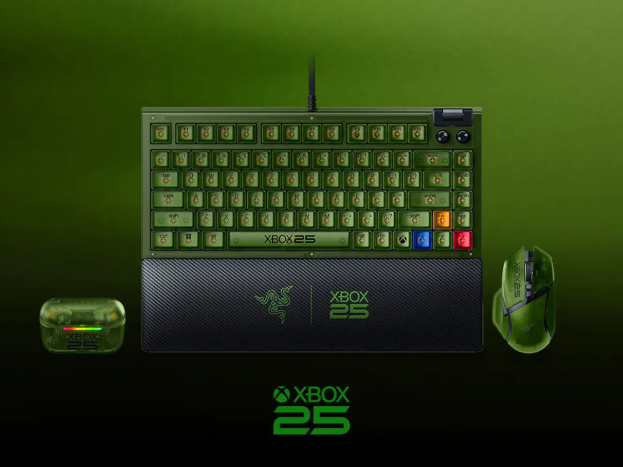
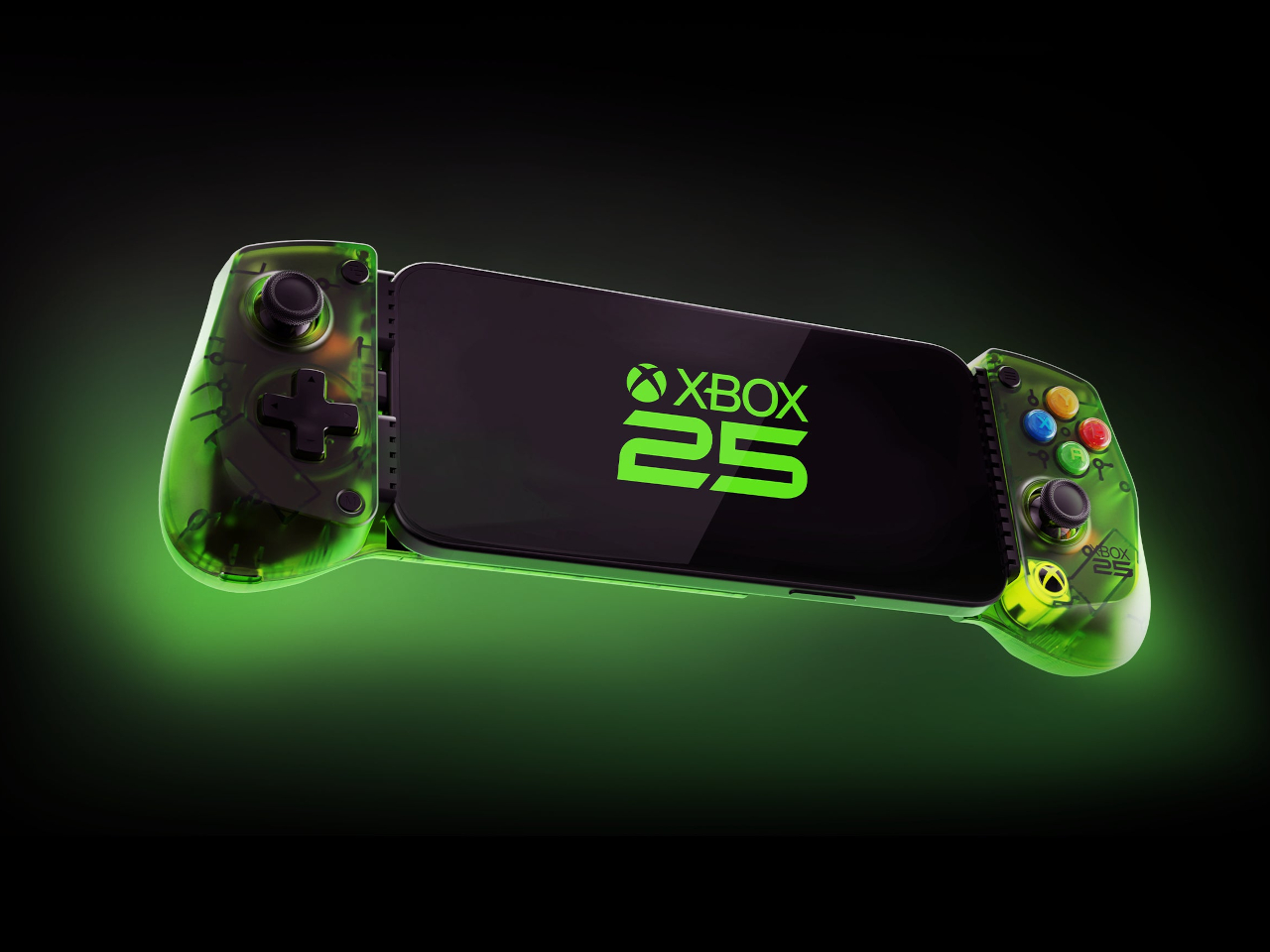
The original XBOX launched on November 15, 2001. A quarter-century later, it’s getting the tribute it probably deserves, not just a cake but a full coordinated collection of gaming accessories wrapped in the translucent green that made the first console so immediately recognizable. Seven products across five manufacturers, all designed to land before November arrives.

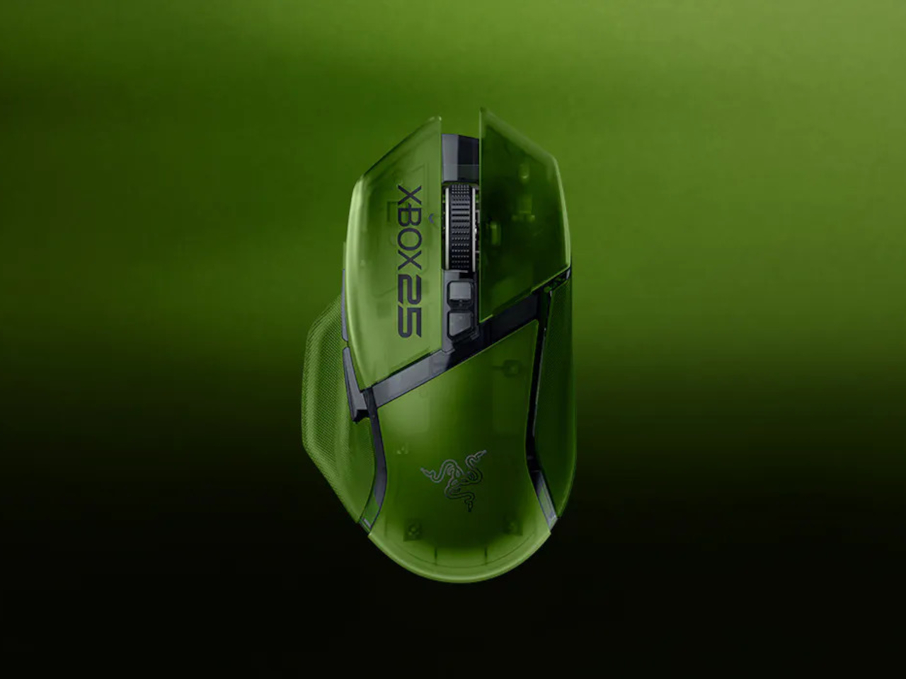
Razer leads the lineup with three anniversary editions spanning mouse, keyboard, and earbuds. The Basilisk V3 Pro 35K brings the translucent green shell to a wireless ergonomic mouse with a Focus Pro 35K Optical Sensor Gen-2, a four-way scroll wheel, and up to 140 hours of battery life between charges. It’s the same hardware underneath; the anniversary treatment is entirely in the aesthetic.

Designer: XBOX, Razer, 8BitDo, Backbone, GameSir

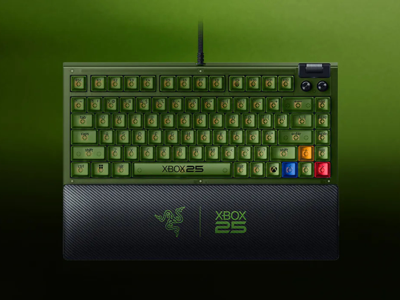
The BlackWidow V4 75% joins it as the compact keyboard option, a wired mechanical board with hot-swappable keys, Razer Chroma RGB, and a new XBOX key that launches Game Bar directly in Windows. It sits comfortably on a desk without dominating it, which is something a full-size board can’t always claim. The 75% layout keeps it portable without sacrificing the keys most gamers actually use.

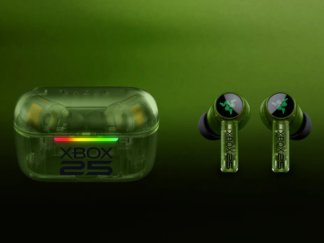
Completing Razer’s contribution are the Hammerhead V3 X HyperSpeed earbuds, which match the translucent green look across both the earbuds and the charging case. They support low-latency 2.4 GHz wireless audio alongside Bluetooth 5.3, with up to 10 hours of standalone use and 35 hours total when the case is factored in. For anyone gaming across multiple devices, the dual-connection options make them genuinely flexible.

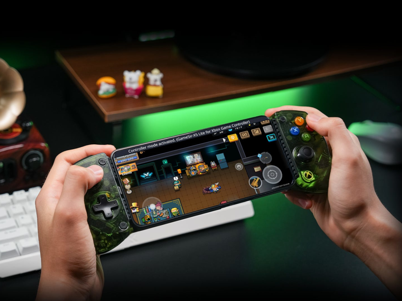
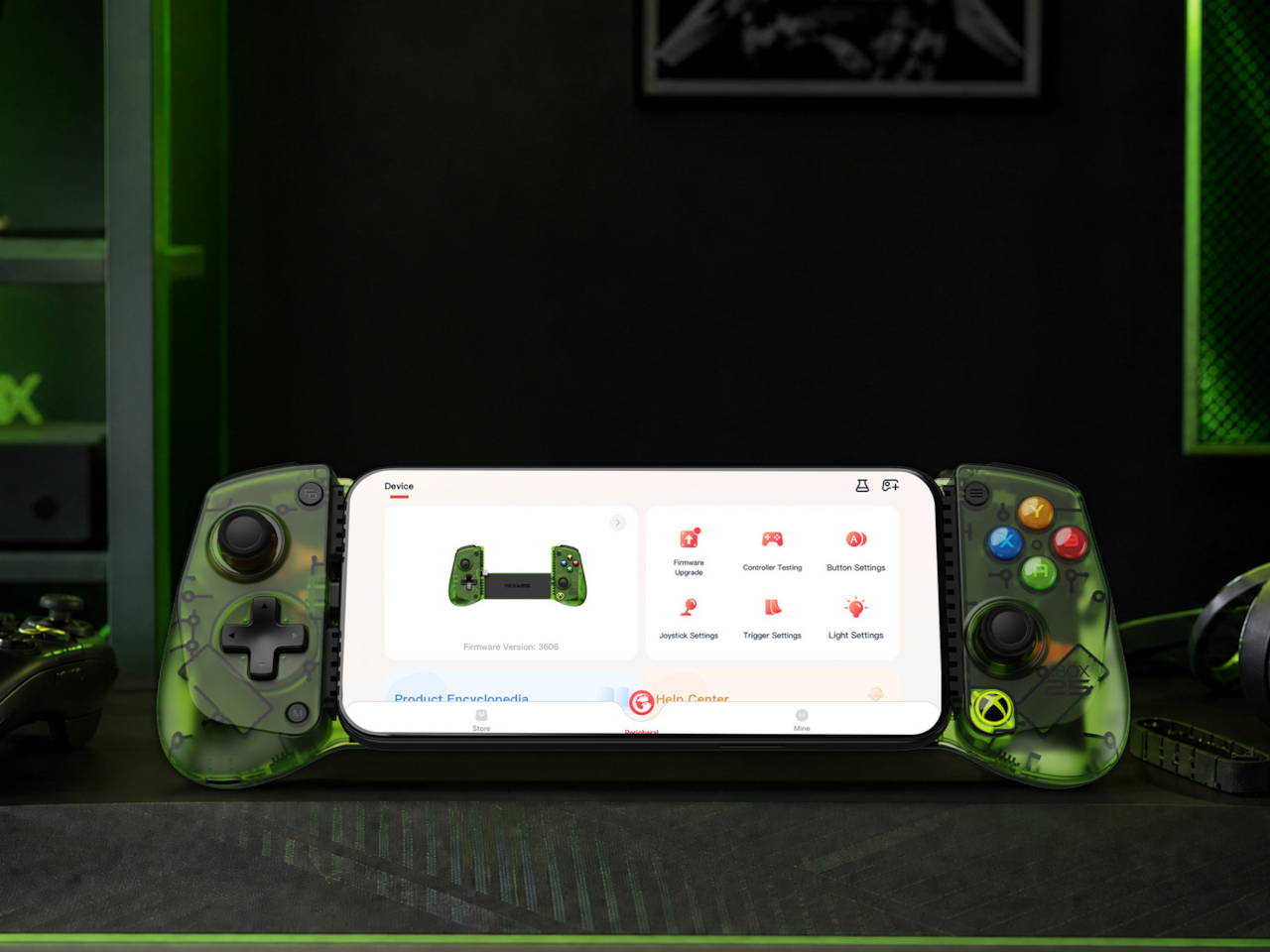
8BitDo brings back the transparent green with its X25 Special Edition of the Ultimate Charging Dock for XBOX controllers, compatible with XBOX Series X|S and XBOX One wireless controllers. GameSir’s X5 Lite for XBOX adds the anniversary colorway to a mobile controller that works with iOS and Android devices and carries Apple MFi certification for broad compatibility, including cloud gaming on either platform.

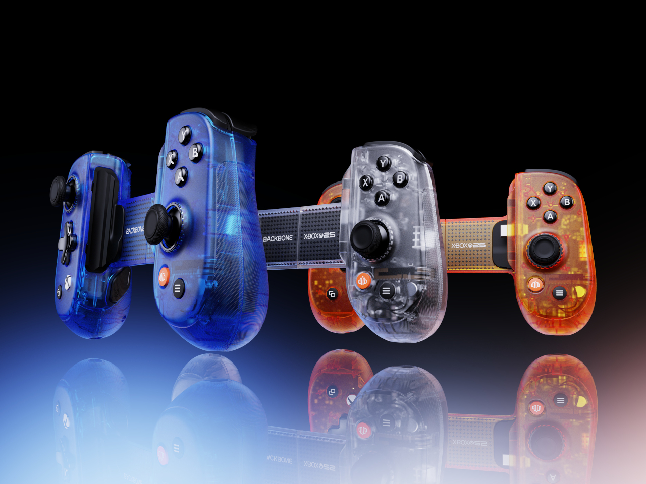
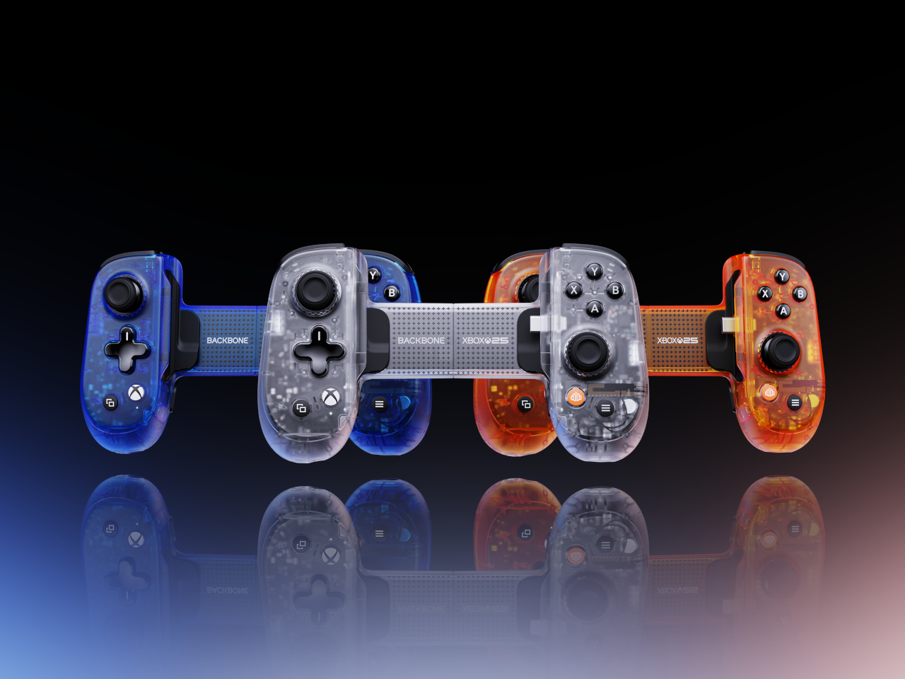
The Backbone Pro XBOX 25th Anniversary Edition takes a different angle on nostalgia. Instead of translucent green, it reaches into the original 2001 hardware’s full palette, offering Iconic Blue, Bold Orange, and Crystal Clear as the three available colorways. The catch is that it ships blind box style, so the color inside the package isn’t something you choose at checkout.

PowerA rounds out the collection with a sling bag built specifically for the ROG XBOX Ally and ROG XBOX Ally X handheld gaming PCs. The four-compartment bag has dedicated space for the device itself, a headset, a controller, and accessories, with a padded main compartment that includes thumbstick protectors. It carries the 25th anniversary logo on the front and matches the green zipper pulls across the bag.

The collection is available for preorder now, with most items shipping in November to coincide with the actual anniversary date. The XBOX Wireless Controller X25 Special Edition, sold separately, uses colored ABXY buttons and black-and-white bumpers as a callback to the original Duke controller’s layout. The PowerA sling bag retails for $39.99 and the GameSir X5 Lite for $44.99, with other pricing still unconfirmed.

The post XBOX Is 25 and 7 Accessories Just Brought Back Its Most Iconic Color first appeared on Yanko Design.
Rear Screens Were a Flagship Trick, so Honor Put One on a Budget Phone

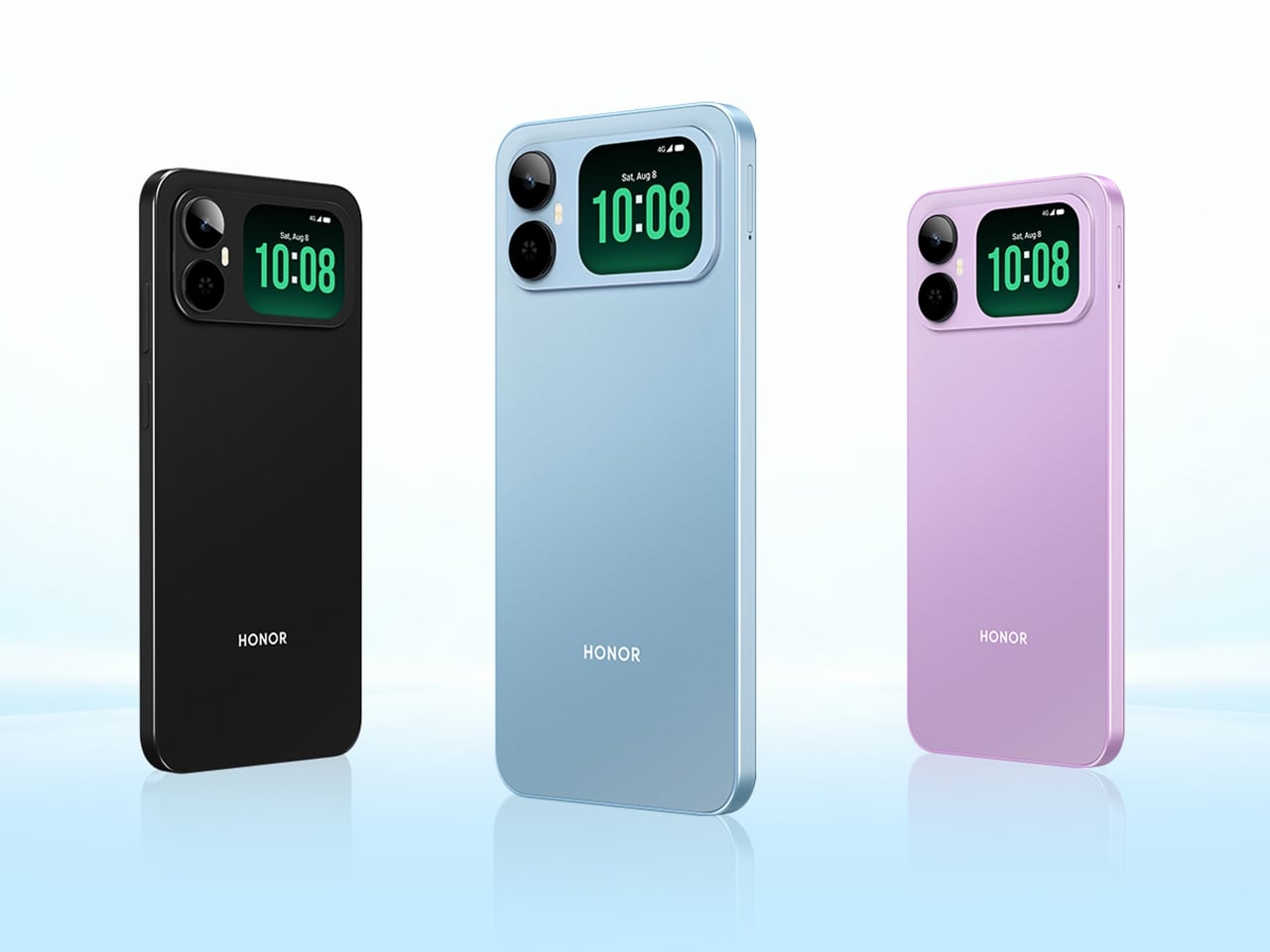
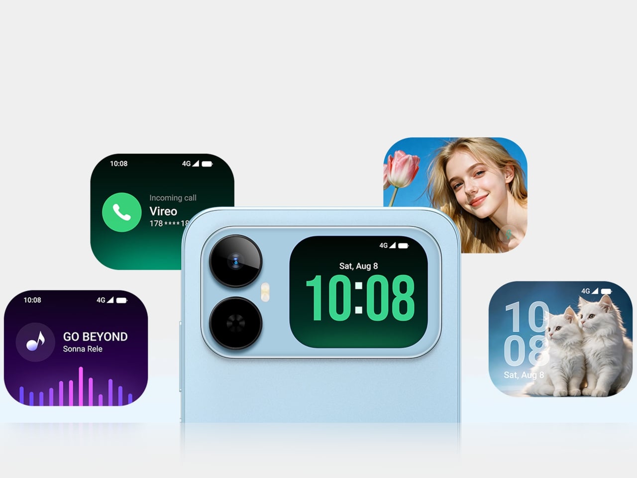
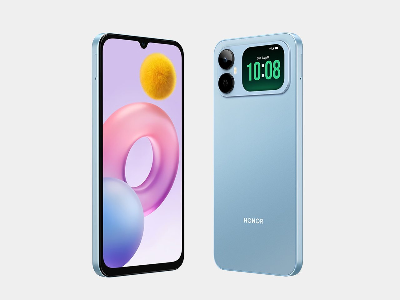
Secondary rear displays have been a flagship trick for a while, the kind of feature that premium phones use to justify their price tags. The Honor Play20A throws that logic out. It’s an entry-level 4G phone with a 6.9-inch main screen, a 6,000mAh battery, and a small secondary display built into the camera module on the back, at a price that isn’t anywhere near flagship territory.

The rear screen isn’t just decorative. It shows the time, incoming call details, and what’s currently playing, so you can pause or skip tracks without flipping the phone over. It also works as a viewfinder, letting you frame shots with the 13MP rear camera rather than the 5MP front camera inside the notch. In practice, that means group photos taken with the better lens rather than settling for the weaker front sensor.

Designer: Honor

That 13MP rear camera is the only functional one despite the module’s appearance. There’s no telephoto, no depth sensor, no second anything hiding behind the glass. It’s a single lens, and the design leans into the secondary screen to make up for the hardware economy. For everyday shooting, the combination works reasonably well, and it sidesteps the common frustration of front cameras that can’t match the quality of the back.

The main screen is a 6.9-inch IPS LCD running at 90Hz with an HD+ resolution of 1600×720. It’s a big panel with slim bezels and a waterdrop notch, and 90Hz makes scrolling feel noticeably smoother than phones still running at 60Hz. That refresh rate isn’t guaranteed at this price point, which makes its inclusion here more meaningful than it might look on a spec sheet.

The 6,000mAh battery is the other headliner. It charges at 15W via USB-C, which is modest given the capacity, so filling it up from empty takes some patience. The trade-off is that you’re unlikely to drain it before the day is done under normal circumstances. A battery this size in a budget phone tends to last considerably longer than comparable handsets that prioritize thinness over endurance.

Running all of this is the MediaTek Helio G81, an octa-core chip built on a 12nm process. It handles messaging, browsing, video streaming, and social media without issue. Intensive tasks aren’t what this phone is built for, and the chip doesn’t pretend otherwise. Paired with 4GB of RAM and up to 128GB of storage, expandable to 1TB via microSD, the Honor Play20A is configured for people who need a phone to do a lot of everyday things reliably.

Connectivity stays at 4G, with no 5G on board, which fits a budget positioning but is worth noting for anyone in a market where 5G coverage has become the practical standard. The triple tray accommodates two SIM cards and a microSD card at the same time, without asking you to choose between extra storage and a second line. The secondary rear display is the feature that makes this phone worth talking about, but the battery and the large screen are what most buyers will end up living with daily.

The post Rear Screens Were a Flagship Trick, so Honor Put One on a Budget Phone first appeared on Yanko Design.
The Xperia 10 VIII Has Rare Android Features, but £549 Is the Catch

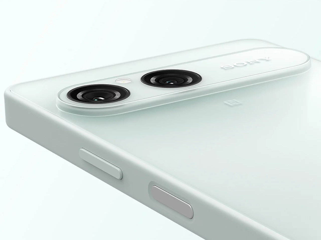
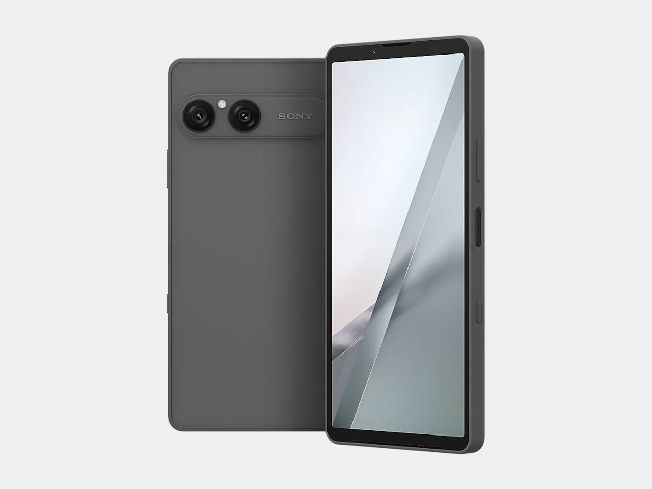
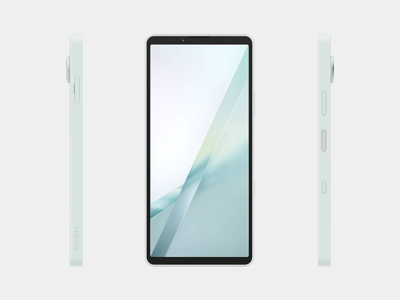
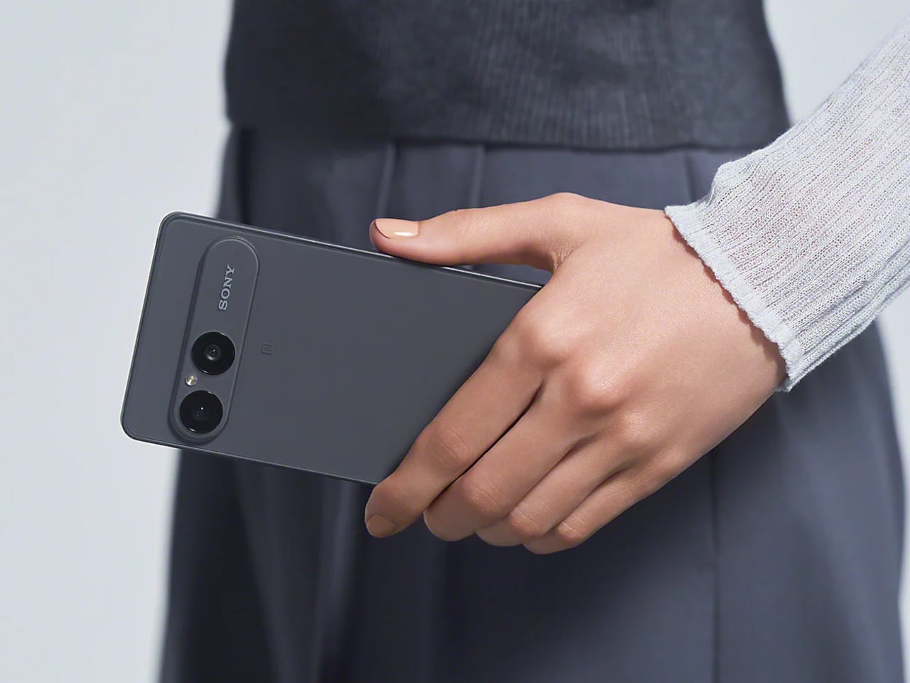
The Sony Xperia 10 VIII is a compact 6.1-inch Android phone with a 3.5mm headphone jack, a dedicated microSD slot, a 5,000mAh battery, and an IP68 water resistance rating. In 2026, that combination is genuinely hard to find on any phone, let alone a mid-ranger. It also costs £549, which is where the conversation gets complicated.

The display is one of the few areas where the 10 VIII makes a clear step forward. Sony says the OLED panel is roughly 50% brighter at maximum than last year’s model, and it pairs that with an automatic color-adjustment system that reads ambient light to keep text and maps legible in direct sun. For a compact phone that goes everywhere, screen visibility in bright conditions matters more than any benchmark.
Designer: Sony

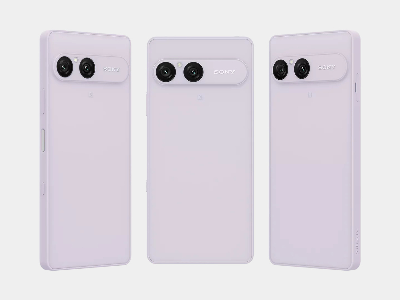
The camera setup stays at 50MP on the main sensor and 13MP on the ultrawide, which is the same hardware as the Xperia 10 VII. The lens combination covers most of what everyday shooting actually demands, and Sony’s imaging tuning has always leaned toward natural color reproduction rather than the overly saturated processing that many phones default to. It’s a camera made for people who shoot, not people who want to appear to shoot.

Battery longevity is built into both the hardware and the software. The 5,000mAh cell comes with Sony’s battery-care system, which manages charge cycles to minimize long-term degradation. The company is also promising six years of software updates here, a notable jump from the four years offered on its predecessor. Getting six years out of a mid-range phone is a meaningful practical advantage.

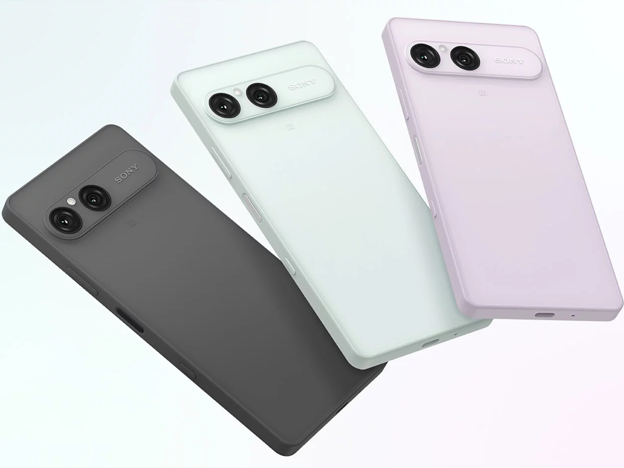
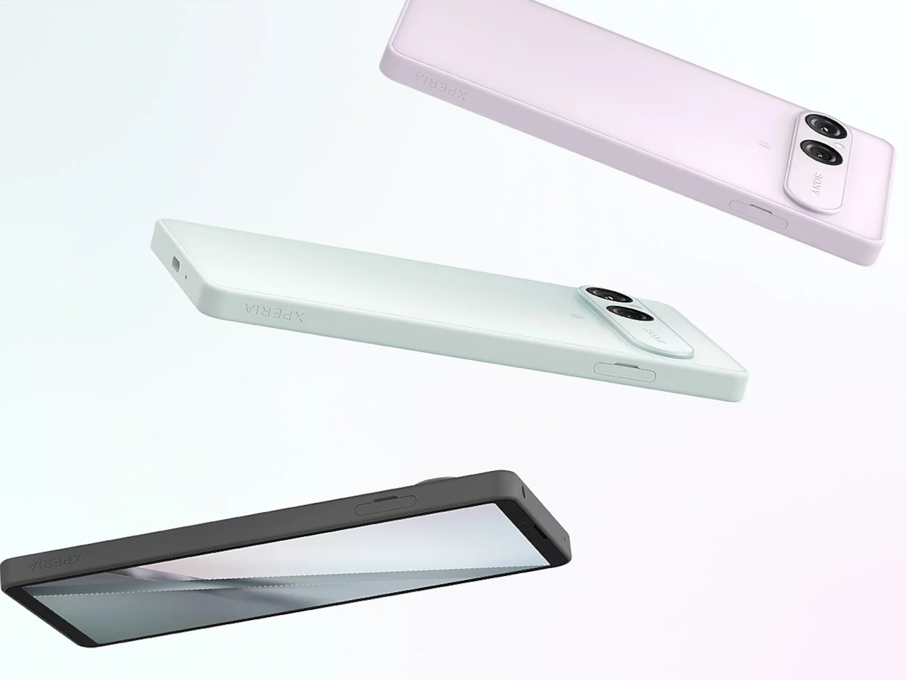
The Snapdragon 6 Gen 3 inside is the same chip that powered the Xperia 10 VII, which launched a year ago. It handles social media, streaming, and everyday tasks without issue, but it doesn’t offer much over what existing owners already have. Sony added a Point & Pay shortcut for faster contactless payments, improved the speaker output, and redesigned the back panel with a translucent matte finish in Frozen White, Frosted Grey, and Misty Lilac.

The headphone jack and microSD slot are worth more than they might initially seem. Most phones at this price tier have dropped both, forcing wireless-only audio and fixed internal storage. For anyone who owns wired headphones worth actually using, or needs to carry large media libraries on a card, those two ports turn the 10 VIII into one of the few phones in this segment that doesn’t demand compromises to accommodate them.

At £549, the Xperia 10 VIII doesn’t have an easy answer to the competition. For similar or less money, there are phones with faster chips, bigger batteries, and more capable camera systems. Sony’s argument is that none of them are this compact and this fully equipped with legacy features in a single package. That’s a narrower pitch than it sounds, but it’s also a pitch that doesn’t have many other phones making it.

The post The Xperia 10 VIII Has Rare Android Features, but £549 Is the Catch first appeared on Yanko Design.