At $270, ASUS’s New Chromebook Has No Business Being This Good

The budget laptop category has a long reputation for disappointing displays, short battery life, and builds that feel provisional rather than considered. Most sub-$300 machines get you to the internet and not much further before something creaks or slows down. It’s a price bracket that tends to ask buyers to accept tradeoffs that shouldn’t really be necessary in 2026, and ChromeOS devices have historically been no exception.

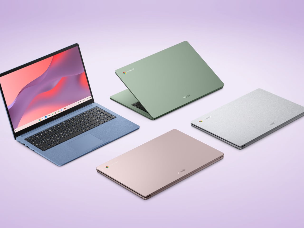
The ASUS Chromebook CM15 and Chromebook CM32 Detachable take a different approach to that bracket. Both run on the MediaTek Kompanio 540 processor with up to 8 GB of LPDDR5X memory, pass 24 MIL-STD-810H military-grade durability tests, and come with a three-month Google AI Pro trial bundled in. They aren’t trimmed-down machines trying to look complete. They’re designed to cover the full range of what most people actually do on a laptop.

Designer: ASUS

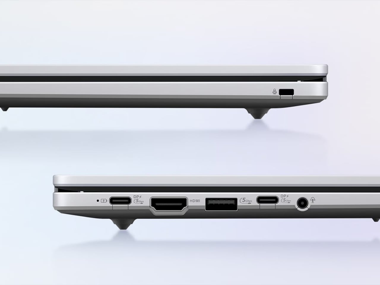
The CM15 is the larger of the two, a 15.6-inch clamshell with an FHD anti-glare panel, a 180-degree lay-flat hinge, and a chassis that weighs 3.26 lbs and comes in four colors: Pure Grey, Fabric Blue, Cream Pink, and Misty Green. Each has a washi-paper-inspired texture that gives it a bit more character than the usual matte plastic. The port selection includes HDMI alongside two USB 3.2 Gen 1 Type-C ports and a USB Type-A, and ASUS specifically flags HDMI as an unusual inclusion at this price point.
The CM32 Detachable is smaller and considerably more flexible, at 1.41 lbs without the keyboard attached. Its 12.1-inch, 2.5K 120 Hz touchscreen is protected by Corning Gorilla Glass, and it comes with a magnetically attached stand, a detachable keyboard with 1.35 mm key travel, and a wirelessly charged stylus shaped like a traditional ballpoint pen. The whole system connects and disconnects cleanly without any of the fussiness that detachable keyboards often carry.
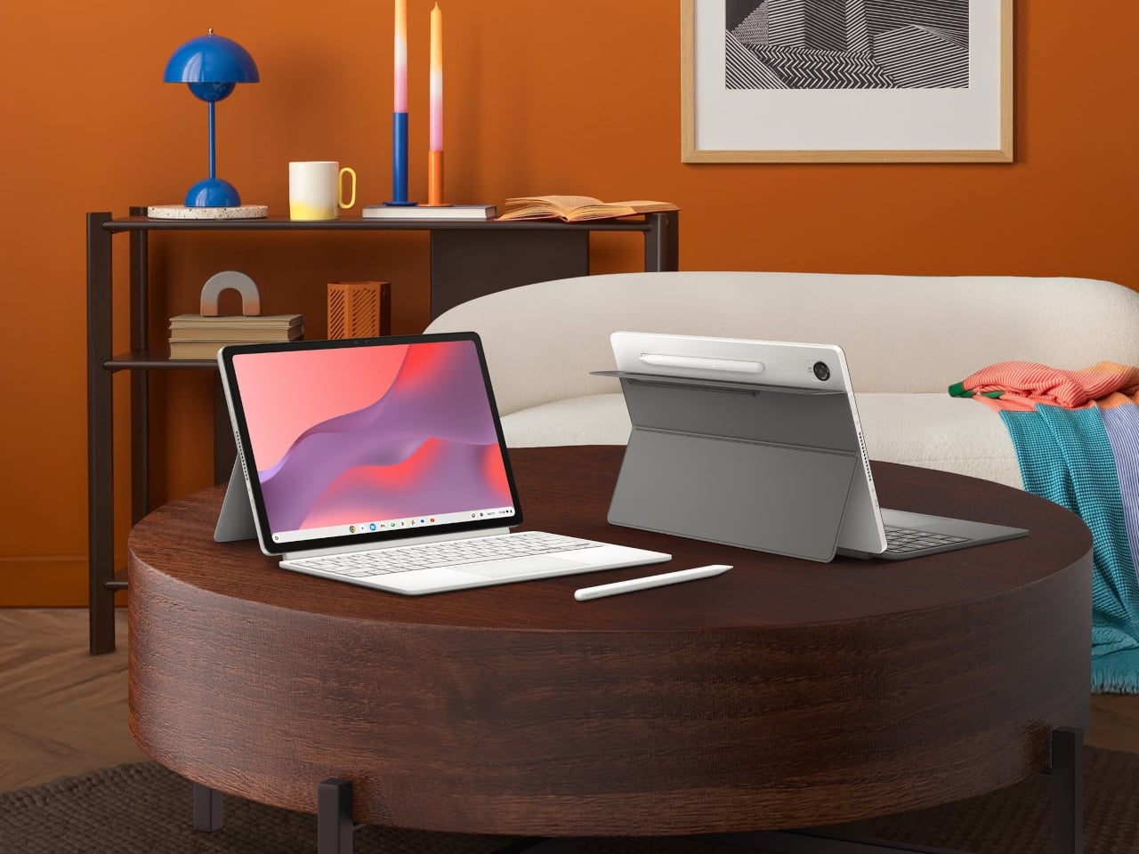

Both devices boot in under ten seconds, handle background updates automatically, and run Android apps from Google Play, which in practice means Netflix, Adobe Lightroom, Zoom, and Microsoft 365 are all accessible out of the box. The Google AI Pro trial includes NotebookLM and Gemini integration across Gmail and Docs, adding genuine productivity value without requiring a separate subscription to access.
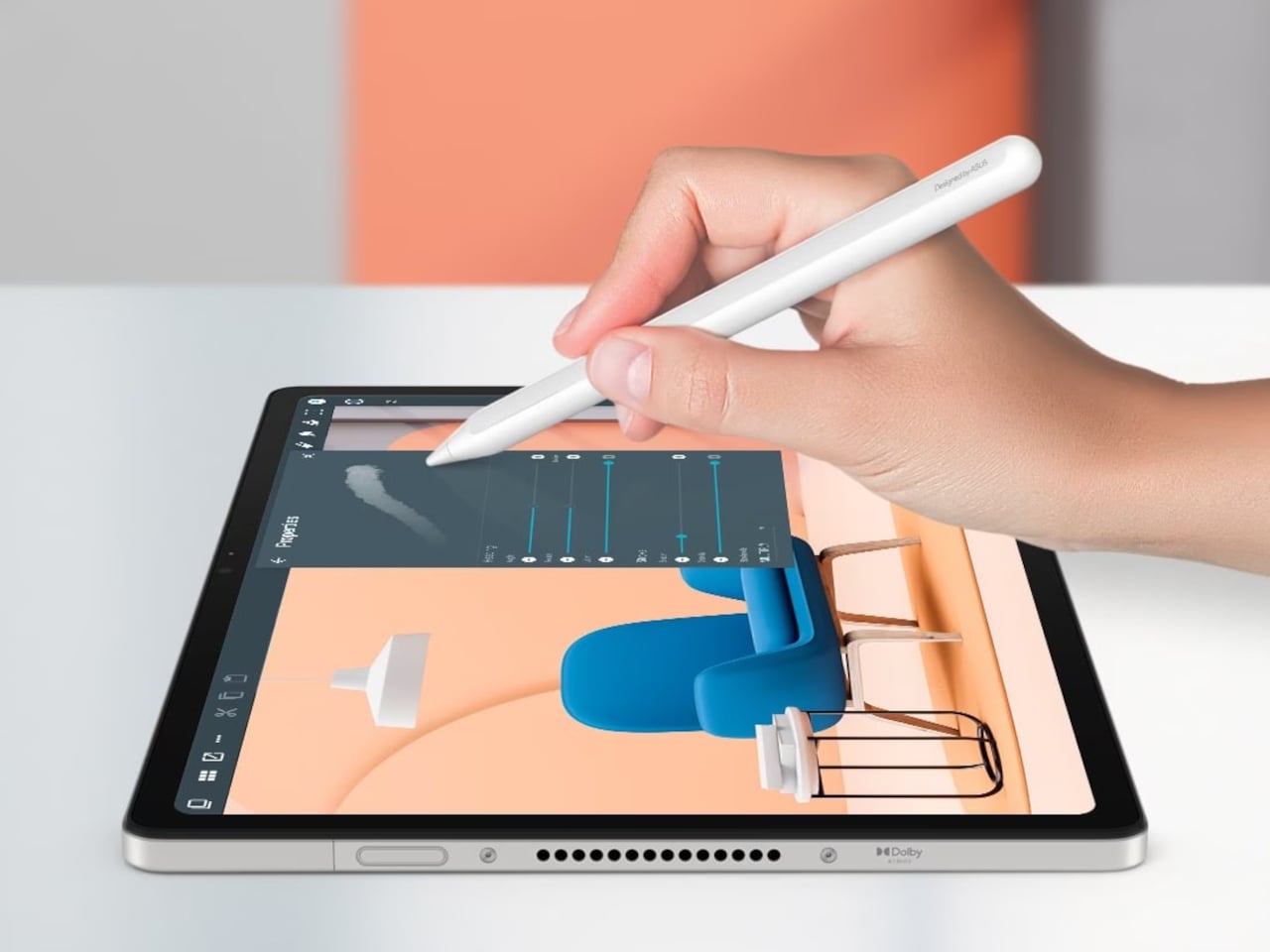
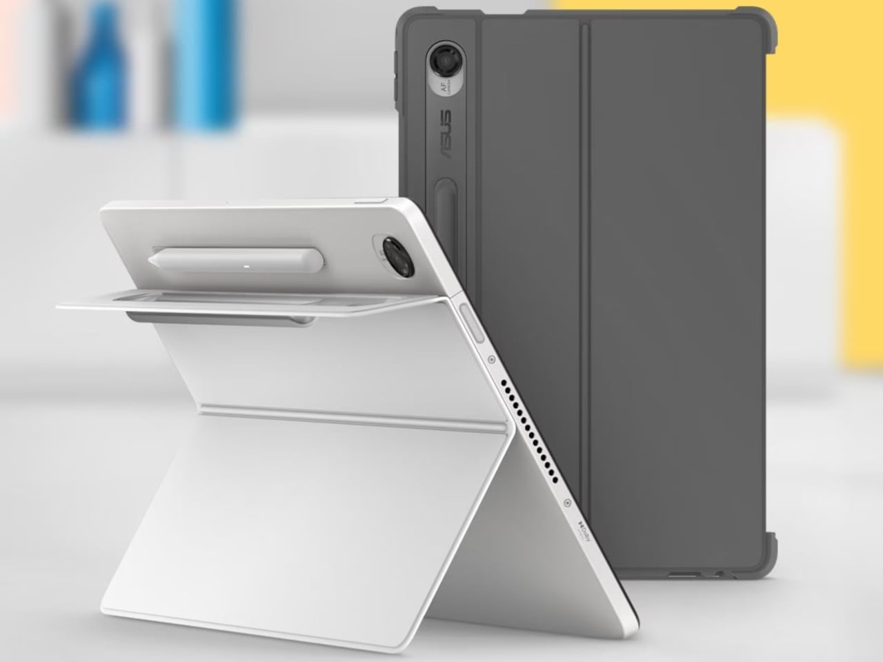
Where the two models diverge is in their use case and price. The CM15 starts at $269.99 and suits anyone who wants a wide screen with a full-size keyboard for daily tasks at home or school. The CM32 at $579.00 is the pick for people who need the flexibility of a tablet one moment and a laptop the next, particularly given the stylus and the 120 Hz display. The CM15 body is also made with 30% recycled plastics and sustainable packaging, a commitment that extends the value of the machine beyond its shelf life.


The post At $270, ASUS’s New Chromebook Has No Business Being This Good first appeared on Yanko Design.
Motorola Just Built the Android Phone Samsung’s Galaxy S26 Almost Was

Wireless charging on Android has been a bit of a mess. Most phones support it, but the speeds tend to lag behind proprietary fast-charging standards, and the Qi2 situation has been particularly awkward. Samsung’s Galaxy S26 series supports Qi2 speeds but skips the built-in magnets, meaning you still need a special case to get the alignment right. Other Android phones that did include magnets weren’t hitting the full 25W Qi2 ceiling. It was always one or the other.

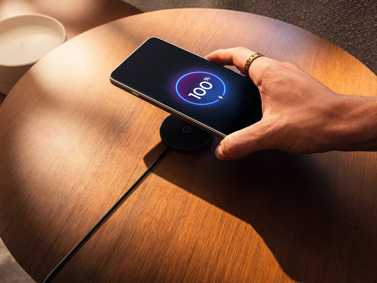
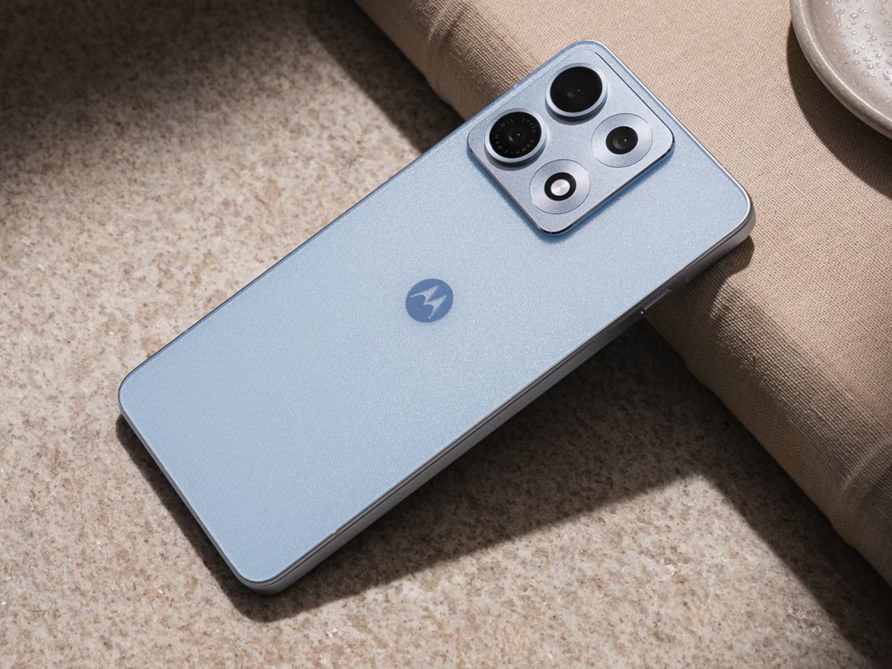
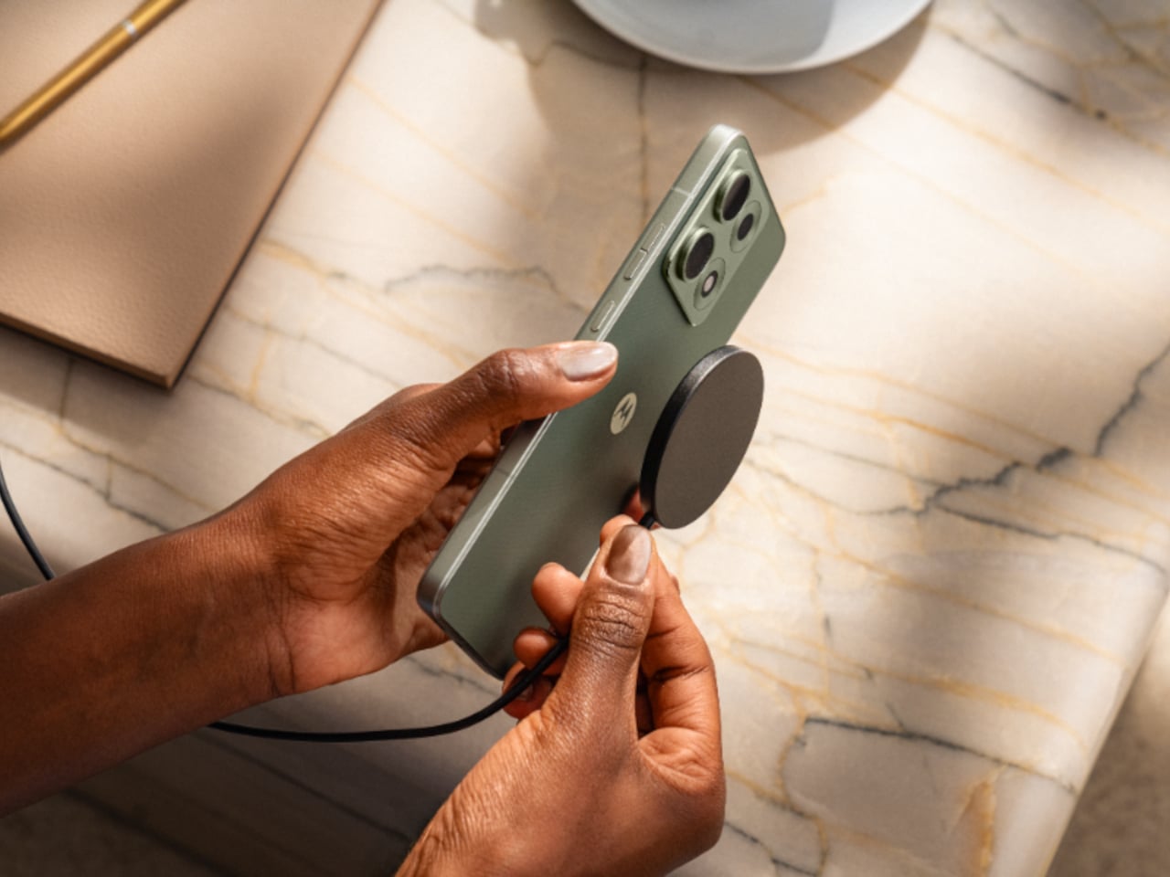
The Motorola Edge 70 Max closes that gap. It’s the first mainstream Android phone outside of Google’s Pixel line to offer true Qi2 wireless charging with built-in magnets and the full 25W MPP25 speed, no magnetic case required, no extra ring to stick on the back. Drop it on a Qi2 pad, and it snaps into position and charges at the maximum rate the standard allows. That’s a more meaningful distinction than it might sound.

Designer: Motorola

For anyone who keeps a charging pad on a nightstand or desk, alignment has always been the friction point of wireless charging. Miss the coil slightly, and speeds drop, or charging stops entirely without any notification. Built-in magnets solve that by locking the phone into position automatically, the same way MagSafe works on an iPhone. Android users have had to use workarounds for years to get the same result, and most still don’t bother.

Beyond the charging story, the Edge 70 Max arrives with serious hardware throughout. The Snapdragon 8 Gen 5 chip delivers a 36% CPU improvement and 11% GPU improvement over its predecessor, and a vapor chamber cooling system with liquid metal and a 5,500 mm² chamber keeps temperatures in check during sustained loads. Up to 12 GB of LPDDR5X memory and up to 1 TB of storage round out the platform.

The 7100 mAh silicon-carbon battery earned a DXOMARK Gold Label with 160 points, and 90W TurboPower wired charging adds enough for a full day in just six minutes. The 50MP Sony LYTIA 710 main camera handles photography with AI-assisted processing, and the phone debuts Motorola Qira, a unified AI system shared across Lenovo PCs and tablets that carries context between devices.

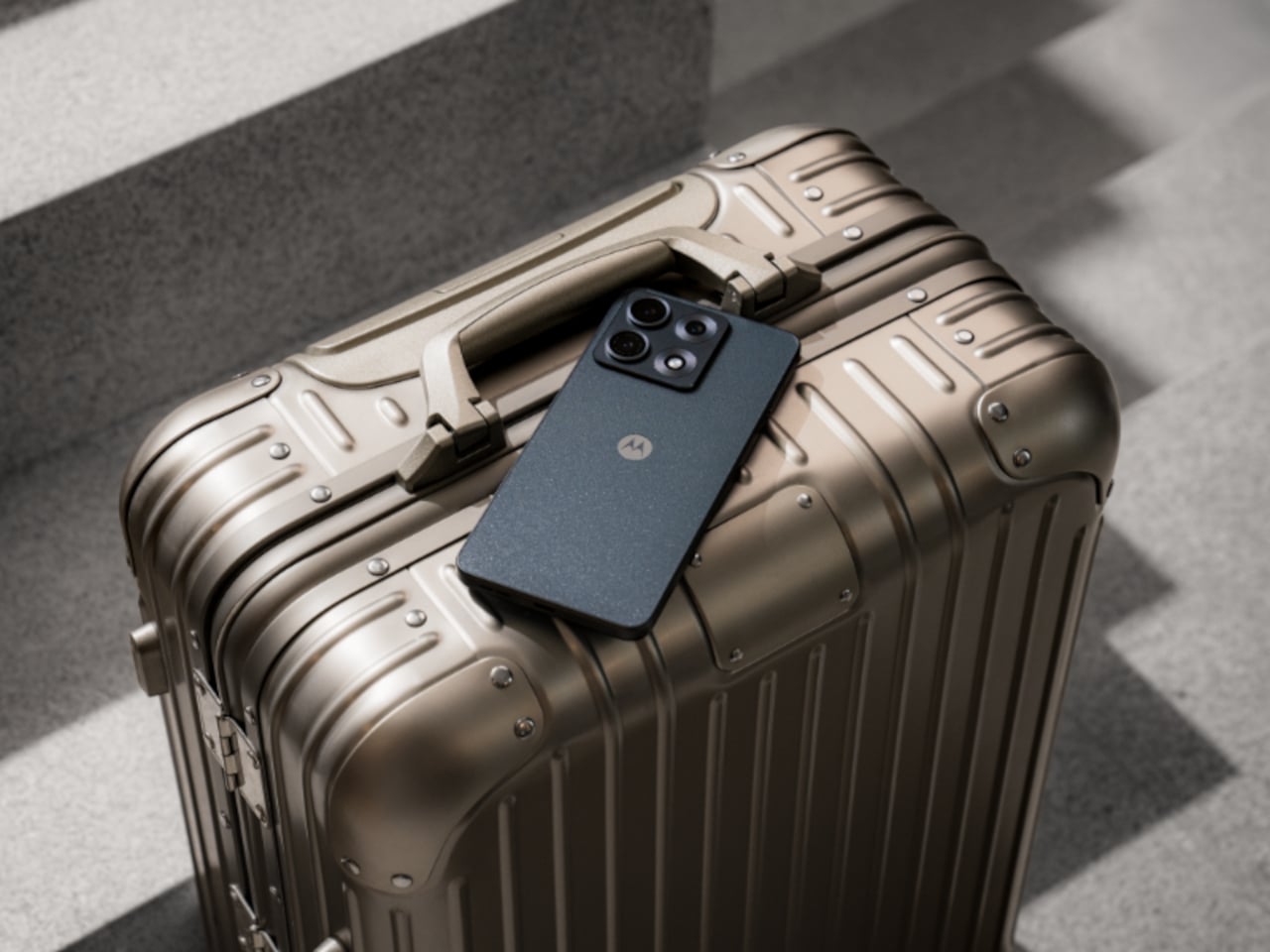
The Quad HD+ (2K) display is rated as the brightest in its category, and the build is aircraft-grade aluminum framed with matte premium glass and MIL-STD-810H certification. Motorola has also made clear that the packaging is fully recyclable and printed with soy-based inks, a detail that reflects the broader Lenovo sustainability push rather than just a spec-sheet line.

The Android wireless charging ecosystem has needed a phone willing to commit fully to Qi2 rather than taking the halfway approach that most manufacturers have favored. The Edge 70 Max is the first non-Pixel Android flagship to do it without compromise, and with the rest of the hardware backing it up, the charging system stops being a headline curiosity and becomes a genuinely practical reason to pick one platform over another.

The post Motorola Just Built the Android Phone Samsung’s Galaxy S26 Almost Was first appeared on Yanko Design.
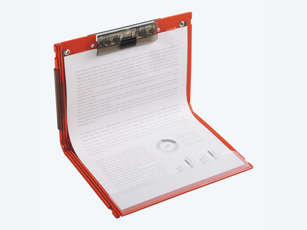
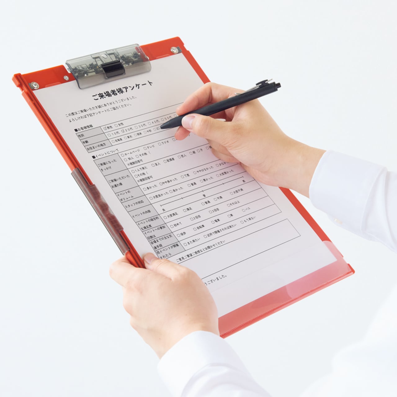
Nobody Expected a $28 Folding Clipboard to Be This Well Thought Out

The clipboard is one of those objects that hasn’t changed much because the problem it solves seems too simple to revisit. It holds paper flat while you write, and that’s essentially the brief it’s been fulfilling for decades. The rigidity that makes it useful is also what makes it awkward to carry. Most are sized for A4, and that footprint doesn’t get smaller just because you’re done with it.

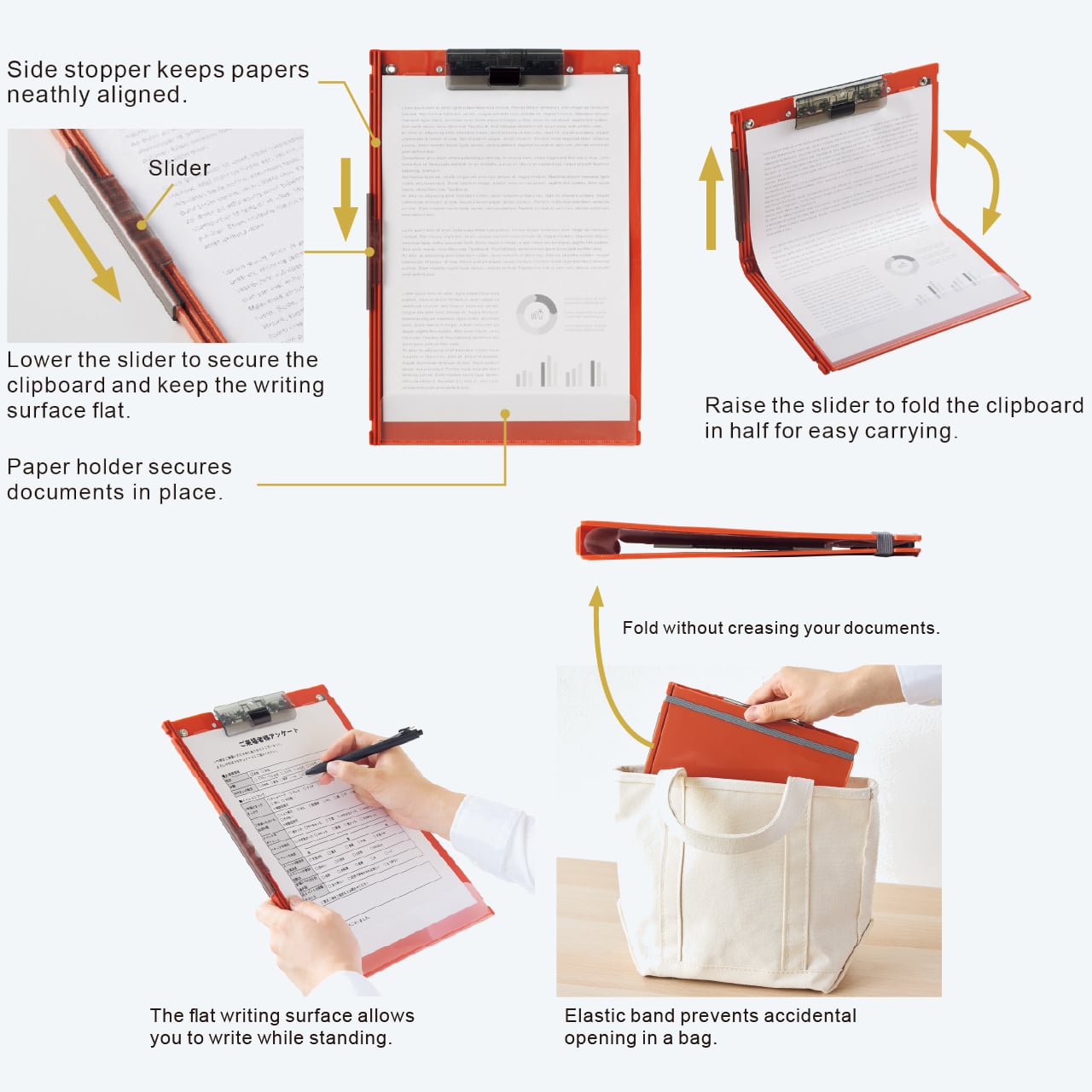
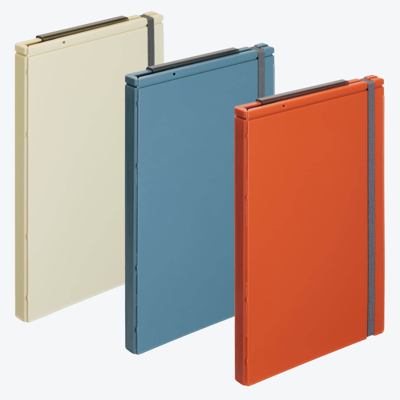
Lihit Lab’s A-2068 Foldable Clipboard addresses that directly. It’s an A4-sized clipboard that folds in half at the midpoint, reducing its footprint to A5 for transport, then locks back open flat and rigid when you’re ready to write again. A slider on the side controls the fold, and the result is something that behaves like a proper clipboard when you need it and a compact document folder when you don’t.

Designer: Lihit Lab.

The slider is the mechanical decision that makes the whole thing work. Once the board is open, it locks both halves flush and stiff, so there’s no flex in the writing surface while you’re standing or moving around. That matters on a jobsite, at a site survey, or anywhere you’re filling out forms away from a desk. Clipboards flex when they shouldn’t, and this one addresses that specifically.

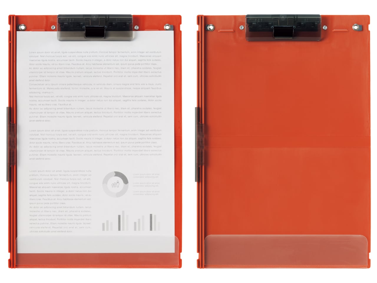
The clip is a lock-function type that can be loaded while the board is open, so clipping down a stack of pages doesn’t require holding the board shut with one hand while fumbling with the other. A paper stopper at the bottom keeps document edges flush when the board is folded closed, and a rubber band wraps around the outside during transit so nothing comes loose inside a bag.

The body is polypropylene, with the binder and slider made from ABS resin, and the elastic band from polyester and polyurethane. Open, it measures 234mm x 339mm and is just 14mm thick. Folded, the height drops to 165mm. The clip holds up to 15 sheets of copy paper, which covers most field documentation. It comes in three colorways: Terracotta Orange, Slate Blue, and Ivory.

Most people who regularly carry clipboards to fieldwork have had to choose between the convenience of a flat writing surface and the awkwardness of a full-sized board in a bag. Storage clipboards try to solve this by adding internal compartments, but they tend to get thicker rather than smaller. The A-2068 takes a different route by reducing the form factor through folding rather than adding more material around the sides.

The A-2068 retails for ¥1,300 in Japan and is available internationally through specialty stationery shops at around $28. It’s the kind of update to a familiar object that’s easy to overlook until you’ve actually had to carry a full-sized clipboard across a job site and back again. The writing surface, the clip, and the capacity are all exactly what you’d expect. It just happens to fold in half.

The post Nobody Expected a $28 Folding Clipboard to Be This Well Thought Out first appeared on Yanko Design.
Lift This Handblown Glass and Find a Smile Left Behind by Your Drink

Condensation on glassware is typically treated as a design problem to be contained. Coasters exist to hide what cold drinks leave behind, and most glasses are designed to minimize the effect where possible. The ring a cold drink leaves on a wooden table is just physics doing its job, and the standard response to that for decades has been to put something between the glass and the surface.

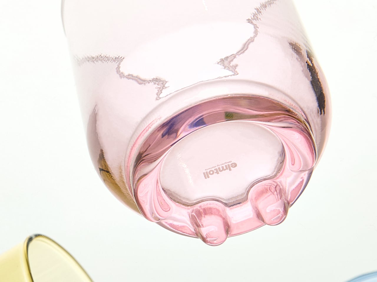
GRINN takes a different position. It’s a handcrafted glassware collection from Bangkok that doesn’t fight condensation but engineers the base to direct it, turning the moisture that forms around a cold drink into a smile-shaped mark on the surface beneath. Lift the glass after it’s been sitting long enough, and the outline of a curve appears beneath it. Not printed, not etched, just water behaving as water does.

Designer: Mooque Sarunphon Boonto (MOOQUE, Elmtoli)

The trick is in the base geometry. Each piece is mouth-blown from soda-lime glass using traditional glassblowing techniques, and the base is precisely engineered to guide condensation along a specific curved path. As a cold drink cools the glass and warm air does its work, moisture collects and follows the curve built into the structure. No stickers, no added decoration; the smile arrives entirely through physics.

The process has three steps: fill the glass with a cold drink and plenty of ice, wait 15 to 30 minutes at room temperature, then lift to discover what’s formed underneath. The sharper the temperature contrast between the drink and the surrounding air, the cleaner the impression. Timing varies with airflow and ice quantity, and smooth, non-absorbent surfaces produce the clearest marks.

Mouth-blown glass carries its own signature, and GRINN leans into that rather than apologizing for it. Slight variations and small bubbles are inherent to the process rather than defects, and no two pieces are identical. The collection is designed for cold and room-temperature beverages only. Hot liquids and sudden temperature changes should be avoided, a constraint that comes with the soda-lime material rather than any compromise in craftsmanship.

The collection spans five pieces: a Classic Glass, a Highball Glass, a Mug Glass, a Beer Mug, and a Carafe. Each applies the same engineered base geometry to a different vessel, which means the condensation smile works just as well on a glass of morning cold brew, a tall iced cocktail in the evening, or a sweating pitcher set at the center of a table.

The smile isn’t decoration in any traditional sense. It’s a consequence of structure, temperature, and time, a moment that only exists because someone put a cold drink down and waited long enough. Making an ordinary act worth noticing turns out to be a harder design brief than it sounds.

The post Lift This Handblown Glass and Find a Smile Left Behind by Your Drink first appeared on Yanko Design.
Kids’ Tech Has a Screen Problem: This $139 Button Is the Fix

Getting kids through morning and bedtime routines is one of those parenting problems that never quite gets solved. Apps on tablets and phones have tried, but the device that’s supposed to help with brushing teeth is the same one that can pull up YouTube. Most parents end up nagging anyway, just now with a screen involved. The category of kids’ tech hasn’t really made mornings easier. It’s made them busier.

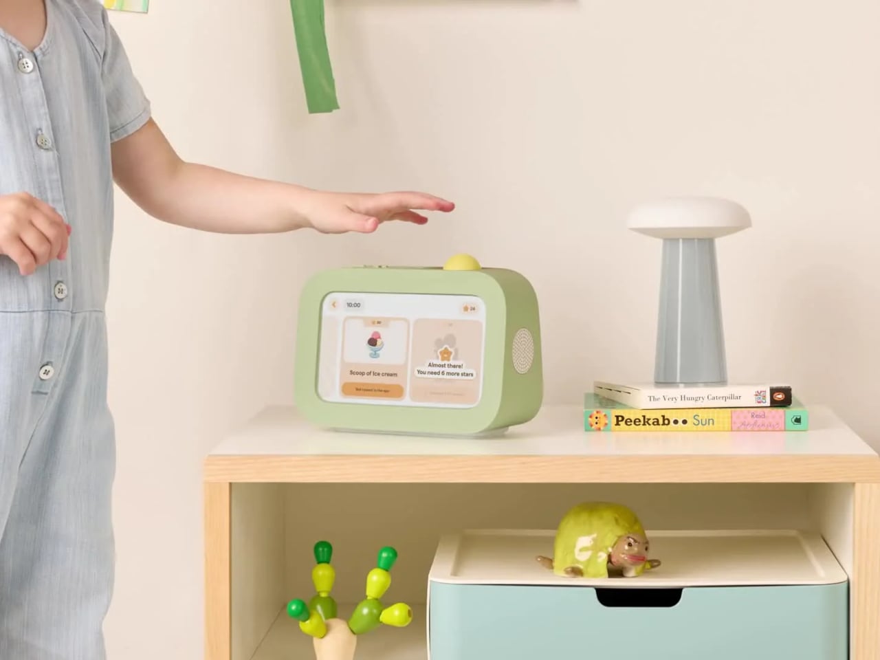
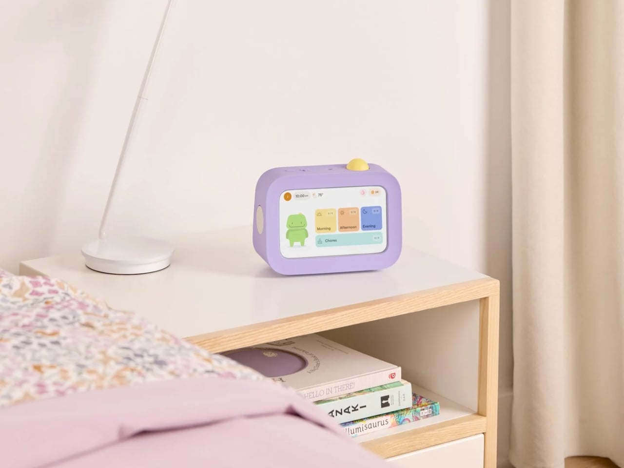
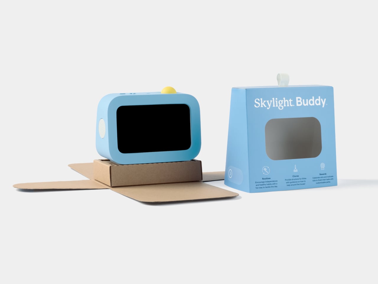
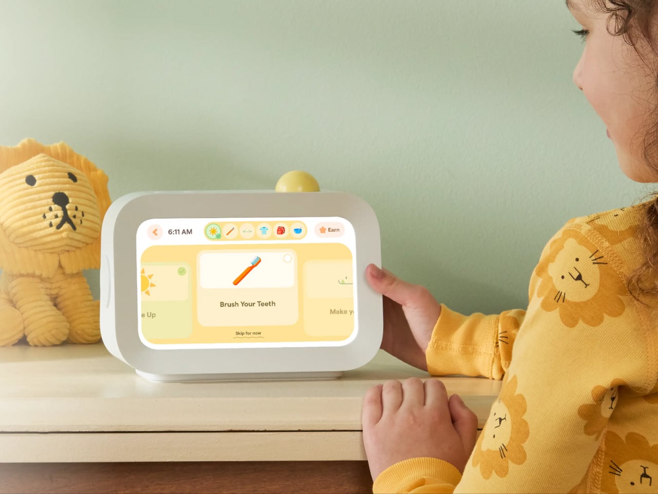
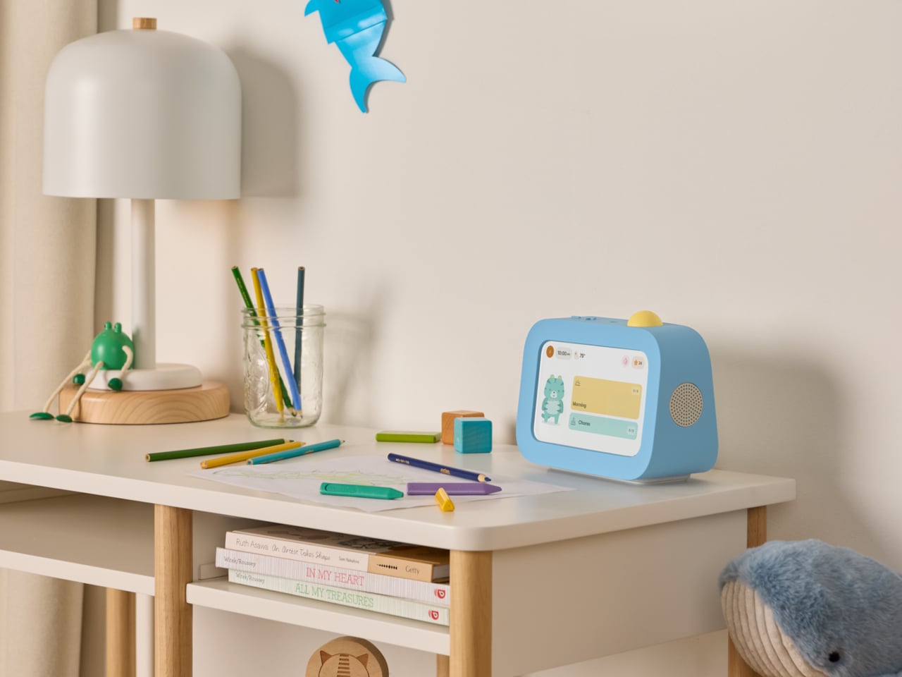
Skylight Buddy takes a different approach. It’s a purpose-built bedside device for children ages 4 to 10, with a touchscreen, a speaker, a built-in nightlight, and a physical action button. What it doesn’t have is just as deliberate: no internet access, no browser, no downloadable apps, no camera, and no microphone. It launched in June 2026, and its first production run sold out within a week.

Designer: level Design

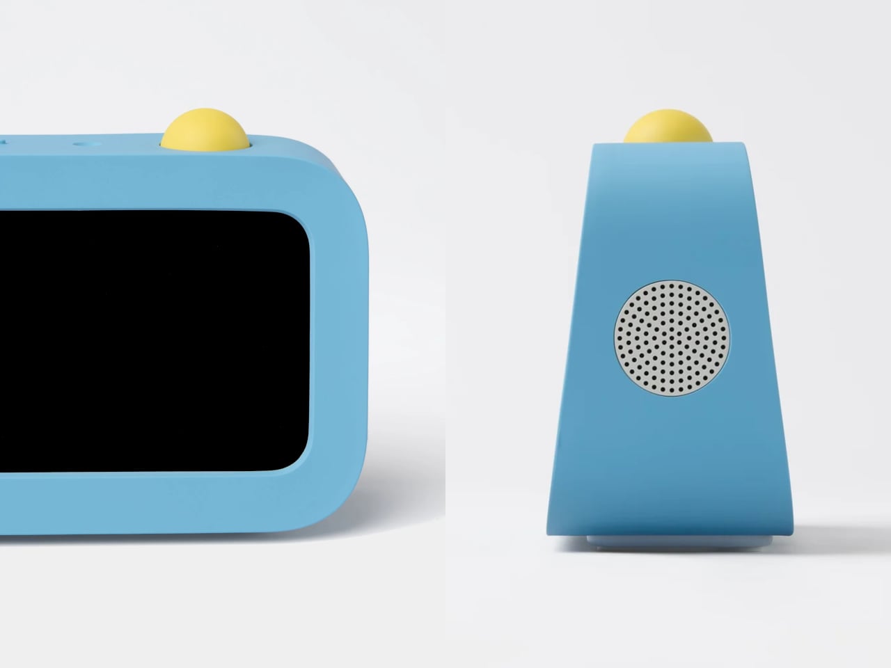
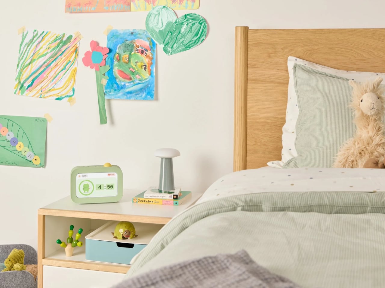
The core interaction is simple. Buddy guides kids through their morning, after-school, and bedtime tasks one at a time, showing each with clear on-screen visuals. When a task is done, the child presses the action button on top to confirm, advance to the next step, and collect stars. The design team pushed hard to keep that physical button rather than defaulting to a screen-only approach.

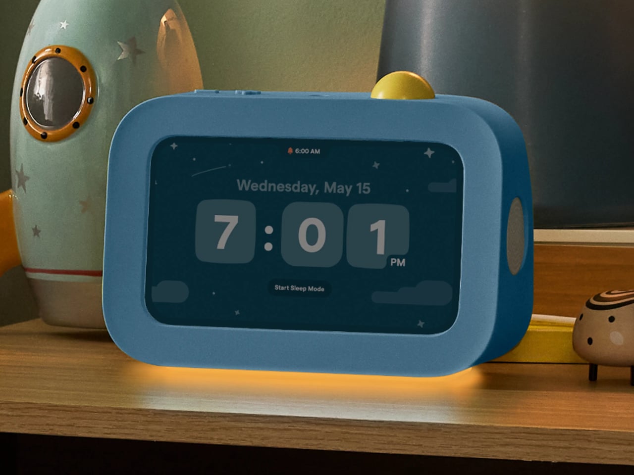
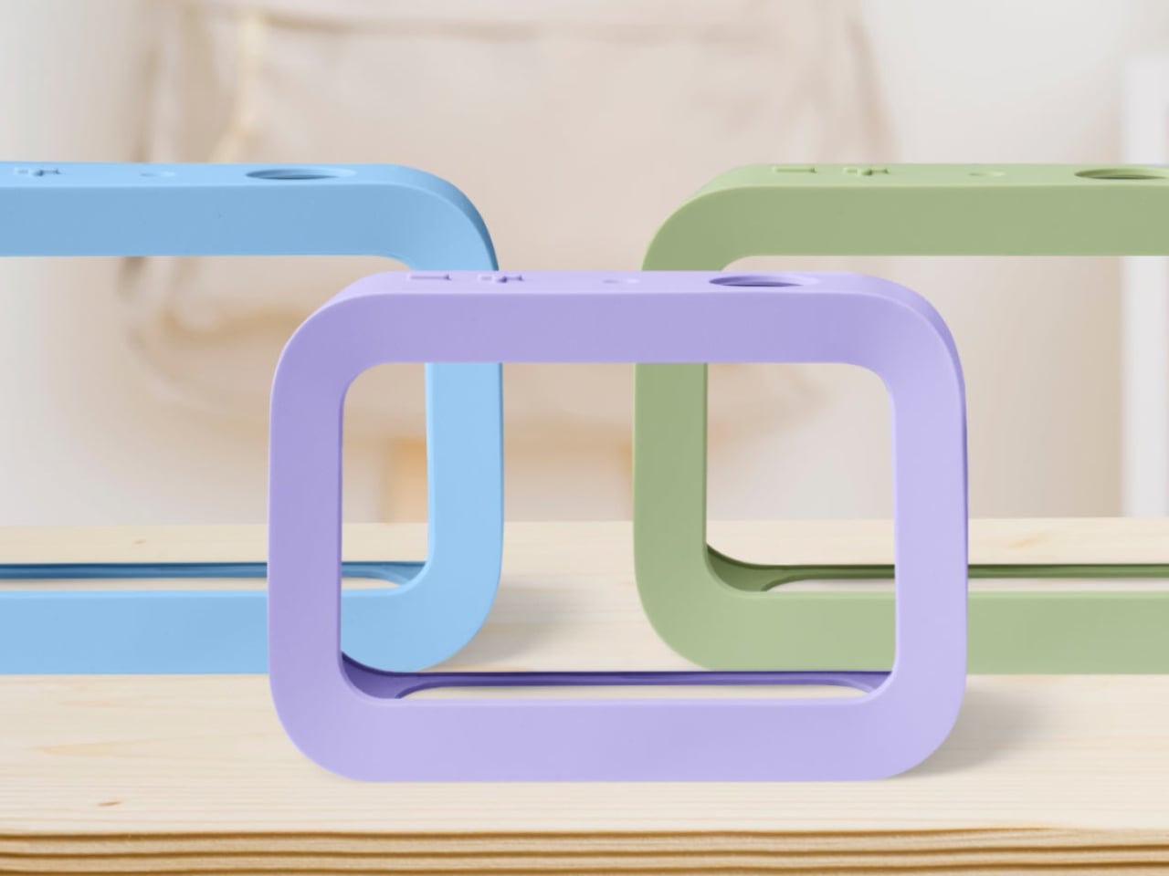
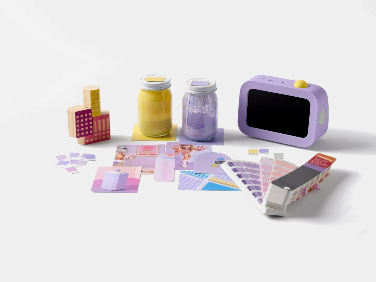
The button is yellow across all three colorways, which serves a functional purpose. It’s the brightest thing on the device, a deliberate visual signal that reads as “press me” from across the room. Buddy comes in blue, sage, and lavender, each with a soft silicone case that wasn’t designed as an accessory but as part of the form. With the case on, the side speaker sits flush with the body.

The integrated light handles two things that parents often buy as separate products: a nightlight for bedtime and an OK-to-wake signal for mornings, so younger kids know when it’s actually time to get up. Add a sound machine for winding down at night and an alarm clock for starting the day, and Buddy replaces a collection of single-purpose devices that typically end up crowding a child’s nightstand.

Buddy works as a standalone device right out of the box, covering routines, chores, the alarm clock, and all core features without any additional cost. Families who already use Skylight Calendar can link the two through the same parent app, syncing a child’s tasks and rewards automatically. A Buddy Plus subscription unlocks additional tools, including rewards tracking, visual timers, and nudges for transitions that are harder to manage.

At $139, it isn’t a cheap clock, but it’s also not competing with tablets or general-purpose screens. That’s the point. Kids can’t download apps on it, can’t open a browser, and can’t drift into videos once their tasks are done. For a category of products that’s gotten very good at capturing children’s attention for all the wrong reasons, Buddy’s restraint is its most compelling feature.

The post Kids’ Tech Has a Screen Problem: This $139 Button Is the Fix first appeared on Yanko Design.
Satechi Just Built the MacBook Neo Accessories Apple Forgot to Make

Apple has always used color as a defining feature of its consumer laptops, and the MacBook Neo leans into that more than most. It’s the brand’s most affordable MacBook yet, arriving in four expressive colorways that clearly aren’t an afterthought. The accessories market hasn’t kept pace with that thinking, though. Most hubs and mice sold alongside colorful laptops are still generic gray or silver, made for nothing in particular.

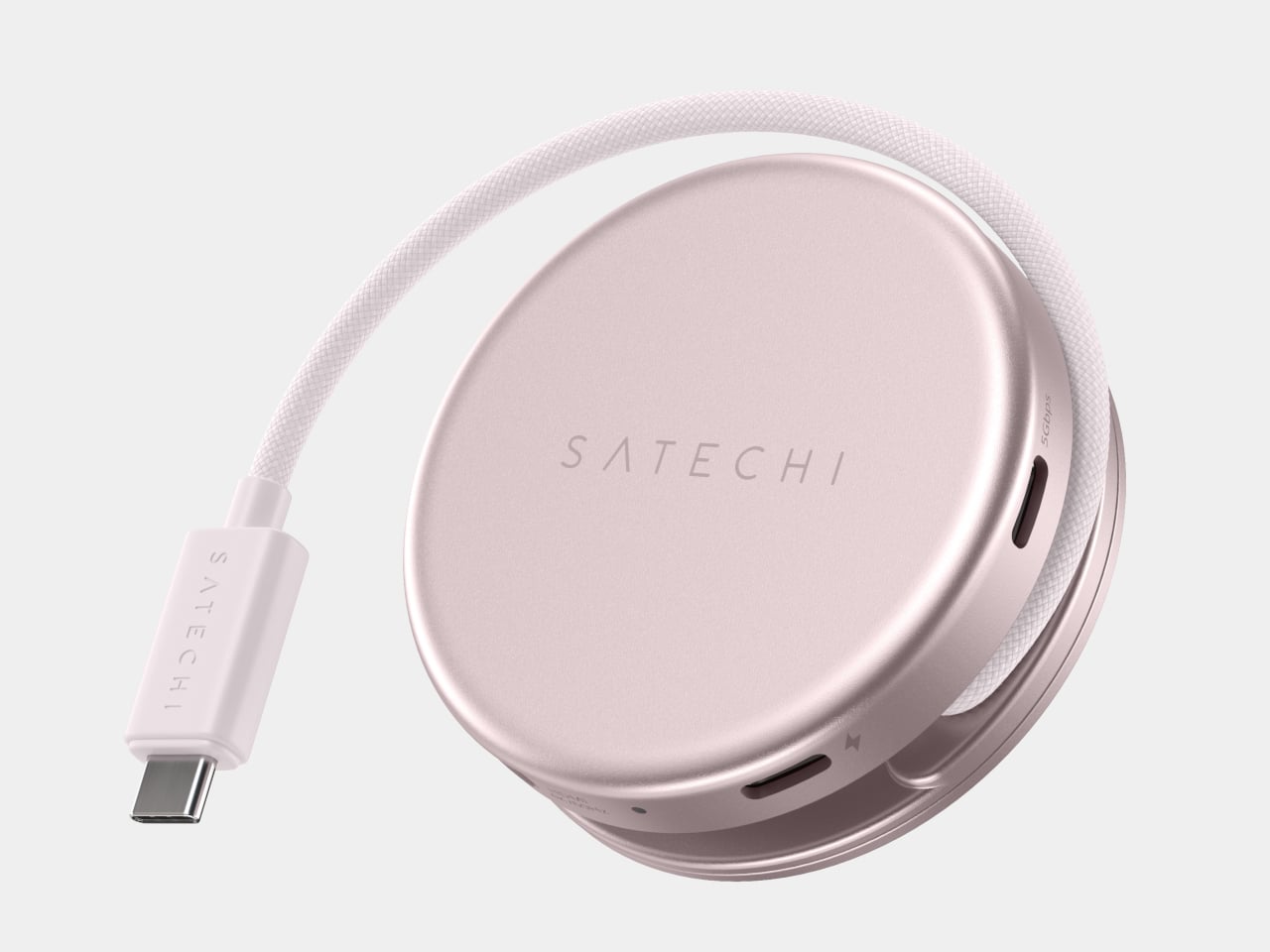
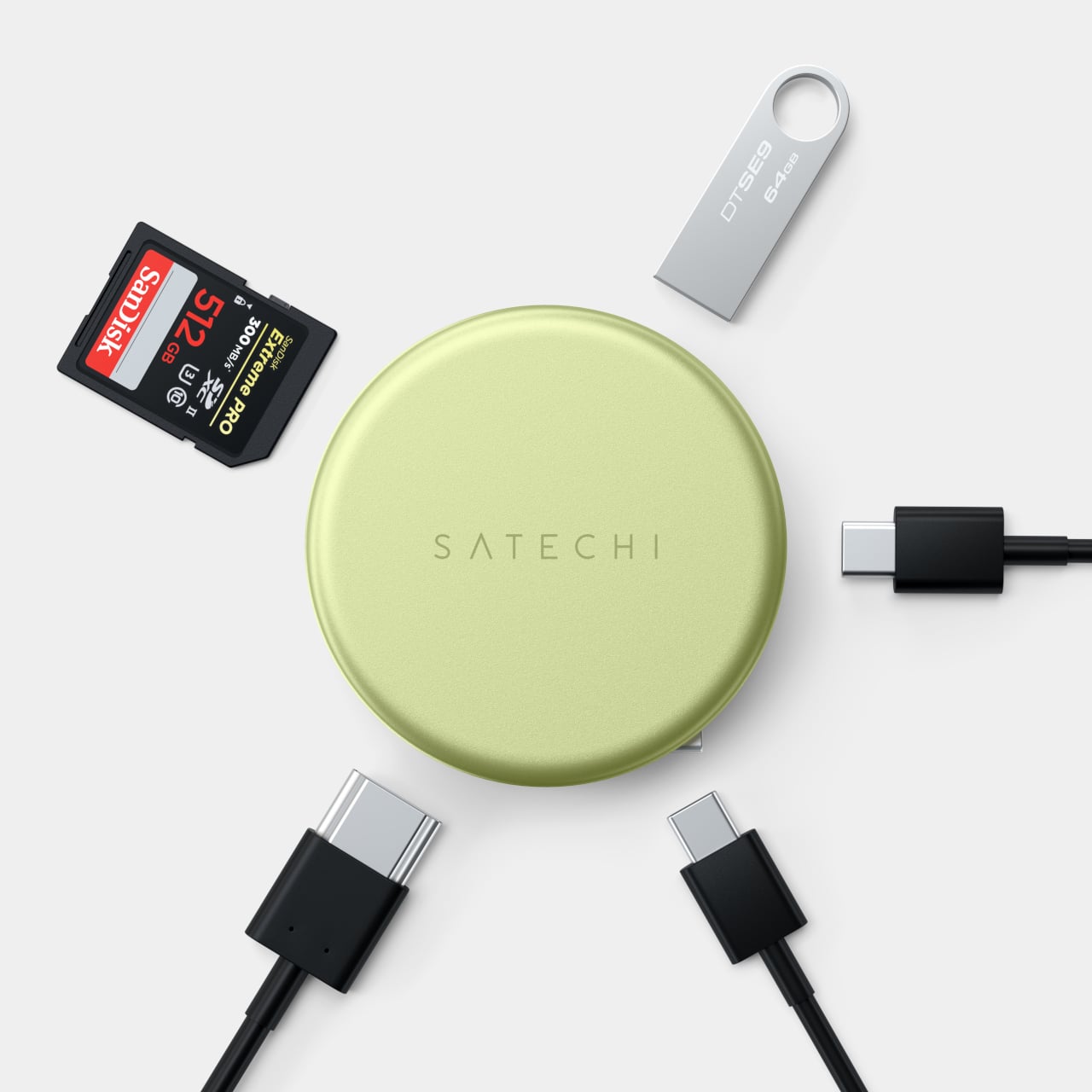
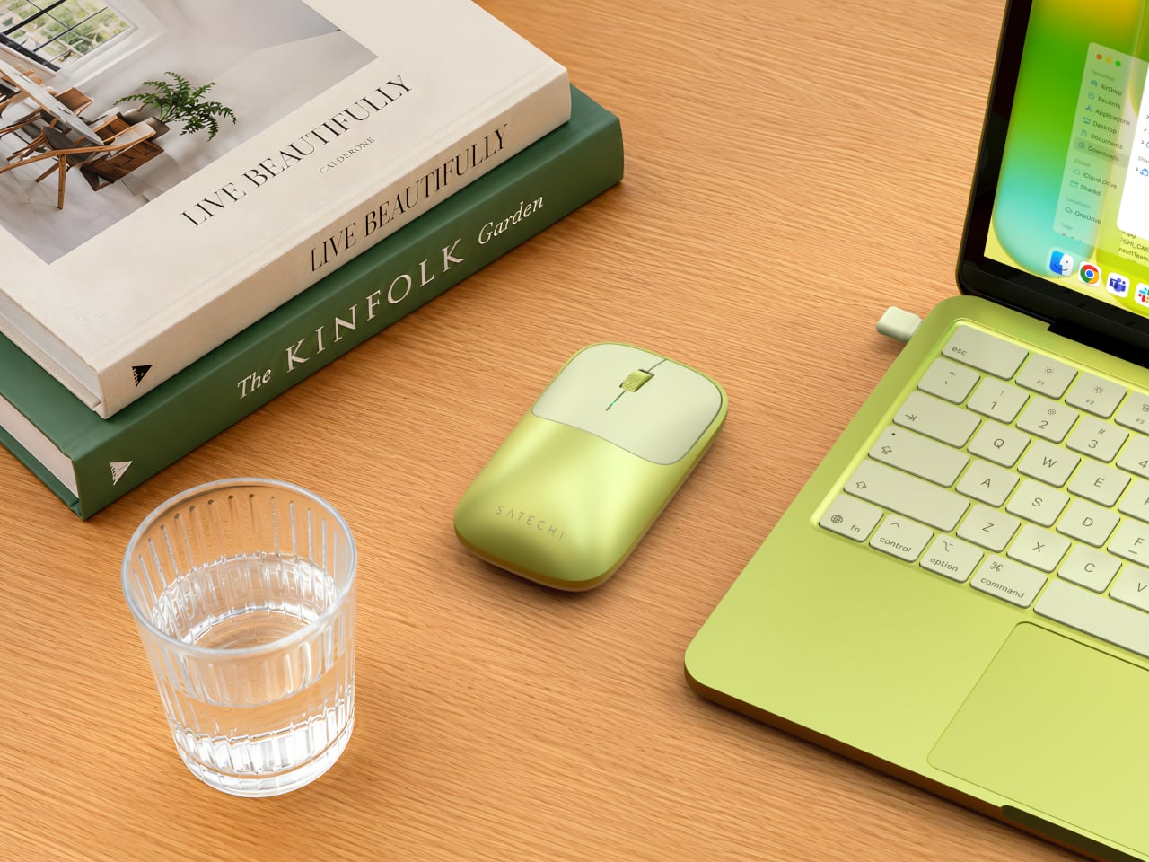
Satechi’s MacBook Neo Collection takes direct aim at that gap. The three-piece lineup, available in Citrus, Blush, Indigo, and Silver, is built around the simple idea that accessories for a distinctly colored laptop should actually match it in kind. That means two USB-C hubs that address the Neo’s limited port selection, and a wireless mouse that rounds out the desk setup with the same visual intention the laptop brought.

Designer: Satechi

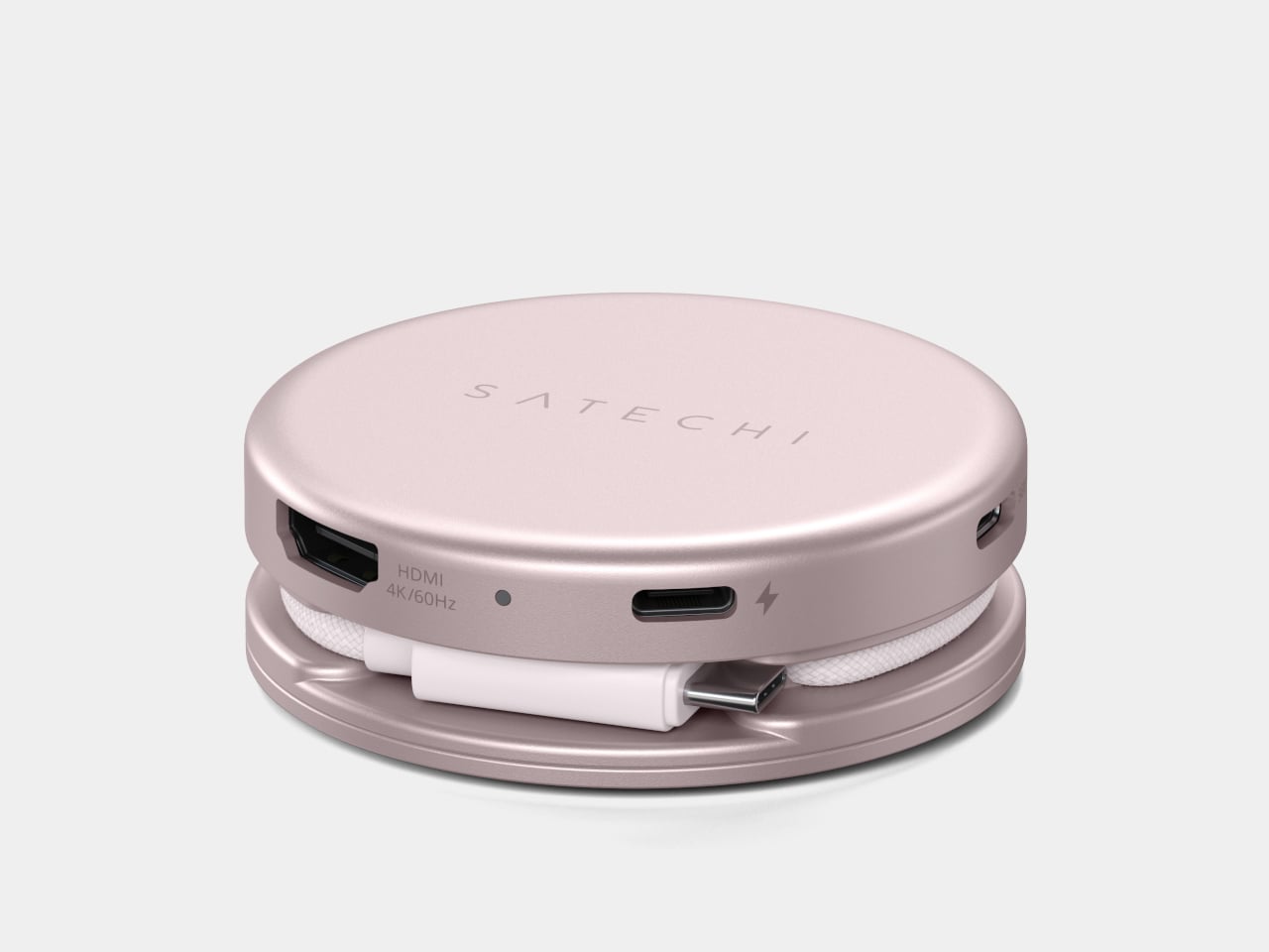
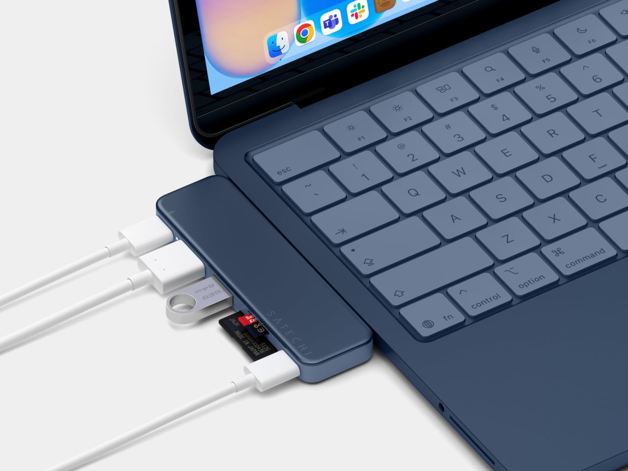
Of the two hubs, the USB-C Snap Hub ($44.99) is the one built most specifically around the Neo. It connects to both of the laptop’s USB-C ports simultaneously and sits flush against the chassis without any cables running off to the side. Six ports all operate at once without any configuration needed, covering 4K/60Hz HDMI output, USB-A and USB-C data, SD and microSD card slots, and 45W pass-through charging.

What makes the Snap Hub more considered than a typical color-matched hub is its two-tone construction. The top surface is anodized aluminum matched to the Neo’s body color, while the base is soft-touch ABS aligned to the keyboard finish, giving it a genuinely integrated look. Most accessories stop at a matching surface. This one accounts for how it looks when it’s actually attached to the laptop, not just placed nearby.

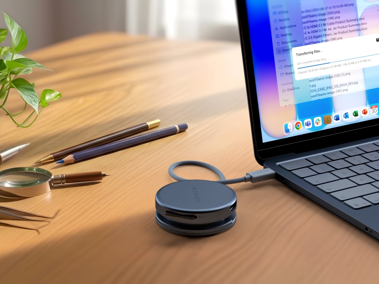
The OntheGo 5-in-1 Multiport Adapter ($44.99) takes a more portable approach to the same connectivity problem. It connects through a single USB-C port via a nylon-braided cable, and its magnetic soft-touch base can snap onto a MagSafe iPhone or mount flush to the Neo’s lid with an included adhesive ring. The ports cover 4K/60Hz HDMI output, 60W USB-C pass-through charging, dual 5 Gbps data ports, and an SD card reader.

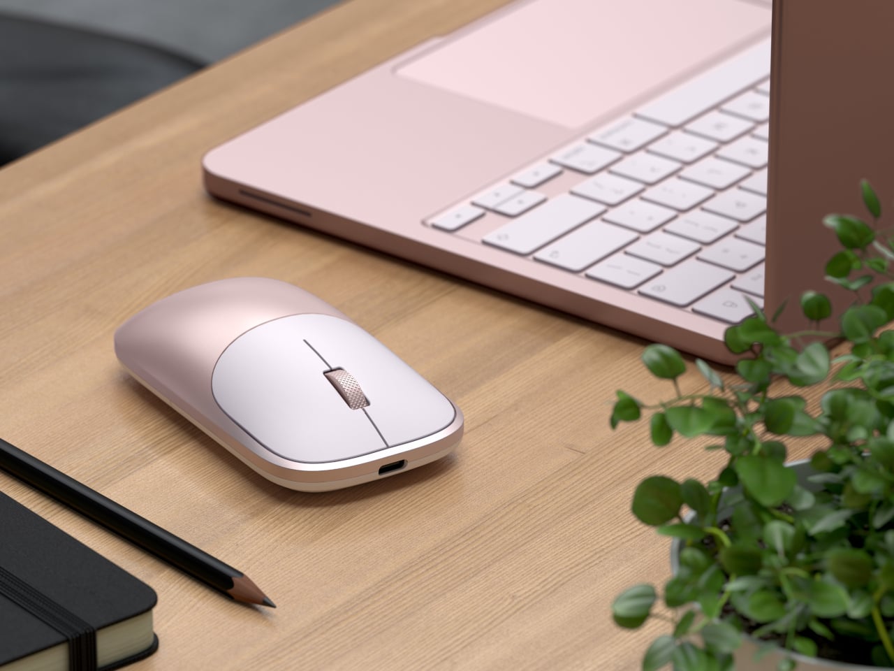
The Slim EX Wireless Mouse ($29.99) completes the collection and the color story it sets up. Previously only available in standard finishes, it now comes in the same Neo colorways for the first time, on an aluminum body that matches the hubs it sits beside. It supports two simultaneous Bluetooth channels and a 2.4 GHz wireless connection, quiet click switches, a precision-machined scroll wheel, and a USB-C rechargeable battery.

The MacBook Neo was designed for people who care about color as much as capability, and the accessories around it should reflect that sensibility. At $29.99 for the mouse and $44.99 for either hub, the collection isn’t asking much. It gives back a desk setup that actually feels considered from one end to the other, which is a harder outcome to achieve in the laptop accessory space than it sounds.

The post Satechi Just Built the MacBook Neo Accessories Apple Forgot to Make first appeared on Yanko Design.
Lamp Switches Have Been Lazy for Decades, This One Uses a Magnet

Lamp switches don’t get much design attention. They’re usually a small toggle on the cord, a push button under the shade, or a touch-sensitive strip on the base that’s easy to miss in the dark. They get the job done, but they’re rarely treated as a meaningful part of the object. It’s one of those details that most lamp designers seem perfectly happy to leave to the supplier catalog.

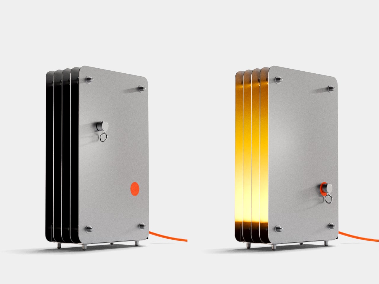
The Strata lamp takes a different position on both counts. It’s a handmade steel table lamp that earns its name from geological rock formations, those compressed, layered bands of sedimentary stone that build up over time into something structurally dense and visually striking. The lamp translates that geological idea directly into stacked steel panels, and pairs it with a switching mechanism that makes turning a lamp on feel unexpectedly deliberate.

Designer: Aleksandr Misiukevich

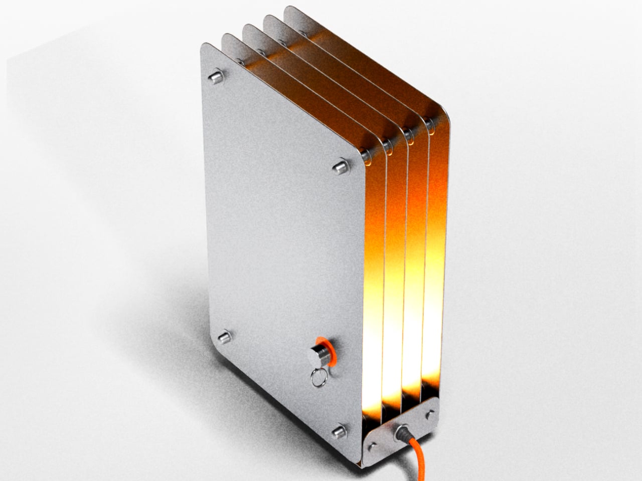
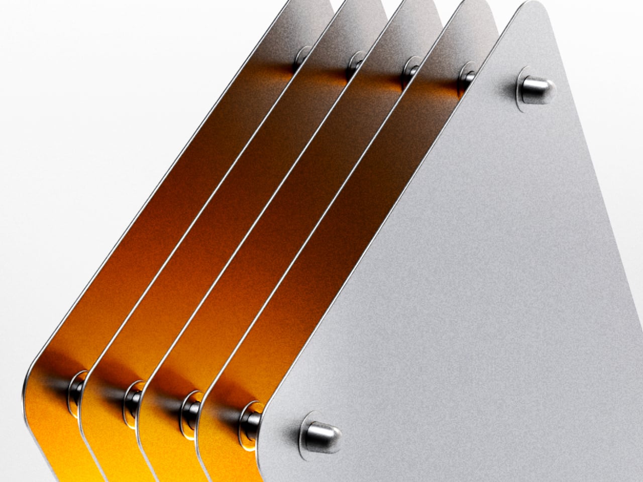
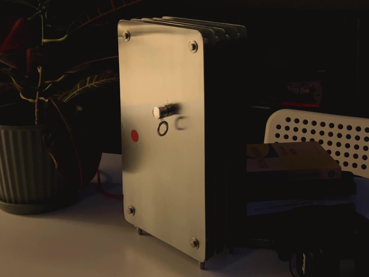
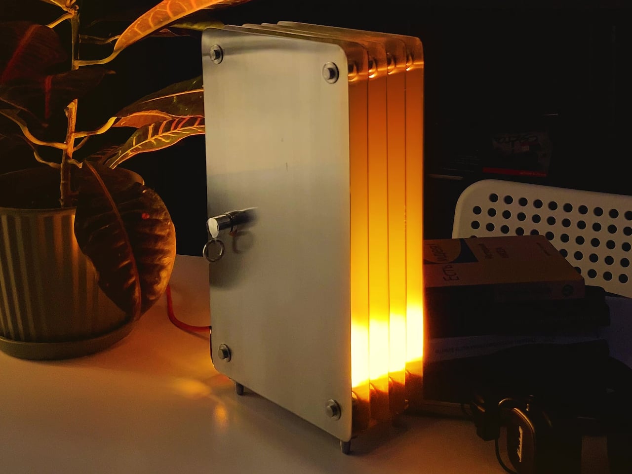
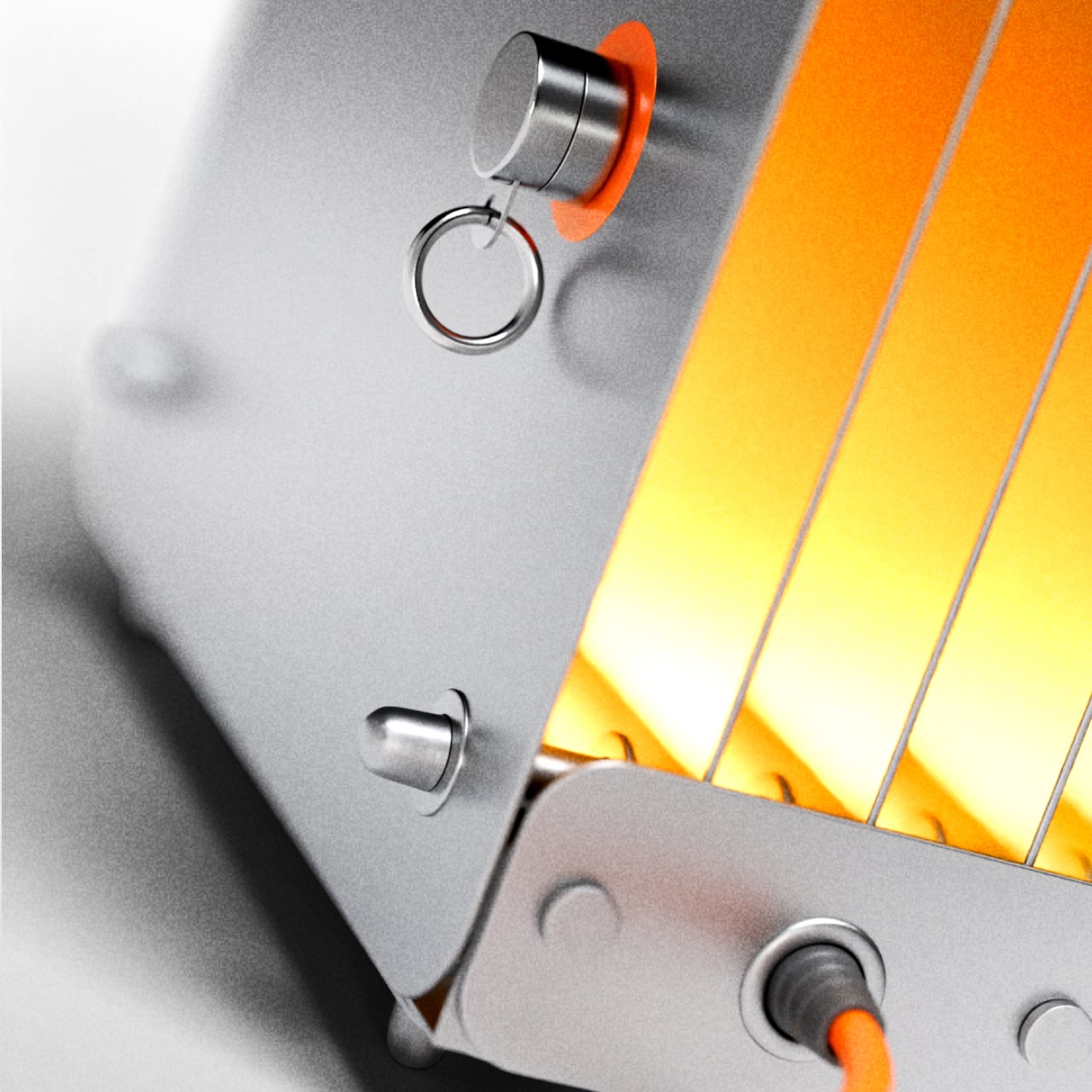
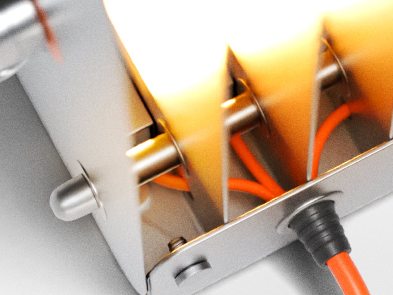
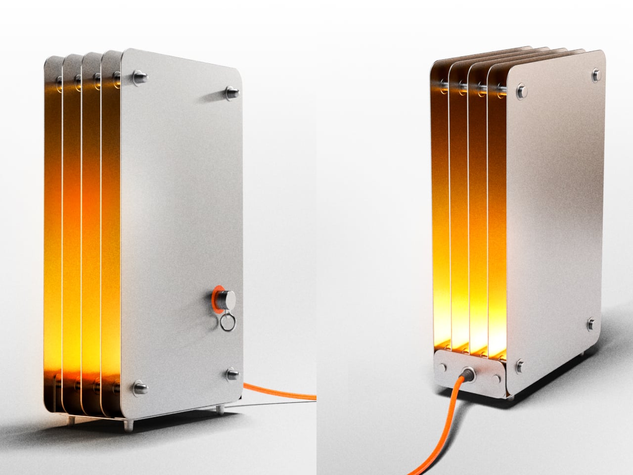
The body is built from individual steel plates with rounded rectangular corners, held in parallel by cylindrical steel standoffs at each corner and center. When lit, warm amber light radiates from the gaps between every plate and from the open front edge, creating a layered glow that shifts from deep orange near the top of the lamp to a brighter, more diffused yellow further along each inner steel surface.

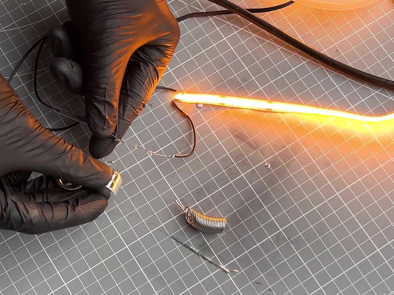
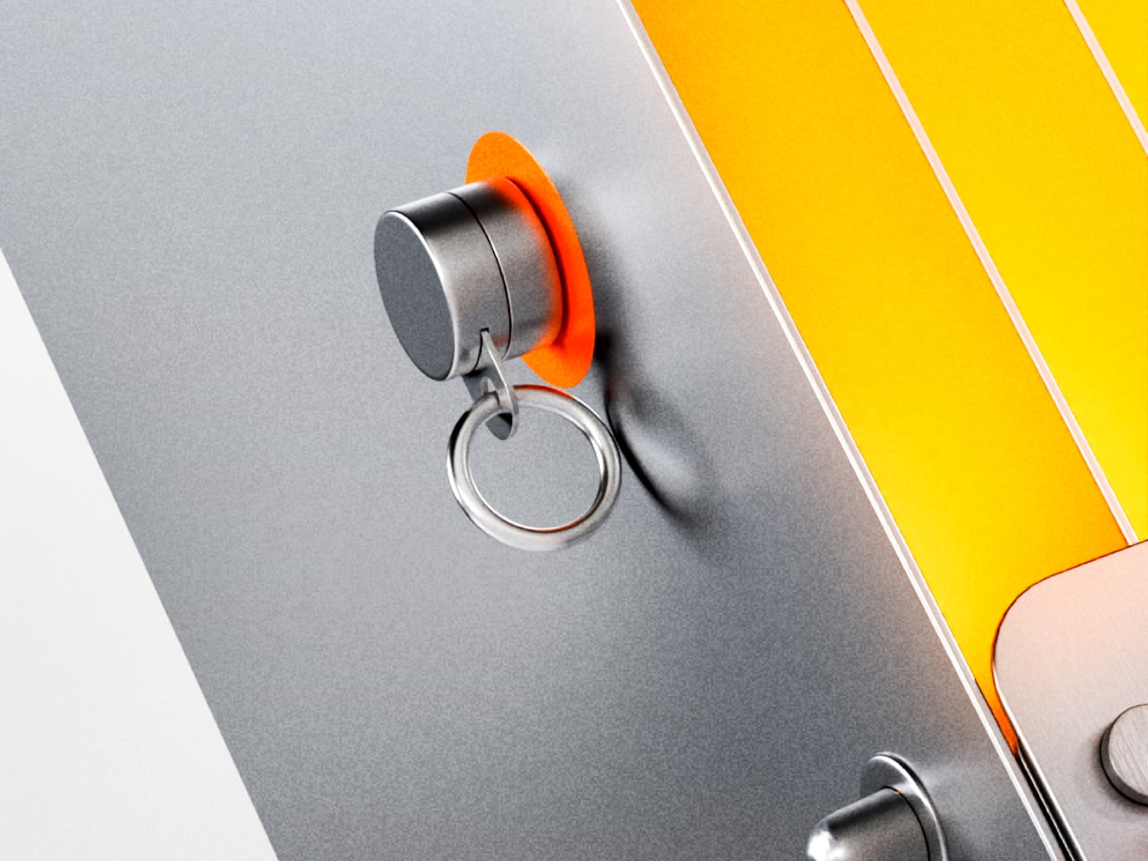
The switch is a magnetic reed switch, one of the simpler components you can put inside a lamp. A small cylindrical magnet, tethered to the body by a metal ring, acts as the key. Set it on the orange circle marked on the front panel, and the lamp turns on. Lift it away, and it turns off. The magnet parks on a small post when it’s not in use.

That interaction is a harder thing to design well than it sounds. Reed switches are decades-old technology, and the magnet-on, magnet-off logic is genuinely simple. But the way it’s set up here gives the action more weight than it would otherwise have. You’re not flipping a switch. You’re placing something intentionally, and removing it just as deliberately. It’s the kind of small habit that starts to feel like a routine.

The rest of the construction follows the same thinking. The steel plates, the standoff hardware, and the small feet that lift the base all stay visible rather than concealed, and an orange power cord exits from the bottom without apology. That cord color, matched to the activation circle on the panel, is the one deliberate accent in an otherwise entirely industrial material palette of matte gray and polished steel.

Strata was built by hand, and that’s evident in the quality of each component rather than any sense of roughness. The plates are cut cleanly, the standoffs are consistent, and the glow that fills the gaps between the sheets has a warmth that a simple LED strip wouldn’t normally produce on its own. The steel acts as both housing and reflector, which is about as economical as structural decisions get.

The post Lamp Switches Have Been Lazy for Decades, This One Uses a Magnet first appeared on Yanko Design.

Huawei Built a 200MP Camera Phone That Finally Shows Your True Colors

The smartphone camera arms race hasn’t let up. Most flagships are pushing harder on AI-assisted processing to compensate for the physical limits of small sensors, and the results are often technically impressive but not always true to what was in front of the lens. There’s a real difference between a photo that looks good and one that actually looks right, and that’s a harder problem to solve than adding megapixels.

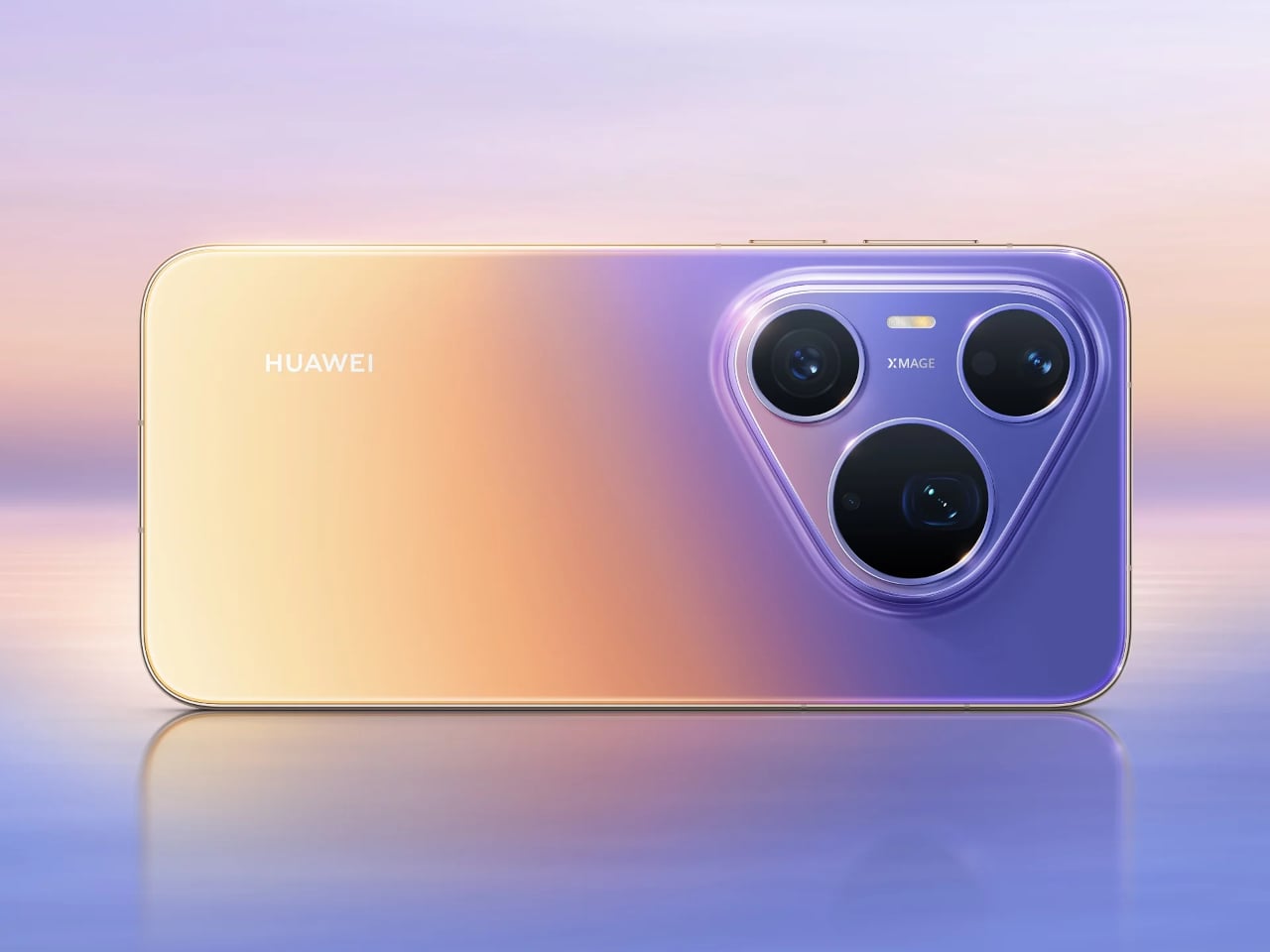
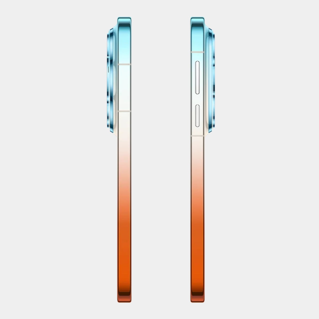
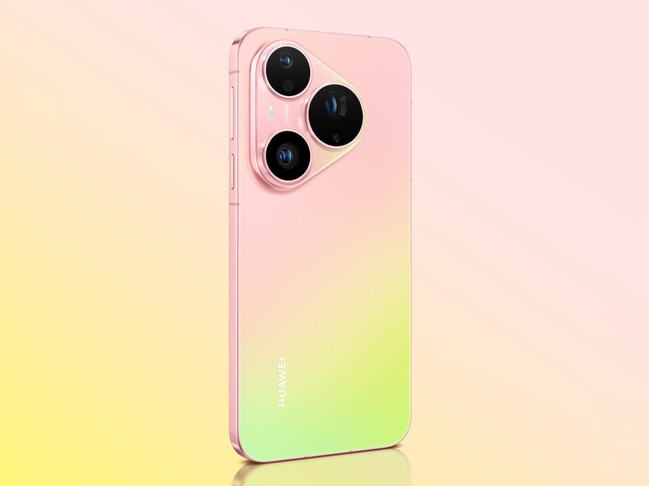
The Huawei Pura 90s Pro and Pura 90s Pro Max are Huawei’s answer to both. Launched in Kuala Lumpur on July 14, 2026, the two phones arrive with a design philosophy called “Rhythm of Colour,” gradient colorways that flow across the chassis, and a camera system built around the idea that color accuracy matters just as much as how sharp the final image gets.

Designer: Huawei

Both models feature True-to-Colour Camera 2.0, a system designed to close the gap between what the sensor captures and what the eye actually sees. A sunset shouldn’t come back looking oversaturated, and skin tones shouldn’t shift cooler or warmer than reality. The RYYB sensor array across all cameras supports this by gathering more color information in low-light conditions than a conventional RGGB layout can.

The Pro Max’s standout addition is a 200MP telephoto camera built on a 1/1.28-inch ultra-large sensor with OIS and 4x optical zoom that also functions as a macro lens. That resolution allows for aggressive cropping while still retaining detail throughout the frame. The Pro takes a different route with a 50 MP telephoto covering 4x optical and up to 8x optical-quality zoom.

Both phones share a 50MP main camera with a physical aperture spanning 10 sizes from F1.4 to F4.0. It’s a genuine mechanical iris rather than a simulated depth-of-field effect, and that distinction matters when conditions change. Moving from a dim restaurant to a bright outdoor afternoon doesn’t mean switching modes; the aperture adjusts, the exposure holds, and the shot works.

An AI composition feature suggests framing adjustments while you’re still pointing the camera, and Kunlun Glass on the front panel is rated at 25 times the drop-resistance and 16 times the scratch-resistance of standard glass. The Pro Max also carries a 40 MP ultra-wide camera, stepping above the 12.5MP sensor on the Pro, and adds LOFIC technology to the main sensor for better dynamic range.

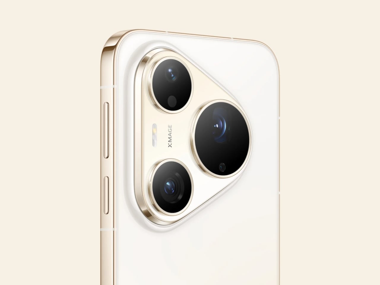
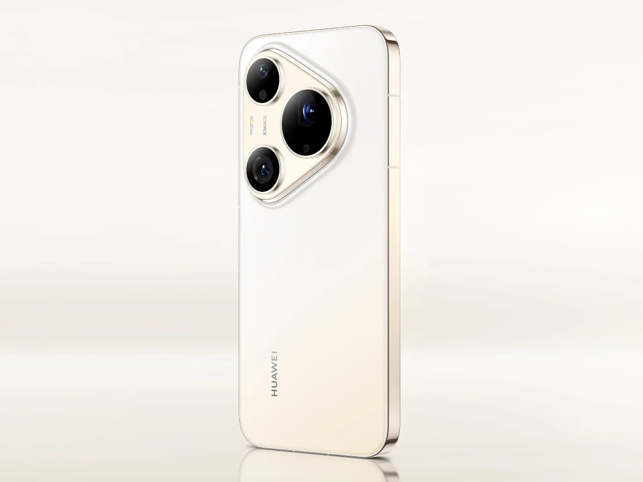
The “Rhythm of Colour” philosophy runs through every finish in the lineup, from the warm orange-to-gold Orange Ocean with its Dual-Tone Gradient Mid-Frame to a purple-to-peach option, deep matte black, and soft pearl white. The triangular camera module on both phones carries XMAGE branding and sits within a chassis that, despite the hardware inside, still manages to feel like a deliberate aesthetic choice.

A 5270mAh battery powers both phones, with 66W Huawei SuperCharge on the Pro and 100W on the Pro Max. Both run HarmonyOS 6.1 on the Kirin 9030S chip and carry IP68 and IP69 ratings for dust and water resistance. The Pro has a 6.6-inch OLED display, while the Pro Max steps up to a 6.9-inch LTPO OLED panel with an adaptive refresh rate from 1 to 120Hz.

The post Huawei Built a 200MP Camera Phone That Finally Shows Your True Colors first appeared on Yanko Design.

The Lamp Switch Nobody Bothered to Design Well, Until Now

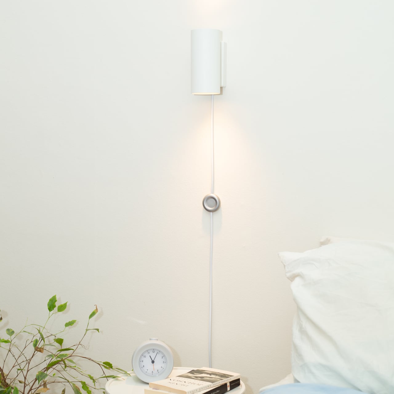
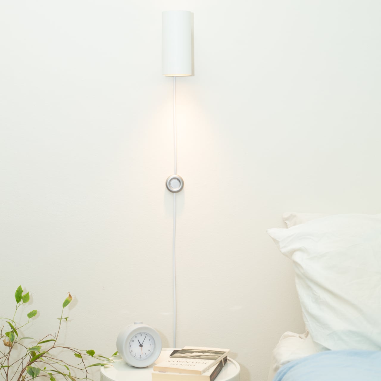
The inline switch is one of those details that nobody seems to question. Most floor and table lamps carry a cheap plastic switch dangling somewhere down the cord, lightweight and hollow, built for low cost rather than durability or feel. These switches are touched constantly throughout a lamp’s life, yet they’re rarely given the same attention as the lamp they’re attached to. That’s a strange kind of oversight.

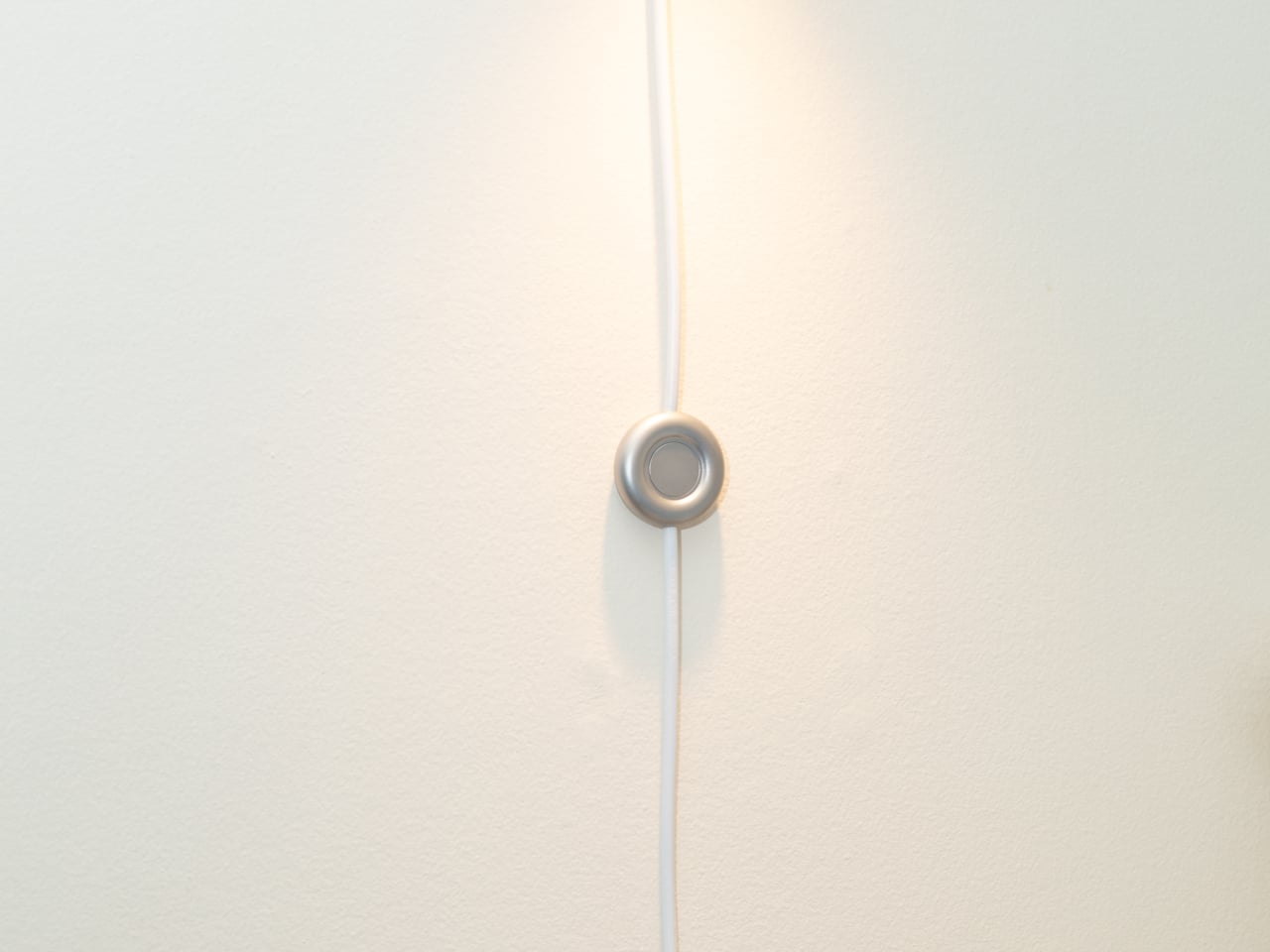
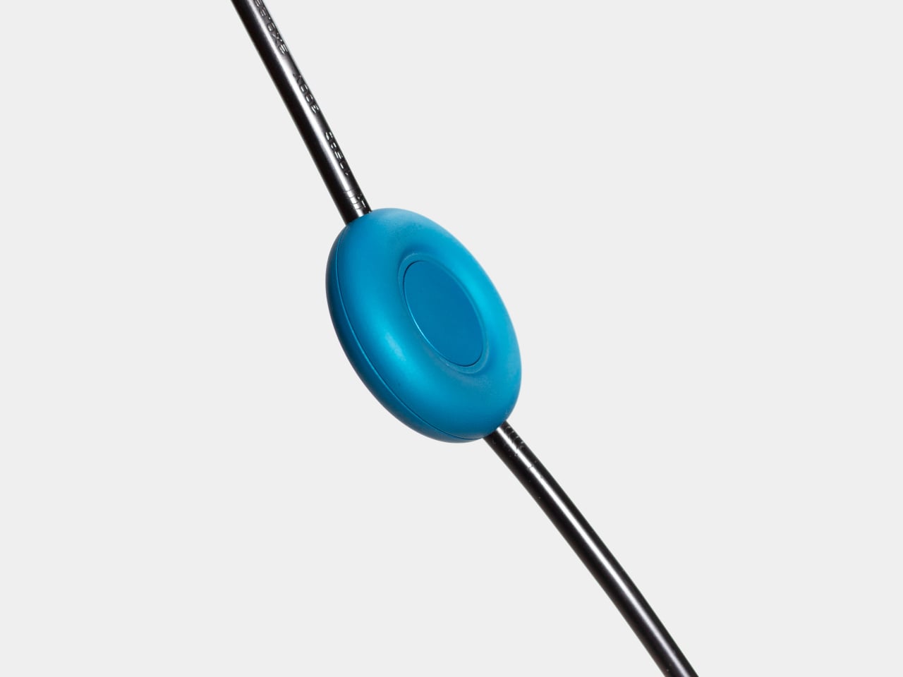
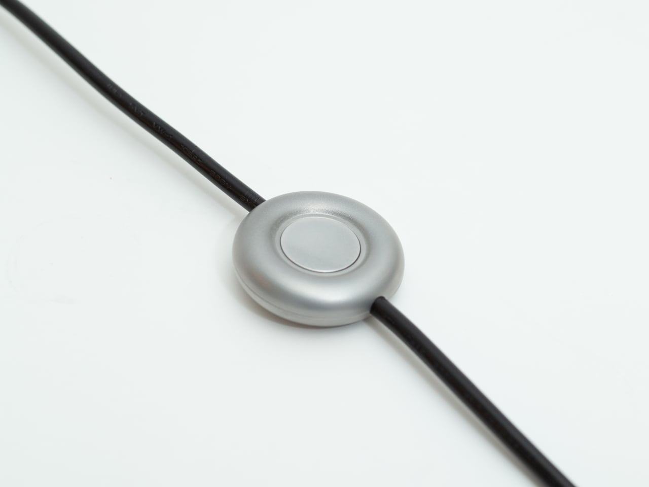
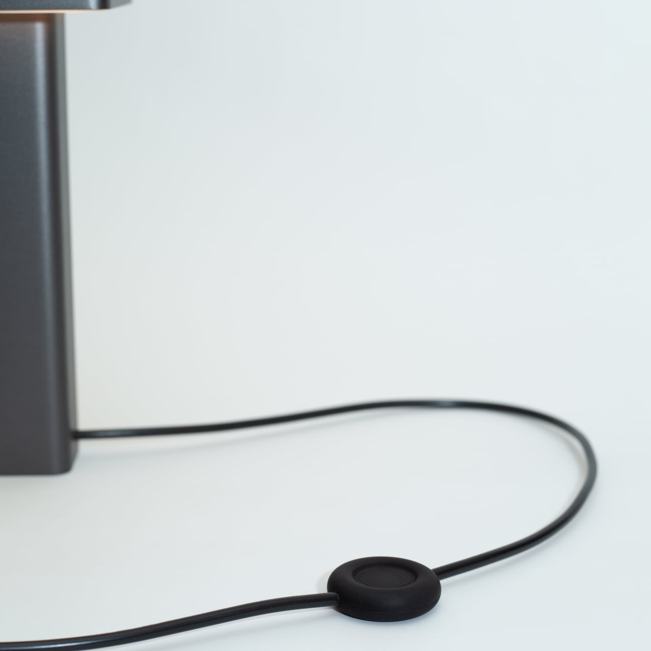
That disconnect is precisely what the Modal Inline Switch sets out to address. Instead of relegating the switch to an afterthought on the cord, it approaches the component with the same consideration typically reserved for the fixture it serves. The result is a CNC-machined, bead-blasted, anodized aluminum switch with a soft circular form, a more deliberate feel in the hand, and a presence that matches the fixtures it sits alongside.

Designer: Andrew King

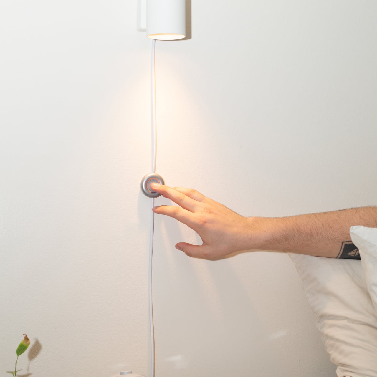
Think about the last time you clicked off a bedside lamp or nudged a floor lamp switch with your foot in the dark. The switch barely registers as a design object, something you feel more than see, yet that click says a lot about the quality of the lamp. A cheap plastic click gives you exactly that impression. The Modal, by contrast, gives you something that actually feels worth touching.

Standard inline switches are injection-moulded plastic, hollow and lightweight, built purely for low cost. Modal swaps all of that for bead-blasted, anodized aluminum, giving it a controlled matte finish that stands apart from any typical lamp cord component. It’s cooler to the touch, heavier in the hand, and more substantial in feel. That added weight, which initially seemed like an inefficiency, turned out to be one of its defining qualities.

The circular form wasn’t arrived at immediately. Earlier prototypes explored angular geometries and segmented shapes before settling on a rounder, gentler profile, one that feels natural to nudge with a foot as well as press with a finger. The button mechanism went through its own refinement; early versions were unstable due to a mismatch between the larger cap and a smaller actuator, a problem the guided button cap system resolves.

The switch’s housing is assembled mechanically rather than with adhesive, meaning it can be taken apart and repaired if needed. That’s not something most people would think to look for in a lamp switch, but it speaks to the broader thinking behind Modal: that making something from better materials, with more intentional construction, can shift how long it’s valued and kept, rather than simply replaced when something gives out.

The Modal Inline Switch isn’t trying to reinvent how a lamp works. It sits on the same cord, does the same on/off job, and doesn’t ask for any more attention than it needs. But it’s designed to hold its place, literally and aesthetically, rather than disappear behind furniture or dangle somewhere on the floor. It’s the kind of quiet intervention that’s easy to overlook until you actually reach for it.

The post The Lamp Switch Nobody Bothered to Design Well, Until Now first appeared on Yanko Design.

Inkleaf’s foldable dual-screen E Ink notebook lets you read and write at the same time

E Ink tablets have become a solid alternative for people who read and write for a living. Devices like the reMarkable 2 and Kindle Scribe do a good job of making digital note-taking feel closer to paper, but they all share the same fundamental limitation. You get one screen, which means you’re either reading or you’re writing, but not both, and that’s a workflow problem that hasn’t really been addressed.

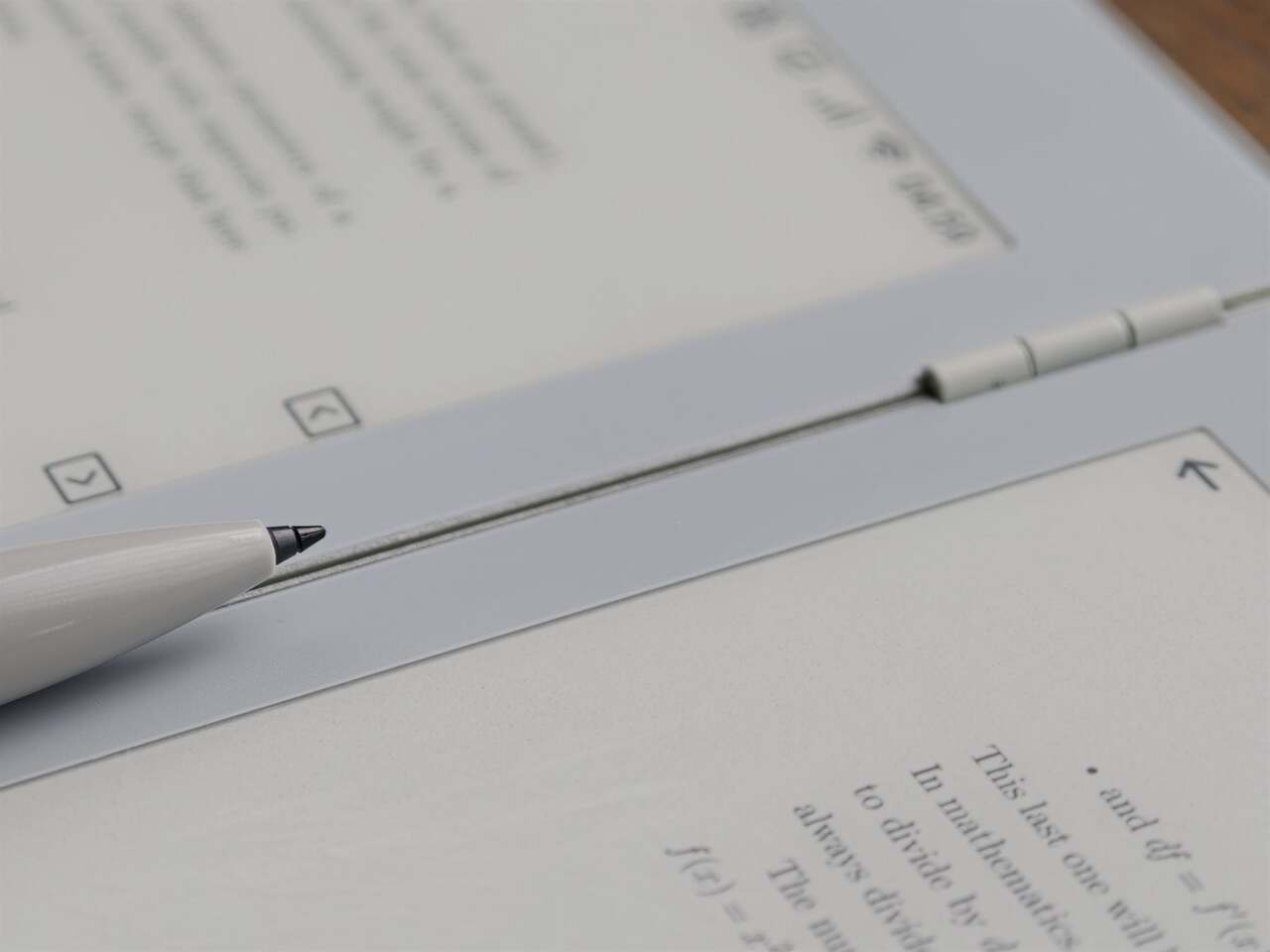
The Inkleaf is a foldable dual-screen E Ink tablet designed specifically for that gap. It opens up to two full 10.3-inch Carta E Ink panels side by side, which lets you keep your source material on one screen while your notes stay on the other. It’s the kind of setup that researchers, students, and writers have been piecing together awkwardly with a tablet and a separate notebook for years.

Designer: Kameron Yu

Think about the last time you had to annotate a PDF while also drafting a response, or work through a textbook while keeping running notes. Most tablets force you to switch between apps constantly, losing your place and breaking focus. With the Inkleaf, you can read on the left and write on the right, and even flick a page from one screen to the other with the stylus.

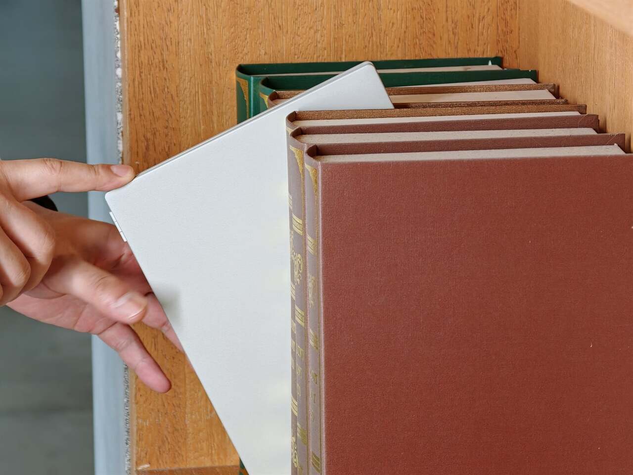
What makes the form factor just as interesting as the screens themselves is how the Inkleaf handles both. It folds shut like a hardcover with a 180-degree hinge that lays perfectly flat when open. Closed, it’s thinner than a standard paperback at 8.4mm and barely heavier at 480 grams. The body is cast aluminum with a precision-machined hinge barrel and tactile page-turn buttons right where your thumb expects them.

To put the thinness in perspective, each open panel measures just 4.2mm, which is thinner than the reMarkable 2 at 4.7mm, the Kindle Scribe at 5.4mm, and the Boox Note Air4 C at 5.8mm. None of those fold, either. It’s a notable feat given that the Inkleaf is essentially two tablets in one, and it’s the only foldable E Ink tablet currently available on the market.

The software runs on Android and supports open file formats, including PDFs, EPUBs, MOBI, and TXT files, with no subscription required to access your own content. An AI-powered handwriting search can surface any phrase across every notebook you’ve written. And because it folds to the size of a hardcover, it doubles as a portable secondary display at a coffee shop, a hotel room, or wherever else you end up working.

The Inkleaf is reportedly priced at around $450, with the first units expected to reach founders in August 2026. It ships with the pressure-sensitive stylus, a USB-C cable, and no subscription fees tied to reading your own files. For people who spend long hours moving between books and notebooks, it’s one of the more thoughtful attempts at genuinely rethinking what a digital writing and reading device can look like.

The post Inkleaf’s foldable dual-screen E Ink notebook lets you read and write at the same time first appeared on Yanko Design.