This Sideboard Has Lapis Lazuli and Green Onyx Hand-Set Into Marble

Black Marquina marble tends to command a room before anything else in it does. The material has a particular gravity, that deep, carbonized base cut through with white veining, which makes most furniture around it feel like an afterthought. Designer Himanshu Kumar Gupta leans into that authority completely with the Midnight Inlay Sideboard, then quietly subverts it the moment someone opens a door.

The exterior runs on strict formal logic. Vertical fluting covers the door panels from edge to edge, each ridge precisely cut into the stone so the surface ripples with shadow even under flat ambient light. On plain marble, this treatment would read as architectural severity, which is exactly the point. The fluting establishes a rhythm, almost like a grid, that makes what comes next feel genuinely disruptive.

Designer: Himanshu Gupta

Scattered across those ridged panels are rectangular inlays in Lapis Lazuli, Red Fire marble, Alikanta, and Green Onyx, appearing at irregular intervals and orientations like signals caught mid-transmission. Each inlay sits flush within the fluting, which means the stone was routed and fitted with zero tolerance for error. A slightly proud or recessed block would break the silhouette entirely. That constraint alone separates this from surface-applied decoration.

The interior is where the piece earns its sharpest contrast. Behind the cool, textured stone exterior is a cavity lined in red velvet over solid wood, a warm, almost theatrical shift in material register. Opening the doors feels less like accessing storage and more like discovering that a severe stone cabinet had a completely different personality waiting inside, the kind of detail that does not photograph well and cannot be fully appreciated without direct interaction.

Cylindrical handles in a warm copper-toned metallic finish sit vertically in the fluting, restrained enough to avoid competing with the inlays. The base is a solid slab, no tapered legs, no gap between cabinet and floor, keeping the profile ground-hugging and monolithic. The overall silhouette is low and horizontal, which helps it read as furniture rather than architecture, even with the stone’s commanding presence working against that reading.

Combining five different natural stones into a single fluted facade is a nontrivial production problem. Stone inlay of this precision typically requires hand-fitting each piece individually, since natural stone does not behave with the consistency of milled engineered material. The designer frames this as a contemporary take on traditional inlay craft, creating a beautiful tension between order and spontaneity, old and new.

The post This Sideboard Has Lapis Lazuli and Green Onyx Hand-Set Into Marble first appeared on Yanko Design.

These Shell-Inspired Lamps Cast Wing-Like Shadows on Your Walls

Most lamps are designed to disappear into a room. The fixture is an afterthought, a delivery mechanism for the bulb, and anything drawing attention to itself risks becoming a problem rather than a solution. Mostafa Arvandbarmchi and Lampart Lighting Solution took the opposite position with the Pelk collection, designing lamps that treat the fixture as the point, with light almost secondary to the form holding it.

The starting reference is the black sea shell, specifically the way its structure balances curvature, layering, and quiet rhythm without any of it feeling constructed. Each Pelk module translates that logic into a pair of curved metal arcs, split open at the front, wrapping a frosted spherical globe without fully enclosing it. The arcs have a brushed, darkened finish and a visible surface texture that reads as geological up close, smooth from a distance, but clearly worked.

Designer: Mostafa Arvandbarmchi

What the shell geometry does for the light is more interesting than what it does for the form. The arcs cup the globe rather than enclose it, so light spills forward and sideways while the back of the shell stays dark. Brass-toned cylindrical connectors catch just enough ambient glow to register as a material contrast. On the wall behind, the arcs throw wide, wing-like shadows that shift with viewing angle, extending the fixture’s presence well beyond its physical footprint.

Pelk comes in two configurations. The floor lamp mounts two modules on a slender black rod above a flat circular base, staggered in height and rotated so the pair reads as a branching structure rather than a stack. The pendant version runs a thin cable from a ceiling mount down to a cylindrical floor counterweight, with four modules spiraling the full length, each rotated slightly from the last for a slow, unwinding rhythm.

That pendant version is the more spatially demanding of the two, occupying a full ceiling-to-floor span and working best against tall, uninterrupted walls where the vertical composition has room to resolve. A low ceiling or a cluttered corner fights it. The floor lamp is more forgiving, but it still performs better with clear wall space behind it, where the shadow work has somewhere to register, and the arcs read as architecture rather than decoration.

Arvandbarmchi frames Pelk as a spatial object that brings rhythm and proportion into a room, not just illumination. That ambition holds up in the pendant version especially, where the spiraling modules do something genuinely unusual with vertical space. That said, the lamp’s strong visual identity could either make it a collaborator in a room’s composition or a fixture that quietly competes with everything around it.

The post These Shell-Inspired Lamps Cast Wing-Like Shadows on Your Walls first appeared on Yanko Design.

This Planter Fits the One Balcony Spot Every Other Pot Ignores

Most balcony railings do exactly one thing: keep people from falling off. The corners, in particular, tend to collect nothing more useful than rust and pigeons. Rephorm, a Berlin-based furniture brand, has a different idea about what that corner could be doing, and the result is a planter that fits where no standard pot ever has.

The Eckling is designed specifically for balcony corners, addressing a gap that rectangular window boxes and round hanging pots have never managed to fill. Most railing planters sit along a straight stretch of rail, so corners get skipped entirely. An L-shaped recess cut into the base of the hemispherical bowl allows it to rest squarely on two railing legs at a corner junction, no extra hardware required.

Designer: Michael Hilgers

This is actually the second generation of Rephorm’s thinking on railing planters. The brand’s original Steckling pot, developed in 2006, introduced the idea of a planter that simply drops onto the rail rather than clipping or hanging. The Eckling borrows that logic and extends it to corner placement. Two plastic cable ties hidden beneath the bowl add security in wind, and the design fits railing stock up to 80mm wide across flat steel, round, and rectangular profiles.

At roughly 44cm in diameter, the Eckling offers about double the planting area of a standard round railing pot. The bowl holds approximately 16 liters of soil, nearly three times the capacity of a typical balcony planter. For anyone who has watched a small pot dry out in a single July afternoon, that volume difference matters. More soil means deeper root runs and longer intervals between watering, practical for herbs or compact perennials filling the wide, shallow bowl.

The material is recyclable polyethylene with a wall thickness Rephorm claims is two to three times that of budget planters from hardware stores. At approximately 2.5kg unfilled, the bowl is noticeably heavier than thin-walled alternatives, and that weight is part of the structural argument. Frost resistance is built into the formulation, so the pot stays through winter rather than being hauled inside each autumn. The matte surface reads closer to coated ceramic than the hollow appearance most balcony planters carry.

One real limitation is worth knowing before ordering. If corner posts project above the top rail line, the L-shaped recess cannot seat properly. The geometry only works when corner posts are flush with or below the horizontal rail, common in modern flat-steel and tube railings but less so in older ornamental ironwork, where vertical elements continue past the handrail. That’s a non-starter for a number of older apartment balconies, so it is worth measuring the railing before committing.

The Eckling is made in Germany, and the design is by Berlin-based architect Michael Hilgers, whose broader practice around what he calls “pragmatic design” tends to focus on modest objects that improve existing infrastructure without replacing it. A balcony corner is about as modest a canvas as it gets.

The post This Planter Fits the One Balcony Spot Every Other Pot Ignores first appeared on Yanko Design.

This 1970s Desk Organizer Works in Every Room But Your Office

Desk organizers have a reputation problem. Most are either forgettable plastic trays that could have come from any office supply aisle, or overdesigned contraptions that look busier than the mess they’re meant to fix. Joe Colombo, the Milanese designer who died at just 41, had a very different take on this problem back in 1970, and it looked like nothing else on a desk then or now.

That design was BOB, a compact object holder made from polyurethane gel that Colombo shaped into something unmistakably organic. The form is elongated and low-profile, almost pill-shaped from above, with one end rising into a soft dome and the other tapering nearly flat. B-Line, an Italian label dedicated to acquiring original molds from discontinued Italian design objects, reissued it in 2023 in five colors: terracotta, slate blue, mustard yellow, warm white, and a translucent frosted version called “ice.”

Designer: Joe Colombo

The top surface divides into three zones with no visible partition between them. The dome end opens into a large oval scoop for bulkier items; the center holds a 3-by-4 grid of individual circular holes, each sized for a single pen or brush; the tapered tail has two horizontal slot grooves that hold flat objects like rulers or small notebooks upright. None of this reads as a spec sheet in person. It reads as a single continuous gesture that happens to organize things.

Colombo was working at a moment when Italian design was treating plastic not as a cheap substitute for better materials, but as a medium with its own formal possibilities. Polyurethane gel has a tactile quality most rigid desk accessories never attempt: it gives slightly under pressure, has a matte surface that’s almost skin-like, and its flexibility is what makes the low, curved profile structurally possible in the first place. A stiffer material would have needed walls. This one doesn’t.

B-Line’s campaign photography makes a quiet argument for where BOB actually belongs. It appears on a marble coffee table holding binder clips and scissors, on a chair seat catching pencils and sunglasses, and on a bathroom vanity with makeup brushes in the pen holes and cotton pads in the scoop. One image places the ice-colored version inside a freezer, either a dry joke about the colorway name or a genuine hint that the flexible polyurethane handles cold fine. Probably both.

That flexibility is worth taking seriously. BOB lies nearly flat on any surface, which means it doesn’t create visual clutter the way upright organizers do. It also means the pen holes require implements long enough to stay upright on their own, which is a quiet limitation Colombo’s grid doesn’t advertise. Short lipstick caps, small erasers, and anything under roughly 10 centimeters will just rattle around rather than stand.

The price reflects provenance more than function. B-Line sells through retail partners, not directly to consumers, and those partners have set their own figures: Design Public at $190, Bauhaus 2 Your House at $427. Colombo’s other B-Line reissue, the Boby trolley, is in MoMA’s permanent collection. BOB is the quieter object from the same designer and the same era, and it raises a question the images don’t quite answer: how many rooms does a well-made desk organizer need to conquer before that price starts to feel reasonable?

The post This 1970s Desk Organizer Works in Every Room But Your Office first appeared on Yanko Design.
Someone Finally Made Metal Keycaps for Low-Profile Keyboards

Low-profile mechanical keyboards have always had a bit of an identity problem. They look the part: slim, clean, desk-friendly. Set one beside a MacBook and it fits right in, at least until you start typing and the plastic keycaps remind you that the aesthetic only goes so far. It is not that PBT is bad. It is just that plastic has a ceiling, and once you have typed on a well-built board, you start to feel where that ceiling is. The sound is a little hollow. The surface wears down. For a form factor that sells itself on refinement, the keycaps have always been the weakest part of the pitch.

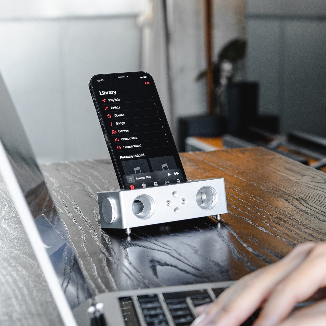
That gap is exactly what Awekeys Air is designed to fill. These are low-profile metal keycaps built from recycled cupronickel, a copper-nickel alloy most people know from coins rather than keyboards. Beyond the material upgrade, there is an immediate visual payoff. A set of Satin Copper or Satin Gold caps on a slim board transforms what was previously just a functional object into something that actually improves the desk around it, the kind of detail that catches the eye mid-conversation and holds it.

Designer: Awekeys

Click Here to Buy Now: $99 $169 (41% off). Hurry, only a few left! Raised over $97,000.

At 5 mm tall, the Awekeys Air is half the height of a standard keycap, which typically sits at around 11 mm. That gap matters more than it sounds. A slim keyboard paired with standard-height keycaps loses its whole visual argument, and any ergonomic board designed for low-profile switches defeats its own purpose if you pile taller caps on top. The Air keeps that geometry honest while upgrading what that geometry is made of.

As someone who writes for a living and codes on the side, I see the keyboard as less a tool and more a constant physical companion, and the I find that the Awekeys Air shifts that relationship in a way that is difficult to ignore. The cupronickel surface stays cool under extended sessions, the low profile keeps wrist angle natural, and the grip from the hand-brushed Special Edition means fingers land where they are meant to, without any of the slight drift that smooth plastic encourages over a long afternoon.

Finish is where the Awekeys Air earns a lot of its character. Seven keycap colorways cover the satin-style options: Satin Gold, Satin Silver, Satin Copper, Titanium Black, Obsidian Black in matte, Ivory White in matte, and Sakura Pink. Each of them reads differently on metal than on plastic. Satin Copper picks up warm ambient light in a way no dye-sublimated PBT can replicate. Titanium Black has that flat, composed surface that makes a keyboard look more like a precision instrument than a peripheral. Small distinctions, but they add up when the whole point is a desk setup that looks as considered as it feels.

The Special Edition hand-brushed finish takes things a step further, available in Gold, Silver, Copper, and Ti Black. Each keycap is brushed individually, which creates a directional texture that shifts under light and adds a grip that the satin versions do not have. It is the kind of finishing detail that is easy to overlook in a product photo and immediately obvious the moment you sit down to type.

Holding it all together is a second-generation nano-coating that Awekeys claims delivers twice the scratch resistance of its first version. For keycaps that will see thousands of actuations daily, surface protection matters more on metal than on plastic, where wear is expected and mostly forgiven. The coating is what keeps the finish consistent across the whole set over time, and on a metal that is this unforgiving of surface variation, that consistency is doing real work.

The recycled angle is worth taking seriously, too. Awekeys notes that processing recycled cupronickel requires roughly 15% of the energy needed for raw metal extraction. giving the material story a logic beyond a simple badge. The acoustic character completes the picture: denser, more planted, with a sound that leans satisfying rather than sharp. The slim keyboard has been waiting a long time for a keycap set built to match it, and the Awekeys Air makes a strong case that the wait is over.

Click Here to Buy Now: $99 $169 (41% off). Hurry, only a few left! Raised over $97,000.

The post Someone Finally Made Metal Keycaps for Low-Profile Keyboards first appeared on Yanko Design.
LEGO Gave Away This Record Player Set: Now It Sells for $50

There’s a certain kind of person who loves the idea of vinyl records without necessarily owning a turntable. They appreciate the artwork, the ritual of flipping a side, the warm analog aesthetic that streaming services have spent years trying to replicate with album art thumbnails and animated soundwave graphics. For that person, and honestly for plenty of actual vinyl collectors too, LEGO quietly released one of its more charming sets of 2024, and a lot of people missed it entirely.

The LEGO 40699 Retro Record Player wasn’t sold in stores. It was a gift-with-purchase exclusive during LEGO Insiders Weekend in November 2024, meaning you had to spend $250 or more on LEGO.com within a two-day window to take one home. That’s a steep entry point for a 310-piece set that fits in the palm of your hand. Unsurprisingly, it’s now showing up on secondary markets for around $50, which tells you more about how people actually feel about it than the promotional circumstances suggest.

Designer: LEGO

What makes it interesting as a design object isn’t the scarcity. It’s the details LEGO chose to include for a freebie that most buyers would have been happy to receive with far less effort. Every single element in the set is printed, no stickers anywhere, including new tile pieces featuring equalizer bars and musical note graphics that were debuted specifically for this set.

The needle swivels and can be tucked behind a small antenna piece when not in use. Flip it around, and there are printed red, white, and grey ports on the back representing stereo channels, details that nobody asked for and that audio enthusiasts will immediately clock. A hidden gear underneath lets the record actually spin, which is either a delightful touch or a reminder that LEGO designers genuinely cannot help themselves.

The set slots into a growing line of brick-built nostalgia objects LEGO has been developing with some consistency. The Retro Radio, the Typewriter, the Polaroid OneStep Camera, each one picks a specific object from cultural memory and asks whether it still means enough to someone to sit on a shelf. The record player fits that pattern, though its scale is more playful than faithful. Closed, it measures about 1.5 inches high and 6 inches wide, so it’s not pretending to be a replica. It’s more like a knowing nod to the thing, compressed into something you can place next to a real turntable or a stack of records and let it be what it is.

The timing of its renewed attention is interesting. Search interest in record players has spiked noticeably in early March 2025, and the LEGO set has moved with it, picking up momentum in trend data well after its promotional window closed. That’s a pattern worth watching with this category of LEGO set. They’re not designed to chase a specific cultural moment. They’re designed around objects durable enough in people’s memories to stay relevant across multiple ones.

Whether a 310-piece brick turntable that doesn’t play music belongs in the same conversation as the real vinyl revival is a fair question. What’s harder to dismiss is that a set distributed as a promotional freebie is generating genuine collector interest months later, and that LEGO apparently left enough room in the design for people to discover details they weren’t expecting to find.

The post LEGO Gave Away This Record Player Set: Now It Sells for $50 first appeared on Yanko Design.
This seahorse-inspired game controller concept is made for smaller hands

Game controllers have not changed much in shape since the mid-1990s. They’re still two-handed symmetrical slabs built around adult grip dimensions, loaded with enough buttons to pilot a small aircraft. For a 10-year-old just getting into gaming, picking one up for the first time is a bit like being handed a TV remote and told to perform surgery, no sweat.

The concept is called LEVION, and it proposes a split controller: two separate units, one per hand, each sized for a pre-teen’s palm. It was designed as a rethink of the thumb stick from scratch, and the result looks like nothing in the current gaming peripheral market, which is mostly the point. And its inspiration comes from the most unlikely source you can imagine.

Designer: Vedika Bapat

The form comes from a seahorse, specifically its upright posture, curved spine, and ridged body. Those horizontal ridges, translated into a soft frill around the base of each unit, are the structural logic of the grip. A seahorse’s bony plates give it stability without bulk, and LEVION’s ridges do the same thing for a small hand holding a rounded object across an hour of gameplay. It’s biomimicry that connects cause to effect rather than borrowing a shape for decoration.

Each unit carries a joystick, three face buttons, and a shoulder button, arranged on a circular head that sits atop a curved hourglass body. The silhouette is wider at the head and base, pinched at the waist, giving the thumb a natural landing zone and keeping the unit from rotating mid-game. The sketch process started with a seahorse drawing annotated “grip inspiration” before moving through VR console proportions to arrive at this form, so the shape isn’t just decorative shorthand.

The colorways lean into the pre-teen audience: pink, mint green, sky blue, and lavender, all in a soft matte finish that reads more like a toy than a peripheral. That positioning is deliberate. Standard controllers signal seriousness and capability. LEVION signals approachability, which matters when the target user is still sorting out that the left stick moves the character and the right one moves the camera.

The honest question is one of input coverage. A standard PlayStation controller has two joysticks, a D-pad, four face buttons, four shoulder buttons, and several system controls. LEVION offers a joystick, three face buttons, and one shoulder button per hand. For casual and younger audiences, that might be exactly right. For anything more demanding, the math gets uncomfortable, and the concept doesn’t address how that gap closes when the pre-teen turns 13.

That’s worth taking seriously, but it doesn’t diminish what LEVION gets right in the space it occupies. The design’s own research board lists the Nintendo Switch Joy-Cons as a reference point, and the parallel is fair: the Joy-Con also split a standard controller into two smaller units and found an audience that didn’t know it needed that format. LEVION asks the same question one step earlier in the age range, in a form that a kid might actually want to reach for.

The post This seahorse-inspired game controller concept is made for smaller hands first appeared on Yanko Design.

$130 Charger Turns 3 Nightstand Cables Into One Folding Pad

Most people who own an iPhone, an Apple Watch, and AirPods have quietly accepted the nightstand situation: three cables, two adapters, and a general sense that none of this should be as complicated as it is. The chargers come off the desk in different orders every morning, find their way into bags, and somehow never make it back to the same spot twice. Journey’s ARIA 3-in-1 Wireless Charging Station is built as a direct answer to that arithmetic problem.

The ARIA is Qi2-certified and Made for Apple, which places it in a fairly short list of chargers cleared to deliver the full 15W to an iPhone 12 or newer. That Qi2 certification also means magnetic alignment is built into the standard, so the phone locks into position rather than needing to be nudged around until the charging indicator finally appears. It is a small difference that makes the whole routine feel more deliberate.

Designer: Journey

Apple Watch gets fast charging as well, and AirPods charge at up to 5W, all three running simultaneously from a single USB-C cable. That consolidates the whole power situation down to one cord running to one spot on the desk. One honest caveat: a 30W adapter is recommended for full performance but does not ship in the box, something worth factoring into the price tag before deciding how good the value proposition really is.

What separates the ARIA from a flat charging pad is a folding mechanism that gives it a second mode entirely. Lay it flat, and it works as a compact 2-in-1 pad, 16 cm long and under 2 cm thick, low-profile enough to disappear into most desk setups without demanding attention. Pop open the phone section, and it props the device up at just over 70 degrees, in either portrait or landscape. The transition takes about two seconds.

That dual-mode flexibility becomes more interesting when packing a bag. At 230g and folded down to 19mm, the ARIA fits into a Dopp kit without the usual negotiation over whether the gadget justifies the real estate. A magnetic alignment ring is included in the box for non-MagSafe phone cases, extending compatibility without requiring a case swap or any real effort.

Qi-enabled Android phones also work in flat mode, though at the reduced speeds their hardware supports rather than the full Qi2 ceiling. The ARIA handles international voltages from 100 to 240V as well, which means it travels without issue as long as you bring your own wall adapter and plug converter for the destination. For a device that sells itself on travel readiness, the missing adapter in the box still stings a little.

There is also a touch-controlled ambient light built into the base. A single tap produces a soft glow that works well at a bedside without flooding a dark room, and it beats reaching for a phone screen at 2 a.m. just to orient yourself. Small features like this tend to matter more in practice than they look on a spec sheet.

The post $130 Charger Turns 3 Nightstand Cables Into One Folding Pad first appeared on Yanko Design.

Satechi Just Replaced 4 Travel Accessories With One Folding Stand

Packing a bag for a day of working away from a desk has become its own logistics puzzle. There is the hub for ports, the stand to prop the screen at a usable angle, the card reader for importing photos, and the charging cable to keep everything alive mid-session. Satechi’s OntheGo Foldable Stand Hub takes a direct swing at this by combining all of that into a single unit that folds flat to under 20mm and weighs just 187.5g.

The premise is simple. Unfold the stand, plug the attached 17 cm USB-C cable into a tablet or laptop, and the whole suite of ports is live: HDMI 2.0 output at up to 4K@60Hz, two 10 Gbps data ports (one USB-C, one USB-A), UHS-II SD and microSD slots at up to 312 MB/s, a 3.5mm audio jack, and 100W USB-C Power Delivery passthrough. That last feature delivers up to 85W to the host device, enough to sustain a MacBook Air or iPad Pro under a heavy session without draining the battery.

Designer: Satechi

For photographers working on location, the card slots alone justify the bag space. Slide in a UHS-II SD card fresh from a camera, and the 312 MB/s ceiling means a full card of RAW files clears quickly. Connect a monitor through the HDMI port, and a hotel desk becomes something closer to a proper edit station, with the screen raised to a natural viewing height and footage already importing in the background.

Compatibility covers the expected range: iPad Pro, iPad Air, iPad mini (2021 and later), and recent iPhones. Worth noting: the iPad mini (2021) tops out at 5 Gbps on the data ports due to its own USB spec, not the hub’s. Outside of Apple’s garden, it also supports select Microsoft Surface Pro models and USB-C Android devices, especially ones that support Samsung DeX.

That last point is an important one. A compatible Samsung phone connected to an external monitor through this hub activates DeX mode, turning the phone into a desktop-style interface without needing a laptop at all. That said, you’ll need to hook up an external monitor to actually activate DeX mode.

At $79.99, the OntheGo Foldable Stand Hub sits in a space where stands and hubs are almost always sold separately, each typically running $30 to $60 on their own. What a spec sheet cannot answer is how the folding hinge holds up after months of daily packing and repacking, and whether the fixed 17cm cable length plays nicely with every desk configuration or occasionally creates its own awkward workarounds.

The post Satechi Just Replaced 4 Travel Accessories With One Folding Stand first appeared on Yanko Design.

Carrying a USB-C Hub and SSD? ADAM elements Hub S Does Both

Modern laptops aren’t short on power, but they’re increasingly short on ports. One USB-C port ends up doing everything: charging, video out, storage, and peripherals, while a small pile of adapters accumulates next to the keyboard. The setup works, but it doesn’t look like the clean, minimal desk you were going for, and it means carrying more pieces than you’d like when you’re working somewhere that isn’t home.

ADAM elements’ Hub S is a USB-C hub with built-in SSD storage, designed around the idea that a hub and an external drive don’t need to be two separate objects. Instead of plugging in one thing for ports and another for files, you plug in one slim aluminum accessory that handles both. It isn’t trying to replace a full docking station, but it’s the right-sized tool for someone who needs the essentials covered without the clutter.

Designer: ADAM elements

Click Here to Buy Now: $69.30 $99 (30% off, use coupon code “30YANKOHBSN”). Hurry, deal ends in 48-hours!

The built-in SSD is available in 240 GB, 480 GB, and 960 GB capacities, so there’s a size for whether you’re keeping a working project library or just enough space for recent shoots and backups. Having storage physically attached to your hub means it’s always there when you need to dump footage, move large project files, or keep a client’s assets close during a session, without remembering to pack a separate drive.

Transfer speeds are rated at up to 520 MB/s read and 456 MB/s write, which makes moving large files feel routine rather than something you schedule around. That kind of speed isn’t just a spec, though. It’s the difference between waiting through a transfer and forgetting it’s happening. For photographers and video editors working on the road, that matters more than it sounds on a product page.

For Mac users, the ADAM elements Hub S is also Apple Time Machine compatible. That means it can act as a rolling backup target every time you plug in, turning a habit that’s easy to forget into something that happens automatically. Backup isn’t exciting, but having it built into the same accessory you’re already using for everything else makes it feel less like a separate job.

The USB-C port on the hub supports PD 3.0 pass-through charging up to 60W, so your laptop doesn’t lose its charge while the hub is handling storage, display, and peripherals. That’s a meaningful consideration when you’re transferring large files and streaming to an external display at the same time, both of which can pull enough power to make a laptop feel like it’s running a sprint.

The HDMI port outputs up to 4K at 30Hz and supports HDCP 2.2, which is the protocol required for streaming 4K HDR content from services like Netflix. A lot of hubs advertise “4K output” but fail on DRM handshakes, so the HDCP 2.2 compliance isn’t a minor footnote. Whether you’re mirroring for a presentation or extending to a monitor for a proper editing session, the connection holds up where it matters.

Rounding out the port selection is a USB-A 3.1 port rated at up to 5 Gbps for peripherals or flash drives, and a 3.5mm headphone jack that supports 48kHz/16-bit audio. Neither is glamorous, but together they cover the inputs that would otherwise require yet another adapter. The aluminum alloy body is designed to sit flush on a desk surface, and the whole thing weighs about 2.5oz, roughly the weight of a single C battery.

The ADAM elements Hub S works best as the kind of accessory you stop thinking about. You plug it in, your files are there, your display is connected, your laptop is charging, and your headphones are plugged in. That’s it. For people who’d rather carry one considered piece of hardware than a small collection of adapters and drives, consolidating all of that into a single slim object that fits in a jacket pocket feels like the more sensible way to work.
Click Here to Buy Now: $69.30 $99 (30% off, use coupon code “30YANKOHBSN”). Hurry, deal ends in 48-hours!

The post Carrying a USB-C Hub and SSD? ADAM elements Hub S Does Both first appeared on Yanko Design.