Motorola Edge 50 Neo leak shows off Pantone colors and minimalist design

Smartphone brands have thankfully become more conscious of the design of their phones, or at the very least are now talking more about that aspect of the product. Not everyone gets it right, of course, especially if you look at some of the ginormous camera designs on phones these days. Once in a while, though, you come across a design that still delivers the promise of powerful cameras without being as in your face as their other kin. This year, Motorola’s Edge 50 series seems to have hit the target with a smooth and elegant minimalist design, as shown by leaked images of the upcoming Motorola Edge 50 Neo. Strangely enough, it calls to mind a design that we actually liked and wished stuck around longer.

Designer: Motorola (via Evan Blass/evleaks)

In 2022, we reviewed the OPPO Find X5 Pro which seemed to defy convention with a rear design that ditched the usual metal island that surrounded smartphone cameras. Instead, it used a gentler, curving slope that looked distinctive, less noisy, and more elegant, but it sadly didn’t last more than that year’s OPPO flagship. Whether by coincidence or by design (pardon the pun), it’s like that aesthetic has suddenly resurfaced where we least expect it.

A serving of official-looking renders reveals the design of the Motorola Edge 50 Neo or at least its back, and we can’t help but get a sense of deja vu. Not that we’re complaining, since it’s quite a striking and unusual appearance, and it’s not even limited to this particular model. All members of the 2024 Edge 50 family bear this same design language, including the Motorola Edge 50 Fusion with only two cameras on its back.

Also like its other siblings, the Edge 50 Neo is Pantone-certified, a mark it bears proudly as well. This particular model will come in four color options: Grisaille (Gray), Nautical Blue, Poinciana (Red), and Latte (Beige). The images also suggest that the phones will bear the same textured material on their back, which not only gives them a luxurious feel but also improves their grip.

Other than these visual details, however, not much is known about the Motorola Edge 50 Neo just yet. It will have three cameras, and it might follow in the footsteps of the base Edge 50 model with a 50MP main camera, a 10MP 3x optical zoom telephoto camera, and a 13MP ultra-wide shooter. But as beautiful as this phone looks, consumers might end up a little bit confused as there will be not only two, not even three but four Motorola Edge 50 models to choose from when the “Neo” finally launches.

The post Motorola Edge 50 Neo leak shows off Pantone colors and minimalist design first appeared on Yanko Design.

Tilting water cup concept gets you to drink more water by scaring you

We all know how important water is to our health, but simply knowing those facts doesn’t immediately translate to action. Most of us simply forgo drinking water until we feel thirsty or when it’s time to eat, even though we actually need to hydrate regularly throughout the day. It’s easy to forget to do that in during the busy day, and it’s also just as easy to snooze or skip alarms you set to remind you. You wouldn’t be so complacent, however, if your water cup or tumbler is fated to fall over unless you drink water at the right time, and that’s somewhat the kind of scare tactic that this concept device employs to try to get you to drink water more regularly.

Designers: Yuxiong Dong, Yaoxin Cai, Yongde Zhu, Kang Han

No, the cup thankfully doesn’t actually threaten to spill your water if you don’t rush to catch it, but it makes you think the tumbler will indeed tumble over if you don’t. It only tries to make you stand up and make the effort to walk to the device, presuming you put it far from your desk. The way this tilting water cup works is a mixture of simple mechanics and psychology, though some will probably have doubts about the efficacy of the latter.

The design is made up of two parts, the actual cup that holds the water and the base that does the mind trick. You simply put the cup of water on top of the base, turn the ring on the base to set the timer, and then go back to what you were doing. Once the timer runs out, an alarm presumably sounds and the surface of the base where the cup rests begins to tilt, forcing you to rush to its side and pick up the cup. And since you’re already there anyway, you might as well drink the water from it, which is the whole point of this rather odd system.

Of course, the cup won’t actually fall off since it’s magnetically attached to that base. The question is whether the contents will start spilling at that angle, so you might have to make sure not to fill it up in the first place. You might also wonder if it will be difficult to pick up the cup from the base considering it has to be held by strong magnets to prevent it from slipping when it tilts.

The biggest concern, however, will be whether the strategy actually works. It might be effective for the first few times, but once your mind has adjusted to it, it won’t be so easily tricked again. At that point, you might very well start ignoring it, too, just like those alarms and reminders, turning the titling water cup into an odd but pointless design.

The post Tilting water cup concept gets you to drink more water by scaring you first appeared on Yanko Design.

Cardboard planks create an atmospheric lamp set that pays tribute to dusk

There are many metaphors and analogies related to dawn when the rising of the sun is often compared to new beginnings or opportunities to begin anew. Dusk, however, is just as magical a time as its polar opposite, when the light of the sun is all but spent but lingers every so briefly before giving way to the restful night. For many people, it is a calming moment that signals the end of a busy day and the start of a period of reflection and peace. That is the soothing atmosphere that this set of mood lamps tries to convey, and they do so in the most minimalist way possible using nothing more than a few pieces of regular cardboard.

Designer: Óscar Santos

Cardboard is a material that’s so common that it’s too easily taken for granted. It’s stiffer than paper but less durable than wood, so it’s often used for packaging that’s meant to just be thrown away. It’s a complete waste, of course, especially when the pieces of cardboard are still pristine, but there are few known uses for them outside of breaking them down and recycling them like paper, which also consumes water and energy. Fortunately, there are also a few creative souls who want to give cardboard a chance, like this collection of lamps that take advantage of cardboard’s natural properties.

CENIT, which means “zenith” in Spanish, is a group of three atmospheric luminaries inspired by the highest point of the sun just before nightfall, the dusk that heralds the transition of light into darkness. Rather than use a light source that has to be mixed with the right color temperature in intensity, these lamps simply rely on how cardboard actually naturally reflects and diffuses light in a warm tone and soft brightness. No additional parts are needed, no filters or other materials: just a normal white LED strip and two pieces of cardboard with a certain gap between them.

This super-simple configuration creates an equally simple design that makes it easy for CENIT to blend almost anywhere. The wall lamp is just two long capsule-shaped pieces of cardboard with the larger serving as the base and the smaller hiding the light elements behind it. The desk lamp is a bit more decorative, with the two pieces set on a rectangular stand. On the other hand, the pendant light offers more flexibility, as the smaller cardboard with the LED or bulb can be turned to face away from the other cardboard piece and toward any area that needs more direct and brighter illumination.

The minimalist design also makes the lamps very sustainable, replacing only the parts that get worn down or broken. Given how many cardboard boxes are discarded every day, there will be no shortage of materials to use for replacements or new lamps. It’s a very interesting and poetic design that is able to set the mood and atmosphere in a room almost like magic, just as dusk paints the sky with an enchanting hue before the mystical darkness of the night sets in.

The post Cardboard planks create an atmospheric lamp set that pays tribute to dusk first appeared on Yanko Design.

Robot dog with wheels for feet can climb stairs and fences, do tricks

Boston Dynamics’ nightmarish BigDog is finally behind us, but that doesn’t mean we’re past seeing visually headless robot dogs every now and then. Spot has become the blueprint for these smaller and more agile quadruped machines and, to be fair, it has led to quite a few interesting designs and useful applications. Despite that, there are still a few design issues that need to be addressed, particularly when it comes to the robot’s mobility on any terrain or elevation, especially stairs and fences. That’s the kind of puzzle that this new quadruped robot is solving, ironically with wheels instead of flat feet, and it’s starting to behave almost like a stereotypical dog when it comes to climbing over things it probably shouldn’t.

Designer: Unitree

It sounds almost counter-intuitive to put wheels on a robot’s feet to help it move better, but that’s exactly what will make the Unitree Go2-W a head-turner. Technically, those wheels allow it to move anywhere, practically like an all-terrain four-wheel drive, rolling over smooth floors, rough roads, or inclined surfaces like ramps with precision and agility. But if you think those wheels will give it trouble on stairs, you definitely haven’t been paying attention.

Going up any stairs is no sweat off its non-existent brow, as not only can it lift its feet like a normal (robot) dog, but the wheels actually give it a leg up, pardon the pun. The wheels not only give it a bit more grip but also help boost it up by rolling up on the vertical edge of the stairs. Like with organic dogs, going down stairs or from high places is naturally easier, just rolling off the steps or simply falling off the edge and bouncing back up.

What makes the Go2-W even more special is its ability to climb over fences, almost like a real, naughty dog. It stands on its two hind feet to prop itself on top of the ledge with its front legs. It then uses those rear wheels to hoist itself up, and it’s quite cute to watch it struggle a bit, again like a real dog.

The Unitree Go2-W can do one other trick that almost no other robot dog can. It can do “handstands” and, of course, roll around upside down on its front “feet.” These are definitely impressive abilities, though some will question their practical use. The proper accessories could help the headless dog explore places that are too dangerous for humans to deliver payloads or simply analyze the area. And no one will probably mind being able to teach the dog new tricks, presuming you don’t get too uneasy with such robot dog designs.

The post Robot dog with wheels for feet can climb stairs and fences, do tricks first appeared on Yanko Design.

Xbox Sky Cipher Transparent Controller brings a touch of sustainability

Some might think of gamepads and game controllers simply as accessories, but just like keyboards and mice, their design can greatly affect the user’s enjoyment. It isn’t just about ergonomics and features, though those are definitely definitely critical elements to such a device. A controller’s appearance can also bring delight to the user, especially when it comes in a form that appeals to their aesthetic tastes or interests. That’s why there’s no shortage of controllers sporting designs from popular video game franchises, official or otherwise, or why Microsoft opened up an Xbox Design Lab to let gamers mix and match designs to their heart’s content. This new special edition Xbox Controller offers a more futuristic flavor that also cares for our planet’s future in its own small way.

Designer: Microsoft

There is no small amount of fascination with devices that have transparent shells. Although it only shows contemporary hardware and designs, it gives a window into those technological mysteries that make them feel a little futuristic. No group of people loves this aesthetic more than gamers, and the new Xbox Wireless Controller – Sky Cipher Special Edition gives that feeling many will enjoy, at least if they’re fans of azure hues.

The controller might be blue, but it is far from looking sad. Unlike previous transparent Xbox controllers, Sky Cipher gives a complete and clear view of the device’s innards, at least from the front. Many of those internal parts are given a metallic silver sheen to make them really pop out and add to that futuristic flair. Unfortunately, the back of the controller is completely opaque, which is probably for the best since it has rubberized grips that would look unattractive on a transparent surface.

There are, of course, opaque parts in front as well, but this special edition manages to make them a bit more visually interesting. The triggers and D-Pad, in particular, have a metallic quality to them, which, alongside the silver internals, give the controller a more mechanical personality. It’s like a prop from some sci-fi show that would be used to control giant robots, ships, or drones. Presuming those machines of the future would have such a primitive mode of control, of course.

The Xbox Wireless Controller – Sky Cipher Special Edition is forward-looking in more ways than one. It is the first of its kind to use more environment-friendly packaging, one that completely removes single-use plastics from the box. It even saves paper by ditching the manual for a QR code, since gamers are more likely to go for electronic and online documentation anyway. The controller itself is, of course, still made from plastic anyway, but Xbox is hopefully inching slowly towards a more sustainable design for the true futuristic vision.

The post Xbox Sky Cipher Transparent Controller brings a touch of sustainability first appeared on Yanko Design.

Nothing Phone (2a) Plus Review: It Keeps Getting Better

PROS:


  • Elegant transparent design and Glyph Interface

  • Improved performance across the board

  • 50MP selfie camera

  • Sustainabile design

CONS:


  • No telephoto camera

  • No wireless charging

  • Spotty operator compatibility in the US

RATINGS:

AESTHETICS
ERGONOMICS
PERFORMANCE
SUSTAINABILITY / REPAIRABILITY
VALUE FOR MONEY

EDITOR'S QUOTE:

The Nothing Phone (2a) Plus delivers on its promise of an optimal and accessible daily driver that builds on the essentials and gets it almost perfect.

It hasn’t been that long since we reviewed Nothing’s latest masterpiece, the Phone (2a) which was designed to offer an “optimal” daily smartphone. It was another way of describing what most would bill as a mid-tier device, though it was definitely one that lived up to its hype in both design and performance. It was far from perfect, of course, but it wasn’t bad either. And yet here we are now with a “Plus” version out of nowhere, not a larger version but one that promises a more premium experience, at least compared to the Phone (2a). Color us intrigued, despite the obvious monochrome motif, so we gave the Nothing Phone (2a) Plus a few spins to see if it really has something to be proud of.

Designer: Nothing

Aesthetics

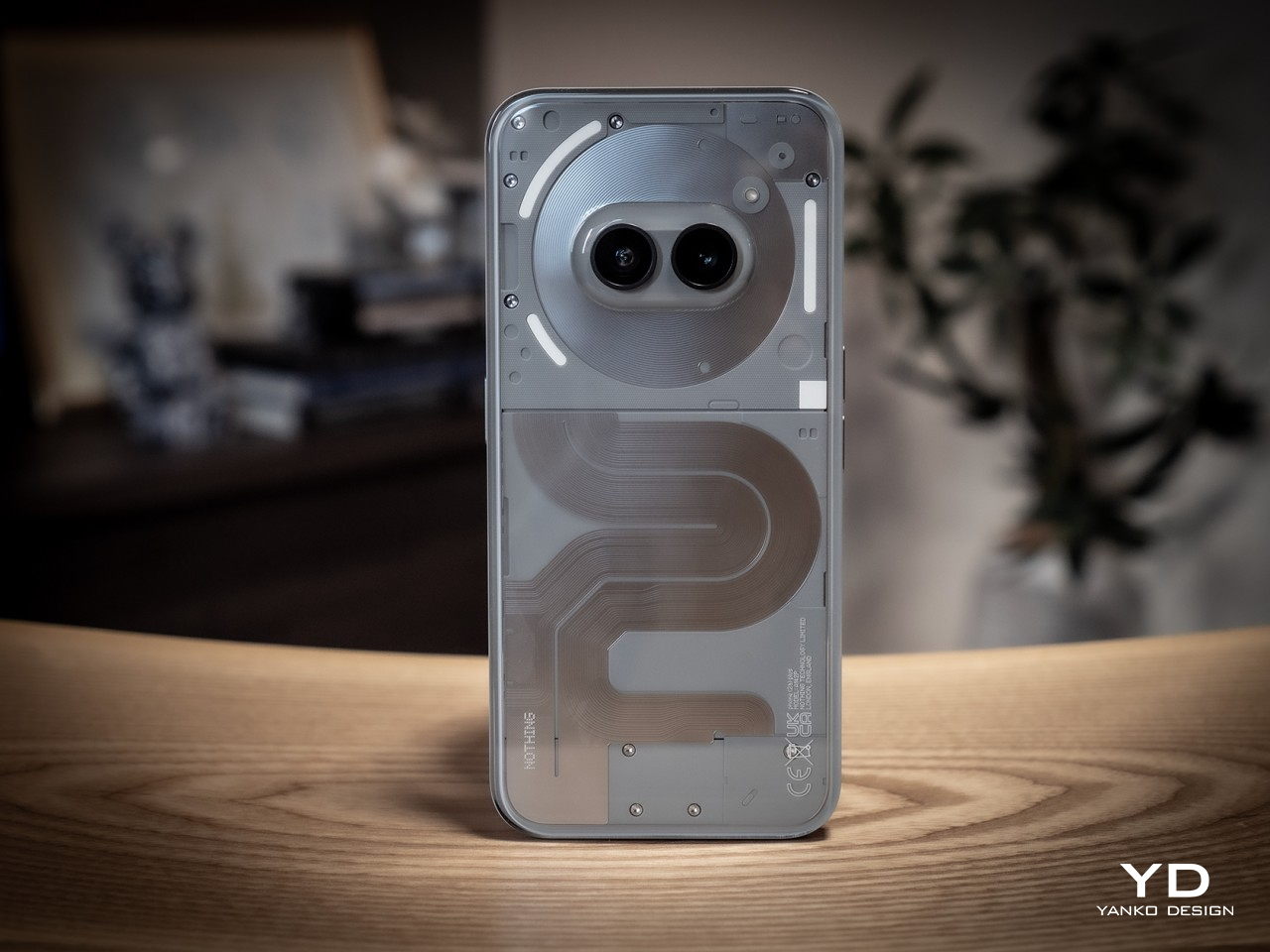
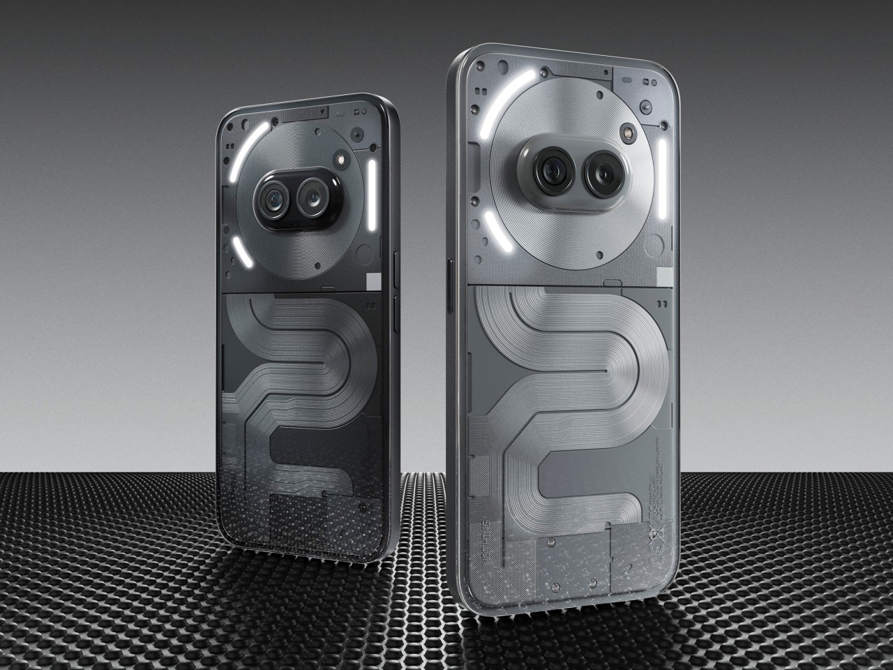
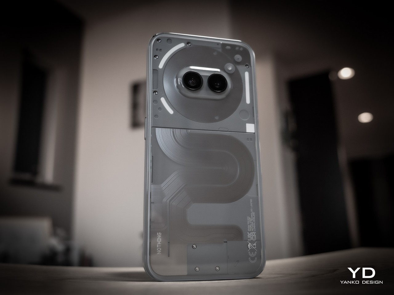
By now, Nothing’s design identity has been well established. It may not be the geeky full transparency many have hoped for, but it definitely managed to strike a beautiful balance between technology and art in its phones. To some extent, that design is even more refined in the Phone (2a) series, with its own unique patterns of opaque lanes snaking down the phone’s back, not unlike roads on a map. It feels like it has a story to tell, not just a composition of shapes, lights, and shadows.

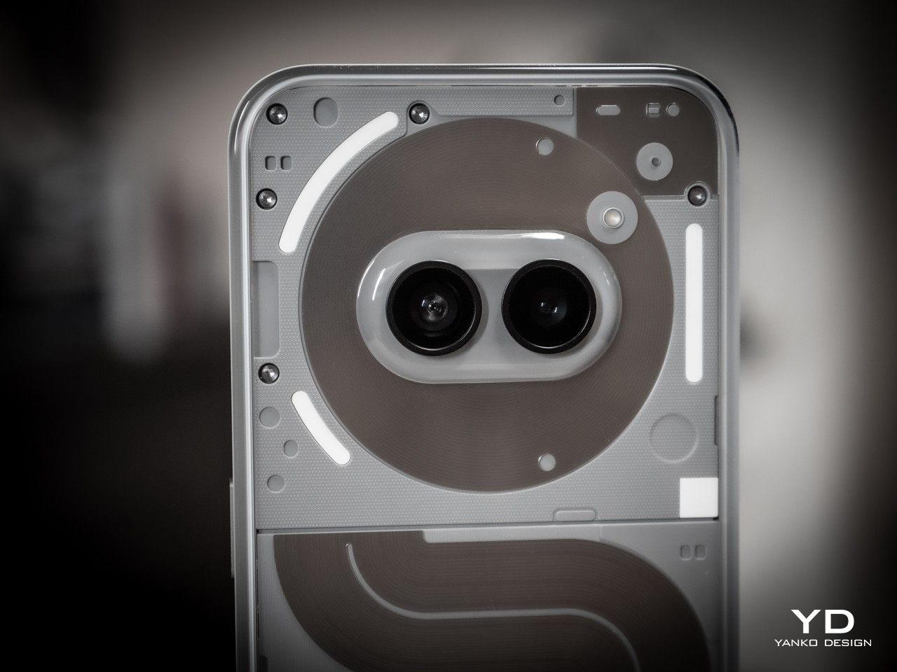
Nothing also embraced that cute little oddity we noticed on the Phone (2a): a face on the back of your phone. The placement of the two cameras in the middle of the NFC coil is no accident, and the company says it gives an anthropomorphic character, almost literally. It’s like having a pair of eyes on a cartoony circular face looking at you, or at least at the person in front of you. It is not by coincidence, either, that the Phone (2a) Plus’s silicon brain actually sits beneath this face as well.

There’s also the Glyph Interface, of course, at least the toned-down version. It might not have the same head-turning effect as the TRON-like Phone (2), but it’s more practical, more efficient, and also longer-lasting. It remains useful and visible even after the novelty has worn off.

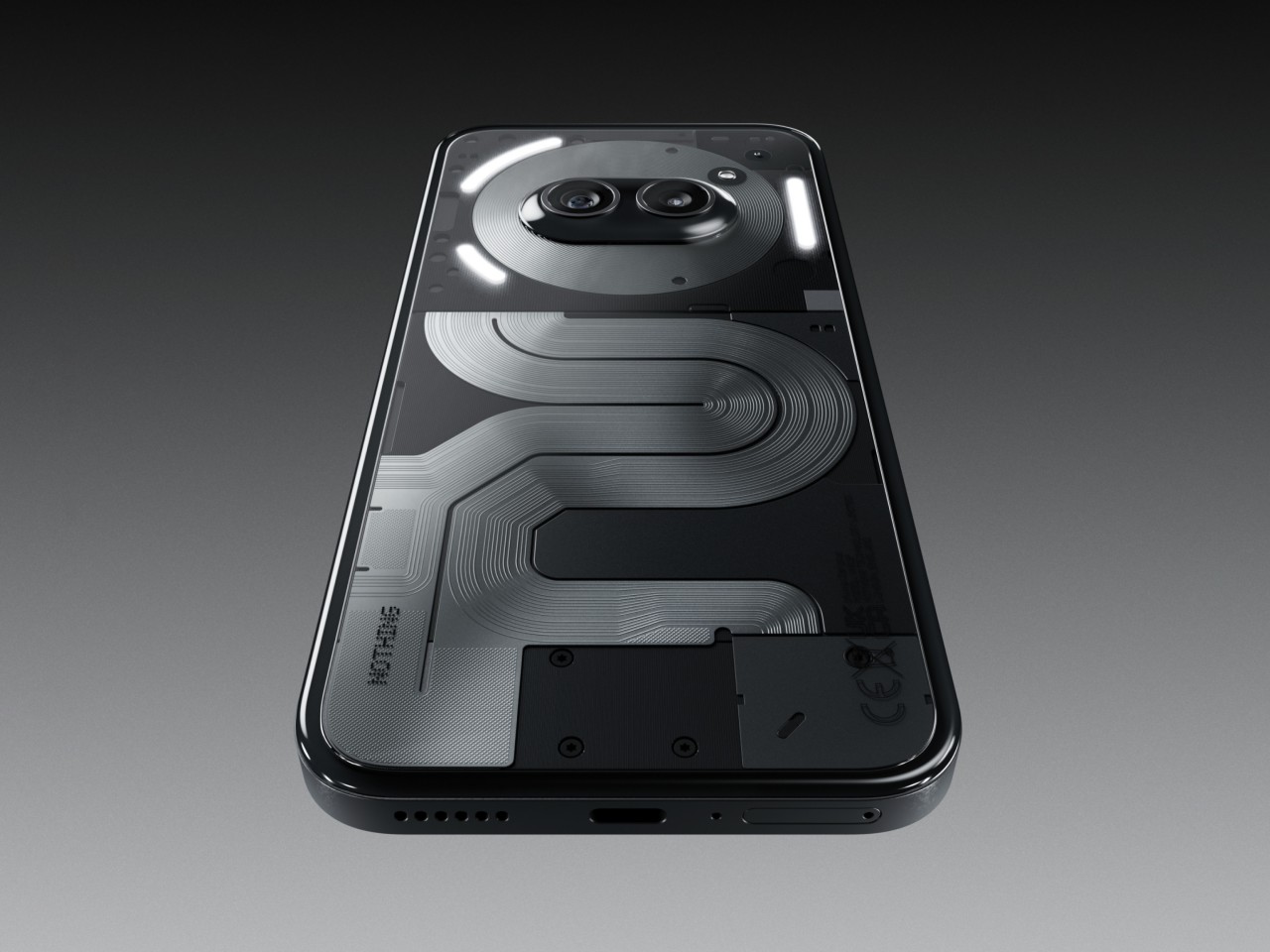
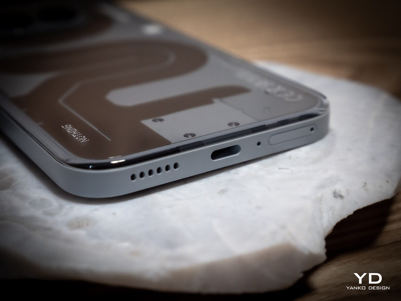
Of course, these are design elements that the Phone (2a) also has, but what sets the “Plus” model apart is its more elegant finish. The Phone (2a) Plus has a metallic edge that’s not simply machined and then polished but is actually a product of multiple intricate processes, which is to say it’s quite a laborious and somewhat costly design. It’s well worth it, however, if only for the fact that it gives the Nothing Phone (2a) Plus a more stylish and premium look that raises its profile to the same level as more expensive handsets.

Ergonomics

The Nothing Phone (2a) Plus has a few upgrades inside that we’ll get to in a moment, but despite the internal and material changes, it remains just as lightweight as the Phone (2a), exactly 190g light, in fact. This makes the phone incredibly easy to hold without feeling flimsy or cheap. That’s very important given how large the phone actually is.

The design of the edges also helps improve that grip. Nothing adheres to that modern flat design school that gives phones more angled edges that lodge themselves into your hand without biting into your skin. It is yet another balancing act that Nothing gets right, allowing users to hold such a big phone with confidence.

Performance

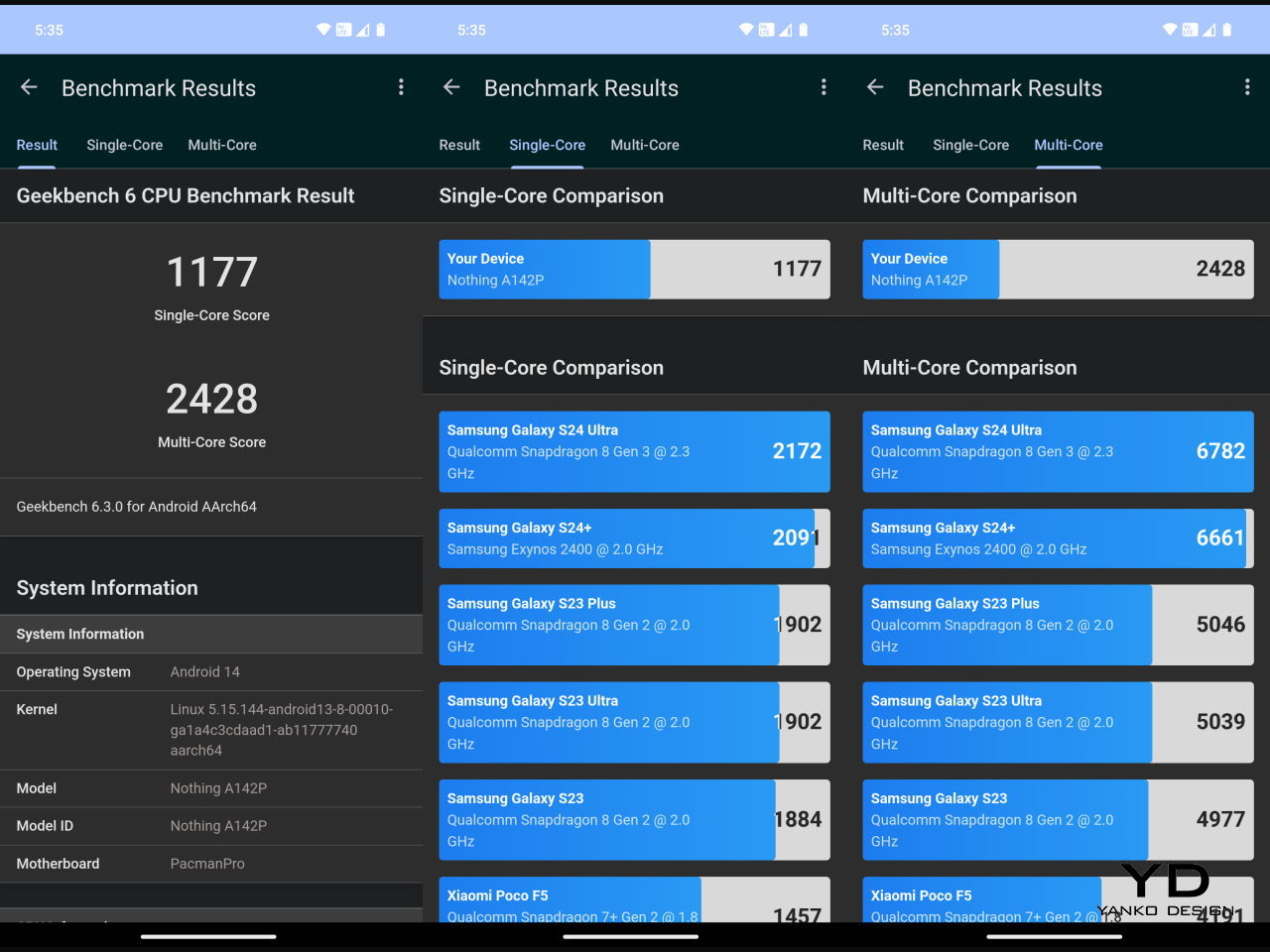
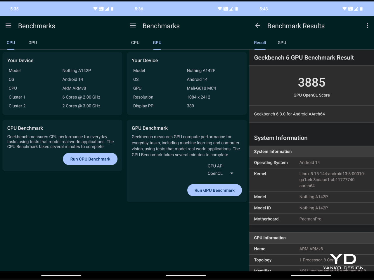
The biggest divide that separates the Phone (2a) and Phone (2a) Plus can be found inside, starting with the new MediaTek Dimensity 7350 Pro 5G that Nothing says was developed exclusively for the brand. It’s definitely a step up from the stock Dimensity 7200 of the Phone (2a), especially by the fact that it can run at 3.0GHz max. It also has a stronger GPU with the Mali-G610 MC4 clocked 30% faster at 1.3GHz. What all these mean in practice is that the phone is even better equipped to handle mobile games, let alone the everyday tasks you throw at it. You’ll still have to dial down the settings, of course, but not to the point that games lose their visual flavor and appeal.

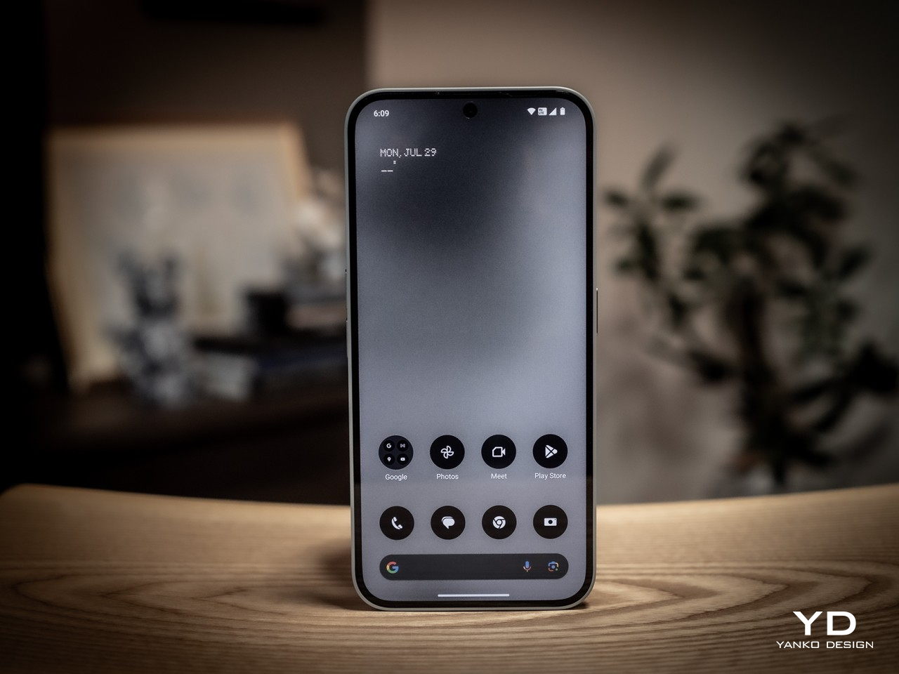
The large 6.7-inch FHD+ AMOLED screen definitely contributes to an enjoyable multimedia experience, especially with its 120Hz refresh rate. The display is vibrant and bright, but not so bright that it will strain your eyes. For that, it supports 2160Hz PWM (Pulse-Width Modulation) dimming, supporting longer screen time use, though it’s still advisable to take regular breaks, regardless.

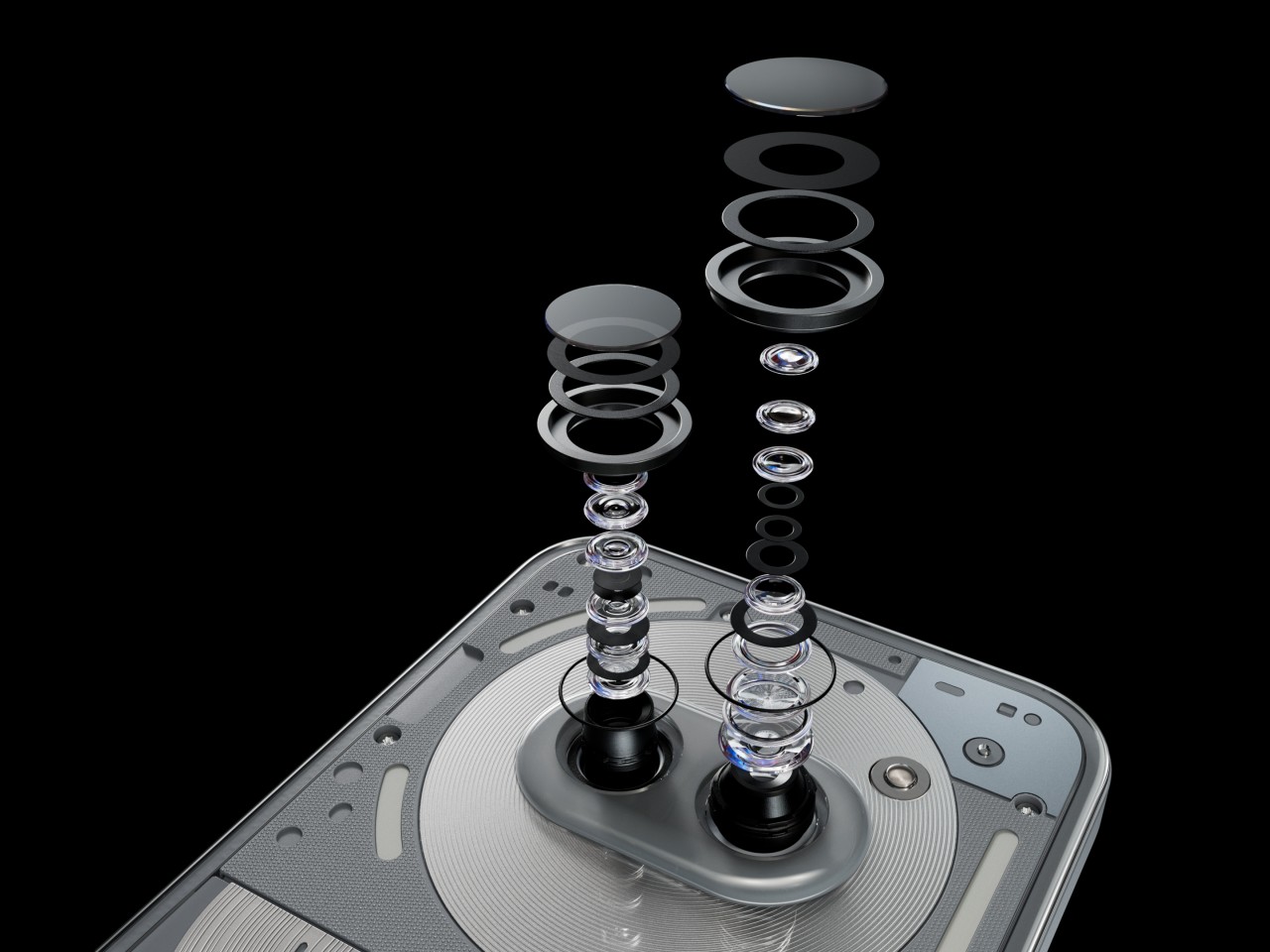
The other big upgrade that the Phone (2a) Plus boasts of is the triple 50MP camera system. No, there are still only two cameras on the back, and both definitely produce impressive output. The newcomer is the 50MP front-facing camera, up from the already good 32MP shooter from the Phone (2a). This is a Samsung JN1 with an F2.2 aperture lens and a wide 81.2-degree field of view. Suffice it to say, whether you’re taking selfies or food pics, you’ll be treated to clear, crisp, and detailed photos, even at night.

Despite the slightly more powerful hardware, the Nothing Phone (2a) Plus retains the same 5,000 mAh battery. It’s still a large and generous serving by today’s standards, so you shouldn’t be worrying about going empty in the middle of the day. For the Plus model, Nothing upped the charging speed a bit to 50W from 45W. It’s not exactly the fastest on the block, but bigger brands have done worse. Sadly, there’s still no wireless charging here, which is disappointing but not unexpected. In the grand scheme of things, that is probably the least of people’s needs for a phone on this tier.

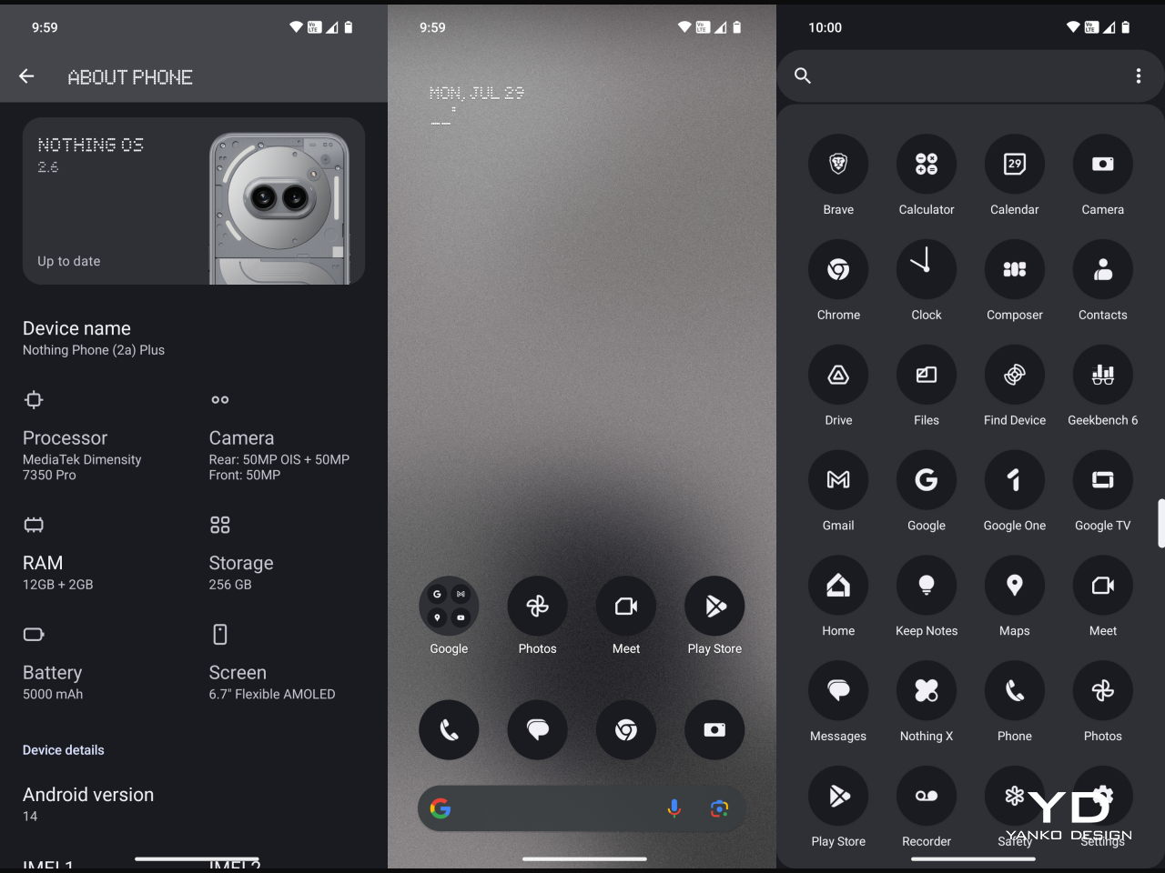
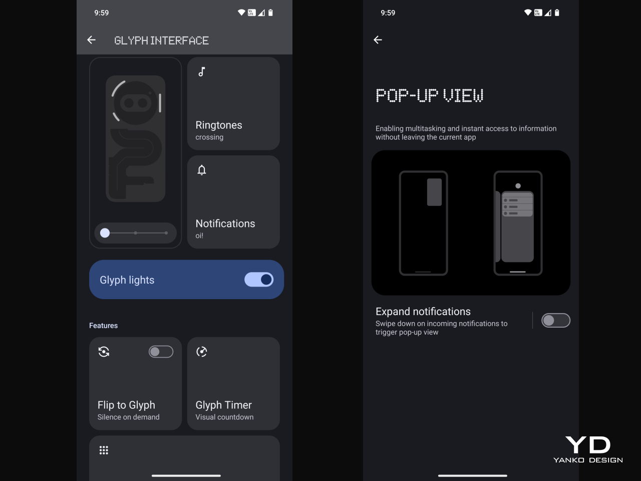
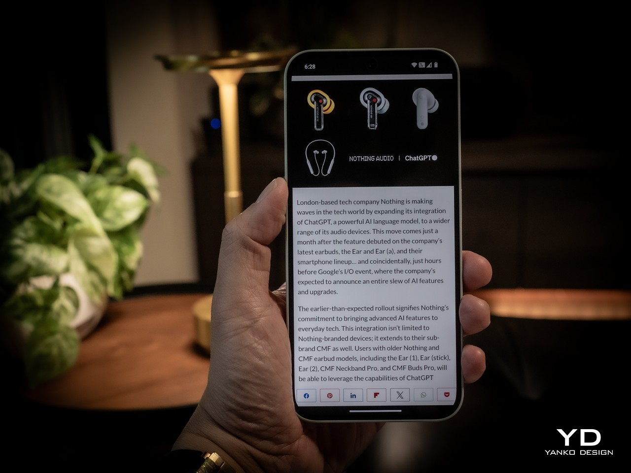
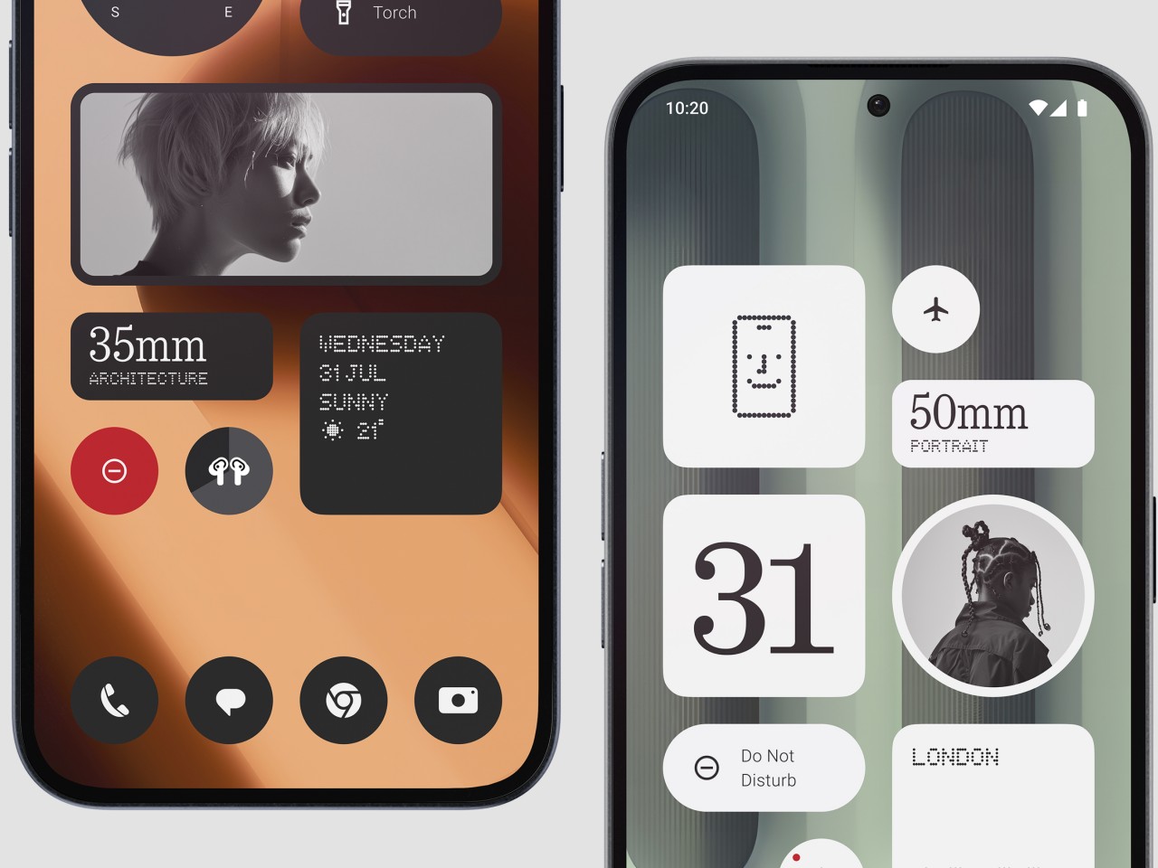
Part of the Nothing Phone’s appeal is its take on the Android experience, and the Phone (2a) Plus definitely has that down to a “T,” including the new AI buzzword. Nothing OS has been famed for its minimalist aesthetic, especially when it comes to home screen widgets. Version 2.6 adds new widgets to that set, and productivity buffs will love the new Date widget for important reminders. There’s also ChatGPT integration for getting the answers you need quickly, though it might be a controversial feature considering some privacy concerns.

Sustainability

Nothing has always positioned itself as a design-conscious company, and designers these days are also conscious of the impact that their designs have on the environment. This is especially true in the smartphone industry where material waste from production and electronic waste from discarded products continue to rise each year as more and more devices are made. That’s why it’s quite encouraging to see Nothing’s efforts in this area, from using 100% recycled aluminum for the midframe to sustainably sourcing over 50% of the Phone (2a) Plus’ plastic parts. It even reuses plastic waste from the production of the Ear (2) buds for this phone.

The Phone (2a) Plus also scores a few points for longevity, particularly with its IP54 dust and water resistance rating. We wish it had a longer software support period, which currently stands at 3 years for Android updates and 4 years for security patches. That can change somewhere down the road, and we hope it does. Where it doesn’t do well is repairability, which isn’t all that surprising considering its uncommon design. Nothing is still young, though, and with the CMF sub-brand, we could see some improvement in that regard as well.

Value

If the Phone (2a) already provided great value for its price, the Phone (2a) Plus takes that a step further. Better performance, a better selfie camera, a slightly faster charging battery, and a great distinctive design all make this handset a great sell. At only $399 for 12GB of RAM and 256GB of storage, it even practically makes the $349 Phone (2a) almost ignorable, strange as that may sound. It is definitely worth considering for your everyday driver, presuming you can get your hands on one.

That is the bit that slightly takes away some of the Phone (2a) Plus’ appeal. You can always import the phone if no local store or carrier offers it, but you will have to do your own research to make sure you can actually use it in your locale. In the US, for example, it doesn’t support AT&T’s 5G network at all and only some of T-Mobile’s 5G bands. Verizon has “limited support,” which means you can use it at your own risk. It’s hardly Nothing’s fault, but it does show some of the disadvantages of being a small fish in such a large pond.

Verdict

The arrival of the Phone (2a) Plus was quite a surprise. Definitely a pleasant one, but a surprise nonetheless. It’s not like the Phone (2a) wasn’t a good phone, but now there might be even fewer reasons for people to want one other than availability and that $50 difference. That’s because the Phone (2a) Plus practically addresses some of the imperfections of its older sibling without taking away any of its charm. It definitely lives up to its promise of a powerful everyday driver, whether you’re scrolling through social media, responding to emails, or even passing the time with games.

The post Nothing Phone (2a) Plus Review: It Keeps Getting Better first appeared on Yanko Design.

Office on wheels car concept lets you take your work anywhere

A large majority of future car concepts that we keep hearing about revolve around self-driving cars that seem to turn every ride into some sort of a party. You have people engaging with each other or at the very least kicking back to relax, idyllic situations that might not exactly match the priorities or needs. Rather than just chilling, some people might actually prefer to be able to work anywhere without having to race for an empty table or socket or, worse, bring a whole RV with them. This two-passenger car concept tries to envision a future where you can bring your office with you, including the comfortable furnishings that let you work productively. It even has room for a houseplant!

Designer: Amiparn Mudgal

This moving workspace is definitely not like any car concept you might have seen, even those that cater to having only two people inside. The body, or at least its bottom half, is more like an upside-down trapezoid and is very boxy and almost clinical in its shape. Of course, the chassis could be any form, including the smooth and sleek designs of luxury cars. That said, the core focus of the design is having enough space inside more than a fashionable style. After all, you are trying to fit an office inside.

The main mechanism that makes this possible is the sliding foldable seats. The passenger seat, for example, folds down and slides inside to get out of the way, while the driver’s seat can scoot over and turn around to face the front or the back of the car that are actually desks. This kind of design, unfortunately, means that only one person can actually be inside when the interior is in “office mode,” so your passenger might have to step out for a bit if they’re sticking around until after you’re done with your work.

Another key element to this rather unusual concept is the sliding tabletops that extend the working space that you have. There’s one in front on the opposite side of the steering wheel, while the one at the back transforms the rectangular desk into an L-shaped corner desk. Whichever way you turn, you’ll have all the table space you need for work, food, and maybe even playing.

One intriguing part of the concept is the idea of this moving workspace as a collaboration between a car manufacturer and a furniture company like IKEA, famed for its modular and flat-packed product. It applies accents and details that you’d rarely find in cars but are common in office furniture, like fabric-covered surfaces or wooden panels that act as tables. There will definitely be some who will scoff at the idea of bringing your work with you on your travels rather than taking a timeout, but there will also always be situations when you can’t afford that luxury and just need to park somewhere to get stuff done.

The post Office on wheels car concept lets you take your work anywhere first appeared on Yanko Design.

Eco-friendly tumbler uses thermoplastic made from unused wood byproducts

Coffee lovers have thankfully become more conscious of the harmful effect their drinking habit has, not on their bodies but on the planet. Plastic cups are the biggest culprits, of course, but even paper cups actually take a toll on the environment in the long run. Paper is sustainable and biodegradable, but the rate at which we manufacture the material is faster than we can grow trees to maturity. At the same time, normal wood isn’t exactly a good material for reusable cups or tumblers that are becoming the go-to solution for environment-conscious drinkers of coffee, tea, or water. This design concept tries to offer a middle ground with a seemingly magic thermoplastic tumbler that is actually made from unused wood.

Designer: Kim Jiwoo (Designer Dot)

Wood is a material well-loved by designers because of its innate beauty and sustainability. But while it does grow on trees, trees don’t grow overnight. And while there are alternatives that make use of recycled synthetic materials like plastic, these don’t easily decompose like wood, which can turn into material that nourishes the soil that trees grow on. In other words, wood is the perfect circular economy material, and it would be great if it could take on the beneficial properties of plastic as well.

CXP or Cellulose Cross-linked Polymer is that growing (no pun intended) solution that promises the best of both worlds. It’s made of wood, specifically the cellulose that is the building block of trees and plants, but it has also been plasticized through specific chemical processes that are fortunately easy to reproduce. Unlike bioplastics that need very specific conditions before they decompose, CXP behaves exactly like wood in this regard. In other words, once this tumbler has reached the end of its life, it can be even used to nourish the soil for other trees whose discarded wood will be used to make more thermoplastics.

LINK is the expression of this sustainability innovation, a tumbler that tries to signify the connection between humans and trees on multiple levels. Its handle is intentionally shaped like a branch sprouting from a tree trunk, sporting a length that is ergonomic for any hand size. The trunk, which is the main body of the tumbler, is also shaped with ridges that try to mimic the uneven surfaces of trees, while also adding to the grippiness of the container.

Unlike a regular wooden vessel, LINK can be used to hold hot beverages like coffee since it is also a conventional thermoplastic. Spills, leaks, and slips can be prevented by using eco-friendly silicone, perhaps the only concession to this design. And because of the very nature of such recycled materials, there will be very noticeable specks of color that give each tumbler a unique identity that represents its special link to all life on the planet through wood.

The post Eco-friendly tumbler uses thermoplastic made from unused wood byproducts first appeared on Yanko Design.

Self-driving pod helps mobility-impaired pedestrians cross dangerous roads

Plenty of new automotive technologies and concepts are naturally being made for the benefit of drivers and passengers, but they are supposed to also indirectly help pedestrians as well, at least in theory. With AI at the driver’s wheel, the promise of safer roads is being made, though we seem to still be far from achieving that ideal future. In the meantime, pedestrians crossing urban roads and highways are still at risk, especially the elderly, people with disabilities, and basically anyone who might not be able to cross fast enough before the light turns green again. Current solutions like footbridges are obviously not designed for these people as well, so this concept mobility device tries to take the fight to cars’ own turf by giving pedestrians their very own self-driving vehicle.

Designer: Jiseon Ju, Gawon Min

Roads are, of course, made for vehicles, and sidewalks and footbridges are for pedestrians. That said, there will always be places where these paths meet, appropriately called crosswalks, and people outside of vehicles are always at a disadvantage and at risk. Traffic lights seem to never give pedestrians enough time to cross safely, or make the presumption that everyone can walk at top speed, presuming they can walk at all. These systems are obviously not very accessible and alienate a large portion of the population, and it’s in dire need of a better and smarter solution.

Crosswalk Mobility is a concept for a cubicle on wheels that ferry people from one side of the street to another. It’s basically designed for people with mobility impairments, from the elderly to the injured. Given its enclosed design, it can also be used by parents with toddlers who are prone to suddenly running off while crossing streets. Of course, you can’t have a permanent driver for such a pod, so it naturally uses self-driving technologies to move.

What makes the concept even more interesting is that it works in conjunction with what should be a smart traffic system. In a nutshell, it communicates with traffic lights so that it can extend the red light duration until it safely reaches the other side. Ideally, traffic lights should allocate enough time for people to safely cross, but this system leaves nothing to chance.

The mobility device itself is designed to be powered using solar energy, ensuring its continued operations 24/7. Instead of regular wheels, it proposes using ball-type wheels that can turn more smoothly as needed. The boxy shape has spacious room even for people in wheelchairs and their companions, and the floor-to-ceiling glass panels increase visibility not only for drivers but also for the people inside. It’s definitely an interesting idea that will significantly increase pedestrian safety, but it unfortunately won’t work unless the traffic system on those roads is also upgraded to work with these self-driving boxes.

The post Self-driving pod helps mobility-impaired pedestrians cross dangerous roads first appeared on Yanko Design.

Hybrid watch concept puts a giant hole in the middle of a circular screen

Smartwatches are now a staple of the tech market14, but the departure of several high-profile brands and the arrival of smart rings are making some reevaluate the wearable device. Just like with paper notebooks, there is a strong and large culture around analog, mechanical watches that find smartwatches unappealing, except for some features that aren’t totally unique to smartwatches, namely, health sensors. Hybrid smartwatches exist for this reason, trying to have the best of both analog and digital worlds, but they are not exactly that common nor are their designs well-established. There’s still plenty of room for exploration and experimentation, like this rather peculiar concept that cuts out a whole in the middle of a circular screen to make room for an elegant analog watch.

Designer: Priyanshu Jaiswal

Inspired by the rather divisive notch or cutout on smartphone screens, the Lunar Eclipse hybrid smartwatch concept puts a mechanical watch in the middle of that hole instead of a camera. It might have been easier to have the display as an inset or restricted to a certain part of the watch face, but that presents some challenges as well, particularly when occluding the beauty of the analog timepiece itself. As weird as it may sound, this notch-based design actually has more benefits compared to a smartphone camera cutout.

Because it is technically still a complete screen, with just the middle part rendered practically unusable and invisible, it is theoretically easier to design the user interface of the “digital bezel” around the watch face. You can have icons and text that curve around the border, and you can even have them animated to add more natural-looking visual feedback, like how notification icons can appear like they’re flowing from the center of the watch rather than just appearing out of nowhere.

This gives Lunar Eclipse nearly the same benefits as having a smartwatch but with fewer opportunities for distractions. The bezel around the watch face is still just a small space that can only fit a few words and icons. You definitely won’t be using the watch to read those notifications or, worse, type out a response. You’ll be able to still see some of your health stats, presuming the watch has the sensors to track your steps, heart rate, and other biometrics.

One disadvantage that design has is that its battery life might not be that different from a regular smartwatch. The concept could use an E Ink screen, however, to help reduce that consumption, especially since the display won’t be changing as frequently as on a normal smartwatch. Another consideration is that with the electronics and battery inside, the room for the actual mechanical components would be very cramped, detracting from the inherent beauty of these timepieces that wristwatch fans are after in the first place.

The post Hybrid watch concept puts a giant hole in the middle of a circular screen first appeared on Yanko Design.