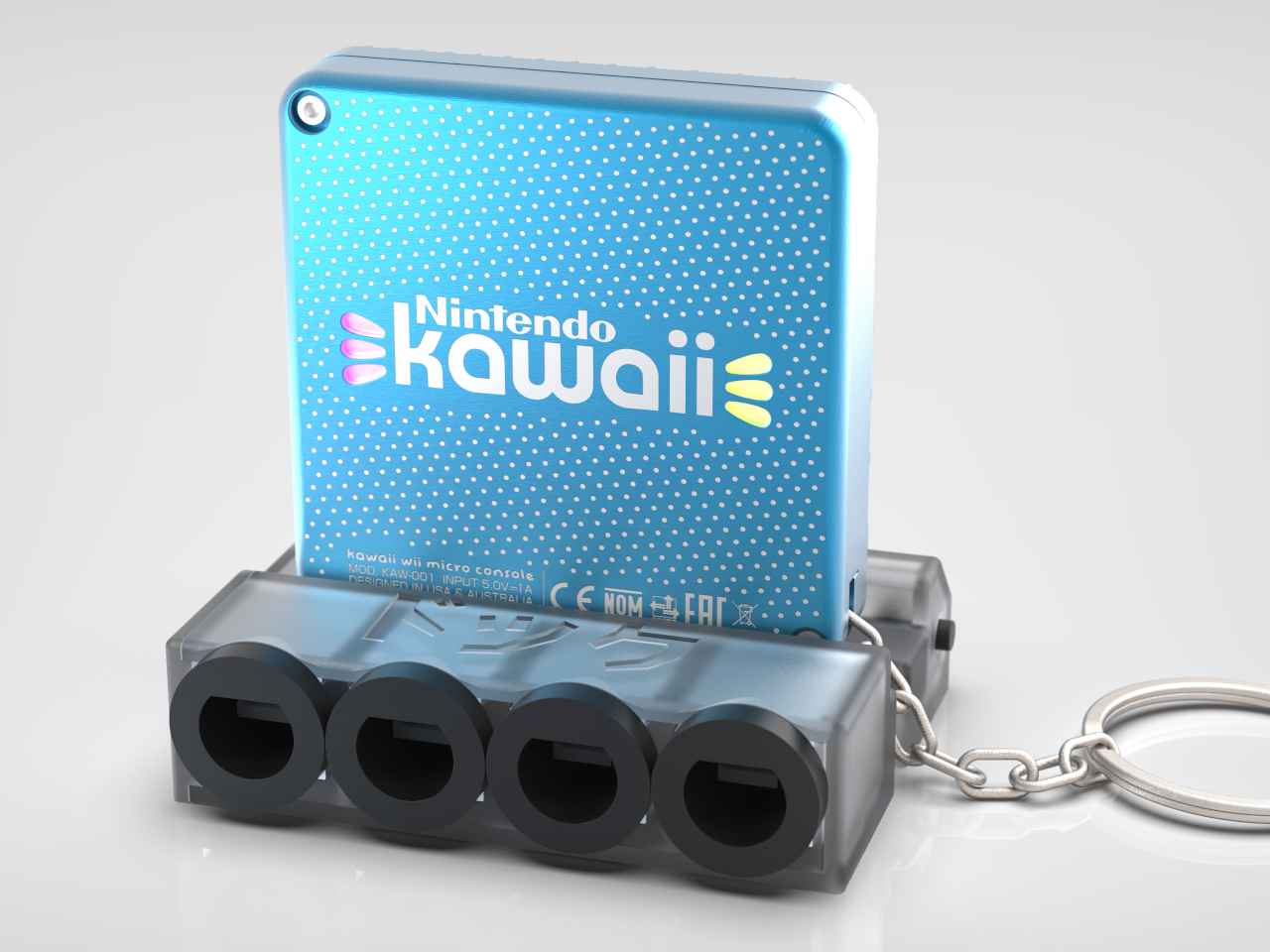
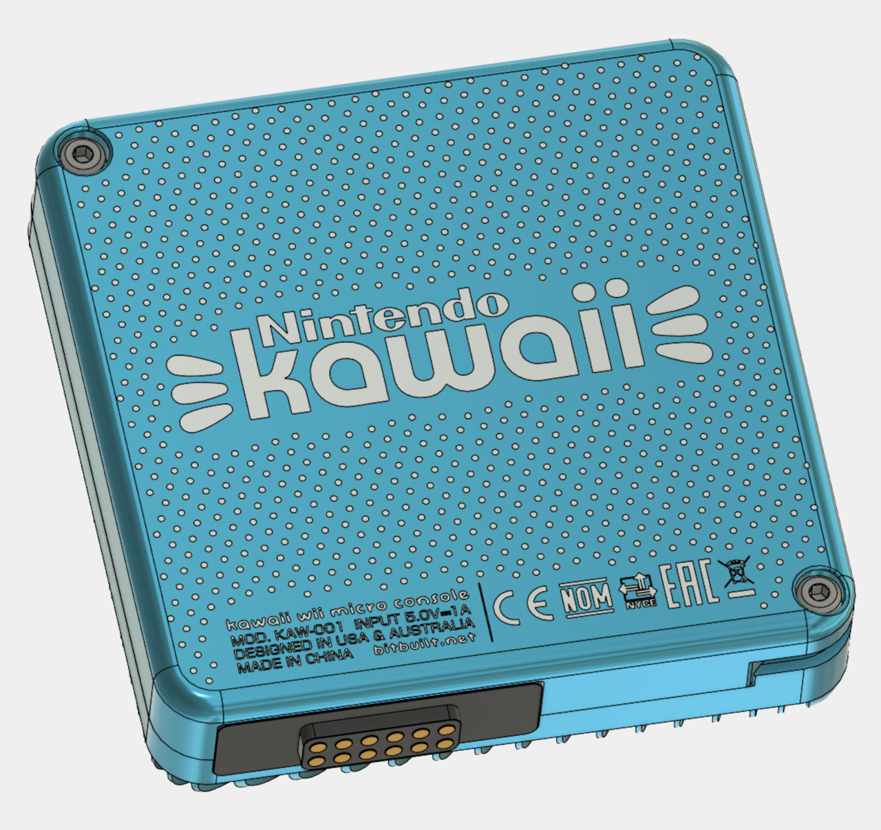
Arguably, the Wii was one of Nintendo’s oddest yet most successful gaming consoles, mostly thanks to the novelty and ingenuity of its “Wiimote” controller, the ancestor of today’s Joy-cons for the Switch. Like any other Nintendo gaming machine, it had a number of titles under its belt, including a few notable exclusives that took advantage of that unique controller design. Of course, its time has long passed, and the Wii is nothing more than a footnote in video gaming history, or so it would seem. It’s unsurprising to hear that it is now the subject of no small amount of mods and DIY projects that try to give the historic console a different flavor, and one of the oddest and most adorable is probably this perfectly named “Kawaii” mod that shrinks the book-sized machine down to portable keychain.
Despite its odd controller, the Wii itself wasn’t exactly that distinctive in terms of its design. It came as a rather plain, compact box that had just enough room for important hardware, which included a cooling fan and an optical disc reader. Remove these two, however, and you can probably cram the console into a tiny box, or at least most of it. That’s exactly what the Kawaii project did, a play on the Japanese word for “cute” and the Wii name, turning the large boxy console into a cute keychain accessory.
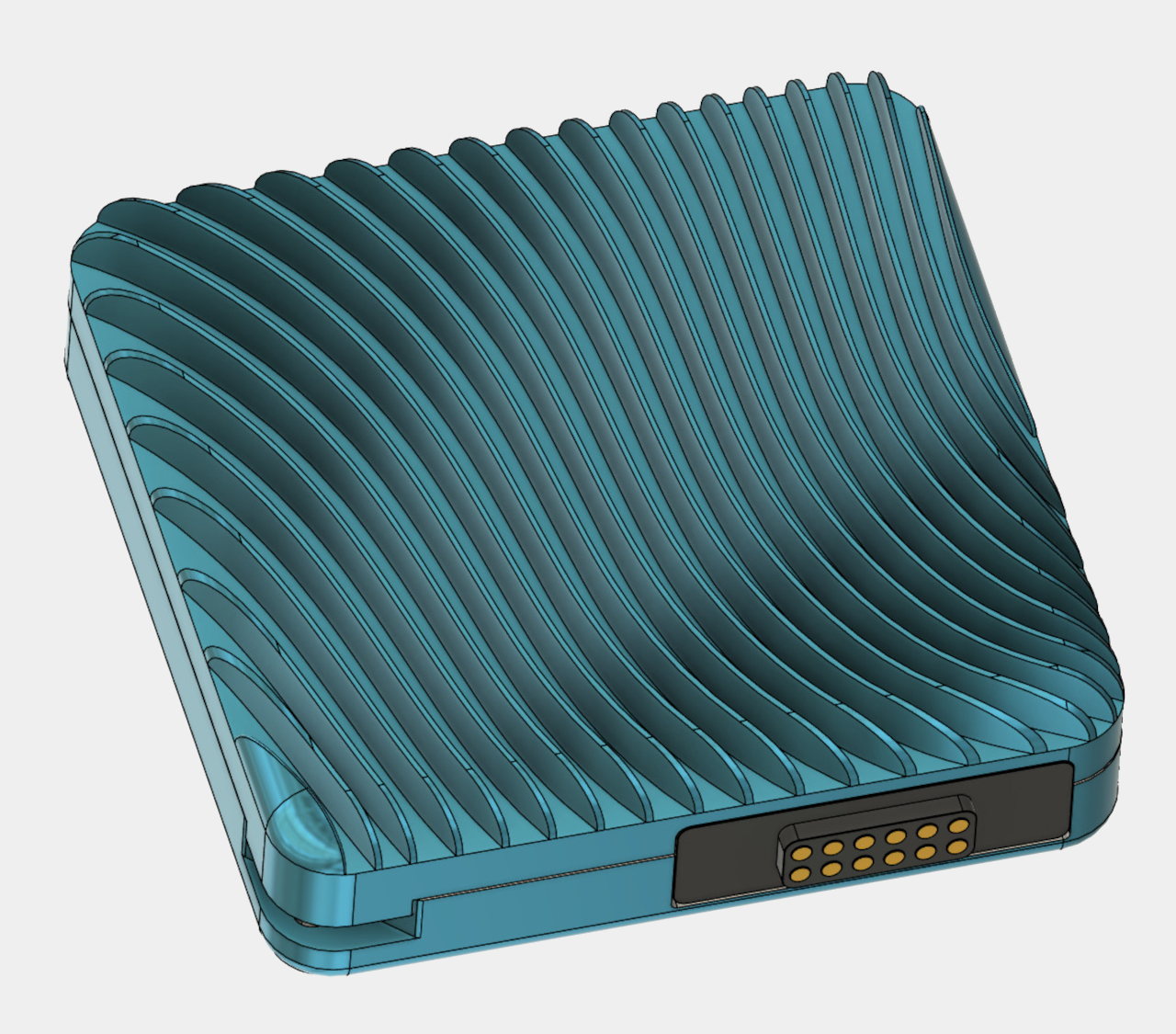
Kawaii is only 60mm x 60mm big and 16mm tall, not that much larger than keyfobs. Its body is CNC machined from aluminum and has these wavy fins on one side that do more than make the small box look eye-catching. They also function as a passive cooling system since the Kawaii doesn’t have room for any fan of any size at all. Obviously, there’s no space for an optical disc reader either, but that’s not the only thing missing from this tiny console.
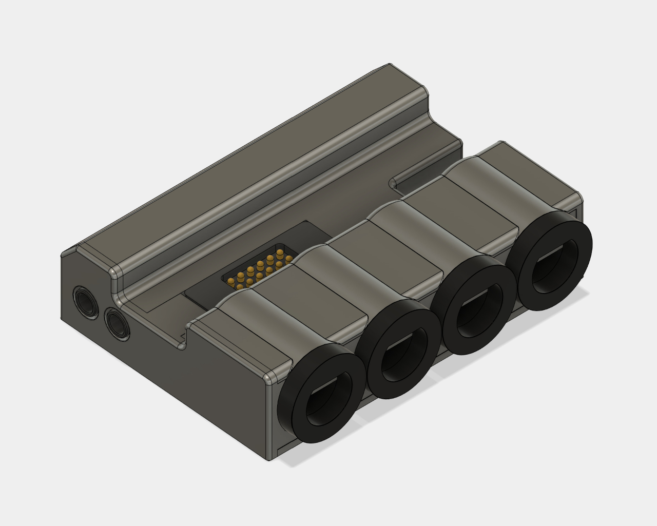
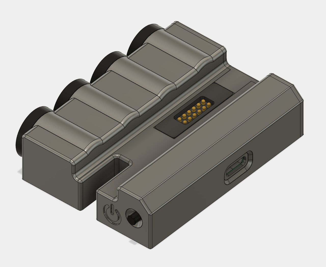
It doesn’t have any direct power source or any ports for that matter, leaving it pretty barebones save for the main board that runs the whole show. To actually make it useful, you have to connect it to a dock via pogo pins, and then you’ll have power, video out, and USB ports for controllers. The dock itself is just a little larger than the keychain console, but it’s still a portable setup, presuming you have a way to power it up or connect it to a display.
Sadly, the adorable Kawaii won’t fulfill your dreams of playing Wii games on the go, at least not the ones that need a disc or use a Wiimote, since there’s no Bluetooth connectivity in there either. That leaves you mostly with downloaded games that work fine with a USB controller, and there’s not much of those going around at this point. Still, it looks like an interesting journey to design a cool-looking console you can hang your keys on, one that preserves the spirit of novelty and playfulness of the Wii, even if it doesn’t exactly have its defining features.
Even with the popularity and ubiquity of wireless earbuds, many audiophiles and gamers still have a soft spot for over-ear headphones. Despite their bulkiness, they still promise better noise isolation and fuller sounds, which is to be expected given their size. They are also expected to be less comfortable to wear over longer periods of time, despite many attempts at using different materials and even designs. This concept design for an aptly named “Comfortably Headphones” takes another stab at that problem, but its solution is more ambitious and, if we’re being honest, less practical. Then again, having a flexible and transparent silicone band is sure to get you some attention, at least during the time you’re comfortably wearing them.
Headphone headbands have always been solid and rigid for a reason. They need to provide sufficient structure and support to hold the large and heavy ear cups together while also ensuring the whole device sits securely on your head. That said, that same rigidity is one of the biggest sources of discomfort for users, and many designers have tried to alleviate the issue with comfortable fabrics or soft materials wrapped around the band or, better yet, make the band slightly more bendable to accommodate different head shapes.
This design concept, however, throws tradition out the window completely by replacing the usual metal bands with nothing but silicone, a material known for its flexibility and plasticity. Silicone can retain the shape it was formed into during production, but it can also slightly bend and even twist with enough force. It won’t perfectly conform to everyone’s head shapes, but it will at least put less pressure on your head while you’re wearing it, at least in theory.
It isn’t just regular silicone that was chosen for this design either; it is a transparent variety. This creates reflections and refractions that add a unique visual flavor to the headphones. At least under some light, it creates more playful and more natural rainbow colors better than what any RGB LED lighting can provide. Of course, it doesn’t do much in the dark, but even the organic form of shadows can become a source of fascination.
Sadly, such a mesmerizing design does have its share of flaws, particularly with the longevity of silicone as a material. It can warp and deform over time, and discoloration is a common phenomenon with “clear” silicone products. Then there’s also the fact that wires bridging the two halves of the headphones mars the transparent beauty of the silicone band unless the headphones are completely wireless even internally. At that point, however, the benefits of such large audio equipment become moot, and people might as well switch to lighter earbuds. Of course, you could just create a solid, opaque silicone band, but then where would be the fun in such a design?
More ergonomic design despite heavier and thicker chassis
Higher performance with lower thermals
CONS:
Windows 11 is still awkward to use on touch screens
Comes in black colorway only
RATINGS:
AESTHETICS
ERGONOMICS
PERFORMANCE
SUSTAINABILITY / REPAIRABILITY
VALUE FOR MONEY
EDITOR'S QUOTE:
The ASUS ROG Ally X is a clear upgrade over the original, addressing complaints without losing what made the ROG Ally great.
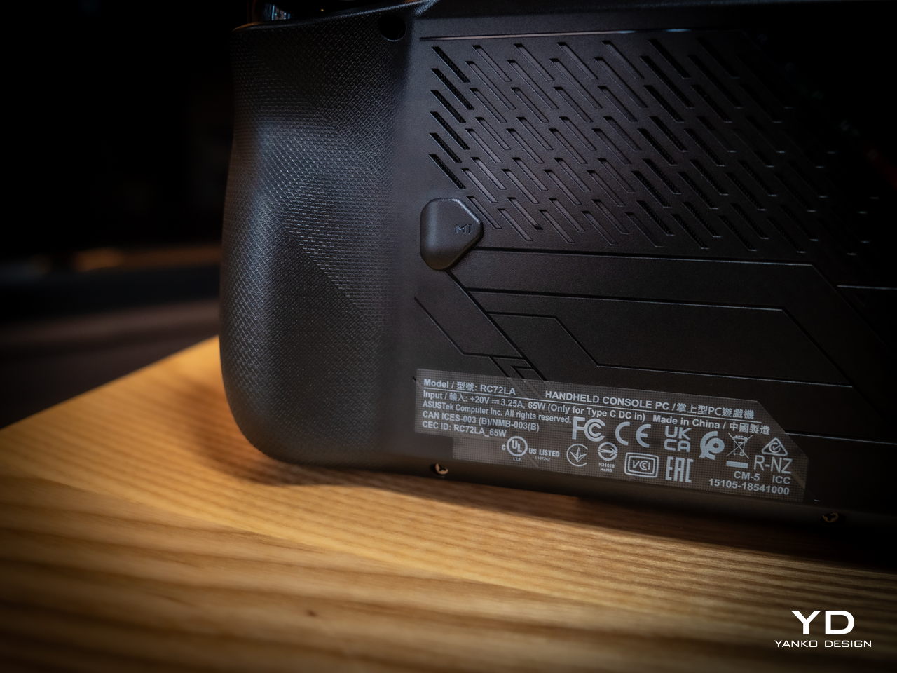
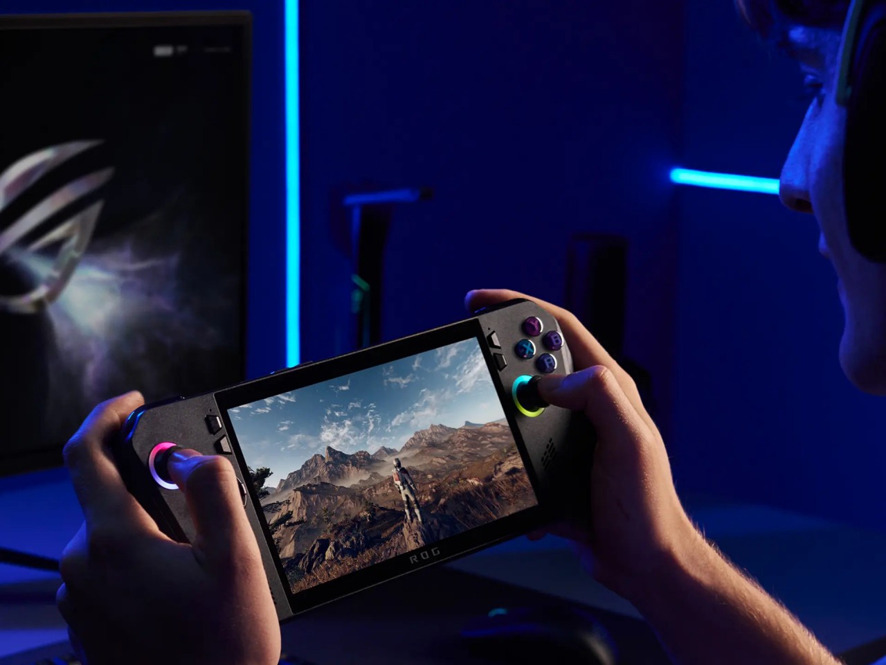
They say hindsight is 20/20, but not everyone gets the opportunity to make a redo of their past actions. That’s especially true when it comes to consumer electronics, where every product involves no small amount of investment and risk. And yet ASUS surprised us at Computex 2024 last month when it revealed not a generational upgrade to its first-ever gaming handheld PC but what is, instead, a redo of the original. The ROG Ally X definitely brings a few much-needed upgrades, but it also feels like this is what should have been launched in the first place last year. That’s why we took this handsome black handheld for a spin to see if it’s really worth its weight in gold or if waiting for the real next-gen design is a better choice.
Simply looking at the ROG Ally X on its own, you might easily mistake it for a black version of the original ROG Ally. Of course, there are subtle yet significant changes here and there, but the fact that it’s able to keep its design identity is still a laudable achievement. On the flip side, there will be no mistaking it for a ROG Ally 2 that’s yet to come, as it shares that DNA so closely with the first model.
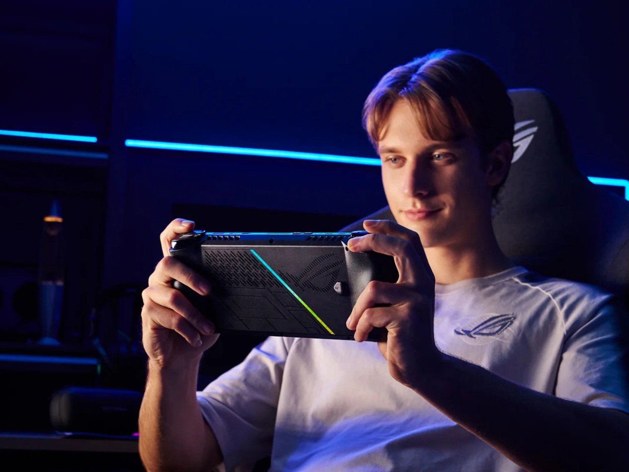
Whether the ROG Ally had a more angular and more aggressive appearance despite its white coating, the ROG Ally X is rounder, curvier, and a bit gentler. This has consequences for the device’s ergonomics, which we’ll get to later, but it also exudes a slightly different character compared to its progenitor. It manages to be a bit more welcoming, almost comfortable, without losing its cyberpunk aesthetic thanks to those RGB lighting accents.
The color choice might prove to be a bit controversial, though. Not because no one likes black but because there’s no other choice. Just like how the ROG Ally came only in white, the Ally X is a black-only design. In a way, it stands out less from the crowd, making it less distinctive. But it also invites less visible stains and dirt on a device that will most likely see a lot of action outdoors. Truth be told, gamers are more likely to slap some skins on these devices than stick with the original coating, but having some choice would definitely help improve its appeal.
Ergonomics
Ergonomics for computers often lags behind performance and aesthetics, but it is even more critical for one that you’ll hold in your hand rather than use on a table. More than just the aesthetics, it’s actually this aspect of the ROG Ally X that sees the most changes, at least externally. Suffice it to say, the handheld is finally designed to let you hold it in your hands for longer periods of time, which translates to more playtime overall.
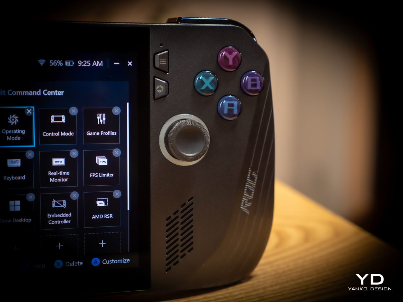
Because of internal changes, the ROG Ally X is chunkier and heavier at 1.45 inches thick and 1.49 lbs compared to the OG Ally’s 1.28 inches and 1.34 lbs. Ironically, the handheld is actually more ergonomic now despite the added bulk and heft thanks to key changes in the grip design and button. The sides, for example, are now more rounded than angular so they don’t cut into your palm. The grips themselves have a more natural contour that’s easier to hold, though they’re still shallower compared to the Steam Deck’s design. Depending on your hand size, you might not have enough room for a good grip just like on the ROG Ally.
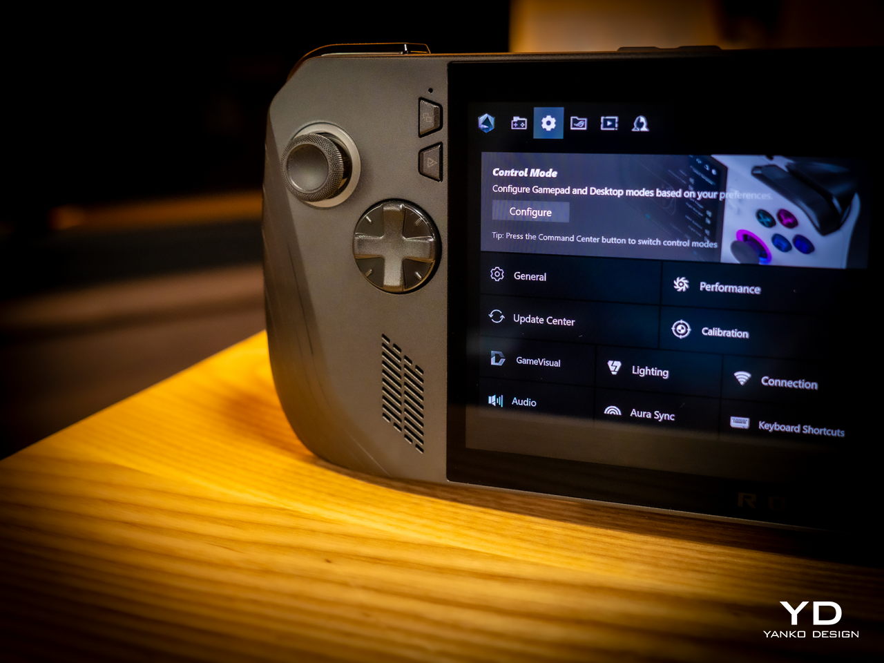
The buttons and sticks feel more solid, too, and give better resistance and stability than the rather loose and flimsy controls of the previous half-generation. The back buttons are smaller and placed higher to address complaints of frequent accidental presses that come too naturally when holding the device. Ironically, players with smaller hands might find it harder to reach them now. Thankfully, their function is usually optional in most games, which is why owners of the ROG Ally were fine with disabling those.
Performance
There are, of course, also upgrades internally, but not enough to call this the ROG Ally 2. It still uses the same AMD Ryzen Z1 Extreme processor, for example, which is capable but not exactly top-notch. What carries its performance forward is the new 24GB LPDDR5 RAM clocked at 7,500MHz, a rather big jump from the previous-gen 16GB 6,400MHz RAM. It’s almost unbelievable how much more RAM boosts overall performance, especially when neither the CPU nor the integrated GPU are starved for memory. More disappointing, however, is the fact that ASUS didn’t go all out to put a solid 32GB in there, but that would have probably raised the already higher price tag.
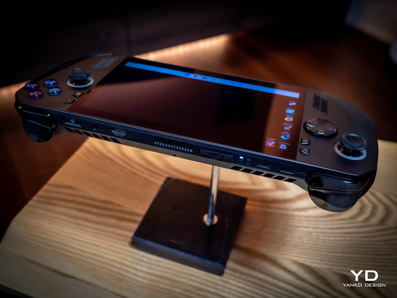
Another big upgrade is the 80Wh battery that’s double the capacity of the meager 40Wh of the OG Ally. This alone accounts for the increase in weight and thickness, and it’s a price many gamers are only too willing to pay. Of course, your mileage will vary, but this allows you to either tack on a few more hours to your game time or, alternatively, crank up the settings higher and still get the same uptime. You can also charge the battery at the maximum 100W that both USB-C ports support, but the included charger only goes as far as 65W.
And yes, you read that right, USB-C ports. Plural. ASUS has done away with the proprietary XG Mobile port for connecting an external GPU and replaced it with a USB-C port with support for USB4, Thunderbolt 4, and DisplayPort 1.4 with FreeSync. This means you can still connect an external graphics dock, but now you have more options if you don’t need to. Unfortunately, both ports are located at the top, so you have less wiggle room when connecting angled cables or thick adapters.
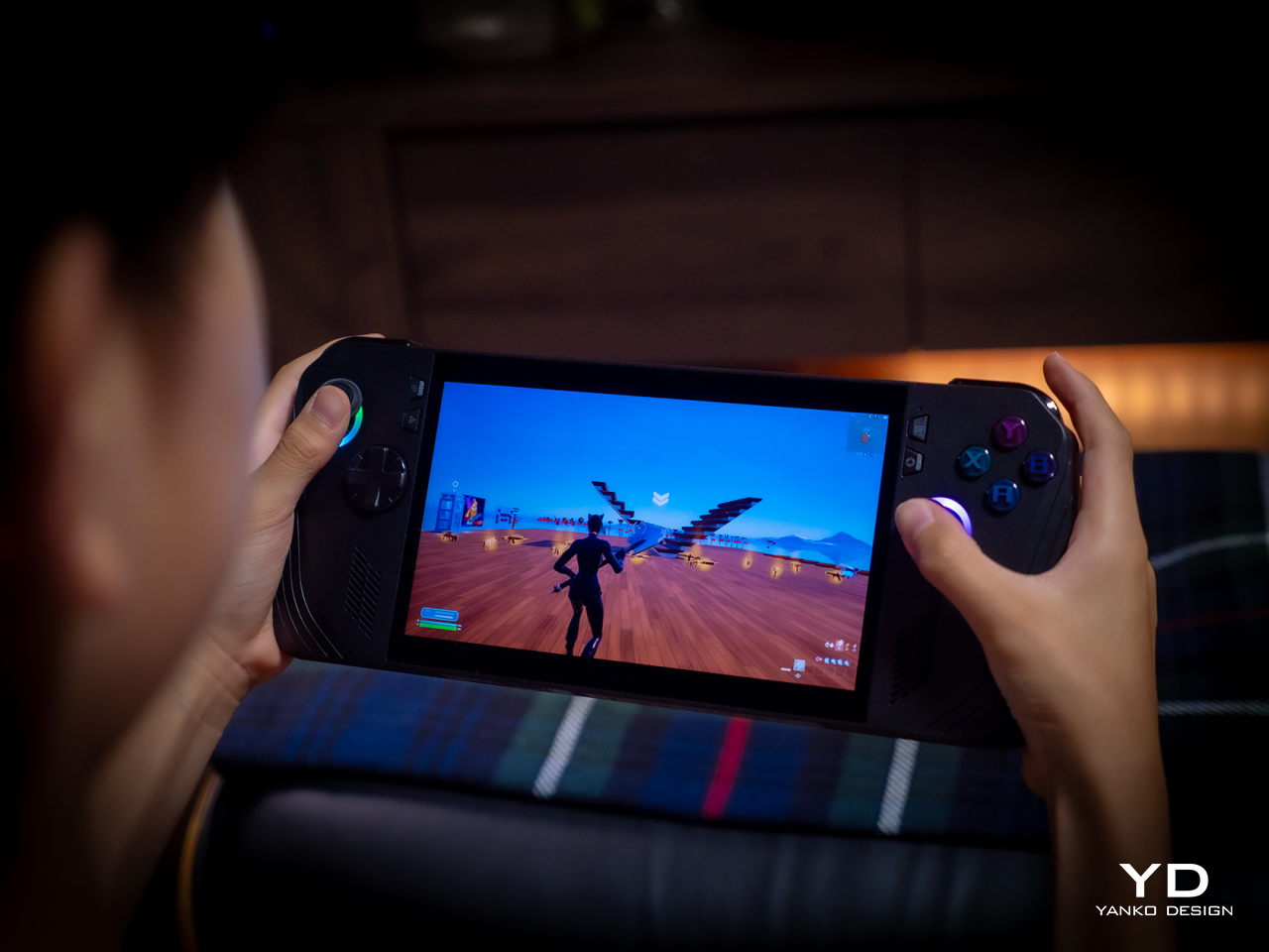
The ASUS ROG Ally X retains most of what its predecessor has, including the aforementioned processor. The 7-inch 120Hz IPS LCD is still the same, which means it’s still bright and vibrant, at least for an LCD panel. The speakers are supposedly upgraded a little, but you’ll hardly notice the difference. The microSD card slot is still located at the top, which might worry some who have experienced fried electronics on the first ROG Ally.
What all these changes and similarities boil down to is a more powerful computer that delivers a better gaming experience overall. Despite all that power, however, the ROG Ally X still runs cooler than its predecessor thanks to an improved cooling system that pulls heat away from the screen more effectively. This is actually important when you consider that this screen is the primary way you’ll be interacting with the Windows 11 operating system. Unfortunately, even with ASUS’ custom software, Windows is still largely a mouse and keyboard-driven platform, which means navigating through menus and windows is still a pain.
Sustainability
Unfortunately, this is one area left completely unchanged between generations. Like the majority of designs in this still nascent market, the ROG Ally X has that typical mixture of metal and plastic, both taken from new materials rather than recycled. It might take a few more generations before they start catching up to their larger gaming laptop cousins.
The same can be said for repairability and even upgradability. You can’t even upgrade the SSD storage, making that microSD card expansion slot even more critical, at least for non-game files. Again, the market is still in its infancy, so we’re holding out hope that the situation will improve over time. After all, some lesser-known brands are already providing easy access to SSD storage for upgrading, so there’s little reason why giants like ASUS can’t do likewise.
Value
It’s clear as day that the ASUS ROG Ally X is a big step forward, fixing the flaws of the ROG Ally in a half-step upgrade. But are those enough to warrant its $800 price tag that makes it one of the more expensive options in the market? As always, the answer isn’t as clear-cut, but the scales might not be tipping in the Republic of Gamers’ favor.
The original ROG Ally was by no means a terrible device even considering the ergonomics, and its current $650 price tag (or even $550 on discount) makes it a more viable starting handheld for those who aren’t sold on the Steam Deck. There’s definitely no reason for ROG Ally owners to upgrade this early, either, so only those who have been on the fence until now might find the ROG Ally X more convincing. But there are also other options in the market, like the Steam Deck that started it all or the Lenovo Legion Go with its Switch-like removable controllers. Then again, you can’t go wrong with the ROG Ally X either, especially if you have the cash to spare.
Verdict
It’s rare for manufacturers to push out a version 1.5 product, especially one that almost makes the original feel inadequate. At the same time, such a strategy weakens the appeal of the “half-step” upgrade, particularly because of the price difference between the two generations. That’s the limbo that the ASUS ROG Ally X practically finds itself in. Taken on its own, it’s a fine gaming kit that offers commendable performance in a more ergonomic design, but it’s no ROG Ally 2. If you’ve been undecided about getting your first ROG Ally, now might be a good time to grab one, especially if a good deal comes up to sweeten that price a bit.
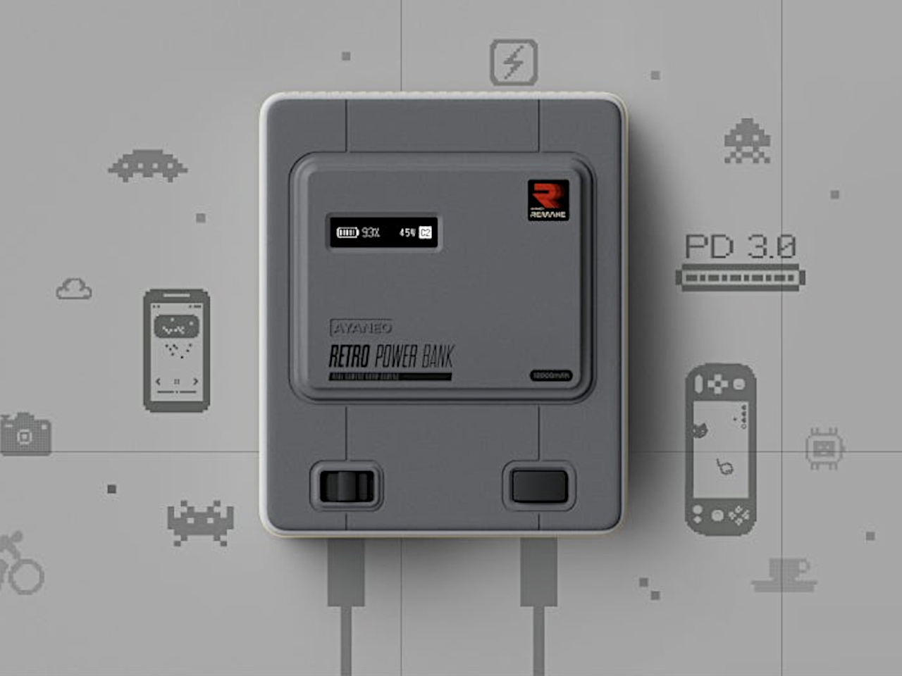
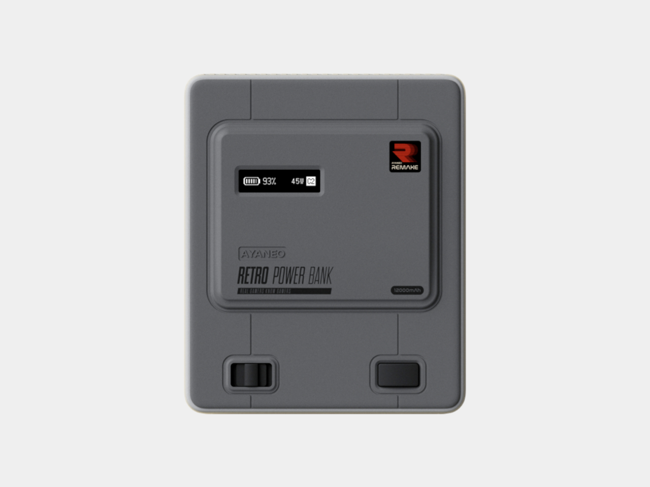
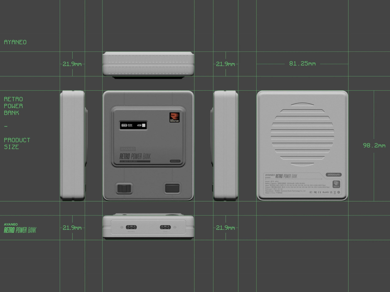
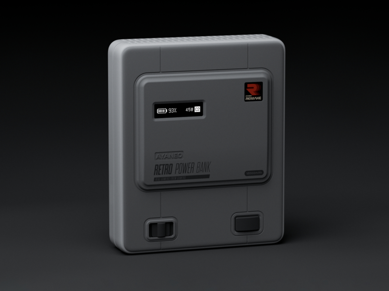
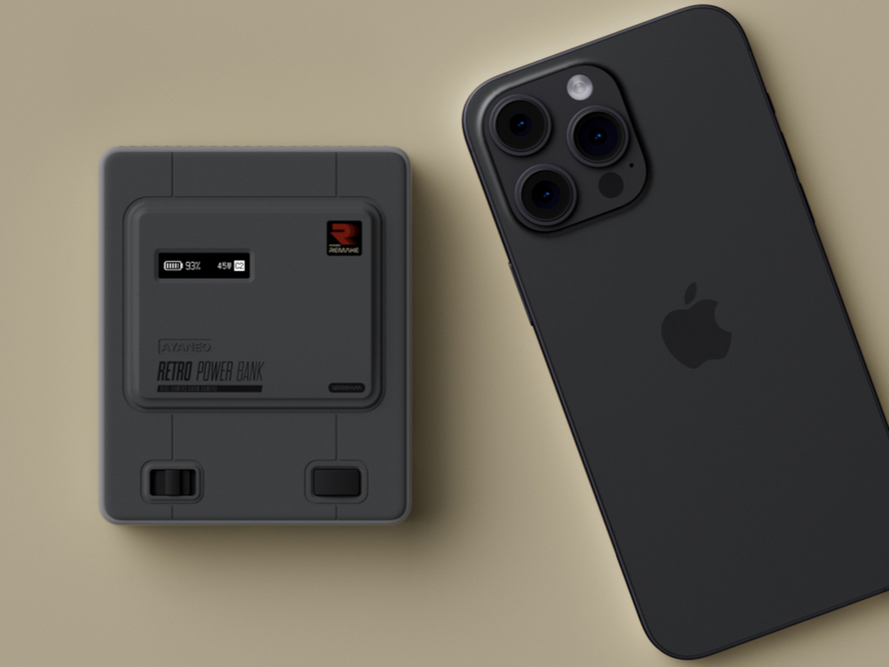
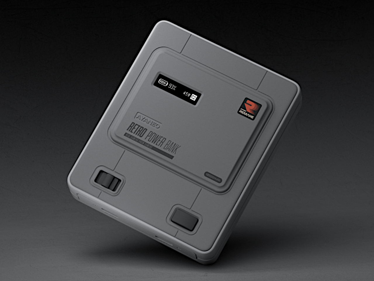
Retro gaming consoles kicked off a trend in the computing and gaming industries that saw the revival of many old-school designs. While the majority of these try to recreate decades-old experiences in a functional manner, some simply go for the aesthetics. After all, the designs can be eye-catching in their own right, regardless if they’re working like the original. Some put modern computing hardware inside shells from a time when monitors didn’t even have color, while others repurpose the design into some desktop or fidget toy only. This tiny retro console, for example, looks like a Super Famicom that’s no larger than your smartphone, but it isn’t actually a device that you can play but is simply AYANEO’s newest throwback: a 12,000mAh power bank in disguise.
The Nintendo Super Family Computer, a.k.a. “Super Famicom,” might be familiar to gamers in name, but those who live outside Japan might be more familiar with its other moniker and design. The Super NES (Nintendo Entertainment System) wasn’t as divergent as the NES from the Famicom, but there were subtle design differences, like the color scheme and placement of buttons. For whatever reason, AYANEO opted to pattern its tiny device on the Japanese Super Famicom, though that actually works in its favor in one specific detail.
The Retro Power Bank, which avoids any legal landmine by using as generic a name as possible, adopts the dual-tone gray color scheme of the famed console as well as the raised section in the middle that delineates the main point of interest in the device. It even has the same sliding switch and button duo, but their locations have been moved around to avoid an exact copy of a copyrighted design. There’s also a small display strip that’s unsurprisingly absent from consoles of that bygone era, but is now almost a staple in high-capacity power banks.
Unlike the SNES, the Super Famicom used a sliding switch for its power button, a mechanism that the Retro Power Bank uses for navigating through menus and changing settings like units used, language, and screen off time, just to name a few. The reset button now becomes a function button that cycles through different display features. That 0.91-inch monochrome OLED screen is just small enough to show discharge and charging power, temperature, and other essential information at a glance.
Adorable as the design might be, some might be a little disappointed in its performance as an actual power bank. 12,000 mAh is admittedly plenty for most phones, but the 45W output will leave some waiting a bit to fully top up their phone. And when you use both USB-C ports at the same time, you’re down to 15W each. There’s also no wireless charging, which is probably for the best since you don’t want to cover that nice tribute to the Super Famicom, which is the entire point of the design in the first place.
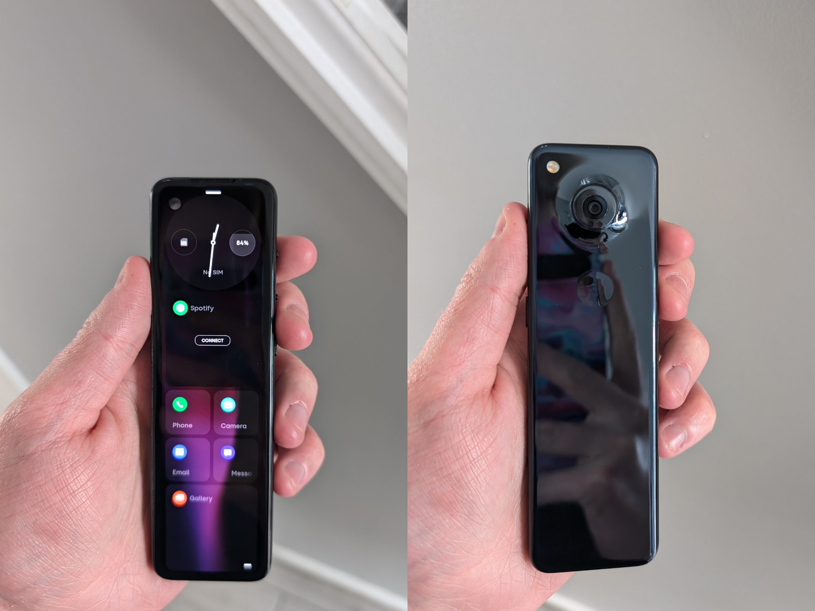
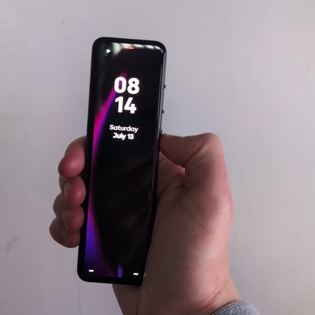
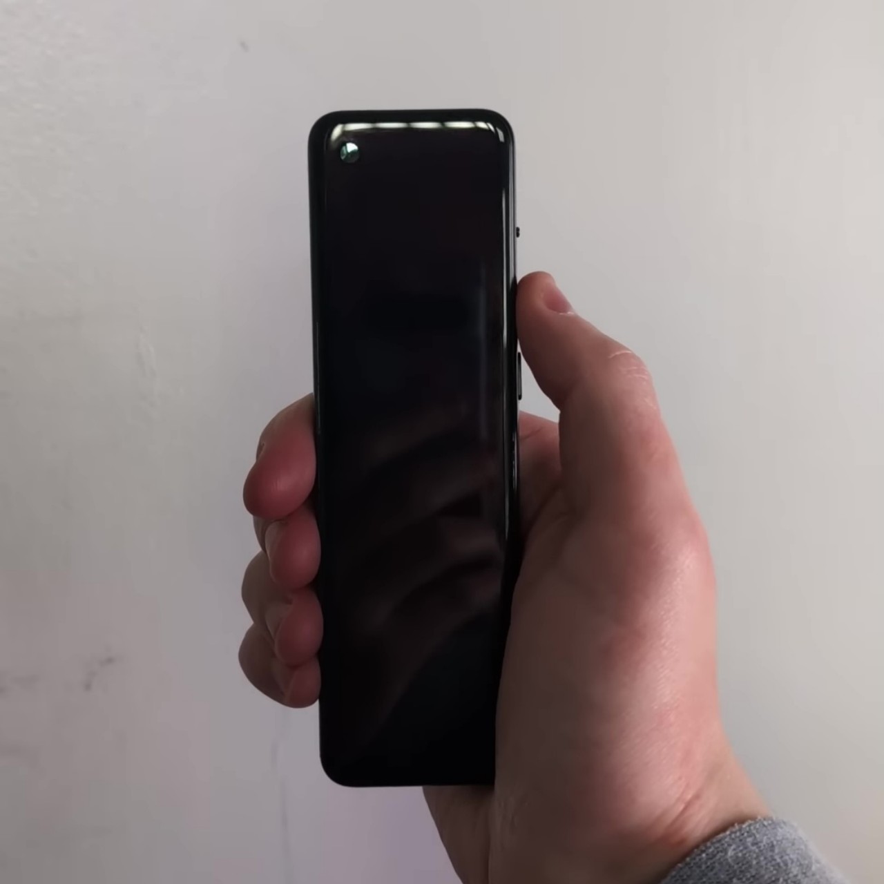
Smartphone companies come and go, but the more notable ones usually stick around long enough to leave a mark. Essential, however, was fated to just be a bright, short-lived spark. Founded by Android creator Andy Rubin after leaving Google, the brand was supposed to mark a return to the essentials of the smartphone experience, hence the name, but it only ever got to release one product, which admittedly met a warm reception. The rest, as they say, is history, and most of us have probably forgotten the Essential PH-2 that made waves in the days before the company’s demise. Thanks to a few prototypes floating around the Web, we finally get to see this oddity in action, making us wonder whether it would have been a revolutionary success or if it’s fortunate it never got to see the light of day.
If Essential was staging a rebellion against mass-produced smartphones, the Essential PH-2 would be its perfect representative. While most devices were getting larger, this ultra-slim candy bar phone felt like someone had split a phone in half along its length. What you get is similar to a tiny smart TV remote with only a screen for its face. Handy, yet awkward and puzzling.
The front sported a 5.7-inch AMOLED display with a resolution of 2160×560, refusing to match any of the standard aspect ratios supported by display industries. The back is an all-glass affair as well as a fingerprint magnet, smooth and plain with only a small lump for a single camera and a dimple for a fingerprint sensor. It’s clear that the Essential PH-2 was designed for ergonomics primarily, something that can’t be said of most smartphones today, but some equally important things might have gotten lost along the way.
The Android-based interface revolves around a metaphor of cards or tiles arranged in a long, scrolling column, with each card representing an app. Given the unfinished nature of the device, it’s not surprising that many of these apps simply didn’t work, but those that did work revealed how the phone would have worked in people’s hands. Suffice it to say, watching YouTube won’t be the most enjoyable experience, even if turn the phone on its side for a 480p quality video.
This does raise the question of who this phone was targeted at. Or better yet, who would have bought such an oddity even back then? It wouldn’t be a fun social media experience, given how small images would be and how narrow text would have to be, nor is it good for watching videos. It might appeal to music lovers and maybe vloggers who want a handy camera to hold, though the prototype’s camera quality wasn’t exactly reassuring in that regard. We’ll probably never know now, though Essential still deserves some praise for daring to think outside the box, whether or not it cost them their business in the end.
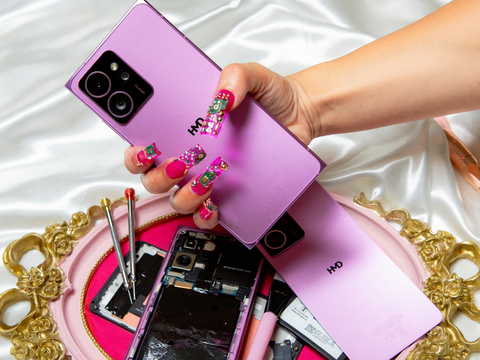
The Nokia brand was famous for its innumerable smartphone designs, some of which have stood the test of time and are being revived today. Although not as old as those, the Nokia Lumia with its blocky silhouette, curved sides, and raised 2.5D screen is just as distinctive, becoming the DNA of the product line until its demise. HMD Global, who now eagerly wants to remind everyone that its name stands for “Human Mobile Devices,” is bringing back that iconic form but with a twist. The HMD Skyline might be a blast from the past, but it is also the most forward-looking of its kind thanks to its strong self-repair spirit.
The Skyline is notable for two things. The first is, of course, is design that is both dated yet ironically fresh to people’s eyes today. The more geometric block is almost in line with art trends today, and its neon pink colorway definitely shouts for attention. Given the retro design craze gripping multiple industries, its arrival couldn’t be more timely.
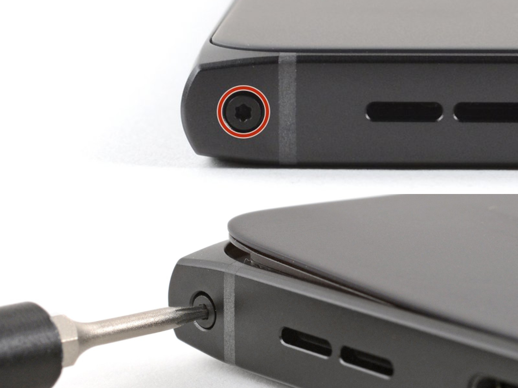
This juxtaposition also shows itself in the HMD Skyline’s other strength: its easy repairability. Sure, it’s not as easy as popping off the back plate with a fingernail and swapping out batteries in a snap, but it’s still worlds apart compared to most smartphones today, including its mid-range buddies. There’s only one screw to lift the back panel, which you can gently pry off with plastic cards or guitar picks, then other connectors can be easily unscrewed or lifted. It’s probably the least risky process around when it comes to replacing the screen. And all that while still having an IP54 dust and water resistance rating.
The irony is that HMD is positioning this Gen 2 repairability as an attractive feature for Gen Z users who, it claims, are more likely to keep their phone if they can repair it themselves. That said, this is also the generation that lives for the latest and greatest designs, convenient services, and near-instant gratification from social media. Then again, it’s also the maker culture, so there might be some DIY DNA running through their veins as well, waiting to be awakened.
The HMD Skyline’s specs are a bit less impressive, but it’s actually almost a miracle that some of them are even there. The 6.55-inch 1080p, for example, is capable of 144Hz refresh rates, and its 4,600mAh battery supports magnetic wireless charging. There’s a massive 108MP camera teamed up with a 50MP telephoto shooter and a 13MP wide-angle camera. The Snapdragon 7s Gen 2, however, clearly marks it for the mid-range class. All things considered, the $500 Android phone isn’t as bad a deal, especially if you’re truly into retro designs that you plan on maintaining for a very long time.
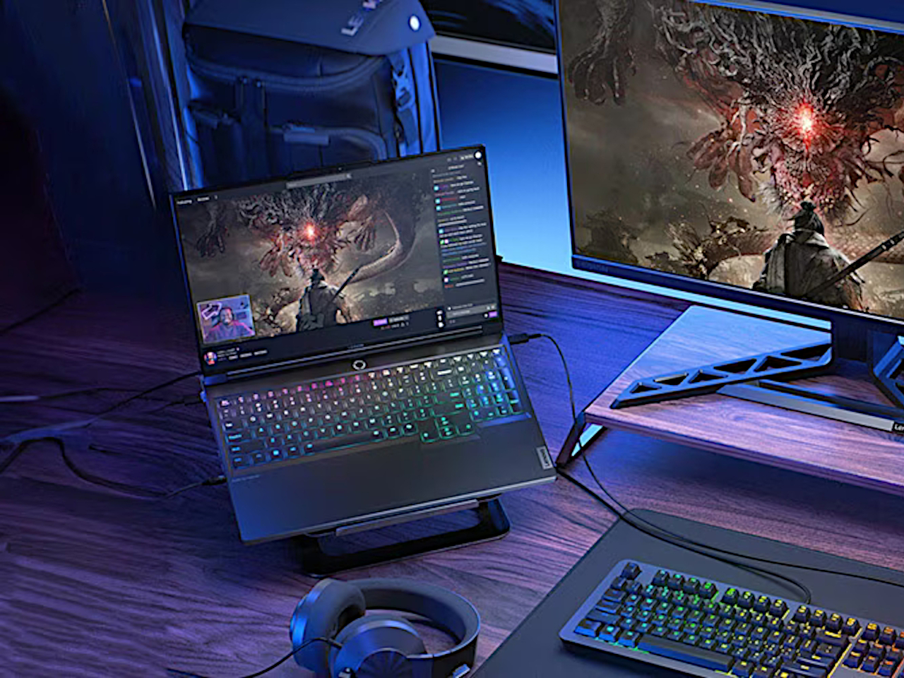
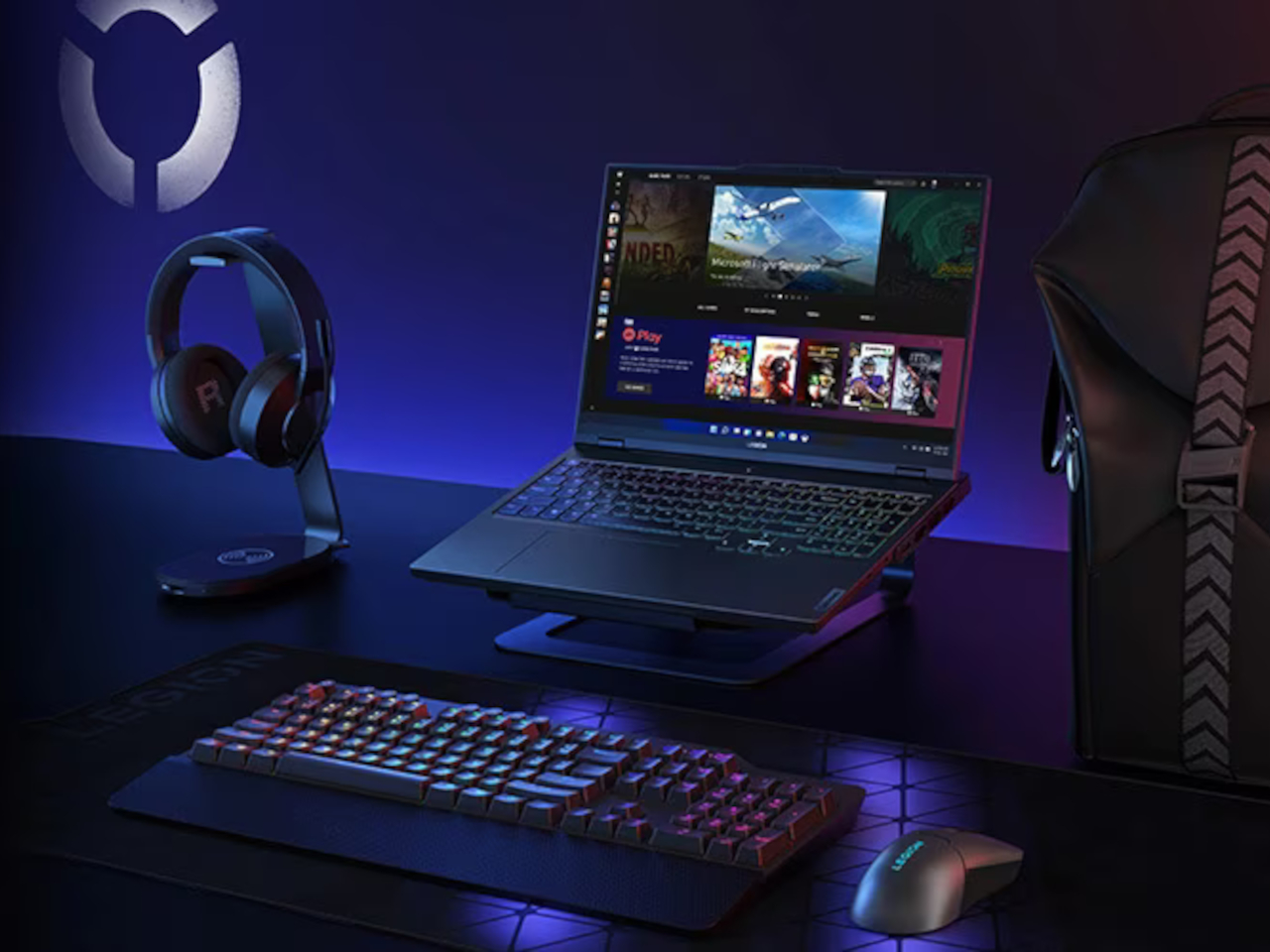
Although a heavyweight in actual weight and price, the Lenovo Legion 7i Gen 9 delivers almost everything gamers and content creators need without breaking the bank.
Microsoft has been very aggressive with its push of AI on new Windows computers, represented by its now omnipresent CoPilot key. New laptops have just been launched touting AI capabilities that revolve largely around the usual culprits like content generation or summarizing content, but they’re not the only new kids on the block either. A new breed of gaming laptops is also on the rise, advertising some AI tricks to optimize their performance. That also means a refresh of popular models that promise even smoother performance and pack more power, but those always come at some cost. Rarely will you find a design that delivers the power that gamers need at a more affordable price point, which is the proposition that the 2024 Lenovo Legion Pro 7i Gen 9 (16IRX9H) is making, so we naturally had to put it to the test to see if it holds up in practice.
Designer: Lenovo
Aesthetics
Common gaming laptops often look like tanks, and the Legion Pro 7i (2024) is sadly no different. It’s not rugged by any means, sporting a sleek and sharp appearance, but it’s thick, heavy, and sharp at the edges. It has an aggressive look to it, though coupled with some RGB lights, it does have a bit of a cyberpunk flair. While it doesn’t shout to the world that it’s a gaming laptop, it doesn’t try to deny its identity either.
It’s also not that different from its Gen 8 predecessor, so there’s practically nothing that sets it apart visually. On the one hand, it establishes a familiarity with the Legion Pro line, so buyers will know what to expect. On the other hand, however, it also feels like it’s lagging behind when it comes to aesthetics, especially when Lenovo has quite a few interesting and distinctive designs available.
Overall, the Lenovo Legion Pro 7i Gen 9 looks pretty plain on the outside. It isn’t as obnoxious as other gaming laptops that show off all their kaleidoscopic lighting, but it isn’t subtle either. You might feel a bit conscious bringing it to the workplace or meeting (unless you work at a game studio), but it will probably only get a few passing looks. Fortunately, most gamers will be willing to overlook this aspect if they’re getting the performance that they’re actually paying for.
Ergonomics
At 4.93 lbs (2.24kg) and 17.6mm (0.69in), there is no mistaking the Legion Pro 7i Gen 9 for a thin and lightweight notebook. Again, this is your expected dimensions for a gaming laptop, so many gamers won’t be so bothered by it. But if you’re a creator and a gamer who find yourself moving around a lot, you best prepare your back and shoulders for some workout.
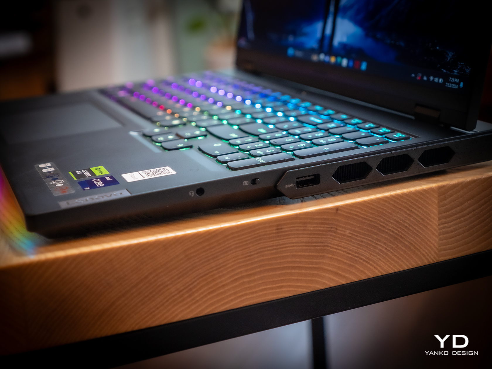
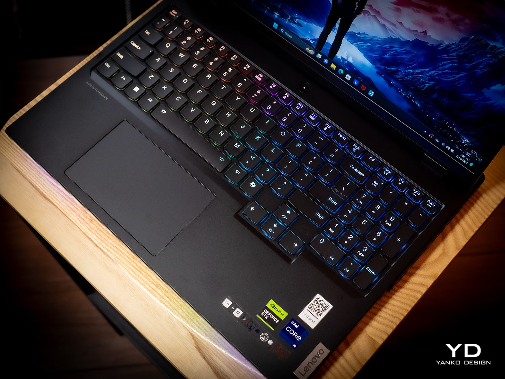
Fortunately, actually using the laptop turned out to be a more enjoyable experience, from the bright and vibrant screen to the responsive and comfortable keyboard. That keyboard is a bit notable in how it sufficiently spaces out the keys and still has room for a numeric keypad as well as a regular T-shaped cursor key arrangement. The latter actually extends a bit lower than the rest of the keys, which has the effect of pushing the touchpad to the left just a little. Definitely not enough to make the button-less surface painful to use.
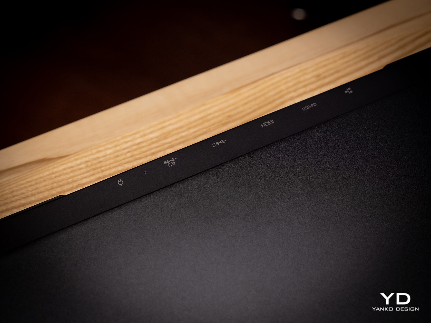
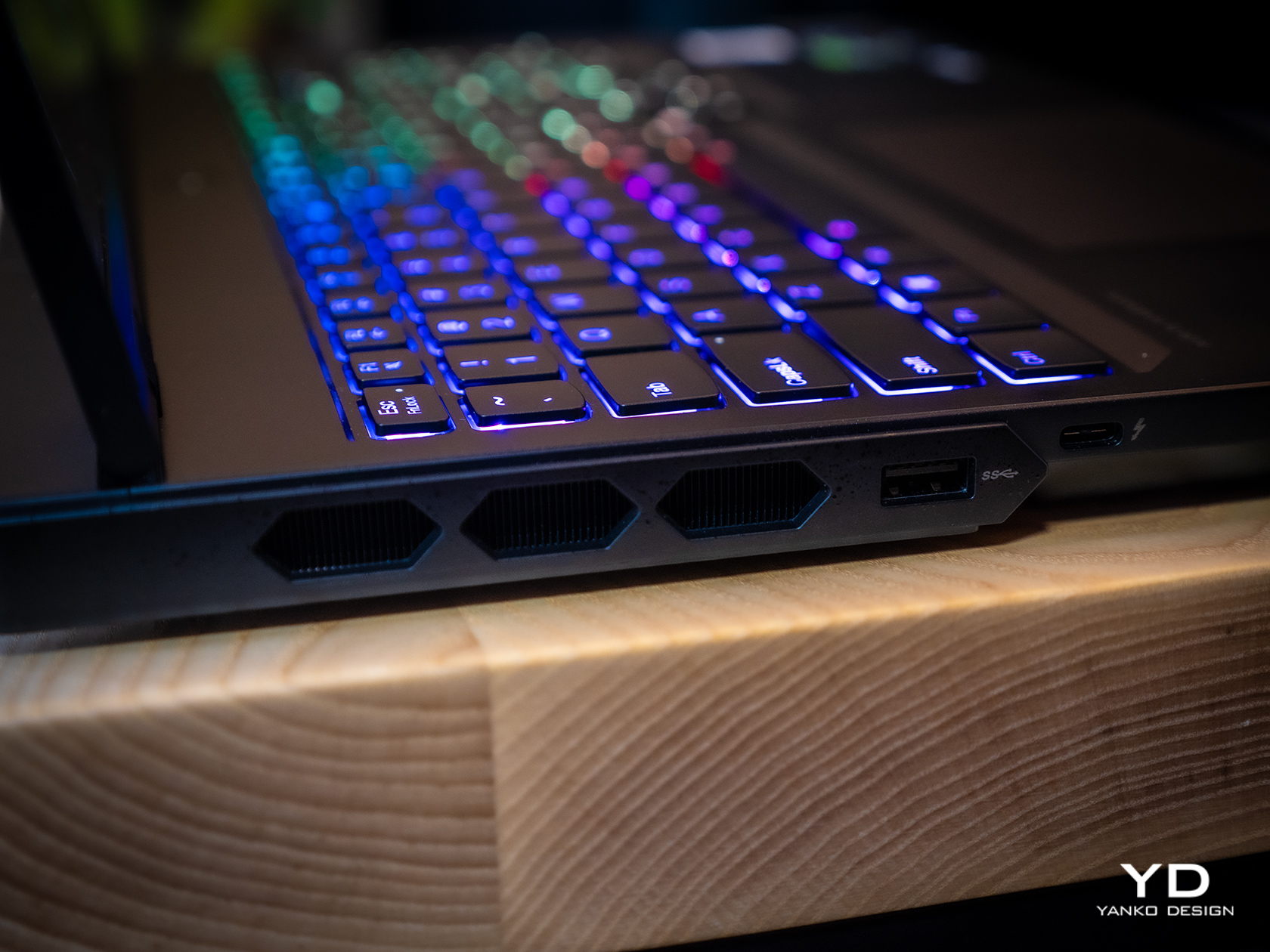
As we’ll get to later, the Legion Pro 7i has a wide selection of ports, and they’re placed in a way that really takes into account how most people use laptops these days. The left side has a USB-A and a USB-C port, while the opposite side gets a USB-A along with a 3.5mm headphone/mic jack. This gives easy access to accessories you’ll connect and disconnect often, like a gaming mouse or your phone. The back has connections like two USB-A ports, one USB-C port, HDMI, and Ethernet, practically the ones you’ll use to “dock” the laptop to more stationary peripherals, making cable management a bit easier. Whether it’s gaming on the go or maybe even working in the office, the Lenovo Legion Pro 7i Gen 9 is designed with ease of use and comfort in mind.
Performance
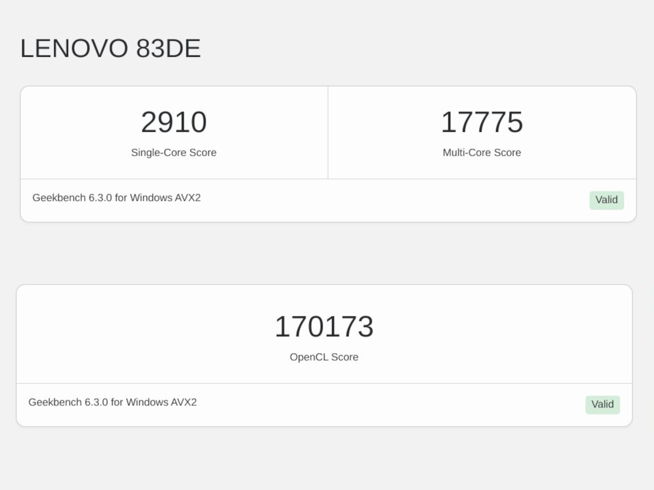
As a somewhat high-end gaming laptop, the 2024 Legion Pro 7i carries some of the best hardware in the market today. Sure, it might not have an NPU-toting processor, but the Intel Core i9-14900HX is definitely as or even more capable than an “Ultra” chip. The NVIDIA GeForce RTX 4080 is just one step lower than the top-of-the-line card, but it’s more than enough for both gaming and content creation. Our review unit came with 32GB of DDR5 RAM and 1TB of storage, which is to say it’s not wanting in any aspect. With both benchmarks and actual usage alike, the Legion Pro 7i Gen 9 performed impressively, yielding consistent high frame rates in games even high settings. It’s also a testament to the laptop’s cooling system that it’s able to squeeze out as much performance consistently, though it naturally did get warm to the touch and the fans were quite audible.
Visual quality is important for gamers, but it is an even more critical aspect for content creators who need color accuracy. This is one area where the Legion Pro 7i Gen 9 surpasses the previous generation, adding support for NTSC, Adobe RGB, and DCI-P3 color gamuts. Not only does this make colors really pop, it also means that the 16-inch 2K screen is now able to support the needs of creatives, making the gaming laptop more of an all-around high-performance tool. And with extremely thin bezels, you experience a better immersion into that colorful world, especially when the decent bottom-firing speakers complete the audiovisual experience.
This heavy laptop carries a 99.99Whr battery, the largest allowable on planes, and its uptime is as much as you’d expect. Normal use, which is a mix of multimedia and browsing, can net you around 7 hours, but heavy gaming makes that figure nosedive to just two or less. Lenovo compensates for this with a “Super Rapid Charge” technology that can fully charge the Legion Pro 7i in around 80 minutes, presuming you’re using the hefty 330W power brick with a proprietary connector. You can also charge the laptop via USB-C if you have a 140W charger, but Lenovo doesn’t ship one in the box.
All in all, the Lenovo Legion Pro 7i Gen 9 performs so well that we have very little to complain about it. There’s very little bloatware aside from Lenovo’s own tools, as well as those from Nahimic for audio and Tobii for the webcam. Yes, it’s heavy and it burns through a battery quickly, but that’s also expected from high-end gaming laptops. It’s a rather powerful package made even more enticing by its bang-for-buck value.
Sustainability
Before we get to that, however, a word has to be said about Lenovo’s actions to leave a more positive impact on the planet. Though the Legion Pro 7i Gen 9 might look plain to the naked eye, it actually uses quite a number of sustainable materials for its body. It uses recycled aluminum as well as magnesium, giving the laptop both durability as well as a premium touch. The bottom, in particular, is made with 50% recycled aluminum, while the cover frame utilizes 30% post-consumer recycled polymers.
The laptop is also designed to be upgradable, at least as far as RAM is concerned. Repairs and other upgrades, however, require a bit more work, so it comes up short of getting a high score. Given how gaming laptops are more likely to wear out components faster than regular laptops, repairability should be the next priority for Lenovo’s designers and engineers.
Value
There’s no getting around the fact that the Lenovo Legion 7i Gen 9 is a bit pricey, starting at around $2,420 all the way to $2,850 for the highest configuration. And that’s with discounts already! On its own, that price tag might feel quite burdensome, until you consider that many laptops on this tier ask for more and deliver less.
With this sub-$3000 gaming laptop, you’re getting a near-perfect configuration that is useful not just for gaming but even for content creation as well. It’s not perfect, of course, and we wished it had a longer battery life given its weight, but you’d also be hard-pressed to find a similar experience on designs that won’t require you to pay even more with not as much performance gains.
Verdict
With PC gaming on the rise again, the number and variety of gaming laptops have also seen an uptick. While the need for power has never changed, gamers have become more conscientious not just about price value but design value as well. Carrying the design DNA of its predecessor, the Lenovo Legion Pro 7i Gen 9 (16″, 2024) looks sleek yet deceptively simple, belying the power it carries inside. But more than just unrelenting performance, it brings a well-rounded set of features that give gamers, creators, and any other user a powerful tool for a relatively fair price.
With the way how cameras on the back of the phones seem to be dancing around, or how every new model has some innovative glass-etching process, you’d think that the smartphone design field is bursting with activity and changing at every turn. You’d be partially correct, at least if only external appearances are concerned. In one important aspect, however, phone design has somewhat stayed still, held back by the demands of technology. Phones these days are either made up of glass and plastic covers on top of metal or plastic frames, with all-metal designs almost just a footnote in history. As one that never settles for anything less, OnePlus embarked on a bold and ambitious quest to design the first and so far only 5G phone with a metal unibody, a journey that took them back not only through the history of smartphone design but also through the history of human innovation.
Designer: OnePlus
Mobile Innovation, Material Stagnation
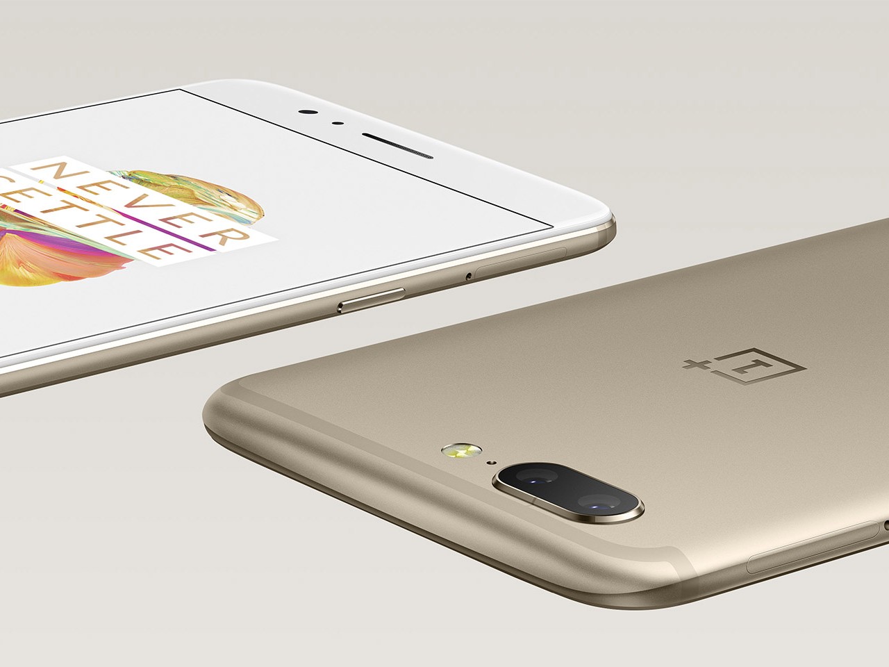
It wasn’t always the case that smartphones had a singular formula when it came to materials. It wasn’t too long ago that OnePlus itself launched a metal unibody design in the form of the 2017 OnePlus 5 and OnePlus 5T. Since then, however, smartphones have moved to those glass-metal or plastic sandwiches and there hasn’t been a full unibody design ever since. Ironically, the reason for that is one of the biggest innovations in the mobile industry: 5G networks.
OnePlus 5
OnePlus 5T
The speed and power of 5G placed heavier demands not just on hardware but also on design, specifically on how radio waves are transmitted through the phone’s body. Wireless signals already have a difficult time passing through metal, and even more so for 5G, forcing phone designers to either have plastic strips on the frame’s edges or simply ditch the all-metal design altogether. Unfortunately, it almost seems as if the industry as a whole is no longer interested in solving this puzzle, but OnePlus has risen to the challenge to provide its loyal users with a no-compromise option that will speak to their hearts through their fingers.
Metal Matters
Since the beginning of human history, especially when it came to trade, metal has played an important role not just in building up civilization but also as a symbol of prestige and luxury. Metal has always had this dual character of being a durable and malleable worker’s tool as well as a premium material for jewelry, decorations, and art. It is this long history that has endeared French designer Mathieu Lehanneur to metal. Famed for his nature-inspired metal-based works, Lehanneur was chosen to design the distinctive Paris 2024 Olympic Torch, perfectly symbolizing not only the aspirations of the Olympics itself but also the poetry in nature found in this year’s location for the event.
Mathieu Lehanneur, Designer of the Paris 2024 Olympic Torch
“I love materials that get their own history,” says Lehanneur as he explains his fascination with metal, “and metal’s history actually starts from the Earth, from the very planet itself. At the same time, it is also a part of human invention and skill, thanks to its ability to be transformed. I love the flexibility of the material, being able to create something that appears like a single piece of metal, a unibody design like the Olympic torch.”
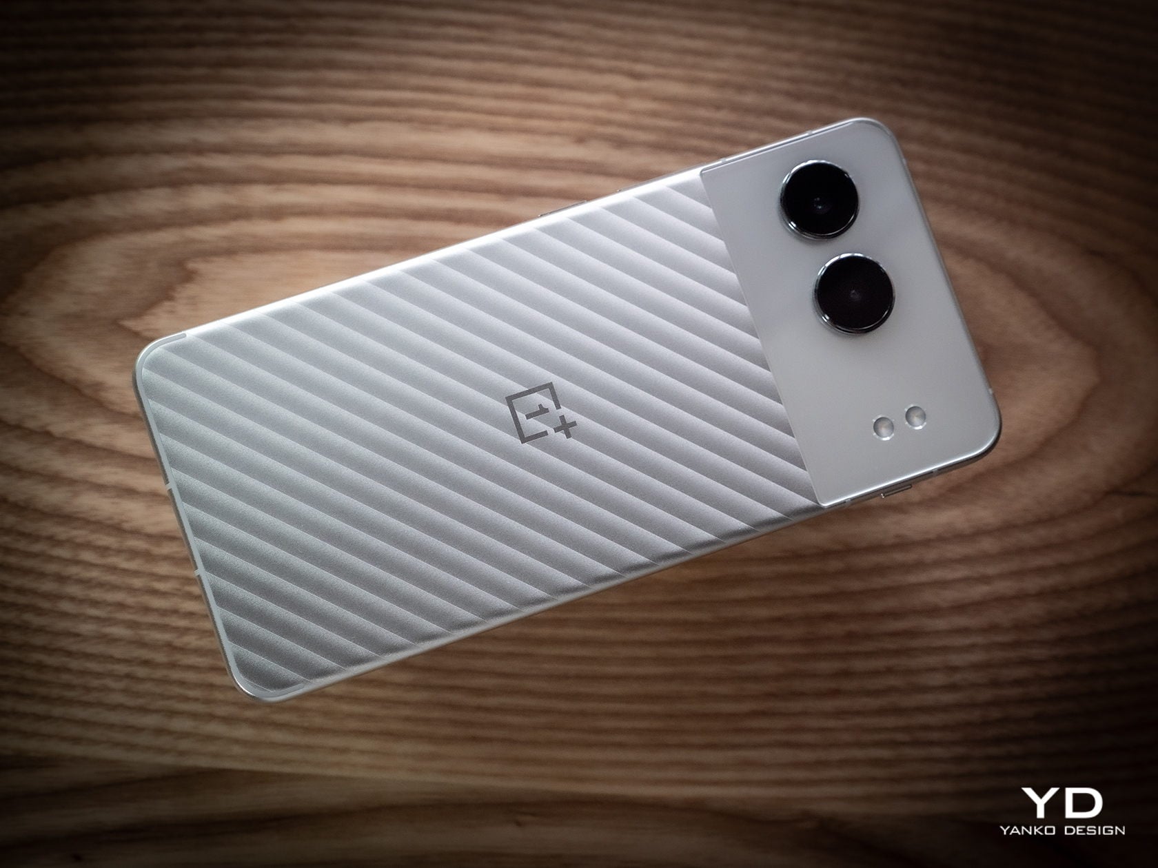
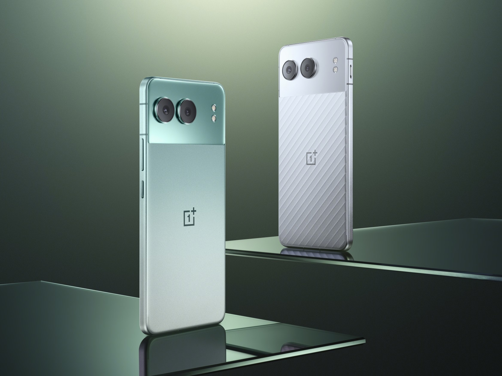
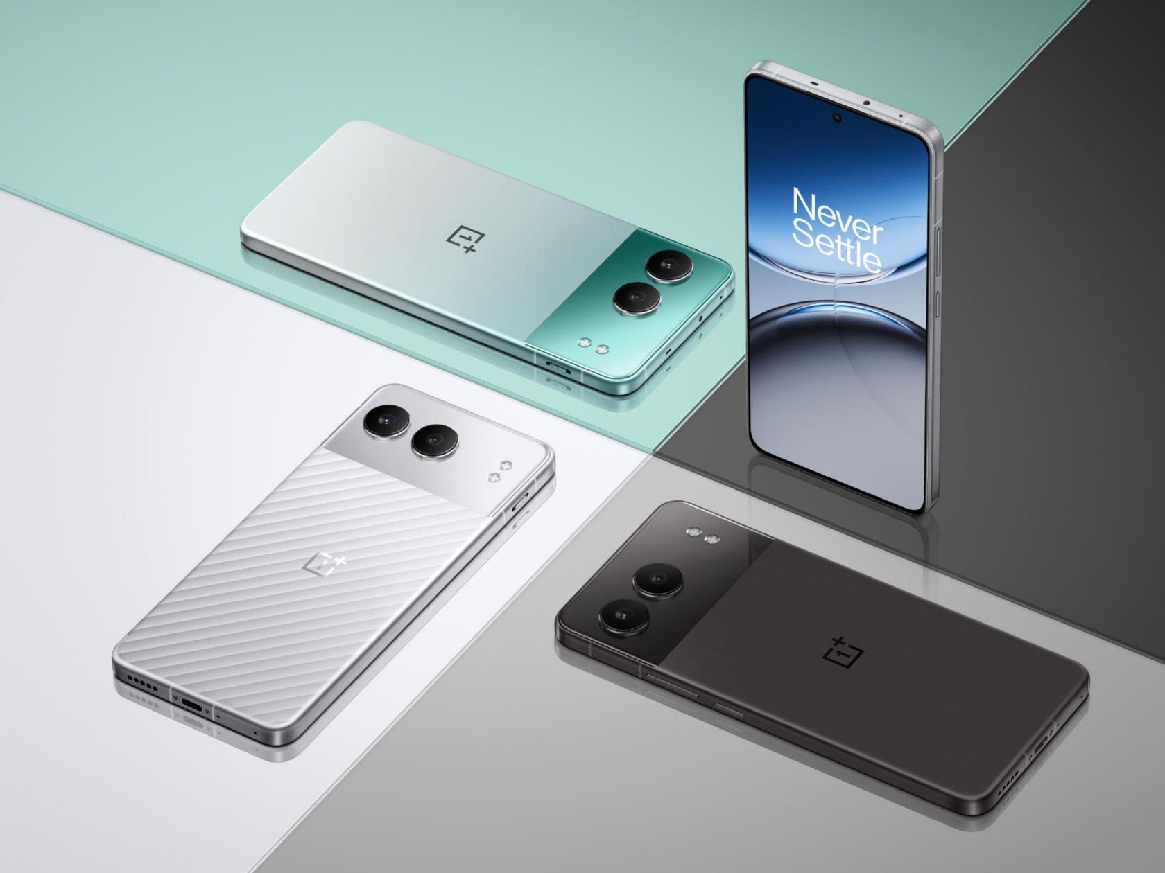
It is that same trait that has allowed OnePlus to craft a seamless and unified metal shell for its latest design, the OnePlus Nord 4. The material delivers a lustrous look and a premium feel, something that users today are craving more than just features and specs. More importantly, however, this metal unibody design was made to address the flaws and concerns that smartphone makers have with mixing the material and current technologies, opening the door to fresh new designs that go beyond limitations imposed by hardware.
OnePlus Nord 4: Metal for the 5G Era
Choosing metal for the new Nord was both logical yet also difficult. It presented an opportunity to uplift the user experience but also put hurdles that needed to be sufficiently overcome lest it actually become a burden to that same user experience. Fortunately, the creative minds over at the OnePlus Industrial Design Studio got together to solve these issues to deliver a fashionable product without compromises.
Ryan Ruan, Head of OnePlus Industrial Design Center, shares the many challenges the team had to face and eventually solved to create the OnePlus Nord 4. In the early stages of the design, it was already clear that the higher thermal conductivity of metal would be a concern. “That’s why we chose the power-efficient (Qualcomm) Snapdragon 7+ Gen 3 and designed a heat dissipation system that uses 17,900 sq. mm. of high-density crystalline graphene and a steel vapor chamber to ensure that even in extreme temperatures, the phone can still operate normally,” the designer explains. This serves to minimize the impact of heat on the metal surface and keep the phone performing optimally.
Wireless charging is another feature that is absent on phones with metal covers, and, unfortunately, there is still no way around this limitation. That said, the desire for this feature is more of a symptom of a much deeper cause. “Ultimately, users are pursuing high charging efficiency and a better user experience overall. Wireless charging is just one of the solutions, but we provide another solution,” according to Ruan. That solution is the OnePlus Nord 4’s extra-large 5,500 mAh battery and super-fast 100W SuperVOOC charging, minimizing not only the charging time but also the number of times you even need to charge the phone.
As for that tricky 5G antenna problem? OnePlus re-designed the phone’s internals to not only maximize battery space but also improve the signal strength. More importantly, the new U-shaped antenna design at the bottom of the internal chassis ensures that there is no degradation of wireless signals when you hold the phone at the sides with the so-called “Death Grip.” In other words, there will never be a wrong way to hold the Nord 4.
The Future of Burdenless Design
“When you choose a device, a product, or an art piece, it’s not only a question of specs or functionality but also a question of emotion, what you can feel from an object,” says Lehanneur. This relationship between object and person is especially true with today’s smartphone users who no longer pick just from a list of features but based on, as the designer describes it, “a question of how you want to be part of this object and how you want it to be a part of your life.” In that regard, Lehanneur expressed his delight in the Nord 4’s metal unibody design, and not just because it was made of metal. The Mercurial Silver colorway, in particular, has this visual effect where you can feel a relief or embossed surface even when there’s none. Lehanneur compares it to the “guillochage” design of luxury watches that provide beautiful visual and tactile experiences in a simple yet striking manner.
It’s a kind of detail that isn’t lost on OnePlus users who Ruan describes as “very playful, very young, and very personalized, pursuing designs where they can express themselves.” That is why early on, OnePlus designers decided to have a very different metal unibody design for the Nord 4 that distinguishes it from the 4G era OnePlus 5 and 5T. The dual-tone design of this generation’s “Nordtones” expresses that spirit of dynamism and vibrancy, while still trying to appeal to a broad range of tastes. It allows the Nord 4 to establish an emotional connection with users and allow them to express themselves in more unique and personalized ways.
A metal unibody is definitely a bold design to use for a phone, but it’s one that looks to the past glories of smartphone history while also safeguarding its future. “Metal is probably one of the most sustainable materials because it can live endlessly,” says Lehanneur. Unlike plastic that loses a part of its substance every time it’s recycled, metal can be recycled again and again. The recycled metal used in the Paris Olympic Torch, for example, could have very well come from a car in the past. In a way, that is also one way that metal carries its history, creating an interesting narrative with each lifetime.
In the same vein, metal wasn’t just a material choice for OnePlus but a representation of the brand’s design philosophy and ideals. “OnePlus is founded on the belief that while form should always perform a function, good design is what ultimately defines the user experience,” says Ruan. Choosing a metal unibody design, despite its numerous challenges, demonstrates the battle cry that launched OnePlus into stardom: Never Settle. “Our aim is to always strike the ideal balance between modern, elegant design and fast, smooth performance while providing users with a burdenless experience.”
Be sure to look out for our review of the OnePlus Nord 4 that will cover not just the design but also the overall value of this bold metal unibody phone.
Stylish, lightweight, and flexible workstation on-the-go
Competitive performance even for light gaming
Creative speaker soundbar hinge design
CONS:
Included pen feels cramped
No HDMI port or SD card slot
RATINGS:
AESTHETICS
ERGONOMICS
PERFORMANCE
SUSTAINABILITY / REPAIRABILITY
VALUE FOR MONEY
EDITOR'S QUOTE:
With a more portable design and solid performance, the Lenovo Yoga 9i Gen 9 makes for a competitive all-rounder that can cover almost every need and use case.
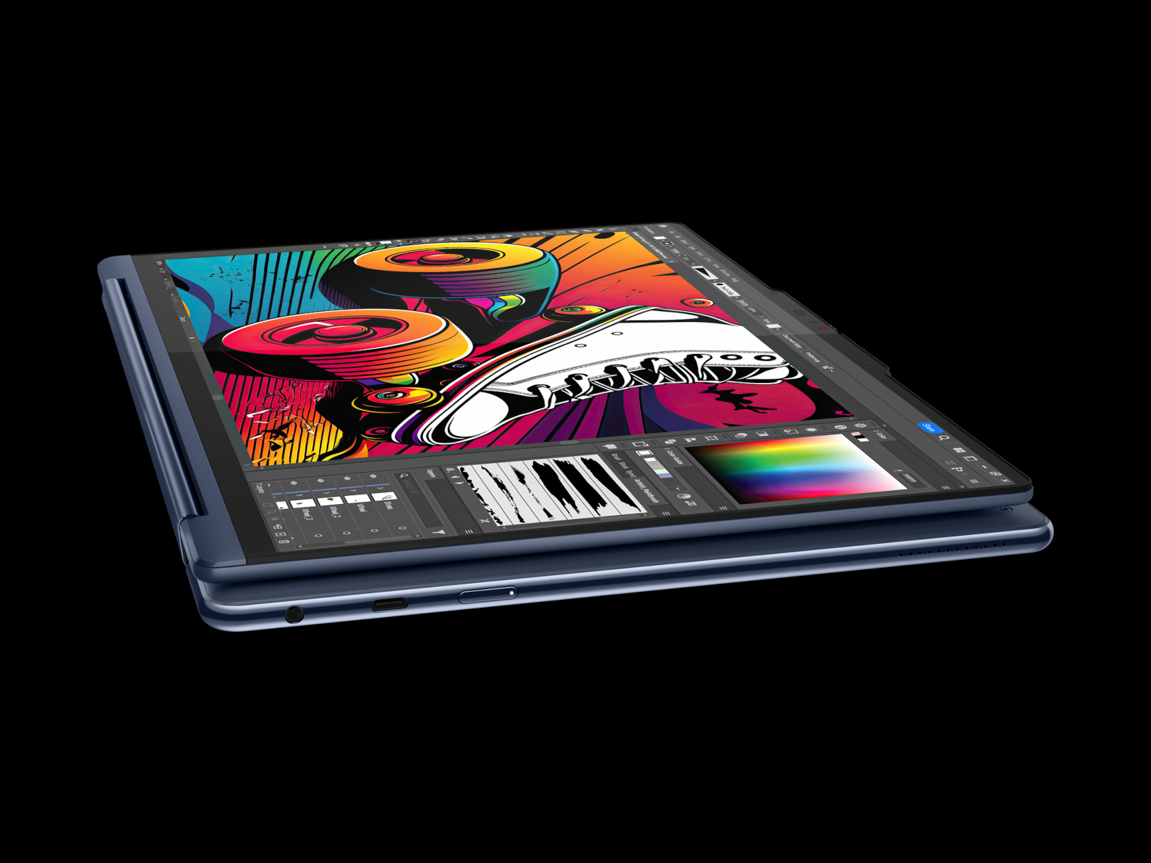
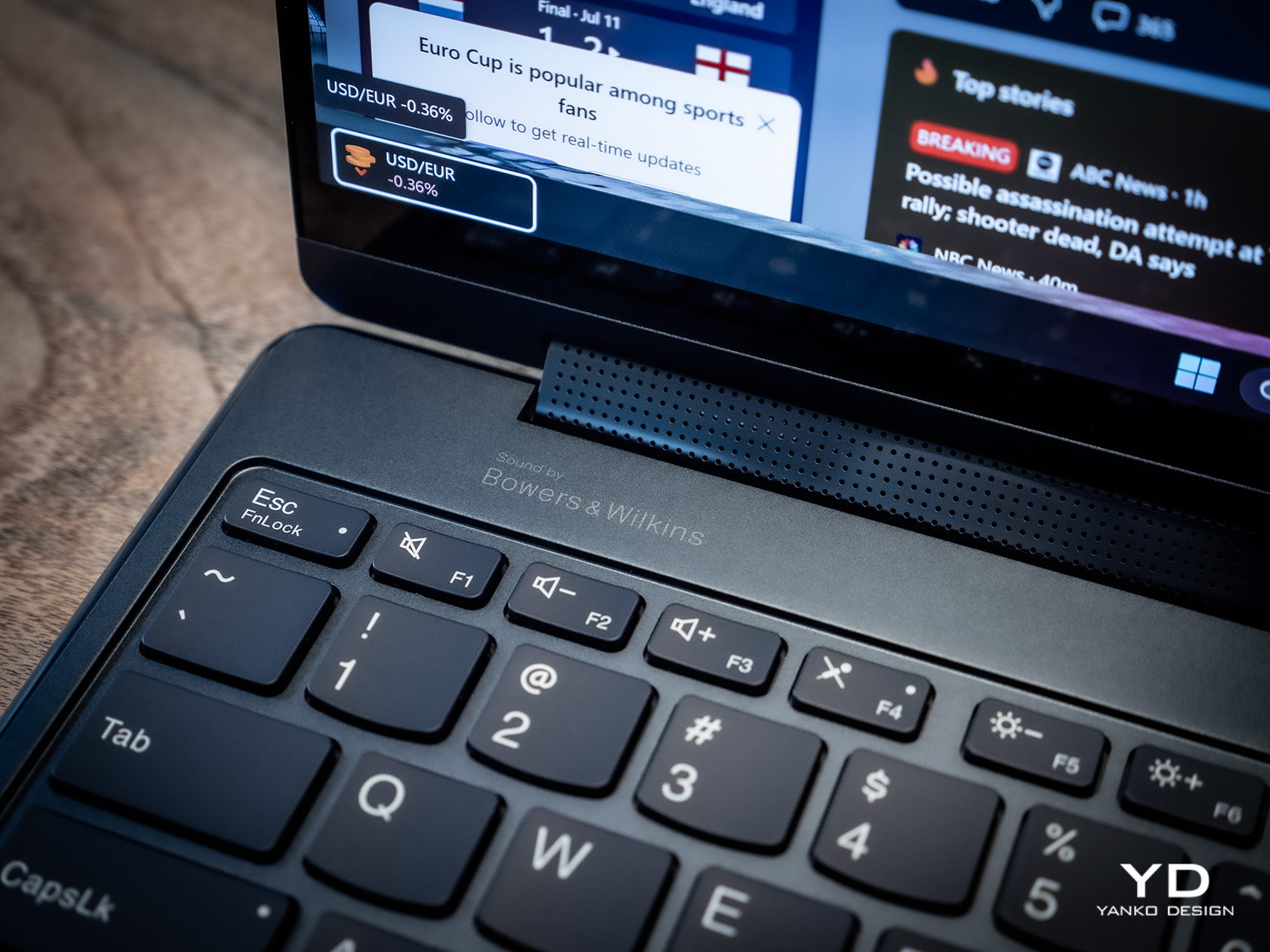
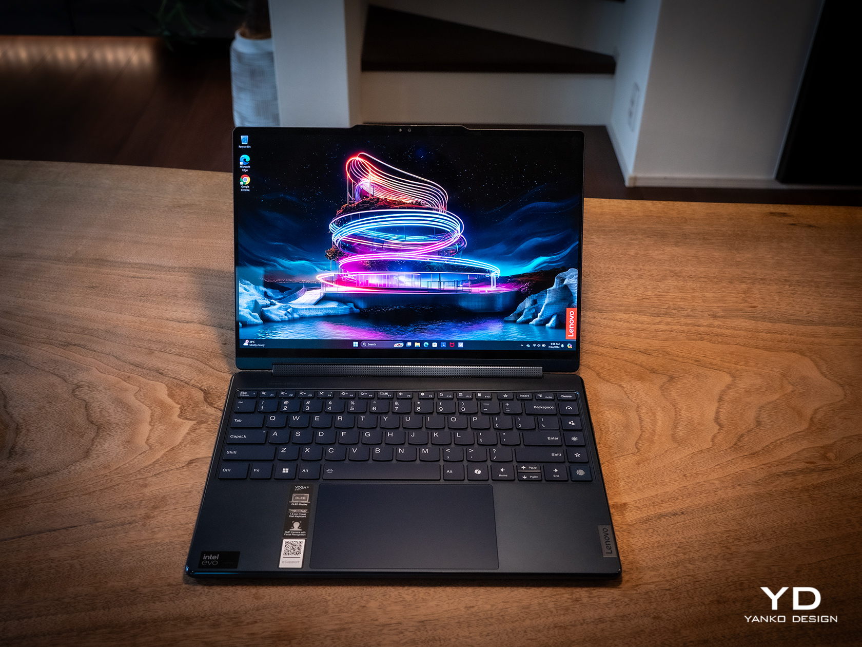
There has been a sudden flood of new laptops in the past months, most of them trying to ride the AI wave. With so many designs and so many configurations available, it can be a bit daunting to pick one for your next major computer purchase. There’s no shortage of models catering to gamers and content creators, as well as pro models aimed at high-performance workers. On the opposite side lies the “economy” choices meant for students and some employees, carrying barely enough power for the most basic tasks. When it comes to those who need a general-purpose computer that can keep up with their changing needs and situations, the choices can be a bit more difficult because they’re all over the place. A solid option with well-balanced features and an accessible price tag is always in demand, and that’s what the 2024 Lenovo Yoga 9i Gen 9 (14IMH9) 2-in-1 convertible laptop is promising, so we take put it to the test to see if it does keep its word.
Designer: Lenovo
Aesthetics
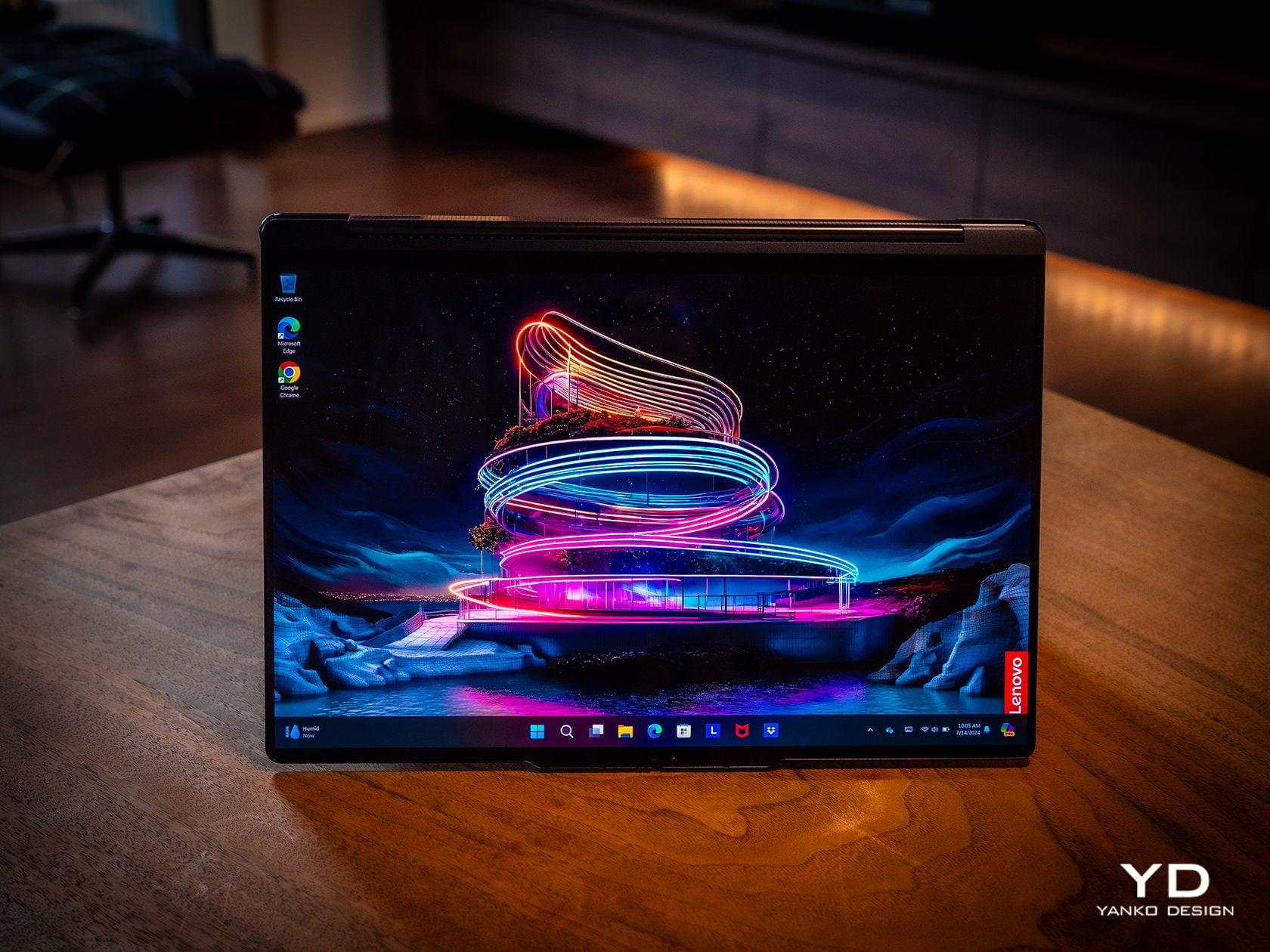
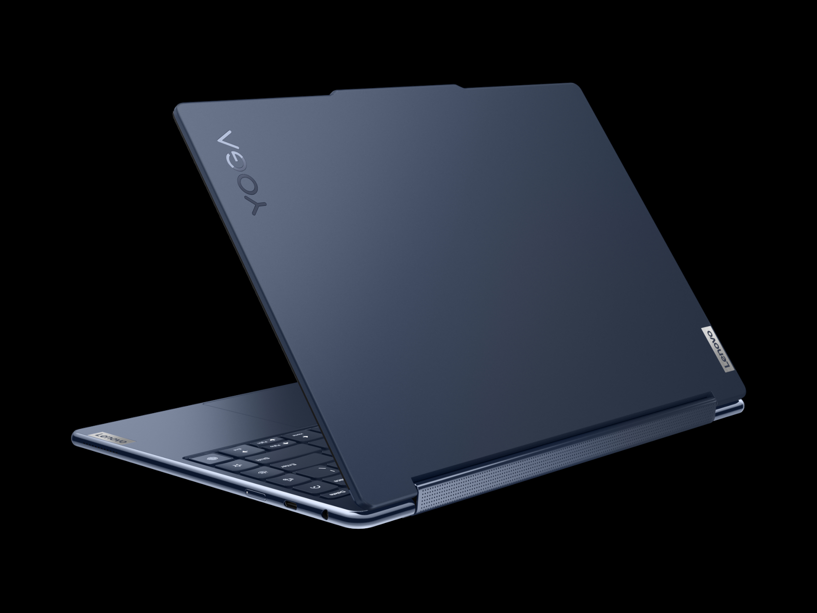
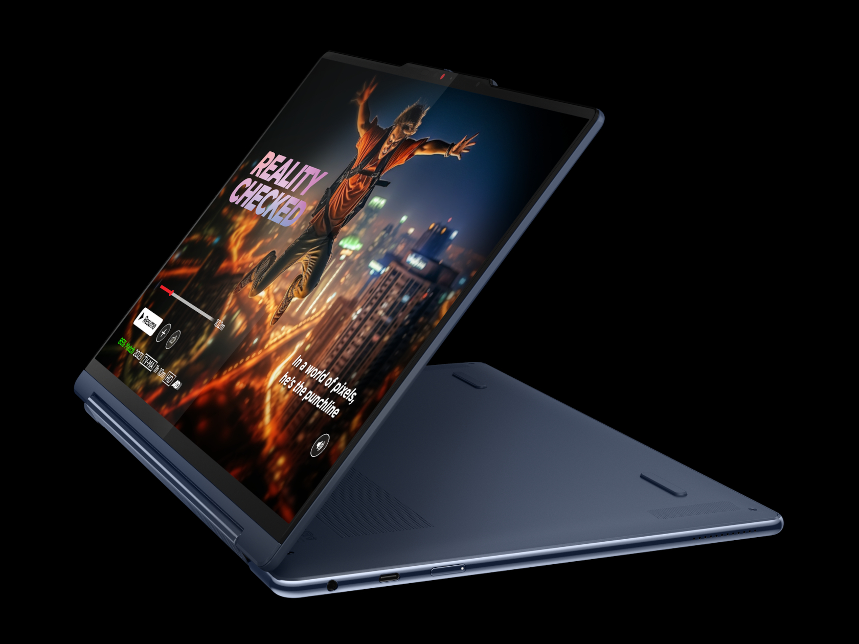
The Lenovo Yoga 9i Gen 9 has a presence that grabs your attention without being loud or distracting. The simple yet sleek shape of the lid combined with the soft curves of the base creates an interesting silhouette whether the laptop is closed or open. And the dark Cosmic Blue hue, still a rarity in this product line, makes it stand out in an aesthetically pleasing way. When the lid is open and the screen powered on, the extra slim bezels around the display further emphasize the laptop’s modern appearance.
Even at first glance, it’s immediately evident how slim and small the 2-in-1 laptop is, at least for a 14-inch device. Compared to its Gen 8 predecessor, this year’s Lenovo Yoga 9i is significantly smaller and lighter, which greatly improves its portability. This attribute is even critical for this kind of laptop since it can be used as a tablet that you’ll sometimes have to hold up for long periods of time, though it does have some drawbacks compared to typical tablets, which we’ll get to later.
One design detail that might prove divisive is how the lid and the base practically have two different designs. The lid is thin and has flat edges with a matte surface, while the base sports curved edges with a shiny finish. The difference between the two is even more stark when you realize that the base is actually wider at its edges than the lid so that these two parts don’t sit flush with each other when closed. It’s an asymmetrical design quirk that might not sit well with some, while others might grow accustomed to it over time, enough to take it for granted.
Ergonomics
At only 2.98 lbs (1.35kg), the Lenovo Yoga 9i Gen 9 is relatively lighter than its predecessor as well as the nearest competition. This gives it an advantage when it comes to portability, especially when you consider how it doesn’t skimp on the specs in return. You still won’t want to hold it up unsupported for long periods of time, but it’s less straining than most. That said, you won’t be able to hold it as comfortably as a regular tablet like an iPad or a Surface because the keys fold to the back of the lid. They’re disabled, of course, but you will still undoubtedly press on them, making for a rather awkward experience.
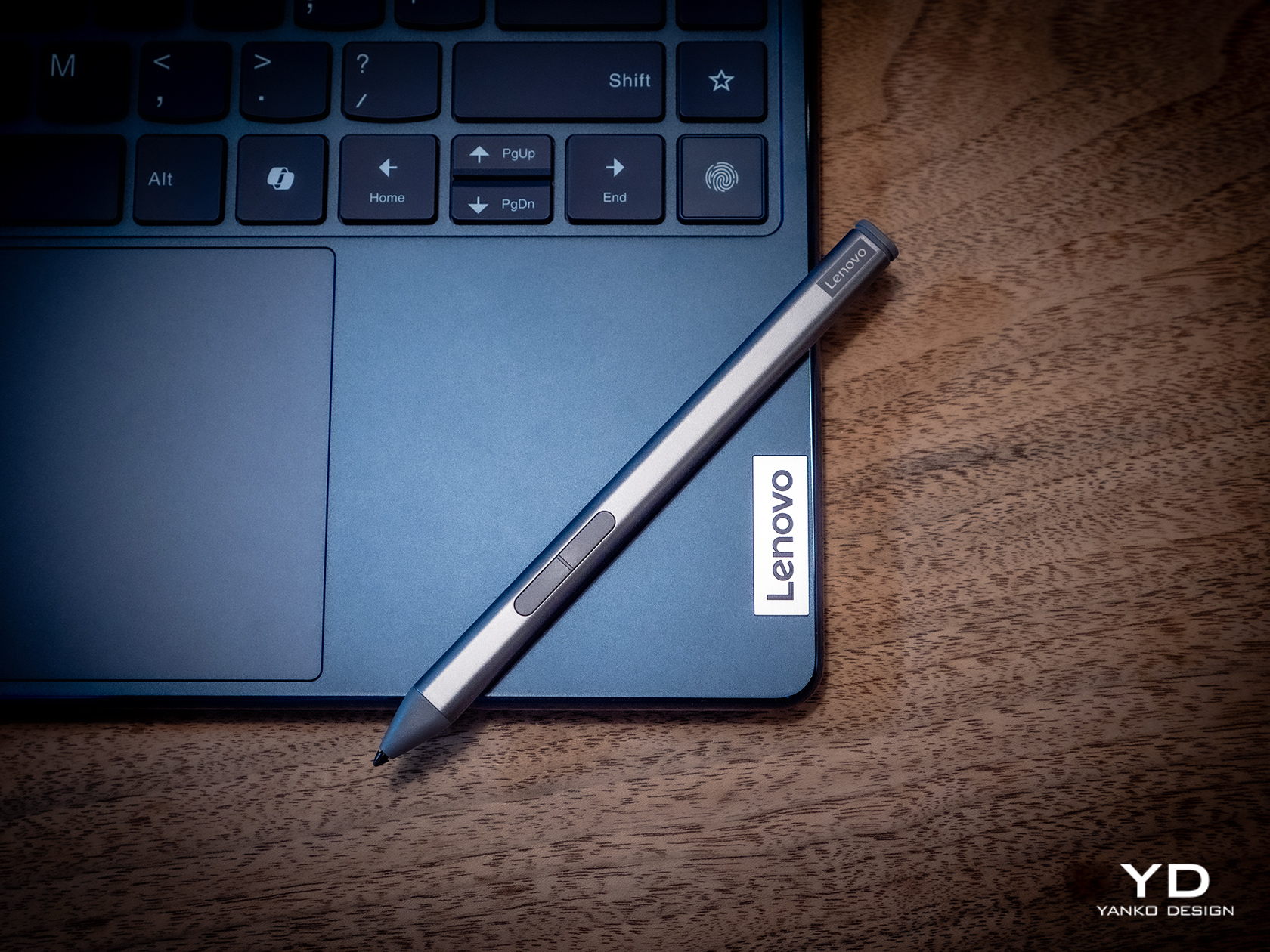
But while using the laptop is comfortable and even enjoyable, the Lenovo Slim Pen that ships with the Yoga 9i Gen 9 is a different story. We don’t have any complaints when it comes to the performance of the stylus, since it does a great job at it, but holding the short and nearly flat stick can strain your hand if you use it for too long. There’s also no secure place to put the stylus on when not in use, because the magnet on the back and top of the lid is not exactly that strong. It almost feels as if designing the pen was an afterthought, especially since previous Yoga 9i models had a silo for its home.
Performance
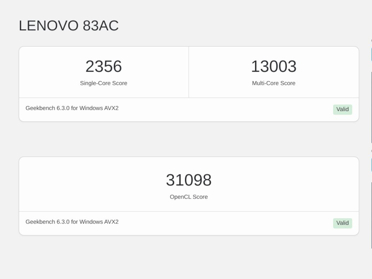
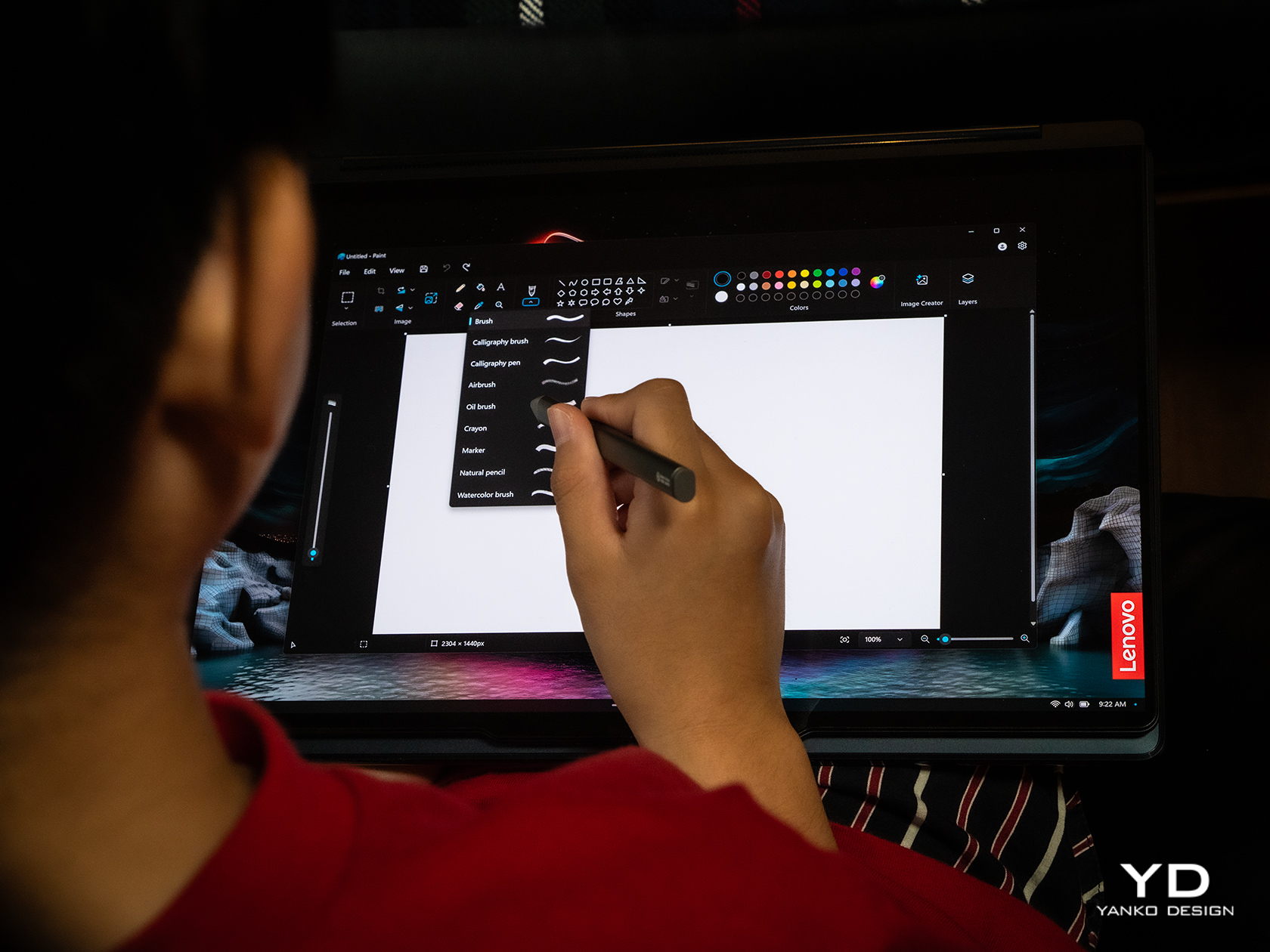
In addition to its facelift, the 2024 14-inch Lenovo Yoga 9i Gen 9 gets a major upgrade in hardware. That’s the Intel Core Ultra 7 155H, the chip maker’s latest entry into the AI arena. This is matched with high-speed LPDDR5x RAM, 32GB for our review unit, and 1TB PCIe SSD Gen 4 M.2 of storage. In addition to the integrated Intel AI Boost NPU (Neural Processing Unit), a key feature of this configuration is the integrated Intel Arc graphics. It’s still a far cry from dedicated GPUs from the likes of NVIDIA and AMD, but it’s still a major leap forward in terms of performance. And it doesn’t disappoint, at least within the right context and expectations. It’s no gaming laptop, but light gaming with medium settings is no problem, as are content creation apps, especially those that utilize AI features.
The real star of the show here is the 14-inch OLED display, with a 3.8K WQUXGA (3840 x 2400) resolution in our review unit (there’s also a 2.8K 2880×1800 option). Both are touch-capable, as you would expect from a 2-in-1 laptop, and the image quality is just astounding in both brightness and color vibrancy. It’s by no means perfect, especially compared to more “pro” laptops, but on a consumer product, this is simply gorgeous. It doesn’t fall short when it comes to audio either, and its unique design solves one of the biggest problems laptops have: speaker placement. In the Yoga 9i Gen 9’s case, the wide hinge also acts as a soundbar that’s always firing in your direction, and the audio that it puts out is full and broad, and it doesn’t sound distorted or tinny at maximum volume.
As a 2-in-1 laptop, the Yoga 9i Gen 9 has to carefully balance the needs of both laptop users as well as tablet users, and nowhere is that more evident than in the choice of I/O ports. There are three USB-C ports, two of which support Thunderbolt 4, one full-sized USB-A port, and a 3.5mm headphone jack. That’s pretty much it. The lack of an HDMI port means you’ll need to use a dongle if your external monitor doesn’t support USB-C video, and digital photographers might be unimpressed with the lack of a card reader. The I/O leans more on the side of portability and mobility, making some practical sacrifices along the way.
The typing experience is quite decent, and the keys have sufficient spacing and travel to keep most users happy. It’s also backlit, so typing in the dark is no problem at all. The touchpad is large, smooth, and responsive, leaving very little reason to complain. One design detail that some might take issue with is the column of special keys on the right edge, providing quick access to a few features, including a fingerprint scanner. Unfortunately, its placement makes it too easy to hit these keys accidentally, especially since they’re so close to important keys like Enter, Backspace, and the Left cursor key. It also means that the entire keyboard is practically shifted to the left, and so will your hands.
Battery life is decent, though not exactly remarkable. The 75Wh battery will last you an average of 5-7 hours on average use, shorter if you crank up the video or game settings. The good news is that it charges over USB-C and any of the three USB-C ports can be used for that purpose. That means you can opt for a faster and smaller GaN charger than the plain 65W brick that comes with the Lenovo Yoga 9i, not that it’s that big a charger in the first place.
Sustainability
The Lenovo Yoga 9i Gen 9’s all-aluminum build means there’s less plastic in each laptop. Even better, it uses plenty of recycled materials as well, like 50% recycled aluminum for the base bottom, 50% post-consumer recycled plastic for the keyboard, and, of course, 100% plastic-free packaging. That’s definitely more than what you might find in other consumer laptops, so Lenovo deserves a pat on the back there.
Unfortunately, the longevity of the 2-in-1 laptop might be a bit of an issue, especially if you consider doing repairs or upgrades yourself. Although held down by four TORX screws, the base bottom panel also has some pretty strong adhesive that gets in the way of easily accessing replaceable parts. Also quite puzzling, this Gen 9 model has apparently dropped support for the longer 80mm NVMe SSD drives, limiting you to the 42mm variety only.
Value
The laptop market is a very competitive space, especially when brands put out new models almost at the same time and with the same core specs. That makes telling each apart a bit more difficult, let alone figuring out the actual value that a product has. With a price tag ranging from $1,300 to $1,500, the Lenovo Yoga 9i Gen 9 (14″, 2024) already stands out as being more affordable, but we definitely can’t judge it by that figure alone, nor can we ignore the competition.
The Yoga 9i Gen 9 definitely offers a well-rounded set of features, wrapped in a design that is elegant and distinctive, even if a bit odd at the edges. The 14-inch display really makes videos and images pop, up and the sound quality is impressive for a laptop. That said, it’s a very close call with its biggest rival, the newly refreshed HP Spectre x360 14, also a 2-in-1 convertible laptop. It might even boil down to which product and software ecosystem you prefer, but you can’t go wrong with a solid performer like the new 2024 14-inch Yoga 9i.
Verdict
Finding a good balance between power, portability, and price isn’t that easy. Some designs don’t even try and instead focus on a specific aspect and refine that to perfection. The Lenovo Yoga 9i Gen 9 almost comes close, bringing the AI-empowered performance of the new Intel Core Ultra line to a sleek and elegant device that you can proudly show off, whether as a laptop or as a tablet. With a large and beautiful screen that barely has any bezels, it not only lets you focus on your work but also enjoy viewing content on it. Best of all, its sustainability and accessibility give it an edge over similarly priced options, making the Lenovo Yoga 9i Gen 9 2-in-1 laptop truly enticing for creators and workers always on the go.
Hands-free gesture and voice control offer unbeatable convenience
CONS:
Struggles a bit in low light
Voice control might be a concern for some users
A bit pricey (without Amazon Prime Day deal)
RATINGS:
AESTHETICS
ERGONOMICS
PERFORMANCE
SUSTAINABILITY / REPAIRABILITY
VALUE FOR MONEY
EDITOR'S QUOTE:
With a sleek, modern design, excellent performance, and helpful AI features, the OBSBOT Tiny 2 4K camera is one of the best webcams money can buy, especially if you get it at a bargain like on Prime Day.
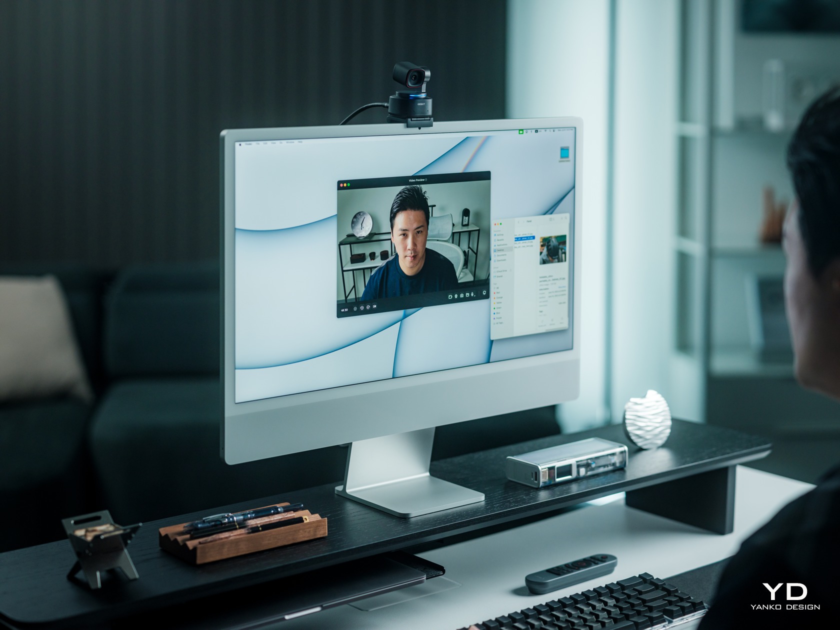
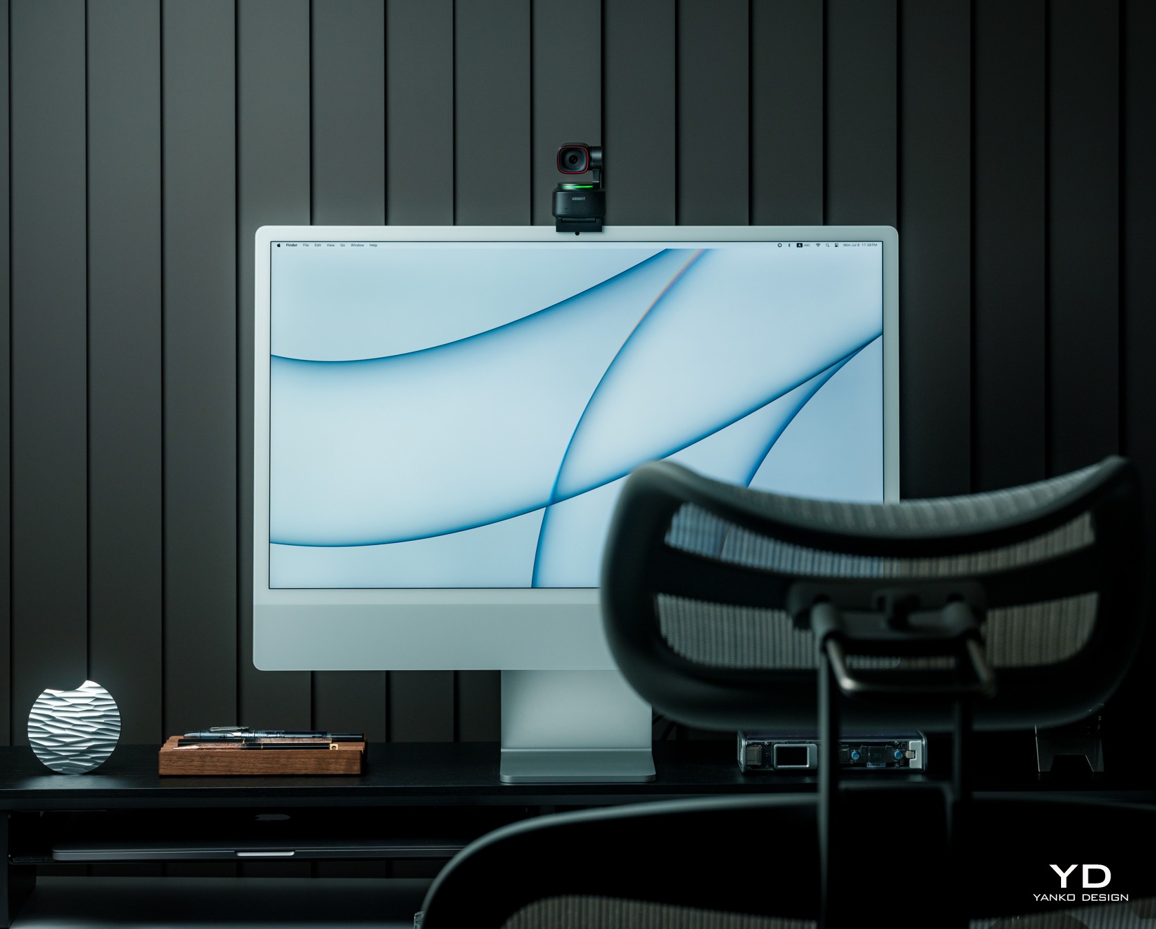
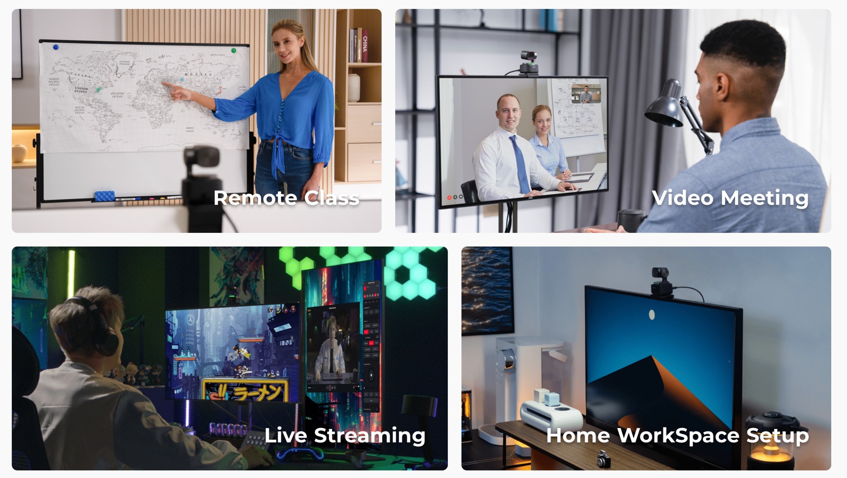
With streaming steadily becoming a popular and even lucrative career, the webcams built into laptops and monitors are not enough to give you an edge over the competition. Sure, they might be serviceable or even decent for meetings, but holding a captive audience requires more than just showing your static, pixelated face all the time. Whether you’re streaming a game, making presentations, selling products, or creating content in general, you will want a webcam that can keep up with you, figuratively and literally. That is exactly what the OBSBOT Tiny 2 AI-powered webcam promises, so we take it out of its premium carrying case, mount it on our monitor, and take it for a spin to see if there’s more to it than an impressive list of smart features.
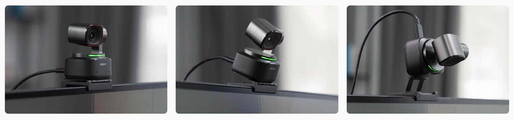
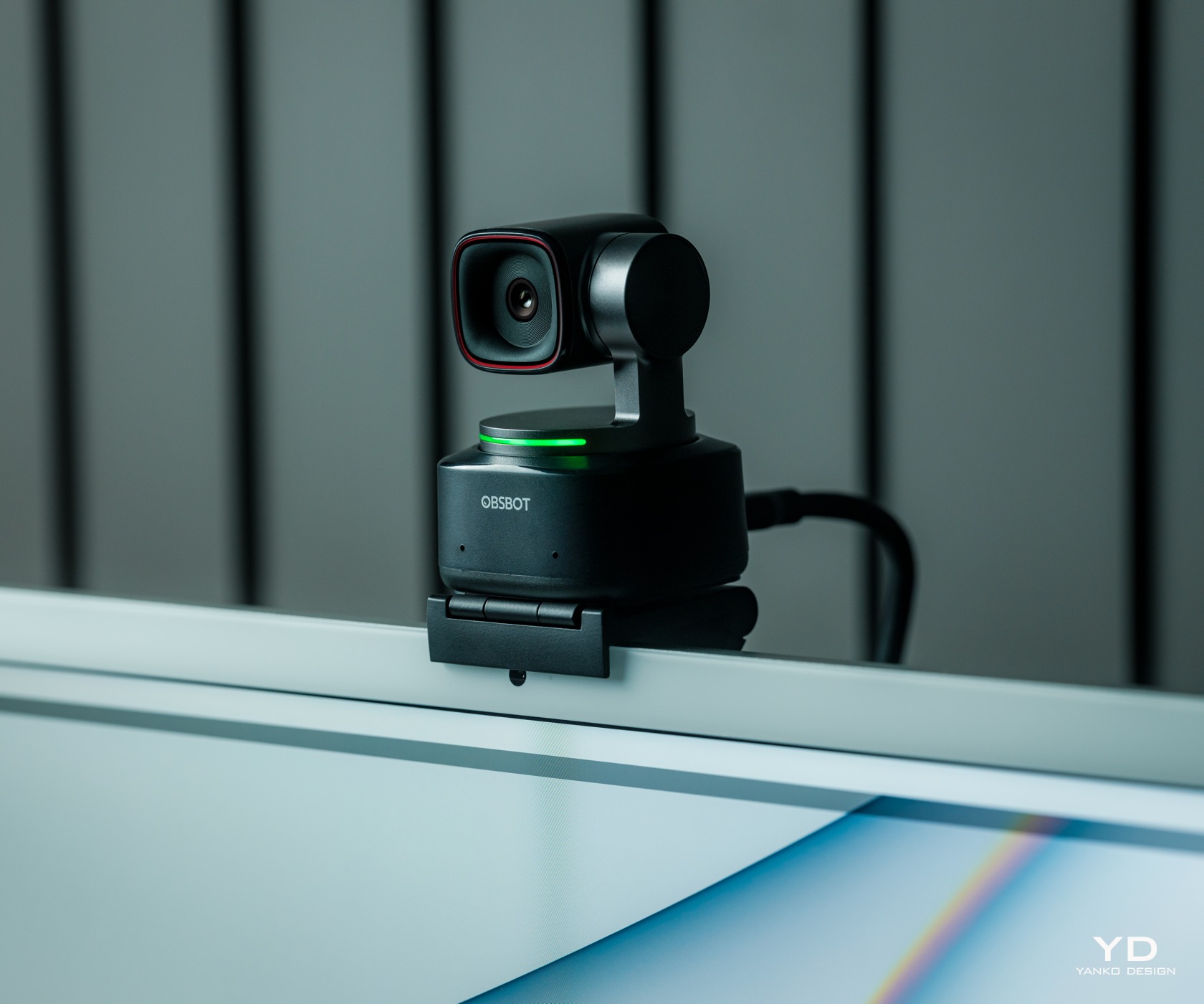
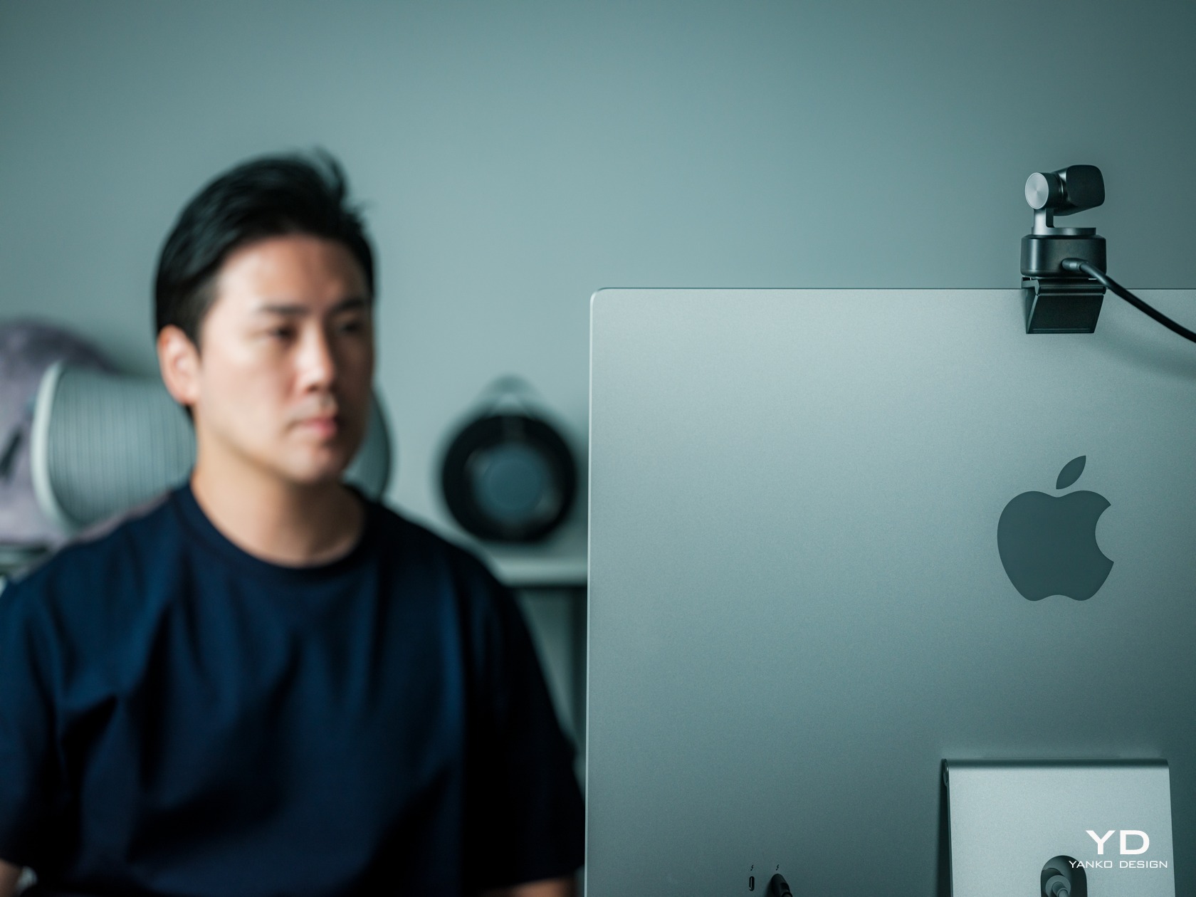
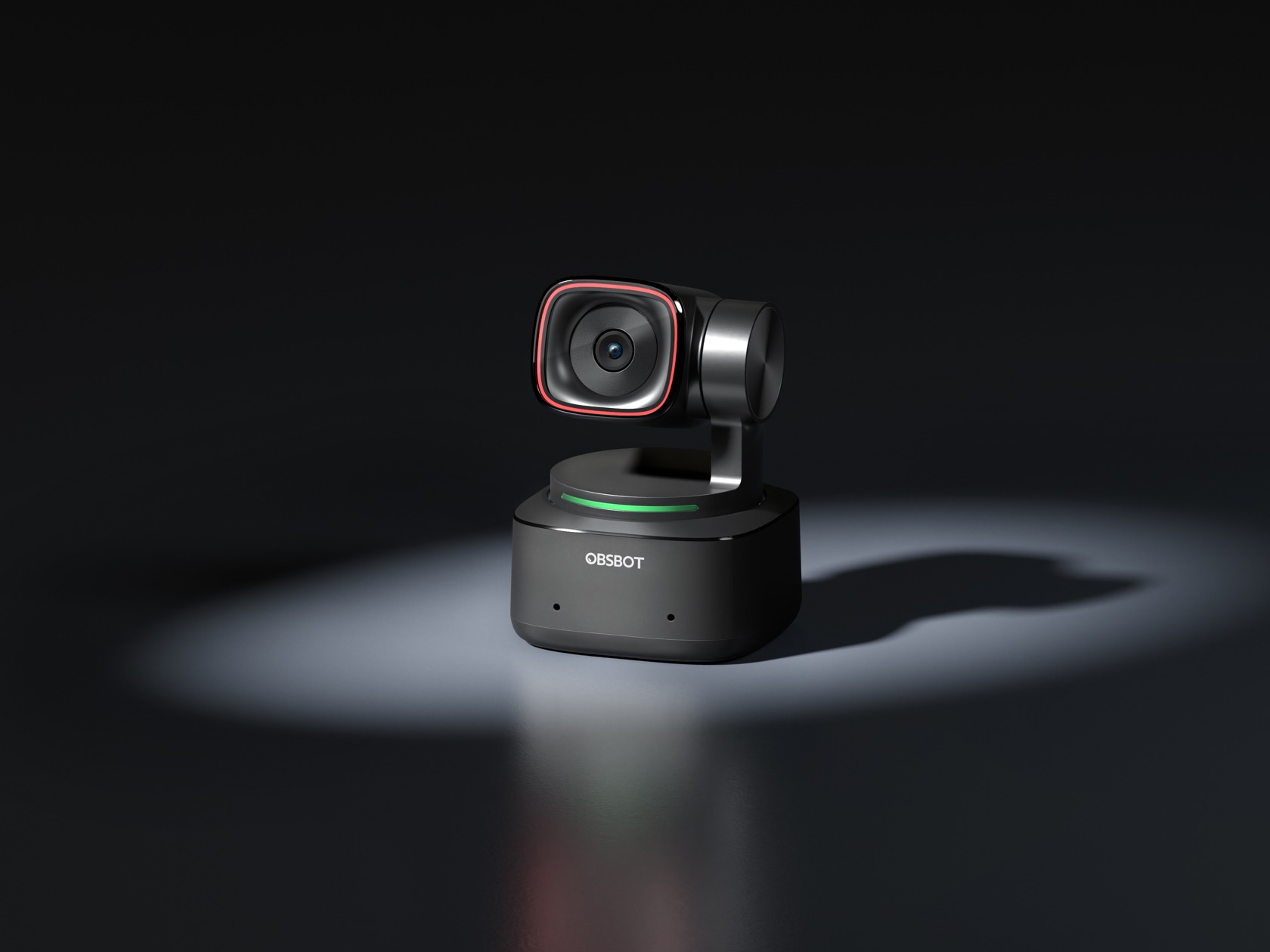
Most webcams, at least those not embedded in monitors, usually come in boxy shapes that try to blend with the edge of the monitor or circles and spheres that look like a creepy eye staring back at you. Very few of their kind pay attention to the subconscious effect their designs have on the people who will be looking at the camera for long periods of time. That makes the OBSBOT Tiny 2 immediately different from its peers the moment you take it out of its carrying case because it immediately cuts a striking figure that makes its presence known without being distracting all the time.
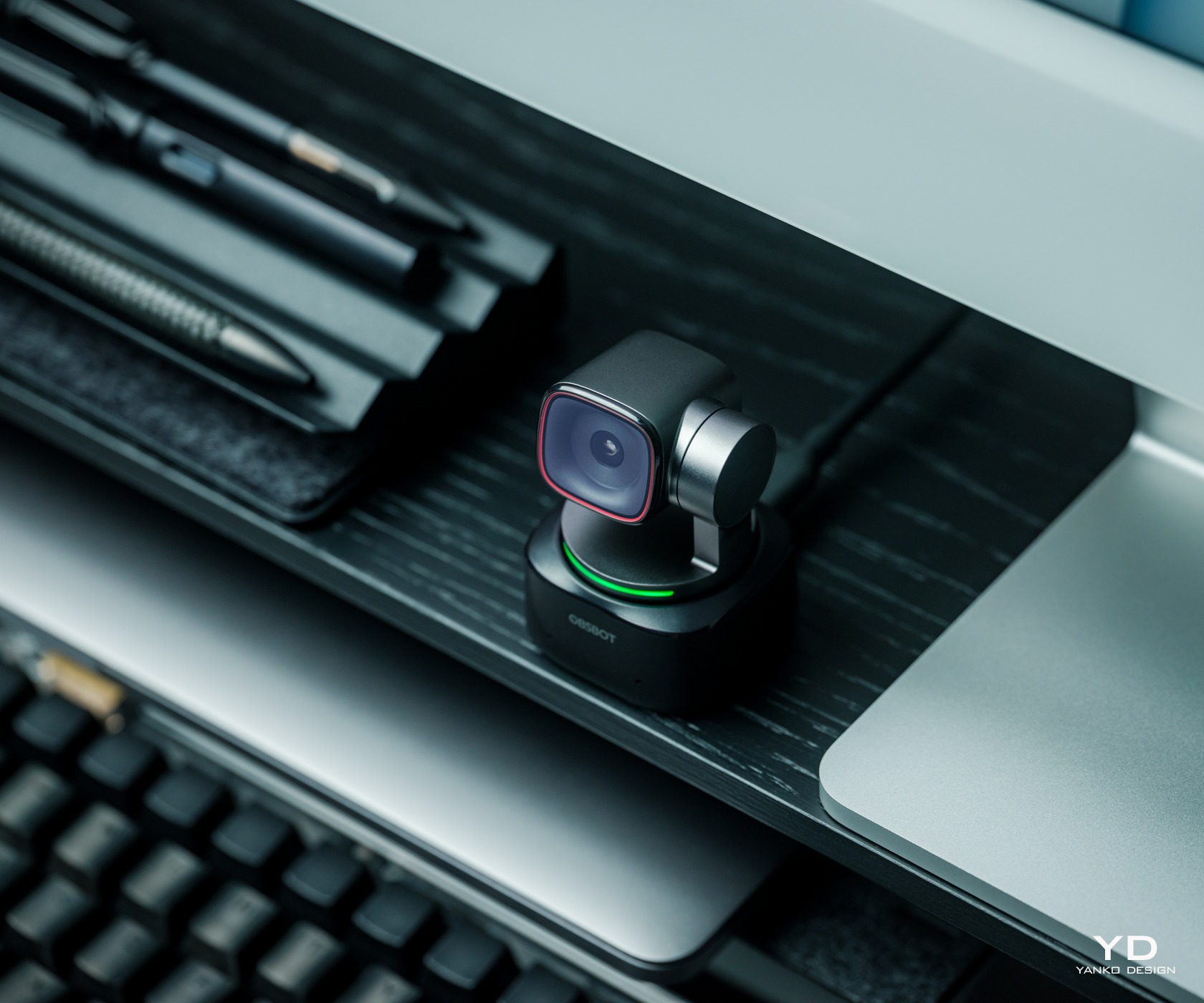
The OBSBOT Tiny 2 comes with a rounded rectangle camera connected to a 2-axis gimbal that’s mounted on a smooth, squarish base. It has a sleek and modern aesthetic that embraces minimalism to its core. There are very few deviations from its predominantly black body, like the red accent around the camera lens and the LED light strip that indicates the camera’s modes. There are no buttons anywhere, and the only break on its surface is the USB-C port. It’s a breath of fresh air from webcams that try to look either too pretentious or too uninspiring.
The camera’s build quality is also commendable, utilizing a metal alloy rather than the common plastic. Its compact size and simple operations make it quite handy as a portable webcam, and the OBSBOT Tiny 2 comes with a solid carrying case that has room for everything you need to use it on the go, namely, its USB-C cable and included mount. Suffice it to say, the webcam’s simple yet stylish design won’t distract you from creating your finest content but will still please your eyes and your subconscious mind every time you do look at it.
Ergonomics
Unlike an action camera, whether in your hand or a gimbal, a webcam is mostly meant to sit on top of your screen or somewhere stationary. And with its minimalist design, the OBSBOT Tiny 2 is definitely not something you’ll be touching a lot to use and control. That’s definitely a good thing since you don’t want to always reach out in front of you to even just adjust the camera’s direction. What you want is to be able to record yourself or take pictures without breaking your flow, and the Tiny 2 handles that quite gracefully.
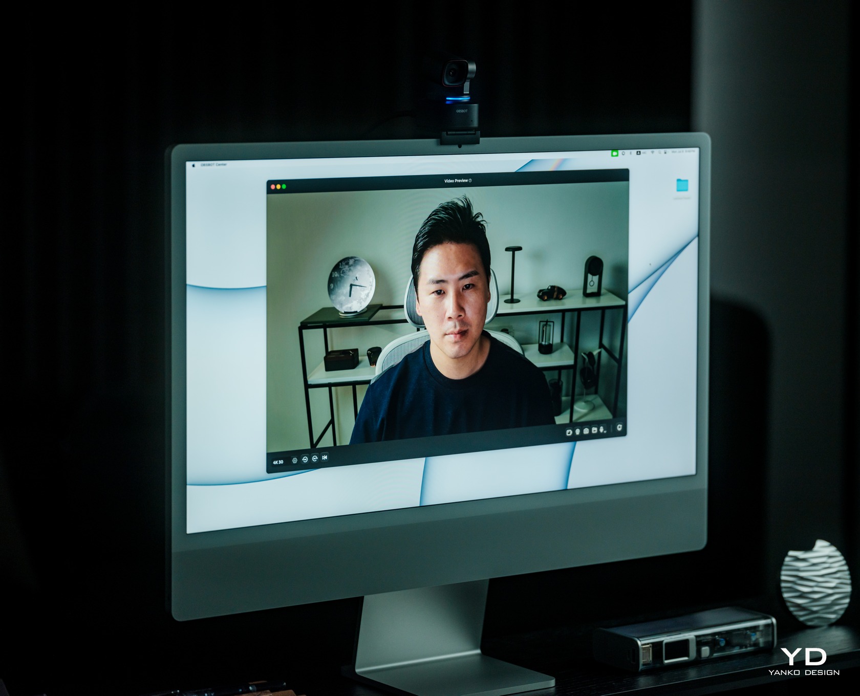
What all this means is that you’ll be controlling the camera directly, either with gestures, voice, or the optional remote control. Yes, you’ll also use the OBSBOT Center software (formerly known as the OBSBOT WebCam), which has all the sliders and buttons you’ll need to fine-tune the camera’s performance. It can admittedly be overwhelming, but it’s something that professionals will want to have access to. And if you really need to control the camera without being near the computer, the $49 OBSBOT Tiny Smart Remote 2 has a few shortcuts handy. Plus it also functions as a presenter for those meetings that will impress your boss and even your colleagues.
Various Placement Methods
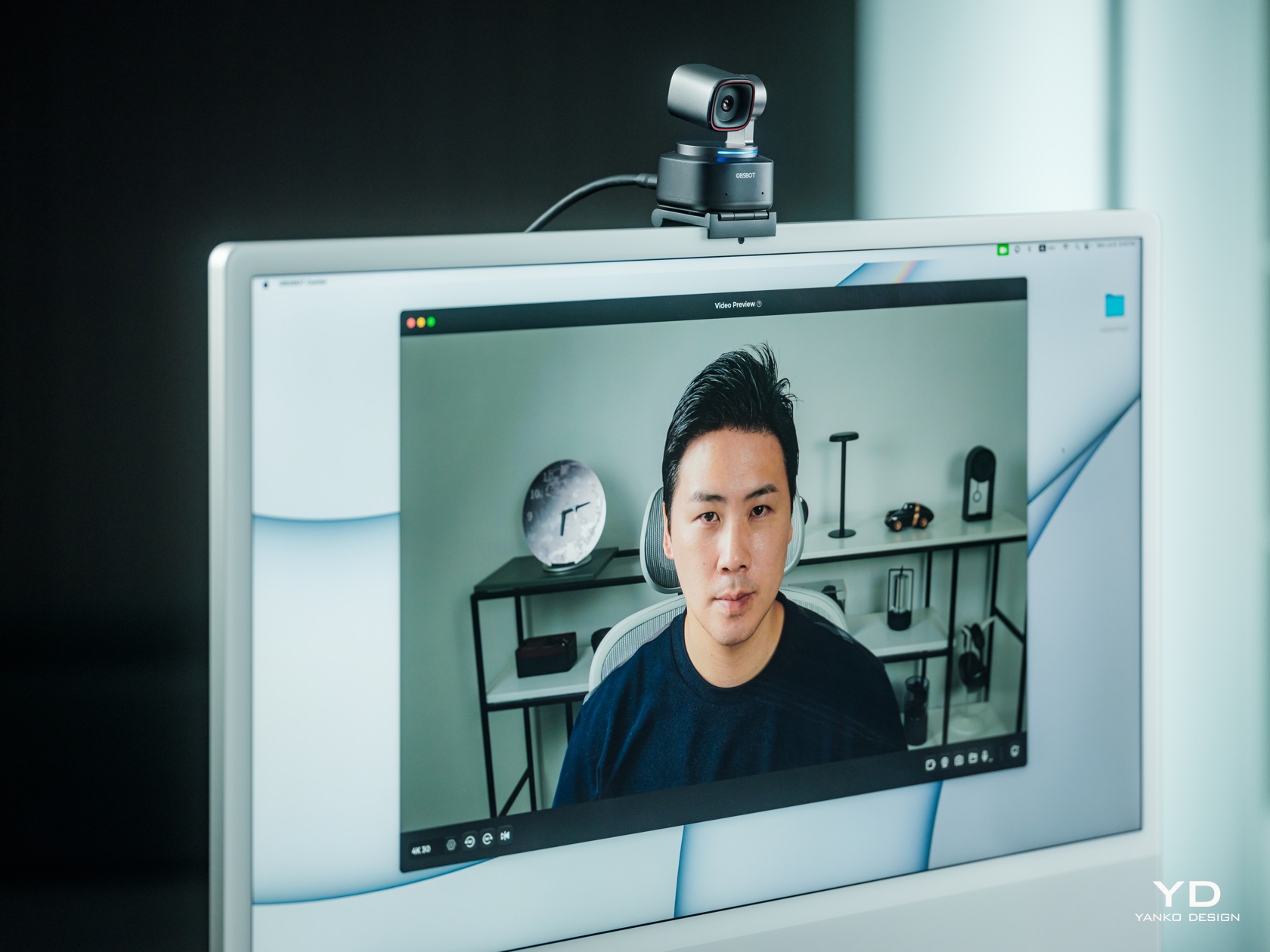
As for placing the webcam itself on a monitor, the OBSBOT Tiny 2 comes with a foldable magnetic clamp made with the same premium metal as the camera. The mount uses physics and gravity to stay on top of the monitor, while a strong magnet keeps the OBSBOT Tiny 2 attached to it, even when you tilt the mount down. Given the foldable design of the clamp, it might have some problems with very thin laptop lids or very thick monitors. Fortunately, you can also screw the Tiny 2 on almost any mount, which opens up more possibilities on where you can use the webcam. The only requirement is that you can still connect it to a computer or even a smartphone with a lengthy USB-C cable.
Performance
4K Video Quality
Before the pandemic, webcams that can go beyond 1080p resolution sounded excessive, but that’s now the bare minimum for these accessories. 4K is becoming more common, and the OBSBOT Tiny 2 is right up there with a 1/1.5-inch CMOS sensor that has an effective 50MP resolution. It’s capable of recording 4K video at 30fps or 1080p at 60fps and lower frame rates. Unfortunately, there is no “in-between” resolution like 2K of 1440p, which is also a common video quality in streaming these days.
In Dim Lighting Conditions
Whichever resolution you go with, the Tiny 2 performs admirably in capturing both still and moving content with plenty of detail and wide dynamic range. It boasts a Dual ISO system that can automatically switch or combine the two depending on the lighting condition. Unfortunately, it does struggle a bit in poorly lit environments, though not terribly. If you’ll be streaming in the dark, like what many gamers do, you might still want a bit of lighting to ensure a balanced image. The camera features two built-in omnidirectional mics with noise reduction, and while it does produce decent audio, it’s not exactly something to write home about. It can also sound a little tinny, so you might want to augment your setup with a dedicated microphone if you can afford it.
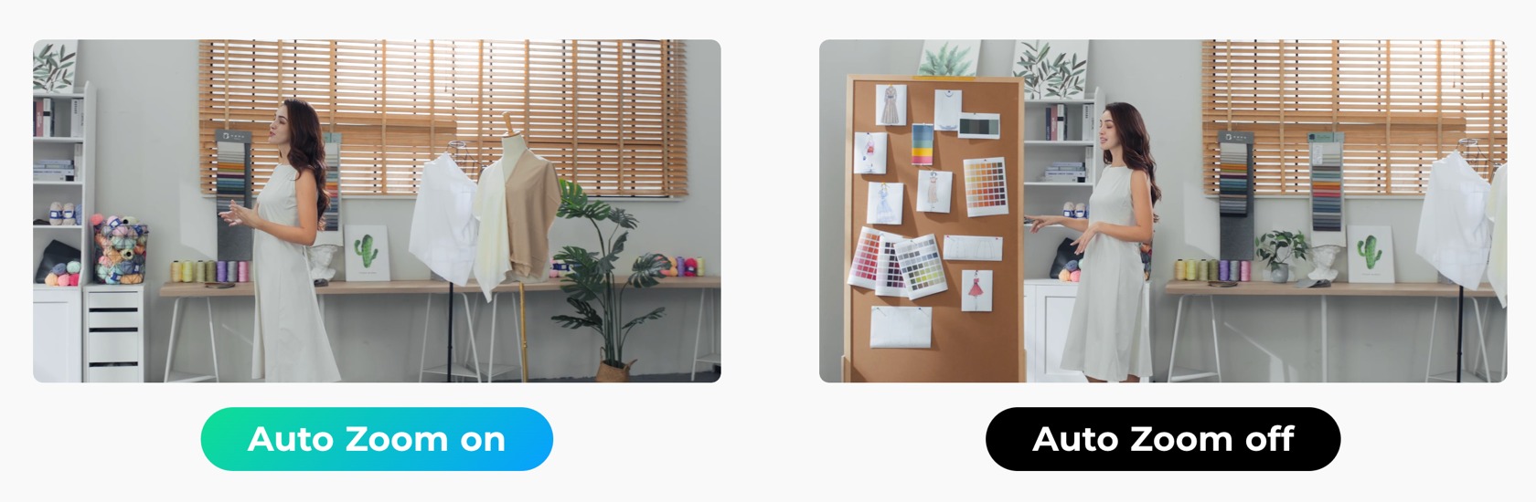
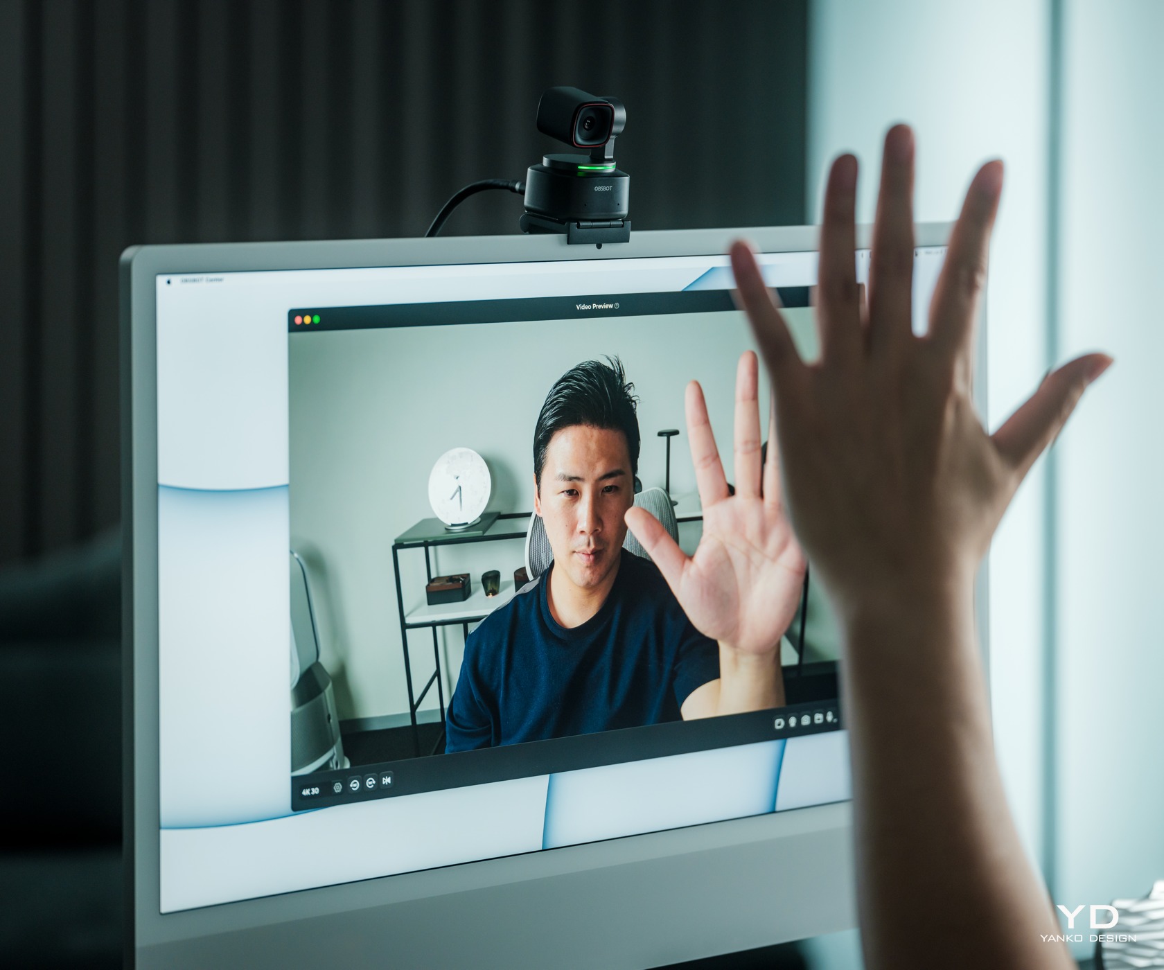
Auto Tracking with Auto Zoom
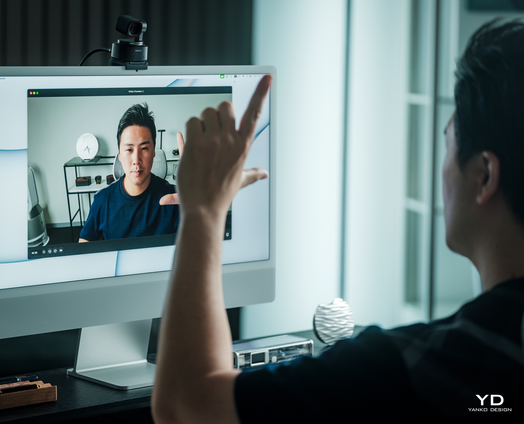
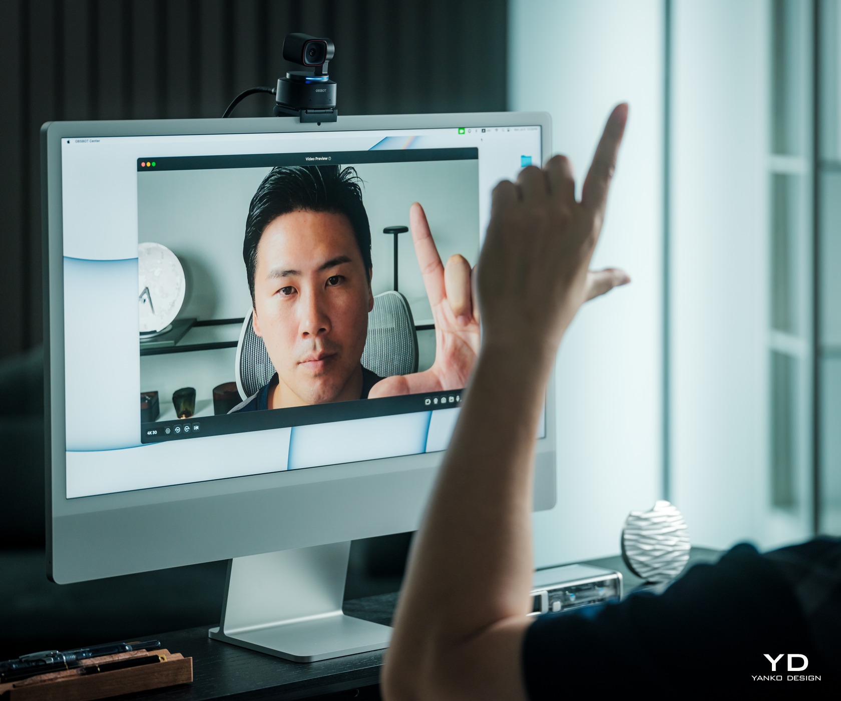
Magical Gesture Control 2.0
4x Zoom In/Out
Select/Cancel Target
While the OBSBOT Tiny 2 already delivers commendable imaging performance, it really goes to town with its long list of features to make creators’ lives easier and even more fun. And, unsurprisingly, many of these harness the power of AI with very impressive results. Tracking the subject is at the very top of the list, and it is fast and smooth, thanks both to the algorithms as well as the 2-axis gimbal. Depending on your settings, the camera can even automatically zoom in and out to make sure your head or upper body is always visible, no matter how far you are from the camera. And if more people join in on the shot, it will automatically adjust the field of view to frame everyone properly.
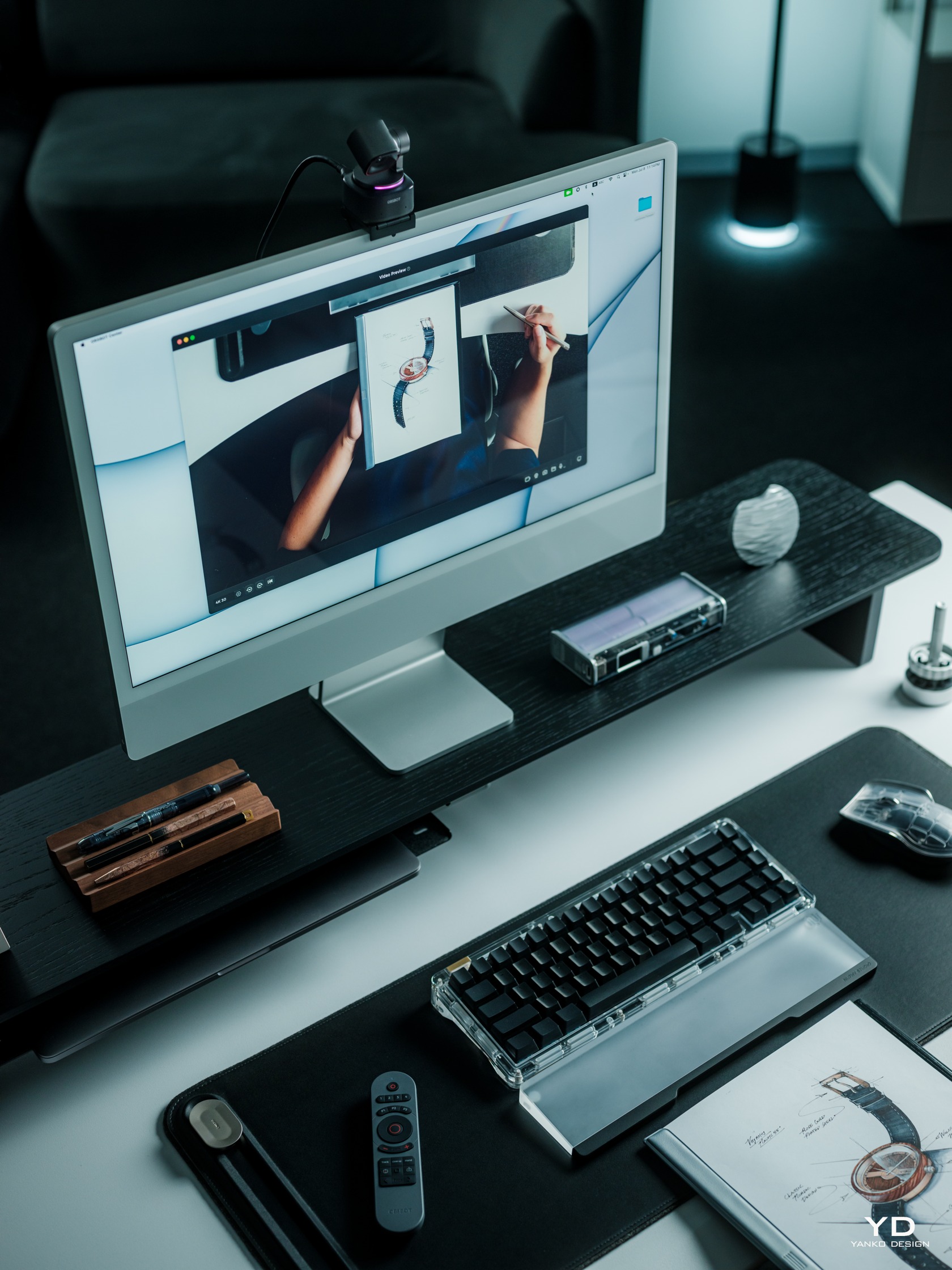
Present Properly with Desk Mode
The Tiny 2 also has a unit Desk Mode that makes the camera perfect for meetings and video instructions. In this mode, you tilt the mount forward and the camera will then adjust its angle so that it’s directly pointing down on the desk. It will then flip the video stream so that viewers can see what you’re writing or doing with your hands in the correct direction. And for those streams that require you to act like a teacher, whiteboard mode will focus, zoom in, and straighten the whiteboard for more effective delivery.
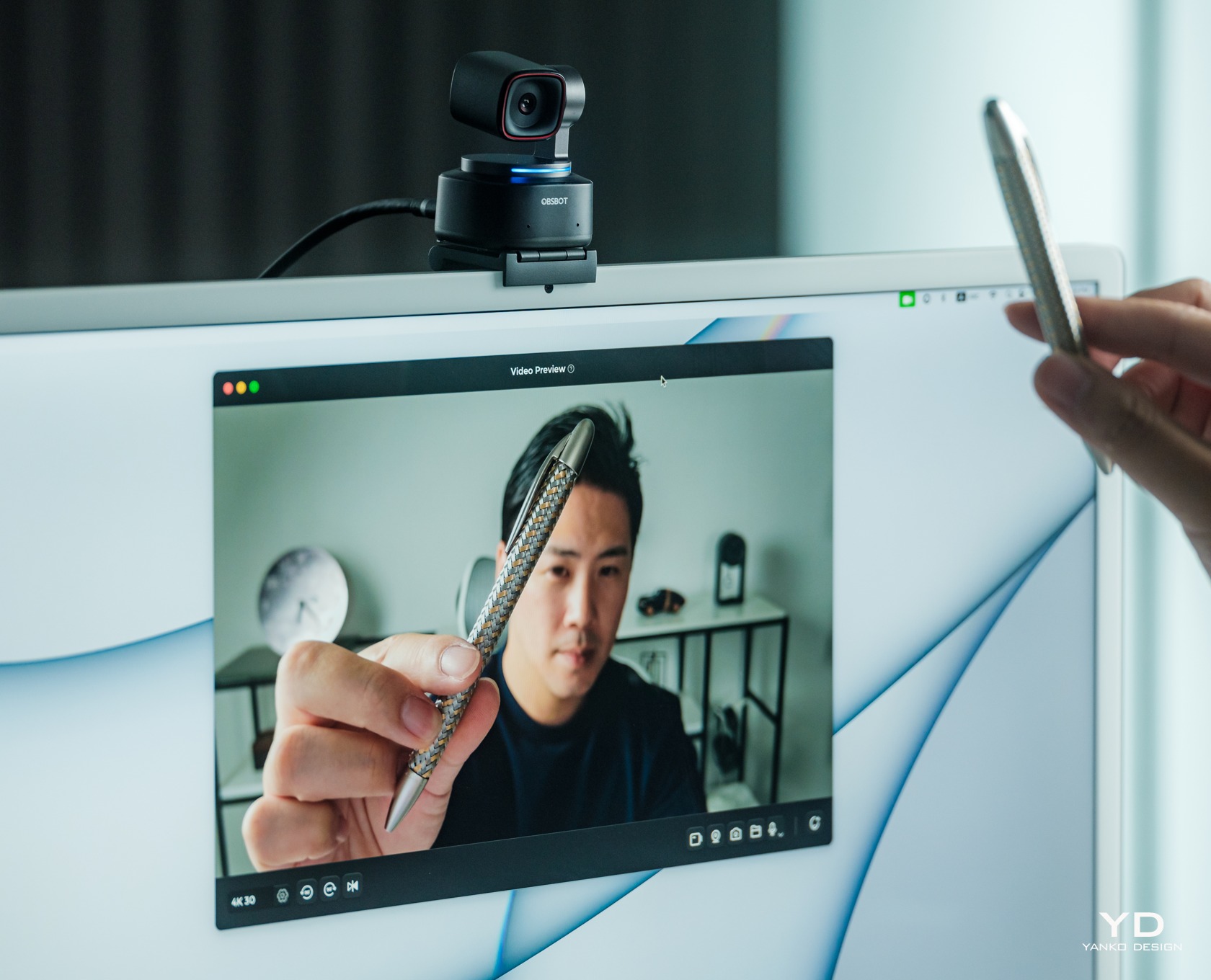
All-Pixel Auto Focus
The list of convenient and impressive features goes on and on. Now four times faster than its predecessor, the OBSBOT Tiny 2’s autofocus is fast and impressive, making sure that the product you’re showing off in front of you is clearly seen before it switches back to showing your face. For brief and quick camera changes, you can use hand gestures to zoom in and out, but the real headlining feature for this new model is voice control. From waking up the camera to having it follow you around, you can just ask “Tiny” rather than reach out for your mouse or keyboard. Some people might feel a bit uneasy with having a camera that’s listening and waiting for your commands, but you can always turn the camera down to turn it off and protect your privacy or disable the feature entirely.
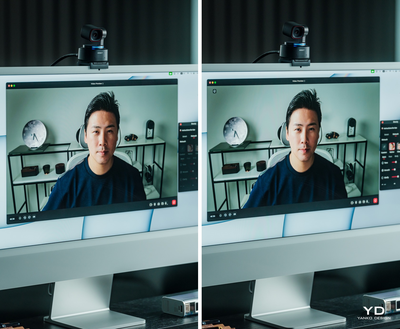
Beauty Mode – Smooth your skin and brighten your eyes in just one second.
Sustainability
With webcams a dime a dozen in the market these days, it shouldn’t be a surprise that the vast majority of them use plastic shells to cover their bodies. What’s more surprising are the outliers like the OBSBOT Tiny 2 which opt for more premium and more sustainable materials like metal. It not only adds character to the design, it also makes it look more forgiving and gentler on the planet. You will want to take better care of the camera when using it outdoors, of course, protecting it from scuffs and dents. Thankfully, that hard shell case is there for that very purpose.
It’s not a complete win, of course, as there are still plenty of plastics in the product as well as the packaging. The camera’s seamless design also makes self-repair nearly impossible, not that you’ll want to do it yourself anyway. OBSBOT does have a strong warranty and repair policy, so you’re better off letting the experts do the hard and precise work.
Value
User Scenarios
If it wasn’t clear yet, the OBSBOT Tiny 2 is chock-full of features, all of which are designed to make a content creator’s life easier and less stressful. It leverages AI so that they don’t have to make minute-by-minute decisions and adjustments to the camera, freeing them to focus on the most important part of the process: actually creating the content and engaging with a captive audience. It’s like having a small cameraman on your desk, following your body’s or hands’ cues to create those smooth transitions and to focus on important parts, whether it’s a product or your face.
That said, the OBSBOT Tiny 2’s SRP of $329 can still be a bit difficult to swallow. Make no mistake, you’re really getting your money’s worth, but not everyone will have that much in reserve for a new tool. Fortunately, Amazon’s Prime Day is just around the corner, and you can get this AI-powered camera at a steep 10% discount that brings the price down to a juicy $296. With that price cut, there’s very little to keep you from upgrading your toolset to become the content creator you’ve always aspired to be. Prime Day also opens the door to other sweet deals, like the Remote Combo with the Tiny Remote 2 getting a 16% discount, or the PowerUp Combo with a remote, a tripod, and an HQ mic going for 15% less. Streaming veterans might want to grab the Streaming Combo (remote, tripod, UVC to HDMI adapter) or the MultiCam Combo (three OBSBOT Tiny 2 Cameras, remote, 3-in-1 USB Hub) with 15% and 14% savings, respectively.
Verdict
We’re way past the time when streamers and video content creators could simply sit in front of their cameras and expect the likes (and money) to start piling in. Viewers have become more discerning, perhaps even more demanding, and streamers now need to take their content to the next level. Of course, the actual content is king, but the presentation can make or break your career as well. More than just a good camera, you need a camera that understands where you’re going and can follow your cues without you even saying a word.
The OBSBOT Tiny 2 4K PTZ Webcam delivers on both fronts, providing excellent video quality with the brains to know how you want a shot to be taken or what to focus on. And it looks great to boot, putting other webcams to shame for their lack of elegance despite all the opportunities and materials available to them. Admittedly, it’s not an inexpensive product, but with a juicy Prime Day deal, there’s no better time to upgrade your streaming equipment and upgrade your channel than with this AI-powered 4K webcam.