Breitling Just Made the Astro Boy Watch Every 90s Kid Wanted

Sometimes the best collaborations are the ones you never saw coming. Swiss watchmaker Breitling just dropped a timepiece that pairs aviation-grade engineering with a 1950s Japanese robot boy, and somehow, it works brilliantly.

The Avenger B01 Chronograph 44 Astro Boy Limited Edition brings together two worlds that seem miles apart: the technical precision of luxury Swiss watchmaking and the retro-futuristic charm of one of manga’s most iconic characters. Created by the legendary Osamu Tezuka in 1952, Astro Boy embodies optimism about technology and the future, which makes this partnership with Breitling’s pilot-focused Avenger line oddly perfect.

Designer: Breitling

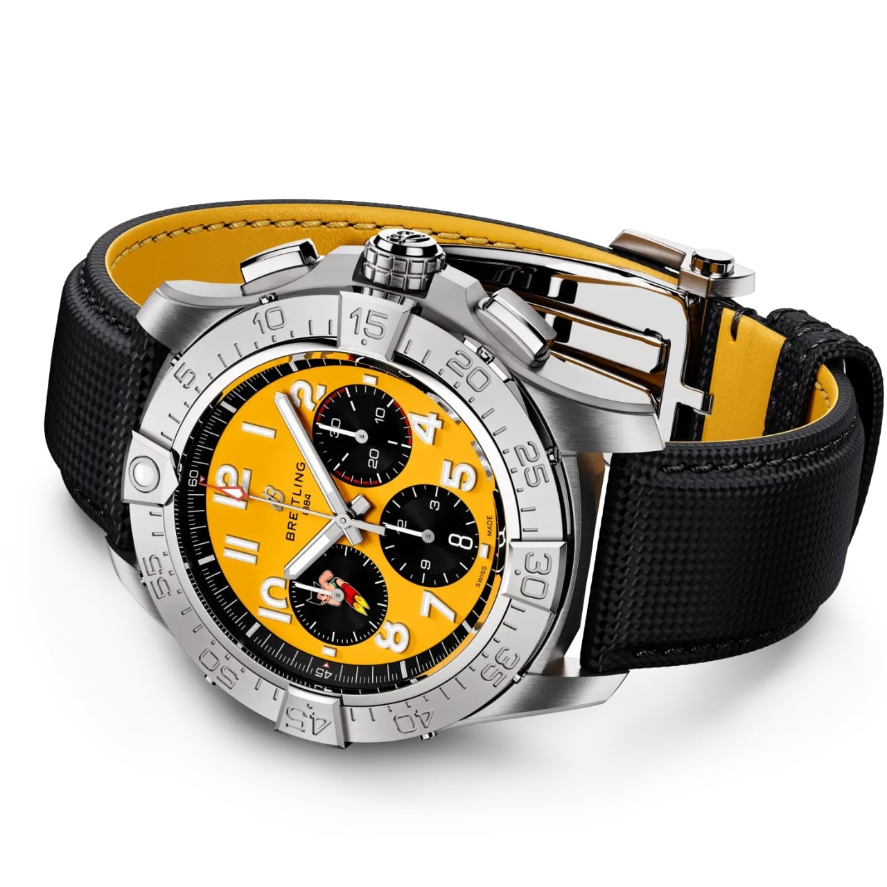
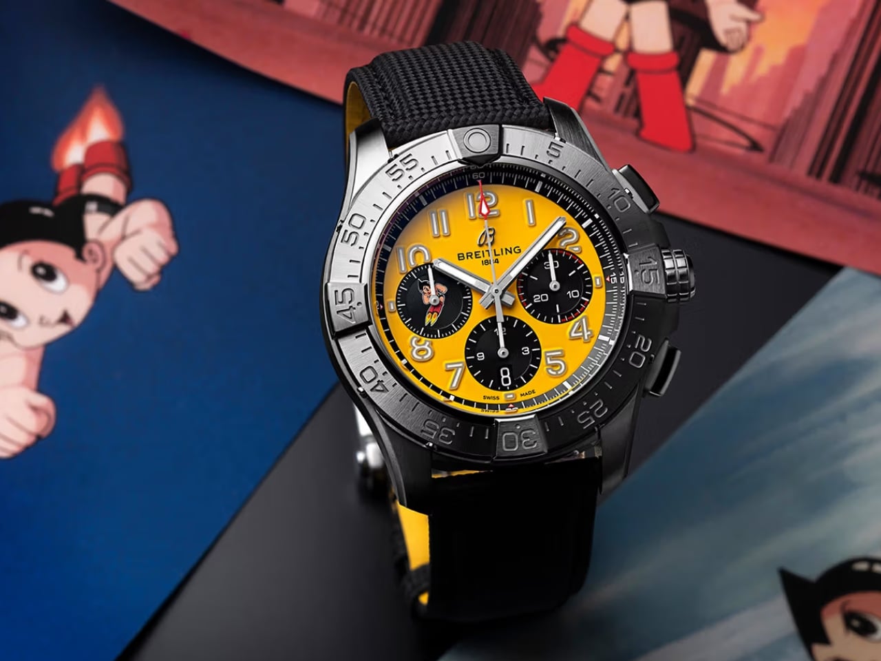
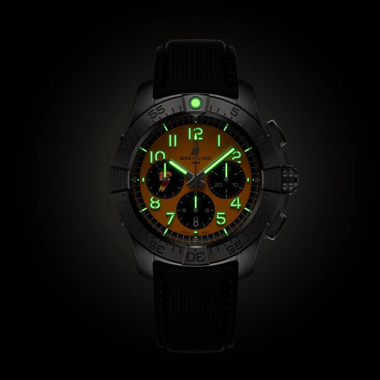
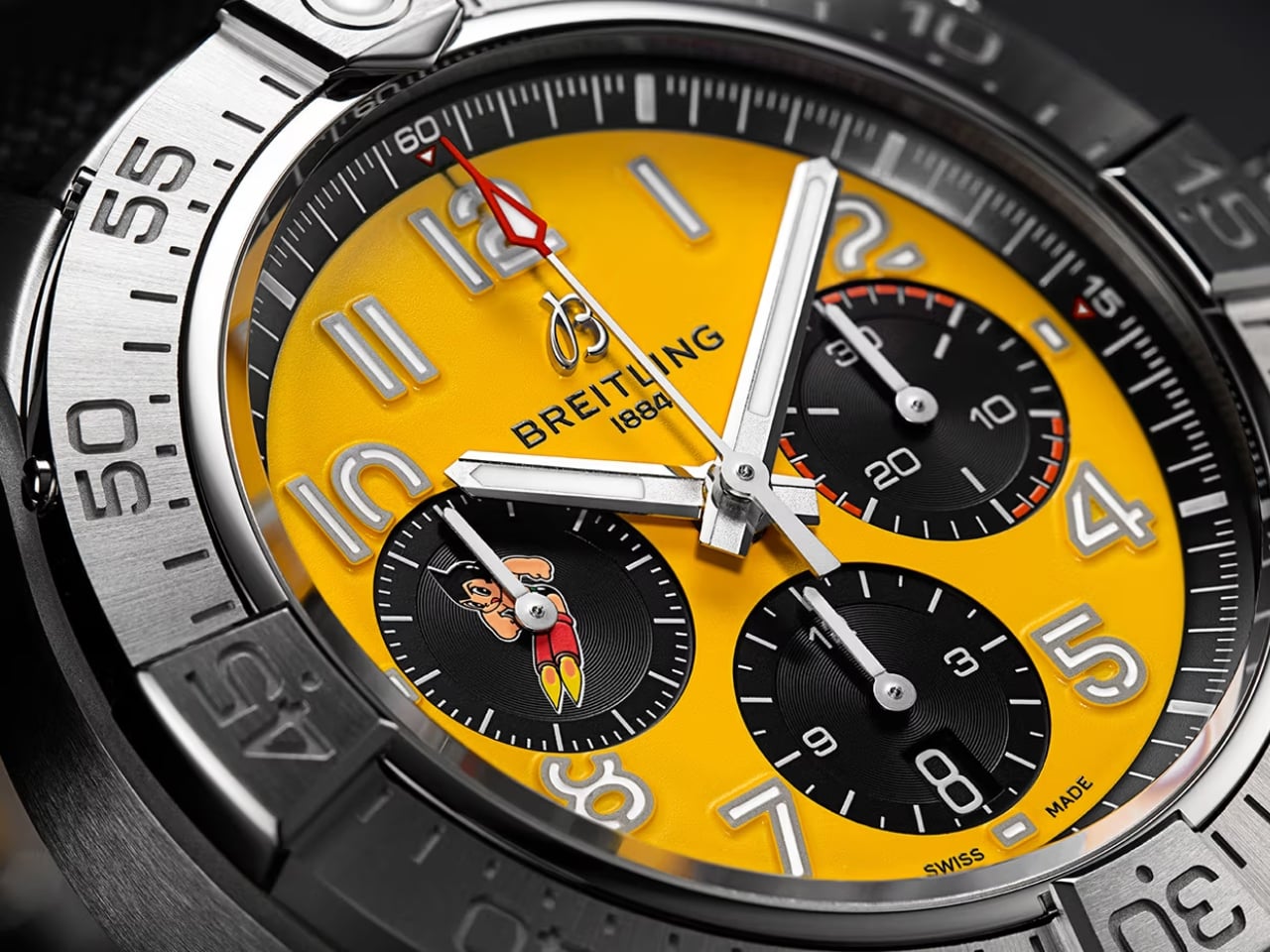
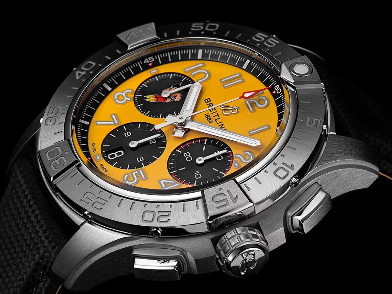
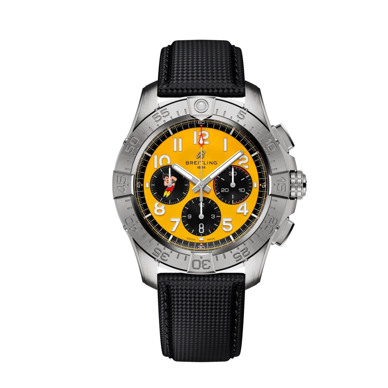
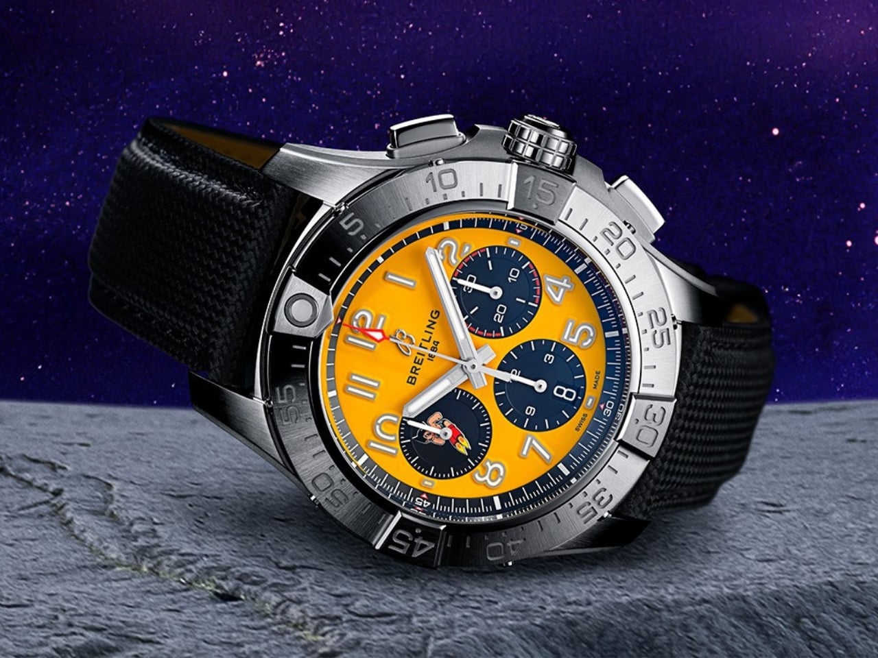
Let’s talk about what makes this watch special. The dial is a vibrant yellow that immediately catches your eye, chosen specifically to echo the fiery thrust of Astro Boy’s signature rocket boots. Against this sunny backdrop, three contrasting black sub-dials create visual depth and drama. But the real star of the show appears on the 9 o’clock sub-dial, where Astro Boy himself is rendered in mid-leap, complete with his spiky hair, those famous red boots, and an expression of pure determination.

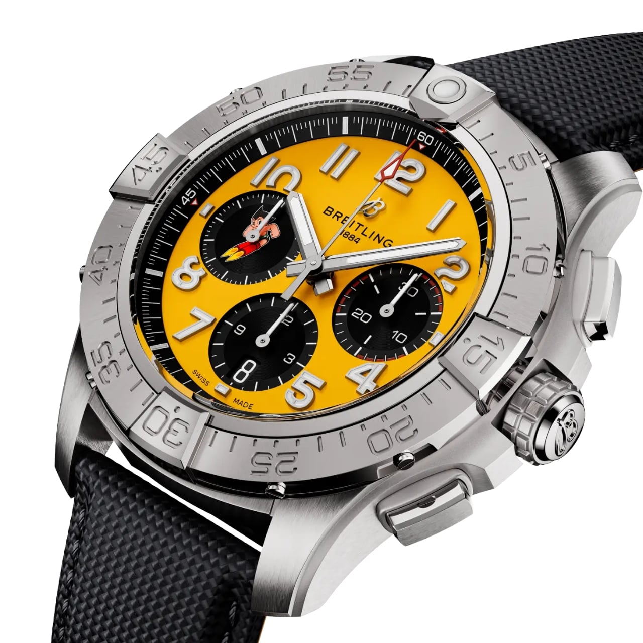
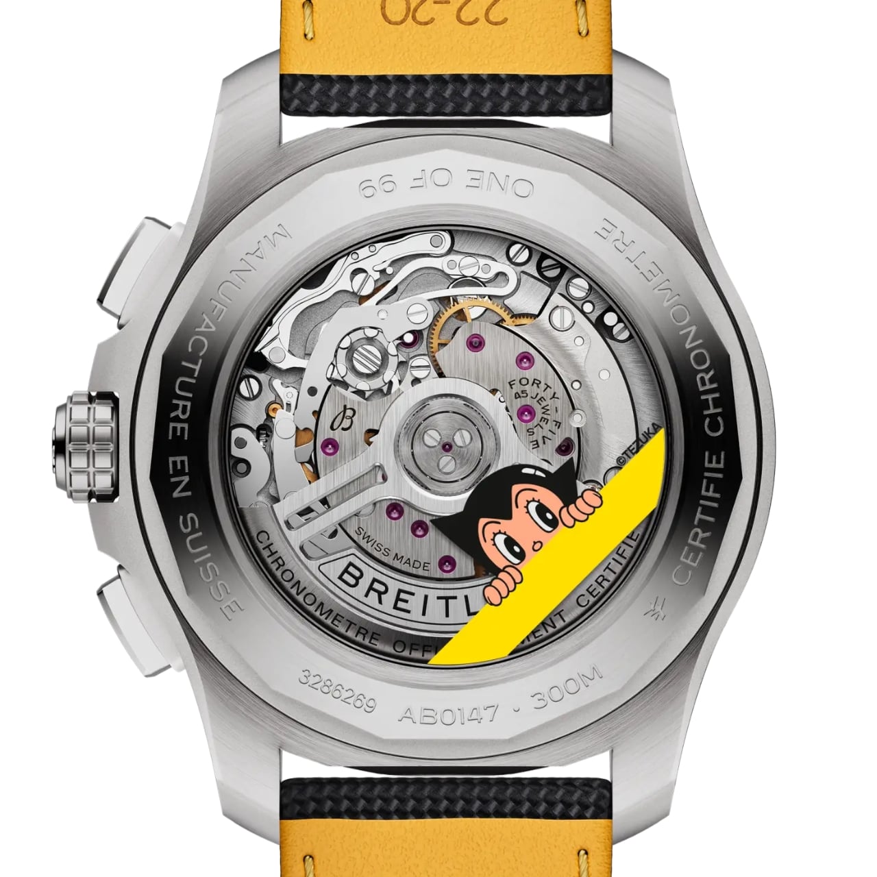
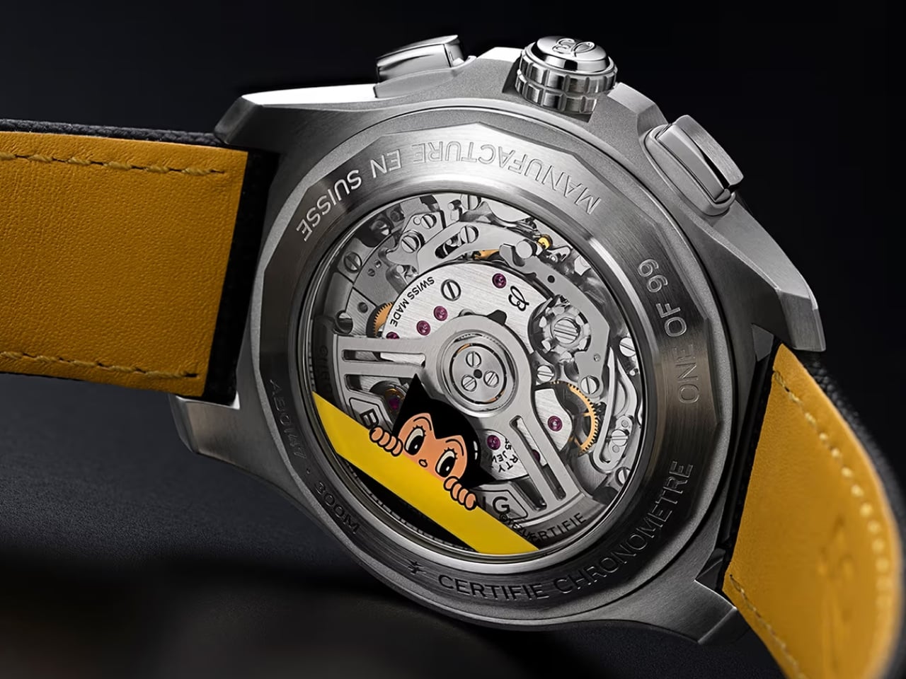
Flip the watch over and you’ll find another surprise. The sapphire case back reveals both a playful portrait of Astro Boy and the impressive Breitling Manufacture Caliber 01, a COSC-certified movement that offers a 70-hour power reserve. It’s this kind of detail that shows Breitling isn’t just slapping a cartoon character on a watch and calling it a day. The technical specs hold their own: column-wheel control, vertical clutch for precise chronograph engagement, and all the performance you’d expect from an Avenger. The watch itself is housed in a robust 44mm stainless steel case with square pushers and a screw-locked crown, offering 300 meters of water resistance. It’s paired with a rugged black military leather strap that keeps the overall aesthetic grounded and functional, preventing the watch from tipping too far into novelty territory.

This collaboration works because both Breitling and Astro Boy share DNA rooted in pushing boundaries. The Avenger line was built for pilots and adventurers, people who need tools they can trust in demanding conditions. Astro Boy, meanwhile, represented a hopeful vision of how technology could make the world better. When you look at it that way, a robot boy with rocket-powered flight feels like a natural mascot for a pilot’s chronograph.

Of course, exclusivity is part of the appeal. Breitling is only making 99 pieces, each individually engraved with “ONE OF 99.” The watch comes packaged in a specially designed Astro Boy collector’s box, turning the whole package into something that transcends just being a timepiece. It’s a collectible that bridges generations, appealing to vintage manga fans, watch enthusiasts, and anyone who appreciates when two iconic brands take creative risks together. There’s one catch: this limited edition is exclusively available through Breitling’s website and boutiques in Hong Kong, Mainland China, and Macau. That regional focus makes sense given Astro Boy’s massive cultural footprint in Asia, but it also means fans elsewhere might have to work a bit harder to get their hands on one.

What’s refreshing about this collaboration is how it balances playfulness with craftsmanship. Pop culture watch collaborations can sometimes feel like cash grabs, but this feels considered. The yellow dial isn’t garish; it’s bold and confident. Astro Boy’s inclusion feels integrated rather than tacked on. Even the red-tipped chronograph seconds hand ties back to the character’s iconic color palette. Breitling has proven that heritage brands can embrace pop culture without losing their identity. The Avenger B01 Chronograph 44 Astro Boy Limited Edition manages to honor both the technical excellence that defines Swiss watchmaking and the imaginative spirit of Tezuka’s creation. It’s a watch that doesn’t take itself too seriously while still delivering serious horological goods.

For 99 lucky collectors, this timepiece offers something rare: a conversation starter that also happens to be a genuinely impressive chronograph. And in a market flooded with safe choices and predictable designs, that kind of bold creativity deserves a round of applause.

The post Breitling Just Made the Astro Boy Watch Every 90s Kid Wanted first appeared on Yanko Design.

Your Unplayable CD Collection Just Got a $2,000 Solution

Remember when we all decided CDs were dead? When we shoved those jewel cases into storage bins and declared ourselves streaming converts, convinced that digital files and algorithm-curated playlists were the future? Here’s the embarrassing part: I have a stack of CDs sitting on my shelf right now with absolutely no way to play them. And I’m not alone. People are still buying CDs, especially in the K-pop world where physical albums are part of the whole experience, complete with photo cards, posters, and elaborate packaging. We’re collecting music we can’t even listen to properly. Pro-Ject Audio’s new CD Box RS2 Tube might actually fix that problem, and honestly, it’s making me want to finally do something about my unplayable collection.

This isn’t some nostalgic throwback designed to capitalize on retro vibes. Pro-Ject built this thing with the kind of serious engineering usually reserved for audiophile turntables. The Austrian company’s latest entry in their top-tier RS2 line is a top-loading CD player with a fully balanced tube output stage, featuring two premium E88CC vacuum tubes that add warmth and fluidity to digital playback. Think of it as the vinyl listening experience but for your CDs. You know that organic, emotionally engaging sound that makes you actually feel the music instead of just hearing it? That’s what these tubes are doing to your digital audio.

Designer: Pro-Ject Audio

What makes this particularly interesting is the SUOS DM-3381 Red Book drive at its core. This isn’t just any CD mechanism thrown into a pretty case. SUOS-HiFi, which used to be StreamUnlimited Optical Storage, was founded by former Philips CD engineers based near Vienna. These are literally some of the people who helped invent CD technology in the first place. The drive uses a BlueTiger CD-88 servo with predictive algorithms that can maintain accurate data retrieval even when your discs are scratched or less than pristine. We’ve all got a few of those CDs that have seen better days, right?

The integrated Texas Instruments PCM1796 DAC is where things get even more interesting. This means the CD Box RS2 Tube can connect directly to any amplifier with analog inputs without needing a separate digital-to-analog converter. The DAC operates in a fully differential configuration and feeds straight into that balanced tube output stage for maximum signal integrity. You get both XLR balanced outputs and single-ended RCA connections, each with its own dedicated output stage, so you can run both simultaneously without any impedance issues. And if you’re the type who already has a favorite external DAC, there are optical and coaxial digital outputs too.

The build quality is exactly what you’d expect from a product in this range. The entire chassis is precision-machined from aluminum, available in either silver or black finishes, and it’s absolutely gorgeous. The top-loading design means you actually get to interact with your music in a tactile way that tapping a screen just can’t match. There’s something satisfying about placing a disc on the magnetic clamp and watching it load. The big LCD display shows track information and CD-text when available, and it comes with a full aluminum remote control that feels substantial in your hand.

Power delivery matters for any high-end audio component, and Pro-Ject addressed this by using an external power supply to keep transformer noise away from the tube circuitry. For those who want to go even further down the rabbit hole, the player is compatible with Pro-Ject’s Power Box RS2 Sources linear power supply upgrade, which can improve soundstage depth and background silence.

What’s really striking about the CD Box RS2 Tube is how it positions physical media not as obsolete technology but as a deliberate choice for people who care about how music sounds and feels. The resurgence of CD collecting, particularly driven by fandoms like K-pop where physical albums are collectible art objects, proves that people still want to own their music. There’s something to be said for building a curated collection that reflects your actual taste rather than what an algorithm thinks you should like. And if you’re going to own CDs, why not finally be able to play them through something that does them justice?

The CD Box RS2 Tube is set to arrive at UK and EU dealers this month, priced at £1,749 or €1,900. US pricing hasn’t been announced yet, but it’s clearly positioned as a premium product for people who take their listening seriously. Maybe it’s time those of us with unplayed CD collections finally gave them the player they deserve.

The post Your Unplayable CD Collection Just Got a $2,000 Solution first appeared on Yanko Design.

When Fashion Becomes a Safety Net: The Jacket That’s a Tent

What if your jacket could save your life? Not in the metaphorical sense, but literally. Tokyo-based fashion student Yoon Myat Su Lin has designed something that sounds like it belongs in a sci-fi movie but is rooted in very real human need. It’s called Shelter Wear, and it’s exactly what it sounds like: a wearable garment that transforms into a functional tent.

The concept didn’t come from a design studio brainstorm or a trendy pitch deck. It came from memory and trauma. Yoon experienced an earthquake in Myanmar, where she witnessed people suddenly displaced, left scrambling for safety without any temporary shelter. That image stuck with her. She started thinking differently about what clothing could do, beyond looking cool or expressing identity.

Designer: Yoon Myat Su Lin

What if the thing you’re already wearing could become the thing you desperately need? And that’s where Shelter Wear gets interesting. It challenges the entire idea of what fashion is supposed to be. We’re used to clothes being decorative, seasonal, expressive. But Yoon flips that script. She’s asking: why can’t a garment be infrastructure? Why can’t your outfit double as your emergency kit?

When you first look at Shelter Wear, it reads as a structured, utilitarian vest. Think sleeveless outerwear with a high protective collar and some seriously intentional paneling. It’s got that techwear aesthetic, the kind of thing you’d see on someone who’s into urban exploration or just really likes pockets. But here’s where it gets wild: those sleeves? They’re detachable backpacks. You’re literally wearing your storage.

Then comes the transformation. Unclip a few buckles, unfold the structure, and suddenly you’re inside a triangular tent that expands around your body. It’s not a gimmick or a prototype that barely works in controlled conditions. It’s a legitimate shelter that offers protection when everything else has failed. The tent resembles a wide skirt when worn, blending into the garment’s silhouette until you actually need it.

This isn’t about camping trips or festival fashion. This is crisis design. It’s for the moments when help hasn’t arrived yet, when infrastructure has collapsed, when all you have is what’s on your body. In those first critical hours after a disaster, traditional emergency supplies might be inaccessible. But if you’re already wearing your shelter, you’ve bought yourself time and safety. Yoon drew inspiration from designer Aojie Yang, who also works in the space of functional, transformative fashion. But where some conceptual designs feel distant from real application, Shelter Wear feels grounded. It’s portable without being bulky. It’s practical without sacrificing design integrity. And it makes you rethink the relationship between body and architecture.

Because that’s really what this is about. The body as the first architecture. When buildings fall, when homes are destroyed, your body remains. Shelter Wear treats that body as a moving site of refuge. It’s a radical reframing of what clothing infrastructure can mean in vulnerable communities. The design also won the YKK Special Prize at the 25th YKK Fastening Award, which makes sense when you think about the engineering involved. This isn’t just fabric and good intentions. It’s ripstop materials, strategic folding mechanisms, and fasteners that need to hold up under actual emergency conditions.

But beyond the technical specs, Shelter Wear is a gesture of solidarity. It acknowledges that displacement is real, that climate disasters are increasing, that millions of people worldwide face housing insecurity. Instead of looking away, Yoon designed toward that reality. Does it solve homelessness? No. Will it prevent earthquakes? Obviously not. But it does something equally important: it expands our imagination of what design can do. It proves that fashion students in Tokyo are thinking about Myanmar earthquakes, about refugee crises, about what happens when safety disappears. And they’re making things that might actually help. That’s the power of design when it refuses to just be decorative. When it insists on being useful, urgent, and human.

The post When Fashion Becomes a Safety Net: The Jacket That’s a Tent first appeared on Yanko Design.

This 9mm Wireless Charger Just Made Power Banks Obsolete

You know that moment when your phone hits 10% and you’re nowhere near an outlet? We’ve all been there, frantically searching for a charging cable while our phone gasps its last breath. Power banks were supposed to solve this problem, but let’s be honest, carrying around a chunky brick in your bag never felt like the solution we actually wanted.

Enter ALMA, the wireless charger from Addition that’s basically saying “sorry, traditional power banks, your time is up.” This isn’t just another tech accessory trying to make its way into your everyday carry. It’s a genuinely thoughtful rethink of what portable power should look and feel like in 2025.

Designer: Addition

Here’s what makes ALMA different. First, it’s shaped like a slim oval that measures just 9mm thick. That means it actually slips into your jacket pocket or clutch without creating an awkward bulge. Compare that to the standard rectangular power bank that feels like you’re lugging around a paperweight, and you start to see why this matters.

But the real magic is in how it works. ALMA charges wirelessly and gets charged wirelessly too. Think about that for a second. No more hunting for the right cable, no more tangled cords at the bottom of your bag. You just place ALMA on the back of your phone when you need juice, and when ALMA needs recharging, you drop it on any Qi-compatible charging pad. The whole experience is designed around eliminating friction, which is exactly what good design should do.

The aluminum body gives it a quality feel that separates it from the usual plastic gadgets cluttering our lives. Addition offers 17 different designs across three finishes (black, champagne, rose gold, and silver), so you can pick something that actually matches your aesthetic rather than settling for boring black box number 47. What’s really clever is the packaging. The keepsake box ALMA comes in isn’t just pretty, it doubles as a charging pad. So you’re not buying another single-purpose accessory that ends up in a drawer. The box earns its keep on your nightstand or desk as a functional part of the ecosystem.

Robert Louey, Addition’s chief design officer, said they wanted everyday tech to feel like seven-star hospitality. That might sound a bit dramatic, but when you consider how much of our interaction with technology feels clunky and frustrating, aiming for that level of seamlessness makes sense. The oval shape isn’t just for looks. It’s designed to rest naturally in your palm, creating that satisfying tactile experience that Apple perfected with their products.

Under that sleek exterior, ALMA packs some serious innovation. It uses a custom round lithium-ion battery (the first of its kind for this application) and custom internal components to achieve that impossibly thin profile. LED indicators show you the charge status at a glance: one light means 1% to 33%, two lights mean 34% to 66%, and so on up to four lights at 96% to 100%. Simple, intuitive, no guesswork.

ALMA works with any Qi-enabled device, so whether you’re team iPhone, Samsung Galaxy, Google Pixel, or even rocking wireless AirPods, you’re covered. That universality matters in a world where we’re constantly switching devices or sharing chargers with friends who have different phones. At $85 for one or $170 for a set of two, ALMA isn’t exactly impulse-purchase territory. But here’s the thing: when you factor in what you’re actually getting, a beautifully designed object that solves a daily annoyance, eliminates cable clutter, and happens to be customizable, the price starts making more sense. This is clearly positioning itself as the luxury option in a sea of generic alternatives.

Addition is a female-founded company launched by Laura Schwab, who has decades of experience with luxury brands like Jaguar Land Rover and Aston Martin Lagonda. That pedigree shows in the attention to detail and the understanding that design isn’t just about how something looks, it’s about how it makes you feel when you use it.

A lot of tech accessories now are afterthoughts, designed purely for function with zero consideration for aesthetics. But ALMA represents something refreshing. It’s technology that doesn’t apologize for wanting to be beautiful. It’s portable power that doesn’t make you feel like you’re carrying around emergency equipment. It’s the wireless charger that finally delivers on the promise of being truly wireless.

The post This 9mm Wireless Charger Just Made Power Banks Obsolete first appeared on Yanko Design.

This Designer Just Built the Sleep Device Insomniacs Always Wanted

We’ve all been there. It’s 2:47 AM, and you’re staring at your ceiling, mentally calculating how many hours of sleep you’ll get if you fall asleep right now. Spoiler alert: that math never helps. Designer JeJun Park clearly understands this universal struggle, because Re:M tackles the insomnia problem from a completely fresh angle.

At first glance, Re:M looks like it wandered out of a minimalist’s dream. It’s got that soft baby blue finish that feels calming just to look at, and an oval speaker face that tilts upward like it’s ready to have a conversation with you. But here’s where it gets interesting. This isn’t just another white noise machine or smart alarm clock trying to do everything at once. It’s what Park calls a “sleep care object,” which is honestly a much better way to think about it.

Designer: JeJun Park

Create your own Aesthetic Render: Download KeyShot Studio Right Now!

The most brilliant design choice? Those numbers you obsessively check at 3 AM? Gone. Instead of a traditional clock face with digits taunting you about lost sleep, Re:M shows time through just a simple dot for the hour and a line for minutes. It sounds almost too minimal, but that’s exactly the point. When you’re not fixating on the exact time, you stop doing that awful mental math about your dwindling sleep window. You just… let go. The clock becomes ambient, flowing, present but not demanding your attention.

The whole device is built around this philosophy of removing anxiety triggers. Those aluminum dome speakers aren’t just there to look pretty (though they definitely do). They pump out everything from white noise to nature sounds, creating an audio cocoon that blocks out the neighbor’s dog or street traffic. You know that feeling when you’re camping and the gentle sounds of a stream or rustling leaves just knock you out? That’s what Re:M is going for, minus the mosquitoes and uncomfortable sleeping bag.

What really sets this apart from other sleep gadgets is how thoughtfully Park has considered every interaction. Notice there’s basically one button on the entire device? That’s because all the fiddly controls live in the companion app. You’re not fumbling with multiple buttons in the dark or accidentally blasting sound at full volume. The power button is tucked discreetly out of sight, and that side dial handles volume adjustments with precision that touchscreens could never match. It connects via Bluetooth, so you can fine-tune everything from your phone during the day, then just tap the device to turn it on at night.

Even the wake-up experience got a redesign. Instead of a jarring alarm, Re:M gradually increases both nature sounds and a gentle brightening light. It’s like having a sunrise on your nightstand, coaxing you awake instead of startling you into consciousness. Anyone who’s ever been jolted awake by a blaring alarm knows how that sets the tone for your entire day. The practical touches are there too. USB-C charging means you can power it with the same cable as your phone or laptop, and a small LED dot tells you the charging status without being intrusive. The device stands on a stable base with subtle grip pads, so it’s not going anywhere if you reach for it groggily at night.

What I really appreciate about Re:M is that it doesn’t try to be everything to everyone. It’s not tracking your REM cycles, syncing with seventeen other devices, or promising to revolutionize your entire life. It’s simply designed to help you fall asleep more easily and wake up more gently. That singular focus feels almost revolutionary when every product seems to wants to be your all-in-one solution. Park has created something that addresses a real problem (we’re all sleeping terribly) with thoughtful design rather than more technology. Re:M proves that sometimes the best solution isn’t adding features, but carefully removing the things that stress us out. And honestly? In our overstimulated, always-on world, that might be the most innovative thing of all.

The post This Designer Just Built the Sleep Device Insomniacs Always Wanted first appeared on Yanko Design.

This EDC Grinder Makes Every Coffee an Adventure

For years, the manual coffee grinder was a necessary evil. If you wanted the freshest, best-tasting cup outside of a cafe, you had to accept a bulky plastic device or a fragile piece of glass and wood. These tools often felt clumsy, lacking the refinement and durability that modern consumers have come to expect from their high-use items.

Enter the VSSL Java G25, a manual coffee grinder that doesn’t just promise a better cup; it promises a better, more rugged, and far more stylish experience. It represents a shift in thinking, elevating the grinding process from a tedious chore to an enjoyable, tactile ritual. Truth be told, I still can’t figure out the grind settings on most of the complicated, dials-and-knobs grinders that I see in the market. I probably would love to learn all these things, even if there are supposedly 50 distinct settings. The G25 somehow makes the learning curve feel like part of the adventure, a welcome challenge to master a finely tuned instrument.

Designer: VSSL

VSSL, a company known for building essential survival and gear kits into handsome, nearly indestructible canisters, has applied that same obsessive engineering mindset to the coffee ritual. Their design philosophy is clear: utility should never compromise aesthetics, and durability is non-negotiable. The result is a device that feels less like a kitchen tool and more like high-end outdoor equipment you’d find clipped to a mountaineer’s pack. Constructed from 6061 machined aircraft grade aluminum and 304 food-grade stainless steel, this grinder is built for abuse, making it equally at home on a clean, granite kitchen countertop or a cold, granite mountain outcrop. Its sleek, black cylindrical form factor is compact, ergonomic, and unapologetically cool, fitting perfectly into the gear aesthetic that dominates modern tech and design circles. It’s a piece of gear you want to show off.

But the G25’s appeal extends far beyond its rugged good looks and durable exterior. Inside that resilient shell lies the heart of a true barista tool, engineered for uncompromising performance. The quest for the perfect grind is a core obsession in the coffee world because flavor extraction is utterly dependent on particle size consistency. VSSL delivered this crucial consistency by incorporating high carbon 420 stainless steel conical burrs stabilized by dual bearings. This is the hardware that ensures the particle size of your coffee grounds is uniform—the single biggest factor in extracting a delicious, balanced flavor without the bitterness of fines or the sourness of boulders. For those of us who appreciate precision engineering, the detail of dual bearings stabilizing the central axle is paramount; it’s the mechanical assurance of quality.

Crucially, the G25 offers 50 distinct grind settings. This level of granular control is usually reserved for professional-grade electric models that take up half your countertop. Having 50 click adjustments means the user can dial in the perfect setting for literally any brewing method. Whether you are aiming for the coarse texture required for a full-immersion French press, the near-powder fine consistency for a demanding espresso shot, the medium grit for a precise pour over, or anything in between, a quick, audible adjustment is all it takes. This expansive range eliminates the guesswork and the frustration of inferior grinders, transforming the often-frustrating manual grind into a satisfyingly accurate and repeatable process.

The features engineered specifically for portability truly elevate this grinder into a must-have piece of everyday tech. The handle, which expands during use to increase leverage and make the grind effortless even for light roasts, quickly retracts and cleverly doubles as a secure, locking carabiner. This isn’t just a convenient detail; it is a profound design choice that signals the product’s dual purpose: serious quality both at home and on the move. The magnetic integration keeps the grinder knob securely attached within the catch when stored, and a quick push-release top cap allows fast access to the 30-gram bean hopper—enough capacity to fuel a substantial morning ritual. Measuring only 6.3 inches long with a neat two-inch diameter, the entire unit is designed to nest seamlessly with popular travel brewing systems like the AeroPress Go.

The VSSL Java G25 is a beautiful merging of two powerful cultural trends: the rising demand for specialty, quality, at-home coffee, and the desire for durable, highly designed, and adventure-ready gear. It speaks directly to the person who refuses to compromise on quality, whether they are settling into their home office for the day or setting out for a weekend in the wild. It’s more than just a grinder; it’s an essential, beautifully executed piece of modern carry that promises a perfect cup, no matter where you are.

The post This EDC Grinder Makes Every Coffee an Adventure first appeared on Yanko Design.

This Flat Bottle Becomes a Kettle When You Need It Most

There’s something satisfying about products that do more with less. You know the feeling: when you discover a gadget that’s been cleverly engineered to solve multiple problems without adding bulk to your life. Tetra, a new travel bottle concept by designer Amal SS, nails that sweet spot between everyday practicality and outdoor functionality in a way that actually makes sense.

At first glance, Tetra looks like a streamlined water bottle dressed in a minimalist gray shell with sunny yellow corner accents. It’s flat, roughly the size of an A5 notebook, which immediately tells you someone thought hard about how this would actually fit in a backpack. But here’s where it gets interesting: that yellow base section? It’s not just decorative. It’s a detachable heating deck that transforms your water bottle into a portable kettle when you need it.

Designer: Amal SS

The modular approach is what sets Tetra apart from the crowded field of travel bottles trying to be all things at once. Instead of permanently integrating heating elements that add weight and complexity to something you might carry daily, Amal SS separated the functions. Need just a water bottle for your commute or gym session? Leave the Thermo-Deck at home and travel light. Heading into the wilderness for a camping trip? Snap it on and you’ve got hot water capability wherever you land.

This kind of thinking feels refreshingly practical in a world where most products seem designed to cram in every possible feature whether you need them or not. The architecture here respects how people actually use things. Your daily hydration needs don’t require heating functionality, so why carry that extra weight around? But when you’re watching the sunrise from a mountaintop or setting up camp after a long hike, having the ability to heat water for coffee or tea without packing separate equipment becomes genuinely valuable.

The design language speaks to durability and thoughtful interaction. Those yellow corner guards aren’t just visual punctuation, they’re protective reinforcement for the spots most likely to take impact when you inevitably drop this thing on a rocky trail or concrete floor. The recessed grip grid textured across the surface gives your hands something to hold onto, even when wet or wearing gloves. Every detail seems considered from the perspective of actual use rather than pure aesthetics, though the clean lines and confident color blocking certainly don’t hurt.

What really catches the eye is how Tetra manages to look tech-forward without screaming “gadget.” The flat profile feels almost architectural, like something that could live comfortably in a design studio or strapped to a hiking pack with equal credibility. The proportions are balanced, the material transitions feel intentional, and those yellow accents provide just enough visual interest without tipping into gimmicky territory.

The A5 form factor deserves special mention because it solves a genuine packing problem. Cylindrical bottles, no matter how well-designed, create awkward gaps and wasted space in bags. A flat profile nestles against laptops, books, and clothing layers much more efficiently. For anyone who’s played Tetris with their backpack contents before a trip, this thoughtful approach to dimensionality will resonate immediately.

There’s also something appealing about products that acknowledge different contexts of use. Tetra doesn’t pretend you’ll need a kettle function at your desk job, and it doesn’t force you to commit to carrying unnecessary weight just to have that option available. The snap-on, snap-off modularity respects your intelligence as a user and trusts you to configure the tool for your actual needs. This kind of flexible functionality reflects a broader shift in how we think about everyday carry items. The best products increasingly recognize that our days aren’t one-size-fits-all, and neither should our gear be. Something that works for Monday’s office routine might need different capabilities for Saturday’s mountain trail. Tetra’s modular design bridges that gap without compromise.

Whether you’re a design enthusiast who appreciates thoughtful industrial solutions, a tech person drawn to smart functionality, or an outdoor adventurer tired of juggling multiple pieces of equipment, Tetra presents an intriguing answer to the eternal question: how do we carry less while being prepared for more? Sometimes the smartest design move isn’t adding another feature. It’s knowing exactly which features to make optional.

The post This Flat Bottle Becomes a Kettle When You Need It Most first appeared on Yanko Design.

This Wicker Collection Looks Like the Forest Came Indoors

There’s something magical about watching an ancient craft transform into something that feels utterly contemporary. That’s exactly what happens when you encounter Whispers of the Wildwood, a new collection from Hyderabad-based design studio The Wicker Story. Designer Priyanka Narula has taken the humble art of wicker weaving and turned it into something that feels like poetry you can touch.

Wicker has been having a moment lately. You’ve probably noticed it creeping back into the design world, showing up in Instagram-worthy cafes and carefully curated living rooms. But here’s the thing: most wicker pieces still carry that nostalgic grandma’s-porch vibe, charming but predictable. Narula decided to throw that playbook out the window.

Designer: Priyanka Narula for The Wicker Story

Instead of sticking to traditional furniture forms, she looked to the forest itself for inspiration. The collection draws from the organic chaos of nature, from meandering rivers that never quite go straight to forest canopies that filter light in a thousand different ways. There’s the gentle sway of wild grasses caught in the breeze, the textured warmth of tree bark, the unpredictable curves of branches reaching toward the sun. Each piece in the collection becomes a memory of these natural moments, frozen in woven form.

What makes this collection so compelling is how it pushes wicker beyond what we think it can do. These aren’t just chairs and tables with a nature-inspired twist. They’re sculptural pieces that happen to be functional, blurring that increasingly fuzzy line between art and design. The textures are incredibly fine, elevated through contemporary silhouettes and details so subtle you might miss them at first glance.

Take the Pagdandi wall unit, for example. The name itself evokes narrow forest paths, those meandering trails worn by countless footsteps over time. The piece captures that same sense of organic movement, of following where nature leads rather than imposing rigid geometry. It’s the kind of design that makes you stop and look twice, wondering how something woven could feel so fluid.

The earthy tones throughout the collection feel deliberate but never forced. Instead of reaching for trendy neutrals, Narula stays true to the materials themselves, letting the natural warmth of wicker shine through. It’s a celebration of what the material can do when you really understand it, when you’ve spent years researching and experimenting with traditional weaving techniques and then finding ways to push them forward.

This approach makes sense when you learn more about The Wicker Story itself. Founded by Narula in 2018, the studio has built its reputation on research-driven design that respects Indian weaving craft while refusing to let it remain static. It’s not about preservation for preservation’s sake. It’s about honoring the skill and knowledge of traditional artisans while asking what else is possible, what new forms and expressions might emerge when you give craft room to evolve.

The timing feels right for a collection like this. We’re living in an era where people are craving authenticity and connection to natural materials, but nobody wants their space to feel like a museum or a rustic cabin. We want pieces that acknowledge our contemporary lives while bringing in warmth and texture and that ineffable quality of something made by human hands. Whispers of the Wildwood hits that sweet spot perfectly.

What Narula has created isn’t just furniture. It’s a reminder that the best design often comes from deep observation of the world around us. The forest doesn’t use straight lines or perfect symmetry, yet it creates compositions that feel balanced and beautiful. By channeling those organic rhythms into woven forms, this collection brings a piece of that wildwood serenity into our built environments.

For anyone who loves design that tells a story, that carries meaning beyond pure aesthetics, this collection deserves your attention. It proves that traditional craft can speak to contemporary sensibilities, that wicker can be sculptural and sophisticated, and that sometimes the most innovative design comes from looking not to the future but to the timeless patterns of nature itself.

The post This Wicker Collection Looks Like the Forest Came Indoors first appeared on Yanko Design.

Gerber Just Solved Camp Cooking’s Messiest Problem With 6 Pieces

You know what’s annoying about camping? You’re out there trying to enjoy nature, breathe in the fresh air, and cook a decent meal, but then you realize your cutting board is wedged under the cooler, your knife is somewhere in the depths of your trunk, and everything you need for meal prep is scattered across three different bags. It’s chaos, and not the fun kind.

Enter the Gerber ComplEAT Cutting Board Set, which is basically what happens when someone finally asks the right question: what if your entire camp kitchen could pack itself into something the size of a shoebox? This six-piece set is like the Russian nesting doll of outdoor cooking gear, and honestly, it’s kind of brilliant.

Designer: Gerber Gear

The whole thing starts with two cutting boards. One is bamboo, measuring about 9.6 by 15.6 inches, and the other is polypropylene, slightly smaller at 8.9 by 14.3 inches. Both are dual-sided with juice grooves, which means you can flip them depending on what you’re prepping. The bamboo board gives you that nice, knife-friendly surface for vegetables and bread, while the polypropylene one handles the messier stuff like raw meat without absorbing odors or staining. It’s the kind of thoughtful detail that shows someone actually tested this thing in the real world.

Tucked inside are two fixed-blade knives: a 3.25-inch paring knife and a 6-inch chef knife. These aren’t flimsy camping afterthoughts, either. They’re made with 4116 German stainless steel, which is corrosion-resistant and holds an edge really well. The handles are glass-filled polypropylene with a rubber overmold for grip, and there’s even a lanyard hole if you want to tether them. According to reviews, these knives are legitimately sharp, the kind you’d be happy to use in your home kitchen.

What makes this set stand out is how everything nests together. The knives fit into an inner tray, and that tray sits inside the base tray between the two cutting boards. Heavy-duty locks keep everything secure, so you’re not worried about sharp blades sliding around in your gear. When closed, the whole setup measures approximately 15.6 by 10 by 2.5 inches and weighs just over four pounds. That’s compact enough to slide into a car trunk, RV cabinet, or even a large backpack without monopolizing space.

The design is smart in those small, annoying-problem-solving ways. The cutting boards have rubber feet to keep them stable while you’re chopping on uneven surfaces, which is pretty much every surface when you’re camping. Everything is dishwasher safe, so cleanup isn’t a nightmare after a long day outdoors. And the inner tray doubles as storage for utensils or other small kitchen items, giving you a little extra organizational real estate.

Is it perfect? Well, at around $117, it’s definitely an investment. This isn’t something you casually toss in your cart unless you’re serious about outdoor cooking or you’ve had one too many experiences with bad camp knives. But if you’re the kind of person who actually enjoys making real meals while camping (or tailgating, van life-ing, or boat dwelling), the quality justifies the price. Reviews consistently mention that the knives alone make it worth it, and the fact that everything stores so neatly is a game changer.

Gerber designed the ComplEAT as part of a larger collection aimed at people who don’t want to sacrifice quality when they’re away from home. It’s for the folks who would rather grill fresh vegetables and sear a good steak over the fire than eat sad sandwiches out of a cooler. There’s something satisfying about gear that works hard and looks good doing it, and this set checks both boxes.

At its core, the ComplEAT Cutting Board Set is about solving a very specific problem: how do you bring a functional kitchen into the woods without it becoming a logistical nightmare? Gerber’s answer is elegantly simple. Pack smart, nest everything, and don’t compromise on the tools. It’s design meeting utility in the best possible way, wrapped up in a package that actually makes outdoor cooking feel less like roughing it and more like, well, eating well.

The post Gerber Just Solved Camp Cooking’s Messiest Problem With 6 Pieces first appeared on Yanko Design.