World’s Comfiest Mouse looks legitimately ugly… but it somehow works

I remember being in the third year of design college when I was introduced to this massive book titled “Indian Anthropometric Dimensions.” For the uninitiated, this book contained practically all the dimensions of the average (and non-average) Indian person, male and female, old and young. The purpose of such a book was to understand ergonomics numerically, rather than visually. And for designers, this meant adding the ultimate constraint to our wild designs… so humans could actually use them.

This YouTuber’s take on an ergonomic mouse is the antithesis of everything I was taught. The problem is, however, it works! See, designers have to balance this ergonomic approach with actual aesthetics. That’s why ergonomic mice actually look stylish, rather than being shaped exactly like the inverse of your hand. It’s why gun grips look the way they do; why bike seats, or car seats have an abstract-ness to them, and don’t actually have your individual buttocks molded into their designs. The world’s comfiest mouse works, but at a rather painful aesthetic cost!

Designer: Play Conveyor

Play Conveyor’s design process ignites a pretty strong debate between aesthetics and comfort. The Apple Magic Mouse, for example, is a prime example of the former completely ignoring the latter… and almost every mouse (even the ergonomic ones) aim at trying to achieve a balance between the two. Play Conveyor’s experiment swings the pendulum the absolute opposite way – what if a mouse was hideous as sin, but legitimately comfortable?

The process starts fairly simply. Play Context first ripped apart a wired mouse to see what the inner components looked like. He then 3D printed a plastic chassis on which he added play dough, filling in all the negative space created by his hand. This basically turned the mouse into a direct inversion of his hand, creating something that quite literally fit like a glove. After the play dough model was made, he scanned it, refined it, and printed it. What we see here is pure anthropometrics at work – no design, no aesthetic study, nothing.

What’s interesting is how accessible the whole process has become. A decade ago, this would’ve required industrial equipment, professional 3D scanners, and a hefty budget. Now it’s an iPhone, a 3D printer that costs less than a decent laptop, and some squishy molding compound. The democratization of manufacturing tools means anyone can now ask the question: what if products were designed for me, specifically me, and nobody else? It’s selfish design in the best possible way.

The first iteration (top left) was way too sharp, with jagged edges left behind either during the molding process or the scanning process. Play Context merely softened the edges down to create something that looks like, well, the Millennium Falcon covered in goo. Cutouts was added for left and right clicks, but soon ditched for actual hinged buttons, along with a central groove for the scroll wheel.

The final result is, well, a mouse that’s too ugly to be seen in the outdoors. It’s also a mouse that uniquely ONLY fits the ergonomic grip of one user. The justification for this can be two-fold: First, just accepting that there’s no way a company would be able to mass-produce this. People have different grips, different hand sizes, and even usage frequencies. That’s why companies like Logitech or Razer make mice the way they do, blending ergonomics with a healthy dose of aesthetics to have peripherals that actually look good while functioning flawlessly. The second justification, however, is for more edge-cases. Maybe a mouse designed for someone with Parkinsons, or with a genuine handicap or special need. We’ve seen special-needs gaming controllers from Sony for the PlayStation and Microsoft for the Xbox, but they’re mass-produced too. What if we could somehow build outer bodies of gadgets to suit our anthropometric needs? As Play Context demonstrates, the process is fairly easy, requiring only a 3D printer as a specialized equipment. All you need is a fair bit of free will, determination, and play dough!

The post World’s Comfiest Mouse looks legitimately ugly… but it somehow works first appeared on Yanko Design.

RISD’s $100K Loop Lab Creates Art Supplies From Campus Waste

The Rhode Island School of Design has discovered something remarkable hiding in plain sight: their trash bins contain tomorrow’s art supplies. Through the newly launched Loop Lab initiative, what once headed to landfills now becomes raw material for the next generation of designers and artists. The Edna W. Lawrence Nature Lab spearheaded this ambitious pilot project with backing from a substantial $100,000 grant from the Maxwell/Hanrahan Foundation. The concept appears deceptively simple yet revolutionary in practice. Rather than purchasing new materials while simultaneously discarding potentially useful waste, RISD has created a closed-loop system that transforms campus refuse into studio-ready resources.

Walking through the Loop Lab reveals an almost alchemical process. Blotter paper that once absorbed spilled paint finds new life as a substrate for experimental work. Cotton muslin scraps, previously destined for disposal, emerge as carefully prepared materials ready for student projects. The transformation extends beyond mere recycling, representing a fundamental shift in how educational institutions can approach resource management. Students participate directly in this material resurrection, learning firsthand about circularity principles while solving practical design challenges. The hands-on approach ensures that sustainability becomes integral to creative education rather than an abstract concept discussed in theory classes.

Designer: Rhode Island School of Design

Each transformed material carries embedded stories about waste reduction, resourcefulness, and environmental responsibility. Recent media attention from design publication Dezeen highlights the broader implications of RISD’s approach. The coverage emphasizes how the initiative addresses what project leaders call “the lowest hanging fruit” in institutional sustainability efforts. By focusing on internal waste streams, the school creates immediate impact while developing scalable solutions for other educational institutions. The timing proves particularly significant as design schools worldwide grapple with sustainability mandates and environmental consciousness among students.

Loop Lab offers a practical framework that other institutions can adapt, creating measurable change without requiring massive infrastructure investments or complete curriculum overhauls. Material circularity research forms the theoretical backbone of the project, but practical applications drive daily operations. The lab expands understanding of how discarded matter can inform regenerative design practices, presenting students with materials that carry environmental narratives alongside creative possibilities. Each project becomes an exploration of both aesthetic potential and ecological responsibility.

The Nature Lab’s documentation through social media platforms reveals ongoing discoveries and successes. Students share their experiences working with transformed materials, creating a growing archive of circular design practices that extends the project’s influence beyond campus boundaries. Loop Lab represents more than waste reduction or cost savings. The initiative fundamentally questions traditional material sourcing while providing tangible alternatives. Students graduate with direct experience in circular design principles, carrying these approaches into professional practice where sustainable material choices increasingly influence client decisions and project outcomes.

As design education evolves to meet environmental challenges, RISD’s Loop Lab demonstrates how institutions can transform operational necessities into educational opportunities. The pilot project’s success suggests a future where campus waste streams become integral components of creative curricula, turning every scrap into a story worth telling. This innovative approach positions RISD at the forefront of sustainable design education, creating a model that combines environmental stewardship with creative excellence while preparing students for a future where circular design principles define industry standards.

The post RISD’s $100K Loop Lab Creates Art Supplies From Campus Waste first appeared on Yanko Design.

Stanley’s Pour Over Kit Might Be the Last Coffee Brewer You’ll Ever Need to Buy

The brand famous for its tumblers (and how incredibly durable they are) is looking to upend the coffee industry too. Stanley’s ‘Perfect Pour Over Brew Set’ is the company’s take on pour-overs, redesigning them in a way that’s simple, robust, and reusable. The set features a pour-over top (with a metal filter) and and a Stanley cup for its base. No coffee filters, no disposable liners. Every inch of this brew set is designed for travel, durability, and sustainability.

The Perfect Pour Over Brew Set’s design feels unmistakably ‘Stanley’. The simple metal outer construction, with powder-coated color-ways. The Stanley logo front and center, and a 2-part design that’s simple yet ruthlessly effective, whether you’re brewing a cuppa in your kitchen or the great outdoors. I guess the Perfect moniker suits it, no?

Designer: Stanley

Click Here to Buy Now

The pour-over set is capable of brewing anywhere from your standard 8oz cup, to a whopping 1.4 quart (44.8 oz) bottle. Its wide top holds enough grounds to make a large batch for an entire family or your average caffeine-addict. You don’t need anything more than what the Perfect presents you with. No scales, no fancy kettle to pour water, not even a coffee filter. The Perfect’s upper element features a 2-part design, with a lower half that unscrews to reveal a fine perforated mesh filter. This reduces waste but also ensures cleaning remains a breeze… but as far as pouring goes, all you do is load the top over your Stanley mug (it even fits the larger Stanley bottles), add the grounds, and pour hot water up until the line marked on the inside.

Once you’ve poured out the hot water, the process takes anywhere in the 5-10 minute range depending on how much coffee you’re making. A single cup doesn’t take long, and once the water’s percolated, your cup of coffee is ready to enjoy – either immediately, or on the go, thanks to a sipper lid that comes with the brew set, designed for the mug. Cleaning the upper portion out is simple. Just suspend it over a waste bin and tap vigorously against the sides to make the grounds fall out. Then, just rinse with water and your brew set is ready for round 2.

Just like their tumblers, this one is built to survive pretty much anything. Whether it’s your standard LA girlie brewing coffee in her boutique apartment’s kitchen, or the average outdoor lover taking this to the campsite for a cup of joe, the Perfect Pour Over Brew Set travels really well, and its color palette lends itself perfectly to the outdoor landscape, your tailgating setup, or even that KitchenAid mixer or Smeg fridge adding vibrant life to your kitchen!

Click Here to Buy Now

The post Stanley’s Pour Over Kit Might Be the Last Coffee Brewer You’ll Ever Need to Buy first appeared on Yanko Design.

Finally, You Can 3D-Print Real Silicone Molds and Gaskets on Your Prusa 3D Printer

Anyone who’s worked with flexible 3D printing filaments knows their limitations; TPU and TPE only go so far, and nothing on the desktop market has matched the heat resistance and elasticity of real silicone. We’ve been stuck making parts that feel rubbery but fail the moment they get too warm or need to seal properly. That’s all changed with the arrival of Prusa’s new XL printhead, developed in collaboration with Filament2. This toolhead uses a pioneering dual-filament system to produce actual, industrial-grade silicone prints, a feat that moves desktop printing into a whole new category of material science.

Instead of extruding a simple thermoplastic, this system feeds two liquid-core filaments into the nozzle, where their outer sheaths are stripped away. The liquid silicone components are then mixed and cured in real time as they are deposited. This is not some rubber-like substitute; it is genuine silicone with all its useful properties, created right on the print bed of a standard Prusa XL. The elegance of containing the entire two-part mixing process within a clean, self-contained filament and toolhead system is a massive engineering win, solving the mess and complexity that has kept liquid printing out of reach for most people until now.

Designer: Prusa

This method completely sidesteps the need for the clumsy pumps and reservoirs seen in previous experimental liquid printers. The genius is in the filament itself. By encasing the two liquid parts in a stable sheath, Filament2 has created something that handles just like a standard spool of PLA. The printhead does the heavy lifting, performing a micro-scale version of what you would do with a two-part epoxy, but with incredible precision. You get the benefits of a reactive polymer without the hazardous mess, which opens up a world of possibilities for creating functional, end-use parts, not just look-alike prototypes.

Think about the immediate applications for this technology. In the automotive world, the ability to print custom, one-off silicone gaskets, seals, and vibration dampeners is a game changer for restoration and prototyping. No more waiting weeks for a custom mold or settling for a close-enough part. For product designers, this means creating truly functional prototypes with soft-touch grips, flexible waterproof seals, and even custom ergonomic components for wearables. Because silicone is skin-safe and can be sterilized, it also opens up possibilities for custom medical models and assistive devices. We are talking about end-use parts, not just look-alike models.

The choice to launch this on the Prusa XL platform is also incredibly clever. The XL’s main selling point is its automatic tool-changing capability, which suddenly makes it the perfect machine for true multi-material fabrication. You could print a rigid nylon housing with one toolhead, then have the printer automatically swap to the silicone head to print integrated waterproof seals and vibration-dampening feet onto the same part in a single, uninterrupted job. This elevates the machine from a multi-color printer to a genuine multi-property manufacturing station. It’s a level of automation and material integration that was previously reserved for machines costing tens of thousands of dollars.

Now, it’s important to keep expectations grounded. This will not be as simple or cheap as printing with standard PLA. The specialized filament from Filament2 will undoubtedly carry a premium price, and I anticipate a learning curve. The process requires incredible precision; any imbalance in the mixing ratio or inconsistency in the liquid cores could lead to failed prints where the silicone doesn’t cure properly. We still need to see long-term reliability data and learn about the maintenance requirements for a printhead that handles what are essentially reactive adhesives. Still, even as a niche application, it pushes the entire industry forward by showing what’s possible when you rethink the entire printing process, from the filament spool to the nozzle tip.

The post Finally, You Can 3D-Print Real Silicone Molds and Gaskets on Your Prusa 3D Printer first appeared on Yanko Design.

A Side Table That Doubles as a Bookmark for Your Favorite Reads

Side tables typically end up holding whatever gets set down near them. Coffee mugs accumulate next to half-read novels that slide beneath remote controls and charging cables. Books in progress disappear into this visual clutter, creating friction between the intention to read and the reality of finding where you left off. Most furniture treats books as afterthoughts rather than priorities, offering no dedicated space that keeps them visible and within reach.

Bookmarker addresses this by treating reading as an activity worth designing for specifically. The table’s form creates a clear place for books in progress, making them visible rather than buried. Japanese cypress construction gives it a warm, tactile presence that reads as furniture first, while its cutouts and slots serve the practical needs of someone settling in with a novel and a drink.

Designer: studioYO for Bito

The entire piece cuts from a single board of vertically laminated cypress, producing three interlocking parts with minimal waste. This efficient approach allows the table to ship flat and assemble without hardware, reducing both material use and packaging volume. The cutouts that enable this nesting also define the table’s visual character, creating geometric negative space that feels intentional rather than incidental.

Assembled, the table forms a C-shaped profile with a circular opening and a vertical slot running through its center. Books slide into that slot and rest upright, accessible from either side depending on where you’re sitting. The circular cutout provides another grab point for reaching volumes stored within. This dual access removes the awkward leaning or reaching that happens with conventional side tables when you want a book stored underneath.

The top surface holds a mug, small plate, or reading glasses without crowding the book storage below. Water-repellent ceramic coating protects the cypress from condensation rings and accidental spills, which matters when hot drinks sit directly on wood. The coating maintains the natural wood finish rather than creating a glossy sheen that would feel out of place.

Leftover material from production becomes small cardholders included with each table, extending the zero-waste philosophy to packaging and accessories. The flat-pack design collapses the assembled table back into its three nested components, making storage or relocation straightforward if living situations change.

What distinguishes Bookmarker from typical side tables is how it makes reading visible in daily spaces. Books stored vertically in the slot create a small display of current interests rather than hiding beneath surfaces or leaning against walls. The table becomes a physical reminder of reading intentions, turning background clutter into foreground presence.

The cypress grain varies across each piece, ensuring no two tables look identical. Wood’s natural characteristics mean some sections show tighter grain while others spread wider. This variation reinforces the handmade quality and material honesty. The light tone works across different interior palettes without demanding specific color schemes.

Bookmarker occupies a specific niche between purely decorative furniture and purely functional storage solutions. It handles the practical needs of readers who want books and drinks close at hand while maintaining a sculptural quality that justifies its presence even when not in use. The table makes reading visible in daily spaces without forcing aesthetic compromises or demanding reorganization of existing routines.

The post A Side Table That Doubles as a Bookmark for Your Favorite Reads first appeared on Yanko Design.

Kartell Revives a 1967 Icon: The KD28 Lamp Gets a Modern Makeover

There’s something magical about design pieces that refuse to fade into history. They sit there in archives, quietly waiting for their moment to shine again, proving that good design really is timeless. That’s exactly what’s happening with Joe Colombo’s KD28 lamp, which Kartell is bringing back to life after its original debut in 1967.

If you’re not familiar with Joe Colombo, let me paint you a picture. This Italian designer was basically the poster child for optimistic, forward-thinking mid-century design. He created bold, colorful furniture and objects that perfectly captured the era’s “the future is bright” energy. Colombo sadly passed away in 1971 at just 41, but his work continues to influence designers today. The KD28 lamp is a perfect example of why his pieces remain relevant decades later.

Designer: Kartell

What makes this relaunch particularly interesting is how Kartell has managed to honor the original design while addressing contemporary concerns. The lamp’s silhouette stays true to Colombo’s 1967 vision, but the materials tell a different story. This new iteration is manufactured using recycled materials, which feels like exactly the kind of innovation Colombo himself would have championed. He was always about pushing boundaries and embracing new technologies, so it’s fitting that the lamp’s comeback includes a sustainability angle.

The technical updates go beyond just eco-friendly materials. The shade now features a satin finish treatment that creates a warmer, more enveloping glow compared to the original. Anyone who’s ever dealt with harsh lighting in their home knows how much of a difference this makes. It’s the kind of thoughtful detail that transforms a lamp from merely functional to genuinely cozy. Even the power cable gets the deluxe treatment, covered in fabric that matches the base color. It’s a small touch, but it shows that Kartell understands that design is about the complete package, not just the flashy parts.

Now let’s talk about the color options, because this is where maximalists are going to lose their minds. The KD28 comes in eight shades: Bordeaux, Woodland Green, Dove Grey, Orange, Petroleum, Mustard, Black, and White. That’s quite a spectrum, ranging from neutrals that’ll blend seamlessly into minimalist spaces to bold statement hues that demand attention. The Mustard and Orange options feel particularly vintage in the best way, channeling those groovy 60s and 70s vibes without feeling like a costume. Meanwhile, the Petroleum and Woodland Green speak to today’s preference for moody, sophisticated tones.

What’s really compelling about this reissue is what it represents for Kartell as a brand. They’re not just randomly dipping into their archives to capitalize on nostalgia. The KD28’s return demonstrates a clear through-line in their design philosophy, connecting past innovation with present-day values. It’s proof that their commitment to pushing materials and manufacturing forward isn’t new, it’s been part of their DNA all along.

This approach to heritage design feels refreshingly honest compared to some of the trend-chasing we see in the furniture world. Rather than trying to make the lamp “relevant” by completely reimagining it, Kartell recognized that the original design already had everything it needed. The updates are practical improvements that make it work better for contemporary life, not desperate attempts to chase Instagram aesthetics.

For anyone building a collection of iconic design pieces or just looking to add something special to their space, the KD28 offers an interesting proposition. You’re getting a legitimate piece of design history, crafted by one of the 20th century’s most influential designers, but with the practical benefits of modern manufacturing. It’s the best of both worlds: vintage credibility with contemporary functionality.

The KD28 lamp proves that sometimes looking backward is the best way to move forward. In a market flooded with disposable products, there’s something deeply satisfying about investing in a design that’s already proven its staying power over five decades.

The post Kartell Revives a 1967 Icon: The KD28 Lamp Gets a Modern Makeover first appeared on Yanko Design.

7 Best Versatile Seating Solutions That Transform How We Live & Sit

Modern living demands furniture that adapts, evolves, and serves multiple purposes within our increasingly flexible spaces. The traditional single-function chair no longer meets the needs of contemporary homes where rooms serve multiple roles throughout the day. Today’s most innovative seating solutions transcend basic functionality, offering dynamic designs that transform alongside our lifestyles.

These seven exceptional pieces represent the cutting edge of versatile seating design, each bringing unique solutions to modern living challenges. From reimagined classics to experimental concepts, these chairs prove that versatility and beauty can coexist in remarkable ways.

1. IKEA POÄNG Redesigned Chair: Social Connection Redefined

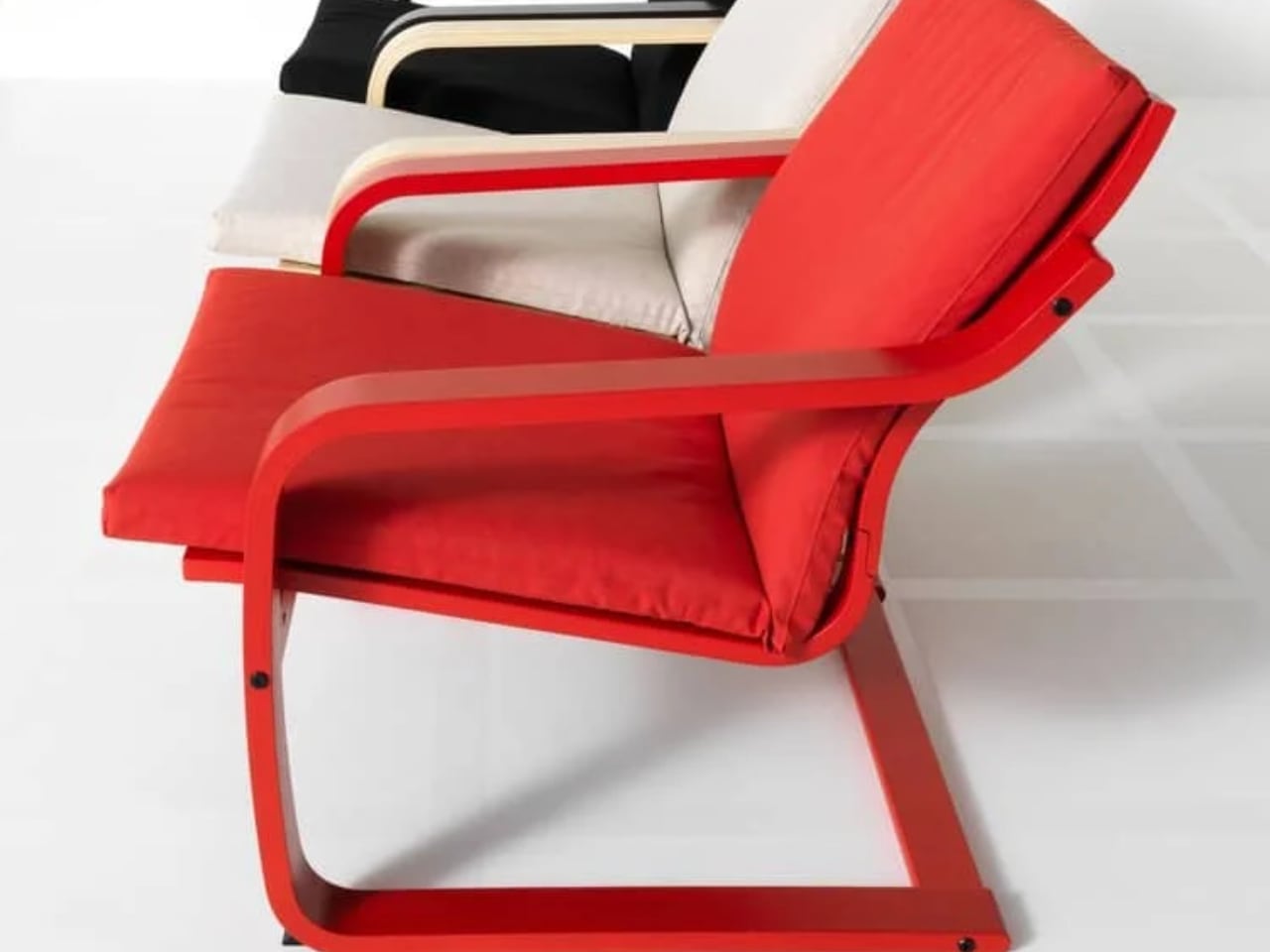
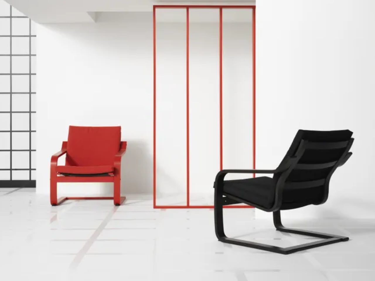
IKEA has fundamentally reimagined its most enduring furniture icon through a transformative redesign that prioritizes social interaction over solitary comfort. The POÄNG armchair received its most significant design evolution in nearly five decades when late designer Noboru Nakamura emerged from retirement to personally oversee this dramatic transformation. His final creative act involved removing the signature headrest entirely, creating a low-back version that encourages conversation rather than retreat.

The elimination of the headrest serves multiple purposes beyond pure aesthetics, fundamentally changing how people interact with both the chair and their surroundings. By lowering the overall profile and opening the back design, Nakamura created seating that transforms a personal sanctuary into an invitation for interaction. This modification reflects contemporary living patterns where multipurpose spaces demand furniture that adapts to various social contexts and encourages meaningful human connection.

What we like

• Promotes social interaction and conversation through open-back design.

• Maintains iconic comfort while adapting to modern living needs.

What we dislike

• Less head and neck support for extended relaxation sessions.

• May not suit those preferring private, enclosed seating experiences.

2. Color Roller Transparent Rolling Chairs: Dynamic Chromatic Design

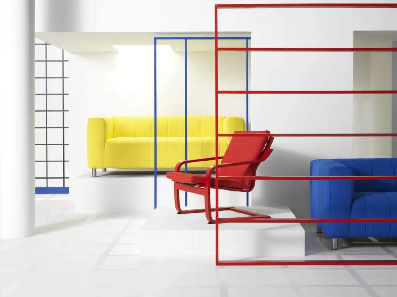
Like De Stijl once deconstructed form and space into elemental purity, Color Roller reimagines that legacy through motion and transparency using primary colors red, yellow, and blue. This experimental furniture collection plays with relationships between geometry, light, and interaction, creating transparent forms that transcend boundaries and merge into endless new shades. The result transforms furniture into evolving chromatic sculpture that invites users to participate in environmental reconstruction.

Color Roller explores how color and form coexist as active agents in spatial design through three components, including a hexagonal chair, a rectangular table, and a triangular floor lamp. Made entirely from transparent acrylic panels intersecting in pairs, these forms create vivid and flexible compositions of color. Depending on light direction and intensity, the furniture transforms and casts overlapping shadows and gradients that turn interiors into interactive canvases.

What we like

• Creates dynamic color interactions that change throughout the day.

• Lightweight rolling design allows easy reconfiguration of spaces.

What we dislike

• Transparent acrylic may show fingerprints and require frequent cleaning.

• Limited cushioning options may affect long-term seating comfort.

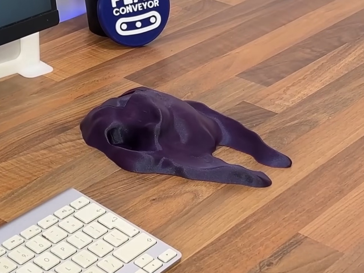
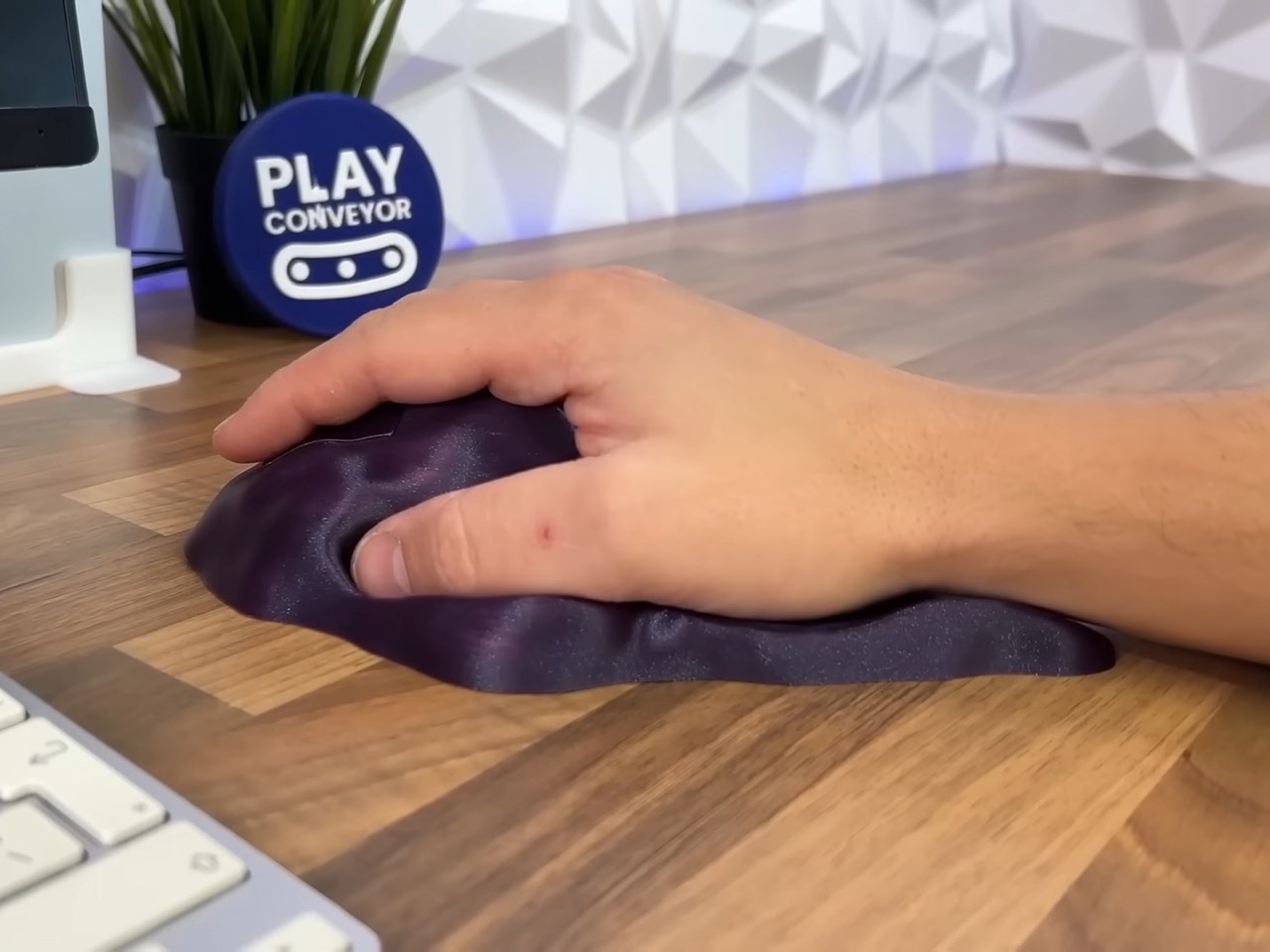
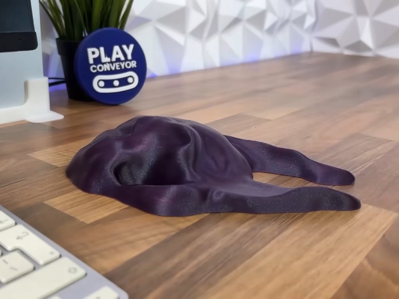
3. Himalaya Pelvis Chair: Biomimicry Meets Elegant Function

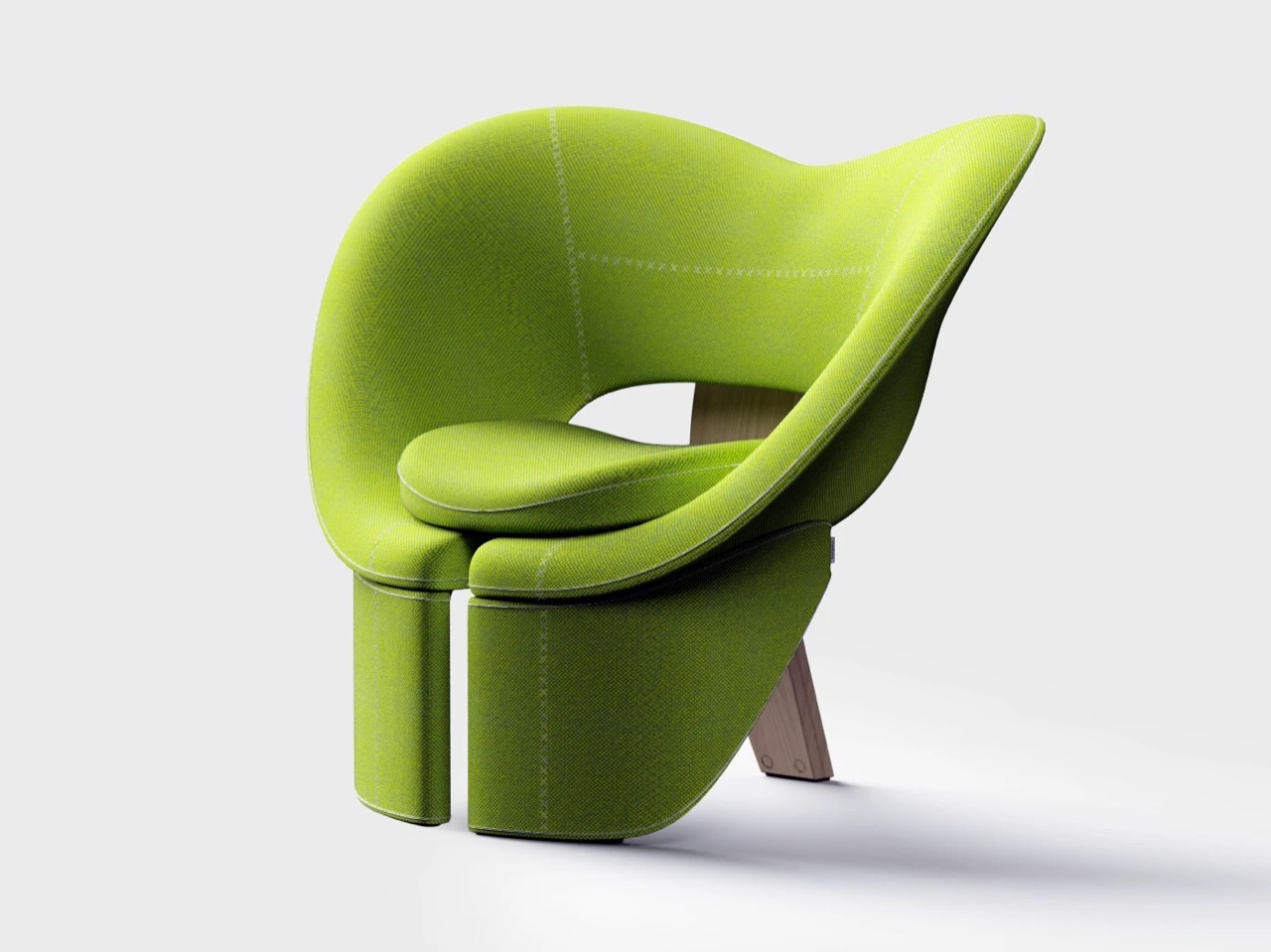
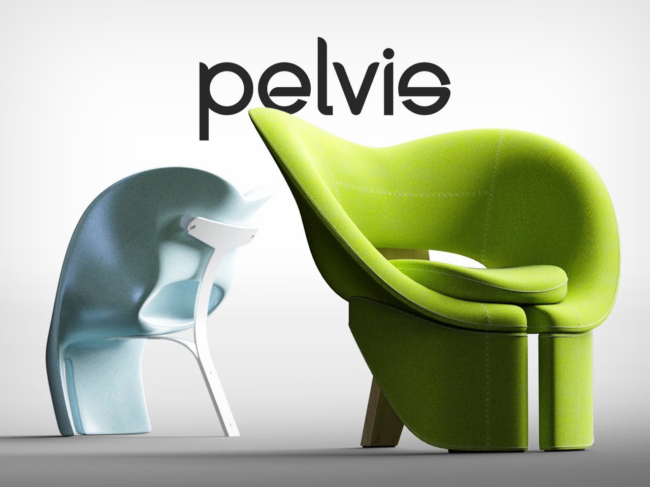
Furniture often aspires to fit the body, but the Himalaya Pelvis Chair goes further by finding its silhouette directly in pelvic bone structure. This direct translation from biology to design yields a chair that feels organic, functional, and distinctly new, where comfort and concept are literally intertwined. Designers Mingyu Seo and Eojin Jeon created this rare piece that genuinely makes you reconsider relationships between our bodies and daily objects.

The chair’s entire premise builds on the pelvic bone’s natural ability to cradle and support, translating anatomical engineering directly into refined seating design. This approach sidesteps abstract biomimicry by presenting clear, almost educational links between form and inspiration through unapologetically direct reference. The execution transcends its medical source material through such refined craftsmanship that it becomes genuinely elegant rather than clinical.

What we like

• Anatomically-inspired design provides natural ergonomic support.

• Unique sculptural form serves as a conversation piece and functional seating.

What we dislike

• Bold design may not integrate easily with traditional decor styles.

• Limited availability as a concept piece may affect accessibility.

4. Frank Lloyd Wright Reconstructed Chairs: Architectural Seating Heritage

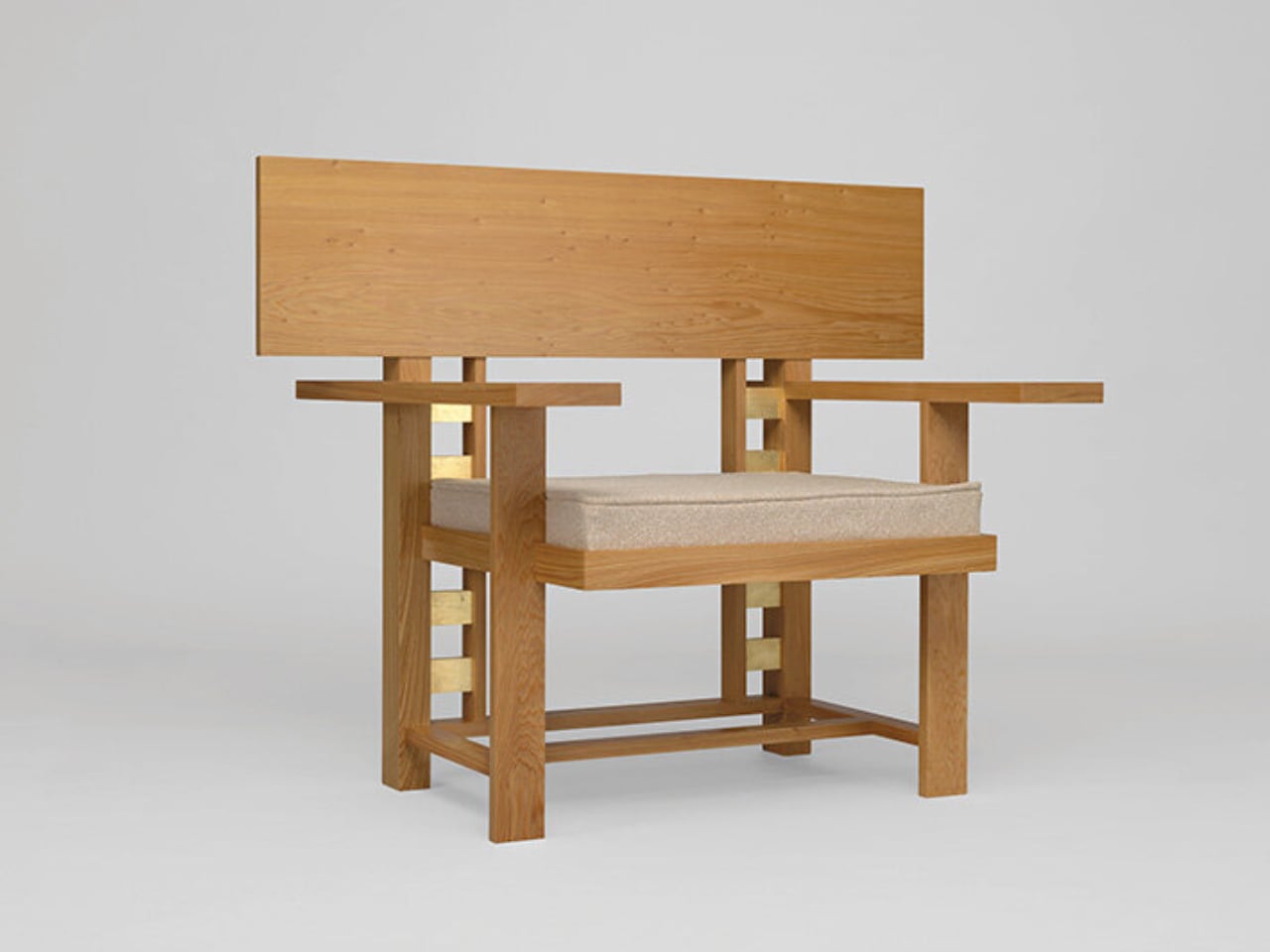
The reconstructed chairs illuminate Wright’s approach to furniture as architectural elements rather than standalone pieces, demonstrating his belief that furniture should emerge organically from the building’s overall design concept. Wright called this philosophy “integral ornamentation” and applied it consistently throughout his career, spanning five distinct periods from 1911 to 1959. The exhibition traces a dramatic evolution from Prairie School geometric vocabulary to later organic forms with flowing curves.

Highlights include first-ever fabrications of designs never built during Wright’s lifetime, such as cafe chairs originally envisioned for the Solomon R. Guggenheim Museum. These cafe chairs represent some of the exhibition’s most significant reconstructions, now realized through collaboration with Milwaukee metal-spinning firm. Early Prairie School pieces display right angles and linear elements complementing the horizontal prairie house emphasis, while later work reveals shifts toward organic forms.

What we like

• Historic design pedigree brings timeless architectural principles to modern spaces.

• Integral ornamentation philosophy ensures harmony with surrounding architecture.

What we dislike

• Limited production availability may result in higher costs.

• Period-specific styling may not suit all contemporary interior approaches.

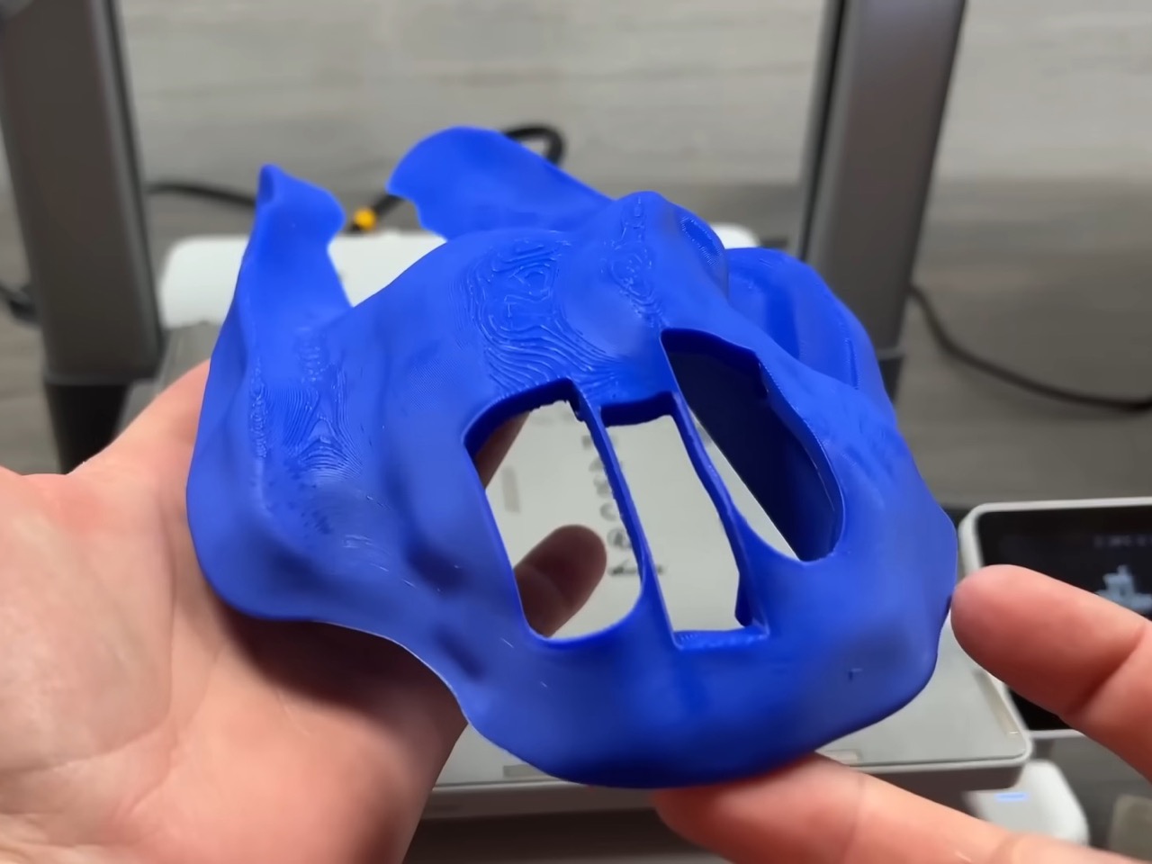
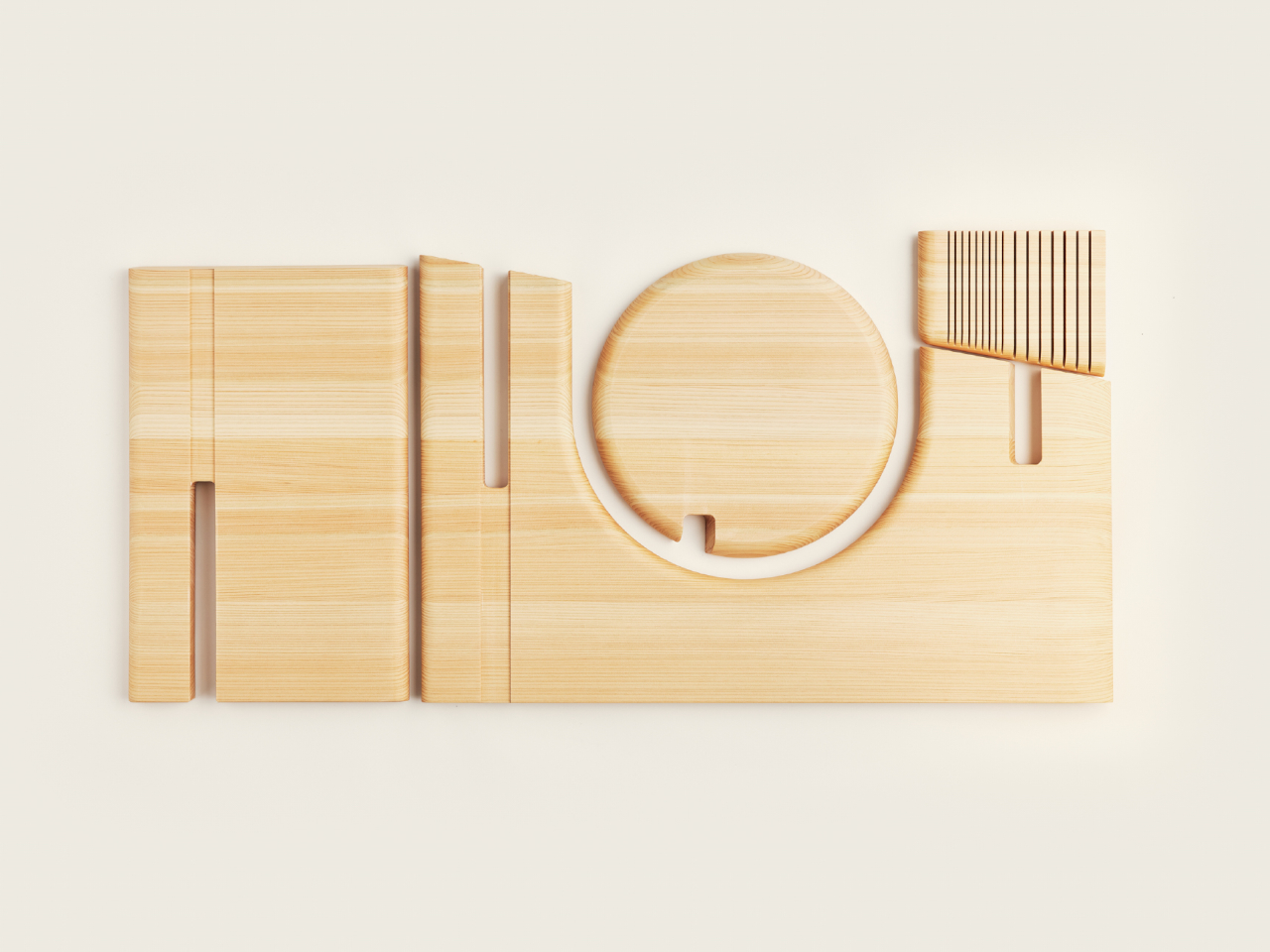
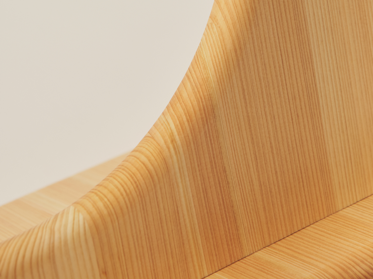
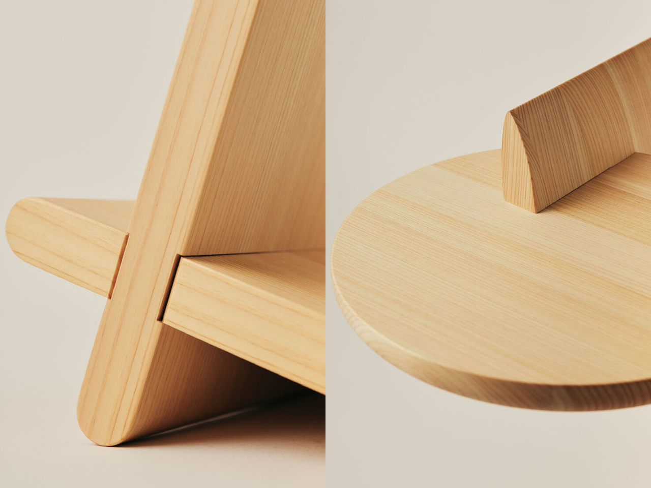
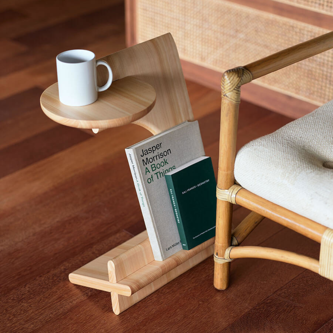
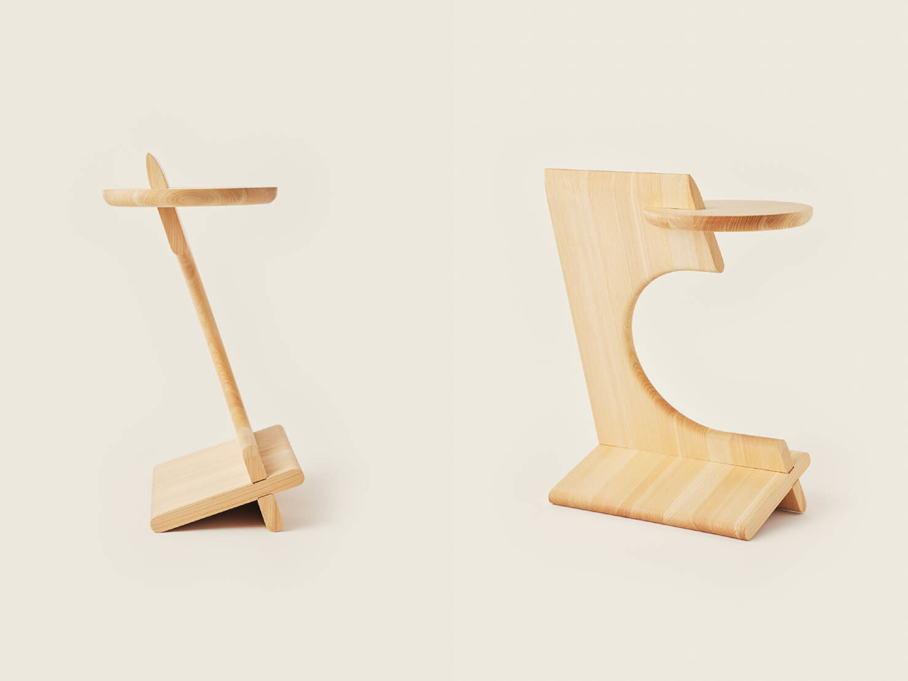
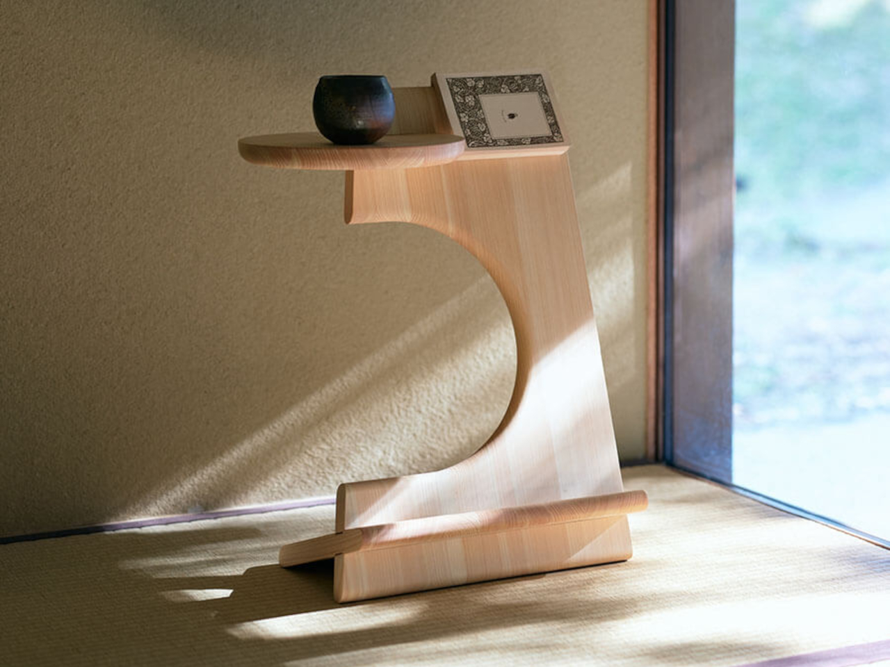
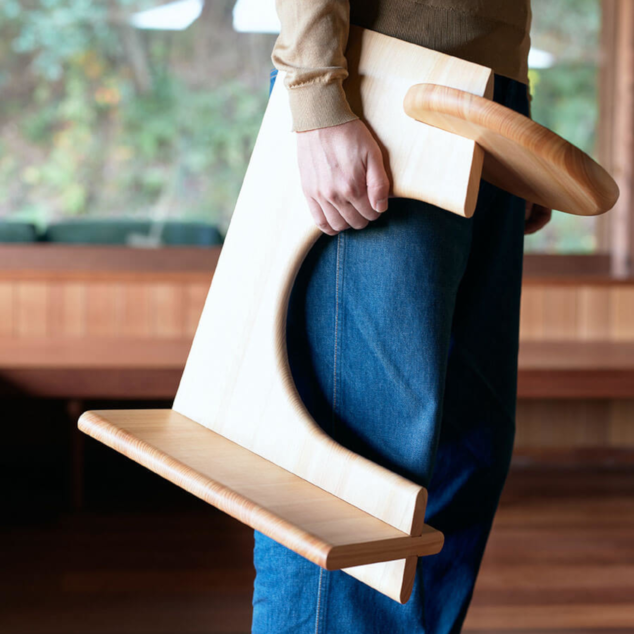
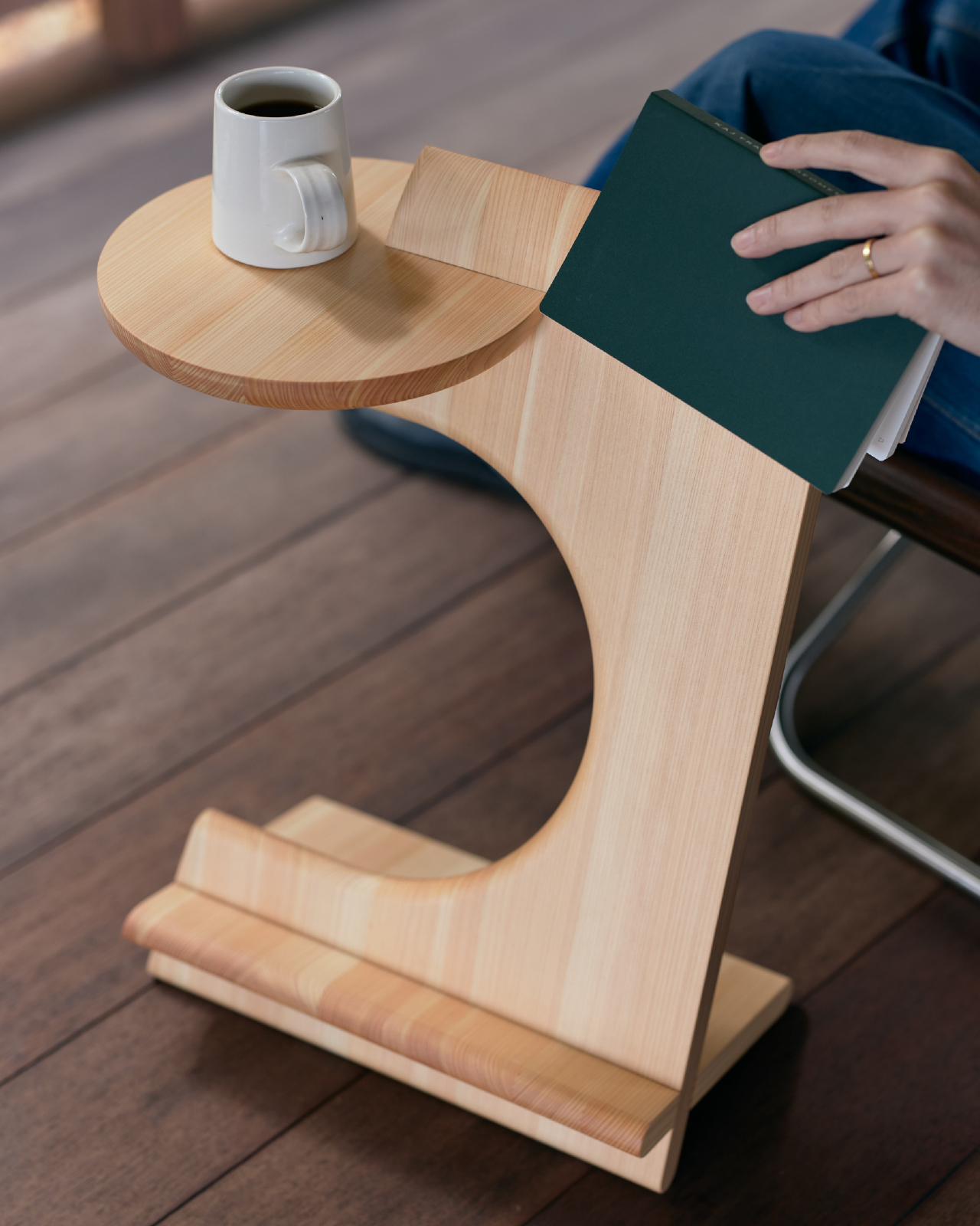
5. LOOP Chair: Sculptural Minimalism in Motion

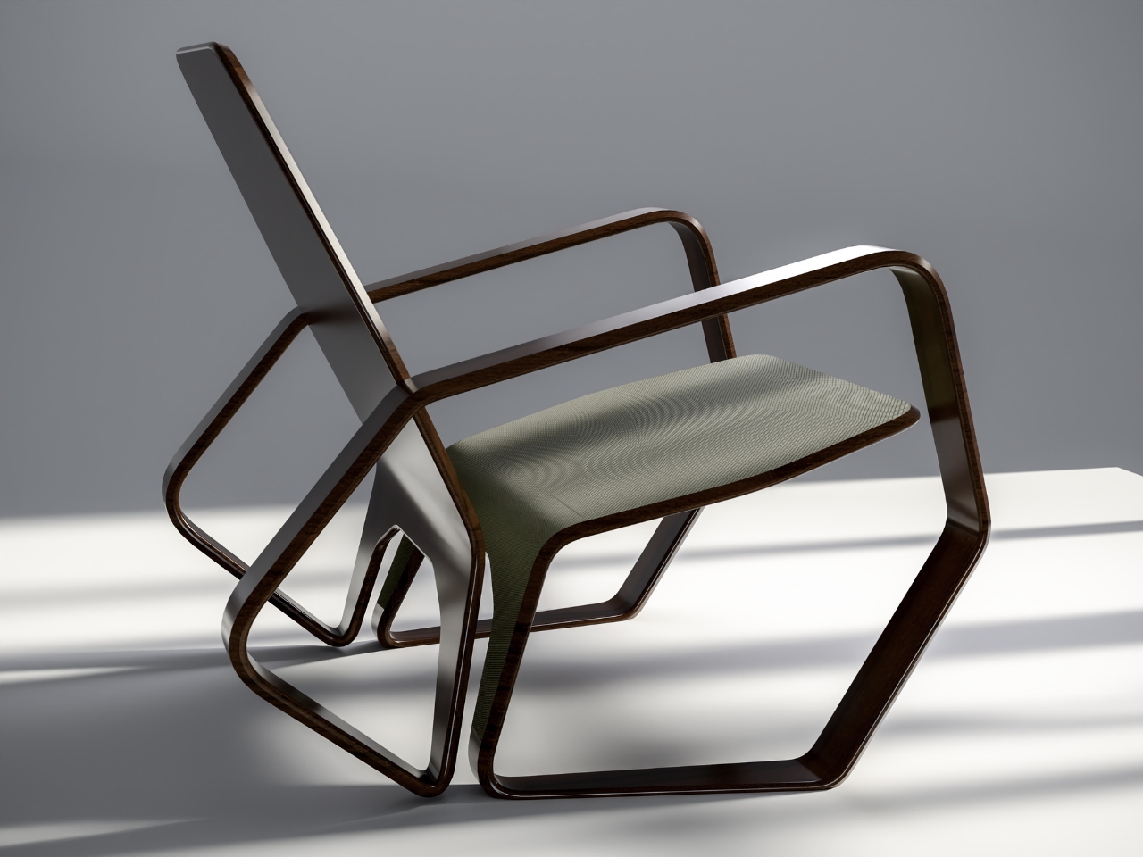
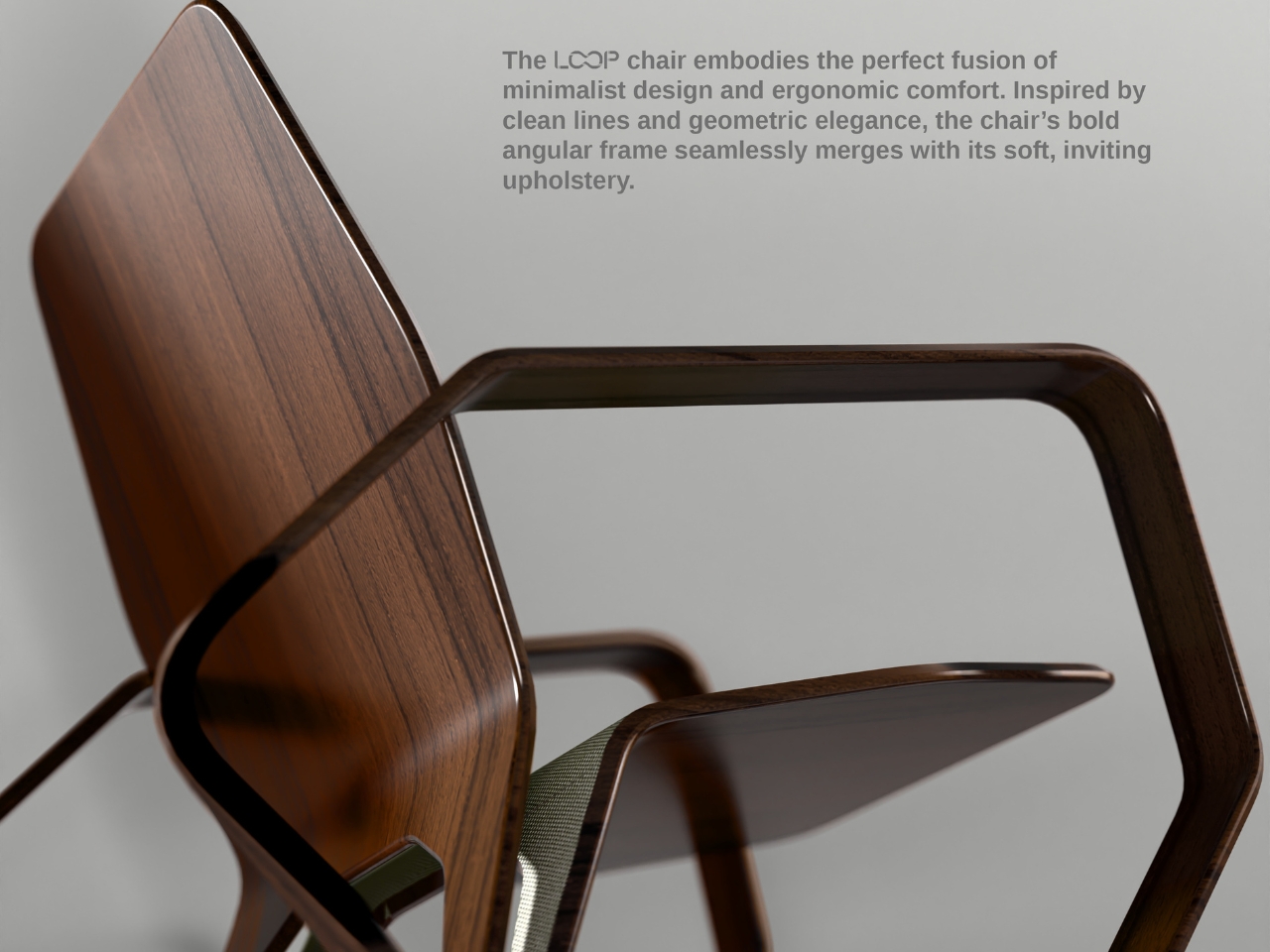
The LOOP Chair concept impresses with a bold, angular frame that feels both dynamic and airy while creating a continuous, flowing form that almost “loops” around the sitter. This unique vision transforms the chair from a functional object into a sculptural experience that serves as both structural support and artistic centerpiece. The proposed walnut wood veneer frame offers options for ash, oak, or black-stained finishes to complement various interior styles.

The chair’s geometry results from careful sketching and creative exploration, balancing soft curves for optimal comfort with sharp angles for modern, architectural aesthetic appeal. The flowing design creates visual lightness while maintaining structural integrity, making it suitable for both residential and commercial applications. This sculptural approach elevates everyday seating into an artistic statement that enhances rather than merely occupies space.

What we like

• Sculptural design serves a dual purpose as furniture and artistic centerpiece.

• Multiple wood finish options allow customization for different interior styles.

What we dislike

• Concept status may limit immediate availability for purchase.

• Angular design elements might not suit all body types comfortably.

6. Same Same Twin Chairs: Playful Minimalist Interaction

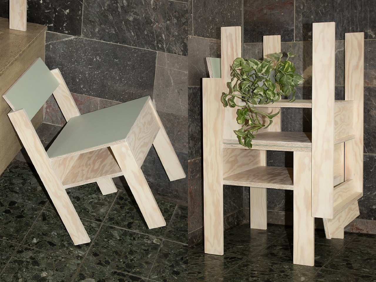
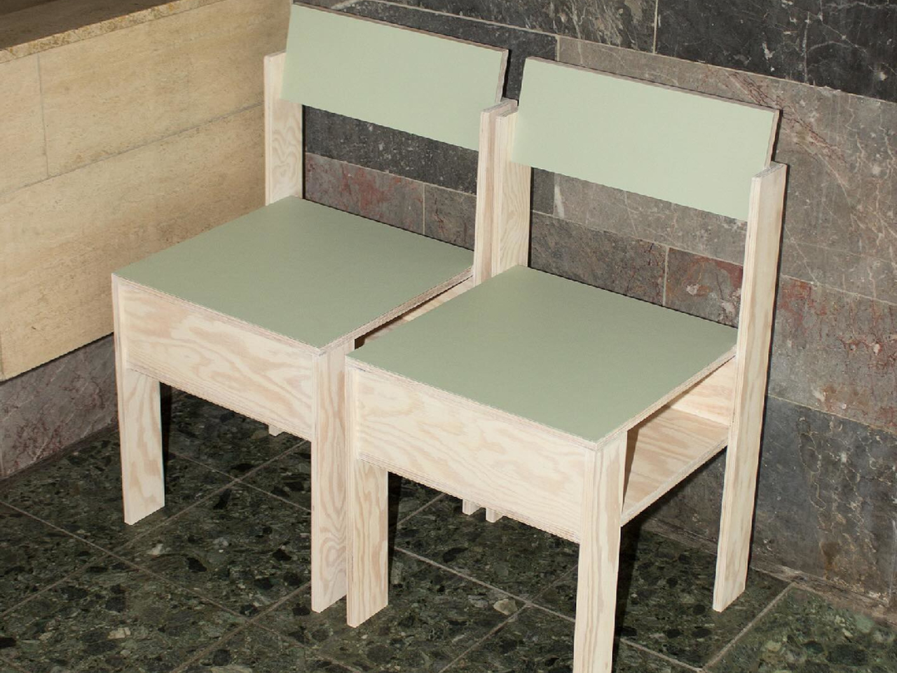
The Same Same twin chairs by A204 challenge traditional furniture limitations by functioning beautifully as standalone seating with built-in storage while unlocking playful possibilities when paired together. These minimalist wooden chairs transform from simple furniture into a creative toolkit that allows interaction, configuration, and use possibilities that adapt to changing needs. The design language speaks to Scandinavian minimalism with pale plywood construction and clean, geometric lines.

Each chair features a subtle sage green accent on the seat and storage surfaces, adding warmth without overwhelming natural wood grain characteristics. The under-seat storage space accommodates magazines, small objects, or standard Euro containers for organized solutions, making each chair genuinely useful beyond basic seating function. When paired together, the chairs create new possibilities for social interaction and spatial configuration.

What we like

• Built-in storage maximizes functionality in compact living spaces.

• Pairing capability creates flexible seating arrangements for various occasions.

What we dislike

• The twin chair concept requires purchasing multiple pieces for full functionality.

• Minimalist design may lack cushioning for extended sitting comfort.

7. Permanent Souls Chair Collection: Memory Made Tangible

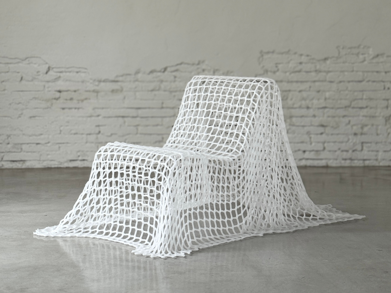
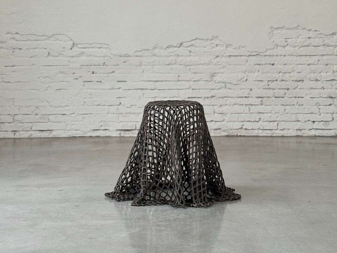
The visual impact is immediate and haunting as light passes through netting in patterns that shift as you move around each piece. These chairs appear solid from a distance but reveal their permeable nature up close, allowing you to see through them, around them, and into spaces they create. They exist in strange territory between presence and absence, like memories made tangible that question the very nature of traditional furniture function.

This collection explores what happens when objects lose their original purpose but somehow endure, transforming nets that once held things together into something that questions functional boundaries. The chairs challenge conventional seating expectations by creating pieces that exist both physically and conceptually, offering a unique perspective on how furniture can embody abstract concepts while remaining functionally relevant.

What we like

• Unique conceptual approach creates a truly distinctive seating experience.

• Permeable design allows light to create dynamic shadow patterns in spaces.

What we dislike

• Unconventional materials may not provide traditional seating comfort expectations.

• Artistic concept may prioritize form over practical everyday functionality.

The Future of Adaptive Seating

These seven innovative seating solutions demonstrate how contemporary designers are reimagining the fundamental relationship between furniture and daily life. Each piece offers a unique approach to versatility, whether through social interaction, dynamic color, anatomical inspiration, architectural heritage, sculptural beauty, playful modularity, or conceptual exploration.

The best versatile seating solutions for modern living transcend traditional boundaries, offering functionality that adapts to our changing needs while adding aesthetic and emotional value to our spaces. These designs prove that chairs can be simultaneously practical tools, artistic statements, and catalysts for human connection, making them essential components of thoughtfully designed modern homes.

The post 7 Best Versatile Seating Solutions That Transform How We Live & Sit first appeared on Yanko Design.

Lemokey Keyboard With Analog Keys Triggers 4 Actions Per Press

The mechanical keyboard market has split into factions that rarely speak to each other. Gaming boards chase millisecond advantages with features most people will never configure, while design-focused options prioritize clean lines at the expense of functionality. Premium keyboards exist in both categories, but they seldom bridge the gap between looking appropriate in a minimalist workspace and delivering the kind of technical depth that competitive players actually use.

The Lemokey L1 HE addresses this gap with a CNC-milled aluminum chassis that weighs nearly two kilograms and looks deliberate rather than flashy. Available in white with yellow accents, black, or silver, the 75% layout includes macro keys and a programmable roller on the left side that defaults to volume control but accepts custom assignments. The metal construction and clean lines work on desks where aesthetics matter.

Designer: Lemokey (Keychron)

The switches underneath are where things get interesting. Gateron’s double-rail magnetic switches use Hall Effect sensors instead of physical contact points, which sounds technical until you realize what it enables. Every key’s activation point adjusts from feather-light to deliberate across a 3.6mm range. Set your movement keys to hair-trigger sensitivity. Configure typing keys deeper so resting fingers don’t accidentally fire off characters. The keyboard adapts to how you work rather than forcing adaptation the other way.

Press a key partway, and one action triggers. Press deeper, and a different command fires. Deeper still, another. Release at the right depth and a fourth activates. This isn’t theoretical; it changes how certain games and workflows operate once you stop thinking in binary keypresses. Walking versus running becomes pressure instead of separate keys. Multi-key shortcuts collapse into single presses with varying depth. Finger gymnastics get replaced by pressure control.

Switching to analog mode turns the keyboard into something closer to a controller. Racing games suddenly respond to how deeply you press acceleration keys, not just whether they’re pressed at all. The magnetic switches detect these pressure variations smoothly enough that steering feels genuine rather than approximated. People who prefer keyboards over controllers gain functionality that previously required switching input methods entirely.

The web-based configurator runs through any modern browser without installation, working identically across operating systems. Remapping happens quickly. Macros are built through straightforward menus. The keyboard connects wirelessly at 1000Hz polling for gaming or switches between three Bluetooth devices for productivity. Battery lasts long enough that charging becomes a weekly task rather than a daily concern.

Typing produces sounds that feel dampened and substantial rather than hollow or sharp. Multiple foam layers and gasket mounting create that quality, along with stabilizers that keep larger keys smooth. The double-shot PBT keycaps handle daily wear without developing shine, and the metal body prevents any flex during aggressive typing sessions. RGB lighting exists but stays subdued enough not to dominate the aesthetic.

The L1 HE occupies unusual territory between gaming keyboards and professional boards. It delivers rapid trigger modes and analog control alongside a build quality and appearance that work in spaces where RGB unicorn vomit would draw complaints. The programmable roller, magnetic switches, and four-action keys make it technically ambitious, while the design keeps it visually restrained.

The post Lemokey Keyboard With Analog Keys Triggers 4 Actions Per Press first appeared on Yanko Design.

I Replaced My iPhone Alarm with this Literature Clock and it made my mornings 5x Stress-Free

Your phone tells you it’s 7:23 AM and cloudy. NovellaMate tells you the same information through a passage from Dickens or Neruda, transforming raw data into something you actually want to read. The difference matters more than you’d think, because most of us have forgotten that time and weather aren’t just functional details to be consumed and discarded. They’re the backdrop to our lives, the quiet constants that shape mood, memory, and even creativity. A clock that treats them like poetry instead of spreadsheets isn’t just a novelty; it’s a quiet rebellion against the way we’ve been conditioned to interact with technology.

I’ll admit, when I first heard about the NovellaMate being a smart clock, my skepticism flared up like a bad WiFi connection. Another “smart” gadget for the nightstand? Another Kickstarter darling promising to revolutionize the way we wake up? But then I watched the demo video, and something clicked. This isn’t about smarter alarms or better sleep tracking. It’s about designing an object that respects the ritual of timekeeping, that understands how deeply literature can embed itself in the mundane, and that for some people, life isn’t a routine, it’s a movie or a book being played out as the main character. The kind of thing that makes you pause mid-morning, coffee in hand, because the clock just read you a line from One Hundred Years of Solitude that somehow fits the way the light is slanting through your window. That’s not a feature; that’s an experience. And in a market flooded with devices that prioritize efficiency over emotion, an experience like the NovellaMate feels magical.

Designers: Mark Chow, Jueer Lee, Stan Lee & Natto Kang

Click Here to Buy Now: $179 $279 ($100 off). Hurry, only 142 of 150 left!

The specs, when you dig into them, reveal a product that’s been thought through with unusual care. NovellaMate’s database doesn’t just pull random quotes from a generic pool; it’s a curated collection of handpicked literary passages, each tied to a specific minute of the day or a weather condition. Rain at 3:47 PM? There’s a quote for that. Clear skies at dawn? Another. The clock doesn’t just tell you it’s 10:12 AM; it finds a way to make 10:12 AM feel like a moment worth noticing. The team behind it claims to have spent over a year compiling and categorizing these quotes, working with literary experts to ensure the selections aren’t just famous but meaningful. That’s the kind of detail that separates a gimmick from something genuinely compelling, the difference between a product that gets used for a week and one that becomes part of your daily rhythm.

NovellaMate inspires us everyday.

Unlike most smart displays that shout information at you, NovellaMate leans into subtlety. The time and weather are presented through literature, either displayed in text or read aloud in a voice that’s designed to feel more like a friend sharing a favorite passage than a robot reciting data. The audio is paired with soft, adaptive lighting and ambient music, creating a wake-up routine that’s closer to a sunrise than an alarm. NovellaMate compares it to being nudged awake by a particularly thoughtful librarian, which, let’s be honest, is a vibe we could all use more of. The physical design reinforces this ethos: walnut grain, vegan leather, a warm glow that acts as an earthy antithesis to the plastic, glass, and metal boxes we associate with IoT devices today.

NovellaMate telling the time.

Of course, the elephant in the room is whether this thing actually works as a clock. The short answer is yes, but don’t expect this to replace your Swiss Chronograph. NovellaMate does tell the time, and it does so accurately, but it’s not designed for glance-and-go utility. If you’re the type of person who needs to know the exact second to time your morning sprint to the office, this isn’t for you. The device prioritizes immersion over immediacy- that’s a deliberate choice, one that forces you to slow down, which people with tight mechanical schedules will see as a trade-off, but to the target audience, it feels like being a protagonist of a book. The weather functionality relies on an internet connection to pull local data, so if your WiFi is acting up, you might get a generic quote instead of one tailored to a sudden downpour. These aren’t dealbreakers, but they’re worth noting if you’re someone who values precision over poetry.

NovellaMate telling the weather.

And sure, with time the same quotes may just become a tad bit repetitive, which is why the NovellaMate promises to constantly add newer quotes to its vast database. The team has hinted at regular updates, with new quotes and even seasonal themes added over time, which suggests they’re thinking long-term. There’s also the quote-saving feature, which lets you build a personal collection of favorites, turning the device into a kind of interactive anthology. That’s a smart move, because it gives users a reason to keep engaging with the clock beyond the initial charm. Still, the success of this hinges on execution. If the updates are sparse or the quotes start repeating too often, the illusion shatters.

What’s most striking about NovellaMate is how it reframes the role of technology in our lives. So much of what we interact with daily is designed to optimize, to streamline, to make us more efficient. NovellaMate does the opposite. It asks us to linger. It turns the act of checking the time into an opportunity for reflection, a tiny pause in the rush of the day. Given how all our devices are constantly demanding our attention, a clock that whispers instead of shouts feels like a small act of resistance, a refreshing reminder that technology can do more than just solve problems. Sometimes, it can make life a little more beautiful.

The NovellaMate comes in across 2 variants – an 8GB one and a 16GB one, which determines how vast its internal database of quotes will be. The 8GB variant is priced at $179, while the 16GB costs $199 (just an extra 20 bucks). Each NovellaMate ships with a 1-year warranty, starting January 2026, so your new year can begin on a much more poetic note!

Click Here to Buy Now: $179 $279 ($100 off). Hurry, only 142 of 150 left!

The post I Replaced My iPhone Alarm with this Literature Clock and it made my mornings 5x Stress-Free first appeared on Yanko Design.

A Rectangular Bladeless Fan? This Design Breaks All the Rules

You know how some designs just make you stop scrolling? That’s exactly what happened when I came across this bladeless fan by Foshan Perfect Industrial Design. It’s not your typical circular fan that we’ve all gotten used to seeing since Dyson popularized the concept. This one’s rocking a square base, and honestly, it’s kind of genius.

Let me explain why this caught my attention. We’ve been conditioned to think that fans, bladeless or not, should be round. It makes sense, right? Air flows in circular patterns, so circular fans seem like the natural choice. But here’s where this design gets interesting. The team behind this fan decided to challenge that assumption and built their concept around a square-based design language. And it’s not just about being different for the sake of standing out.

Designer: Foshan Perfect Industrial Design

The real innovation here is what they’re calling 5D air circulation. Now, I’ll admit that sounds like marketing speak at first, but stick with me. Traditional bladeless fans work by hiding a propeller in the base that sucks air in and pushes it through a ring-shaped opening. The expelled air creates what’s called negative pressure, which pulls even more surrounding air through the ring, multiplying the airflow by up to 15 times.

This square design takes that concept and apparently amplifies it with a focused air duct system. Instead of just sending air in one general direction like circular fans tend to do, this focused duct system accelerates and directs the airflow more precisely. Think of it like the difference between a garden hose with a regular nozzle versus one with a spray gun attachment. Same water source, but way more control and power.

What I find particularly clever about the square form factor is how it fits into modern living spaces. Most of our furniture, shelves, and room layouts are based on right angles and straight lines. A square-based fan just sits more naturally on a desk, side table, or shelf without that awkward “where do I put this round thing” moment we’ve all experienced. It’s one of those design decisions that seems obvious once you see it, but took real creative thinking to actually execute.

The bladeless fan category itself has come a long way since it first hit the market. These devices are safer than traditional fans because there are no exposed blades that curious kids or pets can stick their fingers into. They’re also typically quieter and more energy-efficient. But they’ve mostly followed the same aesthetic playbook, which is why seeing a square interpretation feels refreshing.

This design won recognition from the MUSE Design Awards, which celebrates innovative product design across categories. And it’s not hard to see why. It takes an established product category and reimagines it in a way that’s both functional and aesthetically interesting. The square form doesn’t just look different, it potentially offers better spatial efficiency and air direction control. I think what makes this design work is that it doesn’t sacrifice function for form. The square base isn’t just a stylistic choice; it’s integrated with the technical improvements like that focused air duct system. That’s the sweet spot in product design, where aesthetics and engineering work together rather than competing for attention.

For anyone who’s into tech, design, or just appreciating when everyday objects get thoughtfully reimagined, this fan is worth a second look. It’s a reminder that even in mature product categories, there’s still room for innovation when designers are willing to question the assumptions we’ve all been making. Sometimes the best ideas come from asking the simplest questions, like “does a fan really need to be round?” Whether this square bladeless fan becomes the new standard or remains a cool design experiment, it’s already succeeded in making us think differently about an appliance we barely notice. And that’s kind of the whole point of good design, isn’t it?

The post A Rectangular Bladeless Fan? This Design Breaks All the Rules first appeared on Yanko Design.