There’s something quietly satisfying about a design that doesn’t try to reinvent the wheel. Dai Furuwatari’s Pendulum Candleholder isn’t trying to be radical. It’s not minimalist for minimalism’s sake, and it doesn’t come loaded with a big brand story about disruption. It’s just a very thoughtful update to something that was already good, and that, to me, is the most interesting kind of design work there is.
The backstory matters here. The piece is rooted in a traditional Japanese portable candleholder called a teshoku. Back in the 1600s, the teshoku was a luxury item, the kind of thing you’d find in the homes of the wealthy or inside temple halls. Candles were expensive, and the ability to carry light from room to room was a privilege. At some point, an unknown craftsman solved a simple but obvious problem: the teshoku got a long, horizontal leg that doubled as a handle, making it easier to pick up and carry without getting too close to the flame. It was a small addition that changed the whole experience of using it.
By the 1800s, paraffin candles made the whole thing more affordable, and the teshoku eventually found its way into everyday life. The design stayed more or less the same for centuries, which says something, because designs that stick around that long usually earn it.
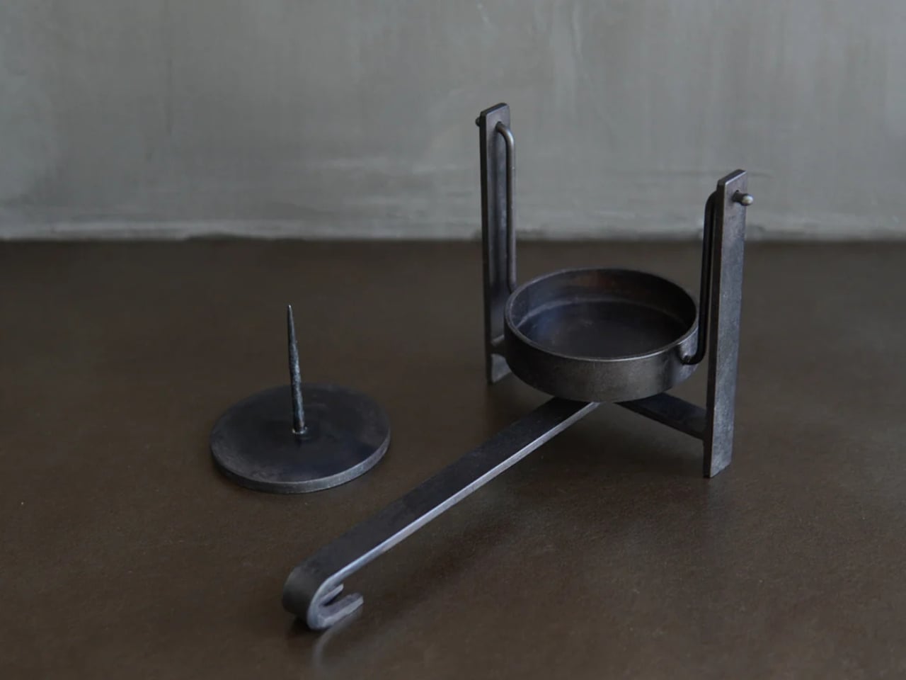
Furuwatari, a product designer who transitioned into ironwork, picked up the teshoku and asked what could still be better. His answer came in the form of two specific, considered improvements that feel less like features and more like realizations.
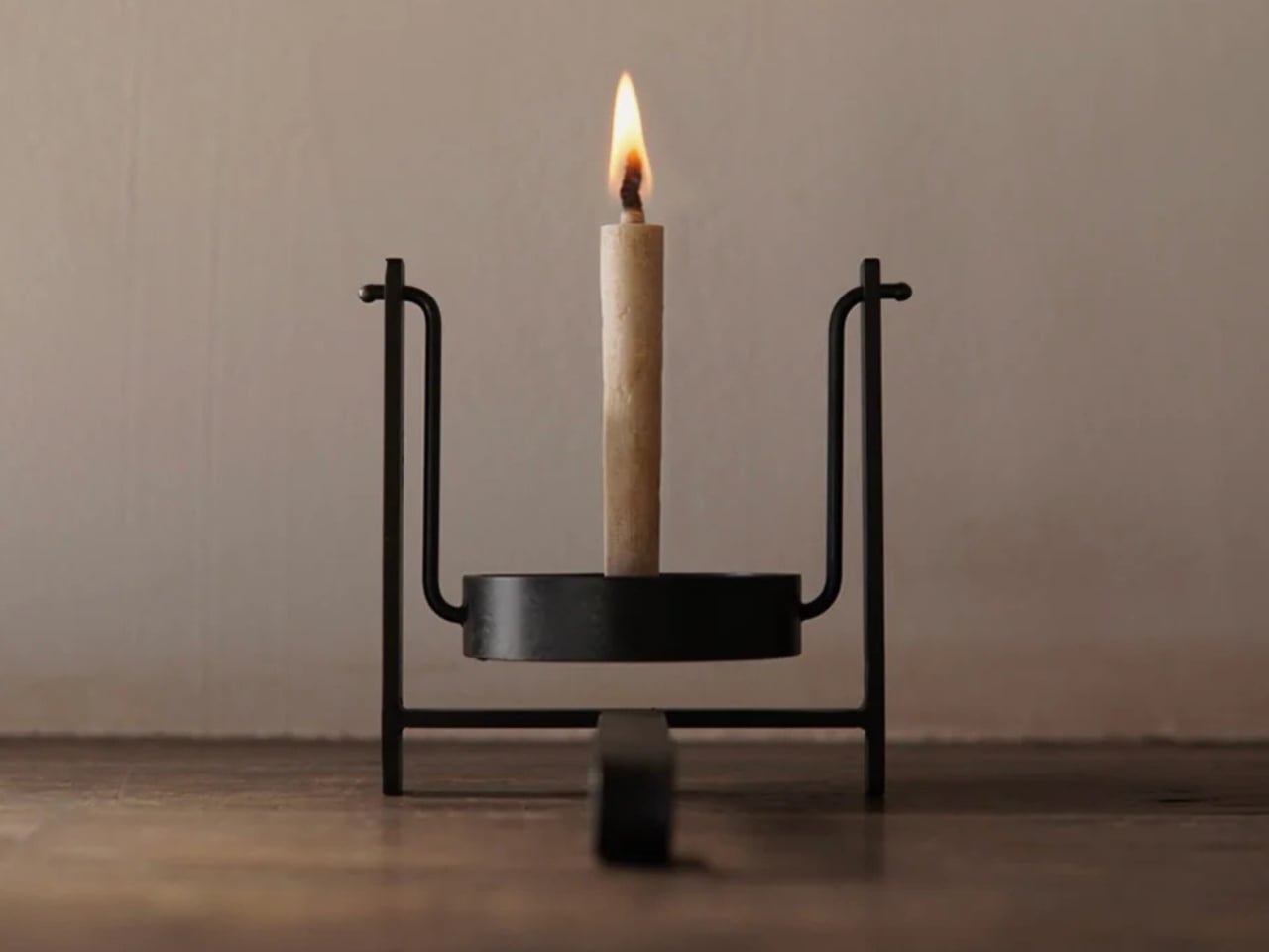
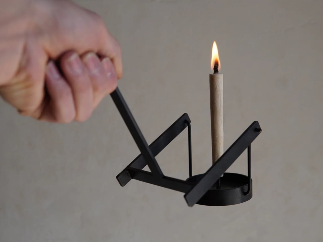
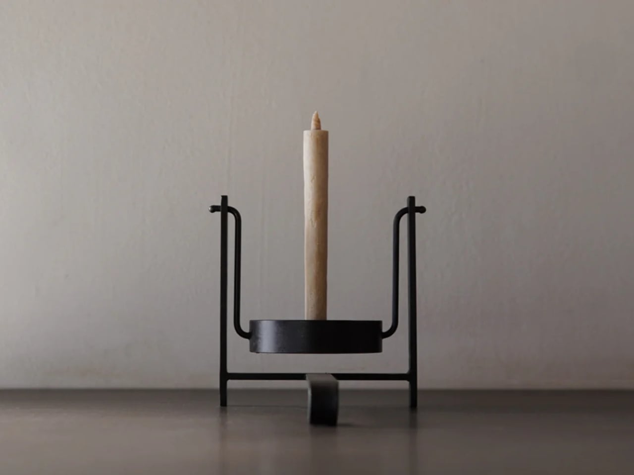
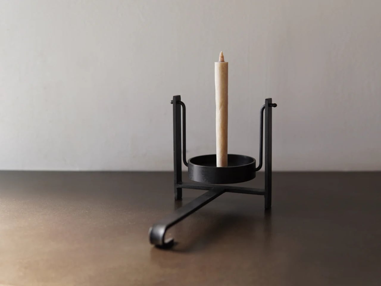
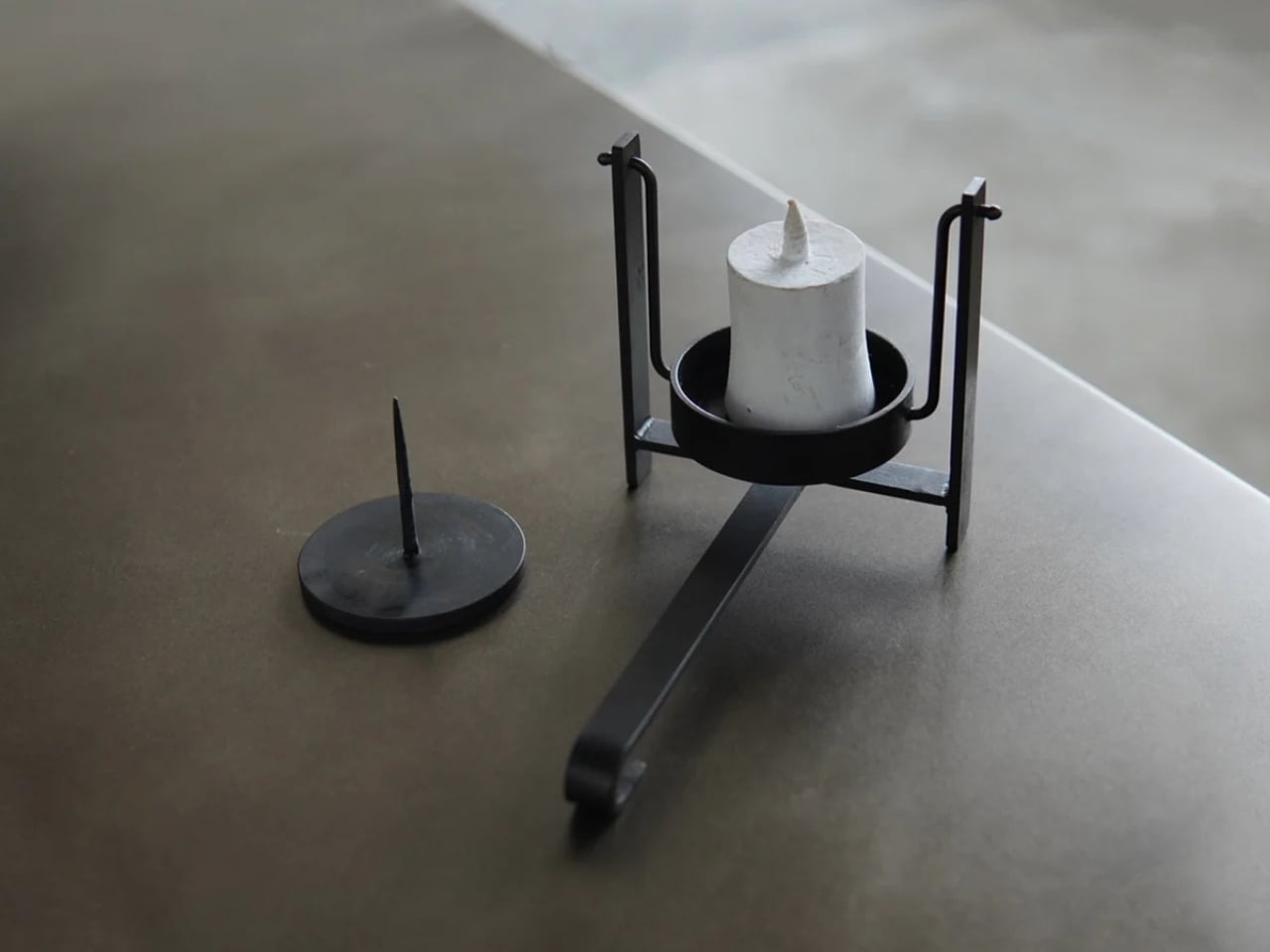
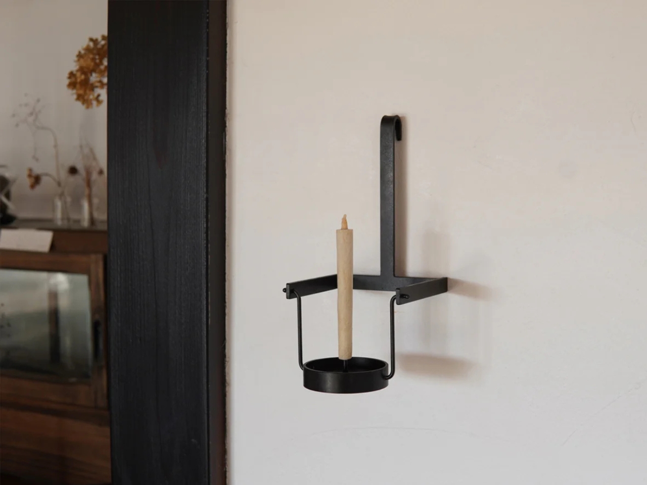
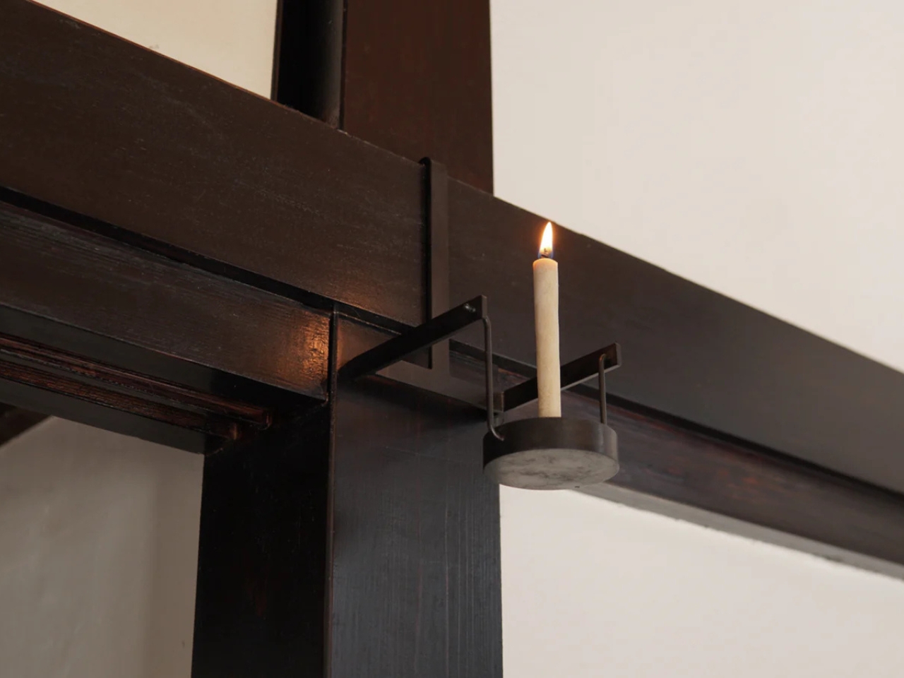
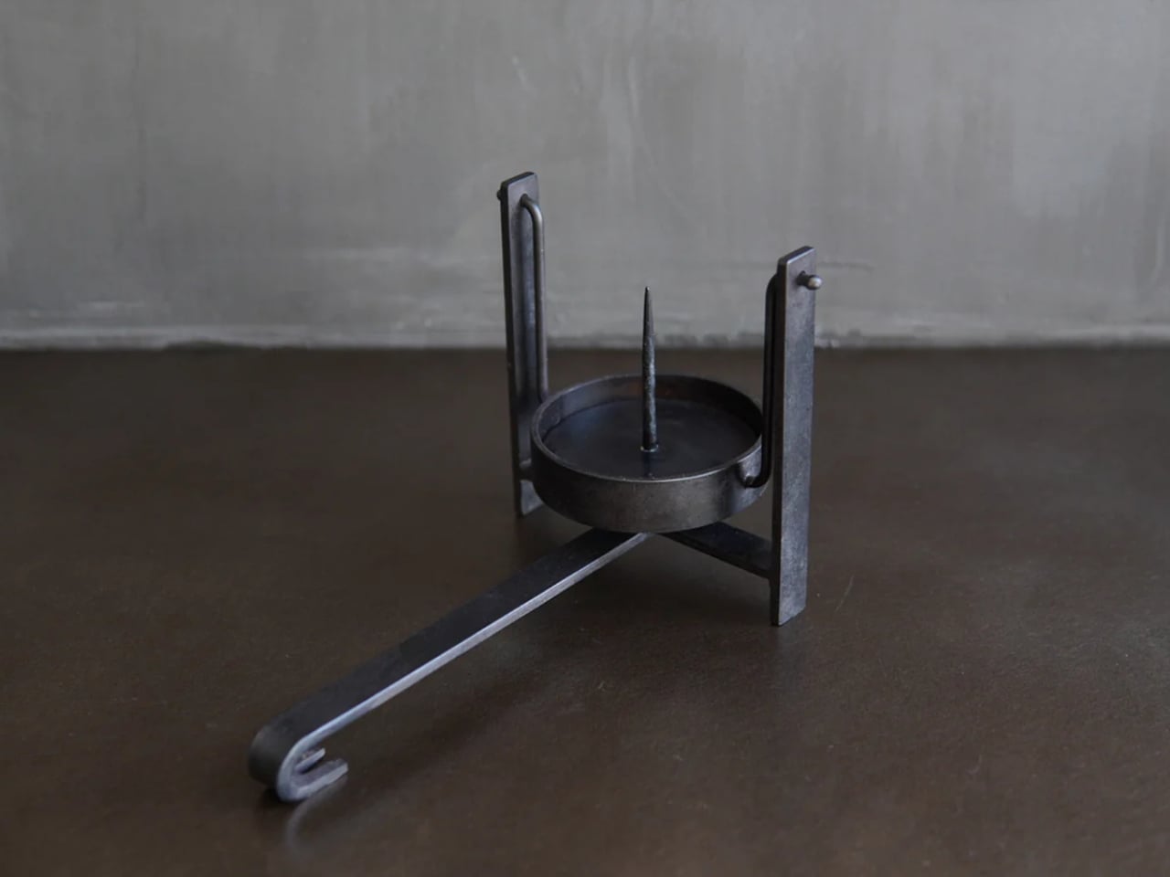
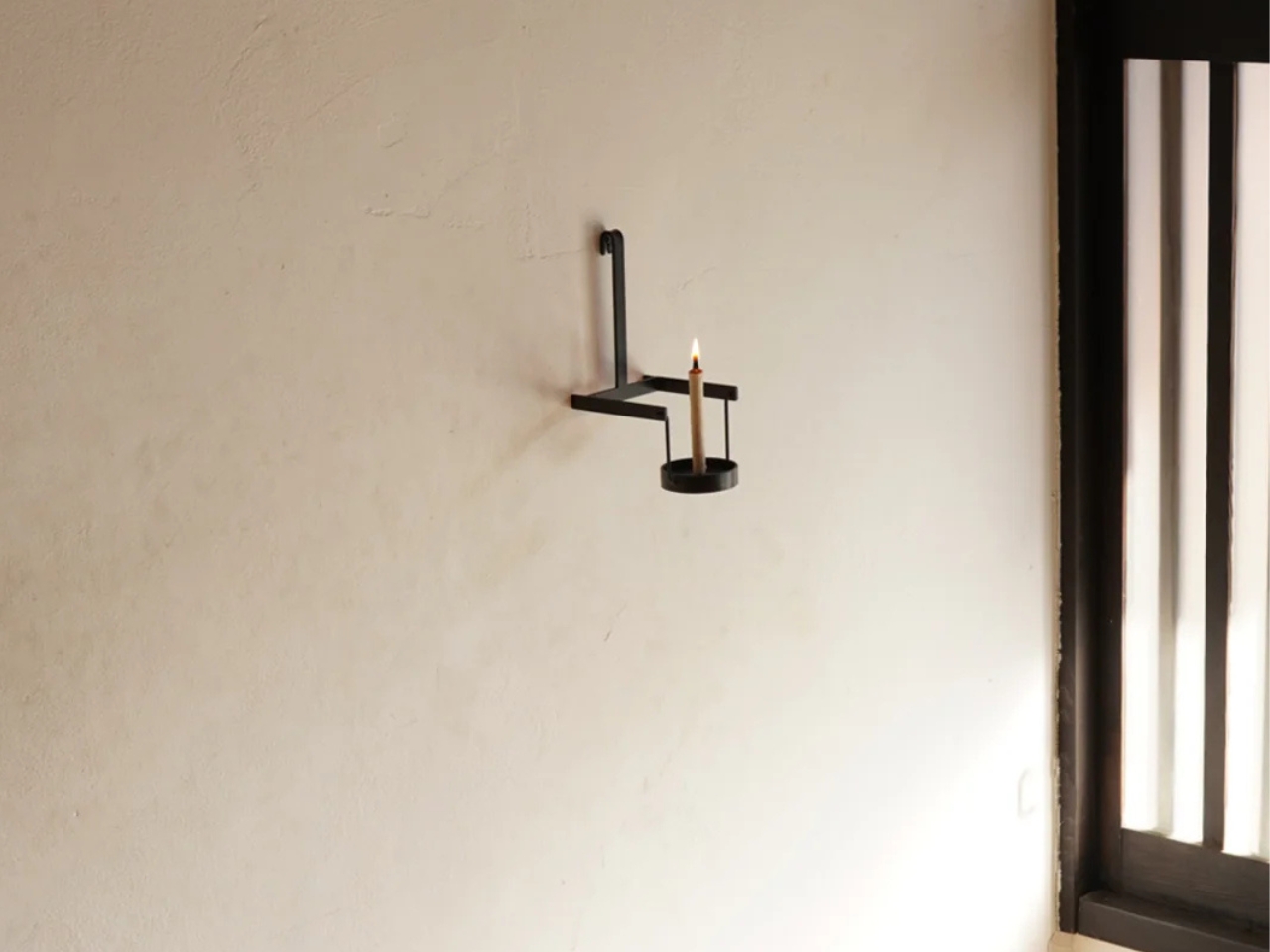
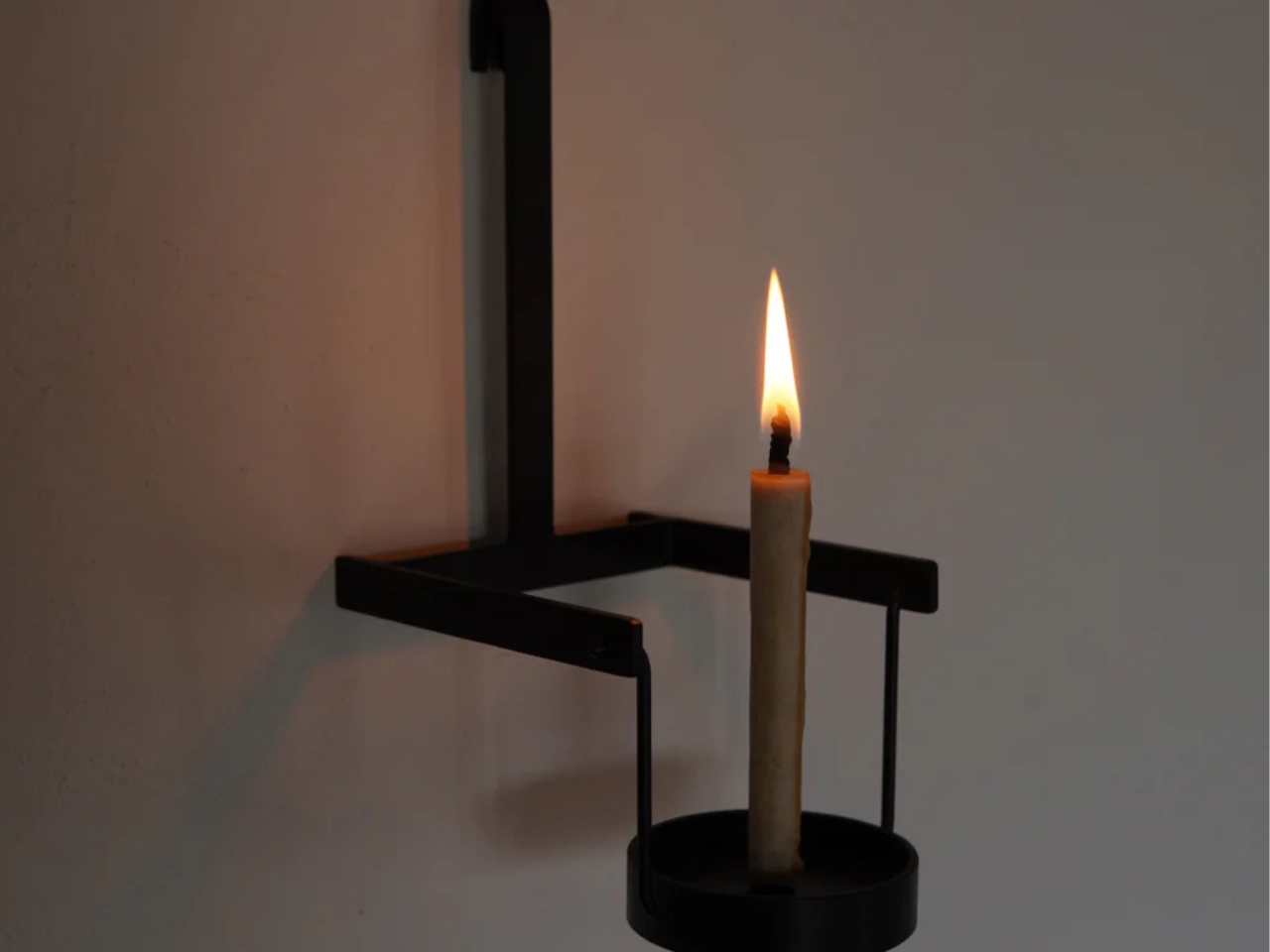
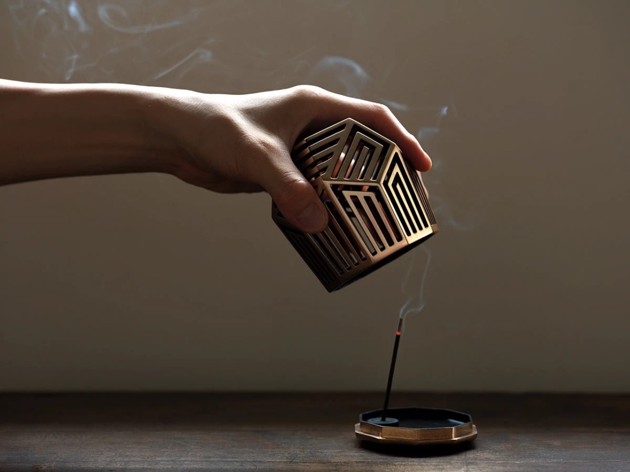
The first is that the long horizontal leg, that original carrying handle, now doubles as a hanging hook. It’s such an obvious extension of what was already there that you almost wonder why no one thought of it sooner. Being able to mount the candleholder on a wall opens up a completely different use case. Suddenly it’s not just portable, it’s also fixed lighting when you want it to be, which makes it far more versatile in how and where it can live.
The second improvement is a pivot mechanism built into the piece. This allows the candle mount to be held at different angles depending on how you’re carrying it, which is genuinely useful. Carrying a lit candle without wax dripping everywhere is its own small skill, and a pivot that lets you adjust the angle takes a lot of the anxiety out of it. The candle mount is also removable, which makes cleaning it much easier.
What I appreciate most about this piece is that both changes are extensions of the original logic of the teshoku. They don’t override the design or force it to become something it isn’t. They follow the same thinking that shaped the object centuries ago: what is this person actually doing with this thing, and how can we make that experience a little less complicated? That’s user experience design at its most sincere, and it shows up in objects just as much as in apps or interfaces.
The Pendulum Candleholder is made to order by Furuwatari’s iron products company, To-Tetsu, and retails for $158. Each piece is handmade by a craftsman, which means delivery can take one to two months depending on order status. Iron is the material, and it will develop rust over time, which can be maintained and even enriched with periodic applications of linseed oil or beeswax. That aging process is part of the appeal if you’re into objects that change with use.
Is it practical in 2026? Not in the way a smart lamp is practical. But there’s a different kind of value in objects that connect you to a longer timeline of human ingenuity. Lighting a candle and carrying it across a room is a small act that people have been doing for centuries. Furuwatari’s version just makes it a little more graceful, and a little more considered, which is more than enough.
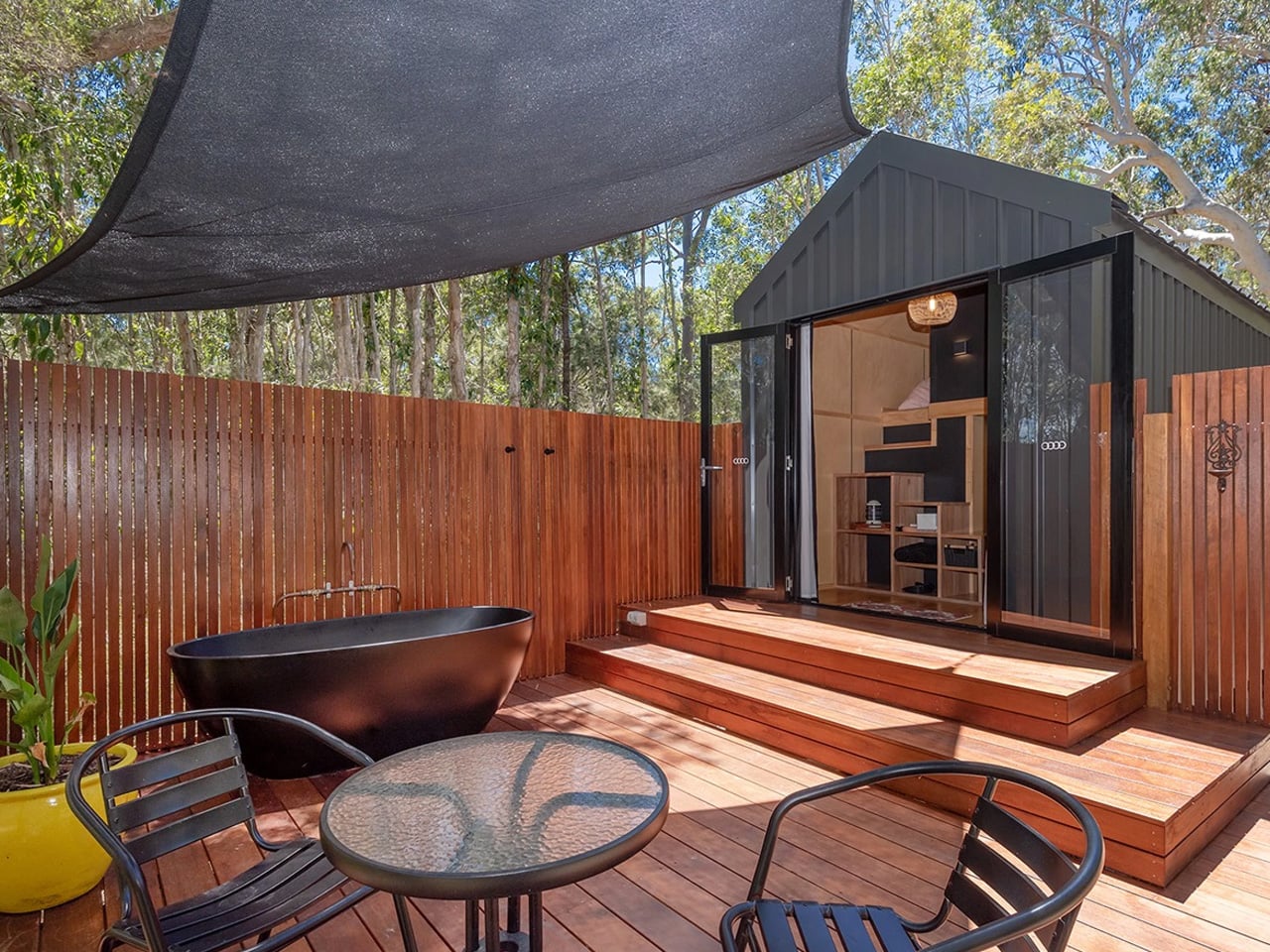
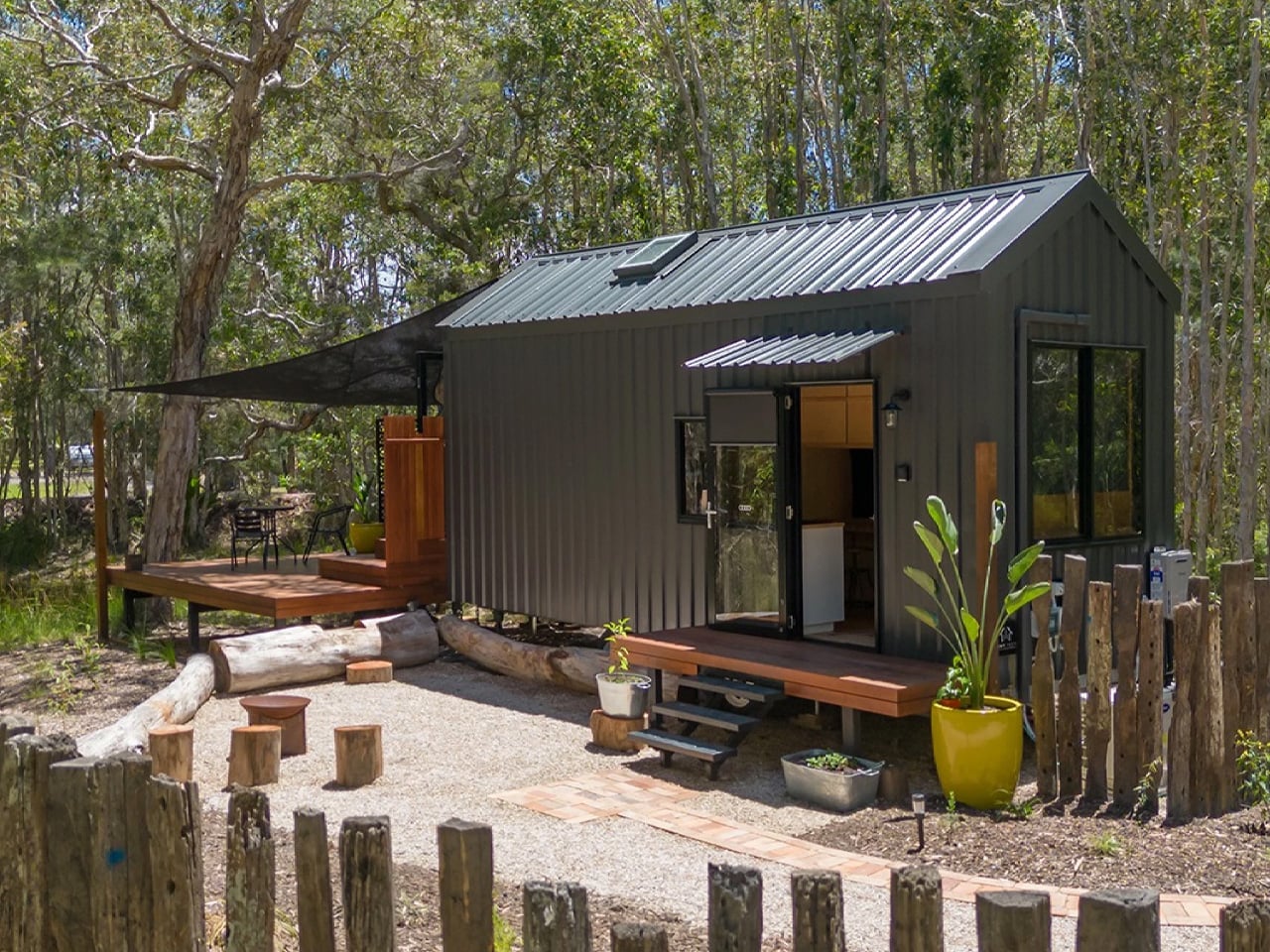
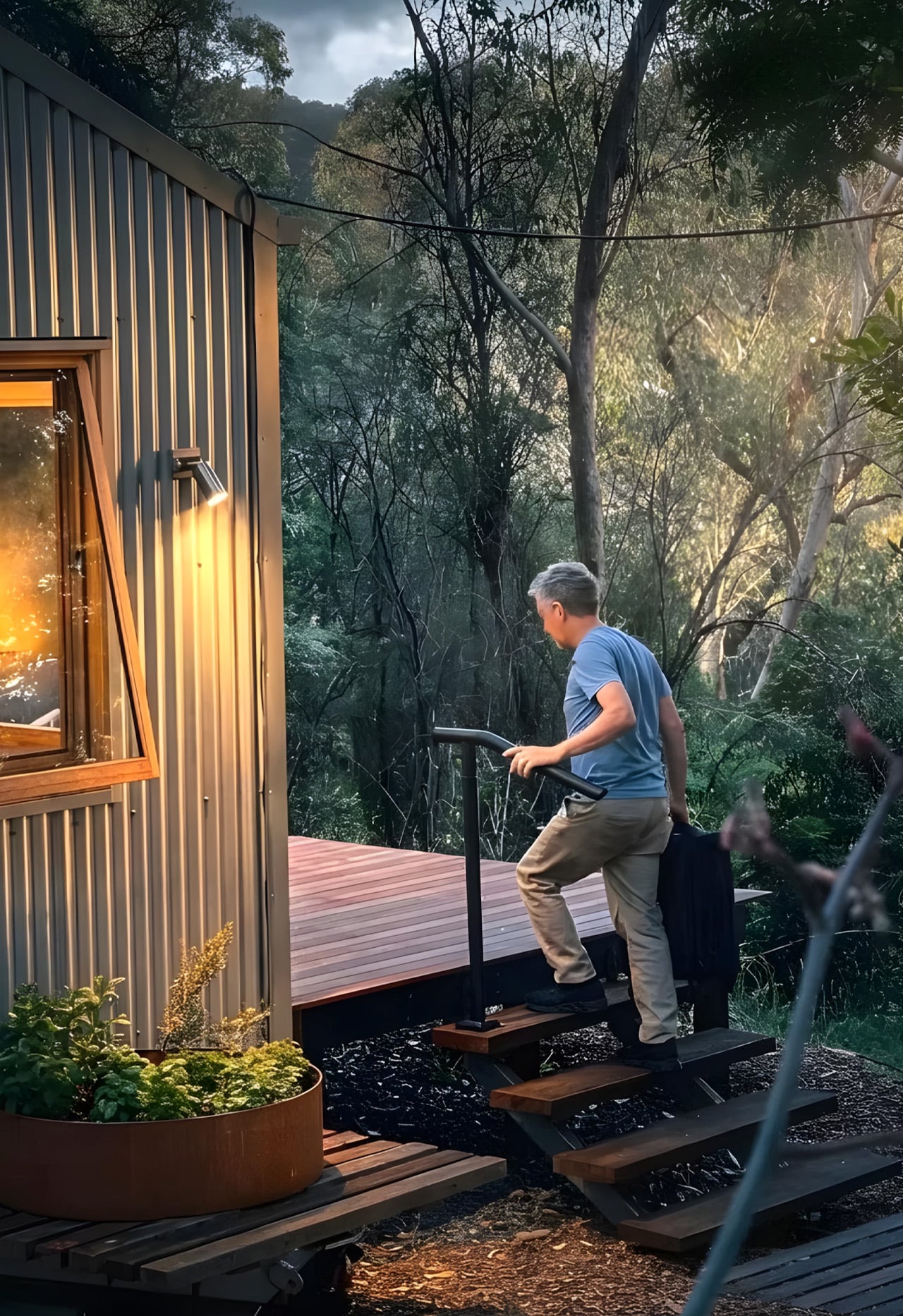
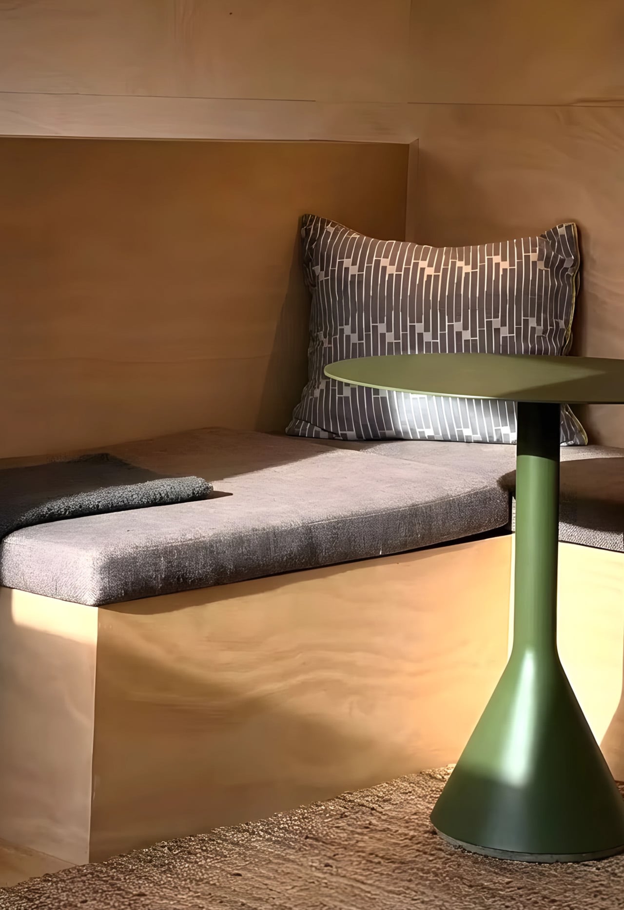
The housing crisis is not a headline anymore; it is a lived reality. Soaring property prices, relentless rent increases, and the quiet exhaustion of never quite owning anything have pushed a whole generation to question what a home genuinely needs to be. The answer, for many, is less. Less debt, less space, less compromise on quality of life. The Artista by Australian tiny house builder Tiny Tect is exactly that kind of answer — compact in footprint, but completely uncompromising in how it lives.
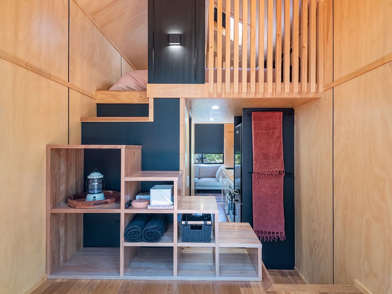
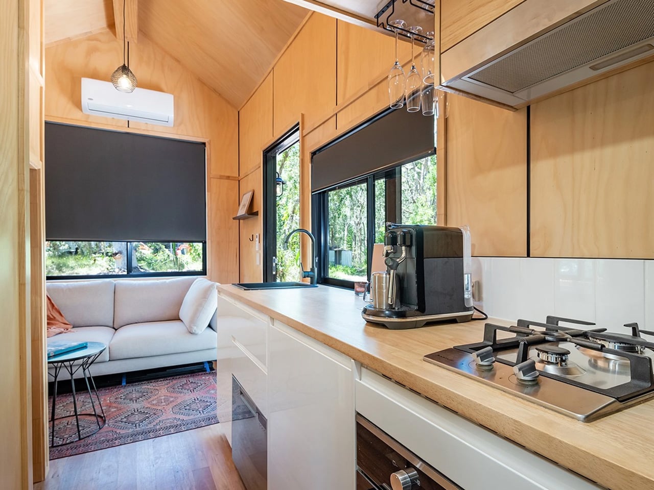
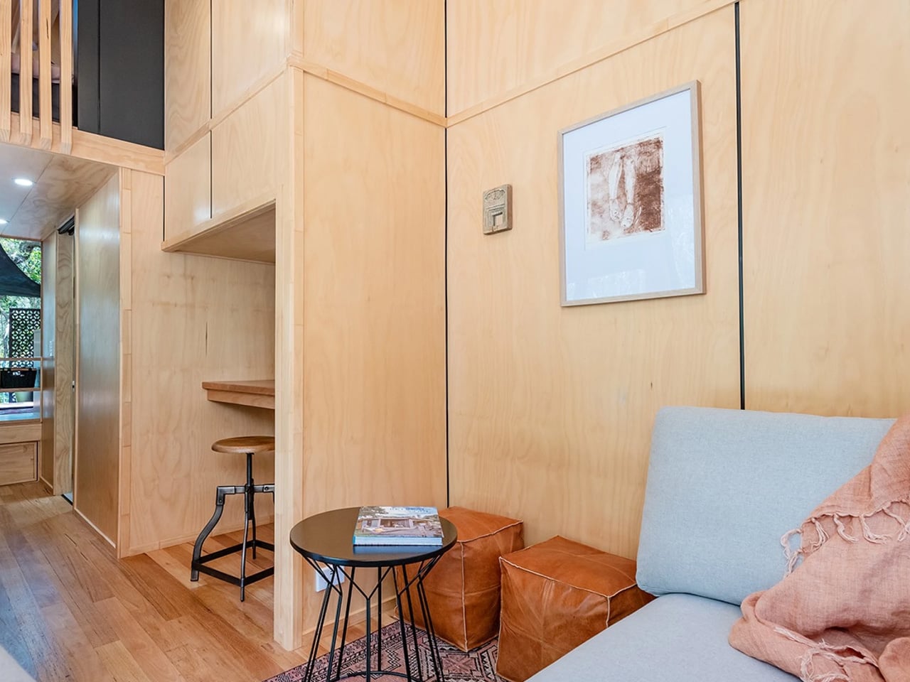
Sitting at 7 metres long, 2.4 metres wide, and 4.25 metres tall, the Artista is built on a certified triple-axle trailer with a 4.5-tonne weight capacity and full road registration capability. On paper, those numbers sound modest. In person, the experience is entirely different. The layout is deliberate from the moment you walk in; a storage-integrated staircase sits at the entrance, turning what is usually dead space into something useful before you have even settled in.
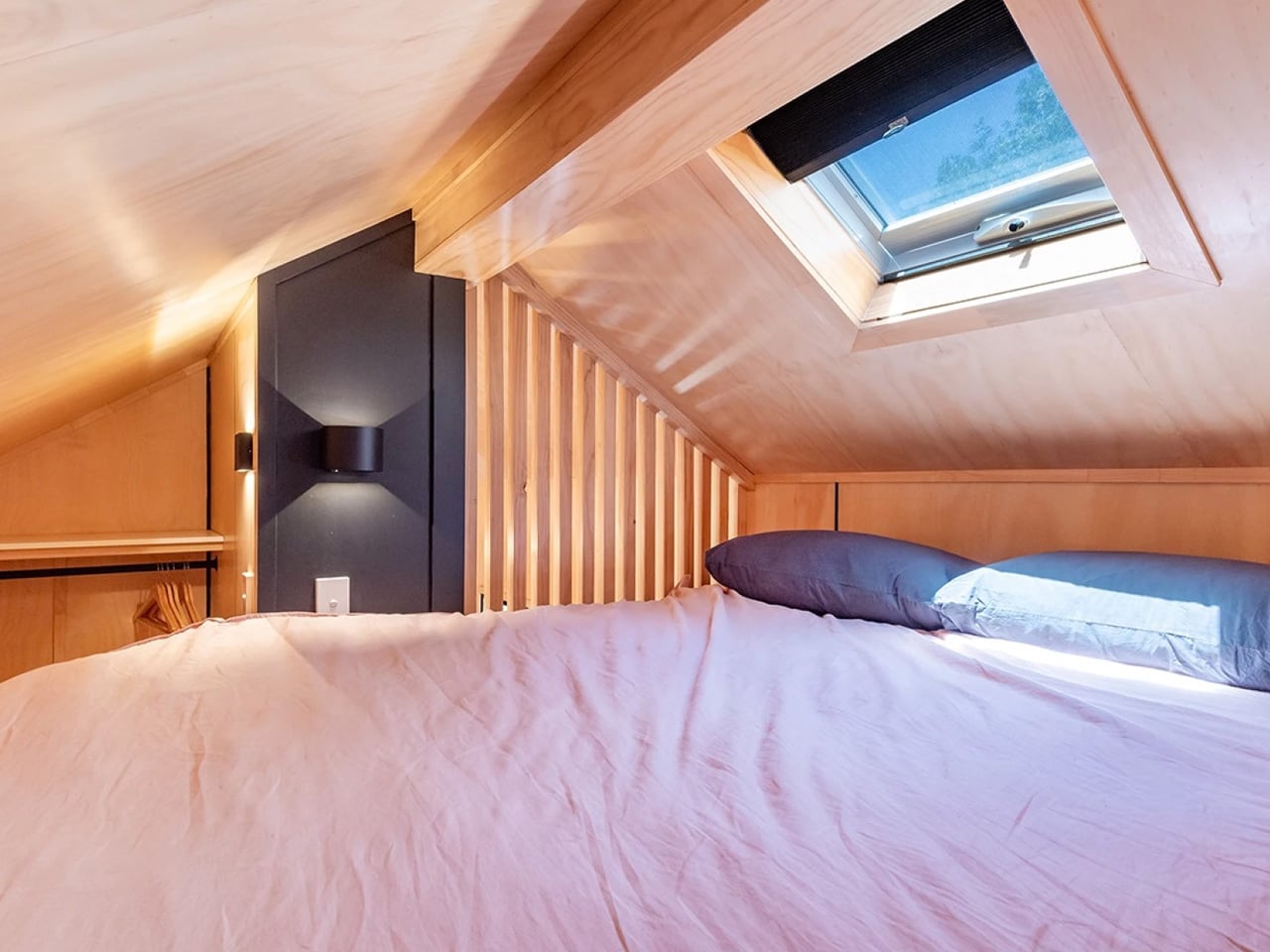
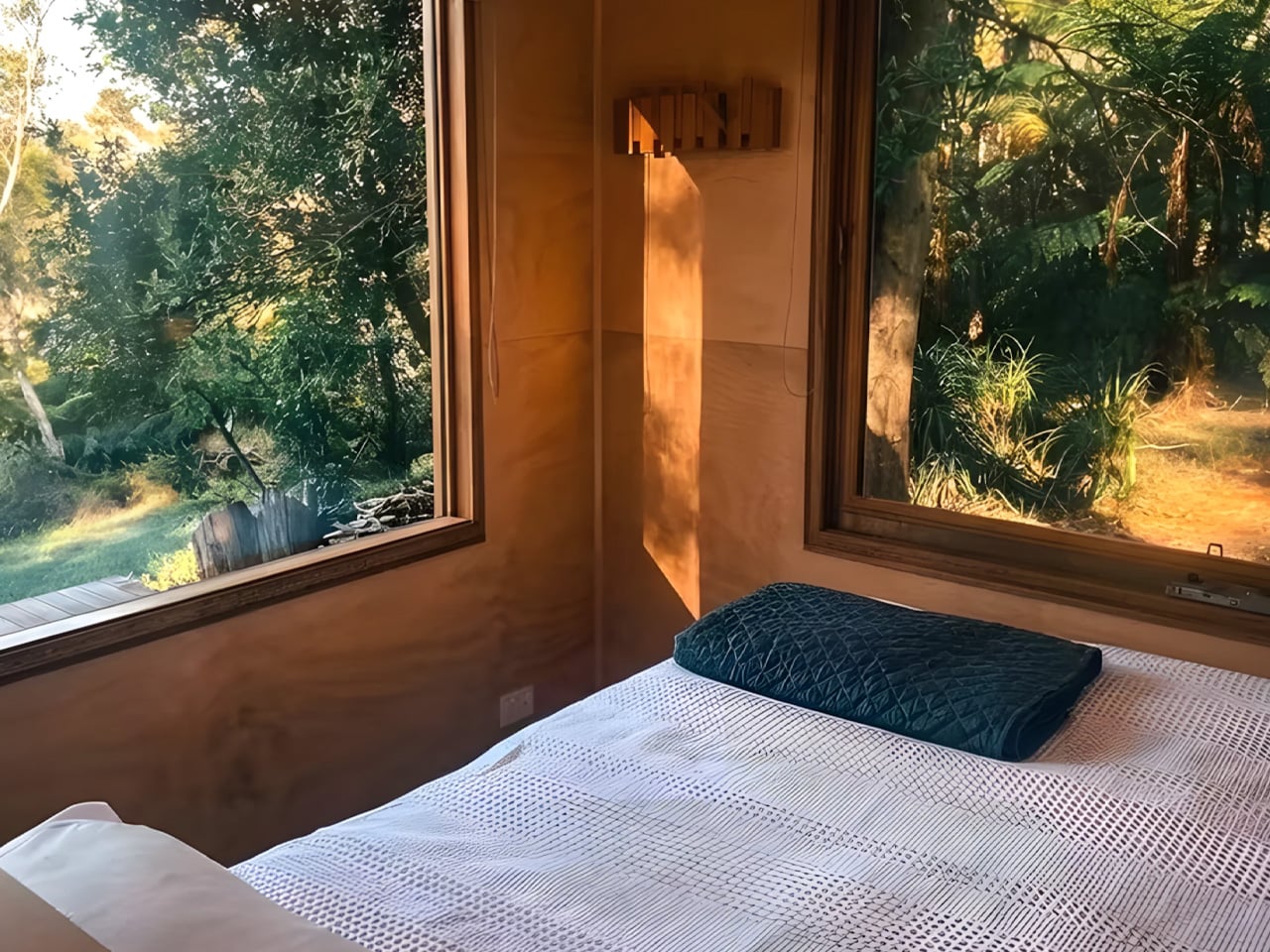
The loft bedroom is where the Artista earns its name. Positioned centrally rather than pushed to one end, it opens up views from both sides of the home — a move that feels more architectural than practical, and intentionally so. The space fits a double bed and a walk-in wardrobe, and for those who need the ground floor to work harder, a flexible lower-level room can serve as a second sleeping area, a home office, or a guest space. For a home this size, sleeping up to four adults is not a workaround…it is part of the plan.
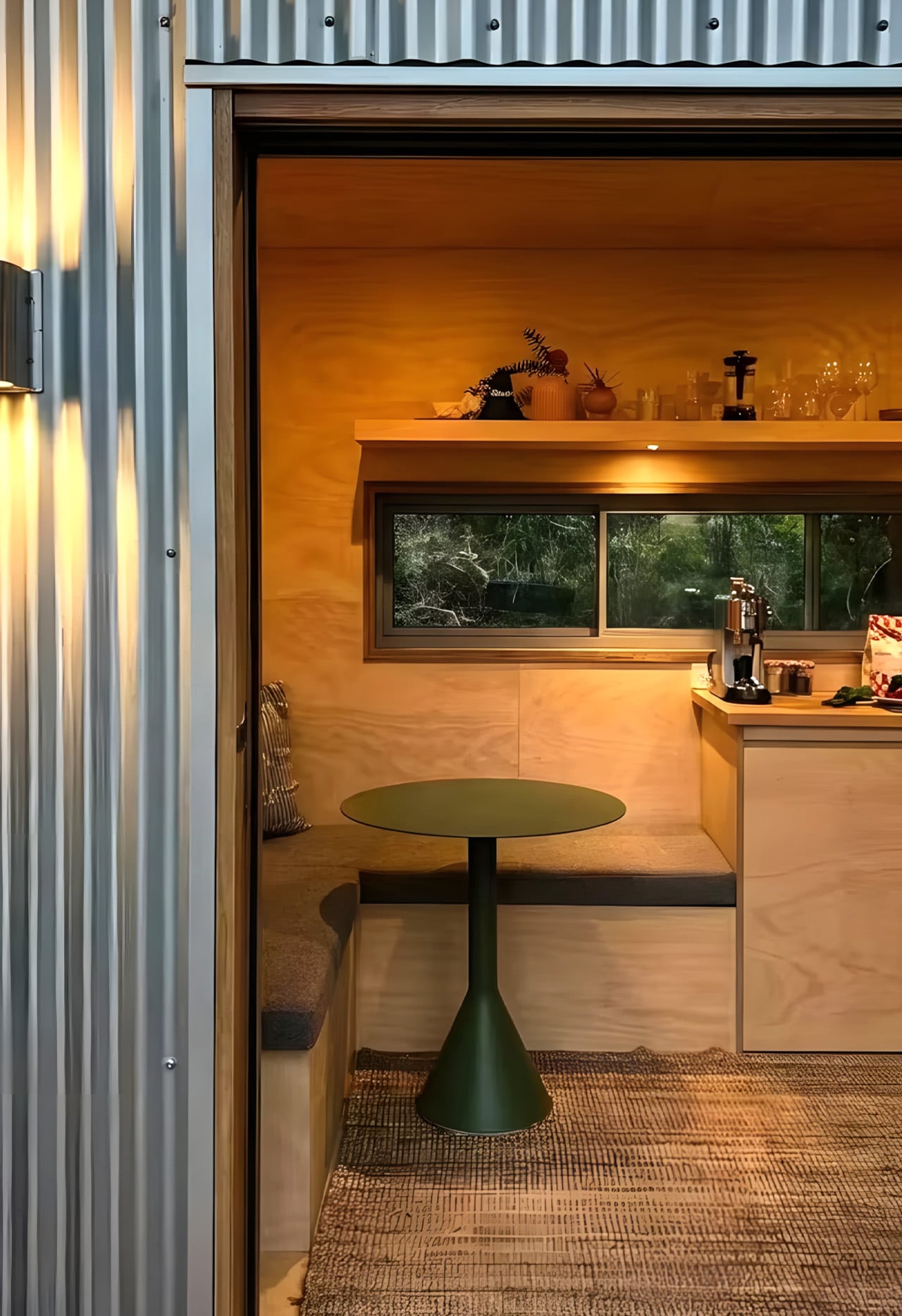
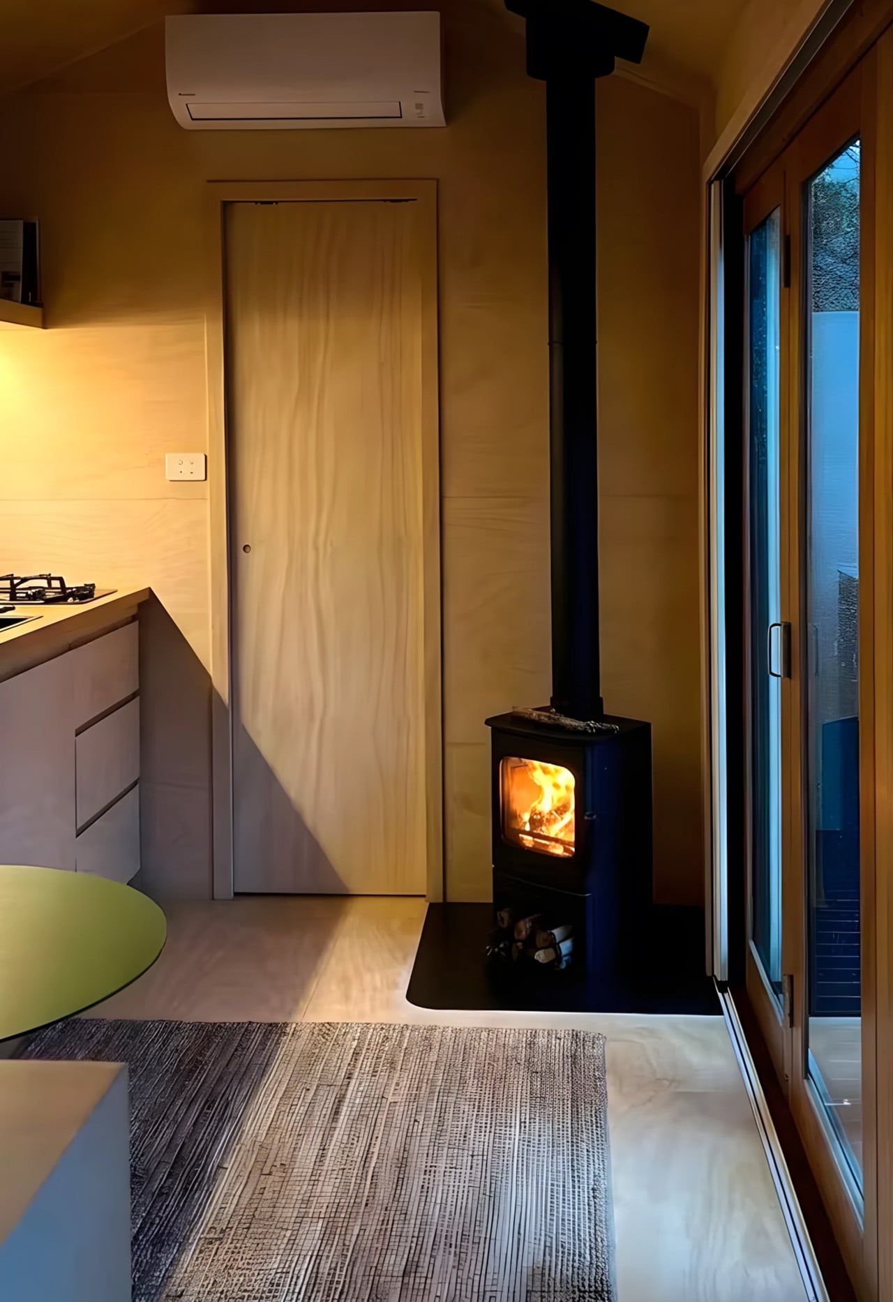
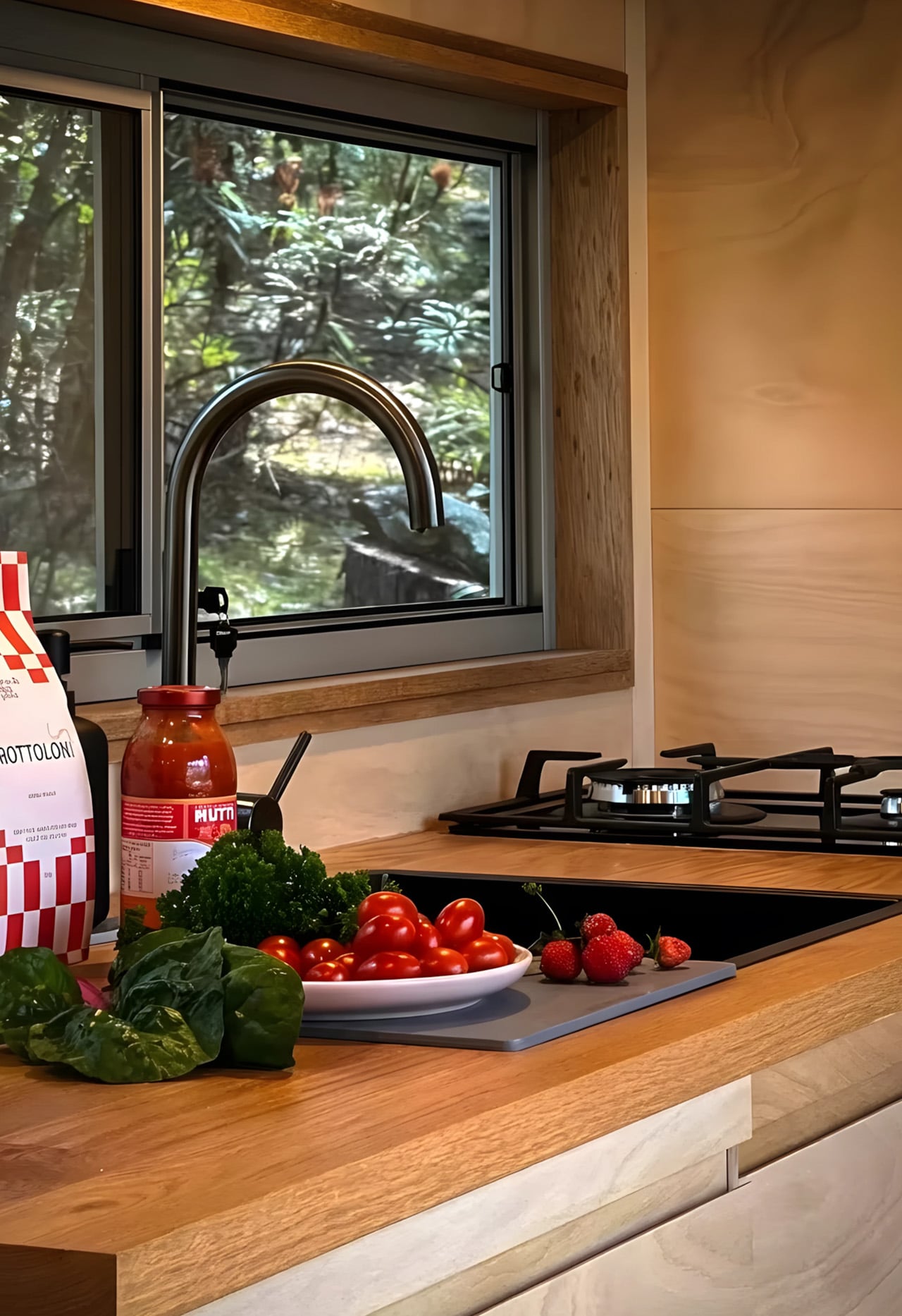
The kitchen does not shrink away from the challenge either. A four-burner cooktop, full oven, sink, and fridge-freezer sit together in a layout that functions like a proper kitchen should. Besides it, the living area holds a sofa and a compact work desk — a quiet acknowledgment that home now means office too, for a lot of people. The ensuite bathroom and a built-in planter box round out the interior with the kind of details that make a small space feel considered rather than crammed.
What the Artista ultimately solves is bigger than square footage. It hands people back financial breathing room. Starting from $98,900 and available from roughly $243 per week in repayments, it sits well below the cost of traditional homeownership in most Australian cities. Optional solar panels, battery storage, and water tanks take it further toward genuine off-grid independence — lowering ongoing costs and loosening the ties to utility bills and landlords alike. The Artista is not a consolation prize for people who cannot afford a real home. It is a deliberate choice for people who have decided that freedom, quality, and intention matter more than floor area. Small in size, yes, but not in any way that actually counts.
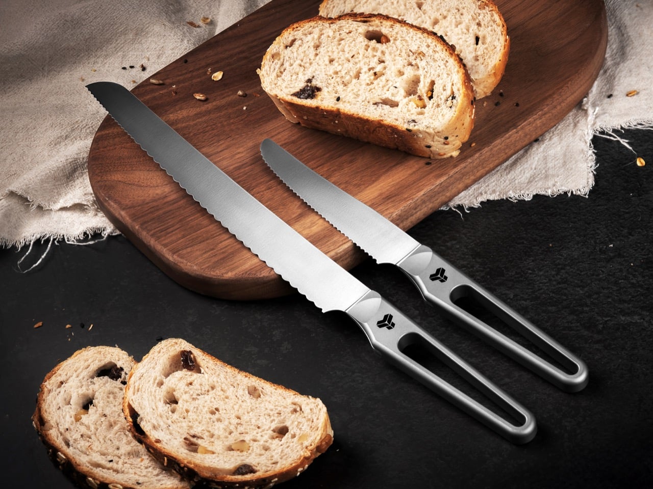
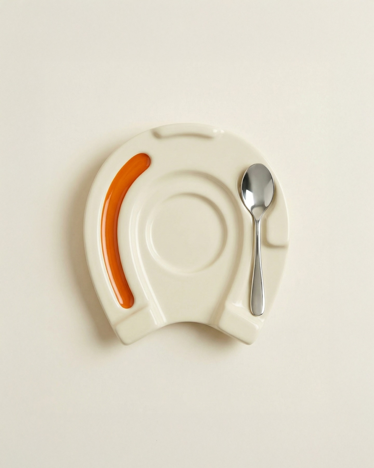
That elongated oval cutout running through the handle of the Titanion APEX catches attention first. It reads almost like a tuning fork, or a beautifully machined piece of industrial hardware that ended up on a cutting board. The form is deliberate on multiple levels: it trims weight from the handle end, which naturally shifts the balance point forward toward the blade. For cooks who prefer that blade-forward feel, the shift is immediately noticeable. And because the whole knife is machined from a single continuous piece of TC4 titanium alloy, there are no separate components, no rivets to rust, no scales to loosen over years of daily use. The result is a full-tang construction by default, which, in a knife made from one of the strongest lightweight metals on the planet, makes for an exceptionally robust tool.
Titanion is a Hong Kong-based brand with three years of focused research into bringing aerospace-grade titanium materials into everyday kitchen use. Their previous tools have already attracted over 5,000 professional chefs and dessert masters as loyal users. The APEX series is their most knife-forward move yet: two serrated blades, a Titanium Bread Knife and a Titanium Multifunctional Serrated Knife. The blade is forged from high-performance 10Cr15MoV steel with precision serrated edges, boasting outstanding hardness, wear resistance, and long-lasting sharpness. Titanion claims this is the first serrated kitchen knife on the market to feature a titanium alloy handle.
The bread knife runs 13.98 inches (35.5cm) total, sitting on the longer end of the bread knife category, which means more stroke per pass and fewer awkward repositions on a large loaf. Titanion uses a segmented serration pattern: larger wavy serrations on the main cutting area for smooth strokes without crushing the crumb, and finer serrations at the tip for piercing hard outer crusts, croissant shells, and thick-skinned fruit. That dual-geometry setup sounds like marketing until you’ve worked through a dense sourdough and realized the tip teeth were doing actual work before the wavy section ever takes over. Blade thickness sits at 0.06 inches (0.15cm), keeping the profile lean enough for clean slicing without wedging. The longer format also makes it useful beyond bread, handling anything that benefits from a long, smooth sawing stroke.
The utility knife at 9.45 inches (24cm) takes a completely different approach: consistent serration from base to tip, the same tooth geometry across the entire blade for stable and uniform cutting performance on whatever it’s working through. That uniformity makes it a genuine generalist, handling root vegetables, steaks, small pastries, and protein foods with equal confidence. Roughly half the length of the bread knife, it’s maneuverable enough for intricate prep but substantial enough for harder cuts, and the compact size pairs well with the ergonomic titanium handle during active cooking. Consistent serration also makes future sharpening more predictable, something the bread knife’s dual-geometry complicates. The two knives fill completely different roles and work as actual complements in daily kitchen use.
TC4, or Grade 5 titanium alloy, runs about 40% lighter than stainless steel while combining superior strength, corrosion resistance, and heat tolerance. The same alloy shows up in aircraft structural frames and orthopedic implants, both of which make the kitchen counter look like a retirement post for the material. In a culinary context, the relevant properties are direct: no moisture absorption, no odor retention, no degradation over time, and full corrosion resistance against acidic ingredients like citrus or vinegar. The 10Cr15MoV steel on the blade side is a high-carbon, high-chromium martensitic stainless that maintains stable sharpness and holds its edge under heavy use significantly better than standard stainless steel options. Together, the materials spec reads closer to precision tooling than kitchen cutlery.
The hollow-out handle is an ergonomic device as much as a visual one. It enhances tactile feedback through the grip, ensures a secure hold even in damp or greasy environments, and significantly reduces fatigue during use. Titanion built in distinct finger grips and a thumb support area, with a flowing contour that allows users to naturally position their thumb and index finger close to the blade’s balance point for a comfortable and precise grip. The oval opening doubles as a hanging point for wall or rail storage, with no extra hardware required. On a knife that gets reached for multiple times a day, small ergonomic decisions like that compound quickly into meaningful quality of life.
Pricing runs $100 for the bread knife, $75 for the utility knife, and $175 for the twin set at the Super Early Bird tier, amounting to a 30% discount on the original price. A discount you should absolutely grab if you’ve made it this far. International shipping is a flat $15 worldwide, with knives delivering starting August 2026. That’s because machining single-piece titanium knives individually takes way more time than snapping components together with glue and rivets. Also, Titanion doesn’t necessarily provide a warranty on the knives, because they don’t need to. Rest assured your GR5 titanium knife will probably outlast you, and then your grandkids too. Wait, why are you still reading? The link’s down below!
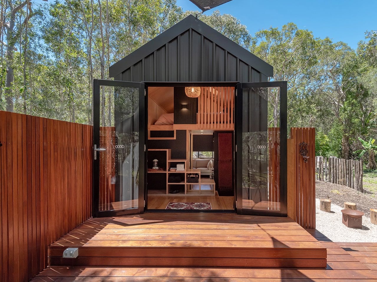
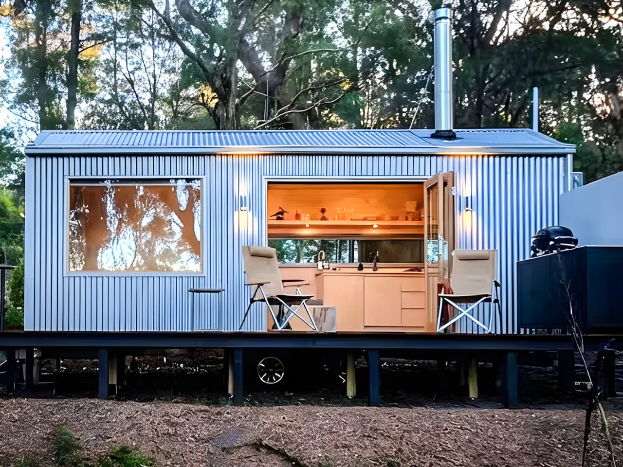
The Zinc Studio Cabin looks like a shed. That’s entirely the point. It pulls from the corrugated iron sheds and shearers’ quarters of rural Australia — those weathered, no-fuss outbuildings that have quietly shaped the country’s built landscape — and re-engineers that heritage into something genuinely architectural. It doesn’t try to be a house pretending to be modern. It’s a prefab that knows exactly what it is, and that confidence shows in every detail.
Built on a steel skid foundation and delivered by truck, the cabin arrives turn-key in as little as eight weeks. The standard model runs seven meters in length, though bespoke configurations stretch to twelve, making it adaptable across residential plots, farm stays, and short-term accommodation sites. The process feels less like commissioning a build and more like receiving a very well-resolved object — one that can be live-in ready the same day it lands on site.
Inside, the single-level layout is open without feeling bare. Architectural-grade plywood lines the walls, hardwood trim works through the details quietly, and a run of generous glazing keeps the cabin in conversation with whatever landscape surrounds it. The tri-fold glass doors are where the design earns its keep — folding back entirely to collapse the boundary between interior and deck, shifting the whole space into something closer to a pavilion. Natural light moves through the cabin freely, making the footprint feel more expansive than its dimensions suggest.
The bathroom is considered complete, with a glass-enclosed shower, vanity, and toilet that sit neatly within the overall material language. A log-burning stove near the entry brings warmth that the plywood and hardwood already hint at. The zincalume exterior handles the elements with minimal upkeep, and Colorbond colour options let the finish be dialled to suit the site. Full off-grid capability rounds out a specification list that holds up whether the cabin is sitting on a remote rural block or a working vineyard.
Zinc Studio has also positioned the cabin as a genuine short-stay income vehicle, and their own hosted properties back that up in practice. What makes the cabin worth paying attention to isn’t any single feature — it’s the consistency. For a structure that arrives fully resolved on the back of a truck, the level of design rigour on display is something the broader prefab market is still working to catch up with. Australia has been building corrugated iron structures for over a century. Zinc Studio is simply doing it better than most.
Spring cleaning has a way of exposing how tired a room can feel. Swapping out a duvet cover or rearranging furniture only goes so far. What actually shifts a space is the accumulation of small, considered objects, the kind that carry weight in both design and meaning. Japan has been refining that philosophy for centuries, and right now, its makers are producing pieces that feel less like accessories and more like answers.
The eight pieces below come from workshops and studios rooted deeply in Japanese craft traditions, from the granite quarries of Kagawa to the porcelain villages of Nagasaki. Each one brings something entirely distinct to a room: texture, scent, sound, light or a quiet kind of order. None of them demands visual attention. That restraint is precisely what makes them so effective at resetting a space, slowly and convincingly, for spring.
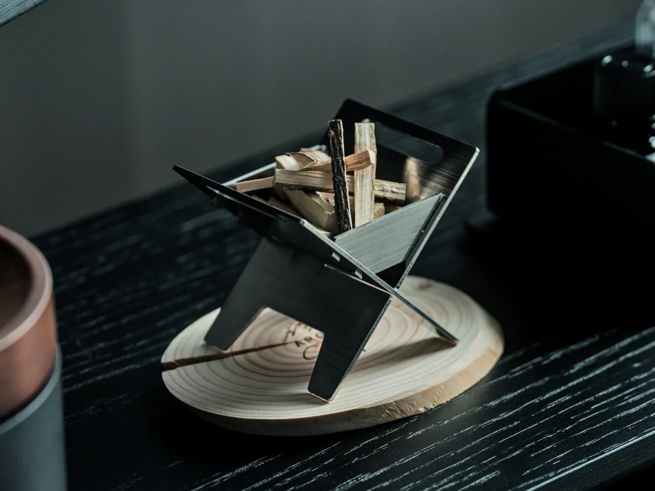
1. Miniature Bonfire Wood Diffuser Set
The first thing you notice about the Miniature Bonfire Wood Diffuser Set is that it shouldn’t work as well as it does. A stainless steel campfire, sized for a shelf, capturing the scent of mountain forests through bundled miniature firewood. Yet everything about it, the tying knot, the proportions, the way the essential oil disperses, feels entirely intentional. It pulls the atmosphere of Mt. Hakusan into whatever room you place it in, with the same gentleness as a forest breeze moving through cedar.
For spring, this diffuser does something conventional reed diffusers rarely manage: it gives the scent a visual story. The trivet feature makes it genuinely dual-purpose, transforming into a pocket stove for an indoor camping ritual that bridges the gap between winter’s coziness and spring’s restlessness. Built from rust-resistant stainless steel, it holds up to repeated use without losing its clean, sculptural presence. As a centerpiece on a coffee table or entryway shelf, it reframes the whole room around calm.
Mt. Hakusan essential oil brings a real, named place into the room.
The trivet conversion makes it an experience, not just a decorative object.
What We Dislike
Scent radius may fall short in larger, open-plan spaces.
Mt. Hakusan oil refills are specialty items, difficult to source outside Japan.
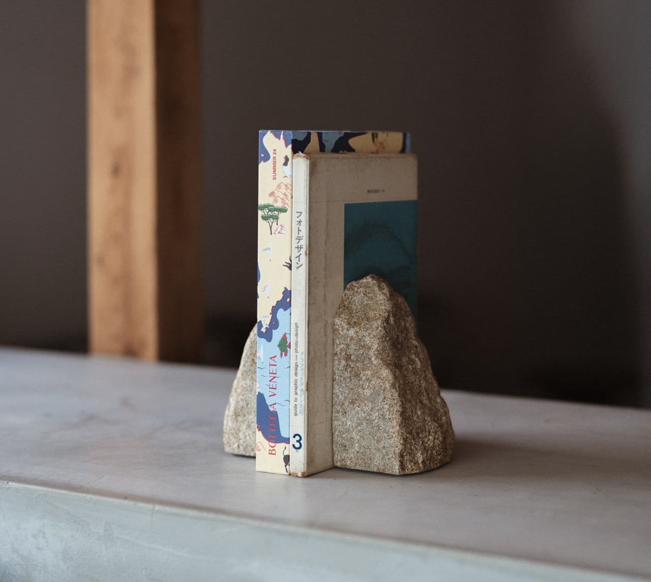
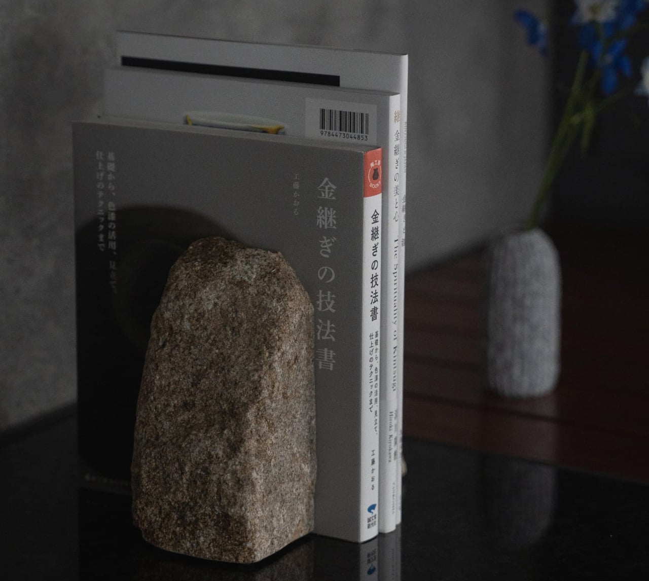
2. Aji Stone Book End Large
Aji Stone is known in Japan as the diamond of granite, quarried exclusively from the northeastern region of Takamatsu City in Kagawa Prefecture, where its exceptional density and refined grain make it unlike any other decorative stone. The Aji Stone Book End Large is perfectly split from a single stone. It holds large books without shifting and carries a physical presence that mass-produced bookends simply cannot replicate.
What makes this bookend particularly suited for a spring refresh is its restraint. It doesn’t decorate; it anchors. A shelf of books held between two blocks of Aji stone immediately reads as curated rather than accumulated, which is a subtle but significant shift for any living space. Its low moisture absorption and resistance to weathering mean it can sit near a window or in an entryway without degrading over time. Spring cleaning often calls for removal. This is the rare piece worth adding.
What We Like
Each piece carries natural individuality that no factory process can reproduce.
Dense enough to hold the heaviest books without shifting.
What We Dislike
At $240, it asks for real confidence in its long-term design value.
Significant weight makes repositioning effortful once placed.
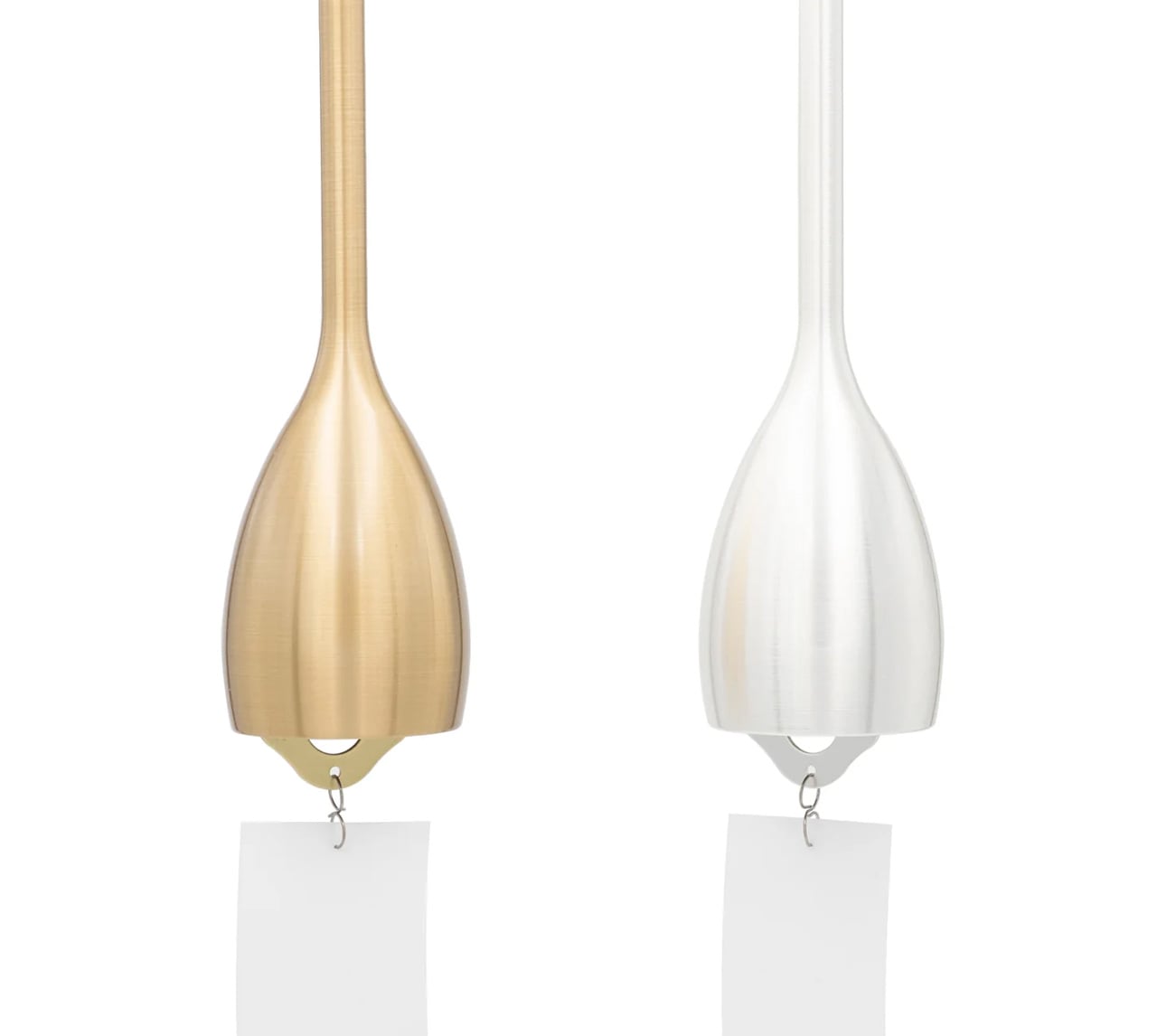
3. Nousaku Slim Wind Chime
Wind chimes occupy a strange, undervalued category in home design: they’re atmospheric tools more than decorative objects, and the Nousaku Slim Wind Chime understands that completely. This chime features a deliberately narrowed opening that concentrates sound into a sharp, transparent tone with a slightly lower pitch than a standard wind chime. It’s the sonic equivalent of a cool spring breeze arriving through an open window, producing a calm, focused resonance that a wider opening simply cannot achieve.
In spring, when windows stay open and air starts moving freely again, this chime becomes a functional part of a room’s ambiance rather than a decorative afterthought. Its slim, elongated form is considered as its sound, clean lines that integrate into the architecture of a space rather than competing for visual attention. Pair it with the Nousaku Wind Chime Onion model and the two produce a layered, resonant harmony that no single chime can generate on its own.
What We Like
The narrowed opening produces a precise, lower-pitched tone that feels intentional.
Pairs with the Nousaku Wind Chime Onion for a harmony no single chime achieves.
What We Dislike
Focused tonal range may feel too controlled for those who prefer a fuller sound.
Largely silent in poorly ventilated spaces or rooms with closed windows.
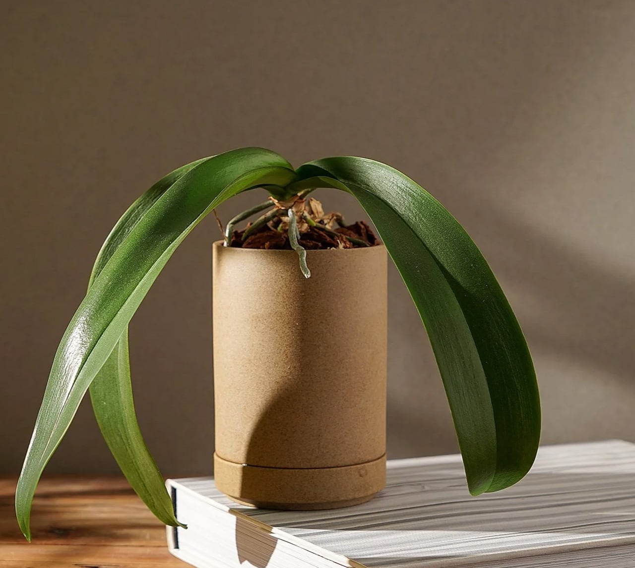
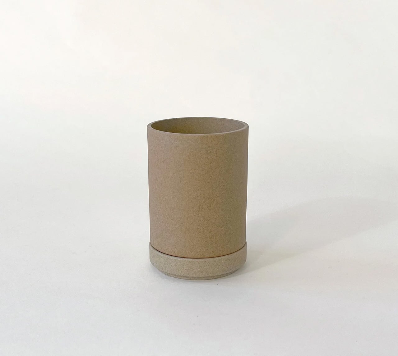
4. Hasami Porcelain Planter
The Hasami Porcelain Planter is the product of a village, not a factory. Made in Hasami, a porcelain-producing town in Nagasaki Prefecture with a craft tradition stretching back to the Edo period of 1603, each piece passes through the hands of artisans who specialize in specific stages of production before it reaches the market. That distributed labor creates a quality that is difficult to manufacture any other way. The result is a planter that feels entirely resolved in both form and finish.
Designer Takuhiro Shinomoto drew the collection’s proportions from the Jubako, Japan’s traditional stacking lacquerware box, and that heritage shows in every curve. The planter’s clean lines and stackable form mean it works as beautifully in a cluster as it does alone. The natural finish, neither matte black nor clear glaze but the raw, textured surface of the porcelain itself, makes it ideal for spring: honest materials, seasonal planting, and a connection to earth that feels earned rather than styled.
What We Like
Village craft passed down since the Edo dynasty lives in every piece.
The Jubako-proportioned stackable form unlocks genuine multifunctionality.
What We Dislike
Unfinished porcelain surface shows marks more readily than a glazed alternative.
Specialty retail distribution makes expanding or replacing pieces difficult.
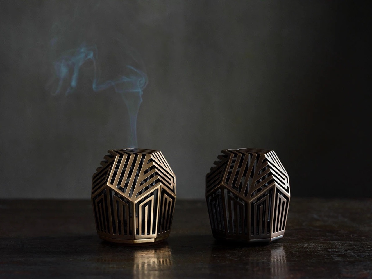
5. Genji-Kō Inspired Incense Burner
Kōdō, the Japanese art of incense appreciation, is one of the country’s oldest sensory practices, and the Genji-Kō Inspired Incense Burner gives it a visual form genuinely worth owning. The design draws from the Genji-kō diagram, a pattern developed to map the chapters of The Tale of Genji through five vertical lines forming 52 distinct configurations. Each configuration represents a chapter of Japan’s most revered literary work, and the burner translates that literary architecture into an object that functions as beautifully as it references.
For spring in particular, incense shifts a room in a way that no visual rearrangement can replicate: it changes the air itself. This burner earns a place on any shelf through the quality of its conceptual design alone, but its relationship to The Tale of Genji, Japan’s eleventh-century literary masterpiece, gives it a cultural resonance that elevates the daily ritual of lighting incense into something more intentional. Place it on a low shelf near an open window and let the morning light and season do the rest.
What We Like
The Genji-kō diagram ties a daily ritual to one of Japan’s greatest literary traditions.
Incense changes the air itself, and this piece makes that shift feel entirely deliberate.
What We Dislike
The design’s depth lands best with some familiarity with Kōdō and The Tale of Genji.
Limited published specifications make it harder to assess physical fit before purchasing.
6. Rustic Ceramic Trivet with Antique Nail Design
The Rustic Ceramic Trivet with Antique Nail Design sits at the intersection of kitchen utility and tabletop art. A stunning ceramic piece whose surface carries a pattern that mimics the texture of aged iron nails, it is a tool for creating grounding earth energy and mindful dining rituals, which sounds like marketing until you place it on a table and recognize how meaningfully it shifts the mood of a meal. It earns its place through presence alone.
The antique nail pattern gives it a tactility that glazed ceramics rarely offer, and the warm earth tones pair naturally with the organic materials, linen, wood, and stone, that define spring table settings. A trivet is typically invisible in the design sense, a purely functional object that disappears the moment the pot is set down. This one refuses that role without tipping into decorative excess. It protects surfaces while adding a quiet, aged presence to the table that earns it a permanent position rather than seasonal rotation.
What We Like
The antique nail pattern reads as a considered tabletop object even when not in use.
Earns its space through function first, with aesthetics following naturally from the craft.
What We Dislike
Textured surfaces can collect residue and require more careful cleaning than smooth ceramics.
An earthy aesthetic may not suit very clean, contemporary kitchen settings.
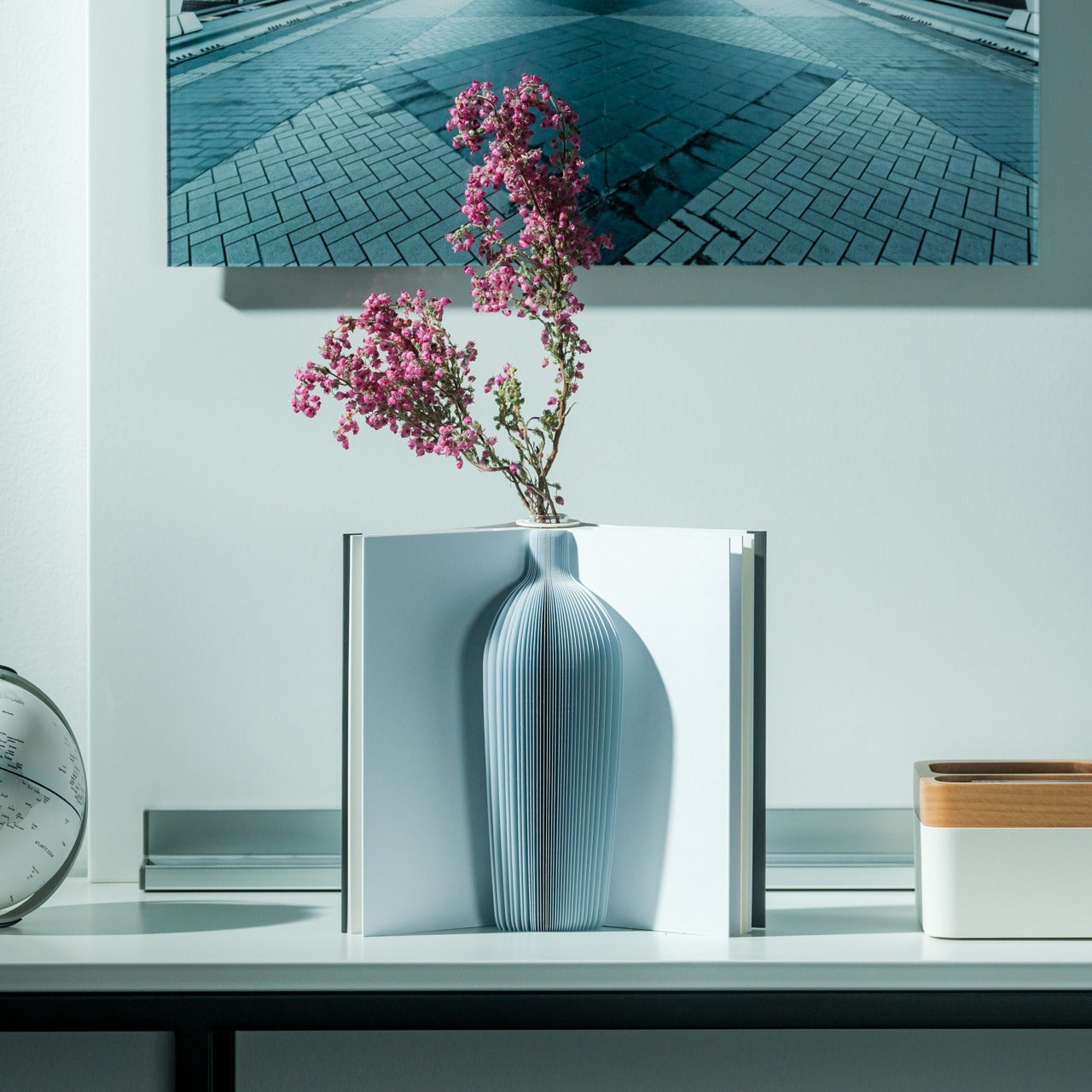
7. Pop-Up Book Vase
The Pop-Up Book Vase is a banger in a soft and unassuming form: it takes one of the most familiar objects in a home and completely recontextualizes it. Open the cover and a 3D vase cutout rises from the pages, holding flowers the way a stage set holds a performance. Three different pop-up designs offer enough variety to keep the presentation fresh across weeks of seasonal blooms. Made entirely from 100% natural pulp with a water-resistant coating, it’s approachably practical and surprisingly robust for its form.
For a spring refresh, this vase works particularly well because it asks almost nothing of its context. Set it on a dining table, a windowsill, or a bookshelf, and the pop-up structure creates its own visual event regardless of the surrounding decor. Flip the book upside down,n and the arrangement transforms entirely, offering a new perspective on the same flowers. It rewards curiosity, which in a home setting is a rarer quality than most design objects manage to carry through to everyday use.
Three built-in pop-up designs keep the display fresh without a new purchase.
Water-resistant pulp construction handles flowers without compromising form.
What We Dislike
Limited water capacity suits single stems better than full bouquets.
May not fully replace a conventional vase for everyday, high-volume use.
8. Riki Alarm Clock
Riki Watanabe was one of Japan’s most celebrated modernist designers, and the Riki Alarm Clock is proof of why his legacy endures. Produced by Lemnos, this analog clock earned the Good Design Award through choices that look deceptively simple: oversized, legible numerals designed to read clearly from across a room, a completely silent movement that eliminates any audible tick, and a single button that consolidates the alarm, snooze function, and built-in internal light into one seamless, unhurried control.
Spring is the season when the phone starts creeping back into the bedroom. The Riki Clock offers a direct, aesthetically grounded alternative. Its timeless analog face, silent enough not to disturb light sleep, replaces the notification-laden device on your nightstand with an object that is simply, reliably there. Morning waking becomes a softer experience, one shaped by the warm quality of the clock’s internal light rather than the cold glow of a screen. For the bedroom’s spring reset, this is exactly where to start.
What We Like
Silent movement removes the most common complaint about analog clocks entirely.
Good Design Award credentials and Riki Watanabe’s legacy make it genuinely worth owning.
What We Dislike
A single-button interface may need a brief adjustment period for new users.
Low-light time checks require activating the internal light, adding one extra step.
These 8 Japanese Pieces Don’t Refresh Your Space. They Reset It.
Spring doesn’t need a renovation. It needs intention. The eight pieces gathered here don’t make noise about what they are: they simply show up in a room and shift the register of everything around them. A stone bookend earns permanence. A ceramic trivet slows a meal. A wind chime marks the exact moment a new season arrives. Japanese design has long understood that the smallest objects carry the longest meaning.
The through line across all eight is craft, objects made by people who understand their materials and know when restraint is the right answer. That clarity translates directly into a home. You don’t need all eight. Adding even one to your spring refresh will do more than any repainting ever could. That is the quiet confidence of Japanese design: it doesn’t ask for your attention, but it almost always earns it.
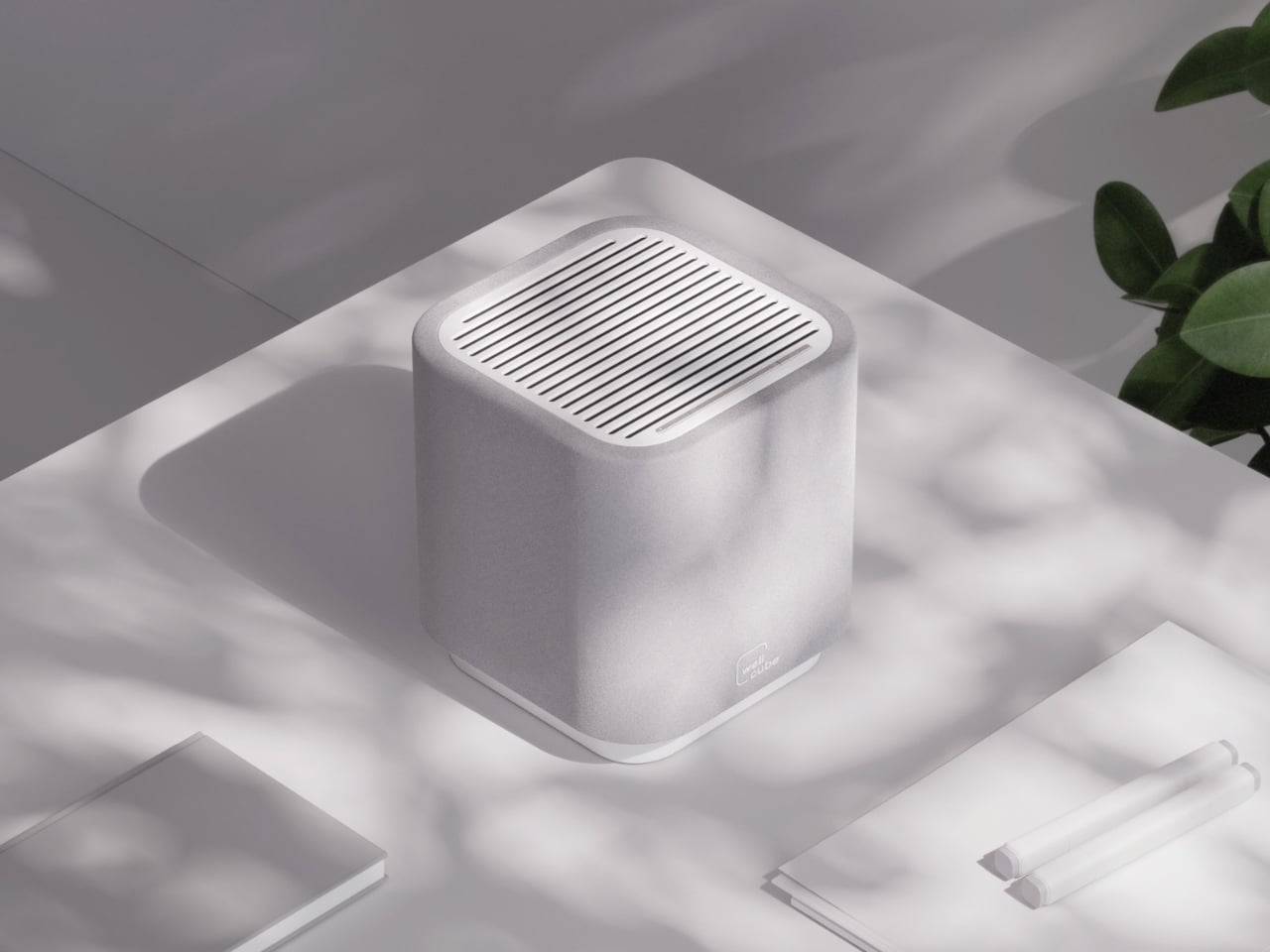
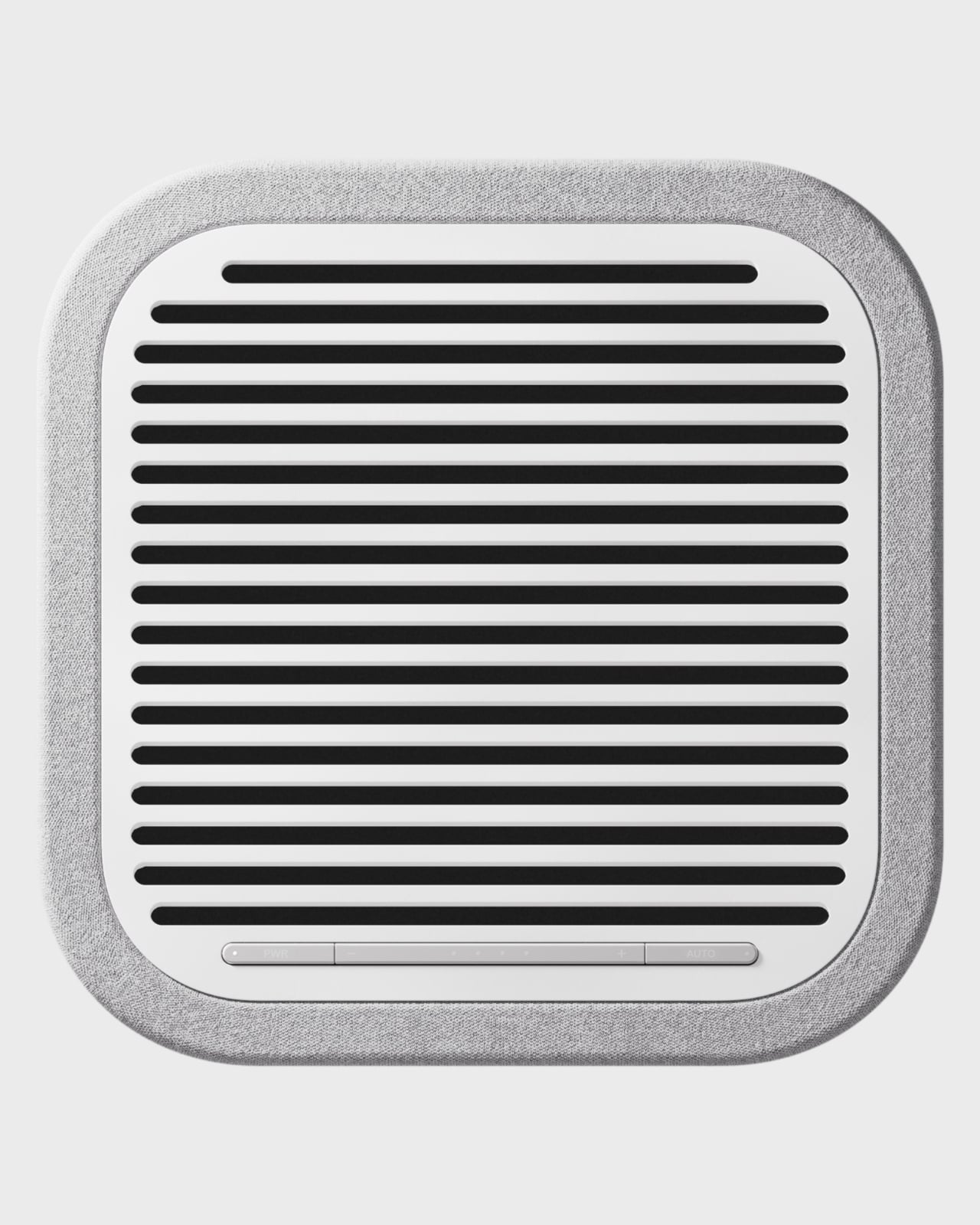
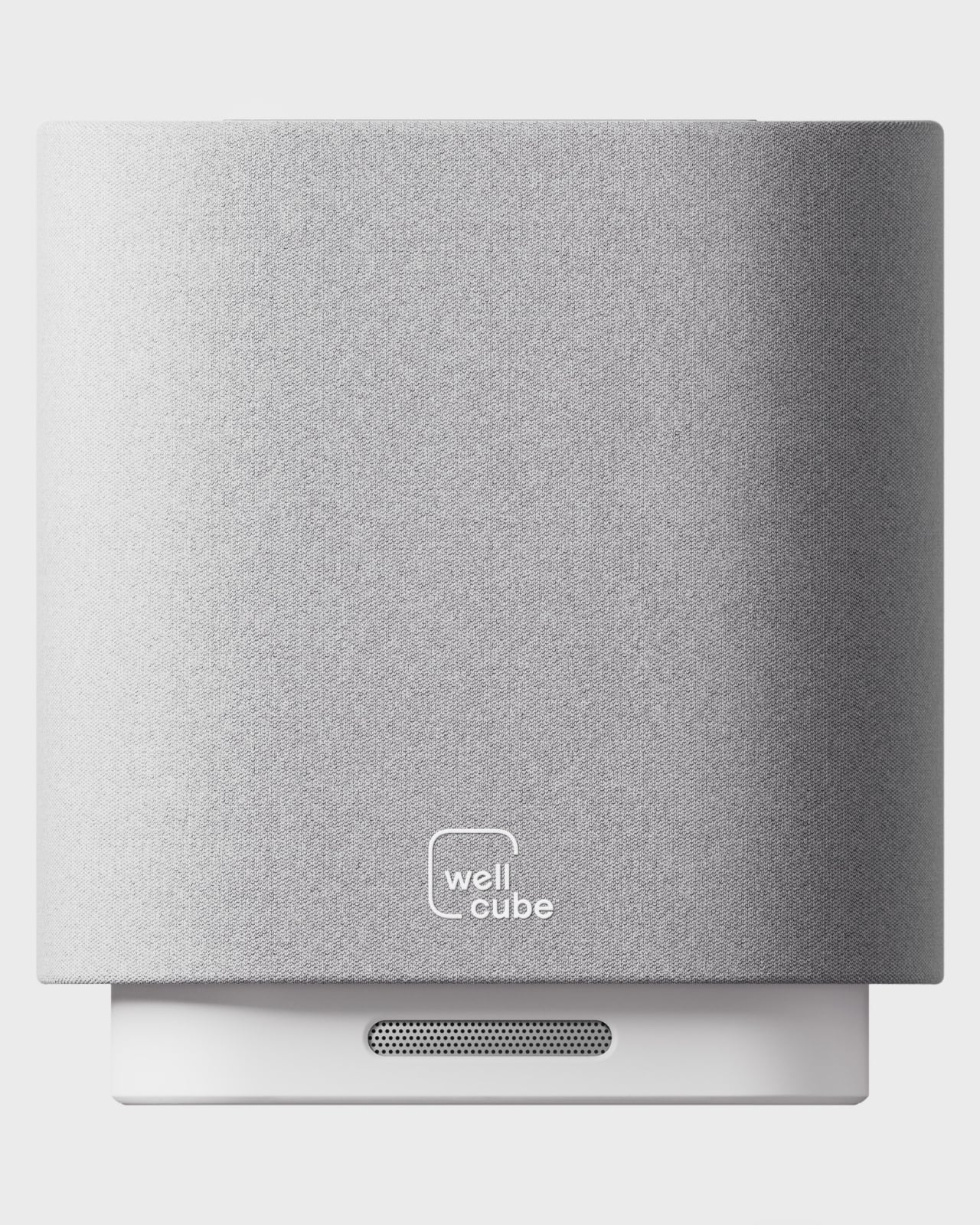
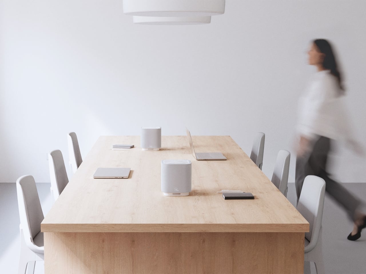
There’s a particular kind of object that design-minded people notice when they walk into a room. Not the artwork on the wall or the fancy ergonomic chair. It’s the small, considered thing sitting on a desk or a conference table that makes you stop and think, “wait, what is that?” The Delos WellCube is that kind of object.
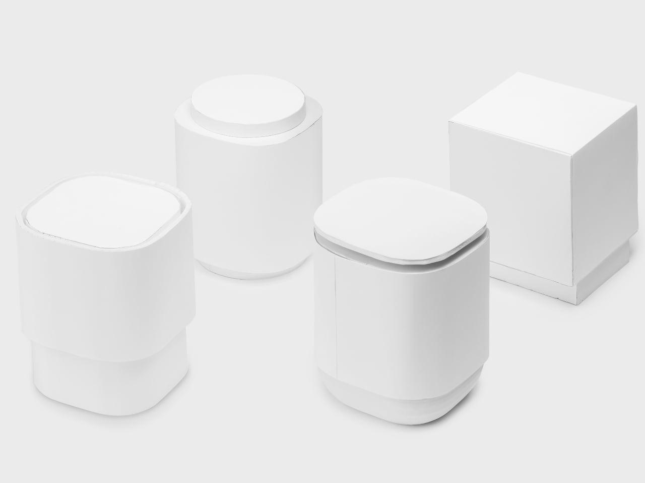
Created by San Francisco-based studio Box Clever in collaboration with wellness technology company Delos, the WellCube represents a design challenge that most air purifier manufacturers have been getting wrong for years: how do you make something people actually want in their workspace instead of something they tolerate?
The brief was specific. Delos has spent more than a decade researching the relationship between indoor environments and human health, and they wanted to create the first connected platform of hyper-localized air purifiers designed specifically for the modern office. Eight built-in sensors. HEPA filtration. Real-time environmental monitoring. All the technical capabilities you’d expect from a serious wellness device.
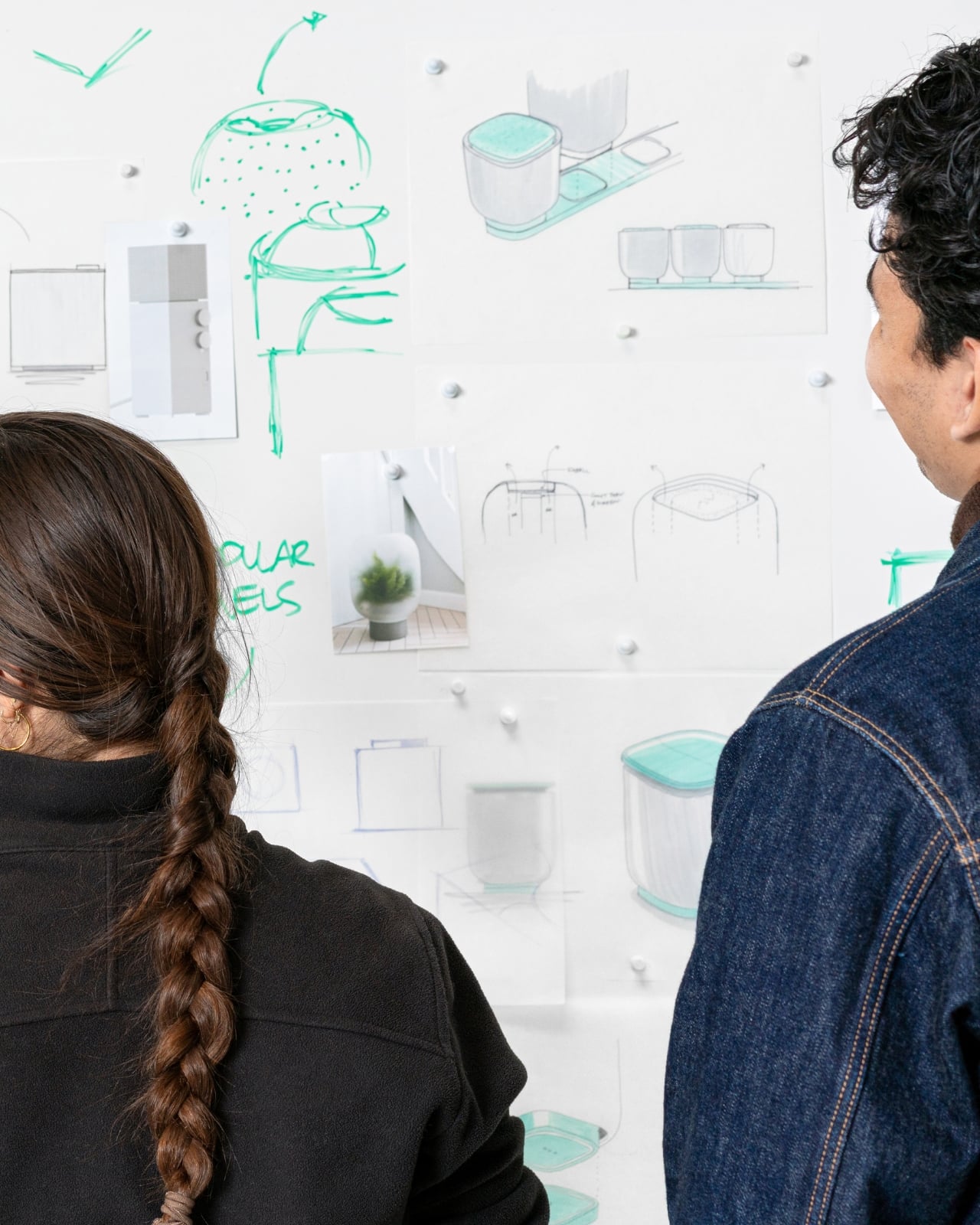
But here’s where it gets interesting. Box Clever’s job wasn’t just to house all that technology in a box. It was to create something that employees, facilities managers, and companies would genuinely choose to place on desks and in shared spaces. Something that doesn’t broadcast “corporate compliance equipment” the second someone walks into a room. The result is a study in how thoughtful industrial design can completely reframe a product category.
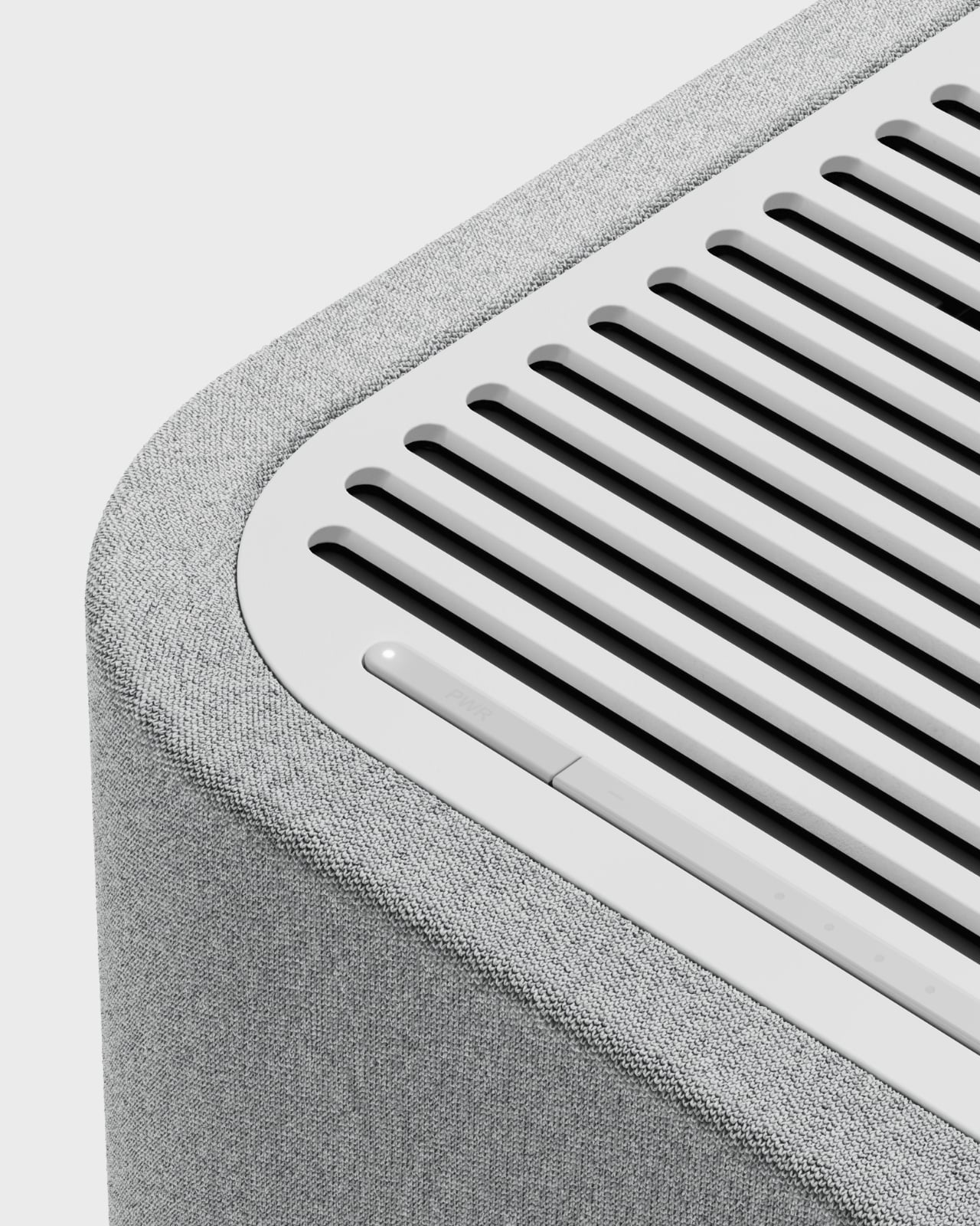
The WellCube sits compact on a desk or table, roughly the size of a Bluetooth speaker. It delivers 99.97% filtration efficiency at 0.3 microns, covering up to 250 square feet while operating at a whisper-quiet 32 to 52 dBA. Those eight sensors track air quality, temperature, humidity, occupancy, lighting levels, and noise simultaneously, creating what Delos calls an insightful view of the invisible health of office spaces.
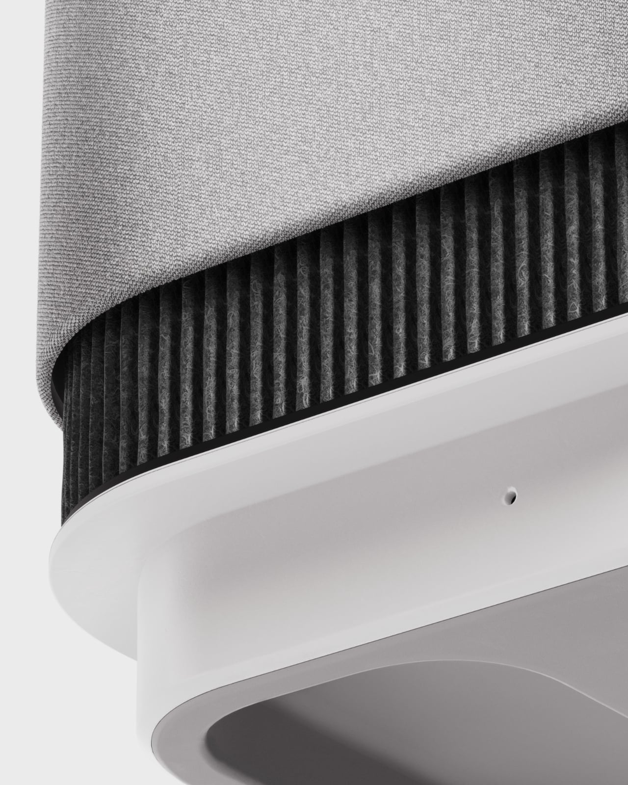
But what makes this design competition-worthy is how Box Clever handled the exterior. The outer layer is a soft, interchangeable fabric cover that completely transforms the visual language of what an air purifier can be. Instead of looking clinical or industrial, it reads as approachable and residential. The fabric isn’t just aesthetic either. It doubles as access to the replaceable filters inside, so maintenance stays simple and unobtrusive. Companies can customize the cover to match any environment’s color palette, which means the same device can feel at home on a personal desk, in a collaborative meeting space, or in an executive conference room.
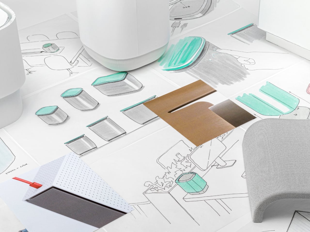
The design development process tells the real story. Box Clever’s documentation shows walls covered in sketches, early foam models exploring different proportions, material samples testing various fabric weights and textures, and iteration after iteration before landing on dimensions that feel, as the team describes it, just right. It’s the kind of rigorous, unsexy work that separates objects that merely look designed from objects that are actually designed all the way through.
What elevates this project beyond a typical product redesign is how seriously both teams took the challenge of balancing technical performance with human-centered design. Office wellness technology typically falls into one of two traps: highly capable but clinical-looking, or beautiful but functionally superficial. The WellCube pushes back on that false choice entirely. The sensor data does more than just measure. It feeds real-time information that helps facilities managers and companies optimize spaces for healthier outcomes, room by room, desk by desk. Think of it as giving buildings the ability to communicate what they actually need. But that sophisticated backend never makes the device itself feel complicated or intimidating to the people using the space.
This is exactly the kind of design thinking that contests and showcases exist to highlight. It’s not just about making something look better. It’s about fundamentally rethinking what a product category can be when you start with human needs instead of engineering specifications. If the future of office wellness is going to look anything like this, it’s going to be a lot more inviting than the sterile solutions we’ve been stuck with. And a lot better looking on your desk.
Our homes are more than dwellings as they are living stories. The most comforting ones merge the wisdom of the past with the ease of modern living. Today, we seek spaces that go beyond beauty, like places that carry history, evoke emotion, and offer a true sense of belonging. This blend of timeless heritage and present-day function isn’t just a trend; it is a lasting design philosophy that nurtures both serenity and style.
It’s about slowing down and valuing the origin of what surrounds us—choosing craftsmanship over convenience, meaning over mass production. Let’s explore simple yet powerful ways to bring ancestral warmth into modern homes, where every detail reflects mindfulness and enduring charm.
1. Furniture Collection Inspired by Traditional Motifs
Furniture should do more than occupy space, as it should tell a story and offer enduring comfort. The key lies in blending classic silhouettes with modern practicality, where traditional joinery meets sleek minimalism. This fusion adds depth and authenticity, giving your interiors a grounded charm that mass-produced pieces can’t emulate.
Invest in a few statement pieces made from natural, lasting wood that age beautifully and gain character over time. A handcrafted dining table, for instance, becomes a gathering point and symbol of permanence. Pair such heirloom-quality designs with contemporary fabrics and lighting to create a space that feels both rooted and refreshingly modern.
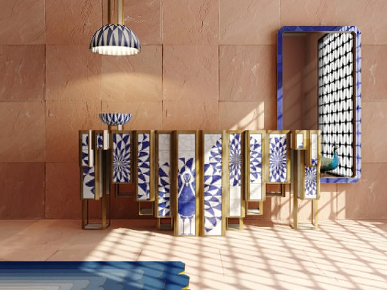
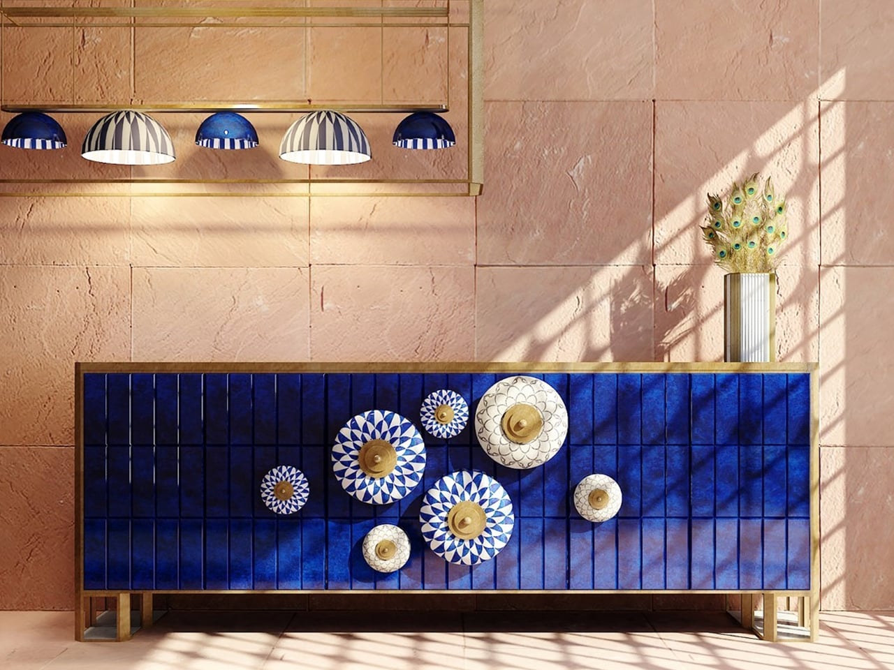
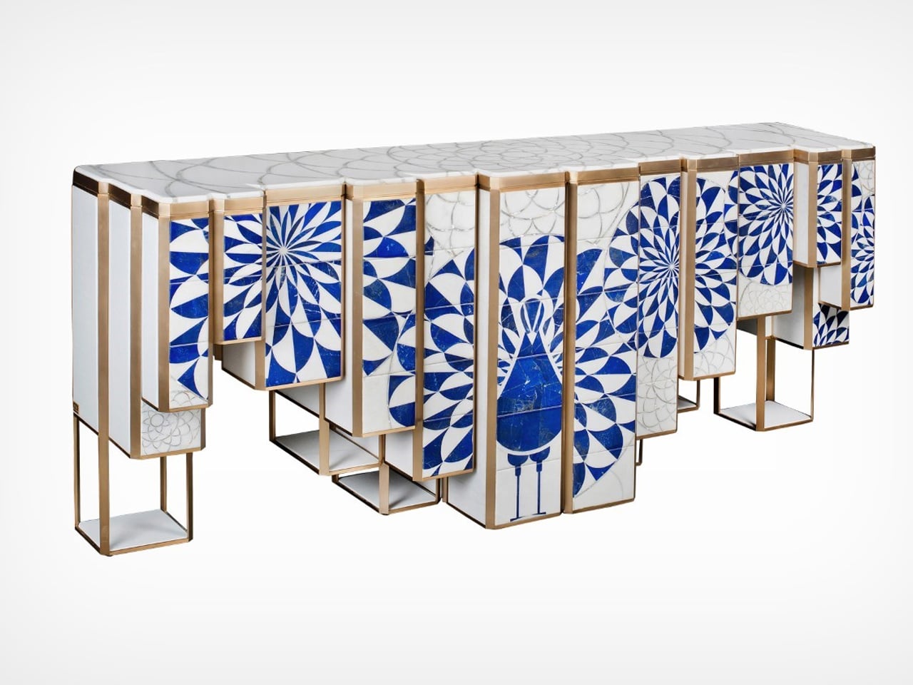
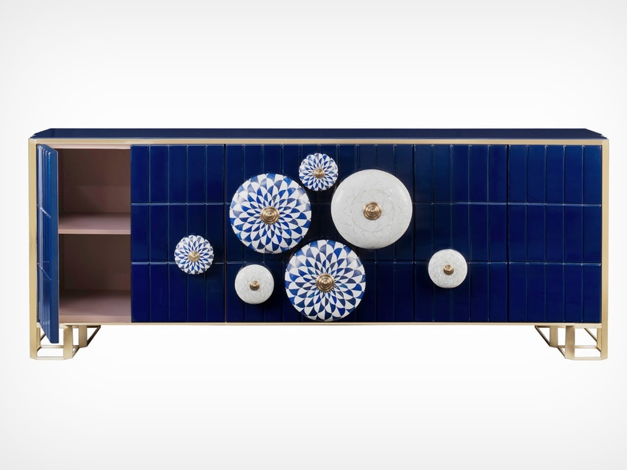
Some furniture pieces transcend mere function to become art. The Jaipur Furniture Collection by Sonal Tuli does just that, blending tradition and modernity in homage to Jaipur, India’s Pink City. Inspired by the city’s architectural motifs and the delicate art of blue pottery, the collection, including the sideboard, chandelier, mirror, and rug, captures Jaipur’s cultural richness. Handcrafted in India, each piece showcases local artisans’ mastery through the use of white marble and lapis lazuli, elevated by intricate stone inlay and overlay techniques that reflect timeless Indian craftsmanship.
Balancing elegance with purpose, the collection marries beauty and function. The sideboard reveals a soft pink hue when opened, while the chandelier and pendant radiate patterns reminiscent of lapis lazuli. The mirror’s backlit knobs offer modern versatility. Initially imagined with blue pottery tiles, Sonal refined her design using more durable marble and reimagined the console for easier transport.
2. Housing Designing with Local Materials
Building or renovating with local materials is both sustainable and deeply meaningful. Using regional stone, native timber, or local clay ties your home to its natural surroundings, creating harmony between structure and landscape. It’s a conscious way to reduce transport emissions while embracing eco-friendly design that feels authentic to the place.
Beyond sustainability, these materials bring texture, warmth, and a lived-in charm that industrial alternatives can’t match. Think of the cool touch of nearby-quarried stone or the organic grain of native wood, each telling a story of place and time. Such choices infuse your home with heritage, authenticity, and timeless character.
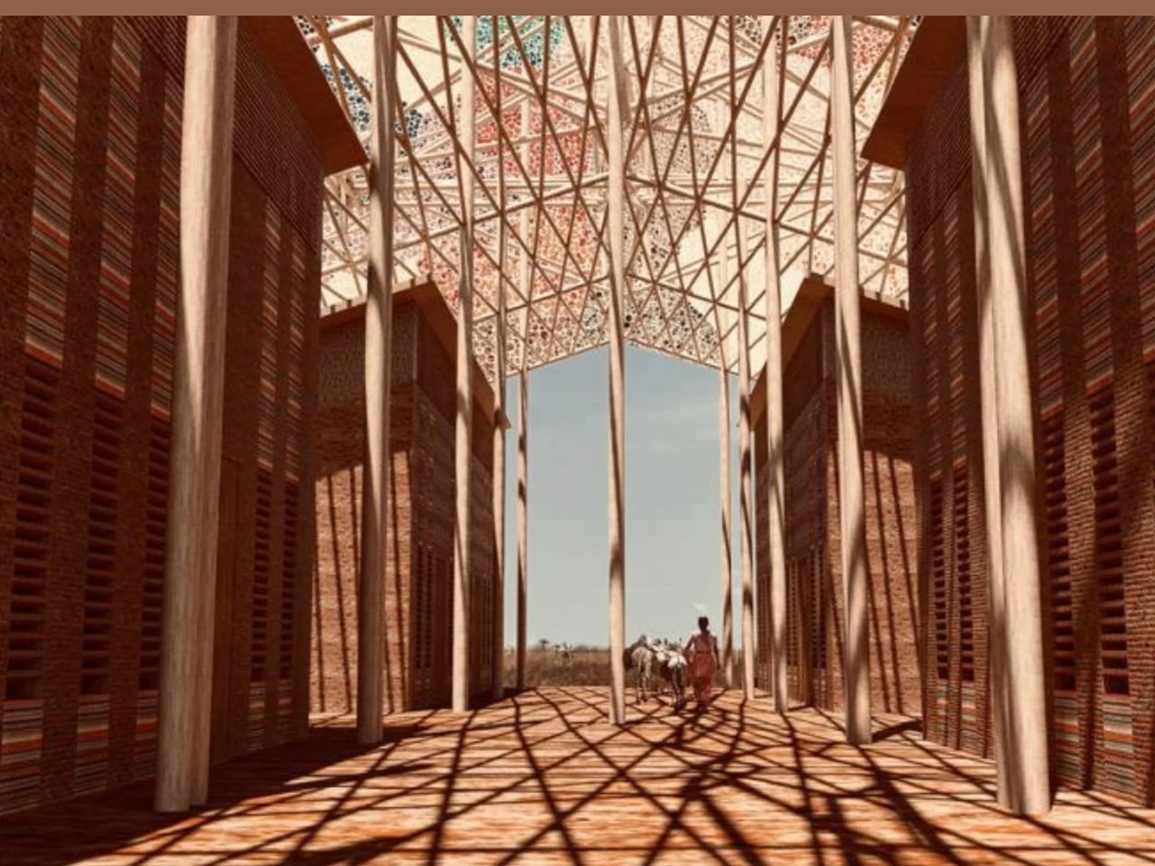
Access to clean water is often taken for granted in developed nations, yet for many communities around the world, it remains a daily struggle that affects both health and survival. This housing design offers a sustainable solution by integrating a water catchment system built with local materials and traditional weaving techniques. Designed for regions like Africa, where water scarcity is severe, the project transforms a basic need into an opportunity for innovation and community empowerment.
The house’s defining feature is its roof, which is a wooden framework interlaced with woven panels that collect dew and rainwater. This moisture passes through a natural filtration system, producing clean water suitable for drinking, cooking, and bathing. Using only locally available materials, the design not only ensures affordability but also celebrates indigenous craftsmanship. The result is a beautiful, functional, and sustainable home that fosters community involvement and could inspire global solutions for water security.
3. Illuminating Spaces
Lighting has the power to do more than brighten a room, as it can express intention and soul. When crafted with care, each fixture becomes a reflection of mindful design, where the maker’s hand and heart are both visible. Think of hand-blown glass lamps or woven shades that glow softly, celebrating imperfection and the quiet rhythm of creation.
To bring this spiritual warmth home, choose lighting that encourages calm and connection. A sculpted pendant or handcrafted sconce can transform a space into a sanctuary. These human-made details radiate authenticity, reminding you to slow down and let light nurture both mood and spirit.
The TRIRIS lamp by Chinmayi Bahl merges spiritual symbolism with modern craftsmanship. It transforms any setting into a sanctuary of calm light and thoughtful design. Inspired by Shiva’s third eye, a symbol of awakening and higher perception, the TRIRIS (Tri-Iris) lamp captures the essence of transformation. Handcrafted from bamboo slivers with copper-finished accents, it exudes warmth, durability, and timeless sophistication.
At its heart lies a heat-molded acrylic core shaped like a swirling tornado, symbolizing the power of inner energy. The lamp’s rotatable design allows users to adjust the interplay of light and shadow, turning simple lighting into a meditative act. Each rotation reflects the gradual opening of the inner eye, revealing beauty and balance. The TRIRIS lamp isn’t just a fixture but is a statement of mindful living and artistic expression.
4. The Timeless Appeal of Wooden Tableware
Wooden tableware embodies warmth, simplicity, and a tactile connection to nature. It’s one of the most effortless ways to bring traditional craftsmanship into daily life. Beyond decoration, wooden bowls, platters, and spoons transform everyday meals into moments of mindfulness. Their natural grain and gentle texture invite you to slow down, creating a sensory link to the earth that nurtures well-being.
When choosing pieces, seek clean silhouettes and hand-finished quality that ensure durability and food safety. Think mango wood dipping bowls or acacia salad servers, which work as organic accents that blend sustainability with rustic charm. Replacing ceramics or plastic with wood instantly adds authenticity and quiet elegance to your table.
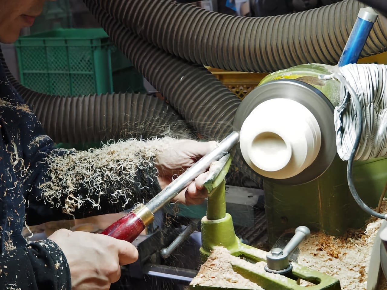
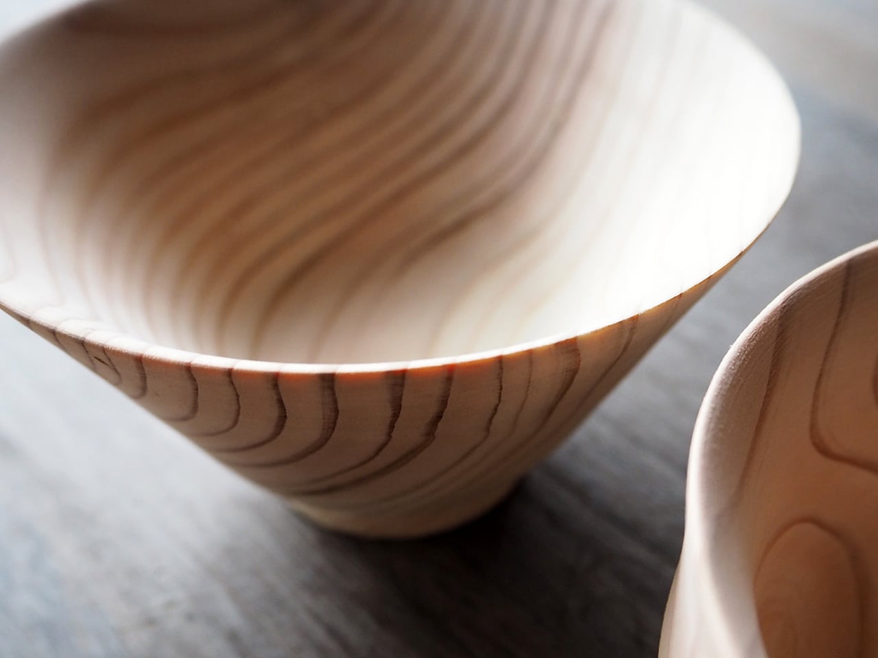
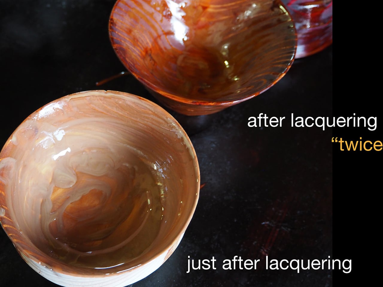
Still used by Buddhist monks today, wood offers a natural warmth and texture that no other material can match. It doesn’t conduct heat like metal, doesn’t shatter like glass or ceramic, and is far safer and more sustainable than plastic. Durable and reusable for decades, wooden utensils represent the perfect balance of practicality and eco-conscious living. For over 68 years, Higashi Shunkei has celebrated this philosophy through handcrafted wooden tableware. Founded in Hida Takayama, Japan, the three-generation company began with chopsticks before expanding into exquisite bowls made from locally sourced cedarwood.
Nestled amid forests covering 92% of Takayama’s land, Higashi Shunkei crafts each Hida-Cedar bowl within its own workshop. The bowls are spun on a wooden lathe and finished using the traditional Suri Urushi lacquering method, which hardens the wood and gives it a glossy, ceramic-like surface. Each bowl’s unique striped pattern becomes richer with time, merging durability, beauty, and timeless craftsmanship.
5. Traditional Aroma Diffusers
An aroma diffuser may seem like a modern essential, yet its purpose is infusing spaces with natural, traditional aromas for healing and comfort—it has ancient roots. From sandalwood to frankincense, these time-honored scents once filled temples and homes, creating a sense of calm and spiritual grounding. Today’s sleek diffusers reinterpret that heritage, blending ancient aromatherapy with contemporary design to nurture both atmosphere and emotion.
For seamless integration, choose diffusers crafted from ceramic, glass, metal, or sustainably sourced wood that harmonize with your decor. Pair them with pure essential oils like traditional sandalwood, soothing lavender, or uplifting bergamot. This mindful ritual not only enriches your senses but also reconnects modern living with the enduring wisdom of aromatic tradition.
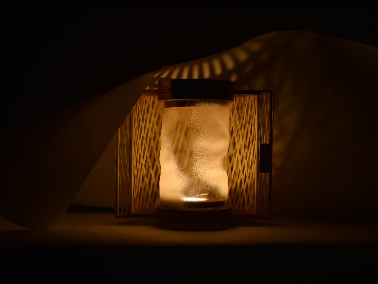
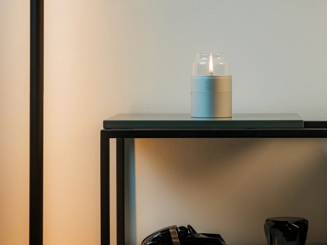
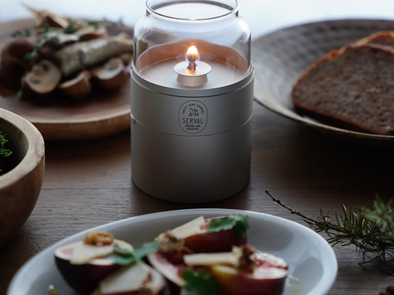
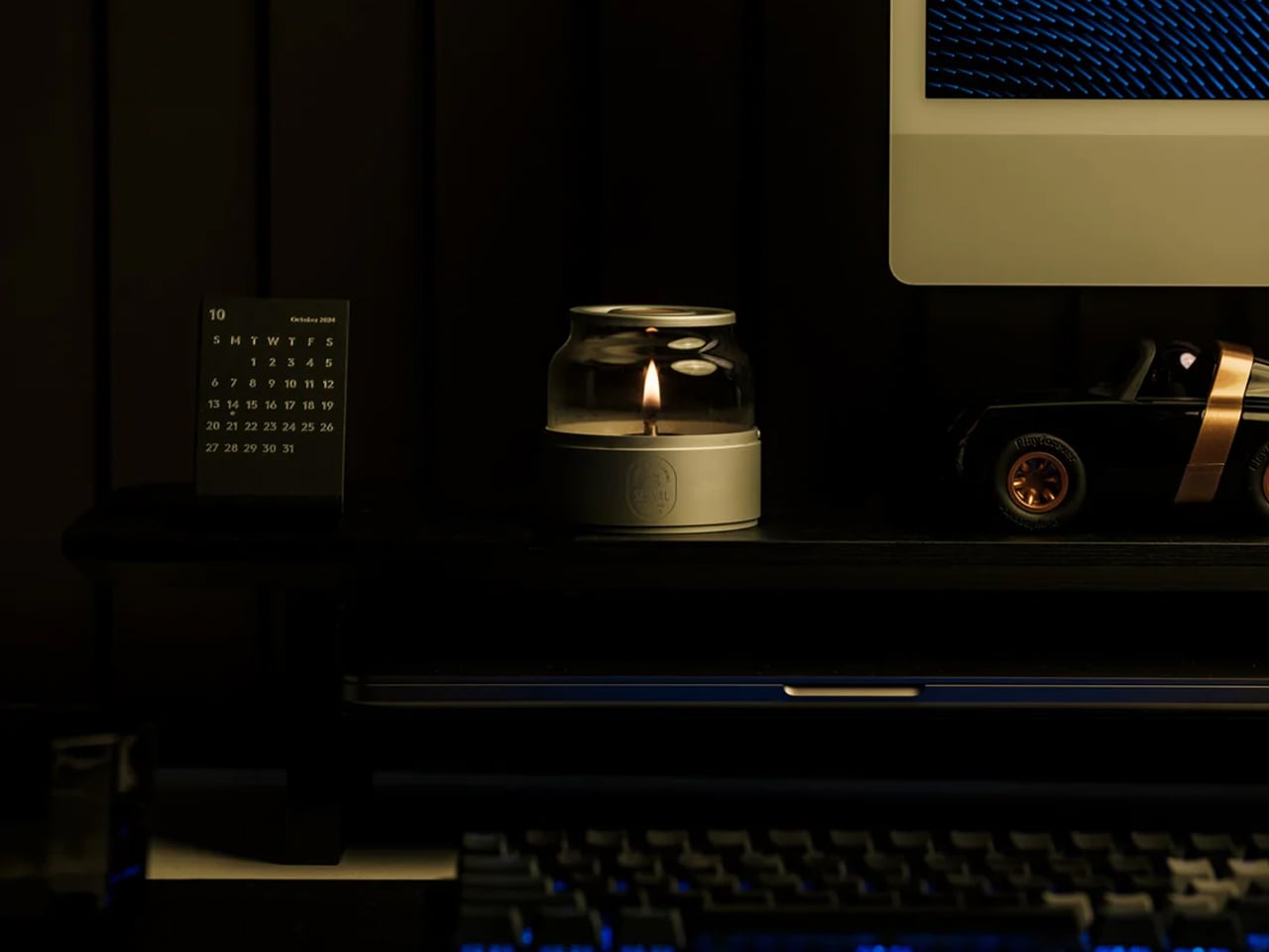
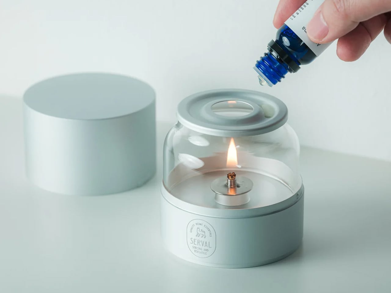
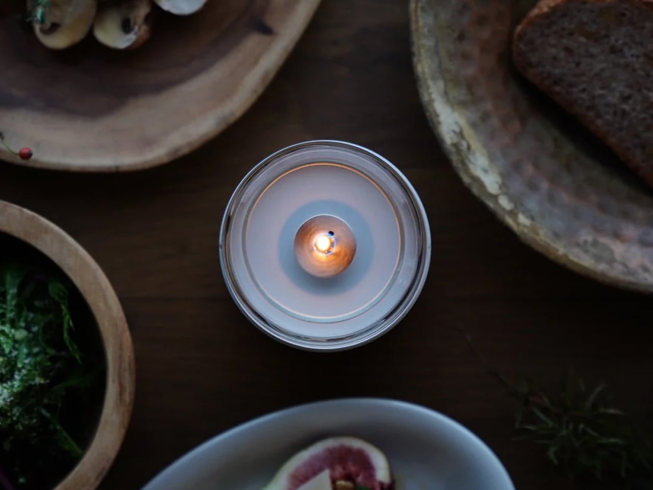
Rooted in the timeless craft traditions of Japan, the Fire Capsule is a testament to what happens when ancient design philosophy meets contemporary vision. Its form is drawn directly from the elegant proportions of traditional Japanese tea canisters, a silhouette that has embodied quiet refinement for centuries, now reimagined through the lens of modern industrial design. Created by Eri Tsunoda of SERVAL, a Kyoto City University of Arts graduate deeply attuned to the balance between heritage and innovation, the lamp honors the Japanese principle of *ma* – the art of meaningful space – by distilling function down to its most beautiful essentials. Premium aluminum and hand-clear glass replace the lacquered wood and ceramic of old, yet the spirit remains unchanged: a vessel that holds light the way tradition holds wisdom, with care, intention, and lasting grace.
Where the Fire Capsule truly shines is in how it carries that traditional soul into the demands of modern life. The age-old ritual of oil lamp lighting, once the cornerstone of every home and hearth, is here made effortlessly accessible through precision engineering, a dust-sealing lid, a 16-hour burn capacity, and an aroma diffusing plate that transforms illumination into a full sensory experience. Its stackable form, protective drawstring pouch, and featherlight 180-gram build speak the language of contemporary living without ever abandoning their ancestral roots. Whether gracing a minimalist apartment, a candlelit dinner table, or a quiet evening under open skies, the Fire Capsule does not simply decorate a space – it reconnects it to something older, warmer, and deeply human, proving that the most forward-thinking designs are often those that look thoughtfully backward.
Reimagining tradition means thoughtfully adapting its finest elements for modern living. By choosing local materials, mindful craftsmanship, and soulful pieces, you create a home that’s personal, sustainable, and serene. It becomes a space that balances beauty with well-being, offering comfort, authenticity, and a timeless reflection of your story.
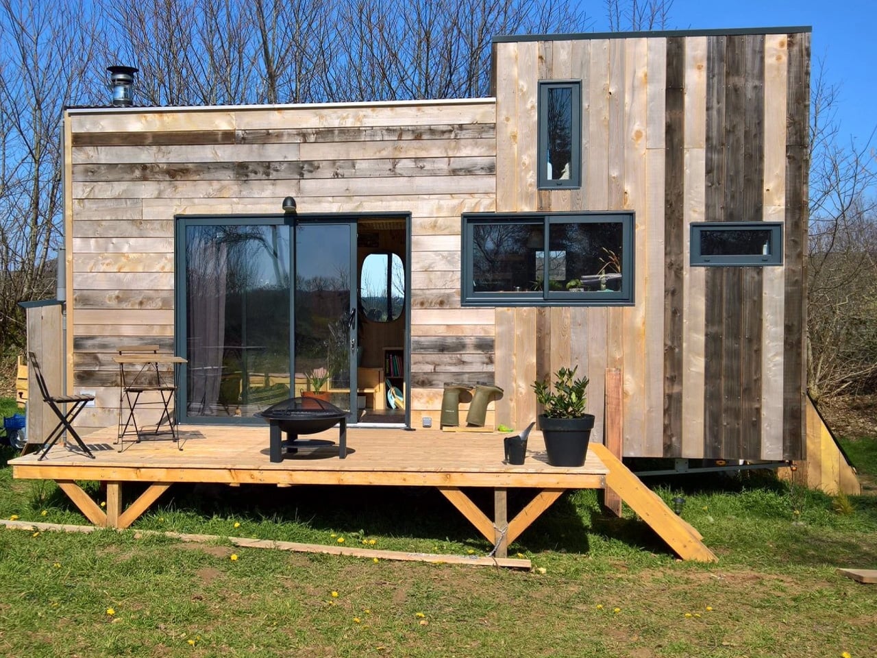
I love a home that is designed to do everything you need and nothing you don’t. The Chillhouse, or La Chillhouse as it’s known in its native tongue, is exactly that kind of home. Built for two, designed for off-grid living, and rooted in a distinctly French woodworking tradition, it’s the latest statement from Brittany-based artisan workshop Atelier Bois d’ici. Small in footprint, deliberate in execution, and almost stubbornly unhurried in its approach, the Chillhouse offers a compelling vision of what modern self-sufficient living can actually look like.
Atelier Bois d’ici, roughly translated as “the local wood workshop, has never been a typical construction company. Wood sits at the absolute center of everything they do, not merely as a raw material but as a guiding principle. The studio operates its own sawmill and timber storage facility on the same grounds as the workshop, meaning each build begins not with pre-cut lumber but with raw logs. This hands-on relationship with the material shapes every decision, from species selection to finish, and gives their homes a depth of character that factory-built alternatives simply cannot replicate.
Sitting on a double-axle trailer and measuring 6.6 meters in length, the Chillhouse is compact by design rather than by compromise. The exterior is wrapped in natural timber cladding, warm and textured in a way that reads differently depending on the landscape around it — equally at home against pine trees or open countryside. The profile is clean without being cold, and the construction feels solid in a way that telegraphs craftsmanship before you’ve even stepped inside. It’s built for couples or solo dwellers ready to trade square footage for genuine freedom.
As you enter the home, the living room makes its intentions clear immediately. A low-profile sofa, discreet storage tucked into every available corner, and a wood-burning stove anchor the space with a sense of warmth that’s both literal and atmospheric. Nothing is decorative for the sake of it. Every element earns its place, and the result is a room that feels genuinely comfortable rather than curated for a photoshoot.
The kitchen runs on the same ethos of considered practicality. A two-burner propane stove, a compact oven, a sink, and a small refrigerator cover every real cooking need without overpromising on space. It’s a kitchen built for people who actually cook, not one designed to impress during an open house. Adjacent to it, the bathroom offers the essentials in a layout that wastes nothing.
Above it all, the bedroom loft is reached by a staircase with storage built directly into each step — one of many small design decisions that quietly distinguish the Chillhouse from less considered builds. The sleeping space itself sits low under the roofline, intimate and removed from the rest of the home in the best possible way. Atelier Bois d’ici sources all timber from within a close radius of the workshop, avoiding chemical treatments entirely and letting the natural resilience of carefully chosen wood species do the work. The Chillhouse doesn’t shout about sustainability, it just lives it.
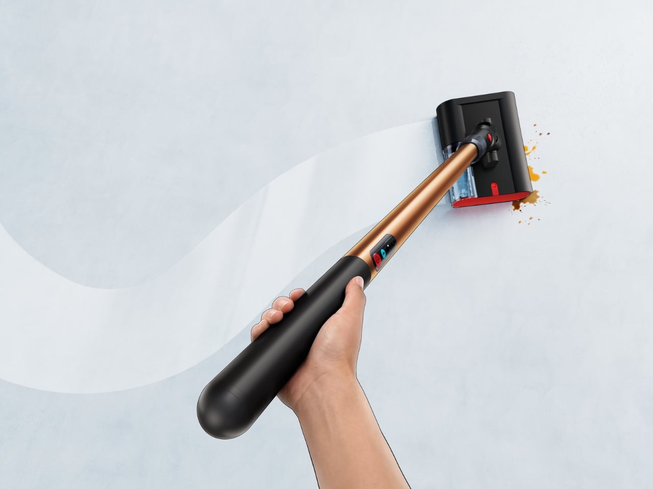
Nobody has ever looked at a traditional mop and thought, “Yes, this is the peak of human ingenuity.” Mopping has always been the cleaning task that feels like a punishment. You fill a bucket, push dirty water across the floor, realize the mop head smells suspect, and then spend the next 20 minutes waiting for everything to dry. It works, technically. But it’s never been good. Dyson wants to change that conversation entirely with its newest launch, the PencilWash, and the case it makes is surprisingly compelling.
The PencilWash follows the same design philosophy as the PencilVac, Dyson’s super-slim cordless vacuum that turned heads when it launched in 2025. The idea is simple but radical: what if cleaning tools didn’t have to be bulky? The PencilWash takes that premise into wet cleaning territory with a 38mm-diameter handle, which, true to the name, is roughly the thickness of a pencil. At just 4.9 pounds total and only 0.8 pounds in the hand, it feels like a completely different category of product from the heavy, tank-like floor washers already on the market.
The slimness isn’t just a style flex. Because the machine lays flat to 170 degrees, it can slide under furniture as low as 6 inches off the ground. That means the coffee table, the media console, the bed frame, all those places where crumbs and sticky residue build up because your vacuum simply can’t reach them, are now fair game. It also maneuvers along walls and skirting boards, which is where most wet cleaners give up and go home. The PencilWash was clearly designed with real living spaces in mind, not idealized showroom floors.
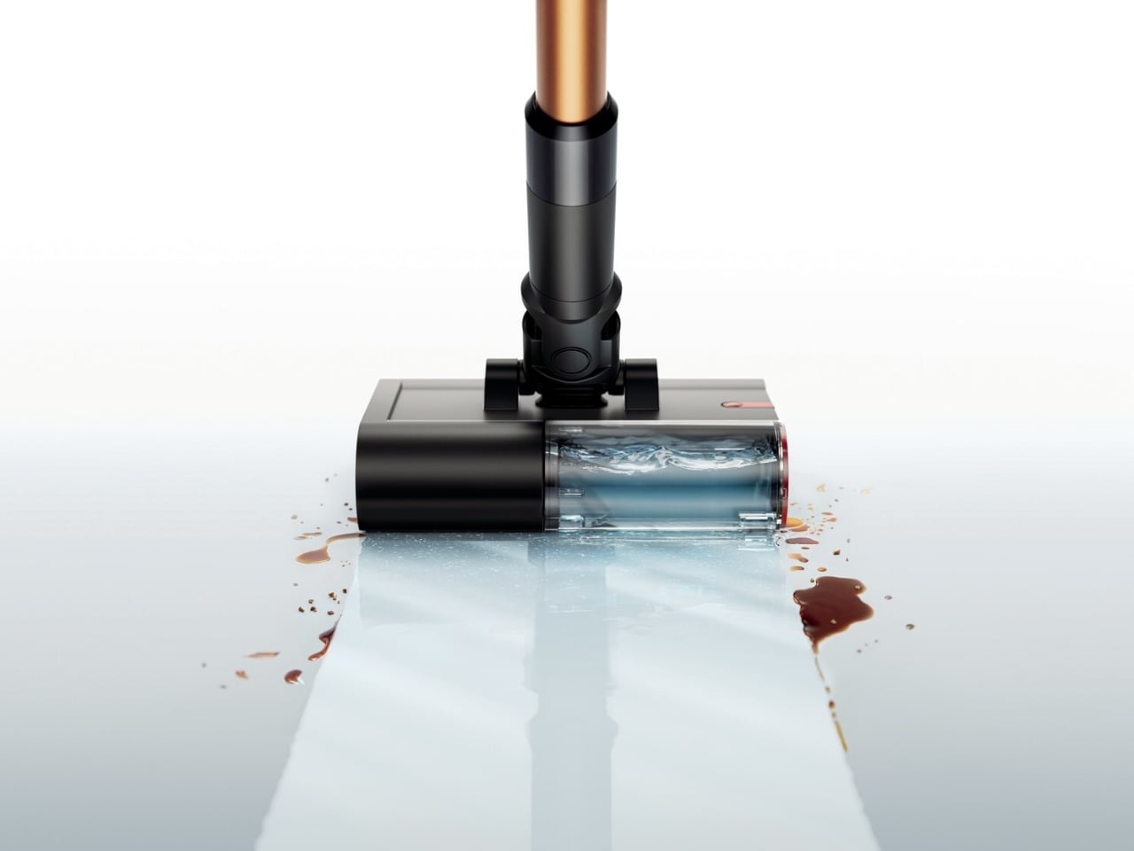
What makes the tech behind it genuinely clever is Dyson’s three-part cleaning approach: hydration, agitation, and extraction. The machine uses a high-density microfiber roller packed with 64,000 filaments per square centimeter, spinning at 650 RPM, to pick up both wet and dry debris at the same time. But the part that truly sets it apart is the 8-point hydration system, which feeds fresh water to the roller on a continuous, controlled basis. Dirty water is extracted from the roller on every single rotation and funneled into a separate 12 fl oz dirty water tank, kept entirely away from the 10 fl oz clean water supply. What that means in practice is that you’re always mopping with fresh water, not just spreading the same grimy water around in circles.
The filter-free design is another deliberate engineering choice. Most wet cleaners rely on filters that trap debris, harbor bacteria, develop odors over time, and eventually clog up. Dyson removed the filter completely, which eliminates the risk of sludge buildup, performance drops, and that particular cleaning-appliance smell you’ve probably already encountered. The clean water tank covers up to 1,076 square feet per fill, enough for most apartments and medium-sized homes in one run.
Dyson also pairs the PencilWash with its O2 Probiotic hard floor cleaning solution, a non-foaming, non-toxic formula that cleans at the microscopic level and is safe around pets and kids. It’s the kind of optional companion product that actually earns its place, rather than feeling like an upsell for upselling’s sake.Battery life sits at 30 minutes per charge, with a 3.5-hour charge time. For bigger homes, there’s an optional swappable battery that extends the range without much hassle.
The Dyson PencilWash goes on sale March 17, 2026, in the US at $349. It launched earlier in the UK at £299.99 and in Australia at AU$499. If you want to be among the first to get your hands on one, Dyson has a waitlist open right now. What Dyson is really building with the Pencil lineup is a new design logic for home cleaning. Smaller doesn’t mean weaker. Slimmer doesn’t mean a compromise. The PencilWash makes a strong argument that the bulky, filter-dependent appliances we’ve tolerated for years were never really the best option available. They were just the only one we had.
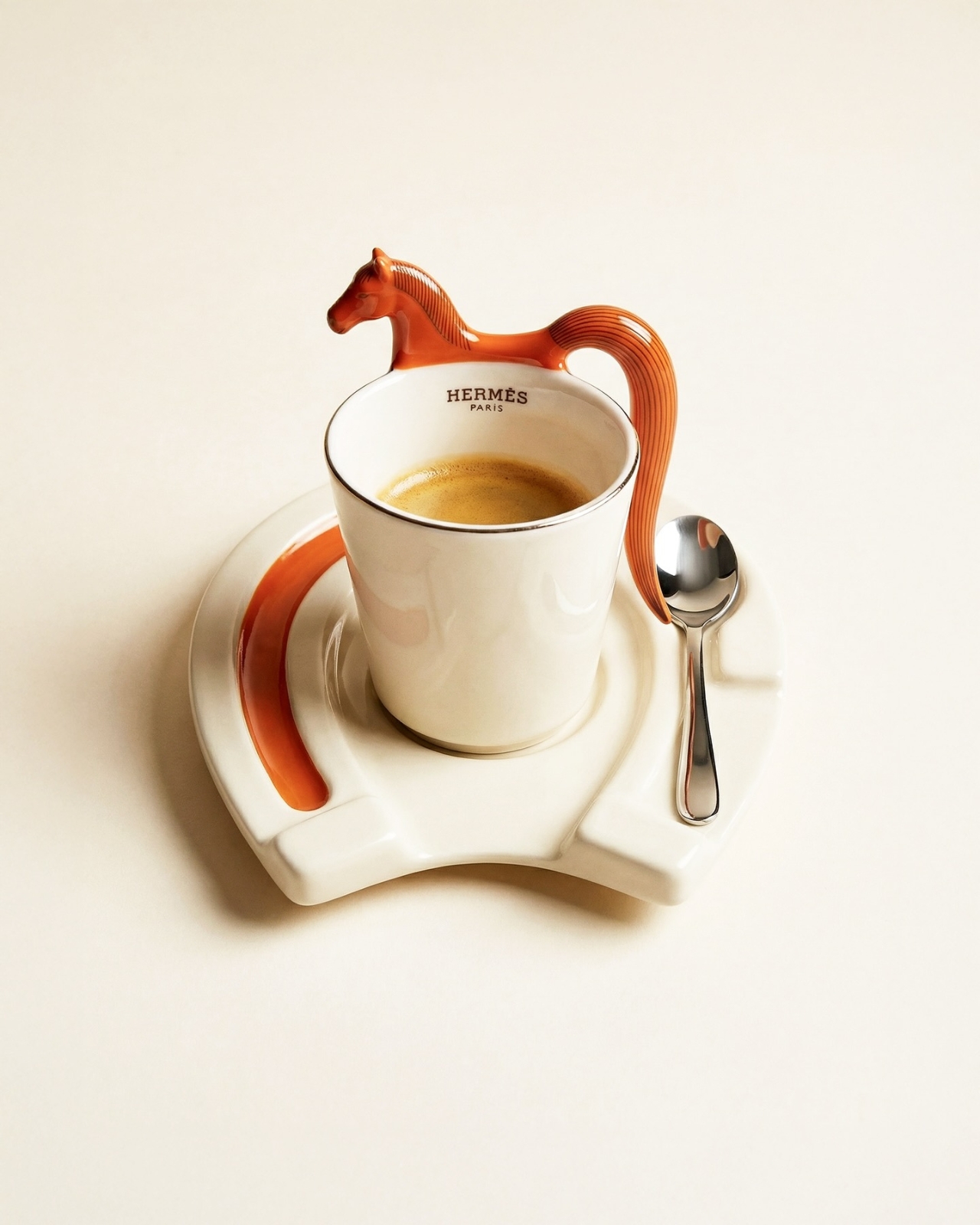
If you follow concept design on social media, there’s a good chance you’ve already stumbled across Jane Morelli’s work. She’s the designer behind that Lacoste x Bialetti moka pot that went viral not too long ago, and now she’s back with something that somehow manages to feel even more covetable. For the Year of the Horse, she has created a concept coffee set that imagines what a Hermès x Bialetti collaboration could look like, and the result is genuinely breathtaking.
To be clear, this is not a real product. It’s a speculative design concept, an unofficial creative exploration that Morelli put together entirely on her own. Neither Hermès nor Bialetti has signed off on it, and there’s no indication it will ever hit shelves. But that hasn’t stopped the internet from losing its collective mind over it, and once you see it, you’ll understand why.
The concept draws on two things that already go together better than most people realize. Hermès has deep equestrian roots. The brand was originally founded as a harness and saddle workshop, and the horse has been central to its identity ever since. That iconic logo featuring a horse-drawn Duc carriage pays homage to the brand’s equestrian beginnings and still appears on every box and ribbon the brand produces today. So when a designer decides to celebrate the Year of the Horse, Hermès is a natural fit.
Bialetti, meanwhile, has its own kind of cult status. The Moka Express, invented by Alfonso Bialetti in 1933, completely changed how people made coffee at home. That eight-sided stovetop brewer became one of the most recognizable objects in design history, sitting comfortably in the same conversation as the Eames chair or the Anglepoise lamp. It’s Italian, it’s timeless, and it’s on millions of kitchen counters around the world.
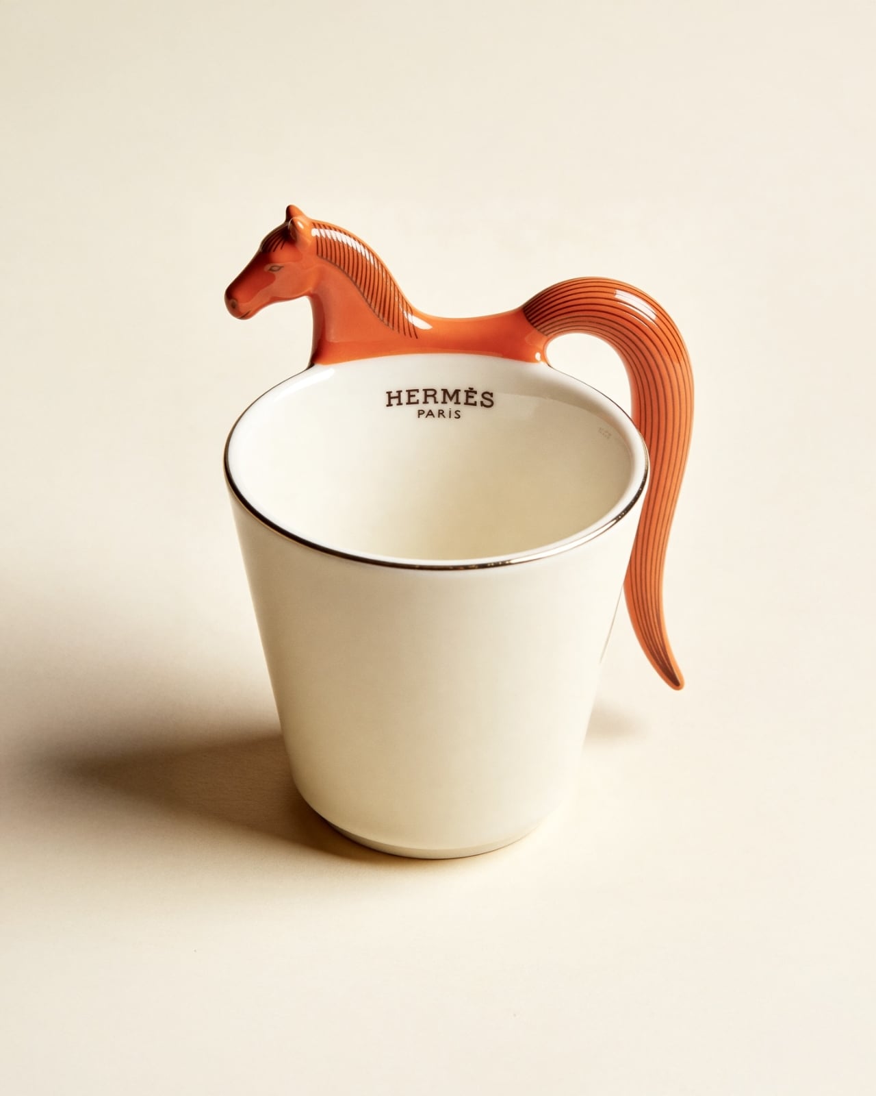
Morelli’s concept merges both worlds with a detail-oriented love for both brands that really shows. The moka pot gets the full Hermès treatment: a rich burnt orange body with a cream horse silhouette painted on its side, and a three-dimensional horse figurine standing on top of the lid in place of the usual knob. It’s playful without being loud, sculptural without being impractical. The color palette, that signature Hermès orange paired with warm cream and a cognac brown handle, feels completely at home on a stovetop.
The espresso cup might be the most charming piece of the set. A sculpted horse head forms the top of the handle, with the body flowing down into a ribbed, flowing tail that curves back up to meet the cup. The saucer takes the shape of a horseshoe, with the spoon resting neatly in the groove on one side. Every element has been thought through, which is what sets a great concept apart from a quick render.
The whole set comes presented in a walnut wooden box lined with cream fabric, with “Hermès x Bialetti: Year of the Horse” inscribed on the inside of the lid. Even the packaging looks like something you’d want to display on a shelf rather than throw away. It’s the kind of unboxing experience that luxury brands have mastered, and Morelli has translated that into her concept with impressive accuracy.
What makes this design so compelling is how it sits at the intersection of craft, culture, and storytelling. The Year of the Horse in the Chinese zodiac is associated with energy, freedom, and elegance, all qualities that feel right at home in both the Hermès and Bialetti universes. Morelli didn’t just slap two logos together and call it a day. She built a visual language that feels native to both brands, which is no small feat. It’s a concept, yes. But the best concepts do exactly what this one does: they make you want something that doesn’t exist yet, and they make you wonder why nobody has done it already.