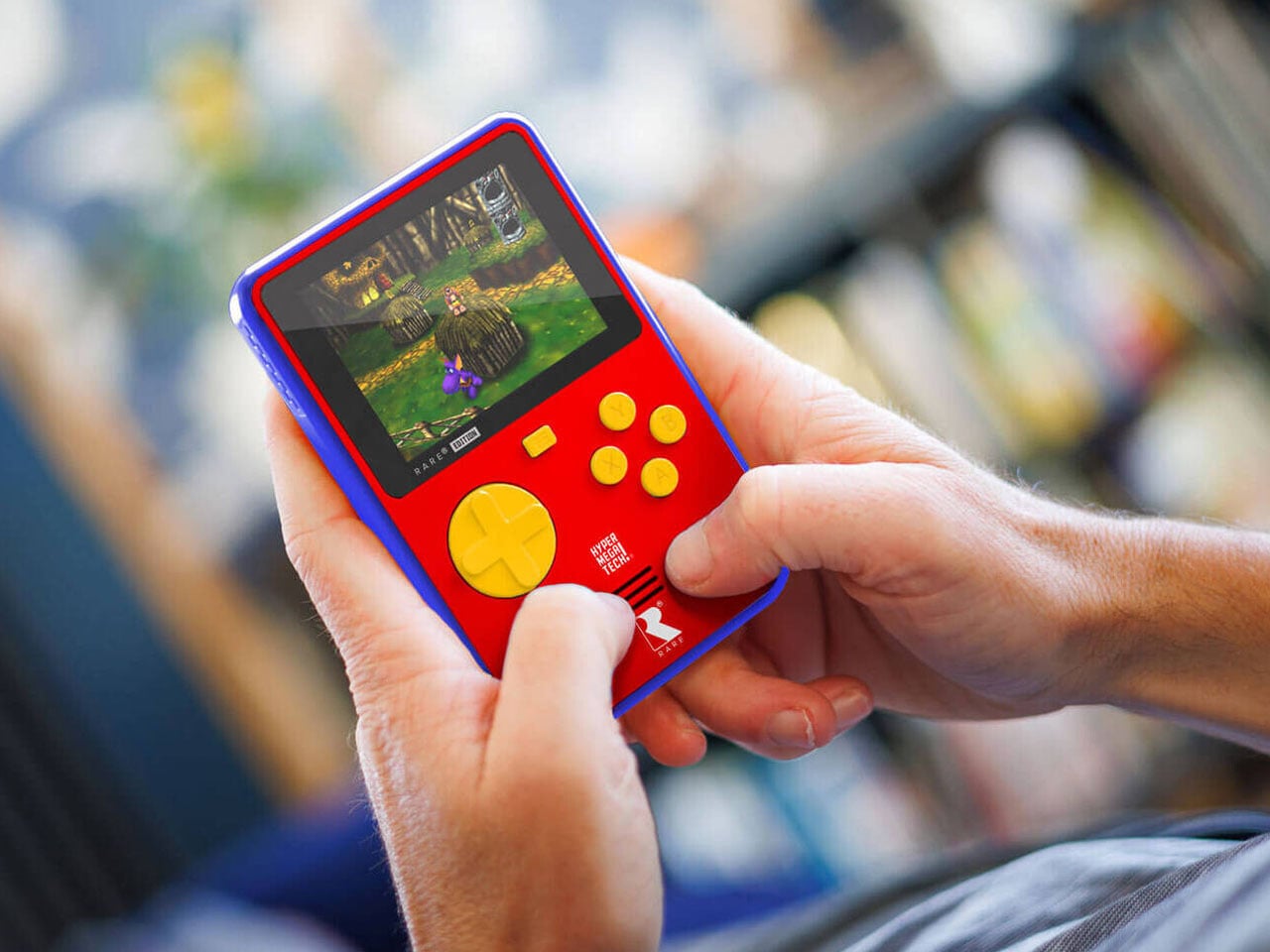
Long before today’s ultra-powerful handheld PCs began chasing console-grade performance in a portable shell, there was something undeniably charming about simpler gaming machines. The kind that fit easily into your pocket, turned on instantly, and transported you straight back to pixelated worlds without menus, downloads, or updates getting in the way. Honoring that era, the HyperMegaTech Super Pocket Rare Edition is here to bring cartridge-ready gaming to your pocket.
Developed by HyperMegaTech (who surprised us with the Micro Keychain Gamer) in collaboration with the British game developer Rare, the original Super Pocket is designed to make retro gaming accessible and refreshingly straightforward. Its vertical layout echoes classic handheld silhouettes, pairing nostalgia with modern practicality. A 2.8-inch IPS display with a 320 × 240 resolution sits at the center, offering sharp visuals suited to 8-bit and 16-bit titles.
What distinguishes the Super Pocket from many low-cost retro handhelds is its hybrid approach. Each edition ships with a curated lineup of pre-installed games, typically centered around a specific publisher or theme. Earlier versions celebrated arcade and console heavyweights such as Capcom, NEOGEO, Taito, Atari, and Data East, giving players immediate access to recognizable classics straight out of the box. The console runs on a 1.2GHz processor and is powered by a rechargeable battery that delivers roughly four hours of gameplay per charge. USB-C charging and a 3.5mm headphone jack round out the essentials, keeping the device practical for everyday use.
The upcoming Rare Edition expands that idea a step further. The Super Pocket Rare Edition, launching in June 2026, includes 14 classic titles from the legendary British developer Rare. The selection spans decades of the studio’s catalog, bringing fan-favorite experiences like Banjo-Kazooie, Battletoads, and Conker’s Pocket Tales into a compact, dedicated handheld format. For many players, this built-in lineup alone justifies the device.
Beyond the preloaded games, the Super Pocket is fully compatible with Evercade cartridges, significantly expanding its potential library. With more than 75 cartridge collections available and access to over 650 officially licensed retro games, users are not limited to the internal storage. This physical-media ecosystem adds a collector-friendly dimension rarely seen in modern budget hardware. If you are already in the Evercade ecosystem, this cross-compatible compact handheld is a no-brainer.
The Super Pocket does not attempt to rival high-end emulation handhelds or modern gaming consoles. Instead, it is a compact machine built purely for classic titles, free from distractions. For those who value tactile buttons, curated libraries, and the satisfaction of slotting in a physical cartridge, nothing gets better than this. In fact, the bright yellow shoulder buttons bring functional clarity and seamless sync with the design.
Despite the retro focus, the Super Pocket Rare Edition, in its signature vibrant blue, red, and yellow theme, remains competitively priced. It is expected to retail for around $69 in the United States, £49 in the United Kingdom, and €59 across Europe, keeping it within reach of casual players and seasoned collectors alike.
The digital nomad bag has evolved past the obvious picks. Laptop, charger, earbuds, done. That kit worked five years ago when remote work meant answering emails from a beach hostel. Now, the people doing this full-time run dual-monitor editing setups from Lisbon apartments, take client calls from co-working spaces in Chiang Mai, and file deadlines from airport lounges without missing a beat. The gear that makes that possible is not the laptop itself but the small, clever peripherals around it, the ones that turn a single USB-C port into a proper workstation and collapse back into a carry-on when it is time to move again.
We have been tracking the gadgets that keep surfacing in nomad communities and tech-forward travel kits this year, and five products stood out for the same reason: they each solve a specific friction point that remote workers hit repeatedly. Not gimmicks, not luxury upgrades, but tools that collapse the gap between a fixed desk setup and a backpack-based office. Some are shipping now, others are in the crowdfunding stage with strong traction. All of them earn space in a bag that has no room to waste.
1. Nothing Power (1)
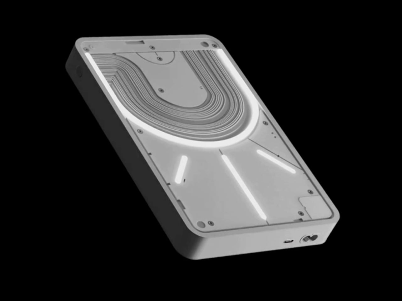
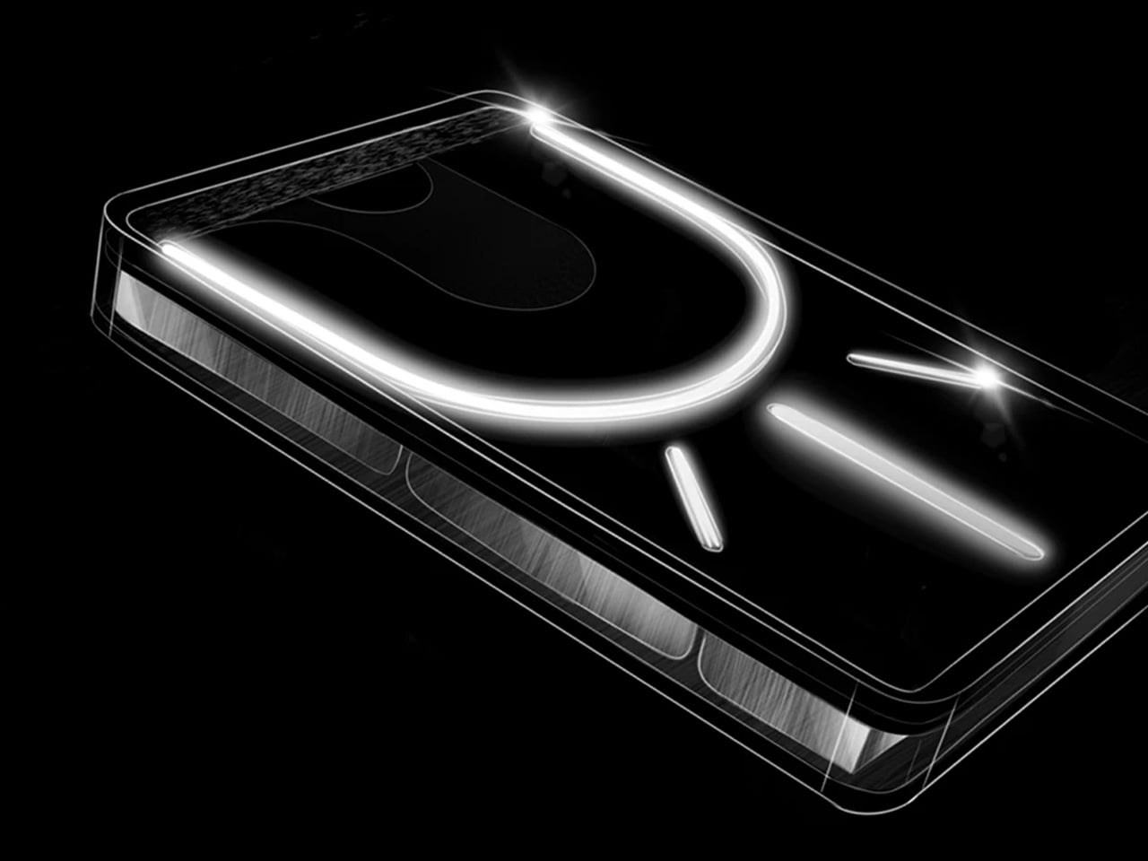
Power banks are the least glamorous item in any travel kit, which is exactly why most of them look like featureless plastic bricks. The Nothing Power (1) is a concept design that imagines what Nothing’s Glyph interface would look like on a battery bank: transparent layers, LED light paths that show charging status and notifications, and the same design language that made the Nothing Phone (1) and Phone (2) stand out in a sea of identical smartphones.
The concept proposes a 20,000mAh capacity with 65W fast charging, enough to hit 50% battery on a phone in under 20 minutes. Dual USB-C ports handle two devices simultaneously. The Glyph LEDs do more than look interesting; they provide intuitive visual feedback for charging status and battery levels without needing to press a button or check a display. Nothing actually had a power bank in development at one point, but scrapped it due to durability concerns with the transparent casing cracking on impact. This concept reimagines that idea with a cleaner silhouette and enough surface area to make the Glyph interface feel purposeful rather than decorative. For nomads who carry a power bank every single day, the idea that it could be a well-designed object instead of an anonymous slab is appealing. This is not a production product yet, but the demand in Nothing’s community forums suggests it is an idea the brand should revisit.
What we like
Glyph LED interface provides at-a-glance charging status without screens or buttons, which is faster and more intuitive than hunting for a tiny indicator light on a conventional power bank.
20,000mAh capacity with 65W fast charging (as proposed in the concept) would cover a full day of heavy device use for multiple gadgets.
What we dislike
This is a concept design, not an official Nothing product, and the transparent casing durability issue that killed the original project remains unsolved.
Transparent construction would likely show internal wear, dust, and scratches over time, especially in a bag that gets tossed around daily.
2. KeyGo Gen2
Carrying a laptop, a portable monitor, and a separate keyboard creates a three-device problem that digital nomads have been trying to solve with lighter versions of each. KeyGo Gen2 collapses all three into one folding slab. It is an ultra-slim keyboard with a built-in 13-inch 4K/60Hz IPS touchscreen, CNC-machined aluminum construction, built-in speakers, and a 180-degree hinge that folds everything flat to 19.3mm thick when closed. A single USB-C cable handles video, power delivery (up to 65W), and data.
The original KeyGo raised over $185,000 in its first campaign, featuring a 720p screen. Gen2 bumps that to full 4K at 3,840 x 2,160, ten-point multitouch, adjustable brightness up to 300 nits, and a weight of about 1 kilogram (2.2 pounds). Unfold it, plug in a USB-C cable, and a laptop instantly gains a second display sitting right below eye level with a full keyboard beneath it. It works with Windows, macOS, Linux, and Android, which means it also pairs with mini PCs and tablets for people building ultra-compact travel rigs. The crowdfunding campaign has already passed $300,000 in pledges, with early bird pricing around $279 and estimated delivery in May 2026. For nomads editing video on cafe tables, managing spreadsheets in airport lounges, or running code with documentation on a secondary panel, this eliminates the portable monitor and keyboard as separate line items in the bag.
Replaces a portable monitor and external keyboard with a single folding device, cutting significant weight and bag space from a travel workstation.
4K touchscreen with 10-point multitouch and 300-nit brightness makes it genuinely usable for detail work like photo editing and timeline scrubbing.
What we dislike
At 1 kilogram, it is not featherlight, and the 19.3mm closed profile is thicker than a standalone portable keyboard would be.
Crowdfunding status means the product is not shipping yet, and the final typing experience can only be judged once production units are in hand.
3. TWS ChatGPT Earbuds
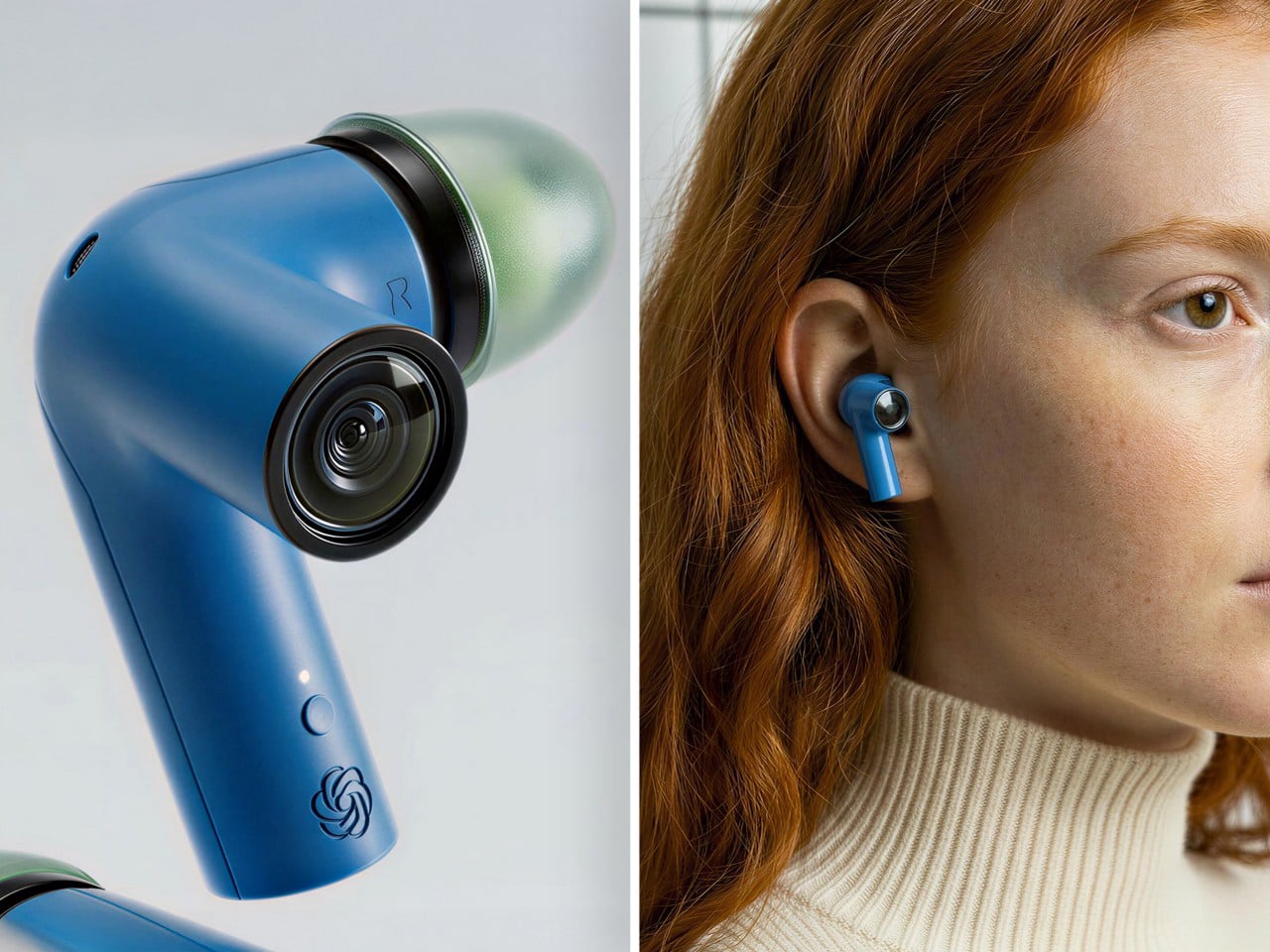
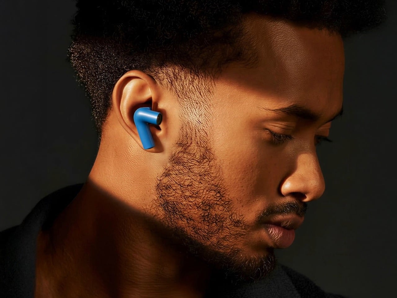
Wearable AI has spent the last two years stuck in an awkward phase. Smart pins looked strange. Pendant cameras felt forced. Smart glasses screamed, “I am recording.” This concept hides cameras inside TWS earbud stems, positioned near the natural line of sight, and pairs them with ChatGPT to create a visual AI assistant that lives entirely in the ears. No screen. No conspicuous hardware. Just a familiar form factor doing something new.
For digital nomads navigating foreign cities, the use cases are immediate. The earbuds can read menus in unfamiliar languages, interpret street signs, describe scenes, and guide navigation through voice alone, all without pulling a phone from a pocket. The social advantage is that earbuds are already normalized. People wear them everywhere without drawing attention, which removes the friction of face-mounted cameras that make conversations uncomfortable. Voice interaction keeps hands free for luggage, laptops, or coffee. The AI processes visual input in real time and responds through audio, creating an assistive loop that does not require staring at a screen. This is a concept at this stage, not a shipping product, but it represents the direction wearable AI is heading. For nomads who spend their weeks moving between cities and languages, an AI assistant that sees what the wearer sees and speaks directly into the ear could replace a handful of translation apps, navigation tools, and accessibility aids with a single pair of earbuds.
What we like
Familiar earbud form factor avoids the social awkwardness of face-mounted cameras, making it usable in meetings, cafes, and public spaces without drawing stares.
Hands-free visual AI assistance for translation, navigation, and scene description addresses real daily friction for nomads moving between countries.
What we dislike
Concept status means no confirmed specs, battery life, or pricing, so the product’s real-world viability is unproven.
Privacy concerns around always-available cameras in earbud stems will be unavoidable once production models enter public spaces.
4. HubKey Gen2
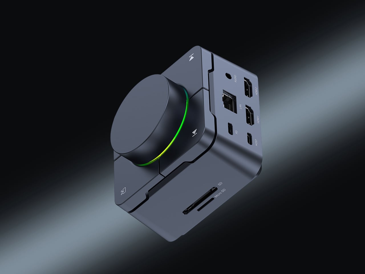
The typical nomad desk involves a laptop teetering on a cafe table surrounded by a small constellation of dongles, adapters, and cables fighting for two USB-C ports. HubKey Gen2 consolidates that mess into a single compact cube. It is an 11-in-1 USB-C hub with dual HDMI ports (both 4K at 60Hz), two USB-A 3.1 ports, one USB-C 3.1 port, SD and TF card readers, a 2.5 Gbps Ethernet jack, a 3.5mm audio port, and a 100W USB-C PD charging port. One cable from the cube to the laptop brings everything online.
What separates it from standard hubs is the top panel. Five programmable shortcut keys and a central control knob sit above the ports, turning the hub into a mini control surface. Volume, mute, screen lock, screenshot, display off: tasks that normally require keyboard shortcuts or menu diving can be done with a single tap or twist. The driver system offers 170 presets with full macro customization across Windows, macOS, Linux, and Steam Deck. At 7 x 7 x 3 cm, the cube disappears into a laptop bag pocket. For photographers and videographers constantly offloading cards while driving external displays, this removes the need for three or four separate adapters.
What we like
Dual 4K/60Hz HDMI output from a single hub means a nomad can build a two-monitor setup at any co-working space without carrying separate adapters for each display.
Programmable shortcut keys and a physical knob add hands-on control that standard hubs do not offer, cutting repetitive menu navigation during editing and video calls.
What we dislike
The compact form factor means ports are tightly packed along the edges, which can cause thicker cables or drives to crowd each other.
5. OrigamiSwift Mouse
Trackpads work fine until they do not. Precise selections in spreadsheets, long editing sessions, and detailed design work all benefit from a real mouse, but carrying a conventional one eats bag space that nomads cannot spare. OrigamiSwift solves this by folding a full-sized Bluetooth mouse down to a 4.5mm-thick slab that weighs just 40 grams (1.41 ounces). Magnetic snaps lock the two sides together in under half a second, and the mouse powers on automatically when assembled. Fold it flat again, and it slides into a laptop sleeve or even a shirt pocket.
Under the origami-inspired exterior sits a 4000 DPI HD infrared sensor capable of tracking at up to 30 inches per second, paired with Bluetooth 5.2 for stable, dongle-free connectivity across Mac, Windows, Android, and iPadOS. A 500mAh lithium polymer battery charges via USB-C and lasts up to three months on a single charge, which effectively removes battery anxiety from the equation. The vegan leather skin adds grip and surface compatibility, while mechanical click switches on the left and right buttons provide tactile feedback. A touch-sensitive scroll area replaces a physical wheel, which keeps the profile flat. At around $49 to $69, depending on the retailer, it sits in a reasonable range for a travel peripheral that genuinely disappears when not in use. The trade-off is that it is not built for gaming or high-speed precision work, but for the spreadsheet-to-email-to-design workflow that defines most nomad days; it handles everything a full-sized mouse would.
Folds to 4.5mm flat and weighs 40 grams, making it the most packable full-sized mouse option available for nomads who cannot sacrifice bag space.
Three-month battery life on a single USB-C charge means one less device to worry about charging between cities and time zones.
What we dislike
The touch scroll area, replacing a physical scroll wheel, takes adjustment, and some users report that it lacks the tactile precision of a traditional wheel during fast scrolling.
Not suitable for gaming or tasks demanding sub-millisecond response times, so users with hybrid work-and-play setups will still need a second mouse.
What the nomad bag looks like now
These five gadgets share a design philosophy that would have seemed niche a few years ago: they treat portability not as a marketing checkbox but as the primary constraint around which everything else is engineered. A hub that replaces four dongles. A keyboard that is also a 4K monitor. A mouse that folds into a credit card sleeve. A power bank that communicates through light. Earbuds that double as a visual AI assistant. Each one subtracts something from the bag while adding a capability that used to require a dedicated device.
The shift is worth paying attention to. Remote work hardware is no longer about miniaturizing desk products and hoping they survive a carry-on. The best nomad gear now starts from the constraints of movement, weight, and setup speed, then works backward to figure out how much functionality can fit inside those limits. Two of these products are concepts, two are crowdfunding, and one is shipping today. That ratio will flip fast. The bag is getting lighter, the workspace is getting more capable, and the gap between a fixed office and a cafe table keeps narrowing.
The sticky note has outlasted every productivity trend that was supposed to replace it, and there’s a reason for that. Writing something down by hand, right when it occurs to you, is still the fastest way to keep an idea from slipping away. Digital apps, meanwhile, have the opposite problem: the moment you unlock your phone to jot something down, you’re one notification away from forgetting why you opened it.
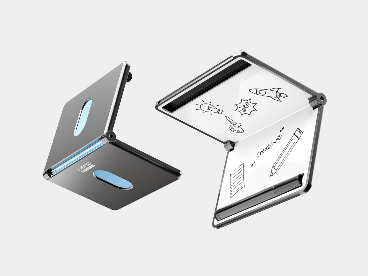
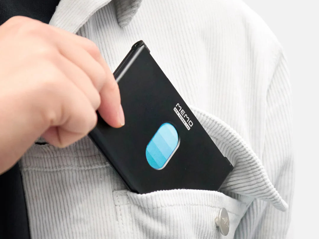
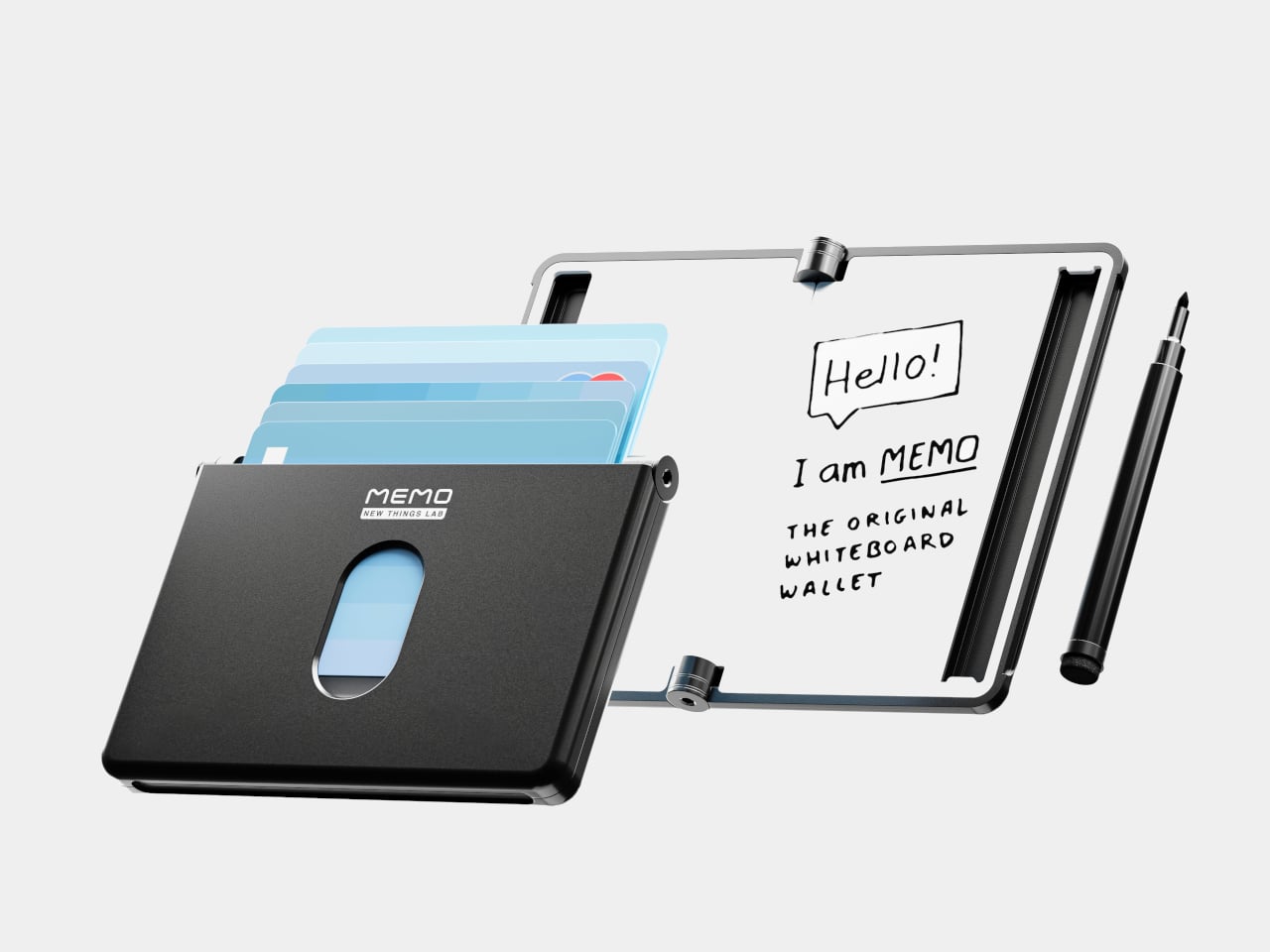
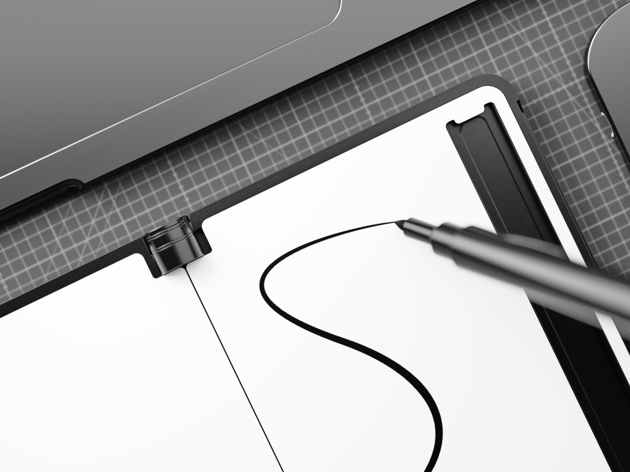
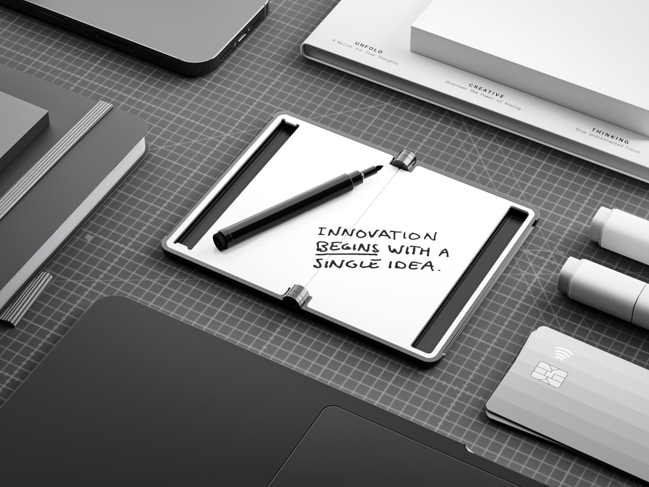
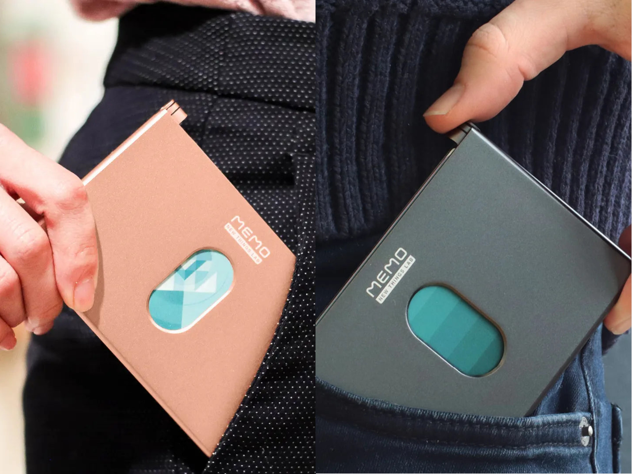
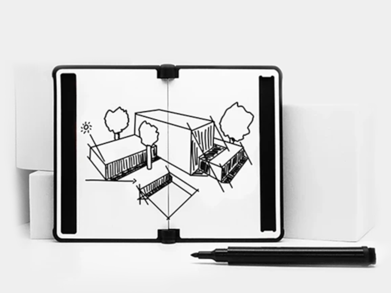
New Things Lab, a design studio from the Netherlands, built a direct answer to that problem. The MEMO Whiteboard Wallet is a precision-machined aluminum card holder with a dry-erase surface built directly into its face, giving you a pocket-sized board that’s always ready when a thought strikes. The concept earned quite a following from people who immediately understood what it was for.
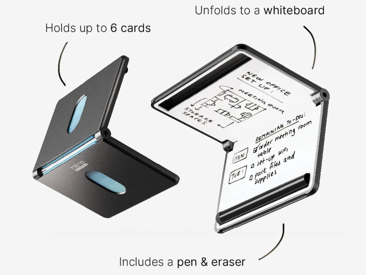
The whiteboard spans 6 inches diagonally, just over A7 in size, and it’s coated with a smooth, heat-cured paint that cleans up without ghosting. It’s large enough to be genuinely useful but slim enough not to add awkward bulk. On a given day, you might use it to jot down a measurement, scribble a password for a guest, or keep a short list of things you’d otherwise forget by lunch.
Writing on the surface is handled by an included 0.8mm fine-point pen that stores in a dedicated slot built right into the wallet’s frame, so it’s always within reach when you need it. Flip the pen around, and there’s an eraser on the other end, making the MEMO genuinely self-contained. You’re not hunting for something to wipe the board with, and there’s no spare piece you’d misplace in a bag.
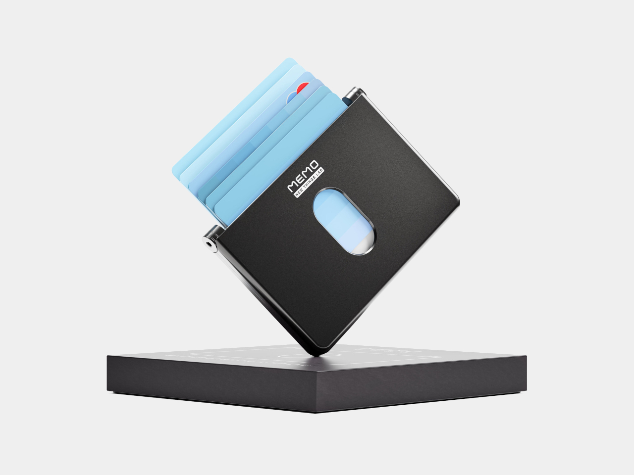
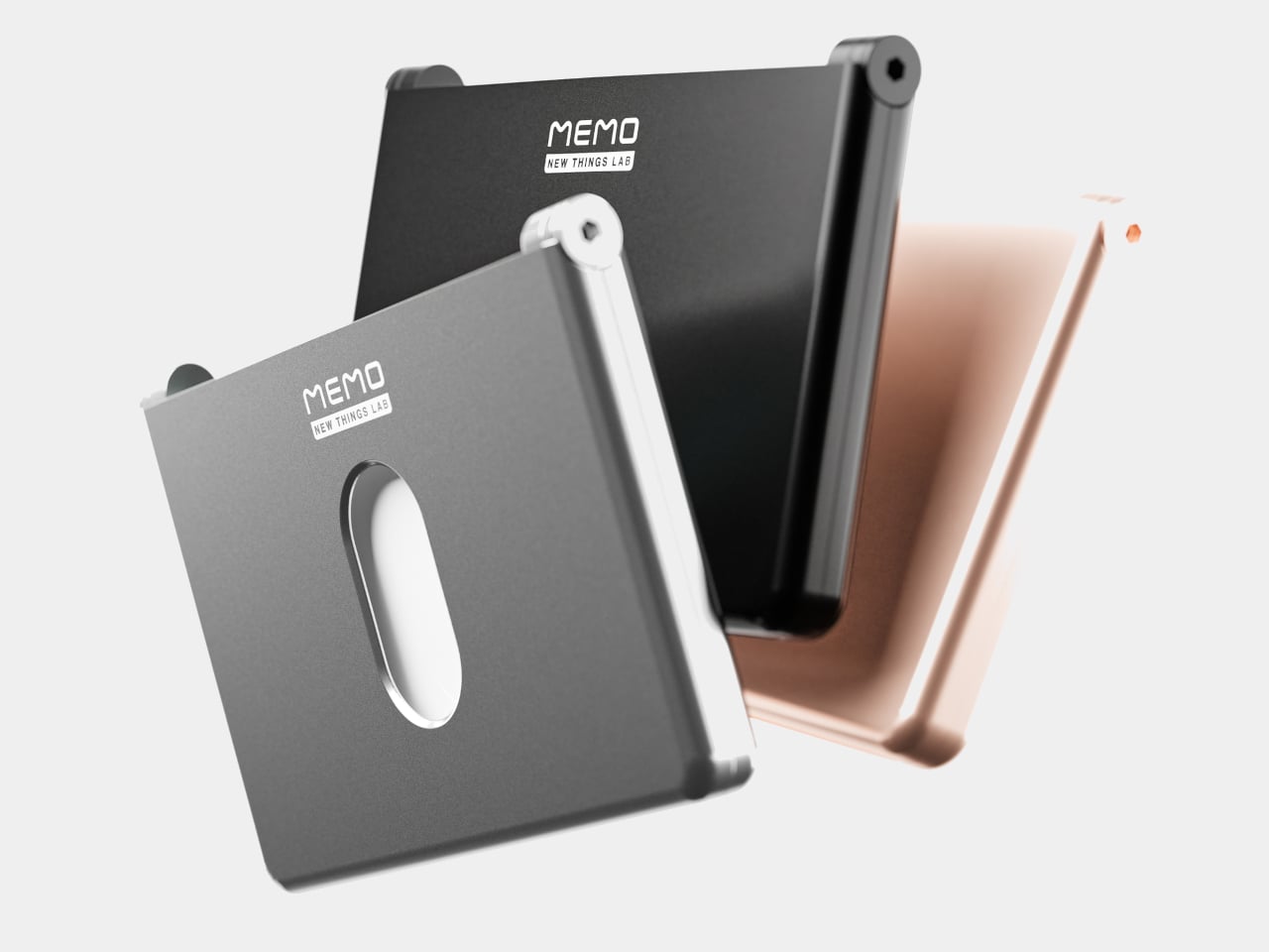
On the other side of the MEMO is the actual card-carrying section, with room for up to six standard cards and a magnetic closure that keeps everything neatly shut. The body is milled from 6063 aluminum, giving it a solid, premium feel without adding unnecessary weight or thickness. That same metal shell also blocks RFID signals, protecting your card data from electronic skimming without needing any additional sleeve or pouch.
The MEMO comes in Charcoal Black, Slate Gray, and Gilded Rose as the standard colorways, with Revision Red and Airmail Blue available as limited editions. All five options lean toward the restrained end of the color spectrum, which suits the product well. There’s also an environmental case to be made here. Every note wiped from the MEMO’s surface is a sticky note that didn’t find its way into the trash, and those savings do compound over time.
The FIFA World Cup, the world’s biggest sporting event, is just a few months away. While there are some issues cropping up in the host countries (specifically the US and Mexico; Canada seems to be doing just fine), brand tie-ups are in full swing with global partners such as Adidas, Coca-Cola, Visa, Qatar Airways, Hyundai-Kia, etc.
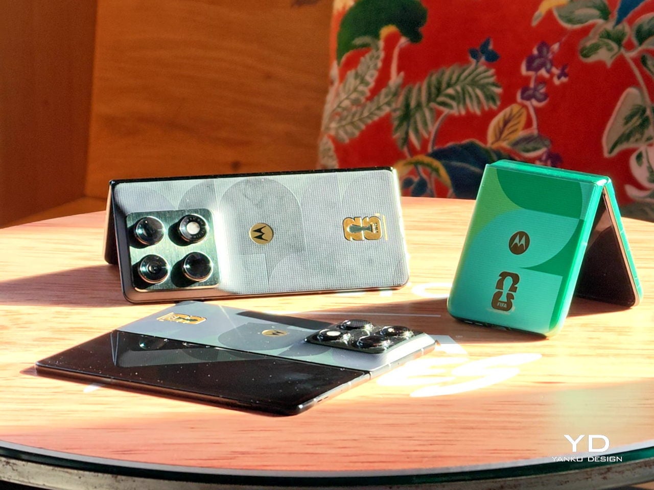
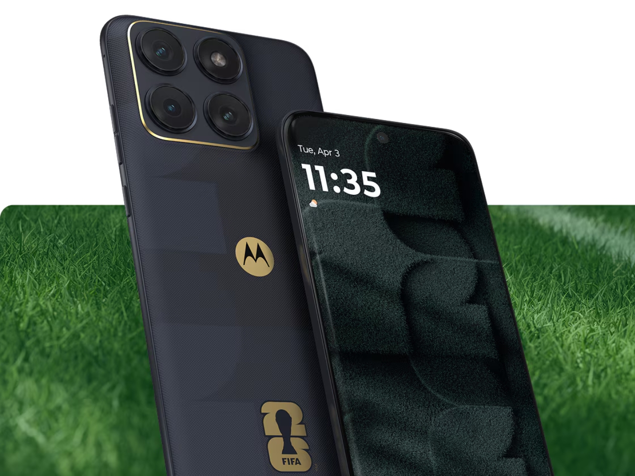
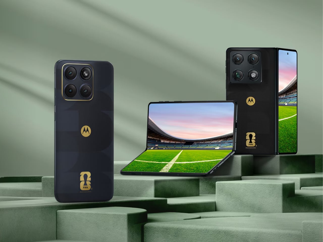
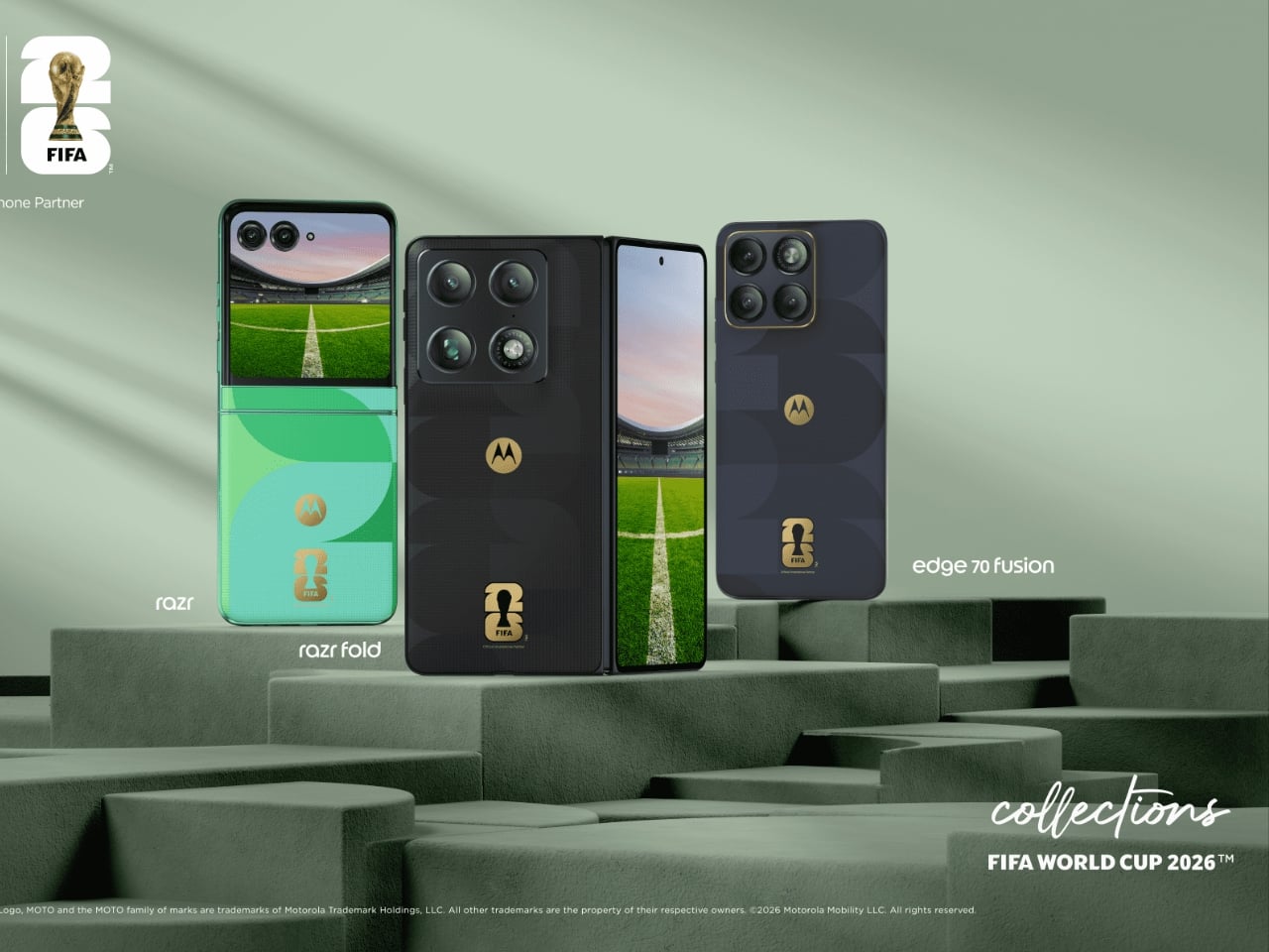
Motorola just announced two new additions to its FIFA World Cup 26 Collection, and they are exactly the kind of phones that make you stop scrolling. The Razr Fold and Edge 70 Fusion now have limited edition versions draped in football-inspired design and 24K gold accents, and whether you follow the sport or not, the craftsmanship here is genuinely worth paying attention to.
Designer: Motorola
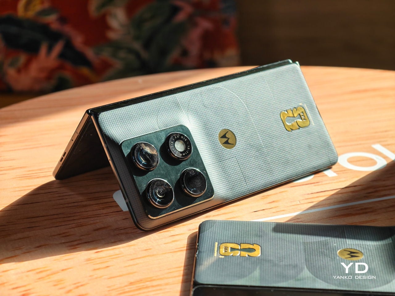
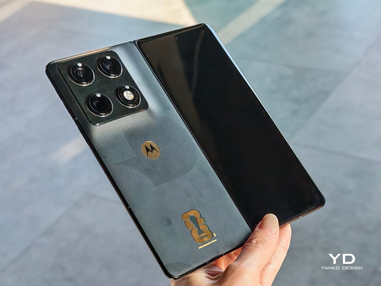
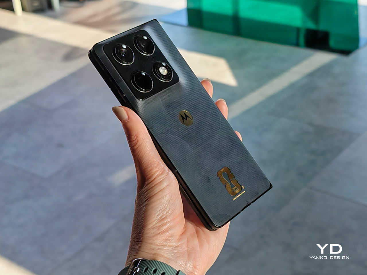
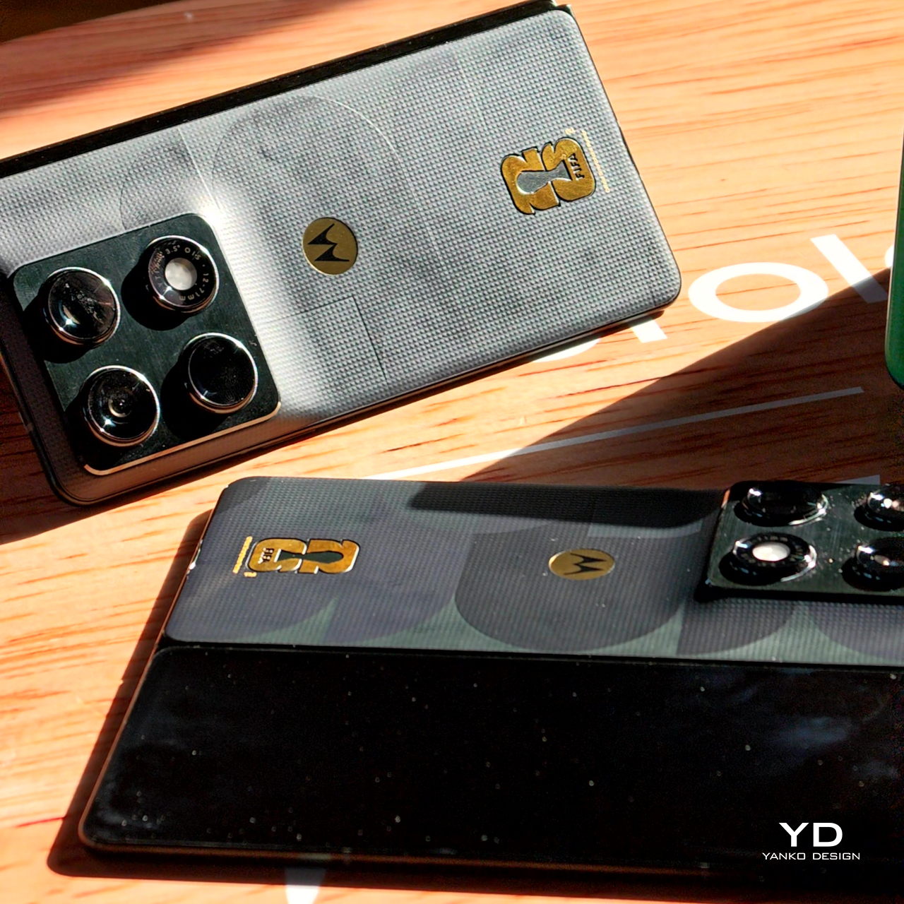
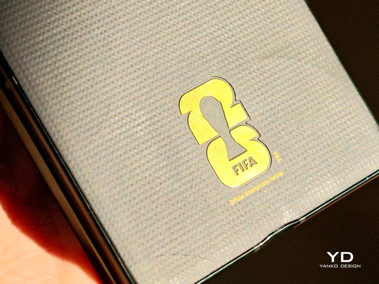
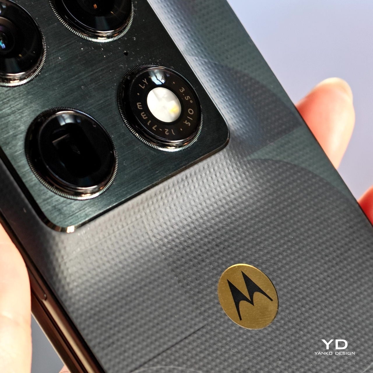
Let me start with the big one. The Razr Fold FIFA World Cup 26 Edition is Motorola’s first book-style foldable, and giving it a limited-edition treatment this early is a bold move. Motorola could have slapped a logo on the back and called it a day, but instead they went further. The back cover features a textured raised-dot pattern pulled directly from the surface of a football, giving the device a tactile quality that you actually feel in your hand. Add the glossy “26” typography cutting through that texture, and the whole thing has a collectible quality that feels deliberate rather than decorative.
The 24K gold-plated FIFA and Motorola logos push it a step further into trophy territory. Under the hood, the Razr Fold runs on a Snapdragon 8 Gen 5 chip, carries a 6,000mAh battery, and sports an 8.1-inch internal display alongside a 6.6-inch cover screen, with three 50-megapixel cameras on the back. As a debut foldable from Motorola in the book-fold format, it’s already a statement device. The FIFA edition makes that statement louder.
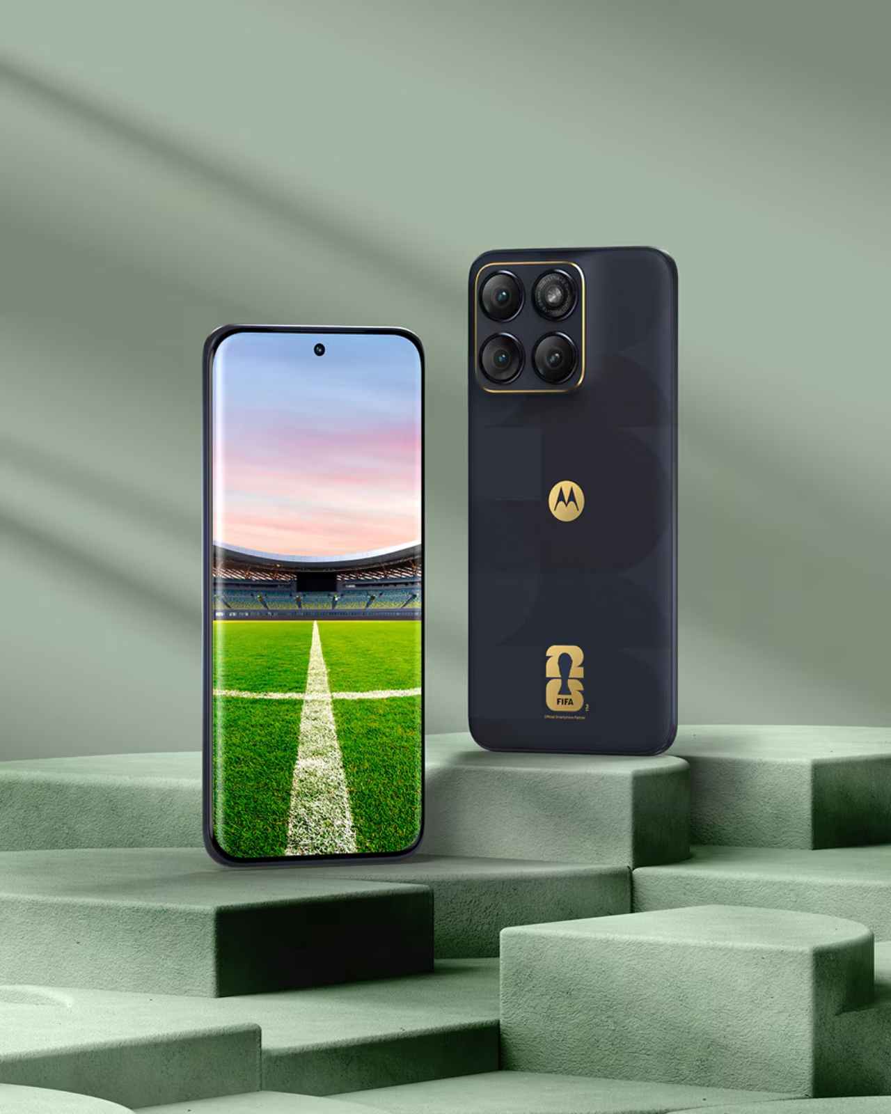
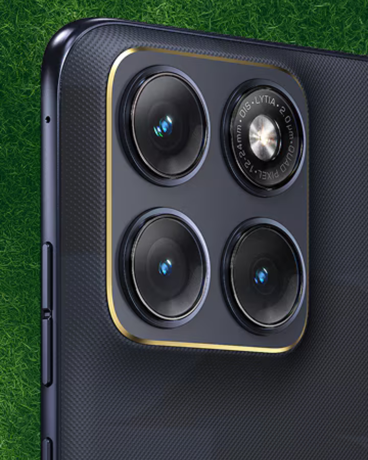
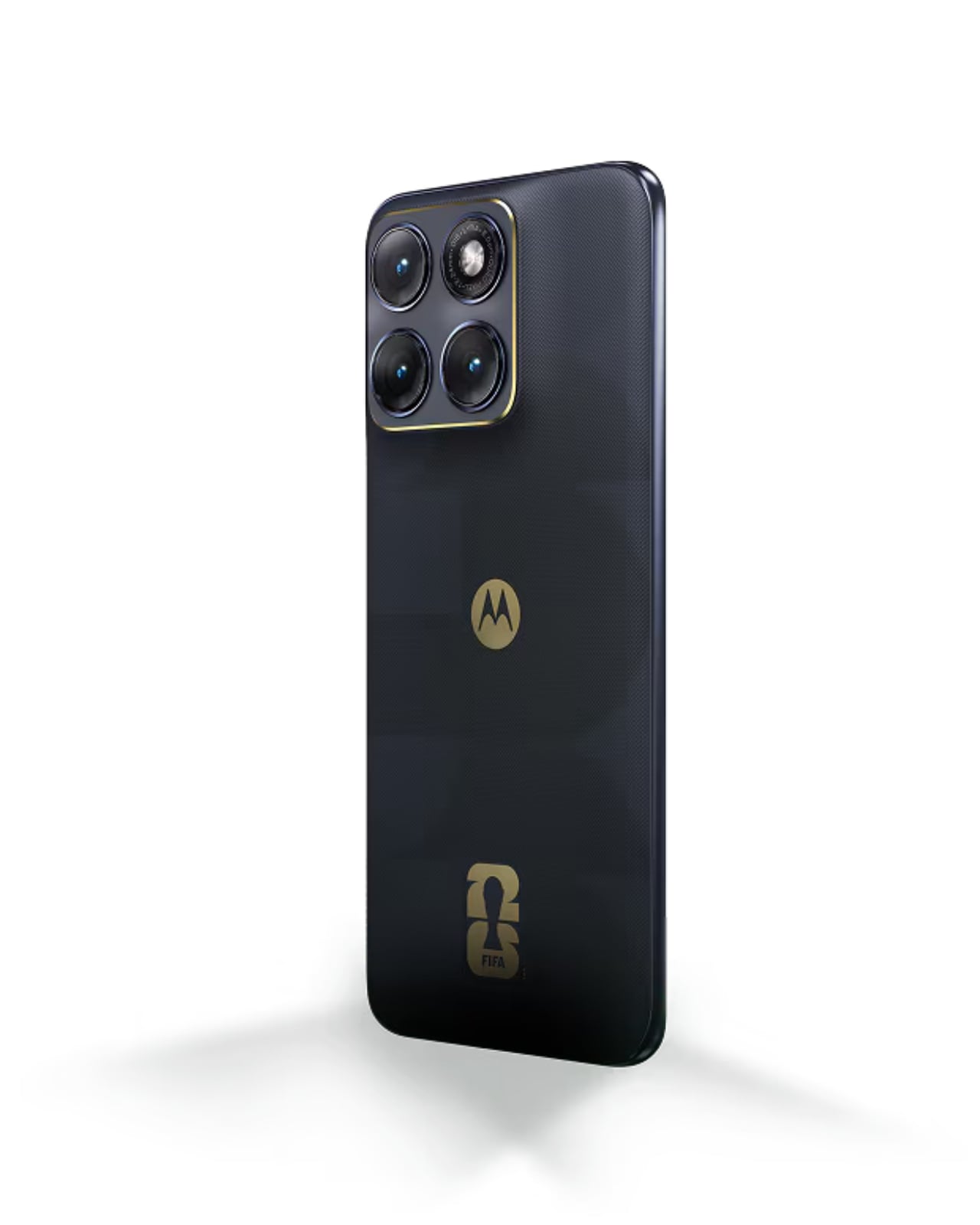
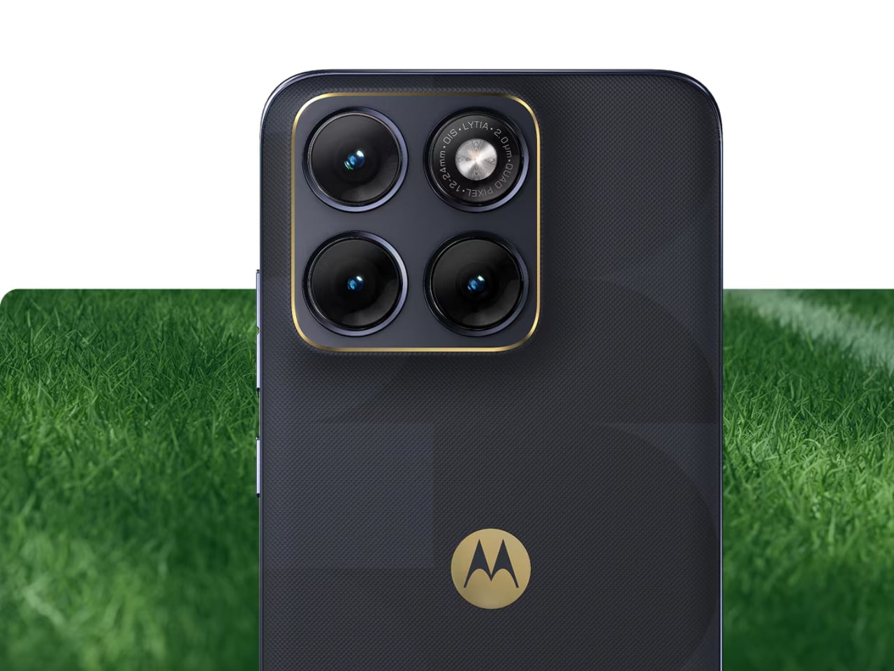
The Edge 70 Fusion FIFA World Cup 26 Edition takes a different approach, and it might actually be the more interesting design story of the two. Instead of the raised-dot texture, Motorola gave the Edge 70 Fusion a leather-inspired finish that replicates the iconic feel of a football’s surface. It’s a detail that sounds subtle but lands with real impact when you see it, because it turns an everyday mid-range phone into something that clearly belongs to a collection. The 24K gold accents extend around the camera island’s perimeter, which keeps the premium feel consistent without overwhelming the design. The phone runs on a Snapdragon 7s Gen 3 chip with a 6.8-inch 144Hz AMOLED display protected by Gorilla Glass 7i, and a 5,200mAh battery. As a mid-range device, the Edge 70 Fusion positions this collection as accessible, not just aspirational, which I think is the right call.
Both phones join the previously released Motorola Razr FIFA World Cup 26 Edition, forming what Motorola is calling the FIFA World Cup 26 Collection under its Collections by Motorola series. Announced at MWC 2026, the collection reflects Motorola’s role as the Official Smartphone Partner of FIFA World Cup 2026, which explains the depth of investment here. This isn’t a one-off co-branded phone. It’s a full lineup with real design thinking behind it.
Sport and technology collaborations can go either way. At their worst, they feel like a badge-slapping exercise where a logo gets placed on an otherwise unchanged product and the price goes up anyway. At their best, they create objects that hold cultural weight beyond their function. What Motorola has done here leans closer to the latter. The texture choices are thematic without being gimmicky. The gold accents are restrained enough to read as premium rather than flashy. And the fact that the design is carried across two very different form factors, a flagship foldable and a mid-range slab, shows that this is a cohesive collection, not just two isolated product moments.
Whether you’re a football fan who wants your phone to carry some of that match-day energy, or simply someone who appreciates when tech and design intersect in a meaningful way, the FIFA World Cup 26 Collection makes a case for itself. The Razr Fold and Edge 70 Fusion FIFA editions are set to arrive in select markets next month. If these end up being the kind of phones that get displayed on a shelf rather than used as daily drivers, I genuinely wouldn’t blame anyone for that decision either.
There’s a specific kind of buyer’s remorse that comes with midrange phones. You get them home, take your first few photos in decent light, and think you made the right call. Then comes the dinner, the concert, the sunset that lasted about 45 seconds, and suddenly you’re squinting at a muddy, blown-out mess, wondering where your hard-earned money went. The hardware looked fine on the spec sheet. It just didn’t survive contact with real life.
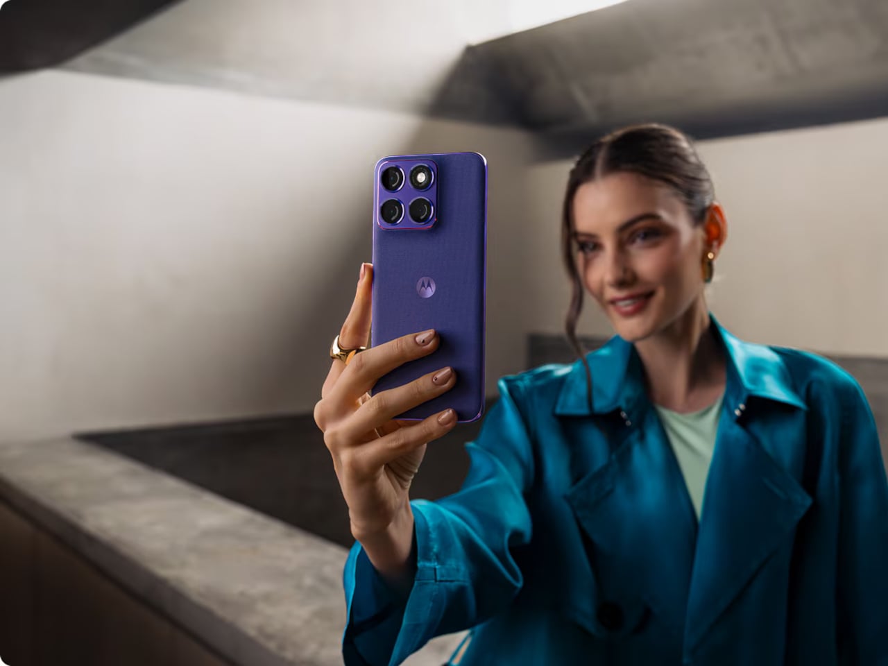
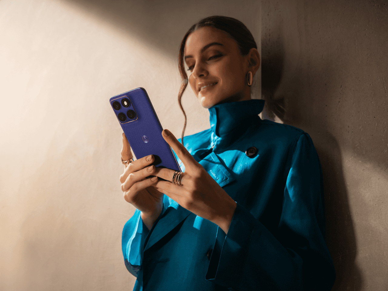
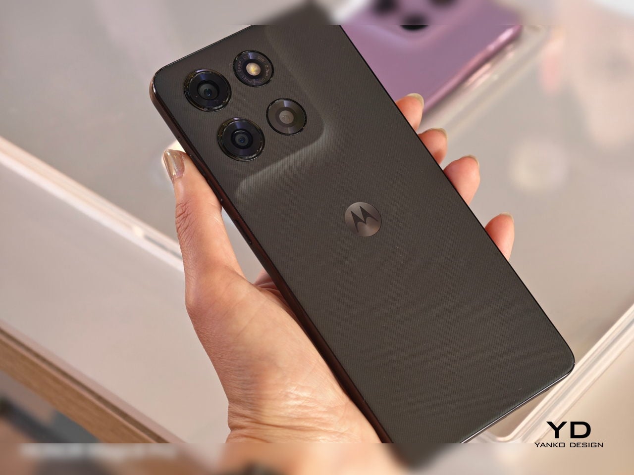
The motorola edge 70 fusion is Motorola’s attempt to close that gap without asking you to spend flagship money. It’s a midrange phone with a few genuinely noteworthy credentials, a handful of firsts, and, depending on which version you buy, a battery that could outlast your weekend. Whether the whole package adds up is worth thinking through carefully.
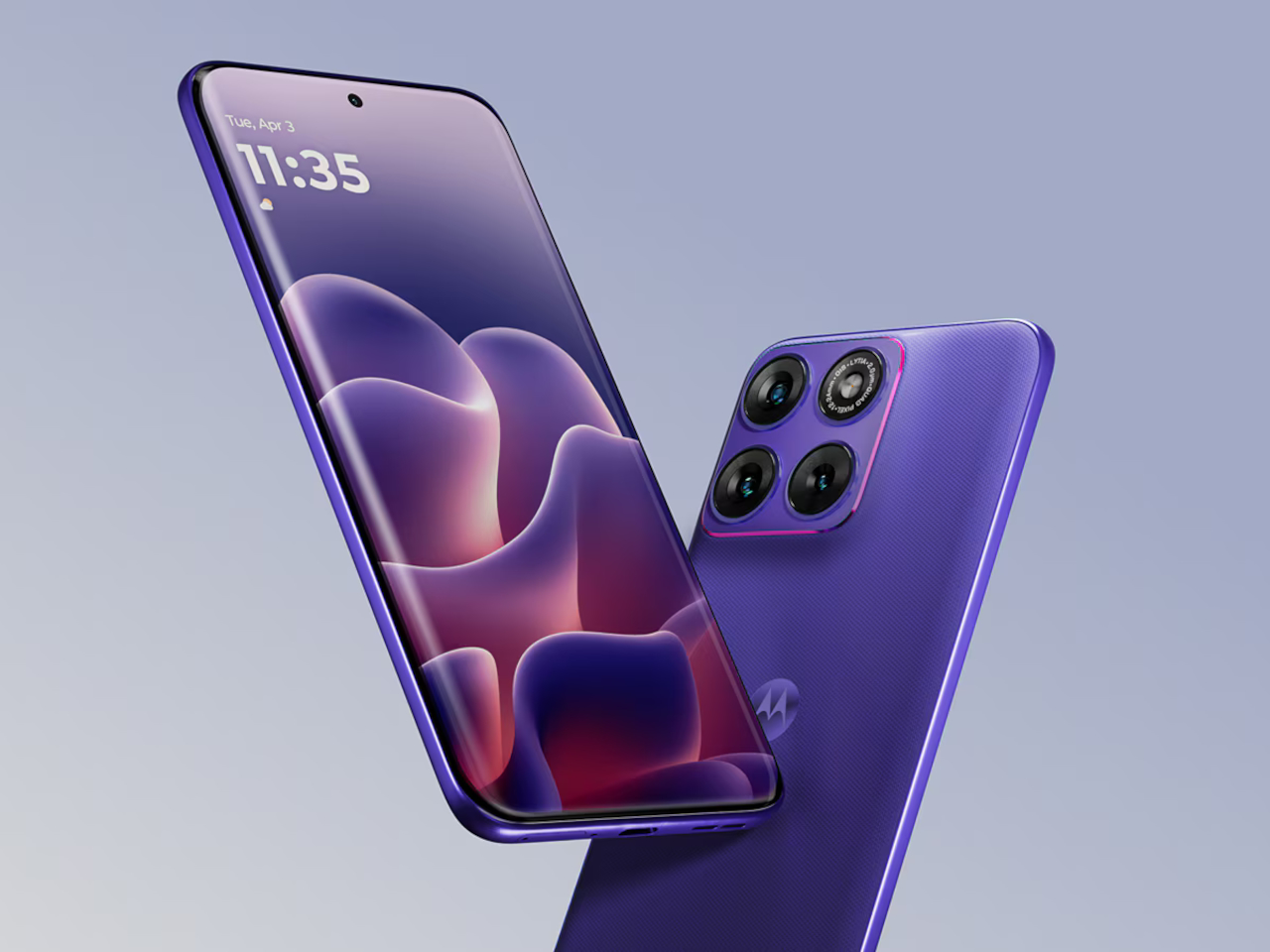
The headline is the camera, specifically the 50 MP Sony LYTIA 710 sensor on the main shooter. This is the first time that particular sensor has appeared in any smartphone, and Sony’s LYTIA line is built around low-light clarity and accurate color reproduction. Optical image stabilization keeps things sharp when your hands aren’t, and moto ai’s Photo Enhancement Engine adds a Signature Style feature that applies consistent color grading across your shots. A 13 MP ultrawide covers the 122° wide-angle and macro territory, and the 32 MP front camera shoots 4K video, which still feels like a meaningful spec at this price tier.
The display is where the edge 70 fusion picks up another first. It’s touted to be the world’s first 144 Hz quad-curved screen with Pantone Validated color certification, spanning 6.78 inches of Extreme AMOLED at 1.5K Super HD resolution with a peak brightness of 5,200 nits. That brightness number is the practical one. It means the screen stays legible in direct sunlight, something that budget and midrange panels have never quite solved. The quad-curve design, where the glass flows continuously from front to back without hard edges, adds a physical refinement that usually costs considerably more.
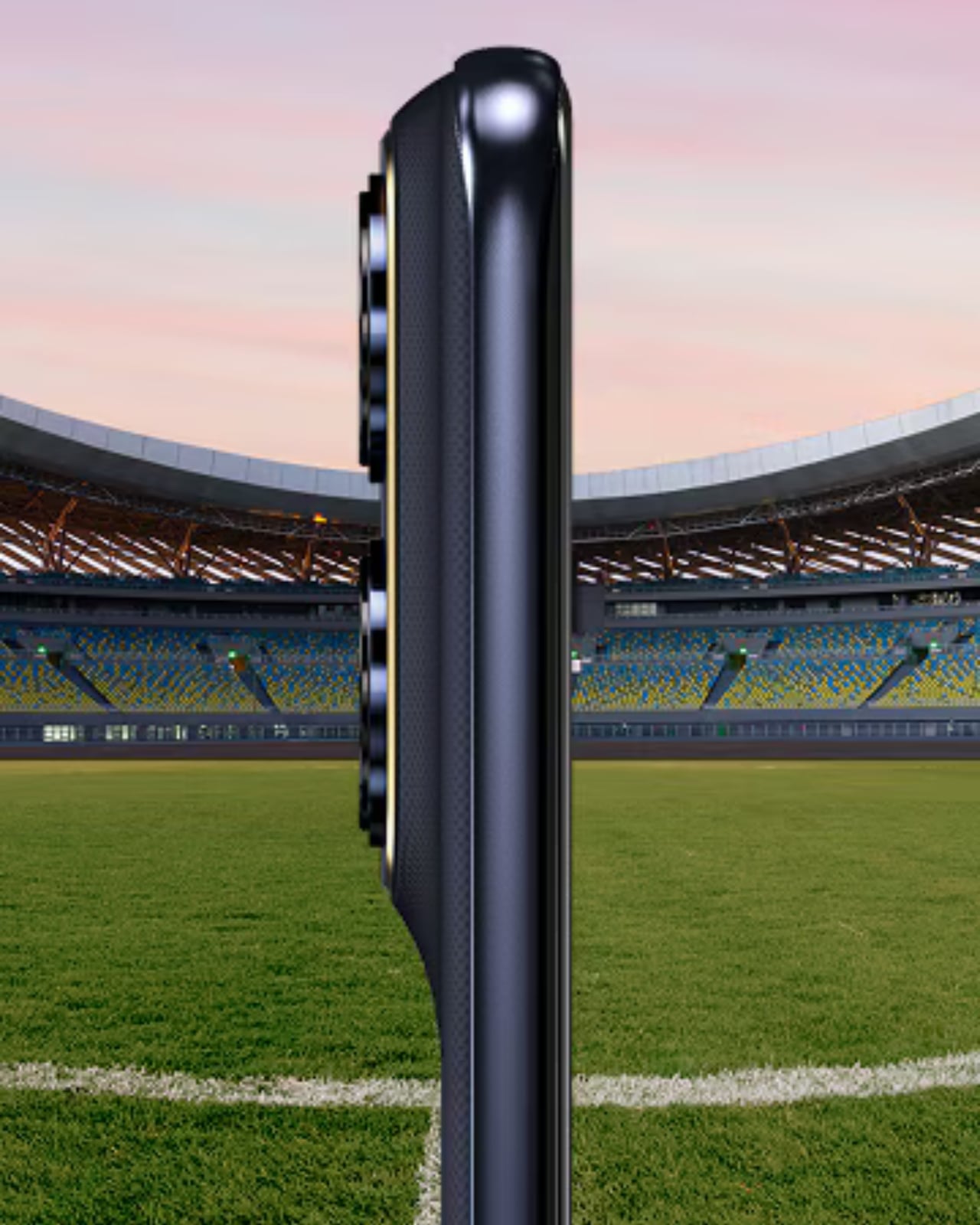
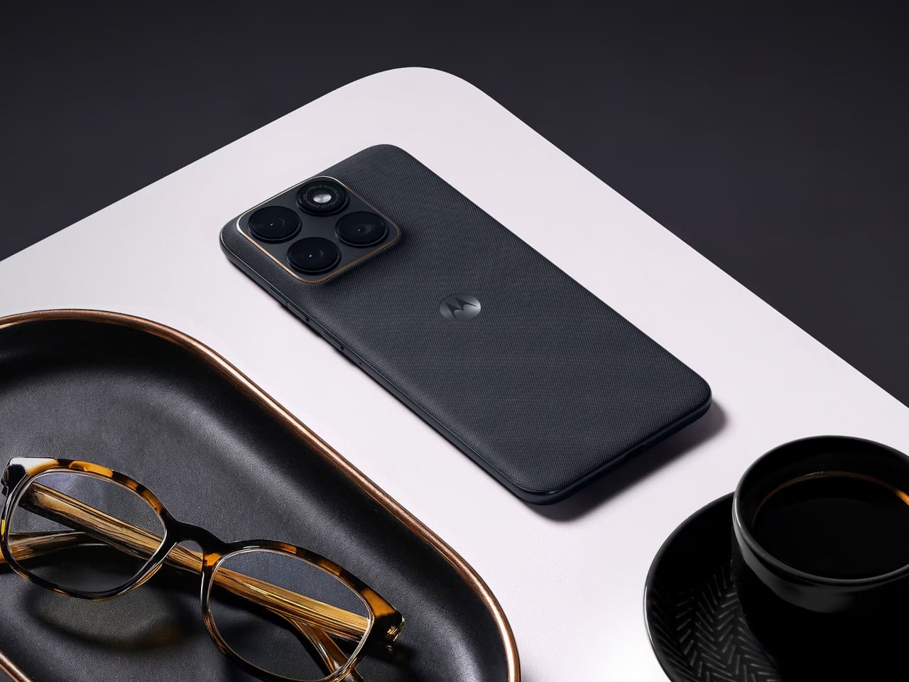
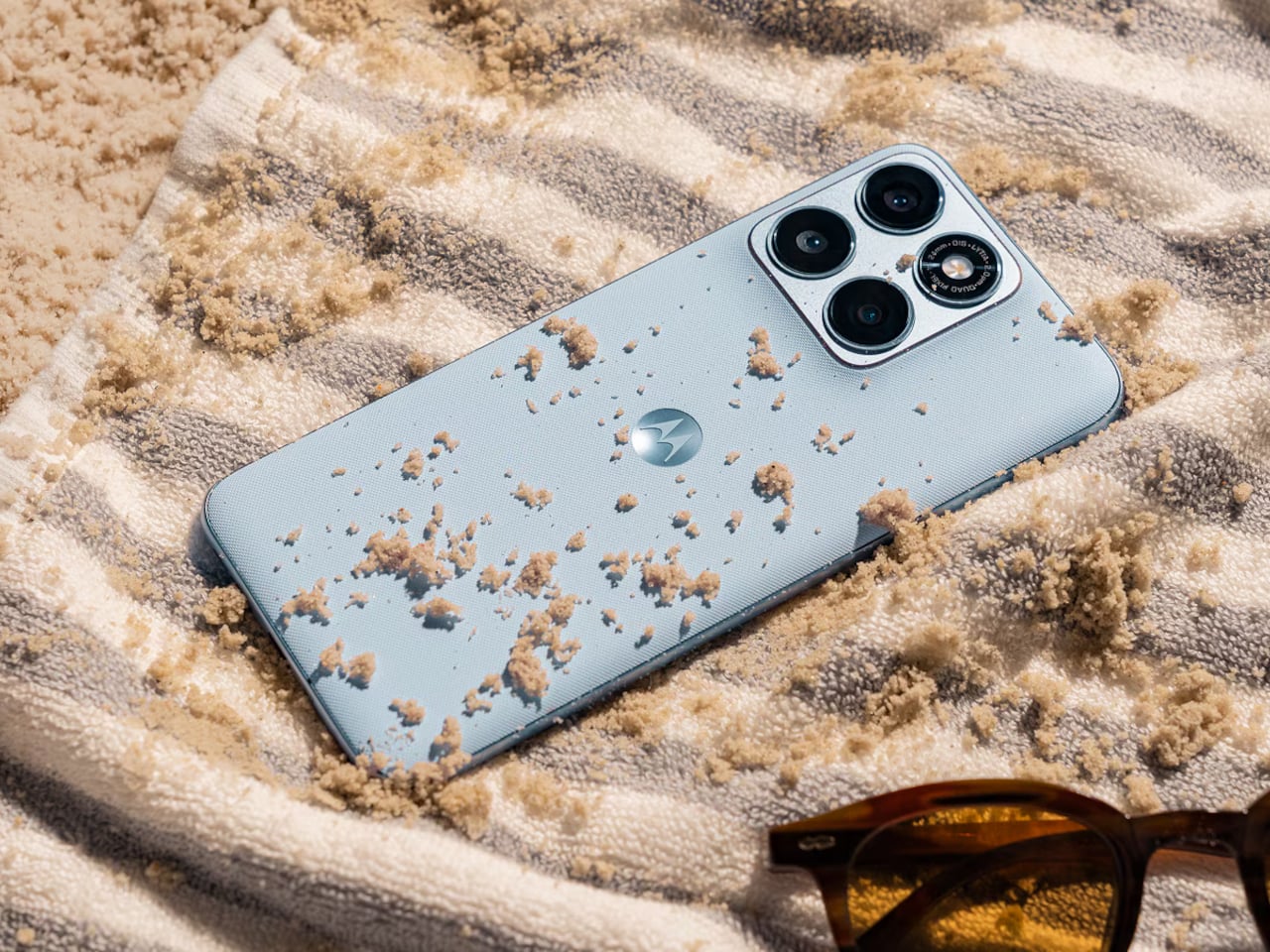
Motorola went further than most midrange phones dare to go on the durability side. The edge 70 fusion carries both IP68 and IP69 ratings, meaning it handles submersion up to 1.5 meters and high-pressure water jets. MIL-STD-810H certification covers the drop and temperature extremes, and Corning Gorilla Glass 7i protects the front. A small but useful detail called Water Touch keeps the touchscreen responsive with wet fingers. The back uses textures inspired by nylon and linen, materials that feel warmer in hand than the cold-glass backs that have become the default on most phones.
There are two battery variants, and the difference between them is significant. The standard model has a 5,200 mAh cell rated for up to 39 hours of mixed use. The second variant ships with a 7,000 mAh silicon-carbon battery, a chemistry that fits more energy into less physical space, rated for up to 50 hours. Both versions charge at 68W via TurboPower, which Motorola says delivers enough power for a full day in just 10 minutes of charging. For anyone who has ever started a long travel day at 34%, that’s not a trivial promise.
The Snapdragon 7s Gen 3 handles processing, paired with up to 8 GB of RAM and a RAM Boost feature for smoother multitasking, with up to 256 GB of internal storage. It’s a capable mid-tier chipset, honest about where it sits. Motorola is guaranteeing three Android OS upgrades, and moto ai brings in features like Next Move for contextual on-screen assistance and Playlist Studio for AI-generated playlists. Google Gemini integration rounds out the software story.
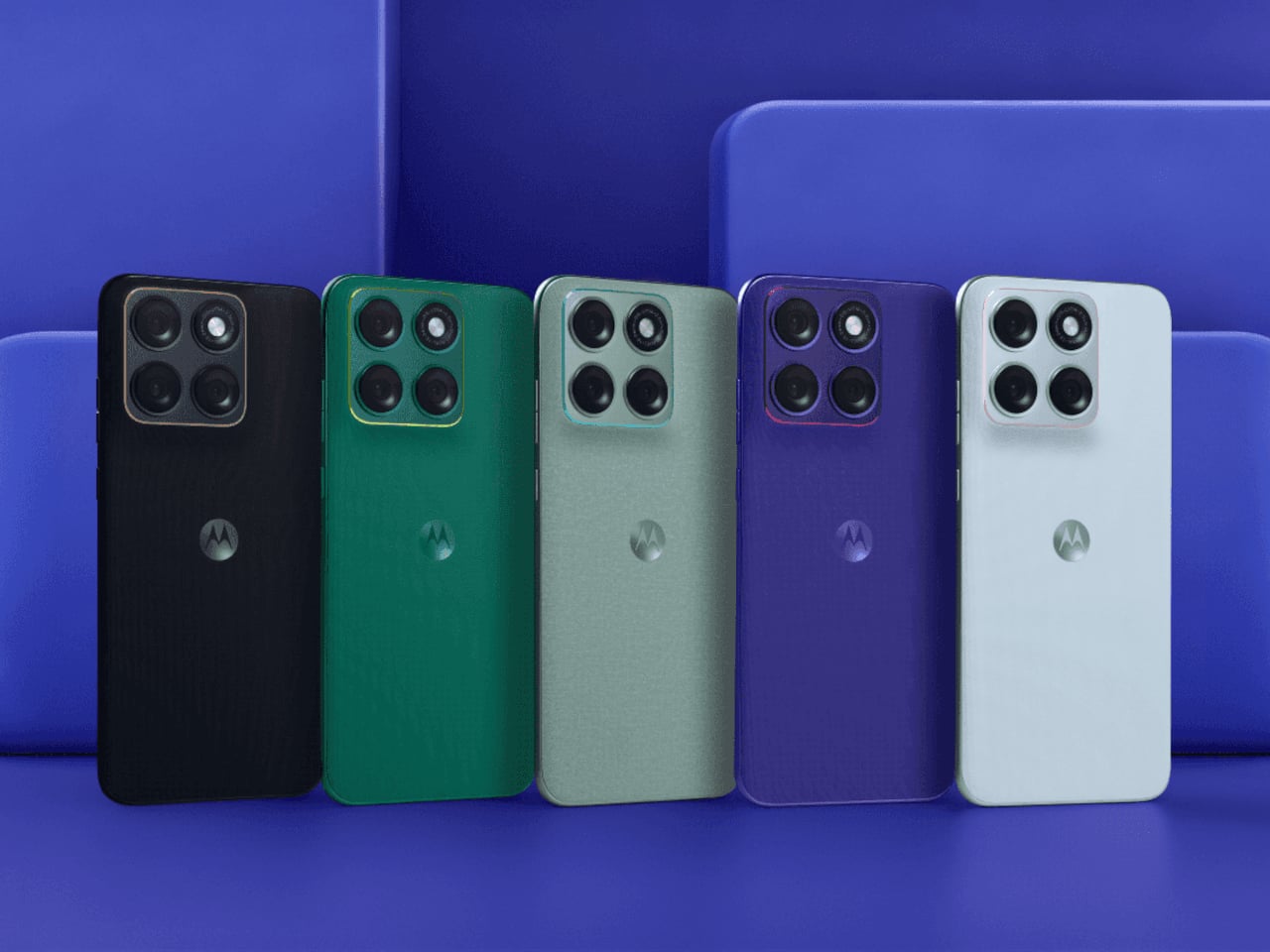
The edge 70 fusion comes in five Pantone-curated colorways, including Orient Blue, Silhouette, Sporting Green, and Country Air, each with matching colored accents around the camera lenses. It’s a detail that suggests the design team was thinking about the phone as something you carry, not just something you use. The real question the edge 70 fusion leaves open is a broader one: at what point does the gap between midrange and flagship stop being about capability and start being about perception?
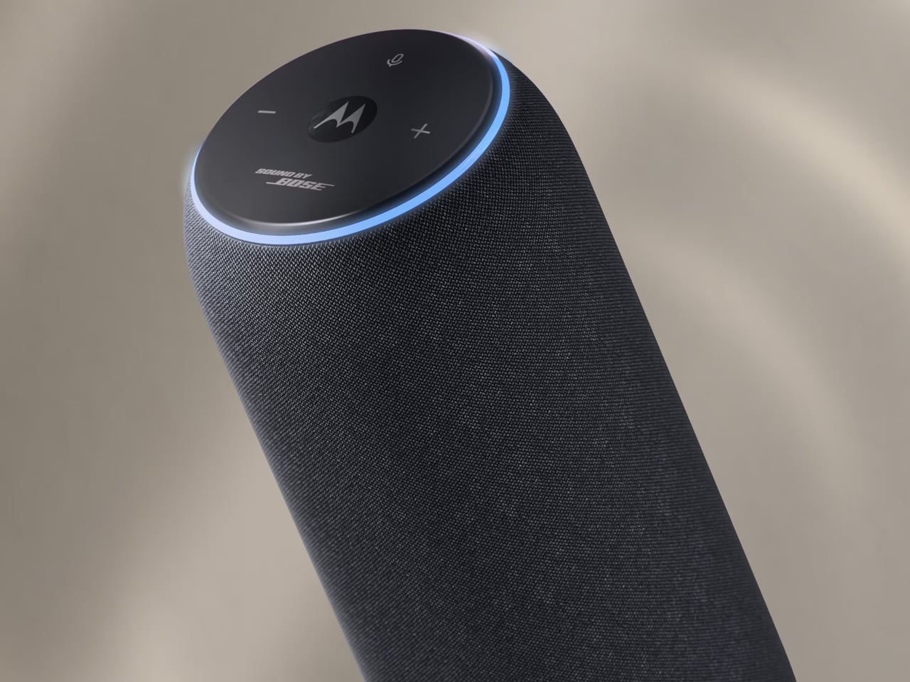
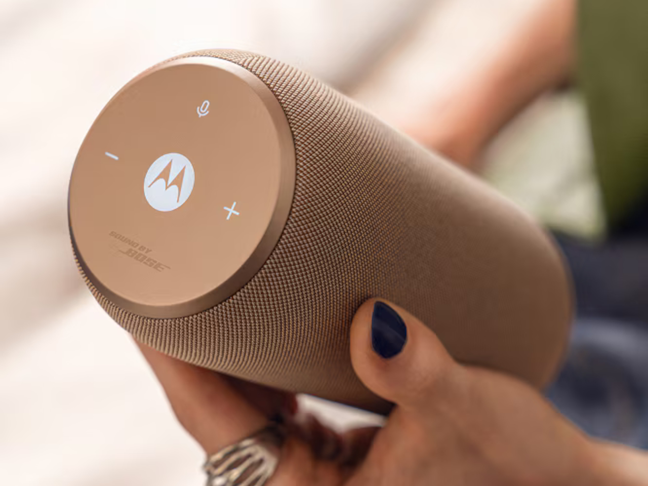
Bluetooth speakers have largely solved the portability problem and mostly failed the living room one. They tend to look like gym equipment that wandered indoors, sit awkwardly on a shelf, and demand a ritual of reconnecting whenever you walk back in the door. The moto sound flow, Motorola’s first portable speaker and the newest addition to the moto things lineup, takes a different angle on all three of those frustrations.
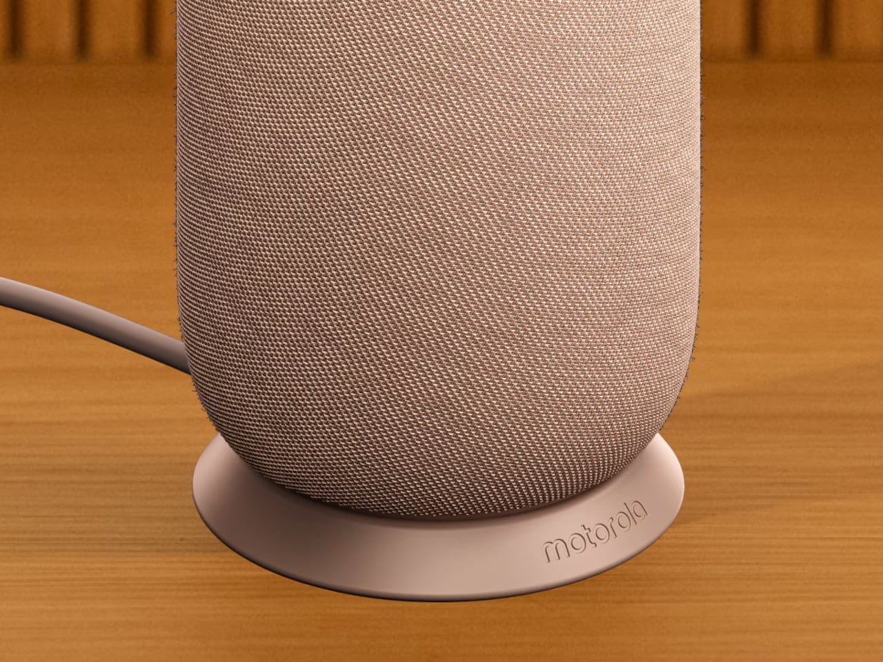
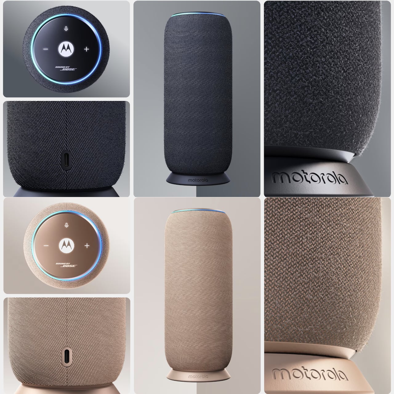
The design makes the first impression. Two Pantone-curated colorways, Carbon and Warm Taupe, wrap the cylindrical body in a twill-textured fabric finish that reads more like a decorative object than consumer electronics. It’s the kind of thing you’d leave on the coffee table without thinking twice, which is precisely the point. Motorola calls it “crafted to be seen and tuned to be heard,” and for once, the marketing copy isn’t entirely hollow.
The hardware inside includes a dedicated woofer, tweeter, and dual passive radiators, producing a 30W output tuned through Motorola’s Sound by Bose partnership. That collaboration, which also appears in the razr fold, applies Bose’s EQ expertise for balanced, detailed sound rather than the bass-heavy thump most compact speakers default to. A companion app also lets you adjust the equalizer to your own taste, available on both Android and iOS.
The moto sound flow also distinguishes itself in terms of connectivity. Beyond Wi-Fi, Bluetooth 5, AirPlay, Google Cast, and Spotify Connect, the speaker uses UWB technology to do something more interesting. Walk close to it with a compatible phone, and it picks up your audio automatically, no tapping required. Run two units together, and Room Shift reroutes music to whichever speaker is nearest, while Dynamic Stereo adjusts left and right channels based on where your phone sits between them.
Those UWB features do carry a fine print worth reading. They require a compatible Android 9 or later phone with UWB enabled, so iPhones and older Android devices don’t qualify. The speaker still works over Wi-Fi and Bluetooth for everyone else, but Room Shift and Dynamic Stereo, the parts that make the pitch most compelling, are locked behind a hardware requirement many buyers won’t check before purchase.
The 6,000 mAh battery covers long listening sessions, and the IP67 rating makes outdoor or poolside use fair game. A dock handles charging instead of a cable, which keeps things tidy. Four built-in microphones manage speakerphone calls. Starting at €199, the moto sound flow enters a competitive space where JBL, Sonos, and Bose already have devoted followings, each with years of speaker-only focus behind them.
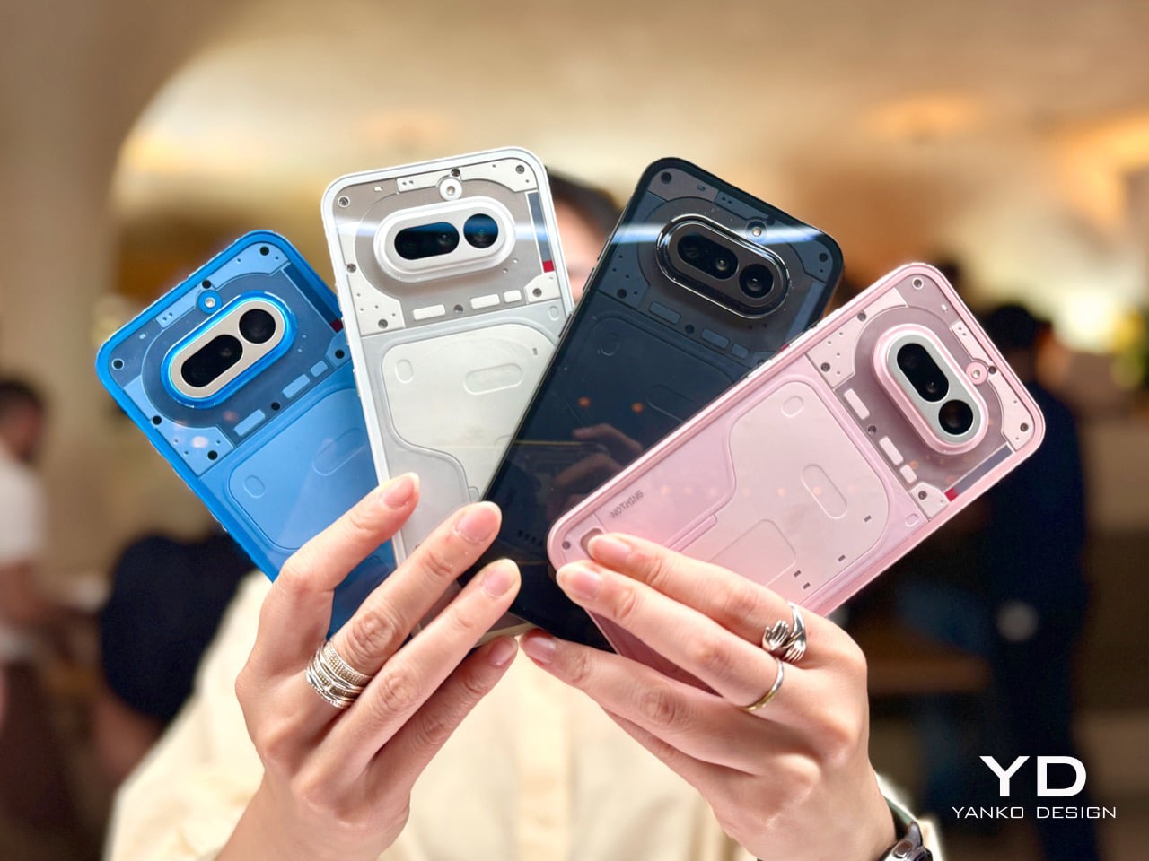
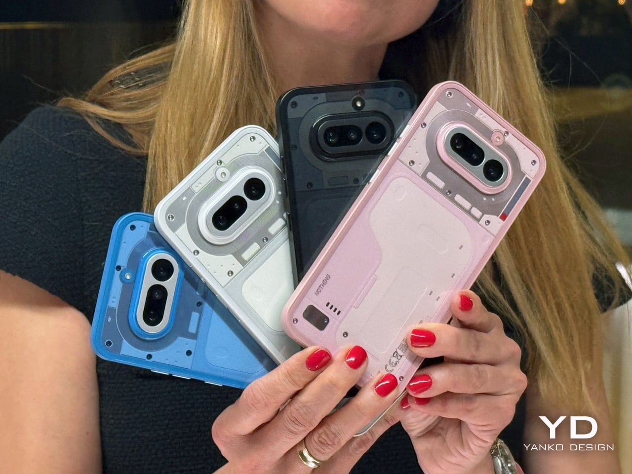
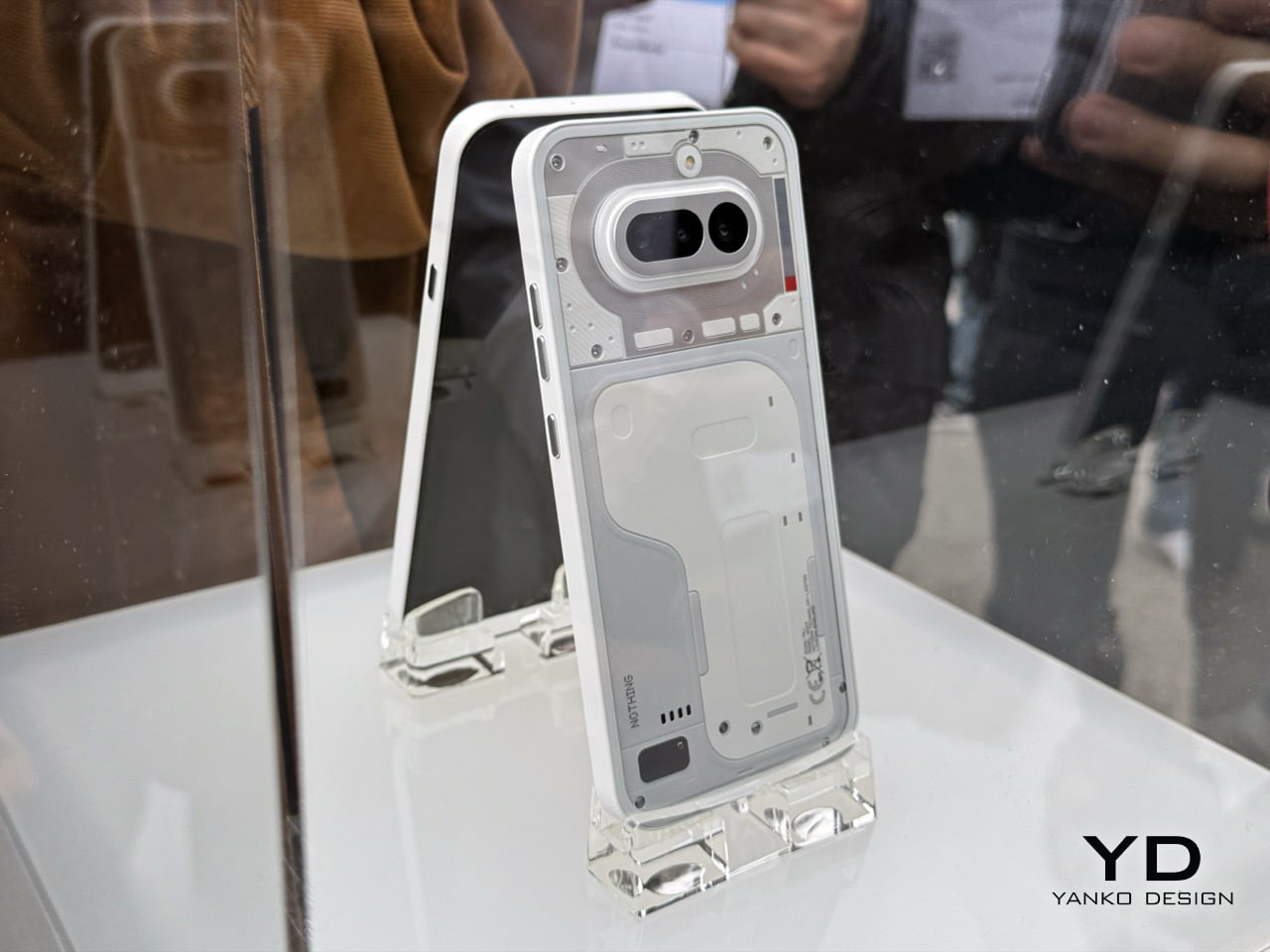
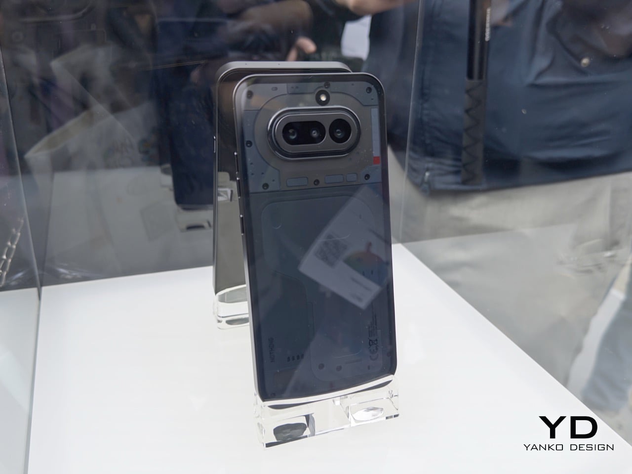
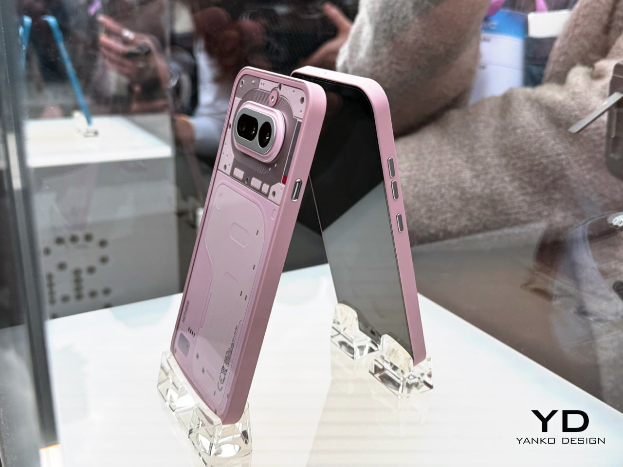
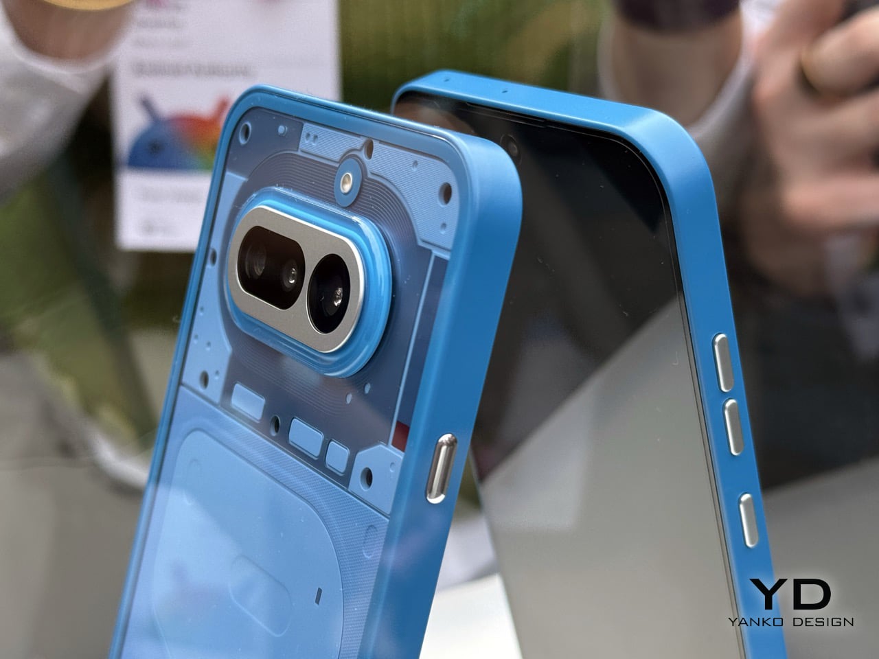
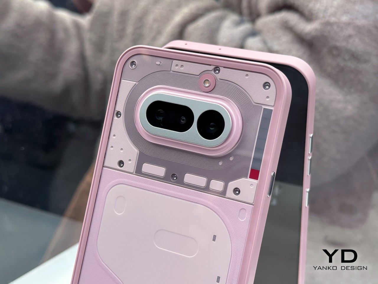
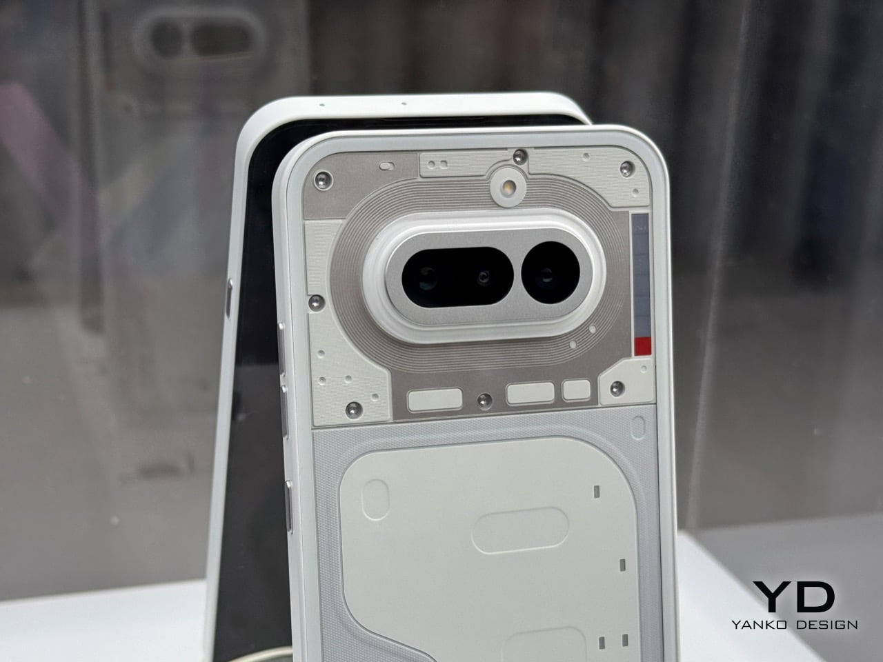
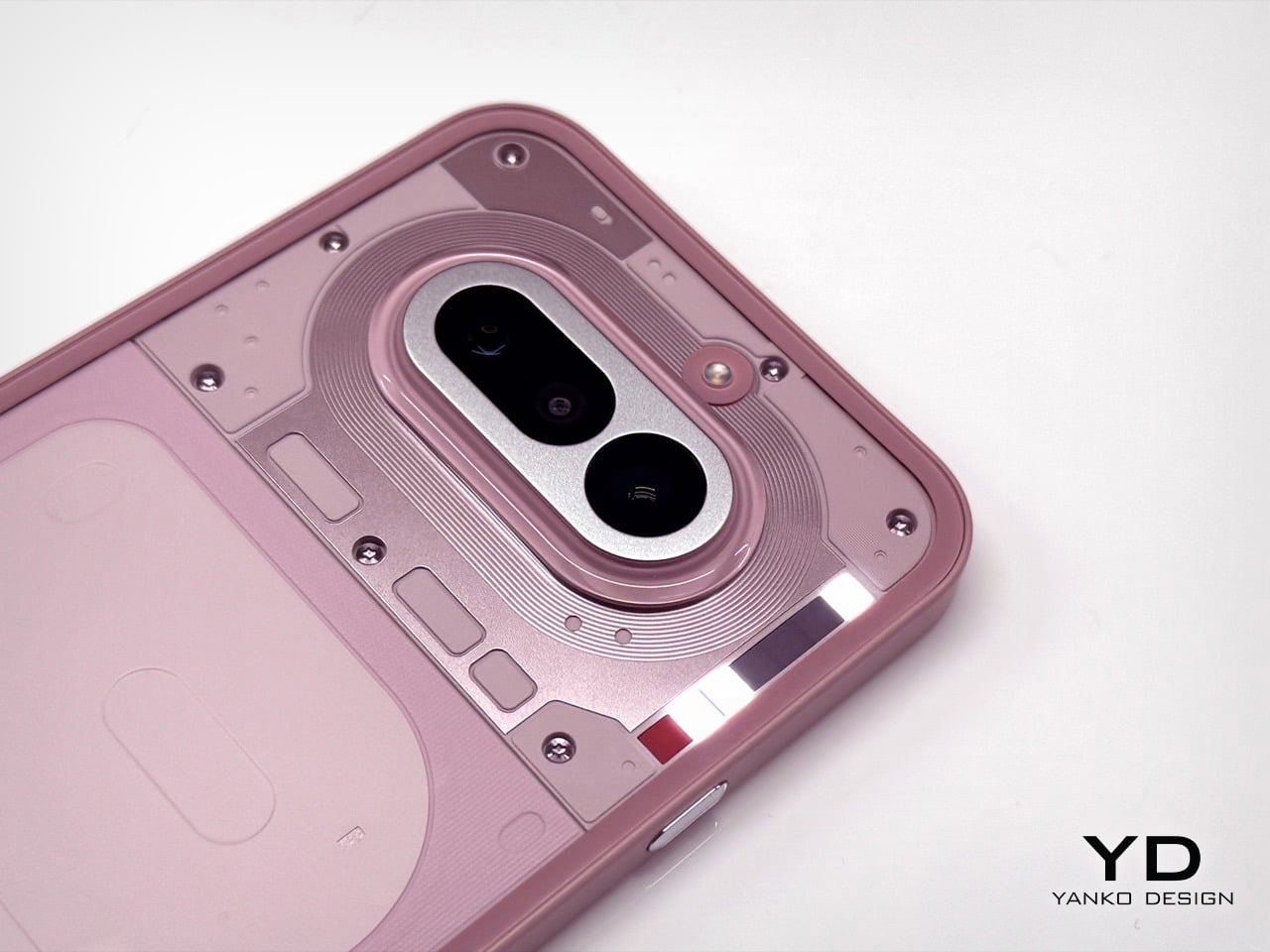
Nothing has a flair for the dramatic – their MWC setup was no exception. Instead of a stuffy booth, they dropped a mysterious shipping container in an open square. It cranked open to reveal the Phone (4a) in its four colorways, a slick bit of industrial theater that gets people talking. We’d all seen the white and pink versions on YouTube, but seeing them in person alongside the brand new black and blue models changes the calculus entirely. It immediately became clear there are two versions of this phone you should absolutely buy, and two you should probably skip. The reasons are not what you might think, and it all comes down to the subtle interplay of material, color, and finish.
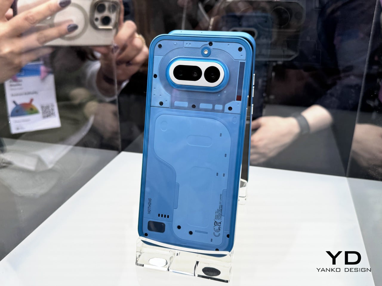
Lined up under glass, the quartet looked impressive. The initial reveal was just that, a visual presentation to let the press get their shots and build some hype. Nothing clearly knew which colors were their heroes; the white and pink that led their digital marketing campaign were positioned prominently. The black and blue felt like they were held back for this physical debut, and it makes sense why. In the controlled lighting of the display, they all looked sharp. But a phone isn’t a museum piece, it’s an object you hold and interact with in countless environments, and that’s where the story took a sharp turn later that evening.
Designer: Nothing
Later that night, the glass came off. At Nothing’s party, they had operational units for everyone to actually handle. First impressions… The device feels solid, and the overall form is a refinement of their established language. As I wrote last week, this is easily Nothing’s most confident design yet; it feels less like a startup experiment and more like a statement from a company that knows exactly what it’s doing. We cycled through the Glyph lights, pairing them with the classic and new generative ringtones, and the effect is still as cool as ever. But my focus was on how the materials felt, and how the colors held up in the real world.
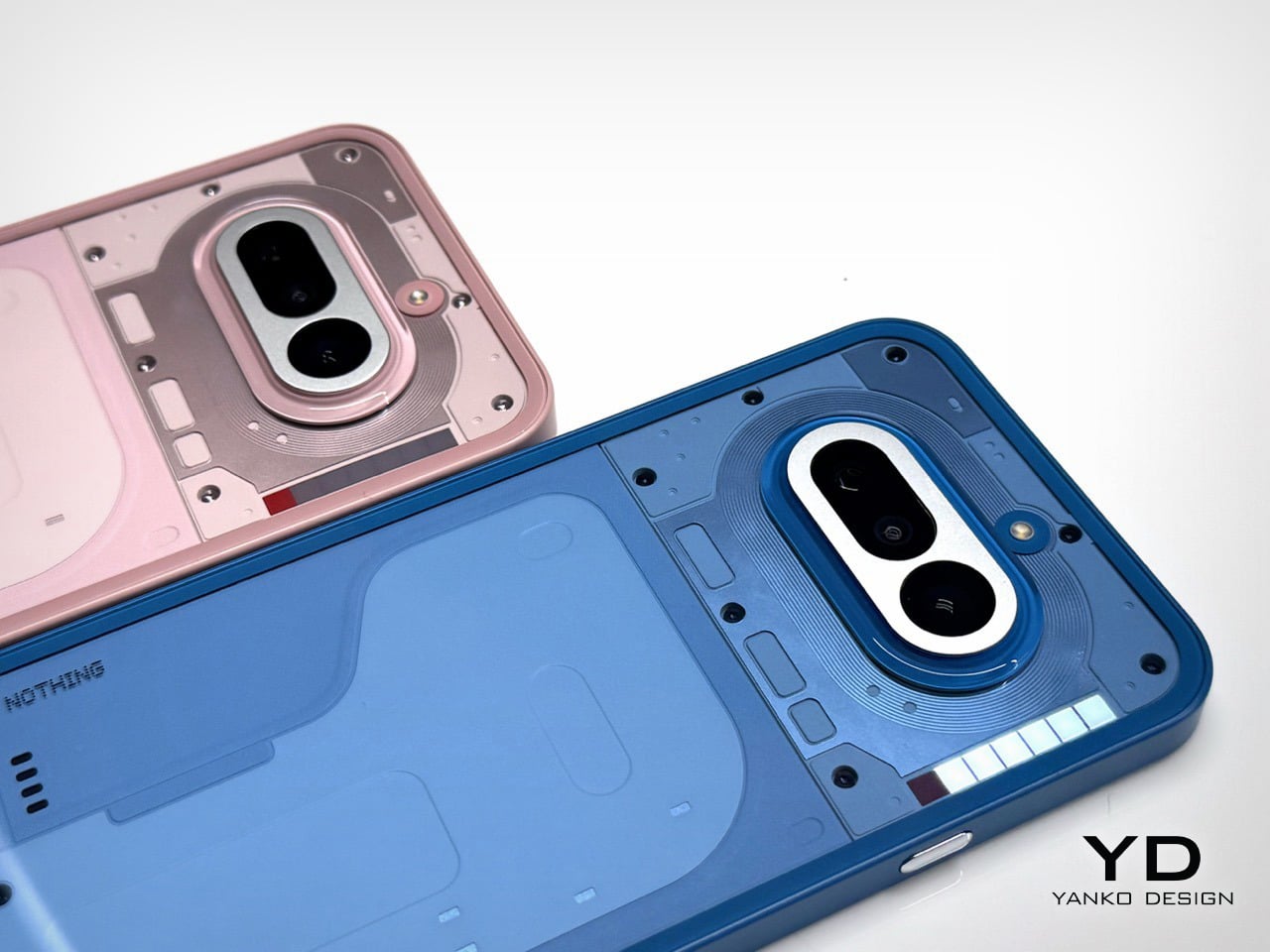
Let’s get right to it: avoid the black. I know it’s the default safe choice for many, but it betrays the entire Nothing ethos. The earlier grey versions of their phones created a beautiful contrast, letting you peer in and appreciate the texture and layout of the components underneath. This new black is just pitch black. In low light, it becomes an amorphous blob, and under direct light, the glass back turns into a smudgy mirror, catching chaotic reflections that obscure any sense of depth. It loses all the nuance and visual intrigue that makes these phones special. You’re left with a simple black rectangle, and frankly, you can get that from anyone.
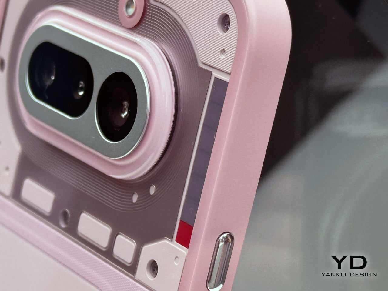
The blue is a more complicated story, and a more disappointing one. The shade of blue itself is fantastic, a vibrant choice that really stands out. The frame is the culprit here. Nothing uses plastic for its frames, which is fine, but the finish on the blue model makes it look and feel overtly like plastic. It has a certain sheen that reads as “budget-ish,” undermining the otherwise premium and considered design of the phone. While the frames on the white and black models have a finish that elevates them, the blue’s just doesn’t stick the landing. It’s a small detail that makes a huge difference in desirability. Thankfully, it’s a problem that can be solved with a good metal bumper case, if you’re truly set on the color.
This is why the white and pink versions are the ones to get. The white is the quintessential Nothing look; clean, architectural, and it showcases the internal components and Glyph system perfectly. The frame’s finish looks gorgeous and intentional. The pink is the surprise winner. It’s a fantastic, almost salmon-like shade that is both playful and sophisticated, and the finish on its frame works in harmony with the color. It feels fun without feeling cheap. Both of these colors feel like they were the primary focus of the design team, where the material choices and color selection are in perfect sync to create a cohesive and desirable object.
Of course, the phone is more than its colorway. The camera is genuinely impressive for this bracket. I took a few shots in the less-than-ideal lighting of the party, and while the processing takes a beat longer than you’d expect, the results are worth it. I was seriously impressed by the quality coming from the 3.5x lens; it’s sharp and holds detail well. The software felt snappy, and the screen is bright and responsive. It’s a proper smartphone experience, wrapped in a design that still turns heads and starts conversations, which has always been Nothing’s core strength.
This MWC party was just the appetizer for the main course. Nothing is holding another event on March 5th, where the full, official launch will happen. That’s when we’ll get the final specs, pricing, and availability. There is also a persistent rumor that the company will use that event to debut a more powerful Phone (4a) Pro model. Given the confidence on display in Barcelona, Nothing is clearly holding a few cards back for the big reveal. They got our attention with the hardware, now we wait to see the full strategy.
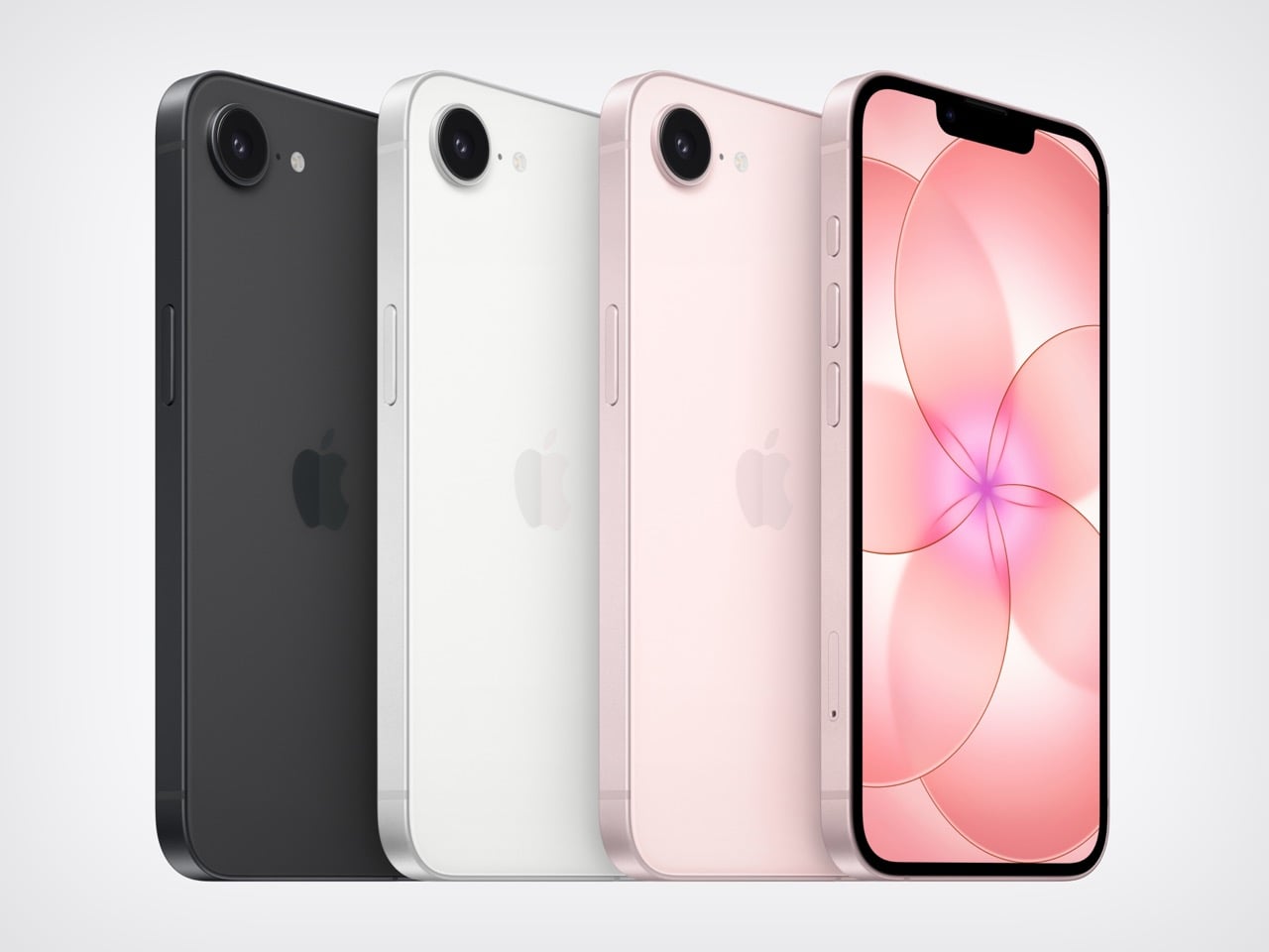
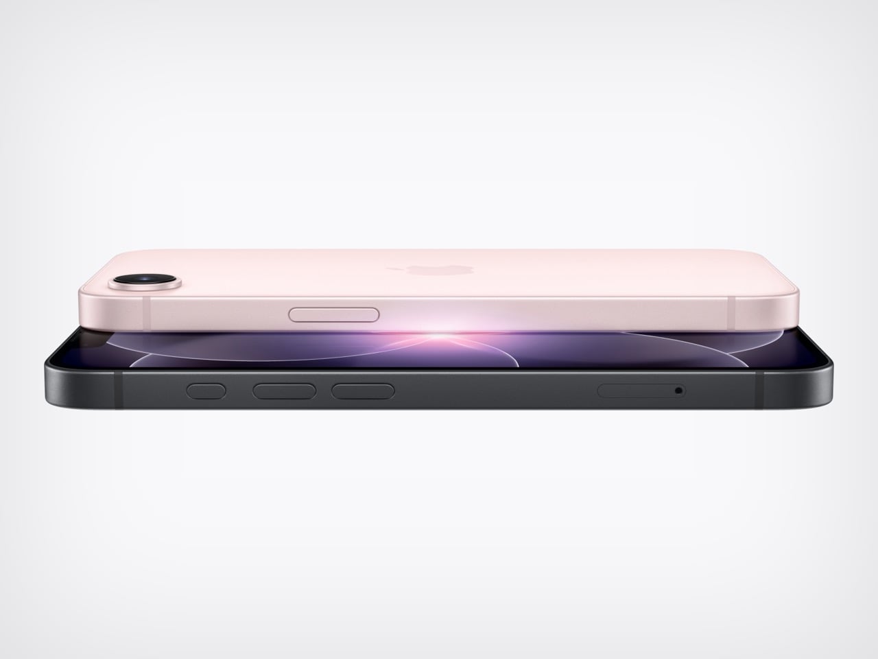
Apple has a habit of making its budget phones more interesting than they have any right to be. The iPhone 17e packs the same A19 chip found in the standard iPhone 17 into a $599 body, with a 6-core CPU built on 3-nanometer architecture, a 4-core GPU with Neural Accelerators, and a 16-core Neural Engine optimized for large generative models. Live Translation, Call Screening, Visual Intelligence, and Hold Assist all run natively on a phone that costs $200 less than the base iPhone 17. That’s the real headline, even if Apple hasn’t framed it quite that directly.
The A19 here is a binned variant with a 4-core GPU versus the 5-core in the standard iPhone 17, but graphics performance is still around 30% faster than the A18 in the 16e. The Neural Accelerators embedded in each GPU core are new to this tier and allow Apple Intelligence to run efficiently on-device rather than leaning on cloud processing. For everyday tasks, the performance gap between the 17e and the standard iPhone 17 will be essentially invisible.
Designer: Apple
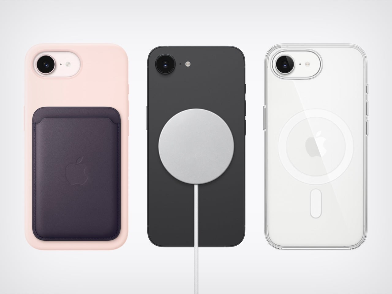
MagSafe finally arrives on the “e” lineup, and it’s one of the more consequential additions Apple has made to this tier in years. The 16e’s absence from the MagSafe ecosystem was a genuine frustration, and the 17e corrects it with 15W wireless charging, double the 7.5W of its predecessor. The full ecosystem of snap-on chargers, car mounts, battery packs, and wallet accessories now works as intended. Storage starts at 256GB, double the 16e’s entry point at the exact same $599 price. On a phone shooting 48MP stills and 4K Dolby Vision video natively, that extra headroom is genuinely appreciated.
The C1X modem delivers up to twice the 5G speeds of the C1 in the 16e while consuming 30% less energy, matching the connectivity of the more expensive iPhone Air. The single 48MP Fusion camera pulls double duty with an optical-quality 2x telephoto mode, next-generation portraits with adjustable post-capture depth, and improved low-light processing through the A19’s image pipeline. Ceramic Shield 2 brings 3x better scratch resistance than the previous generation, and a new antireflective coating makes the display noticeably more usable outdoors. Battery life sits at 26 hours of rated video playback, with a 50% charge in 30 minutes using a 20W adapter.
The honest part: the notch is still here in 2026, and the 60Hz display is increasingly hard to defend. The Gemini-integrated Apple Intelligence features remain locked to higher-end models for now, so the 17e gets the core AI suite but not the full picture of where Apple Intelligence is heading. For anyone on an iPhone 11 through 13, this is a clear, confident upgrade. For 16e owners, MagSafe and doubled storage are real improvements but may not justify a full cycle. At $599, the 17e is the most accessible entry point into Apple’s AI era, and that counts for more than the notch counts against it.
Pre-orders open March 4, units ship March 11, starting at $599 for 256GB.
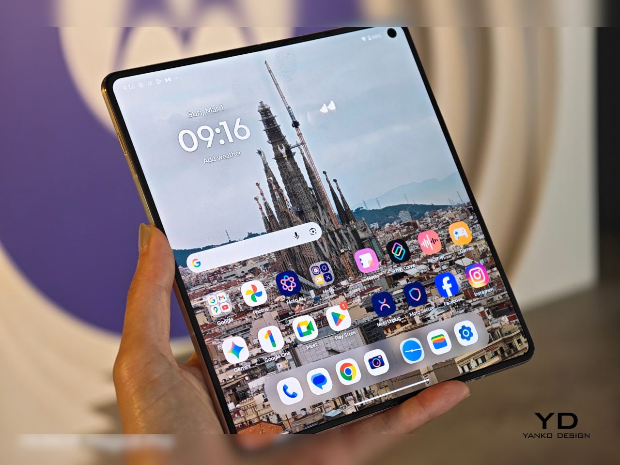
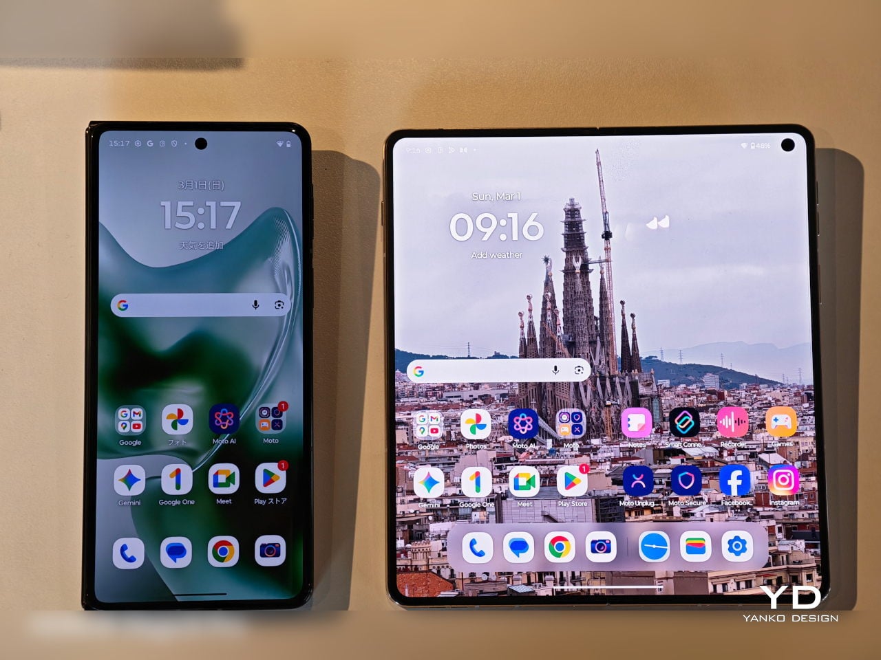
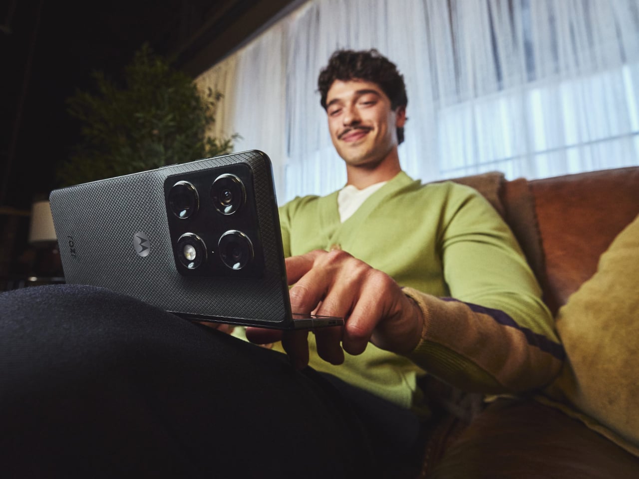
The RAZR name has always carried a certain drama to it. For two decades, it meant the thinnest thing in the room, often at the expense of everything else. The new motorola razr fold, first teased at CES 2026, takes the opposite approach, asking what happens when you refuse to give anything up, and the answer turns out to be a phone that unfolds into an 8.1-inch canvas you can actually work on.
This is Motorola’s first book-style foldable, a different animal from the clamshell razr that folds vertically. Open it up, and you get a 2K LTPO display that peaks at 6,200 nits, bright enough to use comfortably in direct sunlight, and wide enough to run three apps side by side without everything feeling cramped. Close it, and the 6.6-inch external screen handles most of what you’d normally unlock the phone for anyway.
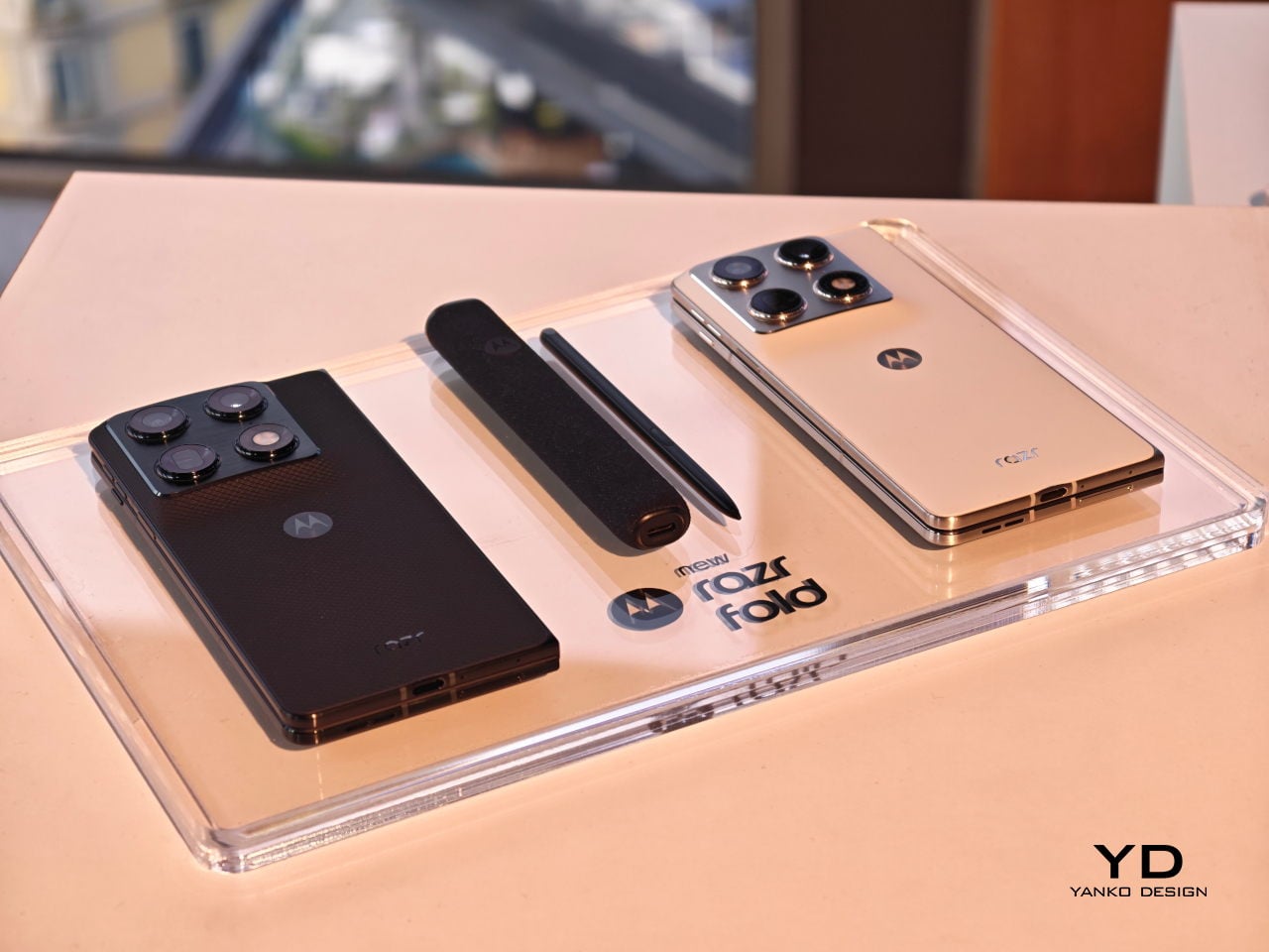
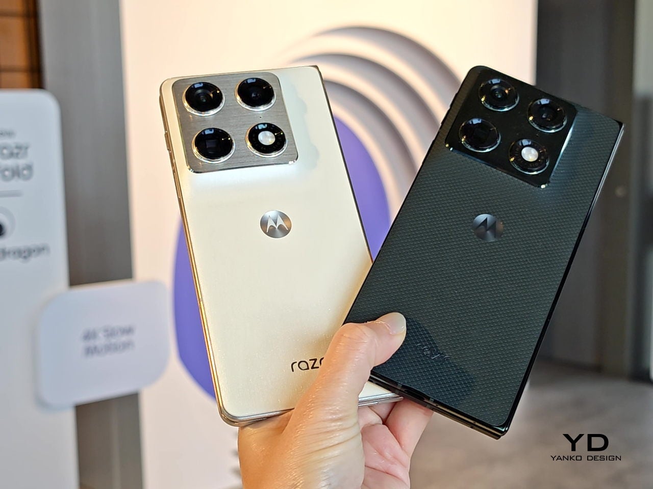
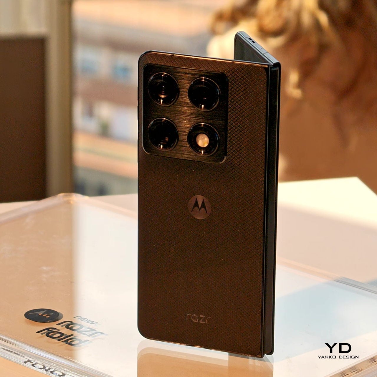
The physical design is harder to dismiss than the numbers suggest. At 4.6mm thin when open and 9.9mm when folded, it doesn’t read as a productivity device that tolerates being a phone on the side. A stainless steel teardrop hinge guides the fold, while a titanium inner plate distributes pressure across the crease so the display returns to its original shape after each cycle. The Pantone Blackened Blue version has a matte, textured surface; the Lily White option goes for a softer, more reflective hand.
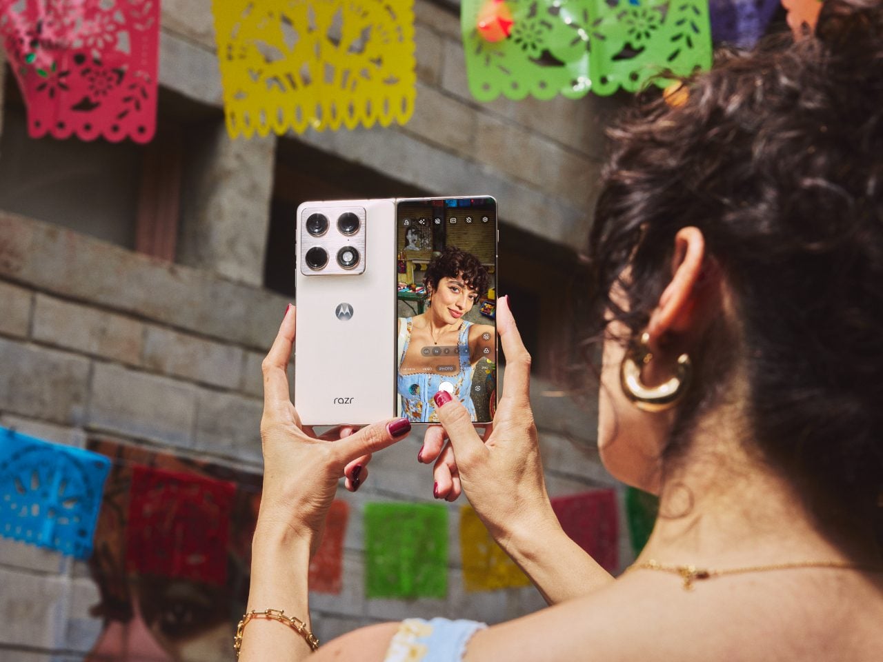
Camera performance is where Motorola appears to have placed its biggest bet. The razr fold earned DXOMARK’s #1 ranking for foldable cameras in North America, backed by a 50 MP Sony LYTIA 828 main sensor, a 50 MP Sony LYTIA 600 periscope telephoto with 3x optical zoom, and a 50 MP ultrawide with a 122-degree field of view that focuses as close as 3.5 cm. The fold-forward form also doubles as a tabletop tripod, which is a minor convenience until you stop fumbling with a prop.
Inside, a Qualcomm Snapdragon 8 Gen 5 handles the workload with 16GB of RAM and storage of up to 1TB. The 6,000 mAh silicon-carbon battery is, by Motorola’s account, the largest in any foldable currently available. The 80W TurboPower charging is supposed to deliver 12 or more hours of use from under 10 minutes plugged in, though those results depend on usage conditions that are rarely as tidy as a manufacturer’s press release describes.
The razr fold also supports the moto pen ultra, sold separately, adding pressure sensitivity and palm rejection to the large display. For anyone already carrying a stylus with a tablet, the pitch is obvious. For everyone else, it leaves an open question about whether a phone at €1,999 for the European launch bundle actually replaces the tablet it resembles, or just occupies an expensive spot between the two.
CES 2026 was crowded with humanoids doing simple household tasks such as folding laundry or stacking up the dishwasher. One thing I was sure of seeing this influx of robots at the world’s biggest tech event, was that such service bots are going to be the next big thing invading our households in the near future.
Staying with that thought, the robotics industry, for now, faces the biggest challenge in teaching robots to operate in the messy real world. The unstructured environment means robots need massive amounts of data to learn. Gathering and structuring that data is the costliest thing in robotics and perhaps the biggest impediment, slowing the entire development process.
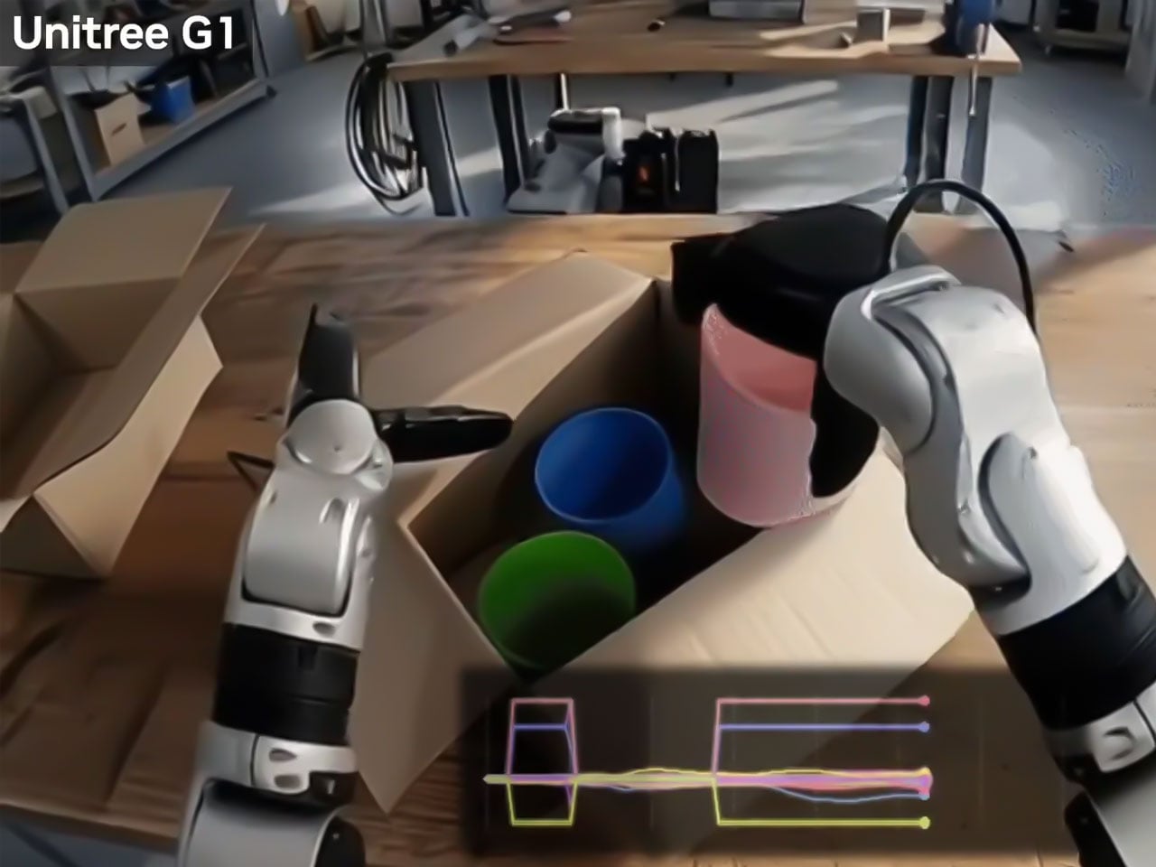
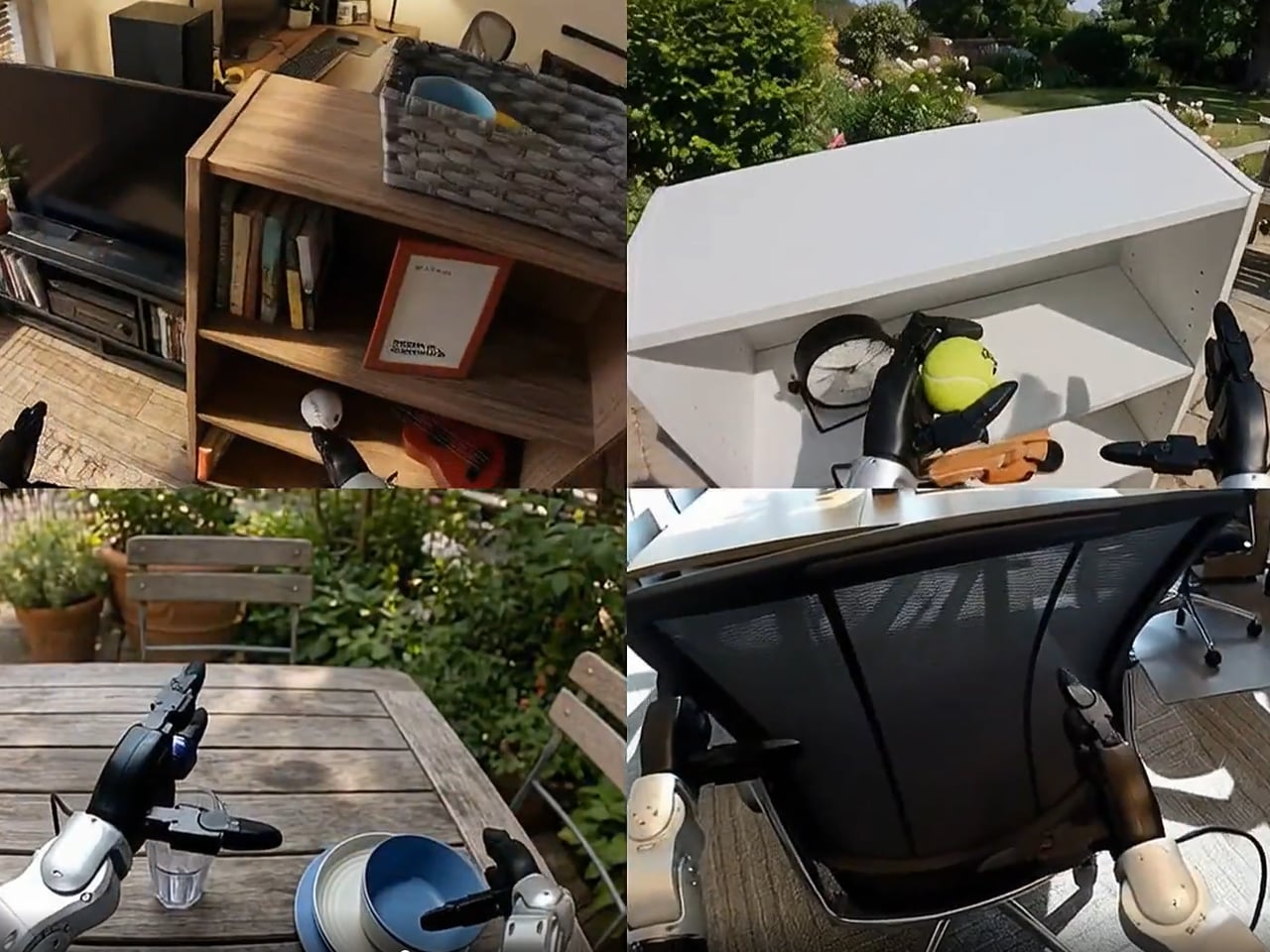
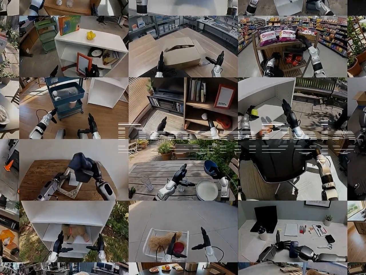
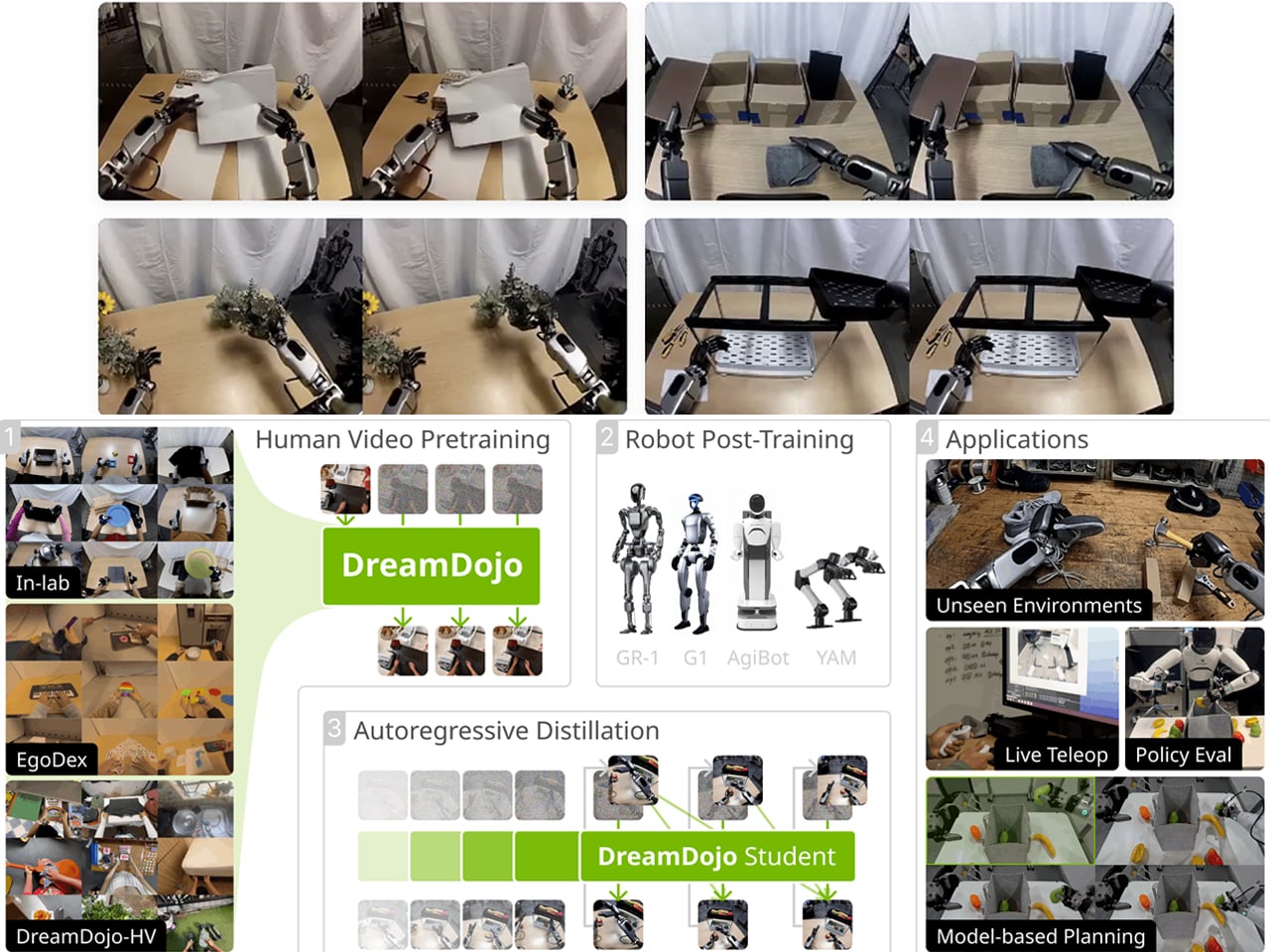
NVIDIA believes it has created a workaround. The company has released DreamDojo, an open-source “world model,” which intends to help robots learn intuitive physics to interact in the physical world by seeing humans do it first. So, instead of relying on painstaking programming or teleoperating robots, Nvidia DreamDojo would allow robots to train on 44,000 hours of egocentric human video, which shows humans handling tools, assembling objects, and doing laundry.
NVIDIA terms this open-source world model as the “largest dataset to date for world model training.” The dataset is called DreamDojo-HV (Human Video) and comprises exactly 44,711 hours of footage, which includes 6,015 unique tasks and more than a million trajectories. This works in two independent phases and is billed by Nvidia to be 15 times larger and about 96 times more skill-packed. It is also believed to include 2000 times more scenes than ever seen in the previous largest datasets for world model training.
Two-phase robotic course for being human
Of course, collecting robot-specific data is the biggest bottleneck in the industry. By simplifying that with abundant human video, Nvidia is trying to make learning convenient and cheaper for robotic companies betting on humanoids. For me, this possibility of learning through seeing before touching physical objects is compelling. And for its execution is divided into two phases: Pre-Training and Post-Training.
Firstly, it pre-trains on large-scale human video using what Nvidia says is “latent actions.” Since human videos do not provide joint torque labels or motor commands, Nvidia has trained a “700-million-parameter spatiotemporal Transformer” to extract “proxy actions” from visual changes between frames, allowing the model to “treat any human video as if it came with motor commands attached.” Secondly, it post-trains on a specific robot body with “continuous robot actions.” The idea is to separate physical understanding from hardware control, so that the robot learns the rules of the physical world first and then adapts them to need and limb requirements.
Real-time dreaming
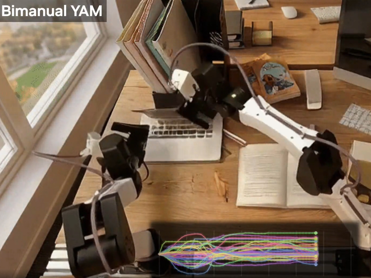
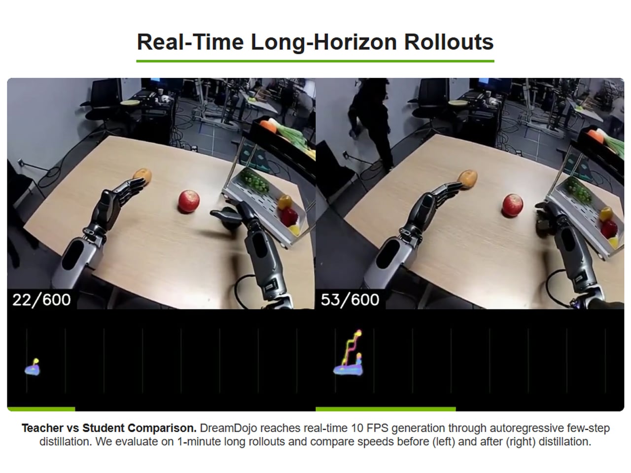
With its world model designed to teach robots to watch humans first, Nvidia is suggesting to us that the best and fastest way to scale humanoids isn’t more robot data. It is probably their exposure to more human experience. Considering this, it’s imperative to note that this is not the first world model. Many have been devised before, but they have been considerably slower at achieving the outcome. NVIDIA has been able to clock up the pace by distilling DreamDojo to run at 10.81 frames per second in real time for over a minute. DreamDojo HV has been demonstrated across humanoid platforms like GR-1, G1, AgiBot, and YAM robots, the company says, and has shown what it calls “realistic action-conditioned rollouts” across diverse environments and object interactions.
From what I see, if DreamDojo can work as the press information reveals, it could make life easier for startups and robotic teams with limited resources to collect a large robot-specific dataset and use it to teach their robots. But before more use case scenarios trained on the Nvidia world model show up, I am skeptical how they will perform in every changing real-world condition, which are not absolutely the same at any two moments.





 Collection, and they are exactly the kind of phones that make you stop scrolling. The Razr Fold and Edge 70 Fusion now have limited edition versions draped in football-inspired design and 24K gold accents, and whether you follow the sport or not, the craftsmanship here is genuinely worth paying attention to.