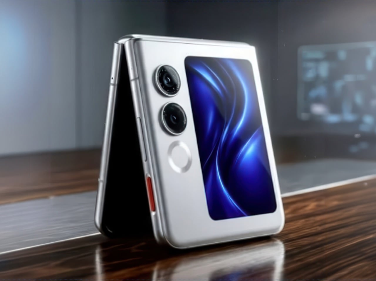
The moment Motorola resurrected the Razr as a foldable in 2020, every industrial designer I know had the same thought: the flip form factor was always the right one, the market just needed to catch up. Five years later, the category has matured enough that Samsung, Motorola, Oppo, Honor, and a dozen Chinese brands all compete for the same $800-to-$1,200 buyer, nudging specs up and prices sideways with each generation. Nobody was competing seriously for the buyer who wants the flip experience at a fraction of that figure, because the assumption was that buyer did not exist at scale. Ai+ has decided to test that assumption directly.
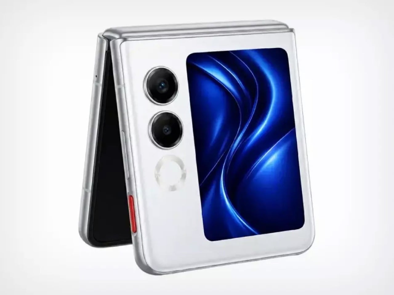
The Nova Flip, unveiled at Ai+’s April 2026 launch event in India alongside the Nova 2 series and a tablet, carries a sticker price of Rs 29,999, roughly $320. The inner display measures 6.9 inches across an AMOLED panel resolving at 2790 x 1188 pixels, complemented by a 3.1-inch AMOLED cover screen. A MediaTek Dimensity 7300 handles processing duties, paired with 8GB of LPDDR4X RAM and 256GB of internal storage. The camera array consists of a 50-megapixel primary sensor, a 2-megapixel depth lens, and a 32-megapixel front camera. Battery capacity clocks in at a surprisingly healthy 4325mAh, with 33W wired charging, 5G, NFC, and IP64 rounding out the headline features.
Let’s talk about that battery for a moment, because 4325mAh in a flip phone is genuinely unusual. The Samsung Galaxy Z Flip 6 packs a 4000mAh cell, and Motorola’s Razr Plus 2024 manages just 4000mAh as well, both at prices three times higher than the Nova Flip. Fitting a larger-than-average cell into a folding chassis requires either a very clever internal layout or an acceptance of added thickness, and Ai+ has not published the device’s folded dimensions yet. The 33W charging speed is adequate without being exciting, sitting well below the 65W and 80W speeds that Chinese flagship foldables now routinely offer. For a $320 device, though, adequate is a perfectly reasonable baseline.
The Dimensity 7300 helps keep the cost within its ultra-affordable bracket. MediaTek’s chip powers a range of competent mid-range phones in the $200-to-$400 segment, including several from Oppo and Vivo, where it handles everyday tasks, social media, and casual gaming without complaint. It does not belong in the same conversation as the Snapdragon 8 Elite powering the Galaxy Z Flip 6, and Ai+ is clearly not pretending otherwise. The 8GB of LPDDR4X RAM is similarly mid-range, a generation behind the LPDDR5X specification that flagship devices now ship with. None of this is disqualifying at this price point, but buyers upgrading from a previous-generation Galaxy or Razr will feel the performance delta in sustained workloads and camera processing speeds.
At that price, the fact that the phone comes IP64 rated is frankly surprising. Splash and dust resistance in a folding device requires careful engineering around the hinge mechanism, where gaps and moving parts create obvious ingress points. Many foldables at twice the price ship without any IP certification whatsoever (it also costs money to get the certification), so Ai+ clearing that bar at Rs 29,999 signals a level of build ambition that the spec sheet alone does not fully communicate. The side-mounted fingerprint sensor, dual SIM 5G support, NFC, and USB-C port complete a feature list that would have looked respectable on a $600 phone two years ago.
The real question the Nova Flip poses has nothing to do with its own specifications. It asks whether the Indian market, and potentially the broader emerging market landscape, is ready to embrace foldables as a mainstream form factor rather than a luxury signifier. Samsung has spent five years building the foldable as an aspirational object, priced and marketed accordingly. If Ai+ can deliver a hinge that survives 18 months of daily use, a display that resists visible creasing, and software that stays coherent across the cover screen and inner display, the Nova Flip could do to the foldable category what budget-tier 5G phones did to 5G adoption: accelerate it by years. The Glacier White colorway goes on sale in May 2026, and that month’s sales figures will tell us far more about the future of affordable foldables than any spec sheet ever could.
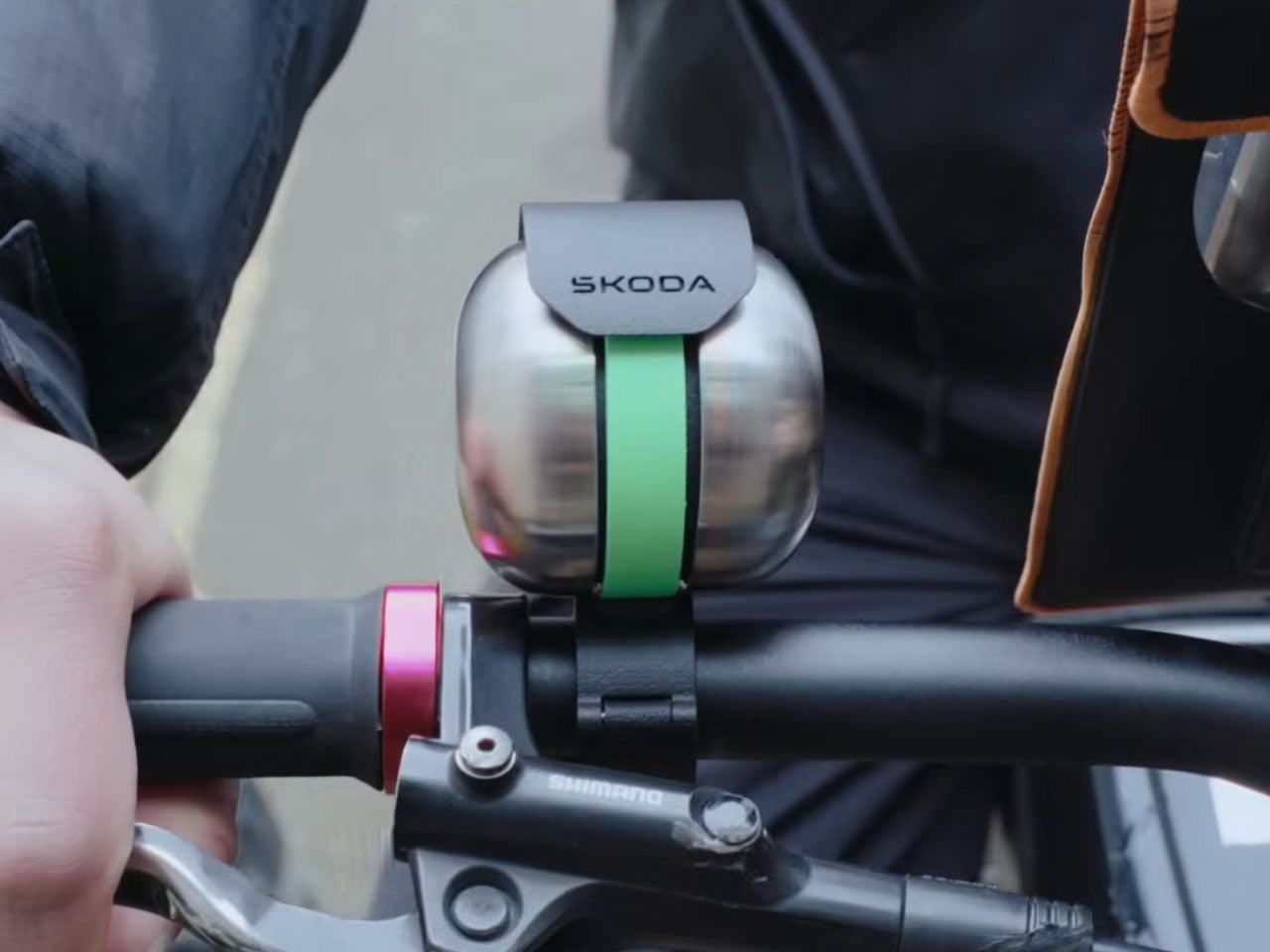
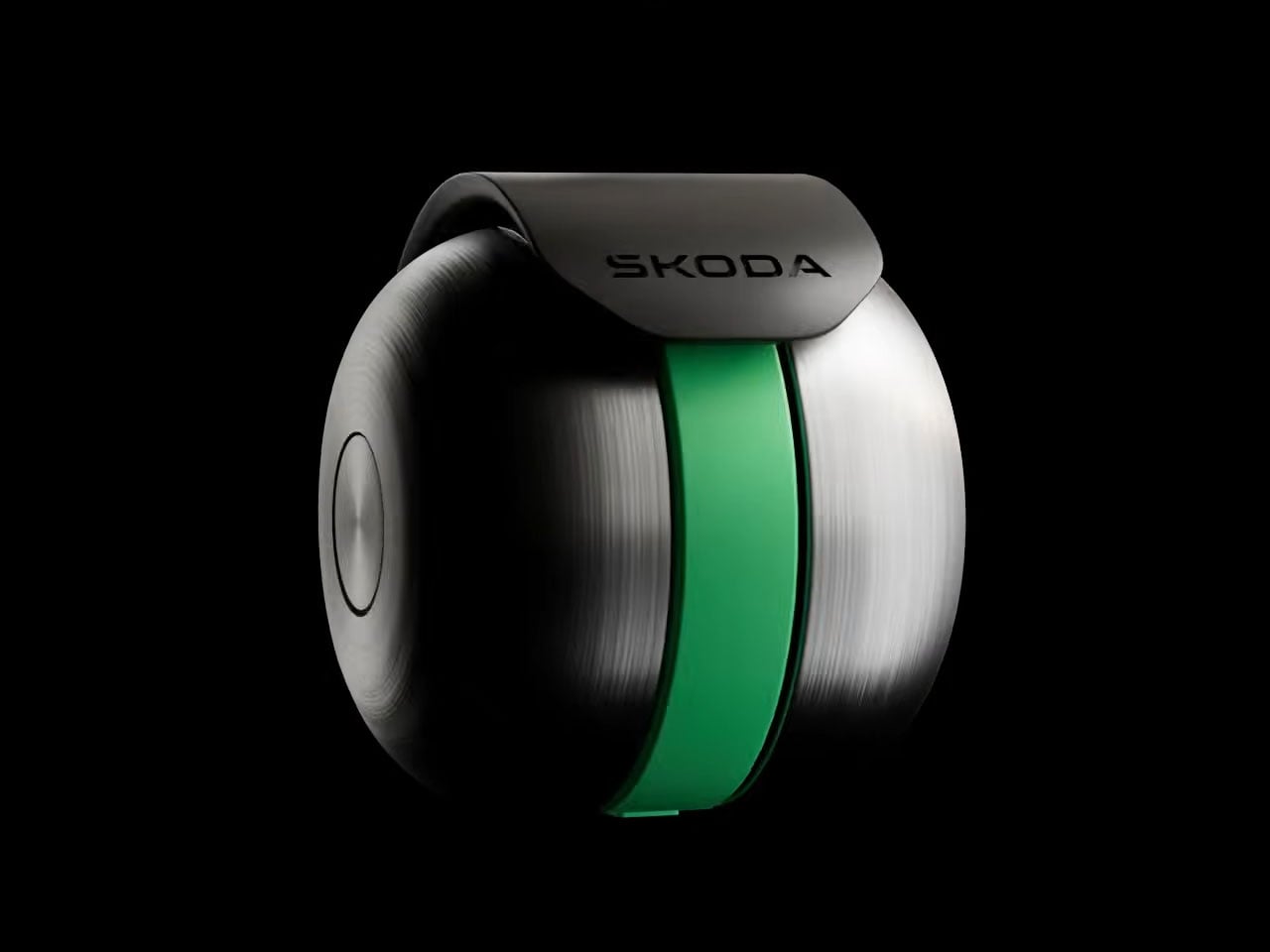
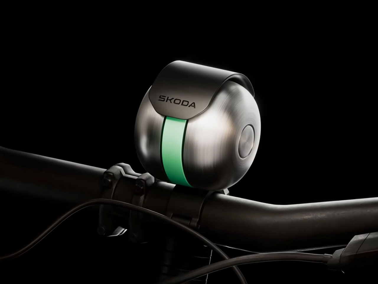
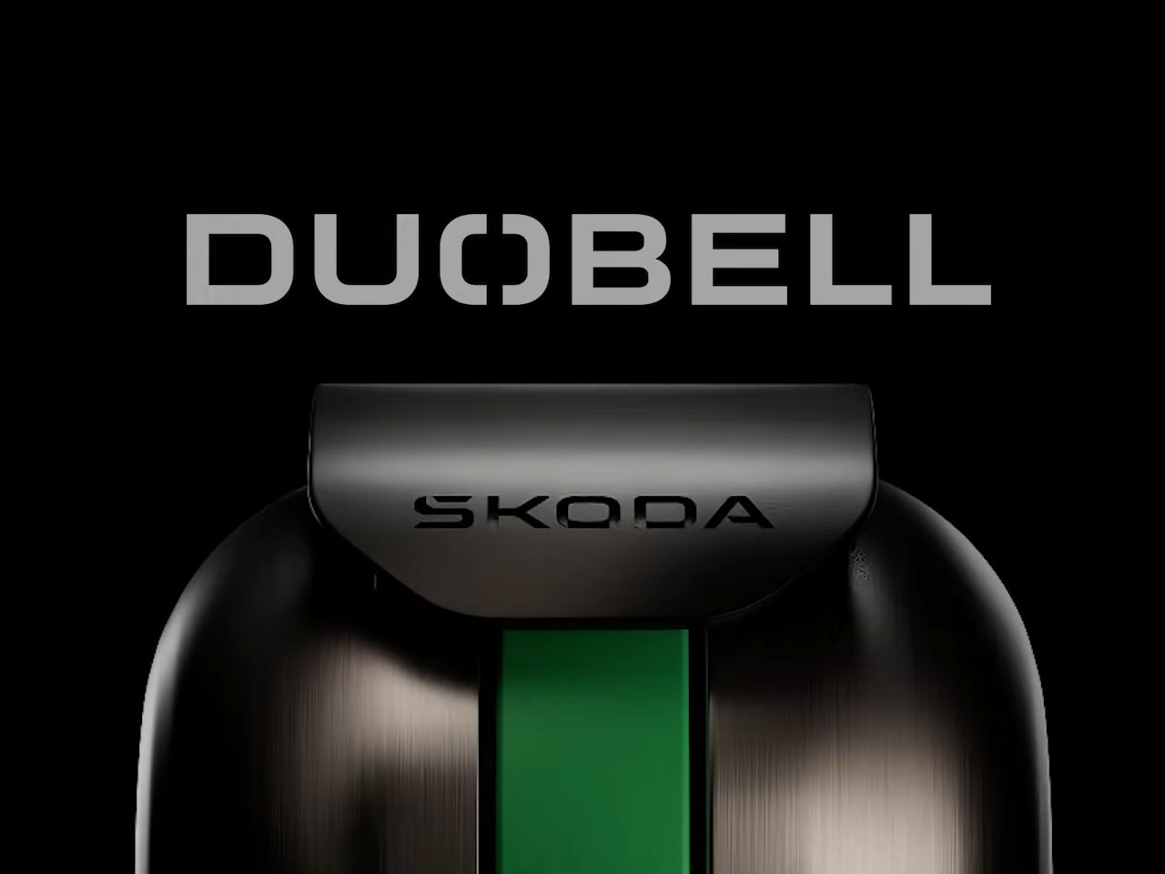
Times have changed so much, we’ve got people walking on the streets with their ANC turned on to zone out, but are unaware of the risks motorists can pose. With active noise-cancelling headphones becoming increasingly common, the sounds of the city (from traffic to bicycle bells) can easily disappear behind layers of digital silence. Recognizing this growing safety challenge, Škoda Auto has introduced the DuoBell, a cleverly engineered bicycle bell designed to cut through active noise cancellation and alert distracted pedestrians before a potential collision occurs.
The concept addresses a modern urban problem: many people walk while listening to music through headphones equipped with active noise cancellation (ANC), which filters out environmental noise. While effective for immersive listening, ANC can also suppress critical warning sounds such as approaching bicycles. To tackle this issue, Škoda collaborated with researchers and audiologists from the University of Salford to study how conventional bicycle bells interact with ANC algorithms and why they often fail to be heard. Their research revealed that typical bells operate within frequency ranges that noise-cancelling systems can easily identify and suppress, essentially muting them for headphone users.
The DuoBell was designed as an analog solution to this digital limitation. Instead of relying on louder volume alone, the bell targets a specific frequency band that ANC systems struggle to eliminate. Through acoustic testing, researchers identified a “safety gap” between 750 and 780 Hz, a range where noise-cancelling algorithms are less effective. The bell is tuned precisely within this band, significantly increasing the chances that pedestrians wearing ANC headphones will hear it.
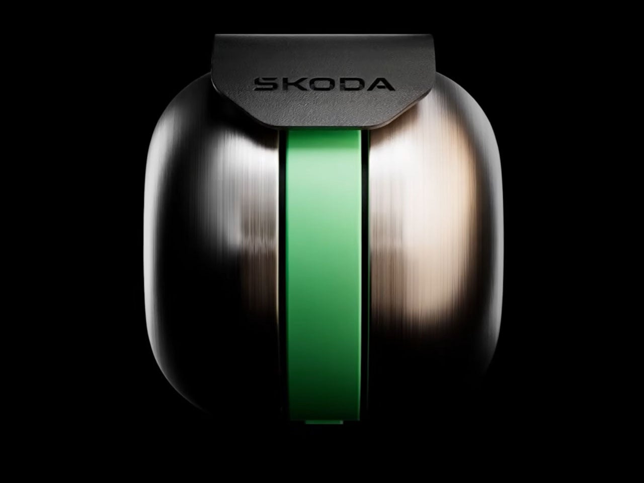
But frequency tuning is only part of the innovation. True to its name, the DuoBell incorporates a dual-resonator design that generates two distinct tones. This layered sound profile confuses noise-cancelling algorithms that typically rely on predictable, steady noise patterns to cancel audio signals. The bell also uses a specially engineered hammer mechanism that produces rapid and irregular strikes, making the sound harder for digital filters to track and suppress.
Testing suggests the design could make a meaningful difference in real-world cycling safety. According to measurements conducted during trials, pedestrians wearing ANC headphones gained up to 22 meters of additional reaction distance when the DuoBell was used compared to a conventional bell. That extra margin can provide critical seconds for both cyclists and pedestrians to react, reducing the likelihood of accidents in busy urban areas.
The bell has already been evaluated outside the lab as well. Field trials were carried out on the streets of London in February, where couriers riding for the delivery platform Deliveroo tested the device during everyday routes. Many riders reportedly found the bell effective enough that they expressed interest in continuing to use it after the trials concluded, highlighting its practical benefits in dense city environments.
Interestingly, the DuoBell achieves all of this without any electronics, batteries, or smart connectivity. It remains a fully mechanical bicycle bell – simple, durable, and easy to install – while using acoustic science to solve a modern technological problem. Škoda also plans to share its research findings publicly, hoping the insights can contribute to broader discussions about pedestrian safety in cities where personal audio devices are now part of everyday life.
Most adjustable shelving systems make a quiet trade-off. To offer flexibility, they rely on rail channels, pin holes, or brackets that work well enough but bring a decidedly utilitarian look to any room. The result is a shelf that adapts to your needs but rarely looks like it was designed with much intention beyond storage. Hiding the hardware means losing flexibility; keeping it means living with it.
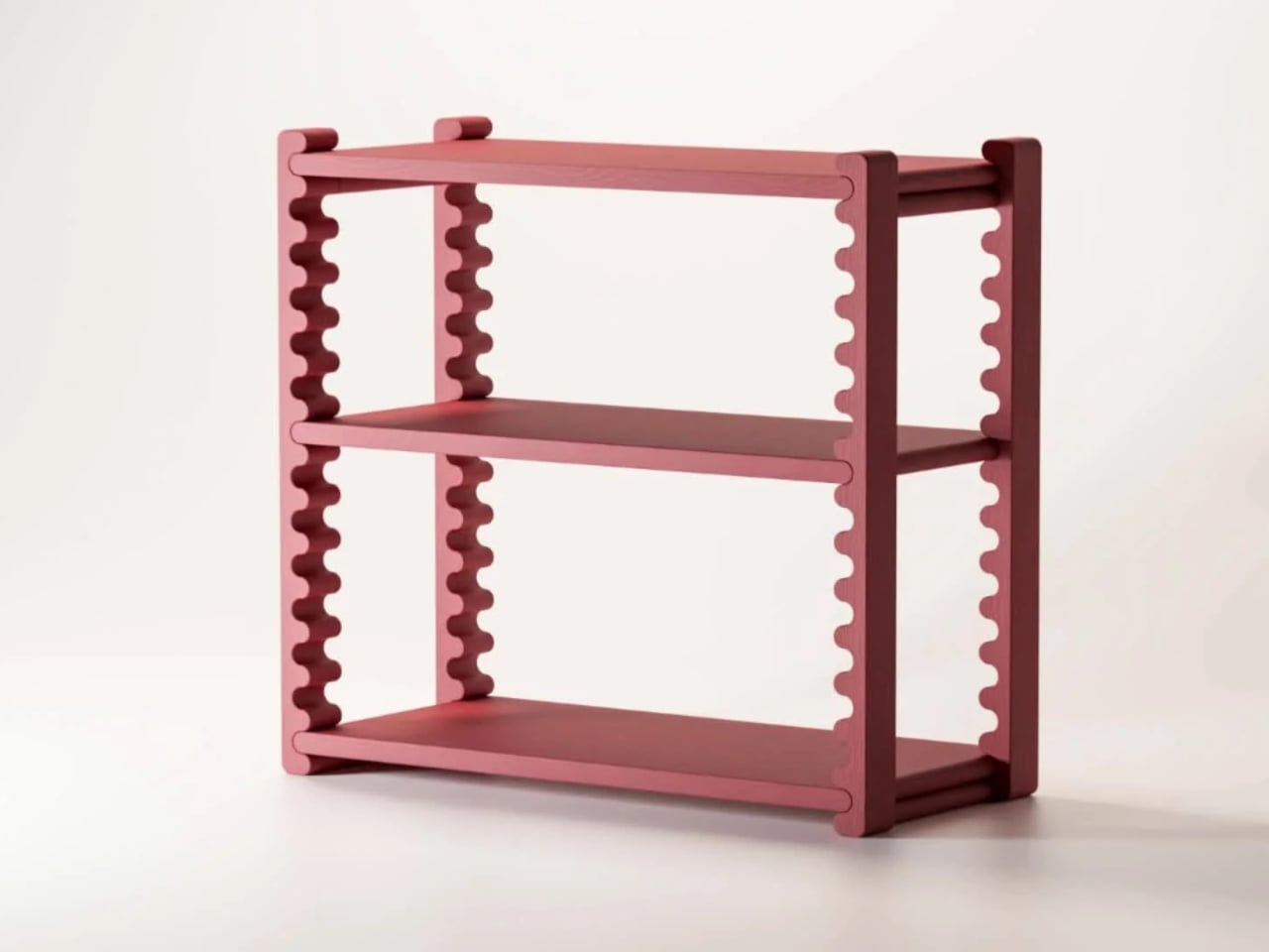
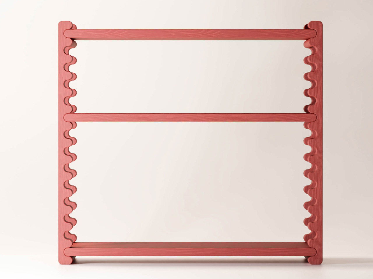
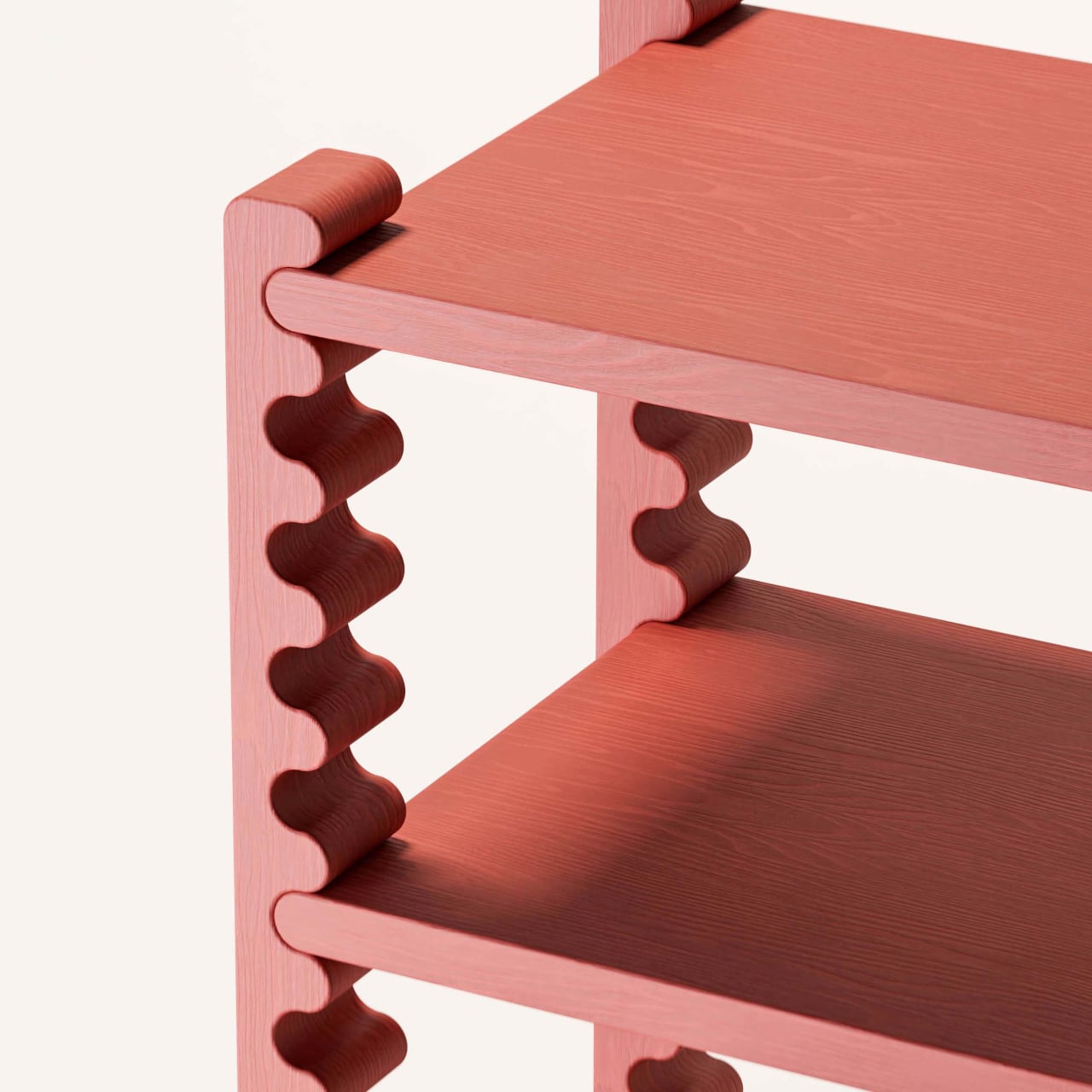
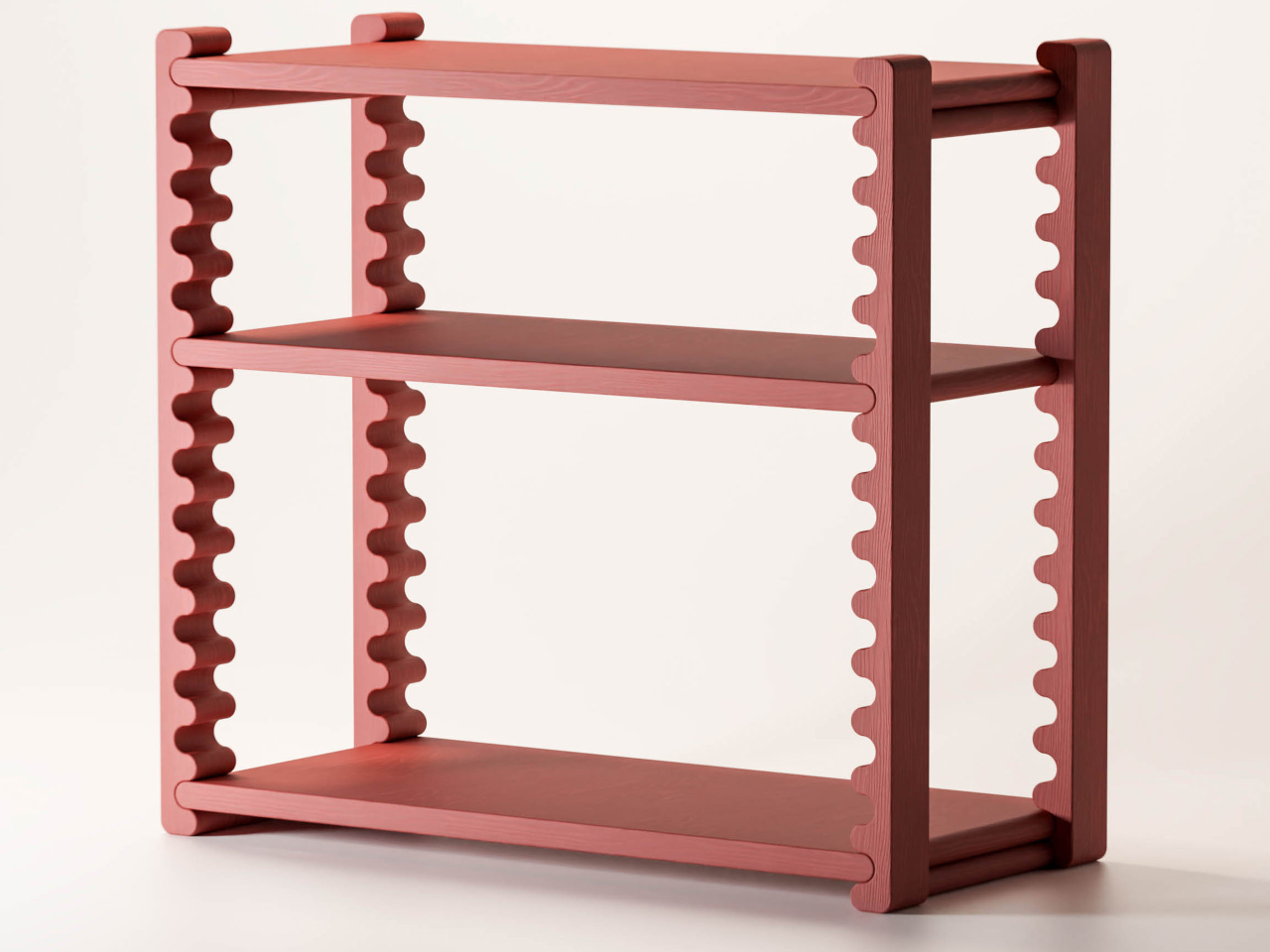
The Ripple Shelf from Sarajevo-based Dilema Studio takes a different approach, one where the shelf’s most visually distinctive element is also its adjustment mechanism. The vertical supports on each side run the full height of the frame in an undulating rippled profile. Those waves aren’t decorative flourishes; they’re guides. The middle shelves slot into them and can be repositioned to different heights without any tools or additional hardware.
The logic here is pretty satisfying. Instead of adding a separate tracking or pinning system, Dilema embedded the mechanism directly into the form. The rippled surface of each support creates natural stopping points along the length of the frame, so positioning a shelf is as intuitive as sliding it into place. There’s nothing to install, nothing to adjust, and nothing to lose at the back of a drawer.
That practicality matters more than it might seem. Someone styling a home office one season and reorganizing it as their book collection doubles doesn’t need to buy a new shelf; they just move the existing ones. A family using the same unit to hold kids’ toys and, later, a collection of records and plants has one piece that grows with the space. The shelf changes; the shelf unit doesn’t.
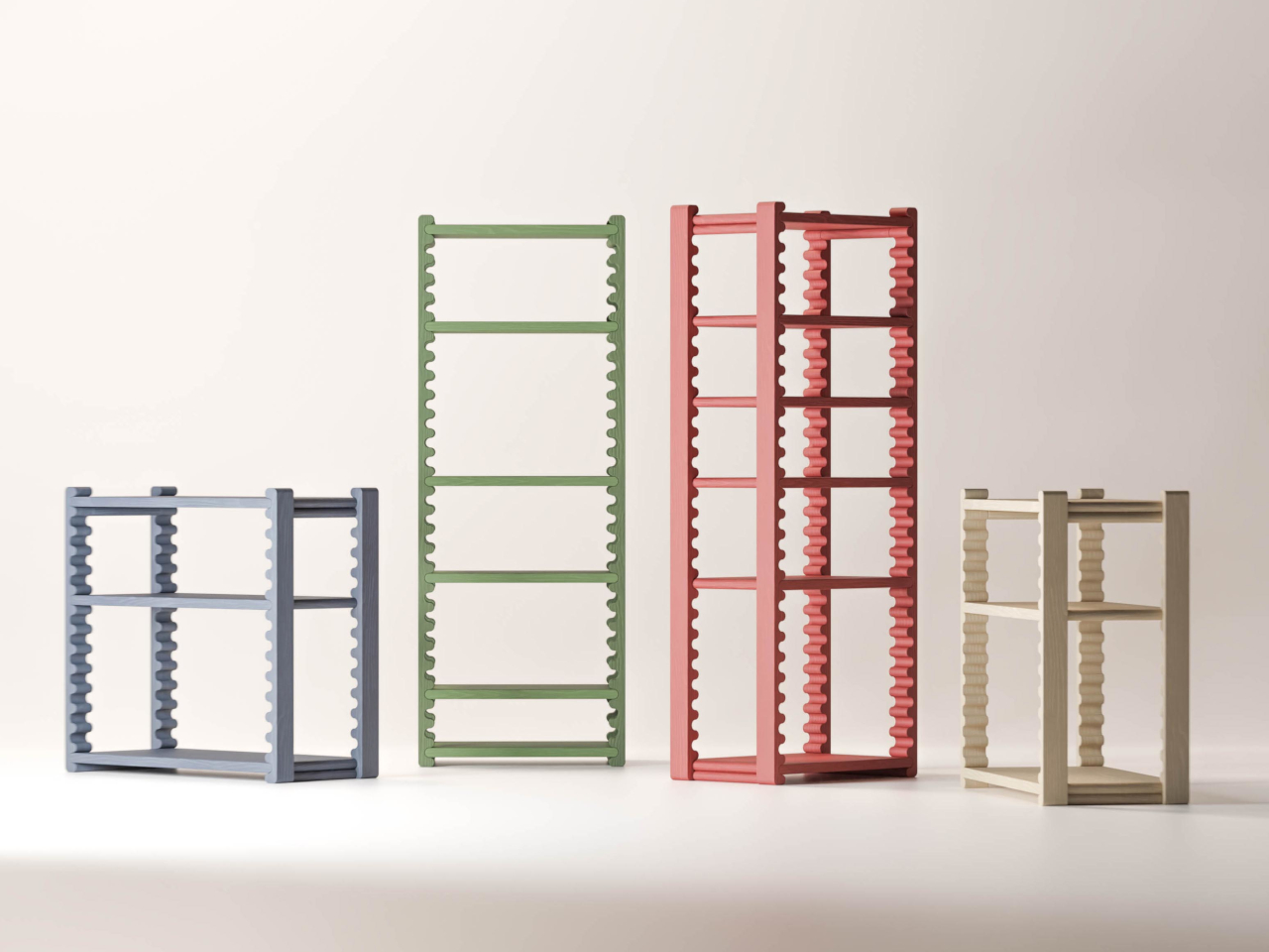
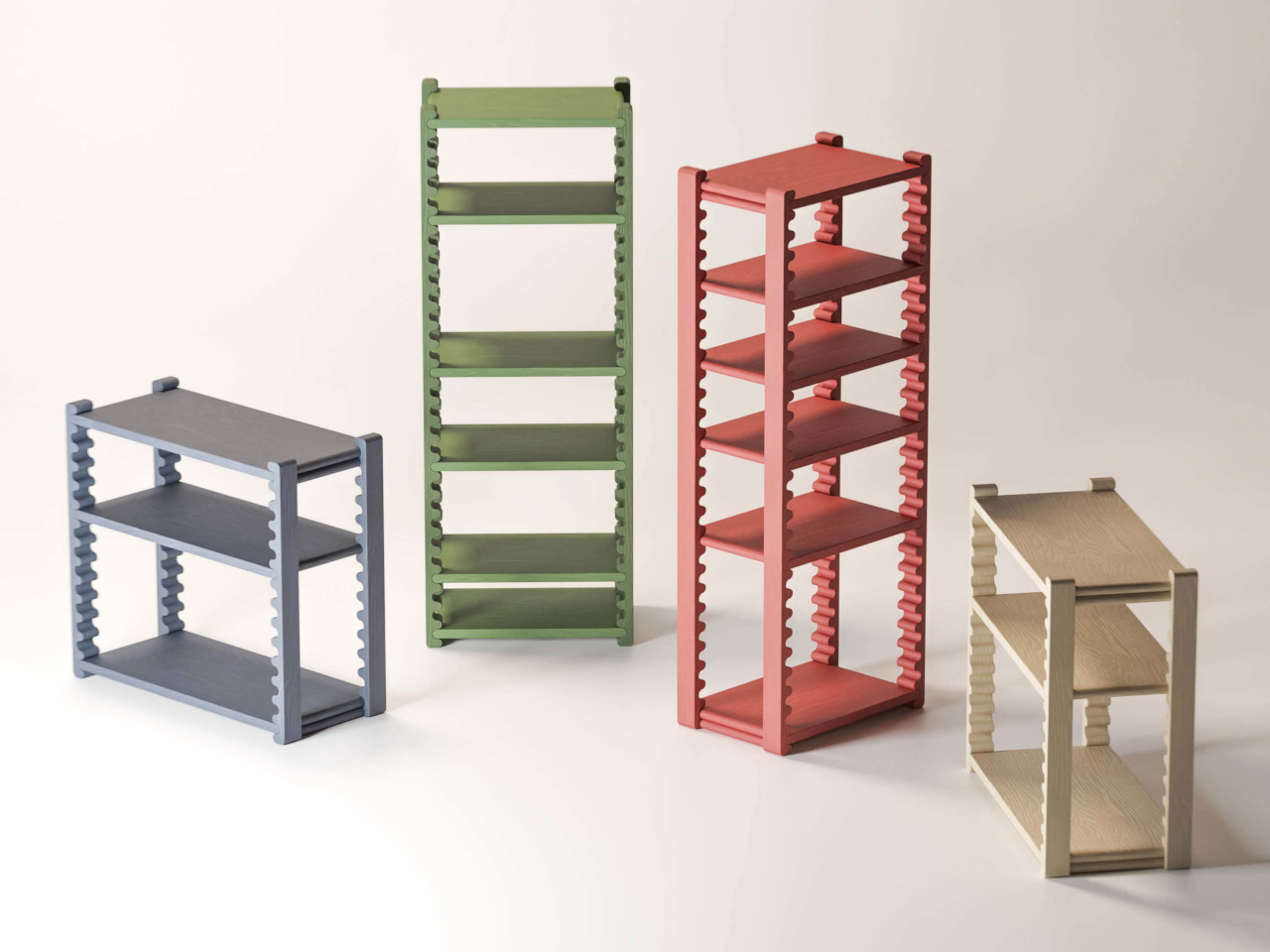
The frame’s fixed top and bottom shelves keep everything stable while the interior remains open to change. Made from beech wood and measuring 750 × 350 × 800 mm, it comes in several color options, including terracotta, sage green, slate blue, and a natural off-white, each with a solid stain that lets the grain show through. The compact footprint makes it workable in tighter rooms without sacrificing capacity.
The system shows up in multiple size configurations, from compact low units to taller multi-shelf towers, giving it range across different rooms and storage needs. That versatility suits living rooms particularly well, where displaying and organizing things often need to share the same piece of furniture. A shelf for ceramics, a lower one for books, a bottom slot for a basket; the spacing adjusts to whatever the situation asks for.
What keeps the Ripple Shelf from being just another clever-but-impractical furniture concept is that it’s genuinely usable. The ripple mechanism doesn’t require any special technique or learning curve; you move a shelf, and it sits where you put it. It’s the kind of furniture that gets better over time, not because it wears in any particular way, but because it stays genuinely useful as what you put on it changes.
For most people, saying something as simple as “good morning” to a stranger or asking for directions takes no effort at all. For the tens of millions worldwide who live with speech impairments or are completely mute, those same moments can be frustrating or simply inaccessible. The tools that exist to help, from apps to letter boards, tend to make communication slower rather than simpler.
That’s what designer Ivana Nedeljkovska set out to change with Your Voice, an assistive communication concept built on a simple premise: the body already tries to speak, even when no sound comes out. Rather than adding yet another screen or typing interface to the equation, the system works with what the body naturally does, turning the attempt to communicate into communication itself.
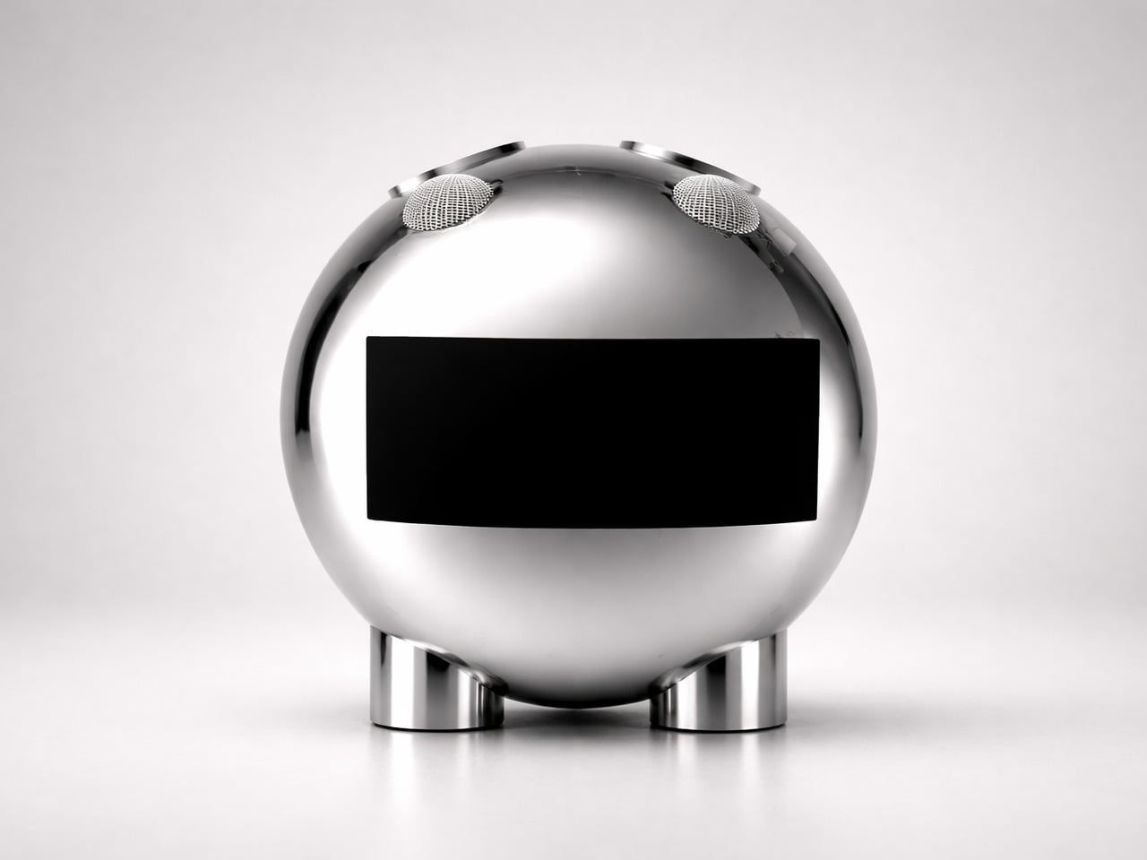
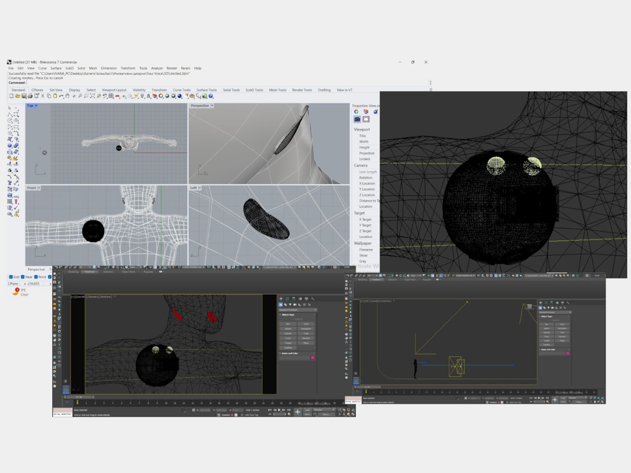
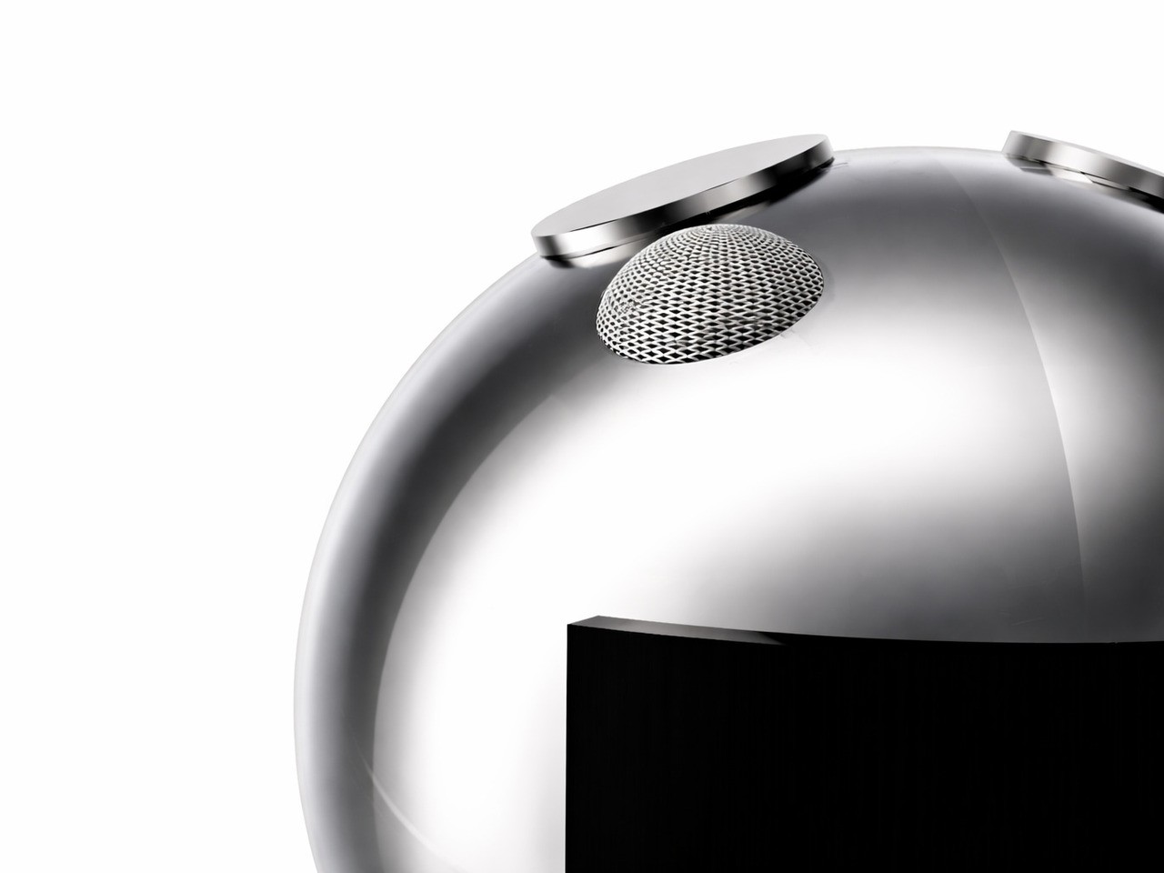
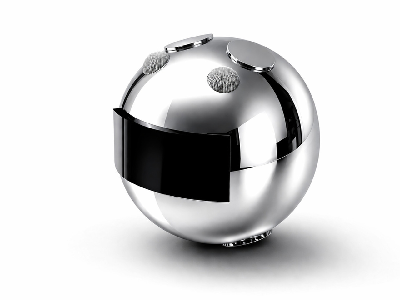
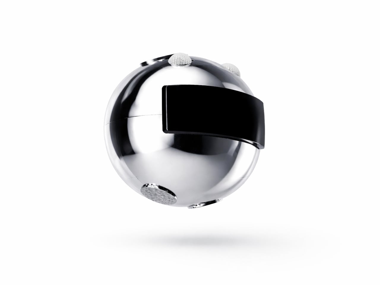
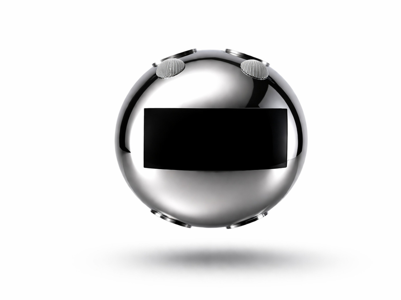
Your Voice consists of two components. A flexible patch worn on the neck detects the muscular movements the body makes during attempted speech, even when the vocal cords produce no sound at all. Those signals are transmitted in real time to a small, spherical robotic unit, which converts them into audible speech. The patch reads the intention; the robot gives it a voice.
What that means in practice is the removal of the pause that defines most assistive communication right now. Someone with a speech impairment attending a meeting doesn’t have to look away from the conversation to type out a response. A child who can’t speak can call for a parent without reaching for a device first. The thought and the response happen almost simultaneously.
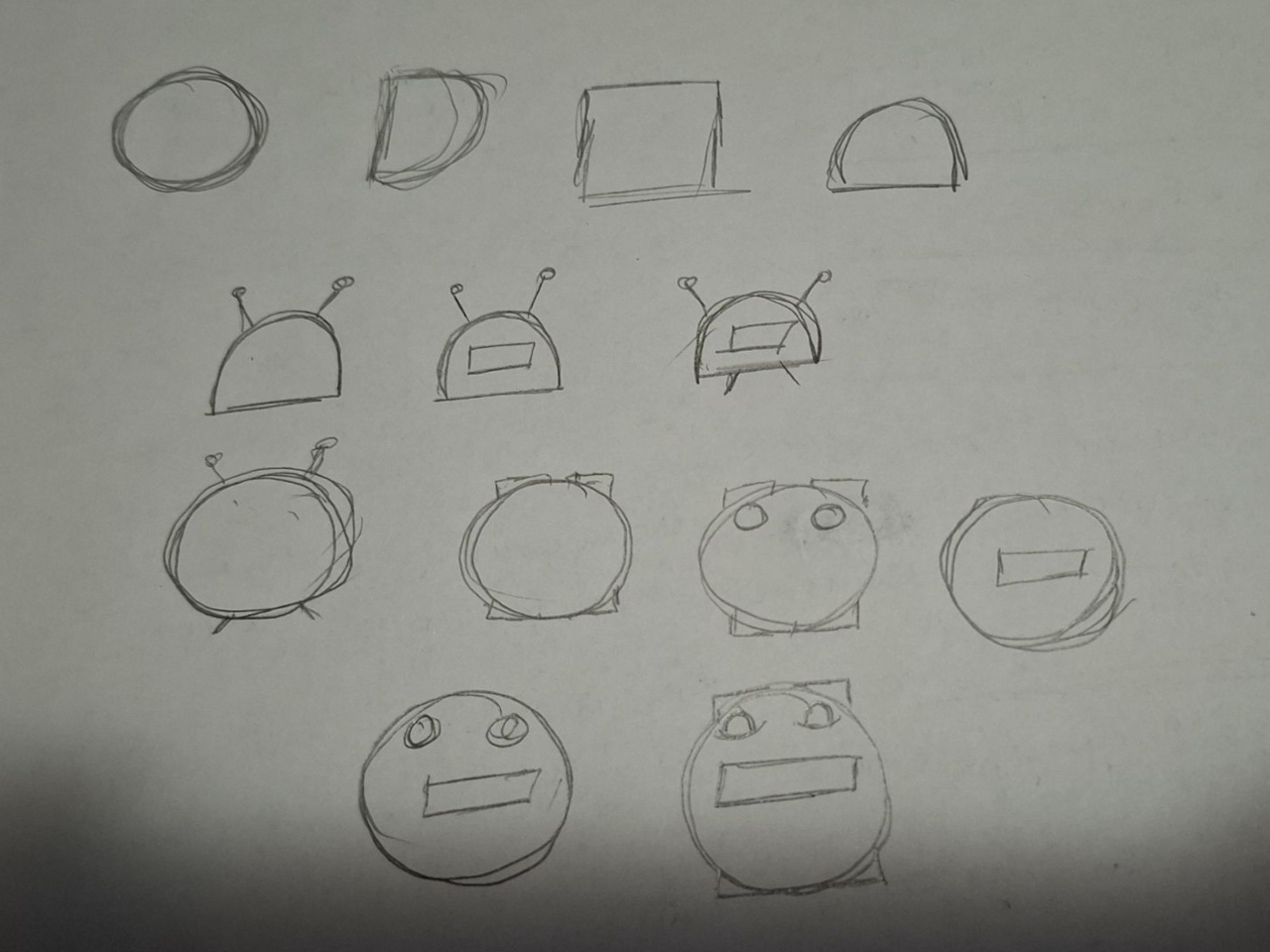
The robotic unit’s form was guided by Nedeljkovska’s early inspiration from an orange, its rounded shape steering the design away from anything clinical. The polished sphere, embedded display panel, and mesh speaker grilles give it a refined look that doesn’t betray its purpose at a glance. It’s something you’d carry without self-consciousness, which matters more in assistive technology than it’s often given credit for.
The display panel on the robot unit adds another layer to the audio output. It shows transcribed words in real time so conversations can continue even in noisy environments or when someone nearby can’t quite hear what was said. The neck patch is designed to sit against the skin comfortably for extended wear, and the robot is compact enough to be held in hand or placed nearby.
Most assistive communication tools are designed around output: a screen to tap, an app to navigate, a board to point at. Your Voice flips that logic by making the body the input. That shift in thinking is arguably the most significant thing the concept offers, more so than any single feature, because it treats a physical limitation as a starting point rather than a constraint.
It’s still a concept, and turning neck muscle signals into reliable speech at scale is a complex engineering challenge. But the direction Nedeljkovska points toward, communication that asks nothing extra of the person trying to be heard, is one that the assistive technology field sorely needs. The ambition isn’t simply to build a better device; it’s to stop making communication feel like work.
A good desk doesn’t happen by accident. Not one loaded with gadgets or overrun with branded accessories, but a workspace where every object earns its place. The stationery you choose sets the tone for how you think, write, and create. When a pen, tray, or ruler is designed with real intention, it stops being background noise and starts becoming an active part of the process itself.
The five pieces collected here share a common thread: they solve real problems without announcing themselves. Each one sits at the intersection of craft, function, and restraint. Whether you’re sketching, drafting, or writing longhand, these objects won’t compete for your attention. They’ll quietly make you better at whatever you’re doing. That’s the standard every great piece of stationery should meet, and these five clear it with ease.
1. Inseparable Notebook Pen
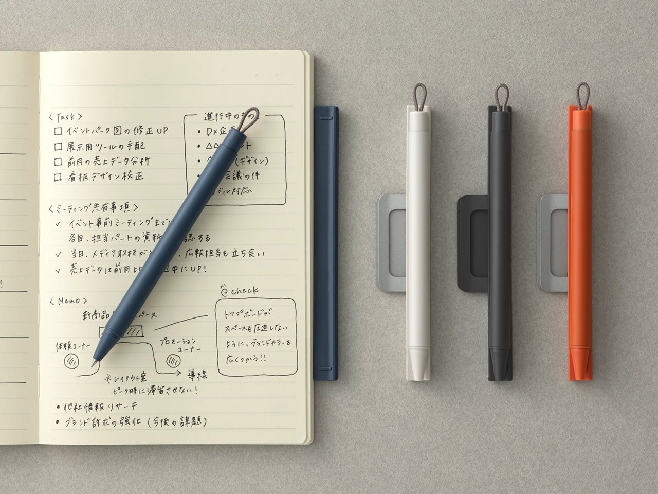
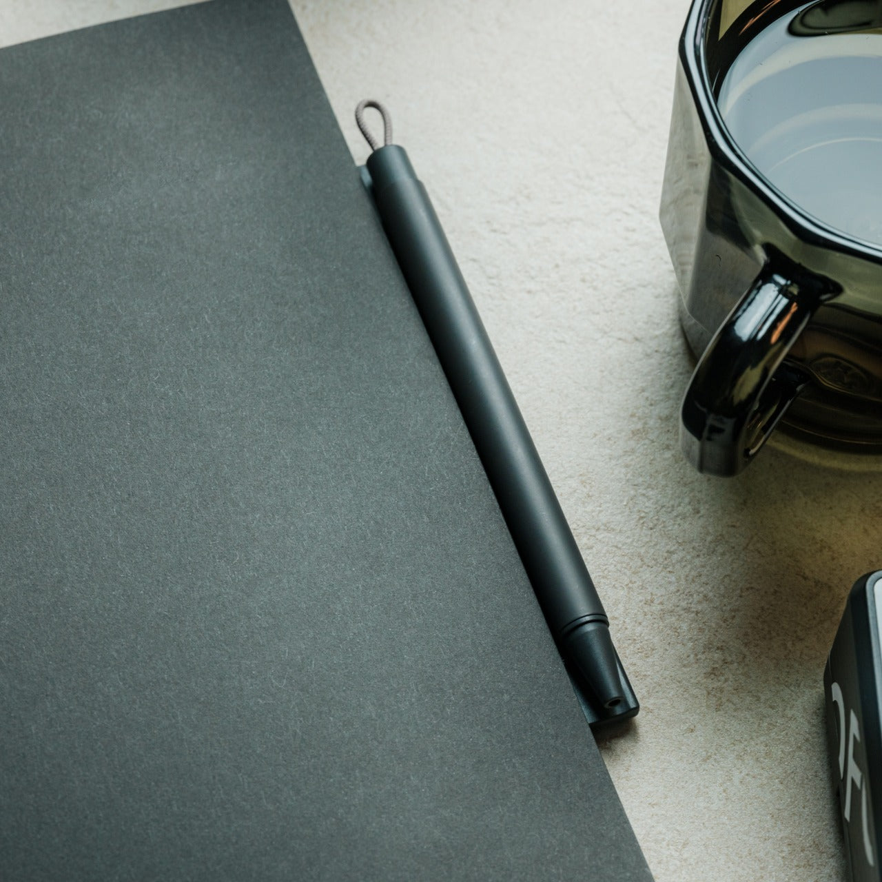
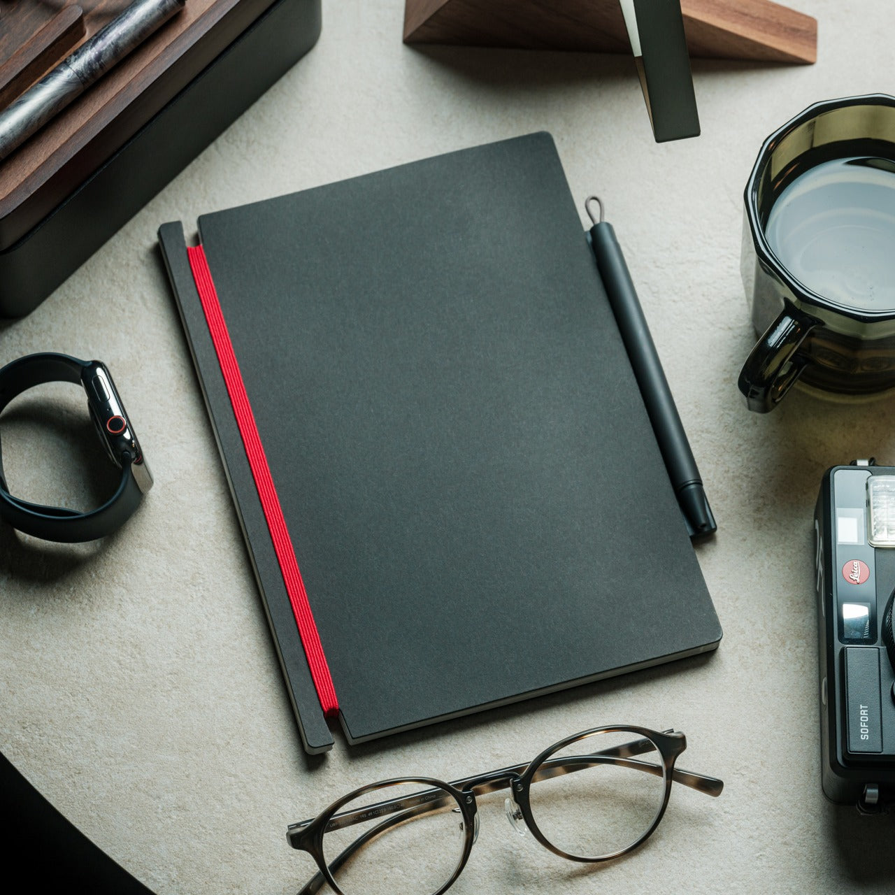
A pen that stays with its notebook sounds like a small idea, but the execution here is anything but minor. Built around a magnetic clip that secures directly to the cover, this piece eliminates the quiet, persistent frustration of reaching for a pen that isn’t there. The minimalist form is unobtrusive, the grip comfortable, and the ink flow smooth enough that writing feels less like a task and more like a reflex you’ve always had.
What makes this pen genuinely useful for daily writing is the built-in silencer, a detail that turns something mechanical into something refined. When you attach or detach it from the notebook, there’s no sharp click, just a quiet, satisfying motion. For anyone who writes regularly, that kind of sensory attention matters more than it should. The pen becomes an extension of the notebook rather than a companion to it, which means your ideas and the tool to capture them are always in the same place.
The magnetic clip keeps the pen fixed to the notebook cover at all times, so losing your writing tool mid-session is no longer a possibility
The built-in silencer makes attaching and detaching feel considered and refined rather than mechanical
What We Dislike
The design works best when paired with its intended notebook, which limits its versatility as a standalone pen
The minimalist form may reduce compatibility with notebooks of varying cover thickness or material
2. Solid Copper & Brass EDC Clutch Pencils
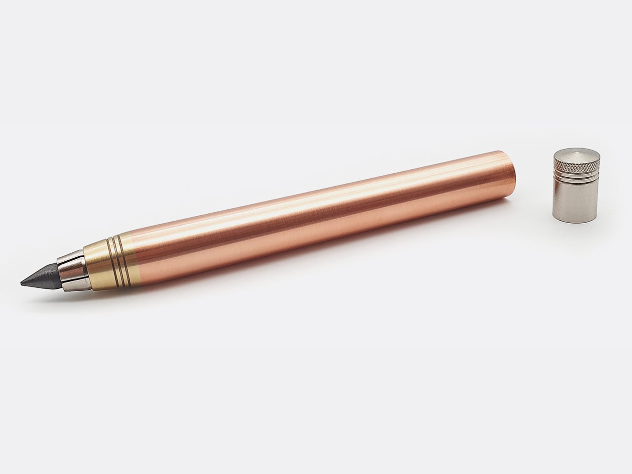
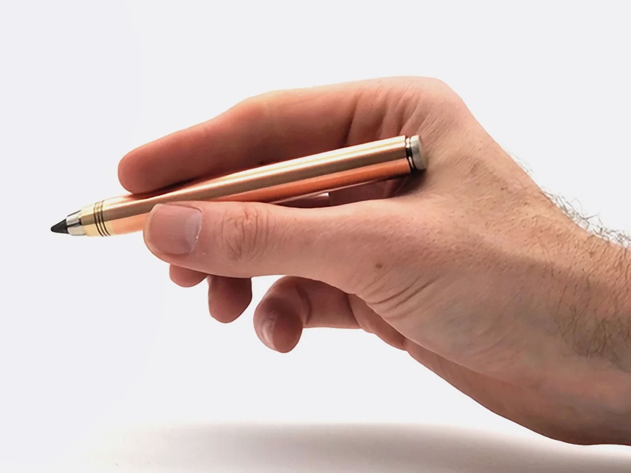
Nicholas Hemingway’s clutch pencils are machined from solid metal bar stock, not hollow tubes or plastic wrapped in metallic finishes, and that distinction matters from the first time you hold one. Copper weighs 8.96 grams per cubic centimeter, and brass sits at around 8.5. Hemingway has built his entire design philosophy around those densities. The mass of the metal body reduces the pressure you need to apply to the page, a concept he calls gravity-feed, making longer creative sessions far less fatiguing on the hand.
The 10th anniversary collection includes three pencils: the 5.6mm Copper and Brass Hybrid at 58 grams for shading and life drawing, with a built-in lead sharpener in the push button, and the 2mm Precision series in both brass and copper at around 30 grams each for technical drafting and fine-line illustration. Hemingway ships each version with a specific lead grade matched to its intended use, so you’re never mid-workflow having to swap. Both formats are fully compatible with any lead brand, making them as practical as they are beautifully crafted.
The gravity-feed approach uses the weight of the metal body to reduce hand fatigue across long drawing or writing sessions
Each pencil ships with a lead grade selected to match its intended use, removing the guesswork entirely from setup
What We Dislike
The solid metal construction makes these significantly heavier than standard options, which won’t suit every hand or working style
The price point of hand-machined tools will be a barrier for casual or occasional users
3. KNOB. Pen Tray
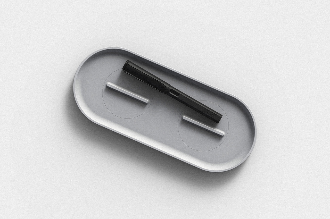
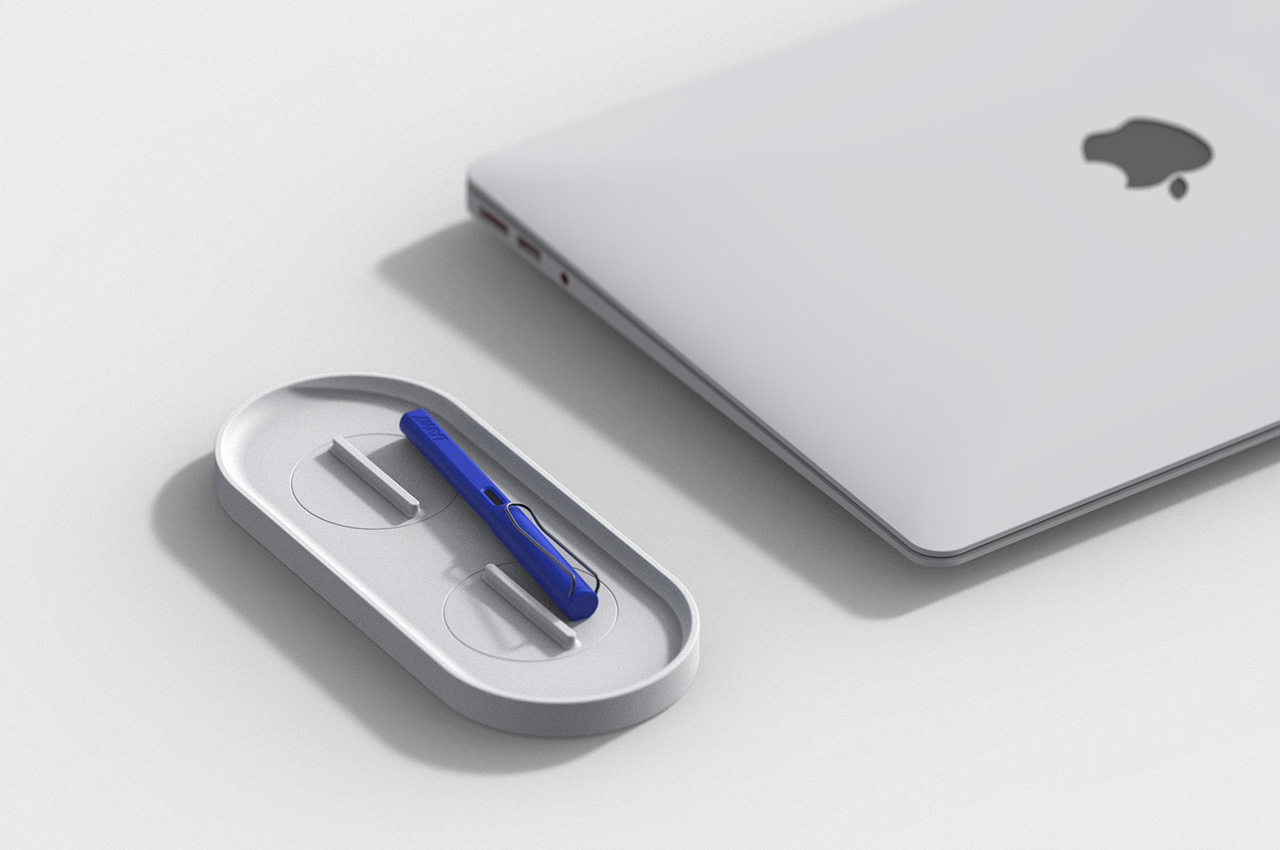
Changho Lee’s KNOB. Pen tray is one of those rare desk accessories that rewards both looking at and actually using. The form is clean and minimal with rounded edges, but the real story lives in the knobs, borrowed from the design language of gas burner controls and reimagined as adjustable dividers inside the tray. Those knobs let you reconfigure the interior space in any direction, depending on what you’re organizing and how you want to arrange it on a given day.
For anyone who cycles between different tools, the KNOB. tray removes the need for multiple organizers competing for desk space. One tray handles everything because you can reshape its interior for whatever you need at any given moment. That kind of adaptable functionality is genuinely rare in desk accessories, which tend to be fixed in their layouts and unforgiving when your needs shift. The visual result is a tray that always looks intentional, regardless of what’s inside it or how the internal dividers have been reconfigured.
What We Like
The adjustable knobs let you customize the internal layout in any direction without tools, additional parts, or a second organizer
The minimal aesthetic keeps the tray from visually cluttering the desk, no matter how it’s currently configured
What We Dislike
The knob-based adjustment mechanism may feel fiddly for users who reorganize their setup frequently throughout the day
The compact footprint may not comfortably accommodate larger or unusually shaped stationery items
4. Eco-Friendly Pencil Sharpener
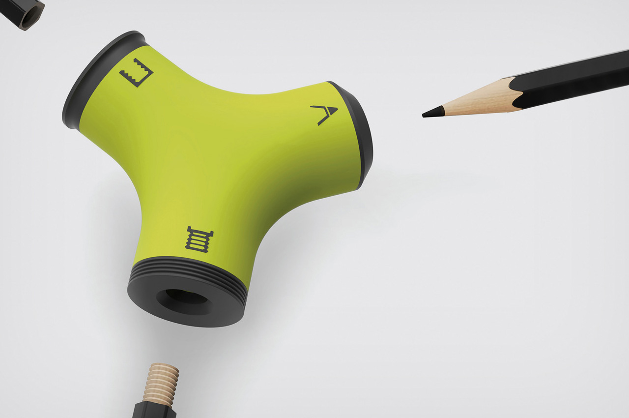
Wang Cheng’s Eco-Friendly Pencil Sharpener is a Red Dot Design Concept Award winner built around one precise and clever observation: pencil stubs don’t need to be discarded. With three sharpening zones, the sharpener handles conventional sharpening but also threads and taps pencils, turning them into wooden screws that connect end to end. A stub that would otherwise be thrown away becomes usable again the moment you screw it into a larger pencil, extending its life without any additional materials or waste.
That mechanism is genuinely satisfying to use, and it shifts how you think about pencils entirely. Threading one end and screwing two together feels intuitive after the first attempt, and the result is a longer, more comfortable writing instrument that has a second act built in from the start. For anyone who goes through pencils regularly, whether sketching, drafting, or writing by hand, this sharpener reframes the stub not as the end of something useful but as the beginning of another productive session.
What We Like
The threading and tapping mechanism extends the life of pencil stubs meaningfully, reducing material waste without requiring anything extra
Winning the Red Dot Design Concept Award confirms that the idea is executed as well as it is inventive
What We Dislike
The three-zone sharpening system introduces more complexity than most casual users will need or ever explore
Screw-together pencils may feel slightly uneven in the hand compared to a single, uniform pencil body
5. Quiver Ruler
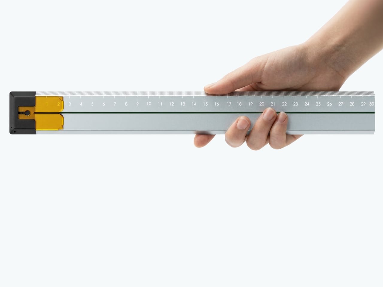
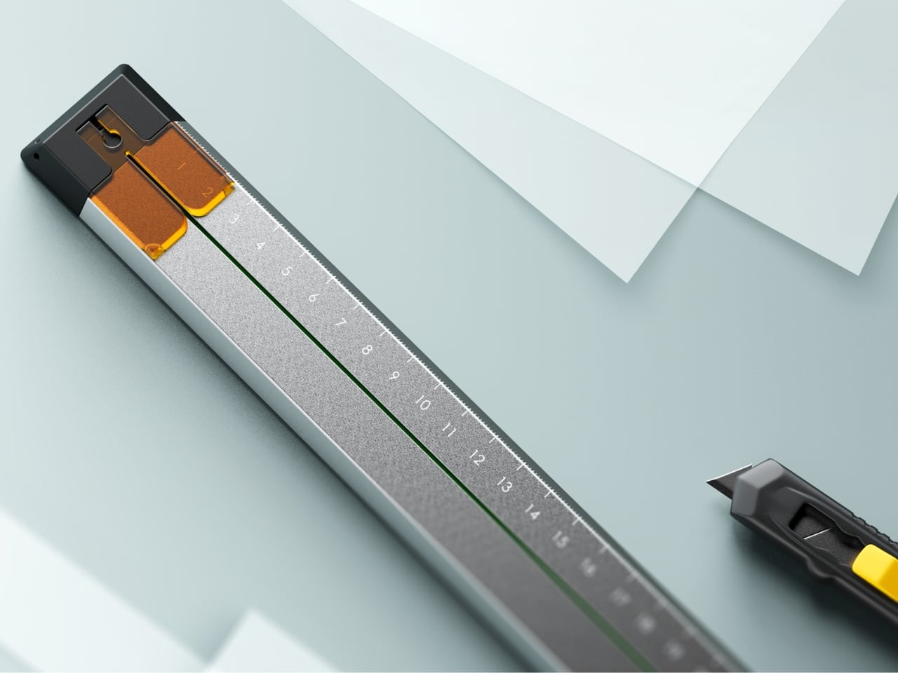
Tunir Maity’s Quiver is an anodized aluminum ruler built for people who actually cut with one, not just measure. It has a clip mechanism that holds paper in place, a blade slit that guides your cut in a straight line, and a weight distribution that favors the cutting end so you don’t have to press down as hard. Made for over 300 cuts with recyclable plastic components, Quiver doesn’t treat shaky hands or imprecise cuts as user failures. It treats them as design problems worth solving properly.
Beyond its cutting functionality, Quiver includes a carabiner attachment for clipping to a bag, which makes it genuinely portable rather than just theoretically so. The anodized aluminum finish gives it a premium presence on any desk, and the minimal profile means it stores flat without consuming unnecessary space. For designers, architects, or anyone who works regularly with physical materials, Quiver is the kind of tool that makes you quietly wonder why rulers weren’t designed this way from the very beginning.
What We Like
The blade channel and clip mechanism make precise, straight cuts achievable without pressing hard or manually holding paper in place
The carabiner attachment makes it easy to carry wherever the work actually happens, rather than leaving it behind on the desk
What We Dislike
Quiver is currently a concept, so availability for purchase has not been confirmed
The emphasis on cutting functionality may feel overbuilt for users who only need a ruler for basic measuring
The Desk You Actually Want
Minimalism isn’t about owning less. It’s about owning better. Each piece on this list earns its place not through novelty or surface-level aesthetics alone, but through how well it understands the person using it. A pen that stays with your notebook, a ruler that guides your blade, a tray that reorganizes itself around your tools. These are objects designed around behavior, not the other way around.
The best stationery doesn’t ask for your attention. It earns your trust slowly, through repeated use, through a grip that feels right after the third session, through a cut that lands exactly where you planned it. The five pieces here share that quality. They’re not trying to be beautiful. They are beautiful because they work, and that’s a distinction worth remembering the next time you’re building a workspace from scratch.
Most smartphones weren’t designed with construction sites or hospital wards in mind. They crack under a single bad drop, struggle with wet or gloved fingers, and can’t survive a pressure wash. Yet these are exactly the environments where reliable communication matters most. Frontline workers are often stuck choosing between powerful devices that can’t take a beating and durable ones too basic to be of any real use.
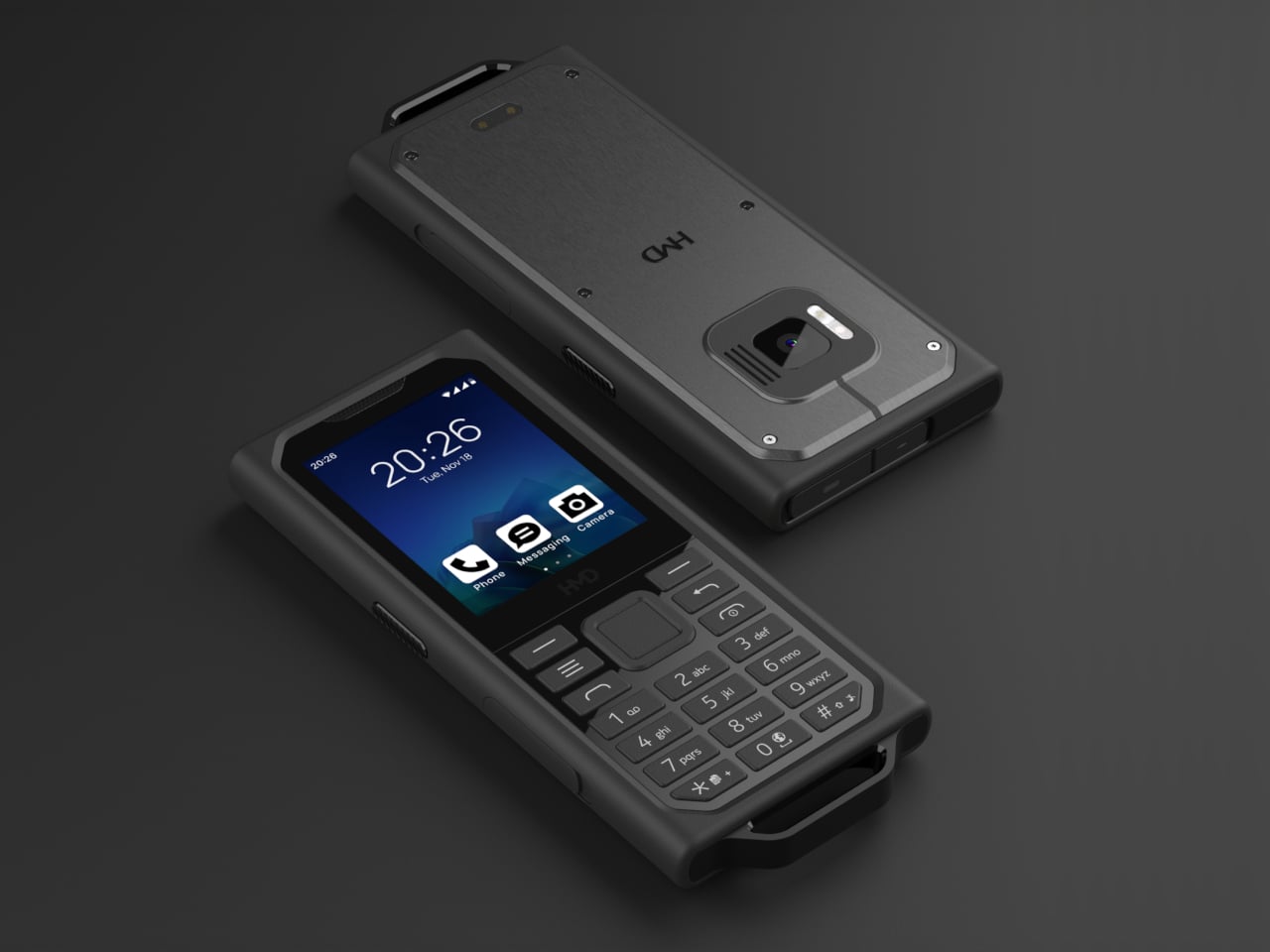
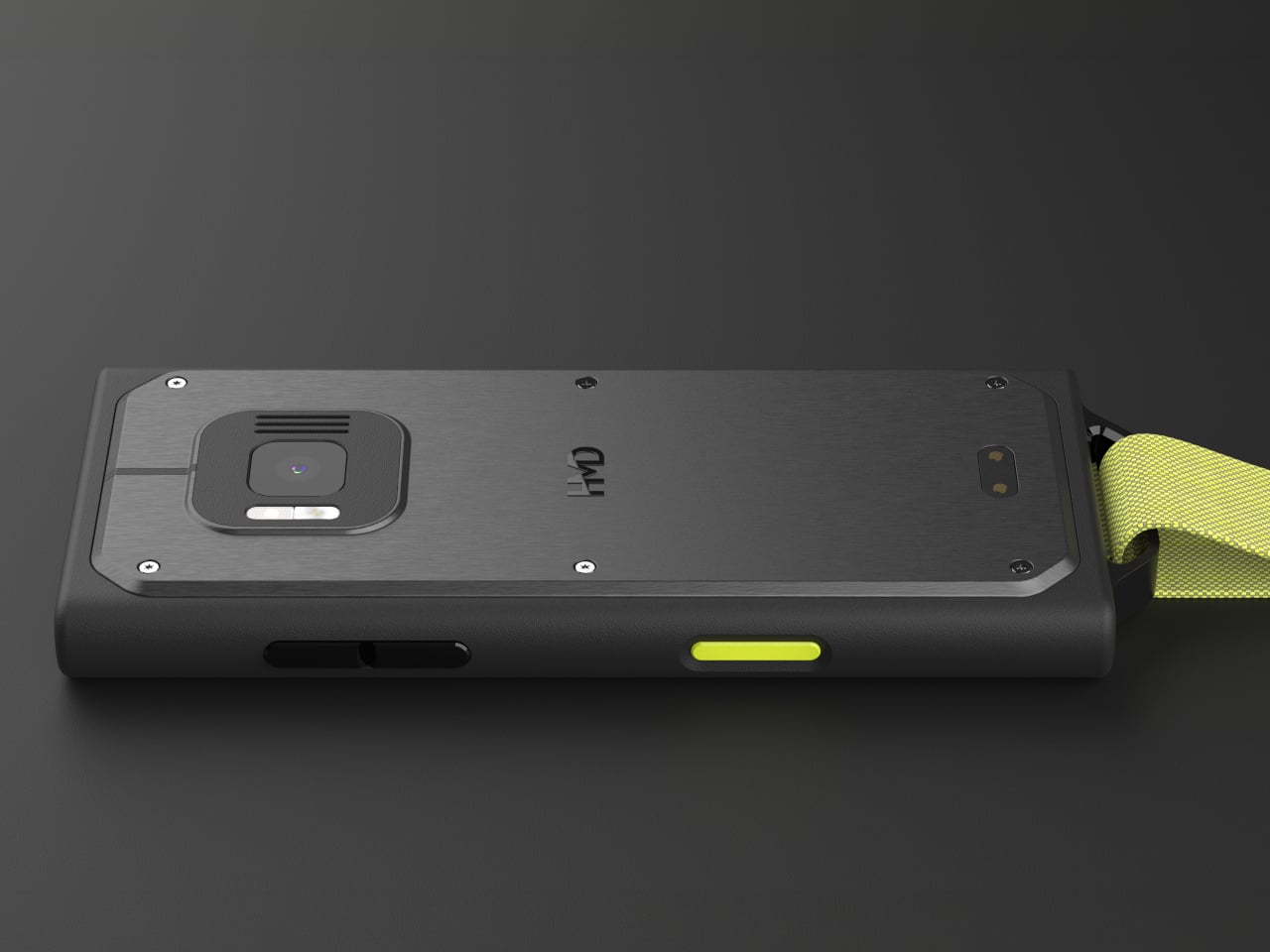
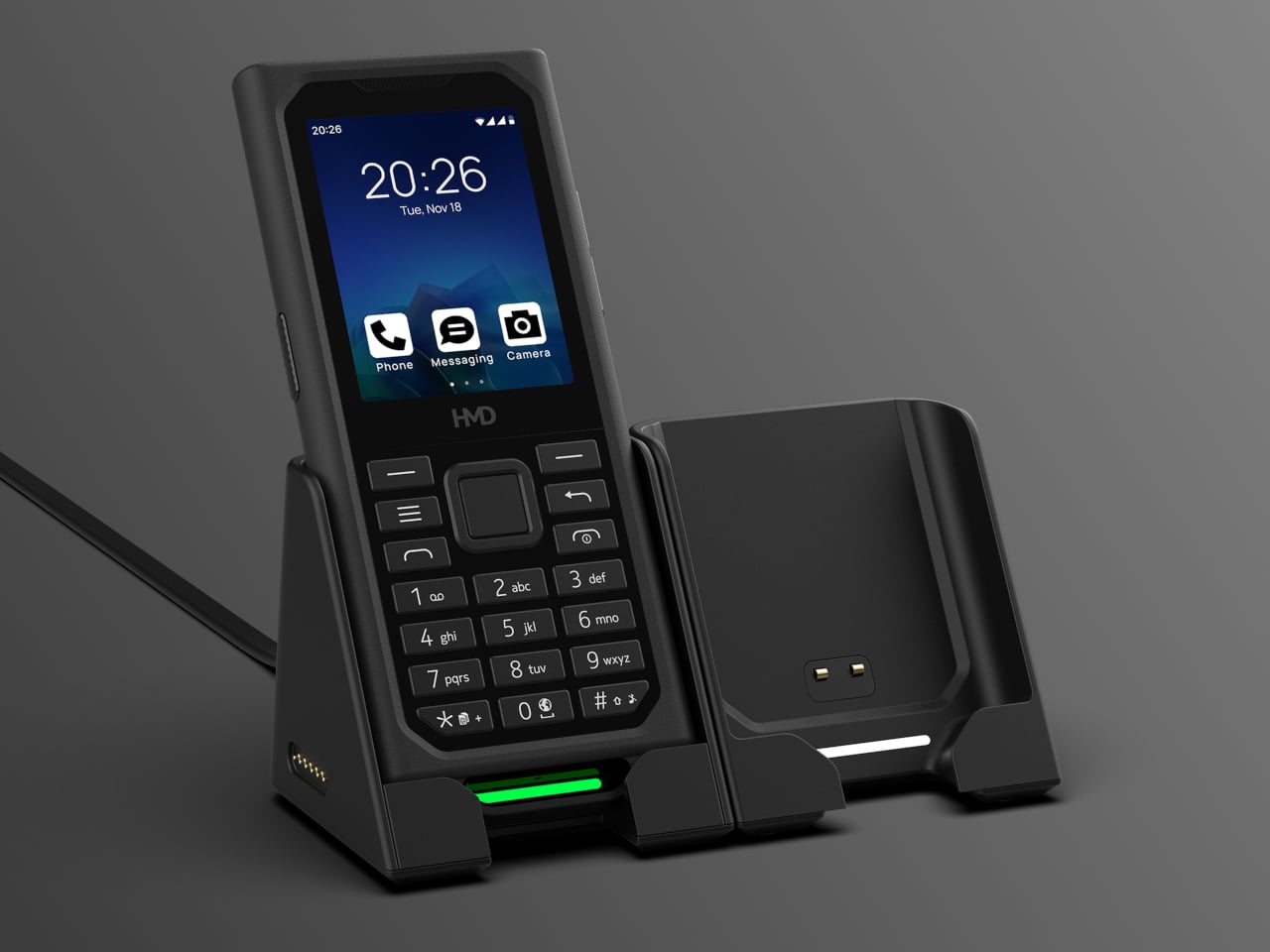
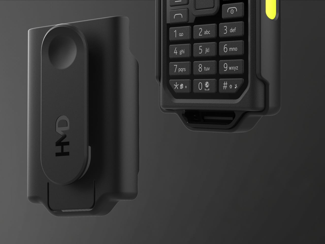
The HMD Terra M tries to close that gap without overcomplicating things. It’s a compact, ultra-rugged feature phone designed to handle the kind of punishment that leaves most consumer devices in pieces. Beyond just surviving harsh conditions, it’s built to actually work well in them, with features tailored for people who spend their shifts outdoors or in places where a dropped call simply isn’t an option.
That starts with its credentials. The Terra M carries both IP68 and IP69K ratings, handling full submersion at 1.5 m for 30 minutes and high-pressure water jets at up to 100 bar and 80°C. It also meets MIL-STD-810H military standards, withstands drops from 1.8 m, and resists gasoline, industrial solvents, and medical-grade sanitizers, covering just about every hazard a field environment can throw at it.
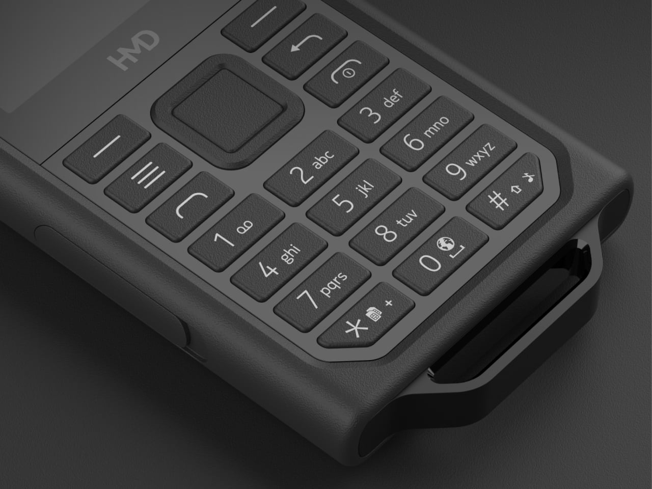
Surviving the job site is one thing, but staying useful there is another. The Terra M has a textured, non-slip grip and large physical keys that work with gloves on, which matters when you’re in the middle of a job and can’t afford to fumble. Its 2.8-inch display reaches up to 550 nits, sits behind Corning Gorilla Glass 3, and responds to both wet fingers and gloved hands.
Communication is where the Terra M earns its keep. Two programmable keys on the side give users instant, one-touch access to Push-to-Talk apps or custom shortcuts without digging through menus. The loudspeaker pushes up to 100 dB, and the microphones come with echo and noise cancellation, so you can be heard clearly even on a loud construction site or in a warehouse with heavy machinery running nearby.
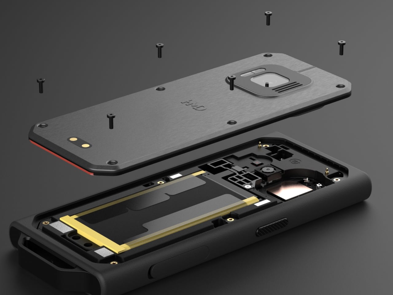
The 2,510 mAh battery is rated for up to 10 days of standby, so field workers don’t have to hunt for a charger mid-shift. Better yet, the battery is user-replaceable on-site without any special tools. Pre-loaded apps include a barcode scanner, a note taker, a sound recorder, and a web browser, among others, meaning the Terra M is genuinely ready to work straight out of the box.
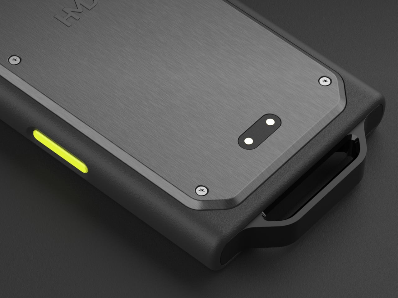
For organizations deploying multiple devices, an optional stackable docking station uses magnetic pogo-pin connectors to charge up to 10 units simultaneously, which suits logistics depots and shift-based teams well. Fleet management runs through Mobile Device Management, with remote OS and security patches delivered via HMD FOTA (Firmware Over The Air). HMD has also committed to five years of quarterly security updates, reducing the overhead of keeping a large deployment current and secure.
The Terra M isn’t trying to compete with the latest flagship smartphones. It’s a practical replacement for the aging two-way radios many frontline teams still rely on, offering modern 4G connectivity, eSIM support, and a proper touchscreen in a form that can take a beating. Priced at £179.99 and available through HMD Secure in select markets, it’s designed for people who simply can’t afford for their phone to fail.
Most smartphones weren’t designed with construction sites or hospital wards in mind. They crack under a single bad drop, struggle with wet or gloved fingers, and can’t survive a pressure wash. Yet these are exactly the environments where reliable communication matters most. Frontline workers are often stuck choosing between powerful devices that can’t take a beating and durable ones too basic to be of any real use.
The HMD Terra M tries to close that gap without overcomplicating things. It’s a compact, ultra-rugged feature phone designed to handle the kind of punishment that leaves most consumer devices in pieces. Beyond just surviving harsh conditions, it’s built to actually work well in them, with features tailored for people who spend their shifts outdoors or in places where a dropped call simply isn’t an option.
That starts with its credentials. The Terra M carries both IP68 and IP69K ratings, handling full submersion at 1.5 m for 30 minutes and high-pressure water jets at up to 100 bar and 80°C. It also meets MIL-STD-810H military standards, withstands drops from 1.8 m, and resists gasoline, industrial solvents, and medical-grade sanitizers, covering just about every hazard a field environment can throw at it.
Surviving the job site is one thing, but staying useful there is another. The Terra M has a textured, non-slip grip and large physical keys that work with gloves on, which matters when you’re in the middle of a job and can’t afford to fumble. Its 2.8-inch display reaches up to 550 nits, sits behind Corning Gorilla Glass 3, and responds to both wet fingers and gloved hands.
Communication is where the Terra M earns its keep. Two programmable keys on the side give users instant, one-touch access to Push-to-Talk apps or custom shortcuts without digging through menus. The loudspeaker pushes up to 100 dB, and the microphones come with echo and noise cancellation, so you can be heard clearly even on a loud construction site or in a warehouse with heavy machinery running nearby.
The 2,510 mAh battery is rated for up to 10 days of standby, so field workers don’t have to hunt for a charger mid-shift. Better yet, the battery is user-replaceable on-site without any special tools. Pre-loaded apps include a barcode scanner, a note taker, a sound recorder, and a web browser, among others, meaning the Terra M is genuinely ready to work straight out of the box.
For organizations deploying multiple devices, an optional stackable docking station uses magnetic pogo-pin connectors to charge up to 10 units simultaneously, which suits logistics depots and shift-based teams well. Fleet management runs through Mobile Device Management, with remote OS and security patches delivered via HMD FOTA (Firmware Over The Air). HMD has also committed to five years of quarterly security updates, reducing the overhead of keeping a large deployment current and secure.
The Terra M isn’t trying to compete with the latest flagship smartphones. It’s a practical replacement for the aging two-way radios many frontline teams still rely on, offering modern 4G connectivity, eSIM support, and a proper touchscreen in a form that can take a beating. Priced at £179.99 and available through HMD Secure in select markets, it’s designed for people who simply can’t afford for their phone to fail.
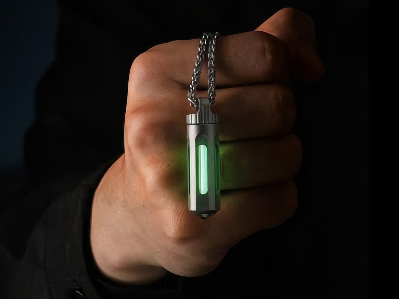
Tritium is a hydrogen isotope with a half-life of 12.3 years. As it decays, beta particles strike a phosphor coating and produce light. The process requires no electricity, no chemical reaction, and no external energy. It simply happens, continuously, for decades. This is why tritium appears in emergency exit signs, military watches, and aviation instruments. The glow is faint compared to an LED, but the reliability is absolute. Nothing else in the consumer lighting world can claim 25 years of operation with zero maintenance.
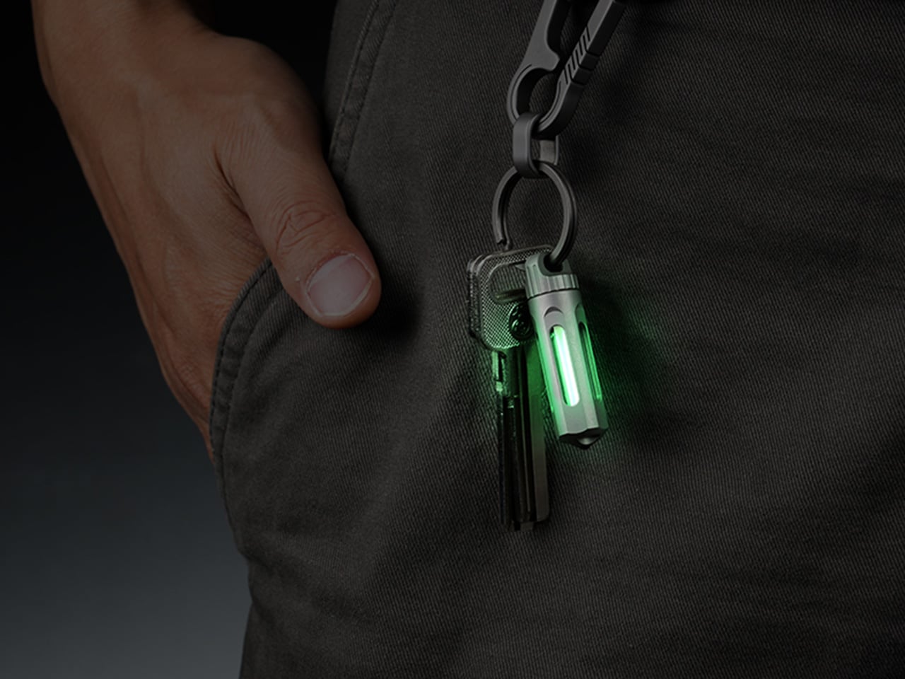
NoxTi by Xedge packages that physics in a 45mm titanium cylinder designed for keychain carry. The tritium vial sits inside a precision quartz tube with 92% light transmission, surrounded by a CNC-machined Gr5 titanium body that weighs just 10.7 grams. The construction is fully serviceable. Two silicone O-rings hold the vial in place, and when brightness fades after two decades, you push the old tube out and slide a new one in. The design includes a ceramic-tipped glass breaker at one end, a keychain hole at the other, and a floating core that’s visible from all sides. Xedge ships it in six colors (Ice Blue, Apple Green, Red, Sunset Orange, Violet, Ocean Blue) and two finishes (sandblasted titanium or black coating). Pricing starts at $25 for a luminescent vial version and $45 for tritium.
The titanium shell measures 45mm long by 12mm wide, putting it in the same size class as a AA battery but considerably lighter. At 10.7 grams, the weight registers as barely-there on a keychain, roughly equivalent to two US pennies. The Gr5 titanium alloy (also known as Ti-6Al-4V) is the workhorse material of the aerospace industry, chosen for its exceptional strength-to-weight ratio and total resistance to corrosion. This alloy doesn’t rust, doesn’t tarnish, and doesn’t degrade in salt water, sweat, or extreme temperatures. Xedge tested the assembly from -20°C to 50°C, and the glow remained steady throughout. The body is CNC-machined, not stamped or cast, which means tighter tolerances and cleaner geometry.
Quartz glass transmits 92% of visible light, far outperforming acrylic or polycarbonate alternatives that yellow and scratch over time. The tube encasing the tritium vial is hermetically sealed, protecting the vial from moisture, dust, and impact. Beta particles from tritium decay are so weak they cannot penetrate paper, let alone quartz. The radiation stays contained. If the tube somehow shattered, tritium is a gas that dissipates instantly with no lingering hazard. The engineering priority here is longevity. The quartz will still be optically clear in 2050.
Two precision silicone O-rings grip the quartz tube at either end, holding it perfectly centered inside the hollow titanium body. The tube doesn’t shift, doesn’t rattle, and appears suspended in midair when you look through the cutouts in the shell. The effect is clean and technical, like looking into a piece of scientific equipment. More importantly, this mounting method makes the vial user-serviceable. When the tritium dims after 20 or 25 years, you press the tube out from one end and slide a fresh one in from the other. No adhesive. No permanent seals. The titanium body becomes a platform you keep forever, swapping cores as needed.
The six color options let you tailor the glow to preference or function. Apple Green is the brightest to the human eye and the most common choice for visibility. Ice Blue reads as cooler and more modern. Red preserves night vision, a carryover from military and aviation use. Sunset Orange, Violet, and Ocean Blue lean aesthetic. Xedge also offers two finishes. The sandblasted titanium option reveals the raw gray-silver lustre of the alloy and develops a patina of micro-scratches over time, creating a lived-in look. The black-coated finish uses a hard scratch-resistant diamond-like coating (DLC) to cloak the body in matte black, letting the glowing core do all the visual work.
The ceramic-tipped glass breaker at the tail end functions as an emergency tool. It’s designed for car windows and similar tempered glass applications. Xedge cautions that it’s for emergencies only, not casual testing, which is the responsible way to position a feature like this on a keychain-sized tool.
NoxTi ships in two versions. The luminescent vial version uses a glow-in-the-dark tube that absorbs ambient light and re-emits it at night, priced at $25. The tritium model glows continuously for 25 years with no external light needed, starting at $45. Both versions ship worldwide with free shipping included. Add-ons include extra vials (three-packs of luminescent tubes for $20, tritium vials for $60), black coating upgrades, quick-release key rings, and stainless steel necklaces. Delivery is scheduled for August 2026.
Think about the last time you actually used the right half of your keyboard while gaming. Your right hand was on the mouse, your left hand was camped on WASD, and every key to the right of G and T was essentially decorative. The numpad, the arrow keys, the entire right side of your keyboard sat there collecting dust while you were busy fragging opponents or managing cooldowns. Keyboards have been designed for typists since the 1860s, and the gaming world has largely just accepted that and moved on.
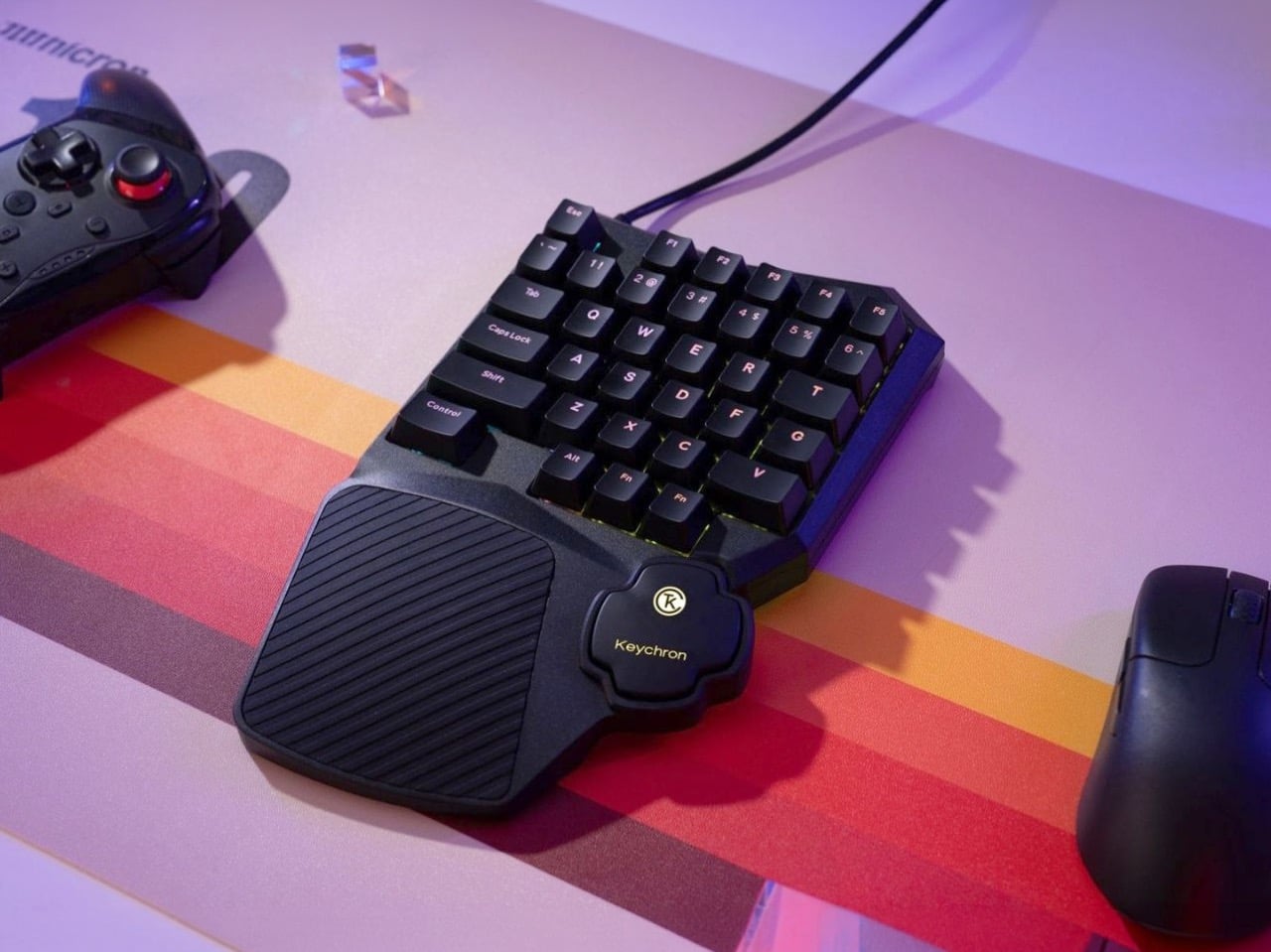
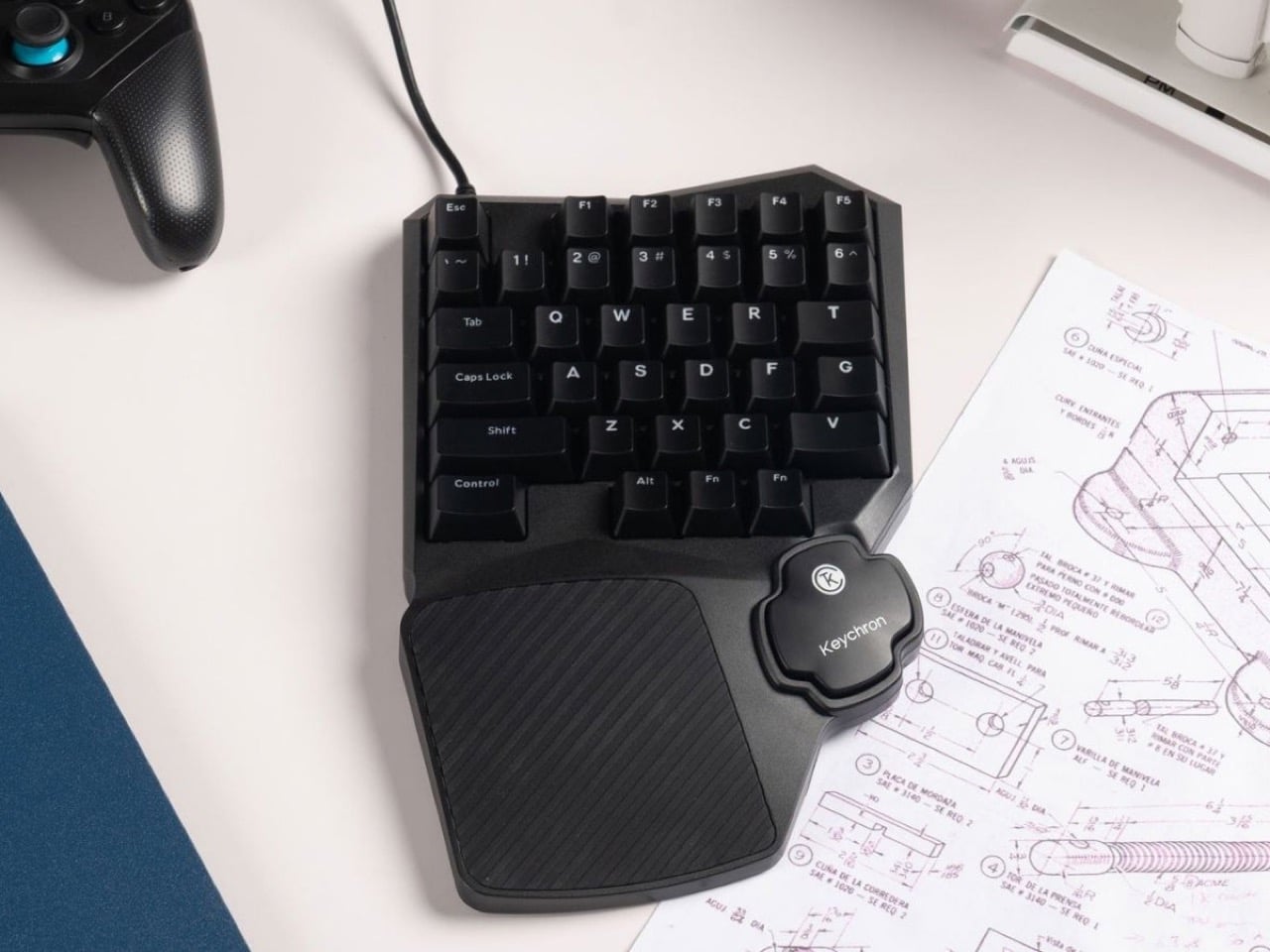
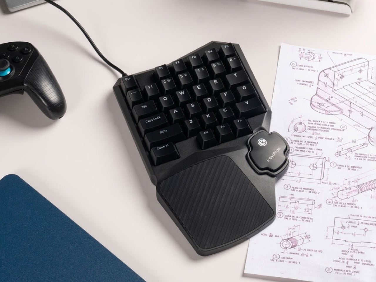
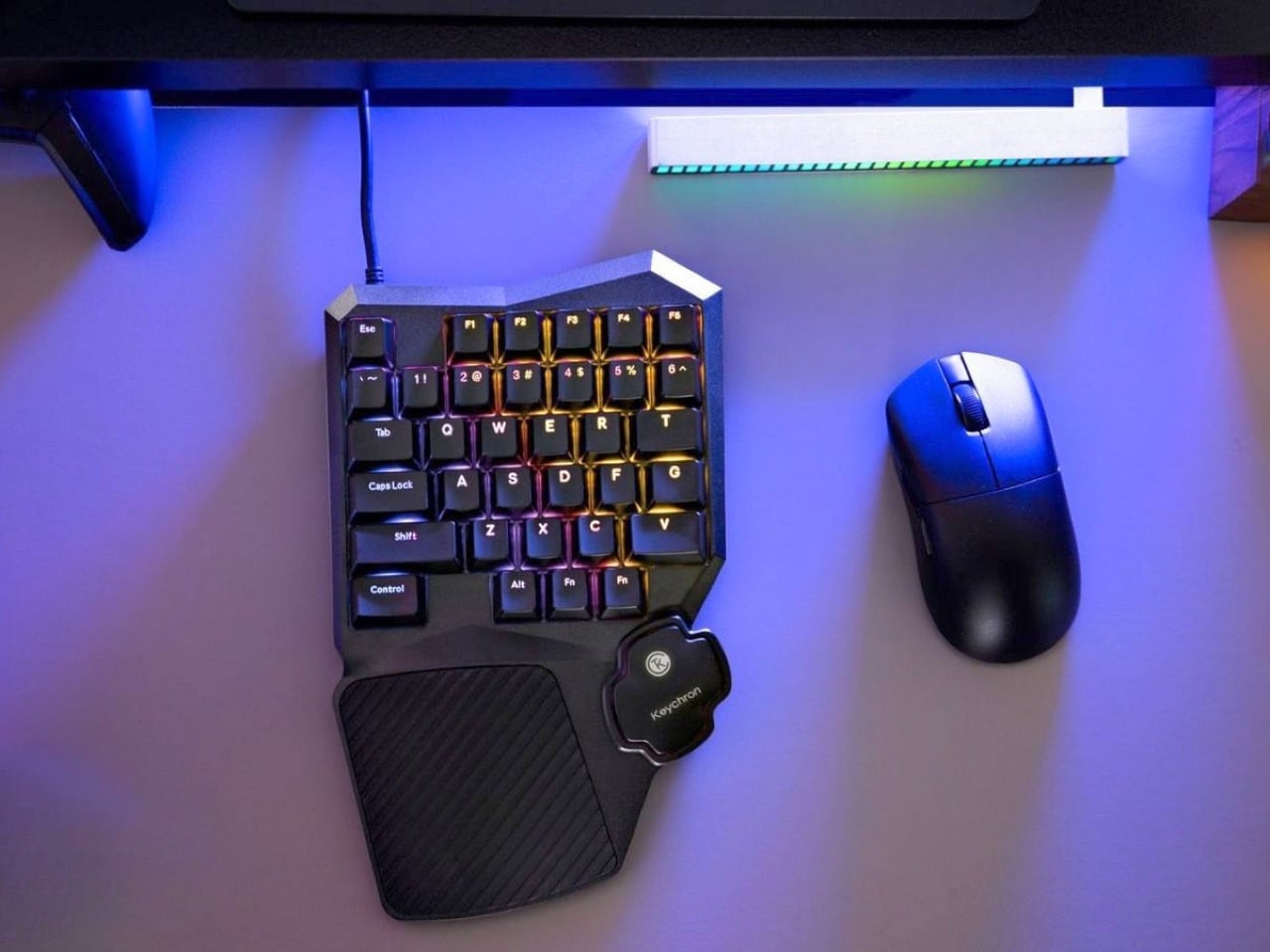
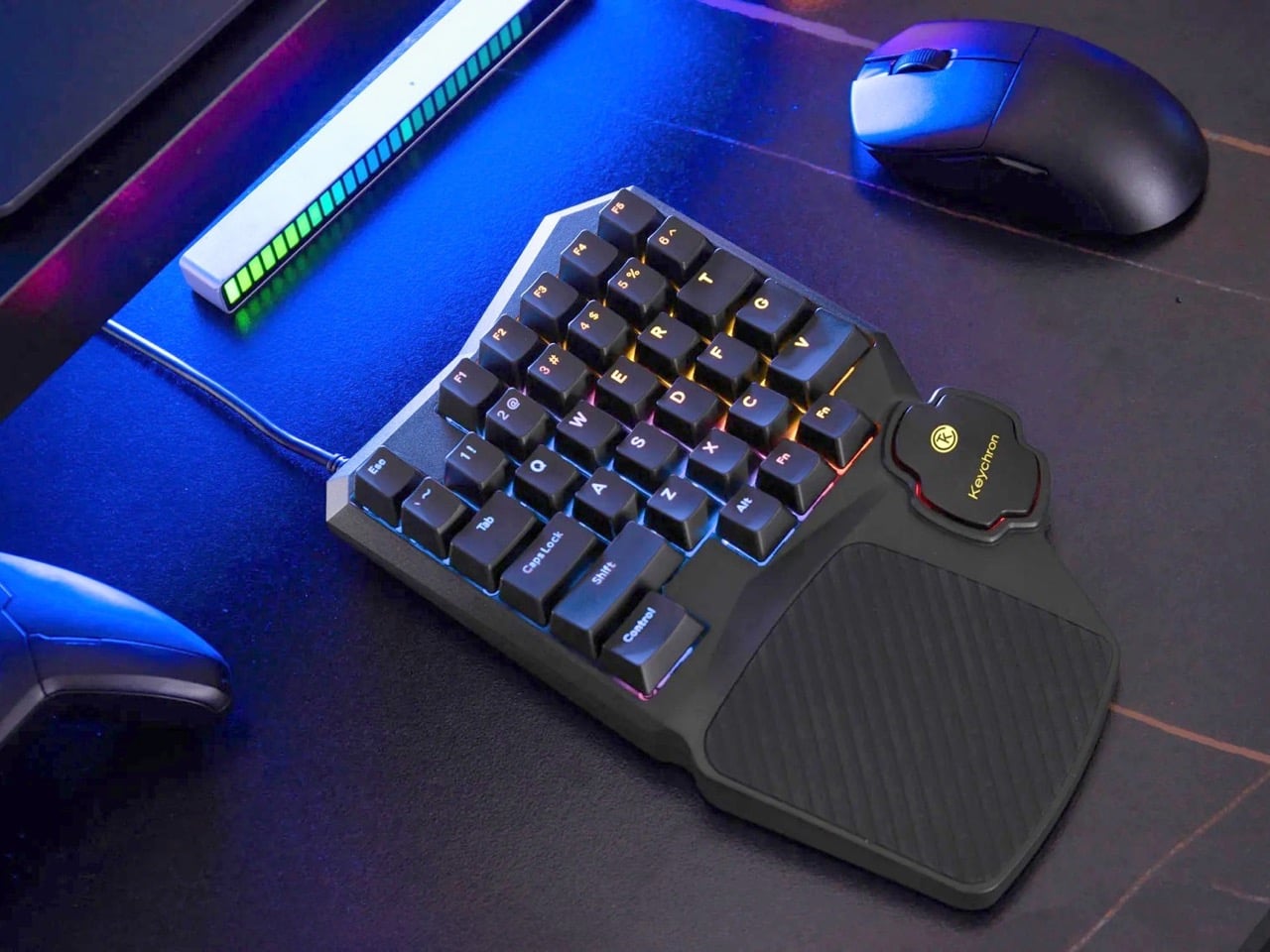
Keychron hasn’t. The C0 HE 8K is a 35-key one-handed gaming keypad that takes the left half of a conventional keyboard, wraps it in an aggressive chassis with a built-in palm rest, and throws Hall Effect magnetic switches and an 8,000 Hz polling rate at it. The result is a peripheral built entirely around how PC gamers actually use their keyboards, rather than how office workers do.
Designer: Keychron
Hall Effect magnetic switches read actuation depth using sensors rather than physical contact between two metal points, which means the switches don’t wear out the same way traditional mechanicals do since there’s no metal-on-metal degradation over time. More practically, you can set exactly how deep each key needs to travel before it registers, right down to fractions of a millimeter, through Keychron’s browser-based Launcher app. Set a shallow actuation for your sprint key, a deeper one for an ability you don’t want to fat-finger, and a rapid trigger profile for keys where you need near-instant re-registration. This level of per-key granularity has historically lived in expensive enthusiast boards, and Keychron is bringing it to a purpose-built gaming pad that fits in half the desk footprint.
At 8,000 Hz, the C0 HE 8K reports its key state to your PC eight times more frequently than the 1,000 Hz ceiling most gaming keyboards hit. You can switch between 1,000, 4,000, and 8,000 Hz in the Launcher app depending on whether you want to conserve USB bandwidth or go full competitive. For most players the difference is nearly imperceptible in casual play, but in titles where frame timing and input consistency matter at the margins, having that headroom available without buying a separate board is a genuinely useful option.
The faceted, angular chassis has beveled edges cutting across the top corners that give the C0 HE 8K a visual identity most gaming peripherals lack entirely. The integrated silicone palm rest flows organically out of the bottom of the unit, wide enough to actually support your wrist rather than just gesture at the concept. North-facing RGB shines through double-shot ABS keycaps in over 22 lighting modes with per-key control, keeping legends readable even in dim setups where the backlighting does most of the work.
Pricing remains under wraps for now. The C0 HE 8K sits in a niche that the Razer Tartarus and Logitech G13 have occupied for years, but neither brought Hall Effect switches or sub-millisecond polling to the category. Keychron has built a reputation on mechanical keyboards that punch above their price point, and if the C0 HE 8K lands anywhere near the $80 to $100 range its feature set suggests, it will be a serious conversation starter for anyone who has ever looked at the right half of their keyboard mid-game and wondered why it exists.
The first thing most people reach for in the morning isn’t a glass of water or a cup of coffee; it’s the phone. From there, it’s a quick trip through news alerts, emails, and a social media feed that didn’t exist last night. Screen fatigue is well-documented at this point, and the solutions that have emerged tend to be more digital tools designed to manage other digital tools.
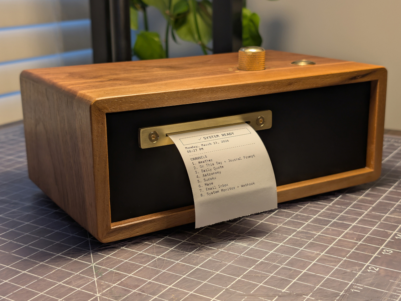
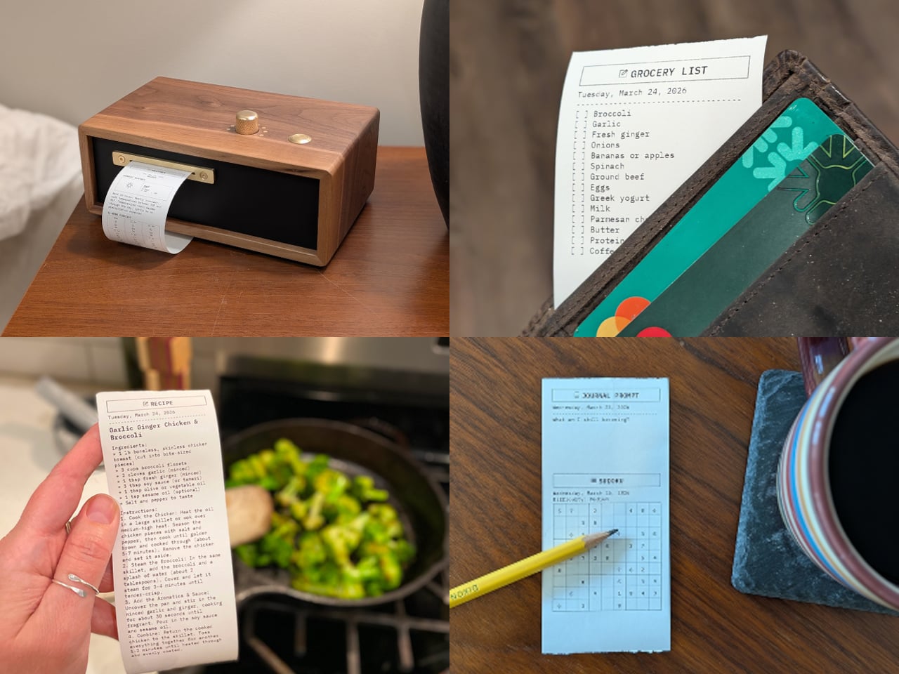
Designer and furniture maker Travis Miller decided to approach the problem differently. His Paper Console PC-1 doesn’t ask you to manage your screen time; it simply offers an alternative that doesn’t involve one. The device is about the size of a toaster and sits on a desk or nightstand, printing your news, weather, puzzles, and other personally selected content on demand, one strip of thermal paper at a time.
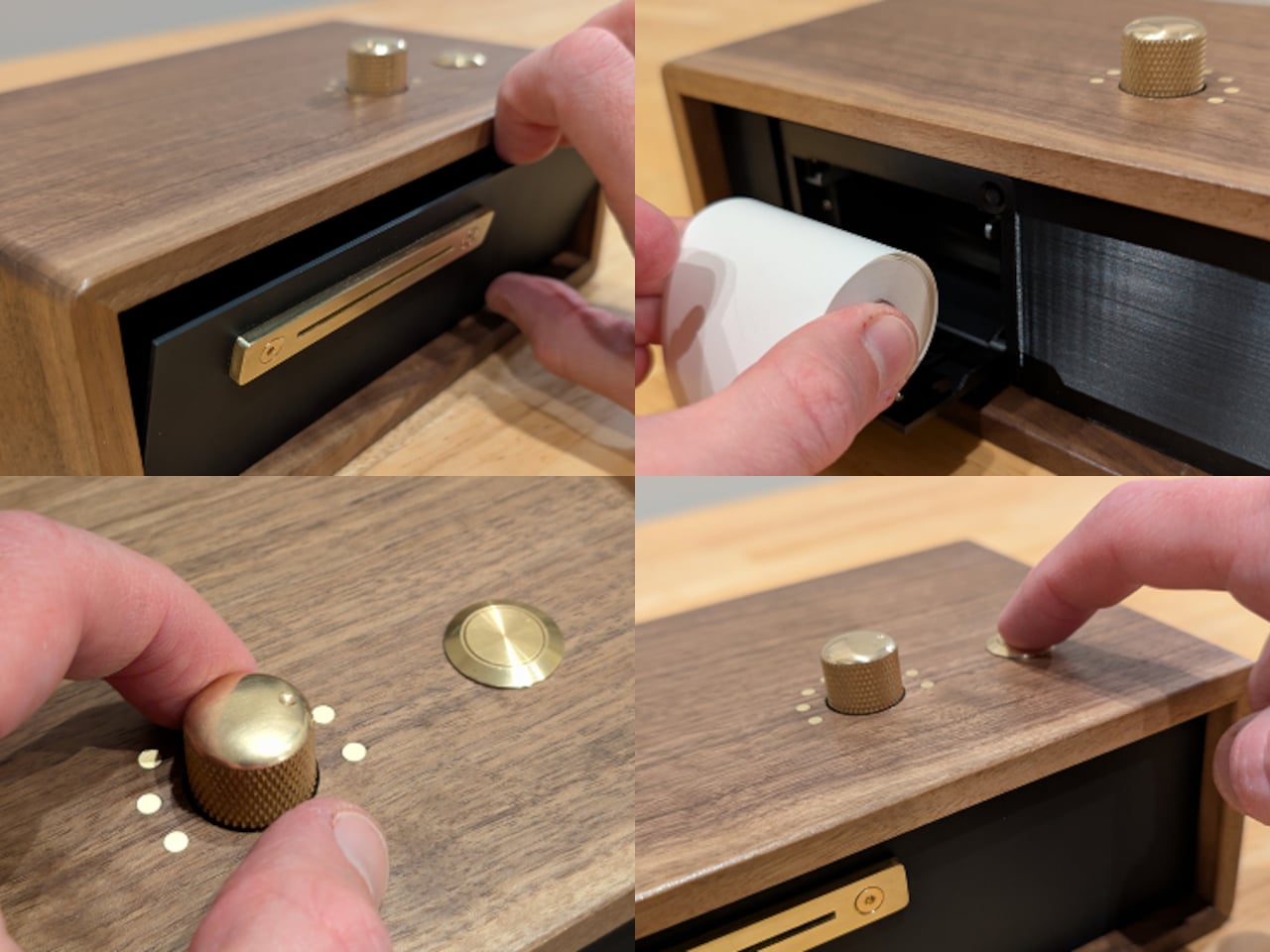
The interaction is deliberately simple. A brass rotary dial on the front selects from up to eight customizable channels, and a single button triggers printing. No menus, no tap targets, no notifications pulling your attention away. The channels can be loaded with whatever content matters most to you, from top news headlines and RSS feeds to weather forecasts, email summaries, astronomy updates, and puzzles like Sudoku and mazes.
Each channel can hold multiple modules stacked in whatever order you prefer, so a single press can deliver a full morning digest: weather first, then headlines, then a journal prompt to think about over coffee. Scheduling is built in as well, so the device can print automatically at set times, silently delivering the day’s content without any input. It’s passive in the best sense.
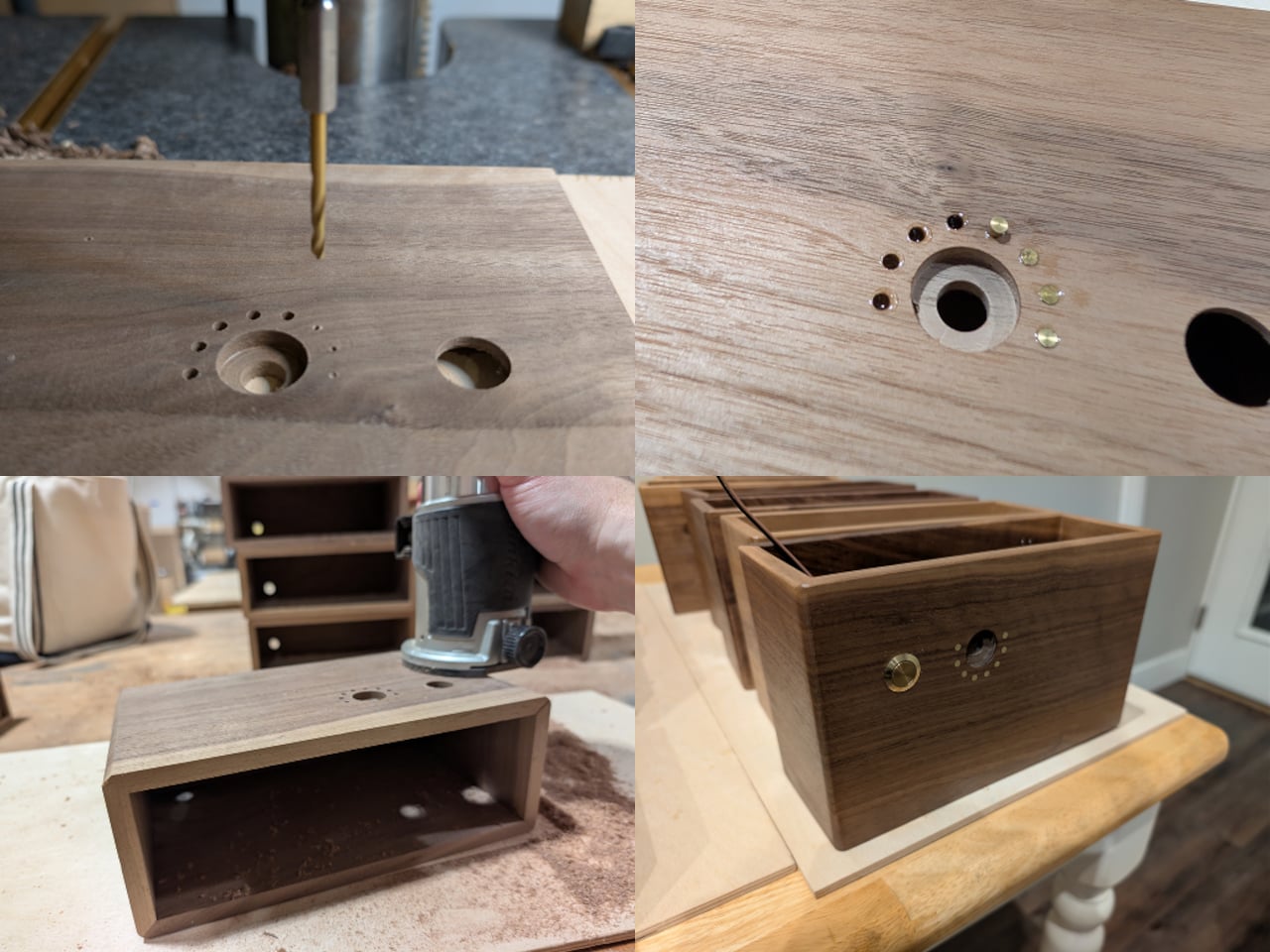
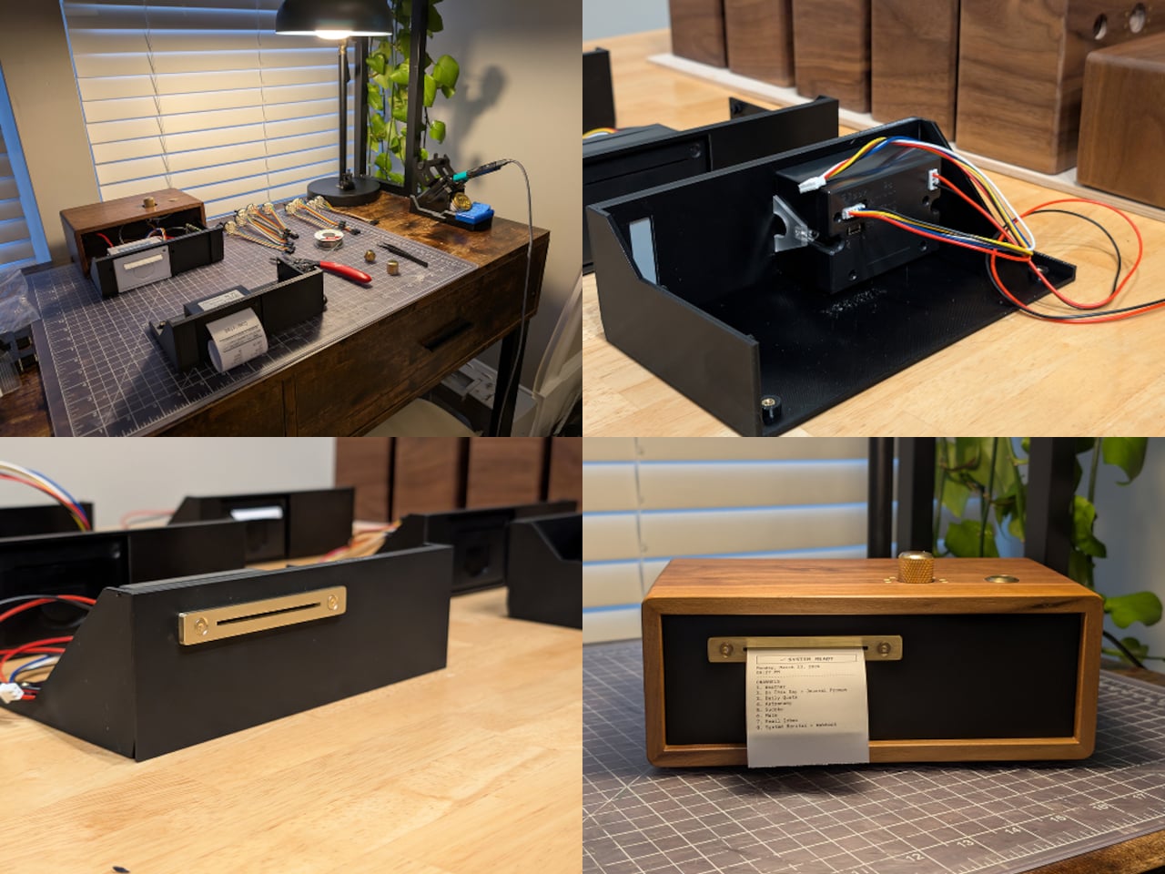
Inside the walnut and brass enclosure is a Raspberry Pi Zero 2 W paired with a 58mm thermal printer. Miller designed and fabricated the case himself, drawing on six years of furniture making, and a 3D-printed internal sled keeps the electronics tidy and mounted. The brass faceplate gives the device the kind of weight and finish that puts it a long way from anything that comes in a retail box.
Miller made only 10 units in this first run, though the full project is open-sourced and documented on GitHub for anyone who wants to build one. That openness suits it well. The PC-1 isn’t a product category or a commercial platform; it’s a personal project that turned out well enough to share. The GitHub documentation is detailed enough to follow and honest about what the build actually involves.
There’s something genuinely refreshing about a device that asks nothing of you except a button press. The Paper Console PC-1 isn’t anti-technology; it’s just more selective about what earns a spot on the desk. Information printed on paper, held in your hand, and torn off when you’re done has a finality that a notification never manages, and for a growing number of people, that difference matters quite a lot.