60Hz Thermal and 4K Night Vision in One Device. SpectraEyes Basically Gives You Superman’s Vision

Military forces figured out decades ago that you need two kinds of vision in the dark: one to detect, one to identify. Heat finds the target, detail confirms it. The problem has always been making both feeds available to a single operator without adding weight, bulk, or the friction of switching between devices. High-end tactical units solved this with helmet-mounted dual-tube systems that cost as much as a used car and require specialized training to operate. Consumer and prosumer markets have lived with the compromise, carrying separate thermals and NVGs or settling for low-refresh overlay systems that blur more than they clarify.

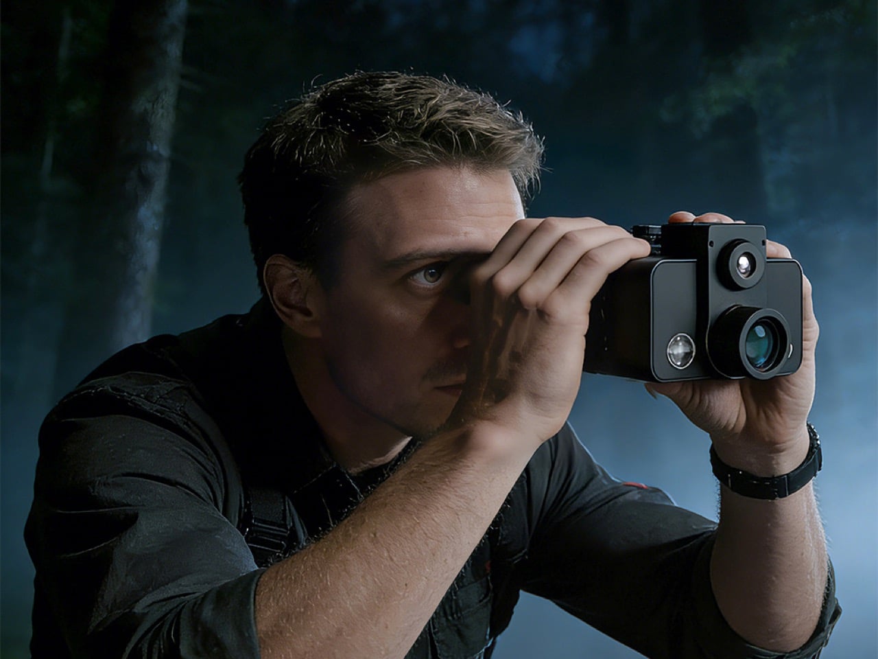
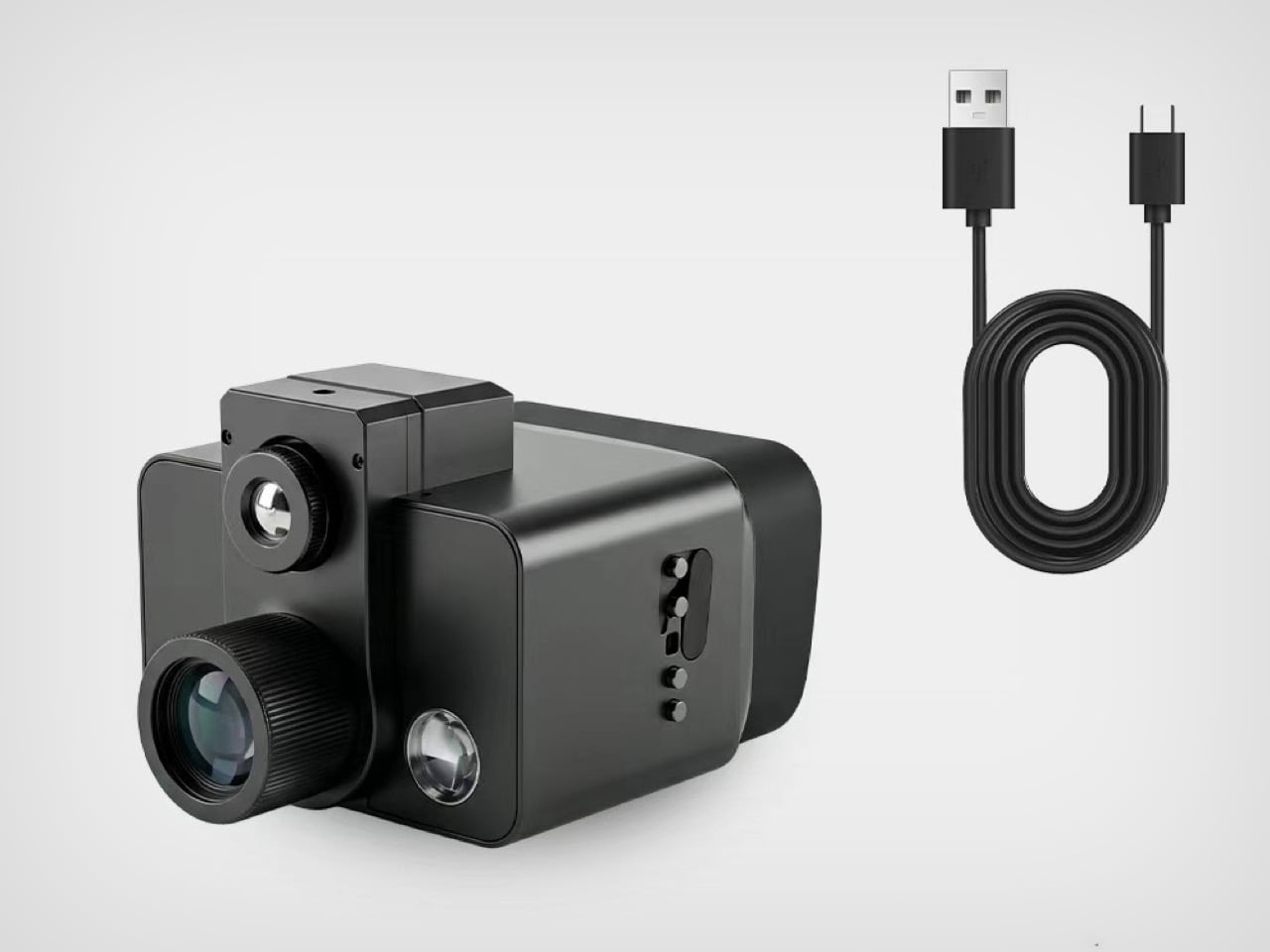
SpectraEyes brings the dual-feed architecture down to the enthusiast and professional level. Developed by a Denver-based team that spent 18 months testing sensor fusion algorithms in high-altitude terrain, the system pairs a 60Hz thermal core with a 4K digital night vision sensor in a synchronized side-by-side display. Each screen operates independently, so you can run thermal-only to conserve battery during long scouts, 4K-only for close-range work, or both feeds simultaneously when the situation demands total awareness. IP67 waterproofing, USB-C fast charging, and an operating range from negative 20 to positive 50 degrees Celsius mean this was engineered for field use, available now at $514 during the current campaign window.

Designer: SpectraEyes

Click Here to Buy Now: $514 $830 (38% off) Hurry! Only 18 days left.
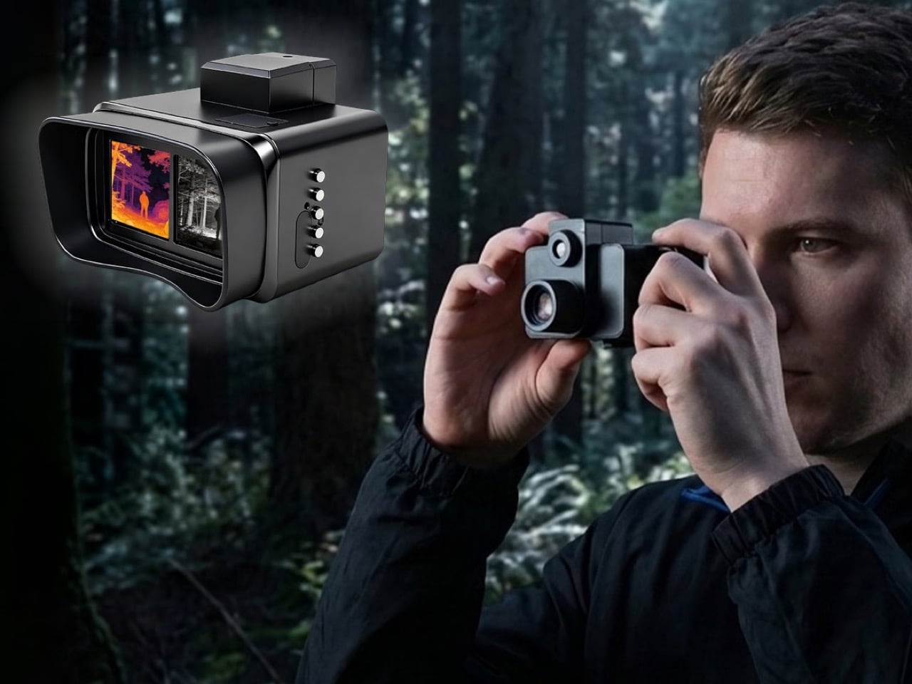
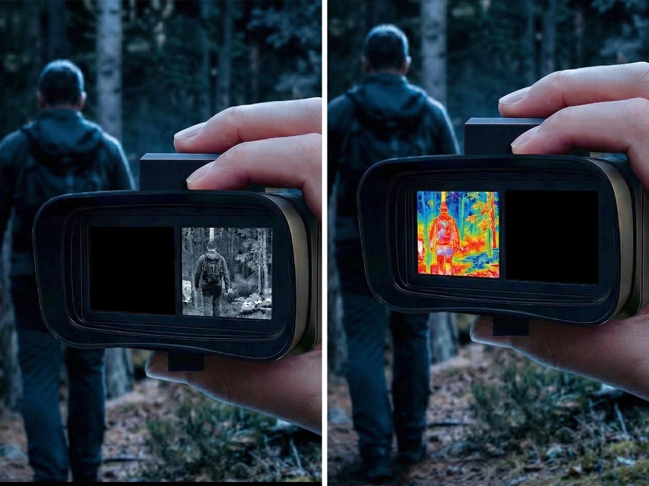
The core innovation lives in what SpectraEyes calls the Real-Time Dual-Screen Synchronization System. Rather than attempting to merge thermal and night vision into a single confused image, the optics route each feed to its own dedicated 1280×720 LCD screen inside the binocular housing. The left screen receives data from a 12-micron thermal sensor running at 60Hz with sub-25mk NETD sensitivity, which translates to the ability to detect temperature differences smaller than 0.025 degrees Celsius. That level of thermal resolution separates a warm body from ambient foliage even when both are nearly the same temperature. The independence of the two displays means your brain processes depth, movement, and context from the night vision channel while simultaneously tracking heat signatures on the thermal side, creating a layered awareness that single-feed systems simply cannot replicate.

Two screens, two feeds, two individual purposes – one Thermal Vision, one Night Vision
The right screen displays output from an ultra-low-light CMOS sensor capable of rendering 4K UHD (3840×2160) footage down to 0.0001 lux, roughly ten times darker than what a human eye can process. In starlight conditions, the sensor delivers full-color imaging, which means you see the actual hues of terrain, clothing, and vegetation rather than the washed-out green associated with legacy analog night vision tubes. In total darkness, the built-in adjustable IR illuminator (850nm and 940nm settings) provides monochrome visibility out to 800 meters without the visible red glow that spooks wildlife or compromises stealth. The choice between 850nm and 940nm wavelengths allows you to optimize for either maximum throw or maximum stealth depending on whether you’re observing skittish animals or working in environments where human detection is a concern.
Most consumer thermal optics run at 9Hz or 30Hz, which produces noticeable lag when panning across a scene or tracking moving subjects. SpectraEyes spec’d a 60Hz thermal core specifically to eliminate that stutter. Whether you’re sweeping a tree line or following an animal through dense cover, the thermal feed stays fluid and responsive. The difference between 30Hz and 60Hz might sound academic until you’re trying to track a running target or assess whether movement in your peripheral vision is wind-blown brush or something warm-blooded, and the lag between what’s happening and what you’re seeing becomes the variable that determines whether you capture the moment or miss it entirely.
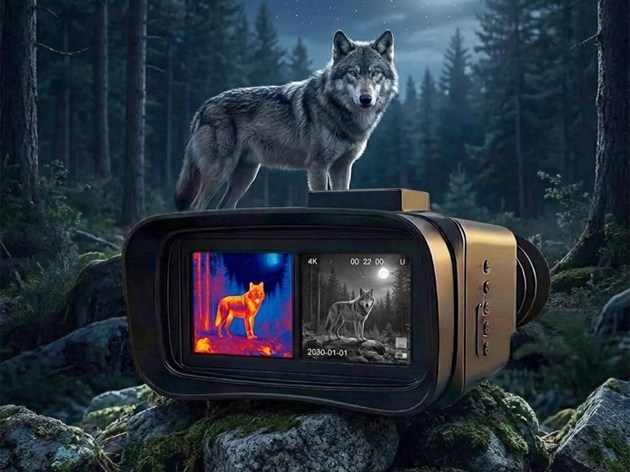
The 7.0mm focal length provides a 24.9-degree by 18.7-degree field of view on the thermal side, wide enough for situational scanning without losing the resolution needed to pick out distant signatures. Thermal detection range reaches 500 meters, digital night vision stretches to 800 meters. The system supports 1x to 10x continuous digital zoom on the night vision channel, useful for identifying details at range without physically closing distance. Zooming in doesn’t degrade the thermal feed, so you can magnify the night vision side to confirm a target’s identity while keeping the thermal side at native FOV to monitor the broader environment for additional heat sources.

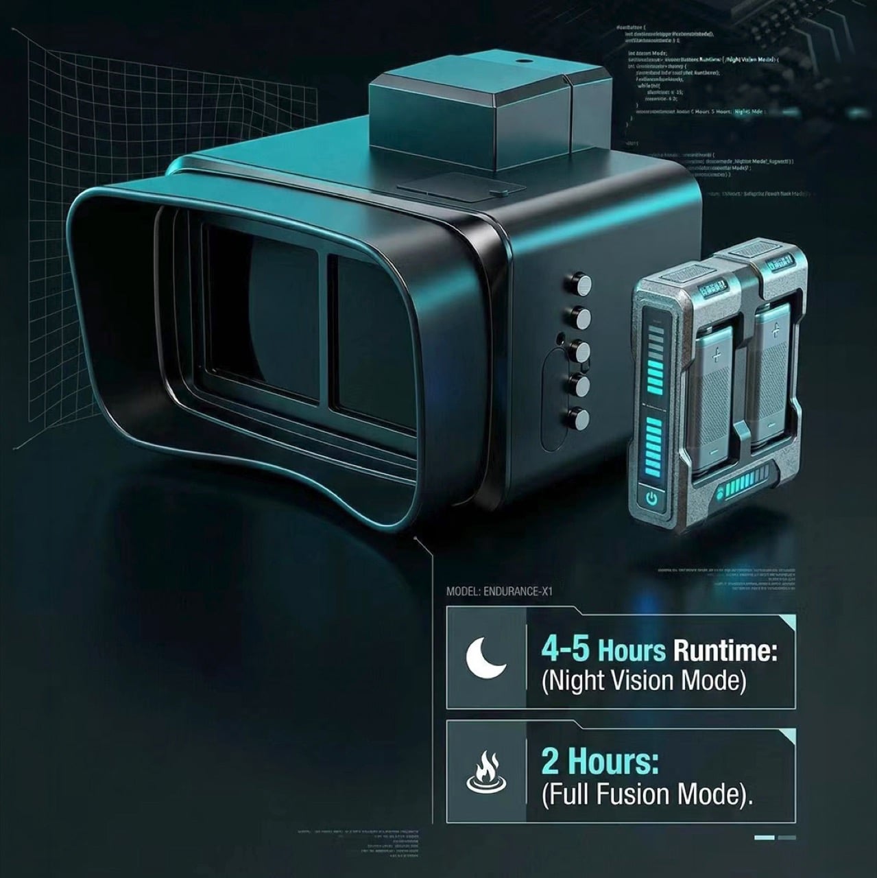
The independent dual-control system means you can toggle each display on or off separately via dedicated buttons on the housing. Running only the thermal channel in scouting mode extends battery life considerably, pulling four to five hours of runtime from the dual replaceable lithium battery setup. Engaging both screens simultaneously in full fusion mode drops that to around two hours, which aligns with what you’d expect from a system pushing two high-refresh displays and processing two sensor feeds in real time. The batteries are external and hot-swappable, so you can carry spares and change them in the field without powering down the unit or losing your position in a critical observation window.

The USB Type-C charging port supports power bank input, so extended missions can be managed with external battery capacity. Storage runs via microSD card, supporting up to 512GB for 4K video recording at 30fps in MP4 or MOV format. Recording captures the night vision feed by default, but you can switch to thermal-only recording or choose to save both feeds as separate files for post-mission review. The ability to document what you observed with native 4K resolution means this doubles as a capture device for wildlife research, security documentation, or any scenario where you need verifiable footage of what happened in low-light or no-light conditions.
The IP67 rating means the housing can handle submersion up to one meter for 30 minutes and shrugs off dust intrusion entirely, appropriate for marine navigation, wet-weather SAR work, or any scenario where gear gets exposed to the elements without warning. The operating temperature range (negative 20 to positive 50 degrees Celsius) covers everything from winter mountain rescue to desert surveillance in summer heat. The form factor is binocular-style rather than monocular, which distributes weight across both hands and allows for more stable long-duration observation compared to single-eye devices that fatigue your grip and throw off your natural field of view balance.
SpectraEyes is currently available through its Kickstarter campaign at $514 as part of the Super Early Bird tier, down from an MSRP of $830. Units ship globally starting June 2026. This is gear built for search and rescue teams who need to spot heat and confirm identity without switching devices mid-operation, for wildlife researchers who track nocturnal behavior across hours of observation, for hunters who work pre-dawn and post-dusk windows where neither thermal alone nor night vision alone tells the full story, and for marine operators navigating in conditions where a buoy, a boat, and a person all look like dark shapes until you layer heat detection over visual context. If you’ve ever carried two optics into the field and spent the night juggling between them, SpectraEyes is the answer to a question the industry has been avoiding for two decades.

Click Here to Buy Now: $514 $830 (38% off) Hurry! Only 18 days left.

The post 60Hz Thermal and 4K Night Vision in One Device. SpectraEyes Basically Gives You Superman’s Vision first appeared on Yanko Design.

The NASA Artemis 2.0 Smartwatch Runs Python And Lets Kids Code Their Own Wearable

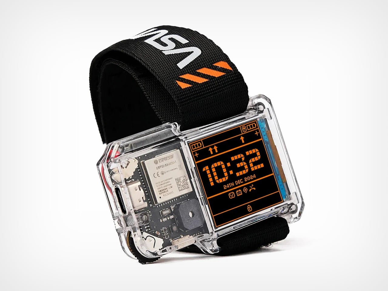
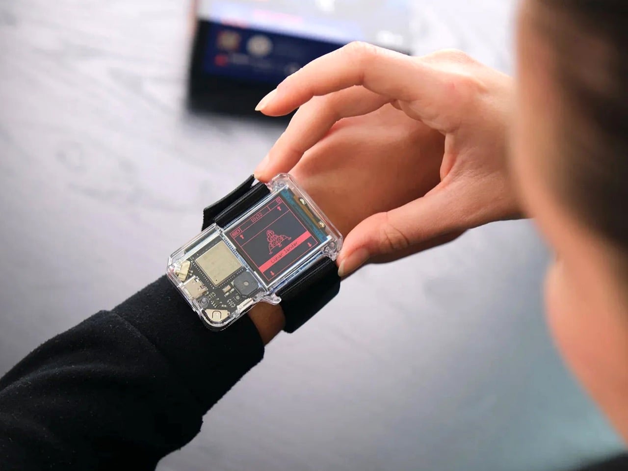
NASA’s Artemis II lifted off from Kennedy Space Center on April 1, 2026, carrying four astronauts on humanity’s first crewed lunar mission in over 50 years. Reid Wiseman, Victor Glover, Christina Koch, and Canada’s Jeremy Hansen are currently aboard the Orion spacecraft, preparing for a lunar flyby that will take them farther from Earth than any humans have traveled since Apollo 13. Space exploration feels immediate again in a way it hasn’t in decades, and CircuitMess timed the NASA Artemis Watch 2.0 perfectly into that cultural moment. This is a $129 programmable smartwatch, fully assembled and ready to use out of the box, inspired by the very mission currently making headlines.

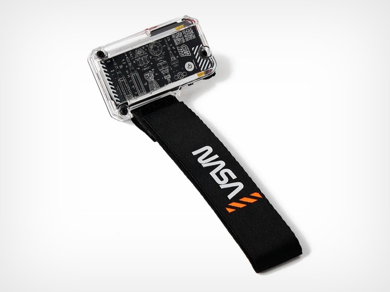
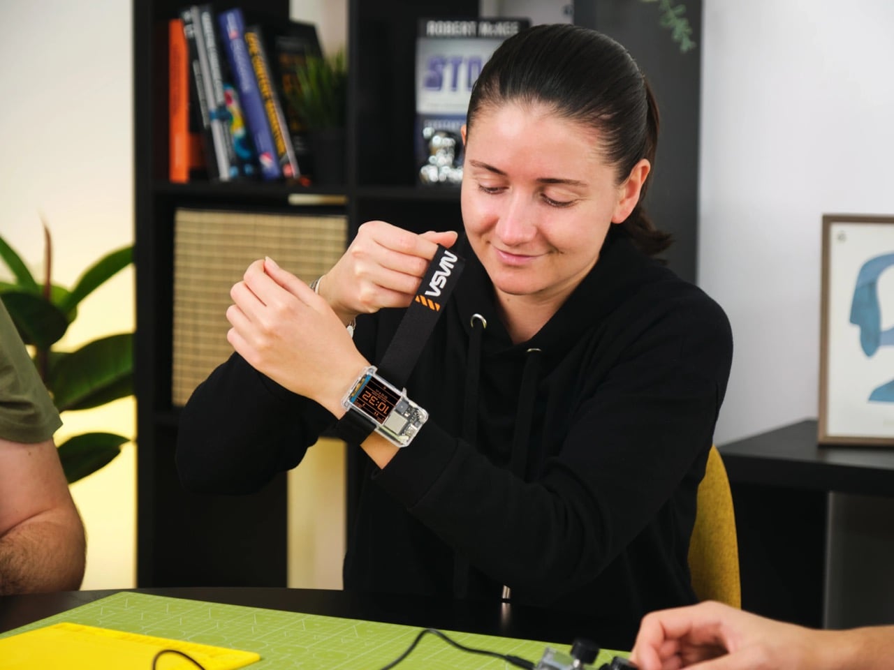
The hardware inside includes a dual-core ESP32 microcontroller, a full-color LCD screen, an accelerometer, a gyroscope, a compass, and a temperature sensor. It pairs with iOS and Android devices over Bluetooth for activity tracking and notifications, and the firmware is entirely open-source, reprogrammable in Python, CircuitBlocks, or the Arduino IDE. You can design custom watch faces, build interactive apps, and modify sensor behavior as deep as you want to go. The age recommendation is 9 and up, which reflects the lower barrier to entry compared to CircuitMess’s Perseverance Rover kit we wrote about earlier. No assembly required, no soldering, just charge it and start exploring.

Designer: CircuitMess

Most smartwatches aimed at kids treat programming as something that happens elsewhere, if it happens at all. You get a companion app with preset themes, maybe a handful of watch face options, and locked-down software that assumes the wearer has no interest in understanding what’s running underneath. The Artemis Watch 2.0 flips that entire model. CircuitMess ships it fully functional, but every layer of the software is accessible and modifiable. The visual block-based CircuitBlocks environment gives beginners a starting point, while Python and Arduino IDE support mean users can graduate to full code without hitting an artificial ceiling. The firmware lives on GitHub as an open-source repository, so there’s no proprietary lock-in and no feature wall you can’t get past.

The dual-core ESP32 processor does real work here. It handles Bluetooth pairing with smartphones, processes sensor data from the accelerometer and gyroscope in real time, and runs whatever custom apps you decide to build on top of the base system. The compass and temperature sensor add environmental awareness, which opens up coding projects beyond simple timekeeping. You could program the watch to log temperature changes throughout the day, trigger alerts based on compass heading, or build a step counter that uses the accelerometer to track movement patterns. The 1.77 x 0.5 x 2.76 inch form factor keeps it wearable for younger users, and the rechargeable Li-Po battery charges via USB-C.

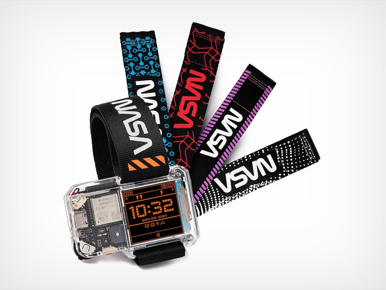
CircuitMess sells the Artemis Watch 2.0 standalone at $129, but it also appears in a Mars Exploration Bundle alongside the Perseverance Rover for $399, a 23% discount over buying both separately. That bundle positions the watch as a companion device for tracking rover missions and staying connected during the 20-hour rover build. CircuitMess also offers a Collector’s Bundle that includes the watch and four official strap designs for $149. The company has sold over 300,000 kits worldwide, and the Artemis branding ties directly into the kind of sustained media coverage that makes space feel culturally relevant again.

The Artemis Watch 2.0 is available now at circuitmess.com. If you followed the actual Artemis II launch this week, if you care about wearable tech that doesn’t condescend to younger users, or if you want a smartwatch that teaches coding by letting you rebuild it from the inside out, this is one of the few products in this category worth the $129 ask.

The post The NASA Artemis 2.0 Smartwatch Runs Python And Lets Kids Code Their Own Wearable first appeared on Yanko Design.

How Is a WWE Championship Belt Made? One Man’s Garage, $40,000, and a Handful of Artisans

John Cena’s spinning championship belt should not have worked. It was gaudy, it was hip-hop inflected, it belonged more to a music video than a wrestling ring, and it absolutely captured a generation of young fans who grew up treating it as the definitive image of what a championship looked like. That belt stayed on WWE television long after Cena’s character stopped spinning it, because WWE understood that the object itself had taken on a life independent of the man who introduced it.

That is the particular power that championship belts hold over wrestling. Mick Foley took three of the most brutal falls in WrestleMania history and walked away as champion, and the belt validated every bit of the punishment. Bray Wyatt’s Fiend character carried a Universal Championship with his own face grotesquely incorporated into the design, because for that character, the belt had to be an extension of the horror. These objects absorb the identity of whoever holds them, and they carry that identity forward long after the reign ends.

A Tradition Borrowed From Boxing

Championship belts predate professional wrestling entirely. The tradition traces back to 1810, when British boxer Tom Crib defeated American boxer Tom Molino in a grueling 35-round fight, and King George III presented Crib with what historians consider the first championship belt, reportedly constructed from lion skin decorated with silver claws. One popular theory holds that early boxers would bring colored cloths to tie around their waists before fights, and winners would take their opponents’ colors and wear them as a belt to signal victory. The symbolism was immediately legible and it stuck.

When professional wrestling emerged as a competitive sport in the late 19th century, it borrowed the championship belt wholesale from boxing. The first recognized wrestling championship arrived in 1905, with George Hackenschmidt becoming the inaugural World Heavyweight Wrestling Champion. Early WWE belts were plain objects, basic leather straps with small metal plates, and during Bruno Sammartino’s legendary seven-year reign in the 1960s, the design featured little more than the shape of the United States pressed into leather. The wrestling mattered more than the prop, and nobody pretended otherwise.

From Simple Leather to Cultural Artifact

The 1980s changed everything. As wrestling transformed from regional athletic competition into globally televised entertainment, the belts transformed with it. The winged eagle championship arrived during the Golden Era and was perfectly calibrated for the personalities carrying it, Hulk Hogan, Randy Savage, the Ultimate Warrior, larger-than-life characters who needed a larger-than-life object to hold above their heads. Reggie Parks, a former wrestler turned belt maker, created that winged eagle design, and it remains the belt most commonly cited when fans argue about the greatest championship design in history.

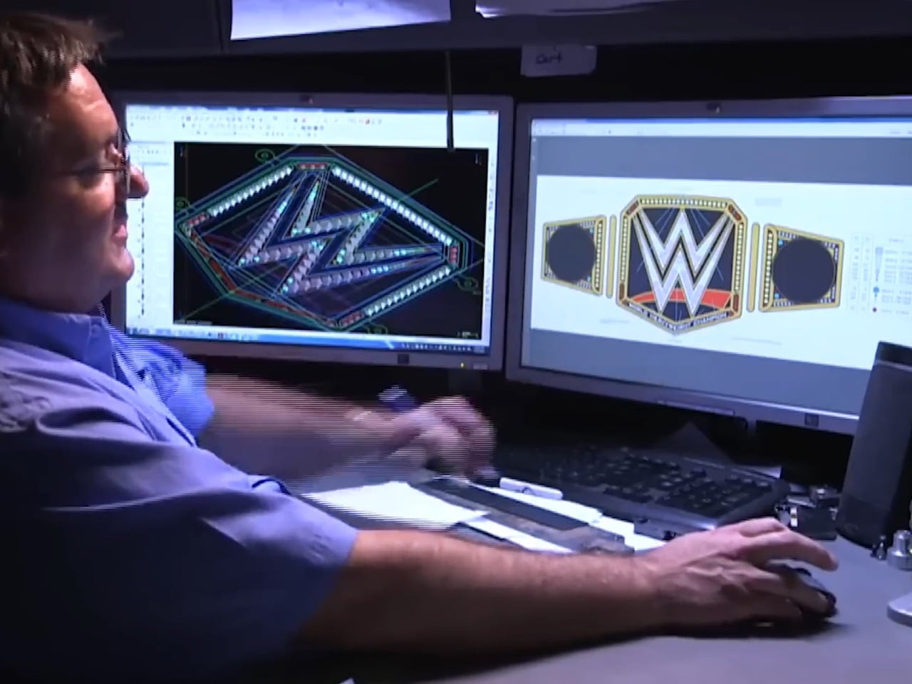
The 1990s brought the Big Gold Belt, originally from NWA and WCW, featuring 24-karat gold, silver, diamonds, and rubies, a genuinely opulent object that looked like it belonged in a museum case. Then came the spinner, Cena’s spinner, which arrived in 2005 and did something no belt had done before: it became a product. Kids wanted replicas not because they idolized the championship lineage but because the belt itself was cool, in the same way a sneaker or a video game peripheral was cool. The customizable side plates introduced in 2013 pushed this further, allowing each new champion to stamp their own identity onto the physical object, making every title change feel like a genuine handover rather than just a storyline beat.

The People Who Actually Build Them

Creating a WWE Championship belt is not a factory operation. It is a craft practiced by a small number of artisans working out of workshops in the United States, and the knowledge passes between them the way apprenticeships work in watchmaking or leatherwork. Dave Millican is one of the primary belt makers working with WWE today, responsible for the WWE Championship, the World Heavyweight Championship, the Intercontinental Title, and the tag team titles among others. He learned his craft directly from Reggie Parks, the man who built the winged eagle, and credits Parks entirely for his credibility when he was starting out.

Millican works from a garage workshop, which tells you something important about the scale of this industry. There is no belt-making facility, no assembly line, no team of technicians running shifts. There is a craftsman, a set of specialized tools, and months of painstaking handwork. WWE contacts belt makers with a set of requirements, the two collaborate through sketches and revisions, and once a design is locked, the real work begins.

Clay, Tin, and Months of Handwork

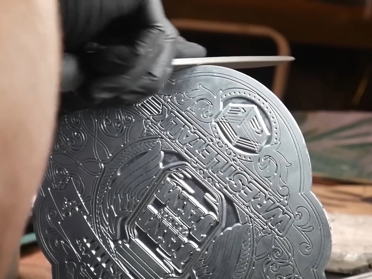
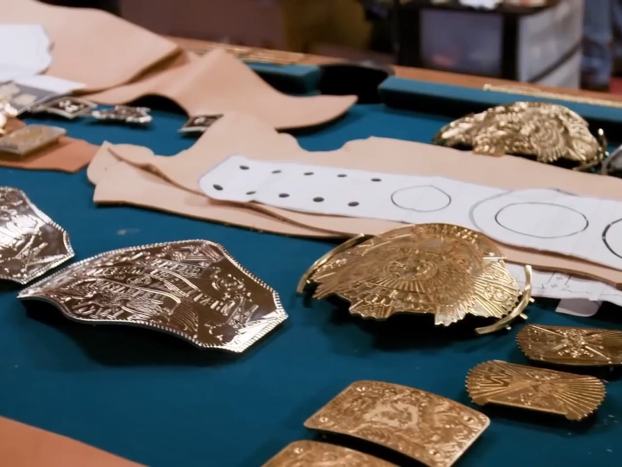
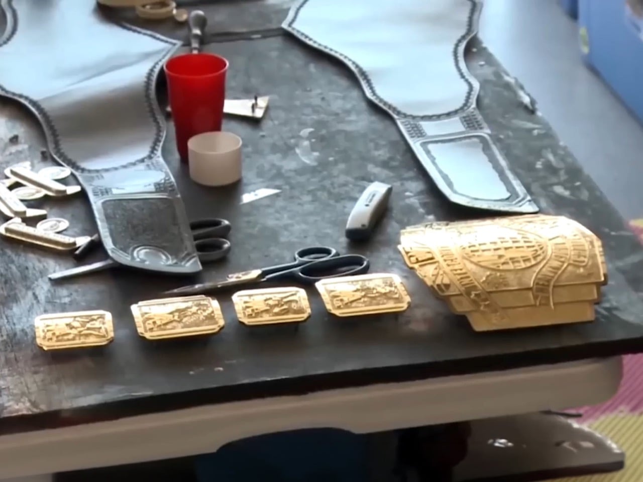
The process starts with clay. The belt maker hand-sculpts a detailed three-dimensional model of each plate from soft clay, capturing every ridge, letter, and decorative element by hand. Once the clay dries and hardens, plaster is poured around it to create a negative mold. That plaster mold produces a soft metal model, typically aluminum, which the artist then spends considerable time refining, sharpening details, smoothing transitions, and preparing for the next stage. This refined metal model becomes the template for the final casting mold.

The actual plates are cast from molten tin. Liquid metal is poured into the mold, left to cool completely, and then pulled out in a state that is nowhere near finished. Freshly cast plates have rough edges, shallow details, and a surface that requires hours of hand-finishing using files, chisels, and specialized tools. Elements that cannot be achieved through casting alone, particularly sharp lettering and small sculptural details, are crafted as separate pieces and attached to the main plate, then refined by hand until they blend seamlessly with the surrounding surface.

Electroplating and the Gold Finish

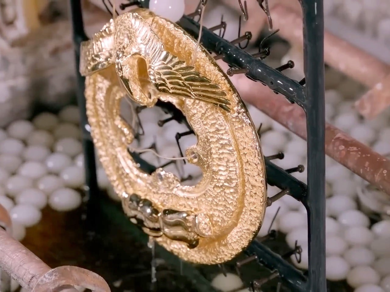
Tin is structurally workable but visually unimpressive, so once the plates are refined, they go through electroplating. The plates are cleaned thoroughly to remove any residual metal shavings or surface contamination, then polished on a rotating buffing wheel until they shine. From there, they are submerged in an electrolyte solution while connected to an electrical circuit, and the current slowly deposits a layer of precious metal onto the surface. Most WWE belts receive a gold finish, though silver and rhodium are also used depending on the design requirements. For belts featuring multiple metal tones, different sections are masked during separate plating stages to create a two-tone effect.

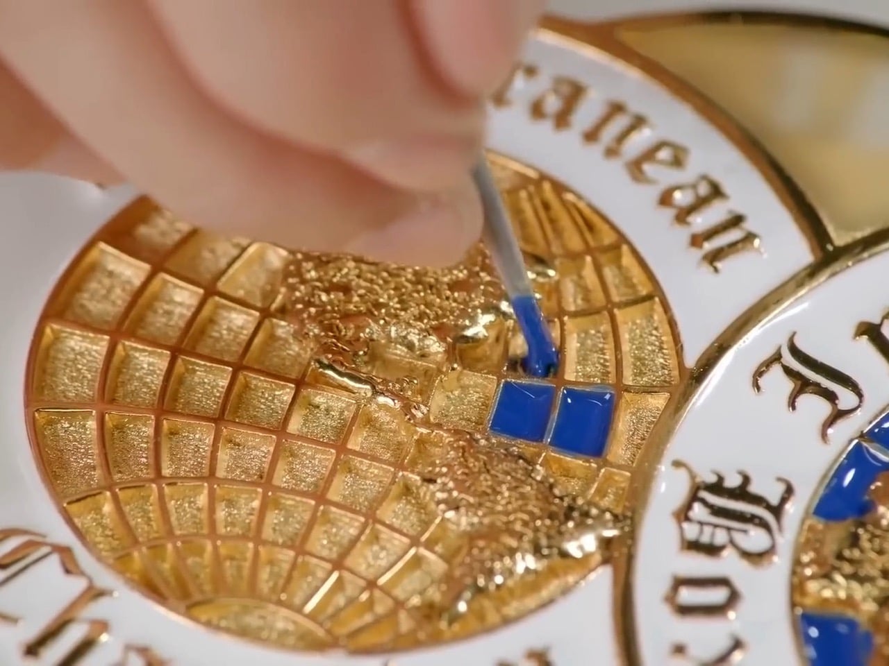
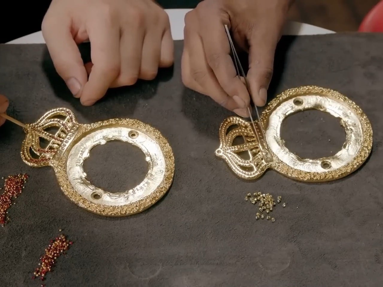
After plating, three finishing techniques add the visual complexity that makes these objects so immediately striking. Etching applies a chemical to specific areas and then submerges the plate in an etching solution, creating textured patterns that contrast against the polished metal. Enamel painting involves applying thick enamel paint to designated sections and baking the plates to lock in a durable, colorful finish. Gemstone setting, the most labor-intensive of the three, has a jeweler attaching rubies, sapphires, diamonds, or crystals directly to molded cavities in the metal surface. The Crown Jewel Championships, the most expensive belts in WWE history, reportedly contain 50-karat diamonds and carry a value exceeding one million dollars. Champions are not permitted to take them home; they remain in Saudi Arabia, and winners receive rings instead.

Leather, Assembly, and the Finished Object

With the plates complete, attention moves to the leather strap that holds everything together. The belt maker hand-traces and cuts the strap from high-quality leather, dyes it to the required color (typically black, though the Universal Championship famously used red), then waxes and polishes it to a durable finish. An inner lining of spandex or felt is added for comfort against bare skin, all layers are stitched together, and the plates are secured using thick leather-working string or industrial-strength adhesive. A closing mechanism, either buckles or snap hooks depending on the design, is added, high-grade vinyl finishes the outer edges, and the inside is branded with both WWE’s logo and the belt maker’s own insignia before the whole thing is packed and shipped.

WWE maintains multiple copies of each belt design. HD belts are built specifically for television, engineered to catch light perfectly under arena conditions. Champions also receive separate travel belts for appearances, signings, and live events. According to Millican, when a new HD belt is produced or refurbished, the previous version gets demoted to road use, which explains the occasional moments when attentive fans spot a belt with slightly wrong plates or minor inconsistencies on broadcast. The pristine version simply did not make it to the venue in time.

WWE creates what it calls HD belts, versions built specifically to perform under television lighting and capture every engraved detail on camera, while champions carry separate travel belts to appearances and signings on the road. When a new HD belt is made, the previous one gets demoted to road duty, which explains the occasional glimpse of a belt with slightly wrong plates or an unfamiliar finish on a live broadcast. Even the logistics of managing these objects reflects how seriously WWE treats them as artifacts rather than accessories.

A replica belt sells at retail because fans understand instinctively that what they are buying is a piece of wrestling history in miniature, a connection to the moment their favorite wrestler finally hoisted the real thing overhead. That impulse makes complete sense when you understand what went into building the original: months of clay sculpting, metal casting, electroplating, gemstone setting, and leather work, all converging into an object that a 10-year-old sees on television and immediately understands means everything.

The post How Is a WWE Championship Belt Made? One Man’s Garage, $40,000, and a Handful of Artisans first appeared on Yanko Design.

Someone Turned the “Cat Knocking Things Off Tables” Meme Into a 3D Printed Lamp and It’s Perfect

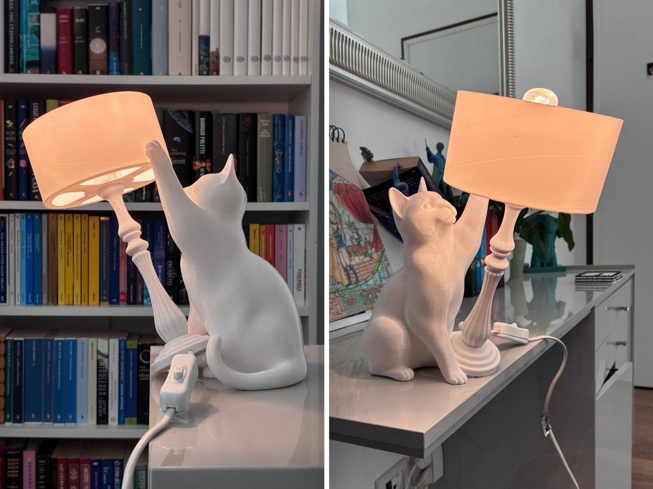
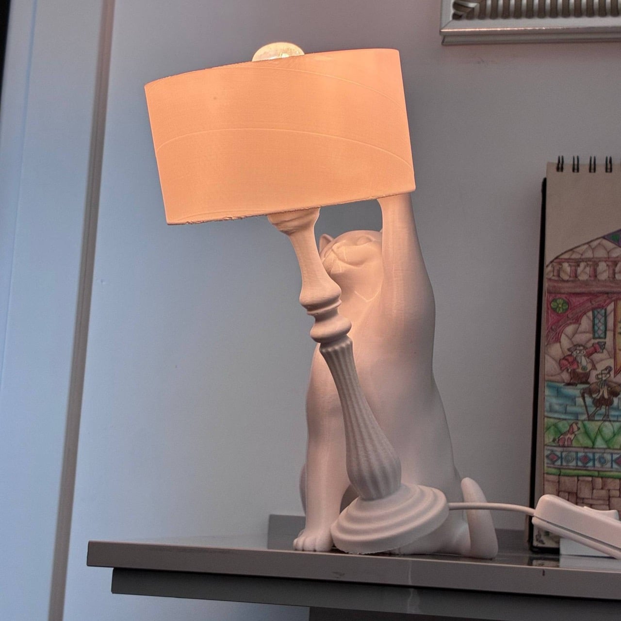
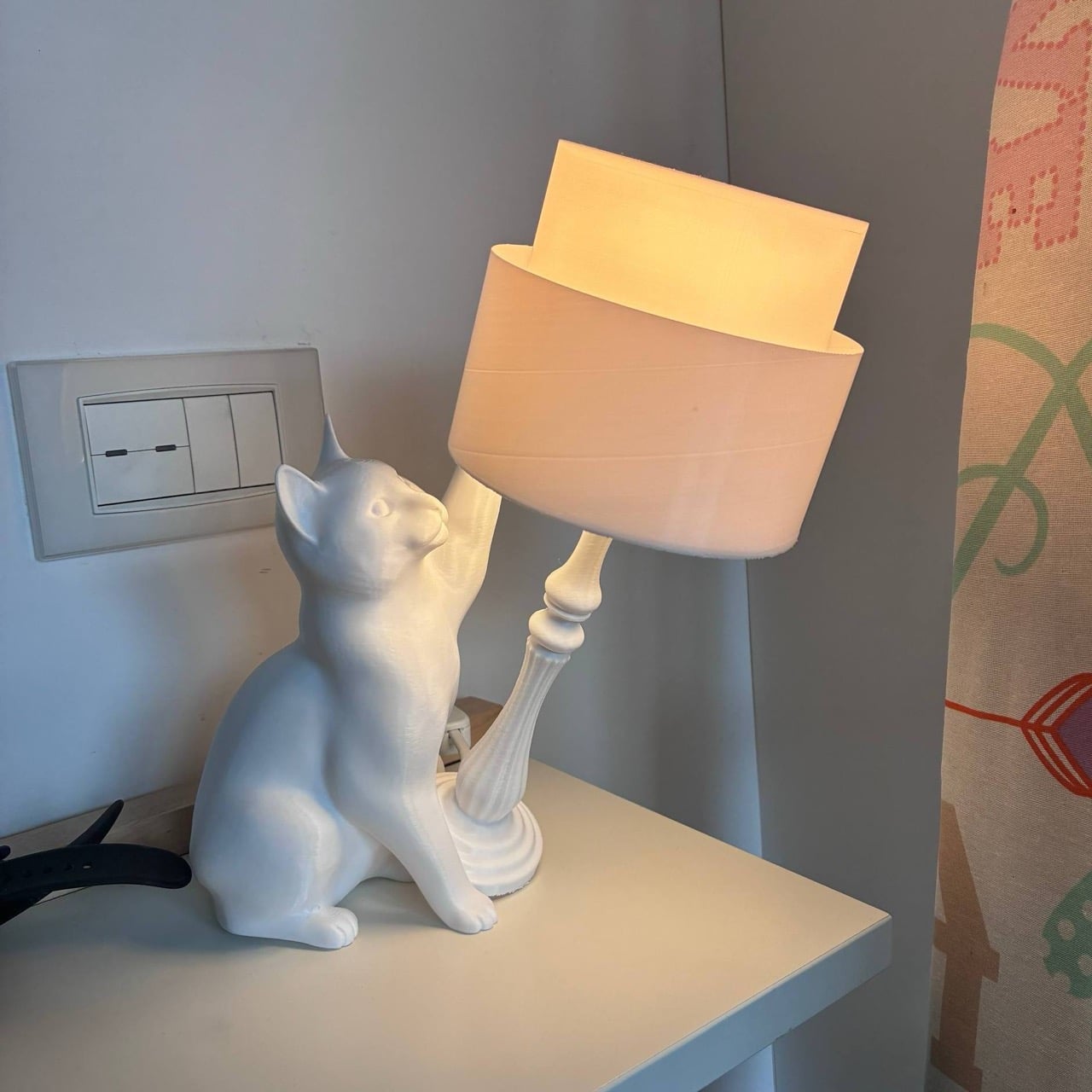
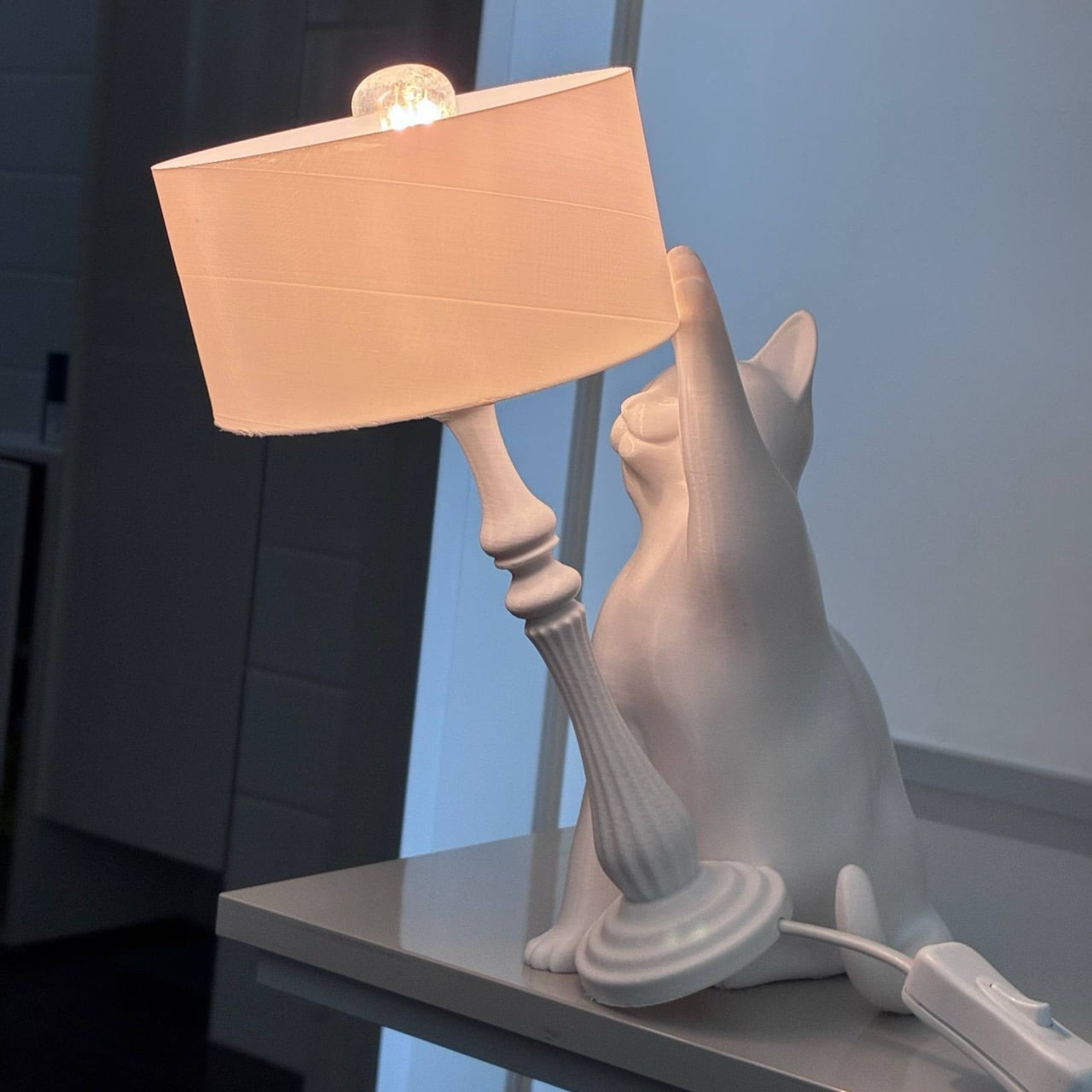
Cats knocking things off tables is old internet. It predates memes as a concept, predates YouTube, predates the entire visual language of digital humor. It is perhaps the most documented animal behavior in human history, captured billions of times, studied by actual ethologists, and still inexplicably funny every single time. Fabio Ferrari has taken this behavior and made it load-bearing, literally, designing a 3D-printed table lamp where a seated cat figure tilts the shade off-axis mid-push, and the resulting tension between lampshade and gravity is the entire point of the object.

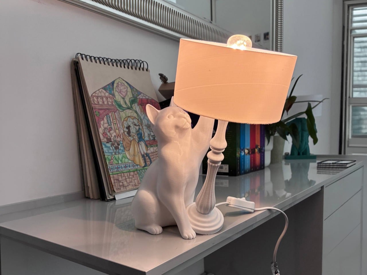
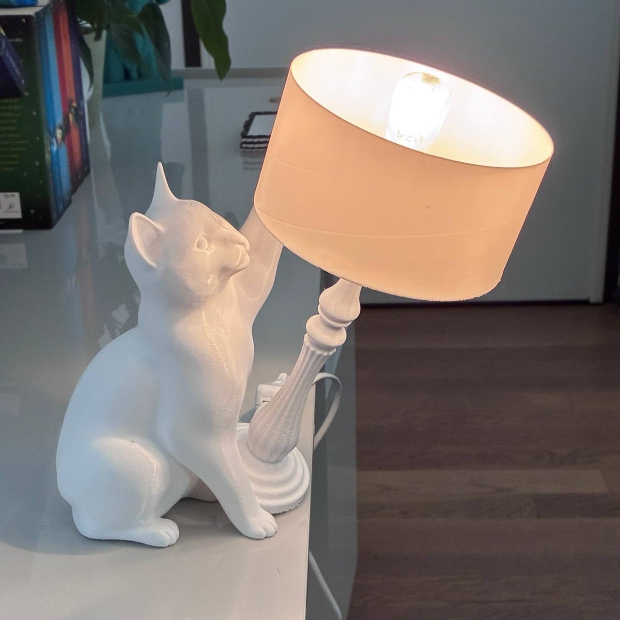
Printed white in PLA, the classical turned column and drum shade read as a proper lamp, and the cat sits alongside it with one paw extended toward the column, head craned upward, frozen in that particular expression of focused feline mischief that every cat owner recognizes immediately. The layer lines on the print dissolve into surface texture at this scale, giving the whole thing an almost ceramic quality. It lands on a desk or nightstand and earns a second look from anyone who passes it.

Designer: Fabio Ferrari

Ferrari released the STL pack on Cults3D in late March 2026, priced at $4.04 after a 50% discount, and it pulled 102 downloads and 7,000 views within days, which for a single-designer listing on a platform with 3.2 million models is a genuinely strong signal. The pack ships five files covering two body variants sized for different bulb lengths, plus a supplementary shade that covers the bulb completely for a cleaner look.

The recommended material is white or marble PLA, though PETG and resin both work, and the print settings are straightforward: 15 to 20 percent infill for the shade, higher for the cat and base to keep the center of gravity honest. The shade is the only component that needs supports, and Ferrari is emphatic that the lamp column itself should print support-free since anything inside that channel will obstruct the wire routing.

The lamp works with standard E12, E14, or E27 bulb kits depending on how you scale it, and the warm ambient glow it throws makes it best suited on a nightstand or shelf light rather than serving task lighting. At roughly 250 to 294mm tall depending on the variant, it has enough physical presence to read across a room without overwhelming a surface.

The design sits in an interesting lineage. Seletti’s Monkey Lamp and the broader wave of anthropomorphic lighting that swept through the design-forward homeware market in the 2010s established that people would pay serious money for a lamp with a personality. What Ferrari has done is democratize that impulse entirely, collapsing the distance between a $300 design object and a $4 STL file and a weekend print. Just make sure you aim for 25% or higher infill or the balance goes awry. You wouldn’t want a lightweight cat actually knocking your lamp over, right?!

The post Someone Turned the “Cat Knocking Things Off Tables” Meme Into a 3D Printed Lamp and It’s Perfect first appeared on Yanko Design.

This Lounge Chair’s Shape Is Precisely Why Two of Them Make a Sofa

Modular seating tends to be either complicated or a compromise. The sectional sofa has never really solved the fundamental problem that living situations change, people move, and the enormous L-shaped configuration that worked in your last apartment probably doesn’t fit your new one. Furniture that adapts to circumstance sounds like an obvious idea, but the designs that actually pull it off cleanly remain surprisingly rare.

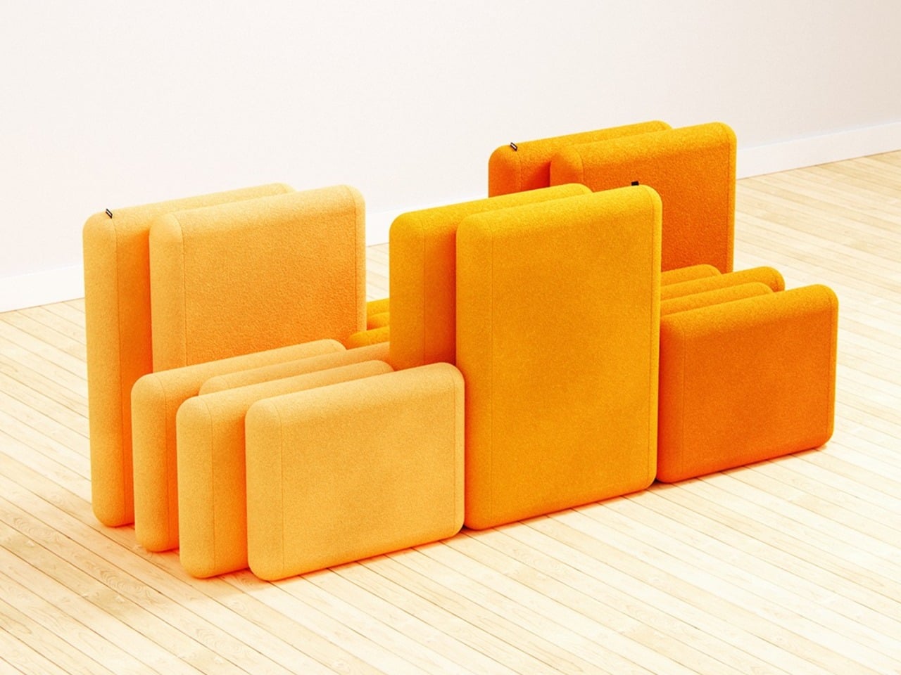
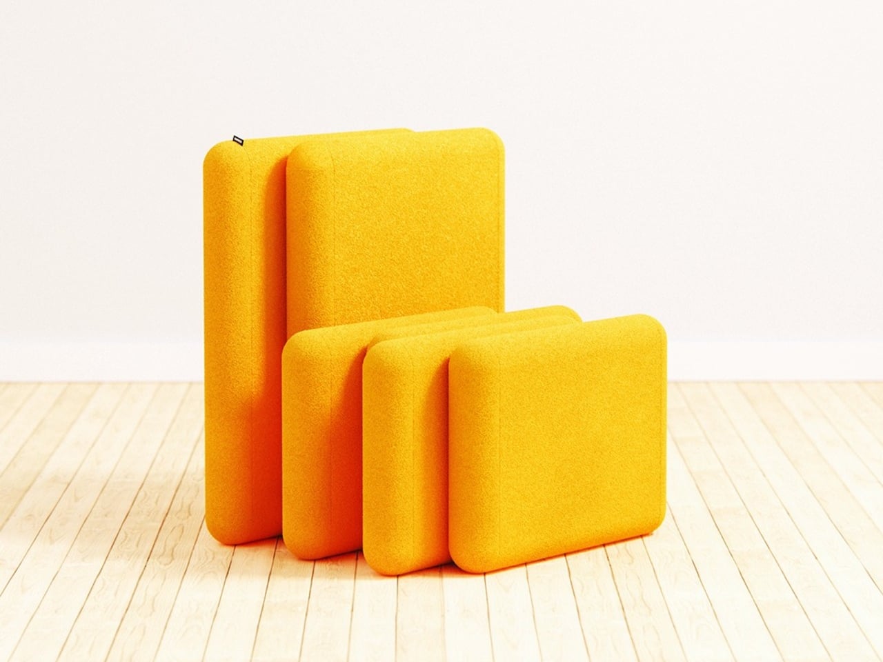
Liam de la Bedoyere, the designer behind Bored Eye Design, takes a direct approach to the problem with Bunch, a modular seating concept that begins from a deceptively simple premise. Each unit is a fully functional lounge chair on its own. The idea, however, is that it was designed from the beginning to combine with others, and the way it does that is where the concept gets genuinely interesting.

Designer: Liam de la Bedoyere

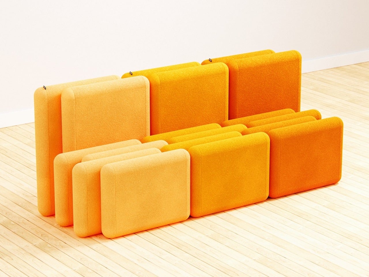
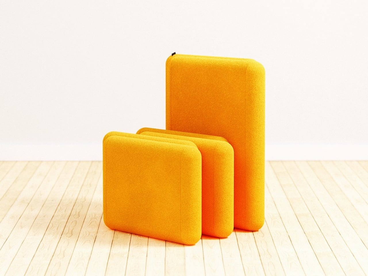
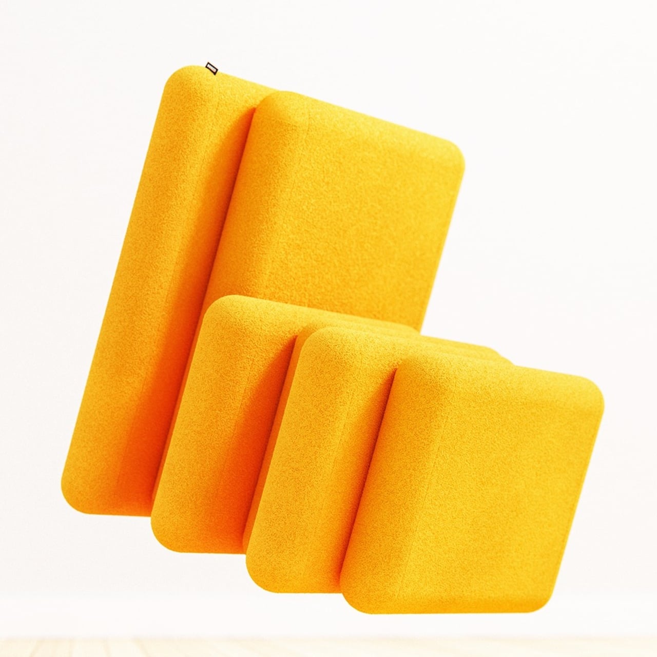
The mechanism is in the staggered relationship between the two parts of each chair. The backrest sits elevated and set back, while the seat extends forward, creating a stepped profile from the side. That offset is precise enough that when a second chair is placed alongside it, the seat of one slides naturally into the space left open by the recessed back of the other. No connectors, no assembly, just geometry.

The result, when two or more units are pushed together, is a sofa that reads as a continuous and intentional piece rather than a row of chairs touching each other. The staggered rhythm carries across the joined units, producing a silhouette that looks considered rather than accidental. It’s the kind of configuration that takes a moment to understand, but once you do, it feels like it couldn’t have worked any other way.

The standalone chair holds up on its own terms, too, and isn’t just a sofa segment that happens to function independently. It sits directly on the floor with no visible legs, giving it a relaxed lounge quality. The proportions keep the form compact enough to live in smaller spaces, which matters when the concept is something you might realistically buy gradually, one unit at a time.

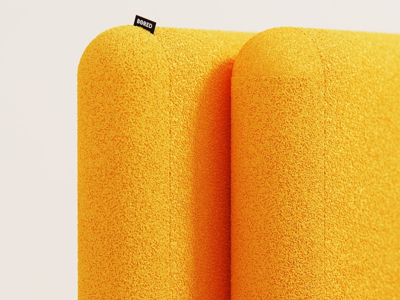
Both the backrest and the seat share the same rounded-rectangle silhouette, upholstered in a thick, textured fabric with the warmth of bouclé. That material, combined with the legless, floor-hugging profile, gives the chair a deliberately unhurried quality, the kind of object that makes a room feel slightly slower and more settled than it did before.

The scalability is part of the appeal. Two units make a small sofa, three make a longer one, and the concept seems to extend indefinitely. When units in different tones are combined side by side, the color contrast adds a visual layer that a single chair doesn’t have. There’s also something honest about a design whose best version requires more than one, an admission that’s built directly into the name.

The post This Lounge Chair’s Shape Is Precisely Why Two of Them Make a Sofa first appeared on Yanko Design.

5 Vertical Farm Designs That Grow Food Inside Your Home and City

Vertical farming is redefining how food is grown, distributed, and consumed in an increasingly urban world. As populations rise and arable land becomes scarce, growing food vertically offers a practical, efficient alternative to traditional agriculture. By producing crops closer to where people live, vertical farming reduces dependence on long supply chains, minimizes food waste, and ensures year-round access to fresh produce. It also uses significantly less water and land, making it a more sustainable approach to feeding cities.

Beyond efficiency, vertical farming is reshaping the relationship between people and food. It brings food production back into daily life, increasing awareness of how produce is grown and encouraging healthier eating habits. Advanced systems that combine controlled lighting, irrigation, and monitoring technologies allow consistent yields with minimal environmental impact. Here is how vertical farming is not just a growing method, but a shift toward resilient, localized, and future-ready food systems.

1. High-Rise Agritecture

Skyscrapers are transforming into living, productive organisms. Static glass facades are giving way to “living skins” that integrate vertical farming, allowing cities to grow food within minimal footprints. This approach reduces transportation emissions and creates a seamless dialogue between architecture and the surrounding urban landscape.

These vertical farms use double-height glazing tuned for optimal light absorption, maximizing photosynthesis and crop yield. Dense vegetation also provides natural insulation, lowering energy use while diffusing sunlight for residents. By merging agricultural efficiency with architectural elegance, these spires redefine urban living, offering sustainable food production and serene, light-filled interiors.

By integrating large-scale vertical agriculture directly into a high-rise typology, the tower addresses food insecurity in Chicago’s underserved neighborhoods, where access to fresh, affordable produce remains limited. Food production is embedded within the building core, allowing crops to be grown, processed, and distributed locally. This approach reduces reliance on long-distance supply chains, lowers carbon emissions, and transforms the skyscraper into a productive, self-sustaining system that supports urban resilience and food equity.

The tower’s form and systems are designed to support continuous agricultural performance. A fluid, water-inspired massing optimizes light penetration, airflow, and water circulation, while cloud harvesting, rainwater reuse, and renewable energy systems sustain year-round cultivation. Residential, educational, and commercial programs are organized around farming zones, reinforcing food production as a shared civic function. Structurally, a diagrid exoskeleton enables large inner voids for light and ventilation, allowing the skyscraper to operate as a vertical landscape where agriculture, architecture, and urban life are fully integrated.

2. Reconfigurable Modular Planter

Modular planters introduce a layered spatial rhythm where planting systems evolve alongside everyday living. Designed with architectural precision, these elements use high-performance bio-composites that express material honesty while functioning as adaptable interior features. Acting as spatial dividers and living furniture, they create biophilic zones that improve air quality and soften the hard lines of contemporary interiors.

The long-term value of modular planters lies in flexibility and design longevity. Systems can be rearranged as spatial needs shift, allowing interiors to remain responsive rather than fixed. More than decorative objects, these planters operate as architectural components, seamlessly connecting interior design with agricultural thinking while preserving the coherence and integrity of the home’s-built form.

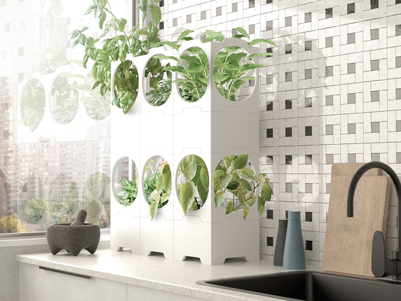
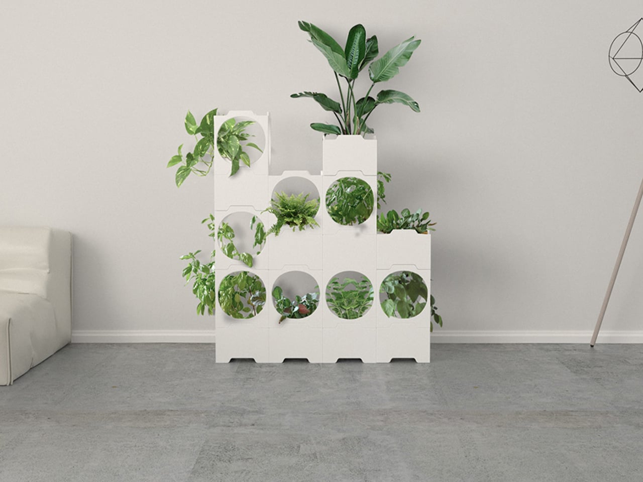
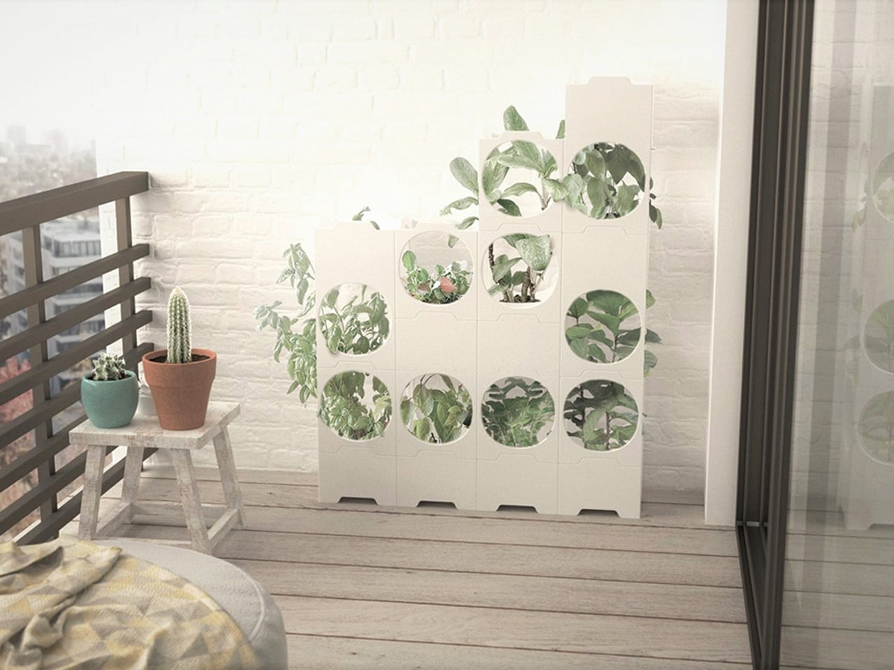
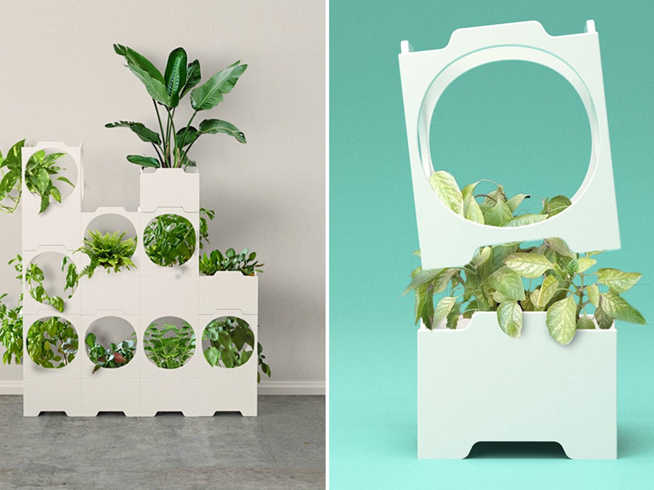
As home gardening gains popularity, the challenge of growing food in compact living spaces has become increasingly apparent. Many planters designed for small homes limit the number of plants they can support, restricting both yield and flexibility. Chilean designer Lorenzo Vega addresses this issue through a modular vertical planter system inspired by LEGO-style construction. Beginning with a single cubic unit, the system allows users to grow vegetables using traditional methods, then expand vertically by stacking additional modules as space permits. This scalable approach enables efficient food cultivation without demanding a larger footprint.

Each module consists of a planting dish encased within a cubic frame that provides sufficient depth for crops to grow to full height. The design draws visual and structural influence from Japanese Metabolism and Social Modernist architecture, resulting in a clean, stripped-back aesthetic. Its stackable form maximizes vertical space, transforming underused areas into productive growing zones.

3. Indoor Vertical Farms

Integrating an indoor vertical farm into the heart of the home has become a defining marker of contemporary luxury. This residential biosphere transforms everyday living into a sensory experience, where the presence of living greens, natural aromas, and visual vitality elevates well-being. Rather than serving as ornamentation, the farm prioritizes nourishment, mindfulness, and a deeper connection between occupants and their environment.

Functioning as an architectural system, these vertical farms actively regulate the home’s internal climate. Layered hydroponic structures support thermal performance, operating as natural heat moderators within the interior. Treated as sanctuaries of softened light, the grow zones conceal advanced technology behind refined joinery, creating a seamless balance between precision engineering and calm, restorative spatial design.

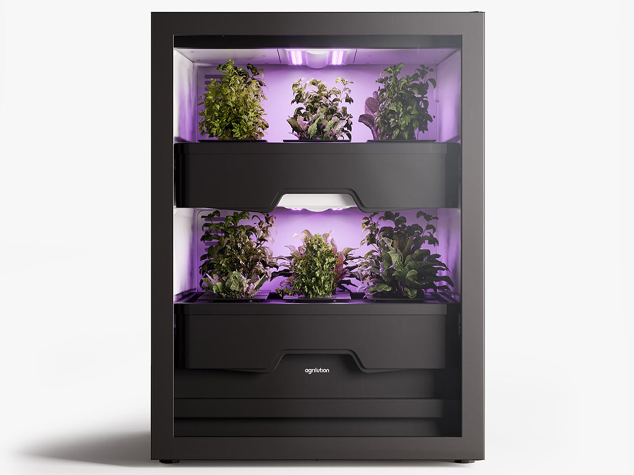
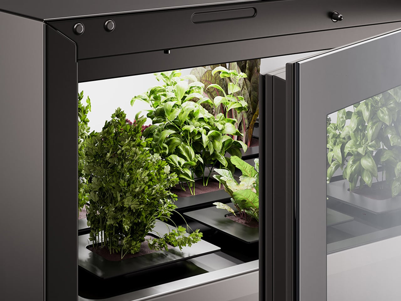
Berlin-based design studio The Subdivision introduced Agrilution as an indoor vertical farming solution that turns sustainable living into an intuitive, everyday experience. Designed with ease of use in mind, the concept focuses on making home-grown food practical for modern lifestyles, particularly for those living in compact urban spaces.

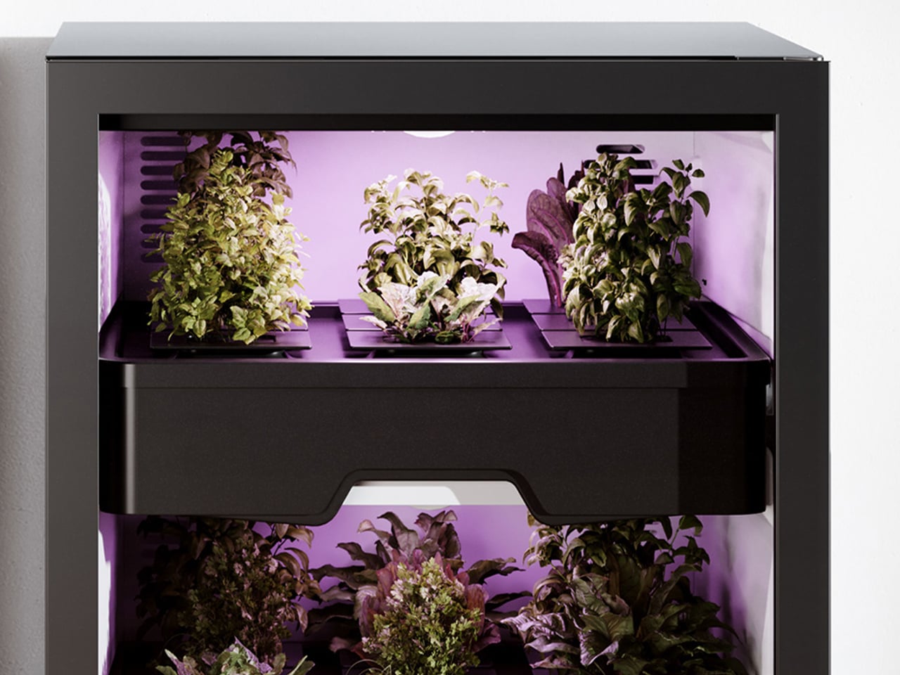
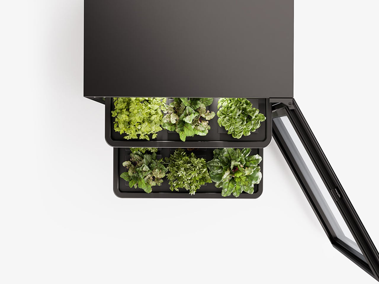
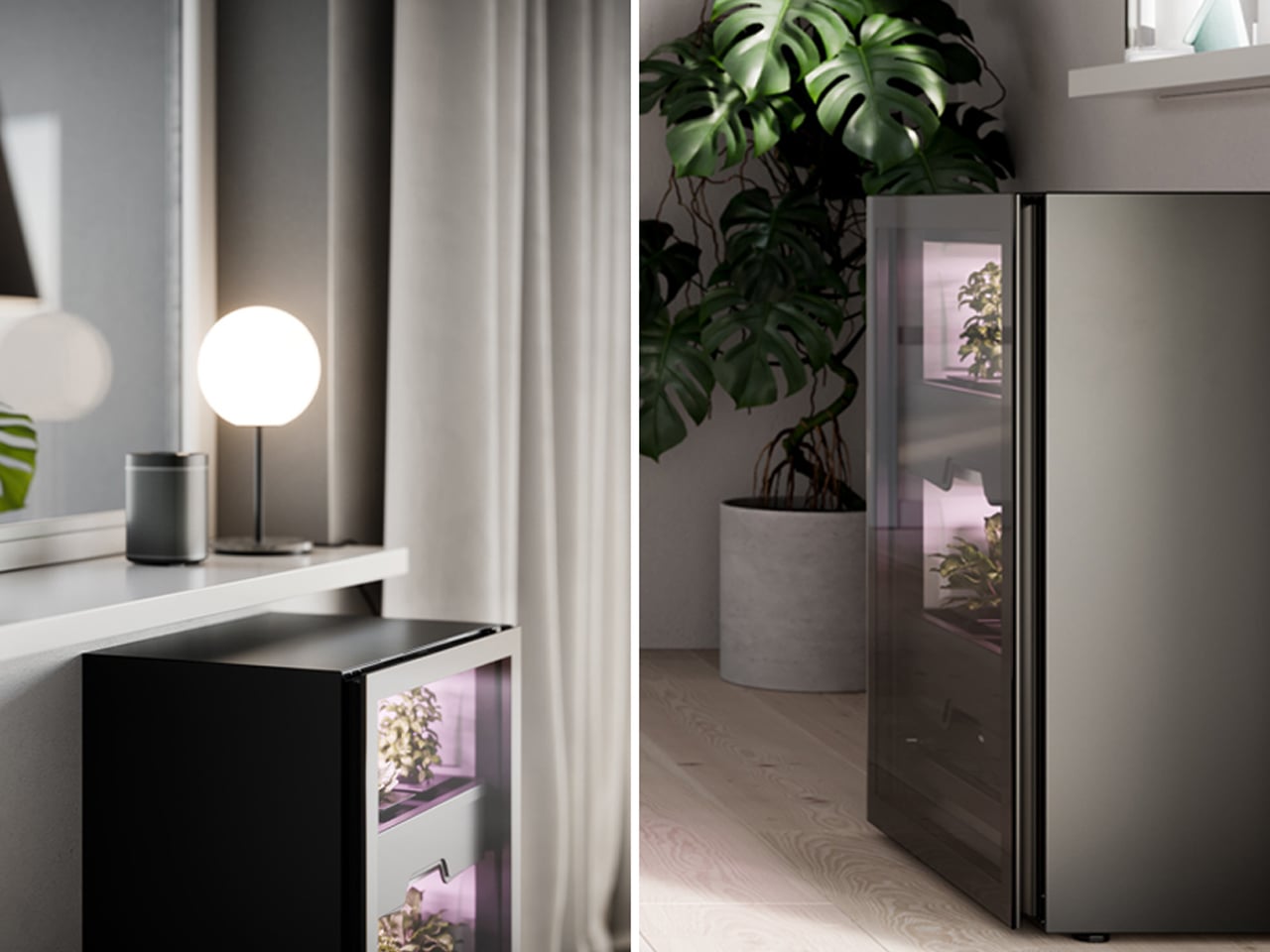
Also known as the Plantcube, Agrilution resembles a small refrigerator and features two sliding shelves for soil planters and crops. Built-in LED grow lights deliver consistent artificial light, supporting plant growth throughout the year. A connected app tracks plant health and alerts users when watering or maintenance is needed. With its clean black-and-white finish, Agrilution integrates effortlessly into contemporary interiors, offering a discreet and efficient way to grow fresh produce at home.

4. Integrating Community Lifestyle

Vertical farming is increasingly understood as a catalyst for social connection within contemporary developments. Shared growing spaces transform food production into a collective ritual, offering a form of psychological value that conventional luxury amenities rarely achieve. These communal agricultural zones function as biophilic environments where residents connect not only with nature but with one another, strengthening the relationship between architecture and social well-being.

Designed as central spatial anchors, these farms are embedded within primary circulation routes to encourage movement, pause, and interaction. Positioning agriculture at the core of daily life reframes it as a cultural act rather than a background utility. In dense urban settings, such spaces counter isolation, fostering shared responsibility and turning the productive landscape into a lived, communal experience.

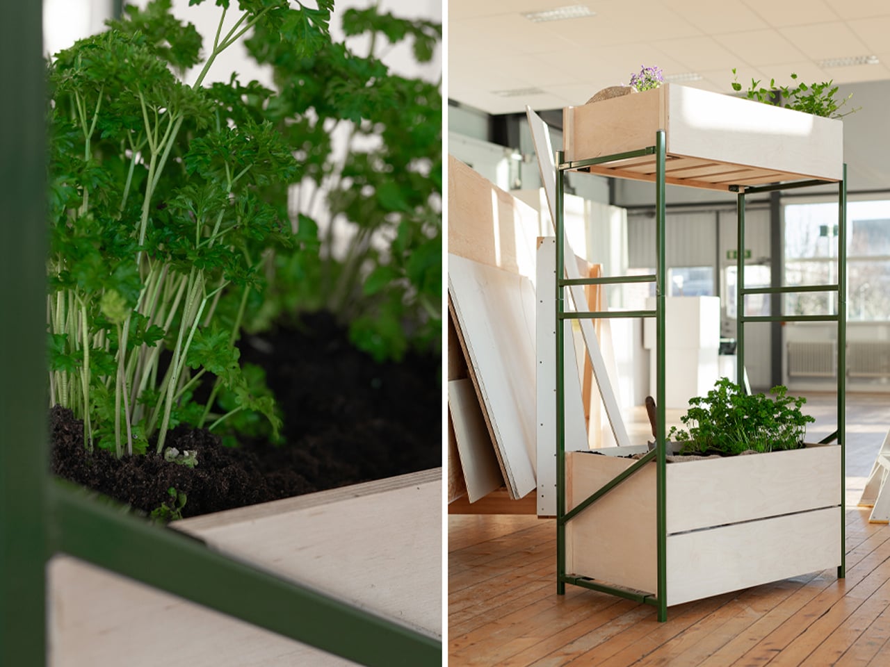
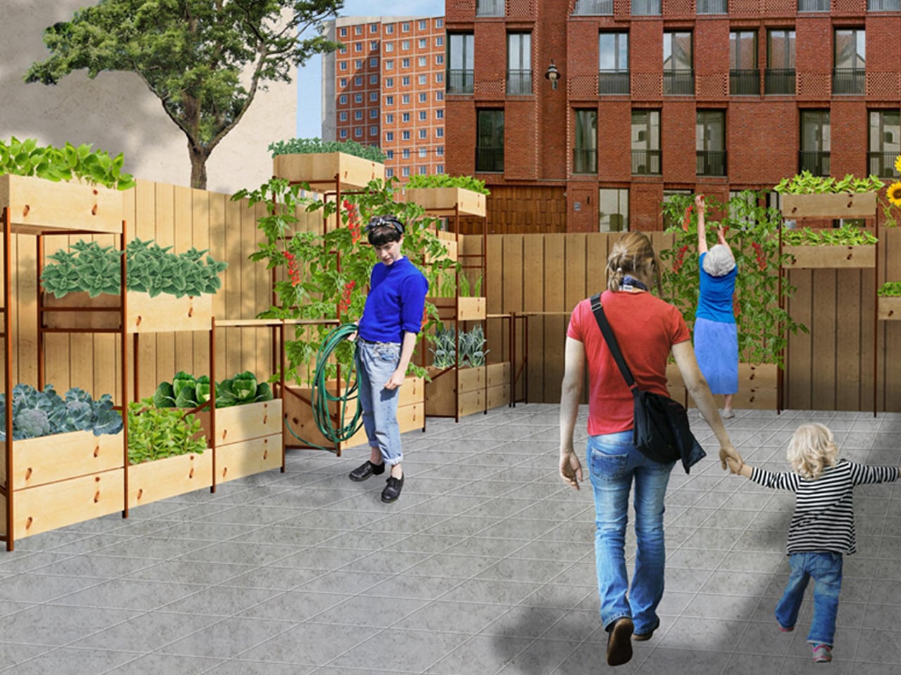
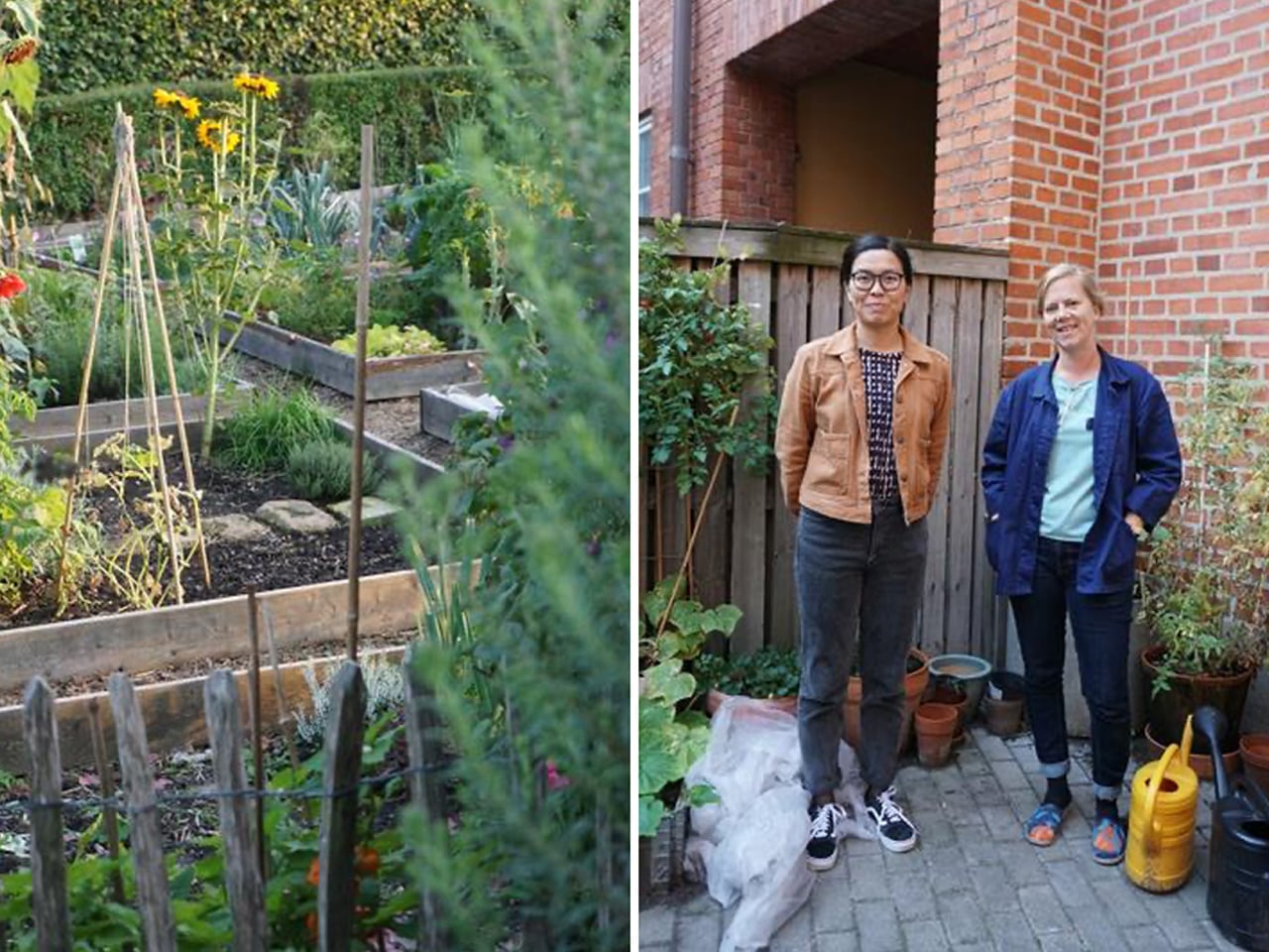
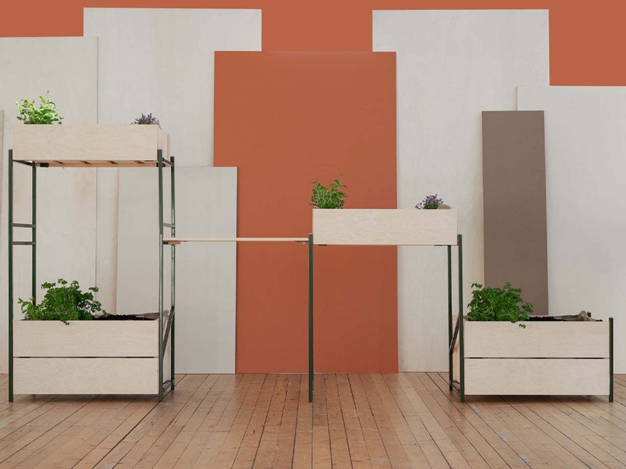
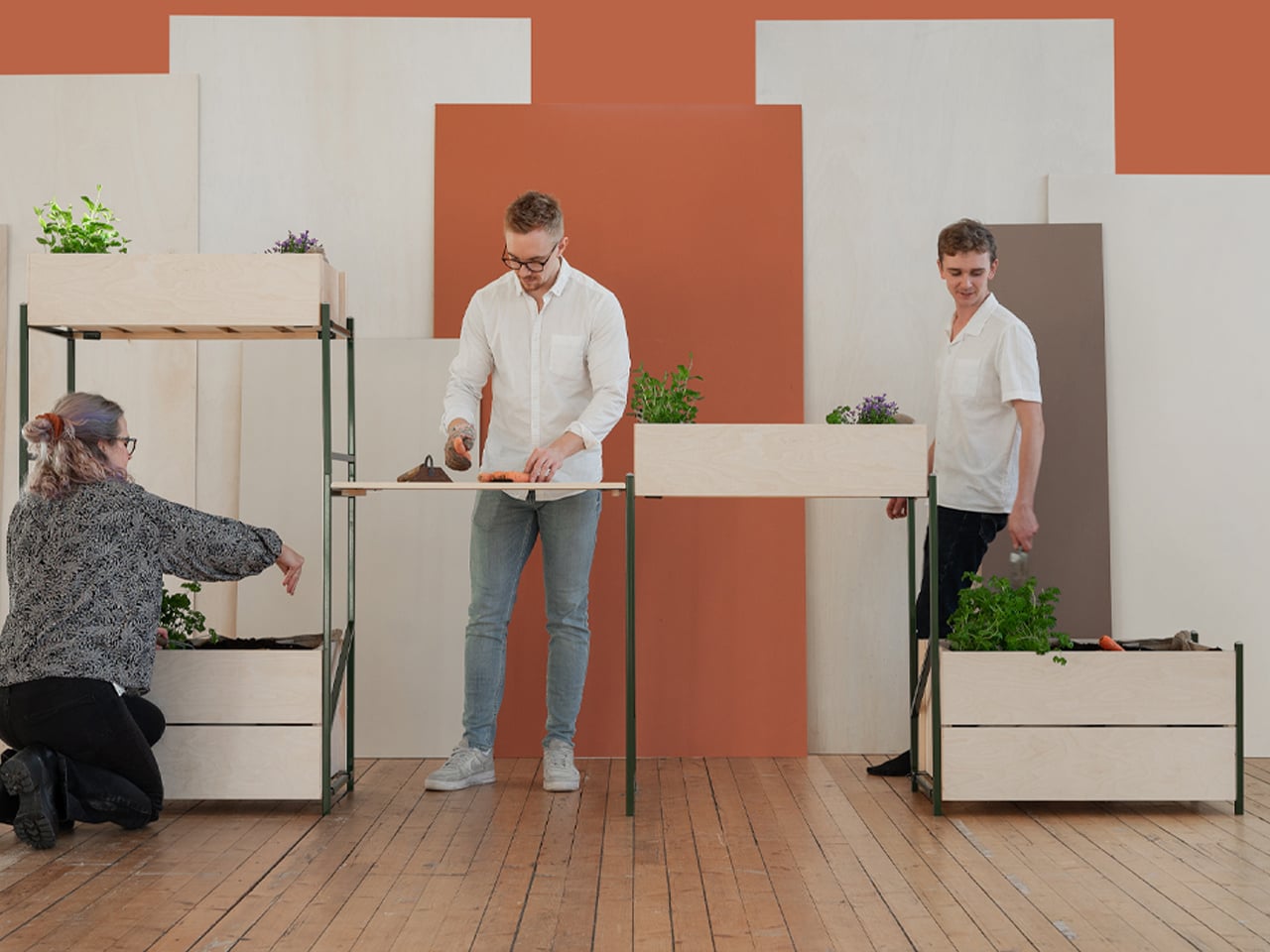
Urban farming adapts to the character and constraints of each city, taking forms that range from backyard gardens to rooftop plots and hydroponic systems. In Malmö, where space is limited, small-scale community farming has become an important part of urban life. Designer Jacob Alm Andersson developed Nivå, a vertical farming system shaped by the practices and shared experiences of local urban farmers. Through interviews, Andersson discovered that many residents began growing food after being inspired by their neighbors, highlighting the role of community exchange in sustaining urban agriculture and encouraging participation across generations.

Responding to Malmö’s spatial limitations, Nivå is designed to function efficiently on a vertical plane while remaining adaptable and robust. The system is constructed from stacked steel beams reinforced with wood, creating stable shelving for cultivation. Heat-treated pine planters attach using a hook-and-latch mechanism, eliminating the need for screws. Beyond growing food, Nivå operates as a communal workstation, complete with a central work surface that supports planting, harvesting, and maintenance, reinforcing urban farming as both a productive and social activity.

5. Automated Irrigation

Automated irrigation operates as the quiet intelligence behind productive, plant-integrated architecture. IoT-enabled systems regulate water and nutrient delivery with extreme accuracy, supporting healthy growth while drastically reducing waste. This technical layer is carefully concealed within recessed channels and shadow gaps, preserving the visual integrity of stone, timber, and other primary finishes while allowing the architecture to read as calm and resolved.

Beyond performance, automation enhances long-term value and resilience. By controlling moisture precisely, these systems protect the building envelope and ensure consistent yields without constant human intervention. The result is a biophilic environment that feels effortless to inhabit where advanced engineering and natural growth work in harmony to create a self-sustaining, low-impact domestic ecosystem.

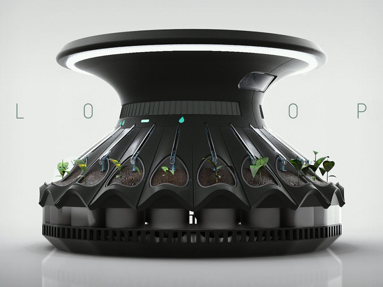
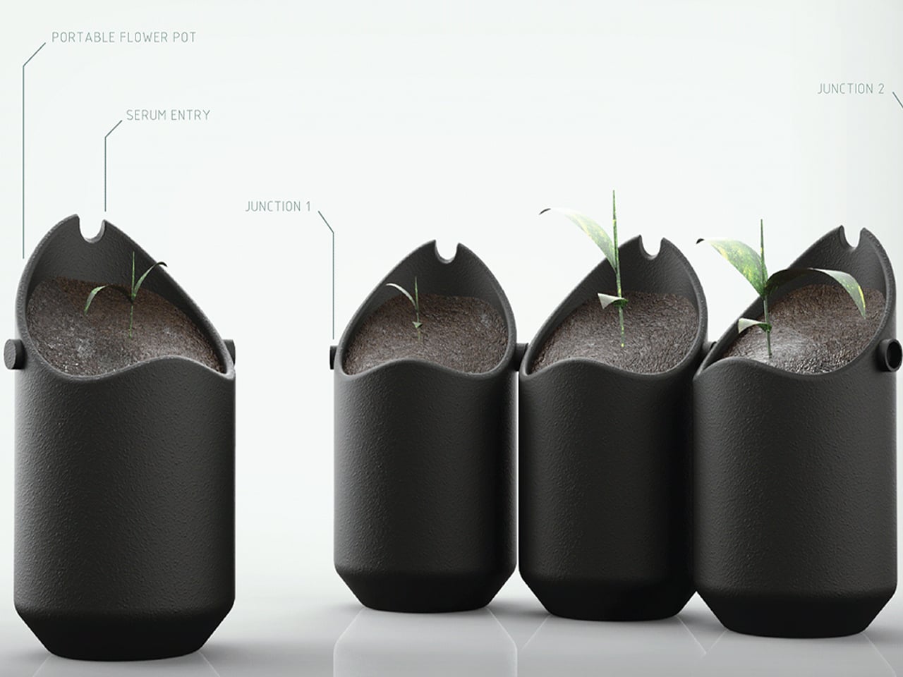
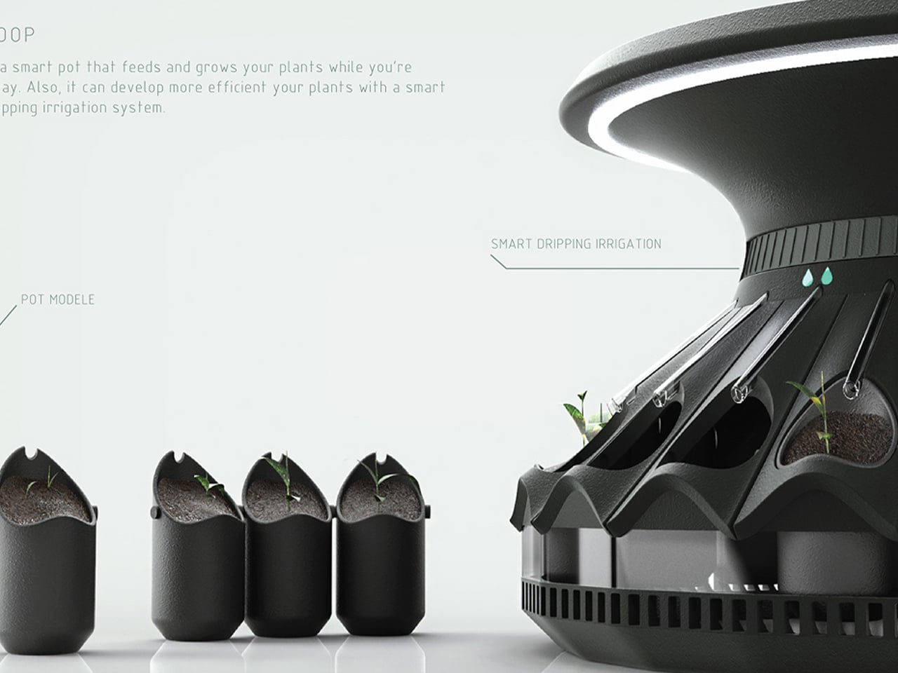
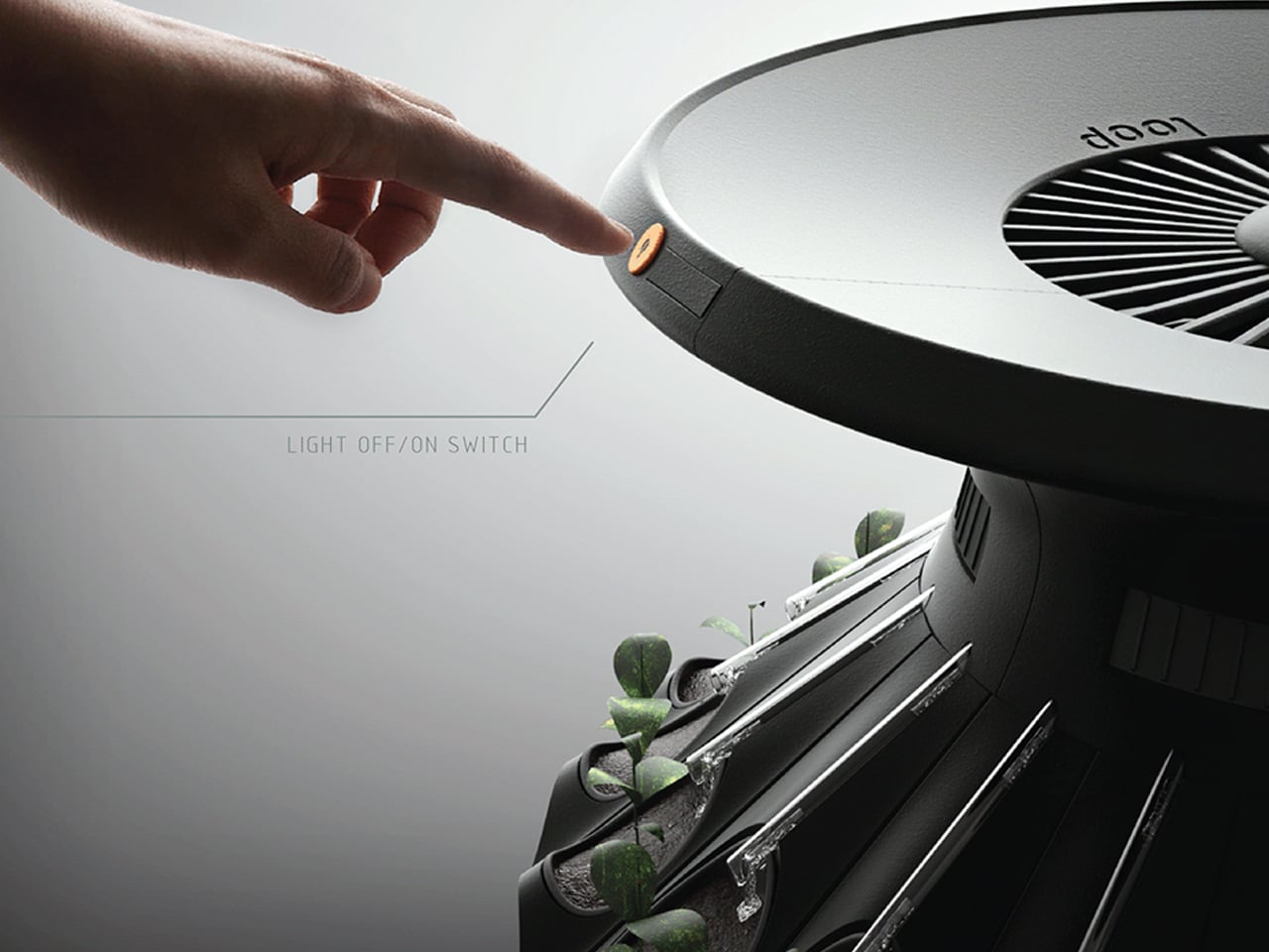
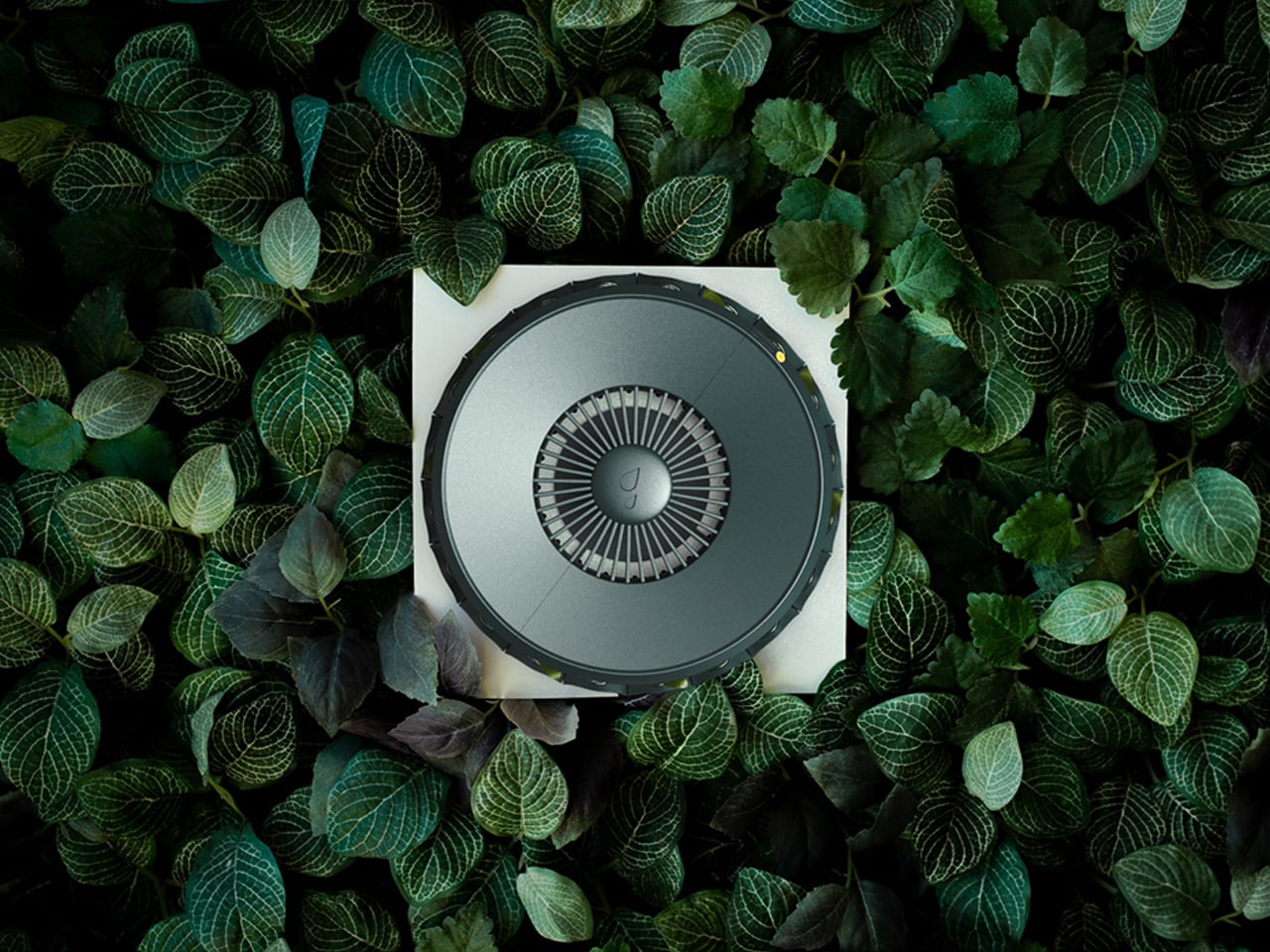
Loop is a smart, modular plant pot designed specifically for compact urban interiors. Created by designer Elif Bulut, the system addresses common challenges of indoor gardening, such as limited space, inconsistent light, and irregular watering. Its sculptural, plume-inspired form allows plants to grow from both the top and bottom, with detachable seed modules arranged in a radial configuration. Each module securely locks into place, enabling easy customization and maintenance while keeping the system compact and visually cohesive.

At the core of Loop is an automated irrigation and lighting system that simplifies plant care. An adjustable top-mounted water reservoir controls the flow of water to each module, allowing users to fine-tune irrigation based on plant needs. Integrated LED lights beneath the lid distribute balanced light throughout the day, supporting healthy growth indoors. Once set up, Loop’s smart technology monitors plant conditions and maintains optimal settings, making indoor gardening intuitive, low-maintenance, and well-suited to city living.

Vertical farming is transforming how we inhabit cities and homes, blending architecture, sustainability, and community. From towering agricultural skyscrapers to modular indoor systems, these innovations create resilient, biophilic environments that nourish both people and planet.

The post 5 Vertical Farm Designs That Grow Food Inside Your Home and City first appeared on Yanko Design.
Portugal’s Official TORRAS Phone Case for World Cup 2026 Has A Hands-Free Camera Stand

Cristiano Ronaldo did not become the most recognizable footballer of his generation by accident. The discipline, the training footage, the obsessive documentation of progress over years and decades, all of that has been as central to the story as any trophy or record. Portuguese football has a particular relationship with that kind of dedication, with the belief that the work done before anyone is watching forms the foundation of everything that happens when the stadium fills. That culture has produced players who treat consistency as a competitive advantage, shaping the team’s identity in a way that outlasts any single result. With the 2026 World Cup approaching on American soil, the squad carries that identity into a tournament that feels deeply personal, thirty-two years after Portugal missed their chance on the same stage.

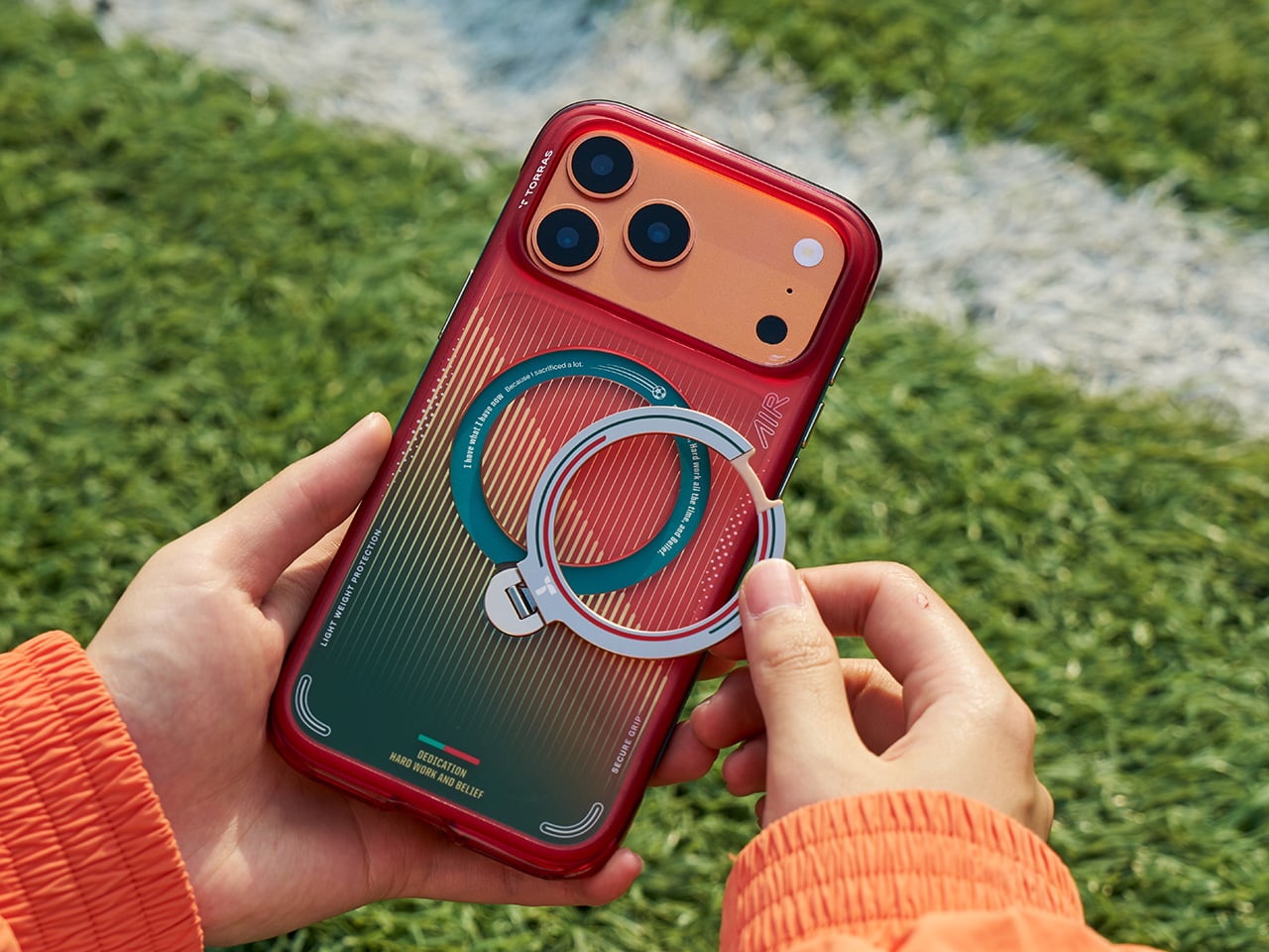
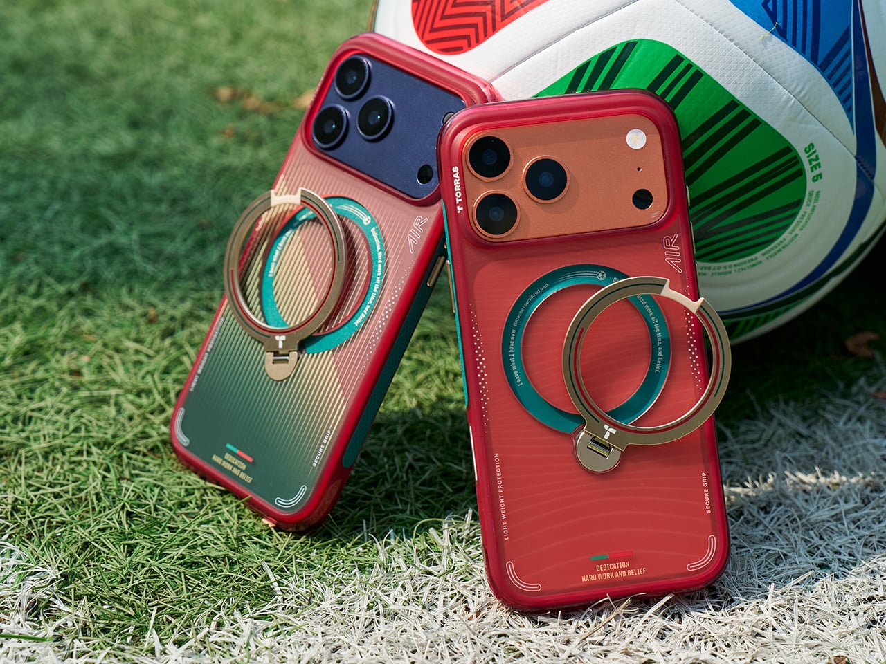
TORRAS built its co-branded case around that spirit, officially partnering with the Portuguese Football Federation. The Q3 Air Portugal National Football Team Edition draws from the squad’s new kit: a red, green, and gold palette, a wave-patterned texture referencing Portugal’s maritime heritage, and the Quinas crest pressed into the airbag structure alongside football-inspired graphics. A No.7 sticker comes included with the case, nodding to the player who has come to embody the “Dedication, Hard Work and Belief” message printed across the back. The magnetic Ostand ring supports 180-degree flipping and 360-degree rotation, enabling hands-free setup on gym equipment, flat courts, or almost any surface. TORRAS has been in the phone stand category since 2018, and the Portugal Football Edition is the most culturally grounded product they have put out.

Designer: TORRAS

Click Here to Buy Now: $69.99.

The gradient runs from deep crimson at the top to forest green toward the base, and the design reads as Portuguese football rather than a Portuguese football souvenir. The vertical line texture looks like jersey fabric up close and stadium turf under floodlights from a distance, which is either a very deliberate choice or the best kind of coincidence. The Quinas crest is pressed into the airbag corner structure, placing Portugal’s national symbol at the exact section of the case engineered to absorb impact. That placement is functionally deliberate as much as it is visual, because the corners carry the highest concentration of drop protection engineering in any phone case. The No.7 sticker reads as insider vocabulary to most, and unmistakable shorthand to anyone who has followed Portuguese football for the last two decades.

The Ostand ring snaps completely flat when not in use, keeping the profile slim enough that the case slides into a pocket like any standard shell. It opens into a stand that locks across a full 180-degree flip range with 360-degree rotation on the horizontal axis, covering portrait, landscape, and every diagonal angle between them. The entire case stays MagSafe-compatible, so wireless charging and MagSafe accessories work without pulling the case off, a trade-off most ring-stand designs handle badly. TORRAS rates the airbag corner structure for military-grade drop protection, and the Football Team edition holds to that spec without adding bulk for the co-branded graphics. The magnetic hold is firm enough for hands-free recording on a gym wall or a stadium barrier, and releases cleanly when you want to reposition.

The 2026 World Cup is set to be held on American soil for the first time since 1994. Portugal’s inclusion in this WC roster gives this campaign a weight that the squad feels and the fan community mirrors. The collaboration, announced under the name “Record Your Passion,” centers on the premise that the daily habit of documenting training is, for many athletes, inseparable from the discipline of showing up for it. The training clips, the watch-party setups, the goal reaction shot on a phone propped against a stadium seat, all of it fills the gap between what broadcast cameras pick up and what personal memory holds. A limited-edition case built in the colors of your team, with a stand deploying in under a second, is a product that knows its audience.

Click Here to Buy Now: $69.99.

The post Portugal’s Official TORRAS Phone Case for World Cup 2026 Has A Hands-Free Camera Stand first appeared on Yanko Design.
This Side Table Has No Legs: Its Two Storage Units Are the Structure

Side tables rarely demand much attention. They hold a drink, a lamp, or a book, and that’s essentially all anyone expects from them. The more ambitious ones add a drawer or a second tier, but the core formula stays the same. It’s one of those furniture categories where function has long settled into convention, quietly waiting for someone to rethink the structure itself.

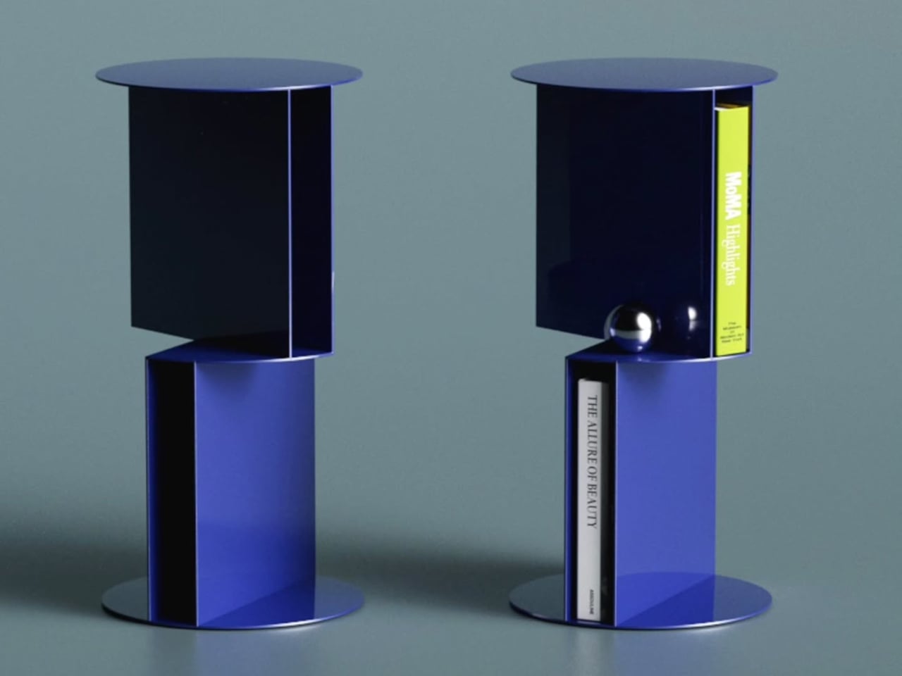
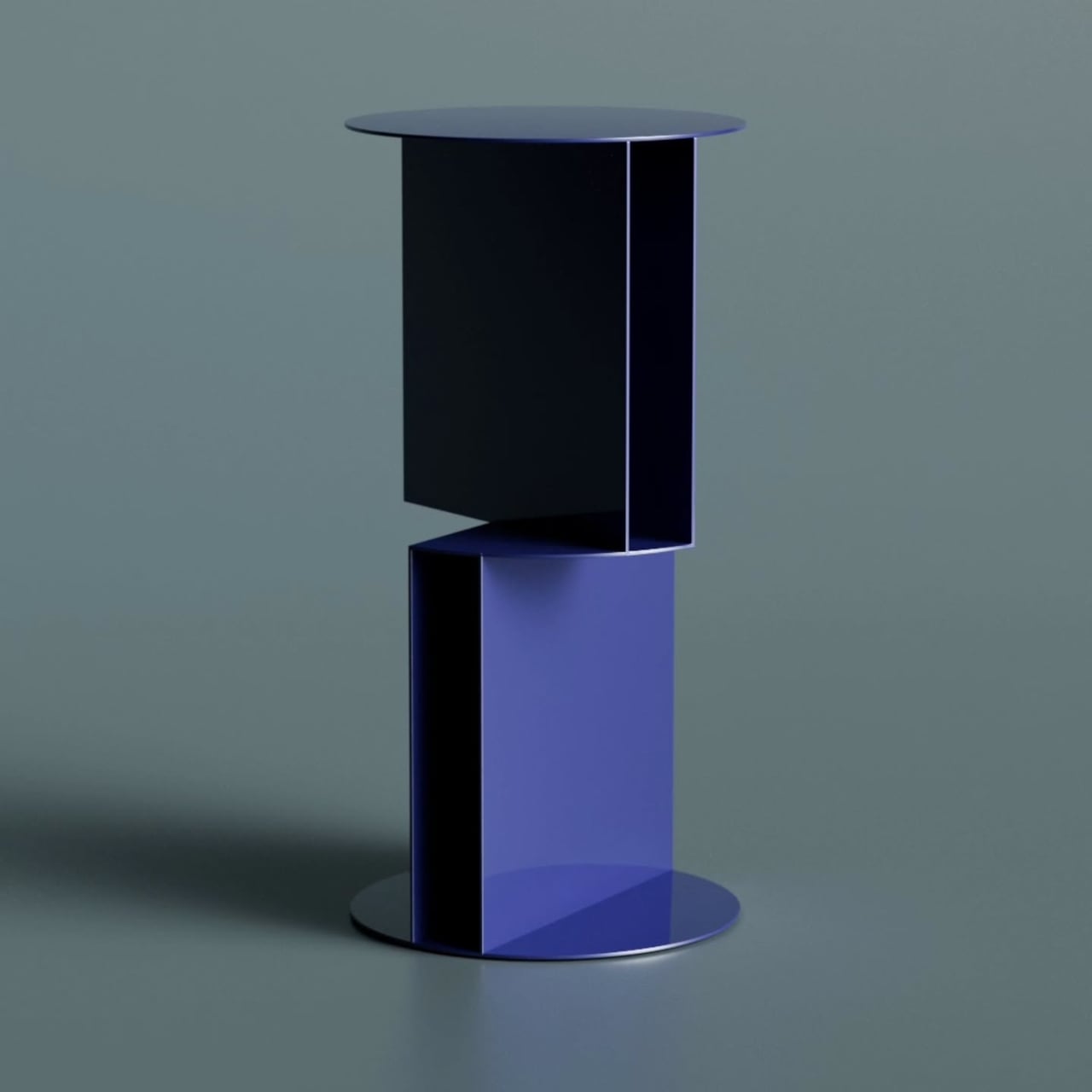
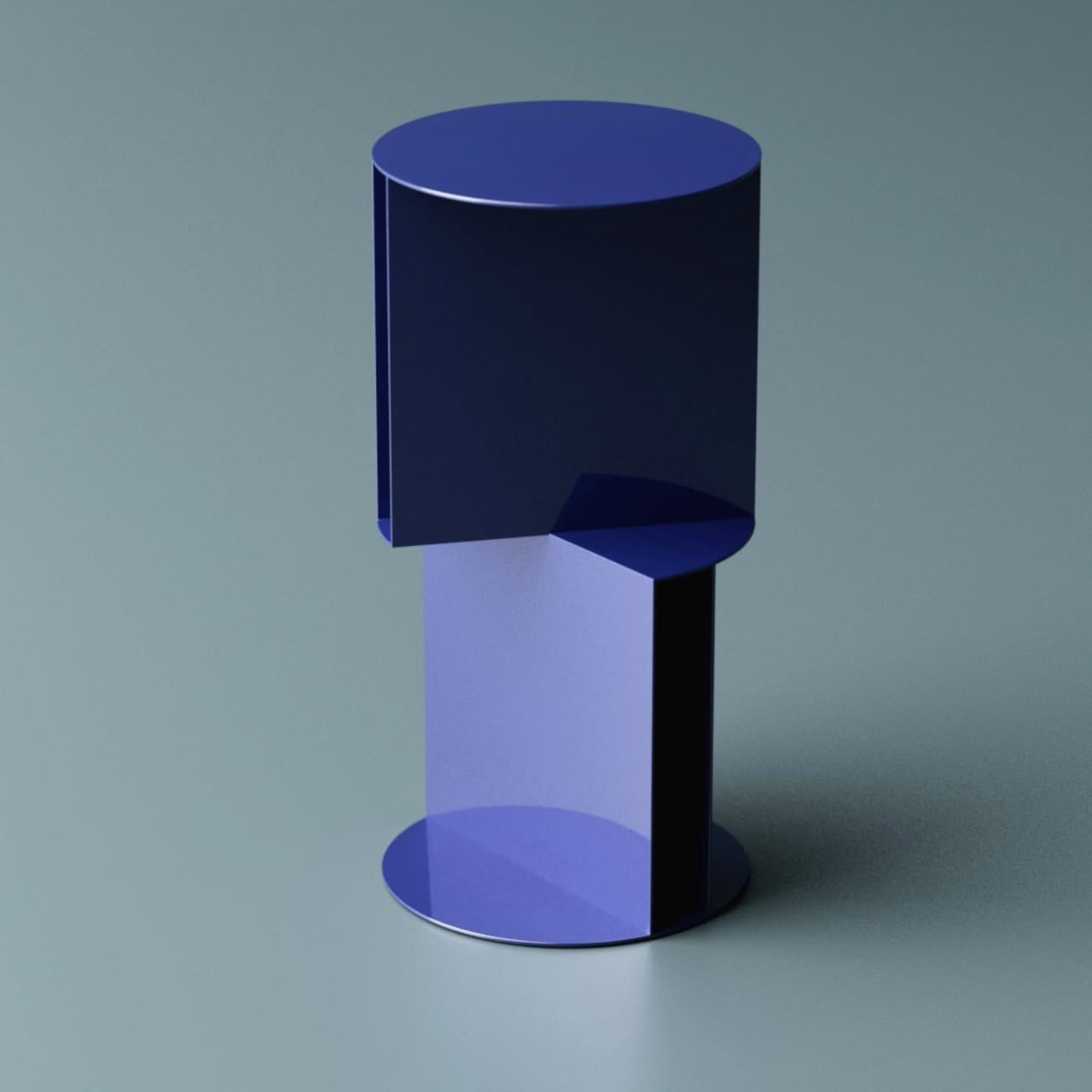
Designer Deniz Aktay has been doing exactly that kind of rethinking through his designs. His latest concept, the Torque High Side Table, takes the structural question seriously, proposing a pedestal that isn’t really a pedestal at all. The table’s support comes entirely from two metal storage units that carry the weight of the design, both literally and visually, stacked and rotated against each other.

Designer: Deniz Aktay

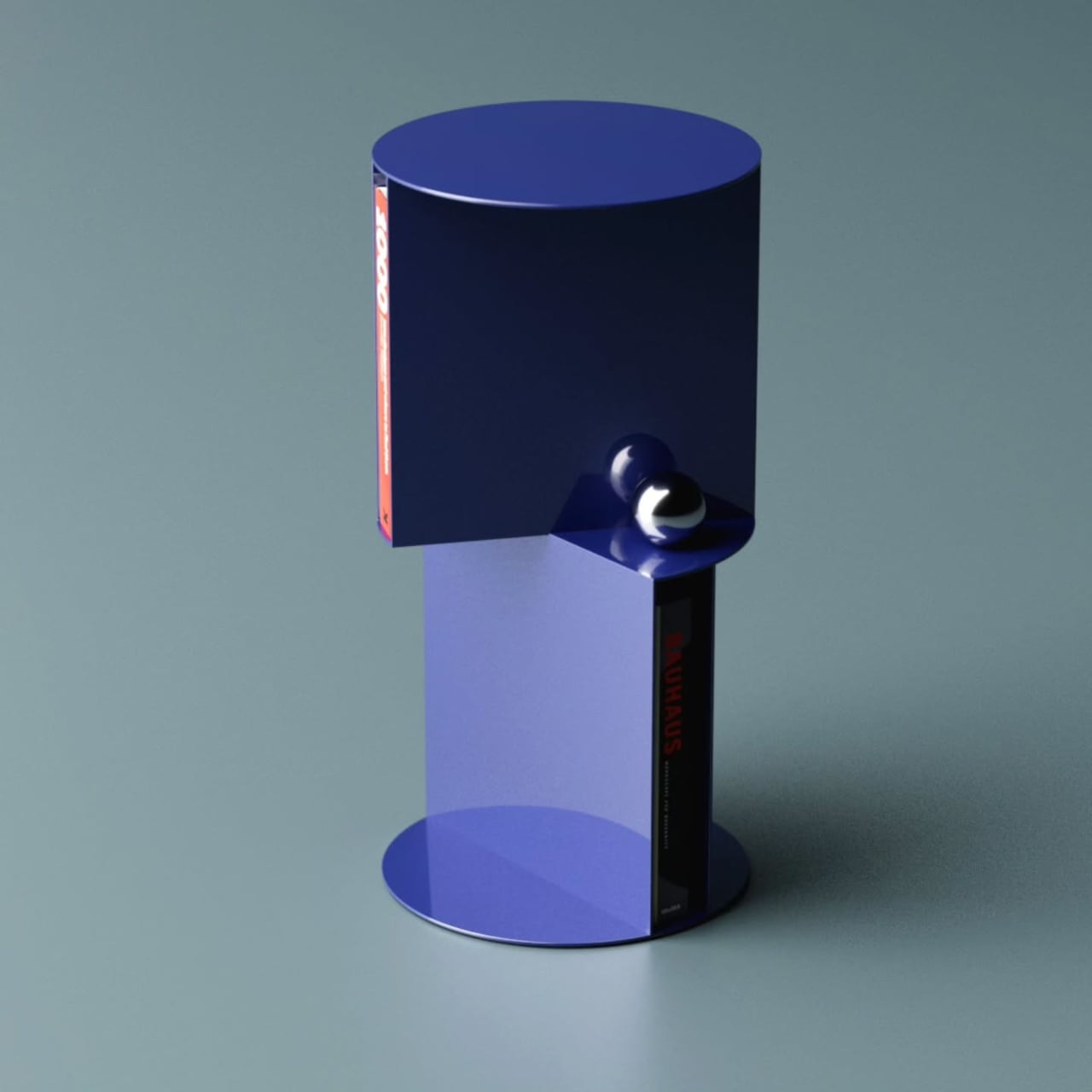
The idea of torque, that mechanical tension created by rotation, becomes the organizing principle here. Each storage unit opens in a different direction, offset against the other to create the visual friction the name implies. It makes the structure feel active, as if the table is caught mid-turn. The two-tone blue colorway reinforces that, with a dark navy upper section against a brighter blue lower.

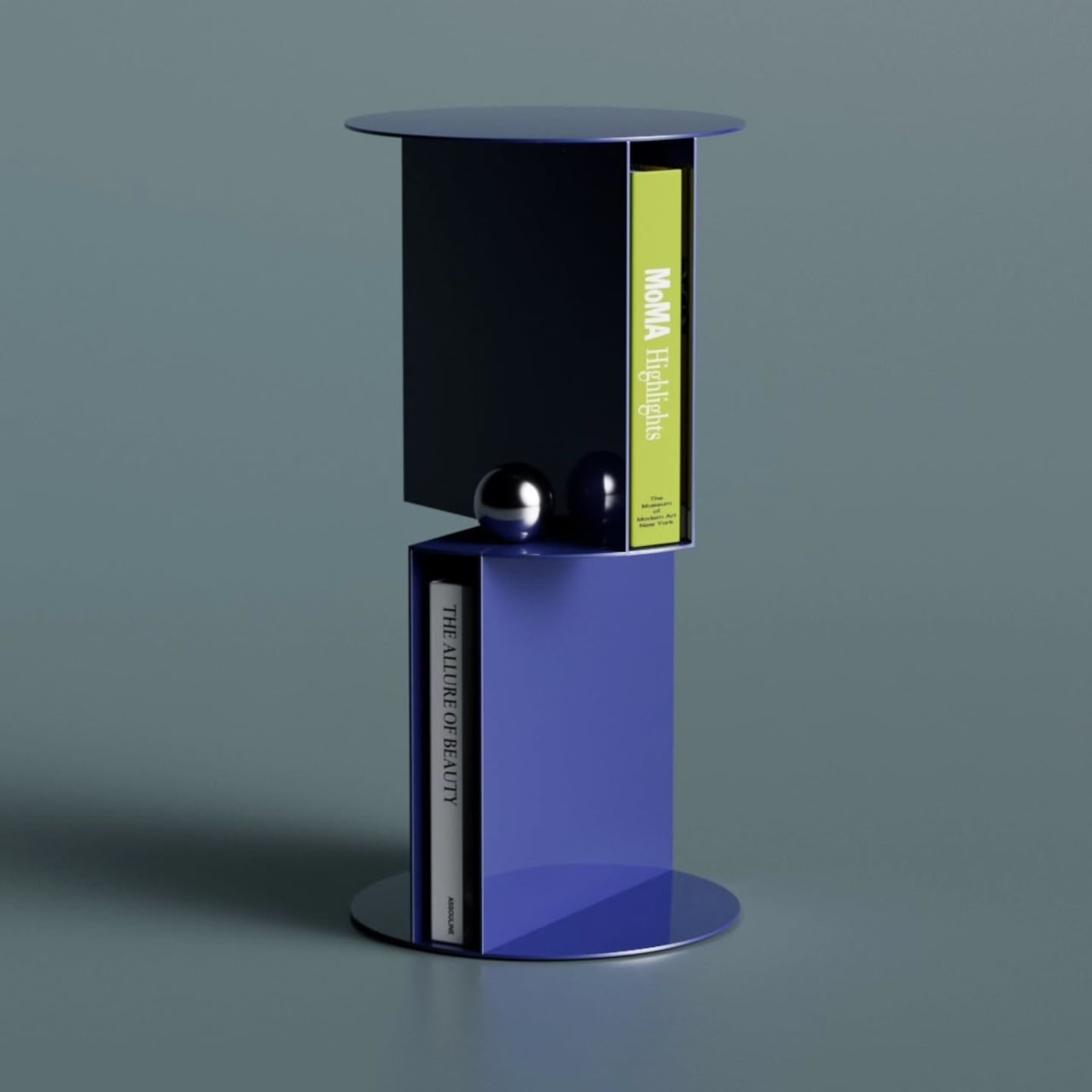
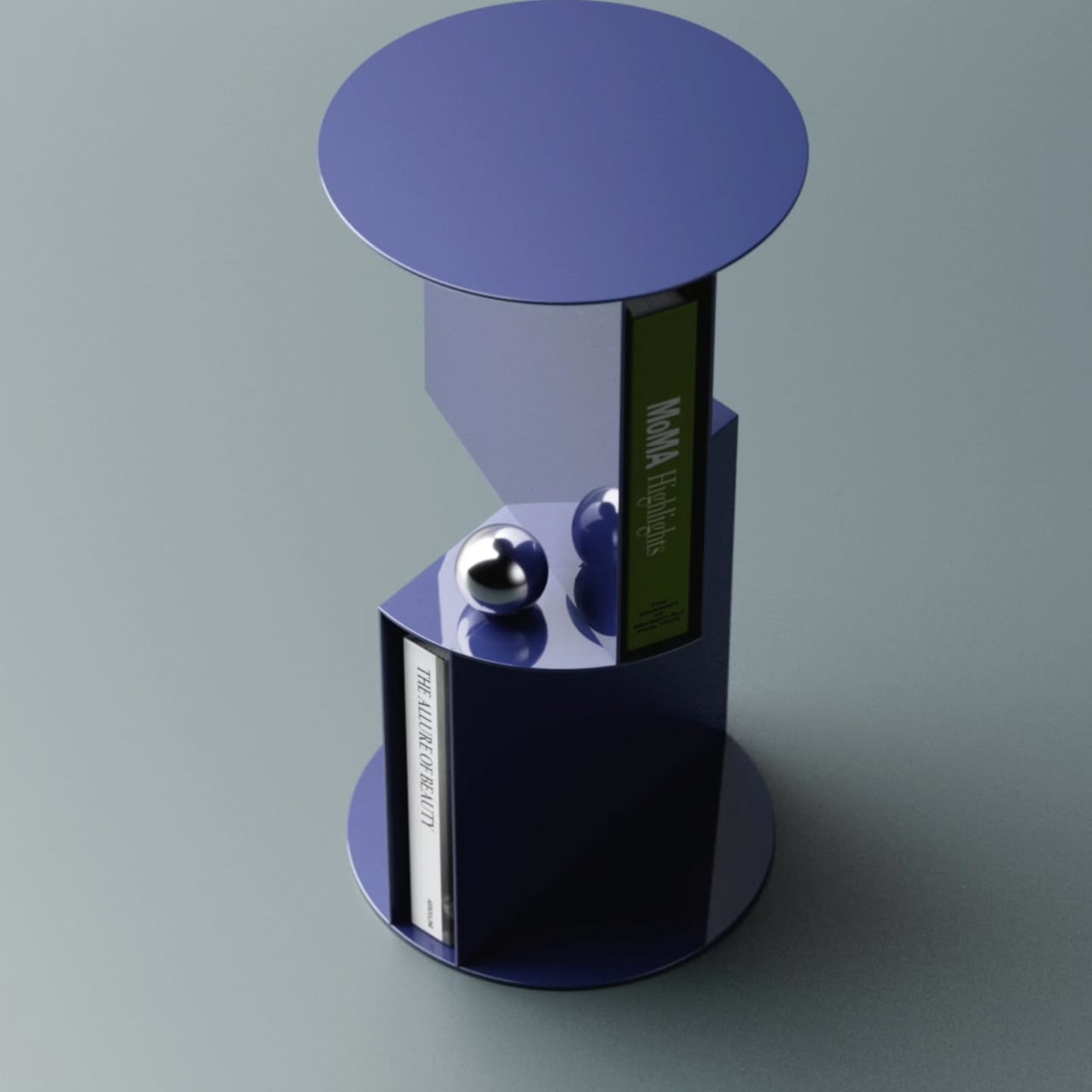
That rotation also creates something practically useful. Where the two units meet, a small shelf platform projects outward between them, adding a third storage level beyond the two main compartments. It reinforces the visual logic of the twist while giving you somewhere to set smaller objects. Three storage spots from a single structural idea is a tidy outcome for a table of this size.

Books sit naturally in each compartment, held upright in the curved enclosures without needing brackets or dividers. Each section holds a small collection without effort, turning what might otherwise be a purely decorative object into something you’d interact with daily. That balance between use and visual statement is where this kind of furniture concept tends to either land well or feel entirely theoretical.

The storage-as-structure approach means the Torque table looks interesting from every angle. There are no legs, no base panel, and no conventional framing hardware. The two open-faced volumes do all the work, with a circular disc on top forming the table surface and a matching flat disc at the bottom serving as the foot. Everything between them is either storing something or making a structural point.

Aktay has built a body of work around this kind of thinking, concepts that start with a formal problem and arrive somewhere genuinely practical. The Torque High Side Table fits that approach well. It doesn’t need to announce its cleverness because the structure speaks on its own, and anyone who tucks a book into one of the compartments and sets a cup on top will feel the logic in it.

The post This Side Table Has No Legs: Its Two Storage Units Are the Structure first appeared on Yanko Design.

7 Best Tiny Home Outdoor Accessories That Turn a 300-Square-Foot Yard Into an Actual Living Room

Small outdoor spaces have a way of revealing exactly how much thought went into the objects inside them. When every square foot counts, the things you choose to bring outside need to earn their place — not just functionally, but visually. The best tiny backyard accessories fold away when you’re done, grow upward instead of outward, and look like they were designed rather than assembled. These seven picks do exactly that.

The difference between a cramped yard and a considered one rarely comes down to square footage. It comes down to objects that understand their role — a fire pit that manages its own smoke, a dining set that lives inside a cylinder, a herb garden that climbs the wall instead of spreading across the ground. Each of these seven accessories solves a real outdoor living problem without creating a new one, which is the baseline requirement for anything going into a space this deliberate.

1. All-in-One Grill

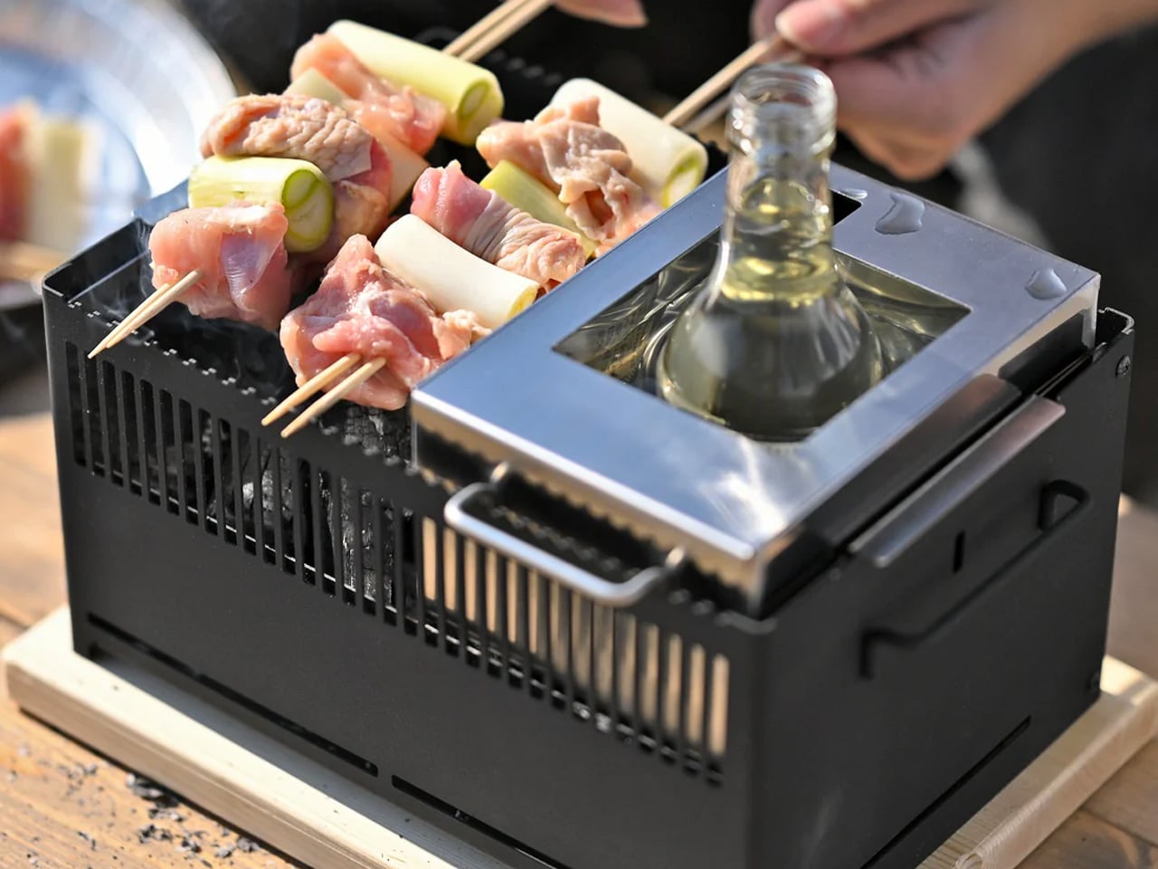
The first question any small outdoor space asks of a grill is whether it can disappear when not in use. This modular tabletop grill answers that cleanly. Its parts separate and stack to support barbecuing, frying, grilling, steaming, smoking, or slow-cooking a stew — all on a surface small enough to sit on any patio table. The design doesn’t try to be everything at once; it brings exactly what you need for the style of cooking you’re doing that evening, then gets out of the way.

There’s also a bottle-warming module in the mix, which sounds like a novelty until the first cold autumn evening when mulled wine becomes the plan. Cleanup is as thorough as cooking; every modular part disassembles for washing, and nothing requires more effort than it should. For a compact yard where a full outdoor kitchen isn’t on the table, this is the kind of object that makes the limitation feel like a deliberate choice rather than a compromise.

Click Here to Buy Now: $449

What we like:

  • Modular design covers six styles of cooking without occupying a permanent outdoor space
  • Parts disassemble quickly, keeping cleanup as easy as the setup

What we dislike:

  • Multiple components mean multiple things to keep organized between uses
  • Better suited for cooking for two or four than for a larger gathering

2. porTable

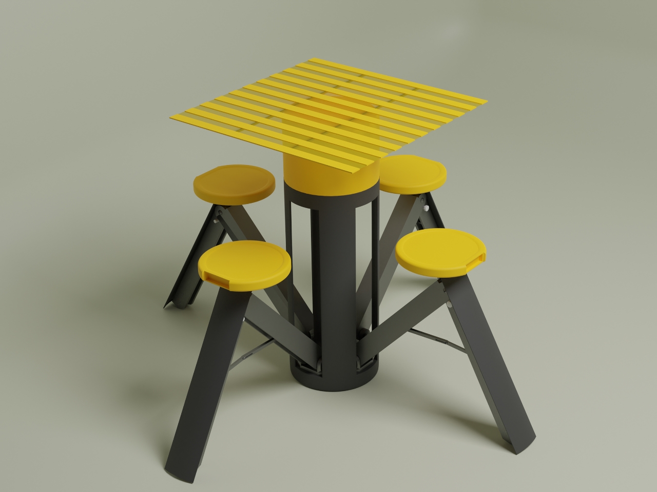
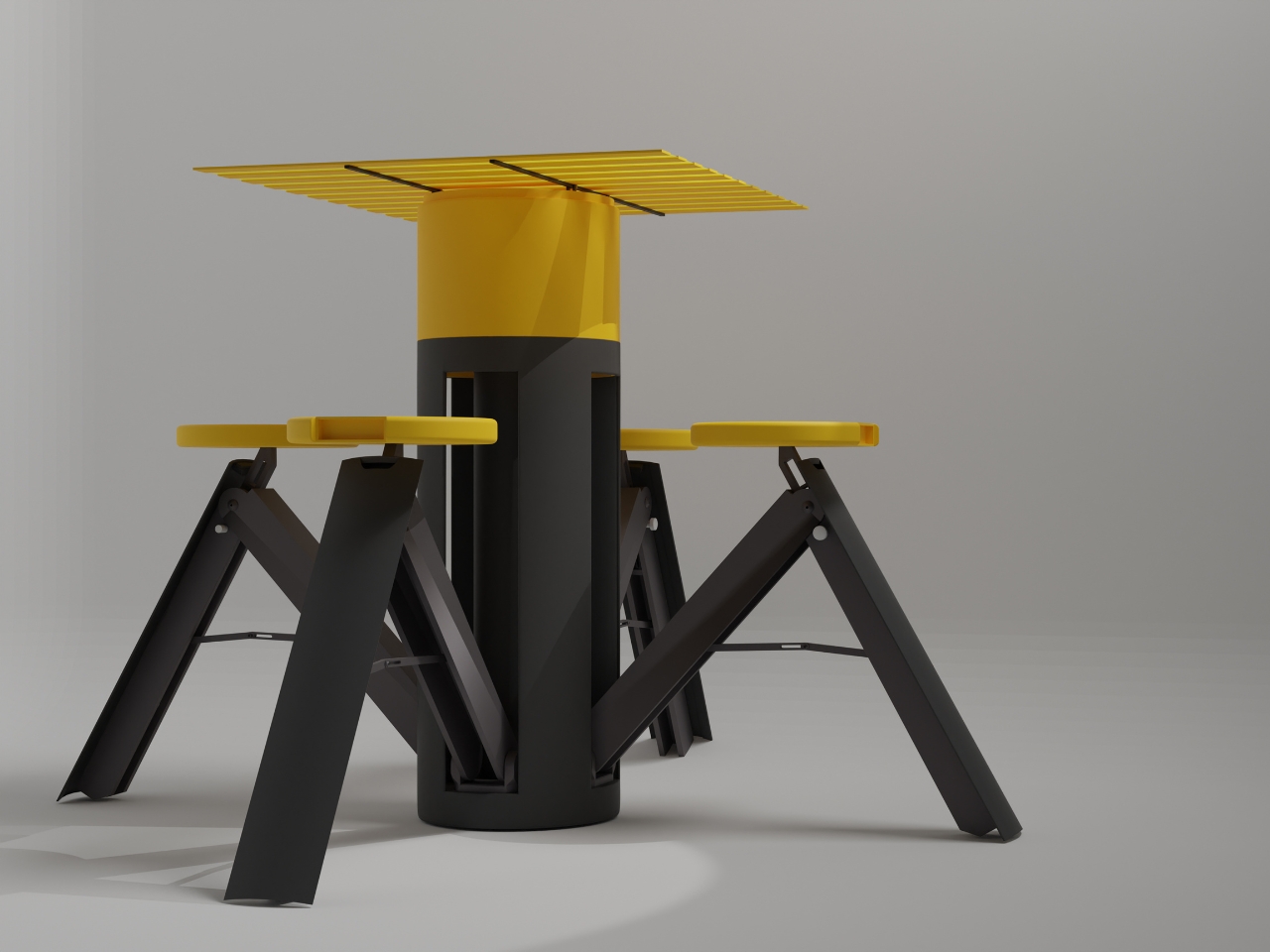
At rest, porTable looks like a bold geometric container — yellow lid, charcoal body, the kind of object you’d leave on a shelf without apology. In use, it becomes a complete outdoor dining setup for four: fold-out seats, a sturdy tabletop, no tools required, no leftover parts. The transformation from container to furniture takes under a minute, which means the decision to eat outside is never more than sixty seconds away from actually happening.

The yellow and charcoal palette is doing real design work here — friendly without being childish, modern without being cold. More importantly, the concept solves the core tension of tiny outdoor living: you want furniture, but you don’t want furniture taking up space when it’s not in use. porTable collapses that contradiction entirely. It lives as a single compact cylinder until the moment it’s needed, then opens into something genuinely functional and good-looking. That kind of thinking is exactly what a small yard rewards.

What we like:

  • An entire four-person dining set stores as a single portable object
  • No tools or assembly knowledge needed to set up or break down

What we dislike:

  • As a concept design, long-term durability in real outdoor conditions is still unproven
  • The bold yellow colorway is a personality commitment that won’t suit every space

3. Birdbuddy Pro Solar

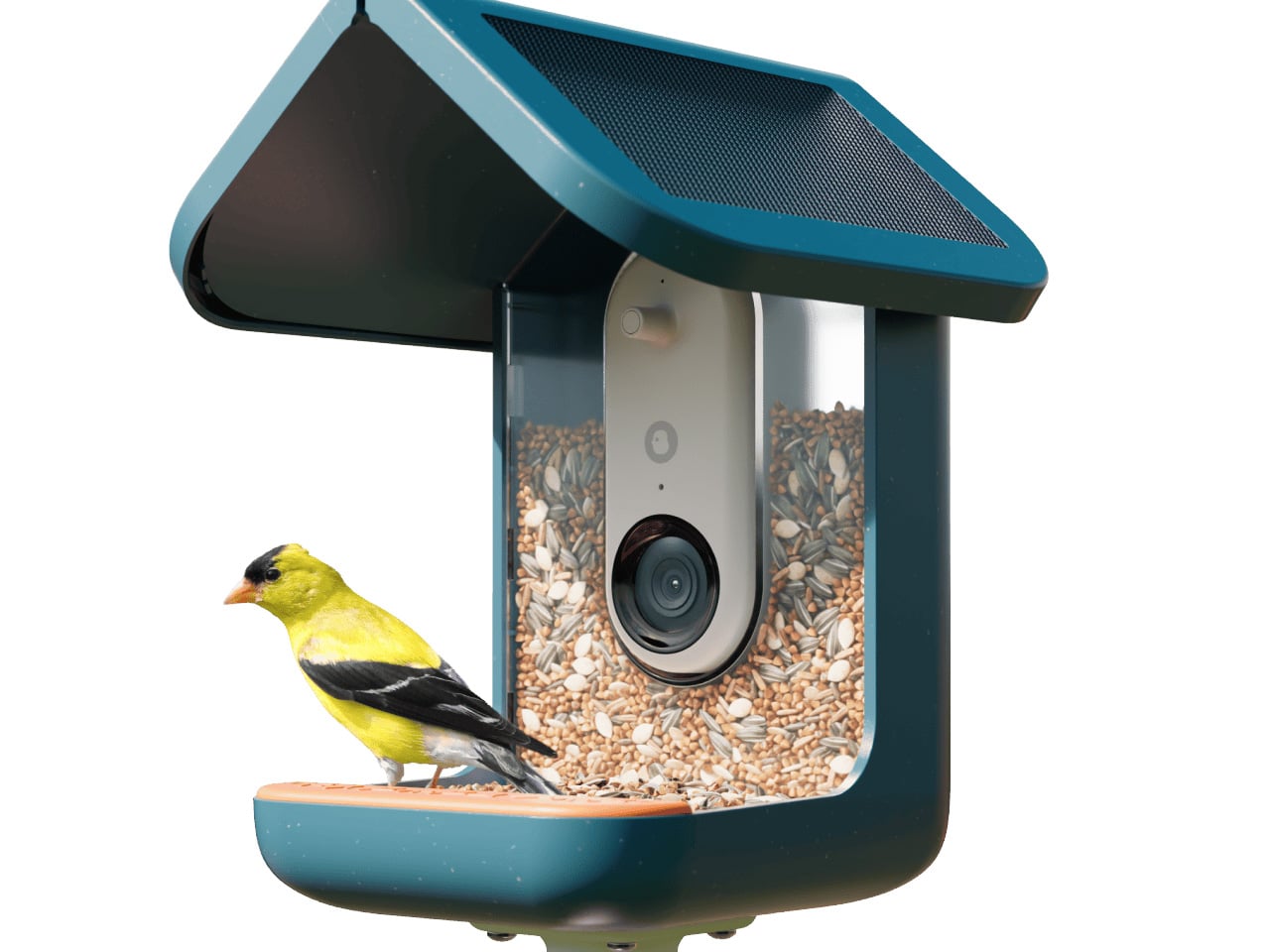
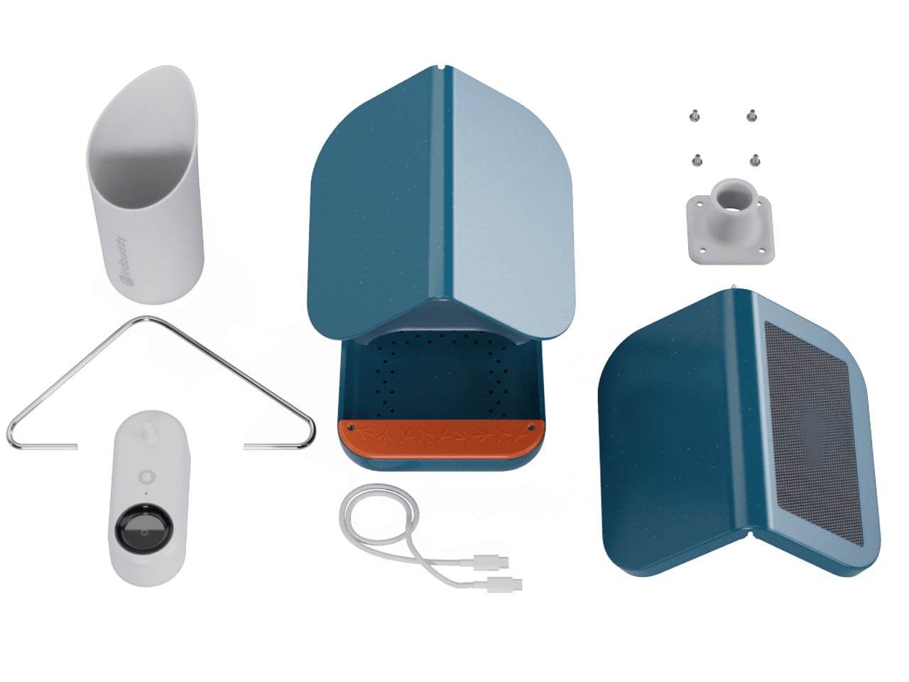
A bird feeder is, in most hands, a lump of plastic with seeds in it. The Birdbuddy Pro Solar is something else entirely — a solar-powered AI camera system that identifies visiting birds, captures slow-motion HD video, and delivers it to your phone via a free app. The expanded field of view and improved sensor handled dappled backyard light without washing out the image. What you get isn’t just a feeder. It’s a front-row seat to the wildlife that was already there.

For a tiny outdoor space, this might be the most meaningful addition on this list. It doesn’t take up floor area. It hangs from a fence or mounts to a wall, taking up exactly zero square footage. And it changes the character of the yard in a way that furniture simply can’t — from static backdrop to living environment. The AI identification runs automatically, building a personal record of every species that visits over time. It’s the rare outdoor product that gets better the longer it sits there.

What we like:

  • Solar-powered design means no cables crossing the yard
  • AI species identification works passively — no effort required from the user

What we dislike:

  • Full camera functionality depends on a consistent Wi-Fi signal reaching the yard
  • Ongoing seed refills add a small but real maintenance commitment

4. Slim Fold Dish Rack

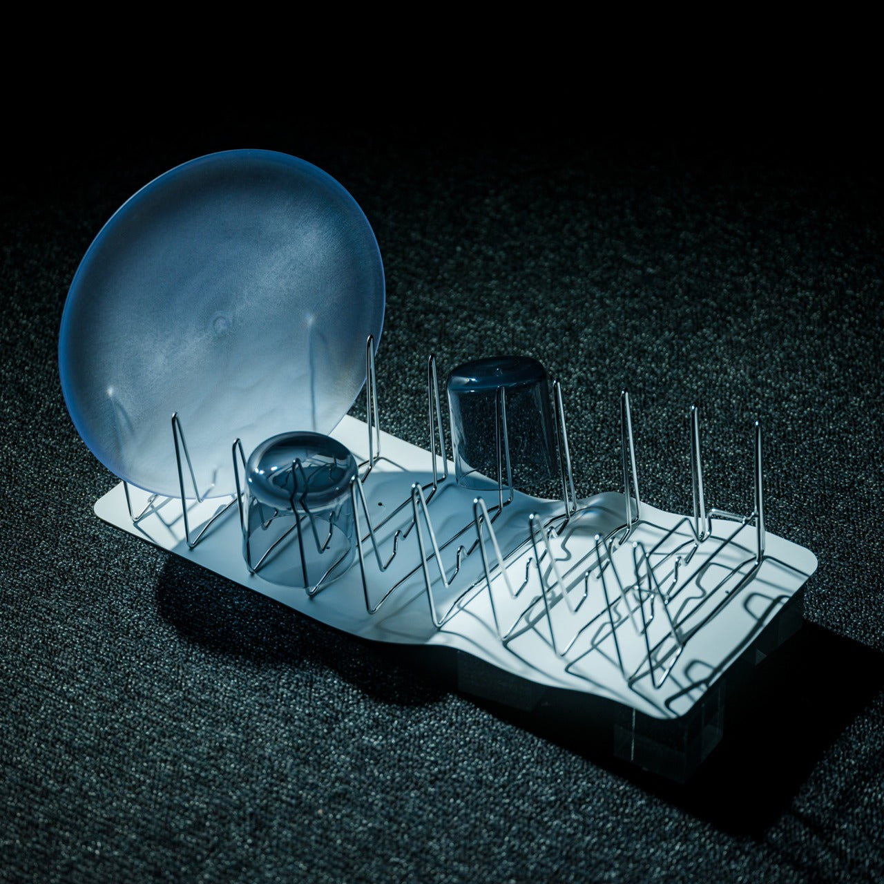
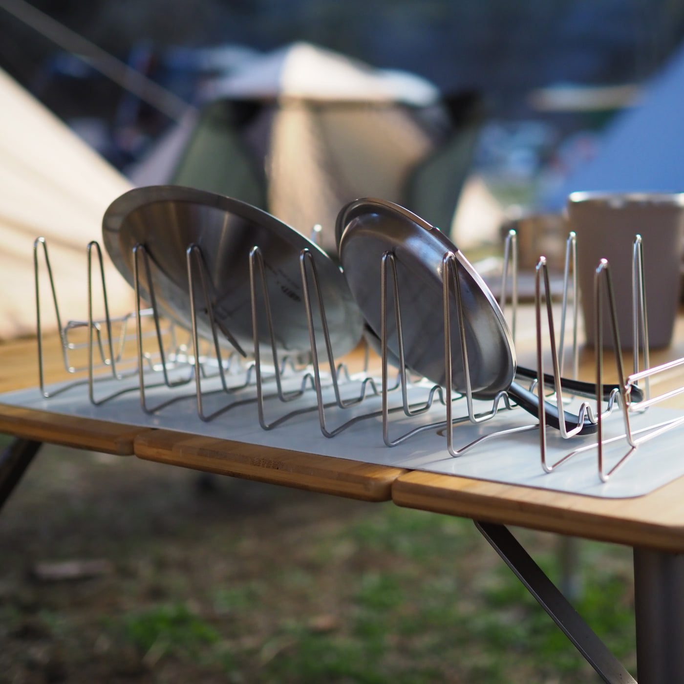
Most dish racks are compromises — too large for small spaces, too flimsy for daily use, too visually noisy to leave out. The Slim Fold Dish Rack collapses this problem with a patent-pending spring mechanism that shrinks a full 14-inch rack to 1.2 inches in under a second. That’s the difference between a dish rack that permanently occupies counter space and one that lives in a bag or a pocket. For outdoor cooking situations where surface area is already borrowed, that distinction is significant.

The ventilation geometry is engineered for real airflow — plates, utensils, and cookware of any size dry properly without needing to be repositioned or fanned out. The design is minimal enough that leaving it out doesn’t create visual clutter; storing it away feels almost like a trick. It’s also dishwasher-safe, which closes the loop on a product that exists to make cleaning easier. In a space where every object has to justify its presence, this one earns it quietly and completely.

Click Here to Buy Now: $75.00

What we like:

  • Collapses to 1.2 inches — genuinely pocketable when not in use
  • Dishwasher-safe, so the cleaning tool is easy to clean

What we dislike:

  • The spring mechanism’s long-term durability across daily use remains to be tested
  • At full extension, very large pots and baking trays will likely overhang the edges

5. Stack & Sprout

A 1×1 square-foot footprint for a full working herb garden is not a compromise — it is the point. Stack & Sprout’s modular tower stacks as high as the wall and ambition allow, with each module holding individual growing pods loaded with smart soil capsules. Fill the water tank, add seeds, and the system manages hydration from there. The result is a vertical column of living herbs that climbs the fence instead of spreading across the ground, leaving every inch of floor space exactly where it was.

What makes this work for a small outdoor space is how little it asks of the person using it. No specialized knowledge, no guesswork about watering schedules, no particular green thumb required. The modular format means you can start with three modules — basil, mint, rosemary — and add more as confidence grows. Fresh herbs picked ten seconds before they go into a dish taste genuinely different from ones that have spent a week in a grocery bag. Stack & Sprout makes that difference accessible to anyone.

What we like:

  • Modular height adapts to any wall space, from a single tier to a full vertical installation
  • Self-watering system removes the most common reason home herb gardens fail

What we dislike:

  • Proprietary smart soil capsules create an ongoing replacement cost
  • Taller configurations may need wall anchoring to stay stable in the wind

6. Forest Cooperage Cedar Soaking Tub

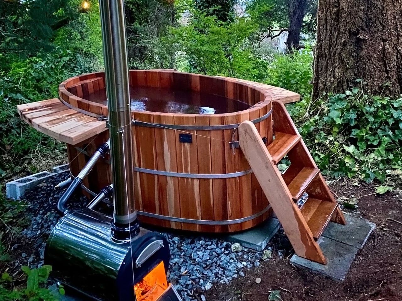
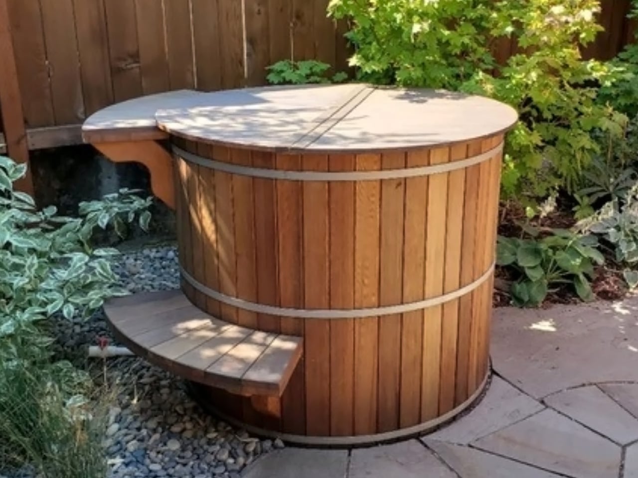
The Forest Cooperage cedar soaking tub is handcrafted on Vancouver Island from clear vertical grain Western Red Cedar, secured with stainless steel hoops. It sits directly on any level surface, fills from a garden hose, and heats with a wood-fired or electric immersion heater — no plumber, no electrician, no permanent installation required. The stave-and-hoop construction is the same method used in barrel-making for centuries, which is why it looks entirely at home outdoors next to bamboo, stone, and weathered wood.

What a cedar tub does to a small outdoor space is harder to explain than it sounds. It gives the space a reason to exist — not as a passageway or storage area, but as a genuine destination. An evening soak in a backyard cedar tub, surrounded by the natural scent of the wood and the quiet of a well-arranged small yard, is a genuinely different experience from anything else available at this price. In 300 square feet, this is the object that makes everything else around it feel intentional.

What we like:

  • No permanent installation — fills from a hose and heats without any plumbing
  • Cedar weathers beautifully outdoors, developing character rather than deteriorating

What we dislike:

  • Regular maintenance is needed to keep the cedar properly hydrated and sealed
  • Wood-fired heating requires planning ahead — this is not a spontaneous soak situation

7. Airflow 8-Panel Fire Pit

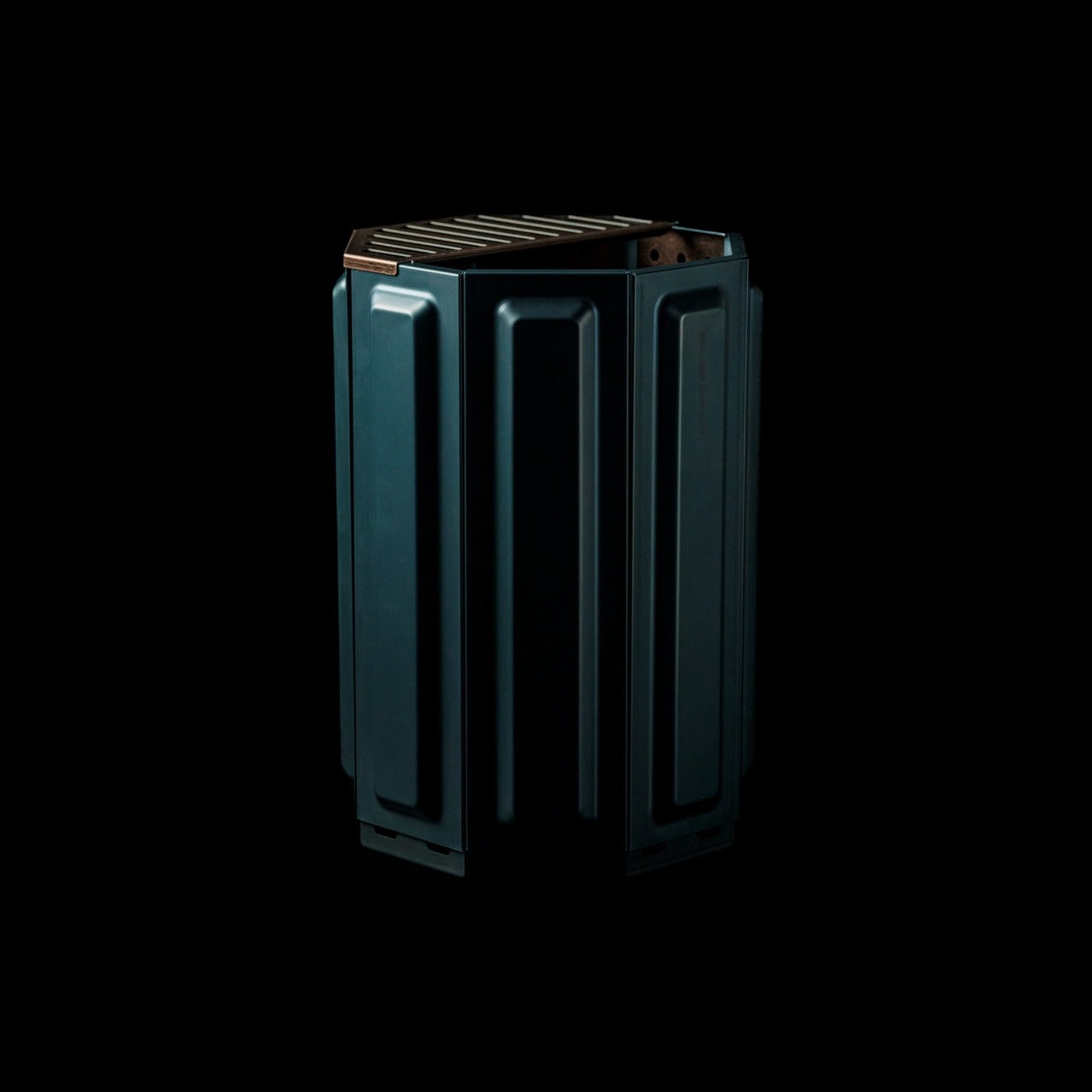
The Airflow fire pit is built around a single engineering insight: clean combustion requires oxygen at the base and a secondary combustion loop at the top. The eight removable panels form an octagonal cylinder with holes positioned precisely to channel fresh air to the base as the primary feed, then up through a double-walled cavity to the top vents as secondary combustion. The fire burns hotter, produces significantly less smoke, and leaves far less ash than a conventional open pit.

The eight-panel removable design does more than manage airflow — it gives you direct control over intensity. Remove panels to widen the burn; keep them assembled for a focused and efficient fire. For a small outdoor space where heavy smoke would ruin the evening entirely, this is the detail that separates a fire you can actually sit around from one that keeps everyone constantly repositioning their chairs.

Click Here to Buy Now: $325.00

What we like:

  • Eight removable panels allow direct, intuitive control over fire intensity
  • Secondary combustion system dramatically reduces smoke output in compact spaces

What we dislike:

  • Eight separate panels add to the number of components to store between uses
  • Steel construction will need occasional treatment to stay ahead of rust in wet climates

Small Space, Considered Objects

A well-used 300-square-foot yard doesn’t need more things in it. It needs the right things — objects that fold away cleanly, grow upward rather than outward, and look like someone thought carefully before placing them there. Each of these seven picks solves a real outdoor living problem without creating a new one, which is the baseline requirement for anything going into a space this small and this deliberately arranged.

The best version of a tiny outdoor space isn’t a smaller version of a large one. It’s something more deliberate — a set of objects that each do their job beautifully and step back when they’re not needed. Get these seven right, and a 300-square-foot yard stops feeling like a constraint entirely. It starts feeling like a choice you made on purpose.

The post 7 Best Tiny Home Outdoor Accessories That Turn a 300-Square-Foot Yard Into an Actual Living Room first appeared on Yanko Design.

Grade 5 Titanium, M390 Steel, Ceramic Bearings, $120 Price Tag: The EDC Knife to Beat in 2026

Most folding knives compromise somewhere. The blade steel holds an edge but rusts easily. The handle looks gorgeous but feels slippery when wet. The action is butter-smooth out of the box but develops wobble after six months of carry. MIH spent months asking a simpler question: what if you refused to compromise at all? What if you stripped away every feature that didn’t directly serve the three things a knife actually needs to do well, and then executed those three things with materials that cost more but last longer?

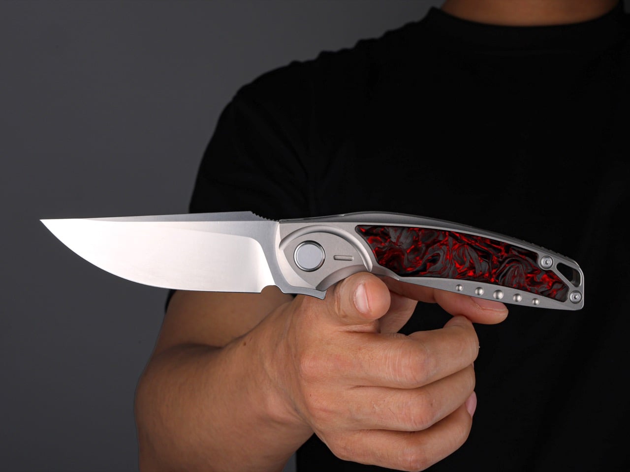
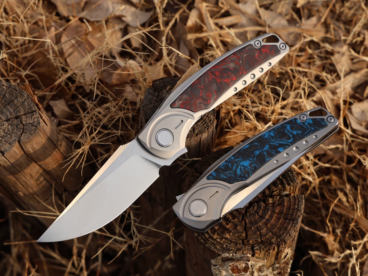
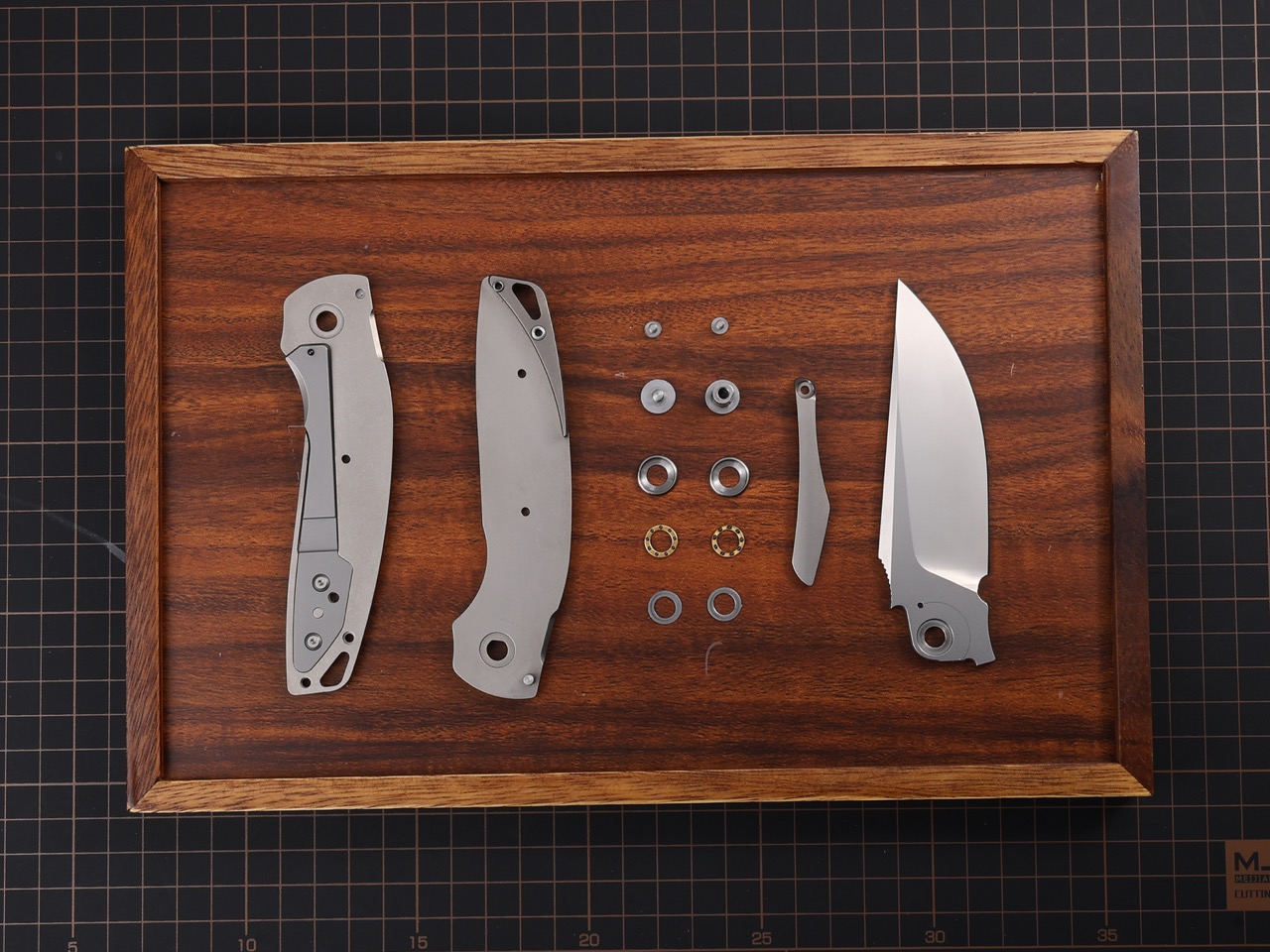
The GraphiX is the answer to that question. M390 steel, the supersteel standard, cuts 959mm of cardboard before dulling compared to 420HC’s 200mm. Ceramic bearings that will never rust paired with phosphor bronze washers that will never wear out. A titanium frame machined from Grade 5 aerospace alloy with a deep-carry clip milled directly into the structure. Carbon fiber scales with a tactile weave that ensures control even with gloves on. At $120 for the D2 version, this is a folder designed to be carried daily, used hard, and maintained rarely. It disappears in your pocket and appears in your hand exactly when you need it.

Designer: MIH

Click Here to Buy Now: $120 $183 (35% off) Hurry! Only 19 days left!

M390 is composed of 1.9% carbon for hardness, 20% chromium for corrosion protection, and 4% vanadium for edge life. That formula puts it at the top of the stainless steel hierarchy, well above the AUS-8 and 8Cr13MoV alloys found in budget production knives. The CATRA cardboard test proves it: M390 slices through nearly five times as much material as 420HC before edge degradation becomes noticeable. Heat-treated to 62 HRC and ground to a 15-degree edge angle per side, the blade hits the balance point where sharpness meets durability. You sharpen other knives. You just use this one. For those who prioritize toughness over ultimate edge retention, the D2 variant delivers serious cutting performance at 58-60 HRC, a tool steel with a long history of reliability in hard-use folders.

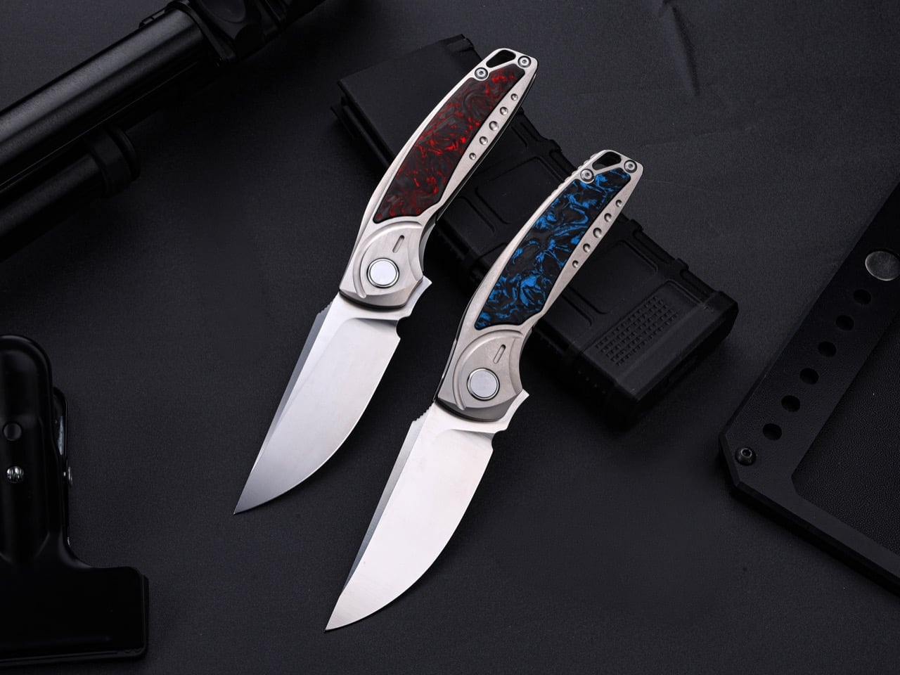
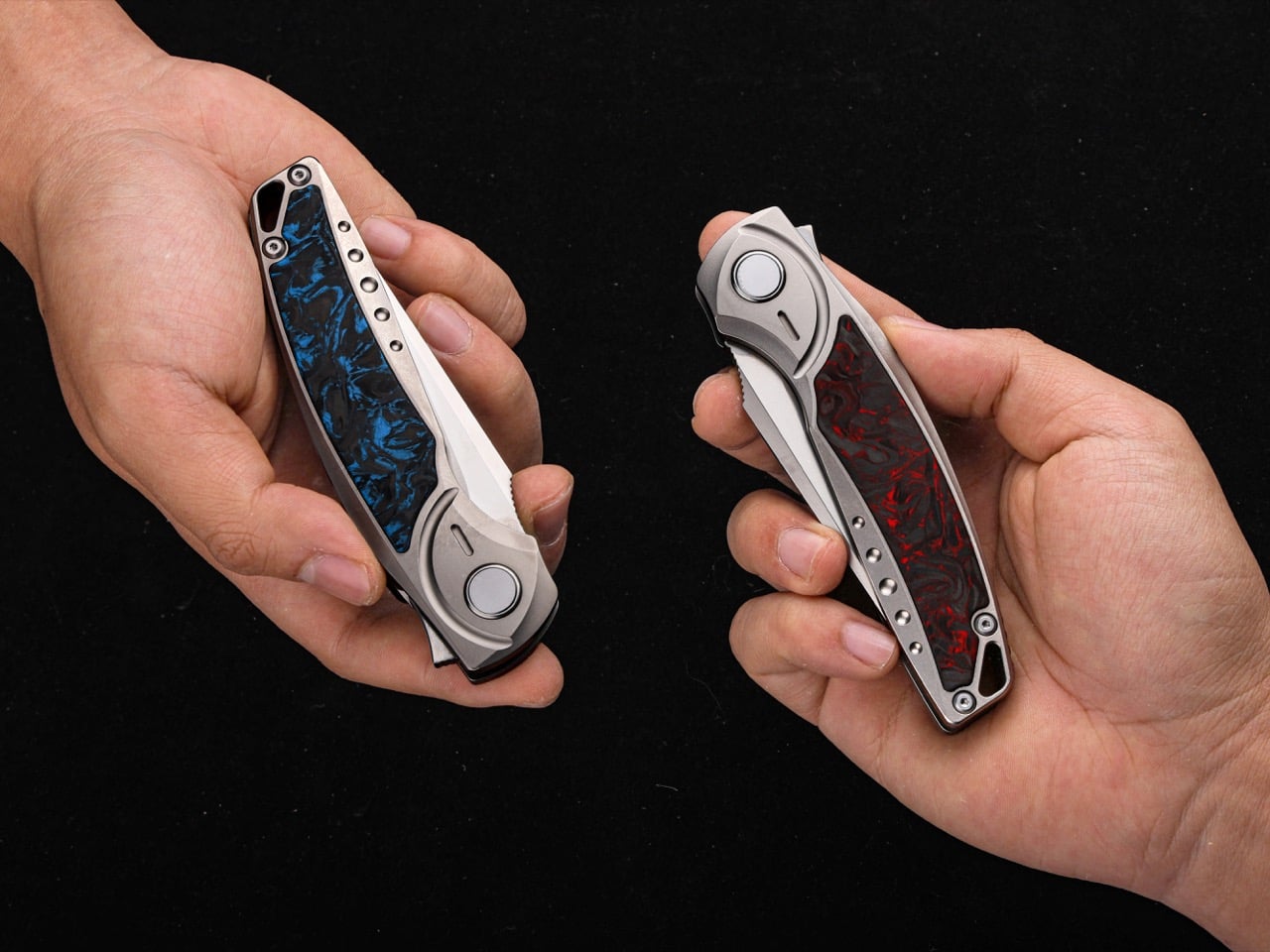
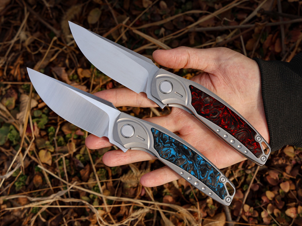
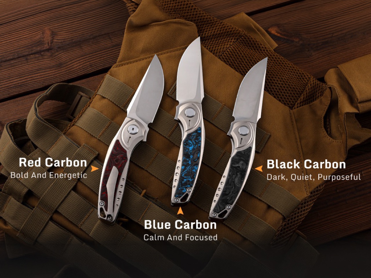
Grade 5 titanium, also known as Ti-6Al-4V, carries a strength-to-weight ratio that makes it the default choice in aerospace and medical implants. MIH machines the entire frame from this alloy, creating a structure light enough to disappear in your pocket at 5.6 ounces but strong enough to resist the kinds of lateral stresses that would bend a stainless steel liner. The frame curves to follow the natural contour of your palm, and the carbon fiber scales layered on top provide texture without aggression. Each scale displays a unique weave pattern since carbon fiber, by nature, never replicates exactly. Red, blue, or black colorways let you choose between bold presence, understated elegance, or low-visibility stealth. At the base of the blade, subtle jimping creates a tactile index point for your finger during detail work, the kind of small addition that only matters when you’re making precise cuts and suddenly realize how much control it gives you.

Ceramic bearings handle the pivot rotation while phosphor bronze washers distribute the load. Steel bearings corrode. Ceramic bearings don’t. Plastic washers compress and wear. Phosphor bronze doesn’t. The result is a deployment action that feels smooth the day it arrives and stays smooth years later. A strong detent keeps the blade locked closed during carry with no risk of accidental opening, but when you engage the flipper tab, the blade snaps out with a satisfying, controlled authority. The lock face and pivot are precision-machined to eliminate tolerances, which translates to zero blade play when the knife is open. No wobble. No lateral movement. Just solid lockup you can trust under hard use.

The blade runs a drop point profile, which means the spine curves gently downward to meet the tip, creating a strong point with plenty of belly for slicing. Drop point is the workhorse geometry for EDC because it excels at the tasks you actually do daily: opening packages, cutting cordage, preparing food, stripping wire, shaving wood. The tip is strong enough for piercing but not so aggressive that it tears through pocket fabric or catches on material when you’re making controlled cuts. At 62 HRC with a 15-degree edge angle, the M390 blade slices through cardboard, rope, plastic banding, and food prep tasks without requiring frequent touch-ups, while the D2 variant trades some of that extreme edge retention for better toughness under hard lateral loads. This is a knife built for the person who’s tired of pocket clips that loosen after a month, blades that need constant sharpening, and folders that feel like they were designed by a committee instead of someone who actually carries a knife daily.

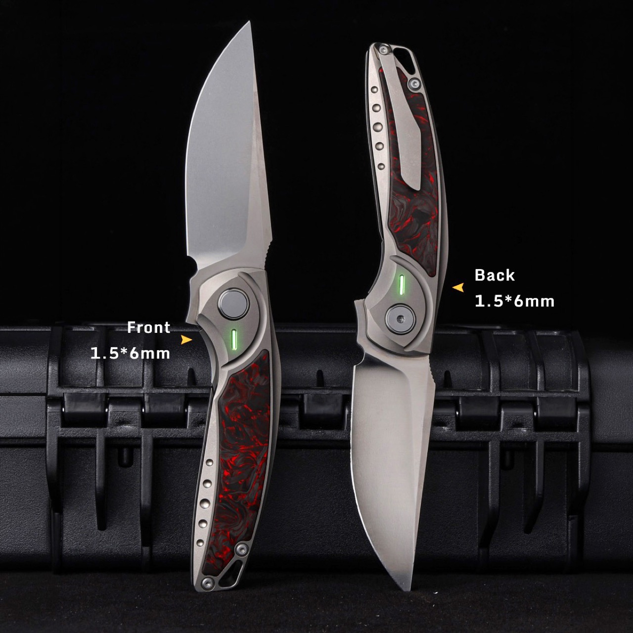
MIH milled the clip channel directly into the titanium frame so the clip sits flush with the handle contour, machined from spring-grade titanium so it grips firmly without deforming and releases smoothly without snagging fabric. Precision-machined tritium slots measuring 1.5x6mm sit on both sides of the handle, ready to accept self-illuminating vials if you want a subtle glow-in-the-dark locator, or you can leave them empty and enjoy the clean lines. A lanyard hole at the tail end gives you the option to attach a bead or cord for wrist retention or easier pocket extraction. Closed, the GraphiX measures 4.71 inches. Open, 8.27 inches. The balance ratio hits 0.618, essentially the golden ratio applied to weight distribution, which means the knife pivots naturally in your hand without feeling blade-heavy or handle-heavy.

The D2 variant starts at $120, making it the accessible entry point into a titanium-framed folder with ceramic bearings and a carbon fiber inlay. The M390 version commands a premium for the superior edge retention. Add-ons include custom engraving, alternate carbon fiber colors (blue or black if you don’t want the default red), luminous vials, tritium vials, a titanium lanyard bead, and a foldable knife sharpener. The GraphiX ships worldwide with no additional shipping fees, and delivery is expected in August-September 2026 for backers who secure their spot during the campaign window.

Click Here to Buy Now: $120 $183 (35% off) Hurry! Only 19 days left!

The post Grade 5 Titanium, M390 Steel, Ceramic Bearings, $120 Price Tag: The EDC Knife to Beat in 2026 first appeared on Yanko Design.