COMODO Entryway Stool Dries and Deodorizes Shoes While You Sit

Taking off your shoes after a long day often means being greeted by damp insoles and stale smells. Rain, sweat, and dust turn footwear into something you tolerate rather than enjoy wearing, and most people either ignore it or resort to stuffing newspaper inside them and hoping for the best. Drying racks clutter the hallway, and washing shoes every time they get wet is too much work for something you’ll just wear again tomorrow.

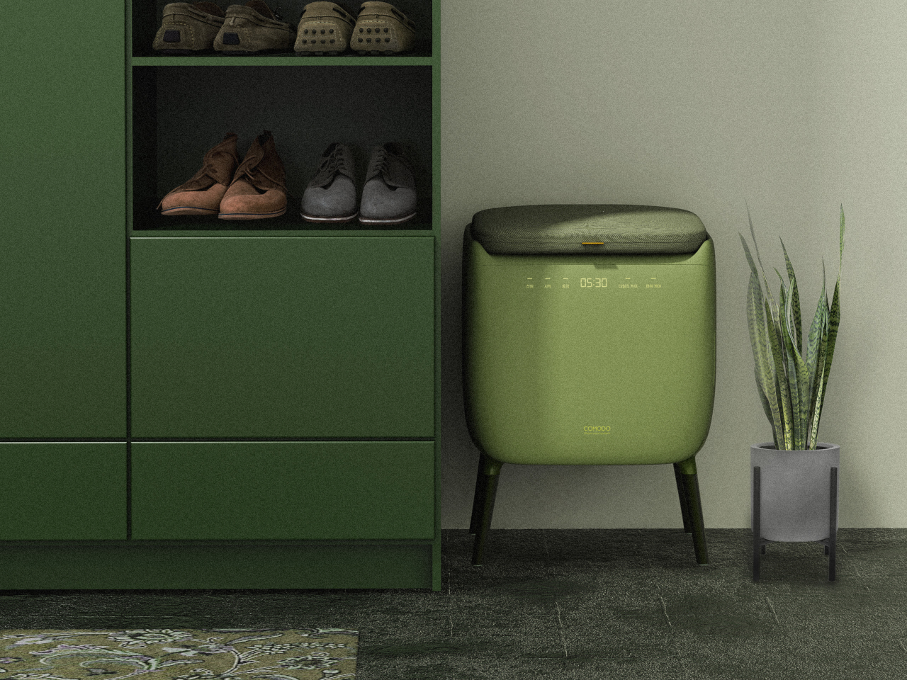
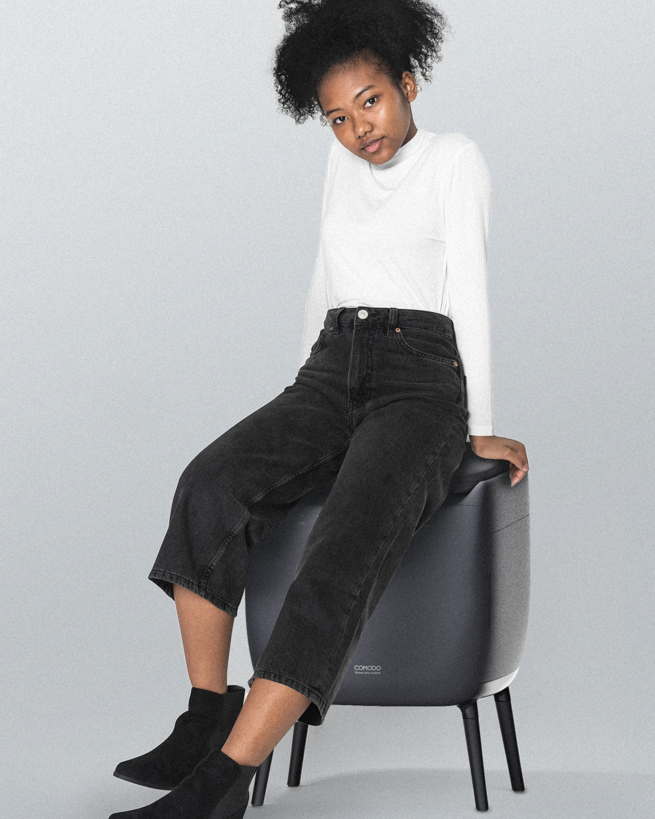
COMODO is a concept that treats shoe care as part of the entryway routine rather than an afterthought. It combines a small upholstered stool with a compact shoe care system inside, so the same object you sit on to put on your shoes also quietly dries, deodorizes, and refreshes them between outings. The name comes from the Spanish word for “comfortable” or “pleasant,” which pretty much sums up the whole idea.

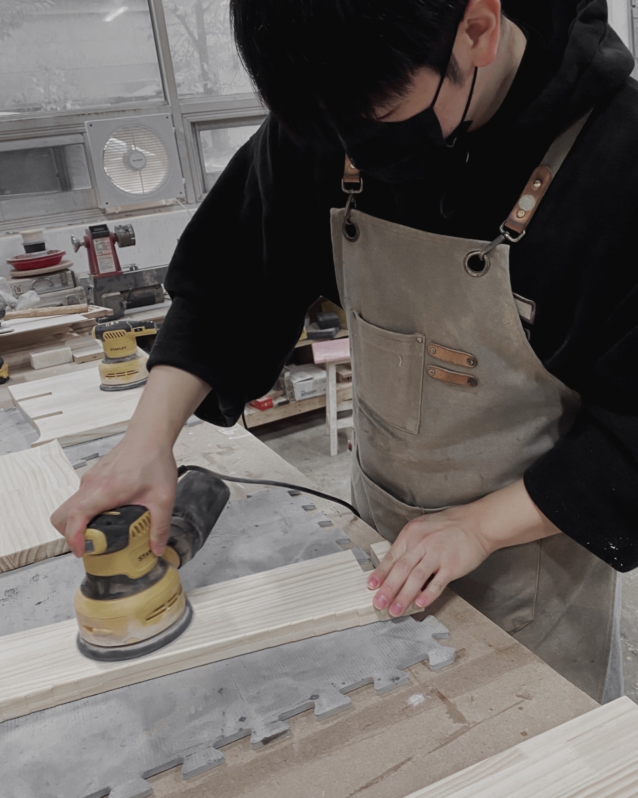
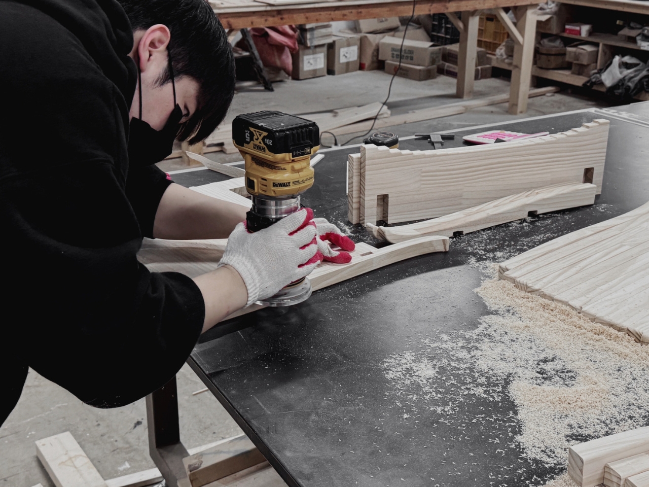
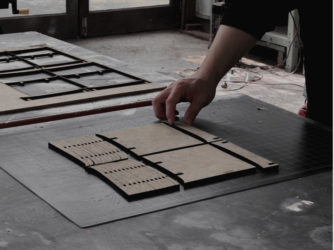
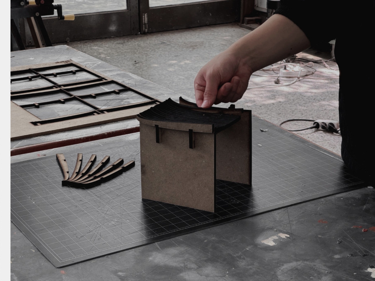
Designer: Hyeona Cho

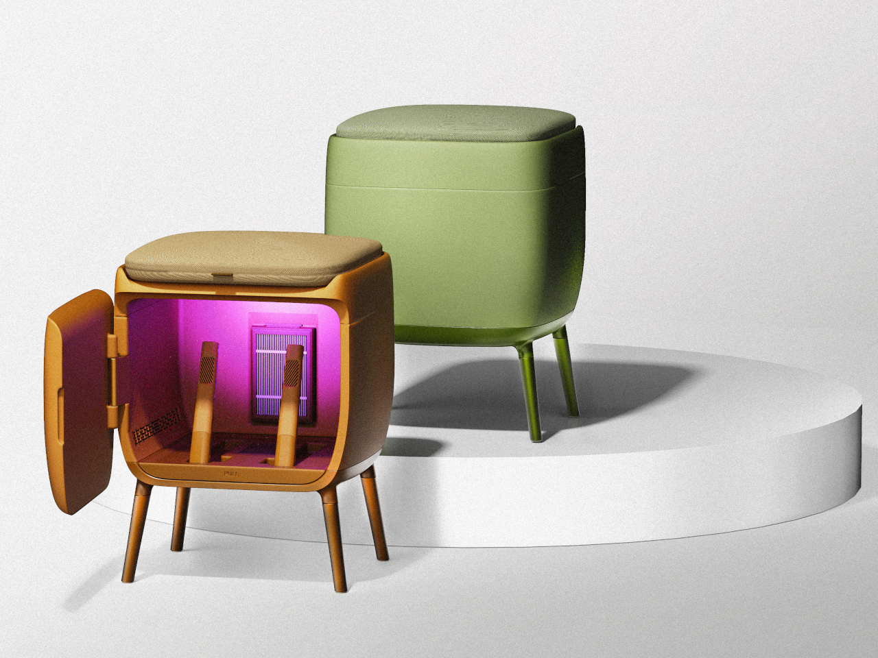
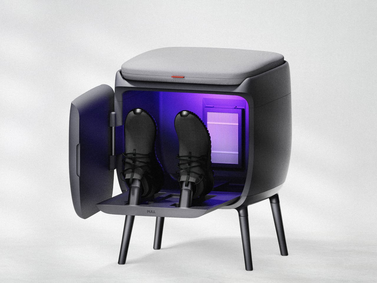
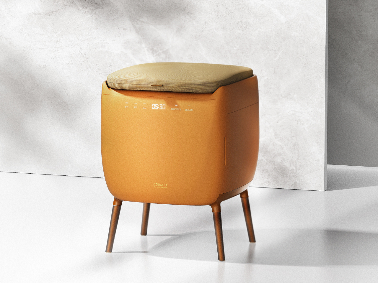
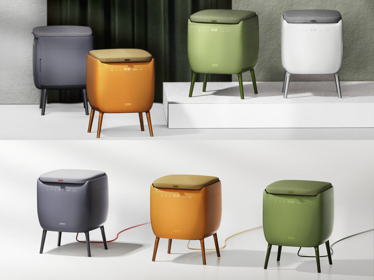
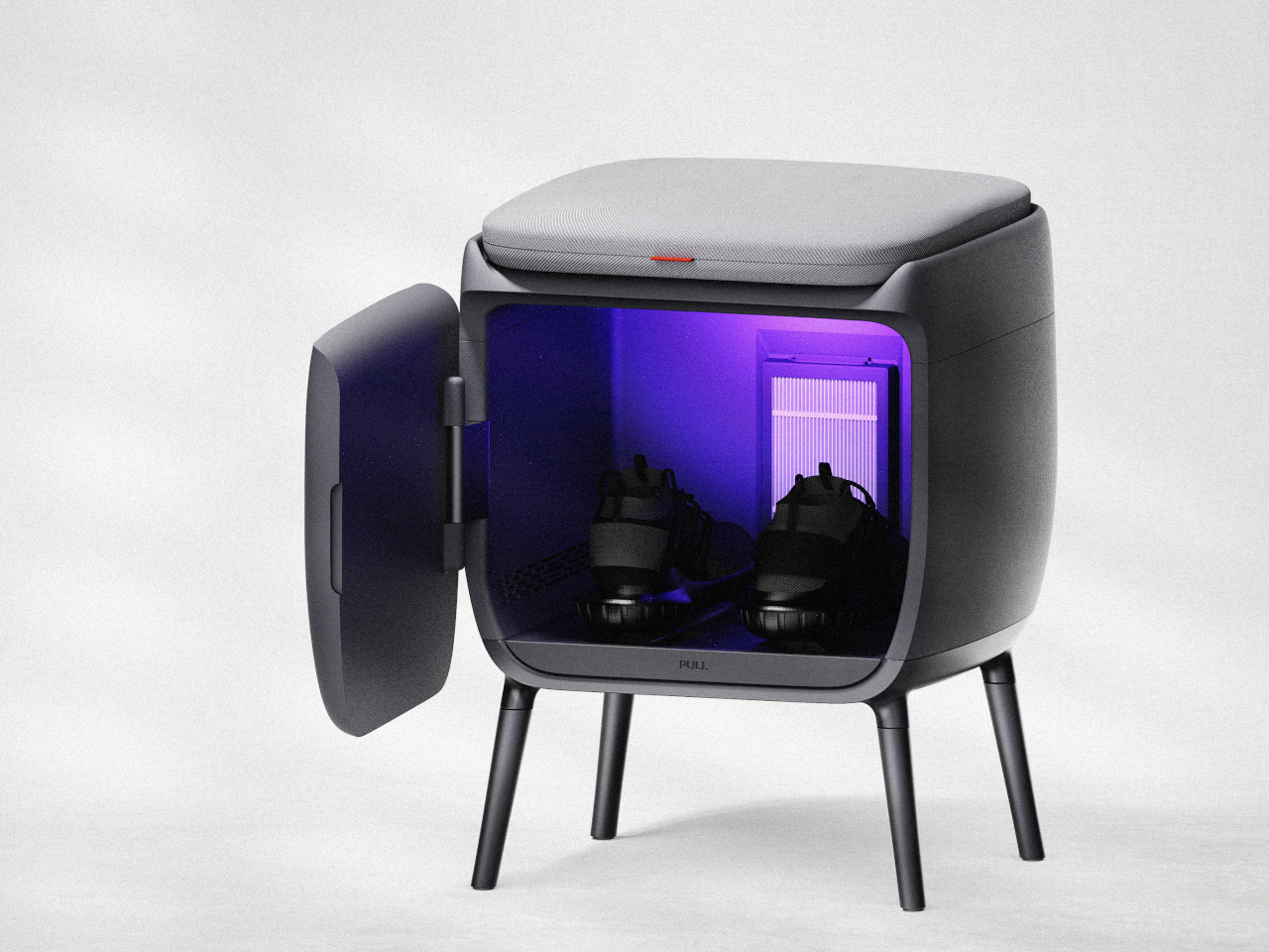
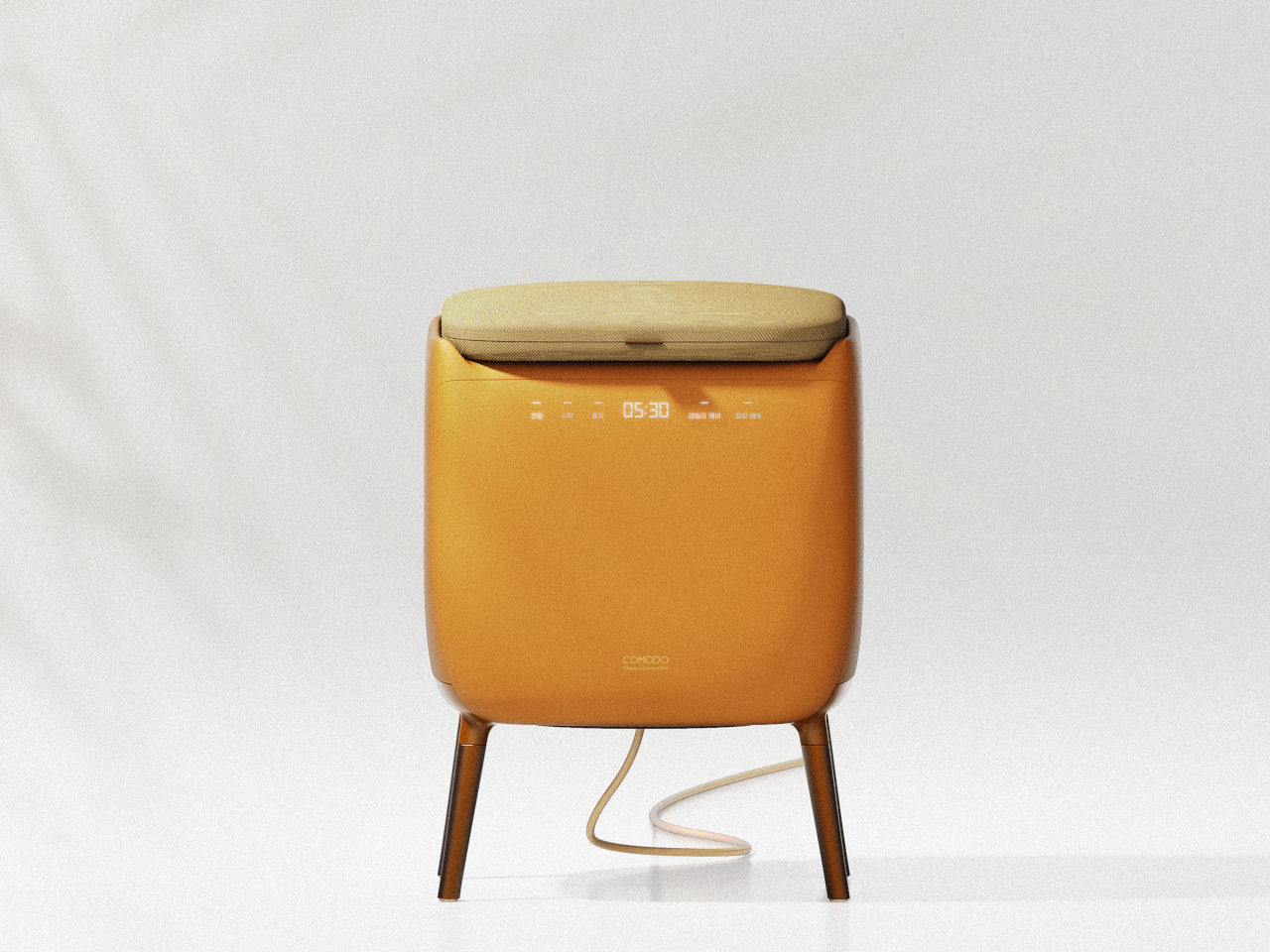
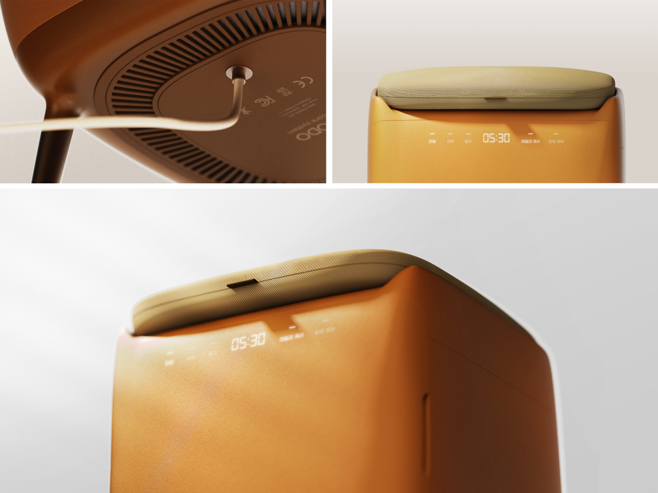
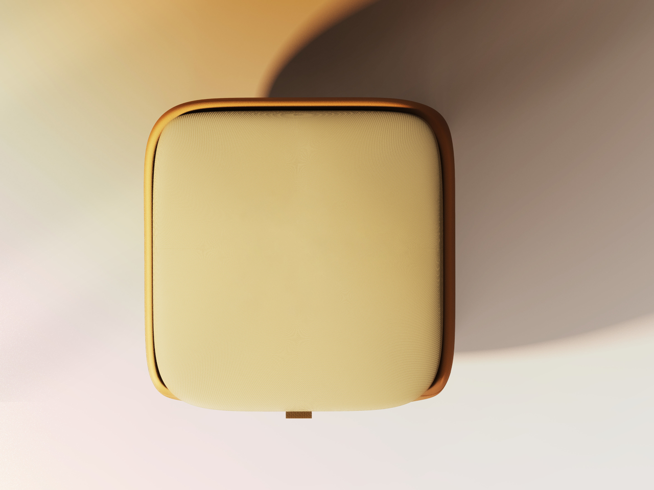
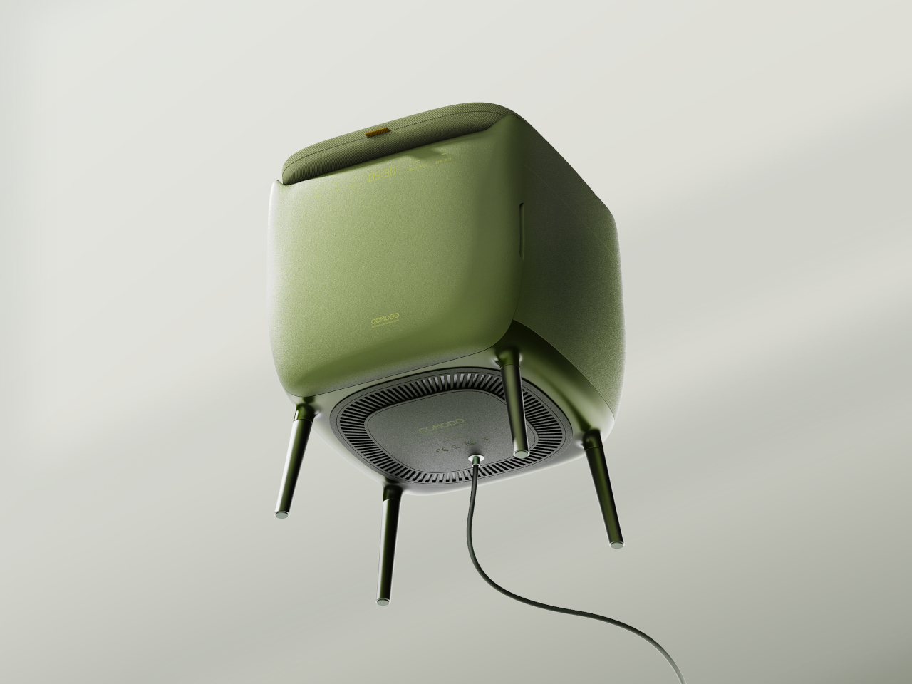
The form is a soft, rounded cube on four slender legs, available in muted colors like charcoal gray, mustard yellow, and sage green. The matte, slightly textured body and cushioned top make it read more like a piece of furniture than an appliance, allowing it to sit next to a shoe cabinet or mirror without looking out of place. It’s the kind of thing you could leave in the hallway without feeling like you’re displaying a gadget.

Open the small front door, and you find an interior chamber with what the designer calls an “air shoetree” and vents. Shoes can be placed on angled posts or directly on the floor of the chamber, where warm air circulates to dry them. A HEPA filter and scent filter work together to remove damp odors and add a gentle fragrance, while a UV lamp at the top targets germs on the surfaces.

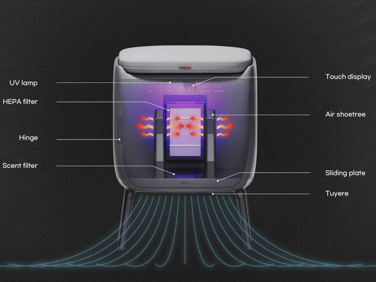
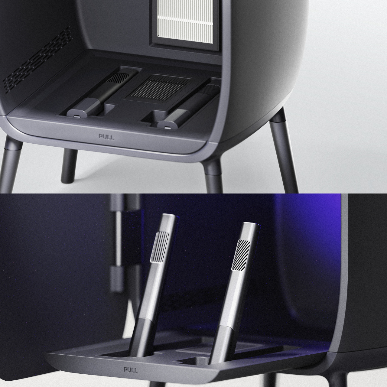
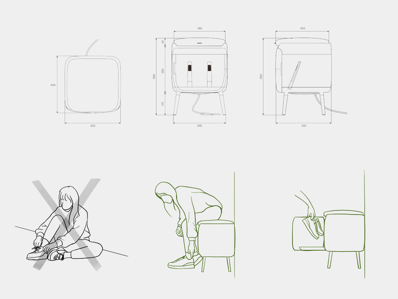
The air shoetree offers some flexibility. Because you can either insert shoes onto the posts or rest them inside the chamber, COMODO can handle different shapes, from sneakers to ankle boots. The base plate slides forward like a shallow drawer, bringing the shoes closer to you and making it easier to place them or even use the raised platform while putting them on.

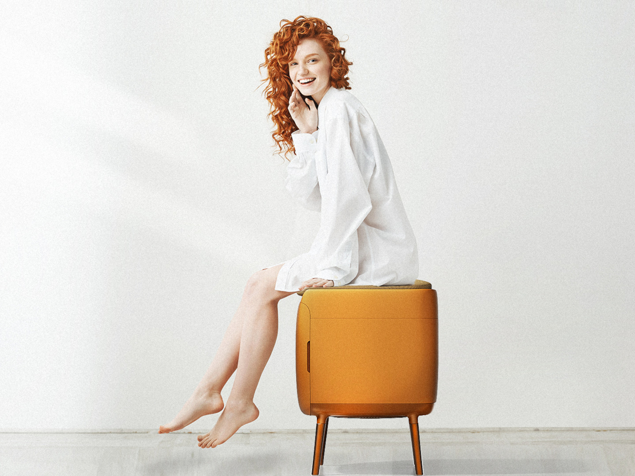
Of course, COMODO also doubles as a proper seat. Many people still sit on the floor to tie laces or wrestle with boots, which is uncomfortable and hard on the knees. The padded top gives you a seat at just the right height, so you can sit, open the door, pull out the sliding base, and deal with your shoes without crouching or balancing awkwardly.

COMODO imagines an entryway where shoes are not just stored but actively cared for, and where the object that helps you put them on also makes sure they’re dry, fresh, and ready for the next day. It’s a small but thoughtful intervention in the daily routine of leaving and returning home, a gentle reminder that even the most ordinary corners can benefit from a bit of design attention.

The post COMODO Entryway Stool Dries and Deodorizes Shoes While You Sit first appeared on Yanko Design.

DIY Coffee Sand Table Turns a Living Room Surface Into Moving Art

Most coffee tables are static slabs of wood, glass, or stone, maybe with a stack of books on top that never gets read. There’s a growing fascination with kinetic sand tables that draw patterns under glass, turning a surface into something alive. Arrakis 3.0 is a DIY coffee table that brings that idea into a more compact, furniture-friendly form you can actually live with in a normal apartment instead of a gallery.

Arrakis 3.0 is the latest iteration of Mark Rehorst’s sand table experiments, this time designed from the start as a practical coffee table. Under a standard 24-by-48-inch glass top, a steel ball slowly traces patterns in a bed of white sand, guided by a hidden mechanism. From above, all you see is a glowing sandbox under glass, constantly redrawing itself while your coffee sits on top.

Designer: Mark Rehorst

A blue anodized aluminum frame forms the table’s skeleton, supporting a black anodized sandbox that sits neatly inside it. The sand rests on a white base, so the patterns read clearly through the glass. A beveled glass top with a black border floats above, hiding the LEDs from direct view and making the whole thing read as a finished piece of furniture rather than a lab rig you’re still tweaking.

RGB LED strips tucked into the sandbox edges wash the sandbed in color, while additional strips under the frame cast a soft glow onto the floor. In a darkened room, the table becomes a low, luminous object, with the ball’s path slowly emerging and fading. The combination of blue frame, black sandbox, white sand, and colored light gives it a clear visual identity without feeling loud or desperate for attention.

Light blue mirrored acrylic panels fill the gaps in the frame, reflecting the LEDs and sandbed while hiding the mechanical guts. They’re centered in the slots with clear silicone edging, so they sit cleanly and don’t rattle. From the side, you see a band of soft reflection rather than belts and pulleys, which helps the table feel more like intentional furniture and less like an exposed machine.

The ball moves slowly enough that you don’t watch it like a screen, but you notice that the pattern is always changing when you glance down. Over the course of an evening, lines accumulate, overlap, and get erased as new designs start. It’s closer to having a mechanical fireplace or aquarium than a gadget, something that quietly animates the room without demanding attention every five seconds.

Arrakis 3.0 shows how DIY can cross into design territory. By tightening the footprint, standardizing the glass, and wrapping the mechanism in a coherent color and light story, this version feels less like a project and more like a piece you’d actually want to put your coffee on. The moving patterns and soft glow give it a presence that changes the room without overwhelming it.

The post DIY Coffee Sand Table Turns a Living Room Surface Into Moving Art first appeared on Yanko Design.

This Swedish Designer Just Turned Childhood Puzzles Into Furniture

You know that satisfying click when two puzzle pieces finally snap together? Swedish designer Gustaf Westman has blown that feeling up to furniture-size with his latest creation, the Puzzle Shelf, and honestly, it’s the kind of playful design we didn’t know we needed.

If you’ve been following Westman on Instagram (and you really should be), you’ve probably already fallen for his signature aesthetic: chunky, glossy objects in candy-bright colors that somehow manage to feel both nostalgic and completely modern. Think rounded edges, inflated geometry, and a sense of humor that most furniture seriously lacks. The Puzzle Shelf fits right into this universe while marking something new for the designer. It’s his first venture into modular shelving, and it’s exactly as delightful as you’d expect.

Designer: Gustaf Westman

The concept is brilliantly simple. Westman took inspiration from, well, puzzles. Actual jigsaw puzzles. “I usually get inspired by the most random things, and in this case, puzzles,” he explains in a recent Instagram Reel. Each shelf unit features those familiar protruding tabs and recessed slots that slide and lock together without any visible hardware. No screws, no Allen keys, no confusing instruction manuals with cryptic diagrams. Just pure, friction-based satisfaction.

What makes the Puzzle Shelf so compelling is how it transforms something functional into something sculptural. These aren’t just storage units. They’re bone-shaped, oversized blocks that you can stack, rearrange, and play with to create whatever configuration your space needs. Want a tall tower of shelves? Go for it. Prefer something low and horizontal? That works too. The system is completely flexible, giving you the kind of creative control that makes arranging your space feel more like art than organization.

Westman’s design process is also pretty fascinating. Before committing to full-scale production, he tests everything through 3D printed miniatures that mirror the final product almost exactly. It’s a smart approach that lets him work out all the kinks while keeping that essential puzzle functionality intact. The result is a system that actually works the way it promises to, which in the world of trendy furniture, is refreshingly rare.

And can we talk about how these pieces look? The glossy finish and those signature candy hues make the Puzzle Shelf feel like an oversized toy that somehow grew up without losing its sense of fun. It’s the kind of design that makes you smile when you walk past it, which is exactly what good furniture should do. Plus, the generous spacing between levels means you actually have room for your books, plants, ceramics, or whatever else you want to display.

This latest piece comes on the heels of Westman’s collaboration with IKEA earlier this year, a 12-piece collection that brought his playful aesthetic to a wider audience. That partnership showed how his rounded forms and informal approach to design could translate across different price points and product types. The Puzzle Shelf feels like the next logical step, proving that Westman’s chunky universe has plenty of room to grow.

What’s refreshing about Westman’s work is that it never takes itself too seriously. There’s a lightness to his designs, a sense that furniture doesn’t have to be stuffy or precious. The Puzzle Shelf embodies this philosophy perfectly. It’s functional without being boring, sculptural without being impractical, and playful without being juvenile. It invites you to interact with it, to rearrange it, to make it your own. It isn’t trying to revolutionize how we think about storage. It’s just making the everyday act of organizing your stuff a little more joyful, a little more tactile, and a lot more fun. And isn’t that what good design should do?

The post This Swedish Designer Just Turned Childhood Puzzles Into Furniture first appeared on Yanko Design.

This Furniture Trick Makes Flat Wood Look Curved With Zero Waste

Have you ever wondered why ergonomic furniture costs so much? Here’s a secret: creating curves that actually fit the human body is ridiculously complicated. Our bodies are all soft lines and organic shapes, but transforming hard materials like wood into those comfortable contours usually requires serious craftsmanship, expensive machinery, or both. Designer Minhwan Kim just cracked this puzzle in the most elegant way possible, and the design world is taking notice. Layer, his recent furniture project, just won Red Dot’s prestigious “Best of the Best” award for 2025.

The genius of Layer lies in how it rethinks an old problem. Traditional curved furniture typically means either steam-bending wood (labor-intensive and temperamental) or carving from solid blocks (hello, massive waste). Some designers have experimented with parametric structures, which use flat sheets cut into specific patterns that can be assembled into three-dimensional curves. It sounds perfect in theory, but there’s a catch. These designs often waste huge amounts of material because the cutting patterns don’t efficiently use the available sheet space. You end up with gorgeous furniture and a dumpster full of expensive scraps.

Designer: Minhwan Kim

Kim’s approach flips this wasteful equation. Layer uses an optimized parametric system that minimizes material waste while creating furniture that looks like it was sculpted rather than assembled. The process starts by digitally breaking down a 3D curved surface into individual layers. Think of it like those topographic maps that show elevation through contour lines, except here each line becomes a physical piece of wood. These intersection curves are then aligned and processed into solid wood components that stack together to create the final form.

The beauty of this system is visible in the finished pieces. That curved seat you see isn’t molded or carved. It’s actually dozens of thin wooden layers precisely cut and stacked, creating a fluid, organic surface that perfectly supports the human form. The wood grain flows across the surface like waves, emphasizing the layered construction rather than hiding it. It’s functional sculpture that actually works as furniture.

What really makes this project special is how it bridges digital design and traditional craftsmanship. The parametric modeling happens on a computer, allowing Kim to optimize every cut for minimal waste. But the actual fabrication involves real woodworking, real routers and sanders, and actual human hands assembling each layer. You can see this in the workshop photos where curved wooden ribs are being clamped together, sawdust coating the workbench, showing that even cutting-edge design still requires getting your hands dirty.

The manufacturing process is surprisingly straightforward once you understand the system. Standard flat plywood sheets get CNC-cut into the calculated patterns. Because the system is optimized, the pieces nest together on the sheet like a jigsaw puzzle, using nearly every inch of material. These flat pieces are then processed into their final curved profiles through careful routing. Finally, they’re assembled layer by layer, each piece fitting into precisely calculated positions until the complete three-dimensional form emerges.

This isn’t just clever for its own sake. In an era when we’re increasingly aware of material consumption and waste, Layer demonstrates how thoughtful design can be both beautiful and responsible. The furniture industry generates enormous amounts of waste, particularly in custom and high-end pieces. By optimizing material usage from the digital design phase, Kim shows that sustainability and aesthetics don’t have to be competing values.

The finished stool in the exhibition space looks deceptively simple. Its dark wood surface curves gently to cradle the body, the layered edge visible like the pages of a closed book. Nothing about it screams “innovative fabrication technique” or “award-winning design.” It just looks like a really nice piece of furniture you’d actually want in your home. And maybe that’s the highest compliment you can give any design: it solves complex problems so elegantly that the solution becomes invisible.

For anyone interested in where design and technology intersect, Layer represents an exciting direction. It shows how computational design tools can enhance rather than replace traditional craft, and how constraints like material efficiency can inspire creative solutions rather than limiting them. Sometimes the most innovative designs aren’t about flashy new materials or radical forms, but about finding smarter ways to work with what we’ve always had.

The post This Furniture Trick Makes Flat Wood Look Curved With Zero Waste first appeared on Yanko Design.

This Floating Bench Defies Gravity (and Your Expectations)

Have you ever looked at a mountain peak piercing through clouds and thought, “I want to sit on that”? Well, Miles Hass from Make With Miles did exactly that, and the result is a piece of furniture that looks like it belongs in a modern art museum but would feel right at home in your living room.

The concept is beautifully simple yet wonderfully complex. A massive rock sits at the base, looking like a mountain rising from the floor, while a wooden bench top appears to float right through it. It’s the kind of design that makes you do a double take because your brain can’t quite process what your eyes are seeing. And that’s exactly the point.

Designer: Miles Hass

Miles drew inspiration from that dreamy image of mountaintops emerging from clouds, and somehow translated that ethereal feeling into something you can actually sit on. The execution required heading out to Joshua Tree, where he collaborated with fellow maker Ben Uyeda to bring this impossible-looking piece to life. Because apparently, regular furniture shopping was just too easy.

What makes this project particularly fascinating is the challenge it presents. You can’t just slap a piece of wood on a rock and call it a day. The engineering behind making a functional bench that appears to defy gravity while maintaining structural integrity is no small feat. The rock needs to support weight, the wood needs to actually hold someone sitting on it, and the whole thing needs to look effortlessly elegant. It’s like solving a three-dimensional puzzle where one wrong move means your mountain bench becomes a pile of expensive mistakes.

The aesthetic is pure contemporary design poetry. We’re often surrounded by mass-produced IKEA clones so there’s something refreshing about furniture that tells a story. This bench doesn’t just serve a function, it starts conversations. It’s sculptural enough to be art but practical enough to be, you know, an actual bench. That balance is harder to achieve than it looks.

For design enthusiasts, this project represents a growing trend in furniture making where natural elements meet modern sensibilities. We’ve seen epoxy river tables take over Instagram, live-edge everything dominate Pinterest boards, and now we’re watching makers push even further into territory where nature and craft become indistinguishable. The floating bench takes this concept and cranks it up to eleven.

What’s particularly cool about Miles’ approach is that he shares the entire process. We’re used to only being shown the polished final product so watching the actual building process, complete with challenges and solutions, makes the piece feel more accessible. Sure, most of us aren’t going to Joshua Tree to hunt for the perfect mountain-shaped rock and engineer a bench around it, but seeing it done demystifies the creative process and might just inspire someone to try their own impossible project.

The technical aspects are equally impressive. How do you secure wood to rock? How do you ensure the weight distribution won’t cause catastrophic failure when someone decides to plop down with their morning coffee? These aren’t questions with easy answers, and that’s what makes the finished product so satisfying to look at. This bench exists in that sweet spot where art, engineering, and function converge. It’s impractical in all the best ways while still being completely practical. You could put it in your entryway, and it would be the most interesting piece anyone encounters in your home. You could place it in a gallery, and it would hold its own against any contemporary sculpture.

In a design landscape often dominated by minimalism to the point of sterility or maximalism that verges on chaos, Miles’ floating bench offers something different. It’s bold without being loud, natural without being rustic, and modern without feeling cold. And honestly, isn’t that exactly what we want from design? Something that surprises us, makes us think, and still lets us sit down at the end of the day.

The post This Floating Bench Defies Gravity (and Your Expectations) first appeared on Yanko Design.

Cosi Laptop Table Brings a Fully Adjustable Work Surface to Any Chair

Laptops have escaped the desk and now show up on sofas, lounge chairs, and every in-between space, often with terrible posture as a side effect. Balancing a laptop on your knees or hunching over a coffee table is fine for checking email but not for real work. The Cosi laptop table is a small, adjustable surface designed to follow those habits and make them more ergonomic.

Cosi is a fully adjustable laptop table developed by Pearson Lloyd for Teknion’s portfolio. It’s a compact side table with a height-adjustable column and a slim top, meant to support typing, writing, or video calls whether you’re in a task chair or a deep lounge. Despite its simple silhouette, it’s the result of a careful review of how people actually work across different seating types and informal spaces.

Designer: Pearson Lloyd for Teknion

The basic form is a thin rectangular top with softly rounded corners sitting on a single round column, which rises from a flat, low-profile base. The base is slim enough to slide under chair legs or lounge frames, while the offset column lets the top cantilever over your lap. The proportions keep it visually light, so it reads as a quiet companion rather than a shrunken desk taking up floor space.

The column allows the top to move from standard typing height when you’re upright in a task chair to a higher position when you’re reclined in a lounge. That means your wrists and shoulders can stay in a more neutral position instead of hunching over a laptop balanced on your knees. Cosi turns casual seating into a place where you can actually work comfortably for more than ten minutes.

Paired with Teknion’s Aarea lounge chairs, the base tucks under the sled frame while the top hovers over the seat. In more traditional offices, it can park next to task chairs as a personal work island. Because it’s small and visually quiet, multiple tables can live in a lounge or focus area without making the space feel cluttered or over-furnished like a forest of full-size desks.

The detailing makes it feel more like furniture than equipment. The tabletop edge is thin and refined, the column-to-base junction is clean, and the finishes align with Teknion’s broader palette, from neutral paints to wood-look tops. There are no exposed mechanisms or clunky levers, just a smooth, minimal form that hides the engineering and lets you focus on the surface itself.

Cosi is one of those small tools that quietly make hybrid work more sustainable. It doesn’t try to replace a full desk, but it gives laptops a proper landing spot wherever you choose to sit. By combining adjustability, a slim footprint, and a restrained aesthetic, it turns the improvised habit of working from any chair into something your body and your workspace can live with a little better.

The post Cosi Laptop Table Brings a Fully Adjustable Work Surface to Any Chair first appeared on Yanko Design.

This School Chair Concept Has 3D-Printable Replacement Parts

Old school chairs like the Mullca were built to survive decades of abuse, with welded steel frames and bolted parts that could outlast the building itself. That durability was impressive, but it also meant the chairs were impossible to take apart or repair at home if something did eventually break. Contemporary designers are questioning whether indestructibility is the only way to think about longevity, with design for disassembly and repair becoming just as important as raw toughness.

Carrousel is a chair concept by Thibaud Rollet that starts from the familiar silhouette of nostalgic school chairs but shifts the focus to how it is assembled and maintained. Instead of chasing the legendary durability of a Mullca, Carrousel is designed to be easy to produce, disassemble, and repair, with individual elements that can be replaced or even 3D printed by the user at home when parts wear out or need refreshing.

Designer: Thibaud Rollet

The basic construction is straightforward. A bent or laminated wooden frame forms the legs and backrest supports, while horizontal traverse pieces carry the structural load. The seat and backrest are separate panels fixed with four screws each, visible on the surface. Those screws bite into metal threaded inserts embedded in the wood, so panels can be removed and reattached repeatedly without damaging the material or stripping the threads.

The covering L-shaped pieces sit over the joints between the frame and the seat or backrest. These parts are held in place by the screws and inserts, and they are the most likely candidates for 3D printing. Users could swap them out to change colors, textures, or even shapes, turning a functional joint into a place for customization and personal expression without needing professional tools.

The visible screws and simple joinery send a clear message that the chair is meant to be taken apart, not treated as a sealed object. Instead of hiding the assembly, Carrousel uses it as part of the aesthetic language. That openness encourages people to replace worn panels, refresh the look, or tinker with new parts, extending the chair’s life in a way that feels approachable rather than intimidating.

Of course, swapping a backrest or changing the covering pieces can refresh the chair without replacing the whole thing, and the act of playing with those options adds emotional value. When you’ve customized or repaired something yourself, you are more likely to keep it around rather than send it to the curb when a screw loosens or a panel gets scratched.

Carrousel borrows the reassuring outline of a school chair but rewires the logic underneath, making it easy to disassemble, repair, and personalize. It suggests that the next generation of everyday chairs might be less about lasting untouched forever and more about being easy to live with, update, and care for. That shift from indestructible to repairable might end up keeping more furniture out of landfills than any amount of added steel ever could.

The post This School Chair Concept Has 3D-Printable Replacement Parts first appeared on Yanko Design.

TWIST Bends One Metal Sheet Into Table, Storage, and Handle

Side tables usually end up as simple flat discs on legs, doing little more than holding a drink or a phone you keep checking when you should be reading. There’s nothing wrong with that, but it also means they contribute almost nothing else to a room beyond a horizontal surface. The growing interest in compact, multi-functional furniture has designers rethinking how small pieces like side tables can quietly add storage and flexibility without cluttering a space.

The TWIST side table uses a single sheet of metal looping in a circular motion to form a tabletop, support, and storage all at once. It integrates a carry handle and a book compartment, with a wooden base adding warmth to balance the cool metal. The whole piece reads like a ribbon frozen mid-twist rather than a collection of separate parts, giving it a sculptural quality that works even when it’s not holding anything.

Designer: Joao Teixeira

The geometry is surprisingly simple once you trace it. The metal rises from the floor as a vertical panel, bends into a round tabletop with a large central cut-out, then drops down and curls into an oval storage bin at the base. The tabletop forms a ring that frames whatever you place on it, while the circular void in the center lightens the visual mass and makes room for the handle element to pass through.

That handle emerges from the tabletop as a vertical fin aligned with the central opening. It’s wrapped with a soft material shown in a contrasting orange, making it comfortable to grip and visually highlighting the interaction point. The handle turns the table into something you can easily pick up and move around a room, reinforcing its role as a portable companion rather than a piece anchored permanently to one spot.

The lower section functions as an open-topped storage bin sized for books and magazines. The metal walls curve smoothly into rounded corners that echo the tabletop’s circular geometry, while a wooden base panel inside the bin adds warmth and keeps stored items stable. That wooden surface also grounds the piece visually, preventing the lower section from feeling too light compared to the tall vertical panel rising above it.

The material palette visible in the renders keeps everything calm and neutral. A matte, light beige metal body pairs with a pale wood base and a small orange accent in the handle. The orange gives the eye a focal point without dominating the design, while the wood base balances the cool metal and helps the table feel at home in living spaces rather than purely industrial settings.

TWIST works well next to a sofa or lounge chair, holding a glass on its circular top while a few favorite books rest in the lower bin. It functions as both a sculptural object and a practical helper, offering storage, surface, and a built-in way to move it wherever you need. It’s a small reminder that even a side table can be drawn as one thoughtful line.

The post TWIST Bends One Metal Sheet Into Table, Storage, and Handle first appeared on Yanko Design.

Concrete Never Looked This Good: Ronan Bouroullec’s Ancora Tables

You know that feeling when you see something that completely flips your expectations? That’s exactly what happens when you encounter Ronan Bouroullec’s Ancora tables. Here’s a material we typically associate with parking garages and brutalist architecture, yet somehow this French designer has coaxed concrete into becoming downright graceful.

The Ancora collection, now in production by Italian furniture maker Magis, includes rectangular and round dining tables along with low tables and side tables. What makes them special isn’t just that they’re made from concrete (though that’s certainly part of it) but how Bouroullec has reimagined what this humble material can actually do when treated with a little finesse.

Designer: Ronan Bouroullec x Magis

Let’s talk about that name for a second. “Ancora” means “anchor” in Italian, and once you know that, you can’t unsee it. The base of each table features this ingenious curved edge that flows into a structural rib, creating a shape that genuinely resembles an anchor. It’s one of those design moves that’s both practical and poetic, balancing the need for stability with an aesthetic that feels almost nautical in its elegance.

What really gets me about these tables is how they challenge our assumptions about concrete. We’re so used to thinking of it as heavy, cold, and industrial. And sure, concrete is heavy by nature, but Bouroullec’s design makes it appear surprisingly light and airy. The way the base tapers and curves, the proportions of the anchor-shaped support, it all works together to create visual lightness despite the material’s obvious heft.

The collection offers flexibility too. You can get the rectangular table in a generous 220 by 90 centimeter size, perfect for those dinner parties where everyone actually wants to sit together and talk. The round version clocks in at 130 centimeters in diameter, ideal for smaller spaces or creating a more intimate dining situation. And because these are designed for both indoor and outdoor use, you’re not stuck making that impossible choice between keeping your beautiful furniture pristine inside or actually enjoying your patio.

Material choices matter here. The bases are concrete (obviously), but you get options for the tops. Tempered glass in clear or smoked finishes gives you that contemporary look and lets the sculptural base really shine through. If you prefer something warmer, there’s MDF veneered in oak, which adds a organic element that plays nicely against the concrete’s industrial vibe.

There’s something almost subversive about what Bouroullec is doing with these pieces. Concrete has this long history in Italian design and architecture, particularly through masters like Pier Luigi Nervi who showed how structural elements could be beautiful. Bouroullec taps into that tradition but pushes it somewhere new, somewhere more refined and residential. He’s taken a material that shouts and taught it to whisper.

The beauty of Ancora lies in its simplicity. There are no unnecessary flourishes, no look-at-me details. The design is essentially sculptural, letting the form speak for itself. That anchor-shaped base does all the heavy lifting (literally and figuratively), creating visual interest without needing any decorative additions. It’s the kind of confident design that comes from really understanding your material and what it wants to do.

What strikes me most about these tables is how they fit into our current design moment. We’re collectively moving away from the mid-century modern pieces that have dominated for the past decade and looking for something with more substance, more presence. Concrete delivers that weight and permanence we’re craving, but Bouroullec ensures it doesn’t feel oppressive or dated. These tables feel contemporary without trying too hard to be trendy.

For anyone interested in design that pushes boundaries while staying practical, Ancora represents that sweet spot. These aren’t art pieces you need to tiptoe around. They’re built to be used, indoors or out, for everyday meals or special occasions. The fact that they happen to be absolutely gorgeous is just the bonus.

The post Concrete Never Looked This Good: Ronan Bouroullec’s Ancora Tables first appeared on Yanko Design.

This Shape-Shifting Classroom Setup Lets Students Build Their Own Learning Space

In traditional classrooms, furniture rarely moves, but learning does. Eduba, the adaptive modular furniture system developed by designer Roie Avni, challenges the static environment of conventional education by introducing a new kind of classroom: one that shifts, evolves, and responds to its users. Through a clever blend of modularity, lightweight construction, and intuitive mechanisms, Eduba transforms the act of sitting and studying into a dynamic experience shaped by students themselves.

At its core, Eduba is a chair-and-table duo designed for versatility. Each piece can be connected, detached, flipped, or reconfigured within seconds. The table offers three height levels depending on how it is placed on its geometric base, while the chair shifts between high, mid, and low seating positions through a simple handle mechanism that locks and unlocks the frame. With no tools required, the furniture can be taken apart and rebuilt on the fly, supporting seamless transitions between different modes of learning.

Designer: Roei Avni

Eduba is rooted in the belief that learning is not one-size-fits-all. Instead of forcing every student into the same posture, the system enables each learner to personalize their physical setup based on their comfort, task, or energy level. Low seating supports relaxed learning, free-flow discussion, and floor-level exploration. Mid-level, more conventional seating mirrors structured, front-facing layouts. High seating encourages movement, collaboration, and active engagement, turning the classroom into an interactive space rather than a passive one.

This fluidity empowers teachers as well. Whether a lesson calls for intimate small-group work, focused heads-down concentration, or an energetic collaborative session, the classroom can be rearranged in minutes. Different areas of the same room can support different activities simultaneously, from quiet individual study to lively project clusters.

Constructed from durable plastic and lightweight aluminum, Eduba strikes a balance between strength and portability. Its components are sturdy enough for daily school use yet light enough for rapid reconfiguration. The intuitive handle-based mechanism enables seat and table height changes without effort, encouraging students to interact with the furniture and take ownership of their own learning environment.

This adaptability extends beyond function, shaping a philosophy of what education can be. Eduba transforms the classroom into a living, breathing ecosystem, one where posture, space, and interaction evolve throughout the day, reflecting the needs and rhythms of its users.

Roie Avni’s Eduba is a statement about the future of learning. By promoting movement, flexibility, and student-centered design, it reframes the classroom as a place that grows, shifts, and responds, mirroring the organic, ever-changing nature of curiosity itself.

The post This Shape-Shifting Classroom Setup Lets Students Build Their Own Learning Space first appeared on Yanko Design.