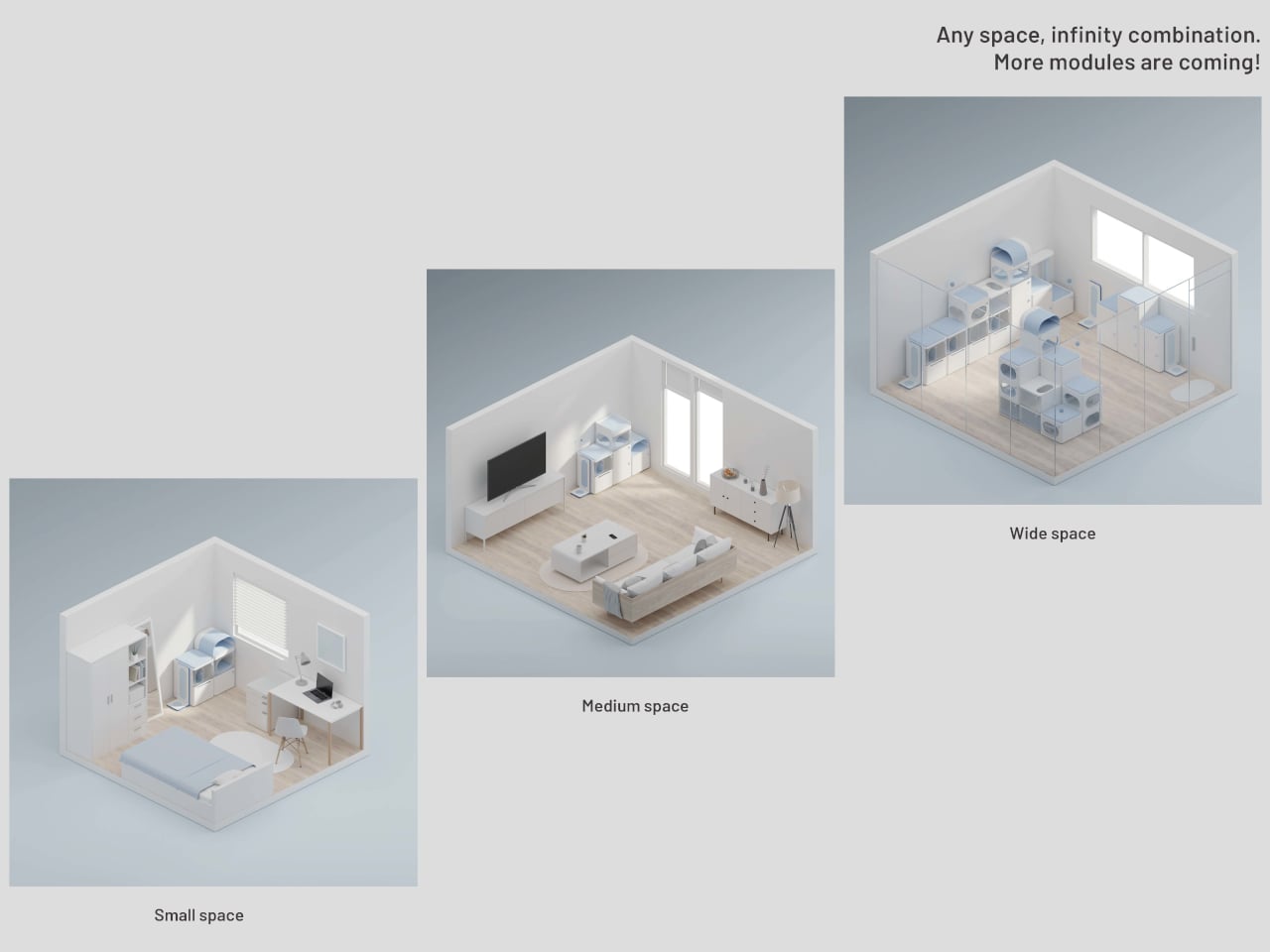
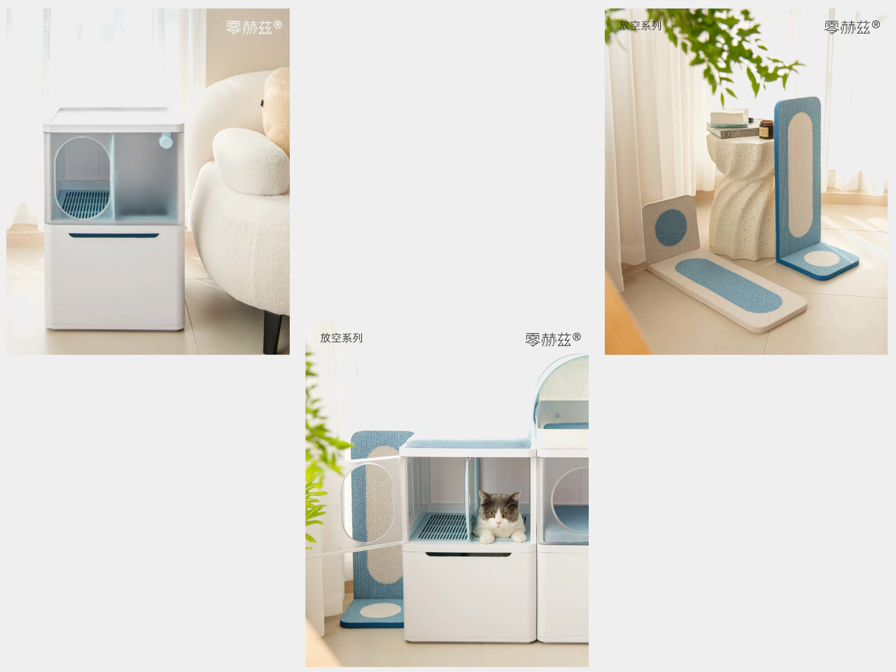
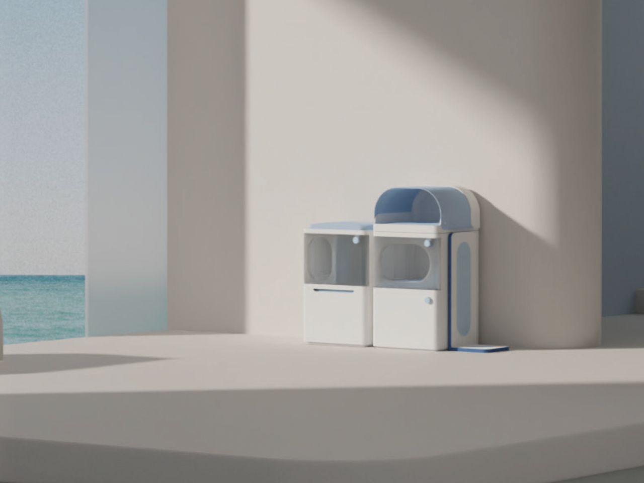
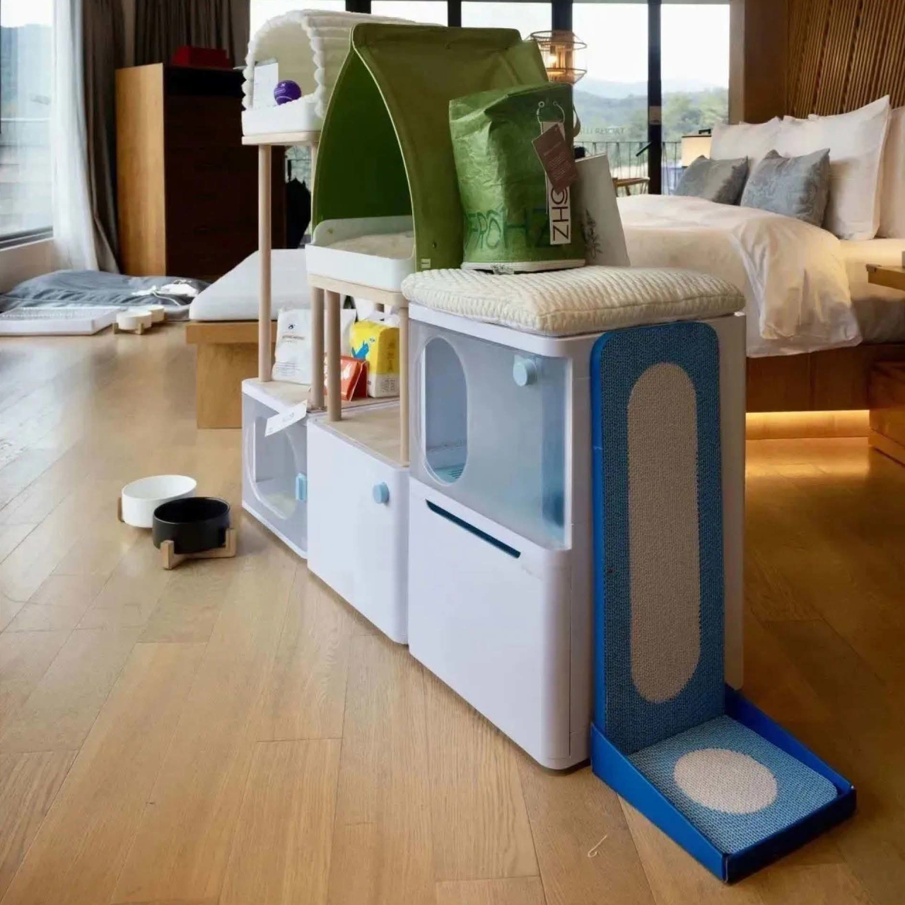
As people become more aware of the role that sound plays in immersive content, the number of speakers in homes also begins to rise. This means that these audio equipment are starting to make their presence not just heard but also seen, and sometimes not in pleasing ways. Fortunately, manufacturers are also becoming more sensitive to this aspect of product design, and we’re seeing a growing number of speakers that extol aesthetics as much as audio quality, though the side effect of this trend means getting locked into a specific design the moment you make your purchase. This customizable speaker concept, on the other hand, offers some flexibility that not only lets you decide how the speaker will look but where you want to put it as well.
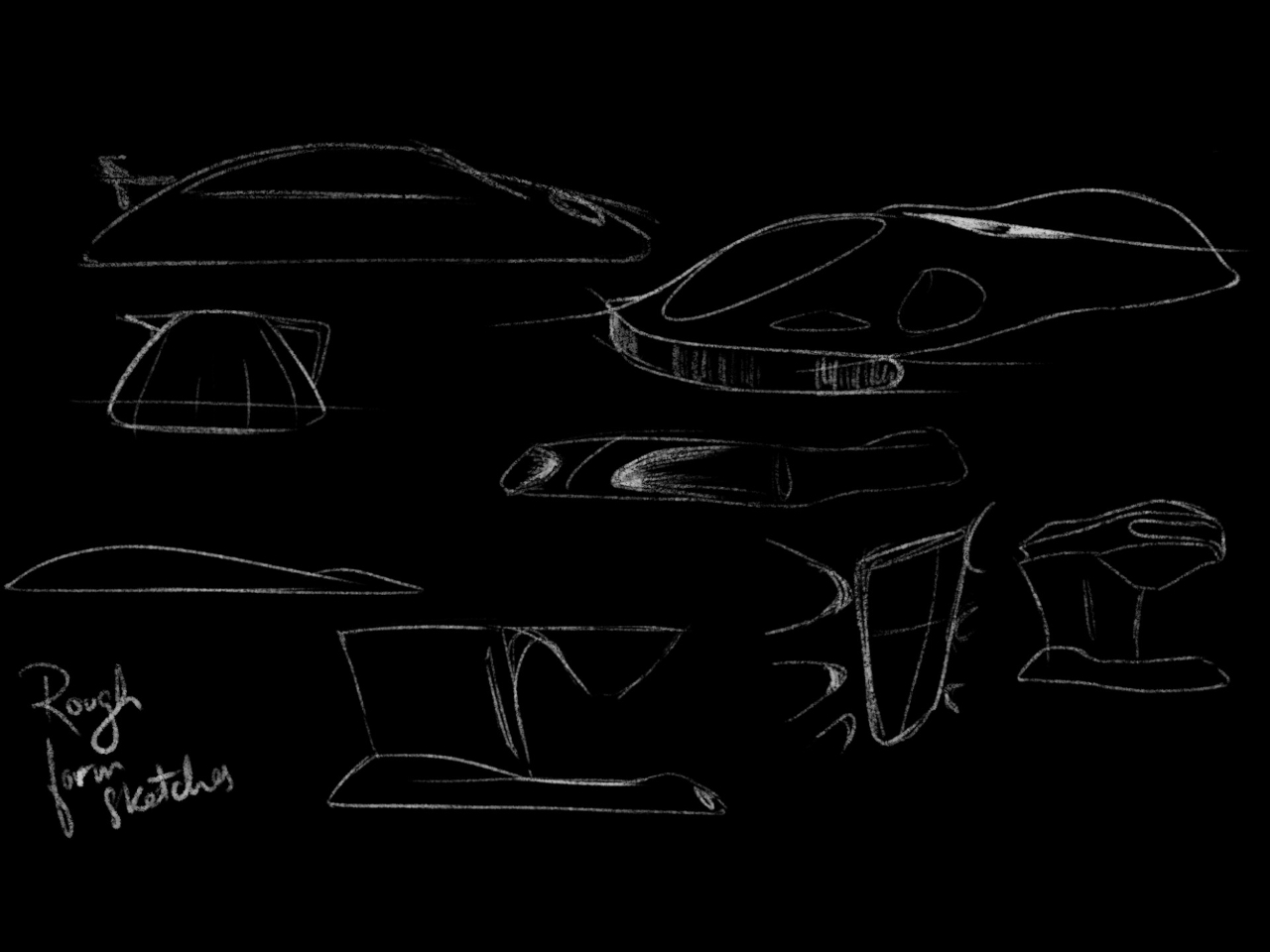
Designer: Eshant Kumbhakarn
Compared to TVs, the true value of speakers lies not in their appearance but in their audio output. Unfortunately, these products still take up physical space, and hiding them doesn’t exactly work because that can negatively affect the way sound travels. Some audio equipment brands try to disguise speakers as art objects or minimize their footprint as soundbars, but this speaker concept design tries to combine both ideas to deliver the best of both worlds.
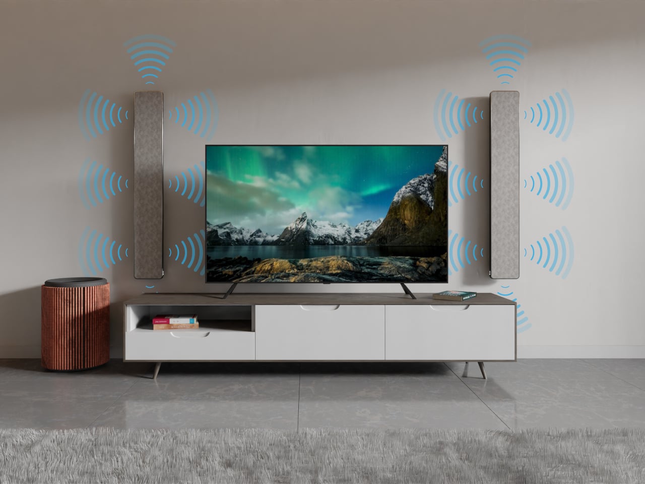
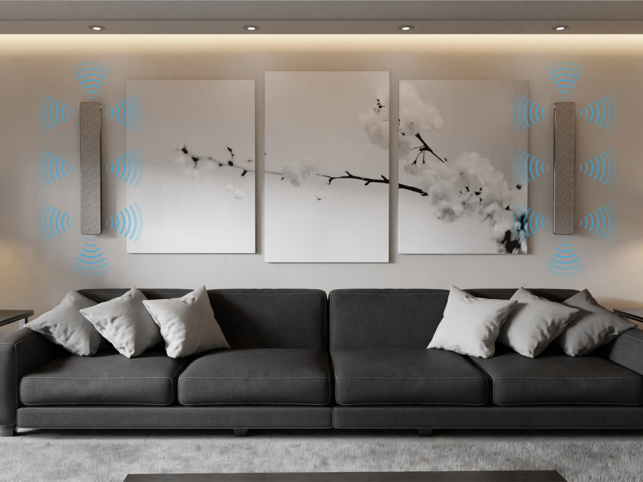
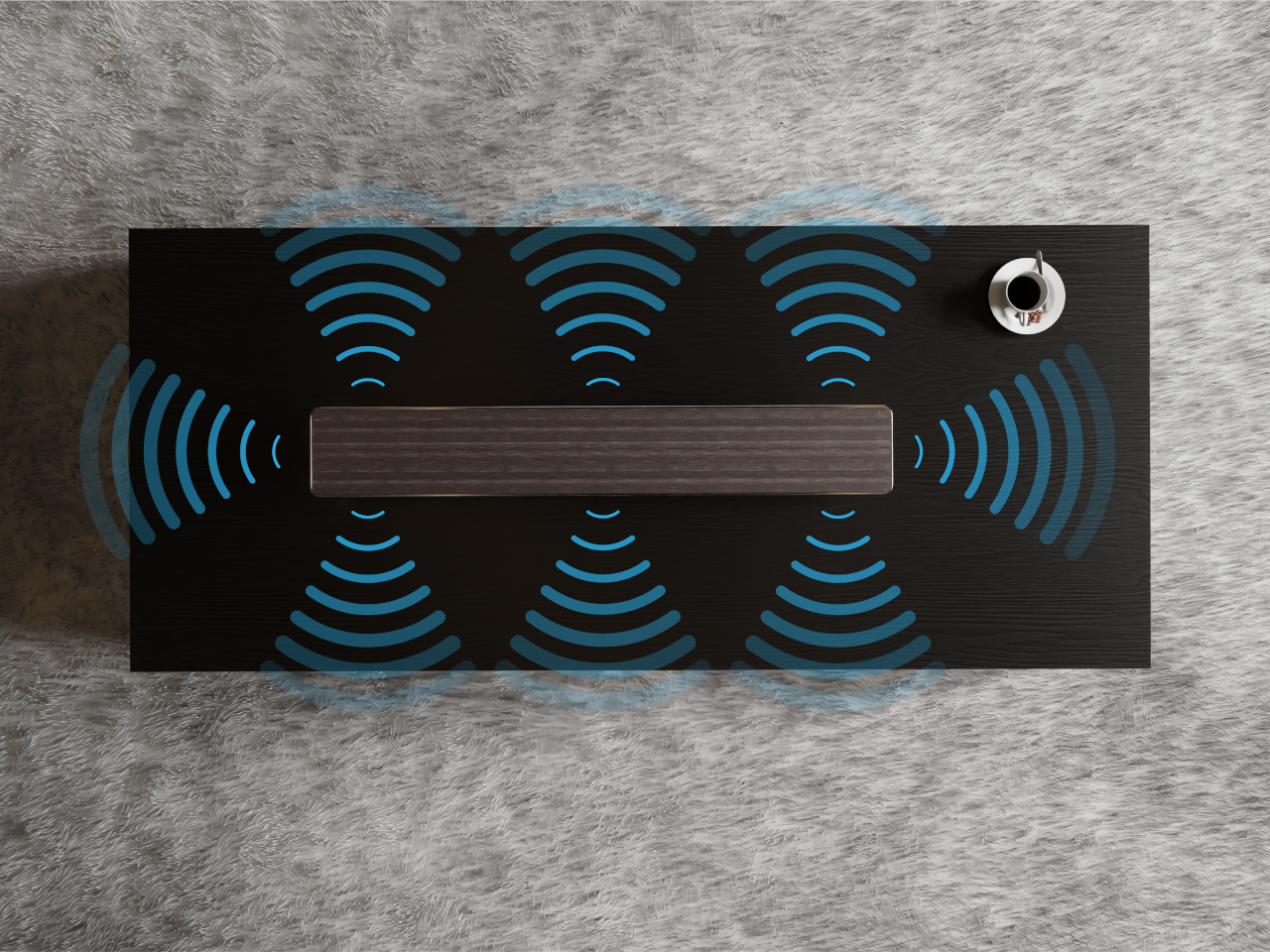
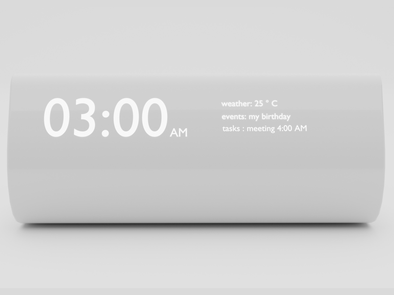
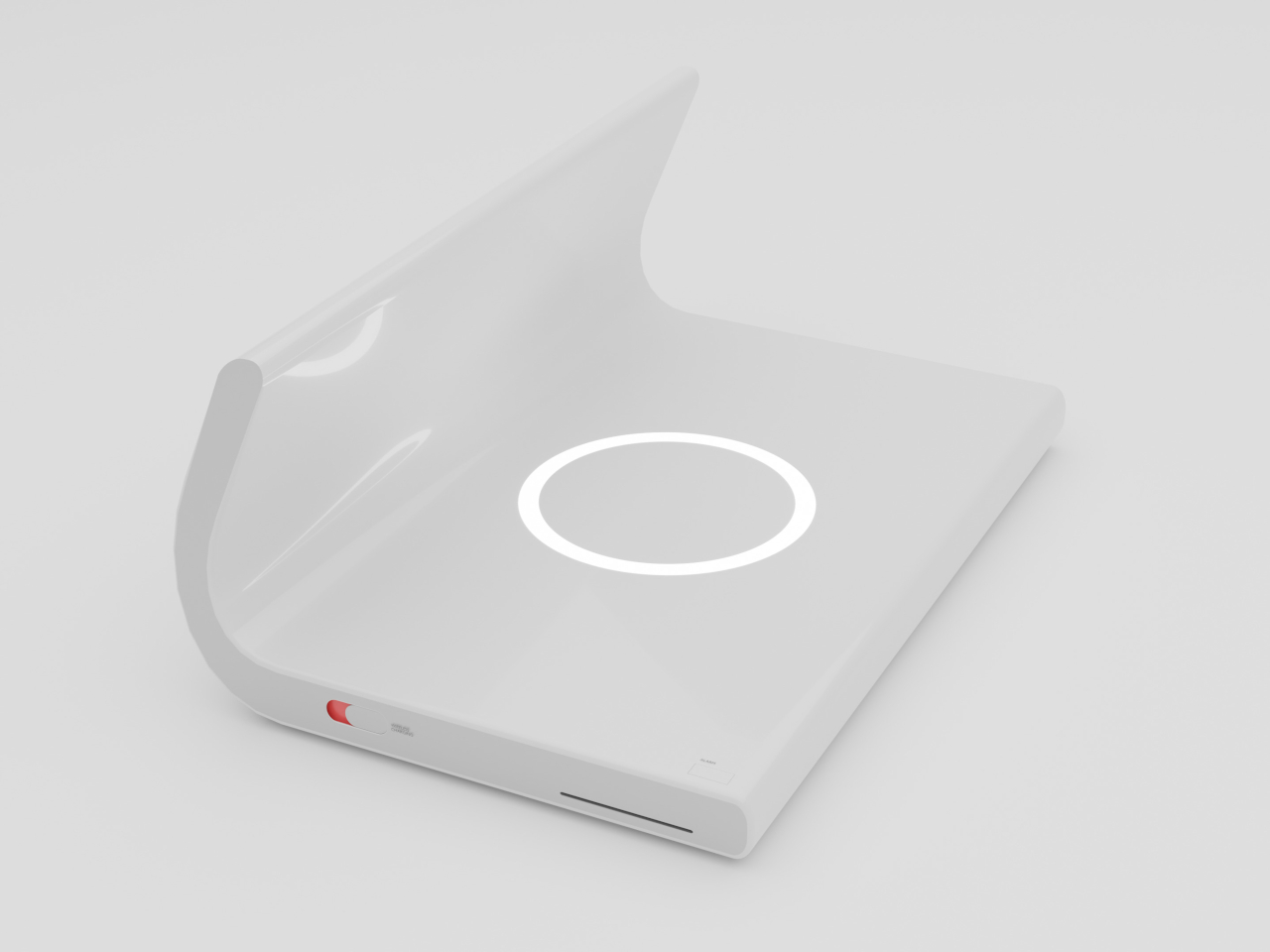
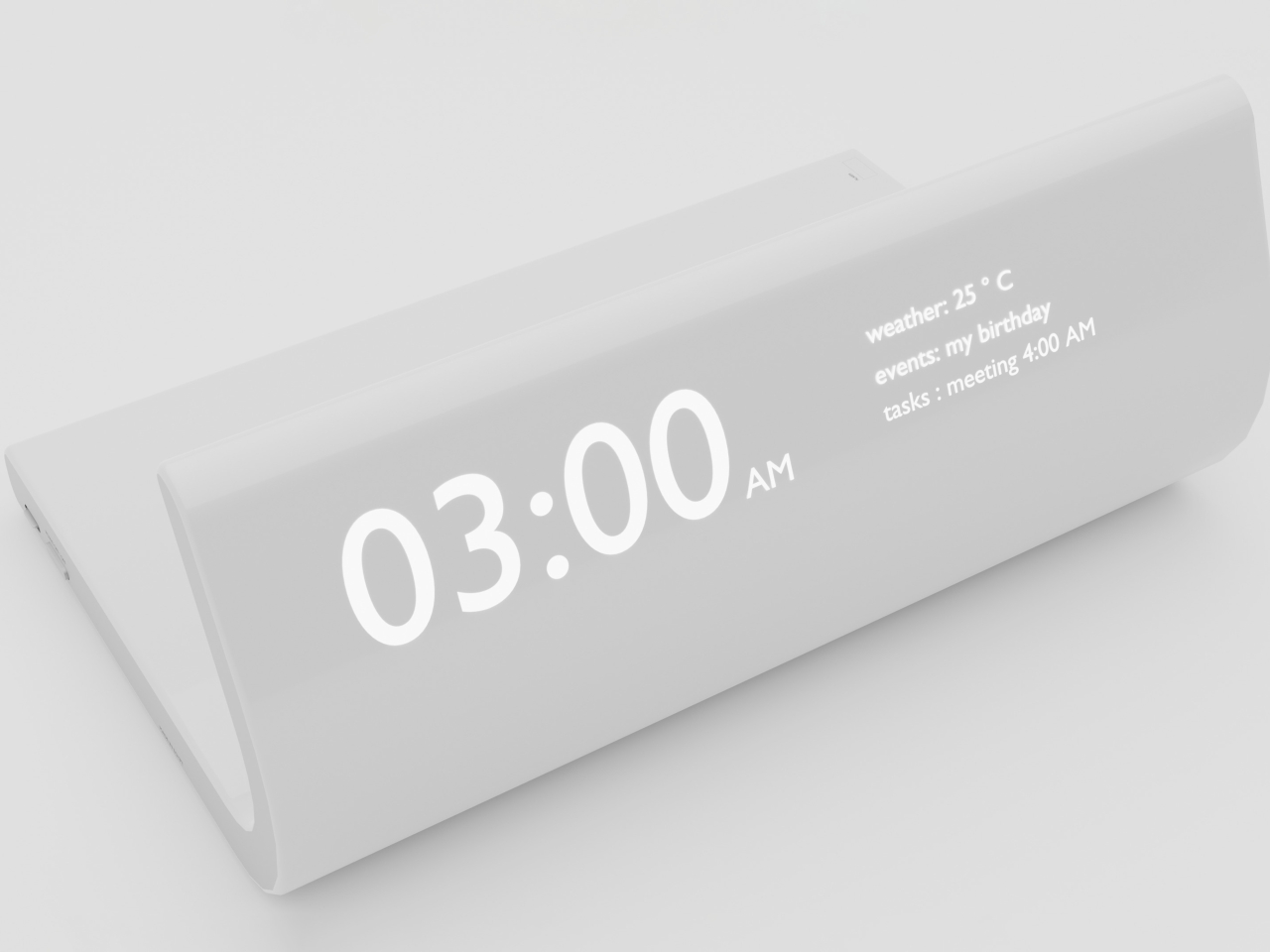
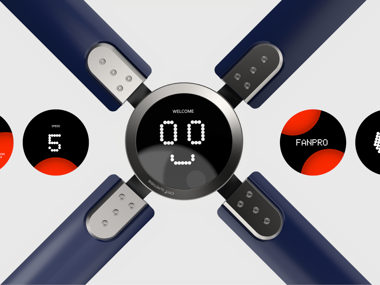
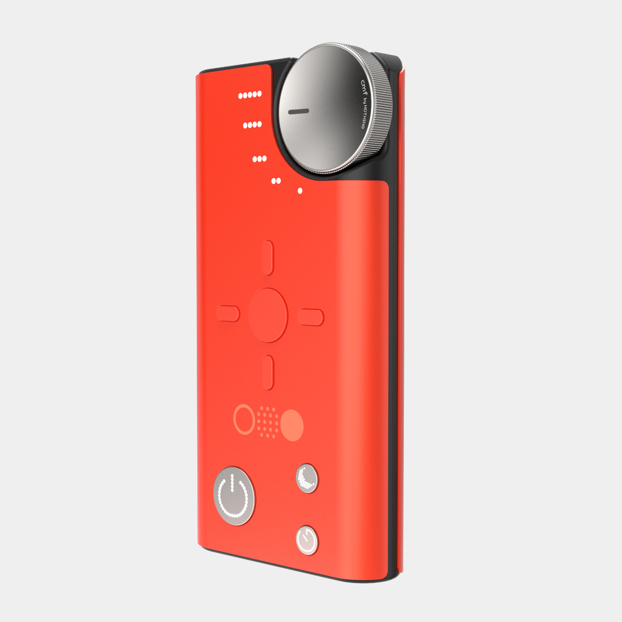
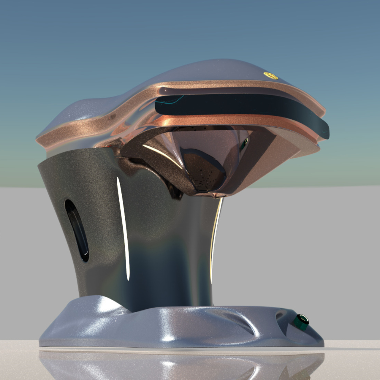
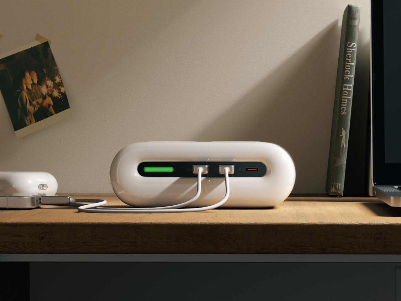
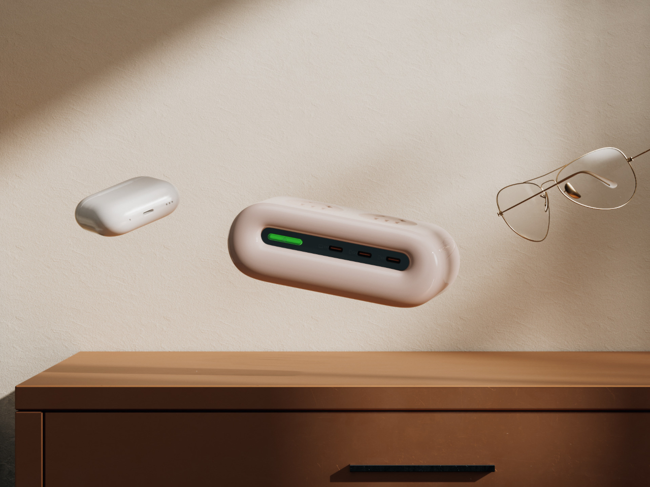
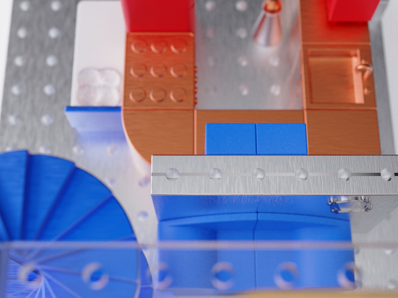
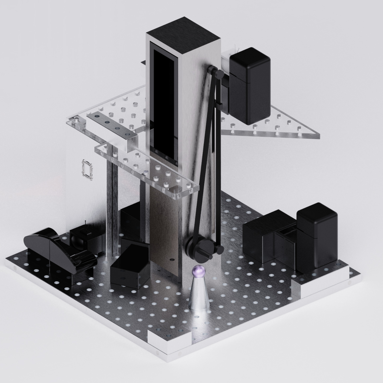
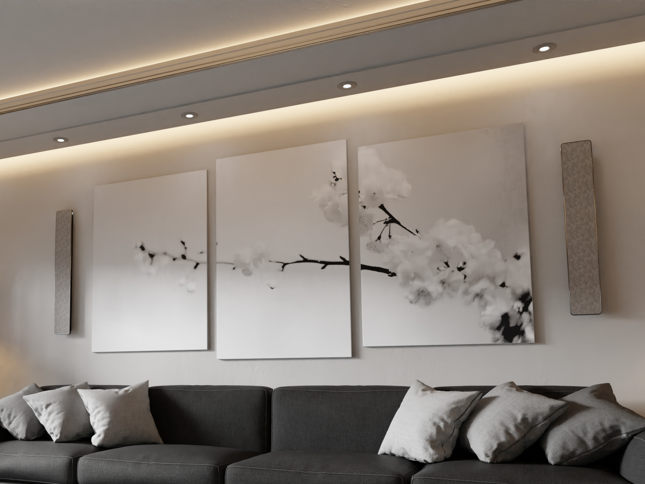
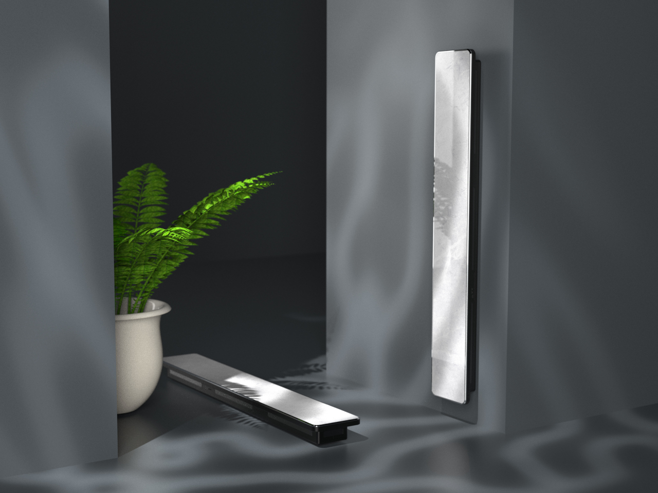
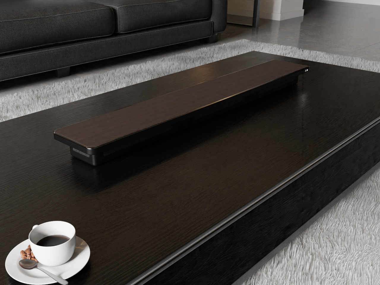
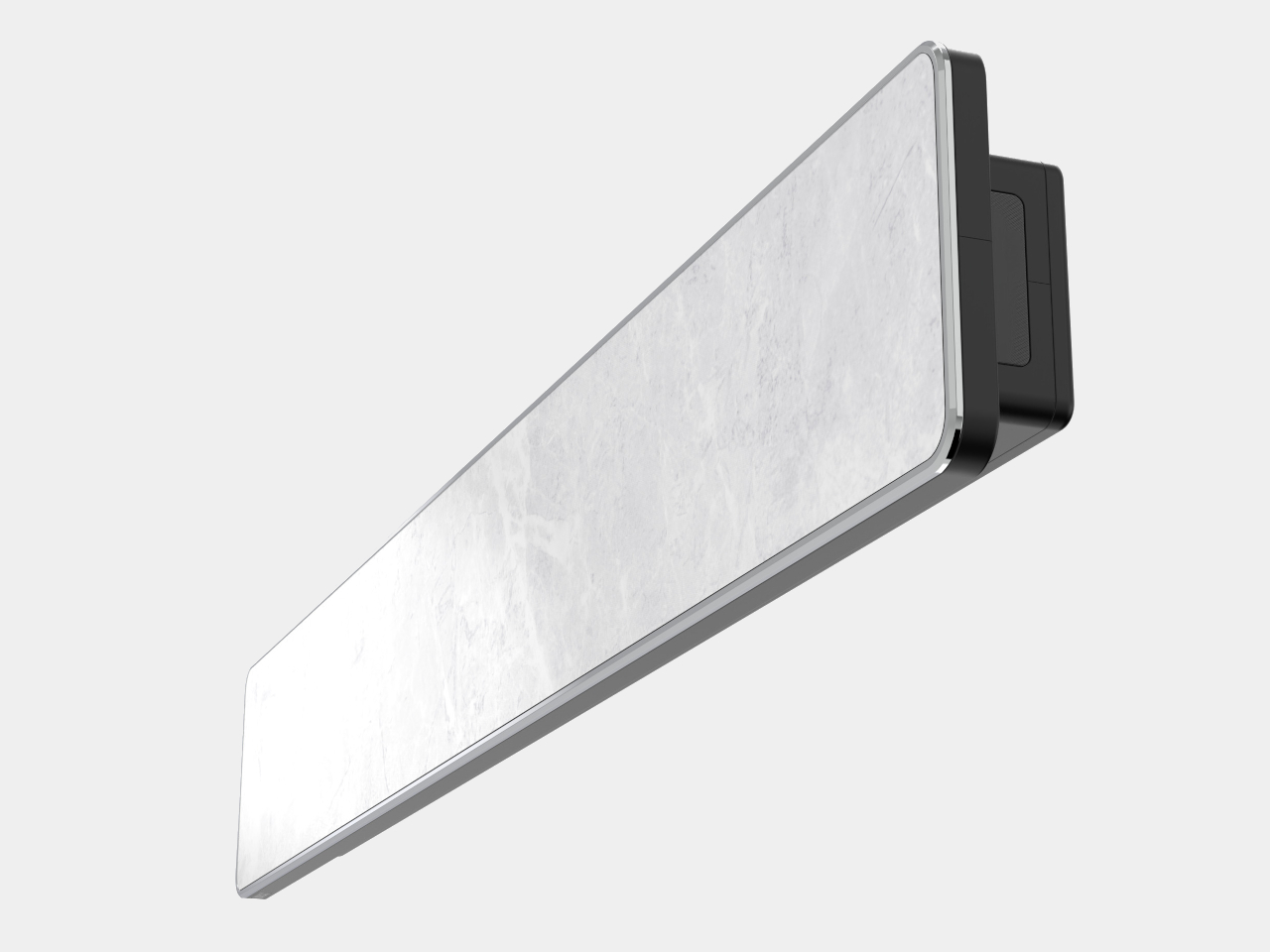
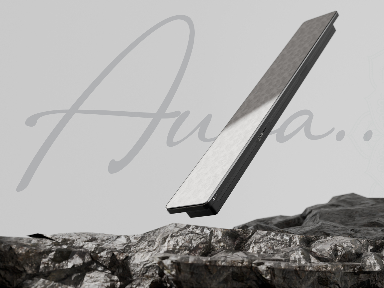
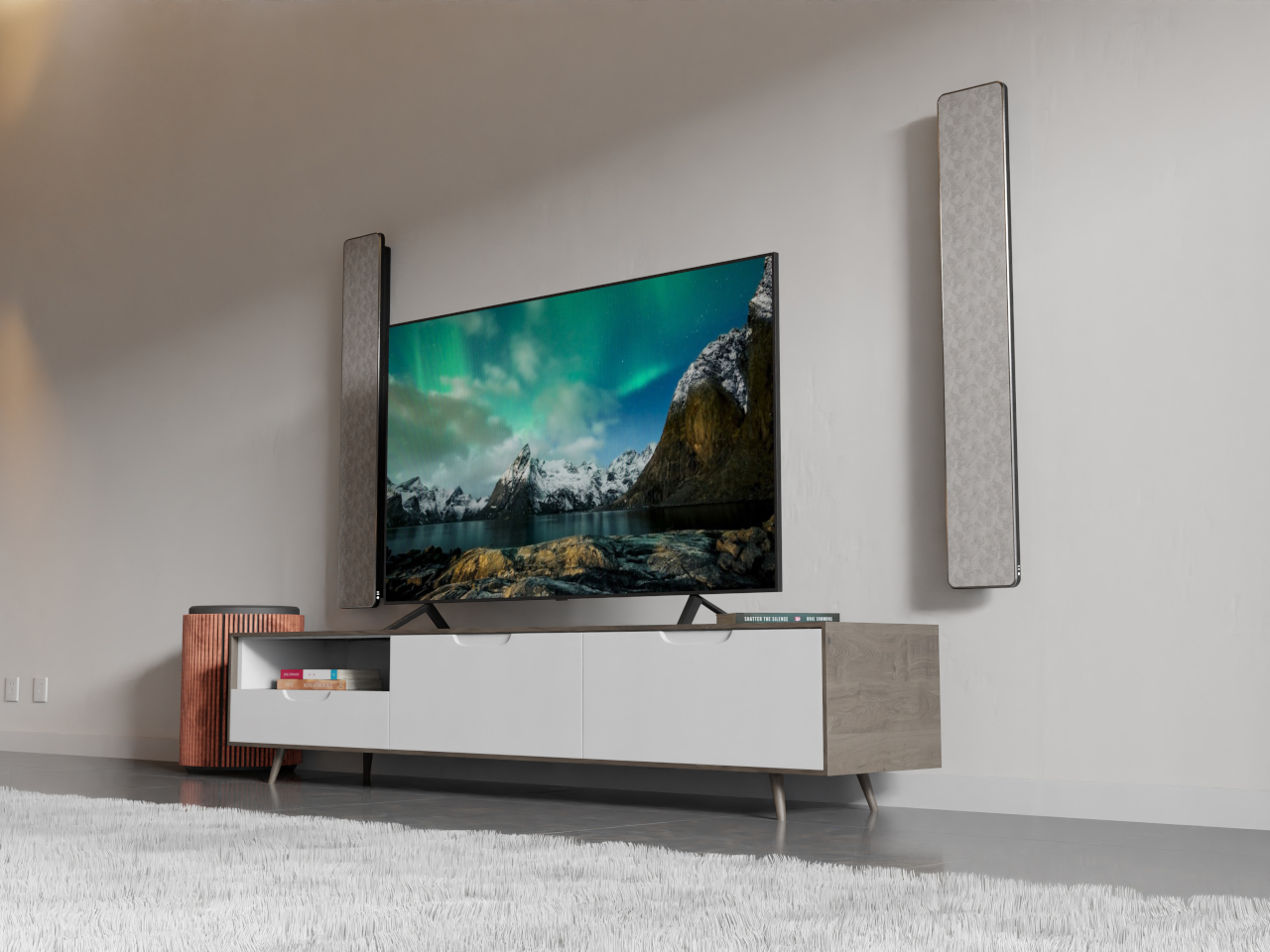
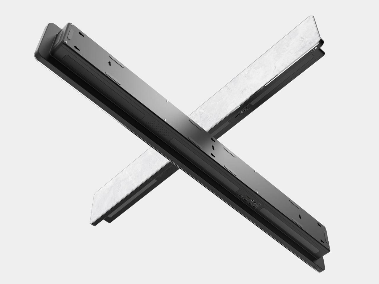
Aura is a concept for a speaker panel that delivers audio in 360 degrees. Rather than pushing sound from the front as you might expect from a flat box, the actual speakers are located around the edges. Thanks to this design, it is possible to place Aura anywhere and in any orientation, whether vertically on a wall, horizontally below a TV, or even lying flat on a long meeting table.
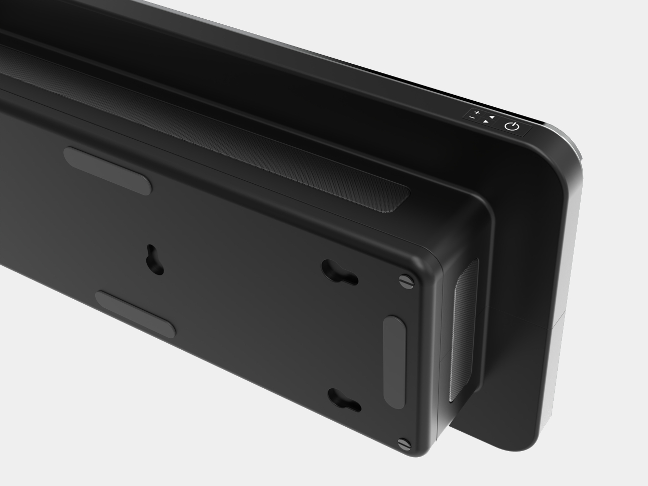
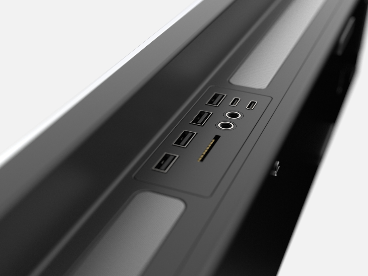
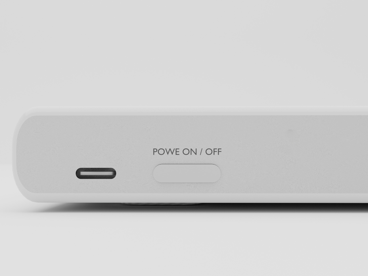
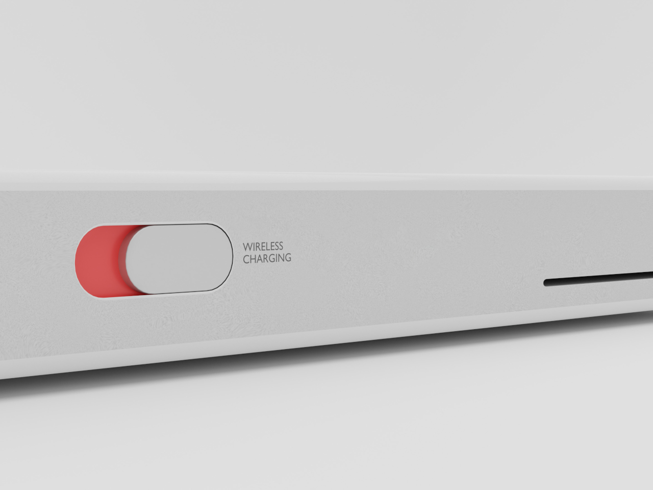
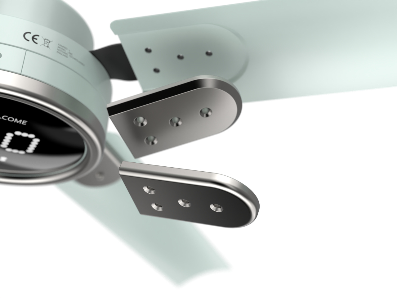
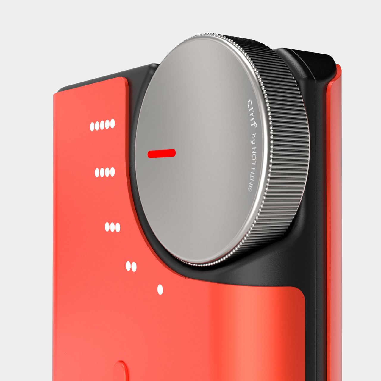
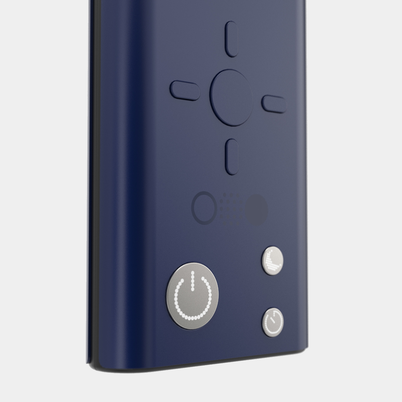
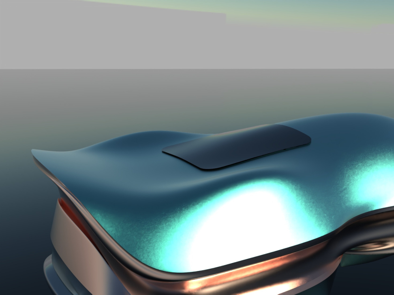
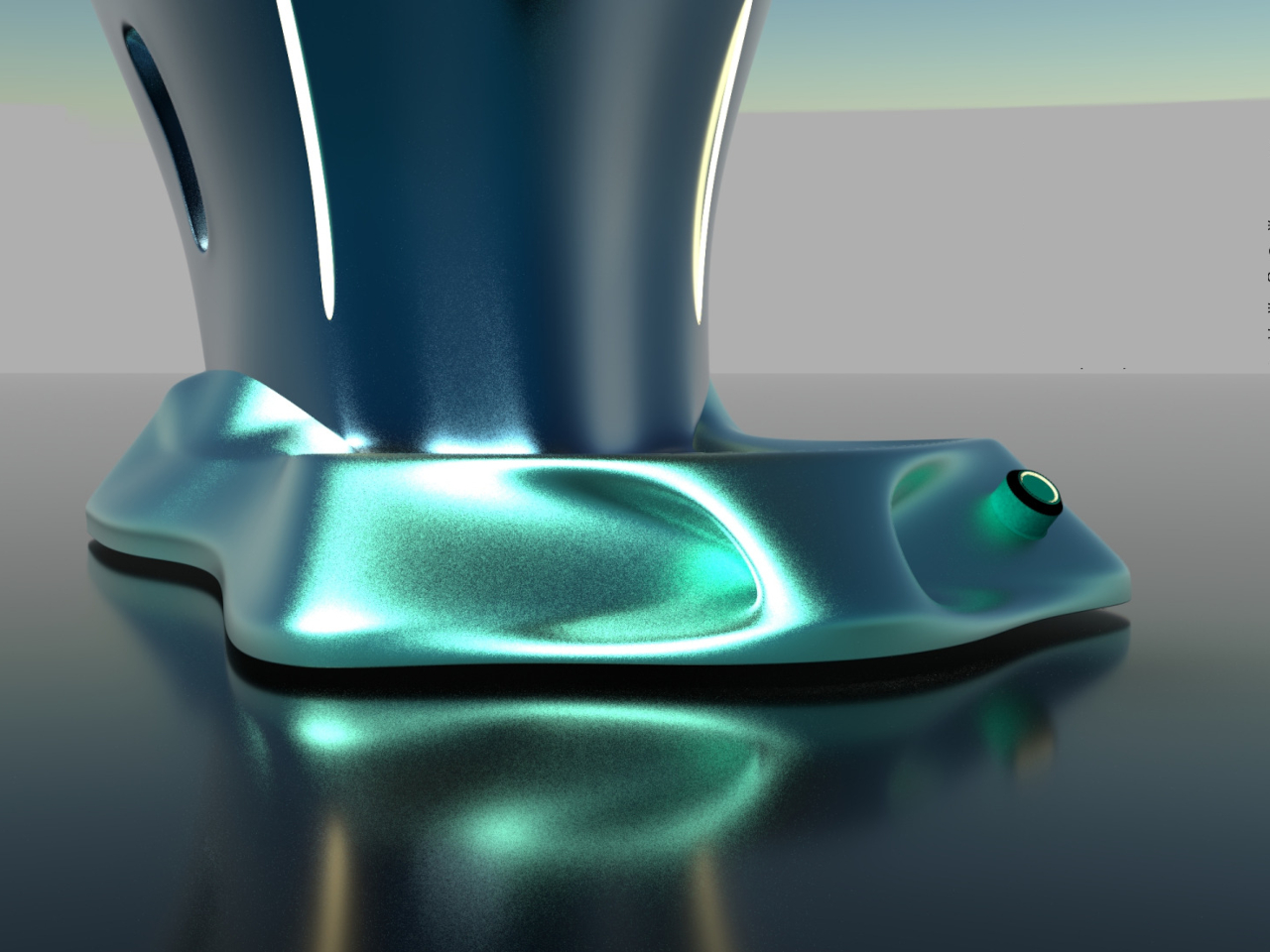
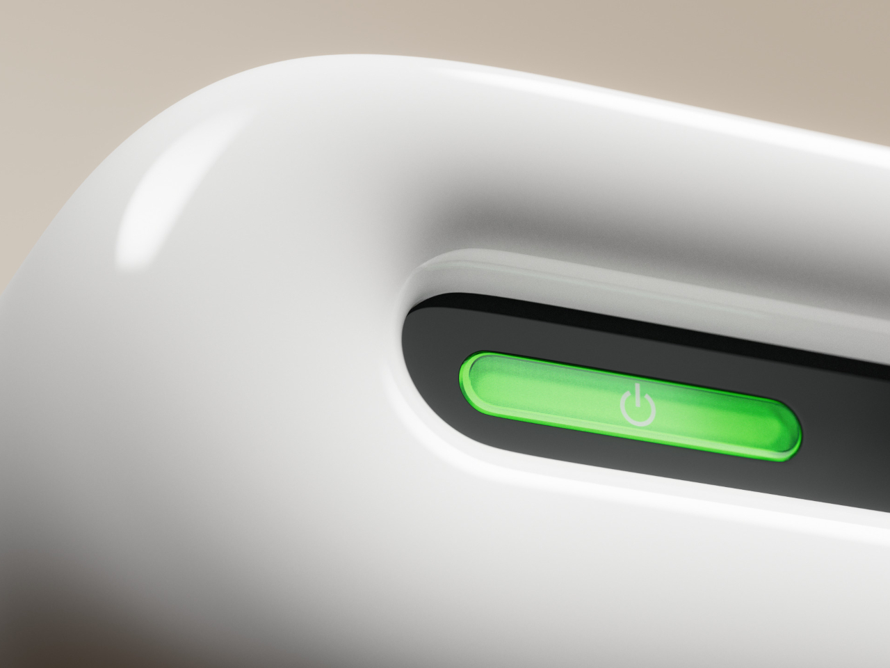
To help make this flexibility more practical, Aura has a special feature that very few speakers have. It has physical controls as well as input ports on both long sides of the speaker, letting you control it directly regardless of the position or orientation. Admittedly, that does add a complication to the internal implementation of the speaker, but it’s not entirely impossible given today’s technology.
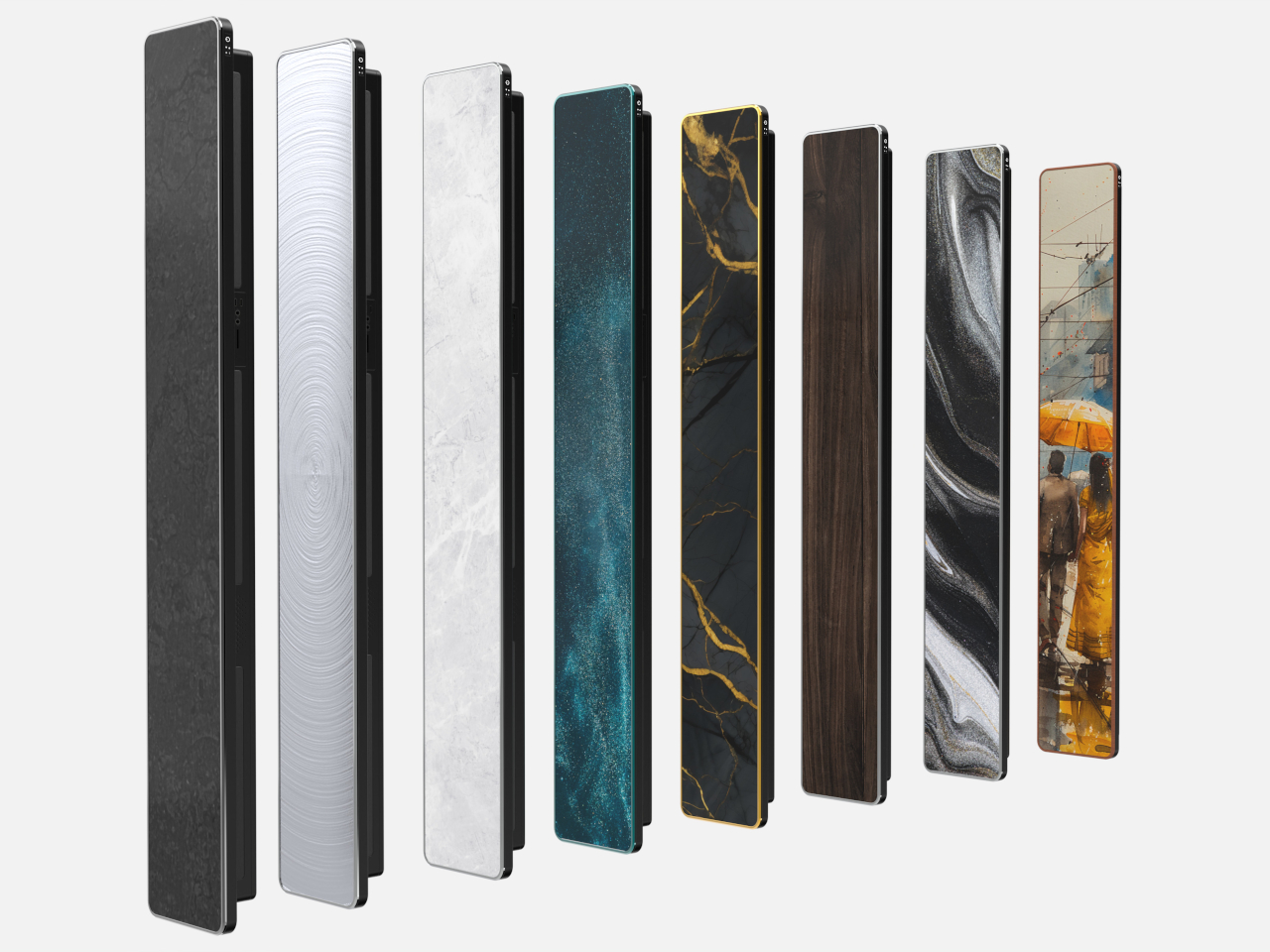
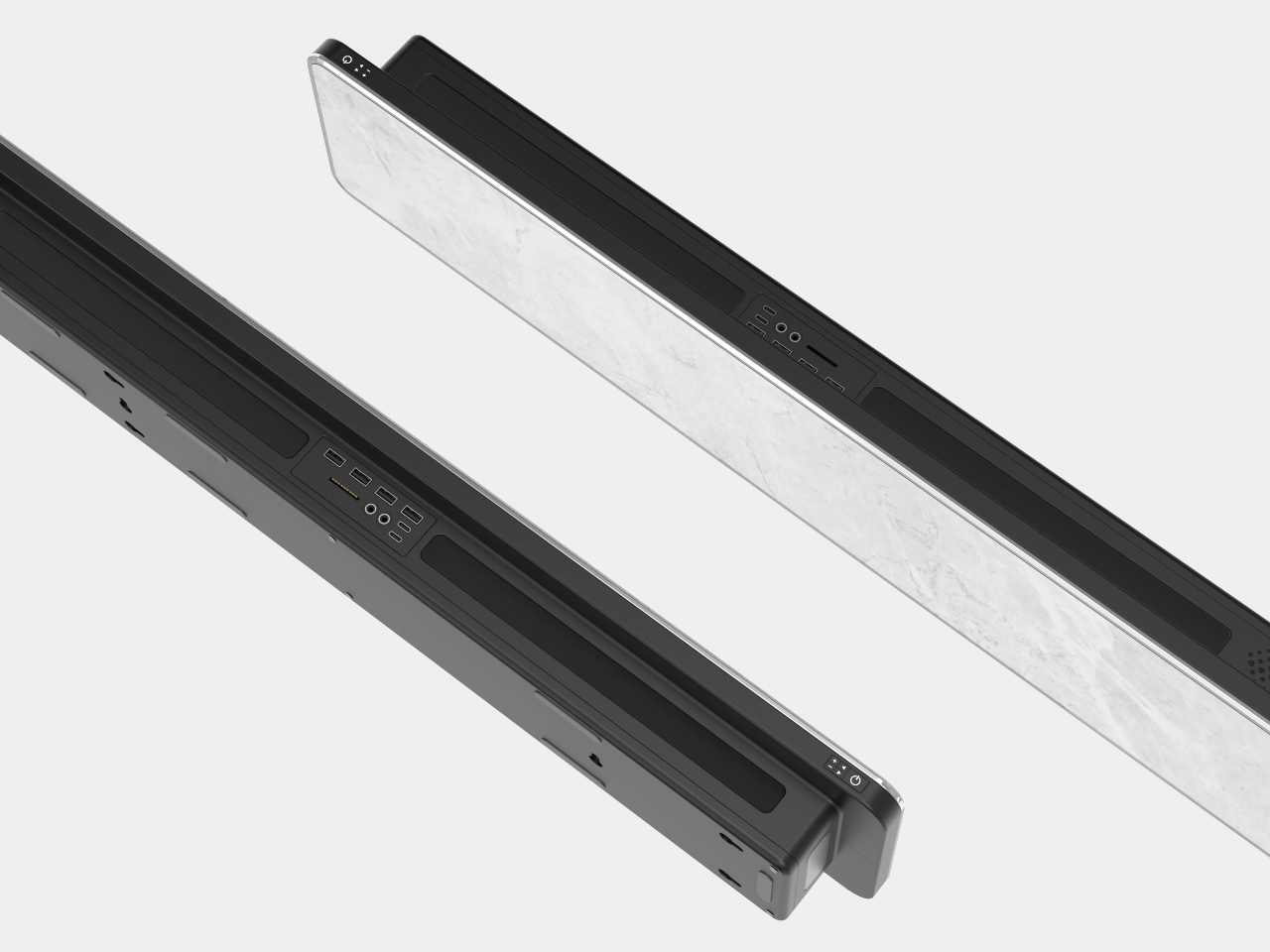
That alone already makes it notable, but Aura’s real value comes from its customizable and interchangeable front panel. In theory, this lets you select a design that would match the motif of the room or even the material of the table on which it will be placed. Whether it’s a marble-like finish, wood, or a typical gray mesh, Aura puts the owner in control of how the speaker looks and blends into the background. Even better, you can always change that panel when you change your interior design, prolonging the speaker’s usefulness for years to come.
The post Aesthetic speaker concept adds decorative value to your home entertainment setup first appeared on Yanko Design.