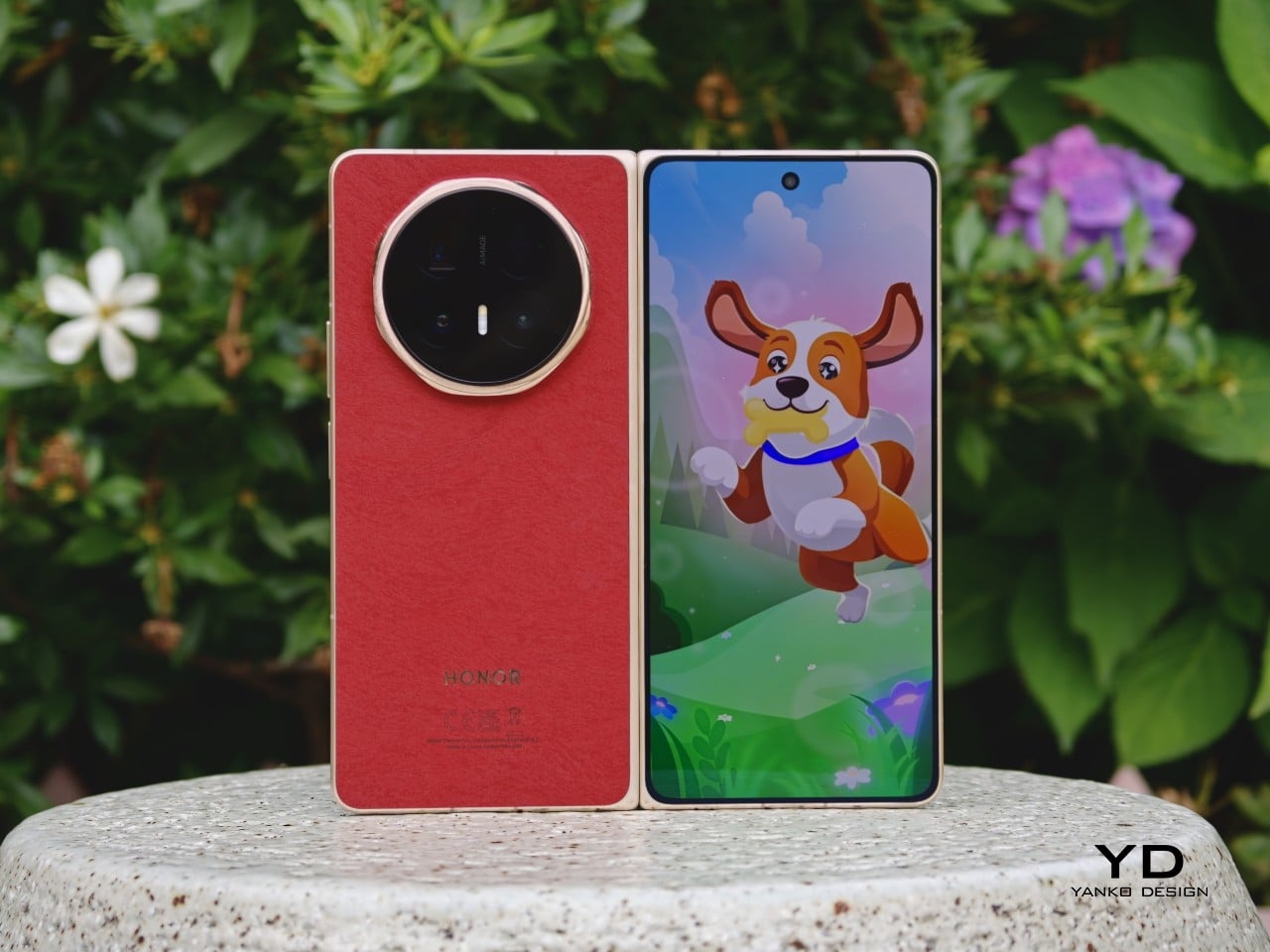
Honor Magic V6 Review: Big battery, slim body, refined experience

PROS:


  • Slim and comfortable design

  • Bright and crisp internal and external displays

  • Outstanding battery capacity, backed by fast wired and wireless charging

  • Great main and telephoto camera for a foldable

CONS:


  • Feels more like a small upgrade over the Magic V5 than a major generational leap

  • Ultrawide camera is decent, but not as impressive as the main and telephoto cameras</li?

RATINGS:

AESTHETICS
ERGONOMICS
PERFORMANCE
SUSTAINABILITY / REPAIRABILITY
VALUE FOR MONEY

EDITOR'S QUOTE:

Honor may not have radically changed the formula, but the Magic V6 shows just how far thoughtful refinement can go.

Honor unveiled its latest foldable, the Honor Magic V6, at MWC 2026 back in March. Now, three months later, the phone is starting its global rollout in Malaysia and Singapore. That shift from launch event to retail availability is where the real test begins, because foldables have reached a point where being thin or flashy is no longer enough on its own.

The Magic V6 does not completely rethink what Honor has already been doing with its book-style foldables. Instead, it builds on a formula that already worked well, pushing it further with a bigger battery, a slim and comfortable design, and a hardware package that feels unusually complete for a foldable. After spending time with it, the Honor Magic V6 feels less like a dramatic reinvention and more like a careful refinement of what Honor already got right.

Designer: HONOR

Aesthetics
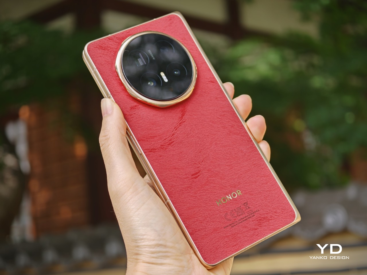
Foldables still have a habit of looking oddly cautious. For devices built around one of the most dramatic ideas in modern consumer tech, they often arrive in the safest shades possible. Black, grey, silver, maybe a muted blue if a brand is feeling adventurous. The color choice itself is usually limited, which can make many foldables feel more sterile than stylish. Honor is one of the few brands that has tried to bring a little more personality into the category, and the Magic V6 sticks with that idea.

At first glance, the Magic V6 looks very similar to the Magic V5. The overall silhouette is familiar, the octagonal camera module is still there, and even the color direction feels like a continuation rather than a reset. This is clearly not a redesign for the sake of it. Honor seems comfortable with the look it has established for the Magic V line, so the V6 feels more like a polished follow-up than a fresh visual statement.
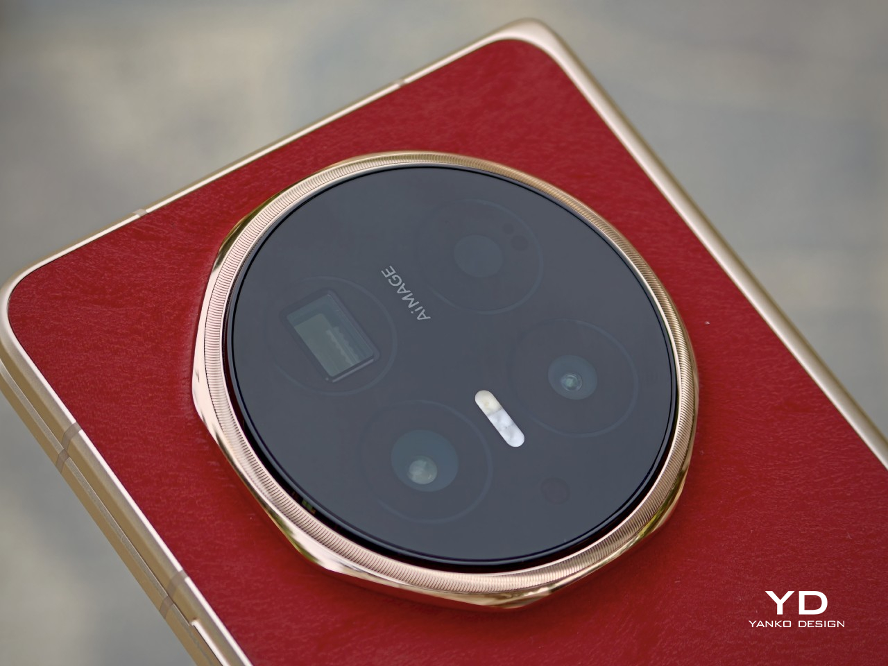
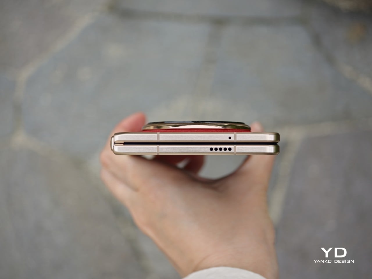
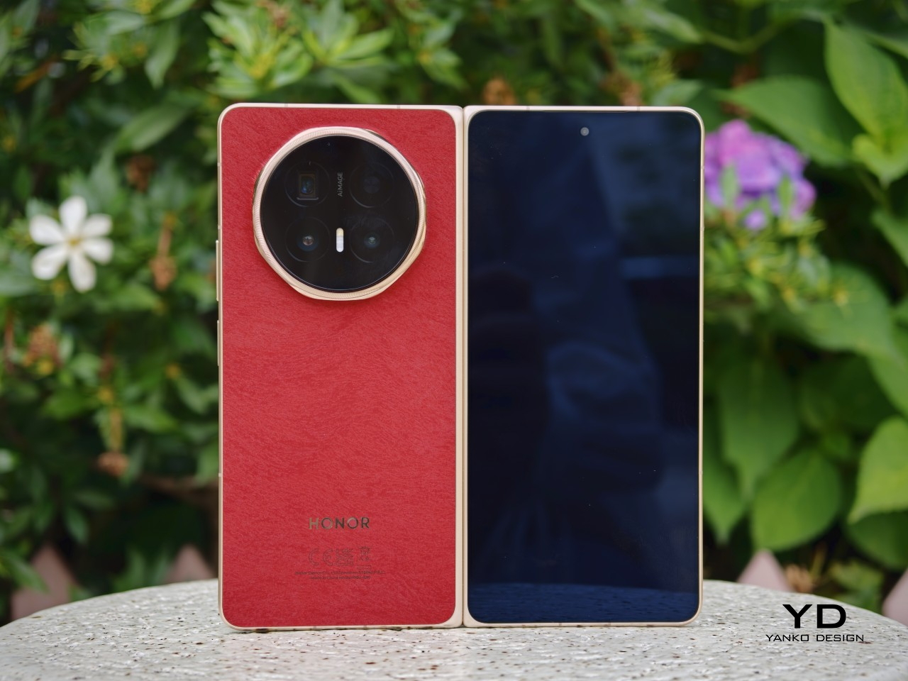
The finishes do a lot of the work in giving the phone its character. Honor offers the Magic V6 in four colors, and they feel more thought-through than the usual selection in this category. The red version I received is the most striking, with a soft-touch finish, a subtle hairline pattern, a gold frame, and a matching gold camera ring that make it feel a little warmer and more expressive than most foldables. The gold version goes in a different direction with a crisscross pattern that gives the back more texture and a slightly dressier look. If you want something more restrained, the white and black versions are there too.
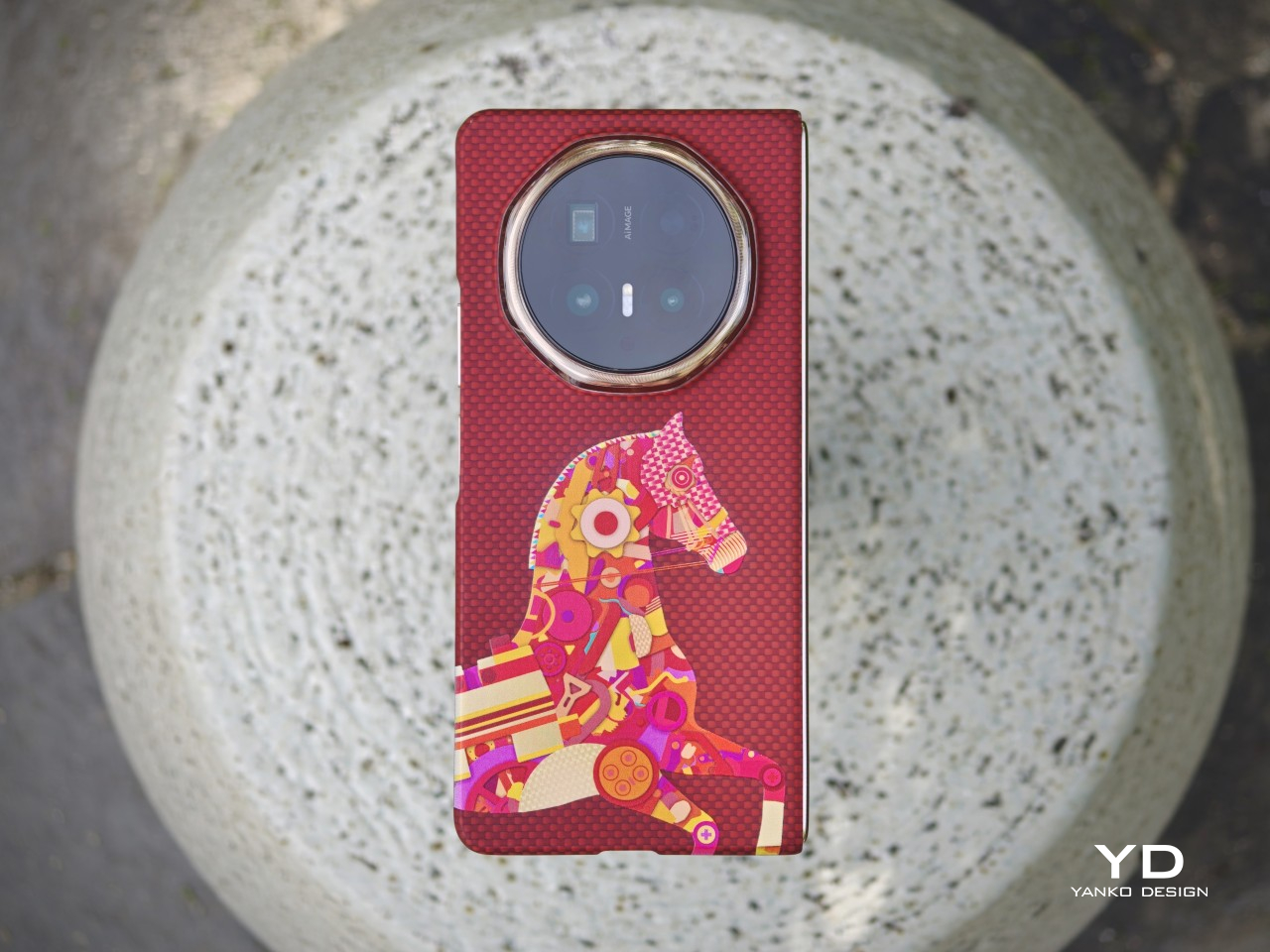
Honor has also paid attention to the accessories. Each color comes with a matching case with a built-in kickstand, while the optional Special Edition case adds a bit more flair. Designed with Yoni Alter, it uses red aramid fiber and a colorful mosaic-style horse motif, while also adding built-in magnetic support. It is a small detail overall, but it suits the phone. The Magic V6 may not change Honor’s foldable design language, but it does show that the company is still putting real thought into how this series looks and feels.

Ergonomics

The ergonomics feel more like a refinement of the previous model, and I think that is a good thing. To me, the Magic V5 was already the most ergonomic book-style foldable around, so Honor did not really need to rethink the formula. What it has done instead is rework the internal architecture to fit what is currently the biggest battery in a foldable phone while still keeping the Magic V6 among the thinnest in the category.

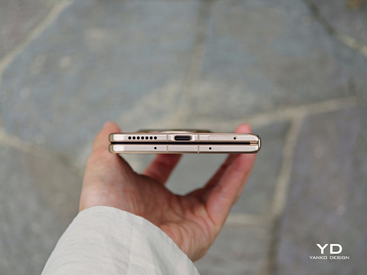
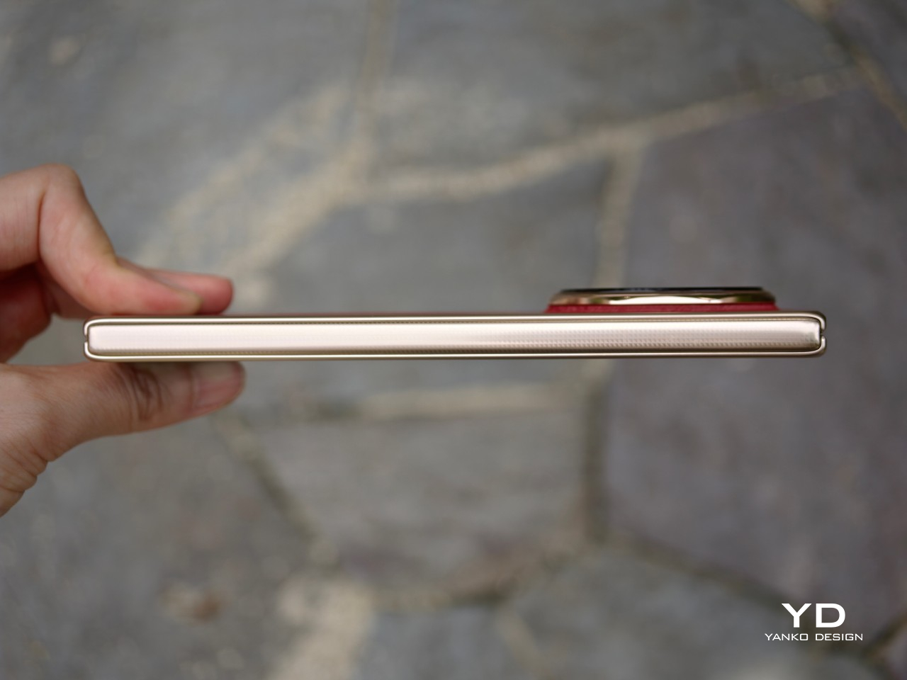
There are slight differences depending on the color. The white version is the thinnest and lightest, measuring 156.7 x 74.5 x 8.75 mm when folded and just 4.0 mm when unfolded, with a weight of 219g. The other color variants are slightly thicker at 9.0 mm folded and 4.1 mm unfolded, and they weigh 224g.
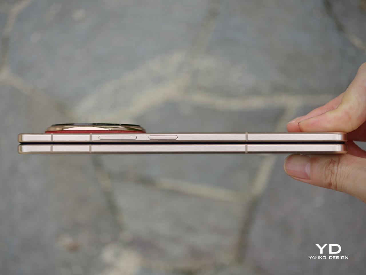
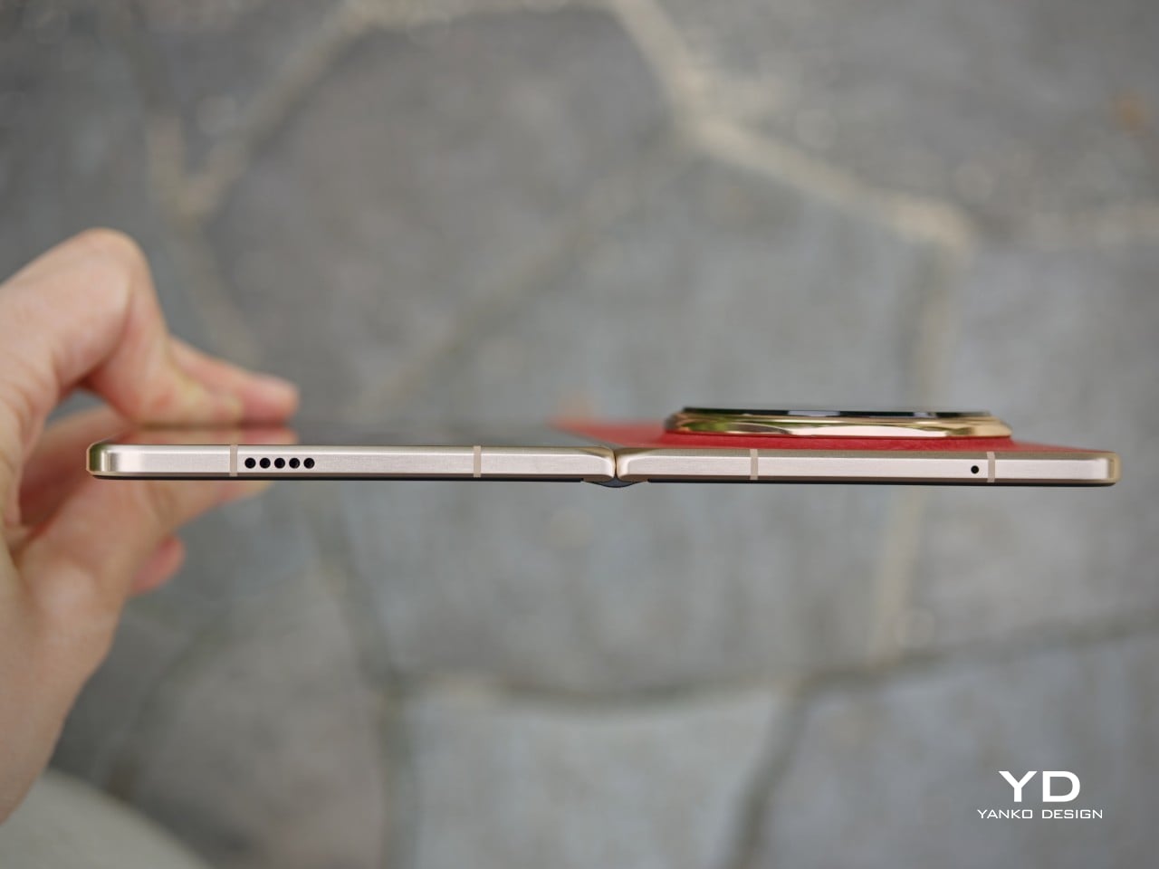
In use, the Magic V6 still feels like one of the most comfortable foldables around. The hinge feels secure and firm, and opening and closing it feels fluid and well-judged. The frame is now flat, but the edges are ever so slightly curved, so it does not dig into your hand. The volume rocker and the power button, which also doubles as the fingerprint scanner, are placed where they are easy to reach. You can also customize the double press on the power button, which is a nice little touch in daily use.

What I like most is that the Magic V6 does not really feel like a typical large book-style foldable when it is closed. Folded shut, it feels surprisingly close to a regular slab phone, which makes it much easier to use casually throughout the day. It is this kind of refinement that makes the Magic V6 so easy to live with day to day.

Performance

The Magic V6 is powered by the Snapdragon 8 Elite Gen 5, which puts it right where a flagship should be in 2026. It is paired with 16GB of RAM and 512GB of storage, although other configurations are available depending on the market. There is no real issue here with multitasking or with playing demanding AAA titles. Apps open quickly, moving between tasks feels smooth, and the phone has the kind of power that lets the larger display feel properly useful rather than overambitious.
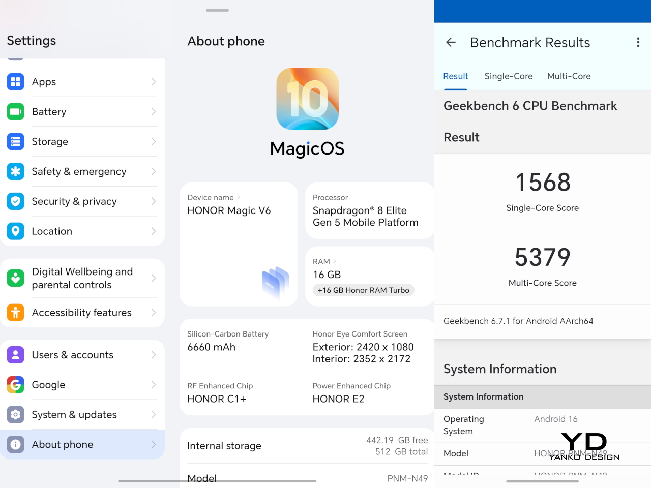
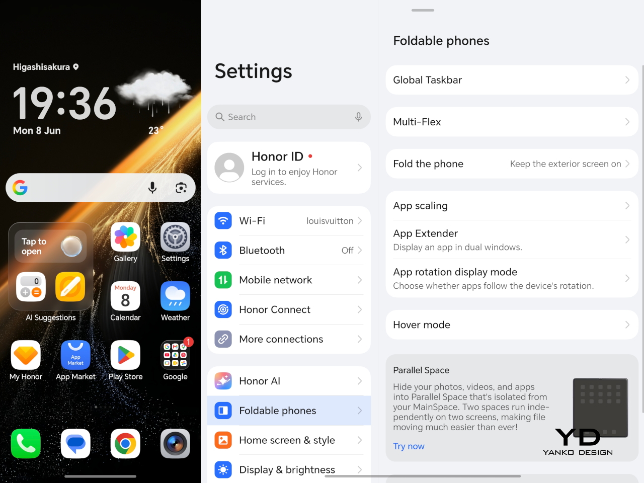
Software is often where foldables either come together or start to feel more awkward than they should. The Magic V6 runs MagicOS 10 based on Android 16, and as with Honor’s recent devices, the focus seems to be on giving users plenty of AI features and cross-platform connectivity. Honor is leaning quite hard into interconnectivity with Apple devices. Using Honor Connect, the Magic V6 supports two-way notification sync with iPhones and iPads, while an Apple Watch can display messages and notifications from both devices. Through Honor WorkStation, the phone can also connect to a Mac and act as an extension of the desktop environment, with support for wireless screen casting, content transfer, and one-tap file sharing, including original-format Moving Photo.

On a foldable, though, the more important question is whether the software makes good use of the larger screen, and here the Magic V6 feels well equipped. Multitasking on the V6 is solid. The inner display gives you enough room to run apps side by side without things feeling cramped, and the phone has more than enough power to keep everything moving smoothly. On a device like this, that matters just as much as raw specs, because a foldable only really makes sense if the larger screen feels genuinely useful in everyday use.
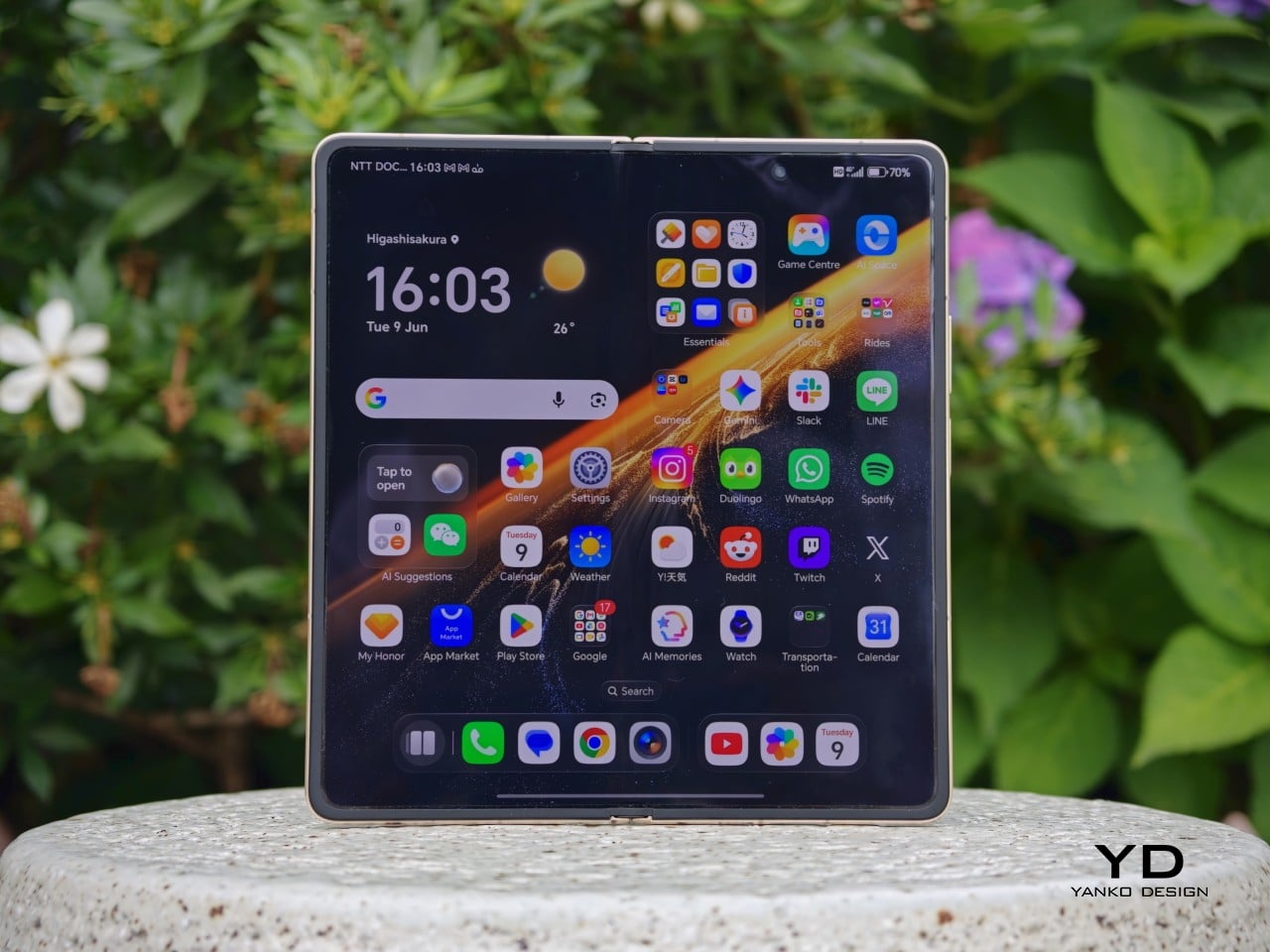
Honor has equipped the Magic V6 with a 6.52-inch 2420 x 1080 AMOLED outer screen and a 7.95-inch 2352 x 2172 AMOLED inner display, and both are vivid, sharp, and fluid. Both panels support a 1 to 120Hz LTPO refresh rate, with up to 5,000 nits on the inner display and 6,000 nits on the outer, alongside eye comfort features such as 4320Hz PWM dimming. In use, the displays are excellent. The crease is barely noticeable, though not quite as invisible as on Oppo’s Find N6. The stereo speakers are also plenty loud and punchy, which suits the phone well for video and games.


The Magic V6 comes with a 50MP main camera with an f/1.6 aperture and OIS, a 64MP telephoto camera with an f/2.5 aperture, a 1/2-inch sensor, and OIS, and a 50MP ultrawide. On paper, that is a solid setup for a foldable, especially in a category where cameras have often felt like one of the first compromises.

In practice, the main and telephoto cameras are both strong for a foldable. Images come out sharp, colors are pleasing, and the overall look tends to lean a little on the brighter side. The ultrawide is satisfactory, though it does not stand out in quite the same way as the other two cameras.


Battery life is one of the Magic V6’s biggest selling points. Honor has managed to fit a 6,660mAh silicon-carbon battery into a foldable that is still among the thinnest in its class, while the 1TB version in China goes even further with a 7,150mAh battery. That is a huge battery even by slab flagship standards, never mind in a foldable.


Charging is strong too, with support for 80W wired and 66W wireless charging on the global model. A foldable this slim with this much battery capacity and this level of charging support is still unusual, and it is a big part of what makes the Magic V6 feel so easy to trust as an everyday device.
Sustainability

When it comes to foldables, durability can still be a concern for some people. Honor is clearly aware of that. The outer screen uses silicon nitride-based Nano Crystal Shield glass with up to 5,600 ultra-precise coating layers, while the inner display uses UTG flexible glass and is said to be 33 percent more impact resistant than the Magic V5. It is also rated for 500,000 folds.

The Magic V6 also comes with IP68 and IP69 ratings, which is the kind of protection you would more often expect from a slab flagship than a foldable. Honor is also promising seven major OS updates, which helps strengthen the long-term ownership story. What would make that sustainability angle more complete is greater use of sustainable materials, which is still an area where Honor could do more.
Value

Value is always a tricky part of the conversation with foldables because these devices are expensive by nature. No one is buying something like the Magic V6 because it is a bargain. Honor is beginning its wider rollout in Malaysia and Singapore. In Malaysia, the Magic V6 is priced at RM 7,699 for the 16GB RAM and 512GB storage version, which works out to roughly US$1,920 at a simple direct conversion. At that price, it is still very much a premium purchase, but the hardware does a lot to justify it. You are getting a slim and comfortable design, strong performance, large and bright displays, a huge battery, fast charging, and a durability story that feels more complete than what many foldables have offered in the past.
Value still depends on what you want from a foldable. If battery life, ergonomics, and high-end hardware matter most to you, the Magic V6 makes a very strong case for itself. If software polish is your top priority, some rivals may still feel a little more mature. Even so, the Magic V6 feels like a foldable that gives you a lot of substance for the money, not just novelty.

Verdict

The Magic V6 feels like Honor refining a formula that was already working well. It does not try to reinvent the book-style foldable, but it improves on the parts that matter most. The design still has personality, the ergonomics are excellent, the displays are strong, and the battery is genuinely standout for this category. The main and telephoto cameras are also better than what many people might expect from a foldable, which helps round out the overall package.

It is not without a few caveats, though. The software still does not feel quite as polished as the very best in the category, and the price places it firmly in ultra-premium territory. Even so, the bigger picture is very easy to like. If you want a foldable that feels slim, practical, powerful, and unusually easy to live with, the Magic V6 makes a very convincing case for itself.
The post Honor Magic V6 Review: Big battery, slim body, refined experience first appeared on Yanko Design.
This Keychain Camera Shares Photos Over Its Own Wi-Fi, No App Needed

Keychain cameras have been enjoying a quiet revival, driven largely by a growing appetite for lo-fi photography and a general fatigue with the algorithmic complexity baked into smartphone cameras. Most of what’s available comes pre-assembled and pre-decided, right down to the app you’re expected to use and whose cloud account your photos end up in. That framing leaves very little room for the person actually taking the pictures.

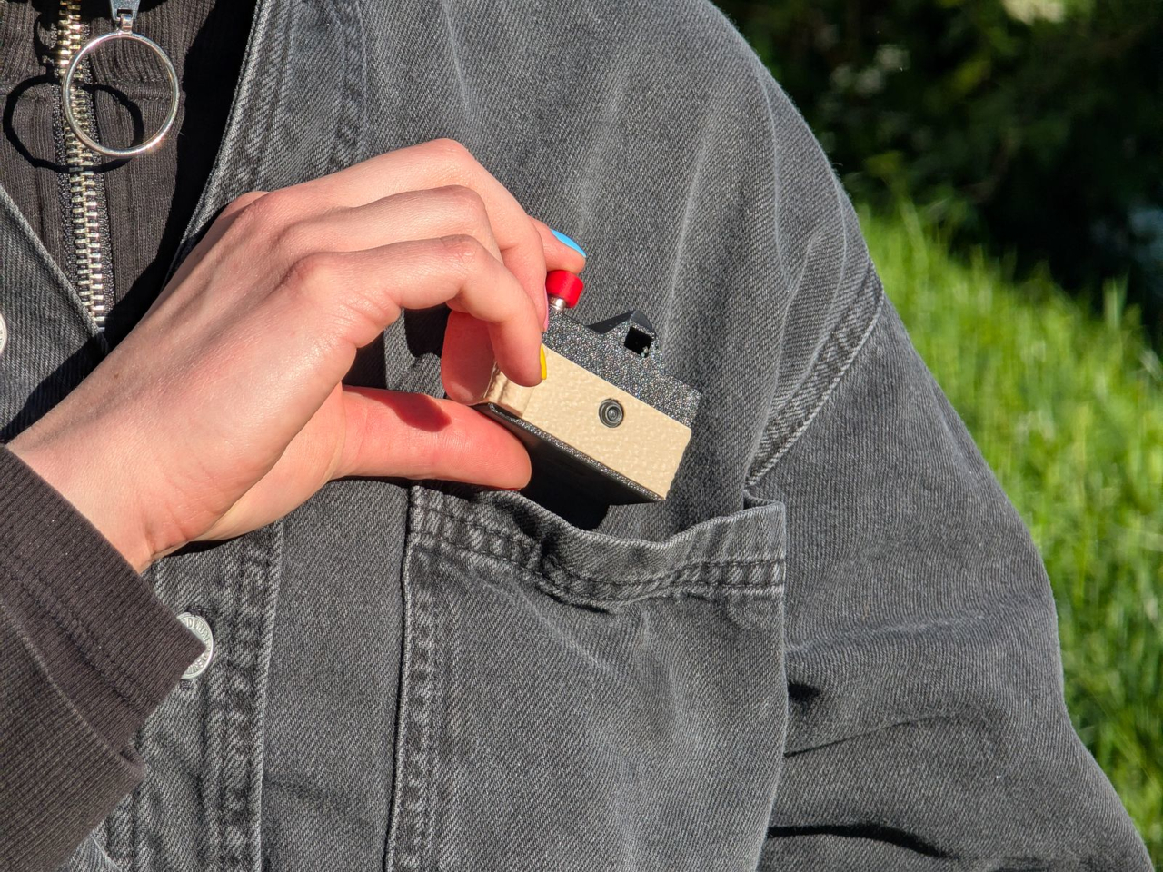
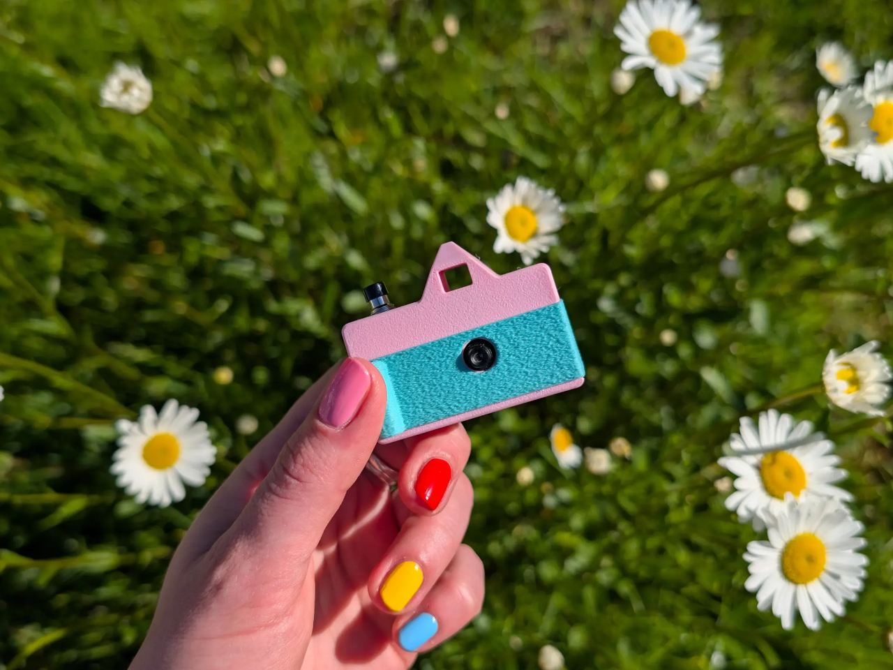
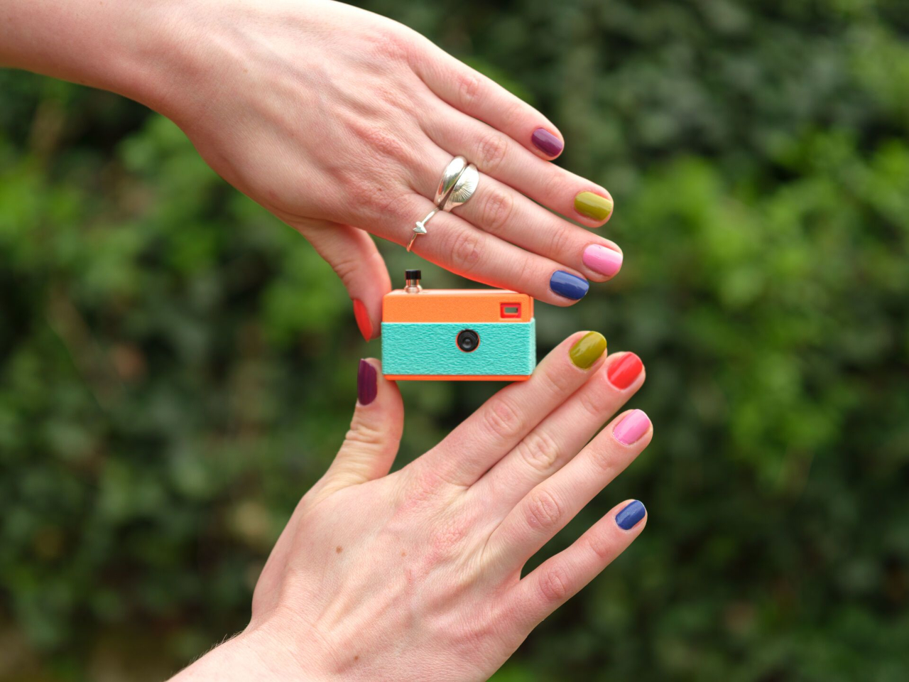
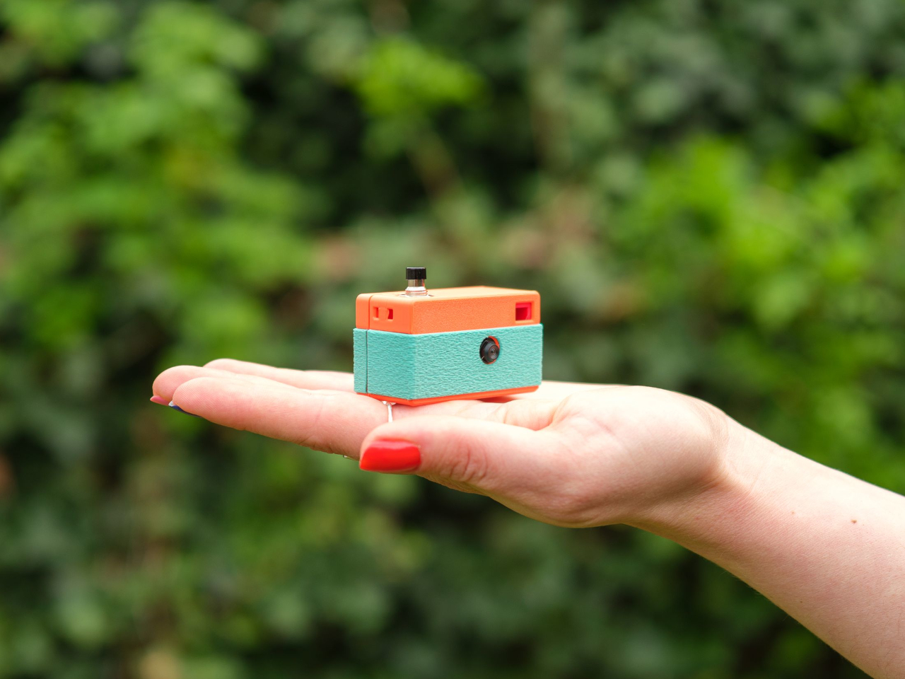
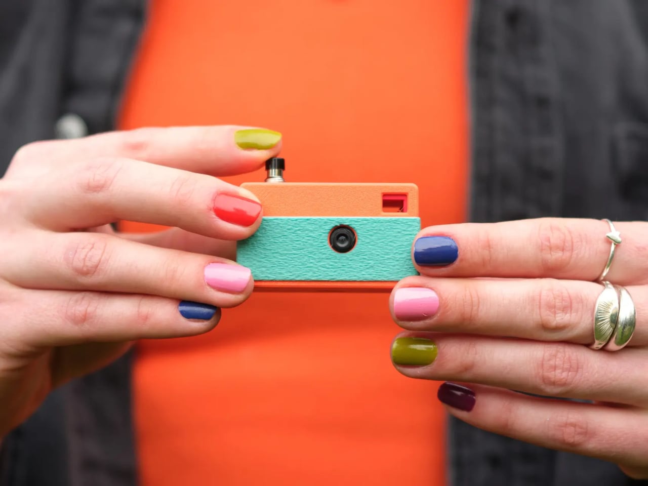
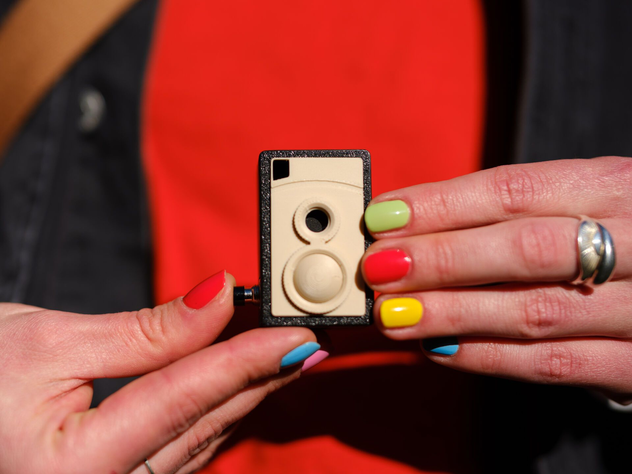
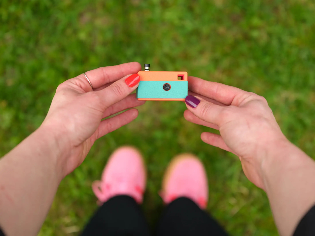
Designer Matej Nahtigal built an answer to that problem, and it’s small enough to hang off your keyring. The Keymera is a fully functional camera that you 3D print and assemble yourself, built around just five printed parts and four electronic components. It takes real 3 MP photos, stores them locally, asks for nothing in return, and fits roughly in the same space as a car key fob.

Designer: Matej Nahtigal

The build is intentionally minimal. The electronics stack consists of a Seeed Studio XIAO ESP32S3 Sense board, a 3 MP OV3660 image sensor, a small LiPo cell, and a single tactile button, connected with four solder joints. Print the shell, wire the components, flash the firmware, and press-fit everything together. No screws, no glue. The whole process takes about an hour to print and another hour to assemble.

Using it is even simpler. A single button does everything. Press it once, and the camera wakes, captures a photo, saves it to a microSD card, blinks an LED to confirm, and goes back to sleep. On standby, it draws roughly 10 µA, which means it can sit on your keyring for weeks between charges without running dry. The logic behind all of it couldn’t be simpler.

Getting your photos off the camera doesn’t require a cable or an app. Hold the button, and the Keymera broadcasts its own Wi-Fi network. Connect any phone or laptop, and a gallery page opens directly in the browser. You can scroll through your shots, view them full-size, and download them from there. That gallery lives entirely on the device. No account required, no metadata harvested, no service to subscribe to.

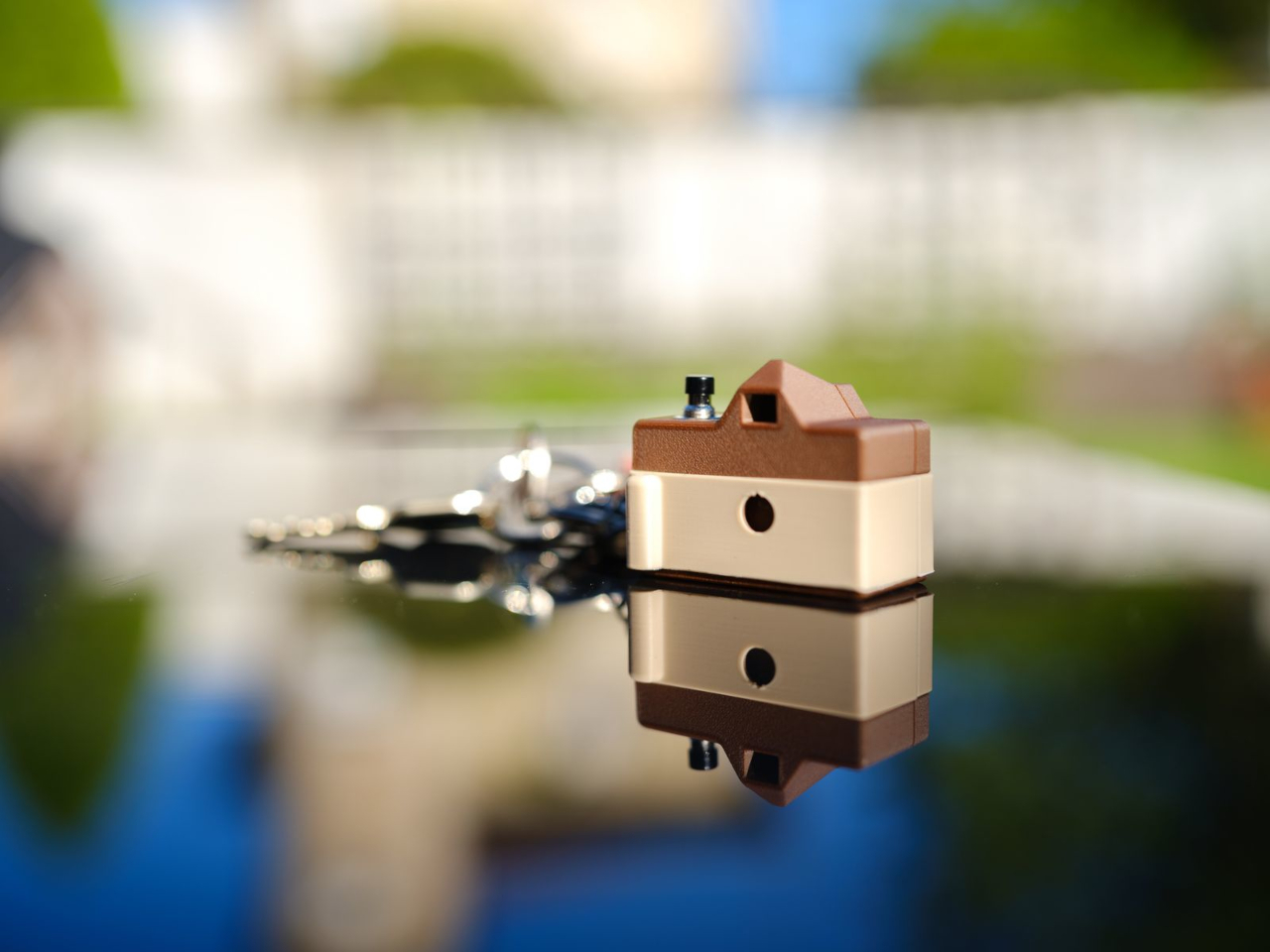
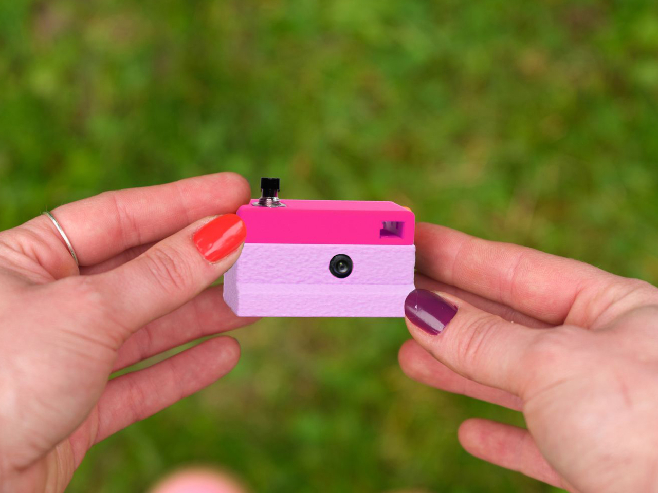
What makes the Keymera a design object rather than just a circuit board in a box is the shell system. One electronics core fits into interchangeable outer shells, each inspired by a different camera era. The original three designs reference a rangefinder, an SLR, and an instant camera, with a twin-lens reflex (TLR) added as a fourth. Any color or filament finish is yours to choose.

That idea, that a camera should fit in your pocket, behave honestly, and let you own the experience from print to final photo, reflects Nahtigal’s deliberate pushback against a moment when phones are adding AI features to everything. There’s no computational processing, no hidden metadata collection, and no account to manage. You clip it to your bag, your belt loop, or your keyring, and it’s simply there when something happens.

The Keymera’s files are sold as licensed digital products, not released as open-source files, which keeps the design controlled and the project financially sustainable for a single maker. The photos it produces are lo-fi and unprocessed, captured on a fixed 3 MP sensor with no computational adjustments applied afterward. For something this small and this honest, that kind of clarity is very much the point.

The post This Keychain Camera Shares Photos Over Its Own Wi-Fi, No App Needed first appeared on Yanko Design.

From Foldable Pilates to Shoe Robots: InnoX GCS 2026’s Best Startups

The consumer tech market has a crowding problem, mostly driven by products that try to do too much for too many people. The most interesting hardware lately has been doing the opposite, building around one specific inconvenience that hasn’t been properly addressed yet. Shenzhen has always had a knack for this, and InnoX Academy has been quietly developing the next generation of builders who make those products happen.

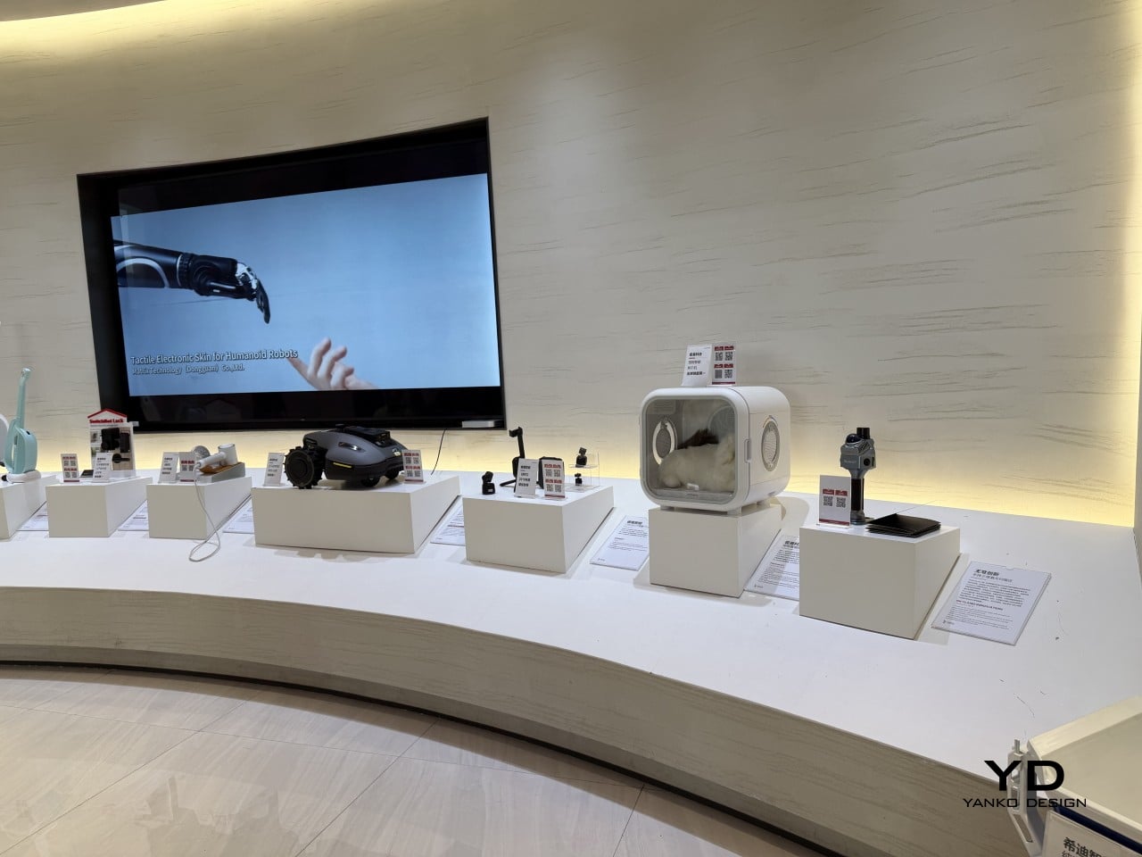
Founded in 2021 by Professor Li Zexiang of Hong Kong University of Science and Technology, Shenzhen InnoX Academy is a structured ecosystem that develops engineers and entrepreneurs into product builders. At the Global Connect Show 2026, it gave the world a look at its latest batch of startups, from home fitness and pet care to ambient design objects, each taking a more considered approach to a specific problem.

Pilates reformers have always been the kind of equipment you’d only find in a dedicated studio, too large and bulky for most apartments to accommodate. Pavo Fitness, started by a team of architects, industrial designers, and professional Pilates instructors, saw that as a solvable problem. The Pavo Reformer is their answer: a compact, foldable machine designed to bring studio-quality resistance training into a regular home.

Designer: PAVO

Once a session is done, it packs away without being disassembled or moved to a corner, so it doesn’t have to become a permanent fixture in your living space. The onboard smart system keeps tabs on workouts, which matters more in a home setting where there’s no instructor watching your form. It adds a layer of accountability that a conventional reformer simply can’t offer.

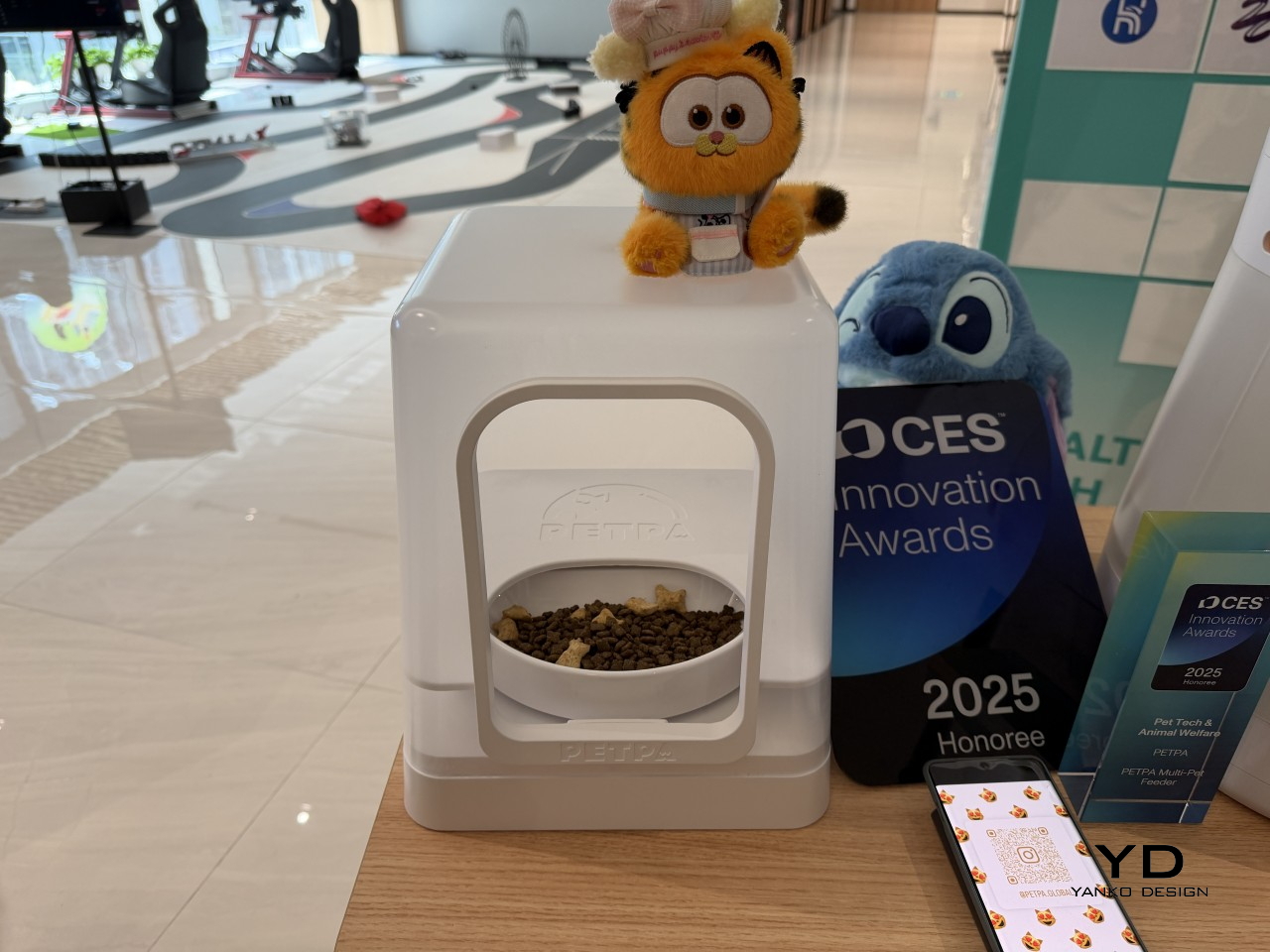
Multi-pet households have a feeding dynamic that most smart feeders don’t actually address. A timed dispenser works for one pet, but when multiple cats have different dietary needs, scheduling meals is only part of the problem; the harder challenge is making sure each cat only gets its own food. That’s what PETPA was built to solve, by a team that previously worked on hardware at DJI, Narwal, and RoboMaster.

Designer: PETPA

The PETPA Multi-pet Feeder uses individual pet recognition to identify each cat and control access to their food, particularly useful in homes where one cat needs to lose weight or follow a prescription diet while the others don’t. It launched at CES 2025 and earned a CES Innovation Award in the Pet Tech and Animal Welfare category, recognizing a product solving a problem most smart feeders still overlook.

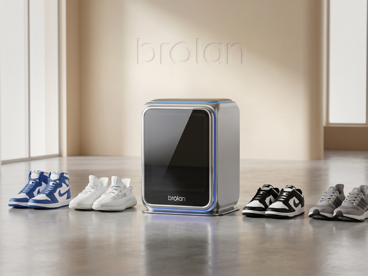
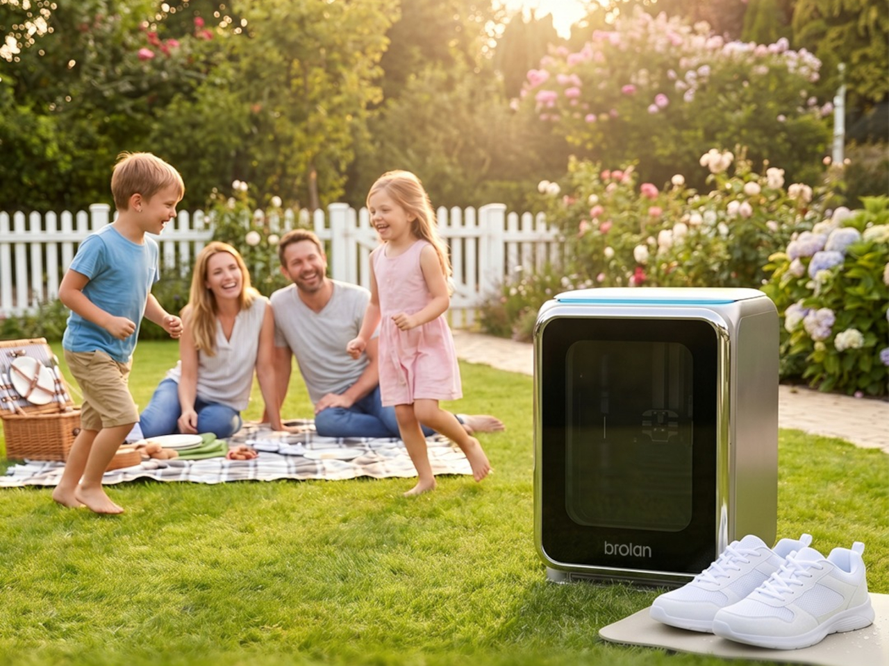
Sneaker care has evolved into its own dedicated ritual for collectors and sports enthusiasts who’d rather not take chances with a stiff brush and soapy water. The typical cleaning routine still carries the risk of fading colors, weakening materials, or warping the structure of more delicate footwear. Brolan’s ClearX is a compact home machine that moves through cleaning, low-temperature drying, and sterilization all in one automated cycle.

Designer: Brolan

Founded in 2025 by a team drawing from Nanyang Technological University, Harbin Institute of Technology, and Tsinghua University, Brolan designed ClearX specifically to clean without the harshness of manual scrubbing. The idea is to get footwear thoroughly clean without putting materials at risk, which matters most for anyone who owns suede, knit, or premium leather shoes that even a careful hand-wash can easily ruin.

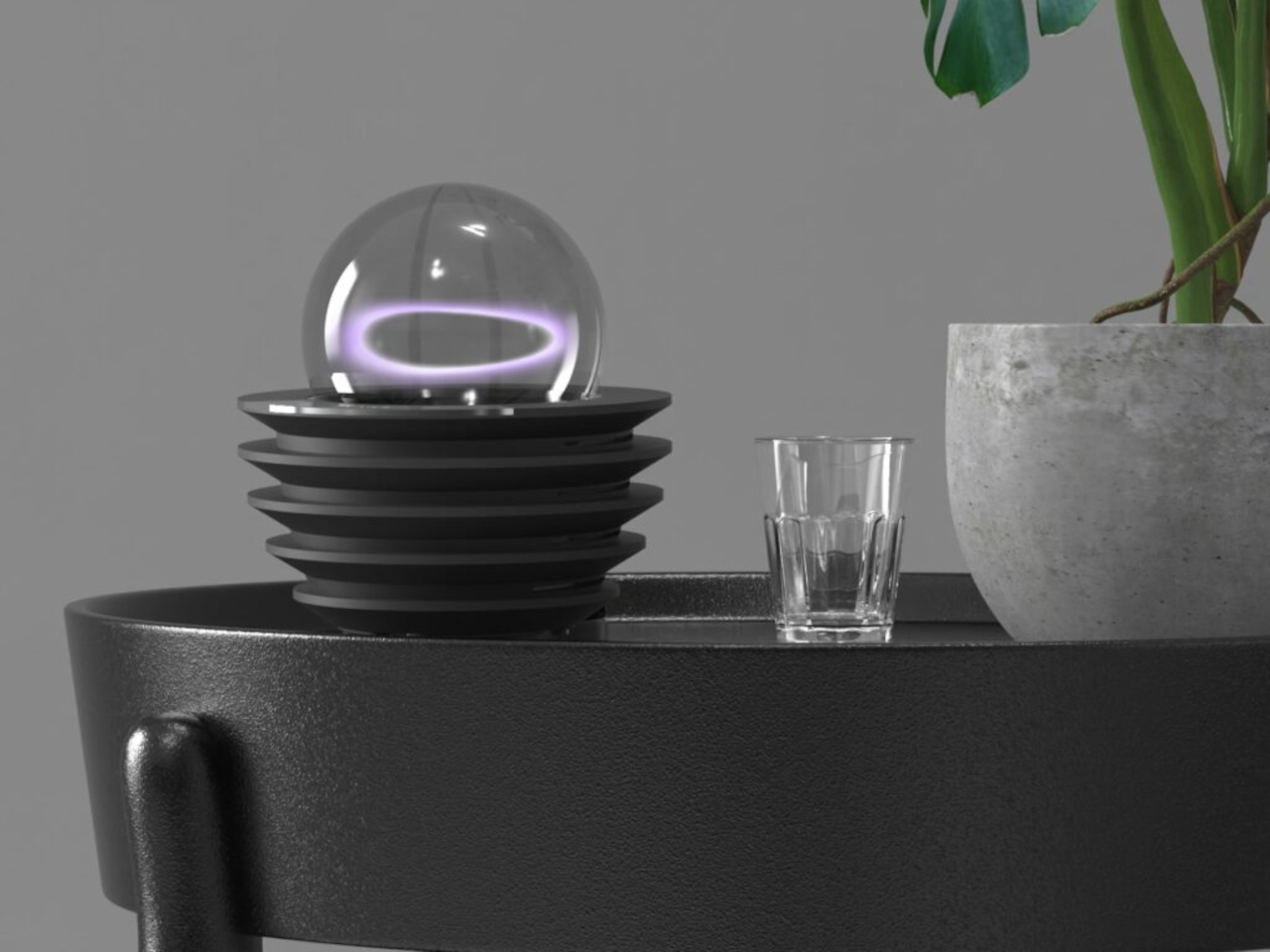
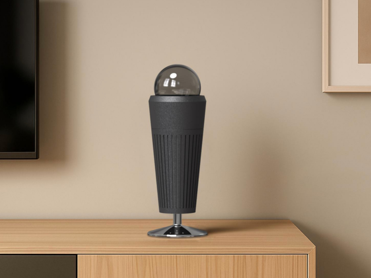
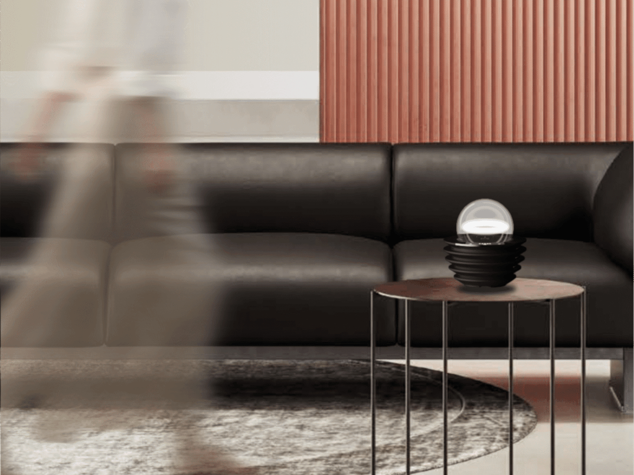
Not everything in the InnoX lineup is about automation or performance tracking. REAZENABLE takes a different direction with the REAZE Sandstone Series, a collection that sits somewhere between smart lighting and decorative object, aimed at people who’d rather their home feel calmer than more connected. The brand’s philosophy, technology empowering nature and light reshaping emotion, gives a clear sense of where its priorities are.

Designer: REANZENABLE

The collection includes the Halo light and three aroma vessels, all made from sand-based materials and shaped with ribbed surfaces that recall an uneven lunar landscape. The technical structure is deliberately concealed within those soft architectural forms, so nothing on the shelf reads as a gadget. Atmospheric light, mineral textures, and scent work together into something that feels more like a ritual object than a piece of hardware.

Several other InnoX startups addressed more personal routines. Rootique brought the DUO, a scalp atomizing applicator using patented DuoTrace and IntelliMist technology for precise serum delivery in about 15 seconds, already validated through an Indiegogo campaign that found backers across 52 countries. OCJOY presented the OCJOY Air, a home micro-air oral cleaning system that brings a water-air-powder cleaning method from dental offices to your own countertop.

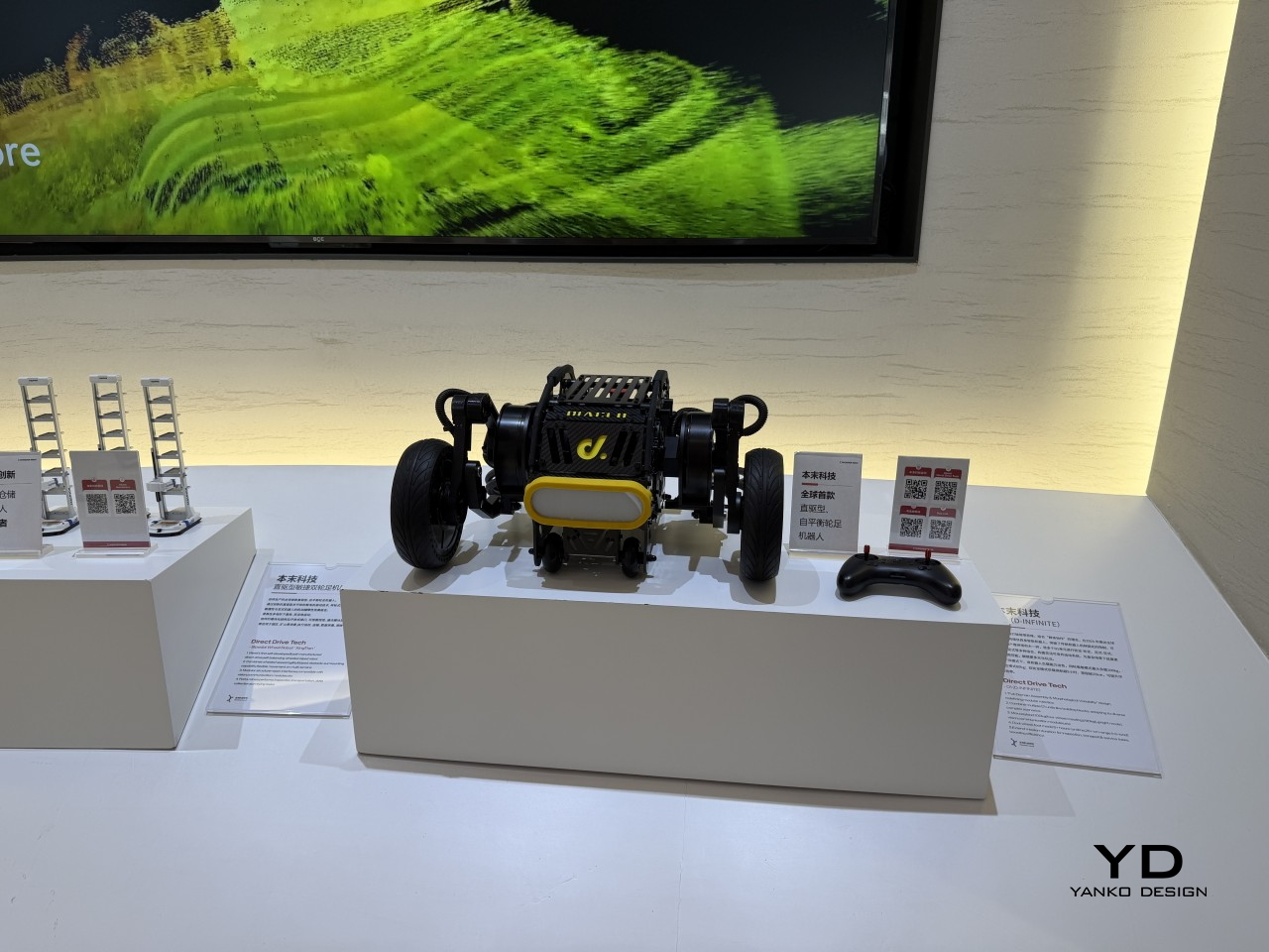
Direct Drive Tech D1

The lineup stretched into less expected territory, too. Blucalm’s StrikeDeck delivers AI-assisted game audio through a desktop controller, while ORULINK’s Watcher-Robot is an open-source desktop AI companion built for everyday interaction. CHEERLUCK brought a sausage vending robot for campuses and public spaces, and both Y-H2O and ANAVI presented electric watercraft, a hydrofoiling vessel, and a smart personal watercraft, each designed to cut the noise and emissions of traditional marine engines.

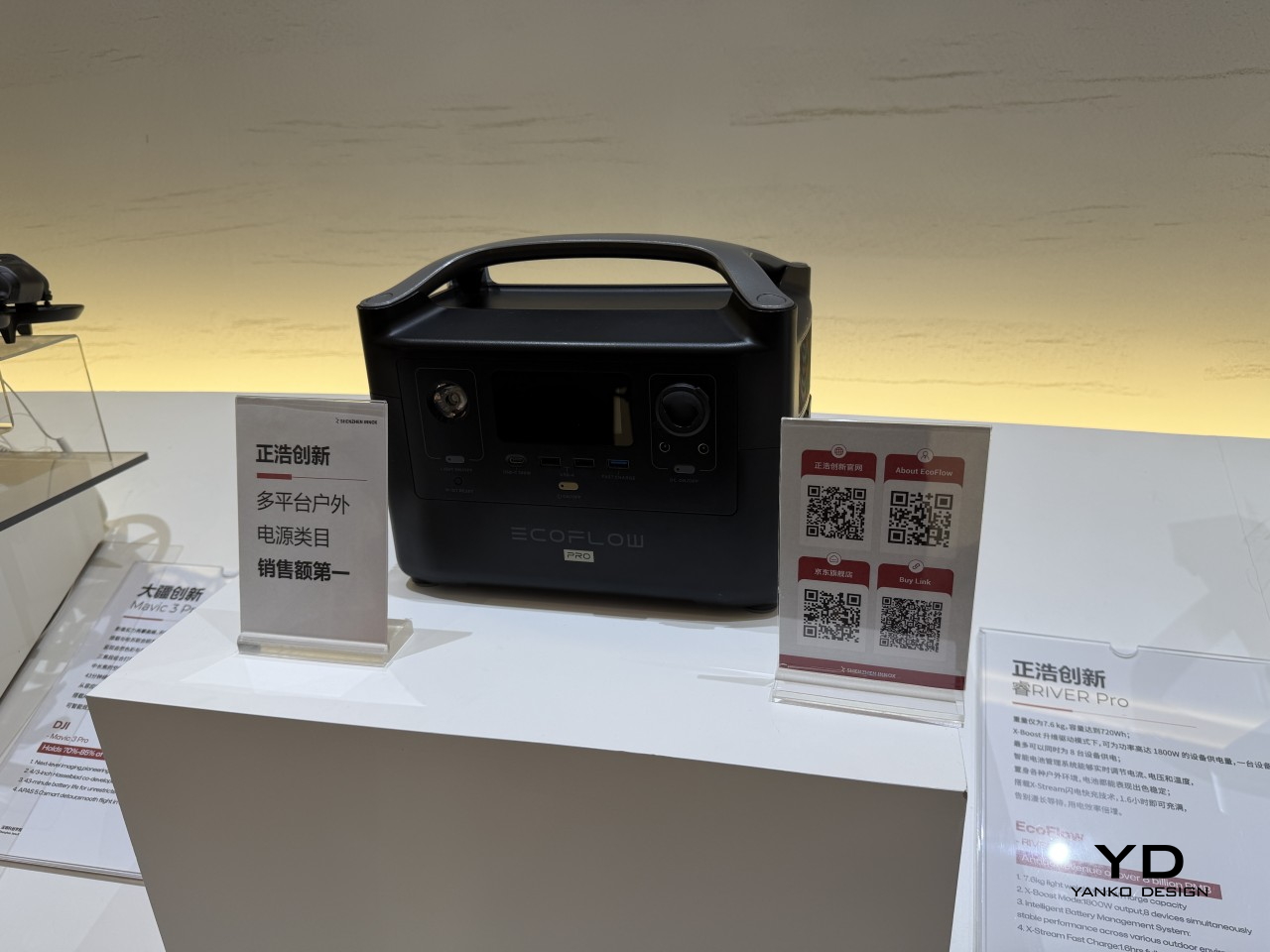
EcoFlow

Narwal

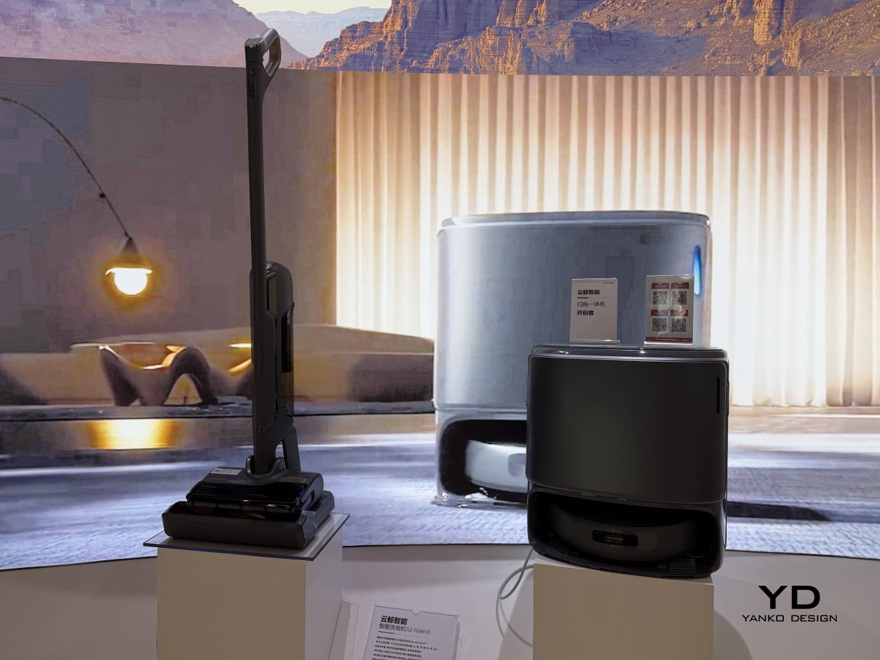
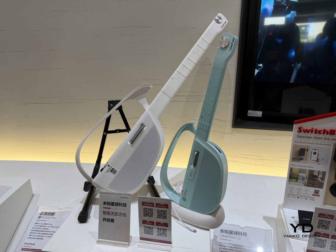
What gives the InnoX lineup credibility beyond the show floor is the academy’s broader history. Brands like Narwal, SwitchBot, DJI, EcoFlow, AgileX, and LiberLive are all part of InnoX’s wider ecosystem, a track record that makes it worth paying attention when the academy’s latest batch of incubated products steps out in front of an international audience for the first time.

LiberLive

DJI

The post From Foldable Pilates to Shoe Robots: InnoX GCS 2026’s Best Startups first appeared on Yanko Design.
What If the Internet Had a Building You Could Actually Walk Inside?

The internet has always been invisible. It moves information at a scale and speed the human mind can’t fully grasp, yet we access it through the most ordinary of interfaces: a flat screen, a pair of earphones, a keyboard. Nothing about how we physically engage with it reflects the enormity of what it represents, or what it means to be connected to the entire world from a single chair.

Michael Jantzen’s Internet Observatory concept addresses that disconnect directly by building a physical structure around the idea of internet access. Placed outdoors, the structure uses its architectural form to stand in for the abstract mechanics of the web. The outer support grid frame represents the internet’s matrix, while the curved space it encloses represents where a person enters and engages with the flow of information.

Designer: Michael Jantzen

You reach the interior by climbing a staircase up to an elevated platform and stepping inside the curved shell. At its center sits an interactive workstation that rises through a glass floor and can also rotate along the floor’s surface, letting the person inside face in any direction. It’s a deliberately simple setup that places one person at the physical center of a structure designed to represent the entire internet.

All of the large curved panels that form the enclosing space can be automatically repositioned around the occupant. The core can be fully open, fully closed, or any variation in between, depending on the activity. Some configurations allow for projecting images and sounds from the internet or the main computer onto the surrounding panels, turning the interior into a fully immersive display environment.

Some of those projected images also appear on the exterior faces of the panels, making what happens inside the structure visible to anyone nearby. A private internet session becomes something closer to a public exhibition, with the curved panels acting as screens that anyone outside the grid frame can see. The distinction between the individual’s experience and the community’s visibility gets built directly into the architecture.

Each structure would also have its own website, through which people could visit and interact with it remotely in real time, selecting images and sounds to be projected inside or directing the movement of the panels. Someone seated at the workstation might find the content surrounding them being shaped by a stranger thousands of miles away. The structure becomes a live, physical interface for the collaborative possibilities of the internet.

The design also contemplates many of these structures existing simultaneously around the world, each publicly or privately owned, all communicating with each other as they interact with their respective occupants. What begins as one architectural statement scales into a distributed global network, a physical version of the very internet it represents, built from steel frames and curved panels rather than servers and cables.

Jantzen calls this a “symbolic temple for the computer age,” and there’s something deliberate in that description. Climbing a staircase, entering a curved space, and sitting at the center while content from around the world flows around you is a kind of ritual that a laptop screen doesn’t offer. It’s an architectural argument for what it might feel like if the internet had a home you could walk into.

The post What If the Internet Had a Building You Could Actually Walk Inside? first appeared on Yanko Design.
Your Kindle Can’t Do This: BOOX’s Pocket E-Reader Now Takes a Stylus

Most dedicated e-readers exist at the opposite ends of a familiar spectrum. Closed-ecosystem devices like the Kindle keep things deliberately simple and locked in, while Android-based tablets offer full flexibility but grow too large to carry comfortably in a pocket. The gap between those two has always been somewhat underserved, especially for anyone who wants true portability alongside a genuinely open operating system.

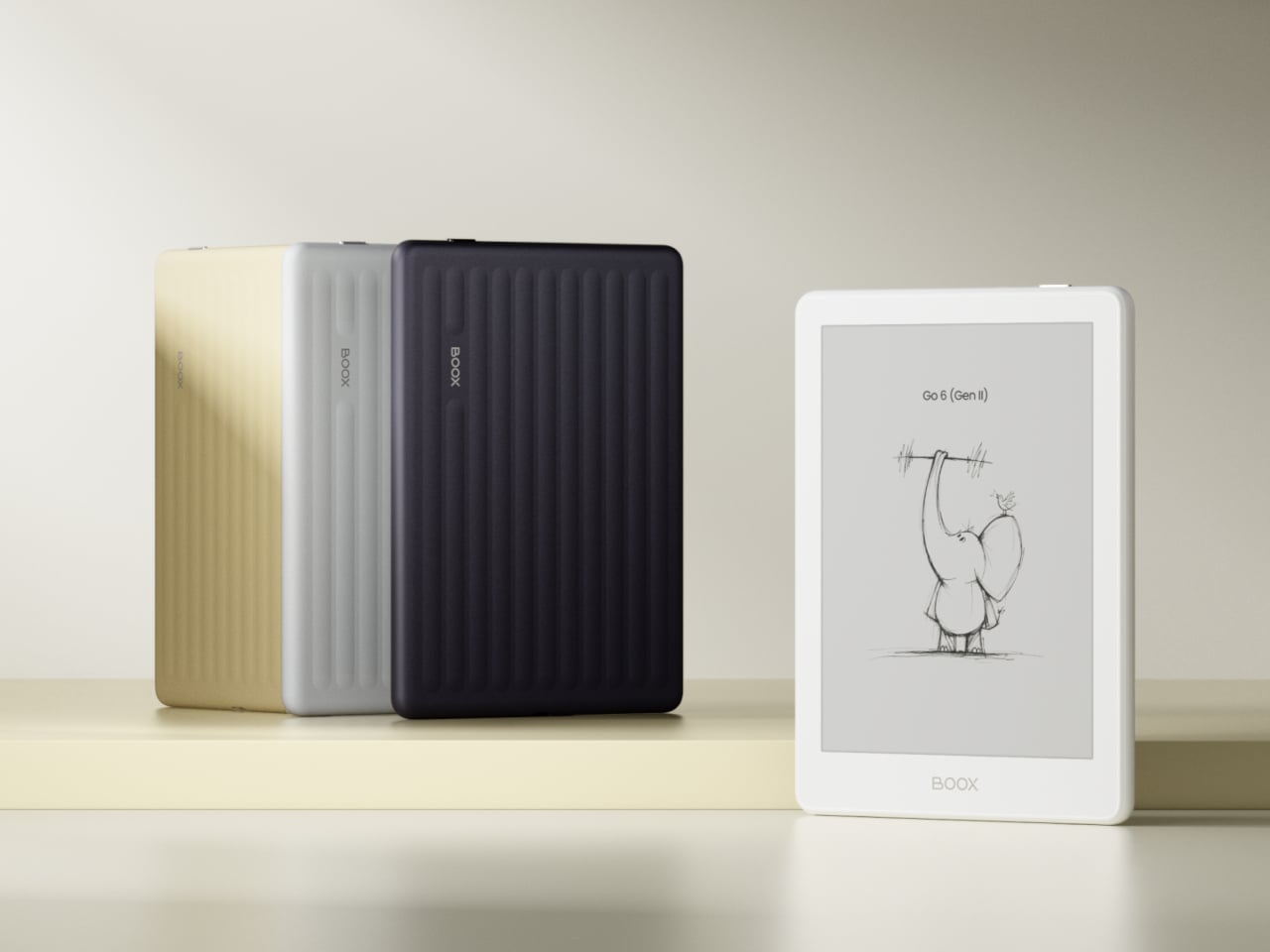
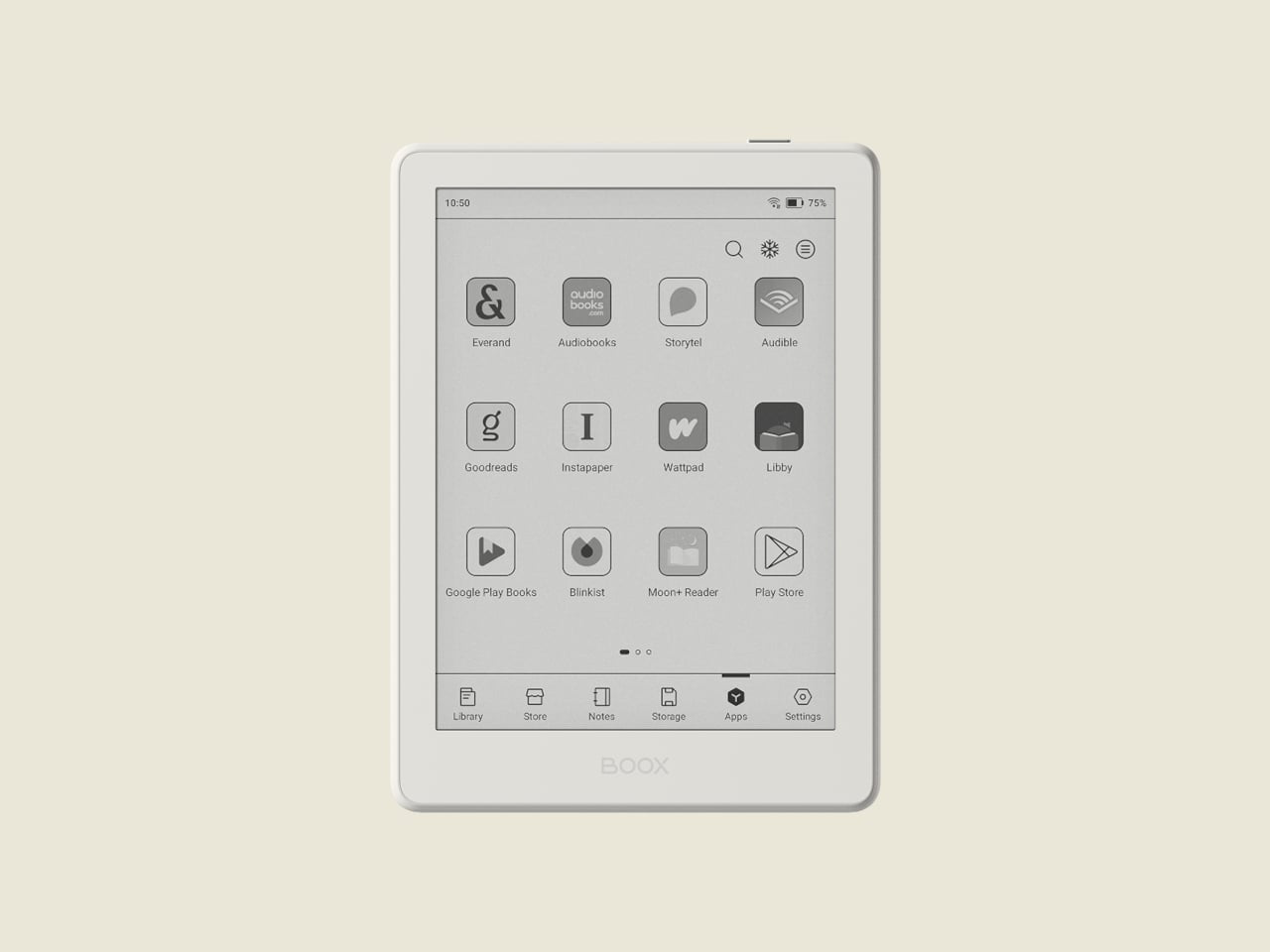
BOOX’s Go 6 (Gen II) is the second generation of its most pocketable e-reader, arriving with upgrades that make that middle ground considerably more appealing. Built around a 6-inch, 300 ppi E Ink display and running Android 11 with full Google Play access, it’s aimed at readers who want their device to be both portable and versatile, without having to choose one over the other.

Designer: BOOX

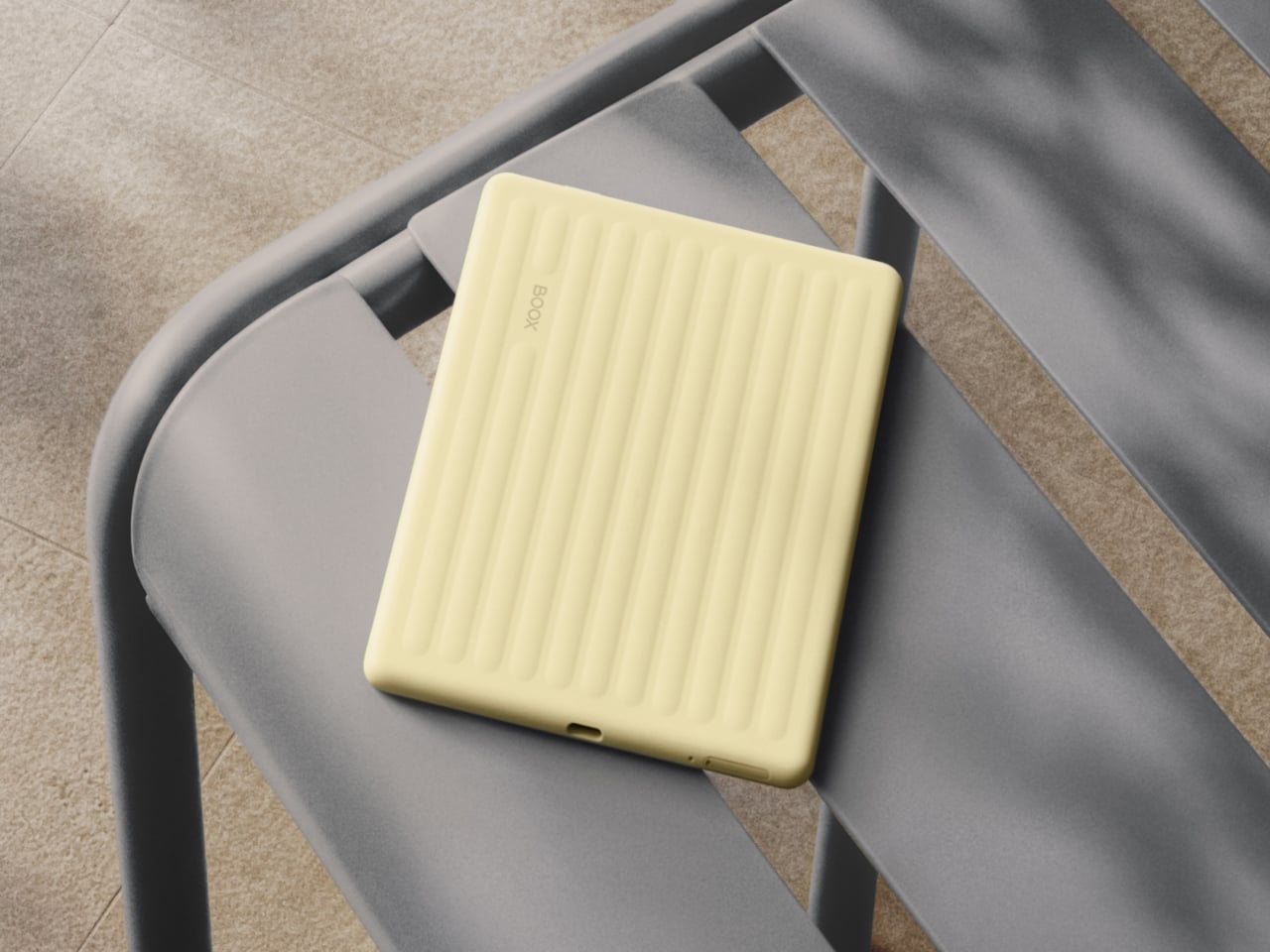
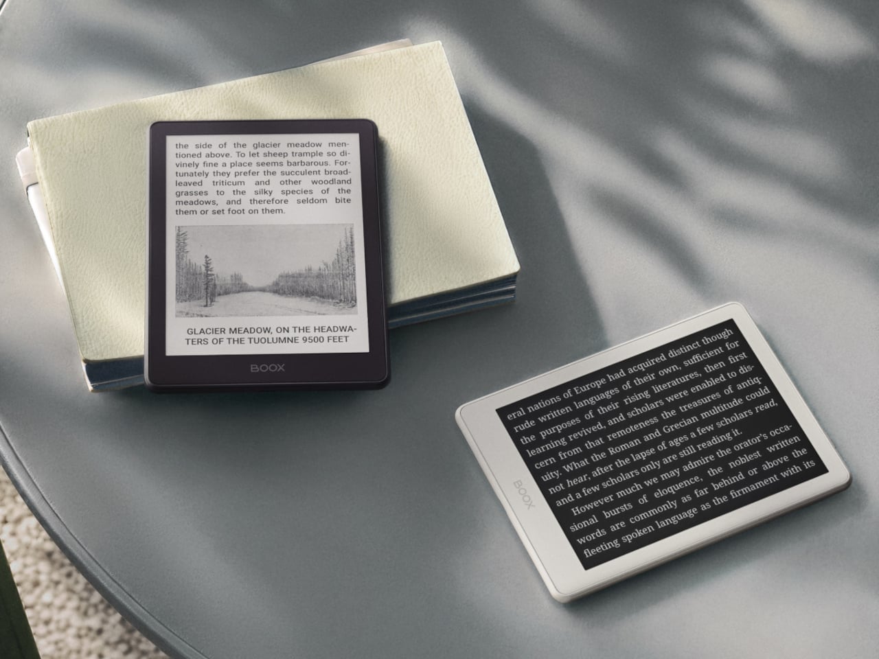
The first thing you’ll notice about the Gen II is that it doesn’t look like a standard e-reader. The redesigned textured rear shell has a suitcase-inspired aesthetic that feels more deliberate than the plain black slab of the first generation. It comes in four muted color options: Plum, Stone, Shell, and Custard, all suggesting a device meant to slip into a bag and come with you wherever you go.

The screen gets a meaningful upgrade with this generation. The Gen II adds anti-glare (AG) glass to its 300 ppi E Ink panel, reducing reflections when you’re reading in direct sunlight on a patio or near a bright window. The adjustable front light handles both warm and cold color temperatures, letting you read comfortably at night without straining your eyes against harsh lighting.

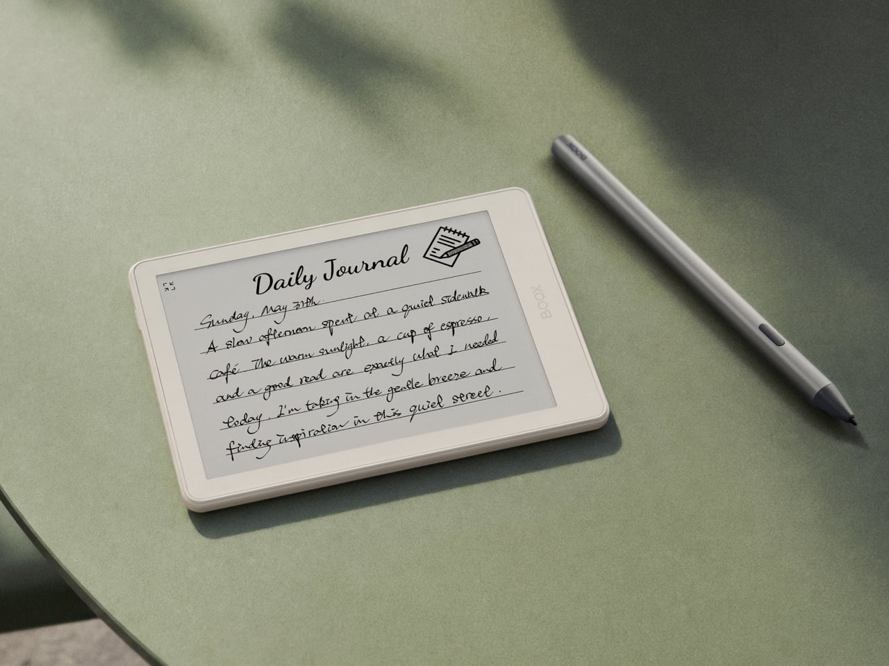
The more surprising addition is stylus support, which is uncommon at this screen size. The Go 6 (Gen II) is compatible with BOOX’s InkSense Plus stylus, an active pen with 4,096 levels of pressure sensitivity that lets you annotate directly in books, mark up PDFs, or take handwritten notes on a screen small enough to fit in a jacket pocket. It connects directly to the device and charges via USB-C.

Running open Android 11 with a built-in Google Play Store means you aren’t locked into any one reading platform. BOOX’s NeoReader app handles 20 document formats natively, including PDF, EPUB, MOBI, and DJVU, and supports dark mode for lower-light reading. Install the Kindle app, Kobo, Libby, or anything else you’ve been using, and your existing library follows you without having to start over from scratch.

At 160 grams and 6.8mm thin, the BOOX Go 6 (Gen II) fits in a jacket pocket without making its presence felt. A microSD card slot supplements the 32 GB of built-in storage, and the USB-C port doubles as an audio jack for wired listening. The 1,500 mAh battery holds up well through long reading sessions, largely because E Ink uses so little power compared to a conventional backlit screen.

The BOOX Go 6 (Gen II) is still primarily a reader’s device, but the combination of Android OS, stylus compatibility, and anti-glare glass packed into a pocket-friendly body gives it a range that most devices at this size simply don’t attempt. It’s currently available for pre-order through the official BOOX store, arriving at a moment when the 6-inch e-reader category could use a reminder of what it can still do.

The post Your Kindle Can’t Do This: BOOX’s Pocket E-Reader Now Takes a Stylus first appeared on Yanko Design.

SharkNinja’s $499 Vacuum Now Comes in Colors Your Designer Would Pick

Most home appliances are designed to be forgiven, not admired. You buy them, you use them, and when company comes over, you hope nobody notices the boxy gray robot charging in the corner or the utilitarian stick vacuum propped against the wall. That’s just been the unspoken contract between cleaning products and the people who own them: function first, aesthetics never. SharkNinja just tore up that contract.

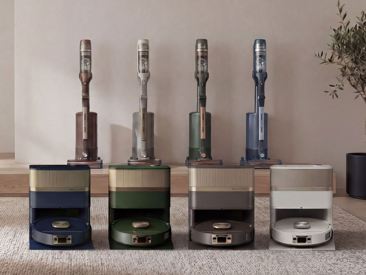
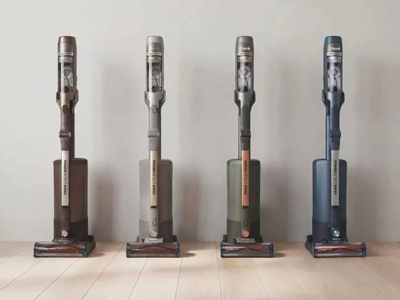
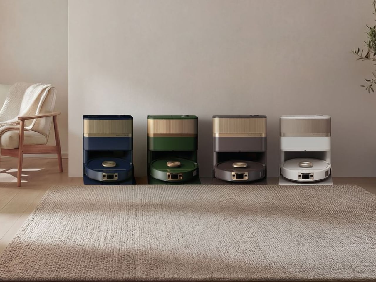
The Shark Home Luxe Collection is SharkNinja’s first coordinated cross-category color initiative, and it’s a surprisingly considered move from a brand better known for suction power than style. The collection spans two of Shark’s most capable products: the PowerDetect UV Reveal robot vacuum and mop, and the PowerDetect Speed cordless vacuum. Both get a total of eight new colorways, split across the two products, and they are genuinely beautiful in a way that feels deliberate rather than decorative.

Designer: SharkNinja

For the robot vacuum, the shades are Espresso, Evergreen, Deep Harbor, and Ivory. The cordless gets Walnut, Oatstone, Sagewood, and Harbor Slate. Read those names and you’ll notice a pattern immediately: these are the exact same tones showing up in Japandi interiors, minimalist furniture lines, and the kind of design-forward spaces that get 400,000 likes on Pinterest. SharkNinja clearly did its homework. The names alone do half the marketing work.

Interior designer Jeremiah Brent was brought in to mark the launch, and his take on it cuts right to the point. “For so long, products in this category were designed to be hidden, when the reality is they live alongside us every day,” he said. He’s right. Robot vacuums don’t get tucked into closets; they sit in plain view on their charging docks. Cordless vacuums lean against walls in the hallway or the bedroom. They occupy space in the same rooms as carefully chosen furniture and lighting, and for years, the design language of those products has been completely at odds with everything else around them.

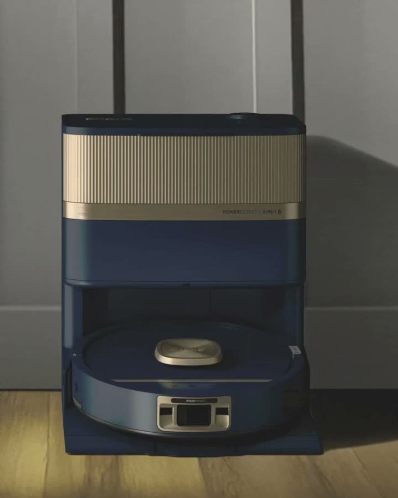
The Shark Home Luxe Collection doesn’t just slap a new coat of paint on existing hardware either. The finishes feel considered, the proportions haven’t changed, and the products underneath are legitimately strong. The PowerDetect UV Reveal is the first robot vacuum and mop to use UV light detection to identify hidden messes, including dried spills, pet accidents, and residue that standard sensors would otherwise miss. It vacuums and mops simultaneously, adapts in real time to different floor types, and the self-empty base holds debris for up to 45 days. Prices for the UV Reveal Luxe start at $1,299.

The PowerDetect Speed, meanwhile, is a 7-pound cordless vacuum offering up to 60 minutes of runtime, with PowerDetect Intelligence that automatically adjusts to different surfaces and cleaning directions. Its auto-empty base can go up to 45 days between empties. The Luxe version starts at $499.99.

Now, is a color refresh a radical redesign? No, and nobody is pretending otherwise. But that’s not really the point. The point is that SharkNinja is acknowledging something the design community has quietly understood for years: objects we live with daily should be held to the same aesthetic standard as everything else in our homes. A vacuum isn’t a utility hiding in a utility closet anymore. It’s furniture, essentially.

The broader trend here is one worth watching. Brands across categories, from air purifiers to kitchen appliances to Wi-Fi routers, are starting to understand that people want technology that integrates into a home visually, not just functionally. Dyson figured this out early. Now SharkNinja is making the same argument, at a wider price range and with a much clearer design vocabulary.

Whether the Shark Home Luxe Collection becomes a defining shift in how cleaning appliances are marketed, or whether it remains a smart but limited edition palette refresh, depends entirely on how consumers respond. My instinct says the response will be warm. Because given the choice between a vacuum that blends into your home and one that doesn’t, most people will choose the one that doesn’t make the room look worse.

The post SharkNinja’s $499 Vacuum Now Comes in Colors Your Designer Would Pick first appeared on Yanko Design.

Fingerprints Are Dead: This $189 Lock Reads the Veins in Your Palm

Smart locks are supposed to simplify entry into your home, but many of them just introduce a different set of frustrations in the process. Fingerprint sensors don’t always cooperate when your fingers are tired or wet. PINs get forgotten or spotted by someone standing too close. Key cards are easy to misplace. Despite years of innovation in home security, reliably verifying identity at the front door hasn’t been answered cleanly.

TCL’s D2 Pro approaches that question from a completely different direction. Instead of asking you to touch a sensor or remember a combination, it reads the unique vein patterns beneath the surface of your palm using infrared light. Those patterns are hidden under the skin, making them practically impossible to copy, replicate, or steal, which gives this particular solution a considerably stronger security foundation than most locks on the market.

Designer: TCL

Think about getting home late at night with both arms full of takeout and a bag swinging off your wrist. There’s no patting pockets for a key or squinting at a keypad in the dark. You raise your palm toward the reader, and the door opens in 0.3 seconds. It’s the kind of effortless entry that sounds like a small thing until you stop having to think about it altogether.

The D2 Pro also learns as it goes. Each time you unlock the door, the on-device AI quietly adjusts your palm vein profile, making recognition faster and more accurate over time. All that data stays stored on the device, so there’s no cloud dependency and no monthly subscription to worry about. A liveness detection system also comes built in, ensuring the scanner won’t respond to anything but a living hand.

Sharing a home means sharing access, and the D2 Pro makes that manageable through the TCL Home app. You can register palm vein profiles for multiple household members, assign or revoke permissions from wherever you are, and receive real-time notifications whenever the door opens. For guests or anyone who doesn’t have a registered profile, the lock still accepts key cards, a physical key, and a backup keypad.

The hardware is built to stay outdoors in all conditions. The D2 Pro’s aerospace-grade aluminum alloy body carries an IP55 weather resistance rating, holding up against dust and water splashes day in and day out. Its operating temperature ranges from -25°C to 70°C, so climate extremes aren’t a concern. A built-in 10,000 mAh rechargeable battery connects via USB-C and is rated for up to eight months on a charge.

A Matter-compatible version of the D2 Pro connects to Apple Home alongside Alexa and Google Assistant, covering most major smart home platforms without needing a separate hub. An auto-lock feature re-engages the deadbolt automatically whenever the door closes, taking care of one more thing you’d otherwise have to remember. BHMA Grade 3 certification covers the structural side, and at $189, it costs significantly less than comparable palm-scanning alternatives.

The post Fingerprints Are Dead: This $189 Lock Reads the Veins in Your Palm first appeared on Yanko Design.
Your Charger Is On Display for 23 Hours a Day, ORNA Designed for That

The wall charger is one of the most present objects in any home and one of the least considered. It sits on bedside tables, desk corners, and coffee tables for most of the day, then gets used for a few minutes and goes right back to being an uninvited presence. Nobody picks a charger because it belongs in their space. They pick it because it was cheap, available, and functional.

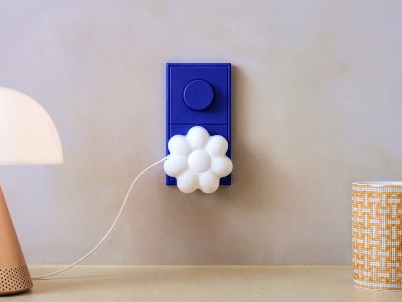
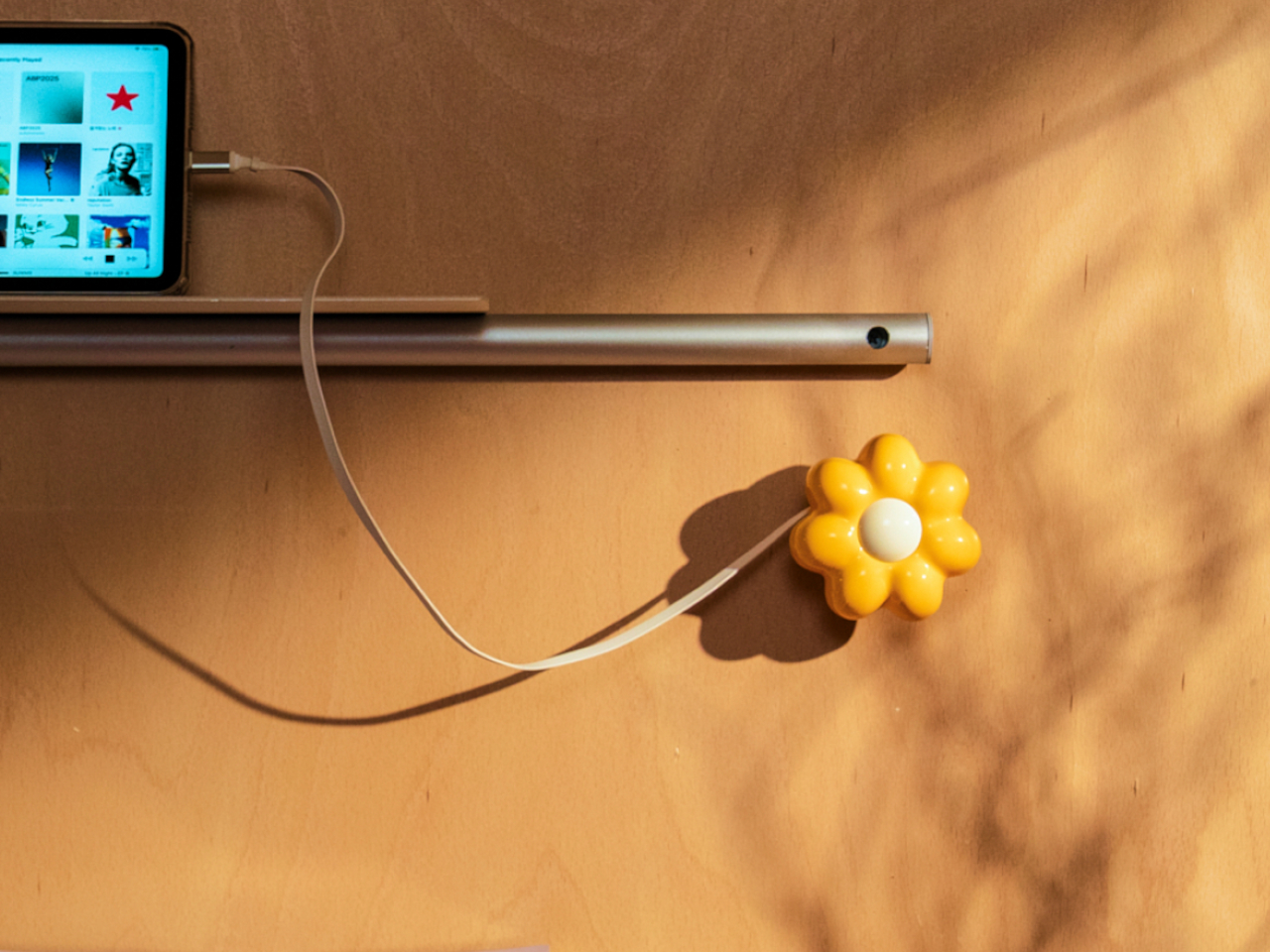
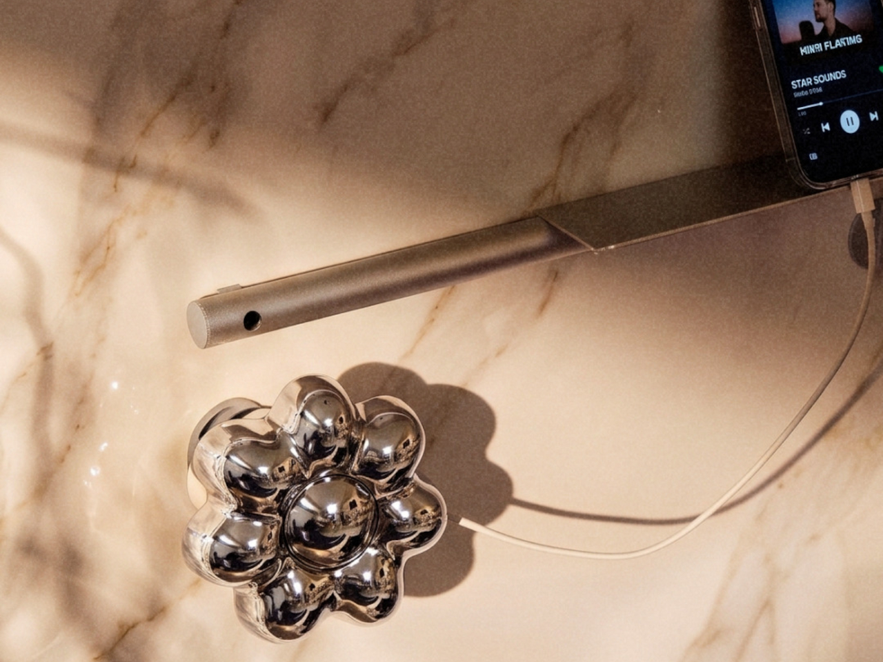
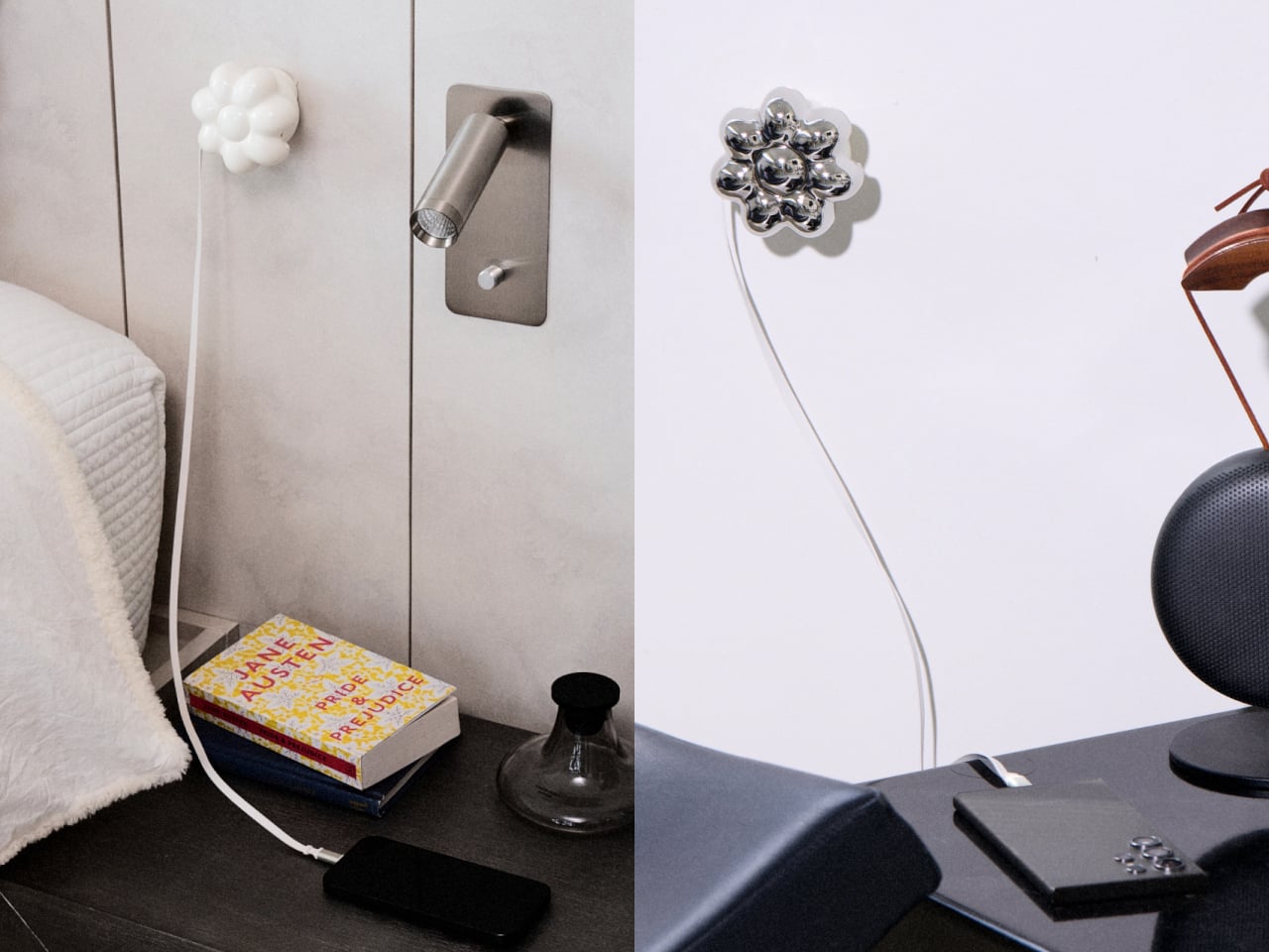
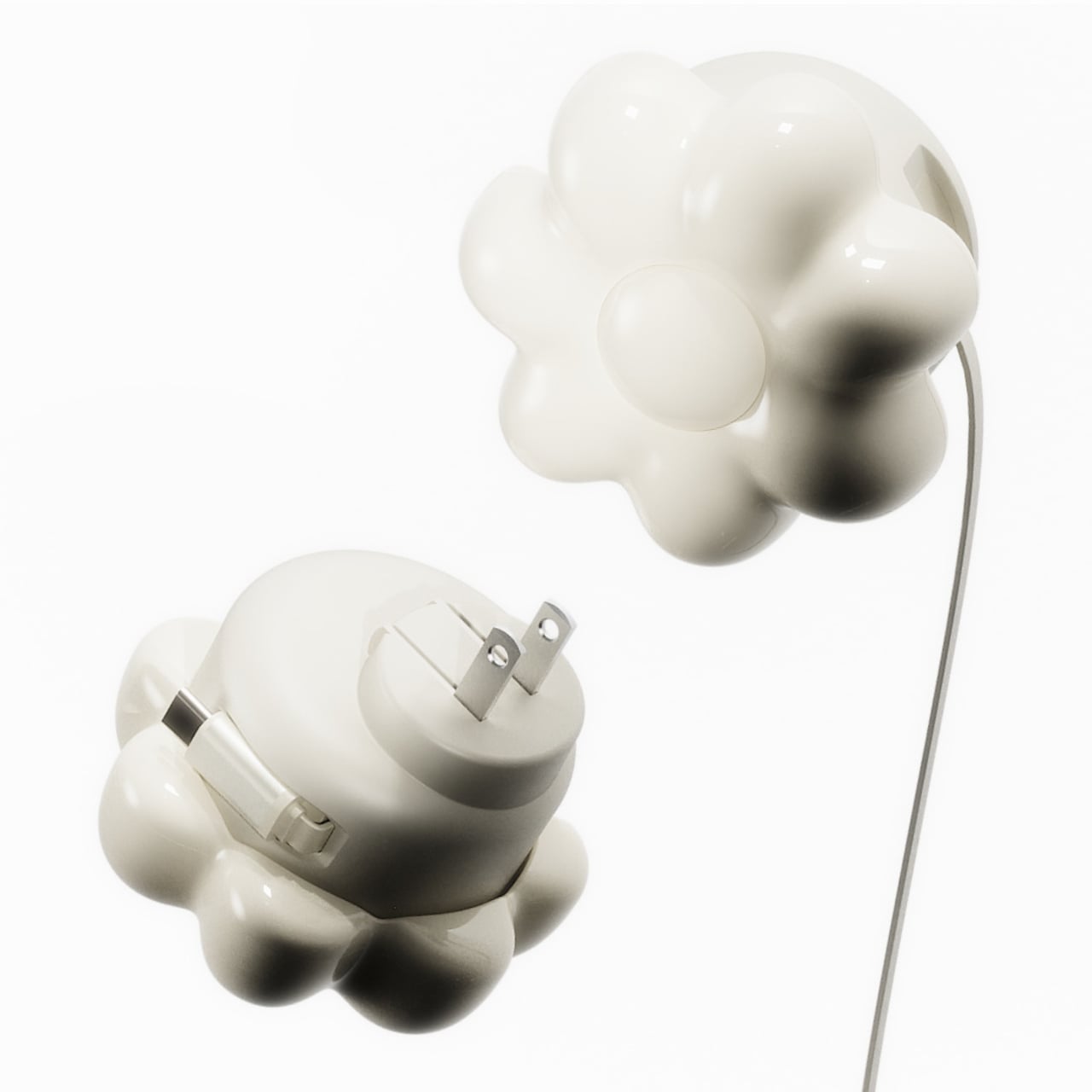
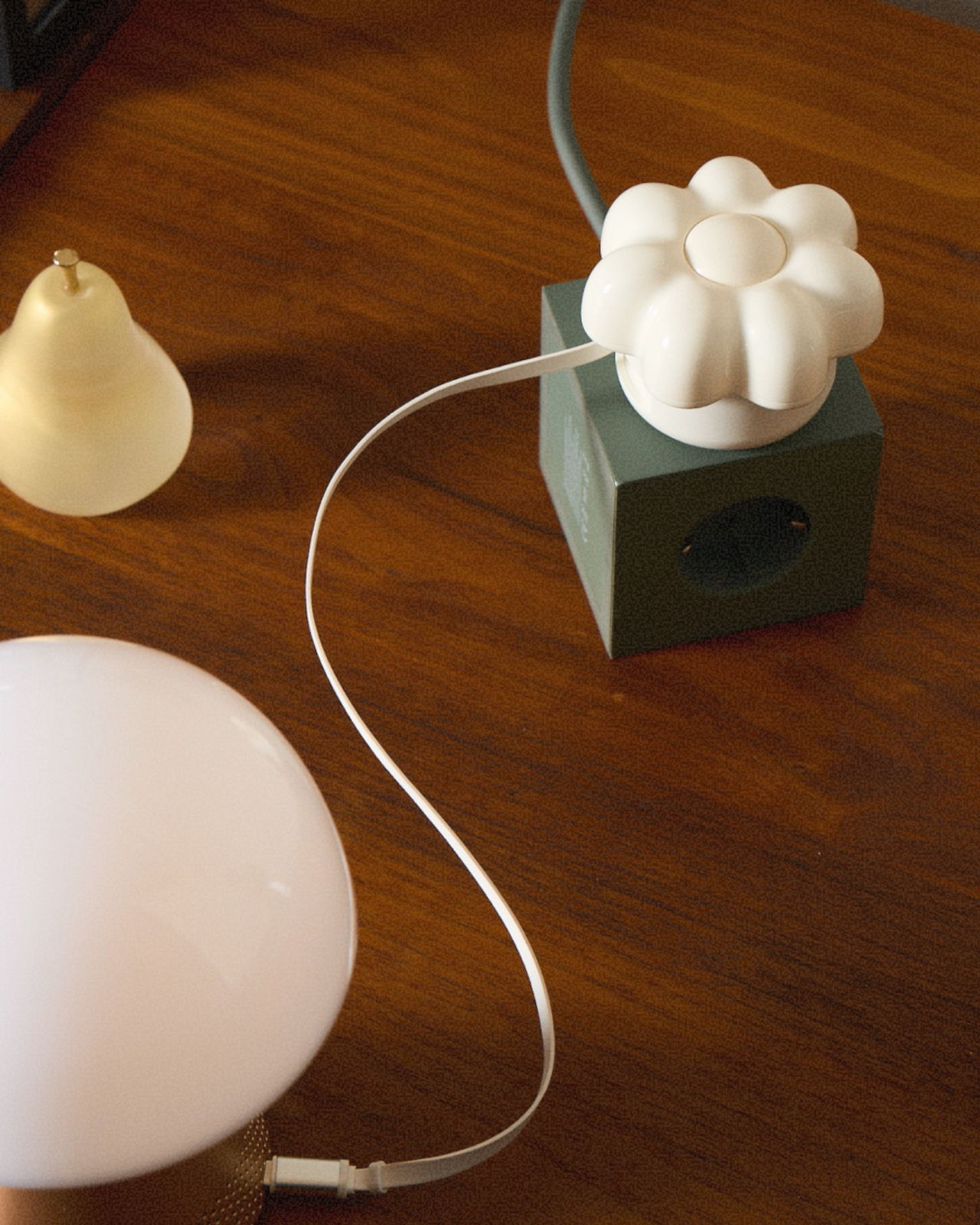
ORNA’s Objet Charger proposes a different starting point. It’s a 35W USB-C wall charger that treats the design of the object as seriously as the technology inside it. The key is a modular floral cover with a high-gloss, pop-art silhouette that attaches magnetically to the charger body and turns an overlooked utility item into a sculptural presence on any wall.

Designers: Kangnim Park, Jaehwa Lee, Jinsu & Jiwoong Studio for ORNA

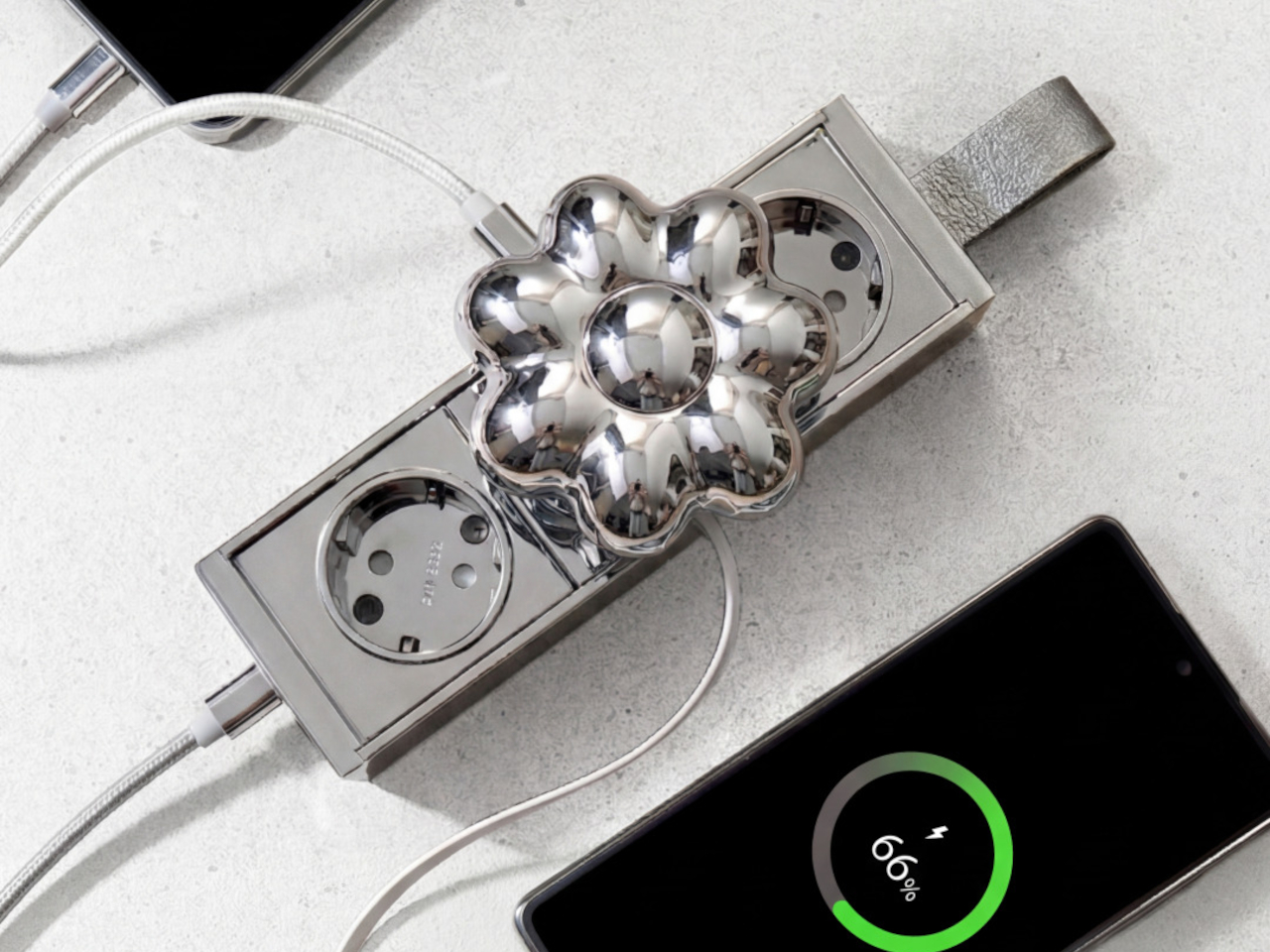
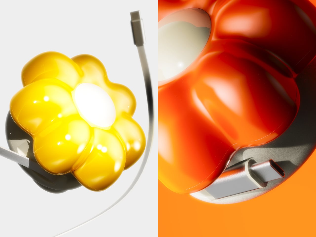
The cover is the part that gets swapped out to suit personal taste. Four versions are available: Daisy White, Sunflower Yellow, Marigold Orange, and Chrome Silver, each finished in a high-gloss surface that reads differently by room. The magnetic connection makes switching instant, which is part of what makes the concept work. Changing the personality of the object doesn’t require a new charger, just a different flower.

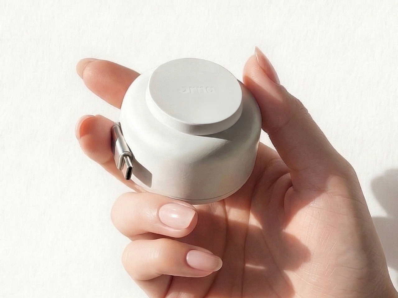
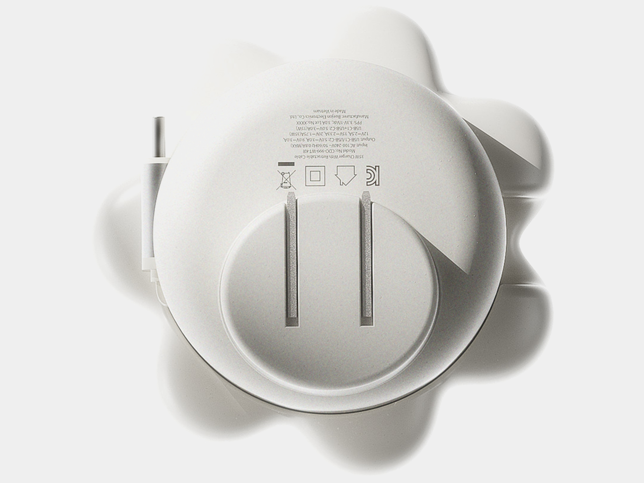
Underneath the sculptural exterior is a charger built for serious daily use. A one-meter USB-C cable is integrated into the body and retracts cleanly, so there’s no loose cord when the charger isn’t in use. A secondary USB-C port on the base handles a second device simultaneously, with the total output shared at 15W when both are active. Single-device charging peaks at 35W with full fast-charge protocol support.

The base of the charger was designed with the proportions of a traditional Korean Moon Jar in mind, a ceramic form known for the quiet completeness of its rounded body and the restraint of its surface. That design context matters more than it might sound. The charger is meant to occupy the wall the same way a carefully selected object occupies a shelf, present, purposeful, and unhurried.

Flower Objet covers are sold separately from the charger base, starting at $49 for the Daisy White and Sunflower Yellow finishes and $99 for the Chrome Silver variant. The modular logic means the same base stays in place for years while the floral cover changes with the seasons, the room, or simply a shift in taste. The foldable plug keeps the package compact enough to carry between rooms or pack into a bag without a trailing cable. It’s a long-term object, not a disposable tool.

ORNA frames the proportion of the charger’s daily existence as roughly 23 hours of visual presence for every one hour of active use. That framing captures why most chargers feel like failures: they’re designed entirely for the one hour and ignored for the 23. The Objet Charger is built for both, which is the kind of quiet attention most objects in our homes never receive.

The post Your Charger Is On Display for 23 Hours a Day, ORNA Designed for That first appeared on Yanko Design.

Why a $70 Screenless Camera Is the Most Interesting Gadget Right Now

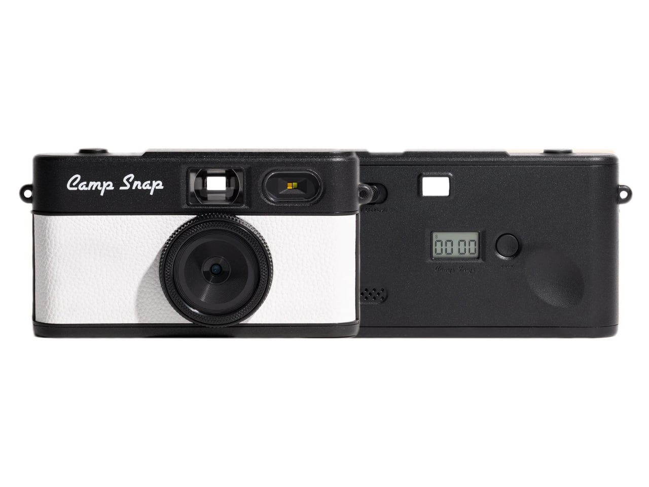
A camera with no screen sounds like a step backward. It is, by design. And that’s exactly the point. We live in an era where every piece of technology is racing to give you more. More features, more connectivity, more reasons to stay glued to a display. And here comes a small, cheerful little camera doing the opposite on purpose. It’s almost rebellious, except it fits in your pocket and comes in Strawberry Splash.

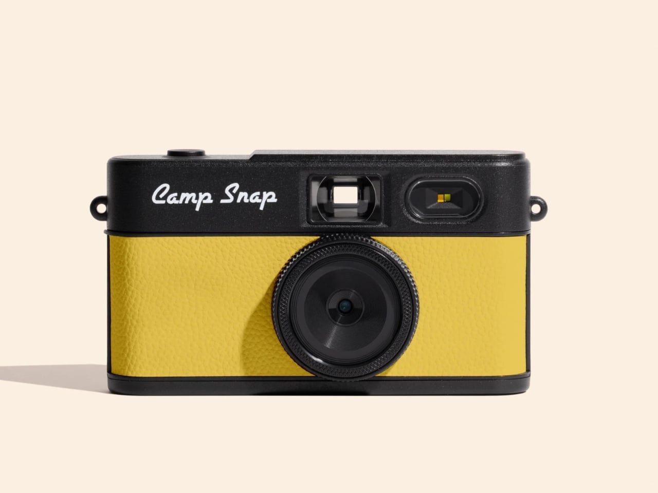
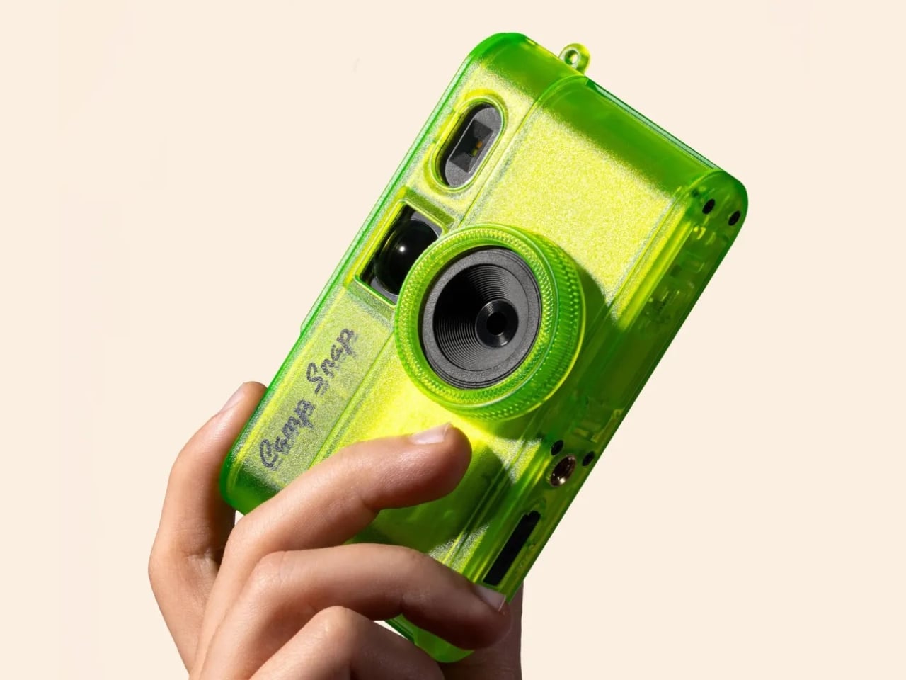
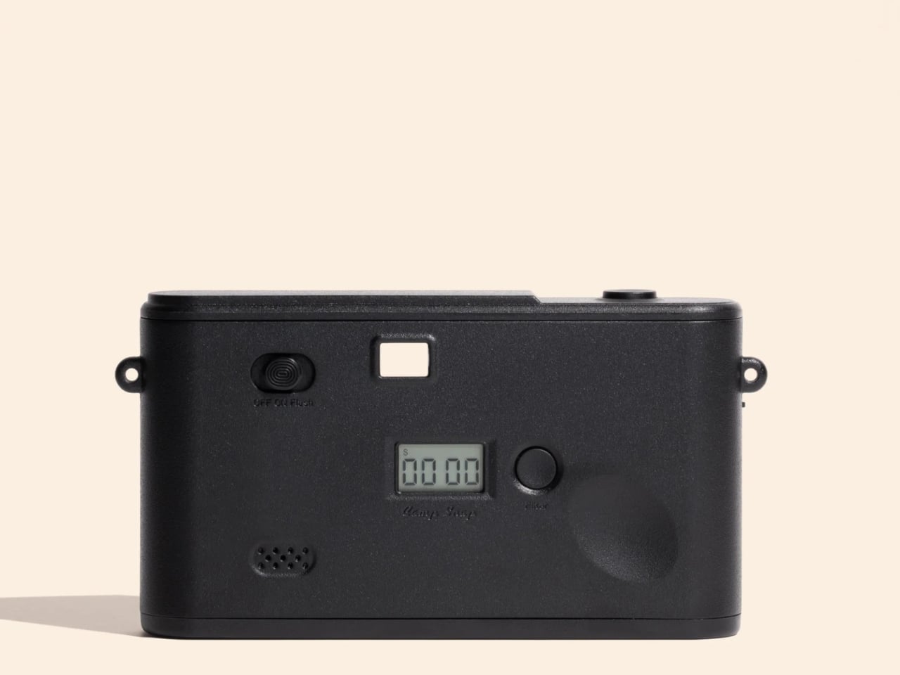
Camp Snap just released its second-generation screenless digital camera, the Camp Snap 2, and it’s already making the rounds on social media with the kind of low-key enthusiasm that feels genuine rather than manufactured. If you missed the original, here’s the short version: it’s a point-and-shoot with no rear LCD, no Wi-Fi, no app ecosystem, and no ability to review your shots before downloading them later. The whole pitch rests on the idea that not knowing what you captured is actually better for you.

Designer: Camp Snap

I’ve thought about this a lot, and I don’t think it’s a gimmick. We’ve spent years optimizing the act of photographing something into oblivion. We shoot, we review, we retake, we add a filter, we post, we check the likes. The photo becomes less about the moment and more about the performance of documenting it. The Camp Snap strips all of that away, and when you hold a camera you literally cannot scroll through, you start paying attention to the moment in a way that feels a little foreign at first, then oddly refreshing.

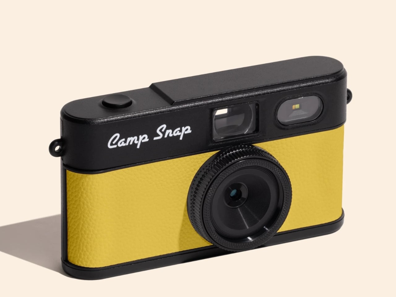
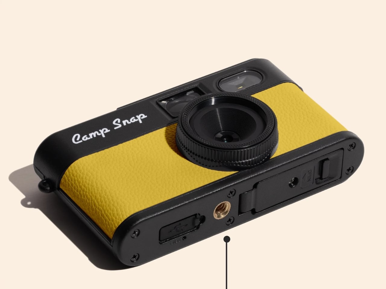
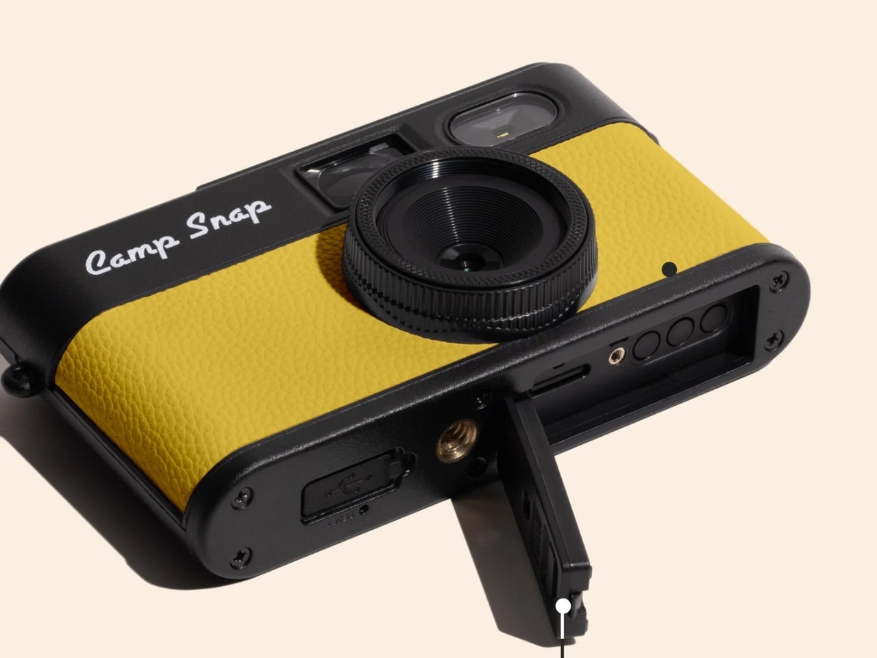
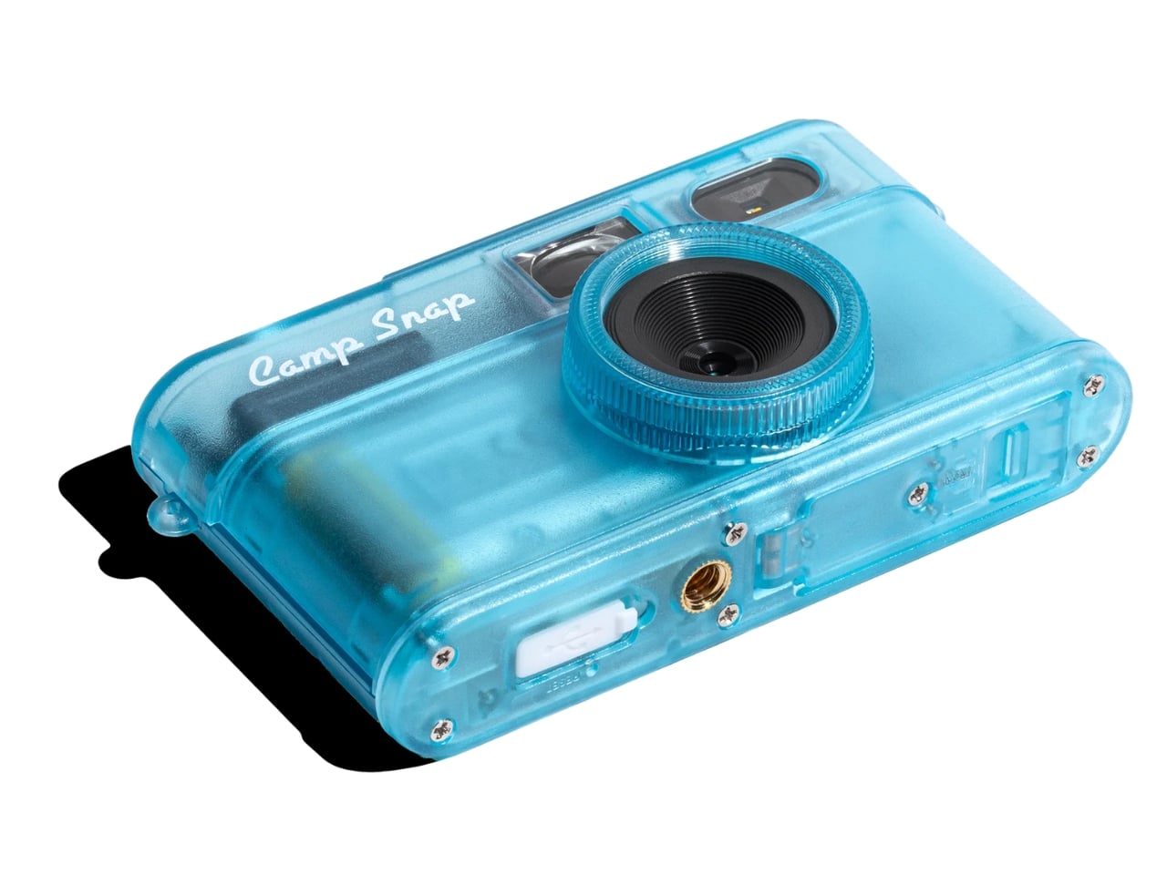
The Camp Snap 2 keeps everything that worked about the original and quietly fixes what didn’t. It’s 15% slimmer than the V1, which sounds minor until you actually slide it into a pocket and forget it’s there. The 8-megapixel sensor is unchanged, which will either bother you or not depending on what you’re looking for. The photos are not going to replace your iPhone shots. They’re warmer, a little imperfect, and have that slightly analog quality that makes you feel like you developed something rather than downloaded it.

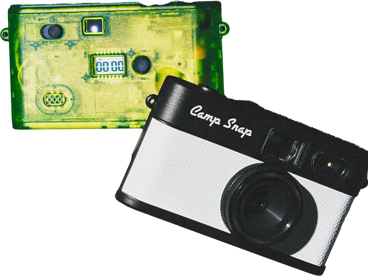
The biggest upgrade is the filter button. On the original Camp Snap, switching filters required plugging the camera into a computer, which was a meaningful enough friction point that most people probably just left it on the default setting and moved on. The Camp Snap 2 now has a dedicated button on the back that cycles through six built-in looks: Standard, Vintage 1, Vintage 2, Vintage 3, Analog, and Black & White. No apps, no computer, just click until you land on the vibe you want. For anyone who bought the first version and felt mildly cheated by the filter situation, this is the update they were owed.

For families, Camp Snap also added a CampLock feature, which disables the filter button so younger users can’t cycle through settings accidentally (or intentionally). You unlock it by holding the button for ten seconds, which is the kind of low-tech solution that’s either charming or mildly annoying depending on the day.

The new model also supports 30.5mm screw-in filters, which opens up creative territory that feels almost comically ambitious for a camera of this nature. Wide-angle adapters, diffusion filters, star effects, macro attachments. It’s a camera designed to make you feel less precious about photography, and now it technically supports a whole accessory ecosystem. The tension between those two ideas is interesting, and I’m curious to see how people actually use it.

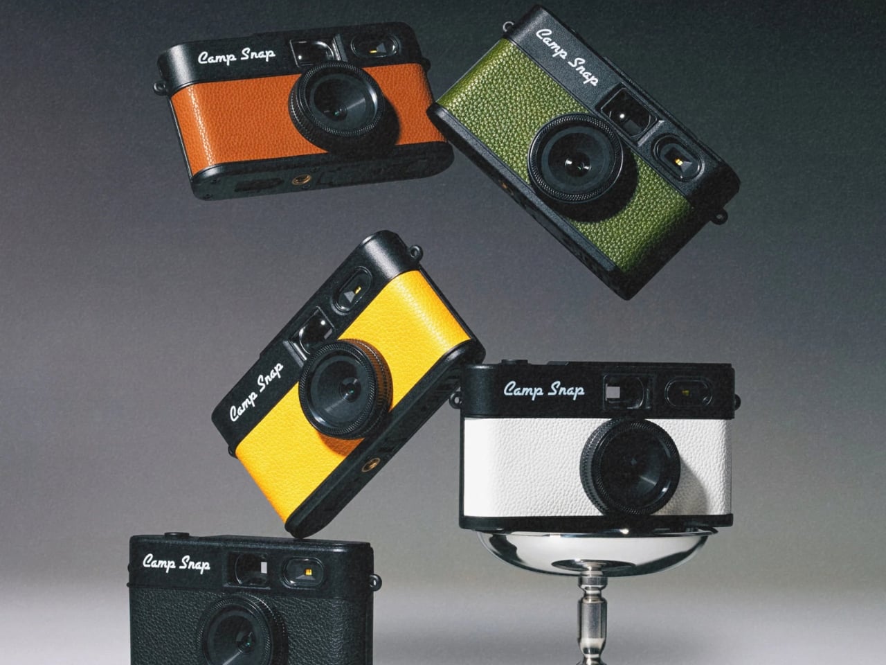
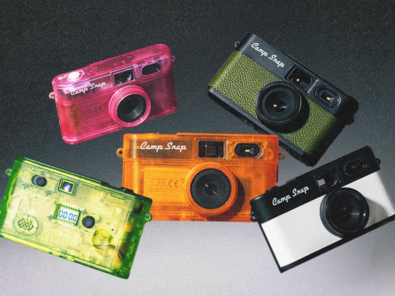
The Camp Snap 2 comes in nine colorways, including some jelly-style translucent options that hit the Y2K nostalgia button hard. Sunbeam Yellow, Tangerine Drift, Twisted Lime, and Strawberry Splash are doing a lot of visual heavy lifting here, and they look exactly like the kind of tech that lived in every locker in 2003. That’s not accidental. Camp Snap knows its audience includes adults who are as nostalgic for simpler devices as they are tired of their smartphones.

At $69.95, the Camp Snap 2 costs about the same as a dinner out, and it will probably be more memorable. It’s not asking you to quit your phone or adopt a new philosophy. It’s just a small, uncomplicated camera that asks you to look up more than you look down. For a lot of people, that might be worth exactly seventy dollars.

The post Why a $70 Screenless Camera Is the Most Interesting Gadget Right Now first appeared on Yanko Design.
FutureWave’s Furny home robot talks to you by moving, not by talking

Most home robots ask a lot from the room they inhabit. They arrive with screens, speakers, wake words, and personalities, all requiring acknowledgment from whoever happens to be nearby. The interaction model is fundamentally borrowed from smartphones: alerts, prompts, and responses delivered through layers of interface. The result is a machine that demands attention in a space that already has more than enough competition for it.

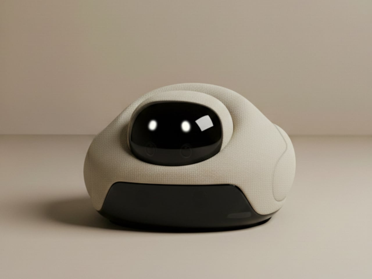
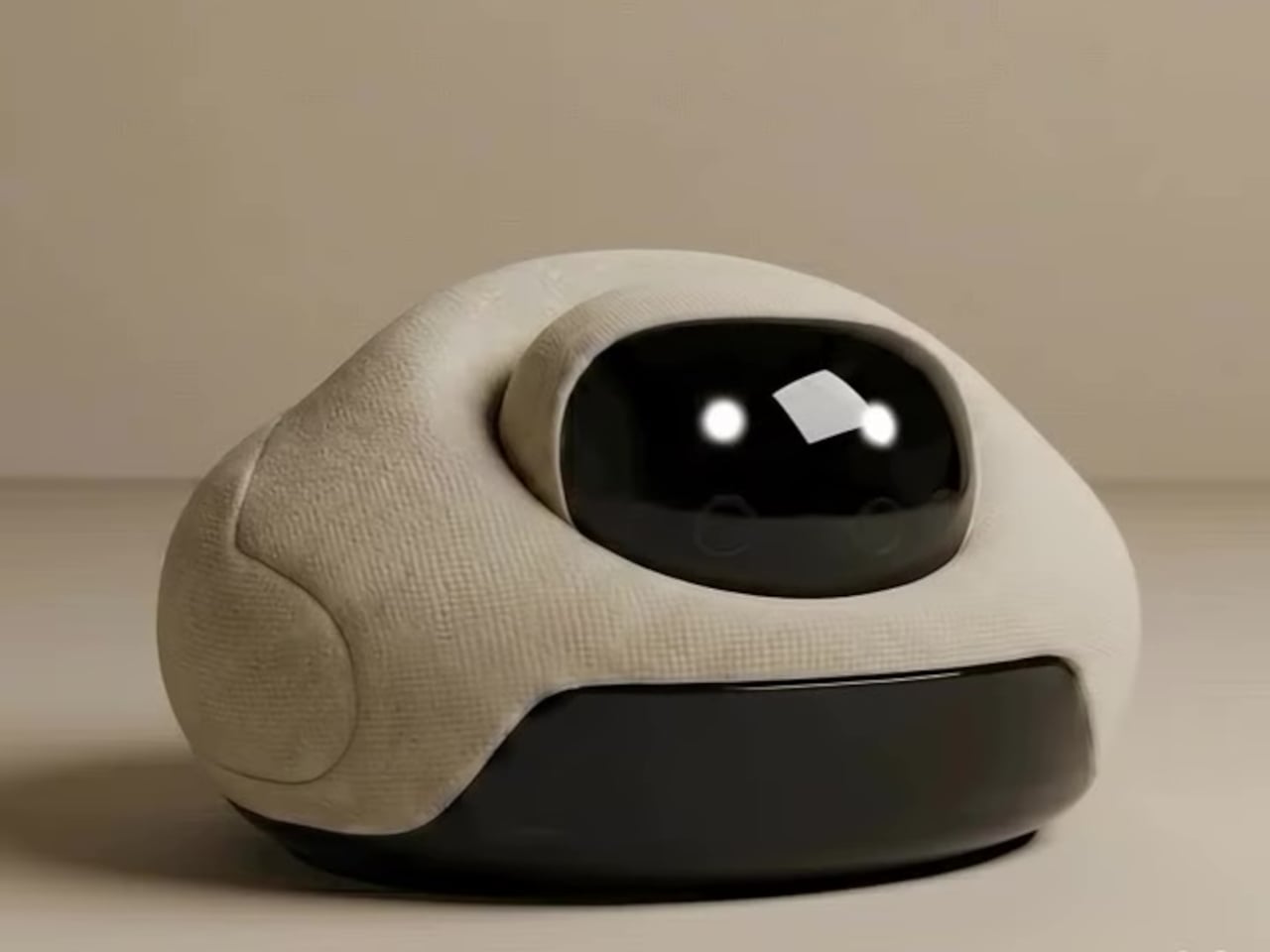
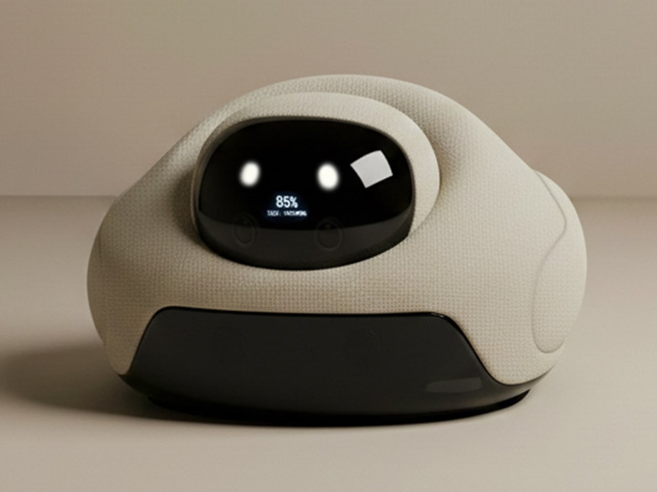
Brussels-based studio Futurewave took a different position with Furny, a domestic robot concept presented at the last Milan Design Week 2026. Rather than building something with a face, a voice, and a screen, the team asked whether a robot in the home could communicate through posture and movement alone, the way furniture communicates presence and purpose without saying anything at all.

Designer: Futurewave

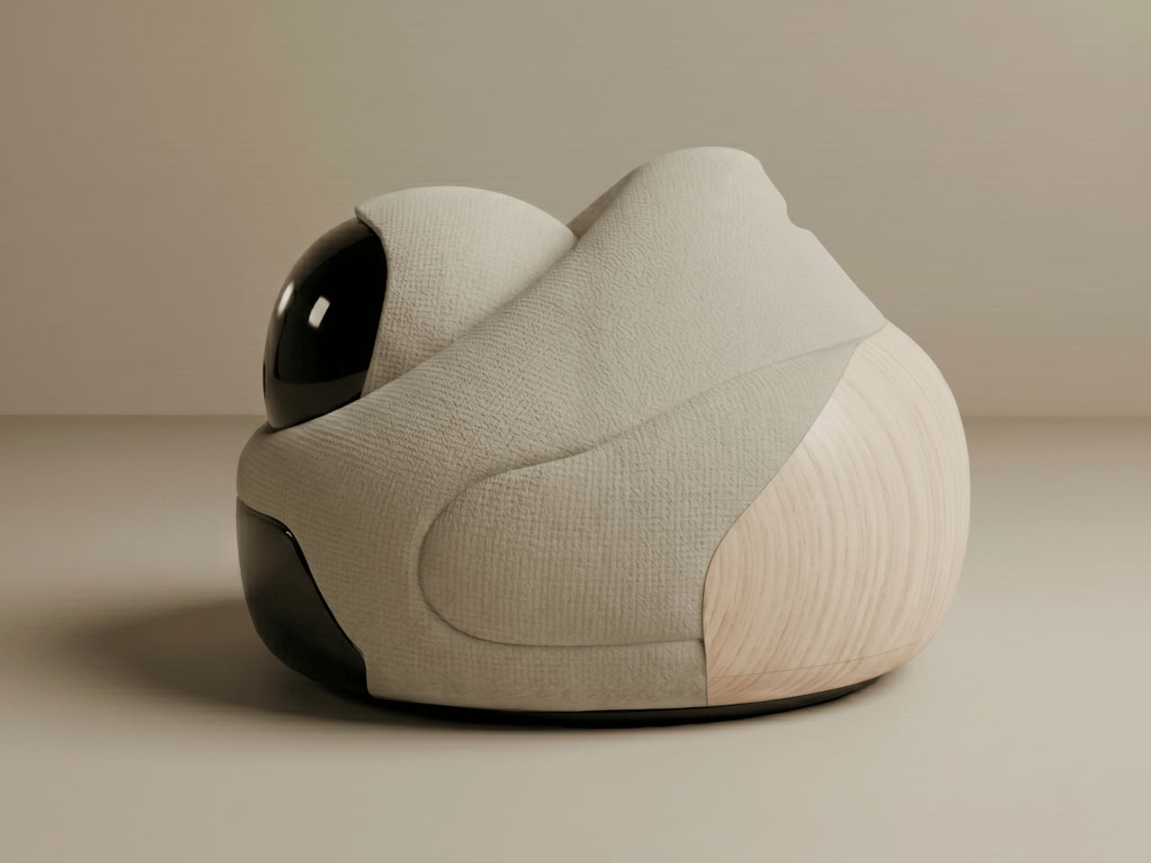
The answer is a furniture-sized object with a movable head that expresses itself entirely through physical behavior. When something happens nearby, the head tilts. When the robot is ready to act, it orients toward the task. When it’s waiting, it recedes into a posture that reads as neutral, almost still. The timing, direction, and intensity of each shift are calibrated to communicate specific states: focus, readiness, attention, and reaction. There are no pixels involved in any of it.


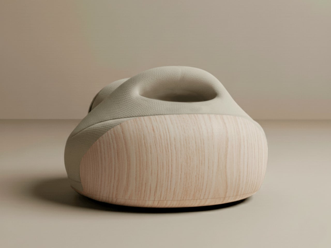
Deliberately avoiding humanoid proportions was a foundational decision. Furny doesn’t mimic the way a person or animal moves. The gestures it uses are abstract enough to feel designed rather than imitated, which makes them easier to read in context without triggering the uncanny valley that tends to follow robots built on biological templates. The visual restraint also helps it belong in a room. It reads as an object with behavior, rather than a character out of place.

The research behind the project draws on work in expressive movement design for non-anthropomorphic robots, a field that looks at how physical states and intentions can be conveyed through spatial behavior without resorting to screens or voice. Furny’s head doesn’t speak for it. The way the body holds itself does. The robot signals what it’s about to do before it does it, which is a meaningful distinction from machines that simply act and leave the explanation for an app notification afterward.

Futurewave also built Furny within a manufacturable framework, which separates it from most conceptual robot work. The project integrates industrial design, embedded electronics, and software-controlled motion systems in a way that points toward practical production rather than exhibition only. That framing is important because the most interesting thing about Furny isn’t the movement vocabulary itself but the argument it makes about what a domestic robot is supposed to be.

The prevailing assumption has been that robots become more useful as they become more capable of mimicking human interaction. Furny pushes back on that. A robot that remains quiet when nothing’s needed, reads the room through its posture, and signals intention before acting doesn’t interrupt the household. It becomes part of it, the way a good piece of furniture does, present and purposeful without drawing attention to itself until the moment calls for it.

The post FutureWave’s Furny home robot talks to you by moving, not by talking first appeared on Yanko Design.