WWDC 2026: iOS 27, macOS 27 and the New Siri App — What to Expect June 8

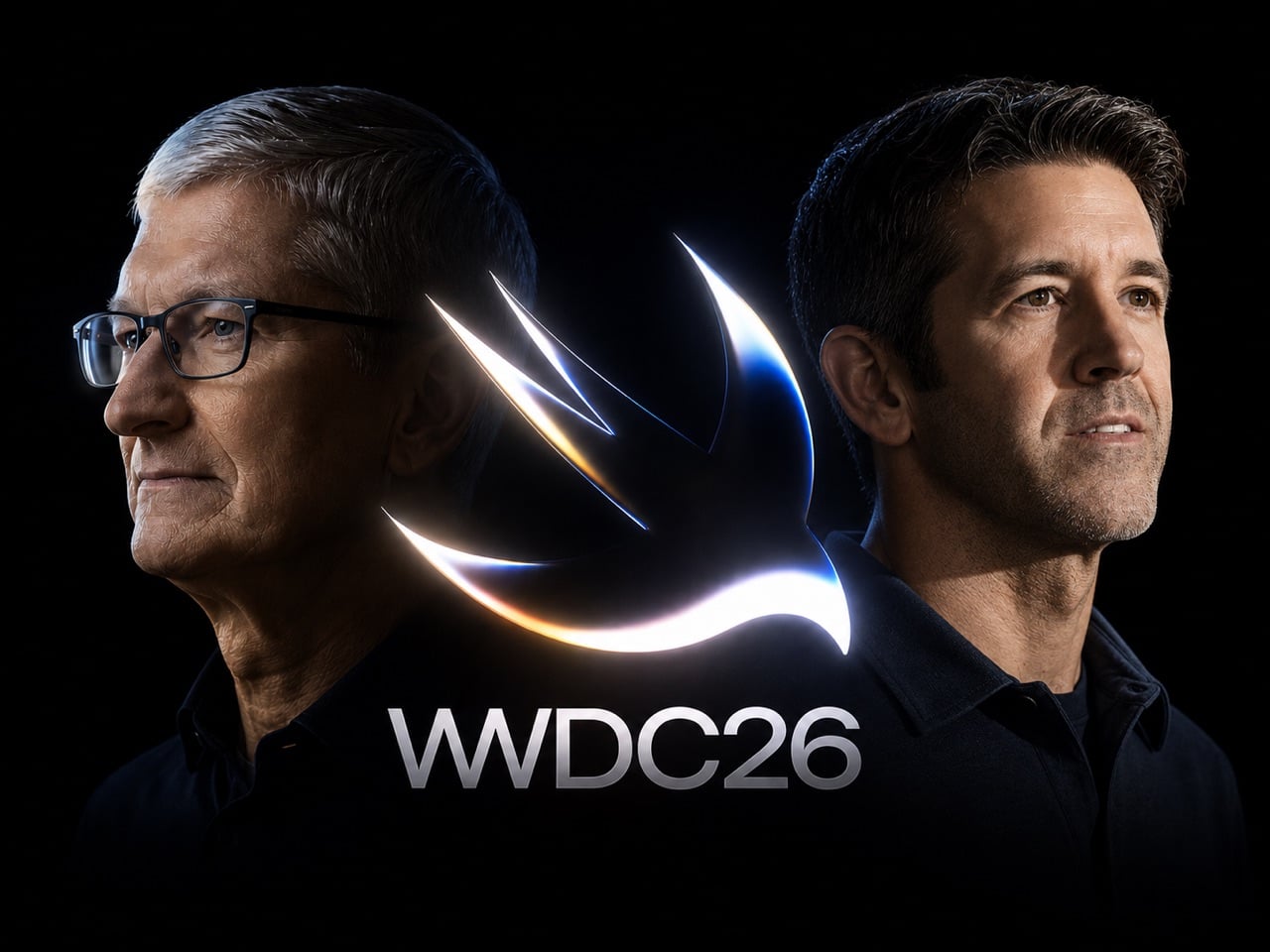
Steve Jobs built Apple on the idea that hardware and software had to be designed as one thing, inseparable and mutually reinforcing. Tim Cook, who took over in 2011 with the company at roughly $350 billion in value, honored that philosophy while adding an operational layer Jobs never had the patience for: supply chains so resilient they made Apple virtually recession-proof, a services ecosystem generating over $100 billion a year, and a trillion-dollar valuation that eventually became three. Cook’s Apple was not the scrappy insurgent of the Jobs era. It was a machine, and WWDC 2026, opening June 8 at Apple Park, is the last keynote he delivers as CEO before stepping aside for John Ternus on September 1st.

Ternus running hardware engineering means he is the person responsible for Apple Silicon, the M-series chip architecture that gave Apple the on-device processing headroom to even attempt building a serious AI assistant. The timing of the leadership transition is its own kind of design decision: Cook presents the software at WWDC, and Ternus inherits it just in time to strap it to the iPhone 18, the rumored iPhone Fold, and whatever Mac hardware lands in the fall. iOS 27’s rebuilt Siri, a standalone app with Dynamic Island integration and a Google Gemini foundation licensed for a reported billion dollars a year, is the software story Cook leaves behind for Ternus to ship.

The Siri situation has been Apple’s most visible embarrassment in the AI era, and Cook knows it. While Google rebuilt Assistant into Gemini and OpenAI shipped ChatGPT to a billion users, Siri kept responding to complex queries with “I found some results on the web.” iOS 27 is the architectural correction. The rebuilt assistant ships as a dedicated app with conversation history, image and document input, and a chatbot-style interface that makes it feel, for the first time, like something a designer actually thought about. Activation drops a pill-shaped glow into the Dynamic Island with a “Search or Ask” prompt, and a swipe down from the top of the screen triggers it system-wide, effectively replacing Spotlight with something that can actually reason. The Gemini model underneath, accessed through Apple’s Private Cloud Compute infrastructure so user data never touches Google’s servers, is reportedly a custom 1.2 trillion parameter build licensed for around a billion dollars annually.

What makes iOS 27 structurally interesting, beyond the Siri cosmetics, is the Extensions framework. Apple is opening the platform to Claude, Gemini, and other third-party agents as swappable AI backends, accessible through a dedicated App Store section. A long-press on the Siri search bar lets you switch models entirely. That is a significant philosophical departure for a company that has spent fifteen years treating openness as a security vulnerability rather than a feature. Whether developers actually build compelling Extensions or whether the system becomes another neglected API graveyard is the real question, but the architecture at least acknowledges that Apple cannot win the AI race alone.

The rest of the OS lineup fills in around the Siri centerpiece. Wallet gets a “Create a Pass” feature that digitizes physical tickets and membership cards from a QR scan. Visual Intelligence gains the ability to read food nutrition labels and feed data directly into the Health app. Safari will auto-name tab groups. The keyboard gets a smarter autocorrect that suggests full rewrites rather than single-word swaps. macOS 27, meanwhile, is quietly laying software groundwork for touch-enabled Mac hardware that Ternus will presumably announce when he is ready. Apple treating macOS 27 as a Snow Leopard-style consolidation release, stable and foundational rather than showy, is exactly the kind of move that makes sense when you know a new CEO with a hardware background is about to take over.

Cook’s WWDC26 artwork says more than the tagline “Coming Bright Up” lets on. The Swift logo rendered in iridescent chrome and bloom light, the same visual language as iOS 26’s Liquid Glass design system taken to a more extreme register, telegraphs a platform doubling down on its own aesthetic identity even as it opens its AI layer to outside competition. It is a confident piece of visual communication from a company that built three trillion dollars of market value on the conviction that how things look and how things work are the same question. Ternus gets to answer what comes next.

The post WWDC 2026: iOS 27, macOS 27 and the New Siri App — What to Expect June 8 first appeared on Yanko Design.

AirPods Pro 3 vs Pro 2: Should You Actually Upgrade in 2026?

Eight months after Apple shipped the AirPods Pro 3, the comparison has quietly shifted. Nobody is really debating whether the Pro 3 are good. They are. The more interesting question, the one actually driving search traffic right now, is whether the Pro 3 are worth it when the Pro 2 can be had for around $167 renewed, and when both models share the same H2 chip.

That last part matters more than it sounds. Apple’s decision to keep the H2 chip in the Pro 3 means both generations run the same core software features, including everything arriving with iOS 26. That’s not a knock against the upgrade. It’s just a useful signal about where Apple actually spent its engineering effort this cycle. The answer is the body.

Design: Apple

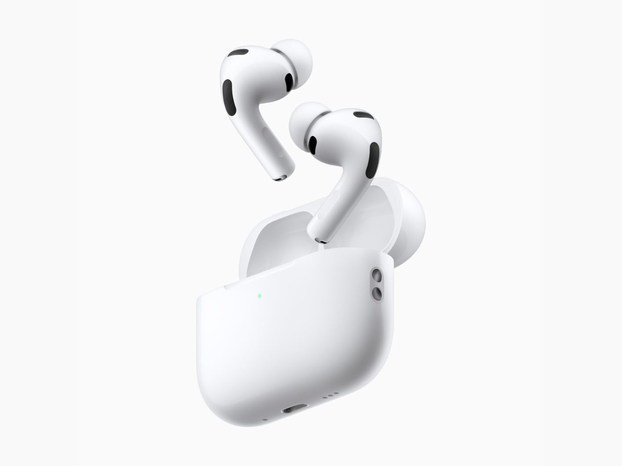
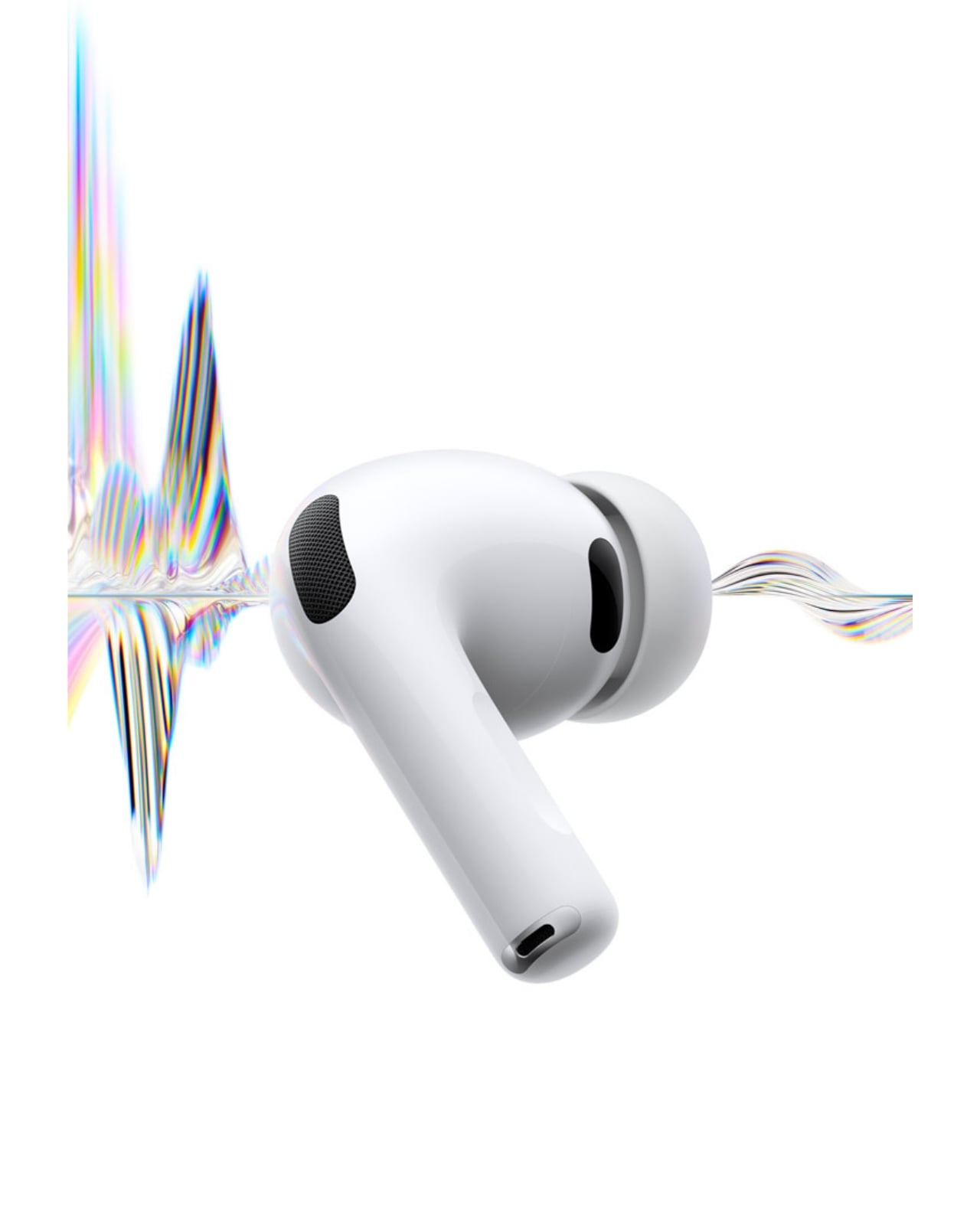
The AirPods Pro 3 ship with a redesigned fit system, adding foam-infused ear tips across all sizes and a new extra-extra-small option for a noticeably deeper seal. That revised fit is doing real work. It’s part of why independent testing from RTINGS shows the AirPods Pro 3 outperforming the Pro 2 on noise isolation, especially with street-level and mid-frequency noise. The ANC improvement is real, and most of it comes from better physics, not a completely overhauled processing stack.

Then there’s the durability jump. IP57 replaces IP54, meaning the AirPods Pro 3 can survive submersion in a meter of water for up to 30 minutes, compared to the AirPods Pro 2’s more modest splash resistance. If you work out in the rain or tend to leave things near water, that’s a quiet but meaningful upgrade. Battery life lands at eight hours with ANC on, a clear step up from the Pro 2. Worth noting, though: using the heart-rate sensor drops that figure to roughly 6.5 hours per charge, so those gains are conditional depending on how you actually use the earbuds. Which brings us to the feature doing most of the marketing heavy lifting.

The heart-rate monitor is the AirPods Pro 3’s most discussed addition, and it’s genuinely well-implemented. You can track over 50 workout types on iPhone alone, without an Apple Watch, logging heart rate and calorie burn throughout. If both devices are present, Apple’s system pulls from whichever sensor is giving more reliable data at the time. That’s a thoughtful design call.

But here’s the thing. If you already wear an Apple Watch, the heart-rate sensor in your ears becomes a nice backup, not a reason to upgrade. The people for whom this feature is genuinely transformative are iPhone-first fitness users who aren’t wearing a watch, or people who prefer fewer devices on their body during a workout. For everyone else, it reads more like product ambition than personal necessity.

So where does the AirPods Pro 2 still hold its ground? Almost everywhere a casual listener, commuter, or Apple Watch owner actually lives. The H2 chip delivers the same spatial audio, the same call quality baseline, and the same hearing health features, including the hearing test and hearing aid mode. At $167 renewed, the Pro 2 offers a level of performance that would have been considered flagship just two years ago.

The AirPods Pro 3 are the better earbuds. They fit better, block more noise, last longer on a charge, and carry the kind of health-sensor integration that signals where Apple wants this product category to go. But better earbuds and better value are not the same thing, and in May 2026, that distinction matters.

If you don’t own AirPods Pro yet, the Pro 3 are the ones to get. If you already own the Pro 2 and they still fit and function well, this is not a compelling upgrade unless the heart-rate tracking or the improved seal solves a real problem for you. At $167 renewed, the AirPods Pro 2 remain one of the most capable earbuds at their price, chip-for-chip. Apple builds excellent products. It also builds excellent arguments for buying last year’s excellent products at a discount.

The post AirPods Pro 3 vs Pro 2: Should You Actually Upgrade in 2026? first appeared on Yanko Design.

A Maker Just Gave the Fortune Cookie a $10 Hardware Glow-Up

I don’t know who decided that wisdom should come wrapped in a brittle shell and a strip of paper, but I’ve always found the fortune cookie oddly charming. Not because of the fortunes themselves, which range from “a smile is your best accessory” to something you’d find stitched on a decorative pillow, but because of what they represent: a tiny, physical moment of pause. A ritual. A reason to crack something open and pay attention to what falls out. In a culture addicted to scrolling, that single sentence on a slip of paper still manages to land.

So when I came across gokux’s eFortune Cookie on Hackaday, I felt a very specific kind of joy. The kind you feel when someone takes a beloved, low-tech ritual and gives it exactly the upgrade it deserves, without ruining what made it special in the first place.

Designer: gokux

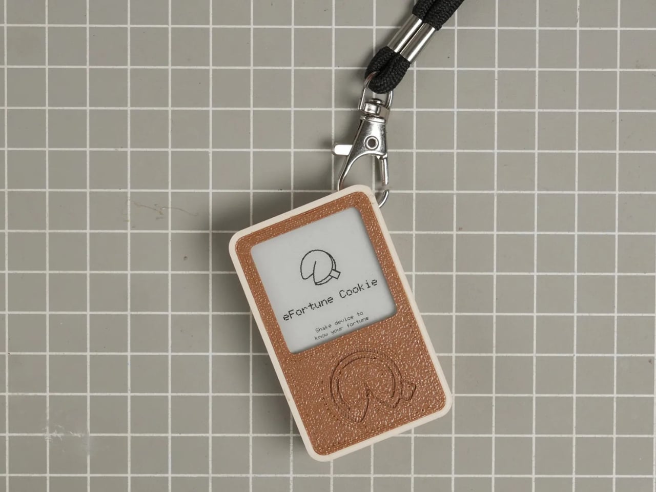
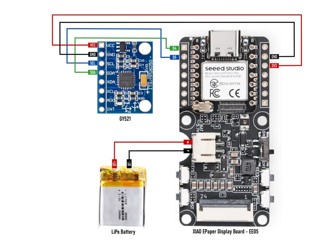
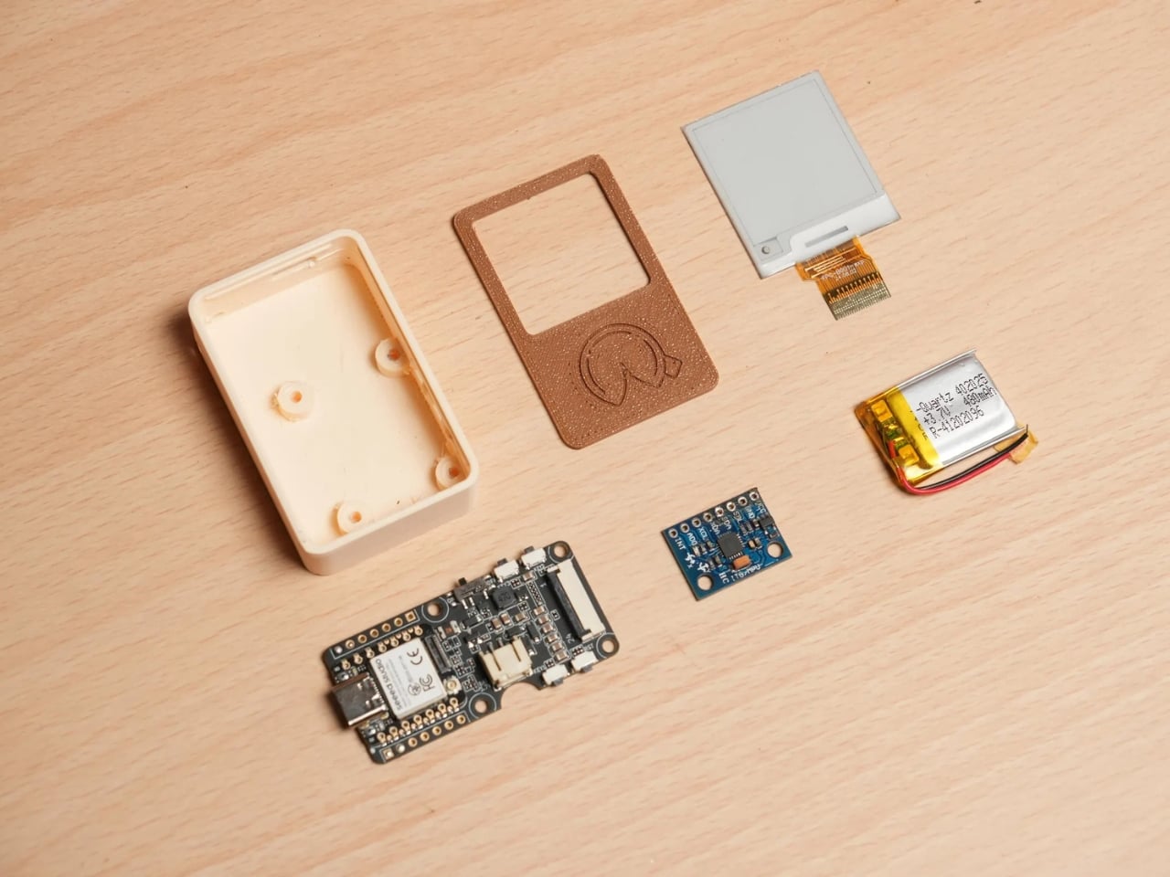
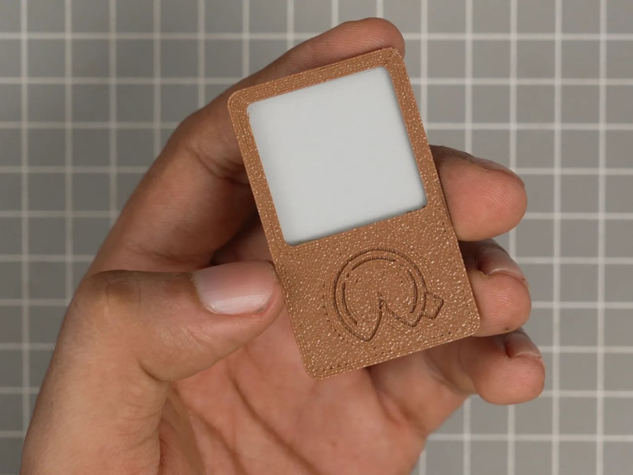
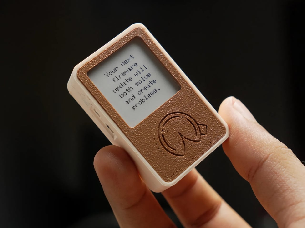
The concept is beautifully simple. gokux built a tiny, 3D-printed gadget in the shape and spirit of a fortune cookie, fitted with a Seeed Xiao ESP32-S3 Plus and a 1.54-inch e-paper display. To get your fortune, you shake it. That’s it. Shake it, and a random fortune appears on the little screen. No apps to download. No Wi-Fi required. No subscription tier. The device stores over 3,000 fortunes entirely offline, which makes it more dependable than half the smart gadgets currently collecting dust on people’s kitchen counters.

The commitment to the gesture is actually the most underrated part of this build. gokux chose to activate the fortune with a shake, not a tap or a button press, and that single decision changes everything about how the object feels to use. A shake carries energy, intention, a little theatrical flair. It mirrors what you’d do with a Magic 8-Ball or a set of dice. It makes the act of asking feel deliberate, even playful. That kind of interaction design is easy to overlook, but it’s often the difference between something you use once and something you keep picking up off the desk.

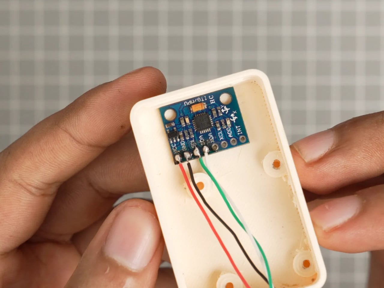
The eFortune Cookie is not a one-trick gadget, either. Side buttons let you toggle between three modes: fortune telling, dice rolling, and coin flipping, each one activated the same way. Just shake. The MPU-6050 accelerometer inside detects the motion and responds accordingly. For a small indie maker project, the level of thoughtfulness packed into something this compact is genuinely impressive. The e-paper display is a smart material choice, too. It’s low power, easy to read in any lighting, and gives the whole thing a slightly analog, slightly mysterious quality that feels exactly right for a device meant to dispense tiny slices of fate.

I’ll be transparent about what the eFortune Cookie is not. It is not artificially intelligent. It is not learning your patterns or curating insights based on your mood. The fortunes are pre-loaded, the shake is random, and the outcome is whatever it is. Some people might see that as a limitation. I see it as the point. We live in an era where every gadget wants to personalize, predict, and optimize us. A device that just shakes out a fortune and doesn’t know a single thing about you feels almost radical by comparison.

The sample fortune visible in gokux’s build photos reads: “Your next firmware update will both solve and create problems.” It’s clearly written for makers, but it captures something universally true. Most things in life both solve and create problems. That’s not pessimism. That’s just the loop we’re all in, firmware or otherwise.

What gokux made here is a small, physical object that does something the internet cannot reliably do: it makes you stop for two seconds and read a single sentence. No notification badge to clear. No thread to fall into. Just a little e-paper screen, a fortune, and whatever you decide to do with it. That’s not nothing. For a weekend project built around a $10 microcontroller and a handful of components, it’s actually quite a lot. Sometimes the simplest ideas make the most enduring objects.

The post A Maker Just Gave the Fortune Cookie a $10 Hardware Glow-Up first appeared on Yanko Design.

Stop Packing Two Chargers: Trozk’s $50 Binary Star Does Both

Travel chargers have always been a bit of a negotiation. You pack a power bank for the long haul, then stuff a wall adapter in separately because the power bank only helps when there’s no outlet. End up with two items taking up bag space, two cables to hunt for, and the occasional moment of realizing you forgot one of them on the nightstand back at the hotel.

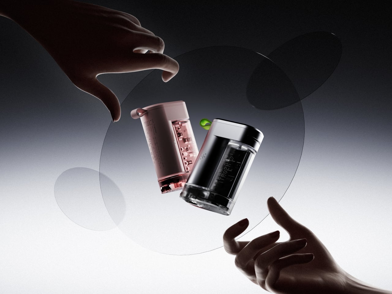
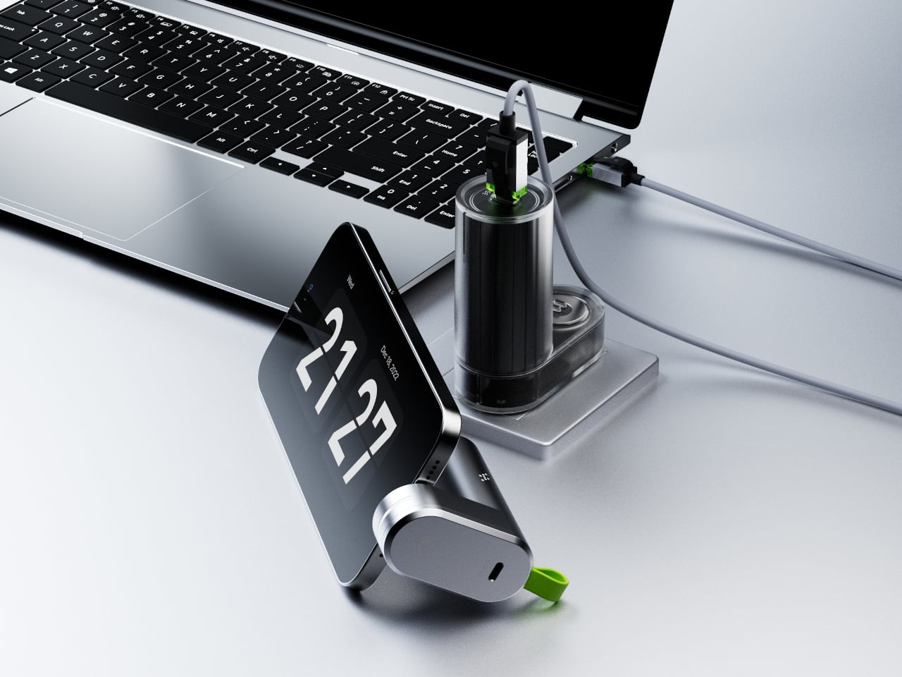
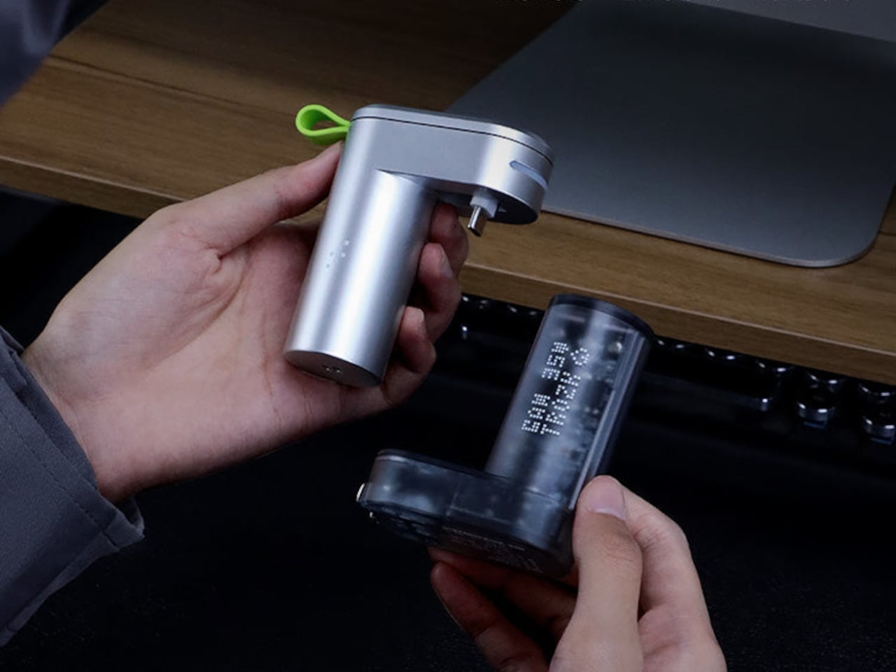
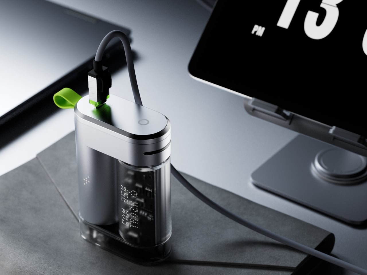
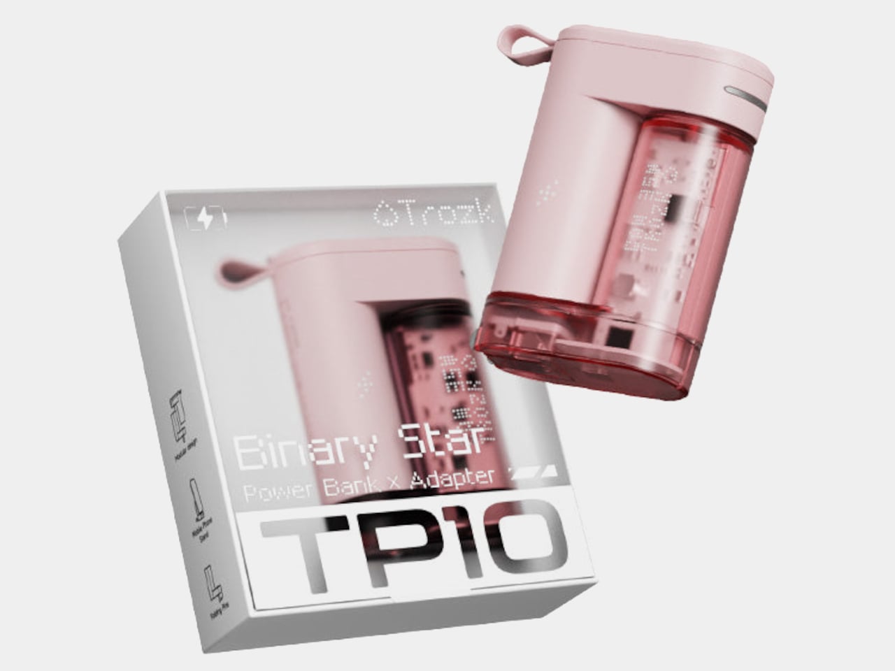
Trozk’s Binary Star tries to settle that negotiation for good. It’s a 3-in-1 device that pairs a 6,800mAh power bank with a 35W GaN wall adapter and throws in a phone stand for good measure. The two units clip together into a single compact form, which is where the “binary star” metaphor earns its keep, two objects perpetually orbiting each other, feeding the same energy cycle.

Designer: PTPC ™ for Trozk

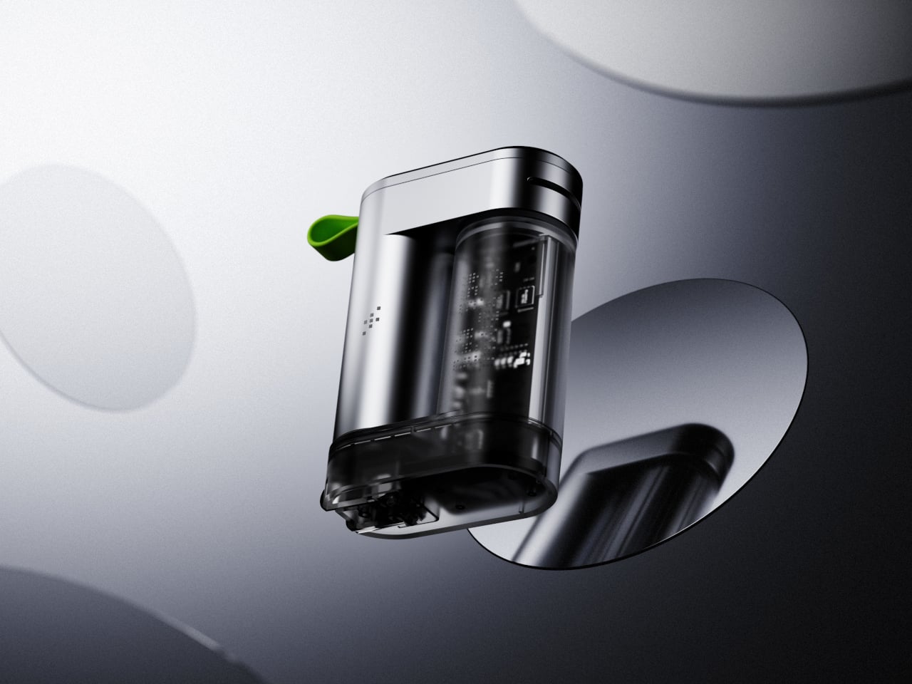
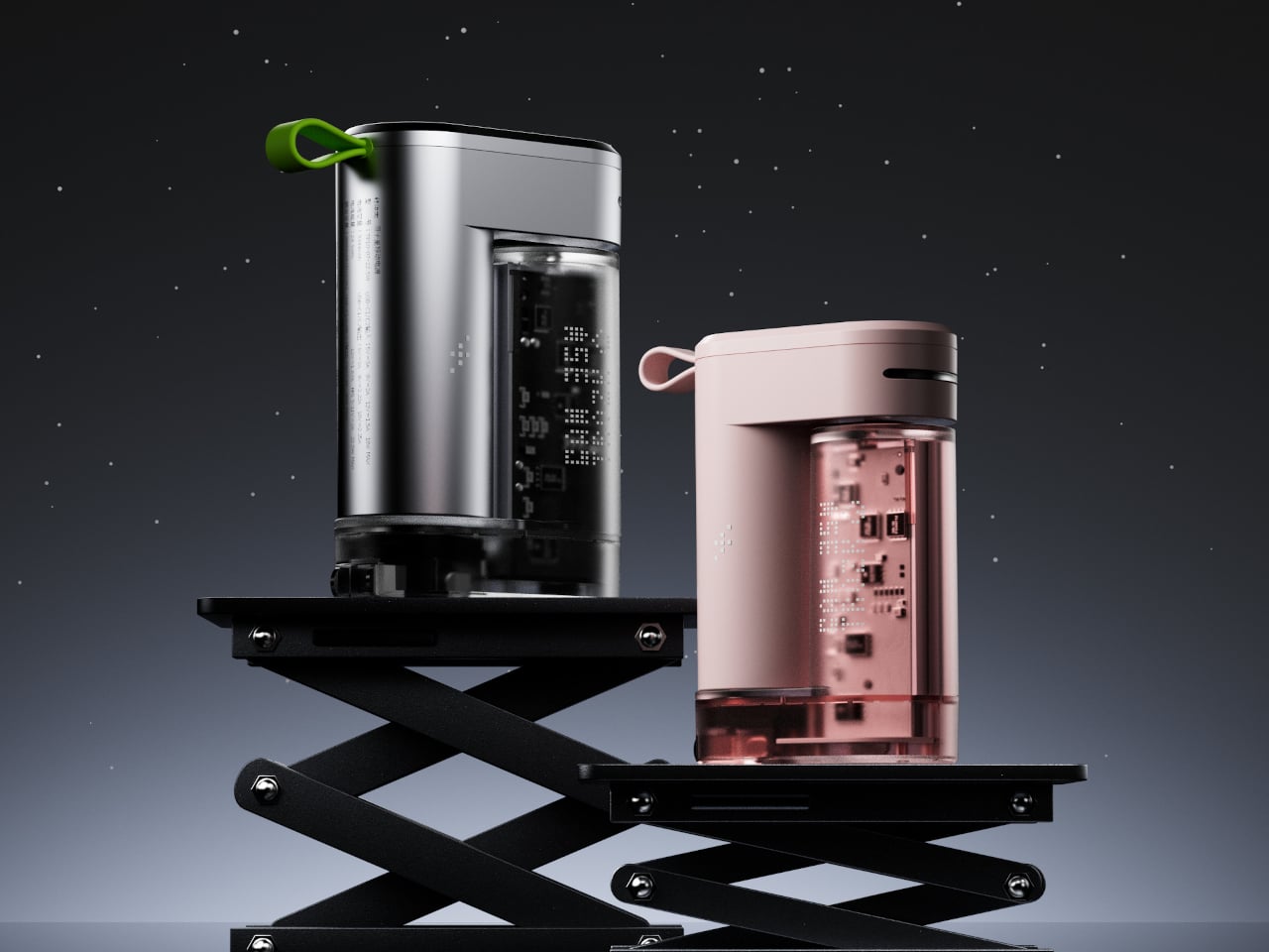
The design is the reason most people will notice the Binary Star before they read a single spec. The charging unit has a transparent body that puts the internal circuitry on full display, giving the whole thing a cyberpunk sensibility. A small green or pink loop at the top adds a pop of color against silver or pink housing, respectively, and doubles as a carry loop for clipping onto a bag.

The adapter side handles up to 35W through third-generation gallium nitride technology, which runs cooler and more efficiently than traditional silicon-based chargers. The power bank can push up to 22.5W, and all three ports across both units support fast charging. That means a phone, a pair of earbuds, and a tablet can all be drawing power at the same time without any of them getting shortchanged.

Inside the power bank are 26650 lithium cells, a step up from the more common 18650 format, contributing to longer battery life and better thermal stability. A pulsing star track light on the body keeps tabs on the remaining charge at a glance, so there’s no need to press a button or fire up an app to figure out how much runway you have left.

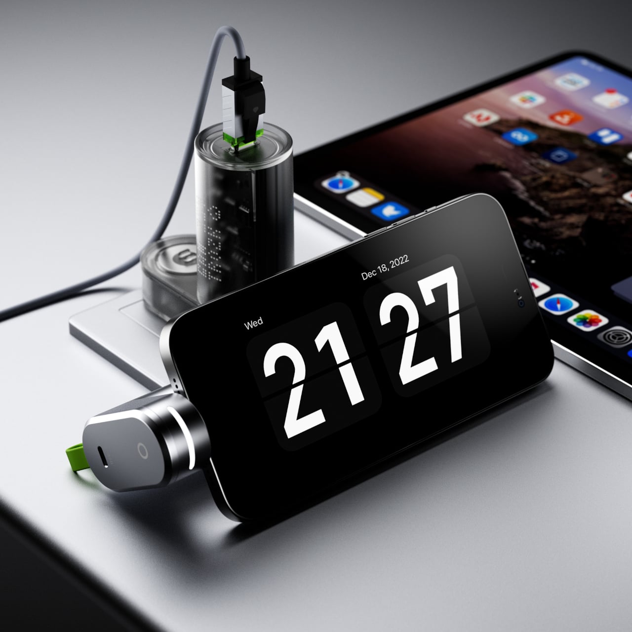
The phone stand feature is easy to overlook, but it’s probably the most welcome surprise for a desk setup. Rather than propping a phone against a keyboard while the Binary Star charges it, the design accommodates a phone at a comfortable viewing angle. It’s a small touch, but it’s the kind of detail that makes a charging device feel more considered than the average palm-sized brick in its price range.

At $49.99, the Binary Star sits comfortably below what you’d spend buying a quality GaN charger and a separate power bank of comparable capacity. That price covers both units, the green carry loop, and three fast-charging ports that all deliver real speed. For anyone who’s grown tired of managing a collection of charging accessories every time they leave the house, it’s a clean and credible solution.

The post Stop Packing Two Chargers: Trozk’s $50 Binary Star Does Both first appeared on Yanko Design.

Stop Packing Two Chargers: Trozk’s $50 Binary Star Does Both

Travel chargers have always been a bit of a negotiation. You pack a power bank for the long haul, then stuff a wall adapter in separately because the power bank only helps when there’s no outlet. End up with two items taking up bag space, two cables to hunt for, and the occasional moment of realizing you forgot one of them on the nightstand back at the hotel.

Trozk’s Binary Star tries to settle that negotiation for good. It’s a 3-in-1 device that pairs a 6,800mAh power bank with a 35W GaN wall adapter and throws in a phone stand for good measure. The two units clip together into a single compact form, which is where the “binary star” metaphor earns its keep, two objects perpetually orbiting each other, feeding the same energy cycle.

Designer: PTPC ™ for Trozk

The design is the reason most people will notice the Binary Star before they read a single spec. The charging unit has a transparent body that puts the internal circuitry on full display, giving the whole thing a cyberpunk sensibility. A small green or pink loop at the top adds a pop of color against silver or pink housing, respectively, and doubles as a carry loop for clipping onto a bag.

The adapter side handles up to 35W through third-generation gallium nitride technology, which runs cooler and more efficiently than traditional silicon-based chargers. The power bank can push up to 22.5W, and all three ports across both units support fast charging. That means a phone, a pair of earbuds, and a tablet can all be drawing power at the same time without any of them getting shortchanged.

Inside the power bank are 26650 lithium cells, a step up from the more common 18650 format, contributing to longer battery life and better thermal stability. A pulsing star track light on the body keeps tabs on the remaining charge at a glance, so there’s no need to press a button or fire up an app to figure out how much runway you have left.

The phone stand feature is easy to overlook, but it’s probably the most welcome surprise for a desk setup. Rather than propping a phone against a keyboard while the Binary Star charges it, the design accommodates a phone at a comfortable viewing angle. It’s a small touch, but it’s the kind of detail that makes a charging device feel more considered than the average palm-sized brick in its price range.

At $49.99, the Binary Star sits comfortably below what you’d spend buying a quality GaN charger and a separate power bank of comparable capacity. That price covers both units, the green carry loop, and three fast-charging ports that all deliver real speed. For anyone who’s grown tired of managing a collection of charging accessories every time they leave the house, it’s a clean and credible solution.

The post Stop Packing Two Chargers: Trozk’s $50 Binary Star Does Both first appeared on Yanko Design.

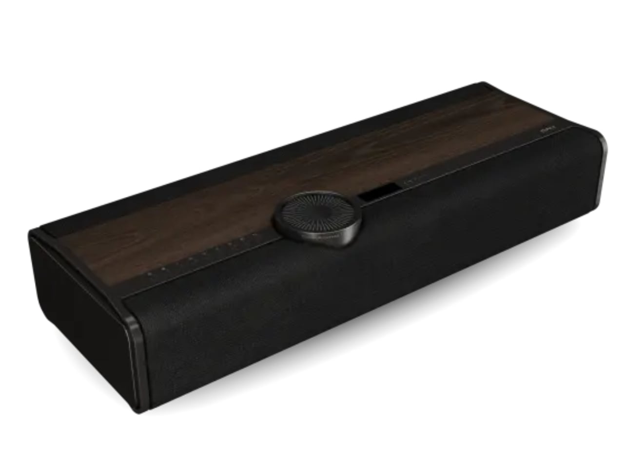
One Speaker, 10 Drivers, 400 Watts: DALI’s Vega Changes the Game

The audio world has always had a bit of a hoarding problem. Amplifiers, preamps, turntables, towers, subwoofers, cables that cost more than a weekend trip. The traditional hi-fi setup has never been known for its minimalism. It’s a rabbit hole, and a beautiful one at that, but a rabbit hole nonetheless. So when a 43-year-old Danish speaker company decides to put everything into a single box and call it done, it’s worth paying attention. That’s exactly what DALI did with the Vega, and I’ll say upfront: I didn’t expect to be as interested in it as I am.

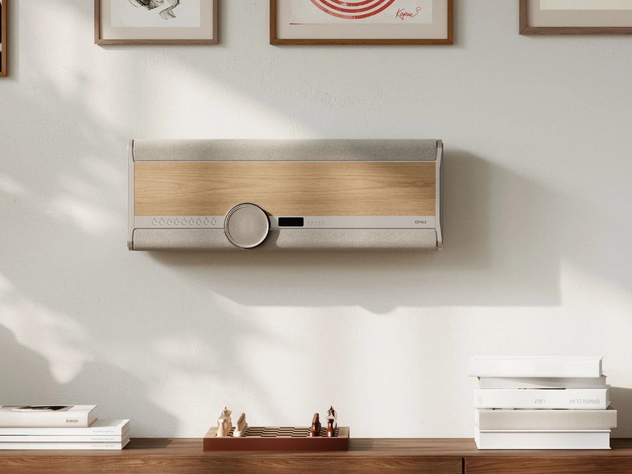
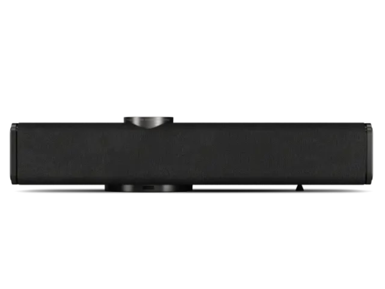
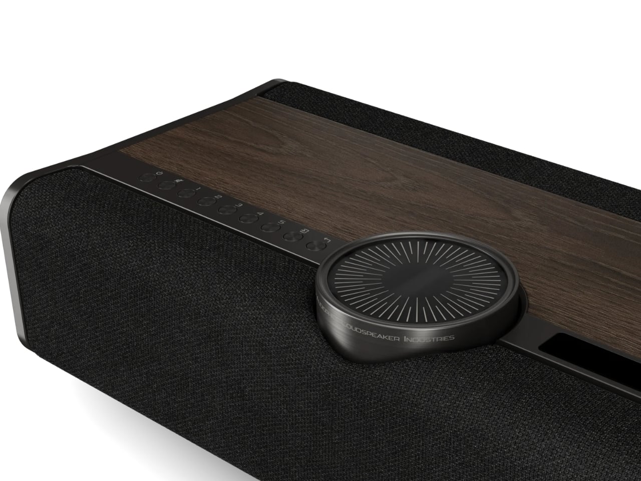
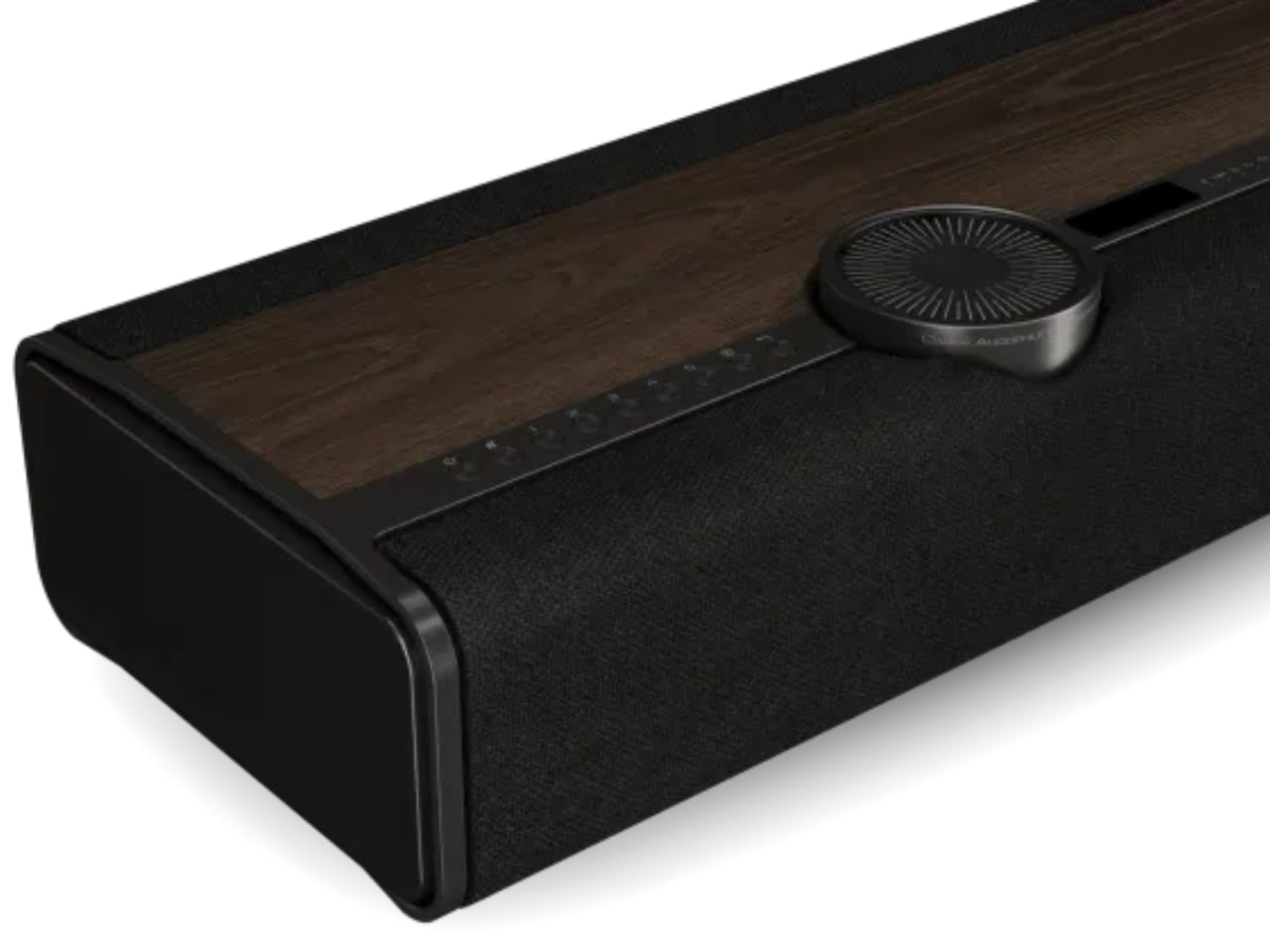
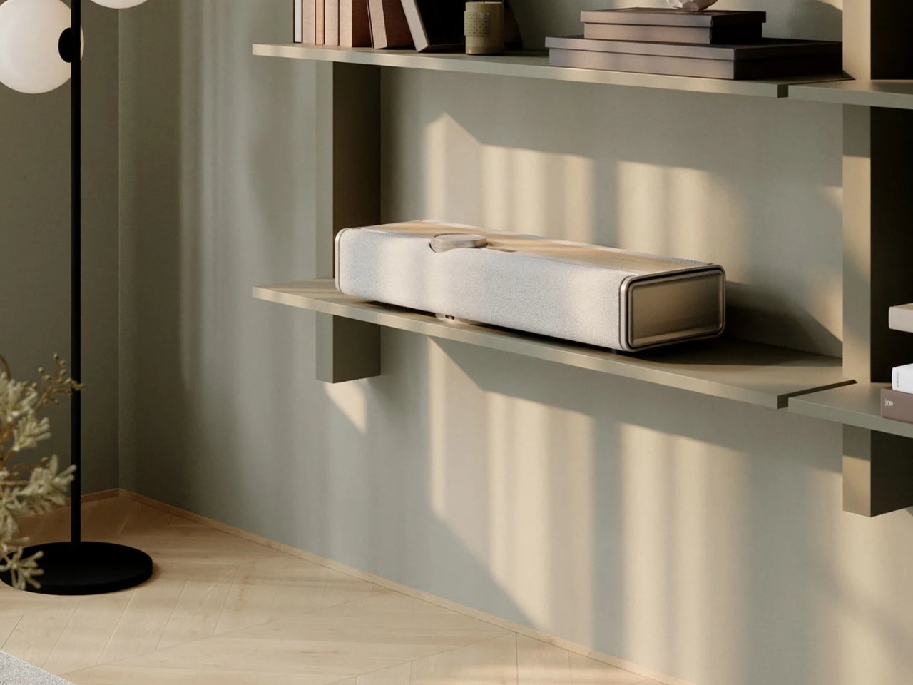
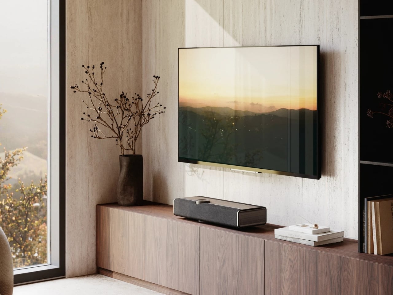
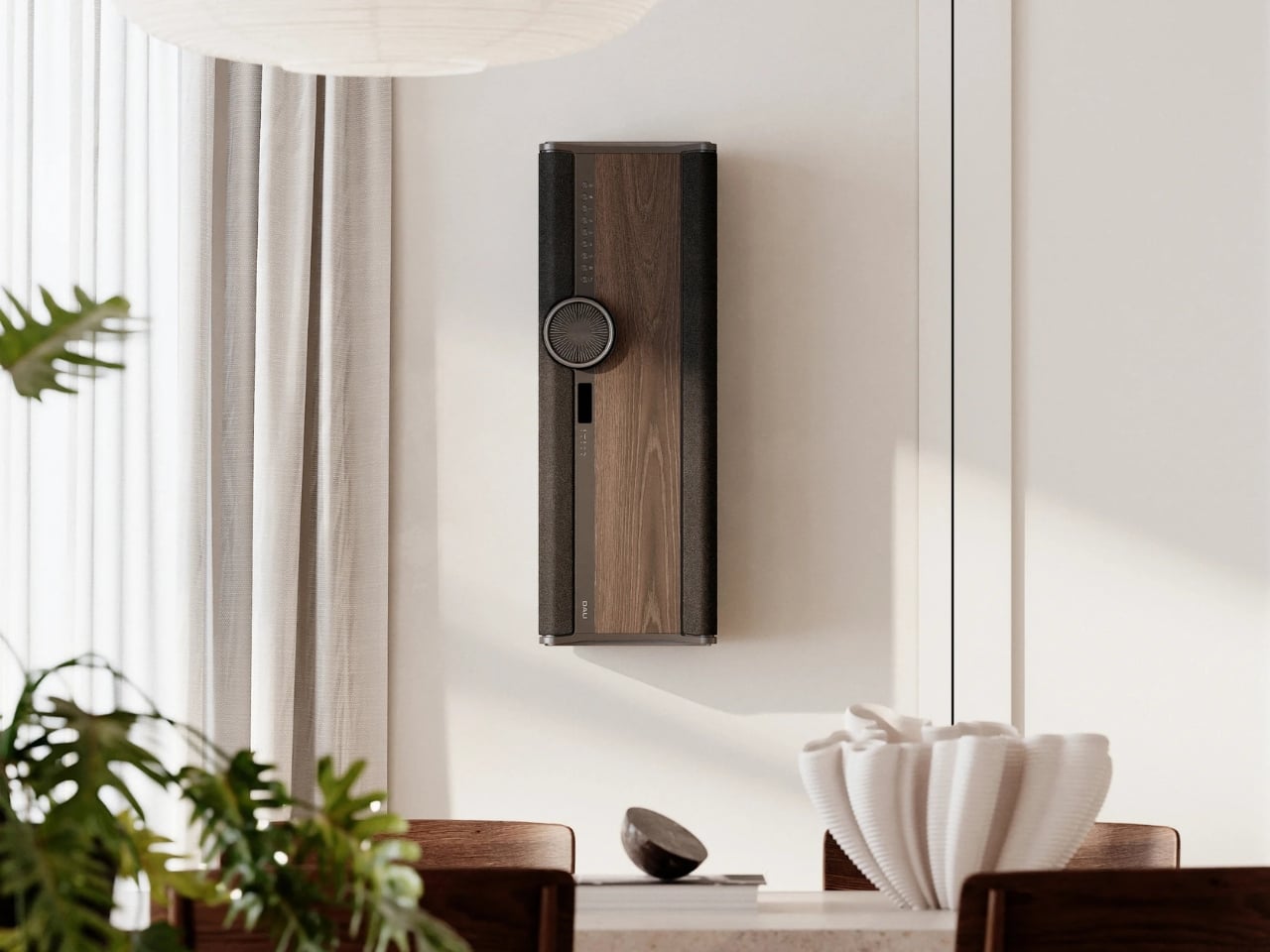
The Vega is an all-in-one wireless sound system built from the ground up. Drivers, amplification, DSP control, all of it developed in-house. The result is a single unit that sits in your room like a piece of furniture and quietly does the work of an entire rack of equipment. It packs 10 drivers into its slim 683mm-wide enclosure, including ultra-light 25mm soft dome tweeters and bass-midrange drivers arranged back-to-back to minimize cabinet resonance. Total amplification lands at 400 watts across eight channels. For a single speaker, those are serious numbers.

Designer: DALI Speakers

What makes the Vega interesting beyond the specs is how it actually approaches the problem of sound in a room. DALI developed a proprietary technology called Adaptive Stereo Enhancement (ASE), which creates a wide soundstage from a single unit in real time. It’s not a gimmick simulation of stereo. It’s an adaptive system that reads the incoming signal and responds accordingly, without introducing the artificial artifacts that can make these kinds of technologies feel forced. Whether it fully delivers on that promise is something we’ll have to wait until it reaches more listening rooms to confirm, but the approach itself is genuinely thoughtful.

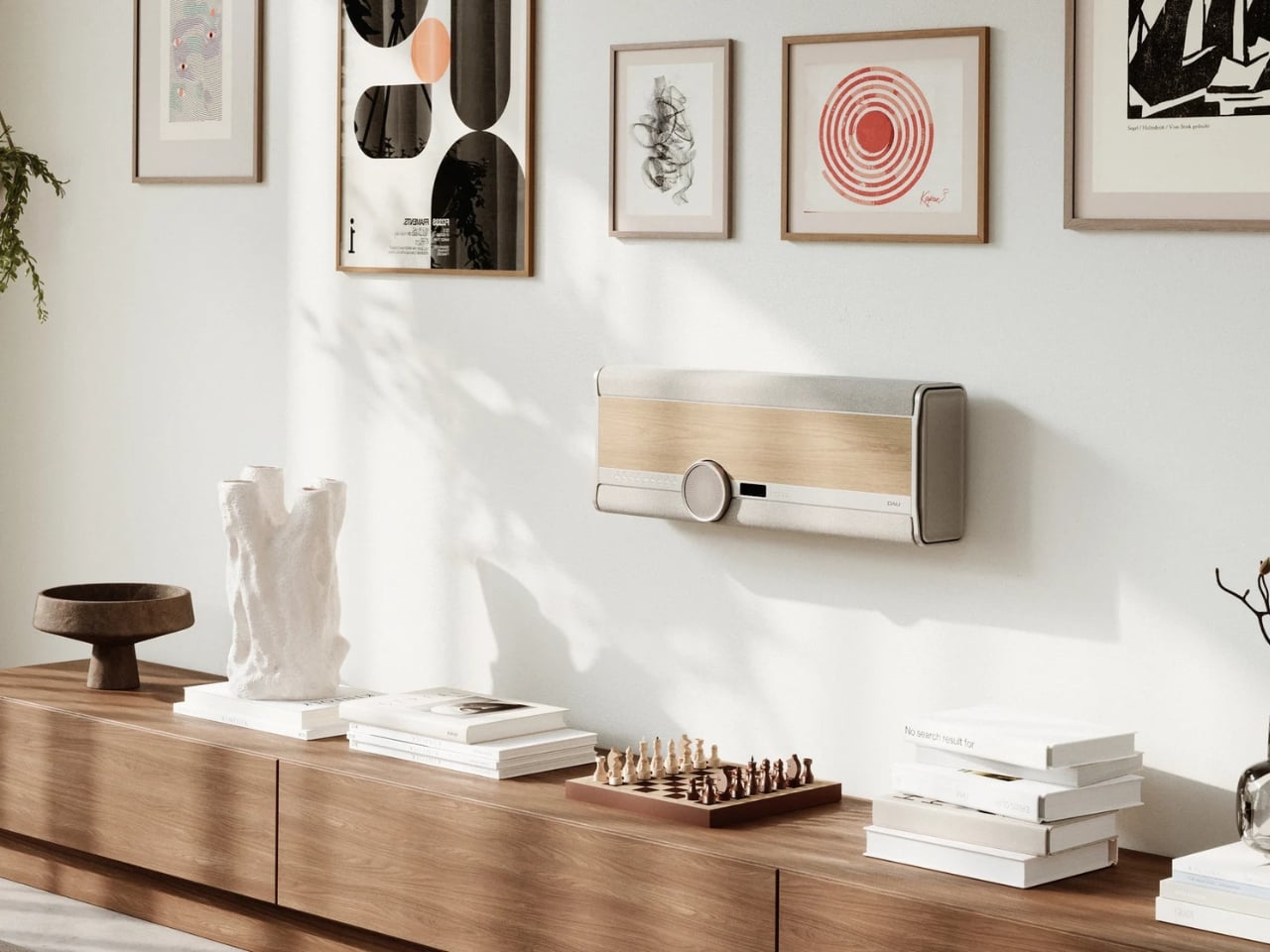
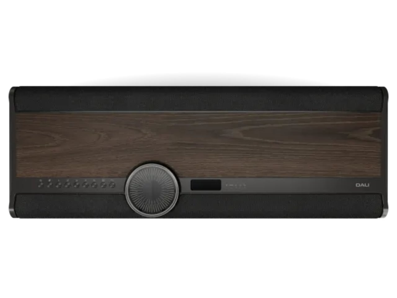
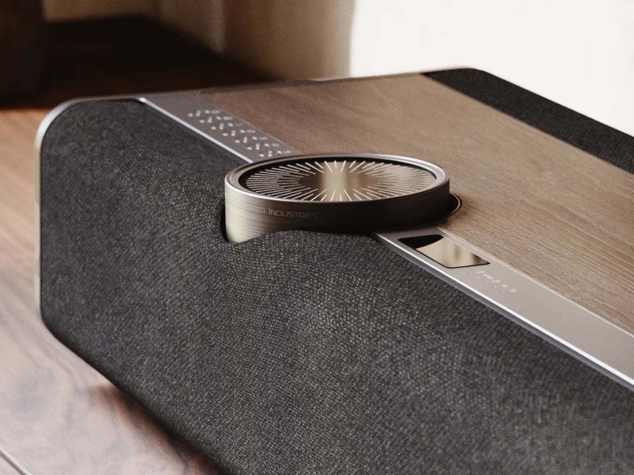
Then there’s the Adaptive Orientation Adjustment (AOA), which automatically optimizes the speaker’s output based on how you’ve placed it. Standing upright on a shelf, mounted flat against a wall in landscape, hung vertically in portrait. The Vega adjusts in real time for each scenario. It even includes an OLED display that rotates with the unit’s orientation. That’s the kind of considered detail that separates a product designed by people who actually care from one that was designed by committee to hit a price point.

And speaking of price points: $4,500 USD is not a casual purchase. I won’t pretend otherwise. But when you start comparing it to the cost of assembling a proper separates setup at equivalent quality, the math starts to look different. A decent amplifier, a quality streamer, a pair of speakers at this level, the cables to connect them all. It adds up fast. The Vega consolidates all of that into one device, one box, one cable to a power outlet.

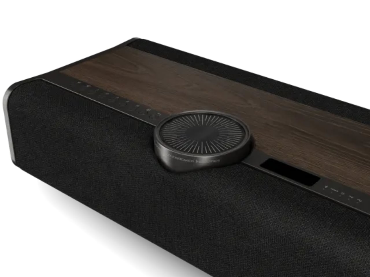
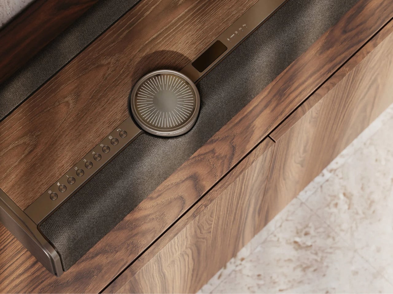
Aesthetically, DALI made choices I genuinely respect. Real wood veneer in Dark Oak or Natural Oak, anodized aluminium details, custom woven fabric. It looks more like something you’d find in a well-appointed Scandinavian living room than a piece of audio equipment. The volume wheel alone is its own small obsession: glass, acrylic, and anodized aluminium riding on an aerospace-grade ball-bearing mechanism. That’s not a specification; that’s a tactile experience someone designed on purpose.

Connectivity is thorough without being overwhelming. BluOS handles streaming and multi-room audio. HDMI, optical, analogue, USB audio, and Bluetooth cover wired sources. Spotify Connect, Tidal Connect, and Apple AirPlay 2 round out the wireless side. You can plug in a turntable or connect a TV, and the Vega handles both within the same system.

The Vega launches in select markets in September 2026, with broader availability following in October and November. Whether the hi-fi world embraces it or resists it on principle is a conversation that will be had loudly in forums and listening rooms for months. But the idea at its core, that great sound shouldn’t require great complexity, is one that’s long overdue for a proper answer. DALI’s version of that answer is elegant, ambitious, and a little bit expensive. Most good answers are.

The post One Speaker, 10 Drivers, 400 Watts: DALI’s Vega Changes the Game first appeared on Yanko Design.

8 Best Summer Gadgets for Men Who Think “Outdoor Tech” Usually Looks Terrible

The category of outdoor tech has a reputation problem. Most of it arrives in high-visibility colors, wrapped in rubberized plastic, and styled as if the designer’s only brief was “make it survive a war.” For men who care equally about function and form, the annual summer gear drop is usually a disappointment. These eight picks are the exception — products that earn their place outside without looking like they belong in a disaster preparedness kit.

Each one solves a real outdoor problem — heat, hydration, light, sound, coffee — without the aesthetic compromise that typically comes with the territory. If you’re selective about what you carry into the wild, this is a list worth saving.

1. RetroWave 7-in-1 Radio

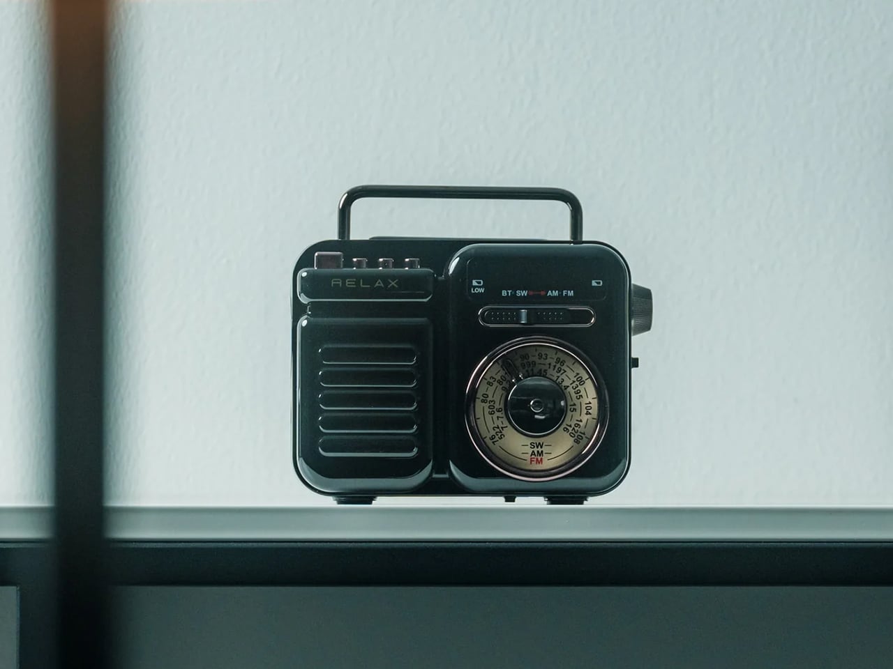
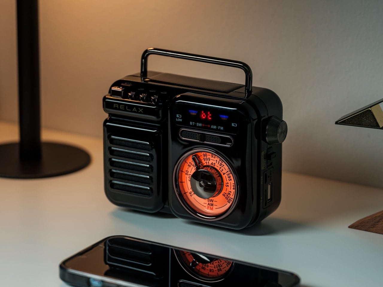
Most emergency gear sits in a drawer until it’s needed — which defeats the entire point. The RetroWave earns shelf space because it looks good enough to display. Styled with a retro Japanese aesthetic and a satisfying tactile tuning dial, it functions as a portable speaker, emergency radio, flashlight, and portable charger from one compact device. It’s the rare piece of outdoor kit that solves the preparedness paradox through sheer design restraint.

At $89, it covers ground that would otherwise require four separate items in your pack. Two colorways — black and warm gray — make it feel considered rather than utilitarian. The 20-hour battery life is enough for a full weekend without reaching for a cable, and the 8W speaker delivers enough warmth to soundtrack a campfire properly. It’s less a gadget and more a statement that survival gear doesn’t have to look survivalist.

Click Here to Buy Now: $89.00

What We Like

  • Seven functions collapse into a single carry-anywhere device with a retro form that earns every gram of its weight
  • Intentional enough in design to live on a shelf rather than be hidden in a bag until an emergency strikes

What We Dislike

  • The retro aesthetic won’t resonate with those who prefer a more modern industrial look
  • Audio output is optimized for outdoor ambience rather than high-fidelity listening

2. Solar-Powered Camping Tent AC
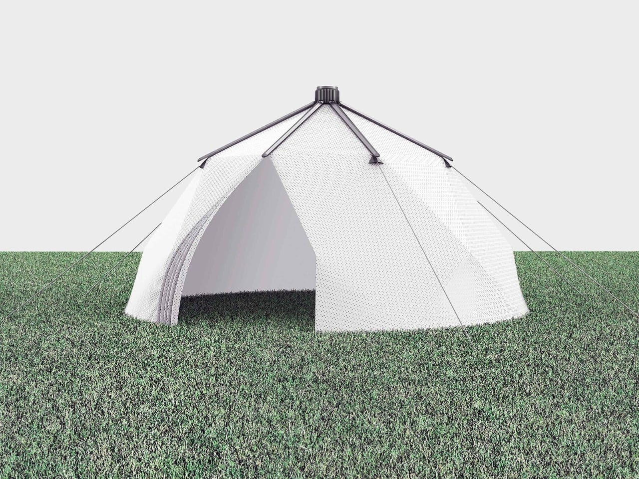
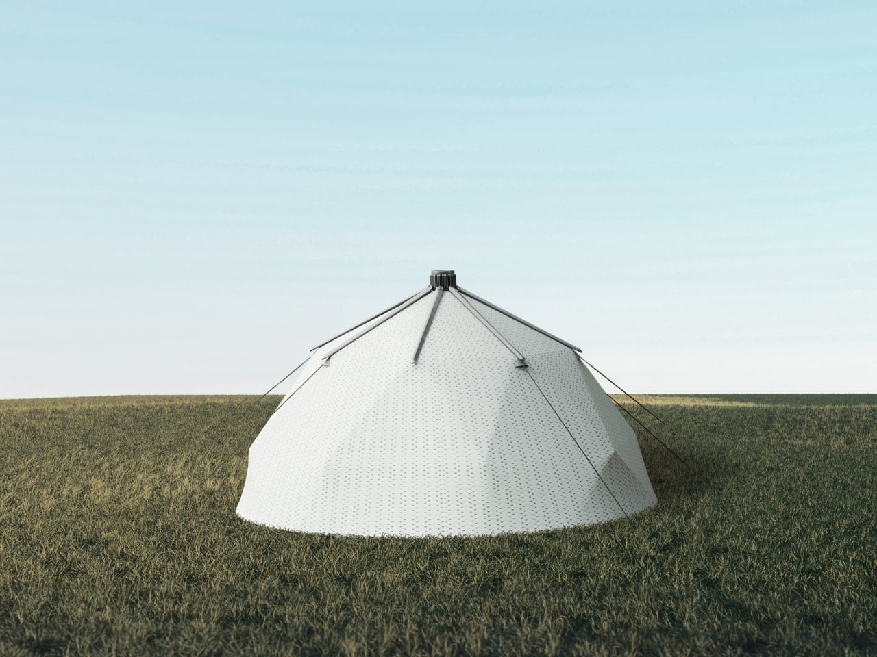
Summer camping’s biggest lie is that you’ll adjust to the heat. You won’t — you’ll sleep worse and wake up annoyed. This solar-powered camping tent concept earned recognition at the Red Dot Design Awards for solving exactly that problem: integrating an air conditioning system powered entirely by solar panels into the structure of the tent itself. No generator noise, no extension cord draped across the campsite. Just a cool night’s sleep that feels like the future.

The design challenge here isn’t purely technical — it’s visual. Solar camping gear has a long history of looking like a science project. This concept sidesteps that with a clean, structured silhouette that doesn’t announce its engineering from across the campsite. For summer trips where heat is the limiting factor rather than terrain, it reframes what a tent can actually do. The idea that solar power and sleeping comfort can coexist elegantly is no longer hypothetical.

What We Like

  • Solar-powered air conditioning solves the most persistent problem in summer camping without relying on noisy, bulky generators
  • Red Dot Design Award recognition confirms that the concept holds up both functionally and aesthetically

What We Dislike

  • As a concept, real-world availability and pricing have not yet been fully confirmed
  • Solar performance will depend heavily on campsite exposure and prevailing weather conditions

3. Yuuye Portable Air Conditioner
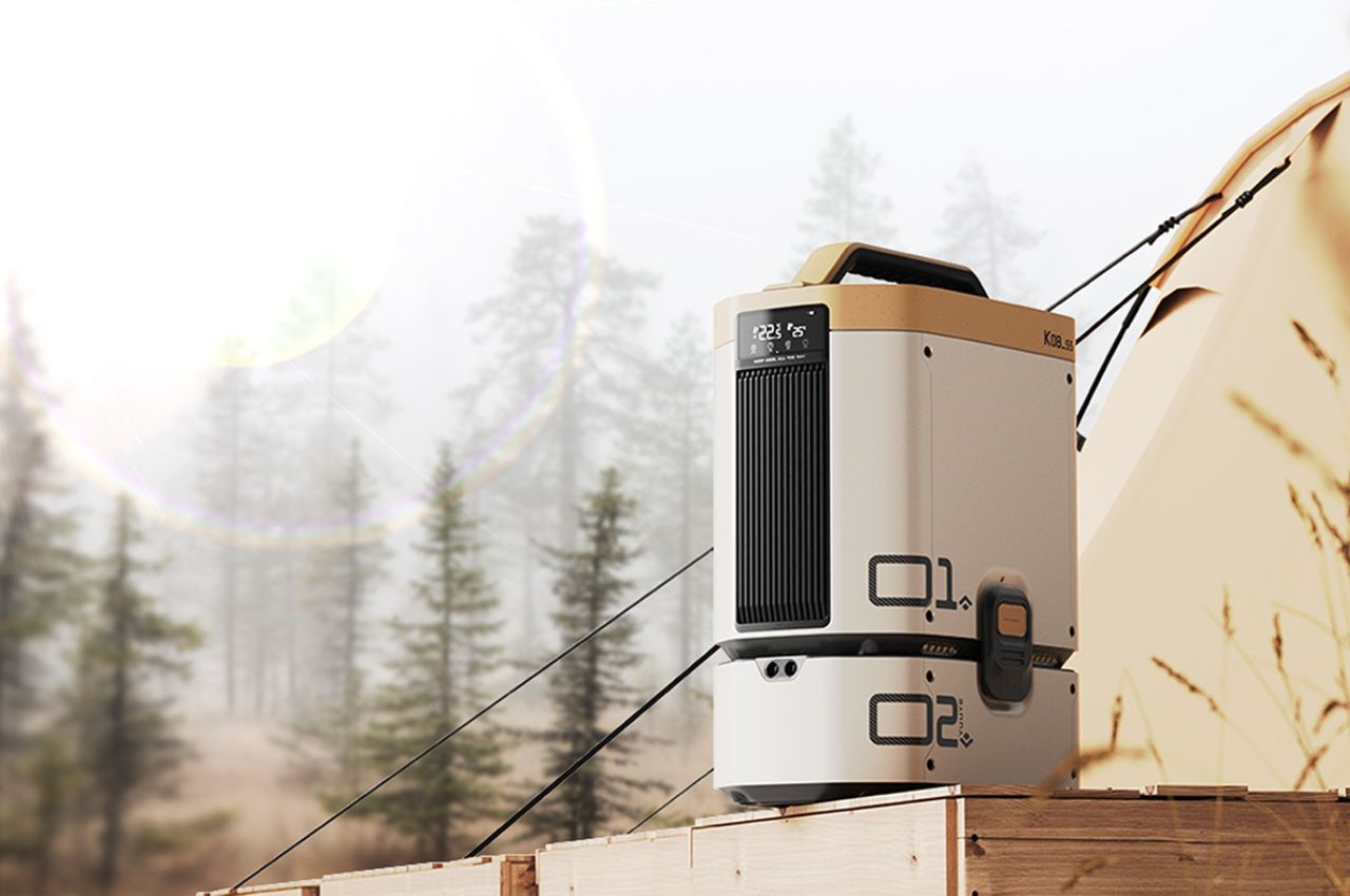
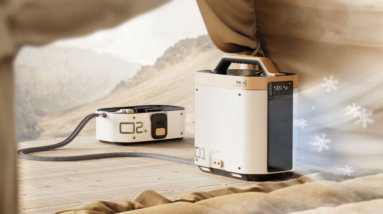
Where the solar tent integrates cooling into the structure, the Yuuye takes a more immediate approach. Its modular design separates the refrigeration unit from the exhaust, drawing in heat and pushing out cool air in a package compact enough to move between a patio, a tent, and an outdoor workspace without a second thought. The LCD screen keeps control simple, and the detachable build means adapting it to a new setting takes seconds rather than a prolonged setup.

The large air outlet distributes cooling evenly rather than in a single concentrated stream, which matters when you’re sitting in front of it rather than standing directly in the airflow. It understands the difference between moving air and actually cooling a space. Compact, lightweight, and designed for exactly the kind of summer that turns a backyard into an endurance test, it earns its place outdoors not by being impressive on paper, but by working when the temperature genuinely spikes.

What We Like

  • The modular, detachable build makes relocating it between outdoor settings fast and completely intuitive
  • Delivers consistent cooling without the bulk or noise of traditional portable air conditioning units

What We Dislike

  • Best suited for small to medium spaces — larger gatherings will need more than one unit to feel the difference
  • Requires a power source for extended use, which limits fully off-grid applications

4. Hemingway Cooler
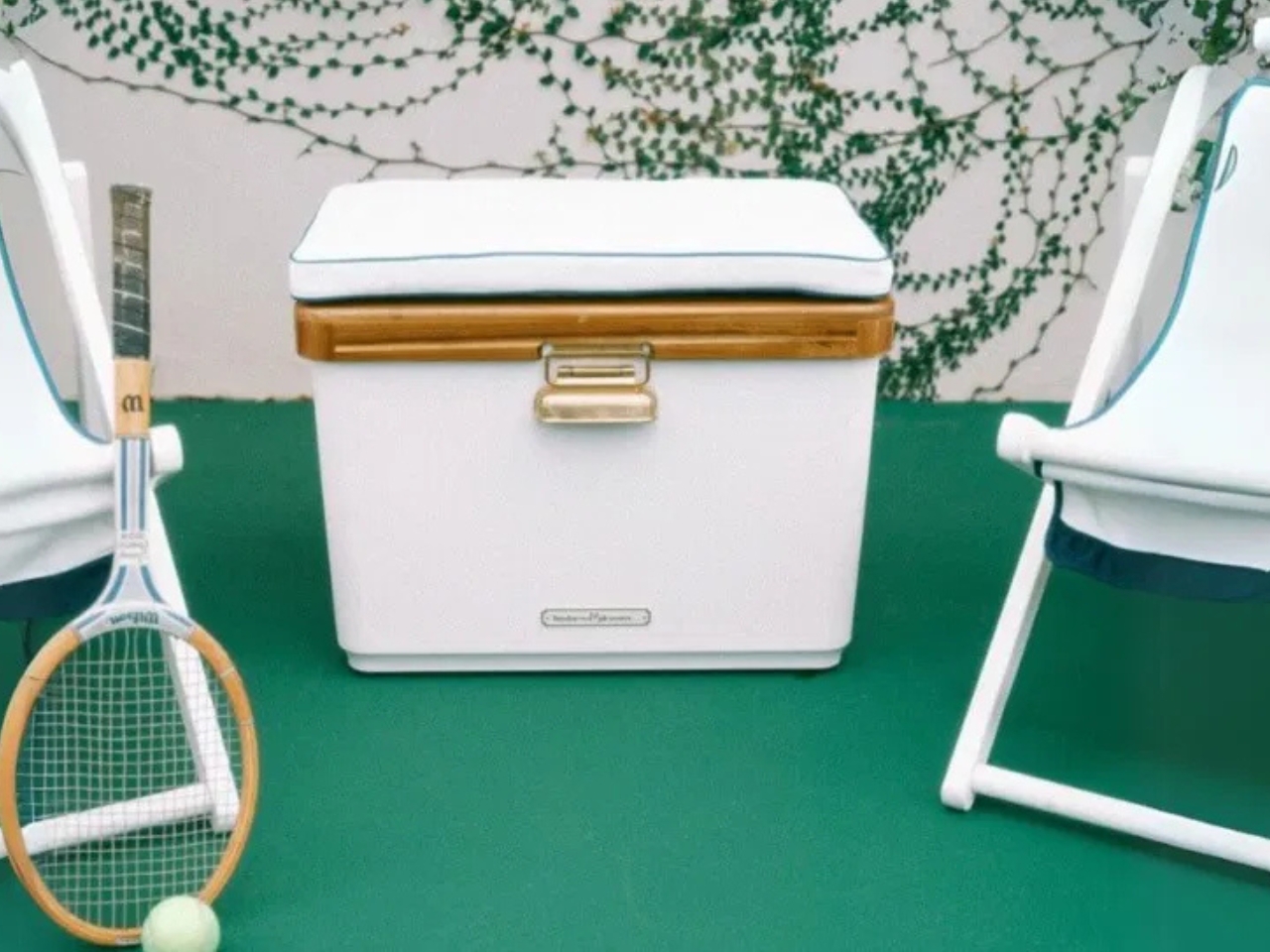
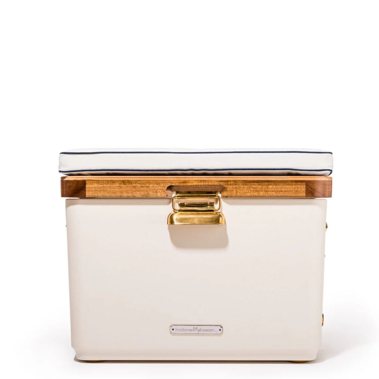
Coolers have spent decades looking like objects that are embarrassed to be at the party. The Hemingway takes a different position entirely. Designed with reference to mid-20th-century European cars and speedboats, it brings a classic, rugged sensibility to something most people treat as purely functional. It’s a cooler that looks as deliberate as the rest of your setup — the kind of thing you’d pack into the back of a Land Rover without any irony whatsoever.

The design doesn’t sacrifice performance for aesthetics. The rugged build holds up to outdoor conditions that take the shine off lesser products quickly, and the form is cohesive enough that it reads as a considered object rather than a branded afterthought. For men who treat the patio and the campsite as extensions of their taste rather than exceptions to it, the Hemingway is the first cooler that actually deserves to be seen.

What We Like

  • The mid-century design reference gives it a visual identity that holds up well beyond the campsite or tailgate
  • Rugged construction means the good looks aren’t at the expense of actual outdoor durability

What We Dislike

  • The deliberate aesthetic may feel out of place in purely utilitarian outdoor contexts
  • Premium design positioning likely carries a premium price point to match

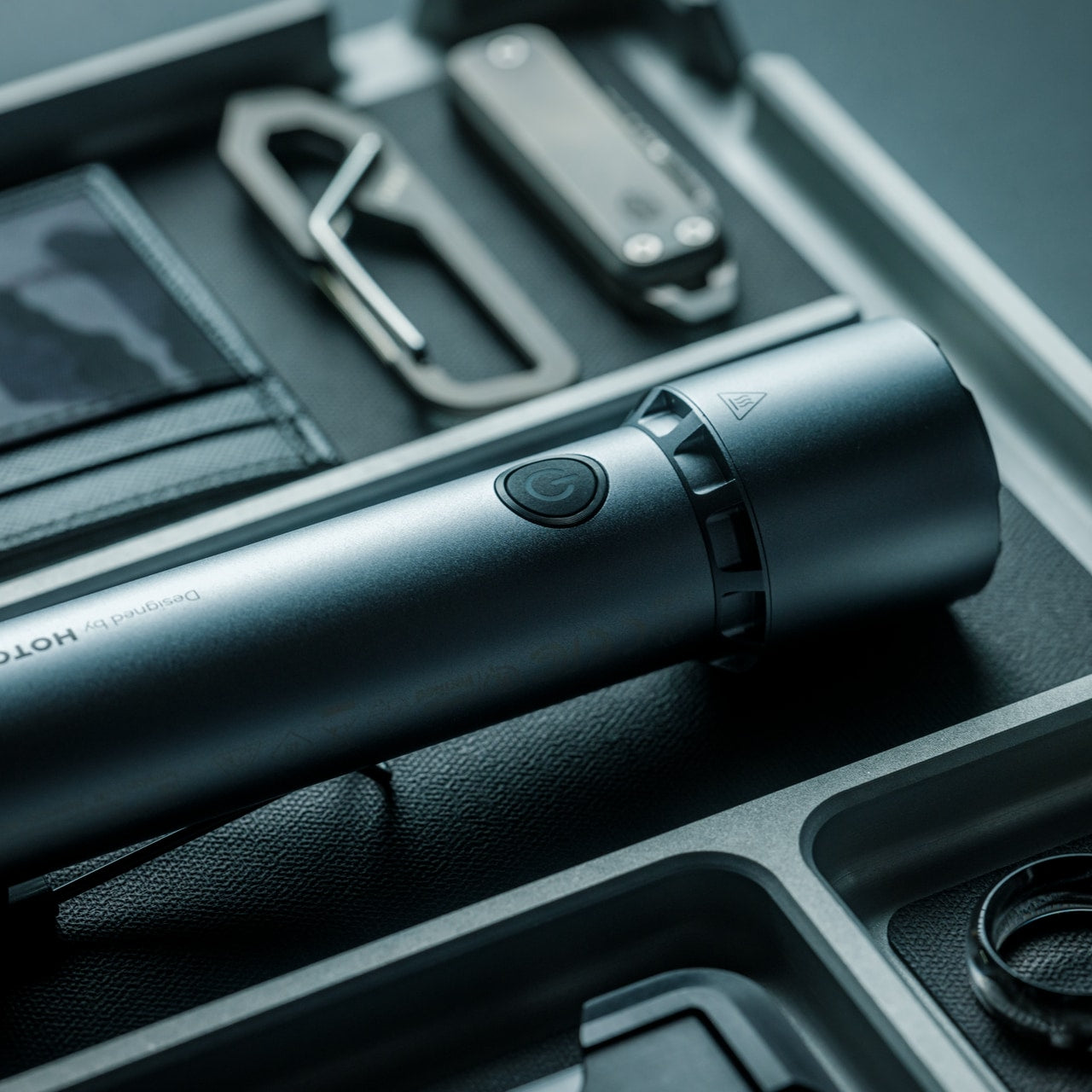
5. BlackoutBeam Tactical Flashlight
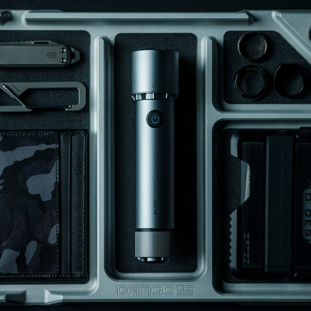
“Tactical” is a word that has done a lot of damage to outdoor gear design. The BlackoutBeam manages to carry the term without leaning into the aesthetic that usually comes with it. At $90, it sits in the range where you’re buying something built for real use rather than a shelf demonstration.

A good flashlight is one of those objects where the quality gap between a considered design and a generic alternative is immediately felt in the hand. Weight distribution, button placement, beam control — these are the details that separate tools from gadgets. The BlackoutBeam handles them with enough conviction to earn the “tactical” descriptor on function rather than branding alone. For the man who refuses to carry anything that looks apologetic, this is the one to reach for.

Click Here to Buy Now: $90.00

What We Like

  • The $90 price point reflects genuine build quality rather than brand markup on a commodity product
  • Restrained design language avoids the aggressive tactical styling that makes most flashlights look out of place

What We Dislike

  • The “tactical” category still carries aesthetic baggage that may not suit every outdoor context
  • Limited design detail available through the shop listing makes spec comparison difficult before purchase

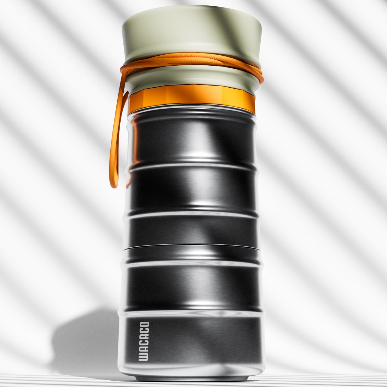
6. MokaMax
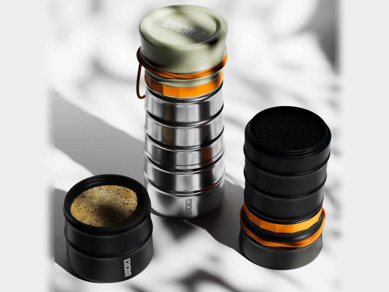
Portable coffee makers have a consistency problem. The plunger versions are messy, the capsule versions need a power source, and the pour-over options require more patience than most mornings allow. MokaMax resolves the argument by packing a pressure brewer directly into a rigid stainless travel mug — delivering espresso-style coffee in the same vessel you carry it in. It positions itself as the proper successor to the Pipamoka, with a form language that reads more like outdoor equipment than a kitchen appliance.

The ridged exterior isn’t purely visual texture — it provides a secure grip in conditions where hands are wet or cold, and it helps the MokaMax blend naturally with the kind of rugged travel gear men who care about this sort of thing tend to carry. It’s a product that earns its presence on a campsite or a trailhead without announcing itself. Good coffee, away from a kitchen, in an object worth actually owning.

What We Like

  • Pressure brewing and carrying a vessel combined means fewer items to pack and clean in the field
  • The ridged stainless form integrates visually with quality outdoor gear rather than clashing against it

What We Dislike

  • Espresso-style output may not satisfy those who prefer larger-volume filter coffee while camping
  • Pressure brewing has a learning curve for those accustomed to simpler portable methods

7. FLEXTAIL Tiny Pump 2X
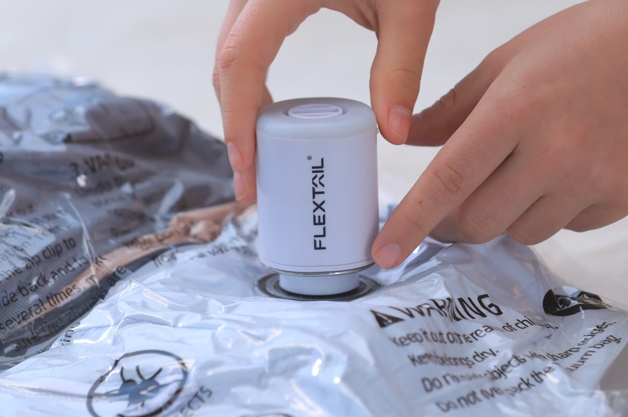
Camping gear that does one thing well is easy to find. Camping gear that does three things well, fits in a pocket, and doesn’t look like an infomercial product is considerably rarer. The FLEXTAIL Tiny Pump 2X manages exactly that — functioning as an outdoor pump, a camping lantern, and a general-use light source in a form factor small enough to get lost in a daypack if you’re not paying attention. Its utility-to-size ratio is genuinely difficult to argue with.

The design restraint does the heavy lifting. Rather than communicating its multi-function capability through an overload of controls or visual complexity, it reads as a single clean object that happens to do more than expected once you engage it. For summer trips where pack weight is a decision every item has to justify, the Tiny Pump 2X earns its place three times over. It’s the kind of product that makes you rethink what minimum viable gear actually looks like.

What We Like

  • Three functions in one compact body reduce the individual item count needed for a serious weekend outdoors
  • The restrained form doesn’t visually telegraph its multi-function capability, which is a genuine design achievement

What We Dislike

  • Compact size means output on each function is calibrated for personal use rather than group coverage
  • Lantern brightness may be insufficient for larger camping setups requiring wider illumination

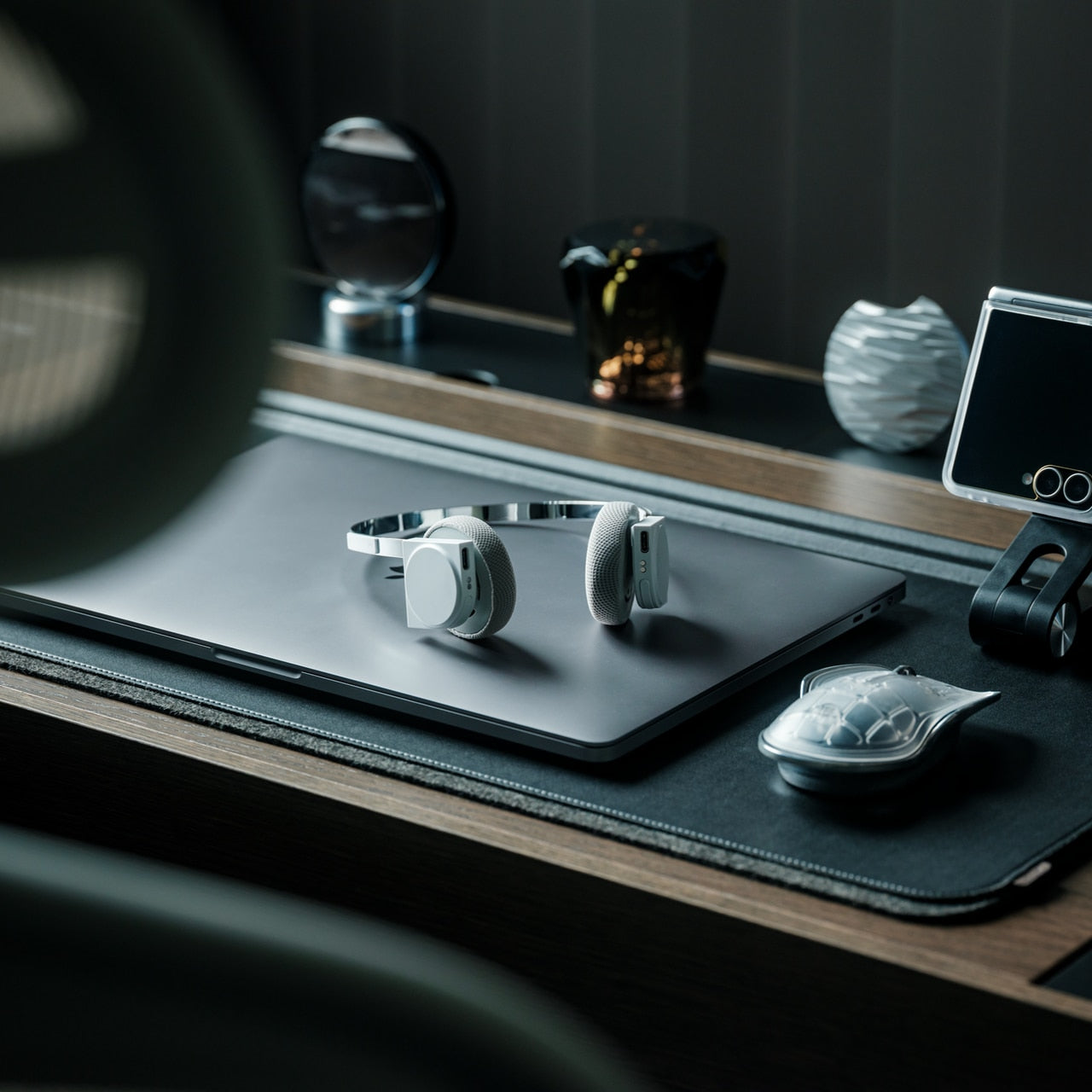
8. StillFrame Headphones

The case for taking good headphones outside has never been stronger, and the StillFrame makes a compelling argument for why. They occupy the space between in-ears and over-ears deliberately — more open than the former, more relaxed than the latter. “Featherlight yet full-bodied” sounds like marketing until you put them on, at which point it just sounds accurate. Listening becomes a physical ritual rather than background noise management.

For outdoor use, weight matters as much as sound. Headphones that feel present on your head become an irritant across longer stretches — hiking, a morning at the campsite, a slow afternoon by the water. The StillFrame disappears in a way that heavier alternatives don’t, which means you stop thinking about them and start thinking about what you’re actually listening to. That’s the benchmark for any piece of audio gear, and this one clears it comfortably.

Click Here to Buy Now: $245.00

What We Like

  • The positioning between the in-ear and over-ear categories gives it a comfort profile that holds up across extended outdoor use
  • At $245, the price reflects a genuine design object rather than commodity audio gear

What We Dislike

  • The open design means reduced passive isolation in high-noise outdoor environments like busy trails or campsites
  • The featherlight build may not appeal to listeners who associate weight with perceived audio quality

Gear That Earns Its Place

The outdoor tech category earns its bad reputation because most of it treats function and form as competing priorities. These eight products make the opposite argument: that the best gear is what you actually want to carry, because it holds up visually and practically. Each one has a design story worth reading before you even get to the spec sheet.

The RetroWave and BlackoutBeam are available directly through the YD shop. The MokaMax, Yuuye, and StillFrame have earned space in multiple roundups for good reason. The solar tent, still in concept territory, is the kind of idea that makes the rest of the industry look like it isn’t trying hard enough. Summer has better options than it used to.

The post 8 Best Summer Gadgets for Men Who Think “Outdoor Tech” Usually Looks Terrible first appeared on Yanko Design.

Huion Note E Feels Like E-Ink Paper but Actually Draws in Color

Digital notebooks have been having a moment. E-Ink tablets like the reMarkable and the Kindle Scribe have made a compelling case for leaving the legal pad behind, offering a pen-on-paper feel without all the clutter. But E-Ink’s inherent limitations, from its monochrome display to sluggish refresh rates, have kept it from being the obvious choice for anyone who regularly works with color content.

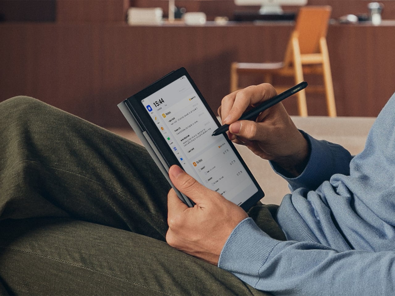
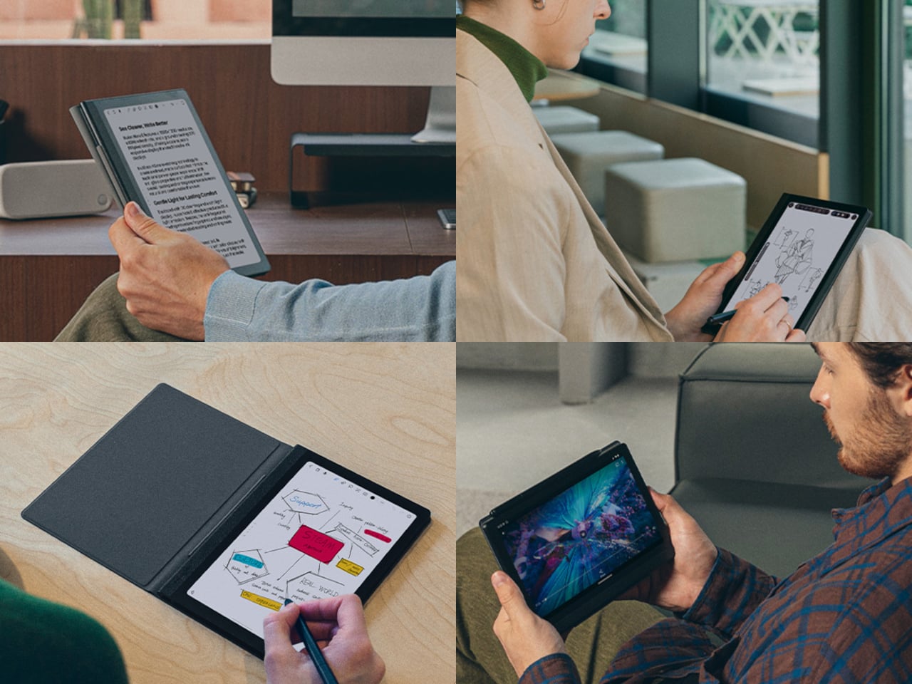
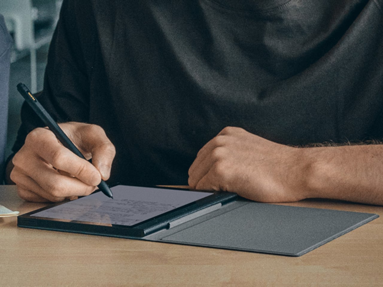
Huion, best known for its pen tablets and pen displays, is stepping into this space with the Huion Note E, an 8.4-inch Android electronic notebook that takes a different approach entirely. Instead of E-Ink, it uses a soft-light color IPS display with AG nano-etching technology to mimic that familiar pen-on-paper feel, while also delivering the vibrant colors and responsiveness that E-Ink simply can’t offer.

Designer: Huion

The display itself is what sets the Note E apart. It’s 1920×1200 resolution and 270 PPI pixel density outperform most E-Ink screens in sharpness, while the 60Hz refresh rate means scrolling through PDFs doesn’t feel like watching paint dry. Anti-glare etched glass and full lamination bring the pen contact point closer to the pixels beneath, giving strokes a more immediate, grounded feel.

The battery-free PW510 stylus magnetically attaches to the Note E, which helps keep it from getting lost in a bag. It delivers 8,192 levels of pressure sensitivity with a report rate exceeding 400 PPS, fast enough to keep up with even the most impatient sketchers. Pressure and tilt are both recognized, making annotations, signatures, and quick sketches feel far more deliberate than tapping at glass.

The Note E runs Android 15 on a MediaTek Helio G99 chip with 6GB of RAM and 128GB of storage. That’s not a powerhouse and not even the latest specs, but it’s more than enough for the built-in HiPaint drawing app, PDF annotation, and everyday productivity tools from the Play Store. Think of it less as a tablet competing with an iPad and more as a focused digital workspace.

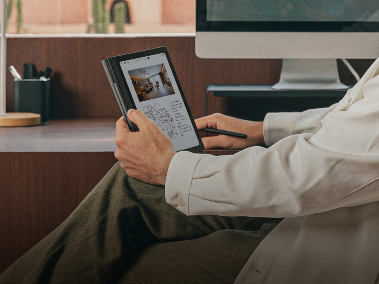
At 7.4mm thick and 348 grams, the Note E is slim enough to slip into a bag without adding noticeable weight, and its 8.4-inch footprint closely matches a standard A5 notebook. A 4,500mAh battery with 18W fast charging keeps it going through long reading and writing sessions, while the magnetic protective case doubles as a stand for more comfortable viewing angles.

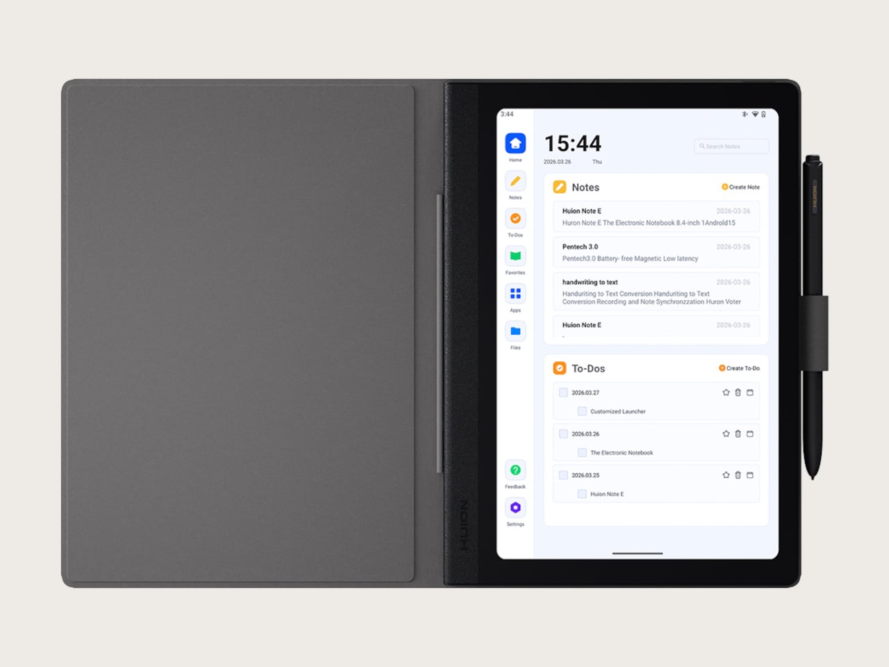
Huion has also thought carefully about the software side. A customized launcher opens directly to notes and to-do lists, skipping the usual Android clutter that makes you forget what you sat down to do. Handwritten notes are searchable, PDFs can be annotated in color, and everything can be exported and shared. For project managers, students, and mobile creatives, it’s a pretty compelling combination.

The post Huion Note E Feels Like E-Ink Paper but Actually Draws in Color first appeared on Yanko Design.

Google’s Android XR Glasses Pick Gentle Monster and Warby Parker

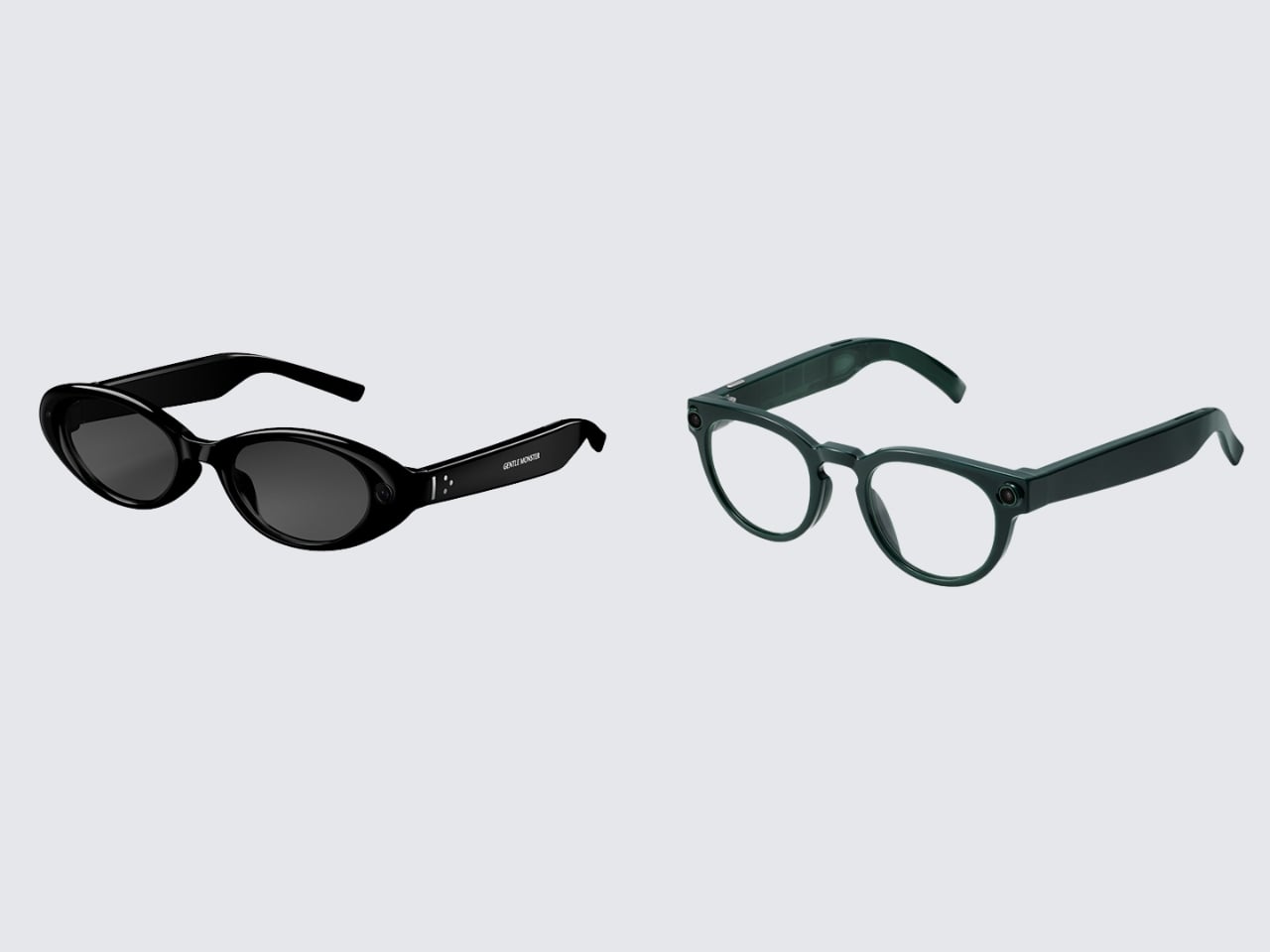
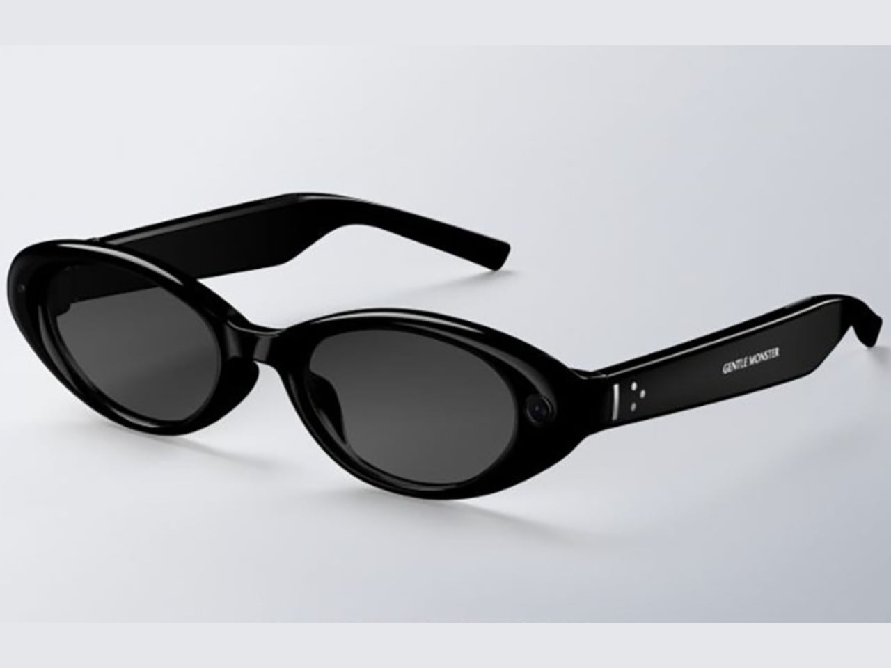
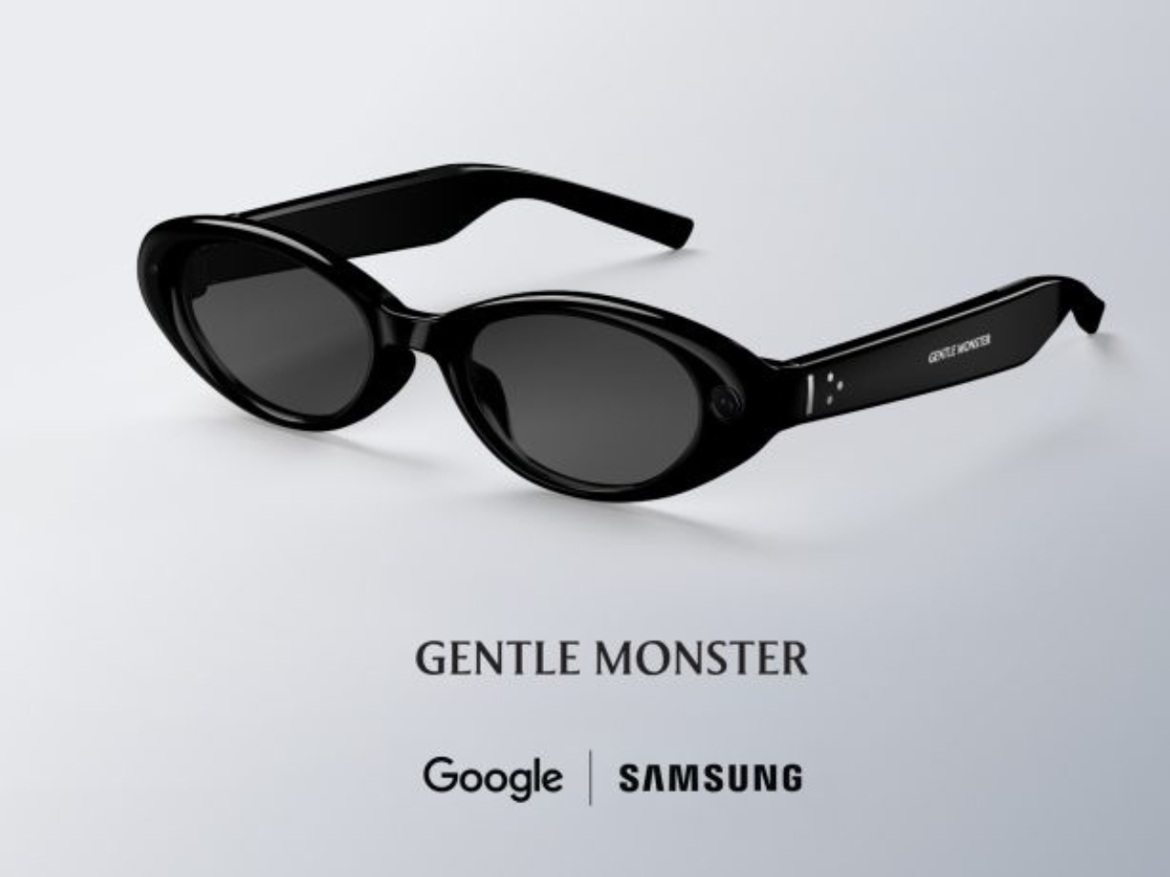
The biggest design announcement to come out of Google I/O 2026 did not involve a language model. It involved a pair of frames. On May 19, Google and Samsung unveiled their Android XR intelligent eyewear, a product that still has no official name, no confirmed price, and no exact ship date beyond “this fall.” What it does have is two very deliberate aesthetic camps: Gentle Monster on the disruptive end, Warby Parker anchoring the refined and timeless side. And leading with eyewear partners instead of chipset specs felt like the most coherent product launch decision Google has made in years.

Two form factors are on the way. Audio glasses ship first, landing later this fall. Display glasses follow at some point after that. The audio version is exactly what it sounds like: Gemini in your ear, accessed by saying “Hey Google” or tapping the frame. From there, you can pull up turn-by-turn navigation, real-time translation, hands-free calls, photo capture, and multi-step task execution through third-party apps like DoorDash and Uber. The glasses work with both Android and iOS, which is smarter than it sounds. Picking a platform fight at launch would have cut the potential audience in half before a single pair hit a face.

Designer: Google x Samsung

The more interesting story, though, is what the Gentle Monster and Warby Parker pairing actually signals. These are not interchangeable options with different colorways. Gentle Monster built its entire identity on turning eyewear into conceptual art, the kind of brand that stages gallery-scale retail installations and has never been embarrassed to make a statement. Warby Parker, on the other hand, is the brand that convinced a whole generation that glasses could be accessible, thoughtful, and quietly cool without trying too hard. Putting both on the same platform is Google saying, very clearly, that Android XR is not a single-consumer product. It is a platform designed to flex across aesthetic identities the same way Android flexes across phone manufacturers.

That framing matters a lot when you look at the competitive landscape. When Meta launched its Ray-Ban Display glasses with EssilorLuxottica, it made a calculated bet on one legacy brand and one aesthetic: cool-casual, lifestyle-adjacent, slightly sporty. The strategy has worked reasonably well. Google is trying something architecturally different. Two visual identities, baked in from day one, each with its own mood and customer. Whether that becomes a genuine advantage or a positioning headache will depend entirely on execution, but the intent is worth paying attention to.

The missing information in this announcement is not accidental. No price. No product name. No exact release date. All of that has been deliberately saved for fall, which means we are still in the phase where the visual story matters more than the spec sheet. That is the right call. If Google had led with processor benchmarks and battery life numbers right now, the conversation would have immediately turned into a hardware comparison against Meta. By leading with Gentle Monster and Warby Parker, they shifted the frame entirely. We are not talking about a spec race. We are talking about what you actually want to wear.

Industrially, the frames read as genuinely wearable. Temple thickness, hinge detailing, and touchpad placement all suggest that someone with a real brief about daily wear and aesthetic integrity was in the room during development. The original Google Glass was technically ambitious and aesthetically alienating, and that gap between capability and wearability became the most expensive lesson in smart glasses history. The Android XR eyewear, at least from what has been shown, appears to have absorbed it.

The fall window is real. Prescriptions, pricing, and the question of what this product is actually called will all arrive before year’s end. But right now, two days out from the reveal, the conversation that Google and Samsung have started feels like the right one. Not what can these glasses do, but who are these glasses for. When the design partners are Gentle Monster and Warby Parker, the answer is already pretty interesting.

The post Google’s Android XR Glasses Pick Gentle Monster and Warby Parker first appeared on Yanko Design.
ASUS’s €280 9mm OLED Monitor Charges Your Laptop Back

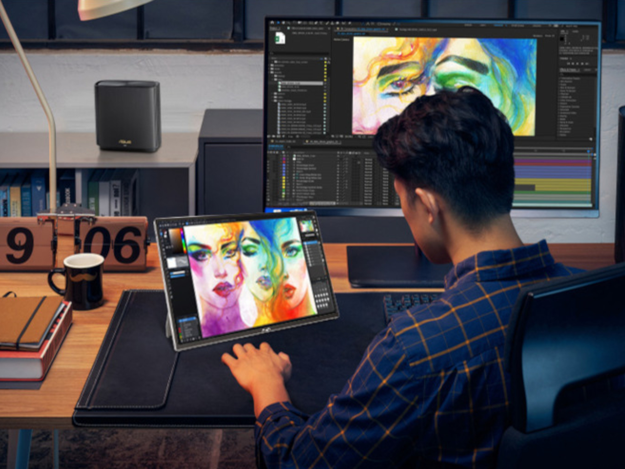
Portable monitors have quietly become one of the most appealing accessories for people who work on the go. Pack a slim second screen, connect it to your laptop, and you’ve doubled your workspace without lugging a desktop around. What nobody really advertises, though, is the trade-off: those displays almost always draw power from the laptop they’re attached to, cutting into the battery life you were counting on.
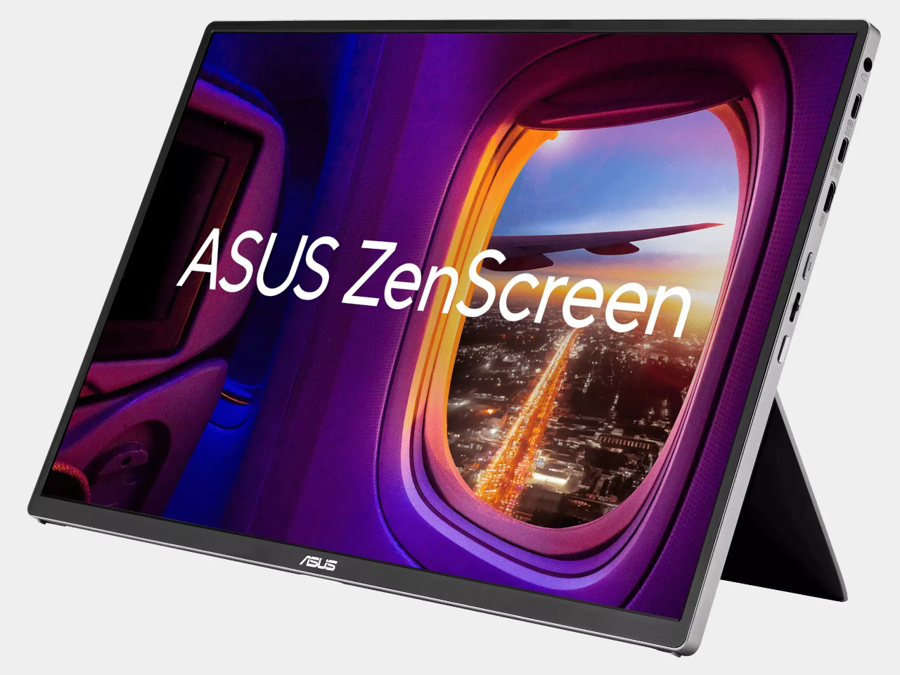
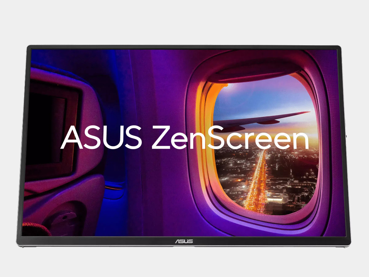
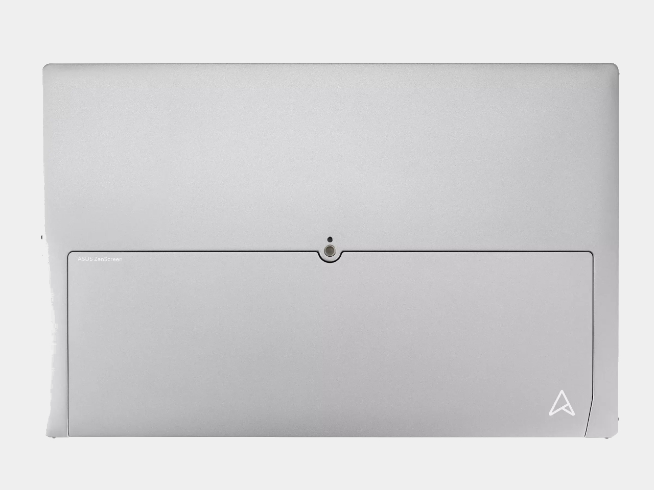
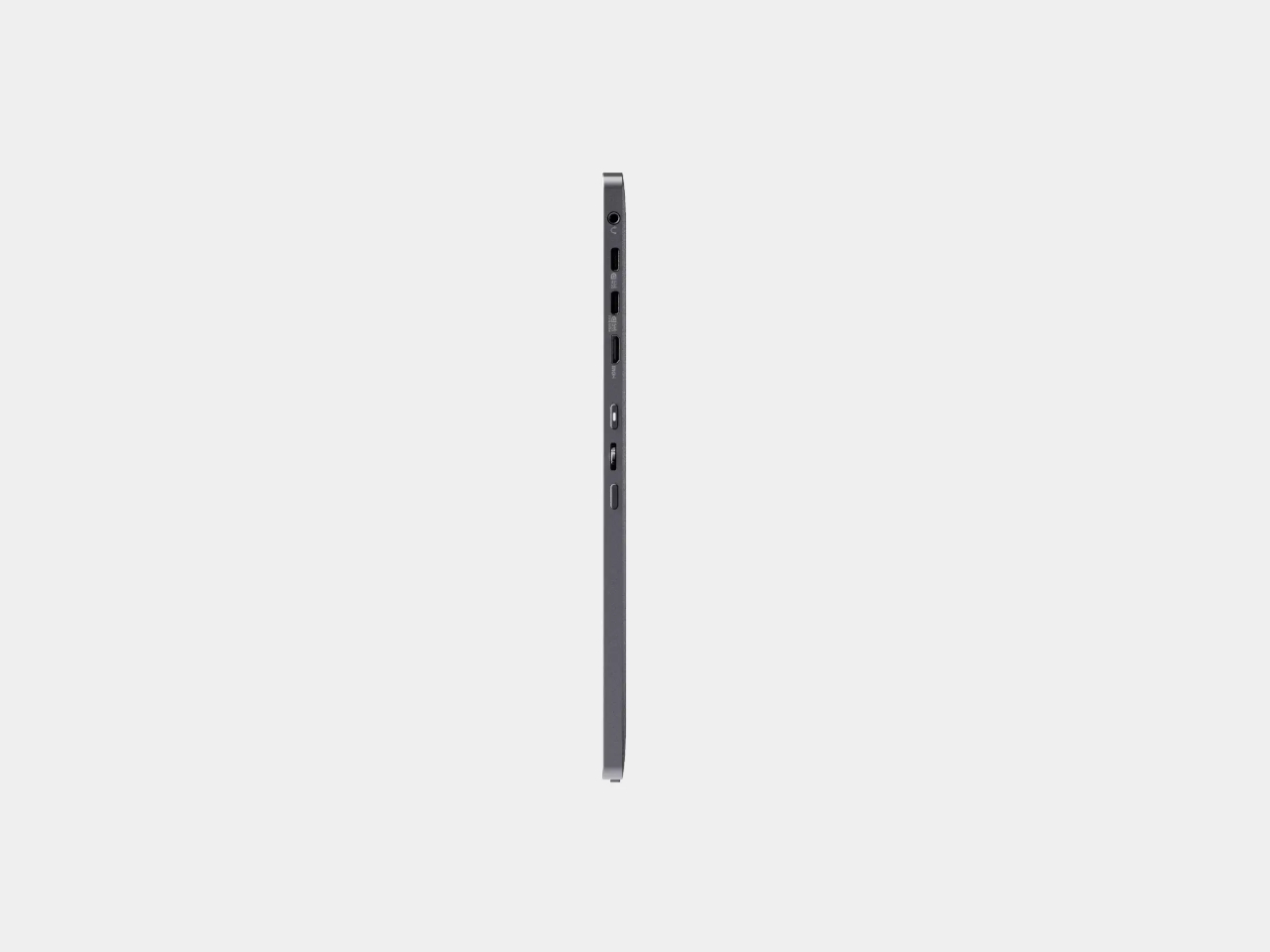
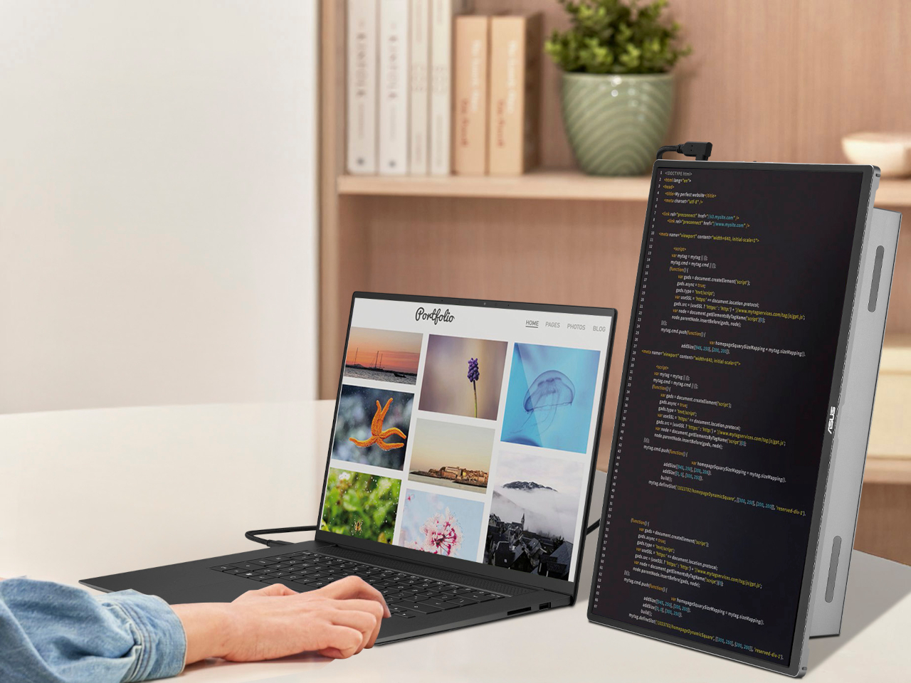
The ASUS ZenScreen OLED MQ16FC tries to fix that. It’s a 16-inch portable OLED display that launched in Europe in early May 2026 at around €280 to €300, measuring 9mm thin and weighing roughly 0.68 kilograms. Those are already respectable numbers for a display of this size, but what actually sets it apart is buried in the port specification: two USB-C connections that can send power in either direction.

Designer: ASUS

Here’s how that works in practice. Plug a USB-C charger into one port on the monitor, then run a single cable from the second port to your laptop. That cable carries both the video signal and up to 65 watts of power, so your notebook keeps charging while the display is running. No power brick plugged separately into the laptop, no second cable hunting for a free port.

It’s worth pausing on why that matters. Most portable monitors are passive in the power conversation; they take whatever the laptop offers and give nothing back. ASUS’s approach treats the power relationship between screen and computer as something the monitor has a responsibility to manage. That’s a small but meaningful shift in thinking, one that asks the accessory to do more work instead of quietly billing the host.

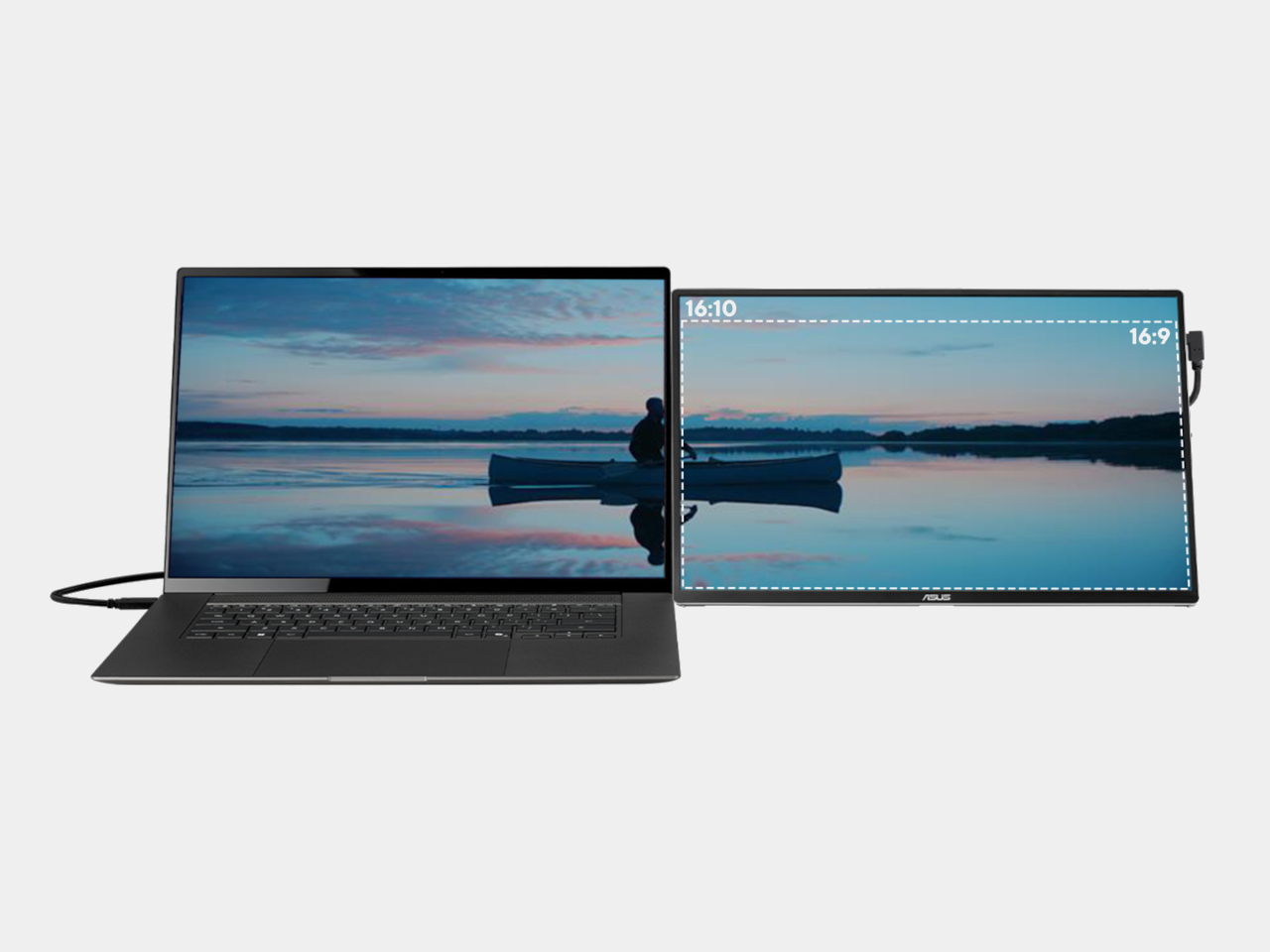
Beyond the power story, the MQ16FC has a display worth carrying. The OLED panel covers 95% of the DCI-P3 color gamut at a 1920 x 1200 WUXGA resolution in a 16:10 aspect ratio, which adds that extra vertical breathing room that widescreen layouts tend to cut off. Contrast is practically infinite by OLED standards, and a 1ms response time keeps things clean enough for video and everyday multitasking.

That said, the MQ16FC isn’t without its quiet losses. There’s no internal battery, so without a charger in the loop, the monitor can still draw from your laptop’s reserves. The 60Hz refresh rate and WUXGA resolution are competent but not particularly exciting for a display positioned as premium. The kickstand-only stand can be awkward on tray tables, and the glossy OLED panel isn’t always your friend in brighter environments.

None of those shortcomings cancels out what makes the MQ16FC interesting. Adding a second screen to a laptop has always been a negotiation between convenience and cable chaos, and for years, the hardware hasn’t done much to simplify that deal. A portable monitor that treats power routing as part of its job description is making a quiet argument about what the category should have been doing all along.

The post ASUS’s €280 9mm OLED Monitor Charges Your Laptop Back first appeared on Yanko Design.