Acer’s DualPlay Mini Is What Happens When a Steam Deck Meets a Laptop

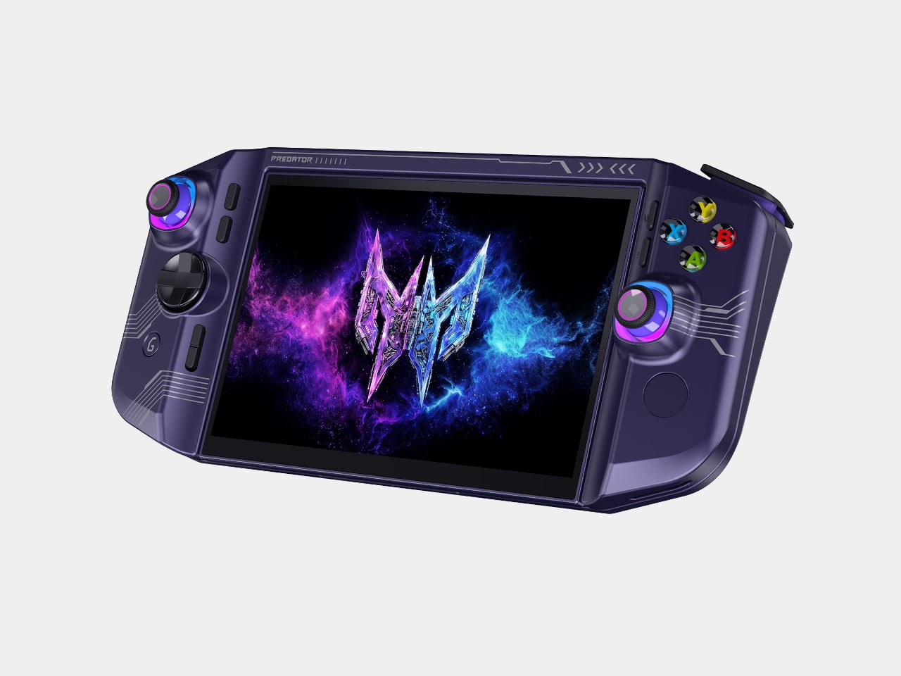
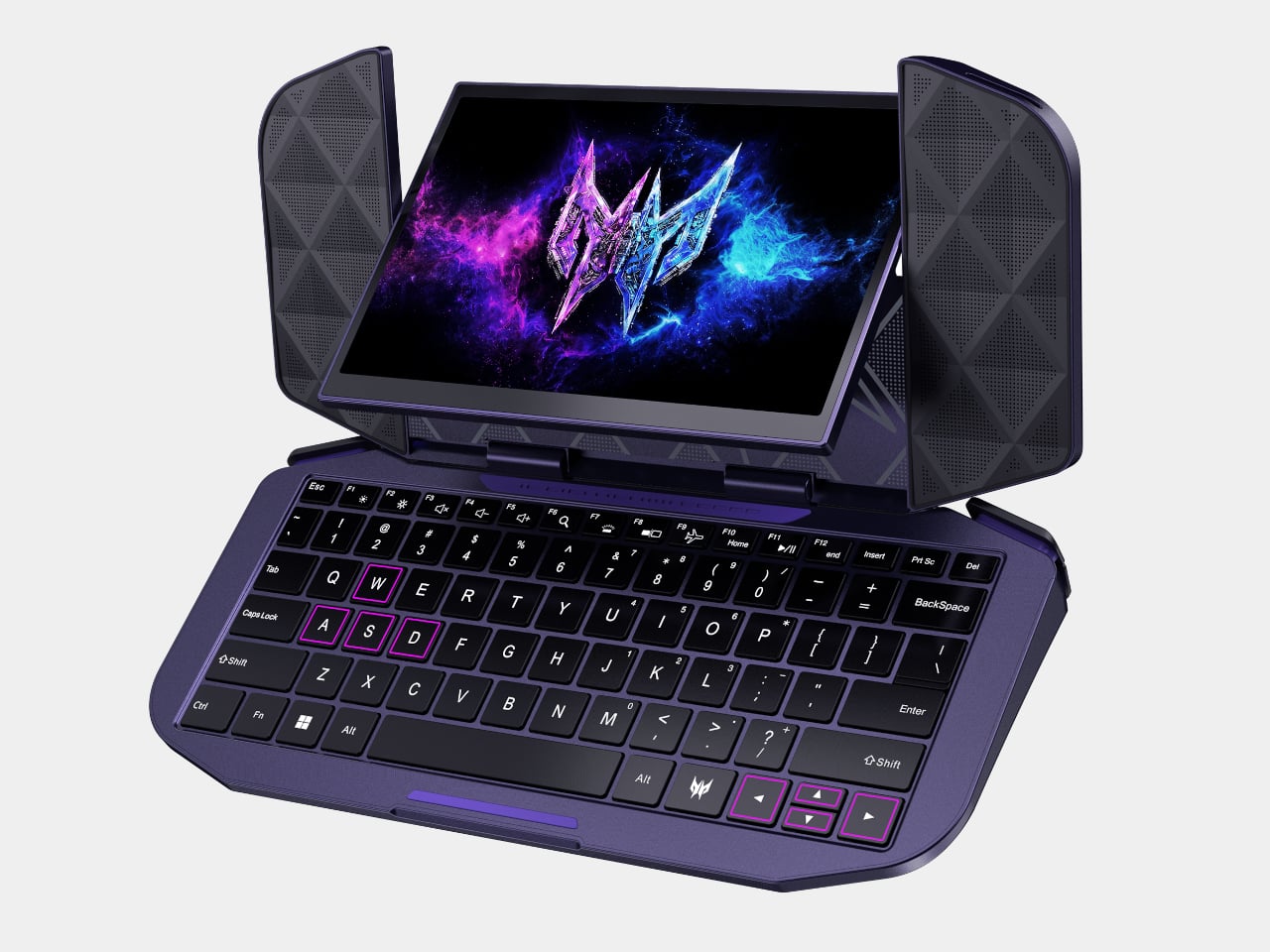
Acer’s Project DualPlay Mini refuses to pick a lane between gaming and work, and that refusal is the whole point. Revealed as a concept at IFA 2026, this 8-inch device from the Predator brand reimagines what a gaming handheld form factor can do, built around dual utility that lets it move fluidly between gaming and productivity without requiring a separate device for each. It reads less like a gadget mashup and more like an argument for mobile computing that reshapes itself around your day.

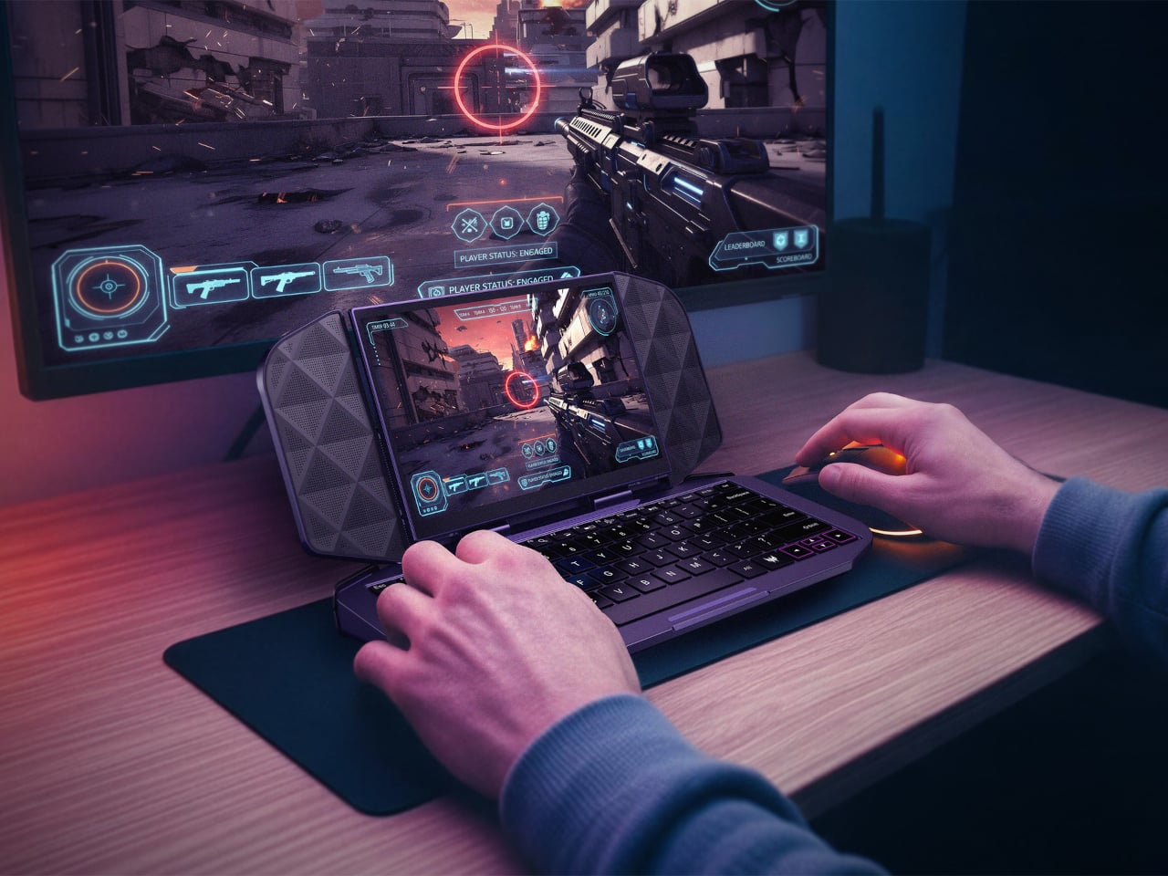
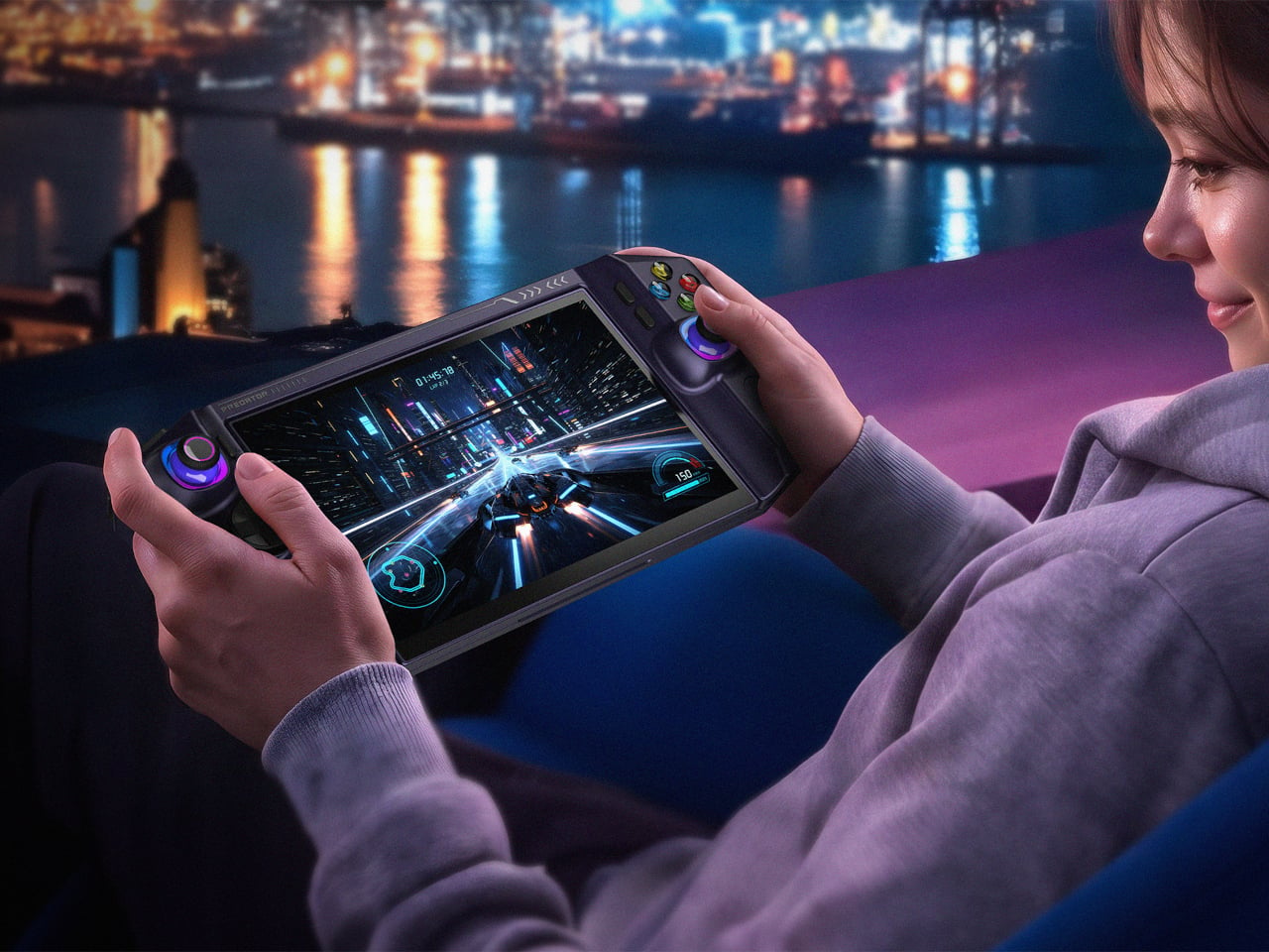
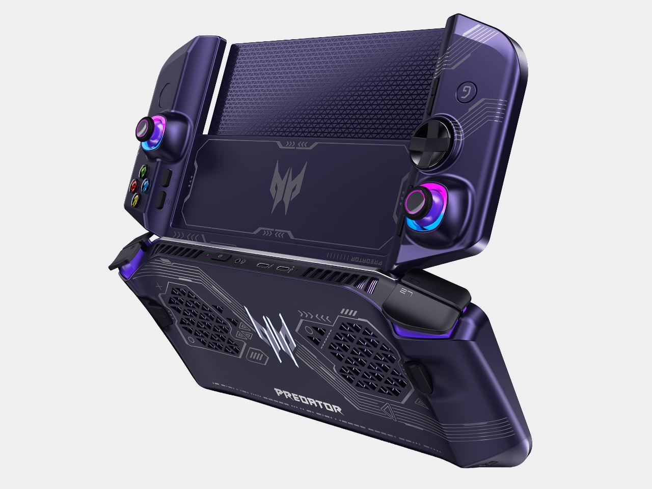
Pick it up as a handheld and Project DualPlay Mini behaves like any console-style device, with dual joysticks, a D-pad, and ABXY buttons framing an 8-inch display for genres that reward quick reflexes and thumb precision. Flip that same shell into laptop mode, though, and a built-in backlit physical keyboard enables the traditional laptop mode for first-person shooter games, while the handheld mode supports console-like experiences for other genres.

Designer: Acer

That transformation runs on a hinge that swivels as it folds, letting the distinctive design convert between handheld and mini-laptop modes at angles a standard clamshell can’t reach. Triangular speaker grilles flank the display on either side, doubling as stands that prop the screen upright once the keyboard tucks flat beneath it. The mechanism turns what could have been an awkward compromise into a shape that looks deliberate in either orientation.

Underneath, the concept integrates the same dual-fan cooling architecture as the Predator Atlas 8, with one Predator AeroBlade metal fan and one plastic fan, except the metal fan offers thinner blades. That detail matters more than it sounds, since squeezing laptop-grade thermals into a form factor built for one hand means the fans can’t afford to be an afterthought.

Acer folds a quiet anniversary tribute into the design too. The back cover hides the words “Acer 50 since 1976” embedded in Morse code, a detail that reflects both the milestone and the Predator brand’s identity. It’s a small flourish, easy to miss during a quick gaming session, but it gives the concept a personality beyond spec sheets and marketing bullet points.

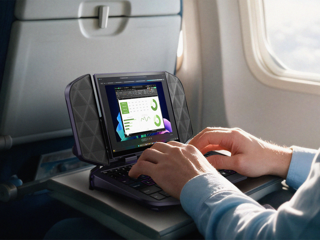
That dual nature earns its keep once the workday intrudes on downtime. Connect an external screen and the device operates as a mobile work device, allowing users to stay productive while on the go without needing a second device. Slide it onto a tray table during a flight, and the keyboard and flanking speaker panels prop the screen up like a tiny travel monitor.

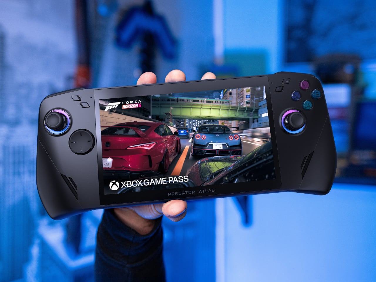
Away from any desk, the handheld mode holds its own too, cradling both palms with contoured grips and a display bright enough to hold up against ambient city light bleeding through a window. Racing games and open-world titles look right at home stretched across that screen, a reminder that DualPlay Mini’s productivity trick never comes at the cost of its gaming chops.

Project DualPlay Mini remains a concept only, with exact specifications, prices, and availability still unconfirmed. Still, it points toward a future where handheld gaming rigs and travel laptops stop being separate purchases. Concepts like this rarely ship unchanged, but this one lays out a shape worth watching as Acer keeps blurring the line between play and work.

The post Acer’s DualPlay Mini Is What Happens When a Steam Deck Meets a Laptop first appeared on Yanko Design.

Acer’s IFA 2026 Handheld Packs Flagship Specs Into 7 Compact Inches

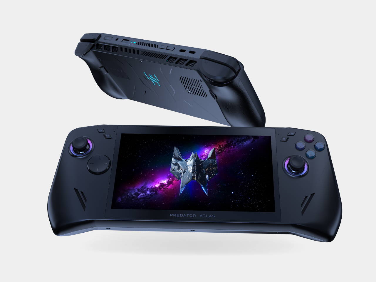
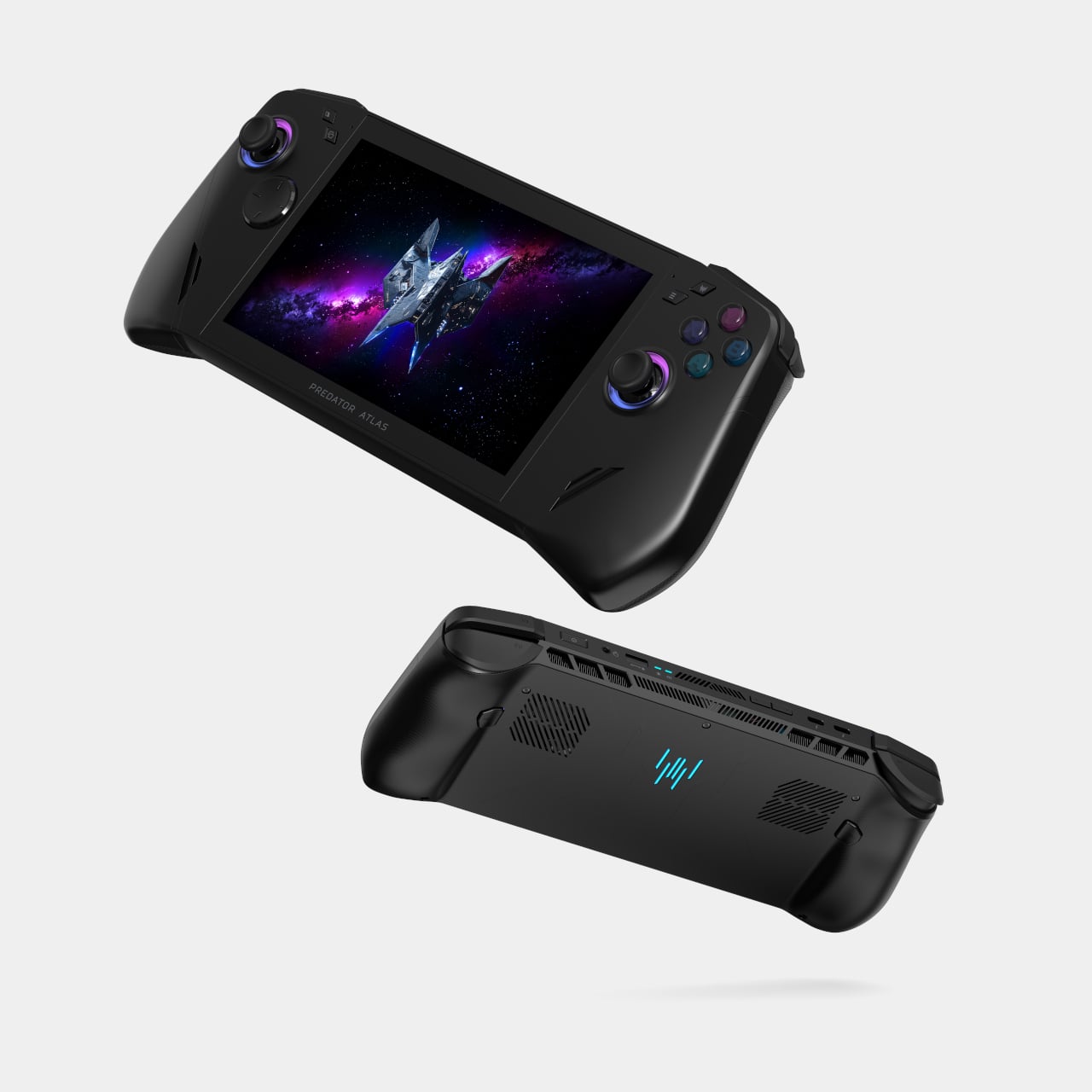
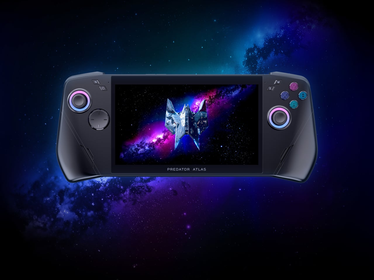
Acer’s Predator Atlas 7 proves that a gaming handheld doesn’t need to look like a slab of plastic armor to feel powerful. Unveiled at IFA 2026, this 7-inch device trims the bulk of its 8-inch sibling into a shape that slides into a bag as easily as it fits into your palms. It’s compact, but every curve and vent hints at the muscle hiding underneath its shell.

Acer built the Atlas 7 to share visual DNA with its 8-inch sibling, keeping the same flagship design language in a smaller shell rather than treating the smaller model as an afterthought. That continuity matters for a lineup meant to scale across different hand sizes and travel habits, giving shoppers a matching pair of handhelds instead of two unrelated products competing for shelf space.

Designer: Acer

Pick it up, and you’ll notice the contoured grips right away, curved just enough to cradle your palms without forcing your fingers into an awkward reach. An enlarged palm rest, recessed keys, and a textured anti-slip finish keep your hands locked in place, even after hours of gripping through a marathon session. It’s the kind of ergonomic thinking that turns comfort into a genuine competitive advantage.

Slide your thumbs onto the joysticks and the option for tunneling magnetoresistance (TMR) sticks becomes obvious in feel alone, delivering precise tracking with zero dead zones and none of the drift that plagues cheaper handhelds. Hall-effect triggers add pressure-sensitive control for racing and shooting genres alike, while a fingerprint reader built into the power button logs you in before you’ve even settled into your seat.

Underneath the shell, a dual-fan cooling system keeps temperatures in check without turning the Atlas 7 into a furnace. The precision metal Predator AeroBlade fan packs 89 blades thinner than a sheet of paper, lifting airflow by up to 10 percent, while a secondary plastic fan and Vortex Flow tuning push hot air out through angled channels for sustained performance.

The 7-inch FHD touchscreen refreshes at 120Hz with up to 500 nits of brightness and Variable Refresh Rate support, so fast-paced titles render smoothly whether you’re chasing frame rates at home or squinting under harsh daylight on a commute. A layer of Corning Gorilla Glass Victus with DXC treatment resists scratches and glare, and Acer even tosses in a tempered-glass screen protector for extra peace of mind.

Two Thunderbolt 4 ports turn the Atlas 7 into a proper docking companion, streaming visuals to bigger screens or pulling data through fast peripherals, while UHS-II microSD support leaves room for expanding storage on the fly. An 80Wh battery backs it all up, and Killer Wi-Fi 7 with Bluetooth 5.4 keeps connections steady while the PredatorSense app puts performance modes, lighting, and monitoring within a single tap.

Audio holds up too, with dual 2-Watt speakers tuned for DTS:X Ultra and two mics running Acer PurifiedVoice to cut background noise during voice chats. Paired with its trimmer shell, these touches turn the Predator Atlas 7 into a handheld built for gaming between destinations, not just at a desk. Acer plans to launch it in North America by Q4 2026, with Europe following in November.

The post Acer’s IFA 2026 Handheld Packs Flagship Specs Into 7 Compact Inches first appeared on Yanko Design.

Acer Finally Made a Premium Laptop You Can Actually Repair Yourself

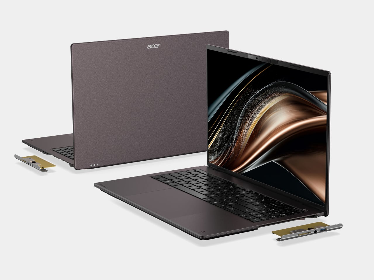
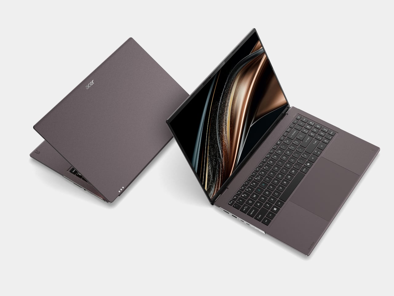
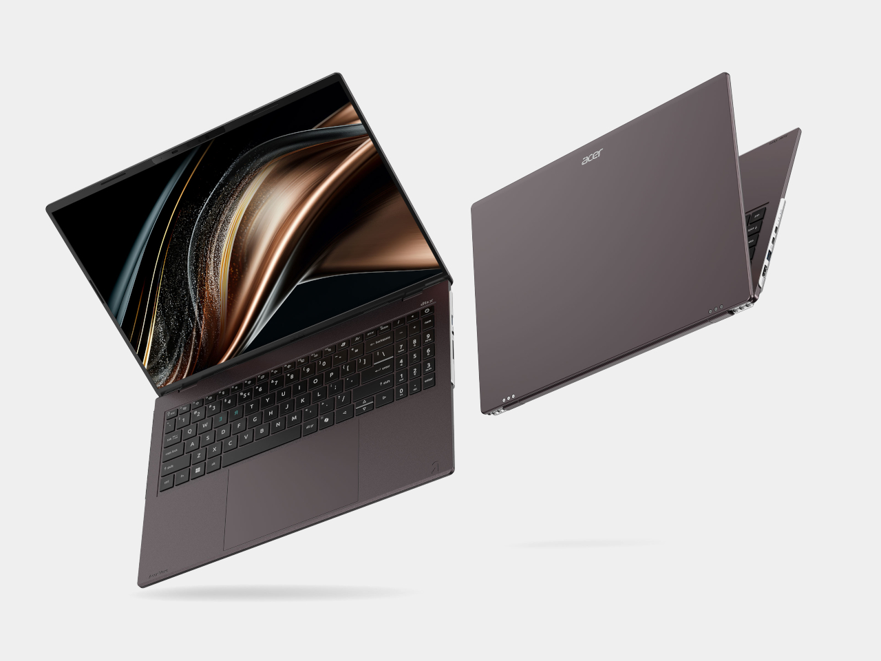
Acer’s Vero 16 treats repairability as a design language rather than an afterthought bolted on for marketing points. Announced at IFA 2026, this fourth-generation Vero laptop wears its screws and access panels with pride, swapping the sealed, glued construction common to premium laptops for a chassis you can actually open without voiding a warranty or hunting down specialty tools. It’s a rare case where sustainability and good industrial design point in the same direction.

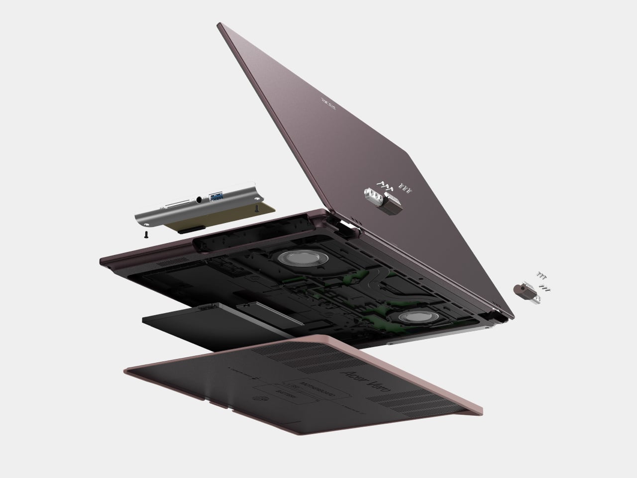
Flip the Vero 16 over and a visual guide etched directly into the bottom cover walks you through the repair process step by step, turning what used to require a service manual into something closer to assembling furniture. A tool-free access latch pops the bottom cover open, exposing a battery and SSD that users can swap themselves. The hinge detaches from the chassis entirely, and the I/O port covers on both sides lift away just as easily.

Designer: Acer

That repair-first thinking extends to future-proofing too. Acer built the Vero 16 to support processor upgrades for at least two generations, a rarity in an industry that generally treats laptops as disposable once the chip inside falls behind. Pair that with materials chosen for their afterlife, and the laptop starts looking less like a purchase and more like a long-term relationship with your hardware.

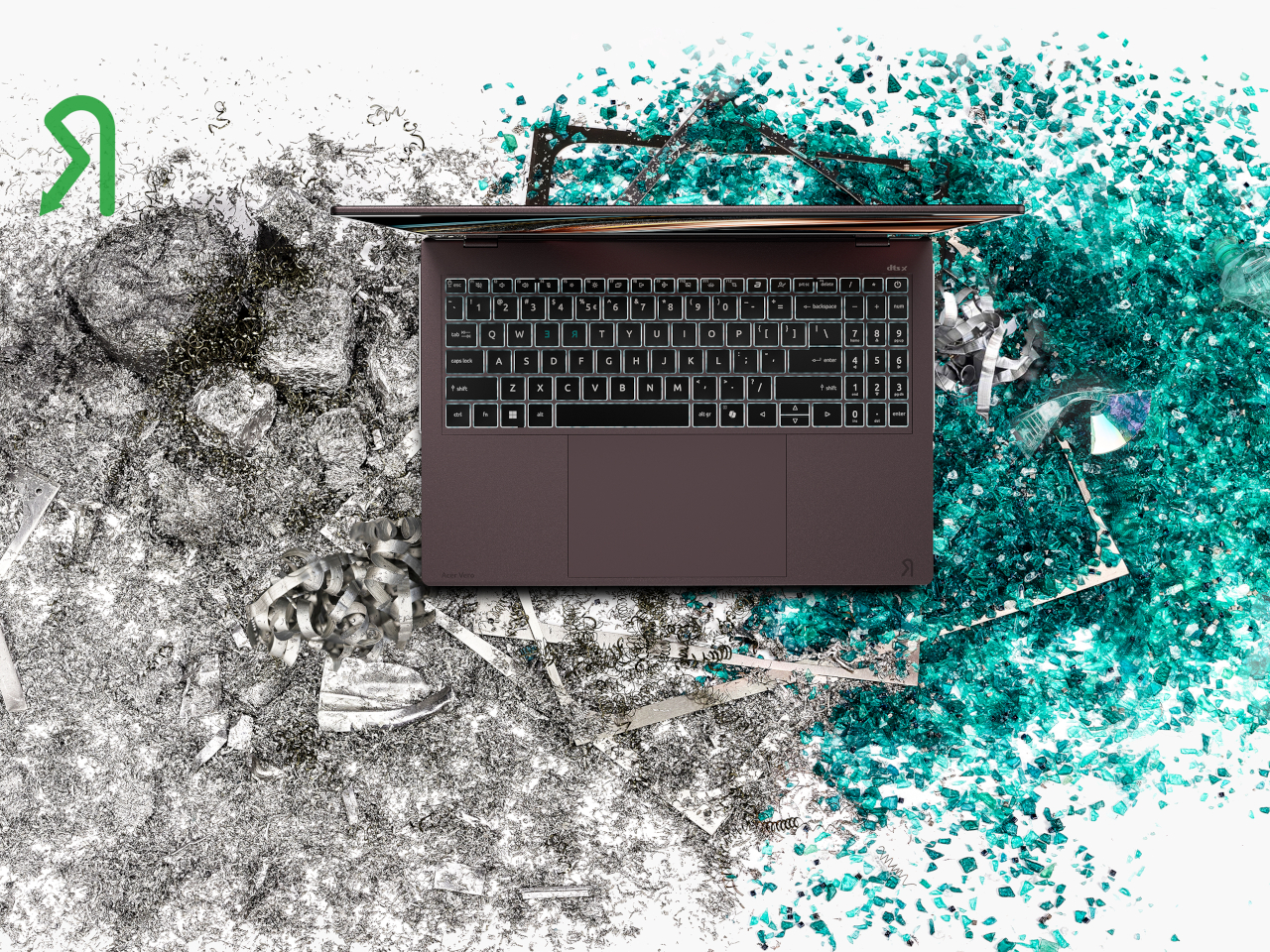
The chassis itself carries that same intentionality. The top and palm-rest covers combine 50% post-industrial recycled aluminum with 50% low-carbon aluminum, while the bottom cover uses 60% post-consumer recycled plastic and the display bezels use 30%. Acer finishes the whole thing in a solvent-free powder coating that cuts VOC emissions while resisting wear better than standard paint, so the Earthy Brown shell should still look presentable years into its service life.

None of that repair-friendly engineering comes at the cost of everyday usability. A 16-inch 3K OLED display handles video calls and spreadsheet work with equal ease, backed by up to an Intel Core Ultra X9 processor pushing 180 platform TOPS for on-device AI tasks. Acer PurifiedView sharpens video call quality automatically, while PurifiedVoice filters out background chatter, useful whether you’re presenting blueprints from a home office or narrating a game night to friends over a headset.

Connectivity rounds out the practical side, with two Thunderbolt 4 ports, an SD card reader, and HDMI 2.1 covering most peripheral needs, plus a USB Type-A port that keeps charging accessories even when the laptop itself is powered down. Acer MyKey adds a programmable shortcut for whatever app or website you open most, a small touch that saves the repetitive clicking most of us do without noticing.

The Vero 16 ships in 100% recyclable packaging made from recycled materials, closing the loop from box to chassis. Acer’s decision to expand its design approach from the standard 3R framework of reduce, reuse, and recycle into a fourth R for repairability suggests the company sees longevity as a feature worth building around, not a checkbox for sustainability reports. The Acer Vero 16 arrives in EMEA in Q1 2027, giving shoppers time to see how well that philosophy holds up against the rest of the market.

The post Acer Finally Made a Premium Laptop You Can Actually Repair Yourself first appeared on Yanko Design.

The 1960s Conversation Pit Is Back, and Milan Can’t Get Enough

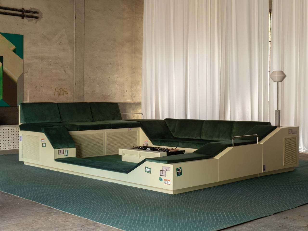
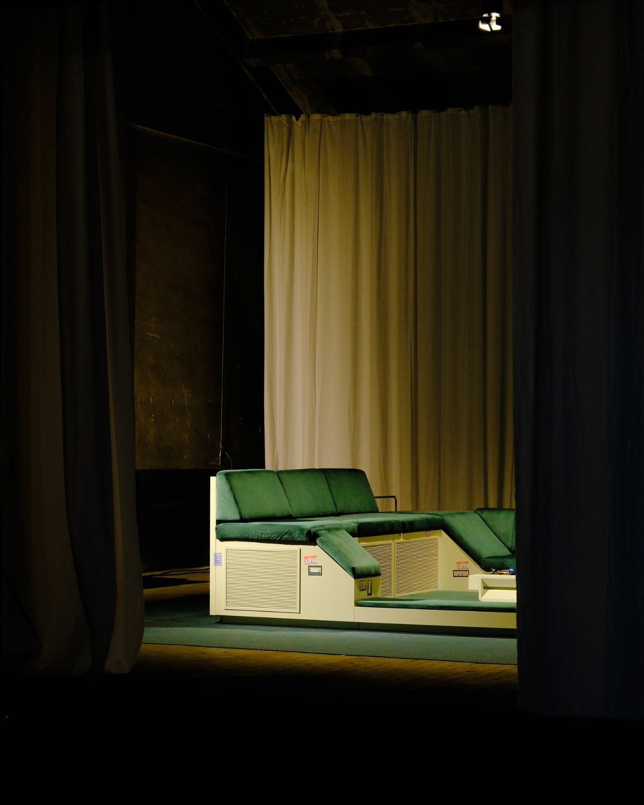
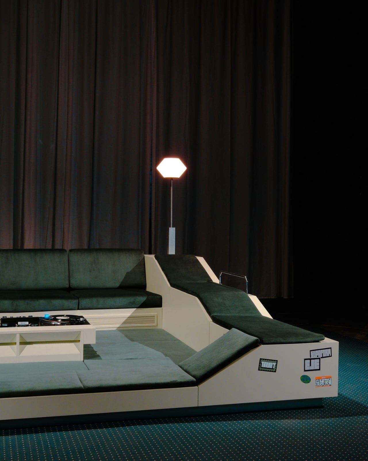
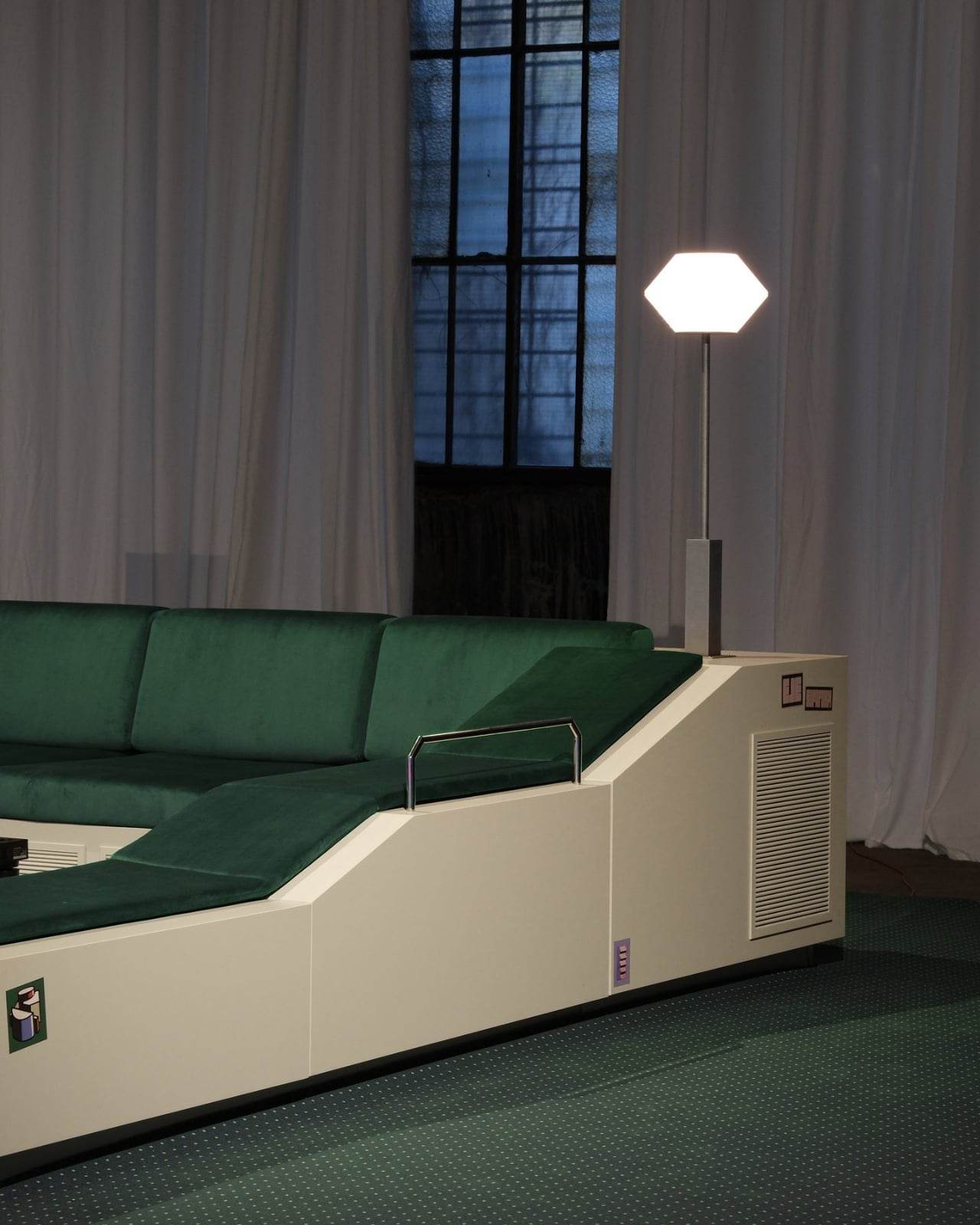
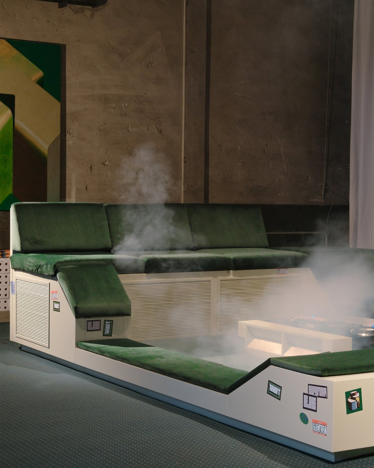
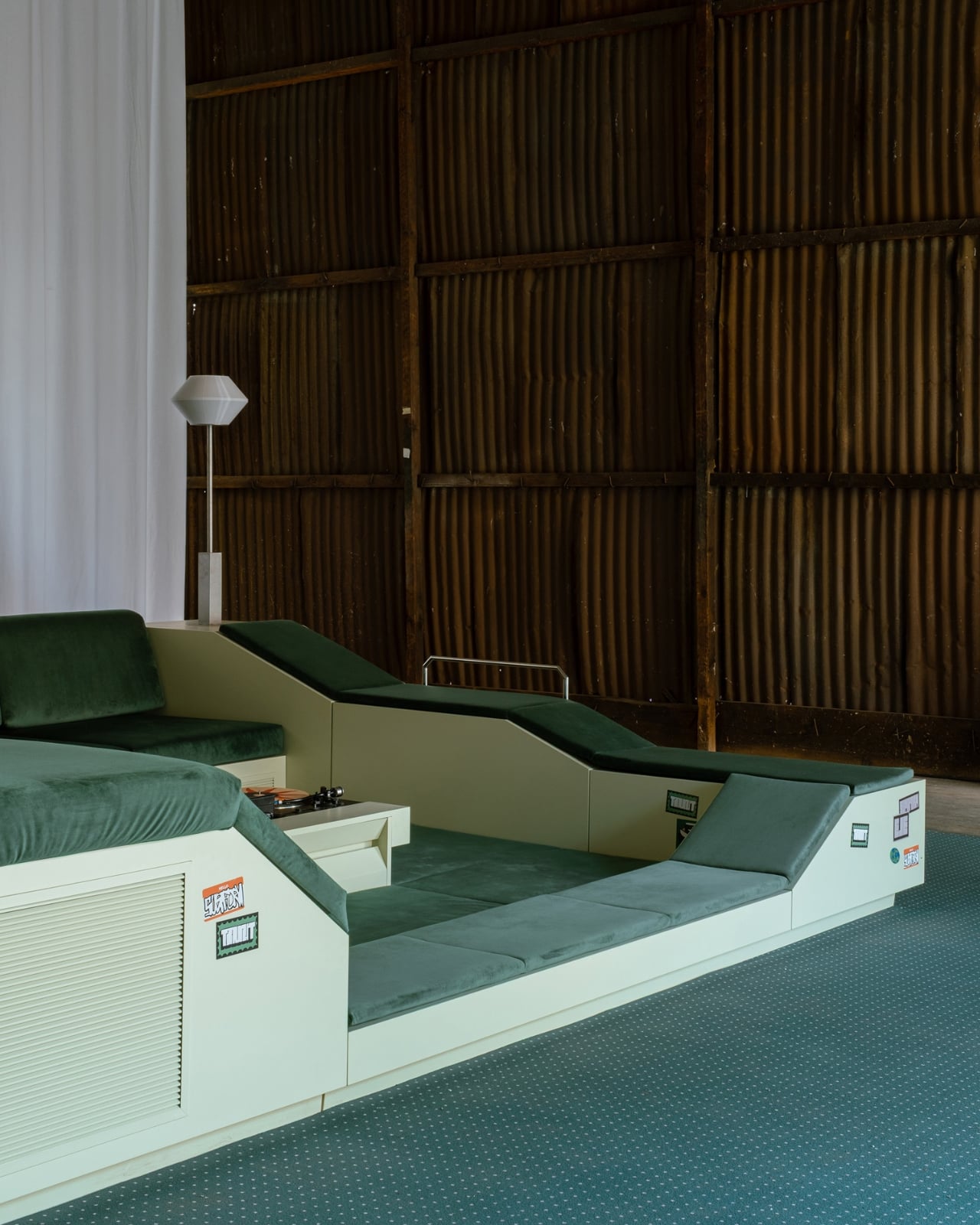
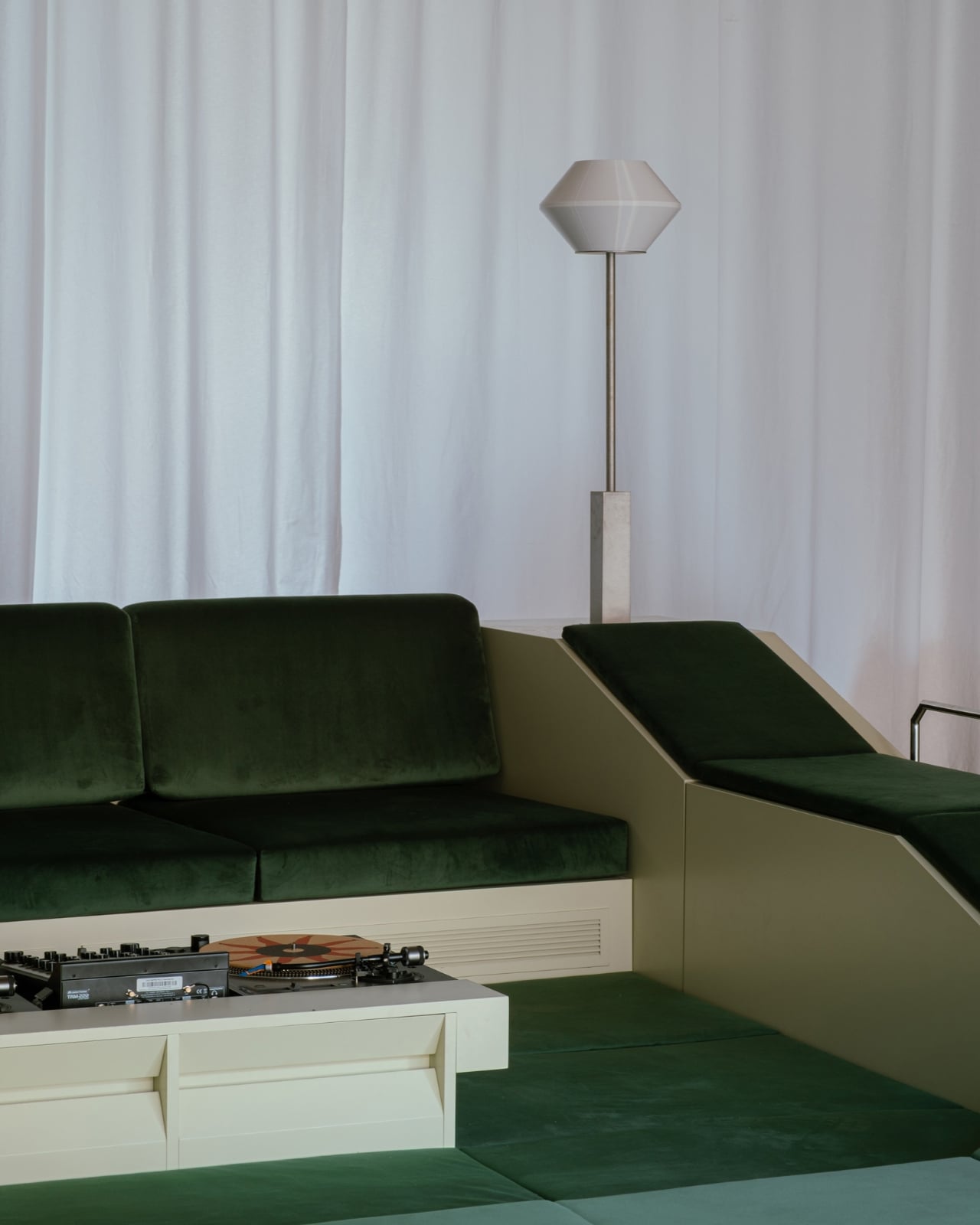
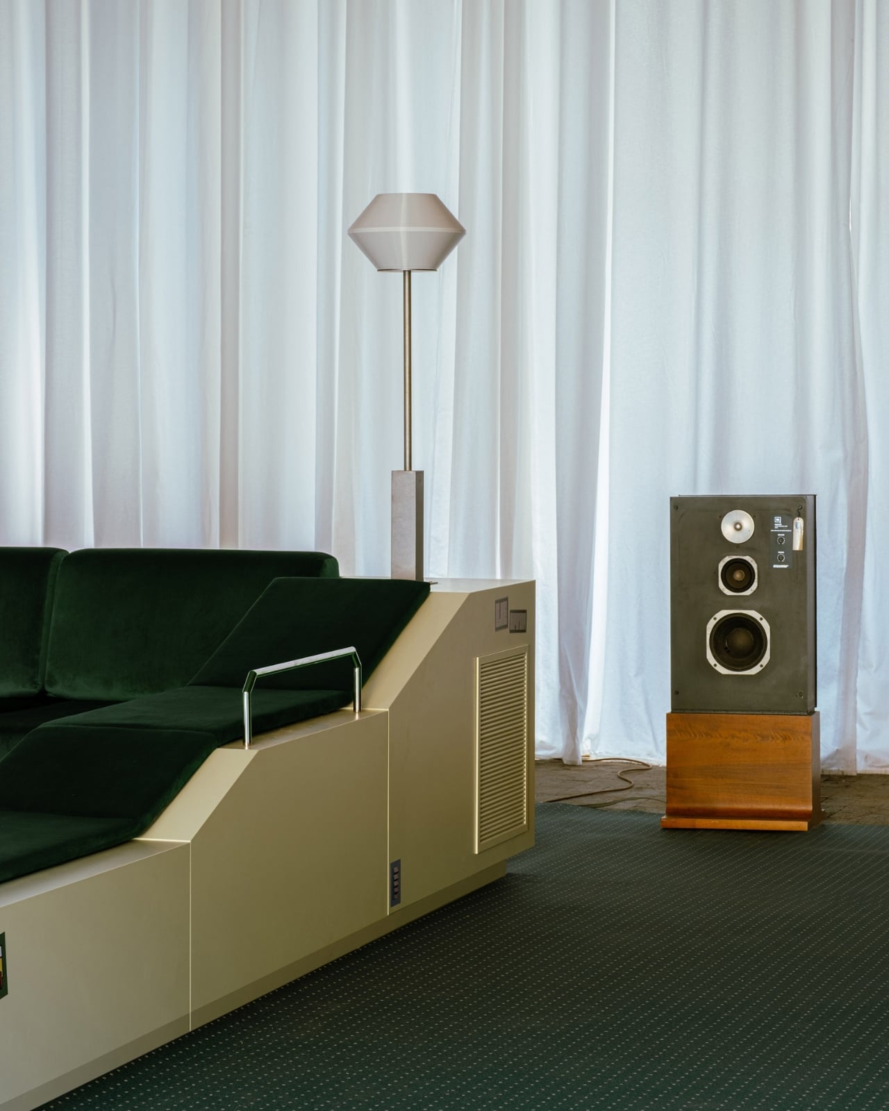
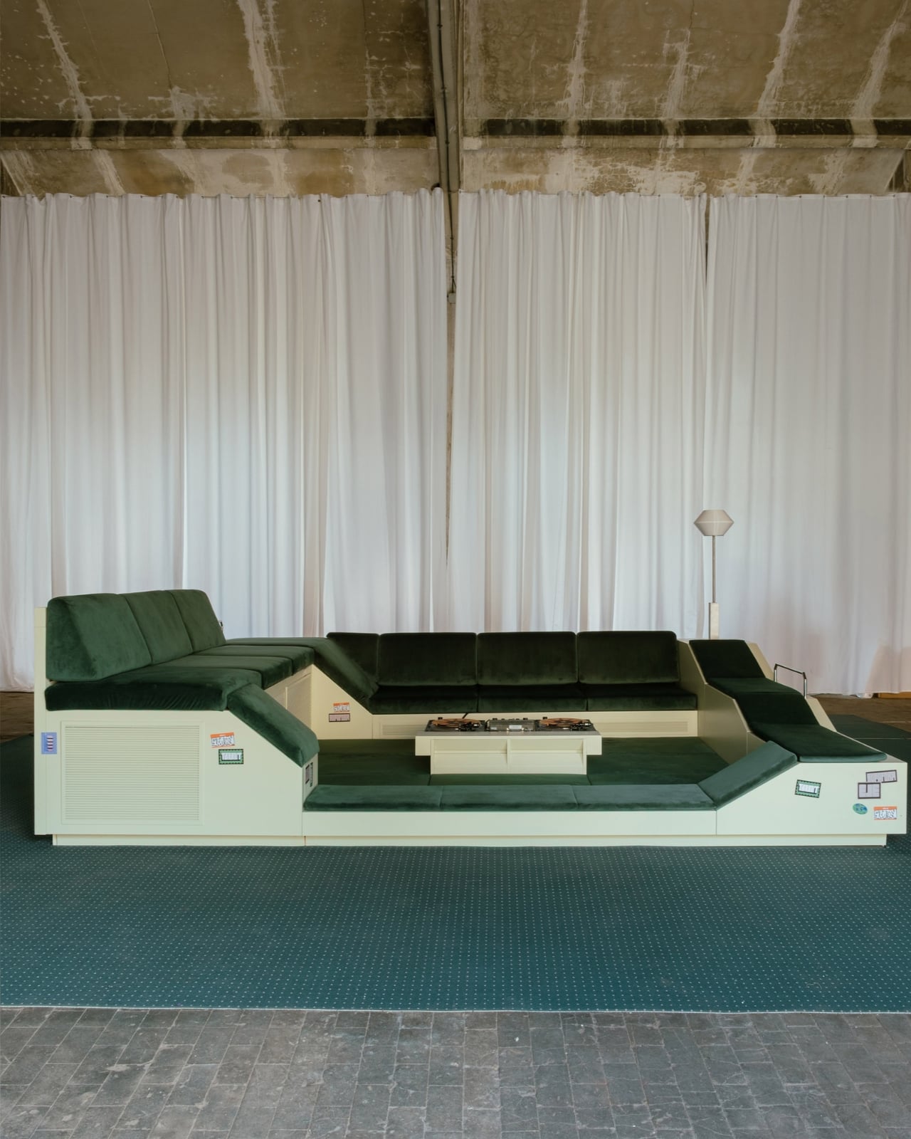
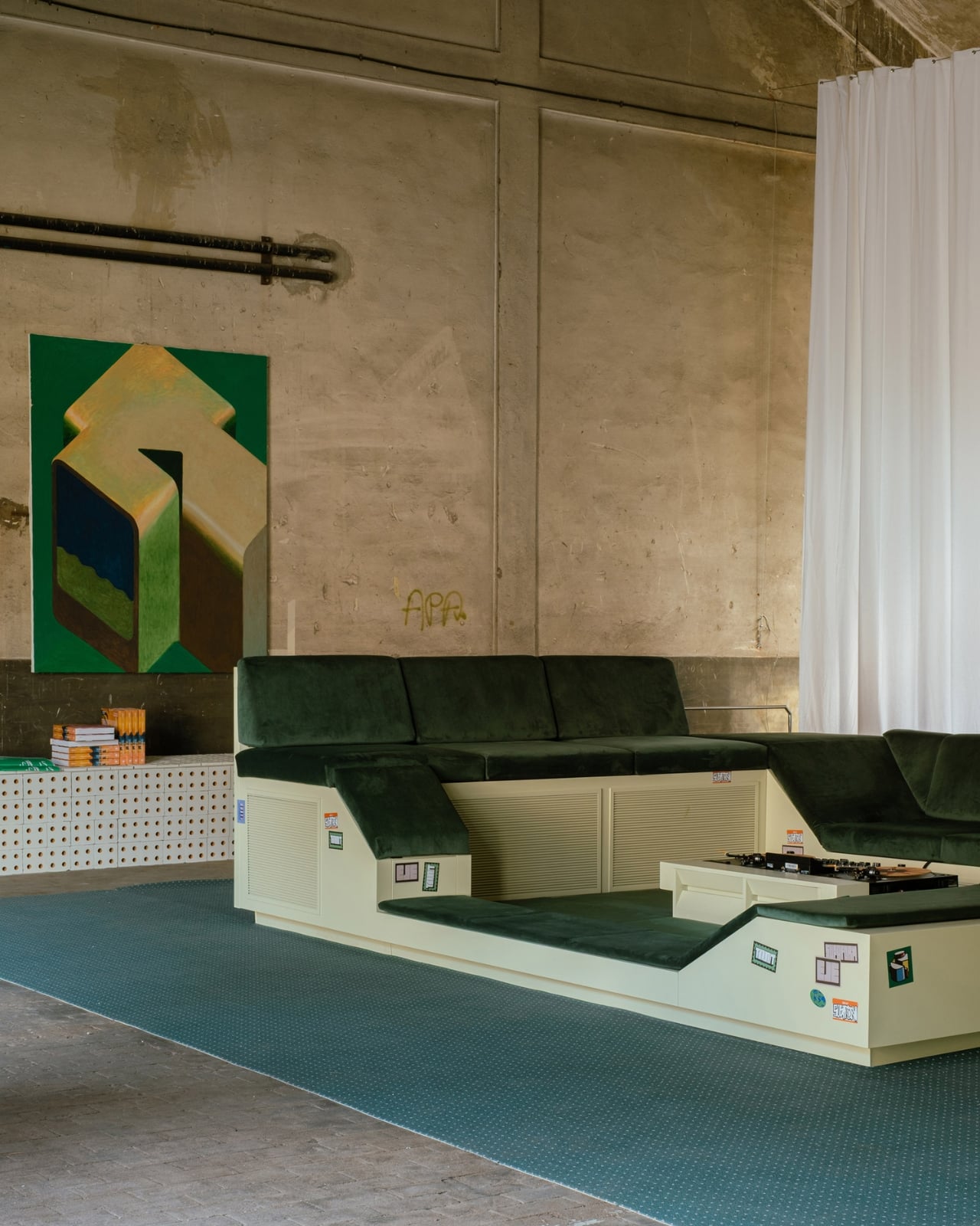
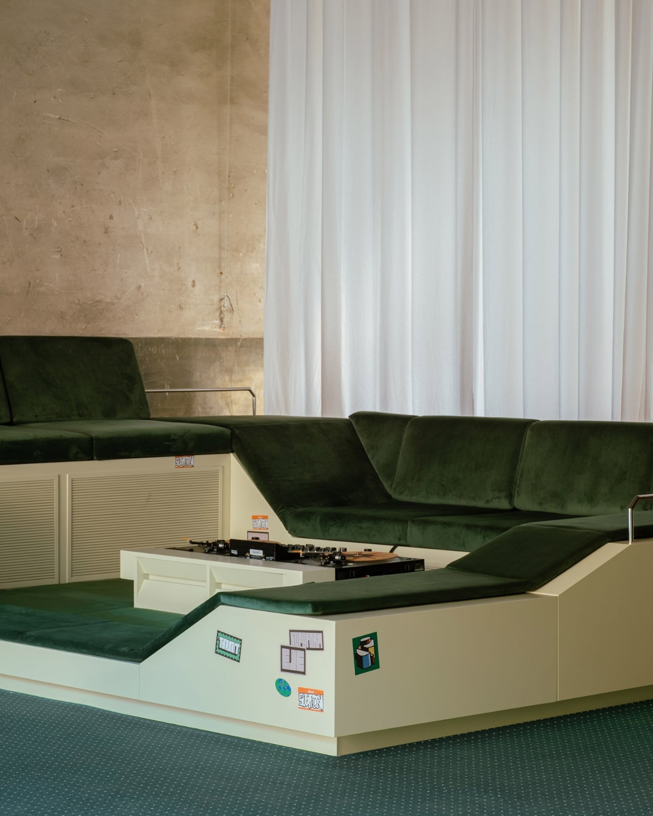
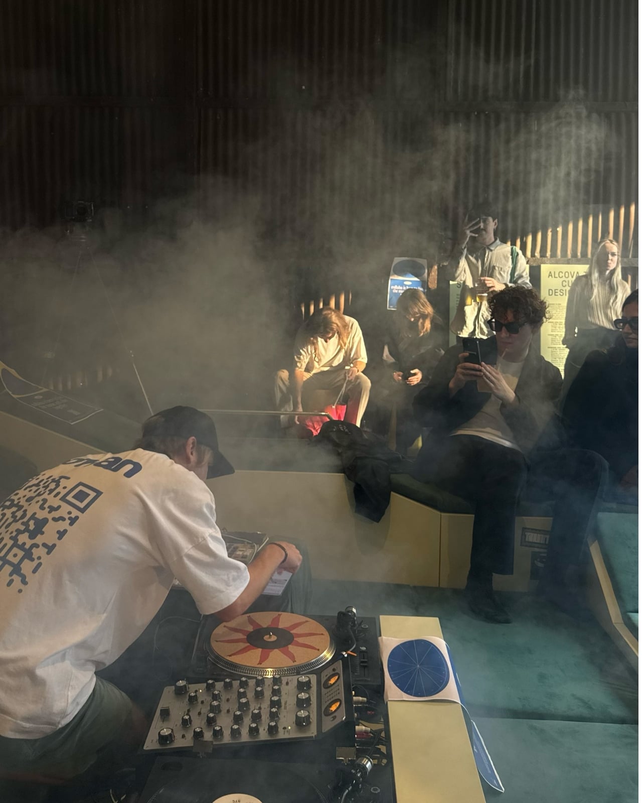
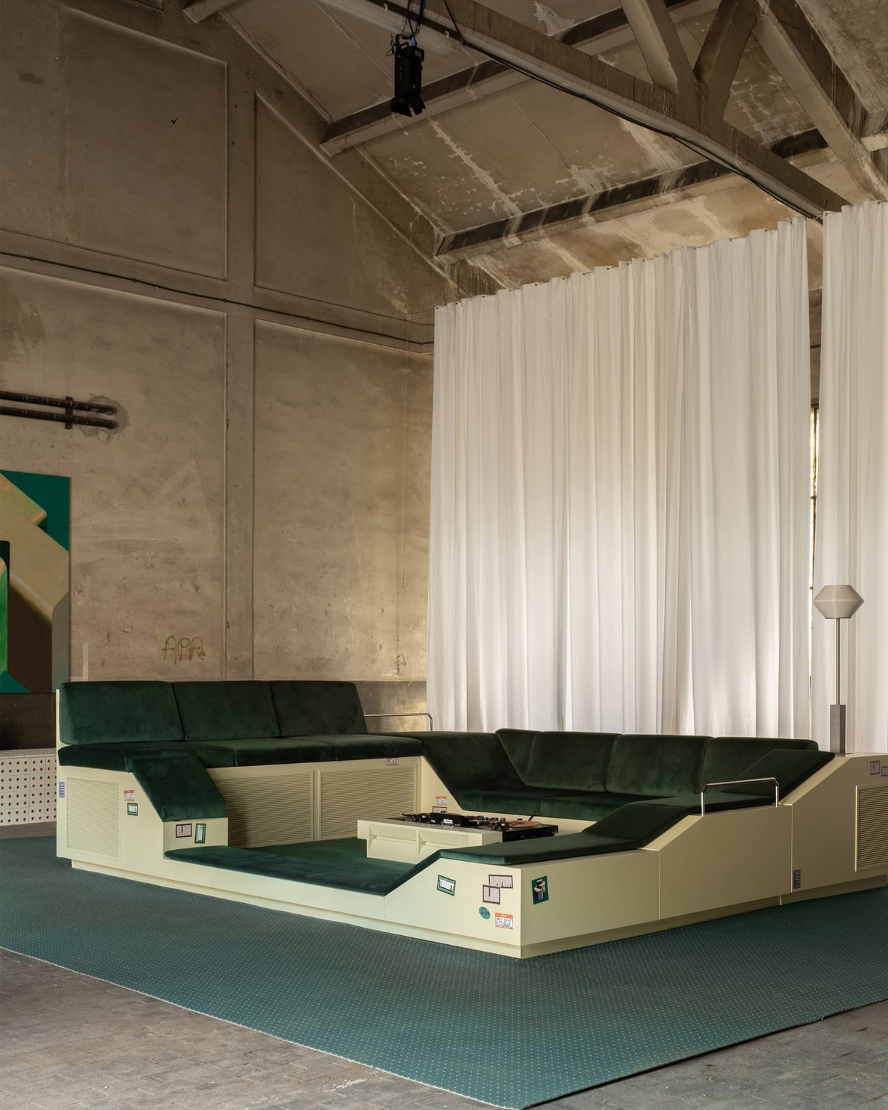
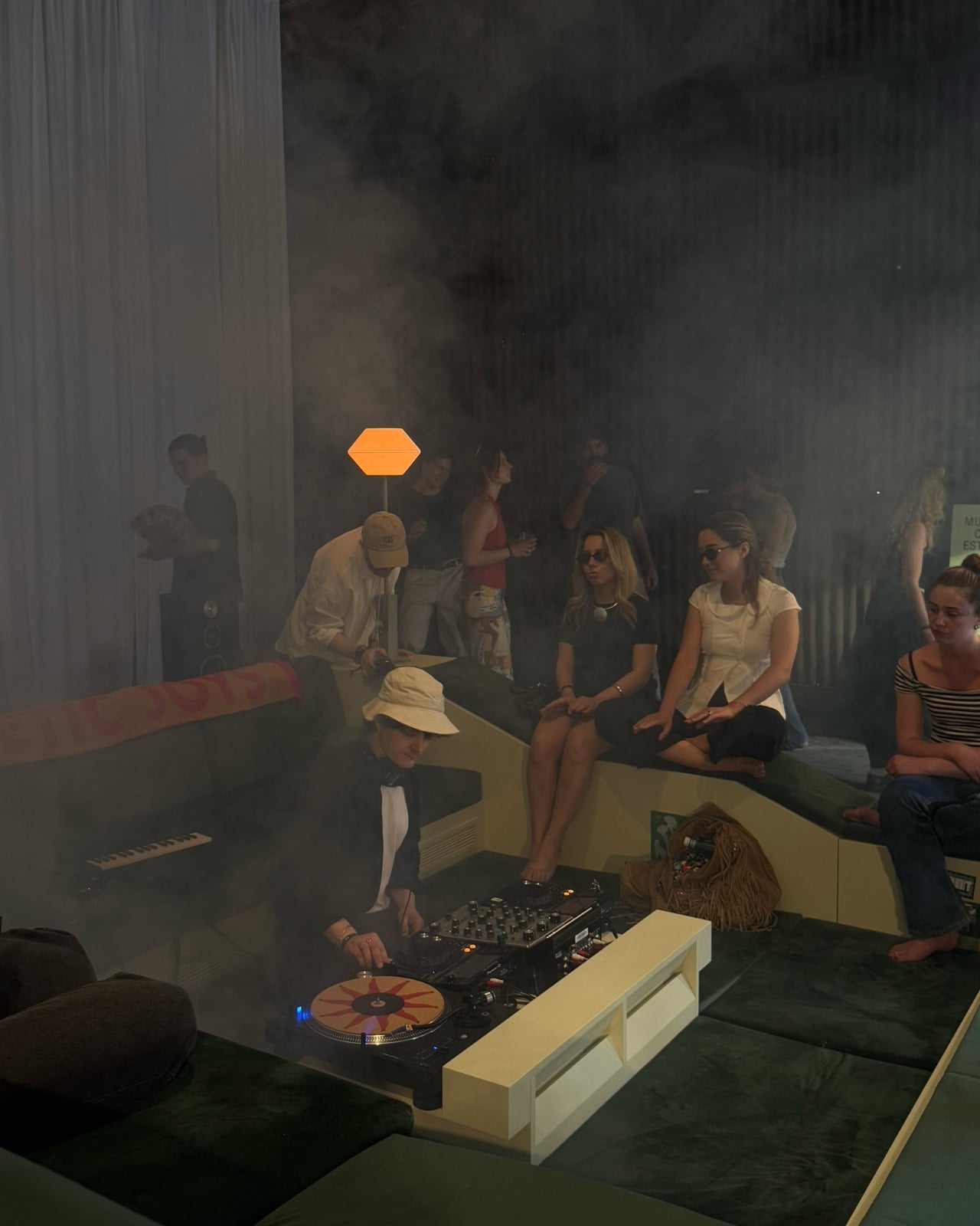
If you walked through Alcova at Milan Design Week this past April, odds are you found yourself gravitating toward a large green seating installation that seemed to have its own pull. People were sitting on it, around it, leaning against it. Conversations were happening. Music was playing. Nobody was rushing to the next booth. The piece was called Transit Encounters, and it was the work of Paris-based studio Supaform, led by designer Maxim Shcherbakov.

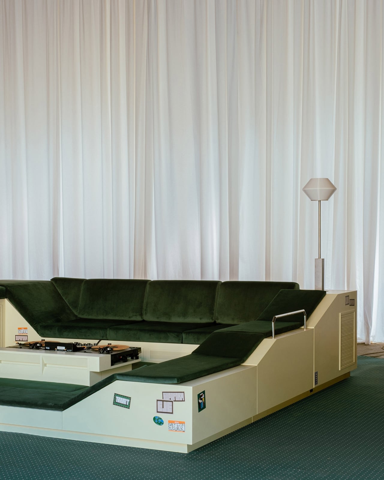
At its core, Transit Encounters is a seating landscape, a low-slung, communal structure that borrows from the mid-century idea of the conversation pit. If you’re not familiar with conversation pits, they were a design trend that had their heyday in the 1960s and 70s, those sunken, cushioned living room alcoves that gathered people inward, face to face, with no option for polite escape. They were a product of an era that genuinely believed design could engineer intimacy. And then, for decades, they fell out of favor, deemed impractical, difficult to clean, or just too aggressively retro.

Designer: Maxim Shcherbakov

Shcherbakov’s version isn’t literally sunken into the ground, but it operates on the same principle: create a space that removes you from the noise and draws you into a shared moment with whoever happens to be next to you. Set inside the former Baggio Military Hospital, one of Alcova’s most atmospheric venues, the installation sat within raw, almost abandoned architecture that made the softness and warmth of the green seating feel even more deliberate. The contrast alone told a story.

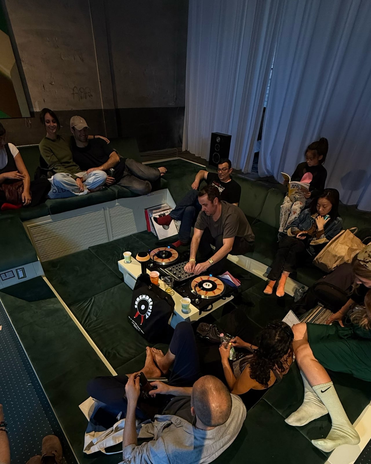
What makes Transit Encounters genuinely interesting, beyond its visual impact, is the thinking behind it. Shcherbakov noticed how a sofa’s boundaries aren’t really defined by its physical edges. People sit on the floor beside it. They lean against it. They occupy its orbit. He took that observation and ran with it, designing not just a piece of furniture but an entire social field. The result functions simultaneously as a stage, a lounge, and a gathering point, a piece of furniture that practically invites improvisation.

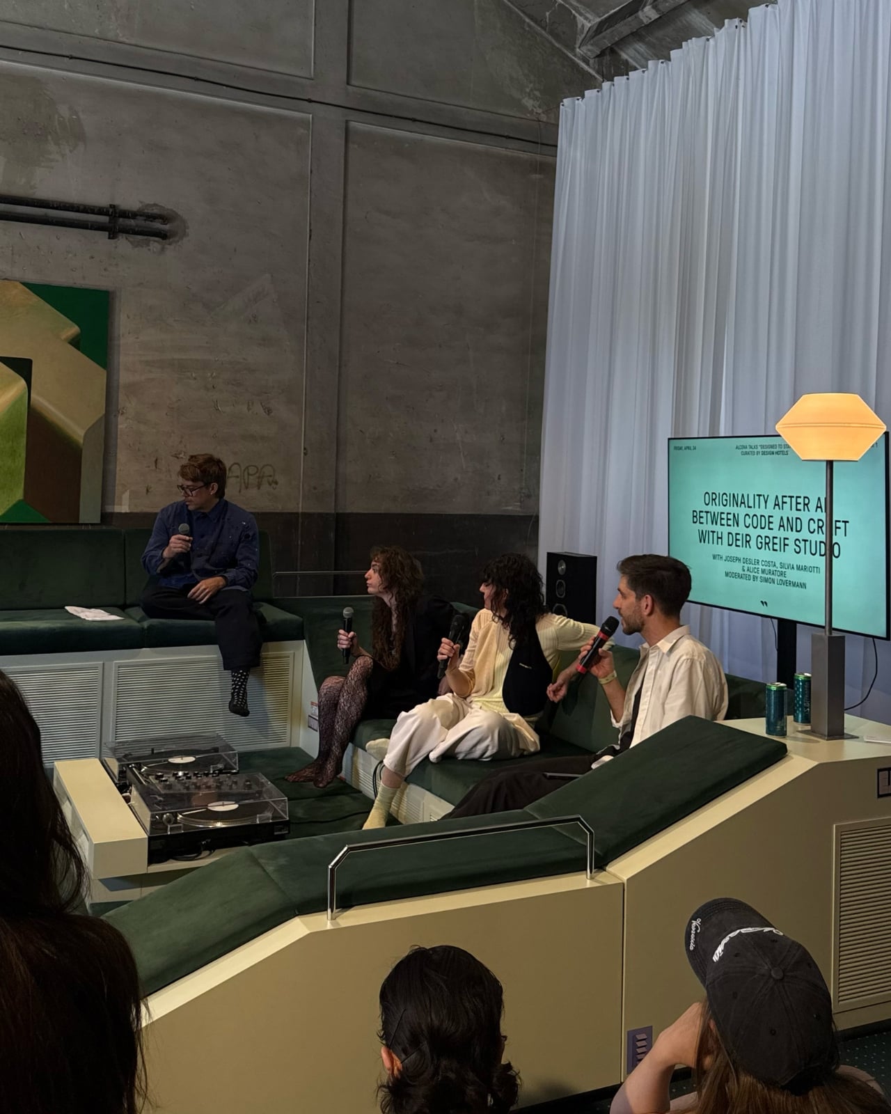
The title carries weight too. “Transit Encounters” points to something most of us have felt but rarely stop to name. We are constantly passing through spaces, airports, lobbies, plazas, and in those in-between places, we sometimes share moments with people we will never see again. There’s an intimacy to that kind of encounter that is entirely different from planned socializing. It’s more honest, somehow. Shcherbakov leans into that contradiction, the idea that transience and closeness can exist at the same time. The installation was developed in collaboration with Esthetic Joys and hosted DJ sets and talks with Design Hotels throughout the week, which means it was literally activated by those kinds of fleeting, unplanned connections.

I’ll admit I have a personal bias here. I think we lost something when the conversation pit fell out of fashion. Not because I’m nostalgic for shag carpeting or sunken living rooms specifically, but because the underlying idea, that furniture could be designed to make you slow down, turn toward each other, and actually talk, felt like a worthy ambition. Most contemporary furniture design optimizes for flexibility, portability, and individual comfort. Modularity is the buzzword. Everything folds, stacks, or wheels away. Transit Encounters isn’t interested in any of that. It’s a fixed, unapologetic invitation to stay.

Supaform sits at the intersection of art and design, and that positioning gives Shcherbakov the freedom to treat furniture less like a product and more like a proposition. With Transit Encounters, the proposition is simple but radical: what if a room’s centerpiece wasn’t a coffee table or a statement light fixture, but an intentional container for human connection? What if we designed less for how a space looks on camera and more for how it feels when it’s full of people?

Milan Design Week surfaces a lot of beautiful things every year. Transit Encounters was one of the few that made you want to stop, sit, and stay awhile. At an event where foot traffic is the currency, that alone says everything.

The post The 1960s Conversation Pit Is Back, and Milan Can’t Get Enough first appeared on Yanko Design.

London’s Barbican Now Has Furniture You’re Allowed to Move

Most public spaces don’t trust you. They’re designed to move you through them efficiently, seat you for a limited time, or keep you from lingering too long. Benches with armrests in the middle to prevent sleeping. Spikes on flat ledges. Gaps between seats so no one gets too comfortable. Somewhere along the way, cities stopped being places you inhabit and started being places you pass through.

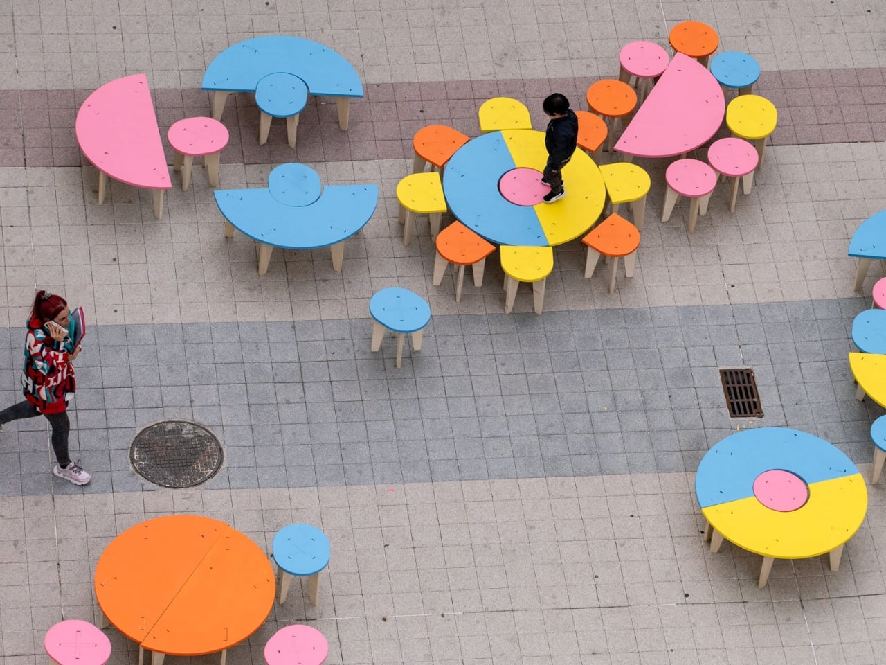
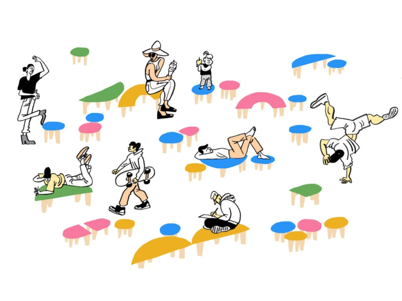
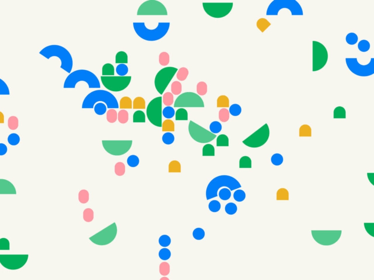
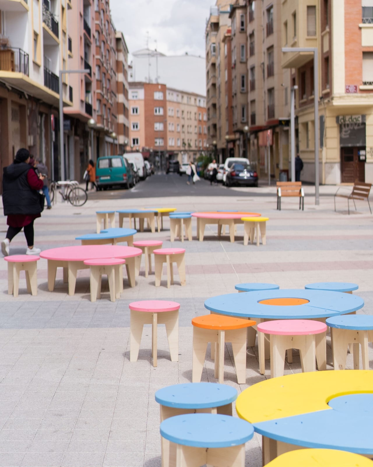
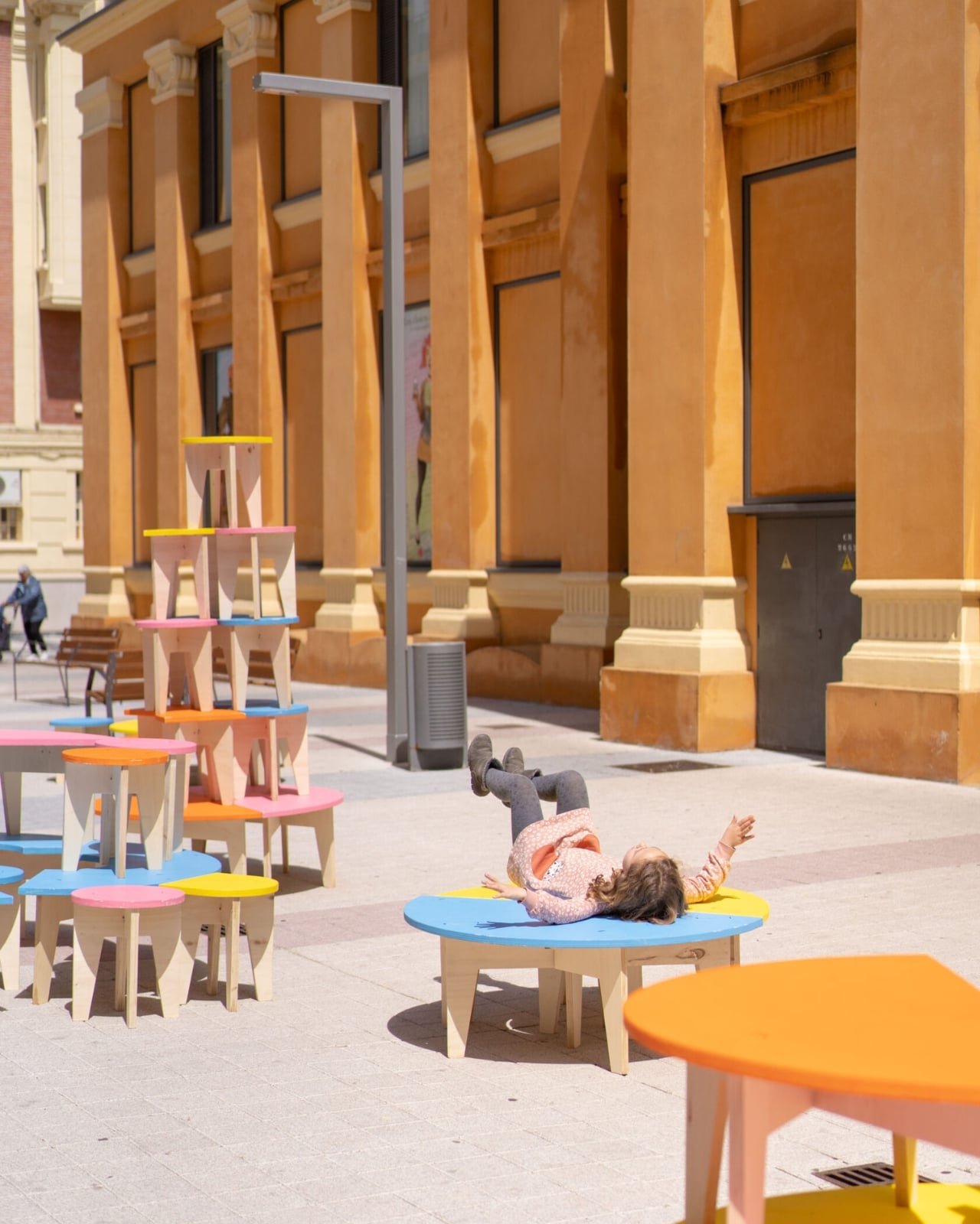
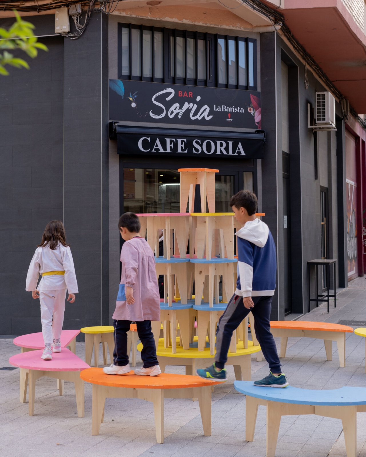
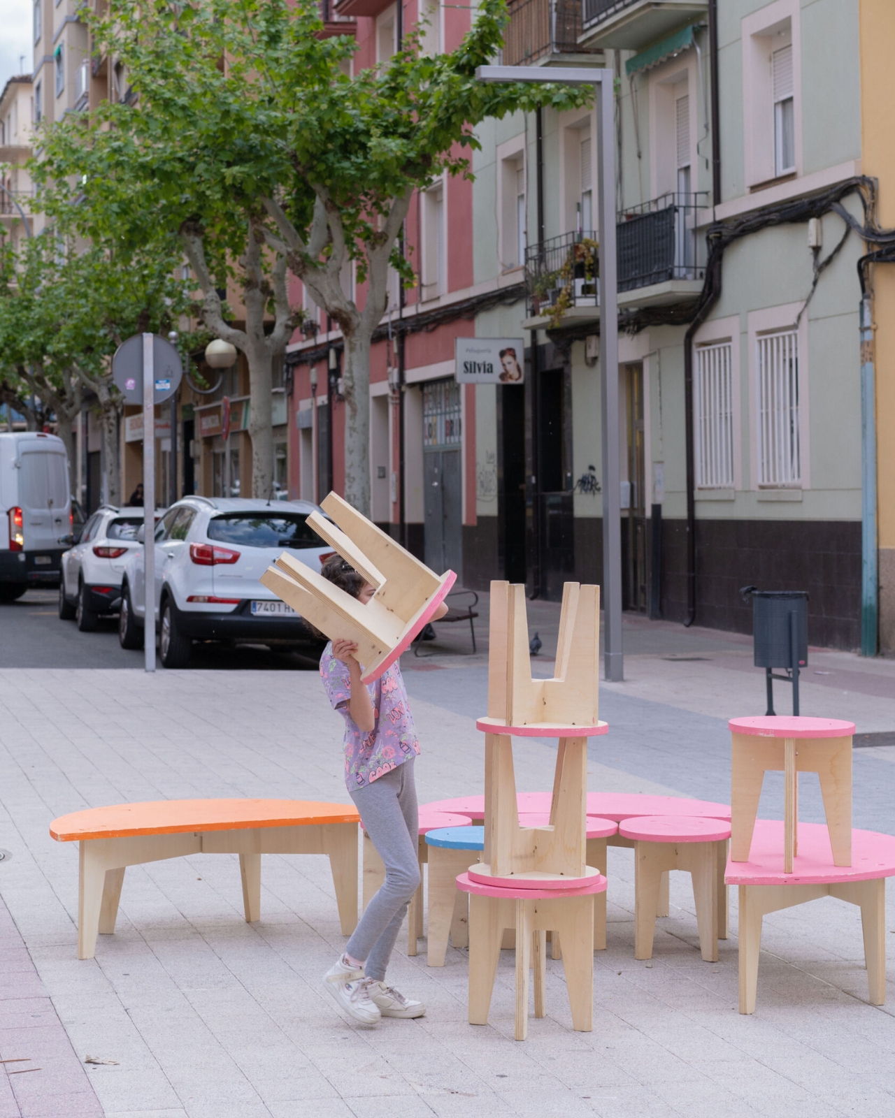
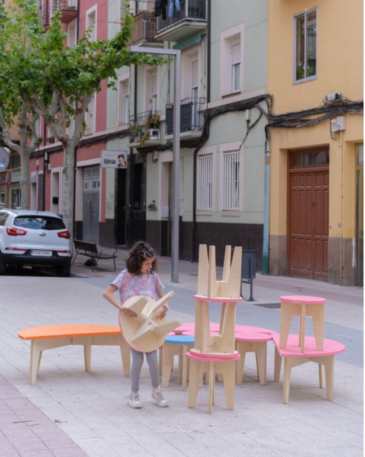
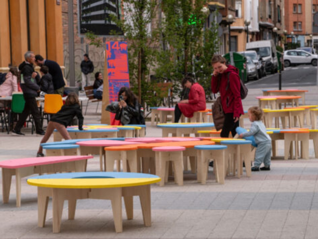
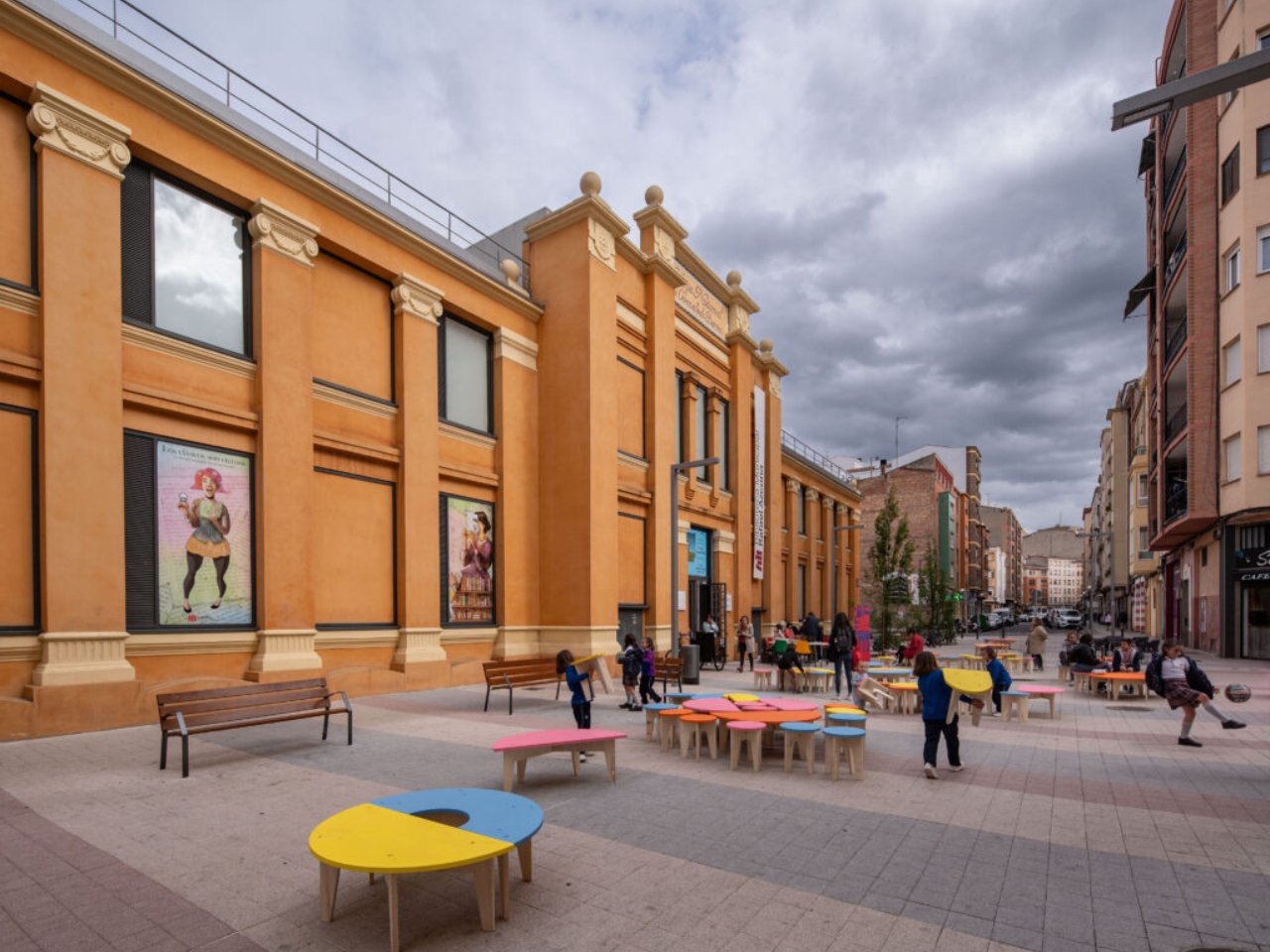
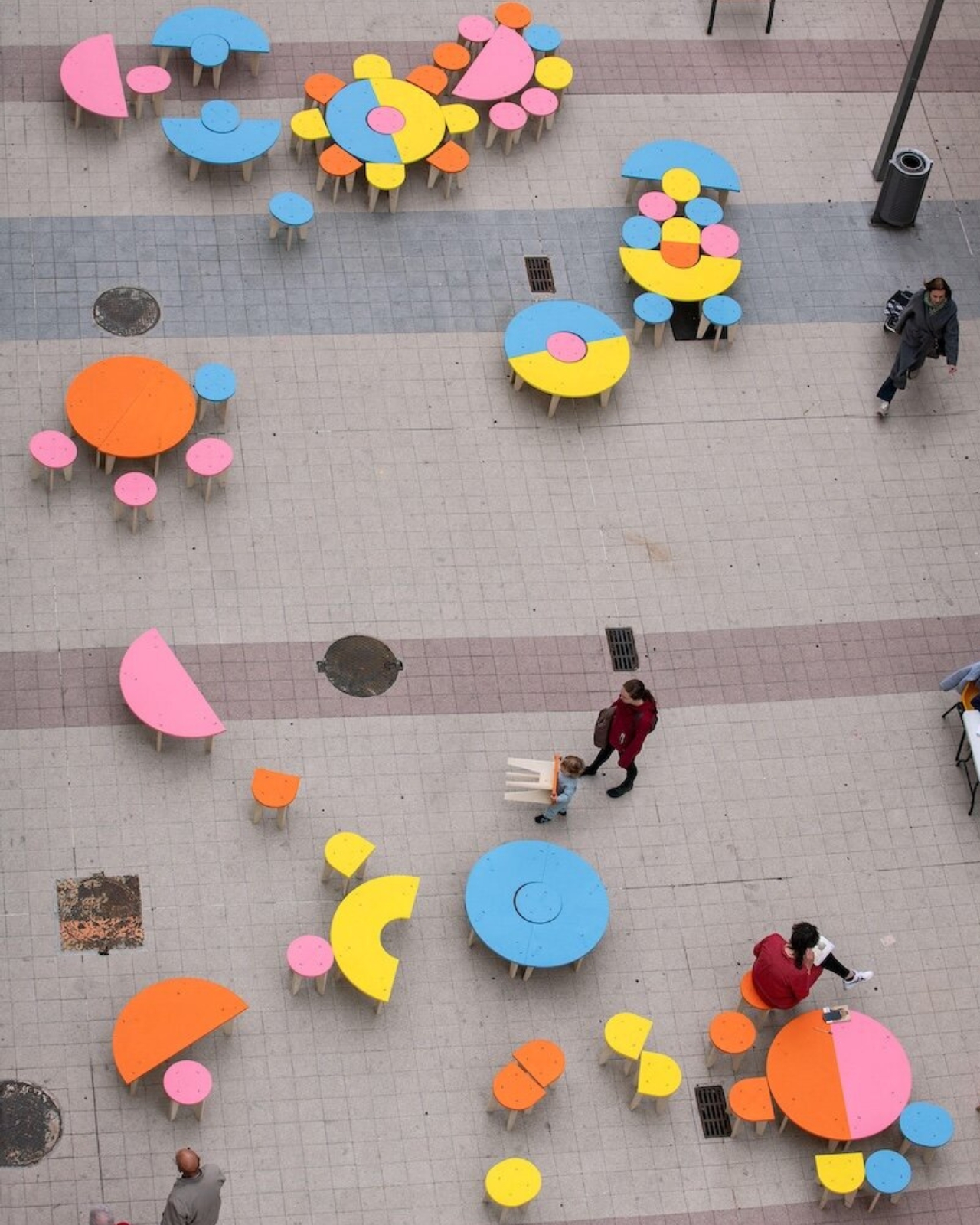
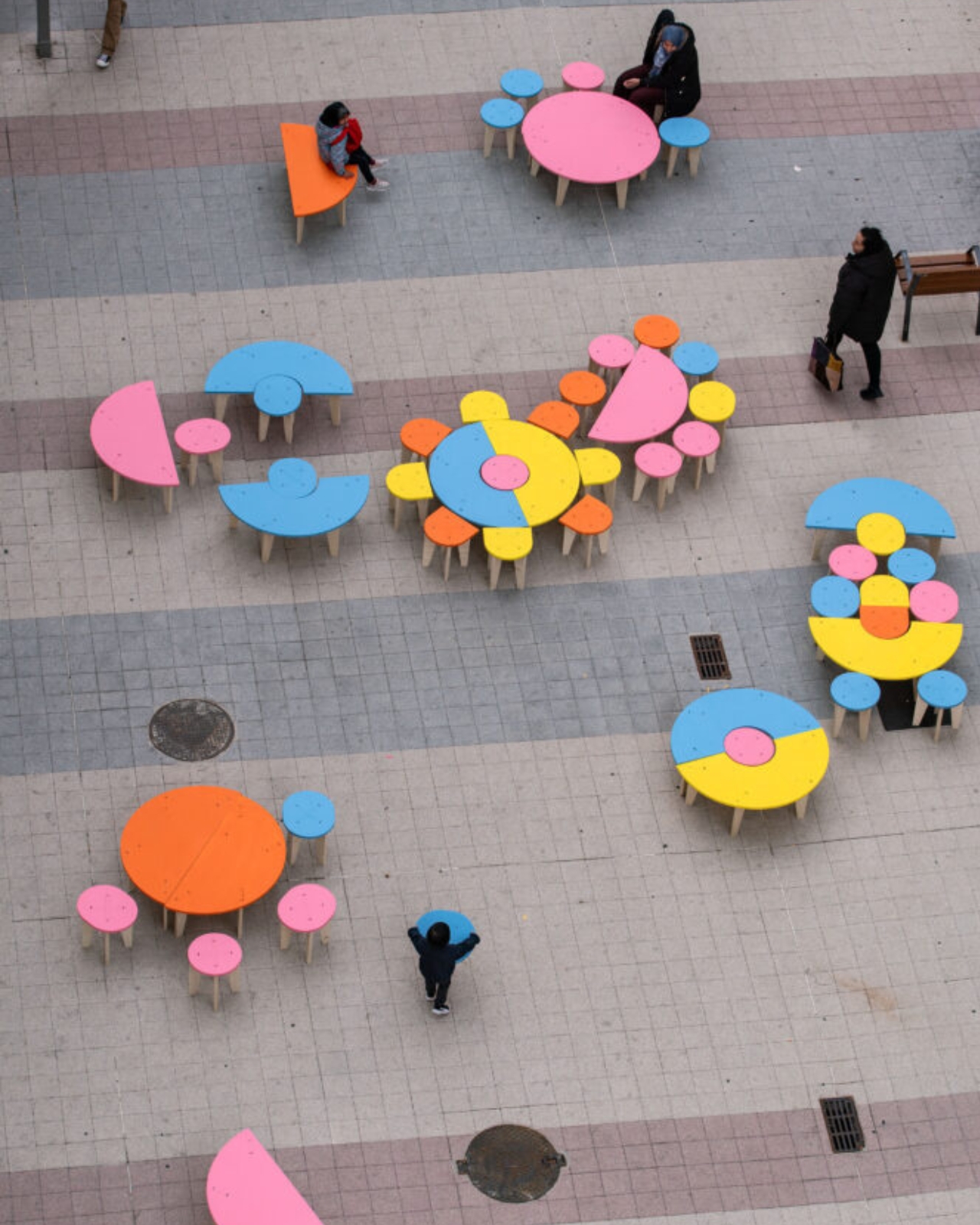
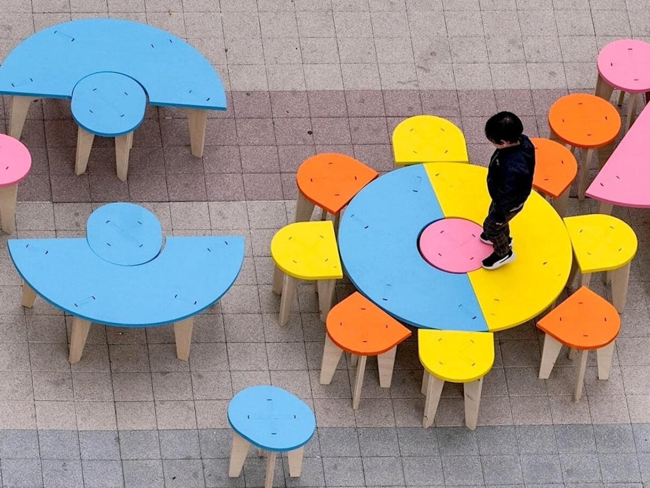
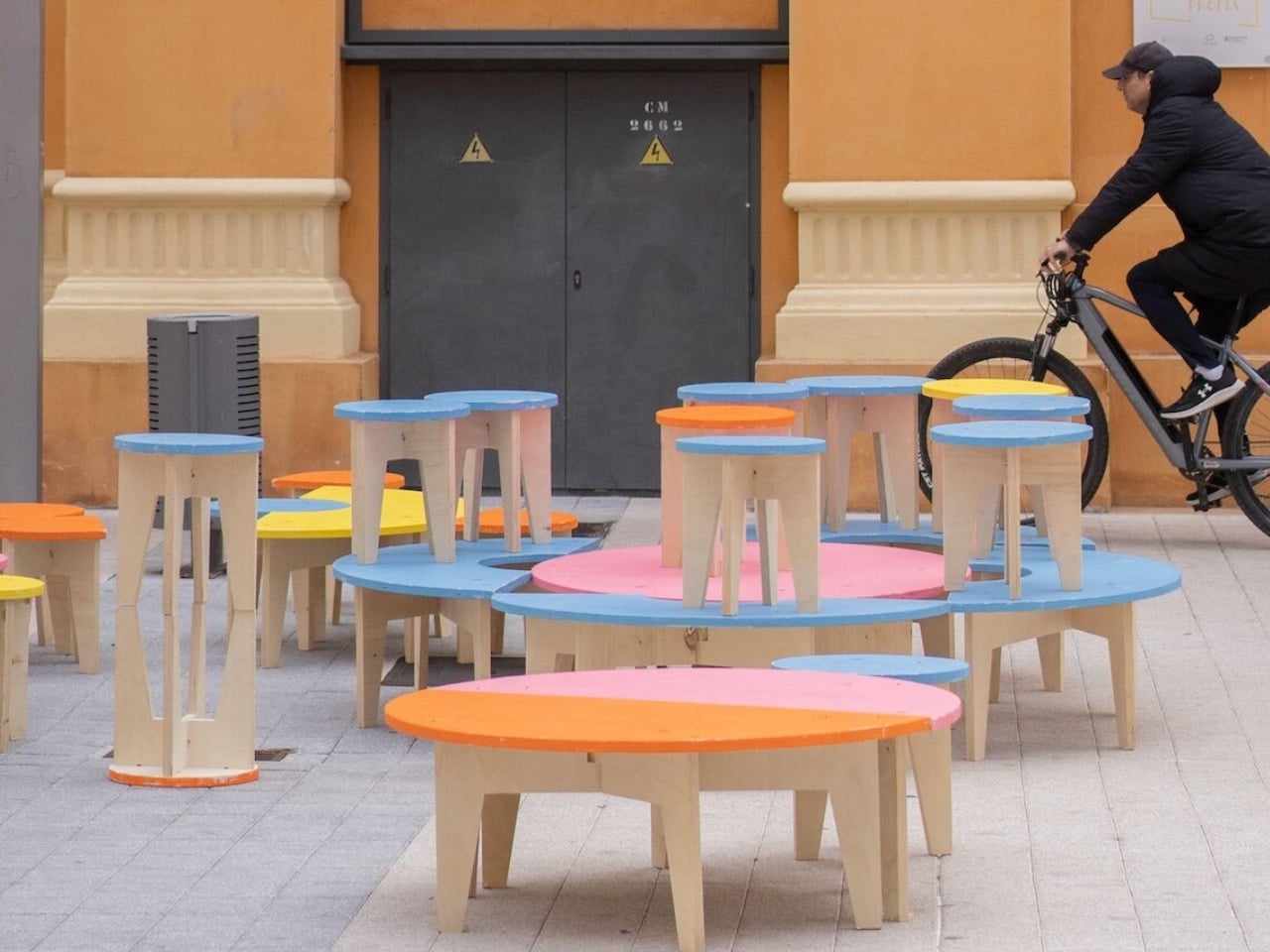
Päivi Raivio’s Basic Forms (of Urban Life) is a direct and cheerful argument against all of that. The Finnish artist and urban designer has taken a set of geometric plywood pieces, painted in colors borrowed from the Barbican’s own brutalist architecture, and placed them in the middle of one of London’s most famous cultural complexes. No instructions. No fixed configuration. No single correct answer. Visitors are invited to pick them up, move them around, stack them, sit on them, or arrange them into something entirely new. What looks like furniture is actually a question: what do you want this space to be?

Designer: Päivi Raivio

I’ve seen a lot of participatory design installations over the years, and most of them fail for the same reason: they participate for you. They have a predetermined “correct” arrangement that visitors slowly discover through guided cues. There’s no real agency. Raivio’s work is different because it genuinely means it. A seat can become a table. A table can become a platform. A platform can become a wall, a stage, or a privacy screen between two strangers who both needed a quiet corner at the same moment. The work shifts with whoever is using it, and that feels radical compared to what most public design offers.

The Barbican is a fitting backdrop for all of this. Designed through the 1950s and completed in 1982, it’s one of the most monumental pieces of brutalist architecture in the UK, all exposed concrete and sharp geometry. Raivio’s lightweight, colorful pieces don’t fight the setting. They echo it quietly, picking up the shapes and tones of the architecture without trying to compete with several acres of concrete. The contrast between the fixed permanence of the building and the cheerful rearrangeability of the installation is part of what makes the whole thing click.

For Raivio, play isn’t a decorative layer applied over the surface of serious design. It’s a foundational principle. Her studio, RaivioBumann, focuses on transforming public spaces into places that are genuinely livable, not just functional. The idea that disorder and disruption can be design tools, rather than problems to be solved, runs through everything about Basic Forms. Public space, in her view, is most alive when it hasn’t been entirely decided for you.

The installation is part of the Barbican’s Play Make Do festival, running 14 to 16 August 2026, and it’s free, unticketed, and open to anyone who walks through. It previously showed at Concéntrico in Logroño, Spain, where it was met with the kind of spontaneous collective enthusiasm that designers spend careers hoping for. People of all ages rearranged, combined, balanced, and rebuilt the pieces for hours. The images from that presentation are worth looking up. They show something you don’t see often enough in public space: strangers making decisions together.

That’s the detail that sticks with me. Not the form, not the color palette, not even the clever way the installation adapts to its environment. It’s the fact that two people who don’t know each other will naturally start negotiating, collaborating, and eventually laughing over how to arrange a pile of plywood. Raivio has essentially built a permission slip for connection, disguised as furniture.

Cities don’t lack benches or tables. They lack reasons to linger. They lack spaces that say, figure it out, make it yours, stay as long as you want. Basic Forms gives London exactly that, even if only for a weekend. The real question it raises is why we aren’t building this kind of thinking into cities permanently, instead of treating it as a festival-season novelty.

The post London’s Barbican Now Has Furniture You’re Allowed to Move first appeared on Yanko Design.

The Floating House Built From Strangers’ Wishes

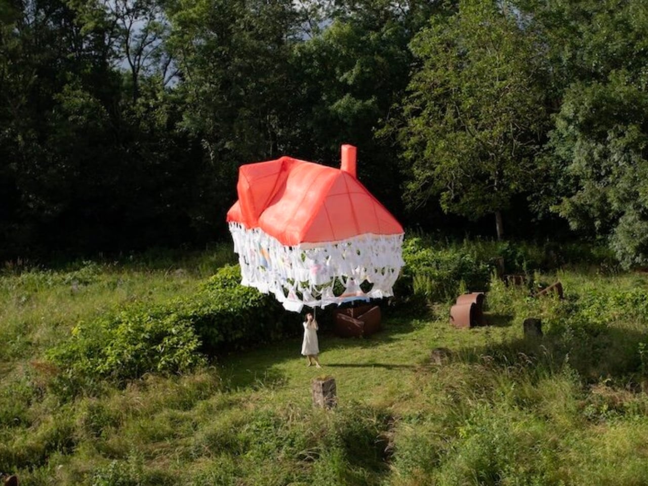
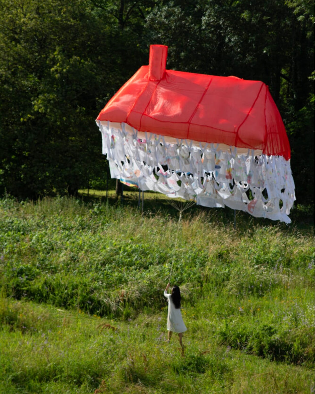
Most houses start with a blueprint. Jisoo Yoo’s Dream House started with a question: how do the dreams and desires we carry shape the landscape of the world we inhabit? The answer, it turns out, is a floating structure made of clothing.

Yoo, a Seoul-born artist who lives and works in France, has been quietly building one of the more compelling bodies of work in contemporary art, one that orbits around the domestic, the ephemeral, and the barely-visible structures that hold our lives together. Dream House, her latest installation presented at (F)ESTIVALES at Les Tanneries, Centre d’art contemporain, is exactly the kind of project that makes you stop and genuinely reconsider what a home actually is.

Designer: Jisoo Yoo

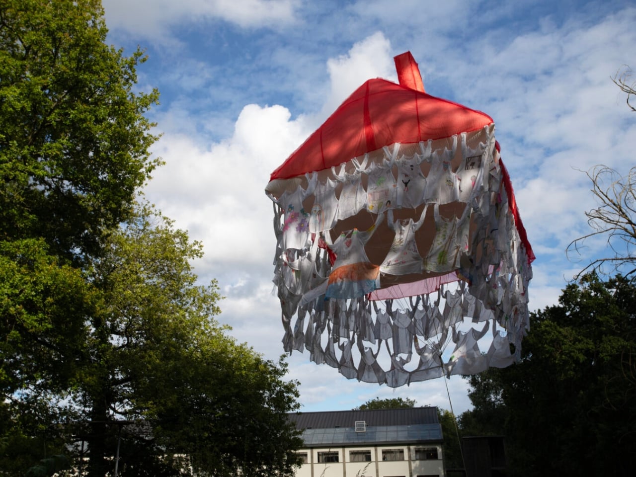
Here’s how it works. Participants are invited to contribute a garment, something personal, something worn, and mark it with handwritten texts and drawings. These pieces of clothing then become the literal building blocks of the structure, each one a personal archive, each one a load-bearing element. The result is a house that floats, literally and conceptually, held aloft not by concrete or steel, but by the private wishes of strangers.

That’s a beautiful idea, and I mean that without a trace of irony. We spend so much time thinking about homes in terms of square footage, property value, and interior aesthetics that we rarely stop to ask what a home is actually made of. Yoo forces the question. Her installation suggests that the answer has less to do with materials and more to do with desire, with the accumulated weight of what people want, need, and imagine for themselves and for each other.

Art that treats the domestic as a lens for examining social and cultural forces is nothing new. But Yoo brings something specific to it. Born in Seoul and trained in France, she operates between two very different cultural frameworks around the idea of home, and her practice reflects that quietly felt tension. Her works often feature spaces that feel familiar but refuse to stay solid. Rooms that waver. Houses that float. Structures that appear and then dissolve. It’s a recurring language across her portfolio, and with Dream House, it feels most fully realized.

Dream House is not trying to comfort you. It’s trying to make you notice something. The garments contributed by participants carry real personal weight: literal handwriting, actual drawings, the residue of real lives. And yet the house they form is temporary. It rises, exists briefly, and then it’s gone. Yoo describes the floating structure as embodying both the creative force of desire and the fleeting nature of existence. The house briefly emerges through people’s dreams, and that, apparently, is enough.

I think that’s the most honest thing any artist has said about housing in a long time. We build our ideas of home from desire, from inherited images of what shelter is supposed to look like, from what we were told to want, and from what we quietly imagine when no one is watching. And all of it is more temporary than we tend to admit. The average person moves multiple times in their life. Neighborhoods change. The house you grew up in gets renovated beyond recognition or torn down entirely. The physical structure of home has always been more fragile than we want it to be.

What Yoo does is make that fragility visible without making it tragic. The floating structure is genuinely striking to look at. The garments create a soft, almost organic texture that reads as intimate rather than architectural, which is exactly the point. You’re not looking at a building. You’re looking at a collective act of imagination, briefly held together by shared hope. Jisoo Yoo is an artist worth paying close attention to. Her work doesn’t announce itself loudly, but it asks questions that stick. Dream House is a reminder that the spaces we live in are not neutral. They are built, always, from something we wanted.

The post The Floating House Built From Strangers’ Wishes first appeared on Yanko Design.

The Fortune Teller Just Got an AI Upgrade and It Knows Too Much

Remember the movie Big? Tom Hanks, the carnival Zoltar machine, a kid who just wanted to grow up overnight. That film had a way of making wish-granting feel both magical and slightly unsettling, because the machine didn’t really know you. It just read the room and gave you what you asked for. Now, almost four decades later, Australian art and technology studio ENESS has built something that does the same thing but with significantly more data points, and the result is one of the more thought-provoking design pieces to come out of the 2026 festival circuit.

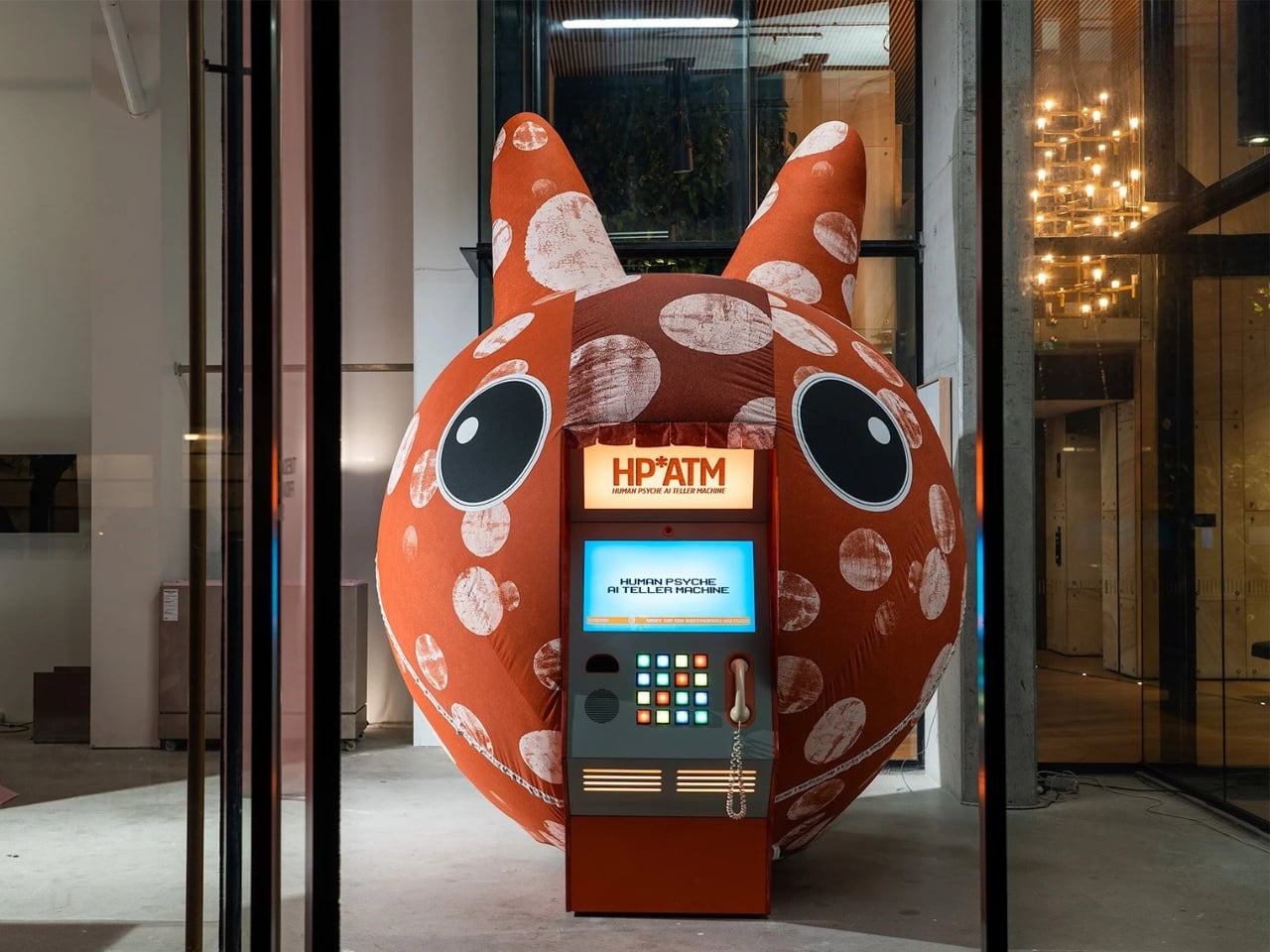
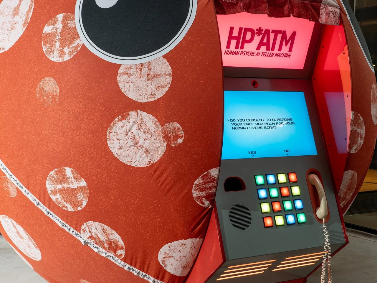
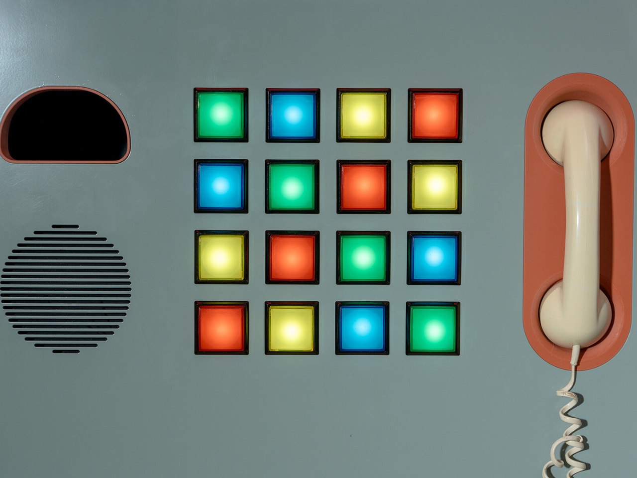
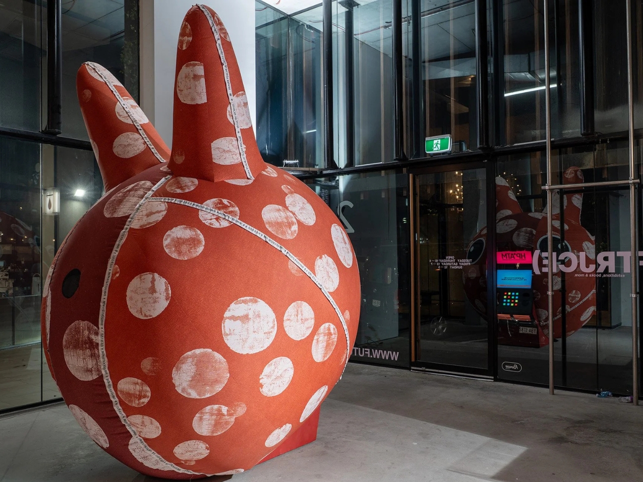
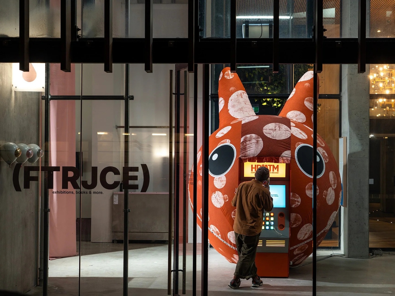
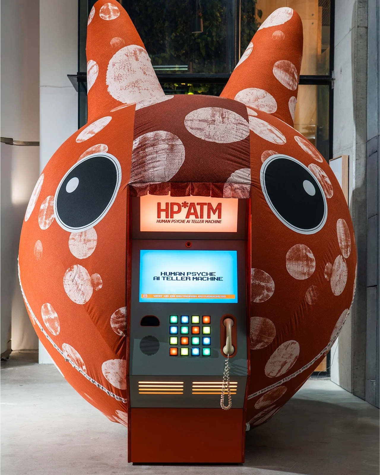
HP*ATM, which stands for Human Psyche AI Teller Machine, debuted at Illuminate Adelaide 2026 as part of an exhibition called Automation Bias. It looks exactly like what you’d expect from an old ATM, boxy and vintage, with colored buttons and a telephone handset forming part of the interface. But instead of dispensing cash, it dispenses something far more personal: a psychological reading based on your face, your palm, and a series of choices you make in the moment. ENESS founder Nimrod Weis drew direct inspiration from the Zoltar machine in Big, and the connection makes complete sense once you’re standing in front of it.

Designer: ENESS

The premise is deceptively simple. You walk up, you consent (the screen literally asks, which is already more than most apps do), and the machine reads you. It analyzes your face and your palm, processes your button selections, and produces what the studio calls a “lyrical psychological reading.” You get a portrait of yourself, filtered through AI. And maybe that portrait is accurate. Maybe it’s not. But the more interesting question is: does it even matter? The moment you step up and say yes, you’ve already told the machine something about yourself.

That’s exactly the territory ENESS is navigating here, and they do it in a way that feels playful rather than preachy. The installation isn’t trying to scare you about AI. It’s asking you to notice something you’re already doing in your daily life, handing over intimate data to systems that claim to understand you, often without the ceremony of a formal machine with colored buttons formally asking for your consent. The irony is that HP*ATM might be the most transparent AI interaction many people have ever had, because at least it’s honest about what it’s doing.

There’s a layer of humor baked into the whole thing, which is very much part of ENESS’ design language. The vintage ATM aesthetic is a deliberate choice. Weis has said the installation is meant to remind visitors that current AI systems might eventually look as dated as cash machines and landline phones. That’s a point worth sitting with. The technologies we currently regard with either reverence or a low-grade anxiety tend to look a lot less intimidating in hindsight, and ENESS is nudging you toward that perspective while you’re still in the middle of it all.

The act of not participating also becomes part of the artwork, and that’s where the piece gets genuinely interesting. If you walk up and decide not to engage, that choice still belongs to the installation. The machine doesn’t require you to perform for it, but it does invite you to think about why you’d hesitate. Why would you say no to an AI reading your face when you’ve already handed that same data to your phone, your laptop camera, and roughly half the apps you downloaded last year without bothering to read the terms? The answer probably says more about you than the machine ever could. The question isn’t rhetorical. It’s just honest.

HP*ATM runs through August 30, 2026, at FutureJuice in Adelaide, Australia. If you happen to be near it, stepping up to that machine and choosing yes or no is probably more thought-provoking than most things you’ll do on your phone that day. And if you’re not in Adelaide, the work still travels with you, because the questions it raises don’t stay in the gallery. They follow you home.

The post The Fortune Teller Just Got an AI Upgrade and It Knows Too Much first appeared on Yanko Design.

A Moss-Covered Payphone Just Became the Voice of 2147

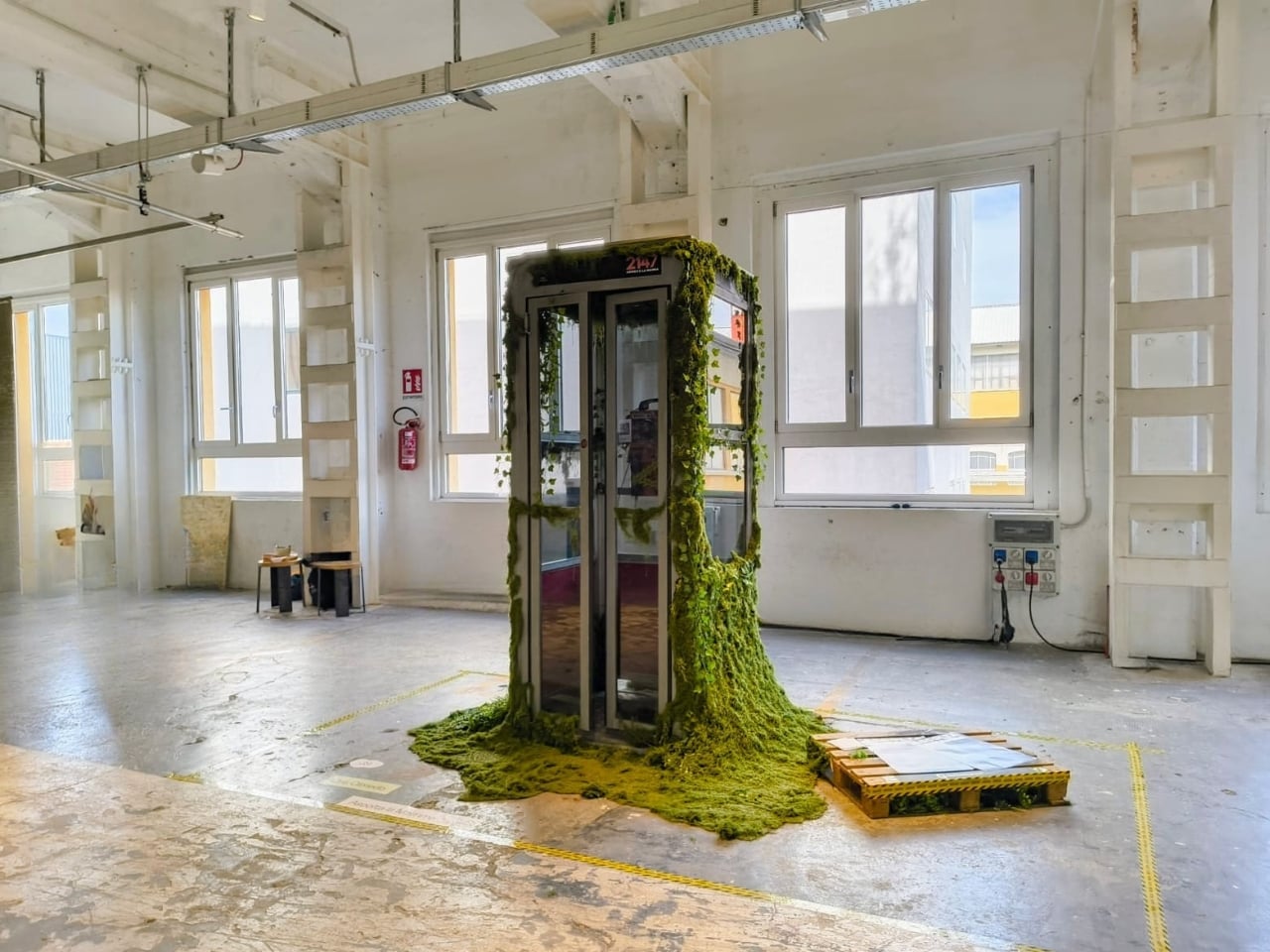
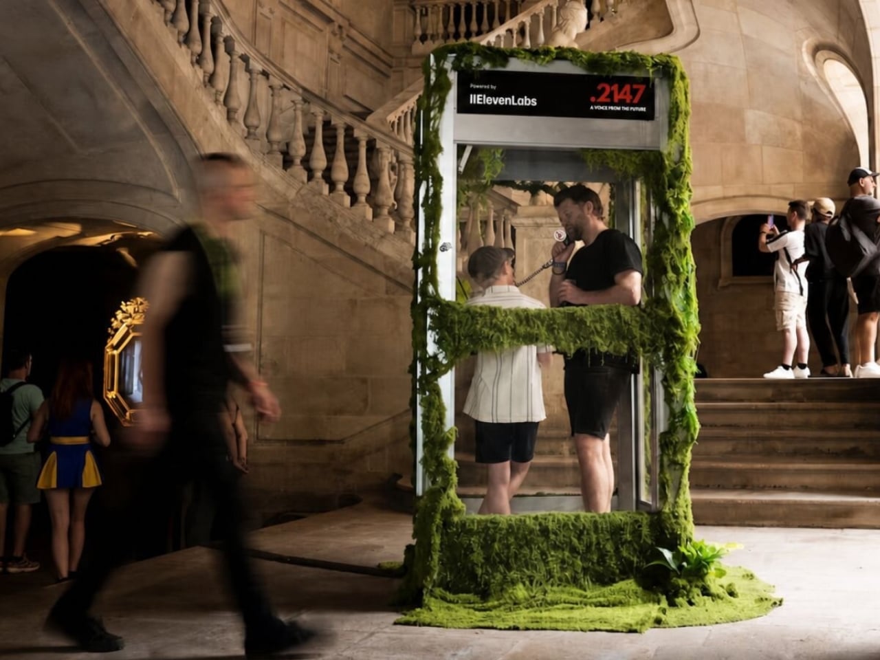
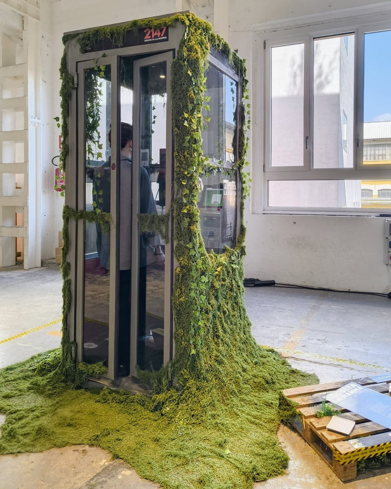
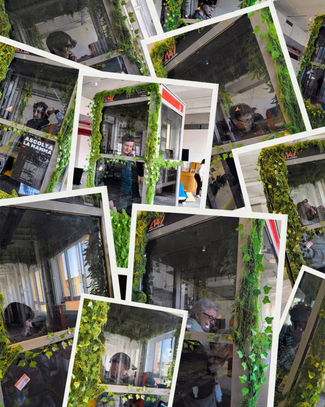
Picture a payphone. Not a sleek, reimagined version, just an actual, beat-up Telefónica booth, the kind you might walk past on a Barcelona street without a second glance. Except this one is overtaken by moss. And if you pick up the handset, the Earth answers.

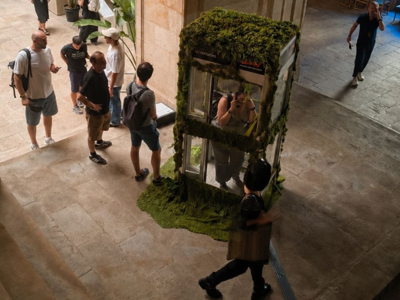
That’s the premise of 2147: A Voice from the Future, an interactive installation by Cris Olmedo of Divina Machina, the digital art branch of creative innovation studio QS Ventures. The piece was presented at Sónar+D, set against the medieval backdrop of the Llotja de Mar in Barcelona. That pairing alone says something: one of the oldest commercial buildings in the city, hosting an open-ended conversation with an AI that speaks on behalf of a future planet.

Designer: Cris Olmedo (Divina Machina)

The concept is disarmingly simple. You pick up the handset. The AI, voiced through an ElevenLabs system and powered by a Raspberry Pi 5 tucked inside the original booth, responds in real time as a fictional representation of the Earth. No scripts, no predefined dialogue paths, no multiple-choice menus. You take the conversation wherever you want, whether that’s climate, survival, memory, or grief. The Earth, imagined 121 years from now, has things to say. Whether you do is another matter.

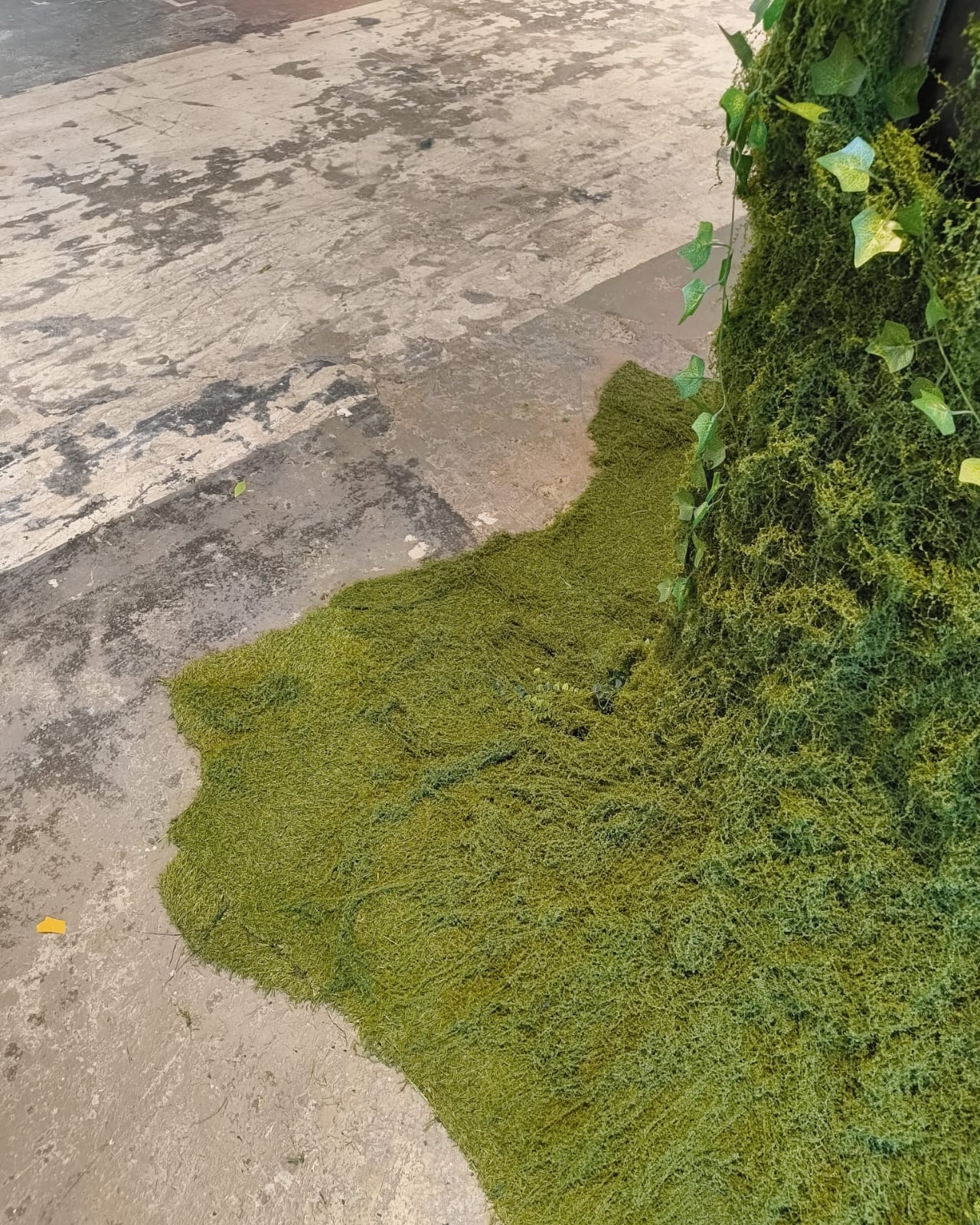
What makes this work is the object itself. Olmedo didn’t design something new and purposefully futuristic. The booth kept its original Telefónica structure, its original signage, its unmistakably analog bones. Only what’s hidden inside changed. The moss slowly consuming the exterior reads like nature quietly reclaiming something that people gave up on. That tension between the obsolete and the alive does a lot of the emotional heavy lifting here, and it’s a smarter choice than any glowing interface could have been.

We tend to think of design as a forward-moving discipline, always chasing newer, faster, more capable. But 2147 asks a different question: what happens when you take something we’ve already discarded and give it a new reason to exist? The payphone is a perfect vessel for that question, precisely because it was once the most public, most democratic form of long-distance communication we had. You didn’t need an account, a plan, or a device you owned outright. Just a coin and a number to dial.

Now that infrastructure is largely gone. Olmedo took what’s left of it and filled it with something else entirely. That’s not just clever art direction. It’s a genuinely pointed observation about how we build things, discard them, and eventually recognize that the shell still has something to offer. The fact that this installation lives inside an actual retired Telefónica booth, rather than a replica, matters more than it might seem.

The year 2147 gives me pause, in the best way. It’s far enough to feel like science fiction, but close enough to feel like a countdown. It’s the kind of temporal framing that shakes you out of the comfortable haze of “we’ll deal with it later.” The Earth speaking through this installation isn’t a distant abstraction. It’s speaking through a receiver you’ve held before, in a language you already understand, about problems you’ve already heard about.

The moss is the detail I can’t stop thinking about. It reads as both beautiful and quietly alarming, the natural world slowly spreading over a structure that once represented human connection. As if the planet didn’t wait for us to sort things out. It also turns a mundane artifact into something you actually want to stop and stare at, which is half the job of any good installation. It communicates instantly and without explanation, which is exactly what good design is supposed to do.

2147: A Voice from the Future earns its concept. It’s not a payphone with AI bolted on. It’s a meditation on time, obsolescence, and the conversations we keep putting off. And the most compelling thing about it is that it asks you to start one, right now, handset in hand, with a planet that’s been waiting for you to pick up.

The post A Moss-Covered Payphone Just Became the Voice of 2147 first appeared on Yanko Design.

The Smart Home Trend of 2026 Is Surprisingly “Emotional Intelligence”

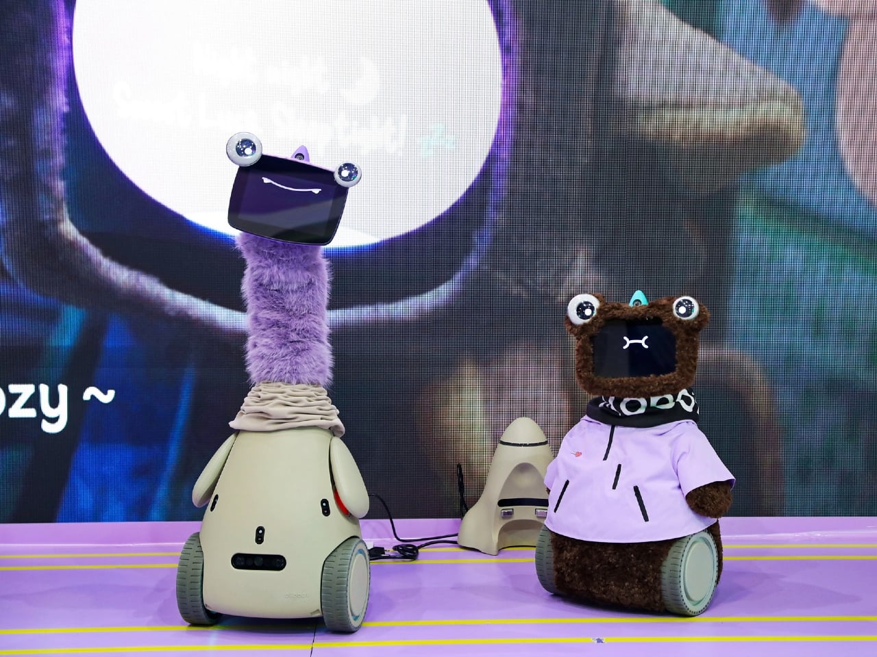
Trade shows usually reward the loudest promise in the room. Faster. Smarter. Smaller. Cheaper. Shenzhen’s Global Connect Show had plenty of that, but one image lingered longer than any spec sheet. A cyber pet named Ollobot stood beside its founder as if it belonged there, blinking at the crowd while a presentation about emotional intelligence unfolded behind it. In a sea of home tech, this was the product that behaved less like an appliance and more like a companion.

That image became a useful key for reading the rest of the event. Yanko Design attended GCS Shenzhen 2026 expecting to see the usual future-home playbook, AI family hubs, robotic lawn care, spatial scanning, smart personal care. Those products were all there. What changed was the framing. Again and again, founders described their devices in emotional terms, selling comfort, reassurance, confidence, and family harmony with the same urgency that hardware brands once reserved for raw utility. GCS itself was built for that kind of storytelling, a curated Shenzhen showcase designed to connect globally ambitious brands with international media, editors, and partners in a more focused setting than a giant expo floor.

Lymow One Plus – The Saturday morning machine
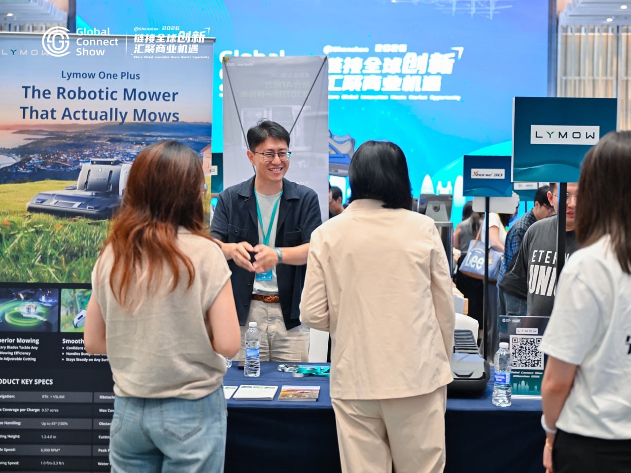
If you wanted a clean example of utility evolving into lifestyle design, Lymow made the case better than anyone. Co-founder Charles Lee opened with a blunt question about why robotic mowers still struggle once they leave the brochure and meet actual grass, uneven terrain, slopes, and the chaotic reality of a lived-in yard. That framing mattered. Lymow was not selling lawn care as novelty. It was selling competence.

The appeal of the Lymow One Plus sits in what it gives back. A mower that can handle difficult grass types, navigate complex terrain, and work through multiple zones promises something quietly luxurious, a weekend that stays yours. Smart home brands used to pitch automation as technical progress. Lymow pitches it as a better relationship with your own home. The dream here is simple and deeply relatable: coffee in the yard instead of labor in the yard.

Dreame Roboticmower A3 AWD Pro – When the smart yard becomes a robot ecosystem
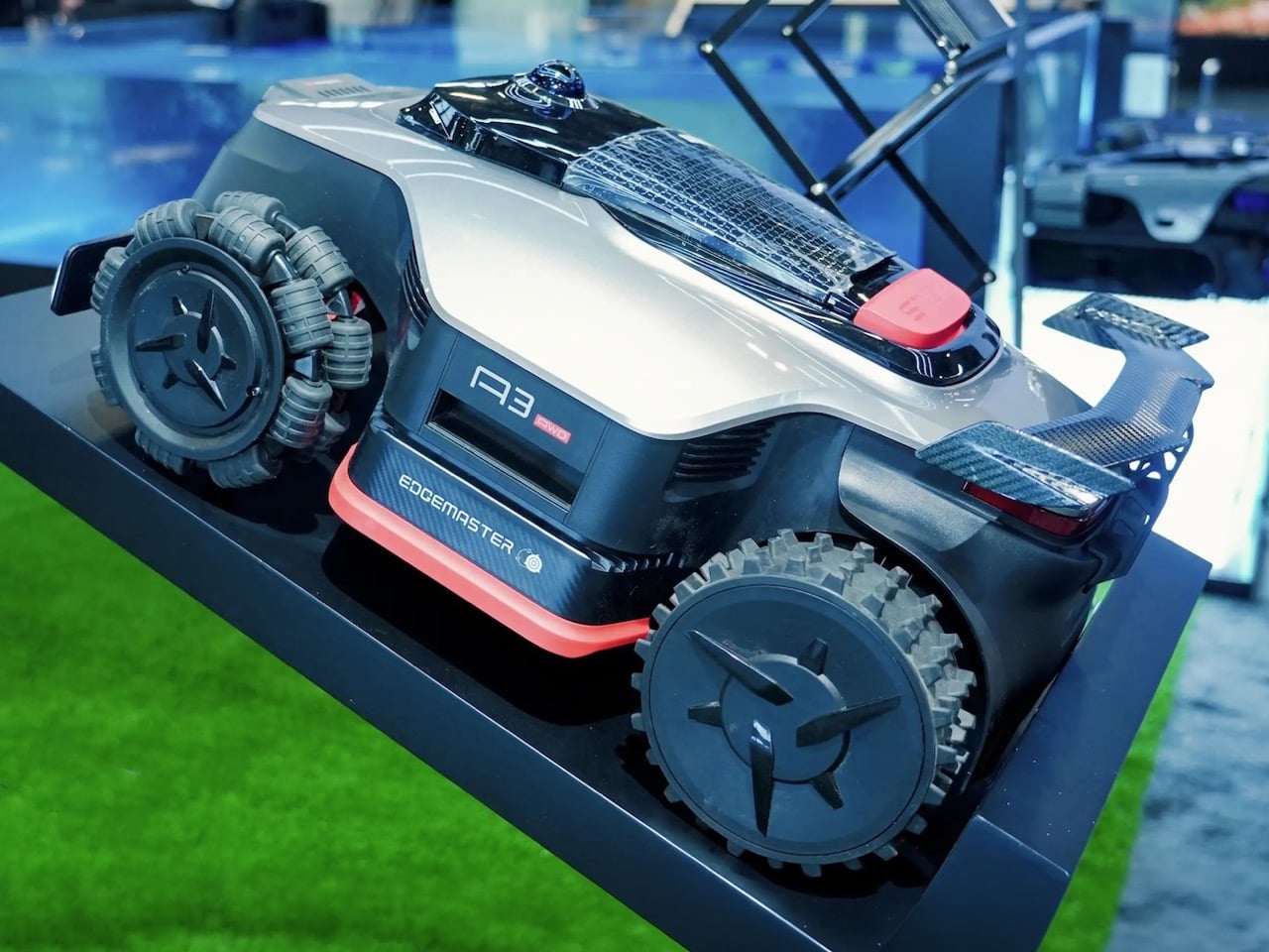
Dreame’s presence pushed that same idea further into full ecosystem territory. The company is already well known for indoor smart cleaning, but its outdoor ambitions are where things start to get interesting. The Roboticmower A3 AWD Pro was framed as part of a broader whole-home system, one that extends the logic of autonomy from your floors to your garden.

That shift changes the emotional reading of the category. A mower with LiDAR, AI vision, anti-theft features, and always-on awareness sounds impressive on paper, but the deeper promise is environmental calm. The yard becomes one less unmanaged edge of domestic life. Dreame’s concept work, especially the idea of a mower that could eventually interact with obstacles and assist with yard upkeep in more embodied ways, hints at where this goes next. The smart yard is starting to look less like a single appliance category and more like a robotic layer around the home itself.

NAVEE Birdie 3 and Birdie 3X – Leisure tech learns how to disappear
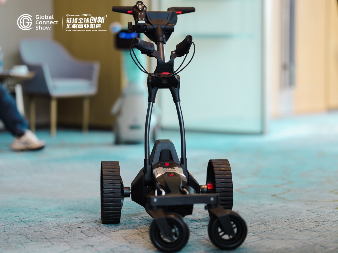
NAVEE’s electric golf push carts may seem slightly outside the article’s home-tech orbit, but they belong here for one reason: they show how emotional design is spreading into every corner of lifestyle hardware. The Birdie 3 and Birdie 3X were presented as compact, capable companions for the golf course, with features built around reducing friction during play.

That sounds minor until you think about what luxury often looks like in 2026. It is not always excess. Sometimes it is the absence of interruption. A cart that follows you, assists on inclines, and removes physical hassle from the round allows the player to stay mentally inside the experience. This is the same emotional logic driving the best home products right now. Great hardware increasingly succeeds when it fades into the background and leaves a cleaner emotional foreground behind.

Cozyla Calendar+ 2 – The family hub that sells mood
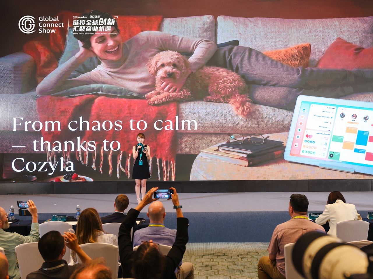
Cozyla was one of the clearest examples of a familiar smart home category being repositioned through feeling. The founder’s setup was instantly recognizable: rushed mornings, forgotten lunches, fragmented communication, children moving in different directions, adults trying to keep the day from collapsing before noon. Plenty of family dashboards have tried to solve that problem. Cozyla’s pitch stood out because it did not stop at efficiency.

The line that landed hardest in the room was about mood. A testimonial framed the product as something that changed the emotional atmosphere of the house, not merely the schedule pinned to the wall. That is a subtle but meaningful escalation in smart home language. Once a device claims it can improve the tone of family life, it enters a more intimate contract with its users. The screen becomes part planner, part mediator, part ambient stabilizer for the household. That is a far more ambitious role than calendar sync.

iClever Q950 – Safety as emotional design
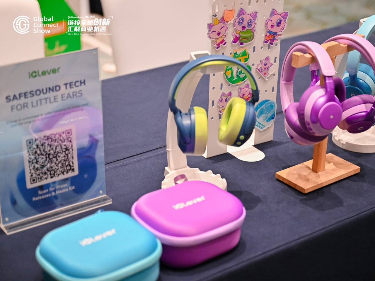
Children’s headphones are easy to dismiss as a practical category, but iClever showed why that would be a mistake. The Q950 was presented through the lens of hearing care, safe listening, and child-focused product development. On the surface, that is a straightforward wellness pitch. Underneath it sits something more emotionally resonant: parental reassurance.

That may be one of the least glamorous but most powerful forms of empathy in consumer tech. A product designed around safety communicates care before it communicates performance. Battery life, noise cancellation, and certifications matter, of course, but the emotional payload is trust. Parents buy peace of mind as much as they buy hardware. In that sense, iClever fits neatly into the broader pattern from GCS. The smartest products in the room were often the ones translating technical features into emotional relief.

Realsee – Turning rooms into memory, media, and data
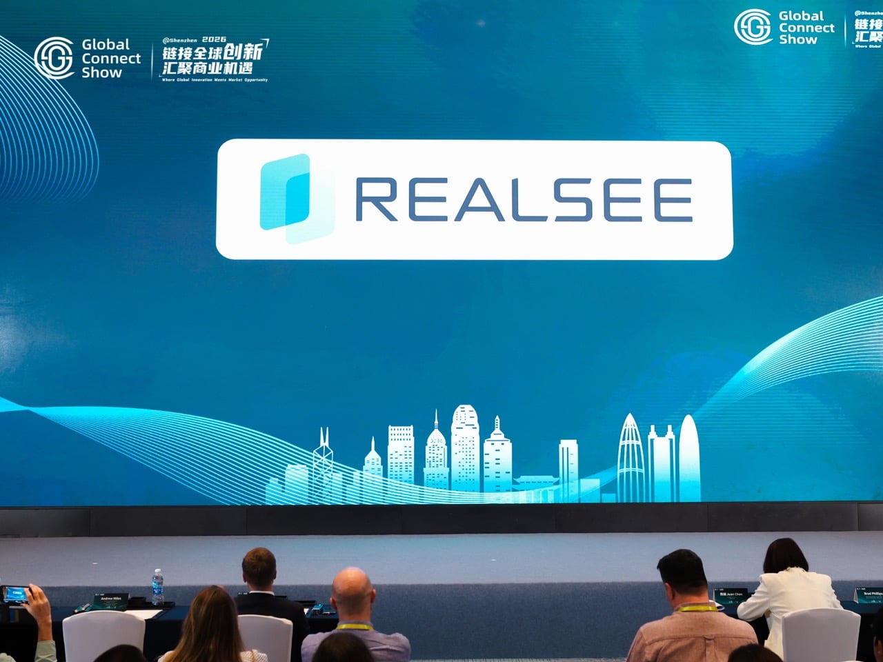
Realsee brought a very different kind of intelligence to the event, one rooted in space itself. Its digital twin platform can scan real environments and turn them into immersive 3D experiences that people can walk through remotely. The demo on site made the technology feel less like documentation and more like spatial publishing. A place becomes something you can revisit, present, share, and preserve.

That has obvious commercial applications in real estate, retail, architecture, and tourism, but it also expands the definition of what a home can be in digital form. A house stops being just shelter and starts becoming an experience layer, a navigable archive of how a place looked, felt, and was arranged at a particular moment in time. There is something emotionally charged about that. Once domestic space can be captured with this level of permanence and fidelity, the home becomes part memory object, part media asset, part data structure. Realsee may be selling scans, but the subtext is preservation.

Ocjoy – Oral care, recast as confidence
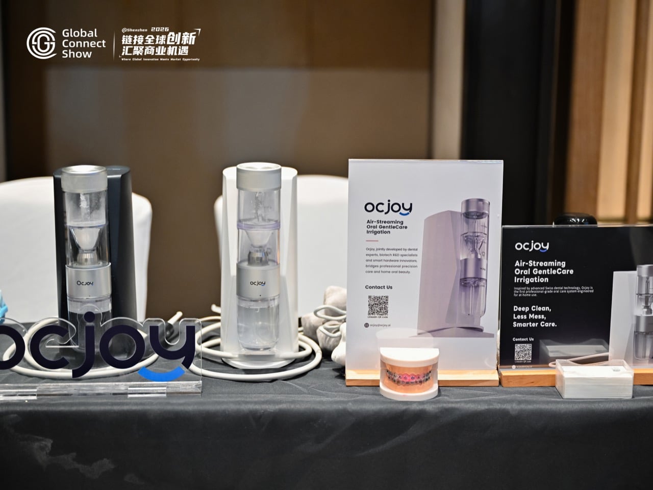
Few categories feel more clinically trapped than oral care. Most brands still speak in the language of plaque, whitening, sensitivity, and dentist-approved outcomes. Ocjoy took a different route. Its presentation focused on comfort, gentleness, and the emotional state attached to daily self-care. The most memorable line of the evening was not about performance metrics. It was about those two minutes before leaving the house and how that ritual should feel.

That reframing matters because it moves oral care out of the correction mindset and into the confidence mindset. The category has spent years talking like a clinic. Ocjoy talks like a lifestyle brand with an unusually intimate understanding of vulnerability. The promise is not simply a cleaner mouth. It is a better emotional launch into the day. When a founder positions a hygiene routine as a source of confidence, the product stops acting like equipment and starts behaving like emotional infrastructure.

Ollobot OlloNi – The thesis, standing on stage
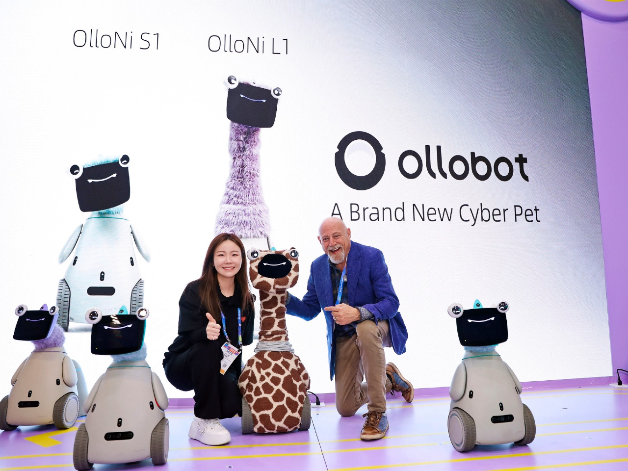
Then there was Ollobot, which felt like the entire article condensed into one physical object. The company’s cyber pet companion robot did very little to hide its intentions. This was a machine built for attachment. It was expressive, soft, almost creature-like, and explicitly framed as something that grows with a family over time. In a product landscape obsessed with doing, Ollobot was interested in being there.

That distinction is what made it so compelling. The company described emotional sensing, long-term memory, and a model of companionship shaped by repeated interaction. Even the idea that the robot’s memories could survive hardware failure, preserving continuity across bodies, suggests a design philosophy centered on relationship rather than replacement. That is a startling proposition for home tech. We are used to devices becoming obsolete. Ollobot imagines a household object whose value compounds through emotional history.

It also raises the biggest question hovering over this entire trend. What happens when the devices in our homes become fluent in feeling? A robot that remembers your face, senses your mood, and develops a unique personality over time can sound comforting, even beautiful. It can also sound like the most persuasive surveillance object ever designed. Empathy, after all, is a form of access.

What GCS Shenzhen 2026 actually revealed
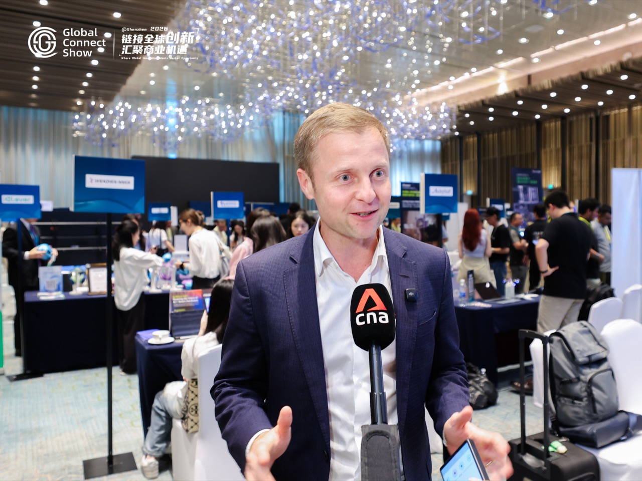
Seen individually, these products occupy very different categories. Lawn care, golf accessories, family dashboards, children’s audio, digital twins, oral care, companion robotics. Seen together, they reveal a new competitive terrain. Features still matter. Performance still matters. Design still matters. But the strongest brands at GCS were reaching for something harder to quantify and easier to feel.

They were selling a home life with less friction and a better emotional texture. Calm instead of chaos. Confidence instead of routine dread. Presence instead of passive automation. Relief instead of one more task. That does not mean the smart home has become soft. If anything, it has become more sophisticated in the way it frames value. The next generation of domestic technology wants to be welcomed, trusted, and emotionally legible.

That is why Ollobot felt so important. It made visible what other brands were still expressing in subtler ways. The home is no longer simply getting smarter. It is getting more attuned to the people inside it, their moods, their rituals, their anxieties, their desire for time back, and their hunger for a domestic life that feels smoother on the inside.

Whether that future sounds comforting or invasive depends on your tolerance for intimacy from machines. Either way, Shenzhen made one thing clear. The smartest home products of 2026 are no longer competing only on what they do. They are competing on how they make you feel.

The post The Smart Home Trend of 2026 Is Surprisingly “Emotional Intelligence” first appeared on Yanko Design.
The Hague Just Turned Air Into Its Most Exciting Museum

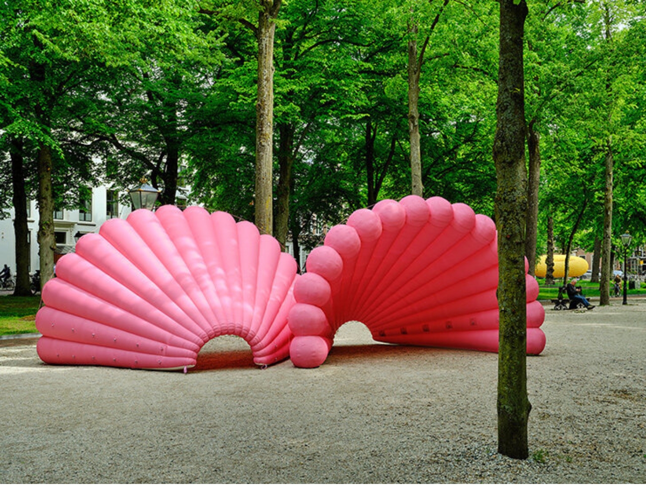
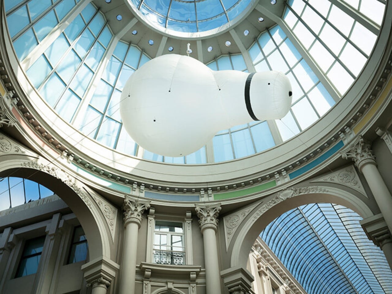
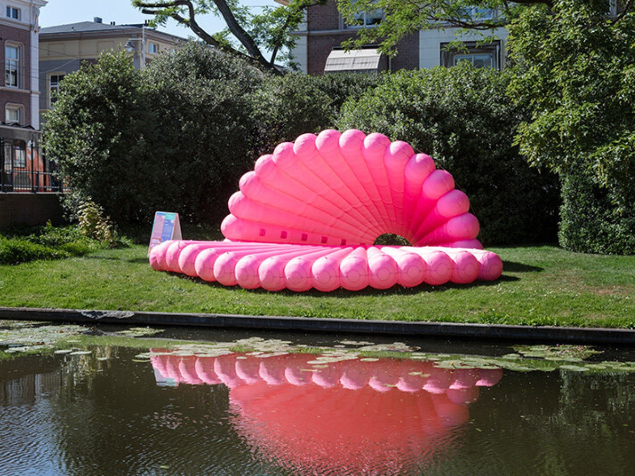
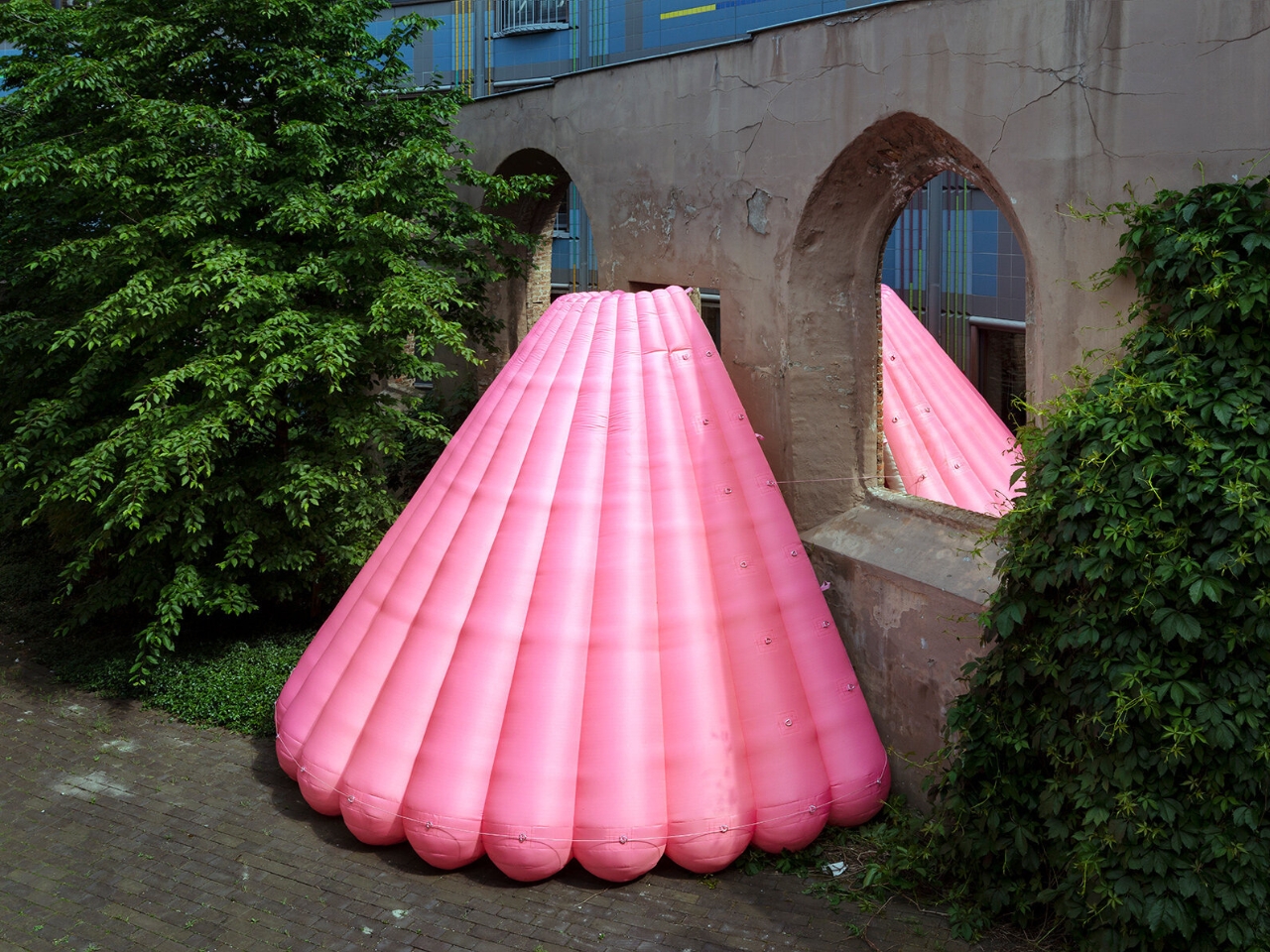
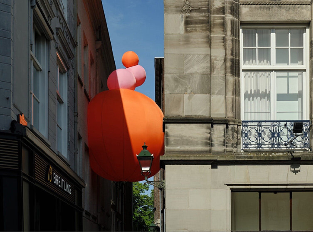
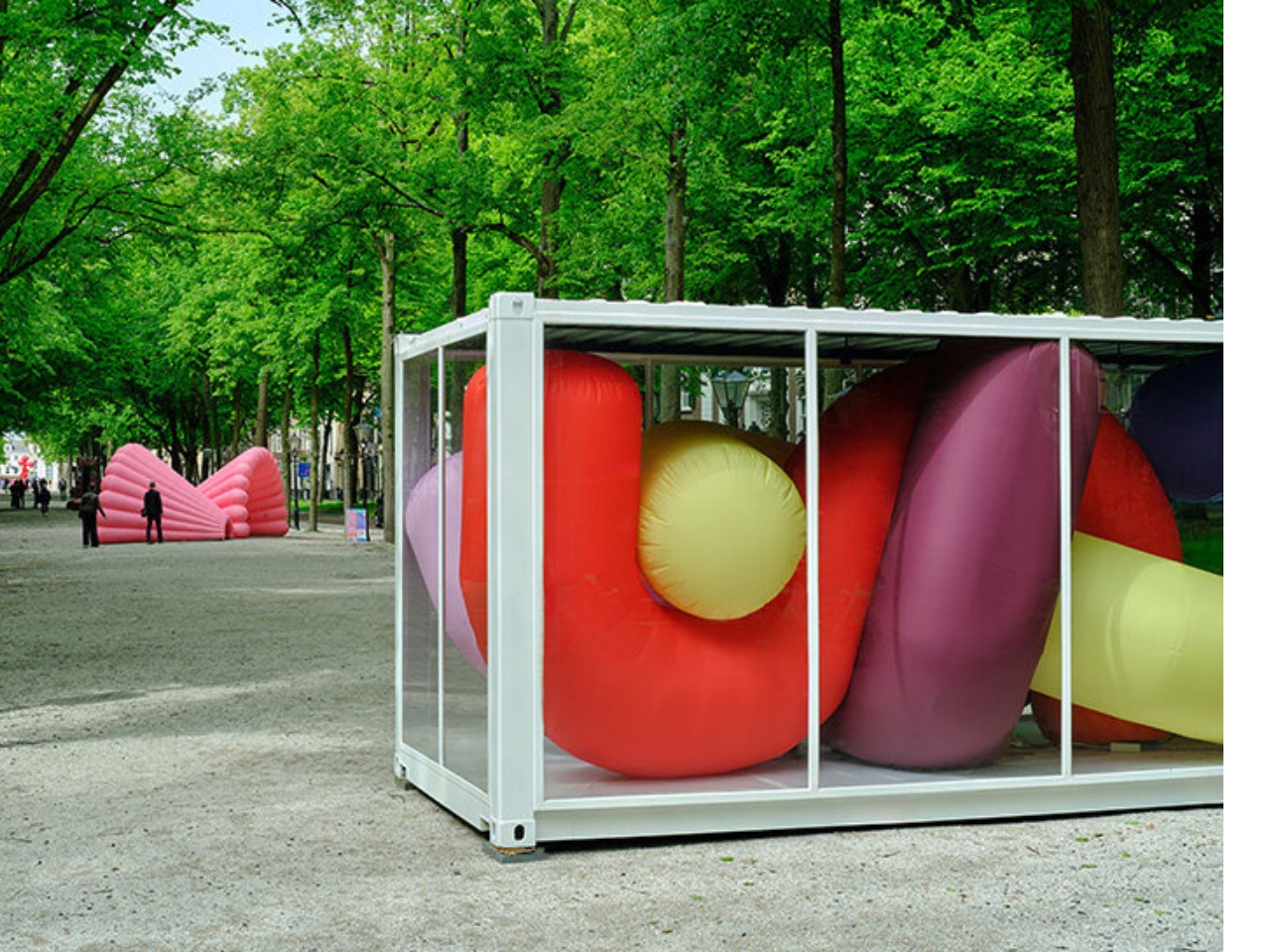
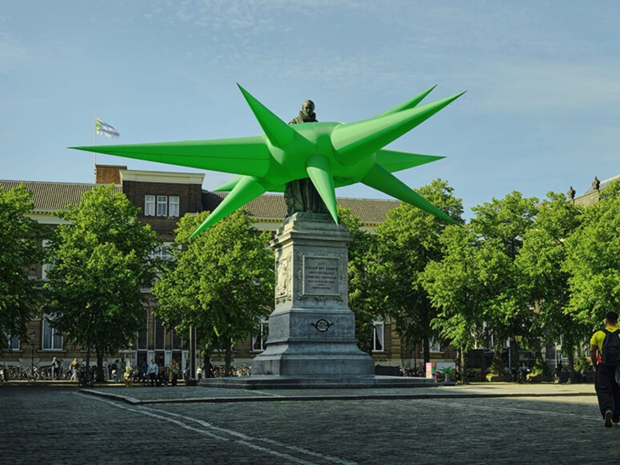
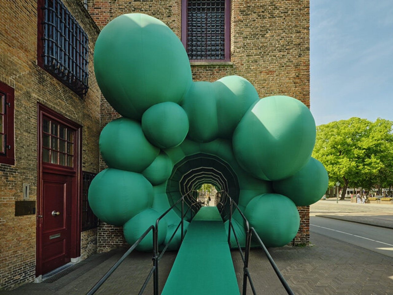
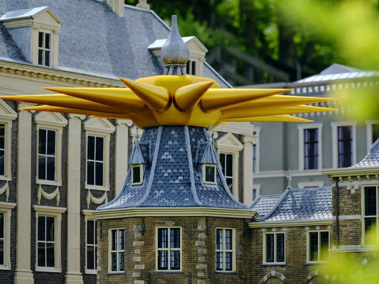
The Hague is not the first city you’d expect to reinvent what a museum looks like. But from May 22 to June 21, 2026, it might just be the most interesting one. BlowUp Jubilee, the fifth anniversary edition of BlowUp Art Den Haag, has filled the city’s historic Museum Quarter with 24 inflatable artworks from some of Europe’s most creative designers, and the result is one of the more quietly radical things happening in public art right now.

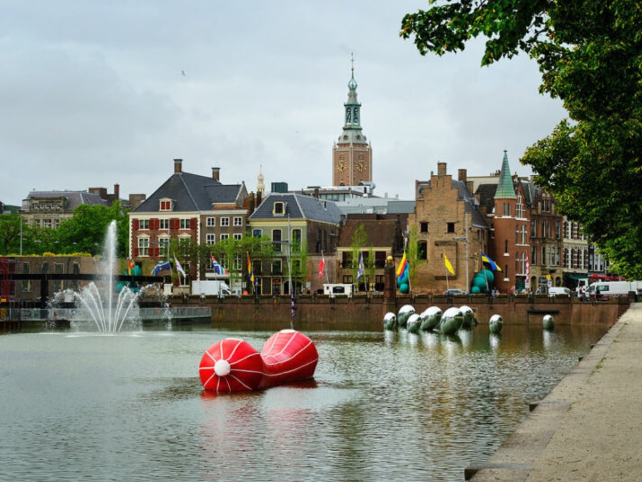
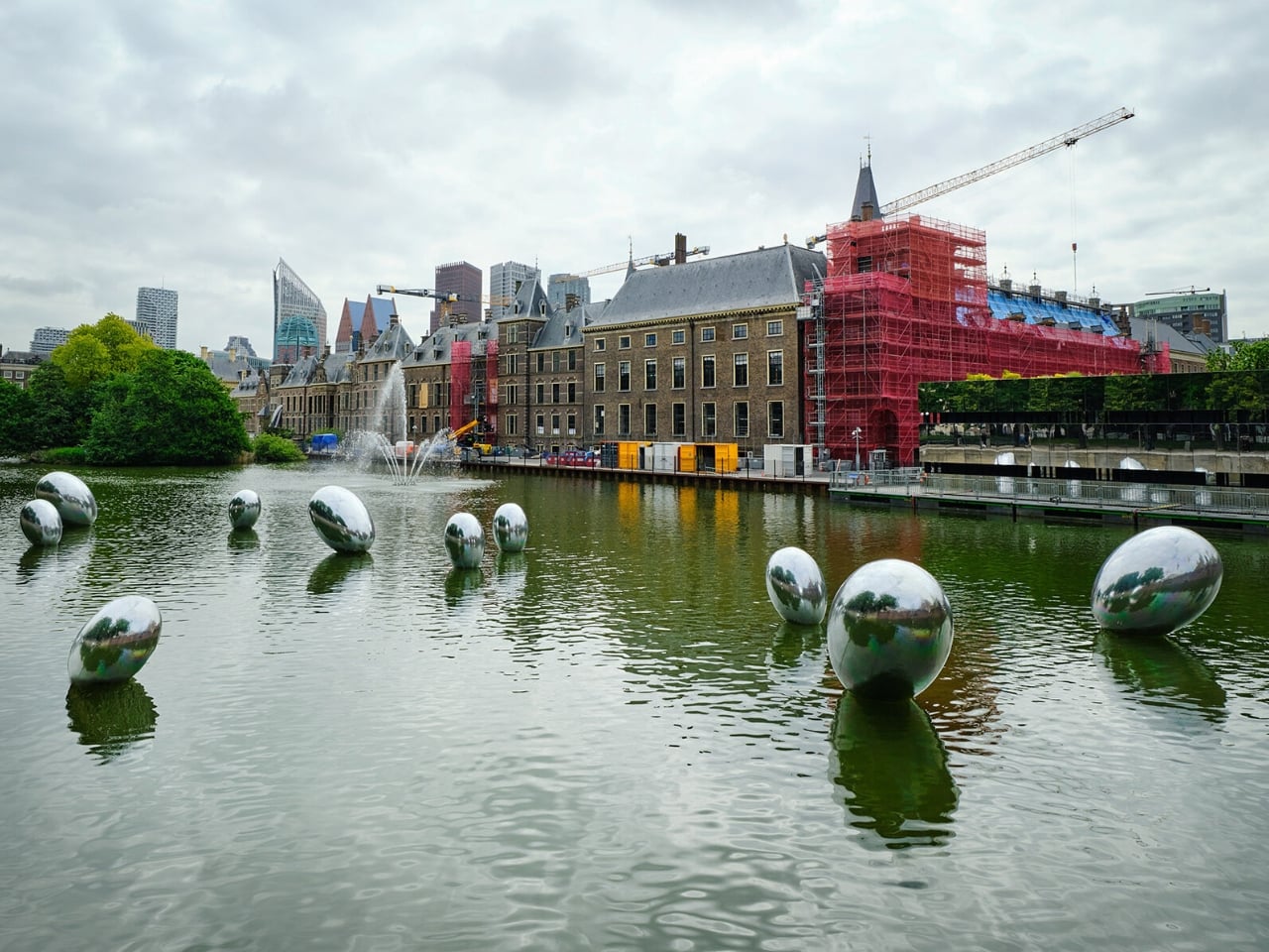
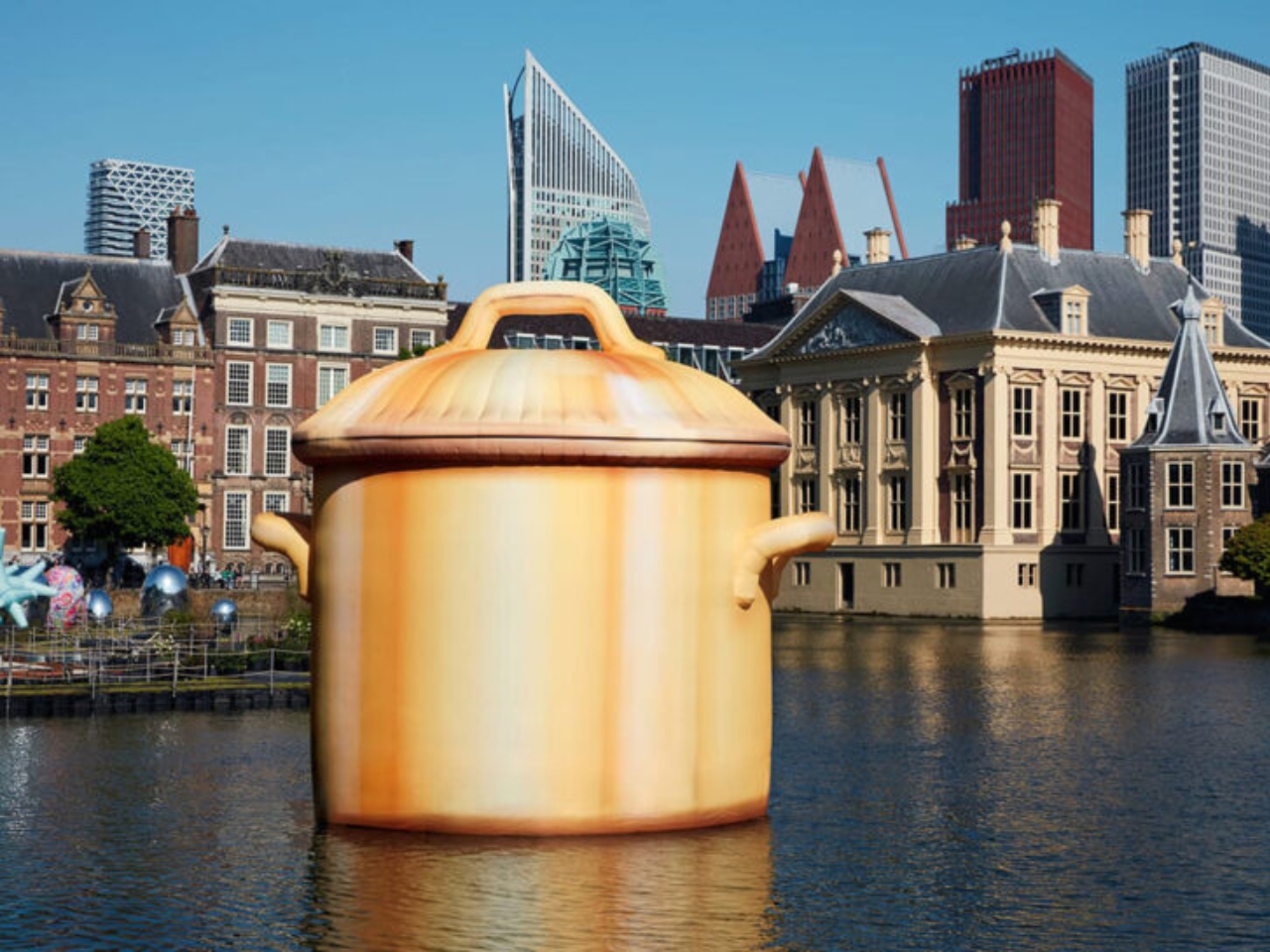
I want to start with the obvious, because the obvious is actually the point: these things are enormous. Steve Messam’s Crested rises above The Hague’s tree line as a vivid red spiked headdress. Studio Job sends an oversized cooking pot drifting across the Hofvijver. Marcel Wanders contributes a cluster of giant reflective Eggs that sit near centuries-old civic squares and somehow look completely at home. The sheer scale is part of the experience, but so is the material. Seeing something so large made of something so inherently light creates a kind of visual dissonance that’s hard to explain until you’re standing in front of it.

Designers: Various

Inflatable art has a reputation problem. For most people, that word conjures balloon animals or the kind of thrashing tube men outside car dealerships. What BlowUp Jubilee does is force a total rethinking of that association. When a floating cooking pot makes you stop mid-walk and laugh before you even think to analyze it, something worthwhile has happened. The best public art doesn’t ask you to be prepared. It just catches you off guard.

The whole exhibition started in 2022 as part of BinnenhofBuiten, an initiative by The Hague & Partners, commissioned by the municipality while the Binnenhof, the Netherlands’ historic political complex, undergoes major renovation. The closure could have left the area feeling hollow. Instead, curator Mary Hessing turned the absence into an opportunity, building a cultural walking route through the Museum Quarter that gave people a reason to keep moving through the neighborhood. What began with six artists has grown into a full five-year survey, with earlier works returning alongside new commissions.

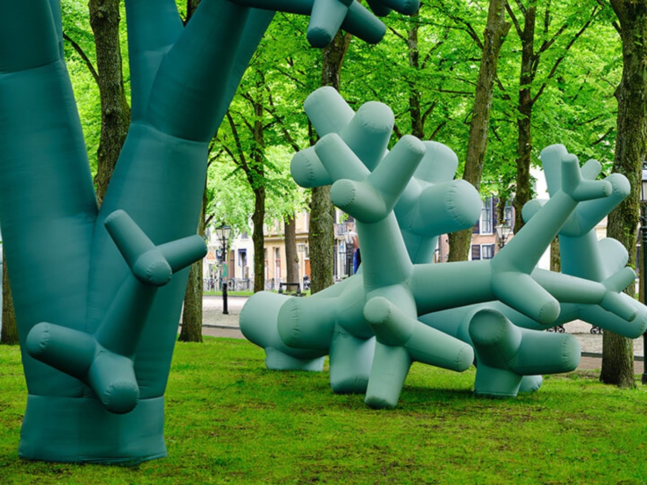
The artist list for this jubilee edition is genuinely varied. Raw Color brings graphic precision with Compressed Cylinders, Studio Ossidiana’s Softshell settles into its surroundings like something halfway between a creature and a building, and Studio Mieke Meijer’s Airboretum reinvents the idea of a tree entirely. Larissa Ambachtsheer’s Keep Me in Balance and Adrianus Kundert’s My First Inflatable lean into a lighter register. One of the most compelling additions is 21-year-old Eugenie Boon, whose piece Koncha pa Dilanti draws from her Curaçao heritage, filling an inflatable with scenes from the island’s food, parties, and community life. It’s a reminder that this format, when used thoughtfully, carries real cultural weight.

The question of access runs through everything BlowUp Jubilee does, and I think it’s the most underrated part. A museum asks you to go to it. This exhibition is simply there, spread across parks, along Lange Voorhout’s tree-lined stretches, near canals and building facades, and even inside a train station. You don’t buy a ticket to see Studio Job’s cooking pot. You just happen to look up on your way somewhere else. For anyone who finds gallery spaces quietly intimidating, that changes the entire relationship between a person and public art.

It also says something useful about how cities can respond to disruption. The Binnenhof renovation is an inconvenience, spatially and symbolically. BlowUp Art was the response that asked: what if we made the disruption into something worth seeing? Five years in, that bet has clearly paid off. By June 21, all 24 installations will be packed up and deflated, the whole spectacle compressed back into storage. Inflatable art lives on borrowed time by design. But the case BlowUp Jubilee makes for public art that is joyful, free, and genuinely oversized has a staying power that the materials don’t. Sometimes a museum doesn’t need walls. Sometimes it just needs air.
The post The Hague Just Turned Air Into Its Most Exciting Museum first appeared on Yanko Design.