Some people adapt to trackpads just fine. They swipe, they tap, they gesture their way through a full workday and never once think about what they’re missing. That has never been me. Trackpads feel unintuitive, slow and imprecise in a way that becomes genuinely frustrating once the work gets serious. Image editing, timeline scrubbing, file navigation, moving through a browser at pace, these are things a trackpad tolerates and a mouse handles. That distinction matters when you travel for work as often as I do, and it is why a wireless mouse has been a permanent fixture in my laptop bag for as long as I can remember.
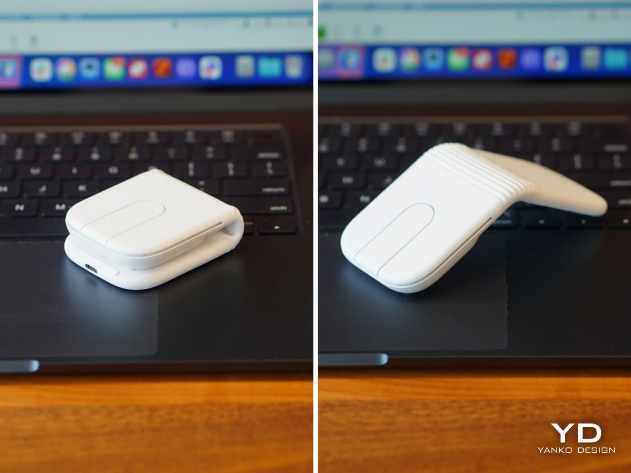
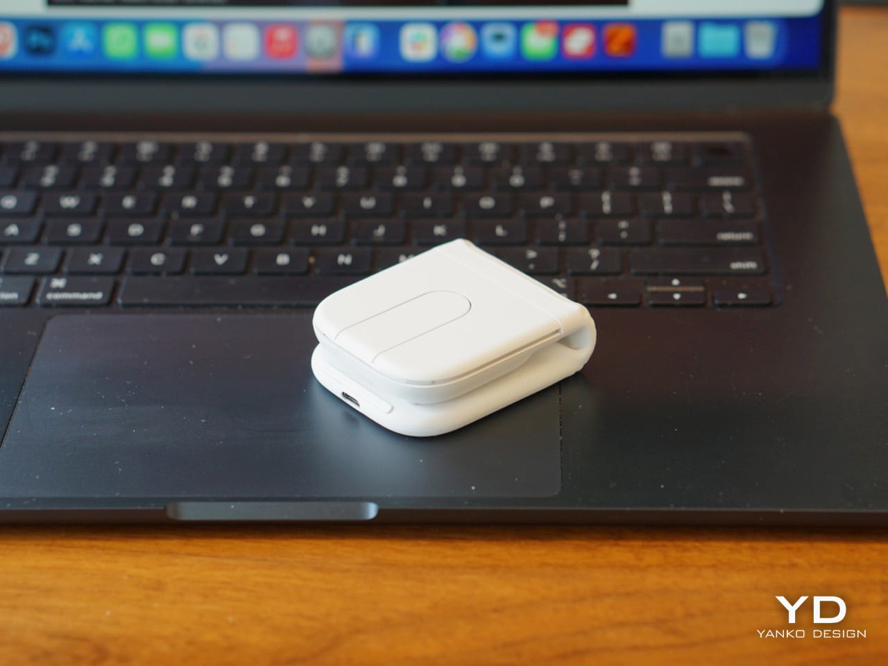
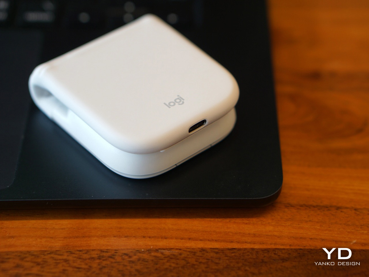
The problem with that habit is volume. A full wireless mouse takes up real estate, adds weight, and always ends up in the way of something else. I have watched foldable mouse concepts cycle through design blogs and crowdfunding pages for years, always clever in theory and usually mediocre in practice. The ergonomics were afterthoughts, the build quality felt questionable, and none of them felt like something worth trusting with actual work. Logitech’s Mobi Fold is the first one that genuinely changes that equation, folding to the size of a bifold wallet and opening into a properly ergonomic mouse with the kind of engineering behind it that makes it feel like a real daily tool.
Designer: Logitech
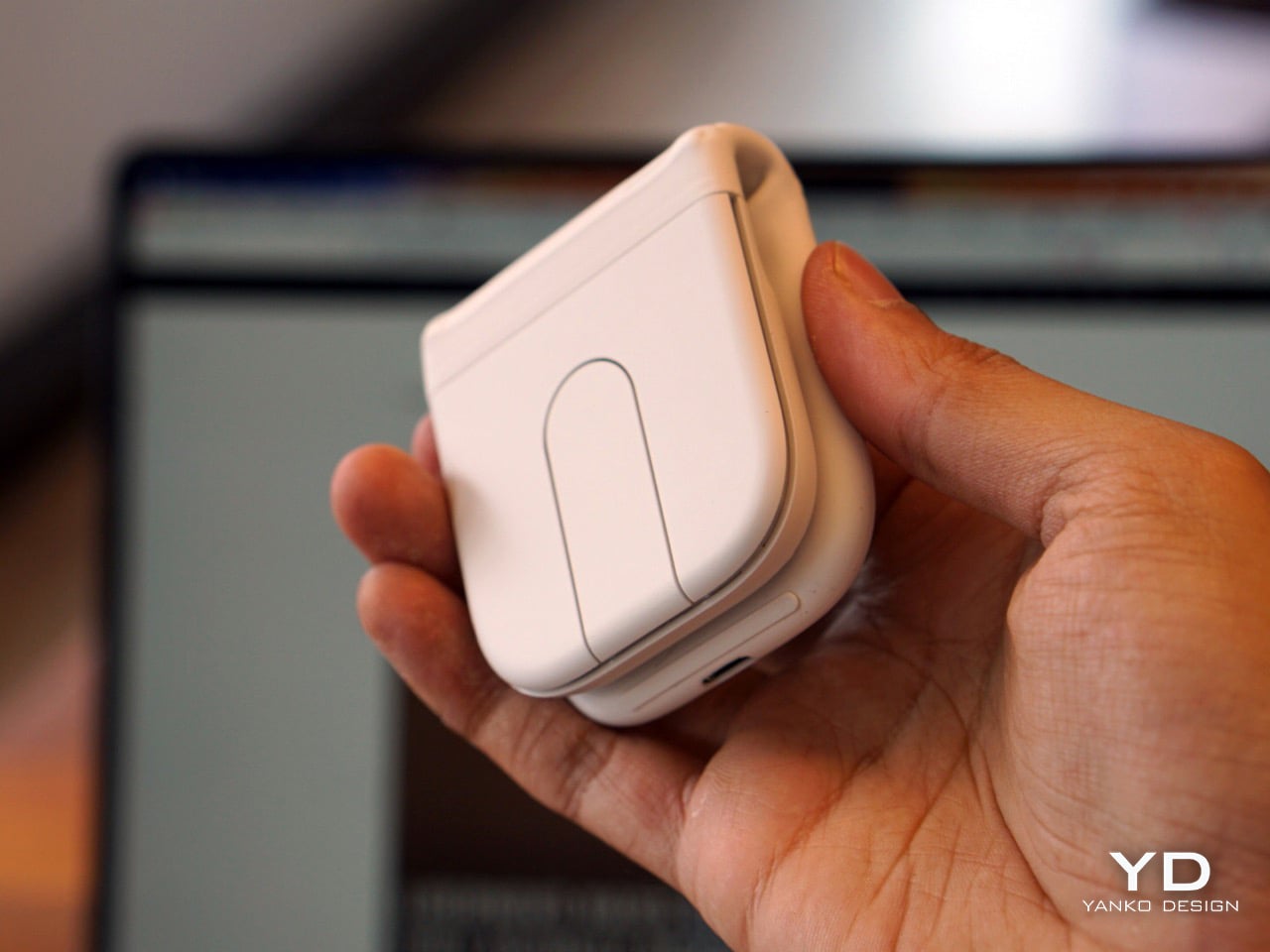
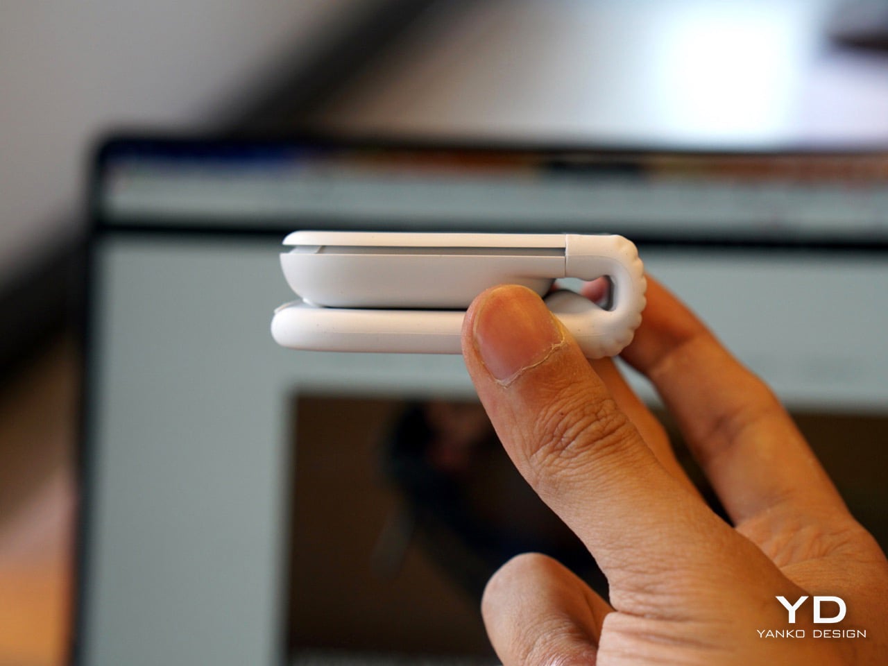
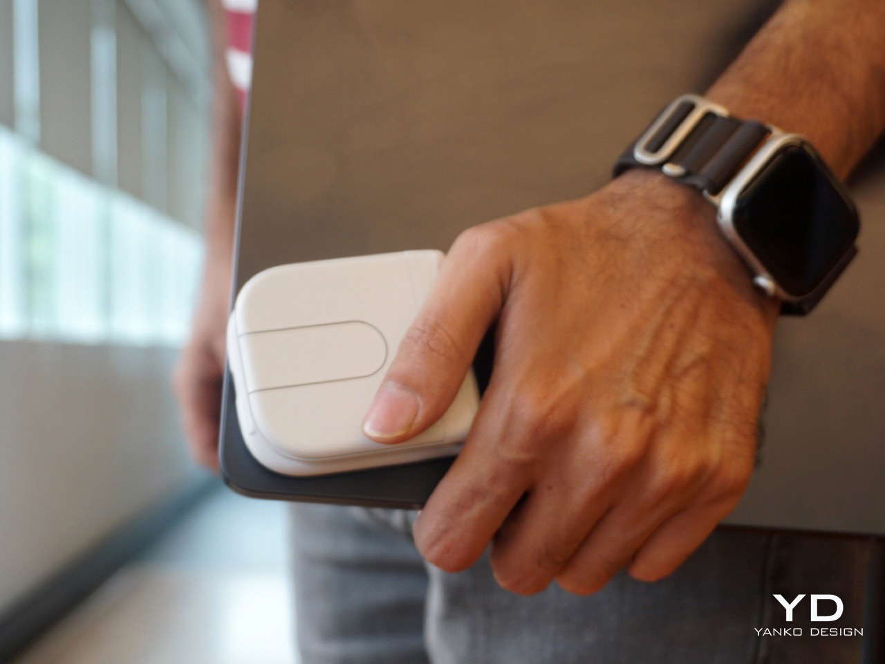
At 21mm when folded and 79 grams total, it pockets without a second thought, and the folded profile is compact enough that it stops reading as a mouse and starts feeling more like a card case or compact notebook. The dust-resistant exterior and drop-tested construction suggest something engineered for the bottom of a bag rather than careful handling, which matters when travel means moving quickly between locations without stopping to think about fragile equipment. It does not feel like an accessory that demands its own consideration. It feels like something designed to absorb daily life and stay functional throughout.
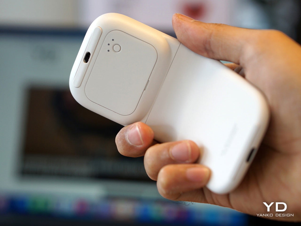
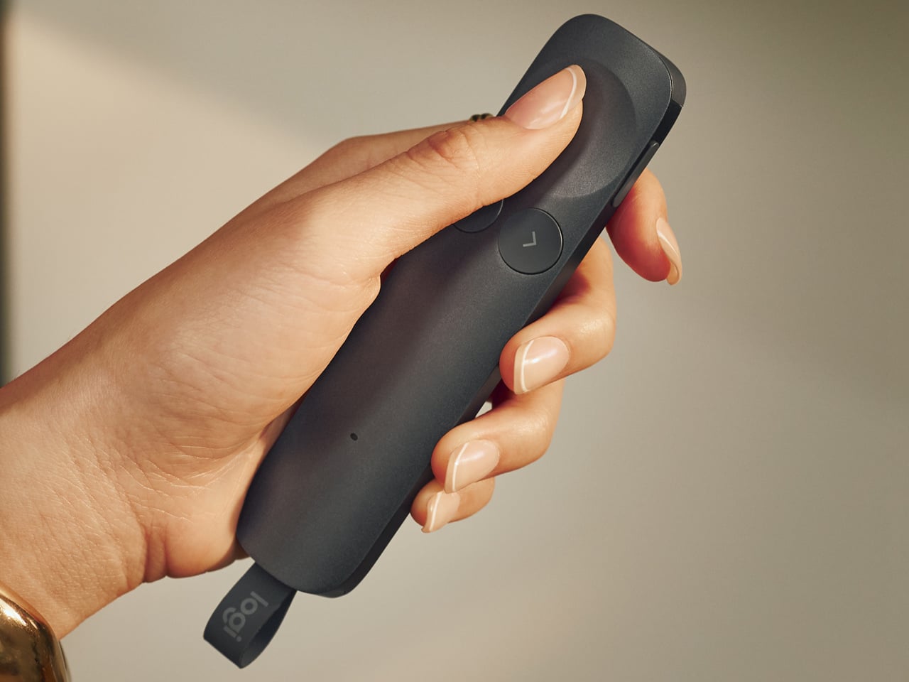
Unfolding it one-handed is cleaner than expected. The mouse settles into its predefined ergonomic angle with a firmness that feels researched, and from that point the experience becomes surprisingly familiar. The left and right clicks are effectively inaudible in a shared workspace, genuinely close to silent in a way that means a library table or open-plan office registers no reaction from the people sitting around you. What makes the folding experience feel genuinely intelligent is that the Mobi Fold knows when it is being closed. The on-device AI model helps prevent unintentional clicks when folding, a behavior I tested repeatedly and found completely reliable every single time. Folding it shut also powers it off automatically, which removes any need for a separate off switch and makes the entire experience feel self-contained.
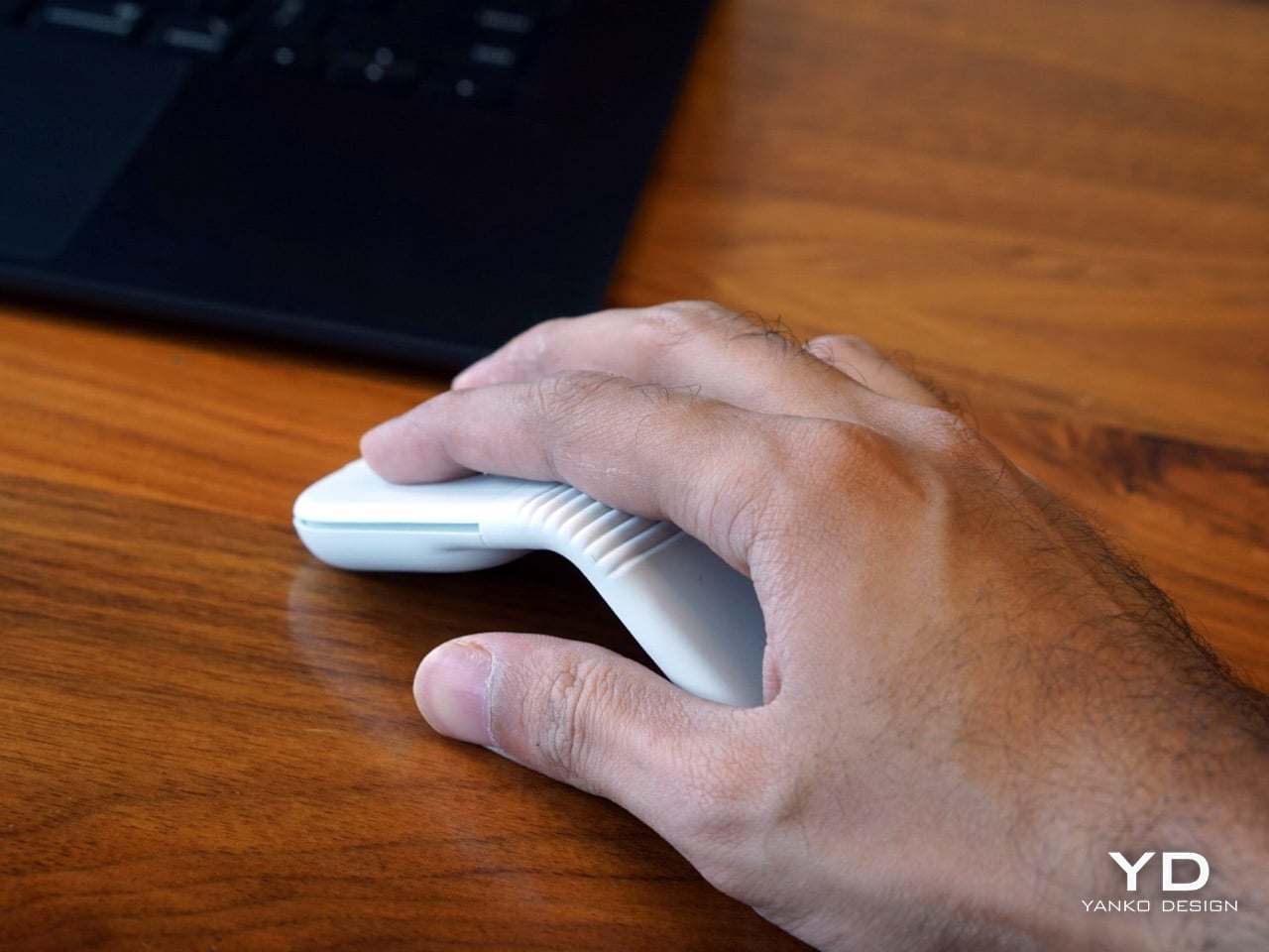
Opening the mouse turns it on. Closing it turns it off. There is no dedicated power button to hunt for, no mode to toggle, no need to remember. But the smarter detail is what happens during the transition. An on-device AI model helps prevent unintentional clicks by recognizing when to disable the buttons, so inputs are blocked while your hand is still mid-motion. This sounds like a small thing until you test it repeatedly and realize it works flawlessly every single time.
Comfort, on the other hand, takes a little recalibration. The ergonomic angle works and the shape causes no discomfort, so the learning curve comes from a different place entirely. Even with its super compact design, it unfolds to fit naturally in the hand at a predefined angle, with 22% less muscle strain compared to a laptop trackpad, but at 79 grams it is considerably lighter than something like the MX Master 4, and the familiar resistance you expect under your palm simply is not there at first. The flat scrolling surface adds to that shift. It does not glide with quite the same fluidity as Apple’s own trackpad, though holding that against Mobi Fold feels like comparing different hardware categories. Muscle memory reaches for a physical wheel and finds a flat touch surface instead, and both take a day or so to recalibrate. There is also something oddly satisfying about the gap the fold creates underneath the mouse. Tucking your fingers into that space feels natural, and it might just be specific to how I hold a mouse, but it works.
The clicks are exceptional. Left and right are effectively inaudible in a shared workspace setting, which is not an exaggeration. Shared office environments, open-plan cafes, library tables, all of those spaces where a clicking mouse would normally draw quiet irritation from the people nearby, the Mobi Fold operates in near silence. Logitech has shipped quiet-click mice before, so this is not new territory for the brand, but the execution here is particularly clean. The mouse weighs 79 grams, which gives it a noticeably lighter feel in the hand than most desktop mice. Coming from something like the MX Master 4, the weight difference is a bit of a culture shock, and it takes a few sessions before your hand stops expecting more resistance beneath it.
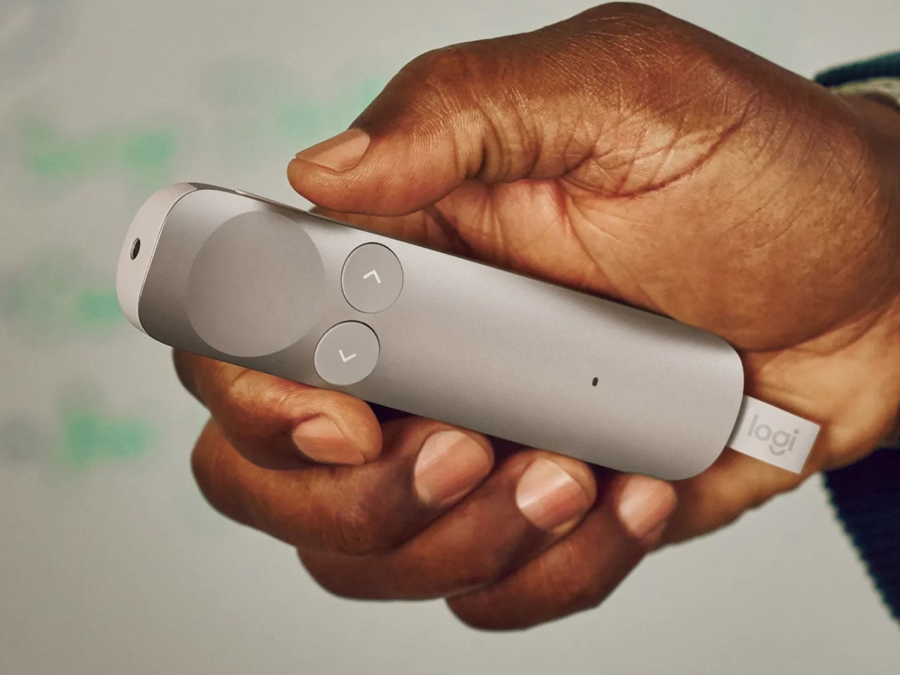
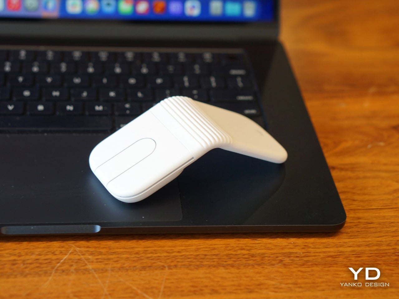
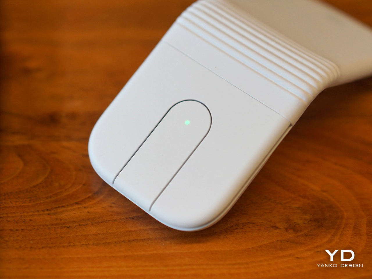
The center control replaces your standard scroll wheel – for logical reasons, scroll wheels occupy space and the Mobi Fold doesn’t have any room for it, given the optical tracker sits right underneath the scroll area. Described in the spec sheet as a touch panel with two customizable buttons, the center control functions in practice more like a multi-input surface that earns more real estate in your workflow the more time you spend with it. It handles scrolling, whether navigating massive spreadsheets with line-by-line precision or gliding through long documents hyper-fast. The panel also rocks, registering separate inputs at the top and bottom, which Logitech defaults to Forward and Back navigation. For anyone who spends a significant portion of their day working in a browser, that default alone pays off immediately. Through the Logi Options+ App, the two customizable buttons on the touch panel can be personalized to trigger shortcuts like switching applications or taking screenshots instantly, or remapped to things like muting your microphone or toggling your camera in Zoom, giving the panel a versatility that a standard physical scroll wheel would struggle to match.
The surface is smooth, the feedback is silent, and the precision is genuinely there for line-by-line navigation or hyperfast scrolling powered by the 4K DPI sensor. The Apple Magic Trackpad scrolls more fluidly, but that smoothness comes from Apple’s own software stack, so the comparison is not a fair one to draw. What matters is that the Mobi Fold’s scrolling is functional and versatile, and the muscle memory issue fades with use. It is a reasonable adaptation to make for a mouse this portable.
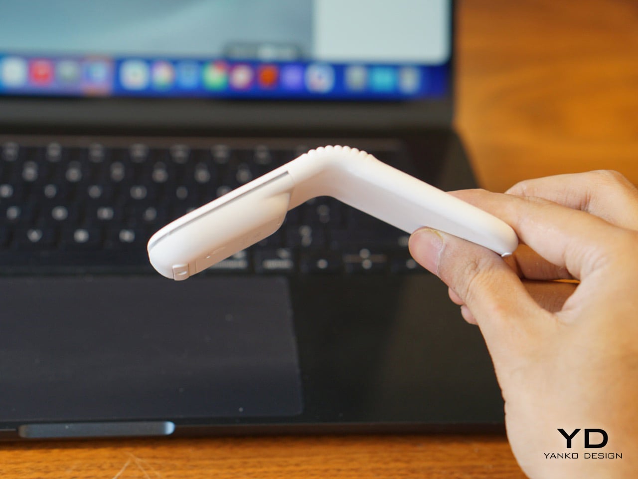
One persistent instinct the design triggers is the urge to open Mobi Fold completely flat. The hinge stops at its predefined angle, which Logitech settled on after extensive user research, but the hand keeps wanting to push through. It is a small quirk rather than a flaw, and it fades with familiarity. My own hope is that Logitech’s natural evolution of this form factor eventually lets the device open flat, turning it into a presentation remote or pointing device in the process. For now, Logitech has successfully bridged tech and everyday carry to produce a mouse that earns its place in a travel setup from the first day you use it. The Mobi Fold is now a mainstay in mine.
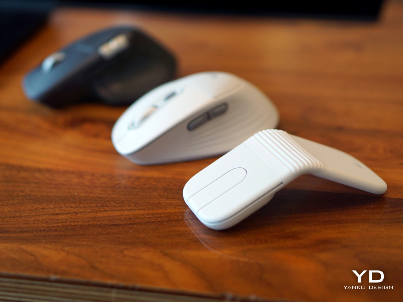
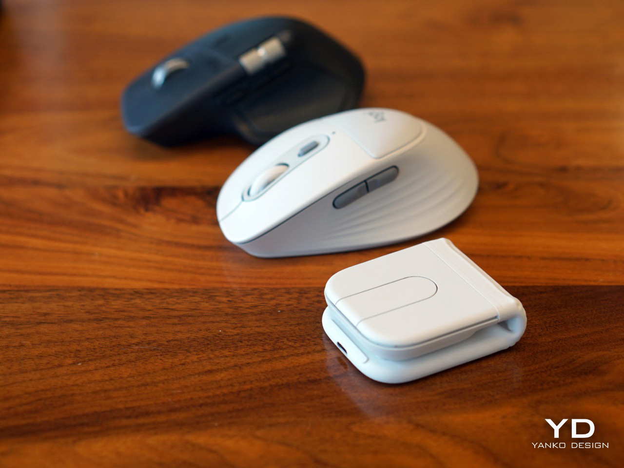
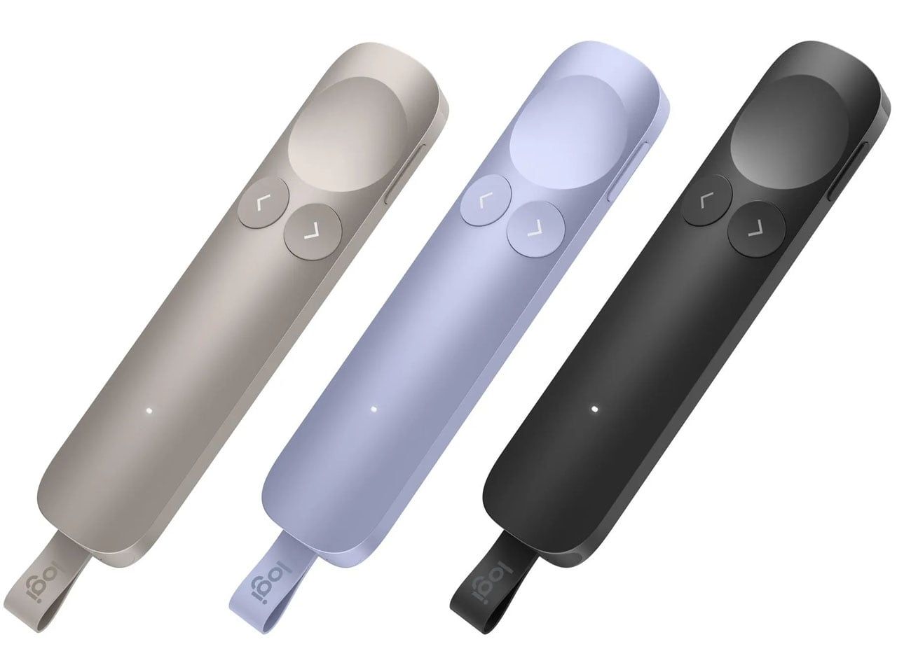
There are two mice in my setup now, one that stays on my desk and one that goes everywhere else. The MX Master 4 handles the home office. The Mobi Fold handles everything that happens between flights, hotels, cafes, and borrowed desks. It is available in Graphite, Lilac, and Off-White in select markets, starting at $79.99. The white finish is something I want to monitor over the next few months to see how it holds up to daily travel and bag life, but everything else holds up impressively from first use. The foldable mouse has been a concept for a long time. Logitech has turned it into a product worth actually carrying.
The post Logitech’s New Travel Mouse Folds Flat Like a Wallet: Hands-on with the Mobi Fold first appeared on Yanko Design.