Lofree Just Made the Most Eye-Candy Mechanical Keyboard of 2026 and It’s Inspired by Lipstick

Your desk says something about you before you ever open your mouth. The monitor, the mug, the little objects arranged around your keyboard, they all add up to a portrait. And the keyboard sits dead center in that portrait, the most touched, most visible, most personal object in the whole setup. So why do most of them look like they were designed by someone who has never once cared about how a workspace feels?

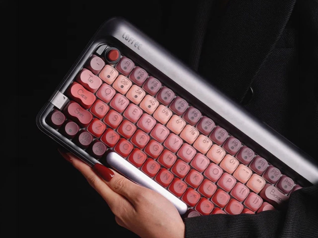
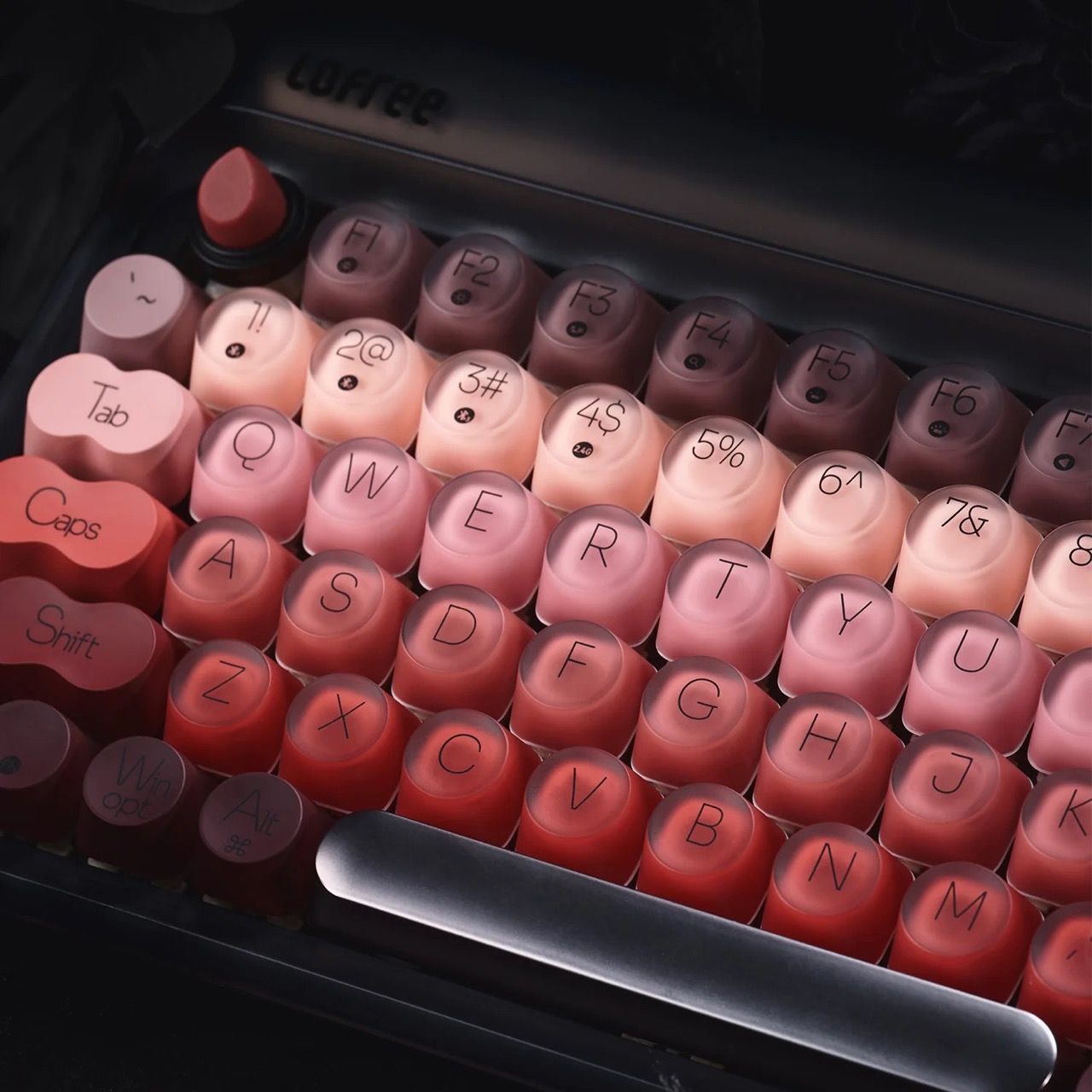
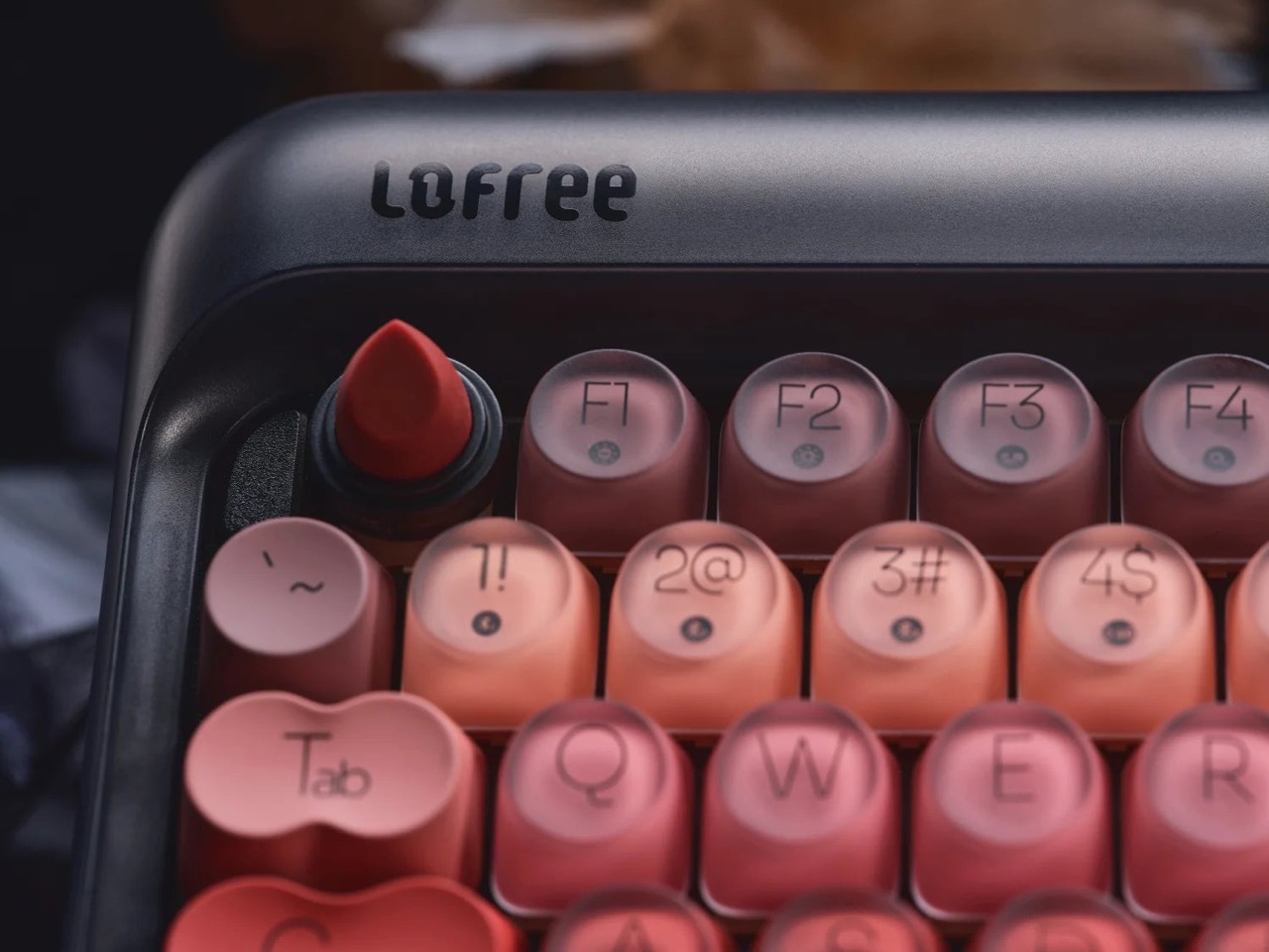
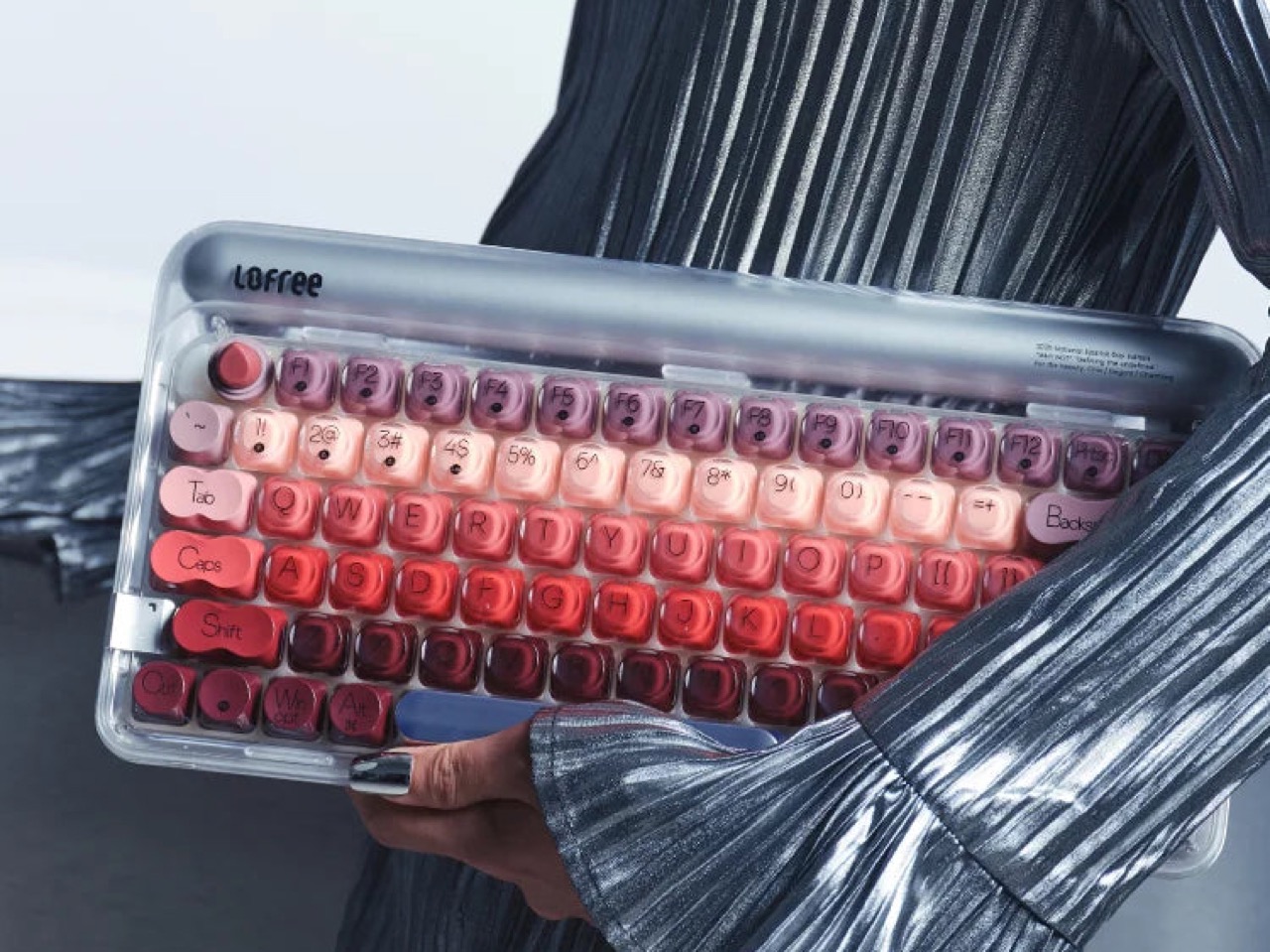
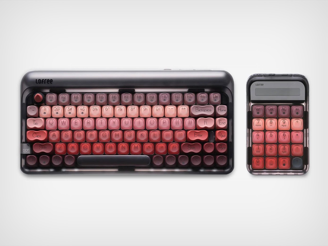
Lofree has been answering that question for years, building a catalog around the idea that a keyboard can carry genuine personality. The Lipstick is where that philosophy gets its boldest, most unapologetic expression yet. Five lipstick shades flowing across the keycaps in a deliberate ombre gradient, a sculptural lipstick-bullet ESC key rising from its cradle, and a gorgeous frosted transparent shell that puts the whole color story on display like jewelry in a glass case. It retails for $199 and is available now in Silver and Black directly from Lofree.

Designer: Lofree

Click Here to Buy Now

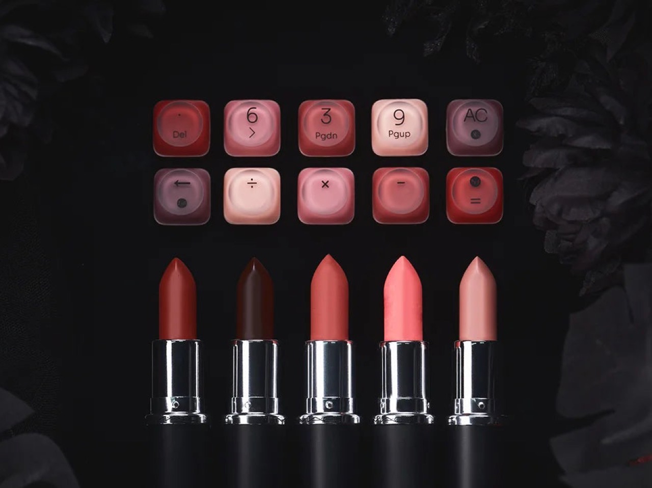
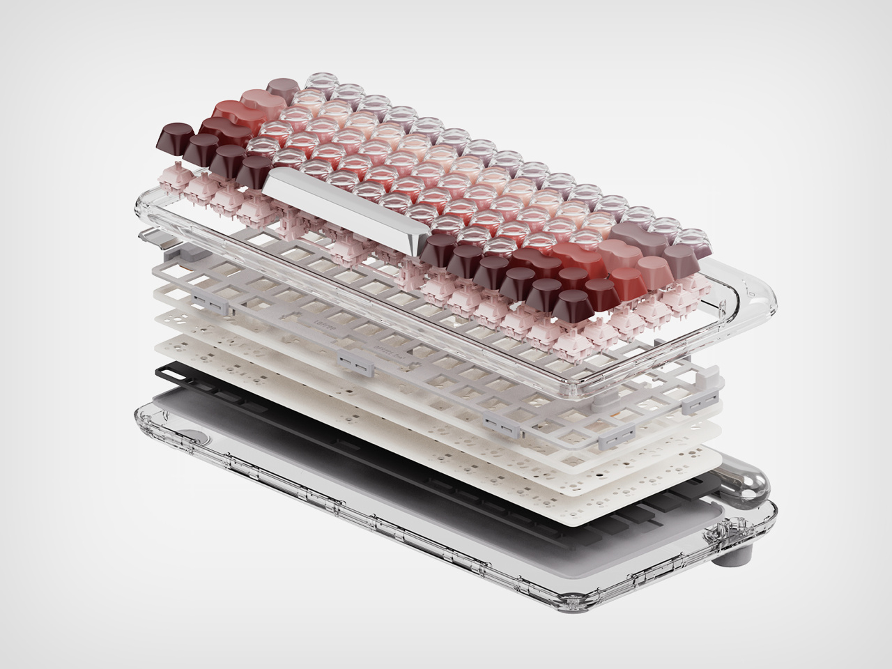
Never did I think the overlap between beauty and keyboards would exist so seamlessly. Lofree used dual-tone PBT keycaps to create that mystique that is each and every key, with a frosted outer shell revealing the hint of a hue underneath. Lofree didn’t scatter five themed shades arbitrarily across 84 keys. They sequenced them, running deep burgundy and wine tones from the left and right of the board through warm coral and brick red across the QWERTY row, then lightening into blush pink and dusty mauve as you move into the function row. The result reads like a makeup palette laid flat across your desk, a color story with a beginning, a middle, and an end. The keys on the extreme left and right (Tab, Caps Lock, Shift, Enter) are single-tone, giving you a direct look at the color while the rest of the row looks like actual samples of lipstick or nail paint that you’d feel like popping out to test. Pair this with the nail-job on your actual hands and you’ve got absolute art at work.

Lofree’s rounded, typewriter-inspired keycap profile has been a house signature since the original Block, and the Lipstick leans into it fully. That retro shape is clever because it mimics the cylindrical form of a lipstick tube at a miniature scale, which means the thematic reference lands in three dimensions rather than just through color. The ESC key pushes that logic to its natural conclusion, a fully sculpted lipstick bullet in matte red, sitting upright in a black cradle in the top left corner of the board. It physically protrudes above the surrounding keys, and when you see it in person, it has the quality of a very good joke told with a completely straight face. Clever without being loud about it.

Under all of that, Lofree built a proper enthusiast keyboard. The Lipstick runs Lofree x Gateron linear switches with a 40g actuation force, hot-swappable and compatible with both 3-pin and 5-pin configurations, so you can retune the typing feel whenever you want without touching a soldering iron. A gasket mount structure absorbs the hard edges out of each keystroke, softening the acoustics and adding a slight cushioned rebound that makes extended typing sessions noticeably more comfortable than a standard tray mount board. The 1000Hz polling rate over both 2.4GHz wireless and USB-C wired connections keeps response times sharp, and a 4000mAh battery delivers up to 14 days of use with the backlight off, or 30 hours with all seven lighting effects running. The keys aren’t individually backlit, which is what you’d expect with dual-tone PBT caps, but rather the space between the keys lights up, giving you a look at the keyboard’s outline. Bluetooth 5.3 handles up to three paired devices simultaneously, with seamless switching across macOS, Windows, iOS, and Android.

Lofree also makes a matching Lipstick Wireless Numpad that carries the same gradient keycaps and frosted shell, available separately for anyone who wants the full spread across their desk. It connects via the same tri-mode system, so the two sit together without any friction. At $199 for the keyboard, the Lipstick sits at a price point where the spec sheet fully justifies the ask, and the design justifies everything else.

Click Here to Buy Now

The post Lofree Just Made the Most Eye-Candy Mechanical Keyboard of 2026 and It’s Inspired by Lipstick first appeared on Yanko Design.

Lexon Turned Jeff Koons’ Most Famous Sculpture Into The Coolest Statement Lamp You Can Actually Own

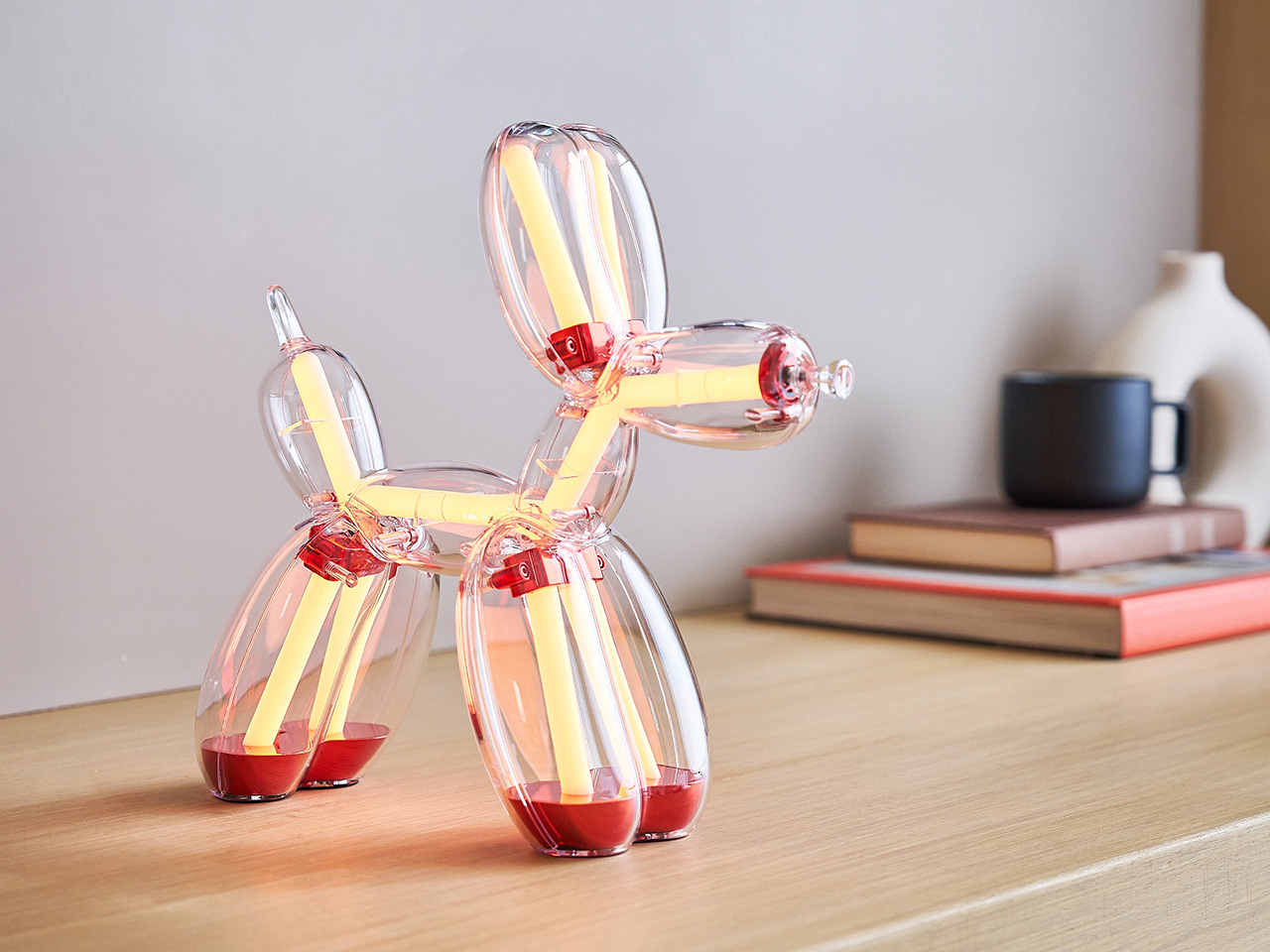
Transforming Jeff Koons’ Balloon Dog into a fully functional lamp required more than good intentions and a licensing agreement. For French design/tech atelier Lexon, more than 50,000 hours of development went into the project, working through the specific challenge of preserving the sculpture’s iconic silhouette while engineering a translucent polycarbonate body capable of housing 400 LEDs and diffusing light cleanly. The result respects the form with a fidelity that goes well beyond cosmetic homage. Lexon, a French brand with 35 years of design experience and more than 250 awards behind it, brought its full technical vocabulary to bear on a project that demanded something genuinely new. The Balloon Dog Lamp Chromatic is the 2026 edition of that effort.

Four colorways define the Chromatic lamp: Platinum, Gold, Blue, and Red, each built from optical-grade polycarbonate chosen for its crystal-clear transparency and the way light moves through it, and anodized metal components that add a pop of color. The colorway identity comes through tinted zones within that transparent body, giving each piece a distinct chromatic character that works even when the lamp’s off. Inside that shell, LEDs operate entirely independently of the body’s tint, cycling through 9 color modes and 9 lighting animations regardless of which colorway body they sit inside. The 2026 edition introduced an additional layer of technical complexity, requiring Lexon to match finishes, tones, and material specifications across both the lamp and speaker product lines while maintaining consistent visual identity throughout. Each piece features Jeff Koons’ engraved signature on the front feet of the sculpture, maintaining a direct physical connection to the artist across all four versions.

Designer: Lexon x Jeff Koons

Click Here to Buy Now: $800. Hurry, limited edition! Pre-orders capped at two pieces per color, per product, per collector.

Jeff Koons has received France’s Légion d’Honneur and the U.S. Department of State’s Medal of the Arts, and his work has been presented at MoMA, the Guggenheim, and the Tate. The Balloon Dog specifically has spent decades accumulating cultural meaning at a pace few contemporary artworks can match. Its form borrows from a children’s party toy, scaled to monumental proportions in mirror-polished stainless steel, yet the conceptual charge it carries never tips into pretension. Koons has always worked around the democratization of beauty and the conviction that joy deserves serious artistic attention. Lexon, whose design philosophy centers on making beautiful objects genuinely accessible, found a natural creative partner in that worldview, and the Balloon Dog Lamp is the physical record of that alignment.

The lighting system offers a wide range of atmospheres offer a behavioral range that goes considerably deeper than a standard color-cycling product. Nine animations, each with their own sub-animations, move from soft warm whites and cool daylight tones through vivid RGB cycles, rainbow sequences, flashing, and strobe, giving the piece a genuinely different character depending on the occasion and the room. Brightness is fully adjustable, and all controls live on the nose of the sculpture, handling color, intensity, and effect from a single tactile point of contact. That decision keeps the lamp’s silhouette completely uninterrupted while making the interaction feel native to the object rather than bolted on. Battery life sits at five hours at 75% brightness, recharging via USB-C, and the lamp’s 29 × 11 × 28 cm footprint and 1 kg weight give it enough physical presence to anchor a space without overwhelming it.

Lexon’s proprietary Easy Sync Bluetooth technology allows an unlimited number of Balloon Dog Lamps to connect and synchronize simultaneously across color, effect, and brightness. That feature transforms what is already a compelling standalone object into the foundation of something considerably more ambitious, particularly for collectors building across multiple colorways. Whether displayed across a room or grouped together, lamps running Easy Sync work in perfect unison, allowing collectors to create immersive multi-piece lighting compositions.

The first Lexon x Jeff Koons edition reached collectors and design enthusiasts across more than 90 countries, a number that speaks to Koons’ global cultural reach and Lexon’s ability to execute a collectible that resonates well beyond the design industry. The Chromatic Collection builds on that foundation with a firm no-reissue commitment across all four colorways and a purchase cap of two units per color per collector, keeping the experience personal and the supply genuinely controlled. Orders are fulfilled on a first-come, first-served basis through monthly shipping slots, with worldwide shipping beginning June 2026. Pre-orders are live now at lexon-design.com. At $800 per piece, the Balloon Dog Lamp Chromatic brings four decades of Koons’ cultural legacy off the gallery wall and onto your side table, where it lights your room, holds its own as a sculptural object, and reminds you every evening that great art and everyday life were never meant to be kept apart.

Click Here to Buy Now: $800. Hurry, limited edition! Pre-orders capped at two pieces per color, per product, per collector.

The post Lexon Turned Jeff Koons’ Most Famous Sculpture Into The Coolest Statement Lamp You Can Actually Own first appeared on Yanko Design.

Forget Your Old Loadout — 5 EDC Essentials Built for Summer 2026

Summer 2026 is a different kind of season for EDC. The carry conversation has matured past keychain gimmicks and bulk-heavy multitools into something sharper; gear that’s actually thought through, built from aerospace-grade materials, and designed with the same care as the objects that live on your desk. These five pieces represent the best of where that shift has landed: practical without being boring, minimal without being precious.

Whether you’re navigating festival crowds, weekend camping trips, or the daily urban grind, the right loadout isn’t about carrying more — it’s about carrying smarter. Each of the picks below earned its spot not through spec sheets alone, but through intentional design choices that make the experience of using them genuinely different. These are the five pieces worth making room for this summer.

1. Cubik Knife

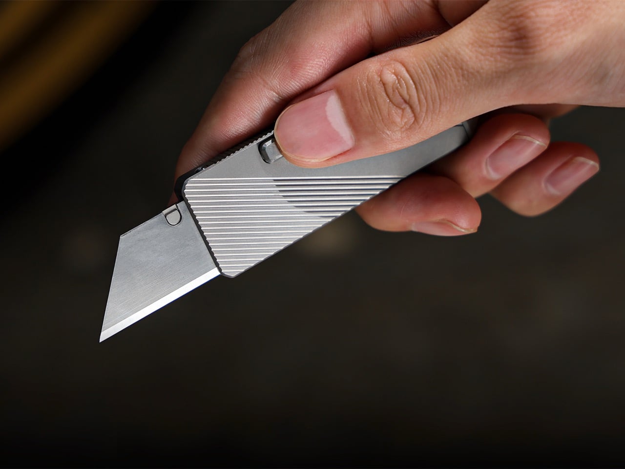
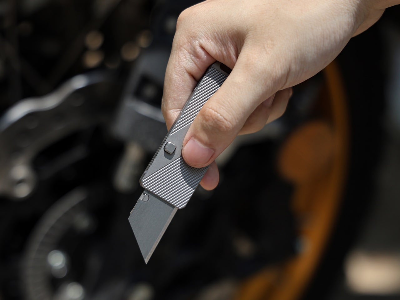
Gravity-powered deployment sounds more cinematic than practical — until you hold the Cubik. Designed by IF and machined from aerospace-grade titanium, this pocket knife opens with a button-flick and the natural pull of gravity: no springs, no mechanisms to fail, no audible snap. At 2.6 inches long, 0.98 inches wide, and just 0.2 inches thick, it slips into a pocket and disappears. The Cubik looks more like a designer flash drive than a knife, which is exactly the point — and what makes it so easy to live with every single day.

The blade runs a standard trapezoid utility format — the same geometry used to slice linoleum, roofing materials, acrylic, and thin sheet metals. When one edge dulls, flip it; when both are spent, swap it. That interchangeable format turns a consumable item into something genuinely sustainable over time. A deep-carry titanium clip keeps it flush to the pocket edge, and a tungsten carbide glass-breaker on the rear makes it a legitimate lifesaver when it counts. At $59 with five replacement blades included, it’s one of the most sensibly priced titanium tools in the category.

What we like

  • Gravity-flick deployment is spring-free, meaning zero moving parts to fail over time
  • Swappable trapezoid blades make the Cubik cost-effective and sustainable for long-term carry

What we dislike

  • The utility blade format won’t appeal to collectors who prefer a dedicated knife steel
  • Gravity deployment requires a deliberate wrist flick that takes a brief learning curve

2. 8-in-1 EDC Scissors

Most EDC scissors ask you to accept a compromise — either you get a folding design that sacrifices cutting power, or you get a rigid tool that’s too bulky to pocket. The 8-in-1 EDC Scissors from Eiger Design, available through the Yanko Design Shop, sidesteps both problems. Made in Japan and compact enough to sit in a palm at just 13 centimeters (5.1 inches) closed, it packs scissors, a knife, a lid opener, a can opener, a cap opener, a bottle opener, a shell splitter, and a degasser into a single carry-ready object.

The scissors themselves are the real story — full-strength blades that don’t rely on a collapsible pivot to achieve their compact profile, which means they cut with conviction through materials that foldable scissors would snag or mangle. The remaining seven functions are genuine, not ornamental. For summer specifically — camping weekends, beach cookouts, farmers market errands, festival packing — this is the kind of tool that earns its weight early and keeps earning it. At $53 through the YD Shop, it’s the most versatile item on this list per dollar spent.

Click Here to Buy Now: $59.00

What we like

  • Eight independent tools in a 5.1-inch, palm-sized package that’s genuinely comfortable to carry daily
  • Made-in-Japan manufacturing brings real precision to both the scissors and every secondary tool

What we dislike

  • The scissors-first form factor means the secondary tools can feel secondary in actual day-to-day use
  • Not the right call if you’re shopping for a dedicated cutting tool rather than a multitool

3. NoxTi

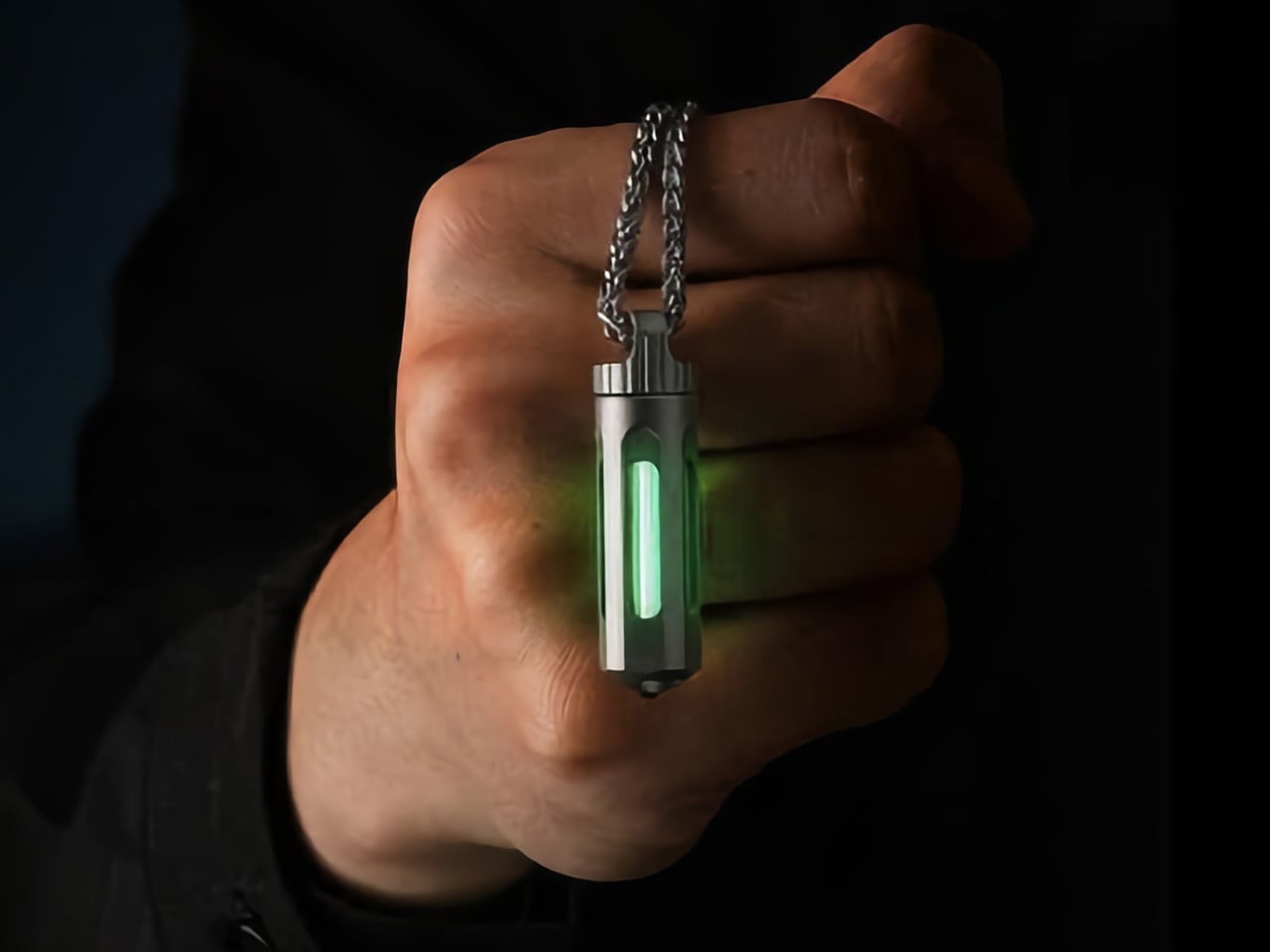
NoxTi is the kind of object that makes you reassess what belongs on your keychain. Designed by Xedge and built from Grade 5 titanium, it measures just 45mm and weighs 10.7 grams. The core of the piece is a tritium vial — a sealed, self-luminous insert that glows continuously for 25 years without batteries, charging, or any external power source. Quartz glass protects the vial from impact, and the titanium housing supports interchangeable vial options alongside a glass-breaker tip at the rear, making it far more than a novelty.

In practical terms, NoxTi solves a problem most EDC setups don’t realize they have: passive orientation in the dark. When your keychain is at the bottom of a bag, buried in a jacket pocket, or left on a nightstand, the glow orients you without reaching for your phone. That always-on, zero-input utility is a design philosophy most gear claims but rarely delivers.

What we like

  • Tritium vial delivers 25 years of passive, battery-free illumination with no maintenance required
  • Grade 5 titanium housing and quartz vial protection make it exceptionally durable for keychain life

What we dislike

  • At 45mm, it’s compact but will add noticeable length to an already-loaded keychain setup
  • Tritium vials are radioactive (safely contained, but a consideration for buyers who prefer chemical-free carry)

4. HYZER

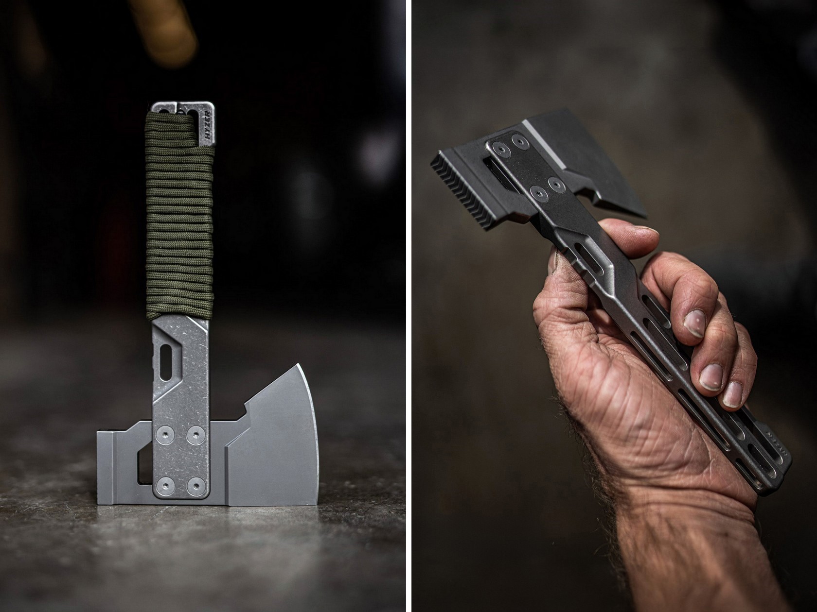
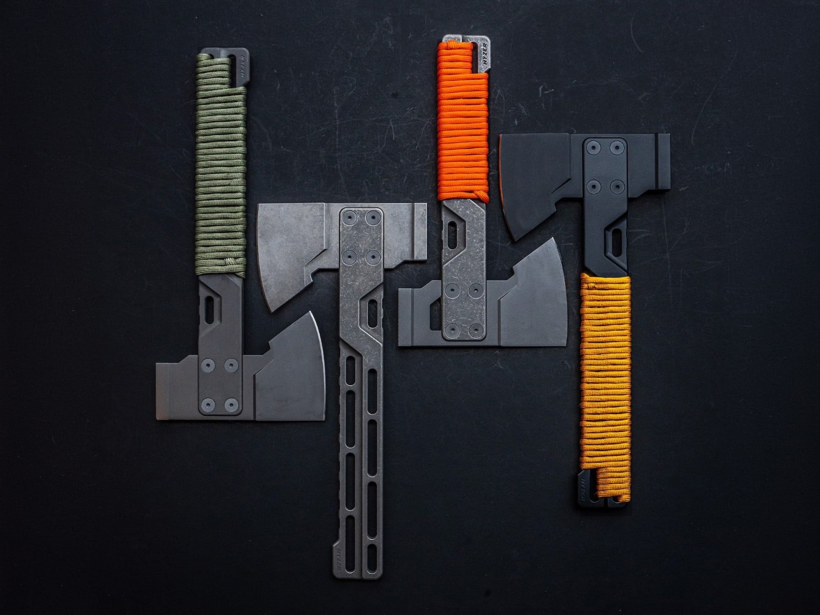
Exceed Designs doesn’t do anything conventionally, and the HYZER is the clearest proof of that. At its core, it’s a hatchet — but calling it that undersells the engineering. The handle is fully skeletonized and CNC-machined from a solid block of 6AL-4V Grade 5 titanium, available in two lengths: a full-size 9.75 inches or a compact 8.15 inches. The head runs on an infinitely modular nested system that lets you swap cutting formats without replacing the handle — a level of adaptability that no conventional hatchet even attempts.

For summer carry — backcountry hiking, basecamp setups, or serious van-life configurations — the HYZER changes the math on what a hatchet needs to be. The D2 steel axe head delivers serious chopping performance, while the titanium handle keeps the tool lighter than any steel-handled competitor in its class. The stonewashed finish gives it a visual identity that’s unmistakably premium without being precious about it.

What we like

  • The modular nested head system allows the HYZER to adapt to different cutting and splitting configurations
  • Full skeletonized Grade 5 titanium achieves meaningful weight savings without compromising structural integrity

What we dislike

  • The premium titanium and D2 material combination places this at a significantly higher price point than most seasonal carries
  • Two-handed hatchet operation demands dedicated pack space that the other four items on this list don’t require

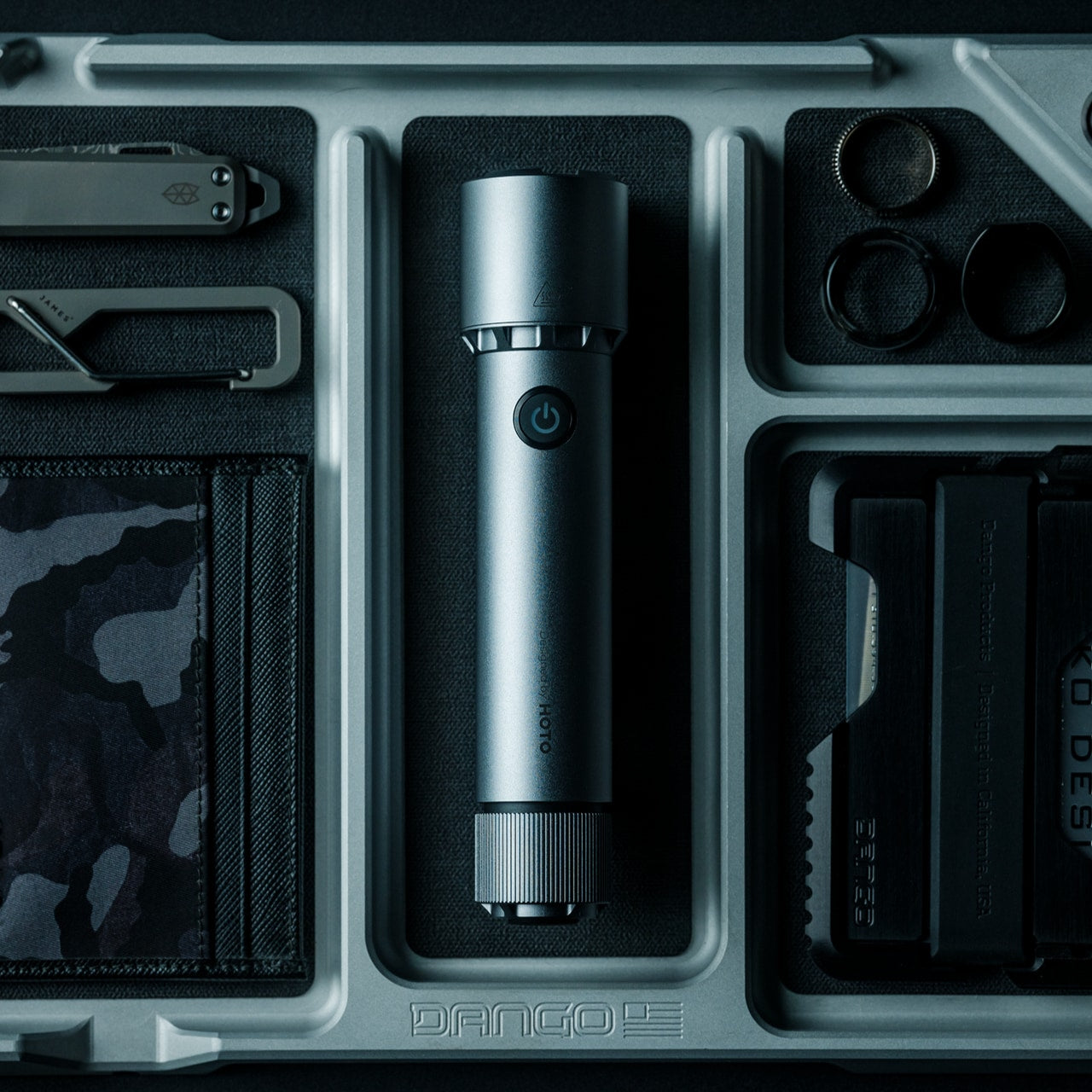
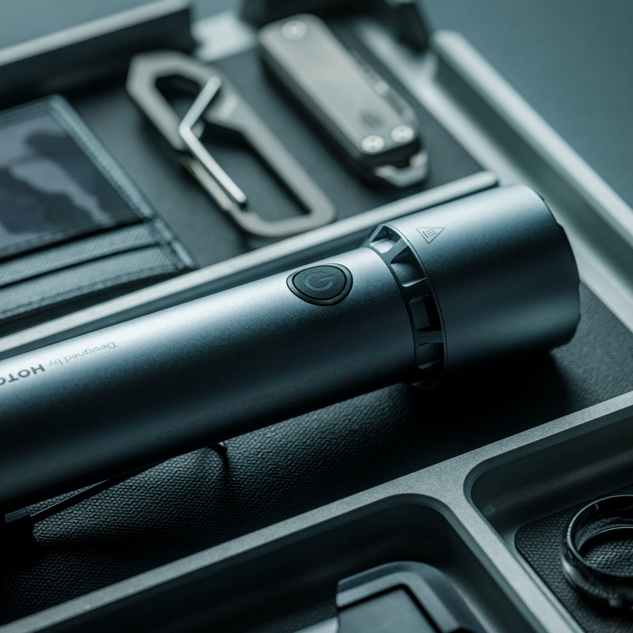
5. BlackoutBeam Tactical Flashlight

A 2,300-lumen output in a tactical flashlight isn’t rare in 2026 — but a 2,300-lumen flashlight that looks like it belongs at a design exhibition rather than a military surplus store is still genuinely hard to find. The BlackoutBeam, available through the Yanko Design Shop at $90, pairs that blinding output with an industrial aesthetic that wears well whether it’s clipped to a backpack or sitting on a shelf. The 300-meter throw distance cuts through darkness with clinical precision, and the IP68 waterproof rating ensures it performs regardless of what summer throws at it.

Five operational modes — including strobe and pinpoint — give the BlackoutBeam tactical flexibility that goes well beyond on-off cycling. The 0.2-second instant-on response is the detail that separates tools built for designers from tools built for actual use: in a power outage, a trail emergency, or any situation where you need light immediately, that activation speed matters in a way that a spec sheet can’t fully communicate. With longer days turning into late evenings outdoors and camping season running hot, the case for a serious flashlight in your summer kit has never been more straightforward.

Click Here to Buy Now: $89.00

What we like

  • 2,300-lumen output with a 300-meter throw distance puts it firmly in professional-grade territory
  • A 0.2-second instant-on response time makes it genuinely dependable when the situation demands it

What we dislike

  • The tactical aesthetic reads as aggressive for carry setups that lean toward minimalist or everyday styling

The Best Loadout Is the One You Actually Think About

What these five pieces share isn’t material or price point…it’s intention. Every one of them was designed by someone who cared enough to solve the actual problem rather than approximate a solution. That’s the standard worth holding EDC to in 2026, and it’s becoming a higher bar to clear as the category matures and the market fills with near-misses. The best loadout is never the one with the most gear. It’s the one with the right gear.

Summer tends to be the season when carry gets edited down; lighter layers mean fewer pockets, and heat means less patience for bulk. These five designs all pass that test. They’re compact enough to disappear when you want them to and capable enough to matter when you don’t. Whether you pick up one or all five, the upgrade from whatever you’re carrying now is real.

The post Forget Your Old Loadout — 5 EDC Essentials Built for Summer 2026 first appeared on Yanko Design.

The Memdock G3 Is the 13-Port Dock You Don’t Have to Hide Anymore

Modern desks have never looked better. Sit-stand tables, cable management trays, and ultra-thin laptops have turned the average workspace into something worth showing off. But for all the effort that goes into making a desk look clean and intentional, the accessories that actually power it are often still a mess, and docking stations, in particular, tend to be boxy, generic things that most people try to hide.

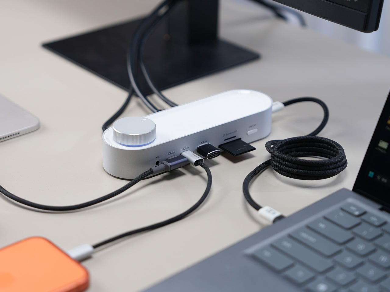
That habit of hiding docks makes sense, since most of them aren’t exactly something you’d want on display. The Memdock G3 takes a different approach. It’s a 13-in-1 docking station that doesn’t look the part in the way most docks do, and that’s a compliment. With a rounded aluminum body and a physical volume knob at one end, it’s designed to sit on the desk, not behind it.

Designer: Memdock

Click Here to Buy Now: $89 $189 ($100 off). Hurry, only 135/200 left! Raised over $50,000.

The aluminum shell is both light and sturdy. Weighing just 175g and measuring 17cm in length, it won’t crowd any desk. The silver-white finish sits comfortably alongside a MacBook or a Surface without looking out of place. A one-touch power switch keeps things simple, while the knurled volume knob doubles as a status indicator with a blue ring glowing softly at its base.

Where the G3 separates itself from generic hubs is with its dual HDMI outputs, both capable of 4K at 60Hz. Whether you’re juggling two monitors or spreading your workspace across screens, the setup doesn’t need extra adapters or complicated display routing. It works across Windows and macOS without additional drivers, so plugging in is genuinely all you need to get a full dual-screen arrangement running.

Charging is another area where the G3 keeps things clean. The 100W PD port can keep a laptop topped up while everything else stays connected, which means you don’t need a separate charger taking up another outlet. Pass-through charging also stays active even when the dock is switched off, so your devices keep charging overnight without you having to think about it.

On the data side, the G3 carries multiple 10Gbps connections, including USB-C, which is meaningfully faster than the 5Gbps typical of most docks in its category. Moving a batch of raw photos or offloading footage from an external drive feels noticeably quicker, cutting the time you’d otherwise spend watching a progress bar crawl. Two USB-A ports handle the everyday stuff, from keyboards and mice to thumb drives.

Photographers and video shooters will appreciate having both an SD and a TF slot built in, which removes the hassle of hunting for a separate card reader every time they need to pull files off a camera. Pair that with a Gigabit Ethernet port for a steadier wired connection, and the G3 handles a range of workflows that most hubs can’t without reaching for yet another dongle.

The volume knob deserves a separate mention, not just as a feature, but as a design choice that says something about the G3’s priorities. Instead of digging through a settings panel every time you want to nudge the audio on a call, you just reach over and turn it. It’s a small thing, but it’s the kind of immediate, tactile control that feels obvious once you have it.

Docking stations rarely get treated like products worth designing with real care. They sit at the junction of display, power, data, and audio, making them genuinely central to how a desk functions, yet they’re almost always designed as if nobody will ever look at them. The Memdock G3 is a reminder that the things holding a workspace together can be just as thoughtfully considered as anything else on the desk.

Click Here to Buy Now: $89 $189 ($100 off). Hurry, only 135/200 left! Raised over $50,000.

The post The Memdock G3 Is the 13-Port Dock You Don’t Have to Hide Anymore first appeared on Yanko Design.

5 Memorial Day Outdoor Gadgets That Make Every Camping Trip Feel Engineered in Japan

Memorial Day weekend is when the campsite gets its first real test of the year. The gear you pack either earns its place or takes up space. This year, a handful of outdoor gadgets are shifting the conversation, designs so considered, so precise in their logic, they feel lifted straight from a Tokyo design studio. Each one solves a familiar outdoor problem in a way you didn’t see coming.

What unites these five objects is a shared commitment to intentionality, the Japanese idea that a well-made thing should do its job beautifully, without fanfare or waste. Whether it’s a lantern that turns like a toy or a fire pit engineered around combustion science, these gadgets carry a point of view. Not here to impress on a spec sheet. Just here to make the long weekend feel properly planned.

1. RetroWave 7-in-1 Radio

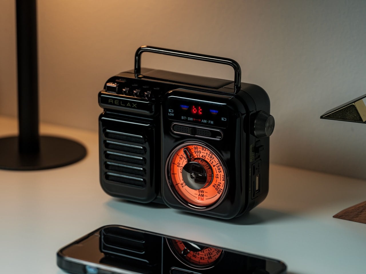
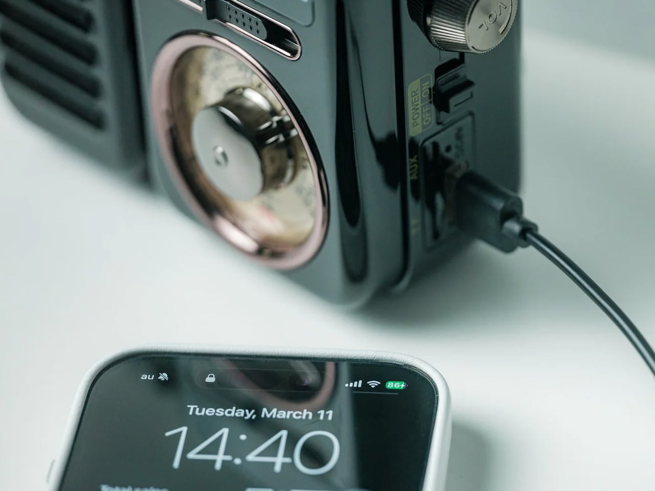
There’s a radio sitting somewhere in Japanese design history that directly inspired this one. The RetroWave 7-in-1 Radio arrives with a tactile tuning dial, a warm housing drawn from mid-20th century aesthetics, and the kind of visual restraint that makes a thing look inevitable. Behind the retro face is a 7-in-1 device handling AM, FM, and shortwave reception, Bluetooth streaming, a built-in flashlight, SOS alarm, power bank charging, and a 2000mAh battery that tops up via hand-crank or solar panel.

The 8W speaker punches with enough warmth to soundtrack a campfire properly, and the 20-hour radio battery life means it runs through a full weekend without reaching for a cable. Two colorways — black and warm gray — make it look as good on a picnic blanket as it sounds in the open air. It’s the rare object that solves the problems you forgot to plan for: music, emergency signaling, phone power, and light, all from one compact, beautiful thing.

Click Here to Buy Now: $89.00

What We Like

  • The 7-in-1 function set means it replaces multiple items in your pack — flashlight, emergency radio, portable charger, and speaker all collapse into a single carry-anywhere device with one well-resolved retro form that earns its weight every time.
  • The retro Japanese design with a tactile tuning dial doesn’t look like survival gear. It looks like a piece you’d buy for the living room, which means it earns a permanent spot in the gear bag rather than getting quietly left behind on the shelf.

What We Dislike

  • Bluetooth battery life tops out at approximately 5 hours at 75% volume, meaning a full camp day of wireless streaming will require a recharge — the solar panel helps, but cloud cover changes that math quickly.
  • The compact body keeps it packable, but the speaker volume has a ceiling that wide-open outdoor settings can expose, especially once the campfire gets going and conversation picks up.

2. Twist Camping Lantern

Small beige LED lamp lit with a warm glow, sitting on a round wooden stump.

Cream wireless over-ear headphones resting on a wooden stump against a pale background.

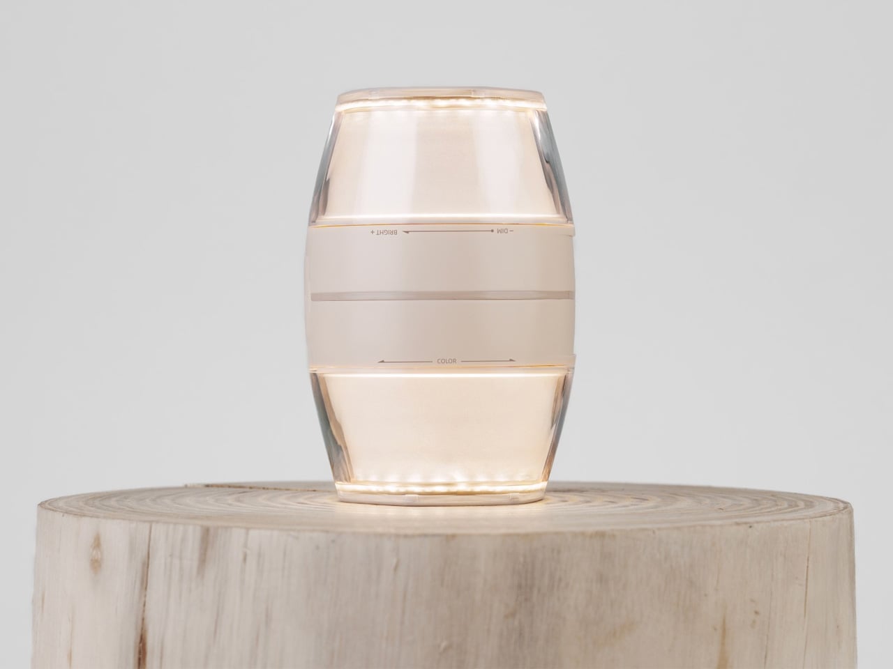
When designer iu Llong looked to Japanese gashapon vending machines for inspiration — those capsule toy dispensers that make cracking open a prize feel like a small ceremony — the result was a camping lantern that turns on exactly the way a gashapon opens: with a satisfying twist. Built for Havnby as two cones joined at the base, the single twist mechanism adjusts both brightness and color temperature, dialing from cool white all the way down to a warm red.

The Twist Lantern packs a 10,000mAh rechargeable lithium battery into a compact form that weighs around 410 grams and charges fully in under three hours via USB-C. Its runtime stretches from 3.8 hours at full brightness to an impressive 70 hours on its lowest setting — enough for an extended weekend. The waterproofing and built-in magnetic mount mean it handles rain and hangs wherever you need it. For a lantern, it’s remarkably thoughtful. For a design object, it’s immediately recognizable.

What We Like

  • The gashapon-inspired twist interaction makes operating this lantern something you’ll actually look forward to — the kind of satisfying physical gesture that cheap pushbutton camp lights have never managed to replicate across years of trying.
  • A 70-hour runtime on its lowest setting is exceptional for any rechargeable camping lantern, meaning you can leave home without calculating whether the battery will outlast the trip or quietly die at hour three.

What We Dislike

  • At 520 lumens, the Twist Lantern is optimized for ambiance and intimate spaces — it sets a tent mood beautifully but won’t flood a large group campsite the way a high-output utility lantern would.
  • The twin-cone form factor, while visually striking, is less stackable in a tightly packed gear bag than a more conventional cylindrical lantern design, which may require some creative packing on longer trips.

3. Iam Sauna

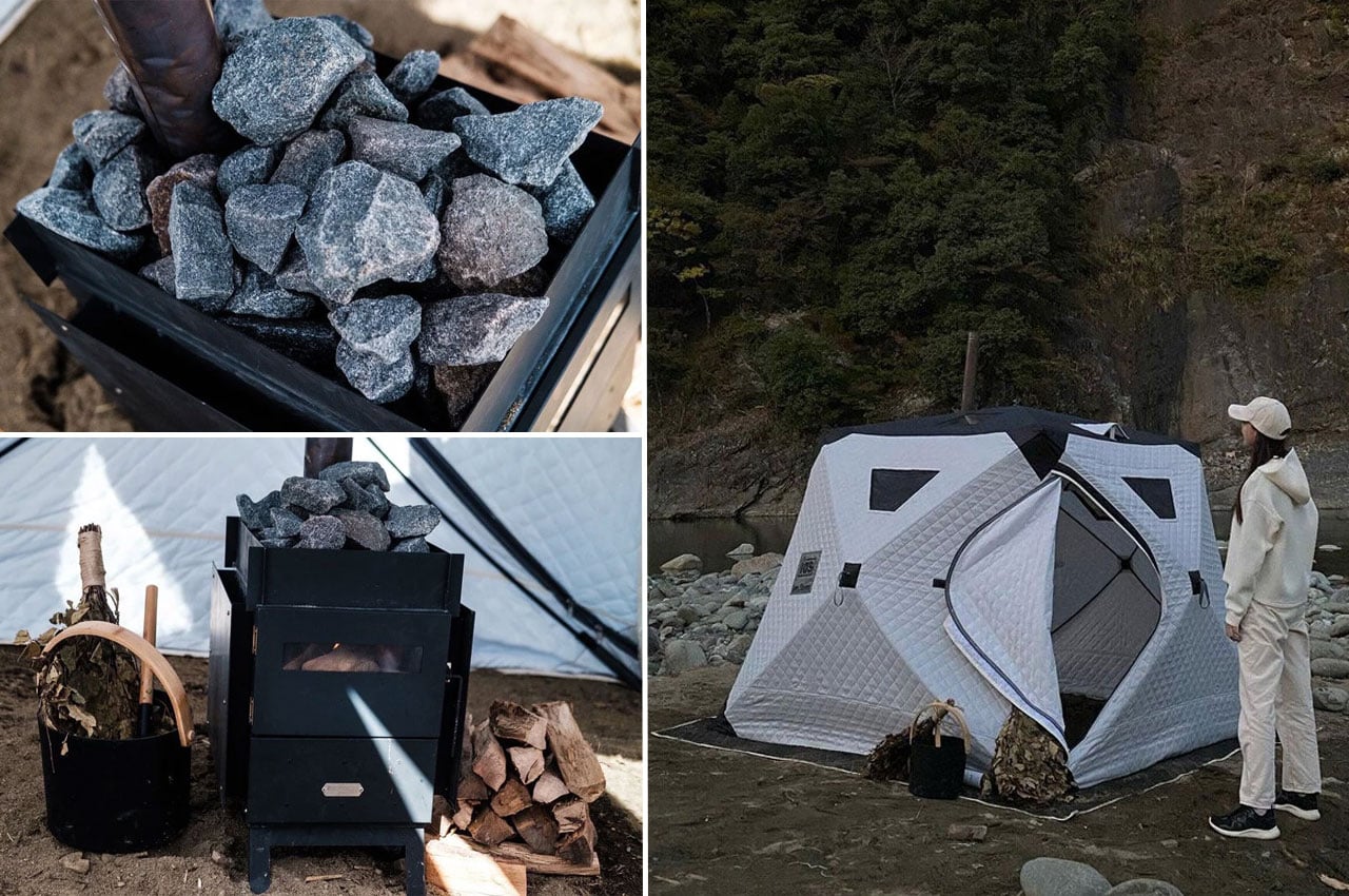
Iam Sauna is a portable sauna, genuinely made portable. The tent-style unit measures 220cm x 220cm x 185cm, accommodates up to six people, and is built from heat-insulating cotton material designed to trap steam and hold warmth in cold outdoor conditions. The included Tanzawa wood-burning stove is iron-built with folding legs, a heat-resistant glass window, and a removable guard plate where sauna stones stack neatly on top. Setup takes under a minute — one person, four pull tabs.

The panoramic windows along the upper section of the tent are a quiet design decision that separates this from any other portable sauna concept. Heat the stove, settle in, and you can watch stars or the tree canopy while your body does exactly what it came outdoors to do. Whether recovering after a full day of hiking or committing to a Saturday evening ritual by the lake, Iam Sauna delivers the restorative experience that used to require a fixed structure.

What We Like

  • A single person can collapse and set up the full tent structure in under 60 seconds, which means the sauna arrives at the campsite as a realistic option rather than a logistical project that gets quietly abandoned at the trailhead.
  • Panoramic windows at the top of the structure keep you visually connected to the outdoor environment while you’re inside — a design detail that makes the experience feel like it genuinely belongs in the wilderness, not in a hotel spa.

What We Dislike

  • The Tanzawa iron stove weighs approximately 18kg on its own, which adds meaningful carry weight to an otherwise packable system, effectively making Iam Sauna more of a car-camping or van-camping solution than a true backpacking option.
  • The wood-burning heat source requires sourcing fuel on-site or carrying it in, which introduces a variable that a gas or electric alternative would eliminate for weekend campers who prefer to pack light and plan less.

4. Airflow 8-Panel Fire Pit

Japanese company UM spent decades in metal processing before arriving at the Airflow 8-Panel Fire Pit, and that deep material knowledge shows clearly. Eight removable panels form an octagonal cylinder optimized for secondary combustion. Holes at the base of each panel channel fresh air directly to the wood for primary combustion. As that air heats up, it rises through the double-walled cavity and exits at the top, creating secondary combustion that burns wood more completely and produces significantly less smoke.

The exterior panels are removable, meaning fire intensity is adjustable — pull one or two off and the fire breathes differently. The interior uses corrosion-resistant stainless steel designed to age into a natural patina, while exterior panels take the punishment a campsite delivers. A grill grate attachment turns it into a cooking platform without altering the fire pit’s core logic. Ash falls and collects at the base. Cleanup is minimal. It’s a piece of engineering that makes fire feel considered.

Click Here to Buy Now: $325

What We Like

  • The secondary combustion system is a genuine engineering achievement at this size — the smoke reduction is physics, not a marketing claim, and it makes extended campfire evenings significantly more comfortable for everyone sitting around it without constantly shifting to dodge the drift.
  • The modular panel system means the fire pit packs down smaller than its assembled footprint suggests, making it more portable than traditional bowl-style designs that share its output and heat radius.

What We Dislike

  • Assembling eight individual panels before the fire can be lit adds more steps to the startup process than a campfire usually demands — a minor friction, but one that registers in the dark or in rain when fumbling with separate components feels less intuitive.
  • The cooking grill grate is sold as an optional add-on rather than included in the base package, which feels like a missed opportunity given that cooking over fire is the most obvious secondary use case for every campsite fire pit.

5. Haori Cup

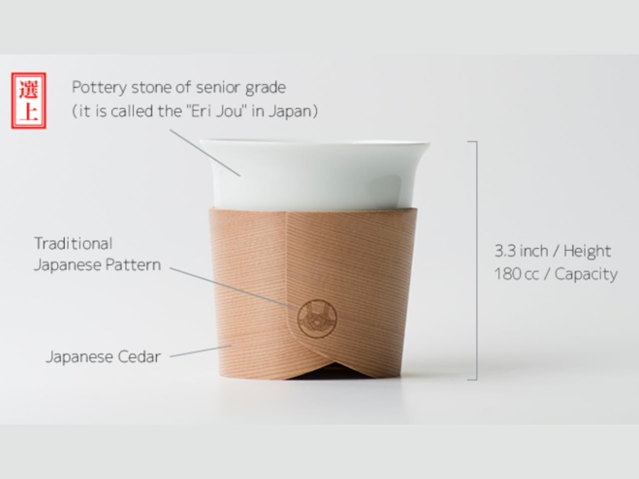
When designer Tomoya Nasuda set out to revive Hakata Magemono — the 400-year-old Japanese craft of hand-bending thin cedar into curved forms — he built the Haori Cup from a single piece of Japanese cedar. The result is a vessel that holds warmth from the inside and transfers almost none to your hands, because cedar insulates naturally. Available in several colorways, including the “Sakura” edition, every cup is handmade and shaped by grain patterns unique to that piece of wood.

The cedar lends a whisper of fragrance to each sip — a clean, forest quality that doesn’t compete with the coffee, just frames it. Bring the Haori Cup camping, and something specific happens. Holding warm coffee in a vessel bent from a single piece of Japanese cedar, sitting among trees not unlike the ones that made it, that’s the kind of moment you came outside for. It’s lightweight, it carries centuries of craft, and it makes the morning feel intentional.

What We Like

  • Reviving the 400-year-old Hakata Magemono craft means every Haori Cup is genuinely one of a kind — no two grain patterns are the same, and that individuality gives it a value that mass-produced camping vessels with identical stamped forms simply cannot offer.
  • Cedar’s natural thermal insulation keeps drinks warm without heating the exterior surface of the cup, meaning you can hold a freshly poured coffee comfortably without burning your hands — a straightforward material advantage with quietly elegant results in practice.

What We Dislike

  • Cedar is not dishwasher-safe and requires careful hand cleaning followed by thorough drying, which is a manageable routine at home but adds genuine friction when you’re washing up at a campsite with limited water and fading daylight.
  • As a handcrafted artisan object rooted in centuries-old technique, the Haori Cup carries a premium price that may be difficult to justify for a purpose as unpredictable as outdoor camping, where the risk of a dropped cup on river rock is never zero.

The Best Camping Gear Doesn’t Add More — It Gets Everything Right

Five products, five different problems, each solved with a rigor that feels less like product design and more like pure philosophy. That’s what Japanese design does at its best: it doesn’t add features to justify a price. It removes everything unnecessary, then makes whatever’s left feel like the only possible answer. That’s the standard these objects hold, and it makes everything else at the campsite feel slightly underdressed by comparison.

The best gear for Memorial Day isn’t the most technical. It’s the most considered. A radio that earns its campfire seat. A lantern that makes switching on a light feel like an occasion. A fire pit engineered so you don’t think about combustion. A sauna you carry in and a cup that turns coffee into a ceremony. Pack these five, and the weekend will be more than just a long one.

The post 5 Memorial Day Outdoor Gadgets That Make Every Camping Trip Feel Engineered in Japan first appeared on Yanko Design.

Your Bench Vise Can’t Hold Round Parts, This One Grips Anything

Most workshop tools haven’t changed much in decades, and bench vises are a good example of that. They’re big and heavy, and they work well enough when you’re clamping flat stock between parallel jaws. But the moment you try to hold something round, irregular, or fragile, a standard vise quickly becomes more of a problem than a solution, and you’re left wishing for an extra hand.

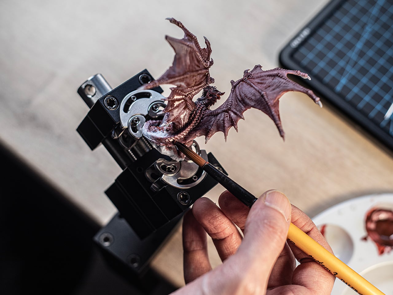
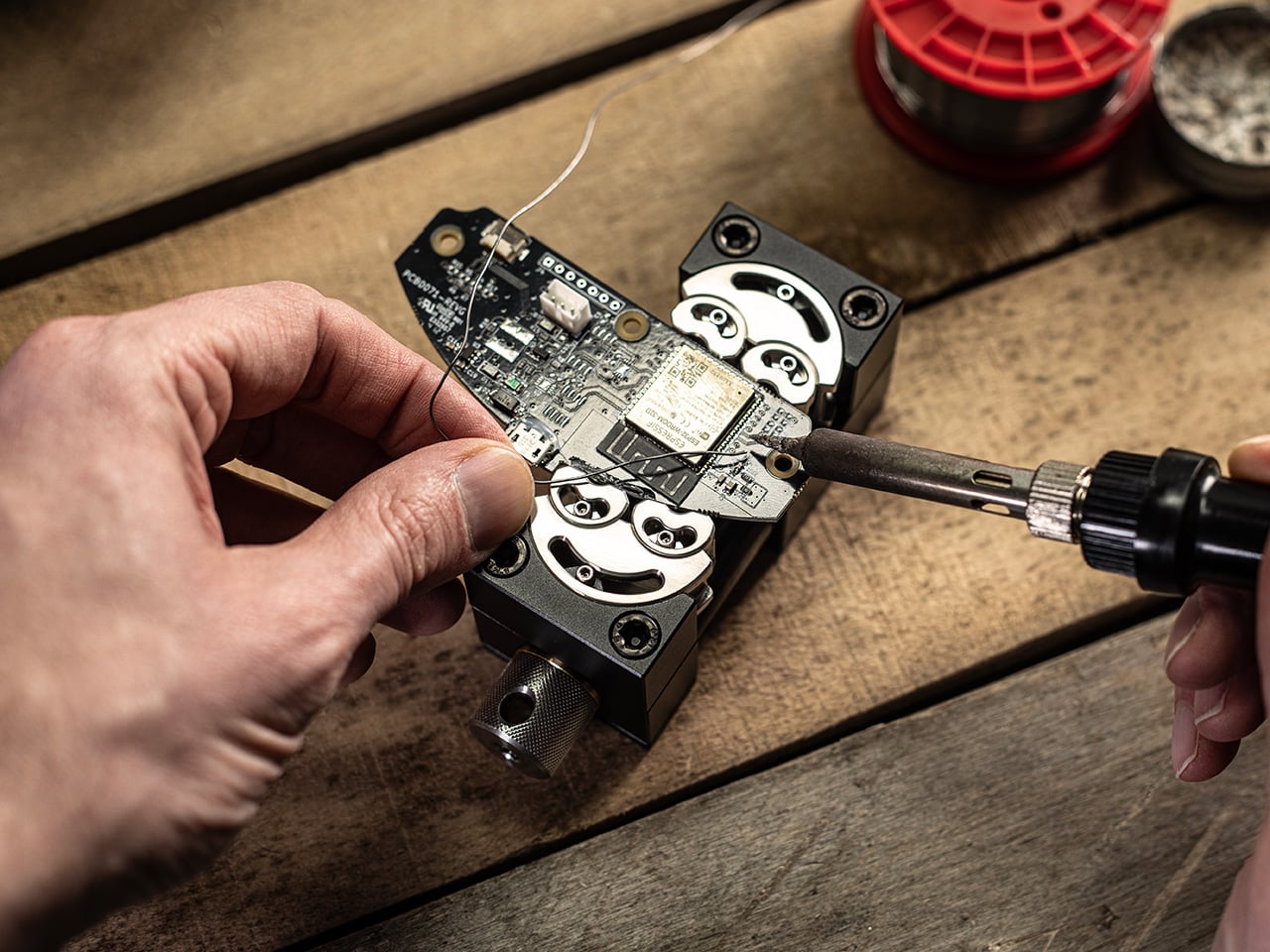
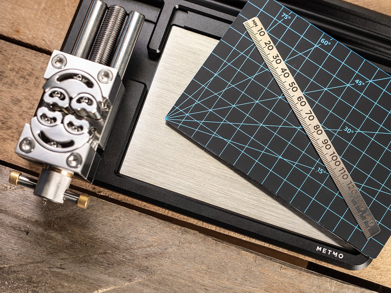
The maker community has grown considerably over the past decade, pulling in everyone from miniature painters and watch tinkerers to 3D printing hobbyists and electronics enthusiasts. These people aren’t using industrial-grade machine tools; they’re working at a desk, dealing with small parts in odd shapes that standard vises simply weren’t designed for. MetMo’s Fractal Vise feels like it was built specifically with that reality in mind.

Designers: Sean Sykes & James Whitfield

Click Here to Buy Now: $297.

The idea behind the Fractal Vise isn’t entirely new. It traces its origins to a patent filed in 1913, though the original concept was built for heavy industrial machinery rather than desktop use. What MetMo has done is take that same engineering principle and scale it down into something compact enough to sit on a workbench or desk without taking over your entire workspace.

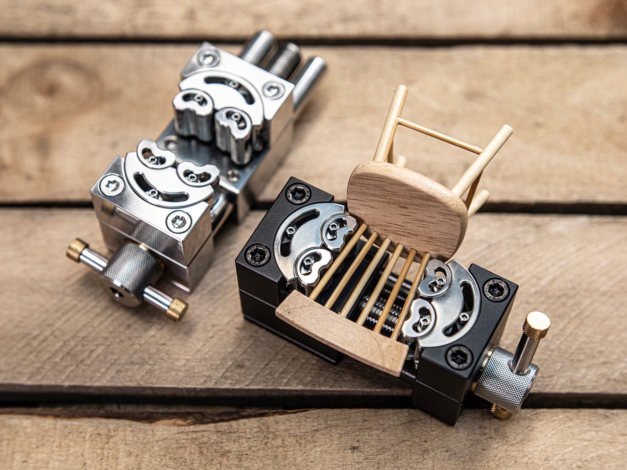
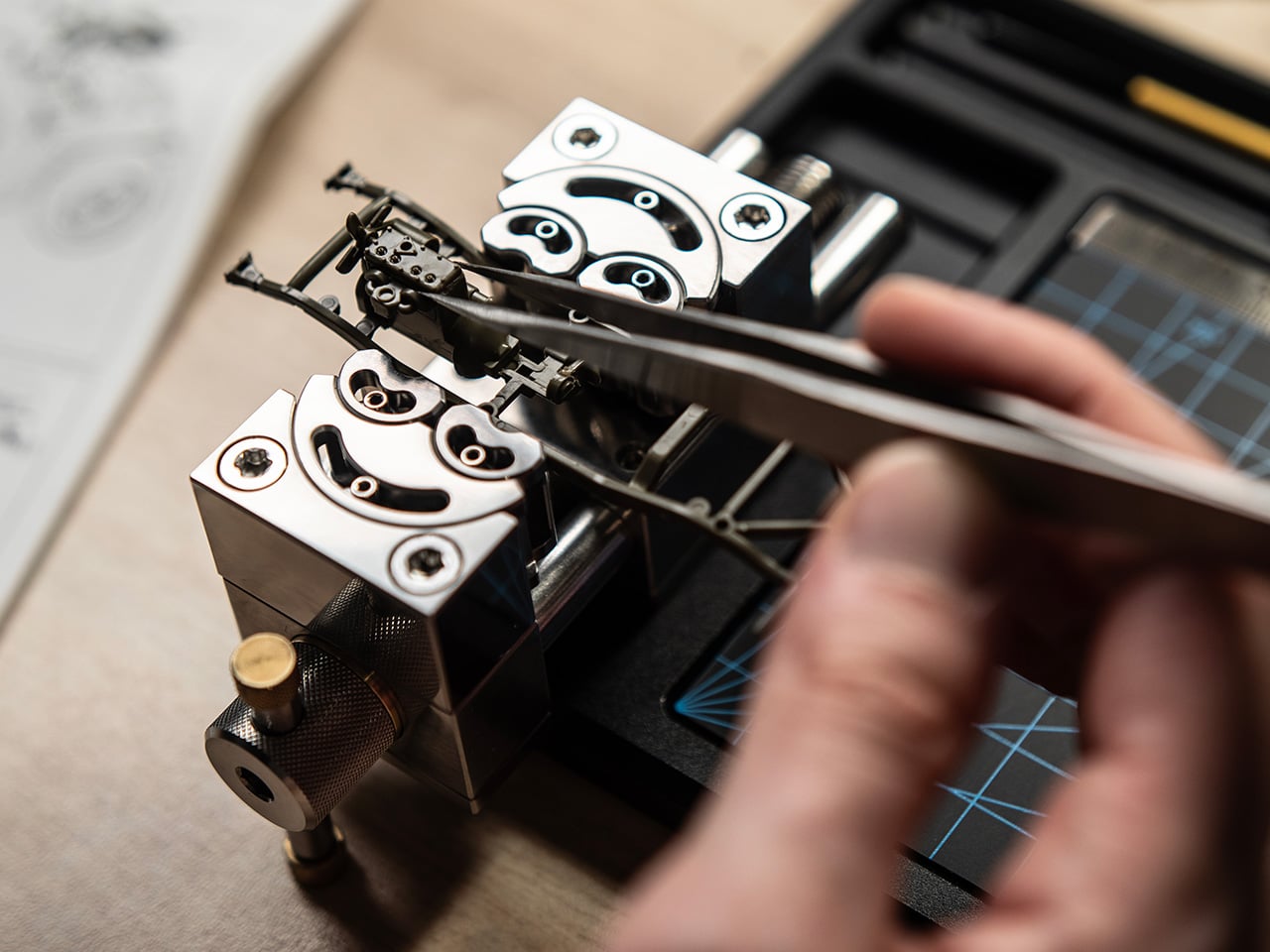
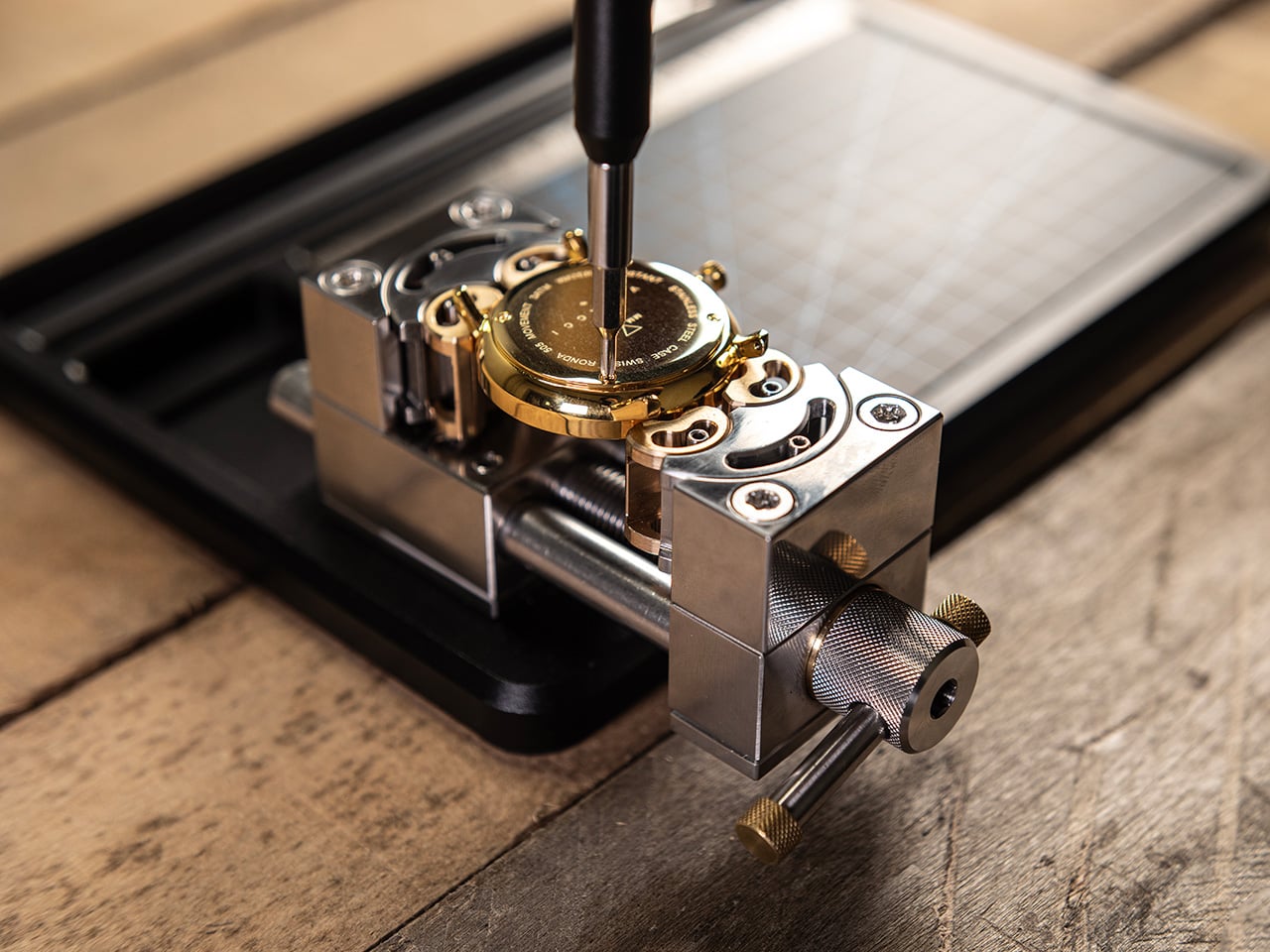
The magic is really in the jaws. Instead of two flat clamping surfaces moving in a straight line, the Fractal Vise uses jaws made up of independently articulating segments, six in total, that shift and pivot as they close around an object. That means it can grip round tubes, tapered forms, and irregular parts just as easily as flat ones.

What makes this even more compelling is how seriously MetMo has approached the construction. The body is machined from aerospace-grade anodized aluminum, the jaws from hardened martensitic stainless steel, and the whole assembly runs on precision-ground linear rails for a backlash-free feel. There’s also a fine-threaded adjuster and a hex drive point for when you need more torque than your fingers can deliver.

Person soldering a small circuit board secured in a vise on a wooden workbench, soldering iron touching a component.

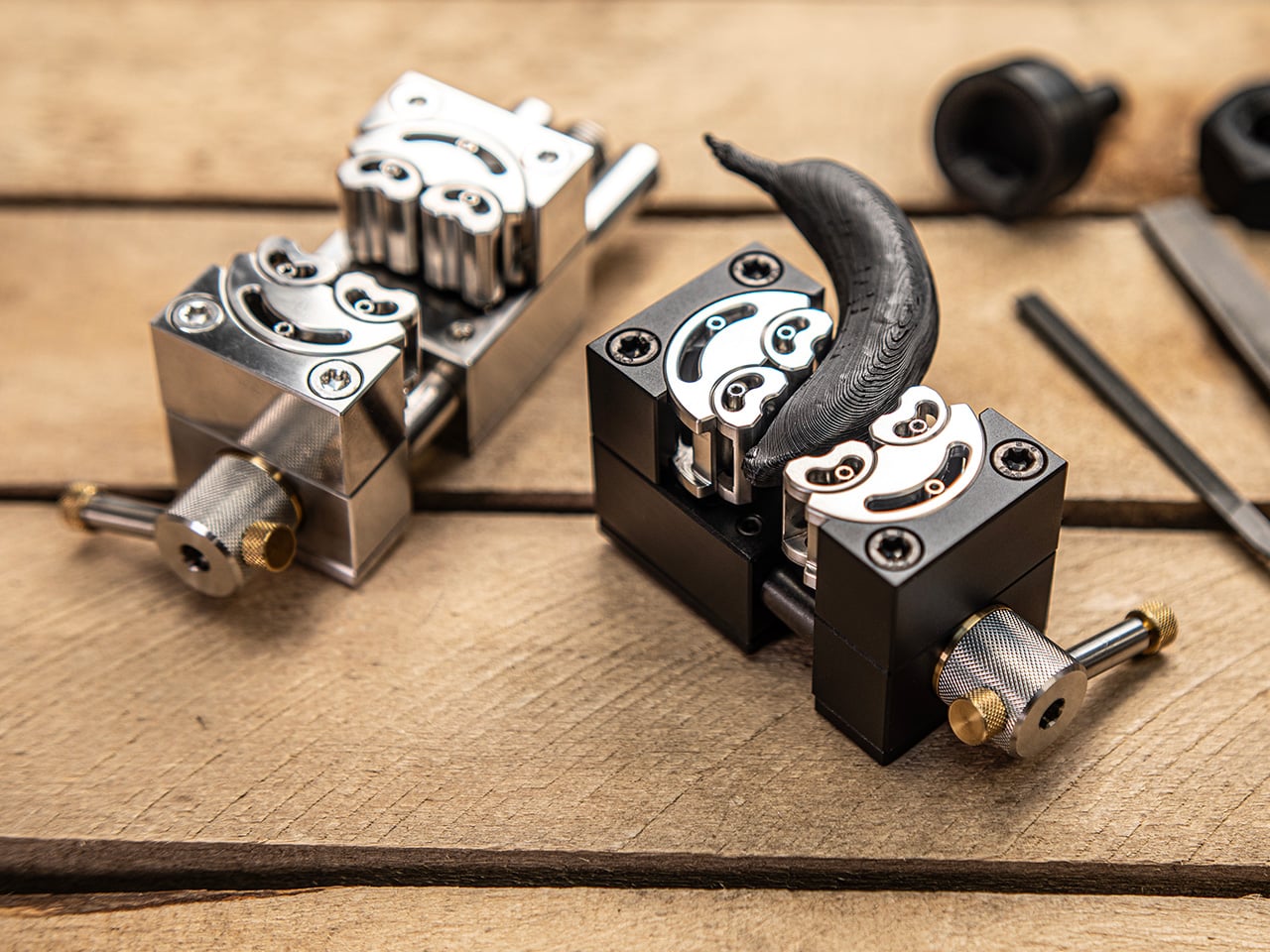
The Fractal Vise comes in two sizes, 32mm and 82mm clamping zones, and two material configurations. The Black version uses a hard-anodized aluminum body for a lighter, more portable build that’s ideal for detail-oriented work like model painting, watch repairs, or delicate 3D printing tasks. The aluminum construction keeps it light enough to reposition freely around your desk without feeling like you’re dragging a miniature anchor from one spot to another.

Close-up of a metal hole-punch tool on a wooden workbench, beside a blue-grid cutting mat with a wooden ruler laid diagonally across it.

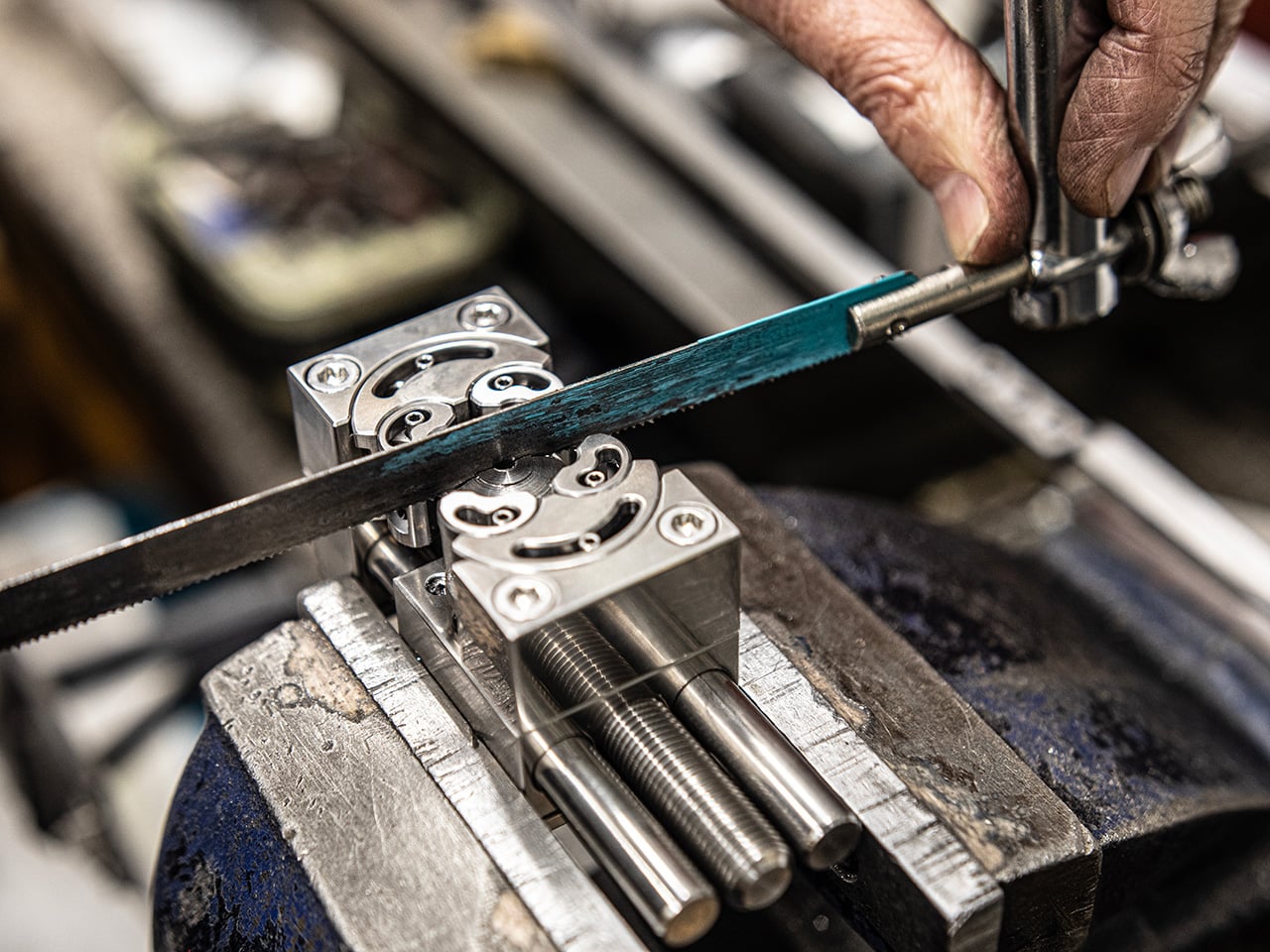
The Stainless Steel Fractal Vise takes a different approach. Made entirely from heavy-duty steel, it offers considerably more mass and stability for tasks that need a firmer base, whether that’s light metalwork, filing, or anything where cutting forces might otherwise shift a lighter tool out of position. It’s the version you’d reach for when the work itself gets a bit rougher.

Beyond straight clamping, the Fractal Vise has a few other tricks. Its jaws are reversible, letting you clamp the inside diameter of hollow objects like glassware or pottery for engraving and painting work. Each face of the body is also precision ground, so you can stand the vise on its end and access a held part from a different angle without disturbing what you’ve already set up.

There’s also a parallel design that lets you drop the Fractal Vise straight into any standard bench vise or machine tool, effectively adding fractal jaw capability to equipment you already own. It’s fully bolted together and serviceable, with removable and reconfigurable parts, all of which says a lot about how MetMo thinks about the long-term life of what it builds.

At its core, the Fractal Vise is what happens when someone decides to stop accepting that a category of tool hasn’t kept up. Not every maker needs one, but anyone who’s spent time trying to keep a round part from rolling away while working on it will understand immediately why this design exists, and why it took this long for something like it to land at desk scale.

Click Here to Buy Now: $297.

The post Your Bench Vise Can’t Hold Round Parts, This One Grips Anything first appeared on Yanko Design.

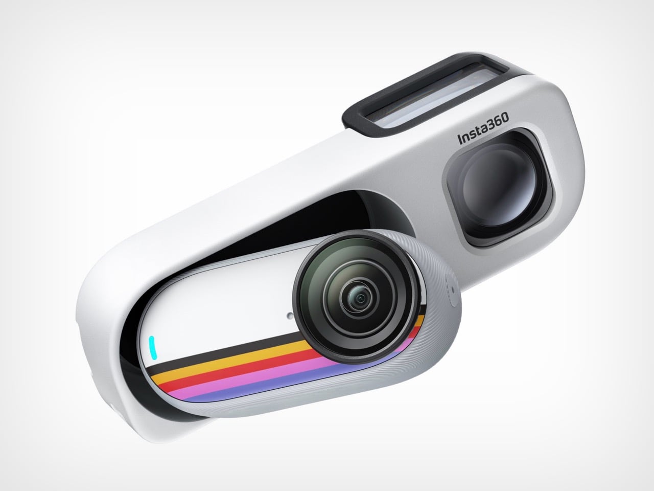
The Insta360 Go 3S Retro Bundle Is a 4K Action Camera With A Viewfinder That Lets You Shoot Like It’s 1965

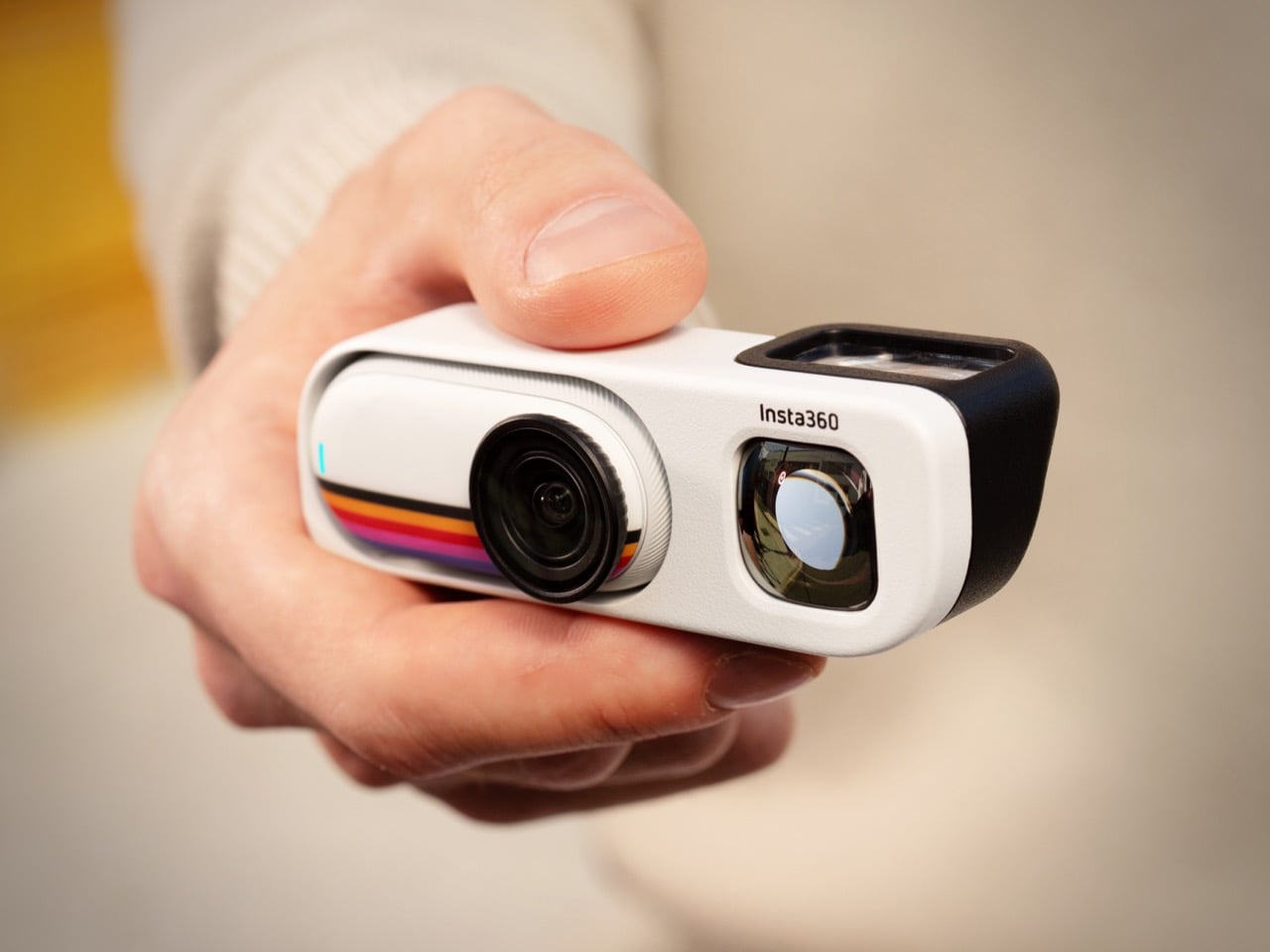
The Kodak Charmera sold out repeatedly on the back of pure aesthetic energy, and Insta360 was clearly paying attention. The Go 3S Retro Bundle arrives squarely in that same cultural moment, where younger creators are increasingly drawn to cameras that feel tactile and intentional rather than optimized and frictionless. The difference is that behind the retro stripe and optical viewfinder sits a legitimately capable action camera: 4K video, FlowState stabilization, 10-meter waterproofing, and a magnetic mounting system that lets you stick it to your jacket in under a second.

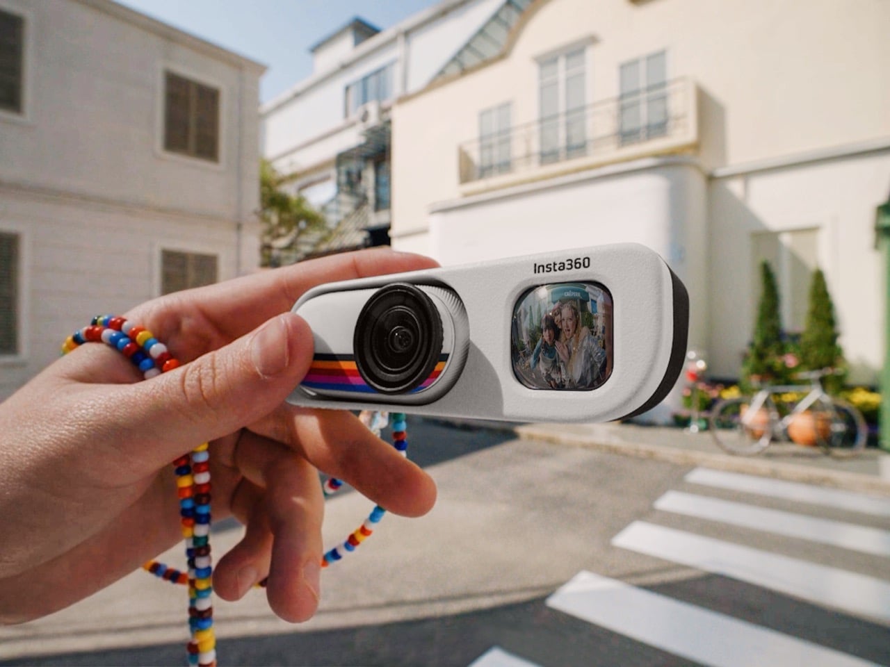
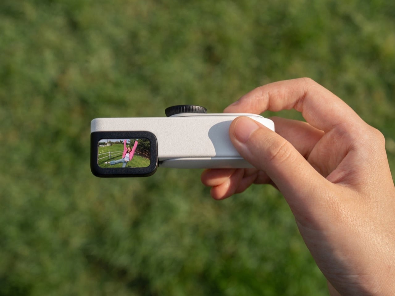
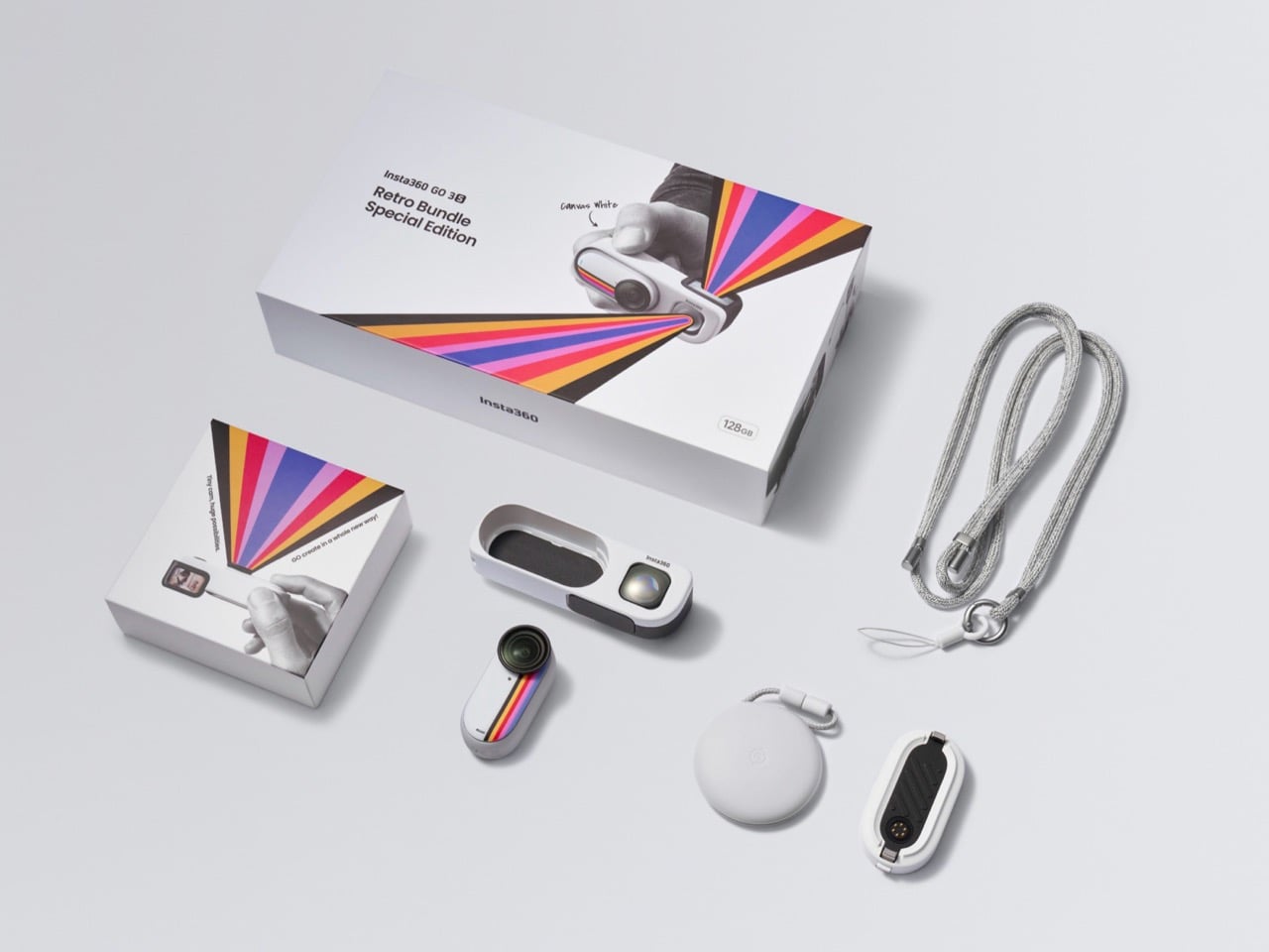
The bundle swaps the standard Action Pod for a new Retro Viewfinder, a simple optical accessory with a waist-level finder and a built-in selfie mirror. It adds no processing power and carries no battery, which is precisely the point. Insta360 is betting that some creators want to feel their way through a shot rather than preview it on a flip screen, and they’ve built an entire product around that instinct.

Designer: Insta360

Click Here to Buy Now

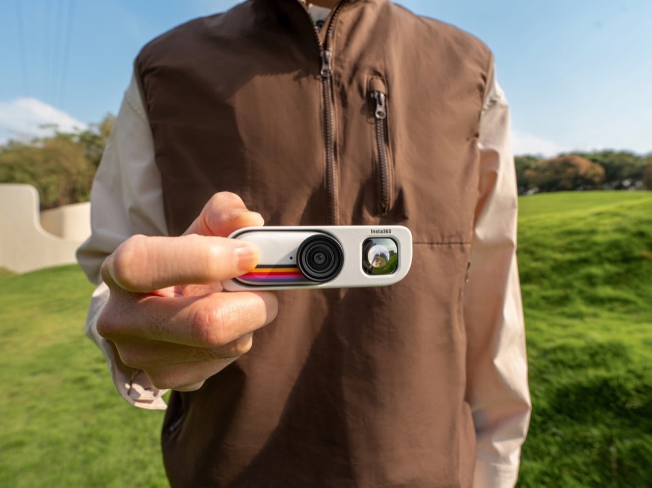
The visual language is an emphatic nod to retro. That Polaroid-stripe graphic running across the front face of the Canvas White body is not a subtle nod; it’s a full commitment to a specific cultural reference, one that lands immediately in the hand. The waist-level viewfinder on top directly recalls the twin-lens reflex cameras that street photographers used in the mid-20th century, the Rolleiflex era of composing from the hip with your eyes down instead of raised. It’s a deliberate posture shift, and it changes how people interact with you when you’re shooting. Nobody flags you down for pointing a GoPro at them; a waist-level retro camera with a Polaroid stripe is a conversation starter.

What’s worth understanding is what Insta360 gave up to get here, and why that trade makes design sense. The standard Action Pod is genuinely useful: it charges the camera module, provides a touchscreen for playback and settings, and functions as a remote monitor. The Retro Viewfinder does none of that. Settings changes require the Insta360 app on your phone, accessed quickly via the included NFC skin, and the optical finder offers only approximate framing rather than precise composition. For a camera this small, shooting 4K with FlowState absorbing the shake, approximate framing is usually enough. The 12-megapixel 1/2.3-inch sensor captures enough resolution that modest crops in post are painless, and the magnetic pendant means you can switch to pure POV mode the moment precise framing stops mattering.

A separate 393mAh battery pack clips on alongside the camera module’s built-in 310mAh, bringing total recording time to 76 minutes, because the Retro Viewfinder carries no internal power of its own. For a day of casual street shooting, 76 minutes covers more than enough ground. For a long travel day, you’ll want to know where your pack is. The two-piece power solution is a fair exchange for the form factor, though it’s a consideration worth making consciously before you head out the door.

We’ve covered Insta360’s ecosystem experiments before, from the X5’s replaceable lens architecture to the Ace Pro 2’s snap-on Polaroid printer, and the consistent thread is a company willing to bet that the camera module is a platform rather than a finished product. The Retro Bundle is that philosophy applied to a mood rather than a spec sheet. Three exclusive film filters, five new color profiles including Vintage Vacation and Mono, and the analog shooting posture the viewfinder enforces all push toward a coherent experience. The Canvas White and Classic Red colorways are available now at $279.99 for 64GB and $299.99 for 128GB, and if you already own a Go 3S, the Retro Viewfinder sells separately for $48.

Click Here to Buy Now

The post The Insta360 Go 3S Retro Bundle Is a 4K Action Camera With A Viewfinder That Lets You Shoot Like It’s 1965 first appeared on Yanko Design.

8 Best Pens and Writing Instruments That Make You Actually Want to Pick Up a Pen Again

There is an argument happening on desks everywhere, and it is not about productivity systems or the right notebook grid. It is about whether the thing you write with deserves the same design attention as everything else you choose to own. For most people, a pen is a pen. For a small and growing number, it is the one object that connects thought to surface, and that connection is worth getting right. The instruments on this list take that idea seriously.

What unites them is not price or prestige. It is that each one treats the act of writing as a design problem worth solving from the beginning — the weight, the mechanism, the material, the way it sits in the hand before the nib or tip ever touches paper. Some are concepts. Some are products you can order today. All of them make the case that the writing instrument is still one of the most interesting objects in design.

1. Yamaha Swing Scribe

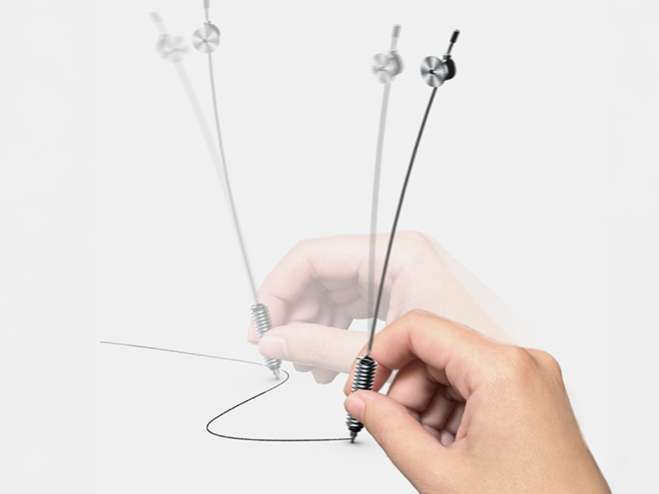
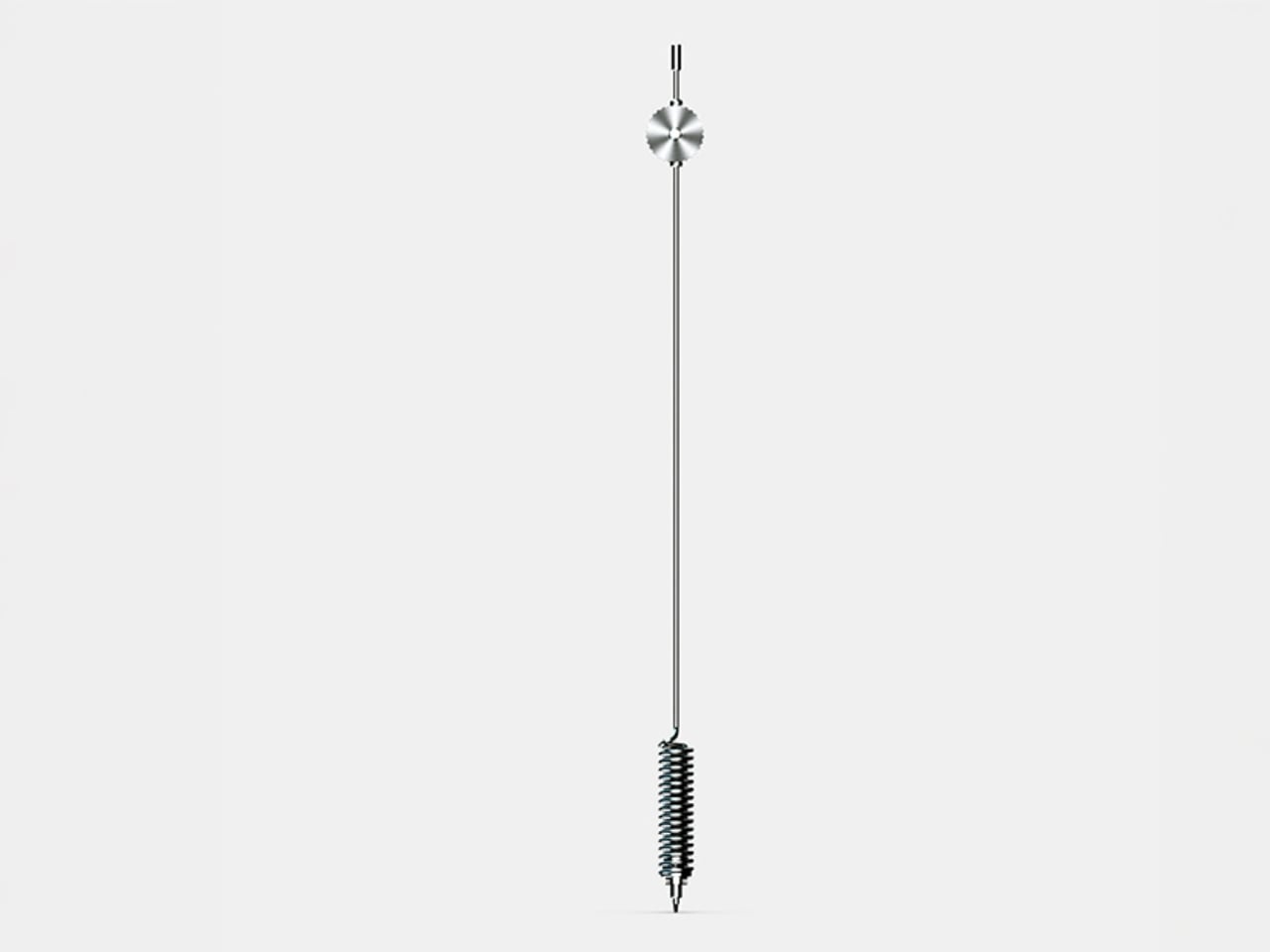
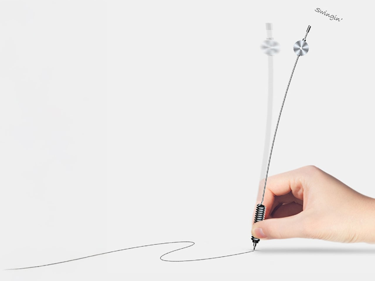
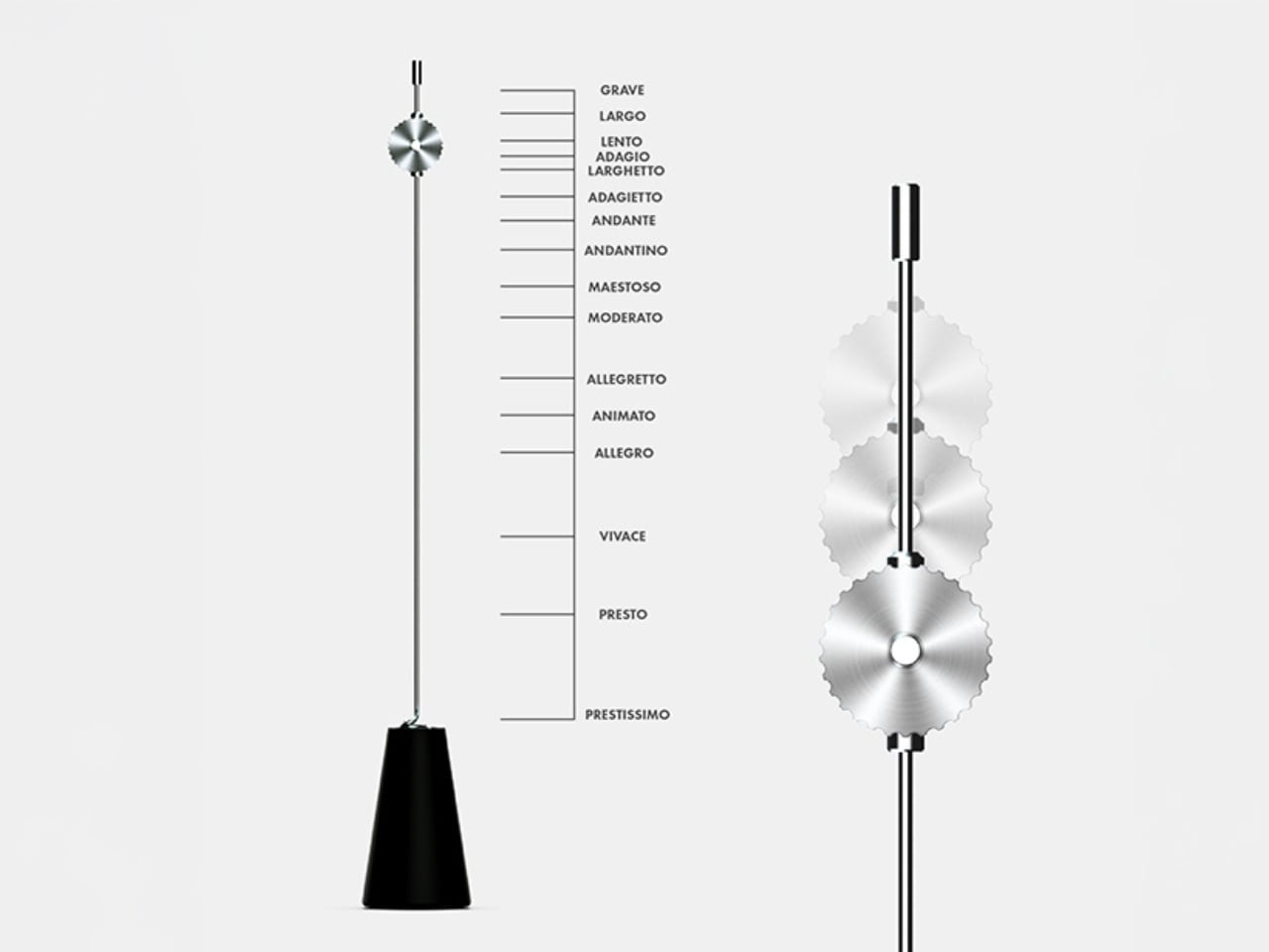
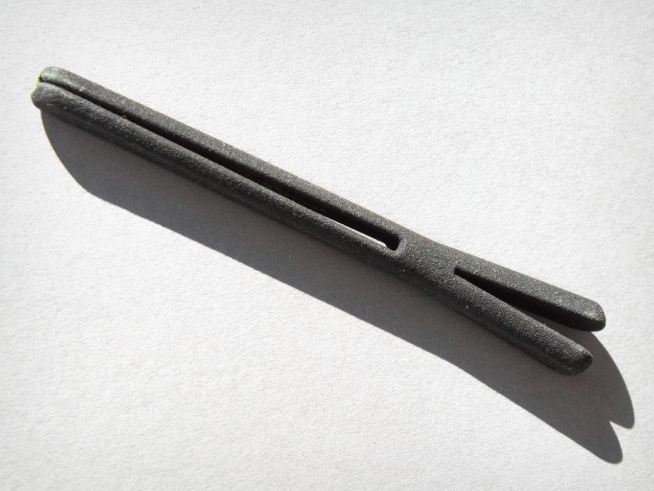
Yamaha’s answer to the question nobody thought to ask — what if a pen had a heartbeat? Part of the brand’s Scribe Tool Design 2024 project, the Swing Scribe draws its logic from the quill: as a feather naturally wobbles under air resistance while writing, it gives the act a physical rhythm. Yamaha made that incidental quality intentional. A weighted tip attached to a metal bar swings as the pen moves, feeding a small, steady pulse back into the hand with every stroke. No batteries. No app. Just physics.

The weight slides along the bar, letting you dial in the arc of the swing to match how you’re writing at any given moment. Pull it close to the pivot for a tighter, faster beat. Let it run wide for slow, deliberate work. This is the kind of design thinking that earns the word Kando — the Japanese concept of emotional resonance that sits at the core of everything Yamaha builds, from concert grands to this pen. It doesn’t make writing faster. It makes it more felt.

What we like:

  • The pendulum mechanism works without any power source, making it completely self-contained
  • Adjustable weight position means it adapts to the writer rather than demanding the writer adapt to it

What we dislike:

  • The swinging arm adds visual complexity that won’t suit every context or desk aesthetic
  • The concept hasn’t been tested across extended, high-volume writing sessions yet

2. Inseparable Notebook Pen

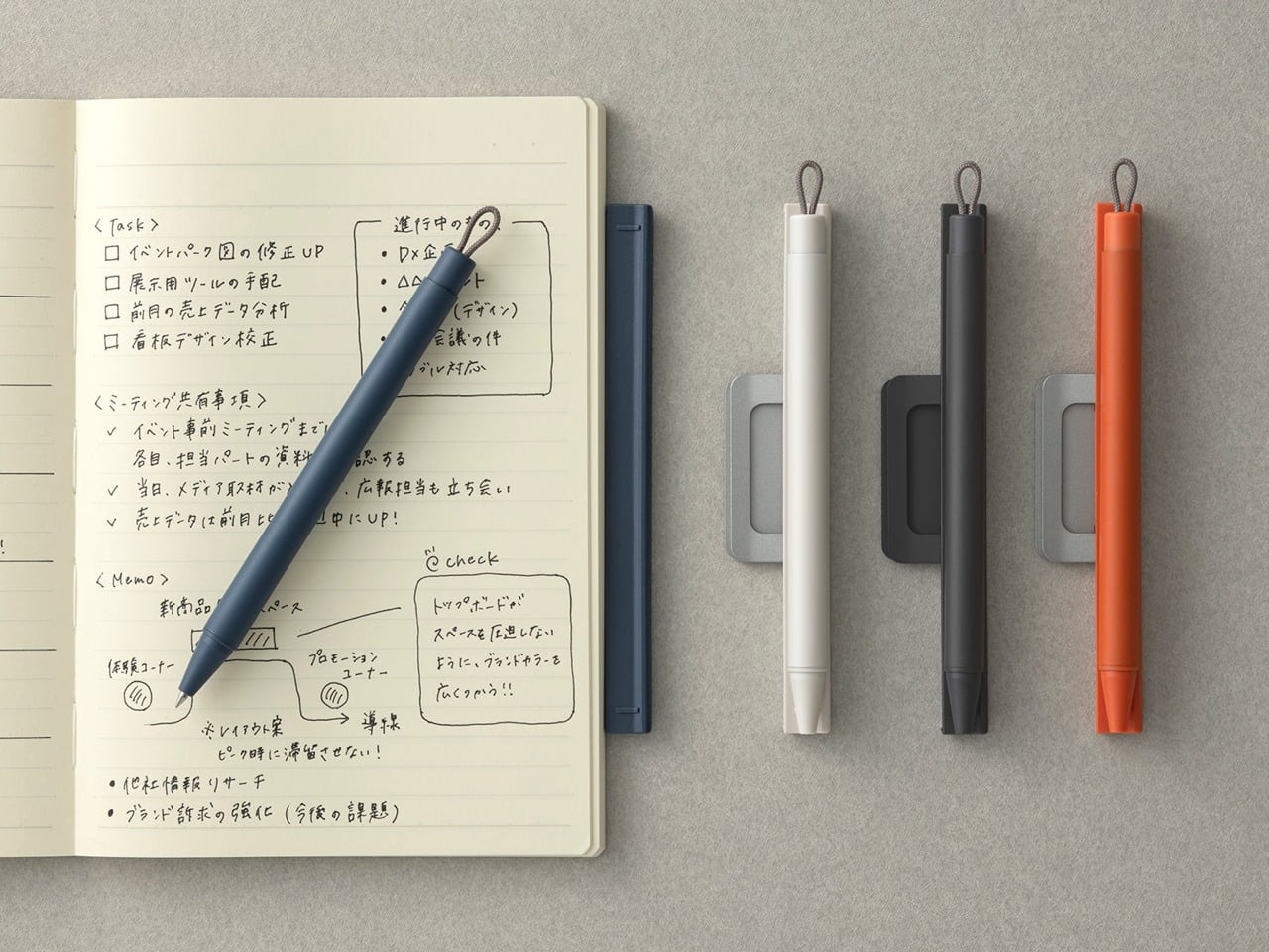
The premise is embedded in the name. Most pens and notebooks exist in a state of constant near-separation — the pen migrates to a bag, a pocket, another room, and the notebook sits waiting and useless. The Inseparable concept addresses this directly, building pen and notebook as a single resolved object rather than two products that happen to be sold together. The pen lives within the notebook’s architecture rather than being clipped to it as an afterthought, and removing it feels deliberate rather than accidental.

What makes this design interesting isn’t just the integration — it’s that the integration is the premise, and everything else follows from it. The proportions of the pen are dictated by the notebook. The notebook’s form is shaped around the pen’s presence. Neither object is compromised to serve the other, which is harder to achieve than it sounds. When a design solves a problem this specific and this common, it has a right to exist.

Click Here to Buy Now: $19.95

What we like:

  • Eliminates one of the most common and most irritating failures of the writing ritual entirely
  • The formal resolution between pen and notebook is tight — neither object feels like a concession

What we dislike:

  • Integration at this level commits you to one notebook format, limiting flexibility for writers who move between sizes
  • Writers who prefer their own paper choices will find the pairing restrictive

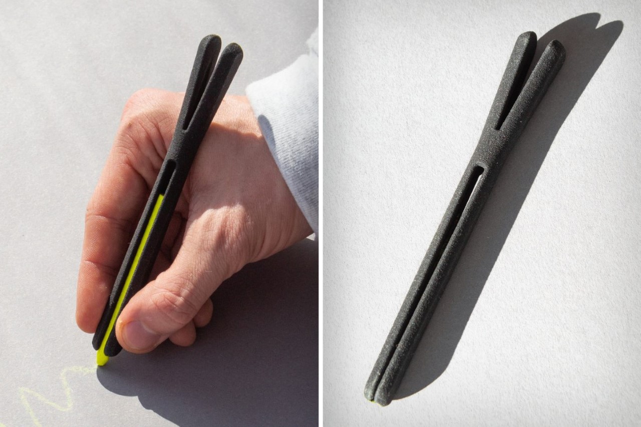
3. Da Vinci Pencil

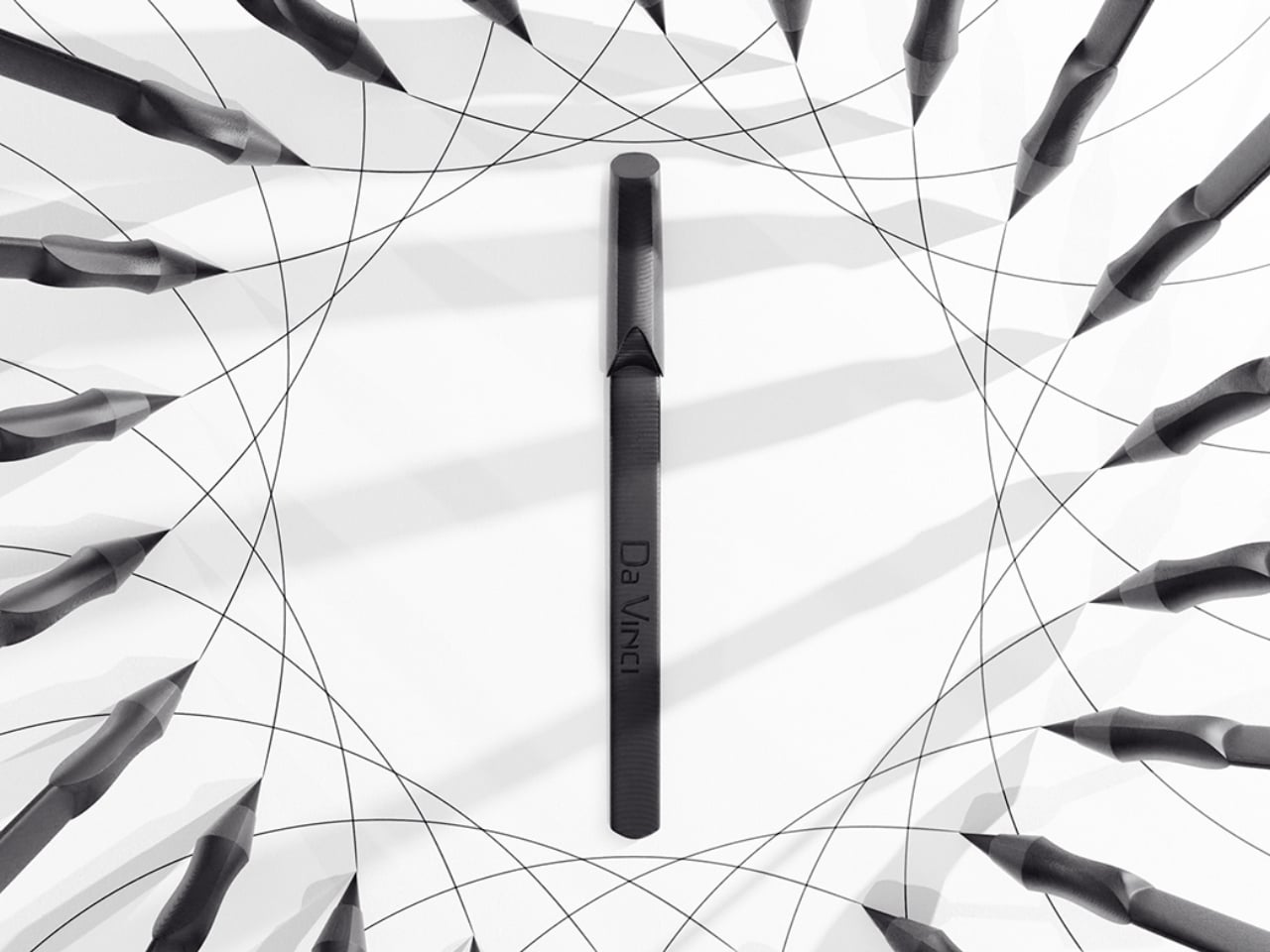
Gabrilevich Design’s Da Vinci pencil concept earns its name not through ornamentation but through the kind of cross-disciplinary thinking that made Leonardo’s notebooks worth studying in the first place. The design draws from da Vinci’s own mechanical sketches — the geometry, the visible logic of moving parts, the sense that an object should reveal how it works rather than hide it. The result is a pencil that functions as a small piece of mechanical sculpture, beautiful precisely because nothing about its construction is concealed.

The concept challenges the pencil’s conventional muteness. Most pencils look like nothing in particular. The Da Vinci concept looks like something that was thought about — that has a position, a point of view about what a mark-making tool should communicate about the hand that uses it. Whether it writes better than a standard pencil is beside the point. It writes differently, and it makes you think about the act differently, which is often the more interesting design outcome.

What we like:

  • Treats a pencil as a vehicle for design philosophy rather than a commodity object
  • The exposed mechanical logic gives it a conceptual depth that most stationery completely lacks

What we dislike:

  • Concept-driven designs at this level of visual complexity often struggle in extended daily use
  • Visible mechanisms can introduce maintenance friction that disrupts the writing ritual

4. Levitating Pen 2.0 Cosmic Meteorite Edition

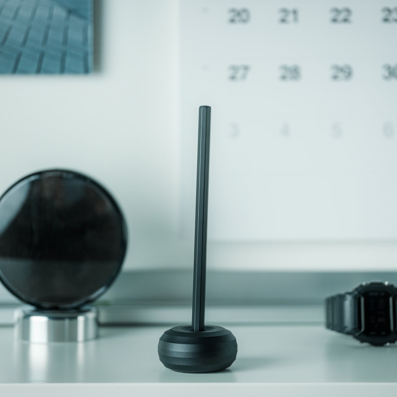
The levitating pen is a category that could easily slide into novelty, and the original versions of magnetic levitation pens leaned into that direction unapologetically. The 2.0 Cosmic Meteorite Edition changes the conversation by adding material seriousness to the spectacle. The pen itself incorporates genuine meteorite fragment material — iron-nickel alloy from outside the atmosphere — which gives the levitation a context it previously lacked. The object that hovers above its base is, in a measurable sense, from space.

That combination of astronomical material and magnetic suspension creates an object that earns its place on a desk in a way that pure spectacle cannot. It is a writing instrument that happens to be made partly from the oldest solid material you will ever hold, suspended above a surface by the same electromagnetic principles that govern planetary orbits. The writing experience is secondary to what the pen communicates as a resting object, and for a desk piece that doubles as a conversation anchor, that hierarchy is entirely appropriate.

Click Here to Buy Now: $399.00

What we like:

  • The meteorite material elevates the concept from a gadget to a genuine collectible
  • The levitation serves the narrative of the material rather than competing with it

What we dislike:

  • The magnetic base required for levitation eliminates any possibility of portability
  • Its function as a writing instrument is always secondary to its function as a display object

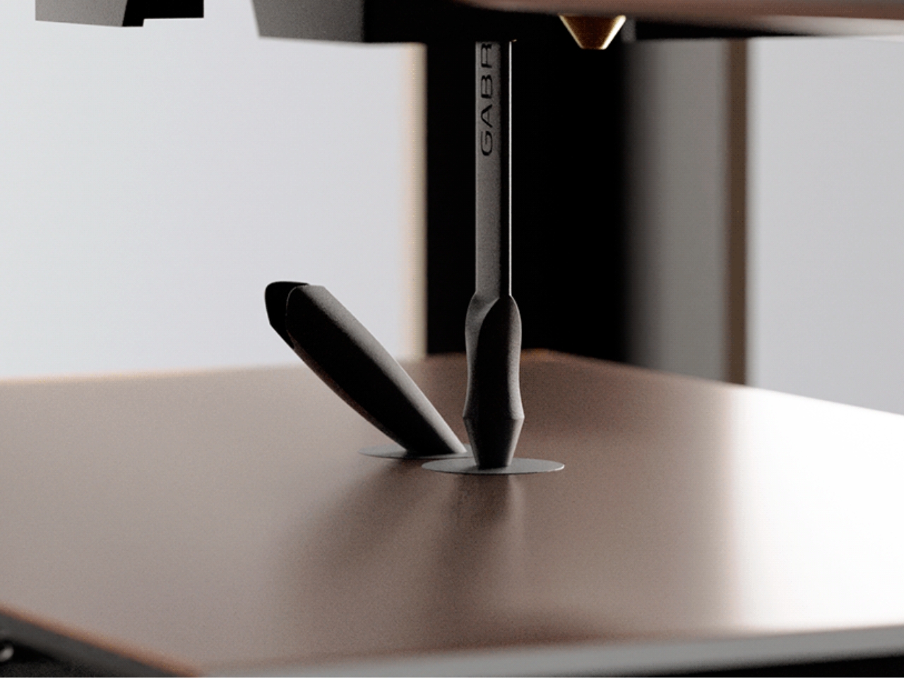
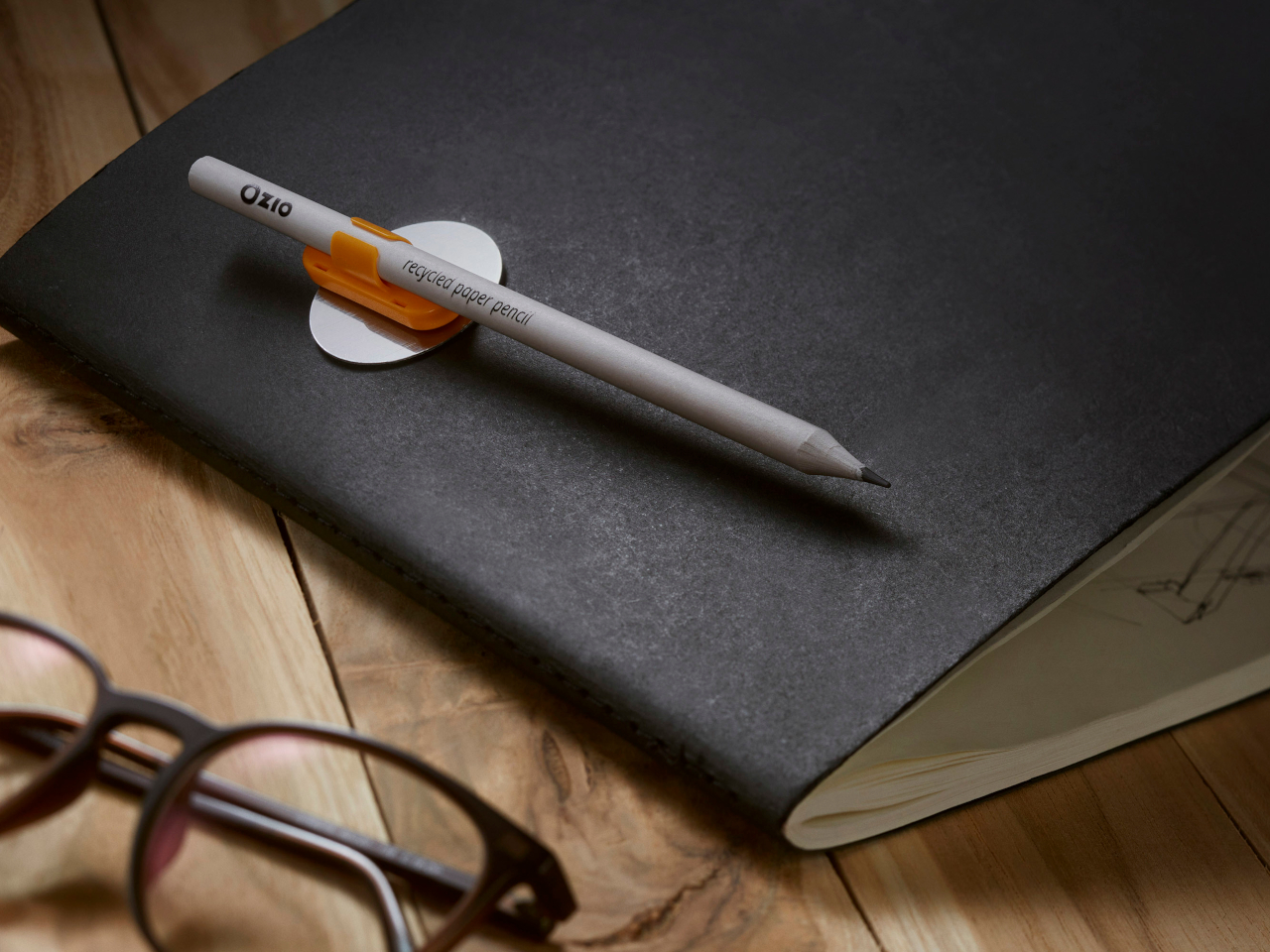
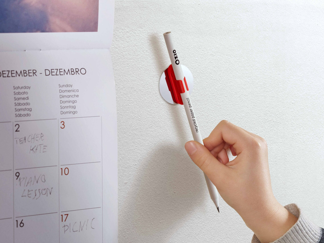
5. Qui Magnetic Pencil System

Qui operates on the premise that the friction between a pencil and the surface it lives on — a desk, a notebook, a wall — should be designed rather than incidental. The magnetic system allows the pencil to attach and detach from its designated surface with a satisfying, calibrated resistance, making the act of picking it up and setting it down feel considered rather than casual. This is a small interaction, but it happens dozens of times a day, and designing it well changes the quality of the entire writing practice.

The system thinking extends beyond the magnetic connection. The pencil’s geometry is resolved with the mounting surface as part of the design problem, not as a separate accessory. The result is that Qui occupies space well even when not in use, which is most of the time. A pencil that looks intentional when it is sitting still is a harder design challenge than one that merely writes well, and Qui understands that the resting state is part of the design.

What we like:

  • The system approach treats the pencil and its environment as a single design problem
  • The resting interaction — picking up and setting down — is as considered as the writing experience itself

What we dislike:

  • The magnetic system creates a dependency: without its base, the pencil loses its defining characteristic
  • Committing to a fixed mounting point works against the natural portability of a pencil

6. PENTAPA

Konstantin Diehl’s PENTAPA takes its name and its logic from the pentagon — five sides, each one a resolved surface rather than a generic round barrel. The five-sided form is unusual enough to read as a design decision the moment you pick it up, and practical enough to hold well once you begin writing. Pentagons don’t roll off desks. They register against the fingers in a way that circular barrels don’t, giving you tactile information about the nib’s orientation before the tip reaches paper.

PENTAPA belongs to a tradition of geometric pen design that runs from the hexagonal tradition of rOtring and Kaweco through to contemporary CNC-machined objects, but it finds its own position in that tradition rather than merely referencing it. Five sides is not the expected answer. It is the interesting one — the number that offers enough symmetry to feel resolved and enough irregularity to feel considered. That balance between the expected and the surprising is where most good pen design lives.

What we like:

  • The pentagonal form solves the rolling problem with more formal interest than a standard hexagon
  • The five-sided barrel gives the pen a distinct tactile identity that rewards extended daily use

What we dislike:

  • The unconventional geometry won’t suit every grip style or hand size
  • Finding a compatible pen case or sleeve requires more effort than standard round or hexagonal barrels

7. Everlasting All-Metal Pencil

The all-metal pencil solves a problem that the pencil has had since its invention: it runs out. A graphite core depletes. A pencil shortens. Eventually, it disappears entirely and takes with it whatever patina or character it had developed through use. The everlasting all-metal pencil replaces graphite with a metal alloy tip — typically an aluminum or similar soft-metal formulation — that deposits a mark through controlled abrasion rather than core consumption. The pencil does not shorten. It does not run out.

The mark is different from graphite — lighter, slightly metallic in tone, with a distinctive quality that serious writers and sketchers tend to either embrace or reject immediately. The design interest is in what remains when the core is removed: a pure metal object whose entire form is determined by how it feels to hold, since there is no pencil-to-grip ratio to manage, no sharpener to carry, no length to account for. The result is one of the most resolved objects in everyday carry design.

Click Here to Buy Now: $19.95

What we like:

  • Removes the pencil’s built-in obsolescence entirely, changing the object from consumable to permanent
  • With no core to deplete, the entire form is determined purely by how it feels to hold

What we dislike:

  • The mark quality is distinct enough from graphite to require genuine adjustment and won’t suit every application
  • Some writing and sketching tasks — particularly those requiring dense, dark marks — simply don’t translate well to a metal alloy deposit

8. The Bolen

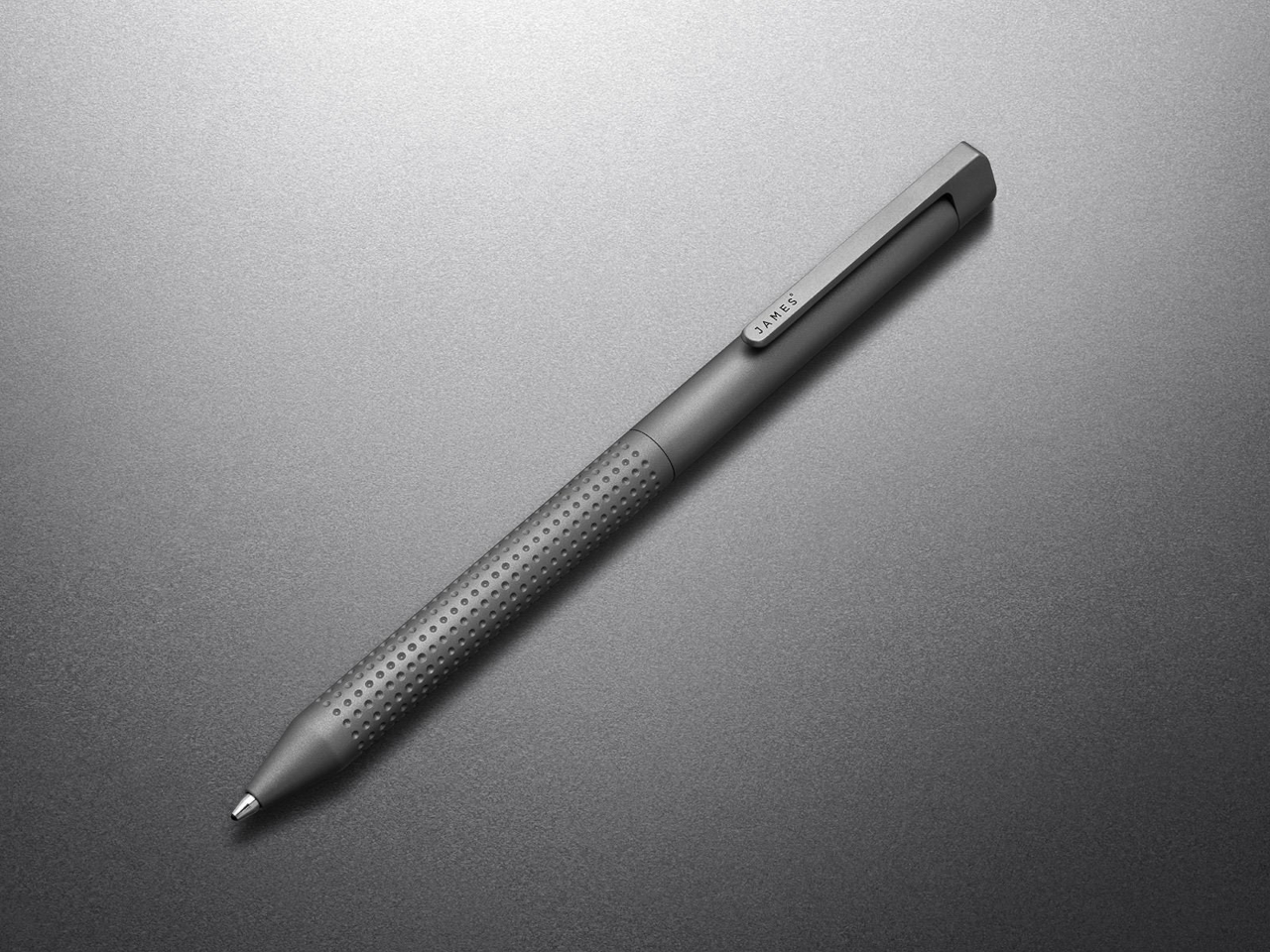
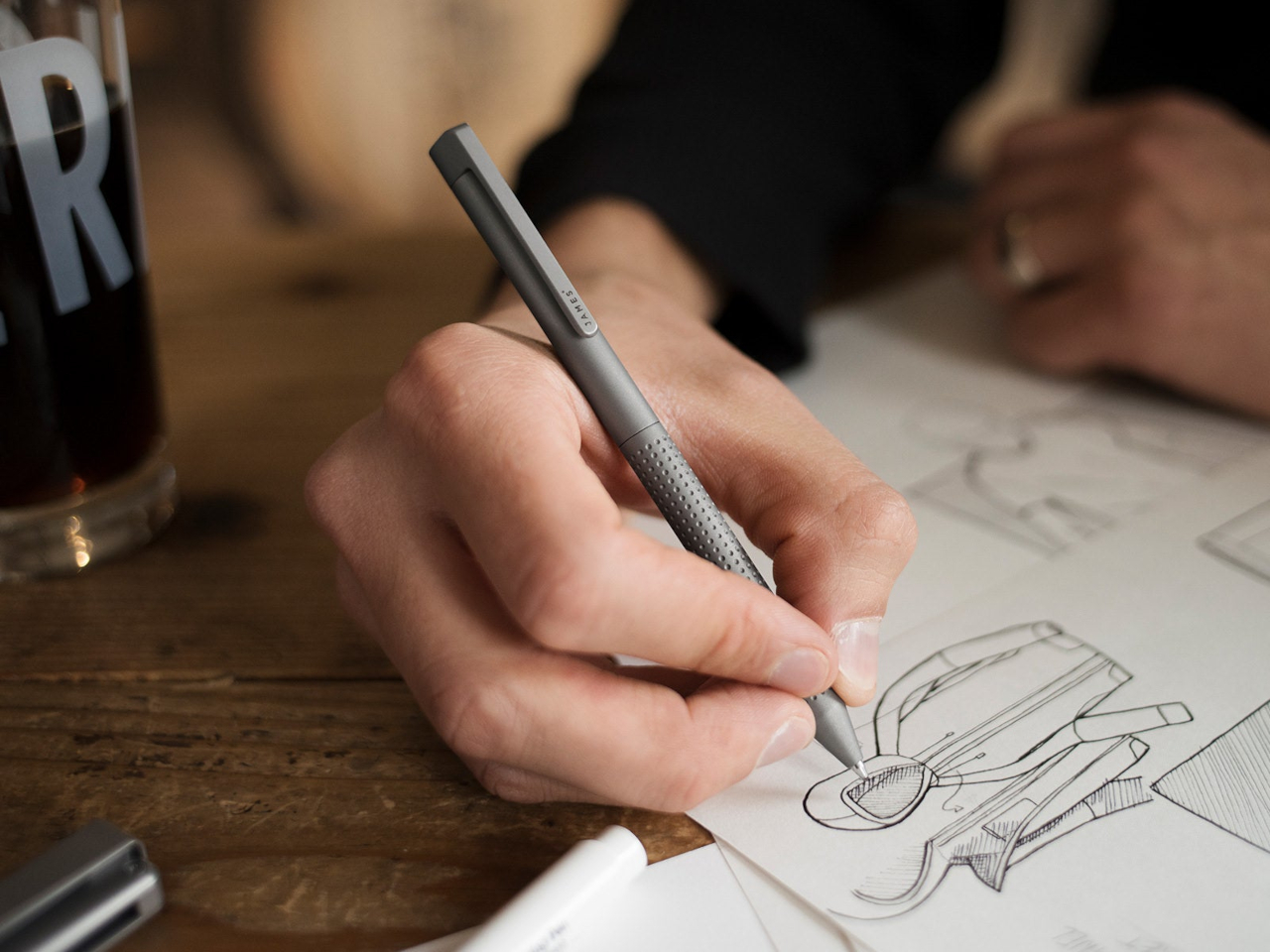
The James Brand has built its reputation on EDC objects with no unnecessary elements — knives, tools, and pens that look like they were designed by someone who uses them. The Bolen is the brand’s pen, and it carries the same design logic as everything else in their catalogue: machined from quality materials, resolved in form, designed to be carried without thought and used with satisfaction. The clip works. The mechanism engages cleanly. The proportions sit right in the hand without adjustment.

What distinguishes the Bolen from most EDC pens is that the James Brand comes from a tool-making tradition rather than a stationery one, which means the pen is designed for carry first and desk presence second. That priority ordering produces a different object than you get from pen-first design — one that is slightly more aggressive in material and slightly more considered in how it lives in a pocket. It is the writing instrument for someone who doesn’t think of themselves as a pen person, and that is exactly who needs it most.

What we like:

  • The tool-making heritage produces genuine material integrity, with nothing present without a reason for being there
  • Carry-first design logic makes it the most naturally portable instrument on this list

What we dislike:

  • The EDC-first approach means it lacks the expressive personality of instruments designed for desk use
  • Writers who want the pen to feel special on the page rather than merely functional in the pocket may find it underwhelming

The Object in Your Hand Shapes the Thought on the Page

Eight instruments that represent eight different positions on what a writing tool should be. The Yamaha asks what happens when you give a pen a pulse. The Levitating Pen asks what happens when the material itself carries a story. The Bolen asks what happens when you design for the pocket before the page. None of these answers is the same, which is the point. The best design in any category is the kind that expands your sense of what the category can contain.

What they share is the conviction that the instrument matters — that the weight, the mechanism, the material, and the form of the thing in your hand have a real effect on what ends up on the page. That conviction used to belong only to serious writers and professional draughtsmen. The fact that you can now find it in a magnetic pencil system, a levitating desk object, and a pen designed by a motorcycle company suggests the rest of the world is catching up.

The post 8 Best Pens and Writing Instruments That Make You Actually Want to Pick Up a Pen Again first appeared on Yanko Design.

This Portable Keyboard Has a 13-Inch 4K Touchscreen Built In, and It Fits in Your Laptop Sleeve

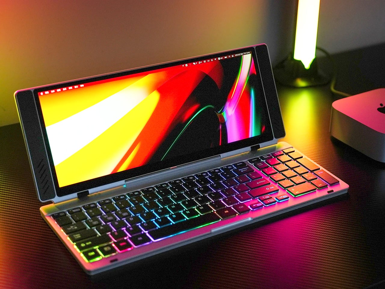
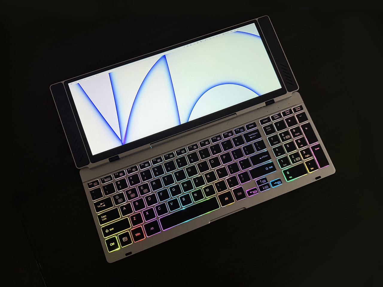
Closed, the VitaLink looks like a very flat book, silver, about the footprint of a large paperback, with nothing to suggest it carries a 4K display inside. At 20mm thick with a CNC-machined aluminum shell, it weighs 1200 grams and travels the way a slim notebook does; it fits in a laptop sleeve, takes up a predictable corner of a bag, and requires no dedicated case beyond what you already carry. Then it unfolds at 180 degrees. The screen lifts above the keyboard, the whole unit settles into a 34 by 15 centimeter footprint, and what you have is a self-contained dual-screen workspace that happened to be a thin slab a moment ago.

The keyboard is the part that usually betrays products like this. Portable keyboards compress key spacing to save millimeters, shorten travel to save thickness, and leave you typing on something that feels like a shallow membrane rather than actual keys. VitaLink went in the opposite direction, widening key spacing to 3.27mm and setting travel at 0.8mm, with scissor switches tuned for speed and quiet actuation. The display above it runs at 3840×1600 with a 2.4:1 aspect ratio, a cinematic proportion that gives the screen an unusually wide horizontal span, well-suited to keeping a reference panel open alongside a working document without feeling like you’re squinting at either side.

Designer: VitaLink

Click Here to Buy Now: $299 $658 (55% off). Hurry, only 379/600 left! Raised over $286,000.

The resolution translates to 298 pixels per inch, which puts it in the same territory as Apple’s Retina displays and well above the pixel density of most portable monitors in this category. Text holds sharp at native scaling, fine details in images stay crisp, and the 60Hz refresh rate keeps touch input feeling immediate. Ten-point multitouch means gestures respond the way they do on a tablet, with swipes, pinches, and drags registering without lag. The screen covers 100 percent of the sRGB color gamut, which makes it viable for color-sensitive work where you need confidence that what you see on the display matches what the final output will deliver. That 2.4:1 ratio keeps showing up as the design’s defining decision; it gives you enough horizontal real estate to run a code editor with a console window beside it, or a timeline with a preview panel, without either side feeling like it’s been compressed into a narrow strip.

Typing on the VitaLink is designed to feel deliberate in a way that most travel keyboards do not. The 0.8mm of key travel sits in a range where the keys actuate fast but still give tactile confirmation that you pressed them, a balance that makes a difference during long writing sessions where you need speed without sacrificing accuracy. The 3.27mm key spacing is wider than what most compact keyboards offer, eliminating that cramped sensation where your fingers feel like they’re hunting for keys in tight quarters. RGB backlighting runs through three modes, activated with function key shortcuts: a breathing gradient, a solid single-color backlight, and a rainbow wave that ripples across the keys as you type. The backlighting does actual work in low-light environments, but the rainbow mode leans more toward visual flair than strict utility.

CNC machining means the aluminum body starts as a solid block and gets precision-carved, producing the kind of structural rigidity that protects the screen during transit and prevents flex when you’re typing hard. The 180-degree hinge lets the unit lay completely flat, which matters both for stability on uneven surfaces and for low-angle use when you’re working on a cramped airplane tray table or a café counter. Dual USB-C ports handle video, data, and power delivery up to 65W, so a single cable from your laptop, tablet, or phone brings the display to life with no drivers to install. Compatibility spans Windows, macOS, Linux, and Android, with plug-and-play recognition across all of them. Connect a Steam Deck or a Nintendo Switch via USB-C, and the VitaLink becomes a 13-inch 4K external display for handheld gaming, turning a small console screen into something considerably more immersive.

VitaLink offers eight keyboard layout options, covering US Windows (the default), US Mac, German QWERTZ, Japanese JIS, UK, French AZERTY, Nordic, Italian, and Spanish. The standard US Windows layout ships at no extra cost; upgrading to US Mac adds ten dollars, German or Japanese layouts add twenty, and UK, French, Nordic, Italian, or Spanish layouts add thirty. The layouts require specific laser engraving and dedicated production runs, so they’re available as optional add-ons rather than default configurations. You select your preferred layout during checkout or in a post-campaign survey if you miss it the first time.

VitaLink is currently available on Kickstarter starting at $299, down from a retail price of $658. The package includes the VitaLink keyboard and display unit plus two USB-C cables. Eight keyboard layout options are available as add-ons, including US Mac, German QWERTZ, Japanese JIS, UK, French AZERTY, Nordic, Italian, and Spanish, with upgrade fees ranging from $10 to $30 depending on the layout. Shipping is scheduled for September 2026, with delivery fees ranging from approximately $18 to $33 depending on region. VitaLink covers all taxes and customs duties, so the listed shipping fee is the only additional cost beyond the pledge amount.

Click Here to Buy Now: $299 $658 (55% off). Hurry, only 379/600 left! Raised over $286,000.

The post This Portable Keyboard Has a 13-Inch 4K Touchscreen Built In, and It Fits in Your Laptop Sleeve first appeared on Yanko Design.

10 Best Kitchen Tools and Appliances Designed to Live on Your Counter, Not in Your Cupboard

The kitchen counter is prime real estate. Most appliances waste it, sitting there looking generic and visually forgettable until they get pushed to the back and eventually into a box. A smaller category of kitchen objects earns that space differently. They are worth looking at, whether in use or not. The ten products here belong to that category, and each one makes a quiet but convincing case for staying exactly where it is.

The question has never really been about function alone. It is about form meeting function so completely that putting the object away would feel like a loss. A Dutch oven with architectural presence. A kettle that handles like nothing you have owned before. A grater shaped like a curled sheet of paper. These are not kitchen tools that happen to look good. They are objects that happened to end up in the kitchen and have no intention of leaving.

1. Smeg Air Fryer + Steam
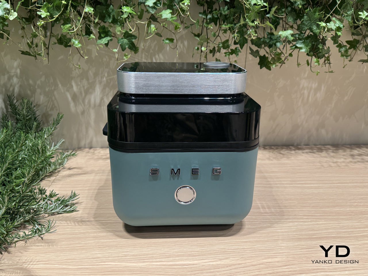
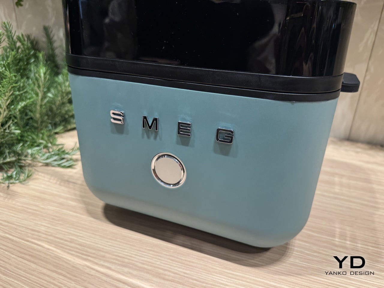
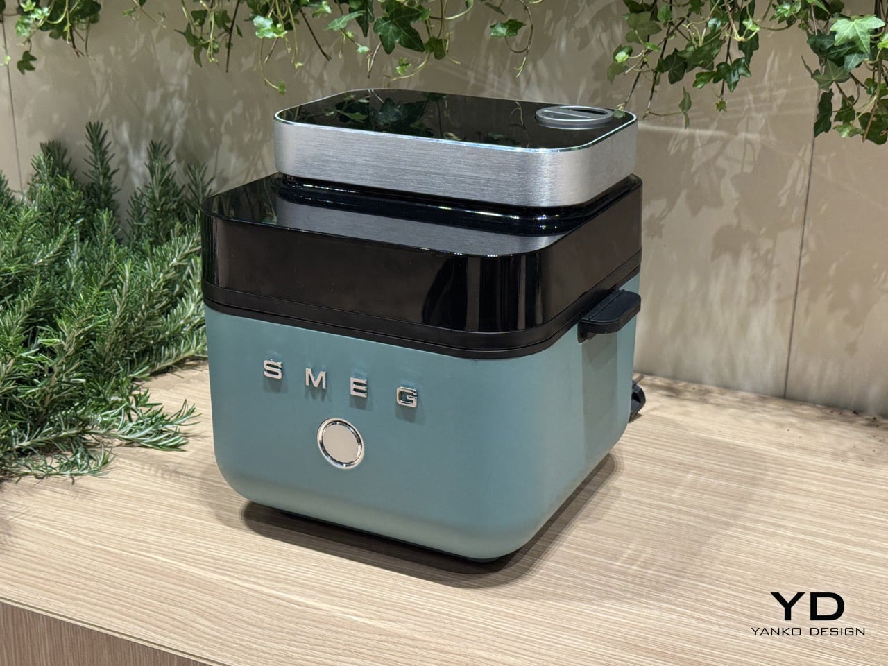
Smeg’s origins are in enamel technology, not the candy-colored kitchen appliances the brand became famous for. At Milan Design Week 2026, the Italian company debuted a concept air fryer that brings genuine cooking innovation to a form that could hold its own in any design-forward kitchen. The fryer opens from the top rather than the front, its lid ejecting at the press of a button to reveal a 7-liter basket, an exposed heating coil, and a tinted black visor that lets you see inside while it works.

What separates it from the broader category is a built-in steam function. A removable water cartridge feeds moisture into the basket via a top-mounted nozzle, creating an environment where food crisps on the outside while retaining moisture within. Chicken wings come out with a fried texture and no oil. Bread develops the kind of crust usually reserved for a professional oven. Currently a concept with no confirmed launch before 2027, it already sets the benchmark for where the category is heading.

What we like

  • The steam function produces results that no standard air fryer can replicate
  • The top-opening form and enameled body make it worthy of permanent counter placement

What we dislike

  • Not available to purchase, with no confirmed launch before 2027
  • Bold color options lean maximalist, which won’t suit every kitchen aesthetic

2. Playful Palm Grater
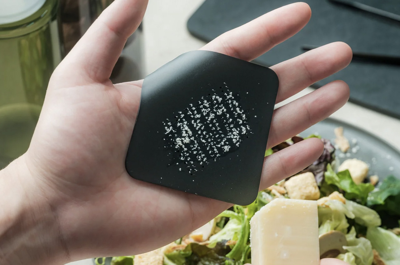
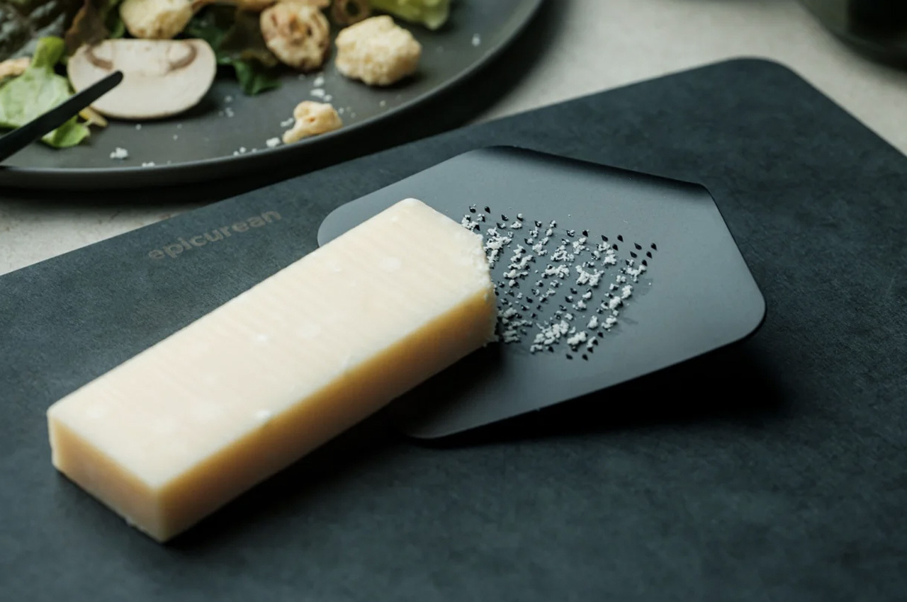
Most kitchen tools that try to be playful end up decorative and useless. The Playful Palm Grater avoids that completely. Designed to look like a sheet of paper curled at one corner, its form solves the ergonomic problem that plagues standard graters: it sits inside the palm of your hand, keeps knuckles clear of the surface, and contains what you are grating rather than scattering it across the counter. The object makes a strong aesthetic case while being entirely serious about its purpose.

At $25, it is the price anchor of this list and arguably its sharpest surprise. Guests who pick it up typically ask what it is before they realise it is a grater, which is the clearest signal that the design is working at the level it intends to. Hard cheese, citrus zest, ginger, chocolate: it handles all of it without protest. It also stores flat, so the playfulness does not come at the cost of practicality.

Click Here to Buy Now: $25

What we like

  • Palm-hold grip makes grating more controlled than any flat or box grater alternative
  • A genuine design achievement delivered at a $25 price point

What we dislike

  • Compact surface area limits it to small-quantity grating tasks
  • Not suited for bulk preparation, where a larger, fixed grater would serve better

3. Mitsubishi Bread Oven

The Mitsubishi Bread Oven exists at the opposite end of the appliance spectrum from multi-function, multi-mode, multi-button. It does one thing: toast a single slice of bread to a standard that no conventional toaster approaches. It’s a sealed, thermally insulated chamber that locks moisture in during the process, producing a slice that is crisp at the edges and genuinely fluffy at the center. The boxy silhouette and matte finish make it look less like a toaster and more like an object recovered from a mid-century Japanese archive.

For anyone serious about morning rituals, it rewires the relationship between bread and appliance entirely. One slice goes in, and a considered, unhurried result comes out. Its compact footprint occupies less counter space than most four-slice toasters while commanding considerably more visual presence. The Bread Oven is the kind of appliance that prompts questions from anyone who enters your kitchen, not because it looks complicated, but because it looks so deliberately, confidently simple.

What we like

  • A sealed thermal chamber produces toast that no pop-up toaster can replicate
  • Minimal Japanese form earns counter presence through restraint rather than spectacle

What we dislike

  • Limited to a single slice at a time, which doesn’t suit households cooking for multiple people

4. BØYD Espresso Machine
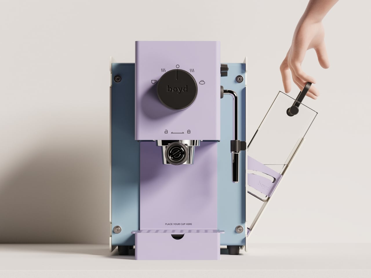
The BØYD Espresso Machine is a coffee machine that reads as modern sculpture before it reads as equipment. Its smooth curves and pure lines result from stripping the object back to what the design actually requires. No panel clutter, no unnecessary controls. Just form shaped around the daily ritual of pulling a shot, and a counter presence that justifies every centimeter it occupies.

It belongs to a growing movement of coffee equipment that treats the counter as an extension of living space rather than a working surface. BØYD understands that an espresso machine is often the first thing reached for in the morning and the last object you look at before leaving the kitchen. Making that object worth looking at is not superficial. It is the point. For a home barista who cares as much about the counter as the cup, BØYD answers both without compromise.

What we like

  • Sculptural form elevates the morning coffee ritual beyond the purely functional
  • Minimal interface keeps the countertop visually clean and uncluttered

What we dislike

  • The stripped-back aesthetic works best in kitchens that can match its visual confidence
  • Design restraint offers little warmth for kitchens that lean more traditional in character

5. FineLine Aluminum Chopsticks

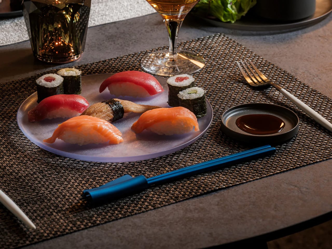
Chopsticks are rarely considered as design objects in Western kitchens, which is precisely the space the FineLine Aluminum Chopsticks occupy. Machined from aluminum with a finish that sits somewhere between tool and instrument, they bring the same material confidence to the table that a well-made knife brings to the counter. For everyday use, the grip is secure and the balance calibrated enough that switching from wooden chopsticks feels immediately like a step worth taking.

Left beside the matching chopstick rest, they form a composition rather than a cutlery arrangement. That distinction makes them worth the counter space: they are objects you would display even without daily use. Aluminum resists staining and absorbs minimal heat, so hot dishes do not require the caution that some metal utensils demand. The design is one of those cases where the material logic and the aesthetic argument arrive at the same answer.

Click Here to Buy Now: $30.00

What we like

  • Machined aluminum delivers a material precision and weight that wooden chopsticks cannot match
  • The finish reads as a considered object rather than a utensil, earning a counter display

What we dislike

  • Aluminum conducts heat, which can be uncomfortable with very hot food over an extended period of contact
  • The refined finish requires careful washing to maintain its quality over time

6. Kenwood Go Compact Stand Mixer
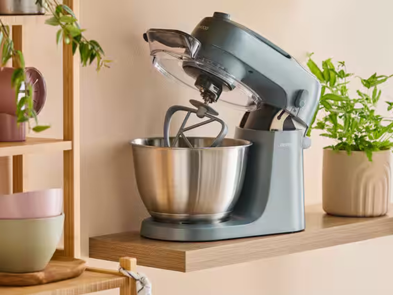
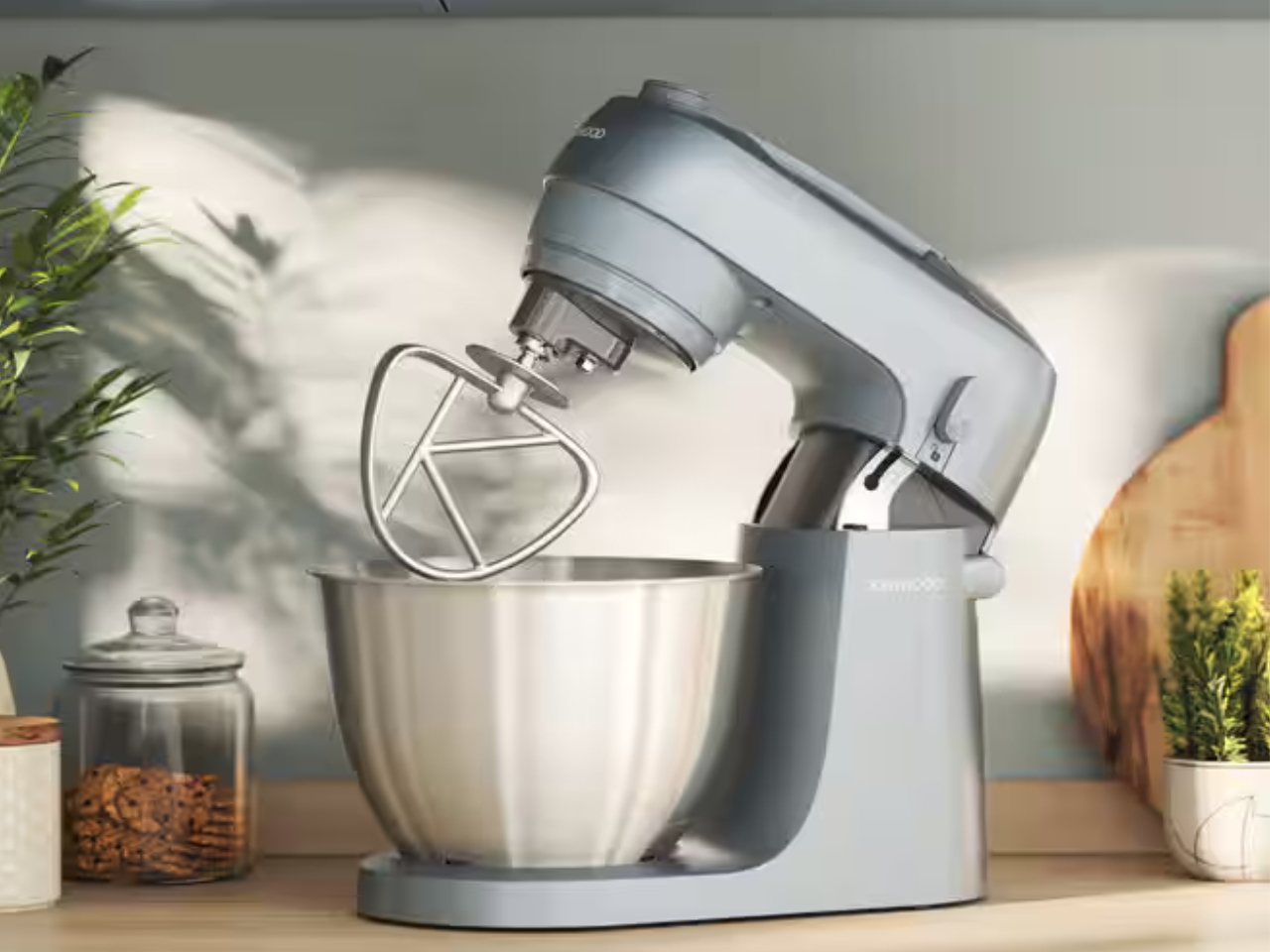
The stand mixer has always been a counter occupant by necessity rather than by design. They are large, heavy, and most look like they belong in a professional bakery. Kenwood’s Go Compact reframes the category. It packages the performance of a full stand mixer into a footprint small enough to coexist with everything else on a compact counter without requiring the kitchen to reorganize itself around one machine.

Its value is in the everyday bake rather than the occasional showpiece production. It handles the mechanical work of mixing dough, whipping cream, or folding batter without demanding that the kitchen dedicate itself to the task. That restraint in form, paired with Kenwood’s track record for motor reliability, makes it a counter object rather than a stored appliance. Compact proportions mean it stays where it sits, ready for the next session, without becoming a visual intrusion between uses.

What we like

  • Compact footprint genuinely rethinks the stand mixer for smaller kitchens without sacrificing performance
  • Kenwood’s motor reliability means the scaled-down size doesn’t compromise on results

What we dislike

  • Smaller bowl capacity limits batch sizes for high-volume or professional-scale baking sessions
  • Can feel less stable than full-size alternatives when working with particularly stiff doughs

7. JIA Inc. Rolling Mortar

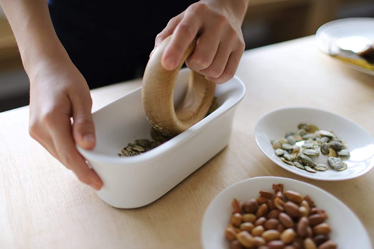
The mortar and pestle have been functionally unchanged for roughly 35,000 years, which is either a testament to the design or an invitation to rethink it. JIA Inc., a Taiwan-based design brand, chose the second view. Their Rolling Mortar replaces the vertical pounding motion with a rolling action: a stone sphere moves across a curved ceramic base, grinding herbs and spices through rotation rather than force. The gesture is more intuitive, considerably less tiring, and far more interesting to watch.

On a counter, it reads as a sculptural object long before it reads as a kitchen tool. The sphere and base form a self-contained composition that earns its space whether in use or not. Fresh pesto, ground spices, crushed garlic: the results are consistent, and the process is more enjoyable than the traditional method. It also cleans easily, which is the practical detail that tends to close the case for anyone still on the fence.

What we like

  • The rolling mechanism reduces the physical effort of traditional pounding significantly
  • The sphere-and-base composition is sculptural enough to justify permanent counter display

What we dislike

  • Slower than traditional methods for particularly coarse or hard spices, requiring significant force
  • The sphere needs adequate clearance to move freely, demanding more counter space during active use

8. Toru Kettle
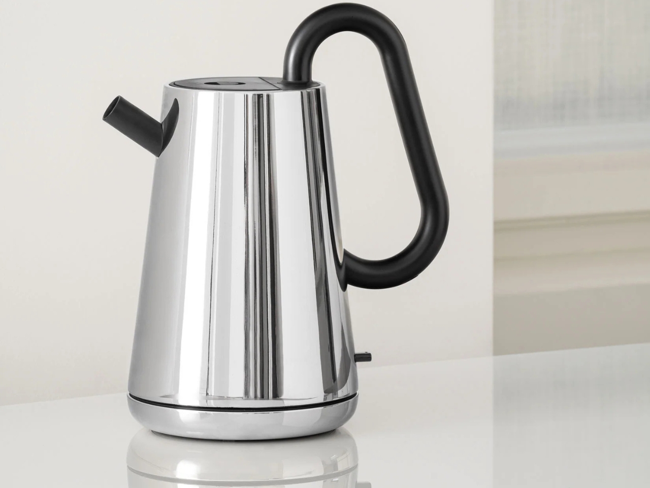
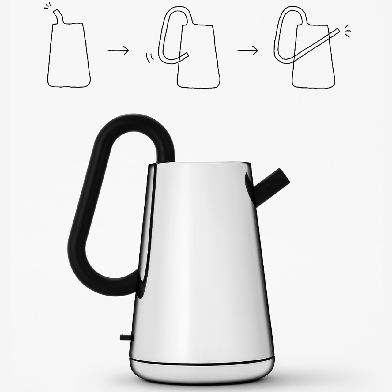
Nendo’s design work is consistent in one quality: it takes a familiar object, finds the assumption buried inside it, and quietly dissolves it. With the Toru kettle for Alessi, that assumption is how a kettle is held. Rather than a handle attached to the side, a black tube runs through the body of the stainless-steel vessel, becoming the grip itself. Toru means “through” in Japanese, and the name describes the design principle with complete accuracy.

Alessi’s metalworking precision is evident in the finish, and the contrast between the brushed steel body and the matte black tube creates a tonal balance that reads as sculpture before it reads as kitchen equipment. On the counter, it occupies the same visual register as a considered ceramic object or a well-made vase. Boiling water in it feels slightly ceremonial, which is not incidental to the design. Nendo and Alessi intended the daily ritual to feel like one.

What we like

  • The through-handle design transforms a routine gesture into something worth noticing every morning
  • Alessi’s metalworking gives it a material quality that mass-market kettles cannot replicate

What we dislike

  • The unconventional grip takes some adjustment, particularly when pouring with precision
  • The stainless and matte-black palette, while refined, can feel cool in warmer-toned kitchens

9. Hesslebach Dutch Oven
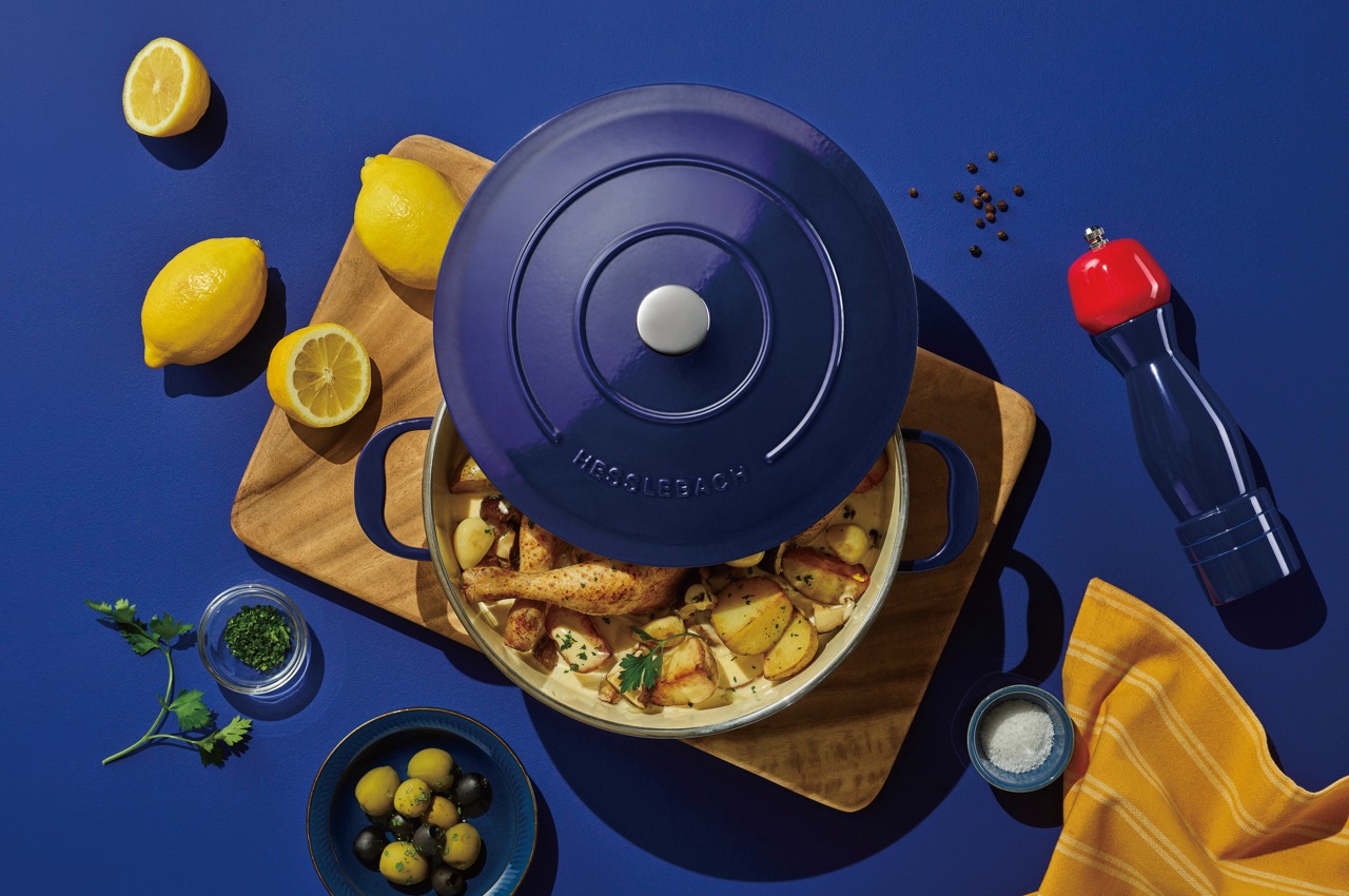
The Dutch oven is the kitchen’s most honest piece of cookware. It travels from stovetop to oven to table without changing character, and the finest examples improve with use rather than degrade with it. HK Kim’s Hesslebach takes that functional lineage and applies a design sensibility that treats the vessel as an object worth placing rather than simply setting down. Its counter presence communicates something deliberate about the kitchen it occupies, a quality very few pieces of cookware achieve.

A well-made Dutch oven retains and distributes heat in a way that makes slow-cooked dishes genuinely superior in result. Braises develop deeper flavor, bread develops a crust that rivals a professional deck oven, and soups reach a depth of reduction that stovetop-only pots rarely match. The Hesslebach is built to that standard, and its form carries the confidence of its material. Left on the counter between sessions, it functions as an aesthetic anchor for the kitchen space around it.

What we like

  • Heat retention and distribution deliver cooking results that lighter cookware simply cannot match
  • A form confident enough to remain on the counter between uses without apology

What we dislike

  • Weight and material density demand more deliberate handling than lighter everyday cookware
  • The investment required places it well above casual kitchen upgrade territory

10. FineLine Chopstick Rest

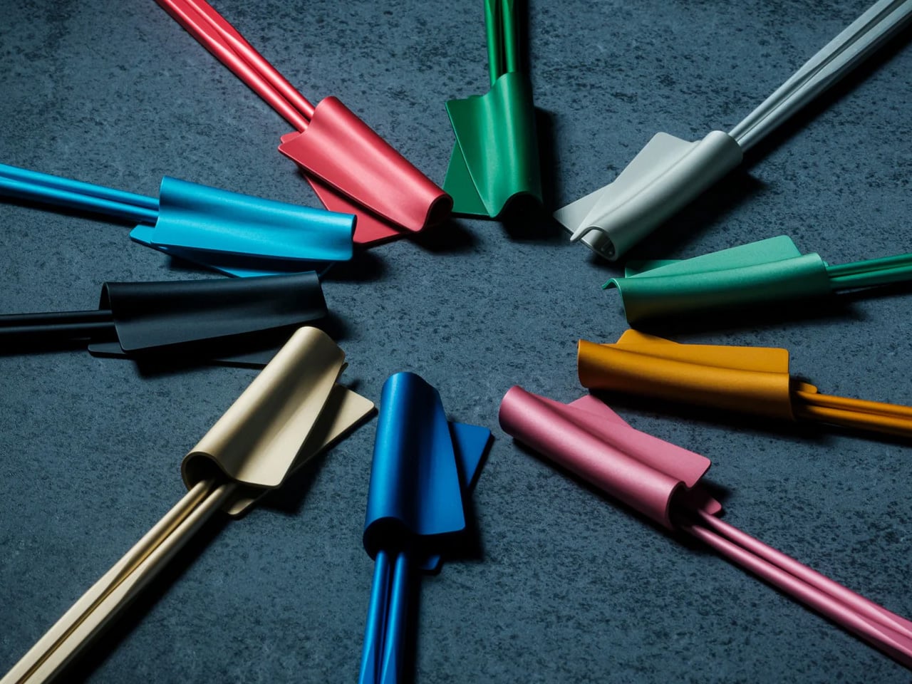
The chopstick rest is the punctuation mark of a table setting: small enough to be overlooked, significant enough to shift the character of everything around it. The FineLine Chopstick Rest is machined from the same aluminum as the chopsticks it accompanies, creating a material consistency across the table that reads as intentional rather than assembled. Its form is architecturally proportioned, a precisely angled piece that holds the chopsticks cleanly off any surface.

What it does for the FineLine chopsticks is what any well-designed accessory does for its counterpart: it completes the object. Chopsticks left flat on a table look forgotten. Placed on a form machined to hold them, they look arranged. That distinction carries through to the counter, where rest and chopsticks together become the kind of small arrangement that makes a kitchen feel curated rather than accumulated. Very few objects at this price point deliver that quality of visual return.

Click Here to Buy Now: $20.00

What we like

  • Machined aluminum matches the FineLine chopsticks precisely, creating a coherent tabletop object
  • The angled form elevates the chopsticks from a utensil to a display piece between uses

What we dislike

  • Designed specifically around the FineLine chopsticks, which limits pairing with other styles
  • The minimal form is unforgiving if placed on a visually cluttered or busy surface

The Objects That Stay

A kitchen that looks considered doesn’t happen through a single purchase. It accumulates through a sequence of decisions, each one small enough to seem insignificant until the room starts to reflect them. The ten objects here span different categories, different price points, and different materials. What they share is a refusal to be hidden away. Each one earns its counter space not through function alone but through the integrity of its form.

The Smeg fryer shows where cooking technology is heading. The Mitsubishi Bread Oven shows what happens when a brand stops trying to do everything. The Toru Kettle shows that the most familiar object in a kitchen can still be entirely rethought. The rest follow the same logic: that good design and daily use are not competing priorities. They are, at their very best, the same thing.

The post 10 Best Kitchen Tools and Appliances Designed to Live on Your Counter, Not in Your Cupboard first appeared on Yanko Design.