Huawei Built a 200MP Camera Phone That Finally Shows Your True Colors

The smartphone camera arms race hasn’t let up. Most flagships are pushing harder on AI-assisted processing to compensate for the physical limits of small sensors, and the results are often technically impressive but not always true to what was in front of the lens. There’s a real difference between a photo that looks good and one that actually looks right, and that’s a harder problem to solve than adding megapixels.

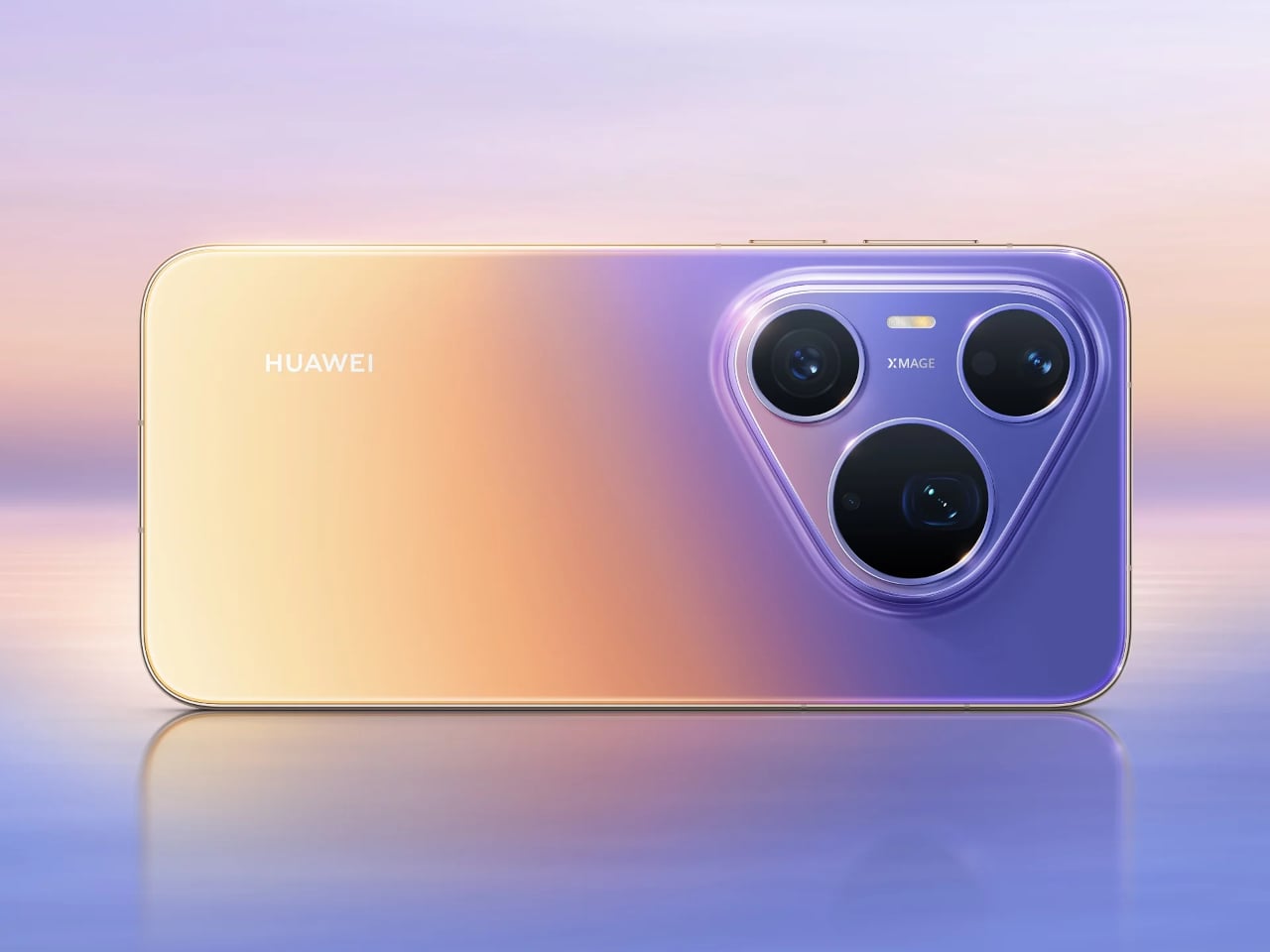
The Huawei Pura 90s Pro and Pura 90s Pro Max are Huawei’s answer to both. Launched in Kuala Lumpur on July 14, 2026, the two phones arrive with a design philosophy called “Rhythm of Colour,” gradient colorways that flow across the chassis, and a camera system built around the idea that color accuracy matters just as much as how sharp the final image gets.

Designer: Huawei
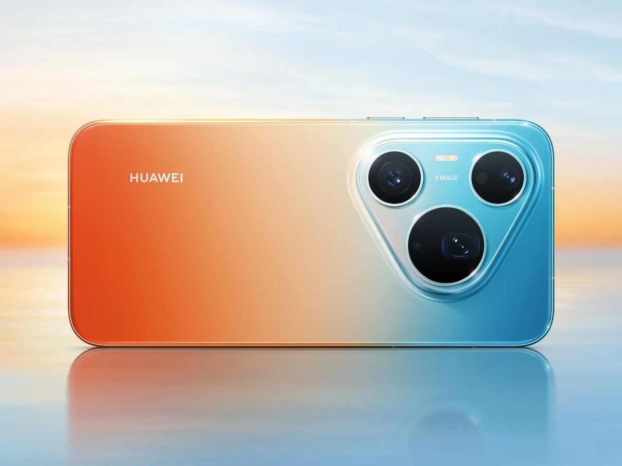
Both models feature True-to-Colour Camera 2.0, a system designed to close the gap between what the sensor captures and what the eye actually sees. A sunset shouldn’t come back looking oversaturated, and skin tones shouldn’t shift cooler or warmer than reality. The RYYB sensor array across all cameras supports this by gathering more color information in low-light conditions than a conventional RGGB layout can.
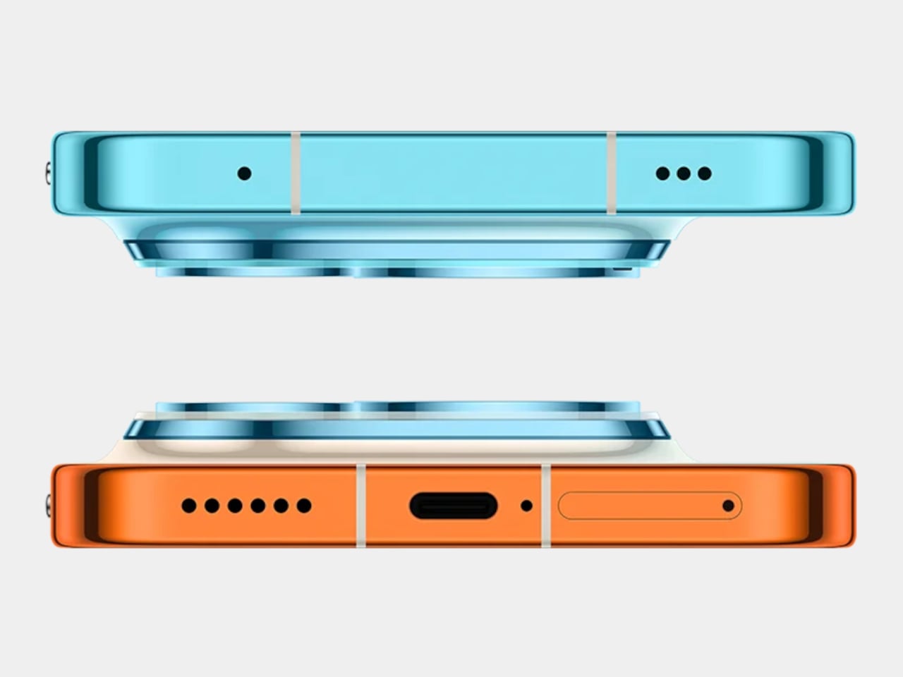
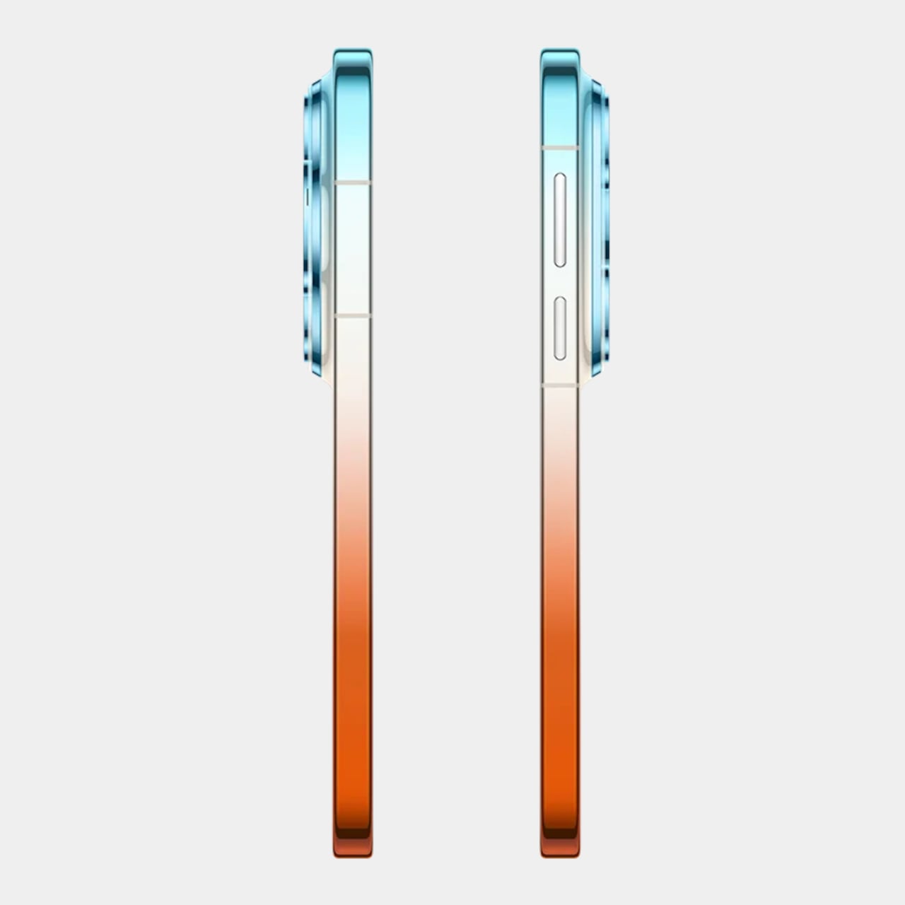
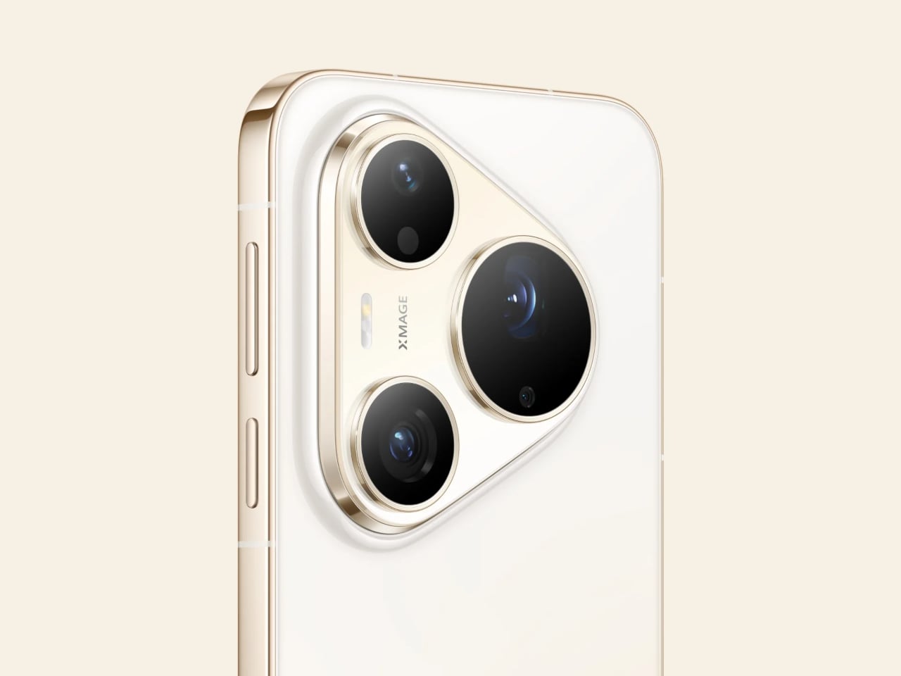
The Pro Max’s standout addition is a 200MP telephoto camera built on a 1/1.28-inch ultra-large sensor with OIS and 4x optical zoom that also functions as a macro lens. That resolution allows for aggressive cropping while still retaining detail throughout the frame. The Pro takes a different route with a 50 MP telephoto covering 4x optical and up to 8x optical-quality zoom.
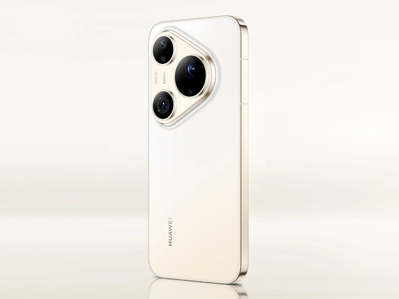
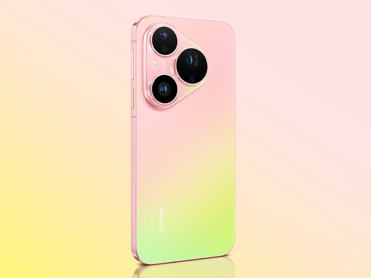
Both phones share a 50MP main camera with a physical aperture spanning 10 sizes from F1.4 to F4.0. It’s a genuine mechanical iris rather than a simulated depth-of-field effect, and that distinction matters when conditions change. Moving from a dim restaurant to a bright outdoor afternoon doesn’t mean switching modes; the aperture adjusts, the exposure holds, and the shot works.
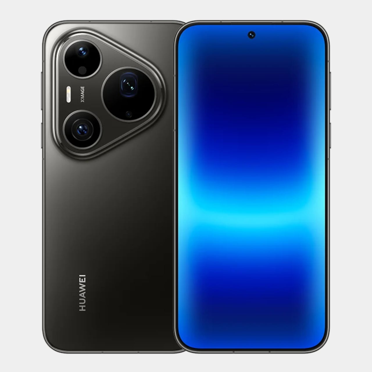
An AI composition feature suggests framing adjustments while you’re still pointing the camera, and Kunlun Glass on the front panel is rated at 25 times the drop-resistance and 16 times the scratch-resistance of standard glass. The Pro Max also carries a 40 MP ultra-wide camera, stepping above the 12.5MP sensor on the Pro, and adds LOFIC technology to the main sensor for better dynamic range.
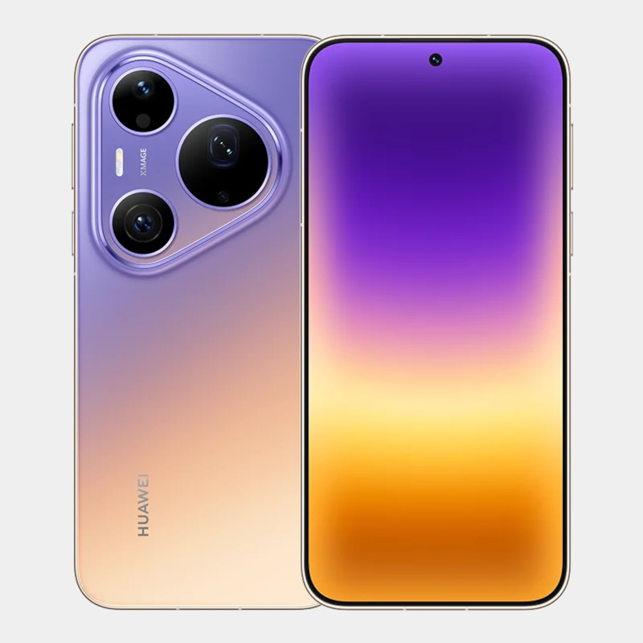
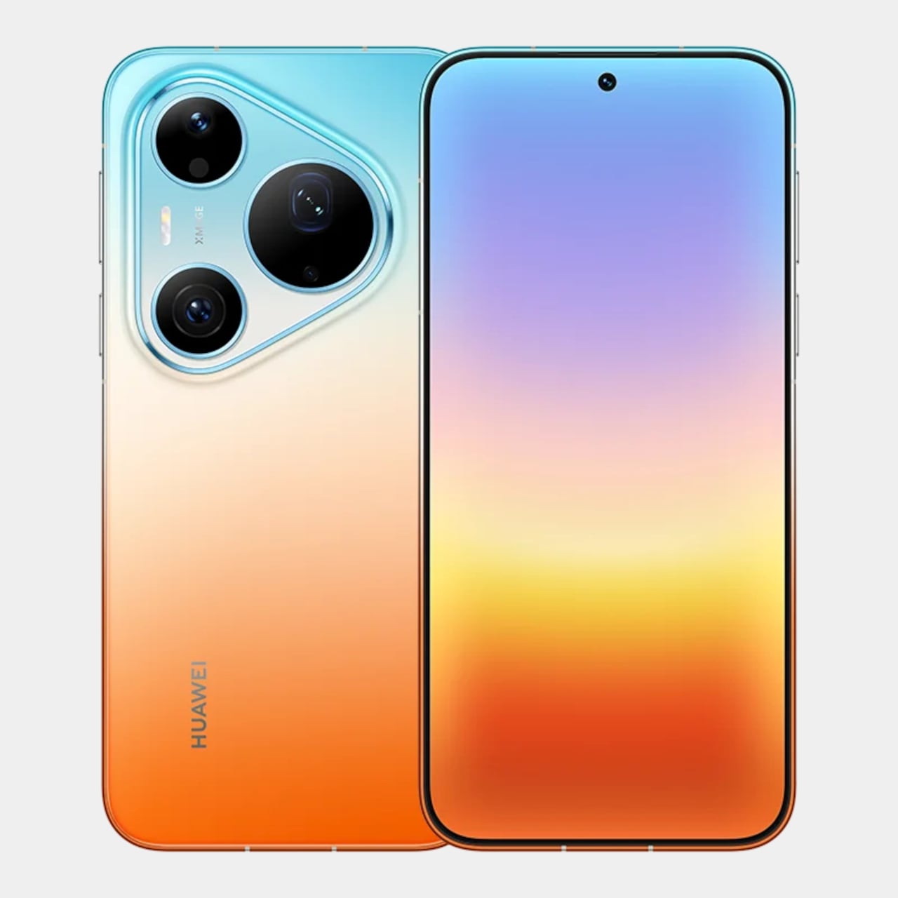
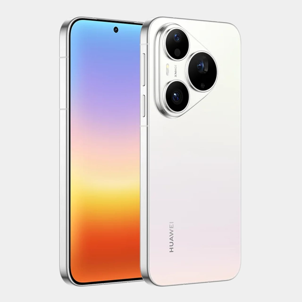
The “Rhythm of Colour” philosophy runs through every finish in the lineup, from the warm orange-to-gold Orange Ocean with its Dual-Tone Gradient Mid-Frame to a purple-to-peach option, deep matte black, and soft pearl white. The triangular camera module on both phones carries XMAGE branding and sits within a chassis that, despite the hardware inside, still manages to feel like a deliberate aesthetic choice.
A 5270mAh battery powers both phones, with 66W Huawei SuperCharge on the Pro and 100W on the Pro Max. Both run HarmonyOS 6.1 on the Kirin 9030S chip and carry IP68 and IP69 ratings for dust and water resistance. The Pro has a 6.6-inch OLED display, while the Pro Max steps up to a 6.9-inch LTPO OLED panel with an adaptive refresh rate from 1 to 120Hz.
The post Huawei Built a 200MP Camera Phone That Finally Shows Your True Colors first appeared on Yanko Design.
Galaxy Z Fold 8: July 22 date confirmed, S Pen returns

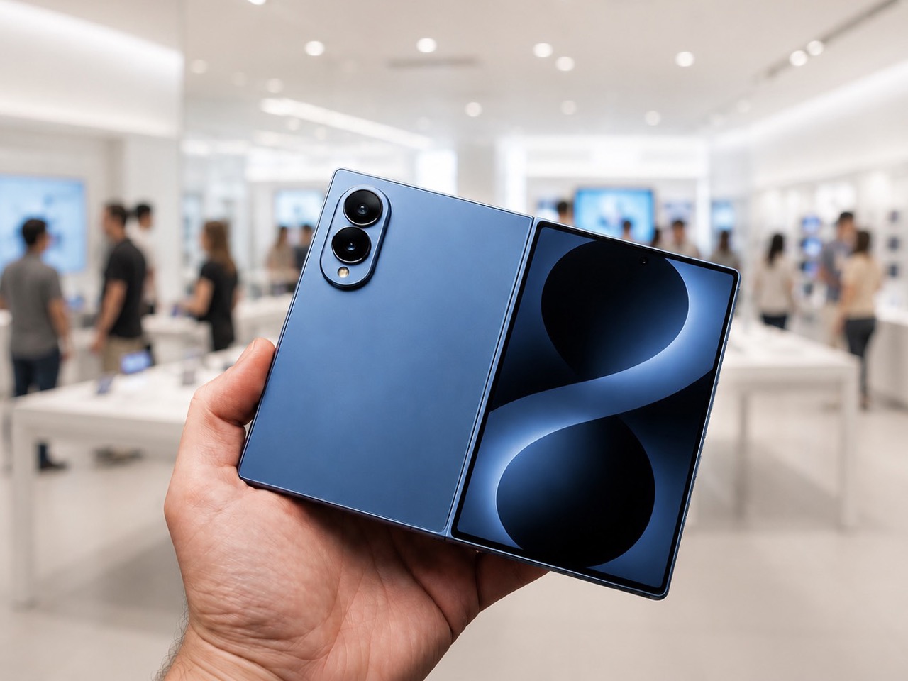
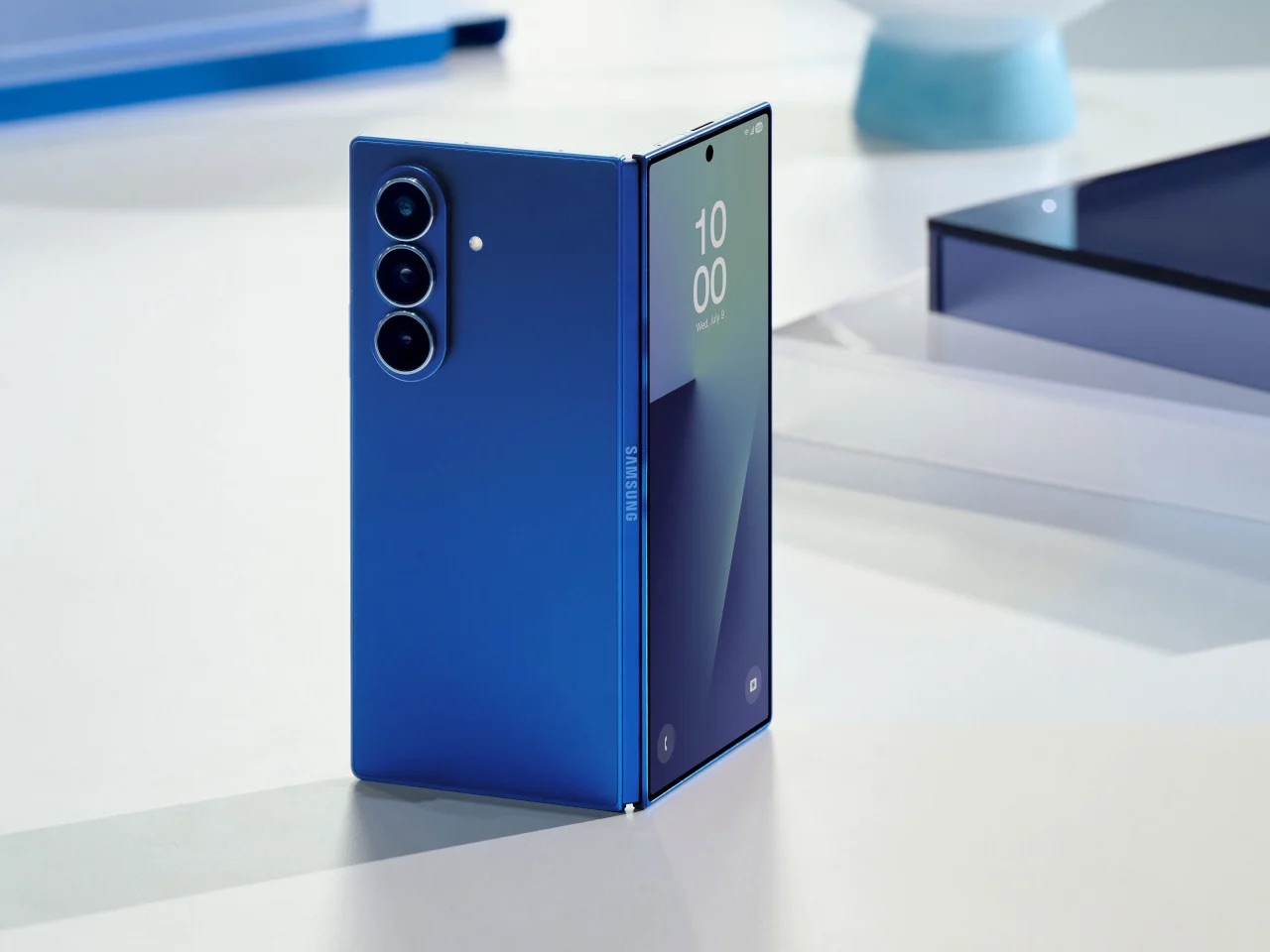
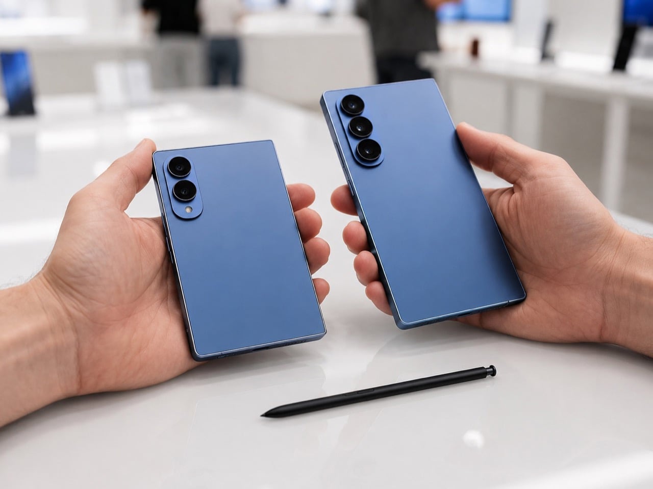
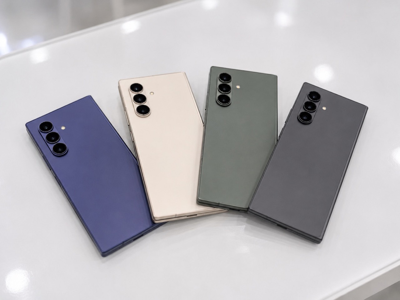
Samsung has spent years pushing the Galaxy Z Fold toward a cleaner, slimmer silhouette, treating thinness like the ultimate expression of foldable progress. That approach gave the Fold 7 a sharper visual identity, but it also stripped away one of the features that helped define the device as a serious productivity tool. Now, with the Galaxy Z Fold 8 expected to bring back S Pen support, Samsung seems ready to revisit the balance between elegance and utility.

That shift could make the Fold 8 one of the most revealing foldables the company has made yet. A fractionally thicker body may sound minor on paper, yet in design terms it signals a broader change in priorities. The next Fold may show that maturity in foldable design comes from restoring capability, refining ergonomics, and building a device people want to live with every day.

Designer: Samsung

The Fold 7 was a genuinely impressive piece of engineering, arriving at 4.2mm when unfolded and claiming the title of the thinnest book-style foldable on the market at the time. That number made headlines and performed well in comparison videos. What it cost, though, was the S Pen digitizer layer, a piece of hardware Samsung had to physically remove to achieve that profile. For users who bought into the Fold precisely because of its large-screen, stylus-ready workflow, that tradeoff landed hard.

The S Pen on earlier Galaxy Z Fold devices was never a casual accessory. It turned the inner display into a note-taking canvas, a sketching board, and a precision annotation tool, especially useful for professionals bouncing between documents and apps on the go. Removing it reduced the Fold 7 to a premium hardware story without the software depth to back it up for power users. Thinner, yes. More complete, arguably not.

What makes the lead-up to July 22 particularly interesting is how complicated the S Pen picture has become. According to multiple leaked spec sheets and tipster reports, the standard Galaxy Z Fold 8 and the new Fold 8 Wide variant may both launch without S Pen support, with Samsung reportedly continuing its thinness-first approach for those models. The standard Fold 8 could come in at 4.1mm unfolded, the Wide at an even leaner 3.9mm (pre-empting Apple’s own wide iPhone Ultra), numbers that suggest Samsung has no intention of walking back the Fold 7 philosophy across the board. The S Pen story, if it holds, belongs to a third model entirely. A Fold 8 Ultra appears to be where Samsung is routing the stylus comeback, alongside a wider display orientation and a 5,000mAh battery that would represent the first meaningful capacity upgrade for the Fold line since the Fold 3.

The Fold 7 used a titanium backplate, a strong and lightweight choice that also happens to be poorly suited to the digitizer layer S Pen functionality requires. Reports have suggested Samsung may shift the Fold 8 Ultra to a combination of titanium and carbon fiber reinforced plastic, a material used in earlier Fold models that works far more naturally with stylus hardware. The material choice, in other words, may be less about aesthetics and more about what the device is structurally allowed to do.

Samsung is also reportedly researching a digitizer-free stylus solution that would remove the hardware dependency altogether, potentially allowing S Pen-style input on ultra-thin builds in future generations. That research, if it eventually ships in a product, would be one of the more significant industrial design developments in the foldable category, because it decouples a core productivity feature from physical bulk entirely.

What Samsung appears to be attempting with the Fold 8 lineup is something more architecturally ambitious than a single model update. A tiered approach, with the standard Fold chasing thinness, the Wide offering a tablet-like aspect ratio, and the Ultra absorbing the S Pen and flagship camera system, is a bet that different foldable buyers want fundamentally different things from the same category. Whether that structure serves users better than one well-resolved device is a question worth raising, because fragmentation across three models can dilute the identity of each one. Ask Apple how they felt about launching 3 iPhone SKUs in the same September launch. Rumor has it Ternus is changing that, and only announcing the Pro iPhones this September.

Still, the design direction Samsung is pointing toward with the Ultra is the more honest one. A foldable that accepts a few extra millimeters in exchange for a stylus, a bigger battery, and a wider display is a device making peace with what the form factor actually needs to be useful. Thinness is a compelling engineering goal. Usability is a more durable design ambition, and the Fold 8 Ultra, if the leaks hold, may finally be the version of this phone that stops apologizing for being a productivity tool.

The July 22 Unpacked event in London will confirm how much of this actually ships. But the shape of what Samsung is building already says something worth paying attention to.

The post Galaxy Z Fold 8: July 22 date confirmed, S Pen returns first appeared on Yanko Design.
This Pixel 11 Pro Concept Makes the Camera Bump Its Best Feature

The back of a smartphone has historically been the least interesting real estate on the device. A logo, some camera lenses, and a flat slab of glass or metal. Nothing phones started to change that conversation a few years ago by threading LED strips through their transparent backs to indicate calls, charges, and timers with light patterns. The question since then has been whether anyone else would take the idea further.

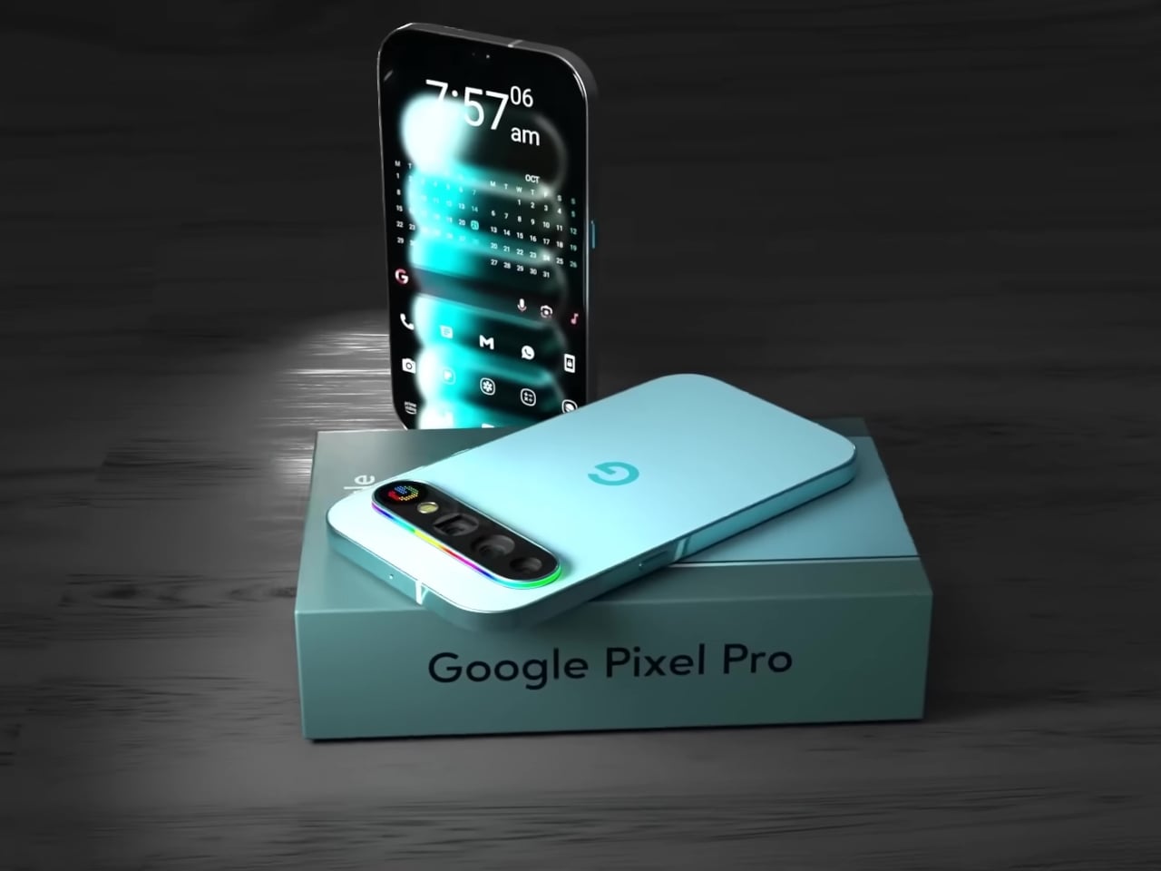
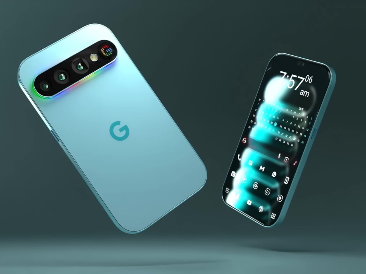
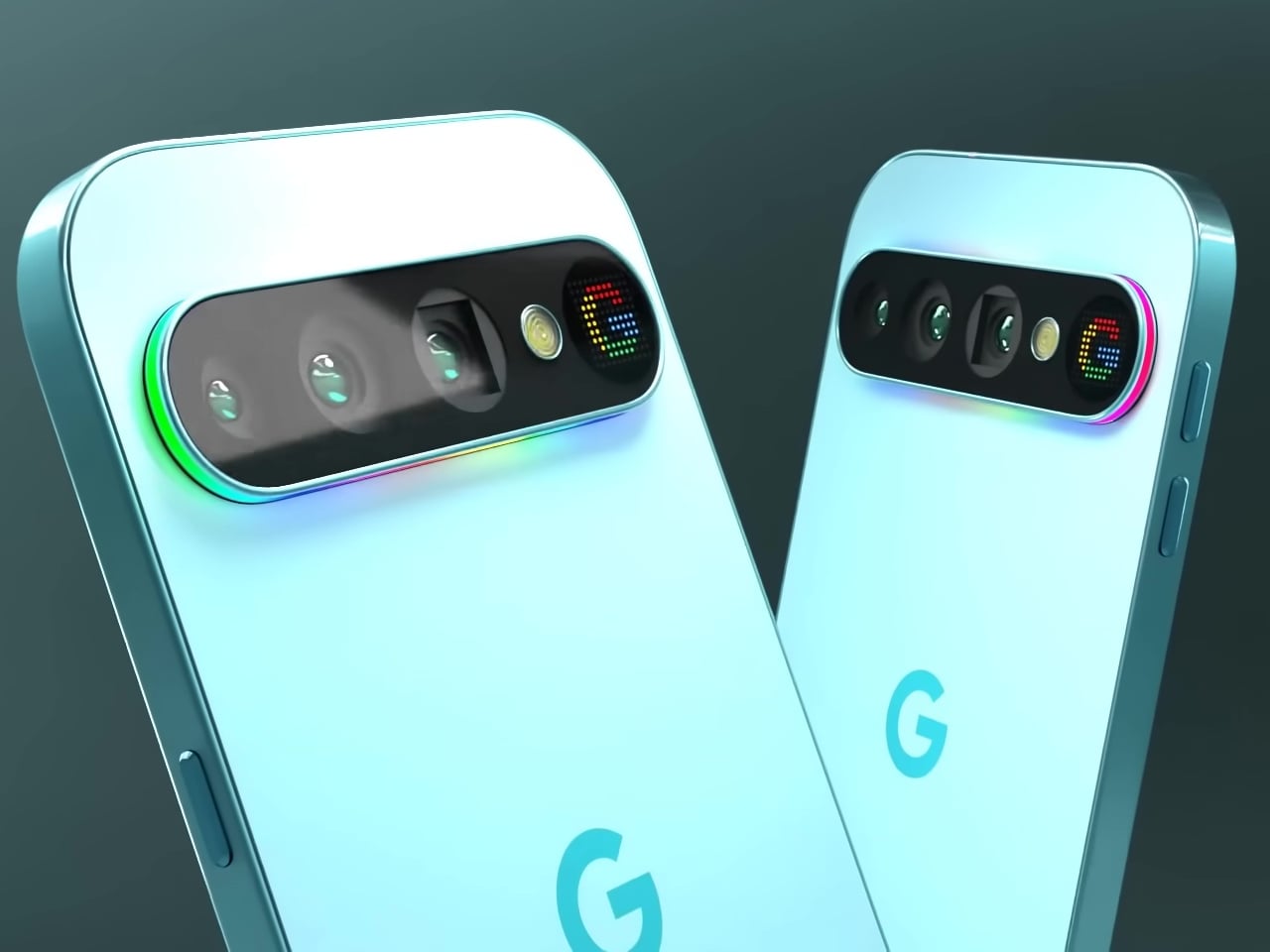
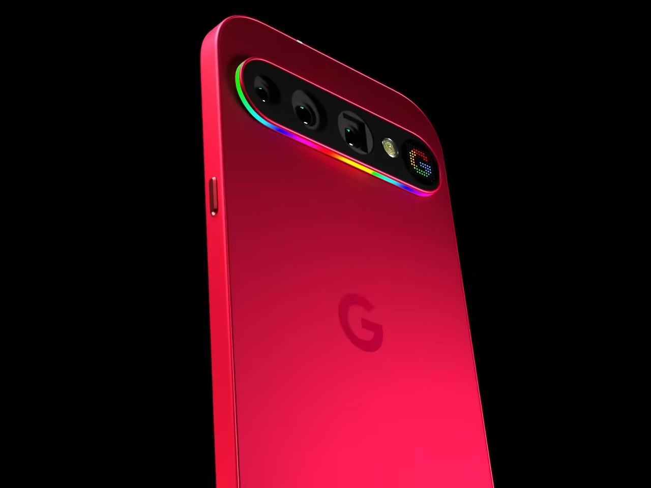
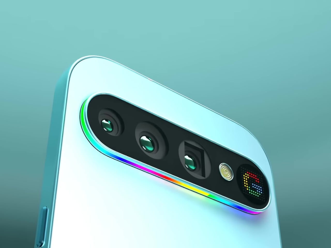
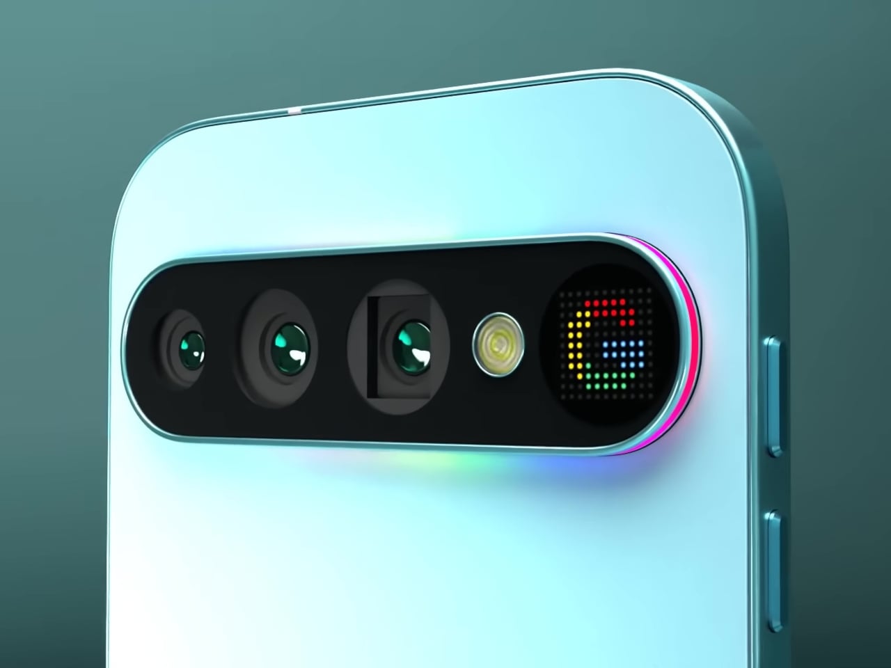
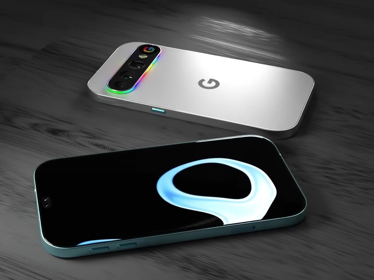
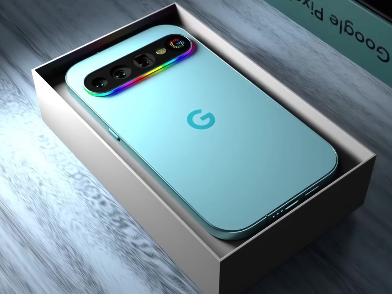
This concept for the Google Pixel 11 Pro imagines exactly that. Built around the Pixel’s signature horizontal pill-shaped camera module, it proposes two distinct types of back-panel feedback: a full-spectrum RGB light strip running around the entire perimeter of the camera bump, and a small dot-matrix display embedded at its right end that can render icons and text in pixel-art style.

Designer: AndroidLeo

The light strip is the more immediately readable of the two. A continuous loop of addressable LEDs traces the full outline of the pill module, capable of cycling through any color and pattern the software dictates. A missed call could glow one color, a new message another, and a timer nearing its end could pulse differently again, all communicable from across the room without touching the phone.

The dot-matrix panel, which the concept labels the “Pixel Display,” takes things a step further. Rather than a single color conveying a signal type, this small grid of colored LEDs can render simple graphics, caller ID icons, app logos, or even short scrolling text. It’s the difference between a traffic light and a small sign, and for a platform with as much software integration as Google’s, the implications are hard to ignore.

There’s an obvious precedent in Nothing’s Glyph Matrix, which brought a similar dot-matrix concept to Phone (3). That system already lets users assign custom animations to specific contacts and apps, turning the back of the phone into a secondary notification surface. What this Pixel concept adds is the light strip as a companion layer, the two systems working together rather than choosing between ambient mood and readable icon.

The practical case for this kind of design doesn’t require much imagination. Leave your phone face down on a table, and you will lose all notification awareness. Flip it over, and you get the full attention-grabbing brightness of the main display. A customizable light strip and a small icon panel would let the phone communicate at a much lower intensity, at a glance, rather than a full distraction.

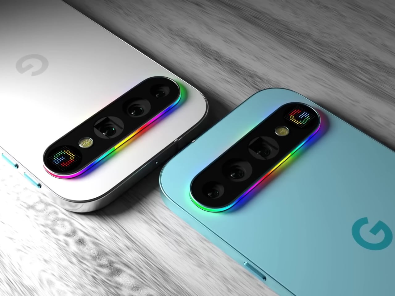
The concept renders the phone in both a pale aqua colorway and Parchment white, giving the full-spectrum strip a different quality in each: cool and vivid against the teal, soft and almost art deco against the white. Either way, the camera bump, typically the most criticized part of Pixel’s evolving design language, becomes something that actually earns its presence.

This is, of course, a fan concept rather than a leaked render or confirmed direction. The real Pixel 11 Pro hasn’t arrived yet, and nothing official confirms either the Pixel Display or the RGB strip. But the appetite for this kind of back-panel intelligence is clearly there, and if Nothing can build a devoted following around light strips alone, the version with two complementary systems and Google’s ecosystem behind it would be something worth watching for.

The post This Pixel 11 Pro Concept Makes the Camera Bump Its Best Feature first appeared on Yanko Design.
Bigme Finally Made an E Ink Phone Without the Usual Trade-Off

E Ink phones have built a devoted following among people who’ve grown tired of the toll a conventional smartphone screen takes on their eyes. The technology’s reflective nature means less eye strain over long sessions, better outdoor readability, and dramatically lower battery drain. The problem has always been what happens when you need your phone for something that an E Ink display simply can’t handle well.

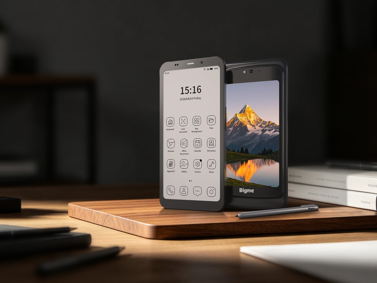
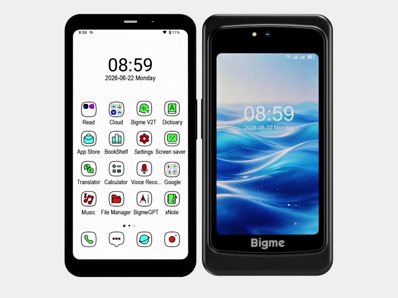
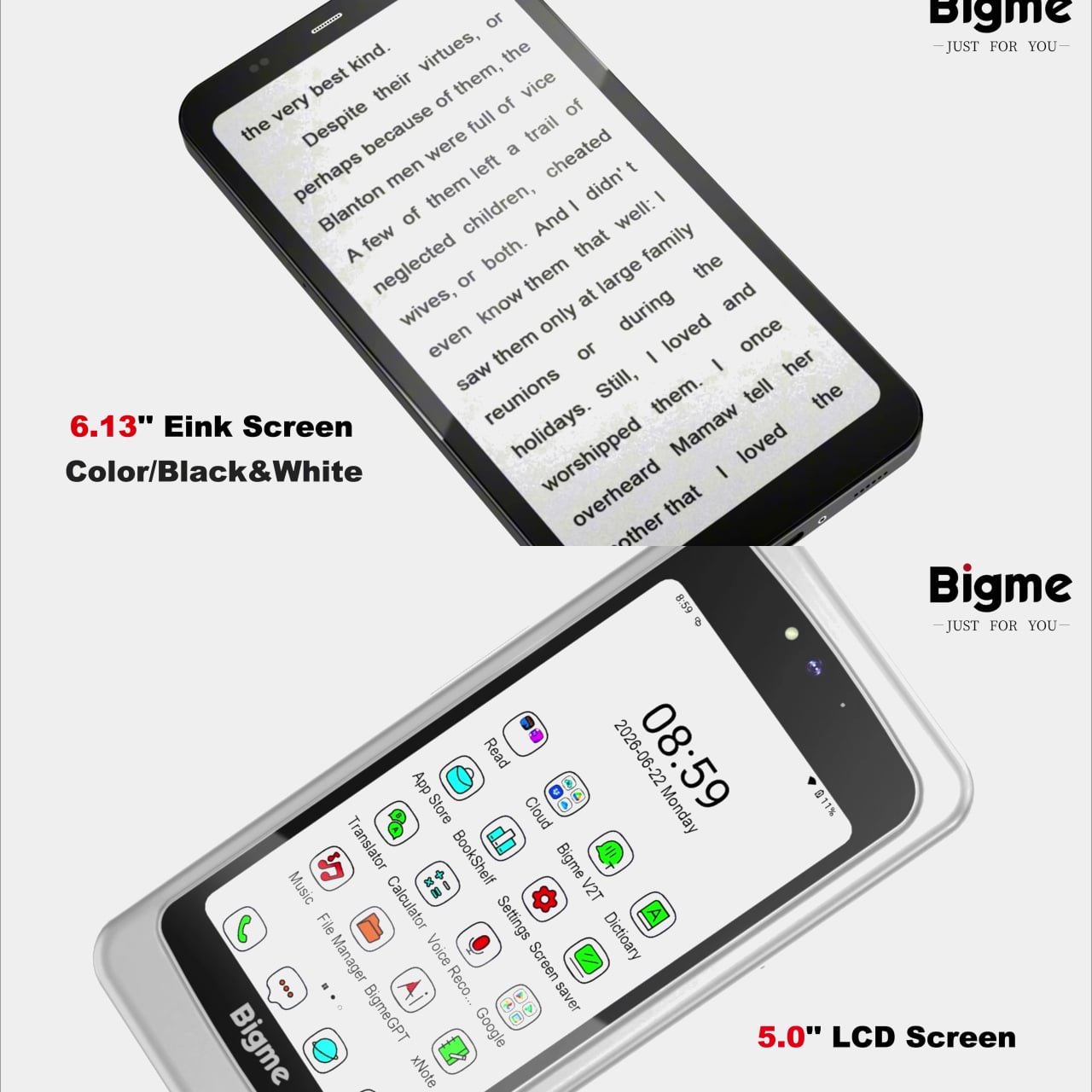
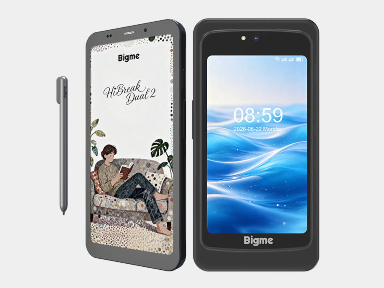
Watching a video, navigating an unfamiliar city, or glancing at a notification with any urgency are all tasks that remind E Ink phone owners of what they gave up. The Bigme HiBreak Dual 2 takes a different approach to this trade-off by not asking you to make it at all. It carries both a 6.13-inch color E Ink display and a 5-inch LCD in the same device.

Designer: Bigme

The E Ink side refreshes at up to 80 frames per second, considerably faster than earlier E Ink phones, and addresses the ghosting and sluggishness that made scrolling a timeline or navigating menus feel like wading through mud. The display supports both color and black-and-white content, and stays readable under direct sunlight without the glare that makes most LCD and OLED screens unusable outdoors.

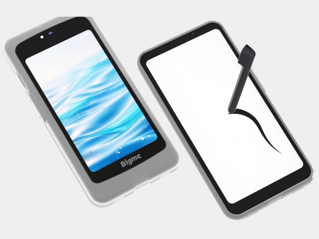
The 5-inch LCD handles the tasks that E Ink screens aren’t built for. A video call, a color-accurate map, a quick stream of something while you’re waiting; these situations don’t work well on E Ink, and the Dual 2 doesn’t pretend otherwise. Flip the phone, and the LCD takes over without sacrificing the primary display that makes reading and messaging so much easier on the eyes.

What makes the Dual 2 a real step forward from its predecessor is the size of that LCD. The original HiBreak Dual had a token sub-screen, small enough to overlook and hard to take seriously as a second display. At 5 inches, the Dual 2’s LCD is actually large enough to be useful, bringing both displays into rough parity rather than a clear main-and-minor arrangement.

The stylus support adds another layer that typical smartphones don’t offer. A dedicated note-taking app with pressure sensitivity and variable pen thickness lets you annotate directly on the E Ink screen with familiar paper-like resistance. For anyone who prefers handwritten notes over typed ones, or who marks up documents throughout the day, this combination of a large E Ink screen and stylus input is the entire value.

The hardware isn’t a compromise, either. A MediaTek Dimensity 8300 processor, 12GB of RAM, 256GB of storage, a 50MP rear camera, and Android 16 with Google Play already installed make it a fully capable phone rather than a reading device that also makes calls. Dual 5G SIM support and NFC round out a spec sheet that doesn’t ask the buyer to excuse anything on the technical side.

The Bigme HiBreak Dual 2 has a super early bird pricing starting at $574 for the black-and-white E Ink configuration and around $699 for the color version. That’s the going rate for a phone that takes eye comfort seriously enough to build an entirely separate display around it, and supplies enough everyday capability alongside to not feel like a specialist tool with a serious drawback.

The post Bigme Finally Made an E Ink Phone Without the Usual Trade-Off first appeared on Yanko Design.
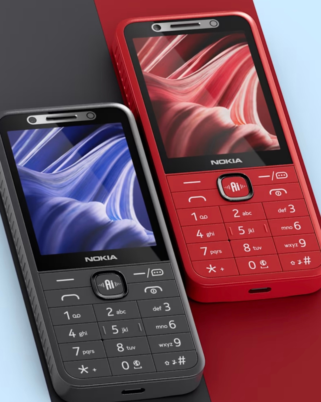
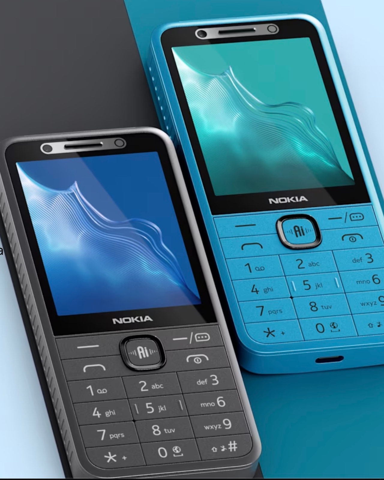
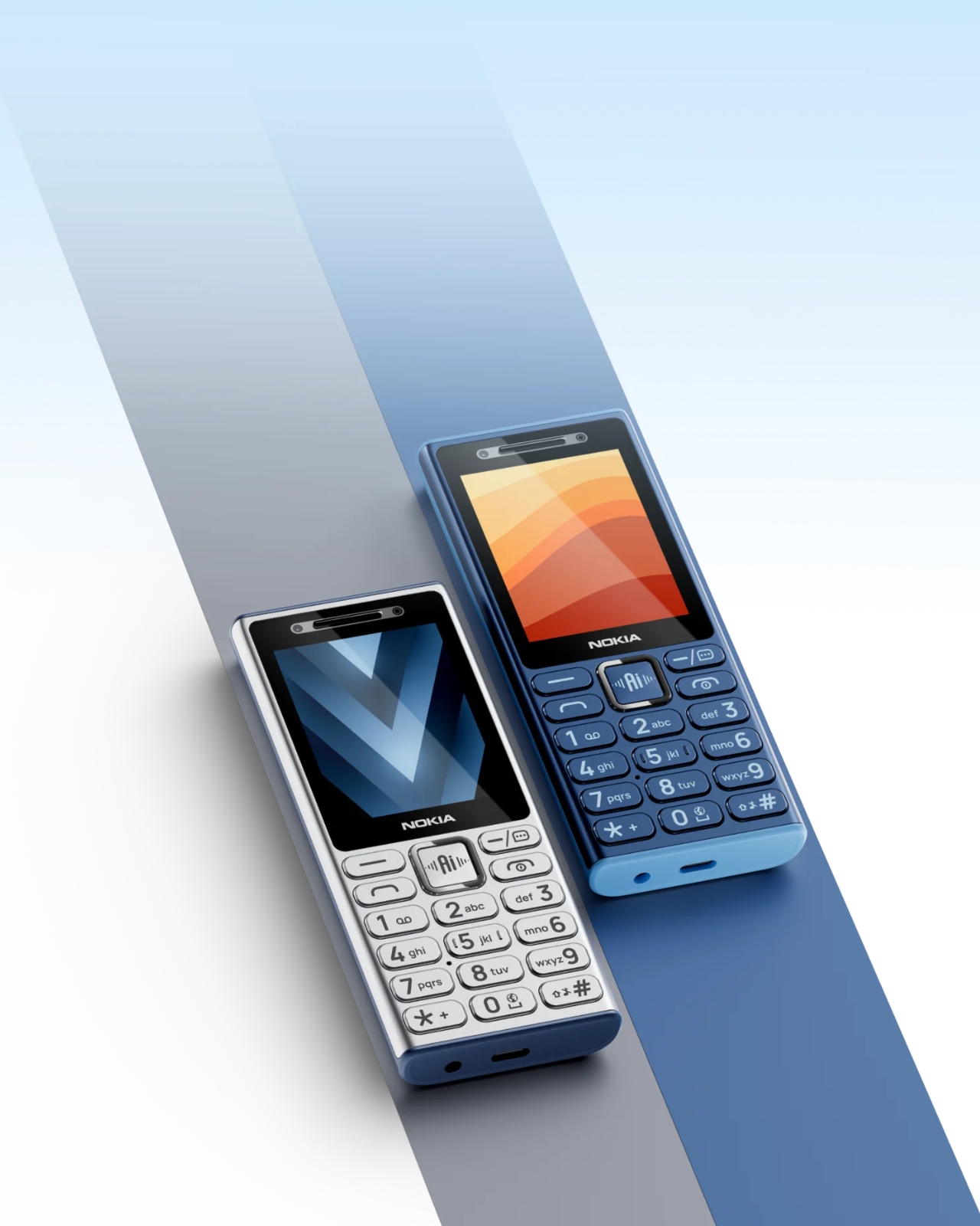
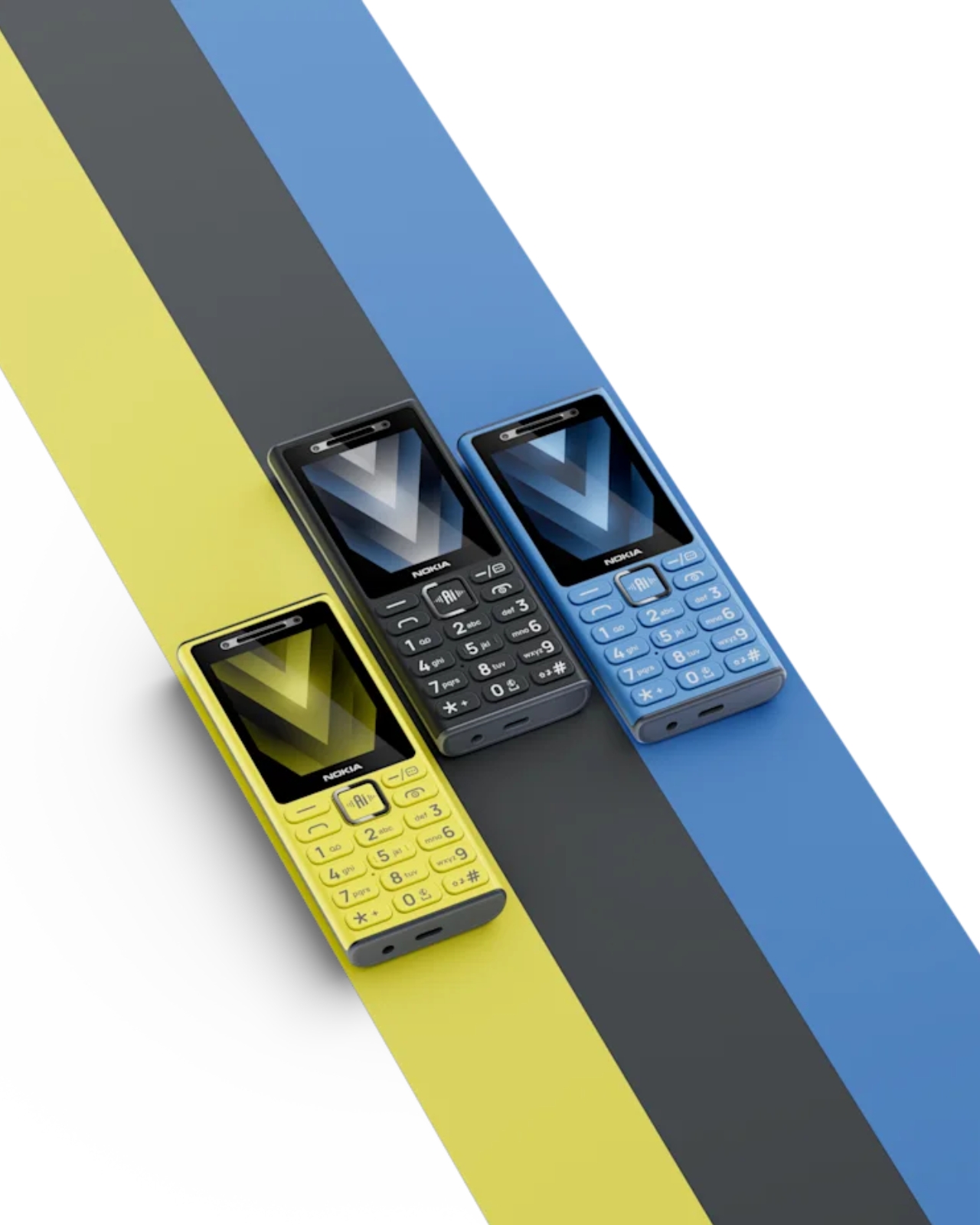
Nokia’s 4 New Dumb Phones Still Come With an AI Button

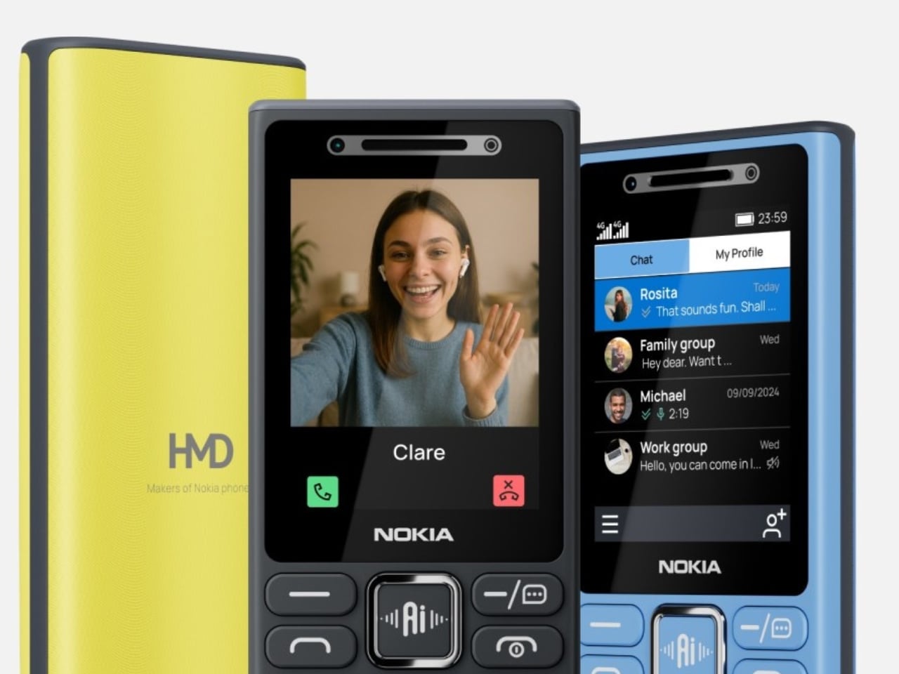
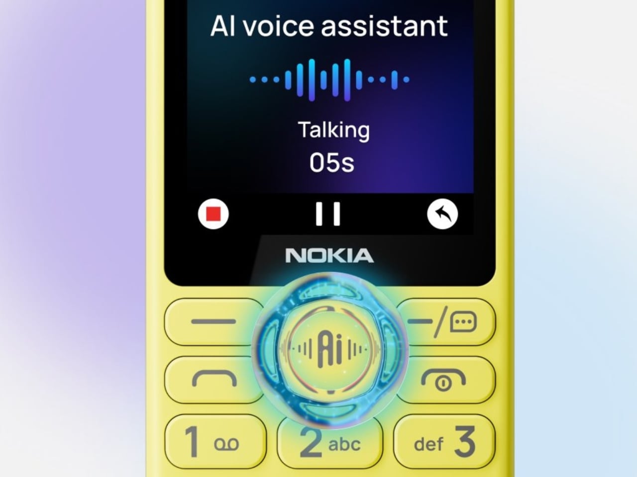
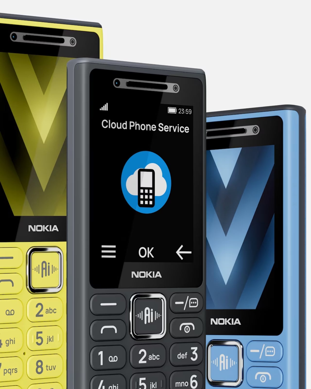
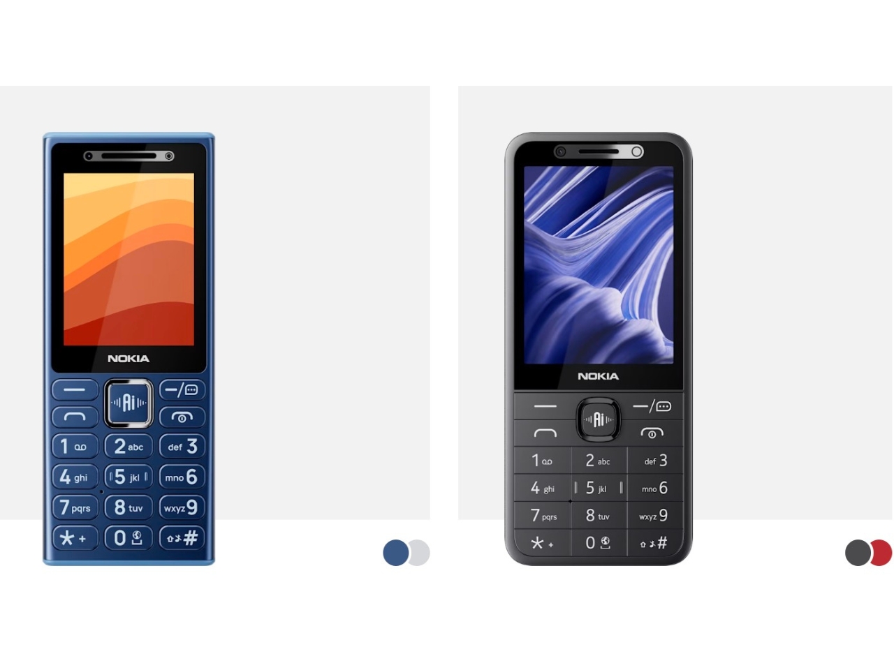
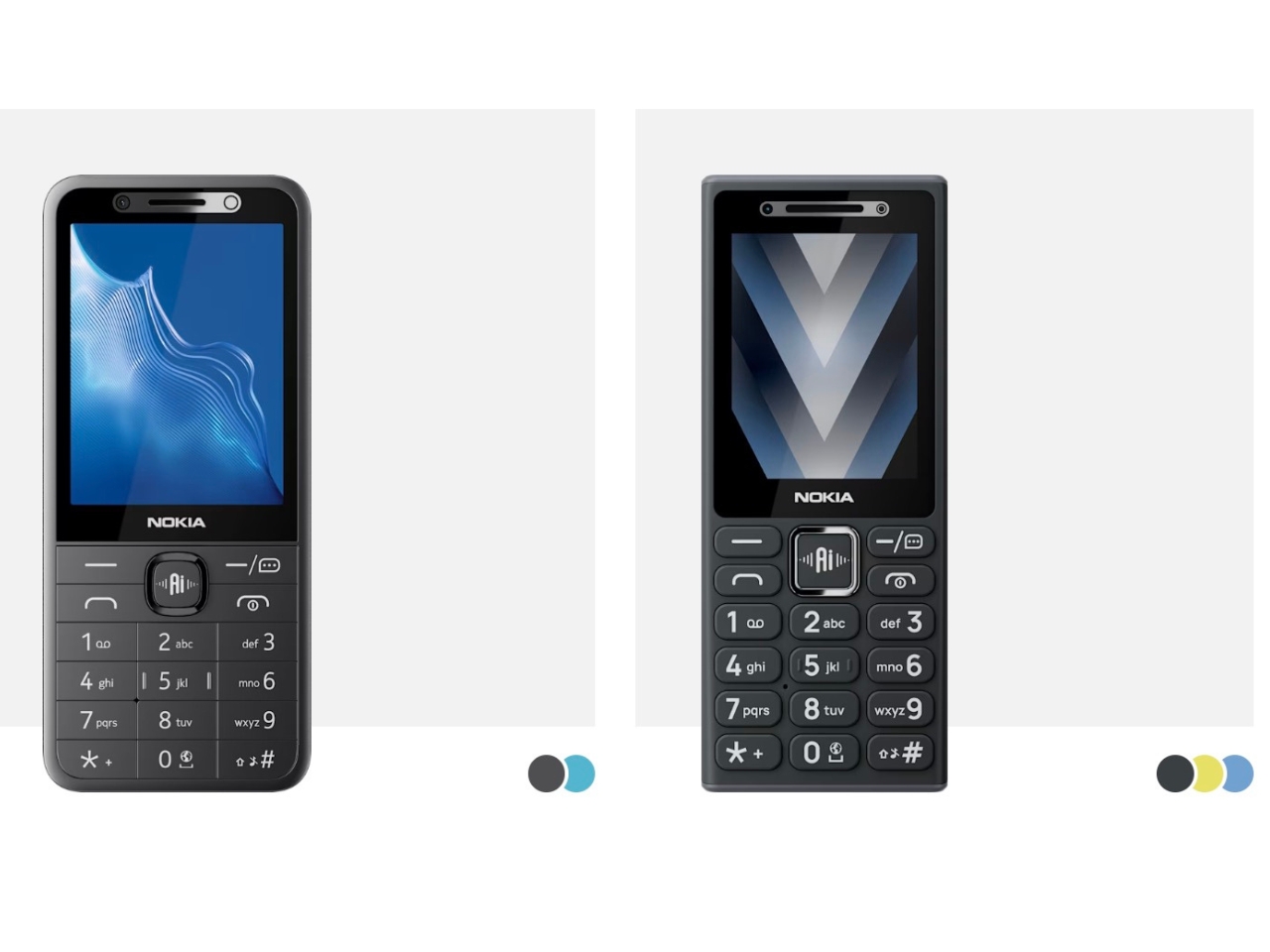
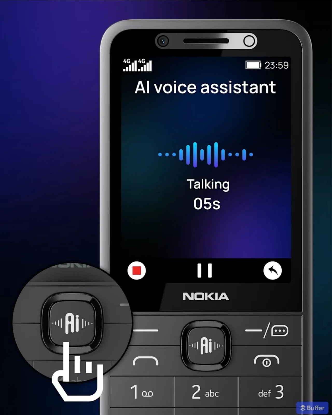
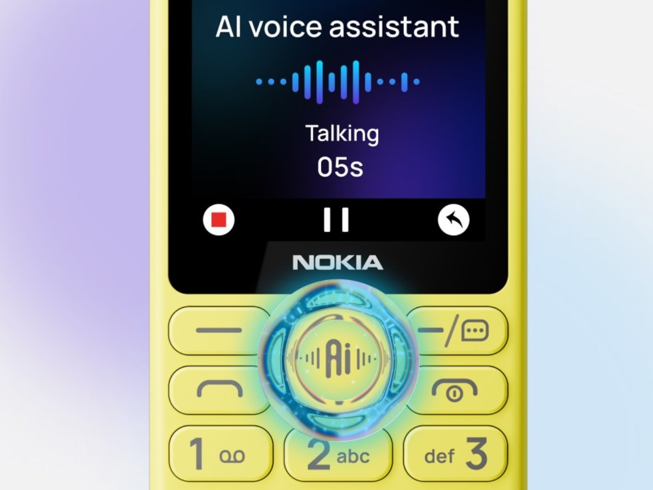
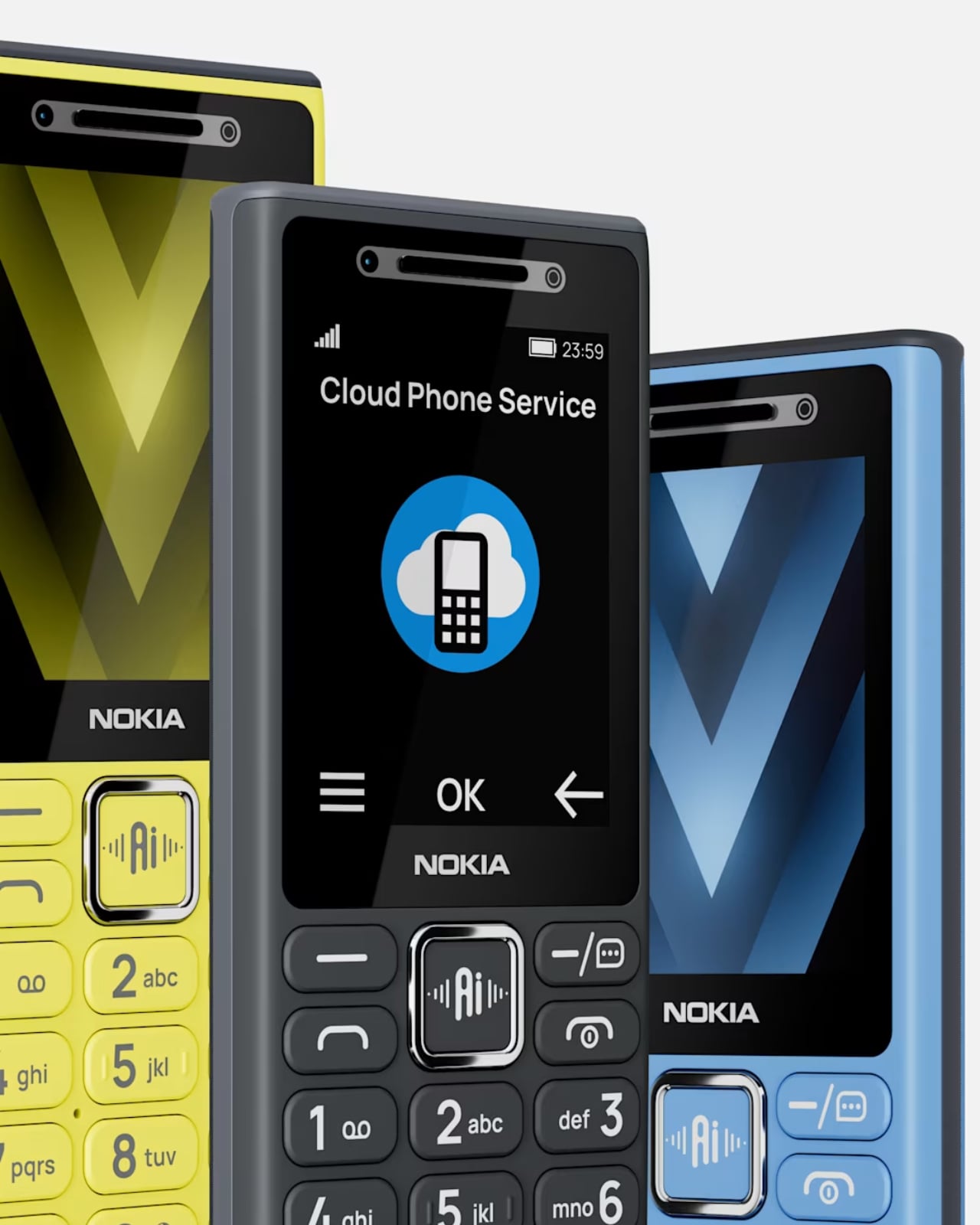
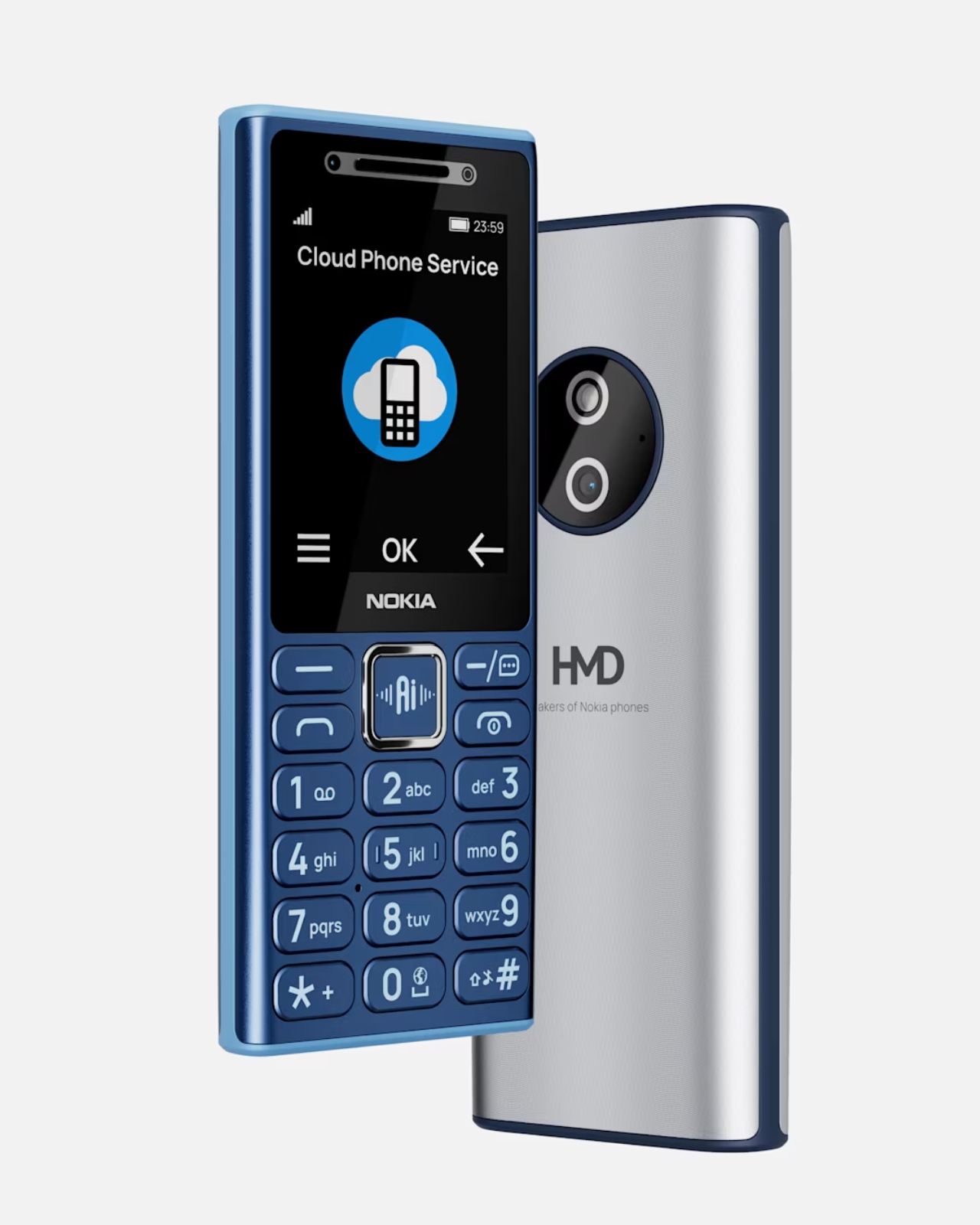
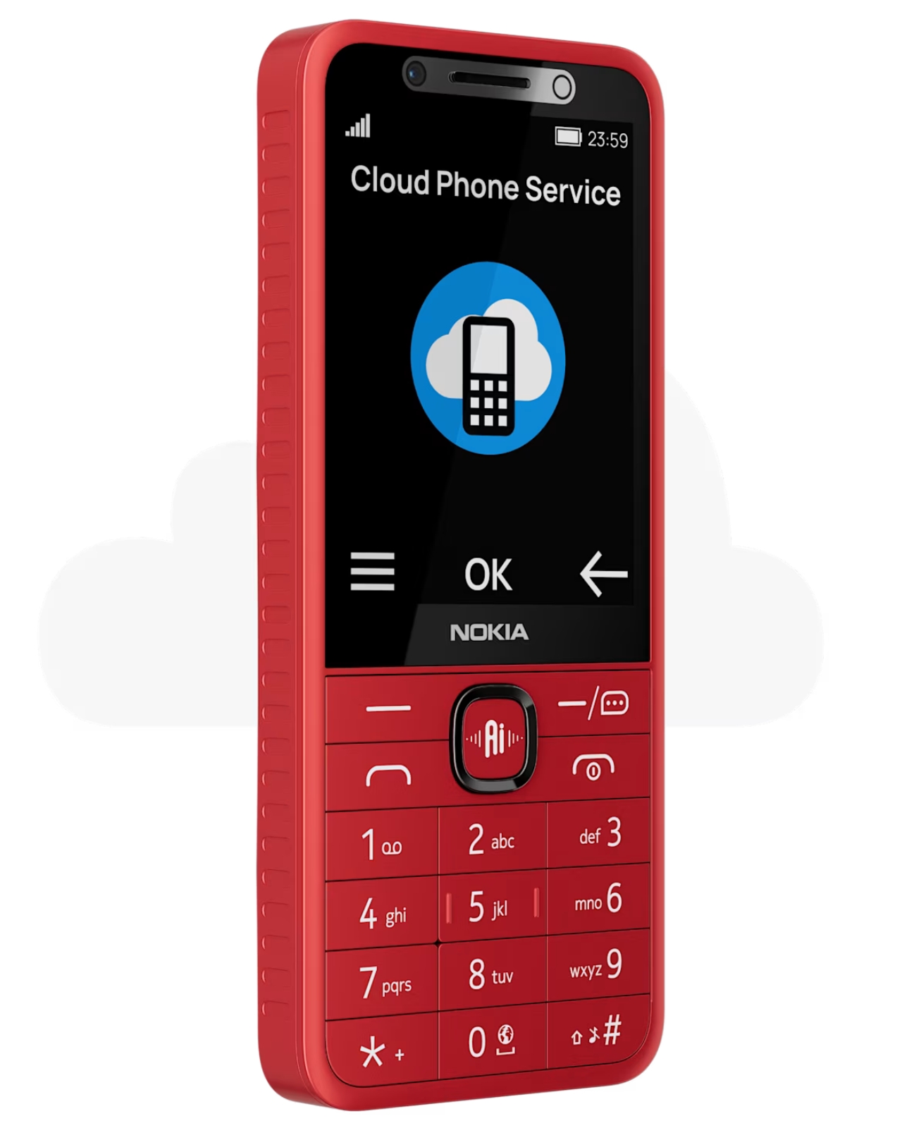
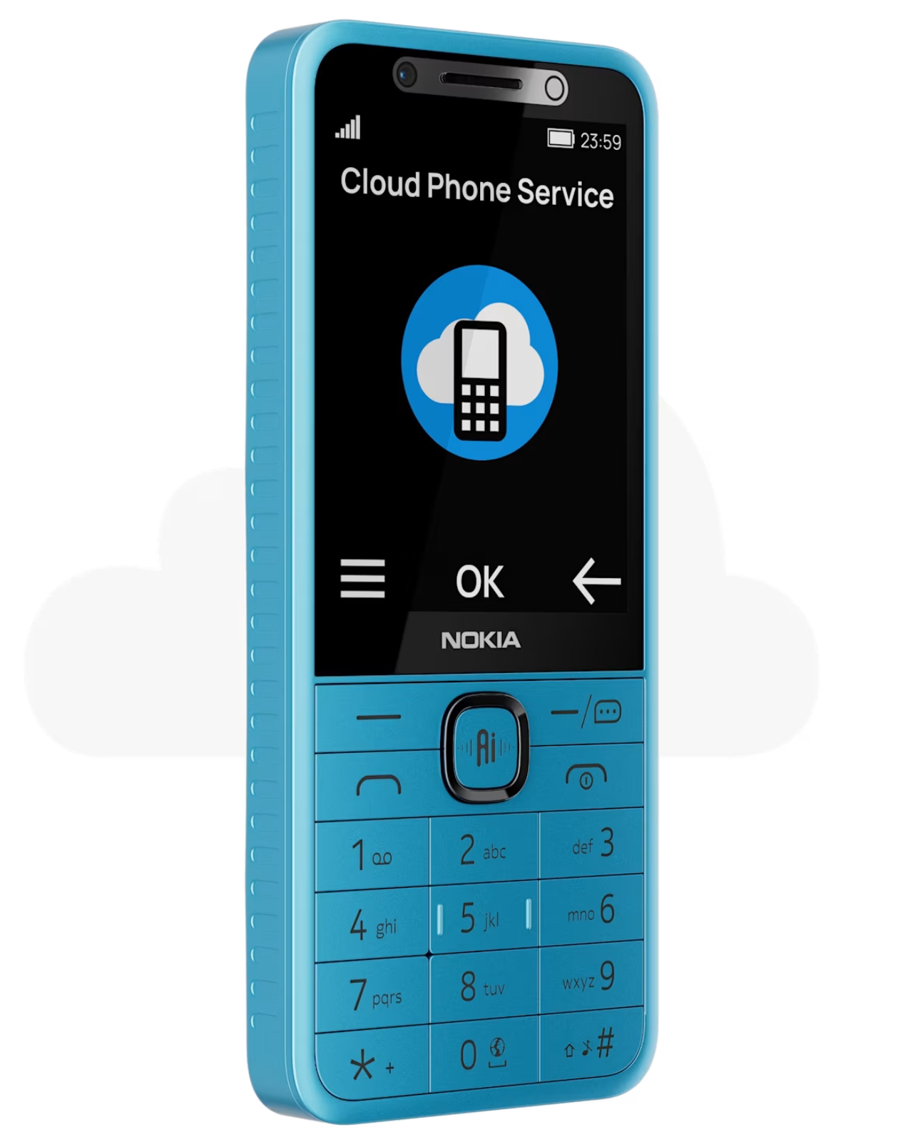
The dumb phone comeback has been one of the more quietly satisfying design stories of the last few years. People are tired. Tired of doom-scrolling, tired of notification overload, tired of carrying a pocket-sized anxiety machine everywhere. So when HMD quietly dropped four new Nokia feature phones — the Nokia 210 4G, Nokia 200 4G, Nokia 215 4G 2nd Edition, and Nokia 235 4G 2nd Edition — it felt like another chapter in that story. Except for one very notable detail sitting right on the side of each device: a dedicated AI button. Yes. An AI button. On a dumb phone.

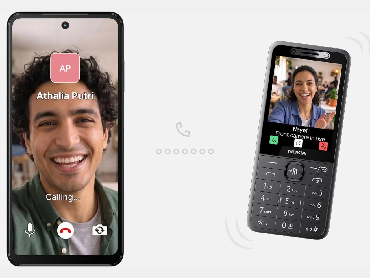
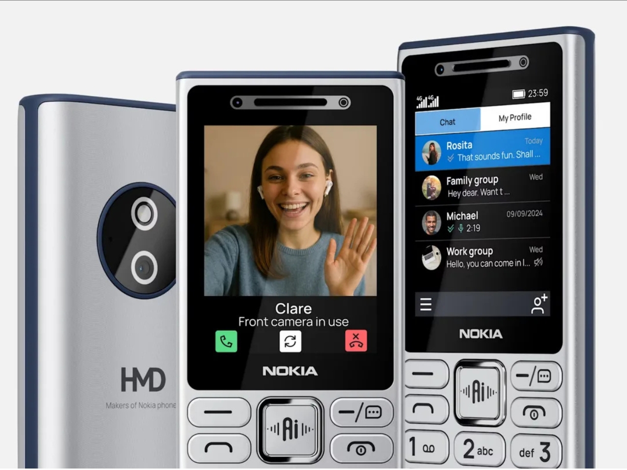
Let me back up. These phones are, by most definitions, exactly what the dumb phone crowd has been asking for. Compact candy-bar designs. That immediately recognizable Nokia build, now with a metallic frame around the selfie camera and speaker that gives it a slightly more premium feel. A 1,450 mAh battery. A 3.5mm headphone jack, because HMD remembers those exist. FM radio. USB-C charging. The Nokia 215 4G 2nd Edition and Nokia 235 4G 2nd Edition carry 2.8-inch IPS displays, while the Nokia 200 4G and Nokia 210 4G keep things even more minimal with 2.4-inch screens. You can make calls, send texts, set an alarm, and leave your house without dreading a 14-hour screen time report. Classic.

Designer: HMD

And then there’s the AI. The button accesses an on-device assistant powered by Sikey AI, which lets you do things like turn on the flashlight, set a reminder, open the camera, or place a call using voice commands. It even comes with cloud phone service support, so you can check weather forecasts, sports news, and short-form video without eating up local storage.

On paper, that sounds almost reasonable. Voice control on a small phone with no touchscreen? Fine, I get it. But the moment you start pulling on that thread, the whole premise of a “digital detox device” starts to unravel a little. A feature phone that checks your weather and streams video content via the cloud is not exactly the quiet, intentional tool that most dumb phone enthusiasts are reaching for. It starts to feel less like a step back and more like a regular phone wearing a disguise.

The subscription element makes it even more interesting. The Sikey AI features come with a free trial period, after which users need to subscribe to a paid plan. HMD notes, somewhat cheekily, that you’ll need an actual smartphone to complete that purchase. So your minimalist phone requires a smartphone to fully unlock its most marketed feature. That’s a sentence.

None of this makes the devices bad. For their actual intended market — likely first-time phone users, older users who want simplicity, or people in markets where smartphone data is still a real cost concern — these phones make a lot of sense. The design language is clean and familiar. The feature set is honest. And HMD has clearly put thought into making them feel more current with the USB-C port and 4G connectivity.

But I keep thinking about what the AI button is really doing here. Is it genuinely useful? For some users, absolutely. Is it a design choice that muddies the identity of a product built around the appeal of doing less? Also yes. The best thing about a dumb phone is the clarity of purpose. You pick it up, you make a call, you put it down. Every added layer of “smart” functionality chips away at that clarity, even if the layer is thin.

HMD is navigating a strange middle ground, honoring a legacy brand built on simplicity while trying to stay current in a market that rewards anything labeled AI. Whether that balance lands well depends entirely on who’s buying. For the digital detox crowd, these probably won’t scratch that itch. For everyone else, they’re solid little phones with a lot of nostalgic charm and a feature that might come in handy more often than expected.

The post Nokia’s 4 New Dumb Phones Still Come With an AI Button first appeared on Yanko Design.
Most MagSafe Wallets Just Hold Cards, MOFT’s Also Tracks Itself

MagSafe wallet accessories have become their own product category, and the options aren’t in short supply. Most do one thing well. The slim ones snap on neatly but run out of card space fast. The fuller ones carry more but are hard to ignore in a pants pocket. Finding one that handles everyday carry, quick card access, and location tracking together has been less straightforward than it sounds.

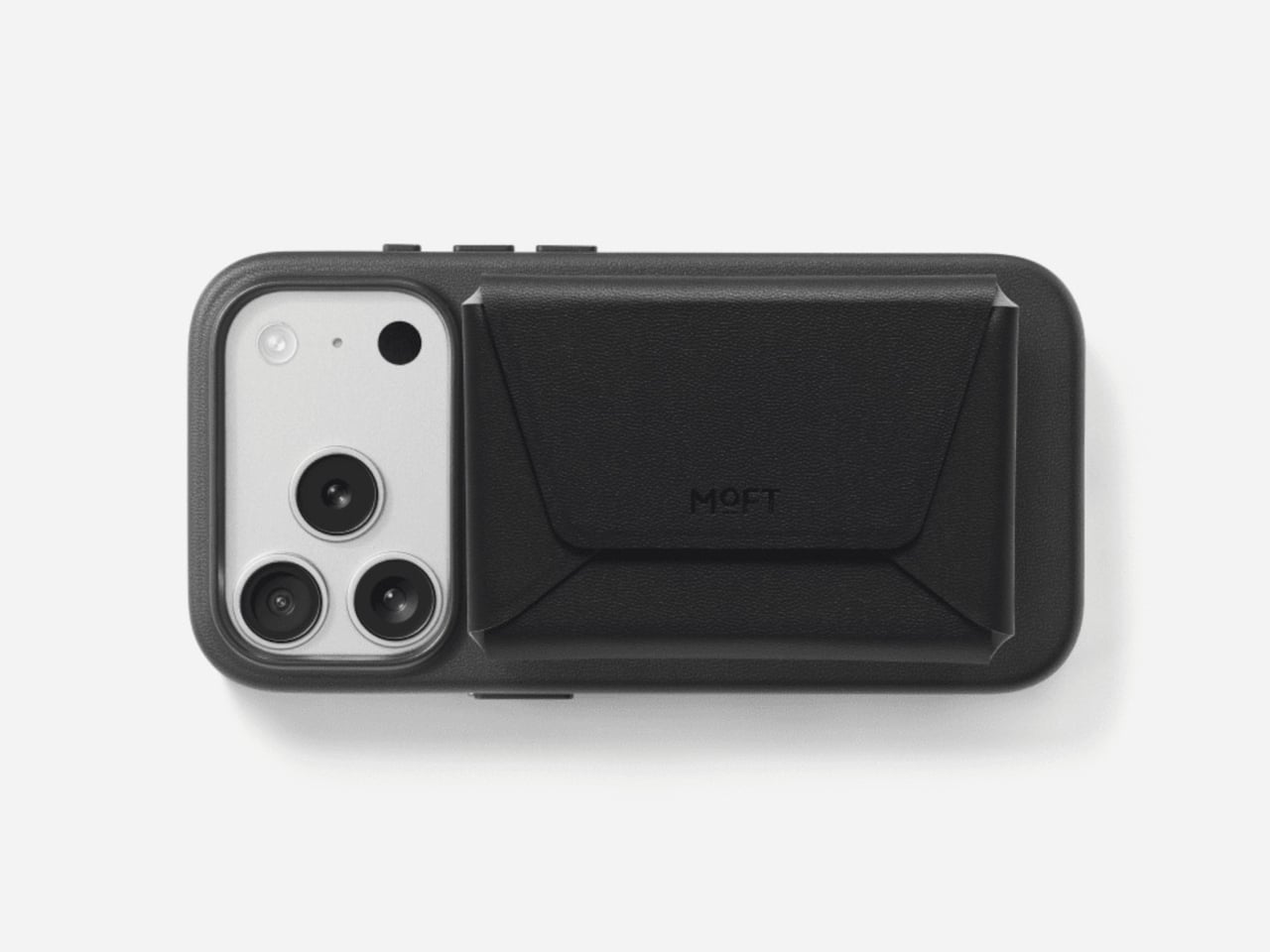
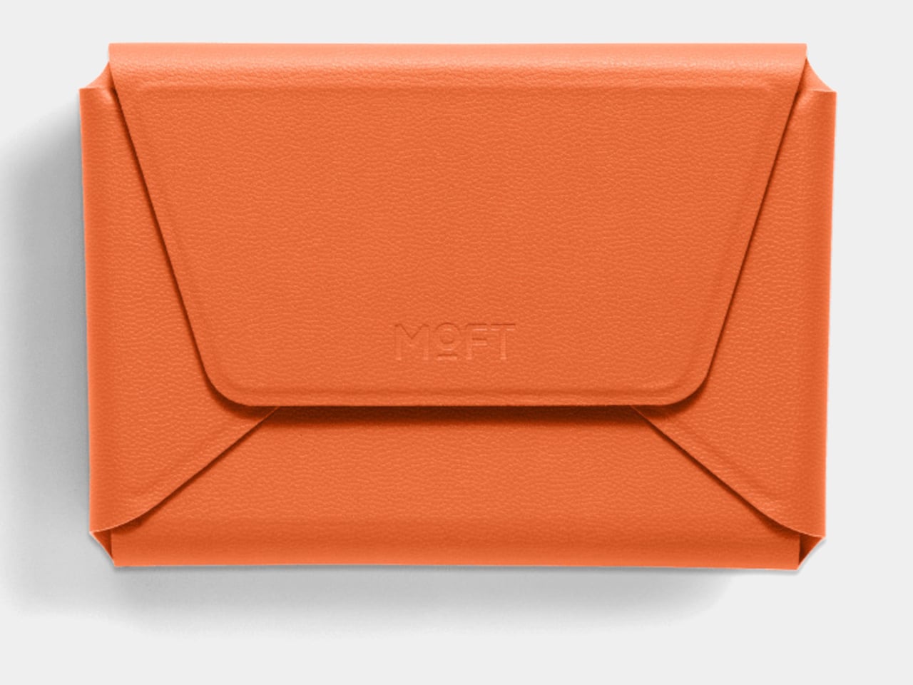
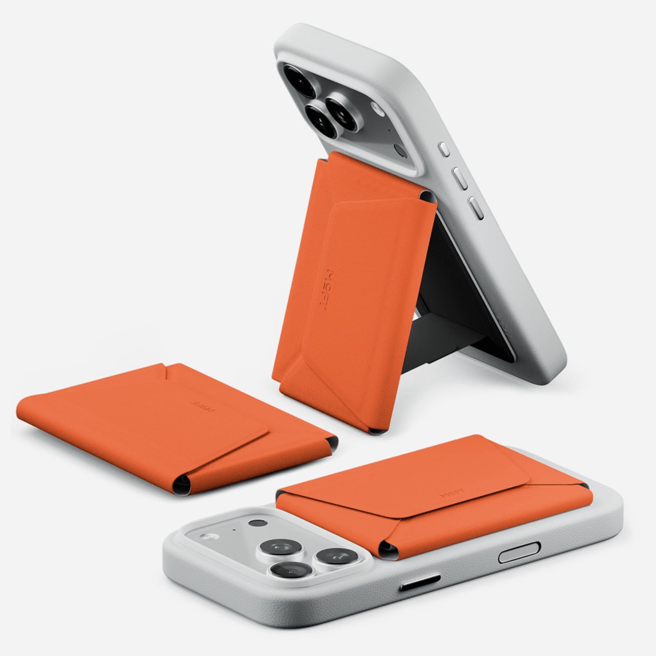
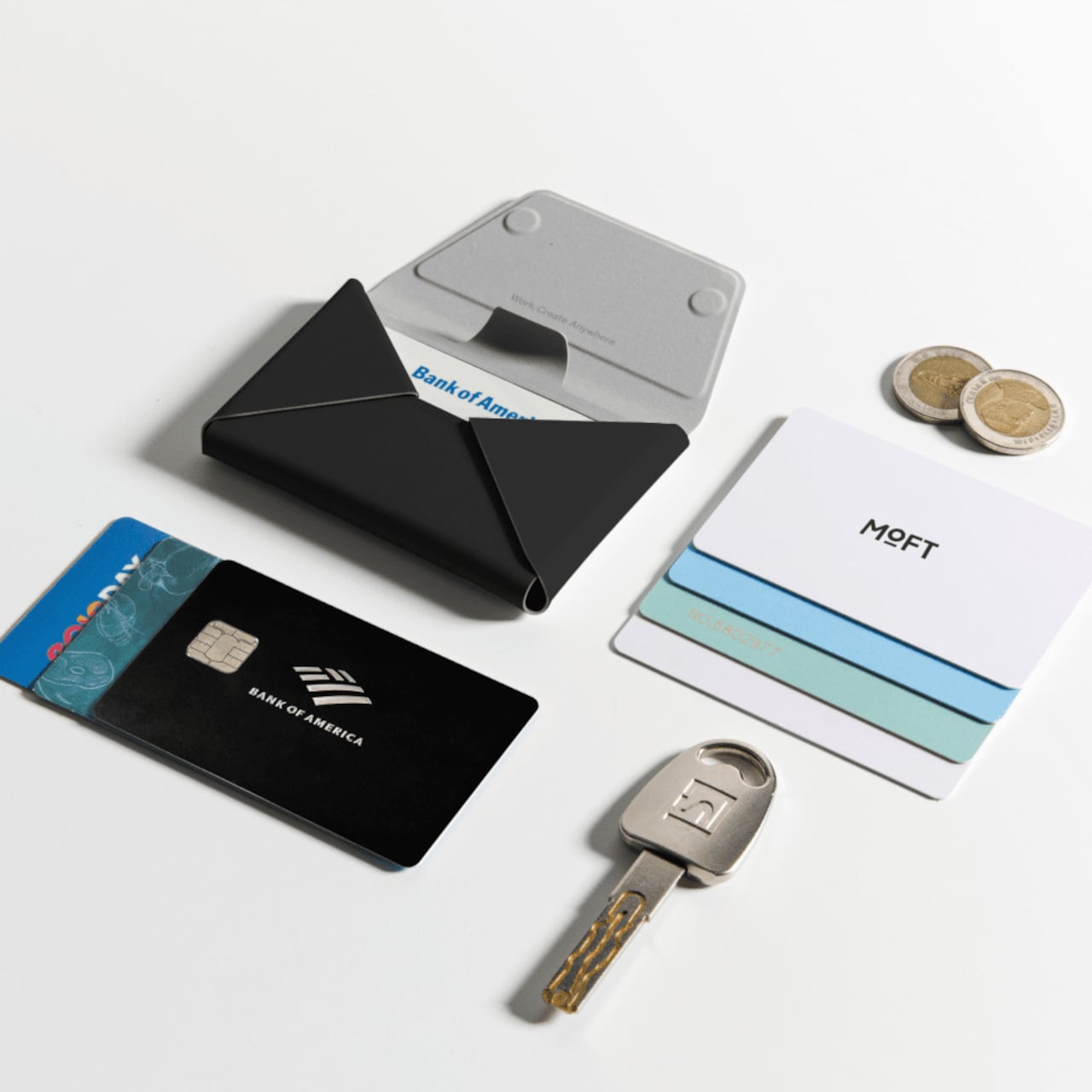
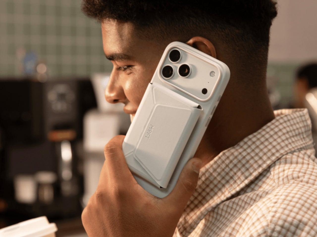
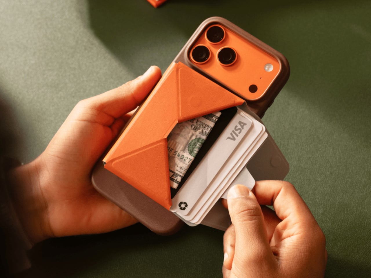
MOFT’s Trackable Field Wallet is a more ambitious take on the MagSafe wallet than the category usually produces. It snaps to an iPhone with strong magnetic force, holds up to eight cards in three organized compartments, tracks its location through Apple’s Find My and Google’s Find Hub, and folds into a phone stand. That’s an unusual amount of functionality packed into something roughly the size of a standard wallet.

Designer: MOFT

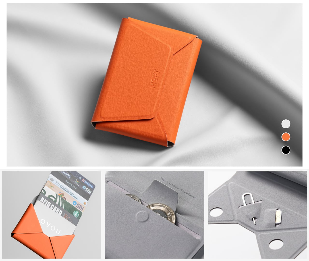
The card access design is one of the more practical details. A pull-tab on the front fans cards outward the moment you pull it, so you aren’t standing at a checkout counter hunting for the right one. The envelope-style body opens to three compartments: space for cards in the back, cash in the middle, and a magnetic slot for coins or small items like a SIM ejector tool.

The built-in tracker is what separates this from other Field Wallet versions. It connects to both Apple’s Find My network and Google’s Find Hub, so both iPhone and Android users can locate it from their device’s native tracking app. The hardware runs on a single wireless charge that lasts up to six months before it needs topping up again, meaning the tracking capability doesn’t ask for much maintenance in return.

There’s a particular kind of dread that comes from reaching into your bag and finding your wallet isn’t there. The tracking doesn’t prevent loss; it just gives you a map back to wherever the wallet went. For anyone who carries their cards clipped to their phone, the wallet and phone are already together in the first place, which narrows the chances of separation considerably.

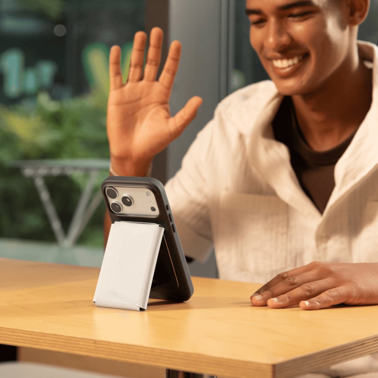
Flipping the wallet into stand mode is straightforward enough to do while you’re still holding the phone. The geometry of the envelope-style body creates a natural kickstand angle when folded open, propping the phone up for hands-free calls or a video playing on a table. It’s an expected feature from MOFT at this point, but it integrates naturally into the wallet’s fold-and-snap design rather than feeling like an afterthought.

The outer shell uses MOFT’s MOVAS vegan leather, which has a consistent texture and holds up to daily wear without requiring special care. An RFID-blocking layer keeps the cards protected from unauthorized scanning, though the magnets mean magnetic stripe cards shouldn’t be stored inside. The wallet is compatible with iPhone 12 through iPhone 17 series and works with non-MagSafe phones via a metal ring adapter included in the box.

The Trackable Field Wallet comes in three colors, Jet Black, Terracotta, and Misty Cove, and in two versions: one with a built-in stand and one without. For anyone who has been carrying a separate tracker alongside their wallet and phone, the appeal here is straightforward. The organization, the tracking, and the phone stand are built into a single object that already goes everywhere your phone does.

The post Most MagSafe Wallets Just Hold Cards, MOFT’s Also Tracks Itself first appeared on Yanko Design.
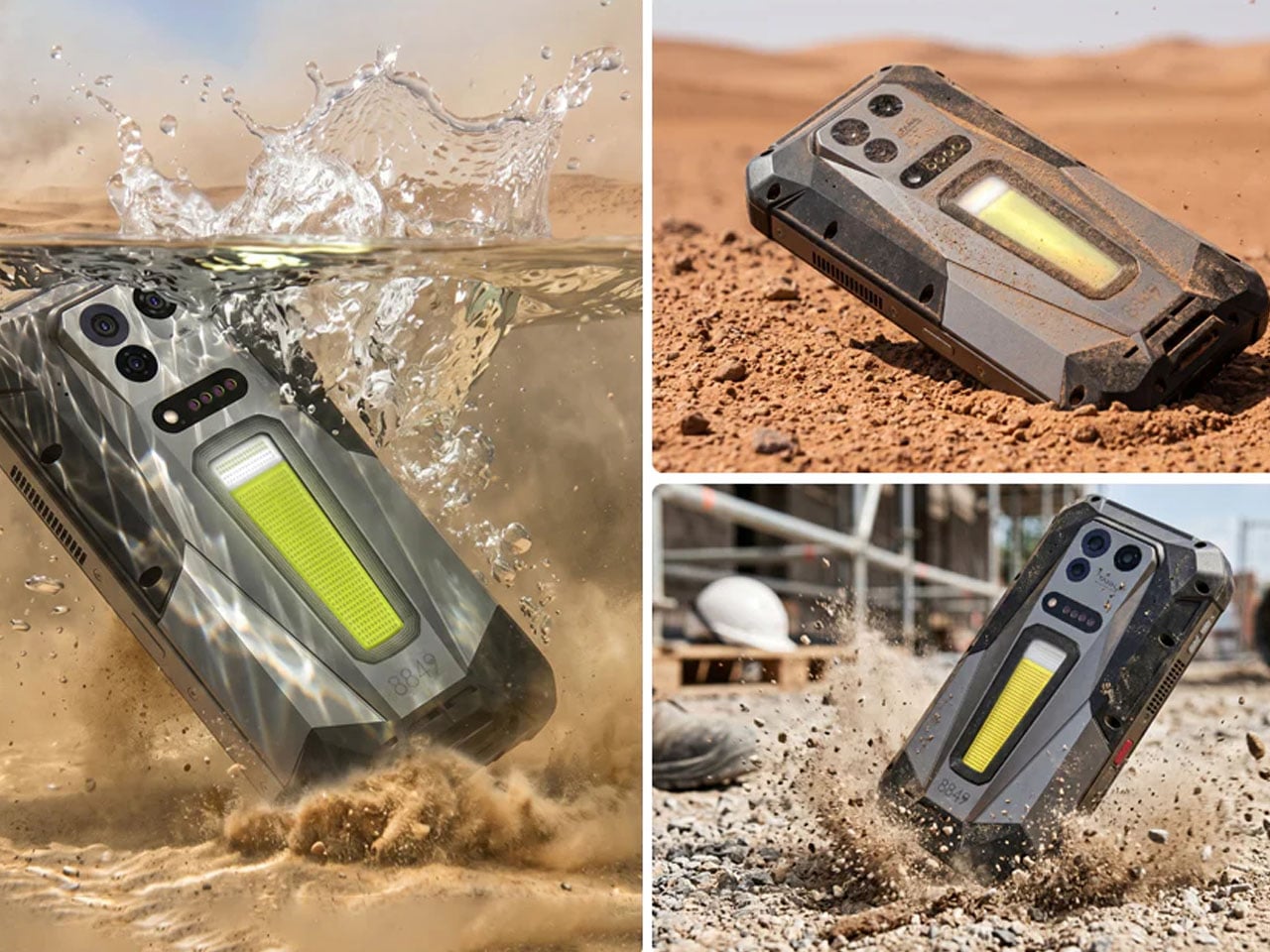
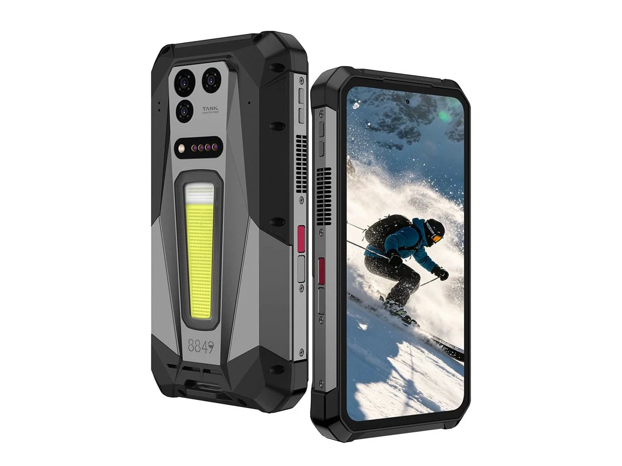
8849’s Tank 5 phone built for the harshest of conditions has a 2K DLP projector

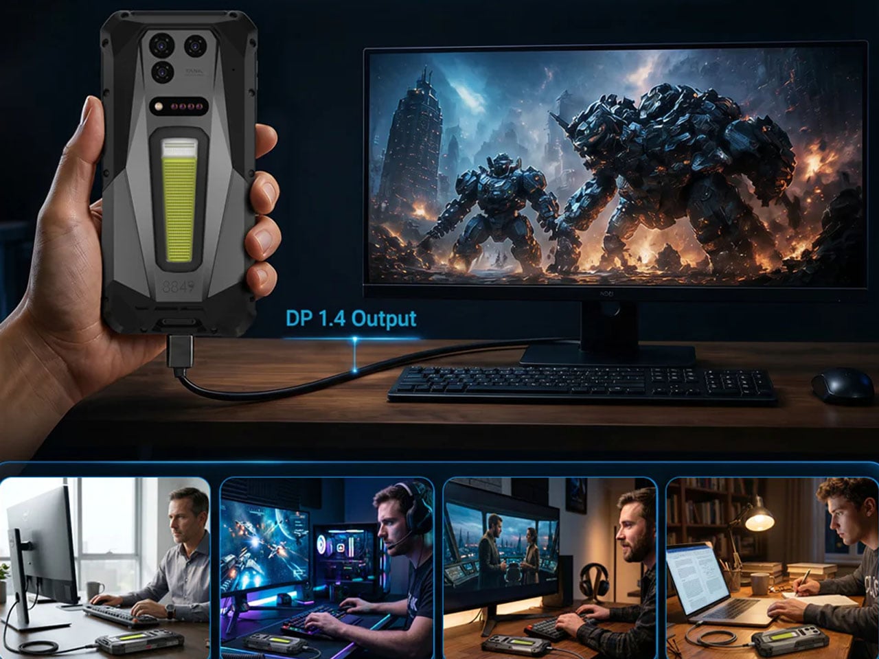
Smartphones have brought the smarts of the tech world to our pockets, but there’s still scope for more. Rugged phones like Blackview XPLORE 2 and the 8849 Tank Pad Ultra have already demonstrated what smart devices built like a tank are capable of beyond their stellar protective shell. It serves as the perfect housing for securing a small projector inside.

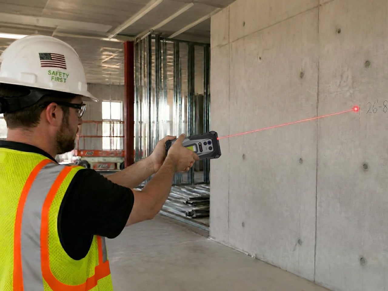
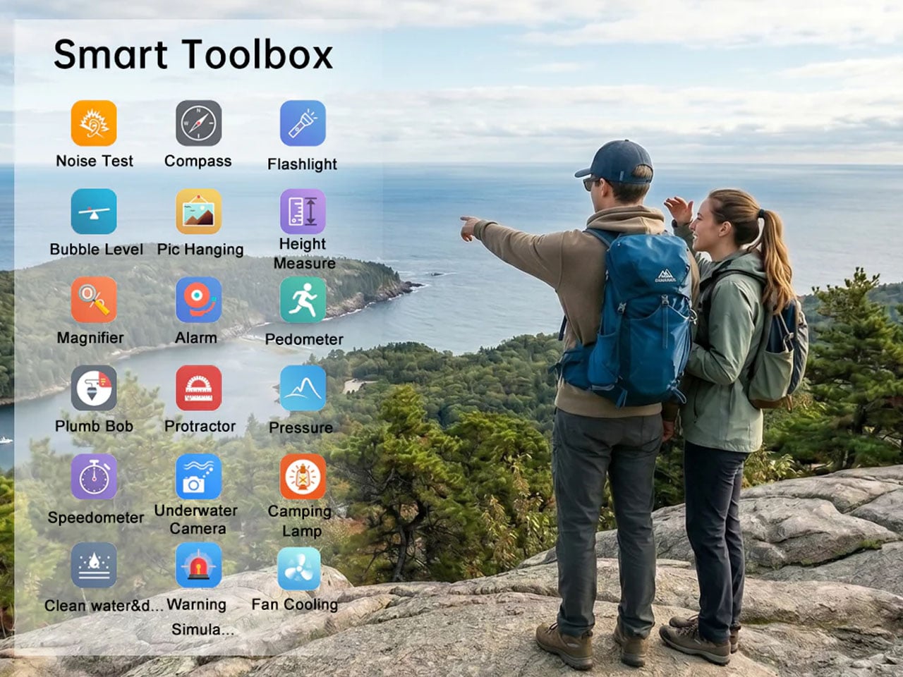
Rugged smartphones are typically known for their larger batteries, night-vision cameras, and even thermal cameras, targeted at users who spend a considerable amount of time in the great outdoors. 8849 wants to have more than a slice of that niche market with the new Tank 5 phone, which comes with a DLP projector so you never get bored on those lonely nights camping out in the wild.

Designer: 8849

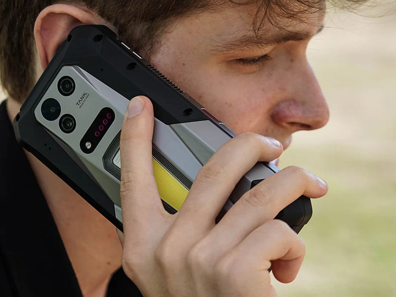
Although the mobile device is also targeted towards users who work in industrial sectors where other phones won’t survive the hardcore conditions, this phone is the ideal companion for someone who’s downright clumsy. Sure, the device is quite thick at 33.8mm and heavy at 715 grams, for being a daily driver, but the utility it packs should appeal to hardcore users who want a bit extra from their smartphone. For that reason, Tank 5 comes with an IP68 and IP69K water and dust resistance rating, making it better than most mainstream flagship devices.

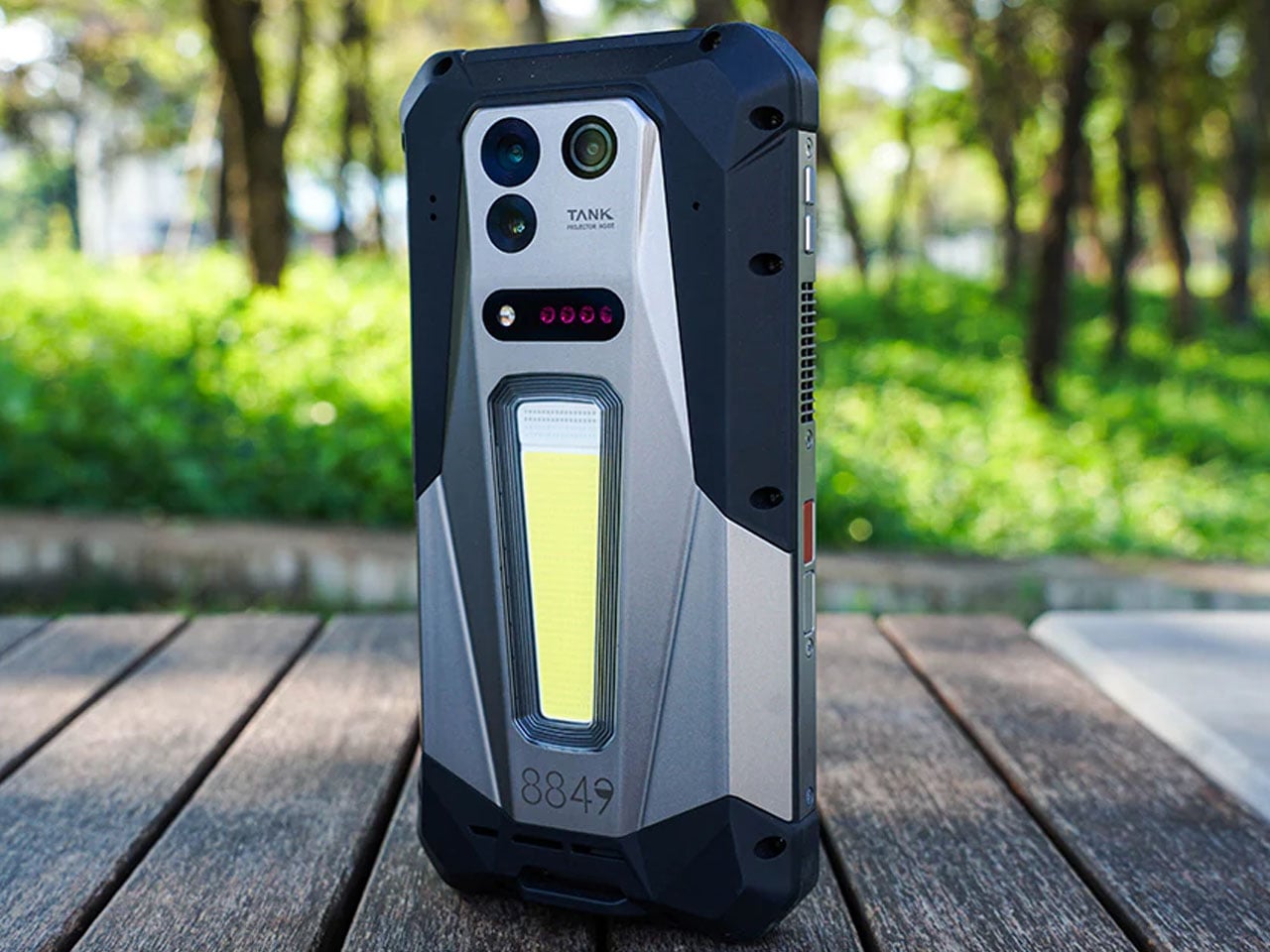
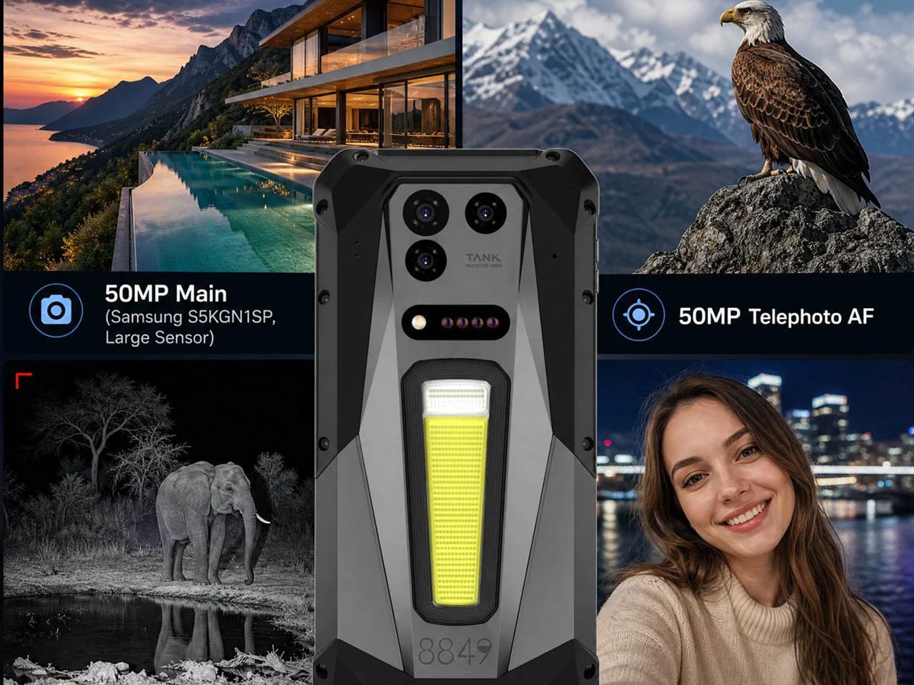
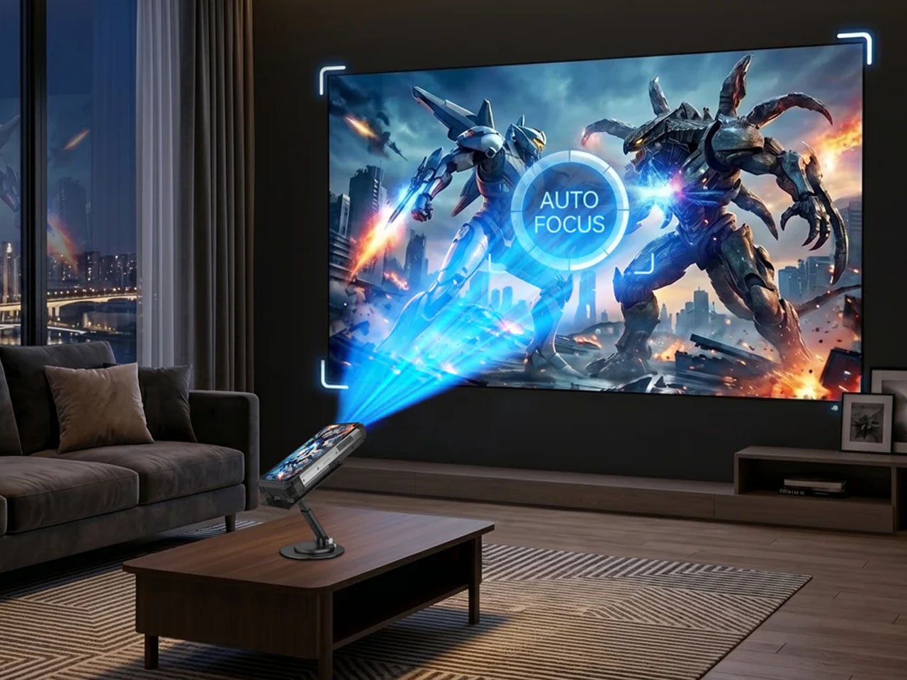
Take it into the wild, and you’re most certainly guaranteed weeks of battery backup courtesy of its 17,600mAh battery. With the accompanying 120W charging setup, this tank-like device juices up in 90 minutes. It also doubles as a reverse charging unit for your other gadgets. The battery cell is rated to survive ambient extremes from -28 °C to 56 °C. On the back, the phone gets a 1200-lumen camping light with an RGB function to send SOS signals, look deep into the woods, or light up the camping ground. The highlight of this rugged phone is the built-in 2K DLP projector (resolution of 2048 x 1080 pixels) that comes with laser-based auto-focus and automatic keystone correction for enjoyable late-night entertainment. The small yet power-packed projector delivers 220 lumens of brightness, which is respectable enough for a quick session of binge-watching on any flat projection surface.

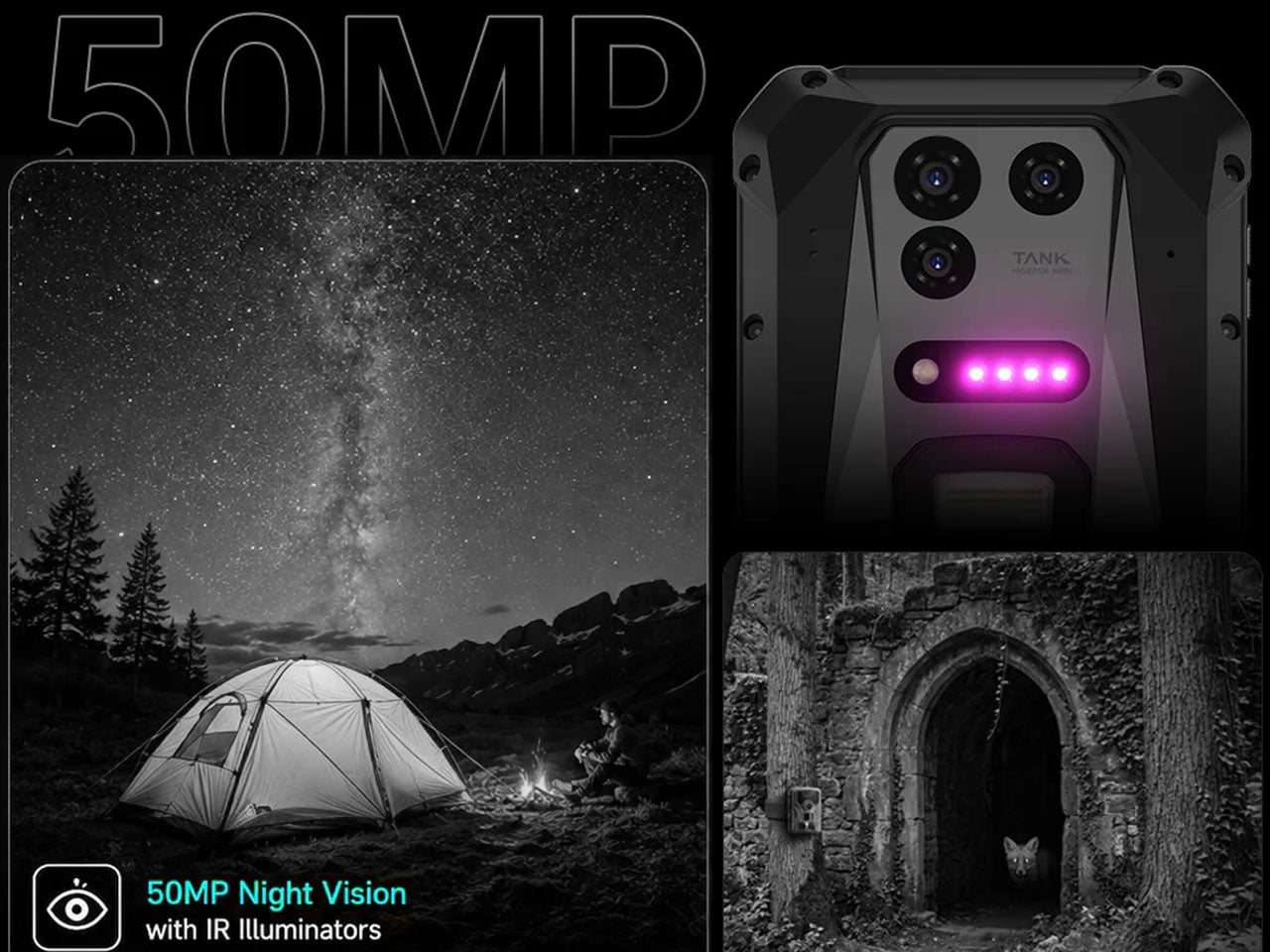
Still, at the end of the day, it is a 6.73-inch AMOLED display phone boasting a 3200×1400 pixel resolution with a 120 Hz refresh rate. The 3,000 nits of peak brightness ensure the content being displayed is clearly visible in direct sunlight outdoors. Under the hood, the phone packs a lot of power thanks to the MediaTek Dimensity 9400e processor mated to 18GB LPDDR5X RAM and 512 GB internal storage (UFS 4.0), which can be extended to 2GB via the microSD card slot. You can click good photos with the phone thanks to the 50 MP primary shooter, 50 MP night vision camera, and a 50MP telephoto lens on the rear. For selfies and video calls, Tank 5 gets an impressive 32MP shooter. Of course, there’s a 3.5 mm jack, a side-mounted fingerprint sensor, and two programmable keys to assign your favorite functions.

8849 takes device connectivity and security seriously; that’s why this phone gets WiFi 7, NFC, Bluetooth 5.4, and eSIM support. Tank 5 carries a price tag of $900 during the initial pre-order phase, which will later rise to the regular $999 price.

The post 8849’s Tank 5 phone built for the harshest of conditions has a 2K DLP projector first appeared on Yanko Design.
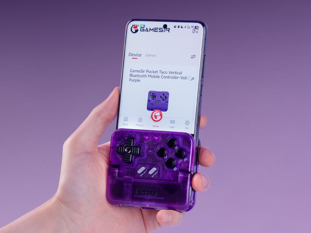
Transparent Purple Makes This $35 Phone Controller Impossible to Ignore

Touch controls on smartphones are a compromise most mobile gamers have learned to live with. They work well enough for casual games designed around them, but the moment you try running a classic arcade title or an emulated game that expects physical buttons, things fall apart quickly. Your thumbs slide off invisible buttons, precision goes out the window, and the whole appeal of playing a retro game on the go quietly evaporates.

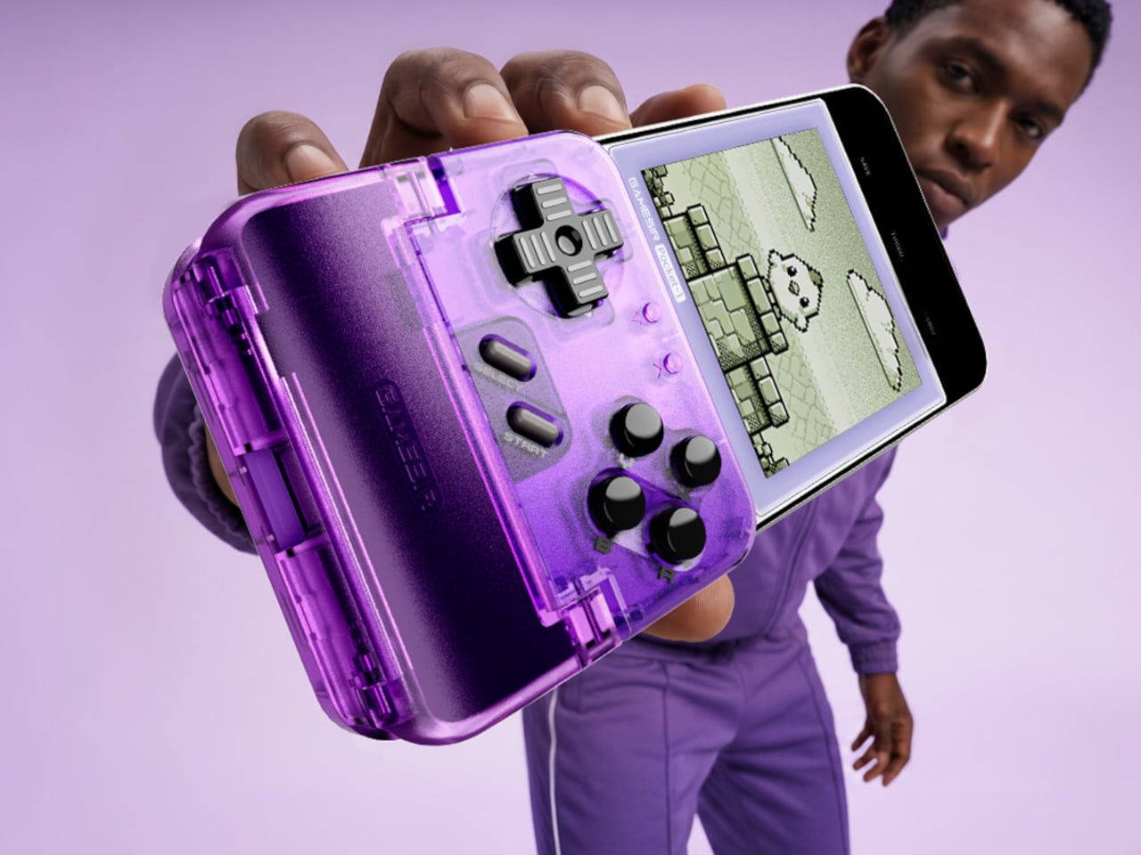
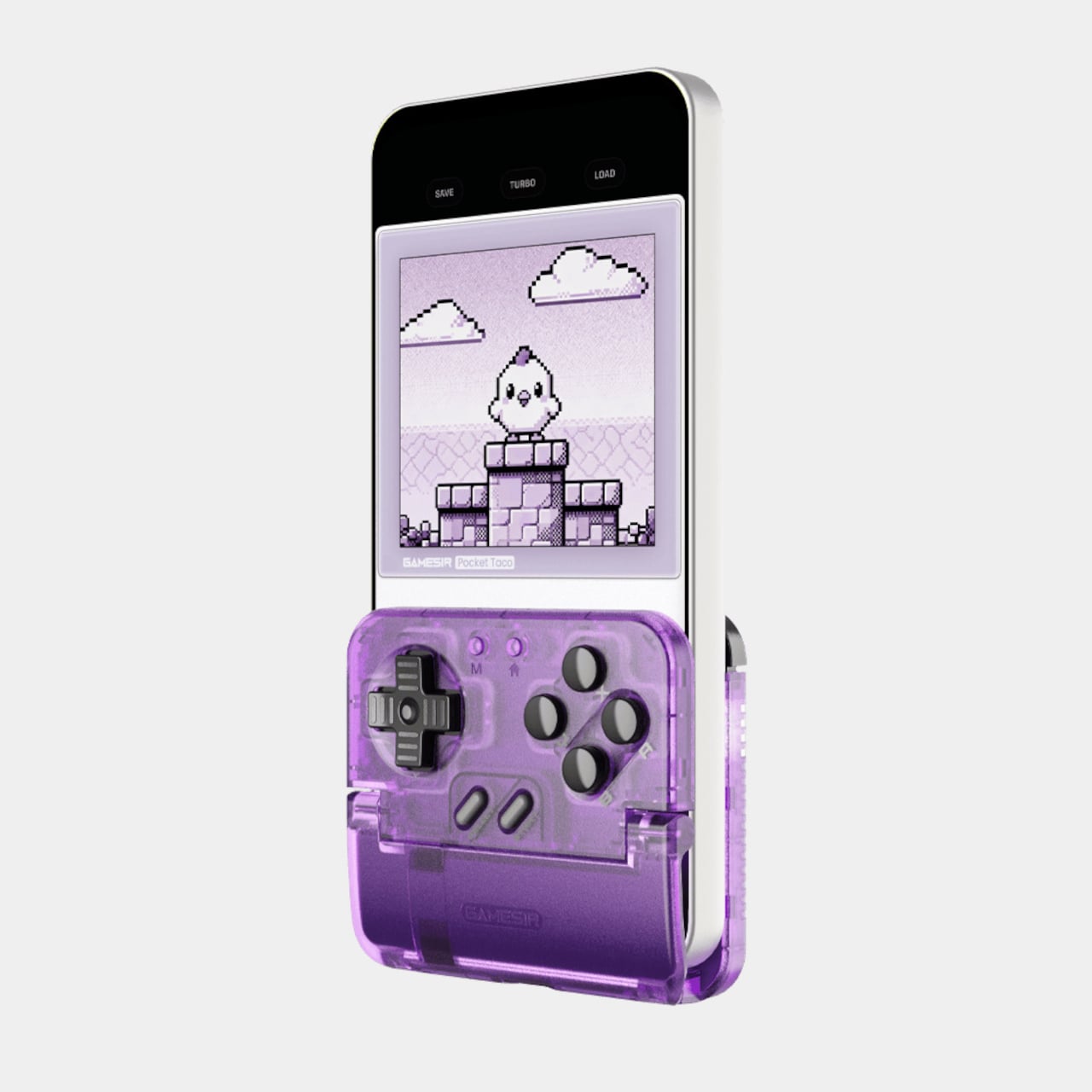
The GameSir Pocket Taco is a clamp-style vertical controller that clips around your phone and instantly turns it into something far closer to a proper handheld console. The design is vertical rather than the sideways landscape grip most mobile controllers use, which puts the phone in portrait style and gives the whole setup that unmistakable Game Boy silhouette. It’s a specific choice that makes a lot of sense for the kind of games it’s clearly built around.

Designer: GameSir

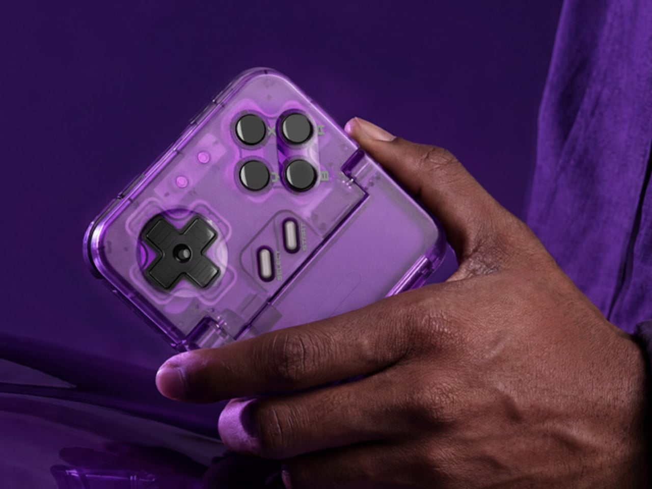
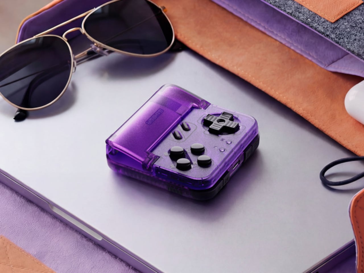
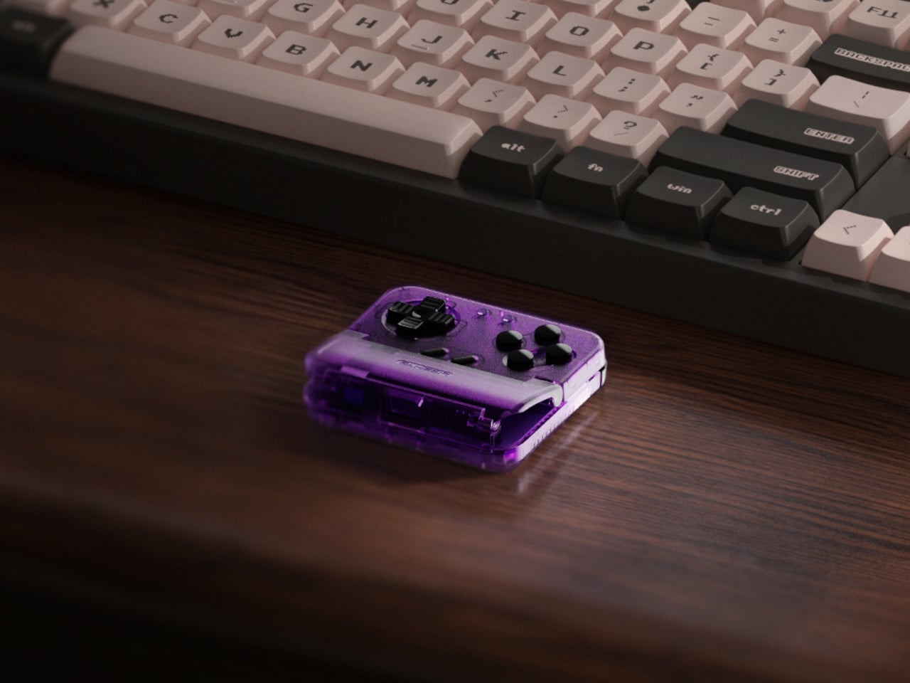
The Voltage Purple colorway is a new option for the Pocket Taco, arriving a few months after the original retro grey version launched. Where the original leaned into a deliberately aged aesthetic, Voltage Purple reads much more confidently as a contemporary gaming accessory. Both versions carry the same hardware and features, so the choice between them comes down entirely to how you want the thing to look in your hand.

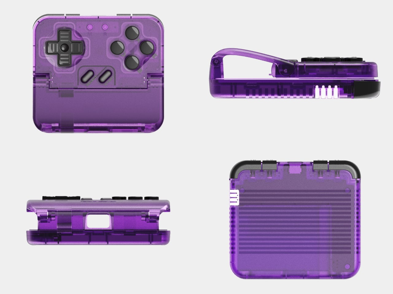
The buttons are the central selling point. Cushioned membrane ABXY and D-pad inputs sit at the bottom of the controller, backed by tactile switch triggers and bumpers, and the whole layout comes together in a way that feels genuinely satisfying for side-scrollers, shoot ’em ups, and anything else designed around a proper gamepad. A turbo function covers all eight main buttons, which the hardcore retro gaming crowd will appreciate immediately.

The Pocket Taco handles some practical concerns that most accessories at this price point ignore. Soft silicone pads line the phone clamp area to prevent scratches, a hollow gap at the bottom aligns with your phone’s charging port so you can top up during longer sessions, and the whole thing powers on automatically when you unfold it and shuts off when you close it. At 62.2 g, it barely adds any noticeable weight.

The GameSir App extends the experience further with button remapping, D-pad diagonal lock, and G-Touch and V-Touch functions for on-screen input simulation. There’s also a keyboard mode built in, letting you switch input types for games or apps that need it. A 600 mAh battery handles cordless sessions, and the package includes a storage box, a charging cable, and a lanyard so the whole thing stays organized between uses.

The Pocket Taco in Voltage Purple retails for $34.99, while the original grey version currently sits at $29.99. The $5 difference comes down entirely to the color choice. At 78mm x 70.9mm x 20.7mm, it slips into a pocket or bag with the storage box without much fuss, which keeps the pitch for daily carry entirely believable for anyone who tends to game in short bursts throughout the day.

It’s not a controller for every kind of mobile gaming. If you spend most of your time in landscape-format games that already support proper controller input, a horizontal grip will serve you better. But for anyone running emulators, arcade titles, or vertical shoot ’em ups on their phone, the Pocket Taco fills a gap that the rest of the mobile controller market has mostly ignored.

The post Transparent Purple Makes This $35 Phone Controller Impossible to Ignore first appeared on Yanko Design.
Lenovo’s AI Student Phone prioritizes learning over entertainment with smart parental controls

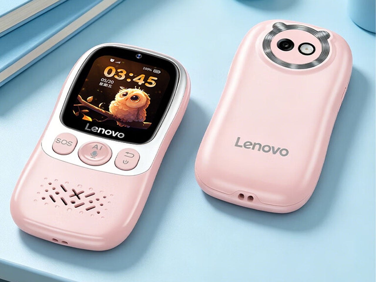
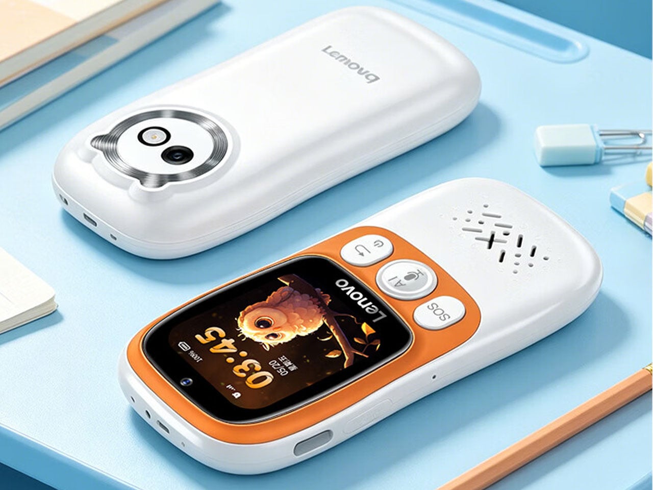
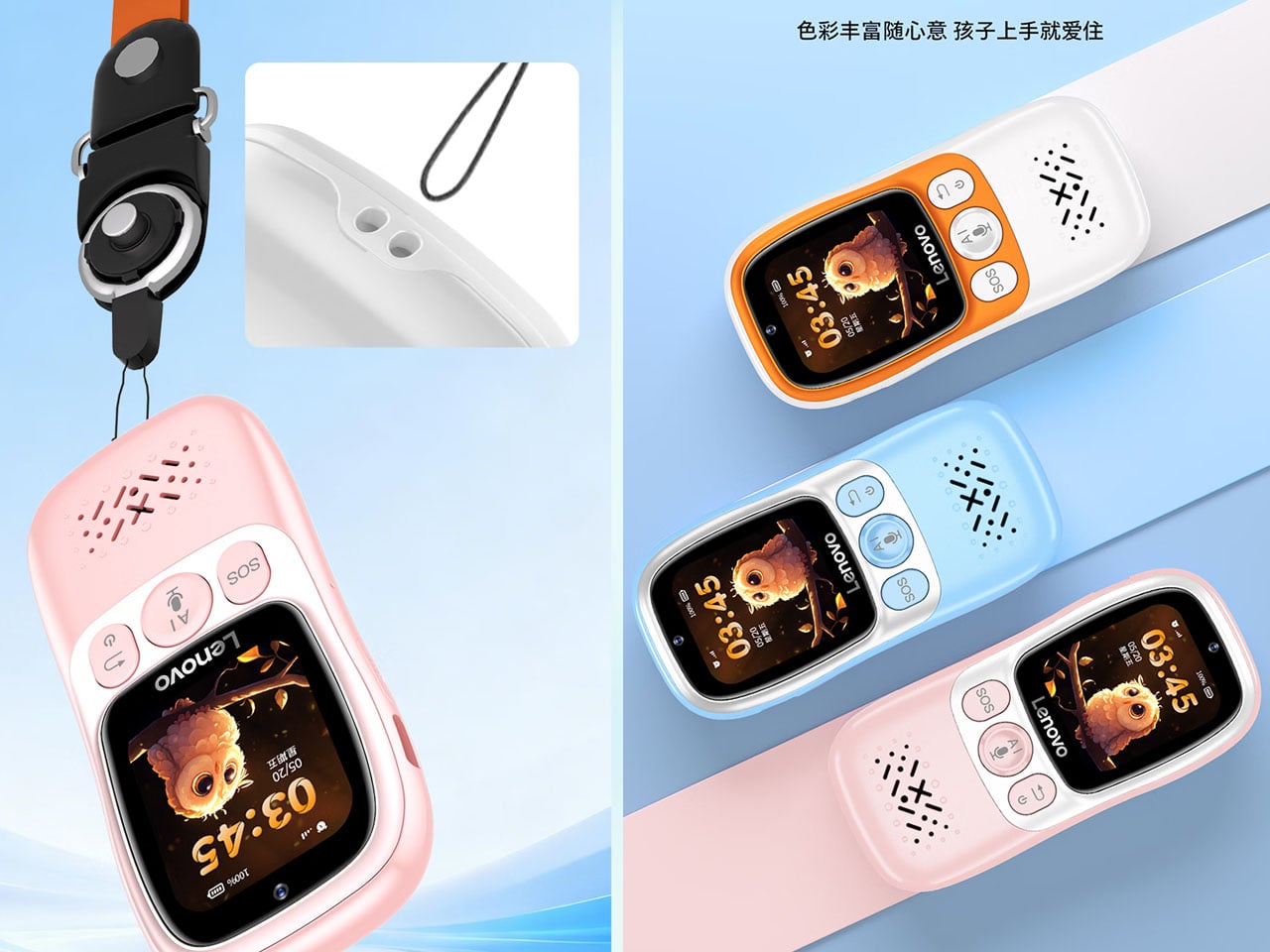
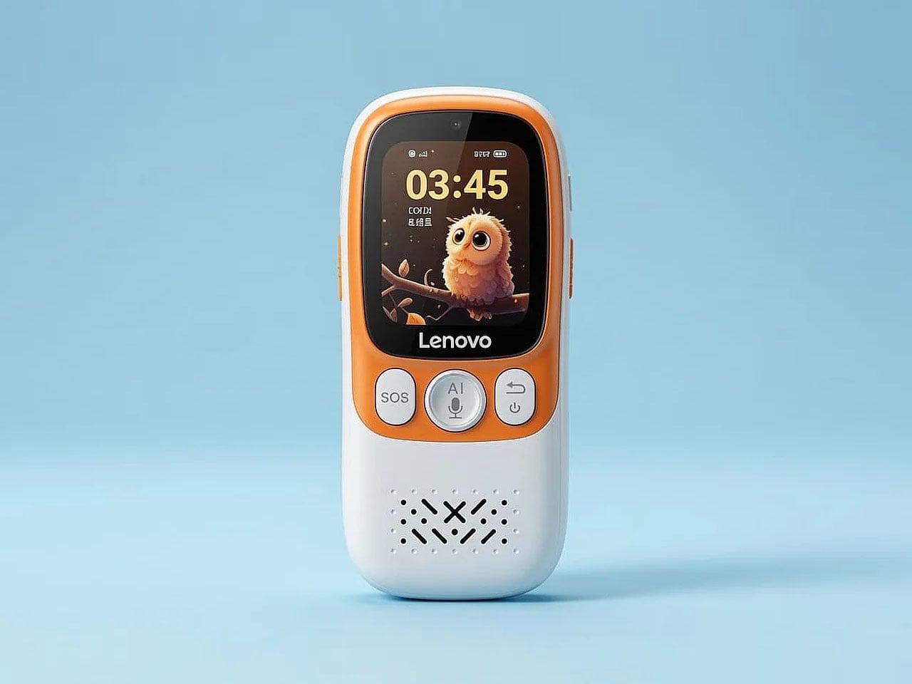
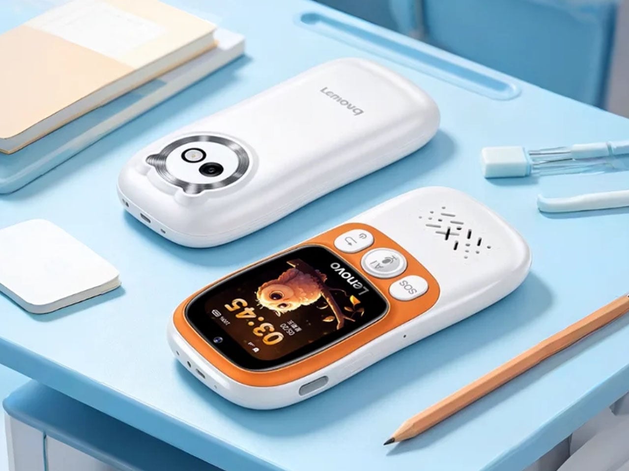
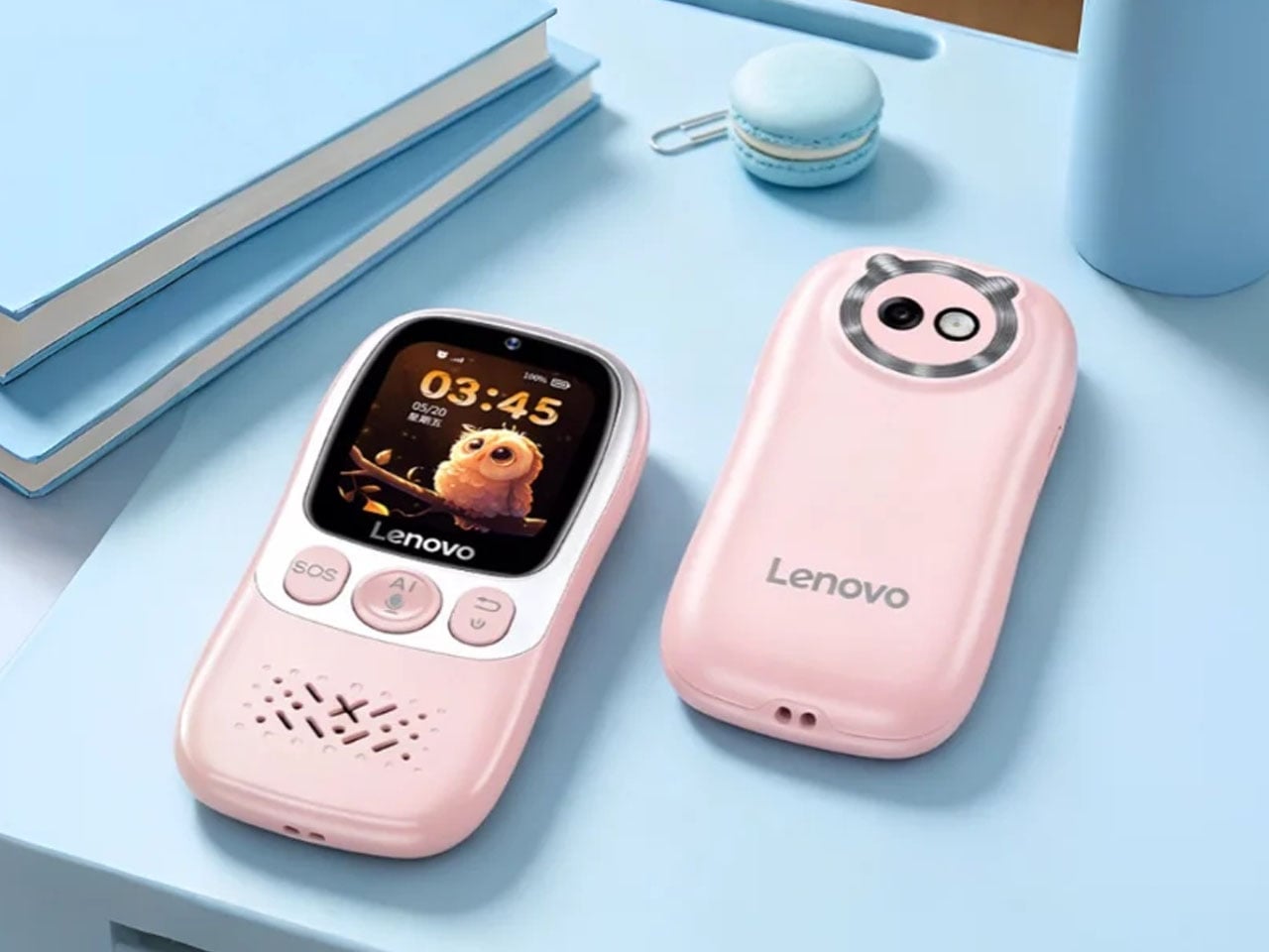
Lenovo has introduced a smartphone with a very different purpose from the devices that dominate today’s gadget landscape. Instead of chasing higher performance, better cameras, or immersive entertainment, the AI Student Phone is designed to help students stay focused on learning while giving parents greater control over how the device is used. Launched in China at an affordable price of 299 Yuan (approximately $44), the phone strips away many of the distractions associated with modern smartphones. The device instead replaces them with AI-powered educational tools and safety-focused features.

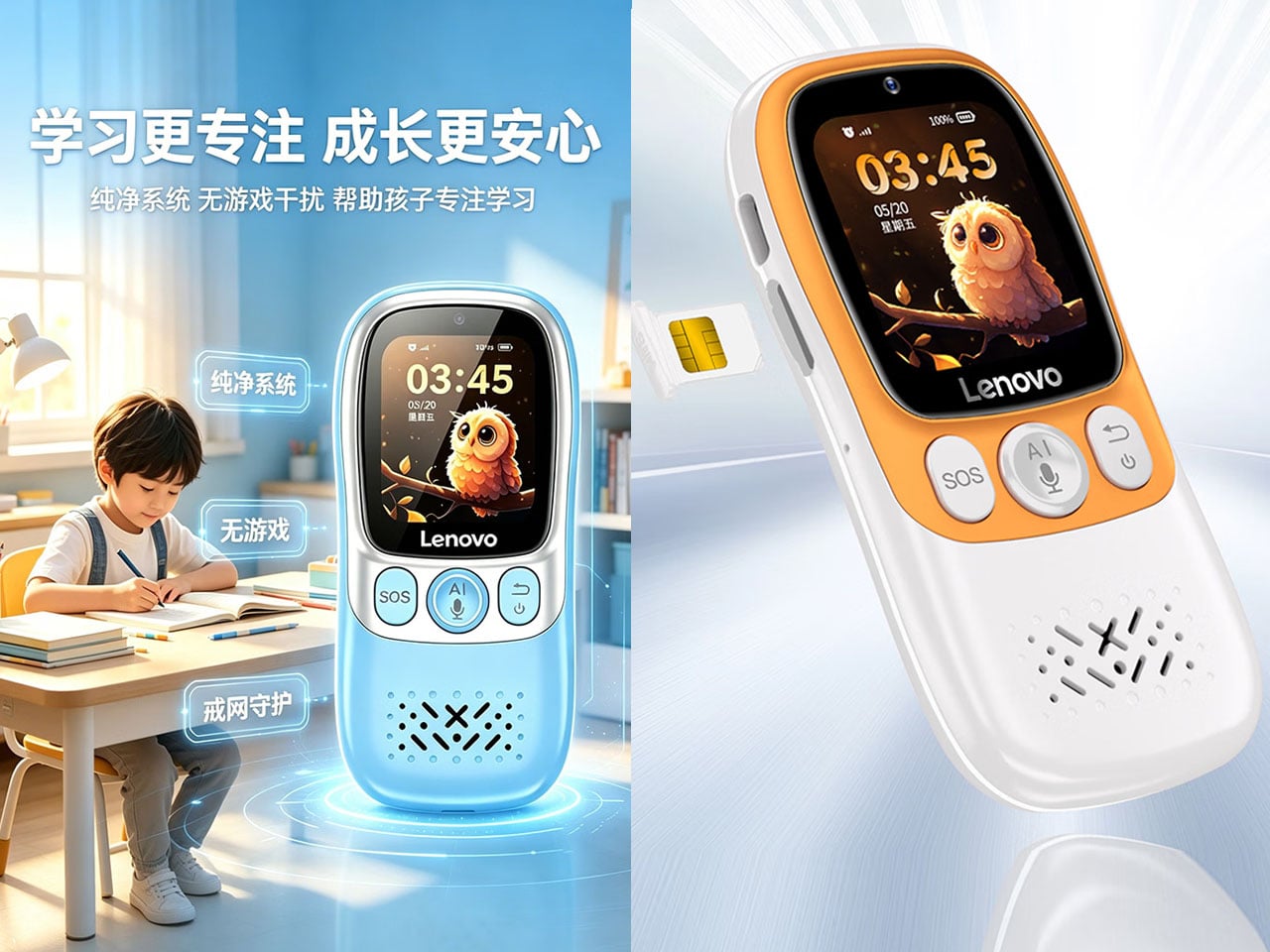
Unlike conventional Android smartphones, the AI Student Phone intentionally excludes games, web browsers, and social media platforms. This reduces digital distractions during study sessions while still allowing students to stay connected with parents and access learning resources. Rather than serving as an all-purpose entertainment device, it functions as a communication and educational companion that encourages healthier smartphone habits.

Designer: Lenovo

A dedicated AI button sits on the side of the phone, providing instant access to the built-in assistant. Students can ask questions using voice commands, receive explanations for school subjects, and get homework assistance without navigating through multiple apps. Lenovo positions the AI assistant as a reliable study companion that can provide quick answers while keeping interactions simple enough for younger users.

Parents receive an equally important set of features through extensive remote management tools. They can monitor the phone’s location using GPS tracking, establish geofenced safe zones, and receive notifications whenever a child enters or leaves designated areas such as school or home. The parental controls also make it possible to manage usage remotely, ensuring the device remains focused on educational activities rather than unnecessary distractions.

The phone includes support for voice and video calling, allowing families to stay in touch throughout the day. Despite the simplified software experience, the device still offers practical communication capabilities, making it suitable for everyday use. Lenovo has also incorporated emergency features that enable children to quickly contact family members if needed, further strengthening the device’s appeal as a first phone for younger users.

From a hardware perspective, the AI Student Phone focuses on reliability instead of premium specifications. It features a compact touchscreen display, basic cameras for communication, and sufficient battery capacity to comfortably last through a school day. The modest hardware helps keep costs low while remaining adequate for the educational tasks the phone is intended to perform.

While its highly restricted software environment may not appeal to general smartphone users, Lenovo’s latest device fills a niche that many parents have been looking for. This is an affordable phone that keeps children connected without exposing them to the endless distractions of traditional smartphones. The budget-friendly AI Student Phone is a highly practical solution for families seeking a safer introduction to mobile technology for students.


The post Lenovo’s AI Student Phone prioritizes learning over entertainment with smart parental controls first appeared on Yanko Design.
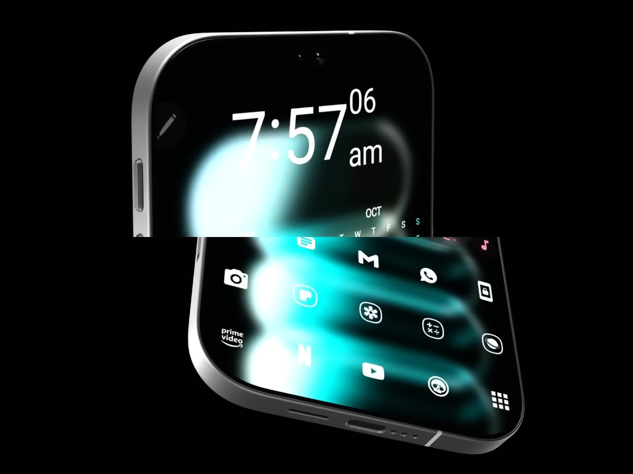
Twin Phone splits into two for users who don’t want to live with a dumb phone for the rest of their lives

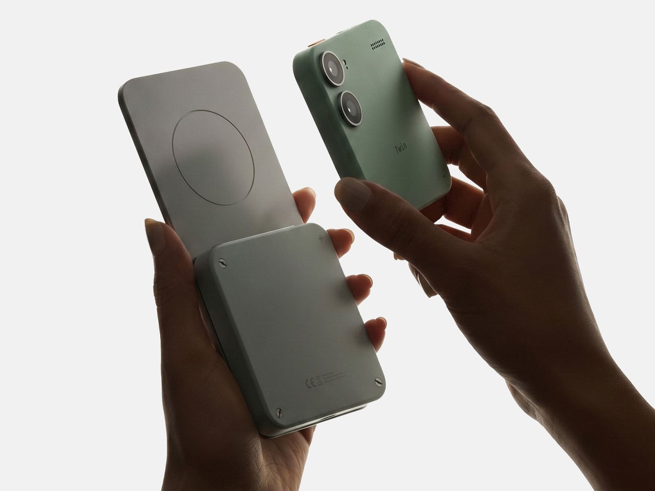
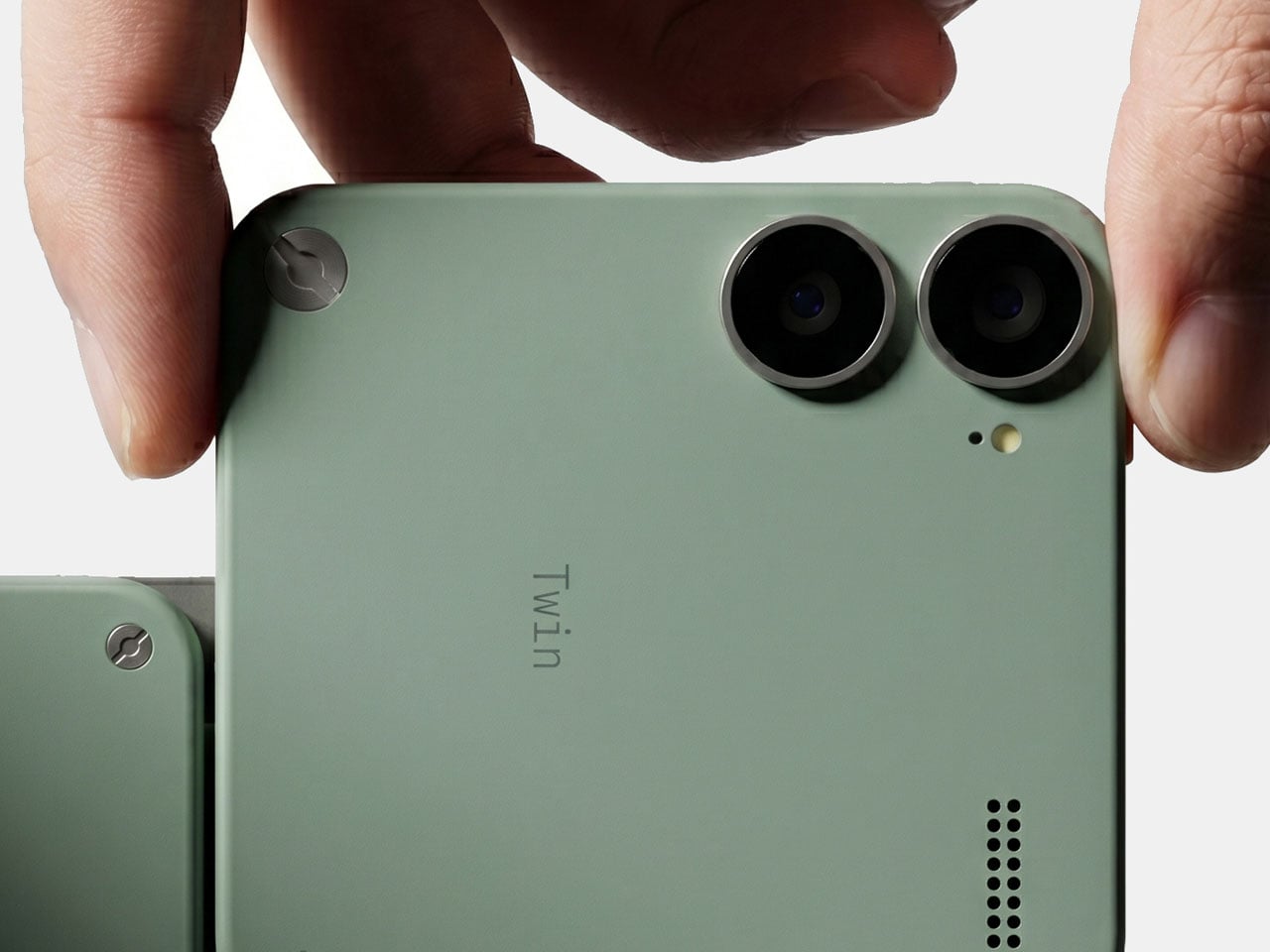
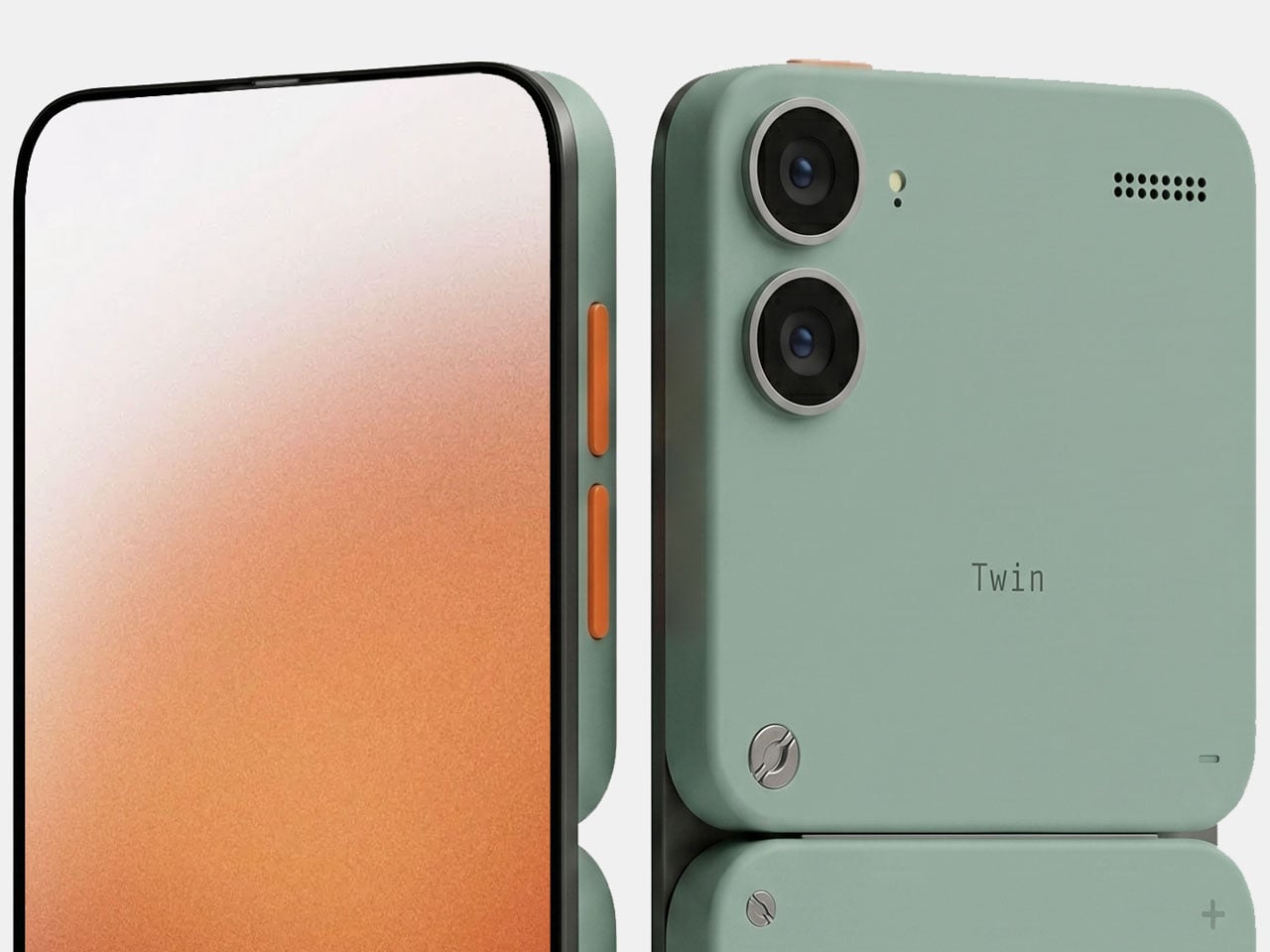
Just when you think you’ve seen all the smartphone form factors – flip phones, triple-fold ones, ones with popping cameras, and whatnot – there’s still one more to surprise you. This is the Twin Phone designed to have the most flexible form factor you could imagine on a daily driver device. You can virtually take this phone apart into two halves, because why not?

The concept device created in collaboration with Olivier Verbeke concentrates on the perils of modern-day devices that overpower the user’s will to have self-control and not go down the doom-scrolling rabbit hole. While we do have dumb phones and dedicated applications to control smartphone addiction, whether they actually work is anybody’s guess. That’s where Twin Phone has a different approach to things.

Designer: Wild Mind and Olivier Verbeke

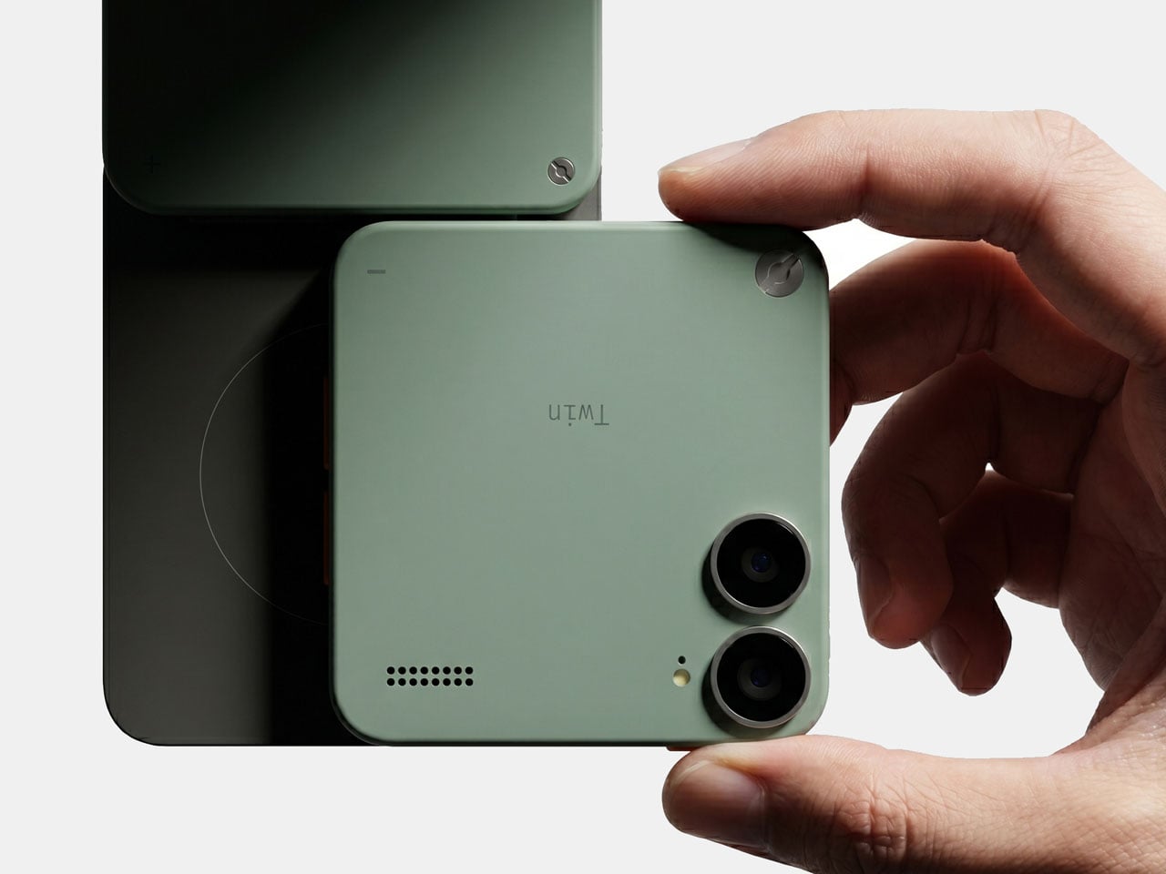
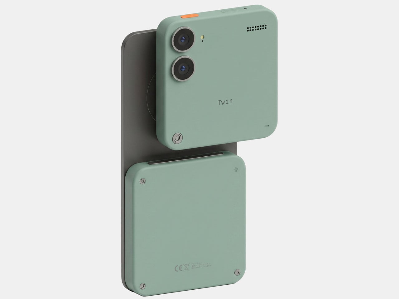
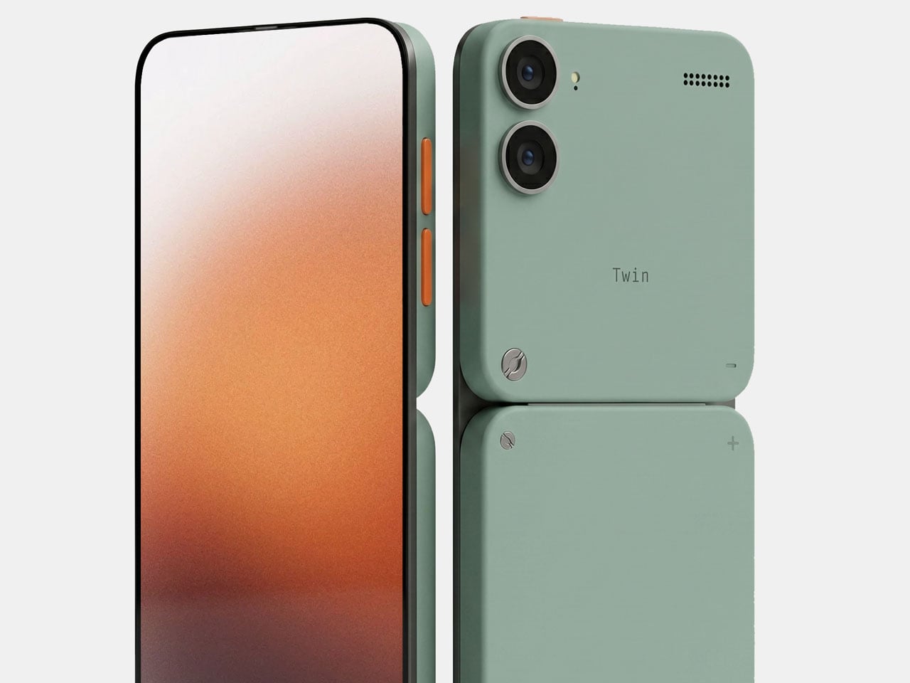
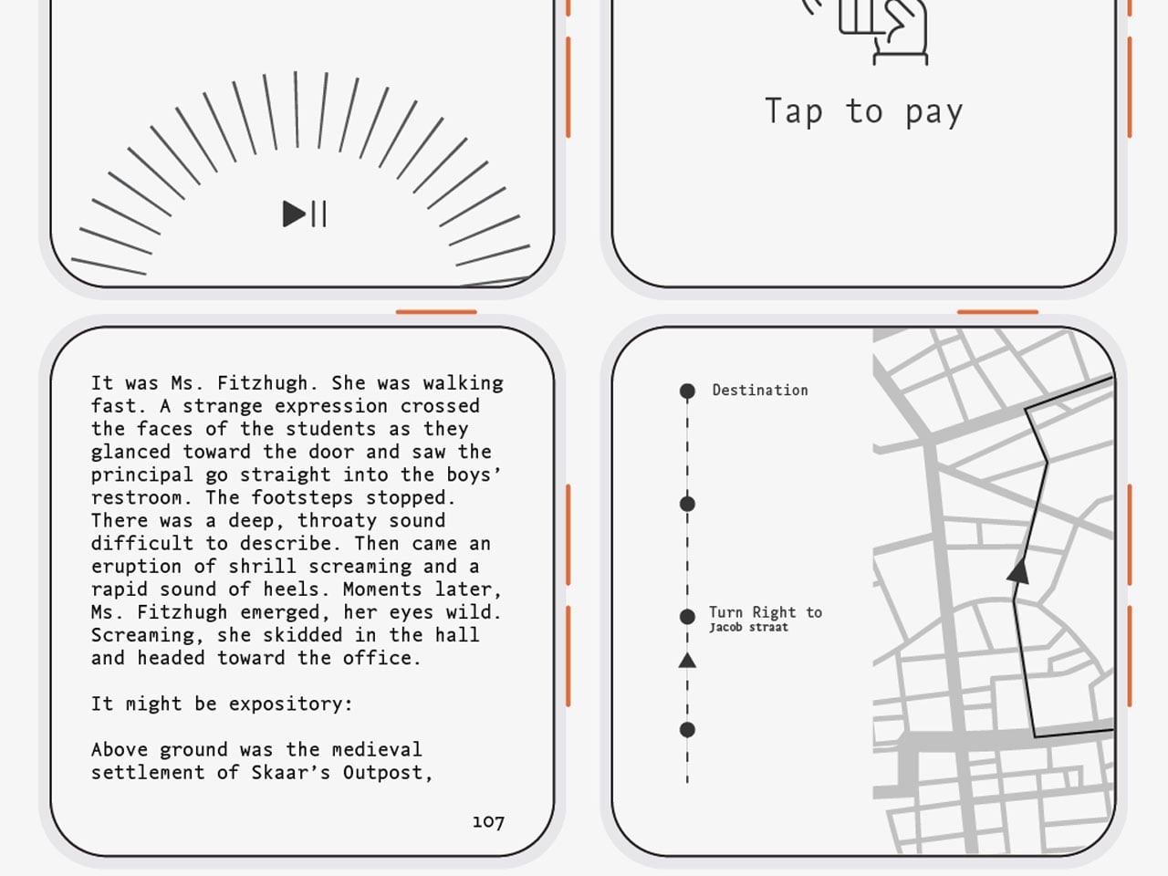
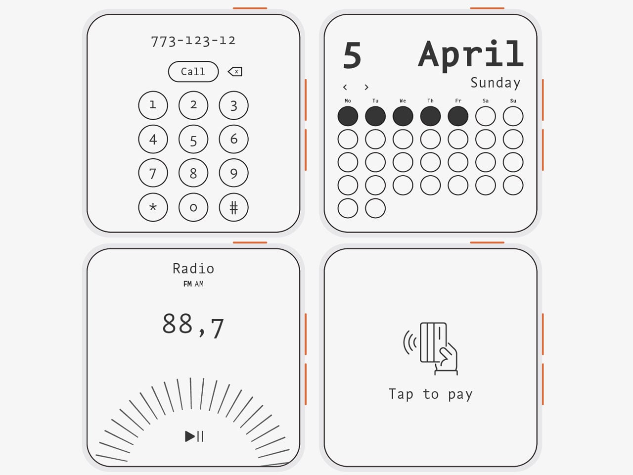
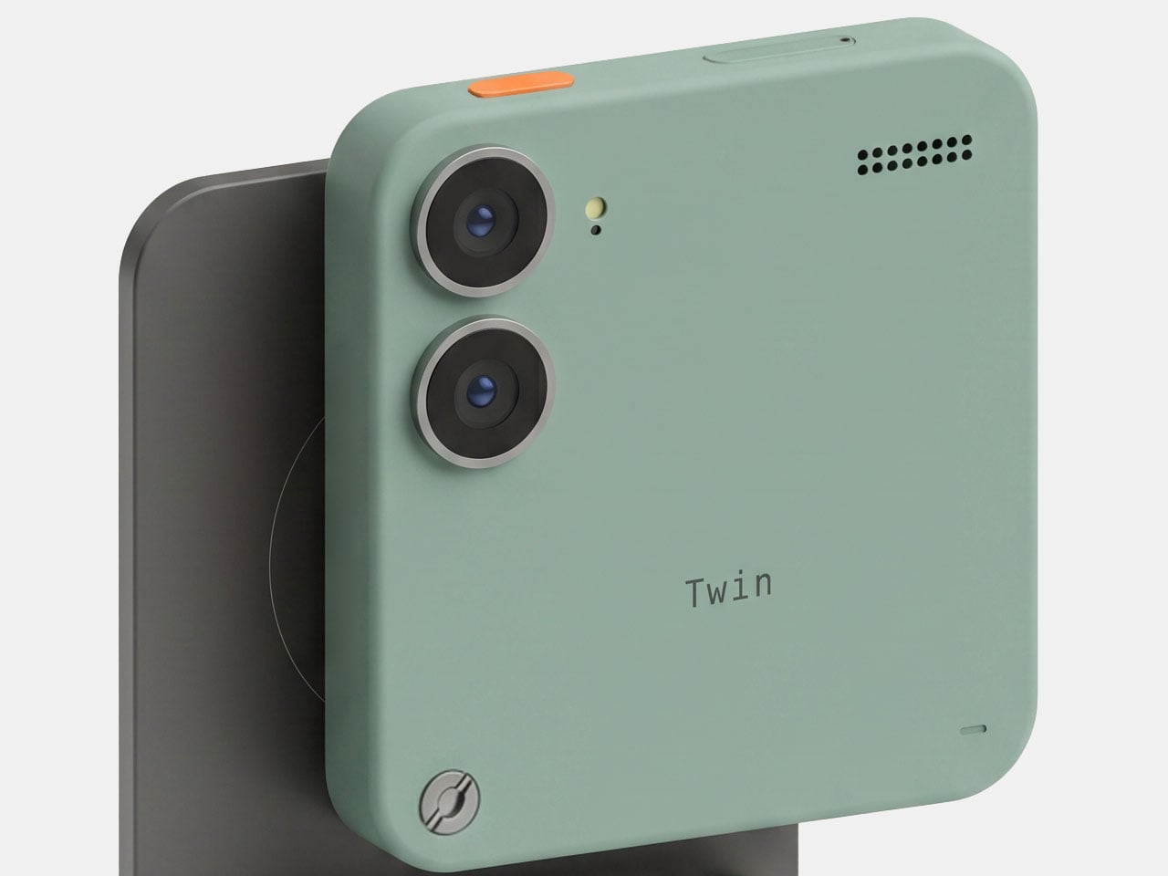
Two halves of the phone serve their own dedicated purpose, while putting them together brings the best of both worlds together. One half is a simple phone for basic functionality like taking calls, texting, reading e-books, or essential functions like navigation. The other half has a larger battery module for heavyweight tasks and functions as a dock for the smaller unit to snap onto. Slide them together, and there is the Twin Phone ready for a day’s work, just like your usual modern-day smartphone.
The simple phone module has everything toned down in that mode, as the E-ink display is easy on the eyes and uses very little power. Since the compact form of this module houses a smaller battery, power conservation is essential, which is achieved by the minimalist approach. This comes in handy when you simply leave the other module in your closet and tag along with the module without feeling disconnected from the world. Come back home and put the two modules together to get the advantage of a “smart phone” in your possession.

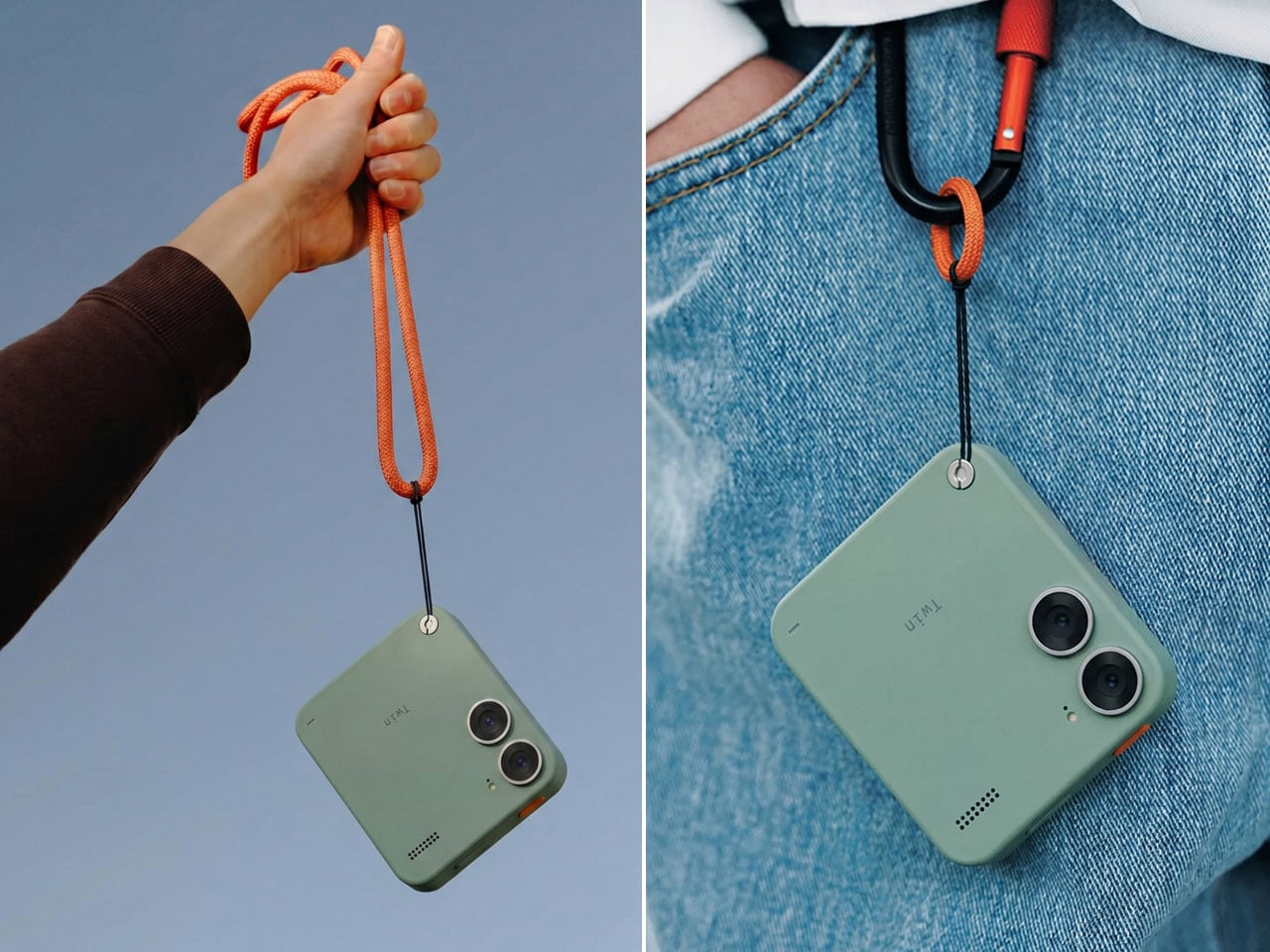
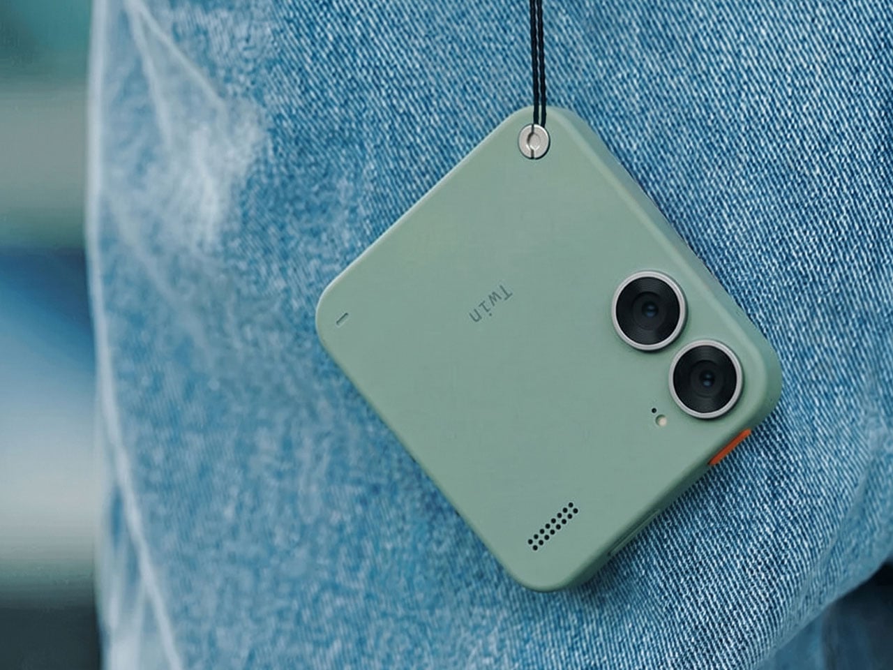
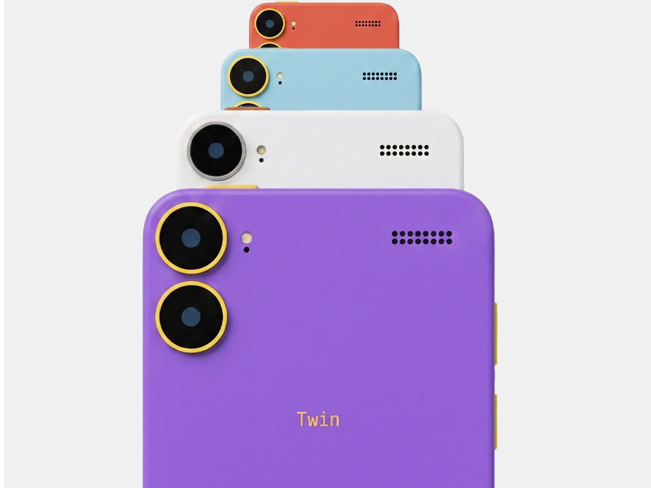
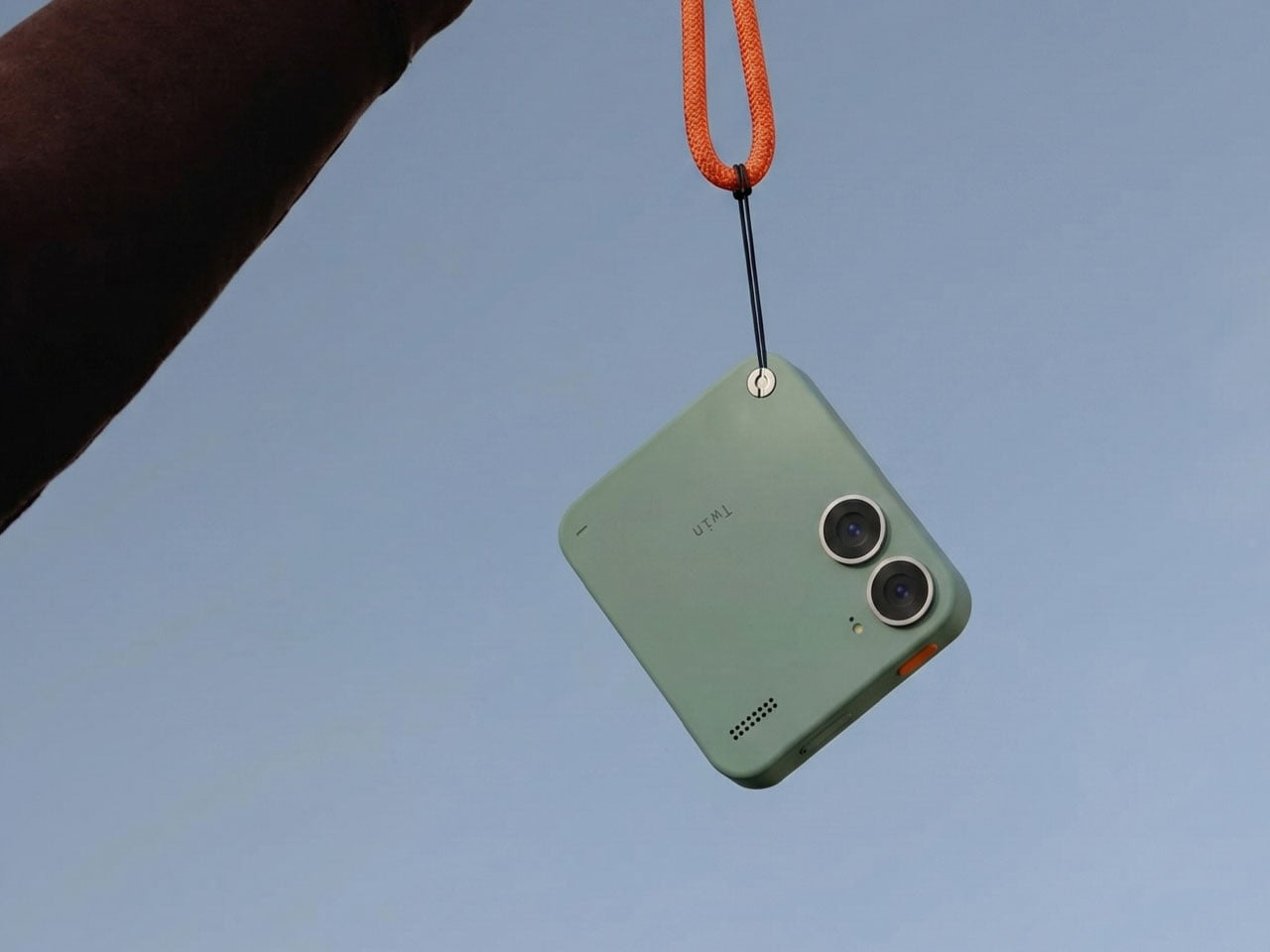
Twin Phone is built from recycled plastic, and the on-board battery can be replaced by removing the screws on the back. A larger screw on the back acts as a strap attachment for the lanyard function. To keep the phone relevant for young users, the designer imagines the device in a range of peppy colors, including blue, orange, purple, military green, and muted white.

I simply love the idea of such a thoughtful device, which doesn’t try to completely put a stop to smartphone usage, giving one no option to retreat for some breathing space. The phone lets you decide when it is time to go minimal and when it’s time to explore the capabilities of a powerful device. This freedom lets the user gradually ease into a lifestyle wherein the phone is no longer dictating terms, and solves the intended purpose for once.

The post Twin Phone splits into two for users who don’t want to live with a dumb phone for the rest of their lives first appeared on Yanko Design.