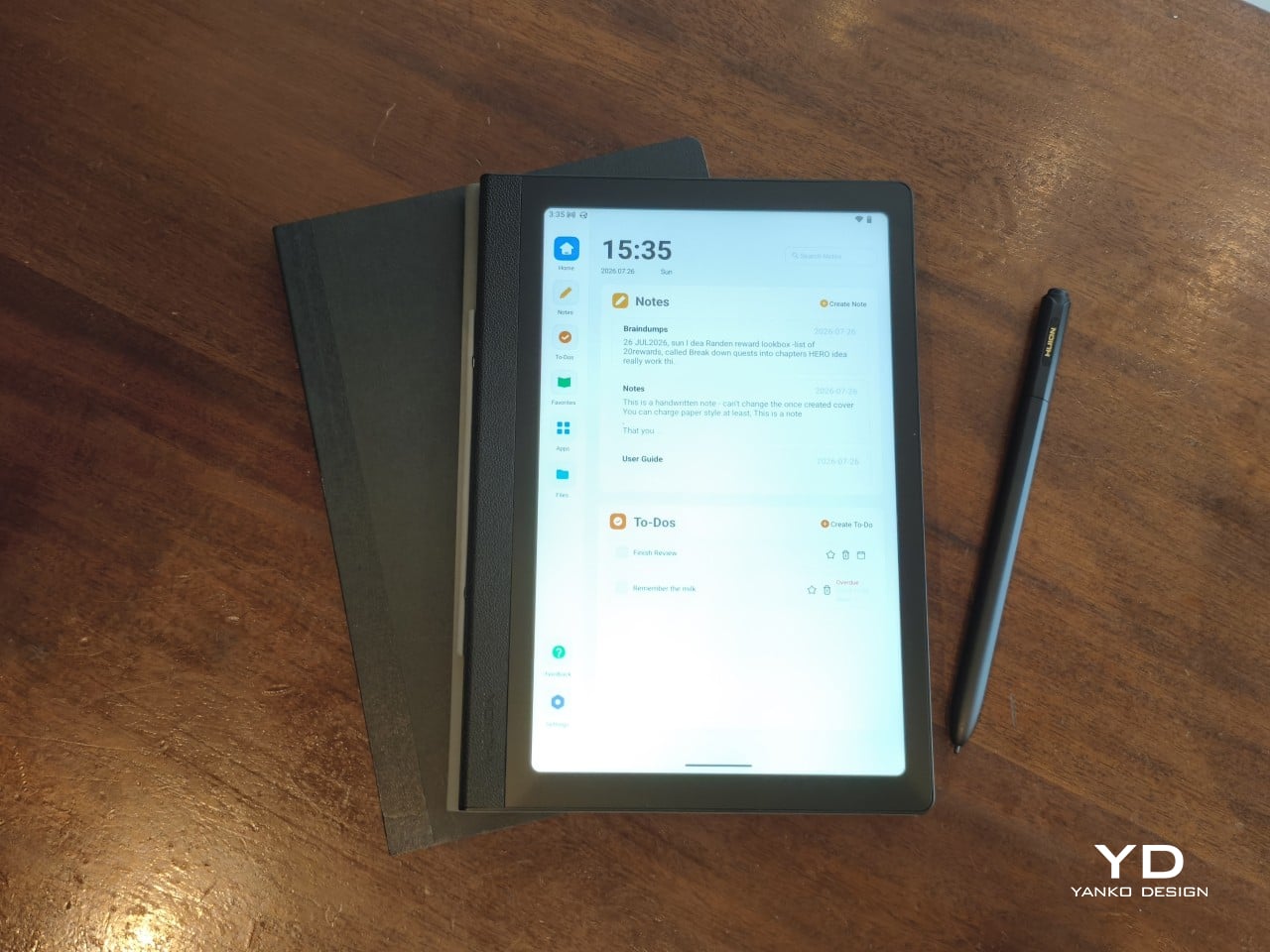
Huion Note E Review: The Notebook That Never Runs Out of Pages

PROS:


  • Streamlined and focused note-taking experience

  • Looks and feels like using a digital A5 notebook

  • Battery-free stylus with 8,192 levels of pressure and tilt support

  • Sharp display with anti-glare nano-etching, DC dimming, and soft light

CONS:


  • No microSD storage expansion

  • Cover attachment feels prone to breaking

  • Custom software has room for improvement

RATINGS:

AESTHETICS
ERGONOMICS
PERFORMANCE
SUSTAINABILITY / REPAIRABILITY
VALUE FOR MONEY

EDITOR'S QUOTE:

The Huion Note E delivers an enjoyable writing experience on a notebook that never runs out of pages.

award-icon

Huion has made a name for itself with digital drawing tools that empower creatives, both professional and hobbyist alike, regardless of their budgets. It has lately dabbled in the realm of standalone Android tablets, bringing its technologies that would allow designers and artists to let their creativity roam free, figuratively and literally. It even put out some “Smart Notebooks,” catering to the note-taking crowd more than artists.

Against this backdrop, the Huion Note E arrives with an ambitious goal: to be the electronic notebook to replace your handful of paper notebooks. It’s designed to even look the part! But this has been attempted before by many companies, including more expensive fruit-labeled slates, so how does the Note E fare in this regard? Is it able to deliver that paper-like writing experience, or is that just another bullet point in a smorgasbord of disjointed features? We take out our thinking caps, jot down our musings, and take it for a spin to find out.

Designer: Huion

Aesthetics
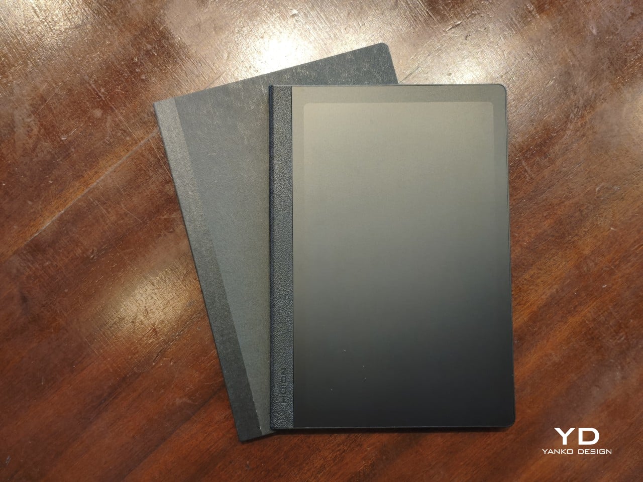
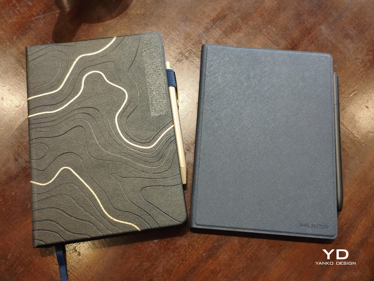
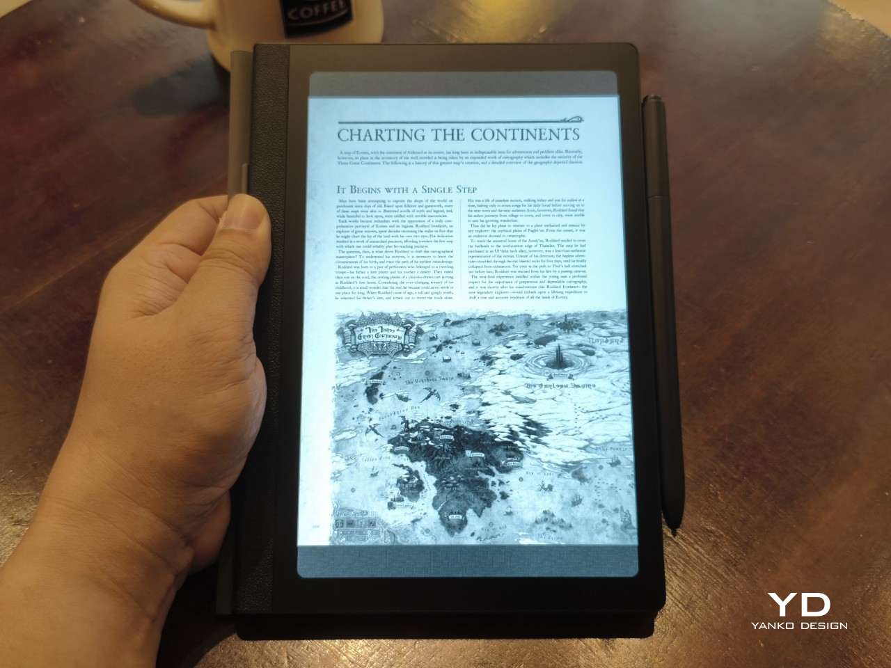
Huion dubs the Note E as an Electronic notebook, and the first impression you get definitely supports that characterization. Out of the box, it already sets itself apart from typical Android tablets and even from e-readers that have thick bezels and a wider left edge. That left edge uses a rough textured material that mimics the appearance and experience of spines on some paper notebooks.
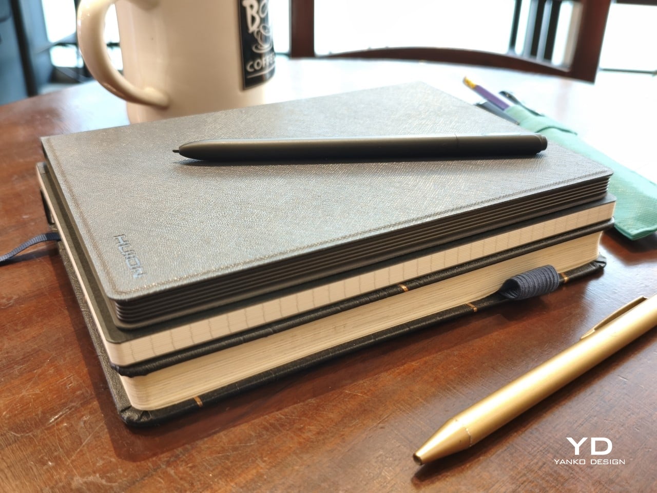
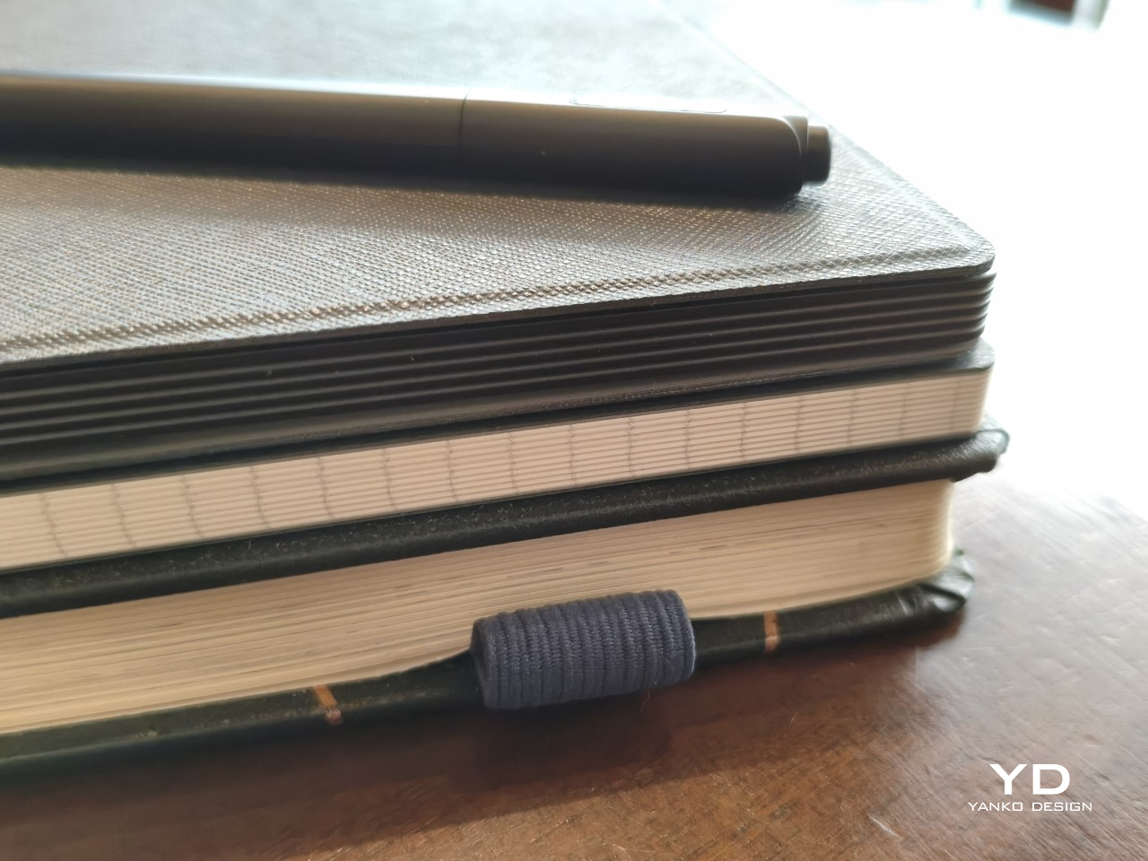
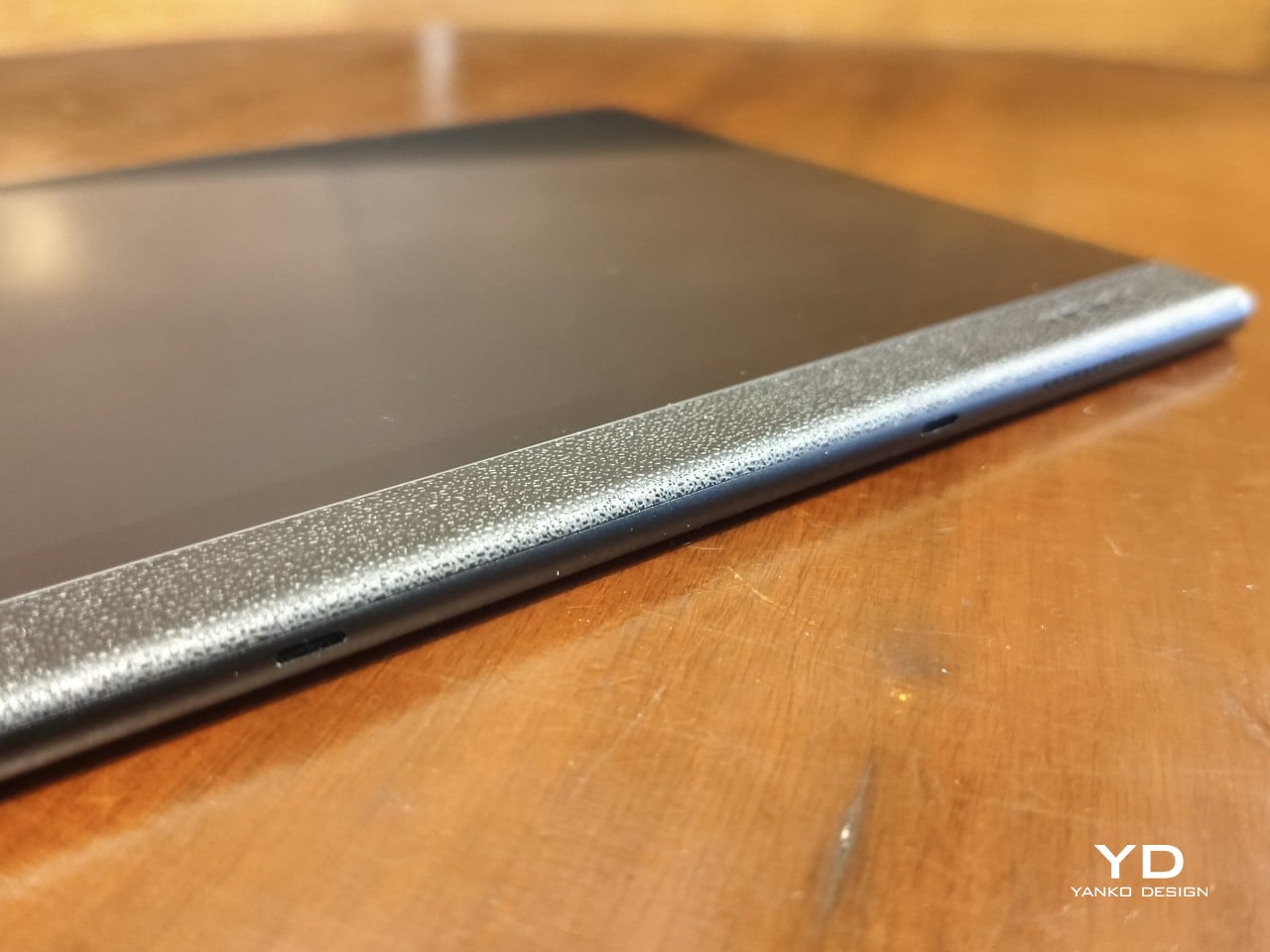
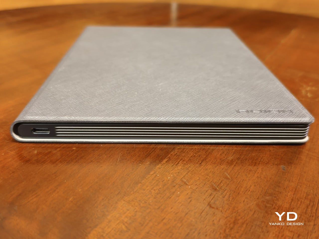
In fact, the Huion Note E tries quite hard to push that notebook metaphor, almost to the extreme. Instead of your typical smooth edges, the tablet’s sides have an unusual ridged structure that looks like pages of a notebook. That is, if your notebook used black paper. All in all, the Huion Note E presents itself well as an electronic A5 notebook, which helps endear itself to those planning to make the switch from paper to digital.
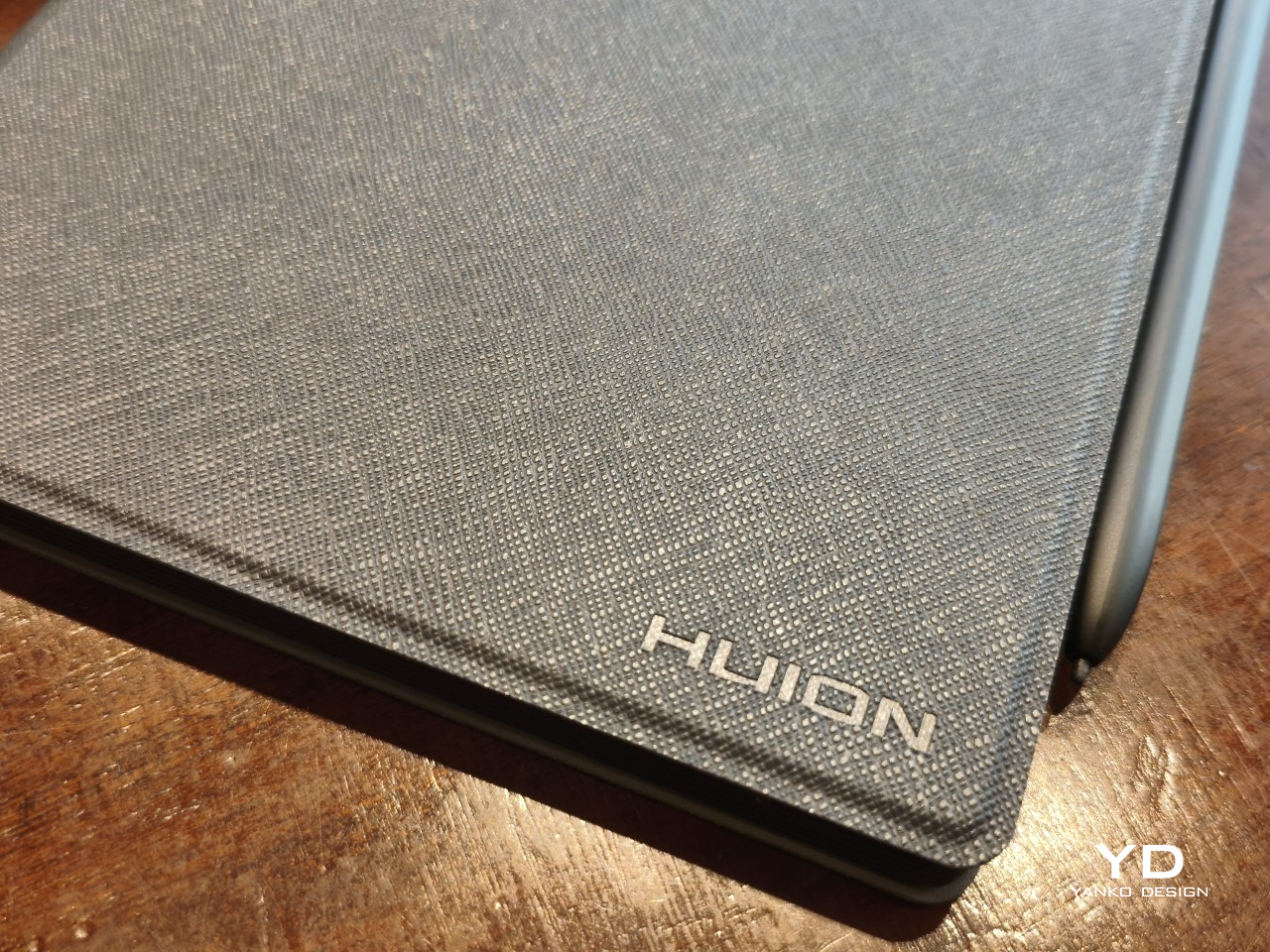
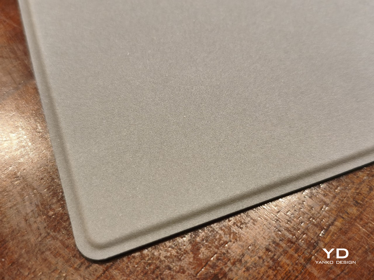
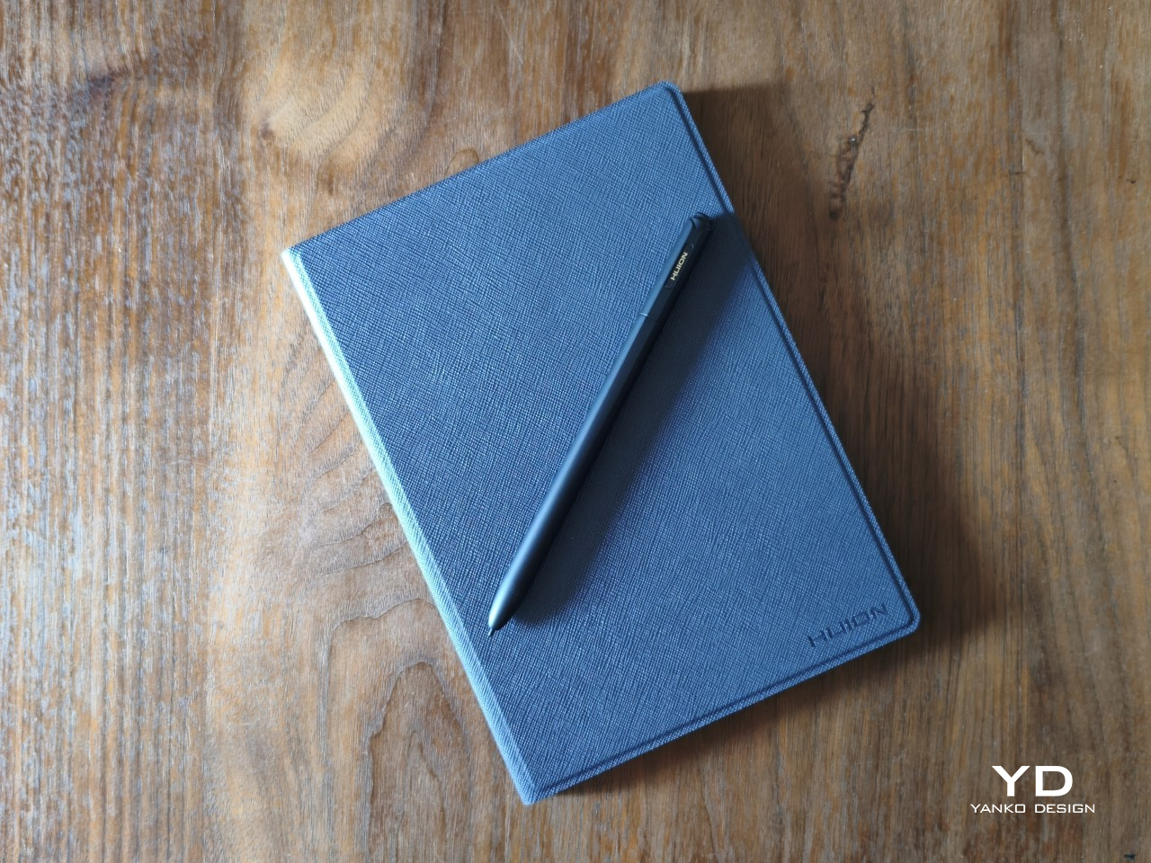
The included cover adds a pinch of luxury to that presentation, with a PU leather material on the outside and a soft, felt-like texture on the inside. It’s reminiscent of premium journals and their leather-like covers, reinforcing the image of the Huion Note E as an electronic notebook. It’s nothing grand or spectacular, but small touches like these help give the product a distinct personality as a carefully designed object rather than just another tablet in the market.
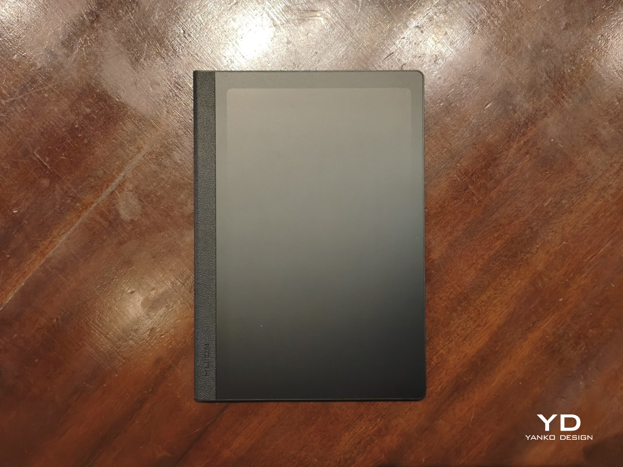
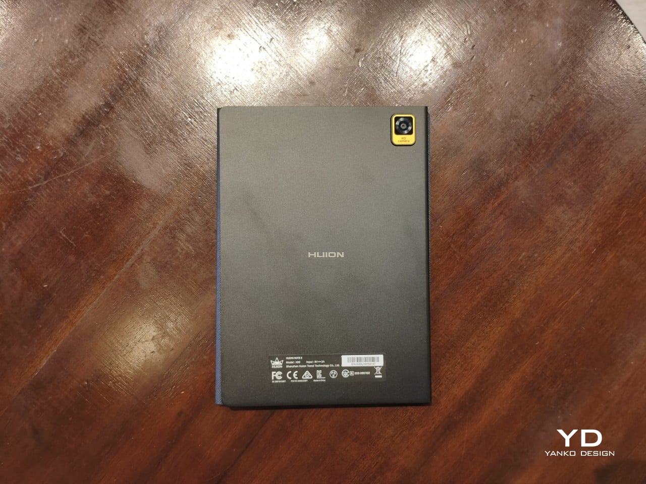
The Huion Note E embraces a very minimalist design, at least aside from those aforementioned details. Without any physical volume controls, only the power button, USB-C port, and holes for the mics, speaker, and cover break the flow of the ridges around the device. The LCD screen with anti-glare nano-etching is laminated and lies completely flat, just like a page of a notebook. The back is also pretty bare, save for the Huion branding in the middle and the camera bump in a rather unconventional corner. The back has a somewhat matte texture that is, unfortunately, quite a smudge and fingerprint magnet.
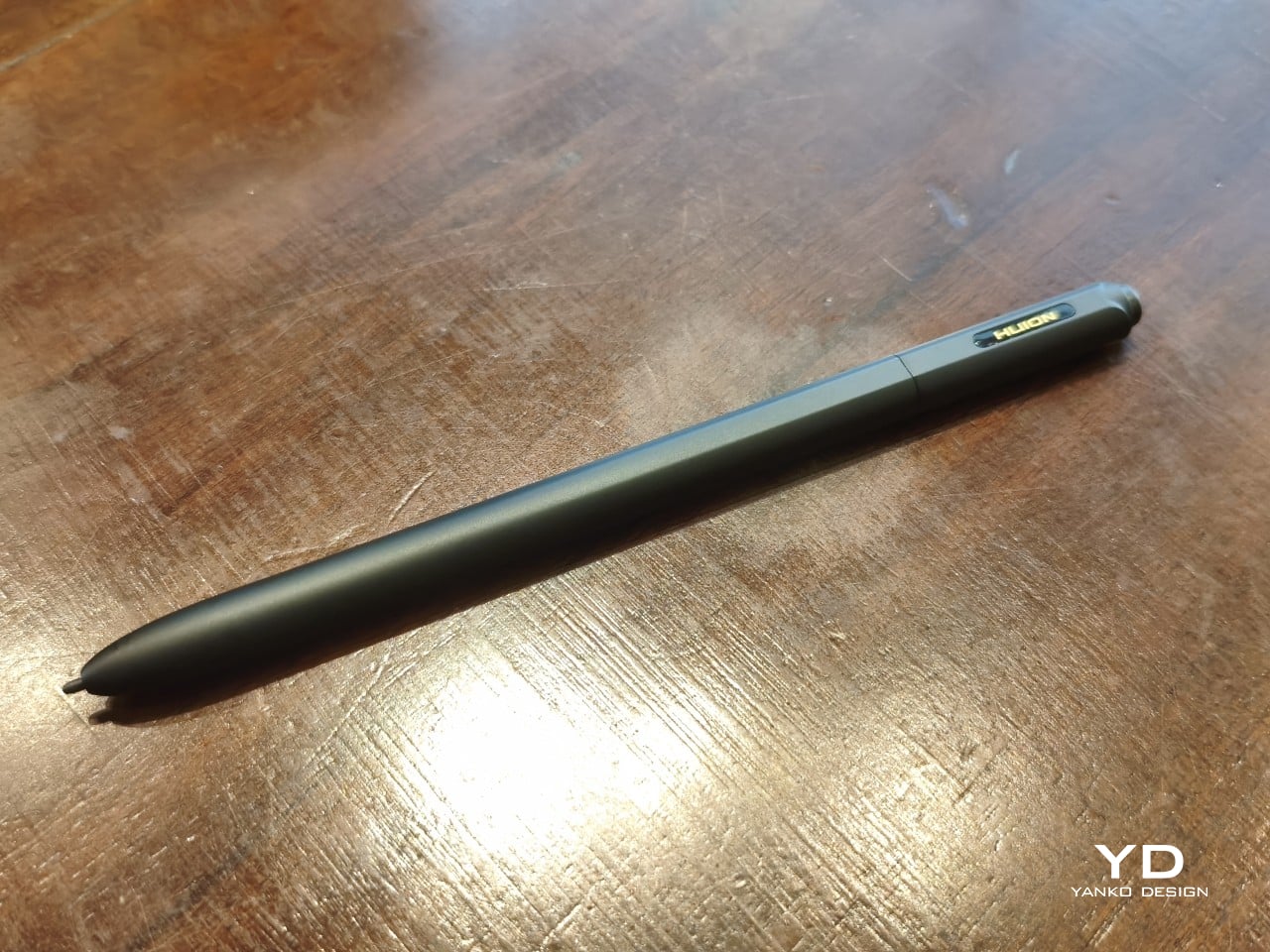
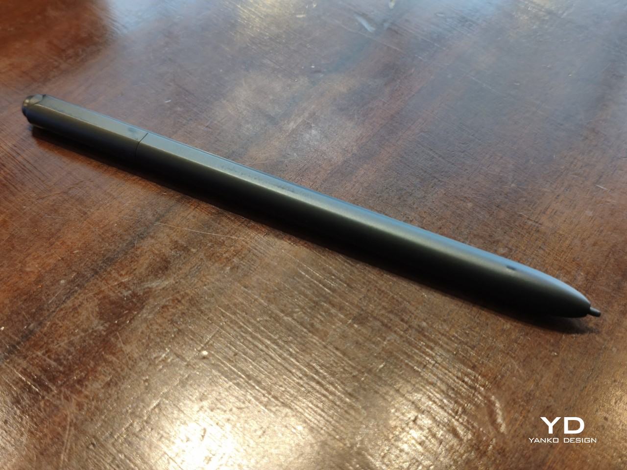
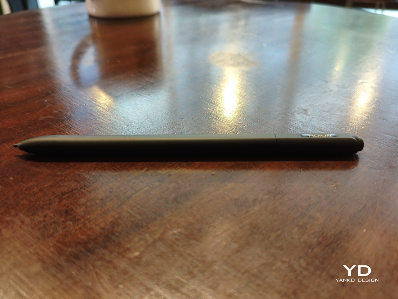
The included stylus, a Huion PW510 with PenTech 3.0, follows that same minimalist aesthetic. It has no side buttons, for better or for worse, and aside from the pen nib, the only interaction point is the springy eraser on the other end. The 9mm-diameter barrel has two flat sides that keep it from rolling off a table. Amusingly, the pen seems to roll on its “back” more often than not, ensuring that the Huion name on the barrel is always visible.
Ergonomics

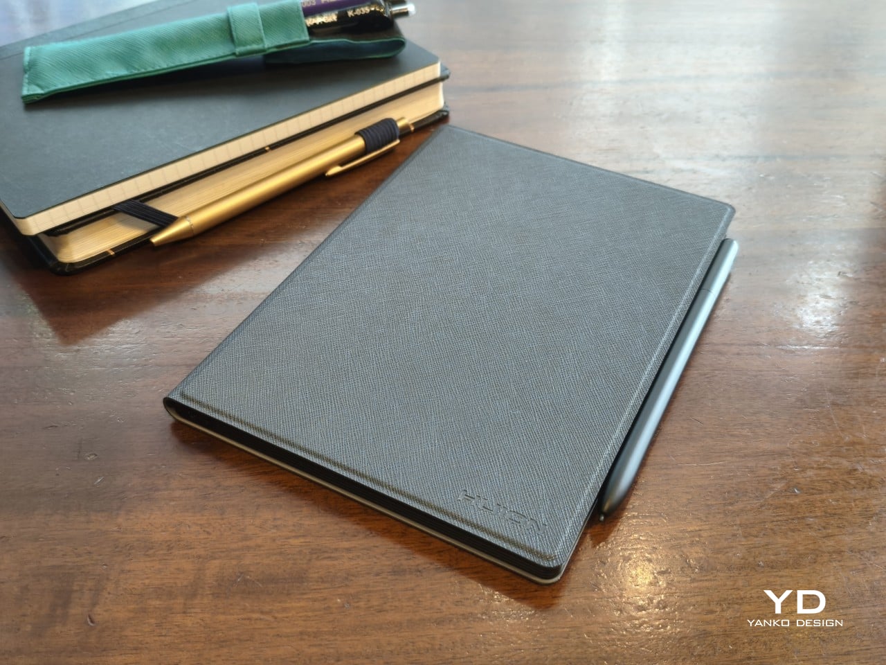
The comparison with a paper notebook doesn’t stop at the appearance. The Huion Note E is almost exactly the size and thickness of an 80-page A5 notebook. At around 348g, it almost weighs as much as one, though the cover adds around 100g more to that ensemble. It’s still light and slim enough to carry everywhere you’d normally take notebooks with you, with the advantage that you only need one Note E versus a stack of A5 notebooks.

That also means it’s convenient to hold the Huion Note E up in one hand, though your exact comfort will depend on your hand size and grip. Those with larger hands or longer fingers might be able to more comfortably grip both edges to hold the tablet like a notepad, while some might prefer gripping the textured left edge instead. That said, the device has enough heft that it can start to feel a bit tiring after a long period of time.
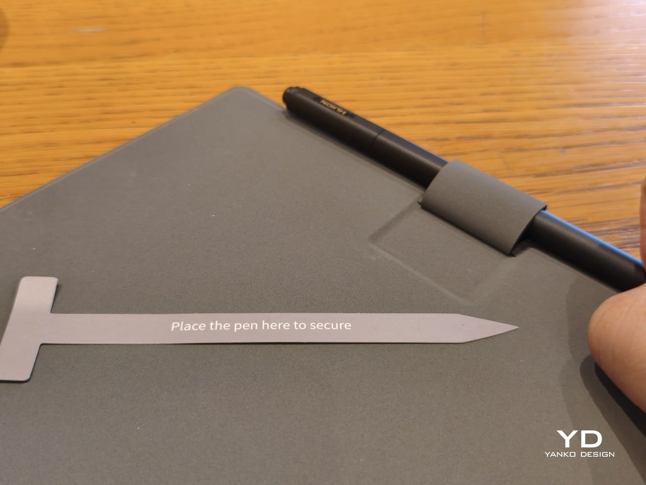
The Huion PW510 pen’s 9mm diameter also makes it a joy to hold and use. It has enough girth to feel comfortable without being too chunky. The body is also well-balanced, so nothing weighs down your hand to get in the way of writing. The lack of a side button aligns with the goal to mimic a pen and paper experience, though at the expense of some useful functionality. The pen magnetically attaches to the side of the Note E, making it easy and convenient to stow away the pen when not in use. There’s also a pen loop on the included cover, though designed in a rather unusual way.
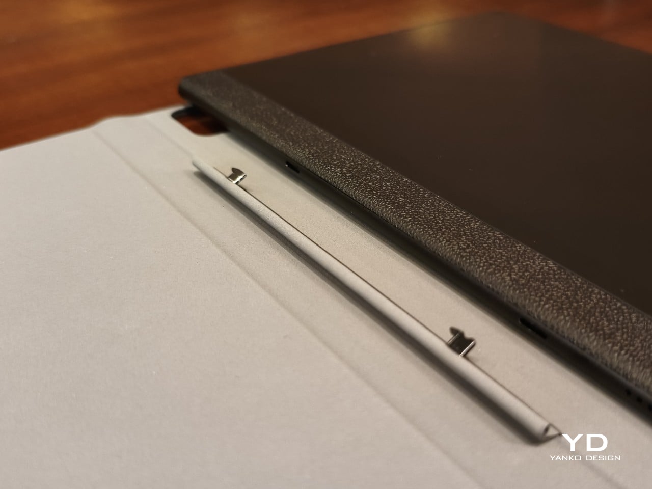
That magnetic cover itself is a bit of an odd duck, sadly. While it’s understandable that Huion avoided using extra-strong magnets that would have affected the EMR pen’s performance, the mechanism they chose feels both unintuitive and flimsy. There are two small prongs inside the spine of the cover, and you have to slide the tablet up or down, depending on whether you’re removing or attaching it, respectively. Given the size of the prongs, it feels like an accident waiting to happen.
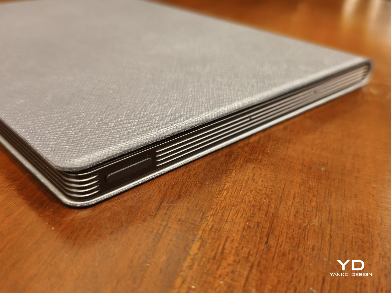
One rather curious note is the placement of the power button, which also functions as a fingerprint scanner, on the upper right edge. I usually open books or notebooks from that corner, so when I flip the cover open, my finger naturally brushes against the power button and automatically unlocks the tablet so I don’t have to do that step consciously. Whether that design was intended or not, it was still a nice touch, no pun intended.

Performance

Huion already has quite a number of Android-powered tablets in the market, including a 10-inch one with an E Ink screen. The Note E, however, has a distinct purpose that calls for a rather different combination of hardware and software features. It’s meant to be a highly portable digital notebook first and foremost, so everything else falls under this lens, both the good and the bad.

Specs and Battery

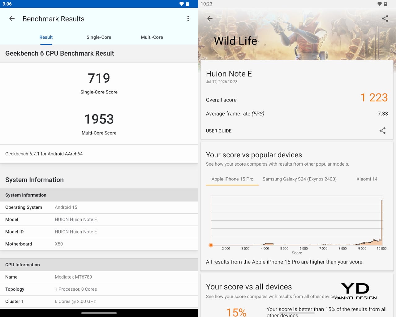
The Huion Note E is unambiguously what would be considered a mid-range tablet, especially with its MediaTek Helio G99 processor. While that may have been billed as a gaming chip for budget smartphones back in 2022, it doesn’t hold a candle to today’s mid-tier silicon, at least in theory. In practice, however, it actually performs quite well, especially with 6GB of RAM that gives apps sufficient space to operate. It’s no racehorse, for sure, but that isn’t even the point of this device in the first place.
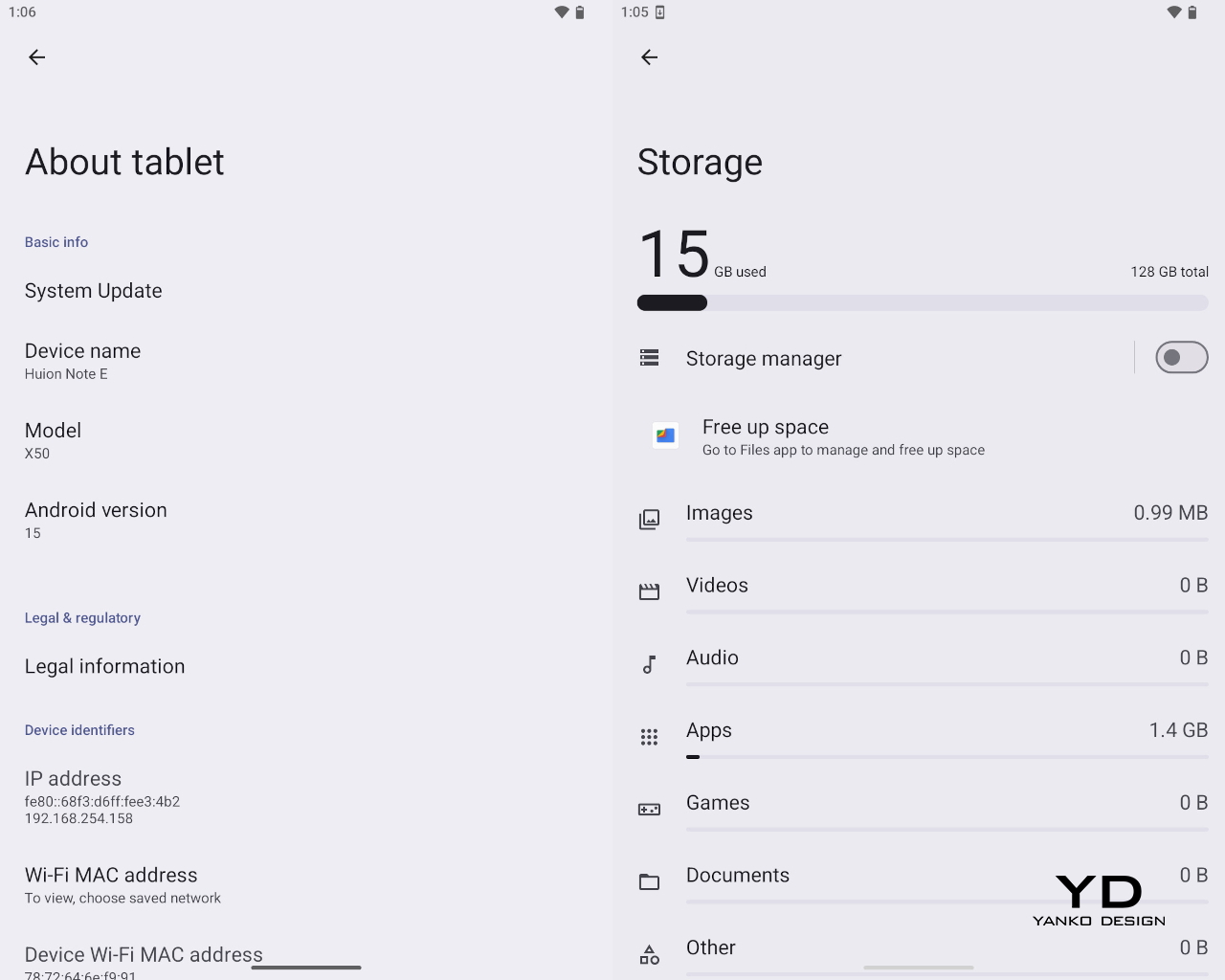
The tablet comes with 128GB of RAM, which is modest by 2026 standards, especially without any option to expand it with a microSD card. It will be enough to hold notes, pieces of art, and ebooks aplenty, but you’ll definitely feel cramped for anything else. You will definitely feel the intentional limitations Huion put in place, preferring to focus on the core use cases for the device: note-taking with a bit of drawing and reading on the side.

Huion Note E (Left) | POCO X8 Pro (Right)
That’s also why the Huion Note E’s camera story is almost non-existent. There’s an 8MP shooter on the back that’s primarily for scanning documents, notes, and books. You can take passable photos, definitely, but the quality is so basic you’d be better off reaching for your smartphone. Yes, you can probably snap up a reference for your drawing, but don’t expect accurate colors, let alone fine details. Unsurprisingly, there is no front-facing camera, even for video calls.
A 4,500mAh battery sounds a little too modest for a tablet, but it does surprisingly well. On standby, with 2 or 3 benchmarks run, it lasted almost three days from full to 5%. On a full day of regular use, you won’t even need to reach for a power bank until the next day. The 18W “fast” charging speed is definitely a bummer, requiring 2.5 hours to top up.

Display and Pen

Where the Huion Note E excels is, of course, the screen and stylus experience, which isn’t surprising given the brand’s core technologies and target market. The 8.4-inch laminated LCD screen comes with an anti-glare nano-etched surface that is advertised to provide a traditional pen-on-paper experience. In practice, it feels more like writing on a sheet of smooth, high-quality paper, like the ones you’d find in Japanese-made notebooks and planners. It doesn’t exactly have that “scratchiness” of regular paper, but there’s enough resistance that it doesn’t feel like plastic sliding on glass.
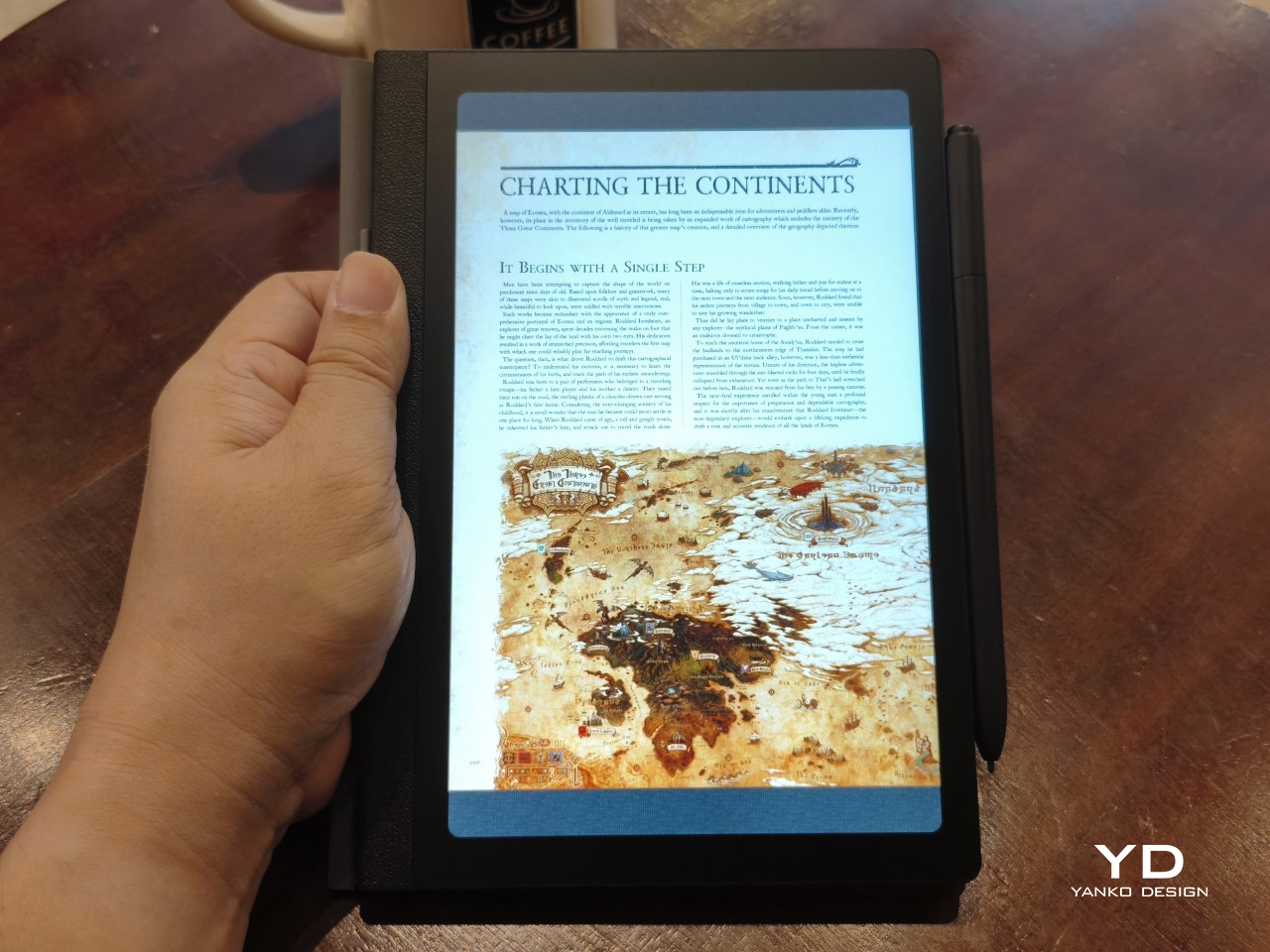
With a 1920×1200 resolution, the 60Hz screen boasts a pixel density of 270 PPI, close to what ereaders offer. Huion doesn’t advertise it as something similar to E Ink, nor does it even talk about a paper-like reading experience. It’s still an LCD screen, though with some features aimed at helping reduce eye strain. For example, it opts for DC dimming over the more popular PWM to reduce flickering that hurts the eyes over long periods of use.
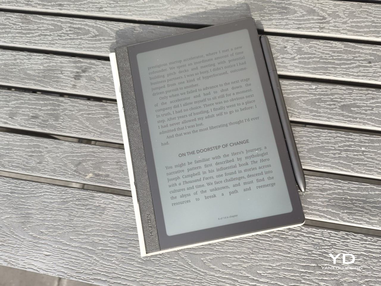
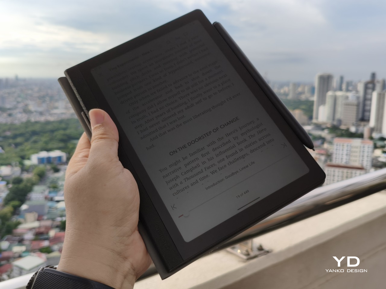
All of these come together to deliver a screen that is sharp, clear, and colorful, allowing for a variety of uses that go beyond just scribbling or reading. Under bright light, even under the sun, the screen is still readable, especially at max brightness. The anti-glare finish does affect viewing angles, but very few people would read or write at an extreme angle anyway.
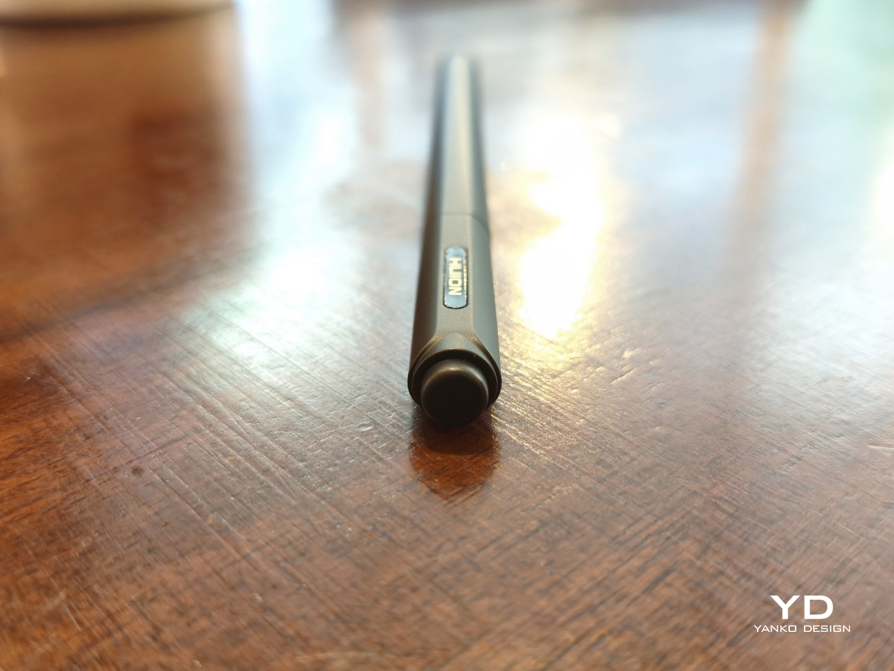
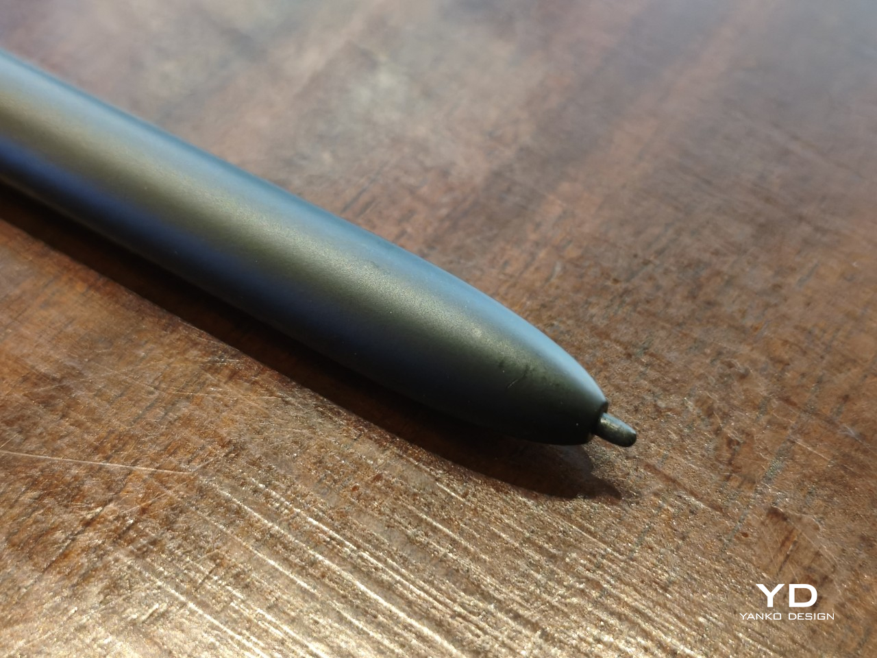
The Huion PW510 stylus that comes in the box utilizes the brand’s PenTech 3.0 technology, promising 8,192 levels of pressure as well as tilt sensitivity. It definitely works as advertised with no latency in any app, reproducing that joyful feeling of seeing “ink” flow smoothly from the tip of the pen as it glides across paper. Sadly, the design of the 1.6mm felt nib makes it harder to take full advantage of tilt, but it’s definitely there.

Software

That the Huion Note E is specifically designed for note-taking is perhaps best seen in the mixed bag that is the software experience. It runs on a customized Android experience that more closely resembles an e-reader than a typical Android tablet. Most of the features and settings are still there, just hidden and sometimes even locked down.

There is thankfully not much bloatware installed, save for some “basic” Google apps. Ironically, while the device does support Google Play, you have to take some extra, but thankfully easy, steps to register the device. It’s an unfortunate situation, but not a complete deal-breaker. Once you get past that, almost any app on the Play Store is available to install.
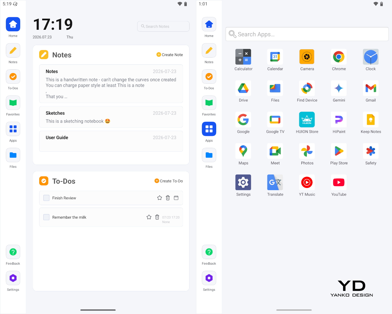
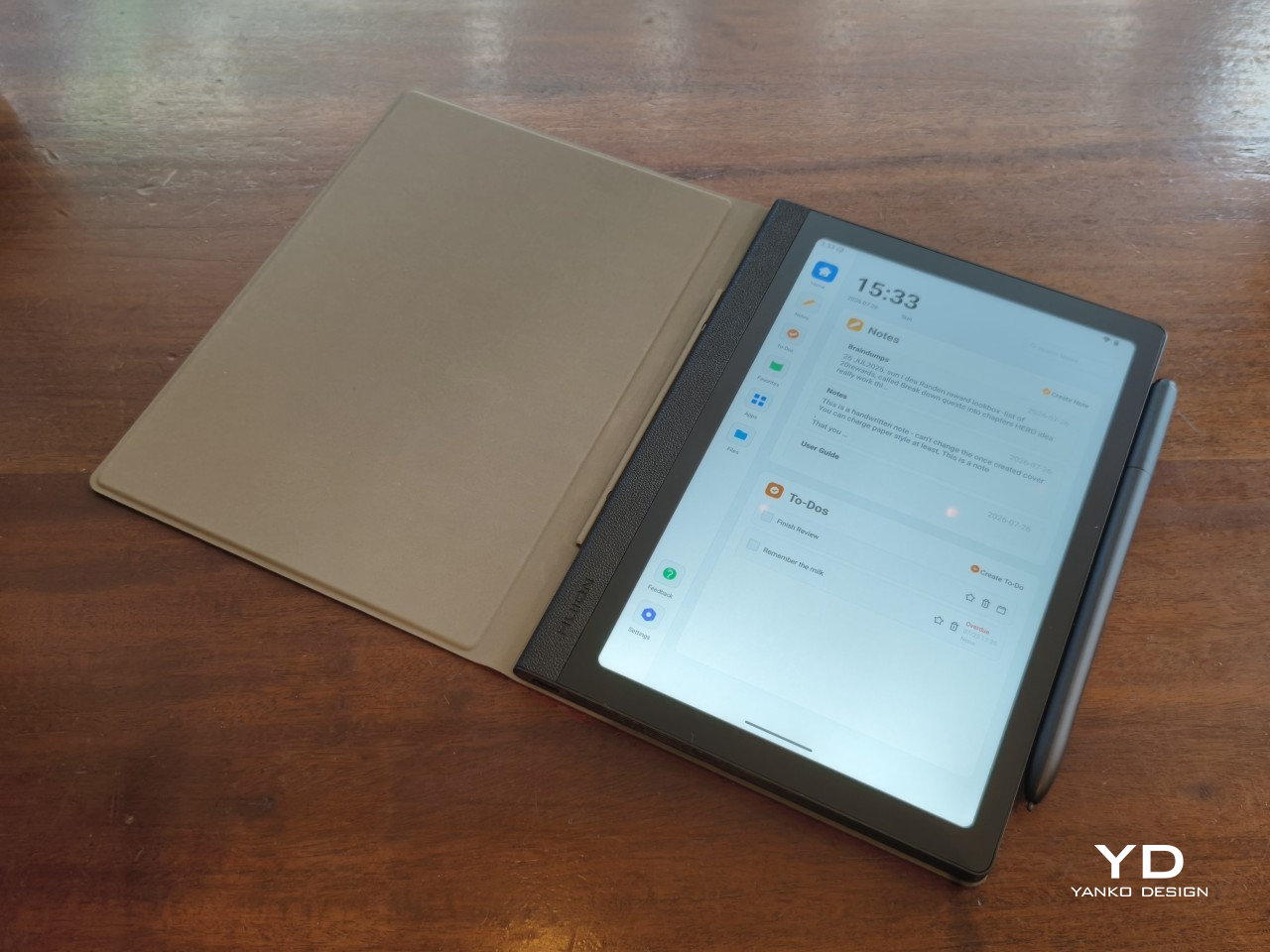
Huion’s built-in software, however, leaves some things to be desired. The launcher, which has “tabs” on the left, is designed to be minimal and distraction-free. It’s also the only way you can get to the Huion Notes and To-do apps, as they are baked into the launcher, following the practice of some Android ereaders. Unfortunately, it’s so minimalist that there’s no option to rearrange apps in the Favorites tab (but you can do that in the All Apps tab), nor is there a dark mode that will avoid blinding your eyes in a dark room.
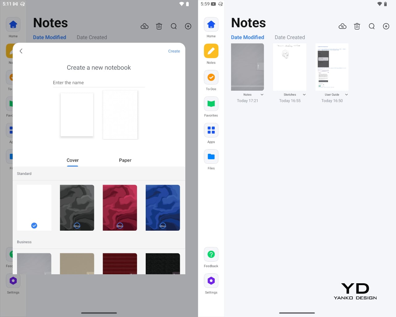
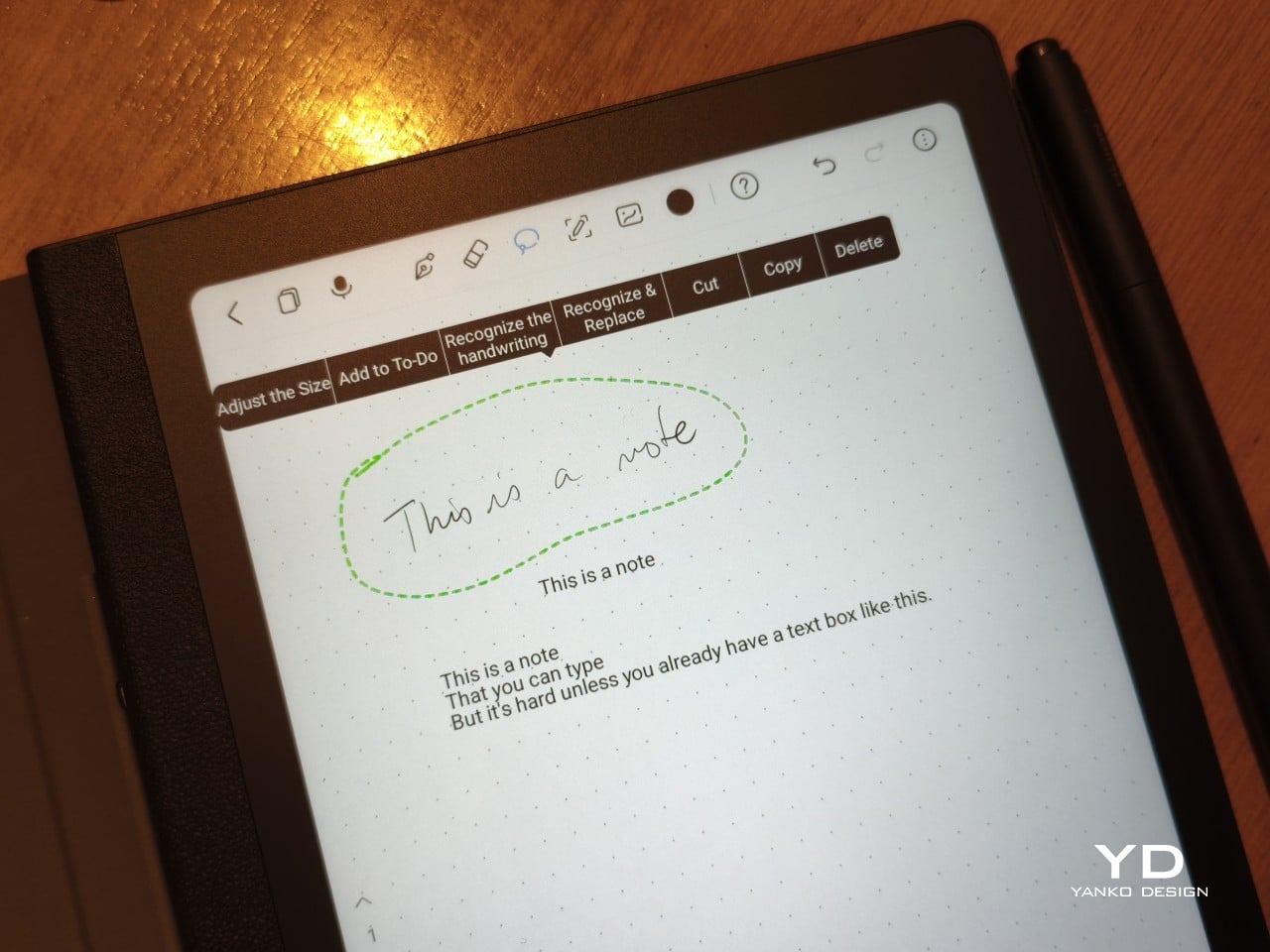
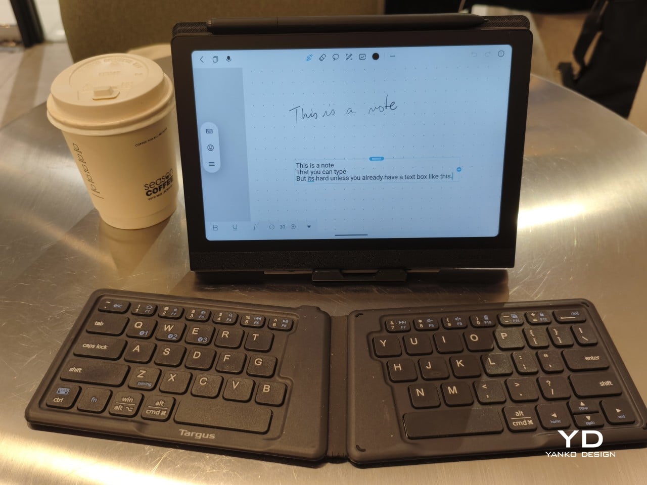
The Huion Notes app is also capable but basic, designed more for quick notes rather than elaborate journals and planners. You have four “pens,” only one of which takes advantage of pressure sensitivity. There’s no way to directly type in text, forcing you to write by hand and then convert to text, but once text is already there, you can edit normally with a keyboard. One key feature is the ability to record audio while writing, for example while taking notes in a lecture, and you can later play the recording back and watch your handwriting appear in sync.
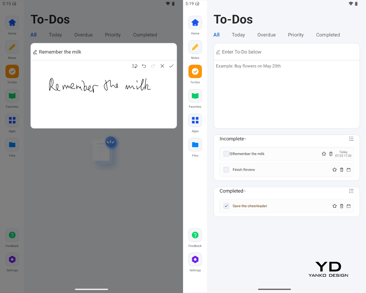
The built-in To-Dos app is even more basic, simply letting you scribble a task, which it converts to text, enter sub-tasks, and assign due dates and times. You can type in text at all, so you’ll really have to do everything with the stylus, which is the entire point in the first place. You don’t type in your paper notebook, after all.
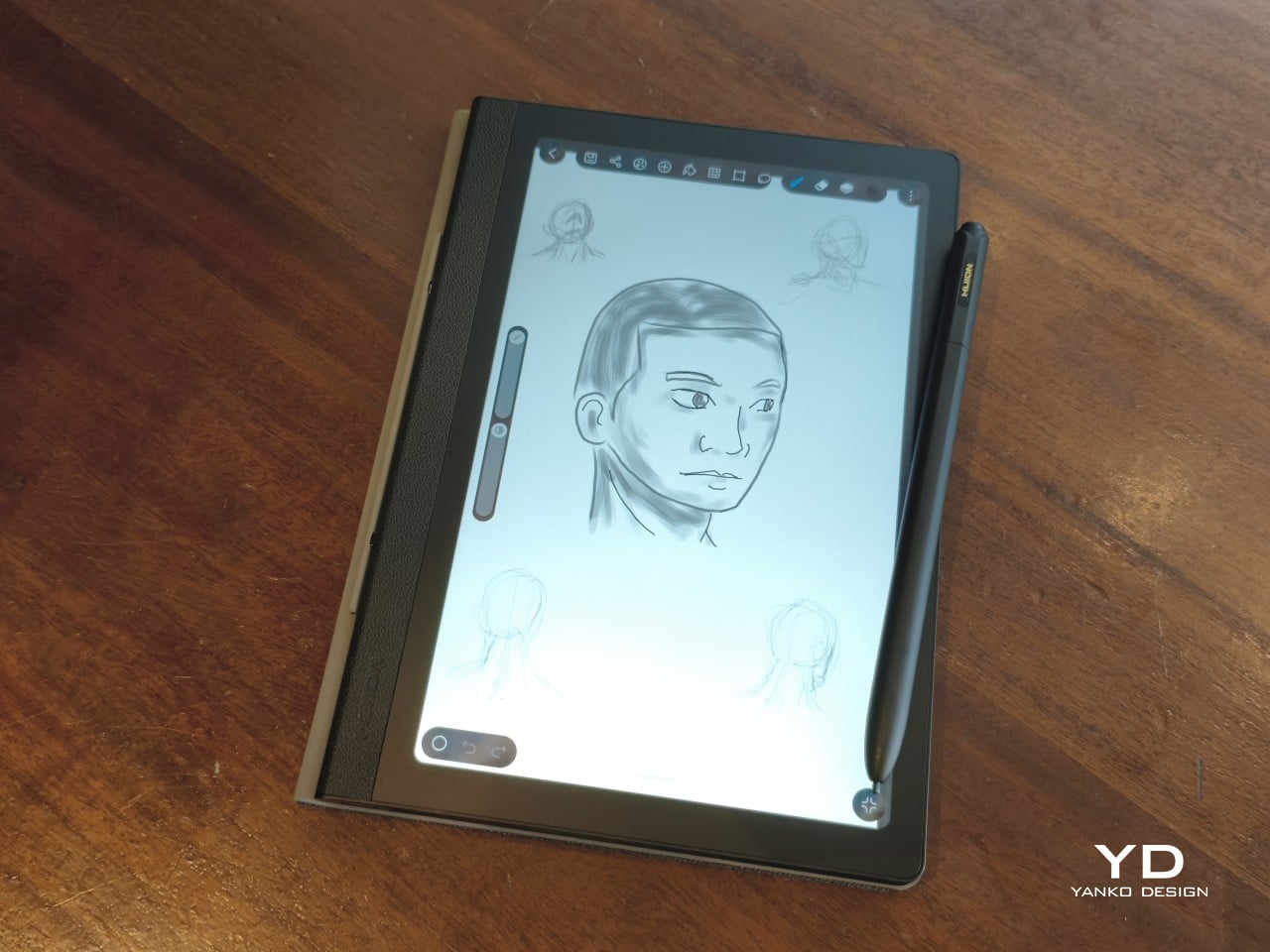
HiPaint, which some consider to be the Android Procreate, is also pre-installed, but you can install any drawing app of your choice. With Huion’s display and pen tech, turning the Note E into a portable digital sketchbook is like second nature. Of course, you can also read books, comics, and, if you really want, scroll through social media, though the reading experience might be subpar compared to a color E Ink device.

Sustainability

The Huion Note E doesn’t exactly score well in this criterion. The device is mostly plastic, with no mention of recycled parts. The packaging is compact and minimal, but there’s still quite a bit of plastic there as well. The device itself is only rated for IP40, which practically means no protection even against accidental splashes. It does run Android 15, which was last year’s release, but there is no clear upgrade path moving forward.
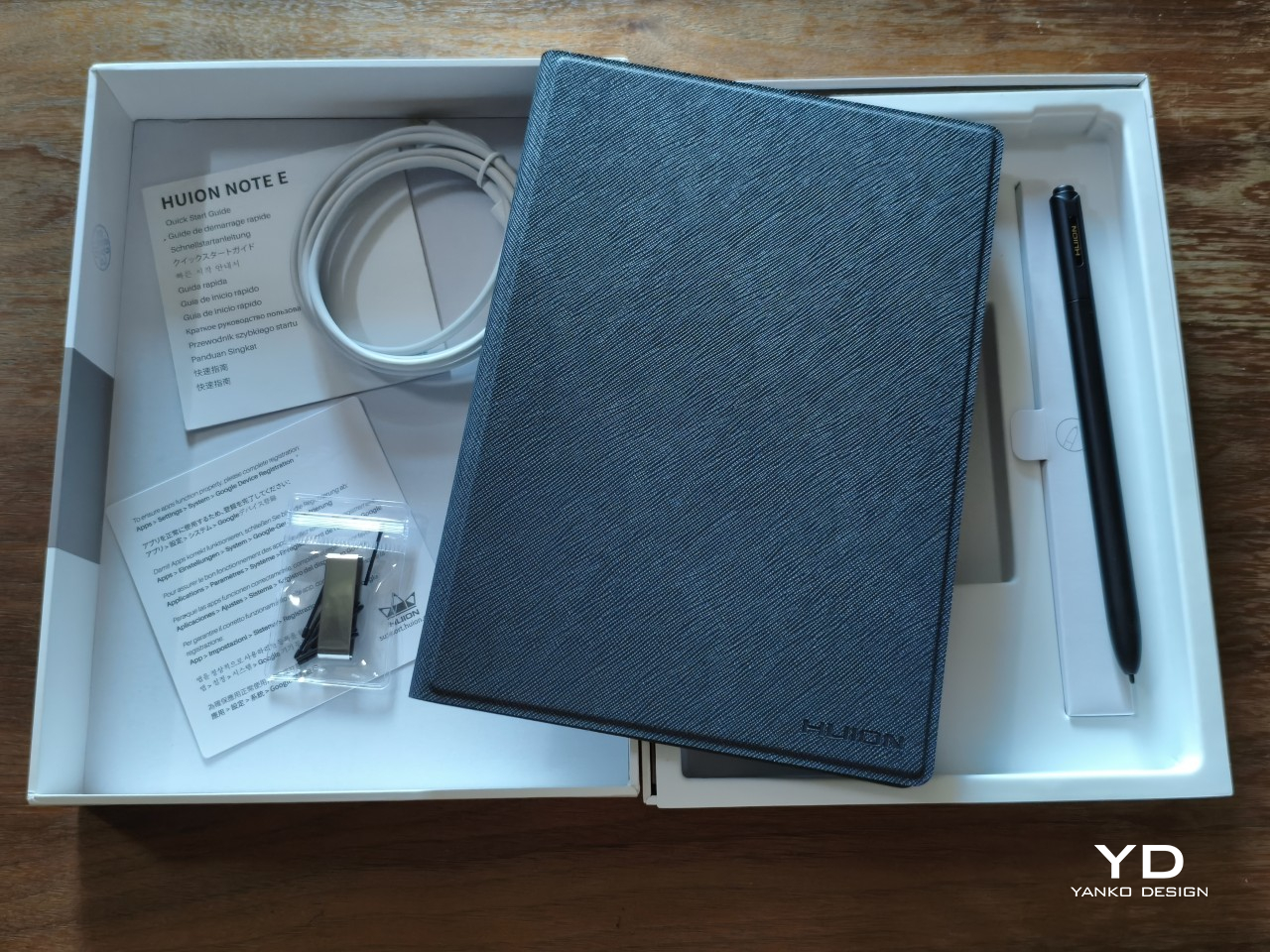
The Note E’s sustainability advantage is in what it saves in the long run, even if indirectly. It is trying to create a culture of swapping out paper notebooks for electronic ones, at least for the more disposable use cases. The battery-free stylus is not only, well, battery-free but also saves up on energy you would have used to charge the pen. Small wins, definitely, and hopefully Huion would move toward stronger sustainable practices and materials soon.

Value

At $369, the Huion Note E is hardly what you’d consider a budget tablet. It does include an excellent stylus and a somewhat ambiguous cover, but if you’re looking for hardware chops, you’d best look elsewhere. A mono speaker and a single 8MP camera are not what you’d consider modern features. It is definitely not the only Android tablet with a stylus, either.
What Huion brings to the table isn’t just another Android device, but one that is clearly designed, both in hardware and software, for a specific, focused purpose. That it looks like an A5 notebook isn’t an accident, and, incomplete as it may be, the streamlined software experience is quite intentional. The Note E aims to be your one electronic notebook to replace your other paper notebooks, and it definitely gets the job done, with plenty of room for growth.

Verdict

There is no shortage of Android tablets that support pen input, from the large and expensive “Pro” slates to E Ink readers. At first glance, the Huion Note E looks like yet another entry in that market, but just turn it to the side, and you will immediately see that it’s a different beast entirely. It’s an electronic notebook first and foremost. Everything else is just side effects.

What really sets the Huion Note E apart is the carefully selected mix of features and limitations that make it look less like a mass-market device and more like a considered object. It looks like the object it’s meant to replace, and the limitations it has in place streamline rather than restrict the experience. Sure, there are a few quirks, most of which can be fixed with software updates, but, in the end, the Huion Note E still manages to deliver its promise: an enjoyable writing experience on a notebook that never runs out of pages.
The post Huion Note E Review: The Notebook That Never Runs Out of Pages first appeared on Yanko Design.
This Steel Side Table Has 6 Functions and Zero Extra Parts

Living with limited floor space has always required some level of compromise, and furniture is usually where that compromise shows most. Side tables, in particular, tend to occupy a fixed spot and stay there, doing exactly one thing for the life of the room. The modern home demands more from every square meter, and most furniture simply isn’t designed to meet that demand in any meaningful way.

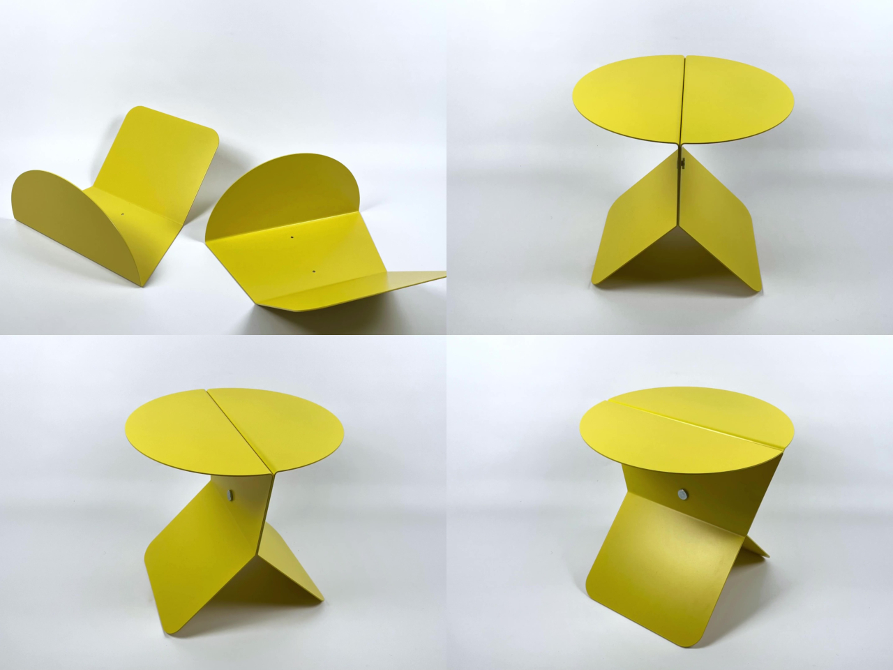
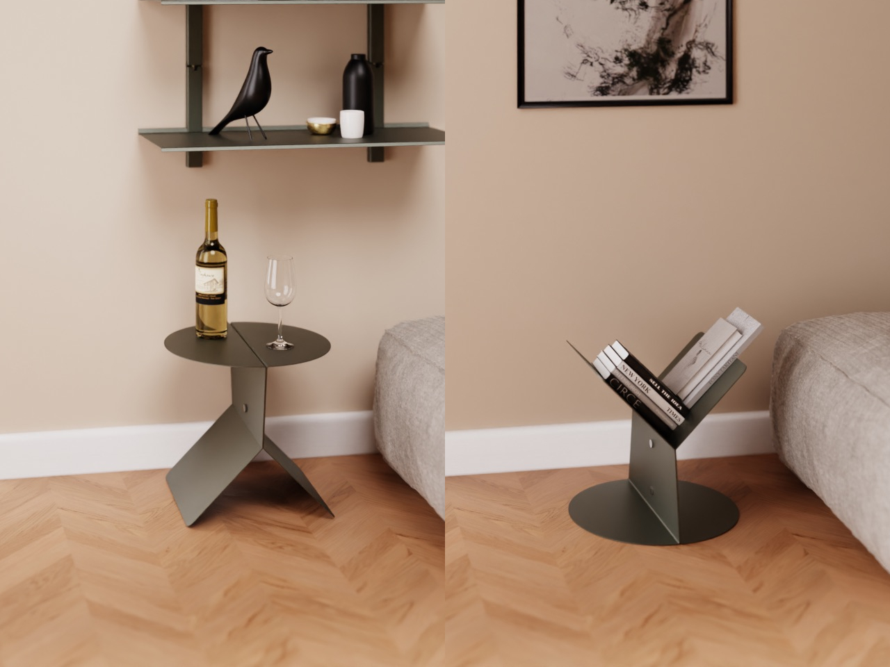
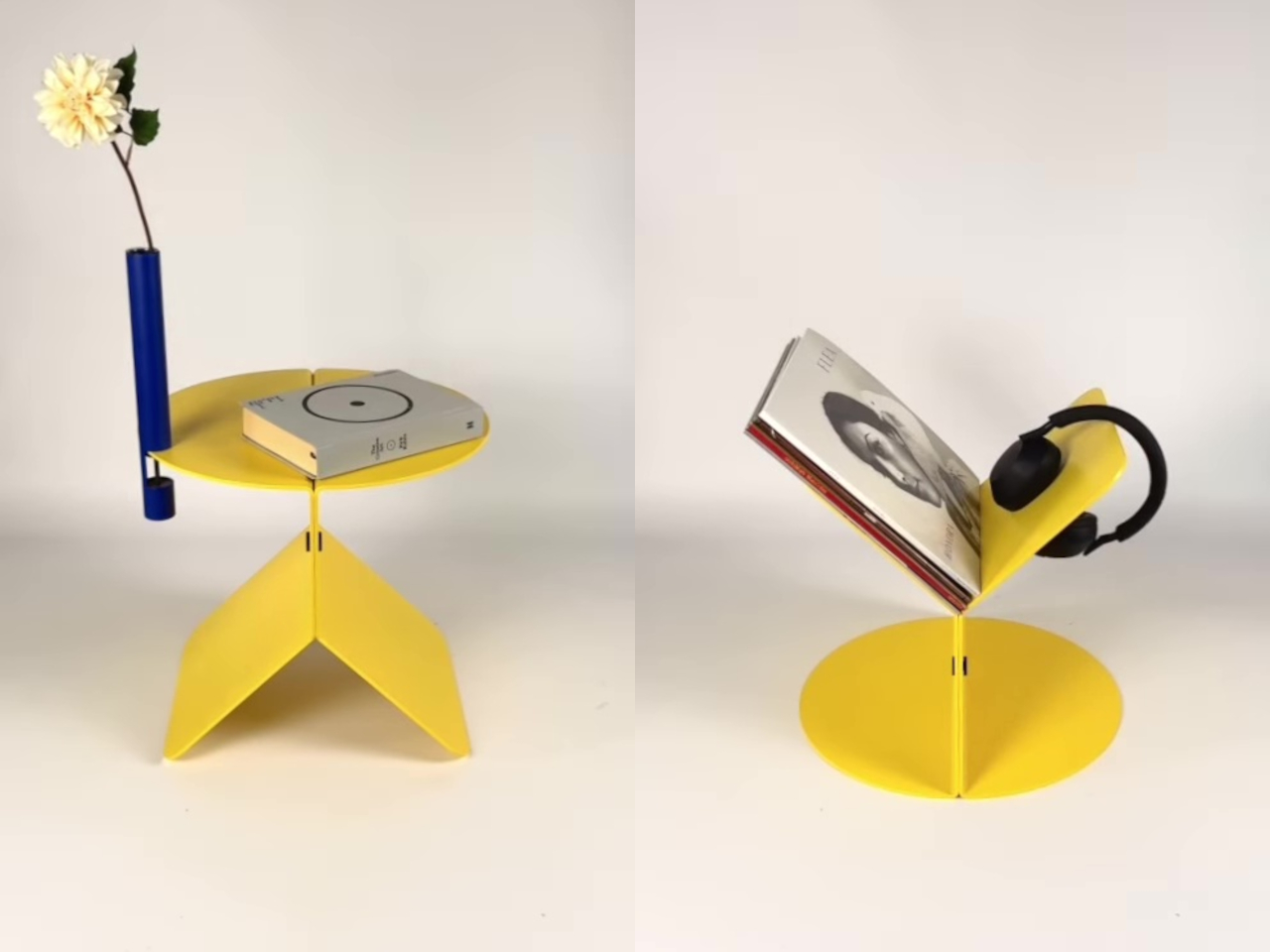
The Modular No. 2 takes a different approach. It’s a minimalist piece made from two halves of powder-coated steel that, depending on how they’re arranged, can serve entirely different functions without any added hardware, tools, or separate components. The flexibility isn’t a feature tacked on as an afterthought; it’s built directly into the form and the way the two halves relate to each other.

Designer: Michael Hilgers

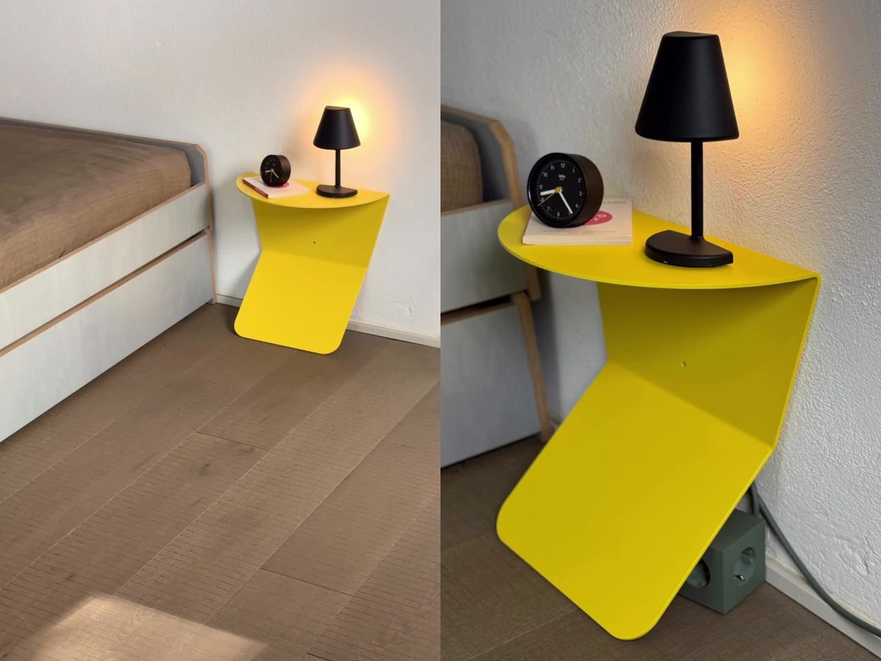
In its most familiar configuration, the two halves are joined to form a low side table, steady and practical for a drink, a bedside lamp, a small plant, or the usual stack of books collecting dust and good intentions. The clean steel surface and minimal silhouette means it doesn’t announce itself too loudly in a room, which is often the most you can ask of a side table.

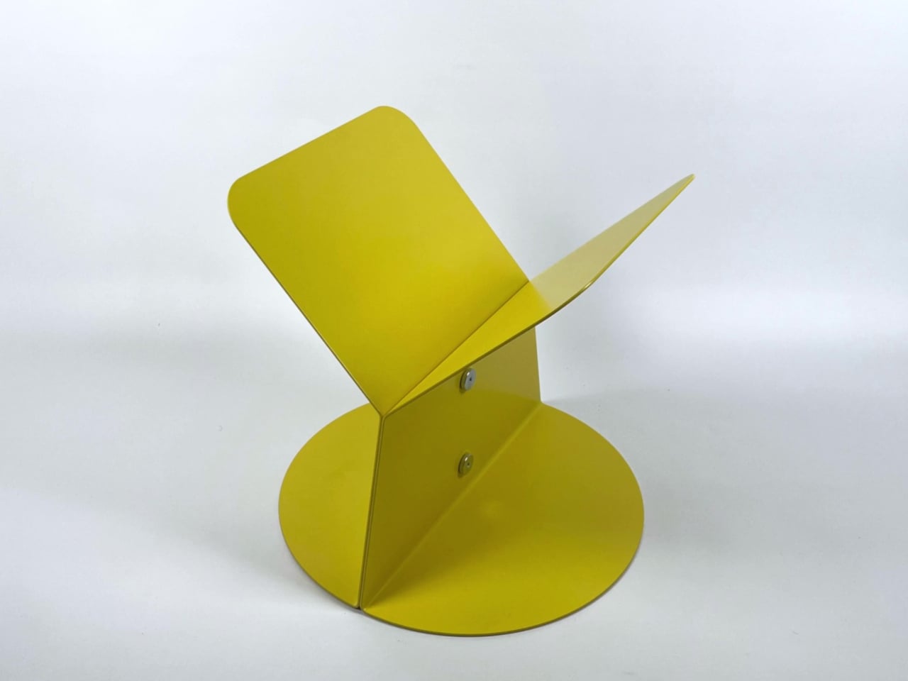
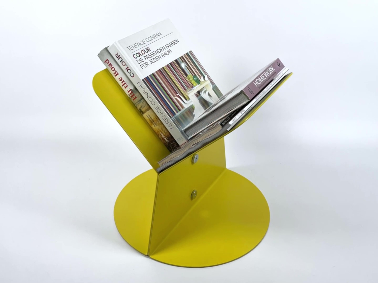
Flip it over, and the same piece becomes a magazine rack or bookstand. The geometry that creates the flat table surface in one orientation naturally forms a slotted structure in the other, holding books, periodicals, or papers upright without any additional parts. It’s one of those moments in furniture design where the function feels almost accidental, even though it’s clearly the result of considered thinking about form.

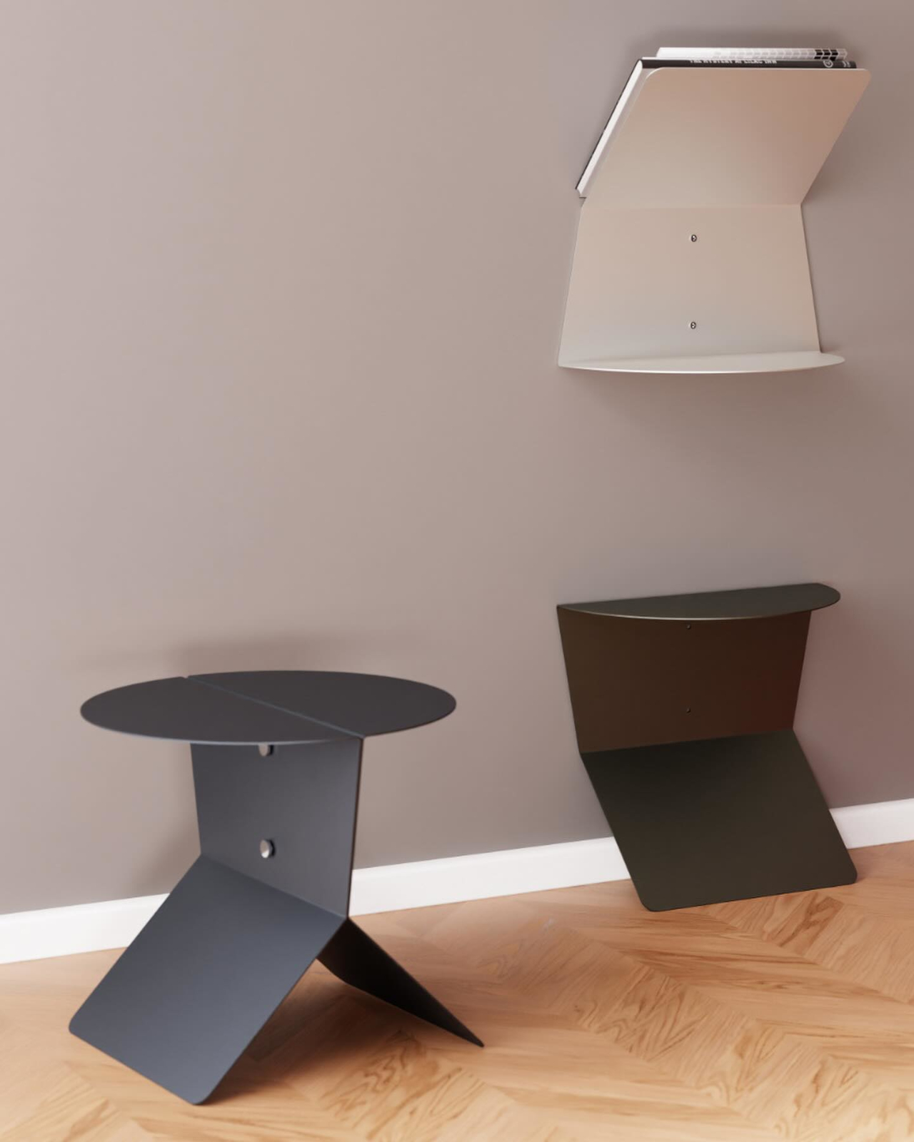
The third configuration is arguably the most useful one in a bedroom short on floor space. The same holes used to join the two halves together also serve as wall-mounting points, so each half can be fixed independently to a wall as a floating nightstand. Placed on either side of a bed, the pair creates a neat bedside setup that takes up no floor space at all.

That list of functions doesn’t end there. The piece also works as a wall console near an entryway for keys and small items, as a desk extension for an extra surface when working, or as a decorative shelf in a hallway. Every configuration uses the same two steel components, so there’s nothing to store, lose, or replace when you decide it’s time to rearrange.

The construction is straightforward in the best possible sense, with both halves made from steel with a high-quality powder coating. The design is minimalist and purist without being cold or uninviting, and the clean form sits comfortably alongside wood, fabric, and natural materials without competing with them. It’s the kind of piece that quietly earns its place in a room and then earns it again every time you realize it can be something different.

The post This Steel Side Table Has 6 Functions and Zero Extra Parts first appeared on Yanko Design.

Get Ready for the $349 Smart Ring That Vibrates on Your Finger

Smart rings have quietly become one of the more compelling wearable categories, but they’ve also settled into a familiar pattern. Almost every new model competes on the same promises: better sleep tracking, a more refined readiness score, and slightly longer battery life. The hardware keeps improving, but the relationship between the wearer and the device hasn’t shifted much. It still mostly communicates through morning reports and app dashboards.

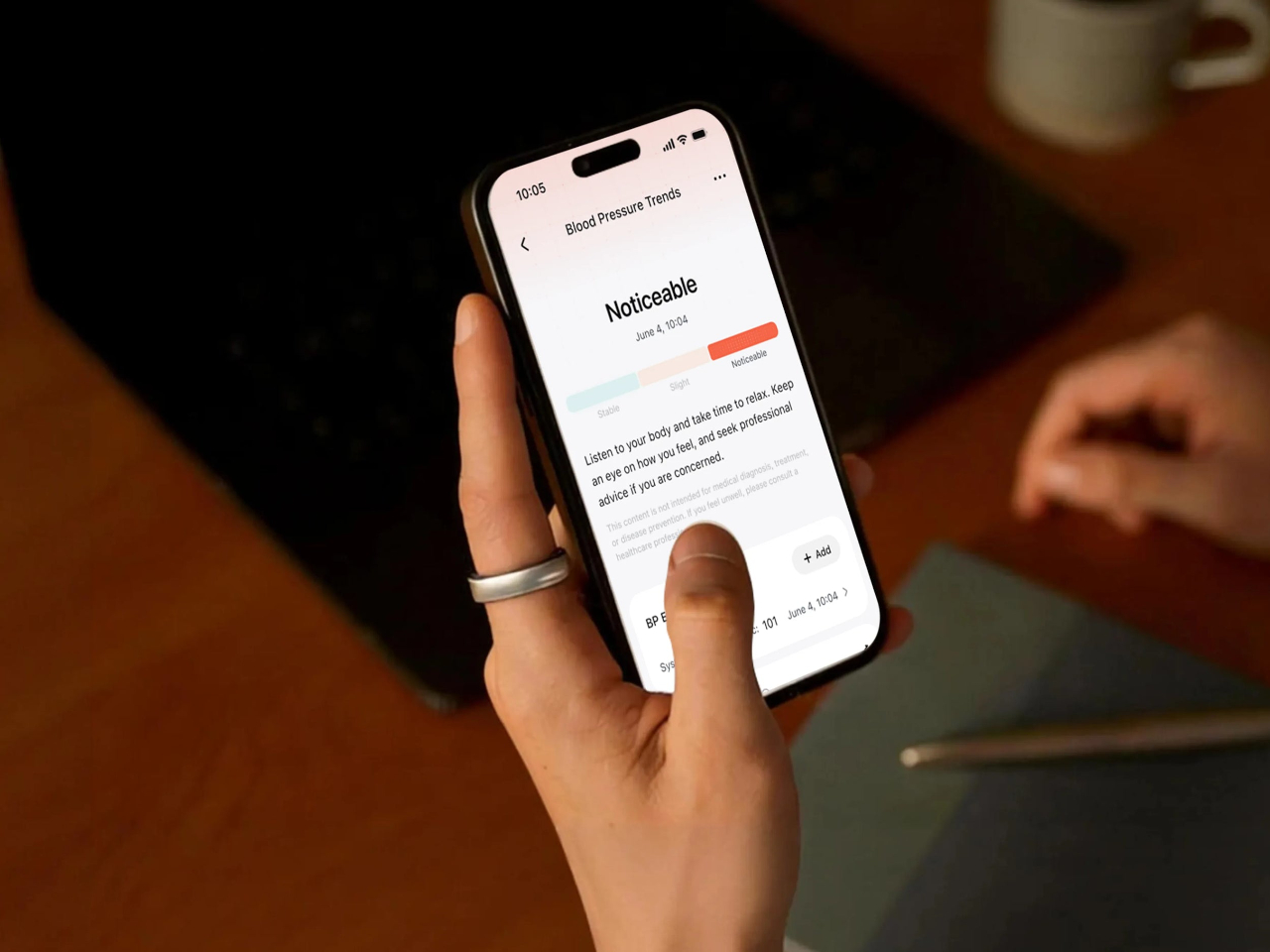
RingConn Gen 3, which launched on July 25, 2026, is making a case for something different. Beyond the usual cardiovascular basics, it introduces vascular trend tracking, giving wearers a longer-view picture of their health over time. It also adds haptic vibration alerts, a feature no other smart ring currently offers. The whole package comes in at $349 with no subscription fees, which keeps the ownership model refreshingly straightforward.

Designer: RingConn

Most attention will drift toward the vascular tracking angle, but the haptic motor deserves a closer look. A smart ring that vibrates on your finger isn’t the same experience as a watch tapping your wrist. The finger is one of the body’s most tactile zones, so a buzz there lands differently, more directly, and in a way that’s harder to tune out or dismiss as background noise.

That difference matters most in the moments when you’d least want to pull out your phone. A quiet nudge during a meeting, a gentle prompt after sitting still for too long, or a discreet alert in the early hours when something shifts overnight, none of those need a screen. They just need a ring that knows when to say something and how to say it without disturbing everyone around you.

The vascular trend tracking feature is the bigger headline in category terms. Rather than adding another single-moment metric to the app dashboard, it monitors patterns over time, giving wearers a broader sense of how their body is trending across days and weeks. It’s framed as a wellness insight rather than a clinical reading, which keeps the expectations grounded and the interpretation squarely in the wearer’s hands.

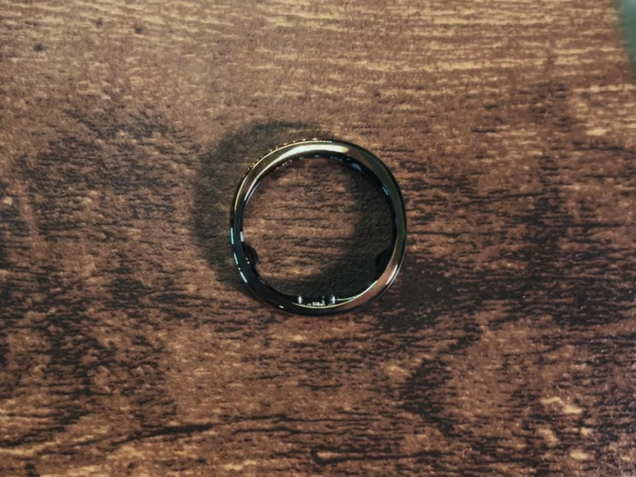
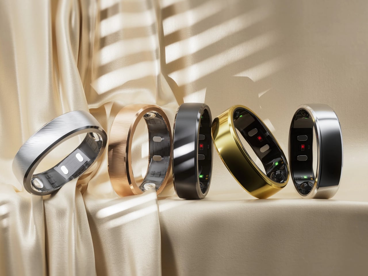
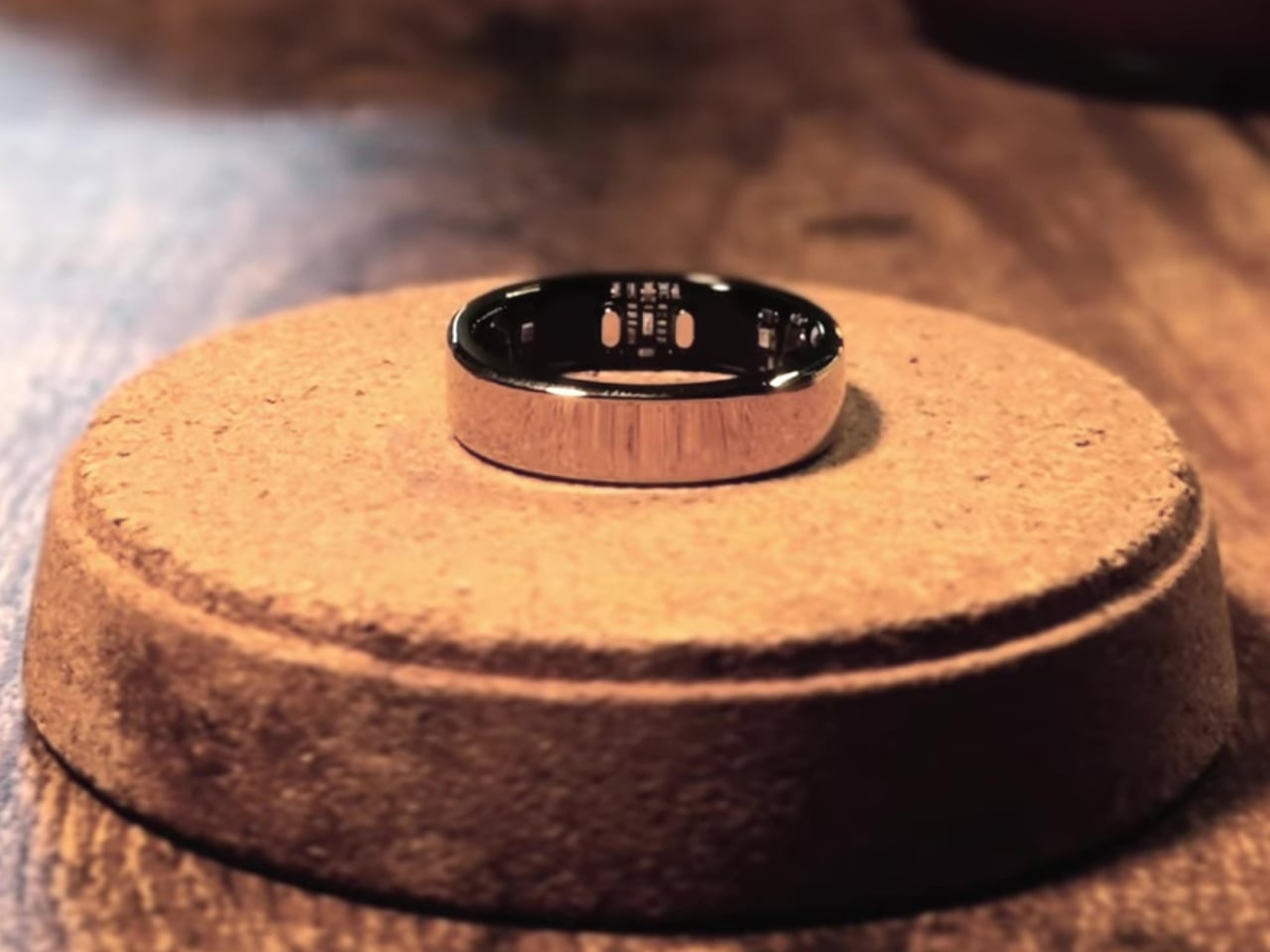
What makes this interesting from a design standpoint is that RingConn managed to fit optical sensors, a vibration motor, and up to 14 days of battery life into a 2.3mm titanium body. The inner surface uses medical-grade resin for comfort, and the ring itself weighs between 2.3 and 3.5 grams depending on the size. That’s a serious hardware challenge for something designed to sit on your finger all day.

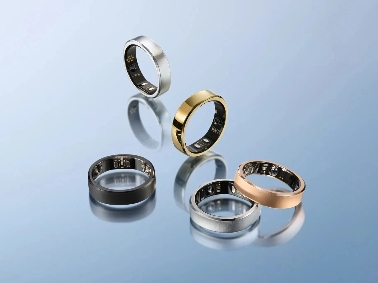
The Gen 3 comes in five finishes: Future Silver, Royal Gold, Matte Black, Brushed Silver, and Brushed Rose Gold. At $349, it’s firmly in premium smart ring territory, but the lack of a subscription fee makes that price easier to justify over time. Rivals that tack on monthly charges for full app access end up costing noticeably more in the long run, which makes RingConn’s flat-fee model considerably more appealing.

Then there’s the Warner Bros. Lord of the Rings collaboration, a limited-edition partnership that RingConn isn’t shy about mentioning. It’s a smart piece of brand alignment, a ring company partnering with the most famous, or infamous, ring in pop culture. Whether the tie-in feels like genuine collector appeal or calculated marketing depends on the buyer, but it does add some character to a category that tends to take itself rather seriously.

What RingConn Gen 3 really proposes is that a smart ring doesn’t have to stay quiet. The category has spent years refining how it listens to the body, and Gen 3 asks what happens when it starts talking back. Whether that’s a light nudge during a sedentary afternoon or a vascular trend surfacing across a few weeks, there’s something worth considering in a ring that finally has something to say.

The post Get Ready for the $349 Smart Ring That Vibrates on Your Finger first appeared on Yanko Design.
Pocketbyte: The Modular Open Source PDA Nobody Knew They Still Wanted

The PDA had a good run in the late 1990s and early 2000s before smartphones absorbed everything it did, then kept going. What disappeared with it wasn’t just a product category but a device that was genuinely focused: it did a handful of things well, didn’t ask for your attention beyond those things, and fit comfortably in a pocket. The smartphone replaced it with something more powerful, but also something that never quite left you alone. That tradeoff is what a growing number of people are starting to notice.

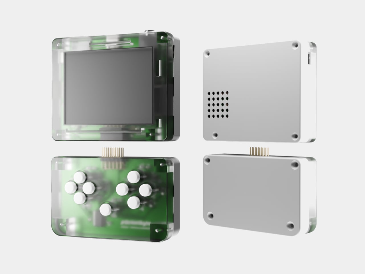
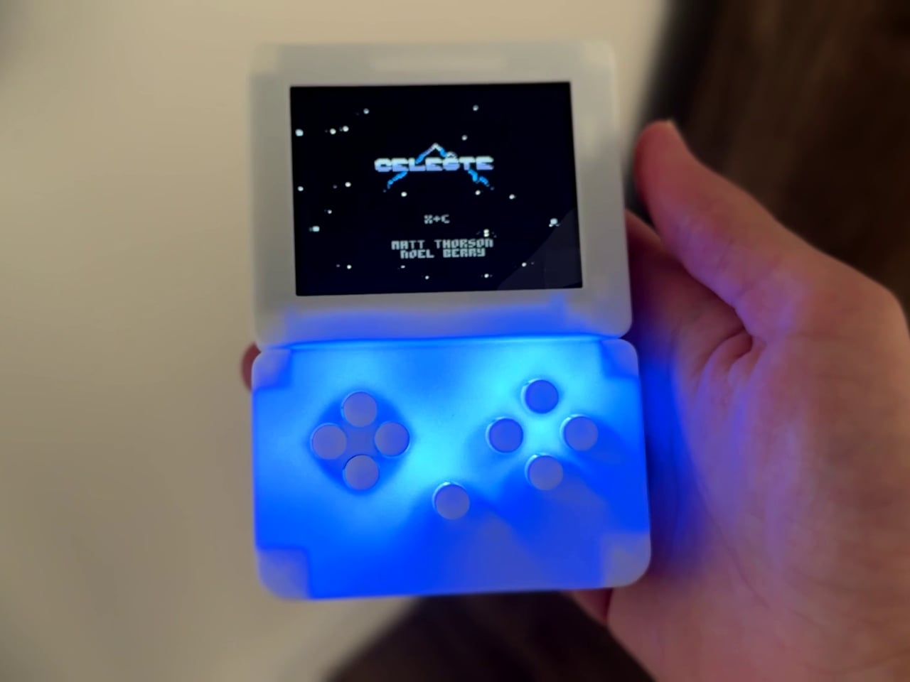
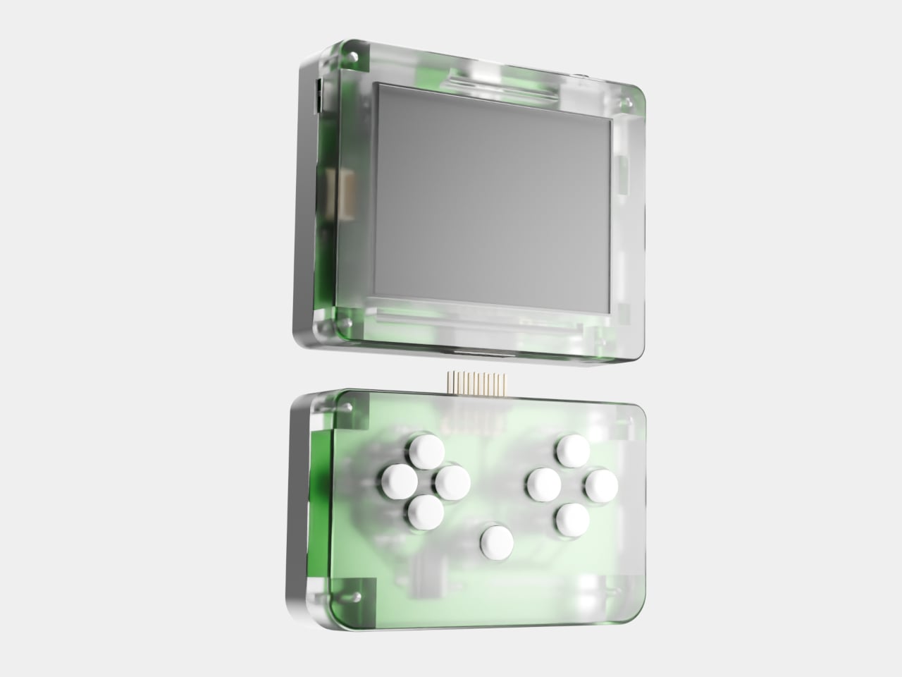
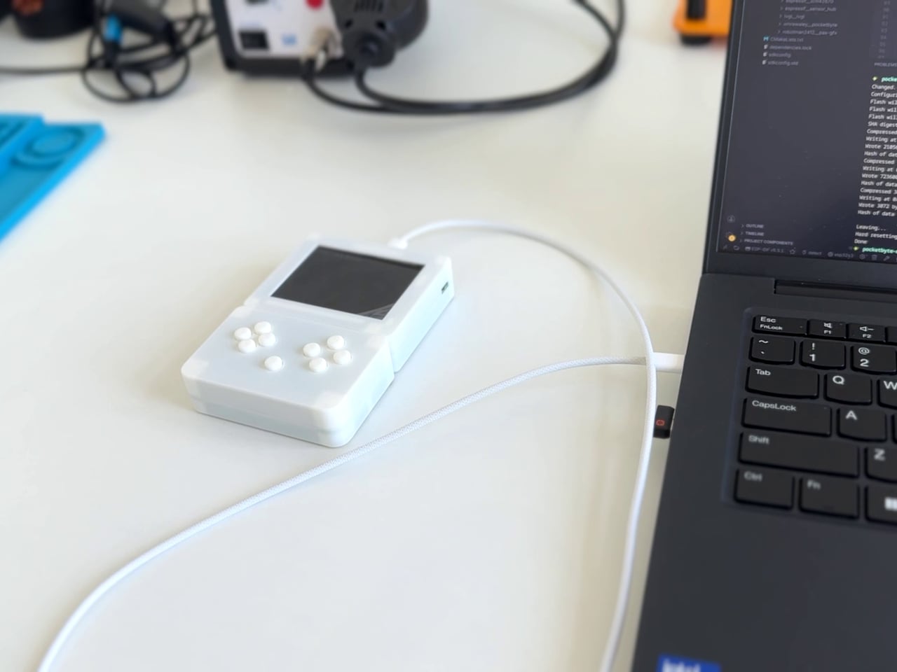
Pocketbyte is a solo-built, open-source handheld computer that describes itself as a modern PDA: a pocket device for play, notes, music, and tinkering, built without the feeds, notifications, or ambient pull of a connected smartphone. It runs on an ESP32-S3 processor, a dual-core chip clocked at 240 MHz, paired with a 2.8-inch IPS display that stays readable in sunlight. The 1,500mAh battery charges over USB-C and holds up through extended sessions of gameplay or music listening.

Designer: Om Rawaley

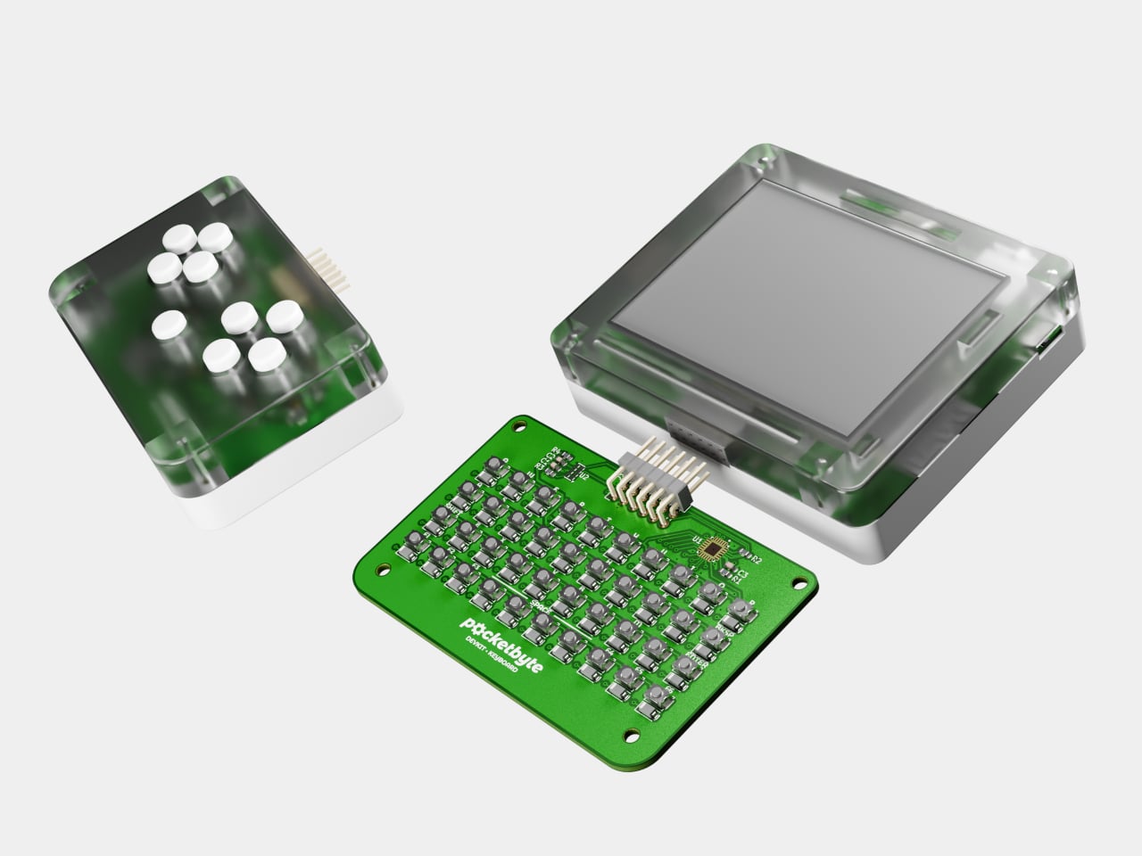
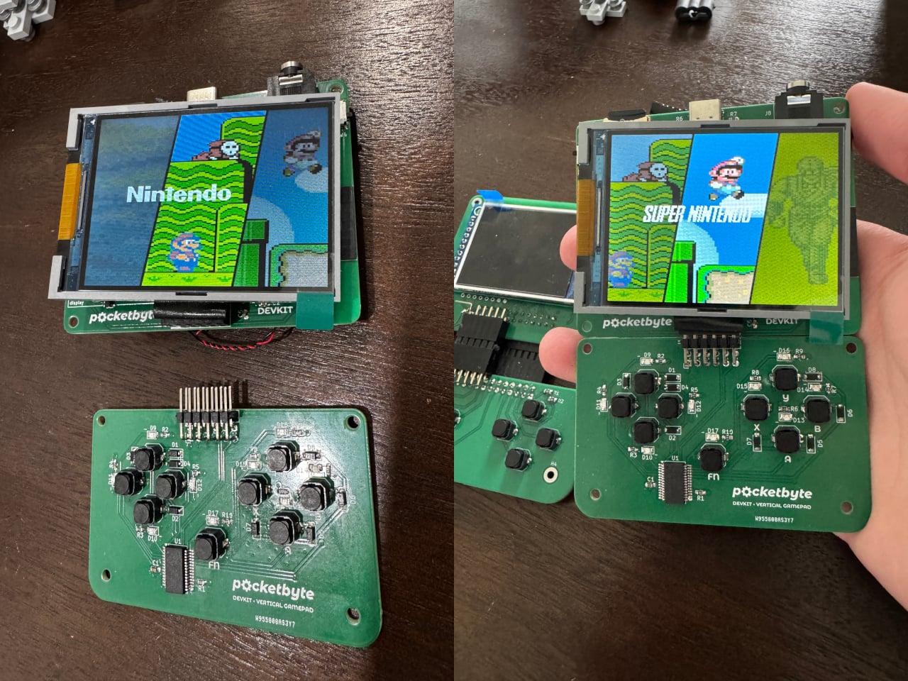
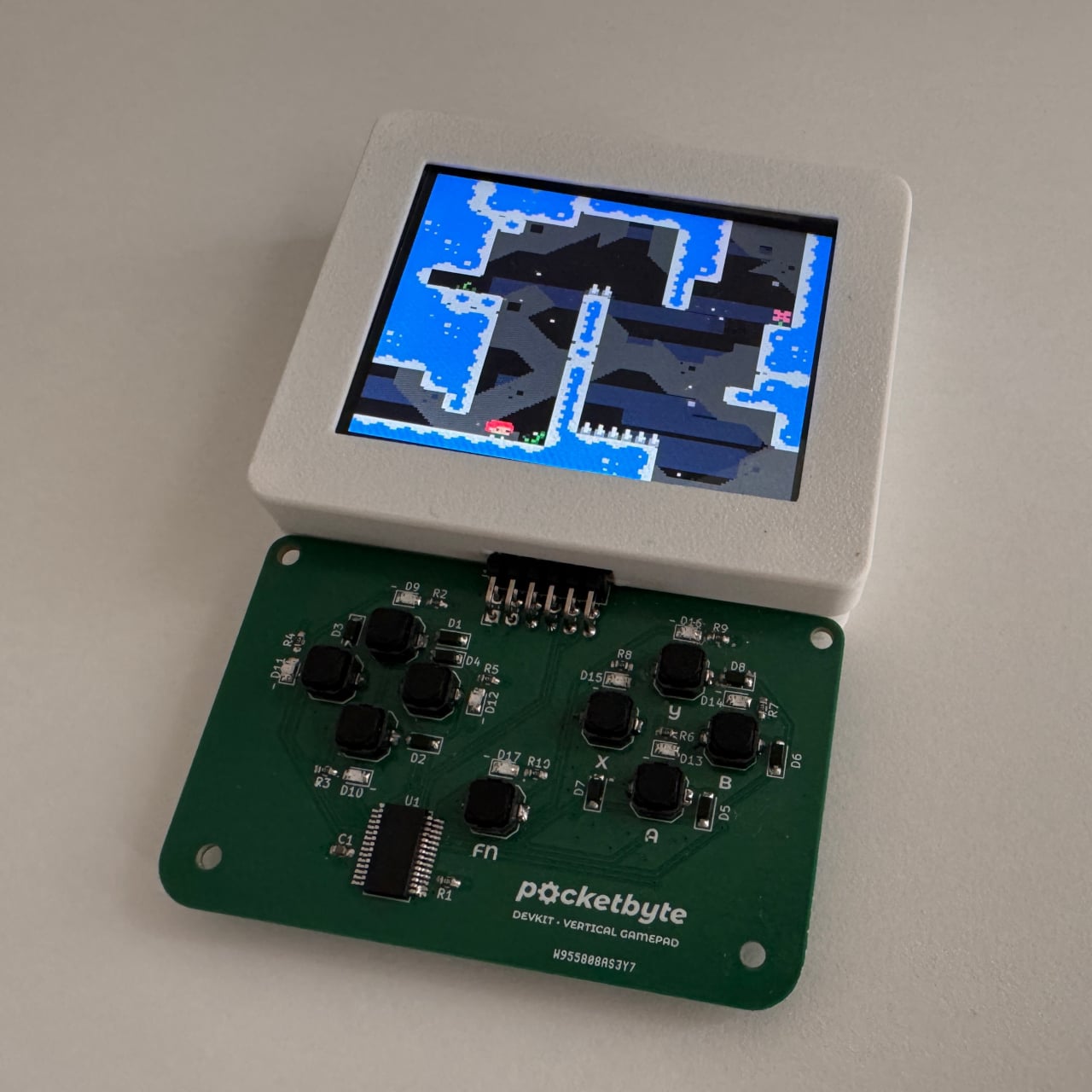
What separates it most from every comparable device is the modular input system at the bottom. A magnetic pin connector accepts swappable control modules, and two are available now: a gamepad layout for games and a QWERTY keyboard for typing. The connection is physical and hot-swappable, so switching from a gaming session to writing a note takes as long as pulling one module off and clipping another one on. Anyone can design a third module, fourth, or fiftieth. The documentation is open, and the architecture invites it.

The software side is just as open. PocketbyteOS has a built-in App Store accessible over Wi-Fi, where community-built apps can be downloaded and installed without connecting to a computer. For those who want to go deeper, the C library is available under the Apache 2.0 license on GitHub, and there’s no locked bootloader preventing anyone from flashing whatever they build. The Retro-Go emulator runs SNES, Sega Genesis, Game Boy Color, and NES titles comfortably on the hardware. Celeste has been ported to it. The device also plays MP3 and WAV files with cover art and ships with a stereo headphone jack alongside the built-in mono speaker.

Storage goes up to 32GB via microSD, which covers a lot of retro games, playlists, and saved data in a device this size. Wi-Fi and Bluetooth are both built into the ESP32-S3, so wireless connectivity is available without adding hardware. For anyone who wants to build interactive apps, such as wireless messaging tools, music sequencers, graphing calculators, or text editors, the platform handles all of it within a form factor that actually fits in a pocket.

DevKits are coming to early adopters and developers first, with broader availability to follow. It’s aimed at makers, retro gaming fans, digital minimalists, and anyone who’s wanted a small, capable, honest machine that doesn’t ask for more of their time than they’re willing to give it. Devices like this used to exist. They went away. Pocketbyte is an argument that they shouldn’t have.

The post Pocketbyte: The Modular Open Source PDA Nobody Knew They Still Wanted first appeared on Yanko Design.

The €169 Portable Mechanical Keyboard That Makes the Mouse Unnecessary

The mechanical keyboard market has grown considerably in recent years, but most of the attention still goes to full-size, desk-bound boards that aren’t designed to travel. Compact computing has moved in a very different direction, with more people coding, writing, and browsing from small setups, tablets, mini PCs, and couches as often as from dedicated workstations. Keyboards built for that kind of flexibility are surprisingly hard to find.

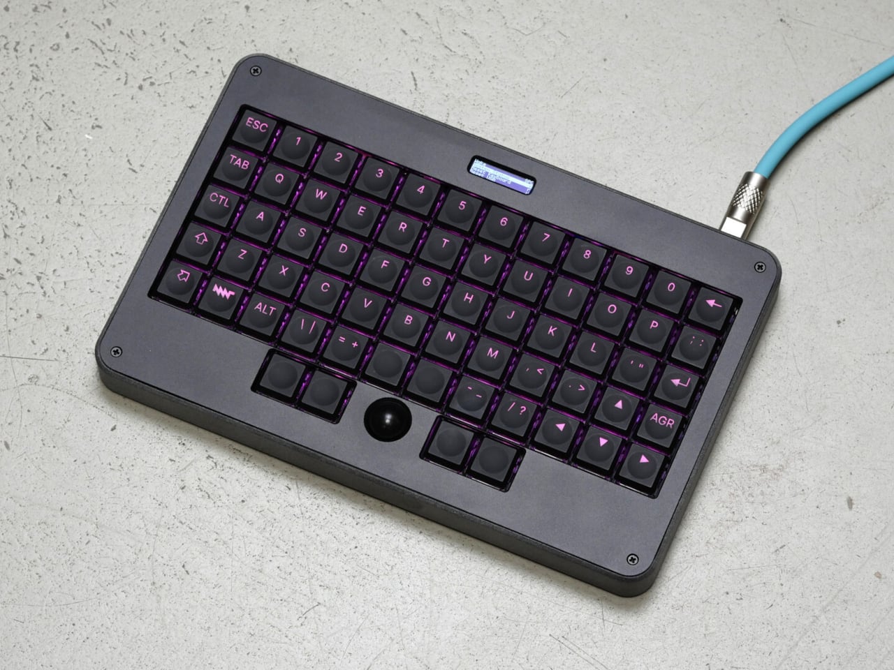
The MNT Pocket Reform Standalone Keyboard takes an unusual path to solving that. It started as the built-in keyboard of the Pocket Reform, a netbook-inspired open-hardware mini laptop, and has since been given a dedicated anthracite enclosure for use with any device. Everything that made it satisfying in the original machine, the integrated trackball, the ortholinear layout, the mechanical switches, came along with it.

Designer: MNT Reform

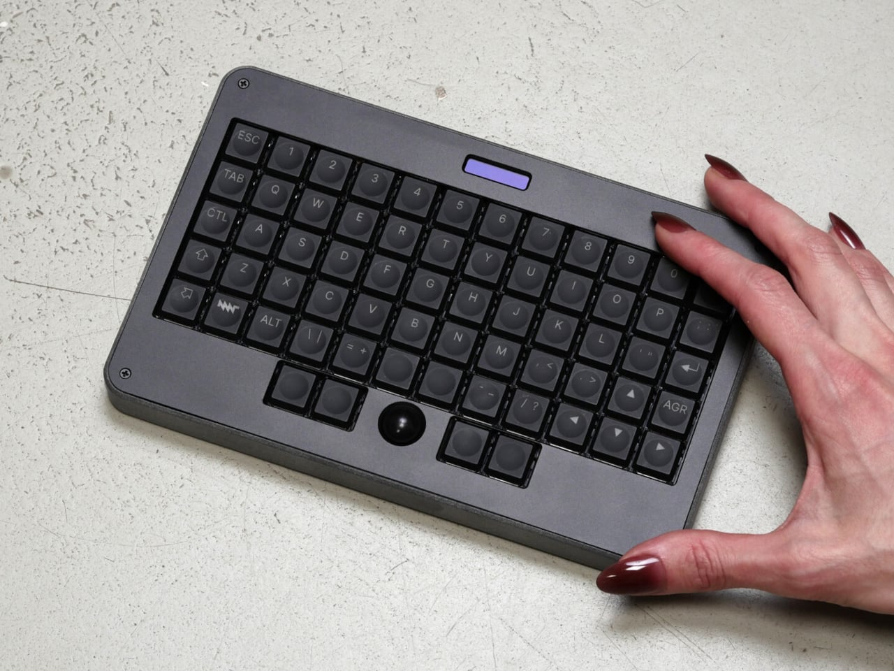
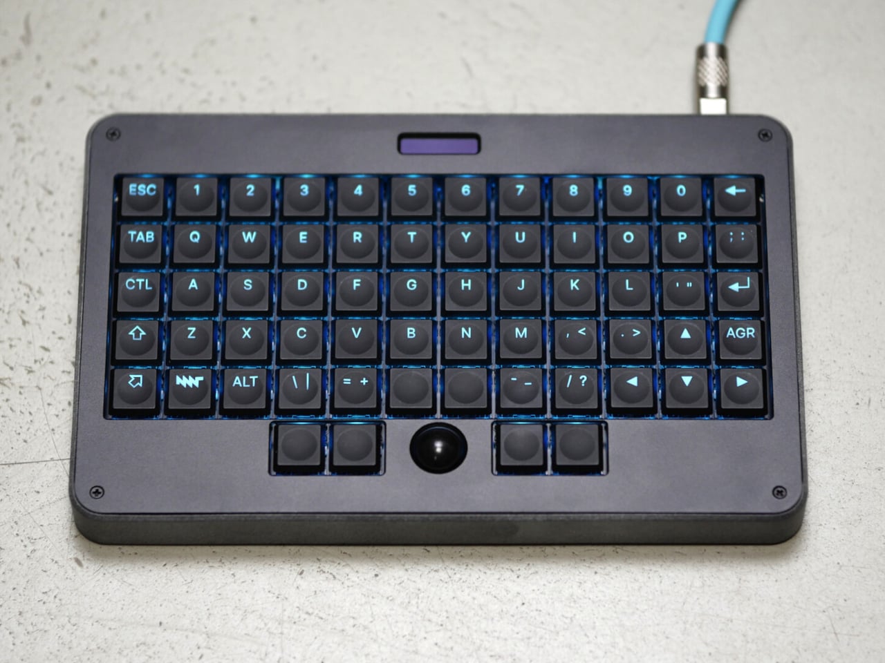
The layout is the first thing to adjust to. All 60 keys sit in a strict rectangular grid, doing away with the staggered rows on conventional keyboards. The arrangement is designed to reduce the diagonal reach each finger makes on a standard board, and everything fits into a footprint of 20.5cm x 13cm, compact enough for a desk corner or a couch armrest.

Switch choice is picked at purchase: Kailh Choc Red Pro for a smooth, quiet linear press; Choc Brown for tactile feedback without the noise; or Choc White for an audible click. The same switches also power the four buttons flanking the trackball, which keeps the typing and pointing experience consistent throughout. The keycaps are laser-engraved with a translucent ABS and PU construction that lets the RGB backlight show through clearly.

The built-in trackball is arguably the standout feature for anyone tired of juggling a keyboard and a mouse on a tight desk. The 15mm optical trackball handles left, middle, and right clicks plus scroll through its four surrounding buttons, positioned right below the spacebar. A 128×64 pixel OLED display near the top of the board acts as a live settings interface for the RP2040 microcontroller running the unit.

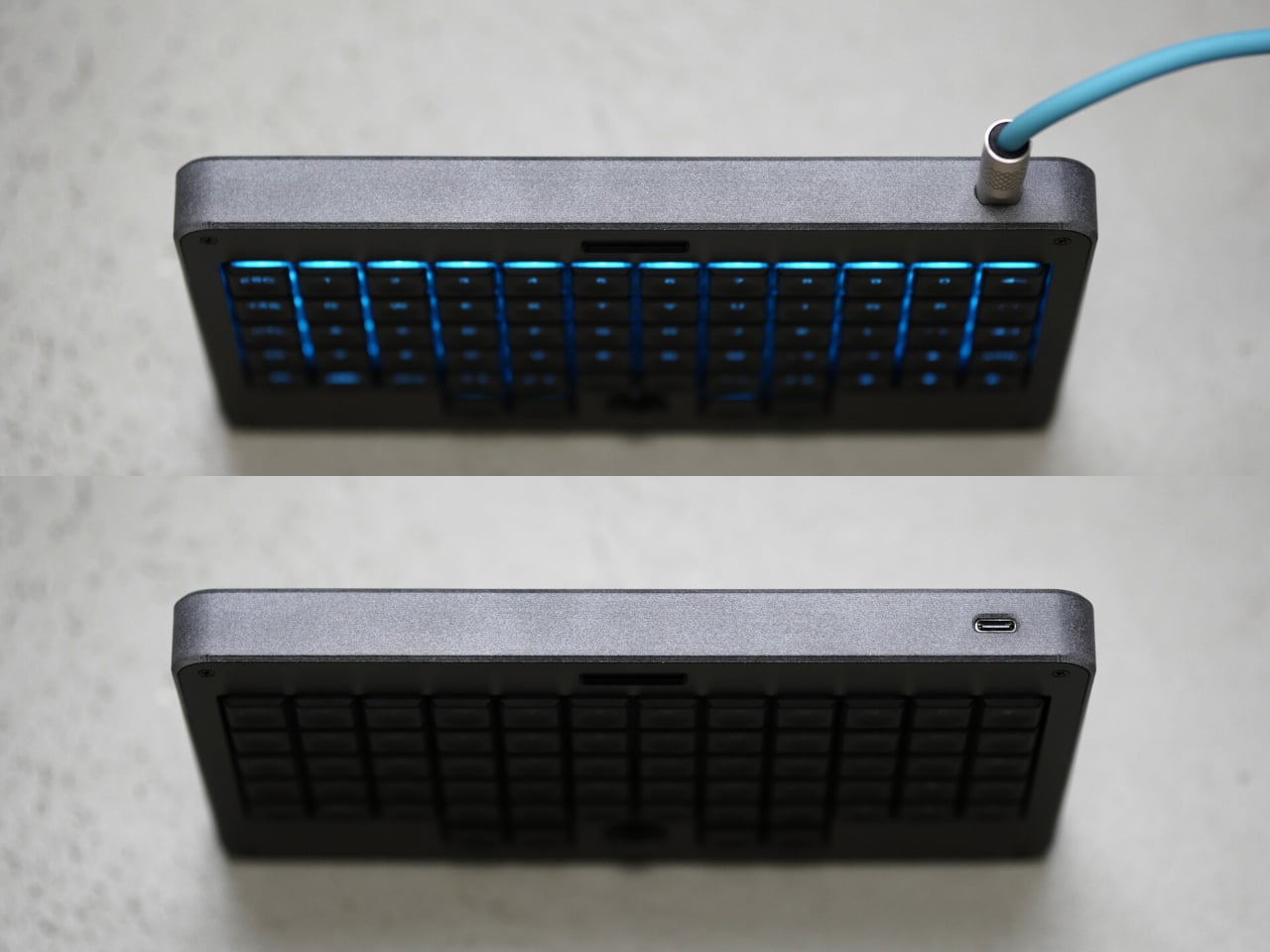
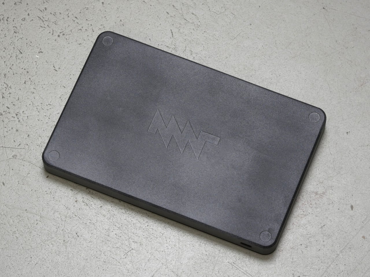
The 64 individually addressable RGB LEDs give the backlight a customizable glow that can be dimmed to nothing or tuned to taste. The enclosure is made from two materials: a lightweight grey nylon lower shell produced through HP Multi Jet Fusion, and a black-anodized, bead-blasted aluminum top plate. The combination keeps the board light without compromising the surface rigidity that matters during fast, heavy typing.

The keyboard is also fully open hardware, with PCB schematics, firmware, and mechanical designs all publicly available for modification. Like every device in the Reform family, it’s built to be repaired or altered by the owner, and the community around the platform means documentation and support are genuinely active. For people who care about knowing exactly what’s in their gear, that’s a meaningful distinction.

It connects to computers, tablets, and phones via USB-C, which handles both data and power, making it compatible with anything that supports USB HID. That also means plugging it into a phone or tablet for on-the-go typing is genuinely straightforward, and that’s a handy thing when the alternative is a touchscreen keyboard. The fully assembled version is available from the MNT Research store for €169, with no cable included.

The post The €169 Portable Mechanical Keyboard That Makes the Mouse Unnecessary first appeared on Yanko Design.

This iPhone Case Shows Any Photo You Want, Even With the Phone Off

Phone cases have been a stubborn category for personalization. Swapping the look of your phone has traditionally meant buying a different case altogether, waiting for it to arrive, and committing to whatever fixed image or color you chose until you get tired of it again. Custom print-on-demand cases get closer, but they’re still a one-and-done commitment once the ink is on the plastic.

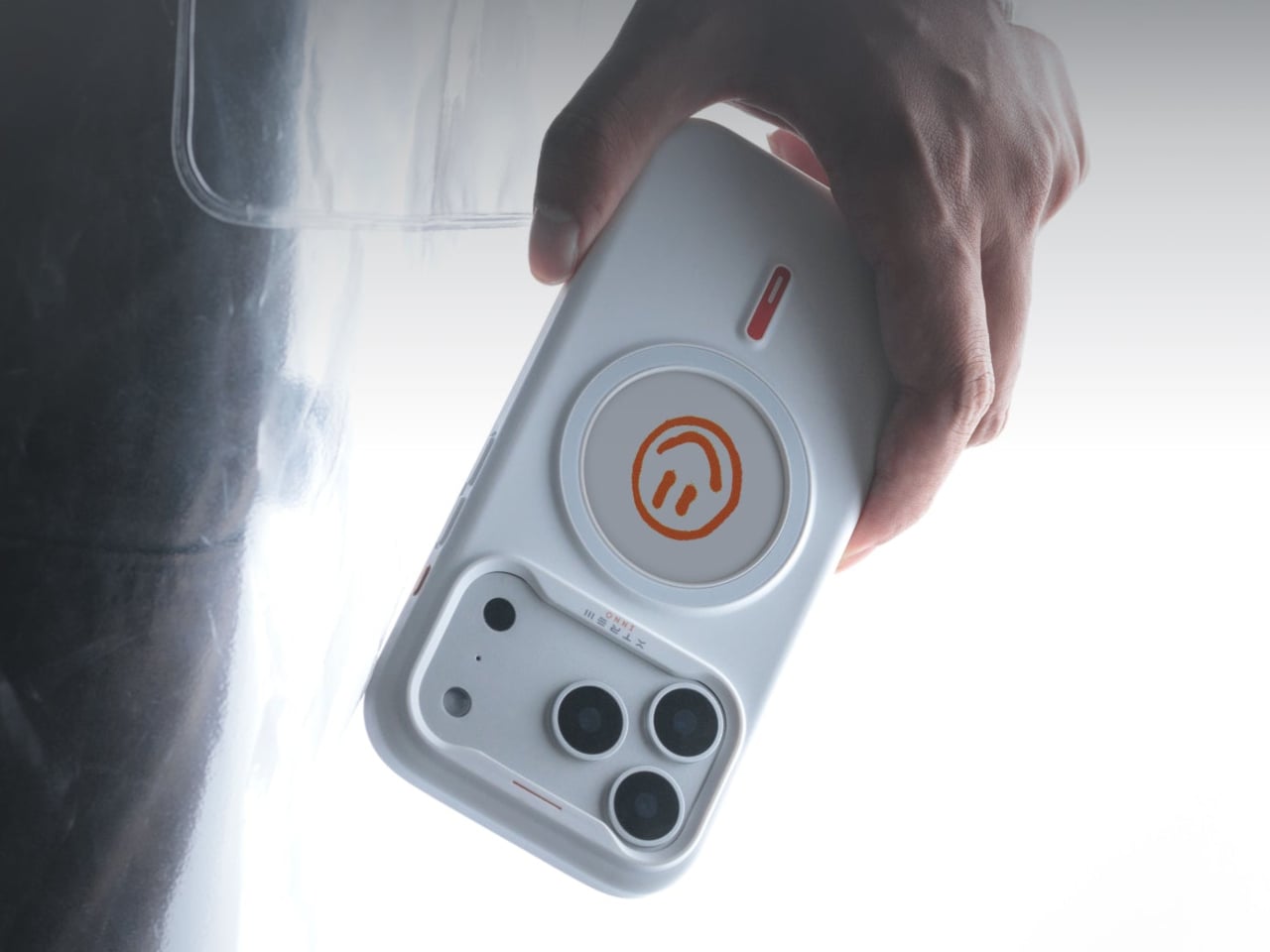
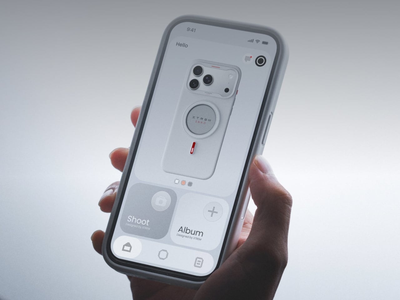
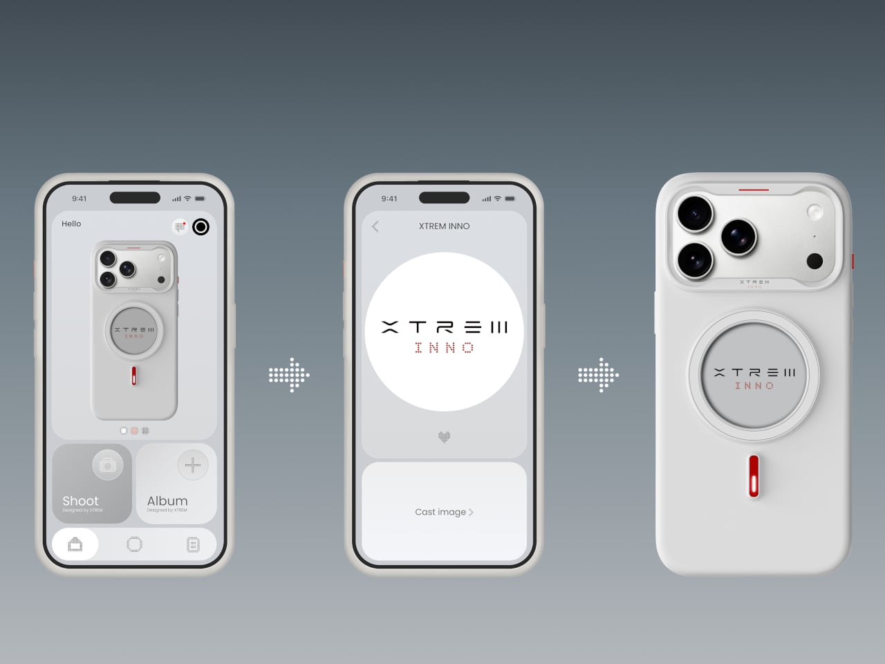
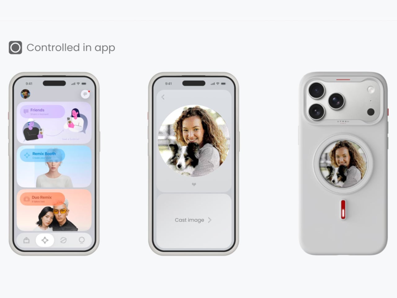
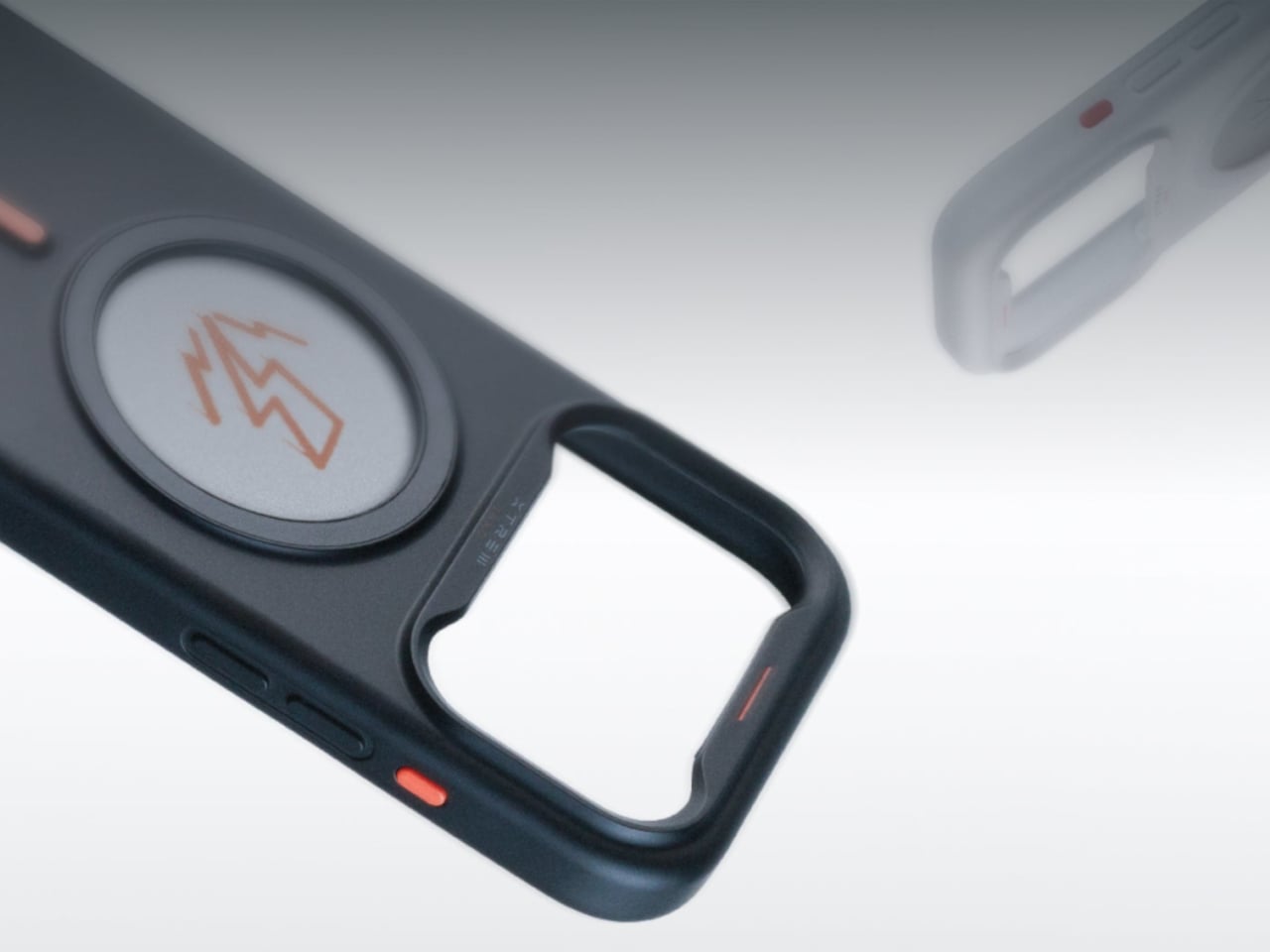
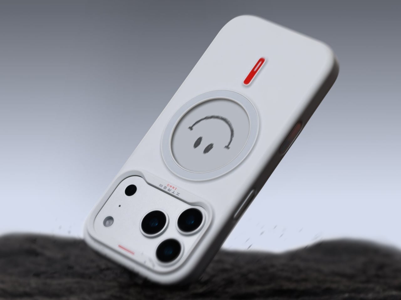
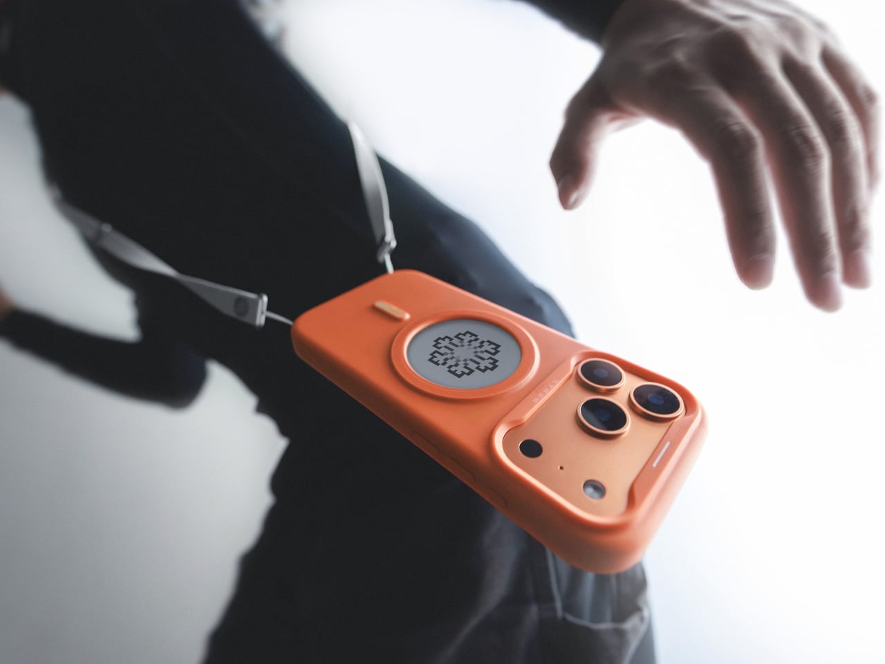
The XTREM INNO Instant Custom Case takes a different approach entirely by putting a live E-Ink display on the back of the case. The circular screen sits on the rear of the case and can be updated anytime using the companion G-SHELL app. Pick a photo from your camera roll, tap “Cast Image,” and within seconds the display updates to show it. No charging cables, no dongle, no separate battery to keep alive.

Designer: XTREM

That last part is the piece worth pausing on. The display uses passive NFC technology, which means the case draws what it needs from the phone only during the update and then holds the image indefinitely using essentially zero power. The photo stays visible even with the phone switched off or the case detached entirely. It doesn’t dim, doesn’t drain the phone’s battery, and doesn’t require any kind of maintenance.

The E-Ink screen itself runs at 212 PPI with a four-color system covering black, white, red, and yellow. That palette is wider than most standard tri-color E-Ink screens, though it’s worth noting the display doesn’t replicate photorealistic color the way a phone screen would. Images take on a quality closer to a printed photograph or a high-contrast graphic, which has its own particular appeal depending on what you’re putting on the case.

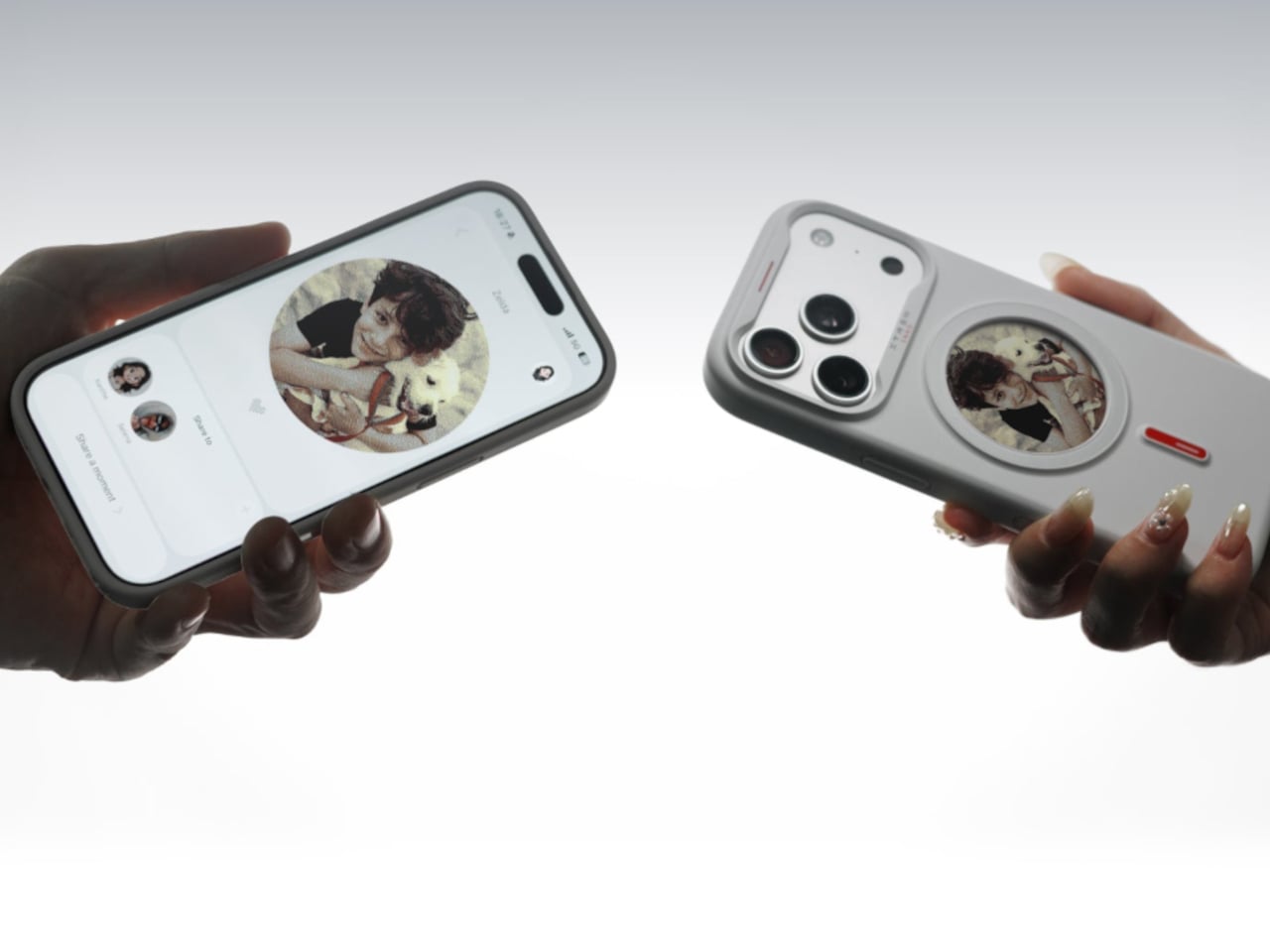
A more recent feature lets users link their case with a friend’s and cast photos directly to each other’s displays. Send a selfie, a shared joke, a matching photo, or anything else from your camera roll straight to someone else’s phone case without going through a message thread first. It’s a genuinely odd little communication channel, and a lot more tactile than a reaction emoji.

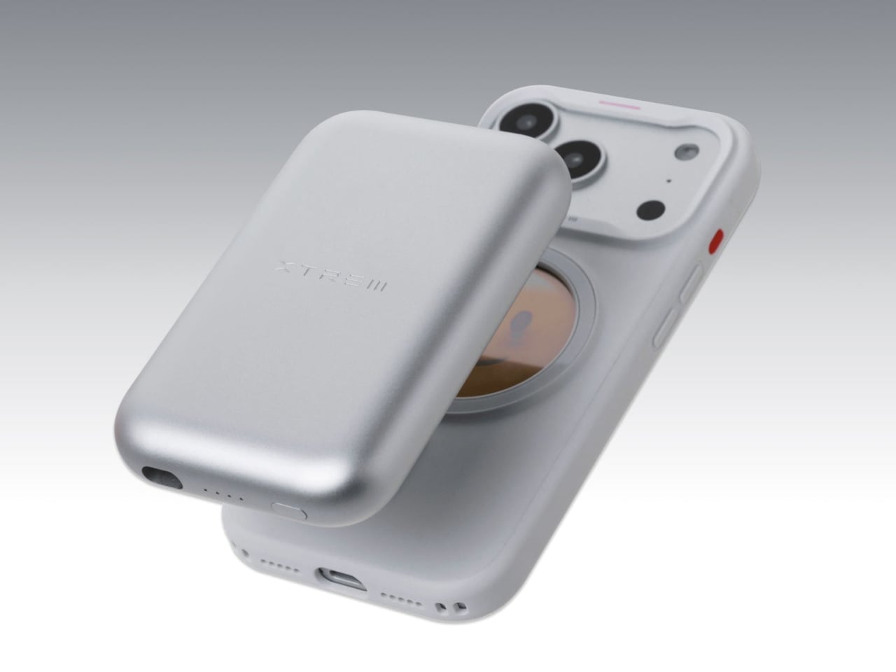
The case itself is built around a sandwich structure that the company says improves wireless charging efficiency and heat dissipation compared to a standard case. It weighs just 40g, clears MagSafe compatibility fully, and has passed drop testing with reinforced corners and a patented frame. The material is treated against yellowing, which is one of the more persistent grievances with transparent cases over time.

Available for iPhone 15 through iPhone 17 models, the XTREM INNO case comes in Nova White, Noir Black, and Cosmic Orange. The circular E-Ink panel is the same across all variants; the color options refer to the frame and body of the case itself. A single case retails at $69.99, which is more than a typical protective case but significantly less than replacing an entire case every time you want a different look.

For people who already change their phone lock screen frequently or rotate between a few different photos they actually care about, the logic of a case that does the same thing doesn’t take much convincing. The technology’s already proven in e-readers; applying it to the back of an iPhone case turns out to be a surprisingly sensible place to put it.

The post This iPhone Case Shows Any Photo You Want, Even With the Phone Off first appeared on Yanko Design.
A 3-Part Titanium Rescue Whistle That Combines Into a 120dB Siren

Most emergency gear has a problem that rarely gets discussed: people don’t actually carry it. A multi-tool left in a drawer or a whistle packed inside a bag at home might as well not exist. Rescue whistles, in particular, haven’t changed much over the years. They’re usually afterthoughts, built to make noise rather than to be trusted or carried without a second thought.

TriReso is Spark Cube’s answer to that problem. Rather than building a louder whistle, the team spent nearly two years designing a three-module system that borrows from the acoustic logic of emergency sirens: irregular, shifting frequencies that are harder for the human brain to ignore. Volume matters, of course, but the real focus is a signal that people actually hear, recognize, and can locate under pressure.

Designer: Spark Cube

Click Here to Buy Now: $64 $99 (35% off). Hurry, 63/200 left! Raised over $45,000.

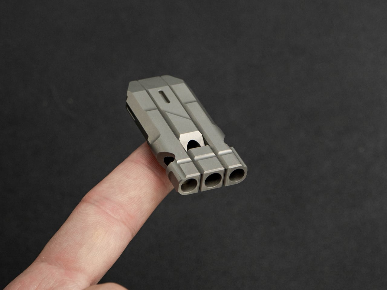
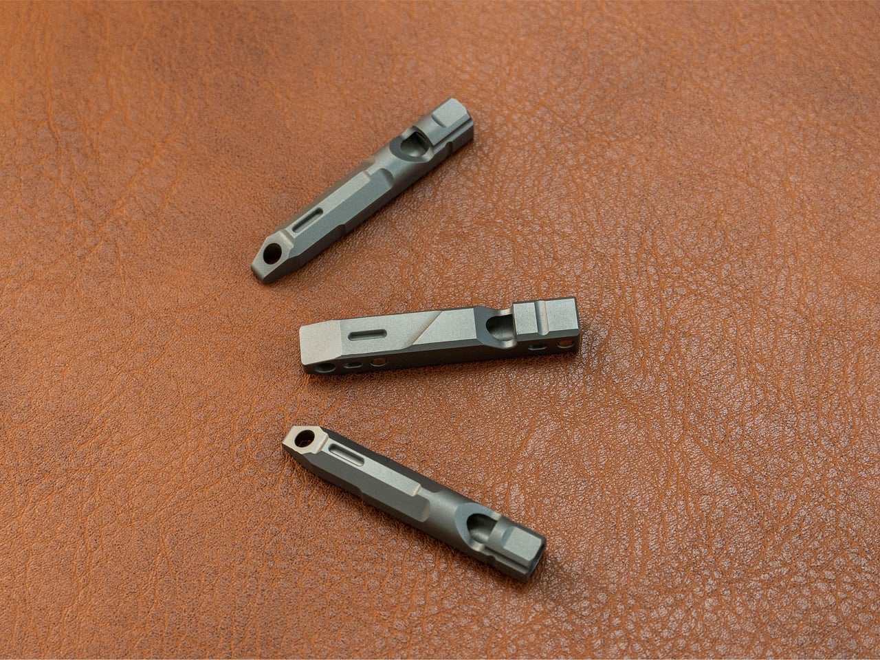
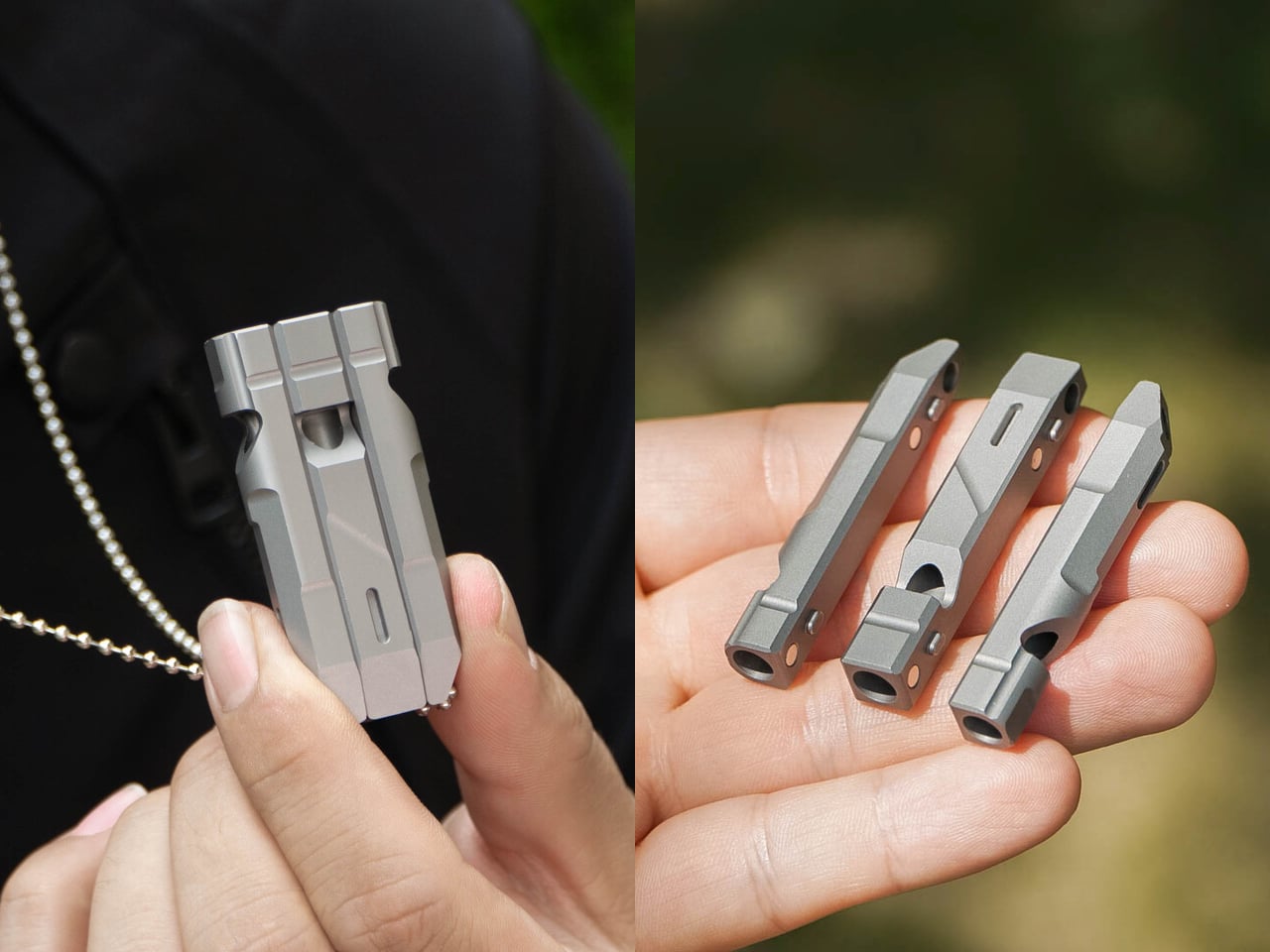
Each of TriReso’s three modules is a fully functional whistle tuned to a different frequency. The Power Chamber sits at 3,600 Hz and 110 dB, built for open terrain and heavy wind. The Alert Chamber pushes up to 4,800 Hz at 105 dB, sharp enough to cut through crowd noise. The Echo Chamber runs at 3,800 Hz and 100 dB, adding a layered resonance to the combined signal.

1

1

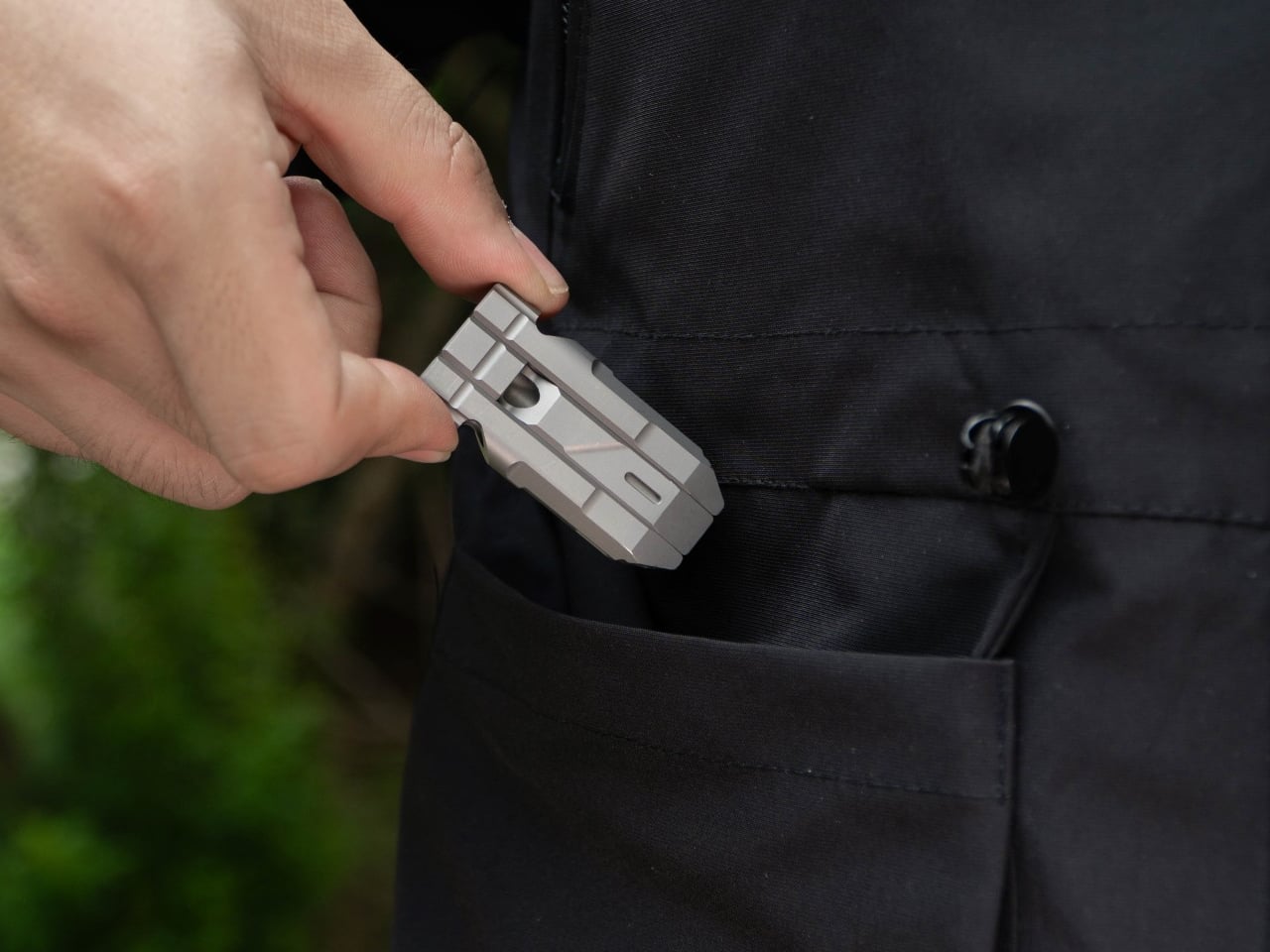
What makes the system interesting is what happens when those modules combine. Snap any two together, and you get one of three dual-chamber configurations, each with its own blended sound profile. Snap all three and TriReso reaches up to 120 dB, producing an irregular, multi-frequency output that shifts the way a siren does, spanning a range from 3,600 to 4,800 Hz.

The assembly is just as considered as the acoustic concept. The modules connect through a triple-lock structure using hidden multi-point magnets and guided alignment grooves that snap them into position quickly and securely. When threaded together on a chain or cord, the lanyard holes also merge, adding another layer of physical retention. It’s a satisfying mechanism that makes switching between modes feel deliberate rather than fussy.

1

That modularity opens up something a standard whistle simply can’t do. Since each piece works independently, one TriReso system can be split among up to three people, which is particularly handy for group hikes, trail-running teams, or outdoor families. Instead of everyone carrying a separate whistle, one compact system distributes the coverage without adding meaningful weight or bulk to anyone’s kit.

Reliability was clearly a priority in the build. TriReso uses a pealess design, so there’s no moving ball inside that could freeze, corrode, jam with sand, or swell from moisture. Whether you’re hiking in wet weather, scrambling through dusty terrain, or digging it out of a cold jacket pocket in winter, it doesn’t need warming up. Pick it up, blow, and it works.

The material options are titanium and aluminum, and neither feels like a compromise. Titanium delivers strength, corrosion resistance, and a premium, machined feel, available in sandblasted gray or an optional PVD black finish. Aluminum keeps things lighter, coming in orange by default, with blue and green as options. Both bring the kind of build quality that makes a small tool feel worth keeping for years.

1

Each module has a dedicated tritium slot, which means the full system can hold up to three tritium tubes. Tritium produces its own glow for up to 25 years without a battery or charge, which keeps TriReso easy to spot in the dark. It’s a handy feature for something small enough to clip to a keychain, slide onto a backpack strap, or wear as a necklace.

There’s also an optional custom engraving, which turns it into a thoughtful safety gift for a partner, a child, or a friend. It’s a subtle touch that says something about what TriReso is going for: a tool personal enough to keep close, reliable enough to trust when things go wrong, and well-designed enough to actually want to carry every single day.

Click Here to Buy Now: $64 $99 (35% off). Hurry, 63/200 left! Raised over $45,000.

The post A 3-Part Titanium Rescue Whistle That Combines Into a 120dB Siren first appeared on Yanko Design.
A Walnut and Brass Desktop PC That Still Runs an RTX 5090

The PC industry has spent decades optimizing for a buyer who tolerates ugly hardware. Not a buyer who wants it, necessarily, but one who accepts it as the cost of performance. The tradeoff between raw computing power and the aesthetic quality of the object sitting on a desk has been so consistent for so long that it’s stopped feeling like a compromise. Most high-performance desktop computers look like something between a server rack and a concept car that got stuck in the concept phase, and they live under desks partly because there’s no reason to keep them visible.

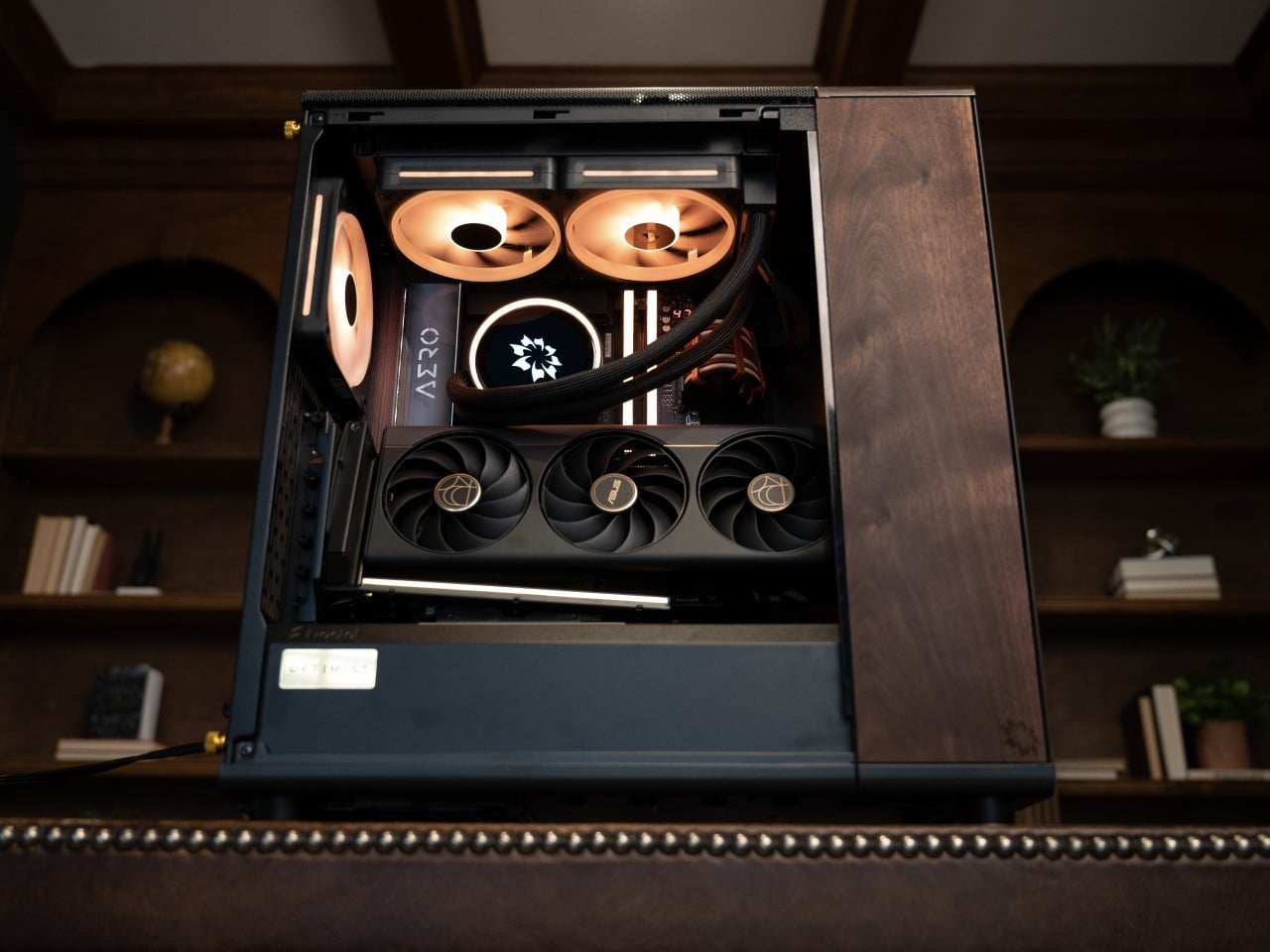
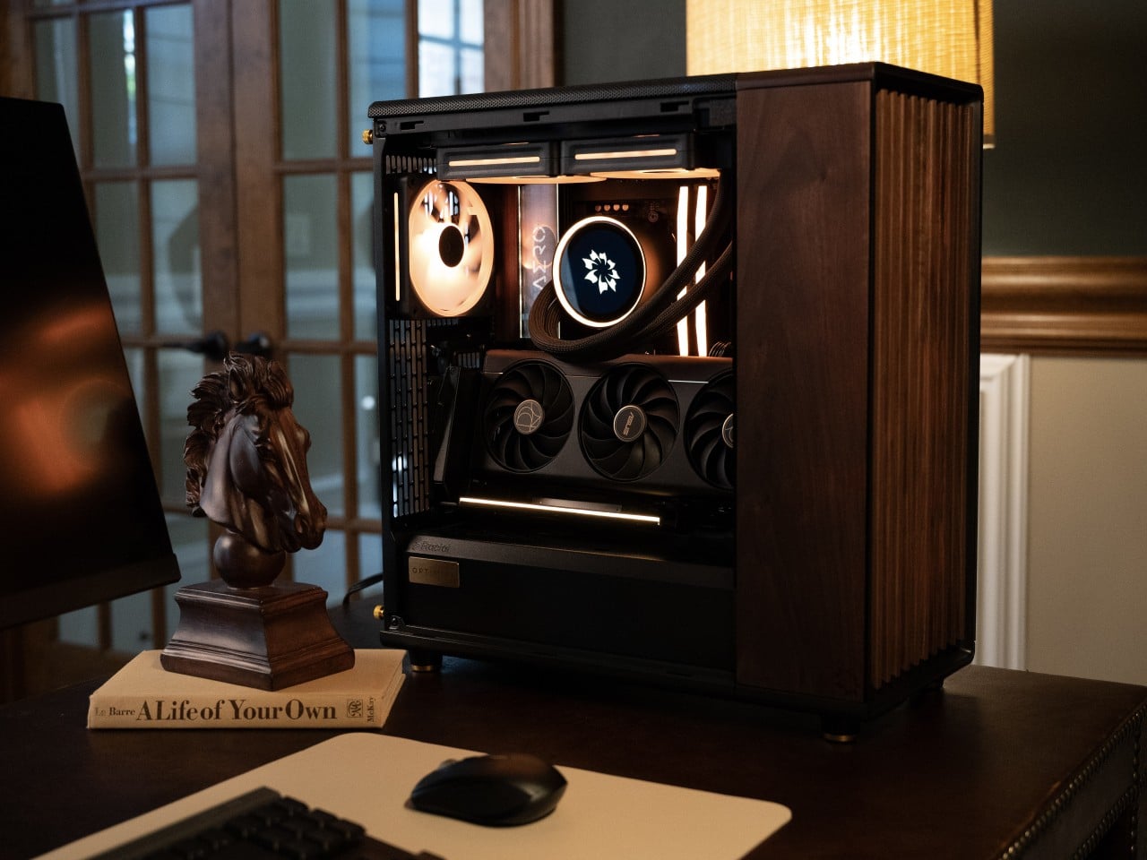
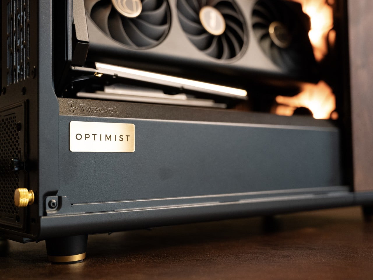
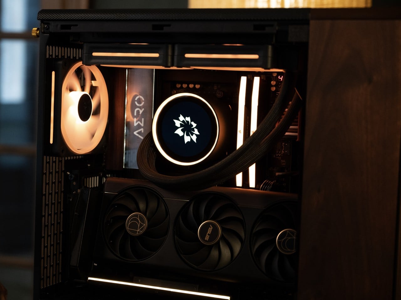
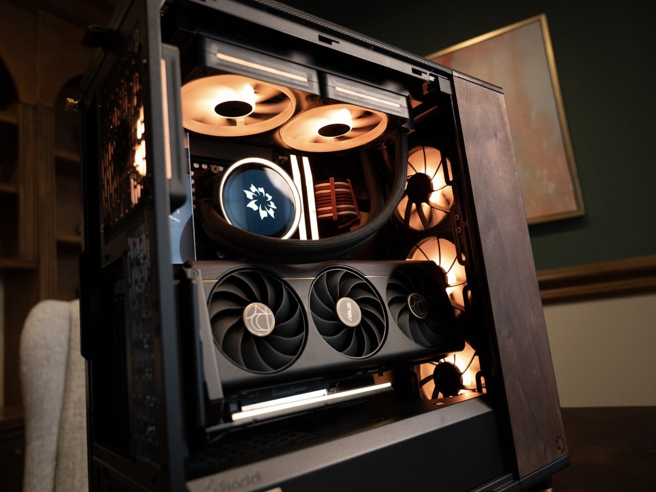
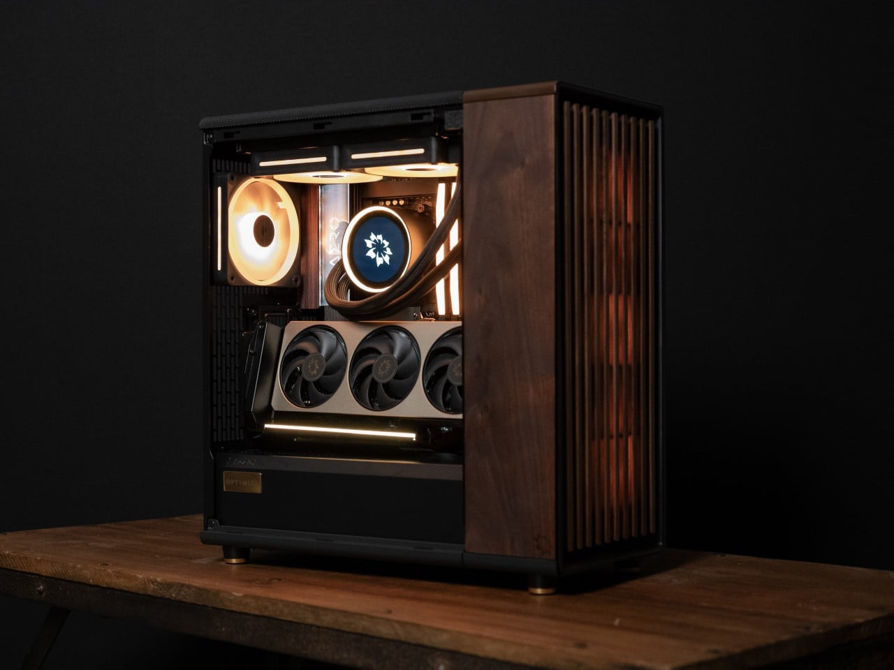
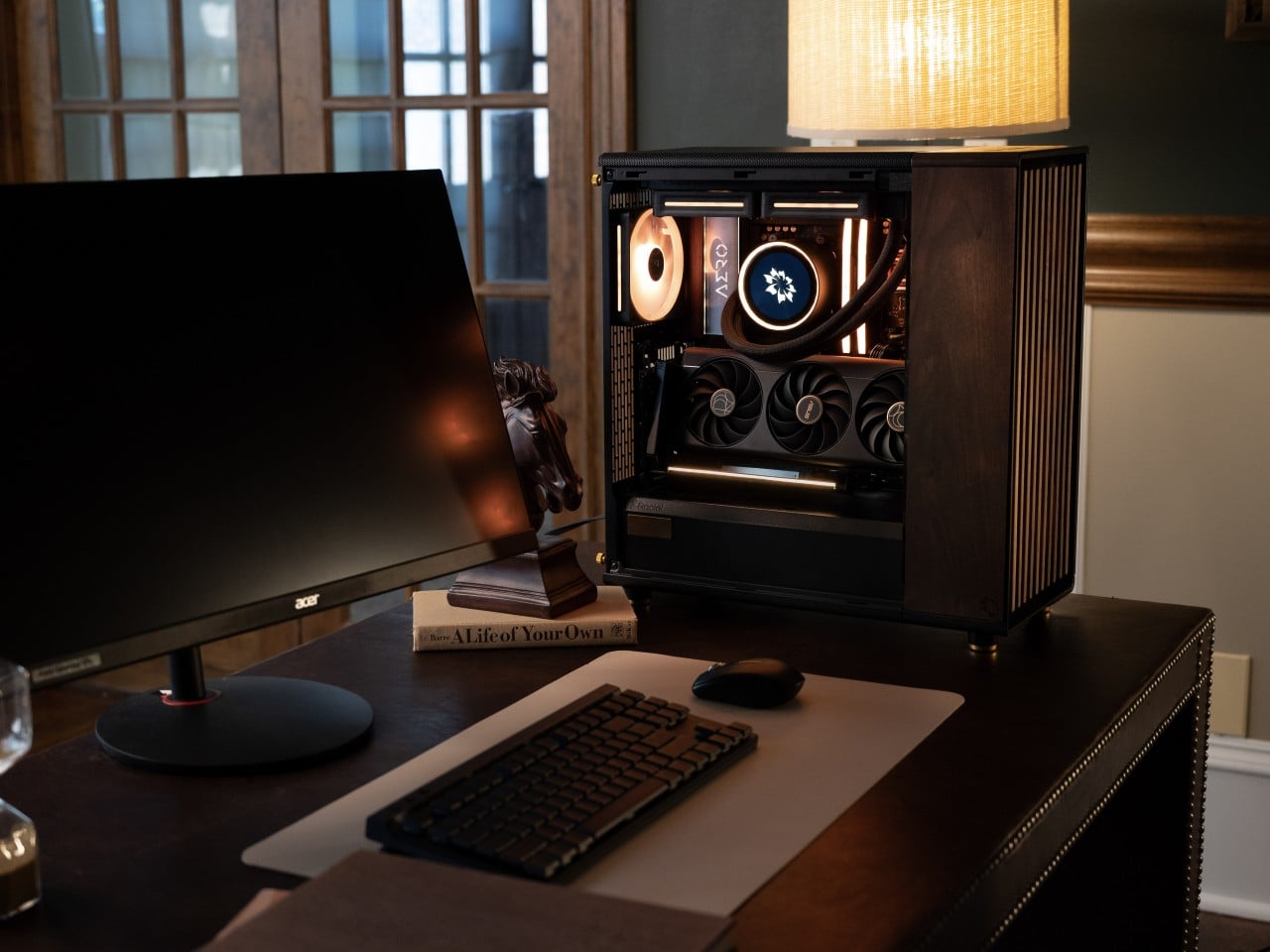
The Nocturne is a desktop PC built in direct opposition to that assumption. Its chassis is sub-11L, which makes it compact enough to actually sit on a desk rather than beneath one, and its materials are a considered departure from the standard palette of tempered glass and injection-molded plastic. The side panel is a single plank of American Black Walnut, laser cut, hand finished, and polished with organic beeswax, a finish that deepens naturally with age rather than fading or yellowing. The front face is walnut as well. The feet, badge, buttons, and screws are turned from solid brass. The top panel is individually airbrushed per unit.

Designer: Ren Zhen (Optimist)

Every Nocturne is assembled and tuned by the same small team at Optimist’s shop in North Carolina before it ships. That includes a photography session for each unit, which is both a quality step and a signal that the people building these take the object seriously as a designed thing rather than a configured product. Nothing in the process is shared with mass production. The Optimist emblem is laser-etched directly into the walnut, not applied as a sticker or decal.

The hardware inside doesn’t make any concessions to the visual restraint outside. The Nocturne supports configurations up to an AMD Ryzen 9 9950X3D2 processor and an NVIDIA GeForce RTX 5090 GPU with 128GB of DDR5 memory available at the top end. The acoustic performance matches: the system runs at sub-decibel levels, which matters as much for the room it sits in as for the person sitting in front of it. A machine that sounds like an appliance disappears into a space in a way that a machine with a fan you can hear from across the room never does.

The warranty structure reflects the relationship the company expects to have with buyers after the sale. Parts are covered for two years and labor for six, and if a repair is needed, the unit can be shipped back for in-house service without conditions. That’s a longer commitment than most pre-built PC companies offer, and it makes more sense when the object in question is hand-finished wood and brass rather than standard black plastic.

The Nocturne first appeared in 2024 and garnered quite the attention. Optimist keeps no more than five designs available at any time, retiring past builds as new hardware and new aesthetics arrive. The Nocturne has persisted through multiple cycles. That’s a harder thing to maintain in a market that typically treats last year’s chassis as obsolete the moment a new one appears.

The post A Walnut and Brass Desktop PC That Still Runs an RTX 5090 first appeared on Yanko Design.

This $60 Apple Watch Case Is the iPod Apple Never Replaced

There’s a specific kind of nostalgia attached to the original iPod’s click wheel that has very little to do with the music. It had to do with the feeling. Scrolling through a playlist with a thumb, hearing and feeling that resistance, navigating a menu without looking away from the wheel; it was one of the few moments in early consumer electronics where a device felt as good to hold as it did to use. Touchscreens solved a lot of problems, but they quietly retired that particular quality.

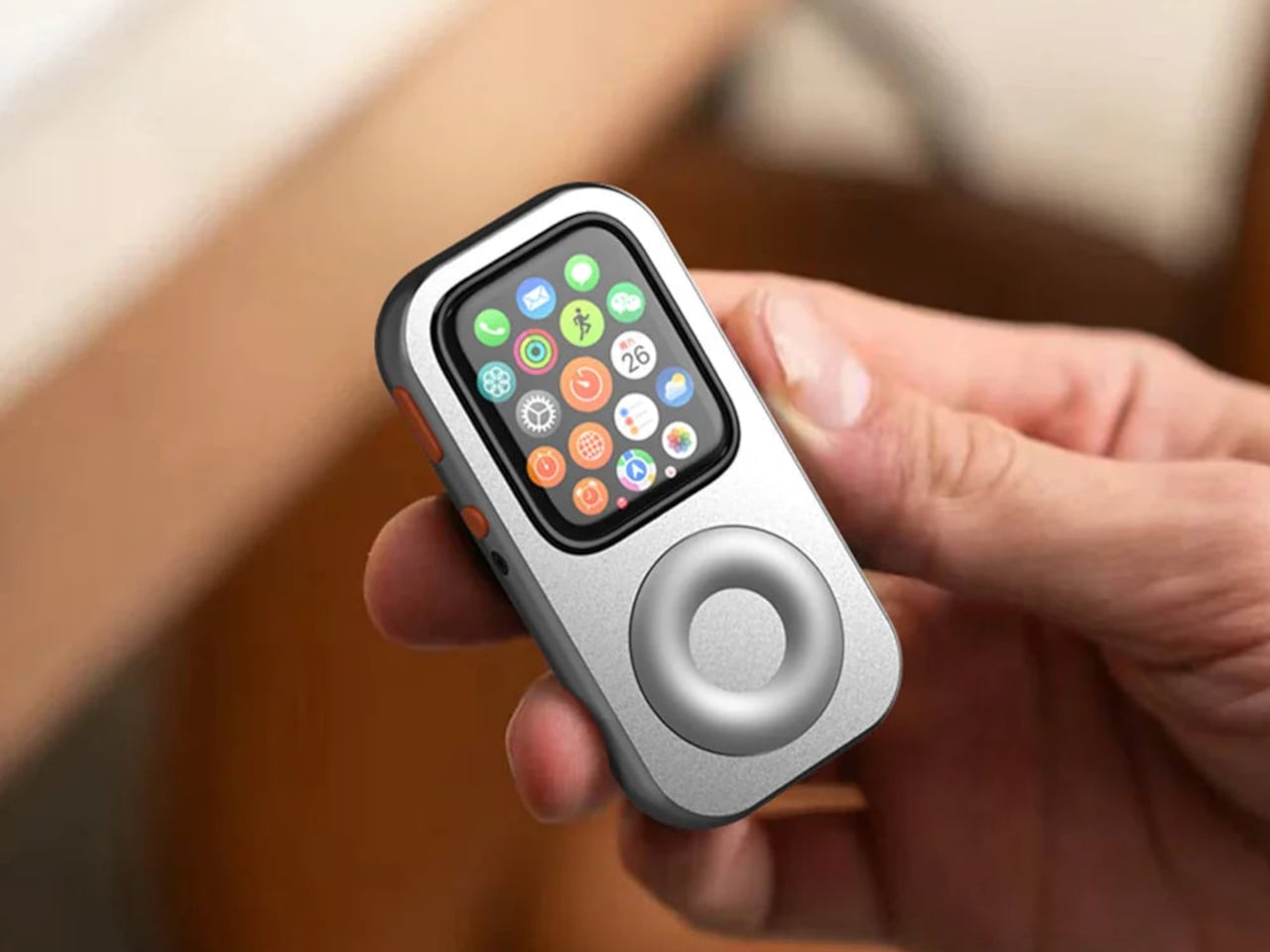
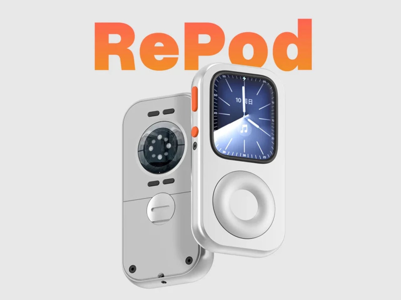
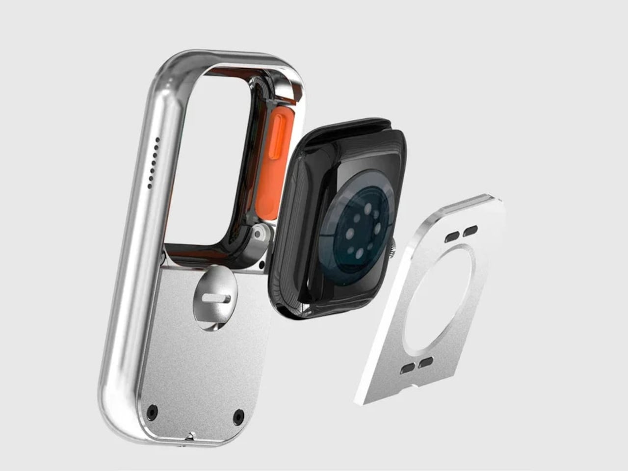
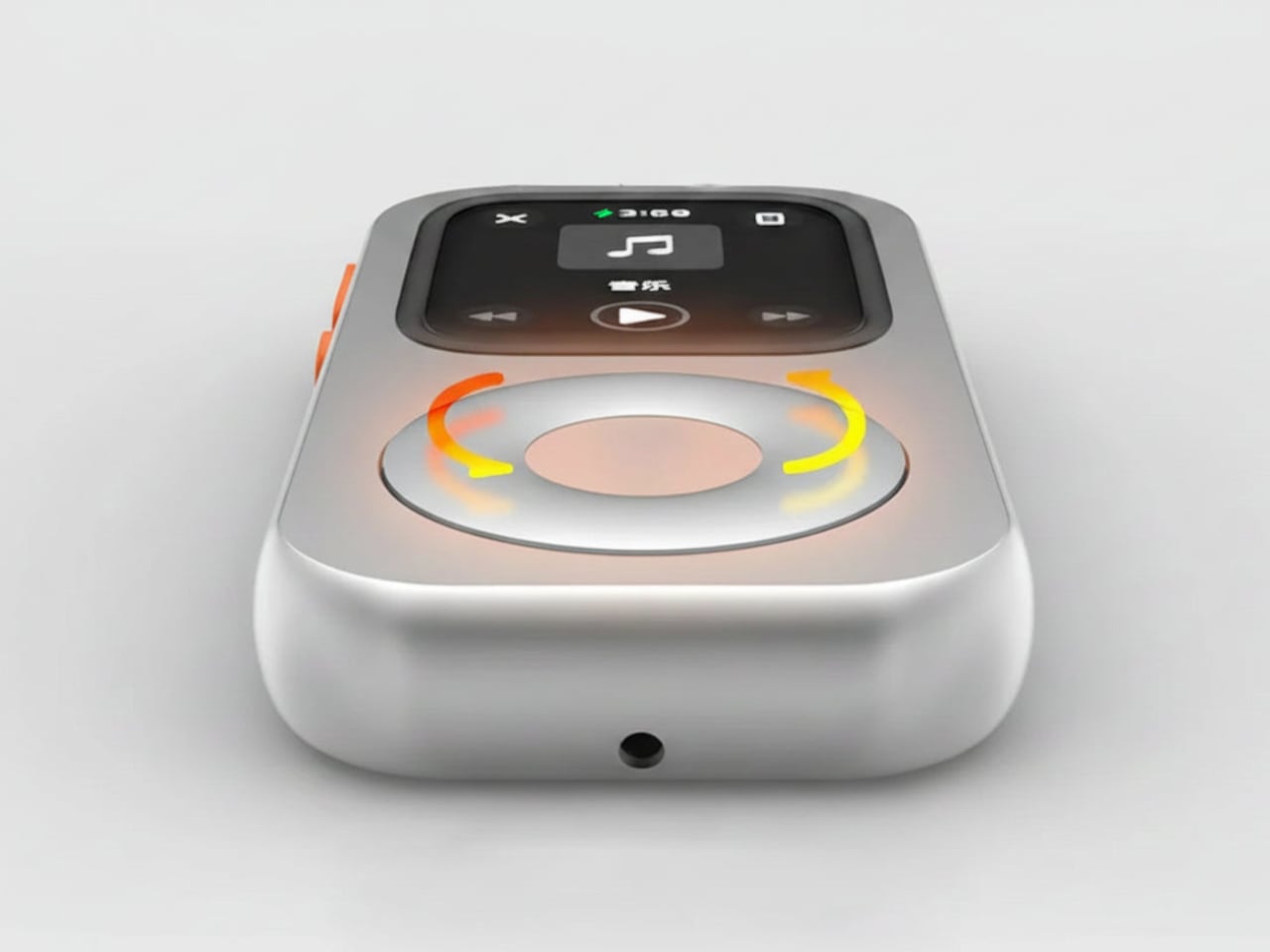
The RePod C1 is a CNC-machined aluminum case for the Apple Watch that rebuilds that tactile experience from scratch. The outer shell gives the watch the proportions and visual language of a classic iPod, and the click wheel around it is mechanically linked to the Apple Watch’s Digital Crown, so turning it actually does something. It’s not decorative. The scroll feedback comes from real physical interaction with the watch’s native controls, which makes the nostalgia feel a bit less hollow than it might have been.

Designer: Techpod

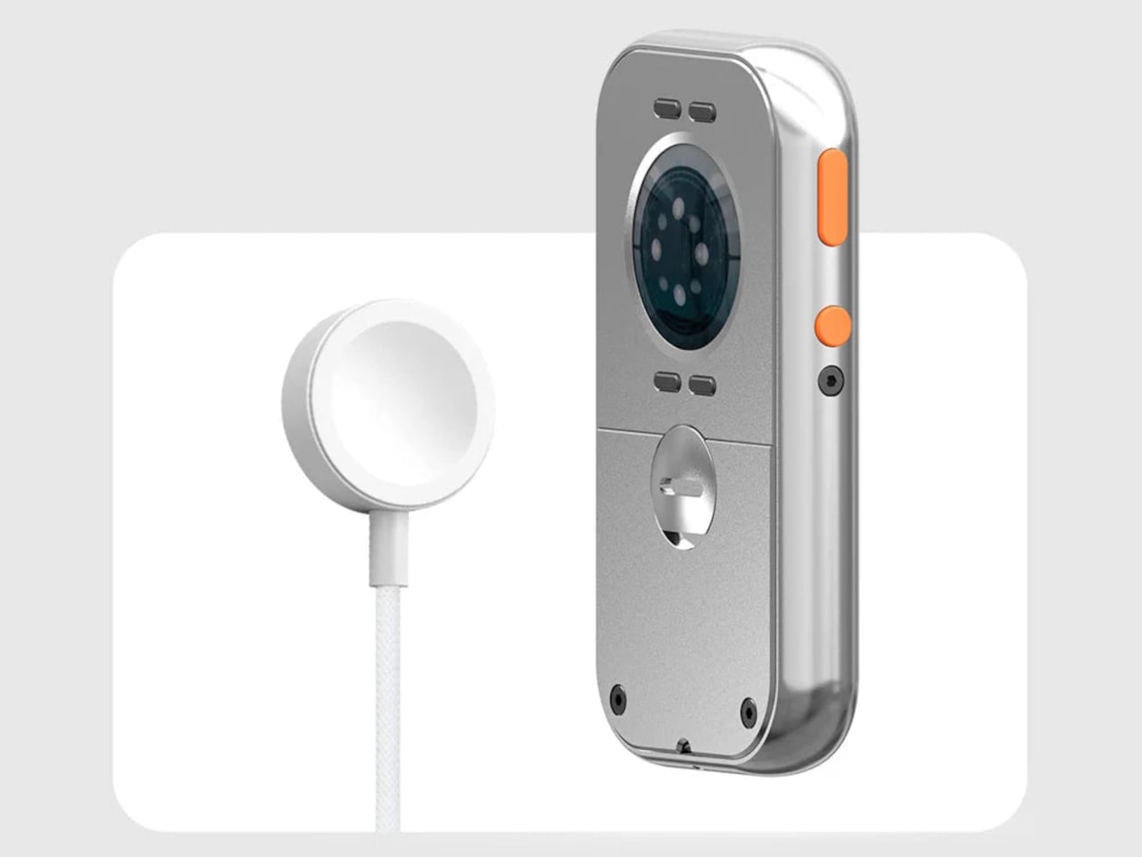
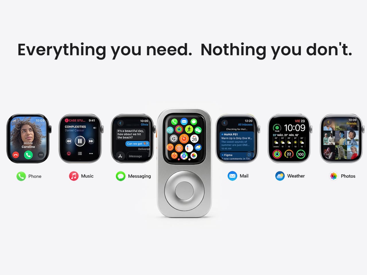
The case doesn’t ask the Apple Watch to give anything up. All of its sensors remain accessible through an open-back design, which means heart rate monitoring, ECG, and NFC for Apple Pay all continue to work normally. Antenna cutouts preserve Wi-Fi, Bluetooth, and cellular connectivity, so messages, calls, and Siri stay intact. The only thing that changes is the shell around the watch and the way it sits in your hand.

That second part matters more than it sounds. One of the more interesting things the RePod C1 does is turn the Apple Watch into a pocket device rather than exclusively a wrist device. Slide it into a pocket during a run, a commute, or an errand where pulling out a phone feels like too much, and the watch does most of what needs doing. Music plays back offline with Apple Music or Spotify Premium, notifications come through, and payments work at the counter. The phone can stay home, or at least in a bag.

Charging works through a built-in magnetic connector that sits flush in the frame, so the case doesn’t have to come off to top up the battery. The aluminum body also helps manage heat during fast charging, which the original iPod obviously never had to think about. The case is available in sizes covering everything from the Apple Watch Series 4 through the Series 11 and both Apple Watch Ultra models, with prices starting at $59.90 for standard sizes and $69.90 for the 49mm Ultra variant.

The iPod itself was discontinued in 2022 after 21 years, and Apple made no announcement about anything replacing it. The click wheel, as a piece of interaction design, has no current first-party home in any product. The RePod C1 doesn’t try to be a real iPod or pretend the Apple Watch needs help. It’s just a case that noticed the gap between what modern devices can do and what they feel like to use, and made a deliberate choice about which side it wanted to be on.

The post This $60 Apple Watch Case Is the iPod Apple Never Replaced first appeared on Yanko Design.
The Wireless Display Kit That Needs No App, No Network, No Pairing

There’s no shortage of ways to get your screen onto a larger display these days, but the experience rarely matches the simplicity it should have. Adapters pile up in bags, cables stretch across desks, and software-based casting tools have a talent for dropping at the worst possible moment. For a market that’s moved so decisively toward wireless, display connectivity has been surprisingly slow to catch up.

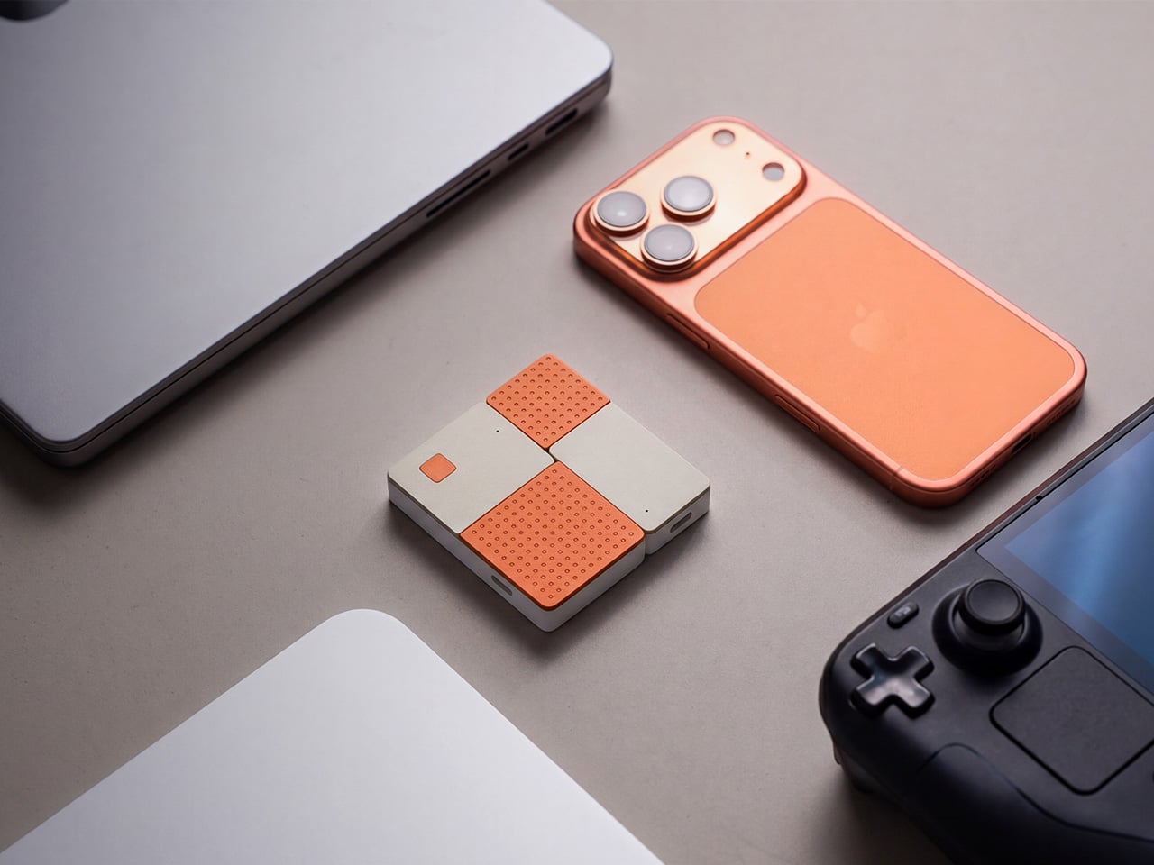
The MouseArc G1 is a wireless HD transmitter and receiver set that takes that problem head-on, without leaning on apps, network menus, or the complicated routines that have made similar devices tedious. It also doesn’t look the part of a utilitarian tool. The G1 sports a puzzle-tile design in white and orange that gives it a visual identity far removed from a typical AV dongle.

Designer: MouseArc

Click Here to Buy Bow: $69 $120 (43% off). Hurry, only 89/400 left! Raised over $49,000.

The kit includes a USB-C transmitter for source devices and an HDMI receiver for the display. Both come factory pre-paired, so there’s nothing to configure right out of the box. No app installs, no Bluetooth pairing, no hopping onto a Wi-Fi network. You plug the transmitter into your laptop or phone, connect the receiver to a TV or projector, and you’re ready almost immediately.

The G1 runs on 802.11ac 5G peer-to-peer Wi-Fi, operating on a dedicated channel rather than borrowing bandwidth from your home network. That separation keeps the signal clean and resistant to interference, which pays off noticeably during longer sessions. It’s also rated for up to 50m in open areas, making it a practical option for conference rooms, lecture halls, and larger commercial spaces.

Think about walking into a conference room with your laptop, needing to get a presentation up before the meeting starts. With the G1 already connected to the room’s display, the only step is plugging in the transmitter. There’s no wrestling with the AV system, no scrambling for a compatible cable, and no awkward silence while everyone politely watches you troubleshoot.

That same ease carries into more personal moments. Connecting a phone or tablet to a TV for a movie night is about as involved as plugging in a USB drive. The G1 works with a wide range of USB-C devices that support DisplayPort Alt Mode, from iPhones and iPads to MacBooks and Samsung Galaxy phones, so there’s a good chance what you already own qualifies.

For anything where motion matters, the G1 supports 1080p at 120Hz, with a dedicated processing unit keeping visuals sharp and movement fluid. Fast-moving scenes stay clear without the blur or judder that can make wireless display setups feel like a step backward. Audio stays synced throughout as well, which rounds out an experience that holds up well for gaming, sports, and high-motion content.

Something that often goes unaddressed with wireless display kits is what happens to your device’s power while you’re casting. The G1 includes a 100W PD 3.0 pass-through charging port, so your laptop or phone stays charged while the transmitter is in use. For anything running longer than a quick demo, that detail makes a real difference to how the session actually plays out.

Then there’s the form factor. At 6.5cm x 6cm x 1.3cm and around 32g, the G1 is compact enough to pocket or slip into a bag without thought. The puzzle-tile silhouette and white and orange finish give it a visual personality that stands apart from the usual AV dongle, which feels like a deliberate design choice for something meant to travel daily.

What the G1 delivers is a cleaner way to use the displays you already own. Whether it’s a presentation, a movie, a classroom session, or a gaming moment on a bigger screen, it handles the connection without demanding anything back. That quiet, friction-free reliability is genuinely hard to find in a category that tends to make everything feel more complicated than it needs to be.
Click Here to Buy Bow: $69 $120 (43% off). Hurry, only 89/400 left! Raised over $49,000.

The post The Wireless Display Kit That Needs No App, No Network, No Pairing first appeared on Yanko Design.