Bike cargo gear has always been the part of cycling that nobody really gets excited about. Racks, panniers, and baskets exist to haul things, and most of them look exactly like what they are, brackets and platforms bolted on as an afterthought. Cyclists who care about aesthetics often treat this hardware as a necessary compromise, something you’d tolerate rather than actually want.
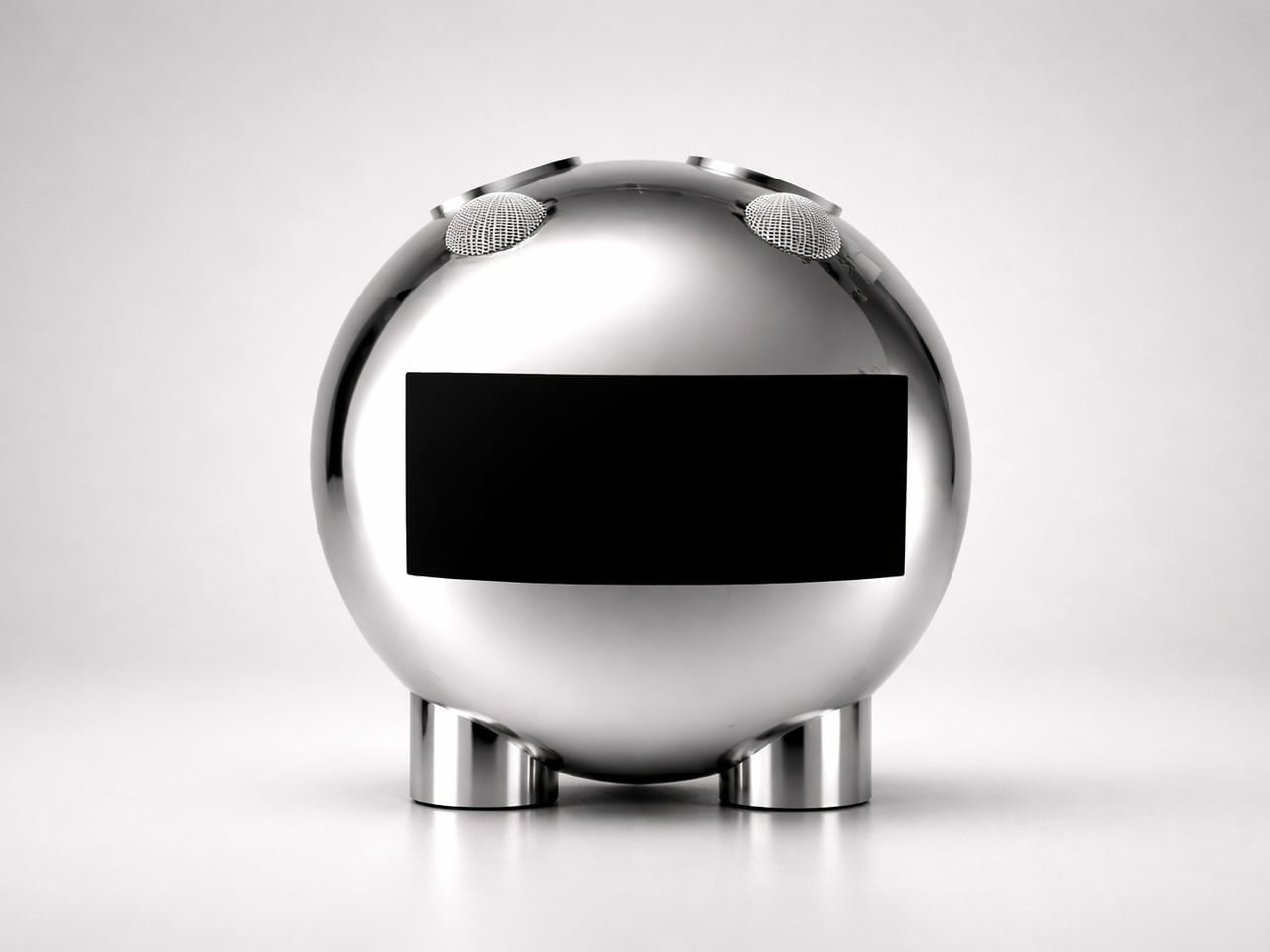
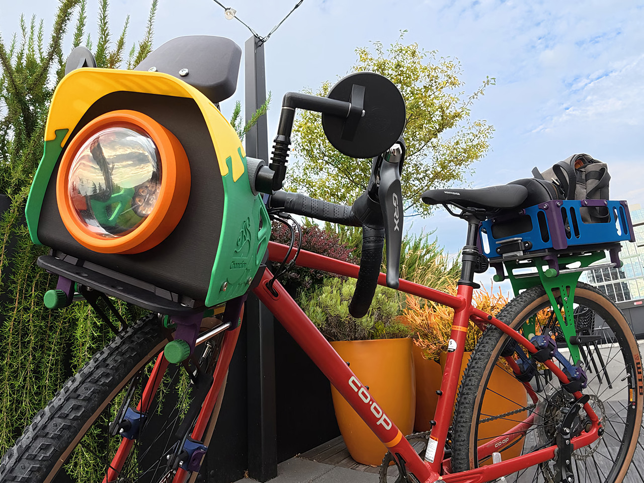
Chamelion begins with the idea that bikes deserve the same sense of character other vehicles already have. That inspiration drives a modular, color-customizable cargo platform from Seattle that includes front and rear racks, pannier rails, aluminum baskets, and a front assembly the designers call the “bike face,” treating cargo gear as part of your bike’s actual identity.
Designer: Yu-Chu Chen
Click Here to Buy Now: $986. Hurry, only a few left!
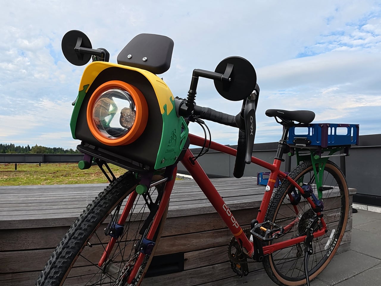
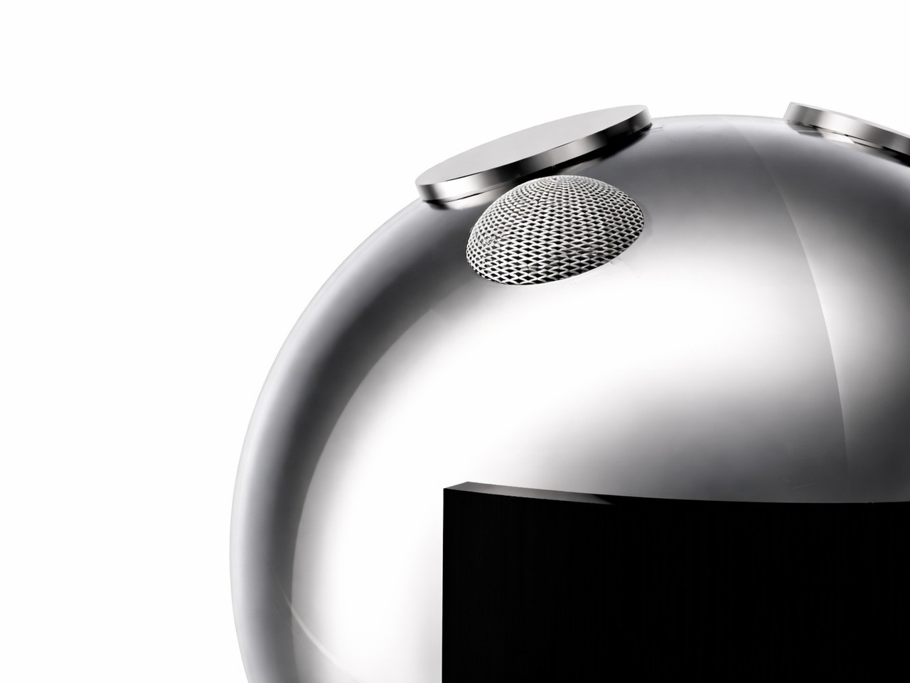
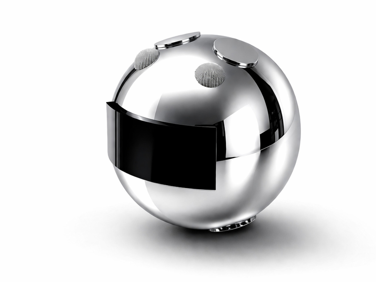
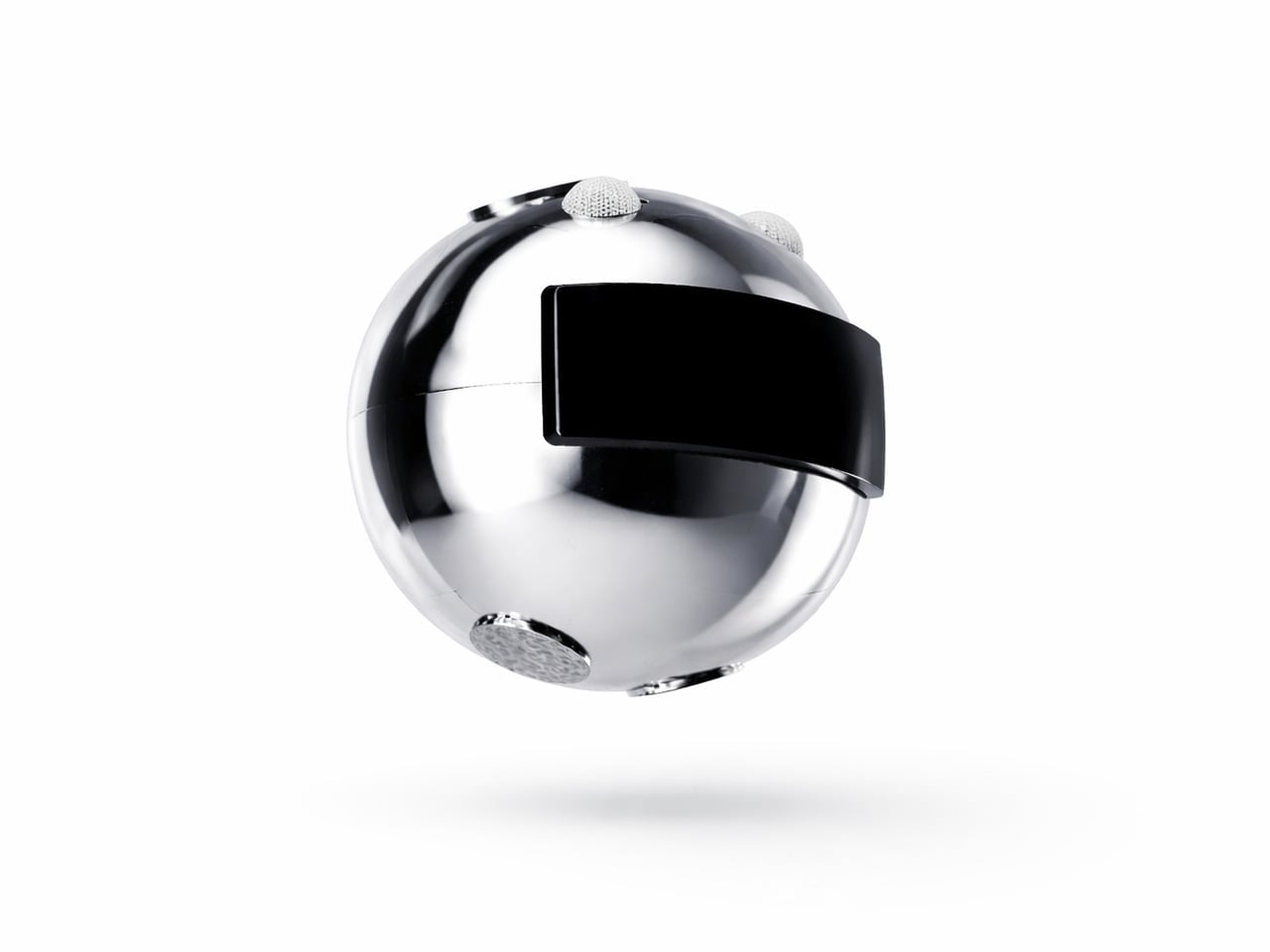
The bike face is the most interesting part of the system, and it does more than look distinctive. It consolidates everything that typically clutters the handlebars into one organized front unit. Your phone’s got a dedicated mount with a sunshade, rear mirrors attach at the sides with wide spacing for better sightlines, and your headlight sits front and center behind a transparent shell.

The racks do serious work. The front has been tested to hold up to 20 kg (44 lbs), and the rear handles up to 27 kg (60 lbs), which is enough for a full grocery haul or a heavily loaded bikepacking setup. The aluminum baskets drop in when you need proper containment, or you can skip them and just strap a bag directly to the platform.

One of the quieter design details is how the racks handle rough terrain. Rather than transmitting every bump directly into your load, the material has enough flex to absorb vibration, so things ride more smoothly on uneven surfaces. Add the pannier rails when you need side-hanging capacity, and the same bike that’s carrying your lunch on a weekday is hauling camping gear on a trail by Saturday.

Installing the system takes some effort upfront, but once that’s done, removing and remounting the racks requires no tools at all. The front rack’s handlebar connectors rotate to fit different bar types and the fork clamps have bearings inside that move with your suspension. The rear rack adjusts between 110mm and 180mm between the clamps, wide enough to accommodate most bikes, including full-suspension mountain bikes.

Of course, the color customization goes well beyond picking a finish. Every component has its own configurable color zone, from the rack platform and frame connectors down to the pannier cap and handlebar connector buckle. The bike face alone has more than 12 individually configurable areas. It sounds excessive until you realize that kind of specificity is exactly what makes the system feel genuinely personal.

What makes that level of customization possible is the manufacturing behind it. The plastic components are produced using powder bed fusion 3D printing in PA12 or PA11 nylon, with coloring handled by Dyemansion. That process gives the parts rich, durable color without relying on conventional painted finishes, and it allows for small-batch production without injection mold tooling, which is what makes individual configurations feasible.

Assembly is guided by interactive 3D step-by-step instructions that let you zoom in, rotate, and inspect every connection from multiple angles before putting it all together. It’s the kind of manual that actually makes you want to read it, which is more than can be said for most flat-pack furniture and certainly more than anyone expects from a bike cargo system.
The broader idea here isn’t a one-off accessory set, but a system that can keep expanding over time, with new modules and accessories already being developed. The 3D-printed version stays the lightest and most configurable option, and the design accommodates future additions as the lineup expands. For a category that’s spent decades being mostly forgettable, this one at least gives your bike the kind of personality it probably should have had all along.
Click Here to Buy Now: $986. Hurry, only a few left!
The post This Bike Cargo System Gives Your Bike a Face With 12 Color Zones first appeared on Yanko Design.