This Origami Mouse Folds Flatter, Not Smaller in Every Direction

My dining table usually becomes a desk by accident. A laptop lands there after breakfast, then a notebook, a charging cable, and a mouse that stays put long after I’ve stopped working. By dinner, I’m moving everything again. That daily reset is a small annoyance, but it reveals a real design problem: most computer accessories assume they can claim a permanent spot, even when the surface they occupy has other jobs.

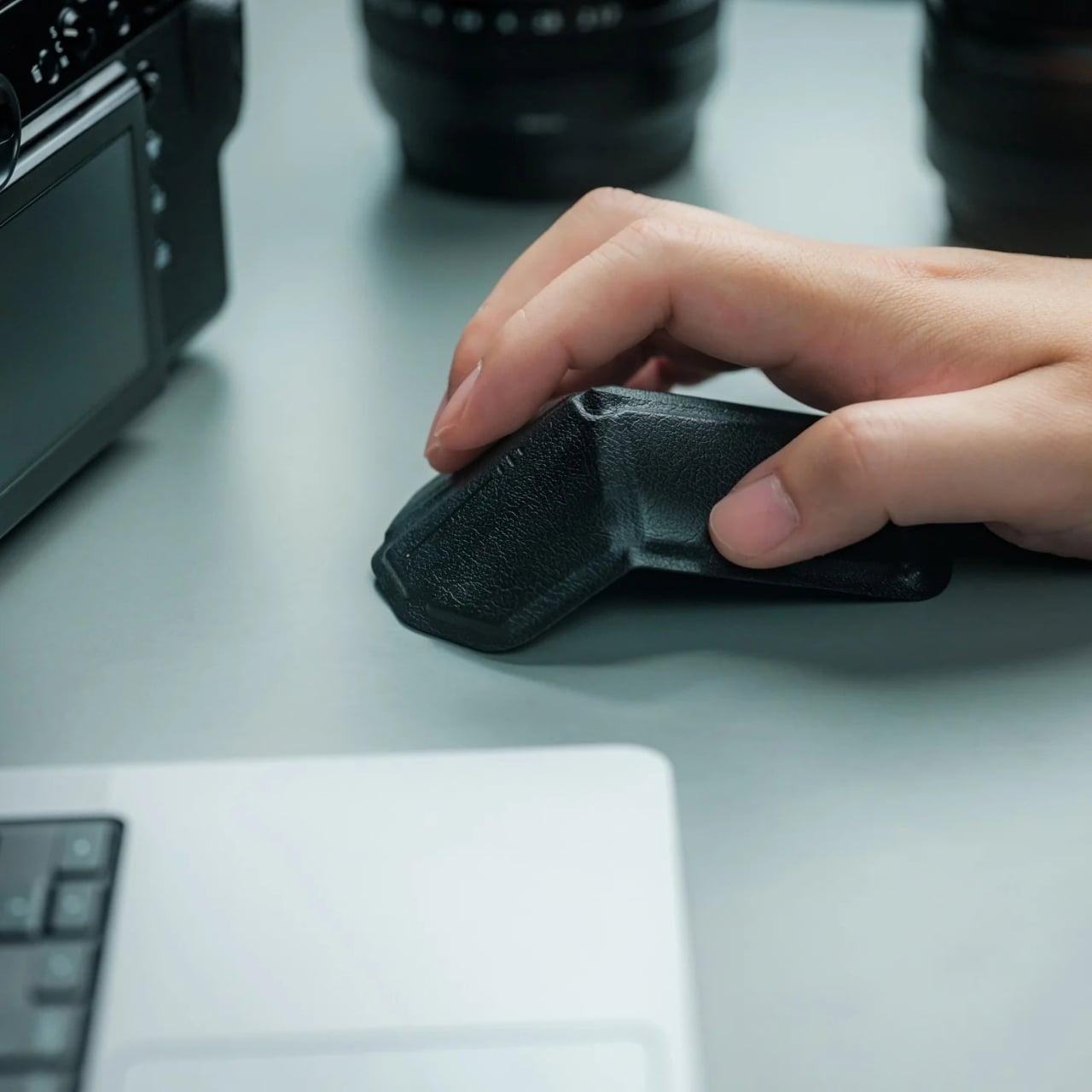
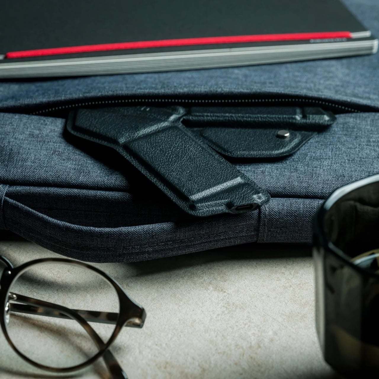
That’s why the OrigamiSwift folding mouse makes more sense to me as a home-office object than as another travel gadget. A regular mouse is easy to use but awkward to tuck away. A tiny one may pack neatly, yet can feel less inviting when you have a long document to edit. OrigamiSwift tries to make the working shape and the storage shape two separate decisions.
Click Here to Buy Now: $85

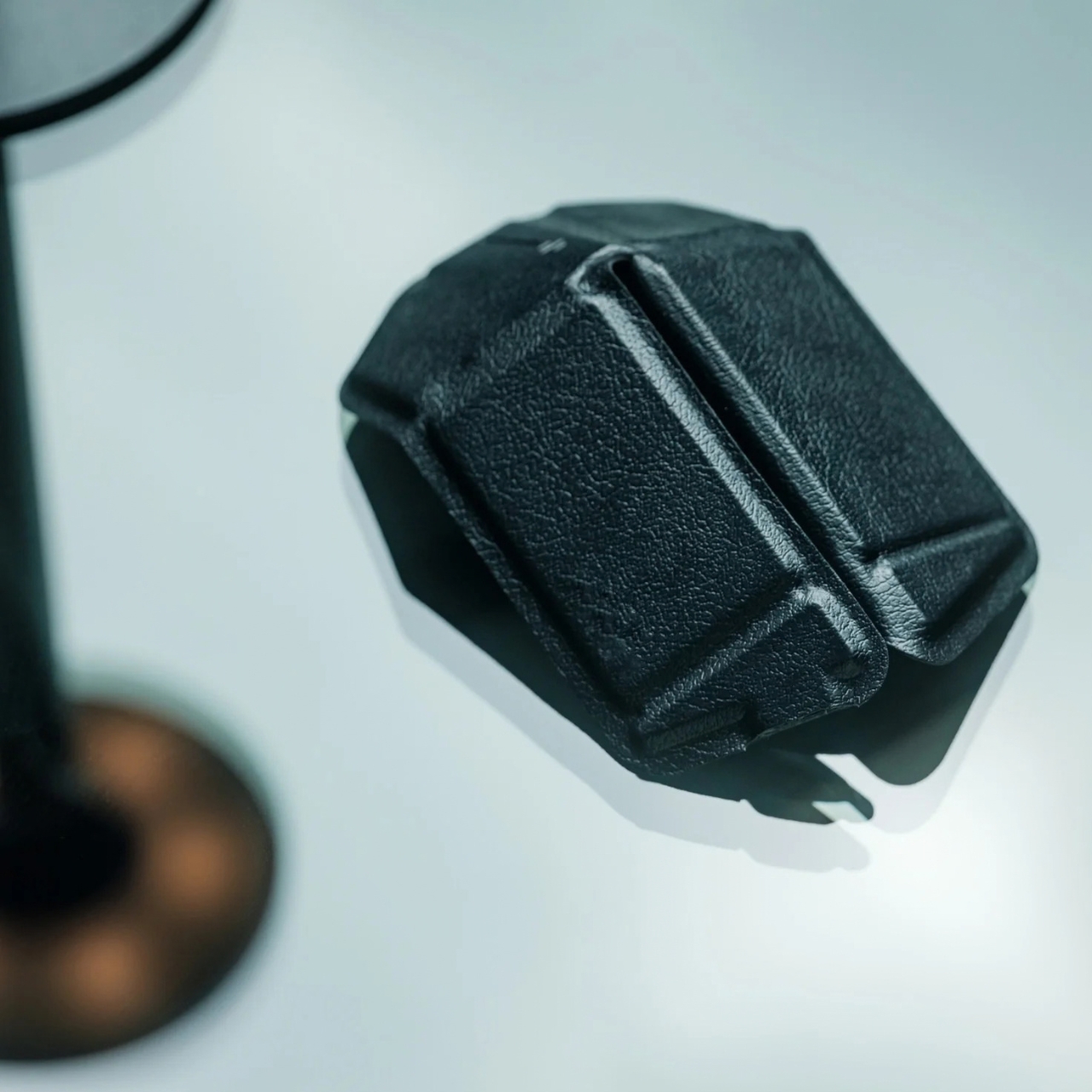
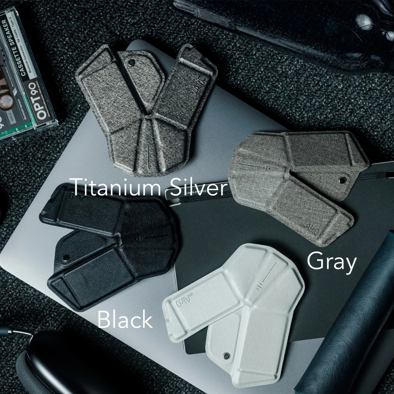
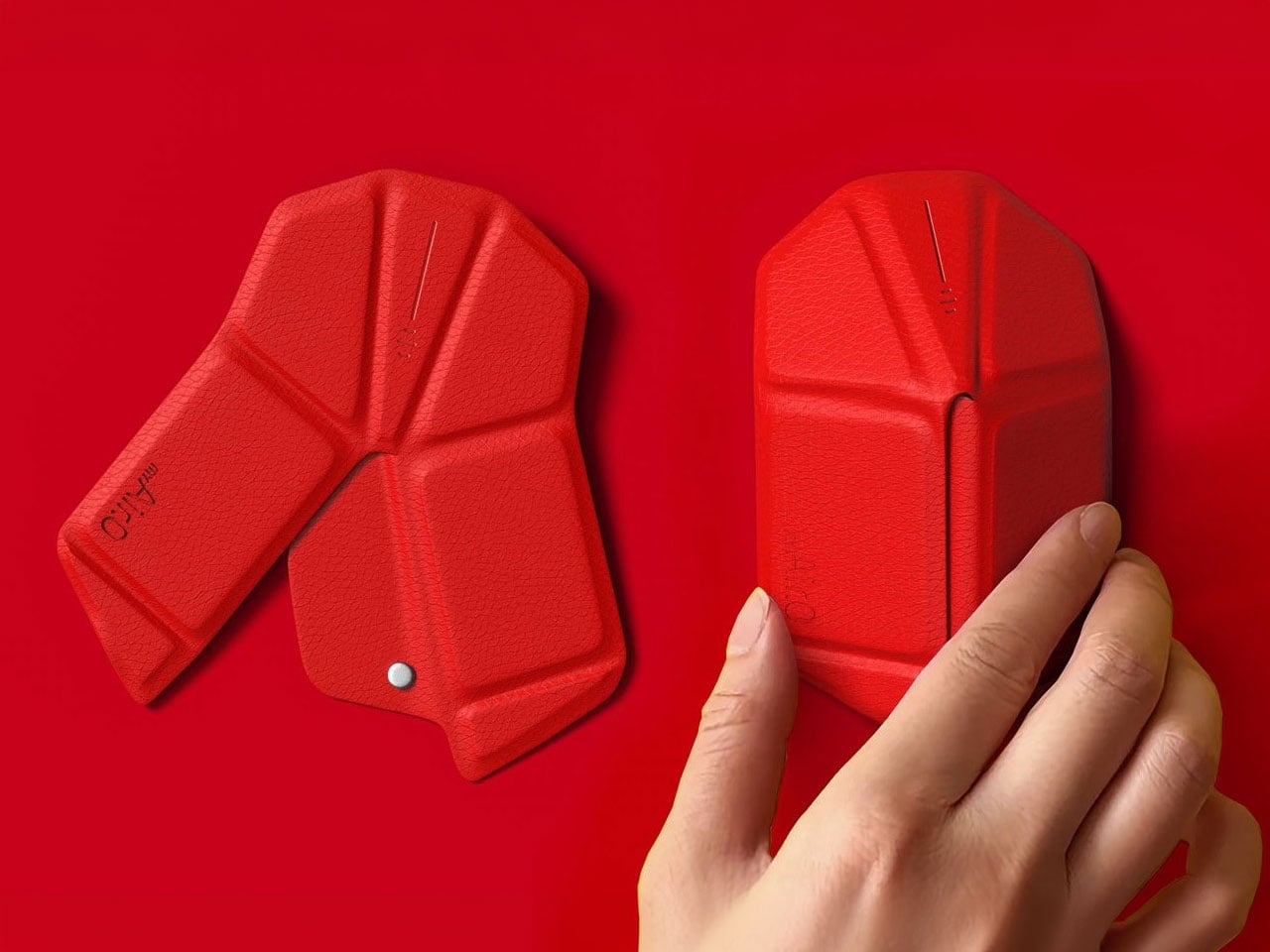
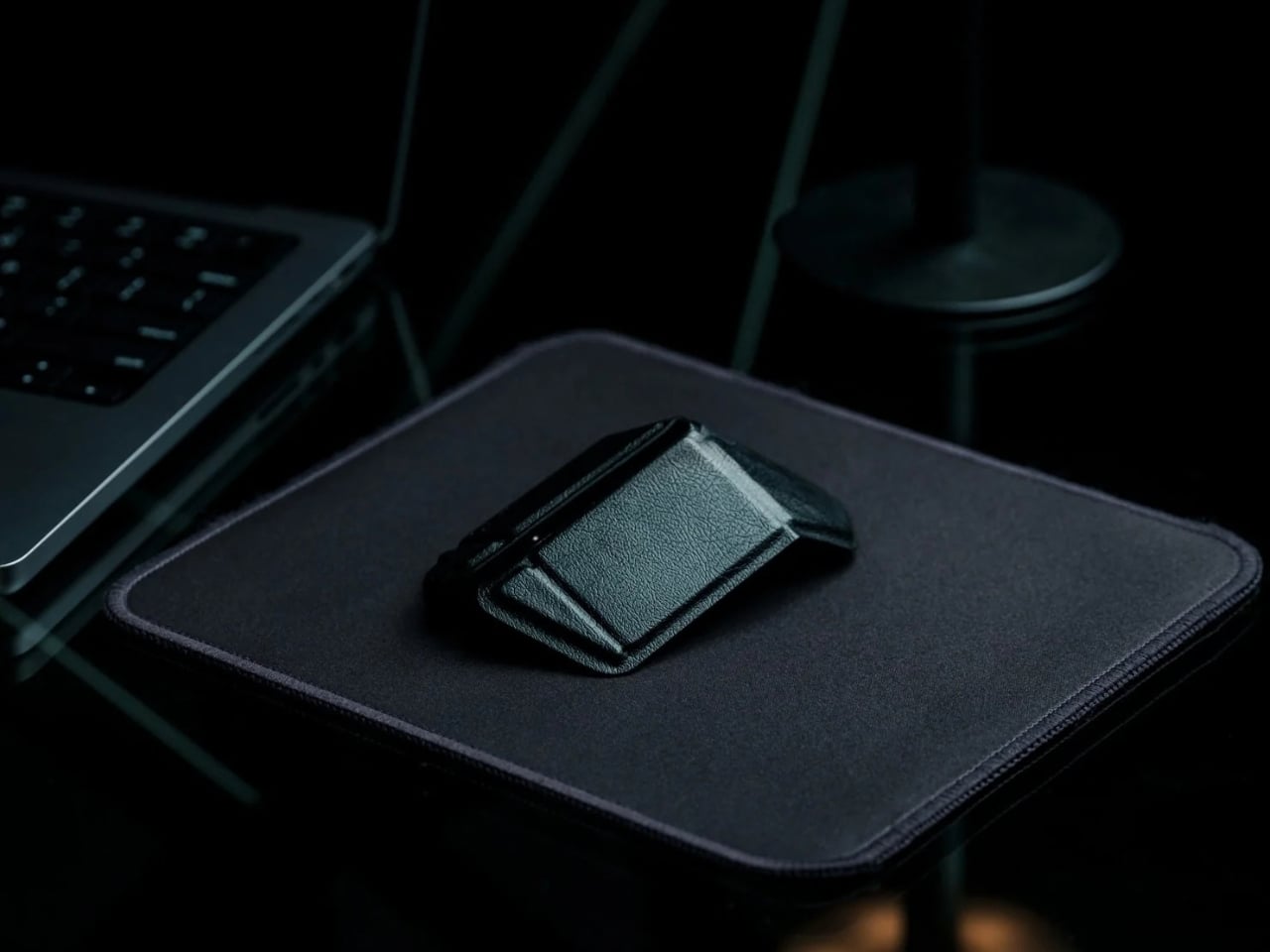
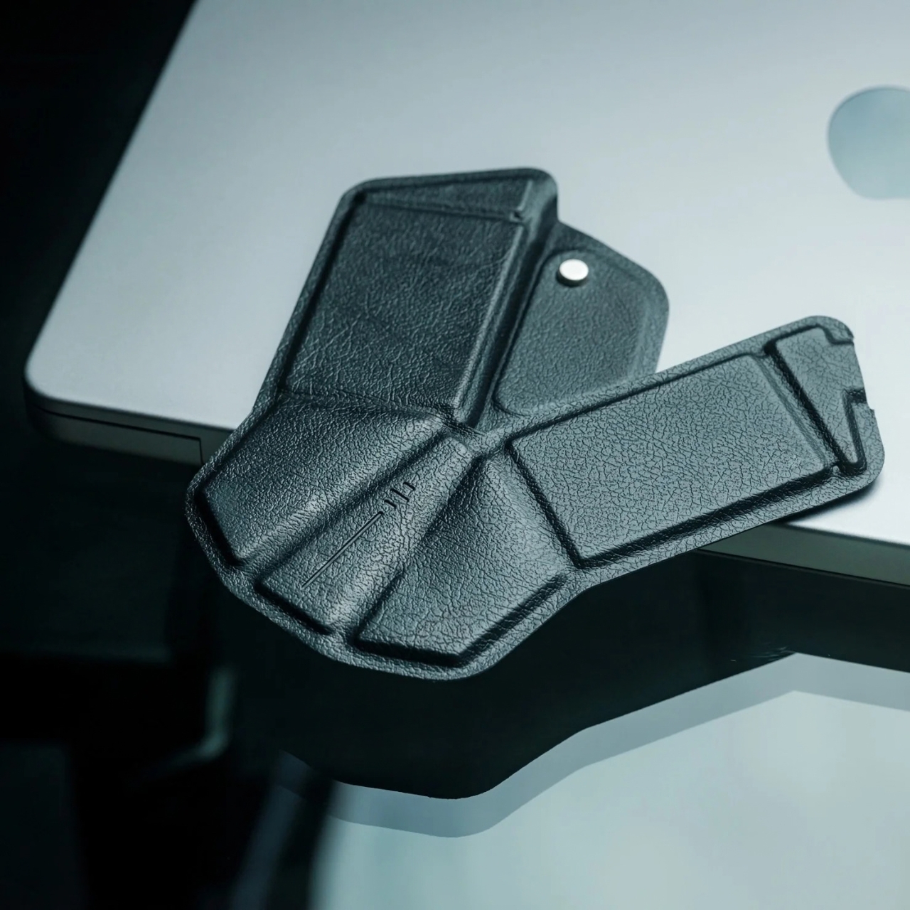
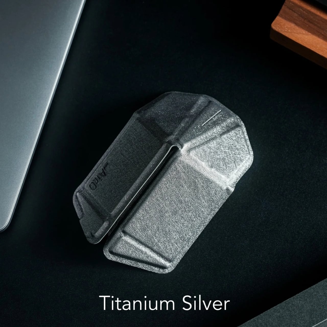
Designed by Horace Lam, it takes its form from origami. Folded open, its triangular structure creates the raised body you expect to hold while moving a cursor. Folded down, it loses that familiar hump and becomes a much slimmer object. I like that the visual idea serves a practical purpose. The angles give it character, but they’re also what make the change in shape possible.

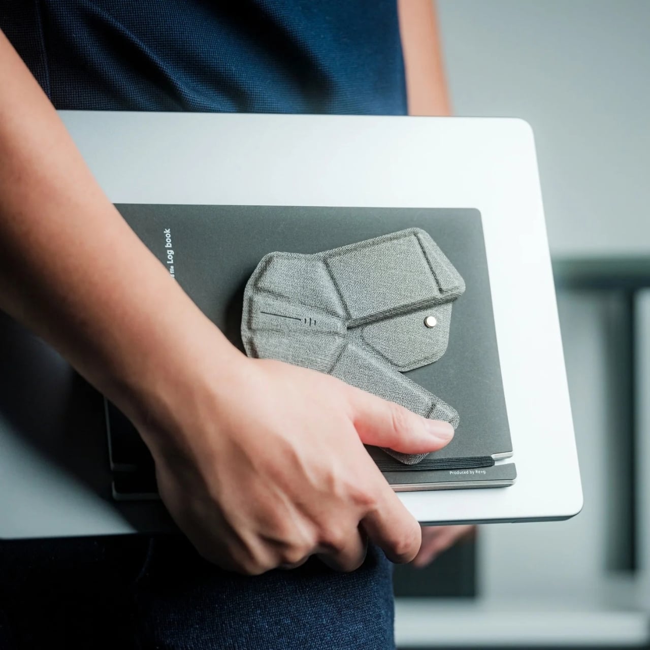
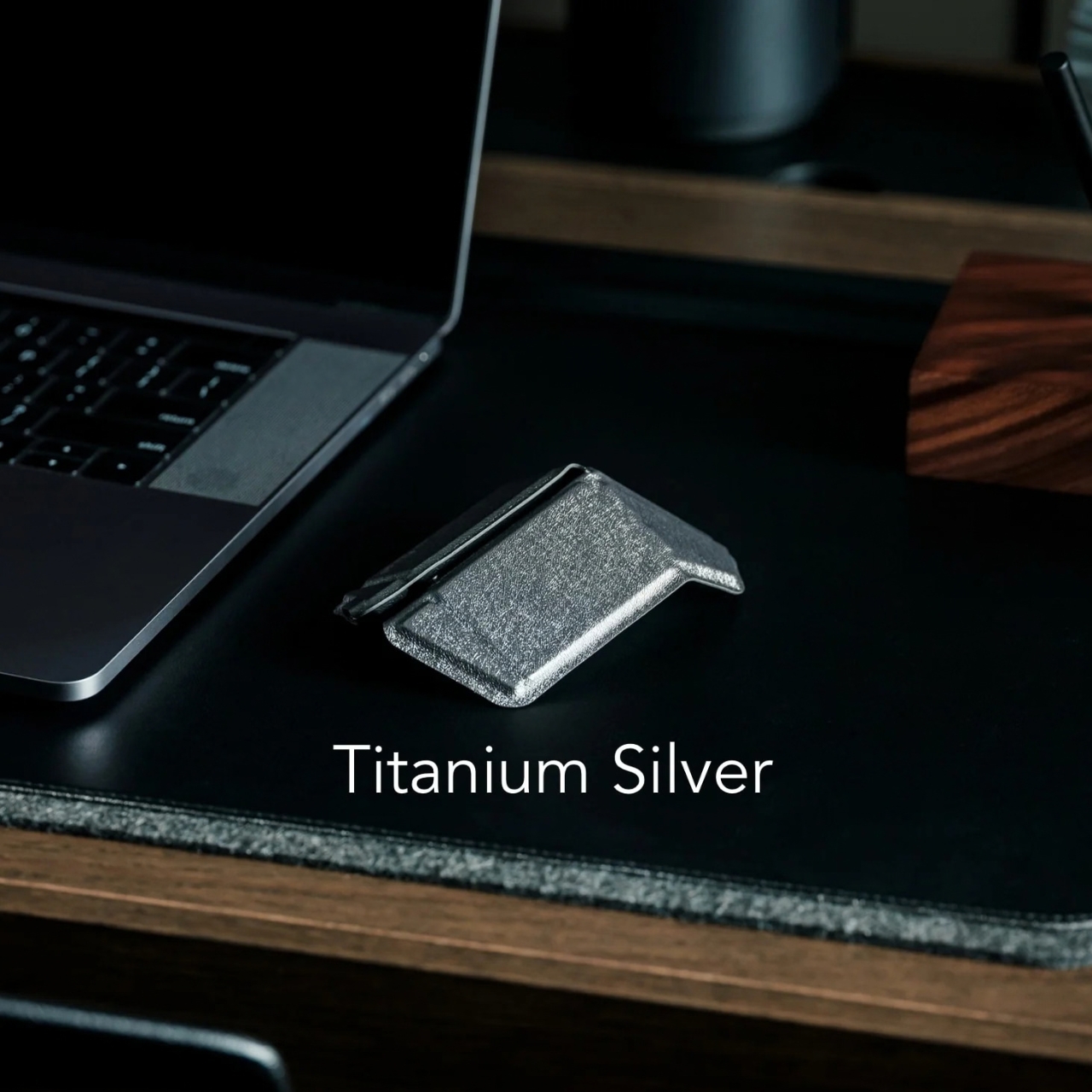
The dimensions tell a more useful story than simply calling it “flat.” In mouse form, OrigamiSwift measures 4.53 by 2.83 by 1.65 inches. Folded, it measures 4.8 by 4.96 by 0.18 inches, with a thicker 0.39-inch section around the sensor. Its footprint gets wider as its height drops. That distinction matters if you’re picturing where it might go: a laptop sleeve or shallow drawer makes more sense than assuming it will vanish into any pocket.

At about 1.41 ounces, or 40 grams, it also shouldn’t add much weight to a bag. But the appeal isn’t just taking it somewhere else. It’s being able to put it away when you’re staying home. Fold the mouse, close the laptop, and the table can go back to being a table without another little piece of tech sitting beside the salt shaker.

That routine may sound ordinary, which is precisely why it interests me. Product photography often shows portable gear moving between airports and cafés. A lot of work is less picturesque: answering emails at a kitchen counter, checking a spreadsheet between errands, or borrowing a corner of a shared room. In those settings, a product earns its place by being easy to take out and easy to put away.
OrigamiSwift still has to do the unglamorous work of a mouse. It connects over Bluetooth 5.2, charges through USB-C, and has an HD infrared sensor rated at up to 4,000 CPI. The listed battery life is up to three months per full charge. Those specifications won’t tell you exactly how it will feel in your hand, but they do show that the folding mechanism isn’t its only feature.

I would be careful, though, about treating “full-size comfort” as a promise that applies to everyone. Hands differ, and a striking shape doesn’t prove it will suit an eight-hour workday. A folding product also introduces a reasonable question about how its mechanism will hold up to repeated use. Those are considerations worth keeping in mind, especially if you already have a stationary mouse you love.

For someone with a dedicated desk, OrigamiSwift Mouse might be a clever accessory rather than a necessity. For someone whose workspace appears every morning and disappears every evening, its design feels more pointed. It acknowledges that packing up is part of the workday, not an afterthought. That’s a modest benefit, but I’d welcome it on my own dining table. The best version of a flexible workspace should make room for the rest of life, too.
The post This Origami Mouse Folds Flatter, Not Smaller in Every Direction first appeared on Yanko Design.
Knot Stool Refuses to Hide Its Rope-and-Aluminum Joints

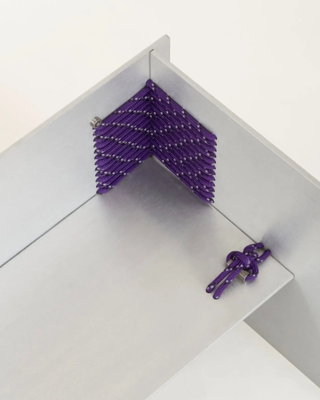
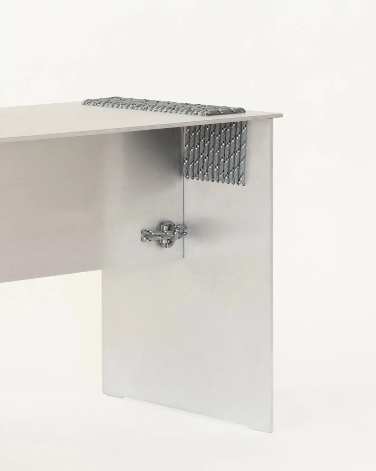
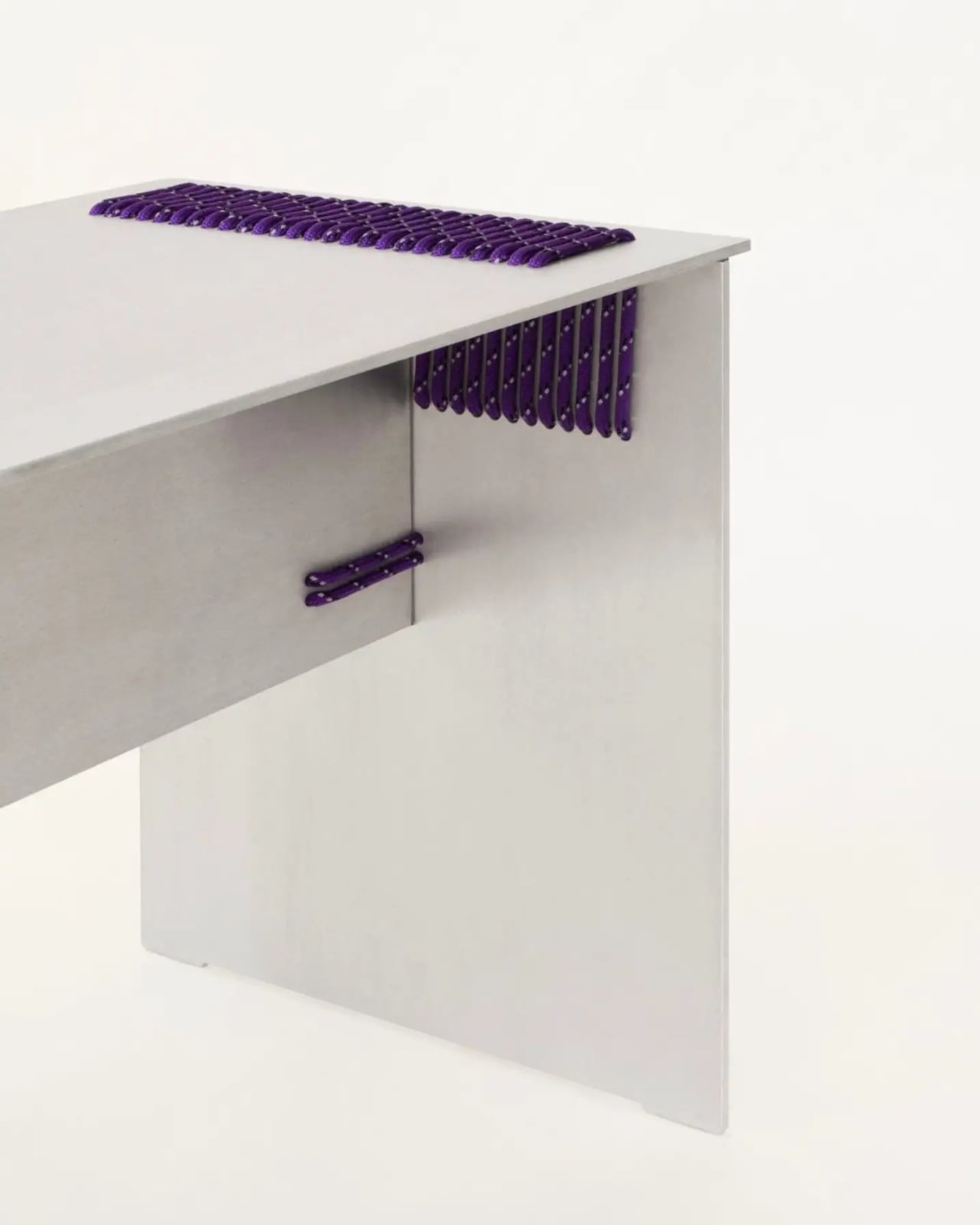
A small knot sticks out from the side of the Knot Stool, and I like that it hasn’t been tucked underneath or disguised with a plastic cap. It introduces the construction challenge behind the design: how to hold a rigid seat together without the usual collection of screws and glued joints. Here, the connection becomes something you’re meant to notice, rather than something the designer hopes you’ll overlook.

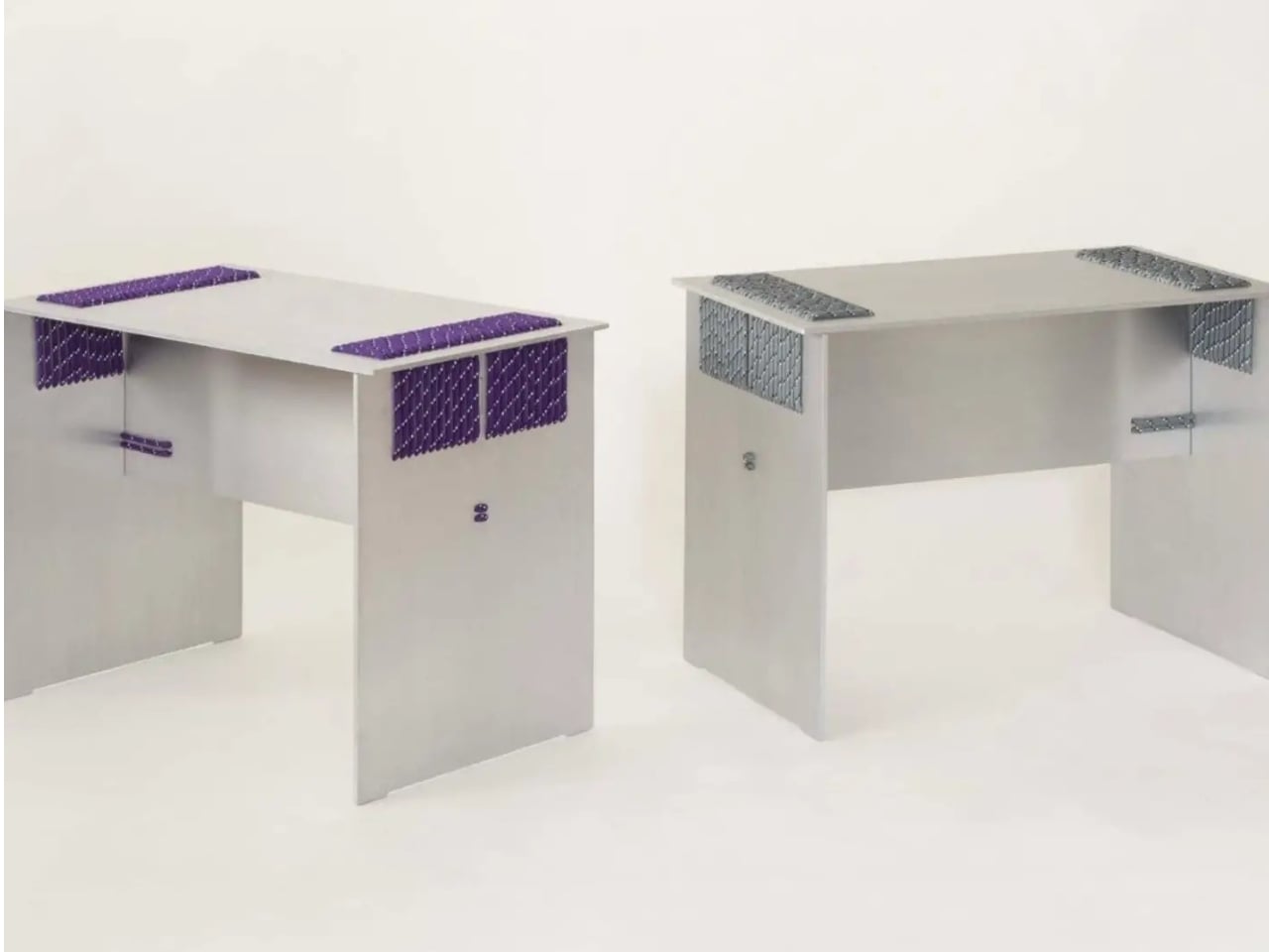
Designed by Studio Yann Gandon in collaboration with Maxime Sauce, the stool uses rope and knots to join laser-cut aluminum components. The metal provides the rigid seat and supports, while the lashing binds the pieces together. That distinction matters. The rope has a structural job, rather than simply adding a crafty detail to an otherwise conventional stool. The studio lists the project for sale, taking the idea beyond a purely speculative concept.

Designer: Studio Yann Gandon

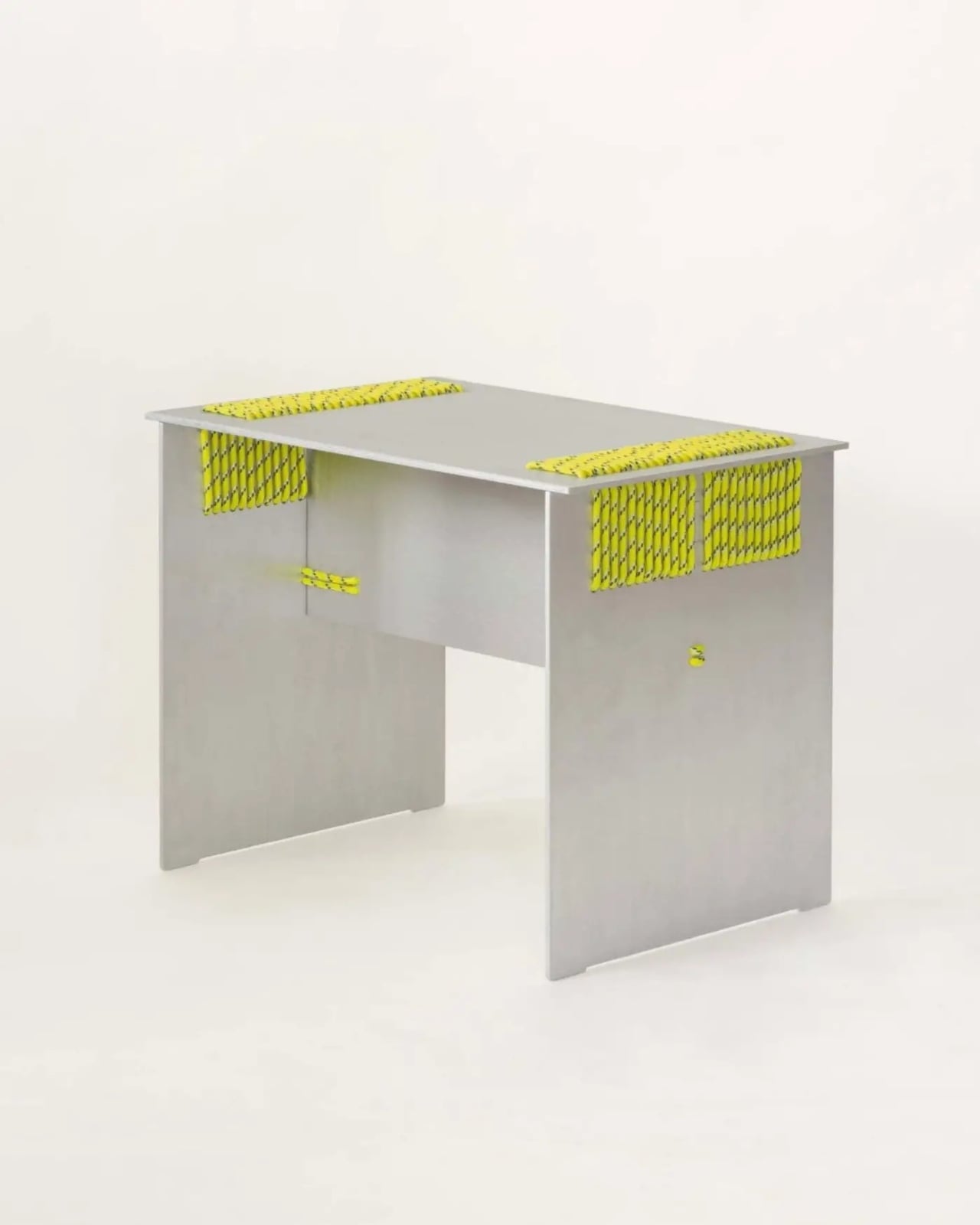
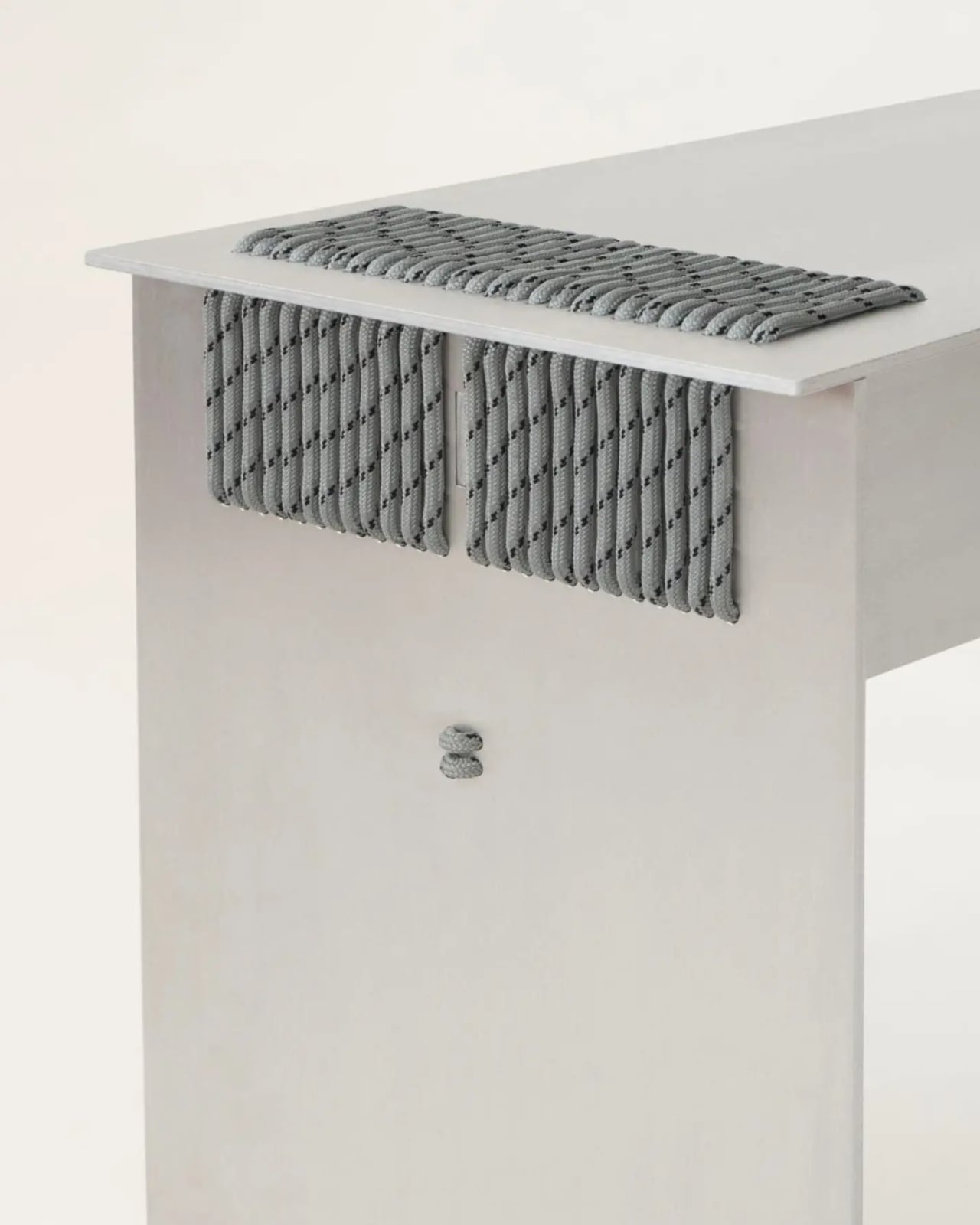
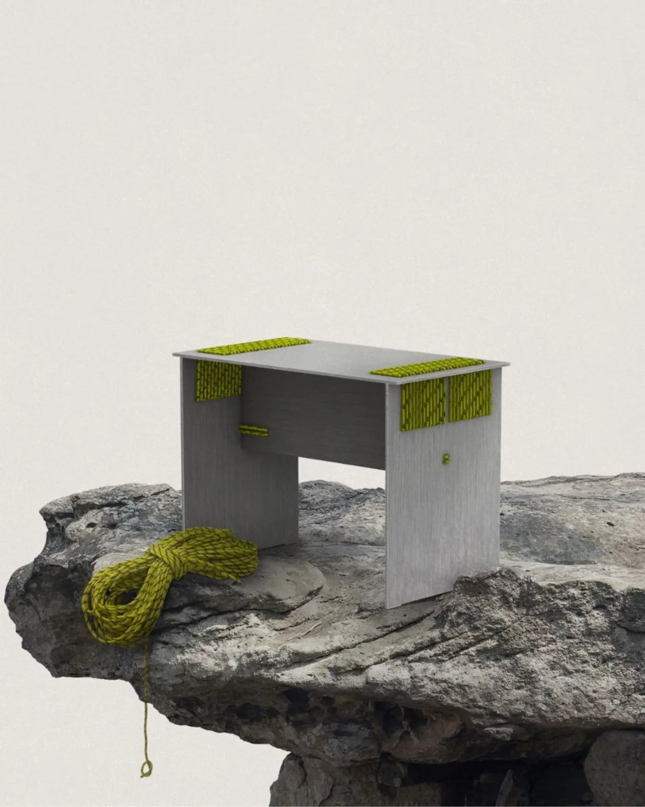
Its overall shape is almost stubbornly straightforward. A rectangular top rests above two broad side panels, with another panel running between them. There are no sweeping curves to distract from the connections. Instead, rows of cord travel across the top near either end and continue down the sides in dense, orderly bands. From a distance, those bands read as blocks of texture. Up close, you can follow the individual strands.

The studio specifies brushed 5754 aluminum for the finished version, a restrained backdrop for all that knotting. Visually, the pairing makes me think of climbing equipment translated into furniture: flat industrial surfaces meeting flecked cord that looks ready for a different kind of work. The appeal comes from that mismatch. Giving the metal a more elaborate silhouette would probably compete with the very detail that makes the stool worth looking at.

The documented rope options include purple, yellow, and gray, and the supplied images make a good case for how much color changes the object. Gray keeps the whole thing close to a single palette, letting the loops register through their shadows. Purple makes the stitching graphic. Yellow is the version I’d pick for an otherwise restrained room, because it gives the stool a little of the visual language of safety gear without covering the aluminum.

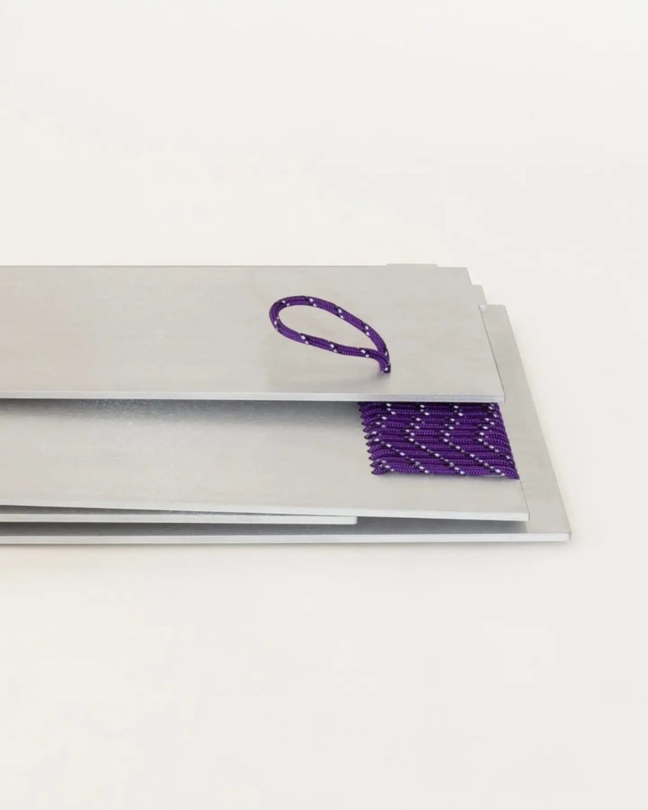
A view of the components stacked flat is equally interesting. The panels sit in a shallow pile, with sections of rope already threaded into place. It suggests a compact packing arrangement, although a photograph can’t tell us how intuitive assembly would be. I appreciate seeing this view alongside the finished object. It lets the design make sense as a collection of parts, not merely as a polished silhouette photographed from its most flattering angle.

Belgian retailer RUIMTE describes the stool as made to order and offers custom sizes and rope colors. Its listing displays a sold-out label, so ordering would need confirmation. That context helps place the design: this is a considered furniture purchase, rather than a substitute for the inexpensive extra seat you grab before guests arrive. Its attraction depends on wanting the construction to have a visible presence in your home.

I’d still want practical answers before choosing one for daily use. The studio’s project description doesn’t provide a load rating or detailed care guidance for the rope connections. Those details would help establish how the lashing should be checked or maintained over time. And while the rows of cord add texture near the edges, the seat remains largely a flat metal surface. I’d approach it as occasional seating rather than assume it promises armchair-level comfort.

Even with those questions, the Knot Stool earns attention through a specific, readable decision. You can look at the rope, follow its route, and begin to understand why it’s there. That makes the little exposed knot more compelling to me than an ornamental flourish. It gives an ordinary seat a reason to be examined from the side, underneath, and up close. The construction rewards curiosity before anyone even sits down.

The post Knot Stool Refuses to Hide Its Rope-and-Aluminum Joints first appeared on Yanko Design.
This 2,680-piece LEGO AKAI tape deck is my kind of analog nostalgia

Owning a reel-to-reel deck in the 1970s meant owning a piece of furniture you could not move alone. The Akai PRO-1000 came in two boxes, with published specs putting the drive unit at about 62 pounds and the amplifier at about 22. That is roughly 85 pounds of hi-fi, which explains why one UK dealer listing recommends collecting in person or booking a pallet. People bought these anyway, because a machine with two huge spinning reels announced to every guest that you took music seriously. Nobody ever put a reel-to-reel in a closet. Now there is a version you could carry to the couch without calling a friend, made of 2,680 LEGO parts.

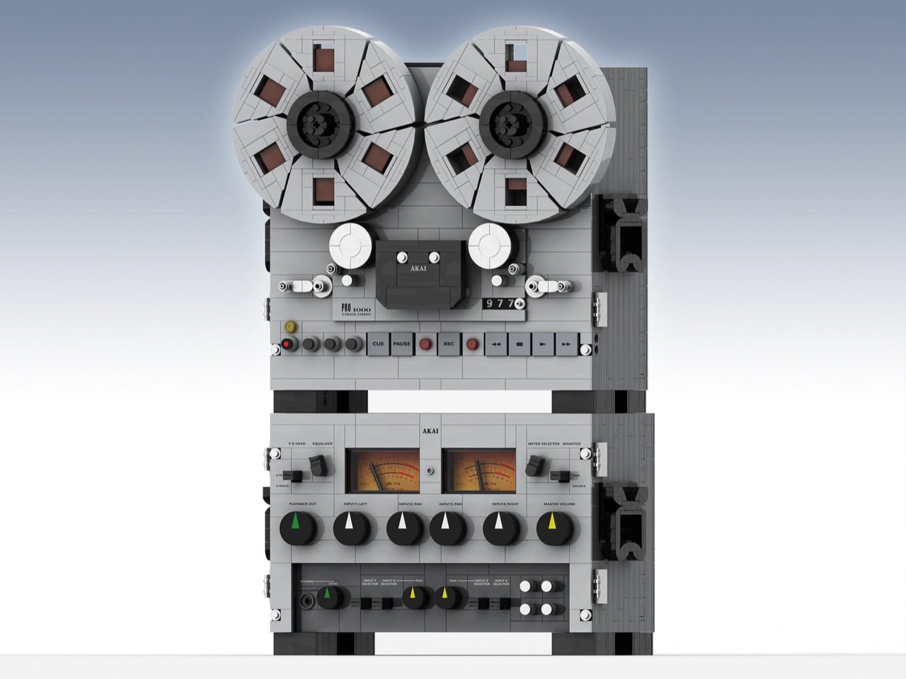
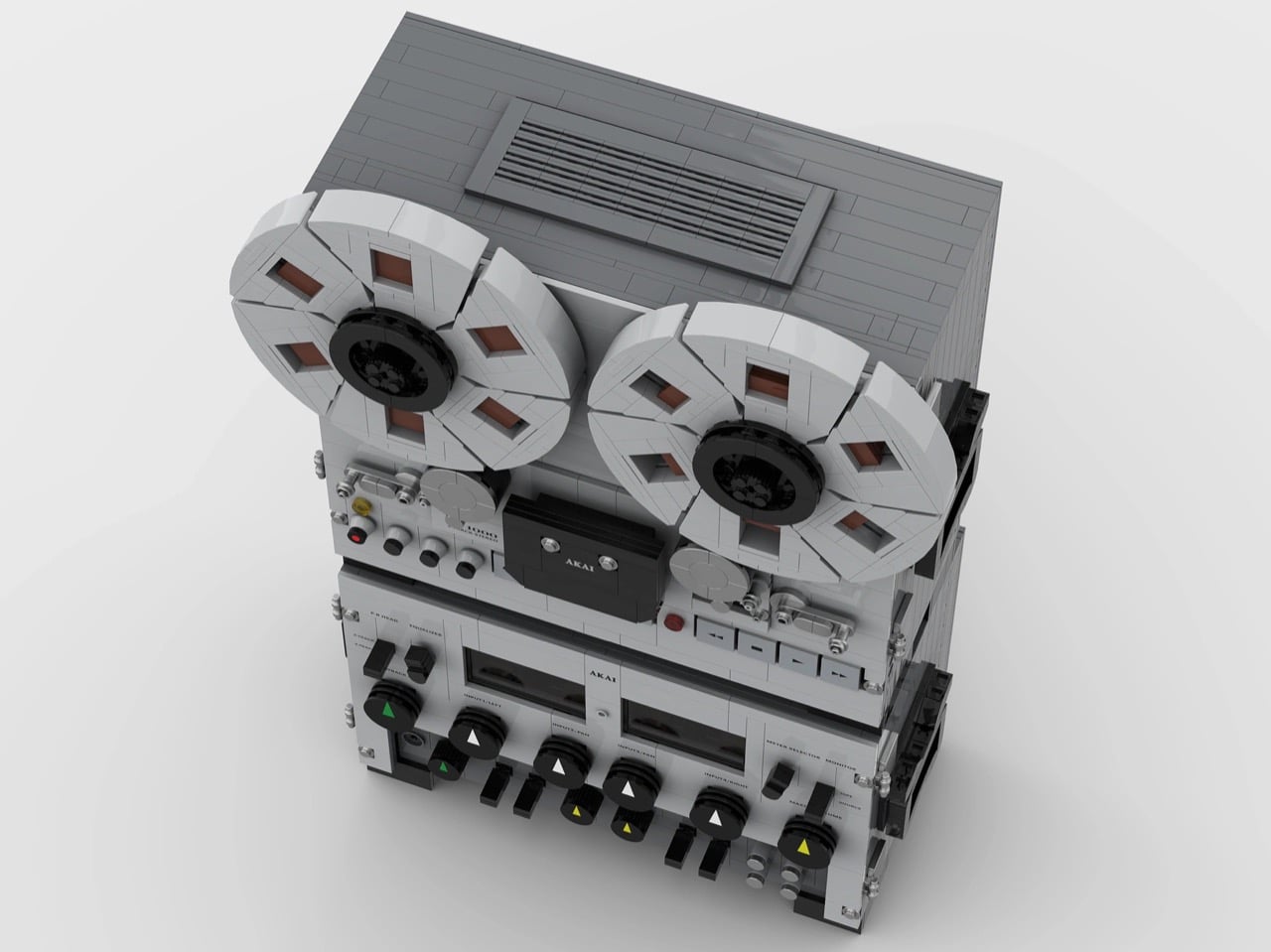
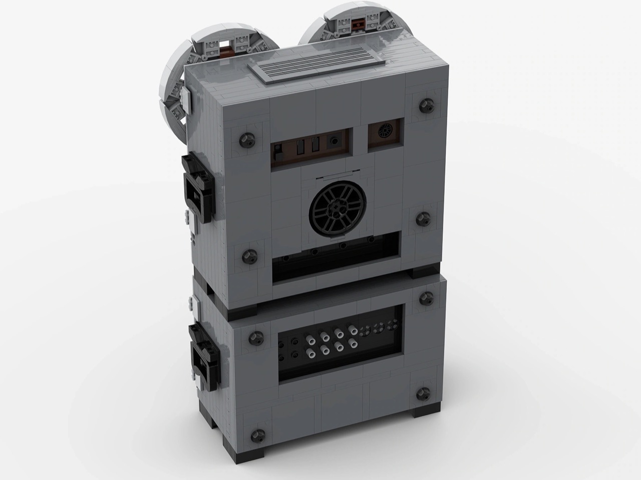
That version is the AKAI PRO 1000 Open Reel-to-Reel Tape Deck, a LEGO Ideas project from Zo Lee that has already picked up a Staff Pick badge. The original was a semi-professional machine from the late 1970s that sold mainly in the US, Canada, and Japan, with a 1977 US price of $1,995. Its two boxes were joined by three cables, so owners could park them side by side or stack them, and the LEGO version takes the stacked route. At about 17 inches tall, 11 wide, and 6.3 deep (43 x 29 x 16 cm), it is a compact take on an original roughly 19 inches across. Finally, a hi-fi flex that does not need a pallet.

Designer: Zo Lee

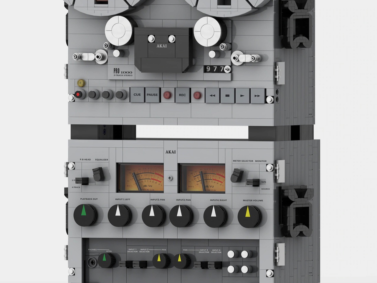
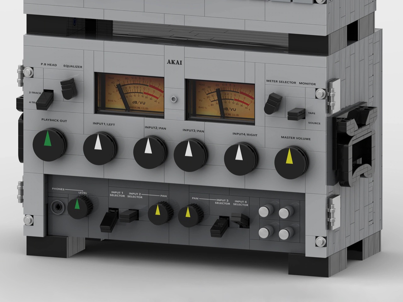
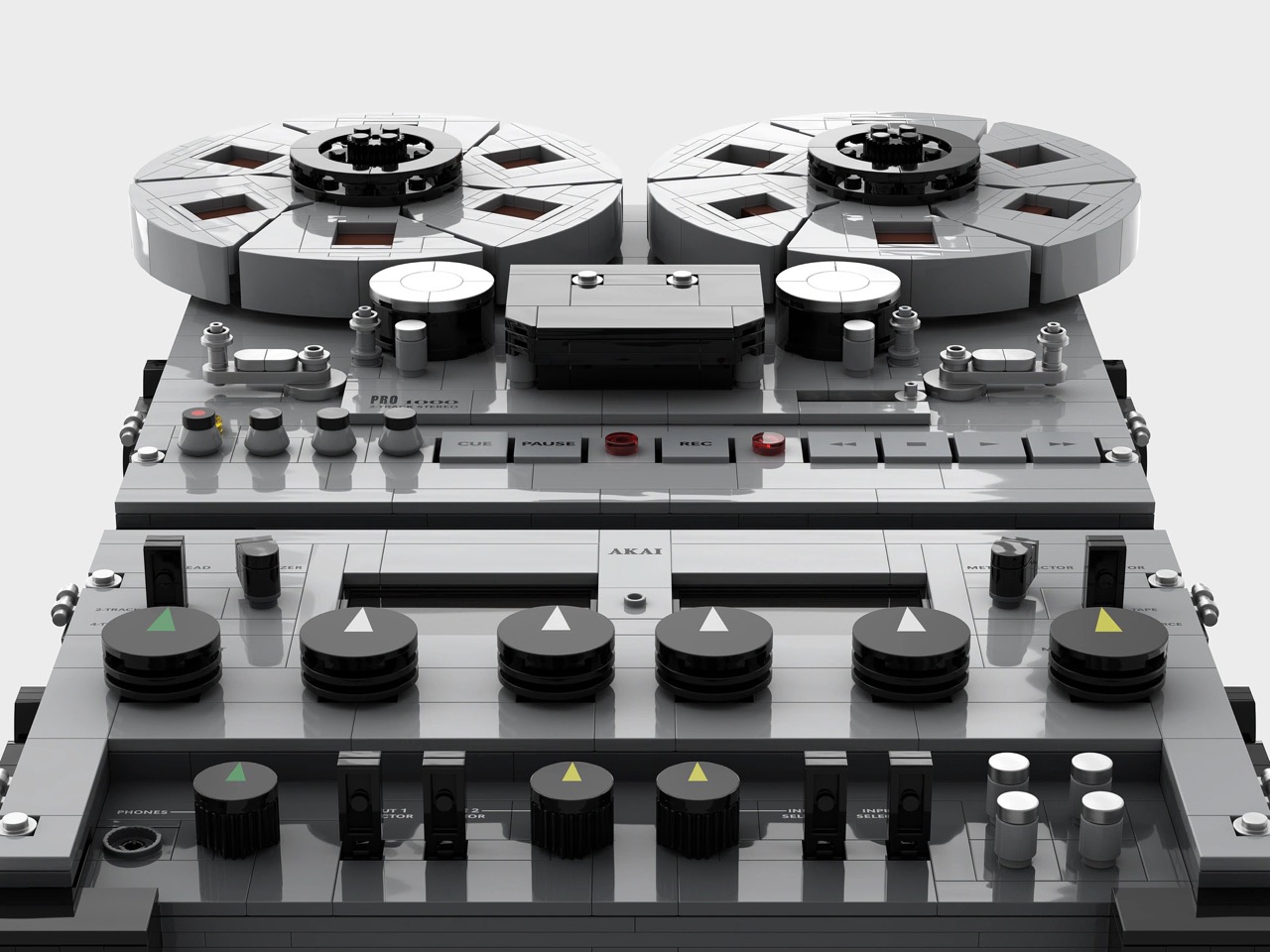
Here is the party trick: the thing moves. A motor turns the reels, the VU meters swing along with them, and the big knobs rotate under your fingers. A removable grid on top lifts off to hold a LEGO battery, so the deck can sit anywhere on the shelf without hunting for a wall outlet. The reels were the first thing every guest stared at on the real machine, so making them the star of the show is exactly right. Powering it up is its own small concert, minus the music.

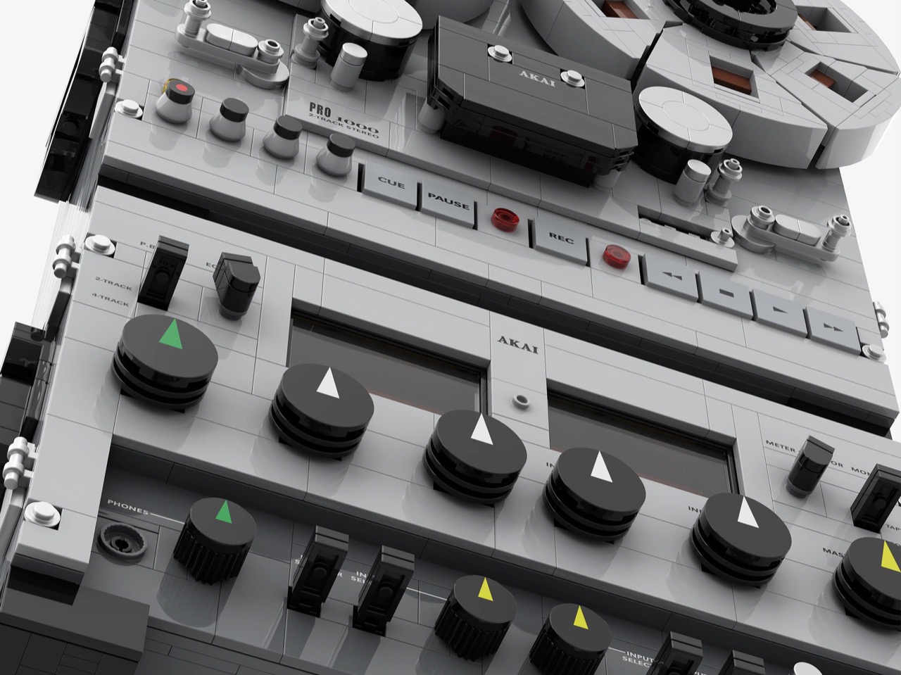
Zo Lee describes the build as extremely difficult, and the list of headaches reads like a boss fight. The odd quarter-distance spacing between tiles, the big reels with all those cutout windows, and an internal frame that has to hold the outer casing each took plenty of brainstorming. Getting that same frame to drive the reels and meters took lots more attempts, per the creator. The payoff shows in the renders: gray reels with dark red cutouts, black knobs with colored pointers, tiny transport labels like CUE, PAUSE, and REC, and a tape counter parked on 977. From a few feet away, the front panel reads like actual hardware, which is the whole point of a shrunken replica.

My favorite detail, though, is the pair of VU meters, which Zo Lee says swing in sync with the reels, but asymmetrically. I am guessing the same motor drives both, which would mean the needles twitch like they are reacting to a song instead of marching in lockstep. That one choice fakes live audio, hides a mechanism behind two amber faces, and probably saves the builder a second motor. It also slots the deck into a neat lineage of LEGO Ideas audio gear, next to Tomasso Builds’ Technics SL-1200 MK2 turntable and Headlight Bricks’ Sony Walkman. Reel-to-reel is the format that came before the Walkman’s cassette, and it has the most dramatic moving parts of the lot.

The deck currently sits at 527 supporters on LEGO Ideas, with the next milestone at 1K and 396 days left to get there. Ideas works like this: fans submit builds, supporters pile up, and LEGO reviews the ones that reach the threshold. The Staff Pick badge is a nice head start, but the votes have to come from people like you, so head to the LEGO Ideas page and give it your vote. Every supporter helps push this toward an actual box. Get it there and you can finally own a reel-to-reel deck without recruiting three friends and a hand truck.

The post This 2,680-piece LEGO AKAI tape deck is my kind of analog nostalgia first appeared on Yanko Design.
A Curved Timber Core Divides This Compact Kyoto Home Without Closing It Off

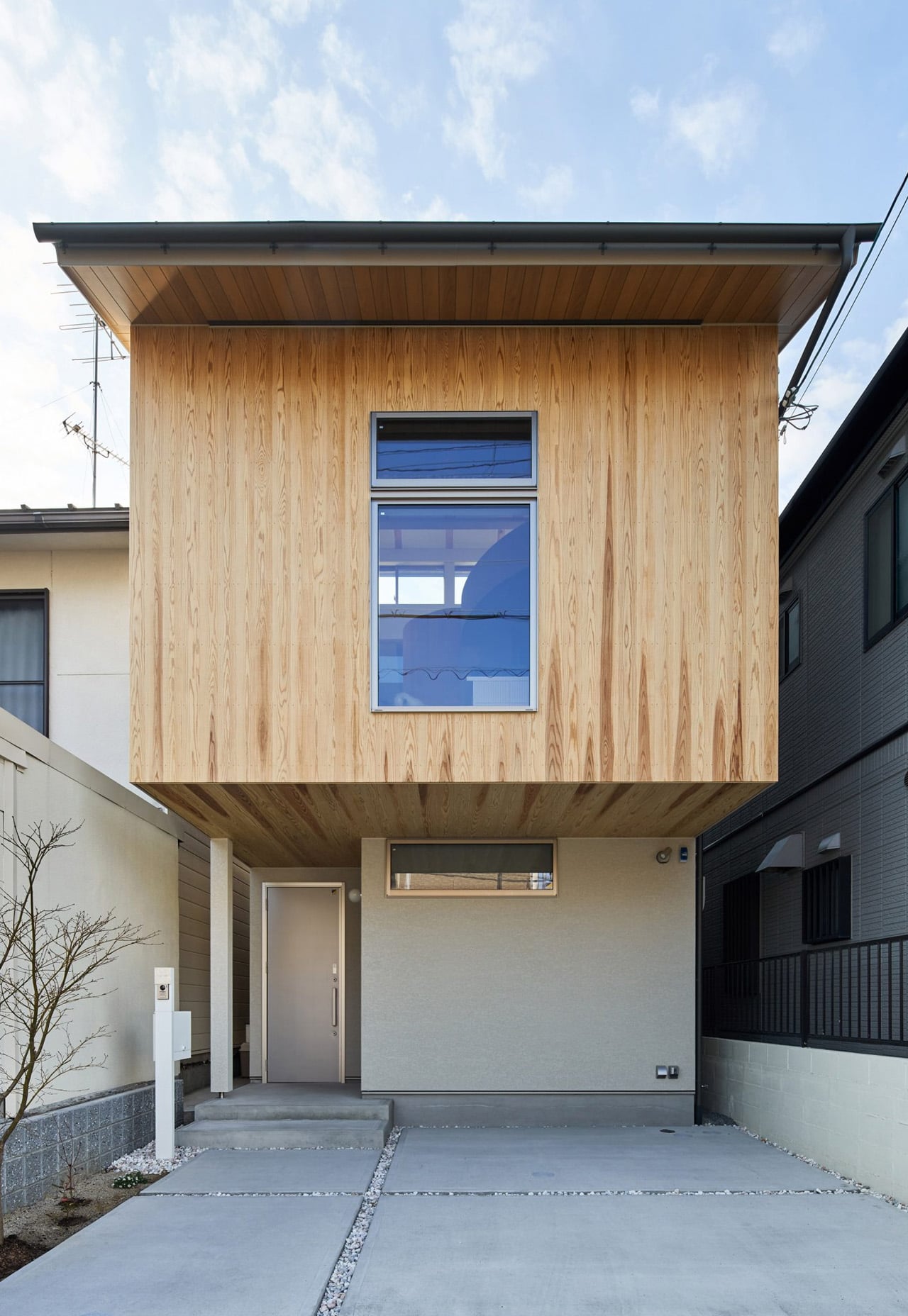
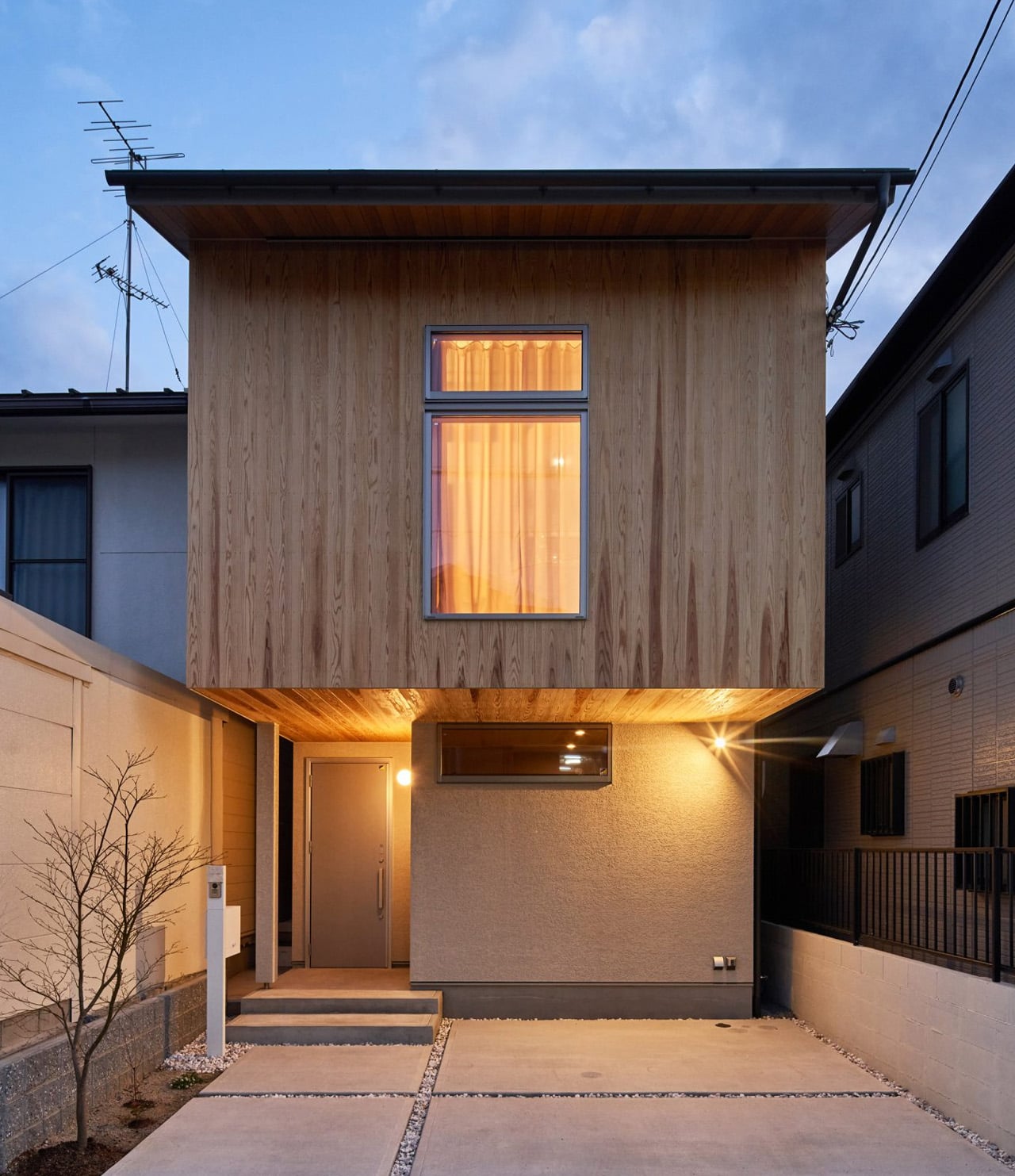
A curved timber volume sits at the heart of Sugi House, shaping the rooms around it without closing them off. Designed by Ujizono Architects, the family residence occupies an 83.91-square-meter site in Kyoto, beside the southern approach to Yoshida Shrine. Completed in January 2026, the timber-framed house contains 94.87 square meters of floor space, with its most interesting decisions unfolding inside a restrained exterior.

From the street, the upper story reads as a wooden box suspended above a recessed entrance and parking space. Vertical boards give the facade a fine grain, interrupted by a single prominent rectangular window. A raised strip of glazing peeks above the front roofline. The composition sits between neighboring houses without trying to outshout them; its depth comes from the shadow beneath the projecting upper floor.

Designer: Ujizono Architects

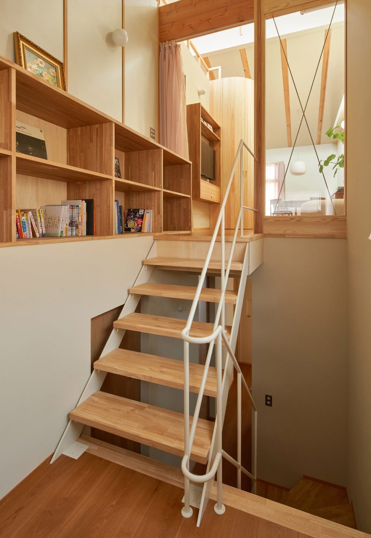
Inside, architects Kazuki Ujigawa and Mirai Ozono establish a contrast between levels. The ground floor follows a relatively enclosed arrangement, with a hallway connecting three bedrooms and a bathroom. A staircase toward the rear leads upstairs, where living, cooking, and dining share a more expansive volume beneath the pitched ceiling. The climb makes the shift from private rooms to communal space part of the everyday route through the house.

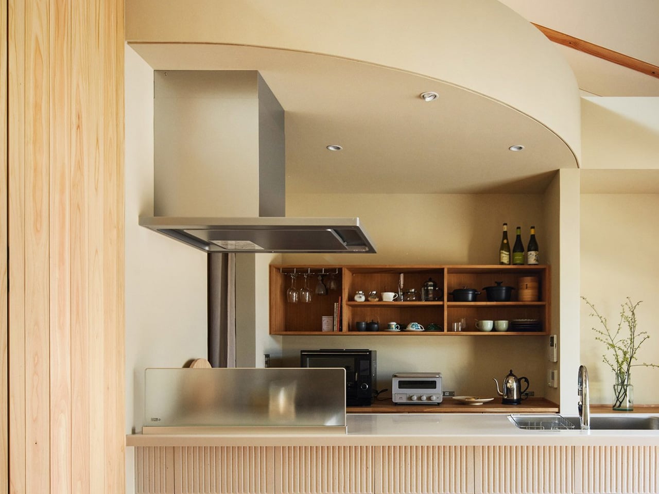
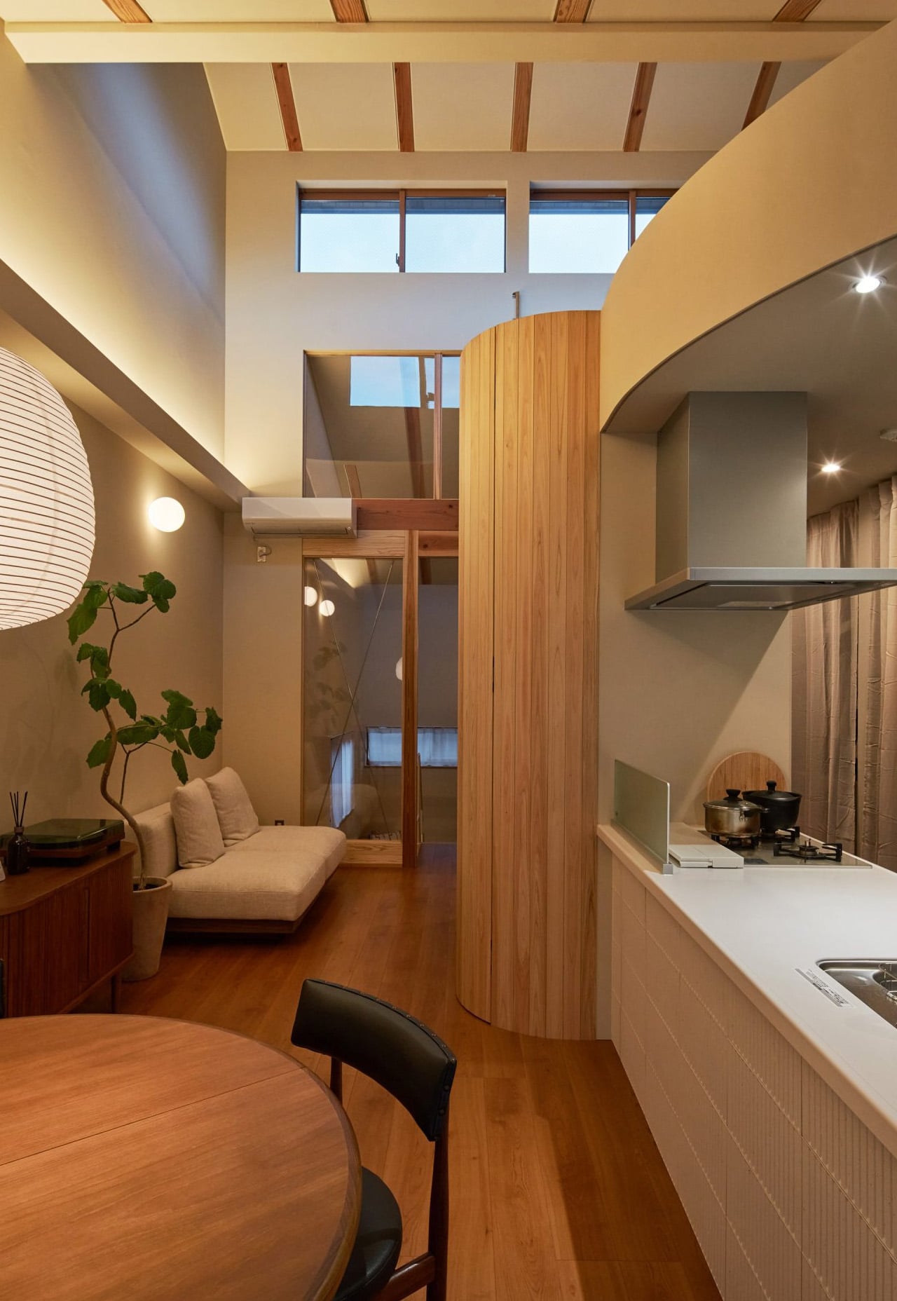
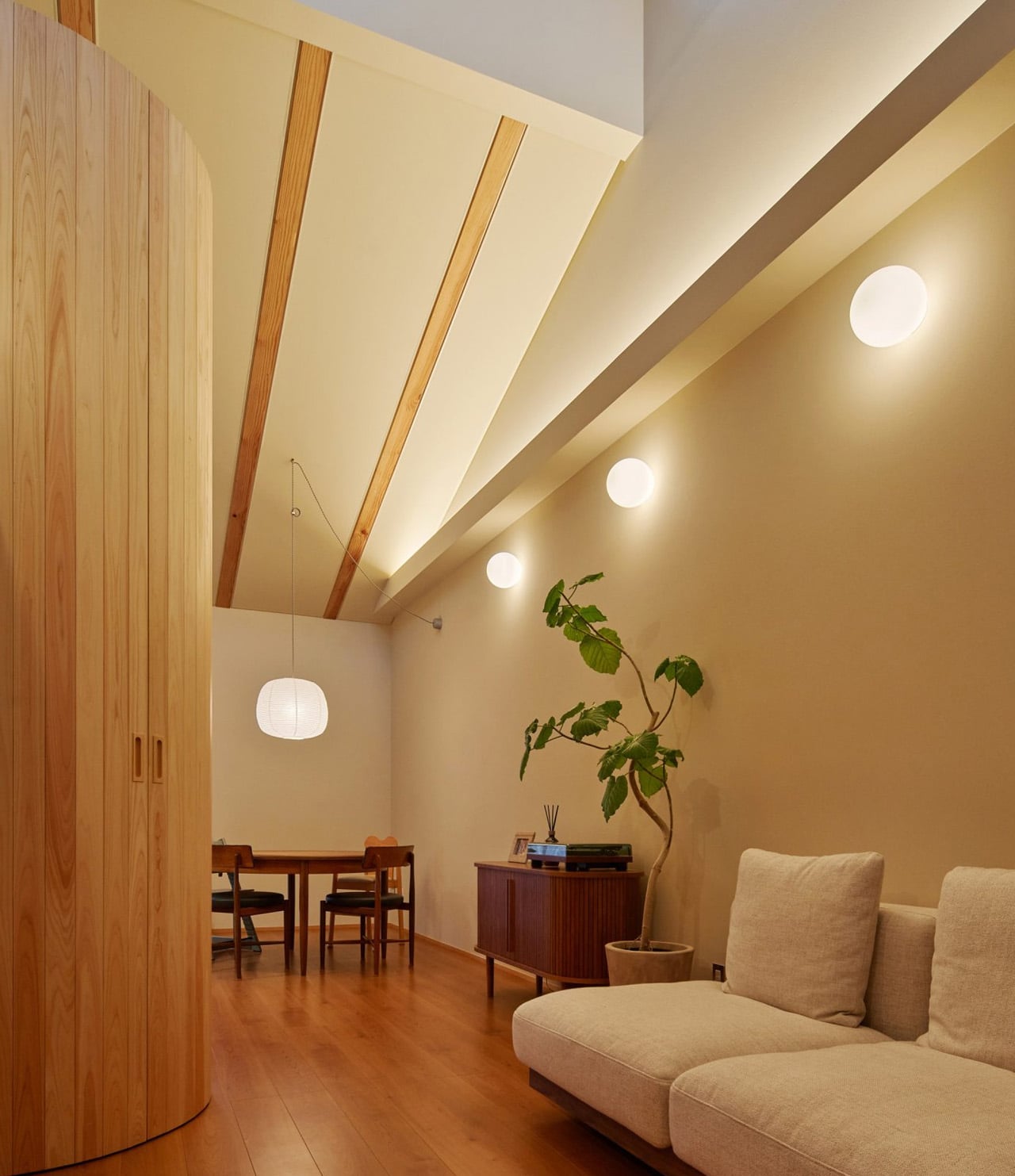
That upper floor avoids the blank openness of an undivided room. Its curved timber core partially separates the living area from the lower kitchen and dining zone, while concealing a ladder-like stair to a mezzanine. Moving around the curve changes what is visible and what disappears behind it. A lowered ceiling above the kitchen reinforces the distinction, giving different activities their own proportions without enclosing each one behind a door.

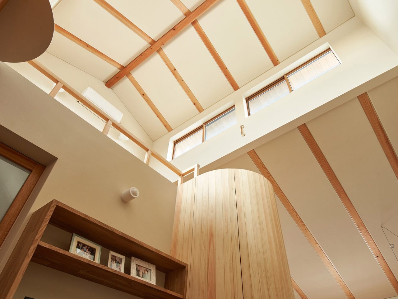
Daylight provides another way to open the interior while maintaining distance from neighboring properties. According to the architects’ project description, high-level windows admit light deeper into the house while limiting direct overlooking. Exposed timber rafters remain visible beneath the roof, giving that overhead space a legible structure. The design’s sense of openness relies on height and illumination rather than extensive outward-facing glass.

Elsewhere, openings between floors create visual connections, while curtains offer boundaries that residents can adjust. These elements support the architects’ intention for family members to remain aware of one another while occupying separate spaces. Privacy becomes something that can vary with the activity, rather than a condition determined entirely by fixed walls.

The curved core is the persuasive move here. It gives the shared floor a center, makes circulation purposeful, and offers partial separation without requiring a corridor. For a compact family home, that is a useful middle ground: enough definition to distinguish activities, with room for daily life to overlap.

The post A Curved Timber Core Divides This Compact Kyoto Home Without Closing It Off first appeared on Yanko Design.
Tesla’s new roadster employs SpaceX thrusters to perform midair flips, reach 60 MPH in 0.81 seconds

Tesla’s second-generation Roadster is taking the idea of a performance car in an unexpected direction. At a demonstration held at a SpaceX test facility in McGregor, Texas, on October 15, the electric coupe was shown performing midair rotations, clearing other cars, and driving upside down on a specially designed ramp. The stunts rely on technology developed with SpaceX, giving the Roadster capabilities that go well beyond those of a conventional electric sports car.

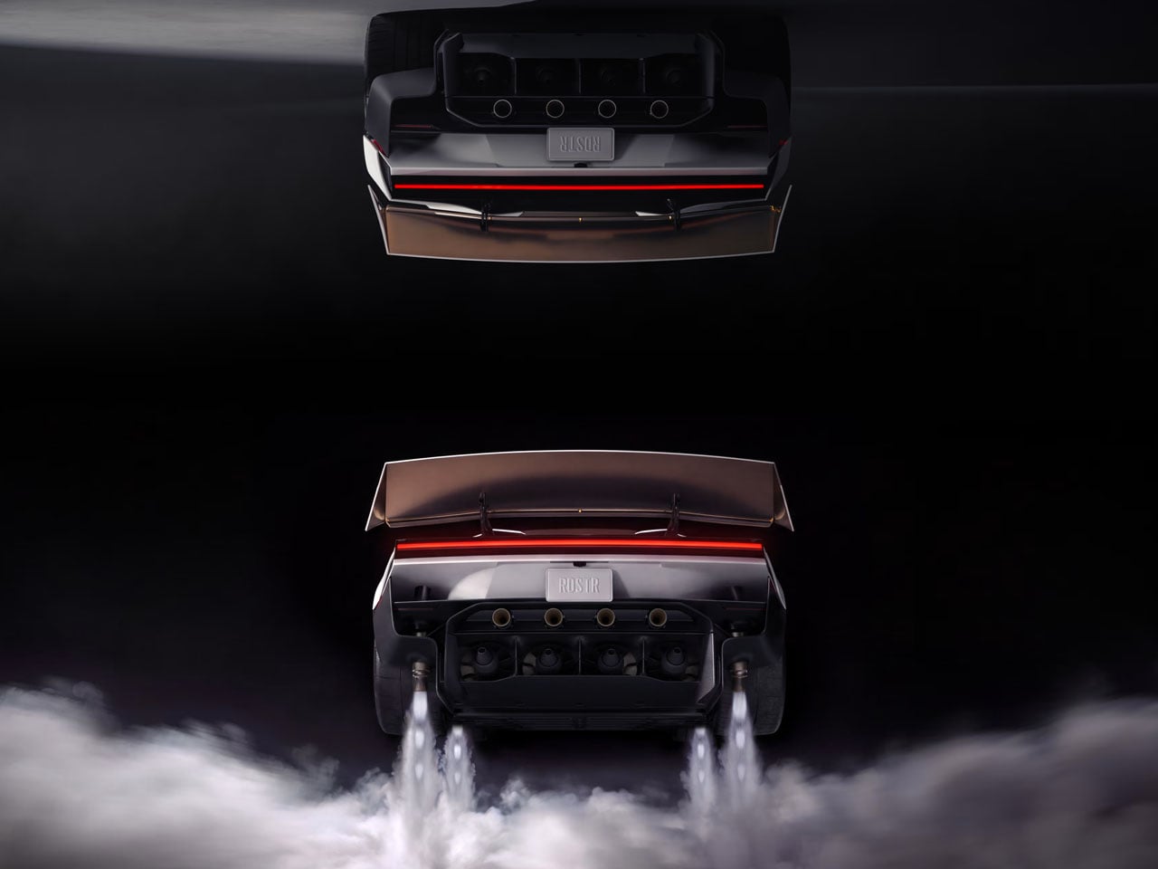
The airborne manoeuvres are made possible by compressed-air thrusters mounted around the vehicle. Instead of using wings or rotors, the system releases pressurised gas through strategically positioned nozzles to generate short bursts of thrust. These help lift the car, control its orientation in the air, and assist with forward acceleration. Tesla has described the system as capable of producing 80 kilonewtons of thrust, although the company has yet to publish a complete set of production specifications.

Designer: Tesla

The demonstration included a corkscrew-like rotation before the Roadster returned to the ground. While the footage gives an idea of what the system can do, it does not establish that the car can sustain flight. The current concept is closer to a road-going vehicle with limited airborne capability than a flying car in the usual sense. The compressed-air tanks also need to be replenished, adding another practical consideration to the system.

Another unusual feature is the car’s ability to travel upside down along a purpose-built ramp. An active suction system beneath the chassis pulls the vehicle towards the surface, helping it maintain contact where conventional aerodynamic downforce would be insufficient. Elon Musk has claimed that the system can deliver more than 2 Gs of cornering grip. Its effectiveness on ordinary roads, however, remains unproven.

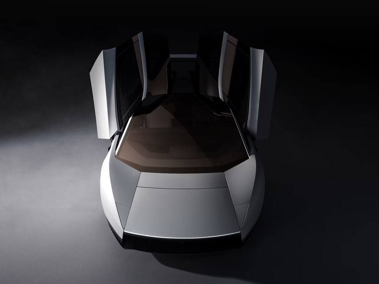
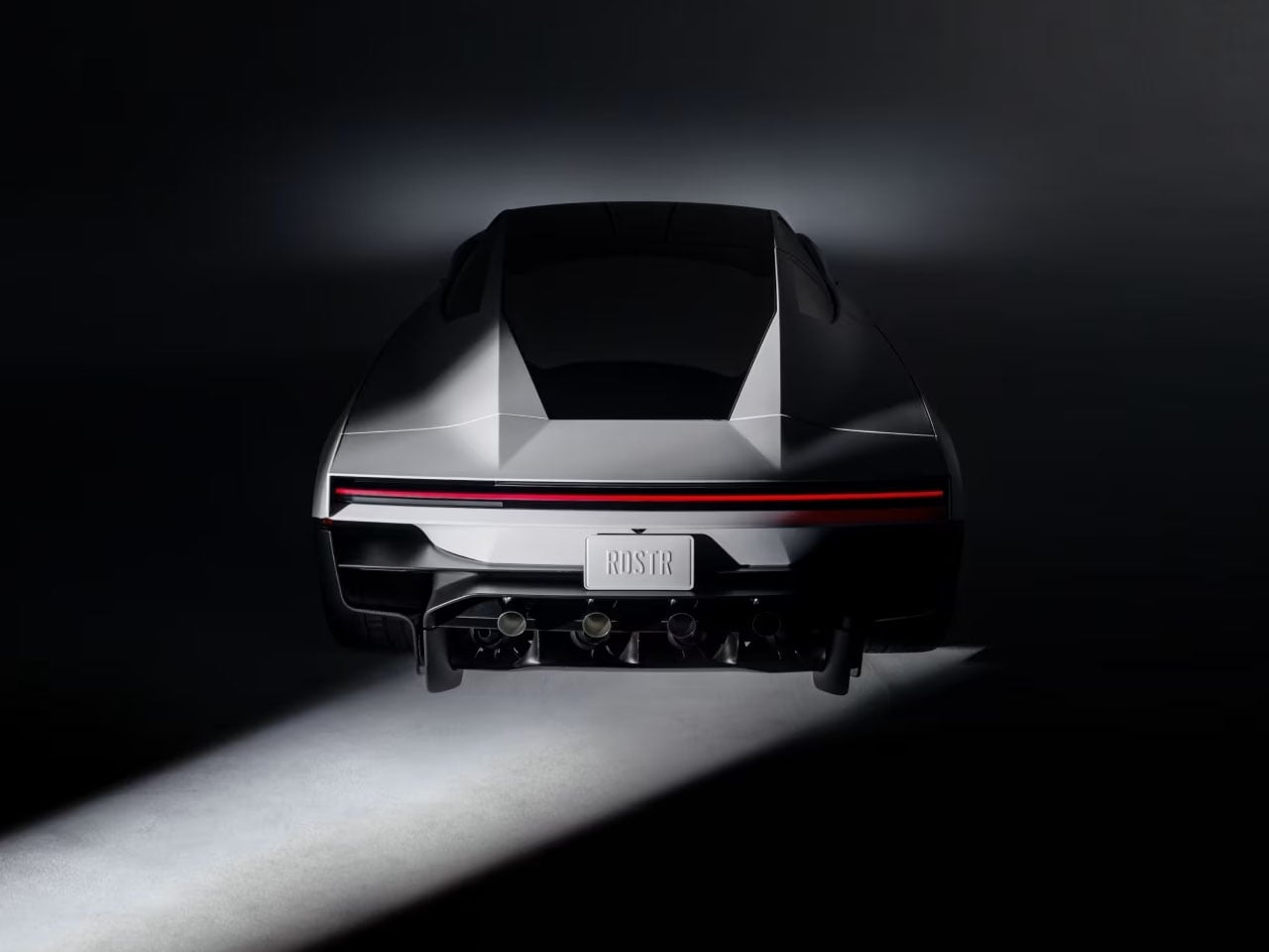
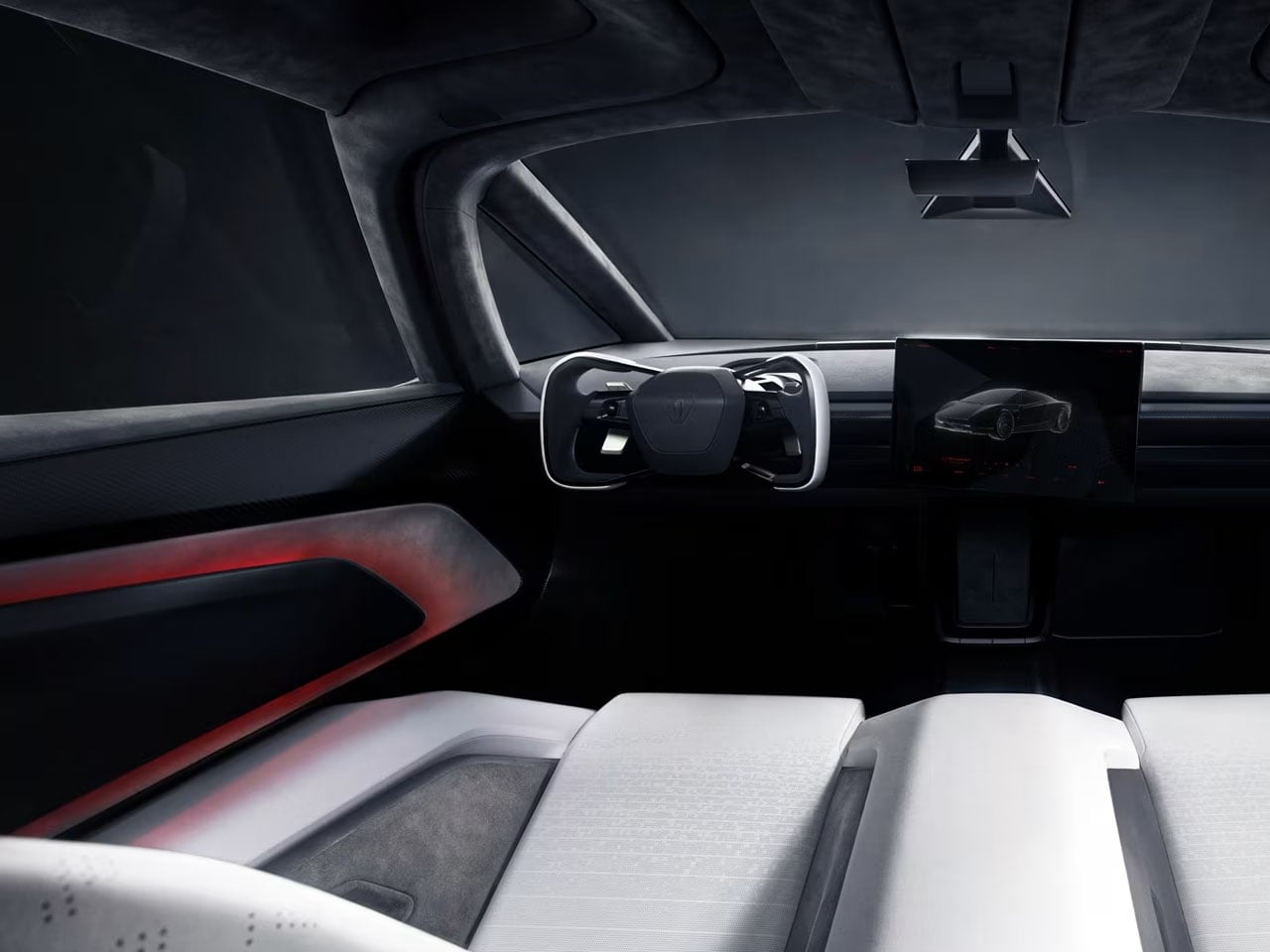
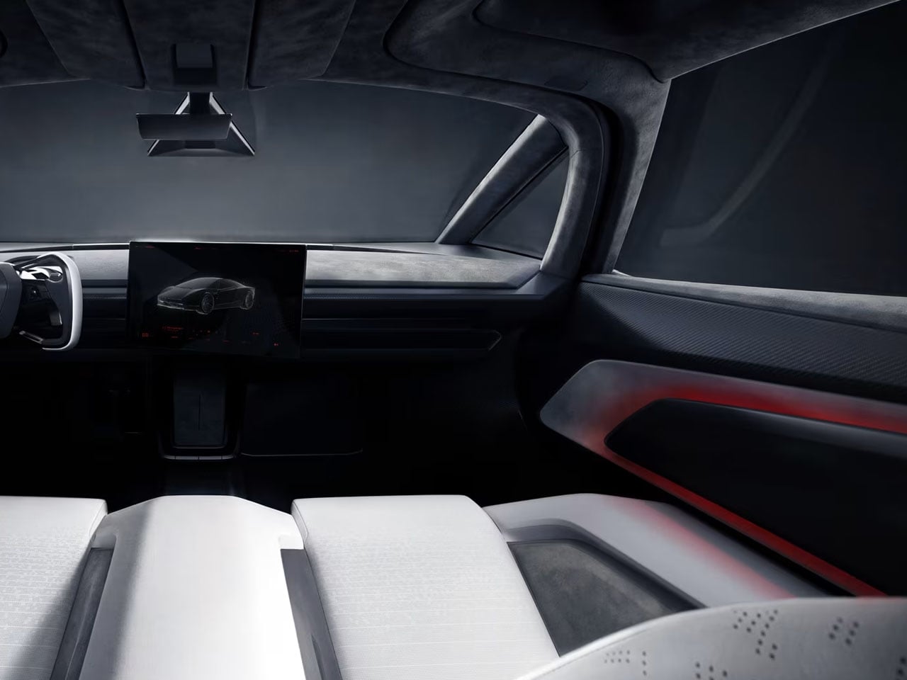
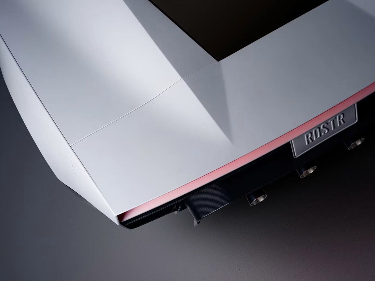
The Roadster’s exterior still follows the proportions of a low-slung sports coupe, with angular bodywork, upward-opening doors, and a deployable rear spoiler. The design has to accommodate more than batteries and electric motors, though. Compressed-air tanks, thrusters, and the associated control systems introduce packaging challenges, while the suction hardware adds another layer of mechanical complexity.

Tesla has also claimed a 0–60 mph time of 0.81 seconds when using the thruster-assisted setup. That figure has not been independently verified as a production-car performance result. The company has outlined Performance, Thrust, and Rocket configurations, with the most extreme version expected to include additional thrusters for vertical movement. Final specifications, pricing, and the precise capabilities of each version remain unconfirmed.

There are practical questions that the demonstration cannot answer. Powerful gas discharges, the demands of controlling the car in midair, and the consequences of a failed manoeuvre would all require careful engineering and testing. Any airborne function would also face regulatory hurdles before it could be used outside a controlled facility.

Tesla is targeting production in 2028, but the Roadster’s final form is still uncertain. The thruster system is an intriguing engineering experiment, though fitting it into a usable, road-legal car will be a different challenge from demonstrating what it can do on a closed test course.

The post Tesla’s new roadster employs SpaceX thrusters to perform midair flips, reach 60 MPH in 0.81 seconds first appeared on Yanko Design.
Toyota’s ‘Wheel-less’ Wheelchair wins the 2026 Red Dot Concept Luminary Award

Somewhere around age eight, I decided the coolest vehicles in the universe all had legs. The AT-ATs in The Empire Strikes Back, the mechs in every anime I wasn’t supposed to be watching, all of them walked where cars couldn’t. Toyota apparently had the same childhood, because its four-legged ‘walk me’ chair just won the 2026 Red Dot: Luminary, the highest honor at the Red Dot Award: Design Concept. The difference is that Toyota pointed its walking machine at something useful, helping people with limited mobility get up stairs and over curbs. Meanwhile, the Empire is still building walkers purely for invading ice planets.

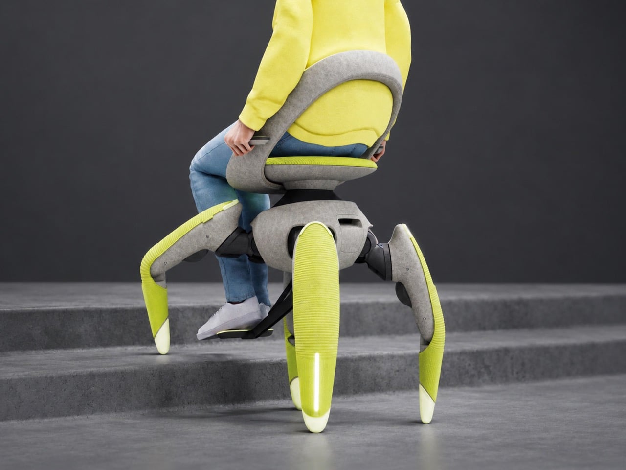
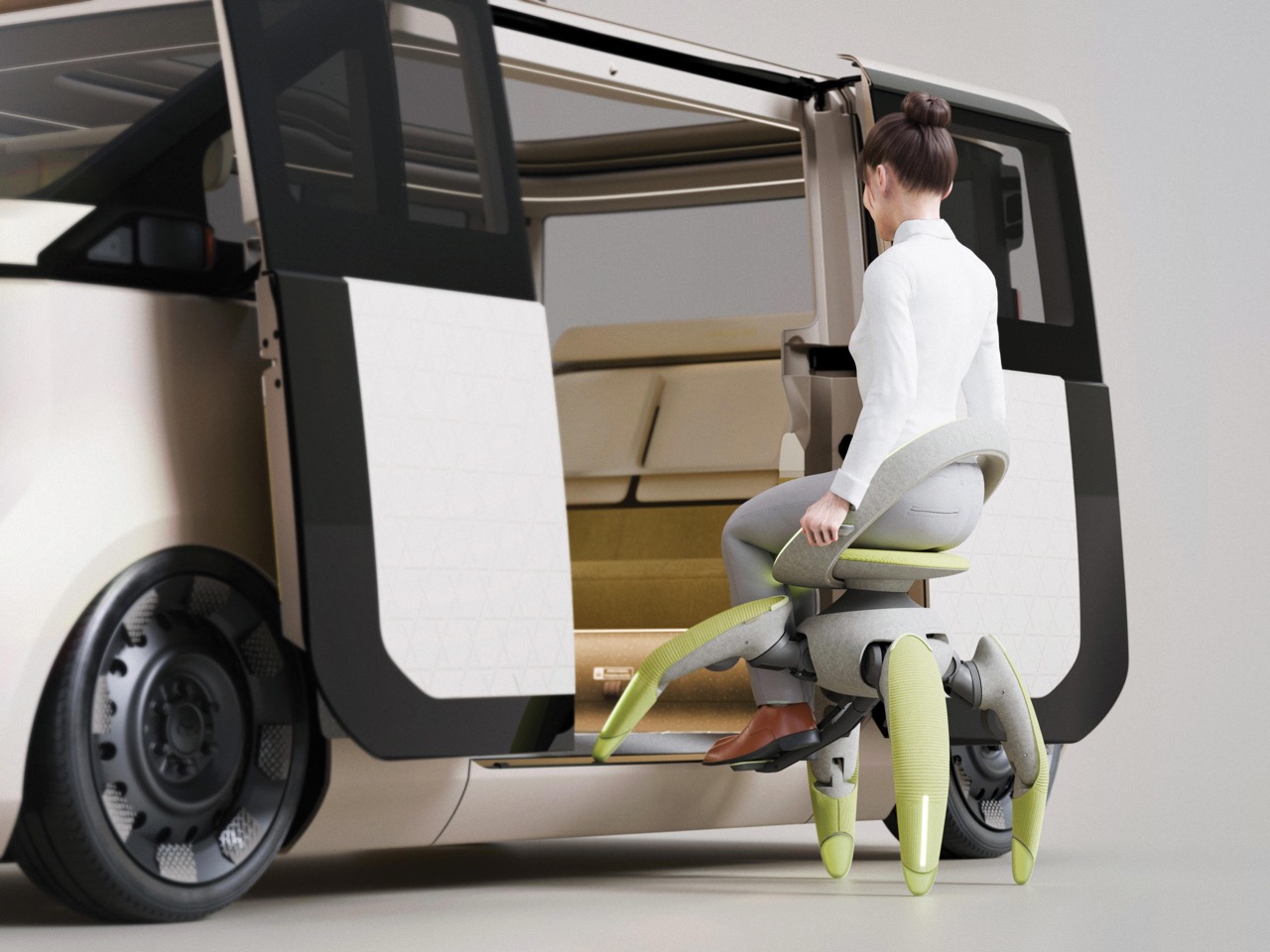
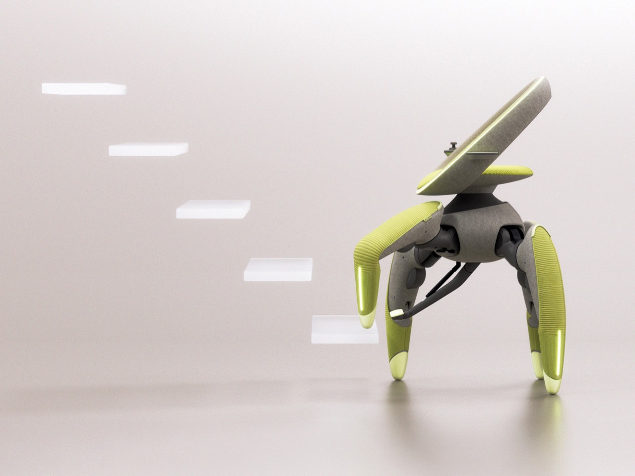
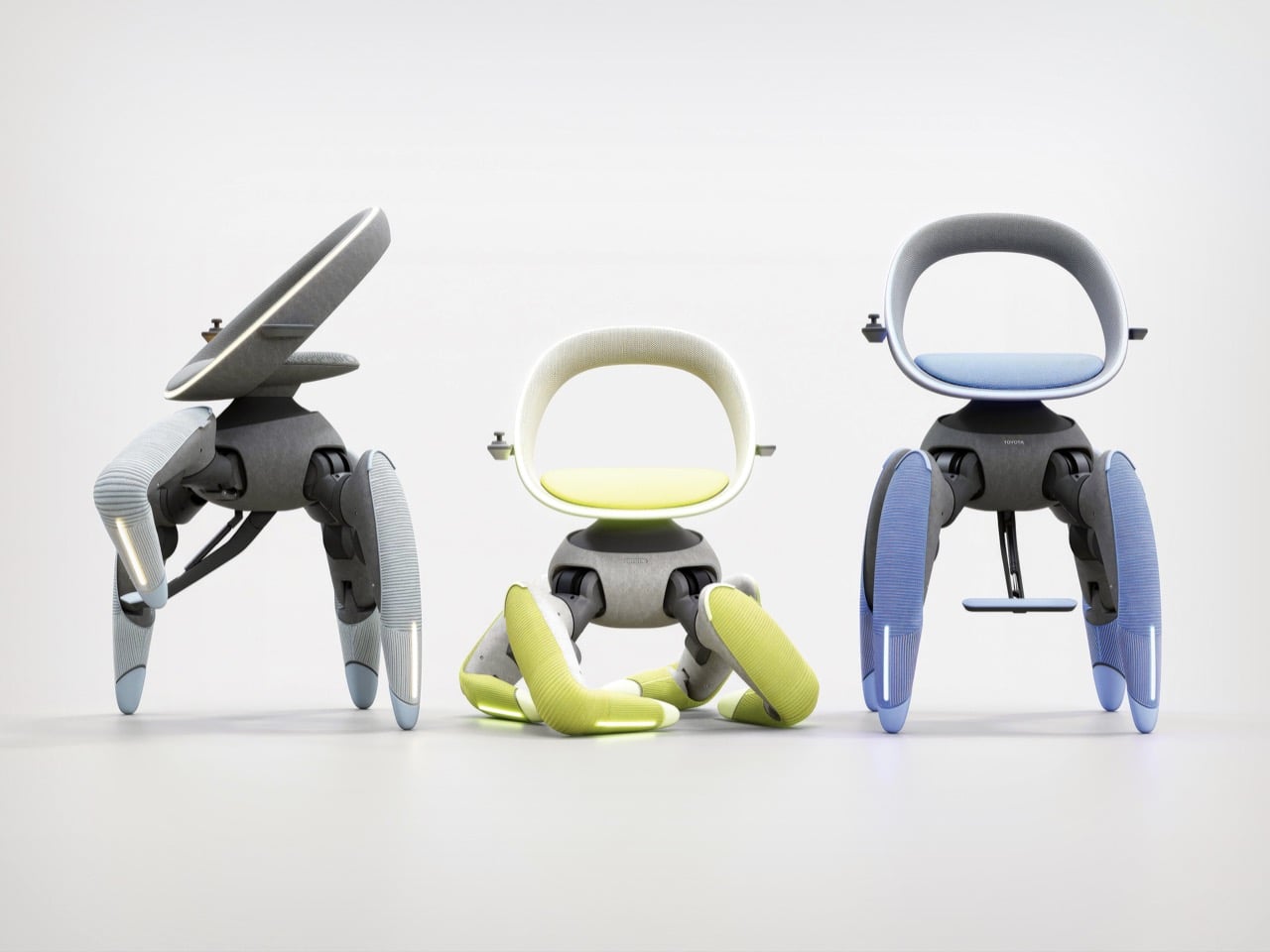
Designed by Misako Kawata under team lead Takashi Nishimura, walk me trades the wheelchair’s wheels for four robotic legs that step up stairs, shuffle sideways in tight spaces, and lift the seat to eye level with standing pedestrians. Toyota skipped the menacing chrome and went soft instead, wrapping the joints in 3D-knitted fabric and a felt-like body with bright chartreuse legs. The result looks like a friendly piece of furniture that happens to climb things. It debuted at last year’s Japan Mobility Show as a concept, and Toyota has announced no price or release date. Mobility for All is the company’s stated mission here, and for once the slogan comes with legs.

Designer: Toyota Motor Corporation

Four Legs are far superior than Four Wheels

Stairs create psychological barriers long before they create physical ones, and Toyota’s own design brief says as much. A wheel looks at a staircase and gives up, so the rider plans the whole day around avoiding them. Walk me swaps the wheels for four robotic legs, which lets one machine link indoor floors, outdoor paths, cars, and public transit. It climbs steps, slides sideways through tight spaces, and generally refuses to treat architecture as a personal insult. Anyone who has ever hunted for the one accessible entrance around the back of a building will understand the appeal.

Four legs can crouch for boarding and stand tall to put the rider at eye level with pedestrians, which fixes a problem wheelchairs have carried forever. Anyone who has spent a whole conversation craning upward at a taller friend knows the strain. Wheelchair users deal with that angle daily, and a chair that rises to meet the conversation changes the dynamic. Toyota says the same leg movement also makes getting on and off the chair easier. It’s a small social fix tucked inside a big mechanical one, and I’d argue it’s the most human detail in the whole design.

A polite Japanese gesture, wrapped in 3D-knitted fabric

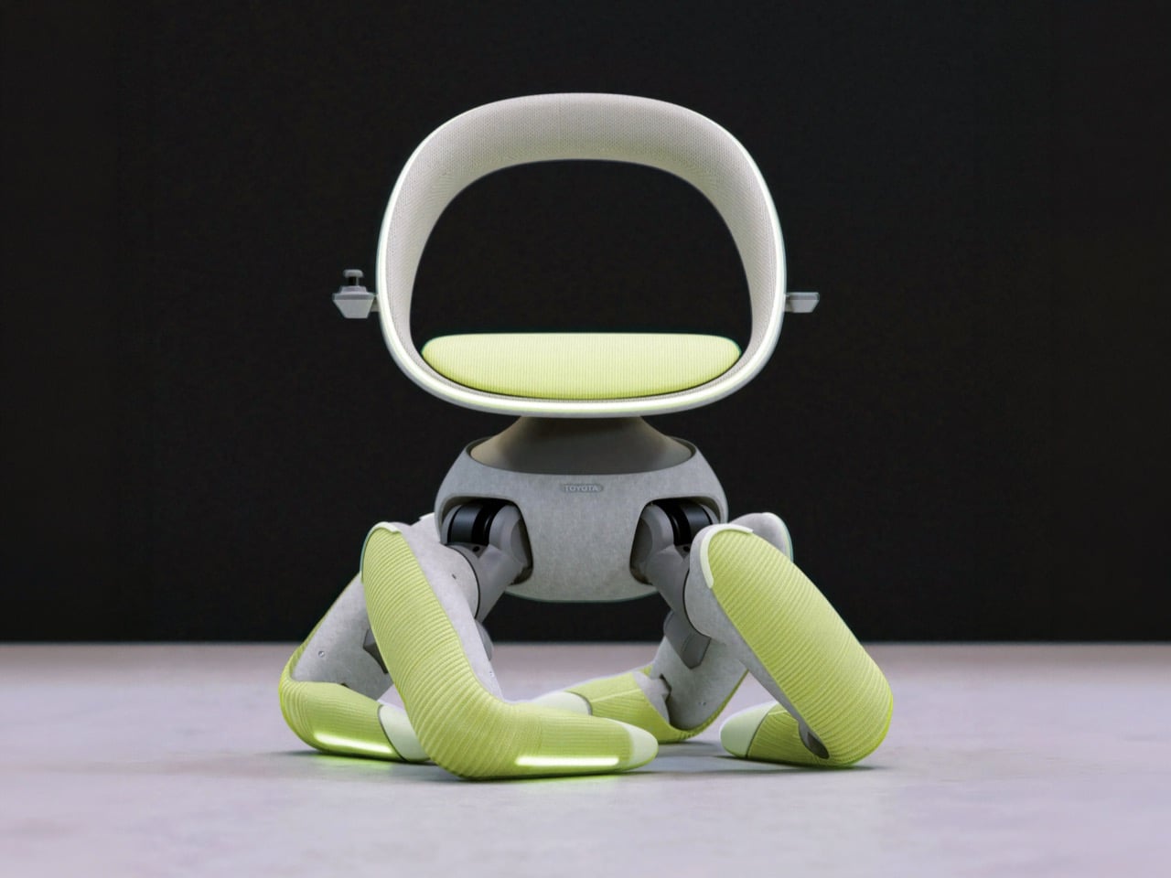
Toyota built the posture around omotenashi, the Japanese spirit of hospitality, so the chair’s stance resembles a polite bow that welcomes its rider. A 3D-knitted fabric covers the mechanical joints, while the warm, felt-like body gives it a friendly, furniture-like silhouette. In the images, the gray hip housing and seat shell read like a premium lounge chair, and the ribbed chartreuse legs add a pop of color that says friendly rather than clinical. I never expected to call a robot cozy, but here we are. Nobody has ever been intimidated by a sweater, and that is very clearly the strategy.

Toyota started as a loom maker under Sakichi Toyoda, so wrapping a robot in knitted fabric reads as a family tradition. Its own Japan Mobility Show booth traced the company’s robotics roots back to the Toyoda Automatic Loom Type G. A century on, textile know-how and robotics meet in a chartreuse-legged chair that bows at strangers. Beneath the fabric sits a topologically optimized internal frame that keeps the structure strong and light while staying completely hidden. Toyota wants you to see an armchair with ambition, and the skeleton is nobody’s business but the robot’s.
Ten months, AI gait control, and a very promising future

Toyota took walk me from idea to working prototype in just 10 months, which is wild for a machine that has to balance a human being on four legs. AI gait control and low-waste metal additive manufacturing made that pace possible, compressing years of R&D into weeks, according to Toyota. The company calls the chair its North Star for human-centered technology. That technology is meant to deliver dignity, hope, and independence alongside plain old movement. Red Dot’s concept award honors prototypes and ideas rather than shipping products, so the Luminary measures vision more than store-shelf readiness.

Hyundai’s Elevate walking car put wheels at the end of long robotic legs, and Kawasaki’s CORLEO robot horse offers a rideable quadruped for off-road thrills. Those machines chase rescue missions and rugged trails. Walk me points similar legwork at a living room staircase, which is arguably the more relatable terrain. Among this year’s Red Dot: Best of the Best winners, it’s the one the jury crowned with the top prize. It remains a concept with no price, release date, or production plans, but a robot that bows, climbs, and wears a knitted sweater has me convinced that the future of mobility might finally have good manners.

The post Toyota’s ‘Wheel-less’ Wheelchair wins the 2026 Red Dot Concept Luminary Award first appeared on Yanko Design.