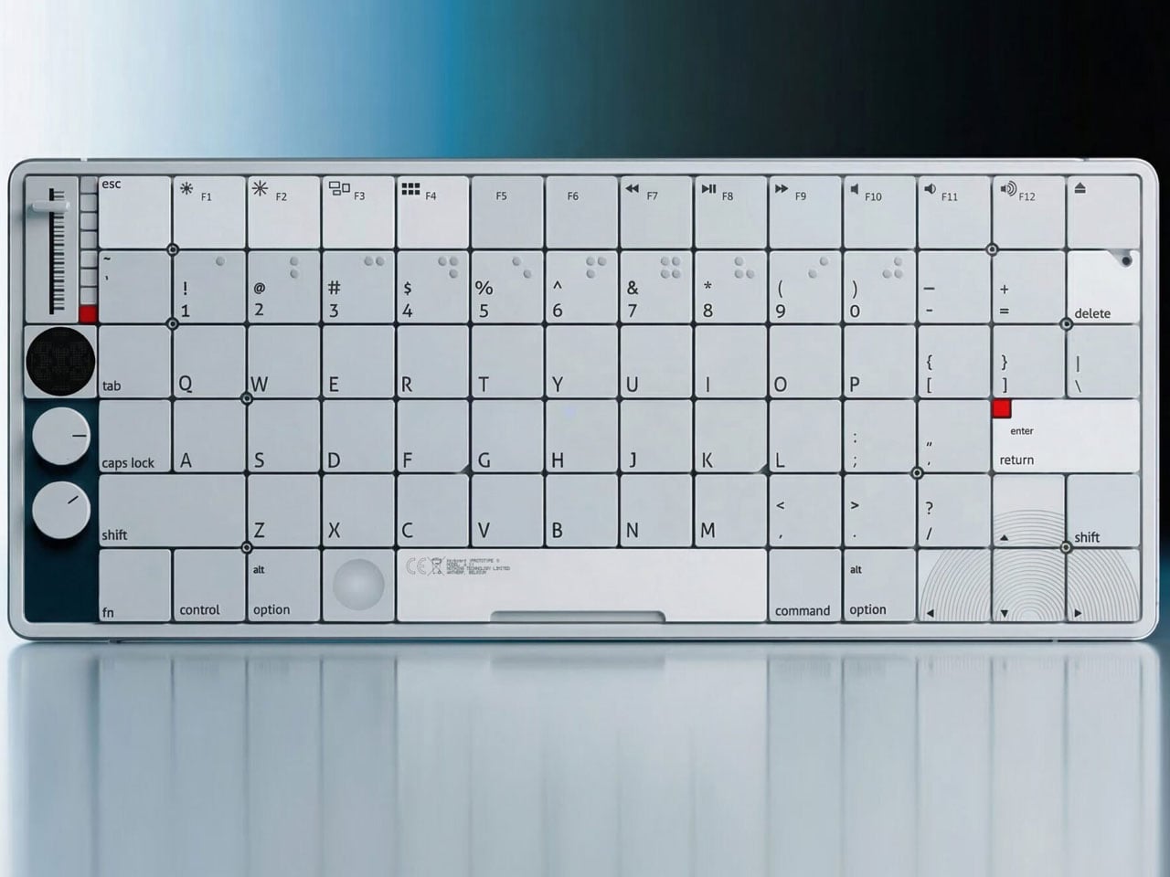
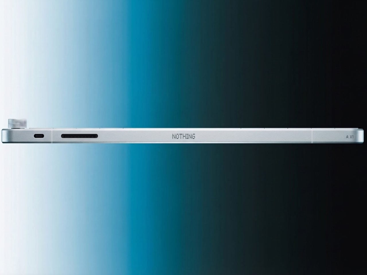
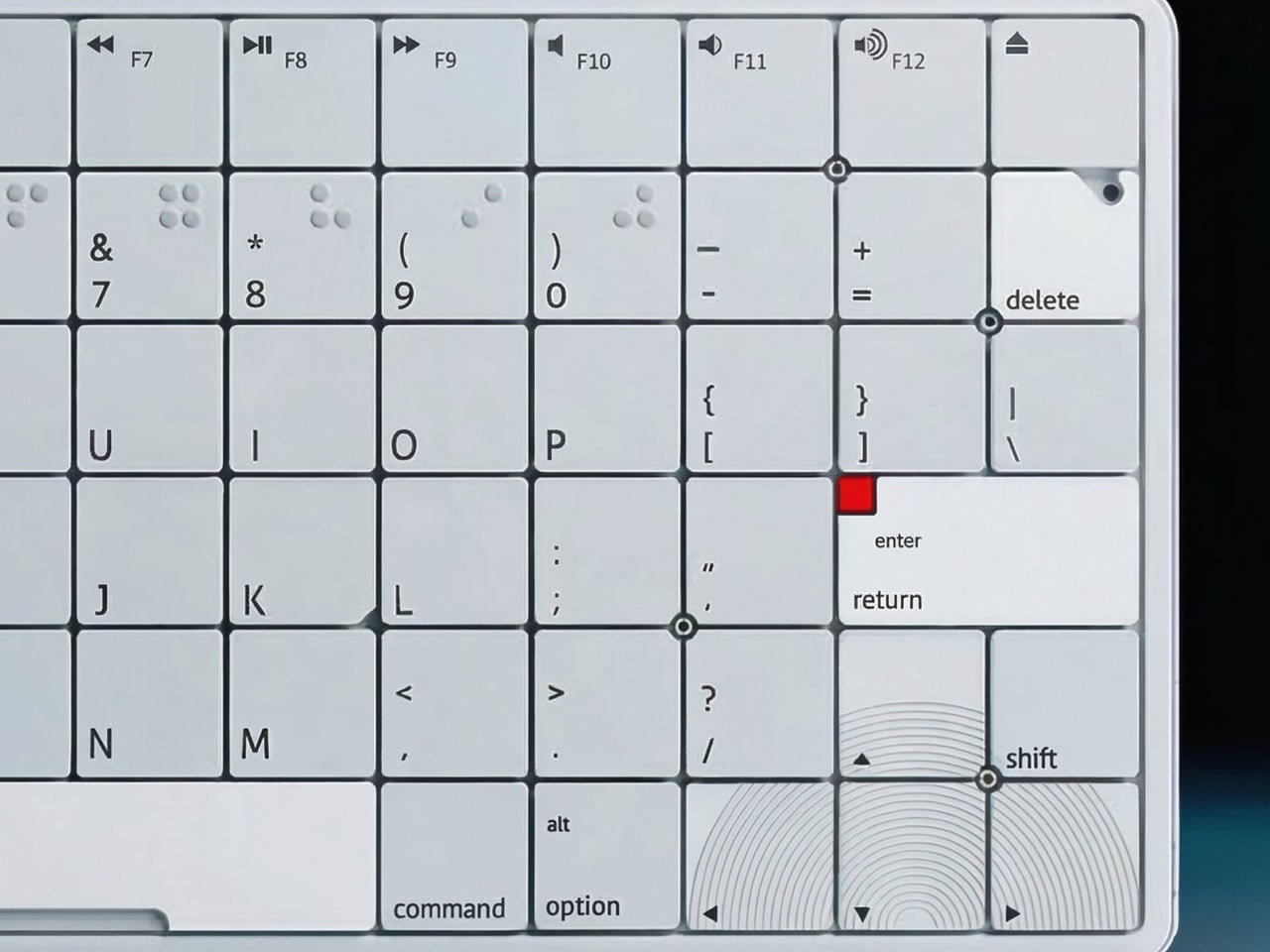
Nothing’s unique design language has inspired many gadgets and concept designs, and this one is no different. Just like the Nothing NK-1 keyboard which follows the brand’s transparent aesthetics, the minimalist form factor, and the signature font, this concept keyboard is one for fans who have always wanted a Nothing keyboard.
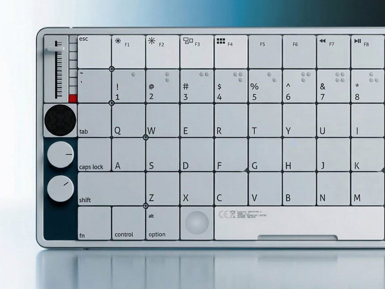
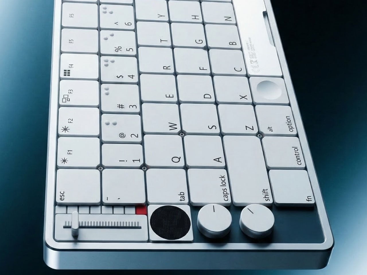
This concept looks like an inspirational cocktail of Nothing and Teenage Engineering with the color choices and the knobs. The designer calls it the A X1 keyboard, and I absolutely love the idea since so many keyboards go for the trending RGB backlit formats. This one stands out for its minimalist yet nerdy vibe.
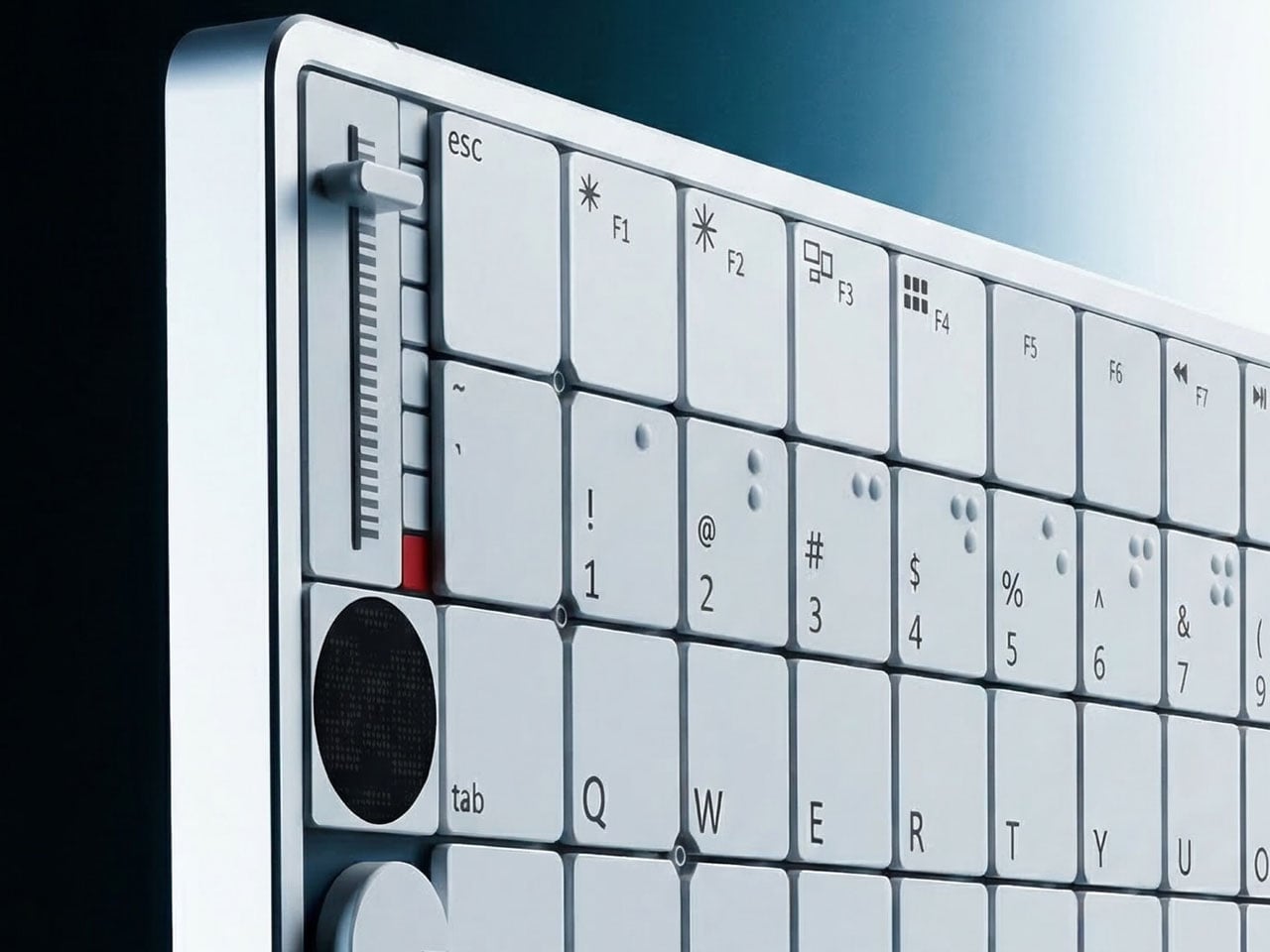
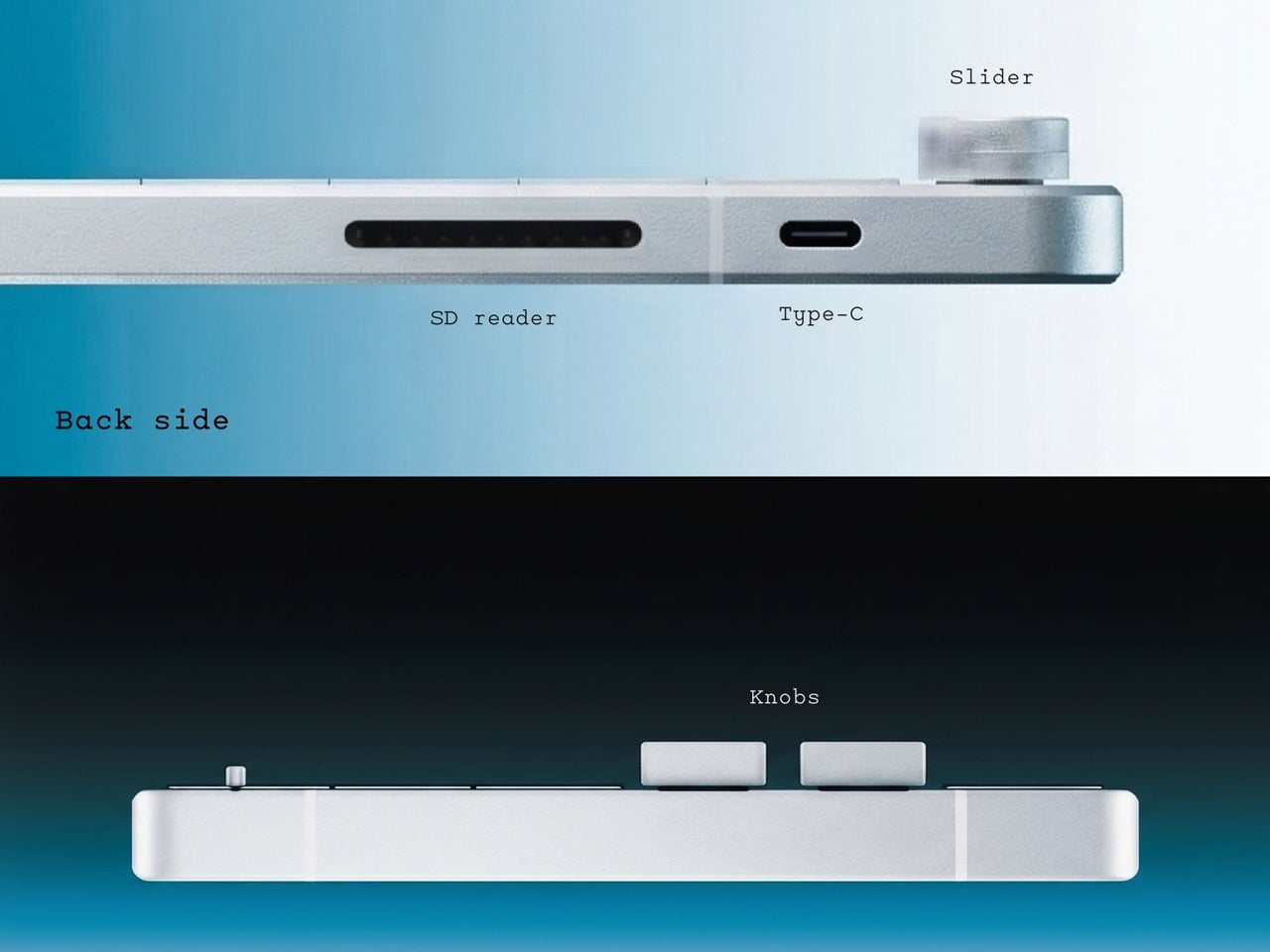
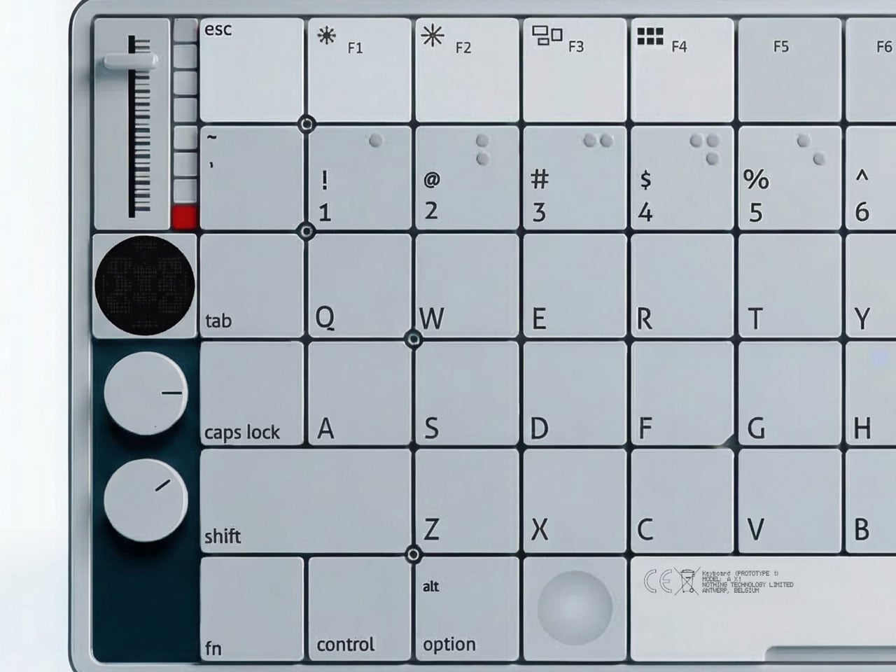
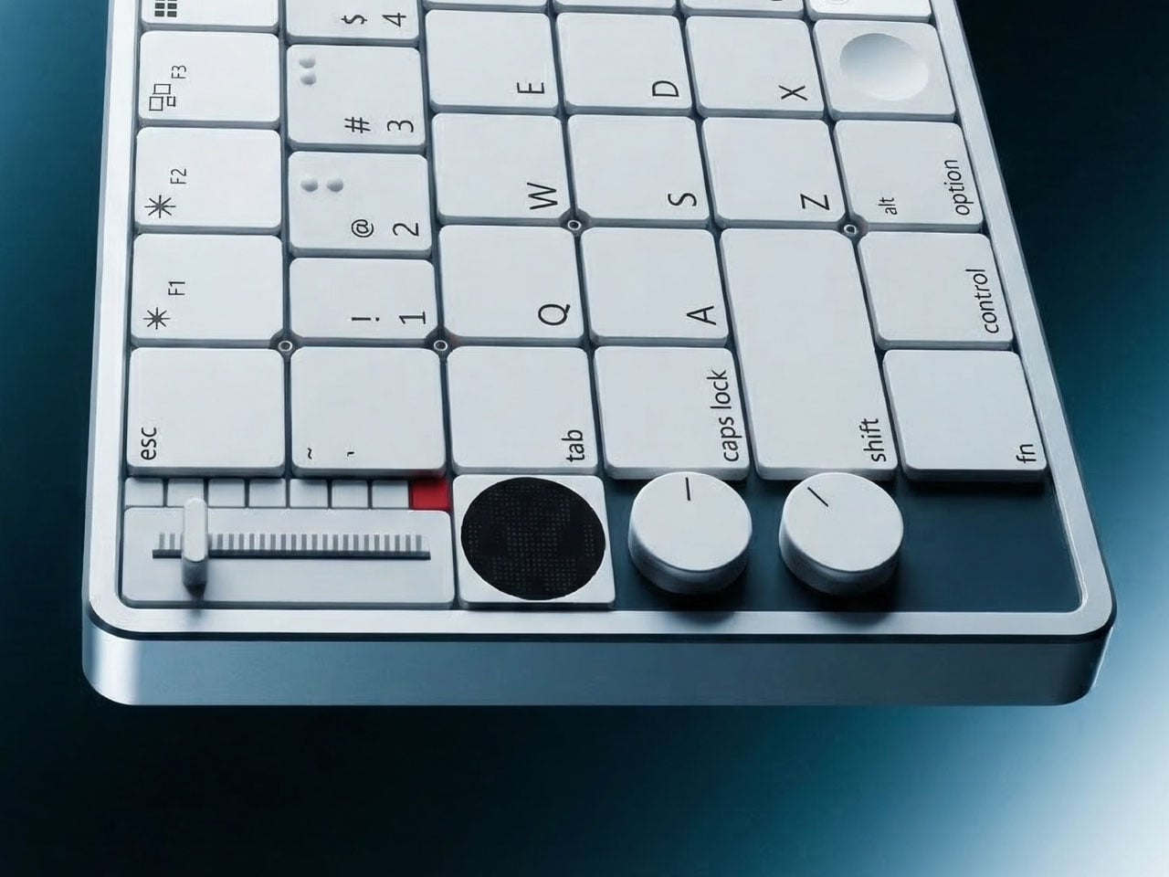
The left side of the keyboard is occupied by the knobs, a slider for toggling functions, and a small circular display showing the current tools in software applications. These include color picker, text selection, cropping, eraser and other contextual commands that can change depending on the software being used. By dedicating a small control hub to the side, the concept emphasizes workflow efficiency while keeping frequently used functions within easy reach.
The compact display plays an important role in making the keyboard feel more interactive. Instead of relying solely on key combinations or on-screen menus, the display offers quick visual feedback for selected tools and settings. This allows users to move between functions without breaking their creative flow, which could be especially useful for designers, editors, and digital artists who often rely on rapid tool switching.
Visually, the keyboard continues to echo Nothing’s recognizable aesthetic language. Subtle graphic markings and carefully spaced typography reinforce the clean, futuristic feel, while the restrained color accents add personality without overwhelming the overall minimalism. The physical knobs further enhance the tactile experience. Instead of treating the keyboard purely as a typing tool, the design imagines it as a broader control interface for creative workflows. Rotating knobs could potentially adjust parameters such as volume, brush size, timeline scrubbing, or zoom levels depending on the active application, making the keyboard more versatile than conventional models.
Heat is one of the most underestimated side effects of climate change, particularly in cities where built-up surfaces trap warmth long after the sun has gone down. Air conditioning has become a near-necessity in many parts of the world, yet millions of people can’t access it, either because they can’t afford it or because they simply have no home to cool. For them, that absence can be genuinely dangerous.
Cool Retreats is a direct response to that reality. Rather than a single structure, it’s a collection of four different solar-powered public pavilions, each built to provide free cooling, shade, and a place to rest to anyone who needs it. The project is specifically aimed at public parks and open areas, particularly in cities where those who need relief the most often have the fewest options.
The Solar Ceiling Fan Pavilion is the most straightforward of the four, an open-frame structure with tilted solar panels across its roof and a row of ceiling fans hanging beneath. The logic is elegantly direct: sunlight hits the panels, the panels power the fans, and the space below stays cool. On cooler days, when the fans aren’t running, the surplus electricity feeds back into the local power grid.
The Solar Breeze Oasis Pavilion scales things up with a prefabricated, modular, octagonal steel structure that can be installed as a single unit or linked with others to form larger configurations. Inside, five solar-powered ceiling fans circulate air above seating areas and worktables, and solar-powered outlets let people charge their devices. The rooftop solar array also collects rainwater, which can be stored and used within the park.
Cool Spots are the most self-contained of the group. Each cylindrical module sits on a circular concrete base, with four large benches arranged around a central table and a solar-powered ceiling fan overhead. Built-in night lights and power ports extend their usefulness well into the evening, and the modules can run off batteries charged by their own solar arrays or pull power from the local grid as needed.
The Cooling Cone is the most visually striking of the four, a stacked, louvered structure that tapers into a cone at the top, where a solar panel powers a ceiling fan mounted just below it. The partially enclosed perimeter, made up of curved, slotted panels, provides both shade and ventilation. It’s the kind of structure that draws you in from the outside and keeps you comfortable once you’re there.
What ties all four together is their shared philosophy: cooling public space shouldn’t require a power bill, complex infrastructure, or permanent construction. Each structure is prefabricated, recyclable, and solar-powered, designed to go where it’s needed most and run without ongoing costs. It’s a reminder that public design can be both socially conscious and sustainable at the same time, without one ever having to come at the expense of the other.
Productivity apps have become one of the more ironic problems of modern work life. The tools meant to keep us focused are apps that live on the same devices responsible for most of our distractions. Switching to a timer app means unlocking a phone, and unlocking a phone means notifications, messages, and a dozen other things competing for your attention before you’ve even started the clock.
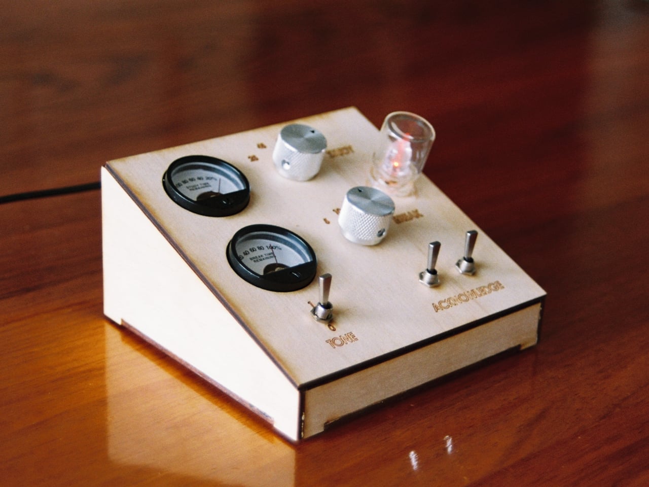
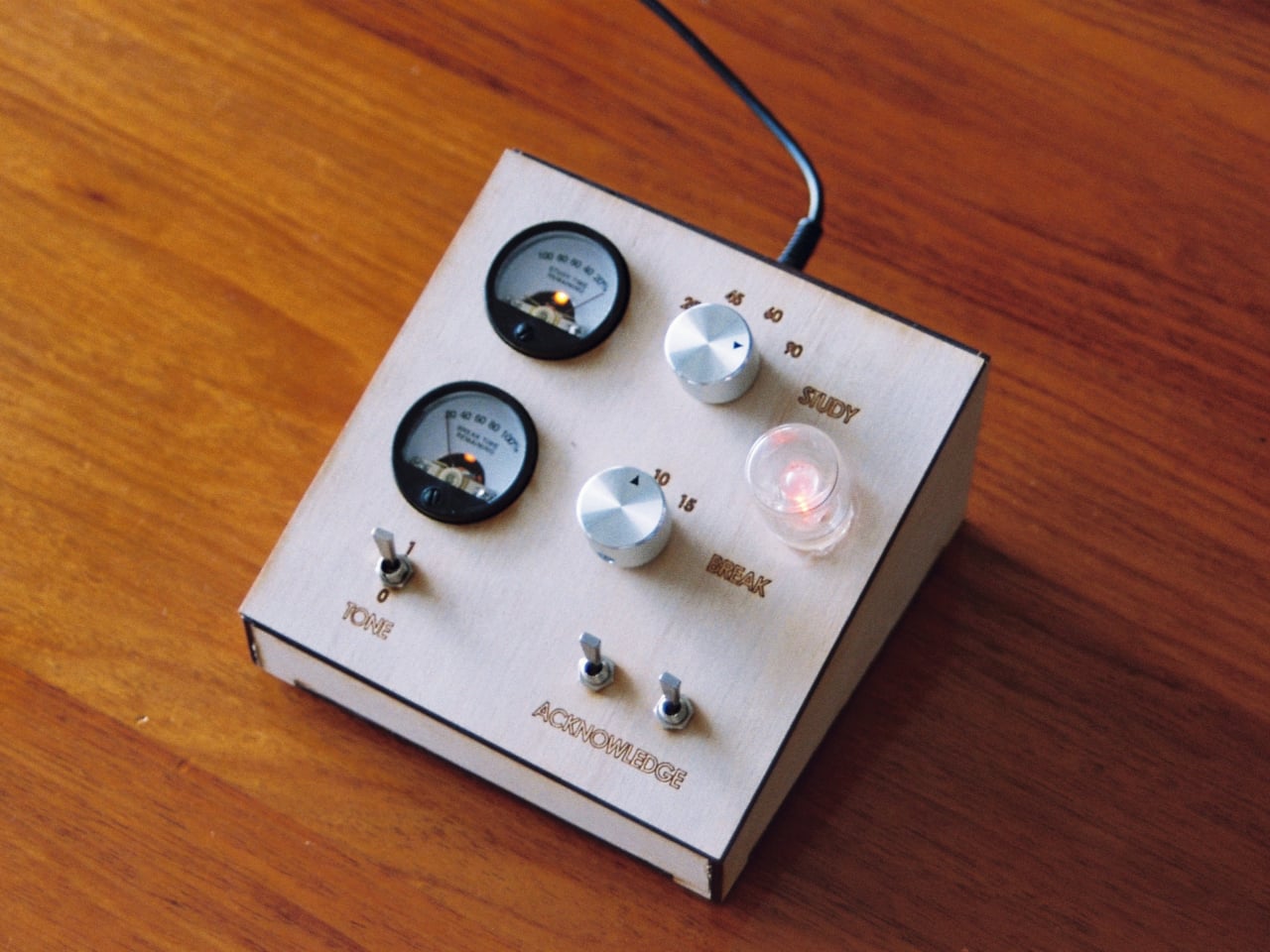
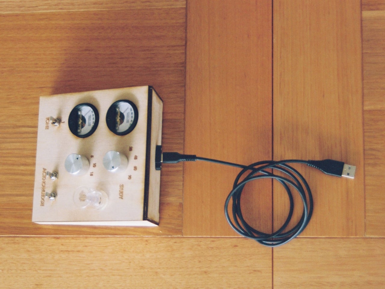
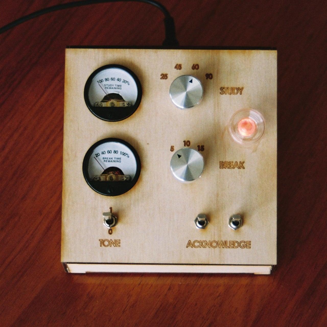
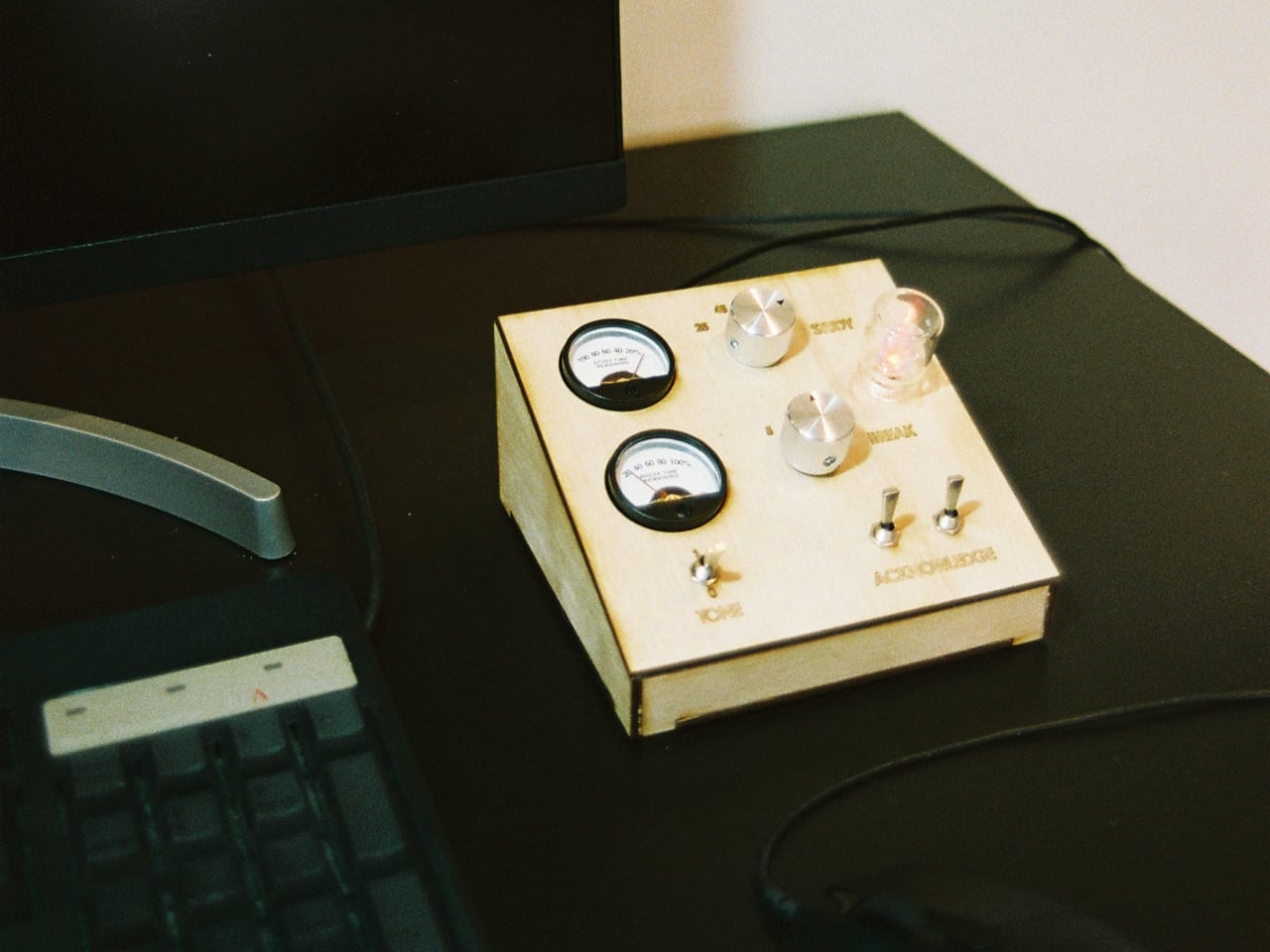
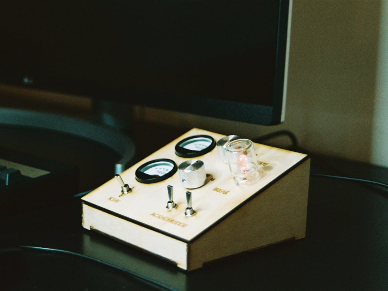
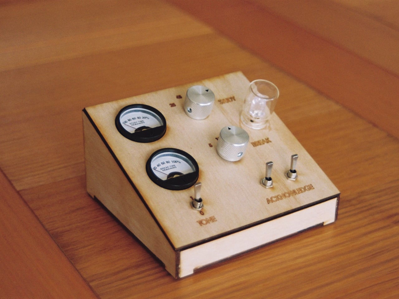
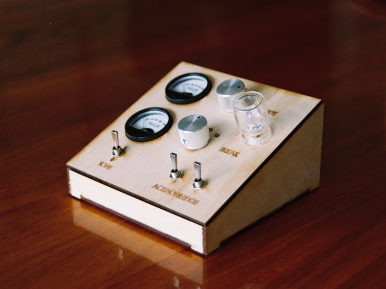
Thomas Curnow of Tomato Clocks had that contradiction in mind when he created the Roma Mk. 1, a purely analog study timer built around the Pomodoro Technique. The method is simple and widely used, working in focused intervals broken up by short rests, but it works best when the timing happens completely off-screen. The Roma Mk. 1 is designed to make that as easy and satisfying as possible.
At the center of the design are two analog gauges, one for tracking a work interval and one for the break that follows. There are no menus to navigate and no app to open. You set the dials, get to work, and let the timer do the rest. The whole interaction takes a second, and that simplicity is precisely the point. It keeps the focus on the task at hand rather than the device managing it.
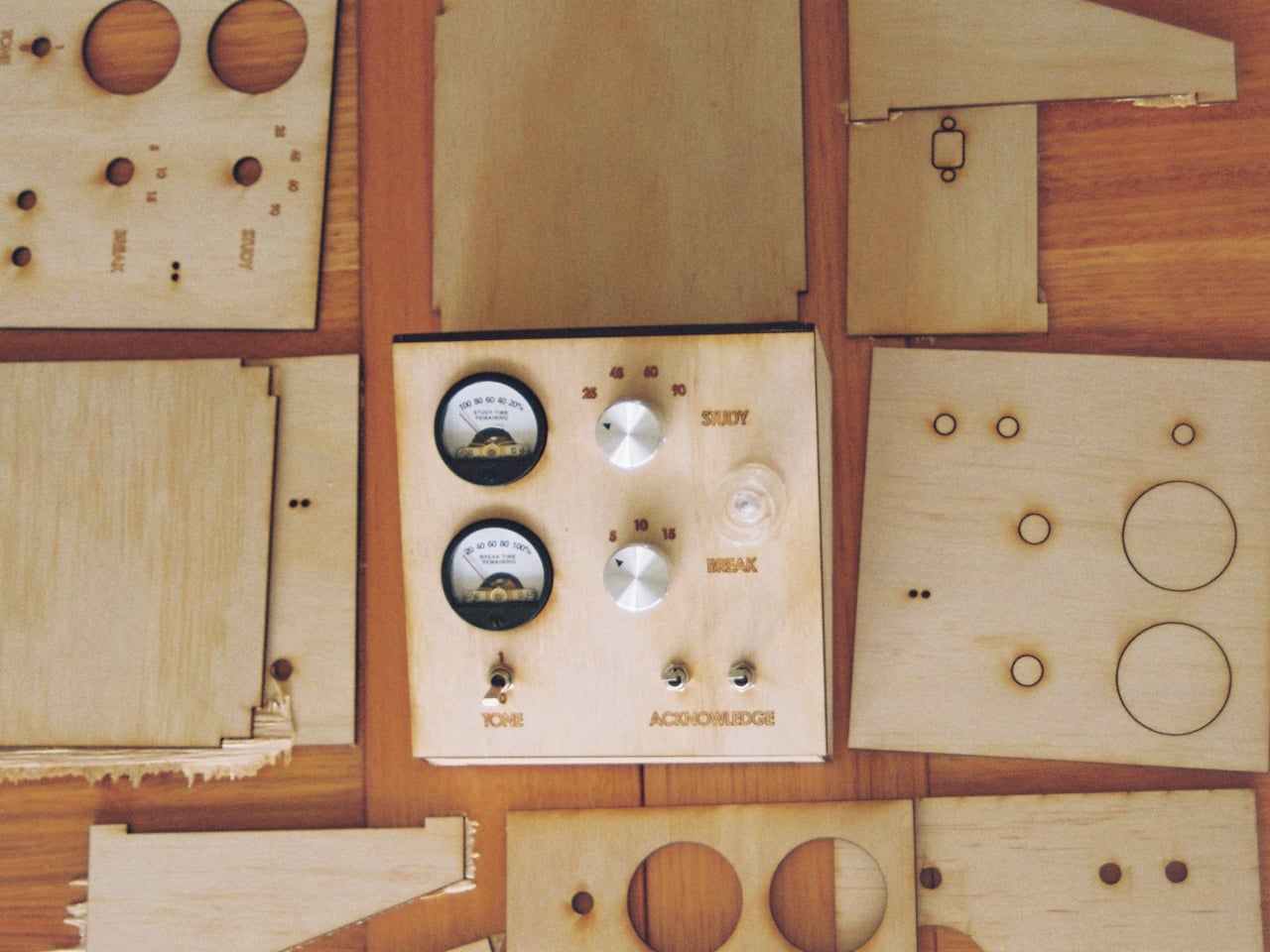
The build quality reinforces that philosophy. Each unit is laser-cut from premium Australian timber and assembled by hand in Melbourne, giving it a warmth and solidity that’s hard to find in mass-produced productivity gadgets. The brass switches used for input have a tactile snap to them, the kind of satisfying physical feedback that makes the act of starting a session feel deliberate rather than incidental.
It’s the sort of object that belongs on a desk permanently, not tucked into a drawer. A wooden timer with analog dials sits comfortably alongside notebooks, pens, and other tools that don’t demand your attention when you’re not using them. That’s a quality digital devices rarely manage, and it matters more than it might seem when you’re trying to build a consistent work habit.
The Pomodoro Technique has been around since the late 1980s, and the basic premise hasn’t changed much since then. What has changed is the environment in which most people try to use it. Screens are everywhere, and the pull of notifications is relentless. A dedicated physical timer doesn’t connect to the internet, doesn’t send alerts, and doesn’t tempt you with anything outside the task you’re working on.
The Roma Mk. 1 is currently available for pre-order at $145, which puts it well above a basic kitchen timer but firmly in the range of a thoughtful, long-term desk tool. It’s handmade, uses real materials, and is designed to last rather than be replaced. For anyone who has tried and failed to stay off their phone during a work session, a well-made analog alternative might be worth far more than what it costs.
April 1st, 2026, marks fifty years since Steve Jobs, Steve Wozniak, and Ronald Wayne signed the papers that would quietly reshape everything: how we listen to music, how we communicate, how we take photographs, and how we think about the relationship between technology and beauty. Apple was founded on April 1, 1976, and fifty years later, it stands as one of the most influential companies in human history. That kind of milestone deserves more than a software update or a casual scroll through the App Store. It deserves a proper celebration, one that reflects the same values Apple has championed since the beginning: precision, intentionality, and the conviction that design is never just decoration.
For true Apple fans, the way you celebrate is in the details. Owning an iPhone, a MacBook, or an Apple Watch is the baseline — everyone has one. The real devotees are the ones who care about how their setup looks, what story it tells, and whether the accessories surrounding their devices feel worthy of the ecosystem. With Apple turning 50 this April, there’s never been a better time to take stock of your setup and fill in the gaps. From a retro watch case that pays tribute to the device that put a thousand songs in your pocket, to a Leica-built camera grip that transforms your iPhone into something you’d actually want to carry into the field, these seven accessories are the ones worth owning.
1. Pod Case
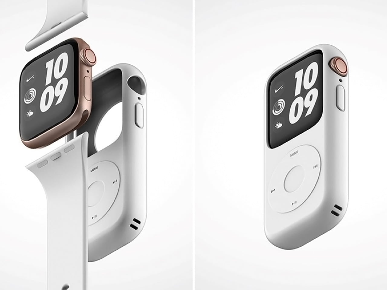
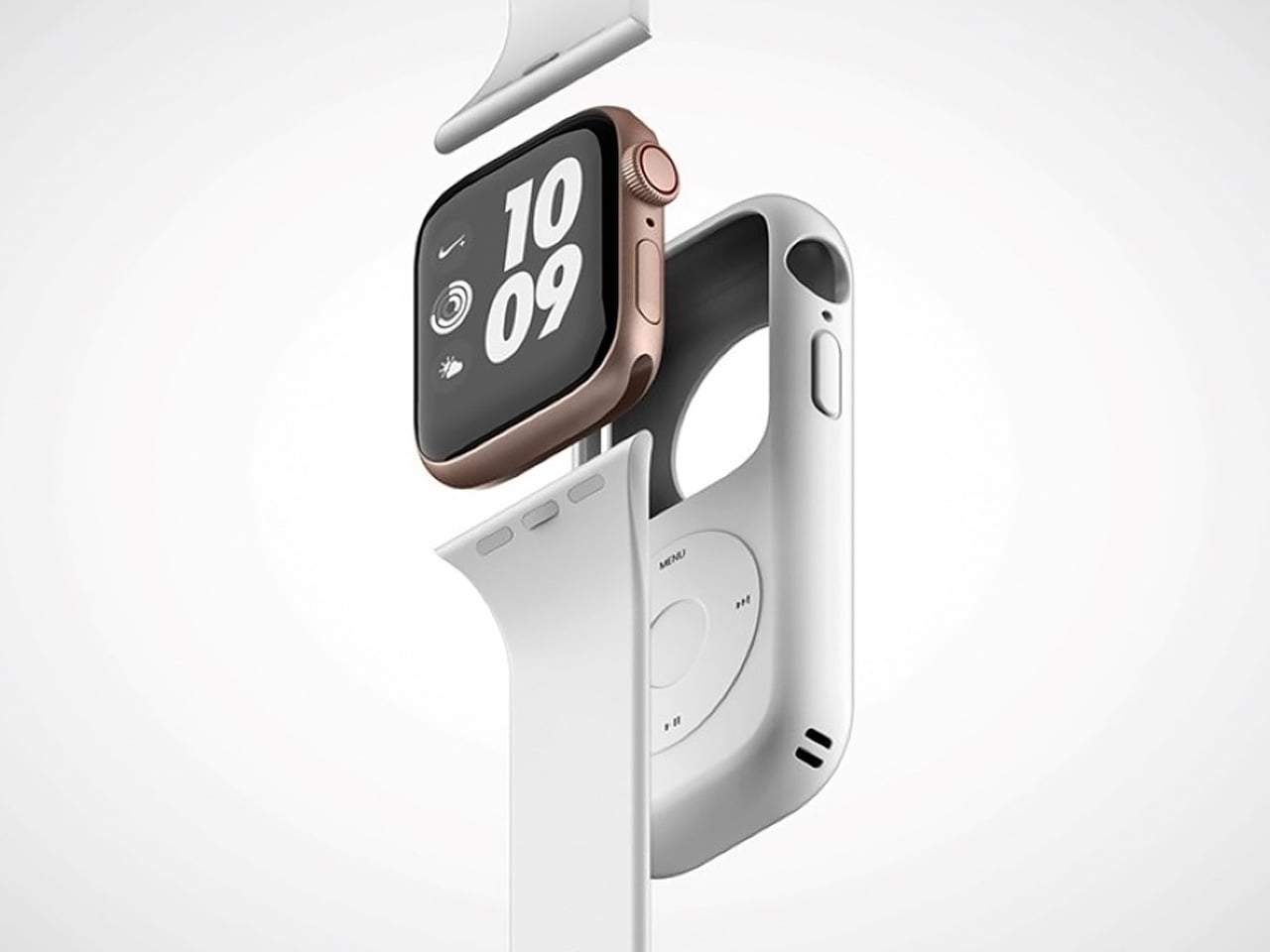
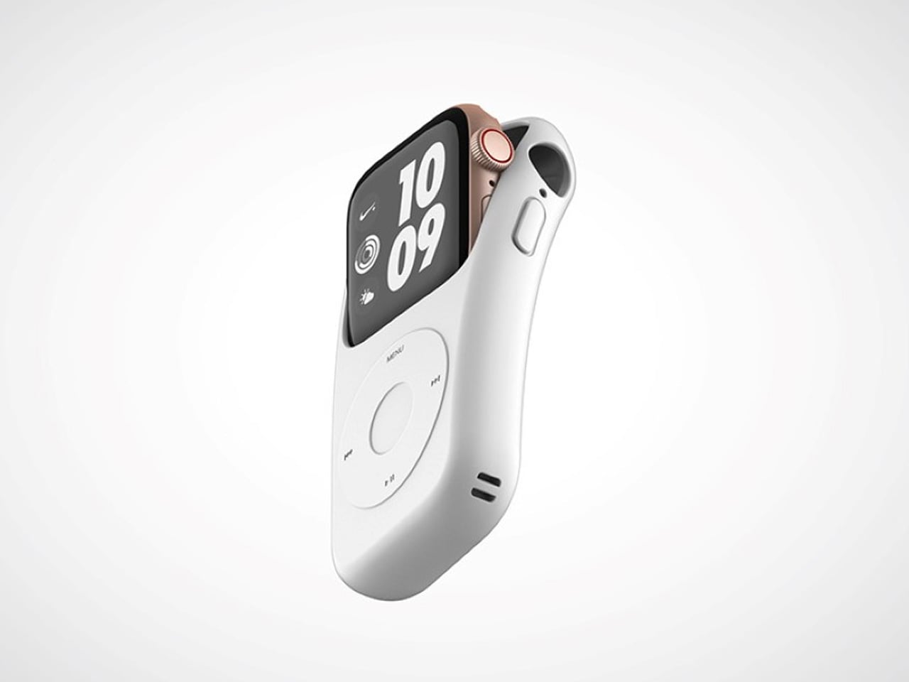
When a design can make you feel genuinely nostalgic the first time you see it, it’s doing something right. The Pod Case wraps your Apple Watch in the silhouette of a classic iPod Nano, arguably one of the most emotionally resonant gadgets Apple ever made. Crafted from silicone, it slides directly over the watch body without obstructing any of its core functions, giving your wrist a retro identity that’s unique and, honestly, a little bit joyful every time you glance down.
What makes the Pod Case especially clever is how it honors Apple’s past without making your watch feel dated. The dummy jog wheel on the front is a warm nod to the scroll wheel that once defined a generation of music listeners, while the watch’s touchscreen remains fully accessible underneath the case. The watch’s screen roughly matches the display size found in classic iPod Nanos, making the illusion feel remarkably convincing. With Apple’s 50th birthday just around the corner, there’s no more fitting way to wear that history on your wrist.
What we like:
The silicone build slides on and off cleanly, so you can commit to the retro look when the moment calls for it without any permanence
It taps into Apple’s most beloved design legacy in a way that feels celebratory rather than costume-y
What we dislike:
The jog wheel is non-functional, which feels like a genuinely missed opportunity for Bluetooth-enabled scroll control
The added thickness may feel noticeable against Apple Watch’s characteristically slim and precise silhouette
2. NightWatch
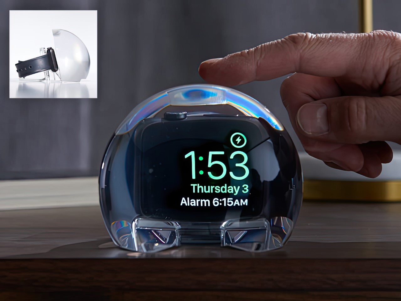
Some accessories solve problems you didn’t know you had until they’re solved, and the NightWatch is exactly that product. Shaped like a generous, luminous orb made entirely from lucite, this dock does three things beautifully: it charges your Apple Watch, magnifies the watch face into a clearly legible bedside display, and amplifies the watch’s alarm through acoustically engineered channels routed beneath the speaker. There are no hidden electronics, no batteries, no inner mechanisms. Just thoughtful geometry working in complete silence.
The NightWatch’s touch-sensitive surface is its most quietly brilliant detail. A single tap on the lucite orb wakes your Apple Watch screen instantly, meaning no fumbling in the dark and no squinting across a dim room at a tiny display. For anyone using their Watch as a sleep tracker and morning alarm, this dock transforms the entire overnight routine. It’s the kind of product that earns its space on your nightstand not through novelty but through genuine, repeatable usefulness that compounds every single morning.
What we like:
The all-lucite, zero-electronics construction is beautifully minimal and requires no power source of its own
The touch-to-wake surface interaction is intuitive and immediately feels like something Apple itself should have shipped
What we dislike:
The orb’s sculptural shape is confident and bold, which may not suit more minimal or tightly curated bedside setups
Passive sound amplification through acoustic channels means volume results will vary slightly depending on which Apple Watch model you’re using
3. AirTag Carabiner
The AirTag Carabiner might be the most practical Apple accessory on this list, and that practicality is housed inside a build quality that punches well above its category. Machined from Duralumin composite alloy, the same material used in aircraft, spacecraft, and high-performance watercraft, it’s designed to handle the kind of daily wear and environmental abuse that standard carabiners can’t sustain. Snap one onto your bag, bike frame, or umbrella, and Apple’s Find My network handles everything else without any additional configuration on your end.
What separates this from the flood of plastic AirTag holders on the market is the craft behind it. Each carabiner is individually hand-finished, and the Duralumin composite holds up equally well in water and at altitude, making it genuinely suited to real-world conditions. It’s available in untreated brass and stainless steel as well, for users who prefer warmer or more industrial finishes. For an Apple fan who wants every piece of their setup to feel considered and intentional, this is the kind of detail that quietly elevates the whole picture. The AirTag itself is sold separately.
Duralumin composite construction brings authentic aerospace-grade durability to a carry item most people treat as disposable
The choice of brass, stainless steel, and treated alloy finishes makes personalization genuinely easy and meaningful
What we dislike:
The AirTag is sold separately, which adds a layer of additional cost for users who are new to Apple’s tracking ecosystem
The premium build quality may feel like overkill when attached to lower-stakes items like an umbrella or a gym bag
4. Magic Bar
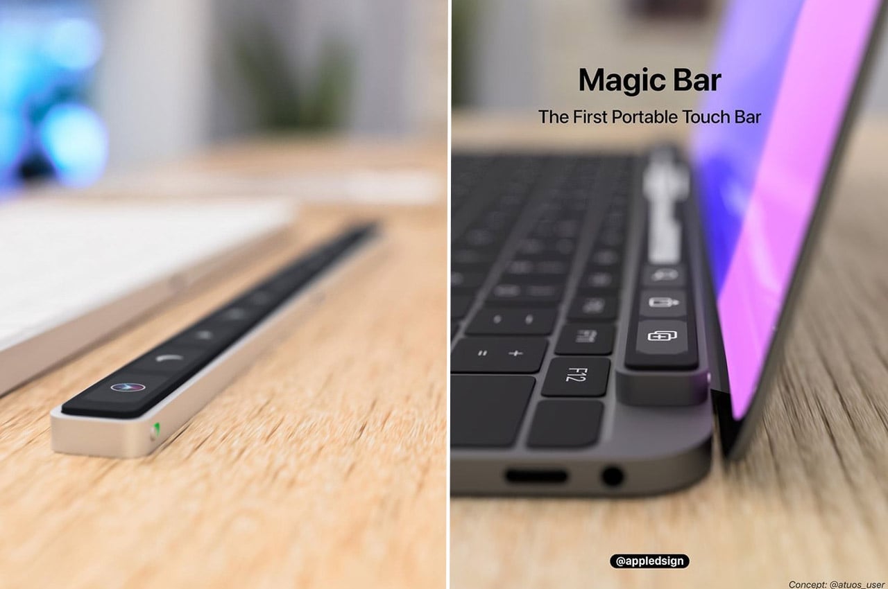
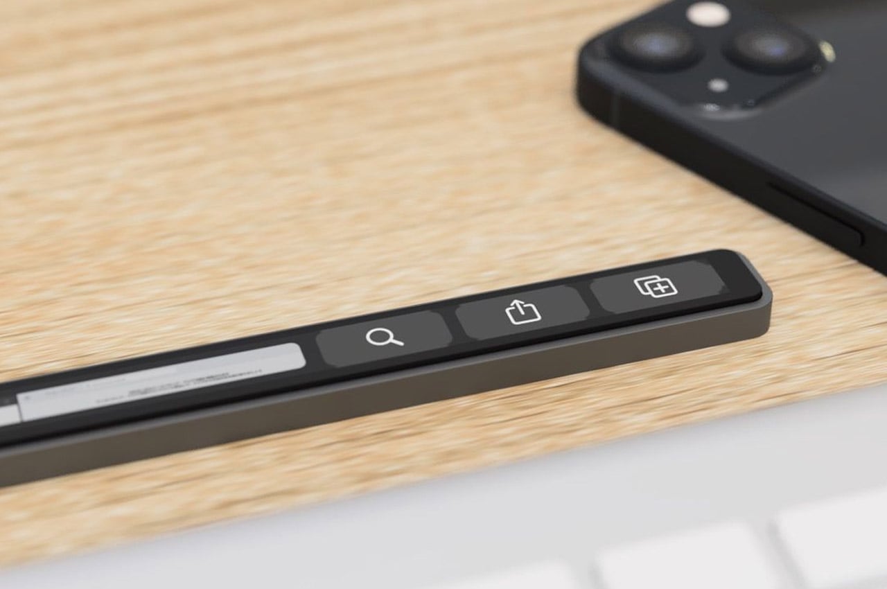
Apple’s Touch Bar had a short and controversial run, but the idea underneath it, a programmable, context-aware strip that adapts to whatever you’re working on, was always more interesting than its execution. The Magic Bar takes that concept and frees it from the MacBook Pro entirely, reimagining it as a standalone, portable accessory that pairs with any Apple peripheral. Built from aluminum to match the existing Magic Keyboard and trackpad lineup, it sits in the setup as naturally as if Apple had always intended it to ship this way.
The proposition is clean and direct: a plug-and-play toolbar that clips horizontally alongside the Magic Keyboard and keeps your most-used shortcuts, smart home automations, and app-specific functions at constant reach. Combined with the iPhone, the use case expands meaningfully, with media controls, quick-launch tools, and home shortcuts all living in a single strip without requiring any window switching. For the Apple power user who lives inside their setup all day, the Magic Bar is the kind of accessory that changes the way you work once you’ve had even a single session with it.
What we like:
The aluminum construction and horizontal layout integrate seamlessly into Apple’s existing peripheral design language without any visual friction
Plug-and-play setup eliminates configuration headaches, making it immediately useful from the moment it lands on your desk
What we dislike:
As a concept design, the final feature set and commercial availability are yet to be officially confirmed by any manufacturer
Compatibility appears optimized for Apple peripherals specifically, which limits the appeal for anyone running a mixed operating system setup
5. Spigen Classic LS AirPods Pro 3 Case
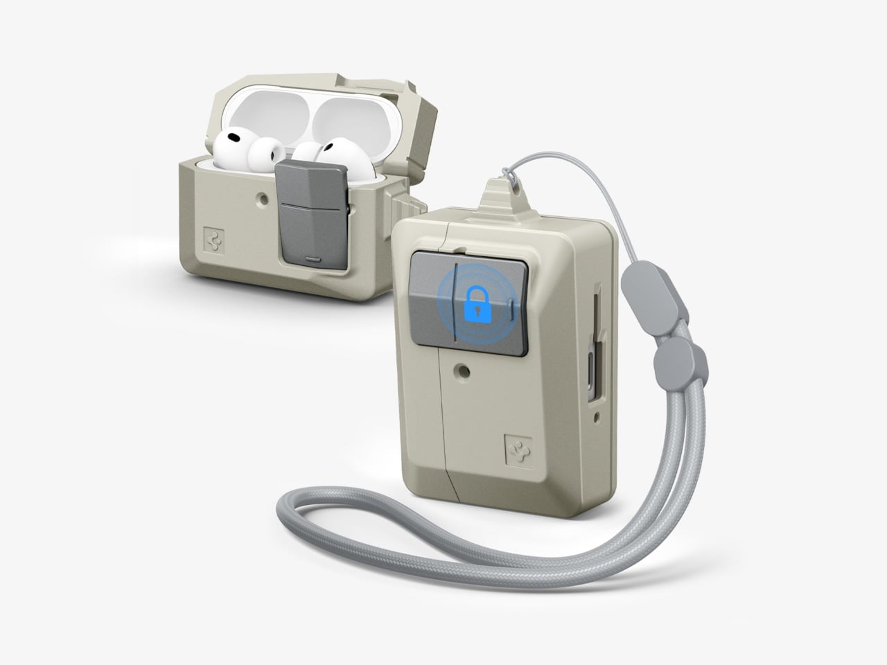
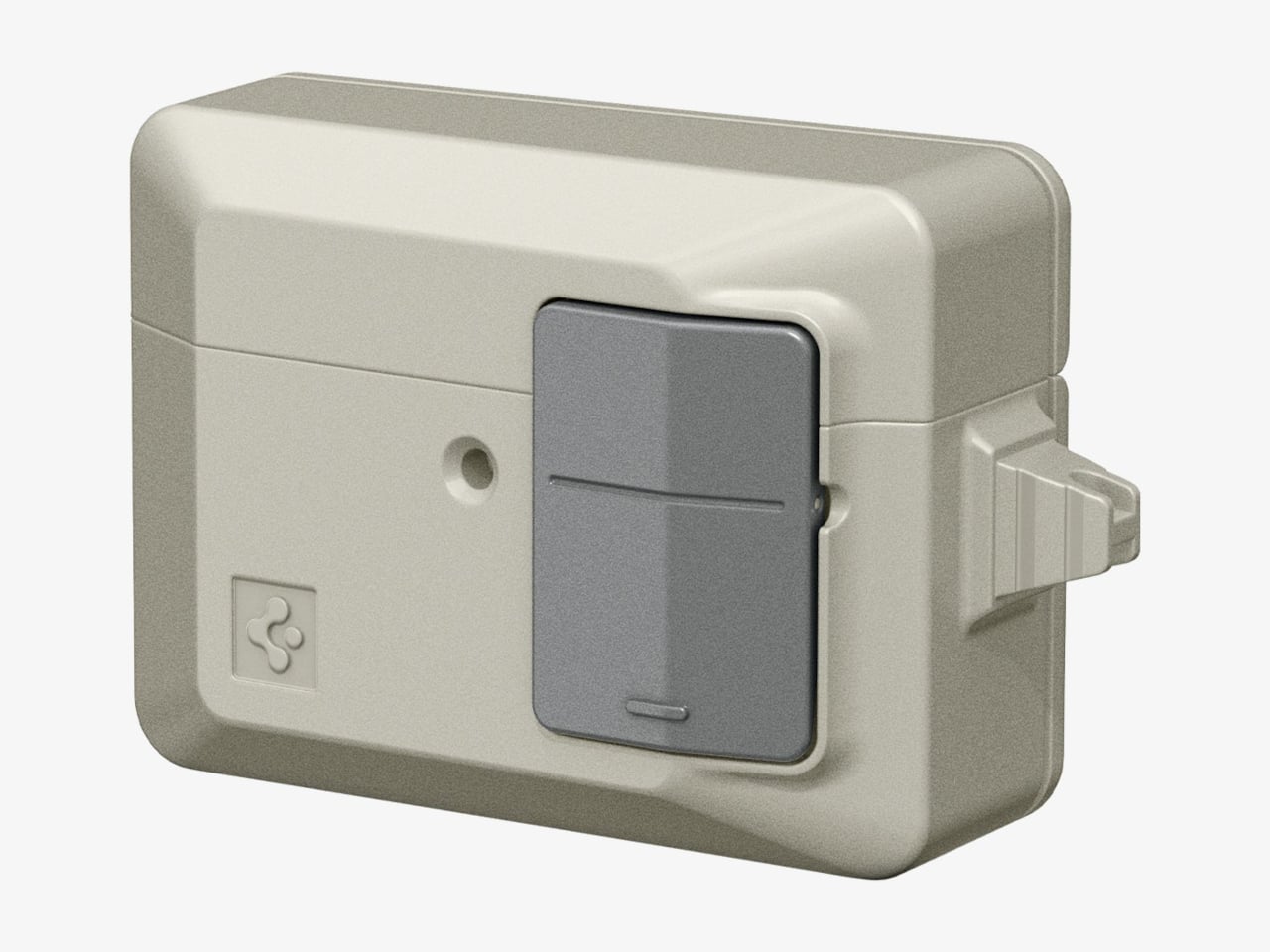
Spigen’s retro-Mac collection is one of the more quietly delightful things to emerge from the Apple accessory market in recent years, and the Classic LS AirPods Pro 3 case is its most charming entry yet. Modeled directly after the original Apple mouse, the flat, single-button input device that debuted with the first Macintosh, it borrows the mouse’s warm, stone-colored plastic, its compact proportions, and most importantly, its most satisfying tactile feature. It’s the kind of object that makes you want to pull it out and show someone immediately.
The “Push to Unlock” mechanism built into the front is the detail that takes this from novelty to genuinely considered product design. Placed exactly where the original mouse button sat, pressing it releases the hinged lid with a deliberate, mechanical click that makes the gesture feel purposeful rather than accidental. It joins a phone strap and a MagFit floppy disk wallet in a cohesive four-piece retro set. With Apple celebrating fifty years this April, carrying this case is one of the most eloquent tributes any fan can make to the design language that started everything.
What we like:
The “Push to Unlock” button is a genuinely tactile, mechanically satisfying feature that pays direct homage to the original mouse button in the most intuitive way possible
Being part of a four-piece retro collection means fans can build a fully coordinated Apple heritage accessory set that tells a coherent visual story
What we dislike:
The warm beige colorway, while historically faithful and correct, may feel too vintage for users who prefer accessories that match Apple’s current aesthetic language
The case is specific to AirPods Pro 3, meaning it offers no crossover value outside that particular model
6. Battery-Free Amplifying iSpeaker
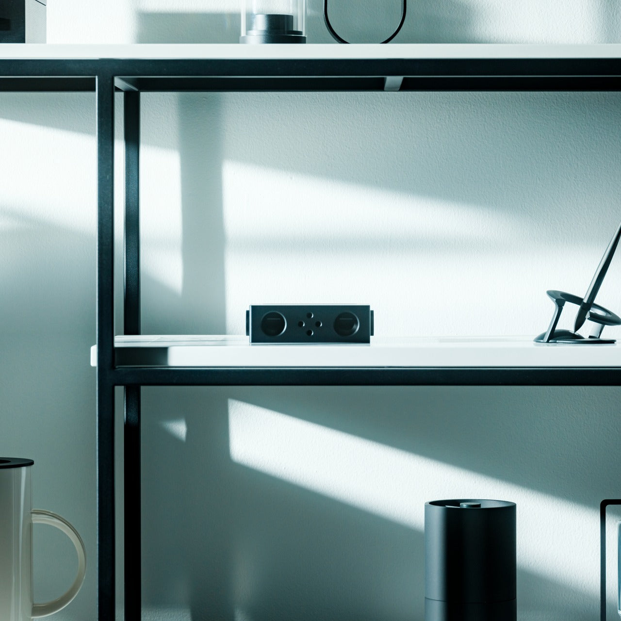
There’s something deeply satisfying about a product that works entirely without power, and the iSpeaker earns that satisfaction honestly. Made from Duralumin metal, the same aerospace-grade alloy that appears throughout the best entries on this list, it uses pure acoustic physics to amplify your iPhone’s audio without drawing a single watt of electricity. Designed using the golden ratio, it doubles as a piece of desk sculpture that holds its own even when your phone isn’t sitting inside it. Function and form, neither compromising the other.
This is the kind of accessory built for a very specific Apple user: one who values craft over convenience, and objects that reward close attention over ones that simply check a box. The Duralumin construction resonates with your music rather than dampening it, producing a warmer, more enveloping sound than plastic or silicone alternatives can manage. It’s also portable enough to take to a hotel room, a client’s office, or a weekend away without any packing anxiety. No cables, no setup, no charging required. Just place your phone inside and let the material do its work.
Zero power required makes it genuinely portable and one of the more eco-conscious accessories in any Apple setup
The Duralumin body produces a noticeably richer, warmer acoustic resonance than plastic and silicone competitors at this price tier
What we dislike:
Output, while impressively improved for a passive speaker, will never match the volume or bass of a powered Bluetooth speaker in the same price range
The +Bloom and +Jet directional sound mods that extend its capabilities are sold separately, meaning full functionality requires an additional purchase
7. Leica Lux Grip
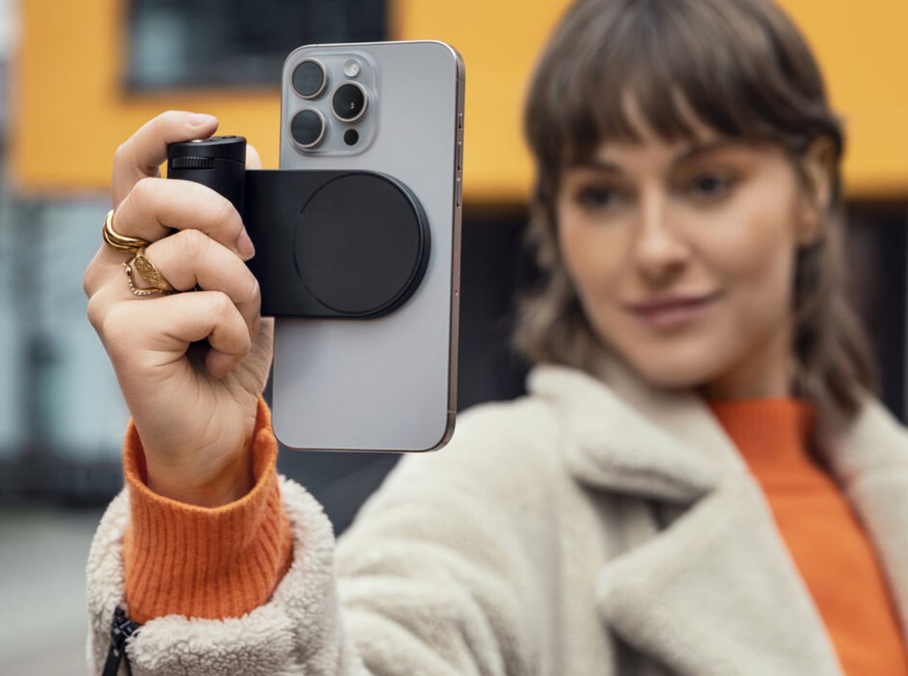
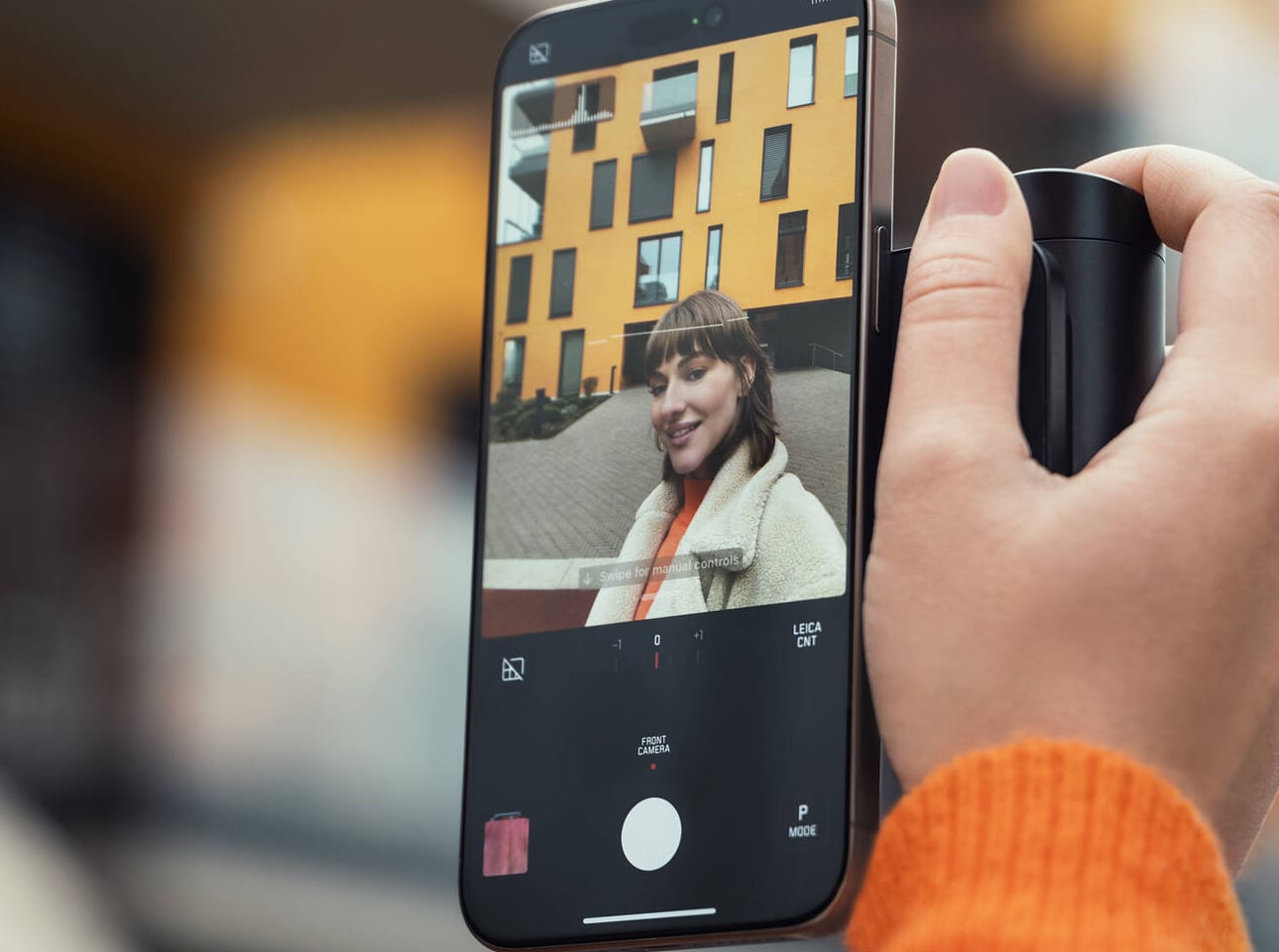
Leica doesn’t make many mistakes when it comes to product design, and the Lux Grip is a strong argument for that reputation. Built for iPhone photographers who want DSLR-level ergonomics without abandoning the convenience of a smartphone, it attaches via MagSafe and works with every iPhone from the 12 onward. Machined from high-grade aluminum with a matte black finish, it adds a reassuring heft to the setup that transforms how the whole device sits and moves in your hands: purposeful, balanced, and undeniably premium.
The cylindrical grip along the left side creates a natural resting point for the fingers that you only realize you’ve been missing once you’ve shot without it. Paired with the Leica Lux app, the mechanical controls provide genuine shutter, aperture, and zoom inputs that touchscreen photography will never replicate in feel or reliability. For the Apple fan who takes mobile photography seriously, the Lux Grip doesn’t just improve how you shoot. It changes how you think about the iPhone as a camera, and that’s the kind of shift that earns its place in any serious setup.
What we like:
MagSafe attachment is secure and broadly compatible, working cleanly across multiple iPhone generations without any adapters or compromises
The mechanical shutter and physical controls provide tactile shooting feedback that touchscreen photography categorically lacks, making sessions feel more considered
What we dislike:
The premium aluminum build and Leica branding command a price point that will be a genuine barrier for casual iPhone photographers on a tighter budget
The added weight and bulk, while ergonomically intentional, may not appeal to users who prioritize a slim, pocketable iPhone profile above all else
Fifty Years In, the Details Still Matter
Apple turning 50 on April 1st is the kind of milestone that asks you to pause, look around your setup, and ask whether the things surrounding your devices actually reflect the standard Apple itself has set. The best anniversary gift you can give yourself isn’t necessarily the newest device on the shelf. It’s the accessories that turn what you already own into something that feels curated, intentional, and worth coming back to every day. That’s always been the Apple promise.
These seven picks honor that promise in different ways: some through heritage, some through clever engineering, and some through the kind of craft that simply makes an ordinary moment feel better. Whether you’re celebrating five decades of Apple with a retro-inspired AirPods case or finally shooting iPhone photos with a grip worthy of the camera you’re already carrying, each one earns its place. Here’s to fifty more years of thinking differently, and the accessories that help you live up to it.
Film photography isn’t going anywhere, and the disposable camera has quietly become one of the more interesting objects in that revival. What started as a practical format for events and travel has turned into a collectible category, with customized cameras appearing at the intersection of fashion, pop culture, and analog nostalgia. The market for limited-edition film cameras that double as design objects has never been more receptive.
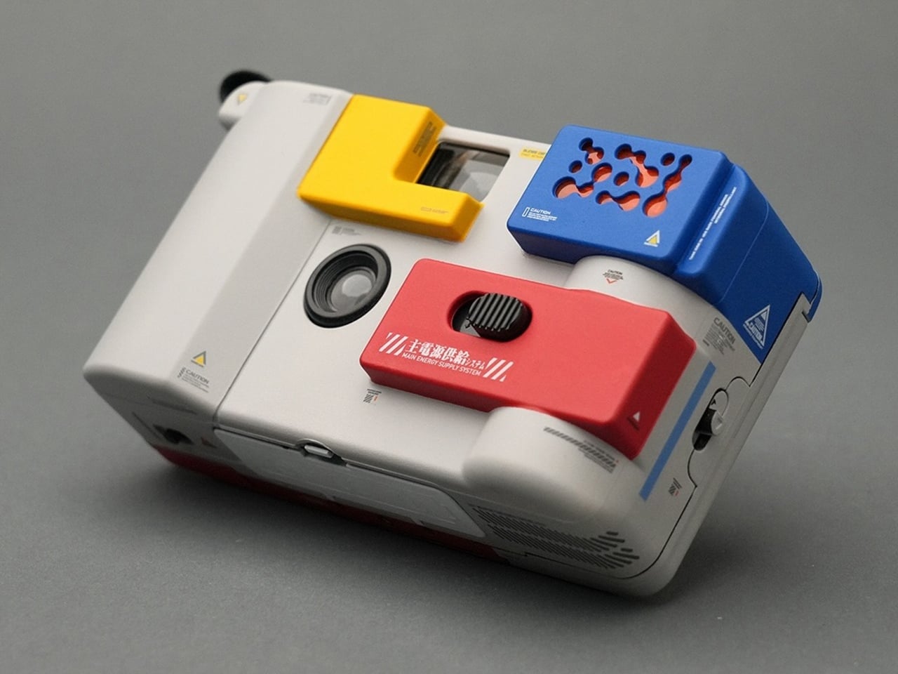
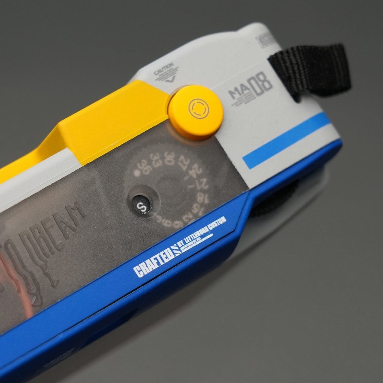
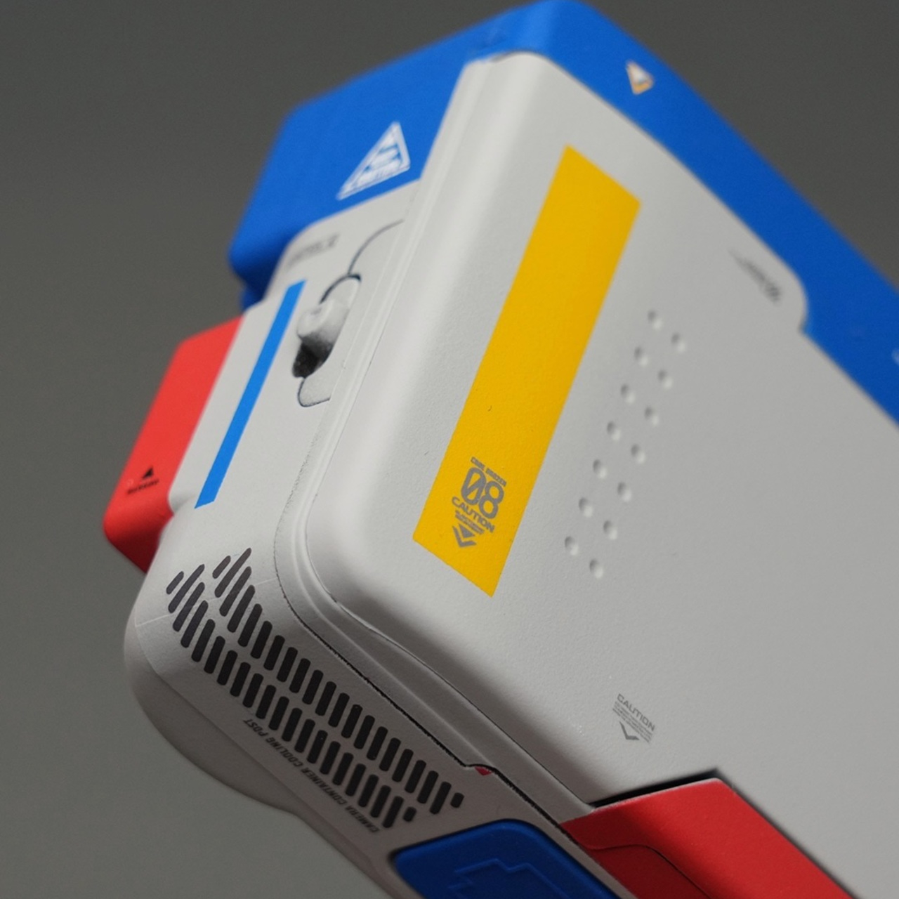
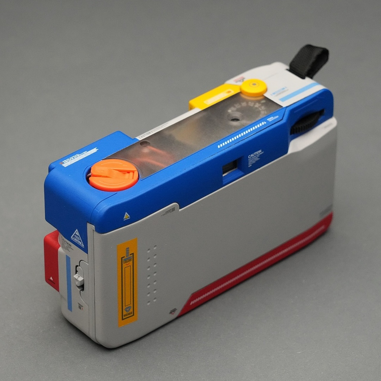
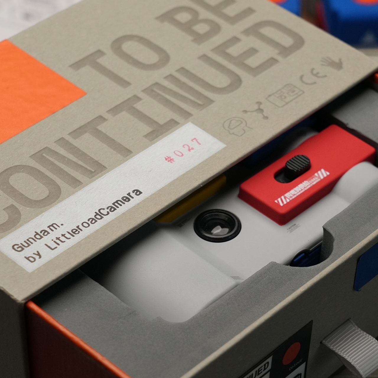
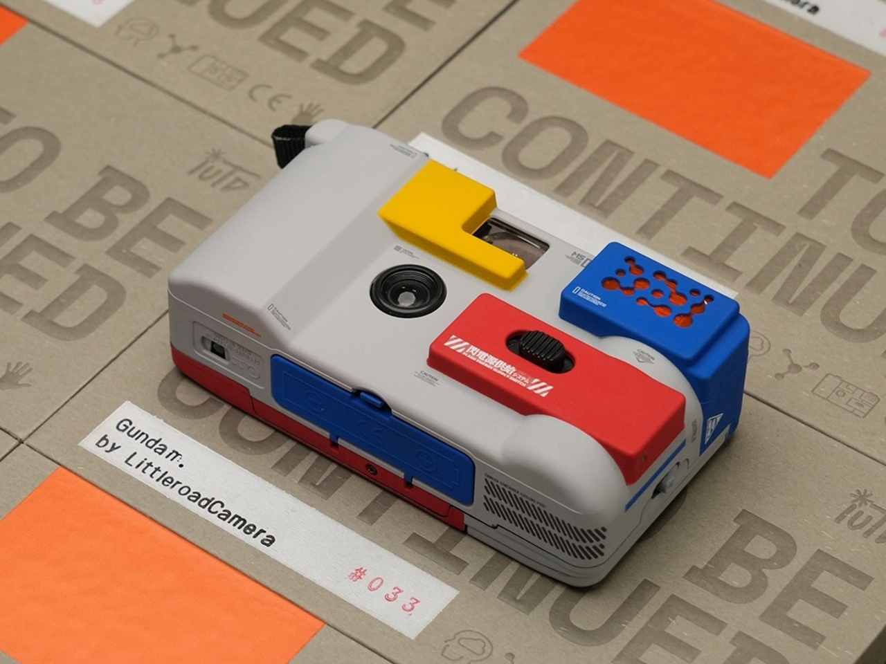
That’s the space the Gundam Camera occupies, a collaboration between artist David C. Wang of Little Road Camera and IUTD Studios that treats a compact film camera as a canvas for the kind of meticulous craft that goes into a proper Gunpla build. Rather than applying a printed wrap or a franchise sticker, the team hand-assembles each unit from scratch, treating the camera body the way a model maker treats a 1/144 scale kit.
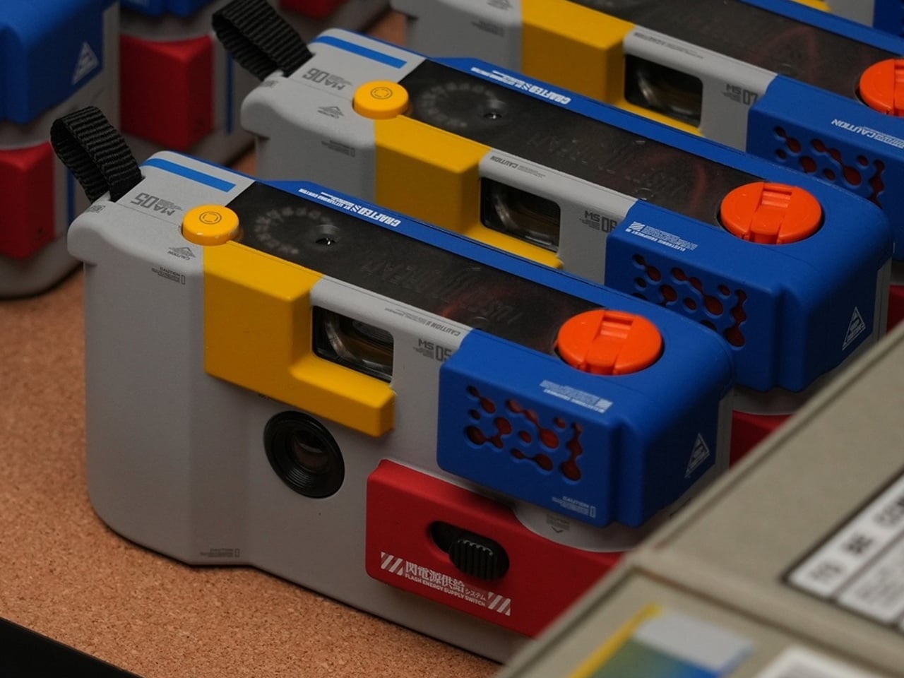
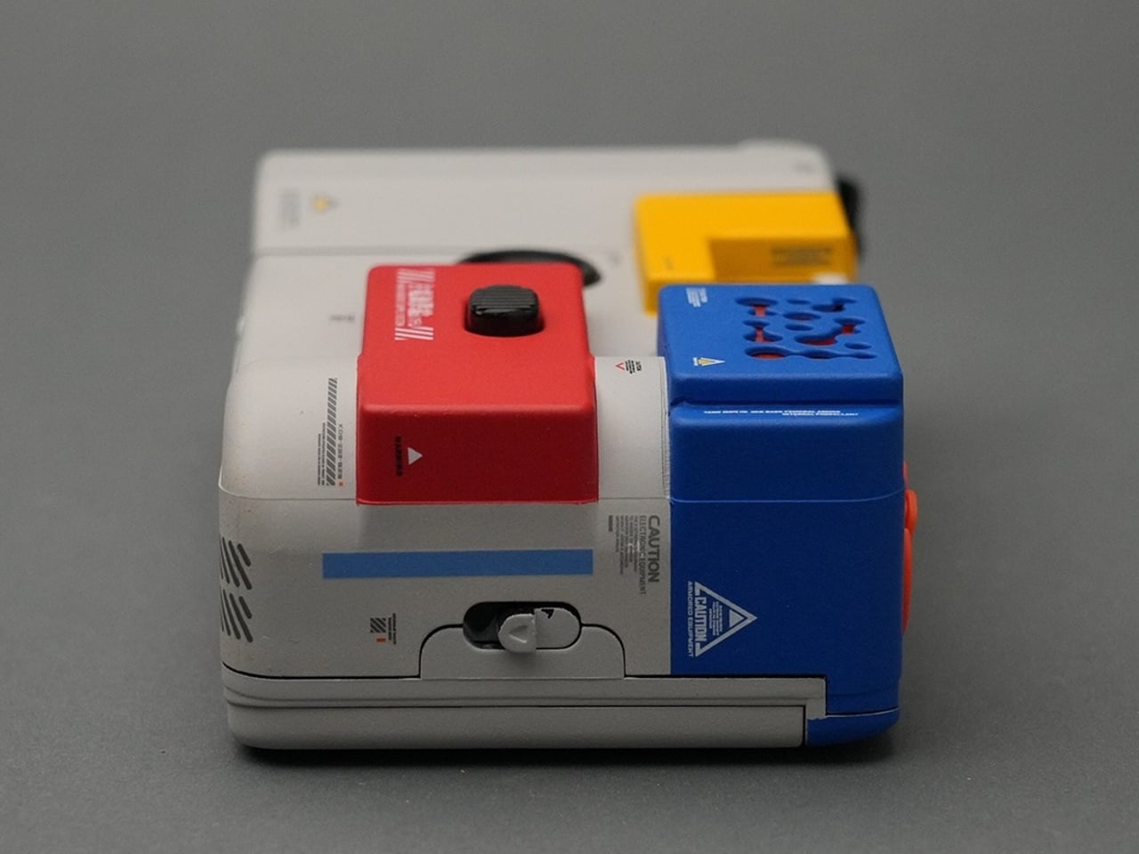
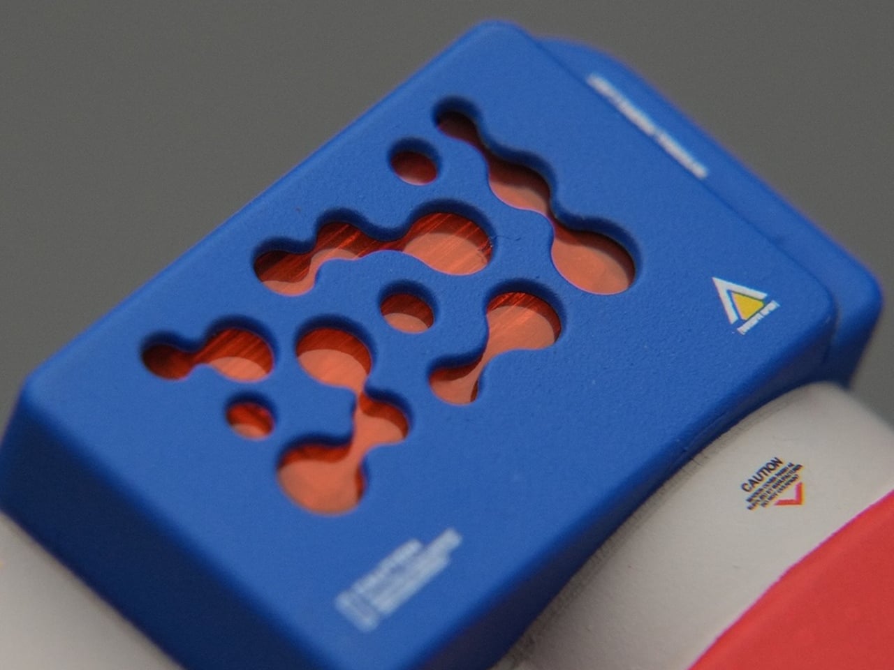
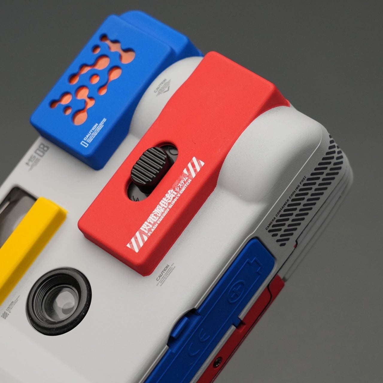
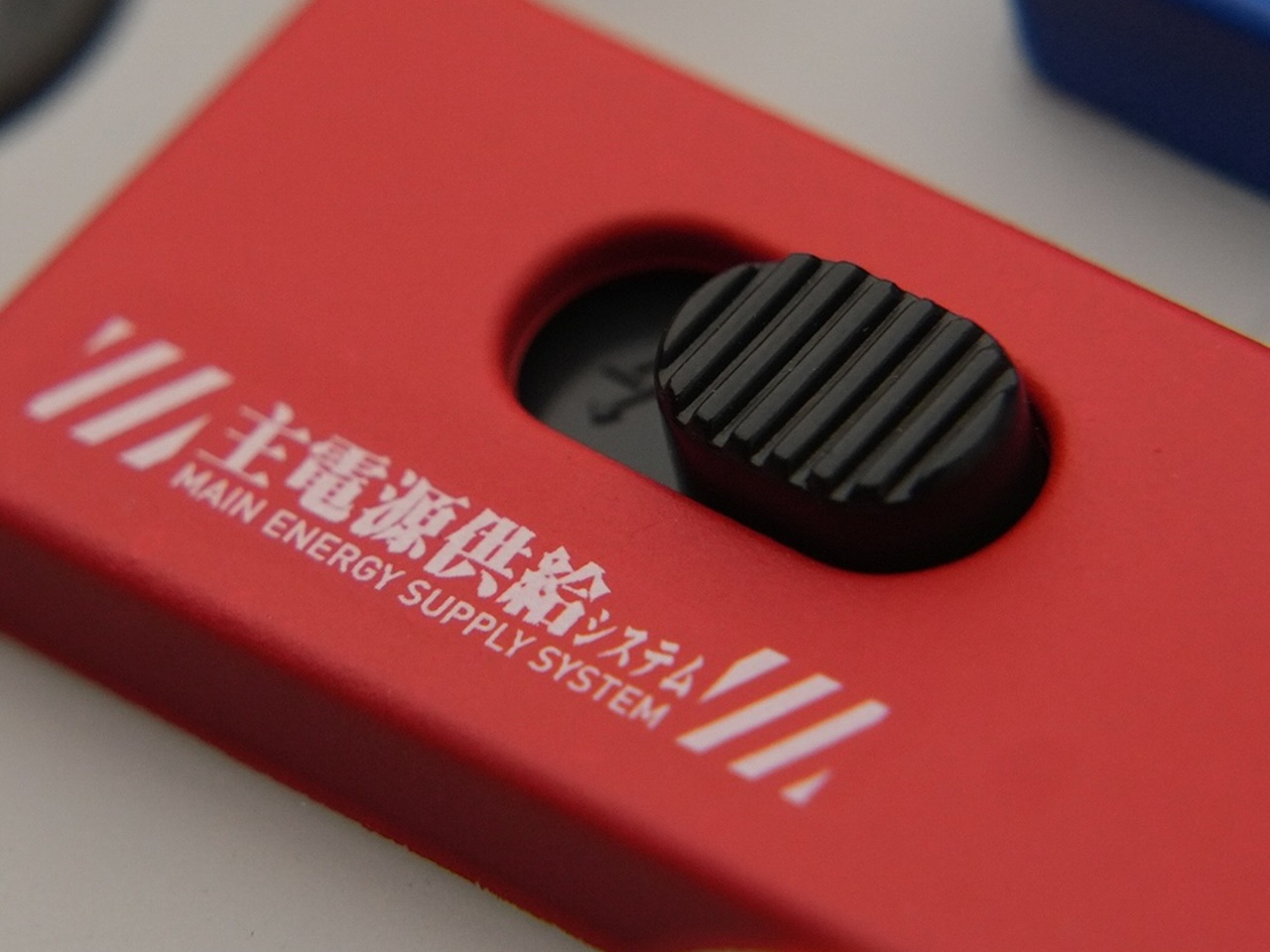
The color palette is unmistakably RX-78-2: white and light grey as the base, with iconic blocks of red, blue, and yellow distributed across the body. The blue module on top mirrors the mecha’s head vents, while the red panel carries Japanese lettering that translates to “Main Energy Supply System.” Warning labels and caution markers are applied throughout, giving every surface the texture of actual military hardware.
None of this is printed or mass-produced. Each camera is assembled, painted by hand, and decorated with decals applied one by one, giving every unit a slightly unique character. Panel lines are added individually, and the surface finish is developed to match how serious Gunpla builders approach their kits, not the kind of detail you’d notice from a distance, but the kind that holds up under close inspection.
Of course, it’s also a functioning film camera, which matters. This isn’t a display piece you’d keep behind glass. Take it out on the street or to an event, and the reaction it gets before you’ve even raised it to shoot becomes part of the experience. Gundam fans who’ve never touched a film camera suddenly have a reason to, and film shooters find themselves explaining it to everyone who asks.
The appeal reaches across at least two communities that don’t often overlap. Analog photography has cultivated a following that values the tangible, the finite, and the slow. Gundam has its own equally dedicated community built around craftsmanship, patience, and an appreciation for machines that look like they were actually built by someone. A camera that speaks to both of those things at once is genuinely hard to dismiss.
Units are limited and offered in small batches internationally, which suits a project built entirely around handmade production. There’s no version of this that scales to mass retail, and that’s precisely what makes it interesting as a collector’s object. For anyone who grew up assembling Gunpla kits and now carries a film camera as part of their identity, this occupies a space that feels genuinely earned.
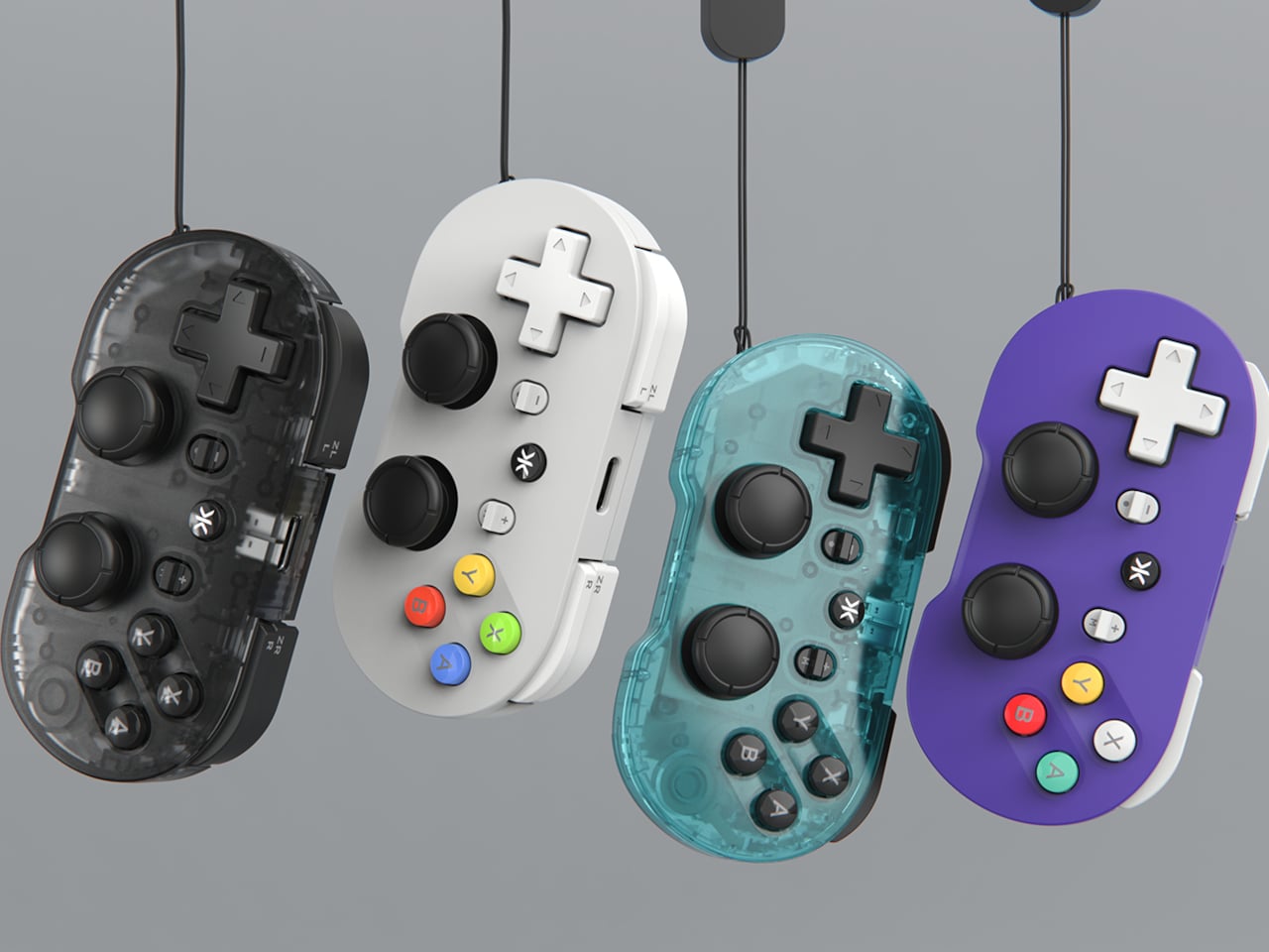
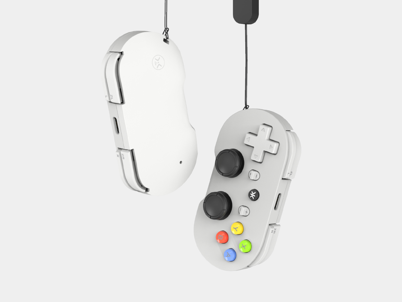
Compact gaming controllers have always occupied an awkward spot in the market. Most work well enough for retro titles, where a D-pad and a few buttons are all you need, but they fall short the moment you want to play anything more demanding. Dual thumbsticks are either absent or prone to drifting, and that’s before you factor in the limited platform support most of them offer.
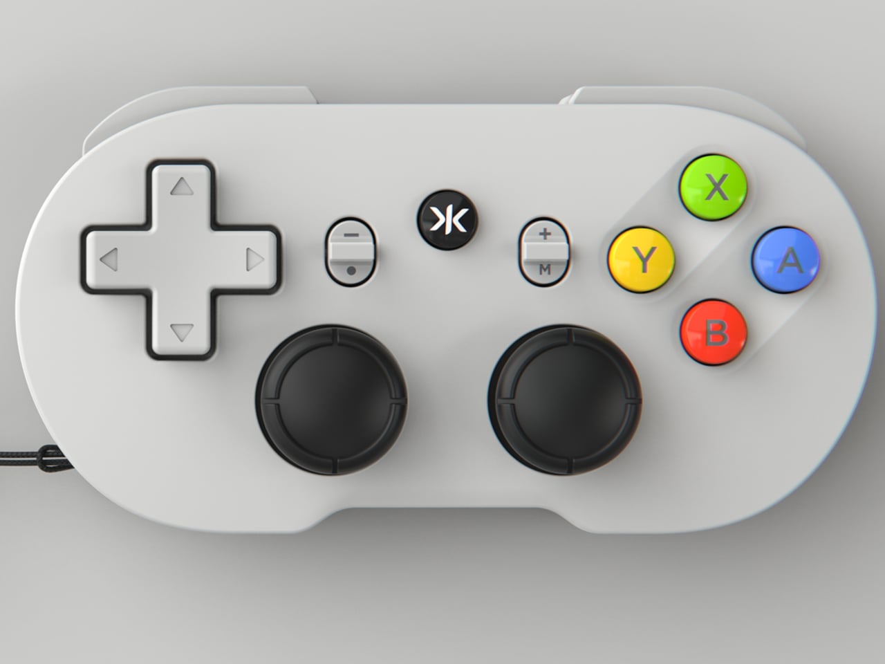
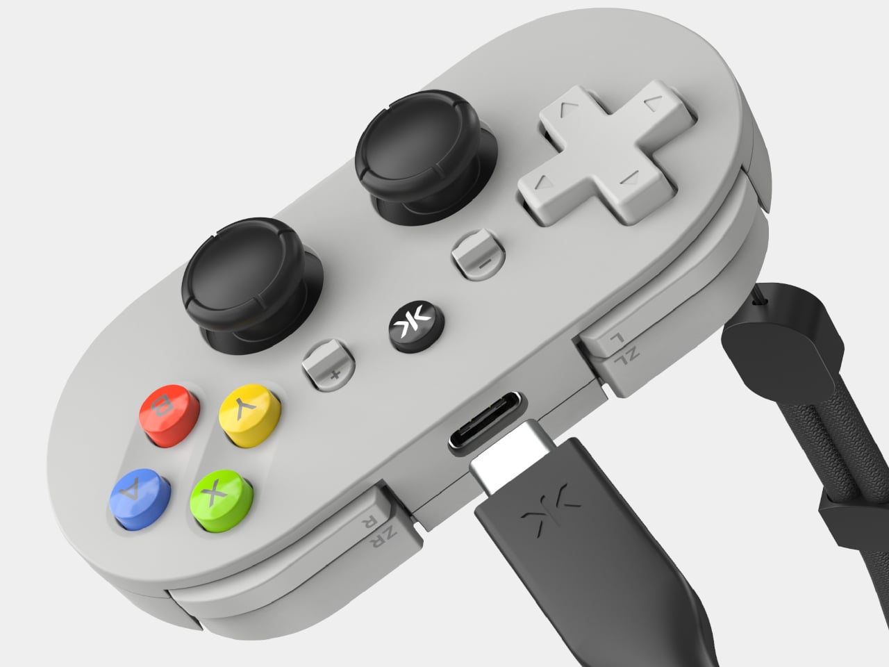
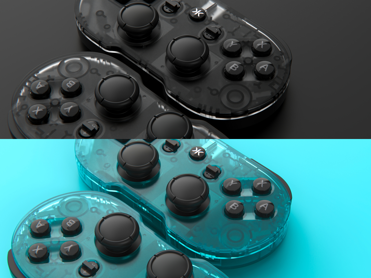
CRKD’s ATOM+ arrives as a direct response to those shortcomings. It’s the follow-up to the brand’s original ATOM keychain controller, but with noticeably bigger ambitions. Rather than catering only to retro gaming, it’s built around a complete control layout and a feature you’d typically find on premium full-sized gamepads: zero-drift TMR thumbsticks. The result is a palm-sized controller that doesn’t ask you to trade performance for portability.
The TMR, or Tunnel Magnetoresistance, thumbsticks are arguably the ATOM+’s most significant selling point. Unlike traditional analog sticks that use physical contact points that wear down with use, TMR technology relies on magnetic sensors to read input, which means accuracy doesn’t degrade over time. Stick drift has been a persistent nuisance in gaming, and it’s particularly glaring in small controllers, where replacement or repair isn’t exactly straightforward.
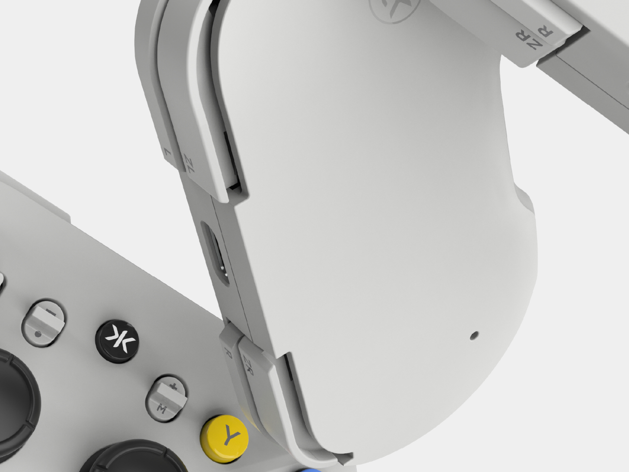
Beyond those thumbsticks, the ATOM+ carries a full control layout with triggers and shoulder buttons, making it capable of handling modern titles without restrictions. At 90mm x 48mm, it fits in a jacket pocket, which means it’s genuinely useful for commuting, travel, or just gaming away from your usual setup. It’s the kind of controller you can toss in a bag and forget about until you need it.
Platform compatibility is another area where the ATOM+ covers its bases. It connects over Bluetooth to the Nintendo Switch 2 and Switch, PC and PC handhelds, iOS and Android devices, and even select smart TVs. The Switch-style button layout keeps things familiar regardless of what you’re playing on, and for a controller this small, the breadth of supported platforms earns its keep rather than just reading as a marketing claim.
There’s also motion control support, a turbo mode, and vibration feedback baked in. Motion controls, in particular, add an extra dimension for compatible Switch titles where gyro aiming can genuinely make a difference. These aren’t features you’d expect to find on a controller this size, and they make the ATOM+ feel less like a novelty and more like a legitimate primary controller for portable gaming sessions.
CRKD also pairs the ATOM+ with its companion app, which lets you tune inputs, update firmware, and customize settings via the CTRL feature. The controller is RFID-enabled too, tapping into CRKD’s True Collection System, so you can tap your phone to it and pull up details like its product number and rarity rank. It’s a collectible angle that’s a bit unusual for a gamepad, but a fun one nonetheless. For gamers who’ve been burned by drift-prone compact controllers, or just want something pocketable that handles any game thrown at it, the ATOM+ is hard to ignore.
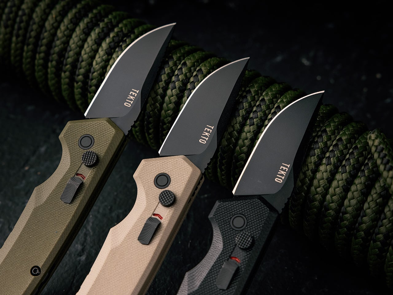
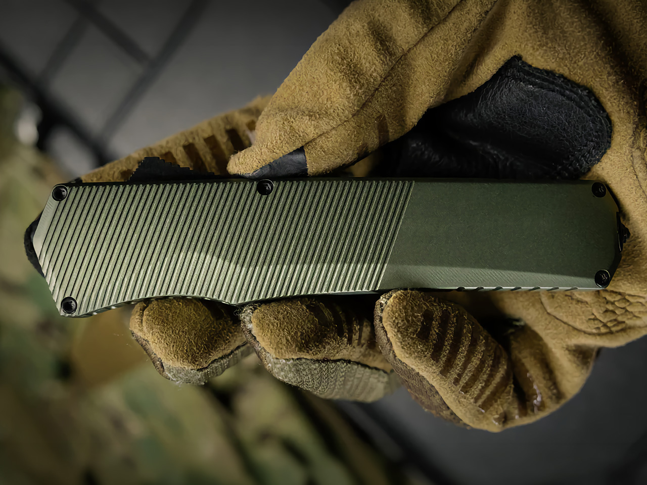
Speed settles a lot of arguments. Ask anyone who carries a knife daily and they’ll eventually get around to the deployment question: how fast can you get the blade out, how cleanly, and with how many fingers occupied. Folders demand a pivot, a swing, and depending on the locking mechanism, a deliberate wrist motion before the blade is truly ready. OTF knives skip all of that. One thumb movement sends the blade straight out the front in a single linear motion, and it locks automatically. There’s no arc, no fiddle factor, and no grip position the hand needs to be in before deployment works. That mechanical simplicity is a genuine advantage that compounds across every use case, whether it’s emergency cutting, utility tasks, or the kind of one-handed operation that makes a real difference when your other hand is occupied.
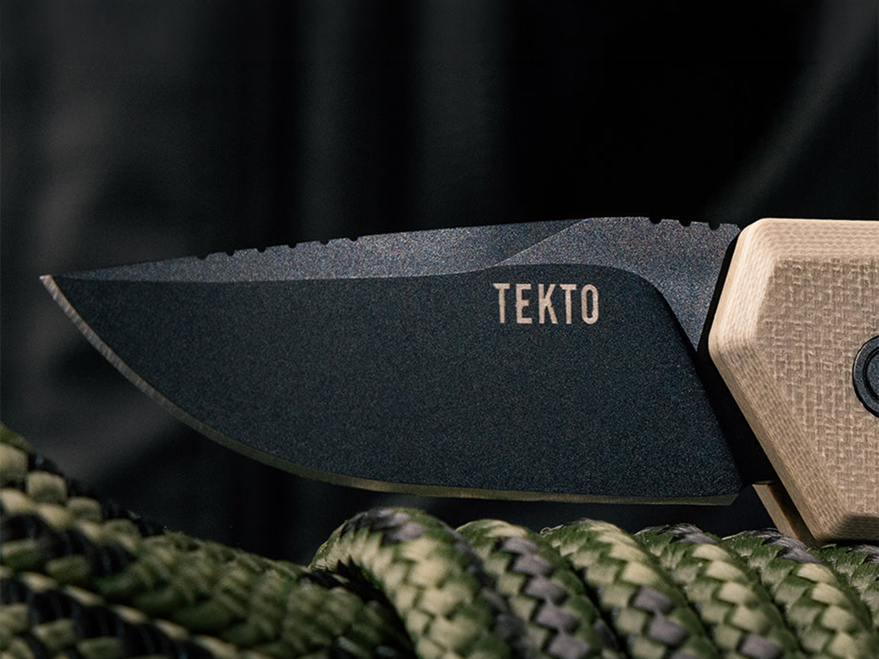
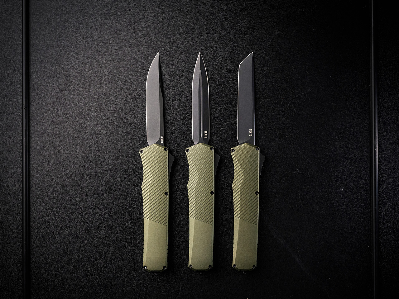
The A3 Delta, the A5 Spry, and the Spry Mini all operate on that same core principle: forward, fast, locked. Tekto’s folder range earns its place as refined everyday carry, but the OTF models are engineered around the reality that access speed and single-hand operation are non-negotiable for a tool you actually rely on. The A5 Spry, carrying an S35VN blade in a precision-contoured handle, represents the tactical end of that thinking. The A3 Delta Mini takes the same OTF discipline and packages it into a compact, California-legal form. The through-line across the range is a commitment to the mechanism itself, treating the out-the-front action as a feature worth designing around, a mechanical conviction rather than a marketing angle.
Single-Motion Deployment Changes the Entire Calculation
The A3 Delta
The core mechanical difference between a folder and an OTF comes down to the number of steps involved in getting the blade ready. A folder, even a fast one with ball bearings, requires the user to find a stud or flipper, apply pressure in a specific direction to initiate a pivot, and wait for the lock to engage. That sequence takes a fraction of a second for a practiced user, but it’s still a sequence. An OTF knife reduces that sequence to a single linear push. The thumb finds the switch and moves it forward; the knife does the rest. This removes the pivot, the swing, and the lock engagement from the user’s list of responsibilities.
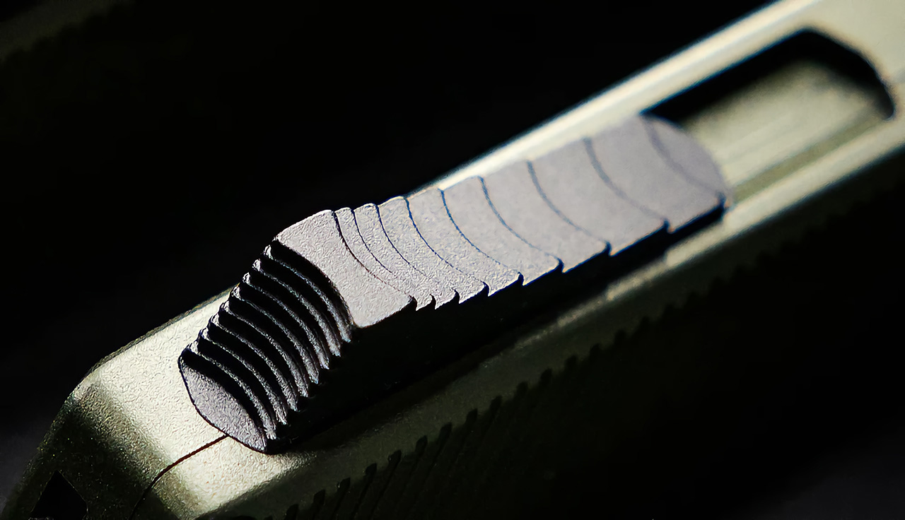
This single-motion system translates to a higher degree of real-world reliability. When one hand is busy holding something in place, there’s no need to adjust your grip or use a second hand to get the blade out. The best OTF designs place the deployment switch exactly where the thumb naturally falls, making the act of gripping the knife and deploying it part of the same fluid motion. It’s a small ergonomic detail that makes a huge operational difference, turning the knife into an extension of the hand in a way a folder’s more complex mechanics can’t quite match.
Grip Position Has No Bearing on Whether the Knife Opens
The A5 SPRY
Folders have a specific vulnerability that rarely gets acknowledged: they require a deliberate, practiced grip to open reliably. The thumb has to find its target, and the wrist needs to be oriented correctly for the blade to swing out without obstruction. In calm, controlled conditions, this is a minor point of practice. But in a hurry, or when wearing gloves, or when your hands are wet or cold, that small dependency becomes a legitimate failure point. OTF knives are functionally immune to this problem. Because the blade travels on an internal, linear track, the mechanism doesn’t care how the handle is being held.
This operational consistency is one of the strongest arguments for the OTF format, and it becomes even more apparent in smaller knives. Compact folders can be notoriously fiddly, with tiny thumb studs and short handles that are hard to manage. A compact OTF, however, deploys with the same authority as its full-sized counterpart. Models with blade lengths under two inches still offer an excellent blade-to-handle ratio and a full, confident grip, proving that the mechanism scales down without losing its inherent mechanical advantage.
Retraction Is as Fast as Deployment, and That Actually Matters
The A5 SPRY MINI
Closing a folding knife is a deliberate act. You have to consciously disengage the liner lock, frame lock, or button lock, then carefully fold the blade back into the handle, making sure your fingers are clear. On a well-made folder, it’s a secure process, but it requires your full attention. An OTF knife retracts with the same speed and simplicity as it deploys. A single pull on the switch sends the blade back into the handle, where it locks just as securely as it does when open. The knife is either fully engaged or fully stowed, with no hazardous in-between state.
This bidirectional action has practical value in any scenario where a tool needs to be put away quickly and safely. It also introduces a level of safety that folders can’t offer. A half-closed folder is a risk; a retracted OTF is a mechanically secured object. The confidence this provides is tangible for anyone who uses their knife frequently throughout the day. The crisp, reliable action of modern OTF mechanisms, both in and out, is a testament to how mature the engineering has become.
The Slim Profile Comes Without Mechanical Trade-offs
The A3 DELTA MINI
Many thin folding knives make compromises to achieve their slim profile. The pivot area is often a point of weakness, and a thin handle can make a strong locking mechanism difficult to integrate. OTF knives, by their very nature, are built on a linear chassis. The internal mechanism runs along the length of the handle, not across its width. This means the design can be inherently slim and narrow without sacrificing the strength of the lock or the reliability of the deployment. Thinness is a natural byproduct of the OTF’s structure, not an afterthought achieved by removing material.
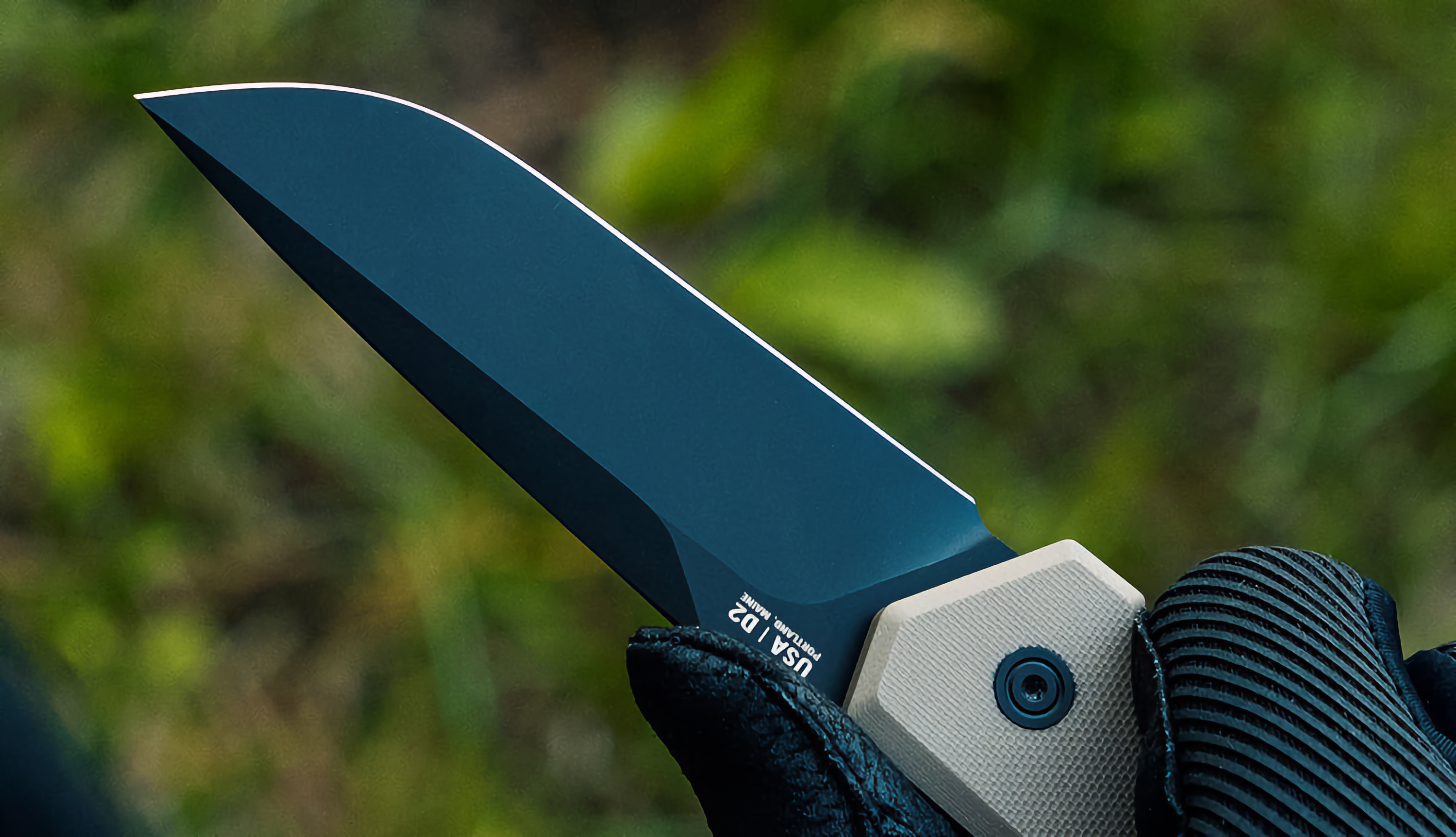
This structural advantage allows for knives that are remarkably easy to carry while still being built from robust, high-performance materials. It’s common to see OTF models with a handle width of less than half an inch that are still equipped with premium steels like S35VN, rated for exceptional hardness and edge retention. These builds demonstrate that a slim, pocket-friendly profile and genuine, hard-use strength are not mutually exclusive concepts. The OTF format delivers both, proving you don’t have to choose between a comfortable carry and a capable tool.
The Blade Style Options Are No Longer an OTF Limitation
One of the oldest criticisms leveled against OTF knives was a perceived lack of versatility in blade shapes. For a long time, the market was dominated by a few basic drop point or dagger styles. That criticism is now completely outdated. The modern OTF category has evolved to a point where it offers the same full spectrum of blade geometries available in the high-end folder market. Whether you need the piercing capability of a tanto, the slicing efficiency of a drop point, or the specialized profile of a dagger, there is an OTF knife built for the task.
This expansion of options has effectively eliminated the last significant advantage that folders held. It is now common for a single, popular OTF model to be offered in multiple blade configurations, and even in both full-size and compact versions. This allows users to select the precise tool they need without having to abandon the superior mechanical advantages of the OTF platform. Blade selection used to be a compelling reason to stick with a folder; today, it’s just another area where OTF knives have achieved, and in some cases surpassed, parity.
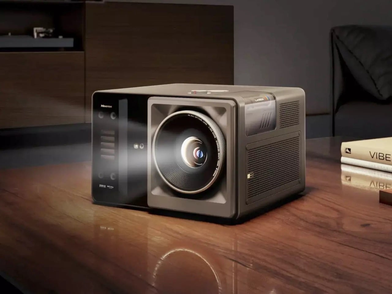
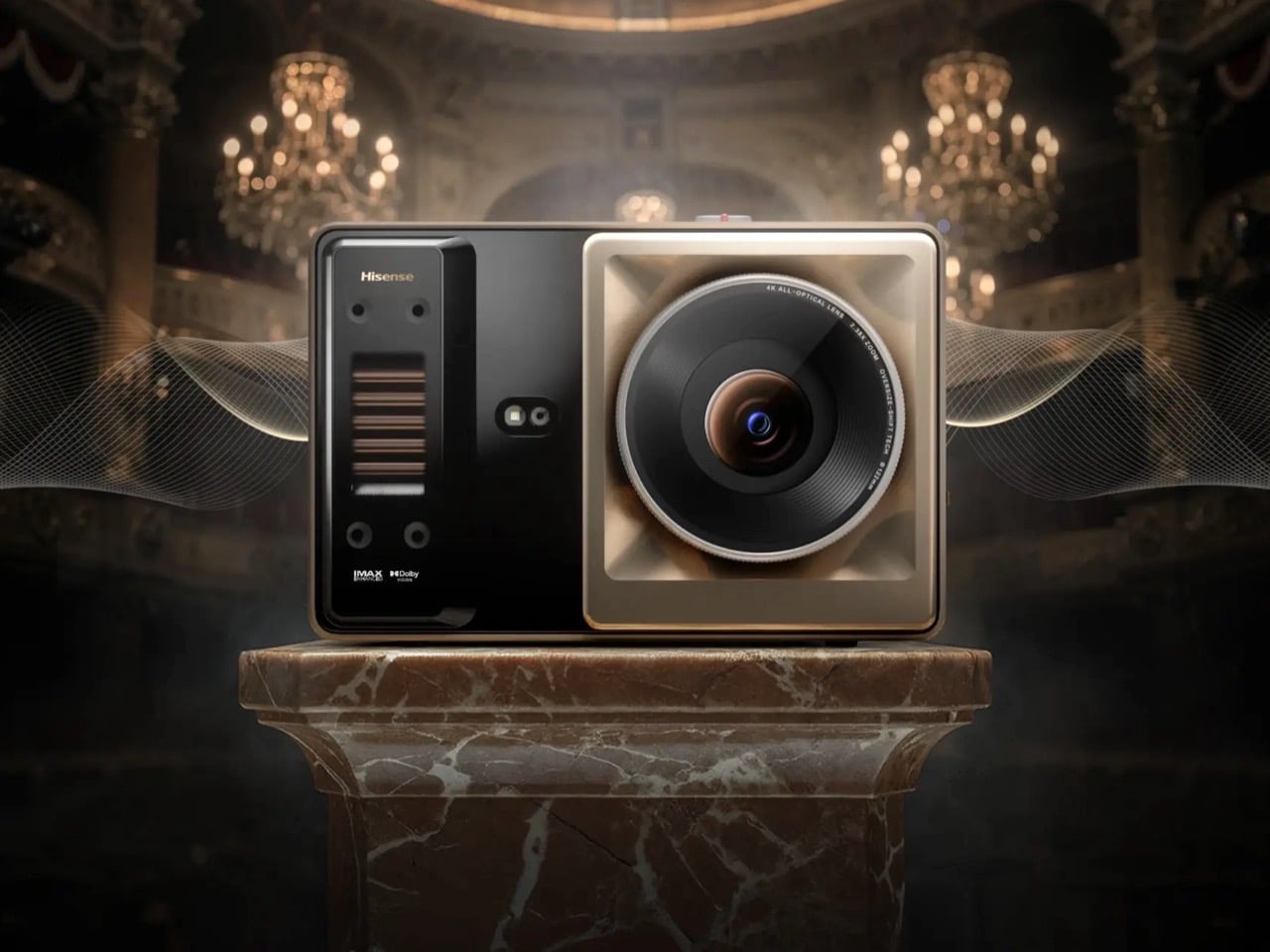
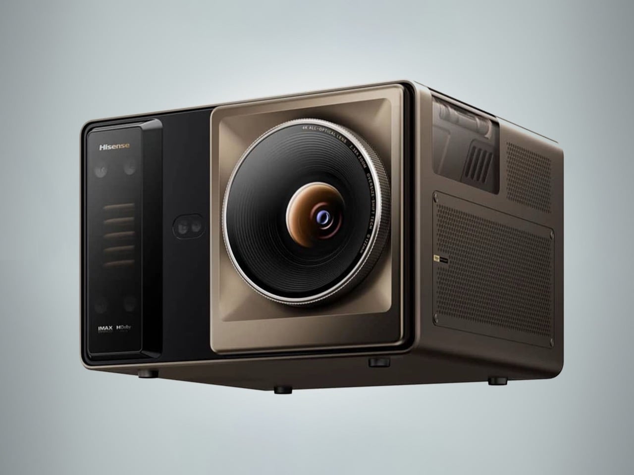
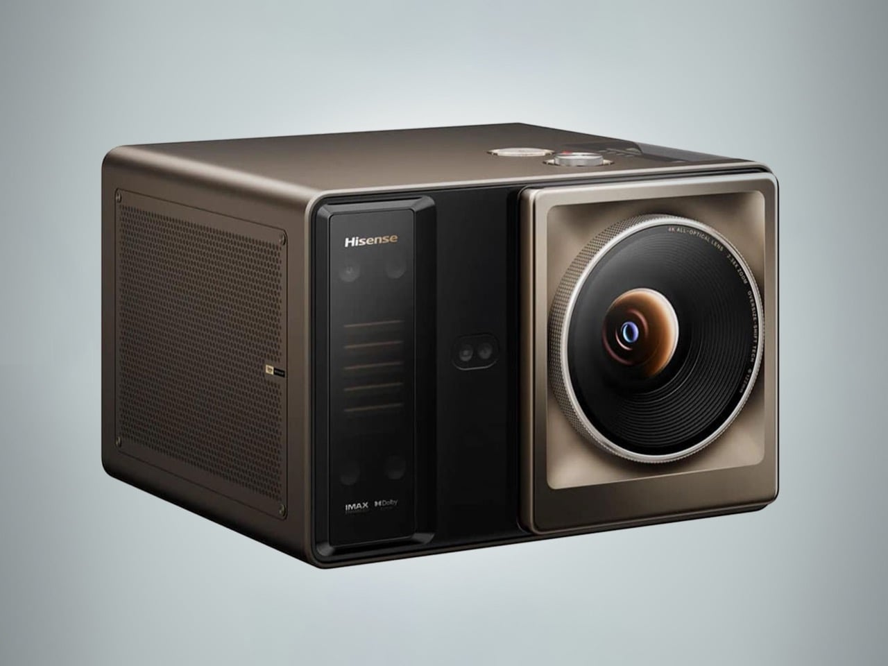
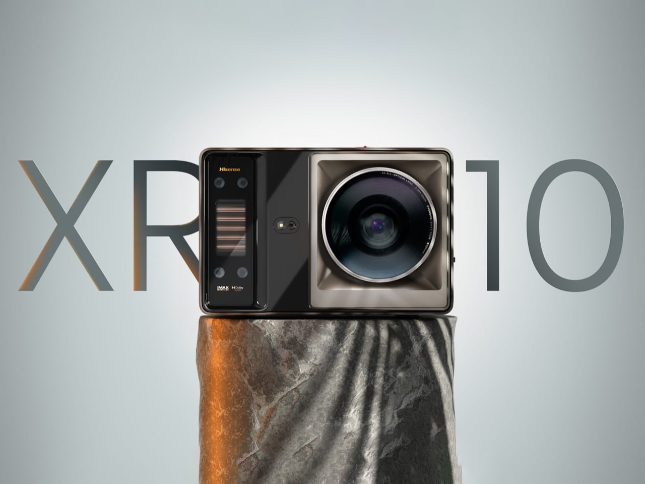
Home theater has always been a game of compromises. You either spend a fortune on a TV large enough to feel cinematic, or you buy a budget projector and spend the rest of your evenings squinting at a washed-out image the moment someone turns a light on. The sweet spot, a projector bright enough to hold its own in a lit room at genuinely cinematic scale, has historically lived at a price point that makes most people close the browser tab. Hisense thinks it has finally cracked that equation with the XR10, a 4K triple laser projector that debuted at CES 2026 and has now officially opened for pre-order.
The XR10 throws a 4K UHD image anywhere from 65 to 300 inches, powered by a triple laser light source rated at 6,000 ANSI lumens and a lifespan of 25,000 hours. That brightness figure is the headline: most home projectors top out well below 4,000 lumens, making ambient light their mortal enemy. Hisense pairs that output with Dolby Vision, HDR10+, and IMAX Enhanced certification, a 17-element glass lens, and a 2.1-channel audio system co-developed with Devialet and tuned with input from the Opéra de Paris. The pre-order price sits at $5,299.99, down from a retail tag of $6,999.99, with a free HT Saturn 4.1.2 wireless sound system thrown in.
The XR10 operates across a 0.84 to 2.0:1 throw ratio with 2.39x optical zoom and lens shift, which means you are not locked into a single position in your room to hit your target screen size. A seven-level iris adjustment and the 17-element glass lens work together to give you granular control over the image, while the native 6,000:1 contrast ratio and up to 60,000:1 dynamic contrast ensure the picture holds depth whether you are watching a sunlit action sequence or a shadow-heavy thriller. Color coverage reaches 118 percent of BT.2020, which puts the XR10 well above the color volume of most consumer displays at any price.
Hisense brought in Devialet, the award-winning French audio engineering firm behind some of the most acoustically serious speakers on the consumer market, to develop the XR10’s built-in 2.1-channel system. Two 8W speakers pair with a 15W subwoofer, the whole profile tuned with input from the Opéra de Paris, and the system supports both Dolby Digital and DTS Virtual:X. Thermal management comes via a dual-channel liquid cooling system that keeps operating temperatures stable without generating the kind of fan noise that pulls you out of a quiet scene.
Smart platform duties fall to Hisense’s VIDAA OS, with Netflix, Amazon Prime Video, Disney+, and Apple TV all available natively. AirPlay 2 and Miracast handle screen mirroring, and the connectivity spec runs to Wi-Fi 7, Bluetooth 5.4, HDMI 2.1, HDMI 2.0, USB 3.0, and Gigabit Ethernet, with eARC and CEC support rounding out the audio integration options. For a device sitting in your living room as a permanent installation, that connectivity stack is exactly what you want.
At $5,299.99 during the pre-order window, the XR10 is not an impulse purchase, and Hisense knows it. The full retail price of $6,999.99 puts it in direct conversation with high-end OLED televisions, and that is precisely the comparison Hisense wants buyers making. A 300-inch OLED does not exist. The XR10 does, and right now you can pre-order one with a free surround sound system included.
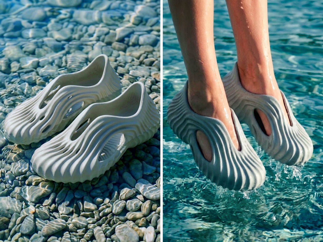
The Yeezy Foam Runner opened a strange and genuinely productive door in footwear design, proving that a monolithic, organically sculpted clog could capture serious cultural attention. Tati Ferrucio‘s Onda walks through that same door but ends up somewhere quite different. Where the Foam Runner borrows loosely from athletic heritage, the Onda goes fully geological, its dense flowing ridges reading more like layered sandstone strata than anything borrowed from a sportswear archive. The comparison is worth making once and then setting aside, because the Onda has its own logic and it holds together well on its own terms.
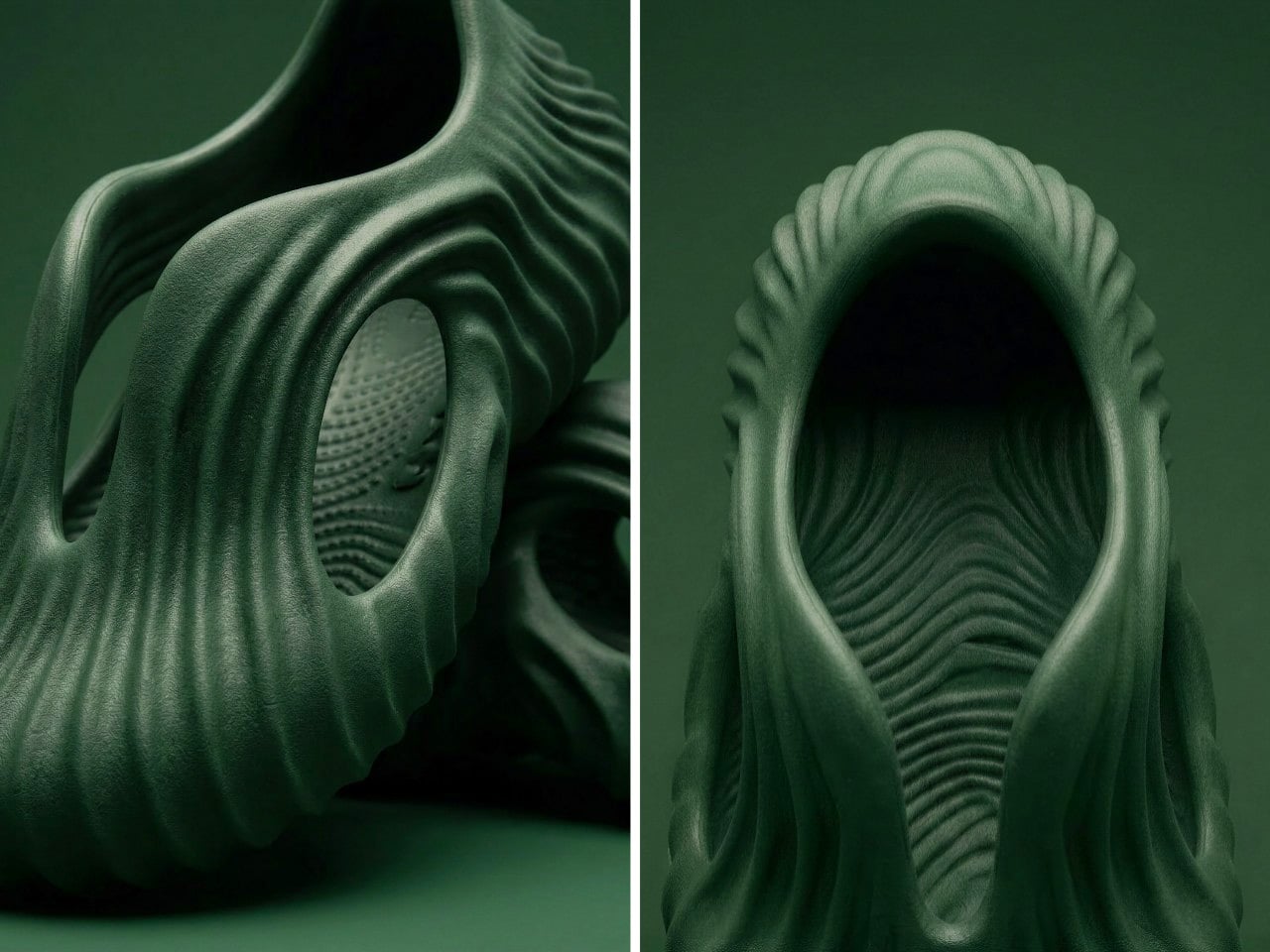
That logic starts with landscape. Ferrucio drew directly from waves, sand patterns, stone surfaces, and tree bark, treating nature as the original generative designer and asking what footwear would look like if it followed the same rules. The cutouts are sculpted voids, not punched holes, and the ribbing on the sole wraps continuously into the upper so there is no visual seam between base and body. It reads as a single carved object, the kind of thing you might find in a tide pool if tide pools produced wearable foam.
Ferrucio developed the Onda using Vizcom, an AI-assisted design platform that takes a designer’s sketch and generates a field of iterated possibilities rather than a single resolved outcome. The workflow is worth pausing on because it explains something about the result. The Onda does not look like a design that was decided in one session; it looks like a form that accumulated, the way sediment does, layer by layer under consistent pressure from the same directional force. Just FYI, Vizcom did not generate the design; Ferrucio directed it, feeding creative intention into each round of iteration and pulling the form toward her reference material until the surface stopped arguing with itself and settled into something coherent.
Positioned along the sides of the upper, the cutouts allow water and sand to escape when moving through wet or granular terrain, which is a functional requirement in a clog built for outdoor use. But structurally, they also reduce material mass without compromising the integrity of the upper, and visually, they create depth in the silhouette that a solid body would not have. The oval void near the heel is particularly well resolved; it sits inside the ribbed surface like a window cut into a canyon wall, framed by ridges on all sides, and gives the rear of the shoe a formal completeness that most clogs never bother to achieve.
Three colorways exist in the current lineup: a grey-blue that photographs like wet stone, a sand beige that almost disappears against the layered rock surfaces in the campaign imagery, and a sage green that reads somewhere between sea glass and weathered copper depending on the light. Each one is photographed in a context that suits it specifically, which is the kind of creative direction that signals a designer who thought carefully about what the object is actually communicating and to whom. The grey-blue sits on a rocky riverbed in shallow water. The beige is shot against sedimentary cliff faces in warm light. The green lands on dry sand with hard shadows. Every environment reinforces the geological reference without stating it out loud.
The Onda is a mere concept at this stage, developed in collaboration with Vizcom as a demonstration of what AI-assisted industrial design can produce when the designer maintains genuine creative authority over the process. Whether it goes into production depends on factors Ferrucio has not specified, but as a design object it makes a coherent and confident argument: that the clog format, for all its utilitarian plainness, has more formal ambition available to it than most brands have been willing to extract.
The MacBook Neo’s entire premise rests on one audacious question: can a smartphone chip carry a laptop? Apple’s answer was to drop the A18 Pro from the iPhone 16 into a fanless aluminum chassis and ship it. For everyday tasks, the answer is largely yes. For gaming under sustained load, the answer hits a wall at 105°C, where the chip pulls back its clocks to avoid cooking itself inside a case with no fan and no active cooling to speak of. The MacBook Neo is a genuinely compelling machine, repairability included since Apple ditched adhesive entirely and built the whole thing around screws, but that thermal ceiling is a real and measurable constraint.
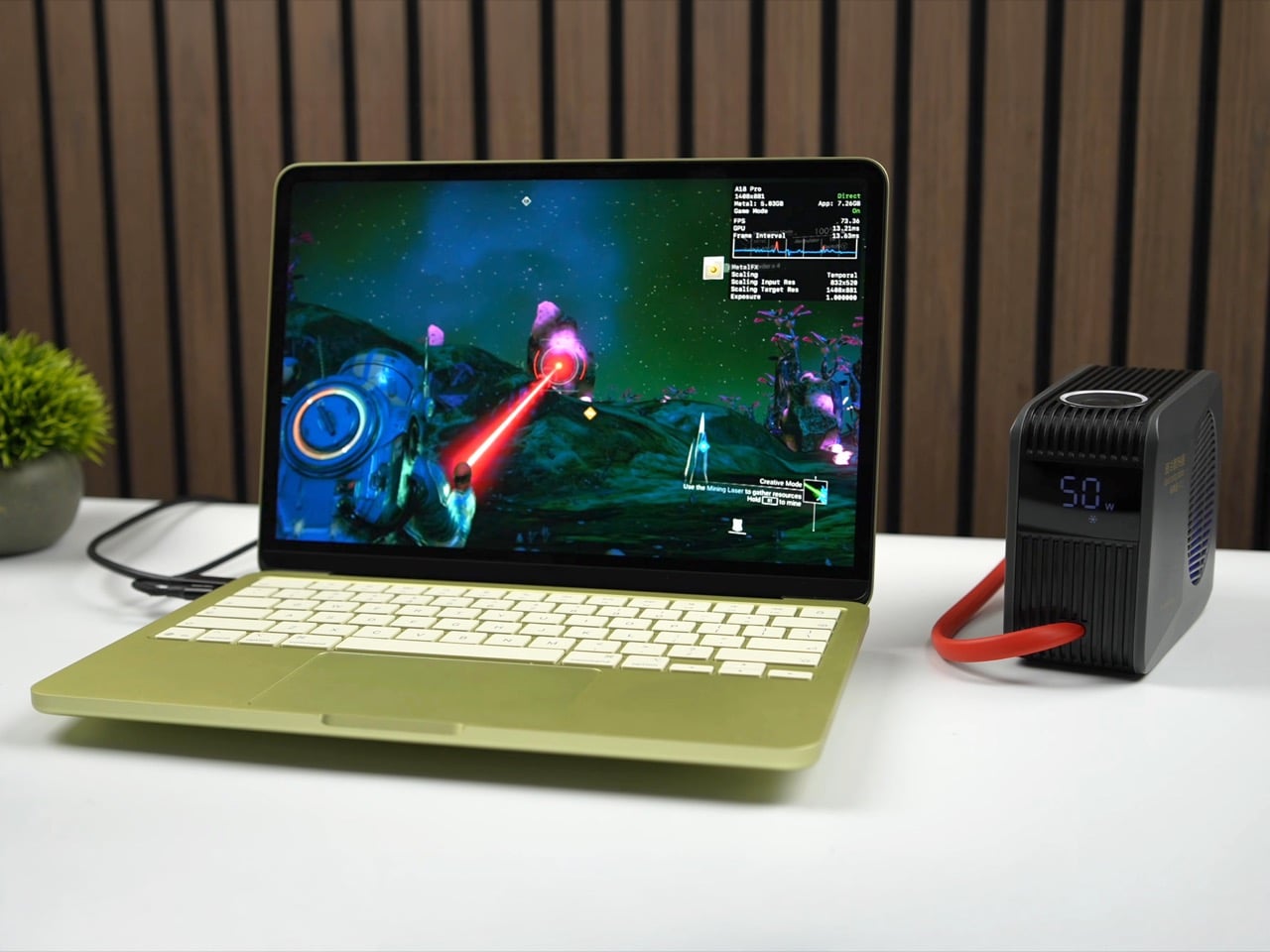
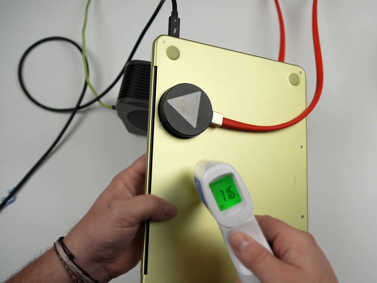
ETA Prime ran the experiment that every thermally curious engineer has probably daydreamed about: what happens when you actually cool this thing properly? First, a custom copper heat sink bridging the chip to the aluminum shell. Then a liquid-cooled thermoelectric Peltier unit clamped magnetically to the outside. Gaming framerates climbed from 30 to 80 FPS. Cinebench single-core jumped 23.5% over stock. The A18 Pro was never the bottleneck. The cooling was.
Designer: ETA PRIME
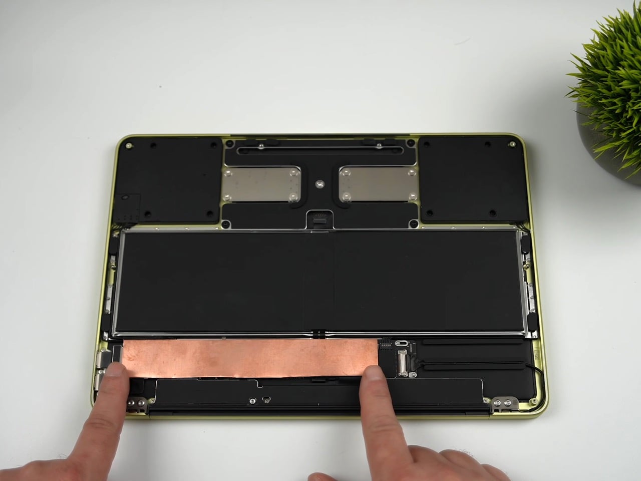
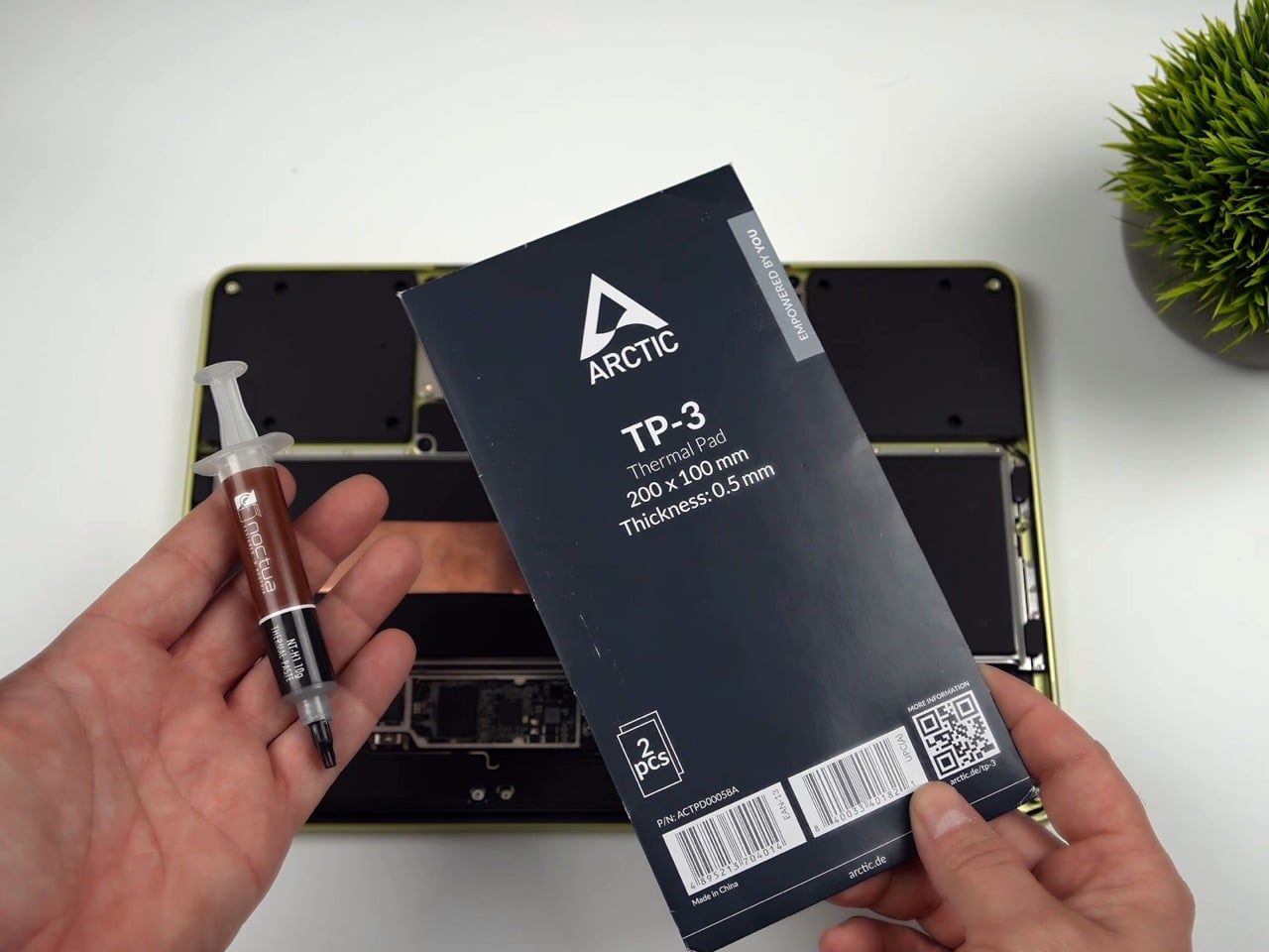
The copper heat sink is the more elegant of the two mods, and honestly the more important one. ETA Prime removed the stock graphene pad using a heat gun, cleaned the A18 Pro die with isopropyl alcohol, and applied Noctua thermal paste directly to the chip. A sheet of copper, cut to cover the full mainboard, sits on top. An Arctic TP3 thermal pad on the upper face of the copper makes contact with the MacBook Neo’s aluminum bottom shell when the screws are tightened back down, turning the entire chassis into a proper heat spreader. The graphene pad was cut in half and kept over the surrounding components for protection, but the CPU die itself is now in a real thermal pathway for the first time. With just this mod in place, No Man’s Sky jumped from 30-31 FPS to 58 FPS, average CPU temps dropped to around 83-84°C, and Geekbench 6 multi-core climbed 9.7% while single-core gained 15.2%. A sheet of copper and a tube of paste did what Apple’s entire thermal design could not.
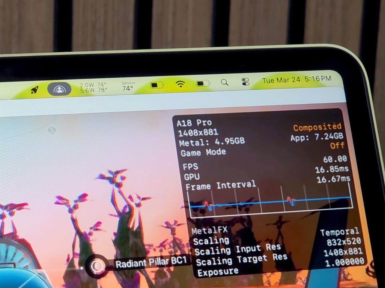
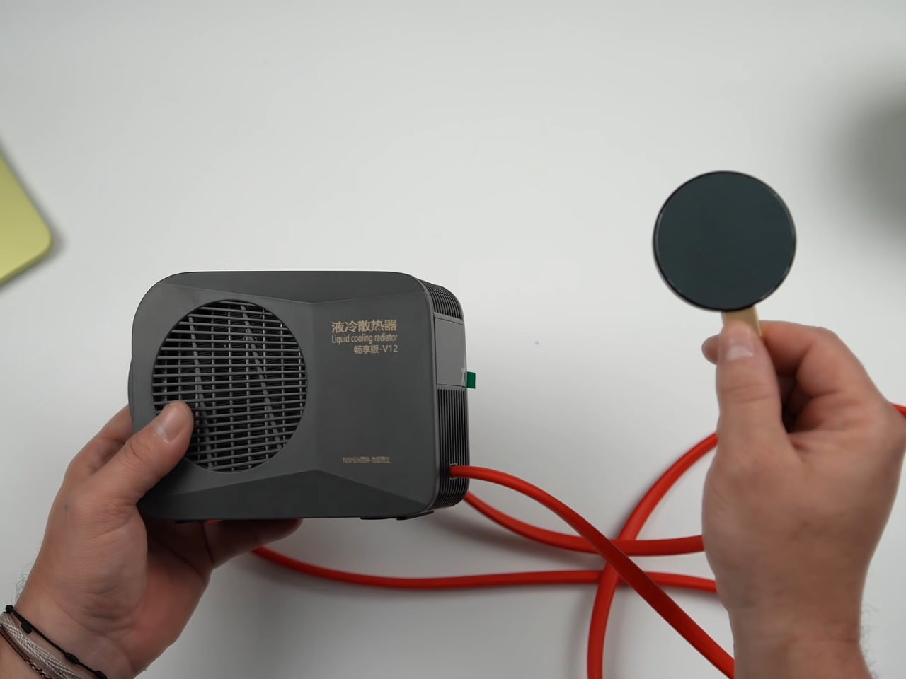
The Peltier cooler is the wilder addition, and it is admittedly overkill in the best possible way. The unit ETA Prime used was originally designed as a phone cooler, a liquid-cooled thermoelectric device with three power settings topping out at 50 watts. One side extracts heat, the other reaches below-freezing temperatures, and ice visibly forms on the cold plate within about a minute of operation. It attaches magnetically to the bottom of the Neo, aligning with the copper heat sink beneath the shell, and pulls the chip’s average idle temp down to 23°C. Under gaming load in No Man’s Sky, the CPU sat at roughly 74°C, and framerates held at 58-59 FPS with VSync engaged. Over a 30-minute sustained session, the machine averaged around 80 FPS at 1408×881 on enhanced settings with Metal scaling set to balanced, compared to the low 30s it would have delivered in stock form.
The benchmark gains with the full liquid cooling setup are worth spelling out. Geekbench 6 multi-core reached 9,394, an 18.6% improvement over the stock 7,921. Single-core hit 3,636, up 17.52%. Cinebench multi-core landed at 1,741 against a stock score of 1,462, a 19% gain, while single-core climbed from 502 to 620, a 23.51% improvement. ETA Prime also tested Fallout 4 running through Crossover, the compatibility layer that lets non-Mac titles run on Apple silicon, and the Neo held a consistent 60 FPS despite relying on SSD swap for additional memory beyond its 8GB ceiling.
The 8GB cap remains the machine’s most stubborn limitation, and no amount of copper or Peltier magic changes that. When the unified memory fills, the Neo starts leaning on SSD swap, which is slower and adds latency that thermal improvements cannot compensate for. It is a real constraint for anyone expecting to run memory-hungry titles at length. That said, the performance ETA Prime extracted here from a chip that costs less than many gaming peripherals is genuinely impressive, and the copper mod in particular requires no permanent modifications and costs almost nothing.
The Peltier is obviously not a portable solution. It draws significant power, runs a liquid loop, and magnetically attaches to the outside of the machine like a barnacle. But the copper mod absolutely is portable, costs next to nothing in materials, and on its own delivers close to double the sustained gaming performance. ETA Prime also tested Fallout 4 running through Crossover on the liquid-cooled setup, hitting a continuous 60 FPS despite the Neo’s 8GB RAM ceiling forcing the system to lean on SSD swap for additional memory. The A18 Pro has more headroom than Apple’s thermal design ever lets it show, and a sheet of copper is apparently all it takes to prove it.