When Data Says No And Your Gut Says Go: What Designers Can Learn From Ti Chang

Design Mindset, Yanko Design’s weekly podcast powered by KeyShot, is quickly becoming a space where designers unpack how ideas actually move from gut feeling to shipped product. Episode 13 zeroes in on something every creative feels but rarely names clearly: that inner voice that pulls you toward a risky idea long before the data looks friendly. Host Radhika Singh calls it “that mysterious inner voice that guides our best work,” the sensation when “data says one thing but something deeper says let’s try something else instead.” A new episode drops every week, and this one sits right at the intersection of intuition, taboo, and cultural change.

This time, Radhika speaks with industrial designer and entrepreneur Ti Chang, Co Founder and Chief Design Officer at CRAVE, the San Francisco company behind design led vibrators and “pleasure jewelry” for women. Ti has spent her career trusting her creative compass in one of the most stigmatized consumer categories. From Duet, an early crowdfunded USB rechargeable vibrator, to necklaces that double as vibrators, she keeps making moves that look commercially reckless on paper and then quietly create new product categories. The episode becomes a compact playbook for using intuition without abandoning rigor.

Download your Free Trial of KeyShot Here

Trusting your inner compass when no one else sees it

Ti does not treat intuition as a vague vibe. It is the core of how she decides what to make. “Intuition is something that have guided me throughout my process,” she says. Her first filter is simple: if a concept does not resonate deeply with her, it is unlikely to resonate with others. “If you follow your intuition to create something that resonates with you, there’s a much higher chance that you’ll resonate with somebody else.” She borrows that framing from Rick Rubin’s The Creative Act, but applies it in a very concrete way to industrial design.

Her career choices follow a three part test. “I’ve been able to find something that serves people and that I’m interested in and I have the skill set to do, and the marriage of these three is what has allowed me to I think have a quite a fulfilling life so far.” Intuition, for her, is not anti research. It is what tells you which questions to ask, which users to serve, and which ideas deserve the grind of engineering and validation. When Radhika asks what trusting that compass feels like, Ti is blunt: “It feels scary. It feels scary and it feels isolating because you’re the only person who sees it and nobody else quite understands it. And so for a long time, you’re going to just be in a scary kind of alone, a lonely spot.” Being early, she suggests, comes with that loneliness baked in.

Nudging culture from the middle, not the extremes

Designing for intimate wellness means walking a tightrope between too safe and too provocative. Ti describes her job as knowing her “playground.” On one edge are clinical, anonymous forms that keep taboos intact. On the other are objects so polarizing that they scare off the very people she wants to reach. Her goal is to live in the middle, where aesthetics are aspirational enough to move culture, but digestible enough that people actually buy and use them.

“You want to be able to nudge people along, bring them along with an aesthetic that they find acceptable and that they can digest, while all the while pushing, you know, aspirational and also creating room for a little more edginess, you know, without completely polarizing them.” She is clear about the commercial reality too. “If I created something that was just so polarizing, I’m sorry, like I would probably sell three a year, you know?” That is not just bad business, it is misaligned with her mission. “I know my playground. I know what will work for the agenda that I am trying to help people have a more open conversation about pleasure.” That agenda shapes choices around materials, silhouettes, and how proudly a product can sit on a bedside table without broadcasting its function.

Duet and pleasure jewelry, when “crazy” ideas become categories

CRAVE’s Duet is a neat case study in how Ti blends intuition with hard engineering. Long before USB everything became standard, she and her team asked why intimate products still relied on disposable batteries and clumsy chargers. The answer became a slim metal vibrator that plugged directly into a USB port, with the motor and electronics separated for safety and durability. This was 2008, pre Kickstarter playbook. Ti self funded prototypes, sourced metal work in China, and took early units to an adult products trade show. Instead of over indexing on focus groups, she watched buyer behavior. Immediate purchase orders were her market validation that the gut call was reading the culture correctly.

If Duet was bold, pleasure jewelry was the move that really made people think she had lost it. In the rapid fire round, when Radhika asks for “one decision you made on pure intuition that everyone thought was crazy,” Ti answers instantly: “Pleasure jewelry.” Turning necklaces and bracelets into fully functional vibrators that can be worn in public contradicted every convention in the category. Investors struggled to imagine why anyone would want their vibrator around their neck. Only once the pieces existed, and early adopters responded emotionally, did the idea begin to make sense to the market. Ti is careful not to claim that empowerment lives in the object. She rejects the notion that women must wear pleasure jewelry to feel powerful, framing empowerment as internal, with products as optional tools that some people find resonant and others simply do not.

Selling intuition to data driven stakeholders

A big chunk of value in this episode lies in how Ti translates a private hunch into something investors, engineers, and retailers can actually work with. Stakeholders do not fund “I have a feeling.” They fund roadmaps and artifacts. Visualization tools sit at the center of that bridge. KeyShot, the episode’s sponsor, is part of her daily workflow, letting her explore materials, textures, and finishes in real time. Those renders are not just for pitch decks. They help her test her own instinctive reaction to an object’s presence. In intimate categories, she often finds those visceral responses more useful than sanitized focus group quotes.

At the same time, she respects data enough to let it overrule her when the stakes are commercial rather than artistic. She laughs about being wrong on colors. “I’ve seen myself thinking like this color is going to be amazing. I’ve been wrong many times. And when you’re wrong with something as, like, in product, when it comes to color, you’re stuck with a lot of inventory and you do not want that. That is not good for business.” In a hypothetical startup challenge, where user testing clearly favors a more clinical aesthetic over a playful one the designer loves, she is clear. If this is not an art project, you ship what users are ready for. Yet she refuses to let numbers become the only voice. Asked what designers who only trust data are missing, her answer is sharp and short: “Missing their heart and soul.”

Prototyping life, not just products

Later in the conversation, Ti talks about being diagnosed with ADHD and autism as an adult. Hyperfocus on topics like gender equality, pleasure activism, and emotional design has been a quiet engine behind her work, letting her stay with difficult ideas long after others would have moved on. The flip side is that when she is not deeply interested, progress stalls. Instead of fighting this, she now uses it as part of her compass, choosing projects she knows she can stay obsessed with for years.

Underneath all the specifics of sex tech and crowdfunding, the operating system stays the same. When you cannot see the full path, you prototype. Ti treats “try, learn, iterate” as both a design tactic and a way to navigate an unconventional career. When Radhika asks if she would still design something her intuition loves even if she knows it will not sell, Ti says yes, “if I think it’s going to be a fun journey.” Some ideas exist to move markets. Some exist to keep the creative self alive. Episode 12 of Design Mindset captures that balance cleanly, showing intuition not as the opposite of research, but as the spark that tells you which risks are worth taking in the first place.


Listen to the full conversation on Design Mindset (powered by KeyShot), available every week on YouTube, to hear more insights from one of the industry’s most decorated design leaders.

Download your Free Trial of KeyShot Here

The post When Data Says No And Your Gut Says Go: What Designers Can Learn From Ti Chang first appeared on Yanko Design.
Hiroshi Fujiwara’s TAG Heuer Carrera Chronograph Is Minimalism With Purpose

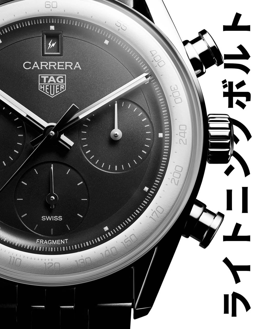
What happens when a Swiss racing watch is redesigned by the godfather of Japanese street culture? TAG Heuer answers that question with the Carrera Chronograph x Fragment Limited Edition, a collaboration with Hiroshi Fujiwara that transforms the brand’s flagship racing chronograph into something that looks more at home paired with Japanese selvedge denim and minimalist sneakers than pit-lane timing equipment.

Designer: TAG Heuer + Hiroshi Fujiwara

This is TAG Heuer’s third partnership with Fujiwara’s Fragment label, following earlier Carrera and Autavia projects, and it represents the most thorough application of his design philosophy to date. Fujiwara built Fragment into a cult streetwear imprint over decades of work in Tokyo’s fashion underground, and his aesthetic has always favored reduction over addition. The result is a chronograph that reads as much like a gallery piece as a timing instrument.

From Tool Watch to Tuxedo

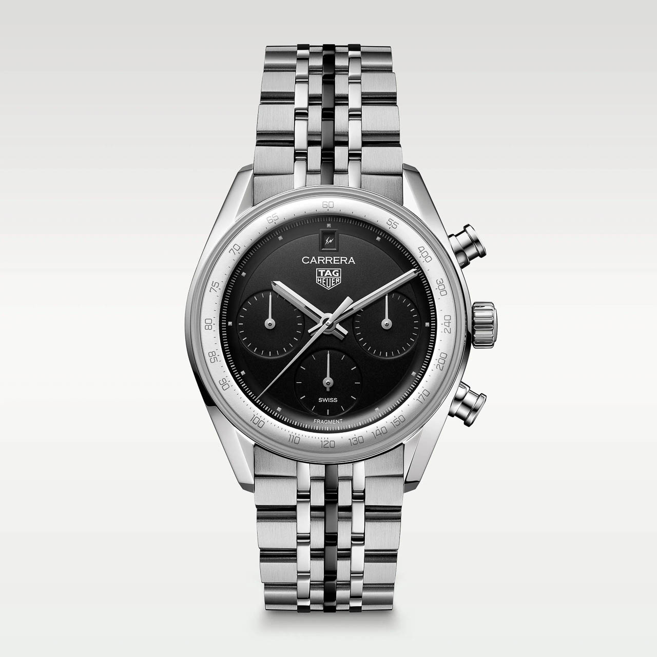
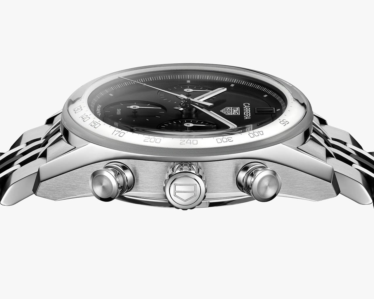
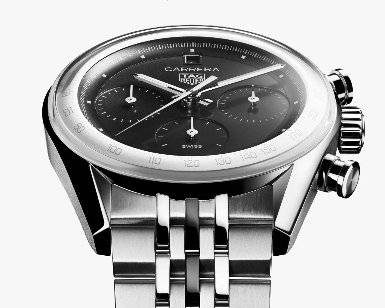
The visual transformation begins with the glassbox crystal, a boxed sapphire design that gives the watch a more polished, architectural presence than traditional tool-watch bezels allow. Underneath sits a matte black opaline dial paired with a chalk-white raised flange carrying a silver tachymeter scale. The combination is loosely reminiscent of a tuxedo dial, formal and restrained where most chronographs lean into busy, information-dense layouts.

Fujiwara’s most striking intervention is the near-total elimination of numerals. The subdials lose their snailing texture and numeric markers entirely, replaced by pure graphic dashes: 12 on the small seconds, 30 on the minute counter, 24 on the hour totalizer. These read as abstract timing scales rather than conventional registers, turning functional displays into visual rhythm.

The standard baton hour markers disappear as well, replaced by tiny raised white pyramidal dots finished with gray Super-LumiNova. Even the lume dots that typically run along the seconds track are gone, leaving the dial remarkably clean.

Where the standard glassbox Carrera reads as a refined sports watch, the Fragment edition presents itself as something closer to wearable industrial design. The dial still reads unmistakably as a Carrera: the proportions, the subdial layout, the tachymeter flange all telegraph the model’s identity. But the calm, logo-light execution feels gallery-ready in a way few limited editions achieve. This is minimalism with purpose, not minimalism as marketing shorthand.

Hidden Graphics: The Fragment Easter Eggs

Fragment collaborations have always rewarded close looking, and this watch continues that tradition through subtle logo placement. Previous Fragment x TAG pieces positioned the double-bolt Fragment logo at 12 o’clock, but the glassbox Carrera places its date window at that position. Rather than abandon the signature branding, Fujiwara moves it into the date wheel itself: on the first of each month, a single lightning bolt appears in the date window, and on the 11th, the full Fragment double-bolt logo takes its place. The calendar becomes a hidden Easter egg, a detail that only reveals itself twice monthly and rewards those who know to look.

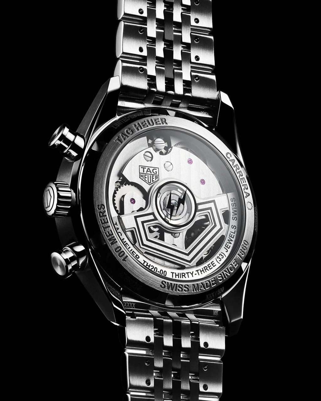
Fragment’s name appears as printed text at 6 o’clock on the dial, while the full double-bolt-in-circle logo occupies the sapphire exhibition caseback. The center links of the seven-link steel bracelet receive black PVD coating, echoing the blacked-out aesthetic that Fragment fans recognize from countless sneaker and apparel collaborations.

The fun here is not in loud colors or obvious branding but in discovering these almost-secret cues over time. Wearing the watch becomes an ongoing conversation with its design, a quality that aligns perfectly with Fragment’s approach to product collaborations across fashion, footwear, and now horology.

Serious Watch, Playful Surface

Beneath the minimalist aesthetic sits genuine horological engineering. The TH20-00 automatic movement features a column wheel and vertical clutch, representing TAG Heuer’s modern approach to chronograph mechanics. The 4 Hz beat rate enables smooth seconds-hand sweep, while the 80-hour power reserve means the watch can sit unworn over a long weekend and still keep time when picked up Monday morning. The 39 mm stainless steel case hits a sweet spot for contemporary tastes: large enough to read clearly but compact enough to slide under a shirt cuff. Water resistance reaches 100 meters, positioning this as a genuine daily-wear chronograph rather than a display-only collectible.

The engineering backbone matters because it anchors the aesthetic story. This is not a fashion watch with movement as afterthought, but a serious chronograph that happens to wear a limited-edition design collaboration on its surface.

Context for Design Enthusiasts

Compared to past Fragment x TAG pieces, this edition pushes furthest into reduction. Earlier collaborations applied Fragment’s aesthetic to vintage-inspired designs, but the glassbox Carrera is already a contemporary reinterpretation, and Fujiwara’s work here strips it even further. Where other Japanese-inspired limited editions in watchmaking have experimented with color, texture, or material contrasts, this one commits to graphic restraint as its central idea.

Limited to 500 pieces at $9,050, with pre-orders opening December 3 at 6:00 AM, the Carrera Chronograph x Fragment Limited Edition arrives individually numbered on the caseback ring. Each comes on the steel seven-link bracelet with butterfly clasp, no strap alternatives offered.

The watch poses a question worth considering: Is this the future of high-end collaborations? Fashion designers have traditionally brought color palettes and material experiments to watch partnerships. Fujiwara instead quietly rewrites the visual language of an iconic object, keeping its proportions, its engineering, and its heritage while fundamentally shifting how it communicates.

The post Hiroshi Fujiwara’s TAG Heuer Carrera Chronograph Is Minimalism With Purpose first appeared on Yanko Design.
This Rugged Braille Reader for Kids Has a Built-In Carry Handle

Blind students often rely on expensive embossers, special paper, and slow production cycles just to get a few Braille books. Most assistive tools are bulky, fragile, or designed for adults sitting at desks, not children carrying them between crowded classrooms and shoving them into backpacks. There is a clear gap between what visually impaired kids actually need and what most assistive hardware looks and feels like on a daily basis.

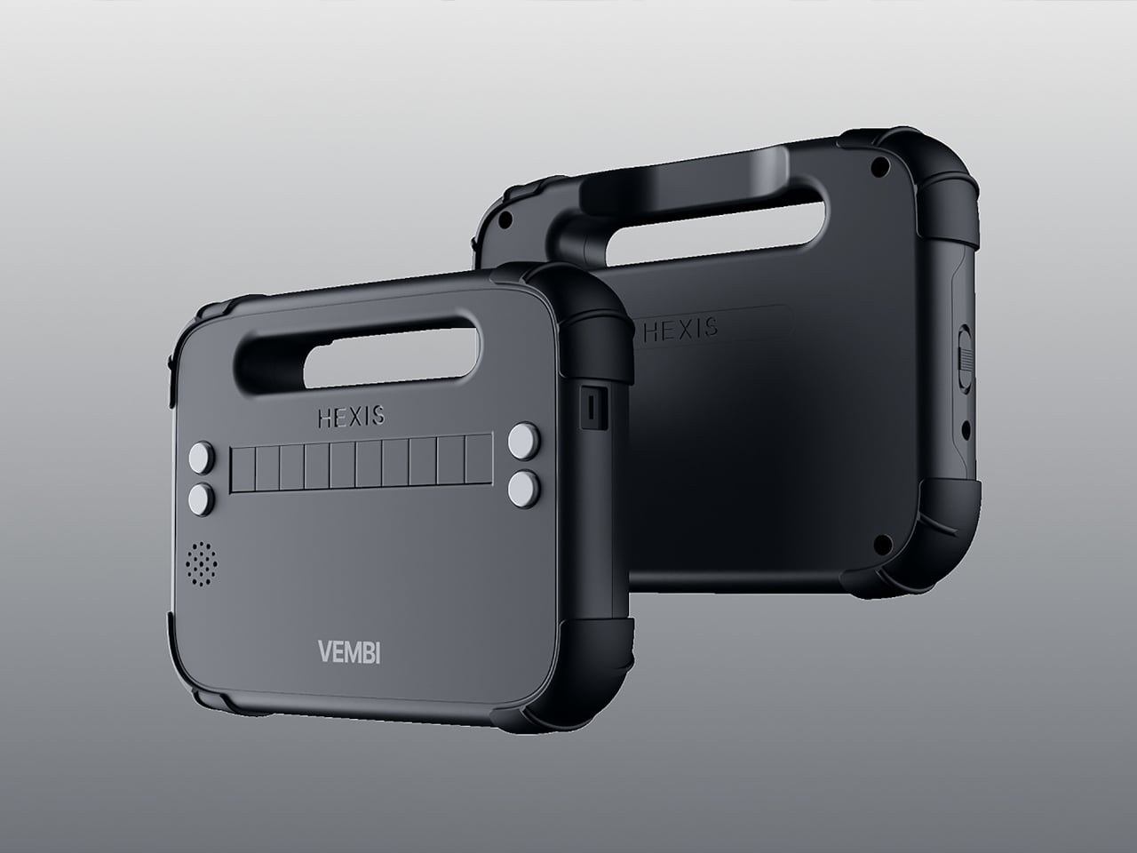
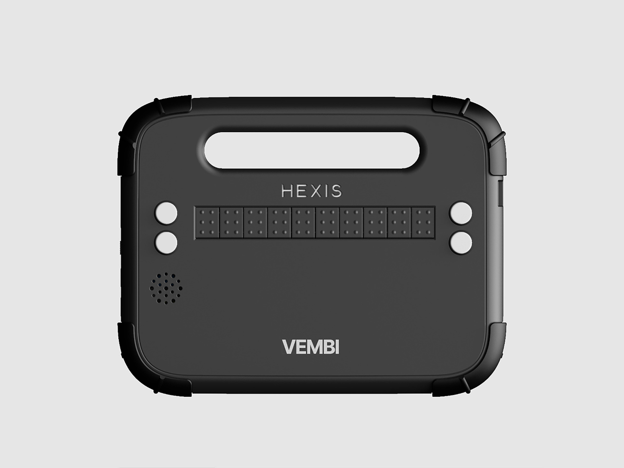
Vembi Hexis is a Braille reader purpose-built for children by Bengaluru-based Vembi Technologies, with industrial design by Bang Design. It turns digital textbooks, class notes, and stories into lines of Braille on demand across multiple Indian languages and English. The device had to be rugged enough for school bags, affordable enough for institutions to buy in quantity, and portable enough that children would actually want to carry it around.

Designer: Bang Design

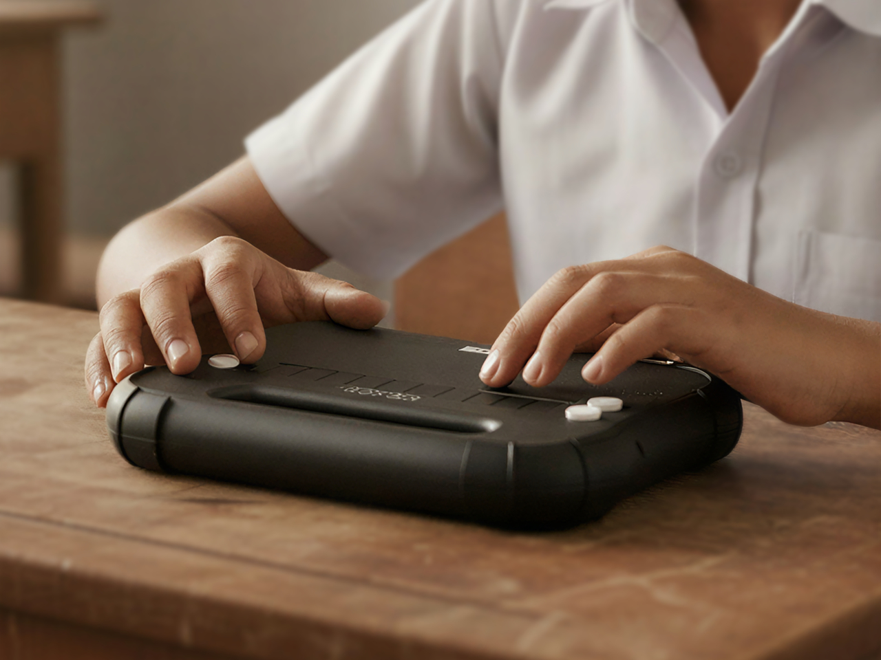
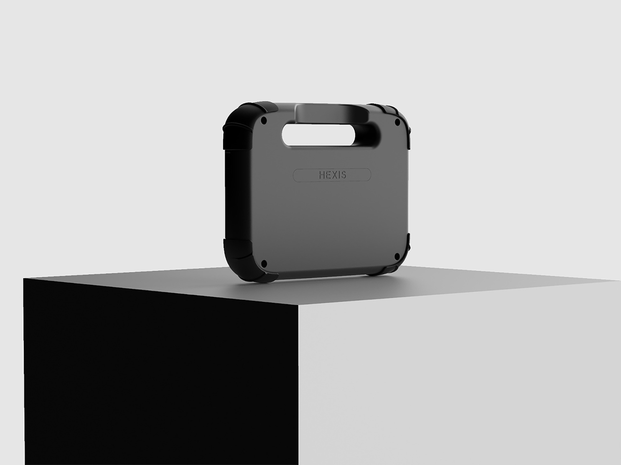
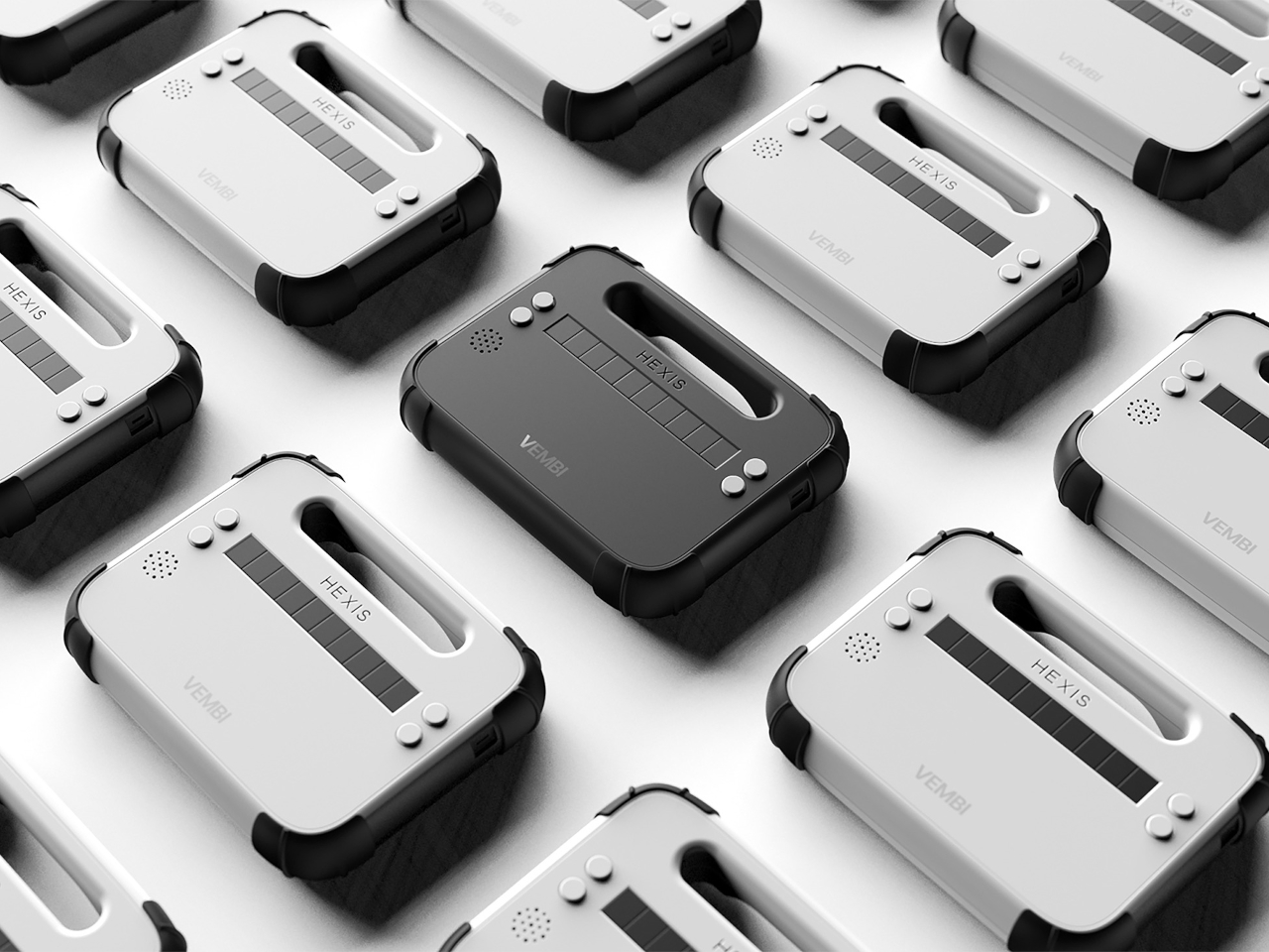
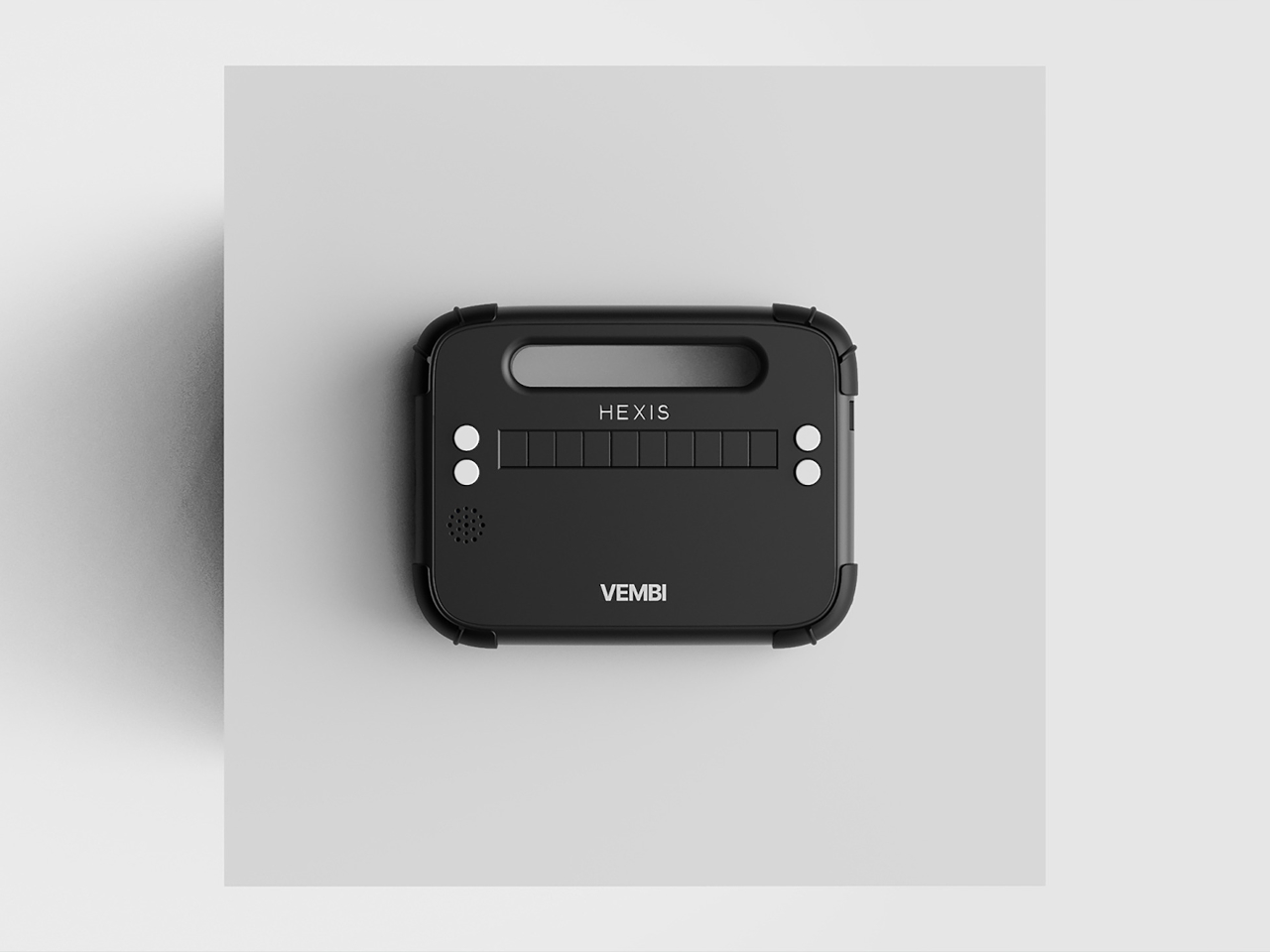
The device is a compact, rounded rectangle with softened corners and thick bumpers that make it feel closer to a rugged tablet than a medical device. The front face is dominated by a horizontal Braille display bar, with a small speaker grille and simple control buttons kept out of the way. Branding is minimal, just small HEXIS and VEMBI marks, so the object reads as a tool for kids first rather than a piece of institutional equipment.

A built-in carry handle is carved cleanly through the top of the shell, giving children a clear place to grab and slide their hand into without straps or clip-on parts. The reading surface is sculpted with a gentle slope leading toward the Braille cells in the reading direction and a sharper drop at the far edge. Those height changes quietly guide fingers along each line and signal where to stop without needing any visual feedback at all.

The durability details acknowledge that classrooms are not gentle places. Corner bumpers extend slightly beyond the body to absorb drops from school desks, the shell is thick enough to shrug off everyday knocks, and charging ports are recessed and shielded to resist spills. This is a device meant to survive water bottles, lunch boxes, crowded bags, and everything else that happens in a normal school day without feeling like a heavy brick.

Bang Design studied how children read Braille in real schools and designed every surface with heightened touch in mind. The soft geometry avoids sharp edges that could become uncomfortable during long reading sessions, while the slope and drop around the display give constant orientation feedback. For kids who navigate the world through their fingers, those subtle contours become part of the interface just as much as the moving dots themselves.

Hexis connects over Wi-Fi to Vembi’s Antara cloud platform so teachers and foundations can push textbooks, notes, and stories directly to devices. It supports multiple Indian languages and has been widely adopted across schools and NGOs, picking up recognition from programs like Microsoft’s AI for Accessibility Grant and Elevate 100. Those signals show that the design is not just elegant on paper but is actually working in classrooms and special education centers.

Assistive technology for children rarely gets the same design attention as mainstream classroom tools, but Hexis treats ruggedness, affordability, and friendly form as equally important constraints. For blind students, having a Braille reader that feels like a normal classroom companion rather than an exception is a quiet but meaningful shift. Hexis sits in school bags next to pencil cases and notebooks, looking and feeling like it belongs there instead of standing out as something separate or clinical.

The post This Rugged Braille Reader for Kids Has a Built-In Carry Handle first appeared on Yanko Design.
This Fire Extinguisher Might Actually Make You Want One at Home

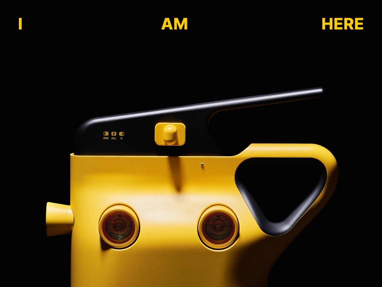
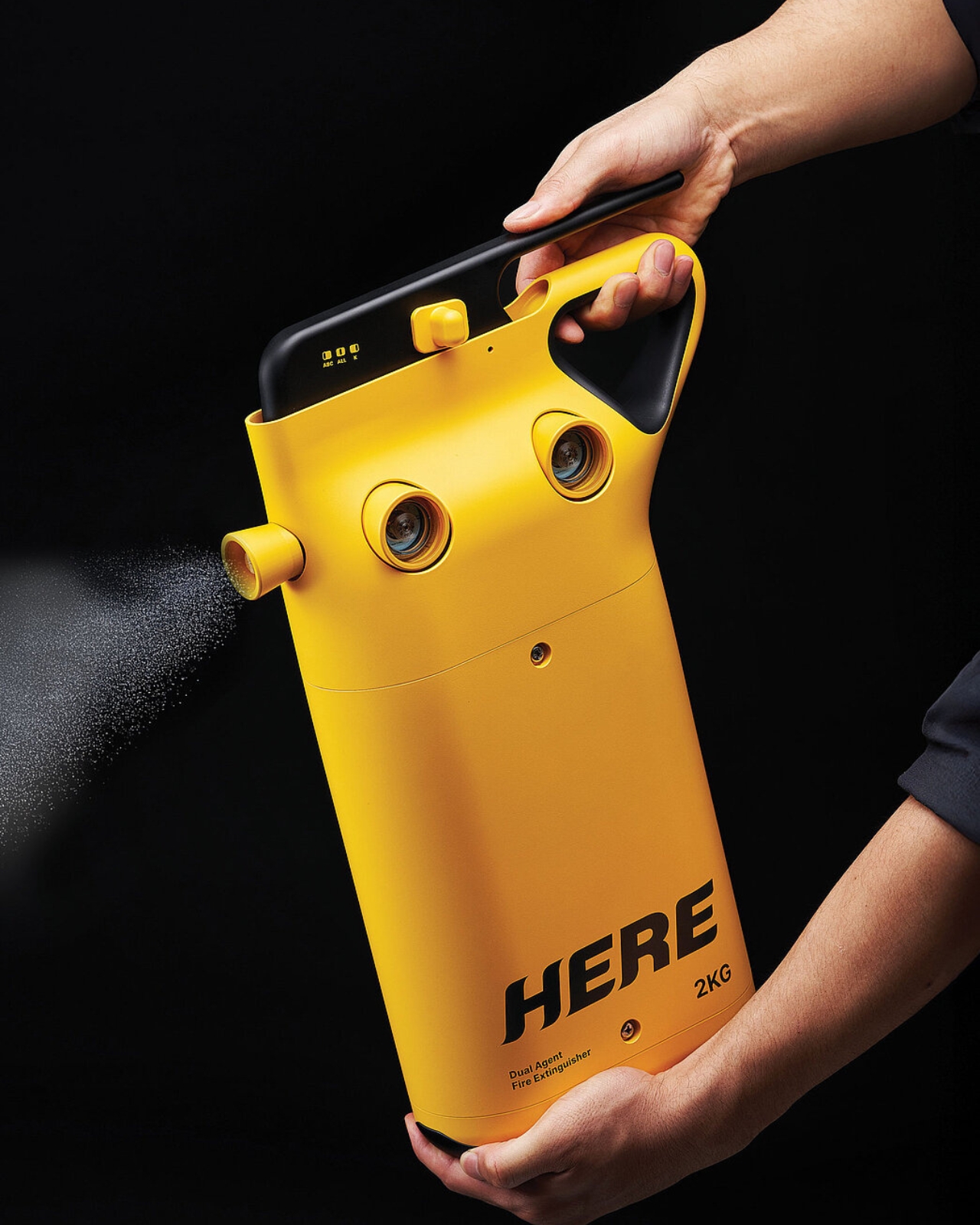
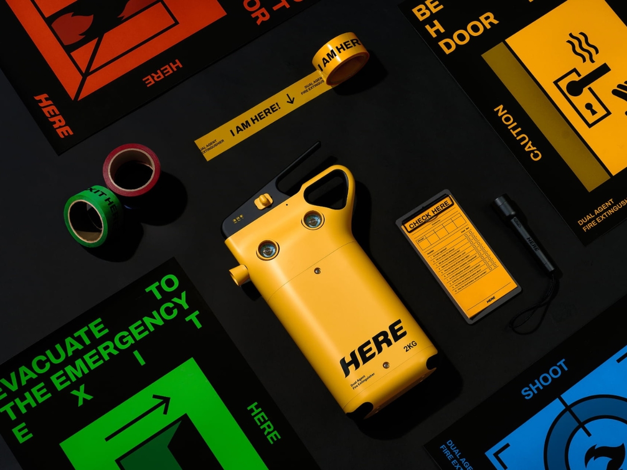
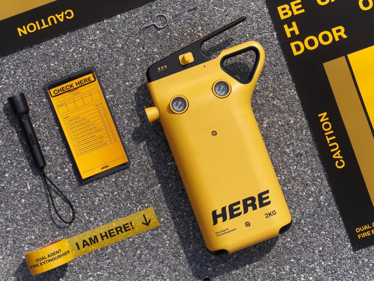
Let’s be honest, fire extinguishers are one of those things we know we should have but rarely think about until we actually need one. They’re bulky, confusing, and usually tucked away somewhere collecting dust. But what if a fire extinguisher could be both smarter and easier to use? That’s exactly what designers Song Kyuho and Kim Jungu set out to create with HERE, a dual-agent fire extinguisher that’s rethinking safety equipment for modern life.

The problem with traditional fire extinguishers is pretty straightforward. That standard red canister sitting in your hallway might work great for a paper fire, but it could be completely useless against a kitchen grease fire. Different fires need different solutions, which technically means you should have multiple extinguishers throughout your home. But realistically, who does that? It’s expensive, takes up space, and adds another layer of complexity when you’re already panicking because something’s on fire.

Designers: Song Kyuho and Kim Jungu for Found Founded

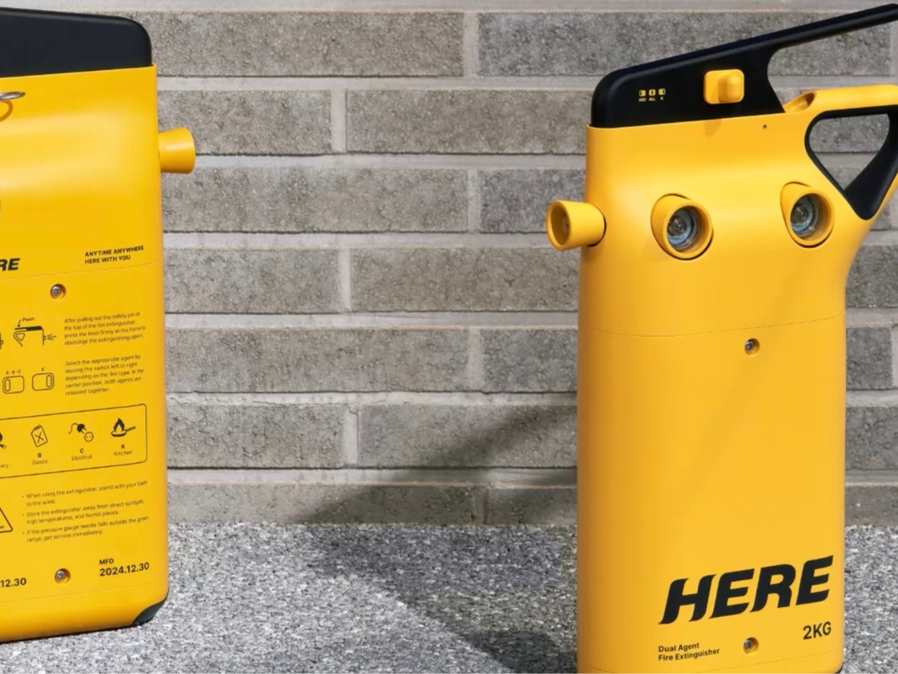
HERE tackles this head-on with an ingenious dual-chamber design. Inside this single unit, you’ve got ABC powder for general fires like wood, paper, and electrical blazes, plus a liquid agent specifically designed for kitchen fires involving cooking oil. Think about how much safer that makes your home. When that pan of oil overheats, you’re not stuck frantically trying to remember which extinguisher works for which fire type. You’ve got both options literally at your fingertips.

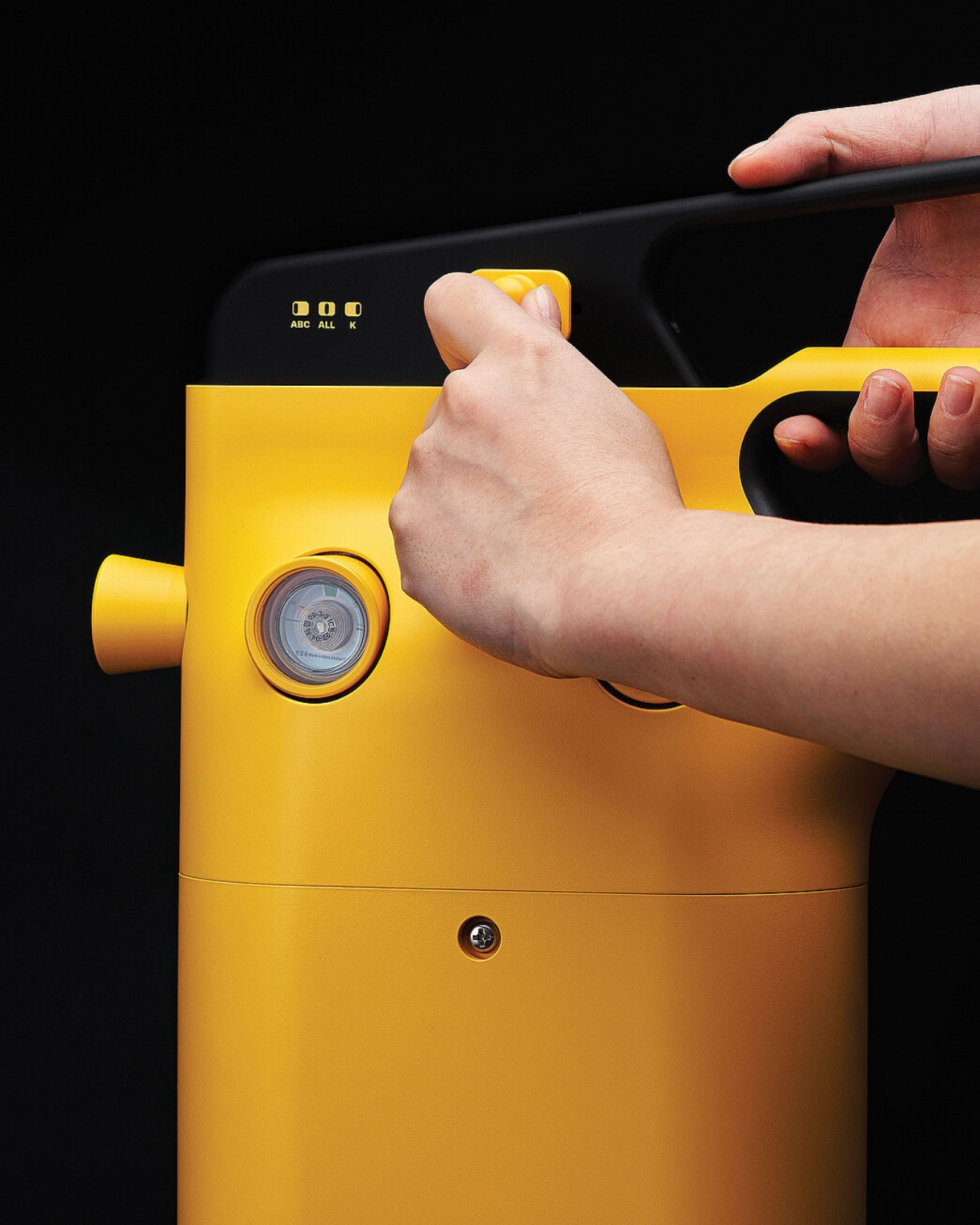
What really stands out is how intuitive the whole system is. There’s a single lever operation, but you can choose which agent to deploy or use both simultaneously. Small indicator lights labeled ABC, ALL, and K make it crystal clear which option you’re selecting. In an emergency situation, that kind of clarity matters. You’re not reading lengthy instructions or second-guessing yourself. You grab it, select what you need, and go.

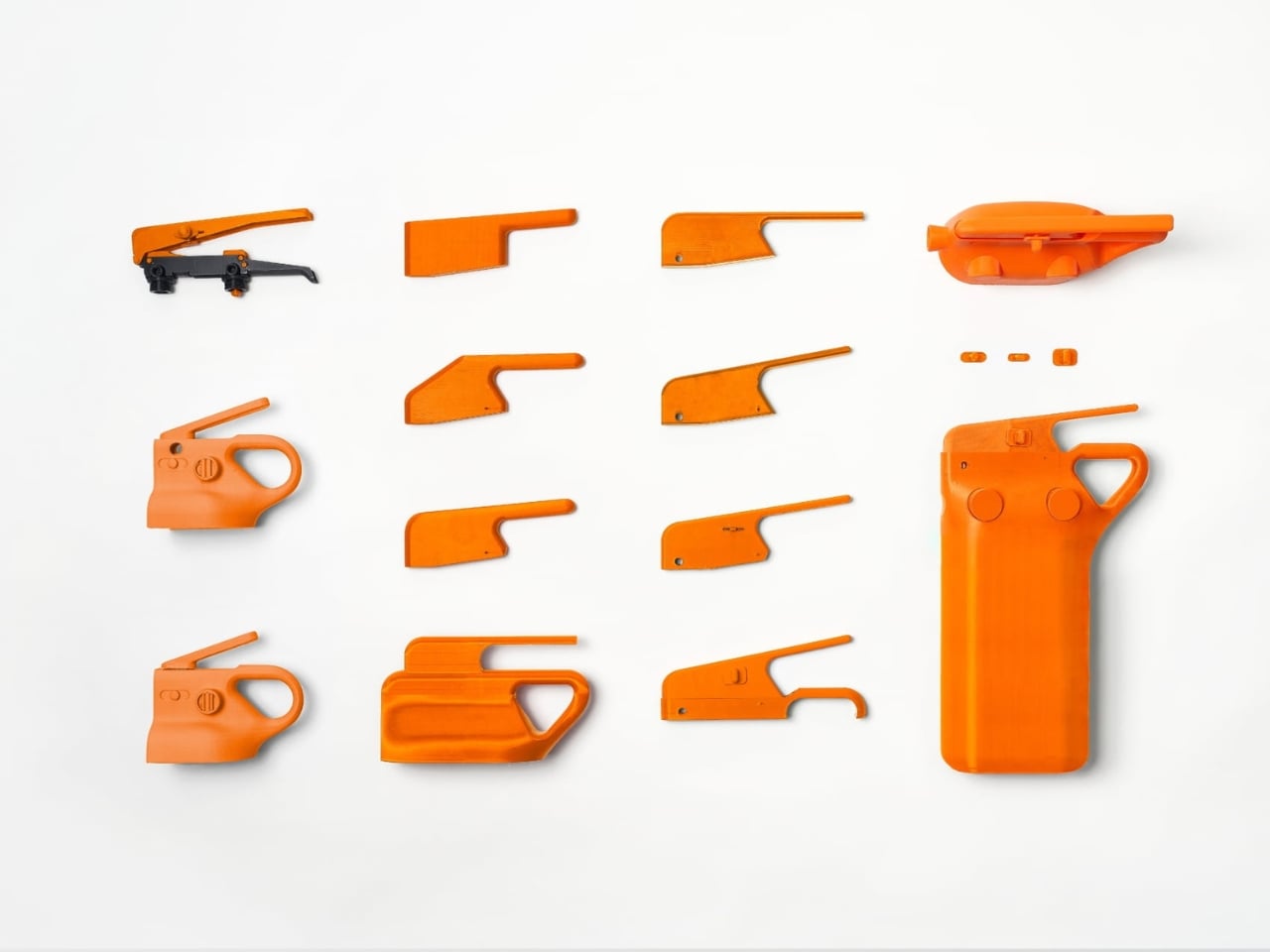
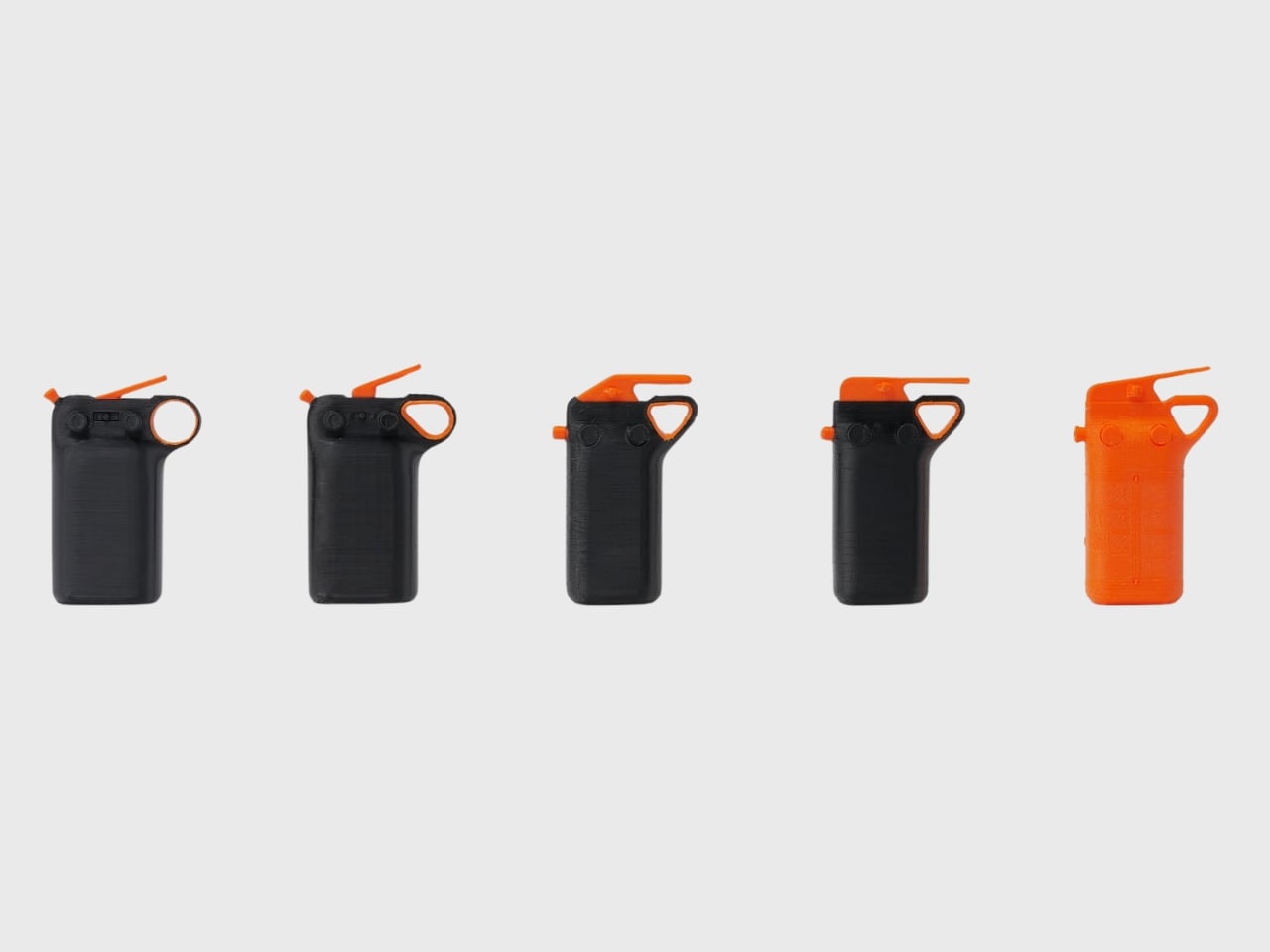
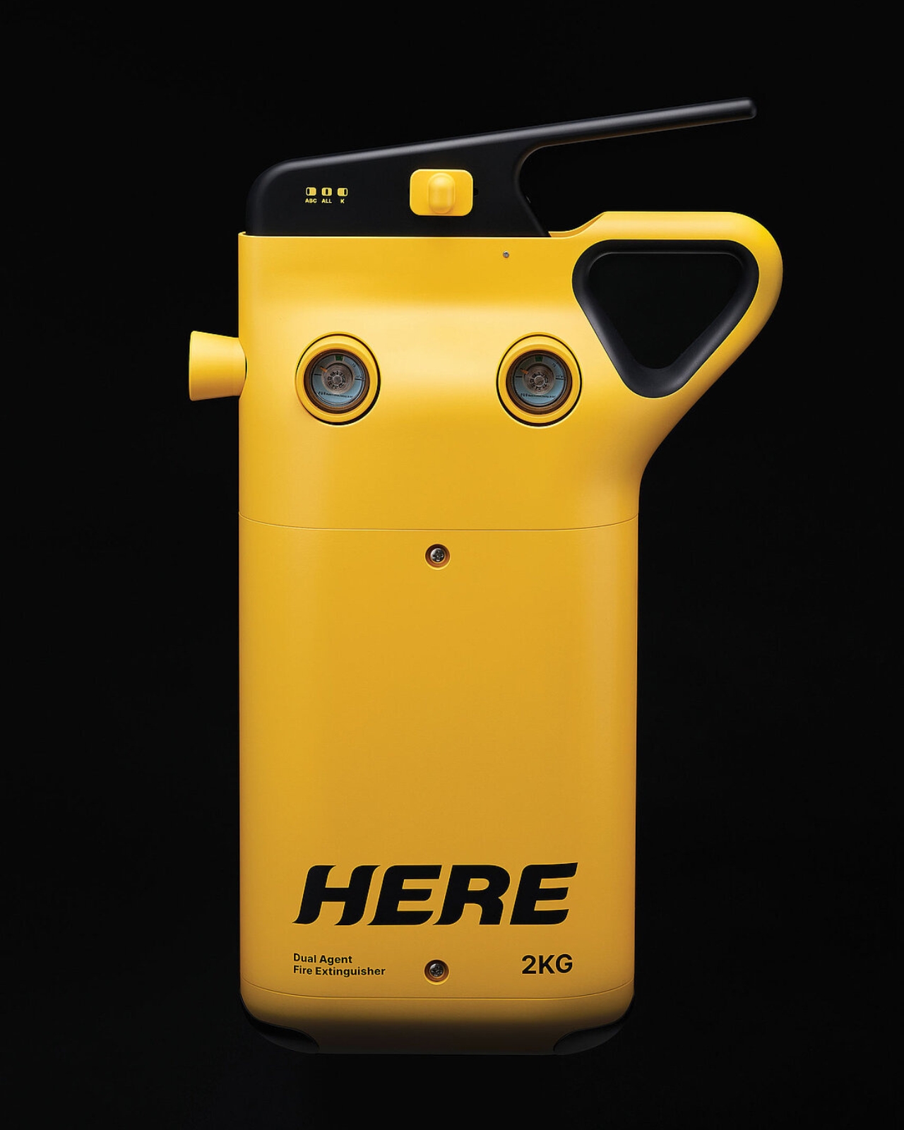
But here’s where the design gets really interesting. Anyone who’s ever handled a fire extinguisher knows they’re not exactly user-friendly. They’re heavy, awkward to grip, and honestly kind of intimidating. The designers didn’t just solve the dual-agent challenge, they completely reconsidered how we interact with these devices. That distinctive triangular grip you see wrapping around the canister? That’s the result of extensive usability testing with 30 different people.

The testing revealed something important. When you’re dealing with a required minimum of 2 kilograms of extinguishing agent, the weight becomes a serious usability issue. Traditional designs put all that strain on your wrist and back. The ergonomic handle on HERE distributes the weight more naturally, making it genuinely easier for anyone to use, regardless of their size or strength. It’s the kind of thoughtful detail that separates good design from great design.

Let’s talk about the aesthetics too, because they matter more than you might think. Fire extinguishers have traditionally been designed to be noticed in emergencies, hence the bright red. But that often means they’re eyesores you want to hide. HERE takes a different approach with its vibrant yellow body and sleek, almost gadget-like appearance. It looks modern, approachable, and honestly pretty cool. The bold branding and clean lines give it a contemporary tech product vibe rather than industrial safety equipment.

Those two circular gauge windows on the front add a touch of personality while serving a practical purpose, letting you monitor the pressure levels at a glance. The overall form is surprisingly compact considering it houses two separate agent systems. It’s the kind of object you might not mind keeping visible in your kitchen or hallway. This project earned recognition at the Red Dot Design Awards, and it’s easy to see why. It represents exactly the kind of innovation we need in everyday safety products. The designers identified real pain points (multiple extinguisher types, difficult operation, poor ergonomics) and delivered solutions that make the product genuinely better without overcomplicating it.

Since we’re at the time now where we’re constantly redesigning everything from doorknobs to kitchen appliances, it’s refreshing to see safety equipment getting the same thoughtful treatment. HERE proves that even something as utilitarian as a fire extinguisher can be smarter, more beautiful, and more human-centered. It’s a reminder that good design isn’t just about aesthetics or clever features. It’s about making things work better for real people in real situations, especially when those situations might save lives.

The post This Fire Extinguisher Might Actually Make You Want One at Home first appeared on Yanko Design.

7 Best Aroma Diffusers To Gift Design Lovers This Year

Finding the perfect gift for someone with an eye for design means looking beyond function alone. The best presents merge utility with artistry, transforming everyday rituals into moments worth savoring. Aroma diffusers have evolved far beyond their utilitarian origins, becoming sculptural objects that command attention while subtly enhancing the atmosphere of any room they inhabit.

This year’s standout diffusers represent a fascinating shift in how we think about home fragrance. These aren’t plug-and-forget devices tucked away on shelves. They’re conversation pieces, meditative objects, and design statements that happen to fill spaces with captivating scents. From Japanese porcelain craftsmanship to volcanic rock simplicity, each piece on this list brings something genuinely special to the table for anyone who appreciates thoughtful design.

1. Miniature Bonfire Wood Diffuser Set

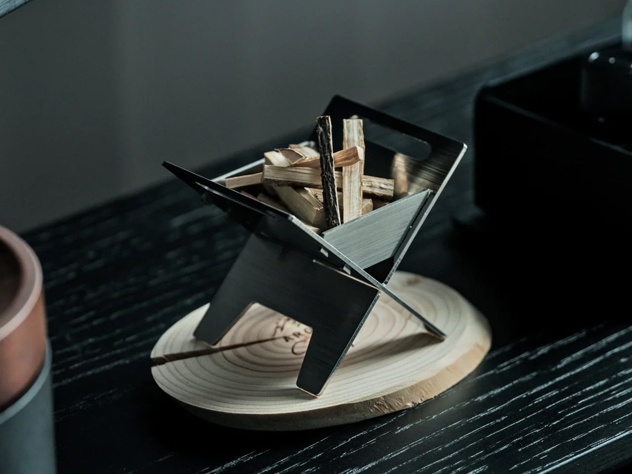
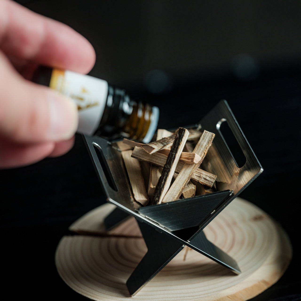
Imagine capturing the essence of a mountain campfire and bringing it indoors without smoke, flame, or fuss. This miniature bonfire diffuser reimagines outdoor serenity as a desktop sculpture, complete with tiny stainless steel firewood pieces that hold and disperse aromatic oils. The design evokes our primal connection with fire while delivering fragrance through a surprisingly gentle mechanism that mimics the movement of forest breezes, rather than mechanical misting.

The rust-resistant stainless steel construction gives this piece genuine heft and durability, making it feel like an heirloom rather than a gadget. What sets it apart is the playful functionality—those miniature logs bundle together with an actual tying knot, and the included trivets transform your diffuser into a working pocket stove for heating small treats. It’s a gift that invites interaction, storytelling, and a bit of indoor adventure for design lovers who appreciate objects with multiple lives.

Click Here to Buy Now: $99.00

What we like

  • The sculptural quality of bundled steel firewood creates an instant focal point on any surface.
  • The Mt. Hakusan-inspired essential oil captures authentic mountain forest character.
  • Trivets add genuine cooking functionality beyond simply diffusing fragrance.
  • The rust-resistant construction ensures this piece will maintain its finish through years of daily use.

What we dislike

  • The open design means oil evaporation happens faster than in enclosed systems.
  • Refilling individual firewood pieces requires more frequent attention than reservoir-based diffusers.

2. 3-in-1 Luminous Mirror Diffuser

Most diffusers ask you to find space for yet another object on your counter. This one replaces three items you already own with a single, elegantly engineered piece. The Luminous Mirror Diffuser combines precision lighting, a shadow-free mirror, and aroma diffusion into one cohesive form that elevates morning routines and evening rituals alike. Created by the same designer behind a best-selling battery-free diffuser, this piece brings that same thoughtful approach to a more complex challenge.

The lighting system offers three distinct color temperatures ranging from warm 2400K relaxation tones to crisp 6000K daylight clarity, each with four brightness adjustments. The advanced reflected light technology eliminates harsh shadows, creating the kind of even illumination that makes grooming tasks feel effortless. For design lovers who value objects that solve multiple problems with grace, this represents the kind of thoughtful integration that defines exceptional product design in our current era.

Click Here to Buy Now: $799.00

What we like

  • Three distinct functions merge into one cohesive object that saves counter space.
  • Shadow-free lighting technology delivers professional-quality illumination for detailed tasks.
  • Multiple color temperatures and brightness levels adapt to different moods and activities.
  • The design pedigree from an award-winning creator ensures quality engineering throughout.

What we dislike

  • The complexity of multiple functions means a higher price point than single-purpose diffusers.
  • More features translate to more components that could potentially need maintenance over time.

3. LITH Volcanic Rock Diffuser

Sometimes the most compelling design solution is the one that strips away everything unnecessary. LITH takes aromatherapy back to pure elemental principles—porous volcanic rock, essential oil, and natural air currents. No electricity, no batteries, no fire hazards, just geology doing what it does best. You place drops of oil on the volcanic stone, and its naturally absorbent surface slowly releases fragrance through simple evaporation, carried by whatever breeze moves through your space.

The volcanic rock sits atop a spiraling cone crafted from acrylic resin, mica, and jesmonite dye, creating a miniature mountain that balances gentle scent with dramatic visual presence. This juxtaposition between peaceful aroma and volcanic power creates an interesting tension that gives the piece real personality. For design enthusiasts who appreciate minimalist approaches and natural materials, LITH offers a refreshingly unplugged alternative to tech-heavy solutions that demand charging cables and app interfaces.

What we like

  • Zero power requirements mean complete portability and placement freedom anywhere in a space.
  • Natural volcanic rock brings genuine geological character to the design.
  • The spiral cone form creates a striking visual impact that elevates beyond typical diffuser aesthetics.
  • No mechanical parts means virtually nothing can break or need replacement.

What we dislike

  • Scent diffusion relies entirely on natural airflow, making coverage unpredictable in still environments.
  • The volcanic rock will need periodic replacement as pores become saturated over extended use.

4. ZenFlow Personal Aroma Diffuser

Japanese craftsmanship meets cutting-edge technology in this diffuser that treats fragrance as an art form deserving of precision engineering. ZenFlow combines 180 years of Shibukusa Ryuzo porcelain tradition with hybrid heat and airflow systems that distribute scent without water or mist. Each handcrafted porcelain filter represents genuine artisanal heritage, while the anodized metal base in silver, gold, or black finishes adapts to virtually any interior aesthetic from minimalist to traditional.

The three adjustable modes offer real versatility—Normal Mode for full diffusion, Airflow Mode for whisper-quiet operation, and ECO Mode for extended battery life. This battery-powered portability means you can move the diffuser from desk to bedside to outdoor patio without hunting for outlets. For design lovers who appreciate objects where heritage craft and modern technology genuinely enhance each other rather than compete, ZenFlow represents a particularly satisfying synthesis of old and new approaches.

Click Here to Buy Now: $169.00

What we like

  • Handcrafted porcelain filters bring authentic Japanese artisan tradition to daily use.
  • Water-free operation eliminates misting issues and maintenance concerns.
  • Three distinct modes adapt performance to different needs and environments.
  • Portable battery power provides true freedom of placement anywhere.

What we dislike

  • Porcelain filters may require replacement over time as essential oils gradually saturate the material.
  • The premium craftsmanship and technology combination commands a higher investment than basic diffusers.

5. MAN BAN Smart Aromatherapy Diffuser

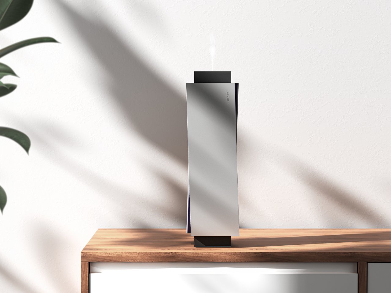
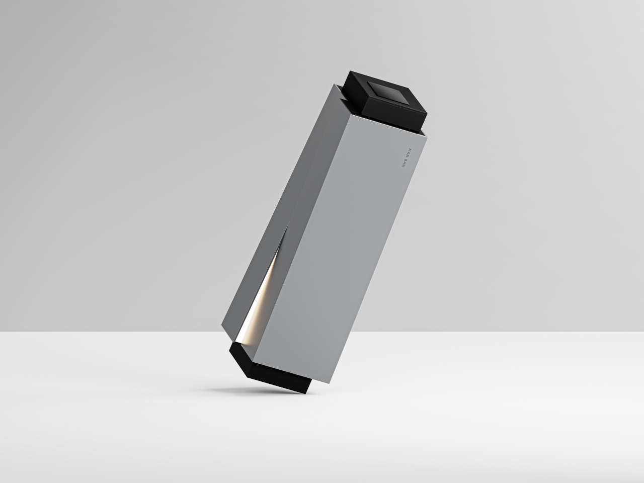
Most diffusers hide their mechanical nature behind soft curves and neutral colors, trying to disappear into backgrounds. MAN BAN takes the opposite approach, embracing bold geometric forms that demand attention and deserve it. This smart diffuser reimagines aromatherapy devices as sculptural objects first, treating the technology inside as secondary to the architectural presence it creates in a room. The result works equally well in minimalist apartments and high-end offices where every visible element carries design weight.

The geometric construction moves beyond typical rounded diffuser shapes toward something more akin to modern sculpture or architectural models. This striking visual language transforms a functional device into a statement piece that sparks conversations before anyone even notices the subtle fragrance it’s dispersing. For design enthusiasts who view their living spaces as carefully curated galleries rather than simple functional environments, MAN BAN offers the kind of bold presence that justifies its prominent placement on surfaces where lesser objects wouldn’t dare appear.

What we like

  • Architectural geometric forms create a genuine sculptural presence worthy of design-forward spaces.
  • Smart technology integration provides modern convenience without compromising the visual statement.
  • The bold aesthetic works as both a functional device and a standalone art object.
  • The design philosophy treats fragrance diffusion as worthy of serious architectural consideration.

What we dislike

  • The strong geometric aesthetic may clash with softer, more traditional interior styles.
  • Smart features add complexity that some users may find unnecessary for basic aromatherapy needs.

6. Ritual Card Diffuser

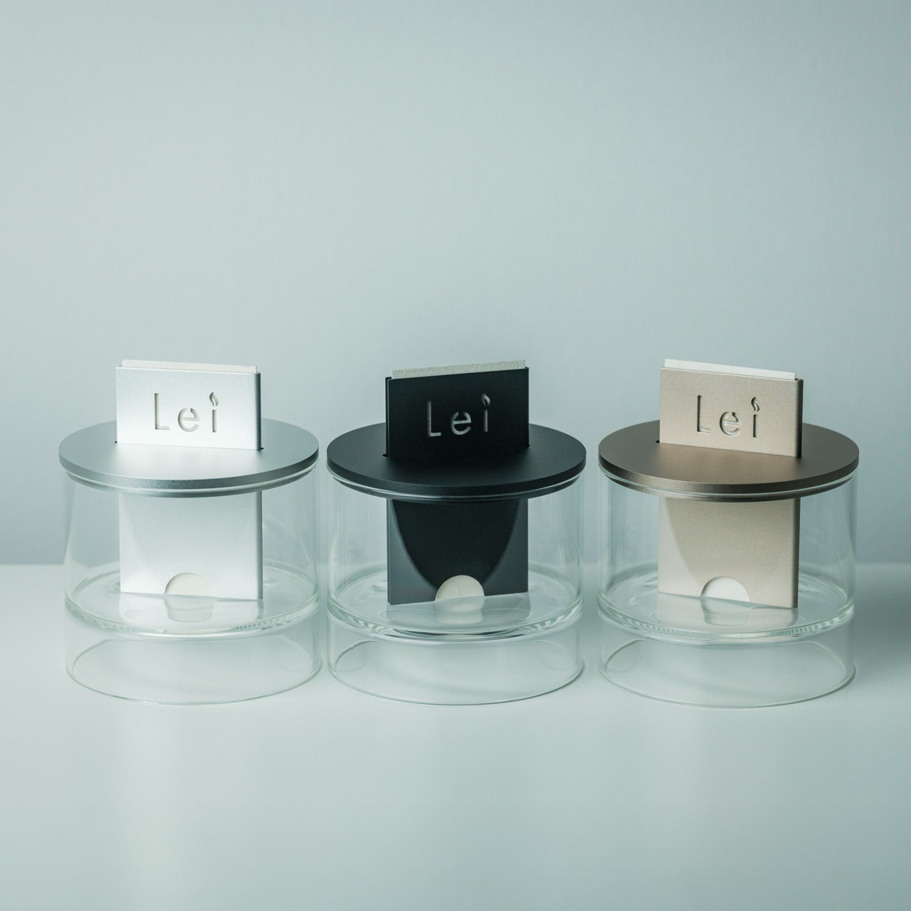
There’s something profoundly satisfying about objects that transform functional tasks into meaningful rituals. The Ritual Card Diffuser turns scent diffusion into a deliberate gesture—you slide a handcrafted washi paper card into an anodized aluminum body, much like inserting a train ticket or placing a bookmark. This simple physical act marks the beginning of a sensory journey rather than just flipping a switch or pressing a button.

The patented mechanism draws alcohol-based fragrance upward through the washi card without mist, vapor, reeds, or power. It’s utterly silent, completely fire-free, and relies on materials—hand-poured oil and Japanese handmade paper—that carry their own cultural weight and craft tradition. The layered glass base creates a visual lightness while the aluminum body grounds the piece with quiet strength. For design lovers who appreciate objects that slow down daily routines and add mindfulness to mundane tasks, this diffuser offers a refreshingly analog alternative to automatic everything.

Click Here to Buy Now: $89.00

What we like

  • The tactile card-sliding ritual adds meaningful interaction to fragrance diffusion.
  • No power, flame, or sound means complete simplicity and safety.
  • Handcrafted Japanese washi paper brings authentic artisan quality to consumable components.
  • The layered glass base creates beautiful visual depth and architectural interest.

What we dislike

  • Replacement washi cards add an ongoing consumable cost to long-term use.
  • The alcohol-based fragrance system limits compatibility with water-soluble essential oils.

7. Sol Brass Aroma Diffuser

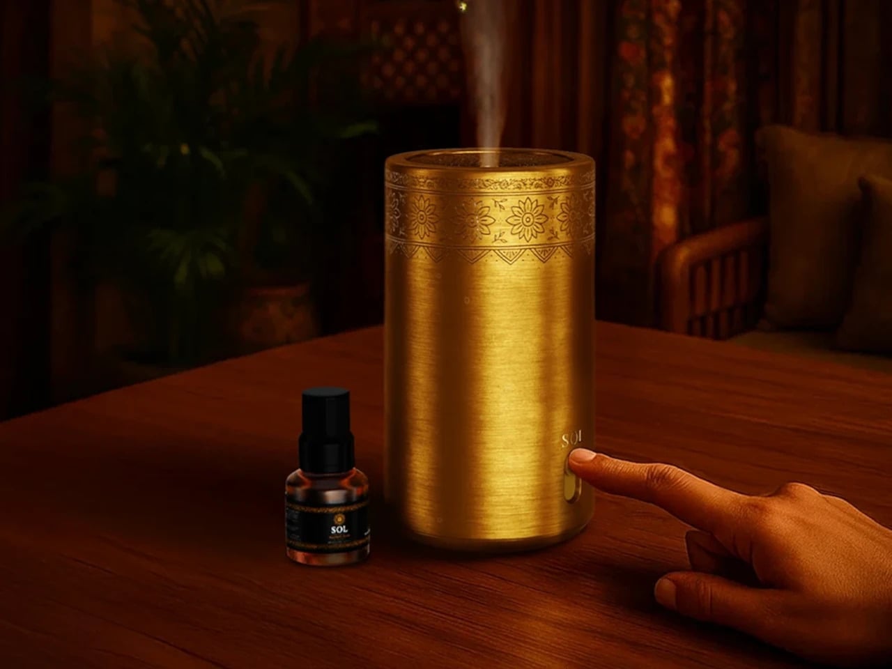
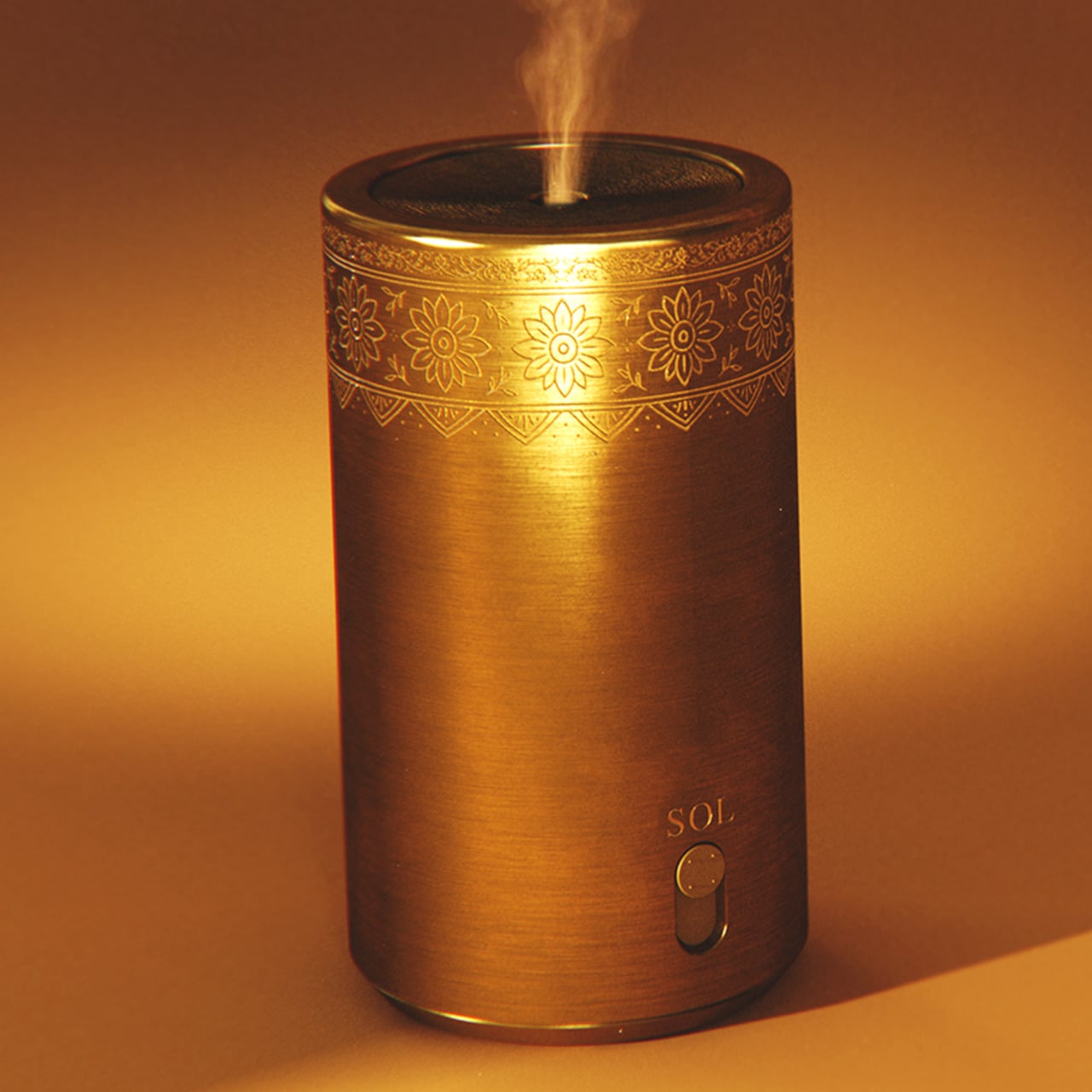
Traditional incense captures powerful emotional memories but fades quickly and rarely travels far from its burning point. Sol reimagines that morning incense ritual through contemporary design thinking, creating what its designer calls a “personal altar” for modern living spaces. The brass construction draws directly from Indian temple bells, heirloom utensils, and engraved thaalis, connecting the piece to centuries of craft tradition while maintaining clean contemporary lines that work in minimalist settings.

Mandala-inspired symmetry and meditative geometry inform every aspect of Sol’s design, creating visual patterns that reward close observation. This isn’t background design meant to blend into environments quietly. Sol makes a statement about the importance of ritual, mindfulness, and the grounding power of familiar scents in spaces where we work, think, and simply breathe. For design enthusiasts with connections to Indian culture or appreciation for how traditional craft can inform contemporary objects, Sol represents a particularly thoughtful bridge between heritage and modernity.

What we like

  • Brass construction brings genuine material warmth and develops character patina over time.
  • Indian craft tradition references create deep cultural resonance and storytelling opportunities.
  • Mandala-inspired geometry rewards careful observation with layered visual details.
  • The personal altar concept elevates daily use into meaningful ritual practice.

What we dislike

  • Brass requires occasional polishing to maintain its finish unless you appreciate natural patina development.
  • The strong cultural design language may feel less universal than more neutral aesthetic approaches.

Finding the Perfect Match

The diffusers on this list share a common philosophy—they treat fragrance as worthy of thoughtful design rather than an afterthought hidden in plastic housings. Each piece brings its own character, from volcanic minimalism to Japanese craft traditions to geometric boldness. The best choice depends entirely on the recipient’s aesthetic preferences and how they actually live with objects in their daily environment.

Consider what kind of interaction they enjoy with their belongings. Some people love tactile rituals like sliding washi cards or arranging miniature firewood. Others prefer set-it-and-forget-it elegance that works quietly in the background. The most meaningful gifts acknowledge these personal preferences while introducing something genuinely special they might not discover on their own. Any design lover receiving one of these diffusers will recognize the care that went into choosing an object that truly respects their eye for exceptional craft.

The post 7 Best Aroma Diffusers To Gift Design Lovers This Year first appeared on Yanko Design.
This $399 Device Can Kill Your Joint Pain Using Infrared Lasers (And Zero Side Effects)

The first Move+ made a bold promise: what if your “painkiller” was a band of light instead of a bottle of pills? By wrapping medical-grade red and near-infrared LEDs around your joints, it tried to tackle the inflammation at the source, not just blur it out. Move+ 2.0 arrives as the next pass at that concept, with a more polished chassis, smarter ergonomics, and a clearer pitch that this is not a gadget for your shelf, but a piece of recovery infrastructure you actually wear.

The real story behind the 2.0 update is a shift in how the device delivers light. Pain, after all, is rarely skin deep. Kineon’s answer was to build a hybrid system, pairing 660nm red LEDs with 808nm near-infrared lasers. While LEDs are great for surface-level recovery, the focused, coherent light from the lasers is engineered to penetrate several centimeters deeper, reaching the actual joint capsules, cartilage, and muscle tissue where chronic inflammation hides. It’s a clever engineering choice that directly addresses the limits of LED-only panels, aiming to deliver a therapeutic dose where it truly matters, whether that’s inside a shoulder with tendinitis or a knee struggling with arthritis.

Designer: Kineon Design Labs

Click Here to Buy Now: $399 $798 (50% off). Hurry, only a few left! Raised over $58,000.

The new adjustable strap is noticeably slimmer and more pliable, designed to solve the ergonomic puzzle of wrapping something securely around tricky areas like the shoulders or glutes. With reinforced stitching, premium materials, and a quick-release function, it feels less like a medical brace and more like a piece of high-end athletic gear. Kineon also includes bridging clips to connect the modules closer together and a separate extender strap. These simple but practical additions ensure the device can comfortably fit both on smaller treatment areas and larger body types or span across the lower back, making the entire system more versatile out of the box.

Even the travel case gets a thoughtful overhaul. Finished in vegan leather with a redesigned interior, it treats the Move+ 2.0 like a piece of premium electronics, not a clunky medical aid. The new layout, with dedicated bridge holders and a simplified charging tray, is about removing the small points of friction that often lead to expensive recovery tools being left at home. It affirms the idea that for a device like this to be effective, it has to be with you when you need it, whether that’s at the gym, in a hotel room, or after a long flight.

By combining LEDs and lasers, the Move+ 2.0 is positioned to address a whole spectrum of common complaints that live deep in the body’s machinery. The issues it targets, from frozen shoulder and carpal tunnel to gout and cartilage damage, are the kind of stubborn problems that often resist simple surface treatments. The device is not just for post-workout soreness; it is designed as a tool for managing the kind of chronic, nagging conditions that can disrupt daily life.

Beyond the hardware, Kineon is building out the digital side of the recovery equation. The new companion app acts as a logbook and a coach, letting you track sessions, monitor progress, and access a library of educational videos and guided recovery programs. This turns the Move+ 2.0 from a purely physical tool into a smarter system. Instead of just treating a sore spot ad hoc, the app provides a framework for managing chronic conditions over time, offering insights and guidance that help connect the daily sessions to a longer-term healing strategy.

At just $399, the entire package feels cohesive, including not just the 3 light modules and adjustable strap, but also the travel case, a charging dock, and a USB-C charging cable. Kineon is clearly positioning the Move+ 2.0 as a serious piece of performance and recovery gear, designed to sit comfortably alongside a high-end smartwatch or a percussion massager. It’s a tool built for a wide spectrum of nagging, persistent issues, from the athlete’s case of tennis elbow to the office worker’s carpal tunnel. By wrapping sophisticated medical technology in a thoughtfully designed, user-friendly package, Kineon is making a strong argument that the future of pain management might look a lot less like a pill and a lot more like a piece of well-designed hardware.

Click Here to Buy Now: $399 $798 (50% off). Hurry, only a few left! Raised over $58,000.

The post This $399 Device Can Kill Your Joint Pain Using Infrared Lasers (And Zero Side Effects) first appeared on Yanko Design.

Momcozy Just Made Baby Gear That Doesn’t Look Like Baby Gear

Baby gear used to mean loud colors and chunky plastic that demanded its own corner of the living room. Most swings looked like they belonged in pediatrician waiting rooms, and breast pumps came with tubes and bottles that made discretion impossible. For parents trying to maintain some semblance of style in their homes, it meant choosing between function and aesthetics, rarely getting both in the same product.

Momcozy approaches parenting products differently, with a design philosophy they call Cozy Tech that blends performance with calm, contemporary aesthetics. Loved by over 4.5 million moms globally, the brand starts from the reality of modern parenting: hybrid work schedules, small urban apartments, and the need for tools that integrate into existing routines without demanding wholesale lifestyle adjustments or visual compromises that most baby gear traditionally required.

Designer: Momcozy

Engineering Meets Empathy

The gap Momcozy noticed was straightforward. Traditional baby swings assumed parents had unlimited space and patience for bulky furniture, while breast pumps were designed as if mothers had all day to sit in private rooms. The disconnect was obvious once you looked at it from the parents’ side: why couldn’t products work beautifully and look beautiful at the same time, especially when those products occupy your home for years?

Cozy Tech is the answer that emerged from that question. It is a design language that prioritizes both powerful performance and restraint. Soft forms, neutral tones, and quiet operation let the products blend into design-conscious homes rather than standing out as medical equipment. The hardware still does serious work, but the presence is gentle enough that you do not feel the need to stash things in closets when people visit.

Momcozy S12 Pro Wearable Breast Pump

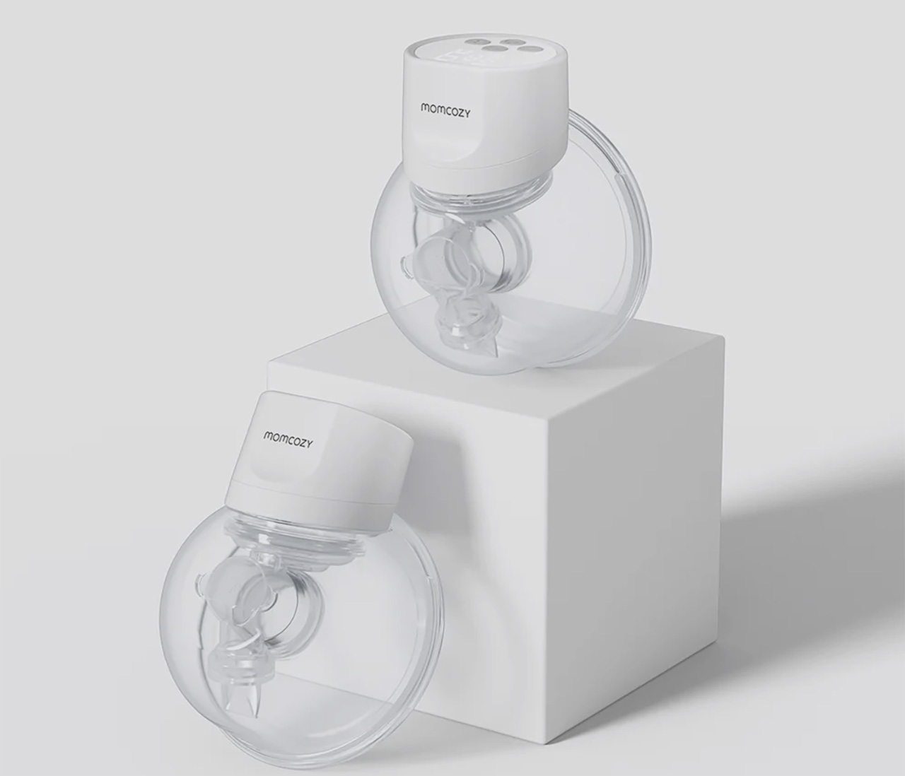
Picture a mother pumping in a parked car between meetings, or quietly at her desk during a video call. The Momcozy S12 Pro Wearable Breast Pump sits inside a standard nursing bra, disappearing under clothing so there are no tubes or external bottles to manage. From the outside, it looks like any other workday, not a carefully orchestrated routine built around pumping schedules.

The S12 Pro is shaped to mold to the body for comfortable all-day wear, offering multiple modes and adjustable suction to match different stages of expression. The internal battery supports seven to eight sessions on a single charge, reducing the mental load of planning around power outlets. It is the kind of device that quietly acknowledges mothers have careers, meetings, and social commitments, building around that reality instead of ignoring it.

Click Here to Buy Now: $139.99.

Momcozy M9 Mobile Flow Hands-Free Breast Pump

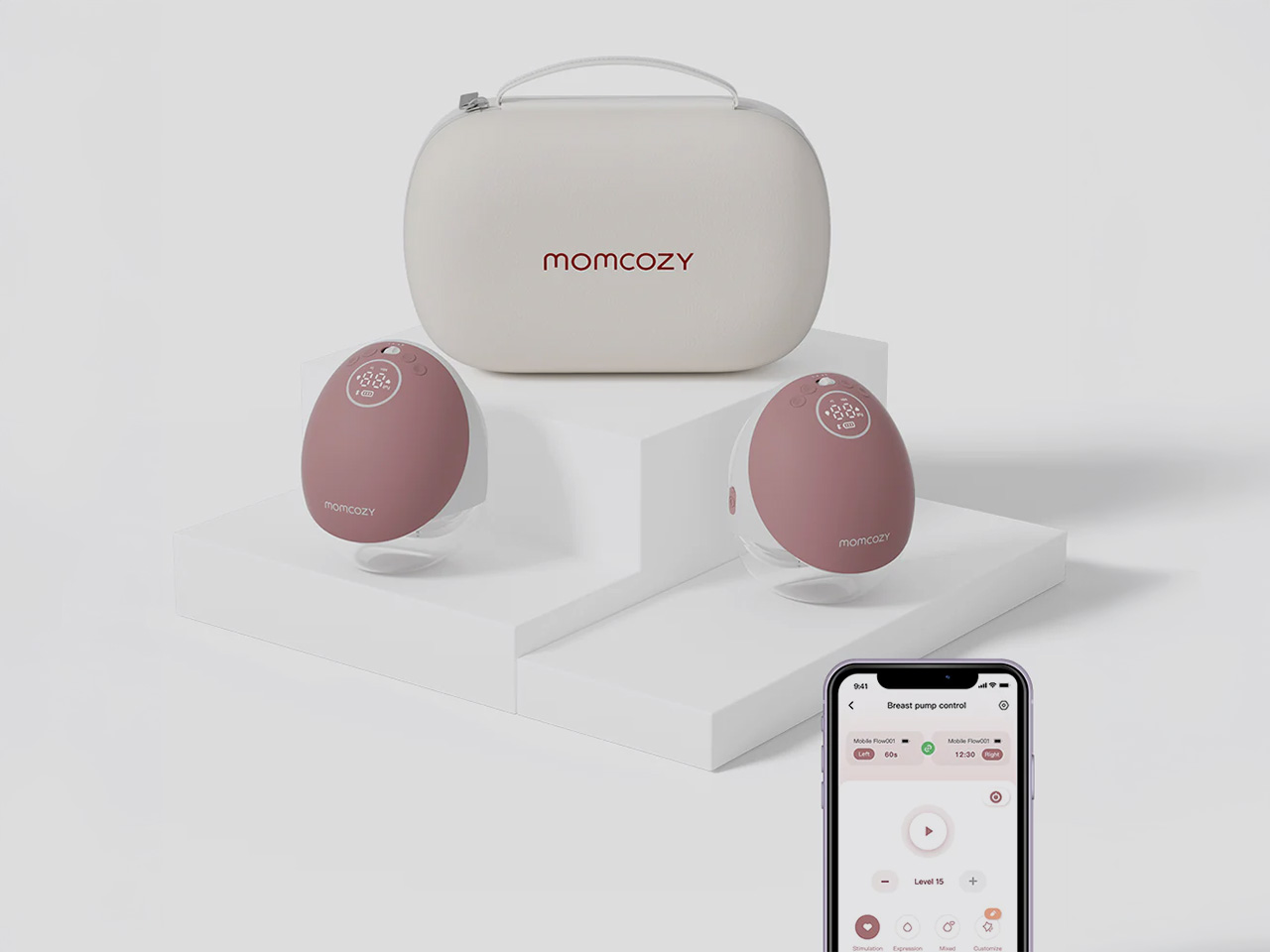
The M9 Mobile Flow Hands-Free Breast Pump is designed for parents who need flexibility without compromising comfort. Imagine someone folding laundry or prepping dinner while the pump works quietly in the background, tucked inside a bra and barely noticeable. The soft, rounded shape and pink finish make it feel closer to a personal wellness device than clinical equipment, blending into the flow of a busy day.

What sets the M9 apart is the combination of smart control and efficiency. The DoubleFit Flange improves fit and reduces leakage, while the app lets parents choose from three modes and fifteen customizable settings to match their rhythm. The eighteen hundred milliampere-hour battery supports up to six sessions per charge, and the upgraded third-generation motor delivers hospital-grade suction without the noise or bulk of traditional pumps.

Click Here to Buy Now: $269.99.

Momcozy 2-in-1 Electric Baby Swing

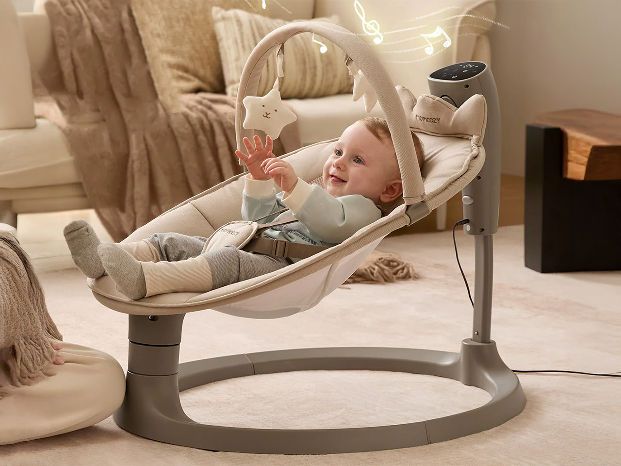
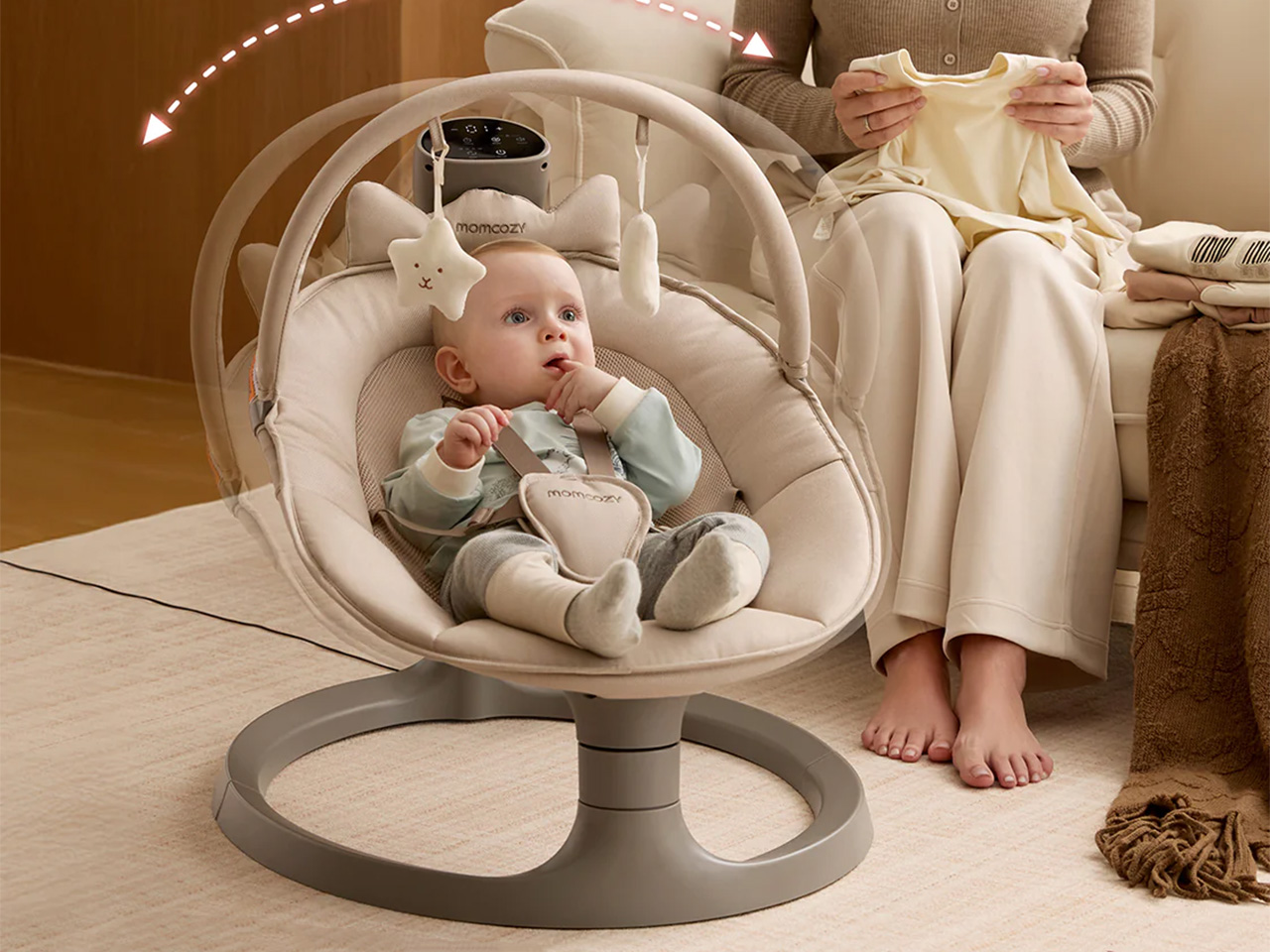
Shift to a different scene: a parent working from home in a small apartment, laptop open at the dining table while the baby rests in the Momcozy 2-in-1 Electric Baby Swing a few feet away. The swing’s neutral tones and clean lines blend into the living room rather than dominating it. Dual arms and a sturdy base keep everything steady, so there is no nervous checking every time the baby shifts position.

The swing mimics the natural soothing motions of a parent’s arms with four swing patterns and four speeds, helping babies stay calm outside of a caregiver’s embrace. The breathable seat adjusts to two recline positions, the cover zips off for machine washing, and when the baby outgrows the swing mode, it converts into a stationary seat that supports kids up to sixty-six pounds, turning it into furniture that lasts years instead of months.

Instead of asking parents to hide the tools that make their days possible, Momcozy designs swings and pumps that can live in the open, both visually and practically. They respect the spaces parents have built for themselves and the complex routines that run through them, showing that parenting gear can be gentle on the eyes while still doing serious work beneath the surface.

Click Here to Buy Now: $159.99.

The post Momcozy Just Made Baby Gear That Doesn’t Look Like Baby Gear first appeared on Yanko Design.
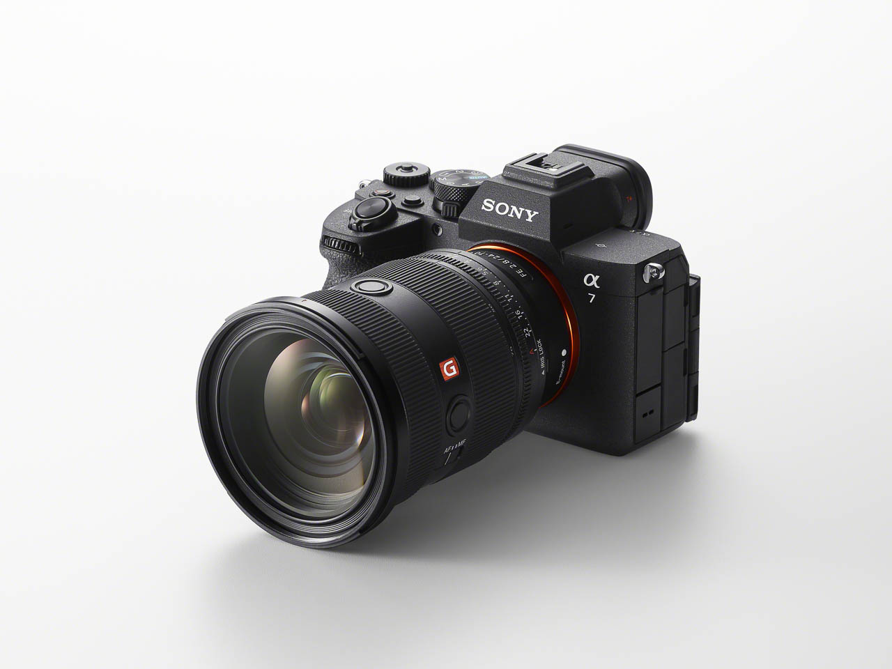
Sony Alpha 7 V Integrates AI Processing Into Its Imaging Engine, Rewrites Full-Frame Expectations

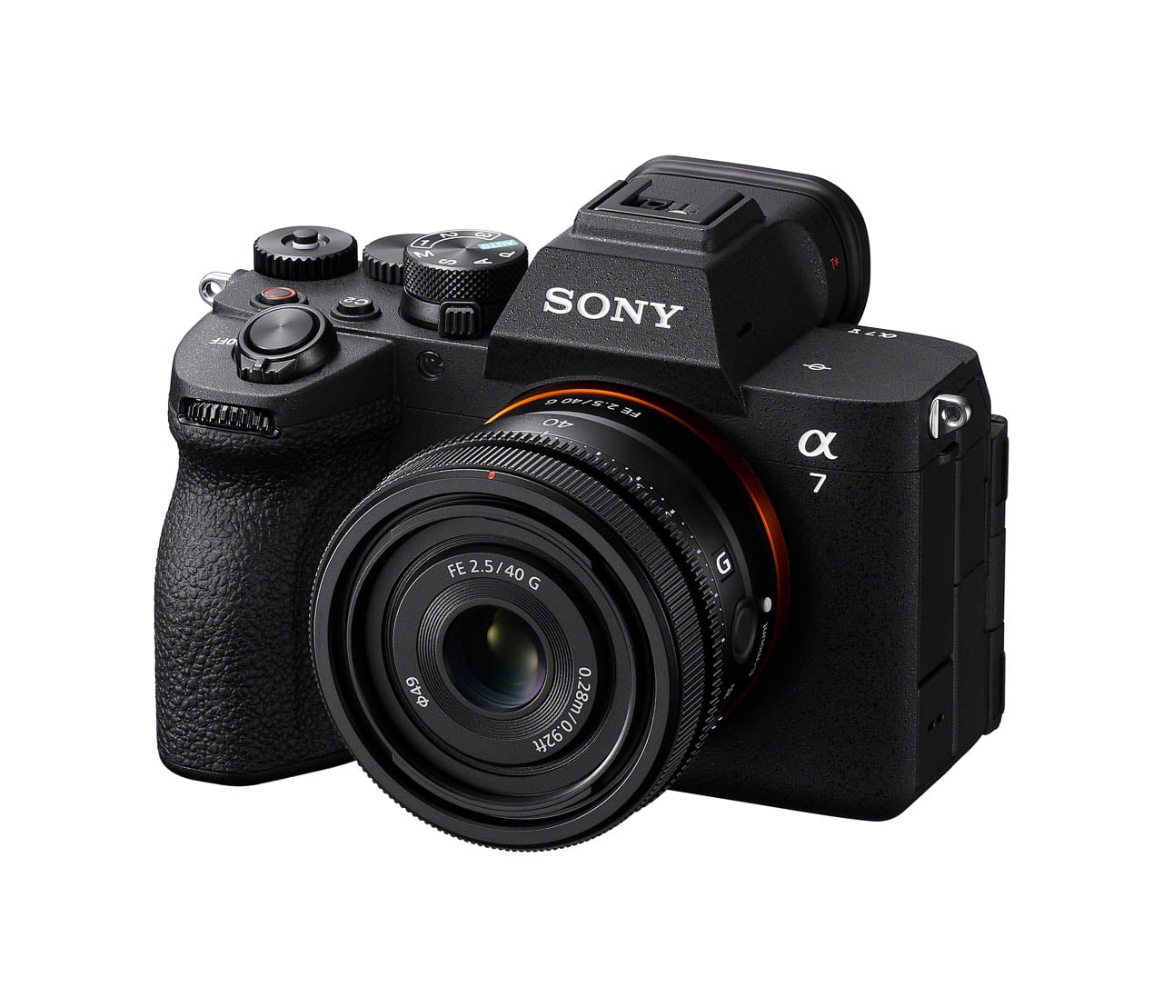
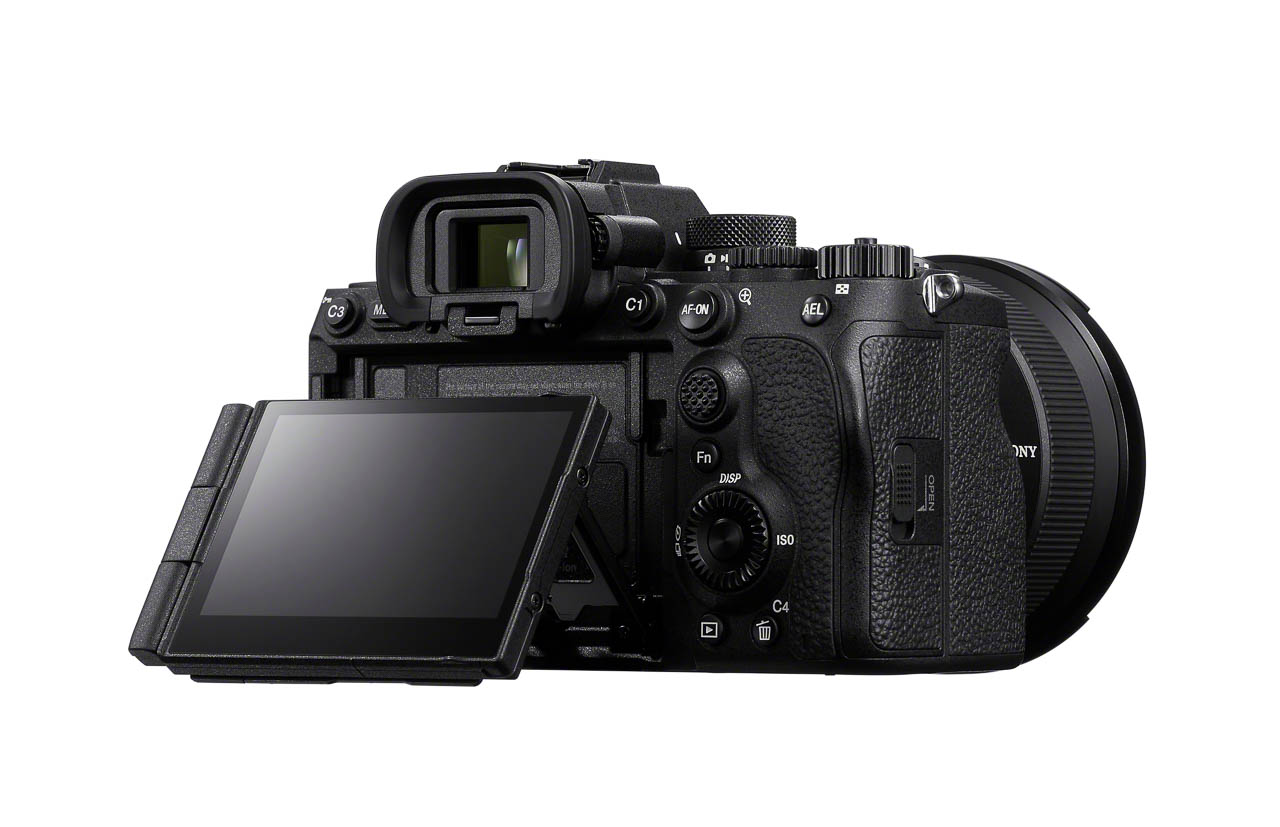
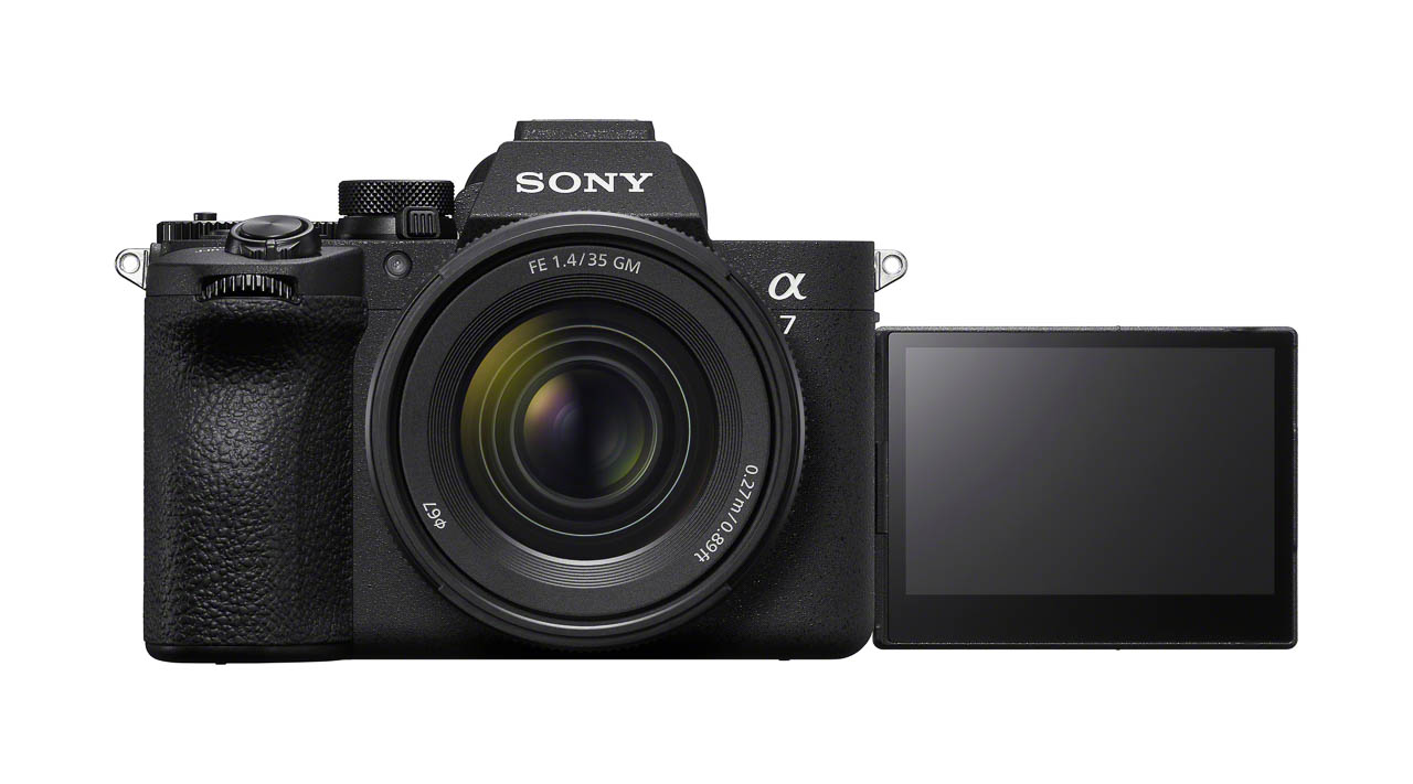
Sony’s Alpha 7 line has defined full-frame mirrorless photography for over a decade. The fifth generation arrives with a fundamental change: the AI processing unit now lives inside the BIONZ XR2 imaging engine rather than running on a separate chip. Every imaging function shares the same processing backbone, and the performance gains cascade through autofocus, subject recognition, color science, continuous shooting, and video.

Designer: Sony

The Alpha 7 V (ILCE-7M5) pairs that integrated processing architecture with a new partially stacked Exmor RS CMOS sensor. At approximately 33 megapixels, it strikes a balance between resolution and file manageability, but the real story is readout speed: 4.5 times faster than the Alpha 7 IV. Faster readout means reduced rolling shutter distortion during fast panning. It means blackout-free continuous shooting up to 30 fps with full AF/AE tracking. It means 14-bit RAW capture at that same 30 fps speed without compromising autofocus performance. Sony also announced the FE 28-70mm f/3.5-5.6 OSS II (SEL28702), a compact standard zoom designed to match these capabilities.

The Pre-Capture function deserves its own attention. It records up to one second before you press the shutter, storing frames in a rolling buffer until you commit to the shot. For unpredictable subjects (pets, children, sports action), this changes the timing equation entirely. Still image performance reaches 16 stops of dynamic range in mechanical shutter mode, ensuring tonal detail across highlights and shadows even in scenes with extreme contrast.

The Real-time Recognition AF system now identifies humans, animals, birds, insects, cars, trains, and airplanes. Sony claims a 30% improvement in eye recognition performance compared to the Alpha 7 IV, measured through internal testing. The 759 phase-detection points cover 94% of the frame, and low-light autofocus extends down to EV -4.0. AF/AE calculations run 60 times per second, continuously adjusting both parameters during high-speed shooting.

Color science gets its own AI treatment. A newly introduced AI-driven Auto White Balance leverages deep learning technology for light source estimation, automatically identifying the shooting environment’s light source and adjusting color tones for natural, stable color reproduction. This should reduce post-production workload for photographers who shoot across varied lighting conditions.

Video capabilities expand significantly for hybrid creators. The Alpha 7 V introduces 7K oversampled 4K 60p recording in full-frame mode and 4K 120p recording in APS-C/Super 35mm mode. Full pixel readout without pixel binning enables highly detailed footage. Dynamic Active Mode provides smooth stabilization for handheld shooting. An Auto Framing function automatically maintains optimal subject composition during recording. New in-camera noise reduction and improved internal microphone functionality address the audio side.

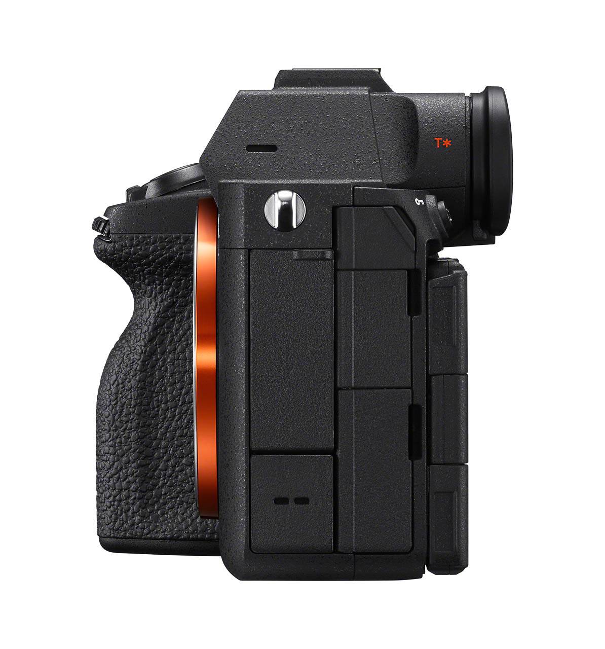
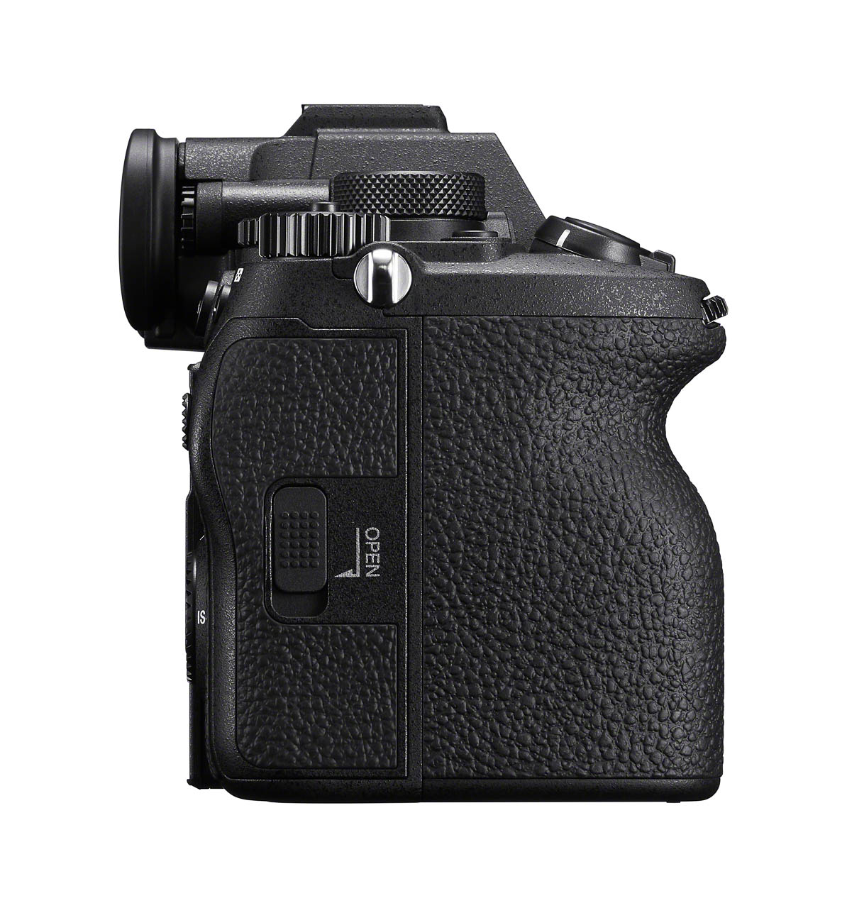
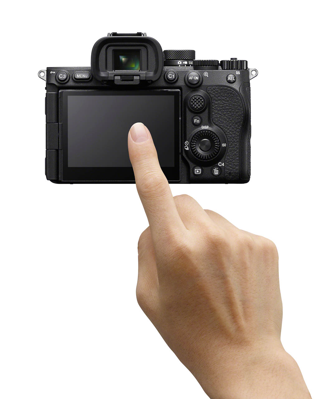
The operability improvements read like a professional wish list: Wi-Fi 6E GHz compatibility, dual USB Type-C ports, vertical format support, adjustable electronic shutter sound, a 4-axis multi-angle monitor combining tilt and vari-angle design, and an improved grip. Battery life reaches approximately 630 shots using the viewfinder (CIPA standards), with a Monitor Low Bright mode extending that further. Thermal management supports extended 4K recording at approximately 90 minutes at 25°C and 60 minutes at 40°C.

The Companion Lens and What It Costs

The FE 28-70mm f/3.5-5.6 OSS II earns attention beyond its kit lens positioning. When paired with compatible cameras, it offers up to 120 fps AF/AE tracking, continuous shooting up to 30 fps, seamless body-lens coordinated image stabilization, AF available during zooming, and built-in breathing compensation support. This addresses the original 28-70mm kit lens’s sharpness and autofocus speed criticisms while maintaining the lightweight profile that full-frame mirrorless shooters expect.

Sony aligned this release with its Road to Zero environmental initiative. Manufacturing facilities for imaging products operate at 100% renewable energy. The packaging uses Sony’s Original Blended Material (bamboo, sugarcane fibers, post-consumer recycled paper) instead of plastic.

The Alpha 7 V body arrives by the end of December 2025 for approximately $2,899 USD ($3,699 CAD). The kit with the SEL28702 lens follows in February 2026 for approximately $3,099 USD ($3,899 CAD). The lens alone: $449 USD ($599 CAD), also February 2026. All products will be sold through Sony and authorized dealers throughout North America.

The post Sony Alpha 7 V Integrates AI Processing Into Its Imaging Engine, Rewrites Full-Frame Expectations first appeared on Yanko Design.
The Cheapest Personal AI Device You Can Own: $50 Raspberry Pi Whisplay Runs Gemini, Claude, and ChatGPT

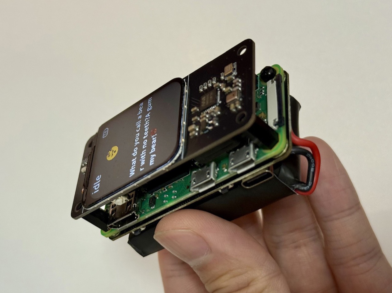
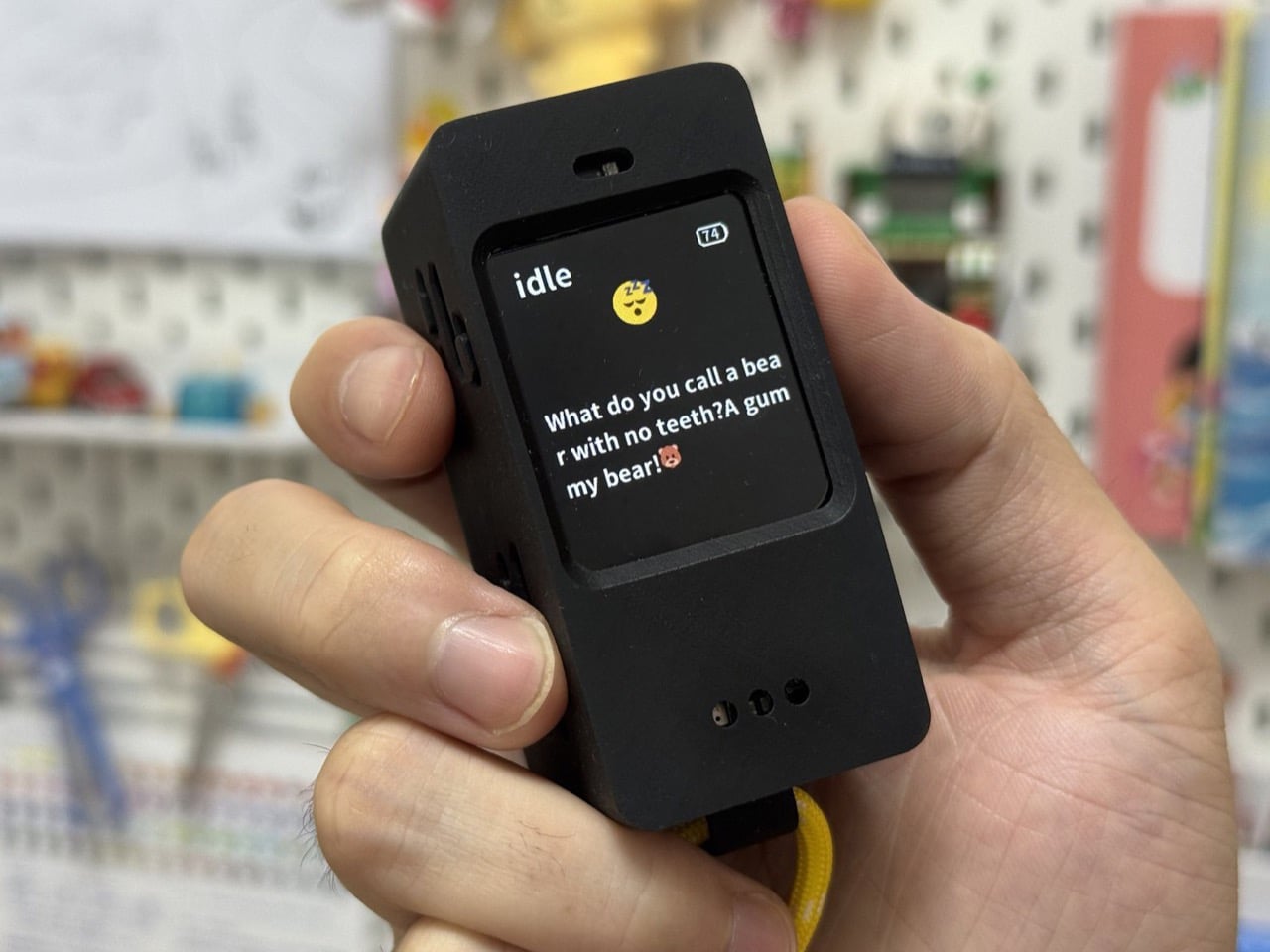
Smartphones were never really meant to be your AI sidekick. They juggle notifications, social feeds, and a dozen background services before they ever get around to being “smart.” Meanwhile, the first wave of dedicated AI gadgets from companies like Humane and Rabbit showed up with big promises, closed ecosystems, and short lifespans. When the money dried up, so did the hardware. A little Raspberry Pi Zero 2 W with a Whisplay HAT quietly sidesteps all of that. It is a DIY AI chat device that you own outright, that you can fix, reflash, or repurpose, and that can talk to Gemini, Claude, or ChatGPT without caring which startup is still solvent this quarter.

Instead of betting on a single company’s cloud, Whisplay treats AI as a replaceable part. The hardware gives you a screen, mic, speaker, and buttons, and leaves the “brain” up to you. If Gemini changes pricing, Claude adds features, or ChatGPT pulls ahead again, you can swap backends with a config file or a bit of code, not a new gadget. In a landscape where AI hardware keeps arriving as disposable, subscription-tethered experiments, this little open, modular box feels like the first honest attempt at a personal AI terminal that will not vanish the moment a runway spreadsheet turns red.

Designer: Jdaie

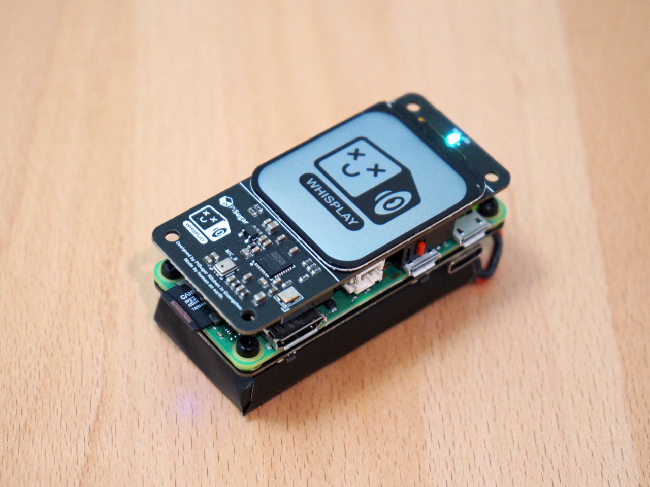
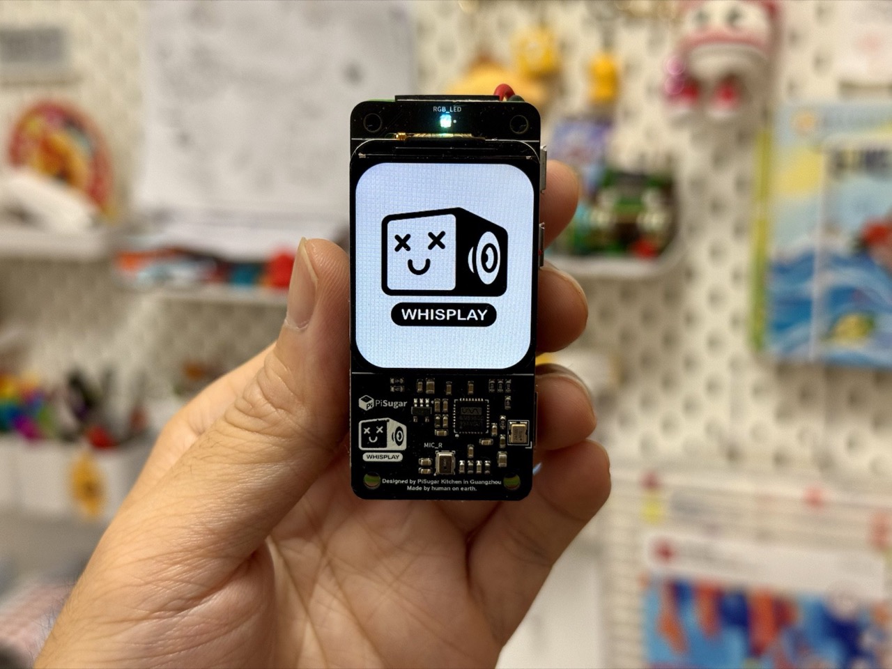
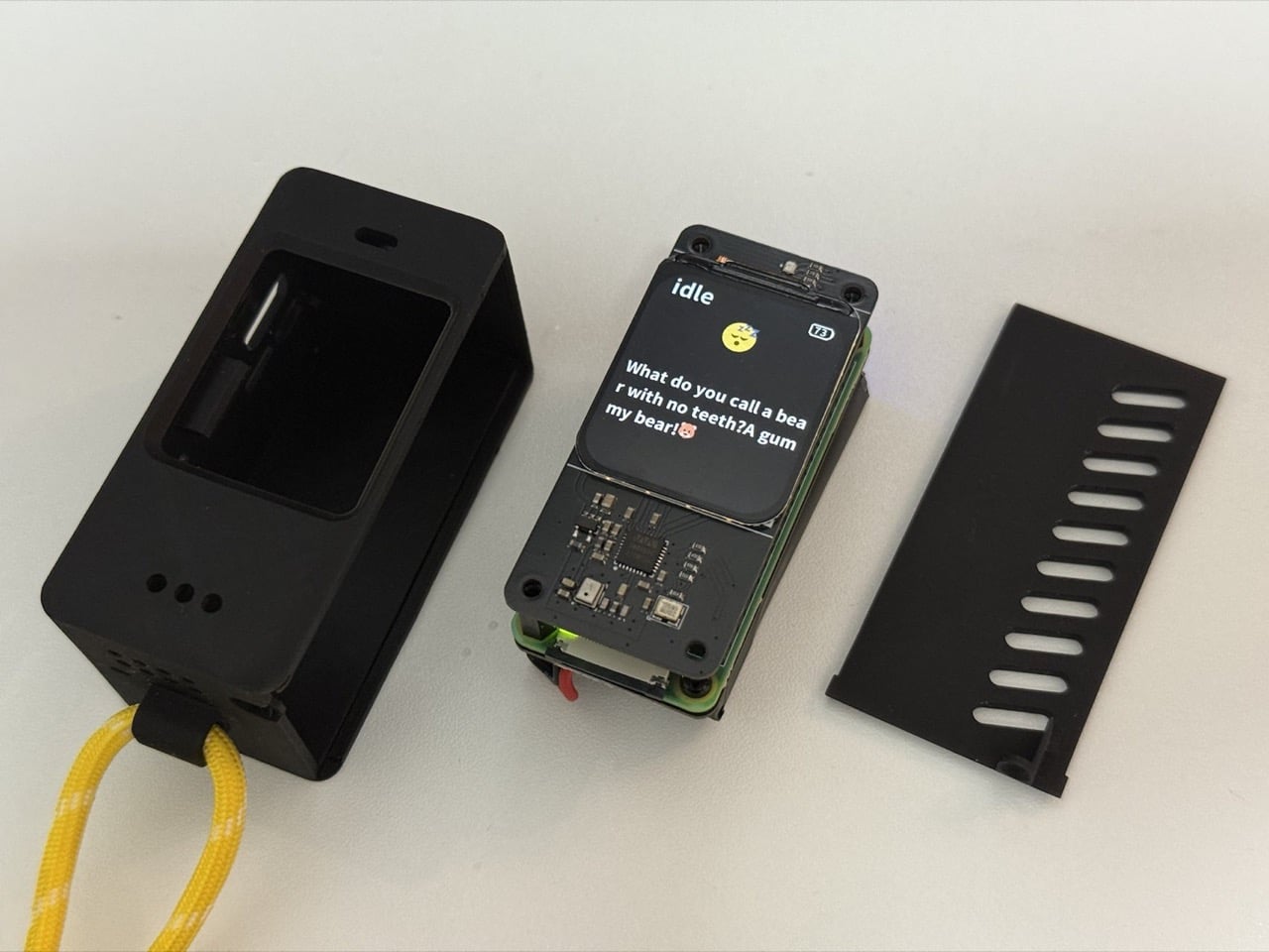
At its very core, the Whisplay HAT is a clever little I/O board designed to give a Pi a face and a voice… simply put. It bolts directly onto the 40-pin GPIO header and provides everything needed for a conversational interface. You get a surprisingly crisp 1.96-inch color LCD for displaying text or animations, a WM8960 audio codec driving an onboard microphone and speaker, an RGB status LED, and a few programmable buttons for user input. It is not a standalone computer, but a purpose-built terminal that turns the Pi Zero into something you can actually talk to. The entire package matches the Pi Zero’s footprint, making for a compact and tidy build that feels intentional, not like a messy science fair project.

The choice of the Raspberry Pi Zero 2 W as the platform is telling. With its quad-core 1 GHz ARM Cortex-A53 CPU and just 512MB of RAM, it is nobody’s idea of a powerhouse. That is precisely the point. The Pi is not running the large language model; it is just a client. Its job is to capture audio, send a request over Wi-Fi, and then play back the response. This thin-client architecture is incredibly efficient, requiring minimal power and processing, which is perfect for an always-on desk companion. The heavy lifting is outsourced to the cloud API of your choice, leaving the Pi to handle the simple, tangible task of being the physical interface between you and the AI.

The actual magic is a simple, elegant pipeline that you control completely. Your code on the Pi captures audio from the Whisplay’s microphone, uses a speech-to-text engine to transcribe it, and then packages that text into an API call to Gemini or another LLM. When the response comes back, a text-to-speech engine converts it back into audio and plays it through the onboard speaker, while the LCD can show the text or a thinking animation. You can point it at Google’s Gemini API today and switch to a local Ollama server running on a spare Raspberry Pi 5 tomorrow if you feel like it. What’s so perfect about the Whisplay HAT is that it assumes companies and models will come and go, so it treats the LLM as a pluggable component. Today, that might be Gemini, Claude, or ChatGPT. Tomorrow, it might be some open model running on your own server. Either way, the little chatting device on your desk stays the same, happily piping audio in and out while you swap brains on the backend.

That brings us to the real kicker. The Whisplay HAT costs about thirty-five dollars. Paired with a fifteen-dollar Pi Zero 2 W, you have the core of a highly capable, endlessly customizable AI device for fifty bucks. Compare that to the seven-hundred-dollar Humane Ai Pin or the two-hundred-dollar Rabbit R1, both of which are functionally just API clients tied to a single, proprietary service. This DIY approach is not just cheaper; it represents a fundamentally different, more sustainable philosophy. It is a platform for tinkering and ownership, not a sealed product designed to be consumed and eventually discarded. It is a starting point, and in a field moving this fast, a good starting point is infinitely more valuable than a dead end.

The post The Cheapest Personal AI Device You Can Own: $50 Raspberry Pi Whisplay Runs Gemini, Claude, and ChatGPT first appeared on Yanko Design.
LEGO Just Dropped a $300 Stranger Things Set That Transforms When You Pull the Corners

In Stranger Things, victims trapped in Vecna’s curse describe the Creel House as a place where reality fractures and splinters around them, rooms shifting into impossible geometries. LEGO has somehow captured that exact horror in brick form. Their new 2,593-piece Creel House literally transforms with a lever pull, walls splitting apart to reveal Vecna’s cursed mind lair within. It’s launching January 1st at $299.99, and after six years without a proper Stranger Things LEGO set, fans won’t want to escape this one.

Stranger Things Season 5 wraps up on New Year’s Eve at 5 p.m. PST. LEGO Insiders get early access to the set that same day before general release on January 4th. You’ll have processed the finale’s emotional damage and immediately have 2,593 pieces of therapeutic building to work through your feelings. I can’t decide if this is brilliant marketing or deliberately sadistic.

Designer: LEGO

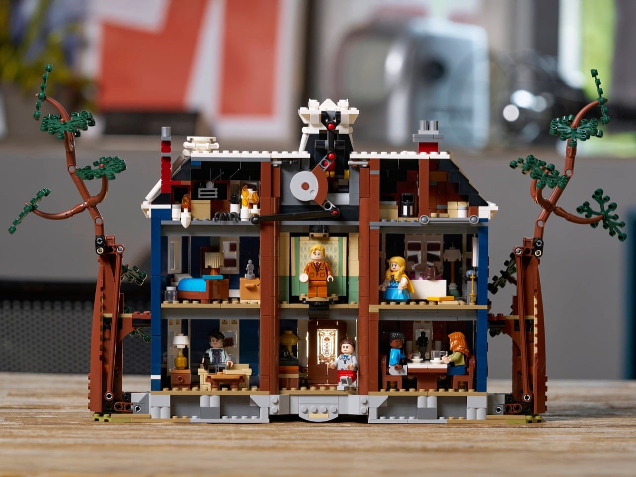
LEGO calls it their first ever transforming house. Pull the corners and the entire structure reconfigures itself: some rooms split in two, others rotate 45 degrees, one wall drops into place, and the central spire rises up to reveal that infamous grandfather clock. Most LEGO sets with transformation gimmicks feel like compromises, sacrificing detail in one mode to accommodate the other. You get a decent robot or a passable vehicle, never both. This thing maintains a 20-inch-wide, nearly 12-inch-tall facade in both states, which means someone on the engineering team actually gave a shit about making both configurations work properly instead of treating one as an afterthought.

Open up the back and you’ve got seven distinct rooms: hallway, dining room, sitting room, Alice’s and Henry’s bedrooms, an upstairs landing, and two attic spaces. You can build it boarded-up or with the boards removed, which matters because the boarded version captures that abandoned murder house aesthetic from earlier seasons while the clean version works better as Vecna’s active lair. That’s not just aesthetic choice for its own sake. Anyone who’s watched the show knows the house exists in multiple states across different timelines, and giving builders the option to represent that shows someone actually paid attention to the source material instead of skimming a wiki for reference images.

Thirteen minifigures come with the set: Will, Mike, Lucas, Dustin, Vecna, Mr. Whatsit (Henry in his Season 5 human disguise), Holly, Steve, Nancy, Robin, Jonathan, Max, and Eleven. For $300, that’s a solid roster. The Mr. Whatsit to Vecna transformation happens through a hideaway feature built into the set, letting you physically swap between Henry’s boring normal kid persona and his full monster form. It works better in LEGO than it would in most other collectible formats because the medium already asks you to suspend disbelief about scale and realism. A transforming minifigure compartment feels natural here in a way it wouldn’t in, say, a high-end statue.

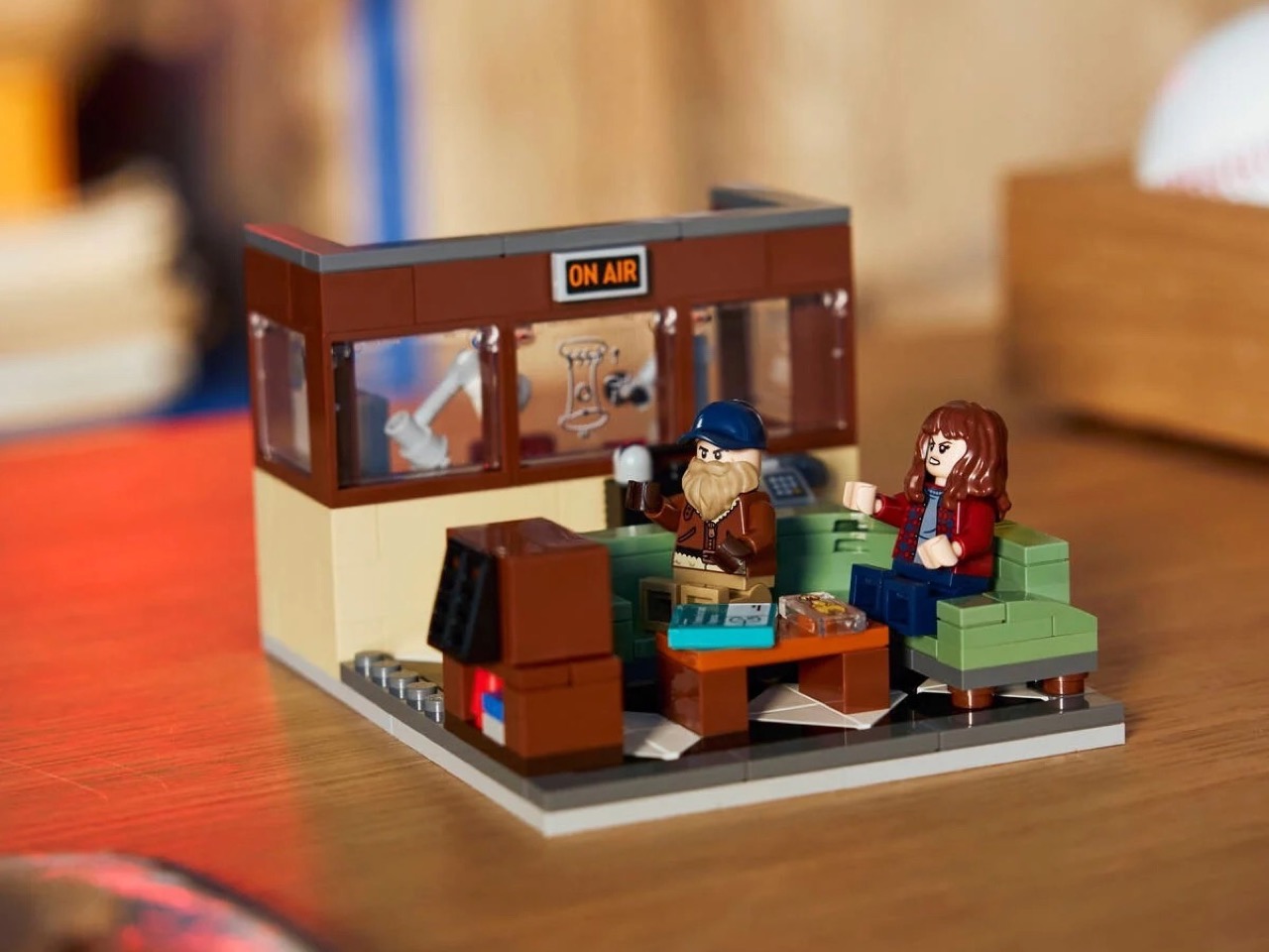
Buy during the first week and you’ll get the 40891 WSQK Radio Station gift, a 234-piece bonus set with Joyce Byers and a magnificently bearded Sheriff Hopper. Given their absence from the main set’s roster, this feels mandatory rather than optional. That rubber chicken printed tile though? Absolute deep cut for fans who’ve been paying attention to Season 5’s marketing. Stock runs out fast on these gift-with-purchase promotions, so waiting for a sale means missing Joyce and Hopper entirely unless you want to pay scalper prices on BrickLink later.

Steve’s car and the WSQK radio van both use six-wide construction with complicated techniques for tight angles and small offsets. Will’s bicycle rounds out the vehicle collection. None of these are throwaway builds to pad the piece count. LEGO City vehicles typically phone it in with basic stud-and-plate construction, but these use the kind of techniques you’d expect from Creator Expert or Speed Champions sets. Small details like that separate a licensed cash grab from a set that actually respects the builder’s time and money.

LEGO’s pricing sits at $299.99 US, £249.99 UK, €279.99 EU, and AU$449.99 Australia. That works out to roughly 11.5 cents per piece, above standard LEGO pricing but expected for licensed sets. Add in the transformation mechanism’s manufacturing complexity and you can justify the premium. Whether 2,593 pieces and 13 minifigures actually justify three hundred dollars depends on how much you care about Stranger Things specifically. If you’re ambivalent about the show, this is an expensive shelf decoration. If you’ve been waiting since 2019 for another proper set, it’s basically a bargain.

The post LEGO Just Dropped a $300 Stranger Things Set That Transforms When You Pull the Corners first appeared on Yanko Design.