Pexar Starlight Review: 15.6″ Picture Frame That Lights Up Memories

PROS:


  • Premium design with wood grain finish and canvas-like matting

  • Rear LED Gallery Lighting adds warmth and dimension to photos

  • Large 15.6-inch anti-glare display with excellent visibility

  • Generous 64GB internal storage

  • Simple setup and effortless sharing via the Frameo app

CONS:


  • No built-in battery

  • Video playback is capped at 15 seconds

  • Uploading more than 10 photos at once remotely requires the optional Frameo+ subscription

RATINGS:

AESTHETICS
ERGONOMICS
PERFORMANCE
SUSTAINABILITY / REPAIRABILITY
VALUE FOR MONEY

EDITOR'S QUOTE:

The Pexar Starlight blends premium design and an all-new gallery lighting into a digital frame that finally feels as special as the memories it displays.

award-icon

Digital photo frames have been around for years, but finding one that actually looks good in your living room remains surprisingly difficult. Most feel like gadgets that happen to show pictures rather than thoughtful décor pieces. They display photos well enough, but they rarely inspire the kind of emotional connection that makes you want to give them the best spot in your home.

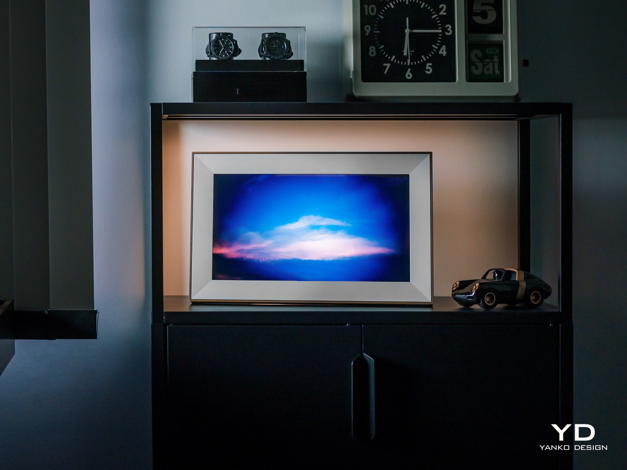
The Pexar Starlight 15.6-inch Digital Picture Frame approaches photo display differently by adding integrated lighting that makes memories glow like gallery pieces. Born from Lexar’s imaging expertise, this frame combines a generous screen with thoughtful design details that celebrate photos rather than just showing them. Let’s see how it actually fares in practice.

Click Here to Buy Now: $349.

Aesthetics

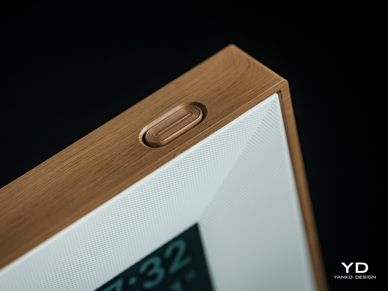
Unboxing the Starlight reveals a wood-grain finish that immediately separates it from typical digital frames dominated by glossy plastic. The texture has genuine depth and character, not just a printed pattern attempting to mimic wood. Running fingers across the surface reveals a tactile quality that makes the frame feel substantial, like furniture designed to last rather than disposable tech.

The canvas-like matting surrounding the display creates instant gallery vibes without trying too hard. Every photo cycling through looks intentional and curated, as if someone carefully selected each image for exhibition. This presentation quality works magic on even casual smartphone snapshots, making everyday moments feel more special than they did when scrolling through a camera roll mindlessly.
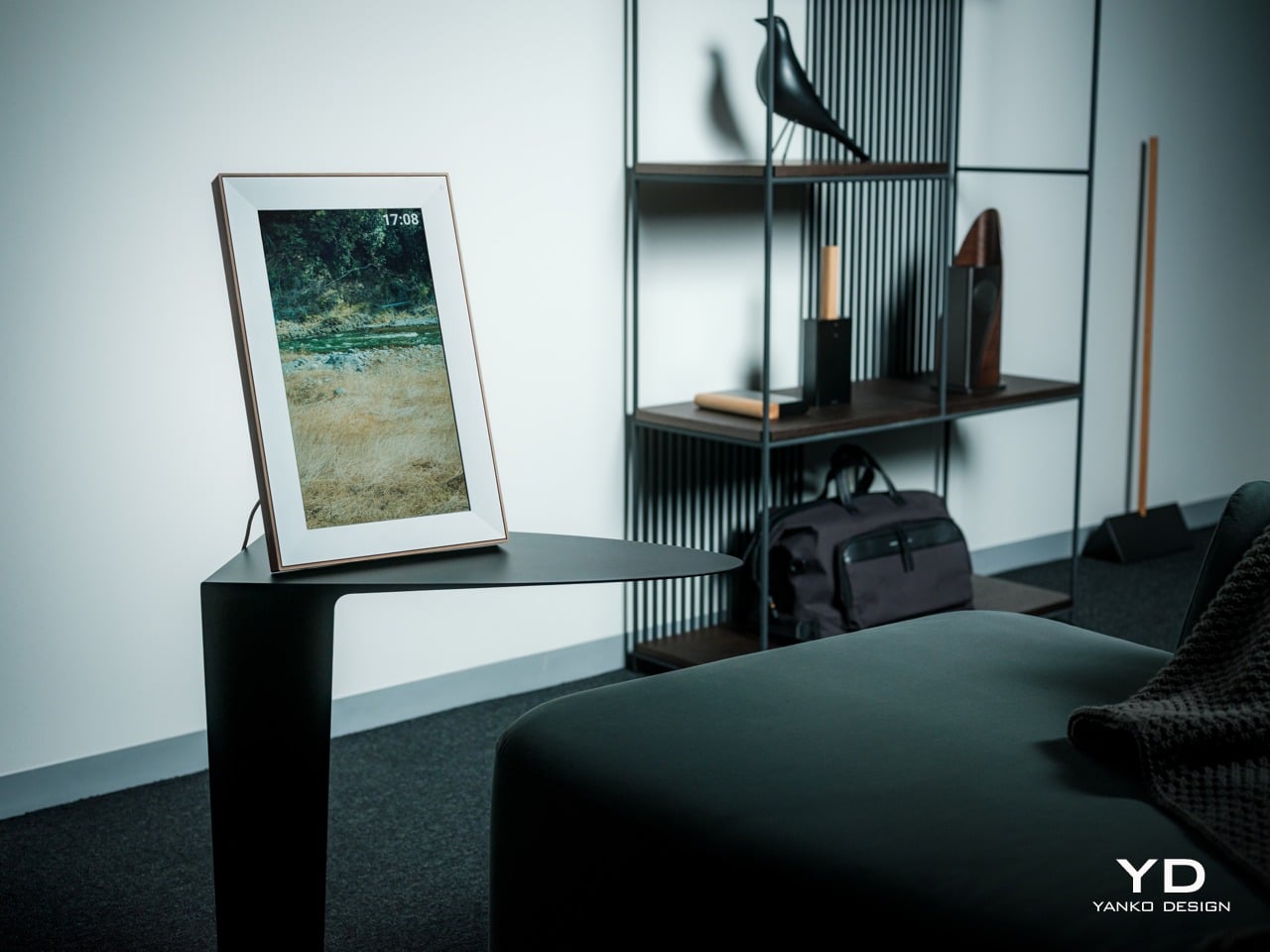
Placing the frame on a living room shelf shows how the thin bezel maximizes screen space without screaming for attention. The proportions feel balanced, with enough frame to provide visual weight but not so much that it dominates nearby objects. The design quietly commands attention rather than demanding it, which matters more than expected when living with something daily.

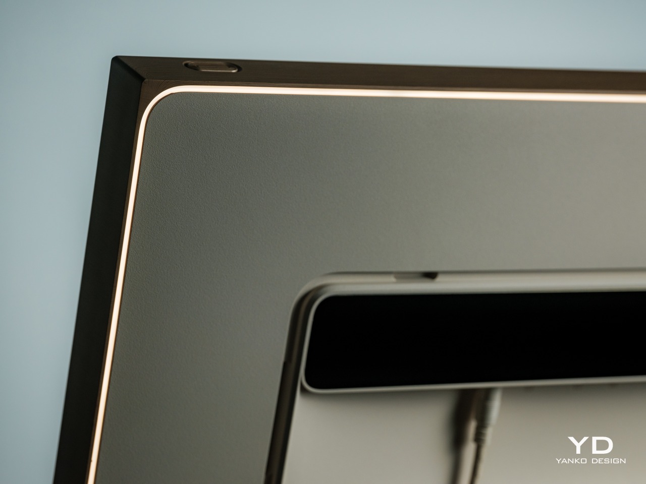
The innovative gallery lighting changes how photos feel in a room entirely. During daylight hours, the warm glow adds a subtle dimension that makes images pop against the wall behind them. As evening arrives and ambient light fades, the lighting becomes more prominent, casting a soft halo that naturally draws the eye toward whatever memory is currently on display.
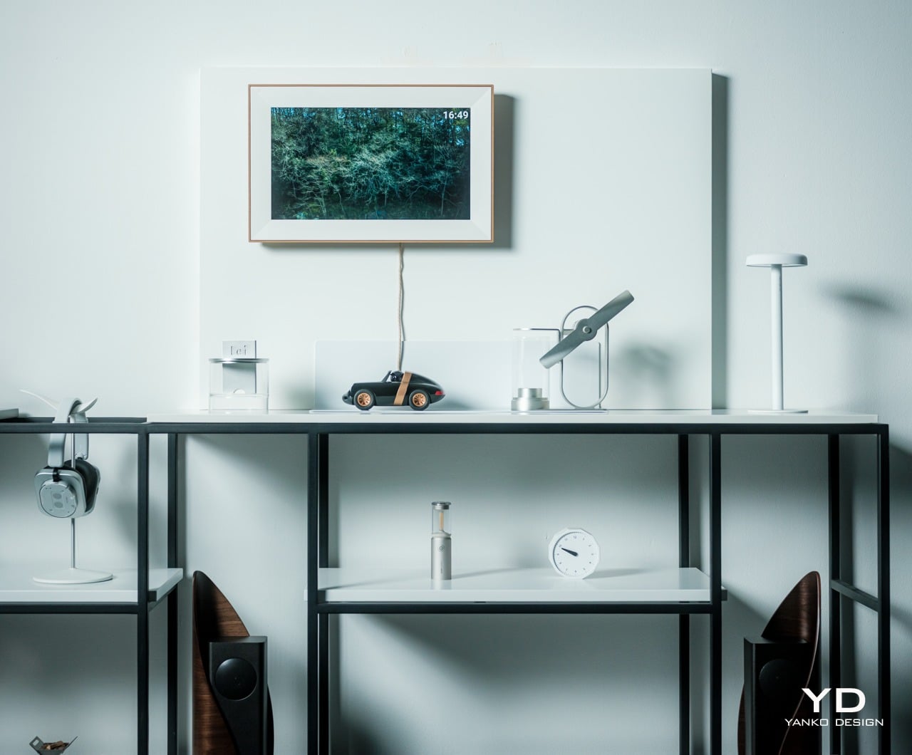
Watching the lighting interact with different photos throughout the day reveals careful tuning and attention to detail. The warmth complements skin tones beautifully while enhancing golden hour sunsets and cozy indoor shots taken during winter evenings. The lighting never fights with images but rather supports them, creating depth without becoming a distraction from the actual photographs.

The anti-glare screen proves its value in challenging lighting conditions that would ruin most displays. Positioning the frame near windows or under bright overhead lights doesn’t create reflective hotspots that make screens unreadable. Photos remain clearly visible from multiple angles throughout the day, maintaining their visual impact regardless of how sunlight shifts across rooms.

The packaging deserves special mention for winning the 2025 MUSE Design Awards with its completely eco-friendly design. The gift box uses 100 percent recyclable materials with a green fiber coating and sand-gold metallic accents, drawing on Nordic and Japanese aesthetics for a premium unboxing experience. The paper pulp construction eliminates plastic entirely while feeling surprisingly luxurious, making the Starlight especially thoughtful for holiday gifting when presentation matters as much as the gift itself.

Ergonomics
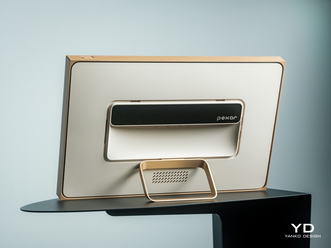
Setup takes barely a minute from opening the box to displaying your first photo on screen. Power on, pick language and time zone, connect to Wi-Fi, name the device, finished. The whole process feels refreshingly simple, with clear prompts that don’t require consulting manuals or watching tutorial videos to figure out what’s happening.

The Pexar Starlight’s touchscreen responds accurately to every tap and swipe without the frustrating lag that makes cheap displays annoying to actually use. Navigating settings, albums, or display options feels smooth and predictable throughout. The interface clearly borrows from modern smartphones, making it immediately familiar even for people who typically struggle with new technology and avoid anything labeled “smart.”
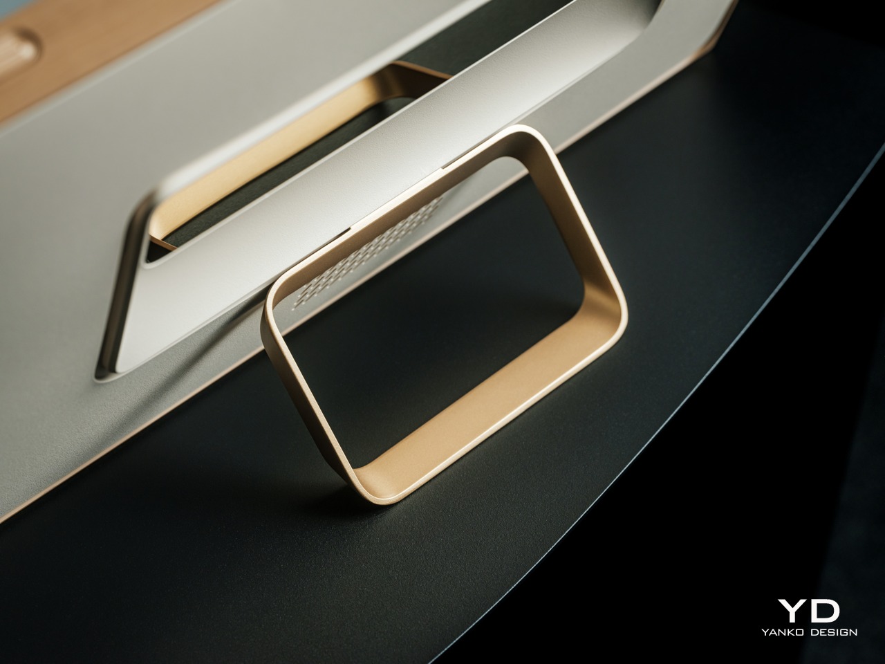
The metal stand holds the frame securely in both portrait and landscape positions without complaint. Switching orientations reveals smooth, stable positioning without wobbling or tipping concerns that would make you nervous about bumping the table. The stand’s minimal footprint doesn’t hog surface area, fitting easily on crowded shelves or narrow surfaces without requiring furniture rearrangement.

Wall mounting keeps everything flush while allowing proper clearance for the gallery lighting to project its characteristic glow. The hardware feels robust enough to trust with a device this size and weight. Once mounted, the frame looks intentional rather than like tech equipment awkwardly stuck to the wall, which becomes important when it’s a permanent fixture in your space.

Auto-rotation works like magic when repositioning the frame between portrait and landscape orientations. Pick it up, turn it sideways, and the display adjusts instantly without requiring button presses or menu navigation. The automatic sensing means photos always display correctly regardless of orientation, whether you’re trying different placements or just moved it to a new room.

Performance
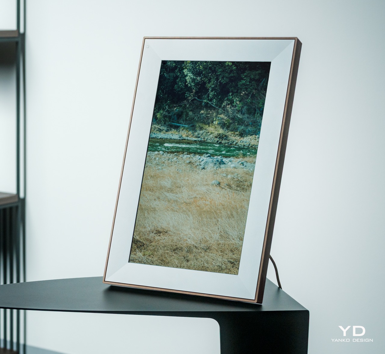
With a 1920×1080 screen resolution, the Pexar Starlight delivers sharp, detailed images that look great from typical viewing distances across the room. Fine details in photos remain crisp and clear, while text in captions or greeting cards stays perfectly readable. The pixel density feels well-matched to screen size, providing clarity without that overly processed digital look that sometimes makes photos feel artificial.

Colors pop with vibrancy that feels realistic rather than artificially boosted like oversaturated TV displays. Photos show rich, engaging hues that don’t cross into unrealistic territory that makes images look fake. Skin tones appear natural and flattering, while blue skies and green landscapes maintain the depth and richness you remember from actually being there.

The 64GB internal storage swallows photo libraries without breaking a sweat or showing performance issues. Loading several thousand images reveals no slowdown, stuttering, or lag during transitions. The frame cycles through photos smoothly, maintaining quick changes and responsive controls regardless of how many memories are crammed into storage over months.

Loading photos via SD card or USB feels straightforward and surprisingly quick for large batches. Insert the storage source, navigate to Settings, select Import Photos, choose your images, and let the frame handle everything else. The interface makes it easy to select all photos at once or cherry-pick specific favorites, depending on how curated you want the current collection.
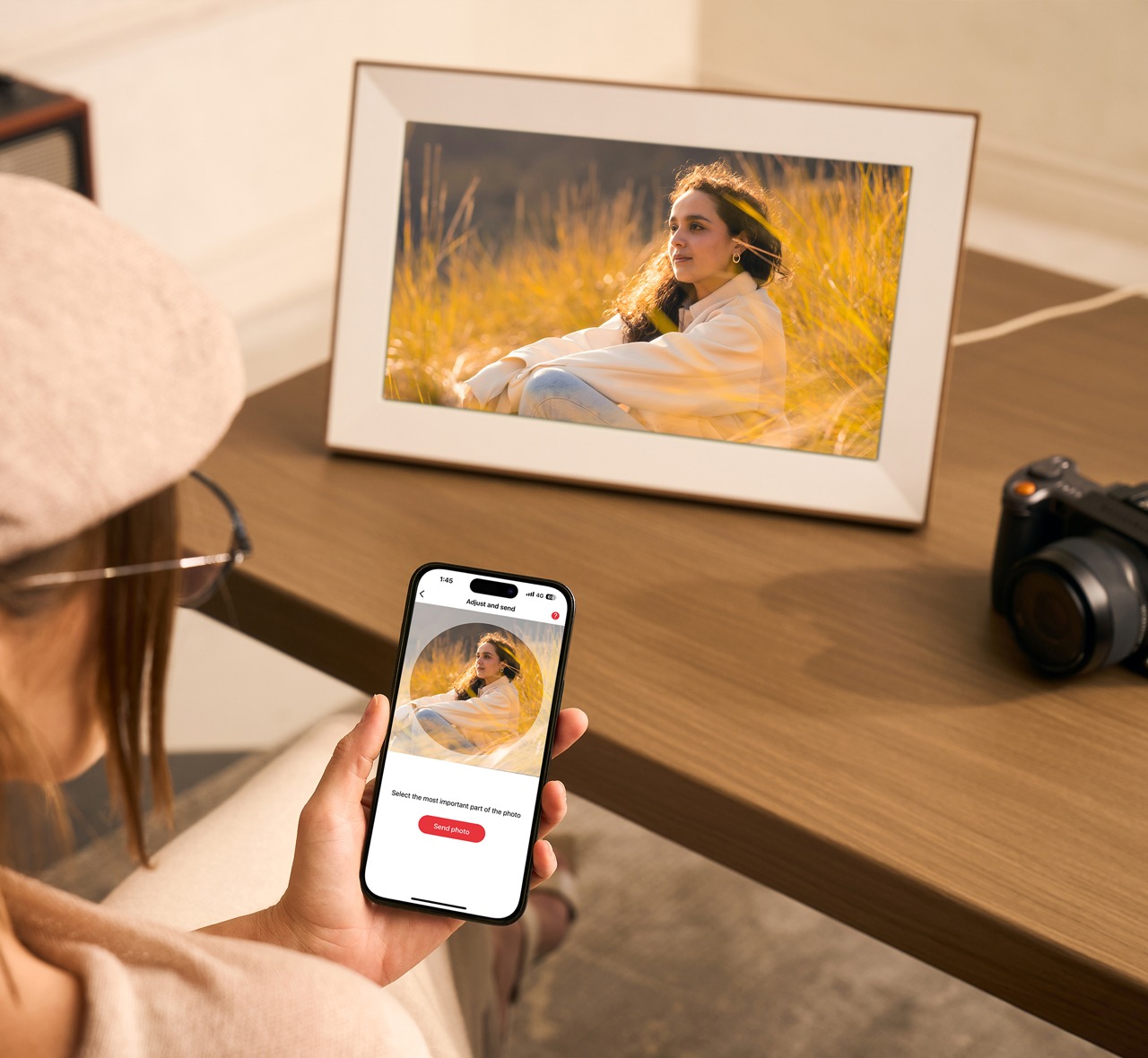
Of course, sending photos to the Starlight from your phone makes the experience feel almost magical, thanks to integrated Frameo support. The mobile app connects to the frame instantly without drama or confusion. Scan the QR code or type in the frame code, and your phone recognizes the device immediately. Sending photos becomes as natural as texting pictures to friends, which matters enormously for getting family members to actually contribute images regularly rather than forgetting about the frame.

The Frameo ecosystem makes sharing photos feel effortless and genuinely social rather than technical. Family members in different cities or countries send images that appear on the frame within seconds of tapping send. The system handles multiple contributors gracefully, organizing incoming photos by sender and allowing everyone to see who shared what without confusion.

Video clips up to 15 seconds capture brief, meaningful moments that photos alone can’t convey completely. While longer videos would expand creative possibilities, the time limit encourages sharing highlights rather than full recordings nobody watches. The built-in speaker provides clear audio for these short clips, adding voices and context that bring moments back to life.

The ten-photo limit for remote uploads seems restrictive initially but rarely causes problems during everyday use. Most sharing happens in small batches anyway: a few shots from dinner, a handful from the weekend trip. For complete vacation albums with hundreds of images, the SD card slot and USB connection handle bulk transfers without making you babysit uploads or watch progress bars creep forward.

Sustainability
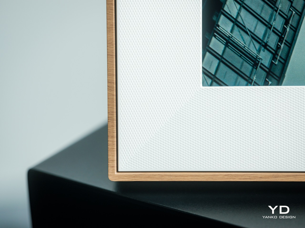
The frame’s construction suggests durability designed for years of daily use rather than quick obsolescence. The wood grain finish shows remarkable resistance to fingerprints, smudges, and general wear from regular touchscreen interaction. After days of handling, the surface maintains its original appearance without visible degradation, dulling, or wear patterns that would diminish its premium look.

Storage expansion capabilities prevent the frame from becoming obsolete as photo libraries grow from thousands to tens of thousands. Rather than hitting capacity limits and requiring complete replacement, the frame adapts to increasing storage needs through affordable SD cards. This flexibility supports sustainable consumption by extending the useful lifespan instead of forcing upgrades.
The digital format reduces environmental impact compared to traditional photo printing and physical framing habits. A single Starlight displays thousands of memories that would otherwise require paper, ink, shipping materials, and physical frames. For households that previously printed select favorites, the frame offers a more sustainable way to enjoy entire collections.
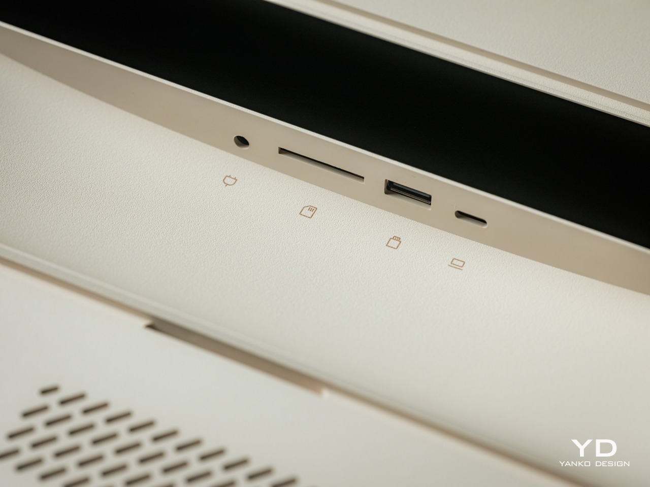
The frame’s offline functionality provides independence from cloud services that could potentially disappear or change. Once photos are loaded onto internal storage, they remain accessible forever regardless of internet connectivity or ongoing service availability. This autonomy means memories stay safe and visible even if business models change or companies discontinue cloud support unexpectedly.

Value

The Starlight occupies premium territory in the digital photo frame market, and pricing reflects the larger screen and distinctive features. Comparing gallery lighting, screen quality, and storage to similarly priced options reveals competitive positioning that justifies the investment. The feature combination makes sense for people who prioritize design and want tech that enhances spaces.

Gallery lighting alone differentiates the Starlight from most frames in any price range currently available. Competing products focus exclusively on display quality without considering how the device impacts room ambiance and atmosphere. The integrated lighting makes the Starlight both a photo display and a mood lighting element, effectively serving two purposes simultaneously.

The 64GB storage outpaces many frames offering 8GB or 16GB that charge extra for expansion cards. Starting with a generous internal capacity avoids constant photo management or forced deletions to accommodate new images. This abundance provides better long-term value by eliminating storage anxiety that ruins the experience of actually owning and enjoying the frame.
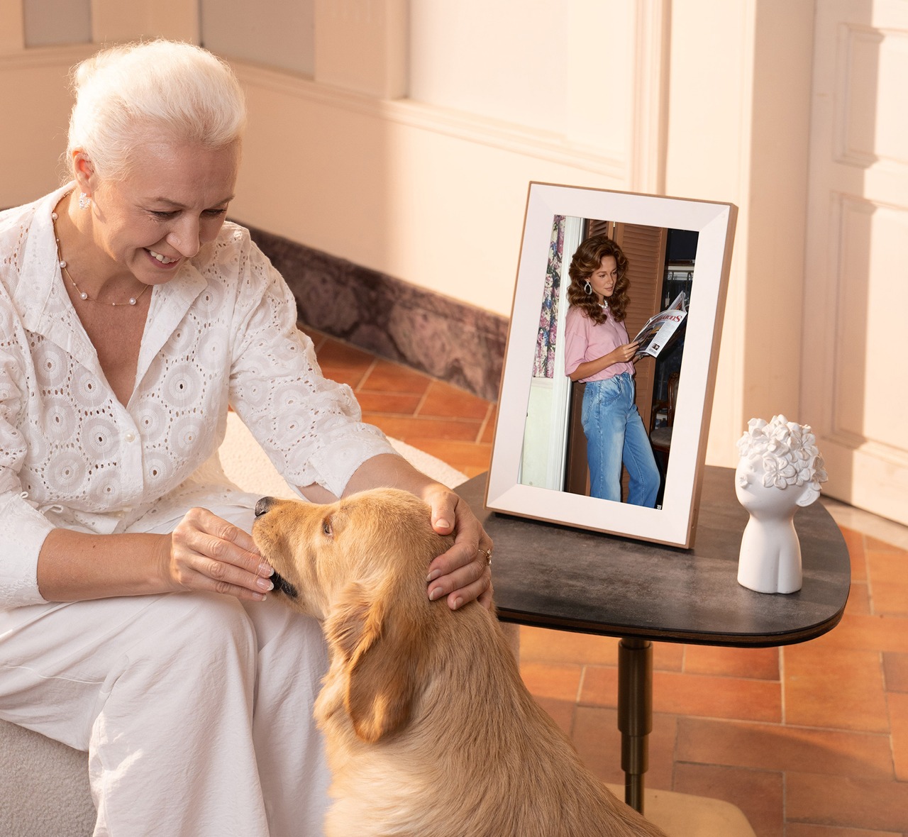
The Pexar Starlight works beautifully as a gift for parents, grandparents, or distant family members who might struggle with complicated tech. The simple setup and multi-contributor functionality make it especially valuable for keeping families connected across distances. The thoughtful packaging and premium presentation reinforce its identity as a meaningful gift rather than just another gadget.

Unlimited distance sharing adds genuine practical value for families spread across different cities, states, or countries. Grandparents receive photos from grandchildren instantly without wrestling with email attachments or complicated file transfers that confuse them. This simplicity increases the likelihood that the frame actually gets used regularly rather than gathering dust after initial novelty fades.

The wood grain finish and gallery lighting ensure the frame enhances home décor rather than detracting from carefully curated spaces. This design consideration adds real value for people who view their purchases through an aesthetic lens first. Premium looks justify premium pricing when the alternative means compromising on how your living space feels, functions, and welcomes guests.

Verdict
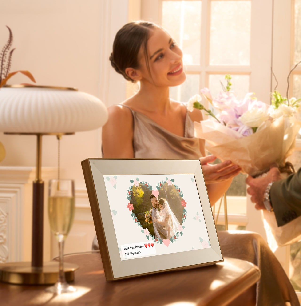
Living with the Pexar Starlight reveals a frame designed by people who understand both technology and how families actually interact with their memories. The gallery lighting, thoughtful materials, and anti-glare screen create experiences that go beyond simply displaying photos. Small design choices add up to something that feels special rather than utilitarian, making the frame something you want to show off.
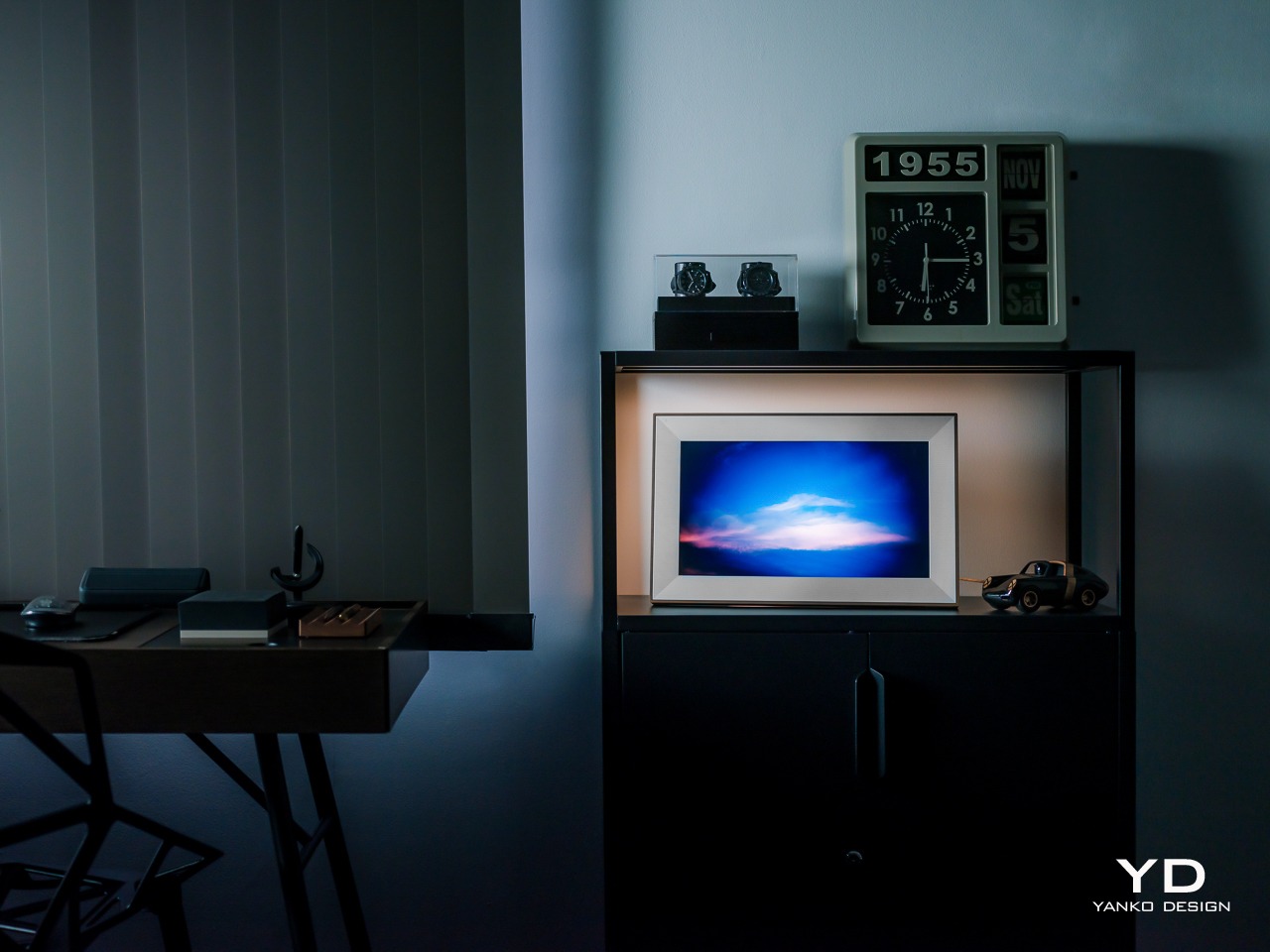
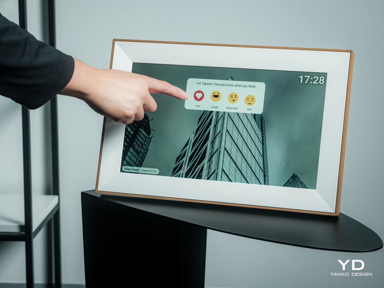
The Starlight shows how digital frames can contribute to atmosphere and aesthetics without sacrificing useful features. For anyone seeking a way to display memories that enhances their space while keeping loved ones connected, it delivers on both fronts convincingly. The frame makes digital memories feel as meaningful as the moments they preserve, which is ultimately what any photo display should accomplish.

Click Here to Buy Now: $349.

The post Pexar Starlight Review: 15.6″ Picture Frame That Lights Up Memories first appeared on Yanko Design.
Clock Makes Hours Appear and Disappear Through Moiré Patterns

Most clocks are content to quietly tick away in the background, marking the hours with little more than a glance from you throughout the day and night. But what if telling time could be mesmerizing instead, an experience that draws you in, sparks curiosity, and turns your wall into a living gallery worth watching? What if checking the time felt less like a chore and more like appreciating kinetic sculpture?

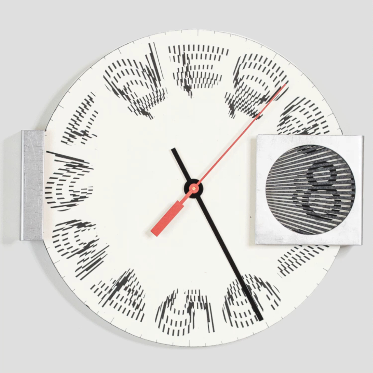
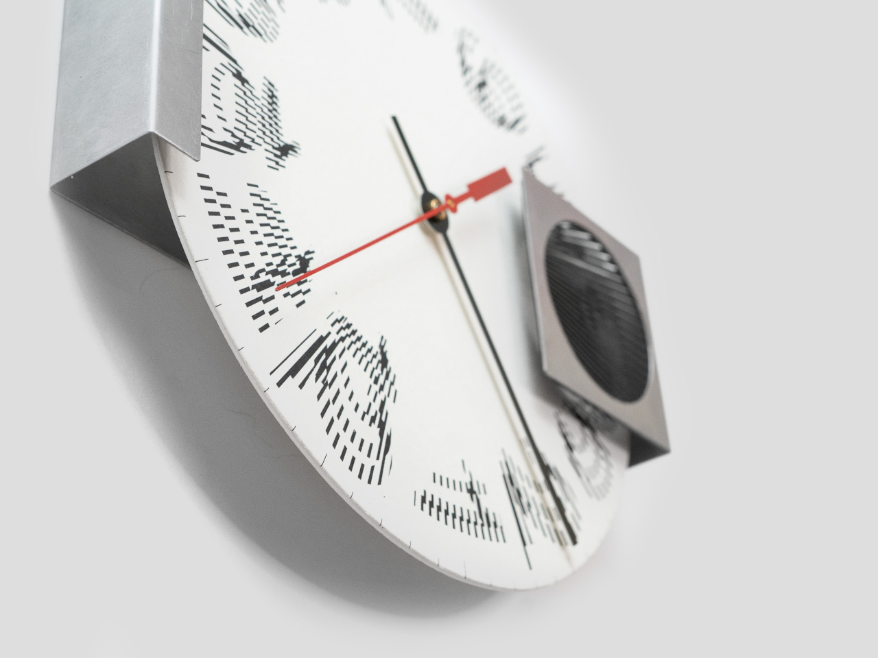
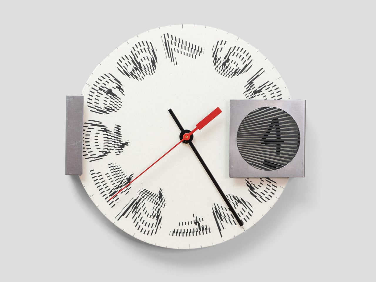
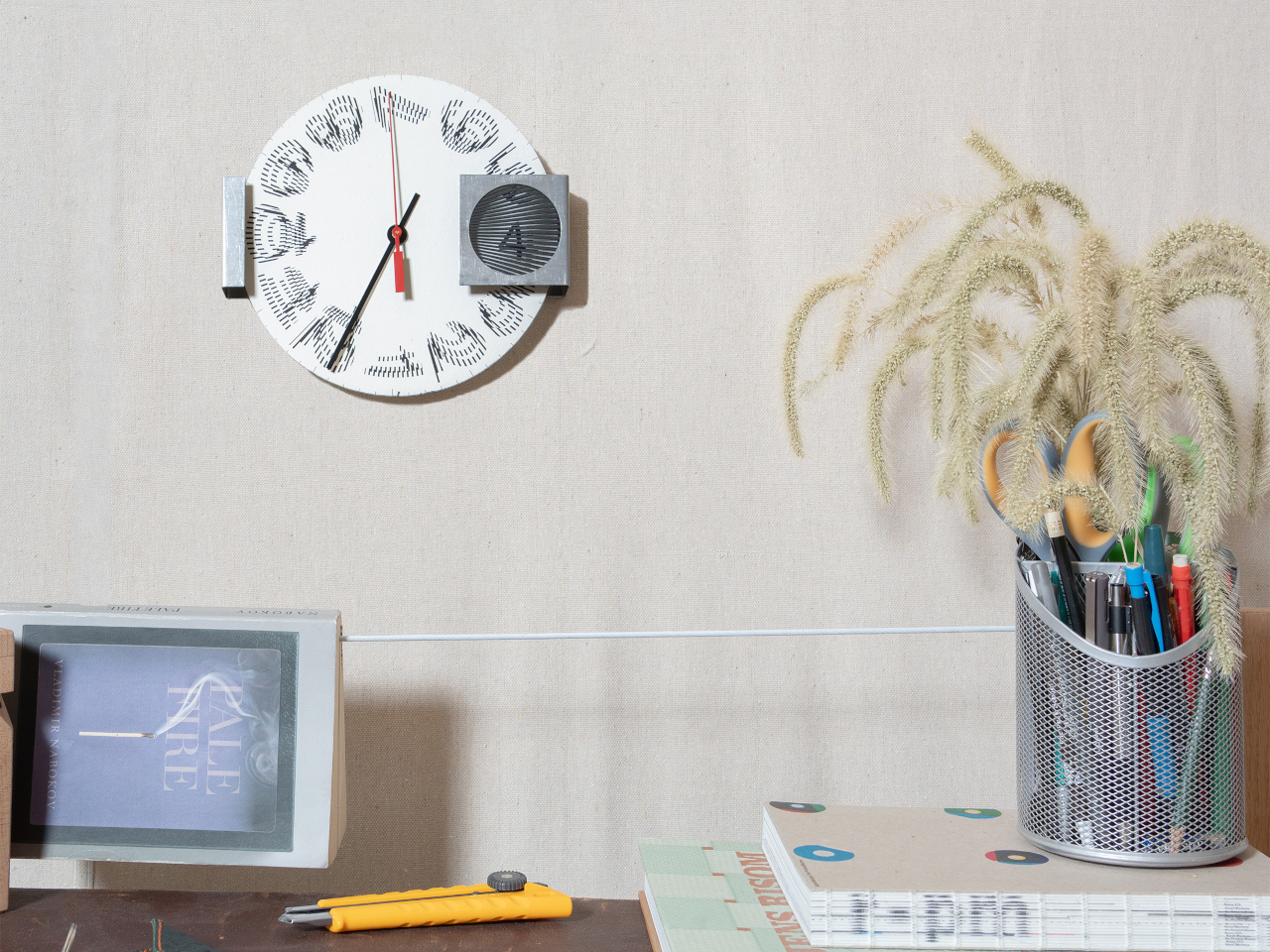
The Moiré Clock is a kinetic timepiece that turns the passage of time into a visual illusion worth watching throughout your day. Using overlapping patterns and continuous motion behind a striped filter, it animates each hour through optical phenomena, making time feel less like a number on a dial and more like a moment to savor. The design explores how perception and movement can create meaning beyond simple functionality.

Designers: Felix Cooper, Amber Li (STATION Design)

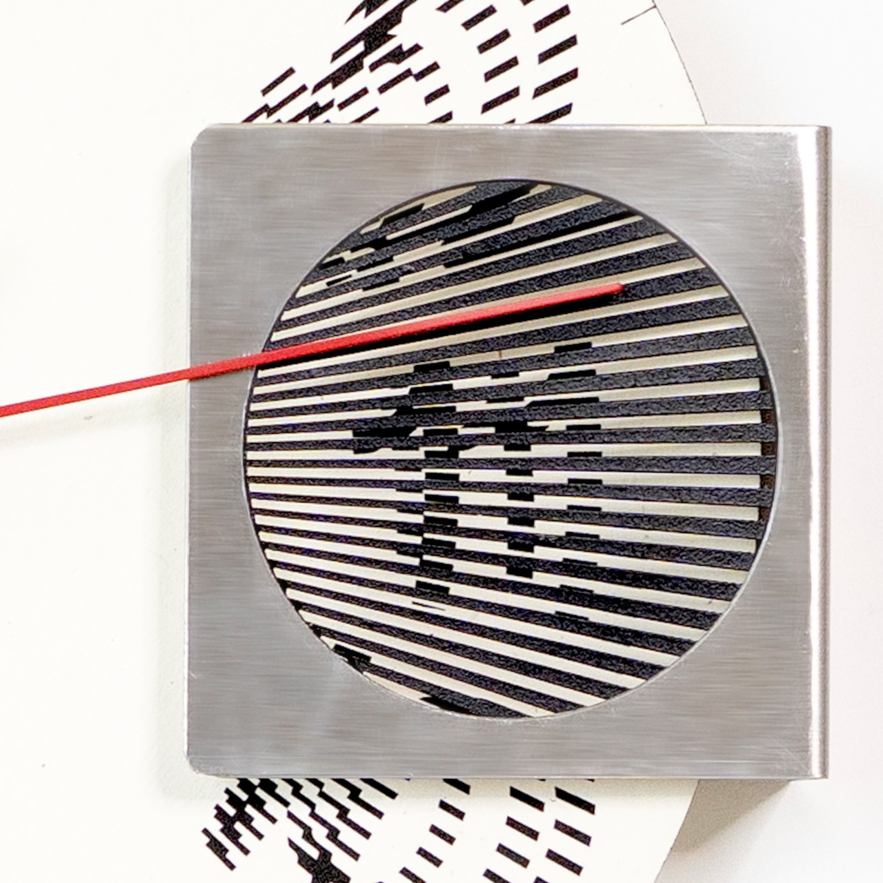
At the heart of the Moiré Clock is a rotating paper disc, printed with custom numerals and set behind a striped steel window that creates the optical magic through interference patterns. As the disc turns throughout the day, the moiré effect causes the hour numerals to morph, dance, and reveal themselves in a hypnotic display that changes with every passing minute behind the filter screen.

The minute and second hands ground the illusion in familiar movement while the hour appears and disappears in a mesmerizing rhythm behind the stationary filter window. The bold red second hand adds a pop of color and visual anchor, making the clock easy to read despite its unconventional hour display created by optical interference. The interplay between traditional clock elements and the animated moiré numerals creates a unique timekeeping experience.

The clock is a study in material contrasts between industrial and artisanal manufacturing traditions. Crisp white paper milled by French Paper Company in Michigan, American-made steel sourced from Pennsylvania, and a quartz movement from Takane, the last US manufacturer of clock mechanisms still producing domestically. The tactile paper face and brushed steel housing give the piece a sense of warmth and industrial substance that goes beyond typical wall clocks.

At 8.5 inches wide and just 2.5 inches deep, it’s compact enough for a home office, studio, or hallway without dominating the wall space, but bold enough to stand out as functional art that deserves attention. Setting up the clock is straightforward: add a single AA battery, set the time using the rear dial, and hang it with a nail or push pin. The paper components invite gentle handling.

The kinetic numerals and bold red second hand make each glance at the clock a small event worth experiencing, turning routine time checks into moments of visual delight throughout your day at home or in creative spaces. For anyone who wants their home to feel creative and alive with kinetic energy, the Moiré Clock brings a sense of play and wonder that traditional clocks simply cannot match or replicate with static designs.

The post Clock Makes Hours Appear and Disappear Through Moiré Patterns first appeared on Yanko Design.

Nubia Z80 Ultra Review: Style, Stamina, and a 35mm Camera Edge

PROS:


  • Stunning "true full-screen" experience

  • Eye-catching Van Gogh-inspired Starry Night design

  • 50MP camera with 35mm optical lens gives a more natural "human eye" output

  • Dual-stage physical button mimics tactile camera experience

CONS:


  • Not available in markets like the US, UK

  • Ultra-wide camera has no OIS

RATINGS:

AESTHETICS
ERGONOMICS
PERFORMANCE
SUSTAINABILITY / REPAIRABILITY
VALUE FOR MONEY

EDITOR'S QUOTE:

The nubia Z80 Ultra delivers the rare combination of professional 35mm optics, multi-day battery stamina, and a truly notch-free display in a design that refuses to blend in.

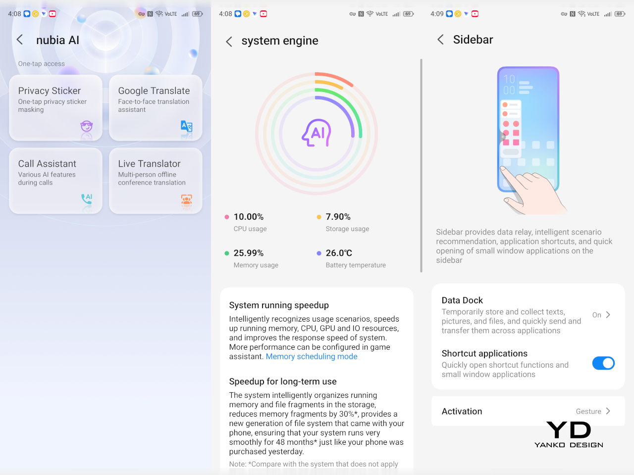
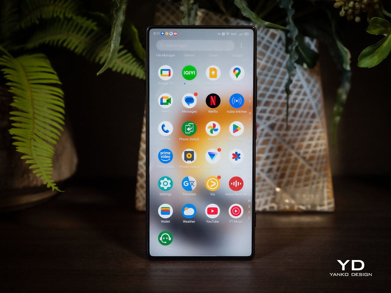
Flagship smartphones have become predictable, with most settling into the same design language, camera arrays, and battery compromises that force users to choose between power and portability every year. The nubia Z80 Ultra breaks from that pattern with a phone that bets big on three things other flagships often sacrifice: a truly immersive, notch-free display; a massive 7200mAh battery that lasts days; and a 35mm optical lens that brings a professional photographic perspective to smartphone photography.

Powered by the Snapdragon 8 Elite Gen 5, the nubia Z80 Ultra targets users who want a device that excels at gaming, photography, and endurance without forcing compromises. Available in Black, White, and a limited Starry Night Blue edition, the phone blends bold design with technical innovation, aiming to stand alongside the best from Samsung and Apple while carving its own path through unique features and design philosophy. But does it deliver its promises beyond the juicy spec sheet? We take it for a spin to find out.

Designer: nubia

Aesthetics

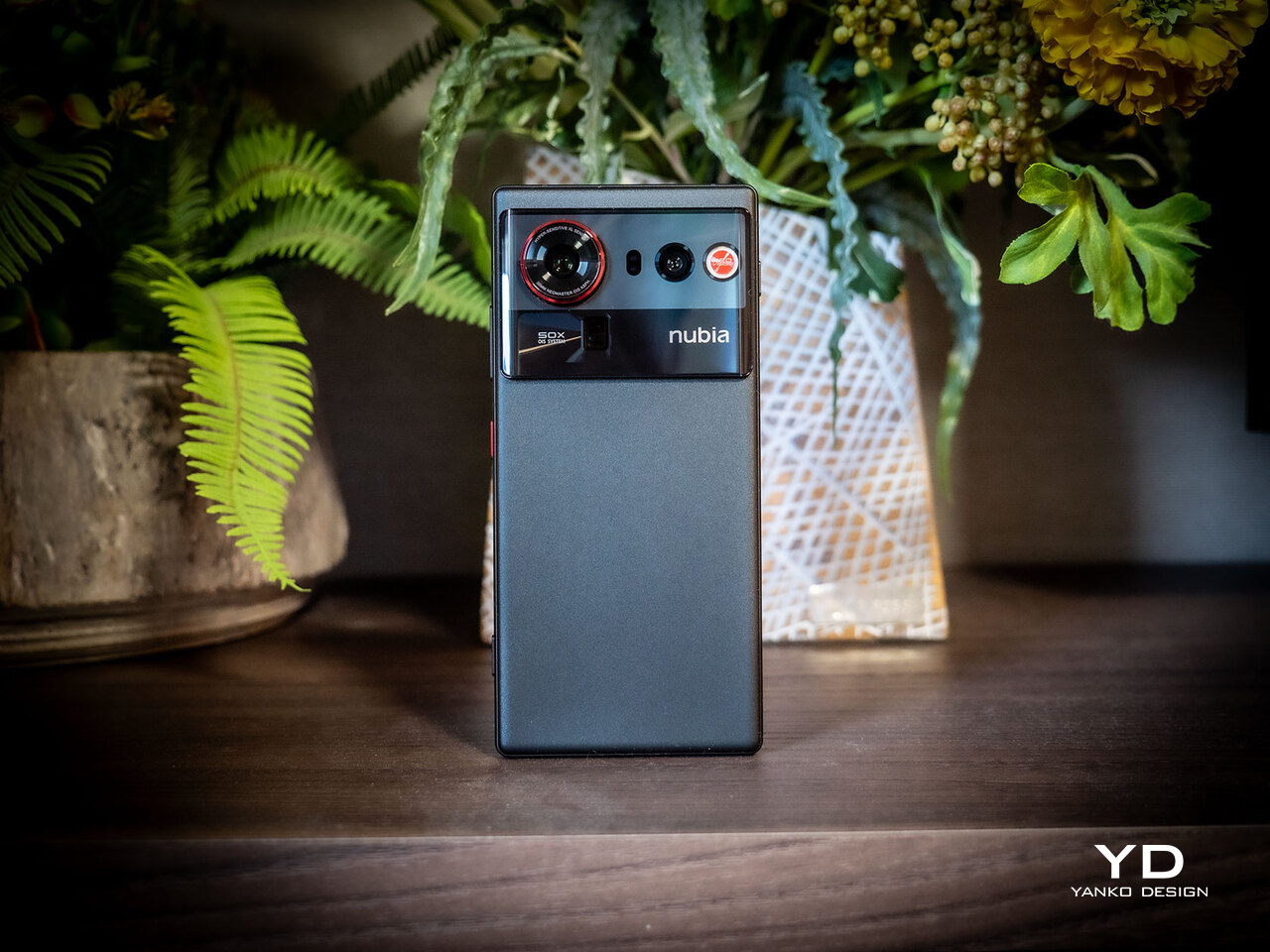
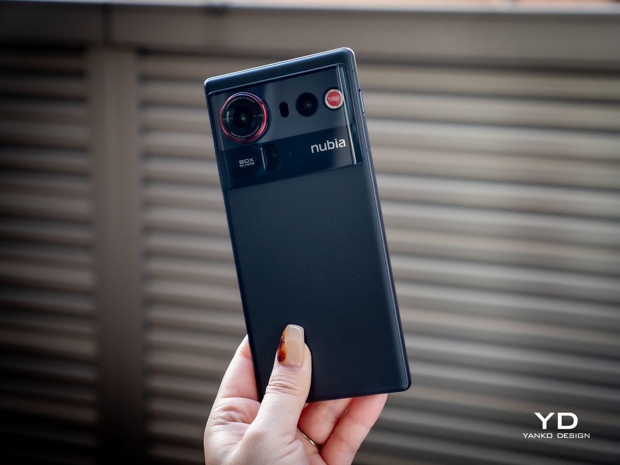
The Z80 Ultra’s design immediately sets it apart from the sea of glass-and-metal rectangles dominating the flagship space right now. The review unit in black showcases a soft stardust matte finish that resists fingerprints and feels warm to the touch rather than cold and clinical. The luminous red ring encircling the main camera creates a visual anchor, drawing the eye without overwhelming the minimalist rear panel’s clean geometry.

The camera module occupies slightly less space than previous-generation nubia flagships, giving the back a more balanced, less top-heavy appearance. The arrangement of three lenses, flicker sensor, and laser autofocus module within the raised island feels considered and symmetrical. The DECO area occupies just 13 percent of the back, leaving plenty of room for the nubia branding and the distinctive red physical button on the right edge.

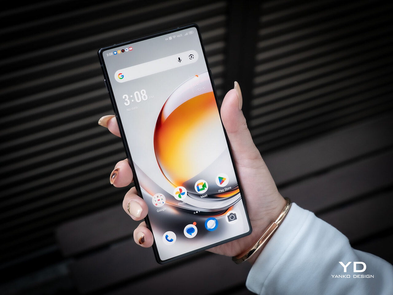
The four-sided curved bonding process and subtle arc edges give the nubia Z80 Ultra a refined, ergonomic profile. The 2nd-generation Longxi glass front is smooth and flat with a 2.5D flexible display that curves gently at the edges, creating a seamless transition between screen and frame. The crystal fiber body feels substantial and premium, while the rounded corners prevent any sharpness or discomfort during extended holding periods.

The Blue Starry Night edition takes the aesthetic in a dramatically different direction, with a Van Gogh-inspired swirling pattern across the entire back panel. This artistic approach makes the phone feel like a collectible statement piece rather than just a communication device. The black variant reviewed here offers understated elegance for those who prefer subtlety, while the white version provides a clean, modern alternative for minimalists.

Ergonomics

Despite the large 6.85-inch display, the Z80 Ultra manages to feel balanced and manageable in daily use. The curved back and tapered edges nestle comfortably in the palm, distributing the 227-gram weight evenly across the hand. The device never feels unwieldy during extended gaming sessions or prolonged photo walks, thanks to the thoughtful weight distribution and grip-friendly curves that encourage natural hand positioning.

The dual-stage physical camera button on the right edge provides tactile control that touchscreen shutters simply cannot match. Half-pressing focuses and locks exposure, while a full press captures the shot with satisfying mechanical feedback. For mobile photography enthusiasts who miss the feel of dedicated cameras, this button brings back the ritual of deliberate shooting. The button’s placement is natural for index finger access during landscape shooting.

Button placement follows a logical pattern, with the power button and volume rocker positioned for easy thumb access during normal holding. The ultrasonic fingerprint sensor embedded in the display responds instantly, unlocking the phone in well under a second. The customizable shortcut key can be programmed for quick camera access, flashlight activation, or any frequently used function, adding convenience without cluttering the minimal design.

The phone slips into jeans pockets without excessive bulk, though its width may challenge smaller pockets or hands. The slim 8.6mm profile helps offset the large footprint, and the matte finish prevents the phone from sliding on smooth surfaces when placed face-up on tables or desks during meetings and meals.

Performance

The Snapdragon 8 Elite Gen 5, paired with up to 24GB LPDDR5X RAM and 1TB UFS 4.1 storage, delivers flagship performance that handles everything from intensive gaming to rapid photo editing without breaking stride. App launches are instantaneous, multitasking between dozens of apps feels seamless, and sustained gaming maintains stable frame rates thanks to the advanced cooling architecture working quietly in the background.

The REDMAGIC CUBE Gaming Engine optimizes power delivery and thermal management during gameplay. Running demanding titles like Genshin Impact at maximum settings with the 144Hz display active, the phone maintains smooth performance with minimal frame drops. The AI Super Frame Stabilization keeps motion fluid even during fast-paced action, while the 3000Hz touch sampling rate ensures every tap and swipe registers immediately for competitive advantage.

The advanced composite liquid metal and oversized 3D Ice Steel vapor chamber cooling system represents a significant upgrade, increasing cooling area by 35 percent over previous models. This thermal management prevents the performance throttling that plagues thinner flagships during sustained loads. During extended gaming sessions lasting over an hour, however, the phone got a little warm to the touch, but not so much to be uncomfortable.

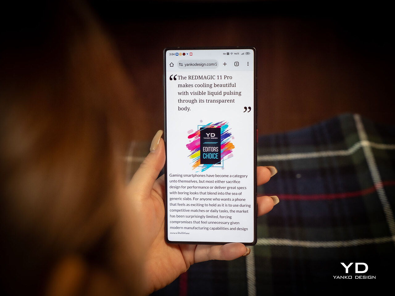
The 6.85-inch BOE X10 AMOLED display is the star of the show, offering a truly immersive, notch-free viewing experience. The 1.5K resolution (2688×1216) delivers sharp text and detailed imagery, while the 144Hz refresh makes scrolling and gaming feel buttery smooth. Peak brightness of 2000 nits means the screen remains visible even in direct sunlight, and the 100 percent DCI-P3 color gamut ensures photos and videos look vibrant and accurate.

The under-display camera technology hides the 16MP selfie camera beneath the screen, preserving the seamless visual experience. While selfie quality in challenging low light doesn’t quite match dedicated punch-hole cameras, the trade-off for an uninterrupted display feels worthwhile for content consumption, gaming, and the overall visual aesthetic. Outdoor and well-lit selfies remain sharp and detailed, making the compromise reasonable for most users.

The triple camera system built around the 35mm f/1.7 main lens offers a perspective that feels natural and professional compared to the wider 24mm or 26mm lenses most flagships employ. Street photography, portraits, and documentary-style shots benefit from the reduced distortion and beautiful subject isolation that 35mm provides. The focal length matches human vision more closely, making compositions feel intuitive and authentic rather than artificially wide or compressed.

The 50MP ultra-wide and 64MP telephoto round out the system, providing versatile coverage from macro close-ups at 5.5cm to 85mm equivalent for portraits and distant subjects. The dual-stage camera button, combined with over 21 creative filters and Pro mode controls, makes the nubia Z80 Ultra feel like a dedicated camera that happens to make phone calls rather than the other way around. Strangely, while both main and telephoto cameras tout optical image stabilization or OIS, the ultra-wide shooter doesn’t.

The massive 7200mAh silicon-carbon battery delivers multi-day endurance that surpasses virtually every flagship competitor. Moderate use with mixed gaming, photography, and streaming easily stretches to two full days, while lighter use can push three days between charges. The 80W wired charging reaches 50 percent in about 20 minutes, and the 80W wireless charging (with nubia’s wireless charging kit) offers cable-free convenience without sacrificing speed.

Sustainability

Build quality inspires confidence from the moment the phone comes out of the box. The crystal fiber construction feels solid and resistant to flex, while the Longxi glass front shows excellent scratch resistance during daily use. The matte back finish hides minor scuffs and maintains its appearance even after weeks of handling without a case, though the included magnetic case adds protection without bulk.

The IP68 and IP69 ratings provide exceptional durability for real-world conditions. The phone survives accidental spills, rain exposure, and even high-pressure water jets during testing scenarios, emerging unscathed and fully functional. This level of protection adds confidence for daily carry in any weather, at the beach, or during outdoor photography sessions where conditions can’t always be controlled. The robust sealing around ports and buttons maintains integrity without compromising accessibility.

Value

The nubia Z80 Ultra positions itself as a flagship alternative that offers premium features without commanding the absolute highest prices in the market. The combination of the 35mm optical lens, 7200mAh battery, truly full-screen display, and advanced cooling system creates a value proposition that stands out from competitors who often sacrifice one or more of these features for slimness or cost savings.

For photography enthusiasts, the 35mm lens alone justifies consideration. Where most flagship cameras default to wider 24mm perspectives that distort faces and architecture, the nubia Z80 Ultra’s 35mm provides the “humanist eye” perspective prized by professional photographers for natural, pleasing compositions. The dual-stage physical button and extensive manual controls add value for users who want creative control rather than purely computational photography.

One significant limitation affects the Z80 Ultra’s global value proposition: regional availability. The phone is not officially sold in some countries, such as the United States, Canada, the United Kingdom, or Japan, limiting access for many potential buyers. This limited availability means warranty support, software updates, and customer service may be challenging for buyers outside official markets. Network band compatibility and potential import costs could also affect value for those considering gray-market purchases.

Verdict

The nubia Z80 Ultra delivers on its promise of blending style, stamina, and photographic substance in a package that stands apart from mainstream flagships. The combination of a truly immersive notch-free display, professional 35mm camera optics, and exceptional battery life creates a phone that excels at the things that matter most for daily use: consuming content, capturing memories, and staying powered throughout extended days without constant charging anxiety.

For design-conscious users who value innovation over brand familiarity, nubia the Z80 Ultra offers a refreshing alternative with its bold aesthetic choices, tactile controls, and technical features that prioritize user experience over spec-sheet bragging rights. While limited regional availability may restrict its audience, those in supported markets will find a flagship that confidently competes with the best while carving its own distinctive identity through thoughtful design and engineering choices.

The post Nubia Z80 Ultra Review: Style, Stamina, and a 35mm Camera Edge first appeared on Yanko Design.
Fitnexa SomniPods 3 Block 42dB of Noise for Side Sleepers

Anyone who has shared a bed with a snorer or tried to sleep in a city apartment knows how fragile nighttime silence can be. Most earplugs force you to choose between blocking noise and staying comfortable, leaving you either wide awake from unwanted sound or unable to sleep from constant pressure against your ear canal throughout the night.

Fitnexa SomniPods 3 was designed as a solution to that trade-off by making silence and comfort coexist rather than compete. Every curve and contour is shaped around one core idea: earbuds that disappear against your pillow while the world around you fades to quiet, without forcing you to sacrifice either aspect for the other during extended wear.

Designer: Fitnexa

Click Here to Buy Now: $129.99 $189.99 ($60 off). Hurry, deal ends soon!

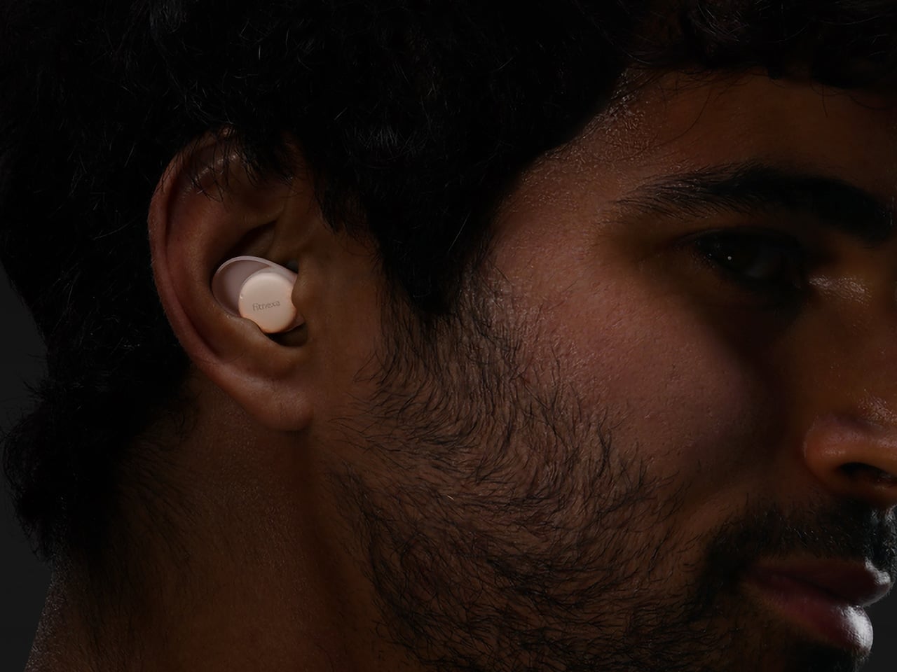
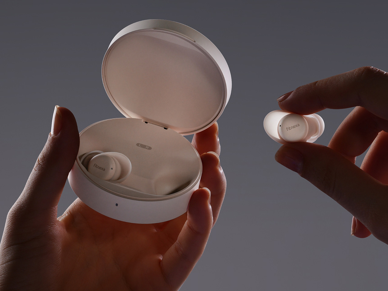
The design starts with a fundamental question: how do people actually sleep, rather than how engineers typically design for performance first. Each earbud reflects that thinking through its proportions: just 3.3 grams and under 9.9 millimeters thin, with a softly rounded form that avoids creating pressure points when your head rests sideways on a pillow for hours at a time. The medical-grade silicone tips feel gentle against your skin, while the compact footprint ensures the earbuds never protrude or press uncomfortably as you shift naturally through the night.

Fitnexa includes ten pairs of ear tips in two distinct shapes and five sizes each, plus four sizes of ear wings for additional stability options. This variety addresses the reality that ear canals vary significantly between people, while multiple size options ensure proper acoustic seal without creating pressure or discomfort during overnight wear when you can’t easily adjust fit.

This variety does more than improve comfort alone. It establishes the foundation for effective passive noise cancellation by ensuring a secure, well-sealed fit that blocks ambient sound naturally. This proper seal gives the adaptive ANC system the stable acoustic base it needs to perform at its best throughout the night without gaps or inconsistencies.

Building on that passive isolation foundation, the hybrid ANC system uses feedforward and feedback microphones to detect and cancel noise from both outside and within the ear canal itself. A low-latency processor generates counter-phase signals in real time to maintain consistent quiet as you move or change sleeping positions naturally throughout the night.

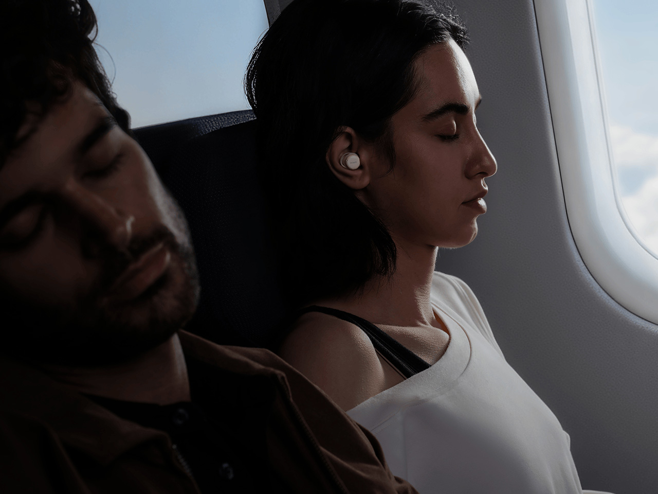
Within the ANC system, Adaptive Leak Compensation continuously senses subtle changes in ear canal pressure or seal integrity and automatically adjusts the ANC response in real time. The result is up to 42 decibels of noise reduction across different sleeping positions. Snoring, traffic, the hum of air conditioners, all fade into natural silence while SomniPods 3 hold the soundscape steady, whether you’re on your back or on either side.

The IPX4 water resistance extends design thinking beyond the bedroom into real-world scenarios where sleep happens in imperfect conditions. After-workout naps and long flights no longer require worry about moisture damage. Hi-Res Audio with LDAC and aptX Lossless keeps sound quality rich and detailed, while the 10-band EQ lets you adjust the experience precisely to match preferences.

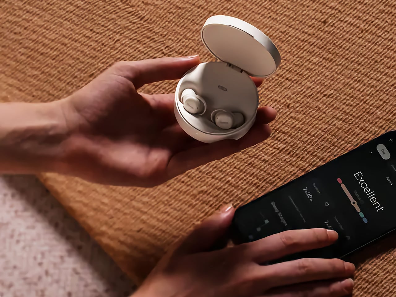
Battery life reaches up to 12 hours in Sleep Mode, extending to 48 hours with the charging case for multiple nights without interruption. Integrated sensors quietly track sleep stages and positions throughout the night, while the Fitnexa app translates that data into AI-driven insights that help you build better sleep habits gradually over time without overwhelming you with information.

Fitnexa SomniPods 3 bring together comfort, advanced noise cancellation, and smart sleep coaching into a discreet package that actually works for real-world use. For anyone tired of restless nights and noisy environments, these earbuds offer a smarter, quieter way to sleep, no matter where life takes you or what challenges your bedroom environment presents.

Click Here to Buy Now: $129.99 $189.99 ($60 off). Hurry, deal ends soon!

The post Fitnexa SomniPods 3 Block 42dB of Noise for Side Sleepers first appeared on Yanko Design.
Teenage Engineering’s latest Microphone is the most unserious yet brilliant piece of music tech we’ve seen

Teenage Engineering has never been content to stay within conventional product categories, consistently pushing boundaries between instruments, toys, and art objects. Their approach to music hardware combines Swedish design sensibilities with genuine technical innovation, creating devices that feel both familiar and revolutionary. The company’s latest announcement signals another bold expansion into uncharted territory, moving beyond synthesizers and samplers into the world of vocal performance.

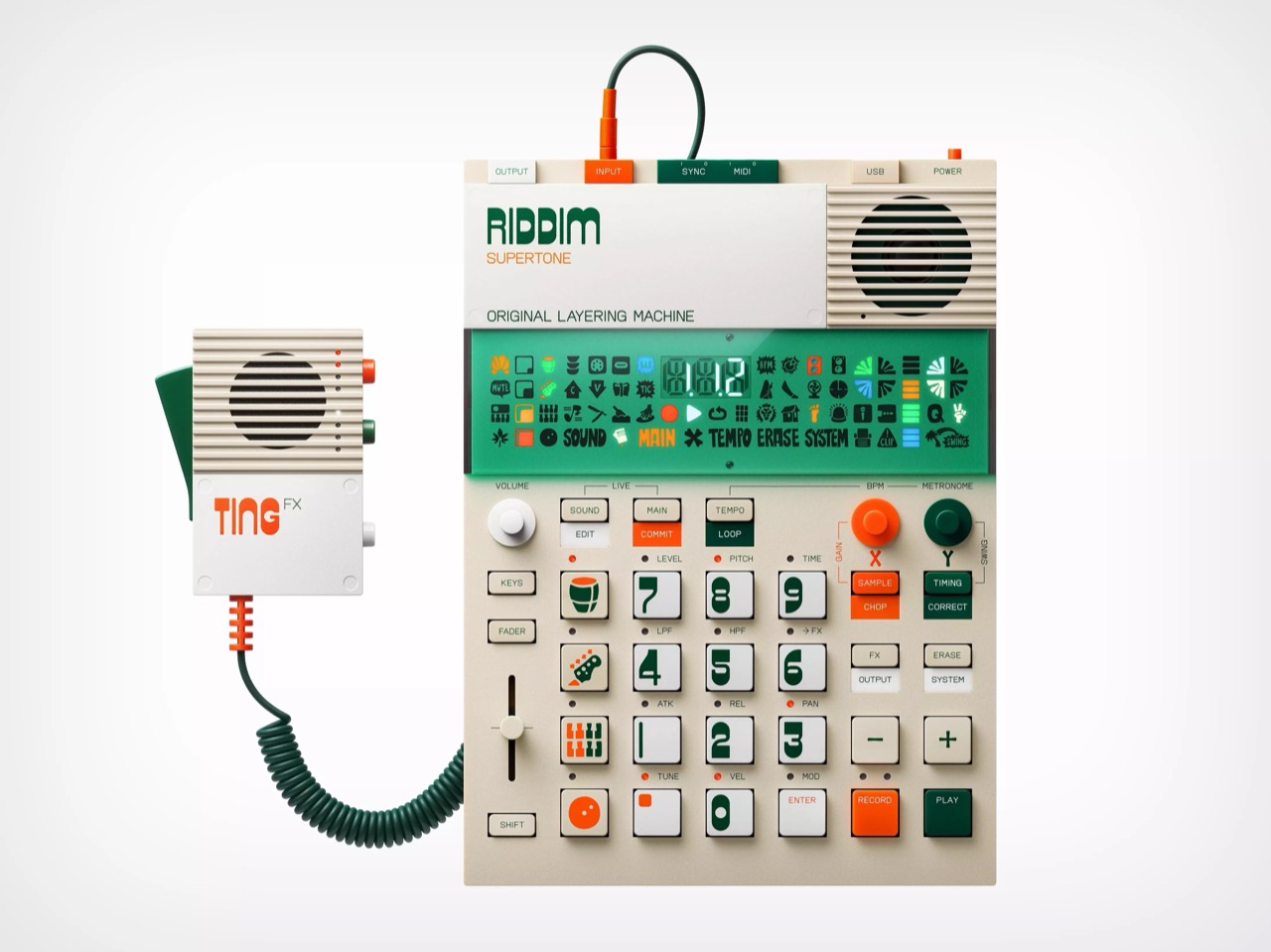
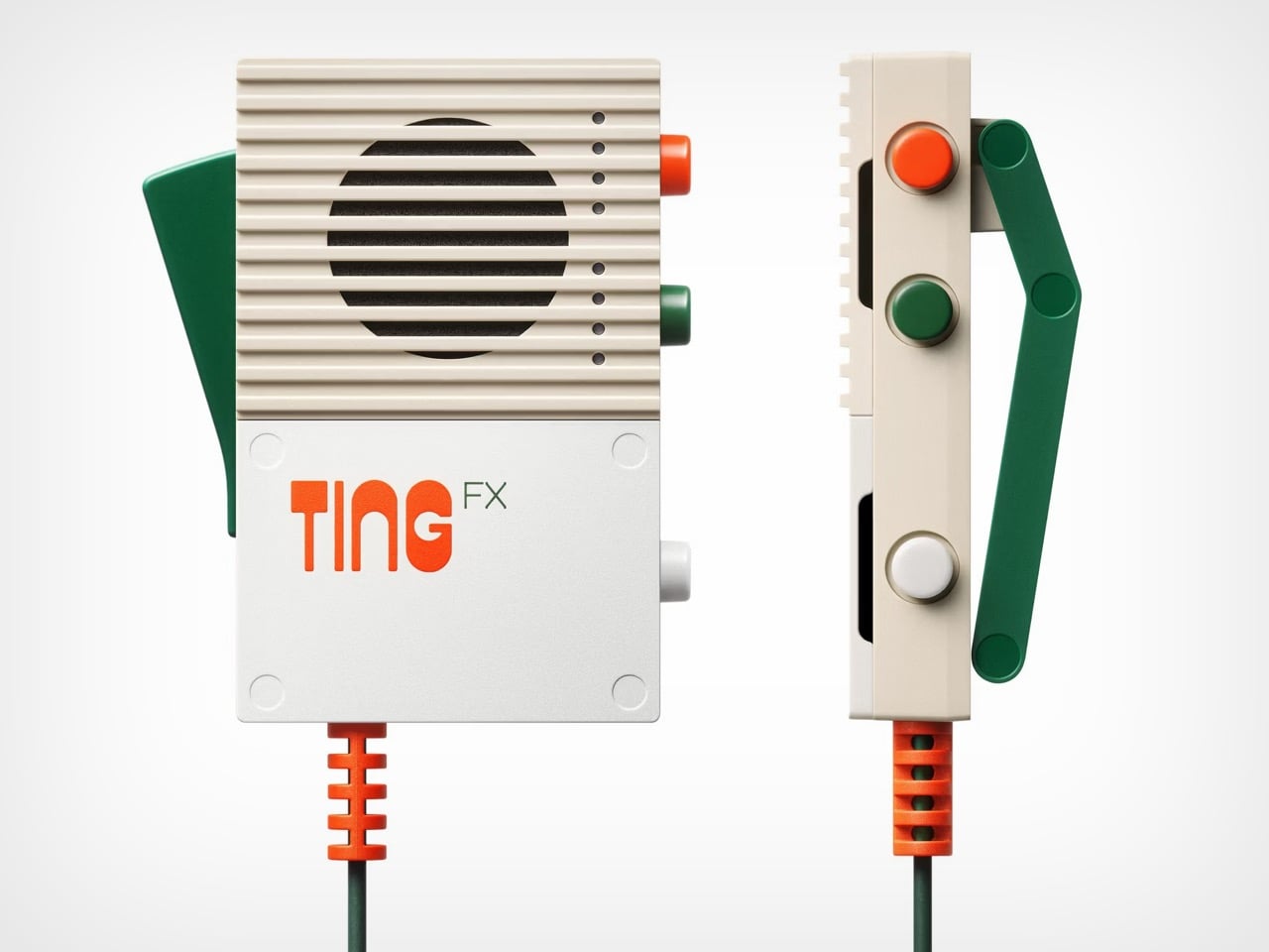
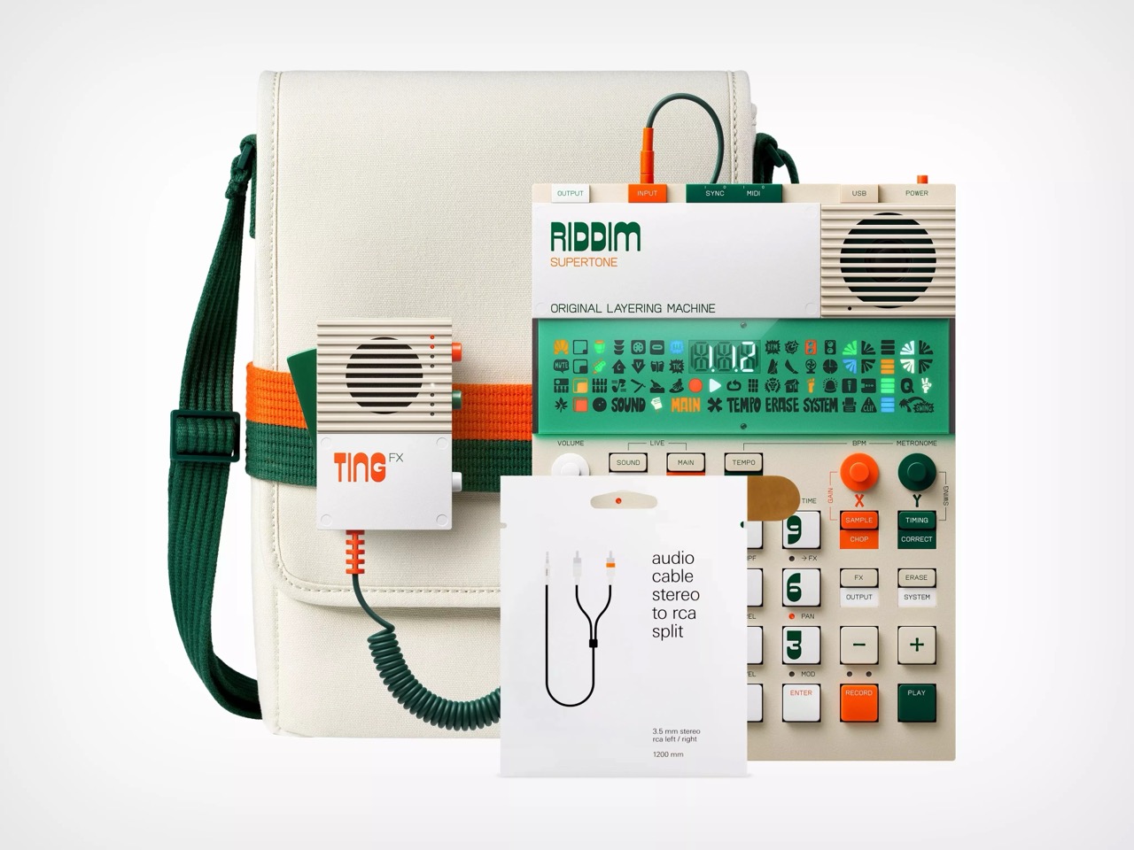
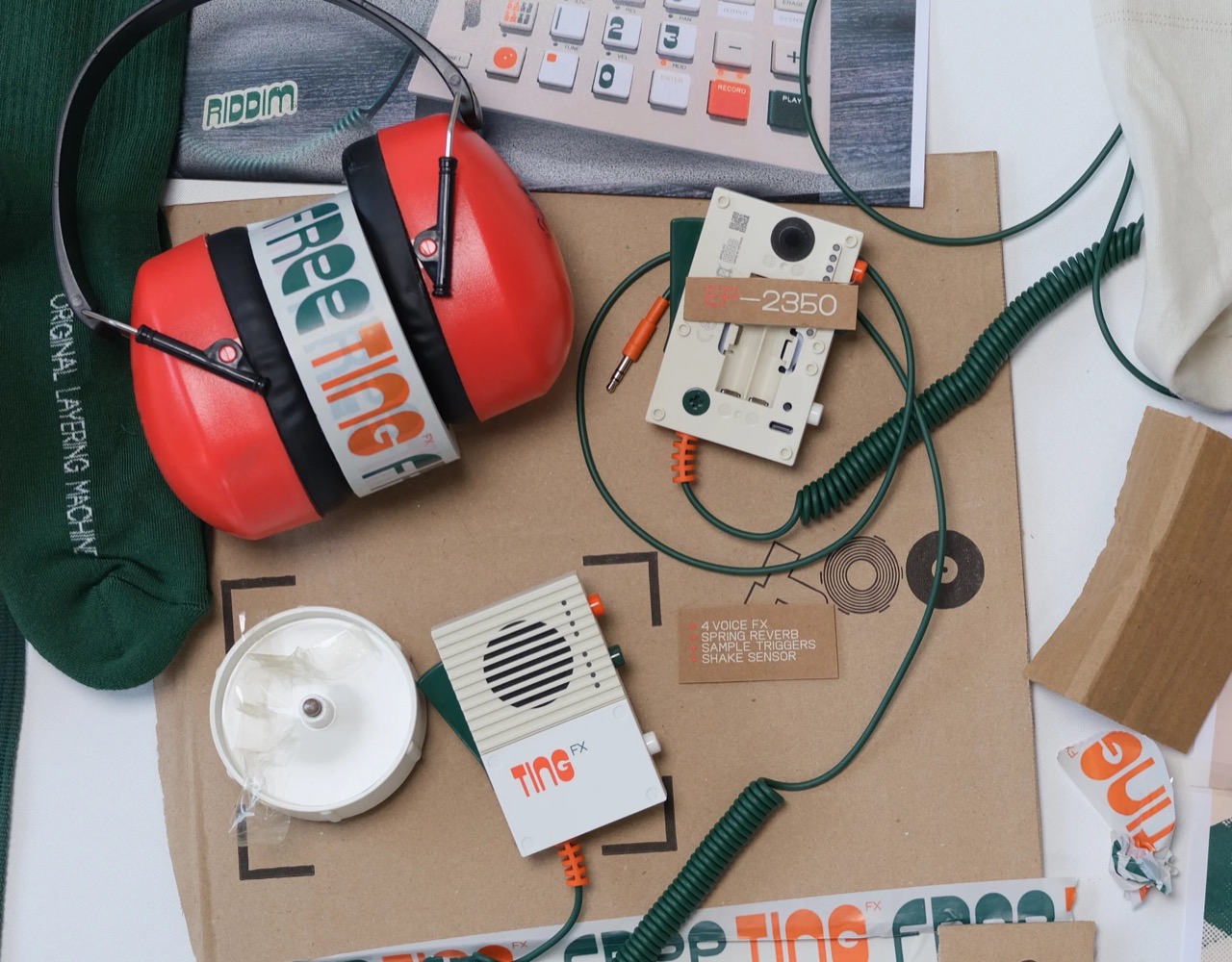
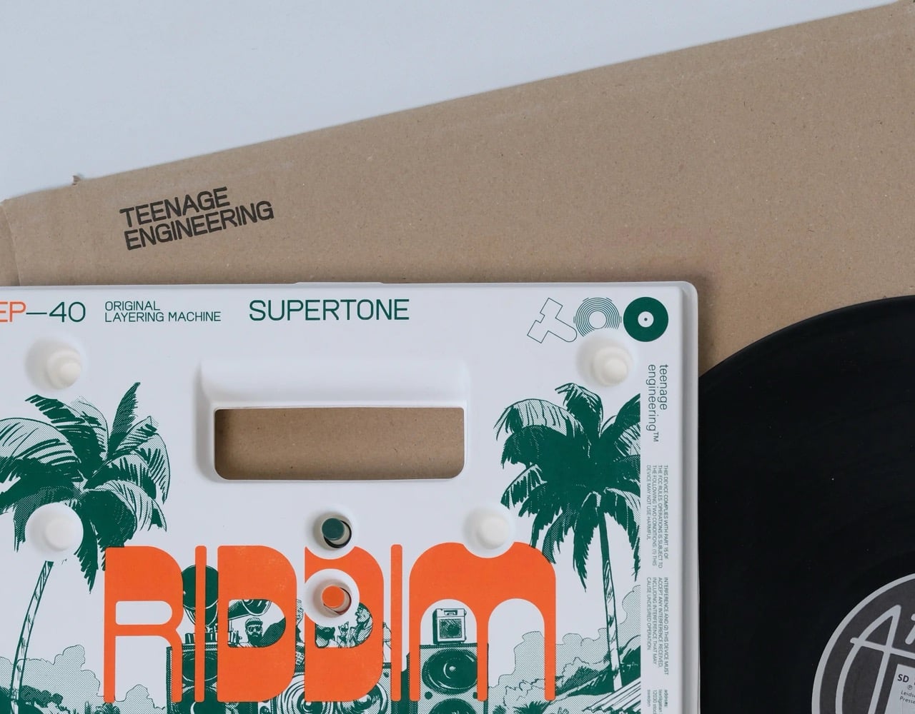
Today’s unveiling of the “Riddim N’ Ting” bundle showcases this adventurous spirit, pairing the recently released EP-40 Riddim sampler with the brand-new EP-2350 Ting microphone. The Ting represents Teenage Engineering’s first foray into microphone design, but it is far from a traditional vocal mic. Instead, it is a compact effects processor, sample trigger, and vocal manipulator rolled into one handheld device, complete with motion sensors and live-adjustable parameters that let performers tilt and move the mic to control everything from echo intensity to robotic voice modulation in real time.

Designer: Teenage Engineering

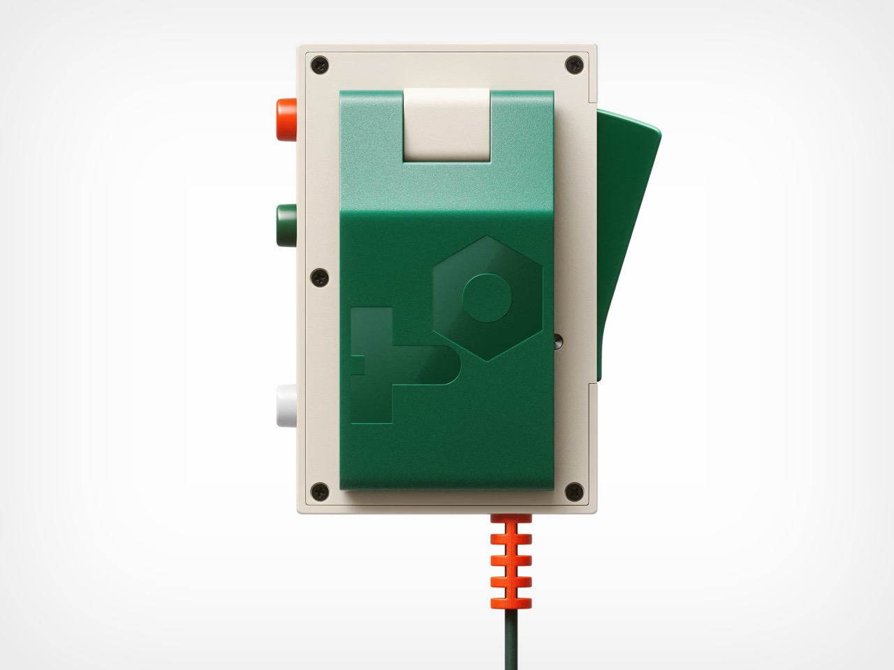
So the Ting itself is this ridiculously lightweight object, weighing a scant 90 grams, that feels less like a piece of serious audio equipment and more like a prop from a retro sci-fi film. That’s the point. It houses four primary effects: a standard echo, an echo blended with a spring reverb, a high-pitched “pixie” effect, and a classic “robot” voice. A physical lever and an internal motion sensor allow you to manipulate the effect parameters by physically moving the mic, turning a vocal performance into a kinetic activity. Four buttons on the side are dedicated to triggering samples, which come preloaded with sound system staples like air horns and lasers but are fully replaceable. It’s a dedicated hype-mic, a performance tool designed for immediate, tactile fun rather than pristine vocal capture.

Its lo-fi audio character is a feature, not a bug, leaning into the saturated, gritty vocal sounds that define dub and dancehall sound system culture. While you could draw parallels to devices like Roland’s VT-4 for vocal processing or Korg’s Kaoss Pad for real-time effects, the Ting’s genius is its form factor. It integrates these functions directly into the microphone itself, removing a layer of abstraction and making the performance more immediate. It connects to any system via a 3.5mm line out, but it’s clearly designed to be the perfect companion for its partner device. This is where the workflow becomes a self-contained creative loop.

That partner, the EP-40 Riddim, is the anchor for all the Ting’s chaotic energy. While it follows the established format of the EP-series, its focus is sharp. It’s a sampler and groovebox loaded with over 400 instruments and sounds curated by legendary reggae producers like King Jammy and Mad Professor. The specs are solid: 12 stereo or 16 mono voices, a 128MB system memory, and a subtractive synth engine for crafting classic bass and lead tones. It includes seven main effects and twelve punch-in effects, all tailored for dub-style mixing. Connectivity is standard for Teenage Engineering, with stereo and sync I/O, MIDI, and USB-C. It’s a capable sampler on its own, but its true purpose is realized when paired with the Ting.

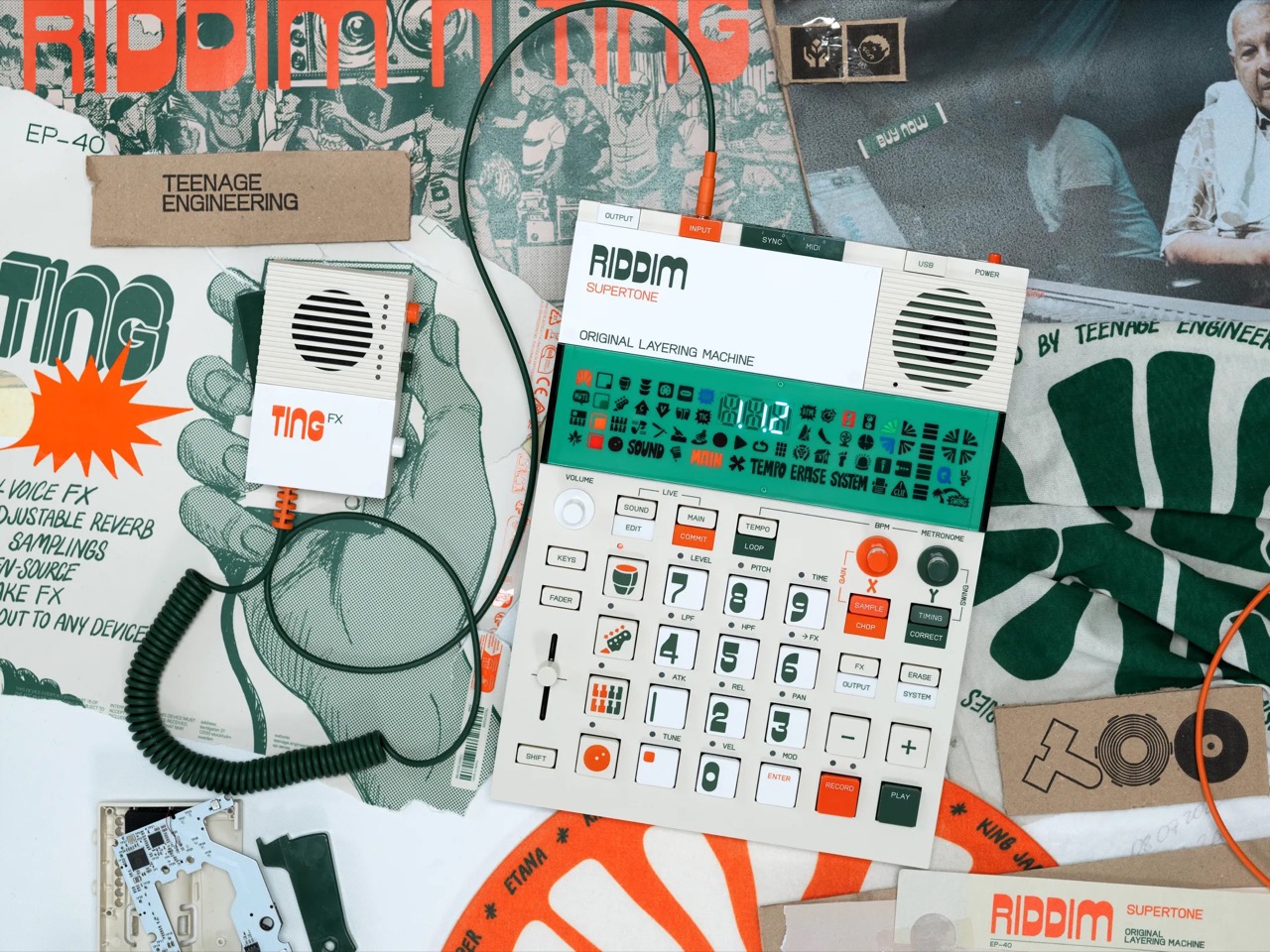
Together, they form a portable, battery-powered sound system in a box. The workflow is obvious and effective: you build a beat on the Riddim, then plug the Ting directly into its input to lay down vocals, trigger hype samples, and perform live dub-outs with the effects. For their launch, Teenage Engineering is bundling them together and offering the Ting for free, a clever move that ensures this new, weirder device gets into users’ hands immediately. It’s a compelling package that champions spontaneity and play. It proves that the most engaging technology isn’t always about higher fidelity or more features, but about creating a more direct and enjoyable path from an idea to its execution.

The post Teenage Engineering’s latest Microphone is the most unserious yet brilliant piece of music tech we’ve seen first appeared on Yanko Design.

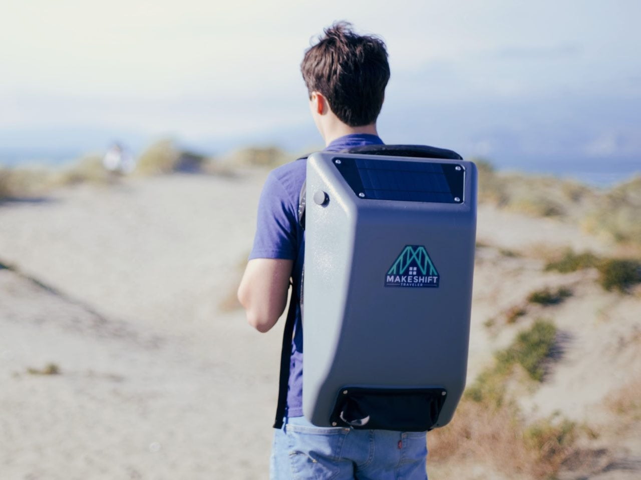
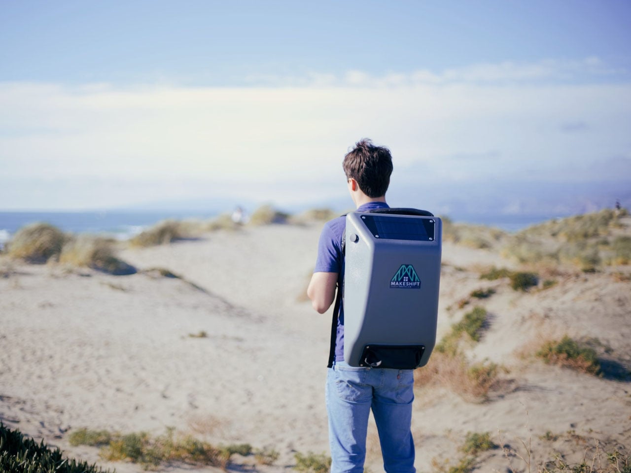
More than a backpack, the solar-powered Makeshift Traveler is helping California’s homeless live better

The best part about my job is, I get to see so many interesting products designed for a spectrum of users. While some cater to the elite and embody luxury, others — such as the HomeMore Project’s Makeshift Traveler — truly touch the heart because of the purpose behind their creation. Since the introduction of the first Makeshift Traveler (a backpack, per se; more on it below), the not-for-profit organization behind the creation has delivered upward of 1,200 units to individuals experiencing homelessness in California.

The target with the fourth edition, built in 2025 with enhanced design and new features, is to deliver another 2,000 units across 25 cities in California and counting. The project that started from Tenderloin in San Francisco has, with feedback from unhoused people, reached a point where it’s more than an ordinary backpack. It’s a self-sustaining unit that is designed to provide connectivity, shelter, resources, and assistance to the homeless.

Designer: The HomeMore Project

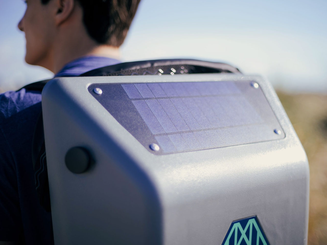
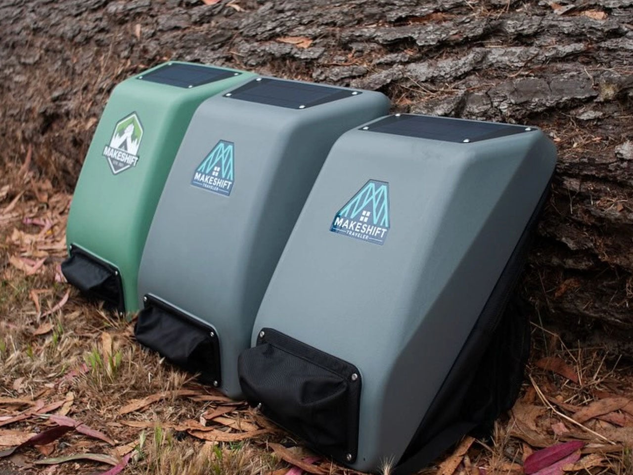
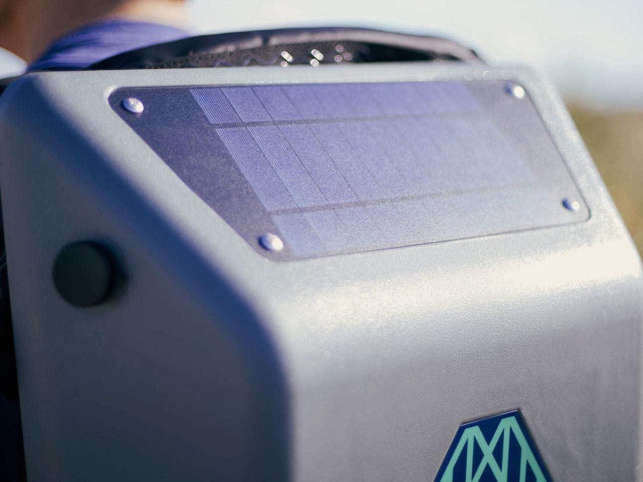
Conceived with the idea to empower the unsheltered homeless community in California, the Makeshift Traveler backpack, with an integrated solar panel, allows the owner to charge their phone and stay connected. The backpack comes integrated with a 4-watt polycrystalline solar panel connected to an internal 10,000-mAh rechargeable power bank, and allows the user to connect their mobile device through the integrated USB port. The backpack comes with many additional utilities, such as a tent and sleeping bag, and also has an FM radio and flashlight inside the pack, which can be charged directly by the power bank.

The Makeshift Traveler requires almost six hours of sunlight to juice up the internal power bank, which can deliver enough power to charge up to three standard smartphone batteries in one full charge. On overcast days or in areas of less sun, the backpack’s power station is chargeable via a wall charger.

As for the construction, the outer surface of the pack is water and weather-proof and is constructed from recycled plastic bottles. With a solar panel embedded on the top and a rain poncho in the pocket at the bottom, the Makeshift Traveler backpack comes with a urethane-coated nylon pillow that can be puffed by stuffing in a piece of clothing. Along with the utilities, the backpack with an anti-theft zipper also features an ID card, a hygiene kit, a 24 oz water bottle, Bombas socks, and an informational brochure listing 15 local partner services ranging from shelter, mental health services, food distribution, wellness, and more.

Of course, this is not an open market product. You cannot get it off the shelf, but if you’re concerned and interested in donating, you can check out the HomeMore Project’s website. Or if you want to wait and ponder introducing a backpack into your community, you have about a year to do so. The fifth edition of the Makeshift Traveler is on the cusp – to release in 2016 – and it will come with reflectors on the front and rear for better nighttime visibility in the dark.

The post More than a backpack, the solar-powered Makeshift Traveler is helping California’s homeless live better first appeared on Yanko Design.

B&O Just Launched a $5,000+ Soundbar That Costs More Than Your First Car

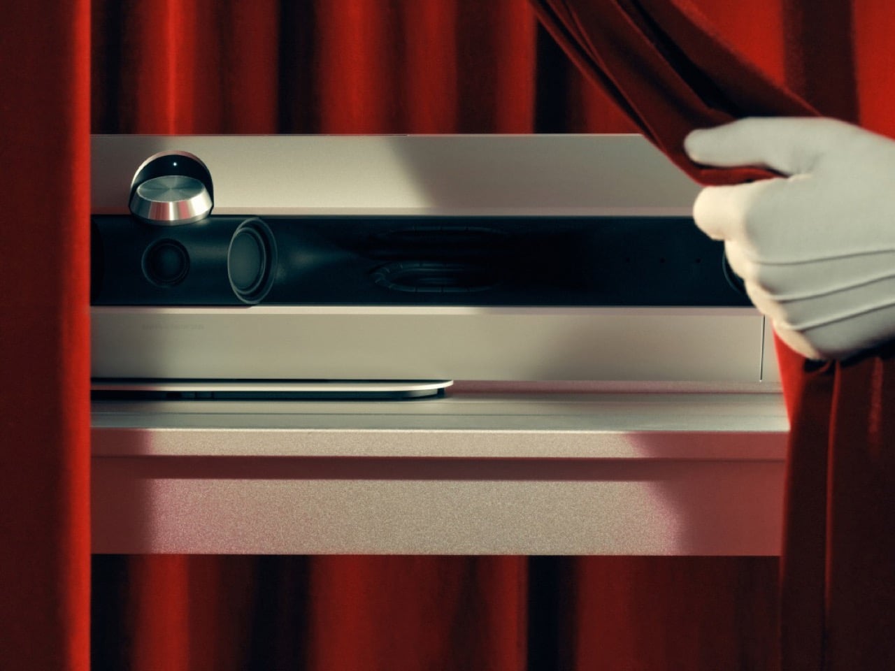
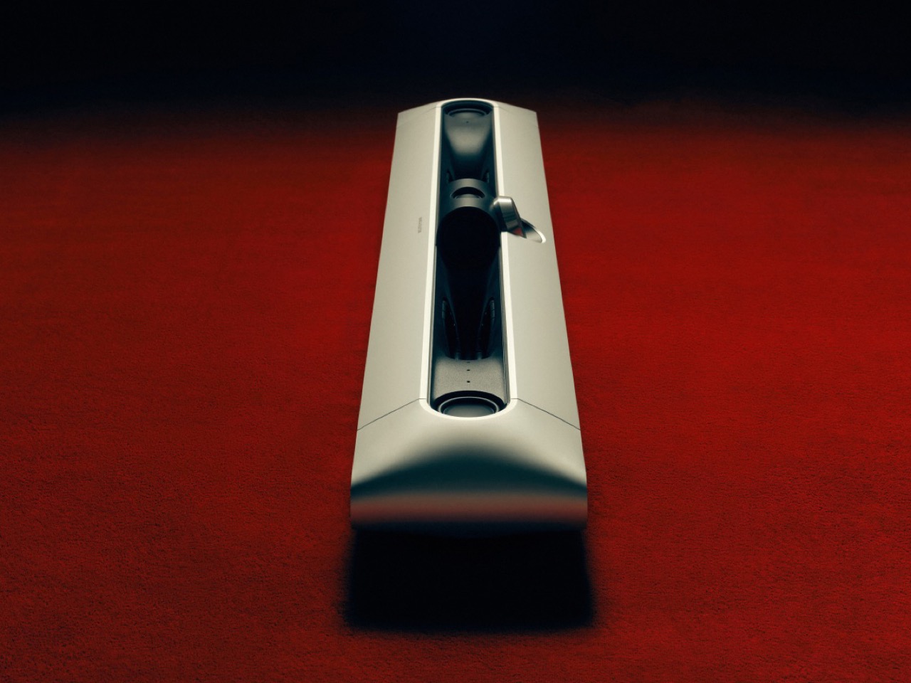
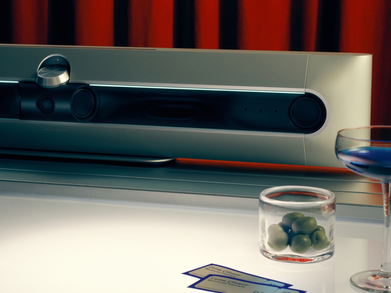
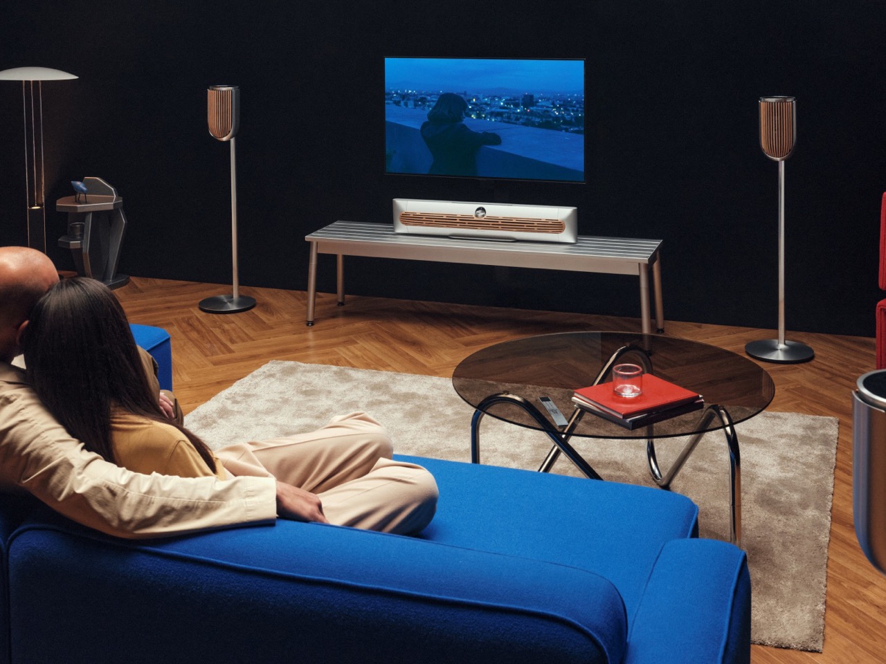
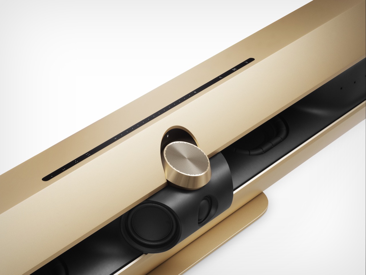
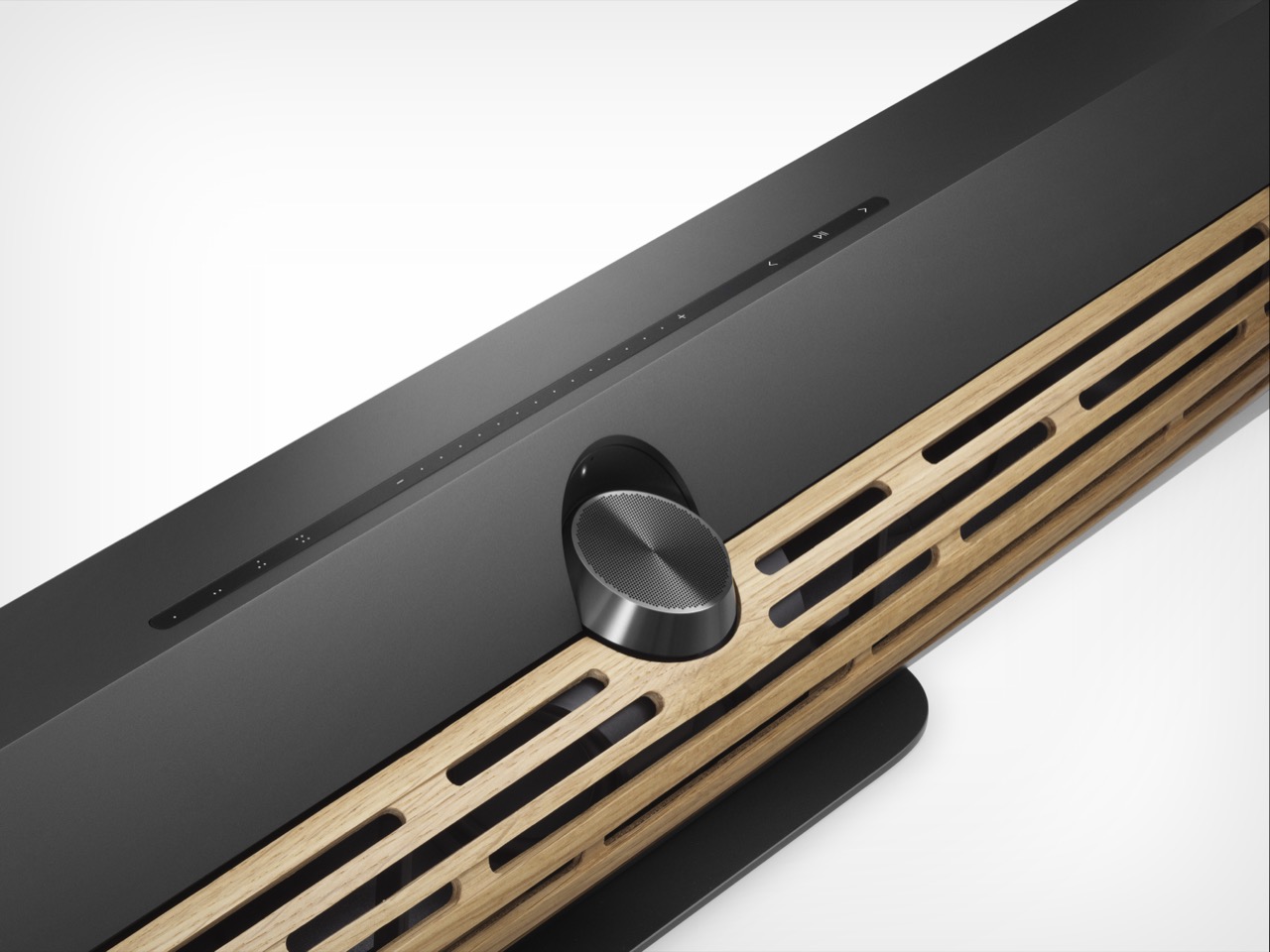
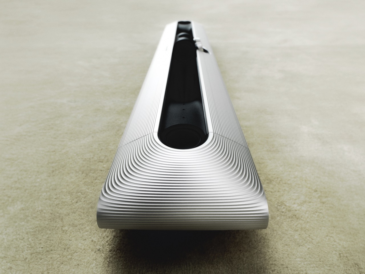
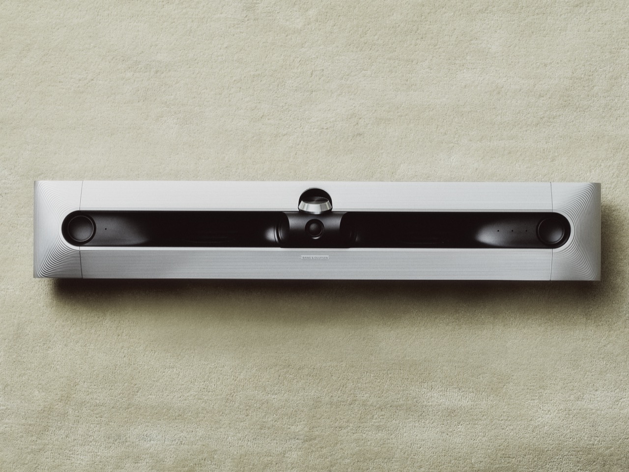
Bang & Olufsen’s Beosound Premiere lands like a spaceship in a room full of toasters. That’s not an exaggeration; it’s just what happens when a company known for treating speakers like sculpture decides to rethink the soundbar. This thing doesn’t just sit under your TV. It commands the room, a slab of pearl-blasted aluminum that looks like it was milled from a single ingot of the future. And yes, it costs £3,900, which is about as much as most people pay for rent, but let’s be real, if you’re the kind of person who buys a soundbar as a statement, you’re not exactly shopping for Black Friday deals.

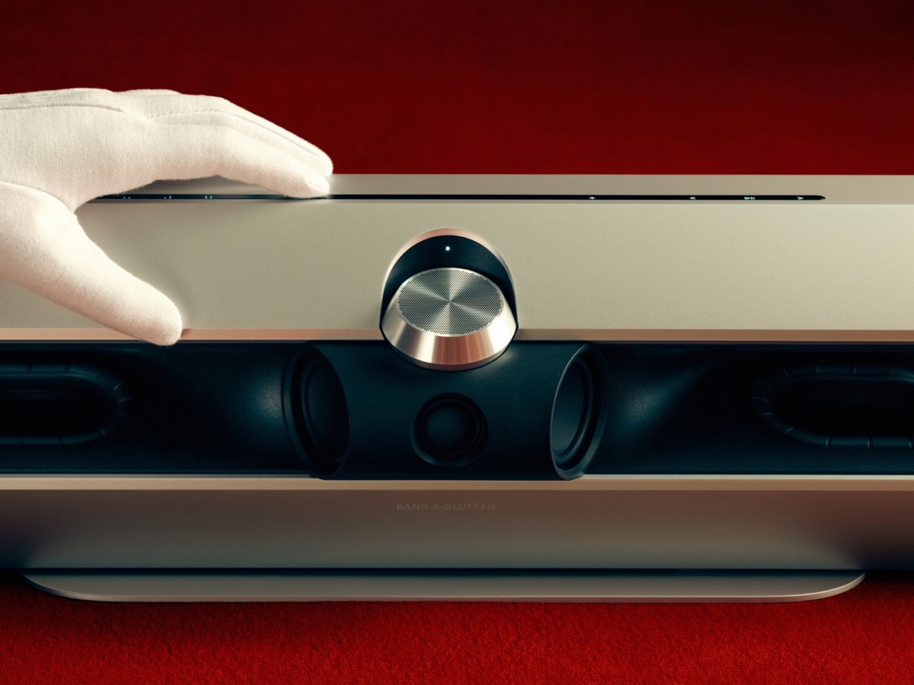
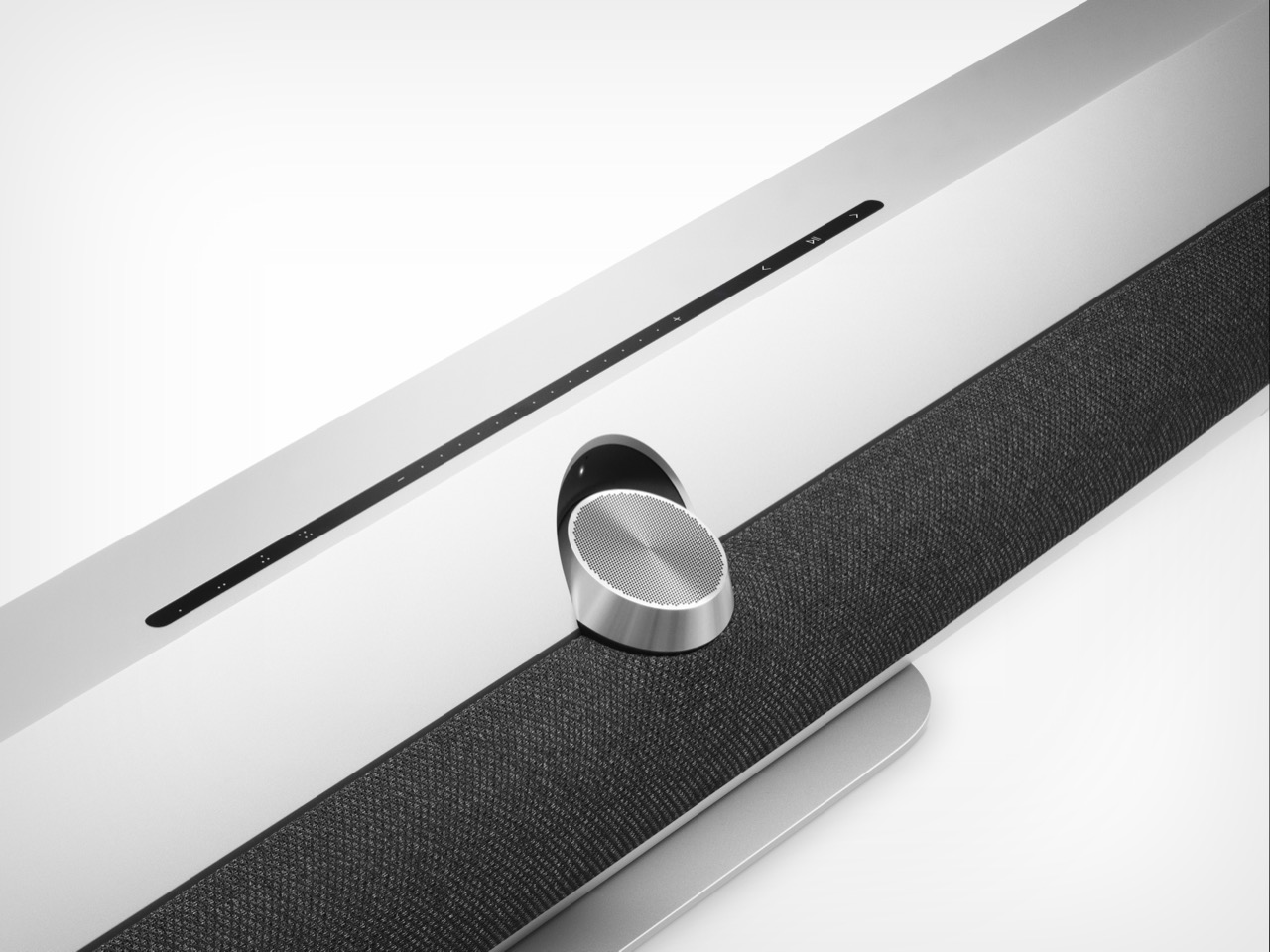
The Premiere’s design is what happens when industrial designers are given free rein and a budget that doesn’t flinch. The up-firing tweeter sits center stage like a jewel, surrounded by 1,925 precision-machined perforations, a nod to Bang & Olufsen’s 1925 founding year, because of course it is. The aluminum chassis isn’t just for show; it houses ten custom drivers, including four racetrack woofers and a tweeter that looks like it belongs in a museum. The side-firing and up-firing drivers are part of the visual language, a reminder that this isn’t a black plastic slab pretending to be invisible. Then there’s the lighting: 90 LEDs that pulse and shift with your adjustments, because why should your soundbar be any less extra than the rest of your smart home?

Designer: Bang & Olufsen

You’d think all this design flair would come at the cost of actual performance, but the specs tell a different story. Ten amplifiers push 70 watts to the woofers and 50 watts to the rest, delivering a frequency range of 32 Hz to 23 kHz. The Dolby Atmos 7.1.4 decoding is paired with Bang & Olufsen’s proprietary True Image algorithm, which supposedly creates a soundstage wider than the unit itself. The company calls it Wide Stage Technology, and while I haven’t heard it yet, the idea of a soundbar that can convincingly fake a surround setup without extra speakers is intriguing. The max output of 102 dB at 1 meter means this thing can get loud, but the real test will be how it handles the subtleties: dialogue clarity, spatial separation, that kind of thing.

The connectivity suite is what you’d expect from a flagship product in 2025, but with a few Bang & Olufsen twists. HDMI eARC with 8K passthrough is table stakes at this point, but the inclusion of an Ethernet switch with three 1Gbit ports is a nice touch for anyone tired of juggling network cables. Bluetooth 5.4 and AirPlay 2 are here, obviously, but the real party trick is Beolink Surround, which lets you wire up additional B&O speakers for a true multi-channel setup. The fact that you can still use analog audio via USB-C (with an adapter) feels like a nod to the audiophiles who refuse to let go of their turntables. And yes, there’s a voice assistant option, but it requires an external Google device, because Bang & Olufsen would rather you use their app than bark commands at a microphone.

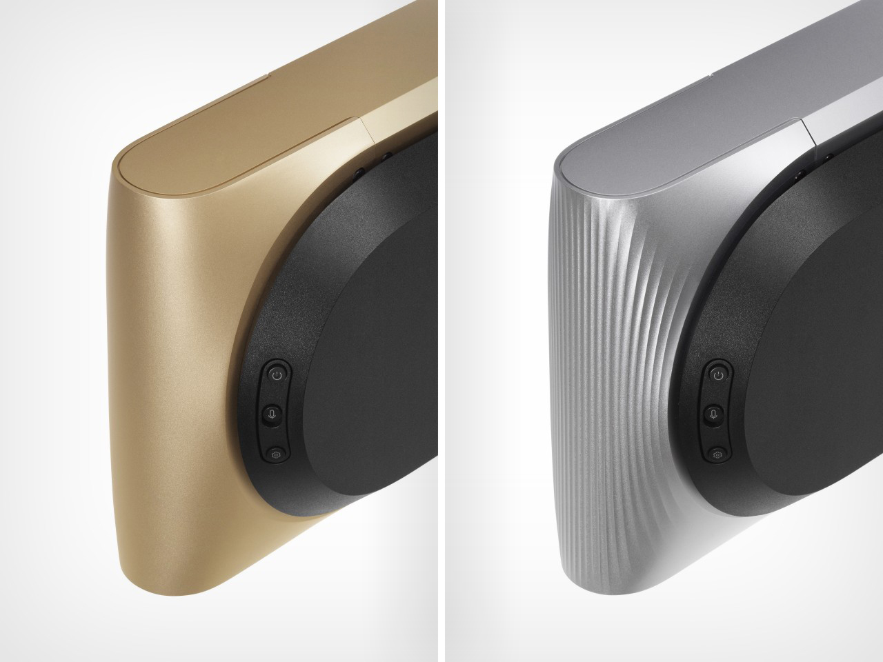
Now, the elephant in the room. £3,900 is a lot for a soundbar, but let’s put it in context. The Premiere isn’t competing with Sony or Sonos; it’s competing with high-end AV receivers and speaker setups that cost twice as much. The Haute Edition, limited to 25 pieces and priced at £11,000, is another story entirely. That’s not a soundbar; that’s a flex. Each one is hand-milled with a pattern that takes 17 hours to carve, because why not? It comes with a numbered certificate and a wooden box for the remote, because at that price, you’re not just buying audio equipment; you’re buying a piece of design history. Or at least, that’s the pitch.

The real question is whether the Premiere can justify its existence beyond being a conversation piece. Bang & Olufsen has a reputation for building products that sound as good as they look, but the soundbar market is crowded with solid performers at a fraction of the cost. The Premiere’s trick will be convincing people that its spatial audio and design justify the premium. For now, it’s hard to deny that this is one of the most interesting pieces of audio gear to come out in years. Whether it’s worth the price of a used car is another matter entirely. But if you’re the kind of person who sees a soundbar as an extension of your aesthetic, the Premiere might just be the centerpiece you’ve been waiting for.

The post B&O Just Launched a $5,000+ Soundbar That Costs More Than Your First Car first appeared on Yanko Design.
Toyota Walk Me: The Robot Chair That Climbs Stairs and Folds Into Your Trunk

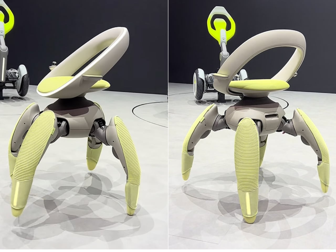
Stairs have long been the nemesis of wheelchair users, turning simple errands into logistical nightmares and limiting access to countless spaces. Toyota’s answer to this mobility challenge doesn’t roll on wheels at all. Instead, the Walk Me concept, unveiled at the Japan Mobility Show 2025, walks on four robotic legs that can climb stairs, navigate uneven terrain, and fold themselves into carry-on luggage when not in use.

Designer: Toyota

A New Kind of Movement

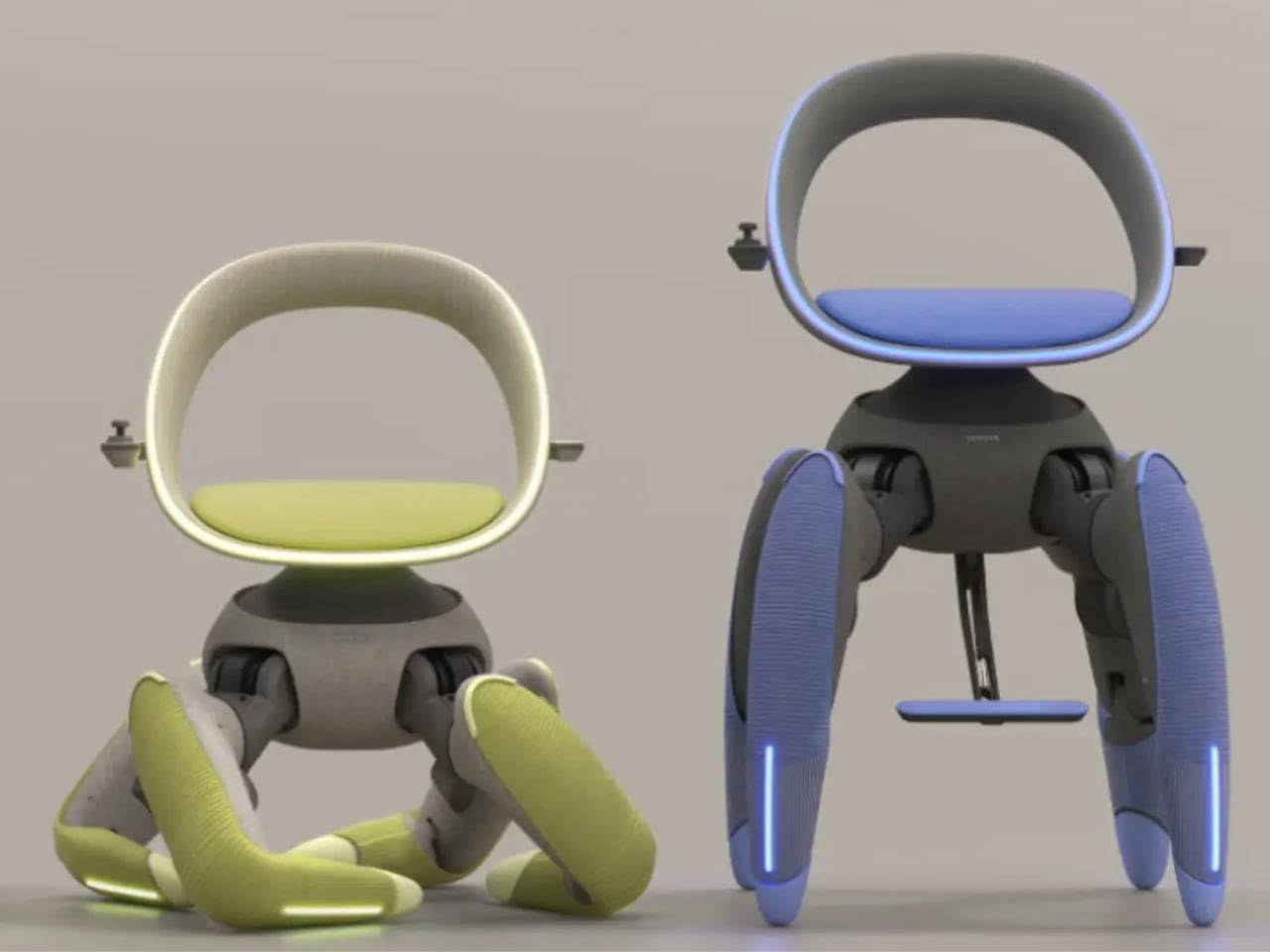
Walk Me replaces traditional wheelchair wheels with biomimetic robotic limbs inspired by goats and crabs, animals known for their sure-footed navigation of challenging terrain. Each of the four independently motorized legs is covered in soft, pastel-colored material that hides the hardware and sensors underneath, making the technology feel approachable rather than clinical. When Walk Me encounters stairs, the front legs test the step height before pulling the chair upward while the rear legs generate thrust and support, creating a smooth climbing sequence that maintains user stability throughout the ascent.

LiDAR sensors and cameras continuously scan surroundings, allowing the chair to navigate obstacles like rug edges, scattered toys, and threshold transitions between rooms. Weight sensors ensure the user remains centered before any major movement, while collision radars stop the chair immediately if something crosses its path. Even when balance shifts unexpectedly, the system automatically widens its stance and adjusts the seat position to prevent tipping.

Comfort, Control, and Autonomy

Walk Me’s seat is designed to adjust to the user’s shape. The curved backrest supports the spine, while small side handles allow for manual steering. Users can twist the handles to turn or press integrated buttons for direction control.

For hands-free operation, voice commands like “kitchen” or “faster” enable the onboard computer to map a path or adjust stride speed. A small display on the armrest shows battery level and distance traveled, keeping essential information at a glance. The system uses smart algorithms and balance control to ensure smooth movement across complex surfaces.

The entire chair operates on a compact battery hidden behind the seat, which provides enough power for a full day of activity. Charging is as simple as plugging it into a wall outlet overnight. Built-in sensors monitor every joint, and if overheating occurs, the chair automatically shuts down and notifies the user.

Compact Design for Daily Life

Perhaps Walk Me’s most striking capability is its folding mechanism. With a single button press, the legs retract telescopically, the knees bend, and the chair compacts itself into carry-on size within thirty seconds. This makes it convenient to store in a car trunk or beside furniture, and when reactivated, the legs extend again while the balance system recalibrates automatically.

The chair’s adaptability extends to vehicle transfers and traditional Japanese living spaces. Walk Me can lift users into vehicles by raising itself on tiptoes, aligning with car doors, and tilting forward to facilitate seamless transfers without assistance or transfer boards. On tatami mats, the legs squat down to lower the seat to mat level, accommodating the floor-sitting culture common in Japanese homes.

Toyota designed Walk Me for practical, real-world use, from Japan’s elevated homes and narrow hallways to outdoor garden paths. The concept addresses the everyday challenges faced by people with reduced mobility, whether climbing stairs, moving over uneven ground, or transitioning into vehicles. By merging robotics, AI, and human-centered design with biomimicry principles, Walk Me represents an approach to assistive technology that prioritizes independence across diverse environments.

Beyond Prototype Status

Walk Me remains a prototype with no announced production timeline. Yet its debut at the Japan Mobility Show 2025 suggests a future where assistive devices are not limited by terrain, architecture, or even wheels. By replacing traditional mobility solutions with intelligent, lifelike motion, Toyota’s Walk Me challenges existing designs fundamentally and offers not just movement, but freedom.

The post Toyota Walk Me: The Robot Chair That Climbs Stairs and Folds Into Your Trunk first appeared on Yanko Design.
Mid-Century Clock and Watch Tell Time With Shapes, Not Numbers

Most clocks and watches fade into the background, quietly marking the hours without much personality or visual presence on your desk or wrist throughout the day. But what if timekeeping could be playful, sculptural, and as expressive as the rest of your space or personal style choices? What if checking the time felt less like a utilitarian glance and more like appreciating a piece of functional art?

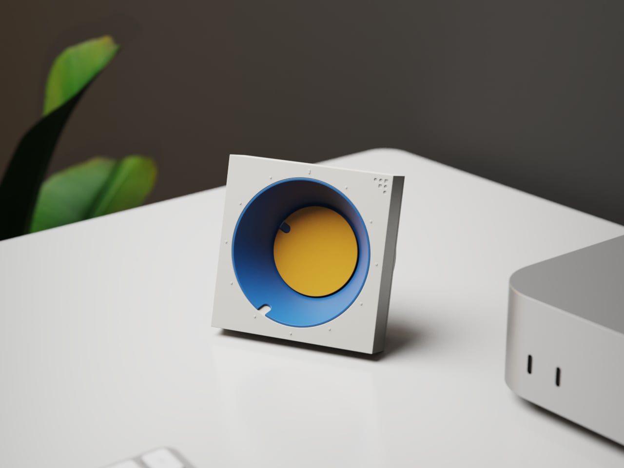
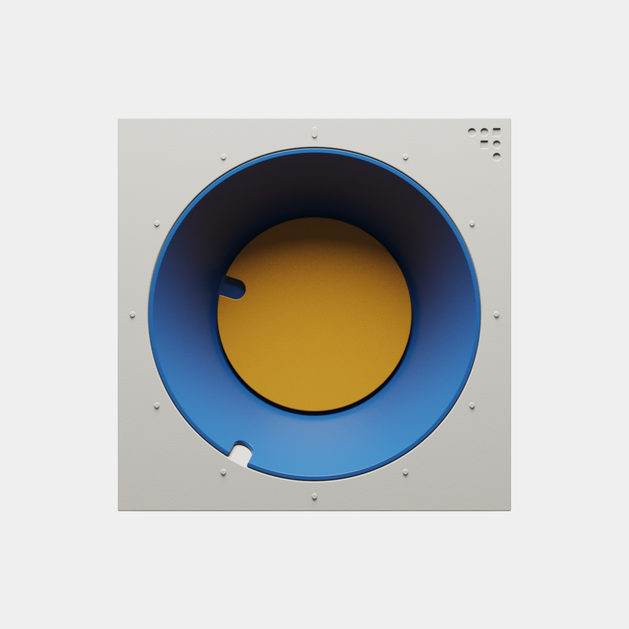
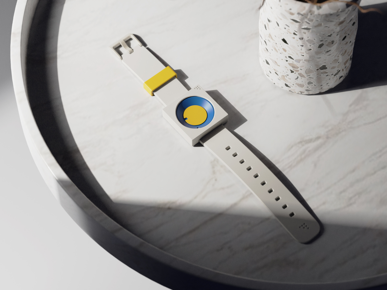
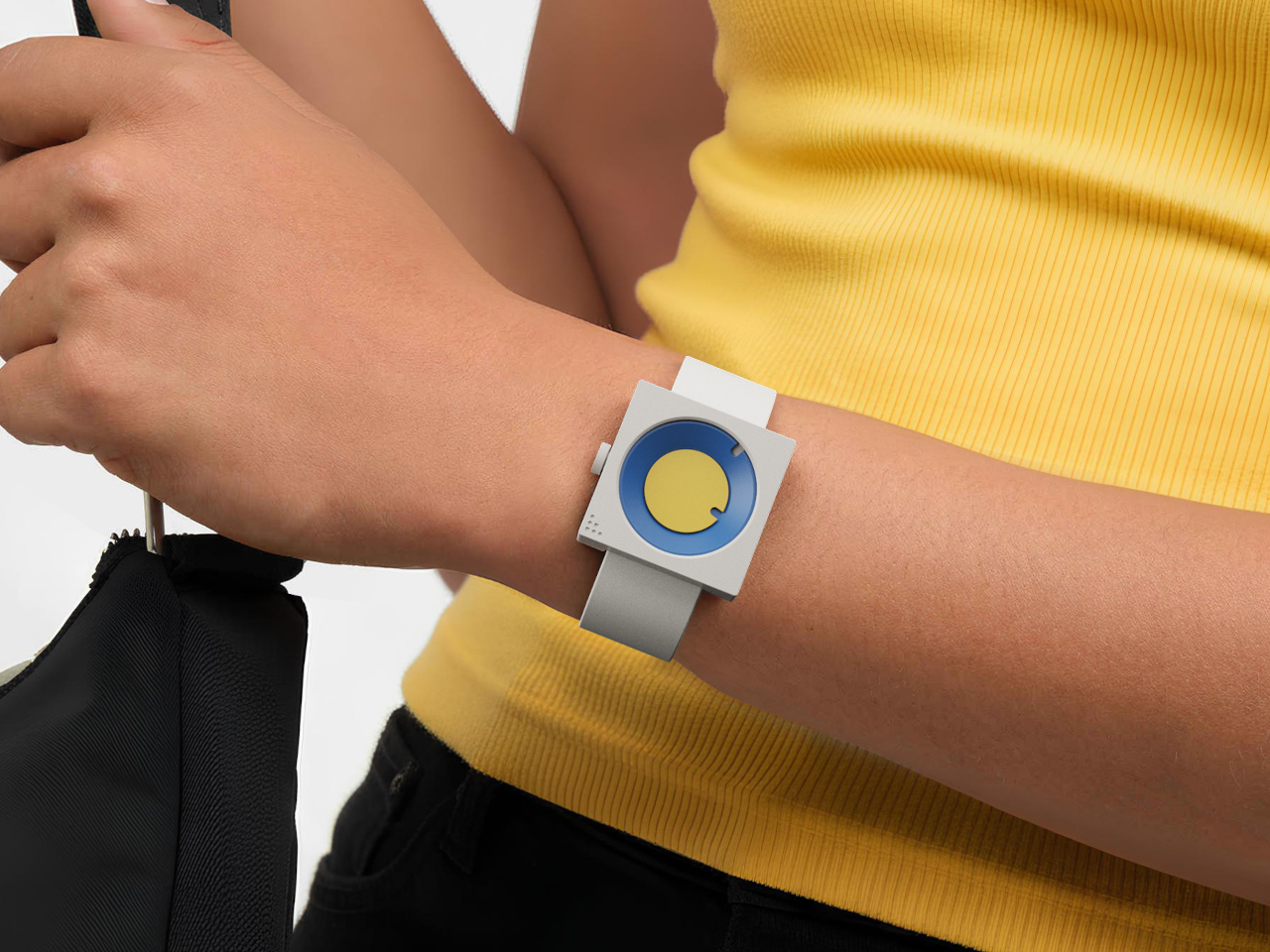
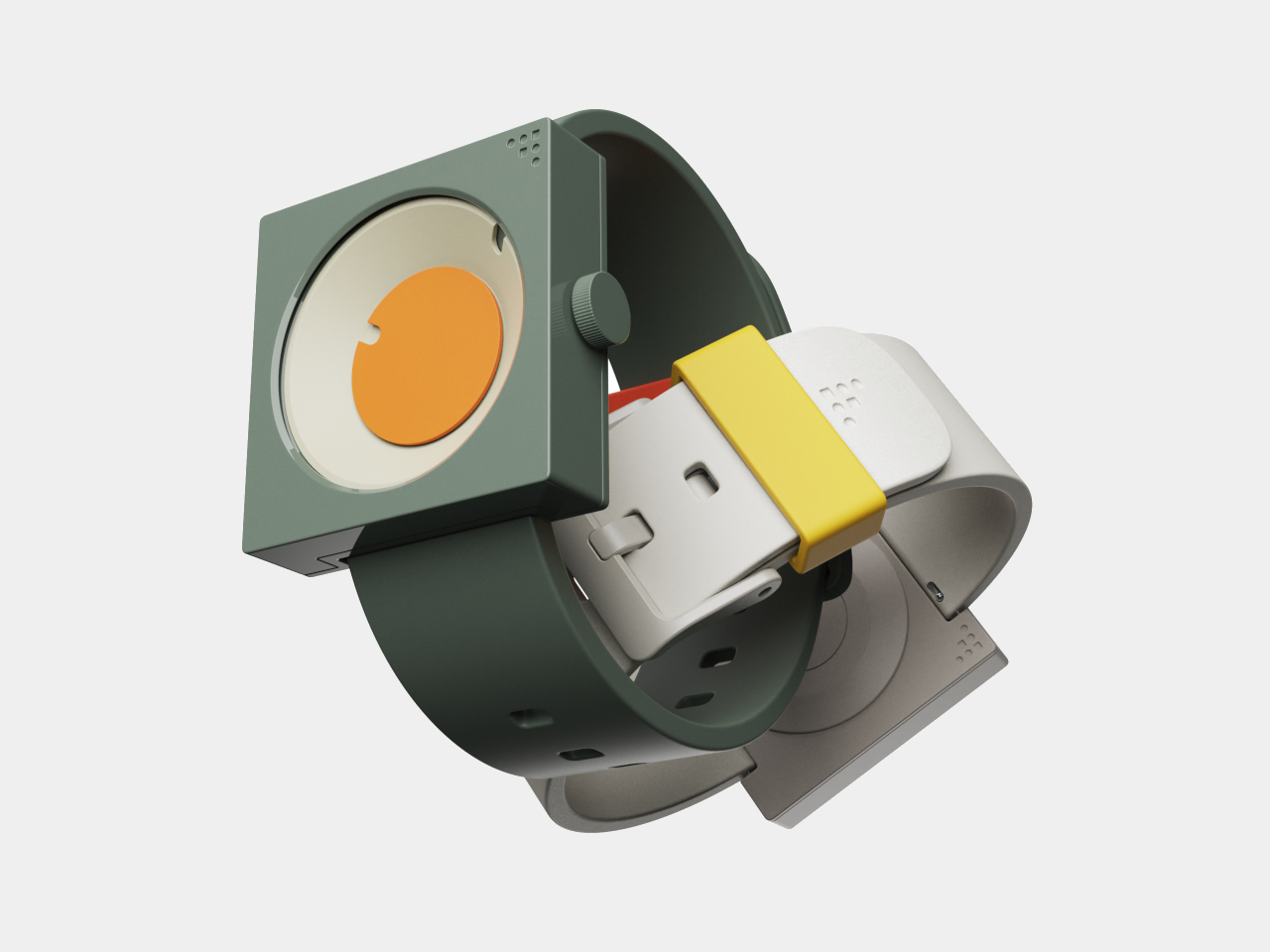
The FC-30 Desk Clock and FW-50 Wrist Watch concepts flip the script on conventional timekeeping, using bold geometry, vibrant color, and tactile design to turn telling time into a daily ritual worth savoring. Inspired by mid-century modern design principles from the 1950s and 60s, both pieces are as much about art as they are about function, bringing sculptural presence to everyday moments throughout your routine.

Designer: Sidhant Patnaik

Create your own Aesthetic Render: Download KeyShot Studio Right Now!

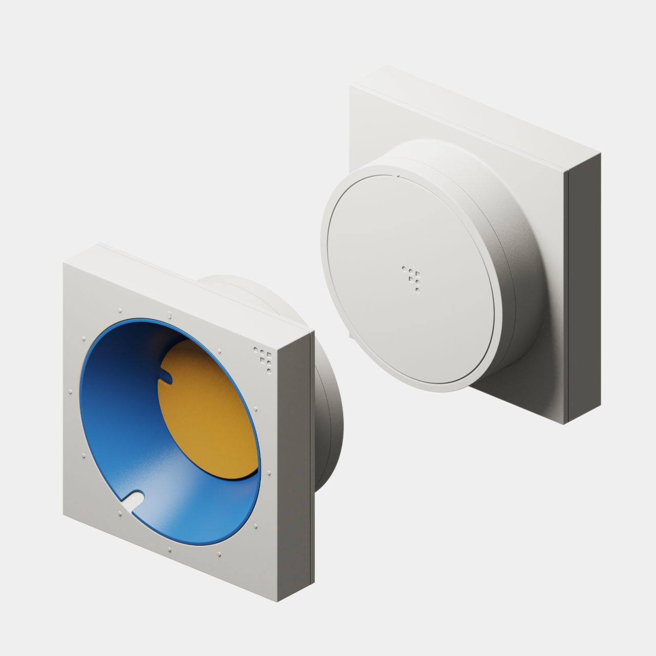
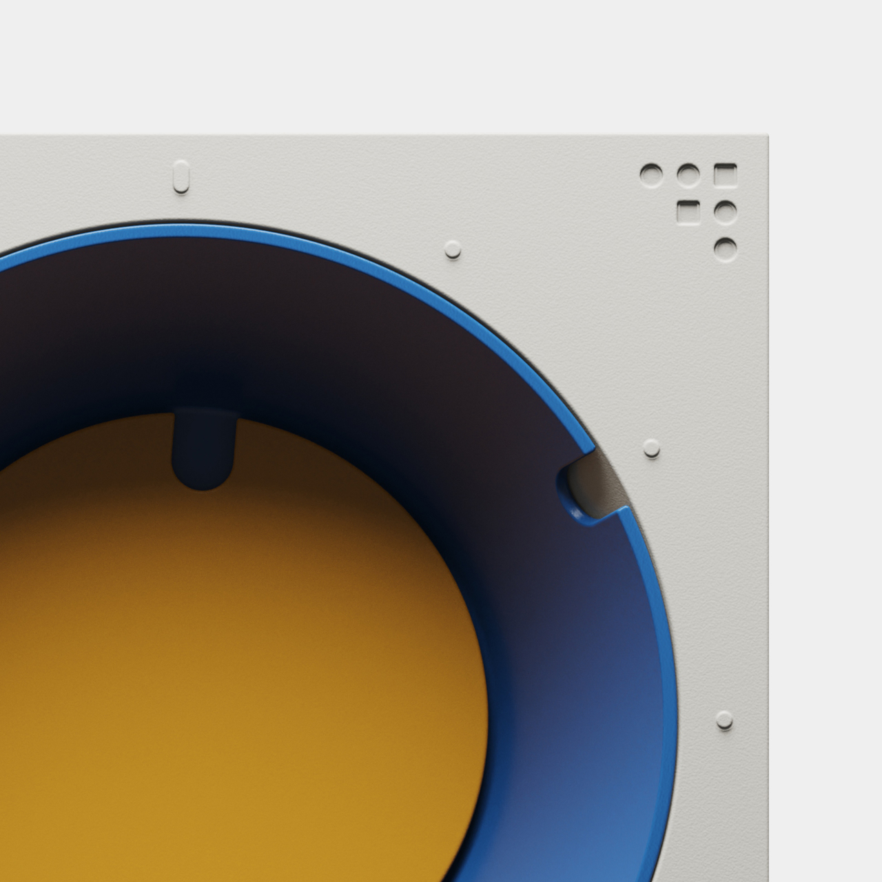
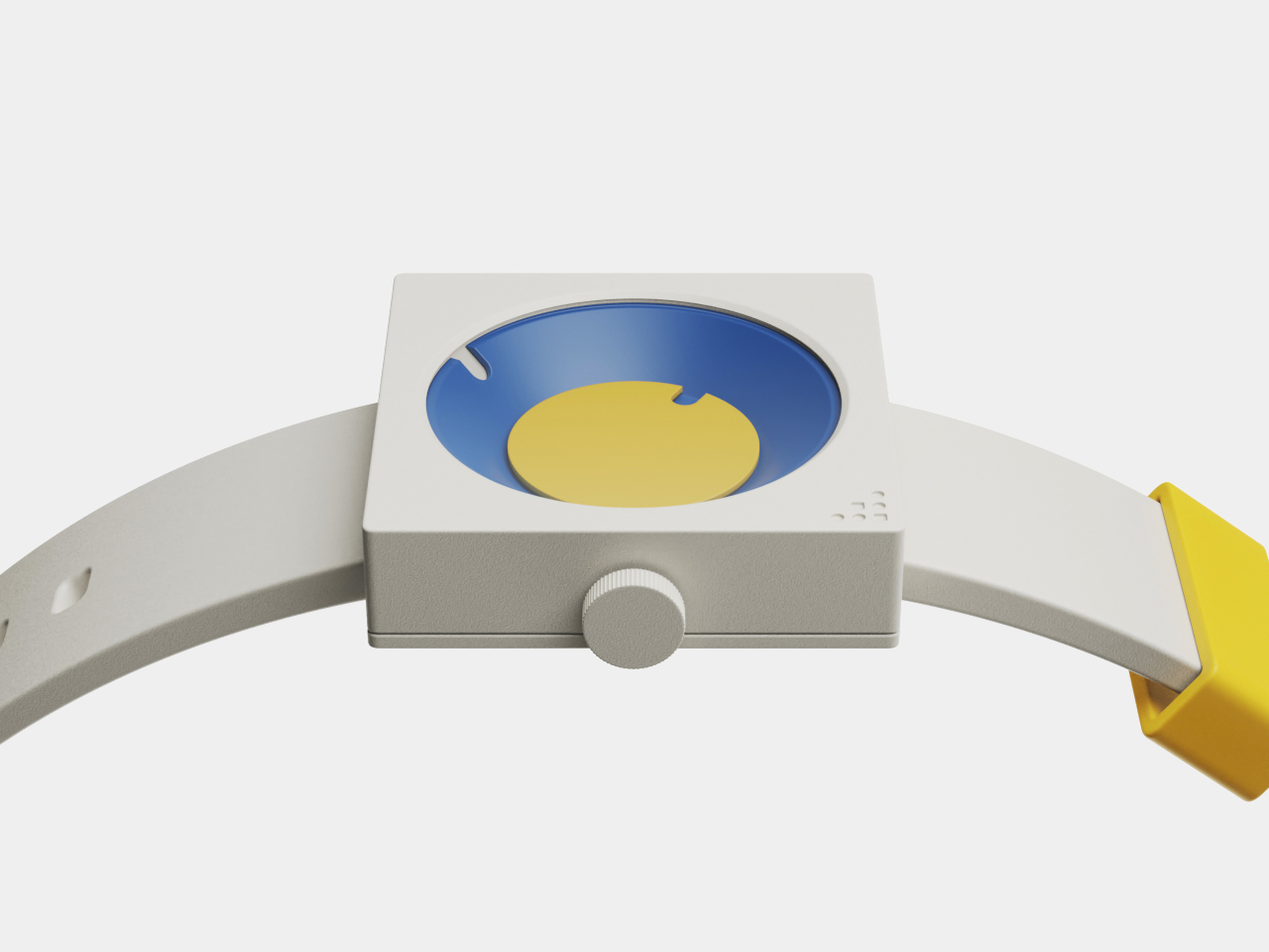
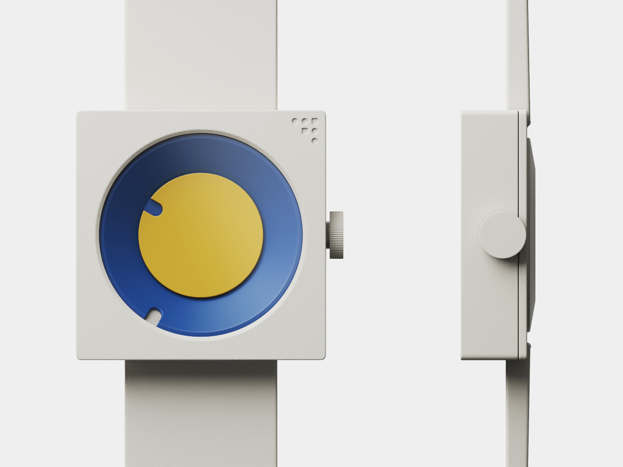
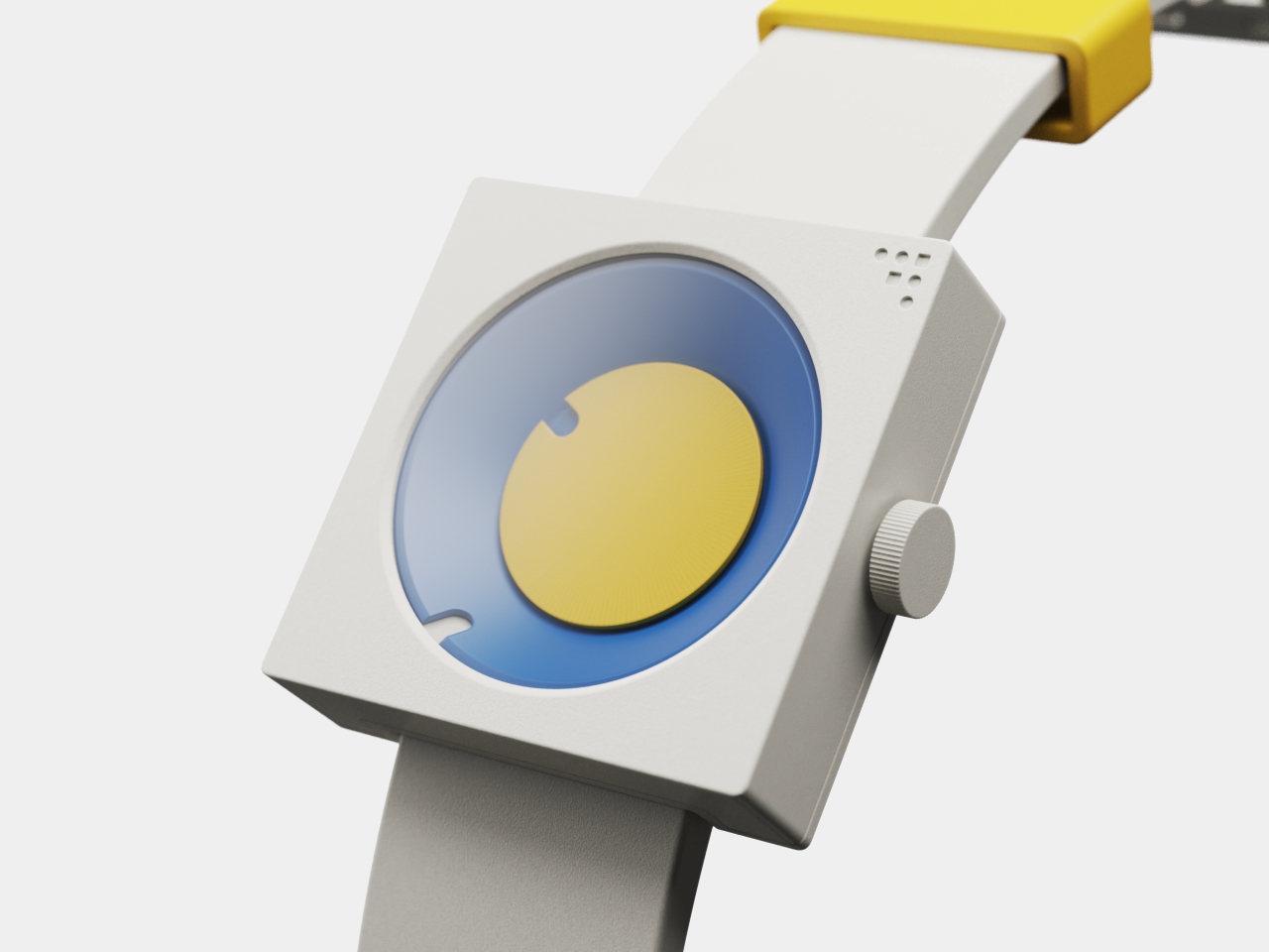
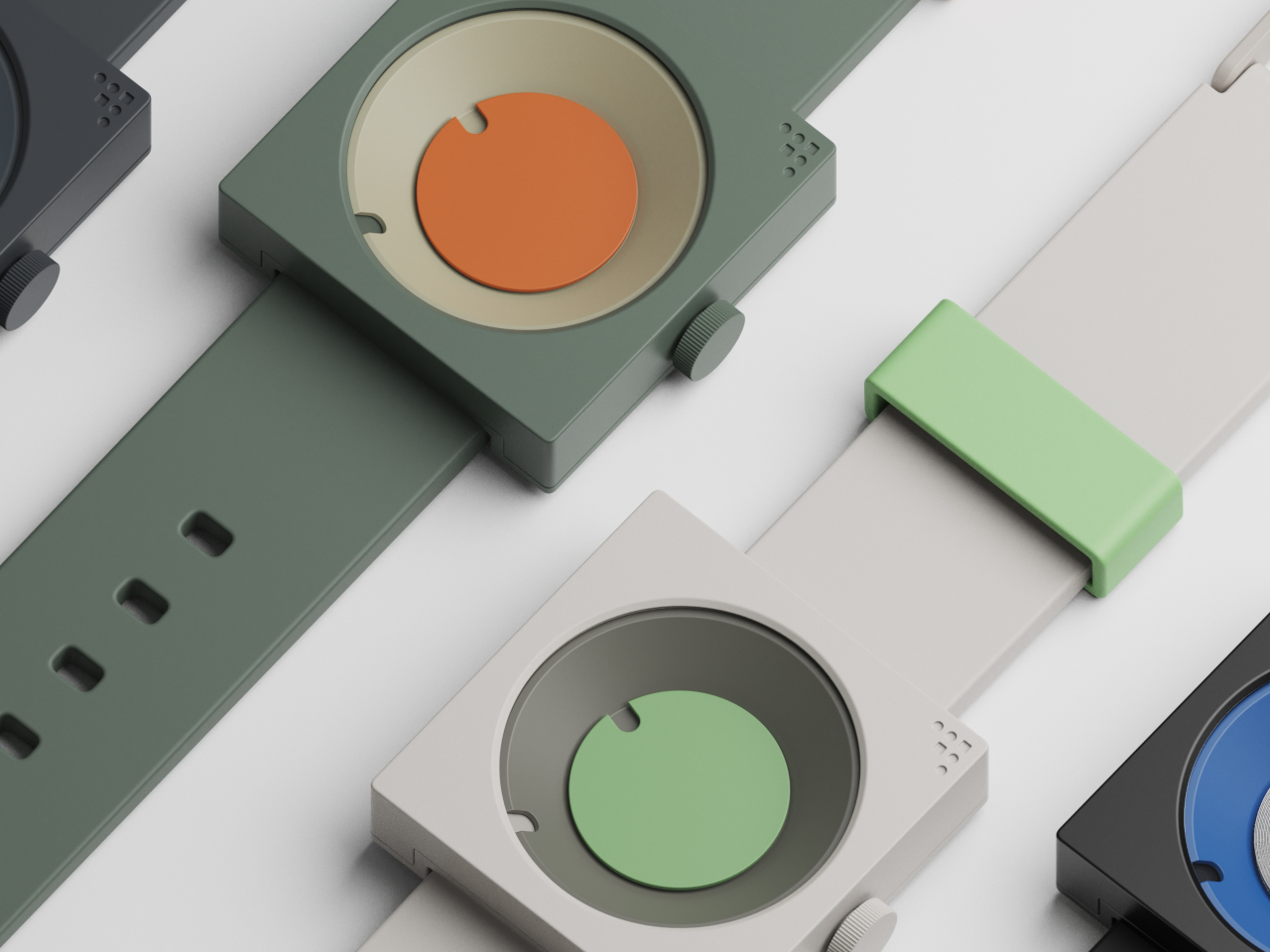
Both pieces are built around the frustum, a geometric form with an angled face that creates visual interest and dynamic readability throughout the day. The FC-30 uses a 30-degree incline for the minute indication, while the FW-50 adapts the idea to a 50-degree angle optimized for wrist wear and comfort. The hour is shown by a colored disc housed inside the frustum, while the sloped edge indicates minutes.

The result is a visual experience that feels fresh and interactive, inviting you to engage with the object every time you check the hour rather than passively glancing at digits. The unconventional layout is intuitive once you spend a moment with it, turning time-telling into something more tactile and memorable than reading digital numbers or traditional clock hands that blend into the background of modern life.

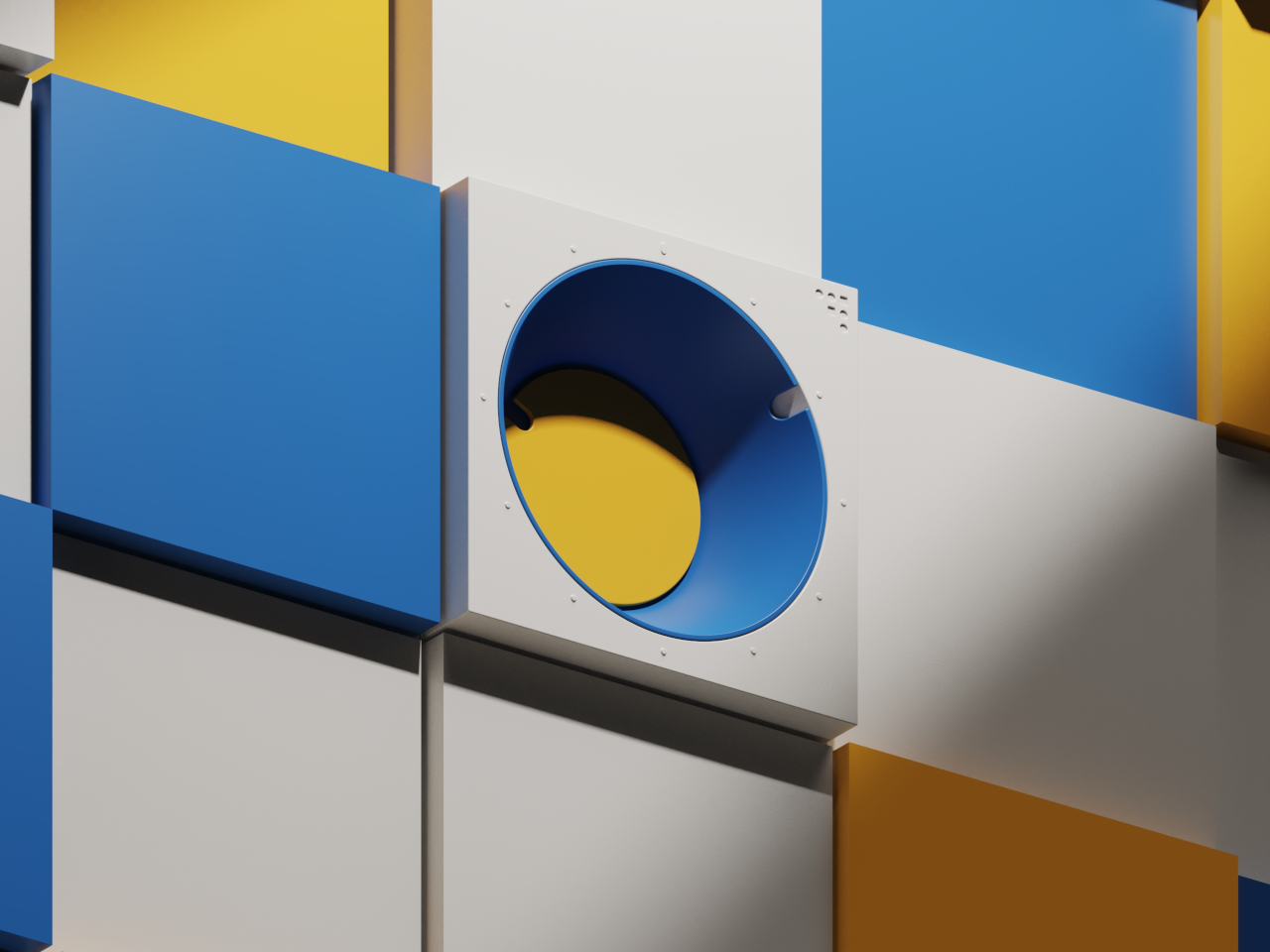
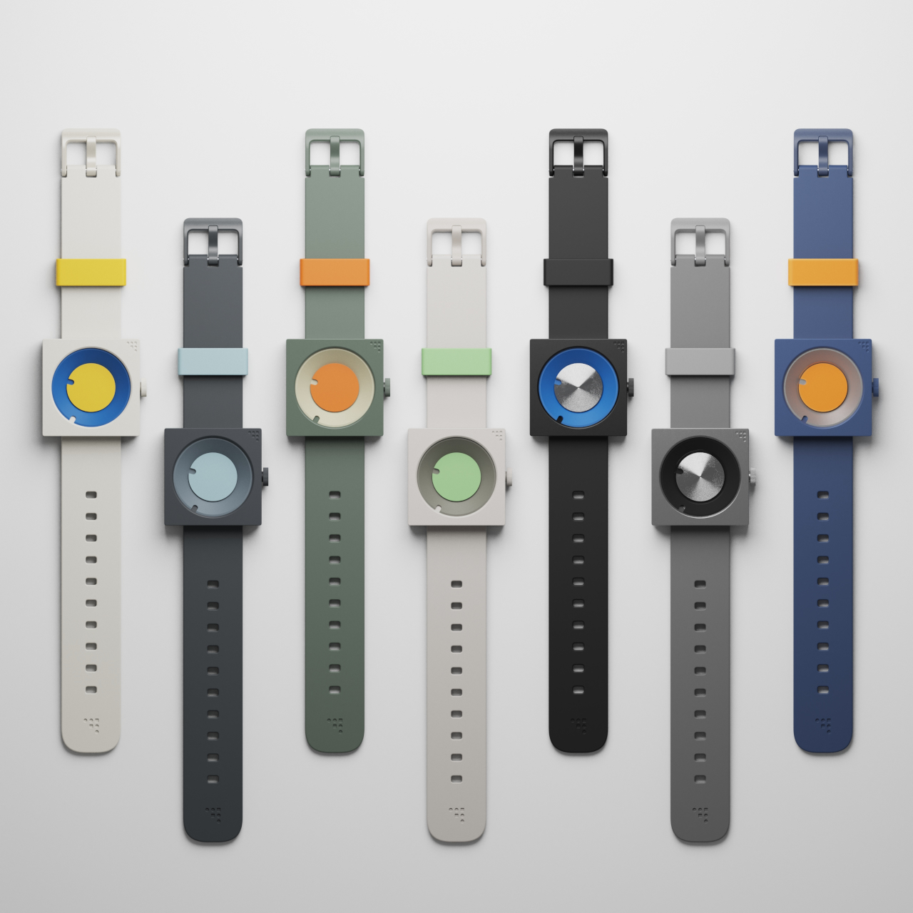
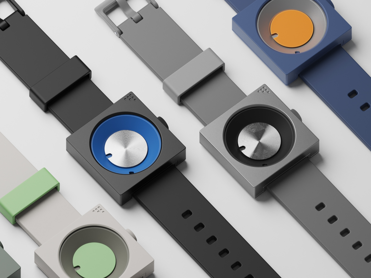
Inspired by mid-century modern classics from the golden age of product design, both the clock and watch feature a palette of bold blues, yellows, greens, and oranges, set against matte white or gray cases with clean edges and visible fasteners. The color blocking and clean lines make each piece stand out visually, whether positioned on a desk, mounted on a wall, or worn on the wrist.

The FC-30’s sculptural form with its angled frustum is as much a statement piece as a practical timekeeper for workspace organization and visual interest. The FW-50’s playful colorways, ranging from sage green to vibrant orange, and tactile crown turn a daily accessory into a personal expression of style and taste. Both designs celebrate the visual language of functional design from classic mid-century product eras.

The absence of numerals and reliance on form and color encourage users to interact with the pieces differently from conventional timepieces. The disc hour and sloped minute readout are learnable at a glance, but different enough to spark curiosity and conversation with visitors or colleagues. Both designs can be oriented or worn in multiple ways for varied visual effects, depending on mood.

The FC-30 and FW-50 concepts bring a little more art into daily routines and personal environments for those who appreciate design. For anyone curating a workspace or searching for a unique statement piece, these timepieces offer a compelling vision where timekeeping becomes an opportunity for visual and tactile delight rather than just a practical necessity.

The post Mid-Century Clock and Watch Tell Time With Shapes, Not Numbers first appeared on Yanko Design.

Box Cutter Dial Lets You Make Identical Cuts Without a Ruler

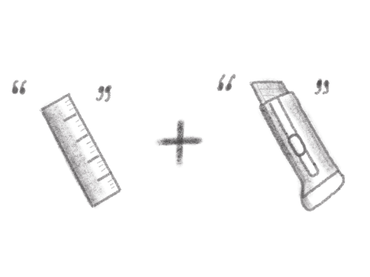
Cutting a straight line should be simple, but for anyone who’s ever measured, marked, and sliced the same piece of foam board or cardboard over and over, the process is anything but straightforward or efficient in practice. The classic “measure twice, cut once” mantra is great advice until you’re making dozens of identical cuts for a project, and the ruler starts to feel like a bottleneck slowing down your entire workflow and creative process.

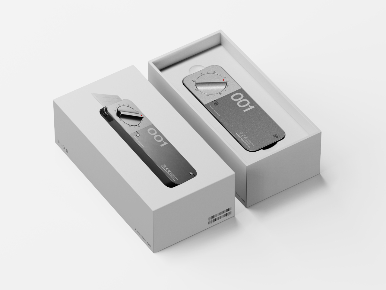
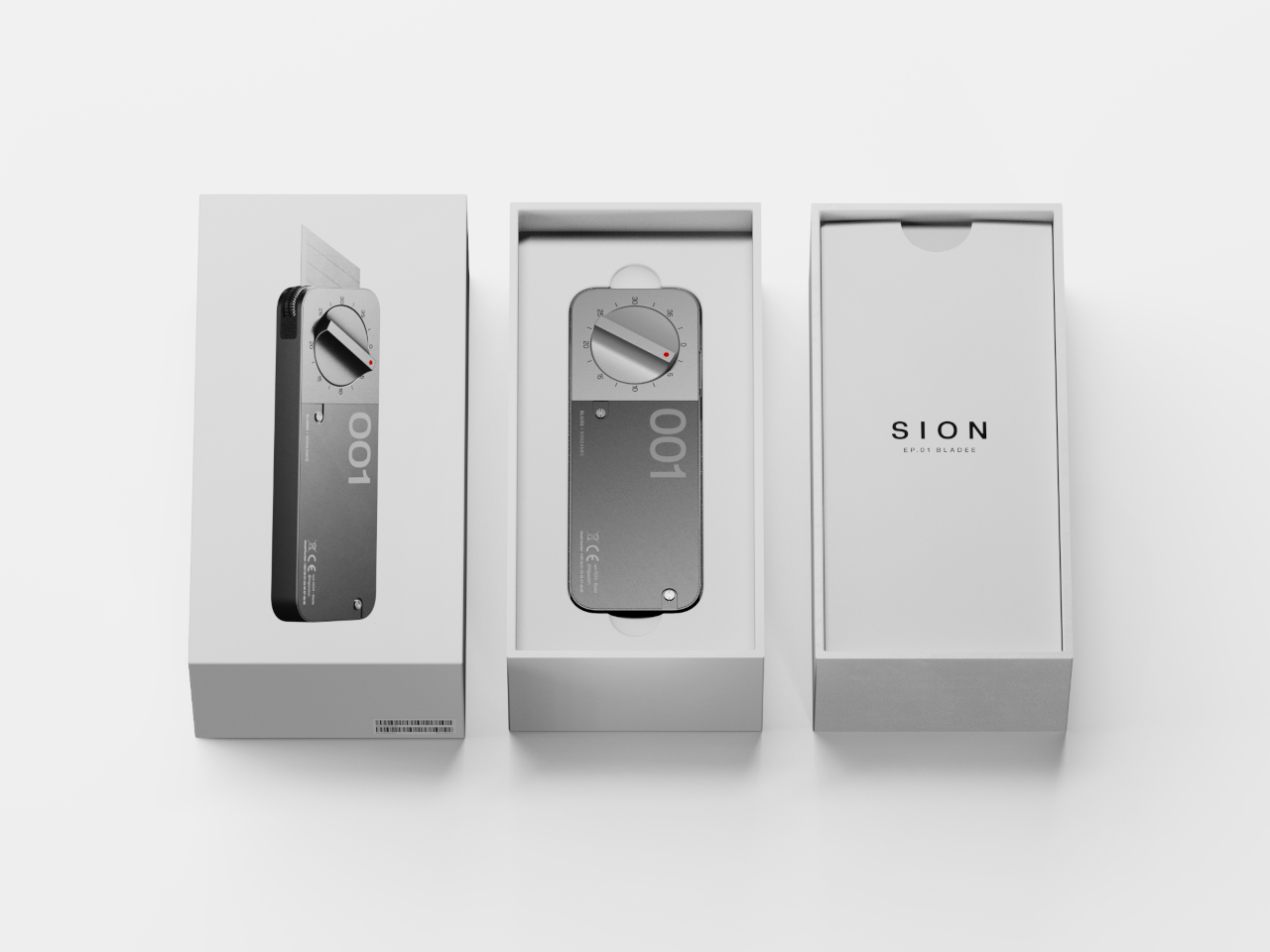
The BLADEE box cutter concept is a rethink of the humble utility knife designed for modern makers and professionals. By building measurement and precision into the tool itself through integrated mechanics and a dial system, it promises to make repeatable, accurate cuts faster and easier throughout your day without external measuring tools. No ruler needed, no marking required, and no guesswork involved when you’re deep into production work.

Designer: Semin Park

Create your own Aesthetic Render: Download KeyShot Studio Right Now!

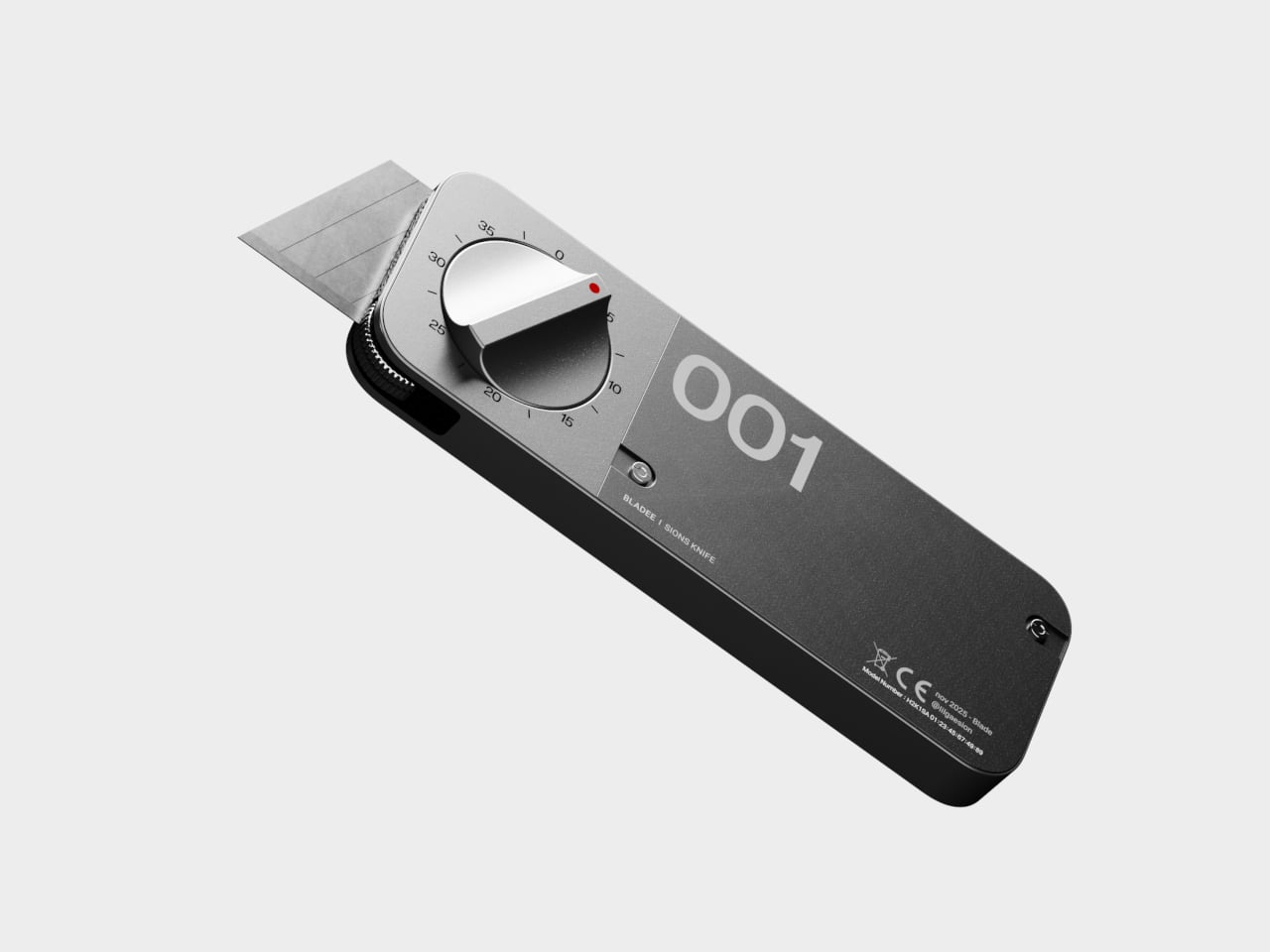
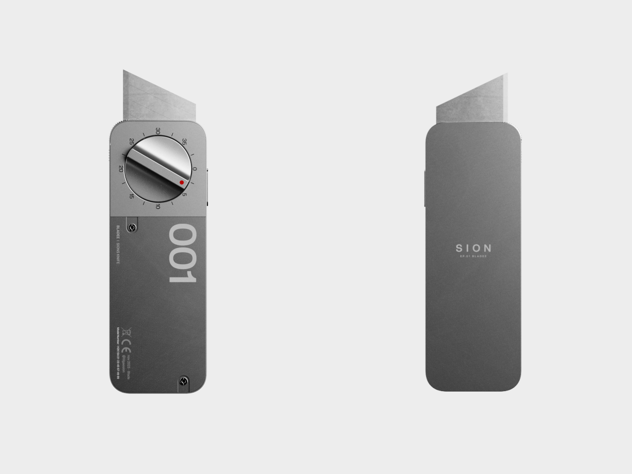
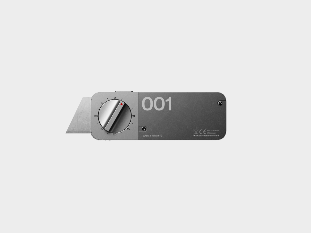
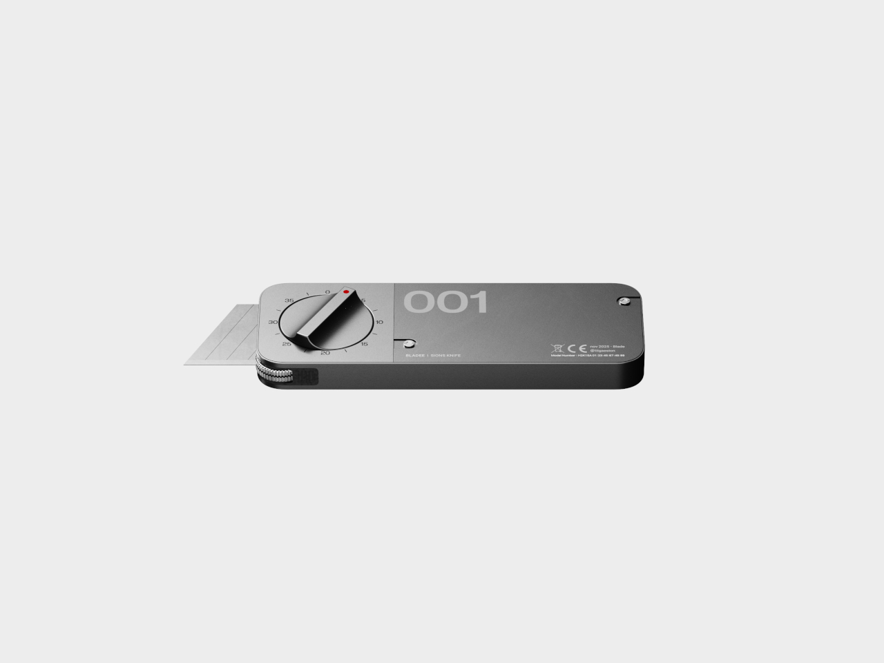
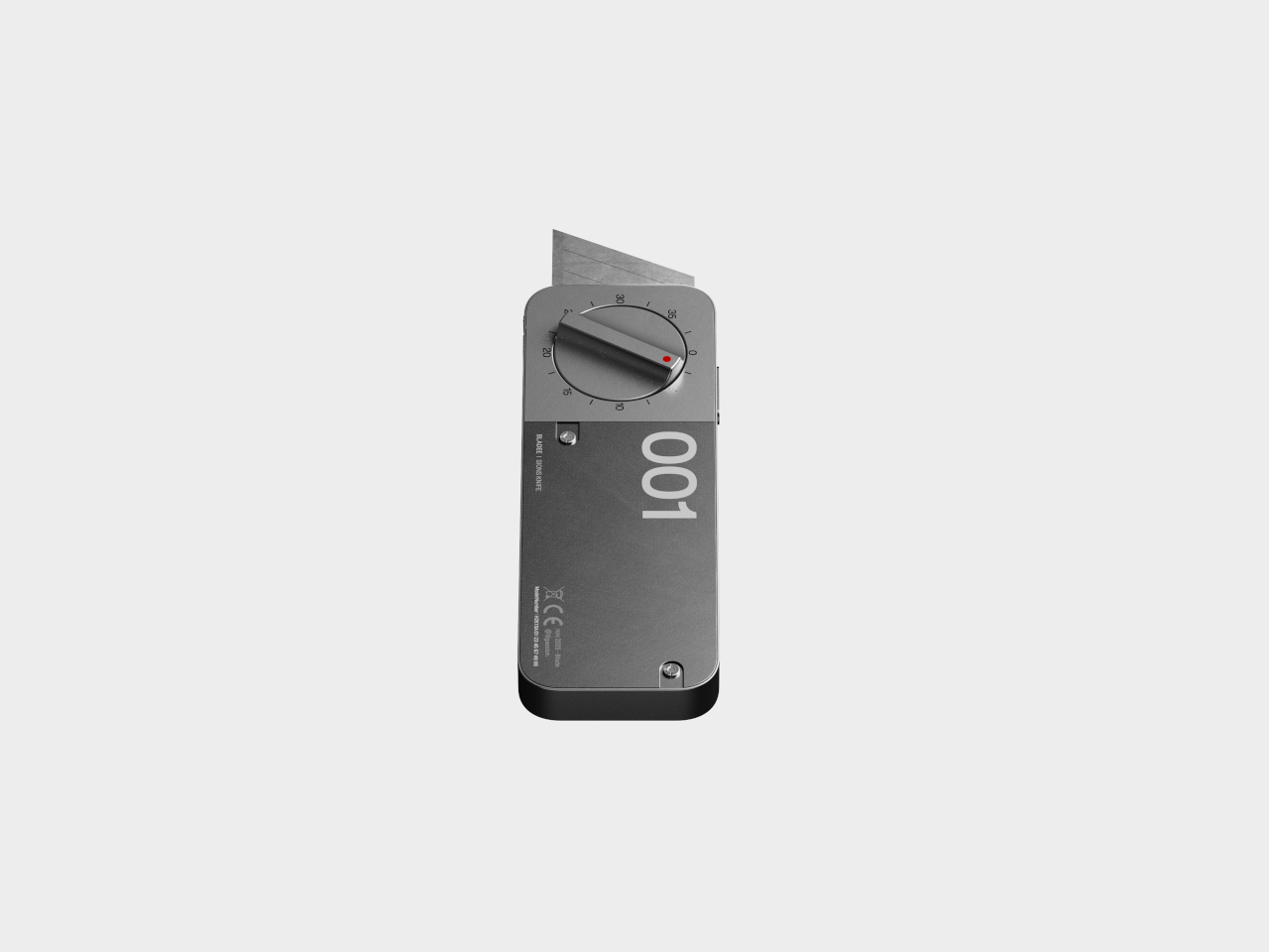
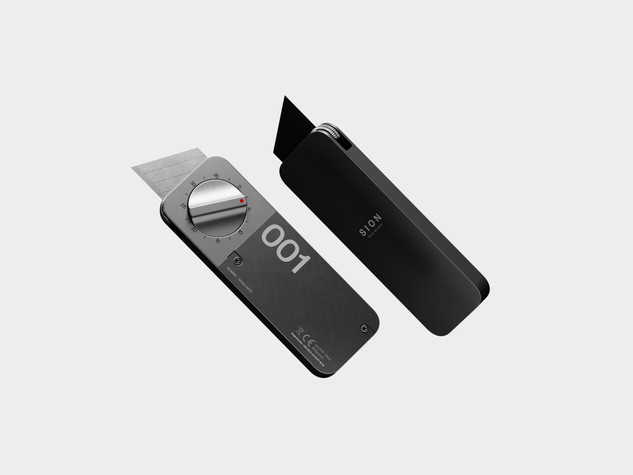
BLADEE’s minimalist, phone-sized body is all about clean lines, matte metal finishes, and a prominent dial that dominates the top surface for immediate visibility and control. The numbered dial lets you set your target cut length from 0 to 35 units, while a lower measurement wheel tracks your progress in real time as you slice through materials. As you approach the preset length, the blade gradually retracts automatically.

The blade always extends a fixed stroke for initial penetration, then withdraws at the set point to ensure every cut finishes smoothly and precisely at the same spot every time. The auto-lock at zero prevents accidental activation during transport or storage, and the dial only works when you press the side button for additional safety during use. This dual-safety system protects both the user and nearby materials.

The real magic is how BLADEE changes the workflow entirely for professional and hobbyist makers alike. No more juggling rulers, pencils, and knives across your workspace while trying to maintain precision and accuracy. Just set the dial to your desired measurement, cut with confidence, and repeat as many times as needed. Whether you’re prototyping packaging designs, building architectural scale models, or crafting at home, the tool eliminates tedious marking.

The right-hand cover is modular and swappable, letting you change colors, finishes, or even add project numbers or initials for organization and personalization. The measurement wheel rolls alongside the blade during cutting, counting travel with each pass and engaging the internal linkage for smooth, automatic retraction at the endpoint. This prevents over-cutting while reducing the risk of slips and accidents at the vulnerable end of each cut.
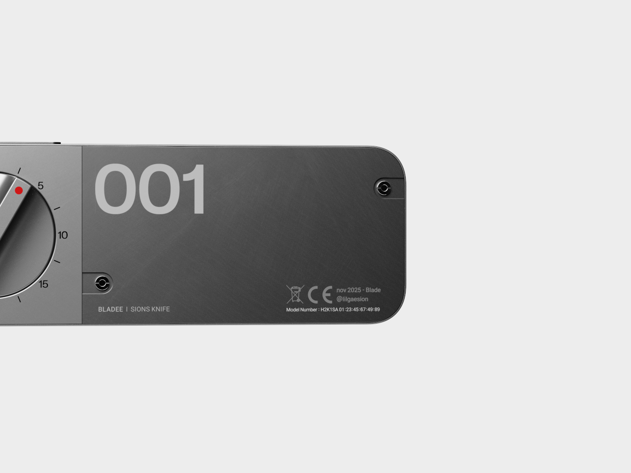
The robust metal construction, bold “001” graphics, and red pointer indicator give BLADEE a premium, professional feel that makes it as satisfying to use as it is to display prominently. For anyone who values accuracy and efficiency in their creative work, this concept offers a compelling reminder that even the most ordinary, everyday tools can be reimagined for modern workflows and contemporary creative needs when designers prioritize user experience and workflow efficiency.

The post Box Cutter Dial Lets You Make Identical Cuts Without a Ruler first appeared on Yanko Design.