Wacom MovinkPad Pro 14 Review: The $900 Sketchbook Designers Needed

PROS:


  • Minimalist design streamlined for focused work on the go

  • Paper-like experience when drawing or writing

  • Comes with Wacom Pro Pen 3 in the box

  • Large, bright, color-accurate OLED screen with anti-reflective surface


CONS:


  • Quite a significant investment

  • Uncertain software update roadmap

  • Instant Pen Display Mode is currently offered as a beta feature

RATINGS:

AESTHETICS
ERGONOMICS
PERFORMANCE
SUSTAINABILITY / REPAIRABILITY
VALUE FOR MONEY

EDITOR'S QUOTE:

The Wacom MovinkPad Pro 14 isn't another Android tablet. It's a sketchbook that happens to run one.

award-icon

For decades, Wacom has held an almost unchallenged grip on the drawing tablet and pen display market. Its products are so trusted that studios and design firms often keep them running for years, sometimes long after they’ve been discontinued. Lately, though, its rivals have been gaining a lot of attention, pushing increasingly attractive prices and expanding into new product categories.

That doesn’t mean Wacom has been idling. The company is finally wading into standalone Android tablet territory with the MovinkPad 11 and the more premium MovinkPad Pro 14, a proper portable drawing machine aimed squarely at working creatives. We’ve been spending time with the larger of the two, along with the new Wacom Art Pen 2, and the question is whether it’s worth every dollar of its price tag.

Designer: Wacom

Aesthetics

Right out of the box, the MovinkPad Pro 14 doesn’t dazzle the way other tablets in its price range tend to. There are no flashy colors, no ultra-thin borders, no polished surfaces. The bezels are noticeably wide, the default wallpaper is a solid, flat light gray, and the whole thing carries a stubbornly plain look that feels almost out of step with the competition.
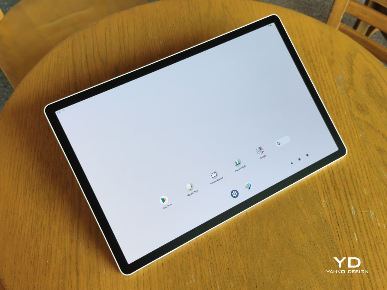
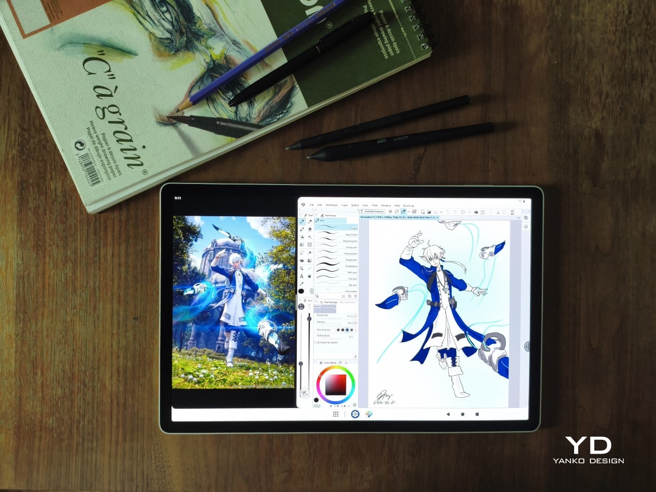
It’s all very much by design. Wacom’s intent is to mimic the look and feel of a physical sketchbook, the kind artists, designers, and architects carry everywhere. The device comes in one color, light gray, which echoes the tone of most sketchbook paper. Its rectangular form, wide borders included, also closely mirrors the footprint of an A4 pad, binding and all.
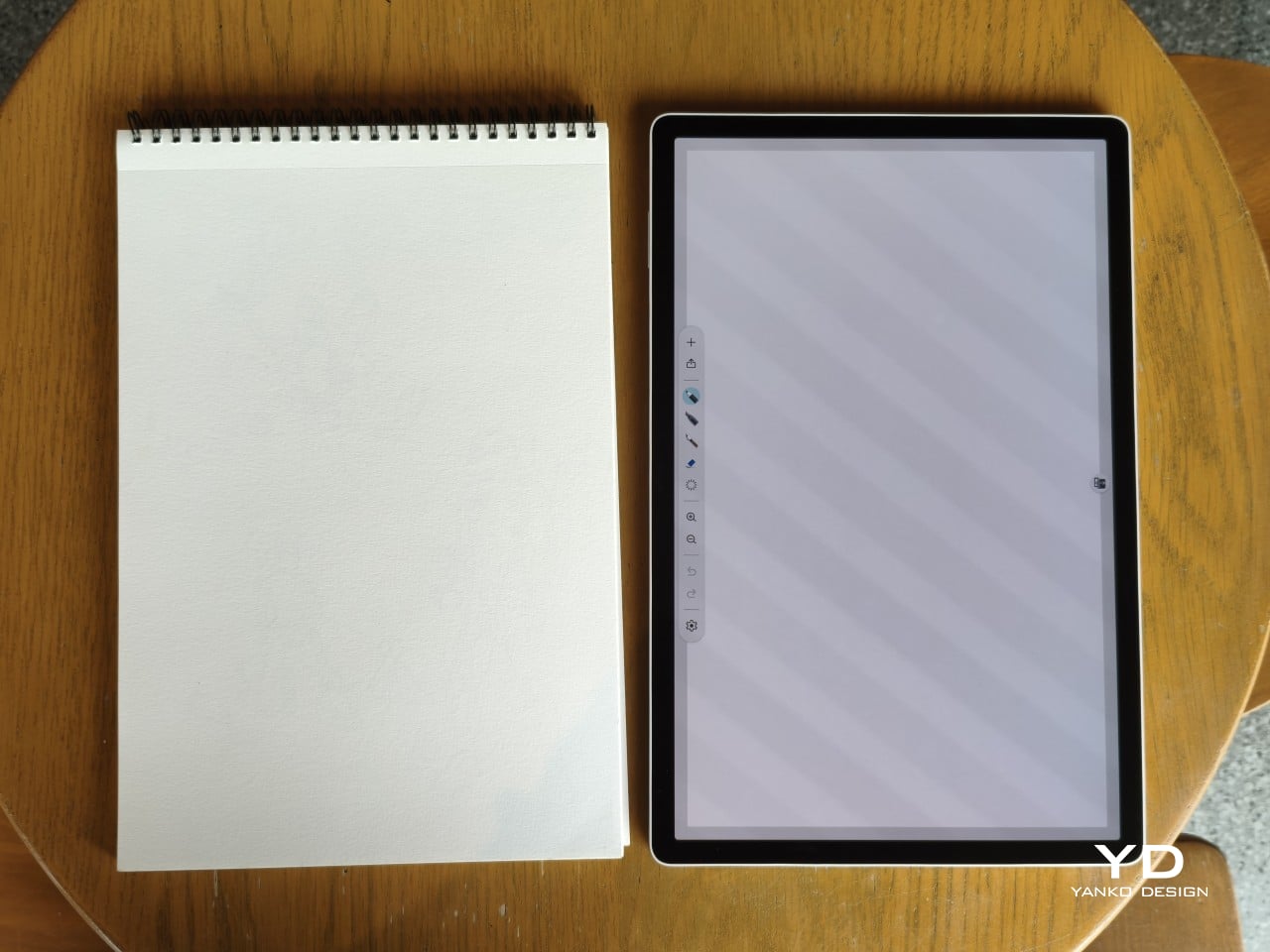
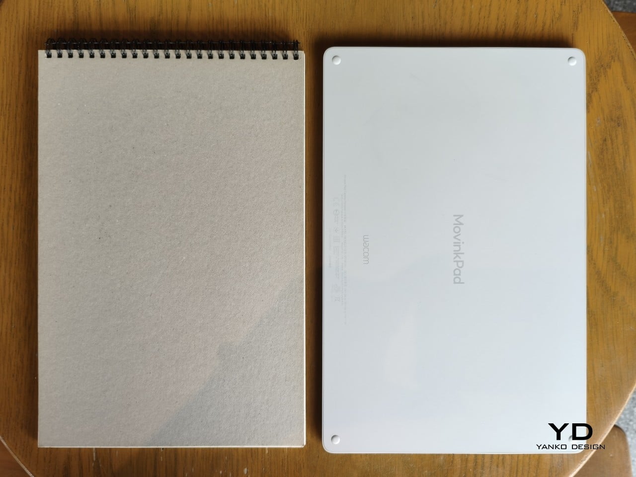
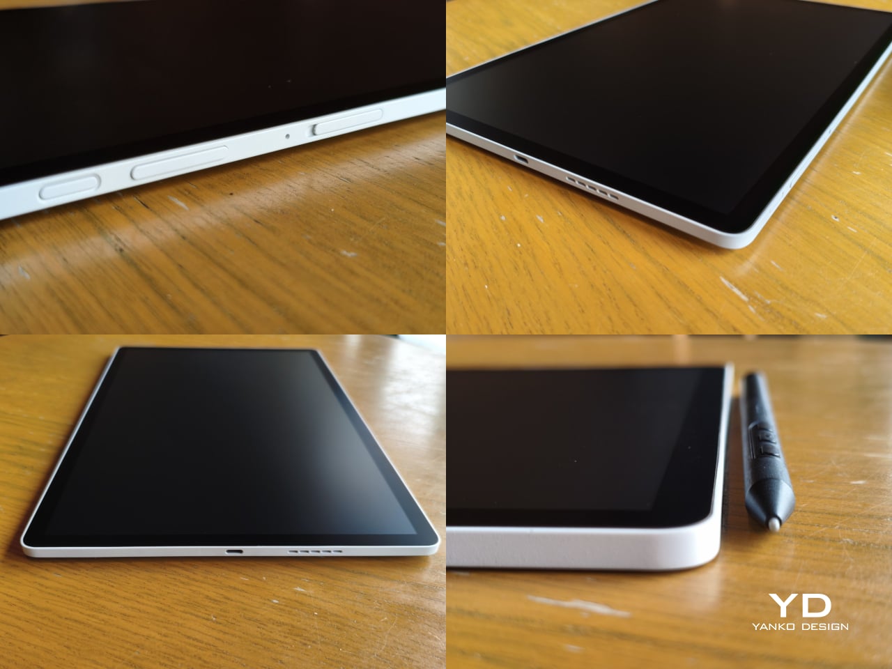
The sides of the device carry that same restraint. One long edge holds the power button, volume rocker, and microSD slot, while the opposite edge features connectors for the optional cover accessory. The short edges house the speakers, and the bottom is reserved for branding, regulatory inscriptions, and four rubber feet. There’s nothing extraneous, nothing decorative, and nothing that distracts from the task you’re there to do.
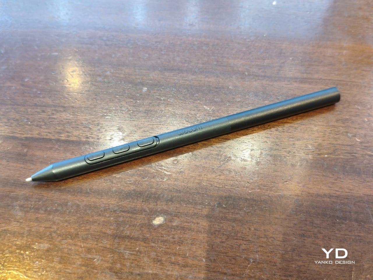
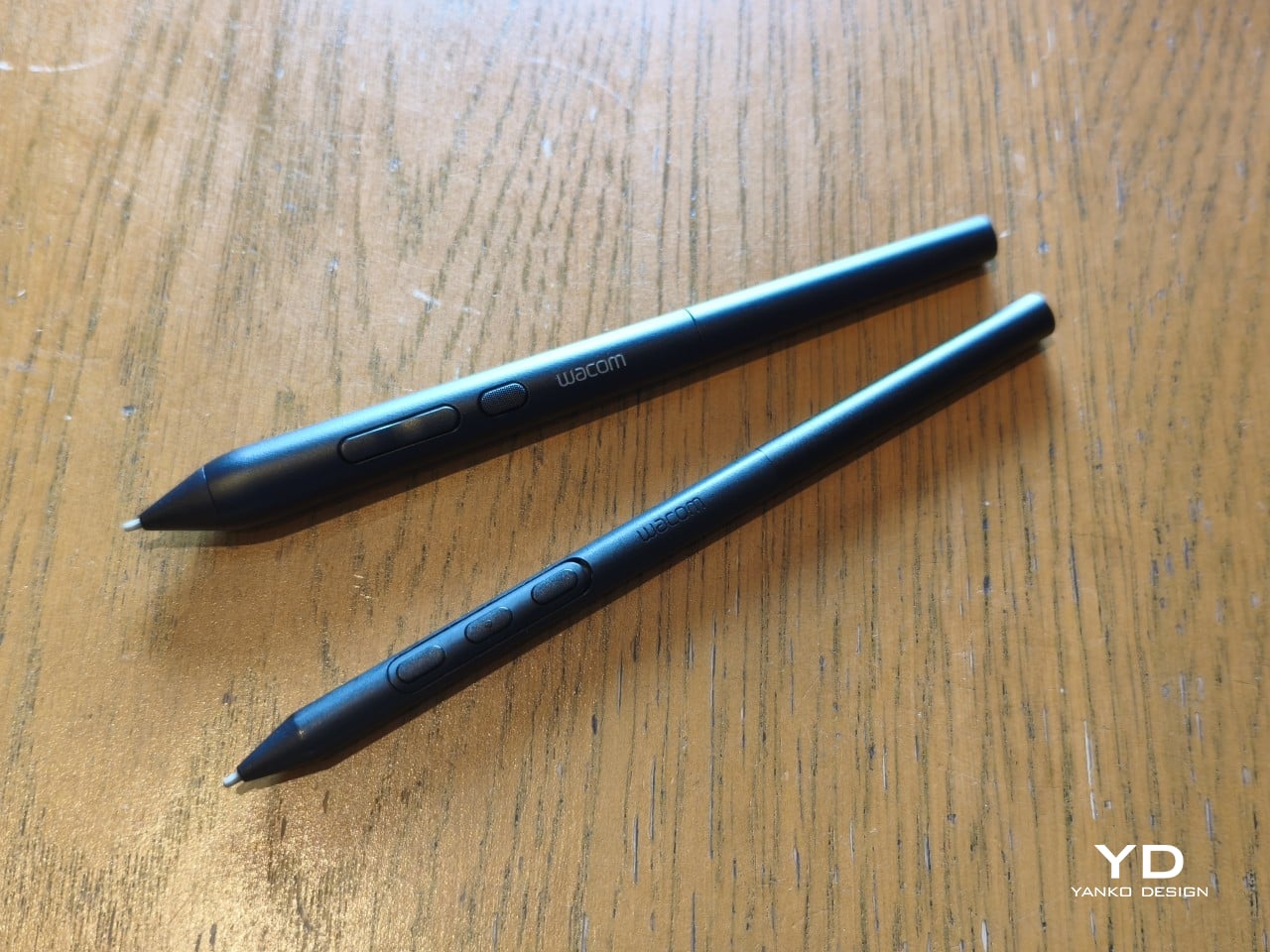
The included Pro Pen 3 follows the same philosophy. It’s all black, slim, and cylindrical, with a body so uniform it almost looks like a high-end mechanical pencil. The three side buttons are barely raised, sitting nearly flush against the barrel for a cleaner look. Unscrewing the rear half reveals three replacement nibs tucked inside: a Carbon Shaft nib, a Felt nib, and a POM nib.
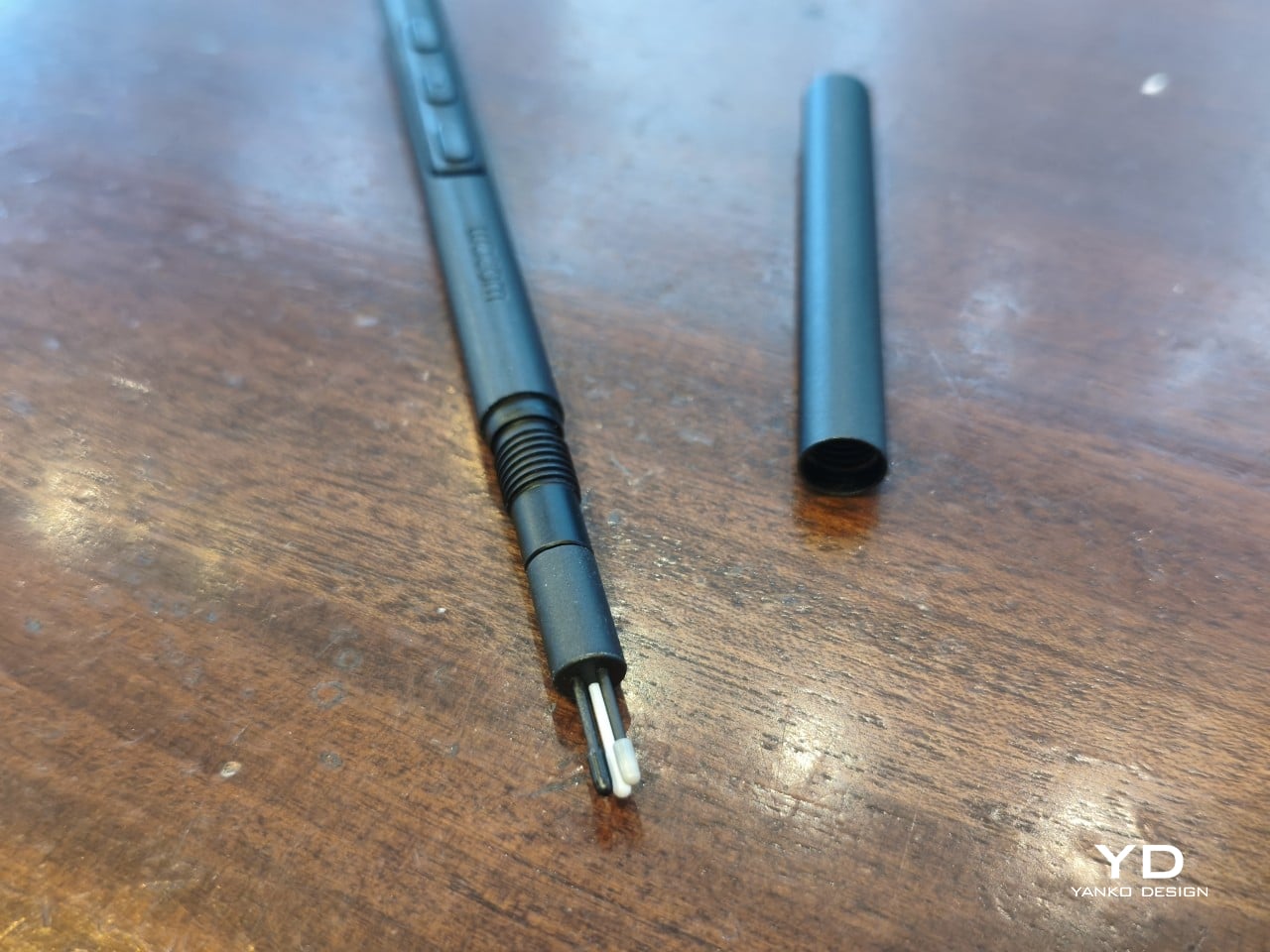
Wacom’s vision for the MovinkPad Pro 14 is to replicate the feeling of picking up a sketchbook, flipping to a fresh page, and getting straight to work. That intent comes through clearly because the tablet removes just about every visual, physical, and digital distraction it can. It doesn’t try to be the slickest-looking device in the room. It tries to be the one you reach for first.

Ergonomics

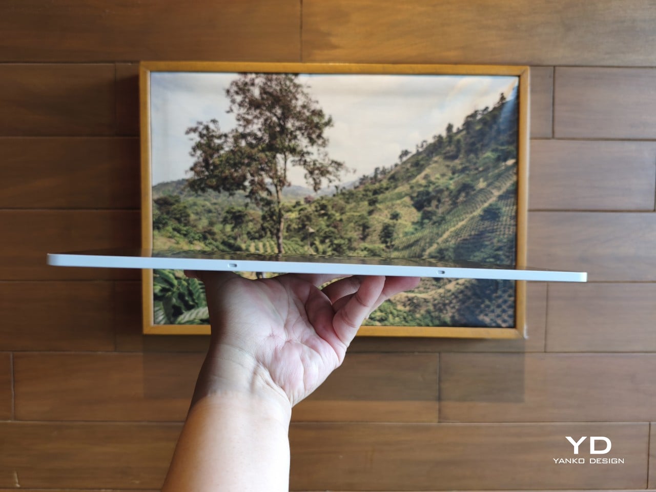
At 14 inches, the MovinkPad Pro 14 isn’t something you’d hold up one-handed for long, but at just 699 grams and 5.9mm thin, it slips easily into any bag. Resting it on your arm or lap doesn’t feel like a chore either. For creatives who move between locations throughout the day, that combination of size and lightness goes a long way toward making it a genuinely portable tool.
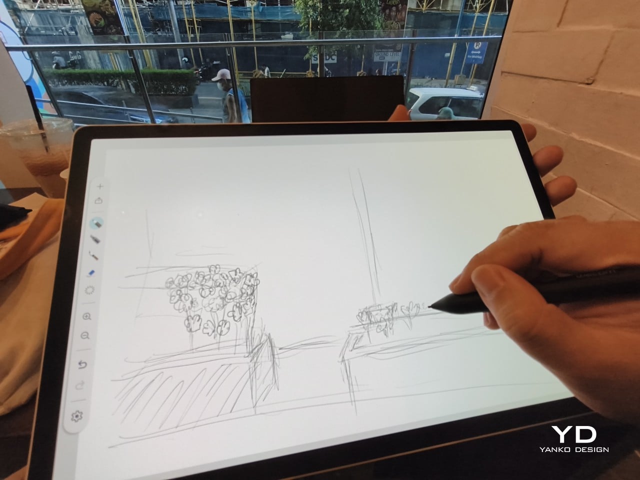
The four rubber feet on the underside keep the tablet from sliding around on a desk and slightly raise the back off the surface, which helps with airflow. There’s no built-in kickstand or angled stand, so if you prefer working at a tilt, you’ll need to source one separately, either from Wacom’s own accessory line or from a third-party option. It’s a small gap in an otherwise thoughtful package.
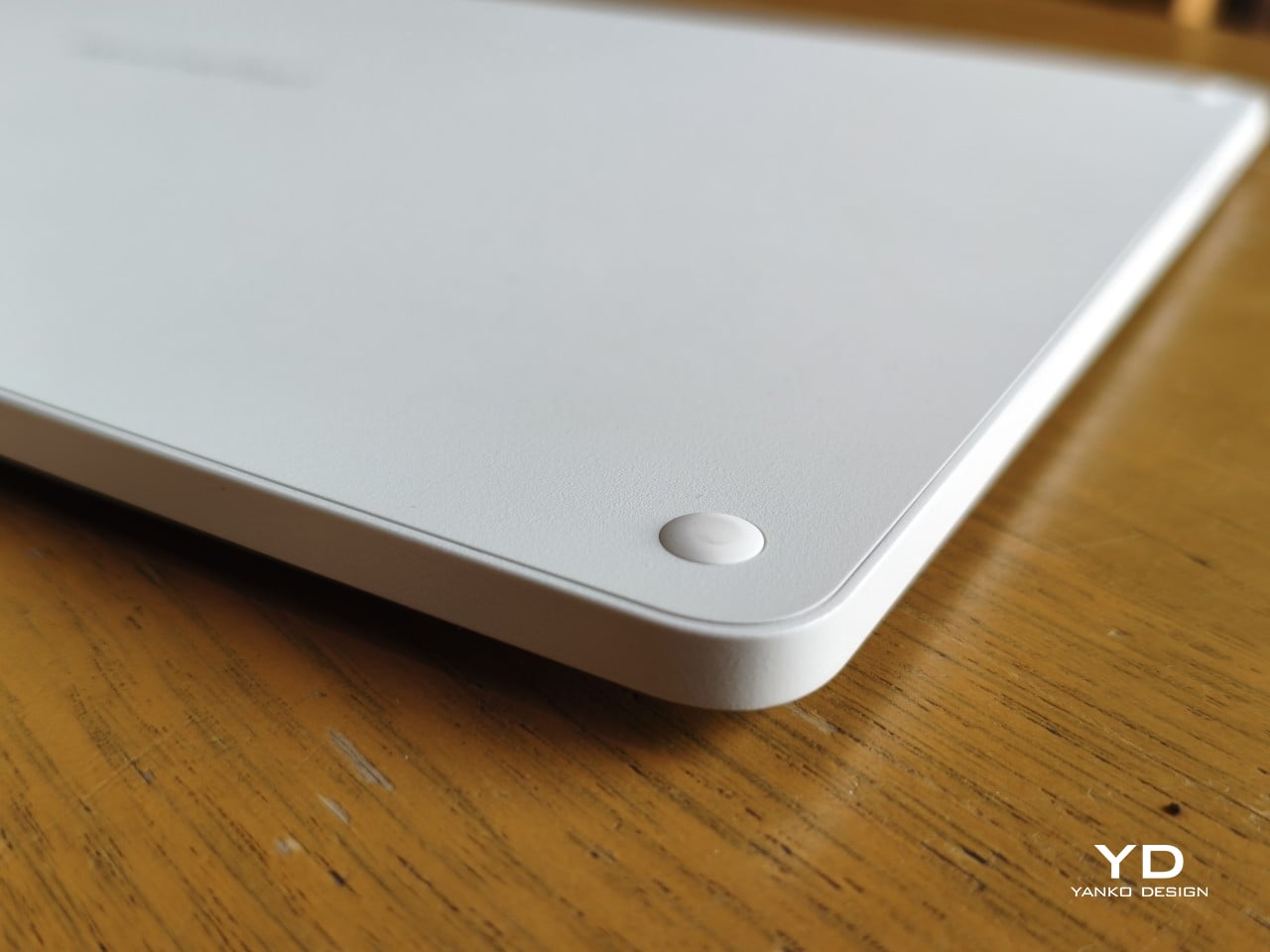
Those wide bezels, which might seem like a design quirk at first, actually earn their place here. They give you a comfortable inactive area to rest your palm or fingers when gripping the tablet from the sides, so your touch input doesn’t accidentally interfere with whatever you’re drawing. It’s the kind of practical thinking that tends to reveal itself only once you’re deep into a long session.
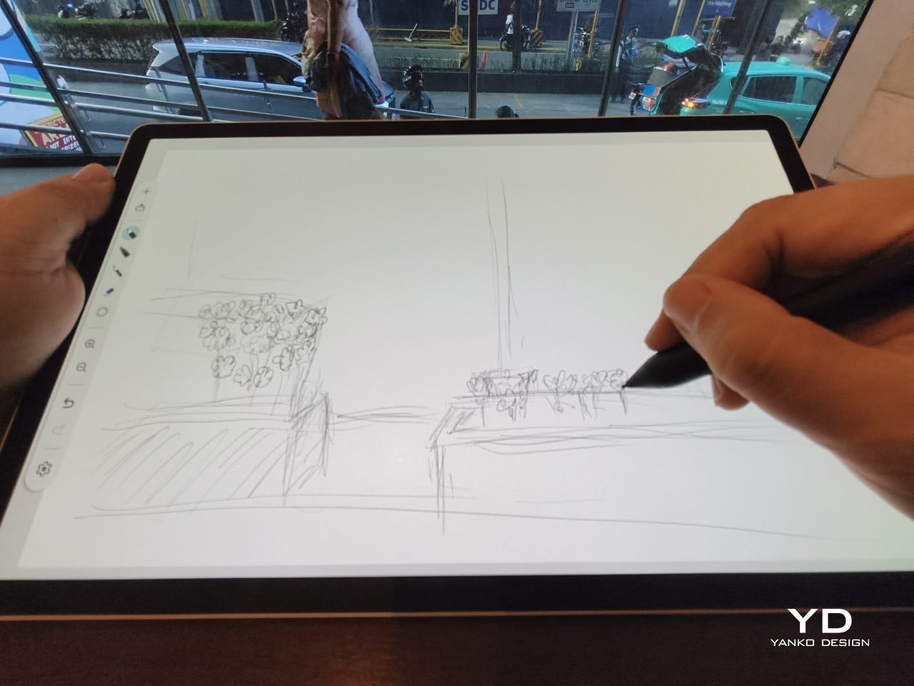
That said, the MovinkPad Pro 14’s footprint means it isn’t something you’d pull from a bag and start sketching on at a moment’s notice. For that kind of spontaneous work, the smaller MovinkPad 11 is probably the better fit. The Pro 14 is better suited to longer, more involved sessions away from the desk, as long as you’ve found a comfortable spot to settle in.
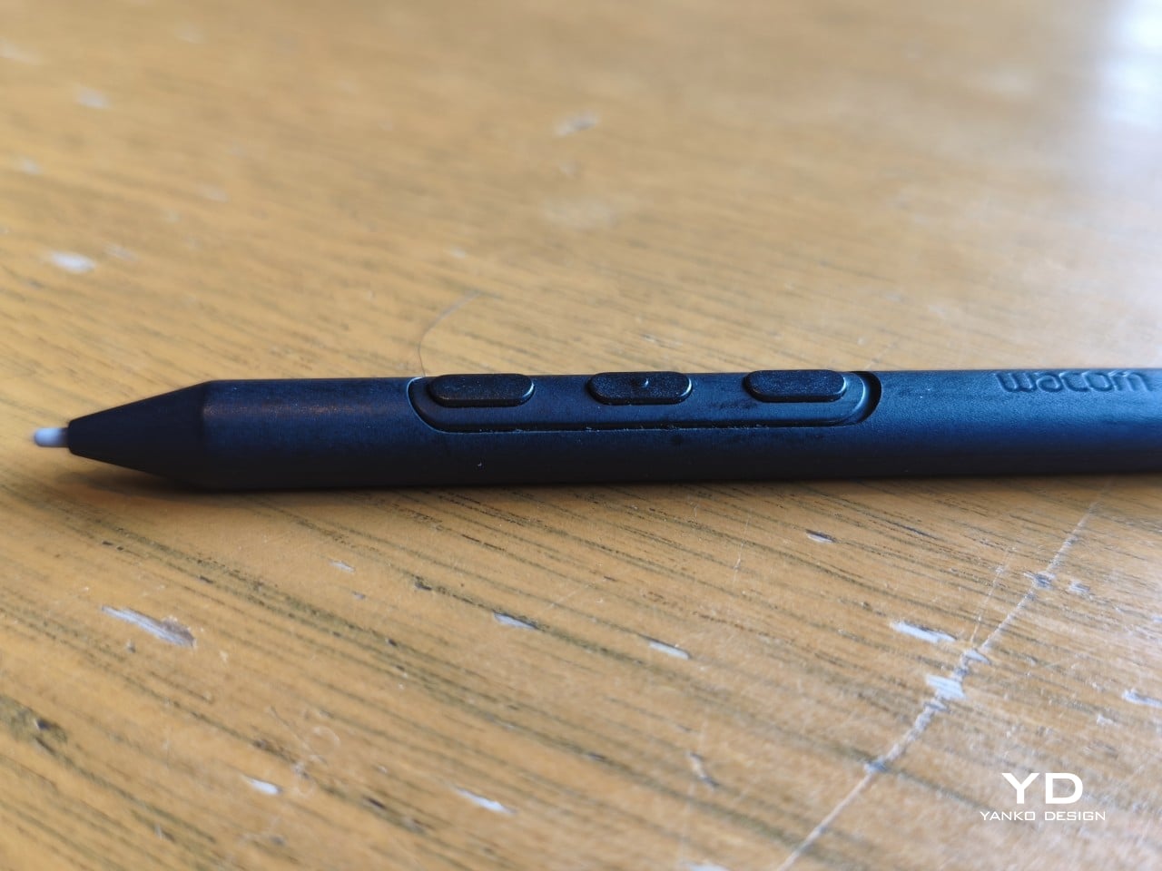
The Pro Pen 3 is well-balanced and comfortable enough in the hand, though your experience will vary depending on what you’re used to. Its slim, pencil-like build can lead to some cramping over long sessions for those accustomed to thicker tools. Official grips are available but aren’t cheap. The nearly-flushed buttons are also too easy to press accidentally. The Art Pen 2, which we’re also reviewing, offers a wider barrel as an alternative but is sold separately.
Performance

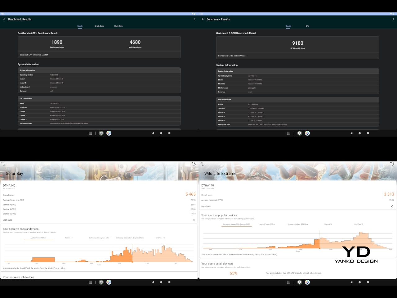
Under the hood, the MovinkPad Pro 14 runs on a Qualcomm Snapdragon 8s Gen 3 with 12GB of RAM and 256GB of storage, expandable via microSD up to 2TB. The processor isn’t the newest available, but it handles everything thrown at it with ease. Multitasking is smooth, app switching is fluid, and there’s no sense that the hardware is struggling to keep pace with anything.
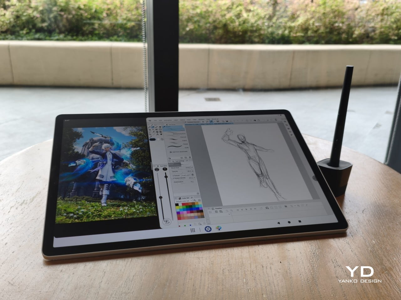
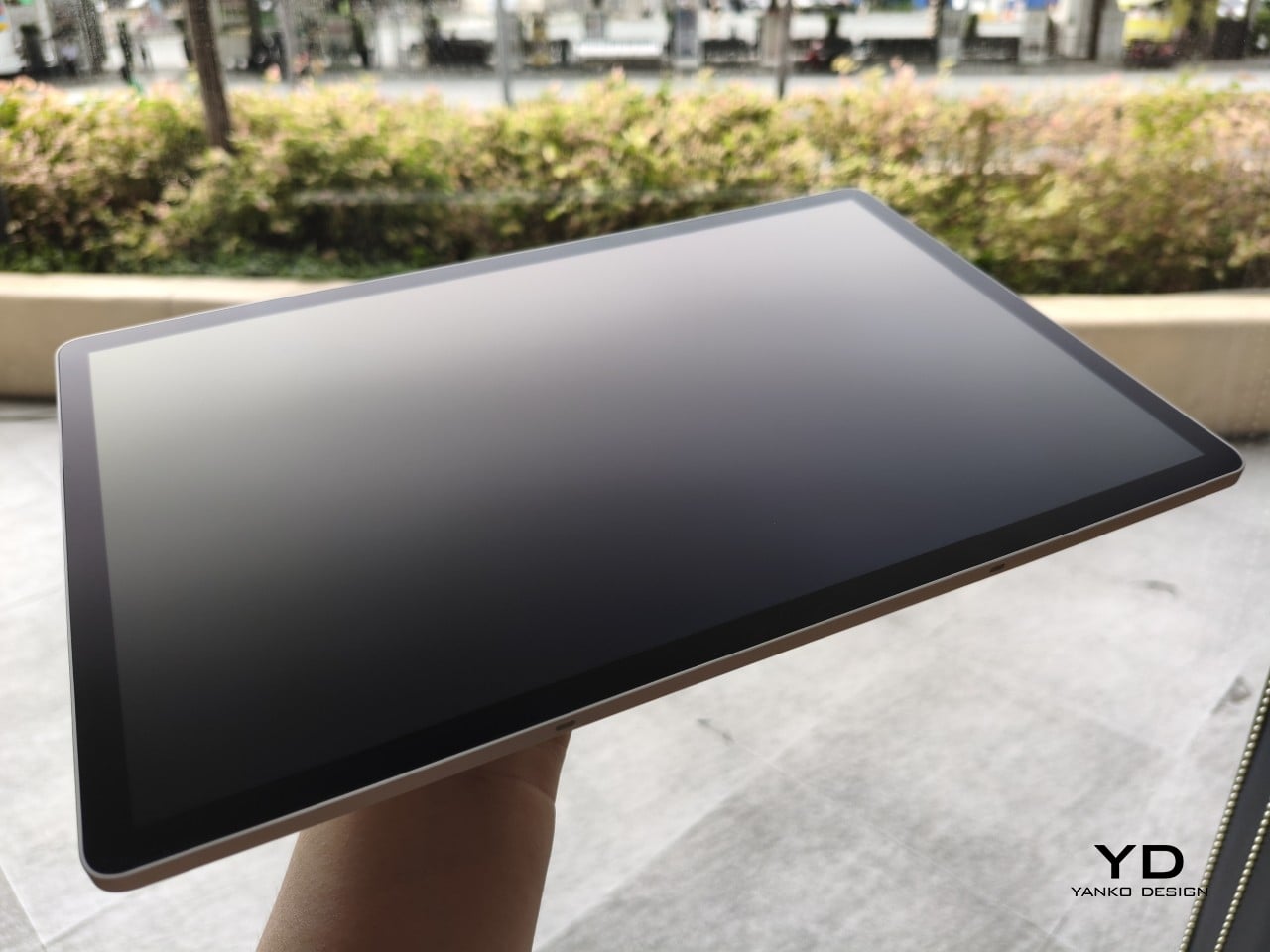
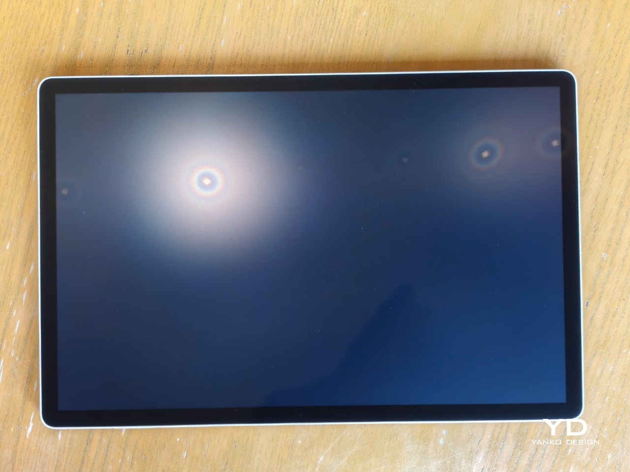
The 14-inch OLED display runs at a 2880×1800 resolution with a 120Hz refresh rate, treated with anti-fingerprint, anti-reflective, and anti-glare textured glass. The wide rectangular aspect ratio works in favor of drawing apps that line their UI panels along the sides, something squarish iPad screens can’t accommodate as cleanly. The textured coating adds a satisfying scratchiness to each stroke, and pen accuracy is, naturally, exactly what you’d expect from Wacom.
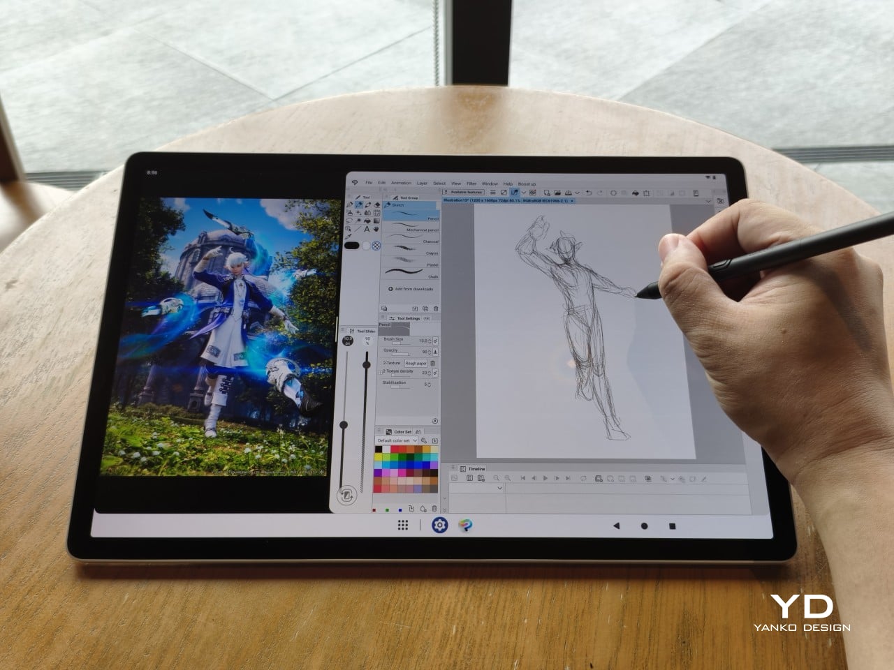
There are no cameras on the MovinkPad Pro 14, front or back. That’s a deliberate choice. There’s no temptation to flip over to social media, no accidental video calls, nothing that pulls focus away from what you’re there to do. Passively watching a tutorial in a corner of the screen is about as off-task as it gets, which, honestly, isn’t a bad thing for anyone prone to distraction. Split-screen functionality makes it easy to have a reference off to the side while you work.
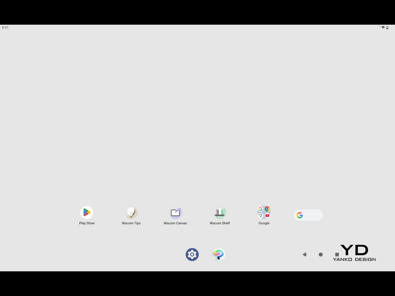
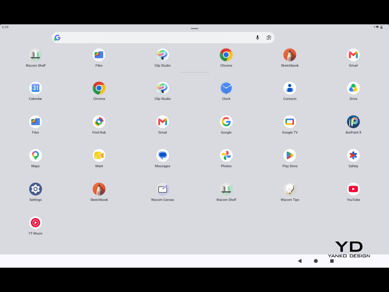
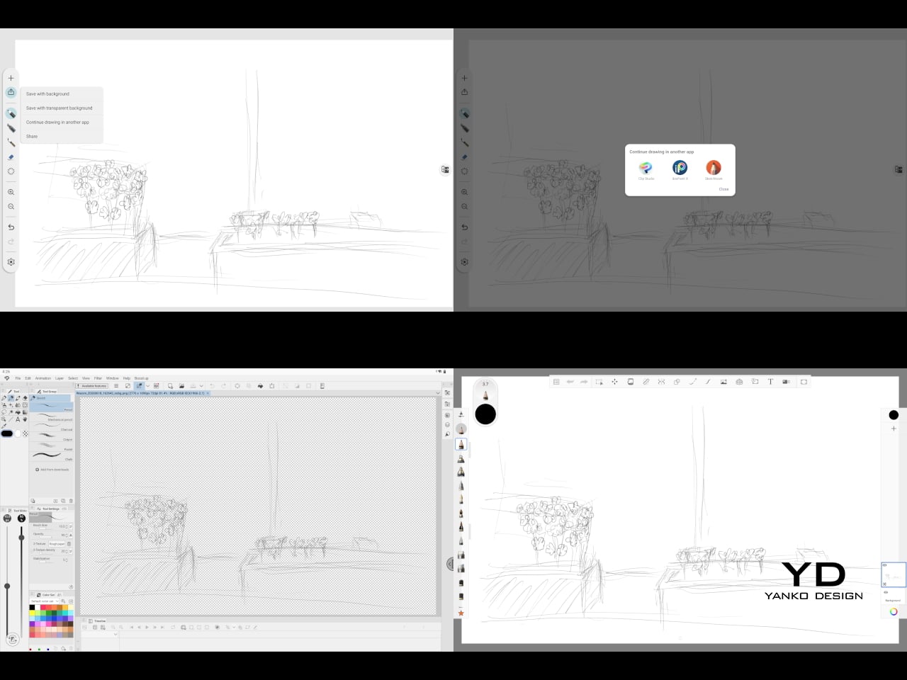
The software side is equally stripped down. Android 15 comes installed with zero bloatware and just three Wacom-made apps: Shelf for your gallery, Tips for settings, and Canvas, a quick sketching surface that wakes directly from sleep with a tap of the pen. It’s intentionally bare-bones for capturing fleeting ideas, though a few more brush options would genuinely be welcome. From Canvas, you can instantly send your sketch to an Android app, though it seems to be limited to Clip Studio Paint, iBisPaint, and Autodesk Sketchbook. Hoping it will offer some flexibility in the future.
Speaking of apps, desktop-grade drawing applications like Clip Studio Paint and Krita run without issue. The broader Android ecosystem opens up a decent range of options, though it’s worth remembering that anything exclusive to Windows or Mac won’t be available here. Customizing the pen buttons is also off the table, a limitation of the Android platform rather than any fault of the hardware itself.
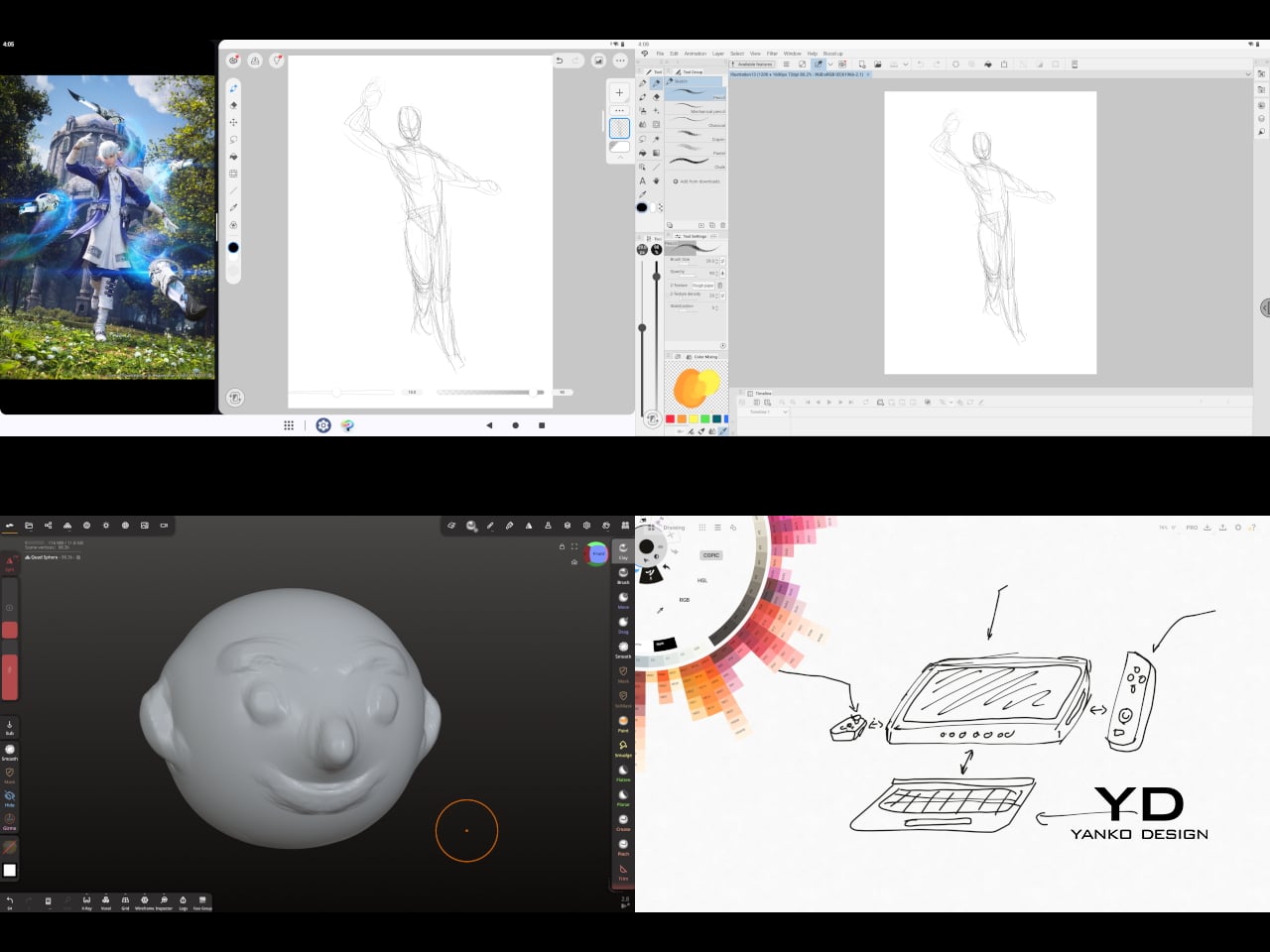
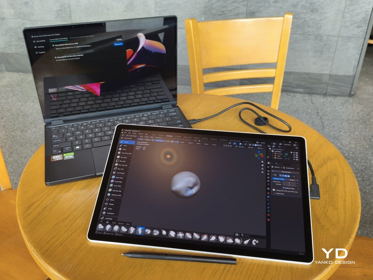
The Instant Pen Display Mode is arguably the most intriguing feature here. It converts the tablet into a secondary display for a Windows or Mac computer, via USB or Wi-Fi, turning it into a portable, makeshift Cintiq. It’s part of Wacom Lab, an experimental creator community that lets users explore and provide feedback on new creative possibilities through beta features. As of this writing, the setup process involves quite a number of steps, and pen button support is currently limited to toggling a small side panel for common modifier keys. It definitely shows promise, so hopefully development will be quick.
Battery life is genuinely impressive. The 10,000mAh cell can sustain nearly five days on standby and supports 65W fast charging, though you’ll need to bring your own charger since none is included in the box. The USB-C port is only 2.0, so it doesn’t charge as quickly as the spec might suggest, but an hour or more of active drawing barely makes a dent in the battery.

Sustainability

Wacom doesn’t use recycled or notably sustainable materials in the MovinkPad Pro 14 itself, but the company does meet several other environmental benchmarks worth noting. Its packaging is compact, minimal, entirely plastic-free, and fully recyclable, while the device is built with the kind of durability Wacom products are known for, the sort that keeps them in active use long after most gadgets would have been binned.
That longevity argument holds well for Wacom’s drawing tablets and pen displays, which tend to outlast their useful lives many times over. A standalone Android tablet is a different matter, though. Apps like Clip Studio Paint have already dropped Android 12 support, making regular OS updates critical. Wacom has committed to keeping the MovinkPad Pro 14 current, but no clear update schedule or roadmap has been shared publicly yet.

Value

At $899.95, the MovinkPad Pro 14 isn’t an impulse buy, but it’s a reasonably grounded one. An equivalent iPad would require buying the Apple Pencil separately, while a comparable Samsung Galaxy Tab tends to run noticeably higher. For a tablet built specifically around the drawing experience, with Wacom’s pen technology at its core, the price lands in a range that’s genuinely difficult to argue against.
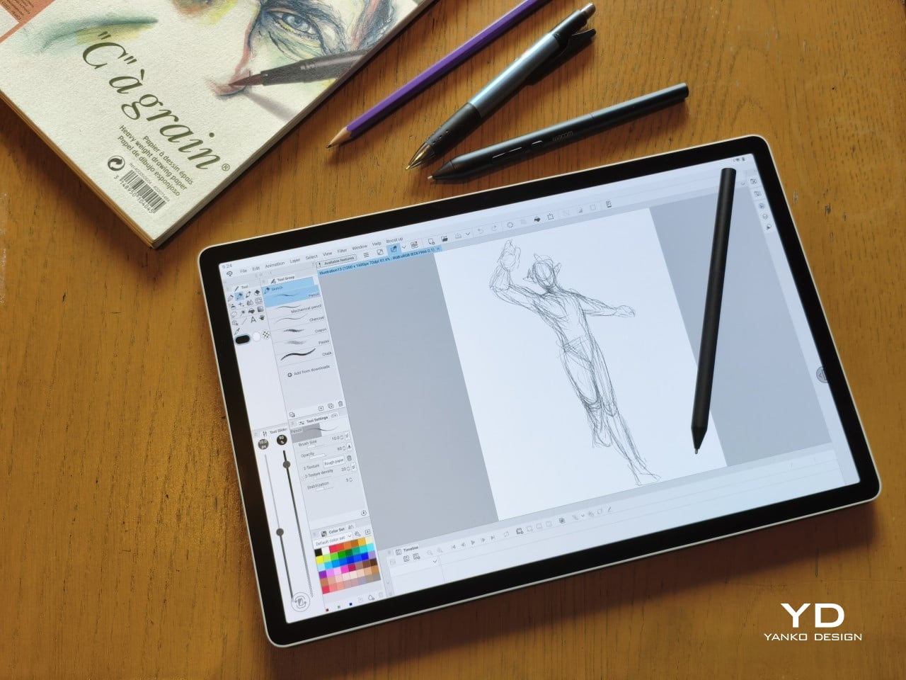
The large screen and capable hardware make it a compelling option for creatives who frequently work away from their desks. It doesn’t sacrifice quality for the sake of portability. With the right app installed, it functions as a capable mobile workstation wherever you happen to be. And when a PC or Mac app becomes unavoidable, Instant Pen Display Mode is there to bridge the gap.
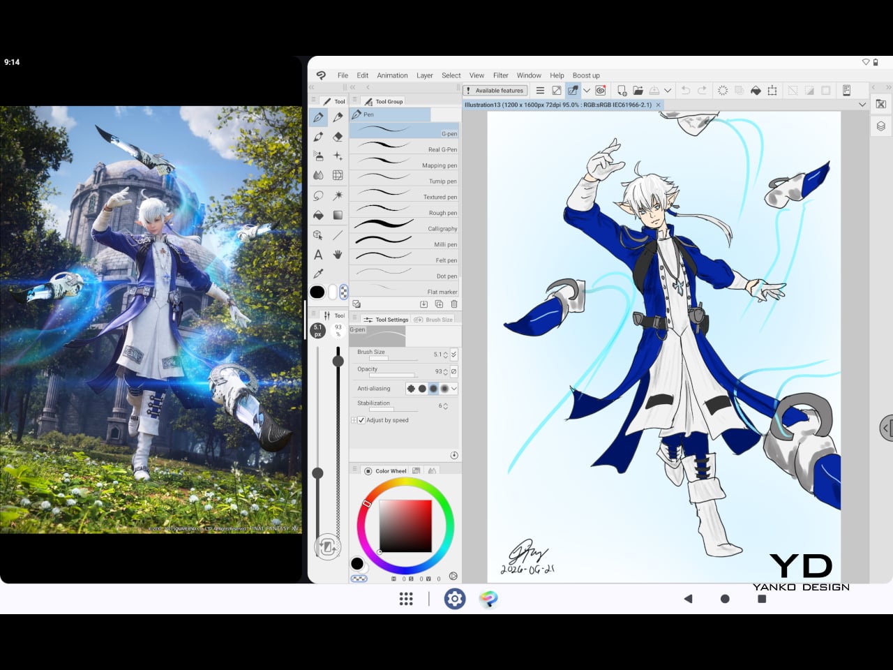
There are caveats, of course. The beta status of Instant Pen Display Mode means it’s not quite ready to be a daily driver feature. You’ll also need to feel at home with Android’s drawing ecosystem for this workflow to really make sense. And the uncertainty around long-term Android updates is a concern that Wacom will need to address more concretely before most buyers can put it fully to rest.

Verdict

The MovinkPad Pro 14 isn’t Wacom’s first stab at a standalone portable device. Veterans will remember the Windows-based Cintiq Companions and the MobileStudio Pros. But this is by far the most portable and clearly focused version of that idea. It doesn’t try to cram Windows into a pen display. It’s a purpose-built mobile experience that happens to carry a Cintiq-like trick discreetly tucked away.

At the same time, it doesn’t operate like an Android tablet with a Wacom digitizer tacked on, which is essentially what Samsung’s Wacom-enabled slates are. Wacom has built something around a specific, coherent idea: a true digital sketchbook. Some software edges still need ironing out, but for artists and designers craving genuine creative freedom outside the studio, the MovinkPad Pro 14 offers something few tablets in its class can match.
The post Wacom MovinkPad Pro 14 Review: The $900 Sketchbook Designers Needed first appeared on Yanko Design.
5 Portable Bluetooth Speakers for Summer 2026 That Sound as Good Outside as They Look

Most portable speakers resolve the outdoor brief in one of two ways. They build something tough enough to survive whatever summer throws at it, then let design take care of itself. Or they craft something that looks considered and hope it never meets moisture. These five refuse that tradeoff. Each earns its place outdoors on visual merit alone, a bar that very few speakers in this category have the confidence to clear.

The selection spans passive acoustic amplification to hard-anodized Danish aluminum, retro broadcast aesthetics to science fiction metalwork, and an outdoor warrior that floats face-up in a swimming pool. What ties them together is a conviction that a portable speaker should be worth looking at when the music stops. Whether you pack one for the long weekend or set one up on the rooftop, these speakers make the setup look considered before anyone hits play.

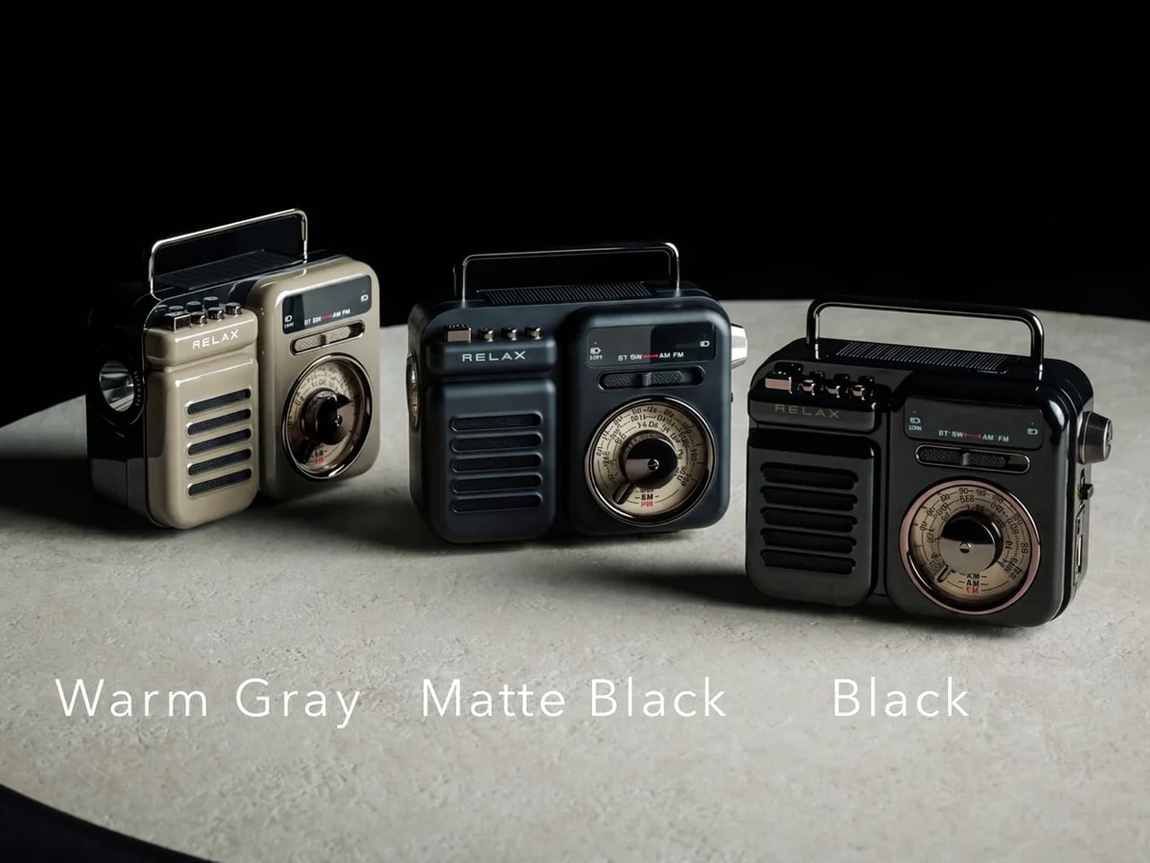
1. Retrowave Radio

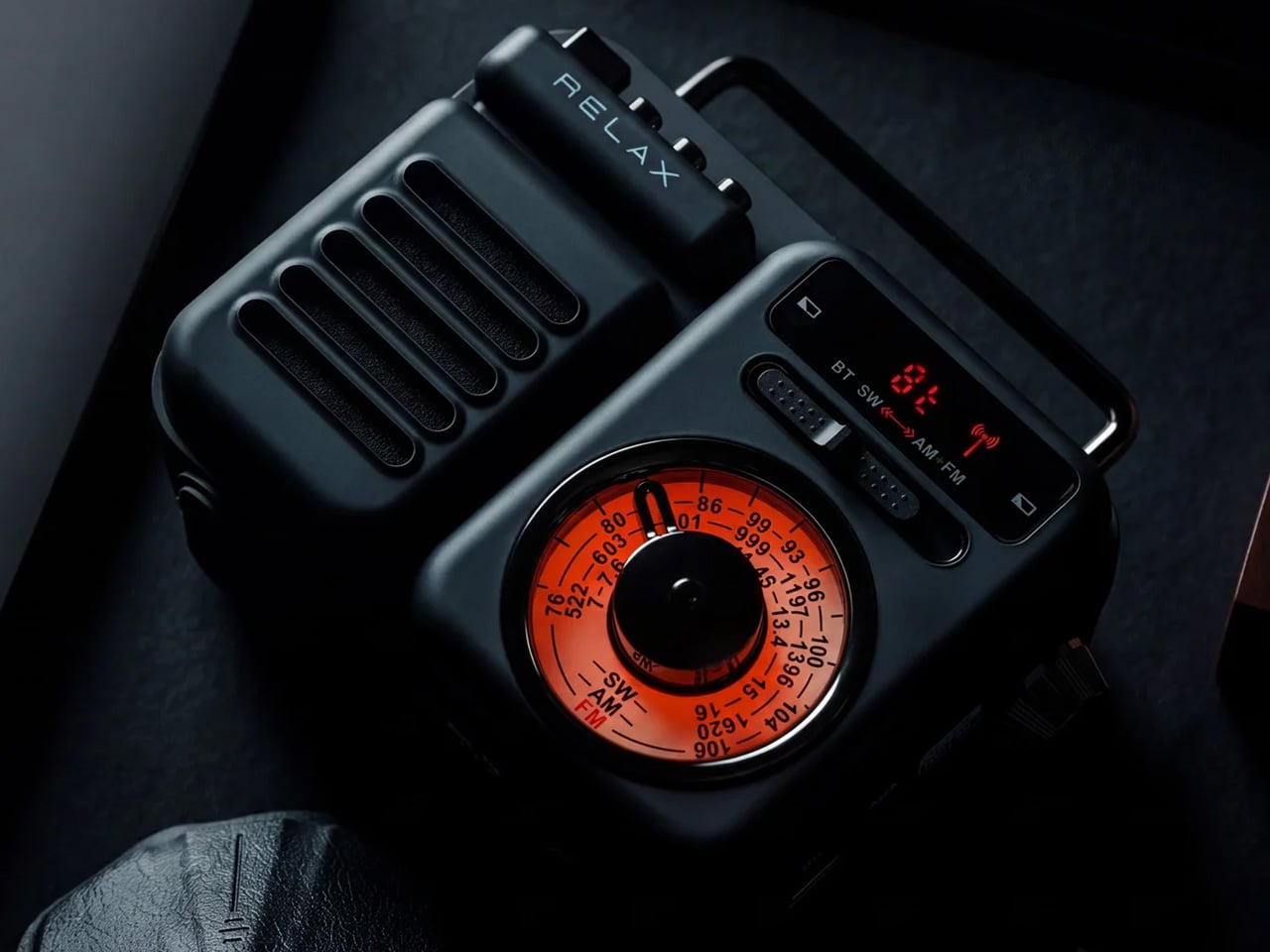
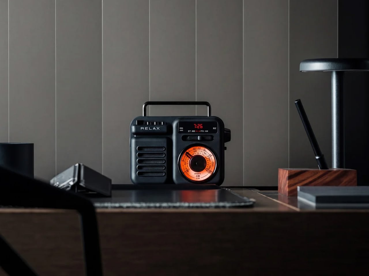
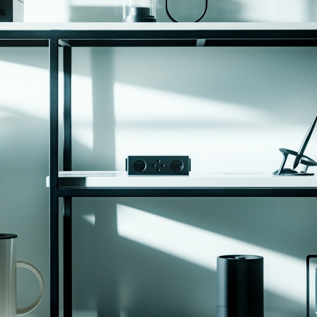
There is a specific pleasure in a speaker that looks like it predates Bluetooth by thirty years. The Retrowave Radio brings that cabinet sensibility into a summer that runs on playlists and wireless connectivity, giving you the best of both. Its proportions and analog-styled face sit more comfortably on a picnic blanket or campsite ledge than most modern speakers manage, which tend to read as tech accessories rather than objects genuinely worth looking at.

The FM tuner adds a layer the streaming era forgot. Scanning local frequencies somewhere without a strong data signal is its own kind of discovery, the kind no algorithm delivers. Bluetooth connectivity keeps it relevant to every device you already own, so the retro shell is not a compromise so much as a philosophy about what listening outdoors should feel like. It is the speaker most likely to draw a question from whoever walks past, which is the highest compliment any piece of audio design can receive.

Click Here to Buy Now: $89.00

What We Like

  • The retro cabinet reads as a considered aesthetic statement rather than a novelty gimmick, and holds its own in any outdoor setting
  • Dual functionality as a Bluetooth speaker and FM radio opens it up to genuine off-grid situations where streaming is not an option

What We Dislike

  • The analog-inspired styling may not suit those who prefer a contemporary minimal look in their audio gear
  • FM reception quality depends entirely on local signal strength, which varies considerably depending on where summer takes you

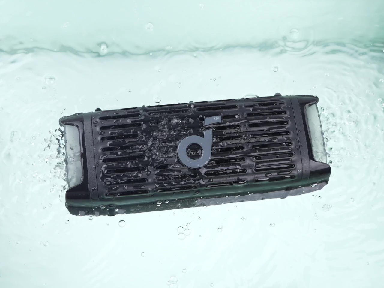
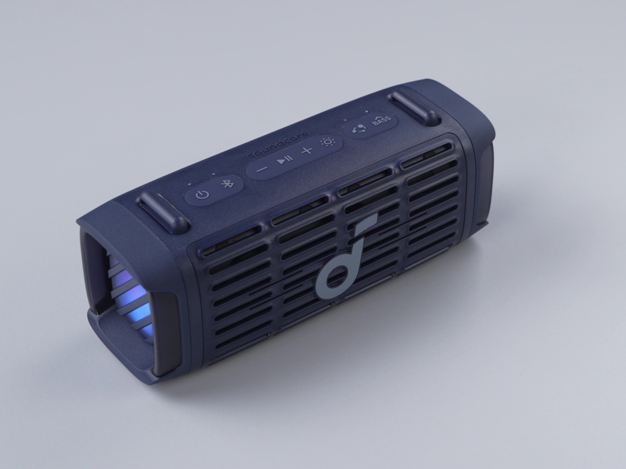
2. Anker Soundcore Boom 3i

The Soundcore Boom 3i solves a problem most outdoor speakers refuse to acknowledge. Pools, lakes, and beaches are exactly where you want music most and also the worst possible environments for most electronics. Anker’s answer is a speaker that floats and self-orients so the audio always faces upward, keeping sound clear whether it was placed there deliberately or went in during a particularly competitive game of volleyball. That kind of design honesty about actual use is rare.

Beyond the floating, it includes Buzz Clean, a feature where the speaker vibrates on command to shake sand and debris out of the grille. It is a small addition that solves a genuine frustration without tools or disassembly. Sixteen hours of battery life and LED lighting that pulses with your music make it a speaker clearly built by a team that has spent time at actual beaches, not imagined them from an office.

What We Like

  • The self-orienting float design solves a real outdoor audio problem rather than just marketing waterproofing that most owners never actually test
  • Buzz Clean is genuinely useful in sandy environments and requires no tools, disassembly, or anything beyond pressing a button

What We Dislike

  • The LED lighting, while effective at night, adds visual busyness that may not appeal to those who prefer their gear to sit quietly in the background
  • Its larger footprint makes it less suited to compact bags or minimalist packing situations where every cubic inch matters

3. Bang & Olufsen Beosound Explore

Bang & Olufsen built the Beosound Explore from hard-anodized aluminum, and that material choice explains everything else about it. Reaching for aluminum where every competitor defaults to polycarbonate communicates a specific set of values about longevity, texture, and what outdoor gear can look like when it is not trying to appear durable but simply is. At 631 grams with a rubberized base and carabiner strap, it travels without ceremony and arrives looking like it belongs wherever you set it down.

The True360 sound from dual full-range drivers means there is no bad angle at a campsite or on a rooftop, and 27 hours of battery life removes the anxiety that shadows every other portable speaker on a long weekend. IP67 water resistance covers submersion up to one meter for thirty minutes, which handles every realistic outdoor scenario. Designed in Denmark and built to outlast seasons rather than one summer, the Beosound Explore is the speaker you eventually stop having to replace.

What We Like

  • Hard-anodized aluminum construction gives it a material quality and cool-to-the-touch feel that no polycarbonate competitor comes close to matching
  • 27-hour battery life is genuinely class-leading at this form factor, removing charging from the weekend equation entirely

What We Dislike

  • The price sits at the premium end of the portable speaker category, which may not align with every budget on this list
  • The compact driver configuration prioritizes audio fidelity over sheer volume ceiling, so those expecting a party speaker may find it more refined than powerful

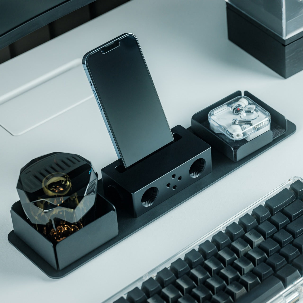
4. Battery-Free Amplifying iSpeakers

The Battery-Free Amplifying Speaker starts from the most honest premise in portable audio: what if the speaker needed nothing from you except the sound you already had? Using passive acoustic amplification, it channels audio from your device through a shaped resonance chamber without a Bluetooth receiver, a charging cable, or a battery to manage. The result is a speaker that is always ready because there is genuinely nothing about it that can run out.

Its design logic sits closer to a musical instrument than a consumer gadget. Every curve and internal chamber proportion is there to do acoustic work, which means every formal decision has a functional one sitting behind it. For a long morning on the balcony or an afternoon at the beach where you forgot to charge everything, it removes the one variable that always causes friction. You set it down, rest your phone inside, and the sound arrives without a single button pressed.

Click Here to Buy Now: $179.00

What We Like

  • Zero dependency on charging makes it genuinely grab-and-go in a way no battery-powered speaker on this list can claim
  • Passive acoustic construction makes it one of the most durable options here by virtue of having no electronics to fail

What We Dislike

  • Volume ceiling is naturally limited compared to powered speakers, making it less suited to larger outdoor gatherings where you are competing with ambient noise
  • Performance is tied directly to the speaker quality of the host device, which varies considerably from one phone to the next

5. GravaStar Mars Pro

The GravaStar Mars Pro does not attempt to blend in, and it is entirely correct not to try. Its zinc alloy body, war-damaged finish options, tripod legs, and exposed mechanical detailing sit somewhere between industrial design and a film prop, which is precisely what makes it worth owning. Most portable speakers are designed to disappear into their surroundings. The Mars Pro is designed to become the focal point of wherever it is placed, and its 20W dual speaker system backs that visual confidence with real audio substance.

A full-range driver paired with a passive bass radiator gives the Mars Pro low-end presence that its dimensions should not produce. The RGB lighting system runs through six dynamic modes, pulsing with your music and making it a natural fit for evening rooftops and outdoor gatherings. At 5.5 pounds, it is the heaviest option here, which places it at the center of a setup rather than inside a bag. That is exactly where it wants to be.

What We Like

  • The zinc alloy construction and sculpted mech aesthetic make it one of the most visually distinctive portable speakers available at any price point
  • 20W dual speaker output delivers bass presence well beyond what the physical size suggests is acoustically possible

What We Dislike

  • At 5.5 pounds, it is not a speaker you carry around a site; it is the one you set up and gather around, which limits where it fits on a summer itinerary
  • The dramatic visual language is polarizing and will not appeal to anyone who wants their audio gear to sit quietly in the background

The Best Summer Speaker Is the One Worth Looking At When the Music Stops

A portable speaker is one of the few objects that has to perform twice over. It has to sound right and look right in the same moment and the same light. The five here clear that bar without any of them feeling like a compromise in either direction. Summer is short enough that whatever you bring outdoors should be worth the trip, and each of these makes that case without any difficulty.

Whether you reach for the passive simplicity of the battery-free amplifier, the engineered restraint of the Beosound Explore, or the unapologetic presence of the Mars Pro, the underlying conviction is the same. Good design does not ask you to choose between form and function. These speakers already made that decision, and it shows from the moment you set them down somewhere they have no business looking this good.

The post 5 Portable Bluetooth Speakers for Summer 2026 That Sound as Good Outside as They Look first appeared on Yanko Design.
TCL PlayCube Review: One Twist Replaces Your Entire Projector Setup

PROS:


  • Fun, quirky, and stylish design

  • Create rotating solution to typical stands and mounts

  • Functional and tactile fabric exterior

  • 66Wh built-in battery for hours of use

  • Built-in Google TV with officially licensed Netflix needs no extra dongle

CONS:


  • A bit pricey

  • Single 5W speaker

  • 750W ISO lumens lamp requires a darker environment

RATINGS:

AESTHETICS
ERGONOMICS
PERFORMANCE
SUSTAINABILITY / REPAIRABILITY
VALUE FOR MONEY

EDITOR'S QUOTE:

The TCL PlayCube isn't trying to be the brightest or the loudest, just the easiest to live with, and it pulls that off beautifully.

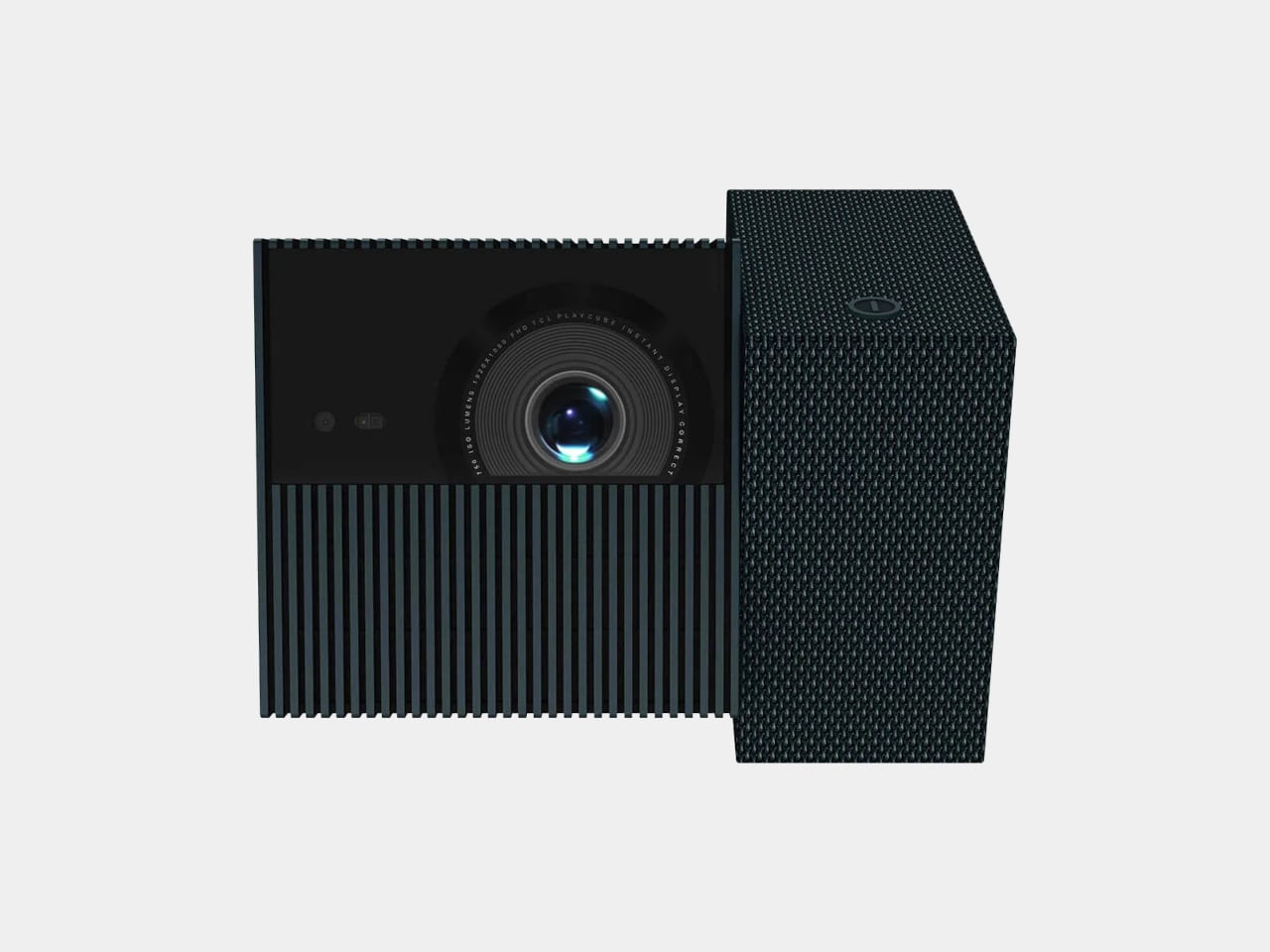
Portable projectors have gotten better on paper, but setting one up in an unplanned setting has stayed stubbornly complicated. Finding a surface at the right height, manually correcting the geometry, and discovering the angle is still off after all of that are steps that haven’t gone anywhere. The gap between what portability promises and what it delivers in practice is one of the more persistent frustrations in personal electronics.

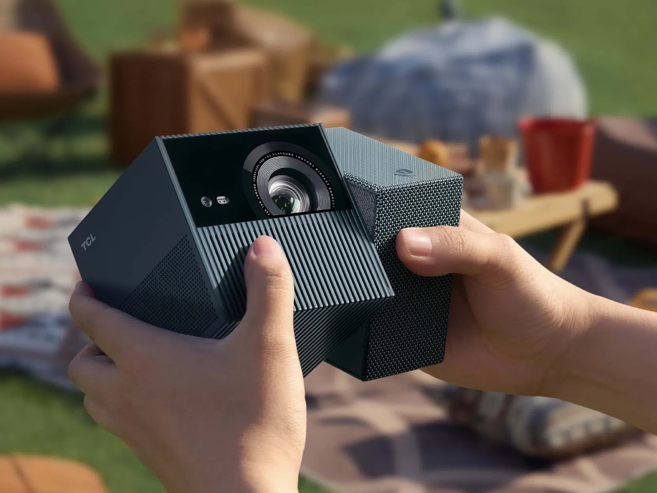
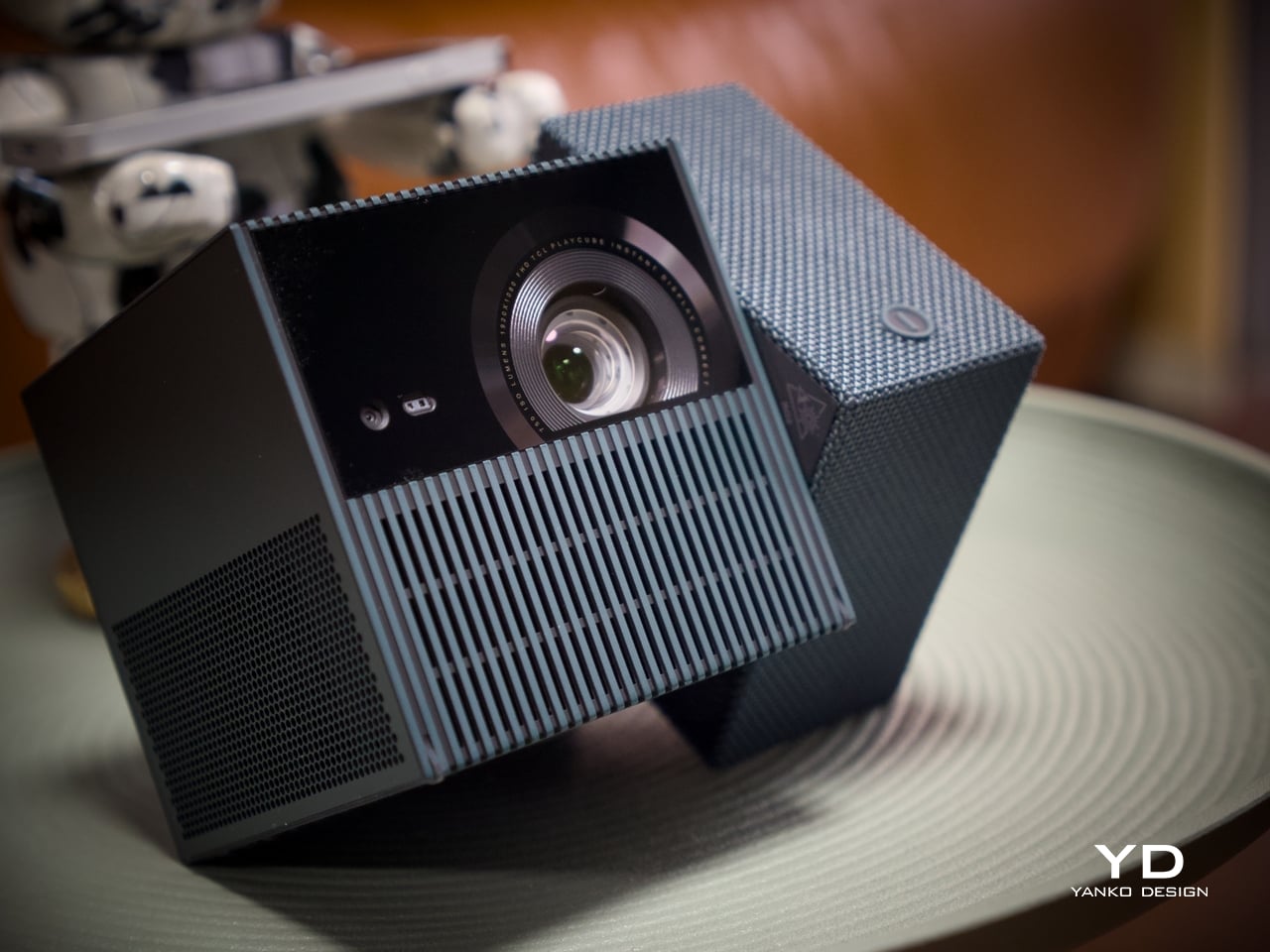
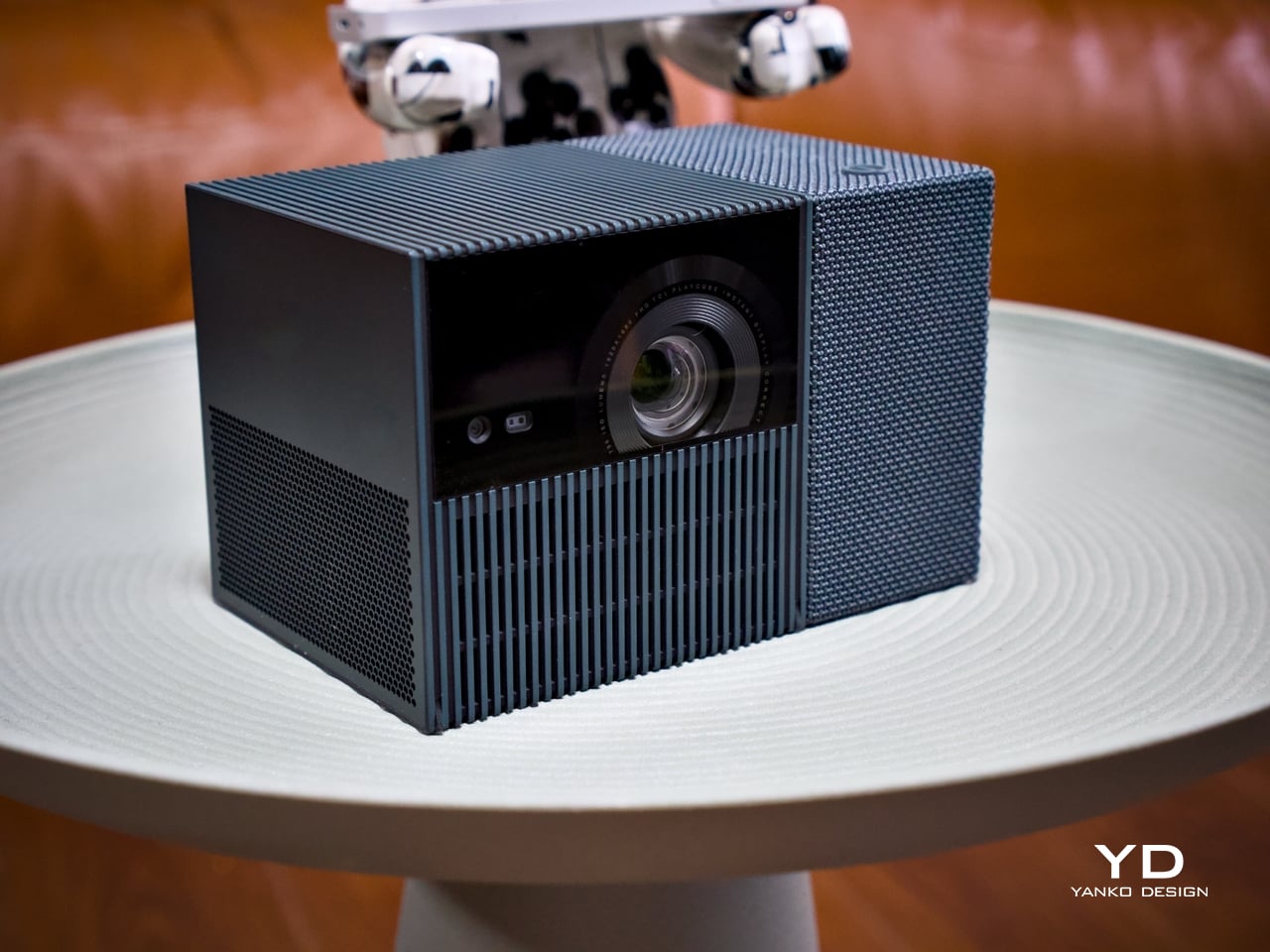
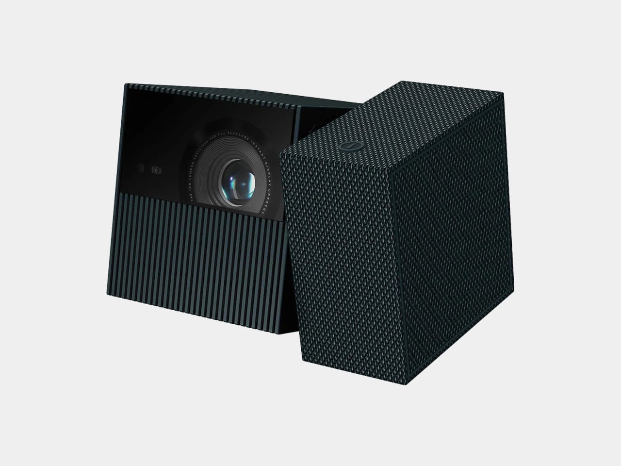
The TCL PlayCube is built around that gap. Rather than adding features to a conventional projector body, it rethinks the form: a compact, nearly cubic unit where the upper half rotates to steer the projection without physically moving the whole device. A built-in 66Wh battery, Google TV, and officially licensed Netflix round out the package, making a case for portability that actually holds up outside of a product demo.

Designer: TCL

Aesthetics

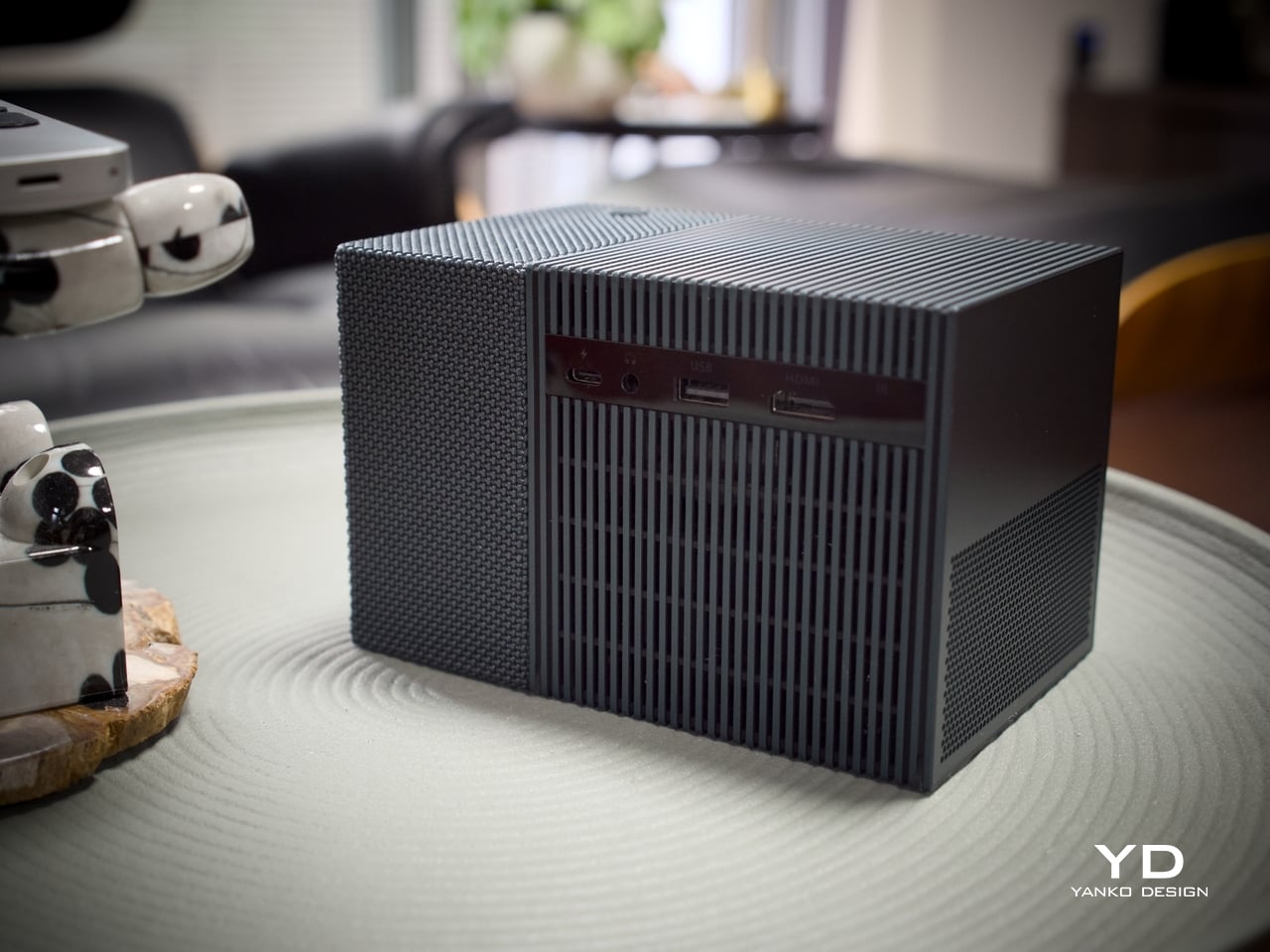
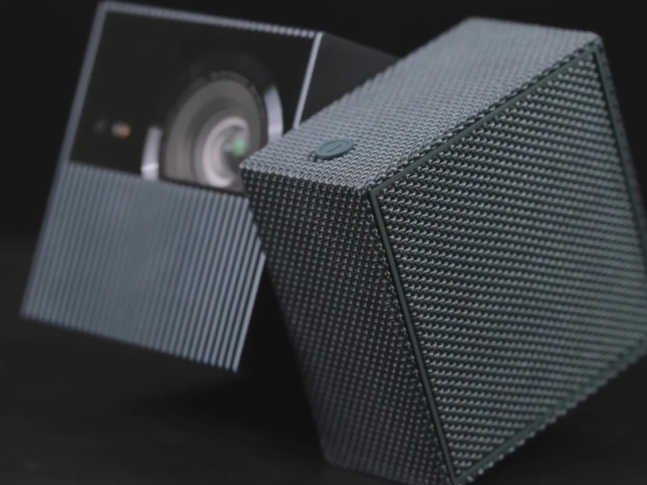
Most portable projectors don’t have a recognizable silhouette, tending toward flat or cylindrical shapes distinguished mostly by logo and color. At 149.8mm x 96.6mm x 96.6mm, the PlayCube arrives with proportions that feel genuinely considered. The near-cubic geometry stands apart on a shelf or tabletop, and the rotating sections make the mechanism visually legible, so the form communicates what the product does before you even touch it.

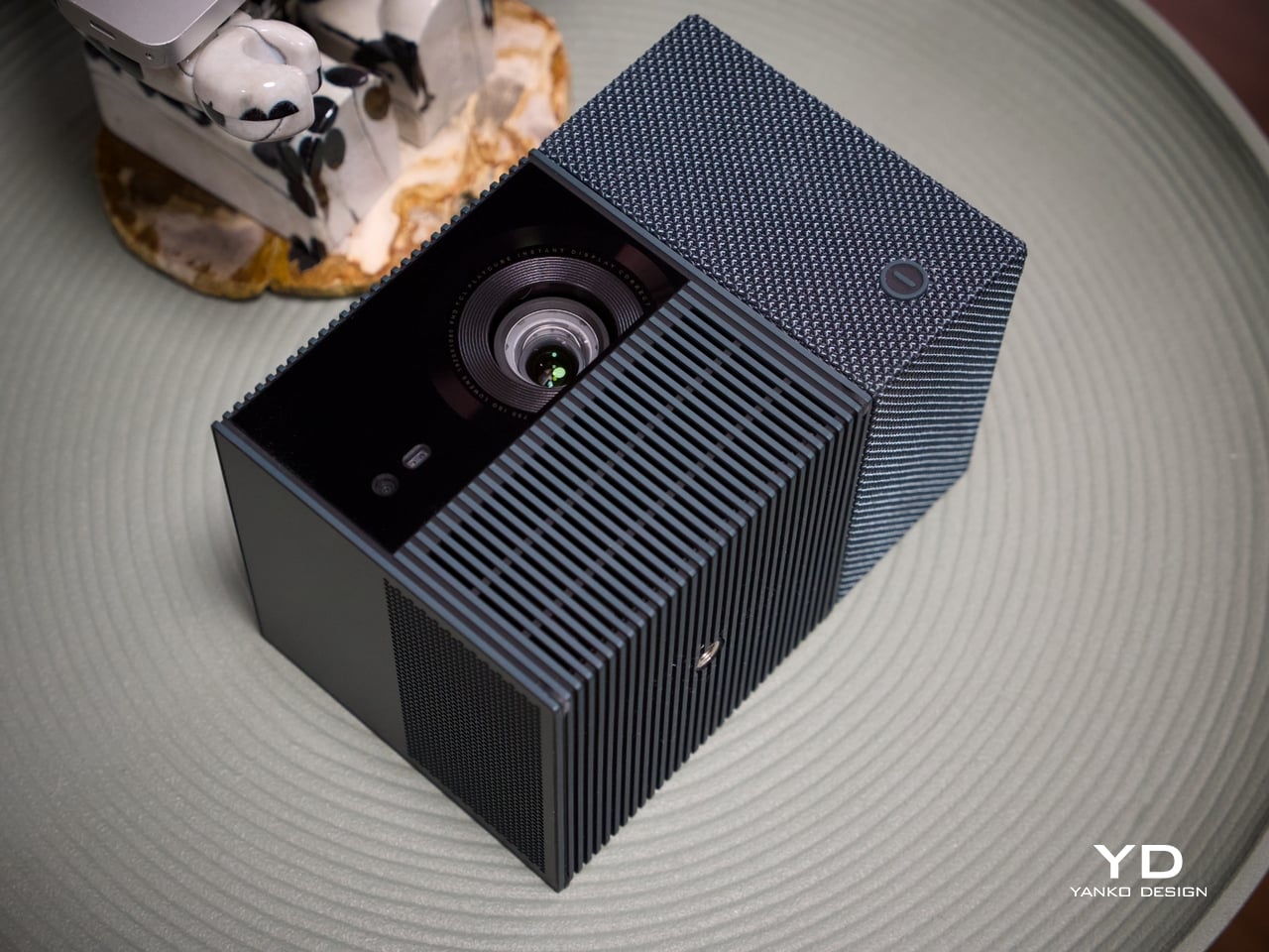
Those sections are where the design does its most interesting work. Twisting it redirects the projection without moving the whole unit, making the device feel less like a sealed gadget and more like a tool with a clear physical interface. The visual logic is borrowed from the Rubik’s Cube, and the reference earns its place, signaling play, interaction, and adjustability in a product that actually delivers those qualities.

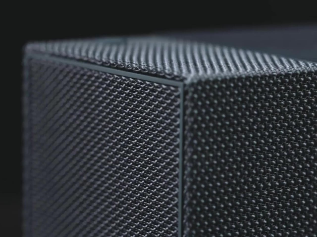
The exterior is wrapped in an outdoor waterproof speaker fabric that went through acoustic testing before landing on the finished product. The result is a surface considerably warmer and gentler than the matte plastic or rubberized textures typical in the category. It makes the PlayCube feel approachable in a way most tech products don’t manage, closer to a domestic object than a piece of AV equipment.

Choosing a textile exterior for a device that also functions as a speaker enclosure is a decision that works on multiple levels. The fabric repels environmental interference, blends into different settings without the harsh visual presence of a glossy casing, and gives the surface a softness that makes handling feel natural. On a nightstand, a coffee table, or an outdoor spread, the PlayCube’s material finish doesn’t announce itself as electronics.

Ergonomics

At 1.3kg, the PlayCube is light enough to move between rooms without planning for it, and the cube-like shape stows more cleanly in a bag than the elongated designs common in the category. The built-in 66Wh battery delivers up to three hours of playtime, enough for a full movie, and USB-C charging means a portable power bank can extend that window considerably when an outlet isn’t available.

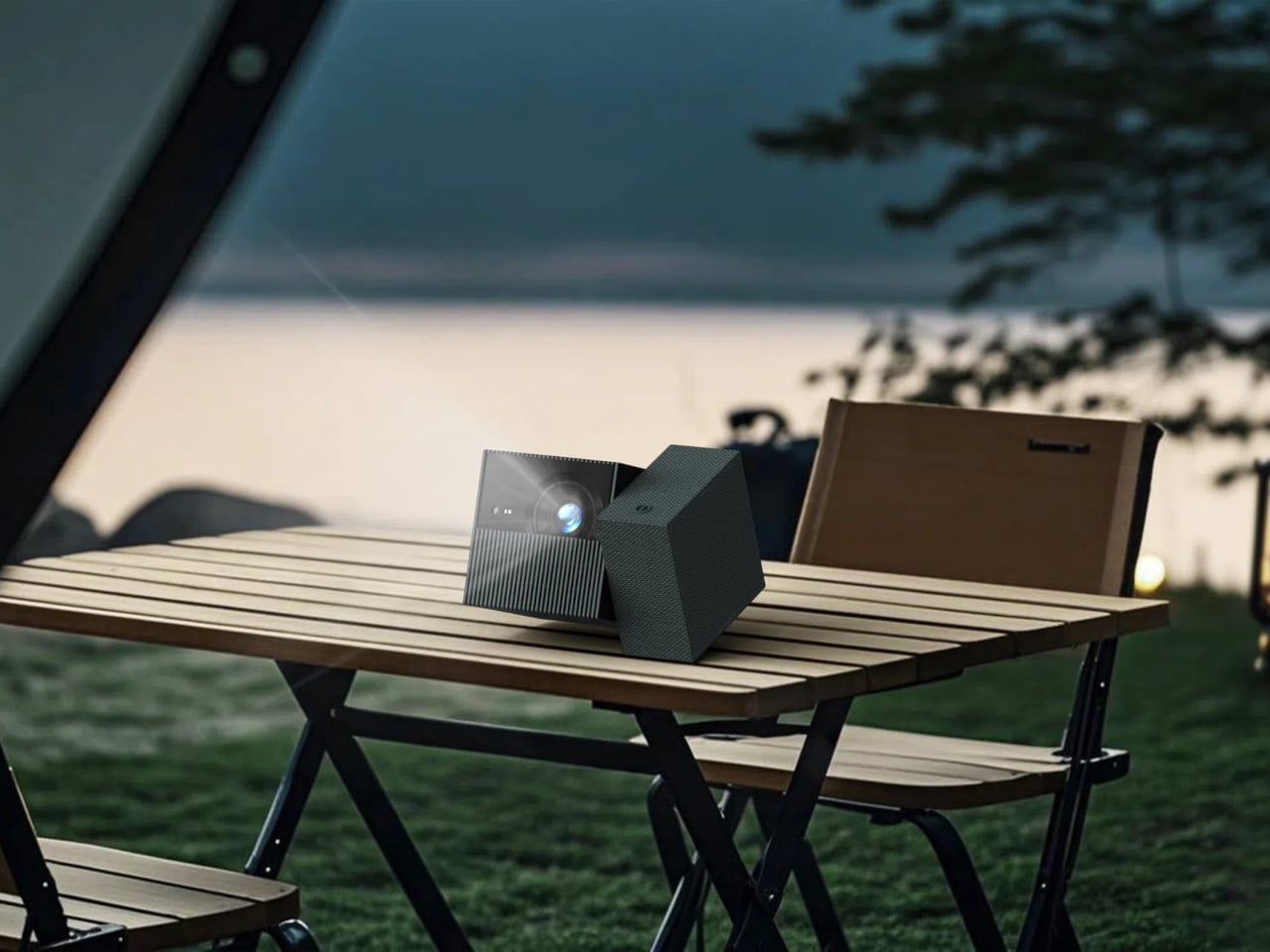
Aim the PlayCube toward a bedside ceiling, and you’d normally need mounting hardware or a creative stack of books to hold the right angle. Here, a simple twist of the upper half handles the redirection, making ceiling projection something you’d attempt on a whim rather than plan for in advance. The rotating design earns its place in the ergonomics story as firmly as it does in the aesthetic one.

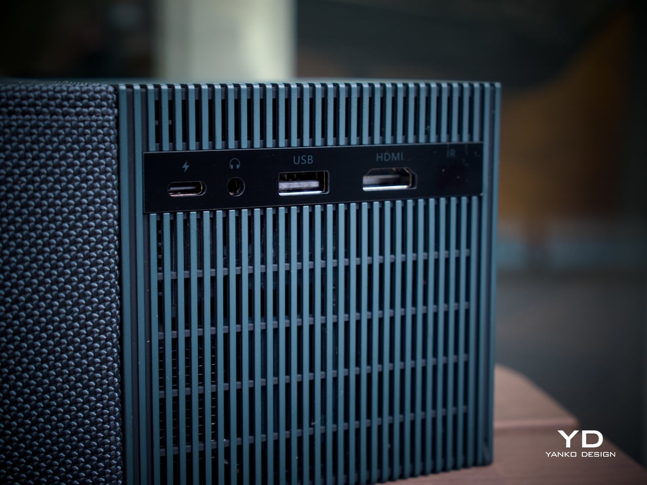
Connectivity is thorough for the size. An HDMI input, USB 2.0 port, and 3.5mm audio output cover the physical side, all of them located on the back for a single point of access. Bluetooth 5.1 and WiFi 5.0 handle the wireless stack, and the Bluetooth connection makes pairing an external speaker effortless whenever the built-in driver isn’t quite enough for a given setting. A standard tripod thread at the base opens up more formal placement options.

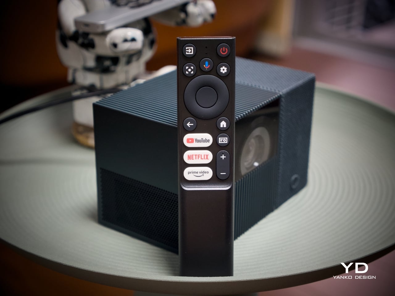
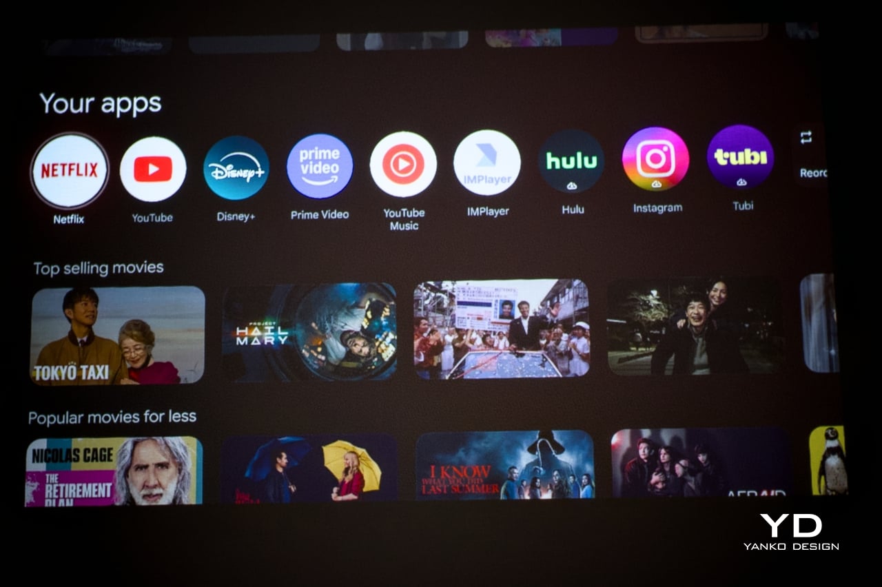
The included remote is compact and covers quick-access buttons for the most commonly used streaming services. Google TV’s interface will feel immediately familiar to anyone who has used a recent Android TV device, removing most of the learning curve upfront. Its broad app ecosystem reduces the need for workarounds or sideloaded content, an advantage most apparent when the PlayCube is set up somewhere without a dedicated media arrangement in place.

Performance

The PlayCube’s imaging uses a 0.33-inch DMD DLP display engine rated at 750 ISO lumens. That ISO designation carries weight because ISO lumens are measured under standardized conditions, unlike the inflated figures common on cheaper portables. In dimmed rooms or outdoor evening settings, 750 ISO lumens holds up well, keeping the image from looking washed out in the conditions this projector is actually built for.

Resolution sits at 1920×1080, holding up across the full projection range from 30 to 150 inches without obvious softness at the larger end. Color is handled by TCL’s ImmersiColor Technology, covering 99% of the Rec. 709 color space, the standard most streaming content is mastered against. A 1,000,000:1 dynamic contrast ratio adds depth to dark-scene performance that the compact form might otherwise limit.

The Intelligent Correction suite is where much of the practical imaging convenience lives. Real-time autofocus, keystone correction, Auto Fit Screen, Auto Obstacle Avoidance, and Auto Eye Protection work together to compress what’s typically a multi-step manual calibration process into something closer to an automatic one. Place the unit, rotate the top toward the wall or ceiling, and the image settles into position on its own within seconds.

Running Google TV natively makes a meaningful difference compared to a projector manufacturer’s in-house smart system. The app ecosystem and interface logic are a step above what most projectors ship with, and the officially licensed Netflix integration removes one of the category’s most persistent frustrations, since many devices either lack direct access or rely on workarounds and external devices.

The built-in speaker is a single 5W driver, suited to personal viewing and small gatherings in quieter settings. It won’t challenge a dedicated audio setup, but Bluetooth 5.1 makes connecting an external speaker simple, and the 3.5mm output handles wired alternatives. EQ presets for movies, music, and sports give the built-in driver more adaptability across content types, which helps when the PlayCube moves between different environments.

The 1.21:1 throw ratio is well-suited to typical room dimensions, making it practical to fill a 100-inch screen without pushing the unit into a far corner. Noise is rated to be around 26dB, which means the fan is slightly audible but not enough to compete with dialogue or pull attention during quieter scenes. These specs make the PlayCube more suited for use in small rooms, but it definitely has a place outdoors, provided it’s dark enough.

Sustainability

The outdoor waterproof speaker fabric wrapped around the PlayCube is made from eco-friendly recycled materials, a detail that doesn’t read as an afterthought. TCL selected it for its acoustic properties and environmental resilience, so the sustainability credentials are attached to a component doing genuine functional work. A material choice grounded in responsible sourcing that also serves acoustic and protective purposes is a rarer alignment than it should be.

Without a replaceable lamp, the PlayCube avoids one of the more persistent limitations of traditional projectors, with no bulb to monitor and no degradation cycle that shortens its useful life prematurely. The fabric exterior also protects the optical housing during transit, making it more resilient than a typical plastic-shelled portable. A projector built for real portability tends to stay in service longer, which benefits environmental footprint and practical value equally.

Value

The PlayCube isn’t aimed at the budget end of the market, and the package supports that positioning. A 1080p DLP engine, 750 ISO lumens, officially licensed Google TV and Netflix, a 66Wh built-in battery, and award-recognized design together form a more complete proposition than most portable projectors at a comparable price. The cost reflects a device where each element was built to serve the others, not assembled from separate decisions.

The value case is strongest for buyers who’ve experienced the gap between what portable projectors promise and what they actually deliver. If the usual frustrations include needing an external streaming device, manual keystone corrections after every move, or improvised elevation workarounds to get the angle right, the PlayCube addresses all three as part of its base design, without additional accessories or workarounds required.

Buyers focused on raw lumen output or built-in audio power will find options that compete more aggressively on those individual metrics. What’s harder to find is a portable projector where the form, the smart platform, the auto-calibration, and the physical placement flexibility are all pulling toward the same experience. The PlayCube’s value sits in that coherence, and it’s a harder thing to quantify than brightness numbers or battery ratings.

Verdict

The TCL PlayCube brings together design decisions that rarely appear in the same device. The twistable cube form, fabric-wrapped exterior, Intelligent Correction suite, and self-contained Google TV platform all work toward the same goal: a portable projector that’s genuinely easy to use across different environments, not just one that lists portability on the box. That coherence is uncommon in a category that frequently trades usability for spec comparisons.

It’ll resonate most with people who’ve grown frustrated with how much effort the category usually demands. The image quality is solid, the smart features work without a separate dongle, and the rotating form makes placement far less of a puzzle. For anyone after a big-screen experience that moves with them as naturally as it performs, the PlayCube is an easy recommendation and an even easier product to live with.

The post TCL PlayCube Review: One Twist Replaces Your Entire Projector Setup first appeared on Yanko Design.

LAYER Just Made a 65W Charger You’d Actually Want on Your Desk

At some point, most of us stopped caring what our charging setup looks like. A tangle of cables here, a plastic brick there, maybe a few adapters scattered across the desk like tech confetti. It works, so why fuss? London-based design studio LAYER is making the case that we’ve been setting the bar way too low, and once you see Node and Loft, it’s pretty hard to disagree.

LAYER, the studio founded by award-winning British designer Benjamin Hubert, recently unveiled Node and Loft, a new family of charging products developed for lifestyle brand Daily Objects. The premise is simple but smart: what if your charging accessories actually looked like something you chose on purpose?

Designer: LAYER

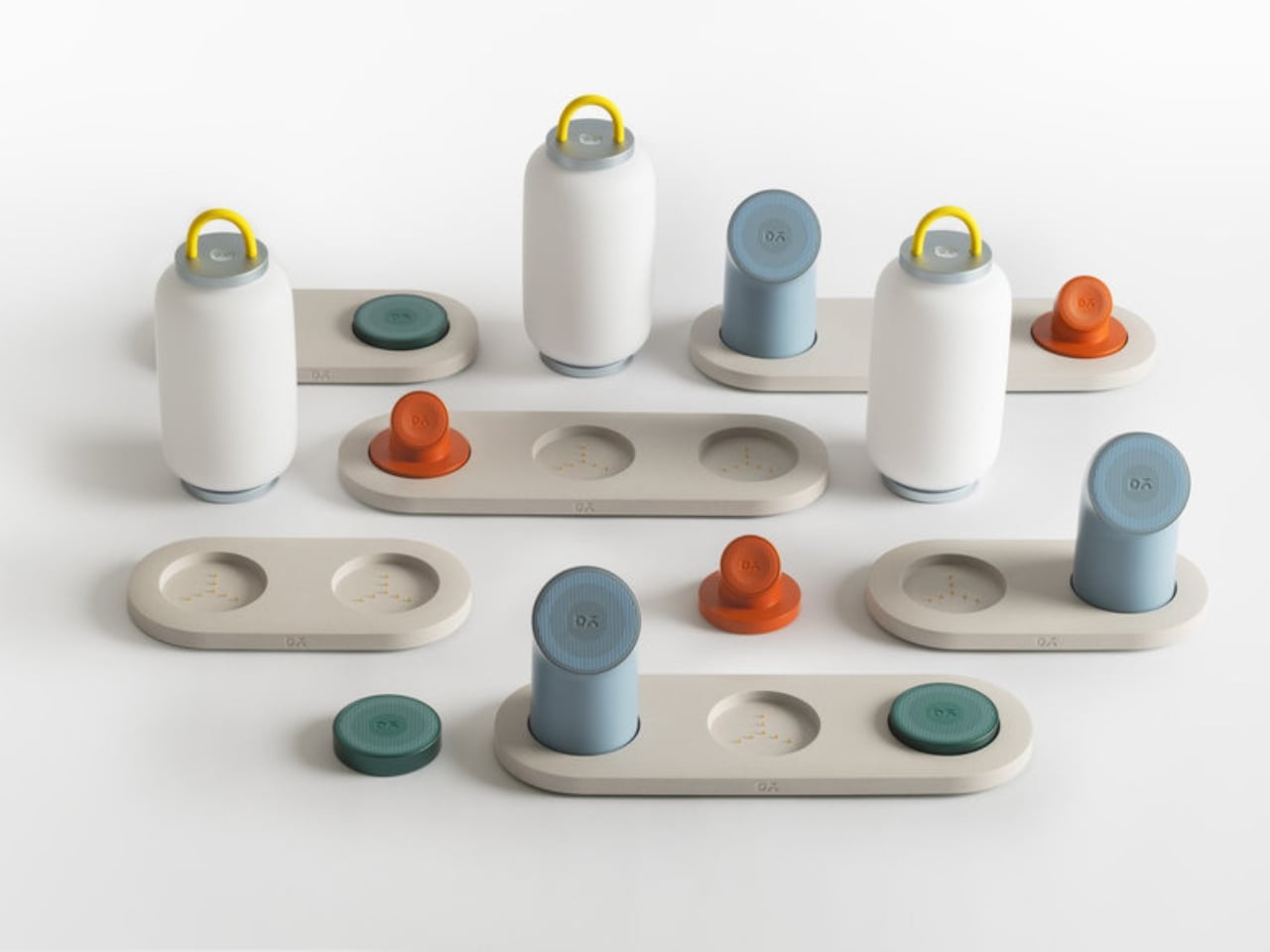
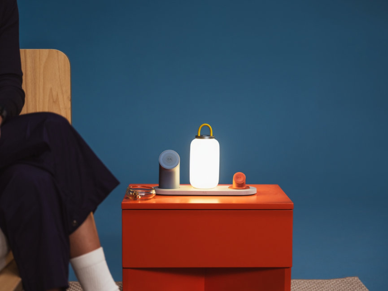
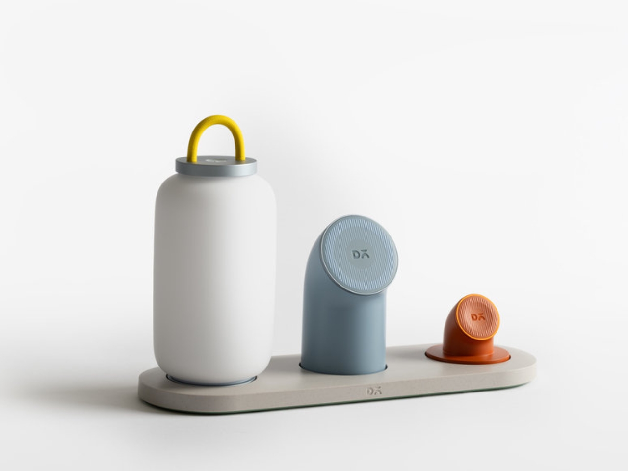
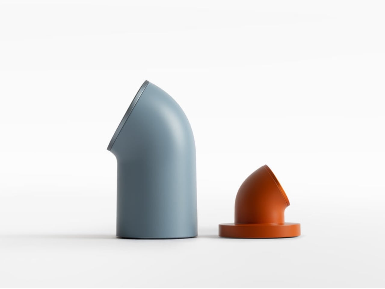
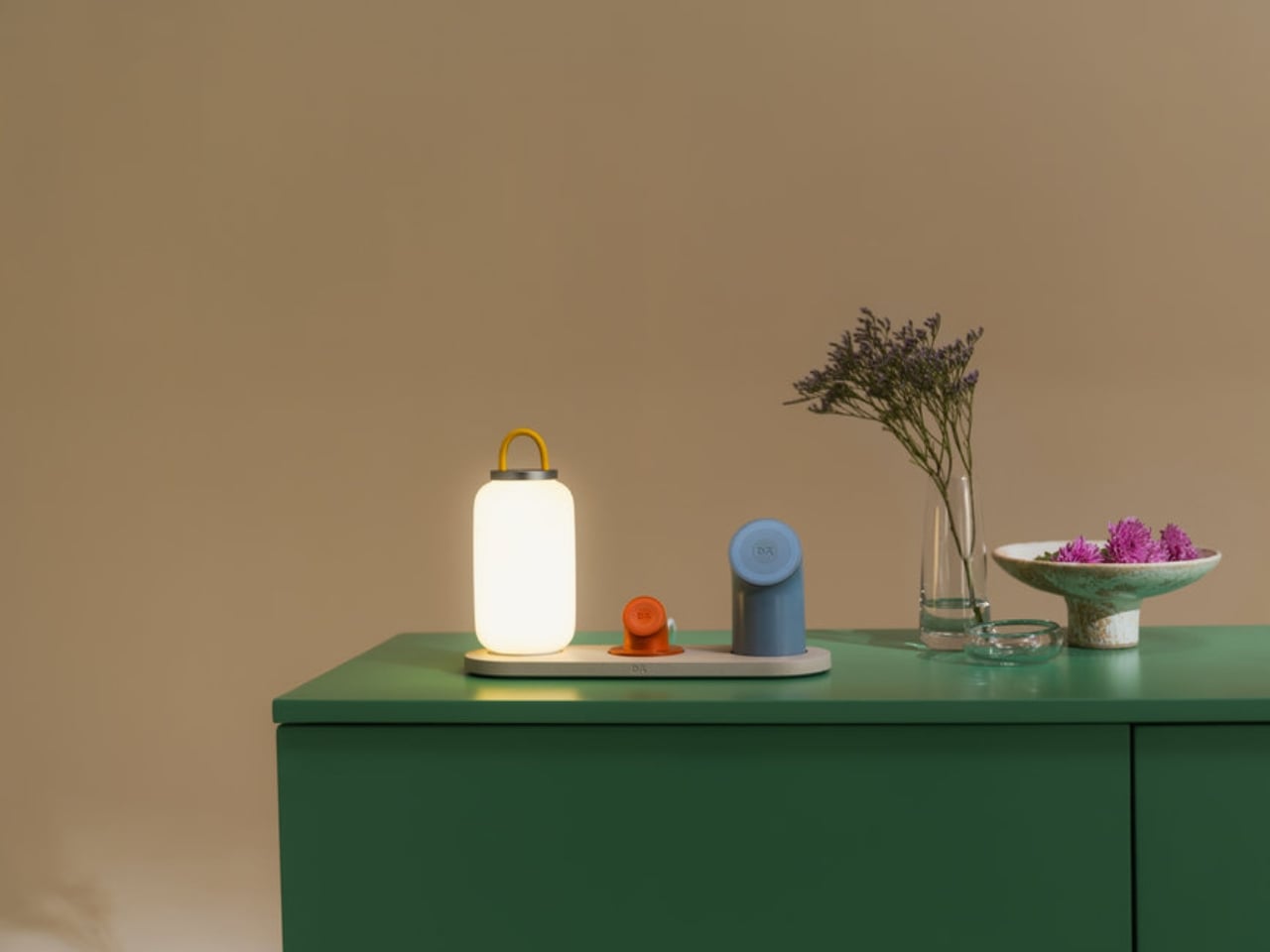
Node is the modular piece of the duo, and it’s genuinely clever. Built around a one-wire setup, it works as either a 2-in-1 or 3-in-1 dock, with four interchangeable modules to mix and match: a Wireless Charging Phone Stand, a Wireless Charging Disk, an Apple Watch Charging Stand, and a Portable Lamp. Each module clicks in when you need it at the desk and lifts off just as easily when you’re heading into a different room or packing a bag. The whole thing feels less like cable management and more like a system you’d actually enjoy using.

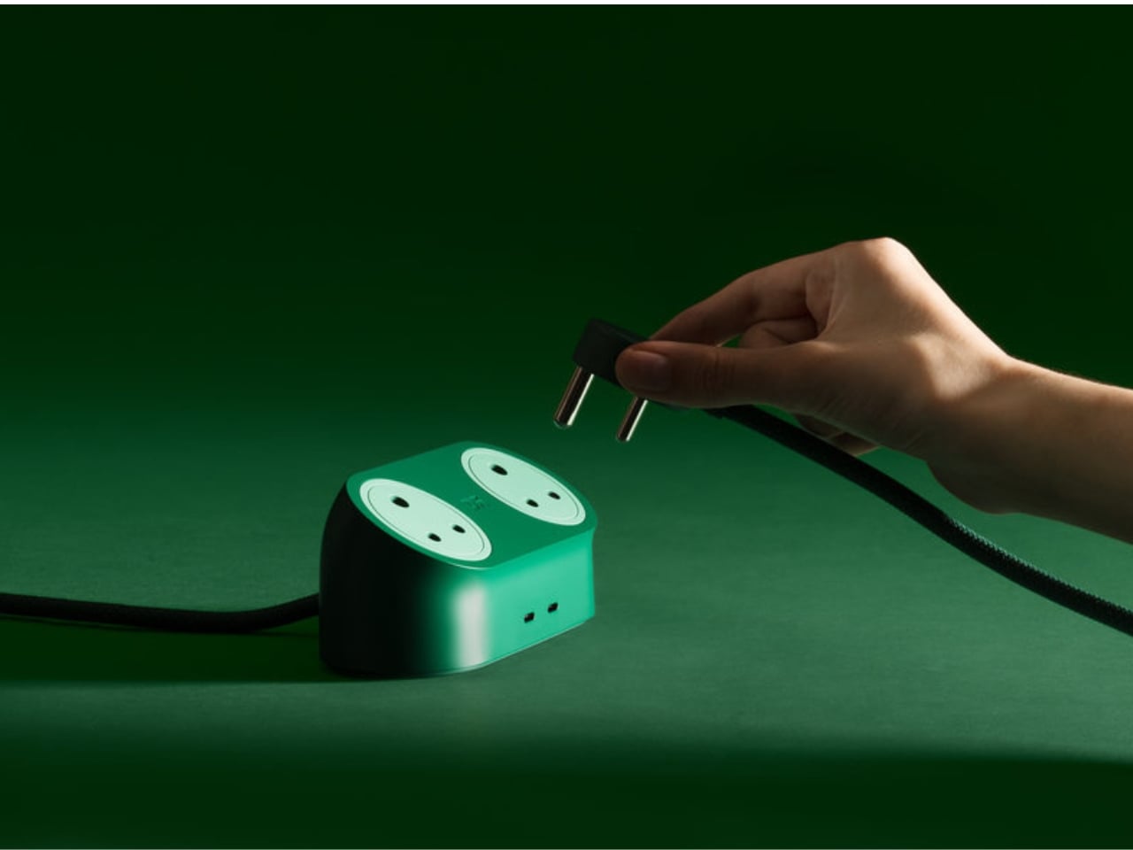
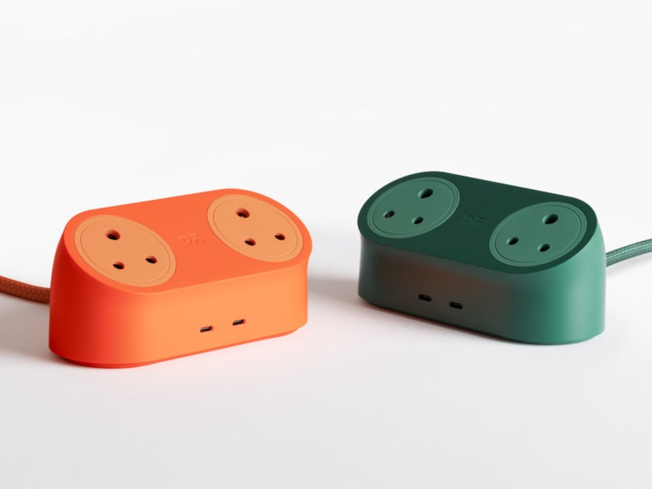
Loft, the other half of the collection, is a 65W charging station designed to sit on your desk without apology. It handles up to four devices at once, mains and USB-C included, all packed into a compact, sculptural form that looks far more intentional than what most charging stations have to offer. The silhouette is arched and minimal. The materials feel considered. It’s the kind of object you leave out because you want to, not because you forgot to tidy it away.

What LAYER has done here, and what makes this more than just another tech accessory launch, is commit fully to a design language rather than just a functional brief. Soft forms, arched silhouettes, tactile materials, a recurring circular charging motif: it all adds up to something cohesive. The goal isn’t just to make charging look prettier. It’s to make it feel like part of how you live, whether at a home desk, in a hotel room, or on a kitchen counter.

Hubert described charging as “one of the most repeated interactions in daily life, yet the products that enable it are often treated as background objects.” That observation is so obvious you’d think more designers would have acted on it sooner. The ugly charging block has been a design blind spot for years, and the solutions that have come before Node and Loft have largely fallen into two camps: clinical and all-white, or trying so hard to look “lifestyle” that they end up feeling performative. Node and Loft feel like neither. They feel like objects with actual personality.

For Daily Objects, an Indian lifestyle brand that’s been steadily building a reputation for design-forward tech accessories, collaborating with LAYER on this makes a lot of sense. The studio is known for a philosophy rooted in what Hubert calls humanising technology, taking things that usually feel cold or utilitarian and giving them warmth and presence. That’s a harder balance to strike than it sounds, especially in a category as commoditised as charging hardware. It’s a thread that runs consistently through LAYER’s work, and it’s very visible here.

The broader trend Node and Loft belong to is worth paying attention to. We’re moving away from the idea that tech accessories have to look like tech accessories. People are putting more thought into how objects feel in a space, not just how they function in one. The line between product design and interior design keeps getting blurrier, and collections like this one are a big reason why.

You probably don’t spend a lot of time thinking about where your charger lives on your desk. Node and Loft are betting that, given the right option, you might start.

The post LAYER Just Made a 65W Charger You’d Actually Want on Your Desk first appeared on Yanko Design.

Forget Looping Rain Sounds. Mur Mur Has an Actual World Inside.

Most of us have made peace with ambient sound being a kind of elegant lie. The rain on your noise app isn’t real rain. It’s a carefully mastered recording, maybe spliced from a few different sessions, looped with enough craft that the seam is hard to find. It’s fine. It works. It gets you through the deadline or the insomnia or the open-plan office. But if you’ve ever listened long enough for the loop to reveal itself, you know the feeling: the spell breaks, and suddenly you’re just listening to a machine doing a trick. Mur Mur is trying to fix that, and the fix turns out to be a lot more interesting than I expected.

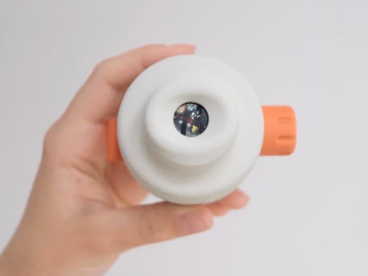
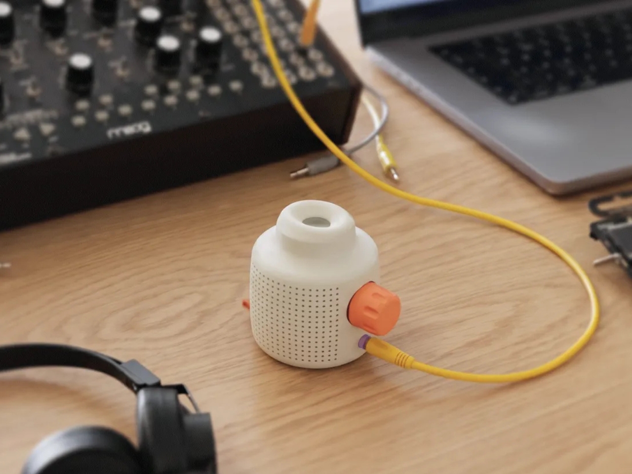
Designed by oio and mattering, two studios with very different but complementary practices, Mur Mur is a physical object (still in prototype) that holds a living, simulated world inside. Not a soundscape. Not a generative AI track. An actual world with terrain, weather, residents, and its own social rhythms. The sounds you hear are produced in real time as tiny digital agents move through their environment, interact with each other, and respond to whatever conditions are happening inside the simulation at that particular moment.

Designers: oio and mattering

There are three worlds to choose from. The Block is a compact city, with the morning rush, delivery robots, pigeons, and street musicians all running their own routines. The Plot is a forest, layered with birdsong and crackling leaves and the occasional footsteps of a lost hiker. The Pond is a water ecosystem, paced by waves, fish, ducks, and boats passing through. Every world sounds distinct, which is the obvious part. What’s less obvious is that every world sounds different every time you listen, because the simulation underneath it keeps running whether you’re paying attention or not.

That detail matters more than it might seem. Mur Mur is not a product you control. You don’t press play, and you don’t press pause. The world inside it keeps going, and you either tune in or you don’t. The instruction on the site puts it plainly: don’t shake it, because there are living agents inside. It’s a funny thing to say about a piece of software, but it’s exactly the right way to describe what Mur Mur is actually doing.

The decision to build worlds rather than generate soundscapes was clearly a deliberate one. Generative AI audio has become its own crowded category, where you describe a mood or a setting and get back an endless ambient loop. oio and mattering went the other direction: instead of giving you a prompt box, they gave you a place. The result is a fundamentally different relationship with the object. You’re not commanding it. You’re sharing a space with it.

oio describes itself as a creative company on a quest to turn emerging technologies into an approachable, everyday reality, for humans and beyond. That description fits Mur Mur perfectly. Mattering works with art and advanced technology, translating emerging conditions into new creative languages. Their partners have ranged from IBM and Apple to Björk and Nike, a spread that tells you they don’t fit neatly into any single category.

As of now, the physical Mur Mur speakers don’t exist yet outside of a few prototypes the team made for themselves. But the worlds are already running, and you can stream them online via the radio they’ve built. There’s also a Max for Live patch that lets you route the sounds directly into Ableton, which opens up an obvious and exciting territory for musicians who want to work with living sound rather than recorded sound. They’re actively looking for hardware producers, musicians, and technologists to help bring it to scale.

I’ll admit that the idea of a sound object I can’t control would normally give me pause. But Mur Mur reframes that completely. The point is that you aren’t supposed to control it. The city doesn’t wait for you. The forest keeps going. The pond doesn’t care about your schedule. That’s not a design flaw. That’s the entire premise, and it’s one of the more compelling premises in recent design thinking.

The post Forget Looping Rain Sounds. Mur Mur Has an Actual World Inside. first appeared on Yanko Design.
The 21.5-Inch Transparent Speaker That Animates Lyrics to Match Your Music

Most home speakers today have settled into a comfortable invisibility. Whether they’re slim soundbars pushed against a wall or cylindrical mesh towers parked on a bookshelf, the design goal is essentially the same: stay out of the way. They’re meant to be heard and rarely looked at, and even the ones that look interesting rarely offer much to see once the music starts.

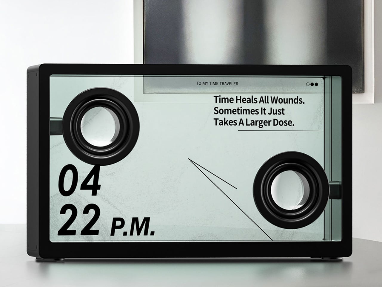
MorningBlues has a clear thesis about music, and it has a lot to do with how the things we listen to can also be things worth looking at. Its SonicGlass A1 is a hi-fi speaker built around a transparent glass driver that lets you watch sound in motion as music plays. It’s the kind of object that sits on a shelf the way art does, with intention, and with something to say even before you press play.

Designer: MorningBlues

Click Here to Buy Now: $646 $999 (35% off). Hurry, only 16/205 left! Raised over $360,000.

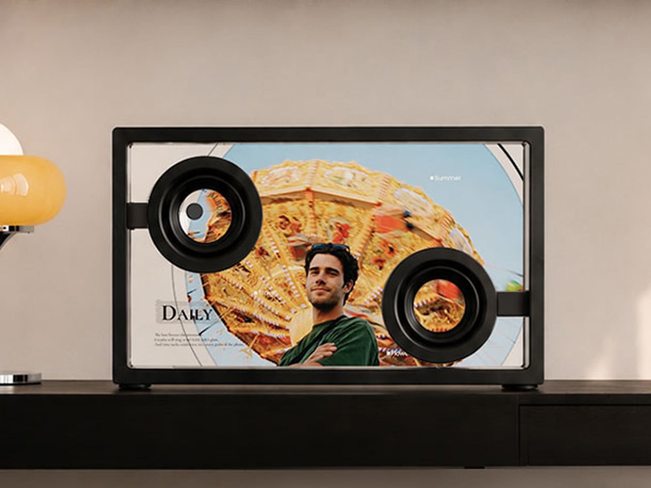
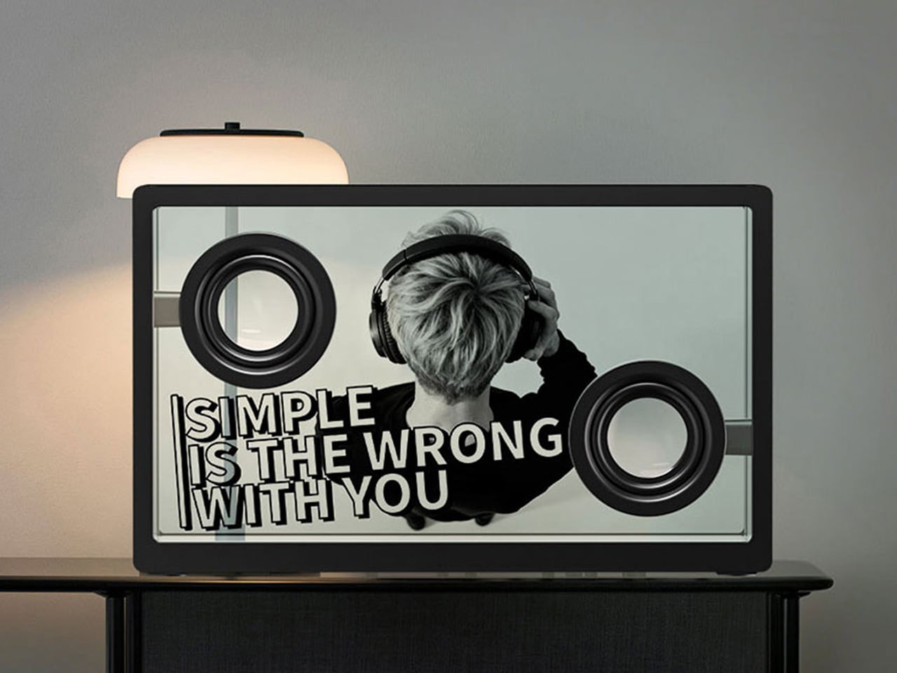
The SonicGlass A1’s front face is a 21.5-inch TFT panel with high-transparency tempered glass, framed in black with over 90% light transmission. The transparent driver sits behind it, fully visible, which is both an acoustic feature and a design statement. There’s no grille hiding anything, no fabric obscuring the view. What you see is the working interior of the speaker, presented like an exhibit rather than concealed like a component.

When a song plays, lyrics appear across the glass surface in motion styles drawn from the track’s rhythm, pace, and emotional character. MorningBlues calls this MoodLyric, built on data from hundreds of millions of playbacks to animate text in ways that feel tied to what the song is actually doing. All lyrics are licensed through LyricFind, meaning the display does right by the artists whose words it borrows.

Beyond the lyrics, a feature called SceneSync adds a visual layer that responds to music genres. Pop, hip-hop, R&B, and rock each trigger different visual aesthetics on screen, generated in real time by AI. The idea is that the speaker shouldn’t just play a song; it should match the world the song is coming from. It’s a more cinematic take on the standard music visualizer.

The MorningBlues app lets you upload a personal photo that AI uses to place your face inside a genre-matched music video, displayed on the speaker’s screen. It’s the kind of feature that’s genuinely fun at a gathering, or just for yourself on a slow afternoon. You can also load the speaker with your own photos and videos to use as background content, turning it into a personal display.

When the music stops, the SonicGlass A1 doesn’t go blank. It has ambient display settings that keep it working as a room fixture, with options like ambient backgrounds, dynamic clock faces, and an ASMR sleep mode for winding down at night. That always-on character makes the speaker feel less like a device you switch off and more like something that already belongs in the room.

Pair the A1 with a microphone, and it becomes a home karaoke setup with licensed lyrics scrolling on screen in sync as you sing. The MorningBlues Music Hub 1, a dedicated controller for phone-free playback, rounds out the experience by letting you manage everything from a single tactile device, so your phone doesn’t need to be part of the evening at all. The large glass screen handles the rest.

The SonicGlass A1 isn’t angling to be the most powerful speaker in the room or the one with the most impressive spec sheet. It’s made for people who think about music the way they think about other things they choose to live with, considering both what those things do and how they look doing it. MorningBlues is asking a direct question: what if your speaker was worth watching?

Click Here to Buy Now: $646 $999 (35% off). Hurry, only 16/205 left! Raised over $360,000.

The post The 21.5-Inch Transparent Speaker That Animates Lyrics to Match Your Music first appeared on Yanko Design.
DJI Osmo Pocket 4 Review: A $486 Pocket Camera That Earns Its Price

PROS:


  • Handy 107GB internal storage

  • Excellent low-light performance

  • Bright screen and creator-friendly controls

CONS:


  • Portrait mode tops out at 3K

  • Low-light mode for video is 1x zoom only

  • No formal water and dust resistance rating

RATINGS:

AESTHETICS
ERGONOMICS
PERFORMANCE
SUSTAINABILITY / REPAIRABILITY
VALUE FOR MONEY

EDITOR'S QUOTE:

The DJI Osmo Pocket 4 doesn't ask you to compromise between portability and quality. It just delivers both.

The gap between smartphone convenience and dedicated camera quality has never been more complicated to navigate. Smartphones shoot impressive footage, but the moment you start walking, panning, or filming yourself without a stabilizer, the limitations show. Shaky handheld video, compromised low-light performance, and the inconvenience of carrying a larger camera rig have pushed creators to look for a smarter middle ground.

The DJI Osmo Pocket 4 is designed to solve that exact problem. Building on a line of compact gimbal cameras that have quietly become a go-to tool for vloggers and travel creators alike, the fourth generation pushes the formula further with an improved sensor, smarter tracking, and a handful of practical upgrades that address the friction points that have always come with shooting on the go.

Designer: DJI

Aesthetics

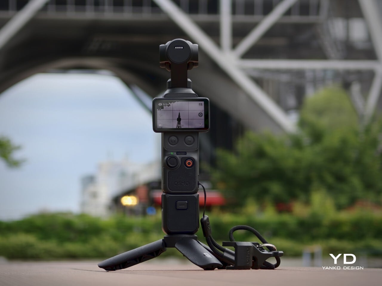
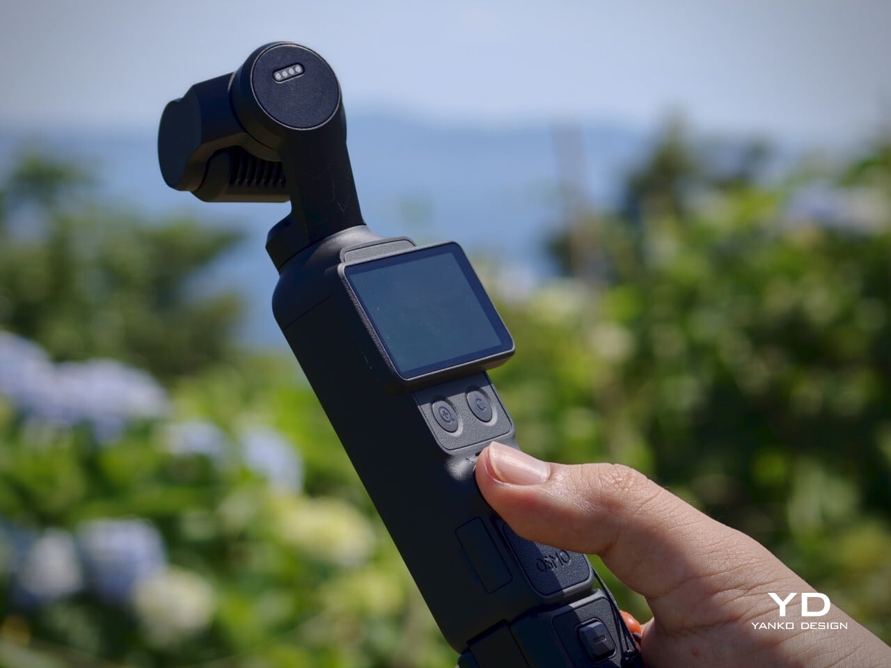
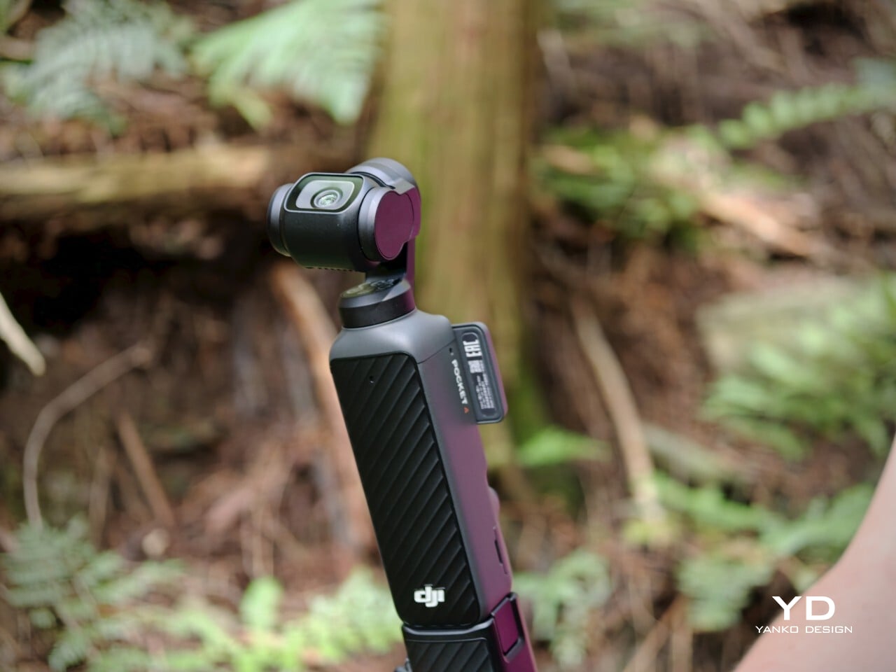
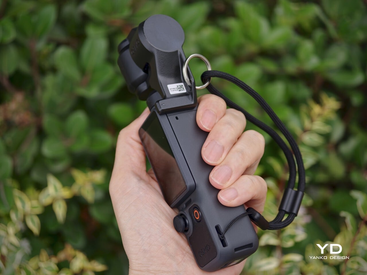
The Osmo Pocket 4 doesn’t try to look exciting. Its silhouette is tall and narrow, with a small three-axis gimbal head sitting at the top. It’s a restrained design that communicates precision rather than personality, and that’s part of the appeal. The matte black finish and clean lines make it look purposeful without being flashy, which is exactly the visual confidence that good industrial design earns.

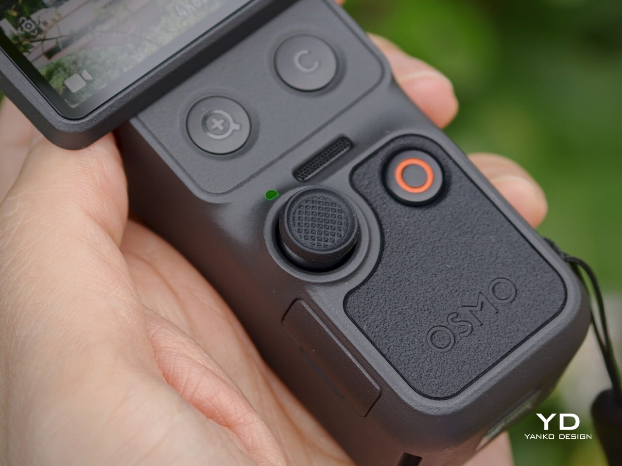
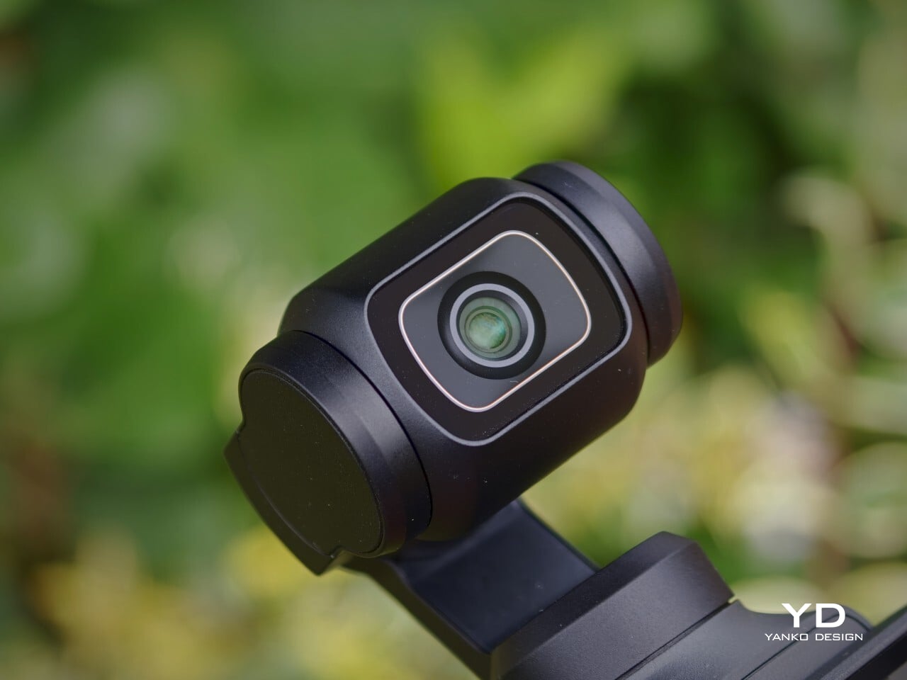
What makes it visually distinctive is the tension between the utilitarian body and the delicate gimbal mechanism at the top. The rotating touchscreen adds a layer of mechanical thoughtfulness to the otherwise straightforward form. Up close, the camera looks precise and well-assembled, with tight tolerances and a consistent finish across its surfaces. It’s the kind of object that rewards a closer look.

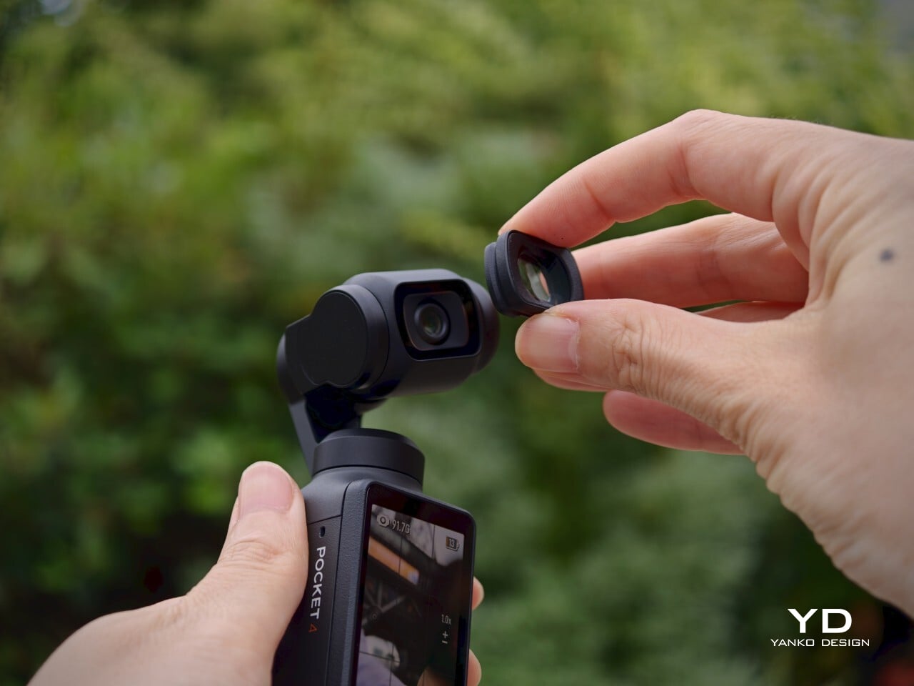
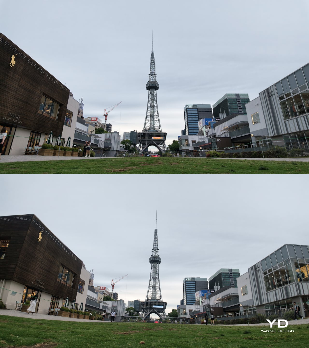
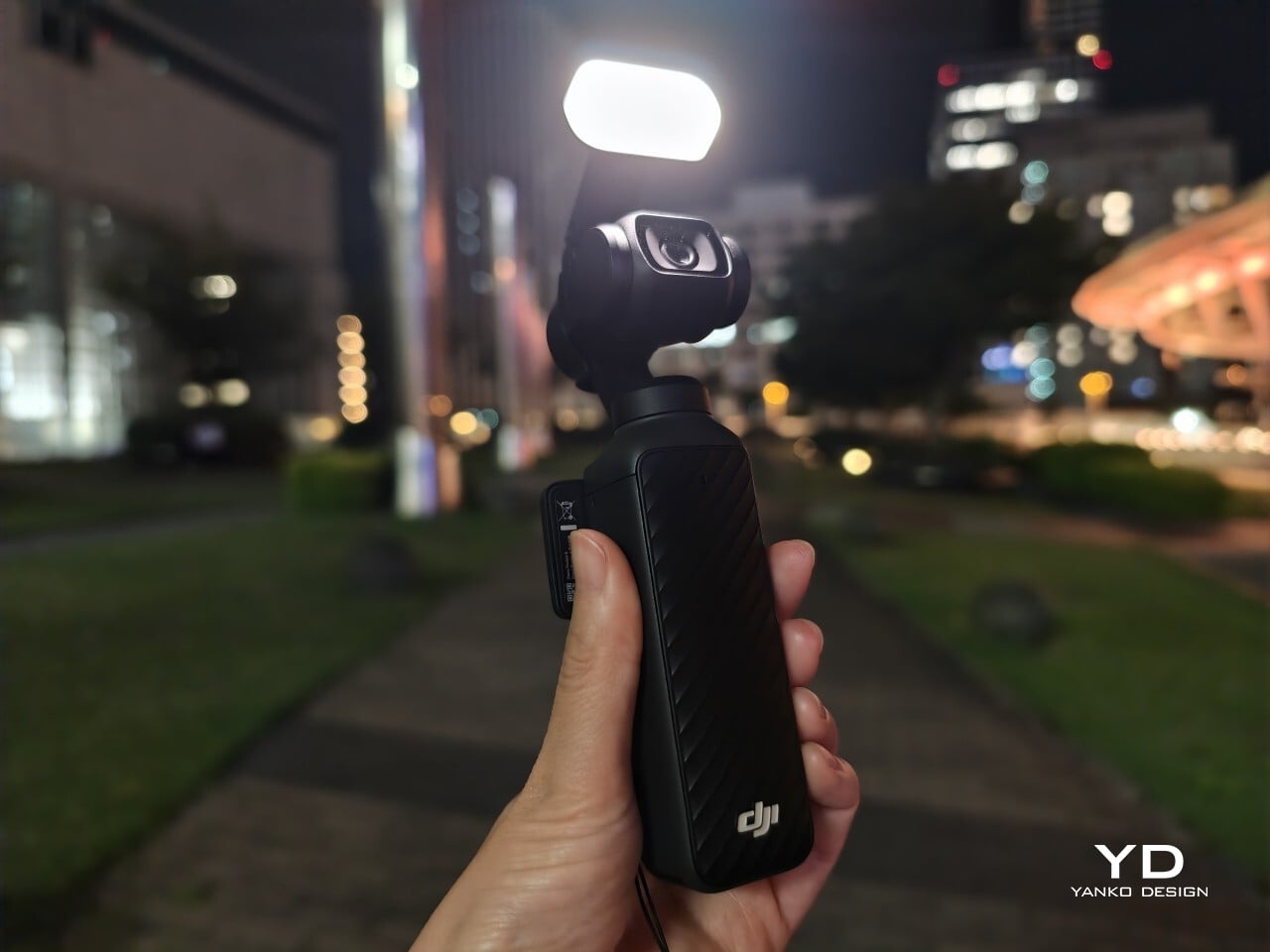
The Creator Combo accessories, including the magnetic fill light and the wide-angle lens, add functional range without dramatically changing the camera’s character. They fit onto the device with minimal fuss and are compact enough to carry without much extra bulk. The wide-angle lens introduces some edge distortion, a minor tradeoff, and it needs to be removed before powering the camera down, making it a small but notable habit to build.

Ergonomics

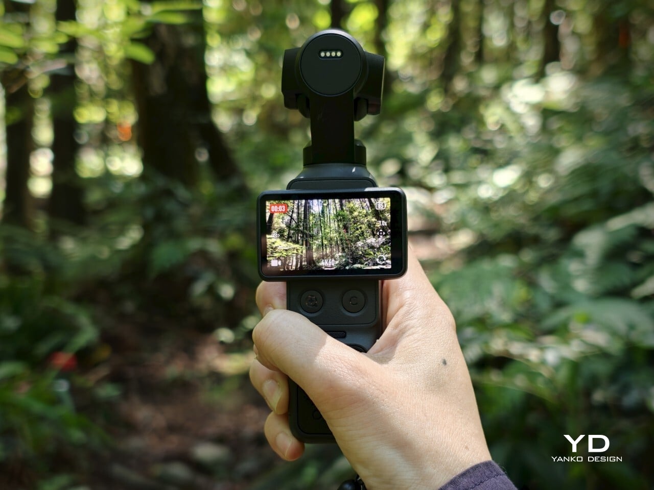
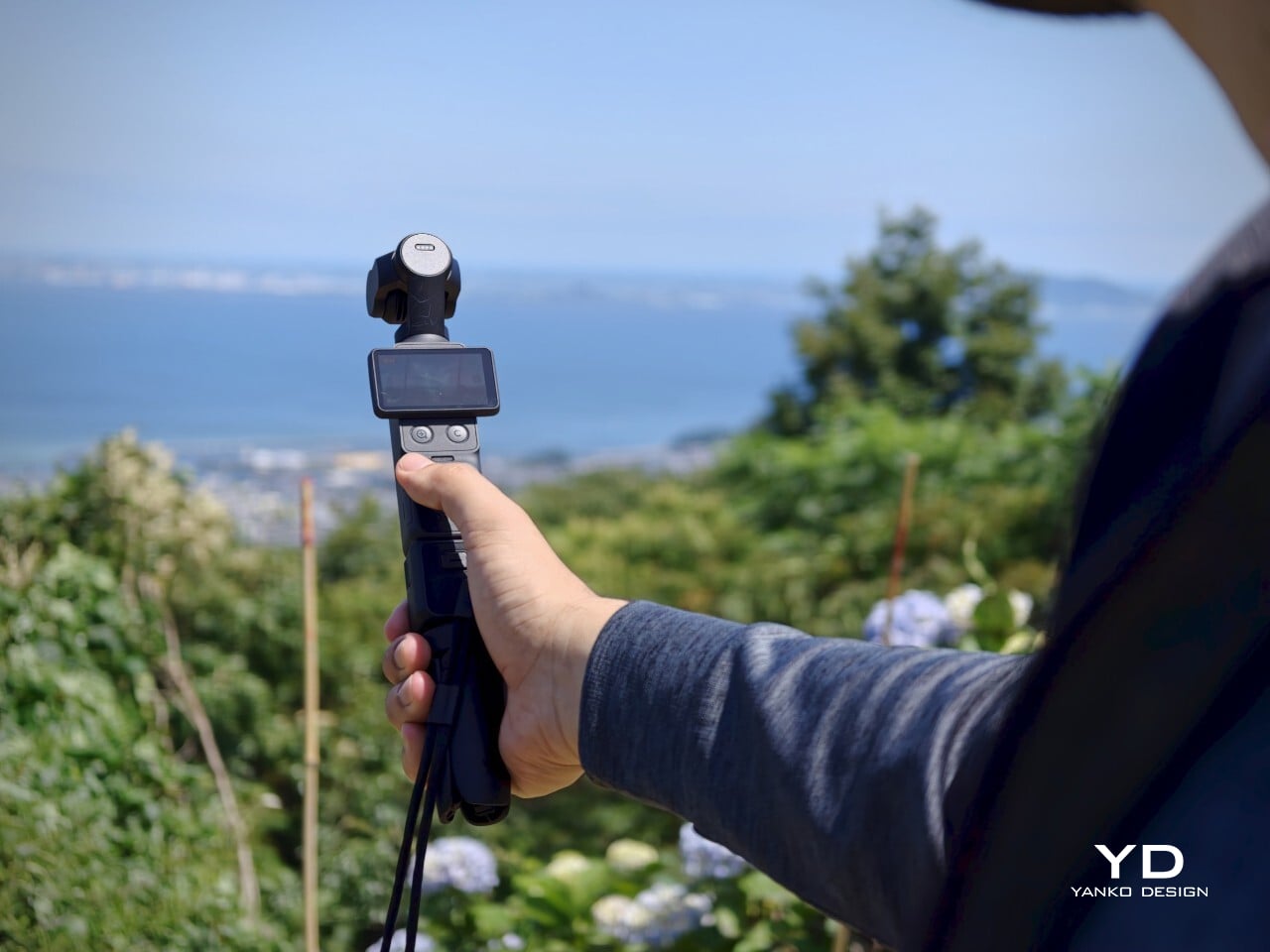
At 190.5g and measuring 144.2mm x 44.4mm x 33.5mm, the Osmo Pocket 4 genuinely fits in a pocket. That sounds like a marketing line, but it’s one of the more meaningful things you can say about a dedicated camera. It’s light enough to forget you have it and small enough that pulling it out feels no more dramatic than reaching for your phone, which is completely the point.

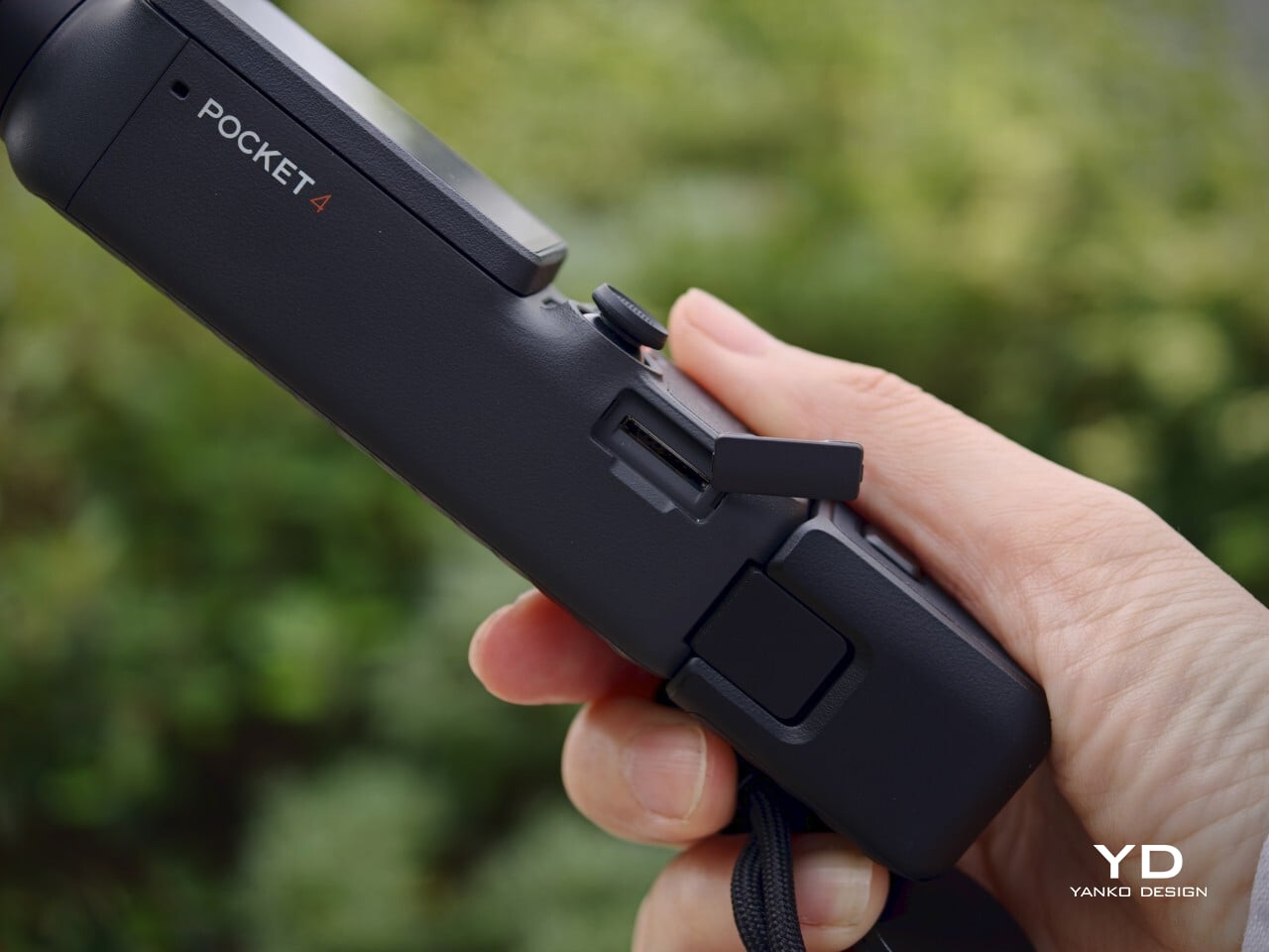
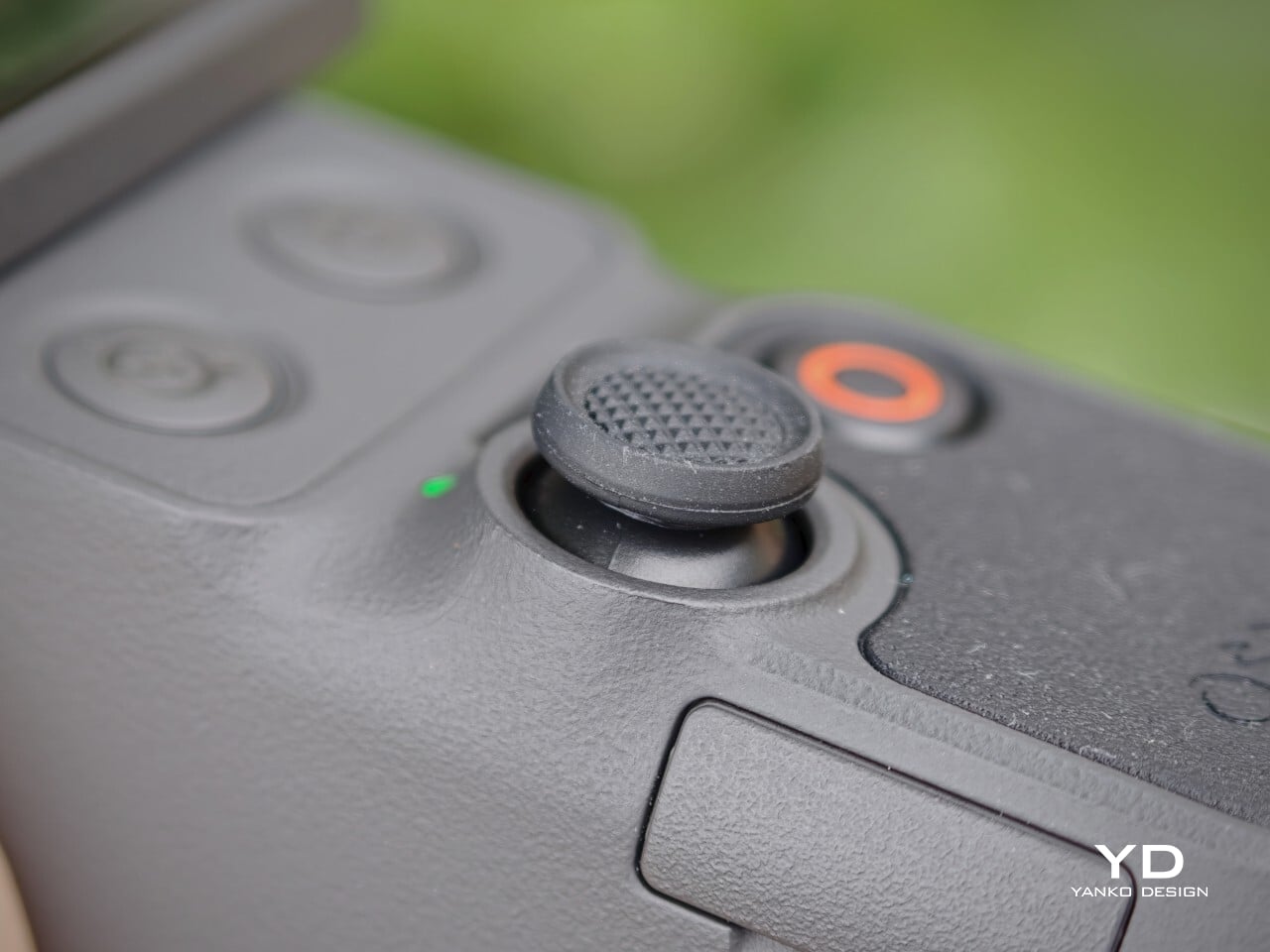
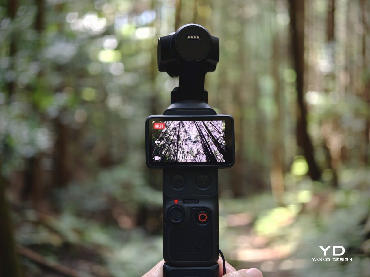
Operating the Osmo Pocket 4 is intuitive. Rotating the screen starts recording automatically, a shortcut that makes spontaneous moments actually capturable. Two new buttons below the screen handle zoom and custom presets, while the 5D joystick lets you reposition the gimbal or flip the camera orientation without going into menus. The controls feel deliberate rather than crowded, and that discipline counts in a device this compact.

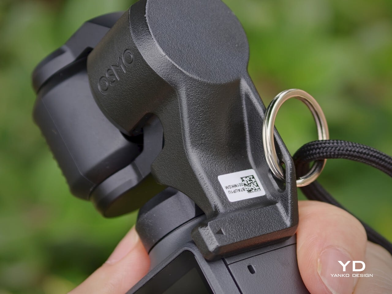
The 2.0-inch touchscreen is bright at 1000 nits, visible enough for outdoor framing, though it could benefit from an anti-reflective surface under harsh direct sunlight. The gimbal clamp that protects the camera head during storage is usefully low-profile, but it’s also easy to misplace precisely because of that. A lanyard attachment helps solve that problem and keeps the clamp reliably on hand whenever the camera needs to be put away.

Performance

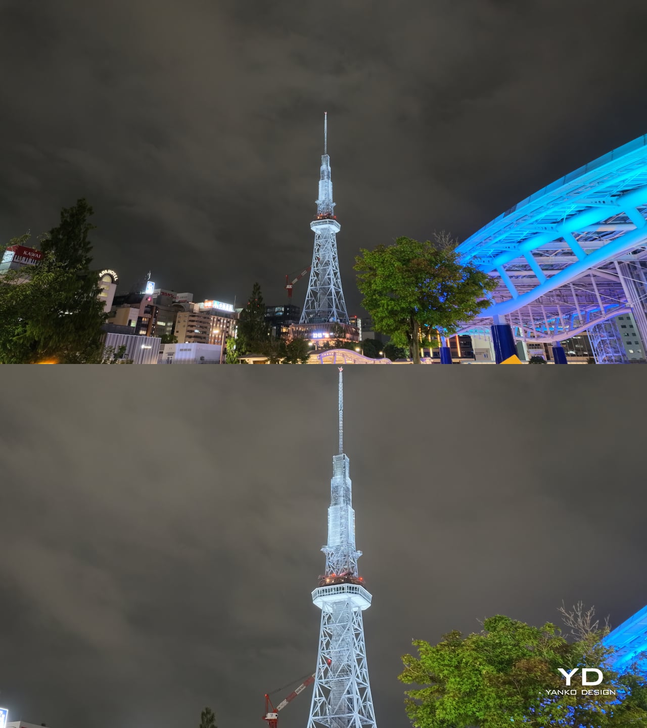
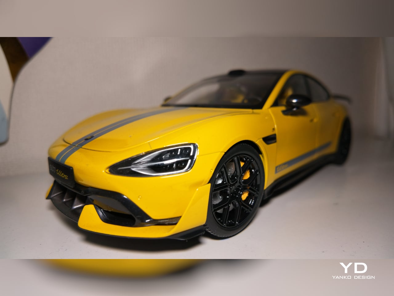
The core of the Osmo Pocket 4’s appeal is its improved 1-inch CMOS sensor, paired with an f/2.0 lens and 14 stops of dynamic range. In practice, that combination produces video with noticeably more texture and tonal depth than a typical smartphone sensor can manage. Highlight retention in bright outdoor scenes holds up well, and shadow detail in mixed-light interiors stays controlled rather than collapsing into noise or flat gray.

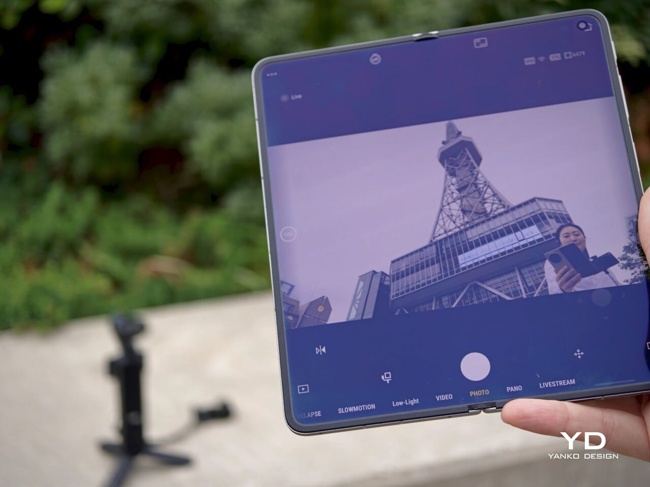
1x (Top) | 2x (Bottom)

1x (Top) | Wide Lens Attachment (Bottom)

Low-light performance is one of the Pocket 4’s stronger points, both for still photos and videos. The dedicated low-light video mode produces clean, well-exposed footage in dim environments where smartphones typically struggle with noise and color accuracy. Sadly, the latter comes with a hidden cost: low-light video mode only works at 1x zoom.

The magnetic fill light from the Creator Combo is a helpful companion for indoor portraits and evening setups, adding enough brightness to make skin tones look clear, though it’s more of a useful enhancement than an absolute necessity. The Osmo Pocket 4 works well enough on its own for nighttime photography and low-lit environments, but in pitch-black situations, the fill light snaps on in a flash, pardon the pun.

Panorama

Landscape

Vertical

For video enthusiasts, the 4K/240 fps slow-motion mode is a genuine highlight. Capturing slow motion at that resolution opens up detailed, cinematic-looking sequences that would have required bulkier equipment not long ago. Sadly, that 4K upgrade doesn’t apply to vertical portrait mode, which remains in 3K land. The 10-bit D-Log color profile adds post-production flexibility, capturing a wider tonal range for those who want to grade their footage in editing software. It’s a meaningful upgrade from the lighter D-Log M available on the previous generation.

With Fill Light

No Fill Light (top) | With Fill Light (bottom)

The three-axis stabilization is the product’s most compelling advantage. Walking footage stays smooth without the warping that aggressive digital stabilization sometimes produces, and ActiveTrack 7.0 tracks subjects confidently through movement at up to 4x zoom. The 107 GB of built-in storage, transferable at up to 800 MB/s via USB 3.1, removes the need for a memory card on most shoots and makes offloading footage back at a desk genuinely fast.

Pitch Black

With Fill Light

Night Shot (Without Fill Light)

Night Shot (With Fill Light)

Sustainability

The Osmo Pocket 4 doesn’t make bold claims about eco-friendly materials, and that honesty is more useful than hollow greenwashing. What it does offer is a well-built product that feels designed to last. The body has no creaking or flex, and the feature set is current enough that it isn’t likely to feel obsolete quickly. That kind of longevity is a meaningful sustainability argument for a consumer electronics device.

Unfortunately, it doesn’t come with any water or dust resistance guarantee, let alone a formal IP (ingress protection) rating. The Osmo Pocket 4 is best used with a bit of care outdoors, since its gimbal-based design doesn’t lend itself to the kind of weather resistance you’d expect from a rugged action camera.

Like most compact gimbal cameras, the Pocket 4 isn’t particularly serviceable at the consumer level. Tightly integrated components make independent repair difficult, so long-term ownership depends on careful handling more than easy maintenance. That said, the modular accessory system means you’re less likely to replace the camera because one peripheral breaks or becomes outdated. The accessories extend the product’s useful life without requiring a full device swap.

Value

At $486, the Osmo Pocket 4 sits at a price point where expectations of serious performance are fair, and for the most part, it delivers. What you’re paying for isn’t just a feature list but the engineering that concentrates stabilization, a 1-inch sensor, internal storage, and creator-focused controls into something pocketable. That concentration costs more than a simpler compact camera, and the footage quality shows where the money went.

The $607 Creator Combo version adds genuine value through the DJI Mic 3 transmitter, the fill light, and a handful of supporting accessories. The wireless microphone alone is a meaningful addition for anyone who records dialogue, since the built-in setup works well but can’t match a properly placed lapel mic. Together, these accessories shift the package from a capable camera into a more complete creator kit.

For creators who shoot on the go regularly and want footage that looks better than what a phone can deliver, the Pocket 4 sits in a position few other devices can match cleanly. The form factor eliminates excuses for not having the camera out, the stabilization removes the need for post-production smoothing, and the image quality means you’re not apologizing for what you captured.

Verdict

The Osmo Pocket 4 is a thoughtfully resolved compact camera that does its intended job with real consistency. The stabilized footage looks clean and confident, the low-light performance holds up better than the size suggests, and the built-in storage removes a quiet but persistent inconvenience. These aren’t small things for a device that has to fit in your jeans pocket while still competing with cameras twice its size.

There are tradeoffs, as there always are with a device optimized this tightly. Portrait shooting tops out at 3K rather than full 4K, the low-light mode locks to 1x zoom, and the lack of weather sealing limits it in unpredictable outdoor conditions. These aren’t dealbreakers so much as parameters, and understanding them is all it takes to decide whether the Pocket 4 fits the footage you actually want to make.

The post DJI Osmo Pocket 4 Review: A $486 Pocket Camera That Earns Its Price first appeared on Yanko Design.
This Air Monitor Drops Like a Canary When Your Room Needs Fresh Air

Most people know that outdoor air pollution is a problem, but indoor air quality rarely gets the same attention. The irony is that we spend roughly 90% of our lives indoors, often in well-insulated, tightly sealed homes where CO₂ builds up quietly and unnoticed. The result shows up as headaches, fatigue, poor sleep, and that vague sense of grogginess that’s easy to blame on everything except the air around you.

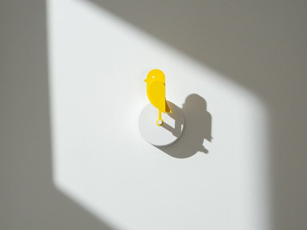
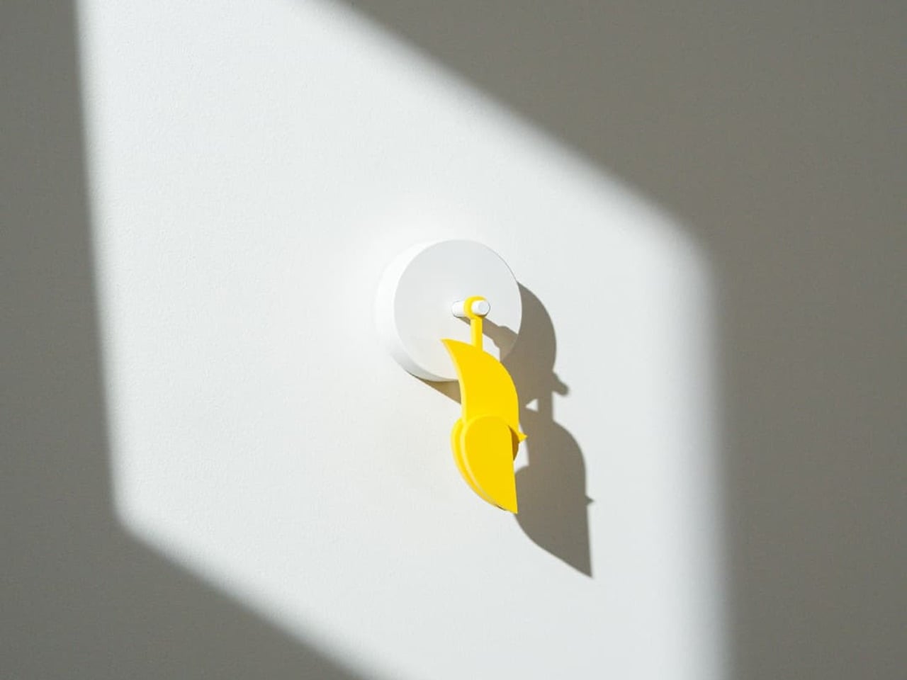
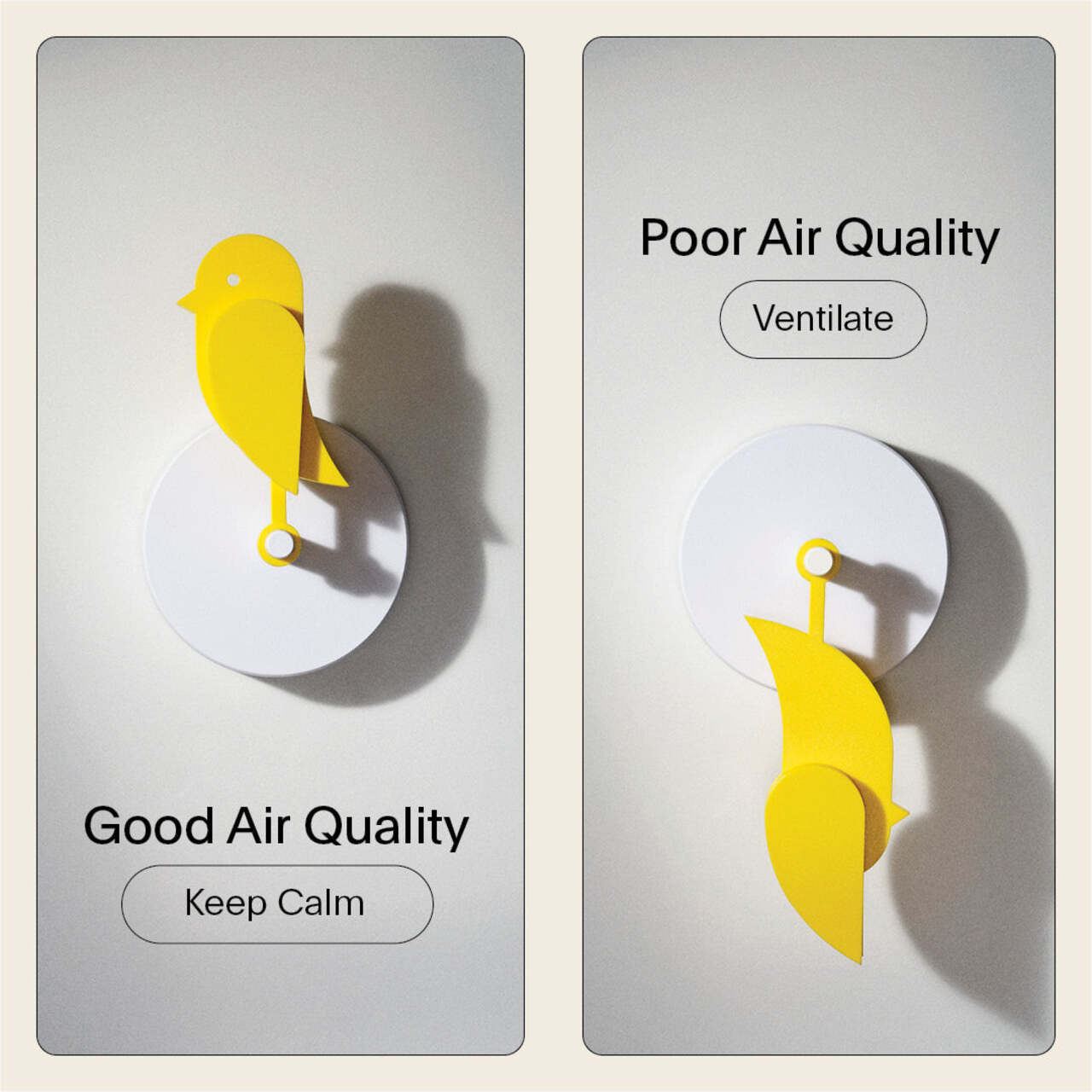
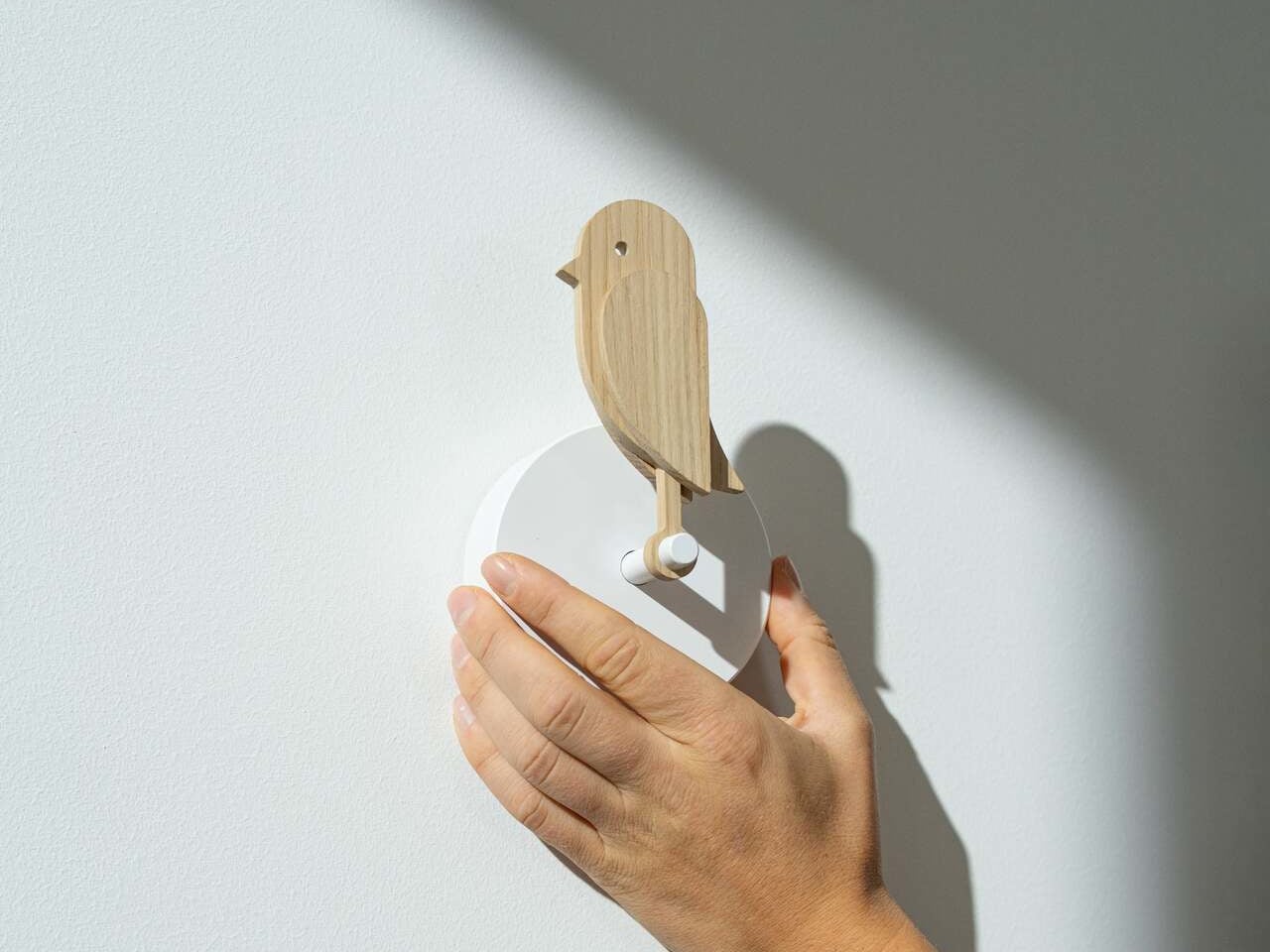
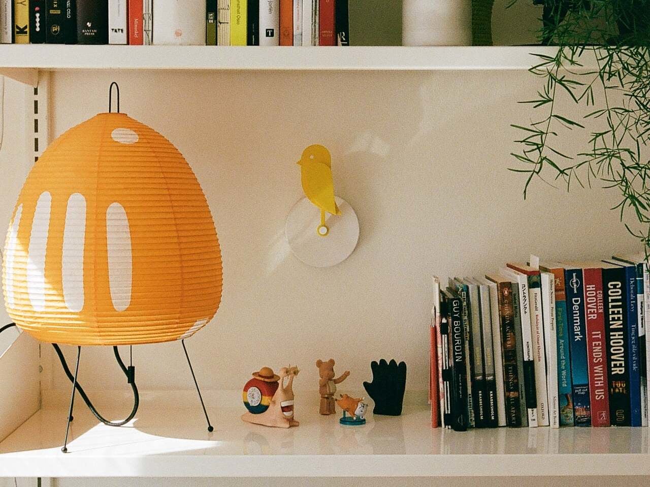
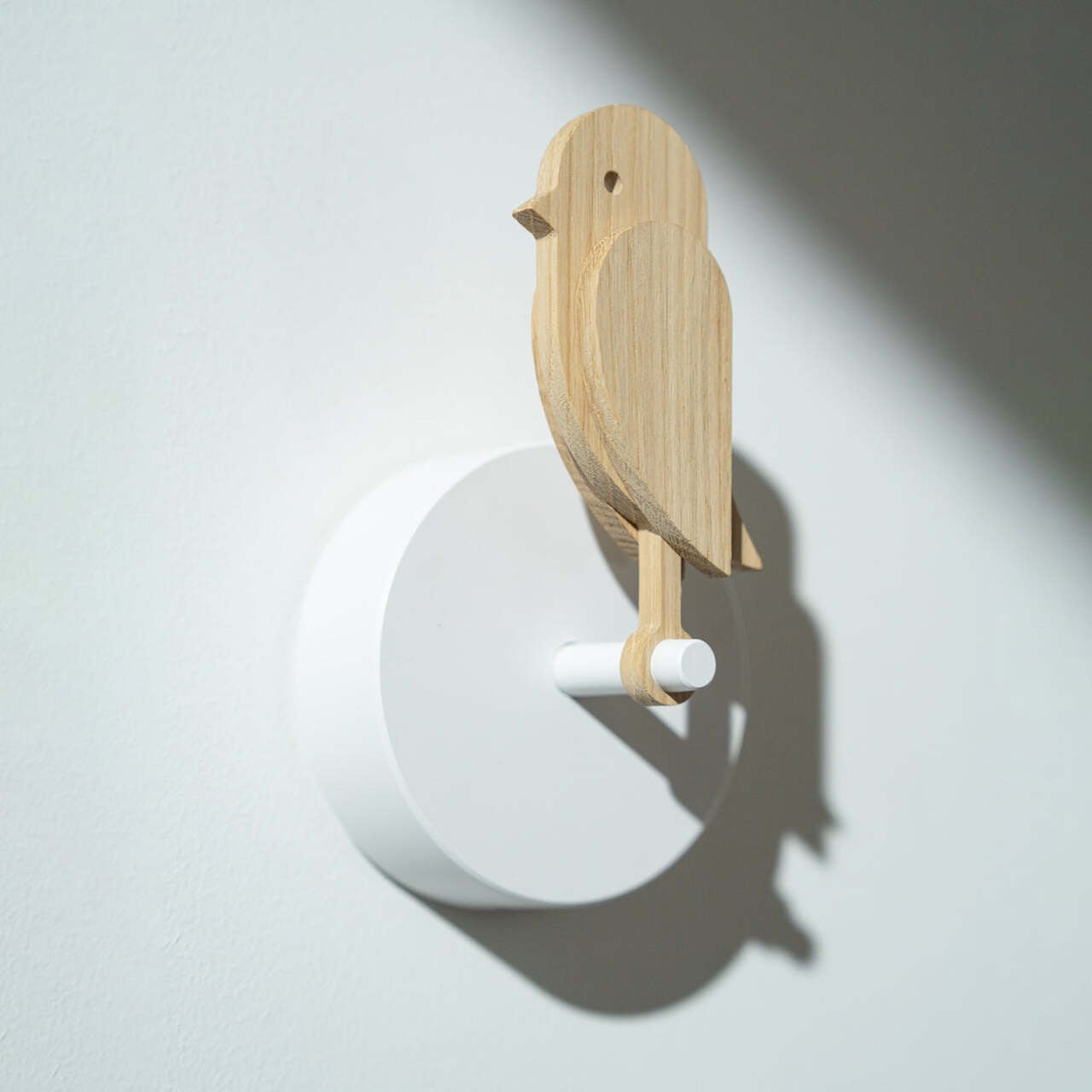
The Birdie 2.0 is a Danish-designed air quality monitor that takes a refreshingly straightforward approach to that invisible problem. It doesn’t display numbers, send phone notifications, or make any sound at all. Instead, it physically droops forward when the air in your room gets too stale, and stands back up once you’ve opened a window and things improve. The feedback loop is immediate, visual, and almost impossible to miss.

Designers: Andreas Kofoed Sørensen, Hans Høite Augustenborg (Birdie)

The concept is lifted directly from a piece of mining history. Coal miners used to carry canaries underground as a warning system: if the bird fainted, it was time to get out. Birdie follows the same logic, housing a Swiss-made Sensirion CO₂ sensor inside a small, bird-shaped form that lives on your wall. When CO₂ levels exceed 1,000 ppm, the figure tilts forward and stays that way until the air clears below 950 ppm, at which point it snaps back upright on its own.

The mechanics are simple but quietly well thought out. Birdie checks CO₂ levels every ten minutes while upright, and every two minutes once it has dropped, giving it faster feedback during the moments that actually matter. After returning to standing, it enters a two-hour cool-down period to preserve battery life, which lasts up to eight months on a single charge. It mounts to the wall with either a screw or a strip of 3M tape and needs nothing else to function.

The body is made from 70% post-consumer recycled plastic, which sits well with the minimal-intervention philosophy the product is built around. It comes with a USB-C charging cable and a wall mount in the box, and setup takes a few minutes at most. One unit covers rooms up to 100 m², though a separate one per floor or closed bedroom is recommended for multi-room coverage.

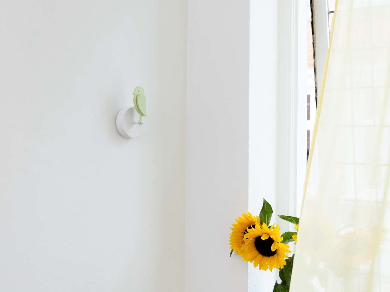
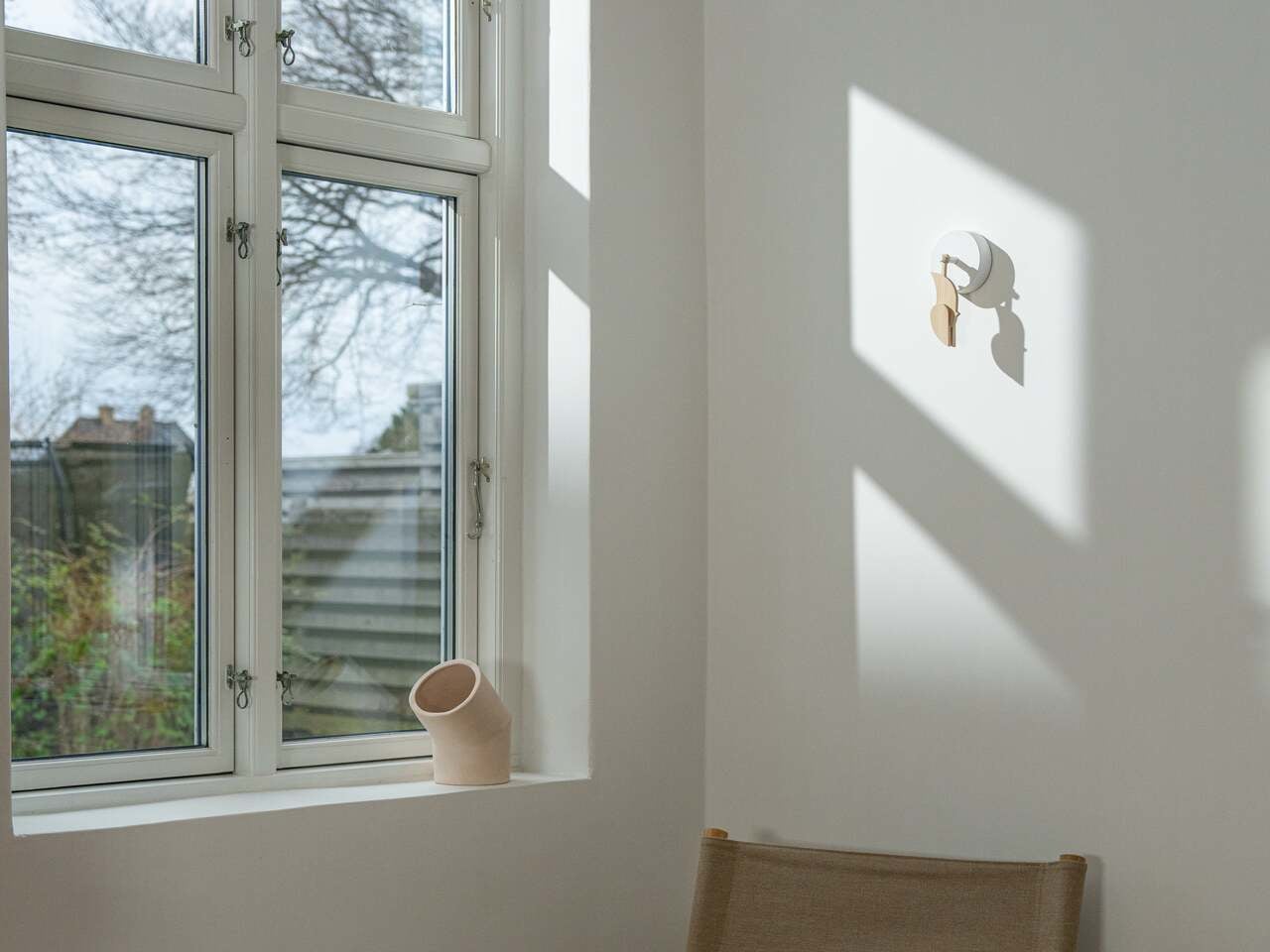
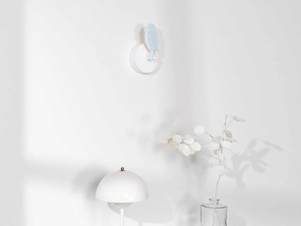
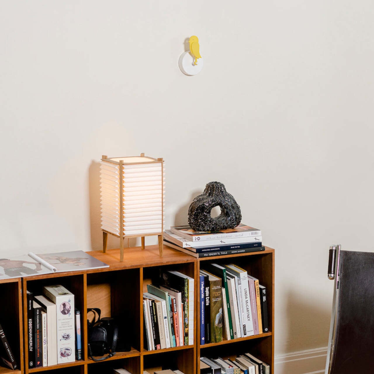
What makes it a particularly comfortable fit for the home is that it doesn’t feel like a gadget. There’s no screen competing for attention, no app to configure, and no blinking light to interpret. It’s a piece of Danish-designed wall art that happens to tell you when your living room needs to breathe. It also comes in several colorways, including the signature yellow and a subdued, earthy Dune, so it can blend into a room rather than dominate it.

Offices and classrooms are where the stakes tend to be highest. Concentration dips noticeably when CO₂ climbs, and in a shared space that doesn’t get ventilated between meetings or lessons, that decline can happen within an hour. Having something physical on the wall, rather than a number on a device that no one is checking, makes it much harder to ignore the problem.

The post This Air Monitor Drops Like a Canary When Your Room Needs Fresh Air first appeared on Yanko Design.
Meta Just Launched $299 AI Glasses Without the Ray-Ban Name

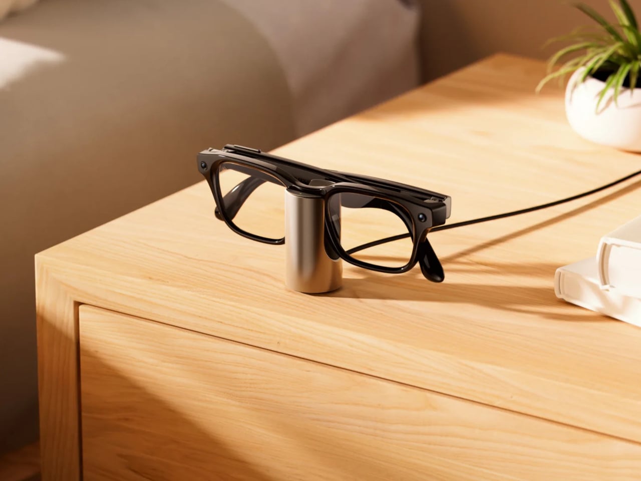
Smart glasses have been trying to go mainstream for years, but pricing has been a stubborn barrier. The Ray-Ban Meta glasses popularized the category by making them feel like normal eyewear, but their entry-level price has hovered well above what many casual buyers are willing to spend on something they might not be sure they need. The market has been compelling, just not quite accessible enough for everyone.

Meta is trying to change that with Meta Glasses, its first line of smart glasses sold under its own name rather than Ray-Ban or Oakley. Developed in partnership with EssilorLuxottica, the new lineup starts at $299, which is at least $80 less than the Ray-Ban Meta Gen 2 entry price, and it arrives in three distinct frame styles designed to cover a broader range of tastes and budgets.

Designer: Meta, EssilorLuxottica

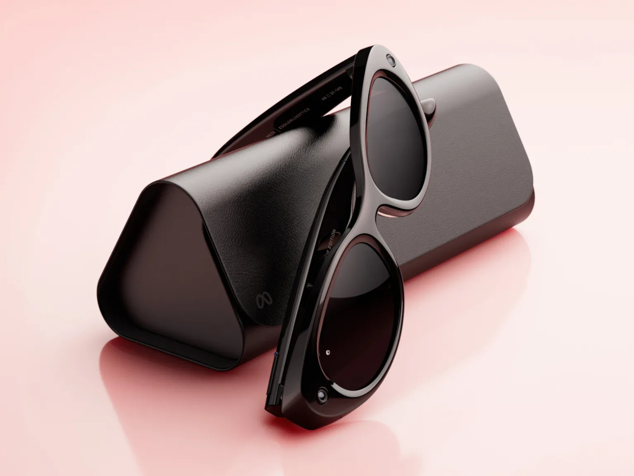
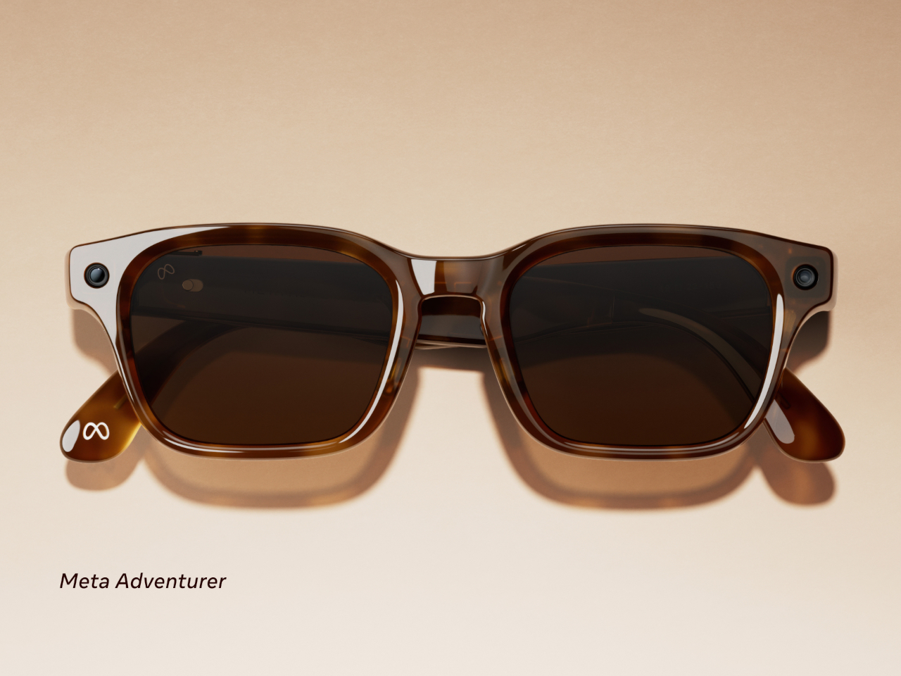
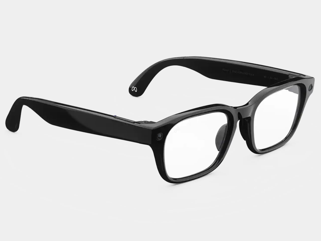
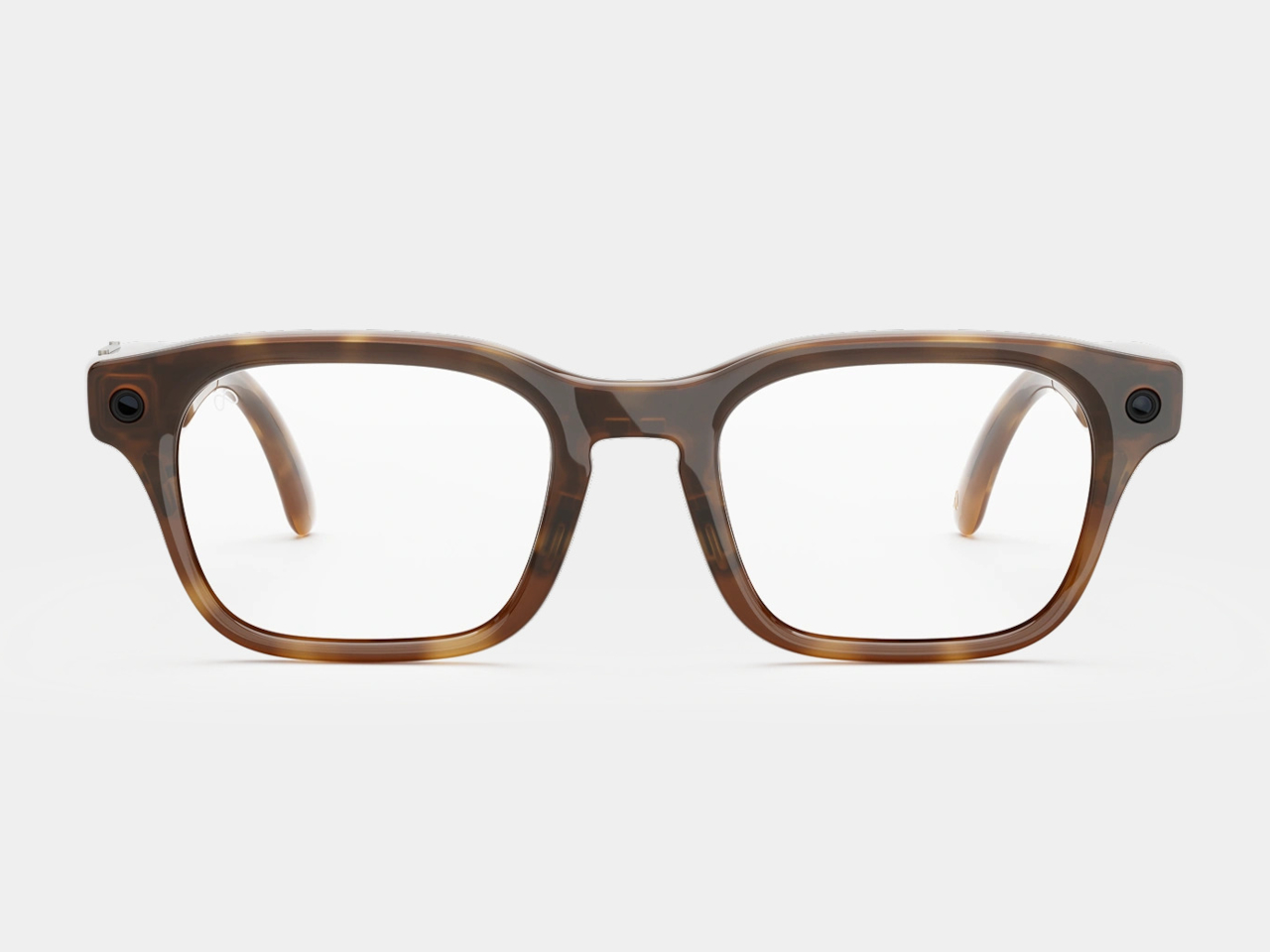
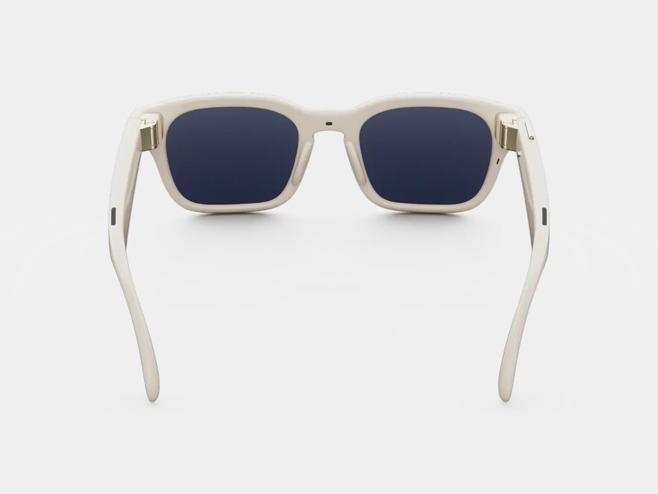
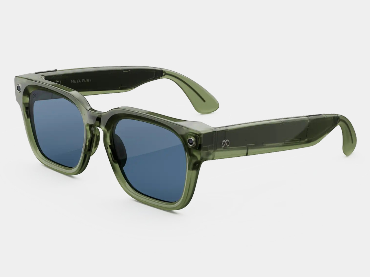
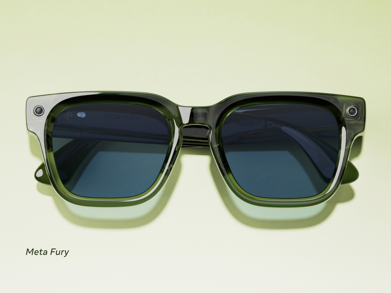
The two base models are the Adventurer and the Fury, each starting at $299. The Adventurer leans toward a slimmer, everyday silhouette, while the Fury goes bigger with a thicker, more rectangular profile, including a striking translucent racing green colorway that reveals the circuitry underneath. Both come in standard and large sizing, and together they span 26 color and lens combinations.

Meta Adventurer

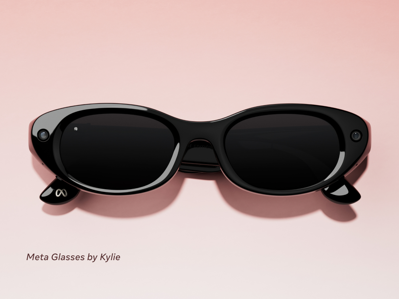
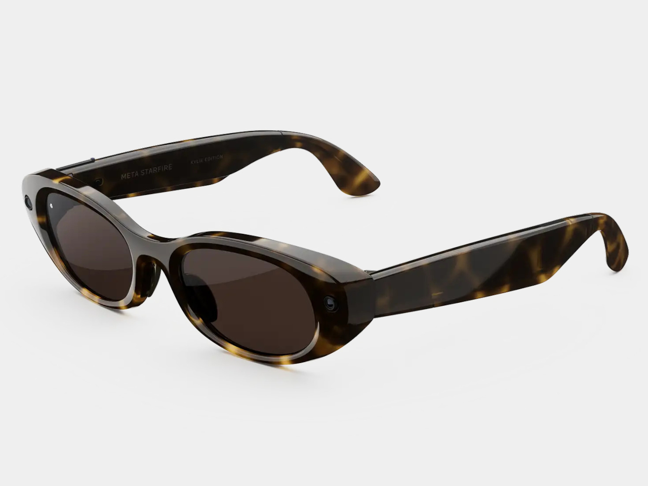
A third model called the Starfire, designed in collaboration with Kylie Jenner, rounds out the lineup at $399. Its slim, oval shape sits closer to the territory of Prada or Gentle Monster than anything Meta has put out before. The most notable exclusive is the option to use Jenner’s own voice as the on-device AI assistant for everything from navigation cues to battery alerts. It’s a fashion-forward direction for smart glasses that doesn’t really have a precedent.

All three models carry the same core hardware: a 12 MP camera, open-ear audio, and a dedicated action button for invoking Meta AI or launching a preferred feature. The addition of three-way adjustable nose pads and temple tips is a practical improvement that makes them easier to wear across different face shapes. They’re also compatible with prescription lenses, which meaningfully broadens who can actually wear them all day.

On the software side, all Meta Glasses launch with Muse Spark, Meta’s newest AI model from its Meta Superintelligence Labs. Live translation now covers 20 languages, adding Mandarin, Korean, Japanese, Arabic, and Hindi to the existing roster. Pedestrian navigation, which debuted on Meta’s more expensive display glasses, now works on the camera-equipped models too, making the $299 pair genuinely capable of directing you through an unfamiliar city while you walk.

A Dynamic Photo feature also debuts with the launch, capturing a quick burst of frames and automatically selecting the sharpest one. It’s a small addition but a practical one, given how awkward it can be to time a single-frame capture when the glasses are on your face and you’re not looking at a screen.

The glasses are available today at Meta.com and through retailers including LensCrafters, Best Buy, Amazon, and Sunglasses Hut. Dropping Ray-Ban from the name is a quiet but meaningful move, and the lower price suggests Meta is confident enough in its own brand to see if that’s what people were actually waiting for.

The post Meta Just Launched $299 AI Glasses Without the Ray-Ban Name first appeared on Yanko Design.
SwitchBot Prime Day 2026: Smart Upgrades, No Installation, Up to 50% Off

Smart home products have come a long way from the days when “home automation” meant complicated setups only tech enthusiasts could manage. The best ones now work with what people already have rather than asking them to start over from scratch. That shift has made the category far more approachable, and Prime Day sales like this one are worth paying closer attention to.

SwitchBot’s Prime Day 2026 sale runs from June 23 to June 26, offering discounts as high as 50% on a range of devices that handle security, window control, home decor, and daily comfort. None of them requires tearing down walls or rewiring anything, which is part of the appeal. The lineup this year has something for practically every room in the house.

Designer: SwitchBot

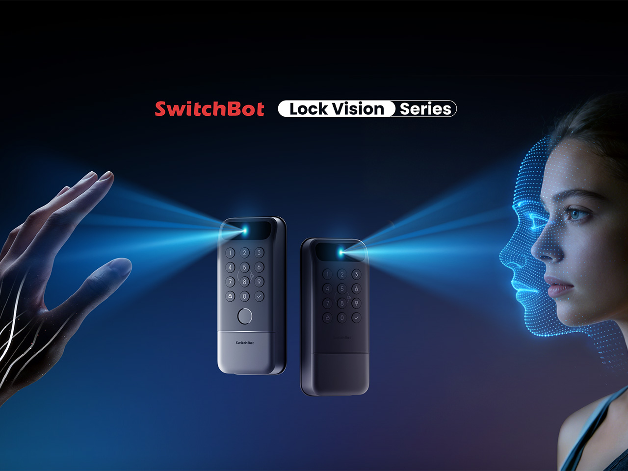
SwitchBot Lock Vision Series

Getting home with your hands full and somehow managing to unlock the door without dropping anything is one of those small daily struggles nobody really talks about. The SwitchBot Lock Vision takes care of that with 3D structured-light facial recognition, letting you walk right in without touching anything. It’s also built to tell the difference between a real face and a photo or video.

If your household has multiple people who need different ways to get in, the Lock Vision Pro adds fingerprint and palm vein recognition on top of the facial option, which makes it a bit more flexible for families. During Prime Day, the Lock Vision is down to $109.99, which is 35% off, while the Pro model drops to $169.99 at 26% off.

Click Here to Buy Now: $109.99 $169.99 (35% off). Hurry, Prime Day Deal ends soon! Website Link Here.

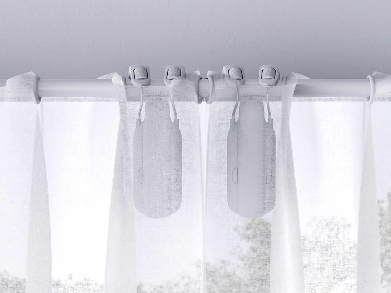
SwitchBot Curtain 3 Rod 2pcs + Remote

There’s something genuinely nice about curtains that open on their own in the morning, letting light in without you having to get out of bed. The SwitchBot Curtain 3 makes that possible by attaching directly to compatible curtain rods, so nothing needs to be replaced. You can control it through the SwitchBot app, a voice assistant, a set schedule, or the remote it comes with.

This bundle comes with two units, enough to cover a full window or even two separate ones, depending on your setup. The motor also runs as low as 25dB in QuietDrift mode, so it won’t wake anyone up if you’ve set it to open at sunrise. At 28% off during Prime Day, it’s priced at $129.99, which makes the automation a lot easier to justify.

Click Here to Buy Now: $129.99 $179.99 (28% off). Hurry, Prime Day Deal ends soon! Website Link Here.

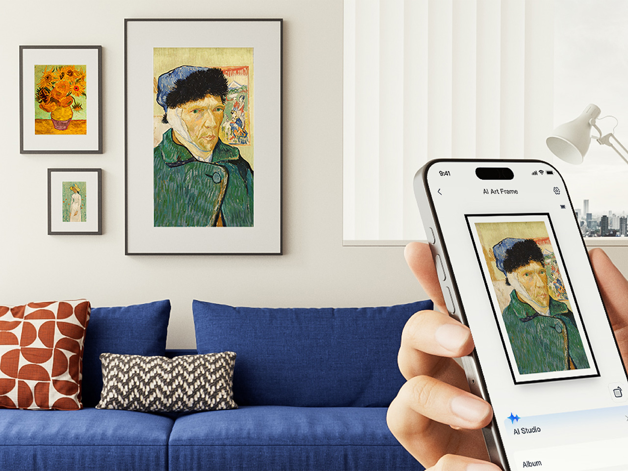
SwitchBot AI Art Frame

Digital frames have been around for a while, but most of them glow a bit too brightly for a living room. The SwitchBot AI Art Frame takes a different approach with an E Ink display that gives artwork a paper-like quality rather than a screen-like one. It comes in 7.3-inch and 13.3-inch sizes, and can show photos, personal artwork, or AI-generated visuals.

What makes it genuinely usable is that it isn’t tethered to a wall outlet, thanks to a built-in battery. It can sit on a desk, lean against a shelf, or hang on a wall, wherever it fits into your space best. The 7.3-inch model is $109.99 at 27% off during Prime Day, and the 13.3-inch goes for $265.99 at 24% off.

Click Here to Buy Now: $109.99 $149.99 (27% off). Hurry, Prime Day Deal ends soon! Website Link Here.

SwitchBot Blind Tilt 3pcs + Hub Mini

If you work from home, you’ve probably gotten up too many times just to adjust your blinds whenever the sun shifts. The SwitchBot Blind Tilt attaches to your existing blinds and lets you adjust the slat angle precisely without replacing anything. Three units are included in this bundle, so you can cover an entire room instead of just one window.

The included Hub Mini connects everything to the wider SwitchBot ecosystem, so you can control the blinds from anywhere, set them up with voice commands, or let a schedule take over. Instead of manually adjusting slats every morning or evening, you can just let it happen on its own. The bundle is $139.99 during Prime Day, which is 26% off its regular price.

Click Here to Buy Now: $139.99 $189.99 (26% off). Hurry, Prime Day Deal ends soon! Website Link Here.
SwitchBot Standing Circulator Fan

A fan that just runs until someone turns it off isn’t exactly the pinnacle of smart living. The SwitchBot Standing Circulator Fan can be scheduled, adjusted remotely, and paired with other SwitchBot devices so it responds to what’s actually happening in your home. Given that Prime Day falls right in the middle of summer, it’s also one of the more timely picks.

Its adjustable height makes it easy to move between rooms without any hassle, and the quiet operation means it won’t be a distraction during calls or when you’re trying to sleep. At $89.99, it’s the most affordable item in this Prime Day lineup, and at 31% off, it’s a reasonable deal for a fan that fits neatly into a connected home setup.

Click Here to Buy Now: $89.99 $129.99 (31% off). Hurry, Prime Day Deal ends soon! Website Link Here.

The post SwitchBot Prime Day 2026: Smart Upgrades, No Installation, Up to 50% Off first appeared on Yanko Design.