Lenovo’s AIO Desktop Finally Comes in 6 Colors to Match Your Room

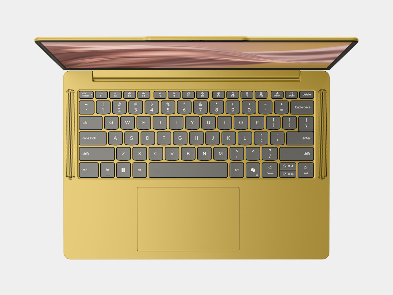
Lenovo built its newest AI PC lineup around a question most manufacturers skip entirely: what color actually feels like you. The IdeaPad Vibe series and IdeaCentre AIO i desktop, both unveiled at Lenovo Innovation World 2026, treat color as a design decision worth researching rather than an afterthought tacked onto a spec sheet. It’s a lineup that asks people to pick hardware the way they’d pick a jacket, based on how it makes them feel.

That thinking starts with the IdeaPad Vibe, developed alongside Pantone Institute to land on seven finishes with names like Zen Green and Dreamy Violet, each tied to a specific mood rather than a marketing buzzword. Lenovo drew those shades from colors people encounter every day and shades that capture how they aspire, learn, create, and live, then extended the idea further with swappable keycaps for anyone who wants even more control over how their laptop looks.

Designer: Lenovo
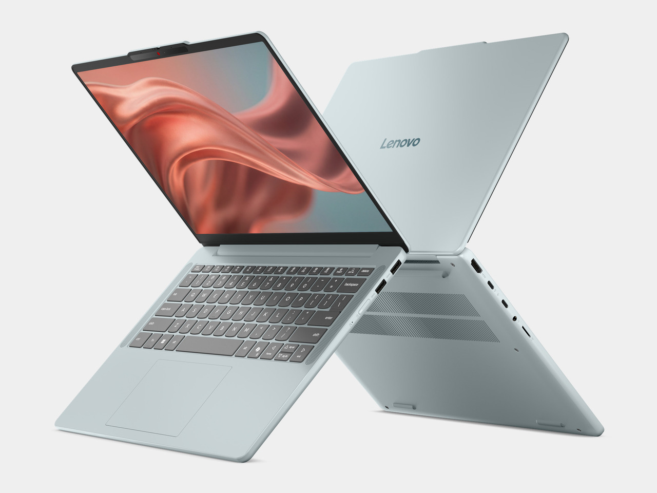
Underneath that color story sits real hardware flexibility. Snapdragon X processors power the base configuration with Copilot+ PC capabilities, while an AMD Ryzen AI 400 Series option adds dual-slot memory upgradeable to 32 GB and storage expandable to 1 TB. Both versions fit into a metal chassis starting at 1.3 kg, light enough to carry between a dorm room and a coffee shop without a second thought about the extra weight.
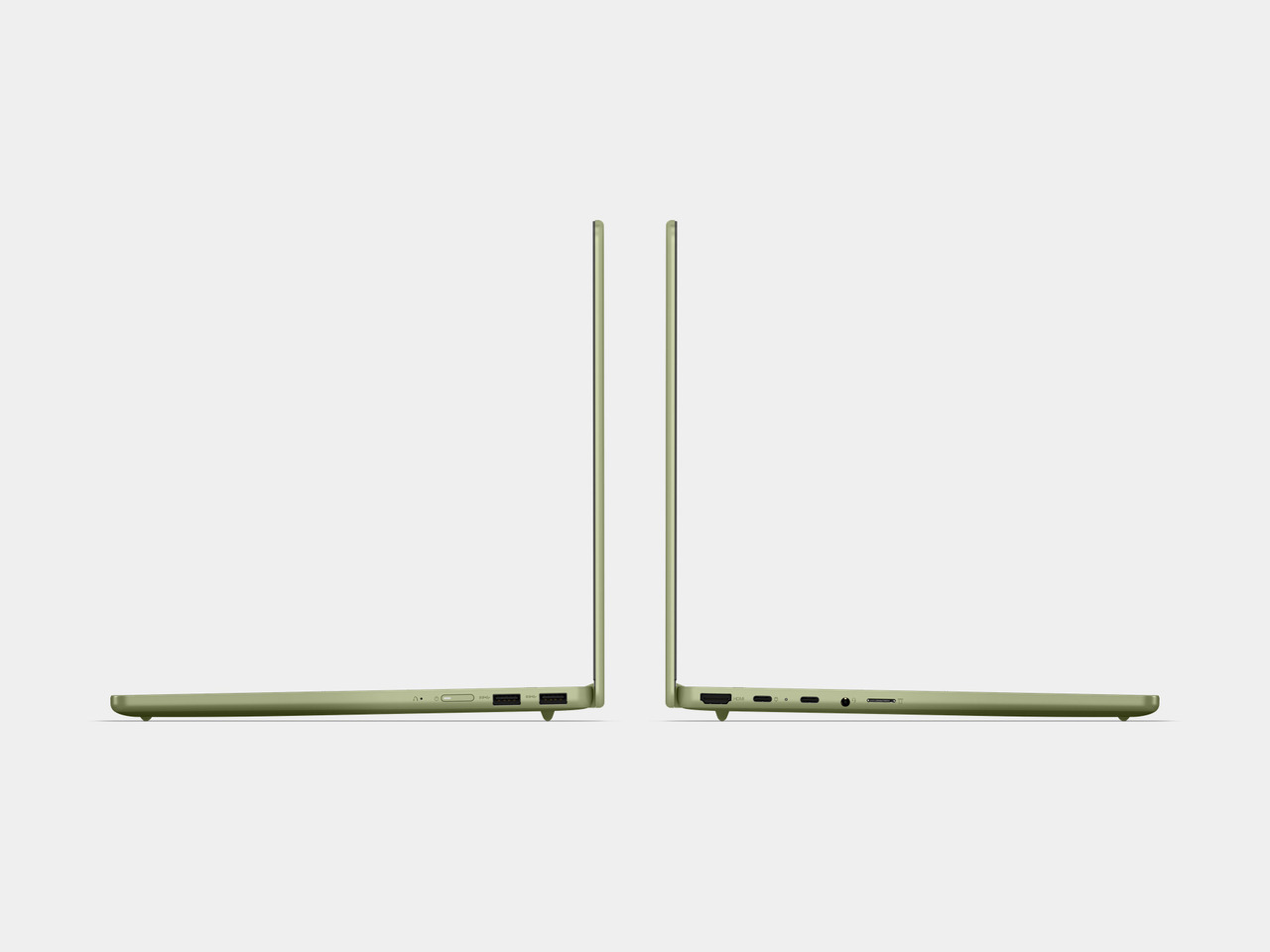
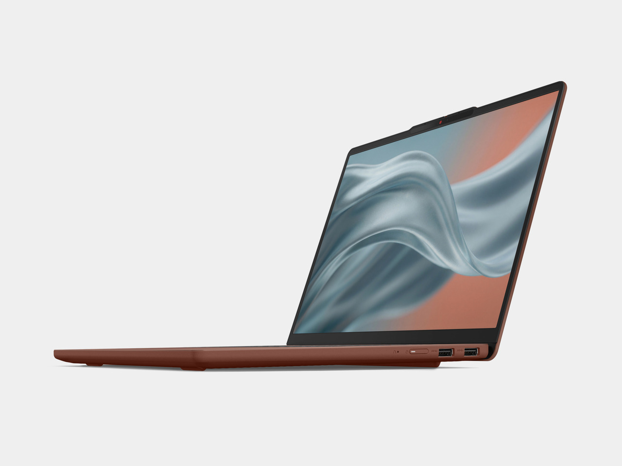
Display options split along similar lines, with OLED panels in Lowkey Grey and Moody Blue pushing up to 100% DCI-P3 coverage for anyone editing photos or watching movies, while IPS configurations keep things smooth at 120Hz for everyday browsing and schoolwork. AI features layered on top, like real-time translation and smarter video call effects, run quietly enough that Lenovo says the whole system stays cool and quiet even under regular use.
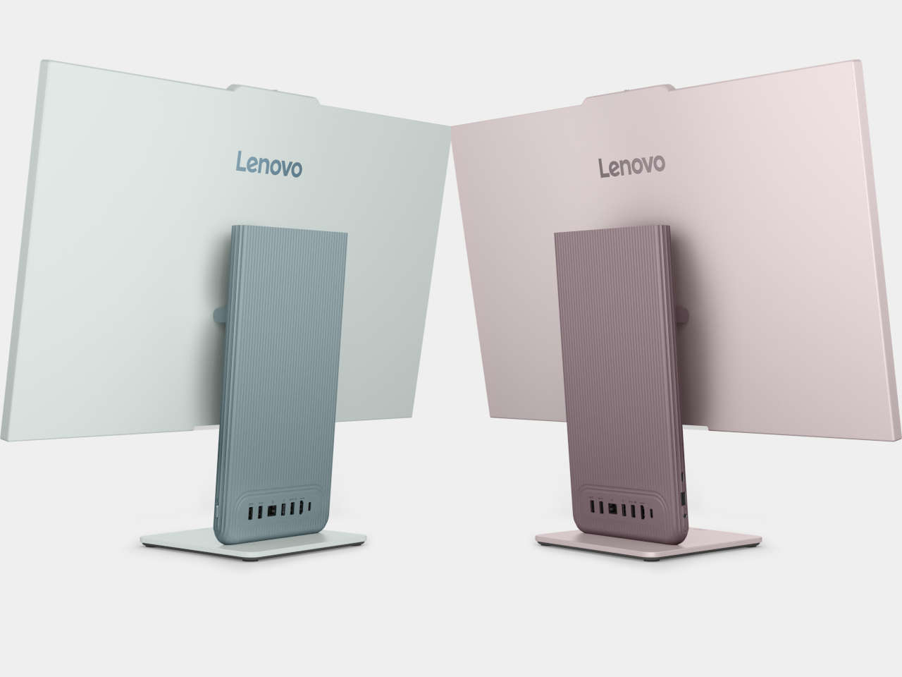
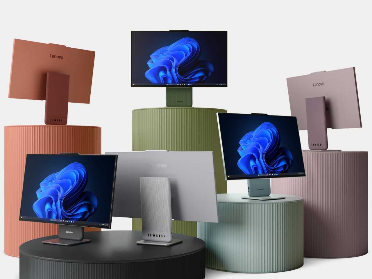
Move from the laptop to the desk and the IdeaCentre AIO i picks up that same color philosophy, arriving in six finishes for the first time, with a matching wireless keyboard and mouse combo tying the whole setup together. Its bigger shift, though, comes from ditching the bulky column of components most all-in-ones hide behind the screen, trading it for what Lenovo calls a middle-box-free architecture that leaves the display looking noticeably slimmer.

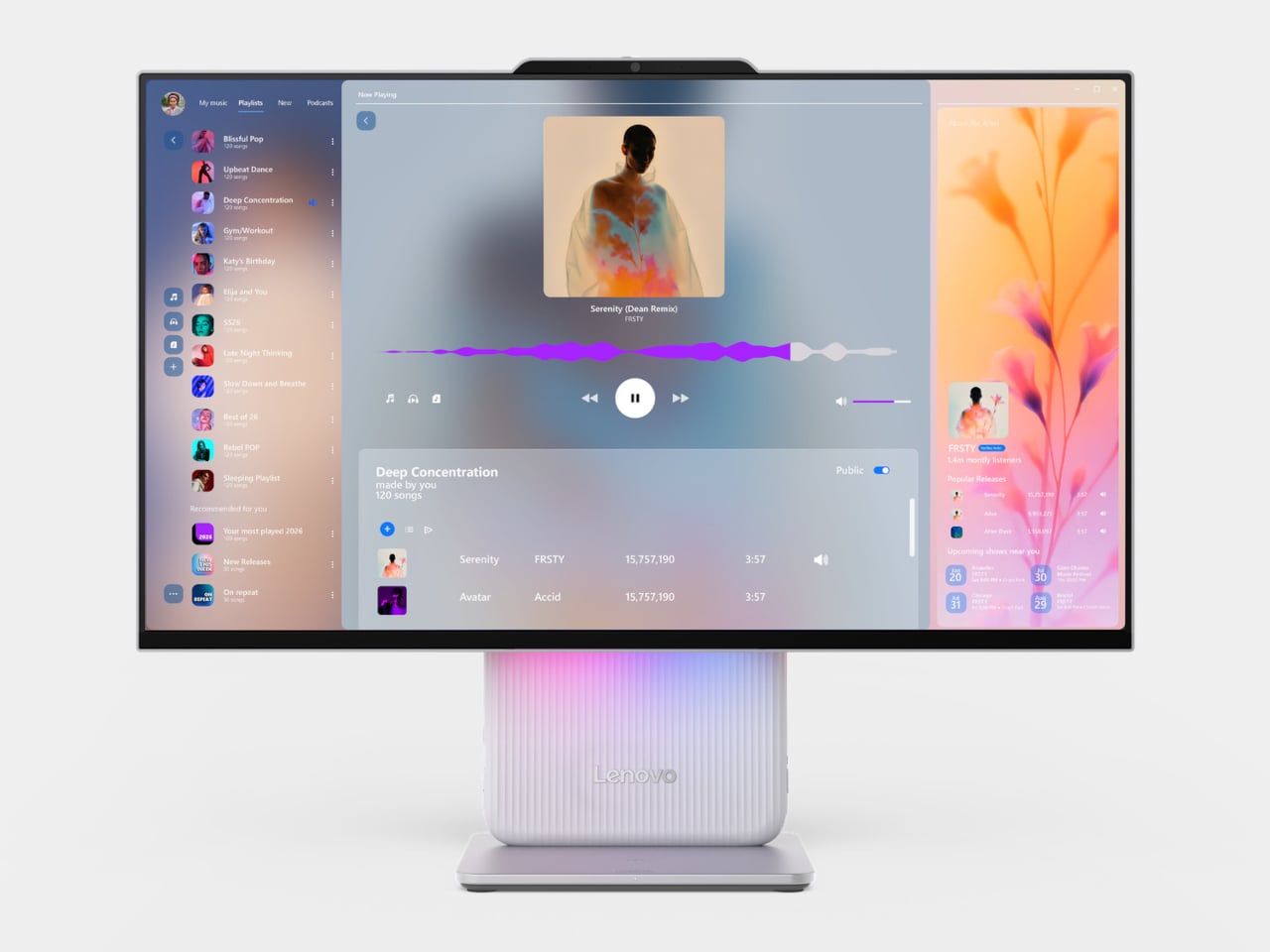
That slimmer build still packs Intel Core Series 3 processors capable of up to 40 platform TOPS, paired with a display stand that tilts from -5 to 15 degrees and adjusts 30 mm vertically, useful whether someone’s leaning in for a video call or angling the screen down for a kid doing homework at the kitchen table. Adaptive Lighting adds boot-up, default, and music-reactive modes, giving the desktop a personality that extends beyond whatever’s on screen.
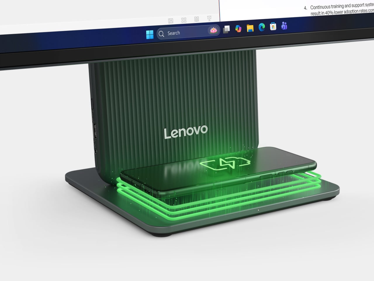
Between the two, the IdeaCentre leans harder into shared spaces, with an optional 5MP IR camera and physical shutter for privacy during calls, plus audio tuned by Harman for movie nights or background music while cooking. An e-book mode dims blue light for anyone using the big screen for actual reading, a detail that feels aimed squarely at households where one screen ends up doing everything.
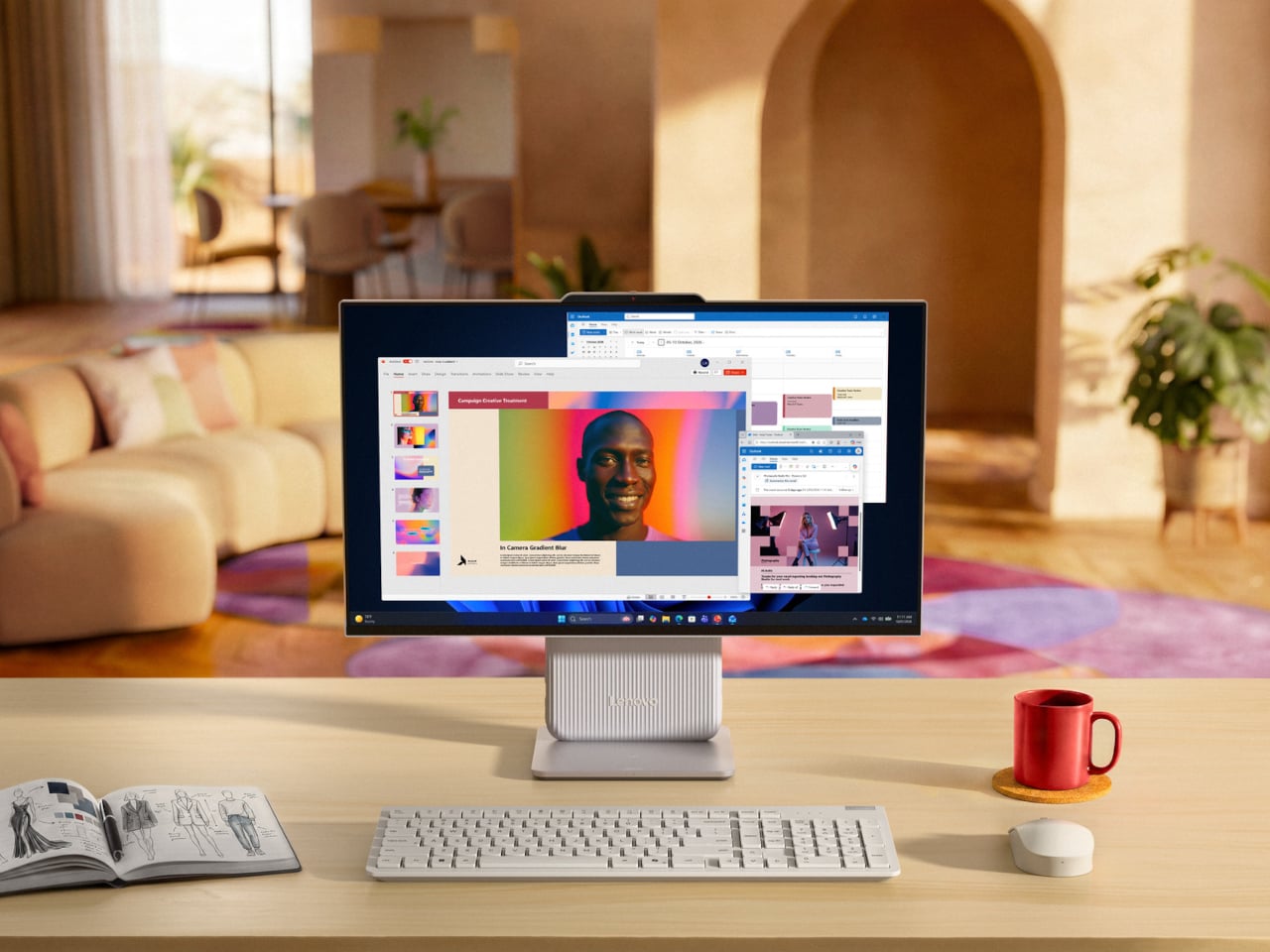
Pricing puts the IdeaPad Vibe at $699.99 regardless of processor choice, while the IdeaCentre AIO i starts at $939.99 for the 24-inch model and climbs to $1,149.99 for the 27-inch version. Both lines share the same instinct: that a PC sitting in a bedroom or a kitchen deserves to look like it belongs there, not like it was designed for a beige office cubicle decades ago.

The post Lenovo’s AIO Desktop Finally Comes in 6 Colors to Match Your Room first appeared on Yanko Design.
Motorola’s Swarovski Razr Was Designed to Be Seen, Not Hidden

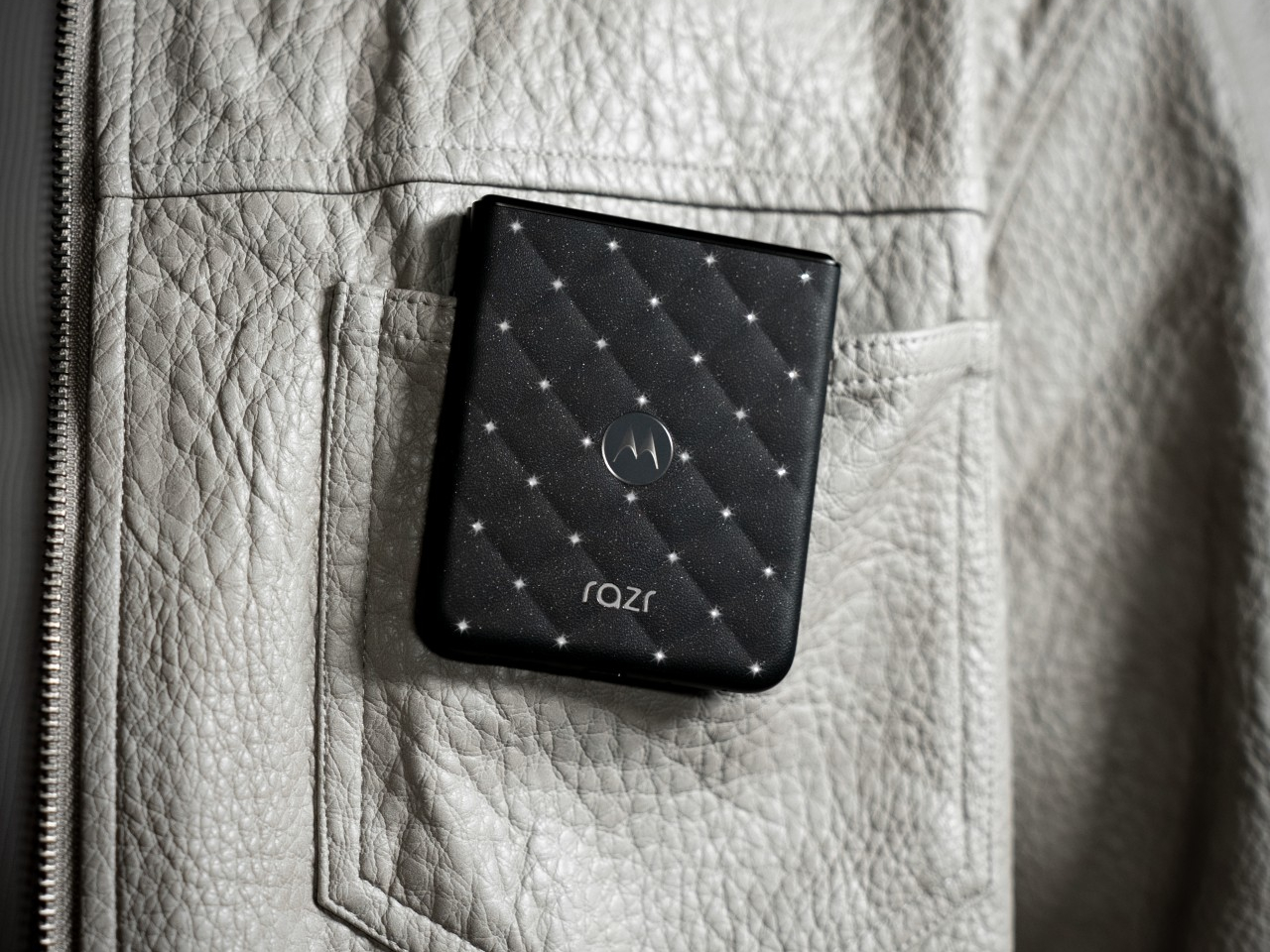
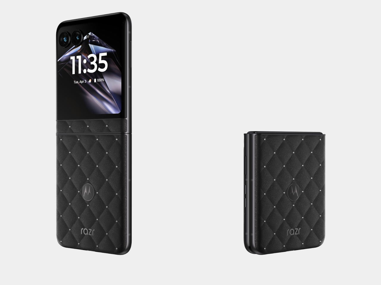
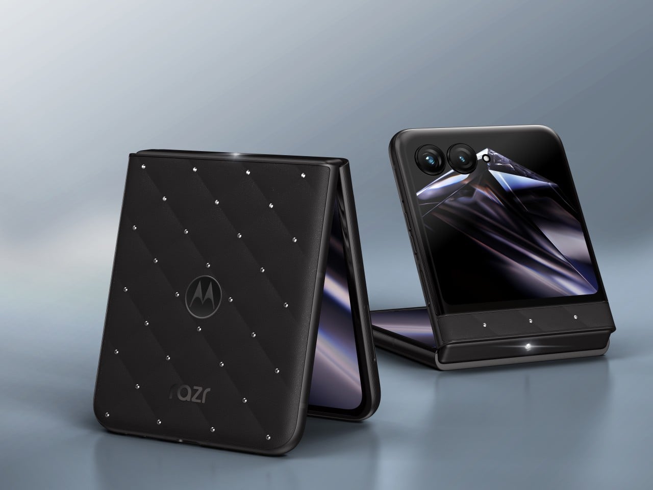
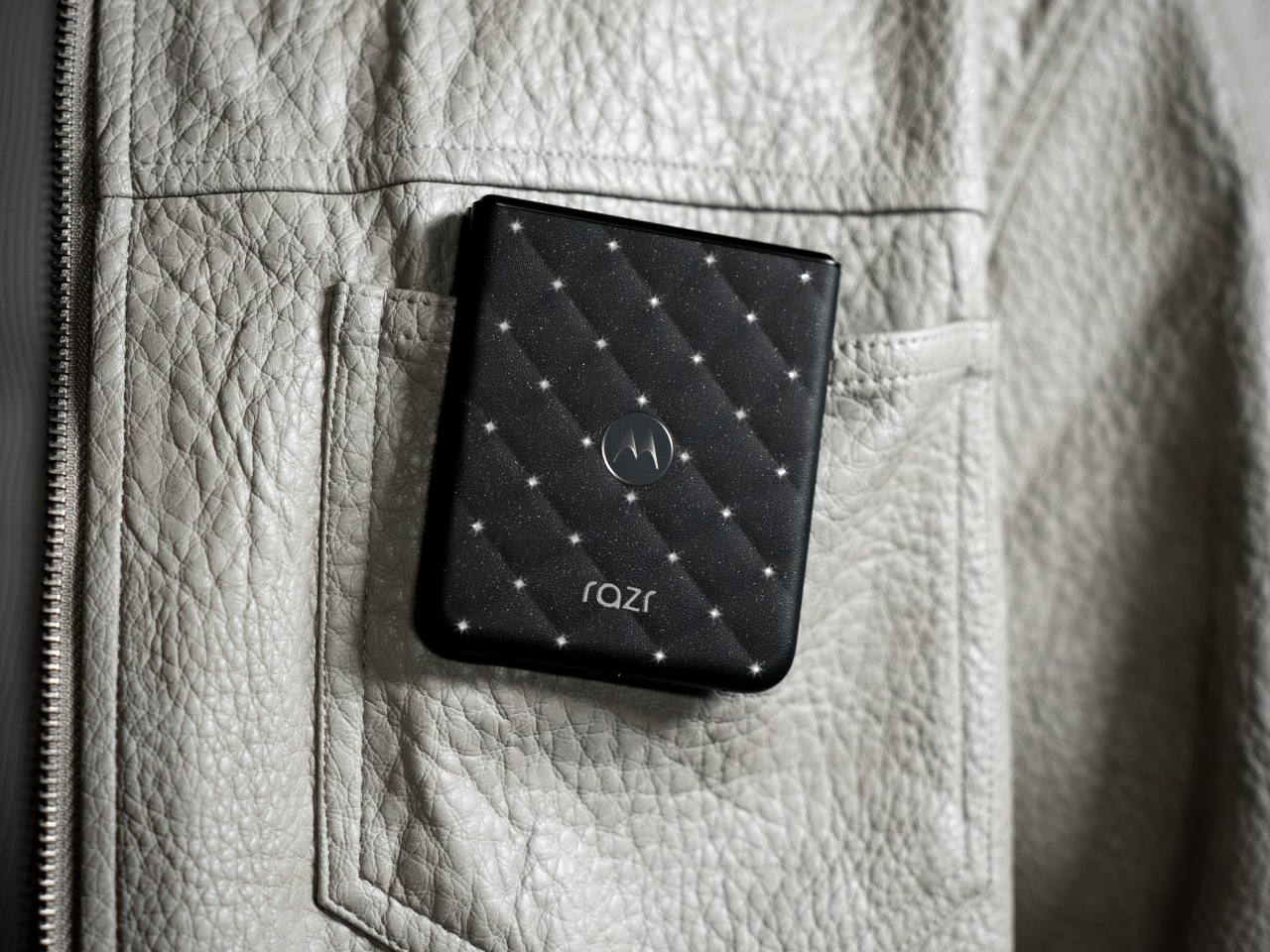
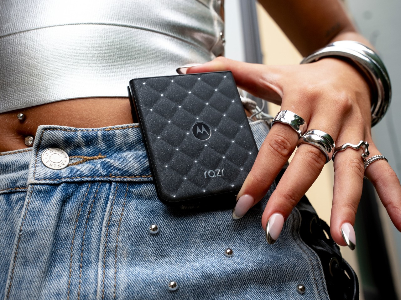
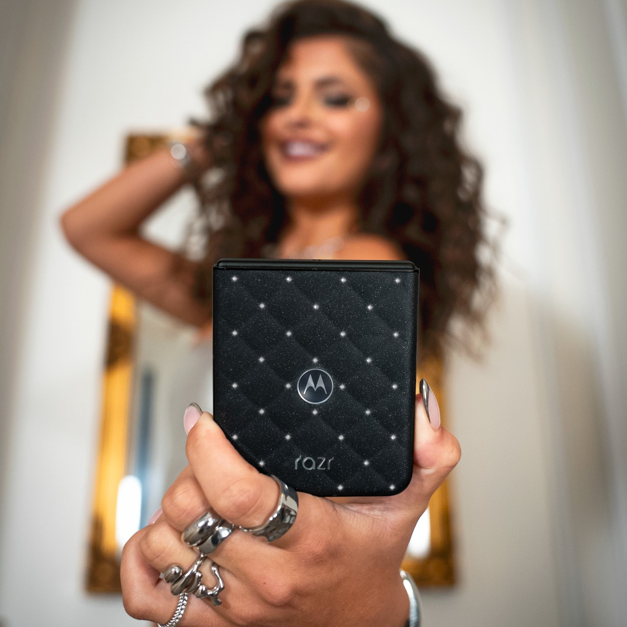
Motorola built a phone that asks to be noticed before it’s even unfolded. The 2026 motorola razr with Crystals by Swarovski joins the Brilliant Collection at IFA 2026, pairing Pantone’s color expertise with Swarovski’s craftsmanship on a foldable that reads less like consumer electronics and more like a clutch bag someone forgot was also a smartphone. It’s Motorola’s clearest statement yet that a phone’s exterior deserves as much attention as its chipset.

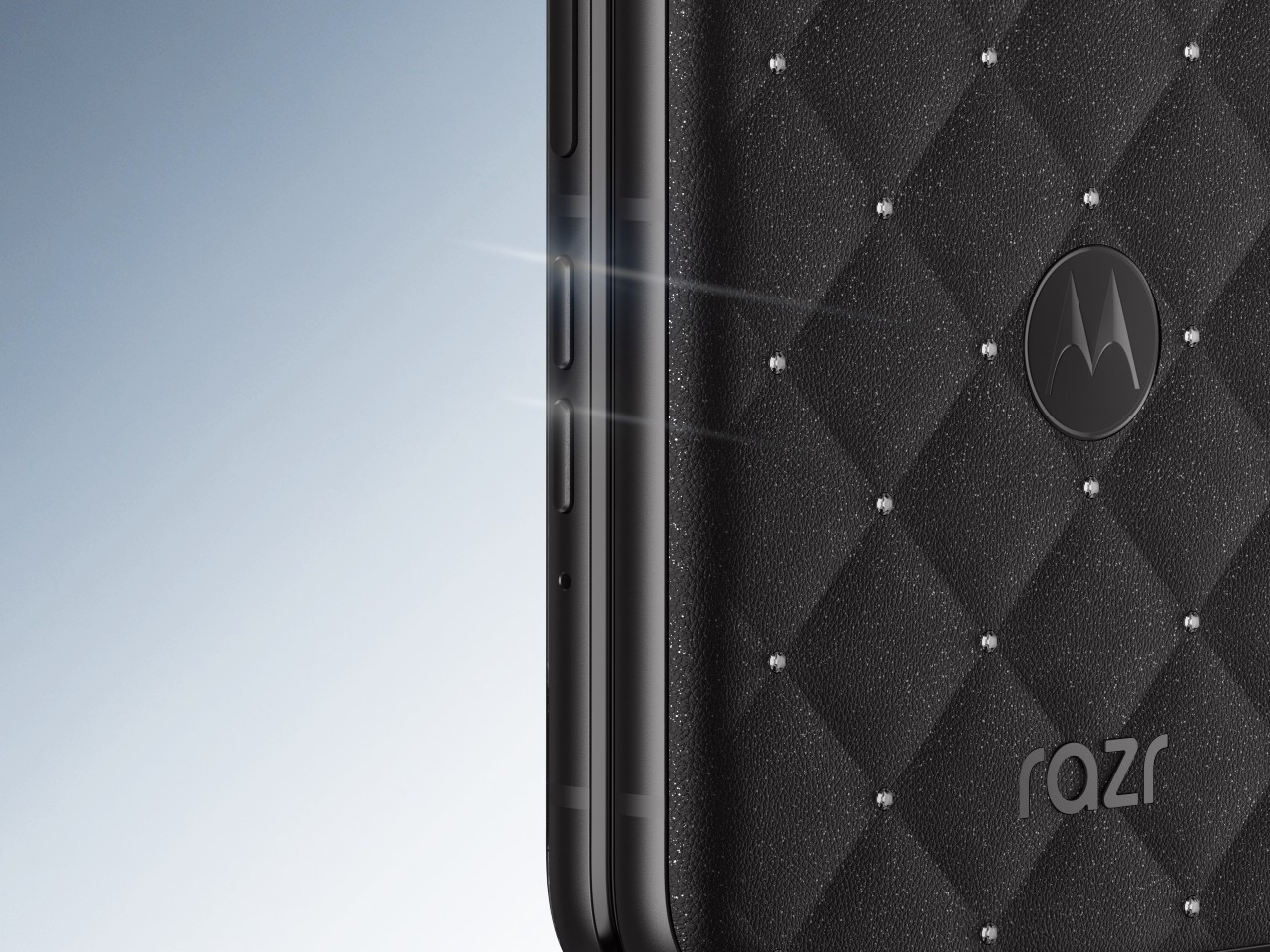
That statement starts with PANTONE Meteorite, a deep, understated shade that never competes for attention against the crystals resting on top of it. Instead, the finish creates contrast, revealing different dimensions of light and sparkle as the phone moves, so a simple pocket check under a restaurant table catches light differently than the same motion under office fluorescents. Color, in this case, does the quiet work of making everything layered on top of it shine harder.

Designer: Motorola x Swarovski

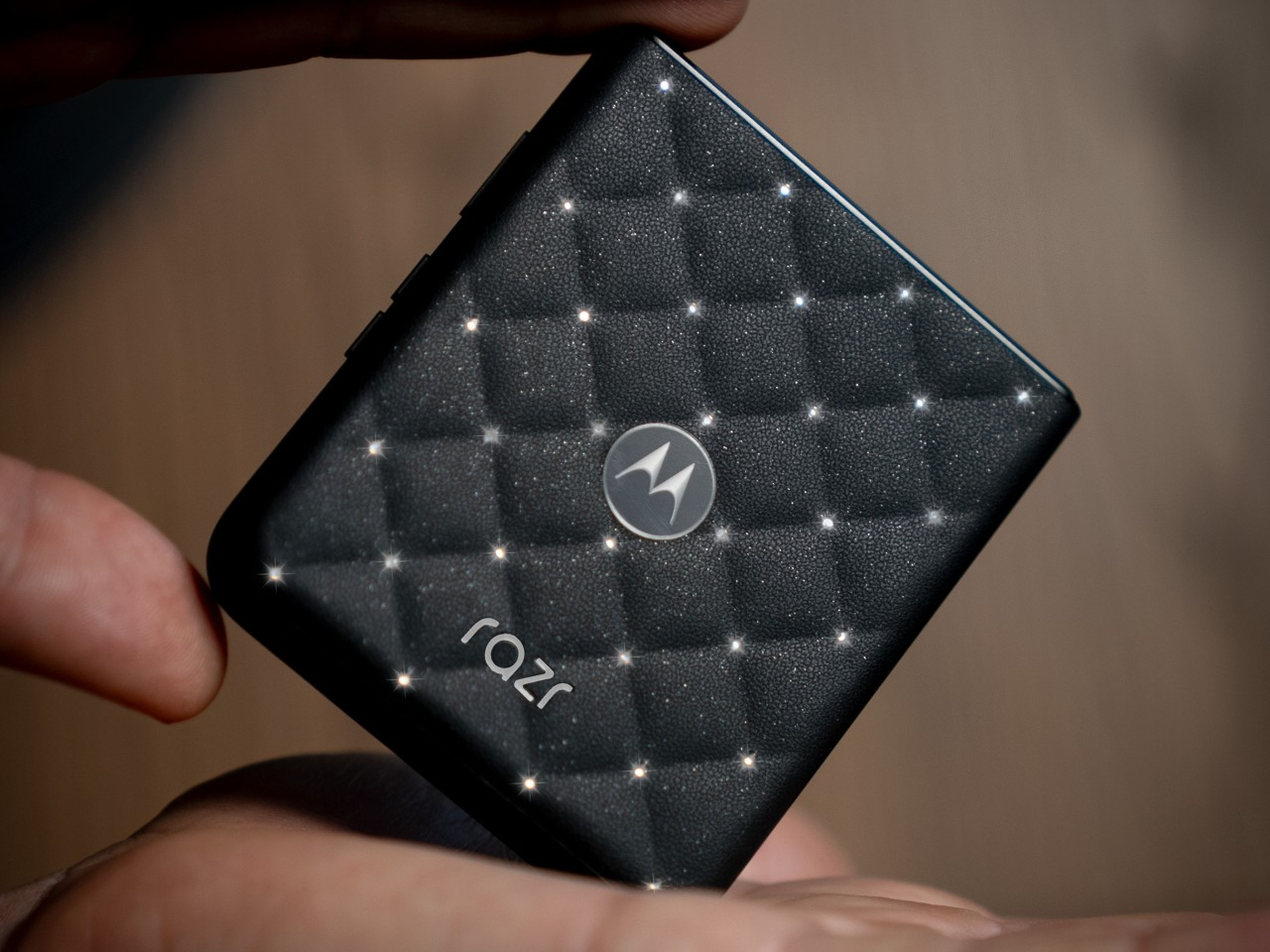
That layering happens across a quilted, leather-inspired texture that already feels premium before a single crystal enters the picture. Set against that padded surface, 35 hand-positioned Swarovski Crystals in Silver Night catch light from nearly any angle, each one placed with enough precision that the pattern reads as intentional rather than scattered. It’s the kind of detail that rewards a second glance rather than exhausting itself after the first one.

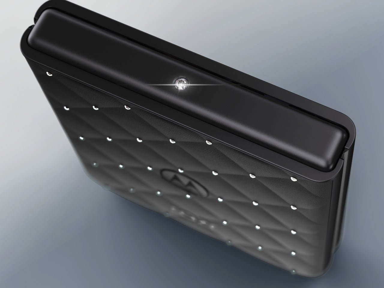
One crystal earns special treatment. A signature 32-facet Swarovski Crystal sits directly on the hinge, catching light with every flip in a way that turns the phone’s most mechanical motion into its most theatrical one. Razr’s flip has always been a small performance, and Motorola clearly understood that placing its biggest crystal exactly where the hinge pivots would turn an everyday gesture into something worth watching happen.

Motorola ships the device with a clear protective case built to frame the design without hiding it, a detail that matters more than it initially sounds. Plenty of phone cases exist purely to protect a device at the cost of concealing whatever made it desirable in the first place. Here, the case reads more like a museum vitrine than a rubber shell, letting the crystal work stay visible through daily handling.

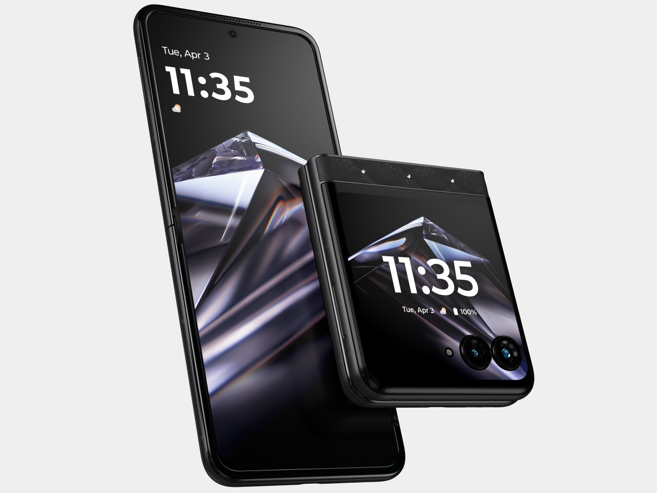
None of that styling comes at the expense of the hardware underneath. A 6.9-inch Extreme AMOLED display unfolds for daily use, backed by a dual 50MP main camera system and a 4800mAh battery rated for more than 36 hours on a single charge. The external 3.6-inch display still runs full apps and handles notifications without requiring an unfold, keeping the phone functional even when someone’s more focused on how it catches light in a bag.

Motorola frames the Brilliant Collection as proof that technology can be both beautiful and intelligent, and this razr backs that framing with hardware that would hold its own even without a single crystal attached. Pricing lands at $899.99 when the phone arrives on Motorola.com and Amazon on September 10, with Verizon carrying it starting September 24, putting genuine jewelry-adjacent design within reach of anyone willing to treat a phone as an actual accessory.

The post Motorola’s Swarovski Razr Was Designed to Be Seen, Not Hidden first appeared on Yanko Design.

Anker Finally Solved Why Fast Wireless Charging Slows Down

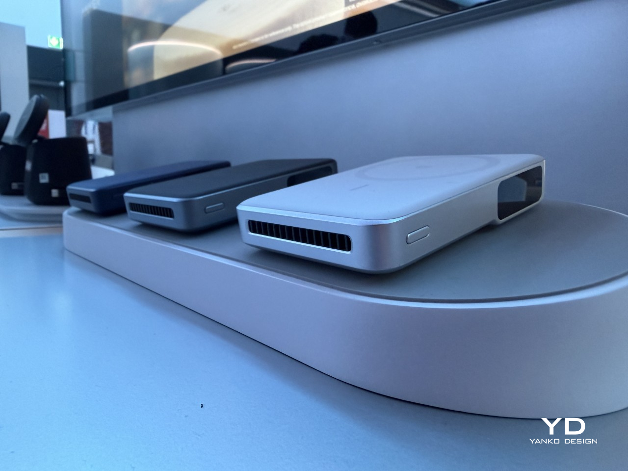
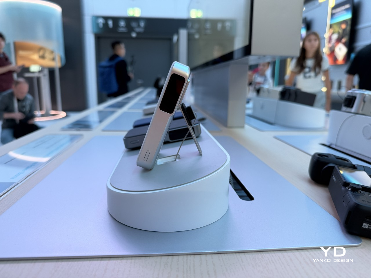
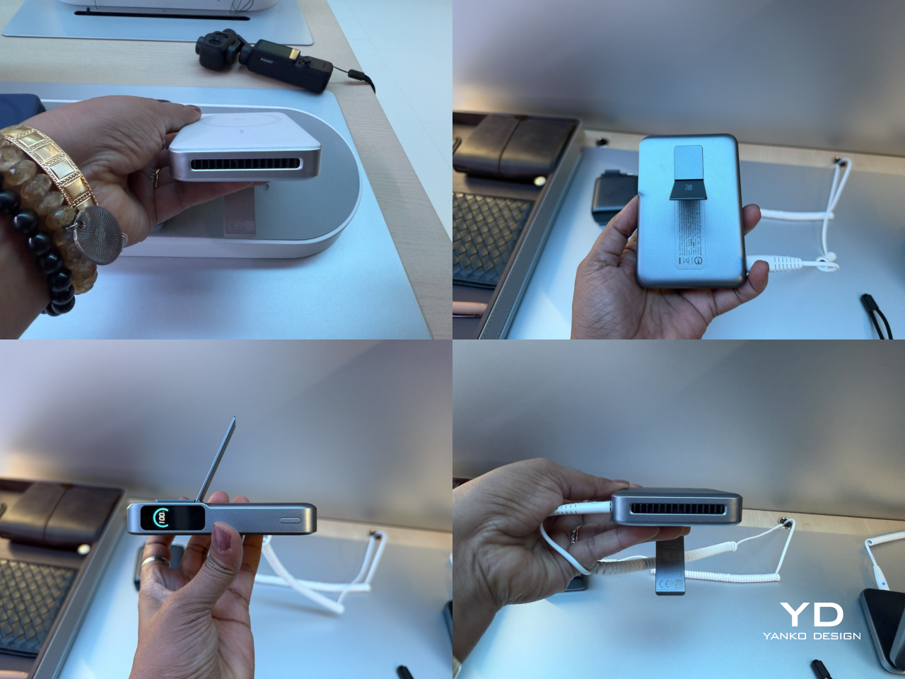
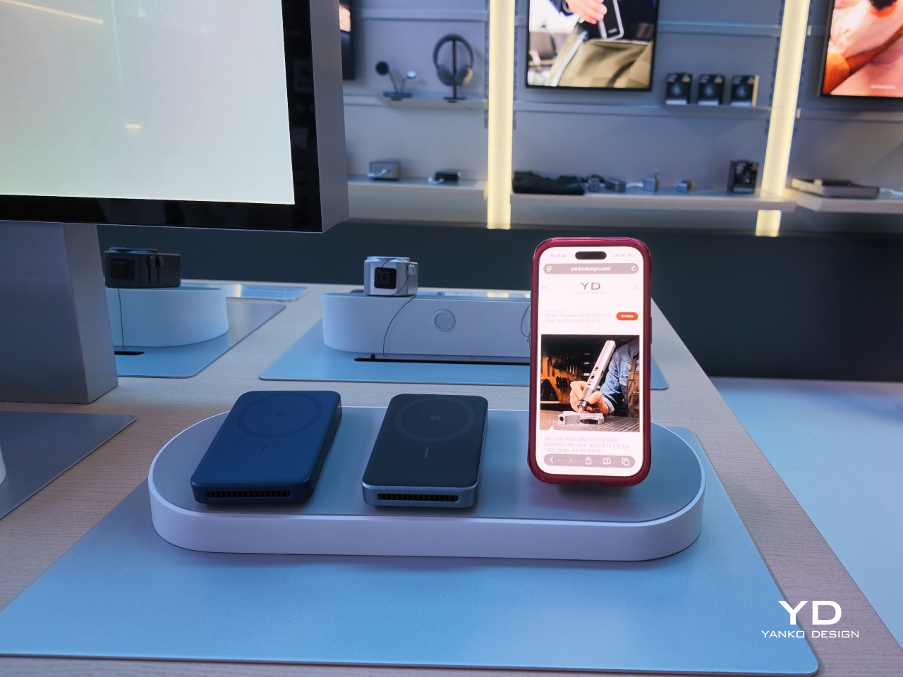
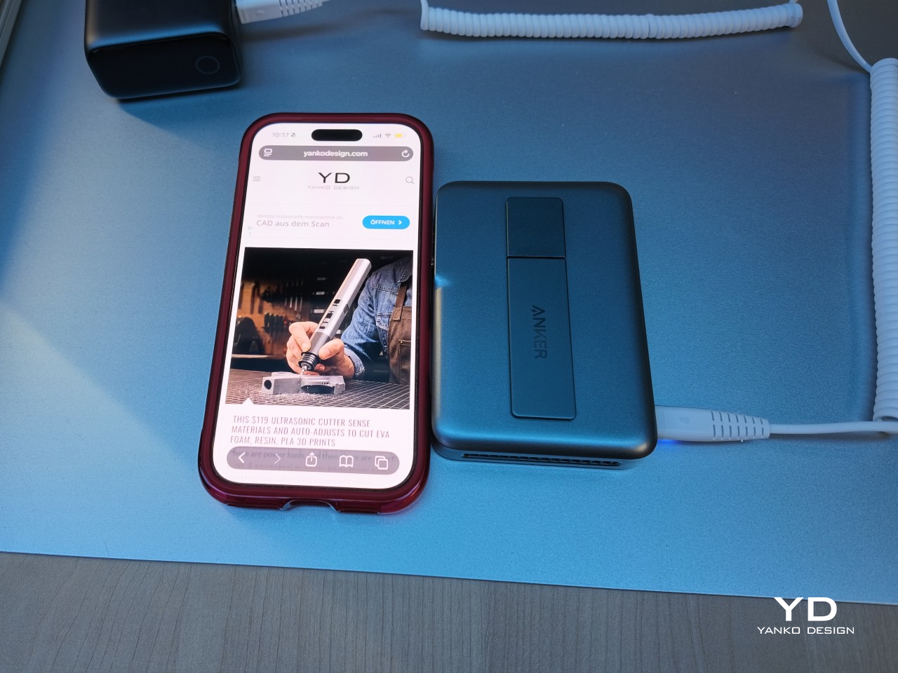
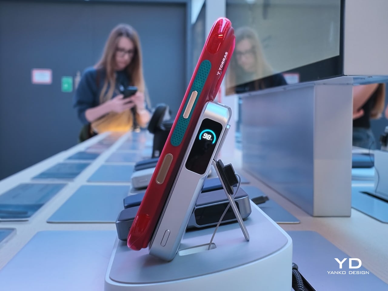
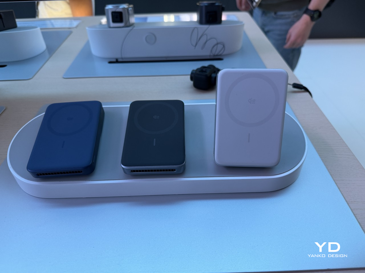
Fast wireless charging has always come with a quiet trade-off. The faster a magnetic power bank pushes power into a phone, the hotter it gets, and heat is exactly what makes phones throttle their own charging speed. Anker built the MagGo Power Bank Pro 2 around solving that specific problem, tucking an actual cooling fan into a battery pack that otherwise looks like any other MagSafe-compatible slab.

That fan changes the math entirely. Anker says comparable 25W magnetic power banks climb past 113°F within 20 minutes of use, triggering the exact slowdown wireless charging is supposed to avoid. The Pro 2 stays closer to 96.8°F throughout a full charge, letting it sustain its rated 25W output instead of quietly dropping to 15W the moment things warm up.

Designer: Anker

The payoff shows up in minutes, not specs sheets. Anker says the Pro 2 pushes an iPhone 17 Pro to 25% in 10 minutes and 50% in roughly 25, numbers that turn a coffee break into a meaningful top-up instead of a shrug-worthy trickle. A 45W USB-C port handles wired charging on the side, strong enough to give a MacBook Air a bit of runway when an outlet isn’t nearby.

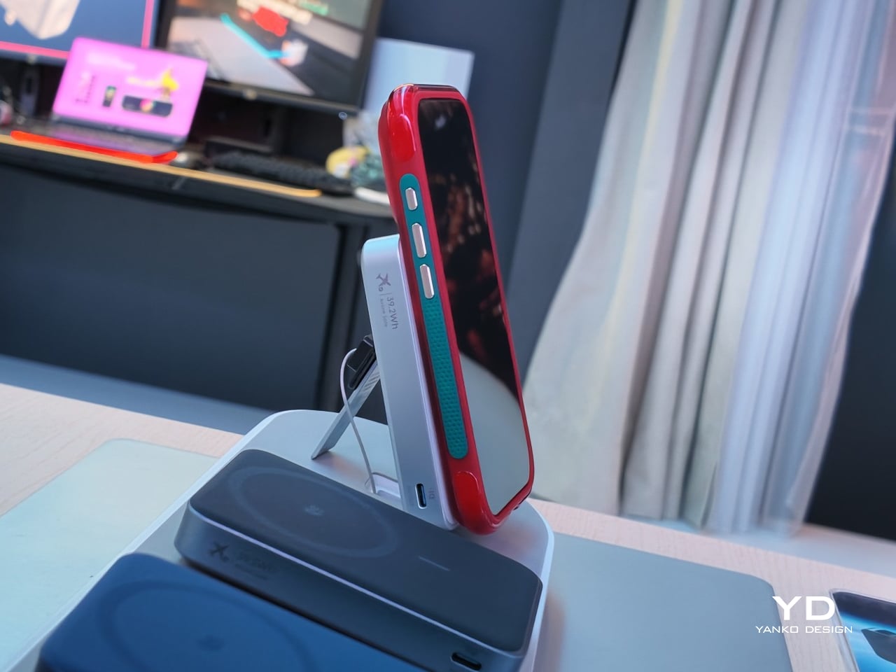
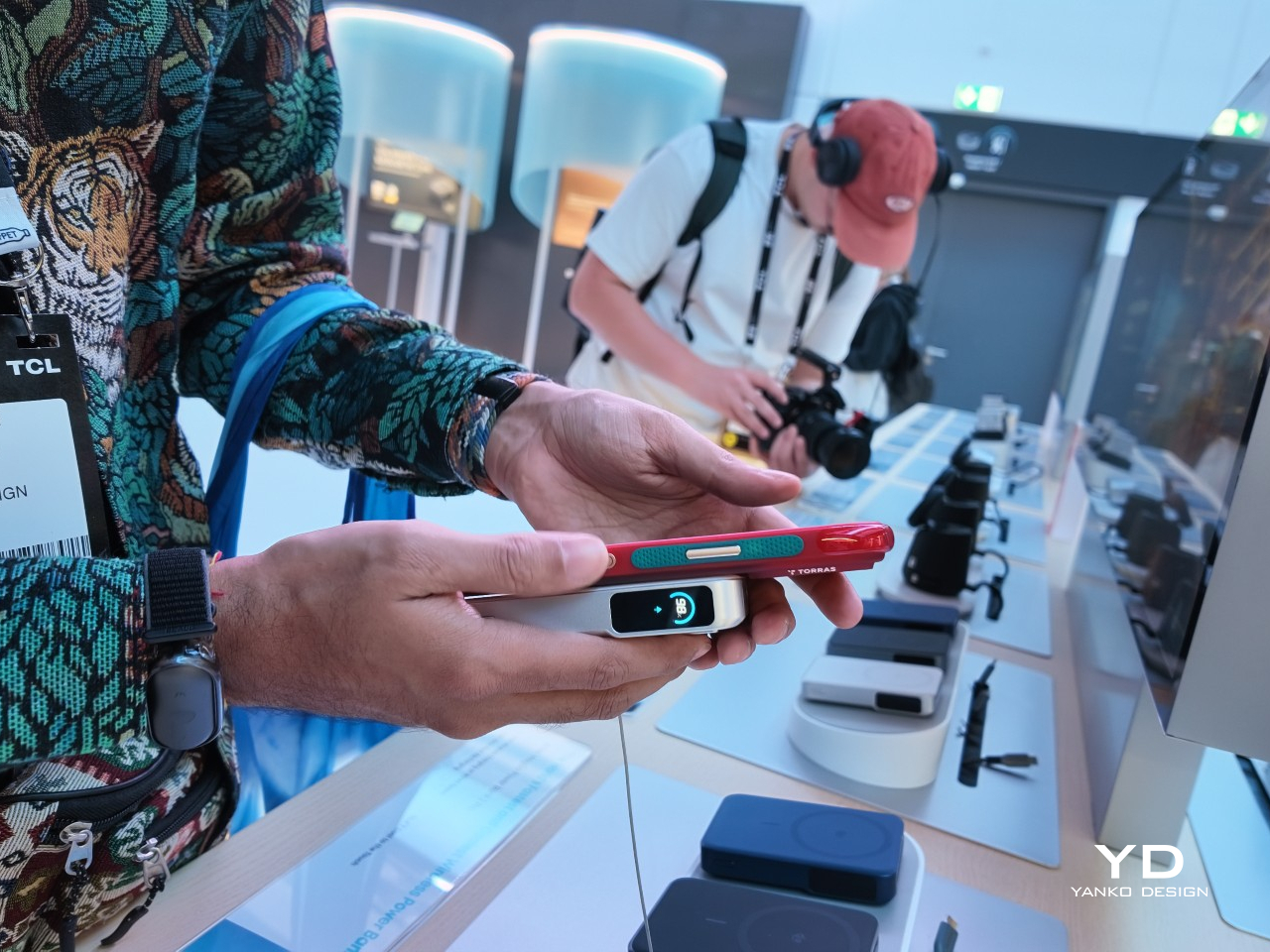
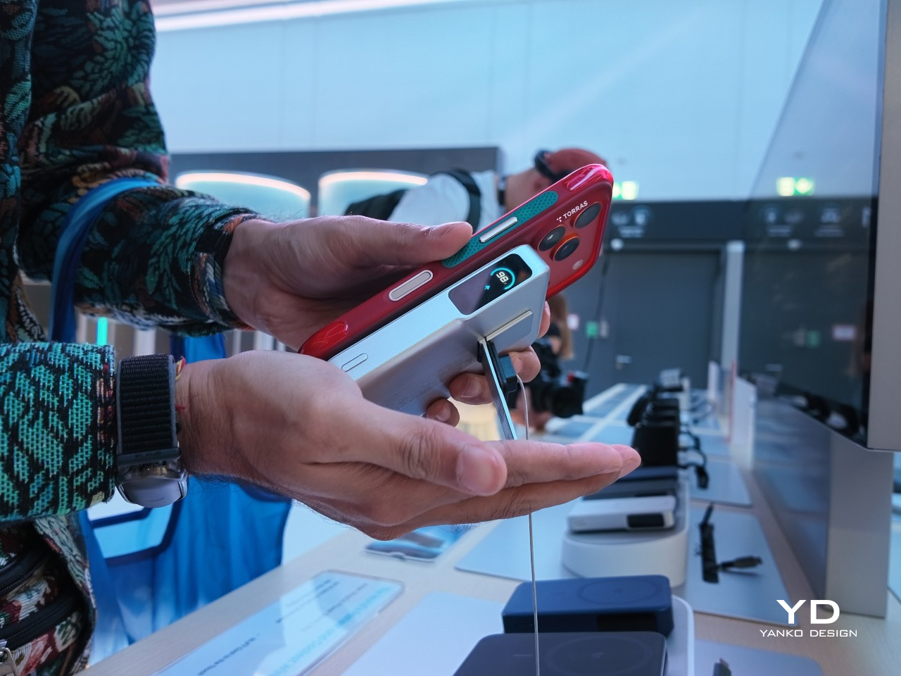
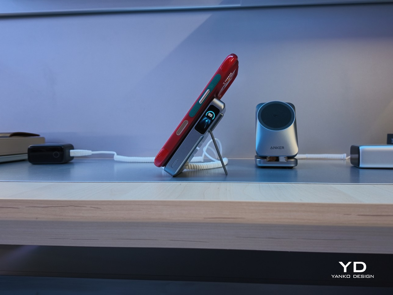
A built-in kickstand does double duty here, letting the phone sit upright on a nightstand or kitchen counter while it charges, which matters more than it sounds once a video call or a recipe needs both hands. The full-color display adds a layer most competitors skip entirely, showing time, weather, and charging status while also recognizing which iPhone model is currently attached.

Overnight charging gets its own dedicated logic. A mode Anker calls Overnight Care paces the charging curve so a phone hits full charge right before a preset alarm rather than sitting at 100% for hours, a small design choice that quietly extends battery health over time. It is the kind of detail that rewards people who plug in before bed and forget about it until morning.

None of this comes at the cost of portability. The Pro 2 weighs 220g and supports every MagSafe iPhone from the 12 through the 18 series, meaning the hardware inside doesn’t demand the newest phone to make sense. Anker offers it in Phantom Gray, Starlight Silver, and Polar Night Blue, colorways that lean muted rather than flashy, fitting a device meant to sit on a desk without asking for attention.

At $109.99, the Pro 2 sits well above impulse-buy territory, positioning itself as a considered upgrade rather than a stocking-stuffer accessory. Anker is betting that solving the heat problem, rather than simply chasing higher wattage numbers, is what actually makes a magnetic power bank worth carrying every day.

The post Anker Finally Solved Why Fast Wireless Charging Slows Down first appeared on Yanko Design.

ShiftCam’s $26 Stick-On Mount Finally Solves the Lens Case Problem

I’ve rebought the same phone case three separate times because I liked how it fit in my hand, how it aged, how it just felt like mine. So when phone camera lens systems started requiring a dedicated case to work, I felt a specific kind of resistance. Buying a great lens shouldn’t mean breaking up with a case I already love.

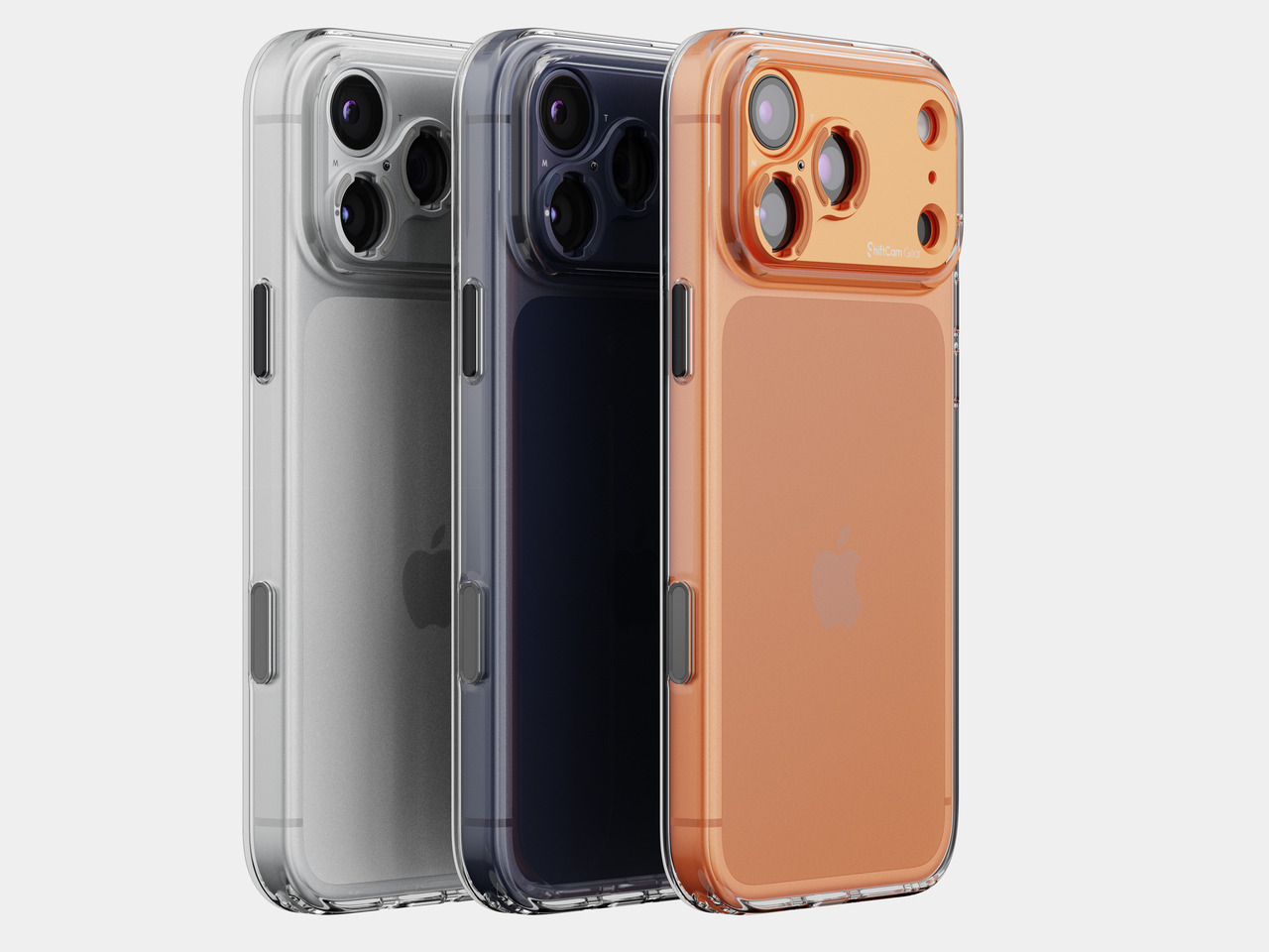
That’s the quiet friction a lot of mobile shooters have been living with. Attachable lens systems are genuinely great for stretching what a smartphone camera can do, but most of them are built around proprietary cases, which means the lens purchase quietly turns into a case purchase too. If you already own a case with the right grip, the right drop protection, the right look, you either give it up or give up on the lens.

Designer: ShiftCam

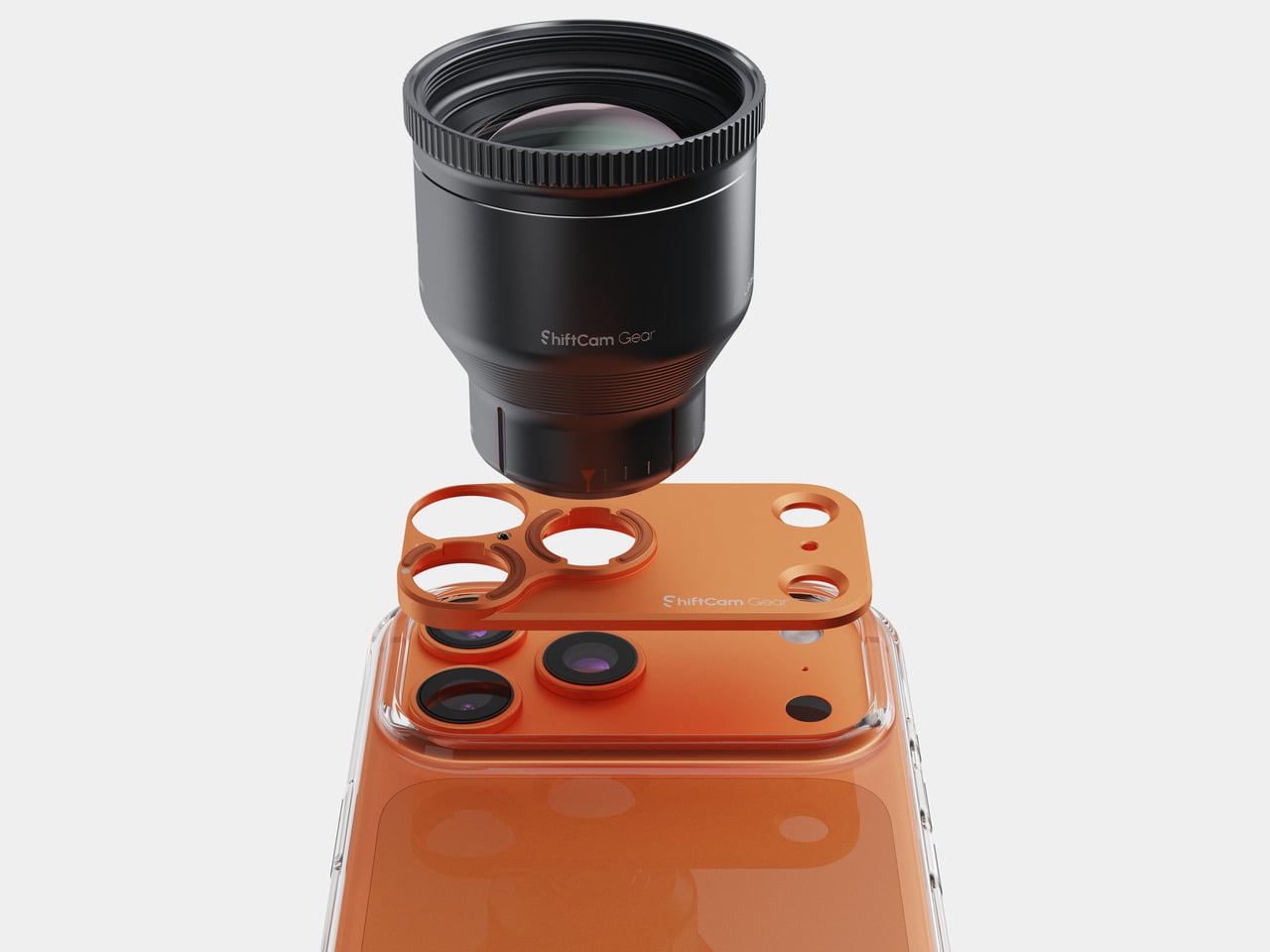
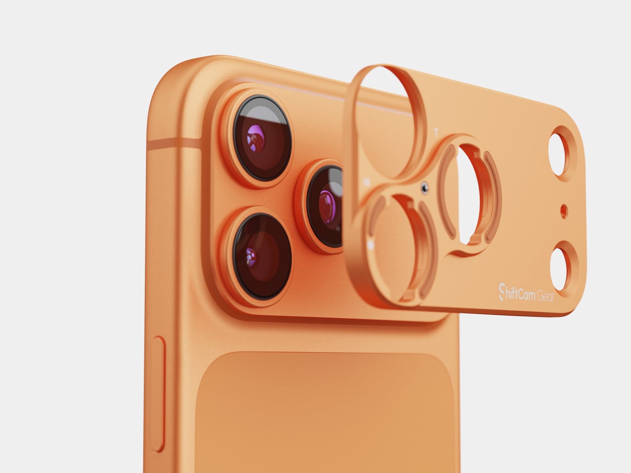
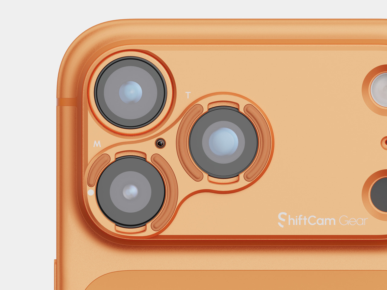
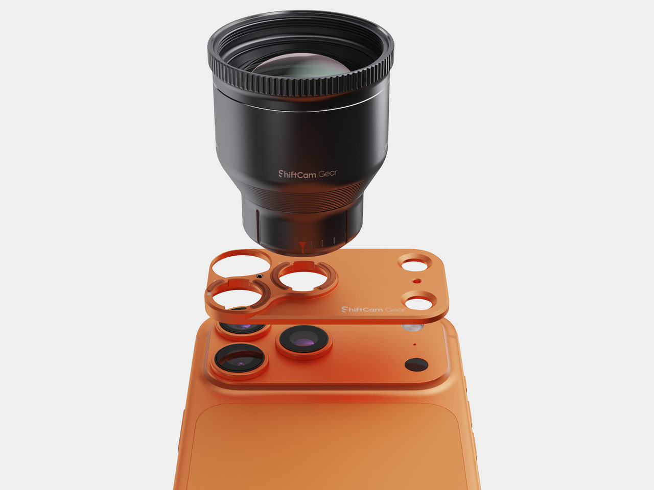
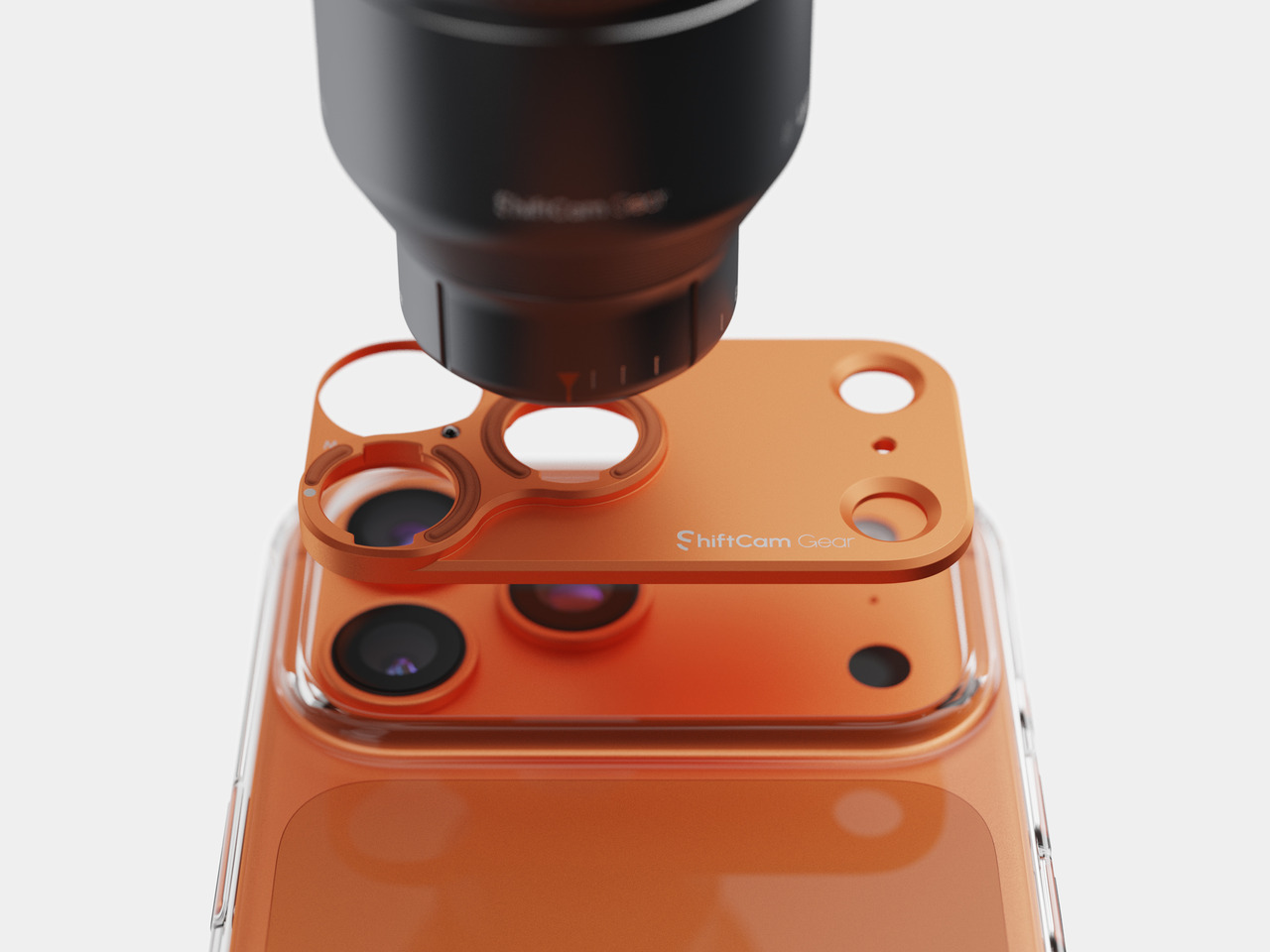
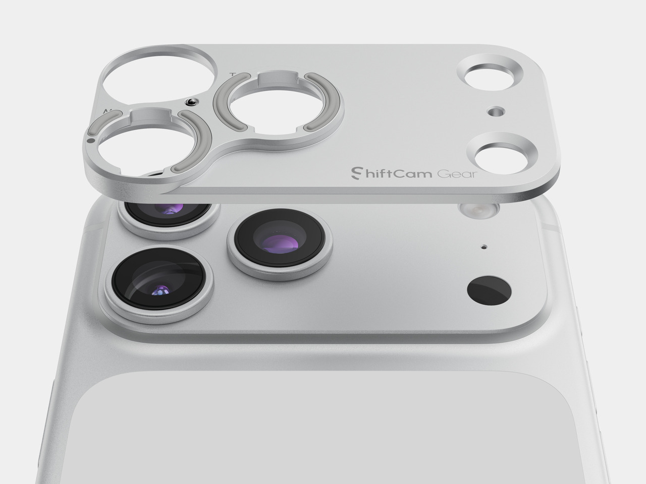
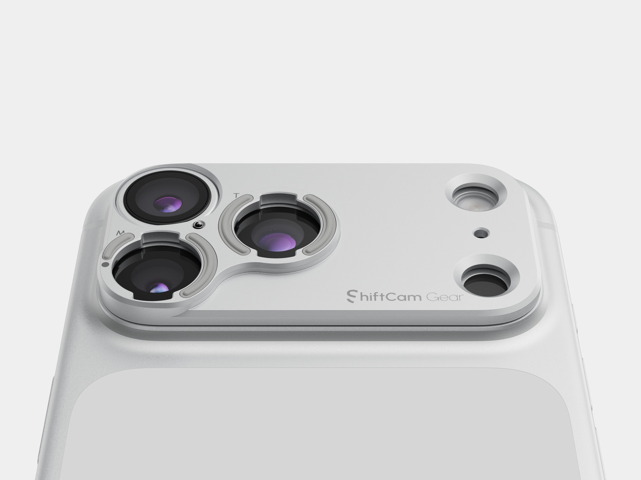
ShiftCam’s new Stick-On Lens Mount is aimed directly at that annoyance, and the way it solves it is where the design actually gets interesting. It comes alongside the brand’s new S.Mount Camera Case for the iPhone 18 Pro and Pro Max, but instead of asking you to adopt a whole new case system, it’s engineered down to almost nothing: a slim plate that sits flush against the phone’s existing camera housing rather than wrapping the whole device. As the company puts it, the plate exists for creators who prefer to use their existing phone case or want a more universal way to add ShiftCam optics, introducing a stick-on mounting solution that brings ShiftCam lens compatibility directly to the device.

That distinction matters more than it might sound, and it’s a design decision as much as a business one. A dedicated case is a fine solution if you’re starting from scratch, but plenty of people already have a case they trust, and asking them to replace it just to unlock a lens is a real barrier. The stick-on mount sidesteps that by treating the camera module, not the whole phone, as the design surface. It doesn’t try to be a case. It tries to disappear into one, and it does so at a price that feels almost like an afterthought purchase rather than a commitment. At $25.99, it’s priced closer to an accessory than a system upgrade, which is exactly the right instinct for a product meant to lower the barrier to entry rather than raise it.

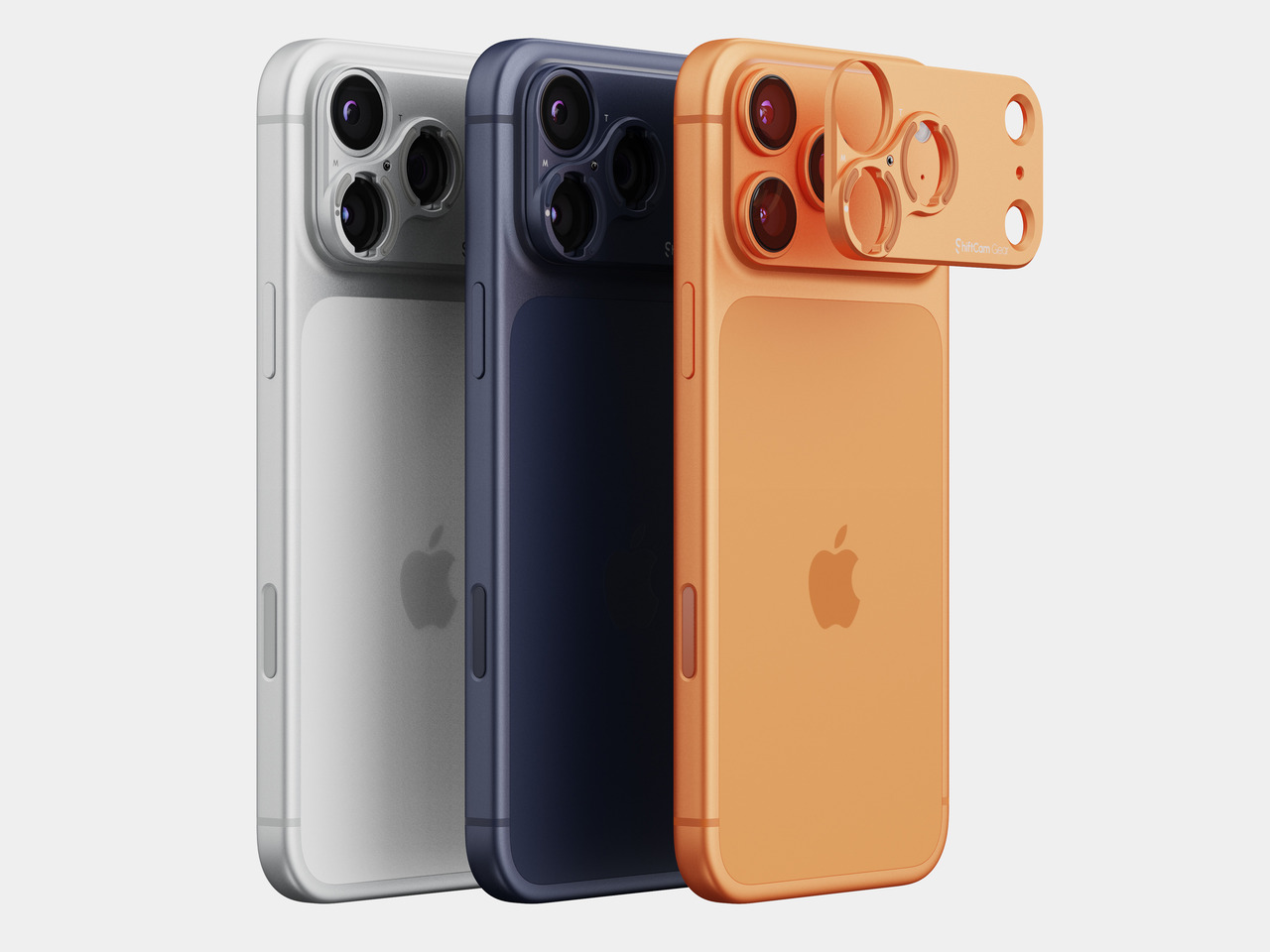
The renders make the design intent obvious. Rather than one universal black plate, the mount comes finished to match the phone’s own colorway, sitting over the lens cluster in a tone that reads more like a factory camera bump than a bolted-on accessory. That’s a small detail, but it’s the kind of thing that separates a mount you tolerate from one you don’t mind looking at every day. Good hardware design for something this small isn’t about adding presence. It’s about matching the object it’s attached to closely enough that it earns the right to be there.

The engineering underneath that quiet finish still has to hold up. ShiftCam’s case-based S.Mount system uses a 90-degree twist lock to keep lenses aligned precisely over the phone’s sensor, and that same alignment logic has to translate into a plate thin enough to hide under a case. Its X.Series lenses lean on fluorite crystal elements and a proprietary coating specifically so that optical magnification preserves resolution and detail rather than relying on digital cropping, while minimizing color fringing and maintaining edge-to-edge clarity. None of that precision matters if the mount holding the lens in place is flimsy or poorly toleranced, which is why a stick-on plate is a harder design problem than it looks. It has to be nearly invisible and mechanically exact at the same time.

There’s a broader philosophy here too, one I actually appreciate. ShiftCam’s CEO framed the company’s newest lineup around removing friction between having an idea and being able to capture it, with the goal of helping creators get more from the lenses they already own, whatever setup they’re starting from. A stick-on mount is a small, unglamorous way of living out that idea through design rather than marketing language.

I won’t pretend a stick-on plate is as elegant as a fully integrated case, and if you’re buying a phone brand new, the case-based mount is probably still the tidier option. But for everyone else, the ones who already found a case they’re not willing to give up, this is the more honest solution. It doesn’t force a tradeoff between protecting your phone and expanding what it can shoot. It just quietly gets out of the way and lets the lens do the talking, which is really all good design should ever do in the first place.

The post ShiftCam’s $26 Stick-On Mount Finally Solves the Lens Case Problem first appeared on Yanko Design.
Scosche’s GloBright Is the Lava Lamp That Also Charges Your Phone

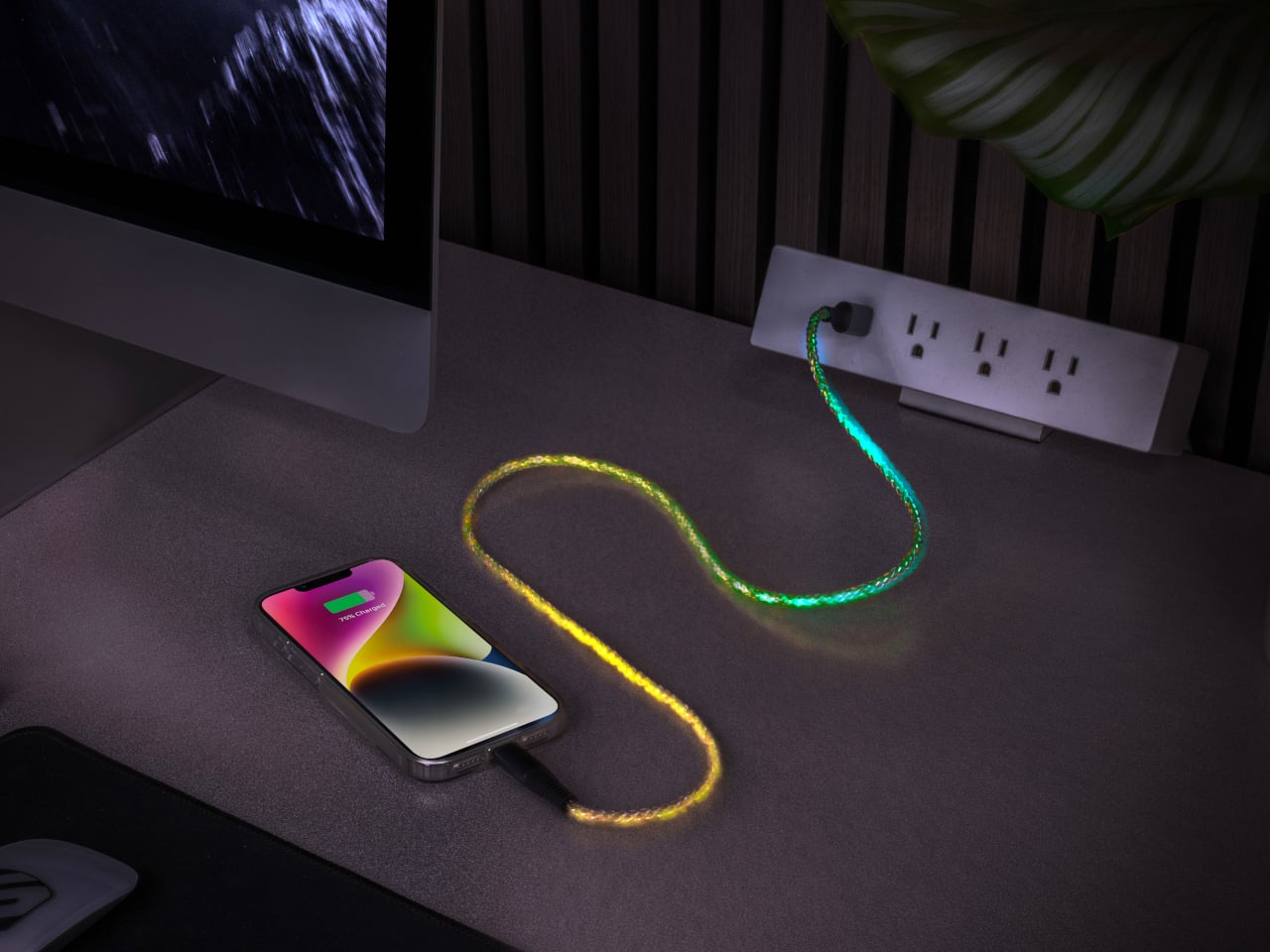
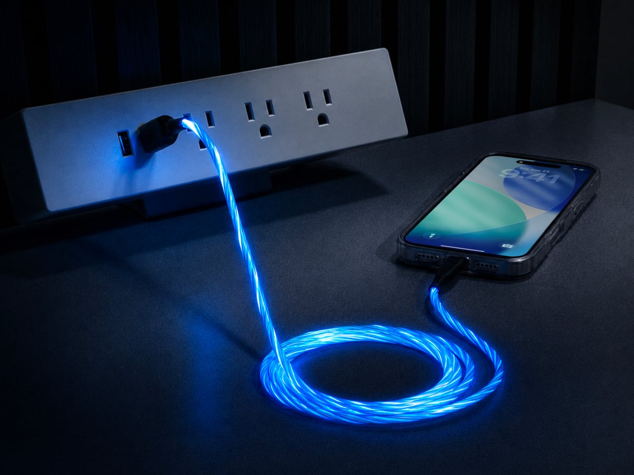
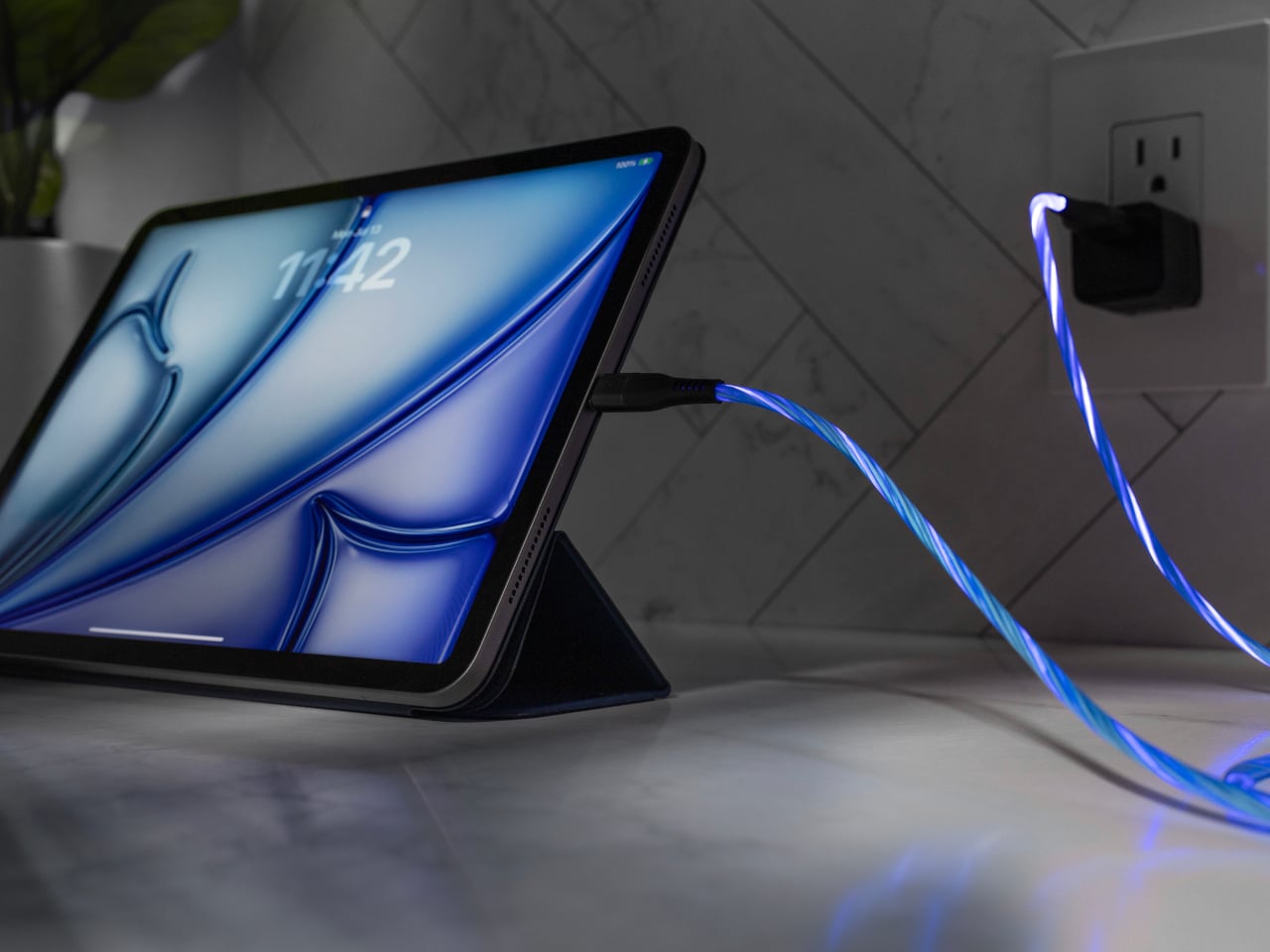
Scosche built a charging cable that refuses to hide once the lights go out. The GloBright MultiColor Glowing LED Charging Cable, developed with Statik and introduced at IFA 2026, takes the most overlooked object on any desk and turns it into something that actually draws the eye. Instead of a black cord disappearing into shadow behind a laptop, this one glows its way across the room.

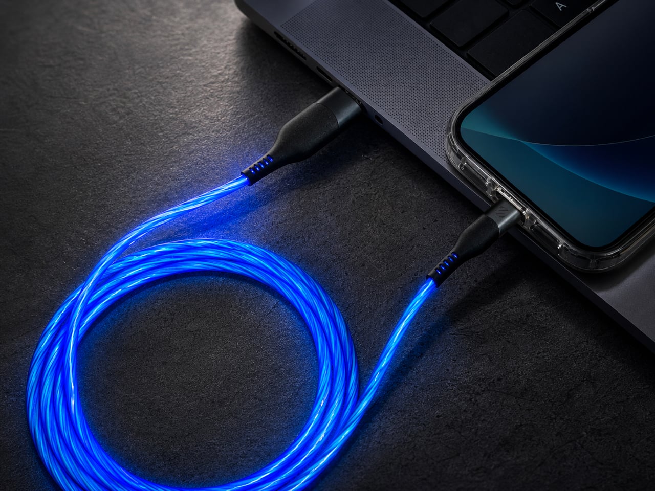
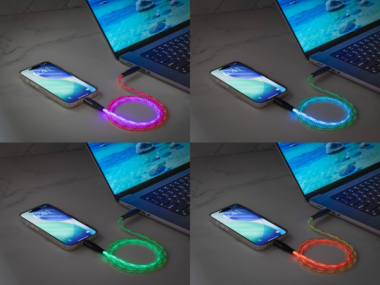
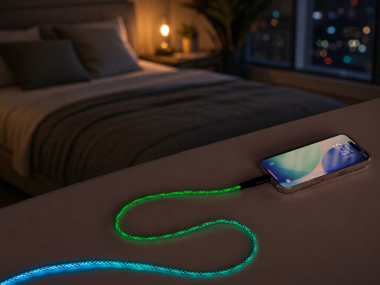
That glow runs through the cable’s full length rather than sitting confined to the connector tips, so a coiled loop on a nightstand reads more like a lit sculpture than a charging accessory. Colors shift gradually along that length too, pink bleeding into purple, blue fading toward teal, giving the cable a slow-motion animation instead of a static single hue that gets boring after the first week of ownership.

Designer: Scosche

None of that visual flair comes at the cost of actual charging performance. Scosche built the GloBright cable to support up to 60W of fast charging for USB-C devices, alongside reliable data transfer, so a phone plugged in overnight wakes up fully charged just like it would with any premium braided cable. The lighting effect runs as a bonus layer on top of specs that already hold up on their own.

Durability gets equal attention. The 3-foot cable relies on premium materials throughout its construction, aiming for a build that survives the daily abuse of getting yanked out of a bag, wound around a charger, or stepped on near a bed frame. Scosche also sells a companion Blue Glowing LED cable in a longer 4-foot option, giving anyone who prefers a single steady color an alternative to the multicolor version’s shifting palette.

Where this cable earns its keep is in the spaces most charging accessories try to disappear from. A gaming setup gets an extra strip of ambient light without needing a separate RGB kit. A bedside table gets a soft, shifting glow that also happens to be topping off a phone overnight. Even a cluttered desk benefits, since a glowing cable is far easier to locate in a tangle of cords than a plain black one ever was.

Scosche prices the GloBright MultiColor cable at $17.99, positioning it well within impulse-purchase territory for anyone shopping for a charging cable anyway. At that price, the lighting effect functions less like a premium upsell and more like a free upgrade bundled into a cable people needed regardless. Buying a charging cable rarely feels like a decision worth thinking about, and Scosche seems to be betting that a little glow is enough to change that.

The post Scosche’s GloBright Is the Lava Lamp That Also Charges Your Phone first appeared on Yanko Design.
Acer’s Packard Bell Crashed IFA 2026 Like a Box of Crayons

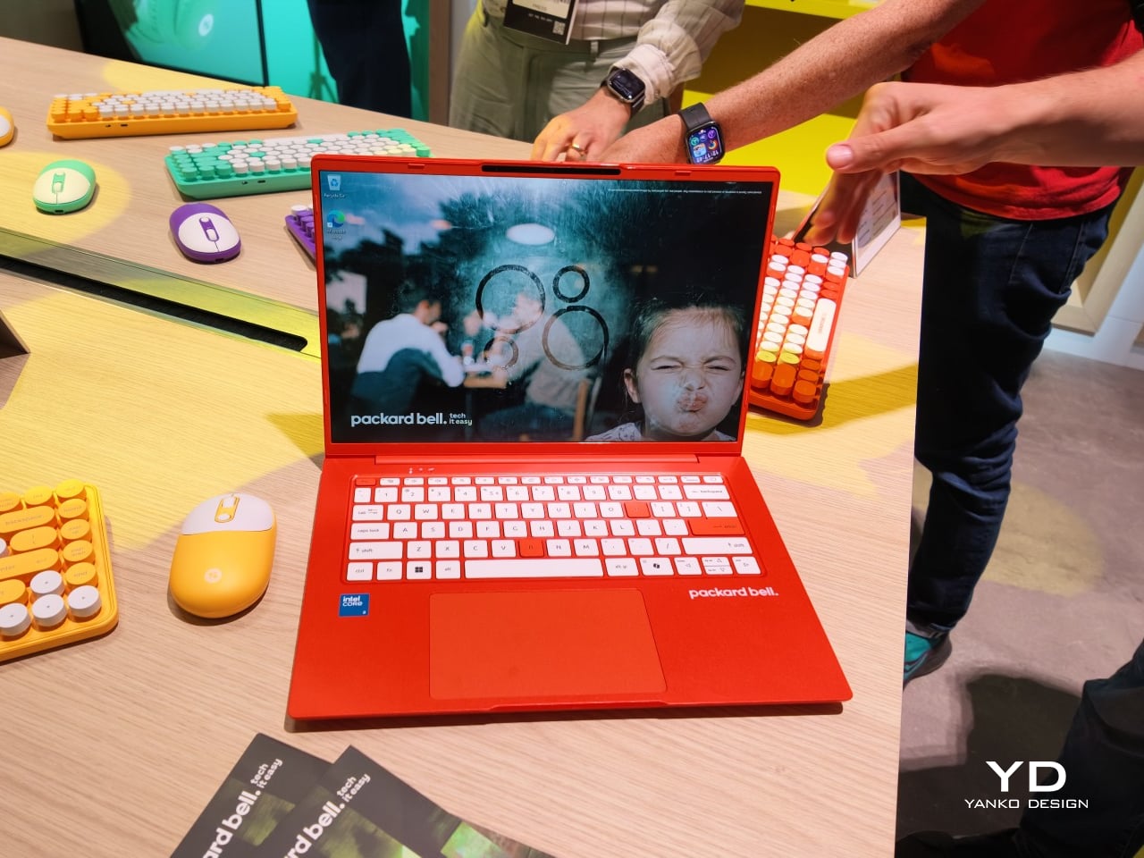
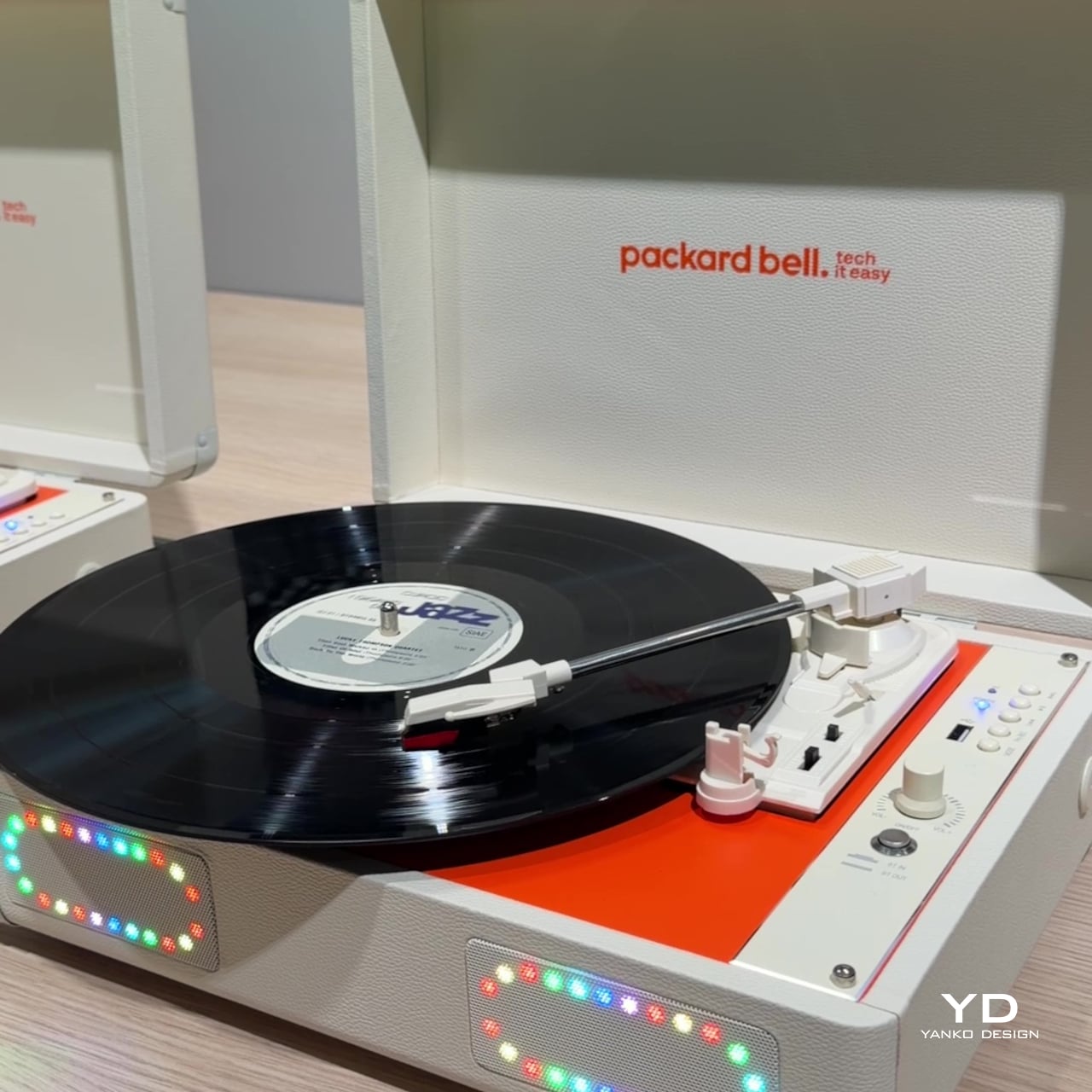
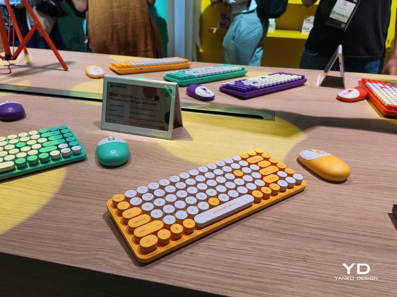
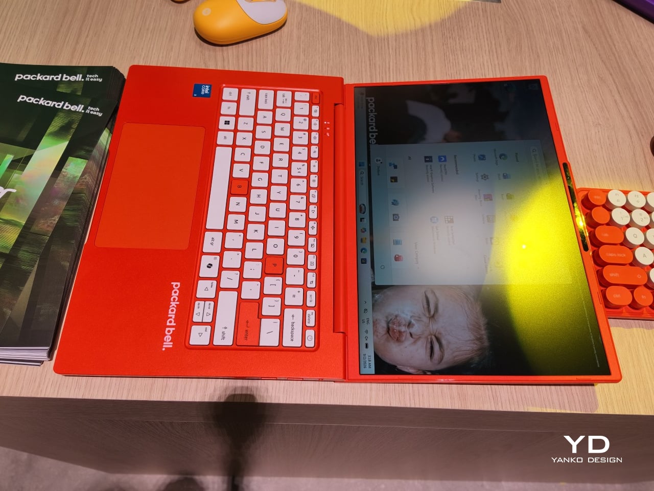
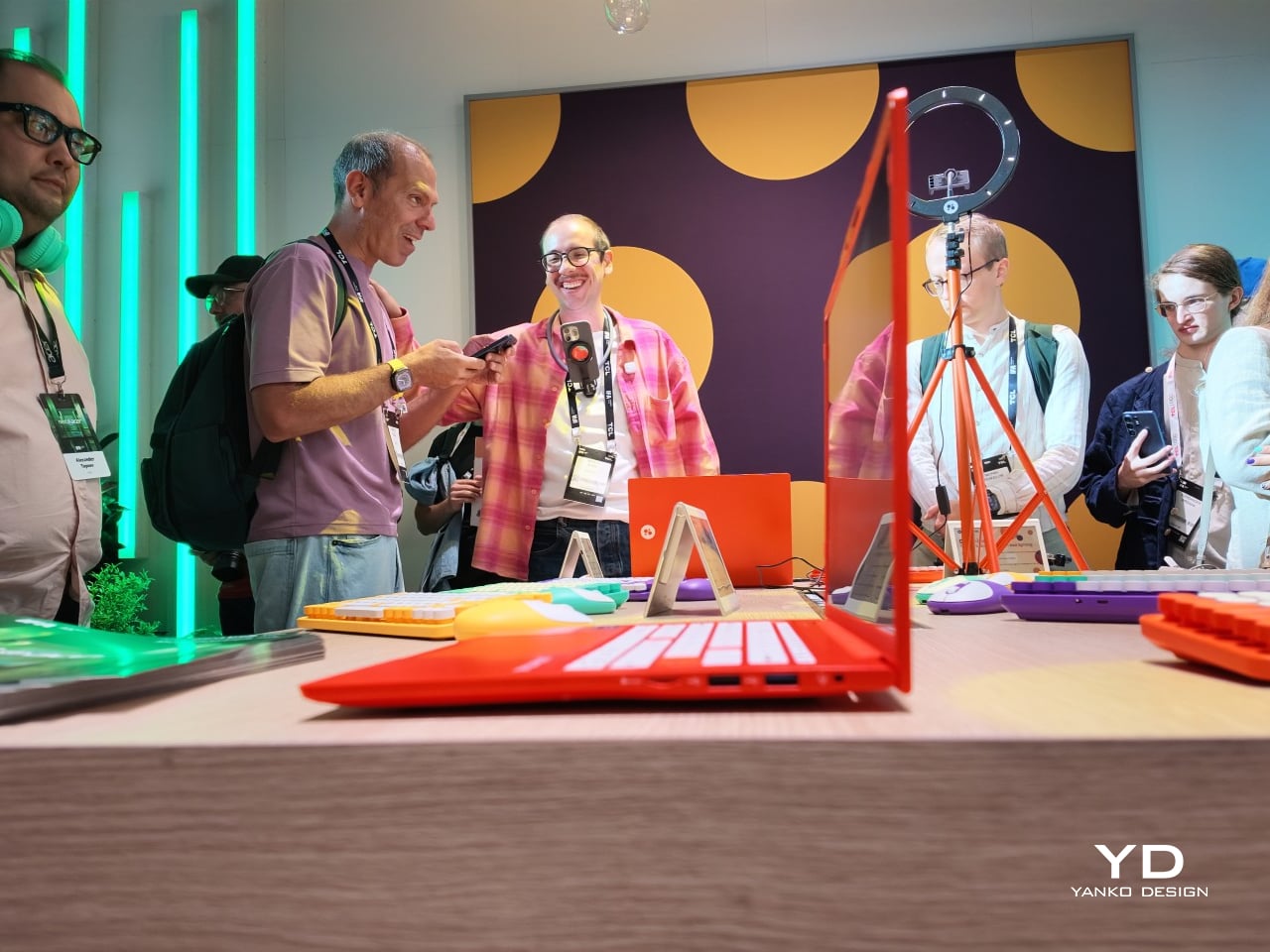
Packard Bell spent a century teaching people that new technology doesn’t have to feel intimidating, and its 100th birthday present to itself leans hard into that idea. Under Acer’s ownership, the brand relaunched at IFA 2026 with a philosophy it calls “Tech it easy,” built around a lineup that trades beige plastic and quiet corporate design for colors loud enough to notice from across a room. Four products anchor that comeback, and each one argues that everyday tech gains something when it stops taking itself so seriously.

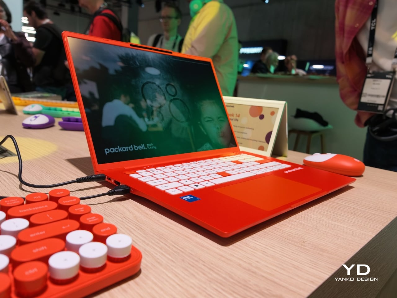
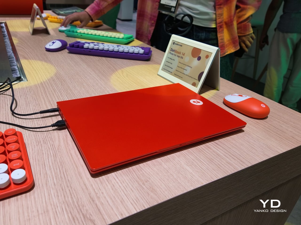
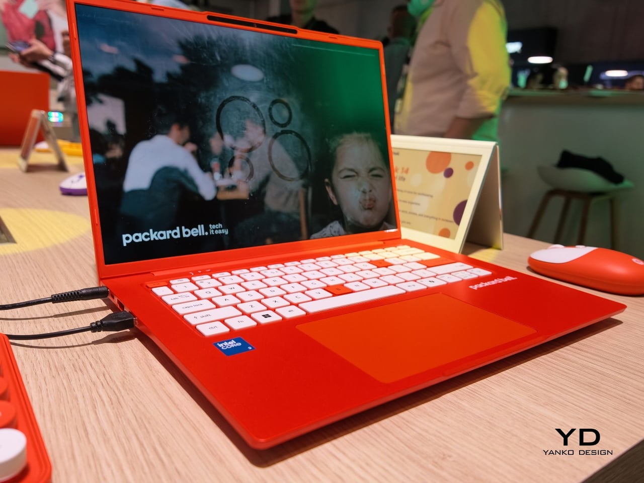
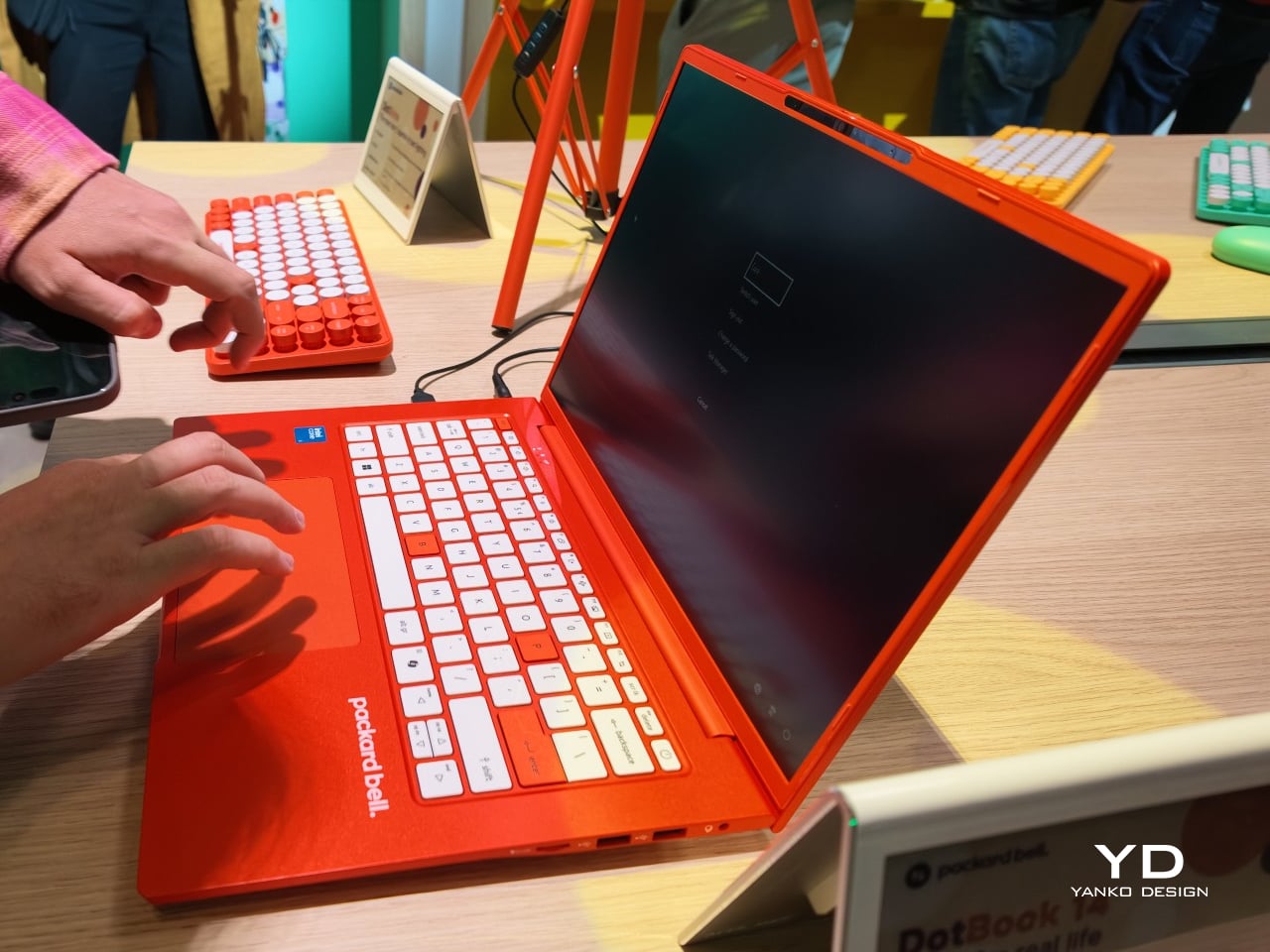
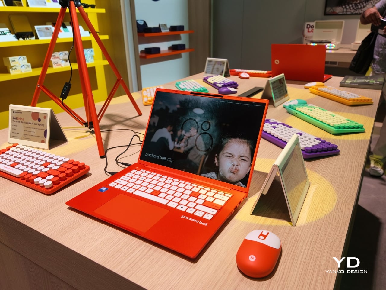
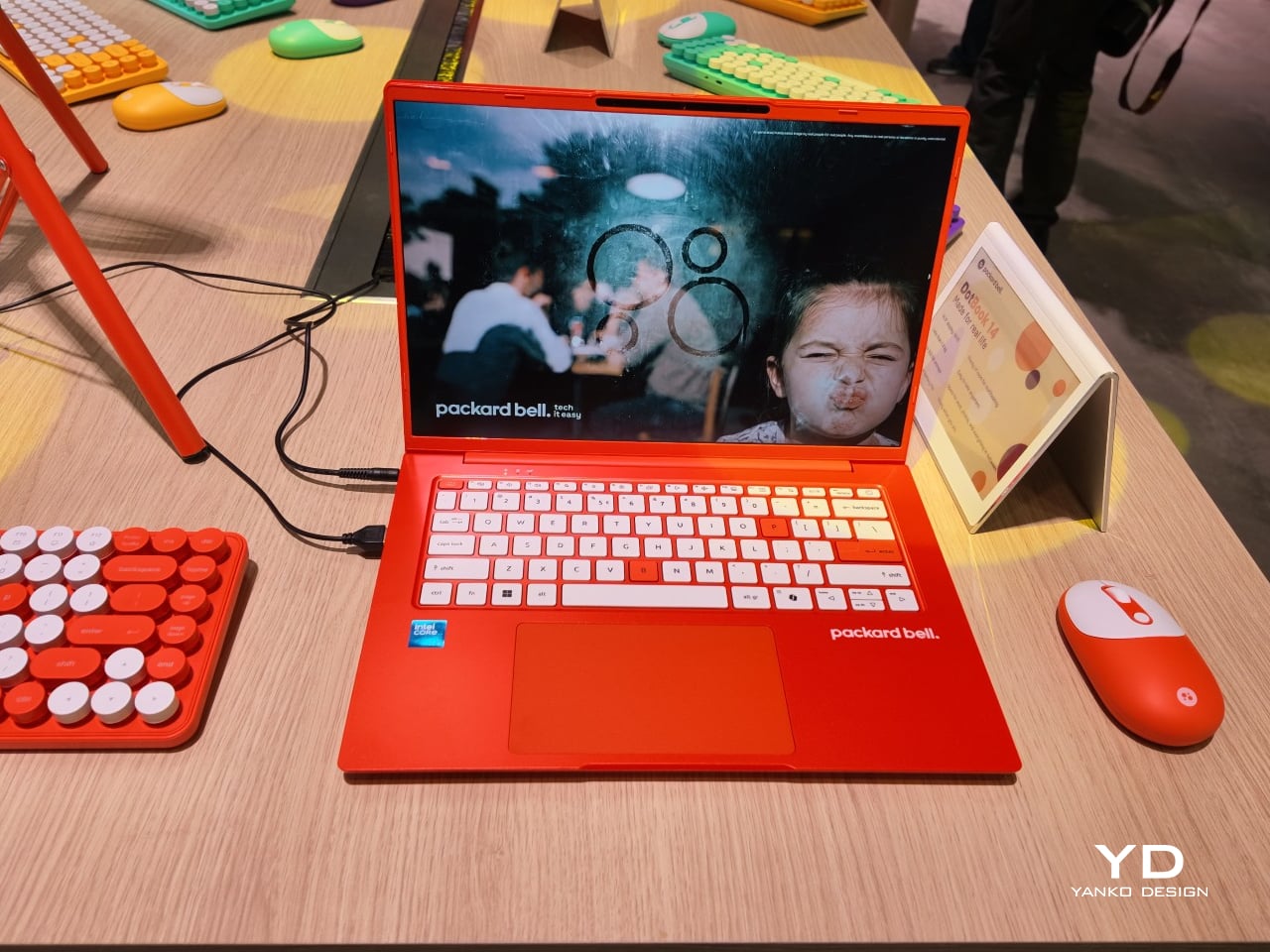
The DotBook carries the heaviest expectations as the collection’s flagship, a 14.5-inch laptop finished in a red-orange shell bright enough to spot on a crowded coffee shop table. Weighing under 1.3 kg and measuring just 17.9mm thin, it’s built for browsing, streaming, and everyday work rather than chasing benchmark scores, backed by up to 512GB of storage and 16GB of memory running quietly under Windows 11. It’s a laptop designed to disappear into a bag, not a spec sheet debate.

Designer: Acer

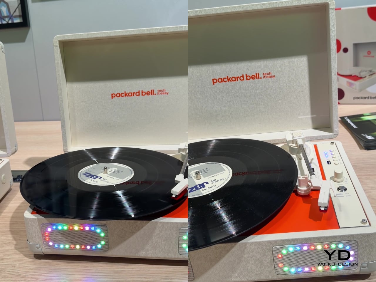
Where the DotBook plays it relatively straight, the DotLoop commits fully to spectacle. Housed inside an actual briefcase shell with a 1970s silhouette, the turntable pops open to reveal a working tonearm flanked by RGB-lit speaker grilles that glow while a record spins. Two built-in 3W speakers handle sound on their own, though Bluetooth and RCA outputs let the DotLoop hand audio off to a proper stereo system whenever the moment calls for something louder.

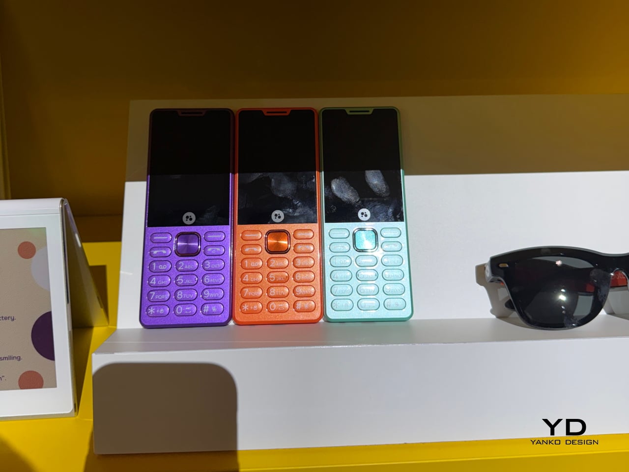
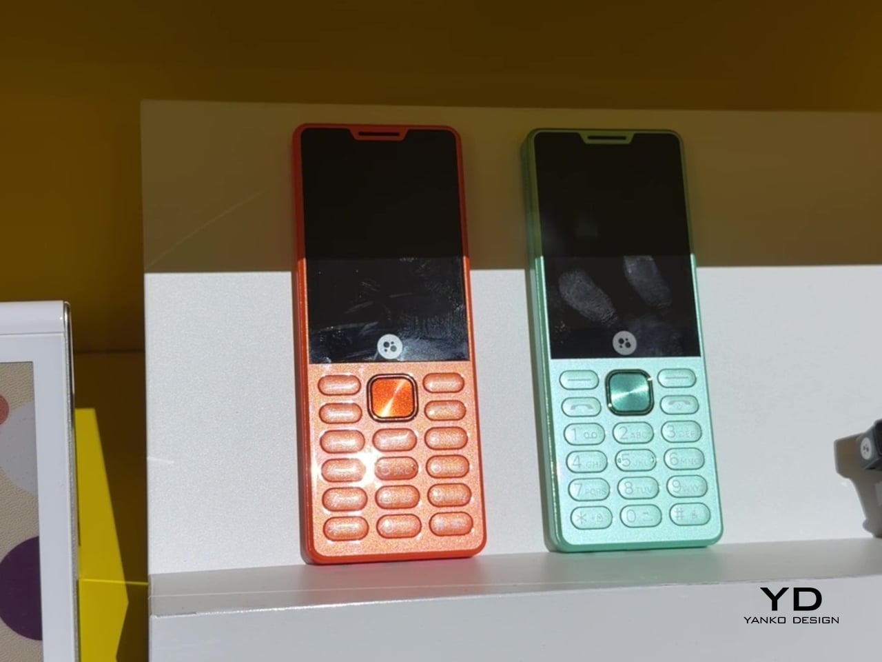
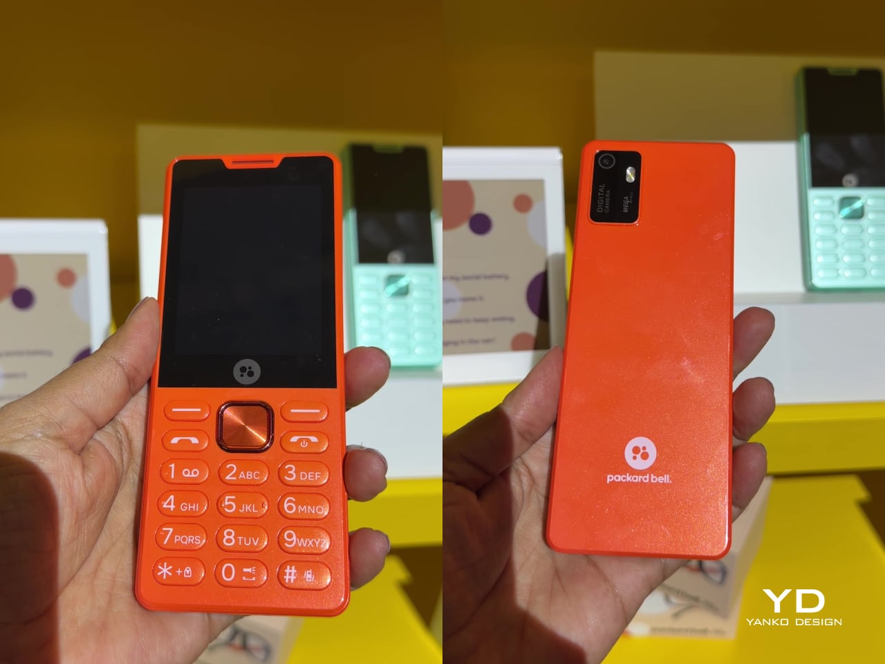
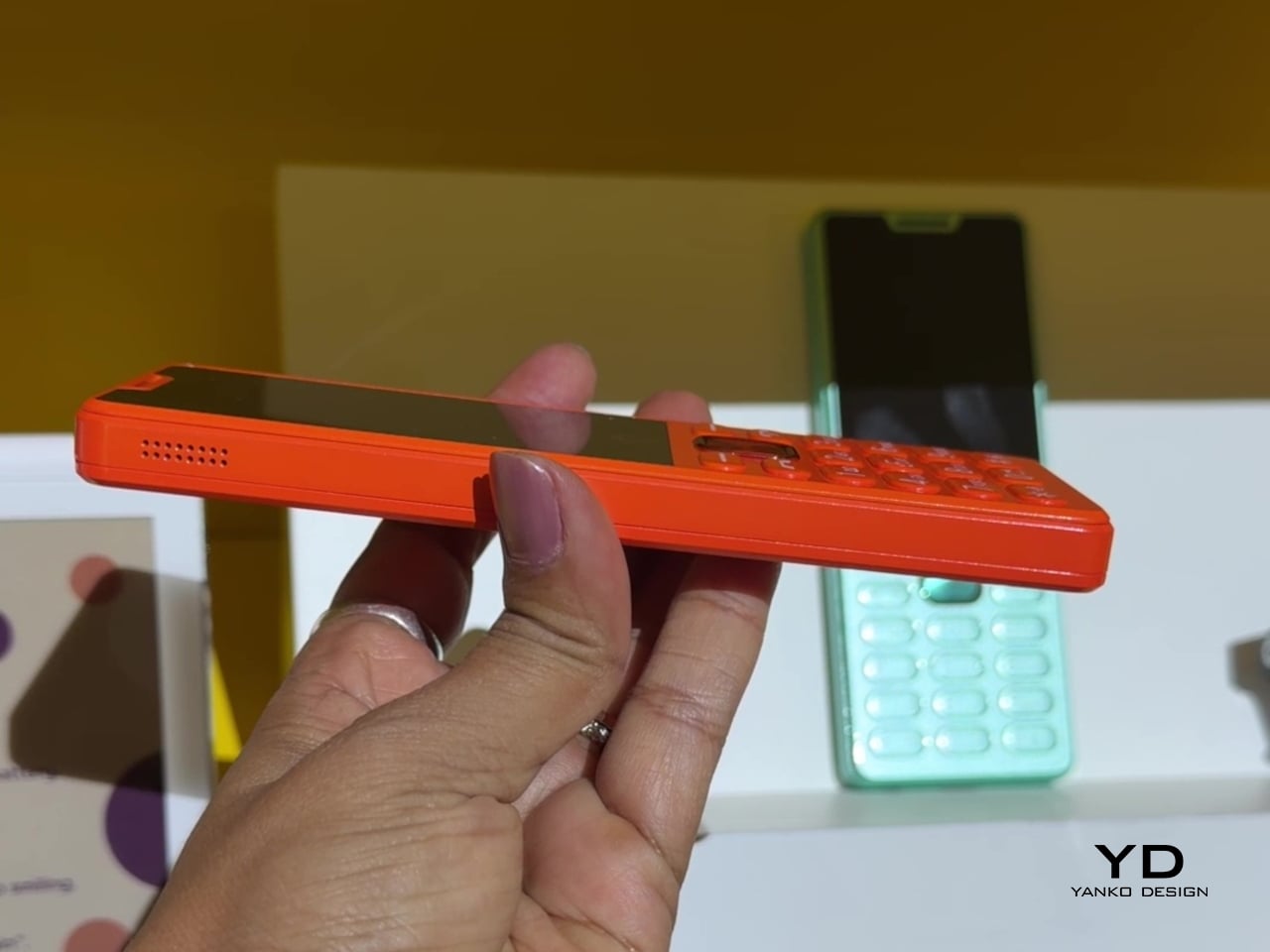
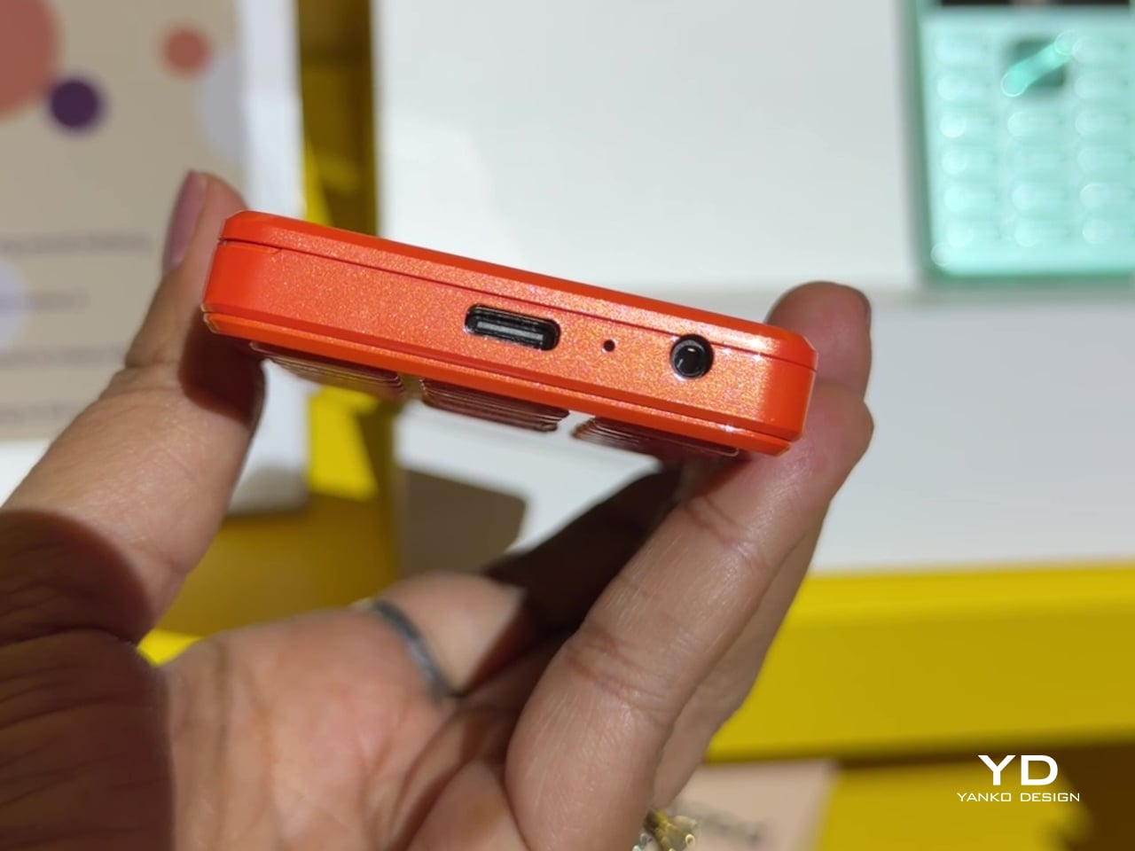
That willingness to have fun with format extends into the DotLine, a feature phone built for anyone tired of feeding a smartphone’s constant appetite for attention. A 2.8-inch display and physical keypad keep the experience deliberately simple, while an 1800mAh battery stretches across roughly two weeks between charges, a number that sounds almost mythical next to a modern flagship’s overnight anxiety. Four color options keep it from feeling like a consolation prize.

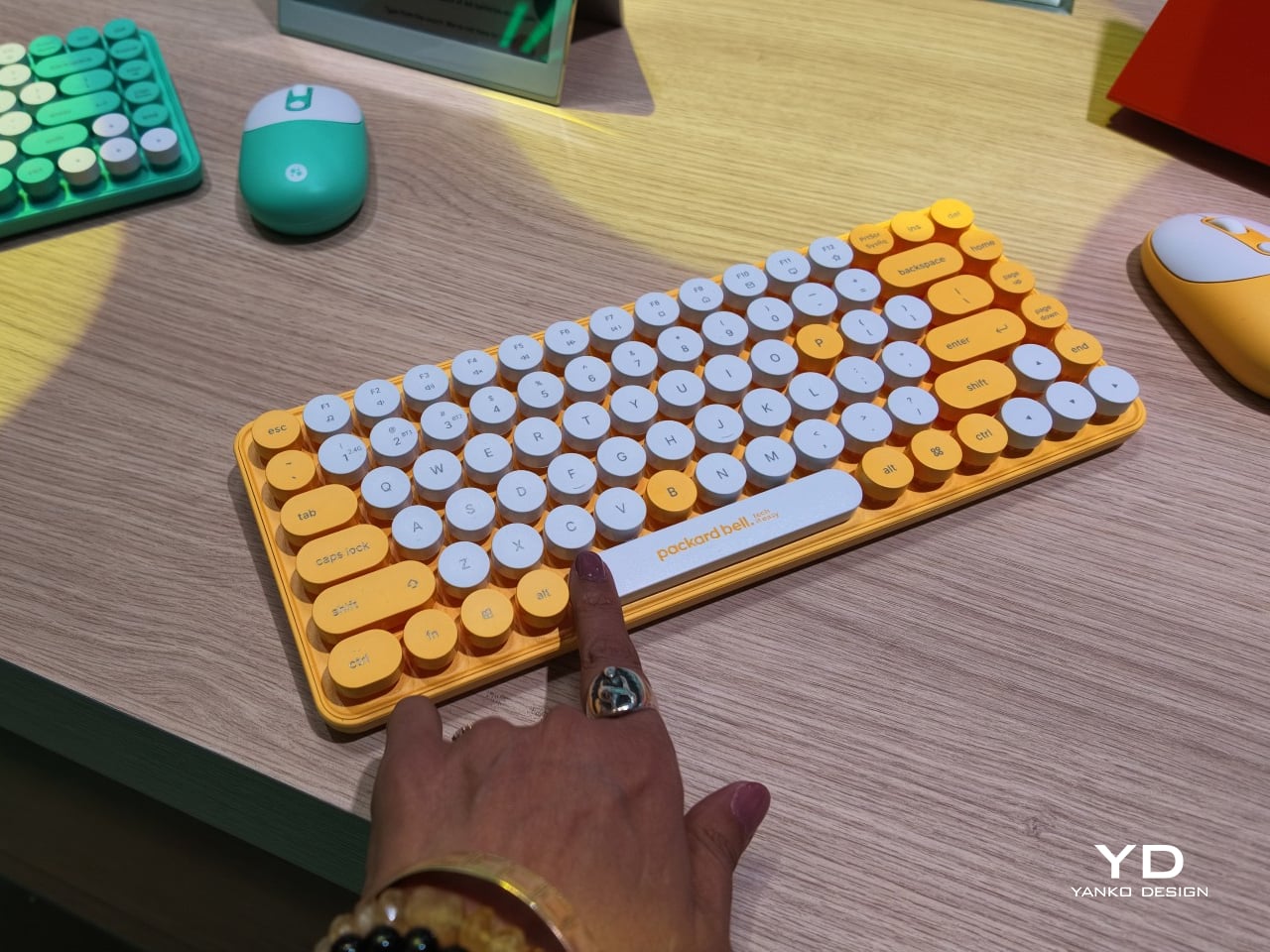
Rounding out the focus lineup, the DotCombo bundles a keyboard and mouse into a single color-matched purchase, eliminating the usual mismatched beige-on-black desk setup that so many peripherals default to. Both pieces run on rechargeable batteries good for hundreds of charge cycles, connecting over Bluetooth or a 2.4GHz receiver without a single AA battery required. Round keycaps borrowed from typewriter design give the whole thing a tactile, almost toy-like presence on a desk.

Beyond these four, Packard Bell rounds out its centennial collection with a portable speaker (DotTune), audio glasses (DotLook), a ring light for creators (DotShine), matching headphones (DotBass), and even a countertop food steamer (Steasy), all sharing the same saturated color palette and straightforward pricing. None of them ask for much attention individually, but together they paint a lineup unwilling to blend into a beige office shelf.

Pricing stays approachable across the board, with the DotBook starting around €499 (around $578), the DotLoop at €149 (around $173), the DotLine at €69 (around $80), and the DotCombo at just €39 (around $45). Packard Bell’s return proves that a century-old brand can still find something new to say, mostly by refusing to whisper it.

The post Acer’s Packard Bell Crashed IFA 2026 Like a Box of Crayons first appeared on Yanko Design.
Finally, a Smart Home You Can Control Without Your Phone

For some years now, the idea of a smart home has been more than just science fiction. We’ve watched lights, thermostats, speakers, security systems, and countless other devices become “smarter.” One issue with these connected homes, though, is that most of their controls are app-based, meaning you always need your phone handy just to turn something on or off. That’s why a dedicated smart home hub is such a welcome idea: a control center that doesn’t live inside your phone.

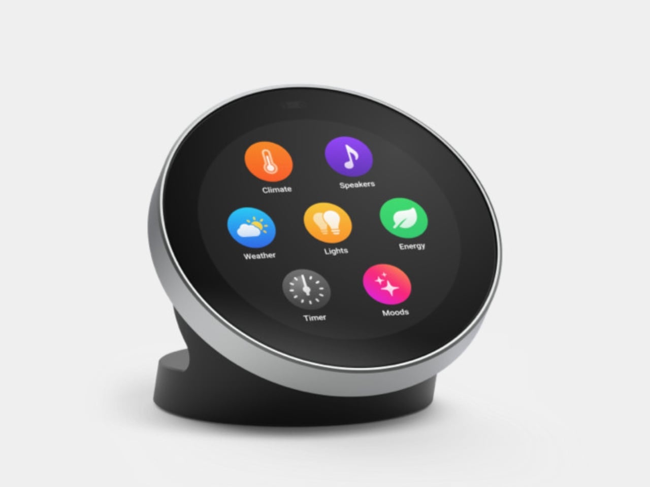
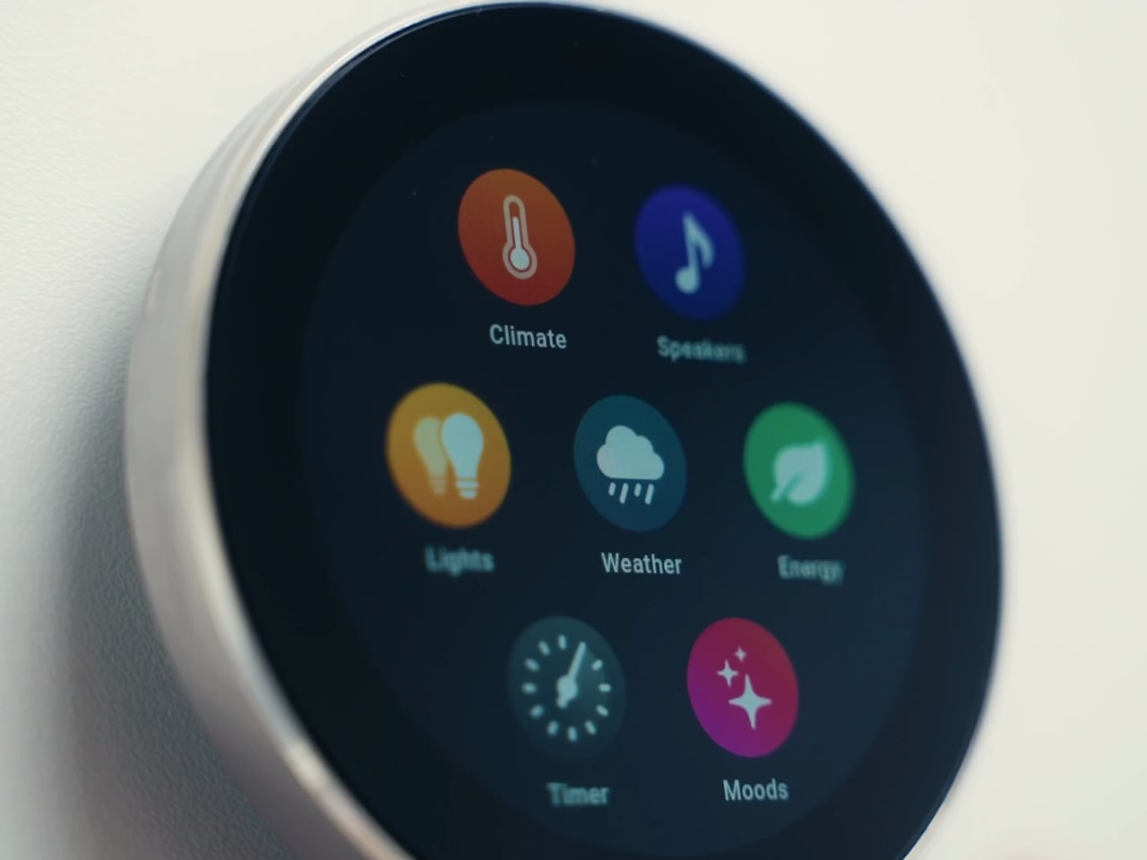
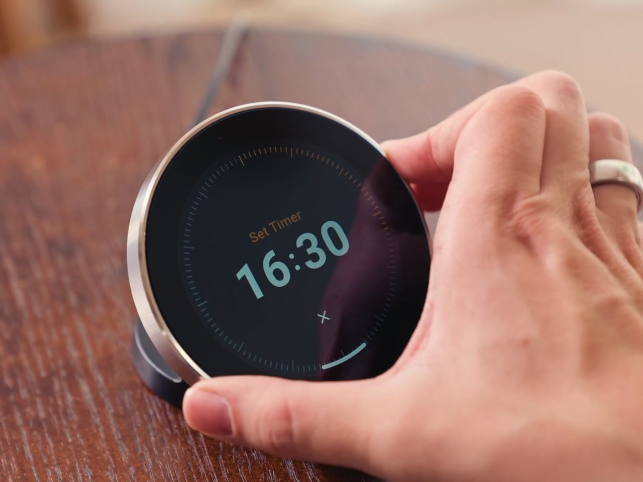
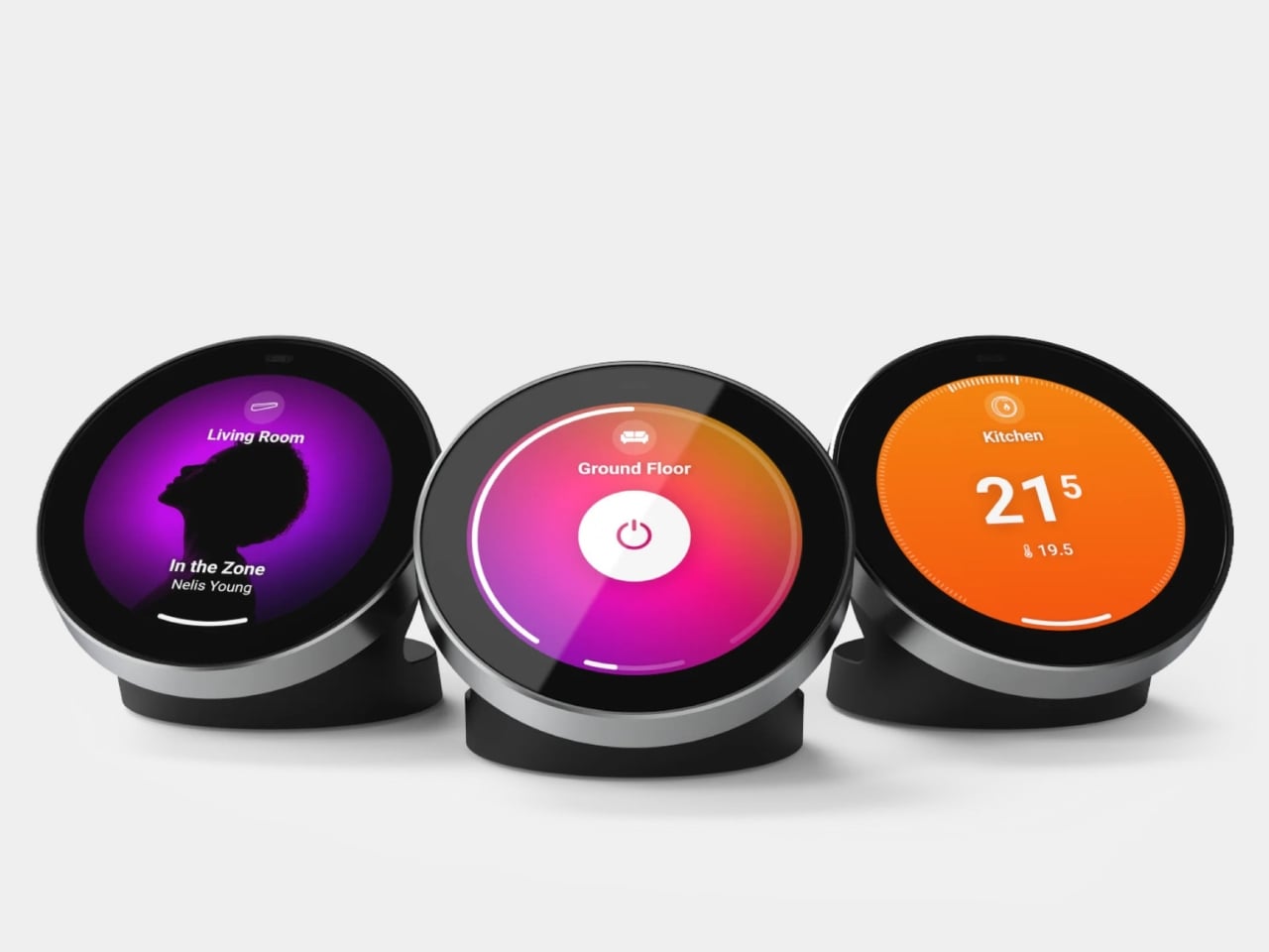
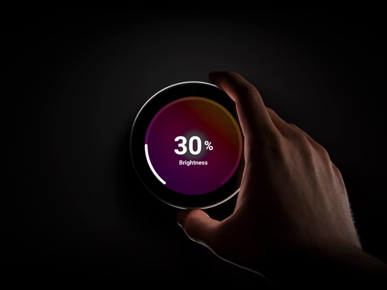
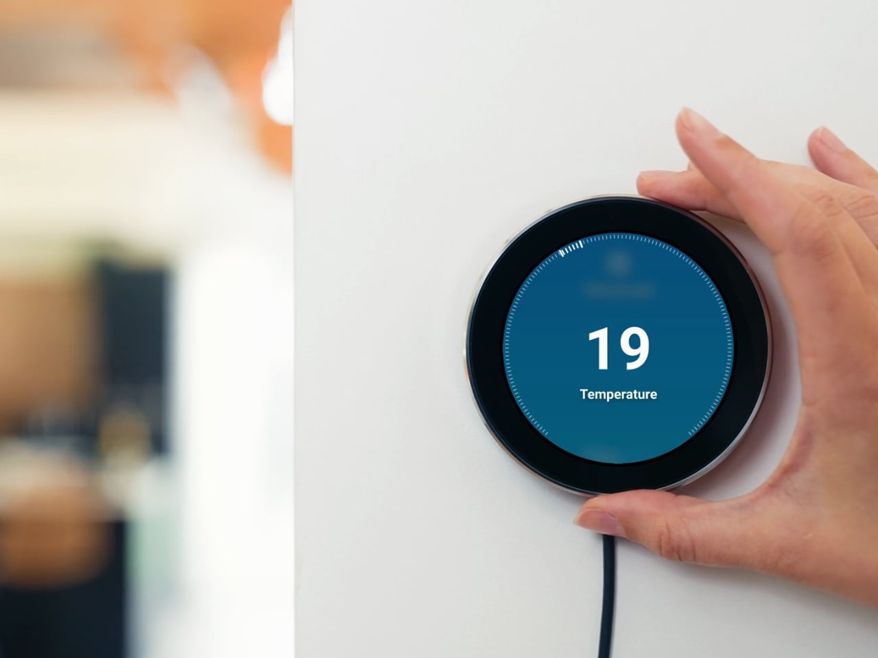
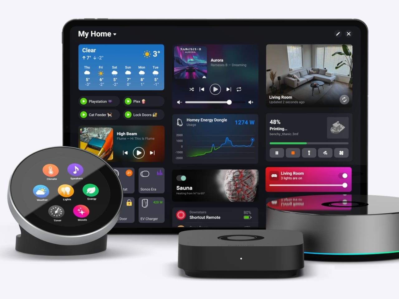
The Homey Portal, created by Dutch company Athom, is a physical smart home controller with a tactile surface that helps you manage all your connected devices. It lets anyone in your household do things like turn the lights on or off, see who’s at the door, check how much energy you’re using, find out what’s playing on your speaker, and trigger various other smart functions you’ve set up.

Designer: Athom

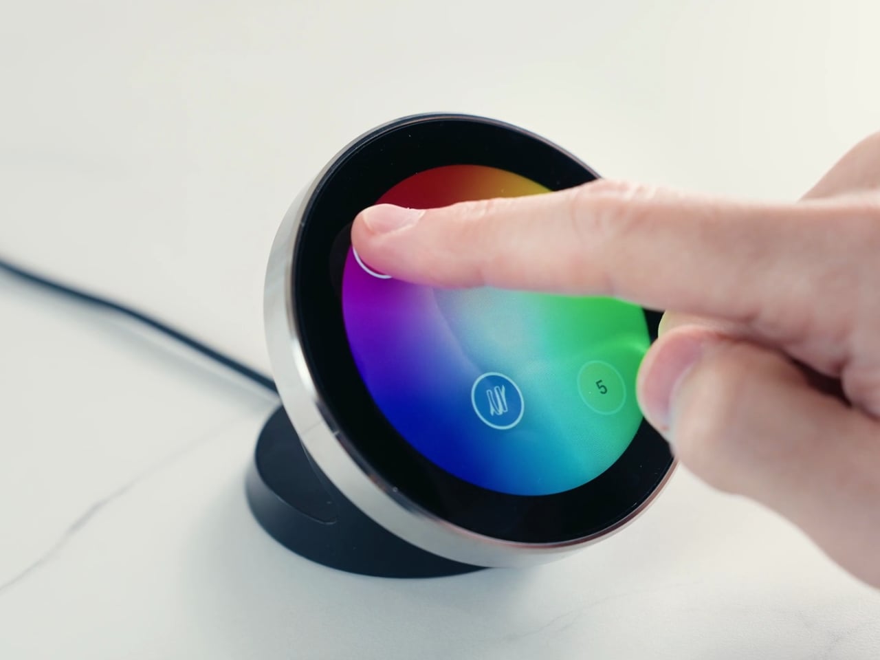
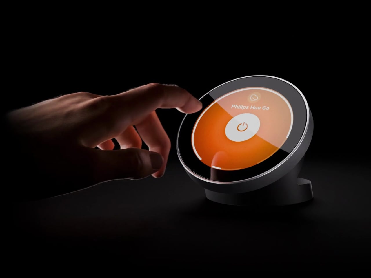
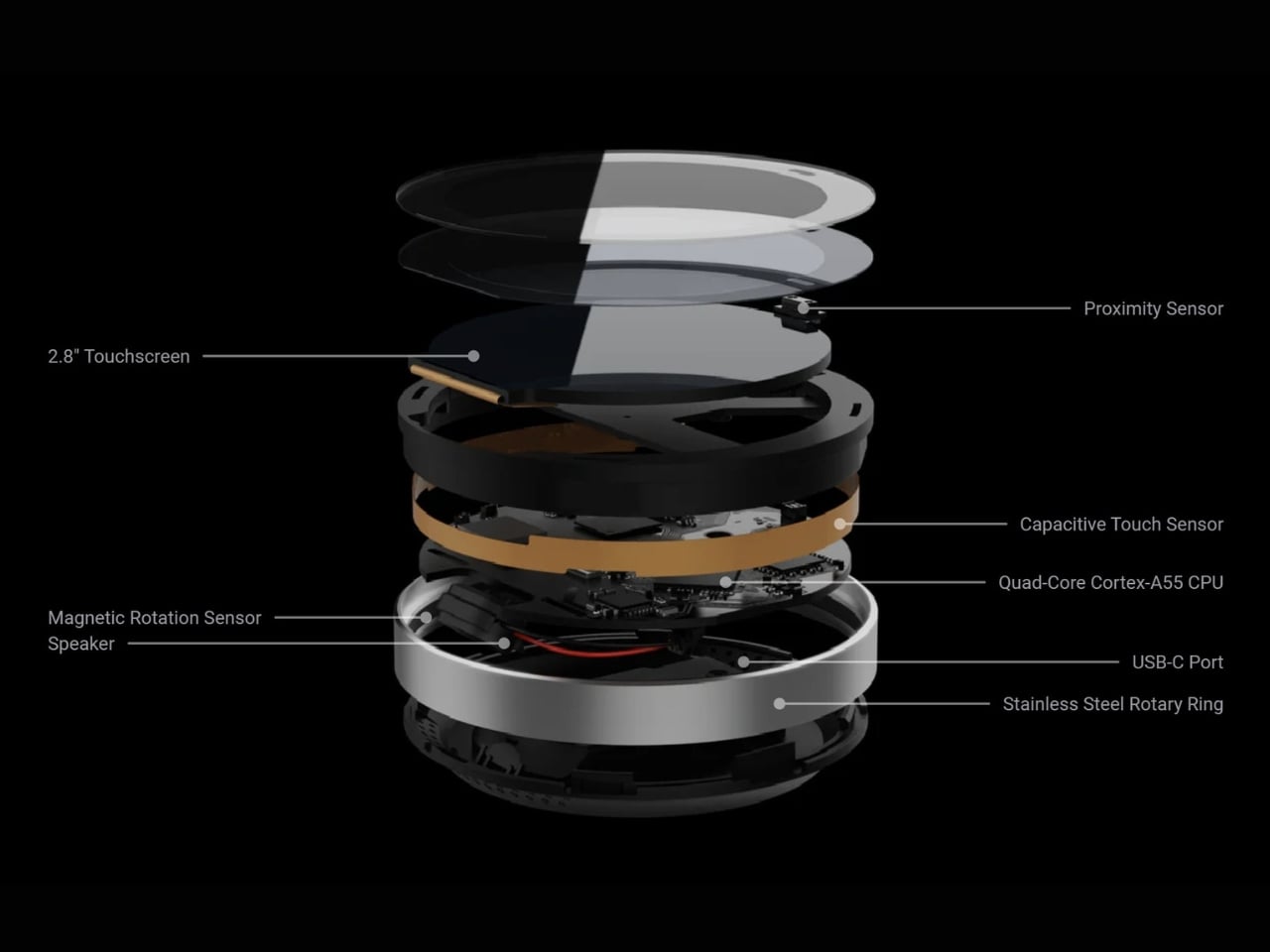
Having a physical smart home controller can be more convenient than relying on a phone-based one, and Homey proves it with this newly launched device. It features a 2.8-inch round touchscreen wrapped in a stainless-steel rotary ring. You can tap the screen to select and toggle your smart devices on or off, then twist the rotary dial to adjust things like brightness, volume, and temperature.

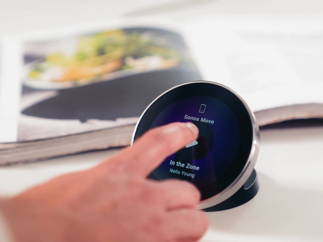
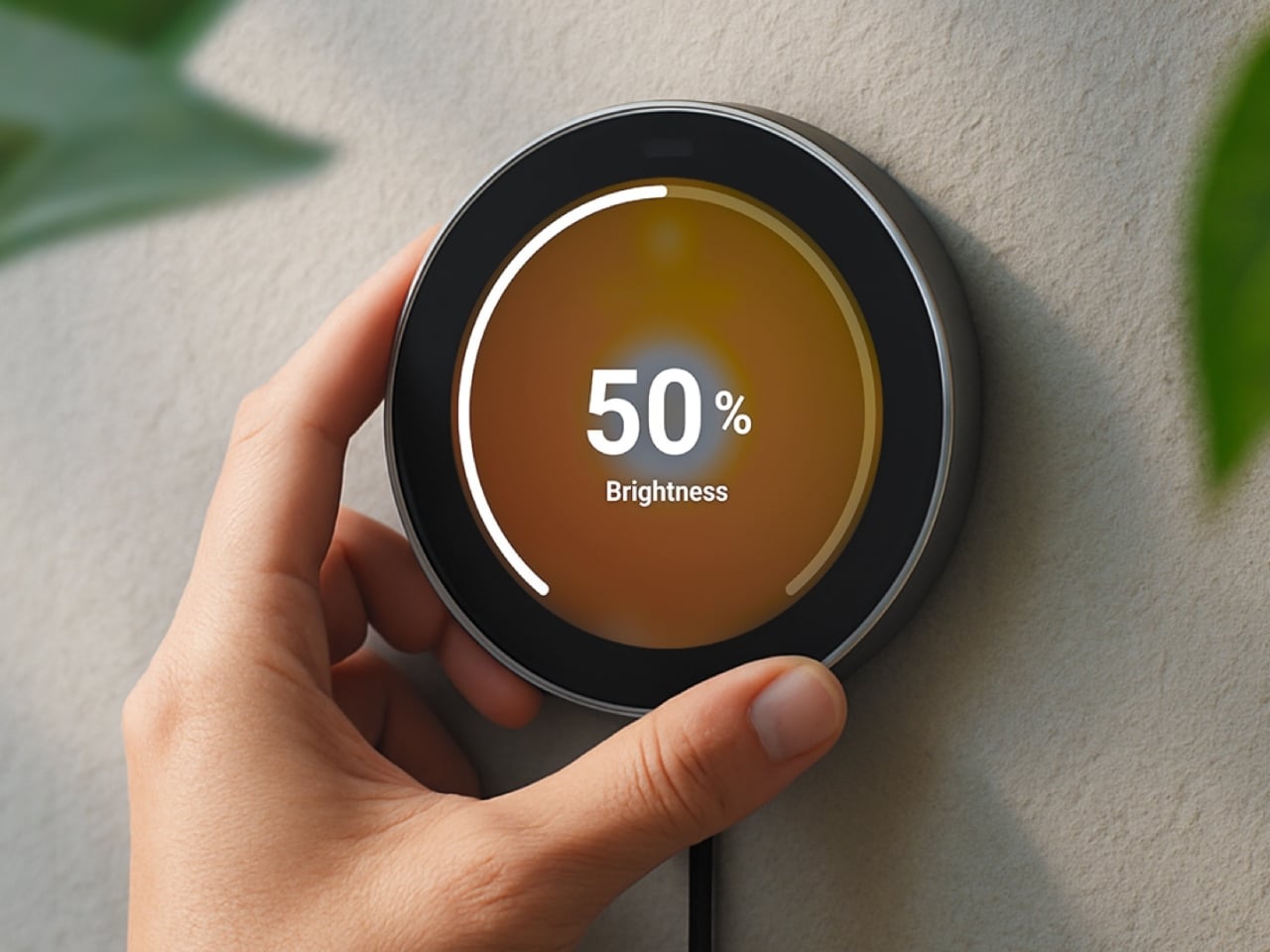
There’s a lot you can do with this little hub. If you have smart lights, you can turn them on and off and then twist the dial to dim or brighten them. It can also show the real-time temperature and humidity of your room, and you can twist the dial to adjust the temperature accordingly. If you’re playing something on your smart speaker, the screen displays the artist, track, and even the album art. From there, you can twist the dial to adjust the volume or swipe on the touchscreen to skip to the next song or go back to the previous one.

You can also set up Flow-based alerts, like a reminder to water your plants or a snapshot from your doorbell camera showing who just rang the bell. If you pair the Portal with a Homey Energy Dongle or another supported energy tracker, you can even check real-time household wattage, solar yield, and the cheapest hours to run your appliances.

The device itself is small enough to mount on a wall or simply place on your desk, side table, or countertop, whichever works best for you and the people you live with. It’s designed to work with the more than 70,000 devices from 2,000-plus brands that Homey already supports, as well as the broader Homey ecosystem, including Homey Pro, Homey Pro Mini, and Homey Cloud. The Homey Portal is available for pre-order now at an introductory price of $249, with the regular price set to rise to $299 once the first batch sells out. Orders are expected to start shipping before the end of the year, and every unit comes with both a desk stand and a wall mount included in the box, so you won’t need to buy any extra accessories to set it up wherever you like.

At its core, the Homey Portal is trying to solve a problem most of us didn’t even realize we’d accepted: that “smart” homes had quietly made simple tasks more complicated. Turning on a light shouldn’t require unlocking a phone, opening an app, and tapping through menus, and the Portal brings back the simplicity of just walking up to a dial and giving it a twist.

It also solves a more personal problem, since not everyone in a household wants to install an app or learn a new system just to turn off a lamp. Because each Portal can be placed in a specific room and used by anyone who walks by, it turns the smart home into something the whole family can actually share, not just the one person who set it all up. Whether it ends up on a kitchen wall, a bedroom nightstand, or a home office desk, it’s a small device aiming to make an increasingly complicated corner of our homes feel simple again.

The post Finally, a Smart Home You Can Control Without Your Phone first appeared on Yanko Design.
Miele’s G8 Dishwasher Photographs Your Dirty Dishes Before Auto-Selecting The Cycle: Hands-on at IFA 2026

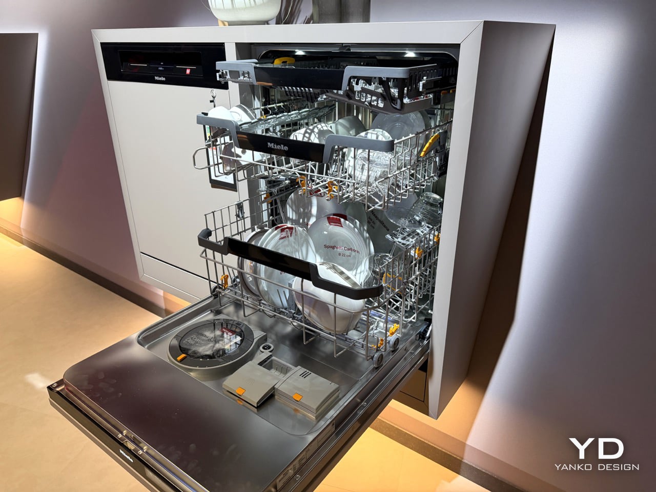
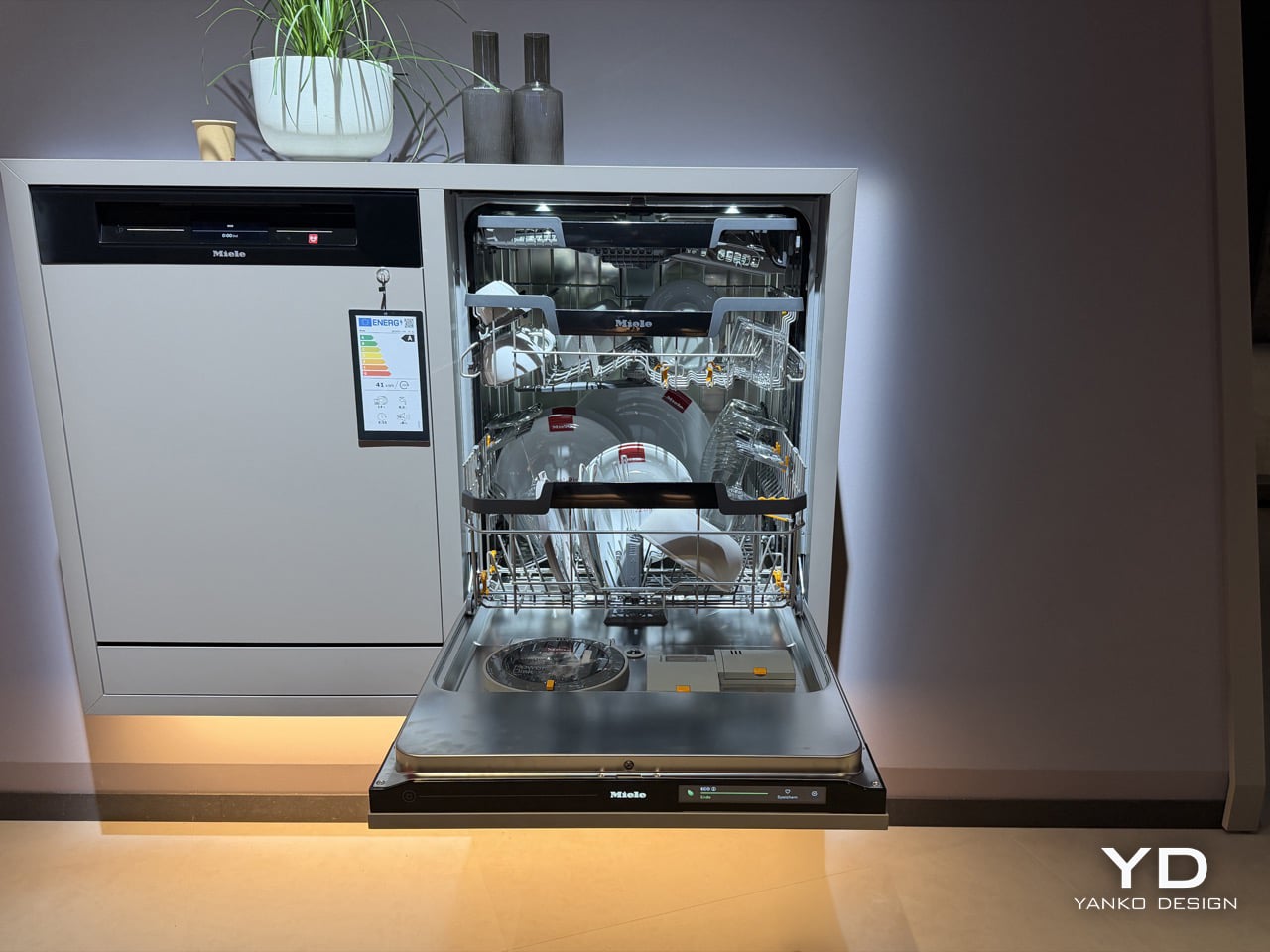
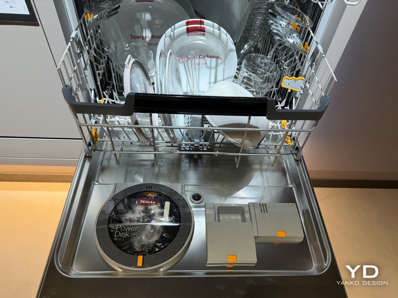
Miele’s new G8 Diamond snaps a photo of your dirty dishes before it washes them. The moment the door swings toward shut, a light inside blinks on, a camera grabs one frame, the light dies, and the AutoVision system studies what it caught. If it sees a bottle, it calls up BottleClean and drives the spray harder. If it sees a pot, the cleaning intensity climbs. If it sees plastics, it runs the new hot air drying harder, because plastic containers are famously terrible at drying themselves. Miele showed it for the first time at IFA 2026 in Berlin, and it lands in Germany, Austria and Switzerland in April 2027.

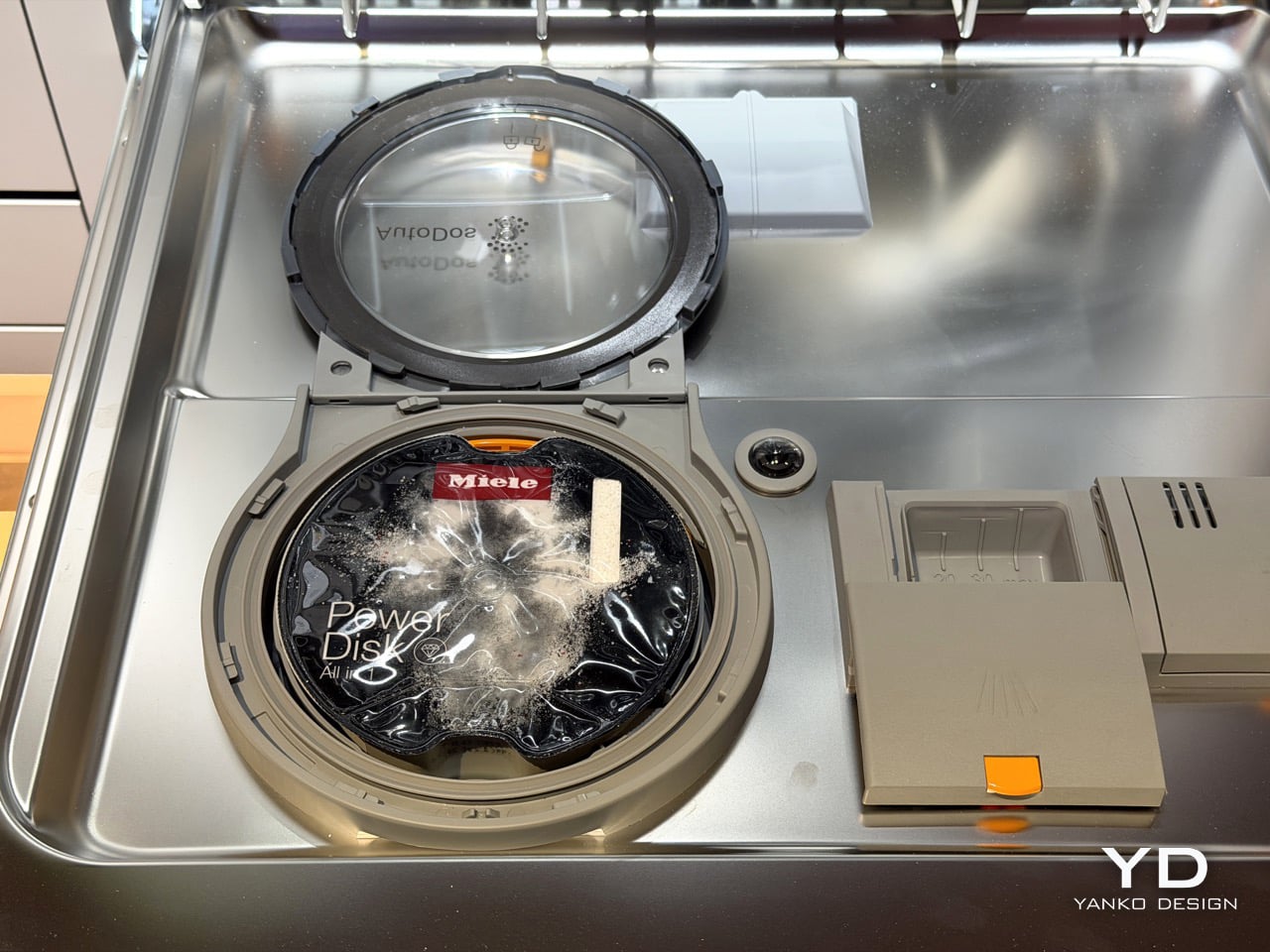
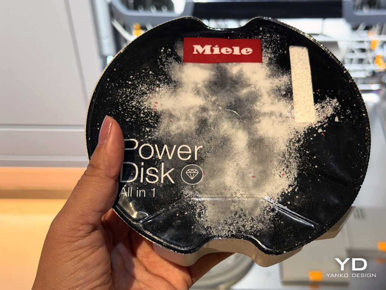
A camera in a dishwasher makes the headline, but the memory is what makes the design. The G8 holds onto that bottle it clocked at breakfast, so stacking dinner plates on top of it by eight in the evening changes nothing. Layer in AutoDos and its PowerDisk granulate, measuring out its own detergent since 2018, then set an app rule that says wait until 80 percent full and never before 10pm, and the machine stops consulting you altogether. Miele has spent decades selling dishwashers on the promise that they scrub so you do not have to. This one wants to think so you do not have to.

Designer: Miele

Here’s the part that actually impressed me. AutoVision doesn’t run a video feed you can scrub through in the app. It fires once, right as the door clicks shut, and the machine works from that single image for the entire cycle. Load a wine bottle at breakfast, stack it under a mountain of lunch plates by evening, and the G8 still treats it as a bottle, because it saw it once and that was enough. The only real caveat came from Miele’s own team at IFA: keep bottles roughly central and pots in the lower basket, since the spray arm still struggles to reach the far corners. Vision only helps if the water can follow it there.

What makes this genuinely new isn’t the word AI, which every appliance brand at IFA 2026 was throwing around like confetti. Most of those claims are turbidity sensors, the kind that read how murky the wash water has become and adjust accordingly. LG’s SenseClean works that way, and Samsung has filed similarly around soil detection. A turbidity sensor knows the water is dirty. It has no idea why. Miele’s camera identifies the actual object sitting in the rack, a considerably harder computer vision problem, and one that both LG and Bosch have patented around for years without shipping a consumer dishwasher built on it. Miele is putting an object-recognition camera inside a box you can buy next spring, not just inside a patent filing.

Around that camera sits a decade of quieter automation finally clicking into place. AutoDos, with its PowerDisk granulate, has been dosing detergent on its own since 2018, and Miele still claims nobody else in the category offers true automatic dispensing. ExcellentDry adds a hot air system with three fixed levels, chosen once and then applied forever, aimed squarely at the plastic containers that usually come out of a cycle still damp at the base. The cutlery drawer becomes a genuine third tier, one side droppable for coffee cups, and a new touch display replaces the old dial logic. Set the app to run only past 10pm and only above 80 percent full, or tie it to your solar output, and the dishwasher stops asking permission for anything.

None of this works if you don’t trust the camera’s judgment, and Miele knows it. “Intelligence can be programmed. Trust has to be earned,” said Dr. Axel Kniehl, the company’s Executive Director of Marketing and Sales, at the IFA press conference, and it’s the one line from the whole reveal that actually admits the stakes. AutoVision only functions if enabled by the user, according to Miele’s own release, which suggests it ships switched off by default. Fair enough. Handing a machine the authority to decide how hard to scrub your grandmother’s pans is a bigger ask than letting it dose its own detergent, and Miele seems to know it needs to earn that permission slowly rather than assume it.

The G8 Diamond won’t reach a single kitchen before April 2027, and even then only in Germany, Austria and Switzerland, so everything here is still a promise rather than a lived-in product. But the promise is the interesting part. For a century, appliance makers competed on how much physical labor they could remove. Miele is the first one at this scale betting the next fight is over who you trust to make the fifty tiny decisions labor never touched in the first place.

The post Miele’s G8 Dishwasher Photographs Your Dirty Dishes Before Auto-Selecting The Cycle: Hands-on at IFA 2026 first appeared on Yanko Design.
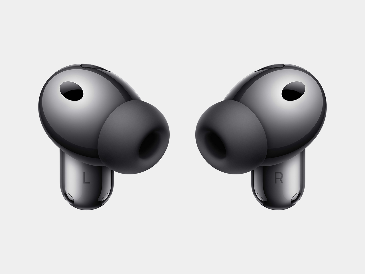
Huawei’s FreeBuds Neo Are Small Enough to Forget, Loud Enough Not To

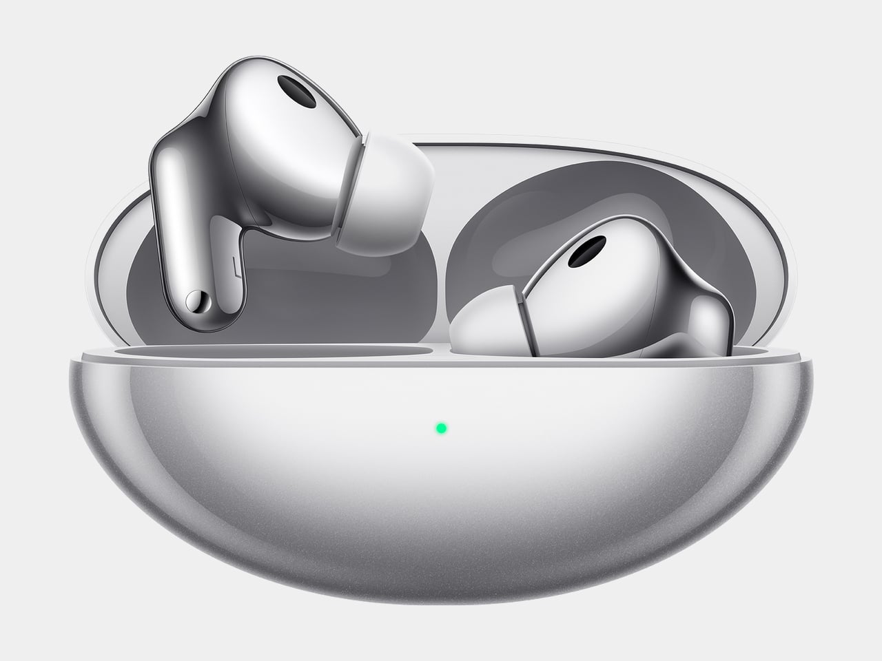
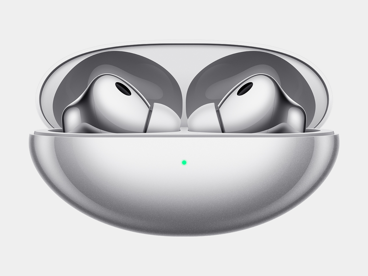
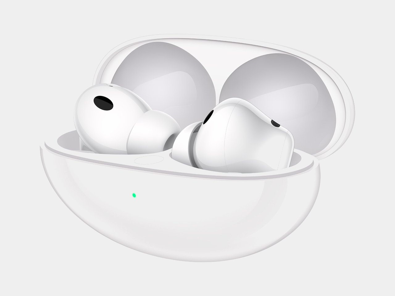
Huawei’s FreeBuds Neo makes a case for restraint, proving a pair of earbuds can shrink in size without shrinking in ambition. Announced globally to launch at IFA 2026, the FreeBuds Neo pairs noise cancellation with a shape built for long days of wear, arriving in four colorways that read more like a fashion accessory than typical tech hardware. It’s a design that treats comfort as a feature worth engineering around, not an afterthought.

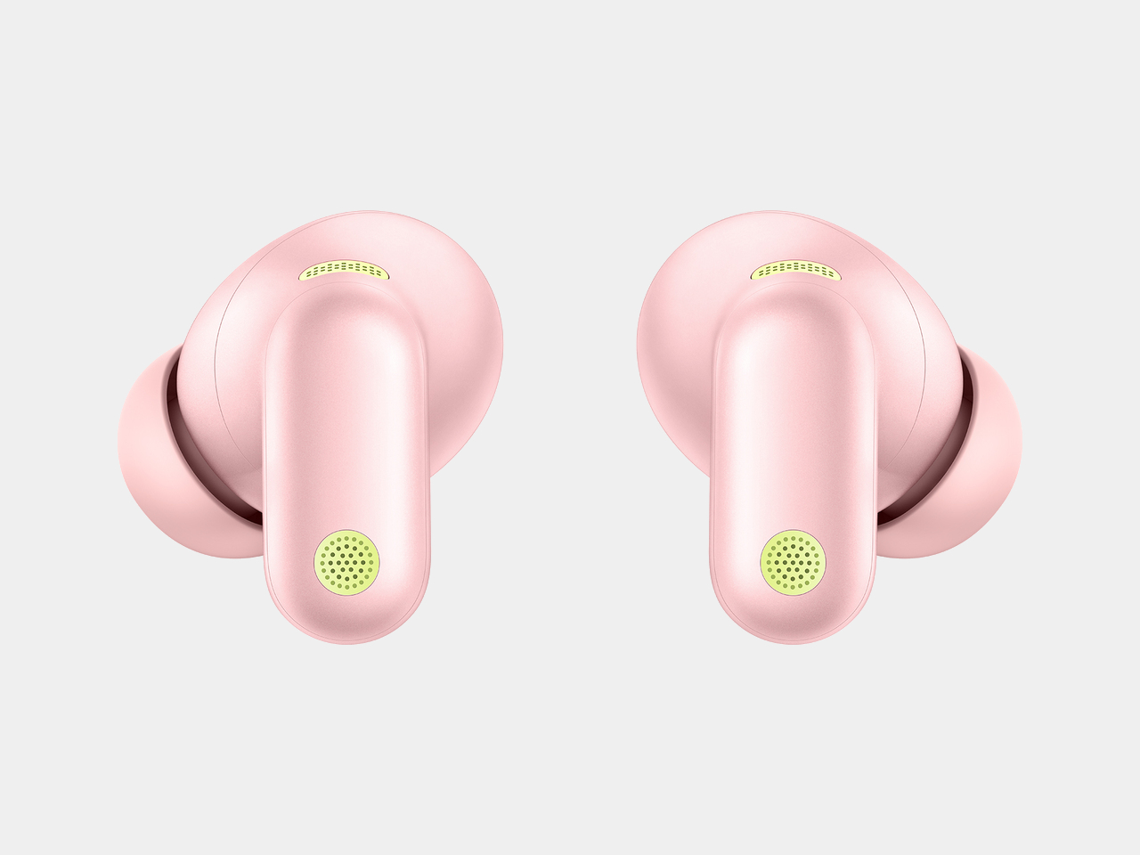
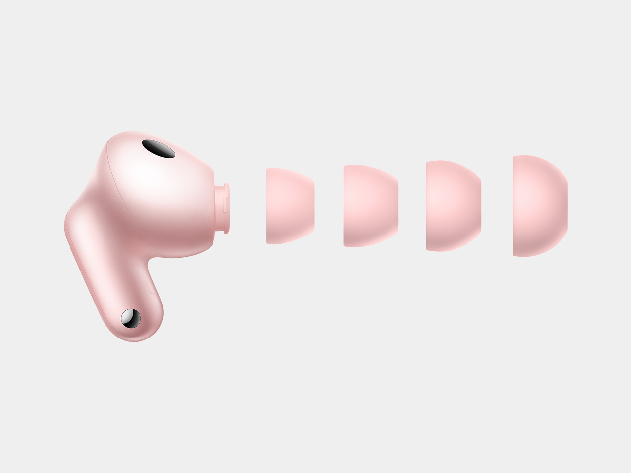
That comfort starts with the numbers. Each earbud weighs only approximately 4.8 g, and Huawei built that lightness around a significant number of real human ear feature data points, delivering an ergonomic, pressure-relieving fit that achieves even pressure distribution for pain-free long-term wear. Simulation tests replicating high-frequency movement led to design tweaks in areas prone to loosening, so the buds stay anchored through workouts, commutes, and everything in between.

Designer: Huawei

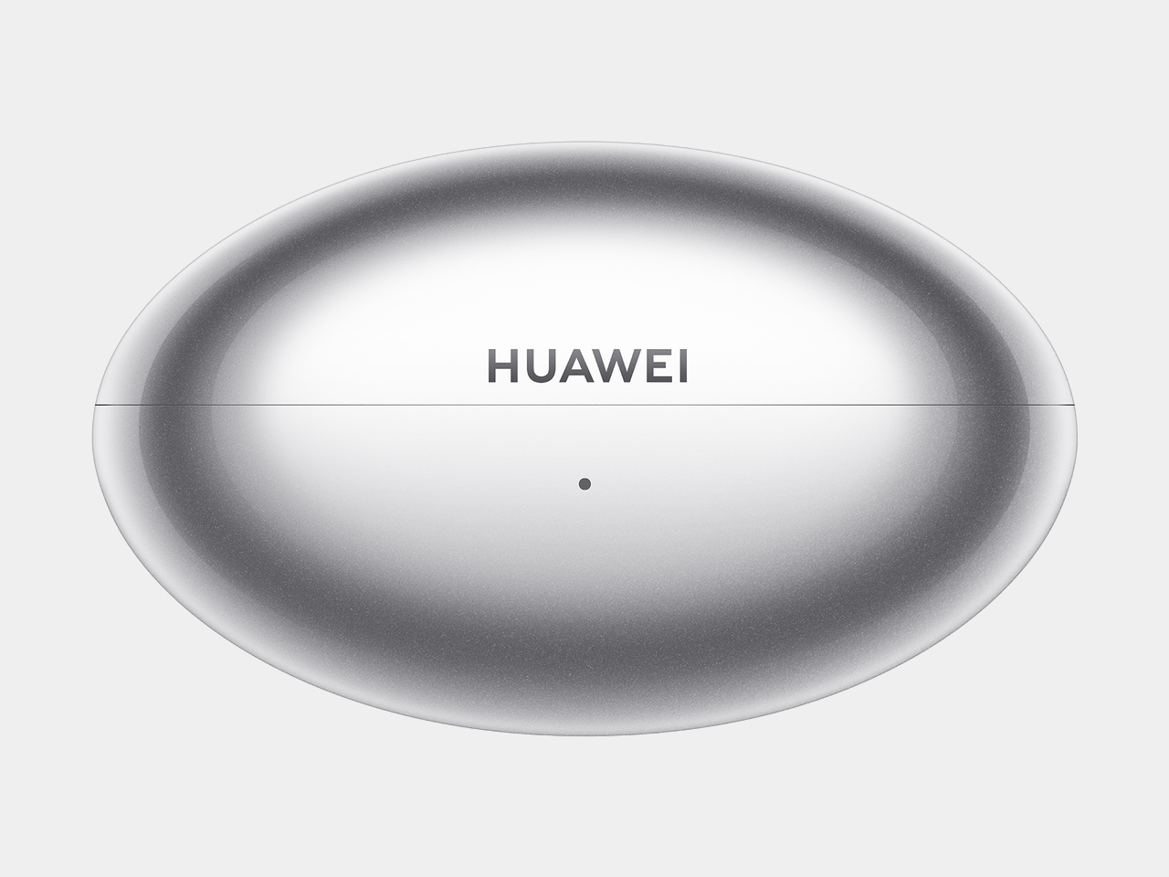
The Mini shuttle case carries that same restraint into its shape, presenting a fully curved form, with a sleek and minimalist silhouette and a lightweight body that slips into a pocket without adding bulk. Four color options, Stellar Silver, Nebula Pink, Ice White, and Starry Black, let the case double as a small style statement rather than a purely functional accessory. The Light Mini Stem carries that philosophy further, conforming to the ear’s contours for a fit that looks as refined as it feels.

Underneath that compact shell, Huawei packs a dual-channel noise cancellation architecture that optimizes sound paths, cutting down medium and high-frequency noise, like wind and ambient chatter, for a full-frequency depth of up to 30dB. A third-gen audio chip handles the heavy lifting, reacting to shifting noise within milliseconds so a subway platform one moment and a quiet office the next don’t require manually adjusting anything.

Sound quality gets its own upgrade courtesy of an all-new Turbo driver unit, stretching frequency response from 10Hz up to 48kHz. That range keeps bass hitting hard on a commute playlist while vocals and instruments stay clear during a podcast or a video call, recreating the texture of a live performance rather than a compressed streaming file. Paired with a Huawei phone, the buds support up to 2.3Mbps of lossless transmission, dropping to a still-respectable 990kbps over LDAC with other devices.

Huawei also built in unlimited spatial audio, using its own algorithms to wrap sound in a 360-degree soundstage regardless of source or device, so a movie watched on a laptop can feel as enveloping as one streamed through a dedicated app. Cross-platform support rounds out that flexibility, breaking down ecosystem barriers to work across Android, iOS, and Windows, with dual-device connections that let someone switch from a work laptop to a phone call without digging through Bluetooth menus.

Pricing lands at £119.99 (around $162) when the FreeBuds Neo arrives in the UK on 23 September 2026, positioning it as a mid-range option against pricier flagship earbuds. Between the lightweight fit, the four-color palette, and noise cancellation tuned for shifting environments, Huawei seems to be betting that people want earbuds that disappear into daily routines rather than demand constant attention.

The post Huawei’s FreeBuds Neo Are Small Enough to Forget, Loud Enough Not To first appeared on Yanko Design.
Huawei Finally Made a Blood Pressure Watch That Looks Like Jewelry

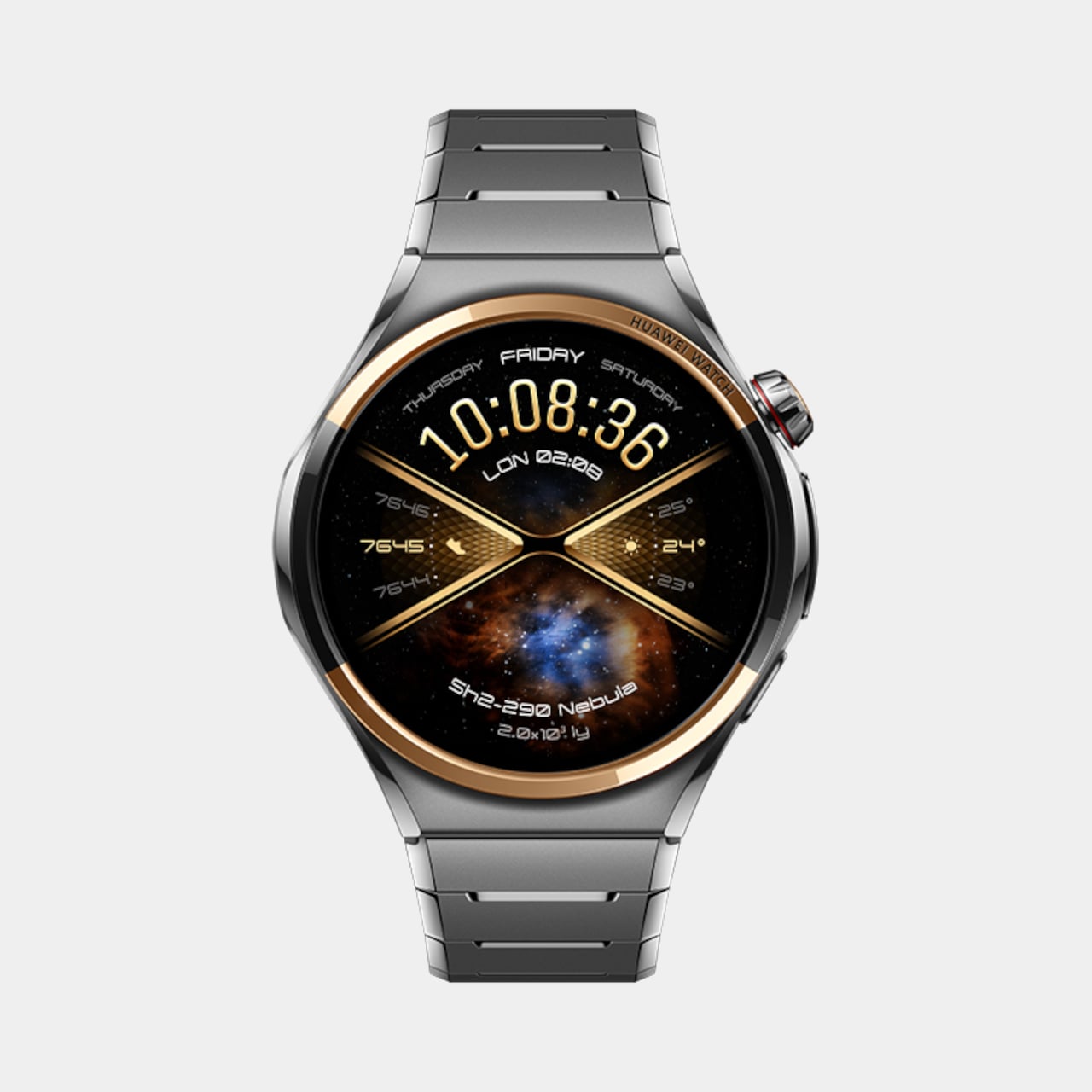
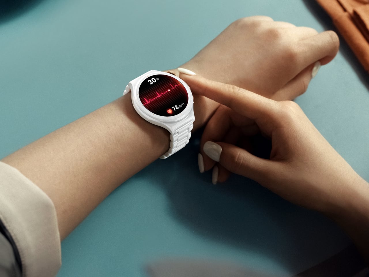
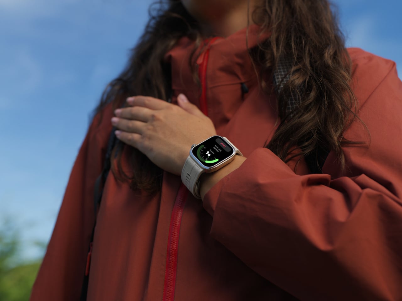
Huawei used IFA 2026 to show that a smartwatch can care for you in two very different ways without ever feeling like two different products. The HUAWEI WATCH 6 Series and the HUAWEI WATCH D3 launched together, one built around elegance and daily versatility, the other built around round-the-clock medical monitoring. Both treat the wrist as a place worth designing carefully, just toward different ends.

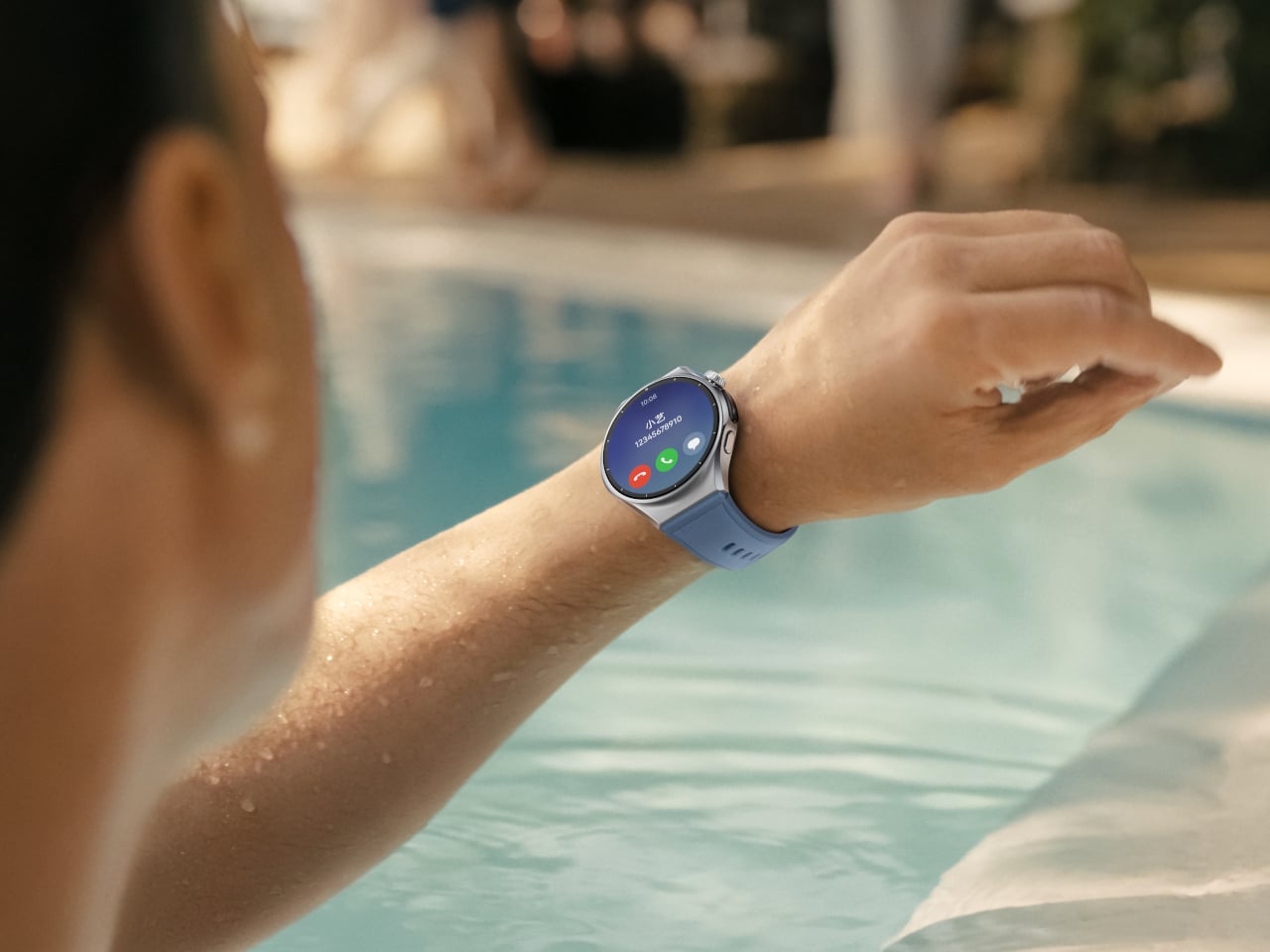
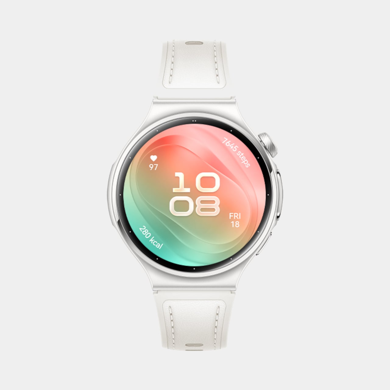
The WATCH 6 leads with restraint. Huawei carries forward the sleek, minimalist design legacy of the WATCH family, introducing a timeless aesthetic that exudes sophistication, and backs that look with real engineering. The 42mm model claims the lightest design in the history of the HUAWEI WATCH Series at just 38g and 10.2mm thin, while the 46mm version leans into a durable stainless-steel case for anyone who prefers heft on their wrist.

Designer: Huawei

Huawei Watch 6

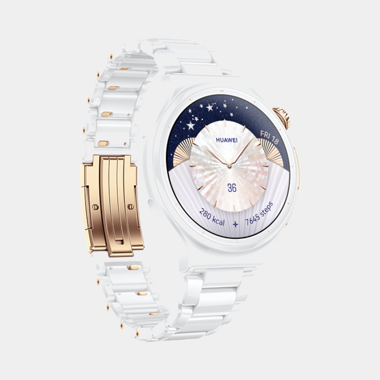
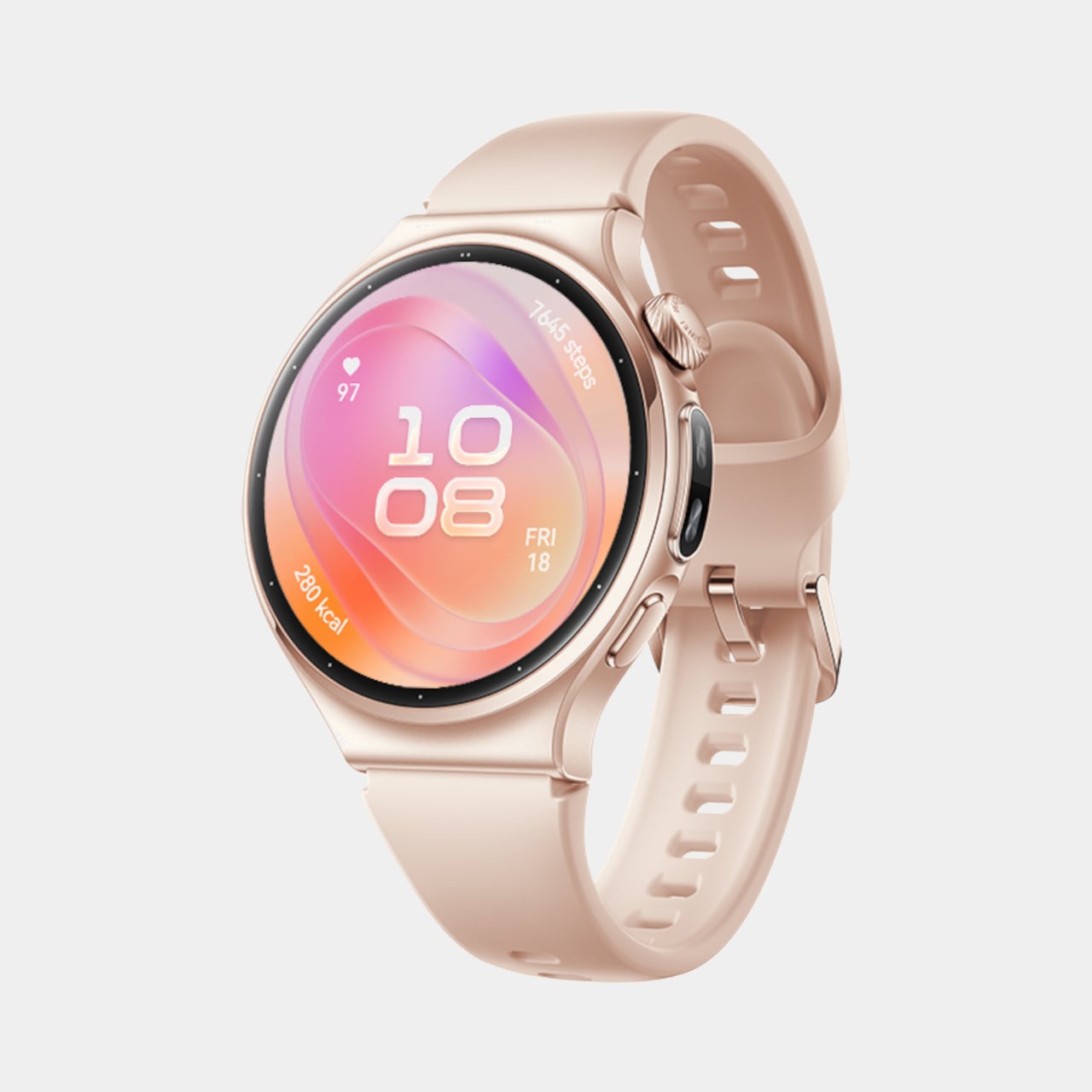
Four finishes carry that design further, from Black Stainless Steel to a Gold Aluminum Alloy paired with a soft pink strap, each fitted with the new HUAWEI EasyCross Strap for a smoother, more breathable fit. The Pro tier pushes materials even harder, with a Space Edition pairing a black ceramic bezel against gold detailing, and a 43mm model marking the first all-ceramic watch in Huawei’s lineup, finished with 18K gold accents for a genuinely jewelry-like presence.

Underneath that shell, the WATCH 6 quietly tracks a lot. An upgraded X-TAP pulls up a full Health Glance with one touch, spanning 11 metrics across basic, endocrine, cardiovascular, and respiratory categories. A new Diet clover rounds out Huawei’s four-leaf wellness model, nudging users toward balanced habits around exercise, sleep, mood, and food instead of just logging numbers nobody revisits.

Connectivity rounds out the experience without demanding constant phone contact. Built-in eSIM keeps calls and messages flowing through a swim or a run, while Safety Check quietly shares location and status with family during less predictable moments. A new wrist rotation gesture lets someone scroll through menus with a flick, freeing the other hand for a coffee cup, a leash, or a set of keys.

Huawei Watch 6

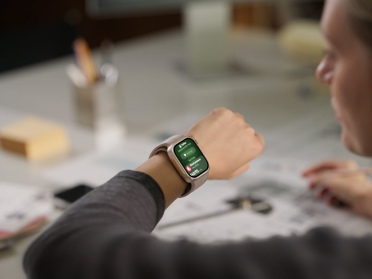
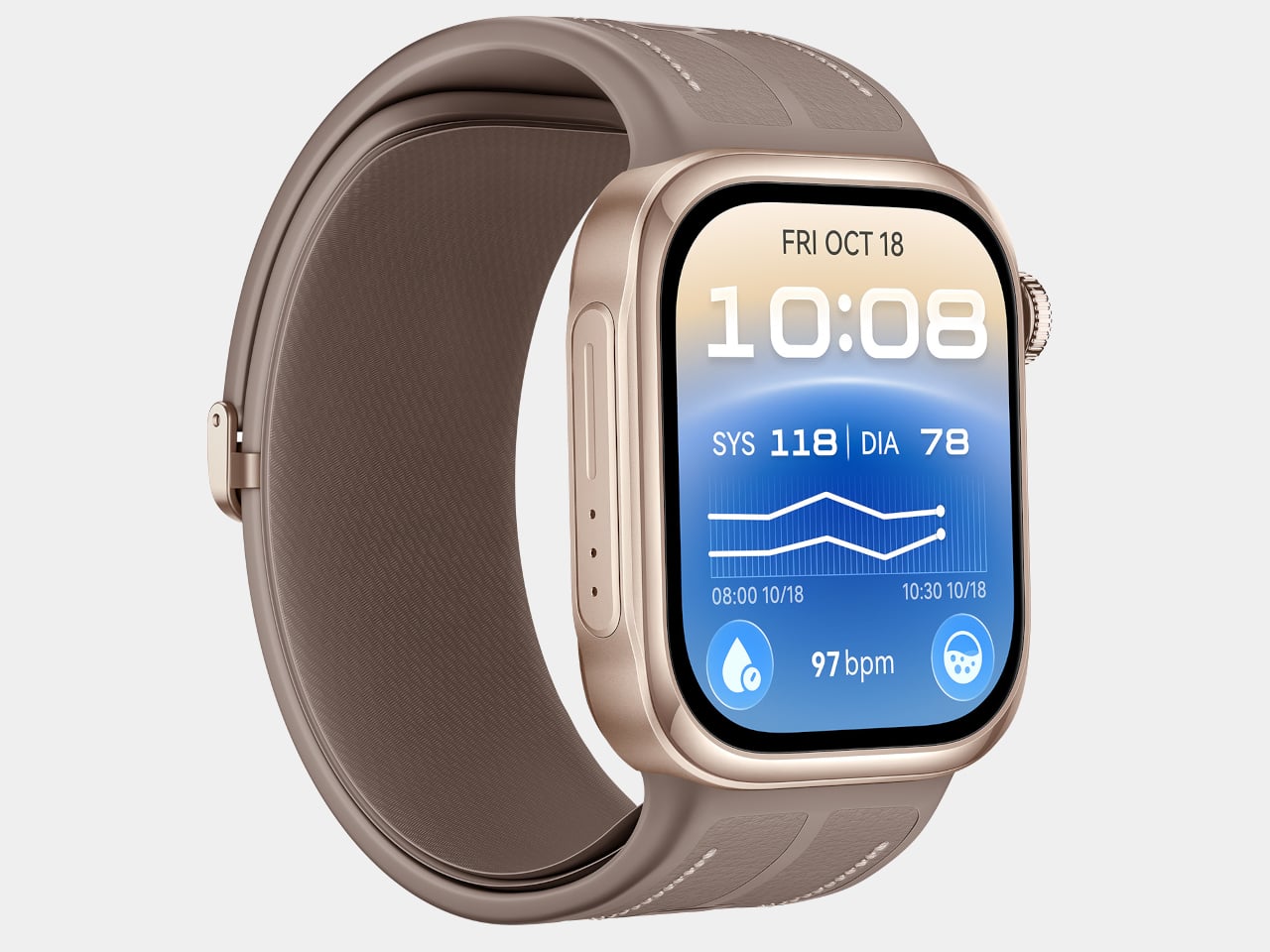
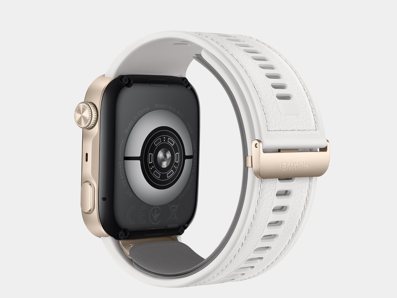
Set beside all that polish, the WATCH D3 takes a more clinical approach, though it never abandons comfort to get there. At 11.3mm thick and 40g, paired with a 25.5mm ultra-narrow airbag strap, the watch stays slim enough to sleep in without leaving a mark. Three finishes, Black, White, and Mocha Gold, keep it looking like an accessory rather than a piece of medical equipment.

Huawei Watch D3

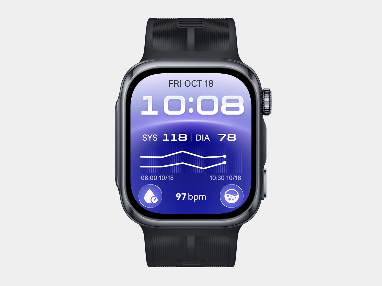
That comfort matters because the D3 asks more of its wearer than a typical smartwatch. A mechanical airbag delivers effective compression and precise sensing across a minimal skin-contact area, paired with a high-precision sensor for readings that hold up against actual blood pressure cuffs. Huawei built in 24-hour Ambulatory Blood Pressure Monitoring, quietly inflating overnight with reduced noise so sleep tracking and blood pressure tracking can finally happen at the same time.

A dedicated pre- and post-exercise measurement mode adds a layer most fitness trackers skip entirely, checking whether blood pressure sits in a safe range before a workout begins and tracking how it shifts once the effort is over. That monitoring carries real weight too, having earned CE marking under the EU Medical Device Regulation, a certification that puts the D3 closer to clinical hardware than typical wearables ever get.

Family features tie the D3’s data into something more useful than a personal log. Health Community lets users view a parent’s or partner’s Health Glance, blood pressure, heart rate, and SpO2 readings from their own wrist, with real-time alerts triggering if something looks off. It turns a single watch’s readings into a small, informal support system for whoever’s paying attention.
Both watches launch in the UK from £399.99 (around $540), with the WATCH 6 Pro topping the range at £599.99 (around $810). Seen together, the WATCH 6 and WATCH D3 make the case that Huawei isn’t chasing one definition of a smartwatch, but building toward two: one dressed for a dinner reservation, the other quietly watching over blood pressure while its wearer sleeps.
The post Huawei Finally Made a Blood Pressure Watch That Looks Like Jewelry first appeared on Yanko Design.