Evenings drift from kitchen to dining table to balcony and back, while the nicest lamp stays tethered to a single socket. The small but persistent annoyance of cords, extension leads, and the feeling that lighting never quite follows where people actually end up sitting becomes background noise. Beautiful lamps are static, and that friction quietly shapes how and where you use light, even when it should not.
Arieto Studio’s ILO Lamp is a response to that pattern. The designers started by watching their own routines, noticing how often they moved while the light did not. ILO is an attempt to let light move as naturally as people do, without turning into a tech gadget or a camping lantern, treating the portable lamp as a piece of furniture that happens to be untethered when you need it.
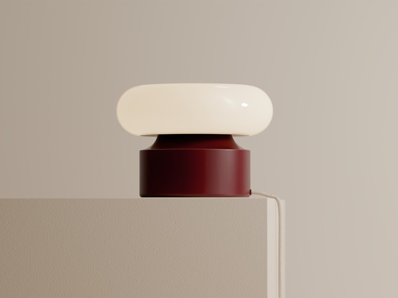
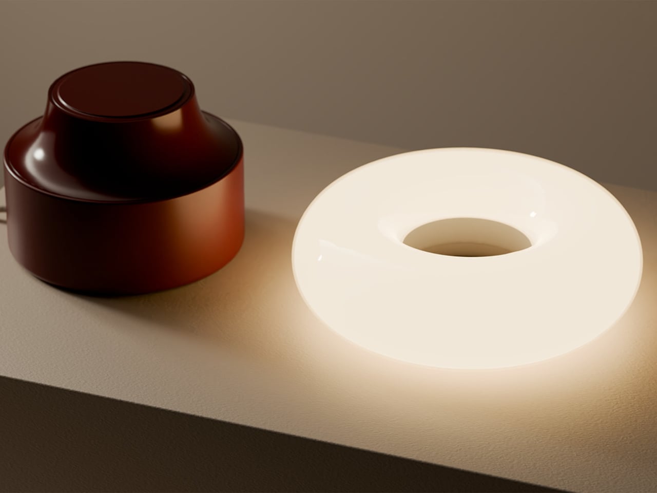
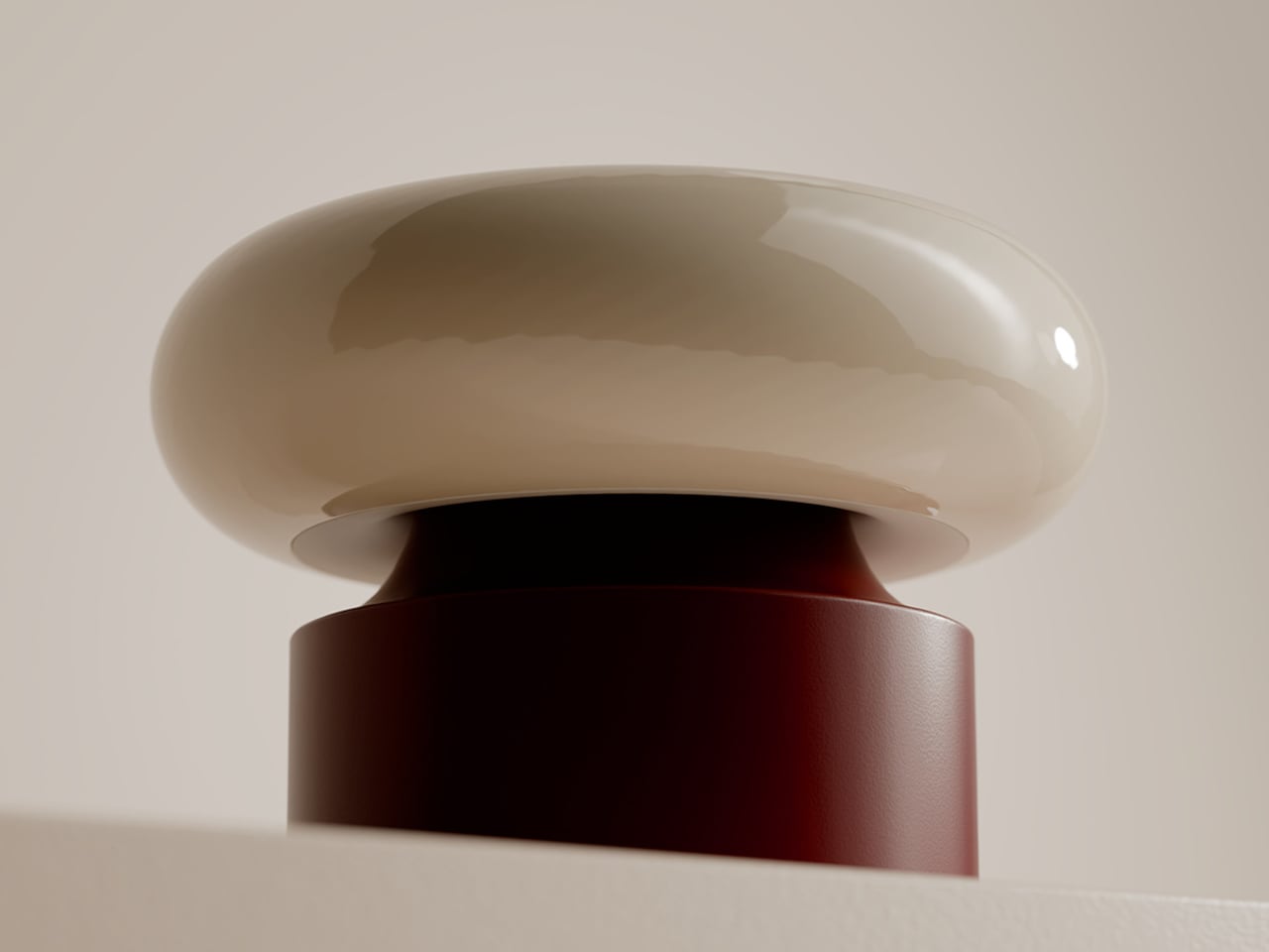
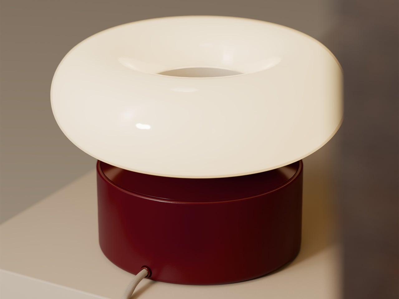
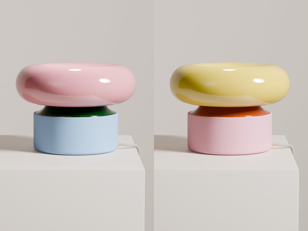
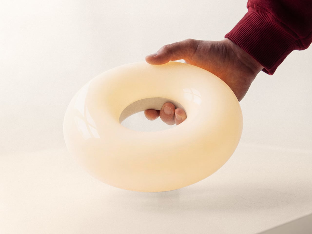
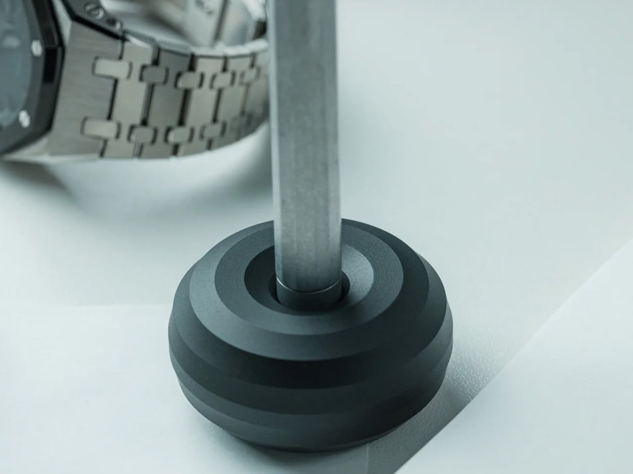
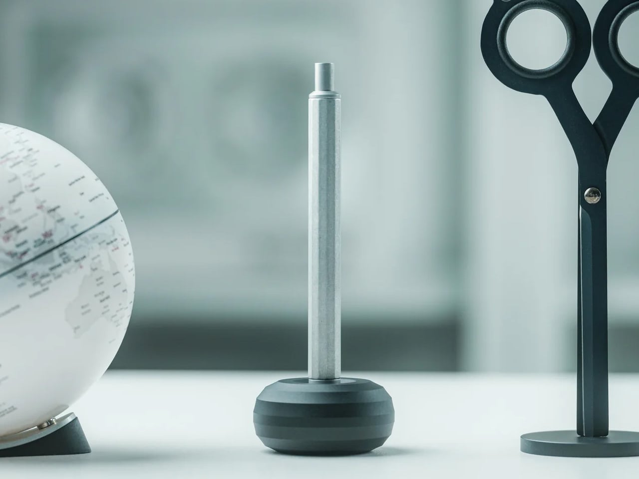
The lamp is two elements that live together, a luminous donut that holds the light and a weighted base that stays plugged in. When the donut rests on the base, it behaves like a sculptural table lamp. When lifted, it becomes a compact, cordless light that can travel to the terrace, coffee table, or hallway without trailing cables behind it or requiring a new outlet.
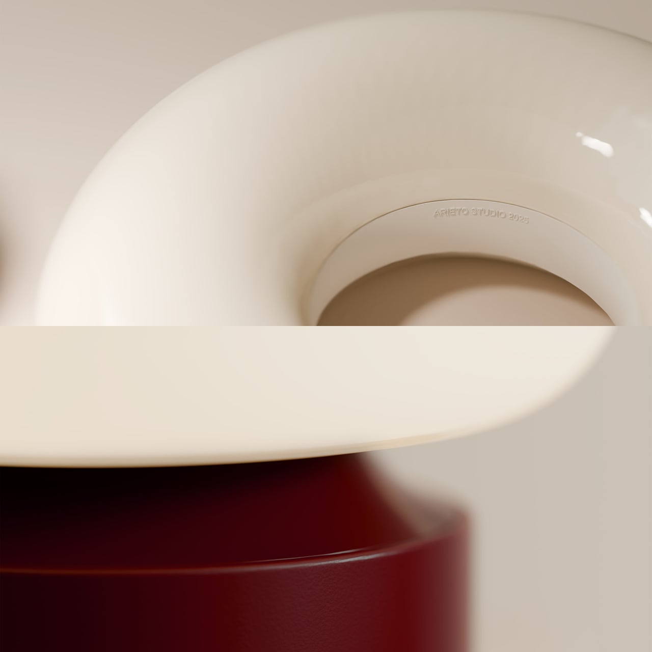
The base is both a stand and an induction charger. When the donut is dropped back onto it, charging starts automatically, no ports or cables to find in the dark. This turns recharging into a background ritual, the same motion you would make when tidying a table at the end of the night, and the lamp is ready again by morning without thinking about it.
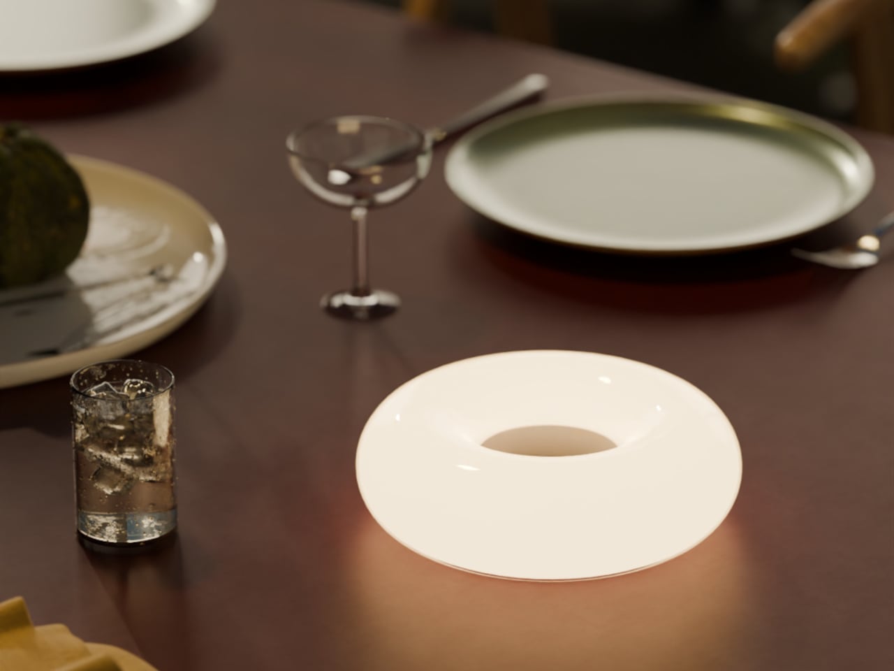
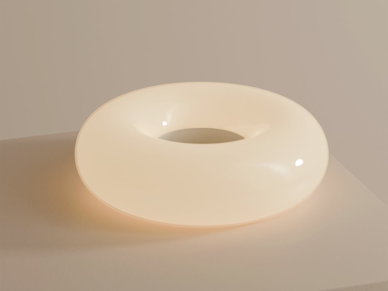
The soft, diffused glow from the ring throws gentle light across a table rather than a harsh spotlight. It is meant for calm, ambient illumination, the kind that makes late conversations feel unhurried and lets food or books sit in a pool of warm light without glare. The donut radiates evenly in all directions, so it never casts hard shadows or creates bright spots.
The donut on a balcony rail during a late drink, on a low shelf beside a sofa, or in a hallway where there is no convenient outlet shows how the same object moves between roles without looking like camping gear. It stays firmly in the language of interior objects, simple forms, rich colors, and a glow that feels like it belongs rather than borrowed from a utility drawer.
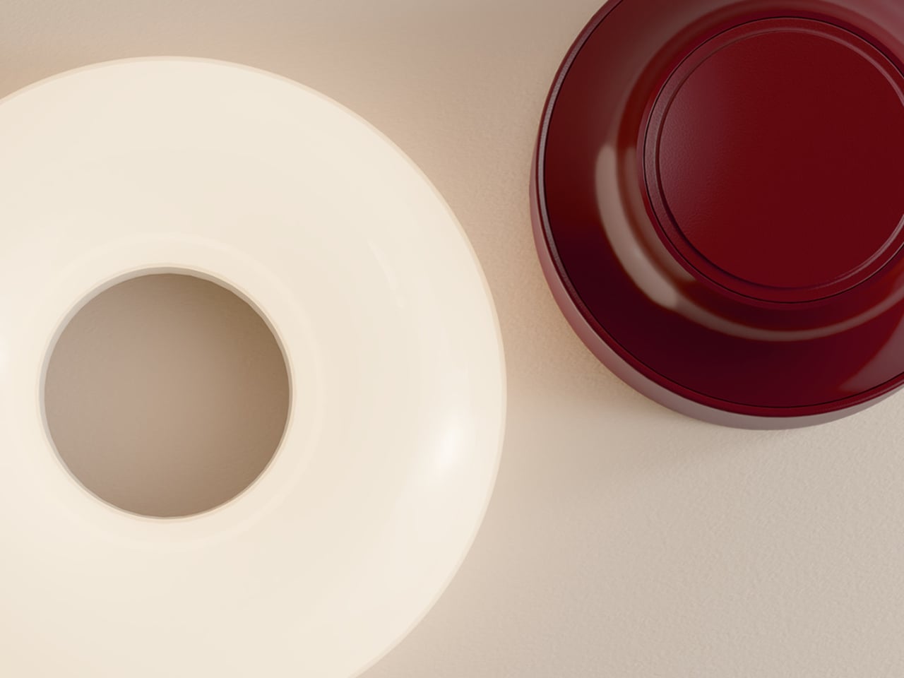
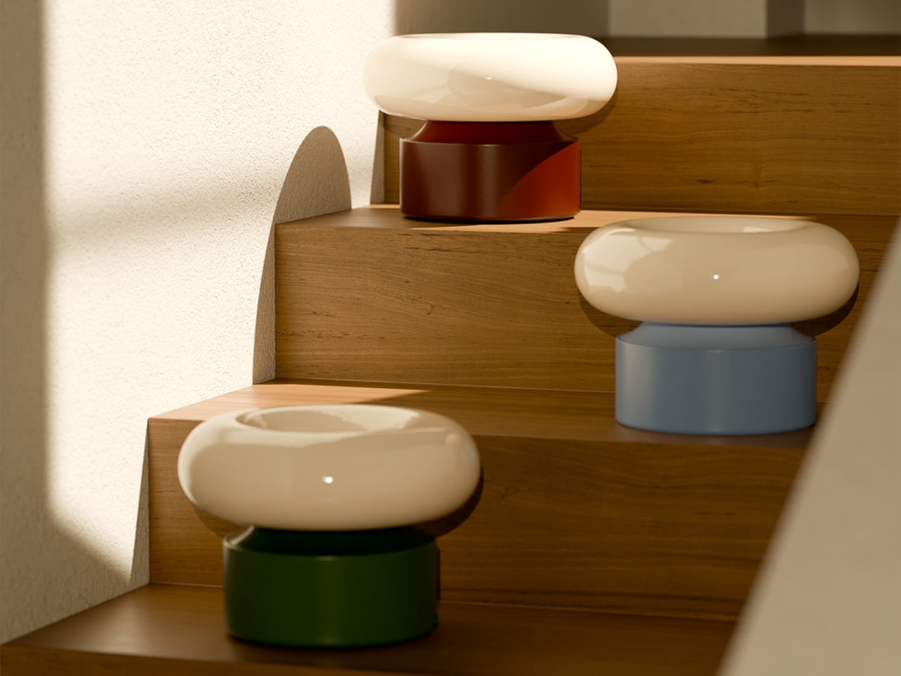
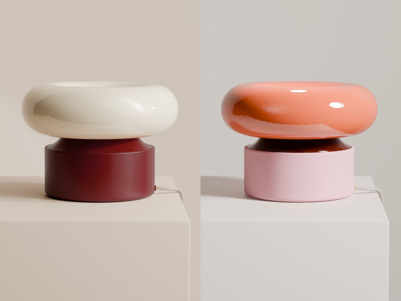
The contrast between the glossy, cream-colored ring and the solid, colored base makes the lamp read almost like a small sculpture when assembled. The base comes in several tones, burgundy, green, and blue, so it can either disappear into furniture or act as a quiet accent in a neutral room. The proportions are calm and grounded, not trying to impress with complexity.
ILO is less about showing off wireless charging and more about removing the tiny compromises that come with static lamps. It treats light as something that can follow dinners, conversations, and quiet moments, while still looking like a considered object when it comes home to its base. For people who move through their homes rather than settling in one spot all evening, a lamp that can keep up without cables or outlets starts to feel less like a luxury and more like how lighting should have worked all along.
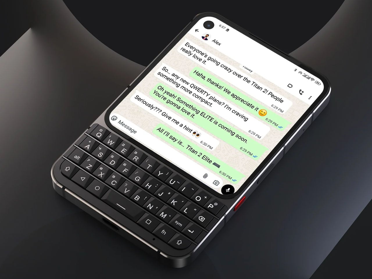
The release of the iPhone in 2007 marked the beginning of the end of the BlackBerry era. The prospect of on-screen keys was undeniable, and the trend of having a pocket PC left everyone dazed over the years as smartphones evolved into their best version, year after year, for decades. However, things then go full circle, and we are plateauing with what bezelless smartphones can offer.
That tactile feel of typing with the physical buttons is reviving for good reason, and Unihertz brought back nostalgic memories of the Passport for good. The full QWERTY keyboard of the phone with a 1:1 aspect ratio was a refreshing introduction to the stale smartphone market dominated by phones that more or less look and feel the same, with few incremental hardware updates that one can hardly drool over.
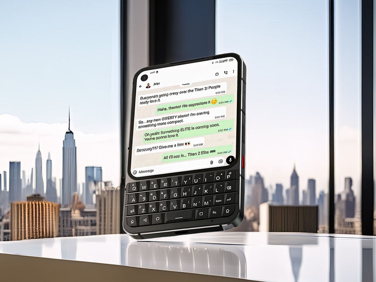
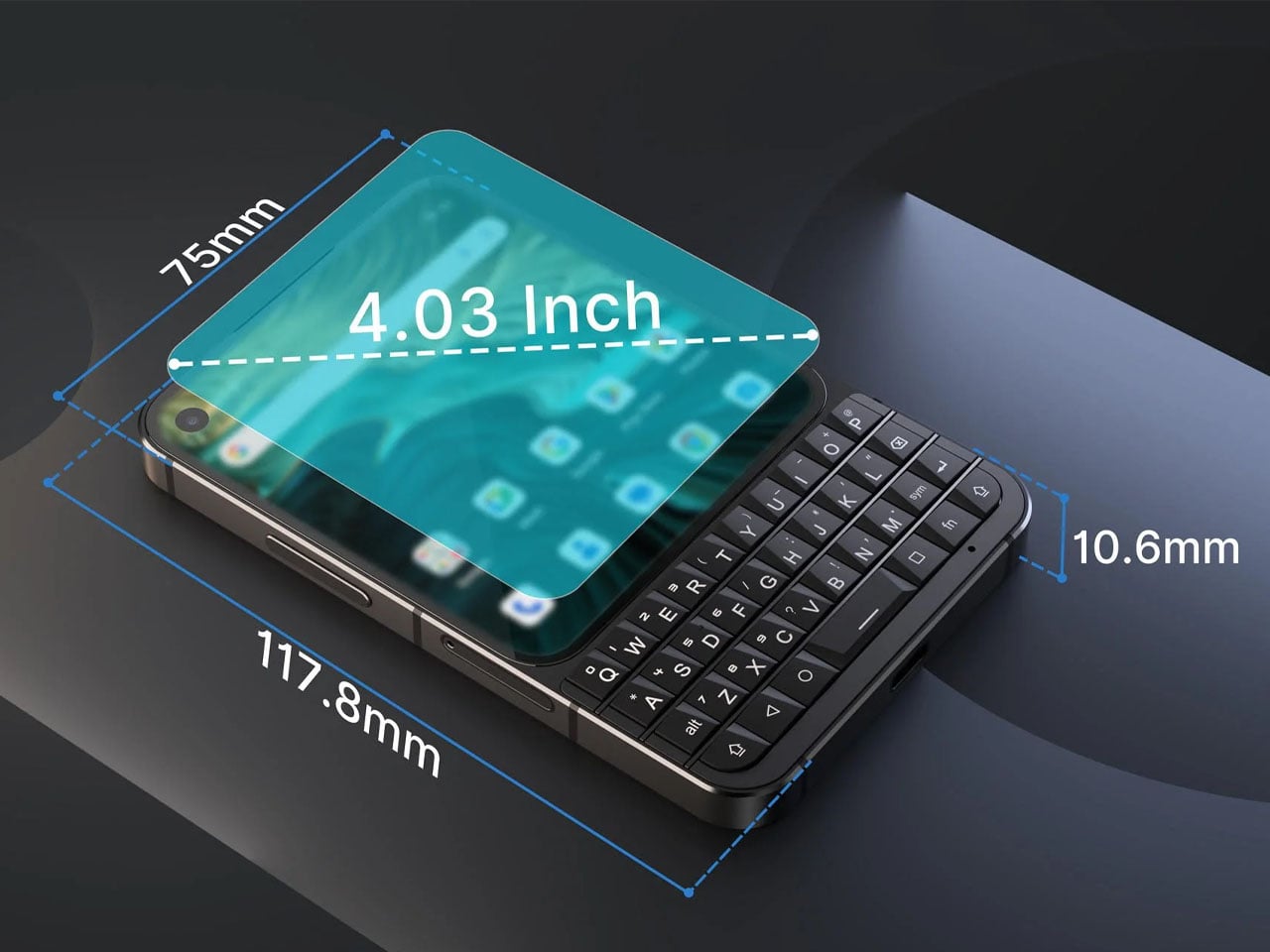
Riding on the momentum of the Titan 2 released in the summer last year, the Shanghai-based brand has revealed the Titan 2 Elite. Unlike the Clicks QWERTY case or the Ikko MindOne Snap-In Case, which are extensions of the phone itself, the Titan line of devices is the real deal. Productivity and ease of use are the focal points with the Unihertz phones, and that element remains constant with the new release. Titan Elite 2 is an improvement over the predecessor with the thin bezel curved display having a punch-hole front camera in one corner. The function keys on the new version take the same layout, while the navigation keys are now placed alongside the spacebar. This results in a decrease in overall size while retaining the same function.
The phone will come powered by the MediaTek Dimensity 7300 processor, have 12GB of RAM, and 512GB of internal storage. There is no word on the display or the battery, but going by the previous release, it should be an AMOLED screen, and the battery should be 5,000mAh. Neither is there any word about the release timeline, pricing, or other features of the device right now. The sole official render of the phone suggests a sleeker-looking body, erringly similar to the Clicks Communicator. The only differentiator is the more squared form of the Titan 2 Elite vs the portrait-dominated aesthetic of the Communicator case.
It’ll be interesting to see what Elite elements the device brings for the users, to consider the niche device over other options. One thing is clear, though the tactile keyboard era is reviving in a big way, and we’re excited to see what will be on offer in the future as more manufacturers find the segment lucrative.
Japanese design philosophy has long celebrated the marriage of form and function, transforming everyday objects into tools that spark joy while serving practical purposes. This ethos shines brightest in stationery design, where minimalism meets innovation to create products that streamline workflows and declutter both physical and mental spaces. The items on this list represent a modern evolution of this tradition, offering solutions that fit seamlessly into contemporary life.
Organization isn’t just about having the right storage solutions; it’s about surrounding yourself with tools that inspire consistent use and thoughtful habits. These seven Japanese-inspired stationery essentials combine intelligent engineering with aesthetic restraint, ensuring that staying organized feels less like a chore and more like a natural extension of your creative process. Each piece has been selected for its ability to eliminate friction from daily tasks while adding visual harmony to your workspace.
1. OrigamiSwift Folding Mouse
Staying organized in a mobile work environment means carrying the right tools without the bulk. The OrigamiSwift reimagines the traditional computer mouse through the lens of Japanese paper-folding artistry, creating a device that collapses to pocket size yet delivers full desktop functionality. This ingenious design features a triangular skeletal structure that folds completely flat when not in use, allowing digital nomads and hybrid workers to maintain their preferred setup regardless of location.
The transformation happens in less than half a second with a simple flick of the wrist, instantly morphing from a slim card into a responsive input device. Weighing just 40 grams, this featherweight mouse disappears into bags and pockets until the moment productivity calls. The aluminum construction ensures durability despite the mechanical complexity, while the ergonomic contours cradle your hand during marathon editing sessions or detailed design work. For anyone juggling multiple workspaces throughout their day, this folding marvel eliminates the compromise between portability and performance.
Deploys in under 0.5 seconds for instant workflow activation.
Origami-inspired triangular structure provides surprising rigidity and stability when deployed.
Ultra-lightweight 40-gram design makes it virtually unnoticeable in bags.
Fits in pockets and tight spaces without compromising on full-sized mouse functionality.
What We Dislike
Ultra-slim profile requires an adjustment period for users accustomed to bulkier mice.
Mechanical hinges need occasional maintenance to preserve smooth folding action.
2. Everlasting All-Metal Pencil
Few things disrupt creative flow like a broken pencil lead or the constant need to sharpen. The Everlasting All-Metal Pencil eliminates these frustrations through material innovation rather than mechanical complexity. Crafted from a specialized alloy core encased in aluminum, this writing instrument leaves graphite-like marks on paper without wearing down at the accelerated rate of traditional pencils. The result is a tool that writes for years rather than weeks, producing consistent lines that erase cleanly with standard erasers.
The tactile experience mirrors conventional pencils closely enough that your hand won’t notice the switch, yet the absence of sharpening fundamentally changes how you interact with the tool. You can sketch freely without monitoring lead length or calculating whether you have enough left for a particular project. The weight distribution feels substantial without being cumbersome, lending a sense of permanence that disposable writing tools simply cannot match. This pencil becomes a reliable companion rather than a consumable supply, encouraging deeper attachment and more intentional use.
Never needs sharpening, creating a completely uninterrupted workflow.
Alloy construction lasts for decades, eliminating constant supply replenishment.
Marks erase cleanly with standard erasers just like traditional pencils.
Reduces waste and mental load of managing consumable supplies.
What We Dislike
Fixed line weight offers less variation than traditional graphite pencils with different grades.
Higher initial cost compared to conventional pencils.
3. MagBoard Clipboard
Traditional notebooks impose structure that sometimes stifles rather than supports organization. The MagBoard Clipboard embraces flexibility through its magnetic lever mechanism, securing up to 30 loose sheets while allowing instant reordering, removal, or addition. This hardcover design functions equally well on a desk or held against your torso while standing, transforming any environment into a viable workspace. The rigid backing provides writing stability without the permanence of bound pages.
The magnetic closure system offers satisfying tactile feedback while maintaining security during transport. Water-resistant materials ensure your notes survive coffee spills and sudden weather changes, protecting work that might otherwise be lost to environmental hazards. The ability to shuffle pages means your organizational system can evolve with your projects, accommodating non-linear thinking patterns that don’t fit neatly into numbered sequences. You might start a meeting with prepared sheets, add new observations throughout, then reorganize everything based on priority before leaving. This adaptive format respects how actual work happens rather than imposing artificial constraints.
Instant page reorganization without tearing or rewriting saves significant time.
Hardcover design allows comfortable note-taking while standing or moving.
Water-resistant materials protect notes from spills and weather damage.
The magnetic lever mechanism secures up to 30 sheets during transport.
What We Dislike
30-sheet capacity may feel limiting for extensive multi-page projects.
Magnetic mechanism adds noticeable weight during extended holding periods.
4. Inseparable Notebook Pen
Misplaced pens represent one of the organization’s most persistent frustrations. The Inseparable Notebook Pen solves this through integration rather than attachment, creating a writing instrument designed specifically to remain with your notebook. The minimalist profile slides easily alongside pages without creating bulk, while the smooth ink flow ensures thoughts transfer to paper without skipping or pressure adjustments. This isn’t just a pen that happens to fit your notebook; the entire form factor was conceived around coexistence.
The grip diameter and length strike a balance between portability and comfort, allowing extended writing sessions without cramping. The understated aesthetic avoids competing for attention, letting your content remain the focus rather than the tool itself. By designing the pen and notebook as a unified system, this approach eliminates the common scenario of finding a notebook but lacking something to write with. The relationship between tool and substrate becomes seamless, reducing decision fatigue and creating muscle memory around a consistent setup. When reaching for your notebook, it always means having a reliable pen immediately available, and capturing fleeting ideas becomes automatic rather than conditional.
Integrated design creates consistent habits around a single unified system.
Slim profile maintains notebook portability without adding noticeable bulk.
Smooth ink flow ensures reliable writing without skipping or pressure issues.
Eliminates the common frustration of finding notebooks without pens.
What We Dislike
Specialized design may not fit other notebooks in your collection.
Requires replacing the specific design rather than using generic pen replacements.
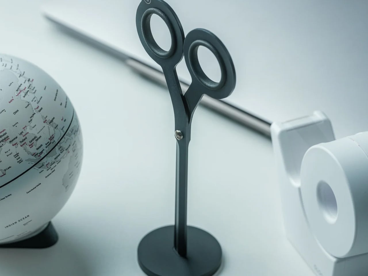
5. Scissors with Magnetic Base
Office scissors typically live in drawers or cups, creating search friction when you need them urgently. These Scissors with Magnetic Base stand perpetually upright on your desk, always visible and immediately accessible. The weighted aluminum base uses magnetic attraction to hold the Japanese stainless steel blades in an elegant vertical position, transforming a utilitarian tool into a sculptural desk element. The Teflon coating on the blades ensures smooth cutting through various materials while preventing adhesive buildup from tape or labels.
The substantial weight of the all-metal construction provides satisfying heft during use, allowing the scissors’ sharpness to do the work rather than requiring excessive hand pressure. One finger ring incorporates a hidden box cutter blade, adding functionality without compromising the clean aesthetic. The upright storage position protects blade edges from the dulling contact that occurs when scissors roll around in drawers. By giving these scissors a permanent home that celebrates rather than hides them, you’re more likely to use the right tool for cutting tasks instead of making do with whatever’s closest. The magnetic base also prevents the gradual migration that causes tools to disappear into desk clutter.
Always-vertical positioning eliminates search time and tool misplacement.
Japanese stainless steel with Teflon coating maintains sharp cutting performance.
One finger ring doubles as a box cutter for added functionality.
Magnetic base transforms a utilitarian tool into a sculptural desk element.
What We Dislike
A dedicated base makes scissors less practical for mobile use or multiple workstations.
A prominent vertical display requires a dedicated desk surface area.
6. Paperweight and Pen Holder
Desktop organization often suffers from single-purpose items that crowd surfaces without earning their real estate. The HMM Paperweight serves dual functions through its donut shape, holding papers securely while offering a stable pen rest when writing tools aren’t in use. The milled aluminum construction features twelve beveled faces that create visual interest through their geometric precision, catching light differently throughout the day. Weighing 101 grams across a 50mm diameter, the compact form factor delivers substantial anchoring power without dominating your workspace.
The central cavity accommodates standard pen diameters, creating a natural resting place that keeps writing instruments from rolling away or getting buried under papers. The tactile quality of the machined surfaces invites idle handling during thinking moments, providing subtle sensory engagement that can aid focus. This piece exemplifies multi-functionality done thoughtfully, where each purpose enhances rather than compromises the other. The paperweight function works best with reference documents you need visible but secure, while the pen holder keeps your preferred writing tool elevated and ready. Together, these capabilities reduce desktop chaos by giving key items defined homes that look intentional rather than cluttered.
Dual functionality maximizes usefulness while minimizing desk footprint.
Twelve beveled aluminum faces create a premium aesthetic appeal.
Compact 50mm diameter delivers substantial anchoring without dominating the workspace.
Tactile machined surfaces provide satisfying sensory engagement.
What We Dislike
The central hole only accommodates vertically positioned pens.
The 101-gram weight may struggle with larger document stacks.
7. Serenity Pen Stand
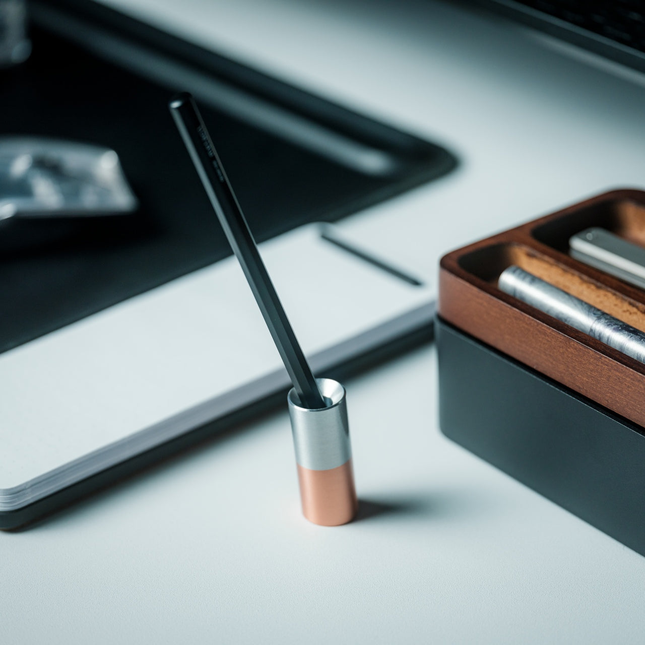
Most pen stands distract from the writing instrument they’re meant to showcase. The Serenity Pen Stand takes the opposite approach, reducing itself to near invisibility through radical simplicity. This minimalist cylinder features a cavity for pen tips and tilts slightly off-vertical for easier retrieval, creating an elegant pedestal that directs attention upward. The combination of aluminum body and copper base creates a subtle two-tone contrast while lowering the center of gravity for surprising stability despite the petite footprint.
The modest dimensions mean this stand occupies minimal desk space, fitting comfortably even on crowded surfaces. The weight distribution prevents tipping even with heavier pens, while the angled presentation makes grabbing your writing tool feel natural rather than requiring careful extraction. This design philosophy celebrates the pen as the protagonist, with the stand serving as supporting architecture rather than a competing feature. The copper bottom develops a natural patina over time, creating an evolving aesthetic that reflects your workspace’s history. For anyone who appreciates their writing instruments as prized tools rather than disposable supplies, this stand offers a reverent display option that respects both the pen and your desktop harmony.
Near-invisible design keeps visual focus on the pen itself.
Copper bottom provides excellent stability despite a tiny footprint.
Slight tilt makes pen retrieval feel natural and effortless.
Develops natural patina over time for evolving aesthetic character.
What We Dislike
Single-pen capacity requires multiple stands for instrument rotation.
A minimalist cavity may not accommodate unusual tip shapes or oversized barrels.
Organizing with Intention
The items featured here share a common thread beyond their Japanese design heritage. Each piece respects your attention by solving specific organizational challenges without introducing new complexity. Rather than adding systems that require maintenance and memory, these tools simply work better than their conventional alternatives. The result is an organization that happens naturally through superior design rather than forced discipline.
When your workspace contains tools that are genuinely pleasant to use and look at, maintaining order becomes effortless. These seven essentials prove that staying organized doesn’t require sacrifice or compromise. By choosing items that combine beauty, durability, and thoughtful functionality, you create an environment where productivity and tranquility coexist. The Japanese design philosophy embedded in each piece offers a masterclass in maximizing efficiency, transforming everyday objects into trusted companions.
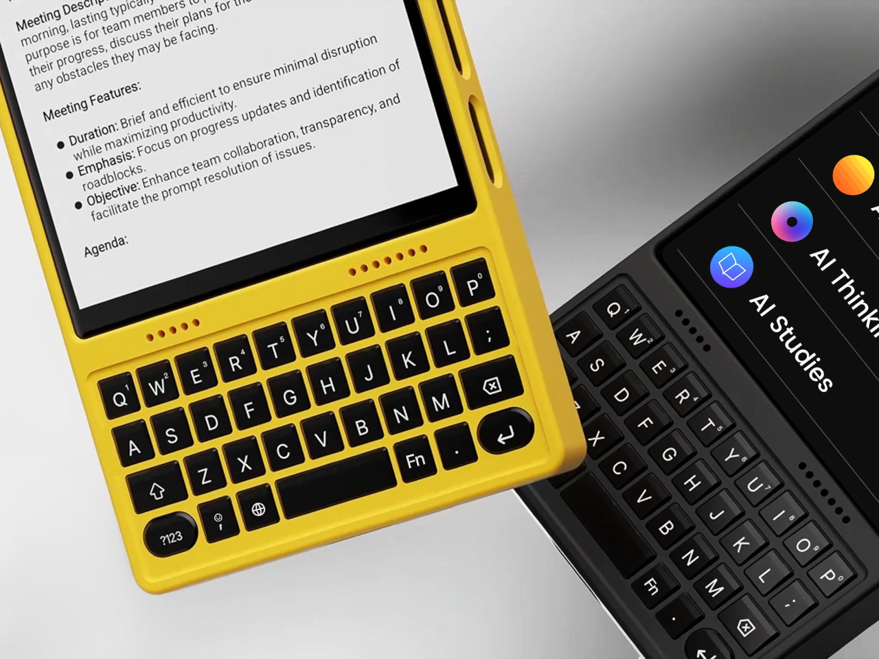
Typing long messages on glass feels clumsy, juggling Bluetooth earbuds means pairing headaches and dead batteries, and using wired headphones now requires a tiny USB-C dongle you will lose three times before accepting defeat. Phones have become powerful but strangely less tactile, and that clashes with people who write a lot, listen a lot, and still like the certainty of a cable and the click of a real key under their thumb.
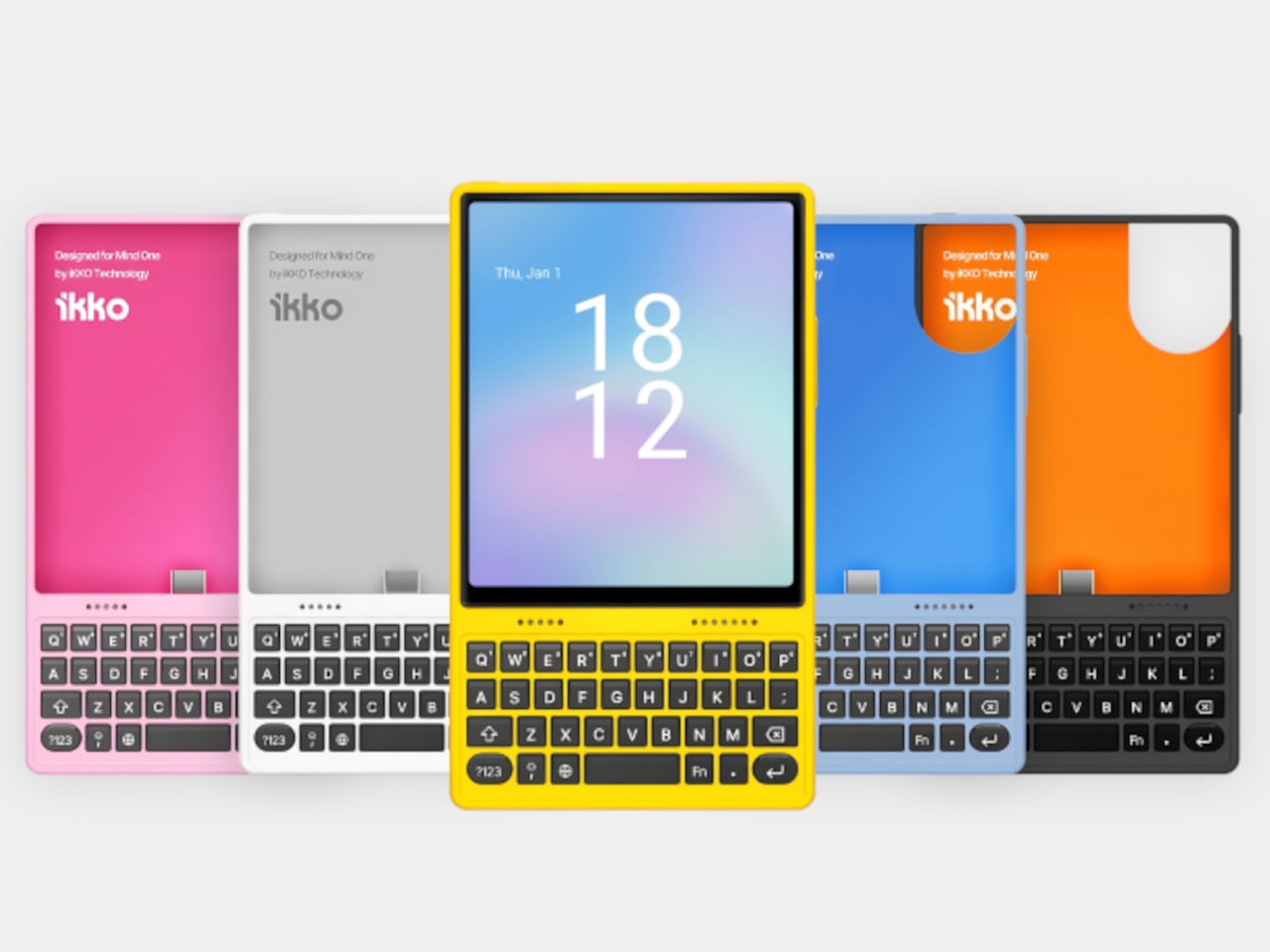
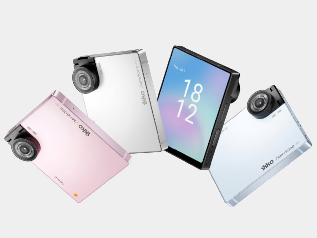
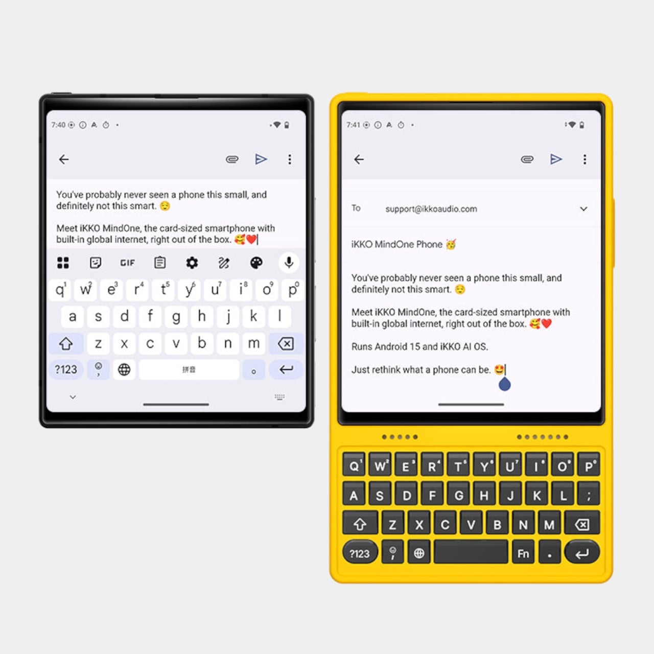
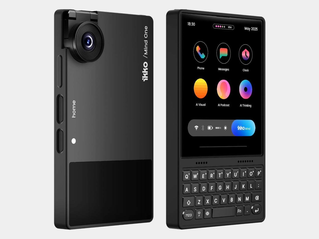
The card-sized iKKO is a small AI-centric smartphone built for always-on connectivity and lightweight productivity. The MindOne Snap-In Case is where it changes character, a snap-on expansion shell that adds a physical QWERTY keyboard, a proper 3.5 mm headphone jack, a dedicated DAC, and a small backup battery in one compact piece, turning the minimal phone into a tiny writing and listening machine.
The QWERTY keyboard changes the way MindOne is used. Raised, separated keys and a slightly sloped surface make thumb typing feel more deliberate than tapping on glass. It is something you reach for when drafting emails, capturing ideas, or editing text while AI handles summarizing and organizing in the background, treating the phone as a tool for active writing rather than just passive messaging and scrolling through feeds.
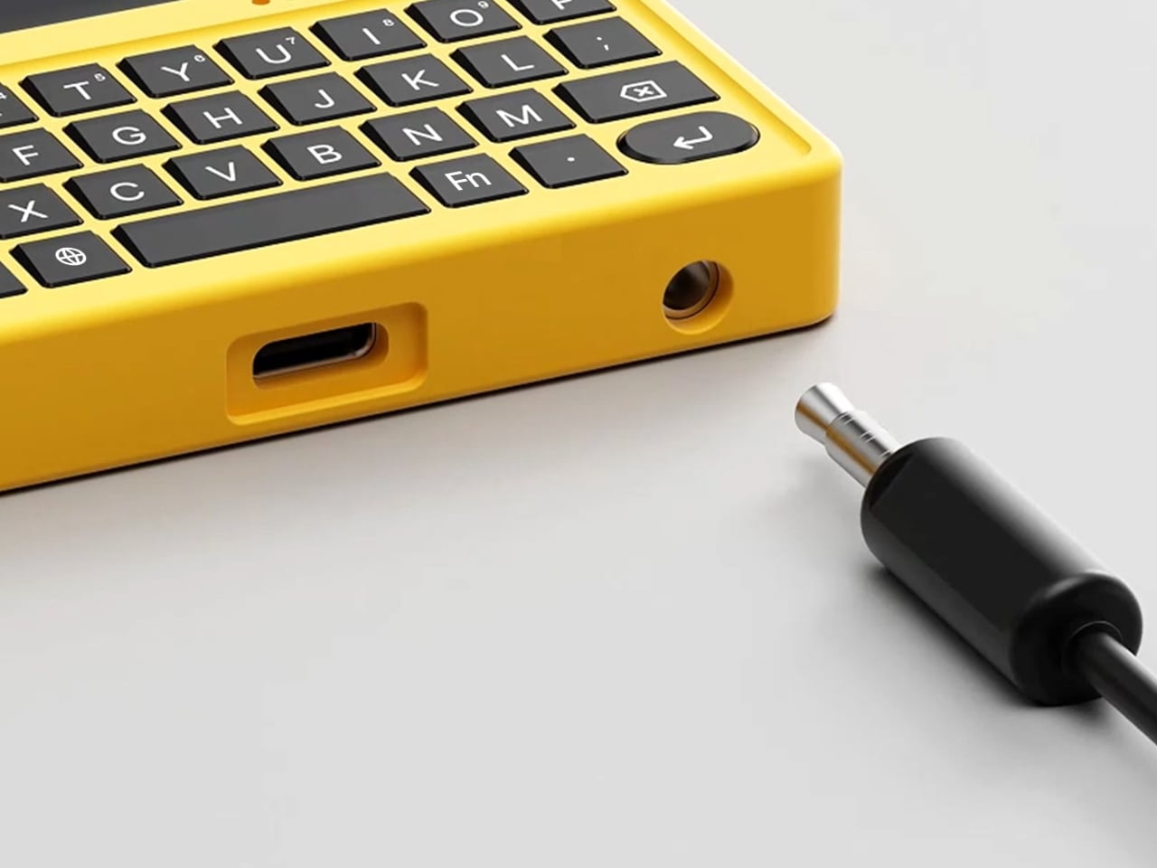
The case adds a 3.5 mm headphone jack backed by a Cirrus Logic CS43198 DAC, the kind of chip usually found in dedicated portable players. It supports Hi-Res audio with 32-bit/384 kHz PCM and DSD256, low-noise playback, and enough dynamic range to make lossless playlists and long podcasts feel crisp and detailed without worrying about pairing or battery levels in wireless earbuds that will die halfway through the flight.
The built-in 500 mAh battery is a quiet safety net rather than a second fuel tank. It tops up MindOne during long typing or listening sessions and helps offset the extra draw from the DAC and keyboard, extending comfortable use without turning the phone into a brick of battery cells. The point is not doubling battery life, but making intensive sessions feel smoother and less anxious.
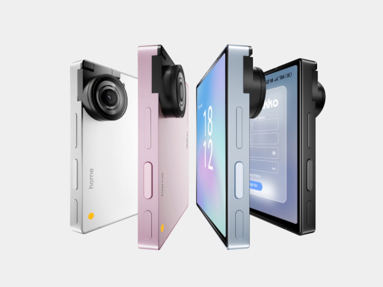
MindOne stays slim and card-like on its own, then becomes a different kind of device when it snaps into the case. You might carry the phone bare for quick AI tasks and navigation, then drop it into the case on a flight, in a café, or at a desk when you know you will be writing and listening for a while, using the same object in two distinctly different modes.
Customizable keycap stickers and a range of colors that match or complement the phone are not just fashion accessories; they are small ways to make a very compact device feel personal. The case is tuned to MindOne’s proportions and personality, not a generic keyboard sled trying to fit every phone, which makes the combo feel considered rather than cobbled together from unrelated parts.
The iKKO MindOne Snap-In Case is less about nostalgia and more about choice, letting a tiny AI phone become a pocketable notebook and Hi-Fi player when needed. Most phones today are sealed slabs, which makes this case feel like a quiet reminder that hardware can still click, plug in, and feel like something you work and listen with, rather than just stare at until the next notification arrives.
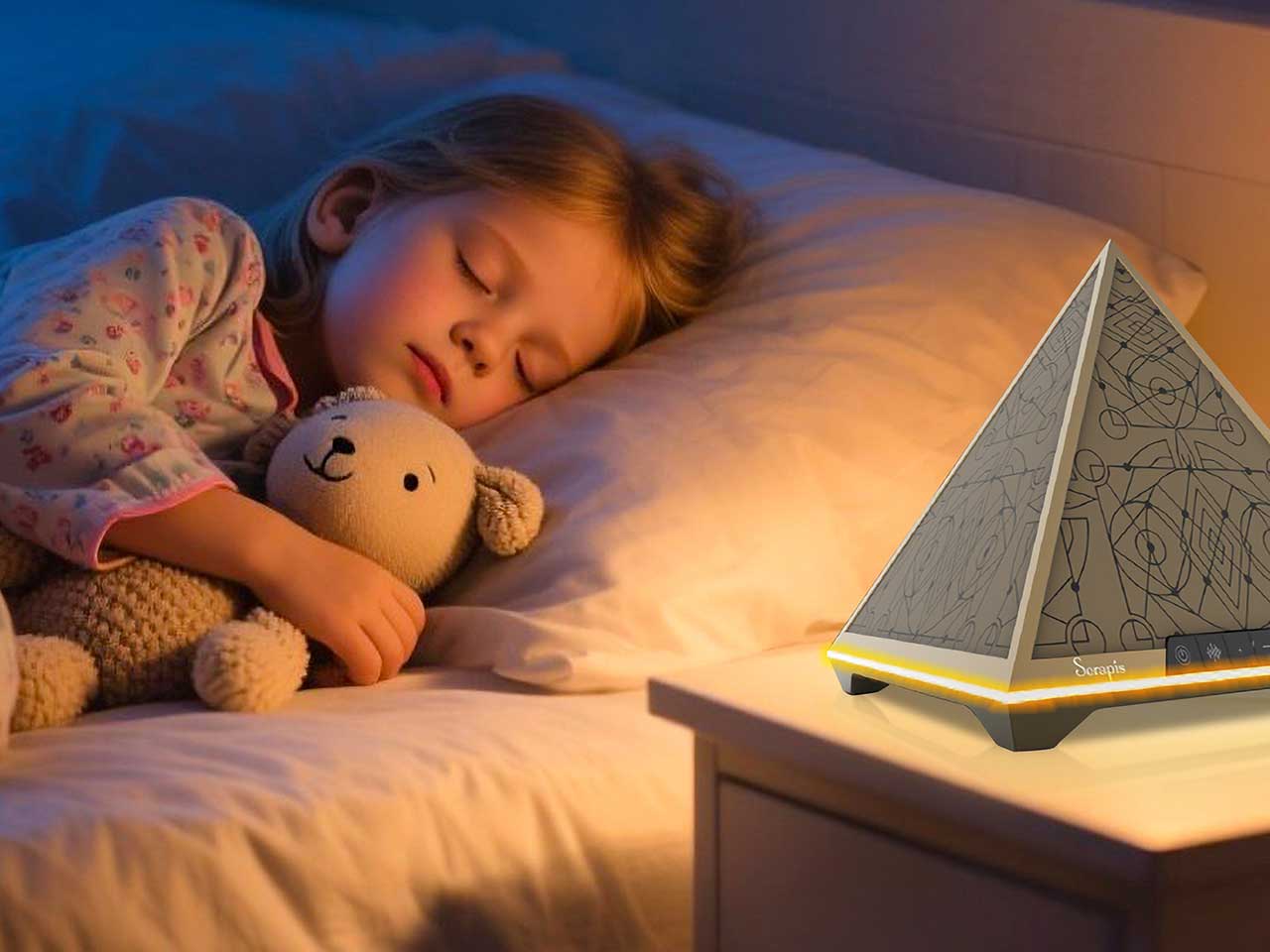
Sleepless nights do not all look the same. Sometimes it is a racing mind, sometimes it is waking at 3 a.m. and staring at the ceiling, sometimes it is jet lag or a room that never gets fully dark or quiet. The market has responded with a pile of separate gadgets, white-noise machines, sunrise lamps, breathing apps, meditation videos, each adding another thing to manage, charge, or remember to open before bed.
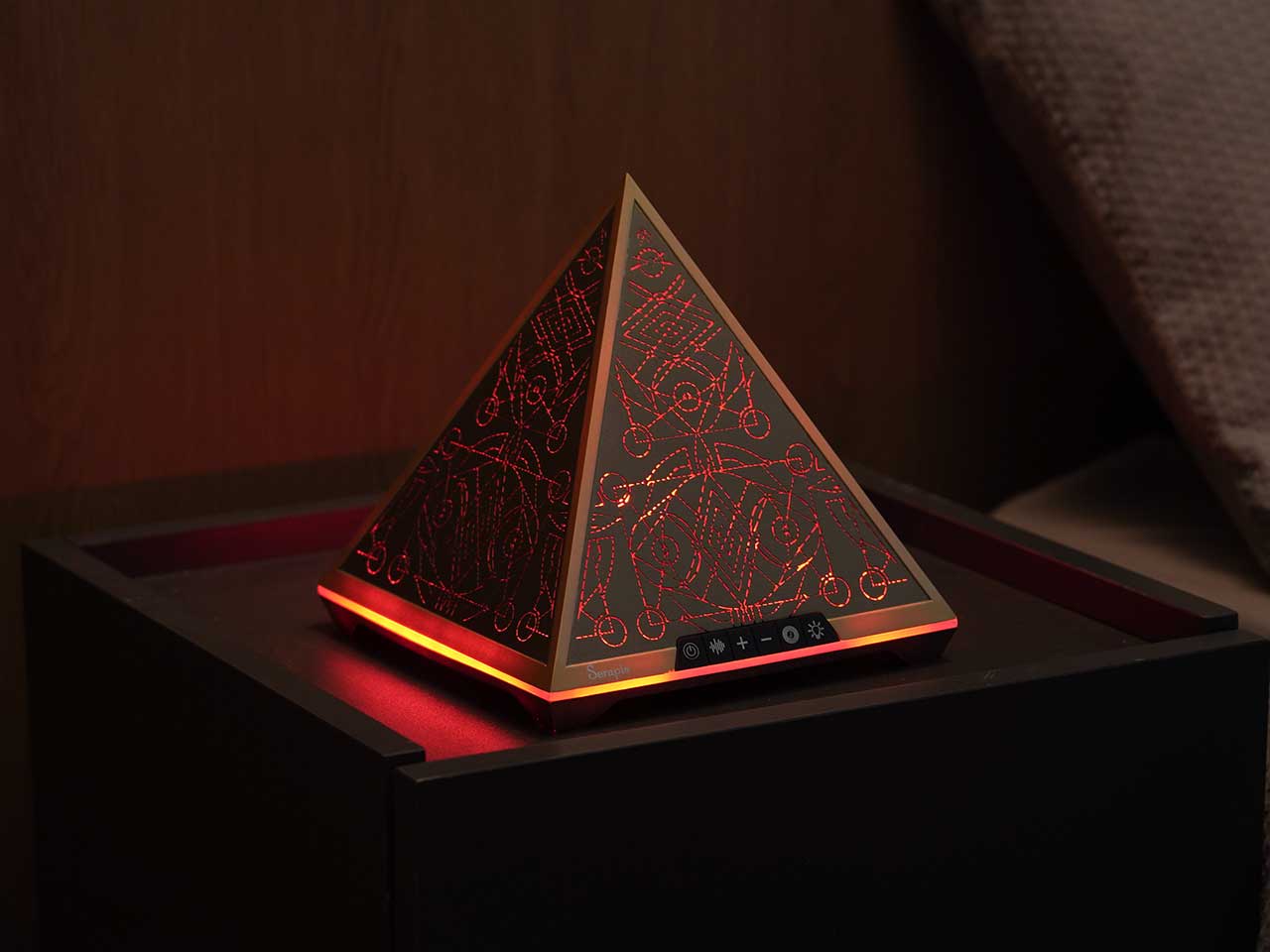
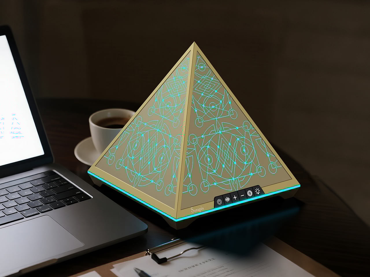
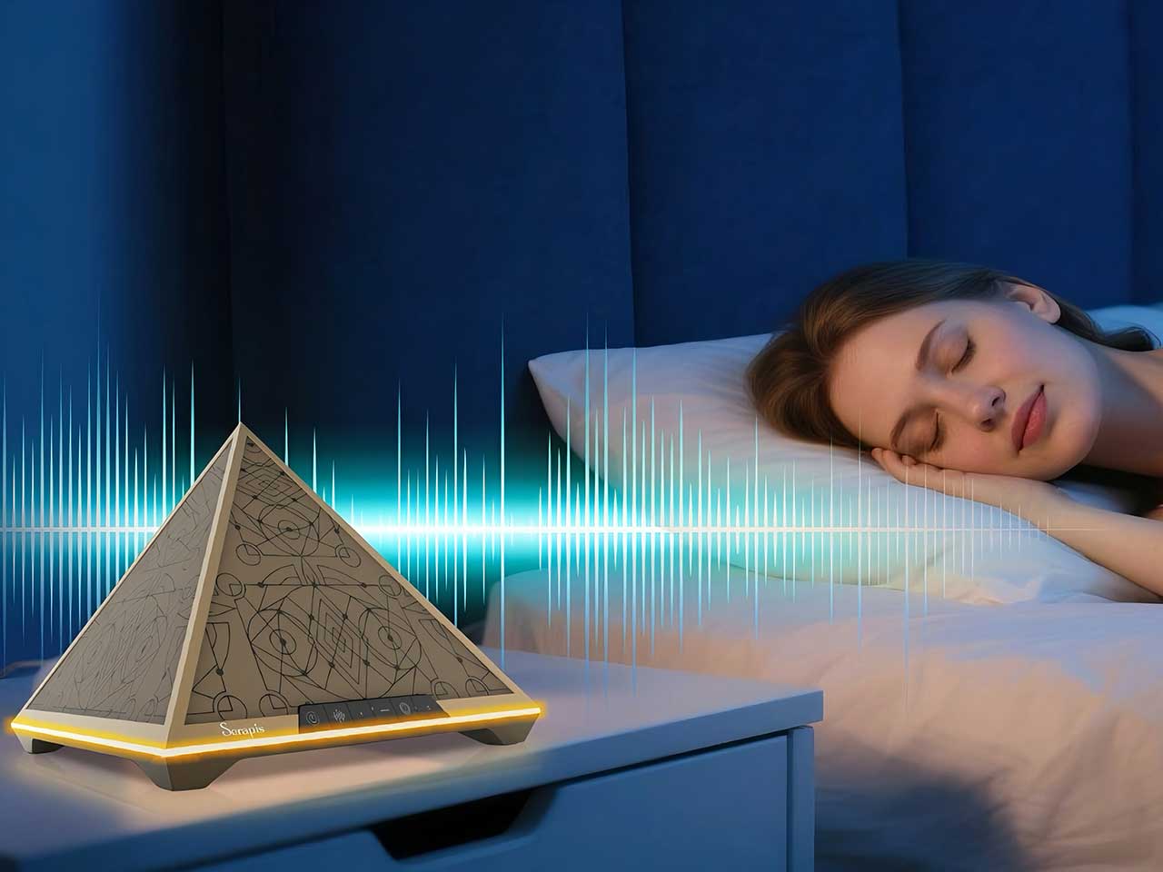
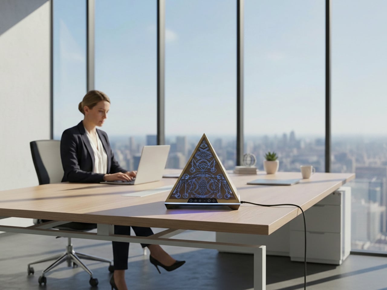
Serapis is an all-in-one sleep-aid system built into a pyramid-shaped bedside object. It combines layered white noise, breathing light, Somnofractal visuals, Schumann Resonance, and calming geometry into one device that sits by the bed and works without an app. The idea is to help the brain settle using sound, light, rhythm, and pattern, working quietly together instead of juggling multiple tools or staring at another glowing screen right before trying to sleep.
Not all sleepless nights have the same root, so Serapis uses a short, 2-minute sleep-type test to map people to patterns like overthinking, jet lag, sensitivity to noise or light, physical discomfort, emotional heaviness, or trouble falling asleep. The device offers modes tuned to those patterns, so an overthinker might get more visual guidance and gentle noise, while a light-sensitive sleeper leans more on sound and subtle breathing light that does not brighten the room.
The five-part tech stack works in sync. Schumann Resonance at 7.83Hz runs as a low-frequency backbone that quietly syncs with alpha waves. Layered white noise blends deep delta tones with soft pink noise to mask distractions. Breathing light pulses in 8 to 12 second cycles and seven color temperatures to nudge your own breathing slower. Somnofractal visuals give your eyes a predictable pattern to follow for a minute or two, and the pyramid geometry diffuses sound while acting as a visual anchor.
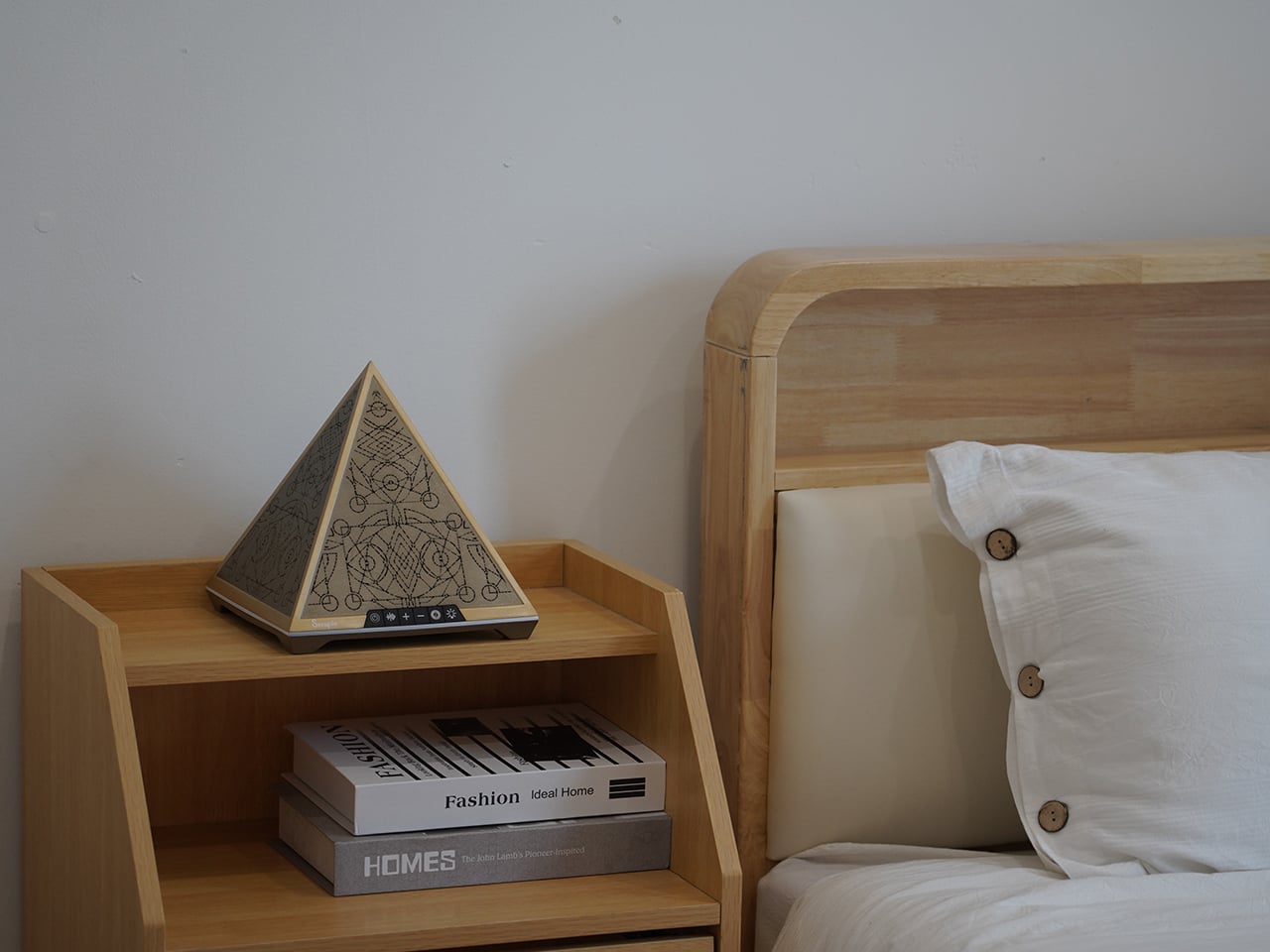
The nightly ritual is simple. You place Serapis on a bedside table, press a touch control to power on, choose between a preset duration of 30 or 60 minutes, and let the combination of sound, light, and pattern run while you lie down. There is no need to unlock a phone, open an app, or stare at a bright screen. The device is meant to be a quiet, science-inspired presence rather than another source of stimulation.
Serapis measures roughly 200 × 200 × 205 mm and has a net weight of around 1.2kg, giving it enough heft to feel like a real object. The pyramid form, etched with Somnofractal patterns, is designed to look intentional on a nightstand, and the internal hardware, speakers, and light modules are housed in metal and plastic with a 12 V input. The emphasis is on a minimalist, all-in-one experience that feels like part of the room instead of another gadget.
Serapis suggests a shift away from managing sleep problems piecemeal and toward letting a single object handle the transition from busy mind to rest. Instead of piecing together white noise from one place, breathing exercises from another, and a visualization from a third, you press a button and let a coordinated system of sound, light, rhythm, and pattern do its work. For people who want their bedroom to feel calmer rather than more connected, that kind of integrated, screen-free ritual is where a device like this quietly makes sense.
The concept world is strange and amusing at the same time. Some motorcycle concepts are outright genius designs that catch the eyeballs of established manufacturers who love the fresh approach of creative designers, while others lie in the pure bizarre domain that cannot see the light of day for their impractical design.
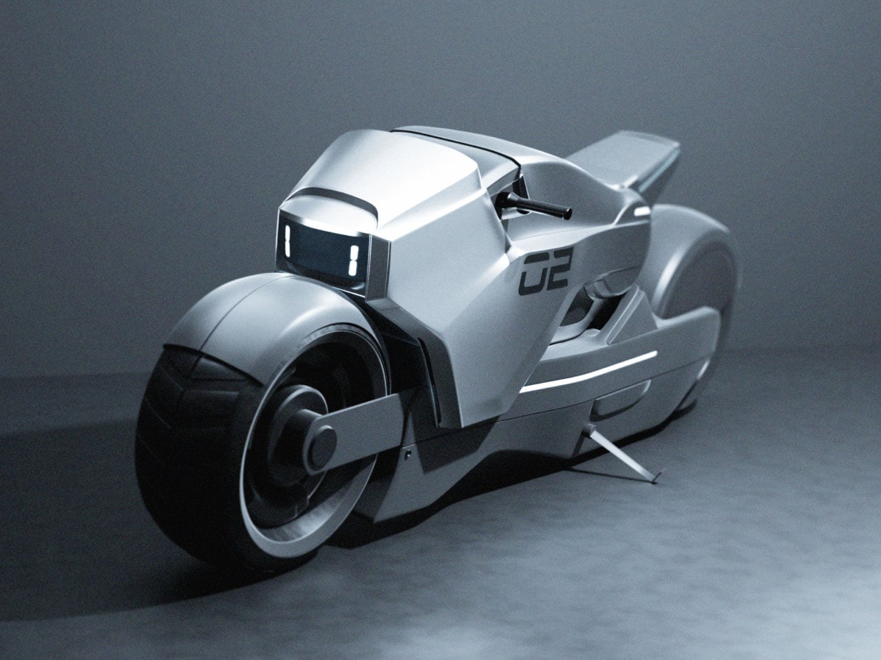
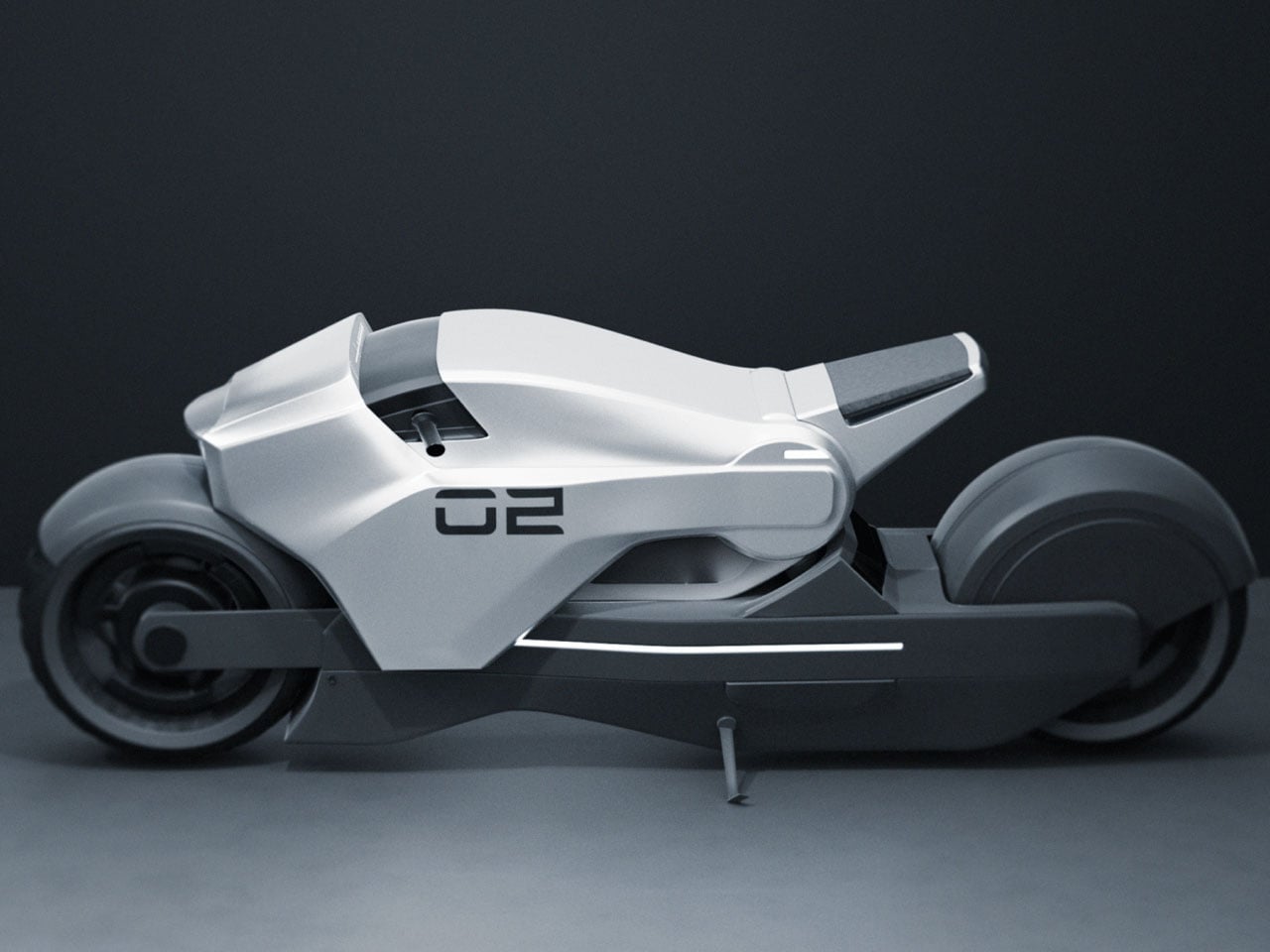
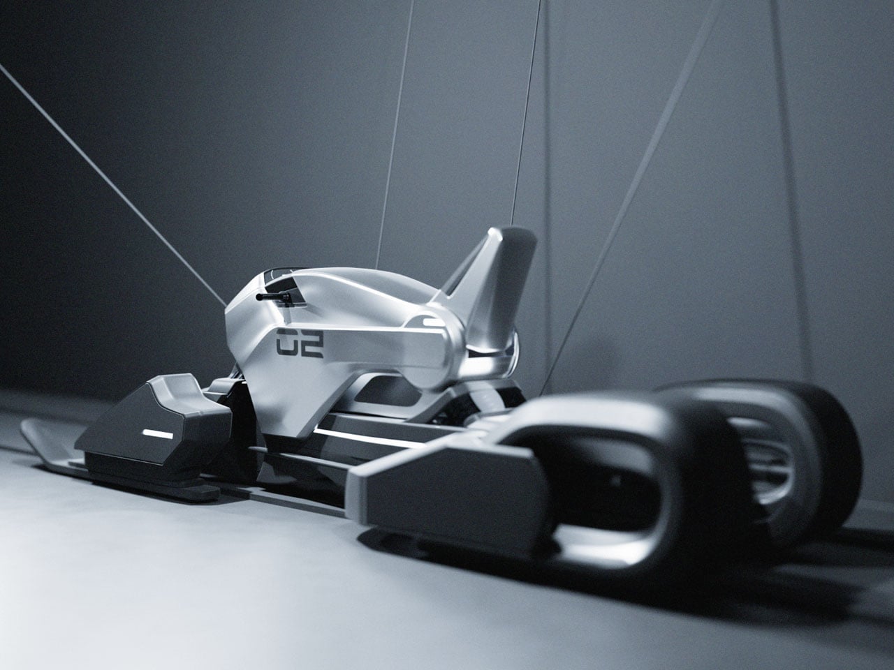
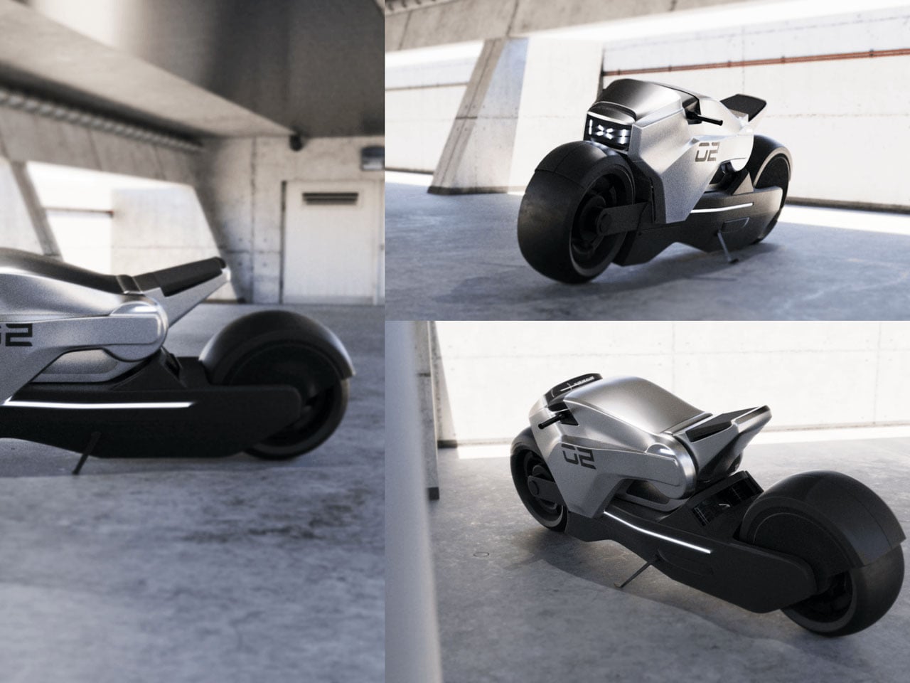
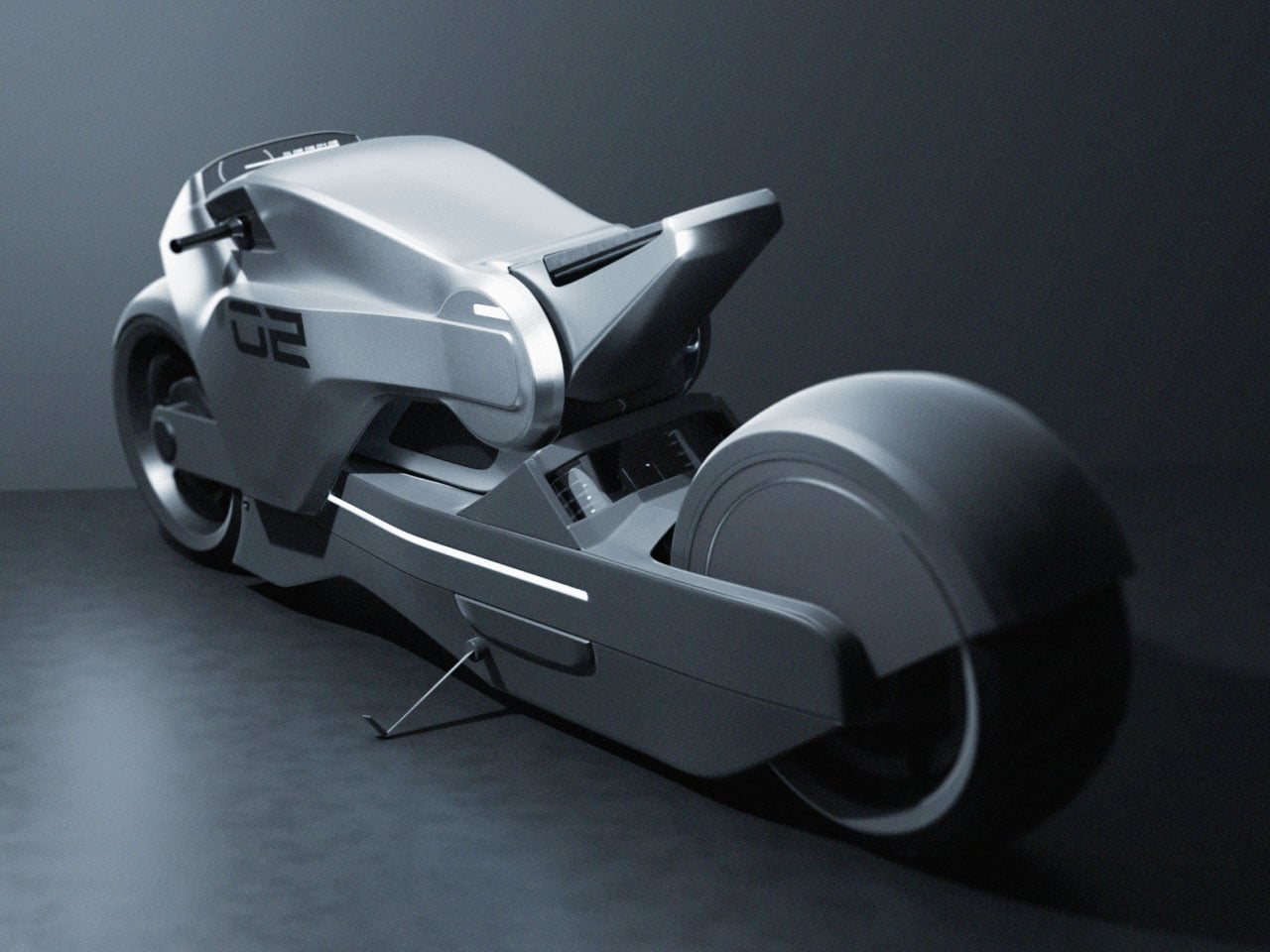
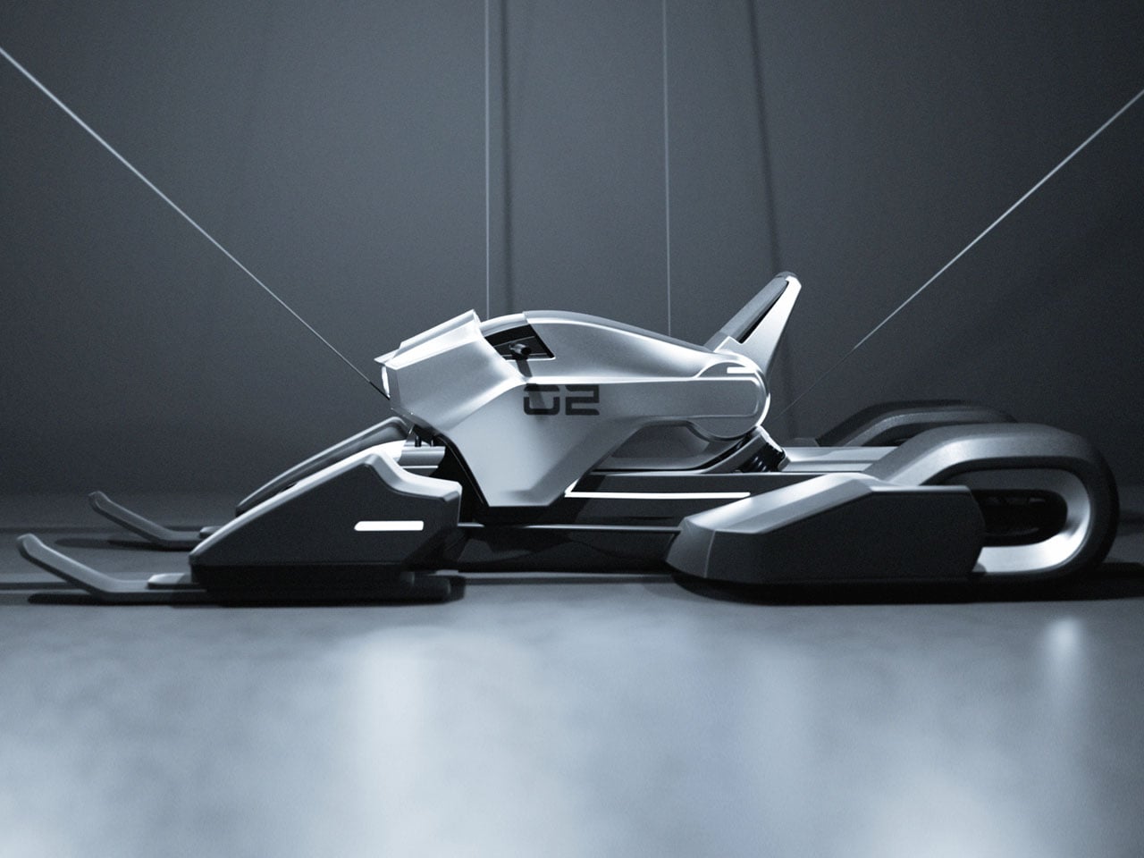
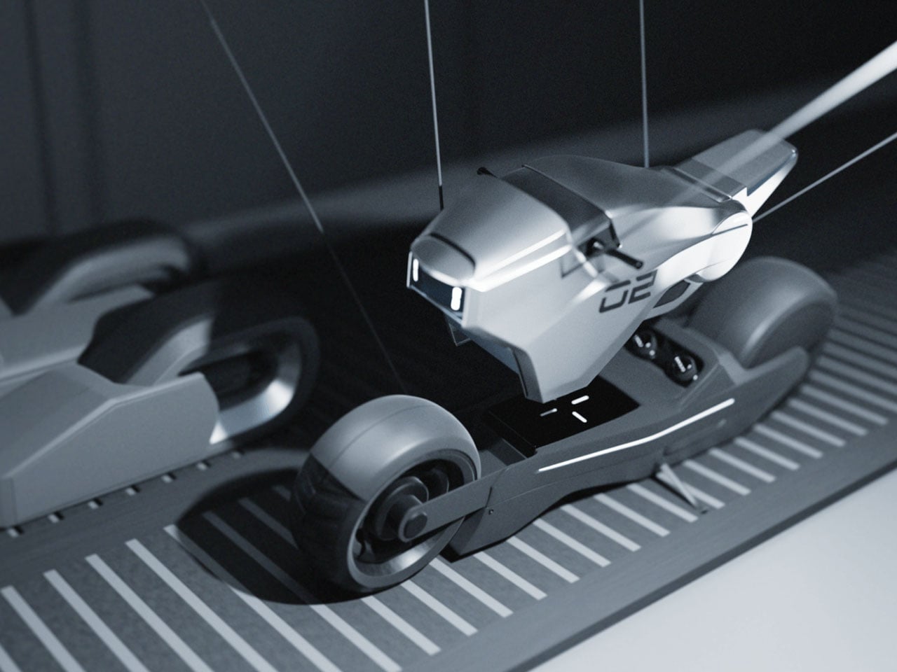
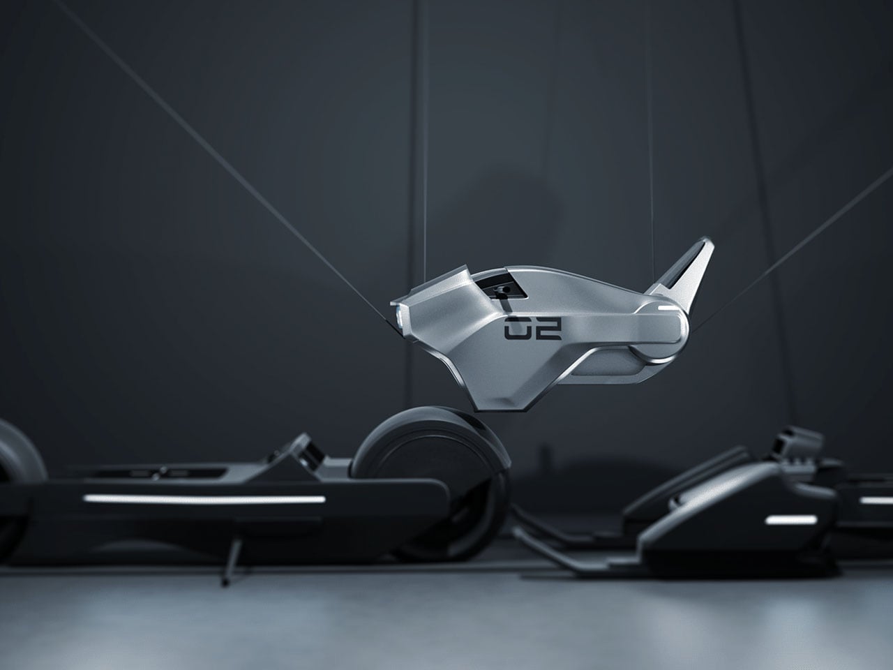
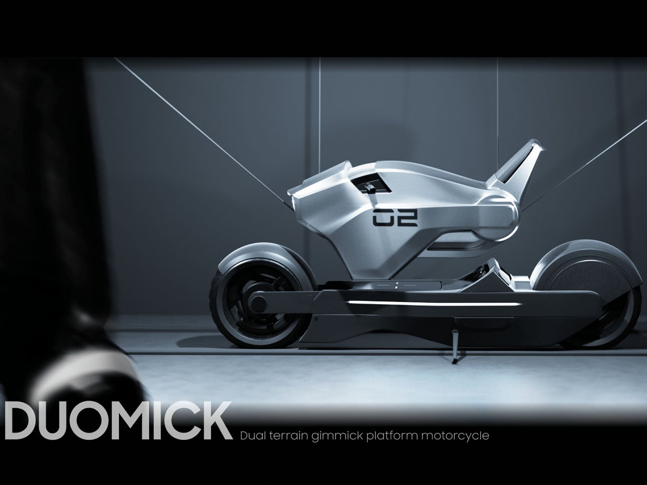
We tend to lean more towards the former category of concept bikes, so that a vision of future automotive trends could be gauged. The DUOMICK dual platform motorcycle is the latest one that impressed us. Based on a modular design inspiration, the bike is good both on solid land and on snowy terrain.
In the bike mode, the café racer-inspired two-wheeler gets a set of wheels for city rides, while the snowmobile mode has the snow track, skid, and skis. The transition is made by lifting the body frame and resting it on the respective drivetrains that presumably sit parked in the garage. Made out of unibody material, the main frame is universal and valid enough for both modes. The wishbone suspension system is of superior materials to withstand the tortures of rough terrain and the strains put on the bike while riding at high speeds.
The saddle of the DUOMICK bike can be rotated depending on the seating position, based on the mode selected. In the bike mode, the sitting position is more low-slung, while the snowmobile mode has a more upright sitting position. Road presence of this concept is more towards a muscular appeal with chunky tires and a futuristic headlight gracing the silver-gray body. When it turns into a snowmobile, the aggressive stance is morphed into a classy form that’s fit for a Bond movie plot.
The idea of this concept is interesting, and in a real-world situation, making the shift from bike mode to snowmobile mode should require precision placement and care of the chassis. It’s just like fitting a steering wheel on the modern supercar (Aston Martin Valkyrie or Lamborghini Egoista), Motorsports racer, or Formula-1 beast.
Spigen keeps one foot planted firmly in Apple’s past. Their retro-inspired cases have become something of a signature move, from iMac G3 translucent homages to see-through AirPods cases that capture Jony Ive’s obsession with showing off internal components. The accessory maker has proven there’s a market for nostalgia you can actually use.
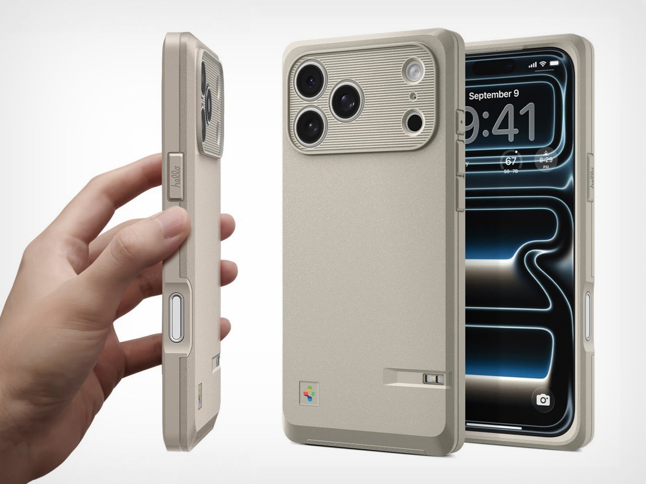
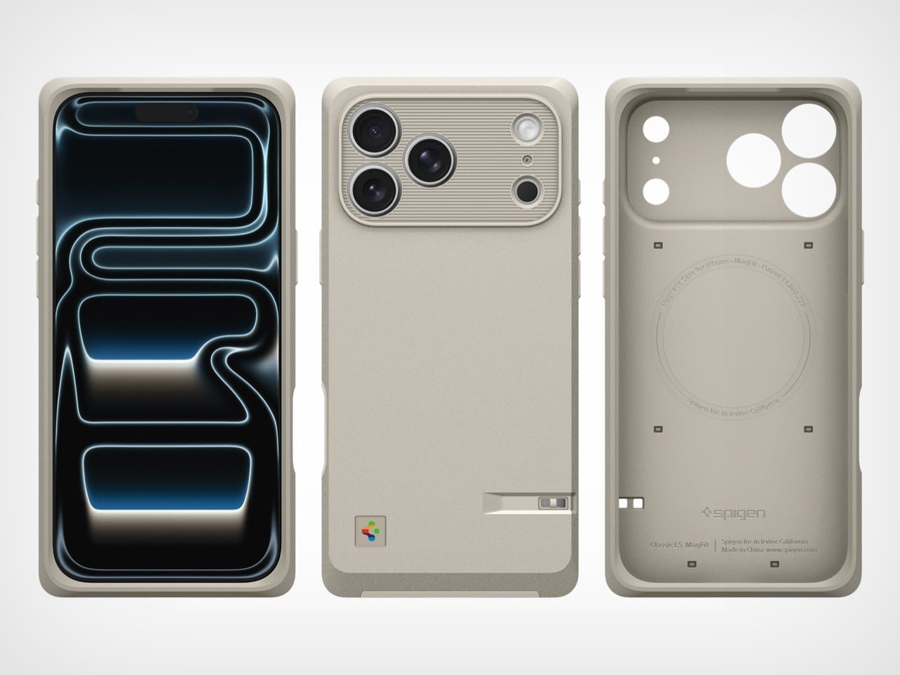
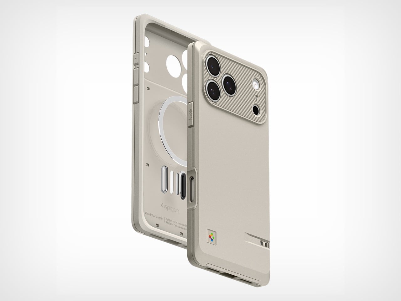
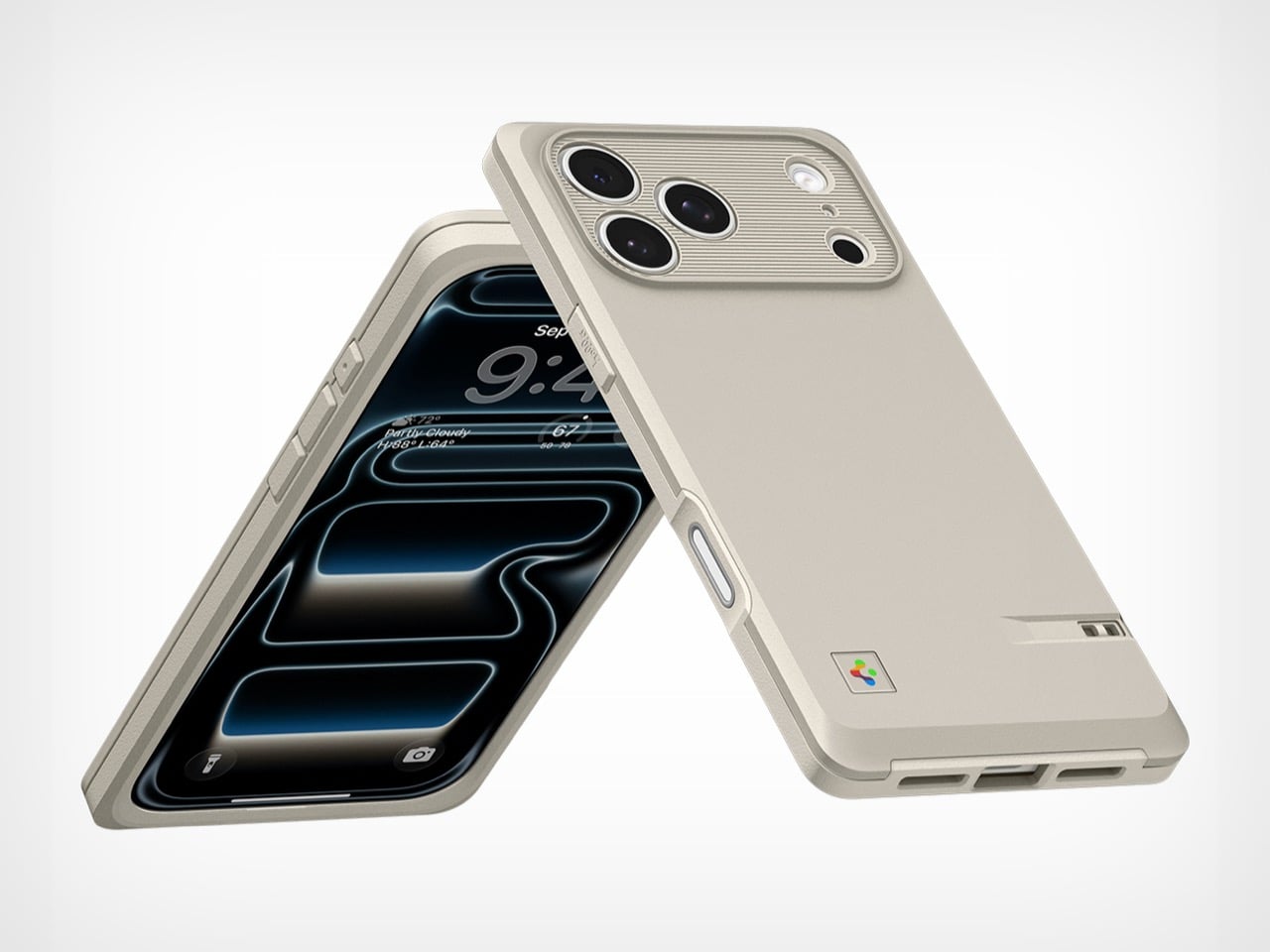
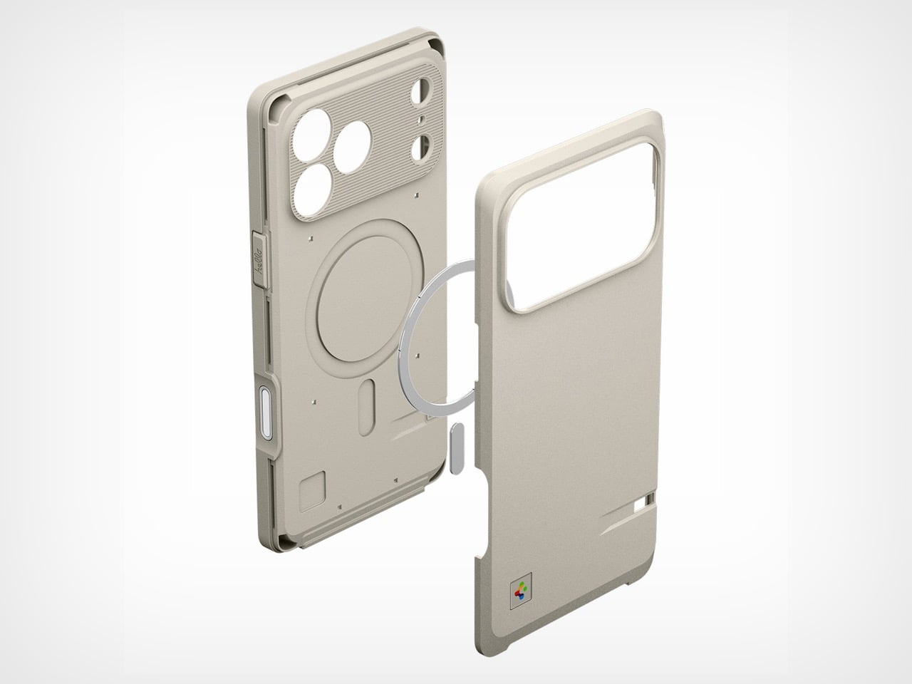
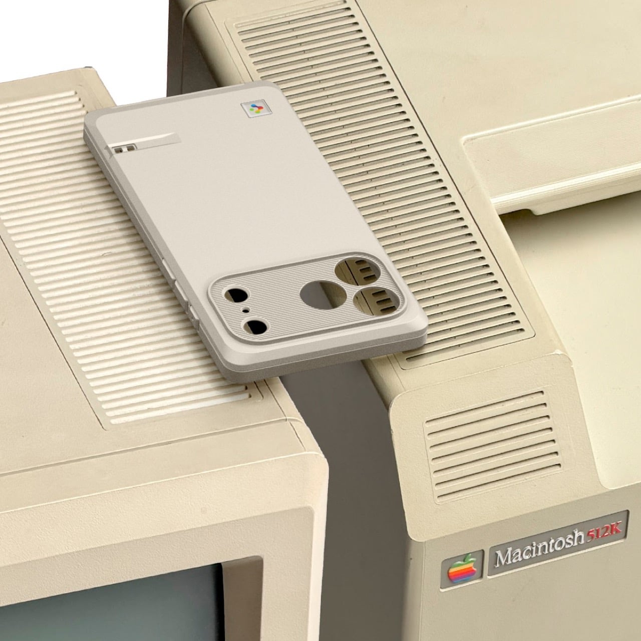
The Classic LS marks a pivot from colorful transparency to utilitarian elegance. Celebrating Apple’s 50th anniversary, this new case reaches back to the Macintosh 128k and Apple Lisa era, when computers came in beige enclosures and harbored revolutionary ambitions. The platinum-gray finish, ridged camera module, and rainbow logo placement all reference those iconic machines. Spigen has managed to honor the design legacy and vision Steve Jobs set in motion while keeping features like MagSafe and Camera Control Button functionality intact.
Pivoting to the 128k and Lisa is a deliberate, almost academic move compared to their previous work. The iMac G3 was about making computers seem fun and harmless; the Macintosh was about making them seem possible. This case captures that earlier, more serious ethos. The horizontal ridges around the camera module directly evoke the necessary ventilation slats of those CRT-era machines, and the case’s texture feels like a direct nod to the plastics of the time.
All this design reverence would be wasted if it didn’t work as an actual case for a 2026 flagship. Spigen is limiting this to the iPhone 17 Pro and Pro Max, with built-in support for the Camera Control Button (rather than a mere cutout). For $39.99, you get the expected MagSafe ring and a discrete lanyard cutout, so the aesthetic doesn’t compromise modern convenience. This is a piece of designed history that actually functions as a daily driver, not just a shelf-bound novelty item.
It’s just refreshing to see an accessory that has a real, informed opinion. The market is drowning in a sea of identical clear cases and minimalist leather folios that say absolutely nothing. The Classic LS, however, makes a statement. It’s for a different kind of Apple enthusiast, one who appreciates the foundational designs that made today’s devices possible. It wraps a sleek, modern slab of technology in something with texture, history, and a point of view. Spigen has managed to create a product that feels both nostalgic and completely current.
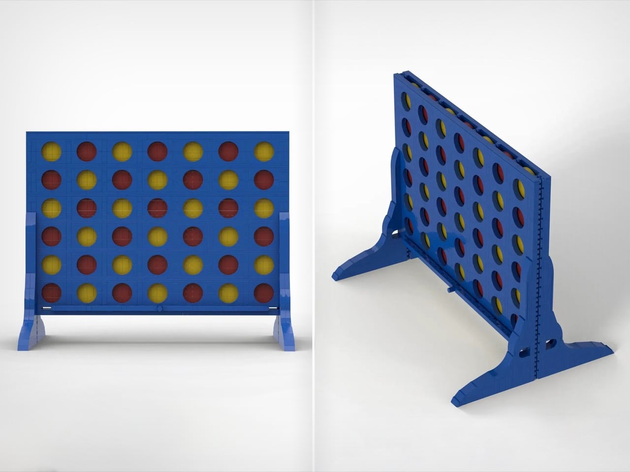
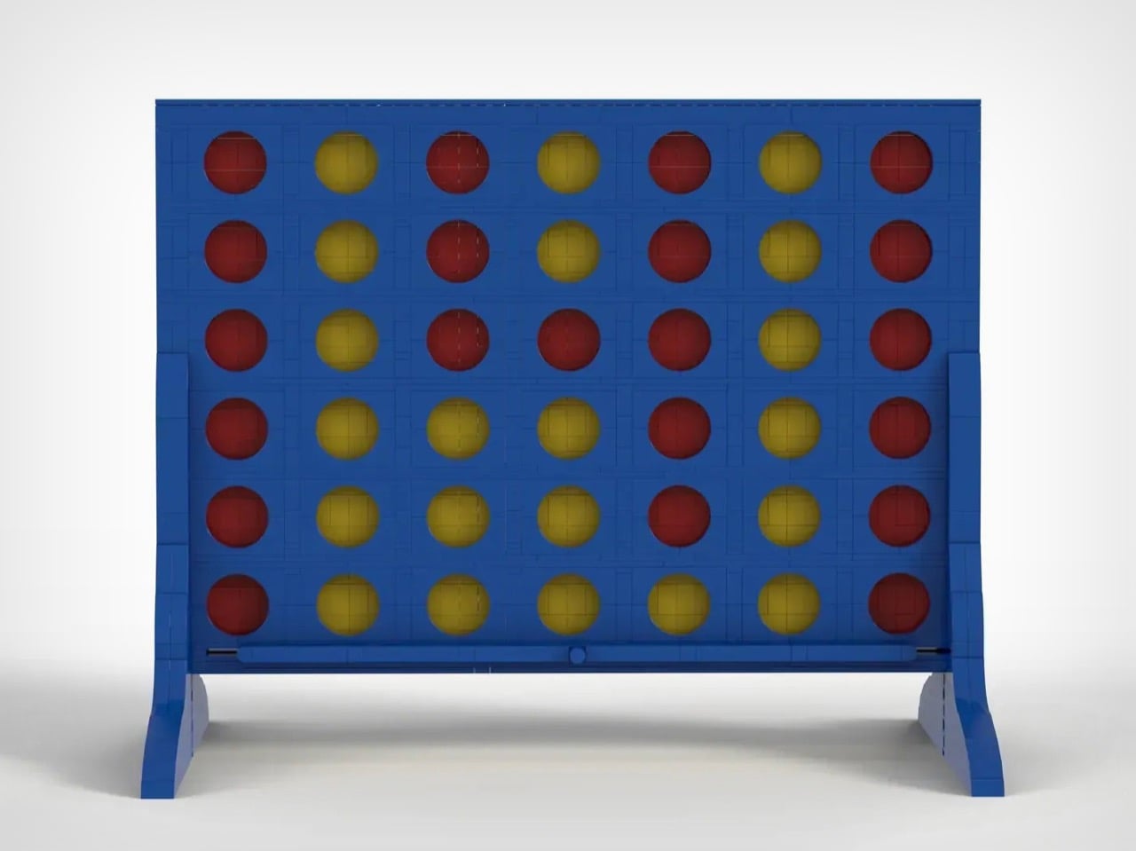
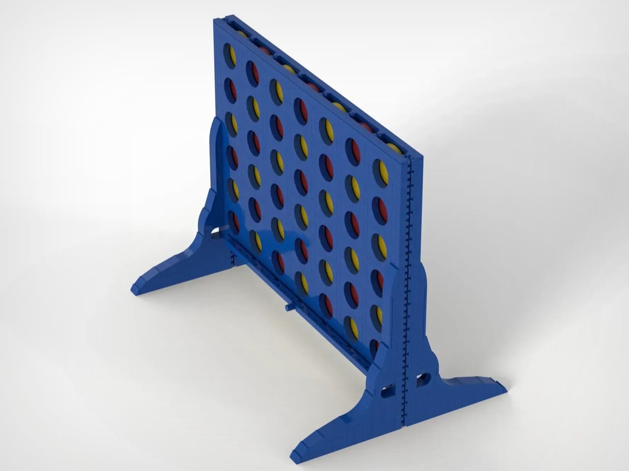
There aren’t many LEGO sets designed to played with once they’re built. A lot of them are envisioned as show-pieces, and yes, you can do imaginary play with them like you would holding a LEGO Millennium Falcon and whooshing around the house, but this MOC from HH Bricks captures a kind of LEGO playability that’s absolutely rare. Inspired by his daughters’ love for building and playing with LEGO, HH Bricks designed this playable version of one of the world’s most popular tabletop games.
For those uninitiated, Connect 4 is a simple game where you drop tokens down a vertical slot-board, trying to build a set of 4 tokens in a straight line. Your job is to simply build a straight line without being stopped, while also consistently breaking your opponent’s ability to build a solid 4 streak on their own. The game just celebrated 50 years since it was first invented in 1974 (and commercially sold in ’75), and this set recreates the game’s strategic magic, just using LEGO bricks.
Designer: HH Bricks
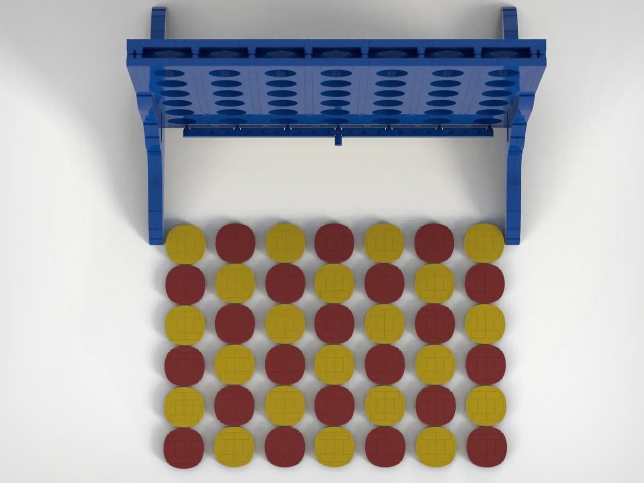
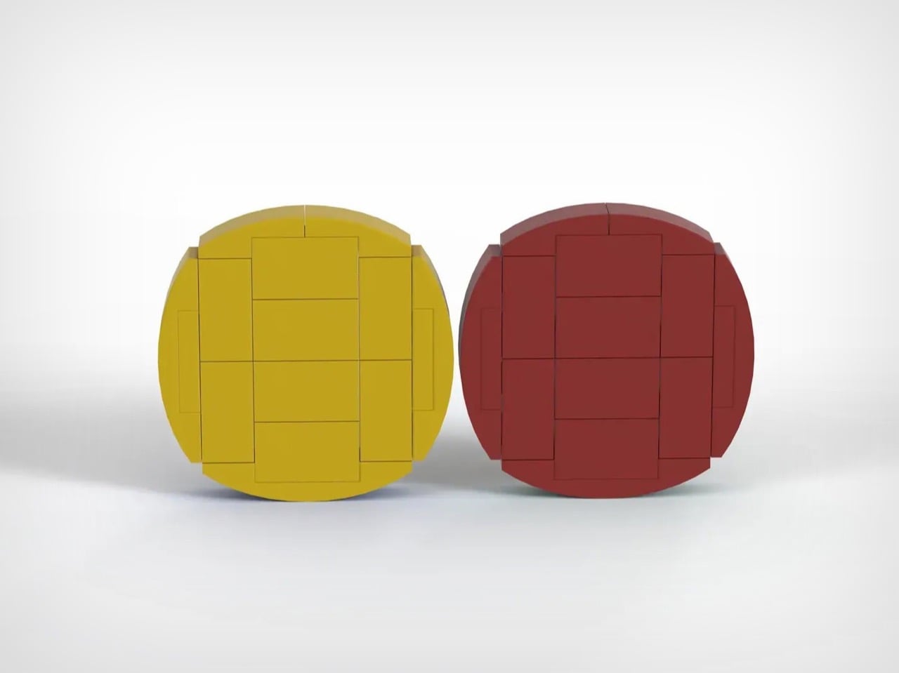
Although HH Bricks doesn’t specify how many pieces come together to build this set, one could venture it’s easily in the higher end of the spectrum, just because of how many tiny single or double-stud bricks were used to build the set’s flat panels and the 42 tokens that come along with the board. Flat surfaces are fairly complex in LEGO, not because of any visual complexity, but just the fact that they require a lot of bricks to build out.
The rules are ridiculously simple. Each player chooses a color and gets to work, dropping tokens into any slot they want. Beat your opponent by building a connection of 4 tokens in the same color in a straight line (horizontal, vertical, or diagonal). Some people even play a double-streak round, trying to hit two connections to eventually win the game. Once the game is over, simply pull out the bottom tray and all the tokens come crashing out, reseting the game for the next session.
If you’re here you’ve probably heard of LEGO Ideas – the online forum where LEGO fans and enthusiasts build, share, and vote for MOCs (or fan-made My Own Creations). This LEGO Connect 4 set is a part of the Ideas forum too, having racked up more than 2,800 votes as of writing this. The ultimate goal is to hit the 10k vote mark (which this MOC has 478 more days to reach), following which LEGO’s internal team reviews the build and turns it into a retail box set if everything goes well. The first step, however, is to hit that 10,000 vote mark, which you can help HH Bricks reach by voting for their MOC on the LEGO Ideas website here!
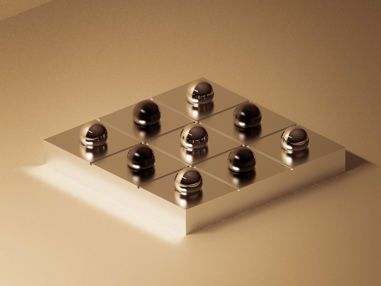
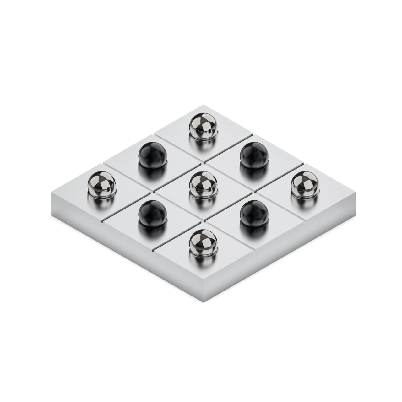
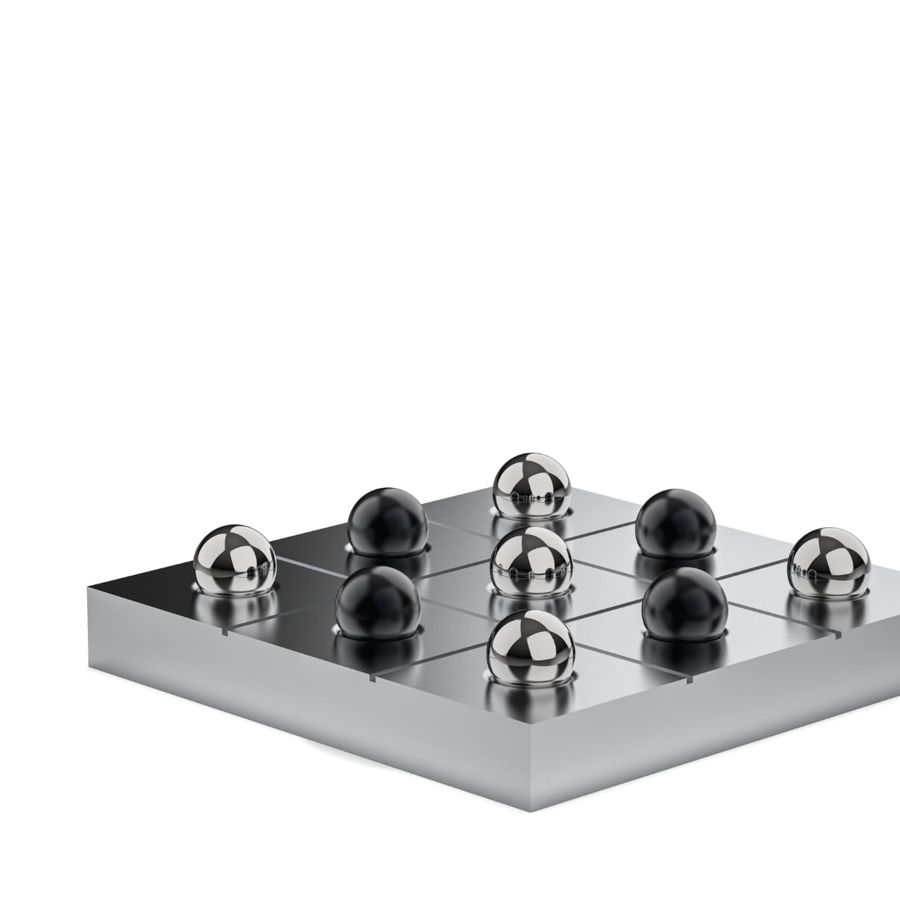
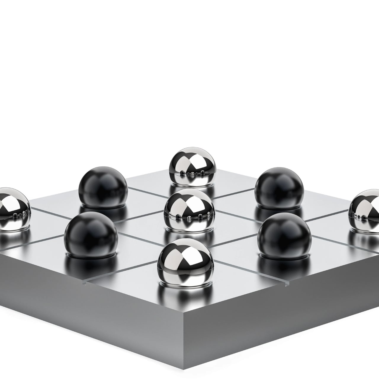
You know that feeling when you see something so beautiful and unnecessary that you immediately want it? That’s exactly what happened when I discovered Bionic’s Tic Tac Toe set. And before you ask, yes, it costs $600. Yes, it’s just Tic Tac Toe. And yes, I’m completely obsessed with it.
Paris-based design studio Bionic just dropped this made-to-order piece, and it’s causing quite the stir in design circles. Not because it reinvents the wheel or solves some massive problem, but because it does the opposite. It exists purely to make you pause, sit down, and actually be present for a moment. In a world where everything screams productivity and optimization, here’s a luxury object that says “hey, maybe just play a simple game for three minutes.”
The base is machined from a single solid block of aluminum, which immediately tells you this isn’t your childhood travel game. It’s heavy, grounded, and precise in a way that makes you want to run your fingers along its edges. The grid isn’t painted or etched on after the fact. It’s formed through machining alone, no decorations, no unnecessary flourishes. Just clean lines and intention.
Then there are the playing pieces, and this is where things get really interesting. The O’s are five mirror-polished stainless steel pawns that catch the light beautifully. The X’s are five black anodized aluminum pawns, each individually CNC machined and finished. Bionic specifically designed them to feel distinct in your hand, because this isn’t about rushing through a game. It’s about the tactile experience, the weight of each piece, the contrast between materials.
I’ll be honest, when I first saw the price tag, I laughed. Six hundred dollars for Tic Tac Toe? But then I started thinking about what we’re actually willing to spend money on. We drop thousands on desks and chairs for productivity. We buy standing desks and ergonomic everything because we’re optimizing our workspace for maximum output. But what about objects that exist purely to give us a break from all that?
Bionic wrote something in their product description that really stuck with me: “Some objects exist to help us work faster. Others exist to give us a moment away from that rhythm.” This Tic Tac Toe set is firmly in the second category. It’s designed to live on your desk or coffee table as a reminder that not everything needs to justify itself through efficiency. And honestly? That feels kind of revolutionary right now. We’re so addicted to hustle culture and productivity hacks that an object designed specifically for pausing feels almost subversive. It’s a sculpture you can interact with, a conversation starter that actually starts conversations instead of just sitting there looking pretty.
The made-to-order aspect adds another layer. This isn’t mass-produced. You’re not going to see these everywhere. It’s exclusive in the truest sense, crafted specifically after you order it. For collectors and design enthusiasts, that matters. It’s the difference between owning furniture and owning a piece. Is it practical? Absolutely not. You could play Tic Tac Toe with literally anything. Pen and paper works just fine. But that’s missing the entire point. This is about elevating something simple and familiar into an experience. It’s about materials, craft, and intention. It’s about having an object in your space that exists purely because it’s beautiful and makes you smile.
Bionic specializes in precision-machined aluminum accessories and workspace tools, all crafted in Paris with that distinctly European sensibility where form and function aren’t at odds. Their whole philosophy is about creating beautiful, thoughtfully designed products that are tools for daily life. This Tic Tac Toe set might be their most purely playful creation yet. So will I spend $600 on this? Maybe not today. But I love that it exists. I love that someone looked at Tic Tac Toe and thought, “what if we made this as beautiful as humanly possible?”
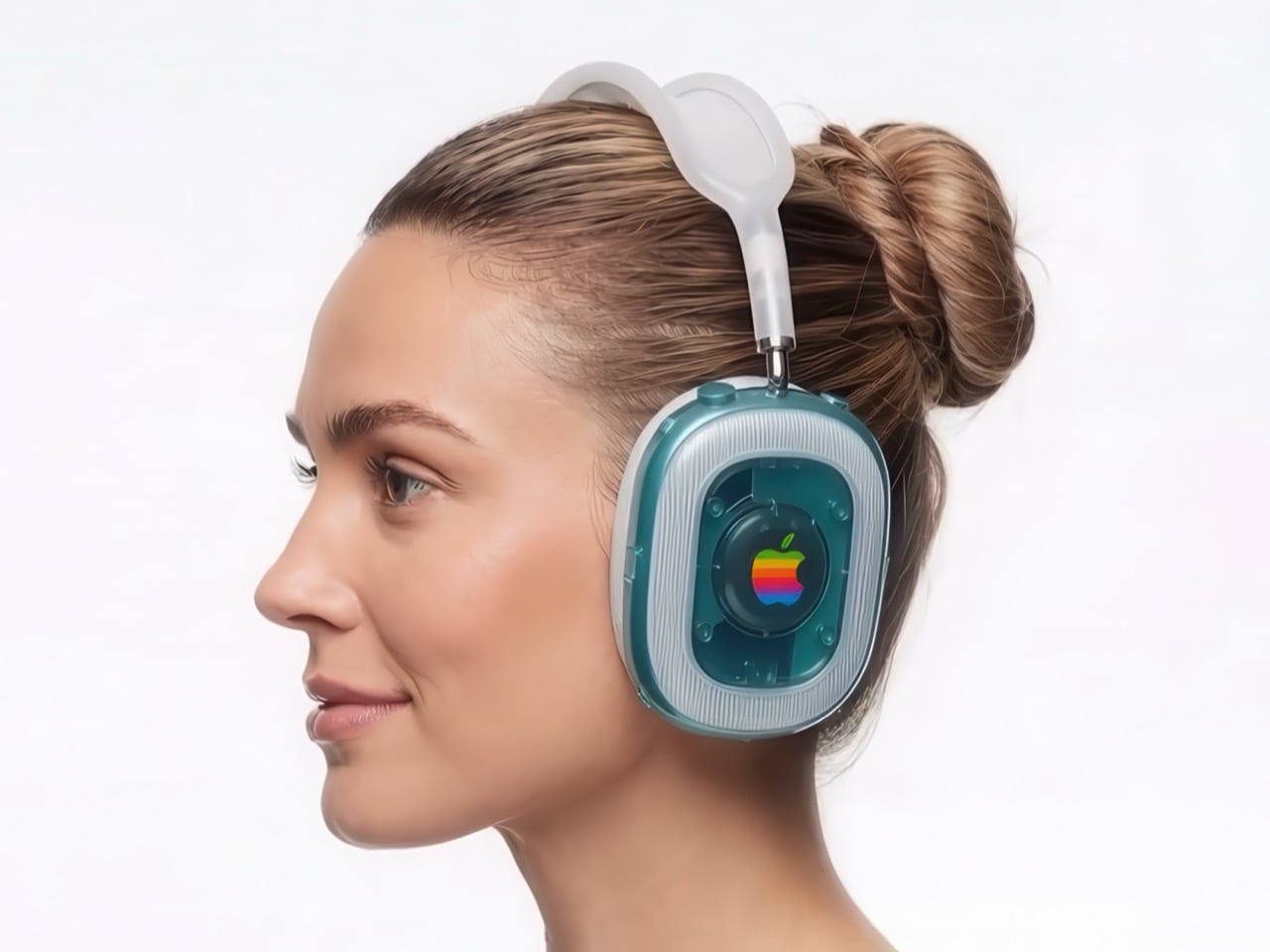
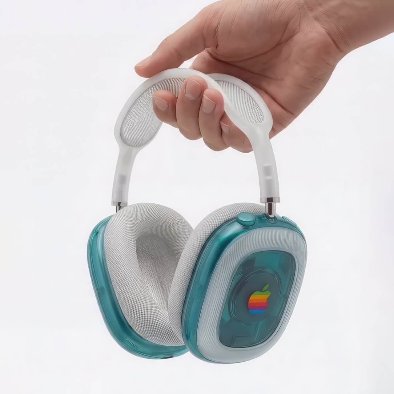
Sure, the AirPods Max come in colors – but there’s something so cold and un-emotional about anodized aluminum. It grabs your eye, but then immediately lets your eye wander once your fingers have run past its cool matte surface. Aluminum’s only purpose was to help build devices that were sleek and thermally advantageous. The problem, however, is that the AirPods Max aren’t ‘sleeker’ than your average headphone. Again sure, the MacBook Air looks so much thinner than the other average laptop – but aluminum in headphones achieves nothing. It adds weight, makes the head feel heavy, and doesn’t even look as eye-catching as some of its plastic-based counterparts.
Saffy Creatives recognized this and decided to give the AirPods Max a rather fitting makeover. After reinventing the Apple Watch as a G3-inspired retro-dream, they’re back with a redesign for the AirPods Max that looks oh-so-gorgeous it makes me want to try licking the headphones – obviously in a non-creepy way.
Designer: Saffy Creatives
What Saffy Creatives did is clever because it doesn’t change the AirPods Max silhouette – just its material treatment. Fair warning, the images ARE made using AI, but to be honest, AI is used more as a rendering tool here than it is as an imagination aid. The device looks exactly the same, except the parts made from metal are now replaced with dual-tone transparent/translucent plastic. The headphones here adopt Apple’s iconic Bondi Blue color scheme, with the outer cans giving a look into the headphones’ inner mechanics (just as Jobs intended with the iMac G3). A cloudy white element breaks the transparent shell, adding almost a halo of sorts around the can while also meaningfully separating the materials that would be probably impossible to injection-mold otherwise.
The old colorful Apple logo also finds itself on both the outer cans – something Apple wouldn’t be caught dead doing with their metal headphones. Is the detail almost too distracting? Some Apple purists would probably say it is – but nobody buys headphones because they look boring. Every audio-lover worth their salt wants headphones that make a noise, whether it’s through audio drivers, or through visuals.
The rest of the headphone remains fairly the same. The cups stay exactly the way they originally were, with the 3D mesh we’ve come to love. Similarly, the headband retains its mesh cushion too, however, the outer plastic frame also gets translucent/cloudy white plastic treatment to match the overall vibe. The result is a pair of headphones that are as gorgeous as any of Apple’s turn-of-the-millennium products – when Jobs and Jony Ive probably had more fun than they ever had making products.
Obviously such a pair of headphones will never exist (and I do wish Nothing had done a better job with their transparent design), but if there’s some maverick YouTuber looking to mod the AirPods Max, this weirdly nostalgic build is definitely worth a shot. After all, it’s nothing a 3D printer could churn out in a few hours. You’re not really changing the geometry either – just the material.